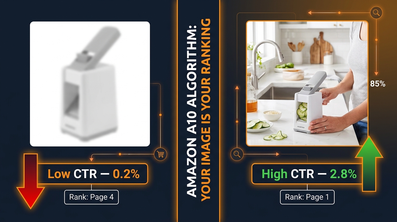
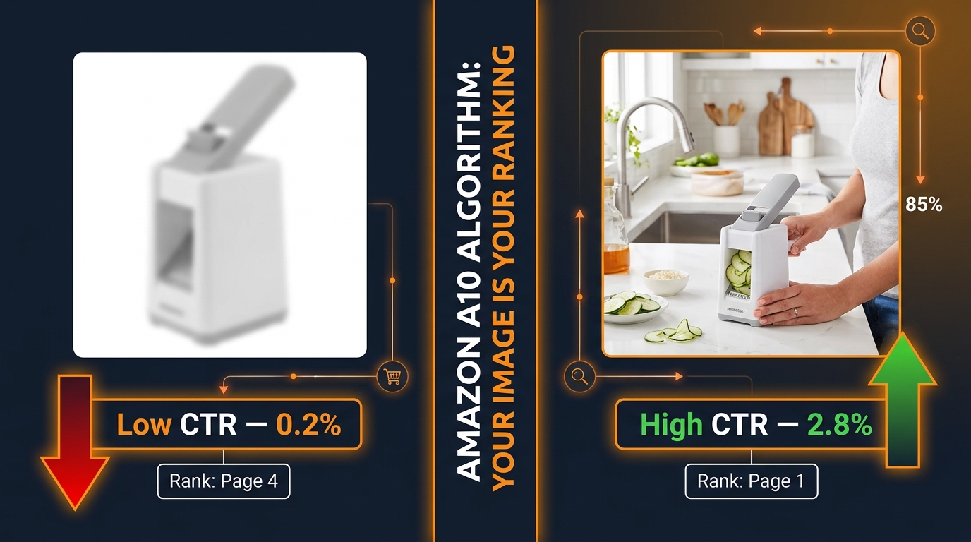
Most Amazon sellers understand, at least in theory, that better images lead to better conversions. What far fewer sellers understand is the precise mechanism by which a single image update can trigger a cascading improvement in organic rank — not over months, but sometimes within days.
The Amazon A10 algorithm doesn’t evaluate your listing the way a human reviewer might. It doesn’t appreciate your brand story or recognize the craftsmanship in your photography. What it does track, with remarkable granularity, is behavioral data: how often shoppers click your listing when it appears in search results, how long they stay, whether they zoom into images, how far they scroll through your image stack, and ultimately whether they buy. Every one of those behaviors feeds a signal. And the signal chain starts with your main image.
This piece is not about image “best practices” in a generic sense. It’s specifically about the relationship between image CTR signals and ranking velocity — the speed at which a listing climbs or falls in organic search position. Understanding this relationship changes how you should think about photography budgets, split testing priorities, image slot strategy, and even how you interpret your PPC data.
We’ll cover the mechanics of the A10 algorithm’s CTR weighting, real benchmark data for what strong CTR actually looks like, the compounding loop that turns a higher click-through rate into accelerated rank gains, and a practical framework for auditing and improving your image stack from slot one through seven. By the end, you’ll have a precise mental model for why images are not just a conversion tool — they are your primary ranking lever.
How the A10 Algorithm Changed the CTR Equation
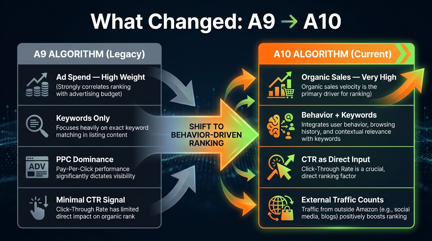
To understand why image CTR carries more weight today than it did three years ago, you need to understand what changed between the A9 and A10 algorithm frameworks.
The A9 Era: Advertising as a Shortcut to Rank
Under Amazon’s previous A9 algorithm, the primary ranking inputs were relatively straightforward: keyword relevance, sales velocity, and advertising spend. Sellers who spent heavily on Sponsored Products could manufacture the sales signals the algorithm needed to push listings up the page. PPC was, in many ways, a direct substitute for organic relevance. If you could afford to pay for enough clicks and conversions, the algorithm would reward your listing with organic visibility — regardless of whether your product or listing was genuinely the best fit for that search query.
CTR mattered under A9, but it was downstream of ad spend. If you were paying for impressions, some clicks would follow. The algorithm was not specifically rewarding listings that earned disproportionately high click-through rates; it was primarily rewarding those that generated consistent sales volume at target keyword positions.
The A10 Shift: CTR Becomes a Direct Input
The A10 algorithm introduced CTR as an independent ranking signal rather than a byproduct of ad spend. This is a meaningful distinction. Under A10, the algorithm now evaluates how often your listing gets clicked relative to how often it’s shown — across both paid and organic placements. A listing that earns a higher-than-expected click-through rate on a given keyword signals to Amazon that it is a more relevant and compelling result. The algorithm responds by increasing impression share for that listing, which compounds into more opportunities to generate clicks, which feeds more sales velocity.
According to analysis of the A10 framework, this shift was deliberately designed to reduce the pay-to-rank dynamic that had frustrated both sellers and customers. Amazon’s business model benefits from shoppers finding exactly what they want quickly — and CTR, when stripped of paid manipulation, is a useful proxy for genuine product-search relevance.
The practical implications of this shift are significant. Under A9, a seller with a mediocre main image but a large PPC budget could still rank competitively. Under A10, that same seller will see their paid traffic convert at lower rates, their organic impression share erode, and their cost-per-click increase as Amazon’s system deprioritizes lower-engagement listings. The image quality problem that ad spend used to paper over now becomes a structural ranking liability.
Other A10 Ranking Factors in Context
It’s worth placing CTR within the full hierarchy of A10 ranking factors to understand its relative weight. Conversion rate remains the single most heavily weighted signal — estimated at 35–40% of the algorithm’s ranking consideration. Sales velocity is the second pillar: consistent, organic unit velocity over 1, 3, 7, 15, and 30-day rolling windows. CTR is the third major signal, with A10 weighting it measurably higher than A9 did. Rounding out the key factors are keyword relevance, seller authority (return rate, customer satisfaction, order defect rate), and external traffic quality.
The reason CTR punches above its apparent weight is positional: it is the upstream signal that makes everything else possible. You cannot generate conversion rate data without first generating clicks. You cannot build sales velocity without conversions. CTR is the entry gate to the entire algorithm loop — and your main image is what determines whether most shoppers walk through that gate or keep scrolling.
The Mechanics of CTR — Benchmarks, Signals, and What “Good” Actually Looks Like
Before optimizing for CTR, sellers need a clear picture of what the numbers actually mean — and what the algorithm is looking for at each performance tier.
Understanding the CTR Formula
CTR is straightforward in calculation: (Total Clicks ÷ Total Impressions) × 100. A listing that receives 1,000 impressions and generates 15 clicks has a 1.5% CTR. What makes this number interesting on Amazon is not the raw percentage but how it compares to category averages and competitor performance on the same search terms.
The algorithm doesn’t evaluate your CTR in isolation. It evaluates it relative to other listings that appear for the same queries. If the average CTR for your main keyword cluster is 0.4% and your listing is producing 0.9%, the algorithm interprets that delta as a strong relevance signal — your listing is resonating with shoppers beyond what baseline expectations would predict. This relative performance is what triggers impression share increases.
CTR Performance Bands and Their Ranking Consequences
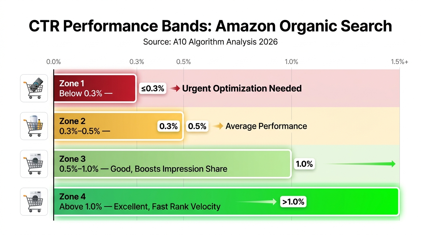
Based on analysis of the A10 environment in 2026, the following performance bands have emerged as meaningful thresholds:
- Below 0.3%: Poor performance that actively erodes rankings. At this level, the algorithm interprets your listing as a poor fit for its current search positions and begins reducing impression share. Sellers in this band typically see organic positions drift backward even with consistent PPC spend.
- 0.3%–0.5%: Average performance. The algorithm treats these listings neutrally — neither rewarding nor penalizing them disproportionately. Rankings remain relatively stable but are unlikely to improve organically without intervention.
- 0.5%–0.8%: Good performance that begins to actively compound. At this level, the algorithm starts increasing impression share in response to the above-average engagement signal. Organic rank velocity picks up, particularly for mid-tail keywords.
- Above 1.0%: Excellent performance that triggers accelerated rank gains. Listings hitting this threshold on competitive head terms often see dramatic position improvements within 2–4 weeks. Some case studies report CTR jumps from the 9–10% range on specific product types after significant image optimization.
For context: a whey protein seller who added clear labeling (flavor and protein count) to their main image packaging saw CTR jump from 9.3% to 17.5% — a near doubling on their primary keyword. This kind of jump is extreme, but it illustrates how a single visual change can shatter the baseline when the previous image was failing to communicate essential decision-making information.
What the Algorithm Is Actually Detecting
It’s tempting to think of CTR as a simple binary signal — clicked or not. The A10 algorithm is more nuanced than that. It also tracks behavioral depth signals that accompany clicks. These include zoom interactions (how many shoppers zoom into your main image), scroll depth through your full image stack, and dwell time on the product detail page. A listing that generates a high CTR but then sees shoppers immediately bounce back to search results is providing a mixed signal. The algorithm interprets this as “compelling enough to click, but not what the shopper expected.”
This is why image stack coherence matters: the main image earns the click, but images 2 through 7 need to hold the shopper, answer their questions, and build toward conversion. A disconnect between the main image’s promise and the secondary images’ delivery creates a CTR-without-conversion pattern that the algorithm penalizes over time.
Main Image Architecture — The Technical Specs That Control First Impressions
The main image is the single most consequential creative asset on an Amazon listing. It renders in search results at thumbnail size, fills 85–90% of a mobile viewport above the fold on the product detail page, and drives more click decisions than any other listing element — including title, price, and review count, according to Feedvisor’s analysis of A10 ranking signals.
The Non-Negotiable Technical Baseline
Amazon’s image requirements for main images are strict and consequential: pure white background (RGB 255, 255, 255), product filling at least 85% of the frame, and minimum 1,000 pixels on the longest side to enable the zoom function. These aren’t arbitrary aesthetic preferences — they directly affect algorithmic performance.
The zoom function deserves particular attention. When your image is below the 1,000-pixel threshold, Amazon’s zoom feature is disabled. This doesn’t just reduce the shopping experience; it removes a behavioral engagement signal that the A10 algorithm actively tracks. Shoppers who zoom in are demonstrating deep product interest. When that signal is absent from your listing, you’re missing one of the behavioral data points the algorithm uses to measure listing quality. The recommended resolution in 2026 is 2,000 × 2,000 pixels for square images or 2,000 × 2,500 pixels for vertical 4:5 ratio formats optimized for mobile displays.
Frame Fill and Product Dominance
The 85% frame-fill requirement isn’t just a policy compliance item — it’s a CTR lever. A product that dominates its image frame communicates confidence and visual clarity. When a product is small, centered in a sea of white, shoppers subconsciously register it as less significant or lower quality. At thumbnail size, a product that fills the frame is simply more visible and easier to evaluate at a glance.
For products with complex shapes or multiple components, this means intentional composition decisions. A supplement bottle photographed at a slight angle, tilted forward, filling the frame edge-to-edge communicates very differently than the same bottle photographed straight-on at 50% frame fill. The first image competes aggressively in search results. The second disappears.
What You Cannot Do — and the Risk of Suppression
Amazon’s main image policy prohibits text overlays, logos, lifestyle backgrounds, borders, watermarks, and accessories that don’t come with the product. These restrictions exist specifically on the main image (slots 2–7 have more flexibility, which we’ll cover). Violations risk automatic listing suppression — not just a policy flag but an active removal from search results.
The suppression risk is worth taking seriously. Amazon’s image recognition systems have become significantly more capable at detecting non-compliant main images, and suppressed listings generate zero impressions, zero CTR data, and zero sales velocity. Every day a listing is suppressed is a day the algorithm is receiving negative signals about that ASIN’s reliability.
The Psychology of the First Frame
Beyond technical compliance, the main image needs to answer one question in under 300 milliseconds: Is this what I’m looking for? That answer depends on category context. In some categories (kitchen appliances, supplements, electronics), showing the product in its most recognizable form — the packaging or primary use view — is the right call. In other categories (apparel, outdoor gear, home décor), a lifestyle-adjacent main image that communicates the product’s end state can dramatically outperform a clinical studio shot, even within the white background constraint.
The angle, the lighting, the product’s orientation within the frame — all of these are CTR variables. A supplement brand that tested three different main image angles using Amazon’s Manage Your Experiments found that a slightly overhead angled shot showing the bottle’s label clearly outperformed a straight-on shot by enough to shift the listing two positions on its primary keyword within three weeks of the winning version going live.
The CTR-to-Ranking Velocity Loop — How a Single Click-Through Win Compounds

The phrase “ranking velocity” refers to the speed at which a listing moves up or down organic search positions — not just whether it eventually reaches page one, but how quickly the algorithm responds to performance signals. Understanding this velocity mechanism explains why image optimization often produces faster results than other listing changes.
Why CTR Has Outsized Velocity Effects
When you improve your main image and CTR rises, the algorithm doesn’t just log a single positive data point. It recalibrates your listing’s impression share across all associated search terms. This means the listing gets shown to more shoppers, which generates more absolute clicks even at the same percentage rate, which produces more conversion opportunities, which builds sales velocity, which is itself one of the algorithm’s heaviest-weighted signals.
The compounding math is striking. A 1% improvement in conversion rate — plausible from a better image stack that reduces buyer uncertainty — has been documented to double organic traffic within six months through this self-reinforcing loop. The mechanism works as follows: higher CTR → more impressions → more conversions → higher sales velocity → improved organic rank → higher search position → higher CTR from better placement → cycle repeats.
The Impression Share Mechanic
Impression share is one of the least-discussed but most important outputs of strong CTR performance. Amazon doesn’t show every eligible listing to every shopper for every relevant search. It makes triage decisions about which listings to surface, partly based on which ones it predicts will generate the most engagement and revenue per impression. A listing with a history of above-average CTR gets preferential treatment in this triage — it gets shown more frequently and in better positions.
This creates an asymmetry between listings competing for the same keywords. Two sellers in the same category with similar review counts and similar pricing can have dramatically different impression volumes simply because one has consistently earned higher CTR. The algorithm is essentially betting on the higher-CTR listing to generate more revenue per search result slot, and it acts on that bet by allocating more impressions to it.
Ranking Velocity vs. Ranking Position
It’s important to distinguish between velocity (the rate of change in rank) and position (where you currently rank). A listing can occupy page two on a keyword and have very high velocity — meaning the algorithm is actively promoting it and it will likely reach page one quickly if the behavioral signals continue. Conversely, a listing can hold page one but have declining velocity — meaning the algorithm is quietly reducing its impression share and it will drift back if performance doesn’t improve.
Image-driven CTR improvements primarily affect velocity. When you lift CTR, you accelerate the rate at which the algorithm promotes your listing. This is why sellers who have invested in strong images often report rapid rank jumps — sometimes 5–10 position gains within 2–4 weeks of an image update — rather than the slow incremental progress associated with keyword optimization.
The Sales Velocity Flywheel
Sales velocity is calculated across multiple time windows (1, 3, 7, 15, and 30 days), with more recent performance weighted more heavily. This recency bias in the algorithm means that a significant CTR improvement triggers a cascade effect: higher CTR produces more daily sales, which immediately elevates the 1-day and 3-day velocity signals, which shifts the algorithm’s ranking decision within days rather than weeks. The flywheel effect means early gains compound quickly, which is why image optimization ROI often looks remarkable when measured against the investment.
Data from the Emplicit case study for SteadyStraps illustrates this: upgrading product images to above 1,600 pixels resolution and adding close-up and lifestyle shots lifted page views by 227.7%, sessions by 103.9%, and units ordered by 12.5% within two months. That session and view growth represents both the CTR gain (more shoppers clicking into the listing) and the velocity impact (more transactions feeding the algorithm’s confidence in the listing’s relevance).
Secondary Images as Conversion Architects (Slots 2–7 Decoded)
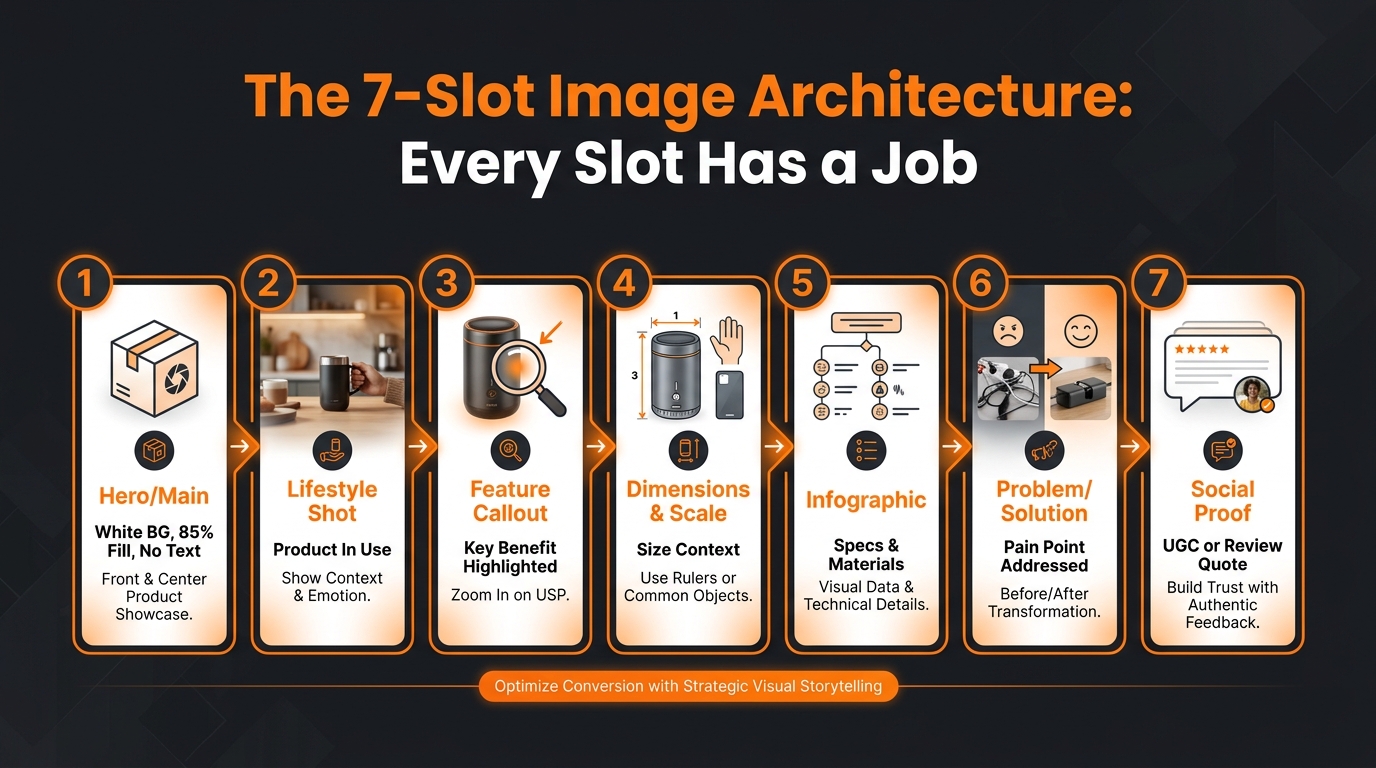
The main image earns the click. Secondary images (slots 2 through 7) earn the conversion. But they also earn the dwell time and scroll-through engagement signals that the A10 algorithm uses to assess listing quality beyond the initial click. The strategic architecture of your secondary image stack is not a creative preference — it’s an algorithmic input.
Why All Seven Slots Matter
Many sellers treat slots 2–4 as primary and leave 5–7 either empty or filled with low-quality backup images. This is a significant missed opportunity. The A10 algorithm tracks scroll-through depth on the image stack. Shoppers who scroll through all seven images demonstrate higher purchase intent and generate stronger behavioral engagement signals than those who stop at image two or three. A listing that consistently generates full-stack scroll engagement gets credit for that deep engagement in the algorithm’s listing quality assessment.
Beyond the algorithmic credit, filling all seven slots strategically reduces the purchase objections that cause shoppers to exit the listing to look for more information. Every time a shopper leaves to search for answers about dimensions, materials, included accessories, or usage instructions, you’re generating a bounce signal that the algorithm interprets negatively — and you’re risking losing that shopper to a competitor whose listing answered their questions more completely.
The Functional Architecture of Each Slot
A structured approach to secondary images treats each slot as a specific job in the purchase journey:
- Slot 2 — The Lifestyle Anchor: Place the product in context of use. This image does emotional work — it helps the shopper visualize the product in their life. For a kitchen appliance, this means a real kitchen environment. For a fitness product, an in-use action shot. Lifestyle images extend dwell time and reduce bounce by creating an emotional connection that pure product photography cannot achieve.
- Slot 3 — The Key Feature Callout: A close-up or annotated image that highlights the product’s single most important differentiating feature. Use clear, readable text callouts. This image should answer the question: “What makes this product worth choosing over the alternatives?”
- Slot 4 — Scale and Dimensions: Size confusion is one of the leading causes of negative reviews and returns on Amazon. An image that shows the product alongside a familiar object (a hand, a common household item, a measuring tape) resolves this objection visually. Returned items generate negative velocity signals; preventing returns through clear communication protects algorithmic standing.
- Slot 5 — The Infographic: A data-dense image that answers specification questions: materials, dimensions, included accessories, certifications, usage instructions. This is the slot where infographic-style design earns its 30–40% conversion premium. Shoppers who need this information and find it in the image stack convert at dramatically higher rates than those who have to search for it in the bullet points.
- Slot 6 — Problem/Solution Framing: An image that explicitly connects the product to the problem it solves. This is especially valuable for health, wellness, organizational, and home improvement products. “Before/after” compositions, pain-point callouts, or before-the-product vs. with-the-product comparisons do strong conversion work here.
- Slot 7 — Trust Builder: Social proof imagery, user-generated content aesthetics, badge callouts (certifications, guarantees, compatibility claims), or a brand confidence statement. This final image should reduce any remaining purchase risk in the shopper’s mind.
Text in Secondary Images: Mobile Readability Rules
Since 67–80% of Amazon traffic originates from mobile devices in 2026, text legibility in secondary images is a functional requirement, not a design preference. The practical test is the “squint test”: reduce your secondary image to thumbnail size on a smartphone screen and determine whether the text callouts remain readable without zooming. If the text requires zooming to read, a significant portion of mobile shoppers will never see it — and those are the shoppers who most needed that information to convert.
Practical guidelines for secondary image text: minimum 24pt equivalent font size, high-contrast color combinations (white text on dark overlay or dark text on light background), no more than 3–5 lines of text per callout, and avoid cursive or script fonts which Amazon’s Rufus AI and standard OCR systems have difficulty parsing.
Mobile-First Reality: The Squint Test and Why Most Images Fail It

The most common image optimization mistake among Amazon sellers in 2026 is designing images for desktop and hoping they translate to mobile. They don’t. The behavioral and algorithmic consequences of mobile image failure are significant enough that this deserves its own focused treatment.
The Scale of the Mobile-First Challenge
Between 67% and 80% of Amazon traffic now originates from mobile devices, depending on the category. For categories with high impulse purchase rates (consumables, small accessories, health products), mobile traffic skews even higher. This means the majority of your CTR data, your conversion rate, your scroll depth, and your zoom engagement are generated by shoppers looking at a screen that is roughly 390 pixels wide.
At that resolution, an Amazon search result tile for your product is approximately 155–170 pixels wide. This is the context in which shoppers make the decision to click or scroll past. The visual elements that differentiate a compelling main image at this size are fundamentally different from those that work at desktop resolution. Large, clearly rendered product form. Strong contrast against the white background. A single visual element that communicates the product category instantly. Anything more complex than this fails at mobile thumbnail size.
How Mobile Failures Manifest in CTR Data
When a main image fails the mobile squint test, the CTR consequence is not subtle. Sellers who have audited their main images against mobile preview data typically find that images designed for desktop perform 15–25% below comparable images optimized for mobile thumbnail rendering. That gap translates directly into impression share erosion, slower rank velocity, and ultimately lower organic positions.
The mechanism is worth visualizing. A shopper scrolling through Amazon search results on their phone is processing dozens of thumbnails per second. They’re not reading titles at this stage — they’re scanning images. A product image that communicates clearly at 160 pixels stops the scroll. One that requires mental processing to interpret doesn’t. The algorithm registers each scroll-past as a non-click, which dilutes CTR, which reduces the algorithm’s confidence in the listing’s relevance for that search term.
Rufus AI and Image Parsing
Amazon’s Rufus AI assistant, which handles an estimated 274 million daily queries and is credited with influencing $10 billion in sales, actively reads and interprets product images using OCR and image recognition. When a shopper asks Rufus about product specifications, dimensions, or compatibility, the AI pulls information from both text fields and images. Listings with clear, OCR-readable text in secondary images receive higher relevance signals from Rufus, which can indirectly boost impressions and CTR from Rufus-assisted searches.
This creates a new layer of image optimization: not just human-readable but machine-readable. Fonts that Rufus’s OCR struggles with (cursive, heavily stylized scripts, very small point sizes) effectively hide that information from Rufus’s awareness. The practical consequence is that listings with machine-readable image text surface more frequently in Rufus responses and benefit from the documented 60% higher conversion rate that Rufus-assisted shopping sessions generate compared to standard search sessions.
Vertical vs. Square Format Decision
Amazon now supports both square (1:1 at 2,000 × 2,000 pixels) and vertical (4:5 at 2,000 × 2,500 pixels) main image formats, with the vertical format increasingly favored for mobile because it occupies more screen real estate in search results. A product image formatted at 4:5 in mobile search results is approximately 15% taller than a square image, which translates to greater visual presence in the search results feed. For categories where mobile dominates, testing the vertical format often produces measurable CTR lifts without any other changes to the image content.
Split Testing Images on Amazon — What Manage Your Experiments Actually Reveals
Amazon’s Manage Your Experiments (MYE) tool is the most direct and reliable method for measuring the actual CTR and conversion impact of image changes on your specific ASINs. Understanding how to use it correctly — and how to interpret its outputs — separates sellers who systematically improve image performance from those who rely on intuition.
How Manage Your Experiments Works
Available to Brand Registry sellers through Seller Central, MYE allows you to run A/B tests on main images, secondary images, titles, bullet points, product descriptions, and A+ Content. The tool splits live traffic roughly 50/50 between the two versions, tracks performance metrics including units sold, conversion rate, and session data, and projects a 12-month sales impact if the winning version is kept live. Tests run until they reach 95% statistical significance, which typically requires between 4 and 10 weeks depending on traffic volume. Amazon’s minimum threshold is approximately 1,000 views per variant for reliable significance.
The auto-publish feature is worth noting: once statistical significance is reached, MYE can automatically push the winning variant live without seller intervention. This is useful for sellers running multiple tests simultaneously, though manual review is worth building in for any test that produces counterintuitive results.
What the Data Actually Shows
Image tests through MYE consistently reveal that small, targeted changes to main images produce more statistically significant results than broad creative overhauls. A stainless steel lunch box seller who reshot their main image to show the product’s compartments open — revealing the internal organization that was the product’s key differentiator — saw CTR rise 38% within the first month of the new image going live, and cost-per-click in their PPC campaigns dropped from ₹45 to ₹29 as the improved organic performance reduced their reliance on paid placement.
Amazon itself claims up to 20% sales lift from optimized content tested through MYE. While that figure represents a best-case outcome rather than a typical one, the mechanism behind it is real: better images that raise CTR and conversion rate generate more sales, and those sales feed the algorithm loop described earlier.
What to Test and in What Order
Given the upstream position of the main image in the ranking loop, it should be the first element you test — not because secondary images don’t matter, but because a main image improvement affects CTR immediately and across all keyword positions, while secondary image improvements primarily affect conversion rate on shoppers who have already clicked through. The ROI sequence is: main image first, secondary images second, title third.
Within main image testing, prioritize angle and composition before testing stylistic elements like color grading or background gradients. Angle changes (straight-on vs. angled, flat lay vs. upright) tend to produce larger CTR deltas than aesthetic refinements. Once an angle is proven, refine within that format.
Pre-Testing Without Waiting for Traffic: PickFu
For ASINs with insufficient traffic to run statistically significant MYE tests within a reasonable timeframe, PickFu panels (showing images to targeted groups of Amazon Prime shoppers) provide directional data that can inform which variant is worth testing on the live listing. PickFu doesn’t measure real purchase intent, but it does surface qualitative feedback about why shoppers prefer one image over another — often revealing specific visual elements (packaging clarity, product scale, visible labeling) that can be directly actioned in the creative revision.
The Infographic Advantage — Data Behind the 30–40% Conversion Lift
The finding that listings with infographic-style secondary images convert 30–40% higher than those using lifestyle photography alone is one of the most consistent data points in Amazon listing optimization research. Understanding why this lift exists — and how to structure infographics to capture it — is essential for any seller treating image stack as a systematic ranking lever.
Why Infographics Reduce Purchase Friction
The conversion lift from infographics is not primarily about aesthetics — it’s about information density delivered at the moment of decision. When shoppers encounter an Amazon listing, they arrive with a mental checklist of questions: Does this fit my space? Is it the right material? What’s included? How does it compare to the standard? Does it have the certifications I need? Every one of these unanswered questions is a purchase friction point.
Bullet points in the listing text answer some of these questions, but they require shoppers to shift attention from the visual scanning mode (images) to the reading mode (text). Many mobile shoppers never make that shift — they evaluate products visually and either convert or bounce based on what the images communicate. Infographics deliver specification-level information in the visual scanning mode, eliminating the need to shift to reading mode for basic product intelligence.
Structural Elements of High-Converting Infographics
The infographics that produce the strongest conversion signals share several structural characteristics. First, they anchor on the most common purchase objections for that product category, not on features the seller thinks are impressive. A camping tent infographic that leads with packed weight and setup time (the actual objections) will outperform one that leads with the frame material specification (a secondary consideration for most buyers).
Second, high-converting infographics use comparison framing where applicable — showing the product against a category standard (“2x thicker than standard” or “30% lighter than competitors in class”). This frame does two jobs: it answers the quality question and it implicitly disqualifies alternatives without naming them. Third, they use visual hierarchy aggressively — one dominant claim, two to three supporting points, no more than five elements total. Cognitive overload in an infographic is as damaging as cognitive overload in any other interface; it sends shoppers back to scanning mode before they’ve absorbed the key message.
The Dwell Time Signal from Infographic Engagement
Beyond the direct conversion effect, well-structured infographics generate a measurable dwell time signal that the A10 algorithm registers. A shopper who spends 8 seconds on image 5 reading a detailed infographic is demonstrating deeper purchase intent than one who flips through the same image in under a second. The algorithm accumulates these behavioral depth signals across all sessions and uses them to calibrate the listing’s overall quality score. Listings that consistently generate deep engagement across the image stack are allocated better impression positioning, which feeds the CTR loop.
When Infographics Backfire
There are scenarios where infographic-heavy image stacks underperform. Products with strong aspirational identity (premium fashion, luxury accessories, artisan food) often see lifestyle photography outperform information-dense infographics because the purchase is emotionally driven rather than specification-driven. In these categories, an infographic with callouts and bullet points can undermine the aspirational positioning that drives conversions.
The practical lesson: use the infographic advantage in categories where buyers are researching, comparing, or evaluating technical fit. Use lifestyle-dominant image stacks in categories where buyers are aspiring, dreaming, or gifting. Most categories contain a mix of both buyer types, which argues for a hybrid approach — lifestyle in slots 2–3, infographic in slots 4–6, emotional close in slot 7.
Video Thumbnails and the Emerging CTR Frontier
Product video — specifically the video thumbnail as a de facto eighth image — has emerged as a significant CTR signal that most sellers have yet to fully integrate into their ranking strategy. Data from 2026 shows that the main image video slot yields CTR lifts of 8–18% in search results compared to static main images, and 12–25% higher unit session percentage on product detail pages where video auto-previews.
Video as a Search Result Differentiator
Amazon increasingly surfaces video thumbnails in search results, particularly in mobile search on high-competition keywords. A listing with a strong video thumbnail — showing the product in action rather than static — stops the scroll more effectively than any static image in crowded search result pages. The movement preview triggers a pattern-interrupt response in shoppers scrolling through visually similar product listings, and the resulting CTR delta can be substantial.
The video thumbnail image (the frame shown before play) is as important as the video itself for CTR purposes. A poorly chosen thumbnail frame that shows an indistinct or unflattering moment in the video will actually underperform a strong static main image. Intentional thumbnail selection — choosing a frame that shows the product clearly, in an emotionally resonant context, with visible motion cues — is a distinct creative decision from the video itself.
Phone-Shot vs. Polished Brand Video Performance
One of the counterintuitive findings from split testing data in 2026 is that authentic, phone-shot product demonstration videos often outperform polished brand production videos when placed in the image stack. The raw, unproduced aesthetic of a genuine product demo reduces buyer skepticism — it reads as an honest representation rather than a marketing production. This doesn’t mean low-quality is a virtue, but it does suggest that authenticity signals in video content can be more persuasive than production value when purchase confidence is the conversion barrier.
Integration with the CTR Loop
Video engagement also feeds A10 behavioral signals. Shoppers who press play on a product video demonstrate a level of purchase consideration that generates a strong positive signal in the algorithm. Video completion rate, in particular, is a high-intent signal: a shopper who watches a full 60-second product video before purchasing has provided the algorithm with evidence of considered decision-making, which correlates with lower return rates and higher review quality — both positive inputs to seller authority scores.
Practical Image Optimization Workflow — From Audit to Rank Gains
Knowing what matters is only useful when paired with a repeatable process for acting on it. The following workflow translates the CTR-velocity framework into a concrete sequence of actions that can be applied to any existing listing or used to set up new listings for maximum algorithmic performance from launch.
Step 1: The CTR Baseline Audit
Before touching any images, pull current CTR data from Seller Central’s Search Term Report (for organic performance) and your campaign reports (for paid performance). Identify the keyword clusters where your CTR is below 0.5% and flag those as priority targets. Check whether the keywords with the lowest CTR are your highest-traffic terms — those represent the largest opportunity because even a small CTR improvement on high-impression keywords produces substantial absolute click increases.
Cross-reference low CTR keywords against competitor main images for those search terms. Open a private browser, search your primary keywords, and take screenshots of the top 10–15 thumbnails. Then add your own listing’s thumbnail to the comparison. This visual audit often reveals immediately whether your main image is visually competitive in your search results context — whether it stands out or blends in.
Step 2: Main Image Prioritization
Based on your CTR audit, determine whether your main image is the primary problem. Indicators of a main image problem: CTR below 0.3%, your thumbnail is visually indistinguishable from competitors, your image resolution is below 1,500 pixels (zoom function degraded), or your product fills less than 75% of the frame.
If a main image overhaul is warranted, commission at least three distinctly different angle/composition variants. Do not attempt to test within a single image — test between fundamentally different visual approaches. Submit these to a PickFu panel of 50 Amazon Prime shoppers before spending money on MYE testing. Use PickFu responses to identify which variant resonates and why, then refine the leading variant before launching the MYE test.
Step 3: Secondary Image Stack Architecture
Map your current secondary images against the 7-slot architecture described earlier. Identify which slots are empty, which are low-quality filler, and which are genuinely functional. Then identify the top three purchase objections for your product category (review analysis is excellent for this — one-star and three-star reviews typically articulate the exact concerns that better images could address).
Build or commission images that directly address those objections in the appropriate slots. Prioritize slots 4 and 5 (dimensions and infographic) if specification confusion is common in reviews. Prioritize slots 2 and 3 (lifestyle and feature callout) if reviews suggest shoppers were surprised by the product’s appearance or feel in real-world use.
Step 4: Mobile Optimization Pass
After creating or revising images, conduct a mobile optimization pass before uploading. Load each image on a smartphone at actual search result thumbnail size and apply the squint test. Check text readability at thumbnail scale. Verify that the product is visually dominant at small sizes. Confirm that the primary visual message communicates within 300 milliseconds of viewing.
For secondary images with text callouts, check that font sizes, contrast ratios, and layout hierarchy survive the thumbnail size reduction. Images that look excellent at desktop resolution often reveal hidden mobile legibility problems when evaluated at actual mobile display size.
Step 5: Measure, Iterate, Compound
After launching updated images, set a 4-week measurement window. Track CTR changes in the Search Term Report week-over-week for the keywords you identified in the audit. Track session-to-order conversion rate changes. Track organic rank position for your top 10 keyword targets.
In most cases, CTR improvements from main image updates are visible within 1–2 weeks. Conversion rate improvements from secondary image updates are typically visible within 3–4 weeks. Organic rank gains from the combined effect usually manifest within 4–8 weeks, depending on the competitiveness of the category and the magnitude of the CTR improvement.
Run one variable at a time through MYE where possible. Changing multiple image elements simultaneously makes it impossible to attribute performance changes to specific decisions — and it means you can’t build the institutional knowledge of what works in your specific category that makes successive iterations progressively more effective.
The Compounding Return on Visual Relevance
The Amazon A10 algorithm is, at its core, a system designed to show shoppers the products most likely to satisfy their needs and generate Amazon revenue. The signals it uses to make those determinations — CTR, conversion rate, sales velocity, dwell time, scroll depth, zoom engagement — are all behavioral. And the primary driver of behavioral engagement, before any other listing element, is the image stack.
The CTR-to-ranking velocity relationship is not linear. It compounds. A 0.4% improvement in CTR does not simply produce 0.4% more clicks — it produces a cascade of impression share gains, sales velocity increases, and organic rank improvements that multiply the initial signal. A 1% improvement in conversion rate, enabled by better secondary images and infographics, can double organic traffic within six months through the same self-reinforcing loop. These are not incremental optimizations — they are multipliers on everything else in your listing and marketing strategy.
The practical takeaways from this analysis are worth making explicit:
- Treat your main image as your highest-ROI marketing asset. Spending money on photography that produces a measurable CTR improvement generates returns through the algorithm that dwarf equivalent ad spend.
- Fill all seven image slots with purpose-built content. Empty slots and filler images are missed opportunities to generate scroll depth signals, answer purchase objections, and reduce bounce rates.
- Design for mobile thumbnails first, desktop second. The majority of your CTR data is generated at 160 pixels wide. Optimize for that context before optimizing for anything else.
- Use Manage Your Experiments systematically. Image testing is the most direct path to understanding what actually drives CTR for your specific product in your specific category — more reliable than any general best practice.
- Measure ranking velocity, not just rank position. A listing that gains four positions in two weeks after an image update is showing you something important about the algorithm’s response to that change. That signal should drive further investment in image quality.
In a marketplace where millions of sellers are competing for the same search result real estate, the listings that earn clicks through genuine visual relevance will always outperform those that attempt to buy their way to visibility. Your image stack is not a supporting element of your Amazon strategy — under the A10 algorithm, it is the engine of your organic ranking velocity.