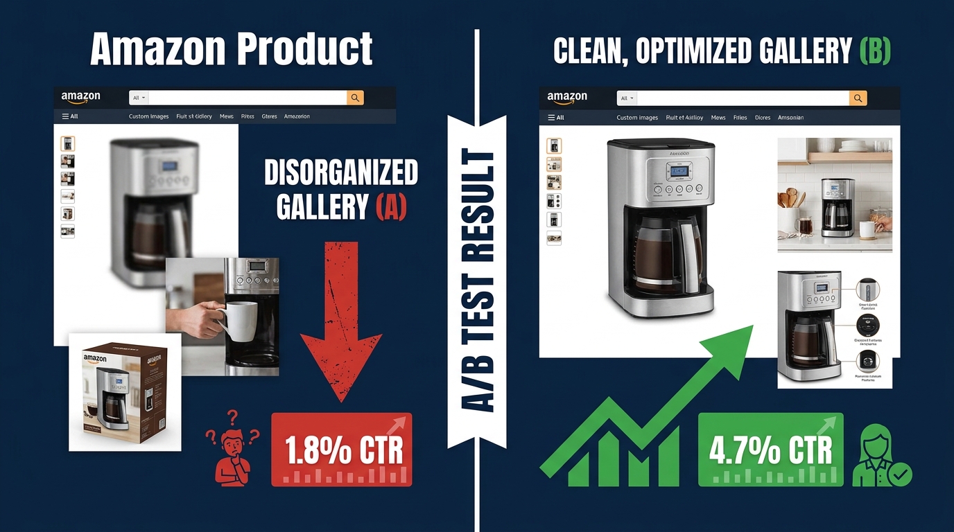
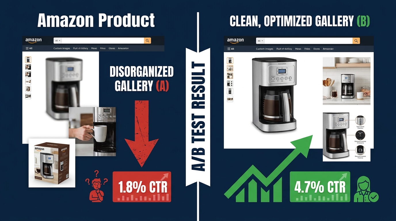
There is a particular kind of confidence that comes from having run an experiment. You split-tested your main image, let it run for two weeks, saw Version B pulling slightly ahead, applied the winner, and moved on. The listing is updated. The test is done. The data has spoken.
Except in most cases, it hasn’t. The data was inconclusive at best — and actively misleading at worst. Amazon’s own internal guidance recommends running image experiments for at least eight to ten weeks. Industry data shows most sellers stop theirs in under three. That gap is where the false confidence lives, and it is costing brands real conversion rate percentage points every single day.
Amazon image testing is one of the highest-ROI activities a brand-registered seller can pursue. Amazon itself has documented listing optimizations producing sales lifts of up to 20–25% in controlled experiments, with even conservative image-specific tests regularly delivering 5–12% conversion rate improvements. But those results only materialize when the testing architecture is designed correctly — when you know what you’re testing, why you’re testing it, what metric actually measures success, and how long you need to wait before the result means anything.
This article is not about whether to test your images. That question is settled: you absolutely should. This is about how the testing process breaks down, what a properly structured image testing architecture actually looks like, and how to build a gallery optimization system that compounds wins over time instead of producing noise.
What Manage Your Experiments Actually Measures (And What It Doesn’t)
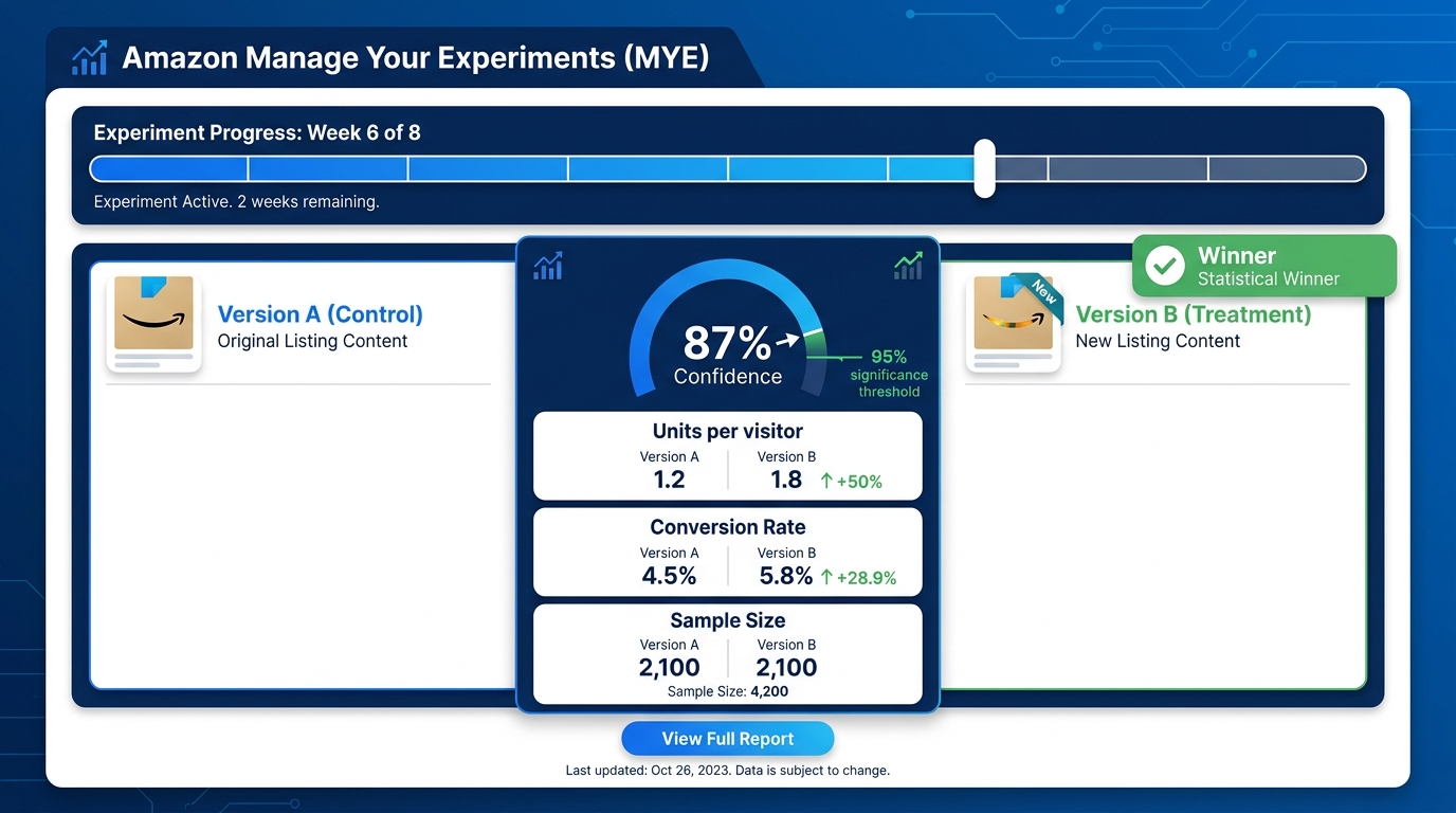
Amazon’s Manage Your Experiments (MYE) tool, accessible via Seller Central under Brands → Manage Your Experiments, is the native A/B testing environment for Brand Registry sellers. It supports testing of main images, image stacks, titles, and A+ content. The mechanics are straightforward: traffic to your detail page is split randomly 50/50 between Version A and Version B, and Amazon tracks performance on both variants simultaneously.
What MYE reports is genuinely useful — but it’s a narrower picture than most sellers assume.
The Metrics MYE Tracks
The MYE dashboard surfaces several core metrics on a weekly basis:
- Units per unique visitor — the primary success metric Amazon uses to determine a winner
- Conversion rate — the percentage of detail page visitors who complete a purchase
- Units sold — raw unit volume per variant
- Sample size — the number of unique shoppers who saw each version
- Probability of winning — Amazon’s confidence estimate for which variant is better
- Projected one-year impact — an estimated annualized sales difference based on current test data
MYE reaches statistical significance when it achieves approximately 95% confidence that one version outperforms the other. That threshold requires sufficient sample size, which in practice means roughly 700 or more detail page views in the preceding 30 days as a minimum eligibility floor — and meaningfully more traffic than that before results become reliable.
What MYE Does Not Tell You
Here is where most sellers run into trouble. MYE measures on-page performance — what happens once a shopper lands on your detail page. It does not directly measure click-through rate from search results or sponsored ad placements. That means if your main image change primarily affects whether shoppers click on your listing from a search page, MYE will only partially capture that impact. The CTR lift shows up indirectly as increased traffic volume to the listing over time, but MYE itself is not a CTR measurement tool.
MYE also cannot isolate the impact of images from concurrent changes. If your team updates ad bids, adjusts pricing, or runs a promotion during an active experiment, the results become impossible to interpret cleanly. This is not a flaw in the tool — it is a constraint every seller needs to understand and plan around.
Eligibility Requirements in 2026
Not every ASIN qualifies for MYE image testing. Amazon’s current requirements include active Brand Registry enrollment, sufficient recent traffic (the 700+ page views per 30 days benchmark is widely cited in the seller community), and the ASIN must be in good standing with no active policy violations. New or low-velocity products simply may not accumulate enough traffic to produce statistically meaningful results within a reasonable test window. This is not a technicality — it is one of the core reasons so many image tests produce inconclusive or misleading results.
The Decision-Journey Framework: Mapping Each Image Slot to a Buyer Question
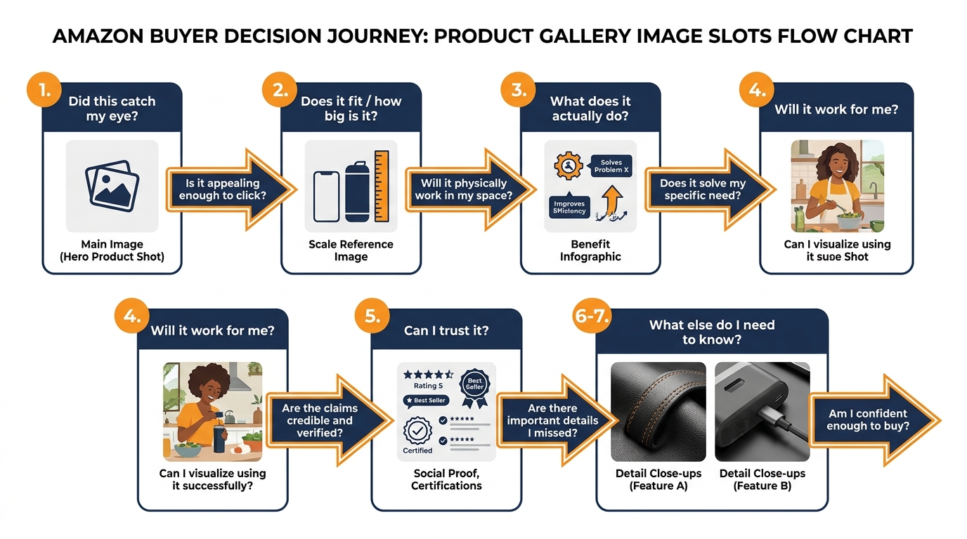
Before you can test anything intelligently, you need a model of what each image is supposed to accomplish. The most effective framework in current practice treats the Amazon gallery not as a collection of product photos, but as a structured answer to a sequential series of buyer questions. Shoppers arrive at your listing with a mental checklist — and your images either answer those questions in order, or they don’t.
This matters because attention decays with every swipe. Research on e-commerce shopper behavior consistently shows that the majority of detail page visitors view images sequentially from left to right. Each additional image receives progressively less attention. The first three images carry disproportionate conversion weight. If you burn those slots on redundant or low-information visuals, you have already lost the majority of marginal buyers before your most compelling content appears.
The Seven-Slot Question Map
Here is the decision-journey mapping that leading Amazon-focused agencies and optimization specialists have converged on in 2026:
- Slot 1 (Main Image): “Is this what I’m looking for?” — Pure recognition and category identification. Amazon’s white-background requirement constrains this slot, but everything within those constraints — product angle, negative space, size fill — is a testable variable that drives click-through from search.
- Slot 2: “How big is it / will it fit?” — Scale and context. Shoppers need a reference point. A product shown next to a recognizable object, in a room context, or with explicit dimension callouts answers the scale question that text rarely resolves as effectively.
- Slot 3: “What does it actually do for me?” — The primary benefit, expressed visually. This is typically the highest-impact conversion slot after the main image. An infographic or annotated lifestyle image that communicates the top value proposition clearly outperforms generic detail shots in this position.
- Slot 4: “Will this work in my situation?” — Use-case contextualization. A lifestyle image showing the product in realistic use addresses the “but will it work for someone like me?” question. This slot should reflect your target customer’s actual context, not a generic aspirational scenario.
- Slot 5: “Can I trust this product?” — Credibility and proof. Certifications, awards, material quality close-ups, or social proof elements belong here. This slot handles the risk-reduction phase of the decision journey.
- Slots 6–7: “What else do I need to know?” — Secondary details, variants, bundle contents, compatibility information. These slots serve the more engaged buyer who has already mostly decided and is validating final specifics.
Why This Framework Changes What You Test
Once you assign each slot a specific job in the buyer journey, your test hypotheses become much more precise. Instead of “let’s try a different image in slot 3,” you’re asking: “Does communicating the primary benefit through an annotated infographic or through a lifestyle-in-use shot produce better conversion at this stage of the decision?” That is a testable question with a clear success metric. It will produce actionable data. Generic image swaps produce noise.
The framework also reveals which slots have the most conversion leverage for your specific category. A product where the primary buyer objection is “I’m not sure if this is the right size” has its highest-impact test opportunity in slot 2, not slot 3. A product where the primary objection is “I’m not sure this brand is trustworthy” has its most important work to do in slot 5. The decision-journey map tells you where to focus your testing resources first.
Main Image Testing: The One Test That Moves Everything Else
If you can only run one test on any given ASIN, it should be the main image. No other single change to your listing — not your title, not your bullet points, not even your price in many cases — has the same upstream leverage. The main image determines whether your ASIN gets clicked from search results. Without clicks, no downstream conversion optimization matters.
This upstream effect is what makes main image testing qualitatively different from testing secondary gallery images. A main image improvement compounds through your entire marketing funnel: more organic clicks, better ad click-through rates, higher quality scores for sponsored placements, and ultimately a more efficient cost-per-click across all campaigns. Estimated improvements in main image performance that lift CTR by even 1–2 percentage points can produce double-digit revenue changes on high-volume ASINs when the downstream math is fully accounted for.
What to Actually Test in Your Main Image
The most common mistake in main image testing is testing variations that are too similar to produce a detectable signal. Moving a product slightly left versus slightly right will not produce a statistically significant result in any reasonable test window. Meaningful tests require meaningful differences. The variables worth testing include:
- Product angle: Front-facing versus three-quarter perspective versus overhead can produce dramatically different recognition rates depending on the category. Apparel, footwear, small electronics, and kitchen tools all have different “recognition angles” that convert differently.
- Product fill and framing: Amazon’s requirement that the product occupy at least 85% of the image frame still leaves substantial room to test how the product is positioned within that frame. Products with multiple components benefit from tighter or looser compositions differently.
- Variant shown: For listings with multiple colors, sizes, or configurations, which variant appears in the main image affects both CTR and downstream conversion. The most visually striking variant often outperforms the most popular seller.
- Props and secondary elements: Amazon’s main image rules prohibit text and promotional badges but allow product-adjacent props in many categories. Testing with versus without contextual props — packaging, accessories, complementary items — can reveal whether context or isolation works better for your category.
- White space distribution: More white space versus less, product higher versus lower in the frame — these subtle compositional choices affect how thumbnails render in search results, particularly on mobile screens where the image is small.
Setting the Right Success Metric for Main Image Tests
Because MYE measures on-page behavior and the main image’s primary job is to drive clicks from search, there is an inherent measurement challenge. The correct approach is to run MYE for the on-page conversion signal while simultaneously monitoring your Brand Analytics data for shifts in click-through rate from search. The two data sources together give you a complete picture of whether a main image change is working. Relying on MYE conversion data alone can cause you to prematurely declare a winner on a variant that converts slightly better on-page but is actually losing clicks in search — producing a net-negative outcome that the test appears to endorse.
Gallery Slots 2–4: The Conversion Engine Most Sellers Underinvest In
If the main image gets the click, slots 2 through 4 close the sale. This is where the majority of buying decisions are made or abandoned, and where the gap between optimized and unoptimized galleries is widest in practice. Yet most sellers either treat these slots as an afterthought — uploading whatever product photos were in the original shoot — or test them so infrequently that they go years without knowing whether their current configuration is anywhere near optimal.
The Strategic Role of Each Slot
The 2026 consensus among Amazon conversion specialists is to treat slots 2, 3, and 4 as three distinct conversion tools, each with a specific job:
Slot 2 — Scale and Context: This slot addresses the single most common reason shoppers abandon product pages without purchasing: uncertainty about size. Dimension infographics, comparison shots showing the product next to everyday objects, or images showing the product in a clearly recognizable context all perform stronger here than aesthetic detail shots. Testing should focus on whether explicit measurement callouts, relative size comparisons, or in-context placement produces better conversion for your specific product category.
Slot 3 — Primary Benefit Communication: Slot 3 is your first full infographic opportunity. The goal is to communicate your single most important value proposition as clearly and visually as possible. Best-performing implementations in 2026 show one hero benefit per image — not three benefits crowded into a single graphic. Testing should compare a single-benefit infographic against a multi-feature overview to understand whether your buyer needs persuasion depth or persuasion clarity at this stage.
Slot 4 — Objection Handling: Every product category has a dominant purchase objection — a specific fear, uncertainty, or doubt that prevents otherwise interested shoppers from committing. Slot 4 should be engineered to address that objection directly. For a supplement, it might be an image highlighting third-party lab testing. For a kitchen appliance, it might be a dishwasher-safe components graphic. For a children’s toy, it might be safety certification callouts. The brands that have mapped their primary objection and addressed it explicitly in slot 4 consistently outperform those using generic lifestyle content in this position.
Testing Gallery Slot Order vs. Image Content
There are two distinct types of tests you can run on slots 2–4: testing what image goes in a slot and testing which order the slots appear in. These are separate questions requiring separate tests. Don’t conflate them. If you swap both the order and the content simultaneously, you have no way to know which change drove any performance difference you observe. Run content tests first — establish what the best image for each job is — then run order tests to optimize the sequence.
Infographic vs. Lifestyle Images: How to Stop Arguing and Start Testing
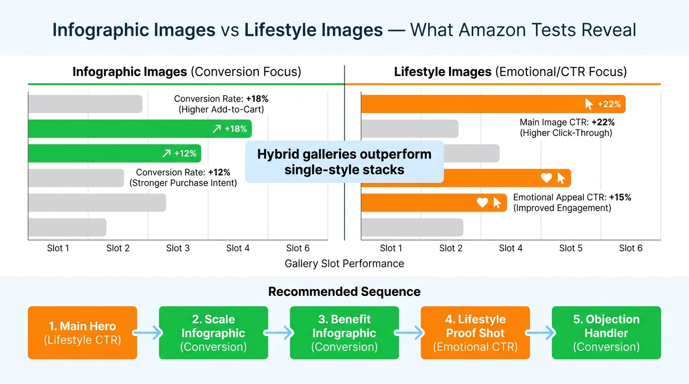
The infographic versus lifestyle debate is one of the most persistent and least productive arguments in Amazon optimization circles. Practitioners on both sides have strong opinions, war stories to support those opinions, and case studies that confirm their priors. The argument persists because both sides are correct — just not universally and not in the same slots.
The current weight of evidence, based on aggregated A/B test results from brands running systematic gallery experiments, points to a consistent pattern:
- Infographic-heavy galleries outperform lifestyle-only galleries on conversion rate — particularly in slots 2 through 4 where information density matters most.
- Lifestyle images outperform pure infographics on click-through rate — they generate more emotional engagement in search results and in top-of-gallery placement.
- Hybrid galleries outperform both single-style approaches — the highest-converting galleries use a structured alternation of infographic and lifestyle content, not a uniform aesthetic throughout.
Why Infographics Win on Conversion
The explanation is grounded in buyer psychology. Once a shopper has clicked through to your detail page, they are in an information-gathering mode. They are asking specific questions and evaluating specific criteria. An infographic that answers those questions explicitly — with labeled callouts, comparison data, or specification graphics — removes friction from the decision process. A lifestyle image of someone enjoying the product is emotionally appealing but functionally non-specific. For a buyer trying to determine whether a mattress topper will fit their California King bed, a clear dimension infographic eliminates the objection. A photo of someone sleeping peacefully does not.
Why Lifestyle Images Win on CTR
The click-through dynamic is the reverse. In search results, shoppers are scanning dozens of thumbnails in seconds. What catches attention at thumbnail size is color, emotional resonance, and visual novelty — qualities that lifestyle photography tends to deliver more effectively than information-dense infographics, which become illegible at small sizes. A main image infographic with text callouts often renders as visual noise in a search results thumbnail, while a bold lifestyle image communicates category and aspiration instantly.
Building the Hybrid Gallery
The practical implication is a deliberate gallery structure: lifestyle or clean hero for the main image (slot 1), infographic treatment for slots 2 and 3, lifestyle-in-use for slot 4, proof/credibility content for slot 5, and a mix of detail and secondary lifestyle for slots 6 and 7. This sequence uses each image type where it performs best. But — and this is critical — the optimal balance is category-specific and buyer-specific. The only way to know the right hybrid ratio for your ASIN is to test it directly with your actual traffic.
The sellers who skip this testing and implement the “standard” hybrid sequence are still doing better than sellers with unoptimized galleries. But they’re leaving residual optimization on the table that only their own data can capture.
Mobile-First Gallery Design: Why Desktop-Optimized Stacks Are Losing
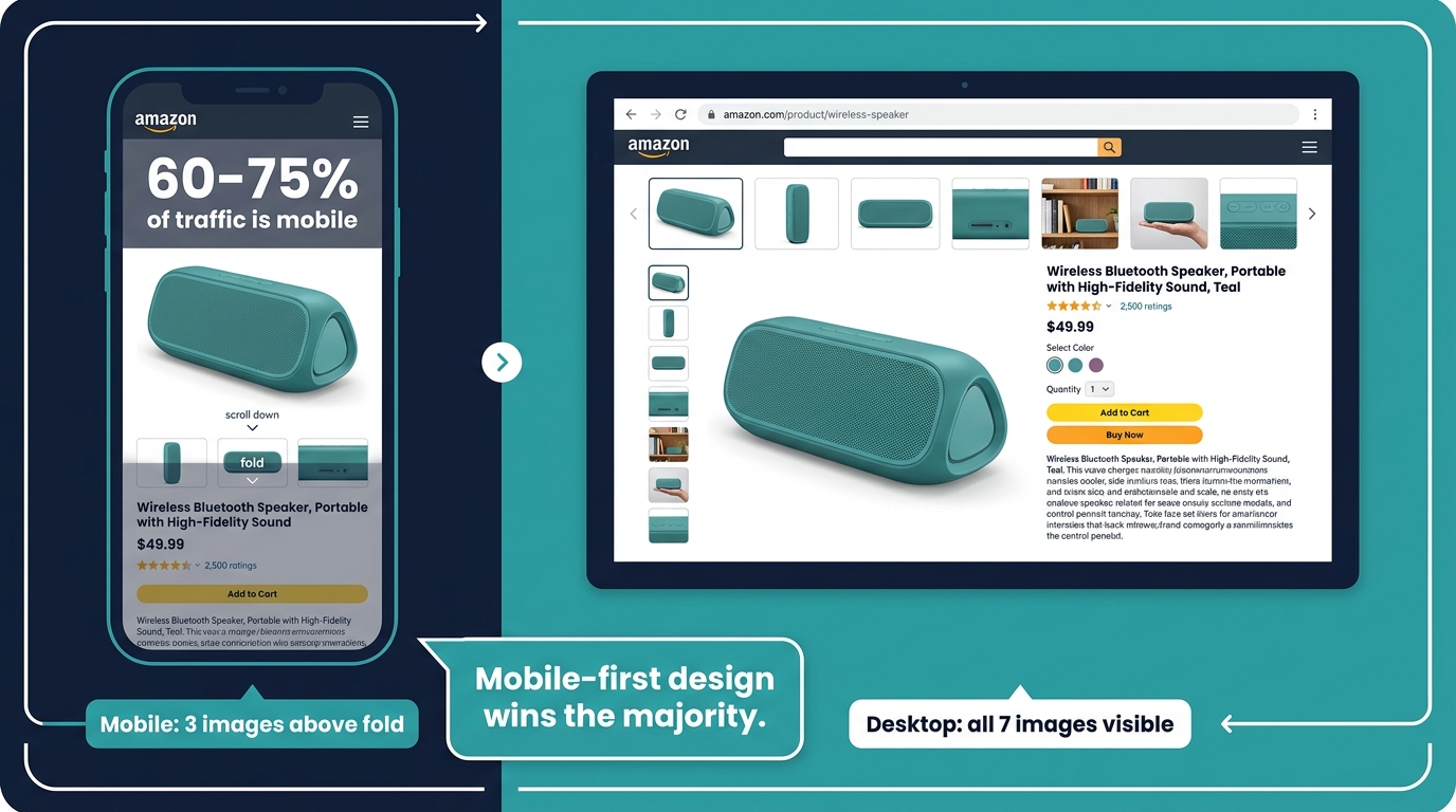
If you design your Amazon gallery images primarily on a desktop monitor, you are optimizing for a minority of your traffic. Current estimates across the Amazon seller community put mobile traffic at 60 to 75% of all Amazon detail page visits in 2026, with some category-specific data suggesting the mobile share may be even higher for impulse and convenience categories. The practical implication for image testing is that your test results are being driven primarily by mobile user behavior — which means mobile rendering quality determines whether your tests succeed or fail.
How Mobile Changes What Works
Mobile Amazon browsing is structurally different from desktop in ways that directly affect gallery performance:
Above-the-fold visibility: On a mobile screen, typically only one to three images are visible without scrolling. The main image occupies most of the screen. Slots 2 and 3 require a swipe. Slot 4 onward requires more deliberate engagement. This means the “conversion window” is tighter on mobile — your first two to three images need to do more of the total persuasion work.
Text legibility at swipe size: The infographic approach that works beautifully on a 27-inch desktop monitor frequently becomes unreadable on a 6-inch phone screen. Text callouts need to be larger, shorter, and more contrast-heavy to remain legible on mobile. Infographics with six or more annotation labels, multi-column layouts, or small supporting text tend to underperform on mobile even when they test well on desktop.
Scroll behavior: Mobile shoppers swipe through images faster than desktop users scroll. Images that require five to ten seconds to fully absorb are skipped on mobile. The “one key message per image” principle is partly an aesthetic recommendation — but on mobile, it is a functional necessity. A mobile user who cannot instantly understand what an image is communicating will swipe past it without stopping.
How to Test for Mobile Performance Specifically
MYE does not segment results by device type, which creates a genuine blind spot for mobile-specific optimization. The workaround most brands use is off-platform testing (covered in the next section) combined with qualitative review of images on actual mobile devices before launching live tests. Before any image goes into an MYE experiment, it should be viewed on a physical iOS and Android device — not a browser developer tools emulation — at the full-screen gallery size and at the thumbnail size that appears in search results on mobile. Images that fail the readability test at mobile thumbnail size should be revised before burning four to eight weeks of live traffic data on them.
The practical design guidelines that emerge from mobile-first testing: minimum 24-point equivalent font for any on-image text, maximum two to three key callouts per infographic, high-contrast color choices that remain legible at reduced size, and product fills that communicate clearly even when the image is cropped to a square thumbnail.
Off-Platform Pre-Validation: The PickFu Layer Before You Burn Live Traffic
One of the most significant shifts in how sophisticated Amazon brands approach image testing in 2026 is the adoption of off-platform pre-validation as a mandatory step before any live MYE experiment. The logic is straightforward: running a poorly designed image variant in a live test for eight weeks costs you real conversion rate and real revenue. Running it in a PickFu poll for $50 and 200 responses costs you $50 and two days. Pre-validation moves the failures out of your live listing and into the design phase where they belong.
How the Pre-Validation Workflow Works
The pre-validation process combines consumer research tools — most commonly PickFu, though ProductPinion and other platforms serve the same function — with Amazon’s native MYE in a two-stage workflow:
- Stage 1 — Concept Screening: Before investing in final production of image variants, run a poll with rough mockups or concept images asking targeted respondents which version they would be more likely to click on. The goal here is to eliminate obvious losers before they reach production. Poll respondents should be filtered to match your target buyer profile — age, gender, purchase history, relevant interests — not the general population.
- Stage 2 — SERP Simulation: For main image testing specifically, PickFu offers a search results page simulation format where your product appears alongside competitor listings. This tests for click-through in a competitive context — the actual environment where your main image’s job gets done. A main image variant that “wins” in an isolated head-to-head comparison may actually lose share in a real search results page where five competitors’ images are visible simultaneously.
- Stage 3 — MYE Confirmation: The variants that survive pre-validation then go into a live MYE test for statistical confirmation with real shopper behavior. Because only pre-validated images enter the live test, the quality of hypotheses is higher, and the probability of reaching statistical significance faster is meaningfully improved.
The Performance Case for Pre-Validation
The quantitative case for this two-stage approach is compelling. Brands that use PickFu pre-validation before MYE have reported reaching statistical significance in MYE in as few as seven days on high-traffic ASINs — compared to the typical six to ten weeks without pre-validation. The mechanism is straightforward: when the image variant entering the live test is already demonstrably stronger by consumer research standards, the performance gap between versions is larger, which requires less data to confirm statistically. Smaller differences require proportionally more data to detect.
The secondary benefit is learning quality. Off-platform polls often include qualitative feedback — respondents can explain why they preferred one image over another. That qualitative data feeds directly back into the creative brief for the next round of image development, creating a systematic improvement loop that pure MYE testing cannot provide.
The 5 Ways Image Tests Fail (And How to Prevent Each One)
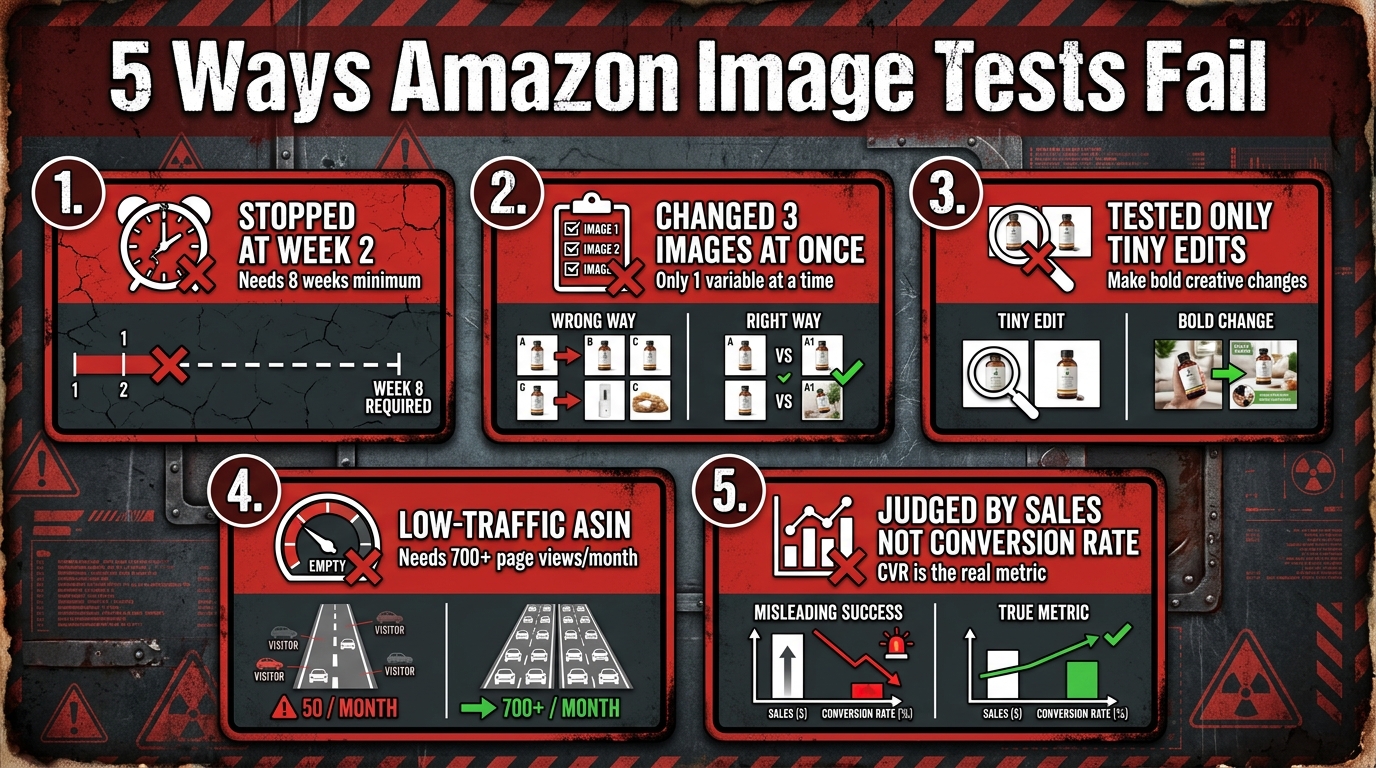
After examining how Amazon image testing works in theory and in practice, the failure modes become predictable. Most teams encounter the same five problems repeatedly. Understanding each one specifically — including what it looks like in your data and how to prevent it — is what separates brands that compound wins over time from brands that run tests indefinitely without accumulating useful knowledge.
Failure Mode 1: Premature Stopping
This is the single most common cause of misleading image test results. A test that has been running for two weeks with a slight advantage for Version B is not evidence that Version B is better. It is evidence that you have accumulated approximately 25% of the data you need to reach 95% confidence. Stopping early is not just unhelpful — it actively produces false confidence. Amazon’s own guidance is explicit: image tests need four to ten weeks depending on traffic volume. High-volume ASINs can reach significance faster; low-volume ASINs may need the full ten weeks or more.
Prevention: Set a calendar reminder to check results at the four-week mark, but commit to not acting on them until Amazon’s confidence indicator reaches at least 90% — and ideally the full 95% threshold that MYE uses to declare a winner. Use MYE’s “run to significance” option rather than setting a fixed end date wherever possible.
Failure Mode 2: Testing Multiple Variables Simultaneously
Updating the main image, swapping slot 3, and reordering slot 4 all within the same test period is not an experiment — it is a change event. When you observe a result (better or worse conversion), you have no way to know which change caused it. Every image test should isolate a single variable. One element, one test, one result. The throughput cost of this discipline — running tests sequentially rather than in parallel — is real but vastly outweighed by the cost of accumulating uninterpretable data.
Prevention: Maintain a test queue, not a test batch. Prioritize which single change has the highest expected impact and test that first. Apply the winner before starting the next test. This sequential approach means each test builds on confirmed knowledge rather than uncertain confounds.
Failure Mode 3: Testing Changes That Are Too Small
A/B tests can only detect differences that are large enough to produce a measurable signal above the noise floor. An image where you moved the product angle by five degrees, changed the background from pure white (#FFFFFF) to off-white (#F5F5F5), or adjusted the shadow treatment is unlikely to produce a detectable conversion difference in any realistic test window. The change has to be substantive enough that a meaningful portion of buyers would actually notice and respond differently.
Prevention: Apply the “would a different buyer population choose this?” test to your variants. If the two versions are so similar that any reasonable person would be indifferent between them, they will not produce a meaningful A/B test result. Reserve subtle refinements for after you have tested large conceptual differences that establish the right creative direction first.
Failure Mode 4: Running Tests on Ineligible ASINs
Amazon requires a minimum traffic threshold for MYE experiments to produce reliable results. The commonly cited benchmark is 700 or more detail page views in the prior 30 days, but in practice, getting to statistical significance quickly requires substantially more traffic than the minimum eligibility floor. Running image tests on low-velocity ASINs produces inconclusive results month after month — which some brands misinterpret as “no difference found” when the reality is “not enough data to detect a difference even if one exists.”
Prevention: Tier your ASIN catalog by traffic volume and run active MYE tests only on high-volume products. For lower-traffic ASINs, use off-platform pre-validation tools and apply the learnings from high-traffic tests as informed defaults rather than waiting for statistically significant on-platform results that may never arrive.
Failure Mode 5: Using the Wrong Success Metric
Many sellers judge image tests by raw sales numbers in the first weeks of a test. This is problematic for two reasons: first, early sales data is too noisy to draw conclusions from; second, sales volume conflates organic traffic trends, paid advertising spend, and seasonal patterns with the actual image performance. The correct primary metric for gallery image tests is conversion rate (unit session percentage) — not total units sold. Conversion rate isolates the probability-of-purchase signal from traffic volume noise, making it a far cleaner measure of whether your image is doing its persuasion job.
Prevention: When evaluating MYE results, lead with conversion rate and units per unique visitor. Use total sales as a secondary sanity check. Resist the instinct to call a winner based on a brief sales spike that coincides with a pricing change, coupon activation, or advertising budget increase during the test period.
Building a Rolling Test Calendar: How to Compound Wins Over Time
Individual A/B tests produce individual wins. A rolling test calendar produces a compounding optimization system. The difference in outcomes over a 12-month period between a brand that runs one or two tests per year and a brand that runs systematic quarterly testing across their top-10 ASINs is not marginal — it is often the difference between a stagnant conversion rate and a listing that has been continuously refined to near-optimal performance.
How the Compounding Effect Works
Imagine a brand that tests and improves their main image in Q1, winning a 3% CTR improvement. In Q2, they test gallery slots 2–3 using the learnings from Q1’s creative approach, winning a 6% conversion rate improvement. In Q3, they test lifestyle versus infographic in slot 4, winning another 4% conversion improvement. Each win compounds on top of the previous one, because the traffic improvements from Q1 mean Q2’s conversion test runs faster, and the improved conversion from Q2 means Q3’s test traffic is higher quality. The math accumulates faster than isolated tests suggest.
The Practical Test Calendar Structure
A functional rolling test calendar for a mid-size Amazon brand (20–50 active ASINs) looks something like this in practice:
- Month 1–2: Main image test on your top 3 ASINs by revenue. These are your highest-leverage tests and should always be the first priority.
- Month 2–3: Gallery slot 2–3 content tests on whichever ASINs completed their main image test. Apply the main image winner before starting the gallery test.
- Month 3–4: Lifestyle versus infographic testing in slot 4 on the same high-priority ASINs.
- Month 4–6: Begin the same cycle on the next tier of ASINs by traffic volume, while running refinement tests on the top ASINs based on prior results.
The critical discipline is never running two overlapping tests on the same ASIN. Concurrent changes to the same listing contaminate both results. Use a simple shared spreadsheet or project management tool to track which ASINs are in active tests, what is being tested, when the test started, and what the result was. This institutional memory is more valuable than any individual test result.
When to Retest
A winning image variant is not permanent. Competitor creative evolves. Category visual norms shift. Seasonal buyer psychology changes. The general guidance in the Amazon optimization community is to retest your top ASINs’ main images every six to twelve months, with gallery slots tested on a 9–12 month cycle. A version that won convincingly 18 months ago may now be losing to newer competitor creative even though you haven’t changed anything.
Measuring Beyond Conversion: What CTR, Returns, and Ad Efficiency Tell You
Conversion rate is the most important metric for gallery image testing, but it is not the only one. A complete picture of image performance requires monitoring several downstream metrics that MYE does not directly surface — and which can reveal that an image is creating problems even when conversion data looks neutral or positive.
Click-Through Rate from Organic and Paid Search
As covered earlier, MYE does not directly measure click-through rate from search results. This creates a real measurement blind spot, particularly for main image tests. The workaround is to monitor your Brand Analytics data — specifically the Search Catalog Performance report, which shows click-through rates for your ASINs in search results — during and after image test periods. A main image change that lifts CTR even marginally on high-volume search terms produces disproportionate revenue impact, because it compounds across both organic and paid traffic.
For sponsored product campaigns, watch your CTR metric at the campaign level during image test periods. If your main image change produces a significant CTR improvement in search results, you will see it reflected in your ad CTR within one to two weeks — well before MYE reaches statistical significance. This early signal can help validate that you are on the right creative track, even if it isn’t a final answer.
Return Rate as an Image Quality Signal
One of the most underused metrics in image testing is return rate. Images that overstate product quality, misrepresent color or size, or create expectations the physical product cannot meet may convert well in the short term — but they produce higher returns, negative reviews, and long-term conversion drag as the review score deteriorates. The most common return-driving image problem is color misrepresentation: product images that show colors more saturated or different from the actual product under normal lighting conditions.
When evaluating a test winner, always check whether the winning variant is associated with a return rate increase. A 5% conversion rate improvement paired with a 3% return rate increase is not a net win — it is a warning signal that your new image may be over-promising.
Advertising Efficiency and ROAS
A well-optimized image gallery improves advertising efficiency because it increases the conversion rate of the shoppers your ads bring to the listing. If your gallery converts at 15% and your competitor’s converts at 22%, you are effectively paying 47% more per sale through the same advertising investment. Gallery optimization is, in this sense, one of the highest-leverage cost-reduction activities available to an Amazon advertiser — but it typically isn’t framed that way in budget discussions.
Track your ROAS per campaign on your top-tested ASINs before and after image improvements. Sustained gallery optimization campaigns regularly produce 10–20% ROAS improvements over a 6–12 month period, simply by increasing the probability that a paid click converts. The advertising efficiency gains from systematic image testing are often larger in absolute dollar terms than the organic conversion rate improvements, because they reduce the cost basis for your entire paid traffic volume.
Putting It All Together: The Testing Architecture That Actually Compounds
The core insight that emerges from everything above is that Amazon image testing is not a one-time activity or a single-test improvement project. It is an architecture — a structured, sequential, hypothesis-driven system that produces compounding improvements over time when built correctly and produces noise when built incorrectly.
The architecture has five interlocking components:
- The Decision-Journey Map: Assign each image slot a specific buyer question it must answer. This creates testable hypotheses instead of arbitrary creative swaps.
- The Pre-Validation Layer: Use off-platform tools to screen concepts before live traffic investment. This improves hypothesis quality and accelerates time to significance in live tests.
- The Live Testing Protocol: Run single-variable tests in MYE for the full recommended duration, using conversion rate as the primary success metric and monitoring CTR and returns as secondary signals.
- The Results Database: Maintain a documented record of every test hypothesis, result, and decision. This institutional memory prevents re-testing known losers and allows creative learnings to transfer across ASINs and categories.
- The Rolling Test Calendar: Schedule sequential tests on a structured cadence, prioritized by ASIN revenue and traffic volume, with retesting cycles built in for previously optimized listings.
The brands that achieve sustained conversion rate improvements through image testing — the ones reporting 15–25% cumulative gains over a 12-month period — are not doing anything magical. They are simply running this architecture consistently, applying wins sequentially, and maintaining the discipline not to conflate noise with signal.
Key Takeaways for Your Image Testing Program
Before you run your next image test, use this checklist to assess whether your testing architecture is set up for success:
- Traffic threshold: Does your ASIN have 700+ detail page views in the last 30 days? If not, prioritize off-platform testing instead of MYE.
- Single variable: Are you testing exactly one change — and nothing else on the listing during the test period?
- Meaningful difference: Are the two variants different enough that a genuine buyer would notice and potentially respond differently?
- Slot assignment: Does each image in your gallery have a specific buyer question it is designed to answer?
- Mobile rendering: Have you reviewed both test variants on physical mobile devices at gallery size and thumbnail size?
- Duration commitment: Have you committed to not stopping the test before MYE reaches at least 90% confidence — and ideally 95%?
- Pre-validation: Have you run off-platform concept screening before investing in final production versions?
- Multi-metric monitoring: Are you tracking CTR (via Brand Analytics), return rate, and ad efficiency alongside MYE conversion data?
- Results documentation: Is your test result going into a shared log that feeds future creative decisions?
- Next test queued: Is the next test already scheduled so that improvement compounds continuously?
Image testing is one of the few Amazon optimization activities where a disciplined, architecture-first approach consistently outperforms improvisation. The sellers who treat every gallery change as a hypothesis to be tested — rather than a design decision to be made — are the ones whose listings look completely different (and convert dramatically better) twelve months from now. That is the compounding dividend of building the testing architecture correctly from the start.