Most guides written for Amazon sellers treat image rules as a checklist to skim before hitting upload. Most guides written for designers treat them as an afterthought — a set of technical constraints that come after the creative work is already done.
Both approaches are getting people burned in 2026.
Amazon’s image enforcement has become faster, more automated, and significantly less forgiving than it was even eighteen months ago. Listings are disappearing from search results without warning emails. Account Health flags are appearing on violations that previously triggered nothing more than an upload error. And the pixel-level rules that used to feel like bureaucratic fine print are now the exact triggers that automated scanning systems check first.
For designers, this changes the job. Understanding the technical specifications is no longer just about keeping a client’s listing live — it’s about understanding how every design decision, from background color to frame composition to file format, connects directly to discoverability, click-through rate, and conversion. The rules aren’t separate from the design; they’re part of it.
This guide is written specifically for the people doing the creative work: the freelance designers, in-house brand teams, and agency production staff responsible for building Amazon-ready images from scratch. It covers every layer of the requirement stack — technical specifications, main image compliance, secondary image strategy, A+ Content rules, mobile-first design decisions, and the enforcement mechanics that determine what happens when something goes wrong.
What it won’t do is rehash the same surface-level bullet points that dozens of other guides have already published. Instead, it goes deep on the decisions that most designers get wrong, the enforcement patterns that most sellers don’t understand until they’ve already lost sales, and the sequencing logic that separates image stacks that convert from image stacks that just comply.
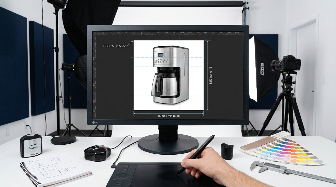
Why the Compliance Layer Has to Come Before the Creative Layer
There’s a workflow problem that affects almost every design team producing Amazon content for the first time — and a significant percentage of experienced ones. The creative work gets done first: product photography, retouching, color grading, layout, infographic design. Then, once the assets are nearly finished, someone remembers to check whether they comply with Amazon’s requirements.
That order needs to flip.
Amazon’s image rules aren’t cosmetic constraints that a designer can layer over an otherwise finished asset. They’re structural requirements that determine what the image can and cannot contain, how it needs to be lit and composed, what color values are acceptable in the background, and what the maximum and minimum dimensions need to be. Designing without those constraints baked in from the start means expensive rework at the worst possible time — usually right before launch when everyone’s timeline is already under pressure.
The Three Compliance Questions Every Brief Should Answer
Before any creative work begins on an Amazon image, a designer needs clear answers to three questions that go beyond “how should this product look.”
What category is this product listed in? Amazon’s general image rules apply to every listing, but individual categories — particularly apparel, jewelry, and electronics — carry additional specifications that override or extend the baseline rules. Designing a main image for a jacket follows different rules than designing one for a power tool, and getting the category wrong means building toward the wrong spec.
Does this seller have Brand Registry? Brand Registry unlocks A+ Content, which adds an entirely separate set of image requirements and design opportunities to the project scope. A brief that doesn’t establish Brand Registry status from the start may result in a deliverable that’s technically complete but missing half its potential.
Is this a main image or secondary image slot? Amazon applies fundamentally different rules to the primary product image versus every other slot in the gallery. The design decisions that are prohibited in the main image — text overlays, colored backgrounds, props — are often not just permitted but actively recommended in secondary slots. Conflating those two contexts is one of the most common sources of compliance errors in finished work.
How Amazon’s Enforcement Actually Starts
When a new image is uploaded to a listing, Amazon’s systems run automated compliance checks before the image goes live — and then continue monitoring it afterward. The checks are not comprehensive at the point of upload. Some violations get caught immediately; others get flagged weeks later during periodic audits.
What this means practically is that passing the upload screen is not a guarantee of long-term compliance. A listing can be live for weeks before an automated scan flags a borderline background color or insufficient frame fill. By the time the suppression triggers, the seller may have no clear idea when the violation was introduced or what specifically caused it. For designers, this reinforces the value of building compliance into the asset from the start rather than relying on Amazon’s systems to catch problems quickly enough to address them before they cause damage.
The Main Image: Every Rule, and Why Each One Exists
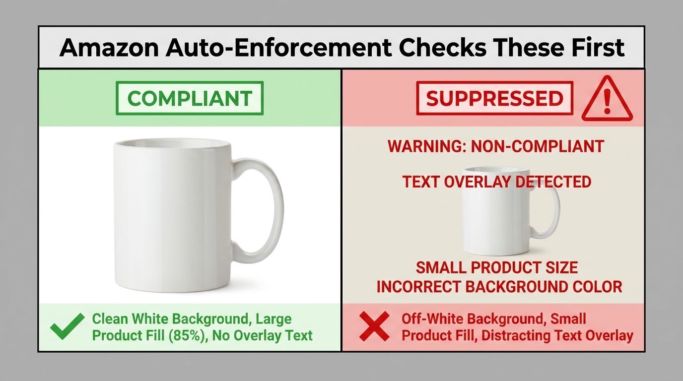
The main image is the only image that appears in Amazon search results. It is the visual that drives click-through rate, which in turn influences ranking velocity. It is also the image subject to the most restrictive, most actively enforced rules on the entire platform. Getting this image right isn’t optional — it is the single highest-stakes design decision in any Amazon image project.
The Background Requirement: RGB 255, 255, 255 — Not “Looks White”
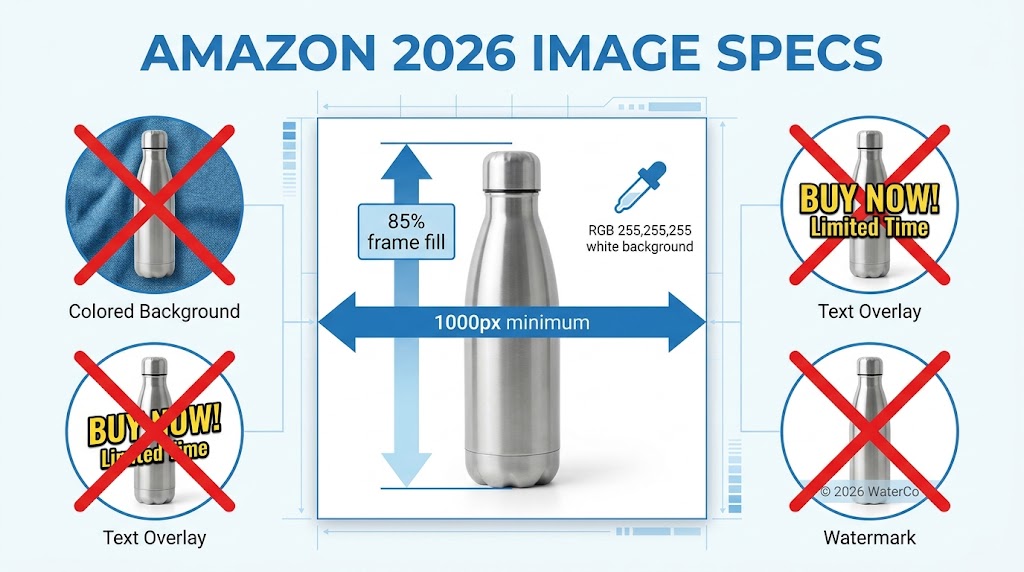
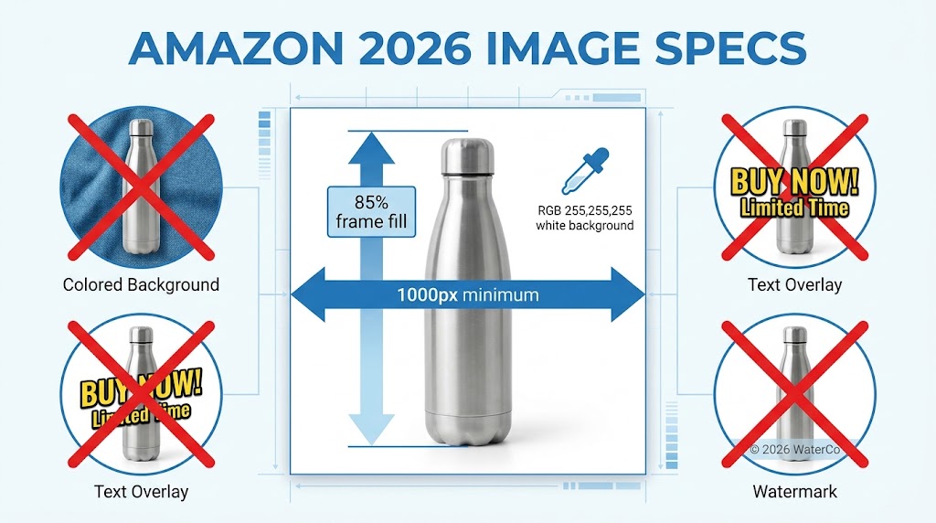
Amazon requires the main image background to be pure white. This sounds straightforward until you’re working with product photography that was shot against a light gray cyclorama, or a JPEG that was compressed and had its white point shifted, or a PNG that has an off-white background that looks perfectly white on a calibrated monitor but fails Amazon’s automated scan.
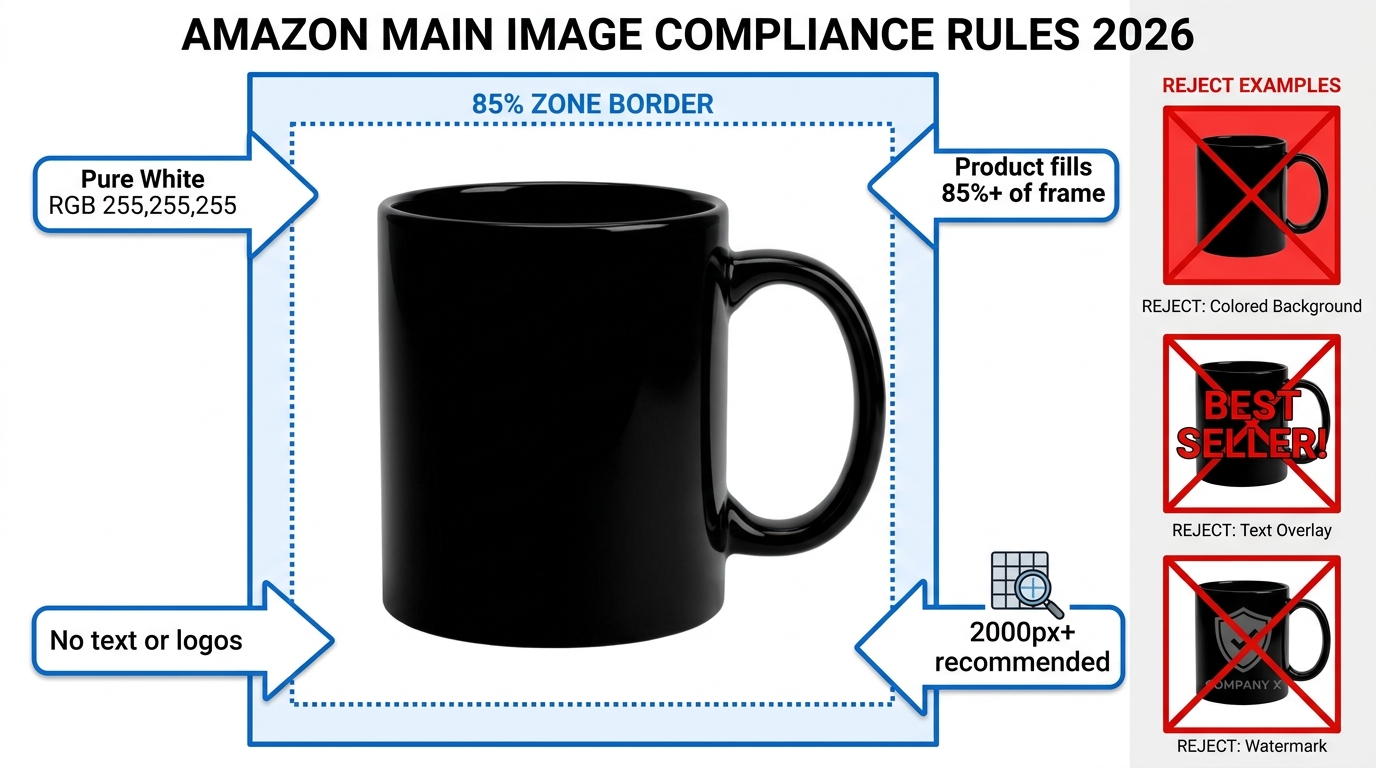
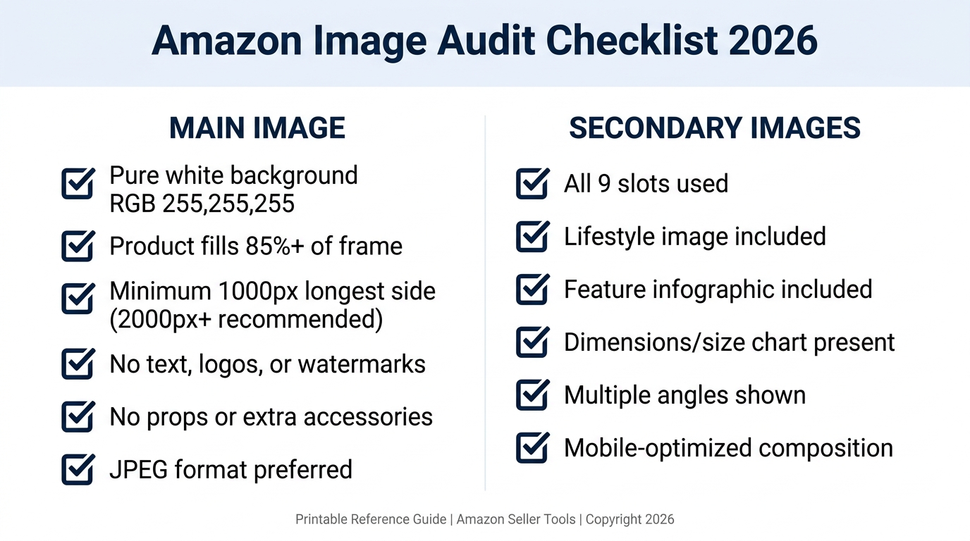
The requirement isn’t “visually white” or “close to white.” It’s RGB 255, 255, 255 — the absolute maximum value for all three channels in the RGB color model. A background that reads as RGB 252, 251, 249 — which the human eye cannot distinguish from pure white — can trigger a suppression flag because Amazon’s scanning systems are checking pixel values, not visual impressions.
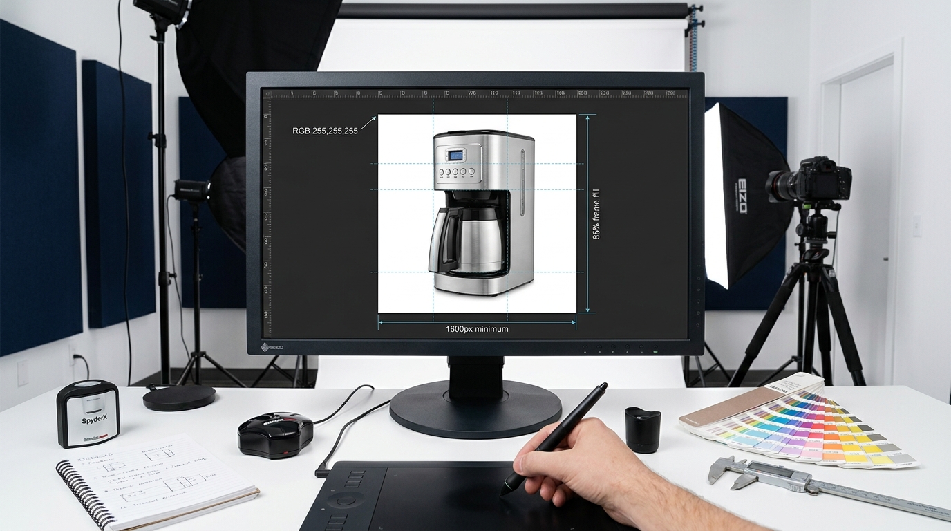
The practical design implication is that retouching product photography to Amazon-compliant backgrounds should always conclude with a background verification step. In Photoshop, this means using the eyedropper tool to sample background pixels at multiple points across the image and confirming all three channel values are at 255. Any pixel that deviates needs to be corrected — not visually judged, but numerically confirmed.
Shadow retention is where this gets technically challenging. Soft, natural product shadows on pure white backgrounds are generally acceptable and often recommended for a sense of depth. But if shadow pixels blend into the background in a way that creates midtone values across a significant area — particularly in corners or edges — they can be flagged. The safe approach is to keep shadows subtle, centered under the product, and ensure they graduate cleanly to full white at the frame edge.
The Frame Fill Rule: 85% and Why It’s Not Arbitrary
Amazon’s official guidance states that the product should occupy at least 85% of the image frame. Many third-party guides and 2026 seller resources have since recommended treating 85% as a floor, not a target — with 90–95% frame fill being the practical standard for competitive categories.
The reason this rule exists is equally important to understand as the rule itself. Amazon’s search results display thumbnails at very small sizes, particularly on mobile devices where the majority of Amazon shopping now happens. A product that fills 60–70% of the image frame can nearly disappear at thumbnail size. The 85% rule is Amazon’s attempt to ensure that main images remain legible and impactful at the sizes where shoppers actually make their first visual judgment about a listing.
For designers, the frame fill requirement affects how product photography needs to be set up and cropped. A product shot from a distance that leaves significant breathing room around the subject needs to be re-cropped or re-shot. The crop needs to be deliberate — tight enough to meet the fill requirement without cutting off product details, handles, edges, or packaging that shoppers need to see.
The 85% rule is measured in terms of the product’s visual footprint relative to the total image area. For irregularly shaped products — a bicycle, a piece of jewelry with fine filigree work, a water bottle with a distinctive cap profile — this can require more careful framing decisions than a simple rectangular product like a book or a phone case.
The Zero-Tolerance Items: Text, Logos, Watermarks, Props
The main image must contain only the actual product being sold. Nothing else. This rule is absolute and enforced with essentially no exceptions in the general product categories.
Text and promotional overlays are not permitted on the main image. This includes brand names, product names, feature callouts, “best seller” badges, “new” labels, promotional pricing, certification marks, and any other typographic element regardless of size or placement. If it’s text, it doesn’t belong on the main image.
Logos and watermarks are prohibited. This catches designers who add a small brand logo to the corner of a product photo as a default step in their workflow. Even a small, low-opacity watermark can trigger suppression. Brand identity must live in secondary images, A+ Content, and Brand Story modules — not the main image.
Props and accessories that don’t ship with the product cannot appear in the main image. A kitchen knife photographed on a cutting board with vegetables arranged around it is in violation if the cutting board and vegetables are not included in what the buyer receives. A supplement bottle photographed next to a glass of water is in violation. The only items that should appear in the main image are items the customer will receive when their order arrives.
Models and mannequins are restricted by category. In most general merchandise categories, models and human props are not permitted in the main image. Apparel and fashion categories are the primary exception — these categories have their own specific rules about model requirements, mannequin use, and clothing presentation that differ meaningfully from the baseline.
Technical File Specifications: The Numbers That Actually Matter
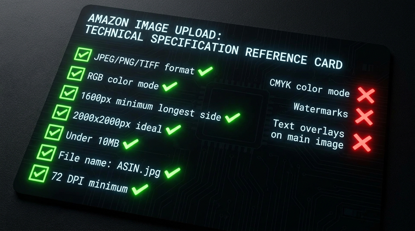
Amazon’s official technical specifications for product images have remained relatively stable in their published form, but the practical standards that experienced designers target have shifted higher. Understanding the difference between the minimum requirements and the production standards that actually deliver results is one of the most practical things this section can do.
Image Format: What Amazon Accepts and What It Prefers
Amazon accepts JPEG (.jpg / .jpeg), TIFF (.tif / .tiff), PNG (.png), and non-animated GIF (.gif) files for standard product images. In practice, JPEG is the dominant format for most product photography because it produces smaller file sizes at high visual quality, uploads reliably, and compresses efficiently without introducing artifacts at the quality levels used for production work.
PNG is the preferred format for images that include transparency — particularly infographics with transparent backgrounds that need to layer cleanly over Amazon’s interface — or for images where lossless quality is critical and file size is not a constraint. Be aware that PNG files will typically be larger than JPEGs at equivalent quality, and Amazon does have file size limits that apply at upload.
TIFF is occasionally used in high-end product photography workflows but is rarely optimal for Amazon submission because of its file size characteristics. If a client’s photography studio delivers TIFF masters, the production workflow should convert them to high-quality JPEGs before Amazon upload.
Dimensions: The Minimum, the Practical Target, and the Sweet Spot
Amazon’s official minimum is 500 pixels on the longest side for upload. Below this, the image will be rejected at upload. This is the hard floor — nothing below 500 pixels will get through the system.
For zoom functionality — which allows shoppers to hover over or pinch an image and see a magnified view — Amazon requires at least 1,000 pixels on the longest side. This threshold matters because zoom is a significant conversion tool, particularly for products where detail, texture, material quality, or fine print are selling points. A listing that doesn’t meet the zoom threshold is a listing where shoppers can’t inspect the product closely.
The practical production target in 2026 is 2,000 pixels on the longest side at minimum, with 2,000 × 2,000 pixels being the widely-recommended standard for square format images. Several experienced seller guides and photography specialists are now recommending 2,500 pixels or higher for categories where detail inspection is particularly important — jewelry, art prints, textiles, and technical products where shoppers routinely zoom into specific areas.
The rationale for going well above the minimum is straightforward. Amazon serves images across a range of device resolutions, screen sizes, and display densities. Higher-resolution source images give Amazon’s systems more data to work with when serving images to high-DPI displays. And when a customer zooms in, a 2,000 px image gives a significantly cleaner zoom experience than one that’s exactly at the 1,000 px threshold.
The maximum upload dimension is 10,000 pixels on the longest side. There is no benefit to going above this, and very large files can cause upload issues or unexpected compression artifacts when Amazon’s systems process them. A clean 2,000–3,000 px image at high JPEG quality is the production sweet spot.
Color Mode: Always RGB, Never CMYK
Amazon’s systems expect and process RGB color mode images. CMYK files — the standard color mode for print production — are not supported and will either be rejected or rendered incorrectly. This is a surprisingly common production error in design teams that handle both print and digital work, where the same product may be going on packaging (CMYK) and an Amazon listing (RGB) simultaneously.
The practical workflow implication is to confirm color mode at the start of any retouching or design work, not at export. Starting with a CMYK file and converting to RGB at the end can introduce color shifts, particularly in saturated colors and product-critical hues. The cleanest workflow starts in RGB from the beginning.
File Naming: The Requirement Nobody Talks About
Amazon specifies a file naming convention that is infrequently discussed but worth getting right. Image file names should use the product’s identifier — ASIN, ISBN, EAN, JAN, or UPC — followed by a period and the file extension. For example: B08XYZ1234.jpg.
Spaces, dashes, special characters, and additional text in the file name can cause upload failures or prevent images from associating correctly with the listing. Design teams that use descriptive file names in their internal workflows — like product_hero_v3_final_RGB.jpg — need a file renaming step in their delivery process before anything goes to the client for upload.
Resolution: Understanding Why 72 DPI is Technically Meaningless Here
Amazon states 72 DPI as its minimum resolution requirement. This requirement is largely a technicality in the context of digital image delivery and is frequently misunderstood. DPI (dots per inch) is a print concept that describes how many ink dots will be placed per inch of physical paper. For a digital image displayed on a screen, the relevant metric is pixel dimensions — the actual number of pixels in the image — not DPI.
A 2,000 × 2,000 pixel image set at 72 DPI and the exact same pixel data set at 300 DPI are identical when displayed on screen. The DPI metadata embedded in the file has no effect on how the image looks on Amazon. The only thing that matters is the pixel count. Focus entirely on pixel dimensions and ignore DPI settings when optimizing for Amazon.
Secondary Image Strategy: Building a 7-Slot Conversion Funnel
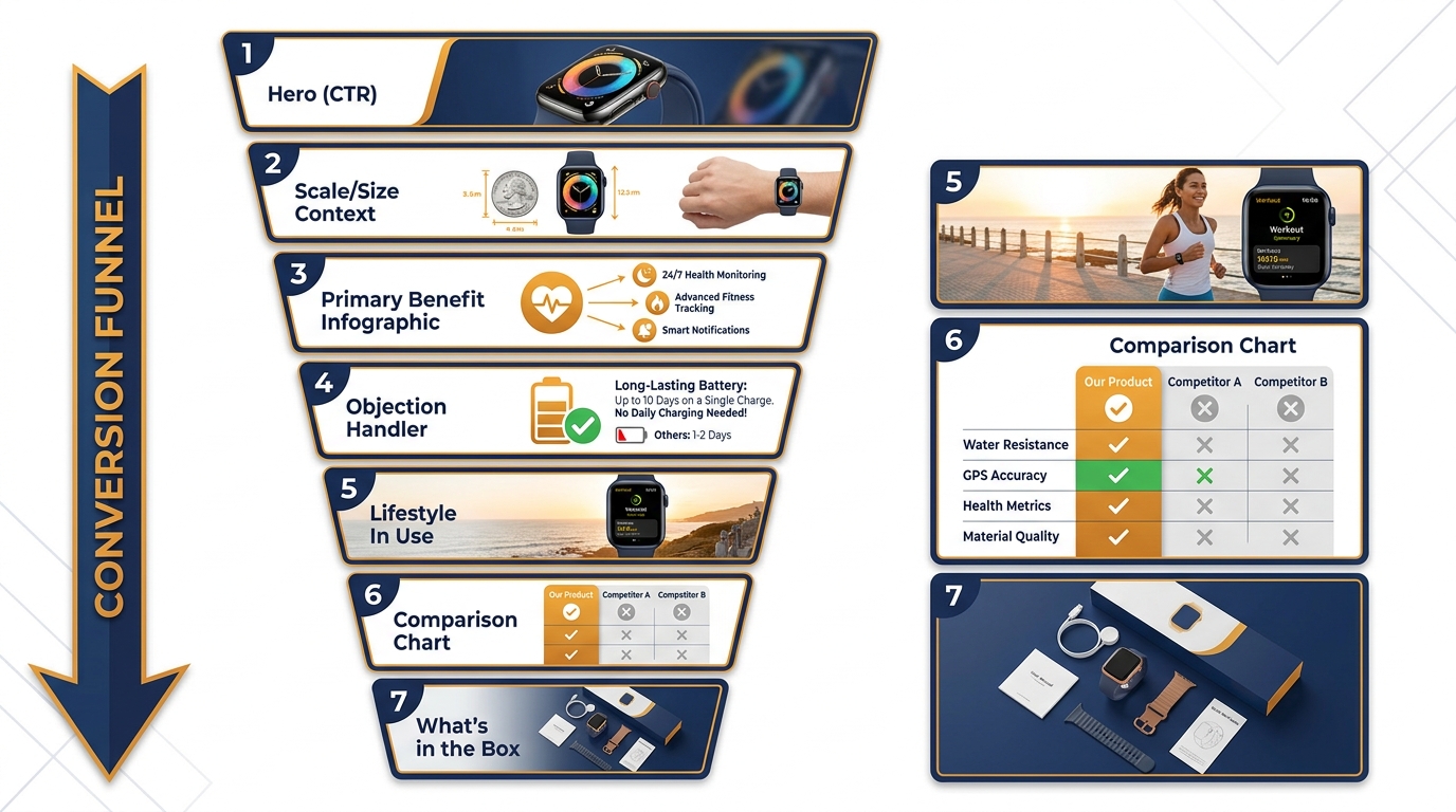
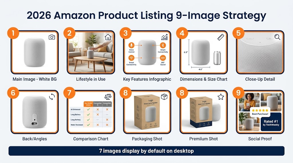
Once the main image has won the click, the secondary image slots — positions 2 through 7 in the standard gallery, with some categories allowing more — become the primary sales mechanism. These images operate under a fundamentally different set of rules than the main image, and the design approach needs to shift accordingly.
Secondary images are where color backgrounds are permitted. Where lifestyle photography lives. Where text callouts, feature infographics, size comparisons, and benefit-driven layouts become not just acceptable but essential. The common mistake is treating these slots as an afterthought after the main image work is done. The more accurate way to think about them is as a seven-frame sequential story that the customer reads from left to right — and where the sequence matters as much as the individual images.
The Sequence Logic: What Goes Where and Why
The order of images in the secondary gallery isn’t just about visual flow. It maps to how buyers make purchase decisions on Amazon, and getting the sequence wrong means answering questions the buyer hasn’t asked yet while leaving the questions they actually have unanswered until too late.
Slot 2 — Scale and context. The first thing many buyers want to know after clicking is: how big is this, really? Product size is consistently one of the top sources of negative reviews and returns on Amazon, and it’s because listings routinely make buyers guess. The second image should resolve this immediately with a direct size comparison — the product next to a universally understood object, a person holding it, or an overlay showing dimensions on the product itself. This image reduces the biggest pre-purchase anxiety most buyers have before they’ve even read a bullet point.
Slot 3 — Primary benefit infographic. This is the first opportunity to lead with the product’s strongest selling point in a visually structured way. Not a lifestyle photo — that comes later. An infographic that communicates the main reason someone would choose this product over any other. Feature callouts, key specifications, or a “why this works” diagram. The goal is to make the strongest argument for the purchase in a format that communicates faster than reading.
Slot 4 — Objection handler. What’s the single biggest reason a buyer in this category hesitates? Compatibility questions (“does this fit my model?”), durability concerns, material quality doubts, complexity worries, size uncertainty that wasn’t fully resolved in slot 2? This image addresses that specific concern directly. Done well, this image removes the last significant barrier between a browser and a buyer.
Slot 5 — Lifestyle in context. Once scale and key features are established, lifestyle photography can do its emotional work. Show the product being used by someone who represents the buyer. Show it in the environment where it will actually live. The lifestyle image should feel aspirational without being dishonest — it should show the buyer what their life looks like with this product in it.
Slot 6 — Comparison chart. If the product has variants, an upgraded version, or competes in a category where buyers are evaluating multiple options, a comparison chart positions it clearly. This image doesn’t need to be a direct competitor comparison — it can compare the product’s own tiers, highlight what differentiates this version from alternatives, or clarify which variant is right for which use case.
Slot 7 — What’s in the box / trust assets. The final regular slot should resolve practical questions: exactly what ships with this order, what the packaging looks like, and any certification, warranty, or quality markers that reinforce confidence. “What’s in the box” images also dramatically reduce the returns rate because they eliminate surprises on delivery.
Design Rules That Apply Specifically to Secondary Images
Secondary images give designers significantly more creative freedom than the main image, but that freedom still operates within rules. Text overlays must be legible at thumbnail size — Amazon’s mobile interface shows secondary images quite small in the initial view, and dense typography that looks clean on a desktop layout becomes an unreadable smear on a phone. A practical rule is to design infographic text at a minimum of 30pt equivalent in the final image, and to test every secondary image at 300px width before approving it.
Accuracy remains non-negotiable regardless of which slot an image occupies. A secondary lifestyle image showing accessories that don’t ship with the product violates the same core rule that applies to the main image — it’s misrepresentation. Lifestyle images should use props and environmental context, but should not imply that additional products are included in the purchase.
Amazon also prohibits promotional language in secondary images that qualifies as false advertising — “best-in-class,” “#1 seller,” comparative claims without substantiation, and pricing or discount language. Infographics with factual claims need to be actually supportable. This is less about what Amazon’s automated systems catch and more about what happens in the review process when a listing is manually inspected.
Category-Specific Deviations: Where the Baseline Rules Don’t Apply
Amazon’s image rules are not uniform across every product category. Several categories have dedicated image guidelines that override or extend the general requirements, and designing without checking the category-specific rules is a reliable way to build work that fails compliance for reasons that have nothing to do with the baseline specifications.
Apparel: The Category With Its Own Rulebook
Clothing and fashion accessories have the most extensive category-specific image requirements on the platform. Main images for most apparel items must show the product on a human model — not a flat lay, not a ghost mannequin, not a hanger — unless the item is underwear or swimwear, where mannequin or model rules have their own sub-specifications.
The model requirements extend to model characteristics in some categories, and to shooting angles that show the garment in a way that communicates how it fits and moves. Footwear has specific angle requirements. Socks and hosiery have their own rules. Jewelry follows separate guidance still. Designers taking on apparel clients need to source the category-specific style guide directly from Amazon’s Seller Central before a single shoot frame is captured.
Electronics and Technical Products: Detail Expectations
Electronics listings live or die on the quality of detail shown in secondary images. The category expectation — from both Amazon and buyers — is that every connection port, button, indicator light, cable type, and physical specification is visible and documented in the image stack. Infographic images showing front/back/side views with labeled ports and specifications are not just best practice in electronics — they’re the price of entry to competing effectively.
Main image rules are consistent with the general platform standard in most electronics subcategories, but the expectation for secondary image depth is significantly higher. A seven-image stack for an electronics listing that doesn’t include a labeled diagram of all physical interfaces is a stack that will leave buyers uncertain — and uncertainty doesn’t convert.
Grocery, Health, and Beauty: Ingredient Transparency
Products in these categories increasingly face buyer scrutiny on ingredient lists, certifications, and label accuracy. Images that show packaging with readable ingredient panels, nutrition facts, and certification logos visible in the image (in secondary slots, where such elements are permissible) reduce the questions that drive buyers to the reviews section instead of the add-to-cart button.
Amazon has also increased scrutiny on health claims made in images for products in these categories. Infographic callouts that imply medical benefits or make specific health claims without appropriate substantiation can attract compliance attention that goes well beyond image suppression.
A+ Content Image Requirements: The Brand Registry Design Layer

Amazon A+ Content — formerly called Enhanced Brand Content (EBC) — is the rich content module that appears in the product detail section below the bullet points for brand-registered sellers. It gives designers a substantially more open creative canvas than the standard image gallery, but it operates under a separate and specific set of technical and policy requirements.
Who Can Use A+ Content and What That Changes for Design Scope
Access to A+ Content requires enrollment in Amazon Brand Registry. This is not a trivial requirement — Brand Registry requires a registered trademark, an active brand website, and a completed application and review process that can take several weeks. For design teams working with clients, confirming Brand Registry status early determines whether A+ Content is part of the deliverable or not.
Sellers with Brand Registry can also access Brand Story, which is an additional content module that appears above A+ Content and allows brand narrative, “about us” content, and a more complete brand identity presentation. Brand Story and A+ Content are separate modules with separate image assets, which means a complete brand-registered listing may require significantly more creative work than a non-registered one.
A+ Content Technical Image Specifications
A+ Content image assets have their own distinct technical requirements that differ from the standard listing image rules in several important ways.
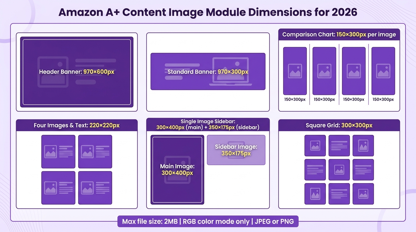
Accepted formats are JPG, PNG, and BMP — note that BMP is accepted here but is rarely used in practice. RGB color mode is required, the same as standard listing images. Maximum file size is 2 MB per image — a constraint that matters because A+ Content modules often use full-width banner images that need to be large in pixel dimensions while staying under the file size ceiling. A well-optimized JPEG at appropriate quality settings will typically meet both requirements, but this is something to verify during production, not assume.
Minimum resolution is stated as 72 DPI, which — as discussed in the technical specifications section — is practically irrelevant. The pixel dimension requirements vary by A+ Content module type. Full-width banner modules typically require images of at least 970 pixels wide (with 1,464 px recommended for retina displays). Individual comparison table modules, feature highlight modules, and text-and-image combination modules each have their own dimension specifications that should be sourced from Amazon’s A+ Content module guide at the time of design, as these specifications are updated periodically.
What A+ Content Prohibits: The Less Obvious Rules
The standard prohibitions apply in A+ Content: no watermarks, no promotional language that misleads (“lowest price guaranteed”), no content that misrepresents the product. But A+ Content has several additional prohibited elements that don’t apply to standard images and that catch designers off guard.
QR codes are prohibited in A+ Content. This includes any kind of scannable code that directs buyers off Amazon, including traditional barcodes, QR codes to brand websites, and deep links. Amazon is rigorous about preventing A+ Content from functioning as an exit ramp from its ecosystem.
External URLs and hyperlinks are not permitted in any A+ Content text or image. This includes URLs embedded in images, URLs in text modules, and any visual element that suggests clickability to an off-Amazon destination.
Competitive product references that name specific competitors by name are generally prohibited. Comparative claims (“better than” with a named competitor) will fail content review. Generic competitive framing is possible but specific brand callouts are not.
CMYK images are specifically called out as not supported — more so than in the standard listing image documentation. Any image file in CMYK mode will fail A+ Content submission.
A+ Content goes through a manual review process before it goes live, which means compliance violations result in a rejection and resubmission cycle — adding days or potentially weeks to a launch timeline. Getting it right the first time requires understanding these rules at the design stage, not during review.
Mobile-First Image Design: The Decisions That Change Everything
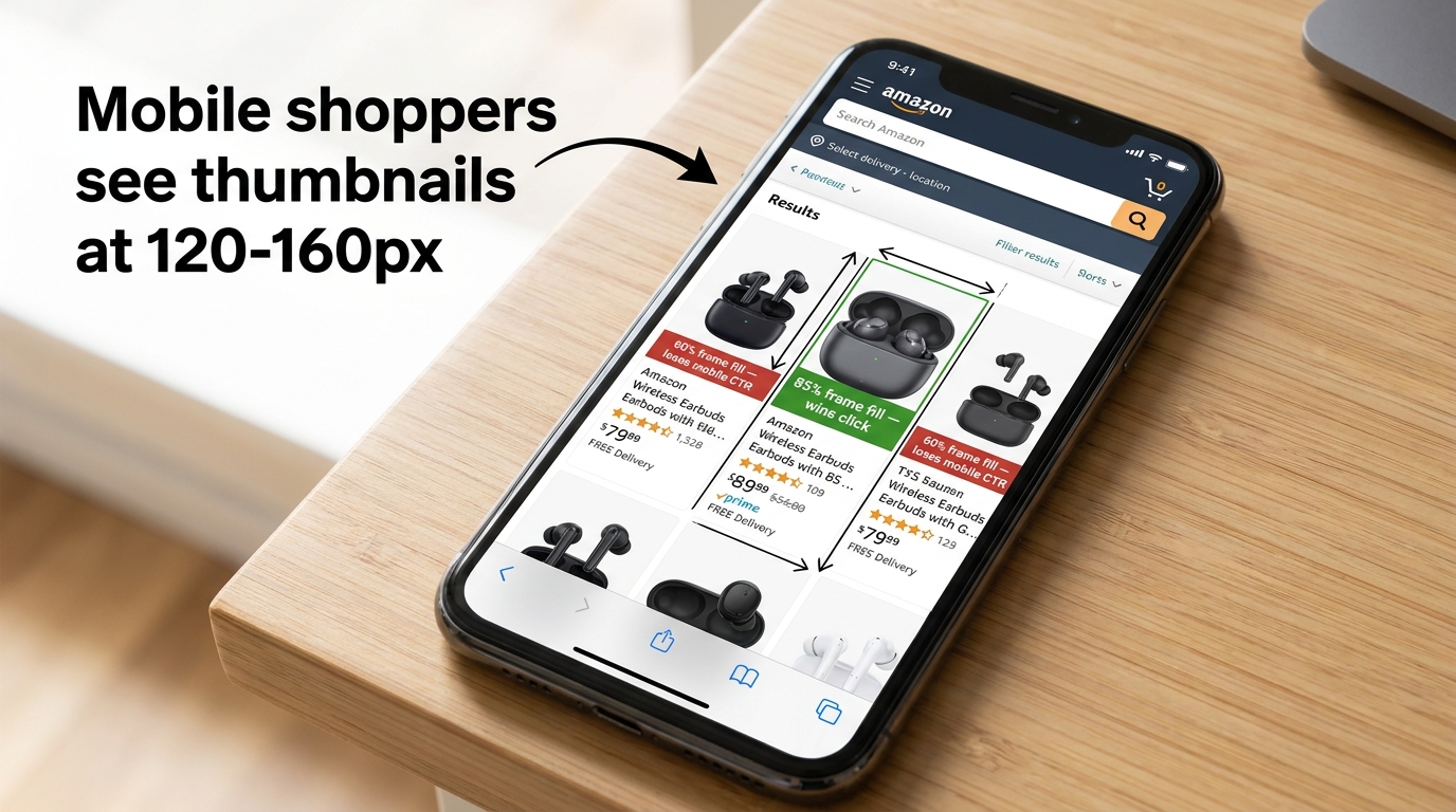
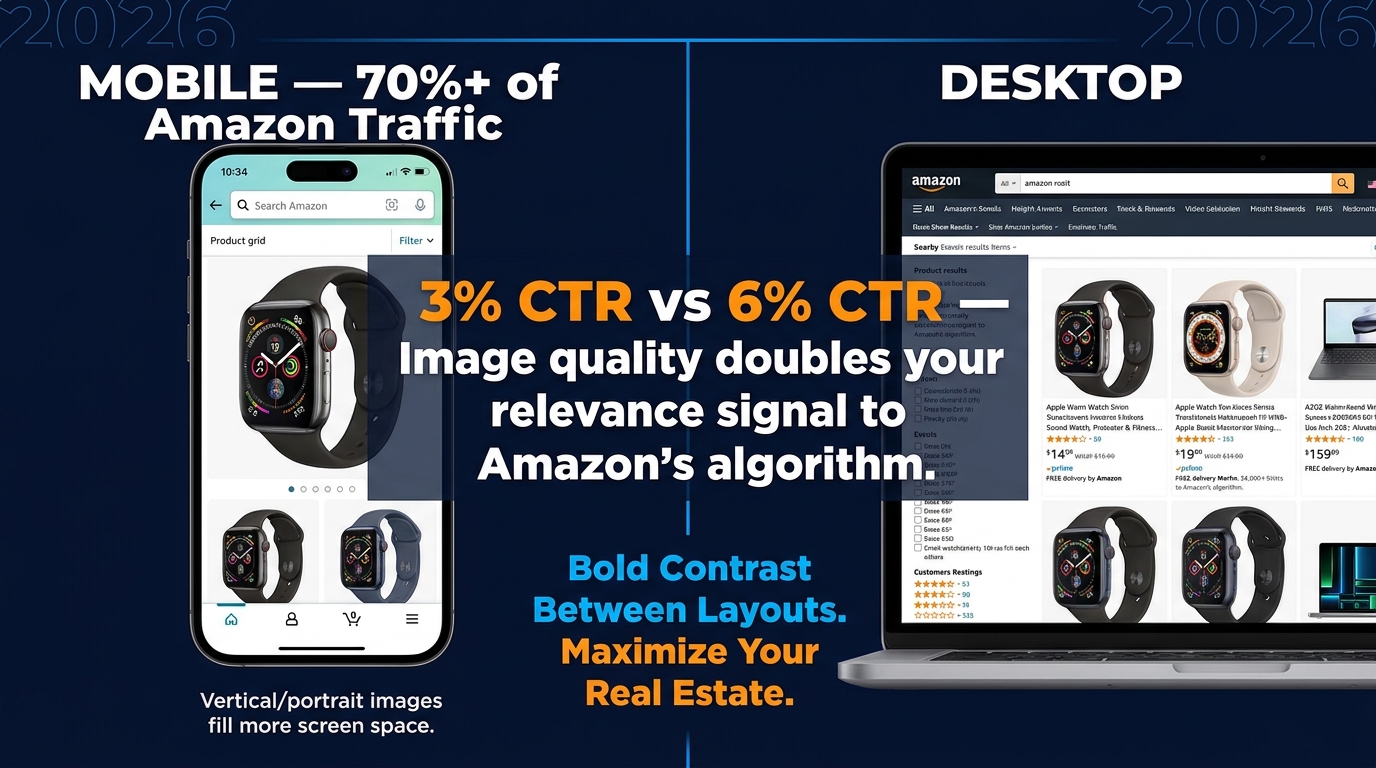
More than half of Amazon purchases now originate on a mobile device. In many product categories, mobile accounts for significantly more than half. But most Amazon images are still being designed, reviewed, and approved on desktop screens — a workflow mismatch that produces design decisions that look fine in a design review but fail in the environment where buyers actually interact with them.
The Thumbnail Problem: What Buyers Actually See First
In Amazon search results on a mobile device, product images are displayed at approximately 120–160 pixels wide. At that size, infographic text that reads clearly at 2,000 pixels becomes illegible. Products with insufficient frame fill nearly vanish. Products with complex silhouettes or multiple items in the frame become unreadable blobs.
The single most impactful design decision for mobile CTR is the 85% frame fill requirement — which is not just a compliance rule but a mobile performance rule. A product that fills 85%+ of a 150px thumbnail is a product that stands out and is immediately recognizable. A product that fills 60% of the same thumbnail is a product that shoppers scroll past without registering.
The practical workflow change this requires is simple but rarely implemented: every main image should be tested at 150 pixels wide before approval. Paste it into a mockup, shrink it down, and look at it honestly. If it reads as clearly and distinctively as the best-performing competitor listings in the same search results, it’s ready. If it doesn’t, it needs to be reshopped, recomposed, or re-cropped.
Typography Rules for Secondary Images: Designing for Two Screen Sizes Simultaneously
Secondary images with text overlays are being designed for two fundamentally different viewing contexts at the same time. On desktop, a buyer browsing the listing might see secondary images at 300–500 pixels wide. On mobile, the same images might first appear in a swipeable gallery at 350 pixels wide, or in the thumbnail strip at even smaller sizes.
The typography decisions this forces are counterintuitive for designers trained in rich print or web design. Fewer words per image, not more. Larger type, not smaller. One core message per image, not a stack of feature points. The instinct to fill secondary image space with as much information as possible — to maximize the “real estate” of each slot — produces images that work well at full size on desktop but fail completely at mobile viewing sizes.
A useful design constraint: write the text that will appear on each secondary image as if you have a maximum of seven words per call-out and three call-outs per image. That limit forces clarity in a way that “use your judgment about what reads well” never will.
Portrait Formats: The Mobile Image Trend Worth Watching
Standard Amazon product images use a square format — 1:1 aspect ratio. But an emerging trend among sellers optimizing for mobile is the adoption of portrait formats (4:5 or 5:4 ratio) for secondary images, on the basis that portrait images occupy more vertical screen space on a phone, creating more visual impact in a scroll.
This is a practice that requires careful category and format verification before implementation, because Amazon’s image rendering behavior varies by category and device. Some category pages handle portrait images cleanly; others crop or reformat them in ways that defeat the purpose. Any implementation of non-standard aspect ratios should be validated with test listings before a full catalog rollout.
How Amazon’s Automated Enforcement Works — and What Happens to a Suppressed Listing
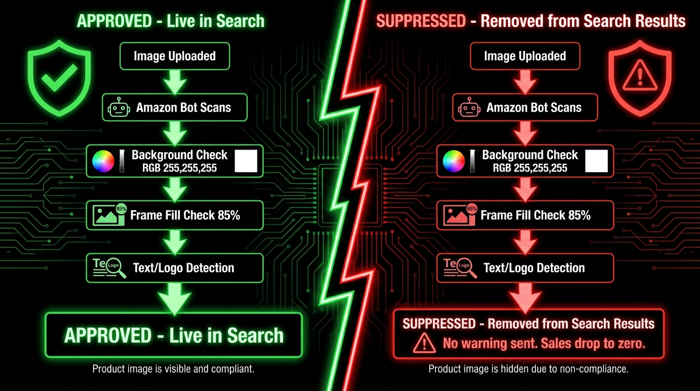
Understanding what Amazon’s enforcement system actually does — and what the consequences are at each level — changes how designers think about compliance. It’s not an abstract set of rules; it’s a system with specific mechanical outputs that affect real revenue in real time.
The Automated Scanning Pipeline
When an image is uploaded to Amazon Seller Central, it passes through automated scanning systems before going live. These systems check for a range of compliance signals: file format validity, dimension minimums, and — most critically — the visual compliance signals that correspond to the main image rules.
Background color is one of the primary automated checks. Amazon’s systems have been analyzing image backgrounds since long before 2026, and they are reasonably effective at detecting backgrounds that deviate meaningfully from pure white. The detection isn’t perfect — edge cases and borderline backgrounds sometimes pass initial scanning — but it is reliable enough that clearly off-white backgrounds and colored backgrounds are caught quickly in most categories.
Text and logo detection on main images is another automated check that has become more sophisticated. Amazon’s computer vision systems can identify text overlays, promotional badges, and watermarks with increasing accuracy. Sellers who relied on borderline cases passing automated review in previous years are finding those same images flagged with greater consistency in 2026.
Suppression: What It Means and What It Costs
When a listing is suppressed for an image violation, the ASIN does not disappear from Amazon. It still exists in the seller’s inventory. But it becomes invisible in search results, category browse pages, and recommendation algorithms. For most products, this means sales drop to near zero for the duration of the suppression — because the product simply cannot be found by new buyers who don’t have a direct link to the listing.
The suppression can happen without a warning email. This is the detail that catches sellers off guard most often. Many assume that Amazon will send a notification, giving time to fix the issue before it affects discoverability. In 2026, that assumption is increasingly unreliable. Automated suppression can and does occur without prior notice, and the first signal a seller receives may be a sudden unexplained drop in sales rather than any formal communication from Amazon.
The fix-and-resubmit process is generally straightforward for image violations: upload a compliant replacement image and submit it for review. Amazon’s systems typically review replacement images within 24–72 hours, though this varies. During that window, the listing remains suppressed and sales continue to be lost.
Escalation: When Image Violations Become Account-Level Issues
A single image violation that’s quickly corrected generally stays at the listing level — a suppression, a fix, a reinstatement. But patterns of repeated violations, particularly violations that Amazon flags as potentially deceptive (misleading product representation, inaccurate claims in images), can escalate to Account Health metrics.
Once an image-related issue appears in Account Health, it carries a different weight. Multiple Account Health demerits for image policy violations contribute to the cumulative score that determines a seller’s standing on the platform. In cases where the violations suggest systematic or intentional misrepresentation rather than accidental non-compliance, Amazon has the authority to restrict selling privileges or close accounts.
For designers, the escalation pathway is a reason to treat image compliance as a professional responsibility, not just a client preference. An image that passes aesthetic review but violates Amazon’s representation rules — showing a product that appears higher quality than it is, including accessories that don’t ship, making performance claims in images that can’t be substantiated — can contribute to an account-level problem that is significantly harder to resolve than a simple suppression.
Split Testing Your Image Stack: How to Measure What’s Actually Working
The final layer of an Amazon image strategy — and the one most frequently skipped — is systematic testing. Building a compliant, well-sequenced image stack is the starting point. Understanding which specific design decisions are driving click-through rate and conversion improvement is what separates teams that continuously improve from teams that set-and-forget.
Amazon’s Native Testing Tool: Manage Your Experiments
Brand-registered sellers have access to Manage Your Experiments, Amazon’s built-in A/B testing platform. It allows sellers to simultaneously run two versions of a listing element — including the main image — with Amazon splitting traffic between the two versions and measuring the conversion impact. For image testing, this means a genuine controlled experiment where both images are served to real Amazon traffic under identical conditions, and the winner is determined by actual purchase data rather than design preference or intuition.
The main image is consistently the highest-leverage element to test because of its direct relationship with click-through rate (CTR). A main image that generates meaningfully better CTR than its alternative lifts the performance of everything downstream — better CTR means more listing visits, which means more conversion opportunities, which means more sales data that Amazon’s algorithm can interpret as demand signal.
The discipline to run a meaningful experiment requires two things: testing materially different concepts rather than minor tweaks, and running the test long enough to reach statistical significance. Changing the background from pure white to a slightly different shade of pure white is not a meaningful test. Changing from a front-facing product shot to a 45-degree angle shot, or from an isolated product to a product with subtle environmental shadow context, is a meaningful test. And a test run for 72 hours on low-traffic listings produces data that is essentially meaningless. A minimum of four weeks, ideally on a listing with sufficient weekly traffic to generate statistical confidence, is the practical standard.
Metrics: What to Watch and What to Ignore
For image tests specifically, the primary metrics are click-through rate (CTR) and unit session percentage (Amazon’s term for conversion rate — the percentage of listing visits that result in a sale). These two metrics measure the two sequential jobs that images do: CTR measures whether the main image wins the click from search results, and unit session percentage measures whether the overall image stack converts visitors once they’ve arrived.
Total sales volume is a less useful primary metric for image testing because it conflates image performance with external factors — traffic level changes, price changes, competitive shifts, seasonal effects. If you change the main image and total sales increase, there’s no way to know from that number alone whether the image is responsible or whether some other variable changed simultaneously. CTR and conversion rate, measured against a simultaneous control, are the metrics that isolate image performance specifically.
What Optimized Image Stacks Actually Deliver
Industry data cited across 2026 seller guides points to CTR and conversion improvements of 20–40% as the performance range for fully optimized image stacks compared to generic, minimally-compliant alternatives. Some categories and products show even larger gaps. This isn’t a claim about any single design change — it’s the cumulative effect of getting the main image right for CTR, sequencing secondary images to address buyer questions in the right order, and building infographics that communicate at mobile sizes.
The implication for designers is that the work of building a compliant image stack is also the work of building a high-converting one. Compliance and performance aren’t separate goals. The rules that Amazon enforces — frame fill, image clarity, accurate representation, sequential information delivery — are the same principles that drive better purchase decisions. Understanding that connection changes how you approach a brief.
The Most Common Design Mistakes That Trigger Suppression in 2026
Pattern data from sellers reporting image violations in 2026 points consistently to a small set of recurring errors. Most of them aren’t exotic or obscure — they’re predictable, preventable mistakes that appear again and again in listings built without a complete understanding of Amazon’s rules.
The Off-White Background That Passed a Visual Check
Background color deviations are the most frequently cited suppression trigger. The violation typically happens in one of three ways: the product photograph was shot against a light gray background that looks white in natural light but reads as off-white to Amazon’s scanning system; the JPEG compression algorithm introduced slight gray artifacts into what was a clean white background; or the designer’s monitor color calibration is slightly off, making a visually-white background appear acceptable when the RGB values are actually slightly below 255 across all three channels.
Prevention requires a numerical check, not a visual one. Use your design software’s color picker tool to sample background pixels in multiple areas of the image and verify the RGB values. 255, 255, 255 across all three channels in multiple sample points is the only standard that guarantees compliance. Anything lower is a risk, and the smaller the deviation, the more likely it is to pass human review while still failing an automated scan.
Product Too Small in the Frame
Insufficient frame fill is the second most common suppression trigger, and it’s often an aesthetic choice that designers make for reasons that seem valid — giving the product “breathing room,” maintaining white space for a premium feel, showing the full packaging including surrounding air. All of those instincts produce images that may look elegant in isolation but fail the 85% fill requirement and shrink to near-invisible at thumbnail size on mobile.
The 85% fill requirement is not a style guideline. It’s a technical compliance requirement that also happens to align with conversion best practices. Design within it.
Text That Seemed Subtle Enough
Watermarks, small brand name overlays, copyright notices in corners, and certification badge graphics all qualify as text overlays on a main image, regardless of how small or subtle they appear. Amazon’s text detection doesn’t grade on subtlety. If it’s text and it’s on the main image, it’s a violation. The instinct to add even a small brand signature to a polished product photo is understandable, but it needs to be redirected to secondary images and A+ Content.
Props That Didn’t Get Flagged at Photography — But Did at Upload
Main image photography that includes a prop or accessory that isn’t included in the order — even a simple surface the product is resting on, a hand holding it for scale, or a small complementary item placed nearby — creates a compliance risk that may not surface until after the image passes initial upload review. This is a pre-production problem, meaning it needs to be resolved in the brief and the photography direction, not in post-production retouching.
The Wrong Image in the Wrong Slot
This sounds obvious but is more common than it should be: a lifestyle image with a colored background uploaded as the main image, usually because someone grabbed the wrong file from a production folder. File management discipline — clear naming conventions, a final compliance review step before upload, separation of main-image assets from secondary assets in delivery packages — prevents this entirely.
The Designer’s Amazon Image Compliance Checklist for 2026
Below is a practical, sequenced checklist for designers building Amazon product images in 2026. This isn’t a rules summary — it’s a workflow checkpoint list that addresses the decisions and verification steps that most often separate compliant, high-performing image stacks from ones that end up causing problems.
Before Photography Begins
- Confirm the product category and source any category-specific image style guide from Amazon Seller Central before the creative brief is finalized.
- Confirm Brand Registry status with the client. Determine whether A+ Content and Brand Story are in scope. If yes, request or plan for additional module-specific assets.
- Define which images are main-image assets (strict rules apply) versus secondary-slot assets (substantially more creative freedom) before photography direction is set.
- Review prop and accessory plan for the main image shoot. Eliminate anything that doesn’t ship with the product before the camera is on.
- Set the background standard for the photography studio: pure white, RGB 255/255/255, verified with a gray card and proper exposure calibration.
During Design and Retouching
- Work in RGB color mode from project creation. Do not convert from CMYK at export.
- Target 2,000 × 2,000 pixels minimum for standard listing images. Use 2,500px or higher for detail-critical categories.
- Verify background RGB values numerically using the eyedropper/color picker after every retouching pass. Don’t rely on visual assessment.
- Measure frame fill for the main image using guides or crop tools. The product should occupy at least 85% of the frame area.
- Remove all text, logos, watermarks, and graphical overlays from main image files before final export.
- Test every secondary image at 300px width to verify readability at mobile gallery sizes. Increase type sizes if text is not immediately legible.
At File Delivery
- Rename all files to Amazon’s naming convention: ASIN or product identifier followed by the file extension, no spaces or special characters.
- Export main images as JPEG at high quality (90–95 quality in Photoshop’s scale). Verify file size is under Amazon’s limits.
- For A+ Content assets: confirm format is JPG, PNG, or BMP; RGB only; under 2MB per file; no QR codes or URLs embedded in imagery.
- Separate deliverables clearly: main image files, secondary image files, and A+ Content files in distinct folders with clear labels.
- Include a compliance notes document for the client that summarizes which files go in which slots and flags any category-specific upload instructions.
Conclusion: Designing for a Platform That Enforces at Machine Speed
The shift that makes 2026 different from previous years isn’t the existence of Amazon’s image rules — those have been in place for a long time. It’s the enforcement velocity. What used to be a relatively forgiving system where borderline images stayed live for weeks or months before anyone caught them has become a faster, more automated, and considerably less patient one.
For designers, that shift changes the professional calculus. Building images that are technically compliant and visually effective isn’t two separate jobs that happen in sequence — compliance first, then creativity. They’re integrated. The frame fill requirement that keeps a listing from suppression is the same rule that ensures the product thumbnail stands out at mobile sizes. The prohibition on text overlays on the main image forces the creative work into secondary slots where it can be more expressive. The white background requirement creates the visual context in which the product has to do all its own work — which is exactly the design challenge that produces the best product photography.
Designers who understand Amazon’s rules deeply don’t treat them as constraints on creativity. They treat them as the operating environment in which creative decisions have to be made — the same way a graphic designer working in print understands bleed and registration marks not as limitations but as the conditions under which the work will be produced and consumed.
The platform enforces at machine speed. The best response is to design with the same precision.
Key Takeaways for 2026 Amazon Image Design: Background pixel values must be verified numerically — visual assessment is not sufficient. Frame fill of 85%+ is both a compliance requirement and a mobile CTR driver. The 7-slot secondary image sequence should be designed as a conversion funnel, not a photo gallery. A+ Content carries separate technical specs and a manual review process — get it right before submission. Mobile testing at 150px wide is non-negotiable for any main image. Automated suppression happens without warning; compliance built into the design process is the only reliable protection.