Tag: Click-Through Rate

  • What Your SQP Data Is Actually Telling You About Your Images (And How to Act on It)

    What Your SQP Data Is Actually Telling You About Your Images (And How to Act on It)

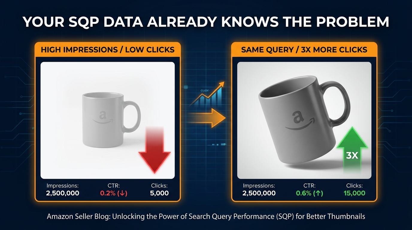
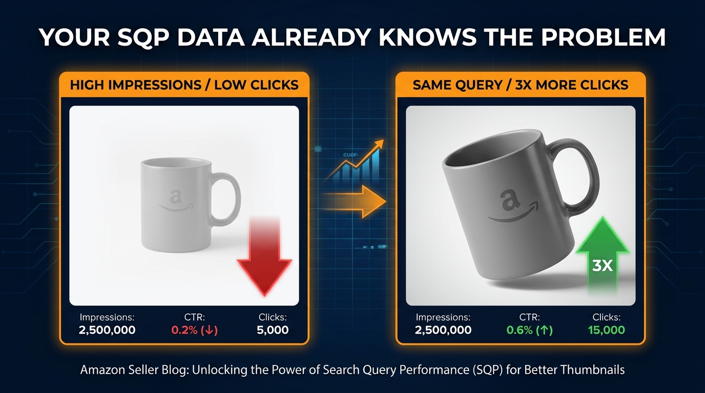
    Split-screen showing high impressions vs low clicks on identical Amazon products, with the text YOUR SQP DATA ALREADY KNOWS THE PROBLEM

    Most Amazon sellers treat the Search Query Performance (SQP) report as a keyword discovery tool. They pull it, look at what queries are driving volume, and feed those terms back into their listings and PPC campaigns. That’s not wrong — but it’s only half the job, and it’s the less valuable half.

    The more powerful use of SQP data is as an image diagnostic system. Every query in your SQP report carries a silent verdict about your main image: either shoppers are clicking on it, or they’re not. When your impression share is outpacing your click share on a given query, the market is telling you something very specific — your listing is showing up, but your thumbnail is losing the moment of decision.

    This post is about building a CTR-first methodology around that signal. Not a “make pretty images” philosophy, but a structured workflow where SQP data tells you which queries to fix, your competitive audit tells you why you’re losing them, and your image changes are tested and tracked back to the same dataset that identified the problem in the first place. It’s a closed-loop system — and it’s one that most sellers aren’t running yet, even in 2026 when the tools to do it have never been more accessible.

    The sellers who understand this have a compounding advantage: better CTR drives ranking, better ranking drives more impressions, and more impressions at higher CTR rates drive purchases — all without increasing ad spend. That’s the actual prize here.

    Why SQP Is an Image Diagnostic Tool First

    The conventional framing of SQP is that it answers the question “which keywords should I target?” But SQP’s most precise signal sits one layer deeper: it tells you, at a per-query level, how your listing performs at the moment of comparison against every competing product in those search results.

    Let’s be precise about what SQP actually measures. At the ASIN level, you get five core metrics for each query: impressions, clicks, add-to-carts, purchases, and your percentage share of each relative to the total market for that query. These five numbers describe your complete conversion funnel for every individual search term, not in aggregate, but query by query.

    The Moment SQP Becomes a Visual Feedback Signal

    When you compute your click share as a percentage of your impression share for any given query, you get a ratio that has a very specific meaning. A ratio close to 1.0 means your listing is converting impressions to clicks at roughly the same rate as competitors. A ratio significantly below 1.0 means you are consistently being chosen less often than your share of eyeballs would predict — and at that specific moment on that specific query, the thing differentiating you from every other listing is your thumbnail.

    It’s not your price — shoppers can barely process price in 0.3 seconds of glance time on a search results page. It’s not your reviews — they register as a star rating and a number, which changes very little between listings in competitive categories. It’s primarily your main image. That’s the creative variable that governs whether a shopper’s eye pauses on your listing or slides to the next one.

    This is the insight that makes SQP such a powerful image tool: it’s not showing you abstract engagement metrics — it’s showing you exactly which shopping scenarios your image is failing in, and how severe the failure is.

    What SQP Cannot Tell You Directly

    SQP doesn’t tell you why your image is losing. It doesn’t explain whether your frame fill is too small, your product angle is confusing, your background isn’t clean enough, or your packaging doesn’t match what shoppers expect to see for that query. That diagnosis requires a separate step — the competitive thumbnail audit. But SQP gives you the targeting precision to know exactly where to look. Without it, you’re guessing which images to improve and testing without a hypothesis. With it, you’re following data to the specific queries where image quality is costing you clicks at scale.

    The Impression-Click Gap: Anatomy of a Missed Click
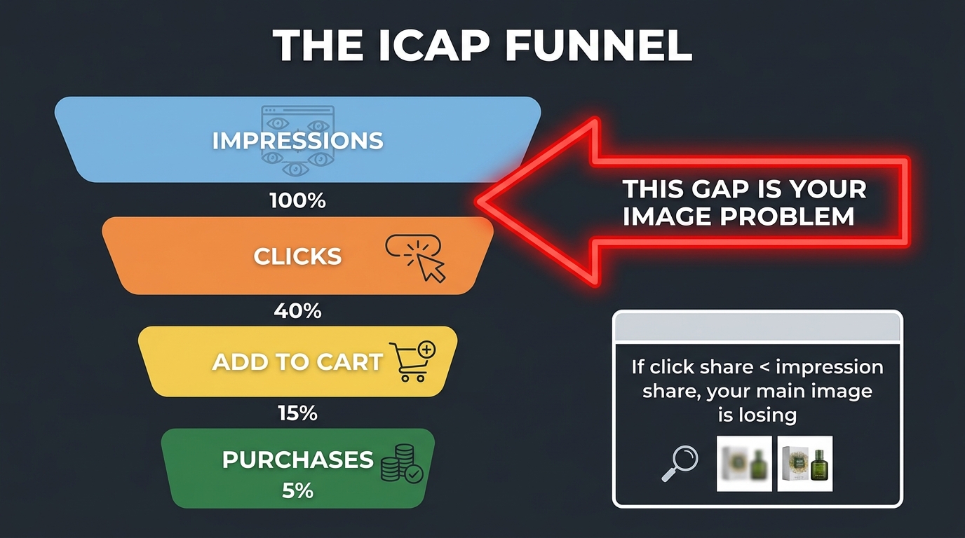
    ICAP funnel diagram showing the gap between impressions and clicks as the image problem, with click share vs impression share callout

    The impression-click gap is the core diagnostic unit of a CTR-first image strategy. Understanding its anatomy — what causes it, what makes it worse, and what conditions it can and cannot diagnose — is essential before you start pulling data.

    Defining the Gap with Precision

    For any given query in SQP, your impression share represents how often your ASIN appeared in search results when someone searched for that term, as a percentage of total appearances across all competitive ASINs. Your click share represents what percentage of all clicks on that query you captured. The gap is simple arithmetic: impression share minus click share. A gap of zero means you’re winning clicks proportionally to your visibility. A gap of 10 percentage points means for every 10 times you appear, you’re capturing 10 fewer clicks than you should be if performance were neutral.

    In practice, most competitive categories see individual ASINs with impression-click gaps of 5 to 20 percentage points, meaning the typical product is significantly underperforming on click capture relative to its visibility. The best-performing listings — the ones with highly optimized thumbnails, strong reviews, and competitive pricing — often show negative gaps, meaning their click share actually exceeds their impression share. These listings are punching above their weight in every impression they receive.

    What the Gap Is Really Measuring

    Think about what happens in a search results page interaction. A shopper types a query, Amazon displays up to 60+ ASINs across multiple pages. But eye-tracking research across e-commerce platforms consistently shows that the vast majority of clicks go to the first handful of results, with position and visual salience being the two dominant variables. Your impression share is largely a function of your ranking and PPC coverage — it tells you how often you’re in the room. Your click share is a function of what happens once you’re in the room.

    The gap, therefore, isolates the creative and pricing performance of your listing from the ranking and advertising performance. A high impression share with low click share tells you that you’ve solved the ranking problem but not the persuasion problem. That’s precisely where image optimization applies.

    The Compounding Cost of a Large Gap

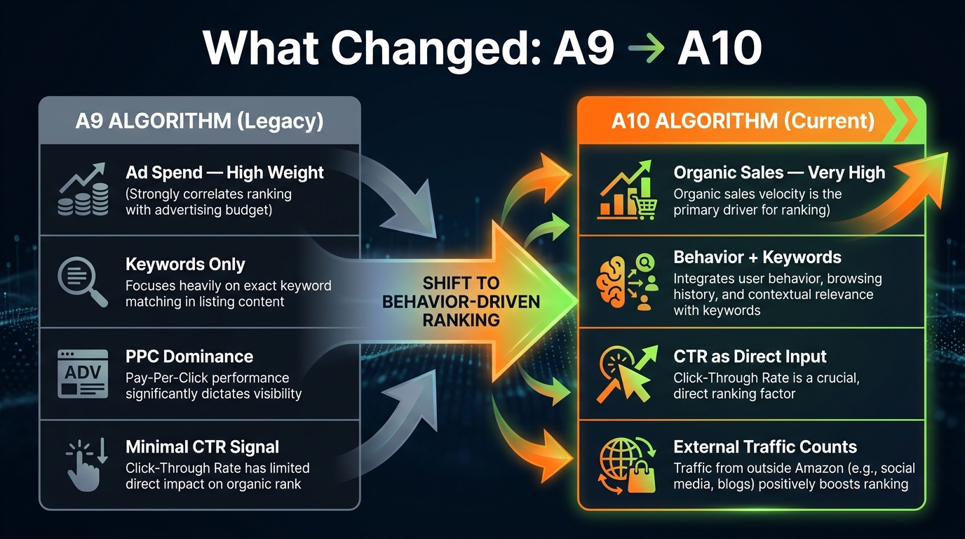
    What makes the impression-click gap worth obsessing over is that it’s self-reinforcing. Amazon’s A10 algorithm factors click-through rate into ranking signals — listings that generate more clicks per impression gradually gain organic rank, which in turn generates more impressions, creating a flywheel. Conversely, listings with persistently low CTR on high-volume queries signal to the algorithm that the listing isn’t what shoppers want for that search, which can suppress organic rank over time even when keyword relevance and sales velocity are strong.

    This means a large impression-click gap isn’t just a revenue problem today — it’s a compounding ranking problem tomorrow. Fixing it through image optimization isn’t just about winning more clicks this week; it’s about building an organic rank trajectory that sustains itself without relentless advertising spend.

    Segmenting Queries by Intent Before You Touch a Single Image
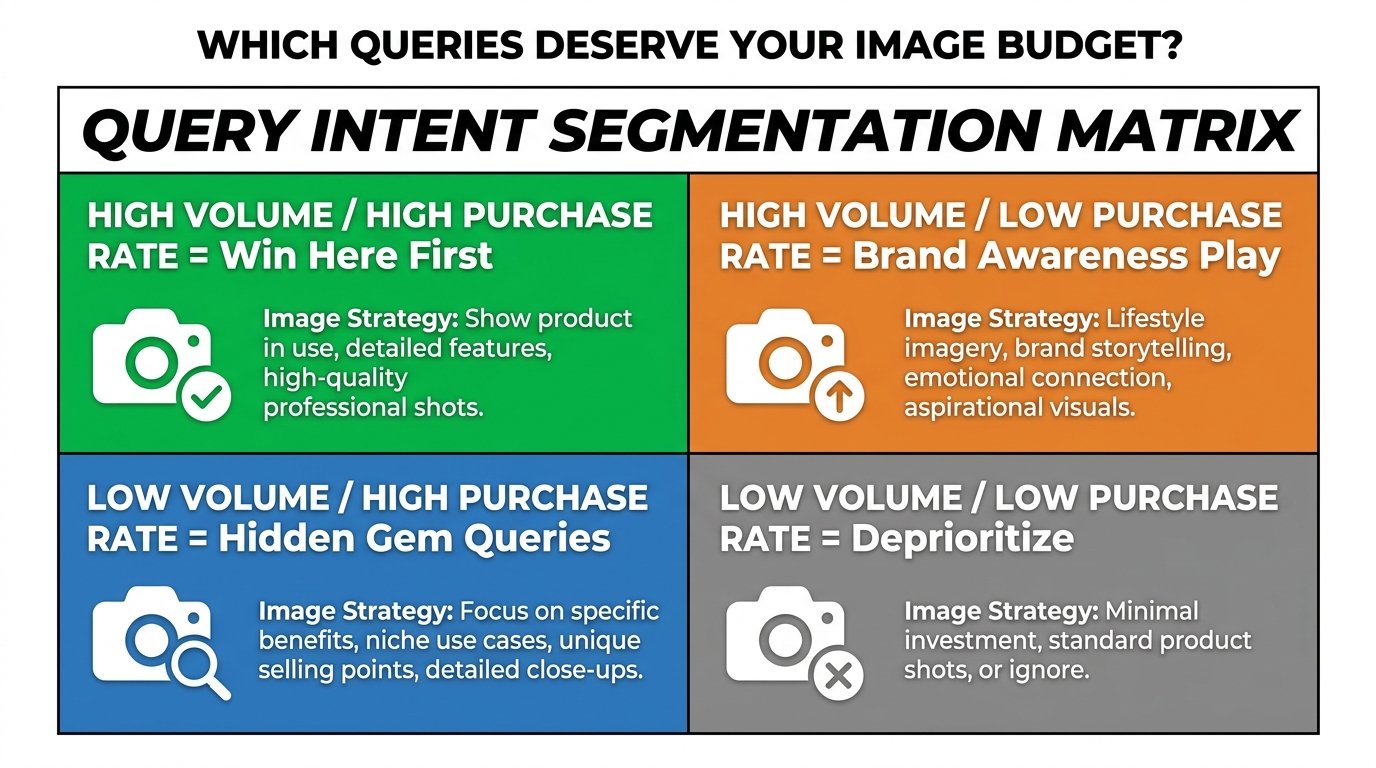
    2x2 query intent segmentation matrix showing high volume/high purchase rate vs low volume/low purchase rate quadrants for image budget prioritization

    One of the most consequential mistakes in SQP-driven image optimization is treating every query the same way. Not all queries with a large impression-click gap deserve the same response — because not all queries represent the same type of shopper, the same conversion potential, or the same type of image requirement.

    Before you commission a single reshooting session or brief a designer, you need to segment your SQP queries into buckets based on intent. This segmentation determines both the priority order of your image work and the creative direction for each set of images.

    Using the Full ICAP Funnel to Classify Intent

    SQP gives you the complete ICAP funnel data (Impressions, Clicks, Add-to-Cart, Purchases) at the query level. The shape of this funnel for each query is your intent signal. Here’s how to read it:

    • High impression share + high purchase rate relative to click rate: These are high-converting queries where every click is valuable. The funnel narrows sharply at clicks but stays wide through to purchases. These are your highest-priority image optimization targets because improving CTR here has an outsized downstream revenue impact.
    • High impression share + high click share but low cart-add rate: Shoppers are clicking but not converting. The image is working — but there’s a disconnect on the product detail page. This is a content and gallery image problem, not a main image problem.
    • High impression share + very low click share + moderate purchase rate: The classic image problem. Shoppers who do click through are buying, but too few are clicking in the first place. This is your primary CTR-first opportunity.
    • Low impression share across the board: This is a ranking or advertising coverage problem, not an image problem. No amount of image optimization will fix an ASIN that isn’t appearing for the query in the first place.

    Building the Segmentation in Practice

    Export your SQP data for the past 90 days. Create a spreadsheet with columns for each of the five ICAP metrics plus the derived ratios: click share ÷ impression share (your “click efficiency ratio”) and purchase share ÷ click share (your “post-click conversion ratio”). These two derived metrics tell you where each query sits on the problem spectrum.

    Queries with a click efficiency ratio below 0.7 and a post-click conversion ratio above 0.5 are your Tier 1 image optimization targets — they have proven buying intent but your image is losing the click competition. Sort by impression volume to find the ones where fixing the image will move the most revenue. These are the queries that deserve your first creative brief and your first Manage Your Experiments test.

    The Intent-to-Image Connection

    Intent segmentation also informs what your image should actually show. A query like “stainless steel french press 34 oz” is a high-specificity, high-intent search — the shopper knows exactly what they want, and your image needs to confirm at a glance that your product matches their mental model. A query like “coffee maker gift” is a browse-intent, low-specificity search — shoppers are evaluating options, and your image might benefit from communicating context and occasion rather than just product specs.

    This distinction matters enormously for creative direction. The same product needs different images to win different types of queries — which is exactly why the Amazon gallery exists. But for main image optimization, you need to understand which intent type represents the majority of your high-gap, high-volume queries, because that’s the shopper your thumbnail needs to convert first.

    The Competitive Thumbnail Audit: Seeing What Shoppers See
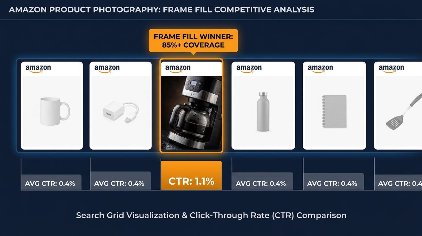
    Row of Amazon product thumbnails where one standout image with 85% frame fill dominates CTR compared to generic competitors

    SQP tells you that you’re losing clicks on a specific query. The competitive thumbnail audit tells you why — and more importantly, what winning looks like in that context. This is the step most sellers skip because it feels qualitative, but done systematically, it’s highly actionable.

    How to Run a Query-Level Thumbnail Audit

    For each of your Tier 1 queries from the intent segmentation step, open an incognito browser window (or use Amazon’s mobile app) and perform the actual search. Don’t look at the page as a seller — look at it as a shopper who has 8–10 seconds to scan results and decide where to click. Take a screenshot. Then do the following analysis:

    Step 1: Identify the visual winners. Which three to five thumbnails draw your eye first? Note what they have in common: product scale relative to the frame, background cleanliness, angle, color contrast against the white search results page, and whether any visual element creates a clear differentiation from adjacent listings.

    Step 2: Locate your ASIN. Find your own listing in the results. Does it visually stand out or blend in? Does it appear smaller, lower-contrast, or more generic than the top-performing thumbnails? Be honest about this assessment — what you see is what shoppers see.

    Step 3: Document the gap. List the specific visual differences between your thumbnail and the three most visually compelling listings on that SERP. These differences are your creative brief. Common gaps include: product fills less than 70% of the frame (competitors fill 85%+); product angle shows a less informative face of the product; packaging detail is illegible at thumbnail size; product appears in a shadow or unclean white background; key differentiators (size, color, quantity) are invisible in the thumbnail.

    What Frame Fill Actually Means

    Frame fill is the percentage of the image area that the product itself occupies. Amazon’s own seller guidelines recommend that the product occupy at least 85% of the image. But many sellers interpret this as “the product plus any packaging” — which often results in a thumbnail where the actual product looks small against the full image dimensions.

    At thumbnail size (Amazon displays main images at roughly 160×160 pixels in most grid views), a product filling 65% of the frame looks dramatically smaller than a product filling 85%. In categories where product size is a purchase decision (kitchenware, supplements, tools, outdoor equipment), that size signal can be a decisive factor in the click decision. Shoppers choose what looks bigger and more substantial, all else equal.

    Color Contrast and Category Context

    Every product category has a de facto visual language — a set of image conventions that experienced shoppers in that category have internalized. Beauty products tend to be shot with clean, clinical precision. Outdoor gear tends to use bold angles that suggest durability. Food products use color saturation that triggers appetite appeal. When your thumbnail violates category visual conventions, it registers as slightly “off” to shoppers, even if they can’t articulate why — and that feeling translates to fewer clicks.

    Conversely, when your thumbnail conforms to the best version of category visual conventions but differentiates through one specific element — an angle, a color accent, a size demonstration — you’re working with the shopper’s expectations rather than against them. The audit is your way of mapping those conventions for your specific competitive set.

    Building Your Image Priority Queue from SQP Data

    With your segmented query list and competitive audit complete, you now have enough data to build an image priority queue — a ranked list of image changes, ordered by expected revenue impact. This is where the data work pays off, because it means you’re not spending budget on image redesigns for queries that are already performing well, or for queries where the problem isn’t actually the image.

    The Priority Scoring Framework

    Score each potential image change opportunity using three inputs from your SQP analysis:

    1. Query volume: Higher monthly search volume means more impressions, which means more clicks available to capture. Weight this heavily — a 10% CTR improvement on a 50,000-impression query is worth more than a 30% improvement on a 5,000-impression query.
    2. Impression-click gap magnitude: Larger gaps represent more clicks being left on the table. An impression share of 12% with a click share of 3% is a more urgent problem than impression share of 8% with click share of 6%.
    3. Post-click conversion rate: This is your confidence signal. If the queries where you have a large gap also show strong purchase rates among the clicks you do capture, then every additional click you win is highly likely to convert to revenue.

    A simple priority score: (Query Volume × Impression-Click Gap) × Post-Click Conversion Rate. Sort your query list by this score, descending. The top 10 queries are your first image sprint. Don’t try to fix everything at once — a focused, sequenced approach produces cleaner test data and clearer attribution.

    Single-Image vs Multi-Image Strategy

    An important structural question: are all your top-priority queries being lost by the same image weakness, or are different queries revealing different creative problems?

    If your audit shows that the problem is consistent — say, frame fill is too small across the board — then a single main image redesign will address multiple queries simultaneously, and you should test one new image variant across all affected queries. But if different queries reveal different problems (one query’s SERP is dominated by lifestyle imagery while another’s is dominated by technical specification callouts), you may need to consider whether multiple listing variants, Sponsored Brands imagery, or A+ content can serve as creative solutions for the secondary queries while your main image optimizes for the primary one.

    Respecting Amazon’s Main Image Constraints

    One reality check that every CTR-first strategy must account for: Amazon’s rules for main images are specific and enforced. The main image must show only the product (no additional props, backgrounds, text overlays, or lifestyle elements) on a pure white background (RGB 255,255,255). Amazon has ramped up enforcement of these rules, with AI-based image scanning flagging non-compliant images with increasing accuracy in 2026.

    This means your creative options for the main image are narrower than they might seem: angle, frame fill, lighting, product configuration (assembled vs. components), color variant selection, and shadow treatment are your primary variables. These constraints aren’t limitations — they’re a creative challenge. The best-performing main images in competitive categories win within these rules, not by working around them. Your competitive audit should surface how the winners are doing this.

    What to Change First: Frame Fill, Angle, Overlays, or Color

    Once you have a priority queue and a creative brief from your thumbnail audit, the practical question is sequencing: which change should you make first? Not because you can only make one change, but because you can only test one hypothesis at a time and attribute the result correctly.

    The Four Primary Image Variables

    Frame fill is almost always the first change to test if your audit shows your product appearing smaller than competitors’ at thumbnail size. The mechanics are simple: crop tighter, shoot closer, or remove excess whitespace in post-production. This change is fast, cheap to implement, and often produces the largest single-variable CTR lift because it changes the product’s visual weight on the page.

    The target is 85%+ product coverage within the frame. Test at thumbnail size — not at full image size — because that’s the context in which the change matters. A product that looks perfectly framed at 1000×1000 pixels may still look small at the 160px thumbnail dimension depending on the product’s aspect ratio and shape.

    Product angle is the second variable to test when frame fill is already strong. The question is whether your current angle communicates the product’s most important attribute at thumbnail size. For a multi-tool, a top-down spread of tools might be more informative than a three-quarter view. For a supplement, a front-facing label view with legible branding might outperform an angled glamour shot. The audit tells you what angle the CTR winners in your category are using — test toward that angle if it differs from yours.

    Product configuration applies to items that can be shown assembled or disassembled, packaged or unpackaged, singular or in set quantities. For multi-packs, showing the quantity visually (three bottles arranged together) rather than relying on text to communicate it can significantly improve CTR for queries like “bulk” or “pack of 3” — because the image confirms what the query expects before the shopper has to read anything.

    Shadow and lighting treatment is a subtler variable but meaningful in categories where product quality and premium positioning matter. Hard shadows against white backgrounds can make products look lower-quality or older in photography style. A natural drop shadow or completely shadow-free shot (achieved in editing) can meaningfully shift the perceived value of the product, which affects click behavior particularly for higher-price-point items.

    What Changes to Defer

    If your audit identifies that competitors are winning with lifestyle imagery in the main image slot, don’t try to replicate this by violating Amazon’s content policies. Non-compliant main images can get your listing suppressed — which eliminates all your impressions, not just your clicks. The correct response to a lifestyle-dominated SERP is to make the strongest possible compliant main image while investing in Sponsored Brands creative for that query, where lifestyle imagery is explicitly permitted.

    Running Manage Your Experiments Without Wasting 8 Weeks
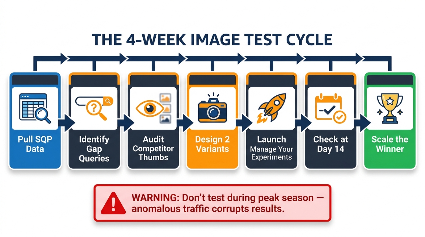
    7-step image test cycle flowchart showing the process from pulling SQP data through launching experiments to scaling the winner

    Amazon’s Manage Your Experiments (MYE) tool is the native way to A/B test main images with statistical rigor, and it’s available to brand-registered sellers with sufficient traffic. The challenge most sellers face with MYE isn’t technical — it’s methodological. They run experiments without a clear hypothesis, test too many variables simultaneously, or let tests run indefinitely without acting on the results.

    Designing a Test That Produces Actionable Data

    The single most important principle in MYE testing is one variable at a time. If you change the angle, the frame fill, and the color balance simultaneously in your test image, you cannot attribute a CTR change to any specific element. You’ll know the new image performed better (or worse), but you won’t know why — which means you can’t systematically build on the result.

    Start with the highest-priority change from your creative brief: if the audit showed frame fill is the primary gap, test only a tighter frame fill, keeping all other elements identical. If the test wins, you’ve confirmed the hypothesis and can proceed to the next variable. If it loses, you’ve ruled out frame fill and need to reassess your audit findings.

    Write your hypothesis explicitly before launching: “We believe that increasing frame fill from 65% to 85% on our main image will improve CTR on queries with high impression-click gaps by reducing our visual size disadvantage against the top three competitors on those SERPs.” This forces clarity about what you’re measuring and why, and it gives you a post-test evaluation framework beyond just “did the number go up?”

    The Traffic Threshold Problem

    MYE requires sufficient traffic to reach statistical significance within a reasonable timeframe. Amazon’s own guidance suggests experiments need at least a few hundred clicks per variant to be meaningful. For high-traffic listings, this can happen within two to three weeks. For lower-traffic ASINs, an experiment might require six to eight weeks to reach the traffic threshold — during which time market conditions, pricing, and competitive dynamics can all shift, introducing noise into the results.

    If your ASIN doesn’t have enough organic traffic to run MYE efficiently, there are two workarounds. First, consolidate your experiment to your highest-traffic ASIN in a brand and apply learnings to lower-traffic ASINs without formal testing — directional data from a high-traffic sibling product is better than no data. Second, use Sponsored Products to drive controlled traffic to both variants during the experiment period, accelerating the time to statistical significance. This costs money, but it gets you a result in half the time and significantly reduces the influence of external variables.

    Reading the Results Without Bias

    MYE results show you both statistical confidence and projected annual sales impact. The temptation is to declare a winner as soon as the confidence indicator is high — but confidence in a statistically insignificant positive result can still be misleading. Look for both high confidence (85%+ by Amazon’s indicator) and a meaningful delta in the primary metric before calling the experiment.

    Also watch what MYE measures by default: it typically optimizes for units sold, not CTR specifically. Since CTR improvements cascade through to units sold, this is usually the right metric — but if your test shows improved CTR with flat units sold, the issue may be post-click conversion, not the main image. That’s a useful finding too, and it redirects your optimization effort to the product detail page rather than the thumbnail.

    Tracking CTR Gains Back to SQP: Closing the Loop
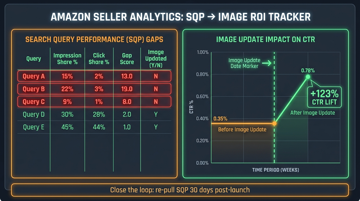
    Analytics dashboard showing SQP to image ROI tracker with before and after CTR line graph showing 123% CTR lift after image update

    This is the step that turns a one-time image fix into a repeatable system. Once you’ve made an image change and your MYE test has concluded, you need to return to SQP and measure whether the impression-click gap on your target queries actually narrowed. This closes the feedback loop — and it’s where most sellers drop the thread, walking away after the MYE result without verifying the effect in the source data.

    The 30-Day SQP Pull Protocol

    Pull your SQP data approximately 30 days after your new main image goes live (or after the MYE winner is deployed at 100%). Compare your click share on the Tier 1 queries you targeted against the click share from the 90-day period before the change. Look specifically at:

    • Did your click share increase on the target queries?
    • Did your impression share stay flat or increase (ruling out ranking changes as a confounding variable)?
    • Did your add-to-cart share and purchase share move proportionally with click share, or did click share increase while downstream metrics lagged (suggesting the new image is drawing the wrong shopper intent)?

    The third point is important and often overlooked. An image change that dramatically improves CTR but produces a parallel drop in add-to-cart rate is a warning sign — the new image may be winning clicks from shoppers whose intent doesn’t match the product. This is particularly common when sellers make images more visually dramatic in ways that create expectations the product doesn’t meet. A 40% CTR improvement that comes with a 30% conversion rate drop is a net negative. SQP catches this where MYE’s unit-sales metric might not.

    Building a Query-Level Tracking Sheet

    Maintain a persistent spreadsheet — or automate a pull using Amazon’s Brand Analytics API if your volume justifies it — that tracks, for each of your priority queries, the click efficiency ratio (click share ÷ impression share) across rolling 90-day periods. This gives you a longitudinal view of image performance that no single-point-in-time snapshot can provide.

    Update this tracking sheet every 30 days. Over time, you’ll see which queries have been permanently improved by image changes, which ones drift back toward poor CTR as competitors update their own images, and which new queries have emerged (through keyword expansion or market growth) that have entered your impression profile but are showing early signs of a click gap.

    This tracking discipline is what distinguishes a CTR-first image strategy from a one-time image refresh. The market changes. Competitors improve their thumbnails. New entrants arrive with better creative. Your SQP data will surface these dynamics before they cost you meaningful revenue — but only if you’re actually looking at it on a recurring basis.

    When Better Images Aren’t Enough: The Price, Badge, and Rating Factor

    A rigorous CTR-first strategy requires intellectual honesty about what main image optimization can and cannot fix. There are real scenarios where the impression-click gap is caused by factors that have nothing to do with your thumbnail — and chasing an image solution for a non-image problem wastes time, budget, and creative energy.

    Price as a CTR Variable

    On most Amazon search result pages, price is displayed prominently alongside the thumbnail. At desktop size, shoppers can see price before they click. This means a meaningful portion of your impression-click gap on price-sensitive queries may be attributable to price positioning rather than image quality. The diagnostic test is simple: temporarily narrow the price gap against the top two competitors on your highest-gap queries and monitor the click efficiency ratio in SQP over the subsequent 30-day period. If click share moves meaningfully with the price change while nothing else changes, price was the dominant variable — not the image.

    Review Count and Star Rating

    In some categories, review count and star rating are the primary click-decision variables, particularly for commoditized products where thumbnails are relatively undifferentiated and shoppers are using social proof as a quality shortcut. If your ASIN has significantly fewer reviews or a lower rating than the top CTR performers on your target queries, image optimization alone will not close the gap.

    The practical implication: use your click efficiency ratio as a proxy for competitive health. If your ratio is below 0.7 and you have strong images, competitive pricing, and good reviews, then image refinement is the right lever. If your ratio is below 0.7 and you have 47 reviews versus competitors with 4,700, invest in review acquisition first and revisit image optimization once social proof is no longer the dominant impression-to-click barrier.

    The Amazon Choice Badge and Coupon Flags

    One underappreciated CTR driver is badge visibility. Amazon’s Choice badges, Prime badges, and coupon flags all appear in the search results thumbnail view and demonstrably affect click-through behavior. If your competitors are running 10% or 15% off coupons that appear as bright orange flags on their thumbnails, that visual element competes directly with your image quality for click attention.

    This isn’t an argument to run coupons at all times (the economics may not support it) — but it’s a reminder that your main image doesn’t compete in isolation. Your thumbnail is the sum of the product photo, the price, any badges, the rating and review count, and the Prime eligibility indicator. All of these together constitute what a shopper sees in the 0.3-second glance that determines whether they click. Image optimization addresses one component of that bundle — and an important one — but a truly CTR-first strategy accounts for all of them.

    Scaling the System: From One ASIN to a Full Catalog

    Once you’ve run the SQP-to-image workflow successfully on one or two high-priority ASINs, the question becomes how to scale it across a larger catalog without the analytical workload becoming unmanageable. This is where systematization matters more than sophistication.

    Building the Triage Layer

    At catalog scale, you can’t do a deep competitive thumbnail audit for every ASIN every month. Instead, build a triage system that surfaces which ASINs deserve deep analysis based on their SQP signal. Create a weekly or monthly report that flags any ASIN whose average click efficiency ratio across its top 10 queries has dropped below 0.65 in the current 90-day window, compared to the prior window.

    ASINs flagged by this triage trigger go into the deep analysis queue: competitive audit, creative brief, and MYE experiment. ASINs with stable or improving ratios get a lighter-touch review — no immediate action, just continued monitoring. This approach concentrates your creative investment where the data says it matters, and keeps the system sustainable at scale.

    Building a Creative Asset Library

    As you run image experiments across your catalog, you’ll accumulate institutional knowledge about what works — which angles win in your category, what frame fill level consistently outperforms, whether your brand’s color palette helps or hurts thumbnail differentiation. Document these findings explicitly and build them into a creative brief template that your photographers and designers use for every new ASIN shoot.

    This means your new product launches start with a higher creative baseline informed by performance data from your existing catalog. Instead of launching with an image that will need to be improved after SQP data accumulates, you launch with an image built on the principles that your data has already validated. The result is shorter ramp-up times to optimal CTR and less lost revenue during the critical early weeks of a new ASIN’s life.

    Integrating SQP Review into Operations

    The final piece of scaling is operational: making SQP review a standard, recurring business rhythm rather than an occasional deep-dive. Set a monthly cadence for SQP pulls. Assign clear ownership for the analysis. Build the click efficiency ratio and impression-click gap metrics into whatever reporting dashboard your team reviews regularly. When SQP data is part of weekly business reviews alongside advertising metrics and inventory health, it stops being an advanced tool that only power users access and becomes a standard part of how your team thinks about listing health.

    At that point, the CTR-first image strategy is no longer a project — it’s a process. And that’s when the compounding advantage starts to accumulate: consistent click efficiency improvements quarter over quarter, organic rank gains that reduce dependence on paid traffic, and a visual competitive moat that takes competitors significant time to close.

    Conclusion: The Repeatable SQP-to-Image Workflow

    The core insight of a CTR-first image strategy is disarmingly simple: Amazon already tells you which queries your image is failing on — you just have to know how to read the signal. The SQP report, used as an image diagnostic tool rather than a keyword tool, gives you query-level precision about where the impression-click gap is largest, which queries have the conversion potential to make closing that gap profitable, and whether your changes are actually working.

    The workflow this produces has a clear, repeatable sequence:

    1. Pull SQP data for 90 days at the ASIN level. Compute click efficiency ratios and post-click conversion rates for each query.
    2. Segment queries by intent using the full ICAP funnel shape. Identify Tier 1 targets: high gap, high conversion, high volume.
    3. Run the competitive thumbnail audit for your top 10 priority queries. Document the specific visual differences between your ASIN and the CTR winners.
    4. Build a priority-scored image change list based on expected revenue impact (volume × gap × conversion rate).
    5. Test one change at a time through Manage Your Experiments. Write an explicit hypothesis before launching. Wait for statistical significance before acting.
    6. Close the loop in SQP 30 days post-launch. Verify that click share improved on target queries. Watch for any deterioration in add-to-cart or purchase rates that would indicate the image is attracting the wrong intent.
    7. Systematize and scale. Build triage triggers for catalog-wide monitoring. Compile creative learnings into a brief template. Make SQP review a standing business rhythm.

    What makes this system valuable isn’t any single step — it’s the closed loop. Too many Amazon optimization efforts are one-directional: change something, hope for the best. SQP-driven image optimization is iterative and self-correcting. The data that tells you where to start is the same data that tells you whether you succeeded — and that’s a structural advantage most of your competitors aren’t building yet.

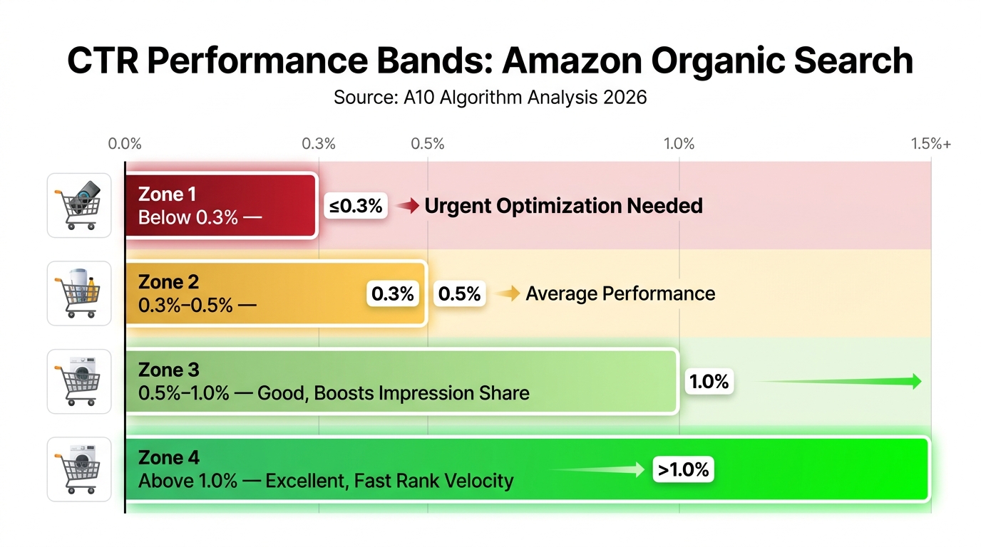
    In a marketplace where the average click-through rate sits between 0.4% and 0.6% and the difference between a 0.4% CTR and a 0.8% CTR represents double the organic traffic at identical advertising spend, the sellers who take image performance seriously — and measure it with the same rigor they apply to their PPC metrics — are the ones building durable, compounding advantages. SQP is your starting point. The image is your lever. The click efficiency ratio is how you know it’s working.
  • The Click-Gap Problem: A Diagnostic Framework for Turning Low-CTR Listings Into Click Magnets Through Image CRO

    The Click-Gap Problem: A Diagnostic Framework for Turning Low-CTR Listings Into Click Magnets Through Image CRO

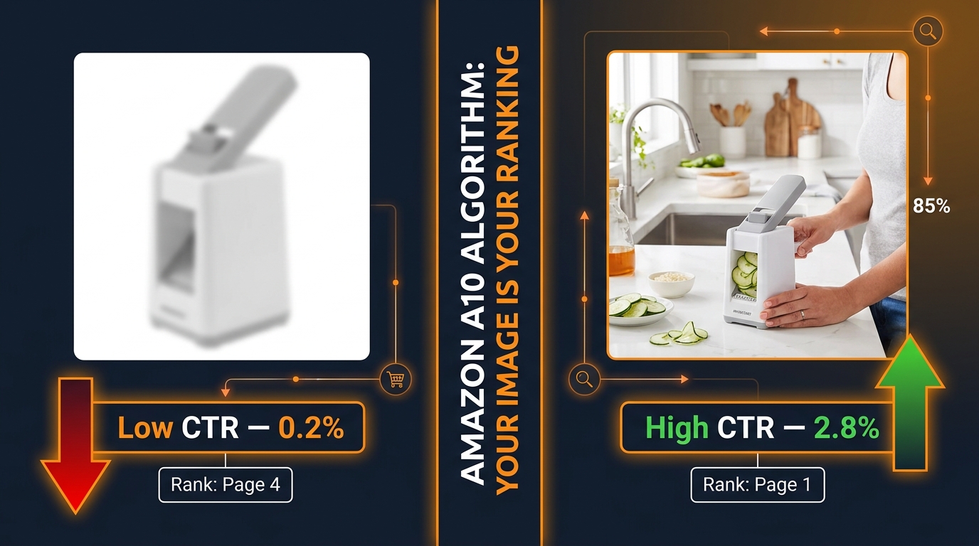
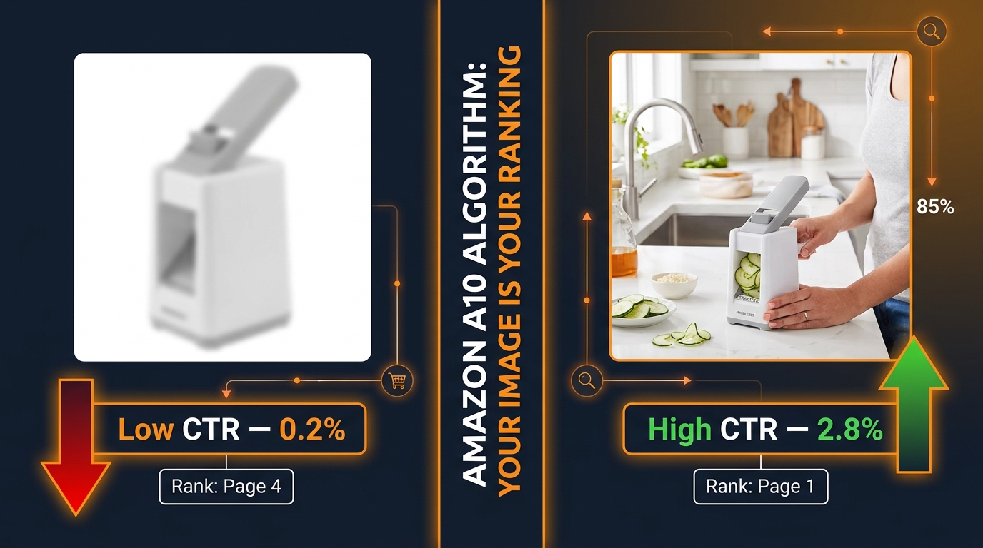
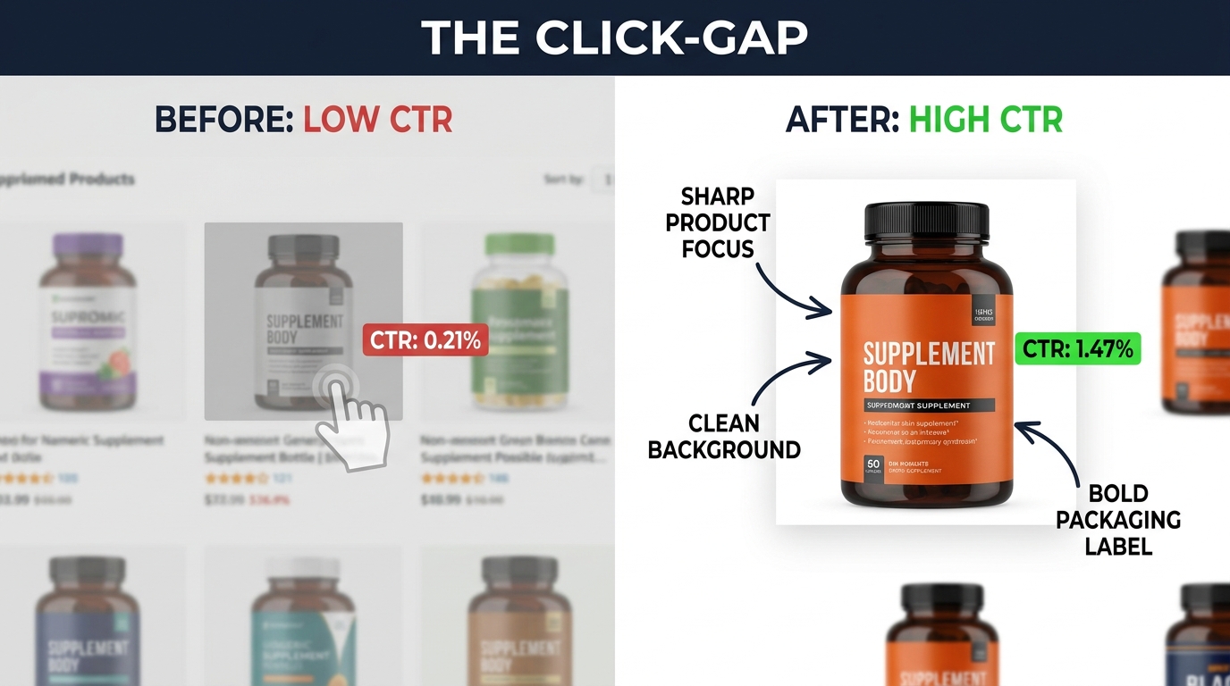
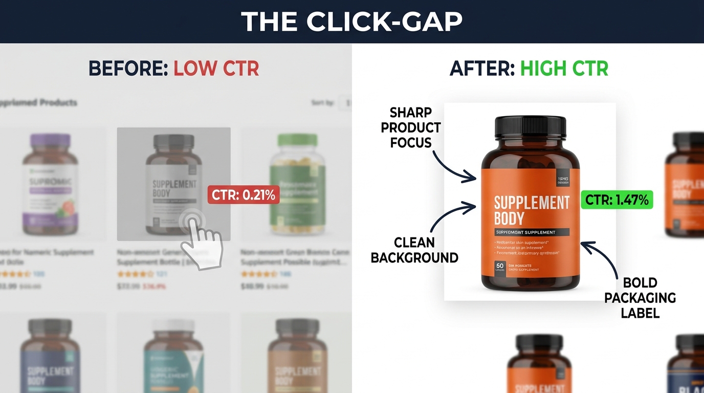
    Split-screen comparison showing a low-CTR product thumbnail at 0.21% versus an optimized image at 1.47% CTR, illustrating the click-gap problem in ecommerce listings

    You are generating thousands of impressions. Shoppers are seeing your products in search results, in sponsored placements, in category grids. And then almost none of them click.

    That gap — between being seen and being chosen — is the click-gap problem. It is one of the most expensive inefficiencies in ecommerce because you are paying for the traffic infrastructure (ads, SEO, catalog management) and getting almost none of the revenue it should produce. A listing sitting at 0.30% CTR on a high-intent keyword is not a ranking failure. It is a persuasion failure. And the persuasion happens almost entirely through your image.

    Most guides on this topic jump straight to image tips: use a white background, fill the frame, show the product in use. That advice is not wrong, but it skips the most important step — diagnosing why your CTR is low before touching a single pixel. The wrong image fix for the right problem can waste weeks of testing and thousands of dollars in traffic.

    This article builds a structured, diagnostic approach to image CRO for low-CTR listings. It starts with the question most sellers never ask (“Is it actually an image problem?”), moves through the visual psychology of the thumbnail, covers the specific anatomy decisions that separate high-CTR main images from average ones, and ends with a testing discipline rigorous enough to produce results you can trust — and replicate.

    The goal is not more clicks. It is more of the right clicks, from the right shoppers, who convert. There is a meaningful difference, and confusing the two is where most image CRO efforts fall apart.

    What “Low CTR” Is Actually Telling You — And What It Isn’t

    Before anything else, you need to be precise about what low CTR means in your specific context, because the signal is frequently misread. A CTR of 0.40% on a broad, low-intent keyword at position seven means something entirely different from a CTR of 0.40% on a high-intent, branded adjacent keyword at position two. Both look identical in an aggregate report. They are not the same problem.

    Benchmark Calibration: What Is Actually Low?

    Across Amazon’s advertising ecosystem in 2026, the average CTR for Sponsored Products sits between 0.34% and 0.58% depending on the category and placement type. Top-performing listings in competitive categories regularly exceed 1.0%, and outliers in well-optimized niches can push past 2.0%. On Google Shopping, the general ecommerce average hovers around 1.5–2.5% for products in strong positions.

    These numbers are not targets. They are orientation points. Your actual benchmark is your category’s median CTR at your average position — not the platform average. A kitchen appliance at 0.70% CTR in a category where the median is 0.50% is performing well, even though the absolute number looks unimpressive. A supplement at 0.70% CTR in a category where strong listings average 1.40% is significantly underperforming.

    The first act of image CRO is to pull this data and compare like-for-like. Segment by placement, keyword intent tier, and device before drawing any conclusions about what needs to change.

    Three Things Low CTR Might Mean (Only One Is an Image Problem)

    Low CTR typically points to one of three root causes, and only one of them is primarily solved through image optimization:

    • Position drag: Your listing appears at position eight or lower. At that depth in a search grid, even the best thumbnail gets limited attention. CTR drops sharply after position three on most marketplaces — not because the image is weak, but because scroll depth is shallow. Fixing the image here produces marginal gains. Fixing the rank produces material ones.
    • Intent mismatch: You are appearing for queries where shoppers are not yet ready to buy the specific product you sell. The listing gets impressions but the shopper’s mental model does not match your thumbnail — so they scroll past regardless of image quality. This is a keyword and listing strategy problem, not an image problem.
    • Visual appeal failure: Your listing is appearing in strong positions for well-matched queries and still losing clicks to competitors. This is where image CRO delivers the most direct value. The image is failing to compete at the moment of comparison.

    Treating every case of low CTR as a visual appeal failure — and rushing to redesign images — is one of the most common and costly mistakes in ecommerce CRO. Run the diagnostic before you run the experiment.

    The 4-Layer Diagnostic — Finding the Real Problem Before You Touch a Pixel

    Four-layer CTR diagnostic framework infographic showing how to identify root causes of low click-through rate before making any image changes

    A structured diagnostic prevents you from solving the wrong problem. The following four-layer framework, applied sequentially, will tell you exactly where to focus your effort before a single image is changed.

    Layer 1 — Query Intent Mapping

    Start by pulling your impression and CTR data segmented by keyword. Sort by impressions descending and look at the CTR for your highest-impression, lowest-CTR terms. Now classify those terms by intent stage: informational (what is X?), comparative (X vs Y, best X for Z), and transactional (buy X, X price, X discount).

    If your lowest-CTR impressions are clustering around informational and comparative queries, you have a targeting problem masquerading as an image problem. Your listing is being shown to shoppers who are not ready to click to buy — and no image redesign will change that. The fix is upstream: tighten your keyword strategy so your product appears in front of transactional intent.

    Layer 2 — Position Reality Check

    Next, segment CTR by average position. Pull data for keywords where your average position is above position four and compare CTR to those where you average below position five. The difference will typically be dramatic. Expected CTR for position one on Amazon Sponsored Products can be three to four times higher than position five for the same keyword.

    If the majority of your low-CTR impressions are at low positions, that is the lever to pull first. Bid adjustments, relevance improvements, and listing optimization that improves organic rank will generate more CTR recovery than any image work alone.

    Layer 3 — Competitive Visual Audit

    Now narrow to keywords where you have strong position (top three) but still underperform on CTR relative to category benchmarks. This is your image problem territory. Manually search those keywords and screenshot the results page. Look at your thumbnail in the context where shoppers actually see it — surrounded by competitors.

    Ask: Does your image pop or blend in? Is the product clearly visible at thumbnail size? Does your image communicate the product category instantly, or does it require mental effort to parse? Are competitors using trust cues (badge overlays, size call-outs, bundle shots) that you are not using?

    This competitive visual audit tells you what “winning” looks like in your specific context before you start generating hypotheses.

    Layer 4 — Trust Signal Inventory

    The final diagnostic layer looks at the non-image factors that appear alongside your thumbnail in search results: star rating, review count, price relative to competitors, shipping badge (Prime, fast delivery), and any promotional labels. A 3.8-star rating next to a 4.7-star competitor means your image has to work significantly harder to close the trust gap. If your price is 40% above the category median, that affects CTR regardless of image quality.

    These factors are not image CRO levers, but they set the context within which your image must operate. Knowing where they sit tells you how much weight the image alone needs to carry — and whether image optimization is sufficient or needs to be paired with other listing improvements.

    The Physics of the Thumbnail — How Visual Hierarchy Governs the First Click

    Eye-tracking heatmap on a mobile ecommerce search grid showing how high-contrast, frame-filling product thumbnails attract 2.3x more gaze time than cluttered or small-product images

    The click decision on a product thumbnail is not a deliberate choice in most cases. It happens in under two seconds, driven by pre-conscious visual processing before rational evaluation even begins. This is not metaphor — it is well-established visual cognition: the visual cortex processes low-level image features like size, contrast, and color in parallel, routing attention toward the most visually dominant element before slower cognitive systems have a chance to assess content.

    For ecommerce thumbnails, this means the battle for the click is largely won or lost on structural visual properties, not on design sophistication or production quality alone.

    The Four Structural Drivers of Visual Dominance

    Eye-tracking research across ecommerce and digital advertising contexts consistently identifies four image properties that determine which thumbnail in a grid captures attention first:

    1. Relative size of the primary subject. A product that fills 85–90% of the thumbnail frame commands more visual weight than one that fills 40–50%. This is one of the most consistent findings in thumbnail research, and one of the most frequently violated rules in product photography. Many sellers photograph products on large white backgrounds that leave enormous amounts of dead space — space that competitors use to fill the frame and win the attention competition.
    2. Edge contrast. The boundary between the product and its background needs to be visually sharp and high-contrast to pop in a crowded grid. A matte beige supplement bottle on an off-white background disappears. The same bottle photographed against pure white (or given a slight drop shadow to create edge separation) becomes instantly visible. The contrast of the product edge against its surround is a stronger CTR predictor than production polish.
    3. Color singularity. Thumbnails with one visually dominant color attract fixations faster than those with complex, multi-color compositions. This does not mean every product should use a single color scheme — it means the thumbnail should have one clear visual focal point from which the eye can then explore. Split compositions, multiple SKUs in a single shot, and complex backgrounds all fragment attention and reduce the click pull of any individual element.
    4. Human and face elements. Where relevant to the product category, including a human face or hand in the thumbnail significantly increases first-fixation rates. This is especially powerful for personal care, fitness, food, and lifestyle products. The visual system is tuned to detect faces and skin at very high speed — using this effect in product thumbnails can provide a substantial CTR advantage in categories where it is permitted and natural.

    The Thumbnail Is a Competition, Not a Canvas

    A critical shift in perspective: your thumbnail is not evaluated in isolation. It is evaluated in a grid, surrounded by competitor images, all competing for the same fixation. An image that looks elegant and professional in a design review can be completely invisible in the search results context it actually lives in.

    This means every image decision should be made with the competitive context in mind. When you do your competitive visual audit (Layer 3), look specifically at which thumbnails in the grid your eye lands on first. Then reverse-engineer the structural properties that made that happen. That is your optimization target.

    Hero Image Anatomy — What the Highest-CTR Main Images Have in Common

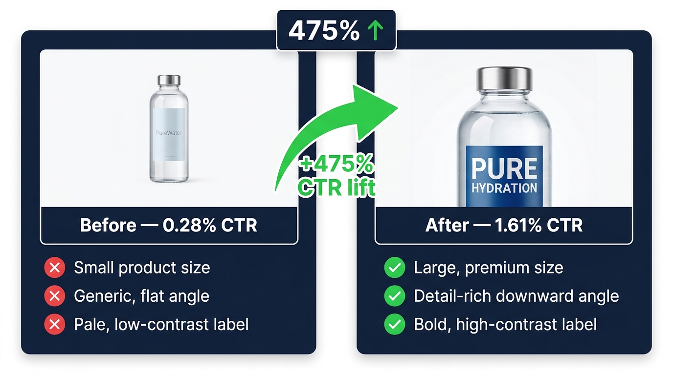
    Before-and-after product thumbnail comparison showing a water bottle with 0.28% CTR versus optimized version at 1.61% CTR, demonstrating hero image anatomy improvements

    Once the diagnostic confirms that your main image is the bottleneck, the next question is: what specifically needs to change? Across well-documented ecommerce tests, the highest-CTR main images share a consistent set of structural decisions. These are not aesthetic preferences — they are functional properties that each serve a specific role in the click decision.

    Frame Fill: The 85% Rule

    Industry testing data, supported by multiple agency-reported experiments, consistently points to products filling 80–90% of the image frame as a CTR-positive configuration. The practical target is approximately 85% fill on the main axis of the product (height for vertically-oriented products, width for horizontally-oriented ones).

    This is not about filling every pixel — it is about ensuring the product appears dominant within the thumbnail. When a product fills only 40–50% of the frame, the whitespace around it communicates absence rather than elegance. Shoppers reading a search grid quickly associate larger apparent product size with higher quality and greater confidence in what they are getting. The visual shortcut “bigger in thumbnail = more product for my money” is powerful and persistent.

    To achieve strong frame fill without violating marketplace guidelines (most require pure white backgrounds and no obscuring of the product), adjust the crop at photography or post-production stage rather than digitally enlarging a small source image. Low-resolution scaling degrades edge sharpness, which hurts the contrast properties that drive visual dominance.

    Angle and Dimensionality

    Flat, straight-on product shots are the default and the worst-performing configuration for most product categories. A slight three-quarter angle (typically 15–30 degrees from front-facing) adds perceived dimensionality to the product, communicates that it is a physical object with real-world depth, and makes the listing feel more informative — as though you are already showing the shopper more than competitors are.

    The specific optimal angle varies by category. For bottles and cylindrical packaging (supplements, beverages, personal care), a slight downward-angle three-quarter view shows the cap and label simultaneously — two trust elements in one image. For electronics, a three-quarter top-right perspective shows the front face, one side, and the top, maximizing the product information per image pixel. For apparel, in-use shots on a model (where permitted) consistently outperform flat lay because they answer the fit question that straight-on pack shots do not.

    Label and Packaging Legibility at Thumbnail Scale

    The main image on most marketplaces is displayed at 150–200 pixels wide in the search results grid on desktop, and even smaller on mobile. At these dimensions, a product label with fine print, complex design, and multiple typefaces becomes visual noise rather than a trust signal. The name recognition and category comprehension that your label is supposed to provide simply does not render at that resolution.

    High-CTR listings solve this by ensuring that at thumbnail scale, two things are legible: the product name (or brand name if it carries recognition) and the category signal (what kind of product this is). Everything else on the label is secondary, and it is acceptable — often preferable — to angle or frame the product so that the primary brand and category text is visible while secondary detail information is not the focus.

    Test your images at actual thumbnail display sizes before finalizing any main image decision. Download the competitor search grid screenshot at full resolution, paste your candidate image into it at the actual display size, and evaluate legibility and visual dominance in that context. This single step eliminates most bad decisions before they go live.

    Image Resolution as a Trust Signal

    Amazon’s current guideline requires a minimum of 1,000 pixels on the longest side to enable zoom functionality, but the practical standard for competitive listings is 1,600–2,000 pixels. High-resolution images that display crisply, even when a shopper zooms in, function as a proxy for product quality. The reasoning is intuitive: a brand that cares about the quality of its product photographs is signaling something about the care it takes with the product itself.

    More importantly, high-resolution source images allow you to crop aggressively in post-production to achieve better frame fill without introducing visible compression artifacts or blur. Shoot at higher resolution than you think you need, then crop to optimize the thumbnail — not the other way around.

    The Background Decision — White vs. Lifestyle and When Each Wins

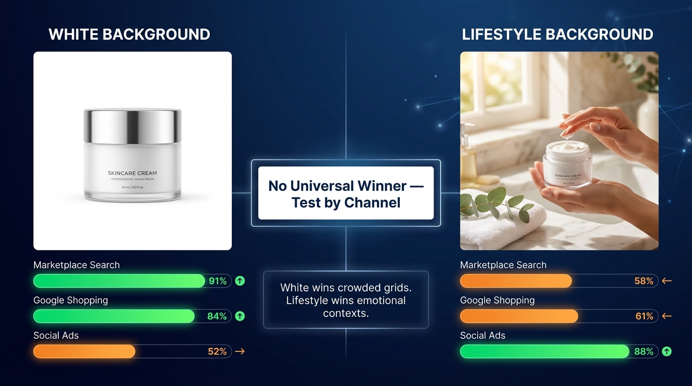
    Infographic comparing white background versus lifestyle background product image performance across marketplace search, Google Shopping, and social ads contexts

    One of the most debated questions in ecommerce image strategy is whether the main image background should be plain white or a contextual lifestyle scene. The answer most practitioners eventually arrive at is that it depends — but the factors that govern the decision are more specific than most guides acknowledge.

    Why White Typically Wins on Marketplace Search Grids

    In a marketplace search results grid, your product competes for attention against 15–20 other thumbnails simultaneously. Most of those thumbnails also use white backgrounds (because marketplace rules often require them). In this context, a white background does not make your image disappear — it places your product on the same visual “stage” as competitors and lets the product’s own shape, color, and edge properties do the competitive differentiation work.

    Data from marketplace testing consistently shows white-background listings generating 15–20% higher CTR in search grid contexts compared to colored or complex backgrounds when all other variables are held equal. The mechanism is that white reduces cognitive load: the shopper’s visual system does not need to parse a scene — it can immediately evaluate the product itself.

    There is also a compliance dimension. Most major marketplaces (Amazon, Walmart Marketplace, Zalando) require pure white or light neutral backgrounds for main images. Lifestyle images in the main image slot on these platforms are either prohibited or cause automated suppression risk. This limits the choice on marketplace channels — but it does not mean lifestyle imagery has no role in CTR optimization.

    When Lifestyle Backgrounds Win

    In social commerce contexts, display advertising, Google Shopping sponsored placements, and category-level browse experiences (rather than keyword-level search), lifestyle imagery frequently outperforms white-background photography on CTR. The mechanism shifts: in these contexts, the product is competing not just against other products but against all other content in the feed. An emotionally resonant lifestyle scene stops the scroll in a way that a product on a white background does not.

    The category of product also matters substantially. For high-consideration or emotionally driven purchases — furniture, fashion, fitness equipment, home decor, personal care — lifestyle context answers the key pre-click question (“Does this product fit my life?”) in a way that isolated product shots cannot. For utilitarian or functional purchases (office supplies, commodity hardware, replacement parts), lifestyle context adds cognitive overhead without adding relevant information, and white-background clarity wins.

    The Practical Resolution: Test by Channel, Not by Philosophy

    The most productive approach to the background debate is to treat it as a testable hypothesis rather than a settled decision. For marketplace main images, default to white unless your category’s top performers are consistently using lifestyle backgrounds (some categories — notably apparel — have evolved norms where model/lifestyle shots outperform studio shots even in search). For all off-marketplace placements, test lifestyle variants against white-background shots with statistical rigor, segmented by placement type.

    Do not apply the same creative decision to every channel just because it reduces production complexity. A brand that shoots a lifestyle variant for social and a white-background variant for marketplace search will, in most categories, meaningfully outperform one that uses the same image everywhere.

    Mobile-First Thumbnail Design — Engineering for the Screen That Drives Most of the Clicks

    Mobile accounts for more than 60% of ecommerce browsing traffic in 2026, and the figure skews even higher on social-driven discovery channels. Yet the majority of image optimization workflows are still conducted on desktop — where images look dramatically different from how they render on the device most shoppers are actually using. This is a structural gap in most brands’ image CRO programs.

    The Mobile Display Disadvantage

    On a standard Amazon mobile search result, the product thumbnail renders at approximately 160–180 pixels wide — roughly the width of a postage stamp on a modern smartphone screen. At this size, any product that fills less than 70% of the frame becomes difficult to identify with confidence. Labels with font sizes below approximately 24pt in the source image become unreadable. Complex compositions with multiple visual elements become indistinguishable noise.

    The mobile context also introduces scroll velocity: mobile shoppers browse faster and with less deliberate attention than desktop shoppers. The window in which your thumbnail needs to capture interest and communicate enough value to generate a click is compressed to under 1.5 seconds in a scrolling grid view. Every millisecond of visual complexity your image adds to the parsing task costs clicks.

    Designing for the Thumb-Stop Moment

    Mobile-optimized thumbnails share several properties that support quick identification and click motivation at small display sizes:

    • Vertical or square aspect ratio orientation. On mobile devices, the natural scroll direction is vertical, and the screen is portrait-oriented. Images that fill the vertical space of their thumbnail cell — typically square images that appear taller relative to their width in a grid — dominate the visual space more effectively than landscape-oriented or letterboxed compositions. If your product has a natural vertical orientation (bottles, boxes, standing figures), orient the image to maximize vertical fill.
    • Single focal point, no secondary competition. The mobile thumbnail is not the place to communicate multiple features. It has one job: get the click. That means one product, one dominant visual element, and as much whitespace reduction as the marketplace rules allow. Every additional element in the frame is a subtraction from the click-pull of the primary product.
    • Punchy color or high edge contrast for instant category identification. At thumbnail scale on mobile, the product needs to be immediately identifiable as what it is. Color is the fastest category signal available. If your product comes in multiple colors, choose the hero image variant that has the highest contrast against white — typically the most saturated or darkest color variant. The muted beige version may be your best-selling SKU, but the electric blue variant may generate significantly more initial clicks that then convert across all color options.
    • File optimization for fast mobile loading. A thumbnail that loads slowly loses clicks regardless of how compelling the image is. Target under 200KB for thumbnail-sized images served to mobile browsers. Use WebP format where the platform allows it, and serve appropriately sized image dimensions (a 2000px image scaled to 180px via CSS is downloading 10x the necessary data). Slow-loading product grids cause scroll continuation — shoppers scroll past rather than wait.

    The Mobile Test Protocol

    Before any image goes live, apply this simple mobile preview test: display your candidate image on an actual mobile device at the size it will appear in search results (screenshot a competitor’s search grid and overlay your image at the same scale). Evaluate it from arm’s length, not up close. The questions to ask: Can you identify the product category in under one second? Does the product appear prominent and confident, or small and tentative? Is there any label text that is attempting to communicate at a scale where it is unreadable?

    Run this test on iOS and Android, and on both high-resolution and standard-resolution displays, because the rendering quality varies and an image that looks sharp on a Retina display can appear noticeably softer on a lower-PPI screen.

    Secondary Image Strategy — Turning the Product Gallery Into a Conversion Engine

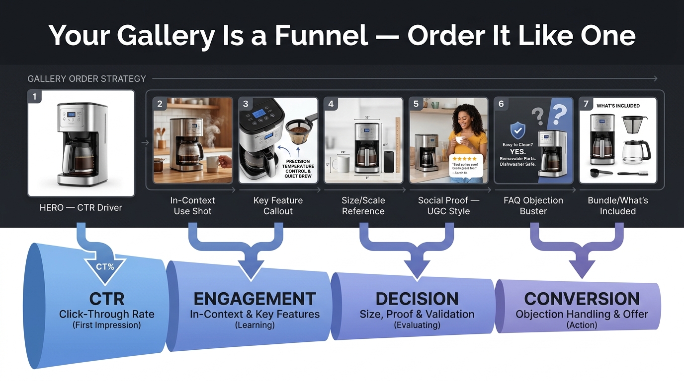
    Product gallery order strategy infographic showing 7 images sequenced as a funnel from CTR driver through engagement, decision, and conversion stages

    Most image CRO conversations focus almost entirely on the main image, which is understandable — it is the primary CTR driver. But there is a meaningful secondary effect that is frequently overlooked: on many platforms, the secondary images in a product gallery are partially visible in search results as thumbnail scrolls or additional slot previews, and they are always visible the moment a shopper lands on the product detail page. Getting secondary image strategy right is how you convert the clicks the main image generates.

    The Gallery Is a Funnel

    Think of the product image gallery not as a collection of product photos but as a structured persuasion sequence. Each image should answer the shopper’s next-most-pressing question in the order those questions naturally arise. The structure that consistently performs well across product categories follows this logic:

    1. Image 1 (Hero): Gets the click from search. Clean, high-contrast, frame-filling main image on white background. Its only job is to generate the click.
    2. Image 2 (In-Context Use): Answers “What does this actually look like when I use it?” Shows the product in a realistic lifestyle setting that your target buyer would recognize as their own life.
    3. Image 3 (Feature Callout): Highlights the most important differentiating feature or benefit with clear text overlay annotations. This is where your key claim — faster recovery, longer battery, softer material — gets visual proof rather than just a text bullet.
    4. Image 4 (Scale and Size Reference): Answers the dimension question before the shopper has to ask. Show the product next to a recognizable object (a hand, a standard household item, an identifiable landmark object) that makes the physical size immediately intuitive. This image alone removes one of the top reasons shoppers abandon product pages without adding to cart.
    5. Image 5 (Social Proof): A UGC-style or review-aesthetic shot that shows the product being used by real people, accompanied by a highlighted review or star rating graphic. Social proof at the image level lands faster than review text further down the page.
    6. Image 6 (Objection Buster): Pre-empts the most common concern or question that causes shoppers to leave without buying. For supplements: safety, ingredient quality, or certifications. For electronics: compatibility or warranty terms. For apparel: fit guidance or return policy. Make this visual and specific.
    7. Image 7 (What’s Included): Shows the complete package contents clearly. Buyers frequently question what comes in the box — an explicit flat-lay of all included components removes this uncertainty at a critical moment in the decision process.

    The Secondary Image CTR Effect

    On platforms that preview secondary images in the search grid (including some Amazon browse contexts, Walmart, and many direct-to-consumer platforms with hover-preview functionality), secondary image quality and relevance has a documented positive effect on CTR beyond the main image alone. Shoppers who hover or swipe to see additional images before clicking are exhibiting pre-click evaluation behavior — they are considering a deeper engagement before committing to the product page.

    For listings in this position, image 2 functions almost as a second hero image, and deserves equivalent production quality and strategic consideration. A compelling lifestyle shot as image 2 can convert a “maybe” hover into a committed click.

    The Testing Discipline — Running Image Experiments That Actually Tell You Something

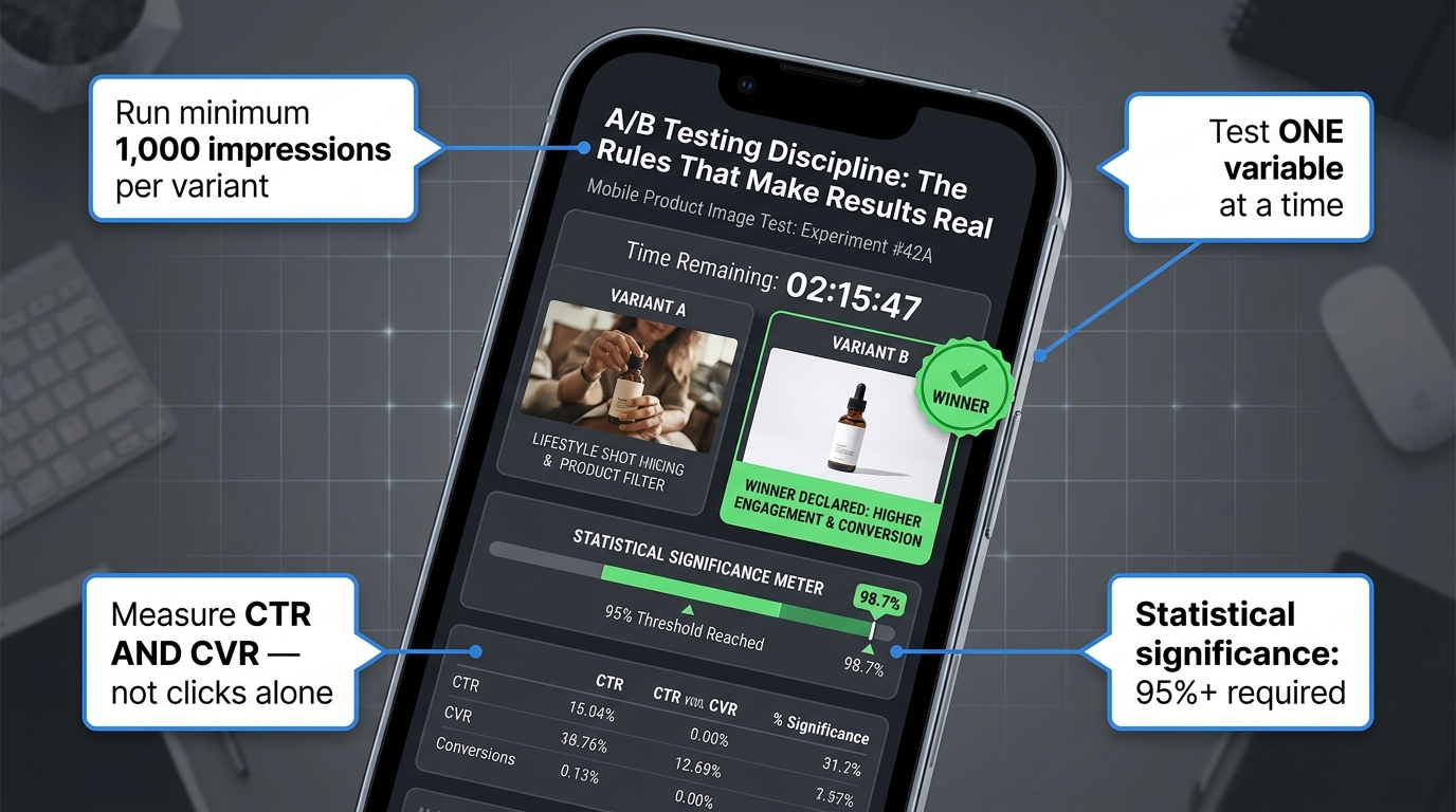
    A/B test dashboard on mobile showing image variants being tested with statistical significance meter reaching 95% confidence, with testing discipline annotations

    The difference between image CRO that compounds over time and image CRO that produces noise is almost entirely in the testing methodology. Most ecommerce brands run informal image “tests” — they update the main image, watch the numbers for a week, and conclude whether it worked. This approach produces false positives and false negatives in roughly equal measure, and the learning does not accumulate because the conditions were never controlled enough to be replicable.

    Image A/B testing in ecommerce is currently seeing a shift toward more rigorous statistical discipline, driven partly by the realization that many past “wins” were regression to the mean or seasonal effects rather than genuine image performance improvements.

    The Single Variable Principle

    Every image test should isolate one variable. Not “new image vs. old image” — that changes everything simultaneously (background, angle, crop, color, subject, composition) and tells you nothing about which specific change drove the result. Instead: same subject, same background, different crop (frame fill). Or: same crop, same background, different angle. Or: same product shot, with and without text overlay annotation.

    This feels slow. It is also the only way to build a knowledge base that transfers to future products and future tests. When you know that a three-quarter angle outperforms front-facing by 18% for your product category, that learning applies across your catalog. When you know that lifestyle-background image 2 outperforms studio-background image 2 for your category’s pre-click behavior, you can make that decision with confidence for new products without re-running the test.

    Sample Size and Duration Requirements

    Image tests fail to reach trustworthy conclusions most often because they are ended too early. The minimum viable sample for an image CTR test is approximately 1,000 impressions per variant, at a minimum, and realistically 2,000–5,000 impressions per variant for low-CTR listings where the absolute click numbers will be small. For statistical significance at the 95% confidence level (the standard threshold for actionable decisions), lower-traffic listings may need to run tests for three to six weeks.

    The practical implication: prioritize your image testing resources toward your highest-traffic listings first. A 15% CTR improvement on a listing receiving 100,000 monthly impressions generates far more incremental clicks and revenue than a 25% CTR improvement on a listing receiving 5,000 impressions. Build your test queue in traffic priority order.

    The Right Success Metrics

    CTR alone is a dangerously incomplete success metric for image tests. It is possible — and more common than most sellers realize — to increase CTR while simultaneously decreasing conversion rate, resulting in higher traffic costs and lower revenue. This happens when an image change attracts curious clicks from shoppers who are not genuinely intent-matched to the product.

    The complete measurement stack for an image test should include:

    • Primary: CTR (from search/ad impressions to product page)
    • Secondary: Conversion rate (from product page to add-to-cart and purchase)
    • Business metric: Revenue per thousand impressions (RPM) or revenue per visitor (RPV)

    A winning image test produces CTR gains without significant CVR degradation — ideally it improves both. If your image change increases CTR by 20% but decreases CVR by 15%, the net effect on revenue is minimal and the test result should be treated as a failed experiment, not a success. The shopper you attracted with the new image was a different shopper from the one your product is actually suited to serve.

    Testing Velocity and the Compounding Learning Effect

    The brands that pull the furthest ahead on image CRO are not those that run the most sophisticated individual tests — they are the ones that run the most tests, period. A disciplined program running two to three image tests per month per product line, each following the single-variable protocol and reaching statistical significance, generates a compounding library of category-specific image knowledge that translates directly to new product launches.

    Build a test log: record every test, every variable, every result, every significance level, and every device and placement segment. After twelve months of this discipline, you will have a set of image principles specific to your category that no competitor who is not running the same discipline can easily replicate. That is a durable competitive advantage.

    Packaging Labels as Micro-Ads — Making Your Product Communicate at Thumbnail Scale

    For products where the packaging label is visible in the main image — supplements, food and beverage, personal care, household goods, cosmetics — the label is one of the most consistently underutilized CTR levers available. Most brands treat label design as a brand identity exercise conducted entirely at print resolution, with no consideration for how the label reads and communicates at 160 pixels wide on a mobile device.

    The Thumbnail Legibility Standard

    At thumbnail display sizes, only two to three elements of any product label will be legible. Every other element becomes visual texture at best, unresolvable noise at worst. The question for image CRO is: which two or three elements are most likely to generate a click if a shopper can read them?

    In most categories, the answer follows this hierarchy: first, the product category identifier (what this product is — “Vitamin C,” “Protein Powder,” “Moisturizer”); second, the primary claim or differentiation (“1000mg,” “Plant-Based,” “SPF 50”); third, the brand name if it carries category recognition.

    Evaluate your current main image at 160px width. Identify which of these three elements are currently readable. For most listings, the answer is: none of them with confidence. The label design that looks elegant in a brand style guide frequently fails entirely as a communication vehicle at marketplace thumbnail scale.

    Label-to-Image Orientation Optimization

    One of the highest-leverage, lowest-cost image improvements available to many physical product sellers is simply re-orienting the product in the photograph so that the primary claim text on the label faces the camera more directly, at an angle and size that makes it legible at thumbnail scale.

    This does not require a full reshoot in many cases. If the product is cylindrical (a supplement bottle, a beverage can, a spray), rotating the product 20–30 degrees to bring the primary label text more perpendicular to the camera can dramatically improve label legibility without changing the overall composition. The product still sits on a white background at the same frame fill — but the shopper can now read “Vitamin C 1000mg” from the search grid thumbnail, which answers a key selection criterion before the click even happens.

    Products where the label is positioned to face the front of the shot, at the maximum scale that the image resolution supports, consistently outperform competing listings where the label is angled away or positioned as a secondary element in the composition. The label is not just a design element — it is your product’s on-shelf sales message, functioning as a micro-advertisement every time a shopper scans the search results.

    Text Overlay as a Label Supplement

    On marketplaces and channels where text overlays on product images are permitted (secondary images on Amazon, most direct-to-consumer platforms, Google Shopping, social commerce), a small, clean text callout in the main or secondary image can supplement what the label cannot communicate at thumbnail scale. A simple “1000mg” badge or “3-Pack Value” indicator positioned in a corner of the image answers a decision criterion before the click, pre-qualifying the shopper and improving the match between who clicks and who converts.

    Keep overlay text minimal, high-contrast (white or near-white text on a dark background rectangle, or vice versa), and positioned so it does not overlap the product itself. Overlays that compete visually with the product reduce rather than enhance the image’s effectiveness.

    The CTR-to-CVR Bridge — Avoiding the Click Gains That Hurt Revenue

    There is a seductive but dangerous simplification in image CRO: treating click-through rate as the objective function. Optimizing purely for clicks, without integrating the downstream conversion analysis, produces a specific failure mode that is both common and financially damaging: you attract more clicks from less qualified shoppers, your conversion rate drops, your advertising cost per sale increases, and your overall profitability worsens — even as your CTR dashboard shows a green line pointing up.

    Image Honesty as a Conversion Principle

    The most durable CTR improvements come from images that attract more of the right shoppers, not simply more shoppers. An image that accurately represents the product’s size, color, texture, and use context while being visually compelling in the search grid will produce clicks from shoppers who are genuinely interested in what the product actually is. These clicks convert at higher rates, return at lower rates, and leave better reviews.

    Conversely, an image that is manipulated to look more impressive than the product actually is — artificially color-saturated, showing a lifestyle context that overstates the product’s prestige, or cropped to obscure size information — can generate higher CTR in the short term while producing elevated return rates, lower conversion, and review profiles that erode future CTR performance as the star rating drops.

    This is the bridge between CTR and CVR: image authenticity. The image should be optimized to be as visually compelling as the actual product genuinely is — not more so. Within that constraint, every structural improvement (better frame fill, stronger contrast, clearer label communication) is a legitimate and sustainable CTR lever.

    Reading the Funnel After an Image Change

    Every time an image test produces a CTR winner, the analysis should not stop at CTR. Allow at least two weeks of post-change data to accumulate, then evaluate the complete funnel: impressions → clicks → add-to-cart rate → purchase conversion rate → return rate (where trackable). A successful image change produces CTR gains accompanied by stable or improving downstream metrics. CTR gains accompanied by CVR degradation of more than 5–10% relative should be investigated before being declared a success.

    The practical implementation requires that your test tracking captures downstream conversions, not just clicks. On Amazon, the Search Query Performance report and the Advertising console together provide enough data to evaluate this funnel for ad-driven traffic. For organic traffic, Brand Analytics (available to brand-registered sellers) provides search-to-click and click-to-purchase data segmented by ASIN.

    Building the Feedback Loop

    The most sophisticated image CRO programs create a feedback loop between image performance data and product development. When an image test reveals that a particular feature callout (say, “dishwasher-safe” shown visually in image 3) produces material CVR improvements, that information should flow back to the product team as evidence that this feature is a key purchase driver — and potentially warrant more prominent placement on physical packaging, more prominent mention in the product title, and higher production investment in communicating it visually across all formats.

    Images are the customer research medium most ecommerce brands are not using. What shoppers respond to in image tests tells you what they care about — at a level of specificity that surveys and focus groups rarely achieve because the decision is revealed by behavior, not stated preference.

    Building a Repeatable Image CRO System — From One-Off Fixes to Compounding Advantage

    The individual tactics covered in this article — frame fill, angle optimization, background selection, label legibility, mobile preview testing, gallery sequencing, statistical discipline — each deliver value as standalone improvements. But the brands that generate sustained, compounding CTR improvement treat image CRO as a system, not a project.

    The Four Pillars of a Sustainable Image CRO Program

    A repeatable image CRO system rests on four organizational pillars that work in combination:

    1. Ongoing Competitive Monitoring. The competitive context of your thumbnail changes continuously as new sellers enter, incumbents optimize, and seasonal changes shift the visual landscape. Schedule a quarterly competitive visual audit for your top-selling keywords — screenshot the results grid, evaluate where your thumbnail stands, and identify if the competitive standard has shifted since your last optimization. What was visually dominant in January may be table stakes by September.

    2. A Structured Test Calendar. Image testing without a calendar defaults to reactive testing — you change images when something looks broken rather than systematically improving what is already working. A structured calendar allocates testing capacity across your product catalog in priority order (traffic volume, margin contribution, strategic importance) and schedules specific variable tests rather than general “image updates.” Two to three tests per month per priority product is a sustainable pace for most ecommerce organizations.

    3. A Knowledge Repository. Record every test result: the hypothesis, the variant, the sample size, the result, the confidence level, the device segmentation, and the downstream CVR impact. Over time, this repository becomes a category-specific image intelligence asset that accelerates new product launch decisions and prevents re-testing variables that have already been resolved. It is also the documentation you need if image CRO responsibilities ever change hands within your organization.

    4. Cross-Channel Image Governance. Establish a rule that requires channel-appropriate image variants rather than universal image application. Marketplace main image (white background, high fill, label-forward). Marketplace secondary images (structured funnel sequence). Social commerce (lifestyle-first, UGC-adjacent). Display advertising (feature-callout forward, with text overlay). Implementing this governance reduces the frequency of channel-mismatched creative decisions that look fine in review but underperform in their actual deployment environment.

    The Compounding Advantage Explained

    CTR improvement compounds in a way that is often underappreciated. On most marketplace advertising platforms, CTR is a direct input into the relevance score that determines your organic and paid ranking. A listing that achieves a higher CTR gets shown more frequently for the same budget, receives a ranking signal boost that pushes it higher in organic results, and then generates even more impressions — which give it more statistical power for further image tests.

    The relationship is not linear. A 30% CTR improvement does not simply produce 30% more clicks. It produces better ranking, more impressions, higher organic visibility, and often a lower cost-per-click on advertising because the platform rewards higher-CTR creative with better placement efficiency. Over six to twelve months of compounding, a disciplined image CRO program can fundamentally shift the economics of a product’s presence on a marketplace — not because any single image change was dramatic, but because each incremental improvement built on the last.

    Actionable Starting Points

    If you are at the beginning of this process, the most efficient starting sequence is:

    1. Run the four-layer diagnostic on your five highest-impression, lowest-CTR listings. Confirm which ones have a genuine image problem before touching anything.
    2. For confirmed image problems: conduct a competitive visual audit at actual thumbnail size on a mobile device. Document what the CTR leaders are doing structurally that you are not.
    3. Identify the single highest-impact variable to test first (usually frame fill or angle for most physical product categories).
    4. Set up the test with proper sample size planning, run to statistical significance, measure the full funnel (CTR + CVR + RPM), and log the result.
    5. Roll out the winner, then identify the next variable. Repeat.

    Image CRO is not about finding a perfect configuration that permanently fixes a listing. It is about building the organizational practice of treating your product images as living performance assets — tested, measured, improved, and adapted to a competitive landscape that never stands still. The brands that do this consistently do not need perfect images on day one. They need a system that makes each week’s images better than last week’s.

    That system, applied with diagnostic rigor and statistical discipline, is how low-CTR listings become click magnets — and stay that way.

  • How Amazon’s A10 Algorithm Reads Your Images — And What That Means for Ranking Velocity

    How Amazon’s A10 Algorithm Reads Your Images — And What That Means for Ranking Velocity

    Amazon A10 algorithm image CTR ranking velocity split-screen comparison showing low CTR rank page 4 vs high CTR rank page 1

    Most Amazon sellers understand, at least in theory, that better images lead to better conversions. What far fewer sellers understand is the precise mechanism by which a single image update can trigger a cascading improvement in organic rank — not over months, but sometimes within days.

    The Amazon A10 algorithm doesn’t evaluate your listing the way a human reviewer might. It doesn’t appreciate your brand story or recognize the craftsmanship in your photography. What it does track, with remarkable granularity, is behavioral data: how often shoppers click your listing when it appears in search results, how long they stay, whether they zoom into images, how far they scroll through your image stack, and ultimately whether they buy. Every one of those behaviors feeds a signal. And the signal chain starts with your main image.

    This piece is not about image “best practices” in a generic sense. It’s specifically about the relationship between image CTR signals and ranking velocity — the speed at which a listing climbs or falls in organic search position. Understanding this relationship changes how you should think about photography budgets, split testing priorities, image slot strategy, and even how you interpret your PPC data.

    We’ll cover the mechanics of the A10 algorithm’s CTR weighting, real benchmark data for what strong CTR actually looks like, the compounding loop that turns a higher click-through rate into accelerated rank gains, and a practical framework for auditing and improving your image stack from slot one through seven. By the end, you’ll have a precise mental model for why images are not just a conversion tool — they are your primary ranking lever.

    How the A10 Algorithm Changed the CTR Equation

    Infographic comparing Amazon A9 vs A10 algorithm ranking factors showing shift from ad spend and keywords to organic CTR and behavioral signals

    To understand why image CTR carries more weight today than it did three years ago, you need to understand what changed between the A9 and A10 algorithm frameworks.

    The A9 Era: Advertising as a Shortcut to Rank

    Under Amazon’s previous A9 algorithm, the primary ranking inputs were relatively straightforward: keyword relevance, sales velocity, and advertising spend. Sellers who spent heavily on Sponsored Products could manufacture the sales signals the algorithm needed to push listings up the page. PPC was, in many ways, a direct substitute for organic relevance. If you could afford to pay for enough clicks and conversions, the algorithm would reward your listing with organic visibility — regardless of whether your product or listing was genuinely the best fit for that search query.

    CTR mattered under A9, but it was downstream of ad spend. If you were paying for impressions, some clicks would follow. The algorithm was not specifically rewarding listings that earned disproportionately high click-through rates; it was primarily rewarding those that generated consistent sales volume at target keyword positions.

    The A10 Shift: CTR Becomes a Direct Input

    The A10 algorithm introduced CTR as an independent ranking signal rather than a byproduct of ad spend. This is a meaningful distinction. Under A10, the algorithm now evaluates how often your listing gets clicked relative to how often it’s shown — across both paid and organic placements. A listing that earns a higher-than-expected click-through rate on a given keyword signals to Amazon that it is a more relevant and compelling result. The algorithm responds by increasing impression share for that listing, which compounds into more opportunities to generate clicks, which feeds more sales velocity.

    According to analysis of the A10 framework, this shift was deliberately designed to reduce the pay-to-rank dynamic that had frustrated both sellers and customers. Amazon’s business model benefits from shoppers finding exactly what they want quickly — and CTR, when stripped of paid manipulation, is a useful proxy for genuine product-search relevance.

    The practical implications of this shift are significant. Under A9, a seller with a mediocre main image but a large PPC budget could still rank competitively. Under A10, that same seller will see their paid traffic convert at lower rates, their organic impression share erode, and their cost-per-click increase as Amazon’s system deprioritizes lower-engagement listings. The image quality problem that ad spend used to paper over now becomes a structural ranking liability.

    Other A10 Ranking Factors in Context

    It’s worth placing CTR within the full hierarchy of A10 ranking factors to understand its relative weight. Conversion rate remains the single most heavily weighted signal — estimated at 35–40% of the algorithm’s ranking consideration. Sales velocity is the second pillar: consistent, organic unit velocity over 1, 3, 7, 15, and 30-day rolling windows. CTR is the third major signal, with A10 weighting it measurably higher than A9 did. Rounding out the key factors are keyword relevance, seller authority (return rate, customer satisfaction, order defect rate), and external traffic quality.

    The reason CTR punches above its apparent weight is positional: it is the upstream signal that makes everything else possible. You cannot generate conversion rate data without first generating clicks. You cannot build sales velocity without conversions. CTR is the entry gate to the entire algorithm loop — and your main image is what determines whether most shoppers walk through that gate or keep scrolling.

    The Mechanics of CTR — Benchmarks, Signals, and What “Good” Actually Looks Like

    Amazon CTR benchmark zones infographic showing performance bands from below 0.3% urgent to above 1.0% excellent with ranking implications

    Before optimizing for CTR, sellers need a clear picture of what the numbers actually mean — and what the algorithm is looking for at each performance tier.

    Understanding the CTR Formula

    CTR is straightforward in calculation: (Total Clicks ÷ Total Impressions) × 100. A listing that receives 1,000 impressions and generates 15 clicks has a 1.5% CTR. What makes this number interesting on Amazon is not the raw percentage but how it compares to category averages and competitor performance on the same search terms.

    The algorithm doesn’t evaluate your CTR in isolation. It evaluates it relative to other listings that appear for the same queries. If the average CTR for your main keyword cluster is 0.4% and your listing is producing 0.9%, the algorithm interprets that delta as a strong relevance signal — your listing is resonating with shoppers beyond what baseline expectations would predict. This relative performance is what triggers impression share increases.

    CTR Performance Bands and Their Ranking Consequences

    Based on analysis of the A10 environment in 2026, the following performance bands have emerged as meaningful thresholds:

    • Below 0.3%: Poor performance that actively erodes rankings. At this level, the algorithm interprets your listing as a poor fit for its current search positions and begins reducing impression share. Sellers in this band typically see organic positions drift backward even with consistent PPC spend.
    • 0.3%–0.5%: Average performance. The algorithm treats these listings neutrally — neither rewarding nor penalizing them disproportionately. Rankings remain relatively stable but are unlikely to improve organically without intervention.
    • 0.5%–0.8%: Good performance that begins to actively compound. At this level, the algorithm starts increasing impression share in response to the above-average engagement signal. Organic rank velocity picks up, particularly for mid-tail keywords.
    • Above 1.0%: Excellent performance that triggers accelerated rank gains. Listings hitting this threshold on competitive head terms often see dramatic position improvements within 2–4 weeks. Some case studies report CTR jumps from the 9–10% range on specific product types after significant image optimization.

    For context: a whey protein seller who added clear labeling (flavor and protein count) to their main image packaging saw CTR jump from 9.3% to 17.5% — a near doubling on their primary keyword. This kind of jump is extreme, but it illustrates how a single visual change can shatter the baseline when the previous image was failing to communicate essential decision-making information.

    What the Algorithm Is Actually Detecting

    It’s tempting to think of CTR as a simple binary signal — clicked or not. The A10 algorithm is more nuanced than that. It also tracks behavioral depth signals that accompany clicks. These include zoom interactions (how many shoppers zoom into your main image), scroll depth through your full image stack, and dwell time on the product detail page. A listing that generates a high CTR but then sees shoppers immediately bounce back to search results is providing a mixed signal. The algorithm interprets this as “compelling enough to click, but not what the shopper expected.”

    This is why image stack coherence matters: the main image earns the click, but images 2 through 7 need to hold the shopper, answer their questions, and build toward conversion. A disconnect between the main image’s promise and the secondary images’ delivery creates a CTR-without-conversion pattern that the algorithm penalizes over time.

    Main Image Architecture — The Technical Specs That Control First Impressions

    The main image is the single most consequential creative asset on an Amazon listing. It renders in search results at thumbnail size, fills 85–90% of a mobile viewport above the fold on the product detail page, and drives more click decisions than any other listing element — including title, price, and review count, according to Feedvisor’s analysis of A10 ranking signals.

    The Non-Negotiable Technical Baseline

    Amazon’s image requirements for main images are strict and consequential: pure white background (RGB 255, 255, 255), product filling at least 85% of the frame, and minimum 1,000 pixels on the longest side to enable the zoom function. These aren’t arbitrary aesthetic preferences — they directly affect algorithmic performance.

    The zoom function deserves particular attention. When your image is below the 1,000-pixel threshold, Amazon’s zoom feature is disabled. This doesn’t just reduce the shopping experience; it removes a behavioral engagement signal that the A10 algorithm actively tracks. Shoppers who zoom in are demonstrating deep product interest. When that signal is absent from your listing, you’re missing one of the behavioral data points the algorithm uses to measure listing quality. The recommended resolution in 2026 is 2,000 × 2,000 pixels for square images or 2,000 × 2,500 pixels for vertical 4:5 ratio formats optimized for mobile displays.

    Frame Fill and Product Dominance

    The 85% frame-fill requirement isn’t just a policy compliance item — it’s a CTR lever. A product that dominates its image frame communicates confidence and visual clarity. When a product is small, centered in a sea of white, shoppers subconsciously register it as less significant or lower quality. At thumbnail size, a product that fills the frame is simply more visible and easier to evaluate at a glance.

    For products with complex shapes or multiple components, this means intentional composition decisions. A supplement bottle photographed at a slight angle, tilted forward, filling the frame edge-to-edge communicates very differently than the same bottle photographed straight-on at 50% frame fill. The first image competes aggressively in search results. The second disappears.

    What You Cannot Do — and the Risk of Suppression

    Amazon’s main image policy prohibits text overlays, logos, lifestyle backgrounds, borders, watermarks, and accessories that don’t come with the product. These restrictions exist specifically on the main image (slots 2–7 have more flexibility, which we’ll cover). Violations risk automatic listing suppression — not just a policy flag but an active removal from search results.

    The suppression risk is worth taking seriously. Amazon’s image recognition systems have become significantly more capable at detecting non-compliant main images, and suppressed listings generate zero impressions, zero CTR data, and zero sales velocity. Every day a listing is suppressed is a day the algorithm is receiving negative signals about that ASIN’s reliability.

    The Psychology of the First Frame

    Beyond technical compliance, the main image needs to answer one question in under 300 milliseconds: Is this what I’m looking for? That answer depends on category context. In some categories (kitchen appliances, supplements, electronics), showing the product in its most recognizable form — the packaging or primary use view — is the right call. In other categories (apparel, outdoor gear, home décor), a lifestyle-adjacent main image that communicates the product’s end state can dramatically outperform a clinical studio shot, even within the white background constraint.

    The angle, the lighting, the product’s orientation within the frame — all of these are CTR variables. A supplement brand that tested three different main image angles using Amazon’s Manage Your Experiments found that a slightly overhead angled shot showing the bottle’s label clearly outperformed a straight-on shot by enough to shift the listing two positions on its primary keyword within three weeks of the winning version going live.

    The CTR-to-Ranking Velocity Loop — How a Single Click-Through Win Compounds

    Amazon CTR ranking velocity compounding loop diagram showing virtuous cycle from better image to higher CTR to more impressions to sales velocity to higher organic rank

    The phrase “ranking velocity” refers to the speed at which a listing moves up or down organic search positions — not just whether it eventually reaches page one, but how quickly the algorithm responds to performance signals. Understanding this velocity mechanism explains why image optimization often produces faster results than other listing changes.

    Why CTR Has Outsized Velocity Effects

    When you improve your main image and CTR rises, the algorithm doesn’t just log a single positive data point. It recalibrates your listing’s impression share across all associated search terms. This means the listing gets shown to more shoppers, which generates more absolute clicks even at the same percentage rate, which produces more conversion opportunities, which builds sales velocity, which is itself one of the algorithm’s heaviest-weighted signals.

    The compounding math is striking. A 1% improvement in conversion rate — plausible from a better image stack that reduces buyer uncertainty — has been documented to double organic traffic within six months through this self-reinforcing loop. The mechanism works as follows: higher CTR → more impressions → more conversions → higher sales velocity → improved organic rank → higher search position → higher CTR from better placement → cycle repeats.

    The Impression Share Mechanic

    Impression share is one of the least-discussed but most important outputs of strong CTR performance. Amazon doesn’t show every eligible listing to every shopper for every relevant search. It makes triage decisions about which listings to surface, partly based on which ones it predicts will generate the most engagement and revenue per impression. A listing with a history of above-average CTR gets preferential treatment in this triage — it gets shown more frequently and in better positions.

    This creates an asymmetry between listings competing for the same keywords. Two sellers in the same category with similar review counts and similar pricing can have dramatically different impression volumes simply because one has consistently earned higher CTR. The algorithm is essentially betting on the higher-CTR listing to generate more revenue per search result slot, and it acts on that bet by allocating more impressions to it.

    Ranking Velocity vs. Ranking Position

    It’s important to distinguish between velocity (the rate of change in rank) and position (where you currently rank). A listing can occupy page two on a keyword and have very high velocity — meaning the algorithm is actively promoting it and it will likely reach page one quickly if the behavioral signals continue. Conversely, a listing can hold page one but have declining velocity — meaning the algorithm is quietly reducing its impression share and it will drift back if performance doesn’t improve.

    Image-driven CTR improvements primarily affect velocity. When you lift CTR, you accelerate the rate at which the algorithm promotes your listing. This is why sellers who have invested in strong images often report rapid rank jumps — sometimes 5–10 position gains within 2–4 weeks of an image update — rather than the slow incremental progress associated with keyword optimization.

    The Sales Velocity Flywheel

    Sales velocity is calculated across multiple time windows (1, 3, 7, 15, and 30 days), with more recent performance weighted more heavily. This recency bias in the algorithm means that a significant CTR improvement triggers a cascade effect: higher CTR produces more daily sales, which immediately elevates the 1-day and 3-day velocity signals, which shifts the algorithm’s ranking decision within days rather than weeks. The flywheel effect means early gains compound quickly, which is why image optimization ROI often looks remarkable when measured against the investment.

    Data from the Emplicit case study for SteadyStraps illustrates this: upgrading product images to above 1,600 pixels resolution and adding close-up and lifestyle shots lifted page views by 227.7%, sessions by 103.9%, and units ordered by 12.5% within two months. That session and view growth represents both the CTR gain (more shoppers clicking into the listing) and the velocity impact (more transactions feeding the algorithm’s confidence in the listing’s relevance).

    Secondary Images as Conversion Architects (Slots 2–7 Decoded)

    Amazon 7-slot image architecture infographic showing purpose of each image position from hero main image to social proof slot

    The main image earns the click. Secondary images (slots 2 through 7) earn the conversion. But they also earn the dwell time and scroll-through engagement signals that the A10 algorithm uses to assess listing quality beyond the initial click. The strategic architecture of your secondary image stack is not a creative preference — it’s an algorithmic input.

    Why All Seven Slots Matter

    Many sellers treat slots 2–4 as primary and leave 5–7 either empty or filled with low-quality backup images. This is a significant missed opportunity. The A10 algorithm tracks scroll-through depth on the image stack. Shoppers who scroll through all seven images demonstrate higher purchase intent and generate stronger behavioral engagement signals than those who stop at image two or three. A listing that consistently generates full-stack scroll engagement gets credit for that deep engagement in the algorithm’s listing quality assessment.

    Beyond the algorithmic credit, filling all seven slots strategically reduces the purchase objections that cause shoppers to exit the listing to look for more information. Every time a shopper leaves to search for answers about dimensions, materials, included accessories, or usage instructions, you’re generating a bounce signal that the algorithm interprets negatively — and you’re risking losing that shopper to a competitor whose listing answered their questions more completely.

    The Functional Architecture of Each Slot

    A structured approach to secondary images treats each slot as a specific job in the purchase journey:

    • Slot 2 — The Lifestyle Anchor: Place the product in context of use. This image does emotional work — it helps the shopper visualize the product in their life. For a kitchen appliance, this means a real kitchen environment. For a fitness product, an in-use action shot. Lifestyle images extend dwell time and reduce bounce by creating an emotional connection that pure product photography cannot achieve.
    • Slot 3 — The Key Feature Callout: A close-up or annotated image that highlights the product’s single most important differentiating feature. Use clear, readable text callouts. This image should answer the question: “What makes this product worth choosing over the alternatives?”
    • Slot 4 — Scale and Dimensions: Size confusion is one of the leading causes of negative reviews and returns on Amazon. An image that shows the product alongside a familiar object (a hand, a common household item, a measuring tape) resolves this objection visually. Returned items generate negative velocity signals; preventing returns through clear communication protects algorithmic standing.
    • Slot 5 — The Infographic: A data-dense image that answers specification questions: materials, dimensions, included accessories, certifications, usage instructions. This is the slot where infographic-style design earns its 30–40% conversion premium. Shoppers who need this information and find it in the image stack convert at dramatically higher rates than those who have to search for it in the bullet points.
    • Slot 6 — Problem/Solution Framing: An image that explicitly connects the product to the problem it solves. This is especially valuable for health, wellness, organizational, and home improvement products. “Before/after” compositions, pain-point callouts, or before-the-product vs. with-the-product comparisons do strong conversion work here.
    • Slot 7 — Trust Builder: Social proof imagery, user-generated content aesthetics, badge callouts (certifications, guarantees, compatibility claims), or a brand confidence statement. This final image should reduce any remaining purchase risk in the shopper’s mind.

    Text in Secondary Images: Mobile Readability Rules

    Since 67–80% of Amazon traffic originates from mobile devices in 2026, text legibility in secondary images is a functional requirement, not a design preference. The practical test is the “squint test”: reduce your secondary image to thumbnail size on a smartphone screen and determine whether the text callouts remain readable without zooming. If the text requires zooming to read, a significant portion of mobile shoppers will never see it — and those are the shoppers who most needed that information to convert.

    Practical guidelines for secondary image text: minimum 24pt equivalent font size, high-contrast color combinations (white text on dark overlay or dark text on light background), no more than 3–5 lines of text per callout, and avoid cursive or script fonts which Amazon’s Rufus AI and standard OCR systems have difficulty parsing.

    Mobile-First Reality: The Squint Test and Why Most Images Fail It

    Split-screen mobile phone mockup showing the Amazon Squint Test comparing a failing product thumbnail with tiny illegible text versus a passing thumbnail with clear readable design

    The most common image optimization mistake among Amazon sellers in 2026 is designing images for desktop and hoping they translate to mobile. They don’t. The behavioral and algorithmic consequences of mobile image failure are significant enough that this deserves its own focused treatment.

    The Scale of the Mobile-First Challenge

    Between 67% and 80% of Amazon traffic now originates from mobile devices, depending on the category. For categories with high impulse purchase rates (consumables, small accessories, health products), mobile traffic skews even higher. This means the majority of your CTR data, your conversion rate, your scroll depth, and your zoom engagement are generated by shoppers looking at a screen that is roughly 390 pixels wide.

    At that resolution, an Amazon search result tile for your product is approximately 155–170 pixels wide. This is the context in which shoppers make the decision to click or scroll past. The visual elements that differentiate a compelling main image at this size are fundamentally different from those that work at desktop resolution. Large, clearly rendered product form. Strong contrast against the white background. A single visual element that communicates the product category instantly. Anything more complex than this fails at mobile thumbnail size.

    How Mobile Failures Manifest in CTR Data

    When a main image fails the mobile squint test, the CTR consequence is not subtle. Sellers who have audited their main images against mobile preview data typically find that images designed for desktop perform 15–25% below comparable images optimized for mobile thumbnail rendering. That gap translates directly into impression share erosion, slower rank velocity, and ultimately lower organic positions.

    The mechanism is worth visualizing. A shopper scrolling through Amazon search results on their phone is processing dozens of thumbnails per second. They’re not reading titles at this stage — they’re scanning images. A product image that communicates clearly at 160 pixels stops the scroll. One that requires mental processing to interpret doesn’t. The algorithm registers each scroll-past as a non-click, which dilutes CTR, which reduces the algorithm’s confidence in the listing’s relevance for that search term.

    Rufus AI and Image Parsing

    Amazon’s Rufus AI assistant, which handles an estimated 274 million daily queries and is credited with influencing $10 billion in sales, actively reads and interprets product images using OCR and image recognition. When a shopper asks Rufus about product specifications, dimensions, or compatibility, the AI pulls information from both text fields and images. Listings with clear, OCR-readable text in secondary images receive higher relevance signals from Rufus, which can indirectly boost impressions and CTR from Rufus-assisted searches.

    This creates a new layer of image optimization: not just human-readable but machine-readable. Fonts that Rufus’s OCR struggles with (cursive, heavily stylized scripts, very small point sizes) effectively hide that information from Rufus’s awareness. The practical consequence is that listings with machine-readable image text surface more frequently in Rufus responses and benefit from the documented 60% higher conversion rate that Rufus-assisted shopping sessions generate compared to standard search sessions.

    Vertical vs. Square Format Decision

    Amazon now supports both square (1:1 at 2,000 × 2,000 pixels) and vertical (4:5 at 2,000 × 2,500 pixels) main image formats, with the vertical format increasingly favored for mobile because it occupies more screen real estate in search results. A product image formatted at 4:5 in mobile search results is approximately 15% taller than a square image, which translates to greater visual presence in the search results feed. For categories where mobile dominates, testing the vertical format often produces measurable CTR lifts without any other changes to the image content.

    Split Testing Images on Amazon — What Manage Your Experiments Actually Reveals

    Amazon’s Manage Your Experiments (MYE) tool is the most direct and reliable method for measuring the actual CTR and conversion impact of image changes on your specific ASINs. Understanding how to use it correctly — and how to interpret its outputs — separates sellers who systematically improve image performance from those who rely on intuition.

    How Manage Your Experiments Works

    Available to Brand Registry sellers through Seller Central, MYE allows you to run A/B tests on main images, secondary images, titles, bullet points, product descriptions, and A+ Content. The tool splits live traffic roughly 50/50 between the two versions, tracks performance metrics including units sold, conversion rate, and session data, and projects a 12-month sales impact if the winning version is kept live. Tests run until they reach 95% statistical significance, which typically requires between 4 and 10 weeks depending on traffic volume. Amazon’s minimum threshold is approximately 1,000 views per variant for reliable significance.

    The auto-publish feature is worth noting: once statistical significance is reached, MYE can automatically push the winning variant live without seller intervention. This is useful for sellers running multiple tests simultaneously, though manual review is worth building in for any test that produces counterintuitive results.

    What the Data Actually Shows

    Image tests through MYE consistently reveal that small, targeted changes to main images produce more statistically significant results than broad creative overhauls. A stainless steel lunch box seller who reshot their main image to show the product’s compartments open — revealing the internal organization that was the product’s key differentiator — saw CTR rise 38% within the first month of the new image going live, and cost-per-click in their PPC campaigns dropped from ₹45 to ₹29 as the improved organic performance reduced their reliance on paid placement.

    Amazon itself claims up to 20% sales lift from optimized content tested through MYE. While that figure represents a best-case outcome rather than a typical one, the mechanism behind it is real: better images that raise CTR and conversion rate generate more sales, and those sales feed the algorithm loop described earlier.

    What to Test and in What Order

    Given the upstream position of the main image in the ranking loop, it should be the first element you test — not because secondary images don’t matter, but because a main image improvement affects CTR immediately and across all keyword positions, while secondary image improvements primarily affect conversion rate on shoppers who have already clicked through. The ROI sequence is: main image first, secondary images second, title third.

    Within main image testing, prioritize angle and composition before testing stylistic elements like color grading or background gradients. Angle changes (straight-on vs. angled, flat lay vs. upright) tend to produce larger CTR deltas than aesthetic refinements. Once an angle is proven, refine within that format.

    Pre-Testing Without Waiting for Traffic: PickFu

    For ASINs with insufficient traffic to run statistically significant MYE tests within a reasonable timeframe, PickFu panels (showing images to targeted groups of Amazon Prime shoppers) provide directional data that can inform which variant is worth testing on the live listing. PickFu doesn’t measure real purchase intent, but it does surface qualitative feedback about why shoppers prefer one image over another — often revealing specific visual elements (packaging clarity, product scale, visible labeling) that can be directly actioned in the creative revision.

    The Infographic Advantage — Data Behind the 30–40% Conversion Lift

    The finding that listings with infographic-style secondary images convert 30–40% higher than those using lifestyle photography alone is one of the most consistent data points in Amazon listing optimization research. Understanding why this lift exists — and how to structure infographics to capture it — is essential for any seller treating image stack as a systematic ranking lever.

    Why Infographics Reduce Purchase Friction

    The conversion lift from infographics is not primarily about aesthetics — it’s about information density delivered at the moment of decision. When shoppers encounter an Amazon listing, they arrive with a mental checklist of questions: Does this fit my space? Is it the right material? What’s included? How does it compare to the standard? Does it have the certifications I need? Every one of these unanswered questions is a purchase friction point.

    Bullet points in the listing text answer some of these questions, but they require shoppers to shift attention from the visual scanning mode (images) to the reading mode (text). Many mobile shoppers never make that shift — they evaluate products visually and either convert or bounce based on what the images communicate. Infographics deliver specification-level information in the visual scanning mode, eliminating the need to shift to reading mode for basic product intelligence.

    Structural Elements of High-Converting Infographics

    The infographics that produce the strongest conversion signals share several structural characteristics. First, they anchor on the most common purchase objections for that product category, not on features the seller thinks are impressive. A camping tent infographic that leads with packed weight and setup time (the actual objections) will outperform one that leads with the frame material specification (a secondary consideration for most buyers).

    Second, high-converting infographics use comparison framing where applicable — showing the product against a category standard (“2x thicker than standard” or “30% lighter than competitors in class”). This frame does two jobs: it answers the quality question and it implicitly disqualifies alternatives without naming them. Third, they use visual hierarchy aggressively — one dominant claim, two to three supporting points, no more than five elements total. Cognitive overload in an infographic is as damaging as cognitive overload in any other interface; it sends shoppers back to scanning mode before they’ve absorbed the key message.

    The Dwell Time Signal from Infographic Engagement

    Beyond the direct conversion effect, well-structured infographics generate a measurable dwell time signal that the A10 algorithm registers. A shopper who spends 8 seconds on image 5 reading a detailed infographic is demonstrating deeper purchase intent than one who flips through the same image in under a second. The algorithm accumulates these behavioral depth signals across all sessions and uses them to calibrate the listing’s overall quality score. Listings that consistently generate deep engagement across the image stack are allocated better impression positioning, which feeds the CTR loop.

    When Infographics Backfire

    There are scenarios where infographic-heavy image stacks underperform. Products with strong aspirational identity (premium fashion, luxury accessories, artisan food) often see lifestyle photography outperform information-dense infographics because the purchase is emotionally driven rather than specification-driven. In these categories, an infographic with callouts and bullet points can undermine the aspirational positioning that drives conversions.

    The practical lesson: use the infographic advantage in categories where buyers are researching, comparing, or evaluating technical fit. Use lifestyle-dominant image stacks in categories where buyers are aspiring, dreaming, or gifting. Most categories contain a mix of both buyer types, which argues for a hybrid approach — lifestyle in slots 2–3, infographic in slots 4–6, emotional close in slot 7.

    Video Thumbnails and the Emerging CTR Frontier

    Product video — specifically the video thumbnail as a de facto eighth image — has emerged as a significant CTR signal that most sellers have yet to fully integrate into their ranking strategy. Data from 2026 shows that the main image video slot yields CTR lifts of 8–18% in search results compared to static main images, and 12–25% higher unit session percentage on product detail pages where video auto-previews.

    Video as a Search Result Differentiator

    Amazon increasingly surfaces video thumbnails in search results, particularly in mobile search on high-competition keywords. A listing with a strong video thumbnail — showing the product in action rather than static — stops the scroll more effectively than any static image in crowded search result pages. The movement preview triggers a pattern-interrupt response in shoppers scrolling through visually similar product listings, and the resulting CTR delta can be substantial.

    The video thumbnail image (the frame shown before play) is as important as the video itself for CTR purposes. A poorly chosen thumbnail frame that shows an indistinct or unflattering moment in the video will actually underperform a strong static main image. Intentional thumbnail selection — choosing a frame that shows the product clearly, in an emotionally resonant context, with visible motion cues — is a distinct creative decision from the video itself.

    Phone-Shot vs. Polished Brand Video Performance

    One of the counterintuitive findings from split testing data in 2026 is that authentic, phone-shot product demonstration videos often outperform polished brand production videos when placed in the image stack. The raw, unproduced aesthetic of a genuine product demo reduces buyer skepticism — it reads as an honest representation rather than a marketing production. This doesn’t mean low-quality is a virtue, but it does suggest that authenticity signals in video content can be more persuasive than production value when purchase confidence is the conversion barrier.

    Integration with the CTR Loop

    Video engagement also feeds A10 behavioral signals. Shoppers who press play on a product video demonstrate a level of purchase consideration that generates a strong positive signal in the algorithm. Video completion rate, in particular, is a high-intent signal: a shopper who watches a full 60-second product video before purchasing has provided the algorithm with evidence of considered decision-making, which correlates with lower return rates and higher review quality — both positive inputs to seller authority scores.

    Practical Image Optimization Workflow — From Audit to Rank Gains

    Knowing what matters is only useful when paired with a repeatable process for acting on it. The following workflow translates the CTR-velocity framework into a concrete sequence of actions that can be applied to any existing listing or used to set up new listings for maximum algorithmic performance from launch.

    Step 1: The CTR Baseline Audit

    Before touching any images, pull current CTR data from Seller Central’s Search Term Report (for organic performance) and your campaign reports (for paid performance). Identify the keyword clusters where your CTR is below 0.5% and flag those as priority targets. Check whether the keywords with the lowest CTR are your highest-traffic terms — those represent the largest opportunity because even a small CTR improvement on high-impression keywords produces substantial absolute click increases.

    Cross-reference low CTR keywords against competitor main images for those search terms. Open a private browser, search your primary keywords, and take screenshots of the top 10–15 thumbnails. Then add your own listing’s thumbnail to the comparison. This visual audit often reveals immediately whether your main image is visually competitive in your search results context — whether it stands out or blends in.

    Step 2: Main Image Prioritization

    Based on your CTR audit, determine whether your main image is the primary problem. Indicators of a main image problem: CTR below 0.3%, your thumbnail is visually indistinguishable from competitors, your image resolution is below 1,500 pixels (zoom function degraded), or your product fills less than 75% of the frame.

    If a main image overhaul is warranted, commission at least three distinctly different angle/composition variants. Do not attempt to test within a single image — test between fundamentally different visual approaches. Submit these to a PickFu panel of 50 Amazon Prime shoppers before spending money on MYE testing. Use PickFu responses to identify which variant resonates and why, then refine the leading variant before launching the MYE test.

    Step 3: Secondary Image Stack Architecture

    Map your current secondary images against the 7-slot architecture described earlier. Identify which slots are empty, which are low-quality filler, and which are genuinely functional. Then identify the top three purchase objections for your product category (review analysis is excellent for this — one-star and three-star reviews typically articulate the exact concerns that better images could address).

    Build or commission images that directly address those objections in the appropriate slots. Prioritize slots 4 and 5 (dimensions and infographic) if specification confusion is common in reviews. Prioritize slots 2 and 3 (lifestyle and feature callout) if reviews suggest shoppers were surprised by the product’s appearance or feel in real-world use.

    Step 4: Mobile Optimization Pass

    After creating or revising images, conduct a mobile optimization pass before uploading. Load each image on a smartphone at actual search result thumbnail size and apply the squint test. Check text readability at thumbnail scale. Verify that the product is visually dominant at small sizes. Confirm that the primary visual message communicates within 300 milliseconds of viewing.

    For secondary images with text callouts, check that font sizes, contrast ratios, and layout hierarchy survive the thumbnail size reduction. Images that look excellent at desktop resolution often reveal hidden mobile legibility problems when evaluated at actual mobile display size.

    Step 5: Measure, Iterate, Compound

    After launching updated images, set a 4-week measurement window. Track CTR changes in the Search Term Report week-over-week for the keywords you identified in the audit. Track session-to-order conversion rate changes. Track organic rank position for your top 10 keyword targets.

    In most cases, CTR improvements from main image updates are visible within 1–2 weeks. Conversion rate improvements from secondary image updates are typically visible within 3–4 weeks. Organic rank gains from the combined effect usually manifest within 4–8 weeks, depending on the competitiveness of the category and the magnitude of the CTR improvement.

    Run one variable at a time through MYE where possible. Changing multiple image elements simultaneously makes it impossible to attribute performance changes to specific decisions — and it means you can’t build the institutional knowledge of what works in your specific category that makes successive iterations progressively more effective.

    The Compounding Return on Visual Relevance

    The Amazon A10 algorithm is, at its core, a system designed to show shoppers the products most likely to satisfy their needs and generate Amazon revenue. The signals it uses to make those determinations — CTR, conversion rate, sales velocity, dwell time, scroll depth, zoom engagement — are all behavioral. And the primary driver of behavioral engagement, before any other listing element, is the image stack.

    The CTR-to-ranking velocity relationship is not linear. It compounds. A 0.4% improvement in CTR does not simply produce 0.4% more clicks — it produces a cascade of impression share gains, sales velocity increases, and organic rank improvements that multiply the initial signal. A 1% improvement in conversion rate, enabled by better secondary images and infographics, can double organic traffic within six months through the same self-reinforcing loop. These are not incremental optimizations — they are multipliers on everything else in your listing and marketing strategy.

    The practical takeaways from this analysis are worth making explicit:

    • Treat your main image as your highest-ROI marketing asset. Spending money on photography that produces a measurable CTR improvement generates returns through the algorithm that dwarf equivalent ad spend.
    • Fill all seven image slots with purpose-built content. Empty slots and filler images are missed opportunities to generate scroll depth signals, answer purchase objections, and reduce bounce rates.
    • Design for mobile thumbnails first, desktop second. The majority of your CTR data is generated at 160 pixels wide. Optimize for that context before optimizing for anything else.
    • Use Manage Your Experiments systematically. Image testing is the most direct path to understanding what actually drives CTR for your specific product in your specific category — more reliable than any general best practice.
    • Measure ranking velocity, not just rank position. A listing that gains four positions in two weeks after an image update is showing you something important about the algorithm’s response to that change. That signal should drive further investment in image quality.

    In a marketplace where millions of sellers are competing for the same search result real estate, the listings that earn clicks through genuine visual relevance will always outperform those that attempt to buy their way to visibility. Your image stack is not a supporting element of your Amazon strategy — under the A10 algorithm, it is the engine of your organic ranking velocity.