Open almost any Amazon listing in a crowded category and you’ll see the same image stack. A white-background hero shot, then a lifestyle photo, then an infographic with six icons, then a close-up of some texture, then a “what’s in the box” flat lay. Every image looks fine and follows the rules. And a lot of those listings still convert badly.
The problem usually isn’t how the photos look. It’s what they’re about. Most listing images are built from the seller’s point of view: here are our features, here are our materials, here is our brand. Shoppers scroll a carousel with a different goal. They’re looking for a reason to trust the product, or a reason to hit the back button.
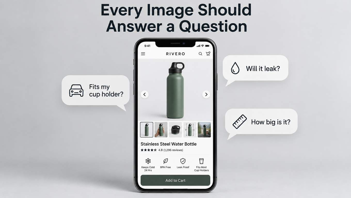
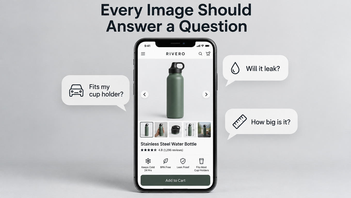
Each shopper arrives with a short list of doubts. Will this fit? Is it as big as it looks? Will the lid leak? Does it work with what I already own? Will it fall apart in a month? If your images don’t answer those questions, and fast, the shopper goes back to the search results and tries a competitor whose images do.
This article lays out an objection-first approach to Amazon listing images. You don’t start with a shot list. You start with evidence: your reviews, your competitors’ reviews, the Customer Questions section, and your return reasons. From that evidence you build an “objection map,” and each image slot gets the job of answering one specific doubt, in order of how much that doubt costs you sales.
We’ll cover the compliance floor you can’t go below, how to pull and rank objections, how to design each slot, the limits a small phone screen puts on you, the objection patterns that show up by category, and how to test and measure with Amazon’s Manage Your Experiments tool. The goal is a process you can repeat on every ASIN in your catalog, not a single redesign that works once.
Why Feature-First Image Stacks Underperform
Nearly every brand builds its image stack the same way. Someone lists the product’s selling points, a designer turns each one into a slide, and a photographer shoots a few lifestyle scenes. The result is a carousel that describes the product well and does very little persuading.
Features vs. doubts
A feature is something the product has. A doubt is something the shopper is worried about. They sometimes overlap, but they’re often different. A seller of a folding step stool might lead with “premium ABS plastic, non-slip treads, 300 lb capacity.” The shopper’s real question might be, “Will this fit in the gap between my fridge and the wall?”
If no image shows the folded width next to something familiar, the shopper has to find the answer in the bullets, dig through reviews, or guess. Many won’t bother. They’ll click the next listing, where the answer is in image two.
The carousel is a decision tool, not a brochure
Think about how people actually use the image carousel. They swipe quickly, stop on anything that looks relevant to their situation, and leave the moment they feel unsure. Every image either lowers their uncertainty or wastes their attention.
A brochure-style stack spends its best slots on brand statements and generic lifestyle shots (“happy family in kitchen”) that answer nothing. Those images aren’t wrong. They’re just in positions where a more specific answer would do more work.
Why it gets worse in competitive categories
In a category with dozens of near-identical products, feature lists converge. Everyone has “BPA-free,” “premium materials,” and “easy to clean.” When features look the same, shoppers decide based on which listing handles their specific worry most clearly. That’s why objection-handling images have an outsized effect exactly where competition is heaviest.
There’s a practical upside here too. Features are easy for competitors to copy. An image stack built from the specific complaints in your category’s reviews is much harder to copy, because it requires doing the research.
The Compliance Floor: Rules You Build On, Not Around
Before strategy, there’s a baseline. Amazon’s image requirements aren’t optional, and a suppressed listing converts at exactly zero. Everything in the objection-first approach sits on top of these rules.
Requirements that apply to all images
According to Amazon’s requirements as summarized by Jungle Scout, images must accurately represent the product for sale and match the product title. The product should fill at least 85% of the image frame.
For the zoom experience on detail pages, Amazon asks for files of 1600 pixels or larger on the longest side. The minimum for zoom is 1000px, and the minimum for display on the site at all is 500px. Images can’t go over 10,000px on the longest side. Accepted formats are JPEG (preferred), TIFF, PNG, and non-animated GIF.
Images also can’t be blurry, pixelated, or jagged. They can’t include Amazon logos or trademarks, or badges like “Amazon’s Choice,” “Best Seller,” or anything that looks confusingly similar. Sellers still get flagged for this one: putting a homemade “#1 Best Seller” ribbon in a secondary image is a violation.
Main image rules specifically
The main image has stricter rules because it appears in search results. Per the same source, main images must:
- Have a pure white background (RGB 255, 255, 255)
- Be a professional photograph of the actual product, not a graphic, illustration, or mockup
- Show no text, logos, borders, color blocks, or watermarks
- Show no excluded accessories or props that could confuse the shopper about what’s included
- Show the entire product, not cut off by the frame (jewelry like necklaces is an exception)
- Show the product out of its packaging, unless the packaging is an important feature
- Show only one view of the product
There are category-specific rules as well. Shoes must be a single shoe facing left at a 45-degree angle. Women’s and men’s clothing main images must be on a human model, while kids’ and baby clothing must be photographed flat. Clothing accessories can’t show any part of a mannequin.
Why this matters for objection-handling
The main image rules mean you can’t answer objections with text in slot one. Every objection-driven overlay, callout, and diagram has to go in the secondary images. As we’ll see, the main image still does a lot of objection work through angle, frame fill, and what it shows. It just has to do it visually.
The “no excluded accessories” rule deserves attention too. Jungle Scout gives the example of a camera microphone listing that showed a camera in the main image when the camera wasn’t included. That’s a compliance problem, and it’s also an objection problem. It creates a false expectation that turns into a return and a bad review.
Mining Objections: Where Buyer Doubts Actually Live
The core of this approach is simple. You don’t guess what shoppers worry about. You read what they’ve already told you, across four main sources.
Source 1: Your own 1- to 3-star reviews
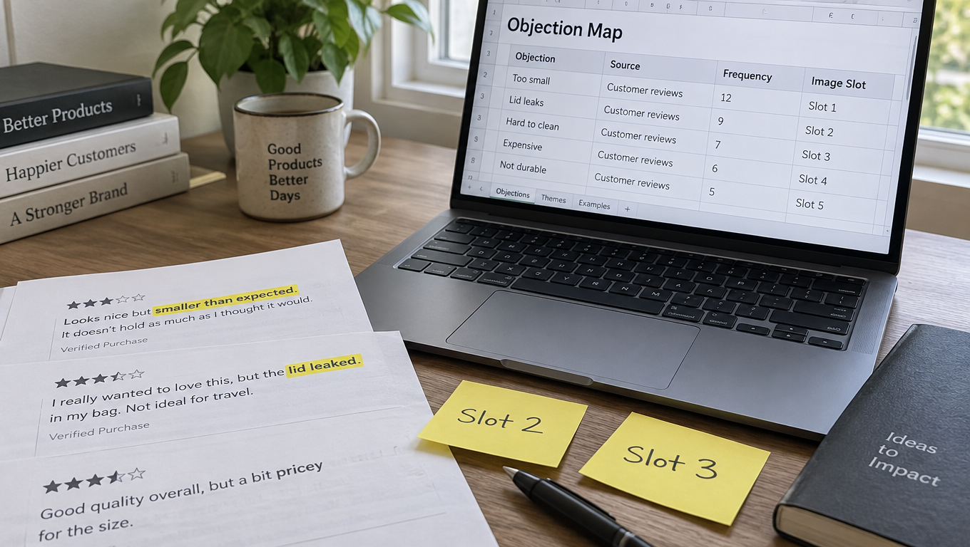
Five-star reviews tell you what people like. Middle and low reviews tell you what surprised them, and surprise is what images are supposed to prevent. Look for phrases that point to a gap between expectation and reality:
- “Smaller than I expected” or “bigger than it looks”
- “Didn’t realize it needed…”
- “The color is different from the pictures”
- “Doesn’t fit my…”
- “Wish I’d known…”
Each of these phrases is a direct request for an image that didn’t exist. “Smaller than expected” means you need a scale image. “Didn’t realize it needed batteries” means your what’s-in-the-box image is missing information, or doesn’t exist.
Source 2: Competitors’ reviews
Your own reviews show you objections your current buyers raised after buying. Competitor reviews show you objections the whole category raises, including ones your product may already solve.
If the top three competitors all get complaints about lids leaking and your lid has a better seal, that’s not just a feature. It’s the answer to the category’s most common doubt, and it deserves a demonstration image, not a single icon on an infographic.
Source 3: Customer Questions & Answers
The Q&A section on your listing and competitors’ listings is a record of questions shoppers couldn’t answer from the images and bullets. Each question there represents many other shoppers who had the same doubt and simply left without asking.
Look for repeated patterns. Compatibility questions (“Will this work with model X?”), dimension questions, and usage questions (“Can I put this in the dishwasher?”) come up constantly and translate directly into images.
Source 4: Return reasons
Your return reports in Seller Central include reason codes and often customer comments. Returns labeled “not as described,” “item defective,” or “didn’t fit” are expensive, because you pay for the lost sale, return processing, and often the negative review that follows.
Returns are the most costly objections you have, because they’re doubts the shopper had after it was too late. If your images had set accurate expectations, some of those buyers would have chosen a different size or variant, and some wouldn’t have bought at all. Both outcomes cost less than a return.
How much data is enough
You don’t need thousands of reviews. For a newer listing, reading 50 to 100 reviews across your product and your two or three closest competitors usually shows the main patterns. The same five or six doubts tend to come up again and again. Once new reviews stop adding new objections, you have enough.
Building the Objection Map
Raw complaints aren’t a plan yet. The objection map turns them into a ranked list with an image assigned to each doubt.
Step 1: Cluster and count
Put every objection into a spreadsheet with its source. Then group similar ones. “Too small,” “smaller than pictured,” and “didn’t realize how compact” are all the same objection: size perception. Count how often each cluster appears.
Step 2: Weight by cost
Not all objections are equal. Rank each cluster on two things:
- Frequency: how often it comes up across all sources
- Severity: does it stop a purchase, cause a return, or just cause mild irritation?
A compatibility doubt that stops a purchase entirely ranks above a cosmetic concern that shows up just as often but rarely changes the outcome. Objections tied to returns get extra weight because they cost you twice.
Step 3: Decide the best format for each answer
Some objections are best answered with a photo, others with a diagram, others with a comparison. A rough guide:
- Size and scale doubts: product in a hand, next to a common object, or with dimension lines
- Compatibility doubts: product shown with the compatible item, plus a clear list of supported models
- Durability doubts: demonstration shots (drop, stretch, load, water) or close-ups of construction
- “What do I get” doubts: clean flat lay with every included item labeled
- “How does it work” doubts: numbered step sequence in a single image
- “Why this one” doubts: comparison chart against generic alternatives
Step 4: Assign slots by rank
The highest-ranked objection gets the earliest secondary slot. Most shoppers don’t swipe through every image, so the order matters a great deal. The objection that loses you the most sales should be answered in image two, not image six.
Here’s what a simplified map might look like for an insulated water bottle:
- Leaking in a bag (high frequency, high severity, tied to returns) → Slot 2: bottle upside-down in a packed bag, “leakproof lid” callout
- Cup holder fit (high frequency, stops purchase) → Slot 3: bottle in a car cup holder with base diameter shown
- Actual size (medium frequency, drives returns) → Slot 4: in hand, next to a standard soda can
- Cold retention claims (medium, skepticism) → Slot 5: ice-after-24-hours demonstration
- Cleaning (medium, mild) → Slot 6: disassembled lid parts, dishwasher guidance
Notice that “premium 18/8 stainless steel” isn’t a slot. It can appear as a small callout. But nobody in the reviews was worried about steel grade, so it doesn’t earn a full image.
The Main Image: Winning the Search Grid
The main image has a different job from the rest of the stack. It’s the only image most shoppers see before they click, and it competes in a grid of near-identical white-background thumbnails. Its first objection to answer is simple: is this the thing I’m looking for, and does it look better than the one next to it?
Frame fill is the easiest win
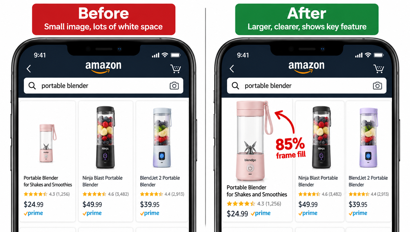
Amazon’s guideline says the product should fill at least 85% of the frame. Many listings don’t come close, especially products with odd shapes or ones shot with generous margins. In a thumbnail grid, a product that fills half the frame looks smaller and less important than the competitor next to it, even if they’re physically the same size.
Crop tightly. If your product is long and thin, like a cable, a pen, or a brush, try angling it diagonally so it covers more of the square frame without breaking any rules.
Choose the angle that answers the first question
Within the rules, you still pick the angle. That choice can quietly handle a major objection. If shoppers in your category care most about capacity, a slightly elevated angle that shows the opening and depth works better than a flat side view. If the key difference is a handle or a unique mechanism, angle the product so that feature is visible at thumbnail size.
Show exactly what’s included, no more
The rule against excluded props helps you here. A main image that shows only what ships in the box sets accurate expectations from the first impression. For multi-packs, showing every unit (where category rules allow) answers the “how many do I get?” doubt before the click.
Test at real thumbnail size
Before approving a main image, look at it at the size it actually appears in mobile search results, surrounded by competitor thumbnails. A screenshot of the real search page with your candidate image dropped in is the most honest review you can do. Details that look great at full resolution often disappear at thumbnail size.
Slots 2 Through 7: Sequencing by Objection Priority
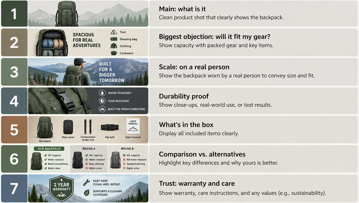
Once a shopper clicks, the secondary images become your sales conversation. The objection map tells you what goes where. A few structural principles help the sequence work.
Slot 2: the most expensive doubt
Image two is the most valuable secondary slot, because nearly every shopper who swipes at all will see it. Give it to the objection at the top of your map. For many products that’s size, fit, or compatibility, the doubts that stop a purchase outright.
Resist the urge to use slot two for a brand story or a generic “key features” infographic. Those can come later. Slot two should make a shopper who was about to leave think, “Okay, it’ll work for me.”
Slots 3 and 4: proof and scale
The next slots usually handle the second and third objections on your map. Often one of them is a scale image. Shoppers judge size poorly from product photos, and “smaller than expected” is one of the most common complaints across many categories.
Effective scale images use references everyone knows: a hand, a standard soda can, a credit card, a person of average height, a standard doorway. Dimension lines alone help, but most people can’t picture “7.8 inches” as well as they can picture “slightly taller than a can.”
Slot 5: what’s in the box
A labeled flat lay of every included item prevents a whole class of returns. It also answers questions like “does it come with a charger?” or “are the batteries included?” If something commonly expected is not included, say so clearly. That feels risky, but it’s much cheaper than a return and a one-star review saying “no charger included, very disappointed.”
Slot 6: comparison
Comparison images answer the “why this one instead of that one?” doubt. Amazon’s rules prohibit disparaging competitors by name, so these usually compare against “other brands” or “standard versions” in general terms. Keep them factual and focused on the two or three differences your objection research showed actually matter.
Slot 7: trust and aftercare
The last slots are good for lower-priority but real concerns: care instructions, warranty information, and how to get support. These reassure the more careful shoppers who swipe to the end, often the ones closest to buying.
Where lifestyle images fit
Lifestyle images aren’t banned in this approach. They just need a job. A lifestyle photo of the backpack on a hiker on a trail can double as a scale reference and a fit demonstration. A lifestyle photo of the bottle in a car cup holder answers the compatibility doubt directly. The best lifestyle images answer an objection while also helping the shopper picture owning the product.
The weakest lifestyle images are the ones where the product is small in the frame and the scene says nothing specific. If you can’t name the doubt an image answers, it’s probably holding a slot that could do more.
Video’s role
Video appears in the image block too, and it handles some objections better than stills. Setup processes, moving mechanisms, fabric drape, and sound are hard to show in a single frame. If your objection map shows lots of “how does it work?” or “is it hard to set up?” questions, a short video focused on that exact doubt usually beats a general brand video.
Designing for the Phone in Someone’s Hand
Much of Amazon’s traffic comes from the mobile app, where images display on a small screen and shoppers swipe with a thumb. A perfectly planned objection map still fails if the images can’t be read on a phone.
The arm’s-length test
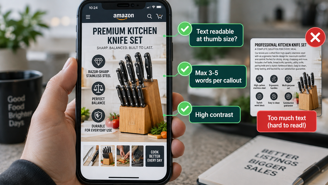
Load every secondary image on an actual phone and hold it at a normal distance. Can you read every word without zooming? If not, the text is too small. Designers often build infographics on large monitors, where 14-point text looks fine, and it becomes unreadable on a phone.
Fewer words, bigger type
A useful rule: one main message per image, with callouts of no more than a few words each. “Leakproof lid” works. “Our patented triple-seal leakproof lid technology keeps your bag dry even when the bottle is upside down” doesn’t, at least not on the image itself. The long version belongs in the bullets.
If an image needs a paragraph to make its point, the visual isn’t clear enough. Rework the photo so it shows the point rather than explains it.
Contrast and backgrounds
Light gray text on a white background, or white text on a busy lifestyle photo, disappears on a phone in bright light. Use strong contrast and consider solid or semi-opaque bands behind text. Test in daylight as well as indoors.
Square-friendly composition
Mobile carousels generally show images in a square or near-square format. Design secondary images in a square canvas (at least 1600 × 1600 to support zoom) so nothing important gets cropped or shrunk. Keep key text and product details away from the edges.
One idea per swipe
On mobile, each swipe is a fresh moment of attention. Images that cram two or three unrelated objections into a collage force the shopper to sort them out. Splitting them across separate slots usually communicates better, as long as you have slots available. If you’re out of slots, combine only closely related doubts, like size and weight together.
Category-Specific Objection Patterns
Every product has its own objection map, but some patterns come up reliably by category. These make a good starting point before you do your own review research, and a good check afterward.
Apparel and footwear
The biggest doubts are fit, fabric feel, and true color. Images that show the garment on models of different body types, with the model’s height and size listed, answer the fit question directly. Close-ups of fabric texture and stretch demonstrations help with feel. For color, photograph in neutral lighting and show the product in natural light as well, since “color was different from the photo” is a common return reason.
Remember the category rules: adult clothing main images on a model, kids’ clothing flat, and shoes as a single left-facing shoe at 45 degrees.
Home and kitchen
Size and fit dominate here: will it fit in my cabinet, on my counter, in my drawer? Dimension diagrams with familiar reference objects work well. Cleaning and maintenance come next. Many kitchen product reviews mention things being hard to clean, so disassembly images and dishwasher information are worth their slot.
Electronics and accessories
Compatibility is the top doubt by a wide margin. The Q&A sections for chargers, cases, cables, and mounts are full of “does this work with…?” questions. A clear compatibility image with a model list, plus a photo of the product with a popular device, answers most of them. What’s included (cables, adapters, power supplies) is a close second.
Beauty and personal care
Shoppers want to know about results, texture, and ingredients. Texture swatches, application demonstrations, and clear ingredient callouts help. Be careful with before-and-after claims. They need to be accurate and consistent with Amazon’s policies on health and cosmetic claims, since overstated results create both compliance risk and disappointed buyers.
Outdoor, sports, and fitness
Durability and real-world performance lead: will it hold up, will it hold my weight, is it waterproof? Demonstration images showing load, weather, or impact carry more weight than icons that just say “durable.” Scale is also important, especially for gear that needs to fit in a car trunk, a closet, or a backpack.
Pet products
Size fit for the specific animal is the main doubt. Showing the product with pets of different sizes, labeled with breed or weight, answers it directly. Durability (“will my dog destroy this in a day?”) and safety materials follow.
Testing with Manage Your Experiments
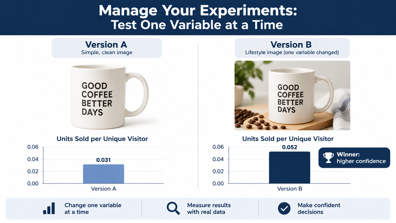
The objection map gives you a strong hypothesis. Testing tells you whether it holds up. Amazon’s Manage Your Experiments tool lets brand-registered sellers run A/B tests on listing content, including main images, on eligible ASINs that get enough traffic.
How it works at a high level
The tool splits traffic between two versions of the content and tracks results over the test period. Amazon lets you choose a test length, commonly in the range of several weeks, and reports results including which version performed better and how confident the tool is in that result. Eligibility and available content types can change, so check the current options in Seller Central under Brands.
Test one variable at a time
The most common testing mistake is changing too many things at once. If version B has a new angle, a tighter crop, and different lighting, and it wins, you don’t know which change mattered. For main images, isolate one variable per test:
- Angle (front vs. three-quarter view)
- Frame fill (current vs. tighter crop)
- What’s shown (single unit vs. full multi-pack, where allowed)
- Product orientation (upright vs. diagonal)
Let tests run their full course
Stopping a test early because one version looks ahead after a week is tempting and usually a mistake. Early results swing with random variation, day-of-week effects, and promotions. Run the full duration you picked, and avoid starting tests right before major sales events, which skew traffic in ways that don’t reflect normal shoppers.
Testing secondary images
Secondary image testing options in Manage Your Experiments have been more limited than main image testing. Where direct testing isn’t available, you can run sequential tests: change the secondary stack, hold everything else steady, and compare conversion over similar time periods. That’s less reliable than a true A/B split, since seasonality and competitor changes add noise, so treat the results as directional rather than definitive.
What to test first
Your objection map suggests the order. If size perception is the top objection and your main image shows the product in a way that makes it look ambiguous in scale, that’s the first test. The hypothesis goes straight from the research to the experiment, which is much more productive than testing random design preferences.
Measuring Beyond Click-Through: Returns, Reviews, and Questions
Most sellers judge images by click-through and conversion rate. Those numbers matter, but an objection-first approach also changes things after the purchase, and those effects are easy to miss.
Conversion rate: the obvious metric
Track unit session percentage (units ordered divided by sessions) in your Business Reports before and after image changes. Compare similar periods and note any price changes, promotions, or ad spend shifts that could muddy the comparison.
Return rate: the hidden payoff
If your new images set more accurate expectations, returns for “not as described,” “too small,” or “not compatible” should drop over the following weeks. This is often where image work pays off most, because every prevented return saves the refund, processing, and the lost inventory value if the item can’t be resold as new.
Watch return reasons specifically, not just the overall rate. If “too small” returns fall after you add a scale image, that’s direct evidence the image did its job.
Review content: are the same complaints fading?
Revisit your review analysis a couple of months after the change. Are the complaints you targeted showing up less often in new reviews? Complaints dropping in new reviews, even while the total review count keeps growing, is a strong sign your images are closing expectation gaps.
Q&A volume: fewer repeat questions
If you added a compatibility image, new “does it work with…?” questions should slow down. A falling number of repeated questions means shoppers are finding answers in the images instead of having to ask.
A simple scorecard
For each ASIN you rework, track five numbers before and after:
- Unit session percentage
- Main image click-through rate (from search query performance data, where available)
- Return rate and top return reasons
- Share of new reviews mentioning your targeted objections
- Number of new Q&A questions on targeted topics
This gives you a much fuller picture than conversion alone, and it helps justify photography budgets across the catalog.
Keeping the Stack Current: Refresh Cadence and Catalog Rollout
Objections aren’t fixed. Competitors launch new products, shopper expectations change, and your own product may get revised. An image stack that fit the category well last year may be answering yesterday’s doubts.
Quarterly objection review
Once a quarter, repeat a lighter version of the research: skim new reviews on your listing and your top competitors, check new Q&A entries, and look at the latest return reasons. If a new objection cluster appears, or an old one fades, update the map and the image assignments.
Triggers for an immediate update
- A product revision changes size, materials, included items, or compatibility
- A new competitor enters with a clear advantage on one of your top objections
- A spike in a specific return reason
- A new device or standard your product needs to show compatibility with
- A cluster of reviews describing the same surprise
Rolling out across a catalog
For sellers with many ASINs, doing a full objection analysis on every listing at once isn’t realistic. Prioritize by revenue and by gap: start with high-traffic listings that have below-average conversion or above-average returns. Those have the most to gain.
Products in the same family often share objections. A full analysis on one hero product in a line can inform the image stacks for related variants, with smaller adjustments for each one’s specific differences.
Build a reusable template
Once you’ve done this a few times, turn it into a documented process: a review-mining template, an objection map spreadsheet, a slot-assignment guide, and a mobile checklist. That lets team members or agencies apply the approach consistently, rather than depending on one person’s instincts.
Keep compliance in the loop
Every refresh is also a chance to recheck compliance. Confirm main images still meet the white background and frame fill rules, that no secondary image has picked up an unauthorized badge or claim, and that resolution supports zoom. A good image that gets suppressed helps no one.
Conclusion: Start With the Doubt, Then Pick Up the Camera
Most Amazon listing images fail quietly. They look professional, follow the rules, and describe the product accurately, yet they don’t address the specific worries that make shoppers leave. The fix isn’t a bigger photography budget or a trendier design. It’s a change in where you start.
Begin with evidence. Your reviews, your competitors’ reviews, the Q&A section, and your return reasons already contain a detailed list of what shoppers doubt. Cluster those doubts, rank them by how much they cost you, and give each image slot one specific doubt to settle. Then make sure every image is readable on a phone, test your main image in a controlled way, and measure the results across conversion, returns, reviews, and questions.
Your action checklist
- Audit compliance first: white background, 85% frame fill, 1600px+ for zoom, no unauthorized badges, no excluded props.
- Mine 50 to 100 reviews across your listing and two or three competitors, focusing on 1- to 3-star feedback.
- Pull repeated questions from Customer Q&A and your top return reasons.
- Build an objection map: cluster, count, weight by severity, pick the best visual format for each doubt.
- Assign slots by rank: the most expensive doubt goes in slot two.
- Pick a main image angle that answers the first question at thumbnail size.
- Run the arm’s-length phone test on every secondary image.
- Test main image changes in Manage Your Experiments, one variable at a time, for the full duration.
- Track the five-number scorecard before and after.
- Review objections quarterly and update when products or competitors change.
Shoppers aren’t looking at your images to admire them. They’re looking for permission to buy. Give them that permission one answered doubt at a time, and the carousel starts selling for you.