There is a version of image testing that feels very productive and produces almost nothing. You swap a new lifestyle photo into slot three, run it for two weeks, look at your conversion rate, notice it barely moved, and conclude that image testing doesn’t really work for your category. Then you move on.
That conclusion is almost certainly wrong — but the testing process that produced it was also almost certainly flawed. The image variables that move click-through rate are not the same variables that move conversion rate. The slots that affect your ad spend efficiency are not the same slots that reduce your return rate. And the A/B testing framework that works for a main image test will produce garbage data if you apply it unchanged to an A+ content experiment.
This is the core problem with how most sellers approach image testing in 2026: they run tests without a clear hypothesis about which funnel stage they’re trying to influence, which metric should move, and what a meaningful result actually looks like. They get data, but they can’t read it. They make changes, but they can’t explain why the changes worked or failed.
This post is a systematic breakdown of what the evidence actually shows about image testing on Amazon — from main image CTR experiments to A+ module architecture to the specific image types that consistently produce conversion lift. The goal is not to give you a list of “winning” image formats. It’s to give you a diagnostic framework so that every test you run teaches you something you can act on.
Why CTR and CVR Are Two Completely Different Conversations
The most common mistake in Amazon image testing is treating click-through rate and conversion rate as interchangeable outcomes — as if improving one automatically improves the other, or as if a test that didn’t move sales must mean the image change didn’t matter.
They operate at different stages of the buying journey, respond to different visual signals, and are driven by different image slots. Conflating them produces tests that either measure the wrong thing entirely or deliver results too muddled to act on.
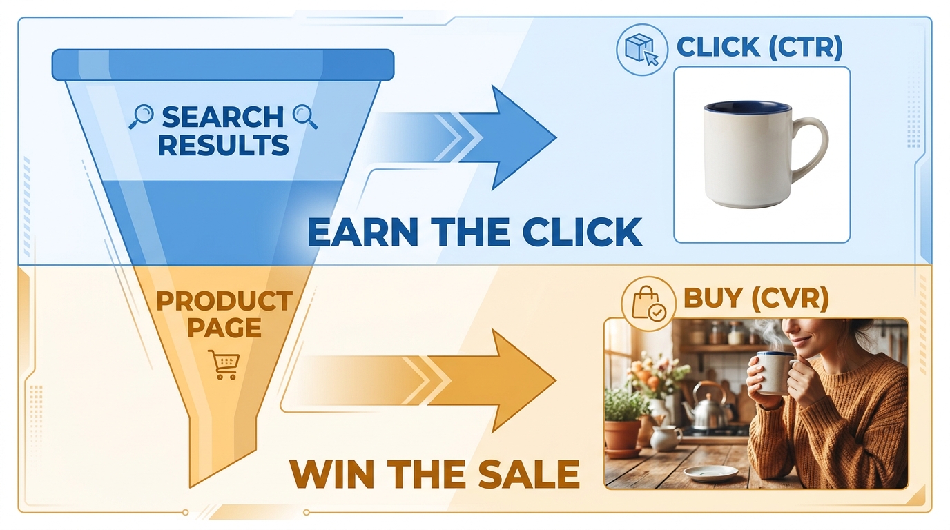
CTR lives in the search grid. CVR lives on the product page.
When a shopper searches for “insulated water bottle,” they see a grid of thumbnails. The decision to click happens in under two seconds, based almost entirely on the main image. That’s a recognition decision — does this product look like what I’m looking for, and does the thumbnail stop my scroll?
Once they click, the decision shifts to evaluation. Now they’re scanning your secondary images, reading bullet points, checking reviews, and building a mental case for or against buying. Conversion rate is what happens when that evaluation goes well.
The implication is direct: your main image is a CTR tool. Your secondary image stack is a CVR tool. Your A+ content is a late-stage trust and persuasion tool. Each layer has a different job, and testing them without that distinction in mind produces data that looks like noise.
The metric mismatch problem
If you change your main image and measure conversion rate as the primary outcome, you’re likely to miss the real effect. A better main image may bring in more clicks, but it also changes the composition of who’s clicking — sometimes attracting shoppers who are slightly less pre-sold on your product. CTR goes up, CVR appears flat or slightly down, and a seller who doesn’t understand the relationship concludes the test “didn’t work.”
The right framework: use CTR (or CTR market share percentage vs. impression share) as the primary metric for main image tests, and conversion rate plus units sold per unique visitor as the primary metrics for secondary image and A+ content tests. Amazon’s own Manage Your Experiments tool reports on sales, conversion rate, units sold, and units sold per unique visitor — which means it’s already configured for post-click evaluation, making it better suited for A+ and secondary image experiments than for pure CTR testing.
The Main Image’s Only Job Is the Click — Stop Asking It to Do More
Every year, sellers find creative ways to load their main images with information: benefit callouts, bundle indicators, badge-style trust signals, variant selectors, and multi-angle composite shots. And every year, the evidence from testing says the same thing: simplicity wins.
A review of more than 40 main-image tests conducted across Amazon categories in 2026 found that simplified, high-contrast hero images beat information-rich images approximately 72% of the time, with an average CTR improvement of around 0.4 percentage points. That may sound modest — but on a high-impression ASIN, 0.4 percentage points in CTR can represent thousands of additional clicks per month without a single dollar of additional ad spend.
The product fill rule: 85% minimum, 90%+ optimal
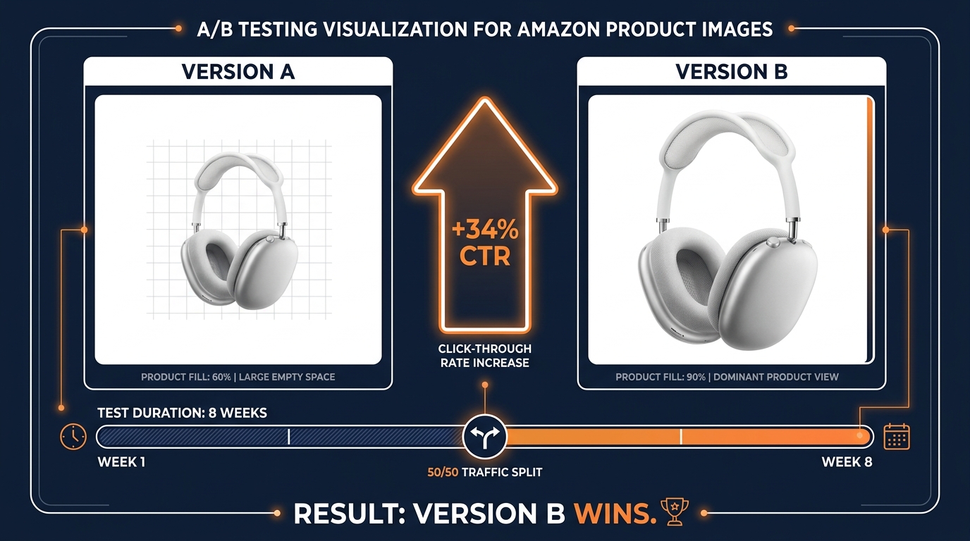
Amazon requires the product to fill at least 85% of the main image frame. Most testing data suggests the optimal fill for CTR is even higher — closer to 90–92%. The reasoning is visual: in a search grid crowded with competing thumbnails, the product that appears larger and more prominent commands attention faster. A product that fills 60–65% of the frame with significant white space around it looks visually smaller relative to competitors, even at the same pixel dimensions.
This is one of the clearest and most actionable findings in the testing literature. If you’re looking for a fast main-image test that consistently produces readable results, testing product fill percentage against your current hero image is the most reliable starting point.
What you can’t test on the main image (and should stop trying)
Amazon’s main image requirements prohibit text overlays, logos, badges, watermarks, borders, color blocks, and graphics over or behind the product. These rules aren’t just compliance guardrails — they reflect a design reality that testing consistently confirms. Shoppers processing a thumbnail in 1–2 seconds are making a shape-recognition decision. Text overlays add cognitive load to a moment when the brain wants instant pattern recognition, not reading.
The legitimate variables to test on a main image are: product angle, product fill percentage, background treatment (pure white vs. off-white vs. light shadow), and for apparel, on-model vs. flat-lay. These are meaningful variables with documented CTR effects. Everything else belongs in secondary slots.
A real CTR test example worth understanding
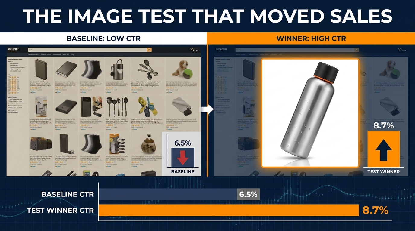
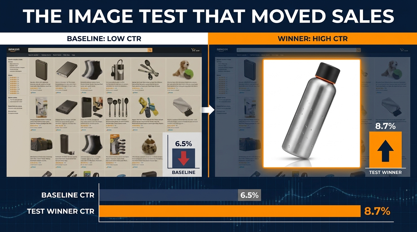
A back-to-school product test conducted across 2.4 million impressions and 847 ASINs reported an 8.7% CTR for the optimized main image group versus a 6.5% baseline — a 34% relative improvement. The winning images shared three characteristics: the product filled more than 88% of the frame, edge contrast against the white background was sharper (achieved through shadow depth and product color), and the primary product feature was immediately identifiable at thumbnail size without any text assistance.
That last point matters: the visual should communicate the product category and primary use case before the shopper reads the title. If your thumbnail requires a title read to understand what the product is, your image is doing less than half its job.
The Second Image Is Your Highest-Leverage CVR Slot (And Most Sellers Waste It)
Once a shopper clicks your listing, the evaluation process begins. The first thing most shoppers look at after the main image is slot two — the second image. On mobile, which now accounts for the majority of Amazon browsing, this image appears immediately below the fold or as the second swipe in the image carousel. It is seen by nearly everyone who clicks. It is also, consistently, the most underused conversion lever in the entire image stack.
Most sellers put a different-angle product shot in slot two. It’s a reasonable default, but it leaves conversion on the table. A different angle answers the question “what does this look like from another direction” — which is not usually the top purchase objection your buyer is carrying when they first click.
Find your top objection, then design slot two around it
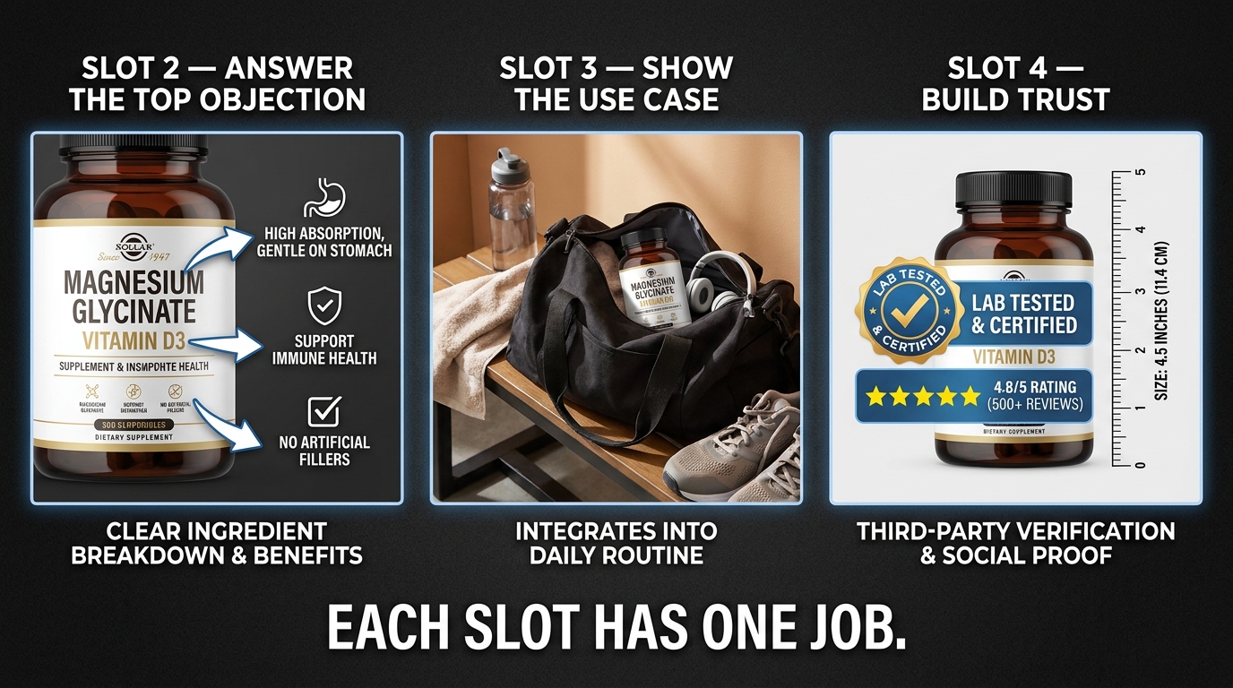
The most effective slot-two images directly answer the single biggest purchase objection for the product. For a water bottle, that might be “will it fit in my car cupholder?” For a supplement, it might be “what are the actual ingredients?” For a kitchen tool, it might be “how big is this, actually?” The fastest way to identify the top objection is to read your negative reviews and your competitor’s negative reviews — you will find the same three or four objections mentioned repeatedly. The buyer who converts is the buyer whose objection gets answered before they leave the listing.
Testing has consistently shown that slot-two images designed around a specific objection outperform secondary-angle shots by meaningful margins in conversion rate. The specific lift varies by category, but the pattern is consistent: answer the real question, not a tangential one.
The slot-two infographic: when it works and when it doesn’t
An infographic in slot two — showing key specs, dimensions, ingredient breakdowns, or compatibility details — performs very well when the primary objection is informational. Shoppers evaluating technical products (electronics, supplements, fitness equipment, kitchen appliances) want data, and an infographic delivers it faster than bullet points. Testing data from category-level experiments suggests that strong secondary infographics can lift conversion rate by 5–15% on information-heavy products.
For impulse-category or low-consideration products, infographics in slot two tend to perform more modestly. If your product is something a shopper buys without much evaluation (a simple household staple, a sub-$15 item), the objection-answering job is smaller, and a lifestyle image that makes the product feel desirable may outperform a data-heavy infographic. The principle is the same: the image type should match the actual decision process for your specific buyer.
What Infographic Images Actually Test Well In (And Where They Disappoint)
Infographic images — product photos overlaid with callout arrows, dimension annotations, ingredient labels, comparison charts, or feature bullets — have become one of the dominant image styles in Amazon listings across most categories. Their popularity is partly deserved and partly a product of trends outrunning evidence. The testing picture is more nuanced than the hype.
Where infographics genuinely lift performance
The categories where infographic secondary images consistently produce measurable conversion lift share a common trait: high information demand before purchase. Supplement and nutrition products, electronics and tech accessories, fitness and exercise equipment, home improvement and tools, and kitchen appliances all involve buyers who want to verify specs, understand compatibility, compare ingredients, or confirm dimensions before committing. For these categories, a well-designed infographic reduces the friction between clicking and buying.
The most effective infographic formats in these categories are: dimension drawings with actual measurements labeled (not just “compact size”), ingredient or component callout panels showing what’s included and why it matters, compatibility charts (“works with X, Y, Z systems”), and before/after visual comparisons where the product’s benefit is demonstrable. These formats work because they answer specific buyer questions faster than text alone.
Where infographics underperform and why
Infographics designed around features — rather than buyer questions — consistently underperform in testing. A list of product features presented as callout arrows (“patented design,” “premium materials,” “ergonomic handle”) tells the buyer what the brand thinks is important, not what the buyer is actually asking. Shoppers on Amazon move fast; if your infographic requires them to read and interpret rather than instantly absorb, a significant portion will swipe past it.
The other consistent failure mode is information overload. Infographics that try to communicate more than three or four ideas in a single image lose focus. The buyer’s eye doesn’t know where to land, the hierarchy of information collapses, and the image ends up communicating less than a clean lifestyle shot would. The discipline of identifying one primary message per image slot is as important for infographics as for any other format.
Mobile rendering: the infographic killer most sellers ignore
A significant portion of infographic images are designed at full resolution and look great on desktop — then become unreadable on a mobile screen where text shrinks to near-invisible. If your infographic contains text smaller than approximately 24pt at the rendered image size, a substantial share of your mobile audience cannot read it without pinching to zoom. Most will not zoom. They will swipe.
Test your infographic images at actual mobile thumbnail size before publishing. If any text element requires zooming to read, the infographic needs to be redesigned — either by reducing the amount of information, increasing text size, or splitting the content across two slots.
Lifestyle Images: The Funnel Stage Most Sellers Get Wrong
The lifestyle image debate — whether lifestyle shots outperform studio or technical shots — has generated a substantial amount of contradictory advice in the Amazon seller community. The reason for the contradiction is that lifestyle images, like all image types, are only as effective as their placement in the right funnel stage for the right product.
What lifestyle images actually do in the buyer’s mind
Lifestyle images work through a specific psychological mechanism: they transfer desire by showing the buyer a version of themselves (or their life) that the product enables. A camping cookware set shot in a beautiful forest campsite doesn’t just show the product — it sells the camping experience, and the buyer’s brain connects ownership of the cookware to access to that experience. That’s a powerful conversion driver when it matches the buyer’s aspiration.
This mechanism works best when three conditions are met: the buyer is in an aspirational or desire-driven purchase mode (rather than purely functional/informational), the lifestyle scenario is specific enough to feel real (generic stock-photo aesthetics undermine the effect), and the product is clearly visible and identifiable in the scene. A lifestyle image where the product is decorative background loses most of its conversion value.
When lifestyle images lift conversion (with data)
For considered-purchase categories — home décor, kitchenware, fitness apparel, outdoor gear, beauty and personal care — well-executed lifestyle images in secondary slots consistently improve conversion rate metrics. A fashion retailer test found that a lifestyle hero image increased conversion rate from 2.1% to 2.9% and add-to-cart rate from 4.2% to 5.8% — an approximately 38% relative lift in both metrics. For higher-price-point items in these categories, industry benchmarks suggest lifestyle images in the secondary stack can produce 15–40% conversion improvements compared to studio-only galleries, though the effect is highly category and execution dependent.
The key qualifier is “well-executed.” Low-quality stock photography with obviously staged scenarios and mismatched aesthetics can actively hurt conversion by making a brand feel inauthentic. The lifestyle image standard has risen across Amazon as more sellers have adopted the format — a mediocre lifestyle image now competes against excellent ones, and shoppers have become more visually literate in detecting inauthenticity.
When product-only images win instead
Lifestyle images do not always win. Tests in functional, utilitarian, or specification-heavy categories have found product-only images outperforming lifestyle in conversion rate — in some documented cases by significant margins. Industrial supplies, replacement parts, technical accessories, baby safety products, and medical or health monitoring devices tend to be purchased based on specs and specifications verification rather than aspirational desire. In these categories, a lifestyle image can actually distract from the verification process the buyer needs to complete before they trust the purchase.
The test-your-category-first principle applies here more than anywhere else. Lifestyle images are not a universal upgrade. They are a specific tool for a specific buyer psychology, and when you apply them to the wrong buyer state, they underperform studio alternatives.
Sequencing Your Image Stack Like a Buyer Journey, Not a Product Catalog
The shift from treating an Amazon image gallery as a product showcase to treating it as a structured persuasion sequence is the most significant evolution in image strategy over the past two years. Sellers who still think in terms of “show the product from multiple angles” are competing against brands that think in terms of “answer every objection before the buyer articulates it.”
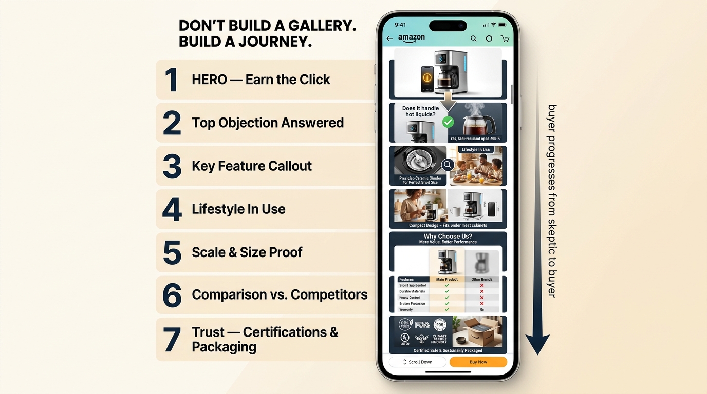
A working sequence framework
The most consistently cited and tested image sequence framework across current Amazon seller guidance maps seven slots to seven buyer stages:
- Slot 1 (Main Image): Win the click. Compliant, clean, high product fill, maximum thumbnail clarity.
- Slot 2: Answer the top purchase objection. This should be the single biggest reason a buyer in your category doesn’t buy.
- Slot 3: Show the primary benefit or key feature. Not a feature list — the single most compelling thing this product does, shown visually.
- Slot 4: Show the product in use. Lifestyle context that lets the buyer visualize themselves using it in a realistic scenario.
- Slot 5: Scale and size proof. Show the product next to a common reference object, or show it in a hand, or provide precise dimension visuals. Returns from “product was smaller than expected” are preventable with this slot.
- Slot 6: Comparison or differentiation. Either a comparison chart against alternatives, or a visual demonstration of what makes this product different from the generic version.
- Slot 7: Trust and conviction. Certifications, quality indicators, packaging contents, or a summary of the value proposition.
Why sequence matters more than individual image quality
Multiple 2026 seller guides and conversion specialists emphasize that the order of images matters as much as their quality. A strong lifestyle image in slot two — before the top objection has been addressed — can actually hurt conversion, because it signals that the brand is more interested in looking aspirational than answering buyer questions. The sequence needs to track the buyer’s cognitive journey: skeptical interest → objection resolution → desire → conviction.
The practical implication is that when you’re testing image changes, you should test sequence changes as aggressively as you test image type changes. Swapping slot two and slot three can produce measurable conversion differences on the same images. This is a low-cost test variable that is underutilized relative to its potential impact.
The mobile-first constraint on sequence
On mobile, the first two to three images in the carousel receive the vast majority of engagement. Slots five, six, and seven are seen by a much smaller fraction of shoppers — primarily the highly engaged ones who are close to a purchase decision. This doesn’t make those slots unimportant; the shoppers who scroll to slot seven are your highest-intent buyers, and giving them strong trust signals at that moment can close sales that would otherwise have stalled. But it does mean your most critical objection-handling work needs to happen in slots two and three, not buried in the back of the gallery.
How to Run A/B Tests That Actually Produce Readable Results
The majority of Amazon image tests fail to produce actionable conclusions — not because image testing doesn’t work, but because the tests are designed in ways that guarantee ambiguity. Understanding what makes a test readable is as valuable as understanding what to test.
The one-variable rule is not optional
If you change the image type (lifestyle vs. studio), the image content (objection vs. feature), the image slot, and the color treatment all at once, you cannot isolate what produced the result. You’ll know something changed, but you won’t know what — which means you can’t replicate the win or understand the loss. Testing one meaningful variable at a time is not a pedantic methodological preference; it’s the only way to extract learnings that compound over time.
The practical corollary: make your Version B meaningfully different from Version A in exactly one dimension. If you’re testing whether a lifestyle slot-two image outperforms an infographic, keep everything else about the listing identical. If the difference is too subtle, the test won’t produce a statistically meaningful result even with enough traffic.
Traffic thresholds and test duration
For main image CTR tests run outside of Manage Your Experiments (using third-party tools or historical comparison), the standard guidance is to run for a minimum of four weeks, with at least 1,000 clicks per variant for any CTR finding to carry real weight. For A+ content and secondary image tests run inside Manage Your Experiments, Amazon recommends running experiments to completion — the tool itself calculates the required sample size and flags when statistical significance has been reached.
The worst testing pattern is running a test for one or two weeks, seeing a promising early signal, and declaring a winner. Amazon traffic fluctuates significantly across days of the week, promotional periods, and seasonality windows. Short tests are contaminated by these patterns. The discipline to run tests to completion — typically eight to ten weeks for Amazon Experiments — is what separates teams that generate reliable data from teams that generate noise that looks like signal.
What to do when the test “doesn’t produce a result”
A test that runs to completion and finds no statistically significant difference between Version A and Version B is not a failed test. It’s a finding: this particular variable doesn’t move the needle meaningfully for your ASIN. That’s valuable information. It tells you where not to spend further testing resources and narrows your focus toward the variables that matter.
The failure is not a null result — it’s stopping the test early, changing multiple variables at once, or running the test on a low-traffic ASIN where the sample size is too small to reach significance in any reasonable timeframe. High-traffic ASINs are your testing assets. Start there, generate learnings at scale, and then apply the validated changes to lower-volume SKUs.
Building a testing backlog, not a testing one-off
The sellers generating the most value from image testing in 2026 treat it as an ongoing practice, not a quarterly project. They maintain a prioritized backlog of test hypotheses, run one to two concurrent tests on their highest-traffic ASINs, document results in a shared format, and apply learnings systematically across the catalog. Over twelve months, that practice produces a library of validated findings specific to their category, their buyer, and their product type — a compounding asset that a seller who does one image refresh per year simply cannot build.
A+ Content’s Real Job in the Funnel (It’s Not What You Think)
A+ Content is frequently positioned as a brand storytelling tool — a place to showcase brand heritage, photography, and values. That framing isn’t wrong, but it’s incomplete, and it leads sellers to build A+ pages that are aesthetically impressive and commercially inert.
The more accurate framing: A+ Content is a conviction module. Its job is to take a shopper who has reviewed your images, read your bullets, and is still not quite sure — and push them over the decision threshold. The buyer who reaches A+ content is a high-intent, high-consideration buyer who has objections that the listing’s primary content hasn’t yet resolved. A+ that treats this buyer to brand photography and lifestyle mood boards without addressing purchase friction will consistently underperform A+ that is structured around decision completion.
The modules that actually move conversion
Not all A+ modules are equal in their conversion impact. Based on current testing patterns and practitioner data, the modules with the most consistent post-click conversion impact are:
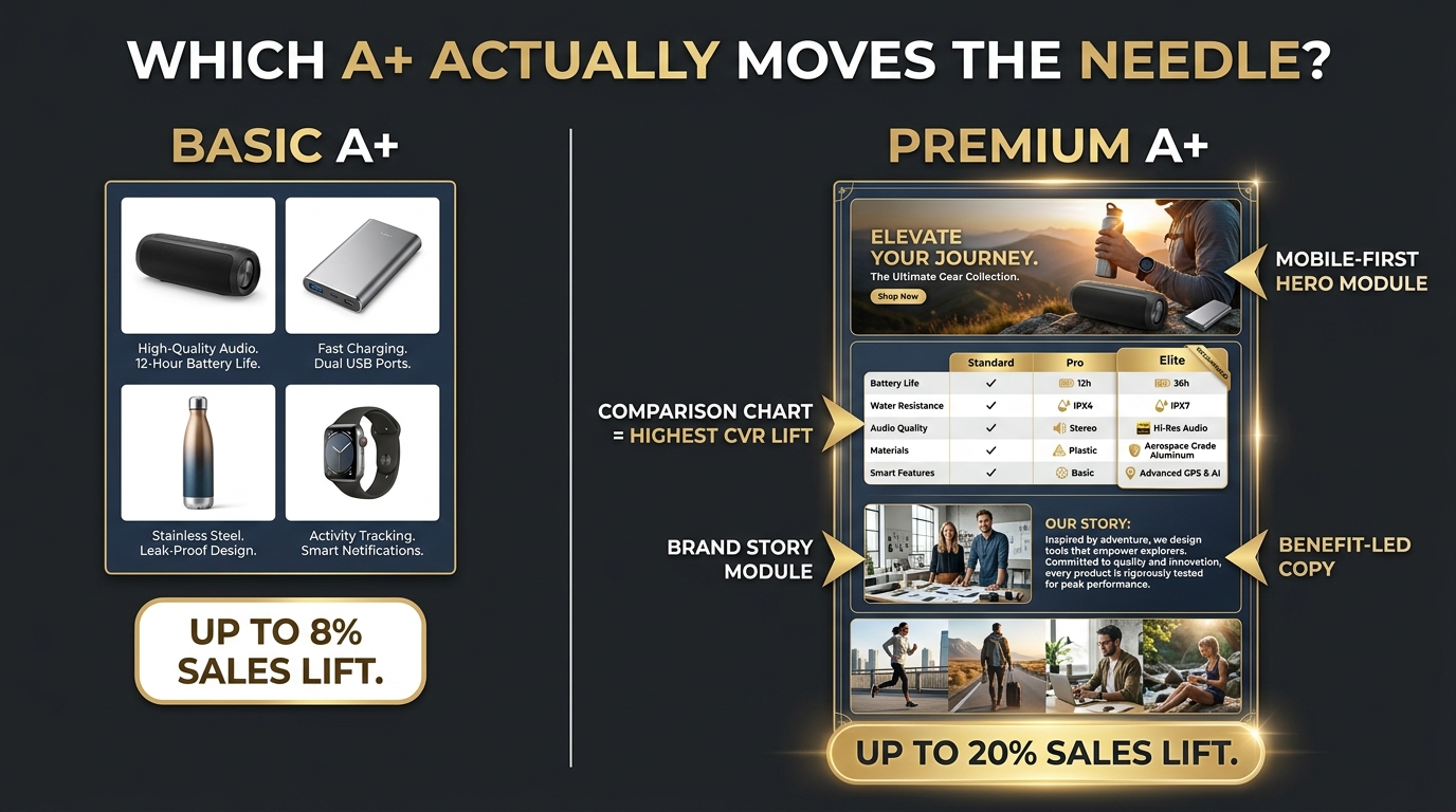
- Comparison charts: Showing how your product compares to alternatives — either your own product line variants or the generic category option — is the single highest-converting A+ module type for most considered-purchase categories. It resolves the “am I getting the right one?” objection that stalls a significant share of ready-to-buy shoppers.
- Benefit-led text modules: Short, punchy benefit statements that answer the “why this product specifically” question outperform long-form brand narrative copy. Each text block should answer one question a buyer would actually ask.
- Dual image + text modules: Pairing a high-quality product or use-case image with a tight benefit statement creates a visual-verbal combination that works well for high-information buyers. This format also renders cleanly on mobile, which is critical since the majority of A+ content is now viewed on a phone screen.
What A+ content does not do well
Brand story modules positioned above the fold — before any objection-handling content has appeared — consistently underperform in conversion tests. The buyer who clicked on your listing did not click because they want to learn about your founding story; they clicked because they think your product might solve their problem. Leading with brand narrative before addressing purchase relevance tells the buyer the listing is about the brand, not about them. That misalignment costs conversions.
The module order principle: put your highest-conviction content first. The comparison chart or primary benefit module should appear in the first visible A+ panel. Brand story and heritage content belongs toward the bottom — for the buyers who want it, it builds trust; for the buyers who don’t, it’s safely below the fold.
Premium A+ vs. Basic A+: When the Upgrade Actually Pays Off
Amazon’s published benchmarks for A+ content are frequently cited without the context that makes them actionable. Basic A+ content is associated with up to an 8% sales lift. Premium A+ — which includes full-width modules, interactive hover elements, video integration, and richer module options — is associated with up to a 20% sales lift.
These are ceiling figures, not averages. Real-world performance data from practitioners typically shows Basic A+ delivering 3–10% conversion lift on well-executed pages, and Premium A+ delivering 8–20% on strong executions in the right categories. The gap between “up to 20%” and “actual 20%” is entirely about implementation quality and category fit.
When Premium A+ justifies the investment
Premium A+ delivers its largest measurable returns in categories where the purchase involves significant consideration time, high price points, or complex feature sets. Home appliances, electronics, fitness equipment, beauty and personal care with complex ingredient questions, and outdoor or sporting goods are categories where the additional visual real estate and interactive module options in Premium A+ can meaningfully improve the buyer’s ability to evaluate and commit.
The interactive elements — hover-activated image panels, expandable comparison tables, integrated video — are most valuable for products where the buyer benefits from exploring details at their own pace. If your product has multiple configurations, components, or use cases that benefit from interactive exploration, Premium A+ provides a canvas that Basic cannot match.
When Basic A+ is the smarter allocation
For low-consideration categories, high-velocity basics, or ASINs where the primary conversion barrier is price rather than information, Basic A+ typically delivers the same practical lift at a lower execution cost. Premium A+ requires significantly more design resources and production time to execute well; a poorly designed Premium A+ page can actually underperform a clean, well-structured Basic A+ page in head-to-head testing.
Premium A+ also requires a published Brand Story across your catalog as an eligibility prerequisite. If your catalog does not have Brand Story content in place, satisfying that requirement is a precondition — factor that into the actual cost and timeline of upgrading. The eligibility change that made Premium A+ available at no additional charge to qualified brands was a meaningful development; it lowers the cost barrier but does not lower the execution quality bar.
Testing your A+ content: the Manage Your Experiments approach
Amazon’s Manage Your Experiments tool supports A/B testing of A+ Content on the same ASINs. The tool runs a controlled experiment, splits traffic between Version A and Version B, and reports results in conversion rate, units sold, sales, and units sold per unique visitor. The output is designed for post-click evaluation — exactly the right metric set for A+ content performance.
The most productive A+ experiments currently involve: testing module order (particularly whether leading with a comparison chart vs. leading with a hero image produces different conversion outcomes), testing benefit-led copy against feature-led copy in the same module type, and testing the presence vs. absence of a comparison chart for ASINs where the category has multiple close alternatives. These are high-information tests because they produce learnings that apply across the catalog.
What a Winning Image Test Result Actually Looks Like
Understanding what counts as a “win” in image testing is less obvious than it appears. The metric that moved, the magnitude of the movement, the statistical confidence behind the result, and the downstream commercial implication all matter — and they rarely all point in the same direction.
Defining a commercially meaningful lift
A 0.4 percentage-point CTR improvement on a main image sounds modest. But on an ASIN receiving 50,000 monthly impressions, that improvement represents 200 additional clicks per month. At a 15% conversion rate and a $30 average selling price, that’s an additional $900 in monthly revenue from a single image change — without any additional ad spend. Over twelve months and applied to a catalog of ten ASINs with similar traffic, the compounding effect is substantial.
The point: translate your percentage improvements into unit economics before judging whether a test result is worth acting on. A “small” CTR improvement on a high-impression ASIN is frequently worth more than a “large” conversion rate improvement on a low-traffic one.
Signs a result is reliable vs. noise
A reliable test result has four characteristics: it ran to statistical significance (not stopped early), the sample size was large enough relative to the effect size, the test period spanned multiple weeks to normalize for day-of-week and promotional fluctuations, and the metric that moved is the one the tested variable was designed to affect.
Warning signs that a result may be noise: the test ran less than four weeks, the winning version’s advantage appeared in week one then flattened, the metric that moved was not the primary outcome for that test type (e.g., the main image test “won” on conversion rate but CTR was flat), or the magnitude of improvement is very large but the ASIN had low traffic and a short test window.
Building a test result library
Every test result — win, loss, or null — should be documented with a standard set of fields: the hypothesis tested, the ASIN and category, the test dates and duration, the primary metric and its change, the statistical confidence level, and a plain-language description of what the result means. Over time, this library becomes the most valuable image optimization asset your brand has. It tells you what works in your specific category for your specific buyer — not what works in the abstract for some hypothetical Amazon seller.
Teams that maintain this library and review it quarterly find that image testing compounds in value. Early tests reveal broad patterns (lifestyle in slot four beats studio for our category). Later tests refine those patterns (lifestyle images featuring solo users convert better than group scenarios for our specific product type). That level of specificity is not available from any external guide — it only comes from your own validated history.
Why Return Rate Is the Image Metric Nobody Tracks (But Should)
Most image testing discussions focus entirely on CTR and conversion rate. Return rate — the percentage of orders that come back — is almost never part of the image testing conversation, which is a significant blind spot given that returns are directly attributable to image quality failures.
The connection between image accuracy and returns
The most common reason shoppers return Amazon orders is that the product differed from expectations — it was smaller than it appeared, a different shade than shown, had different material or texture, or included different components than the image suggested. These are image failures masquerading as product failures. The images communicated something inaccurate, and the customer responded rationally by returning a product that didn’t match what they thought they were buying.
Size/scale images in slot five of your image sequence exist specifically to prevent this. A product photographed in isolation with no size reference leaves the buyer estimating from the thumbnail — and buyers consistently overestimate dimensions. A product shown next to a standard reference object (a hand, a common household item, a ruler overlay) sets accurate size expectations and dramatically reduces “smaller than expected” returns.
Color and texture accuracy as a conversion and return lever
Color-accurate photography is simultaneously a conversion tool and a return-reduction tool. Shoppers making color-sensitive purchases (apparel, home décor, bedding, paint-adjacent products) are more likely to convert when the image accurately reflects the product’s color under natural light — because they can confidently match it to what they need. They are also less likely to return, because the product matches expectations.
The tension is that many product photography workflows prioritize dramatic, visually appealing images over color accuracy. A slightly enhanced, more saturated version of a blue product looks better on screen and may increase conversion in the short term — but generates returns at a higher rate from buyers for whom color accuracy matters. Testing both conversion rate and return rate together is the only way to identify whether an image change is actually improving economics or just shifting the problem downstream.
Building an Image Testing Culture, Not a One-Time Fix
The brands that generate the most consistent value from image optimization in 2026 are not the ones that did the most comprehensive image redesign last year. They’re the ones that built a continuous testing practice — one that produces learnings each month, applies them systematically, and compounds over time into a catalog of listings that are empirically better at converting than anything a competitor designed on instinct could match.
What a sustainable testing rhythm looks like
A practical image testing cadence for most catalog sizes involves running one or two simultaneous experiments via Manage Your Experiments at any given time on your highest-traffic ASINs, reviewing results monthly, applying winners within two weeks of a confirmed result, and documenting every outcome — including null results — in a shared library. That rhythm generates approximately twelve to twenty-four meaningful test results per year per seller, which compounds into significant catalog-level optimization over any twelve-month window.
The bottleneck is almost never testing infrastructure. It’s the creative production pipeline: generating meaningfully different Version B images requires photography, design, or both. Brands that invest in modular image production workflows — where elements like backgrounds, text overlays, and lifestyle scenarios can be produced and swapped efficiently — can maintain higher testing velocity than those that treat every image as a custom production from scratch.
The three tests to run before anything else
If you’re building an image testing practice from zero, the three tests with the highest probability of producing an actionable result are, in order of priority:
- Main image product fill test: Test your current main image against a version where the product fills 88–92% of the frame. Measure CTR over six to eight weeks. This test produces a result on nearly every ASIN because fill percentage has a consistent, category-agnostic effect on thumbnail clarity.
- Slot-two objection test: Identify your top purchase objection from negative reviews, replace whatever is currently in slot two with an image that directly answers that objection, and measure conversion rate over eight weeks via Manage Your Experiments.
- A+ comparison chart test: If your A+ content does not currently include a comparison chart, add one as a Version B in Manage Your Experiments and measure conversion rate. For most considered-purchase categories, the comparison chart is the single highest-return A+ module.
These three tests, run sequentially on your highest-traffic ASINs, will generate more actionable data about your catalog’s image performance than any external audit could provide. They’re also the tests most likely to produce commercially meaningful improvements in your unit economics — which is the real measure of whether image testing is working.
From testing to systematic advantage
The compounding dynamic is worth stating directly: every validated test result narrows the gap between where you are and where your optimal image stack is. A catalog that has had thirty validated image changes applied to it performs materially differently than a catalog where images are changed on gut instinct. The difference isn’t visible in any single metric on any single day — it shows up in conversion rate consistency across traffic fluctuations, in lower ad cost per sale because the organic conversion rate is higher, in lower return rates because images are more accurate, and in stronger review scores because customers received products that matched their expectations.
Image testing, done rigorously, is one of the few catalog optimization practices that improves both the top line and the bottom line simultaneously, without requiring additional ad investment. That’s not a common combination in Amazon selling. It’s worth treating as the operational priority it actually is.
Final takeaways
- Separate CTR and CVR work. Test your main image for CTR. Test your secondary images and A+ for CVR. Don’t evaluate a main-image test by its conversion impact.
- Fill your frame. If your main image product fill is below 88%, test higher fill first — it’s the fastest, most reliable CTR improvement available.
- Slot two owns the top objection. Find your category’s biggest purchase barrier, design slot two around answering it, and test against your current slot-two image.
- Sequence beats individual image quality. A mediocre image in the right slot, answering the right question, outperforms an excellent image in the wrong slot.
- Run tests to completion. Four weeks minimum. Eight to ten weeks for Manage Your Experiments. No early winners.
- Track return rates alongside conversion. An image change that lifts conversion but raises returns has not improved your economics — it has moved the problem.
- Document everything. Every result, including nulls, builds the library that makes future tests faster and more predictive.