
Tag: E-commerce Conversion

  • Why Most Amazon Image Galleries Lose the Sale Before the Scroll — And How to Fix Every Slot

    Why Most Amazon Image Galleries Lose the Sale Before the Scroll — And How to Fix Every Slot

    Amazon listing image gallery optimization — your image gallery is your sales funnel

    Here’s a scenario that plays out thousands of times a day on Amazon: a shopper types in a search query, scans the results grid, clicks one listing over another — and they do it in less than two seconds. They didn’t read a single bullet point. They didn’t check the reviews. They reacted to an image.

    That click — or the lack of it — is the most consequential moment in your entire sales funnel. Everything downstream, your conversion rate, your organic rank, your ad efficiency, your revenue — flows from whether that thumbnail wins attention in a crowded grid. And yet the vast majority of Amazon sellers treat their image gallery as an afterthought: a compliance checkbox, a “we have photos” box to tick, rather than a carefully sequenced visual argument designed to move a specific buyer from curiosity to purchase.

    This post is about changing that. Not by covering the basics you’ve probably already read elsewhere, but by walking through the logic, the psychology, and the practical craft behind what each image slot in your Amazon gallery should be doing — and why most sellers are wasting at least three or four of them on images that don’t actually sell anything.

    The shift in mindset is this: your image gallery is not a photo album. It’s a silent sales sequence. Every slot has a job. When those jobs are defined, filled correctly, and ordered deliberately, the results show up in your click-through rate, your conversion rate, and ultimately your rank. When they’re not, you’re leaving real money on the table regardless of how good your product actually is.

    Let’s go slot by slot.

    The Image Gallery as a Structured Sales Funnel
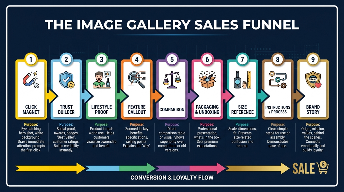
    Amazon image gallery sales funnel — numbered slot strategy from click magnet to brand story

    The first thing to understand about Amazon’s image gallery is that it mirrors the psychological stages of a purchase decision. Buyers don’t arrive on your detail page fully committed. They arrive curious — and possibly skeptical. Your images are doing the job of a skilled salesperson who never gets to speak.

    Think of the gallery in three phases:

    • Phase 1 — Earn the Click (Slot 1): This happens before the buyer ever reaches your listing. Your main image lives in the search results grid. Its only job is to win attention and generate a click. Nothing else.
    • Phase 2 — Build the Case (Slots 2–6): Once the buyer is on your detail page, they’re subconsciously asking: “Is this real? Is this for me? Does it actually work? Can I trust this seller?” Your secondary images answer each of those questions in sequence.
    • Phase 3 — Eliminate Doubt (Slots 7–9): By this point, the buyer is interested but may have lingering objections. Size concerns. Compatibility questions. Uncertainty about what’s included. These final slots resolve the last friction points standing between interest and purchase.

    Most sellers front-load their best creative effort on the main image and then fill the remaining slots with whatever photos came back from their manufacturer or photographer. That approach treats Phase 2 and Phase 3 as filler. They’re not. Studies on e-commerce buyer behavior consistently show that shoppers who engage with multiple product images convert at significantly higher rates than those who only view the main image — in some categories, the difference in conversion can be 30 to 50 percent depending on how well the secondary images are executed.

    Why the Sequence Matters as Much as the Individual Images

    Order is not arbitrary. The sequence of your images shapes the narrative a buyer absorbs. If your infographic appears in Slot 2 before a buyer has even established emotional context for the product, the callout copy feels cold and clinical. If your lifestyle image comes before your trust-building close-up, buyers haven’t yet verified the physical quality of the product they’re imagining themselves using.

    Think of it like a conversation. You wouldn’t walk into a room, immediately hand someone a spec sheet, and expect them to buy. You’d establish relevance, build desire, confirm quality, then handle objections. Your image gallery should follow the same logic — and the good news is that you have up to nine slots on Amazon to do exactly that.

    The Main Image: Winning the Click Battle Before Anyone Lands on Your Page
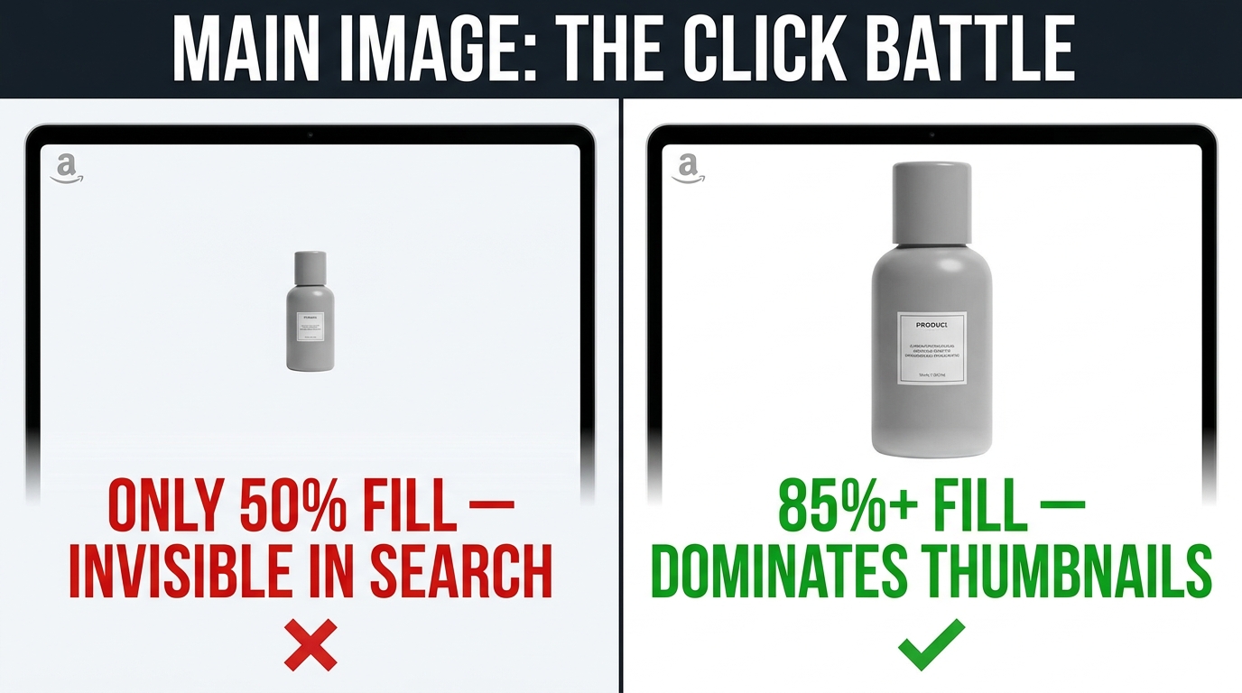
    Amazon main image optimization — product fill percentage comparison, 50% fill vs 85% fill impact on thumbnail CTR

    Amazon’s main image requirements are well-documented: pure white background (RGB 255, 255, 255), no text or graphics overlaid, professional photography only, and the product must fill at least 85% of the frame. These rules aren’t arbitrary — they create a level playing field in search results. What sellers often miss is that within those constraints, there’s still enormous room for strategic differentiation.

    Product Fill: The Most Overlooked Technical Lever

    Amazon requires products to fill at least 85% of the image frame. Most compliant listings actually fall between 85% and 90%. But the sellers who consistently win the click battle are often pushing their products to fill 90–95% of the frame. Why? Because on a search results grid — especially on mobile, where the thumbnails are tiny — a larger-appearing product simply dominates visually.

    Consider two competing listings for a yoga mat. Both have white backgrounds, both are compliant. One shows the mat rolled up, filling 88% of the frame with a lot of white space on the sides. The other fills 94% of the frame with the mat unrolled at an angle, showing the texture clearly. In a grid of twenty listings, which one pulls the eye? Almost always the latter. The extra 6% of frame fill isn’t a dramatic change in isolation, but in context — surrounded by competitors — it registers as a more substantial, more premium product.

    Angle, Dimension, and Color Strategy

    The angle at which you shoot your main image communicates a surprising amount of information before a buyer consciously processes it. A straight-on flat angle reads as simple and direct — good for commodity products where the buyer already knows what they want. A three-quarter perspective angle conveys dimension and quality — better for products where perceived value is a selling factor. An isometric or elevated angle works well for tech accessories, kitchen gadgets, and beauty products where the form factor itself is a feature.

    Color choice in your main image — specifically the dominant color of the product you choose to feature — can also be a strategic decision. If your product comes in multiple colors and the search results grid for your keyword is dominated by black products, featuring your white or natural variant as your main image color creates immediate differentiation. You’re not choosing your favorite color; you’re choosing the color that will stand out most in the specific competitive landscape your listing actually competes in.

    The Zoom Factor: Why 1600px Is the Real Minimum

    Amazon’s absolute minimum for images is 500px on the longest side, and the minimum for zoom functionality is 1,000px. But Amazon itself states that 1,600px or larger is required for the “optimal zoom experience” — and the zoom experience has been shown to increase sales. In practice, experienced sellers shoot at 2,000–3,000px on the longest side. This gives buyers who hover over the image on desktop a crisp, detailed zoom view, which is especially powerful for products where material quality, texture, or fine craftsmanship are selling points. Delivering a pixelated or blurry zoom experience is functionally the same as a buyer picking up your product in a store and having it feel cheap in their hands.

    Slot 2: Building Trust Before the Buyer Has Read a Single Word

    The buyer has clicked. They’re on your detail page. Their first instinct is to swipe or click through images before reading your title or bullet points. Slot 2 is where you begin the trust-building process — and trust on Amazon is built primarily through physical verification.

    What does “physical verification” mean? It means showing the buyer things about the product that prove it’s real, high-quality, and accurately represented. The most effective Slot 2 images fall into a few categories:

    Material and Texture Close-Ups

    For any product where material quality matters — apparel, home goods, bags, beauty tools, kitchen equipment — a tight crop showing the material at close range is extraordinarily effective. The buyer’s brain processes texture information and translates it directly into perceived quality. A sweater that shows individual stitching threads looks more premium than the same sweater shot from a distance. A cutting board that reveals its wood grain in detail feels more substantial than one shown at arm’s length.

    This close-up should be shot at similar resolution and lighting quality to your main image. Inconsistent lighting between Slot 1 and Slot 2 — a well-lit main image followed by a slightly darker or flatter material shot — creates an unconscious mismatch that erodes trust rather than building it.

    Scale Reference Shots

    One of the most consistent friction points for Amazon buyers is uncertainty about size. Even when dimensions are listed in the bullet points, buyers often fail to translate those measurements into a real mental image. An image that shows your product next to a common object — a hand, a coin, a standard-sized cup — resolves size ambiguity instantly and eliminates one of the most common reasons for returns.

    Scale shots are especially high-value for products in categories where buyers frequently complain about size surprises in reviews. If you browse your competitors’ one-star reviews and find “smaller than expected” or “much larger than I thought” appearing repeatedly, a scale reference shot in Slot 2 is directly addressing the primary reason buyers are returning that category of product.

    What’s in the Box / Package Contents

    For products that include accessories, components, or multiple pieces, a flat-lay showing every item included in the package is an excellent Slot 2 option. This eliminates uncertainty about what the buyer is actually purchasing and sidesteps the frustrating scenario where a buyer returns a product because they expected an accessory that wasn’t included. It also signals organization and professionalism — a well-composed flat-lay of your product and its components communicates that your brand is thoughtful and prepared.

    Slot 3: The Lifestyle Image — Selling the Person the Product Makes Them
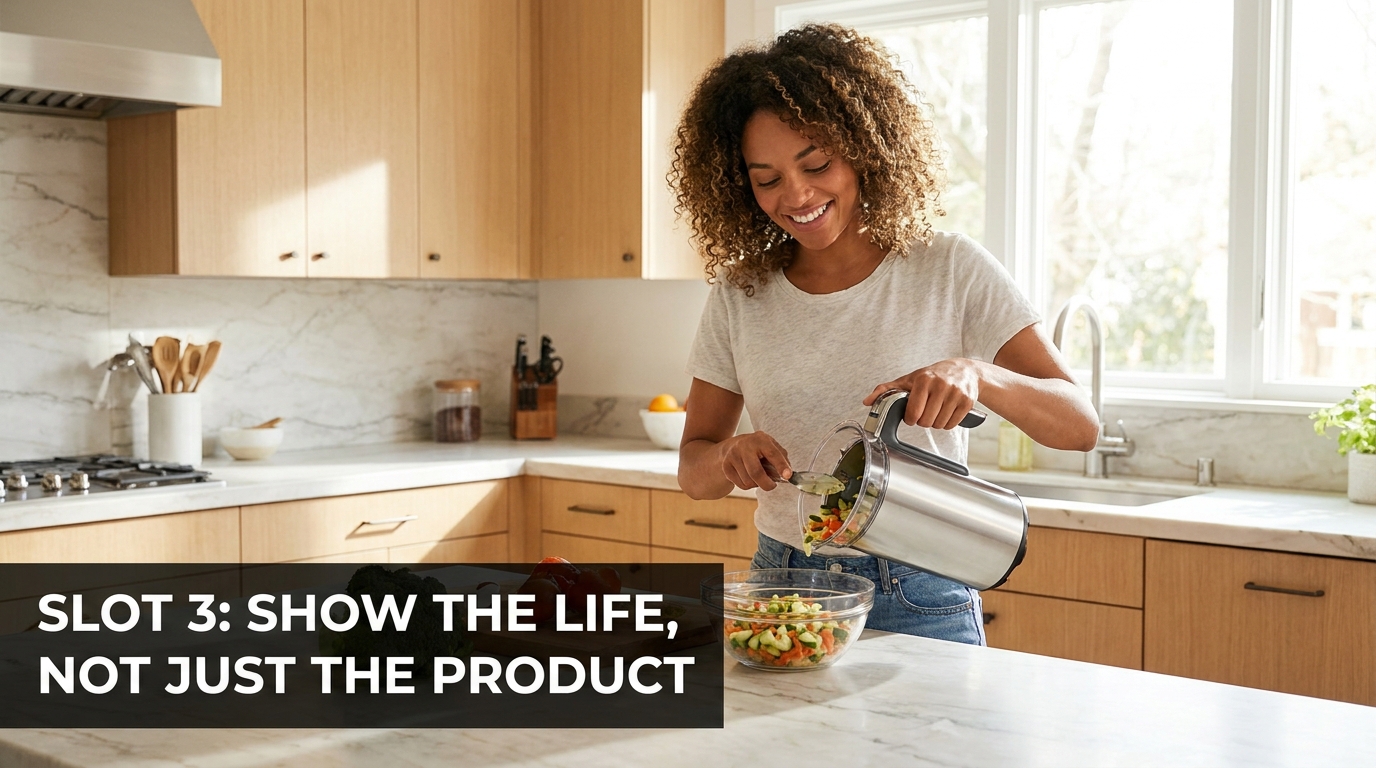
    Amazon lifestyle product image — person using kitchen product in natural home environment, show the life not just the product

    Lifestyle images are arguably the most misunderstood image type on Amazon. Most sellers know they should have one. Very few execute them in a way that actually drives conversion. The reason is a fundamental misunderstanding of what a lifestyle image is actually selling.

    A lifestyle image is not selling your product. It’s selling an identity — a version of the buyer’s life that your product enables. The product is almost incidental. What the image needs to communicate is: this is who you become when you own this thing.

    The Identity Gap: What Your Lifestyle Image Should Bridge

    Every purchase decision involves a gap between where the buyer currently is and where they want to be. A yoga mat buyer isn’t buying a rectangle of foam. They’re buying the version of themselves who practices yoga consistently and has a dedicated, beautiful space to do it in. A coffee grinder buyer isn’t buying a machine. They’re buying the morning ritual — the freshly ground beans, the quiet kitchen, the sense of intention before the day starts.

    Your lifestyle image should visualize the destination, not just the product. This means the setting matters enormously. A protein powder photographed in a cluttered gym locker room feels very different from the same product photographed on a clean, sunlit kitchen counter alongside fresh fruit. Both are technically lifestyle images. Only one communicates an aspirational identity that buyers want to associate with.

    The Casting Decision Nobody Talks About

    If your lifestyle image includes a person, the casting and styling choices you make are sending signals to your target buyer about whether this product is “for someone like me.” This isn’t about representing a narrow demographic — it’s about being intentional. A skincare product shot on a 55-year-old woman sends a very different signal than the same product on a 22-year-old. Neither is wrong. But if your buyer research tells you your primary customer is a 40-something professional woman looking for anti-aging solutions, your model choice, wardrobe, and setting should reflect that specific buyer — not a generic, ageless aspirational figure that no one particularly identifies with.

    The most effective lifestyle images on Amazon show a person who looks like the buyer at their best — recognizable enough to trigger identification, aspirational enough to motivate desire.

    Natural vs. Staged: The Authenticity Balance

    There’s a spectrum from perfectly staged catalog photography to candid-feeling lifestyle shots. In most consumer categories in 2026, the overly posed, perfectly-lit-with-no-natural-shadows aesthetic has lost its persuasive power because buyers have become accustomed to seeing it everywhere. The images that stand out now have slightly more texture — a window with natural light, a setting with authentic lived-in detail in the background, a model whose expression feels like a genuine moment rather than a directed pose.

    This doesn’t mean your lifestyle photography should look amateur. It means the production quality should be invisible — the image should feel like a moment captured, not a moment manufactured.

    Slot 4: The Feature Callout — Answering Every Objection Before It’s Asked
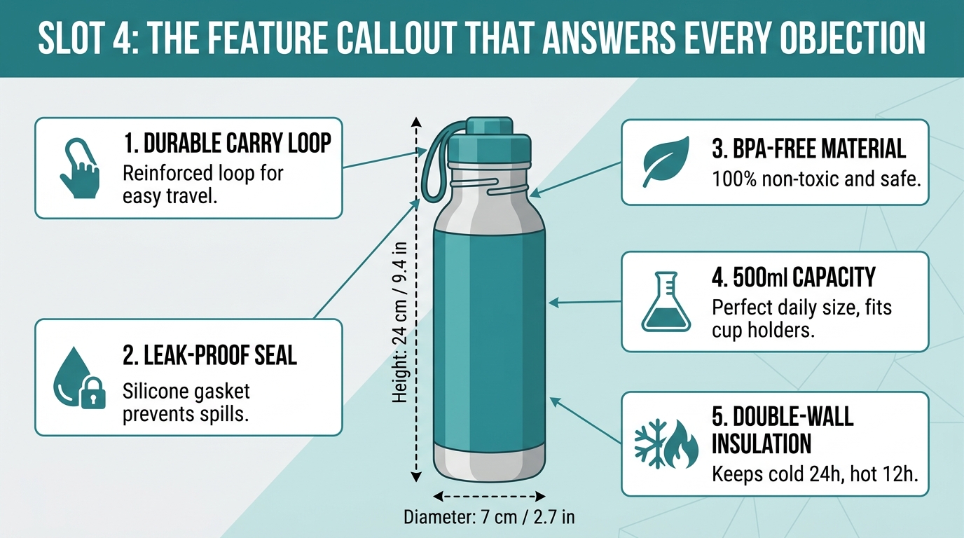
    Amazon feature callout infographic image — annotated product with benefit labels and arrows, answering buyer objections visually

    This is where many sellers become genuinely creative — and where many others produce something that looks busy, confusing, and unconvincing. A feature callout image (sometimes called an infographic image) overlays text, icons, and annotations on a product photograph to highlight key features and benefits.

    Done well, it’s one of the highest-converting image types in your gallery. Done poorly, it looks like a manufacturer spec sheet translated into a JPEG.

    Benefits Over Features: The Core Copywriting Principle Applied to Images

    The single most important principle for your callout image is the same one that governs all great product copy: lead with the benefit, not the feature. A feature describes what the product is or has. A benefit describes what that means for the buyer’s life.

    Consider two ways to label a water bottle lid:

    • Feature label: “Double-threaded seal”
    • Benefit label: “Zero-leak guarantee — toss it in your bag with confidence”

    The first tells the buyer something mechanical about the product. The second tells the buyer something emotional about their experience. Buyers don’t want a double-threaded seal. They want to stop ruining their gym bag with water-damaged electronics. Your callout copy should always be one step ahead of the feature, articulating the outcome rather than the mechanism.

    Visual Hierarchy in Callout Images

    A common mistake in callout images is treating all features as equal. If every callout point uses the same size text, same icon size, and same visual weight, the image becomes impossible to scan — the eye doesn’t know where to start or where to focus. The most effective callout images have a clear visual hierarchy:

    1. Hero benefit: The single most important thing a buyer needs to know — largest text, most prominent position, possibly with an icon or badge.
    2. Supporting features: Two to four secondary callouts in smaller text, positioned around the product image with clean leader lines or arrows pointing to the relevant product detail.
    3. Trust micro-elements: Small supporting details like certifications, warranty information, or material indicators that provide reassurance without demanding primary visual attention.

    The product should remain the visual center of the image. The callouts serve the product — they shouldn’t compete with it for attention. A useful test: if you squint at your callout image and the text elements visually overwhelm the product itself, the balance is off.

    How Many Callouts Is Too Many?

    There’s no universal right answer, but a useful rule of thumb is: three to five callouts per image. Below three, the image feels sparse and doesn’t justify the format. Above five, it begins to feel cluttered and the individual benefits lose their impact by being crowded together. If you have seven or eight important features to highlight, split them across two images rather than cramming all of them into one.

    Slot 5: The Comparison or Social Proof Image

    By the time a buyer reaches Slot 5, they’re genuinely interested. They’ve clicked, they’ve swiped through four images, they’ve spent real time with your listing. The psychological question now is one of justification: Why this product, specifically, over the alternatives? That’s the job of your fifth image.

    Comparison Charts: What Works and What Backfires

    Product comparison charts — tables that pit your product against generic competitors across a list of features — are common in Amazon listings and polarizing among sellers. Used correctly, they’re powerful. Used incorrectly, they generate skepticism and sometimes policy issues.

    What works: A comparison chart that compares your product against a clearly defined problem or inferior approach (rather than naming or implying specific competitors), showing specific, verifiable metrics where your product wins. For example: a wireless charger listing comparing “standard charging cable” vs. “our wireless pad” across dimensions like cable tangle, charging time, compatibility, and ease of use.

    What backfires: A comparison chart that cherry-picks only the attributes where you win, uses vague or unverifiable claims, or tries to name competitors indirectly in ways that Amazon could flag. Sophisticated buyers have seen enough of these charts to recognize when they’re being manipulated — a chart where your product wins every single category by a large margin often reads as suspicious rather than convincing.

    The most effective comparison image is one that’s specific, honest about any trade-offs (even briefly), and focuses on the attributes that actually matter to your buyer — not the full list of attributes where you happen to win.

    Social Proof as a Visual Element

    An alternative to the comparison chart that can be even more persuasive in the right categories is a social proof image — a designed image that surfaces real customer language, review sentiment, or usage data in a visually compelling format. This might be a curated selection of three or four short, specific review quotes overlaid on a product image. Or it might be a “before and after” grid if your product produces a visible transformation result. Or a simple bold-typography image that surfaces a key metric: “47,000+ customers. 4.7 stars. Rated #1 for two years running.”

    Note: any claims you make in image overlays need to be accurate and defensible. Don’t fabricate or inflate review counts, star ratings, or ranking claims. But if you genuinely have strong social proof, displaying it visually in your image gallery is more attention-grabbing than burying it in your bullet points where most buyers won’t read it anyway.

    Slots 6–9: Finishing the Story and Clearing the Final Friction Points

    Not every listing needs all nine image slots. Some products have simpler purchase decisions that are resolved by the first five images. But for most categories — especially those with higher price points, more complexity, or buyers who are doing careful research — the final three or four slots are where you either seal the deal or let doubt send the buyer back to the search results.

    Packaging and Unboxing: The Gifting and Perception Signal

    A photograph of your product’s packaging serves multiple strategic purposes. First, it’s practically useful: buyers want to know what will arrive at their door, and a well-presented package signals that the product has been thoughtfully designed all the way through. Second, in gift-purchase categories — which represent a substantial portion of Amazon’s volume, especially in Q4 — attractive packaging is a direct sales argument. If someone is buying a gift and they can see from the gallery image that it arrives in a premium-looking box, that’s a meaningful reassurance that the gift will make the right impression.

    Third, packaging photography signals brand maturity. A product in a well-designed box looks like it comes from a real brand, not a dropshipper. In a marketplace where buyer trust is precious, that association matters.

    Instruction and Process Images

    For products that require assembly, have a specific usage method, need to be set up before use, or come with multiple components, a step-by-step instruction or process image dramatically reduces buyer uncertainty. This is especially valuable in the home improvement, kitchen gadget, fitness equipment, and personal care categories.

    The format can be as simple as a three-panel horizontal strip: Step 1 image, Step 2 image, Step 3 image, each with a brief caption. This image tells the buyer two things simultaneously: “this product has a clear, simple use process” and “this brand cares enough to show you how it works before you buy.” Both messages build purchase confidence.

    Variant and Use-Case Range Images

    If your product comes in multiple sizes, colors, or configurations, a variant overview image in the final slots helps buyers visualize the full scope of what’s available. This is distinct from your main image strategy — this is about communicating range and flexibility to buyers who might be looking for a specific configuration and want confirmation that it exists before they commit to clicking “Add to Cart.”

    Alternatively, use the final slots to show secondary use cases: a portable speaker that’s primarily marketed for outdoor use might show secondary images in a kitchen, at a desk, in a bedroom. This expands the buyer’s mental context for the product, potentially winning purchases from buyers whose primary use case differs from your main positioning.

    The Brand Story Image

    The final slot is often best used for a brand-level image — something that communicates your company’s values, story, or commitment in a way that provides a final layer of trust for buyers who are still on the fence. This doesn’t need to be elaborate. It might be as simple as a clean, designed image that shows your brand logo, a brief mission statement, and an image of your team or manufacturing process.

    For buyers who have scrolled all the way to the ninth image, this closing brand affirmation can be the final psychological nudge that converts consideration into purchase. They’ve invested time evaluating your product. A brand image says: “we’re a real company, we stand behind this, you can trust us.” That’s not nothing.

    Mobile-First Image Optimization: Where Most Sellers Are Still Thinking Desktop
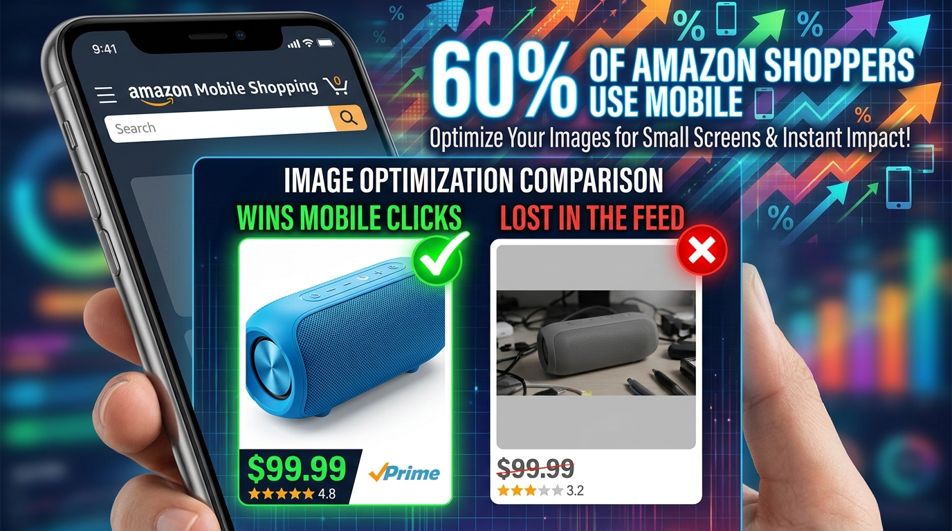
    Amazon mobile image optimization — smartphone showing product thumbnail comparison, 60% of Amazon shoppers use mobile

    More than half of Amazon purchases are now completed on mobile devices, and that figure continues to rise. This is not a minor platform consideration — it has direct, practical implications for how your images need to be designed, shot, and composed.

    The Thumbnail Problem: What Your Images Look Like at 150px Wide

    On mobile search results, your main image appears in a grid at roughly 150 pixels wide. At that size, fine details disappear. Thin text overlays become unreadable. Products with complex shapes or multiple components blur into an indistinct mass. The only things that survive at that scale are bold shapes, high-contrast colors, and clear product silhouettes.

    This is why your mobile thumbnail test is essential before finalizing any main image. Literally resize your candidate images to 150px wide on your screen and compare them against competitors at the same size. Does your product stand out? Is the shape clearly readable? Does the thumbnail look dramatically different from the surrounding products — or does it blend in? If it blends in, it will lose clicks on mobile regardless of how well-executed the full-size image is.

    Text Legibility in Secondary Images on Mobile

    For your secondary images — particularly callout and infographic images — mobile legibility of any text overlays is a critical design consideration. Text that’s comfortable to read at desktop screen size often becomes strained or completely illegible on a 390-pixel-wide phone screen.

    Practical rules for mobile-legible image text:

    • Minimum font size of 24pt in the original image file (at 2,000px width, this translates to approximately 1.2% of the image height).
    • High contrast between text and background — dark text on light backgrounds or light text on dark backgrounds. Mid-tone text on mid-tone backgrounds becomes unreadable at small sizes.
    • Sans-serif fonts at sufficient weight (medium or bold) — ornate or ultra-light typefaces lose definition on mobile.
    • Limit text in any single image to two to four short phrases. Long sentences in image overlays will either require unreadably small type or force the image into an awkward layout.

    The Swipe Sequence: Mobile Image Gallery UX

    On mobile, Amazon presents your image gallery as a horizontal swipe carousel. Buyers swipe left to advance. The friction is minimal, which means buyers who are engaged will swipe through multiple images — but the images need to reward that engagement at every swipe. Each image that delivers value (information, beauty, clarity) encourages the next swipe. Each image that’s redundant, confusing, or low-quality terminates the swipe sequence and sends the buyer either to your competitor or back to search.

    Test your own image gallery by opening your listing on your phone and swiping through it as a buyer would. Pay attention to the moments where you feel pulled forward and the moments where your attention drifts. Those moments of drifting attention correspond exactly to the images that need redesigning.

    The Six Most Common Image Mistakes Killing Amazon Conversions
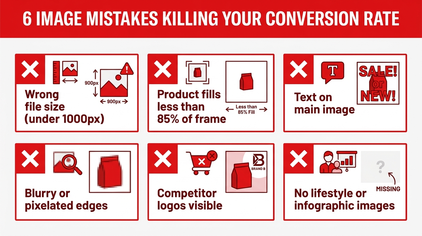
    Six common Amazon image mistakes killing conversion rate — infographic checklist of errors to avoid

    After reviewing thousands of Amazon listings across dozens of categories, certain image mistakes appear with striking consistency. These aren’t obscure edge cases — they’re common errors made by sellers at every level of experience, from new FBA sellers to multi-million-dollar private label brands.

    Mistake 1: Treating All Nine Slots as the Same Type of Image

    Some sellers shoot nine variations of a clean white-background product shot and call it a complete gallery. This is the equivalent of a salesperson who, when asked a question, responds by showing the product from a different angle instead of actually answering. Each slot needs to be a different format — different visual style, different information type — that moves the buyer forward in the decision process. Nine white-background shots deliver the same information nine times, which is redundant without being persuasive.

    Mistake 2: Image Quality That Drops Between Slots

    This is more common than it should be: a stunning, professionally lit main image followed by noticeably lower-quality secondary images — different lighting, different resolution, different color grading. This inconsistency creates a jarring experience that erodes the trust built by the main image. Your secondary images should be produced at the same quality level as your main image, even if their format and content differ.

    Mistake 3: Listing Fewer Than Six Images

    Amazon allows up to nine images (or more if you have Enhanced Brand Content / A+ Content in addition to the standard gallery). Listings with fewer than six images consistently underperform listings with six or more, because buyers who want to do thorough visual research hit the end of the gallery before their questions are answered. Using fewer images than you have available is like a salesperson leaving the room mid-pitch.

    Mistake 4: Text Overlays That Repeat the Bullet Points

    Your images and your written copy should work together, not duplicate each other. If your callout image’s text labels say exactly the same things as your bullet points, you’ve wasted the image slot. The image should show something the bullets can’t — the visual proof of a claim, the scale context, the lifestyle application, the before-and-after result. Reserve your text overlays for things that images communicate better than words, not just a visual copy-paste of your written content.

    Mistake 5: Generic Lifestyle Images with No Buyer Context

    A person holding your product in a vaguely pleasant environment is technically a lifestyle image. But if the setting, model, and scenario don’t specifically reflect your target buyer’s life and aspirations, it’s providing very little persuasive value. Generic lifestyle imagery says “here is a person using this product.” Specific, targeted lifestyle imagery says “here is the version of your life this product enables.” The latter converts. The former barely moves the needle.

    Mistake 6: Ignoring Review-Derived Objections in the Image Gallery

    Your product reviews — and your competitors’ reviews — are a direct line to the specific doubts, questions, and disappointments that buyers in your category experience. If “doesn’t fit as expected,” “hard to assemble,” or “color looks different in person” appears repeatedly in your reviews, those objections need to be directly addressed by images in your gallery. A size chart image, an assembly step image, a consistent color-accurate shot under multiple lighting conditions — these are not just nice-to-haves. They’re directly converting the most common sources of buyer hesitation into buying confidence.

    How to Test and Iterate Your Image Gallery Without Guessing

    The best image strategy in the world is still a hypothesis until it’s tested against real buyer behavior. Amazon’s own data is the most reliable signal available, and sellers who treat their image gallery as a living, testable asset consistently outperform those who finalize images at launch and never revisit them.

    Amazon’s Manage Your Experiments Tool

    Amazon offers Brand Registry sellers access to a tool called “Manage Your Experiments,” which allows you to run controlled A/B tests on your product listing elements — including images. This is arguably one of the most valuable and underused tools available to Amazon sellers. You can test two different main images against each other, see which one generates higher click-through rate and conversion rate, and make a statistically informed decision about which to keep.

    When setting up experiments, isolate the variable you’re testing. Don’t simultaneously change your main image, your title, and your price during an experiment — if your metrics improve, you won’t know which change drove the result. Run image tests independently, against a single variable, for at least two to four weeks to accumulate statistically meaningful data.

    Reading the Click-Through Rate Signal

    Your Amazon listing’s click-through rate (CTR) is the primary signal for main image performance. If your CTR is below category average, your main image is likely the culprit — not your price, not your reviews. CTR tells you whether your thumbnail is winning the click battle in search results. Conversion rate (the percentage of people who buy after visiting your detail page) is the signal for your secondary image performance — it reflects how well your full gallery is converting interest into purchase.

    If your CTR is strong but your conversion rate is weak, the issue is in the gallery, not the thumbnail. If both are weak, start with the main image. If CTR is weak but conversion is strong (unusual, but it happens), you have a highly persuasive gallery but a main image that isn’t winning enough clicks to show it to enough buyers.

    Competitor Benchmarking: Learning From What’s Already Winning

    Before investing in a full image overhaul, spend thirty minutes analyzing the top five organic listings for your primary keyword. Look at their image galleries systematically:

    • What format does each seller use for each slot?
    • What types of callouts appear most frequently?
    • Where do the best-ranking sellers use lifestyle images versus infographic images?
    • What visual style — warm vs. cool tones, staged vs. natural settings — dominates the top results?

    You’re not looking to copy. You’re looking to understand what’s working in your specific market — and where there’s a visual gap you can occupy. If every competitor is using cold, clinical white-background callout images, a warm-toned lifestyle-forward gallery might differentiate your listing dramatically. If the category is saturated with generic lifestyle imagery and no detailed callouts, a gallery that leads with specific, informative infographic images may win on the merits of clarity alone.

    Competitive benchmarking also helps you set a realistic quality baseline. If the top sellers in your category have clearly invested in professional photography, matching that quality level is a prerequisite — not a differentiator. You need to meet the quality floor before you can compete on the specifics.

    Building an Image Brief That Actually Gets You the Photos You Need

    Even sellers who understand image strategy clearly often struggle at the execution stage — because they hand a brief to a photographer or designer that’s too vague, too focused on aesthetics, or too disconnected from the strategic logic outlined above. The result is beautiful photographs that don’t actually do the jobs required by the gallery sequence.

    The Shot List: From Strategy to Deliverables

    Before your photo shoot or your design session, document a specific shot list that maps each slot to a precise deliverable. This shouldn’t be a mood board. It should be a functional specification:

    • Slot 1 (Main Image): Product X, shot at 45-degree angle, isolated on pure white, product fills 90–93% of frame, 3,000px minimum on longest side.
    • Slot 2 (Trust Builder): Tight crop of [specific material or component], showing texture detail, complementary lighting to Slot 1, same white/neutral background.
    • Slot 3 (Lifestyle): Model [demographic description], setting [specific location type], showing product in [specific use scenario], [time of day / lighting style], no props that distract from product.
    • And so on through each slot.

    When your photographer or graphic designer has a slot-by-slot brief with explicit goals for what each image needs to communicate to the buyer, the output aligns with strategy. When they’re given freedom to produce “great product photography,” you often get technically beautiful images that serve no specific strategic purpose.

    Post-Production Standards to Specify

    Even after the shoot, post-production decisions significantly affect image performance. Specify in your brief: color accuracy requirements (no heavy stylized color grading that misrepresents the product’s actual color), background removal standards for any images that will be isolated, consistent brightness and contrast levels across all gallery images, and any text overlay specifications for infographic images (font family, size, color palette).

    Consistency across your gallery is a trust signal that many sellers underestimate. A gallery that looks like it came from a single cohesive creative vision — even if the images vary in format and content — reads as more professional and more trustworthy than a gallery of technically decent images that feel like they came from six different shoots with six different aesthetics.

    The Image Audit Checklist: Where to Start This Week

    If you’ve made it this far and you’re looking at your current listings with new eyes, here’s a practical framework for auditing your image gallery before deciding what to change:

    Step 1: The Thumbnail Test

    Pull up your listing on your phone. Screenshot it within the search results grid. Zoom out until your thumbnail appears at approximately the size it would on a typical mobile screen next to competitors. Ask: does it demand attention, or does it disappear? If it disappears, your main image is the first priority.

    Step 2: The Swipe Audit

    Open your listing on mobile and swipe through all your images. At each image, ask: what question does this answer? What information does it deliver that wasn’t already in the previous image? What buyer doubt or objection does it address? If an image doesn’t clearly answer one of those questions, it’s a slot that’s being wasted.

    Step 3: The Review Mining Exercise

    Read the 25 most recent one-star and two-star reviews on your listing (and your top three competitors’ listings). Document every complaint, confusion, or unmet expectation that appears. Map each recurring issue to a potential image that could address it proactively. These are your highest-priority image additions.

    Step 4: The Format Audit

    List every image in your current gallery and label its format: white background product shot, lifestyle, callout/infographic, comparison, packaging, scale reference, process/instruction, brand. If any format appears more than twice, you likely have redundancy that’s wasting a slot. If lifestyle, callout, or comparison images are missing entirely, you have clear gaps to fill.

    Step 5: The Competitor Gap Analysis

    Do the same format audit for the top five organic competitors in your primary keyword. Compare the format map to your own. Where do the top sellers have image types you’re missing? Where do you have an opportunity to show something they’re not showing? That gap is your differentiation opportunity.

    Conclusion: The Gallery That Sells While You’re Not Looking

    Amazon moves at a pace that makes active selling impossible. You can’t follow up with every buyer who bounced. You can’t answer every question in real time. You can’t walk someone through your product’s features while they’re standing at their kitchen counter scrolling through search results at 11pm.

    Your image gallery is the version of you that shows up when you can’t. When it’s structured correctly — when every slot has a job, when the sequence mirrors the psychology of a purchase decision, when the visual quality is consistent and professional, when the mobile experience is deliberate — it sells your product 24 hours a day without you in the room.

    The sellers who treat images as a strategic asset rather than a compliance requirement aren’t doing anything exotic. They’re simply applying clear thinking to a problem that most competitors are solving randomly. They know that Slot 3 needs to sell an identity, not a product. They know that Slot 4 needs to answer objections, not just list features. They know that the ninth image can be the thing that converts a cautious buyer who’s spent three minutes on their listing and just needs one more reason to trust.

    If you walk away from this piece with one practical change: audit your current image gallery this week using the five steps above. Not to rebuild everything from scratch, but to identify the one or two slots where you’re either missing a format entirely or where an existing image isn’t earning its place. Fix those first. Measure the impact. Then iterate.

    The best Amazon image galleries aren’t built in a single shoot. They’re refined over time — tested, adjusted, improved — by sellers who understand that what’s displayed in those nine slots is not decoration. It’s the entire sales argument for their product, rendered in silence, at whatever hour a buyer decides they’re finally ready to buy.
  • What Your Amazon Images Are Really Costing You (And How to Fix It, Section by Section)

    What Your Amazon Images Are Really Costing You (And How to Fix It, Section by Section)

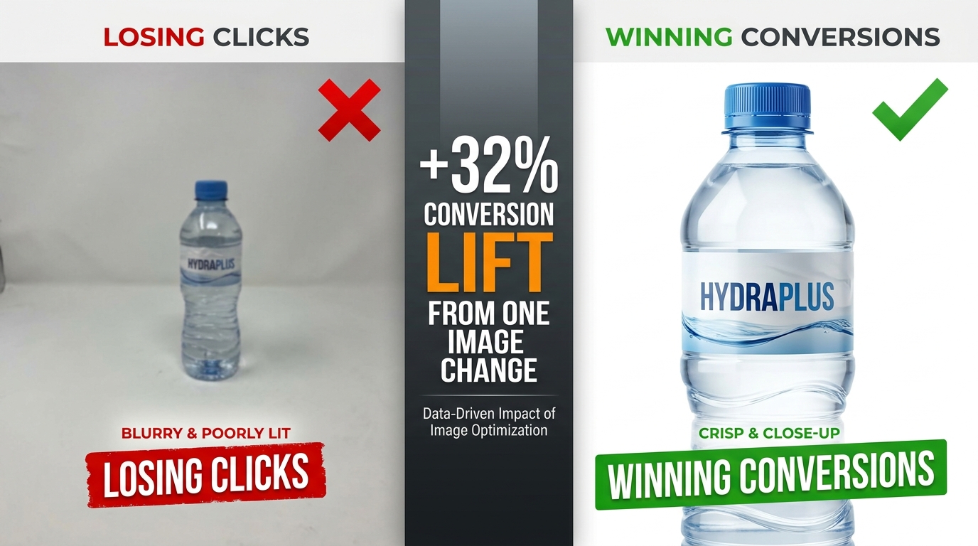
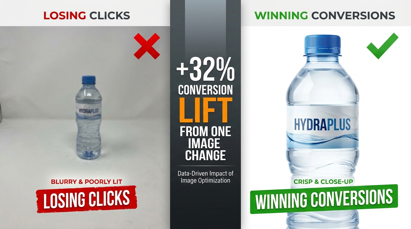
    Split-screen comparison: poor Amazon product image losing clicks vs. optimized image winning conversions with +32% conversion lift stat

    Most Amazon sellers focus their optimization energy in the wrong places. They obsess over keyword density in bullet points, fiddle with PPC bid adjustments, and chase backend search terms — while the single most powerful lever for clicks and conversions sits right at the top of every listing, doing damage no one is measuring.

    Their images.

    Here’s the uncomfortable reality: a shopper who lands on your listing will form a visual impression in roughly 50 milliseconds. Before they’ve read your title, before they’ve scrolled to your bullet points, before they’ve checked your reviews — they’ve already decided whether this product looks worth their time. That snap judgment is made entirely by your images.

    And yet most Amazon listings are built with images that were assembled quickly, tested never, and optimized for desktop in a world where more than 70% of Amazon traffic is now mobile. The result is a silent, invisible tax on every impression your listing receives — lower click-through rates, higher bounce rates, more abandoned carts, and ultimately, margin that quietly bleeds out without a clear culprit on your dashboard.

    This isn’t another post about making sure your main image has a white background. You know that already. This is a detailed, section-by-section breakdown of what truly high-performing Amazon image stacks look like in 2026 — covering the science of sequencing, the specific mistakes that cost sellers real money, what Amazon’s Rufus AI is now extracting from your images, and how to build a testing loop that turns your image gallery into a compounding asset.

    Let’s start at the beginning — with why images aren’t just a creative decision, but an economic one.

    The Visual First Impression: Why Images Decide the Sale Before Buyers Read a Word

    Amazon selling is, at its core, a conversion rate business. Traffic matters — but what you do with that traffic is what separates profitable listings from expensive ones. And the evidence is increasingly clear that images are the single biggest driver of whether a visitor converts or walks.

    JungleScout research ranks product images as the second most critical purchase factor for Amazon buyers, sitting just behind price. That’s ahead of reviews, shipping speed, and brand reputation. When you factor in that images directly influence price perception — a professional image makes a product look premium, justifying higher prices — the argument for treating image optimization as a top-tier business activity becomes overwhelming.

    The 50-Millisecond Window

    Research on visual processing consistently shows that human brains form first impressions of visual content in approximately 50 milliseconds. For Amazon shoppers, that 50-millisecond window happens in the search results grid, where your hero image thumbnail competes against every other product on the page.

    In that instant, a shopper’s brain is running a rapid-fire filter: Does this look professional? Does this look like what I’m searching for? Does this look worth clicking? If the answer to any of those questions is “not sure,” they scroll past. There’s no second chance in the search results — your hero image gets one shot.

    Professional, high-quality images have been shown to produce conversion rates 2-3x higher than amateur or low-quality shots, according to Statista data. That’s not a marginal gain. A listing converting at 6% instead of 3% on the same traffic doubles revenue without a dollar more in ad spend.

    Images as Your Silent Sales Team

    The 65-70% of purchase decisions that are driven by images aren’t just about aesthetics. Images answer the questions a buyer would otherwise have to dig through text to find: What does this actually look like? How big is it? How do I use it? What’s in the box? Will it fit my life?

    Every image slot in your gallery is an opportunity to answer one of those questions before doubt can take root and send the shopper elsewhere. The sellers who treat their image stack like a sales team — each image with a specific job, answering a specific objection, advancing a specific conversation — are the ones whose conversion rates hold up even in crowded categories.

    The sellers who upload seven vaguely similar product photos and call it done are running a listing that’s working against them every single day.

    The Hero Image: Engineering a Thumbnail That Commands the Click

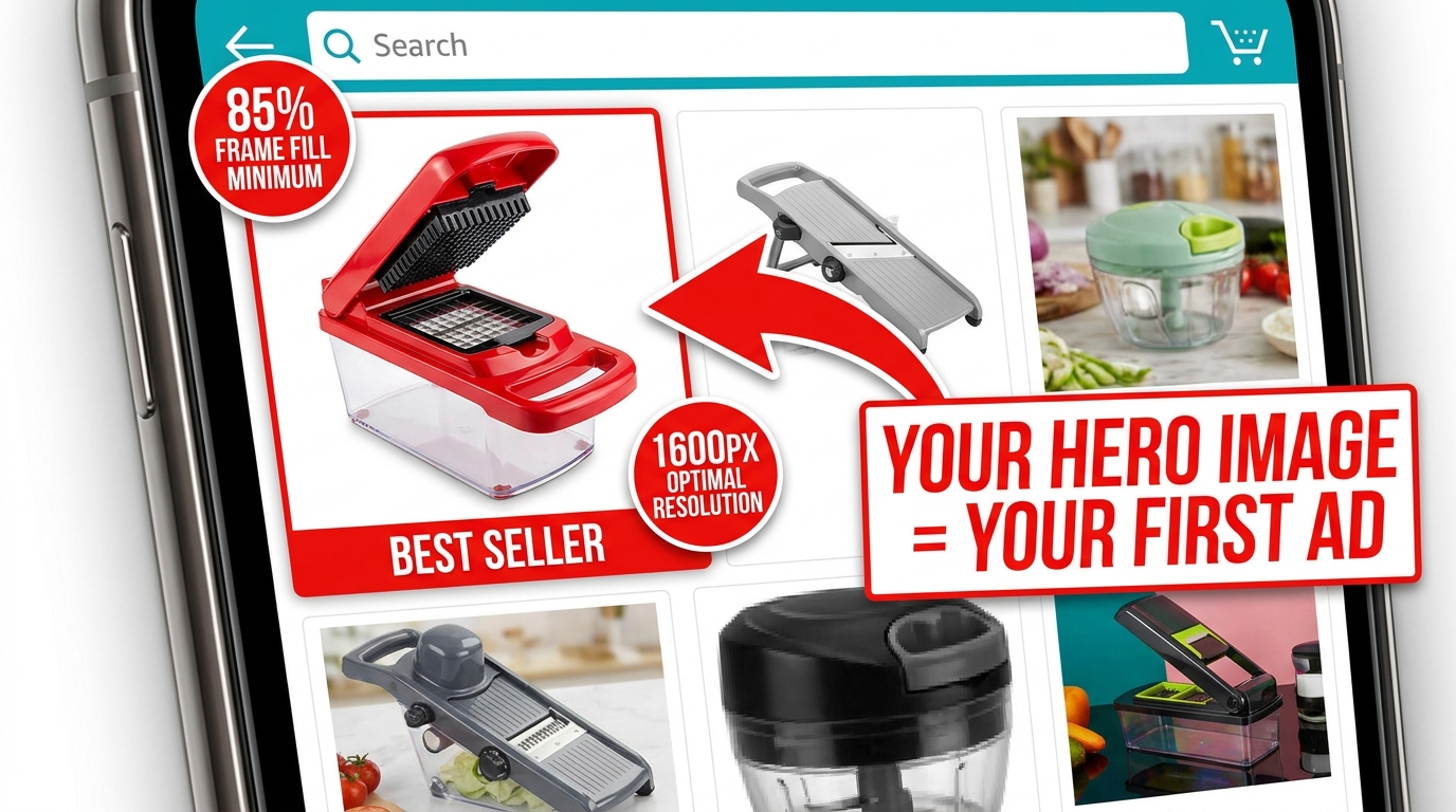
    Amazon mobile search grid showing one optimized product thumbnail standing out with 85% frame fill vs. competitors with dead space

    Your hero image — the main product shot shown in search results — is functionally an advertisement. It’s the creative that runs every time someone searches a keyword you rank for, and its job is a single, specific one: get the click. Not sell the product. Not explain the features. Get. The. Click.

    Everything else in your listing exists downstream of that click. The bullet points, the A+ content, the reviews, the video — none of it matters if the hero image doesn’t earn the visit. That’s why the hero deserves a level of attention and investment that most sellers reserve for their PPC campaigns.

    Amazon’s Non-Negotiable Technical Requirements

    Amazon’s requirements for the main image are strict, and violating them risks listing suppression. The rules are worth internalizing, not just bookmarking:

    • Pure white background: RGB 255, 255, 255 — not off-white, not light gray, not cream. Pure white.
    • Product fills at least 85% of the frame. This is a minimum. 90-95% is better.
    • No text, logos, graphics, watermarks, or borders overlaid on the product or background.
    • Minimum 1,000px on the longest side for the site; 1,600px to enable zoom (which improves conversion); up to 10,000px maximum.
    • Product must be shown outside packaging in most categories. No props or excluded accessories.
    • No multiple views of the same product in the main image.

    Amazon’s optimal specification is 1,600px or larger specifically because zoom functionality — the ability to hover and enlarge the image — has been shown to measurably improve sales. Don’t meet the minimum. Aim for 2,000px or higher for maximum quality at all display sizes.

    What “Commanding the Click” Actually Looks Like

    Within Amazon’s rules, there’s still significant room to differentiate. The best hero images share a few characteristics that go beyond technical compliance:

    Angle matters more than you think. The front-facing, flat product shot is the default — and for most categories, it’s what works. But the best angle is the one that makes your product’s most compelling feature immediately visible in a 200×200 pixel thumbnail. For a travel mug, that might be the lip-seal lid. For a knife, the blade profile. Test angles if you’re unsure.

    Contrast against the white background. White backgrounds make all products equal at a technical level — but visually, a product with natural contrast (dark colors, distinct edges, strong silhouette) pops far better than a light-colored product that blends into the white. If your product is white or light-colored, consider how professional lighting and shadow can create separation.

    Perceived quality through photography. The difference between a $200 professional product shoot and a phone photo isn’t just resolution — it’s lighting, shadows, reflections, and depth that signal to a buyer’s brain whether this is a premium product or a cheap knockoff. Professional photography for your hero image isn’t a nice-to-have. In most categories with competitive imagery, it’s table stakes.

    Dead Pixel Real Estate: The Hidden CTR Killer Most Sellers Ignore

    “Dead pixel real estate” is the term used among image optimization practitioners for the empty, unused space around a product in a hero image. It’s the blank white space that surrounds a product when the shot is taken from too far away, or when the original photography dimensions weren’t optimized for Amazon’s thumbnail format.

    In full desktop view, dead pixel space looks acceptable. But in Amazon’s search result grid — particularly on mobile — thumbnails are small and the competition for visual attention is fierce. Every pixel of empty white space is a pixel your product isn’t using. At thumbnail scale, a product that fills 65% of the frame looks noticeably smaller and less substantial than a competitor’s product filling 90%.

    Why This Matters at the Search Results Level

    At any given time on Amazon, your product thumbnail is displayed alongside 15-48 other thumbnails on a search results page. The cognitive load of choosing what to click is real — and shoppers make those micro-decisions based almost entirely on visual prominence and perceived quality.

    A product with significant dead pixel space around it reads as smaller, cheaper, and less important than its neighbors. It doesn’t matter if the product is actually premium — the thumbnail is the first impression, and perception is reality in the 50-millisecond window of a search results scroll.

    Optimizing for zero dead pixel space means cropping your image so the product fills 90-95% of the frame. If your original photography didn’t achieve this, it can often be corrected in post-production without a reshoot. The fix is frequently cheap. The cost of not fixing it compounds daily.

    The “Dead Pixel” Opportunity in Secondary Images

    The dead pixel concept also applies inversely to secondary images — where blank space can be deliberately used as “real estate” for value propositions. In infographic slots, sellers have used the white space around a product to place specification callouts, measurement indicators, and benefit bullets that technically don’t “overlay” the product itself.

    This approach threads the needle between Amazon’s rules (which prohibit text overlays on the main image) and the desire to communicate quickly in the secondary slots. It’s one of the more nuanced tactics available and, when executed cleanly, can make secondary images significantly more informative at a glance.

    The 9-Slot Image Sequence and the Psychology Behind Each Position

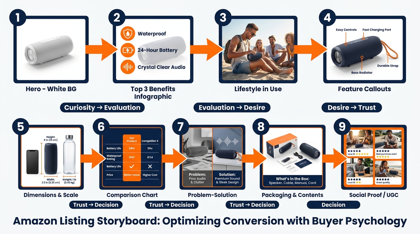
    Amazon 9-image slot storyboard sequence showing psychological buyer journey from curiosity through trust to purchase decision

    Amazon allows up to nine image slots plus a video slot for most categories. The vast majority of sellers use fewer than seven, and the ones who do use all nine frequently upload images in whatever order they happen to be ready — not in a deliberate sequence designed to move a buyer through a purchase decision.

    That’s a structural mistake. The image gallery is a sales funnel. Each slot corresponds to a different stage of the buyer’s cognitive journey, and a well-sequenced gallery moves shoppers from initial curiosity through evaluation, desire, objection-handling, and ultimately to the “Add to Cart” button. A randomly ordered gallery just gives shoppers more chances to find a reason to leave.

    The Nine-Slot Framework

    Here’s how high-converting sellers approach the 9-slot sequence:

    Slot 1 — The Hero: Pure white background, maximum frame fill, professional photography. Drives the click from search results. No information beyond the product’s visual quality and form factor.

    Slot 2 — The Top-3 Benefits Infographic: The buyer has clicked and is evaluating whether to stay. This slot answers: “Why this product?” Three bold, benefit-driven callouts with clean iconography. Not features — benefits. Not “1200W motor” — “Crushes ice in under 10 seconds.” This is where you address the emotional purchase driver immediately.

    Slot 3 — Lifestyle in Context: Show the product being used by a person in a real environment. This slot triggers aspiration and belonging. The buyer thinks: “That could be me.” It also communicates scale, ease of use, and the product’s fit into the buyer’s life — all without a word of text.

    Slot 4 — Feature Callouts with Close-Ups: Now the buyer is warming up and wants details. This slot goes deep on the product’s most important physical features — materials, components, specific design choices — with annotated close-up photography and short explanatory labels.

    Slot 5 — Dimensions and Scale Reference: One of the most common causes of returns is size mismatch. Buyers imagined the product was bigger or smaller than it actually is. A dedicated dimensions image — showing the product next to a recognizable scale reference (a hand, a common household item) alongside actual measurements — prevents this objection before it becomes a return or a negative review.

    Slot 6 — Comparison or Differentiation: If you have a legitimate advantage over the category standard — better capacity, more durable materials, more certifications, longer warranty — this is where to present it visually. A clean comparison chart (your product vs. “typical” competitor, not naming brands) addresses the “why not just buy the cheaper one?” objection directly.

    Slot 7 — Problem-Solution Narrative: Address the specific pain point your target buyer arrived with. “Tired of blenders that can’t handle frozen fruit?” This slot validates the buyer’s frustration and positions your product as the resolution. It’s the slot most sellers skip and the one that often moves the most hesitant buyers.

    Slot 8 — What’s in the Box: Show the full product contents laid out cleanly. This eliminates uncertainty (one of the primary drivers of abandoned carts) and creates positive surprise when the unboxing matches the image. It also signals quality packaging and attention to detail.

    Slot 9 — Social Proof or Trust Signal: Aggregate review ratings, certification badges, sustainability credentials, or user-generated content integrated into a clean graphic. This is the final reassurance before the purchase — the “others trust this, you can too” signal that closes hesitant buyers.

    Why Sequence Matters as Much as Content

    The same nine images in a different order perform differently. An image that works brilliantly in slot 3 can underperform in slot 7 because it’s answering a question the buyer hasn’t asked yet. The sequence mirrors the natural progression of a buyer’s internal monologue, and disrupting that progression creates friction. Friction kills conversions.

    Infographics That Actually Convert: Designing for the 3-Second Mobile Scan

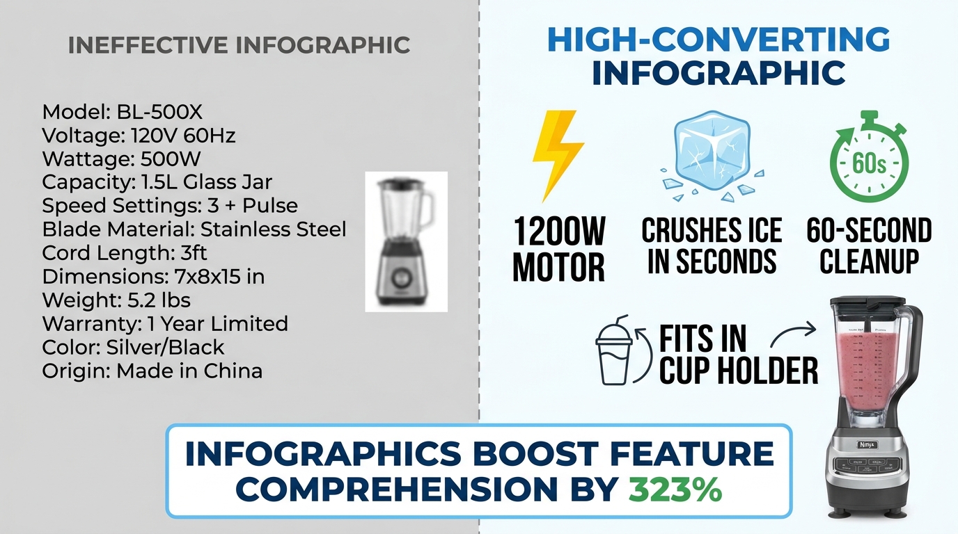
    Side-by-side comparison of ineffective cluttered Amazon infographic vs. clean high-converting infographic with 323% comprehension stat

    Infographic images — the secondary images that overlay text, icons, and callouts on or around product shots — have become a standard part of Amazon listing optimization. But “having infographics” and “having infographics that convert” are two very different things. The Amazon search results pages in most competitive categories are now full of infographic images. Many of them don’t work.

    The data on infographics is compelling: adding infographic and scale images with text to a listing can improve customer understanding of product features by up to 323%, according to aggregated Amazon listing data. That’s a dramatic number. But that uplift requires the infographic to actually be readable and scannable — conditions that a surprising number of infographics fail to meet.

    The Mobile Rendering Problem

    Here is the core design mistake sellers make with infographics: they design them on a large desktop monitor at 1:1 scale, where text looks clear and readable, then upload them without checking how the image renders at mobile thumbnail size.

    On mobile — where over 70% of Amazon shopping occurs — an image designed at 2000×2000 pixels is rendered in a space roughly 350-450 pixels wide. Text that looked fine at desktop scale becomes illegible at that compression ratio. A six-point callout font becomes microscopic. A ten-bullet feature list becomes a gray blur.

    The result is an infographic that registers as “busy” or “complicated” rather than informative. Buyers swipe past it. The 323% comprehension uplift assumes the buyer can actually read the infographic — and on mobile, they often can’t.

    The 3-Second Scan Principle

    High-converting infographics are designed around a single constraint: a mobile shopper should be able to understand the core message within three seconds. Not absorb every detail — just get the point.

    That constraint leads to several specific design rules:

    • Maximum three focal points per image. One image, one message. If you’re trying to communicate five things in one infographic, you’re communicating zero of them clearly.
    • Font size of at least 30-40pt on the original image file so text remains readable at mobile compression ratios. Test by shrinking your image to 400px wide before uploading and checking legibility.
    • High-contrast text on a contrasting background. White text on a white product doesn’t work. Dark text on a light background or light text on a dark element — with clear visual separation — is the standard that survives mobile compression.
    • Icons over text where possible. A lightning bolt icon communicates “fast” instantly. Three words of text do not. Iconographic communication is faster and more mobile-resilient than text-heavy designs.
    • Benefit language, not feature language. “Fits in any standard car cup holder” beats “6.5cm diameter base.” The first is a benefit the buyer can instantly relate to their life; the second requires mental translation.

    The “One Infographic Per Pain Point” Rule

    Each infographic in your image stack should address exactly one buyer question or objection. Not a collection of facts about the product — one clear answer to one specific concern. “Will it last?” “How hard is it to clean?” “Is it the right size for my needs?” When an infographic tries to answer three questions at once, it answers none of them convincingly.

    This single-focus discipline also makes A/B testing infographics much more actionable. When you test two versions of an infographic and one performs better, you know exactly what variable moved the needle — because each image only had one variable to begin with.

    Lifestyle Photography: The Emotional Trigger That Turns Browsers Into Buyers

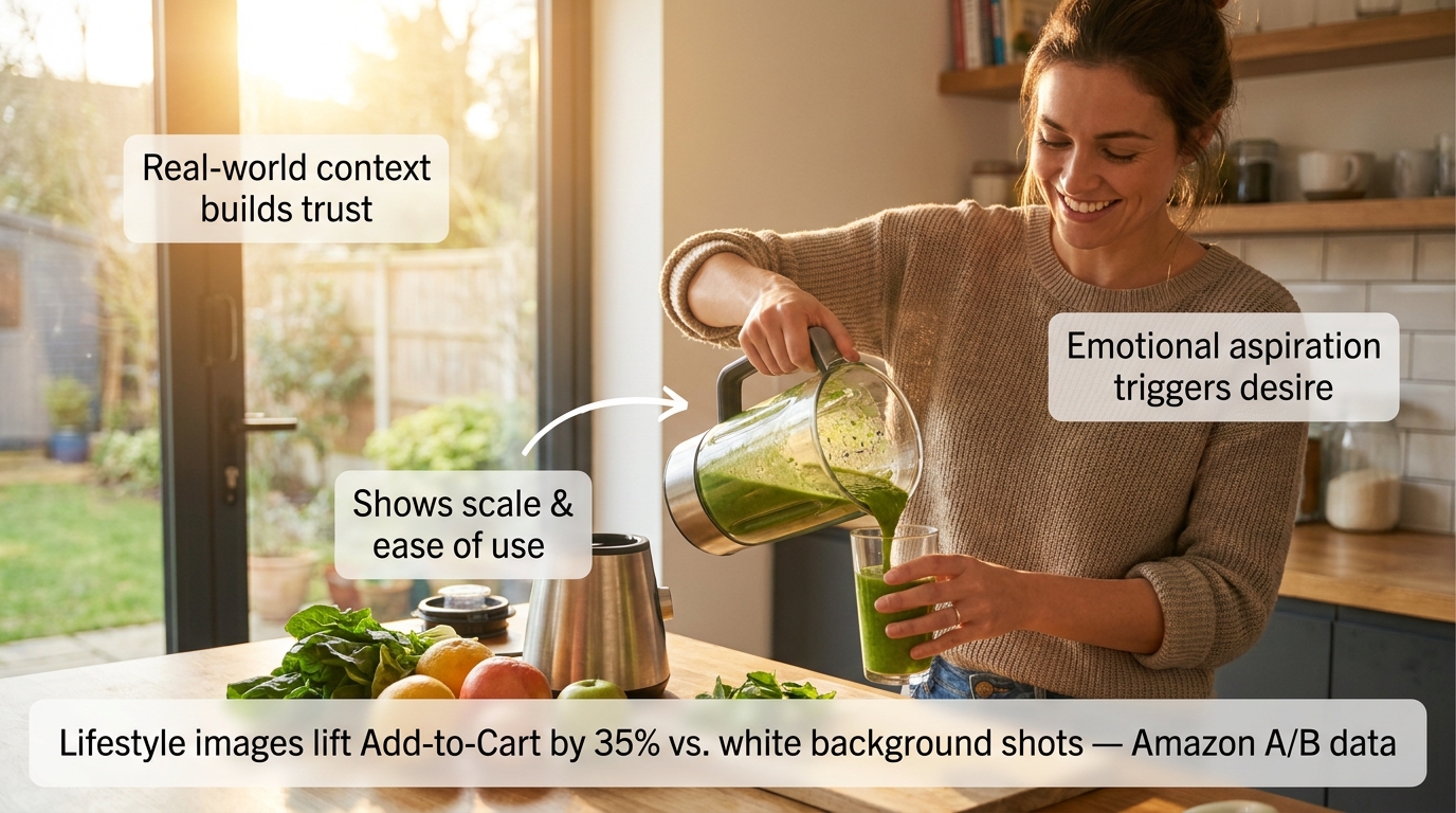
    Cinematic lifestyle product photo of woman using blender in bright kitchen with annotation callouts about trust, scale, and emotional aspiration triggers

    Amazon A/B testing data shows lifestyle images outperform standard white-background secondary shots by approximately 35% in Add-to-Cart actions. That’s a measurable, repeatable finding across multiple categories — and it makes intuitive sense once you understand what lifestyle images actually do psychologically.

    A white-background product image answers the question: “What does this look like?” A lifestyle image answers a fundamentally different — and far more powerful — question: “What will my life look like with this in it?”

    That shift from product-centric to life-centric framing triggers what psychologists call “mental simulation.” When a buyer sees a person using a product in a context they can relate to, their brain automatically begins simulating the experience of owning and using that product. Mental simulation is a key driver of desire — and desire is what converts browsers into buyers.

    What Makes a Lifestyle Image Work

    Not all lifestyle images trigger mental simulation effectively. The ones that do share specific characteristics:

    The model reflects the target buyer. A lifestyle image of a 22-year-old fitness influencer using a blender doesn’t resonate with a 45-year-old parent buying it for family meal prep. The most effective lifestyle images feature people whose demographics, environment, and life context mirror the target customer. This requires actually knowing your buyer — not just photographing whoever was available on shoot day.

    The environment is aspirationally realistic. “Aspirationally realistic” means the setting is attainable and relatable, not fantasy. A kitchen that’s beautiful but clearly someone’s actual kitchen. An office that’s clean and organized but recognizably an office. The aspiration is in the quality and atmosphere; the realism is in the believability. Pure fantasy settings (private yachts, penthouses for a $30 product) create cognitive dissonance that undermines trust.

    The product is shown in active use, not posed. A product sitting on a table with a person standing next to it is a prop photo. A product being actively used — hands on the handle, product in motion, someone mid-action — is a lifestyle photo. The distinction is the difference between showing what a product is and showing what a product does.

    The scale and ease of use are implicit. A lifestyle image should communicate “this is easy to use” and “this fits naturally into daily life” without stating either of those things. If the image requires the viewer to work to understand how the product is being used, it’s failing.

    Mobile-Testing Your Lifestyle Images Before Publishing

    68% of Amazon cart abandonments happen within 90 seconds of the first click, with mobile shoppers abandoning 2.1x faster than desktop users when images fail to communicate clearly. Before publishing any lifestyle image, view it on an actual mobile device at the size it will appear in the listing carousel. If the product isn’t immediately identifiable, if the scene reads as cluttered, or if the emotional message doesn’t land within two seconds — the image needs revision.

    This test takes 60 seconds and is skipped by almost every seller. Don’t skip it.

    What Rufus AI Reads in Your Images (And Why Most Sellers Are Missing It)

    Amazon’s Rufus AI — the conversational shopping assistant integrated into the Amazon app and website — represents a significant shift in how product discovery works. Rufus doesn’t just match keywords. It interprets product listings holistically, including the visual content, to answer natural-language shopper queries like “What’s a good blender for someone who makes smoothies every morning?” or “Show me a water bottle that fits in a car cup holder.”

    What most sellers don’t know is that Rufus uses optical character recognition (OCR) and computer vision to actively read and interpret the text and visual elements in your product images. Your infographics aren’t just for human eyes. Rufus is reading them too.

    How Rufus Extracts Image Data

    Through OCR, Rufus can read text overlaid on your secondary images — spec callouts, feature labels, dimension indicators, certifications. Through computer vision, it can analyze the visual content itself — identifying objects, contexts, and use cases depicted in lifestyle imagery.

    This means an infographic that reads “Holds 64 oz — Fits Standard Car Cup Holders” isn’t just communicating with a human buyer scanning your gallery. It’s feeding Rufus structured attribute data that can surface your product in response to the query “What’s a large water bottle that fits in my car?” — even if those exact words don’t appear anywhere in your title or bullet points.

    The implications are significant. For sellers competing in categories where listing text is already keyword-saturated, the image stack has become an additional indexable surface. The attributes you communicate visually are now functionally part of your product’s discoverable data set.

    Optimizing Images for Rufus Readability

    Several specific practices improve the quality of data Rufus can extract from your images:

    • Use large, high-contrast, readable fonts in infographics. If Rufus’s OCR can’t parse your text — because it’s in a stylized script font, at low contrast, or rendered too small — those attributes aren’t being captured. Clean, sans-serif fonts at adequate size are the most OCR-friendly choice.
    • Be specific in your callout text. “Large capacity” is vague and provides Rufus with limited searchable data. “Holds 64 oz — Fits standard cup holders” is specific and creates structured attributes that match specific queries. The more precise your callout language, the more useful it is to both Rufus and the buyer.
    • Use lifestyle images that clearly depict use cases. Rufus’s computer vision interprets visual contexts. An image of your water bottle in a gym bag tells Rufus this is a gym product. An image of it in a home office tells it this is a desk product. Diversity of lifestyle contexts — multiple use scenarios across your image stack — expands the range of queries your listing can surface for.
    • Include alt text on A+ Content images. A+ Content images support alt text, and Rufus reads those too. A descriptive alt text like “Woman using 1200-watt blender to make green smoothie in modern kitchen” provides far more contextual data than “product image 3.”

    The Competitive Advantage Window

    Awareness of Rufus’s image-reading capabilities among Amazon sellers remains low. Most listing optimization advice still focuses exclusively on keyword text. The sellers who begin optimizing their image stacks for AI readability now — while the majority of competitors haven’t — will build a structural advantage that compounds over time as Rufus’s role in product discovery continues to grow.

    A/B Testing Your Images: The Data-Driven Loop That Separates Growing Listings From Stagnant Ones

    Amazon Manage Your Experiments A/B test dashboard showing variant B winning with +32% conversion lift, 97% statistical confidence, $320K annual revenue impact

    The difference between an image stack that was optimized once and an image stack that is continuously optimized is enormous — and it’s measurable. The documented case studies on Amazon image A/B testing are some of the most compelling data in the seller ecosystem.

    A single image change on an eight-figure client’s listing produced a 32% conversion increase with no change in traffic. On a $1 million annual revenue baseline, that test generated an estimated $320,000 in additional revenue — from one image change. Tested to 97% statistical confidence over four weeks.

    A separate test of lifestyle versus plain background images across a three-week window produced a consistent 15% conversion lift. An 18% conversion rate increase was documented in another test involving both image and title keyword adjustments.

    These aren’t marketing claims. They’re documented A/B test results from Amazon’s own experiment infrastructure. The methodology is rigorous. The results are real.

    Amazon’s “Manage Your Experiments” Tool

    For brand-registered sellers, Amazon’s native A/B testing tool — Manage Your Experiments — is available through Seller Central. It enables you to test two versions of a main image (or other content elements) against each other simultaneously, splitting traffic between the variants and measuring conversion rate, click-through rate, and projected annual revenue impact.

    The tool handles sample size and statistical significance, giving you a confidence score that indicates how reliable the result is. Tests typically require 4-6 weeks to reach meaningful confidence levels — longer for lower-traffic listings, shorter for high-volume ones.

    The key best practice: test one variable at a time. If you change the main image and the background color and the badge in the same test, and conversions improve, you won’t know which change drove it. Isolating variables makes each test actionable, not just informative.

    What to Test and In What Order

    A rational image testing roadmap prioritizes by potential impact:

    1. Main image angle and composition — highest impact, directly affects CTR from search results. Test your current hero image against a version with tighter crop, different angle, or stronger visual contrast.
    2. Slot 2 infographic versus lifestyle — determines whether the “Why this product?” question is best answered with data or emotion for your specific buyer. Category and product type influence the answer differently.
    3. Lifestyle image subject demographics — test a lifestyle image featuring a buyer who matches your target demographic vs. a more generic model. The specificity uplift can be significant in niche categories.
    4. Infographic design variations — test a text-heavy infographic against an icon-forward one for the same content. Mobile rendering often favors icons.
    5. Slot order permutations — once content is optimized, test whether reordering slots improves flow. Slide the comparison chart from slot 6 to slot 3 and measure the effect.

    The Continuous Testing Mindset

    The most important shift isn’t tactical — it’s cultural. Image testing shouldn’t be a one-time project. High-performing sellers run image experiments every 3-4 weeks, rotating through their image slots systematically. The result isn’t a single 32% uplift; it’s a compounding series of 5-15% improvements that, over 12 months, can double a listing’s conversion rate.

    That’s not hypothetical. It’s what continuous testing looks like at scale.

    Video in the Image Stack: Why It’s No Longer Optional

    Amazon provides a dedicated video slot alongside the image gallery on product detail pages. For most categories, this slot can host a product video in the main image carousel — visible before the listing’s A+ content, before reviews, before anything below the fold.

    Video is no longer a differentiator in 2026. It’s expected. Listings with videos see higher engagement metrics across the board: more time on page, lower bounce rates, and conversion rates that consistently outperform video-absent listings in the same category. The aggregated data on listings using at least six images plus video shows conversion lifts in the range of 20-50% compared to image-only listings.

    What Type of Video Converts

    Not all product videos are equal. The videos that perform best on Amazon share a clear structure that mirrors the psychological image sequence described earlier: problem → product introduction → demonstration → result → call to action.

    Amazon video best practices for 2026:

    • Keep it under 60 seconds. The median attention span for an Amazon product video is under 45 seconds. Videos longer than 90 seconds see significantly higher drop-off rates before the key demonstration moments. Front-load your strongest content.
    • Design for silent viewing. A large portion of mobile shoppers view videos without sound. Captions and on-screen text should convey the full message without audio dependency. Key selling points should appear as text overlays at the moment they’re demonstrated.
    • Show the product being used within the first five seconds. Don’t spend time on brand intros, logo animations, or ambient footage before showing the product in action. Five seconds is approximately when mobile viewers make the swipe-or-stay decision.
    • Film in 9:16 vertical format for mobile priority. Amazon’s mobile carousel renders vertical video more effectively than horizontal. Given that mobile represents over 70% of traffic, vertical formatting should be the primary production orientation.

    Video as an Objection-Handling Tool

    The single most valuable function of a product video on Amazon is objection handling. Text and images can describe a product’s ease of use; video can prove it. Text can claim durability; video can demonstrate a stress test. Text can say “easy to assemble”; video can show the assembly completed in 90 seconds by an ordinary person.

    When you identify the top 3 objections holding buyers back from converting on your listing — look at your reviews and Q&A for clues — and build your video around directly addressing those objections with demonstration, you create a video that sells rather than just showing. The difference in conversion impact is substantial.

    The Mobile-First Image Audit: How to Stress-Test Your Listing Right Now

    Everything discussed in this post converges on a single practical starting point: you cannot optimize what you haven’t audited. Most sellers have never actually evaluated their listings the way their buyers experience them — which is on a 6-inch phone screen, in a search results grid, scrolling fast, often in a noisy environment with split attention.

    Here is a systematic mobile-first image audit you can conduct in under 30 minutes, right now, using only your phone and a competitor’s listing for reference.

    The Five-Point Mobile Audit Checklist

    1. The Scroll Test. Open Amazon on your phone and search one of your primary keywords. Scroll the results at normal speed without stopping. Note whether your listing’s thumbnail catches your eye before you scroll past it. If you have to actively look for your product in the grid, your hero image isn’t earning the click from cold traffic.

    2. The Thumbnail Fill Test. Without clicking on your listing, look at your hero image thumbnail in the search results grid. What percentage of the thumbnail space does the product fill? Compare it to the two or three most visible competitor thumbnails. If your product looks smaller or leaves more empty space, you have a dead pixel problem.

    3. The 3-Second Infographic Test. Click into your listing and swipe to your infographic images. Set a timer for three seconds and look at each one. What’s the one thing you understood from it in that window? If you can’t answer that question — if the image required more than three seconds to extract a single clear message — it’s underperforming for mobile buyers.

    4. The Lifestyle Relatability Test. Look at your lifestyle images with fresh eyes. Does the person in the image look like your target buyer? Is the environment recognizable to that buyer? Is the product being used — not just displayed? If any of those answers is no, that image slot is working below its potential.

    5. The Sequence Logic Test. Swipe through your full image gallery as if you’ve never seen the product before. Does each image answer the next logical question in a buying journey? Or do you find yourself confused about why a particular image appears when it does? Note the specific slot where the sequence feels disjointed — that’s your first optimization priority.

    Competitive Benchmarking: What the Category Leaders Are Doing

    For each of the five tests above, repeat them on the top-selling listing in your category. Document what their hero image composition looks like, what their slot 2 image communicates, how they use lifestyle photography, and what their infographic design choices are. Not to copy — to benchmark.

    Understanding where the category standard sits tells you whether you’re above, at, or below the visual baseline buyers expect when they search your category. Being below the baseline means you’re losing conversions to competition passively, every day. Being above it means your images are a competitive moat.

    In most categories, a thorough audit reveals at least three immediately actionable improvements — dead pixel space to close, infographic text to increase, lifestyle images to retarget — that can be addressed without a new photo shoot. Start there.

    The Compounding Effect of a Fully Optimized Image Stack

    Individual image improvements tend to produce individual results. A hero image fix produces a CTR gain. A better slot 2 infographic reduces early bounces. A more targeted lifestyle image improves Add-to-Cart rates. Each gain is real and valuable. But the full value of image optimization isn’t the sum of individual improvements — it’s the compounding effect of all of them working together.

    A listing with a high-converting hero image earns more clicks. More clicks mean more sessions. Better secondary images mean more of those sessions convert. Higher conversion rates improve your organic ranking algorithm, which improves your search placement, which produces still more organic traffic. Better images reduce return rates, which improves your seller metrics, which feeds back into ranking signals. Positive reviews from buyers whose expectations were set accurately by your images reinforce social proof, which improves conversion for future buyers.

    This is the compounding flywheel — and it starts with images, not ads.

    The True Cost of Unoptimized Images

    Every day a listing runs with a dead pixel problem in the hero image, it’s losing a percentage of the clicks it should have earned. Every day an infographic is rendering as unreadable text on mobile, it’s failing to move buyers past the evaluation stage. Every day a lifestyle image features the wrong demographic, it’s failing to trigger the mental simulation that drives desire.

    These aren’t theoretical losses. They’re real buyers who came close, evaluated, and went elsewhere — not because the product was wrong for them, but because the visual presentation didn’t make the case clearly enough at the moment it mattered.

    The cost of a professional product photography session for a full 9-image stack ranges from a few hundred dollars to $2,000 depending on category and complexity. The revenue impact of a 15-32% conversion improvement on a listing doing $100,000 a year is $15,000-$32,000 annually. That math works at almost any traffic level.

    Actionable Takeaways: Where to Start This Week

    If you take nothing else from this piece, start with these five actions:

    1. Run the mobile scroll test on your primary keyword today. If you can’t find your own listing in the first seconds of scrolling, your hero image needs work before anything else.
    2. Check your hero image’s frame fill. Open your main image in an image editor and measure the product’s footprint. If it’s below 85%, crop and reupload. This is a 20-minute fix with measurable CTR impact.
    3. View every infographic image at 400px wide. Screenshot it, shrink it, and read it. What survives? What becomes illegible? Redesign around what remains readable at that size.
    4. Fill every available image slot. If you’re running fewer than seven images, filling the remaining slots with a properly sequenced set of lifestyle, infographic, and detail images should be your first priority. 6+ images consistently outperform shorter galleries across documented data.
    5. Set up one A/B test this month. Brand-registered sellers have access to Manage Your Experiments for free. Start with a hero image variant — the highest-impact single test available. Give it four weeks and let the data decide.

    The sellers who treat their image stack as a living, continuously tested asset — not a one-time creative project — are the ones who build listings that compound in performance over time. In a marketplace where traffic is expensive, margins are compressed, and competition deepens every quarter, that compounding effect isn’t a nice outcome. In 2026, it’s the difference between a listing that grows and one that slowly loses ground.

    Your images are already either earning money or losing it. Now you know which questions to ask to find out which one.