Tag: E-commerce Photography

  • Why Your Amazon Image Stack Is a Silent Sales Funnel (And Most Sellers Are Wasting 6 Out of 7 Slots)

    Why Your Amazon Image Stack Is a Silent Sales Funnel (And Most Sellers Are Wasting 6 Out of 7 Slots)

    Most Amazon sellers think about their product images the same way they think about a brochure: collect your best-looking photos, put the cleanest one first, and hope for the best. It’s a passive approach — and it’s why so many listings with genuinely good products still convert at 8% when their competitors are converting at 22%.

    Here’s the reality: Amazon gives every seller up to seven image slots plus a video slot. That’s seven sequential touchpoints with a potential buyer who is already on your listing page — already interested enough to click. The only question is whether your images are doing the work of a skilled salesperson or just filling space.

    The sellers who consistently hit conversion rates above 15% don’t think of their image stack as a gallery. They think of it as a sales funnel. Each slot has a specific job. Each image hands off to the next. Together, they move a curious browser through doubt, interest, desire, and finally commitment — without the buyer ever reading a single bullet point.

    This post breaks down exactly how to engineer that funnel, slot by slot, with a clear framework for what each image needs to accomplish, what mistakes are silently killing conversions in each position, and how to adapt the strategy for mobile-first browsing behavior. We’ll also cover Amazon’s evolving multi-seller image rules, the right way to run image experiments without tanking your BSR, and the specific design decisions that separate high-converting image stacks from the ones that just look decent.

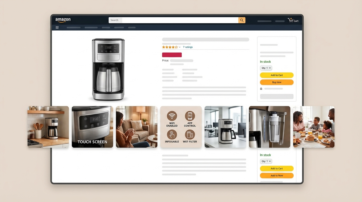
    Amazon listing image stack engineered as a 7-stage sales funnel with each slot labeled by conversion purpose

    How Amazon Shoppers Actually Consume Your Images

    Before you can design a high-converting image stack, you need to understand how buyers actually interact with your listing page — because it’s almost nothing like how most sellers imagine it.

    The Image-First Decision Pattern

    Shoppers on Amazon make their first purchase judgment in the image stack, not the copy. Multiple eye-tracking studies on e-commerce product pages consistently show that visual content is processed before text, and that the image carousel is the single most-engaged element on any product detail page. On desktop, buyers scan the hero image, check the price, then scan the secondary images — often before their eyes ever reach the bullet points. On mobile, the image takes up the entire initial viewport, meaning bullets and title are often not seen at all until the buyer actively scrolls down.

    This isn’t a minor behavioral quirk. It fundamentally changes what your images need to do. If a shopper’s buying decision is largely formed before they read your copy, your images can’t just support the listing — they have to carry it.

    The Mobile Scroll Pattern

    More than 80% of Amazon traffic now comes from mobile devices. On a smartphone, a shopper opens your listing and sees exactly one image: your hero. They swipe through the carousel horizontally. If your secondary images are text-heavy, poorly composed, or don’t load the key information in the top third of the frame (because mobile crops vertical images aggressively), buyers often swipe past without absorbing anything.

    The majority of sellers design their images on desktop screens, where a 1500×1500 square looks perfectly proportioned. That same image on a mobile thumbnail shrinks to roughly 300×300 pixels. Text that looked fine at full resolution becomes a blurry mess at thumbnail scale. Callouts that were clear on a 27-inch monitor are illegible on a 6-inch phone screen. This mismatch between design context and consumption context is one of the most common and most costly image mistakes in the Amazon seller community.

    The 8-Second Decision Window

    Amazon’s internal data, shared in various seller sessions and reported by sellers who’ve participated in brand-building programs, suggests that the average time between a product page load and a buyer’s binary decision — stay or leave — is somewhere between six and ten seconds. During that window, a shopper typically views one to three images. Your image stack doesn’t have the luxury of building a case over seven leisurely slides. It needs to hook, convince, and reinforce — fast.
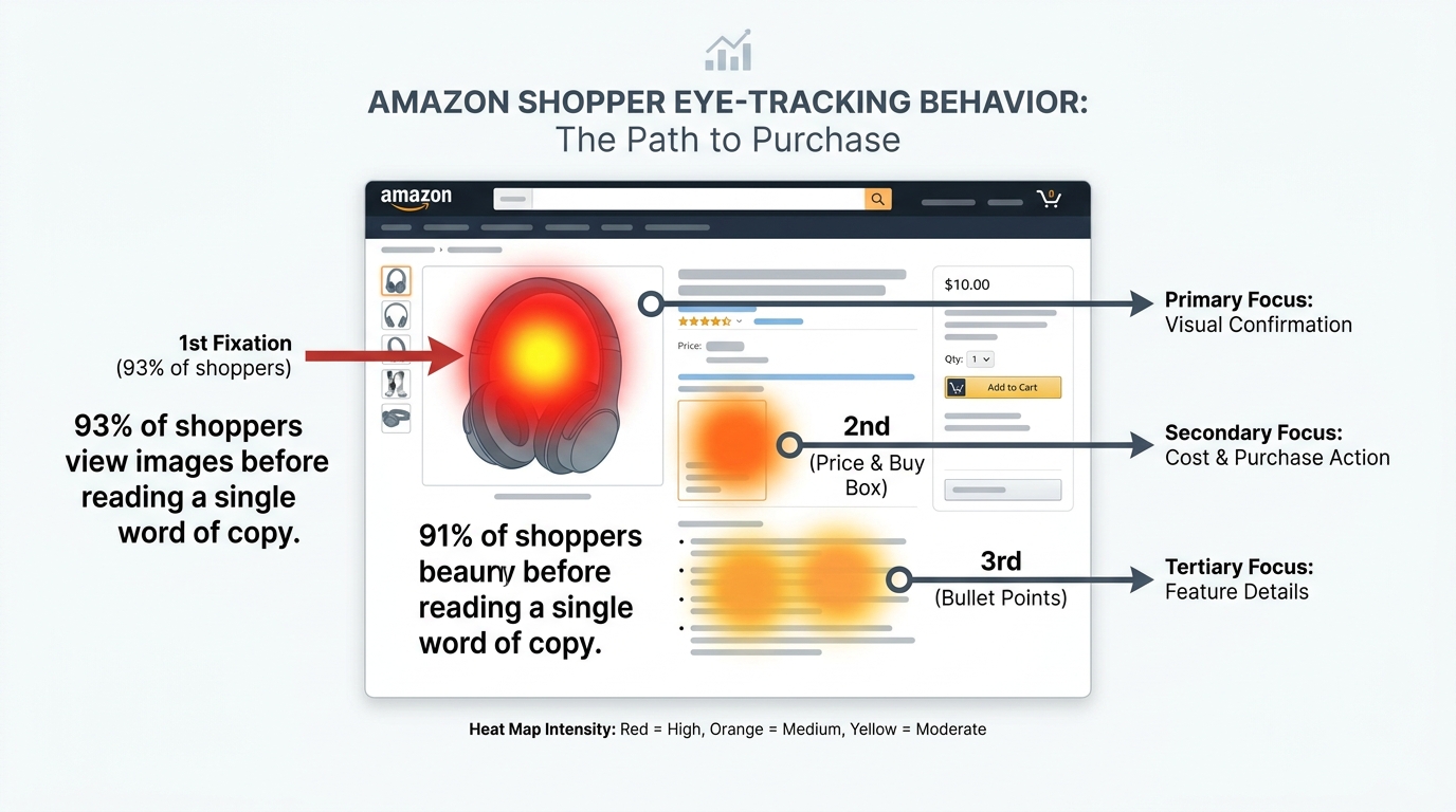
    Eye-tracking heatmap showing Amazon shoppers engage with images before reading copy on product detail pages

    Slot 1 — The Hero Image: Your Only Job Is to Win the Click

    The hero image has one purpose and one purpose only: get the click on the search results page. Not explain the product. Not show every feature. Not look aesthetically interesting. Win. The. Click.

    Everything else — the story, the proof, the lifestyle, the differentiation — lives in slots two through seven. The hero image’s job is over the moment the buyer taps your listing. Misunderstanding this is the most expensive single mistake in Amazon image optimization.

    Amazon’s Technical Requirements (And the Rules That Actually Matter)

    Amazon requires hero images to be on a pure white background (RGB 255,255,255), with the product occupying at least 85% of the frame. No additional objects, no props, no text overlays, no logos beyond what’s physically on the product packaging, and no watermarks. These aren’t optional guidelines — violations can trigger suppression of your listing from search results, which is a conversion problem that no amount of image quality can fix.

    Beyond the mandatory requirements, the most important technical spec is image resolution. Amazon recommends a minimum of 1000 pixels on the longest side to enable the zoom function, but 2000 pixels or more is the practical standard for a sharp, zoomable view. Shoppers who zoom are significantly more engaged buyers. A blurry zoom experience tells a buyer their product might be lower quality than advertised — even when it isn’t.

    What Makes a Hero Image Win Clicks in a Competitive Category

    In search results, your hero image appears as a thumbnail roughly 200-250 pixels wide, surrounded by your competitors. The question isn’t “does my hero look good?” — it’s “does my hero stand out in a grid of 20 similar products?”

    The most effective hero images tend to share a few specific characteristics. First, the product fills as much of the frame as the rules allow — the 85% minimum is a floor, not a target. Products that fill 90-95% of the frame read as larger and more substantial at thumbnail size. Second, the angle reveals the product’s defining feature at a glance. For a kitchen gadget, that might be the cutting mechanism. For a bag, the organizational interior. For skincare, the texture and finish of the packaging. The angle should instantly communicate “this is what makes this product worth clicking.”

    Third — and this is where most sellers leave money on the table — the hero image should be tested against the category context. Open your main keyword’s search results page and take a screenshot of the grid. Your hero should either match the dominant visual style well enough to look credible, or intentionally break from it in a way that draws the eye. Both strategies can work. Having a hero that’s just slightly different from competitors in an unremarkable way — which is most listings — works for neither.
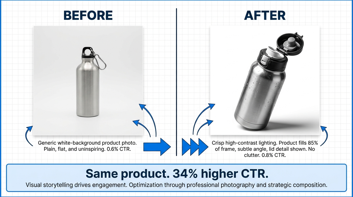
    Before and after comparison of Amazon hero images showing how small visual changes drive significant CTR improvements

    Slot 2 — The Problem Frame: Lead with Pain, Not Product

    Buyers on Amazon are almost always shopping to solve a problem or fulfill a desire. They’re not searching for “stainless steel insulated tumbler” because they’re fascinated by metallurgy — they’re searching because their coffee goes cold, their water bottle leaks, or their current cup is ugly and they’re tired of it. The problem came first. The product is the answer.

    Slot 2 is the most underutilized position in the image stack, and the reason is simple: most sellers skip directly to showing more product shots. They add another angle of the product from slot 1, maybe with slightly different lighting. This is a massive missed opportunity.

    The Problem-Agitation-Solution Structure

    The most effective second images follow a structure borrowed from copywriting: briefly name the problem, make it feel real and relatable, then position the product as the specific solution. In image format, this typically means a two-panel or three-panel design. Panel one shows the friction or frustration the customer experiences without this product — a cluttered cabinet, a stained car seat, a wilting plant. Panel two introduces the product with a short, direct headline that addresses the pain point directly.

    The goal is for a buyer to see this image and think “yes, that’s exactly the problem I have.” When that recognition happens, they’re no longer comparison shopping — they’re evaluating whether your specific product is the right solution. That’s a fundamentally different mental state, and it’s significantly more likely to convert.

    What Problem Framing Is Not

    Problem framing is not the same as negative advertising. You’re not attacking competitors or dramatizing suffering — you’re reflecting the buyer’s existing experience back to them in a way that builds immediate relevance and empathy. The tone should be knowing and helpful, not alarmist. A split image that shows a tangled mess of charging cables on one side and your organized cable management solution on the other hits the right note. An image that depicts someone in distress or uses dramatic language tends to feel off-brand and can actually reduce purchase intent.

    The product category matters significantly here. In the health and wellness space, problem framing around pain, fatigue, or discomfort needs careful handling. In home organization, outdoor gear, or kitchen tools, it’s almost always fair game and highly effective. Know your buyer’s emotional language before designing this image.
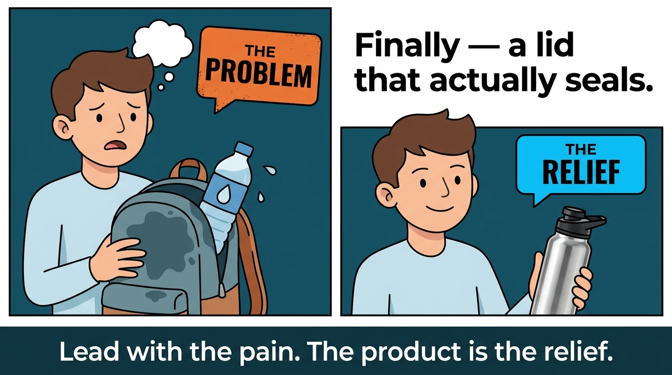
    Amazon listing slot 2 problem frame image design showing before/after panels that lead with buyer pain points

    Slot 3 — The Proof Engine: Feature Callouts That Reduce Cognitive Friction

    By the time a buyer reaches your third image, they’ve moved past initial interest and are starting to evaluate. They’re asking questions: What exactly is this made of? How does it work? What am I actually getting for this price? Slot 3 is where you answer those questions visually, before doubt has a chance to pull them toward the back button.

    Designing Effective Feature Callout Images

    The classic approach is a clean product image — not necessarily white background, though that works — with labeled callout lines pointing to specific physical features of the product. Think of it as an exploded diagram from a high-quality instruction manual, but designed to sell rather than instruct. Each callout should follow the same formula: name the feature, then state the specific benefit to the buyer.

    “BPA-free tritan plastic” is a feature callout. “BPA-free tritan plastic — safe for kids, dishwasher-proof” is a benefit callout. The second version does twice the work in roughly the same visual space. The feature tells buyers what the product is made of. The benefit tells them why that matters for their specific life.

    Four to six callouts is the sweet spot for most product categories. Fewer than four and you’re leaving qualification work undone. More than six and the image becomes visually cluttered, which is especially damaging on mobile where the viewer is already navigating a small screen. Every callout that makes it onto your image should be answering a question or concern that your target customer actually has — not every feature you could possibly list, but the ones that move buyers from interested to convinced.

    Certifications, Third-Party Testing, and Trust Signals

    Slot 3 is also the right place to introduce certifications, safety ratings, and third-party validation that applies to your product’s core features. An FSC-certified wood product, an NSF-certified water filter, a USDA Organic supplement, a UL-listed electrical product — these symbols of external verification carry significant trust weight with buyers who are unfamiliar with your brand.

    The key is to integrate these trust signals visually rather than just stacking logos in a corner. A callout line that says “NSF Certified — independently tested for contaminant removal” is far more powerful than a small NSF logo floating at the bottom of the image with no context. Buyers who notice a certification often don’t know exactly what it means — your callout text is the explanation that closes the sale.

    Amazon product image with feature callout lines showing ingredient benefits and certifications to build buyer trust

    Slot 4 — Lifestyle Context: Selling the Version of Themselves the Buyer Wants to Be

    People don’t just buy products. They buy into an identity, a version of their life that’s slightly better, more organized, more stylish, more capable, or more comfortable than the one they have today. Slot 4 is where that aspiration lives in your image stack — and when it’s done well, it’s often the single most powerful conversion driver after the hero image.

    The Difference Between Lifestyle Images That Convert and Ones That Just Look Nice

    The most common lifestyle image mistake is prioritizing aesthetics over specificity. A beautifully lit product photo on a marble countertop looks professional, but it doesn’t sell the product — it just says “this is the kind of brand that uses marble countertops.” The lifestyle images that actually move conversion rates show the specific target buyer in the specific context where they’d use this product, experiencing the specific outcome the product delivers.

    For a camping water filter, that means showing someone on a trail, filter in hand, drawing water from a stream — not a model holding the product in a studio with a pine tree backdrop. For a meal prep container, that means a tidy, colorful refrigerator shelf with five containers stacked and labeled, not just a single container on a kitchen counter. For a laptop stand, that means a realistic home office setup with the stand elevating a laptop to eye level, a person sitting with good posture — not just the stand holding a laptop in empty space.

    The specificity tells the buyer’s subconscious: “this product is for you, for exactly this situation.” Vague lifestyle imagery doesn’t make that connection nearly as effectively.

    Casting and Demographic Alignment

    If your lifestyle image includes a person — which it often should, because human faces drive engagement — the person in the image should visually match your target buyer’s demographic as closely as possible. This isn’t about exclusion; it’s about recognition. When a 40-year-old woman shopping for a yoga mat sees another 40-year-old woman using it in a way that reflects her actual practice, the product feels made for her. That feeling is conversion.

    Sellers who use generic stock photography — a 25-year-old fitness model doing an advanced pose — often miss the broader audience who would have bought the product but didn’t see themselves in the image. Custom lifestyle photography, while more expensive to produce than stock, consistently outperforms stock in A/B tests precisely because of this specificity.

    Slot 5 — The Comparison Image: How to Differentiate Without Getting Suppressed

    Comparison images are among the most powerful tools in a seller’s visual arsenal — and among the most frequently misused. When executed correctly, a comparison image directly answers the question every buyer is asking by the fifth image: “Why should I buy this instead of the other options I’m considering?” When executed poorly, it can get your listing suppressed, earn policy violations, or simply alienate buyers who resent feeling marketed to.

    What Amazon’s Policies Actually Allow

    Amazon’s image guidelines prohibit images that make false or misleading claims, reference specific competing products by name or with identifiable packaging, or use competitor brand names in a way that implies endorsement or creates confusion. What the policies do allow is a significant amount of space: you can compare your product against a generic “standard” version, show a before/after with your product vs. an inferior generic alternative, or use a comparison chart that evaluates attributes without identifying competitors by name.

    The practical standard that passes review is the “us vs. the category” comparison rather than “us vs. Brand X.” A chart that shows your product checking boxes on material quality, warranty length, certifications, and included accessories — while a “standard version” column shows gaps — makes the competitive case without putting a target on your listing. This approach has become something of a visual convention in highly competitive categories, which means buyers now recognize the format and know how to read it immediately.

    The Attribute Selection Problem

    The comparison attributes you choose in your chart are as important as the format. A comparison image that highlights attributes where your product wins but glosses over attributes where it’s equal to or worse than competitors reads as manipulative — and savvy buyers notice. The stronger approach is to choose comparison attributes that are genuinely important to buyers in your category and where you have a legitimate advantage. Four to six attributes, all of which your product wins or ties, is a more credible presentation than eight attributes where you cherry-picked the five you win and quietly omitted the three you don’t.

    If you can, build your comparison attributes around the objections you see most frequently in your negative reviews or competitor negative reviews. Those are the real buying concerns — and a comparison image that addresses them directly is essentially preemptive objection handling at the visual level.

    Slot 6 — Social Proof and Scale: Making the Crowd Visible

    By slot 6, a buyer who is still in your image stack is seriously considering a purchase. They’ve seen the product, understood the features, felt the lifestyle connection, and compared the value proposition. What they need now is confirmation that other people made this same decision and are glad they did. That’s the job of social proof imagery.

    Review Pulls Done Right

    One of the most direct social proof formats in Amazon listings is a review pull image — a screenshot or typeset version of a real five-star review, presented prominently with the reviewer’s first name and the key sentiment highlighted. This is legal and allowed under Amazon’s guidelines, provided you’re using reviews from Amazon shoppers on your own listing (not fabricated quotes) and not implying Amazon’s endorsement.

    The reviews you choose matter more than the format. The best review pull images feature reviews that address a specific concern or outcome — not just “great product, love it!” but “I was skeptical about the size but it fits perfectly in my bag and hasn’t leaked once in three months.” That specificity mirrors the buyer’s internal dialogue in a way that generic praise cannot. Buyers reading that review don’t just see approval — they see themselves in the situation the reviewer described.

    Numbers as Social Proof

    If your product has crossed meaningful volume thresholds, scale signals can be powerful in this slot. “Over 50,000 units sold” or “Trusted by customers in 42 countries” communicates popularity and validation without relying on individual testimonials. The key word is “meaningful” — a claim like “1,000+ happy customers” reads as small, not reassuring. The threshold depends on your category and price point, but generally speaking, usage or sales numbers work best when they’re large enough that the buyer’s first reaction is surprise or impression, not skepticism.

    Award badges, press mentions, and “as seen in” callouts also belong in this slot if they’re genuine and recognizable to your buyer. A mention in a major consumer publication relevant to your category carries credibility. A logo for an outlet your buyer has never heard of adds no value and can actually make the listing look desperate. Be selective.

    Slot 7 — The Closer: Resolve the Last Objection Before Checkout

    The seventh image slot is the last image in the standard carousel before a buyer either adds to cart, scrolls to reviews, or leaves. This is your final opportunity to remove any remaining friction — and the nature of that friction depends entirely on your product and category.

    The Three Closer Strategies

    The most effective slot 7 images typically take one of three approaches, depending on what’s most likely to stall the buyer at this point in the decision.

    The Guarantee Image. For products where buyers commonly worry about quality, durability, or fit, a clear visualization of your warranty or satisfaction guarantee removes the financial risk of the purchase. “30-Day No-Questions-Asked Returns” in large, readable type on a clean background, with your brand’s tone of voice in the supporting copy, does two things simultaneously: it addresses the fear of a bad purchase and it signals confidence in the product’s quality. A seller who offers a strong guarantee but doesn’t visualize it is leaving that trust signal buried in bullet points where most mobile shoppers never read.

    The Bundle Reveal or What’s Included Image. For products that come with accessories, multiple pieces, or complementary items, a clean flat-lay of everything in the box is enormously effective in the final slot. Buyers often don’t realize the full value of what they’re purchasing until they see all of the components laid out together. This image format also reduces post-purchase disappointment and return rates, because buyers know exactly what they’re getting before checkout. A “what’s in the box” image with labeled items and a headline like “Everything You Need, Right Out of the Box” is both reassuring and compelling.

    The Objection Annihilator. If your negative reviews consistently cluster around one or two themes — assembly difficulty, size discrepancy, material concerns — address those objections directly in slot 7. An image that says “Assembly takes under 5 minutes — no tools required” with a simple visual demonstration of the steps is more powerful than any number of bullet points defending the product. You’re catching the buyer right at the point of departure and giving them the specific reassurance that might tip them back toward adding to cart.

    Mobile-First Image Design: The Specs That Actually Matter in 2026

    Designing for desktop and hoping for the best on mobile is a strategy that was marginal five years ago and is simply indefensible today. With the overwhelming majority of Amazon browsing happening on smartphones, every design decision in your image stack needs to be validated on mobile before it goes live.

    Resolution and Zoom Quality

    Amazon’s minimum image requirement is 500 pixels on the longest side, but that produces images that look soft and unprofessional at full screen on a modern high-DPI smartphone display. The working standard among high-performing sellers is 2000×2000 pixels for square images, which delivers sharp zoom capability and looks clean across all device types. If you’re using a third-party image creation tool or working with a freelance designer, confirm the delivery resolution before the images go live — low resolution is often invisible until the images are actually published and viewed on a high-DPI screen.

    Text Sizing and the Mobile Readability Test

    This is where most image stacks fail silently. Text that looks perfectly readable on a 1500×1500 image on a desktop monitor often becomes completely illegible when that same image is compressed to a 360-pixel-wide mobile viewport. The practical rule most experienced Amazon designers use: if any text in your image is below approximately 40 points at the native image resolution, it’s likely too small to read reliably on mobile. Headlines and feature callout labels should be significantly larger than this — 60-80 points at native resolution is not uncommon in well-optimized listing images.

    The simplest test: export your image, open it on your own smartphone, and view it at the size Amazon would display it in the carousel. If you’re squinting, your buyer will be squinting too — and squinting buyers don’t buy.

    The Top-Third Composition Rule

    On mobile, Amazon sometimes crops the bottom of listing images slightly, and the primary visual weight of the image is always concentrated at whatever the user sees first when they swipe to that slide. The most important text or visual element in each image should sit in the top half of the frame, ideally the top third. Callouts, headlines, and key claims buried in the bottom 20% of an image are frequently missed entirely by mobile users whose thumbs are already poised to swipe to the next image.

    Mobile-first Amazon image design showing font size requirements and composition rules for smartphone shoppers

    Amazon’s Multi-Seller Image Policy: What Changed and What It Means for Your Stack

    In early 2024, Amazon made a significant change to how images are displayed on product detail pages for hardlines product categories. Where previously a single seller’s images controlled the listing’s visual presentation, Amazon now has the ability to pull images from multiple selling partners — or supplement from Amazon’s own image library — when a listing’s image set doesn’t meet minimum requirements.

    The Three Required Images

    Under the updated guidelines, each product detail page in affected categories should have at minimum three specific image types: a product image on a white background, a product image in a contextual environment (lifestyle), and an image showing size and fit information. These aren’t suggestions — they’re the baseline that Amazon uses to evaluate whether a listing’s image set is complete enough to display without supplementation.

    The practical implication is significant: if your listing is missing any of these three required image types, Amazon may now display images from other sellers or from its own sources in your slots. For brand-registered sellers whose products are the subject of that ASIN, this is rarely a problem if the listing is fully optimized. For sellers who’ve been running lean on images — two or three slots only — this policy creates a real risk that a competitor’s image of the same generic product appears on your listing, potentially with different branding or visual messaging than your own.

    Brand Registry Sellers vs. Resellers

    The policy’s impact is most acute for resellers of branded products they don’t manufacture. Amazon’s selection process for which seller’s images to display considers brand ownership and licensing rights, giving brand-registered manufacturers a significant advantage in controlling the listing’s visual presentation. For private label sellers who are the sole seller of their ASIN, the risk is lower — but the mandate to maintain a complete, high-quality image set is now more important than ever, because an incomplete image set is effectively an invitation for Amazon to fill the gaps.

    The takeaway is straightforward: having the minimum three required images isn’t a strategy, it’s a floor. The sellers who protect their listing’s visual identity most effectively are the ones with all seven slots filled with purpose-built, high-quality content — because a complete, high-performing image stack gives Amazon no reason to supplement, and gives buyers no reason to look elsewhere.

    Testing and Iterating: Running Image Experiments Without Losing Ground

    Understanding what makes a great image stack conceptually is one thing. Knowing whether your specific images are actually converting your specific audience is only answerable through testing. Amazon provides brand-registered sellers with a native testing tool — Manage Your Experiments — that allows A/B testing of listing images. Using it correctly is the difference between systematic improvement and expensive guessing.

    How Manage Your Experiments Works for Images

    Manage Your Experiments lets you test two versions of a listing element — including main images and A+ content — simultaneously against a live audience. Amazon automatically splits traffic between the two versions and measures conversion rate, units sold, and revenue per customer across both arms of the test. At the end of the experiment period, the platform identifies a statistically significant winner (if one exists) and allows you to apply it permanently to the listing.

    The most important discipline in running image experiments is testing one variable at a time. The temptation when you have a new image set is to swap all seven slots at once and see what happens overall. The problem with this approach is that you learn nothing useful — if your new image set converts better, you don’t know which image drove the improvement. If it converts worse, you don’t know what broke it. Systematic testing means changing one slot per experiment, running the test to statistical completion, applying the winner, and then moving to the next slot.

    Experiment Duration and the BSR Problem

    Most Amazon A/B tests need a minimum of four to six weeks to generate statistically meaningful data, and sometimes longer for lower-velocity ASINs. This is one of the places where sellers create problems for themselves by ending tests early based on early results. A test that looks like a clear winner after two weeks can reverse after four weeks once seasonal traffic patterns, pricing fluctuations, or advertising changes normalize in the data.

    The BSR concern that keeps many sellers from testing is valid but manageable. Image testing through Manage Your Experiments doesn’t directly penalize your ranking — Amazon’s algorithm sees conversion rates from both image versions and they tend to average out during the test period. What you want to avoid is a scenario where you manually swap images outside the testing tool in a way that creates a sudden, noticeable drop in conversion — which can signal to the algorithm that the listing has changed unfavorably. Using the native testing tool handles the traffic split in a way that protects ranking stability during the experiment.

    What to Test First — and in What Order

    The highest-leverage image to test is always the hero image, because it affects both click-through rate on search results and the initial impression on the product page. Even a small CTR improvement at this level compounds across every subsequent stage of the funnel. Start with hero image variants before testing any secondary images.

    After the hero, the second-highest-leverage test in most categories is slot 2 or slot 3 — the images that engage buyers who clicked through and are actively evaluating. Testing different framings of the problem, different callout structures, or different lifestyle contexts in these early secondary positions often surfaces significant conversion differences. Slots 5 through 7 are worth testing, but their impact tends to be narrower, since only the most engaged potential buyers reach those images in the first place.
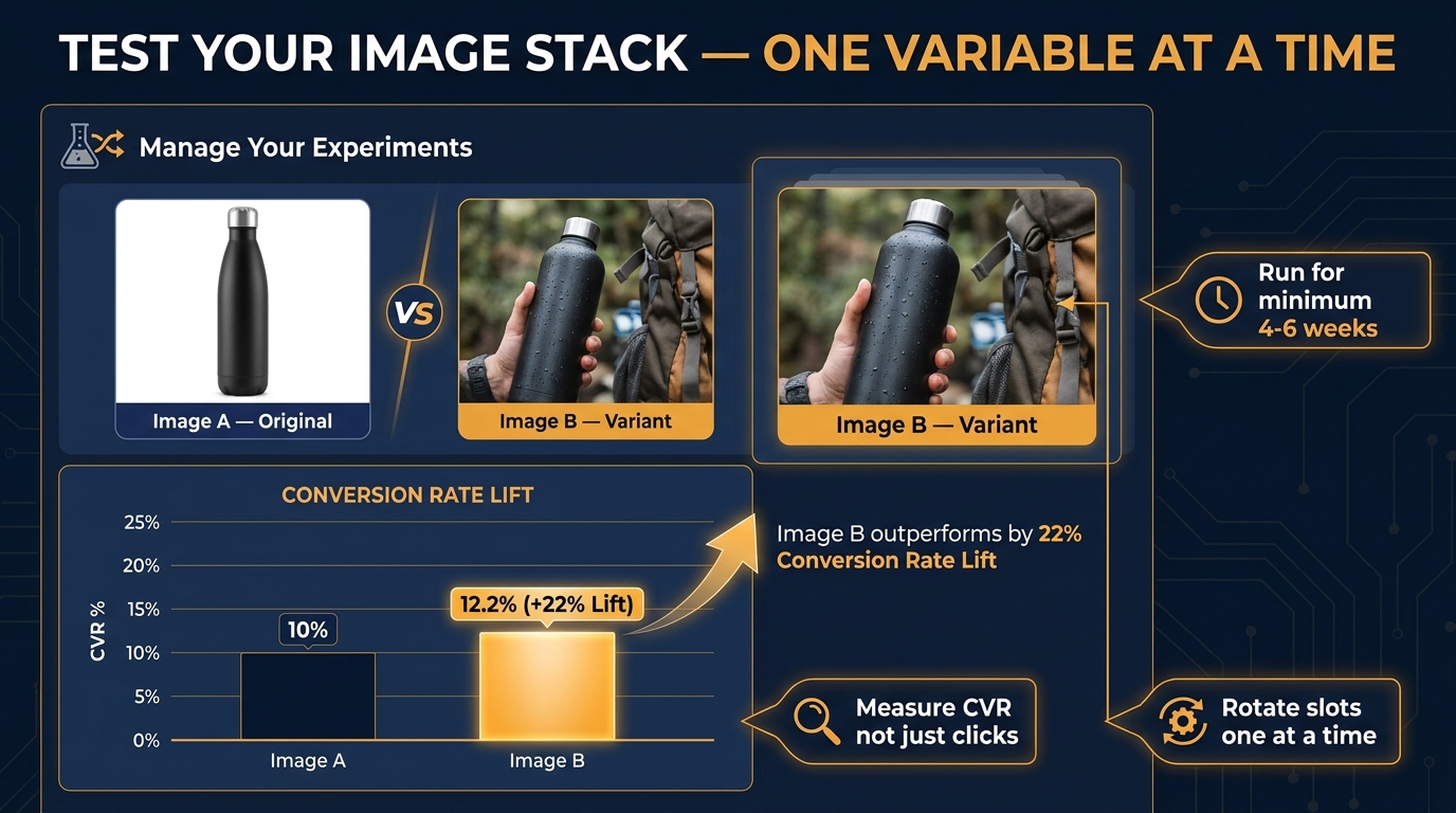
    Amazon Manage Your Experiments A/B test showing image variant performance comparison with conversion rate lift data

    The Production Reality: Building a Full Image Stack on Different Budgets

    A common frustration with image optimization advice is that it often assumes an unlimited budget for professional photography, graphic design, and creative testing. The reality for most Amazon sellers — especially newer private label brands or sellers expanding into new categories — is that every dollar spent on imagery needs to justify itself against other uses of capital. Here’s how the math actually works across different budget levels.

    The High-Budget Approach (and Its Trade-Offs)

    A professional Amazon-specialized product photography shoot with a seasoned e-commerce photographer, art direction, and post-production — including lifestyle setups with models — typically runs between $1,500 and $5,000 for a full listing image set, depending on the product category, number of lifestyle setups, and the production company’s expertise with Amazon-specific requirements. Infographic design on top of that adds another $500-$1,500 depending on complexity.

    The argument for this investment is straightforward on paper: if a properly optimized image stack lifts your conversion rate from 10% to 15% on a product doing $20,000 a month in revenue, that’s an additional $10,000 in monthly revenue for the same ad spend. The full image set pays for itself in weeks. The counterargument is that there’s no guarantee the professional images will outperform a DIY version — which is why testing matters even after high-budget production.

    The Mid-Budget Approach: Hybrid Production

    The most cost-effective full-stack approach for most sellers is a hybrid model: professional white-background hero photography (which requires controlled lighting conditions that are genuinely hard to replicate cheaply) combined with DIY or AI-assisted lifestyle and infographic images. This means one to two hundred dollars for a professional hero shoot, and the remaining slots built in Canva, Adobe Express, or a dedicated Amazon listing image tool like Creativio or Glorify.

    The hero image is the one slot where cutting corners directly costs you money, because it determines your CTR in search results. Everything else in the stack can be produced more economically without a proportional loss in conversion performance — especially if you’re testing and iterating rather than trying to produce the “perfect” image set in one shot.

    AI-Assisted Image Production in 2026

    The landscape for AI-generated product imagery has shifted considerably, and it now represents a legitimate option for specific image types in the stack — particularly lifestyle backgrounds, comparison chart design, and infographic layout. AI tools specialized in product photography can composite a product (extracted from a reference photo) into a variety of realistic environments without a physical lifestyle shoot. For sellers testing multiple lifestyle contexts before investing in a full shoot, this is a useful and significantly less expensive approach.

    The important caveat: AI-generated images are subject to Amazon’s standard accuracy requirements — the image must accurately represent the product as it will be received by the buyer. Using AI to place your product in a realistic context that matches its actual use is acceptable. Using AI to make your product look larger, higher-quality, or significantly different from its physical reality is a policy violation that generates returns, negative reviews, and potential listing suppression. The technology is a production shortcut, not a license to misrepresent.

    The Image Stack Audit: A Practical Checklist for Every Listing

    Before we wrap up, here’s a practical audit framework you can apply to every listing in your catalog today. The goal isn’t perfection — it’s systematic identification of the highest-impact gaps so you know exactly where to focus improvement efforts.

    Hero Image Checklist

    • Pure white background (RGB 255,255,255 — not off-white or light gray)
    • Product fills at least 85% of the frame — ideally 90-95%
    • Minimum 2000px on longest side for sharp zoom quality
    • No text overlays, logos, or props beyond what’s on the product itself
    • The defining feature is visible at thumbnail size — test by shrinking to 200px wide
    • The hero has been tested against at least one variant — or is scheduled for testing

    Secondary Image Checklist

    • Slot 2 addresses the buyer’s core problem — not just another product angle
    • Slot 3 includes 4-6 feature callouts with both feature name and buyer benefit
    • Slot 4 shows the specific target buyer in the specific use context — not generic stock lifestyle
    • Slot 5 includes a comparison image that uses category-generic comparison rather than named competitors
    • Slot 6 includes social proof — review pulls, usage numbers, or certification signals
    • Slot 7 resolves the last objection — guarantee, bundle reveal, or specific concern addressed

    Mobile Readability Checklist

    • No text in images smaller than 40pt at native resolution
    • Primary visual element and key text sit in the top half of the frame
    • All images reviewed on smartphone at actual carousel size before publishing
    • Images are JPEG format, sRGB color profile, and under 10MB (Amazon’s technical requirements)

    Conclusion: Seven Slots, One Story, One Sale

    The Amazon image stack is not a gallery — it’s a sequential conversation with a buyer who is already at your door. Every slot has a specific moment in that conversation where it fits, a specific psychological job it needs to do, and a specific cost when it doesn’t do that job well. Most sellers hand that conversation over to chance by treating their image set as a collection of individual assets rather than a unified, purposefully sequenced narrative.

    The sellers whose listings convert consistently above category averages — the ones who seem to charge more, rank better, and generate better reviews — almost always have image stacks that tell a complete story: here’s what we are, here’s the problem we solve, here’s the proof, here’s your life with this product, here’s why we’re different, here’s what other buyers experienced, and here’s why you can buy with confidence today. That’s not complicated. But it requires intention.

    Start with an audit of your current image stack against the checklist above. Identify which slots are doing their jobs and which are just filling space. Prioritize fixing the hero image if it hasn’t been tested, then work your way through the secondary images one at a time. Use Manage Your Experiments for every meaningful change. Keep mobile at the center of every design decision.

    The conversion rate improvement that comes from a properly engineered image stack isn’t marginal — it’s often the single largest lever available to a seller without changing the product, the price, or the advertising strategy. That’s a lot of upside sitting in seven JPEG files. Make them work for every dollar they cost to produce.


  • AI Background Swaps for Amazon Images: The Complete Execution Guide (2026)

    AI Background Swaps for Amazon Images: The Complete Execution Guide (2026)

    Professional Amazon product photography studio showing AI-powered background replacement workflow on a monitor

    There is a significant gap between knowing that AI background swaps exist and actually executing them without getting your listings suppressed, your conversions tanked, or your catalog looking like it was assembled by three different teams on three different days.

    Most guides on this topic stop at “upload your photo, click remove background, done.” That’s roughly the equivalent of teaching someone to drive by explaining how a steering wheel turns. True — but dangerously incomplete.

    In 2026, Amazon’s AI detection systems have become meaningfully more sophisticated. The margin between a compliant image and a suppressed listing is sometimes a single pixel value. A background that reads as white on your screen — say RGB 254,255,255 — can trigger algorithmic rejection during Amazon’s automated image audit. Meanwhile, for secondary images, the sellers who understand how to build a proper lifestyle image sequence are pulling conversion lifts of 15% to 56% over those who treat the secondary slots as an afterthought.

    This guide is not a tool comparison. It’s not a “here are five AI apps you should try” roundup. It’s an end-to-end execution guide: how to feed AI tools the right inputs, how to verify outputs meet Amazon’s exact standards, how to structure your image sequence for each product category, how to build a QA process that catches problems before Amazon does, and how to scale this across a catalog without it becoming a full-time job.

    Whether you have 10 SKUs or 10,000, the framework here applies. Let’s build it properly.

    Why Background Swaps Are Now Table Stakes, Not an Edge

    Two years ago, a seller who deployed AI background swaps across their catalog had a genuine visual advantage over competitors still paying $400 per product photoshoot. That window has largely closed. Today, AI background removal is accessible to every seller at every price point — and Amazon’s own built-in tools mean even sellers who have never heard of Photoroom or Claid.ai are using AI image enhancement whether they know it or not.

    What this means in practice: the baseline has risen. A clean white background on your main image is no longer a differentiator. It is the minimum viable standard. The sellers who are pulling ahead are not the ones who can remove a background — it’s the ones who execute the entire image stack with precision.

    The Three Layers of Visual Competition on Amazon

    Understanding where background swaps fit within the broader visual competition on Amazon requires thinking in three distinct layers.

    Layer 1 — Search results compliance: Your main image must pass Amazon’s automated checks. This is pure compliance work. A suppressed listing earns zero conversions regardless of how compelling the product is. AI background swaps at this layer are about reliability and speed — getting every SKU to a compliant main image without a $500 photoshoot.

    Layer 2 — Click-through from search: The main image is what drives the click. Within search results, buyers are comparing thumbnails at roughly 200×200 pixels. The questions are: Does the product look clean? Does the thumbnail read well at small sizes? Is the product taking up enough of the frame? Background quality matters here, but so do product clarity, angle, and fill ratio.

    Layer 3 — Conversion on the listing page: Once a buyer clicks through, the secondary images take over. This is where lifestyle backgrounds, in-context shots, and structured image sequences drive purchase decisions. Conversion data consistently shows that secondary lifestyle images — not the main white background image — are the primary conversion lever at this stage.

    AI background swaps touch all three layers, but the execution approach differs for each. Conflating them — using the same tool, same settings, and same workflow for all three — is where most sellers underperform.

    The Input Quality Trap: Why Your AI Tool Is Only as Good as Your Source Photo

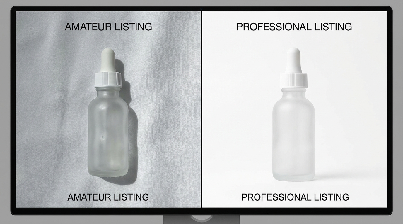
    Comparison of two Amazon product images showing off-white background with artifacts versus perfect pure white compliant background

    The single most common reason AI background swaps produce poor results — artifacts, halos, fuzzy edges, mismatched lighting — is not tool quality. It is source photo quality. Every major AI background tool is a machine learning system trained to identify foreground from background. When that boundary is ambiguous in your source photo, the tool guesses. And it guesses wrong.

    What Makes a Source Photo AI-Friendly

    There are specific characteristics that make a product photo easy for AI to work with, and sellers who understand this can dramatically improve their output quality without upgrading their tools.

    Contrast between product and background: AI edge detection works by identifying contrast boundaries. A white product photographed on a white background gives the model almost nothing to work with. If you are shooting your own source photos, use a mid-gray or light blue backdrop — then let AI replace it with pure white afterward. The contrast at the product edge will be far sharper, resulting in cleaner cutouts.

    Consistent, diffuse lighting: Hard directional light creates cast shadows on the background. Those shadows become part of what the AI “sees” — and it often can’t distinguish a product shadow from a dark edge on the product itself. Use a diffuse light setup (softboxes, ring lights, or natural window light from multiple angles) to minimize background shadows before shooting.

    Minimum viable resolution: Amazon requires a minimum of 1,000 pixels on the longest side, but you should be supplying AI tools with images at 2,000 pixels or higher. Most AI background tools downsample input images to some degree during processing. Starting at 2,000+ pixels gives you meaningful headroom to maintain Amazon’s required resolution in the output.

    Sharp product edges: Motion blur, shallow depth of field at product edges, or optical distortion near the frame corners will all degrade edge detection quality. Product images should be shot on a tripod with sufficient depth of field to keep the entire product in sharp focus.

    The “Garbage In” Problem at Scale

    For sellers working with supplier-provided images, the challenge compounds. Supplier photos are often shot under inconsistent conditions, compressed multiple times, and delivered at low resolution. Running these through an AI background tool does not rescue them — it produces compliant-looking images that still look cheap because the underlying product detail is soft, color-shifted, or poorly lit.

    The practical rule: if a supplier image is below 1,500 pixels on the longest side, has visible compression artifacts, or shows the product under harsh single-source lighting, it is worth the investment to reshoot before running any AI workflow. The AI will improve a mediocre photo. It cannot fix a fundamentally broken one.

    Amazon’s Compliance Minefield: Exactly What Gets Listings Suppressed in 2026

    Amazon’s image compliance enforcement has shifted from primarily human moderation to AI-driven automated audits. This change matters because automated systems are neither lenient nor inconsistent — they apply the same rule the same way every time. Understanding exactly where those rules sit is the difference between a live listing and a suppressed one.

    The Pure White Requirement Is More Strict Than You Think

    Amazon’s stated requirement for main images is a pure white background. The actual enforcement standard is RGB 255,255,255 — the maximum value of white in 8-bit color space. A background that reads as RGB 254,255,255 — one digit off, imperceptible to the human eye — can trigger Amazon’s algorithmic rejection during an image audit.

    This is not a theoretical risk. In 2026, Amazon’s image compliance AI runs periodic audits across active listings, not just at the point of upload. A listing that passed initial review can be flagged and suppressed weeks later if its main image fails a fresh audit cycle.

    The practical implication: when verifying AI output, use a pixel color picker tool (available in Photoshop, GIMP, or free browser extensions) to sample multiple points in the background. Every sampled point should return exactly 255,255,255. If any point returns a value below 255 in any channel, the background needs further processing.

    Shadows, Halos, and the Floating Product Problem

    Three specific visual artifacts generate a disproportionate share of compliance failures:

    Cast shadows: AI tools vary significantly in how they handle product shadows. Some remove all shadows — which can make products look weightless and unreal. Others retain natural shadows — which, if they extend into the background area, violates Amazon’s white background requirement. The correct approach for main images is to use a tool that generates a subtle “ground shadow” directly beneath the product, contained within the product footprint, rather than a cast shadow spreading across the background.

    Edge halos: A semi-transparent ring of color around the product edge is the telltale sign of imprecise edge detection. It happens when the AI retains some color from the original background as it blends into the product edge. This is particularly common on products with fine details — hair, fur, fabric fringes, transparent packaging, or clear liquid in a bottle. Most tools have a “refine edge” or “defringe” step specifically for this; skipping it is where halos get baked into the final output.

    Floating crops: When a product is placed on a white background without any shadow or surface reference, it can appear to float. While not always a compliance issue, floating products score lower in Amazon’s image quality ranking algorithms and can trigger secondary review. A minimal ground contact shadow — one that stays within compliance — resolves this.

    The Hyper-Realistic Render Problem

    Amazon’s 2026 AI detection specifically targets “hyper-realistic” 3D renders and fully AI-generated product images used as main images. The enforcement logic is that AI-generated main images may misrepresent the actual product — a legitimate concern given how generative AI can hallucinate product details.

    The distinction Amazon draws is between AI-enhanced photographs (background removal and replacement applied to a real photo) and AI-generated images (a product synthesized entirely by generative AI). The former is permitted — and is exactly what background swap tools do. The latter is flagged. The risk arises when sellers use generative AI to create product images that don’t reflect the actual item in the listing.

    Tool Selection by Use Case: What Each Platform Actually Does Well

    Various Amazon product categories arranged in lifestyle settings showing category-specific background photography approaches

    The tool landscape for AI background swaps has consolidated significantly. Rather than naming a single “best” tool — a designation that changes as each platform ships updates — the more useful frame is understanding which capability set each tool excels at, and matching that to your specific production need.

    Pure Background Removal (Main Image Compliance)

    When the primary need is reliable, high-accuracy background removal for main image compliance — particularly for large catalogs processed in batch — the tools that consistently perform are those built on dedicated segmentation models trained specifically on product photography. Remove.bg and Claid.ai lead this category, with reported accuracy rates around 98.7% on standard product shapes. The caveat: that accuracy rate drops on complex edges (hair, fur, transparent items, mesh fabrics) and is where manual refinement steps become necessary.

    For sellers processing hundreds of SKUs, API access matters. Both Claid.ai and Remove.bg expose robust APIs that integrate directly into inventory management workflows, allowing background removal to trigger automatically when a new supplier image is received. This removes the manual upload step entirely for routine compliance processing.

    Lifestyle Background Generation (Secondary Images)

    For generating contextual lifestyle backgrounds — placing a product on a kitchen counter, in a bedroom setting, on a hiking trail — the tools performing best in 2026 are those using diffusion-based generative models that can accept a text prompt describing the desired scene. Photoroom’s AI Scene Generator, Adobe Firefly’s generative background fill, and PicCopilot’s contextual background engine all work in this mode.

    The key differentiator here is prompt specificity. Generic prompts produce generic backgrounds. Specific prompts — describing surface material, lighting direction, time of day, prop placement, and depth of field — produce backgrounds that feel intentionally styled rather than algorithmically generated. This distinction matters because buyers can often identify AI-generated lifestyle imagery from human-styled photography, and the reaction to each differs.

    All-in-One Amazon Workflow Platforms

    A third category of tools — Photoroom, Pebblely, and Canva’s Magic Studio among them — combines background removal, lifestyle scene generation, Amazon-specific compliance templates, and basic infographic overlay capabilities in a single platform. These are best suited for sellers managing their image production in-house without a dedicated design team. The trade-off is that all-in-one platforms typically produce slightly lower precision than dedicated removal tools and slightly less sophisticated generative backgrounds than specialized generative AI tools. For most mid-size sellers, that trade-off is entirely reasonable.

    Enterprise Batch Processing Infrastructure

    At catalog scales above 1,000 SKUs, tool selection shifts toward infrastructure rather than individual applications. Amazon’s own Rekognition service, combined with AWS Fargate for compute scaling, can process more than 100,000 images per day in a production pipeline. This approach requires engineering investment upfront but eliminates per-image pricing at high volumes and integrates directly with existing AWS infrastructure that many large sellers are already using.

    Category-by-Category Background Strategy

    The right background approach varies by product category. Not because Amazon’s main image requirements change — they don’t; pure white applies universally — but because the secondary image strategy that drives conversions differs substantially based on how buyers shop and what visual information they need before purchasing.

    Apparel and Soft Goods

    Apparel presents the most technically challenging edge detection problem. Fabric edges — particularly knitwear, lace, fleece, and sheer fabrics — have semi-transparent boundaries that most AI tools handle imperfectly. The practical workaround is to shoot on a light gray or light blue background rather than white, which maximizes contrast at the fabric edge, then replace with white in post-processing.

    For secondary images, the conversion data for apparel overwhelmingly favors on-model photography over flat lays or white-background alternatives. Buyers purchasing apparel need to see fit, drape, and proportion — information that a flat lay or isolated product shot cannot convey. AI background swaps on on-model shots work well when the model is shot on a clean backdrop, but they require careful attention to hair edges and skin tones at the boundary between model and background.

    Electronics and Small Gadgets

    Electronics tend to have hard, defined edges — the ideal scenario for AI background removal. The main challenge in this category is reflective surfaces. Glossy plastic, metal casings, and glass screens reflect the original background, embedding color casts into the product itself that don’t disappear when you remove the background. A product shot against a gray background will often have gray reflections in its screen or casing that persist after removal.

    The professional approach for electronics is to use diffuse white tent lighting for the source photography — an approach that minimizes reflections by surrounding the product with uniform white light. For secondary images in electronics, in-context shots (product on a desk, plugged in and in use, alongside complementary devices) consistently outperform pure studio backgrounds because buyers are assessing how the product fits into their existing setup.

    Beauty and Personal Care

    Beauty products — skincare, cosmetics, haircare — have some of the strongest performance data for lifestyle backgrounds in secondary images. The category is visually driven, with buyers making significant purchase decisions based on brand aesthetic and perceived quality. Background choices in secondary images are therefore a brand signal, not just a compliance exercise.

    Effective lifestyle backgrounds for beauty products lean toward textural surfaces: marble, linen, brushed concrete, aged wood. These convey quality and intentionality without overwhelming the product. AI-generated versions of these backgrounds, prompted specifically with material, color palette, and lighting direction, can achieve results that are difficult to distinguish from styled photo shoots.

    Home Goods and Kitchen Products

    Home goods benefit most from in-situ photography — showing the product in an actual room context. An AI-generated background showing a kitchen counter, a living room shelf, or a dining table setting provides buyers with immediate scale reference and answers the implicit question: “Will this look good in my home?” Conversion lifts for home goods with in-context secondary images are among the highest measured, with documented increases of 34% or more over studio-only approaches.

    The Secondary Image Stack: Building a Lifestyle Sequence That Converts

    Amazon product listing page mockup showing a sequence of lifestyle secondary images including in-context use scenarios, detail shots, and infographic overlays

    Amazon allows up to seven images per listing (one main, six secondary), plus a video slot. The secondary image sequence is where most sellers underperform — either by repeating the same angle with minor variations, or by treating the slots as an afterthought after the main image is sorted.

    A high-converting secondary image stack tells a story. It moves the buyer through a deliberate sequence that addresses every major purchase objection before the buyer has to scroll to the bullet points or reviews.

    The Seven-Slot Framework

    Think about your secondary image slots as chapters in a brief visual narrative:

    Slot 1 — Alternative angle / full context: A second view of the product, often at a different angle or showing multiple units/variants. Still on white or minimal background. This slot answers: “What does the rest of the product look like?”

    Slot 2 — In-use lifestyle shot: The product being used by a person or shown in its natural environment. This is typically the highest-conversion secondary image. Background should be contextually relevant but not visually overwhelming. AI-generated lifestyle backgrounds work well here when the scene is specific and styled.

    Slot 3 — Scale reference: A shot that clearly communicates size — product held in hand, shown next to a recognizable object, or against a simple background with dimension callouts. Buyers systematically underestimate or overestimate size from main images alone.

    Slot 4 — Feature highlight or infographic: Close-up detail on a key product feature, or an infographic overlay on a clean background highlighting specs, materials, or certifications. This slot is where text is appropriate (Amazon permits text on secondary images).

    Slot 5 — Social proof visual: A “before and after,” a result photo, or a comparison against an inferior alternative. This is particularly powerful in categories where efficacy matters — supplements, cleaning products, skincare.

    Slot 6 — Secondary lifestyle: A different context or use case from Slot 2. If Slot 2 showed the product in a home setting, Slot 6 might show it outdoors, in a different room, or in a different color variant.

    Slot 7 — Brand or trust signal: A clean brand-consistent image that reinforces quality — packaging shot, certifications displayed, brand aesthetic reinforcement. This is the final impression before the buyer makes a decision.

    Background Coherence Across the Stack

    One of the most common and costly errors in secondary image sequences is visual incoherence. Each image looks like it came from a different shoot — different lighting color temperature, different shadow depth, different level of visual busyness. When AI-generated lifestyle backgrounds are created independently for each image using different prompts, this incoherence compounds.

    The fix is to establish background parameters before generating any images. Define a color palette (warm or cool tones?), a surface material (concrete, wood, marble, fabric?), a lighting direction (left-lit or right-lit?), and a scene depth (shallow focus or full environment?). Apply those parameters consistently across every AI-generated background in the stack. The result is a cohesive visual identity that signals professionalism and brand intentionality.

    A+ Content and the Background Swap Connection

    Amazon’s A+ Content module (formerly Enhanced Brand Content) gives Brand Registry sellers an additional canvas below the fold — typically 1,500 to 2,000 additional pixels of visual real estate that appears before customer reviews. Most sellers treat A+ Content as a separate exercise from their image stack. The sellers converting better have figured out that they are part of the same visual system.

    Background Consistency Between Listing Images and A+ Content

    A buyer who sees warm wood-textured lifestyle backgrounds in your secondary images and then scrolls to A+ Content modules rendered with cold concrete and clinical lighting experiences a visual discontinuity. It doesn’t make them leave — but it creates a subtle signal of inconsistency that chips away at perceived brand quality.

    When generating AI backgrounds for secondary images, export the background settings (or save the specific scene/prompt) and apply the same aesthetic to A+ Content modules. This creates visual continuity from the first search thumbnail all the way down the listing page — a coherent brand experience that builds trust without buyers consciously noticing why it feels right.

    Using Background Swaps in A+ Comparison Charts

    A+ Content’s comparison chart module — which shows your full product line side by side — is an opportunity that most sellers waste. Products photographed under different conditions, by different photographers, with different post-processing produce a chart that looks chaotic rather than curated.

    AI background swaps are the fastest fix for this: take every product in the comparison chart through the same background removal and replacement workflow, using the same background color and shadow treatment. The result is a comparison chart where all products look visually consistent, reinforcing the impression of a coherent, professionally run brand.

    The QA Process Most Sellers Skip — And Pay For Later

    E-commerce brand building showing rows of product bottles photographed in different lifestyle settings using AI for scalability

    AI background swap tools produce outputs that look good at a glance and fail Amazon’s compliance checks in ways that only appear at the pixel level. Running a proper QA process before uploading images is not optional — it is the difference between images that stay live and images that silently get your listings suppressed during an audit cycle you weren’t watching.

    The Four-Point QA Checklist for Main Images

    Every main image should be verified against four specific criteria before upload:

    1. Background pixel value: Open the image in Photoshop, GIMP, or any editor with a color picker. Sample at least 10 points distributed across the background area — corners, edges, and center. Every sampled point should return exactly RGB 255,255,255. A single point below this threshold requires further processing.

    2. Product fill ratio: Amazon requires the product to occupy at least 85% of the image frame. Use the ruler or measurement tool to verify. This is particularly easy to miss when using batch processing — tools often leave excessive padding around products to ensure no edges are cropped, which can result in a product filling only 70–75% of the frame.

    3. Edge artifact inspection: Zoom to 200–300% magnification and trace the product edge. Look specifically for: semi-transparent halo pixels (discard and reprocess), jagged stair-step artifacts on curved edges (apply edge smoothing), and hard white outlines indicating aggressive edge cutting (apply defringe).

    4. Shadow compliance: If the tool added a ground shadow, verify it is fully contained within the product footprint and does not extend into the background. A shadow that spills more than a few pixels beyond the product base into the background technically violates the white background requirement.

    Secondary Image QA Priorities

    Secondary images don’t face the same pixel-perfect white background requirement, but they face their own compliance and quality checks. Specifically:

    No misleading product representation: AI-generated lifestyle backgrounds cannot show the product doing something it doesn’t do, in a size it doesn’t come in, or with accessories not included. This sounds obvious, but AI hallucinations — the tendency of generative models to add plausible-but-fictional details — can introduce these issues without the seller noticing.

    Text compliance: Secondary images may include text (this is one of the key differences from main images), but that text cannot make unsubstantiated health or safety claims, cannot include external website URLs, and cannot include Amazon’s branded terms. AI image tools sometimes generate backgrounds with legible environmental text (storefront signs, book spines) — scan output images for any legible text that wasn’t intentionally placed.

    Resolution verification: Every image should meet Amazon’s minimum 1,000px longest side. For secondary images that will appear in A+ Content modules, 2,000px or above is recommended given the larger display dimensions.

    Building QA Into the Workflow, Not After It

    The most efficient QA process is one that catches errors as early in the pipeline as possible rather than after all images have been processed. For batch workflows, this means running a small pilot batch of 10–20 images first, reviewing all outputs against the checklist, and adjusting tool settings before processing the full catalog. Changes to edge refinement settings, padding percentage, or shadow treatment at the pilot stage save hours of rework at full scale.

    Batch Processing at Scale: The Real Cost-Benefit Math

    Digital dashboard showing AI image batch processing workflow with compliance status indicators and quality check metrics

    The economics of AI background swaps at catalog scale are compelling — but the numbers sellers cite are often oversimplified. The real cost math requires accounting for more than just the per-image processing cost.

    The True Cost of Traditional Product Photography

    A traditional product photoshoot in 2026 typically costs between $200 and $5,000 per session, depending on the photographer, studio rental, styling, and post-processing. At an average of $75–$500 per finished image (accounting for the session cost spread across the number of final deliverables), a seller with a 500-SKU catalog faces photography costs in the range of $37,500 to $250,000 just for the initial shoot — before accounting for the need to refresh images for seasonal campaigns, new variants, or compliance updates.

    AI Batch Processing Economics by Catalog Size

    AI background processing costs in 2026 range from approximately $0.05 to $2.00 per image, depending on the tool, plan tier, and whether API or manual processing is used. The following breaks down what this means at practical catalog sizes:

    Small catalog (50 SKUs, 7 images each = 350 images): AI processing cost of approximately $35–$700 per catalog cycle, compared to $26,250+ for traditional photography. Even at the high end of AI pricing, the savings are substantial. At this scale, the primary benefit is speed — AI can process 350 images in hours versus the days or weeks required to schedule and complete a full studio shoot.

    Mid-size catalog (500 SKUs, 7 images each = 3,500 images): AI processing at $0.10–$0.25 per image comes to approximately $350–$875 per catalog cycle. Traditional photography at comparable quality: $262,500+. The savings fund an entire year of AI subscriptions and still leave significant budget for other investments. Annual AI tool subscription costs for this volume typically run $600–$2,400 depending on the platform.

    Large catalog (5,000+ SKUs): At this scale, per-image API pricing becomes the critical cost lever. Negotiated API pricing can bring costs below $0.05 per image. Processing 35,000 images (5,000 SKUs at 7 images) costs approximately $1,750 — a rounding error compared to the alternative. The primary investment at this scale is engineering time to build and maintain the processing pipeline, typically a one-time cost of $10,000–$50,000 for a well-built system.

    The Hidden Costs That Get Ignored

    Three costs are consistently overlooked in AI background swap ROI calculations:

    QA labor: Even at 98.7% accuracy, a 5,000-image batch will produce approximately 65 images with errors requiring manual review or reprocessing. At three minutes per flagged image, that is over three hours of QA labor per catalog cycle. This should be factored into the cost model.

    Tool-switching friction: Many sellers use multiple tools — one for removal, one for lifestyle generation, one for infographic overlays. Each tool-switching step adds time and creates format compatibility issues. The hidden cost of a fragmented tool stack can exceed the cost of a more capable all-in-one platform that eliminates the switching.

    Reprocessing cycles: Listings that get suppressed due to image compliance failures require reprocessing and re-upload. If your QA process is insufficient, suppression-driven reprocessing adds 20–40% to your true image production cost. A robust upfront QA process is not overhead — it is insurance against a significantly more expensive downstream failure.

    Amazon’s Tightening AI Detection: Future-Proofing Your Image Stack

    Amazon’s investment in image quality AI is not static. The detection systems that determine compliance are updated regularly, and the trend since 2024 has been toward stricter enforcement, not looser. Sellers who build their image workflow around current minimum requirements are building on sand — what passes today may not pass in six months.

    What Tighter Detection Looks Like in Practice

    Amazon’s current AI detection capabilities include identification of off-white backgrounds (the RGB 255,255,255 enforcement described above), detection of “hyper-realistic” AI-generated main images that lack the natural imperfections of real photography, and flagging of images where the product fills less than 85% of the frame. Each of these capabilities has been tightened over the past 24 months.

    The likely direction of future tightening includes: more precise hallucination detection in secondary images (catching AI-generated accessories or background elements that don’t reflect what’s in the box), tighter enforcement of text-in-image rules, and potentially automated cross-referencing between listing images and product reviews (comparing review photos from buyers against listing images to detect misrepresentation).

    The Principles That Stay Stable

    While specific thresholds may tighten, the underlying principles of Amazon’s image compliance have been consistent: accurate representation, white-background main images, and no misleading elements. Building your image workflow around these principles — rather than around exactly meeting the current minimum — creates resilience against future enforcement changes.

    Practically, this means: always use real product photographs as your source material (never generate the product itself with AI), always verify backgrounds against the strictest current standard, and always err toward more rather than less product fill in the frame. These practices will remain correct regardless of how detection systems evolve.

    Staying Current Without Constant Monitoring

    Amazon does not always proactively notify sellers of image policy changes. The most reliable way to stay current is to monitor the Amazon Seller Central “News” section and to subscribe to category-specific policy update notifications. Additionally, periodic audits of your own catalog — using the same compliance checklist described in the QA section — will catch issues before Amazon’s automated systems do.

    Building Your Internal SOP: Turning This Into a Repeatable System

    Everything described in this guide is only as valuable as the system you build around it. A one-time image upgrade for your top 20 listings is a tactical fix. A documented standard operating procedure that governs how every new SKU enters your catalog is a structural advantage that compounds over time.

    The Five Components of a Functional Image SOP

    1. Source image standards: Define exactly what qualifies as an acceptable source photo before AI processing begins. Minimum resolution, background type, lighting requirements, and edge clarity standards. Any supplier image that doesn’t meet the standard goes back for reshoot or rejection rather than entering the AI workflow.

    2. Tool and settings documentation: For each tool in your stack, document the specific settings used for each image type. Background removal edge refinement settings, shadow treatment preferences, lifestyle background prompt templates, output format and resolution. When team members change or tools update, documented settings prevent quality regression.

    3. QA checklist (printed and digital): The four-point main image QA checklist and secondary image compliance checks should be a written document, not institutional memory. Every image that goes to Amazon should be verified against the checklist by whoever processes it.

    4. Naming and file organization convention: AI batch processing produces large numbers of files quickly. Without a consistent naming convention — ProductSKU_ImageType_Version_Date — catalog management becomes unmanageable within weeks. Establish the convention before the first batch runs.

    5. Refresh triggers: Define the conditions that trigger an image refresh cycle: new variant added, compliance suppression notification received, seasonal campaign launch, performance decline in conversion rate below a defined threshold, major product change. Without defined triggers, image stacks go stale by default.

    Who Owns This Process

    In most Amazon seller operations, image production lives in an unclear zone between the marketing team, the catalog manager, and whatever VA or freelancer is available. The sellers with the most consistent image quality have a clearly designated owner for the image SOP — someone whose responsibility it is to maintain the standards document, run or oversee QA, and manage the tool stack.

    This does not require a full-time hire. It requires clear ownership. Assigning the SOP to an existing team member with defined time allocation produces substantially better results than treating image production as a shared responsibility that falls to whoever has bandwidth.

    Actionable Takeaways: Your 10-Point Execution Checklist

    To close, here is a condensed reference checklist distilling the core execution principles from this guide. Use it as a review against your current image workflow.

    1. Audit your source photos first. Identify which SKUs have AI-friendly source images (high contrast, diffuse lighting, 2,000px+) and which require reshoot before any AI processing makes sense.
    2. Verify pure white using a color picker, not your eyes. Every background sample point on main images must return exactly RGB 255,255,255. This is non-negotiable and non-approximable.
    3. Match your tool to your use case. Use a dedicated removal tool for main image compliance batch processing; use a generative lifestyle tool for secondary images; consider all-in-one platforms only if you lack the time to manage a multi-tool stack.
    4. Define category-specific background strategies. Apparel, electronics, beauty, and home goods each have different secondary image conversion drivers. Identify yours before generating lifestyle backgrounds.
    5. Build your secondary image stack as a deliberate seven-slot sequence. Each slot should serve a specific buyer objection or information need, not simply fill space with additional product angles.
    6. Establish visual coherence parameters before generating any lifestyle backgrounds. Color palette, surface material, lighting direction, and scene depth should be defined and applied consistently across all images in a listing.
    7. Run a pilot batch before full-scale processing. Test tool settings on 10–20 images, verify against QA checklist, then scale.
    8. Include QA labor in your cost model. Even at high accuracy rates, errors occur. Factor the review time into your per-image economics.
    9. Build for tighter enforcement, not current minimums. Amazon’s detection systems improve continuously. Practices that meet current standards comfortably will survive enforcement updates; practices that barely meet them won’t.
    10. Document everything in a written SOP with a designated owner. A process that lives in someone’s head stops when that person does. Write it down, assign ownership, and review it quarterly.

    Conclusion

    AI background swaps have moved from a competitive edge to a baseline production requirement for serious Amazon sellers. The technology is accessible, the cost economics are clear, and the conversion data from lifestyle backgrounds in secondary image slots is consistent enough that there is no reasonable argument for not using it.

    What differentiates the sellers who benefit from this technology from those who merely use it is execution quality. The compliance minefield is real — off-by-one pixel values, edge artifacts, shadow spill, and AI-detection of generated main images all represent live risks to listing visibility. The conversion opportunity is real — but only when secondary images are structured as a deliberate sequence rather than a collection of loosely related photos.

    The sellers who are building durable advantages from AI image production are not simply running photos through a background removal API. They are building workflows with defined input standards, consistent output verification, category-specific background strategies, and documented processes that scale without quality degradation.

    That is the actual work. It is less glamorous than the demos in tool marketing videos, but it is the work that separates a catalog that converts from one that merely exists. Start with one category, build the SOP, verify the output, and then scale what works. The compounding effect of a clean, consistent, compliance-proof image stack across hundreds of SKUs is more durable than any single listing optimization you can make.