Tag: E-commerce Strategy

  • What Your Amazon Images Are Silently Communicating (And Why Most Sellers Are Getting It Wrong)

    What Your Amazon Images Are Silently Communicating (And Why Most Sellers Are Getting It Wrong)

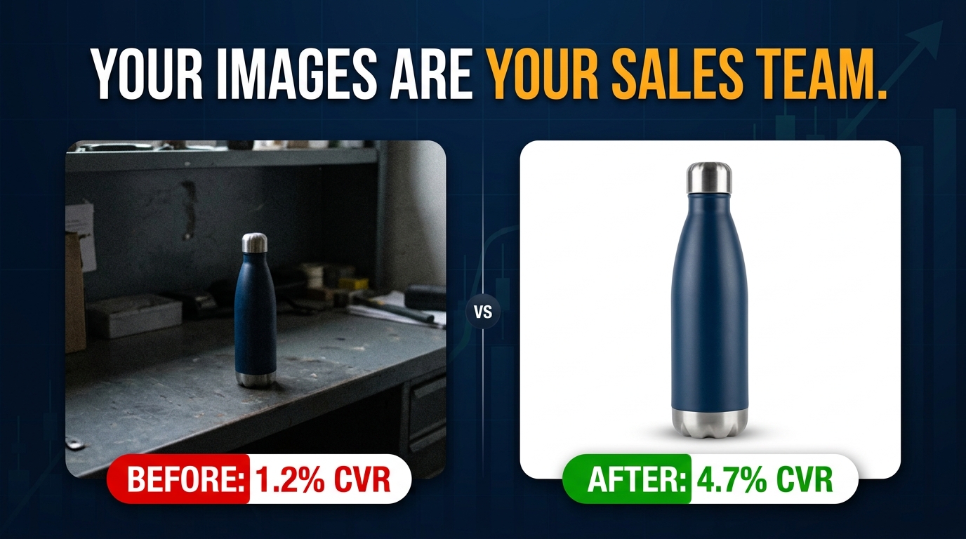
    Before and after comparison of Amazon product listing images showing CVR improvement from 1.2% to 4.7%

    Most Amazon sellers approach their product images the same way they approach their closet: they cram in everything they have, hope the customer finds what they need, and wonder why nothing converts. The result is a listing that looks busy but says nothing — a collection of photographs instead of a conversation with a buyer.

    Here’s what’s actually happening when a customer lands on your listing: they are not browsing. They are scanning, questioning, doubting, and deciding — usually within a few seconds. Every image either answers a question that was about to send them back to search results, or it leaves that question open long enough for them to leave.

    The brands that consistently win on Amazon have figured out something the rest haven’t: the nine image slots Amazon gives you are not a photo gallery. They are a structured sales argument. Each slot has a job. Each job feeds the next. And the sequence matters as much as the individual images themselves.

    This post is about that structure. It’s about understanding what each image position in your listing is actually communicating to a customer who has never seen your product before — and then building images that say exactly the right thing at exactly the right moment. Not just “pretty” images. Not just “compliant” images. Images that sell.

    We’ll cover the visual sales funnel concept, the psychology of the main image, the specific role of each secondary slot, how color and background choices signal brand positioning, how to design for the mobile shopper who represents the majority of your traffic, and how to audit what you currently have against what the data says you should have.

    The Visual Sales Funnel: Stop Thinking in Photos, Start Thinking in Slots
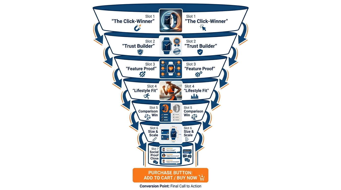
    Infographic showing 7 Amazon image slots arranged as a visual sales funnel from click-winner to social proof close

    Traditional marketing has used the concept of a sales funnel for decades — the idea that buyers move through stages of awareness, interest, consideration, and decision before purchasing. What most Amazon sellers miss is that the same funnel plays out inside a single product listing, compressed into a matter of seconds, driven almost entirely by images.

    Think about how a real customer moves through your listing. They first see your thumbnail in search results and decide whether to click. If they click, they land on the detail page and start scrolling through your image carousel. Each image either advances their confidence or stalls it. By the time they reach the last image, they have either decided to buy, decided to look at reviews first, or decided to bounce back to search results.

    That entire journey is your visual sales funnel. And each image slot is a stage.

    The Seven-Stage Framework

    While Amazon allows up to nine images, most well-performing listings operate around seven core slots, each with a distinct purpose:

    1. Slot 1 (Main Image): Win the click. This is the only image that appears in search results. Its job is not to explain the product — it’s to earn the visit.
    2. Slot 2 (Trust Anchor): Answer the first question. When a customer lands on your page, they immediately start looking for reasons this product might not be right. Slot 2 should directly address the most common doubt.
    3. Slot 3 (Feature Proof): Demonstrate what makes your product worth its price. This is where you prove the claims in your title and bullets — visually, with callouts and annotations.
    4. Slot 4 (Lifestyle Context): Show the product in use, in a context your target buyer recognizes. This is aspirational — it answers the question “Is this for someone like me?”
    5. Slot 5 (Comparison or Differentiator): Either compare your product to the category standard or highlight the one feature your competitors can’t match. This is your competitive positioning slide.
    6. Slot 6 (Size and Scale): Eliminate one of the most common reasons for returns — mismatched expectations about size. A comparison against a recognizable object or a dimension diagram solves this.
    7. Slot 7 (The Close): Social proof, the complete contents of the box, a guarantee, or a summary of the top three reasons to buy now. This is the final push before the customer scrolls down to reviews.

    Notice that this framework is not about product categories or photography styles. A silicone spatula, a wireless earphone, and a vitamin supplement all move through these same seven stages. The content of each image changes — the function does not.

    Why Most Sellers Miss This Entirely

    The most common approach sellers take is to shoot a handful of product photos, pick the ones that look nicest, and upload them. Maybe they add a lifestyle shot because they’ve heard that helps. Maybe they scatter some callouts across a few images without a clear strategy for what each one is supposed to say.

    The result is a set of images that all do the same thing — they show the product from different angles — without any of them doing the work of moving a customer forward through the decision process. It’s the visual equivalent of repeating your product title five times in a row instead of making a case for why someone should buy it.

    The sellers who audit their image stacks against this framework almost always find that they have three or four “showing” images and zero “closing” images. That’s where the conversion leak is.

    Main Image Mechanics: The Thumbnail That Has to Win the Click
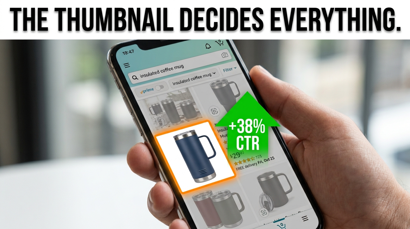
    Smartphone showing Amazon search results with one product thumbnail highlighted with a +38% CTR arrow, demonstrating the importance of the main image

    Your main image is not really part of your listing. It is your listing’s advertisement — a thumbnail that competes for attention in a grid of dozens of other products, almost all of which have professional photography, white backgrounds, and products positioned to fill 85% of the frame.

    Everyone follows the same rules. And that means the rules alone are not enough.

    The Attention Problem in a Grid of Compliant Thumbnails

    When Amazon shoppers look at search results, eye-tracking research consistently shows that attention does not flow evenly across the grid. It clusters. Certain thumbnails attract more fixations — more visual attention — than others, and this happens before the conscious brain has processed any detail about the product. The thumbnail either “pops” or it doesn’t.

    What causes a compliant white-background image to pop? Several well-documented factors:

    • Product angle and orientation: Products photographed at a slight angle (rather than dead-on flat) tend to draw more attention because they create the perception of three-dimensionality. A flat front-facing product looks like a catalog picture. A product shot from 30–45 degrees looks like a real object.
    • Shadow and depth: A subtle drop shadow or reflection beneath the product grounds it in the frame and signals high-quality photography. Products floating on white without any shadow or depth cue often look cheaper than they are.
    • Product state: For products with a visible “open” or “in-use” state, showing that state in the main image can outperform a closed or flat version — a backpack with pockets open, a meal prep container with food inside, a skincare pump dispenser with a drop of product visible. It communicates function at a glance.
    • Product-to-frame ratio: Amazon requires the product to fill at least 85% of the frame. The highest-performing main images typically push this to 90–95%. More product, less dead space.

    The “First Scan” Test

    Here is a simple test you can run right now. Search for your main keyword on Amazon. Screenshot the first page of results. Zoom out until the thumbnails are approximately the size they appear on a mobile phone screen — roughly 150×150 pixels. Now look at the grid.

    Can you identify your listing in that view? Does it look distinct from the listings around it? Or does it look like a photocopy of every other result on the page?

    If your product visually disappears into the grid at mobile thumbnail size, that’s your problem. Not your ad bids. Not your keyword targeting. Your thumbnail is not winning the click.

    What You Can Actually Change Within Compliance

    Within Amazon’s main image requirements — white background, no text, no logos, full product visible — there is still meaningful variation available to you. Angle, shadow treatment, product state, framing tightness, and the specific physical attributes of the product you choose to lead with (color variants, configurations, bundles) all affect click-through rate. Testing two main image variants via Amazon’s Manage Your Experiments tool is one of the highest-leverage tests you can run on any established ASIN.

    Even a 0.5-point improvement in click-through rate on a high-traffic keyword compounds significantly over time — more clicks, more conversions, more sales velocity, which in turn feeds ranking. The main image is the single highest-leverage creative variable in your entire listing.

    Image 2 — The Trust Anchor: Addressing Doubt Before It Kills the Sale
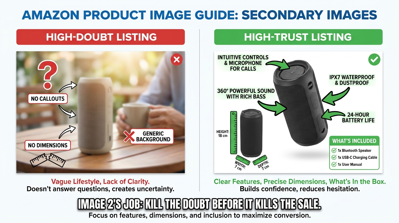
    Comparison infographic showing a high-doubt Amazon listing versus a high-trust listing with feature callouts and dimension diagrams

    When a customer clicks your listing, they arrive with interest — but also with resistance. They have already seen a hundred Amazon listings that promised something and delivered something slightly different. They have learned to be skeptical. Your second image is the first opportunity to disarm that skepticism before it sends them back to the search results.

    Most sellers waste this slot with a second angle of the same product. Same white background, slightly different camera position. It adds zero new information. It does not advance the purchase decision. It is the equivalent of a salesperson responding to a customer question by just repeating the product name again.

    Identifying Your Product’s Primary Doubt

    Every product category has a primary doubt — the most common reason buyers hesitate or return an item. Identifying yours is not complicated. You can find it in three places:

    1. Your 1-star and 2-star reviews: What do unhappy customers say most often? “Smaller than expected.” “Material felt cheap.” “Didn’t fit correctly.” “Confusing to assemble.” Whatever the most common complaint is, that’s your primary doubt — and your Image 2 should address it proactively.
    2. Your competitor’s 1-star reviews: Same exercise, applied to the top three competitors in your category. If customers are frustrated about the same thing across multiple listings, you have an opportunity to visually prove you’ve solved it.
    3. The questions in your Q&A section: The questions customers ask before buying are direct signals of information gaps. If “Does this fit a standard mattress?” is asked repeatedly, you need a sizing diagram. If “Is the battery included?” appears dozens of times, you need a “what’s in the box” image early in your stack.

    What a Strong Trust Anchor Image Looks Like

    A strong Image 2 directly confronts the primary doubt with visual evidence. This might be:

    • A dimension diagram with actual measurements annotated on the product — not just in the bullet points, but visually rendered where the skeptical customer can’t miss it.
    • A material close-up with a callout describing what the material is and why it matters (e.g., “Food-Grade Silicone — BPA-Free, Dishwasher Safe”).
    • A “what’s in the box” flat lay showing every component included, so the customer isn’t surprised by missing accessories upon delivery.
    • A compatibility illustration for products that need to work with other devices — showing exactly which models, standards, or configurations are supported.

    The common thread: specificity. Vague reassurances (“Premium Quality!”) do nothing. Specific visual proof (“18/8 Stainless Steel — 0.8mm Wall Thickness”) changes a buyer’s mental model.

    Images 3–5: Building the Persuasion Engine

    Once you have won the click and anchored trust, your next three images do the substantive work of persuasion. These are the slots where you demonstrate value, create emotional resonance, and begin separating your product from the competition. Done well, this middle section of your image stack is where browsers become genuine prospects.

    Image 3: The Feature Proof Image

    This is your technical credibility image. Its job is to demonstrate — not just describe — the most important features of your product. The best approach is to treat this like an annotated technical diagram crossed with an advertisement.

    Take the product, photograph it at a flattering angle, and then layer labeled callouts pointing to specific features. Not vague labels like “High Quality” — specific, claim-based labels like “Triple-Layer Insulation Keeps Drinks Cold 36 Hours” or “Ergonomic Grip — Reduces Wrist Strain by 40%.”

    Every claim in a callout should be either verifiable (a spec from your supplier or testing data) or widely accepted framing (ergonomic design). Exaggerated or unsupported claims in images can attract negative reviews and policy attention. Honest, specific, visually prominent claims are what buyers are looking for at this stage.

    A good Image 3 answers the question: “Why does this product do its job better than anything else I could buy?”

    Image 4: The Lifestyle Context Image

    Lifestyle images have been common on Amazon for years, but most sellers use them wrong. The typical mistake is choosing a lifestyle photo that looks beautiful but is not specific enough to the target buyer. A generic “active person outdoors” photo that could apply to any product in your category does not create the emotional resonance you need.

    The goal of a lifestyle image is to create a moment of recognition — a split-second where the customer sees the image and thinks “that’s me” or “that’s my situation.” That requires specificity about:

    • The user: Age range, setting, activity. A fitness water bottle used by a 30-something woman doing yoga in a bright studio speaks to a very different buyer than the same product used by a 45-year-old man on a construction site.
    • The use case: Not just “someone using the product” but a specific scenario that represents the peak moment of value. For a food container, that might be the satisfying moment of opening a perfectly organized lunch at the office.
    • The emotion: The best lifestyle images communicate an emotion — ease, pride, competence, comfort — not just product function.

    Know your customer deeply before you shoot a lifestyle image, because a lifestyle image targeted at the wrong persona will reduce conversion among your actual buyers even as it looks impressive.

    Image 5: The Competitive Differentiator

    This is one of the most powerful and underused slots in the stack. Image 5 is where you explicitly separate your product from the generic competition.

    There are two common formats for this image. First, a feature comparison chart: a simple grid showing your product versus “standard” products in the category, with checkmarks and X marks across a set of key features. This works because it does the competitive research work for the customer — they don’t have to open five other tabs to compare.

    Second, a before/after or problem/solution format: showing the problem the customer has (without your product) alongside the outcome with your product. This format is especially powerful for products that solve a visible or tangible frustration.

    An important caveat: Amazon prohibits naming specific competitor brands in your images. Your comparison should be against “standard” or “generic” alternatives, not a named competitor’s product. The frame is “our product versus how this category usually works” — not “us versus Brand X.”

    Images 6–7: The Closing Sequence

    By the time a customer reaches your sixth and seventh images, they are a warm prospect. They clicked, they engaged with your image stack, they haven’t bounced. They are close to a decision. The question is: what final information do they need to cross the line?

    Image 6: Scale and Size Clarity

    Product returns data consistently points to size mismatch as a top reason for returns across a wide range of categories. Customers thought the product would be a different size than it arrived — larger, smaller, thicker, thinner. This is a fixable problem, and Image 6 is where you fix it.

    The most effective size-clarity image shows the product next to a universally recognized object for scale — a human hand, a standard coffee mug, a credit card, a ruler. This gives the customer an immediate, intuitive sense of scale that even a listed dimension in centimeters cannot fully provide.

    For products where size variance matters across variants (different sizes of the same item, different configurations), a scale comparison that shows all variants relative to each other is particularly useful. It helps customers self-select the right variant before they click Add to Cart — which reduces returns and improves review quality.

    Image 7: The Close

    Your final image in the primary stack is the last thing a customer sees before scrolling to reviews. It should function as a closing argument — a final consolidation of the reasons to buy.

    Common high-performing formats for the closing image include:

    • A “Top 3 Reasons to Choose [Product]” graphic — three concise benefit statements with icons, positioned as a summary of the value proposition.
    • A warranty, guarantee, or satisfaction policy image — “30-Day Money-Back Guarantee” or “2-Year Manufacturer Warranty” displayed prominently reduces purchase anxiety and increases willingness to buy from a new or less-known brand.
    • A social proof collage — curated excerpts from real positive reviews (compliant with Amazon’s policies on review representation) combined with a star rating visual. This works because it introduces third-party validation at exactly the moment the customer is deciding whether to scroll down to read more reviews.
    • An “unboxing” or gift presentation image — for products often purchased as gifts, showing the product in premium packaging can be the visual trigger that converts a consideration into a cart add.

    Whatever format you choose, Image 7 should leave the customer with one clear feeling: confidence. Specifically, confidence that buying this product is a safe decision they won’t regret.

    The Color Psychology Behind Your Background Choices

    Color psychology comparison showing the same skincare serum product on four different backgrounds signaling different brand positioning

    Your main image must have a white background. But your secondary images have no such constraint — and the backgrounds you choose for images 2 through 7 communicate far more than most sellers realize.

    Color psychology in retail is well-studied. The application to e-commerce, and Amazon specifically, is less discussed but equally real. When a customer scrolls through your image carousel, the backgrounds they see are shaping their perception of your brand and your product’s category positioning — often below the level of conscious awareness.

    What Each Color Family Signals

    Pure white and light gray: Clinical precision, cleanliness, transparency. Works well for medical devices, kitchen tools, tech accessories, and anything where trust and hygiene are implicit purchase drivers. The risk of all-white secondary images is that they feel indistinguishable from your main image and fail to create any emotional journey as the customer scrolls.

    Earth tones — sage, terracotta, warm beige, forest green: Natural ingredients, sustainability, artisan craft. These backgrounds have become strongly associated with the wellness, organic, and natural products space. If your product belongs to this positioning, earth-tone backgrounds reinforce it. If it doesn’t — say, you’re selling a technical electronic gadget — these backgrounds create a confusing mismatch between what you’re selling and how you’re presenting it.

    Deep navy, charcoal, and black: Sophistication, premium positioning, exclusivity. Dark backgrounds make products look more expensive. A $39 product on a jet-black background with gold accents looks more premium than the same product on a generic lifestyle background. This approach requires high-quality photography — dark backgrounds are merciless with flaws — but the payoff in perceived value can be significant for brands competing on quality rather than price.

    Bright, saturated colors — bold reds, electric blues, vivid yellows: Energy, boldness, youth. These work for sports and fitness products, children’s items, and anything where enthusiasm is a core brand attribute. The risk is that overly saturated backgrounds can feel cheap or chaotic if they aren’t carefully managed with professional design.

    Consistency vs. Variety Across Your Stack

    A common mistake is using completely different background colors across each secondary image, creating a carousel that looks like a random collection of shots from different photoshoots. This fragments the brand experience and makes the listing feel unpolished.

    The better approach is to choose two or three complementary background tones that represent your brand’s visual identity and use them consistently across your secondary images. This creates a sense of deliberate design — a branded presentation rather than a collection of individual photos. The best listings on Amazon feel like a well-designed product brochure, not a stock image search.

    Text Overlays and Callout Hierarchy: The Design System Most Sellers Ignore

    Text overlays on secondary images — callouts, annotations, labels, benefit statements — are one of the most powerful tools available in Amazon listing optimization. They let you deliver messaging that your title, bullets, and description cannot, directly inside the image where 80% of attention is focused.

    But poorly executed text overlays are everywhere on Amazon. Fonts that are too small to read on mobile. Multiple competing callouts with no hierarchy. Color combinations that make text nearly invisible against the background. Grammatically confusing benefit statements that require too much cognitive effort to parse.

    The Three-Tier Callout Hierarchy

    Effective text overlay design operates on three tiers of information, each with its own visual weight:

    Tier 1 — The Anchor Statement: The single most important claim in the image. Should be the largest text element, immediately readable at thumbnail size. Maximum 6–8 words. Examples: “Stays Cold 36 Hours,” “Military-Grade Drop Protection,” “30% More Absorbent.”

    Tier 2 — The Supporting Detail: One sentence or phrase that provides context or proof for the Tier 1 claim. Smaller than the anchor, but still readable on desktop. Examples: “Triple-layer vacuum insulation with copper lining,” “Tested to MIL-STD-810H standards,” “Ultra-fine fiber construction — 300gsm.”

    Tier 3 — The Fine Print: Supporting information, certifications, specifications. Smallest text. Fine print is appropriate for legitimacy signals — “BPA-Free | FDA Approved | Made in the USA” — but should never carry load-bearing sales copy because it won’t be read by most customers.

    A well-structured callout image has one Tier 1 statement, one or two Tier 2 details, and optionally one Tier 3 fine-print line. No more. The moment an image has four or five competing statements of similar visual size, the hierarchy collapses and nothing gets read.

    Font and Contrast Rules That Actually Matter

    Sans-serif fonts consistently outperform serif fonts in callout readability at small sizes — this is not stylistic preference, it’s a function of how letterforms render at low pixel counts on mobile screens. Helvetica, Proxima Nova, Montserrat, and their equivalents are standard workhorses for good reason.

    Contrast is non-negotiable. WCAG accessibility standards require a contrast ratio of at least 4.5:1 between text and background. Dark text on light backgrounds and light text on dark backgrounds both pass this easily. Colored text on colored backgrounds — say, orange text on a red background — almost never passes, and looks visually painful regardless.

    Drop shadows and text backgrounds (a semi-transparent box behind the text) are useful tools when you need to place a callout over a complex or busy portion of a lifestyle image. Use them sparingly and ensure they don’t create a visually cluttered result.

    Mobile-First Image Design: Building for the Majority
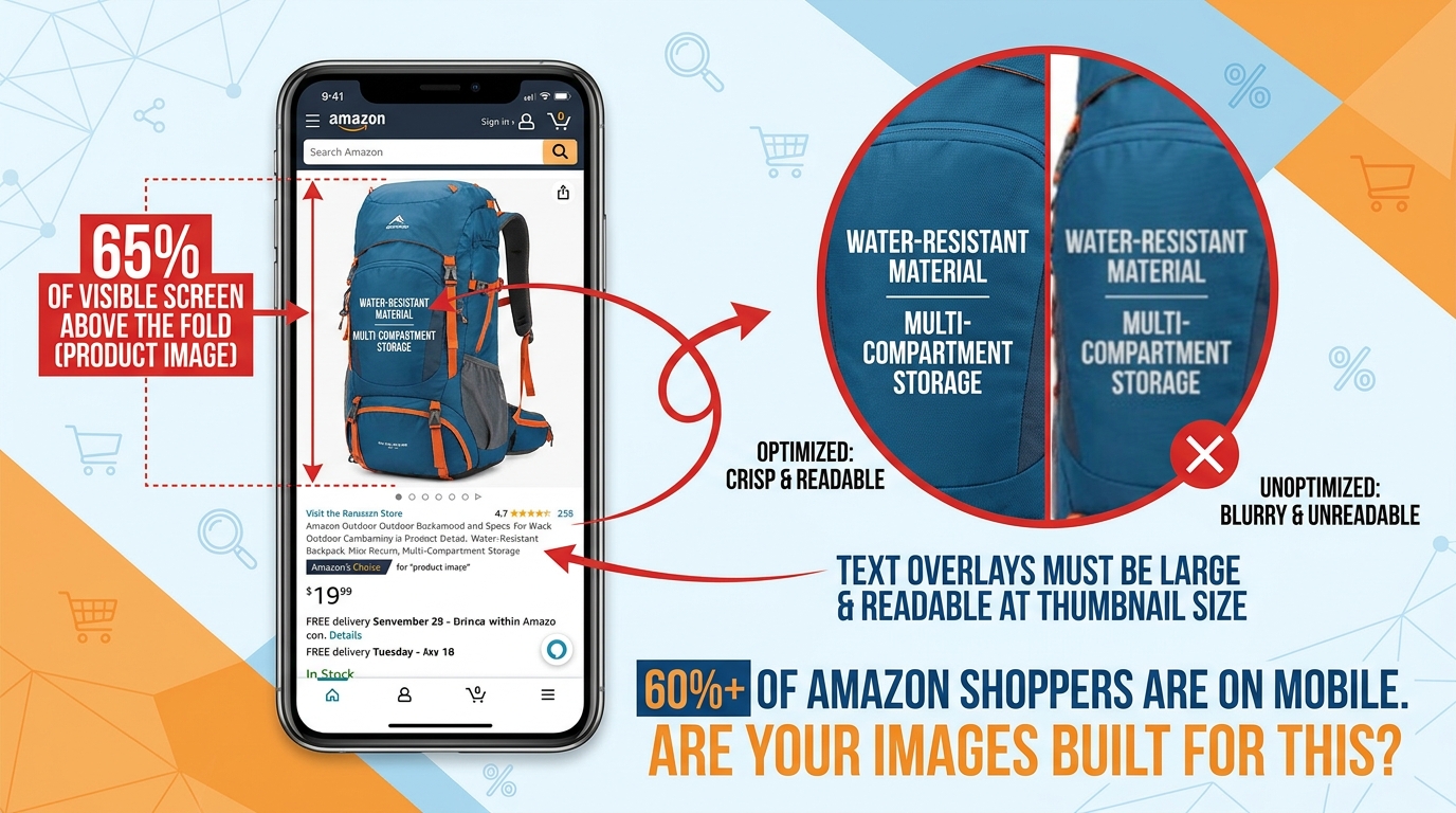
    Mobile phone showing Amazon product page with annotations demonstrating how images dominate the mobile screen and why mobile-first image design matters

    The majority of Amazon’s shopping traffic now comes from mobile devices. Depending on the category and time of day, estimates from various Amazon marketing teams and third-party research put mobile traffic shares between 60% and 75% of all browsing sessions. This is not a trend to prepare for — it is the current reality.

    The problem is that most Amazon product images are designed, reviewed, and approved on desktop monitors. The creative director, the brand manager, and the designer are all looking at the image on a 27-inch screen where every callout is crisp and every detail is visible. The customer is looking at it on a 6-inch phone screen, often in motion, often in varying lighting conditions.

    What Changes on Mobile

    On the Amazon mobile app and mobile web, the product image carousel takes up nearly the entire screen above the fold. The product title, price, and buy box are below the image — the customer has to scroll to see them. This means images carry even more decision-making weight on mobile than on desktop, because they’re the dominant element in the customer’s initial experience.

    But the image quality characteristics that impress on desktop — fine detail, subtle texture, elegant typography — often collapse on mobile. Here’s what specifically changes:

    • Text size: A callout that reads comfortably at 14pt on desktop may be illegible at mobile size. The practical rule: if you can’t read the callout when you hold your phone at arm’s length with the image visible at the natural carousel size, the text is too small.
    • Detail density: Images with many small elements, icons, or annotation lines look clear on desktop and cluttered on mobile. Every additional element competes for limited pixel real estate.
    • Color vibrancy: Mobile screens vary widely in calibration and brightness. Colors that look rich on a calibrated monitor can look washed out or over-saturated on a budget Android phone. Testing your images across multiple devices is not optional if you are serious about optimization.
    • Swipe interaction: On mobile, customers swipe through the image carousel. The first image they swipe to after the main image — which is Image 2 — is disproportionately important, because it’s the most common next interaction after the click. If Image 2 doesn’t immediately deliver something visually compelling and readable, many mobile users stop swiping.

    The Mobile Review Process

    Build a simple mobile review step into your image approval process. Before any image is finalized:

    1. Download the image to a smartphone (preferably two — an iPhone and a mid-tier Android).
    2. View it at full screen in the Amazon app.
    3. Check: Can you read every text element without pinching to zoom? Is the product clearly distinguishable? Does the image communicate its intended message in under 3 seconds?
    4. If the answer to any of these is no, revise before publishing.

    This process takes five minutes and catches a surprisingly high percentage of mobile readability failures before they cost you conversions.

    How to Audit Your Current Image Stack Systematically
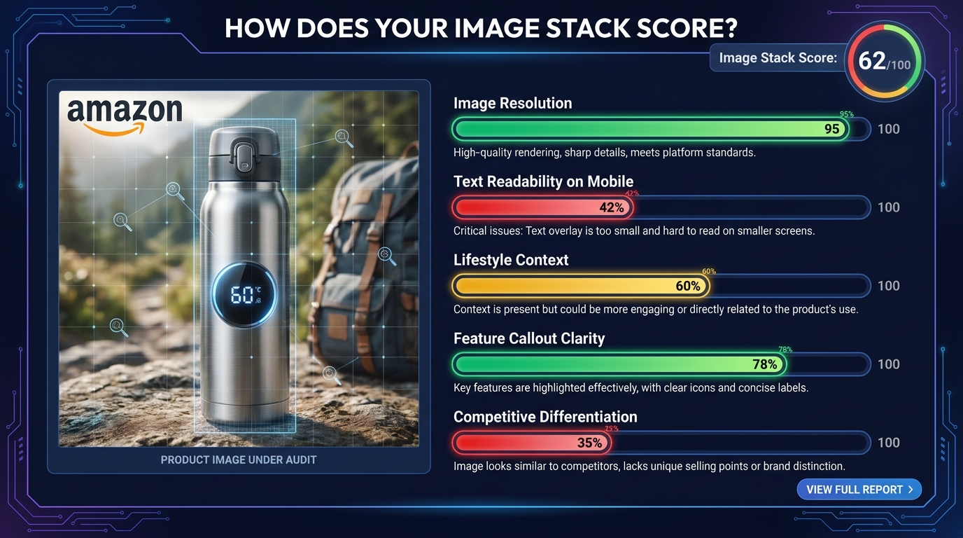
    SaaS dashboard-style infographic showing an Amazon listing image audit scorecard with metric bars for resolution, mobile readability, lifestyle context, feature clarity, and competitive differentiation

    Most sellers know their images could be better. Few have a structured process for figuring out exactly what to fix first. An image stack audit gives you a repeatable framework for assessing current performance and identifying the highest-leverage improvement opportunities.

    Step 1: The Function Audit

    List all your current images (by slot number) and for each one, write a single sentence describing its primary function — what question it answers or what argument it makes.

    If you can’t write that sentence — if an image’s job is unclear even to you, the person who approved it — that’s a red flag. An image without a clear function is an image that isn’t converting.

    Then map each image against the seven-slot framework. Are all seven jobs covered? Are there duplicate “showing” images filling slots that should be doing other work? This exercise alone typically reveals two or three immediate improvement opportunities in most listings.

    Step 2: The Mobile Readability Test

    Run the mobile review process described above on every image in your current stack. Score each image on a simple 1–3 scale:

    • 3 = Passes: Every text element is readable without zooming, the product is clear, the message lands within 3 seconds on mobile.
    • 2 = Borderline: Some text is small but readable. The message is mostly clear but requires a moment of concentration.
    • 1 = Fails: Text is too small to read without zooming. The message requires cognitive effort to decode. The image looks cluttered or confusing at mobile carousel size.

    Any image scoring a 1 should be immediately prioritized for redesign. Images scoring 2 should be revised in your next creative sprint.

    Step 3: The Review-Question Cross-Reference

    Pull the 20 most recent one- and two-star reviews. Pull the 20 most recent questions from your Q&A section. Read through them looking for themes — information customers clearly expected to find but didn’t, objections that caused regret after purchase, features that were misunderstood.

    For each theme, ask: Is this addressed anywhere in our current image stack? If the answer is no, that’s a gap — an information gap that is costing you either conversions (buyers who needed that information to commit) or reviews (buyers who felt misled because they didn’t get the information they needed).

    Step 4: The Metrics Baseline

    Before making any changes, record your baseline metrics: click-through rate from search results (available in Brand Analytics for brand-registered sellers), conversion rate (unit session percentage in Seller Central), and return rate by ASIN.

    After implementing image changes, allow at least 2–3 weeks before evaluating impact. Amazon’s traffic patterns introduce variability that makes shorter measurement windows unreliable. Track against the same period in the prior comparable timeframe, not just week-over-week.

    The Competitive Image Analysis Framework

    Your images don’t exist in isolation. They exist in a search results page where customers compare them — consciously and unconsciously — against every other listing. Understanding what your competitive image landscape looks like is essential to making strategic creative decisions.

    Running a Competitive Image Scan

    This process is manual but valuable. For your three to five primary keywords, screenshot the top ten organic results. Note the following for each competitor:

    • Main image background treatment (pure white, light shadow, reflection)
    • Product angle (flat front-facing, 45-degree, 30-degree)
    • Product fill ratio (estimated percentage of frame)
    • Whether secondary images use text callouts
    • What backgrounds are used in secondary images
    • Whether a lifestyle image appears and how specific it is to a target user
    • Whether any competitors use a comparison or feature chart image

    After completing this exercise, look for patterns. What does everyone do? What does no one do? The “what everyone does” list represents your baseline — the table stakes you need to meet to be credible. The “what no one does” list represents your differentiation opportunity.

    Finding the Visual Gap

    In most product categories, the competitive image analysis reveals one or two consistent gaps. Perhaps every competitor shows lifestyle images of the same demographic and scenario. Perhaps no one uses a comparison chart. Perhaps all the main images use the same product angle.

    These gaps are where creative investment has the highest return. Being the only listing in a category that clearly shows product scale, or the only one that shows the product being used by a specific underserved demographic, or the only one with a clear comparison chart — that distinctiveness gets noticed, gets clicks, and gets conversions.

    The Danger of Copying Category Leaders

    A common mistake is to look at the best-selling listing in a category and try to replicate its image style. This is a losing strategy for two reasons. First, the category leader’s images were often built and tested over years — you’re seeing the end result, not the journey. Second, if you look like the category leader, buyers who notice both listings will default to the one with more reviews and better rank. You need to be distinct from the leader, not similar to them.

    The goal is not to win a comparison against the leader on the same terms. The goal is to make a different visual argument — one that your specific target buyer finds more compelling, even if the leader outsells you in aggregate.

    Putting It All Together: A Framework for Continuous Image Improvement

    Optimized Amazon listing images are not a one-time project. The competitive landscape changes. Customer expectations evolve. Amazon’s interface updates. New demographics discover your product. What worked eighteen months ago may be actively hurting you today.

    The sellers who consistently outperform on conversion rate treat their image stacks the same way growth-oriented companies treat their websites: as living assets that are continuously tested, measured, and improved.

    The Quarterly Image Review

    Set a calendar reminder to run the audit process described in this post once per quarter for every active ASIN in your catalog. The process doesn’t need to be exhaustive — a focused 30-minute review per listing, looking for the highest-leverage gap, is more valuable than an occasional complete overhaul.

    Changes to prioritize each quarter:

    1. Any image failing the mobile readability test (immediate fix)
    2. The slot with the least clear function (next improvement)
    3. A new insight from recent reviews or Q&A (incorporate into the stack)
    4. One A/B test via Manage Your Experiments (for brand-registered sellers)

    Using Amazon’s Manage Your Experiments Tool

    Brand-registered sellers have access to Amazon’s Manage Your Experiments (MYE) tool, which allows A/B testing of listing content including images. This is the only way to get direct, statistically valid data on which image variants actually perform better for your specific ASIN and customer base.

    Best practices for MYE image tests:

    • Test one variable at a time. Changing the main image and Image 2 simultaneously makes it impossible to know which change drove any observed difference.
    • Run tests for the full recommended duration. Amazon recommends a minimum of four weeks; ten weeks provides more reliable results, especially for ASINs with moderate traffic.
    • Measure the right outcome. Conversion rate (Add to Cart and purchases) is the primary metric. Click-through improvements on the main image won’t help if the secondary images don’t convert the additional traffic.
    • Document every test. Keep a running log of what was tested, what the variants were, and what the results showed. This institutional knowledge accumulates into a competitive advantage over time.

    The Compounding Effect of Incremental Improvement

    A single well-executed image improvement might lift conversion rate by 0.3 percentage points. That sounds modest. But applied across a listing generating 500 sessions per week, 0.3 points means 1.5 additional conversions per week — roughly 75 additional units per year. At a $45 ASP, that’s $3,375 in incremental revenue from one image change on one listing.

    Now multiply that across ten ASINs, each receiving quarterly improvements. The math compounds quickly. And because higher conversion rates are factored into Amazon’s ranking algorithm, the benefit extends beyond the direct sales impact — better converting listings tend to rank higher, which generates more organic traffic, which creates more opportunity for the higher conversion rate to work.

    This is the compounding flywheel that image-optimized sellers understand and single-image-fixers miss. The goal is not one great image. It’s a systematic stack that improves continuously.

    Conclusion: Your Images Are Making an Argument — Make Sure It’s the Right One

    Every image in your Amazon listing is saying something to every customer who sees it. It might be saying “this product is premium and worth the price.” It might be saying “this seller doesn’t care much about presentation.” It might be saying “I understand your specific problem and here’s the solution.” Or it might be saying nothing useful at all — just “here is the product from a slightly different angle.”

    The sellers who consistently win on Amazon understand that they have no ability to speak to customers through a salesperson, no way to answer questions in real time, no physical shelf space to arrange and present products attractively. Their images do all of that work. Every pixel earns its keep, or it doesn’t.

    The framework in this post — the visual sales funnel, the function-first slot strategy, the trust anchor, the persuasion engine, the mobile-first design discipline, the systematic audit process — is a way of taking that responsibility seriously. Not as a creative exercise, but as a commercial one.

    Your images are not decoration. They are your selling team. Train them well.

    Key Takeaways

    • Think in functions, not photos. Every image slot has a job. Define it explicitly before you design anything.
    • Image 2 is your trust anchor. Use it to address the primary doubt specific to your product category, not to show another product angle.
    • Mobile is your primary audience. Every image must pass a mobile readability test before going live.
    • Background colors signal brand positioning. Choose secondary image backgrounds deliberately, based on the category perception you want to own.
    • Callout hierarchy is a design system. One Tier 1 anchor statement per image. Readable at thumbnail size. Always.
    • Competitive gaps are your creative brief. What no one in your category is doing visually is often the highest-leverage place to be different.
    • Treat your image stack as a living asset. Quarterly audits, continuous testing, and documented results compound into a durable advantage over sellers who treat images as a one-time task.
  • Why Your Amazon Images Are Silently Killing Your Conversion Rate (And How to Fix Every Slot)

    Why Your Amazon Images Are Silently Killing Your Conversion Rate (And How to Fix Every Slot)

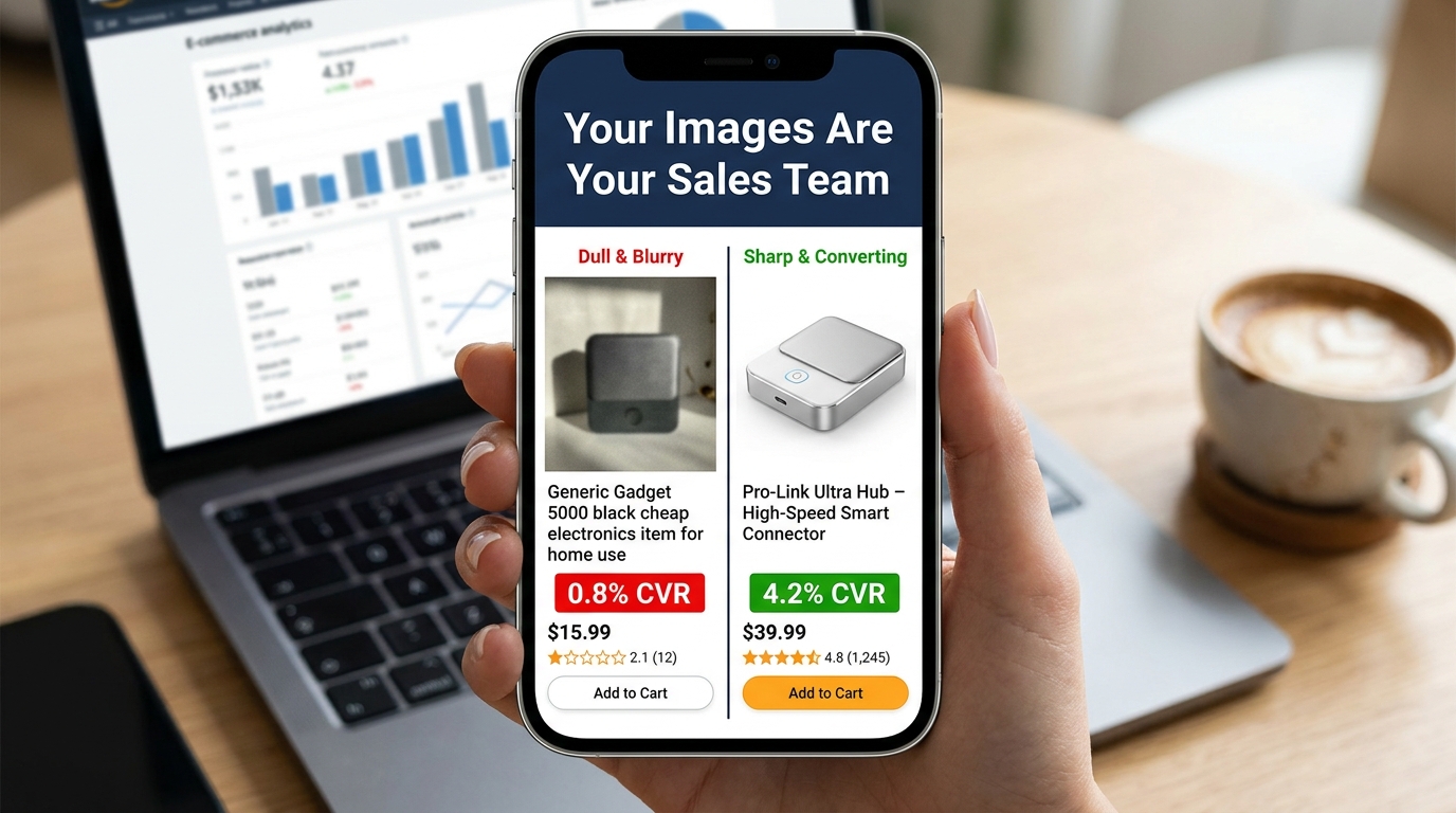
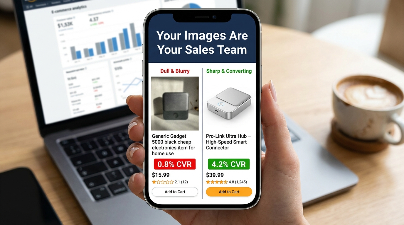
    Split-screen Amazon listing comparison showing low vs high converting product images with CVR data

    There are two kinds of Amazon sellers who read articles about listing images. The first kind has genuinely poor images — blurry supplier photos, non-white backgrounds, mismatched lighting. They know something is wrong because their conversion numbers tell them so. The second kind has done the homework: they have a clean hero shot on pure white, they’ve filled all seven image slots, their infographics are tidy, and their listing looks professional. And yet, their conversion rate is still underwhelming.

    This article is mostly for the second group. Because the gap between compliant images and compelling images is where most Amazon sellers are leaving the most money on the table in 2026.

    Compliance is table stakes. Following Amazon’s technical specifications gets your listing visible. It does not, by itself, get your listing clicked. It does not move a browsing shopper from passive interest to genuine purchase intent. That shift — from compliant to compelling — requires a completely different mental model. You’re not just satisfying a checklist. You’re constructing a visual sales argument, slot by slot, that answers every doubt a buyer might have before they ever read a single word of your bullet points.

    The data backs this up. Professional photography drives 2–3x higher conversion rates compared to listings with amateur or generic visuals. A+ Content with optimized images can increase sales by up to 20% over standard listings. A single main image test can move CTR from 2.1% to 3.4% — a 62% increase — without changing a single word of copy. These are not small numbers in a competitive marketplace.

    What follows is a ground-level examination of every image slot, the psychology driving buyer behavior, the specific mistakes that sabotage otherwise solid listings, and the testing infrastructure you need to keep improving. Let’s start at the very beginning: what happens in the buyer’s brain before they’ve consciously decided anything.

    The Psychology of 50 Milliseconds: How Buyers Decide Before They Think

    Infographic showing the 50ms buyer psychology principle — buyers judge products before reading any copy

    Research on visual perception consistently shows that humans form first impressions of visual stimuli in approximately 50 milliseconds. On Amazon, that means a shopper scrolling through search results has already begun evaluating your product — assessing quality, trustworthiness, and relevance — before their conscious brain has processed a single character of your title.

    This is not a metaphor. It’s the literal neurological reality of your marketplace. And it has profound practical implications for how you think about your hero image.

    The Trust Signal Problem

    When a buyer sees a product image, their brain isn’t asking “does this look nice?” It’s running a much more primal calculus: can I trust this? Sharp focus, accurate color reproduction, professional lighting, and a product that fills the frame all function as unconscious trust signals. They communicate that the seller is serious, the product is real, and the brand has invested in quality presentation.

    Conversely, a dark photo, an off-white background, a product that looks small and lost in an oversized frame, or any hint of blurriness triggers an equally automatic suspicion response. Shoppers don’t consciously think “this seller looks unprofessional.” They just feel reluctant — and they click somewhere else.

    Images as Sensory Substitutes

    In a physical retail environment, customers pick things up. They feel the weight, test the texture, open the packaging, press the buttons. Online shopping strips all of that away. The only sensory information available to a potential buyer is what your images provide. This means your image set isn’t just a gallery — it’s a substitute for the in-store experience.

    The most effective Amazon image stacks understand this implicitly. They anticipate the specific sensory questions a customer would ask if they were holding the product. How big is this, really? What does the material feel like? How does it work? What does it look like when someone my age uses it? Every image slot is an opportunity to answer one of those questions before the customer has to ask it — or worse, leaves to find the answer on a competitor’s listing.

    The Risk Reduction Imperative

    Behavioral economics research consistently demonstrates that loss aversion — the fear of making a bad purchase — is a more powerful motivator than the anticipation of gain. Applied to Amazon shopping, this means buyers aren’t just looking for reasons to buy your product. They’re actively scanning for reasons not to buy it. Every unanswered question, every ambiguous image, every detail left to the imagination increases the perceived risk of the purchase.

    Your image set’s job is to systematically eliminate that risk. Show the product from every relevant angle. Demonstrate scale unambiguously. Show it in use in a realistic context. Answer the “but what about…” questions before they’re asked. The listing that eliminates the most purchase-blocking doubts wins the conversion.

    Your Hero Image: The Click-or-Skip Decision

    The hero image — the first image, the one that appears in search results — is functionally a different animal from all your other images. Its job is not to convince. Its job is to get the click. Everything else on your listing handles the convincing. The hero image is purely responsible for getting the shopper off the search results page and onto yours.

    This is an important distinction that many sellers blur. They design their hero image to communicate features, highlight benefits, or establish brand identity. Those are all valuable objectives — for images two through seven. The hero image has one objective: click-through rate.

    Technical Requirements Are Not Optional

    Amazon’s requirements for the main image are strict and actively enforced:

    • Background must be pure white at RGB 255, 255, 255. Not off-white. Not light gray. Not 254, 255, 255. Amazon’s image processing bots check pixel values, and deviations — even imperceptible ones to the human eye — can trigger automatic listing suppression.
    • The product must occupy at least 85% of the image frame. Images where the product looks small, distant, or surrounded by negative space fail to communicate quality and have reduced thumbnails in search results, where space is already at a premium.
    • Minimum resolution of 1,000 pixels on the longest side, with 1,600–2,000+ pixels strongly recommended. Below 1,000 pixels, Amazon’s zoom feature is disabled. Since 66% of shoppers use the zoom feature to inspect products, disabling it is a significant conversion handicap.
    • No text, logos, badges, watermarks, or promotional graphics. No “Best Seller” banners, no discount callouts, no lifestyle props. The main image must show the product — and nothing but the product — on that pure white background.

    Differentiation Within the Rules

    Given that every seller in your category is operating under the same constraints — white background, no text, full product — how do you differentiate? Several levers remain within compliance:

    Angle. The default supplier photo usually shows the product from a straight-on, slightly elevated three-quarter angle. Most competitors are using this same perspective. Testing a different angle — a direct front view, a slightly lower perspective that creates more presence, a slightly overhead angle for flat products — can make your thumbnail visually distinct in a sea of identically-shot competitors.

    Fill ratio. Aim for maximum allowable product fill. A product that takes up 90%+ of the frame looks more imposing and premium than one at 86%. In a small search result thumbnail, this difference is immediately visible.

    Lighting. Subtle shadows and three-dimensional lighting create depth and weight. Flat, shadowless product images often look like PNG cutouts. Careful studio lighting that reveals the product’s form and texture — without adding non-white elements — creates a more premium visual impression.

    Variant selection. If your product comes in multiple colors or sizes, your hero image should feature the variant most likely to appeal to your target buyer first. Showing your least-differentiated version in the hero wastes the first impression.

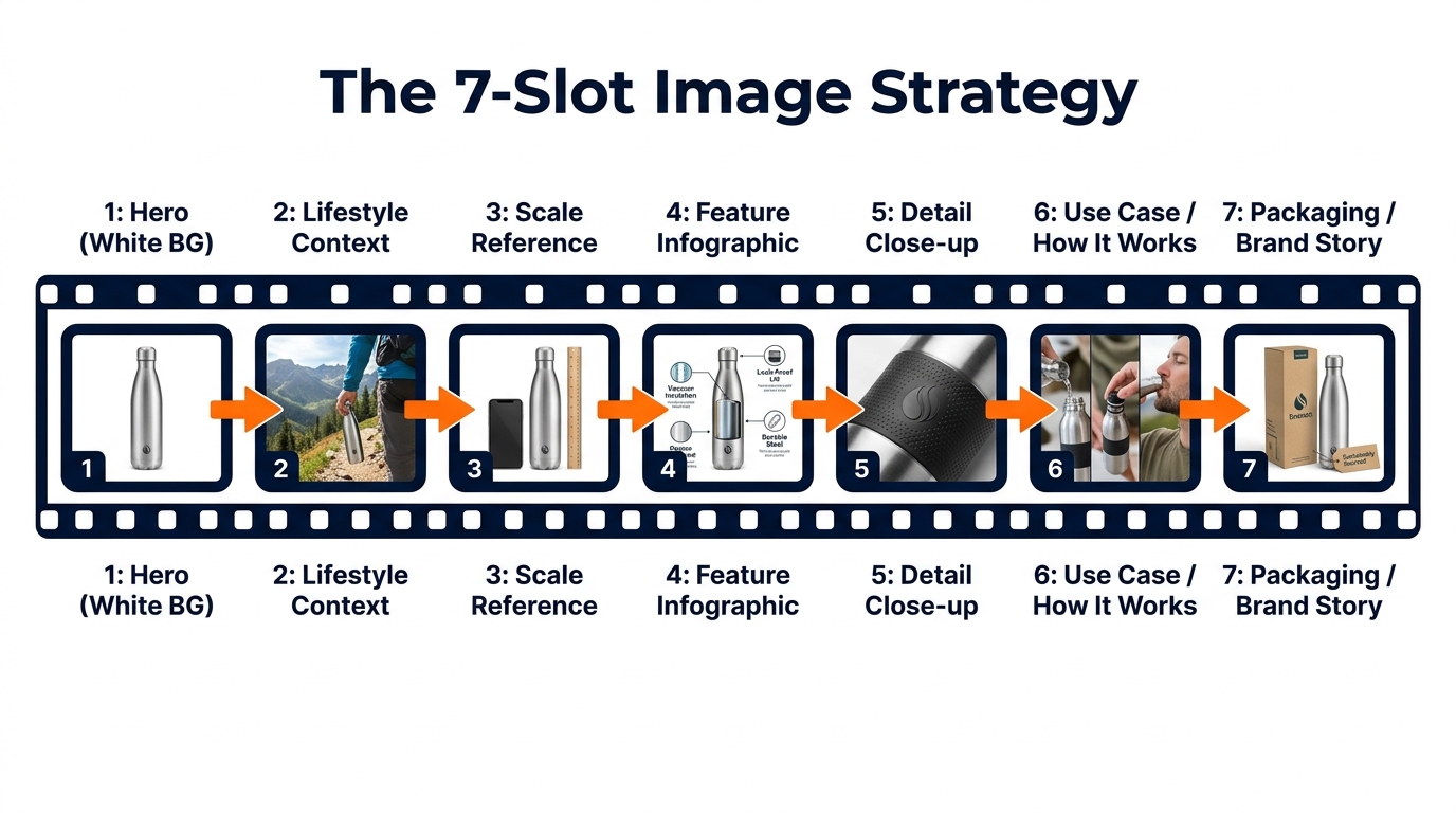
    The 7-Slot Framework: Mapping Your Images to the Buyer Journey

    Infographic diagram showing Amazon's 7-image slot strategy mapped to the buyer journey

    Amazon allows up to nine product images, plus a video. Most successful sellers use all seven primary image slots at minimum. But using all seven slots isn’t the same as using them strategically. The sequence matters. Each image should answer the next logical question a buyer has after viewing the previous one.

    Think of the image stack as a visual sales conversation. You’ve captured attention with the hero. Now you have a shopper on your product page who wants to be convinced. Walk them through that journey deliberately.

    Slot 1: The Hero (White Background)

    As covered above: pure white, 85%+ fill, high resolution, no graphics. Optimized for search result thumbnails and first-impression quality signals.

    Slot 2: Lifestyle Context

    The first secondary image should immediately answer “what does this look like in the real world?” Show the product being used by a person or placed in an environment that reflects your target customer’s life. This image performs a critical emotional function: it invites the buyer to project themselves into the scene. They stop evaluating the product abstractly and start imagining themselves owning it. Research from Amazon’s own data suggests that contextual images correlate with up to 40% higher conversion rates compared to product-only secondary images.

    Slot 3: Scale Reference

    Ambiguous size is one of the most common reasons shoppers abandon Amazon purchases and leave negative reviews. Slot 3 should establish scale unambiguously, by showing the product next to a familiar reference object (a hand, a coin, a standard household item) or against a measuring tape. Dimension infographics — the product with labeled measurements overlaid — also work well here. The goal is that after seeing this image, the buyer has zero doubt about how large or small this product actually is.

    Slot 4: Feature Infographic

    This is where you make the product’s key benefits legible at a glance. Feature callouts, labeled arrows, material specifications, compatibility information. Unlike slots 2 and 3 which build emotional connection and practical understanding, slot 4 speaks to the analytical buyer who wants to verify that the specifications match their needs. Well-designed infographics here can preempt the most common questions and answers submitted on your listing.

    Slot 5: Detail Close-up

    What is the one detail of your product that competitors can’t match — or that looks significantly better up close than it does at full size? This slot exists to show that detail in its best possible form. Stitching on a bag. The grain of a wood surface. The mechanism of a clasp. The texture of a material. Whatever makes your product worth more than the cheaper version, show it at maximum zoom.

    Slot 6: Use Case / How It Works

    For products where usage isn’t immediately obvious, or where the purchase decision hinges on whether the product will work for a specific scenario, slot 6 demonstrates the product in action. Before-and-after comparisons work well here if your product solves a problem. Step-by-step visual instructions for products with a learning curve also reduce friction by preempting “will I be able to figure this out?” anxiety.

    Slot 7: Packaging / Brand Story

    The final slot is where you complete the experience and reduce post-purchase anxiety. Show the product packaging clearly. If the product is frequently gifted, show it gift-ready. If it’s sold with accessories, show the full contents of what arrives. This image answers the final question: “What exactly am I going to receive?” Buyers who know exactly what’s in the box have lower return rates, fewer negative reviews, and higher likelihood of leaving positive feedback.

    Infographics That Actually Convert (Not Just Look Good)

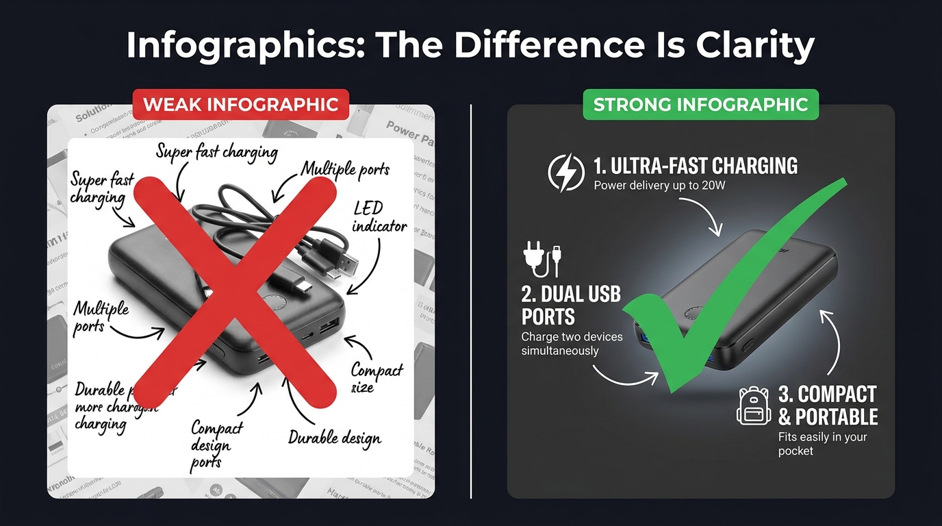
    Comparison of weak vs strong Amazon product infographics showing clarity and text legibility differences

    Product infographics have become near-universal among serious Amazon sellers. The problem is that most of them are designed to look comprehensive rather than communicate clearly. They’re cluttered with feature callouts, competing visual elements, decorative design choices that obscure rather than illuminate, and fonts that look beautiful at desktop scale but become completely illegible as a mobile thumbnail.

    An infographic that can’t be read is worse than no infographic at all. It signals effort without delivering information — a combination that reads as noise rather than signal.

    The Legibility Hierarchy

    Effective infographics follow a strict visual hierarchy. The product image itself occupies 50–60% of the frame. Feature callouts are limited to four to six maximum — not because you don’t have more features, but because each additional callout competes for attention with every other callout. When everything is highlighted, nothing is highlighted.

    Font size matters more than most sellers realize. At minimum, your largest text elements should be readable when the image is displayed at 100 pixels wide — the approximate size of a mobile search thumbnail. Use clean, geometric sans-serif typefaces. Script and decorative fonts look elegant at full size; they become illegible marks at small sizes.

    Rufus AI and Image Text Recognition

    There’s a functional reason to optimize infographic legibility beyond human readers. Amazon’s AI assistant Rufus, which handles an increasing share of on-platform product discovery queries, uses OCR (optical character recognition) to read text from listing images. Well-designed infographics with clear, legible text give Rufus more data to index about your product — which can positively influence visibility in AI-driven search results. Cursive fonts, overly decorative typography, and low-contrast text-on-background combinations are invisible to OCR systems. Clean, high-contrast, sans-serif text is fully readable.

    “Us vs. Them” Comparison Charts

    One of the highest-performing infographic formats on Amazon is the product comparison chart — a table that compares your product against a generic “standard alternative” across a series of features. You cannot name competitors directly, but you can compare against “similar products” or “the competition” using feature checkboxes.

    These charts work because they reframe the buying decision. Instead of evaluating your product in isolation, the buyer is now evaluating it against a weaker alternative. The comparison does the persuasion work so your bullet points don’t have to. The most effective versions of these charts are selective: they highlight the specific dimensions on which your product wins, not a comprehensive feature list where your product might be neutral or weaker.

    Before-and-After as Proof

    For problem-solution products — cleaning supplies, skincare, organization tools, fitness equipment — before-and-after images embedded within an infographic are among the most persuasive visual formats available. They make the benefit concrete. Shoppers don’t have to imagine the outcome; they can see it. The key is that the “after” image needs to be genuinely dramatic enough to justify the format. A subtle improvement shown as a before-and-after signals that the improvement isn’t actually that meaningful.

    Lifestyle Images: What Separates Scroll-Stoppers from Stock Photo Clones

    Lifestyle photography is arguably the most frequently misunderstood element of an Amazon image stack. Many sellers treat it as decoration — a nice-to-have that makes the listing look more professional. The reality is that lifestyle images perform specific, measurable psychological work, and when that work is done poorly, they actively hurt conversions.

    The Aspiration Alignment Problem

    The function of a lifestyle image is to allow a shopper to see themselves in the scene. This only works if the scene accurately reflects the aspirational self-image of your actual target customer. Generic lifestyle photography — stock models who don’t look like your buyer, environments that feel staged rather than real, scenarios that don’t match how your customer actually uses the product — creates a psychological disconnect rather than a connection.

    A kitchen gadget marketed to home cooks needs lifestyle images that feel like a real kitchen, not a photoshoot kitchen. A travel bag needs lifestyle images from actual travel contexts, not a model posing with a bag in front of a white backdrop. The gap between “this feels like my life” and “this looks like an advertisement” is the gap between a lifestyle image that converts and one that doesn’t.

    People in the Frame Increase Conversions

    Multiple studies on e-commerce photography have confirmed that images including human subjects — hands, faces, full figures in context — consistently outperform product-only images in secondary listing slots. There are several reasons for this. Human faces direct attention and create emotional resonance. Hands holding or using a product provide unconscious scale reference. People in context model the usage scenario, reducing ambiguity. And humans are simply neurologically interesting to other humans in a way that isolated objects are not.

    The key is that the person in your lifestyle image should match your buyer’s demographic as closely as possible. A product targeting middle-aged women that features exclusively 25-year-old male models is producing cognitive friction, not connection.

    Environment as a Trust Signal

    The background and environment of your lifestyle images communicate as much as the product itself. A clean, well-lit kitchen tells the buyer that your product belongs in quality households. A cramped, cluttered background with poor lighting signals that the product is a budget purchase. The production quality of your lifestyle photography sets a price anchor in the buyer’s mind before they’ve seen the price. Premium environments justify premium pricing.

    The Supplier Photo Trap: Why Generic Images Force You Into Price Wars

    There is a specific and painful competitive dynamic that happens to sellers who rely on supplier-provided photos. Because supplier photos are typically distributed to every reseller who purchases that product, multiple listings in the same category are showing identical images. The buyer sees the same photo three or four times across different listings. At that point, the only visible differentiator is price.

    This is the supplier photo trap: using generic images doesn’t just fail to differentiate you — it actively positions you as a commodity, a price-per-unit proposition. You become interchangeable with every other seller offering the same product. Your only competitive lever is margin erosion.

    The Investment Calculation

    Professional product photography is frequently cited by sellers as an expensive upfront investment that they’d rather defer. The math, however, rarely supports deferral. A professional product photography session for a single ASIN typically costs between $300 and $800 for a full image set including hero, lifestyle, and infographic components. For a product generating $5,000 in monthly revenue at a 15% conversion rate, a 1 percentage point improvement in conversion rate (from 15% to 16%) — well within the range that professional photography routinely delivers — generates roughly $333 in additional monthly revenue. The photography pays for itself in under three months.

    The cost of not investing in professional images — sustained below-market conversion rates, depressed organic ranking (which responds to conversion signals), and the race to the bottom on pricing — compounds indefinitely.

    What to Look for in a Product Photographer

    Not all product photographers are equally suited for Amazon. The criteria that matter for Amazon specifically are somewhat different from those that matter for brand lookbooks or editorial photography:

    • Amazon compliance knowledge. A photographer who knows the RGB 255, 255, 255 rule and how to achieve it reliably in post-processing is worth significantly more than one who doesn’t. Some photographers charge extra to “clean up” backgrounds in editing; others build it into their standard workflow.
    • Experience with mobile thumbnail optimization. Ask to see examples of their work in Amazon search results. How does the product look as a small thumbnail? Does the product fill the frame?
    • Lifestyle photography capability. Separate from hero shots, lifestyle photography requires scouting or building appropriate sets, coordinating with models, and understanding how to direct “real use” scenarios. Not all product photographers have this skill set.
    • Turnaround and revision policy. Listing optimization is iterative. You may need to update images as you gather conversion data. A photographer who charges full rate for every revision is going to slow your optimization cycle.

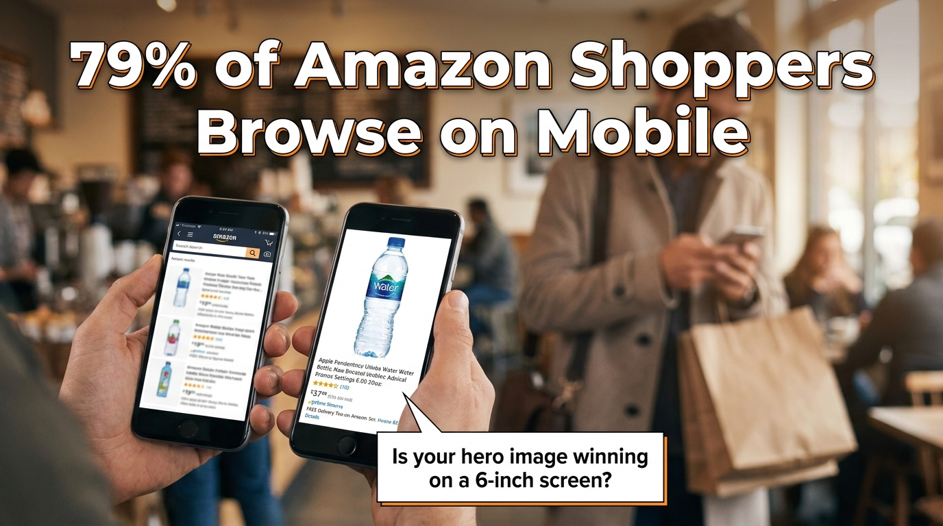
    Mobile-First Image Design: The 6-Inch Screen Test

    Mobile phone mockup showing Amazon product listing optimization for mobile shoppers with 79% mobile stat

    The majority of Amazon traffic in 2026 arrives on mobile devices. Depending on the category, mobile browsing accounts for somewhere between 60% and 79% of Amazon sessions. This isn’t a trend that’s still emerging — it’s been the dominant channel for several years. And yet, a significant number of Amazon sellers are still designing and evaluating their listing images on desktop monitors.

    The result is image sets that look excellent on a 27-inch display and are borderline unusable on a 6-inch phone screen. This is a fixable problem, but fixing it requires changing how you evaluate your work.

    The Thumbnail Test

    Before finalizing any hero image, run what photographers and Amazon optimization specialists call the thumbnail test. Reduce your proposed hero image to 200 pixels wide and evaluate it at that size. Does the product still read clearly? Is it identifiable at a glance? Does it look sharp or pixelated? Does it look larger and more premium than the thumbnails around it in a mock search results grid?

    If the product is hard to identify at thumbnail size, or if it looks smaller and less impressive than competitors’ thumbnails, the hero image needs to be reworked regardless of how it looks at full resolution. The hero image will first be seen as a thumbnail. Optimize for the format it will actually appear in.

    Text Legibility on Mobile

    Infographic text that’s readable at 1,500 pixels wide may become completely illegible at the 400-pixel width of a mobile product image display. The practical rule of thumb: if you cannot read the text when the image is displayed at the width of a typical smartphone screen (roughly 375 to 414 pixels), the text will not be read by most of your buyers.

    This has real consequences. An infographic designed to communicate five key benefits actually communicates zero if the text is illegible on the device your buyers are using. The solution is to be ruthless about text size, to limit the amount of text per image, and to rely more heavily on iconography — which scales better than text — for secondary information delivery.

    Vertical vs. Horizontal Framing

    Amazon’s standard product image ratio is a square (1:1). On mobile, the product detail page displays the main image as a square occupying the full width of the screen. This is actually favorable for product photography — the square format is generous, and a product photographed to fill it well will look impressive on mobile. Where sellers run into trouble is with secondary images that are composed with wide horizontal elements that lose impact when constrained to the square format. Design all secondary images to work within the square frame, with the most important visual information concentrated in the center of the frame where mobile cropping is least likely to affect it.

    A/B Testing Your Way to Better CTR with Manage Your Experiments

    Amazon Seller Central Manage Your Experiments A/B testing dashboard showing Version B winning with 62% higher CTR

    Most Amazon sellers optimize their images once at launch and leave them alone. The highest-performing sellers treat images as a continuously iterated variable — something to test, measure, and improve on a regular cadence. Amazon’s native A/B testing tool, Manage Your Experiments, makes this process accessible to brand-registered sellers without requiring any third-party tools.

    What Manage Your Experiments Actually Tests

    Manage Your Experiments allows brand-registered sellers to run controlled split tests on several listing elements including main images, A+ Content, titles, and product descriptions. For image testing specifically, you create two versions of the element you want to test, Amazon splits your traffic between the two versions, and after a statistically significant sample period (typically four to eight weeks), the tool reports which version performed better on key metrics including click-through rate, conversion rate, and revenue per visitor.

    The main image is the highest-priority element to test first, because it directly affects CTR from search results — the metric that controls how much organic traffic your listing receives. A CTR improvement is not just a revenue increase; it’s an input into Amazon’s A10 ranking algorithm. A listing that gets clicked more often ranks higher, which generates more traffic, which generates more clicks. The compounding effect of CTR improvement is significantly larger than the immediate revenue impact.

    What to Test First

    The most productive main image tests focus on variables with the highest potential for differentiation:

    Angle and orientation. Test your current standard angle against an alternative perspective. A three-quarter view against a straight front view. An elevated view against an eye-level view. Angle changes often produce the largest CTR differences because they affect how the product appears in thumbnail comparison with competitors.

    Single item vs. multi-item context. For some products, showing a single clean unit on white background beats showing the product alongside related accessories. For others, context props (a glass of water next to a supplement bottle, a cutting board next to a knife set) perform better. Without testing, you’re guessing.

    Packaging on vs. packaging off. For products where unboxed and boxed presentations are both plausible, test both. Some categories reward the “ready to use” unboxed appearance. Others benefit from the retail packaging shot that signals the product makes a good gift.

    Reading the Results Correctly

    Manage Your Experiments provides statistical confidence scores along with the performance data. Do not make decisions based on preliminary data before statistical significance is reached. It is extremely common for one variation to appear to be winning decisively after two weeks, then for the results to normalize or reverse as the sample size grows. Wait for Amazon’s confidence threshold — they recommend at least 90% statistical confidence — before treating any result as conclusive.

    Also important: document your tests. Keep a running record of what you tested, what won, and by how much. Over time, this record reveals patterns — perhaps angles consistently outperform flat presentations for your product type, or lifestyle contexts in your hero image consistently underperform clean white backgrounds even though conventional wisdom says otherwise. Your accumulated test data is genuinely proprietary competitive intelligence.

    A+ Content: Extending the Visual Story Below the Fold

    For brand-registered sellers, A+ Content (formerly Enhanced Brand Content) extends the visual real estate of your product listing beyond the seven standard image slots. A+ modules appear below the product description and bullet points, occupying a significant portion of the page before reviews begin. They’re widely treated as secondary to the main image stack, but the data suggests that’s a mistake.

    Amazon’s own reporting indicates that Basic A+ Content increases sales by up to 8% on average. Premium A+ Content — available to sellers who have published A+ on a qualifying number of ASINs — can lift sales by up to 20%. Those are meaningful numbers on any ASIN with established revenue, and they’re achievable purely through optimizing content that many sellers either haven’t published or haven’t updated since their initial listing launch.

    Treating A+ as Continuation, Not Repetition

    The most common mistake sellers make with A+ Content is repeating information already communicated in the main image stack. If your slot 4 infographic already covers the key features, restating those same features in your A+ modules adds length without adding value. Shoppers who scroll to A+ Content have already seen your main images. They’re looking for something new — deeper information, greater detail, reassurance on a point the main images couldn’t fully address.

    Effective A+ Content strategies use the expanded visual space for:

    • Brand narrative. Who makes this product, why does it exist, what’s the philosophy behind it? A+ is where brand story can be told with enough visual depth to feel authentic rather than promotional.
    • Comparison tables. Product comparison modules within A+ allow structured comparison of multiple SKUs in your line, or comparisons against non-specific generic alternatives. These are particularly valuable for product lines where buyers commonly ask “which version should I buy?”
    • Deep feature explainers. Technical products, products with unique mechanisms, or products with complex usage protocols benefit from the expanded space A+ provides for detailed explanation. Where a main image infographic is limited to four or five bullet points, A+ can support a full feature breakdown with larger imagery and richer detail.
    • Social proof integration. Some A+ templates allow the incorporation of quote-style testimonials or user scenario imagery that reinforces the lifestyle messaging from your main image stack.

    Premium A+ Content: When It’s Worth It

    Premium A+ Content unlocks interactive modules including video embeds, interactive hotspot images (where buyers can click areas of a product image to reveal feature details), and larger format imagery. The interactive hotspot module in particular represents a meaningful evolution in on-page conversion tools — it transforms a static product image into an exploratory experience that keeps buyers engaged on your listing longer.

    Longer time-on-page is a positive signal in Amazon’s ranking algorithm. A listing that holds buyer attention — through interactive A+ modules, video, and a compelling image sequence — will rank above an identical listing with lower engagement metrics. The relationship between listing quality and organic visibility is circular: better content drives better engagement, better engagement drives better ranking, better ranking drives more traffic.

    Image Mistakes That Trigger Suppression, Cost Rankings, and Kill Sales

    Beyond the strategic considerations, there are specific technical and compliance errors that do immediate, measurable damage to listing performance. Some of these trigger automatic suppression — Amazon removes your listing from search results until the issue is corrected. Others are more subtle, degrading conversion rates without triggering any alerts.

    Immediate Suppression Triggers

    • Non-white backgrounds on the main image. Even a background that appears white to the human eye can be slightly off the required RGB 255, 255, 255 value. Always verify the background color value in image editing software, not by visual inspection.
    • Promotional text on the main image. “Sale,” “Best Seller,” discount percentages, “Free Shipping” badges — any of these on the primary image will trigger suppression.
    • Images below 1,000 pixels on the longest side. This is the minimum for display; in practice, images below this threshold may not trigger immediate suppression but will degrade zoom functionality and perceived quality.
    • Showing products not included in the listing. If your listing is for a single item and your main image shows two items, that’s a suppression trigger. The main image must accurately represent what the buyer will receive.

    Non-Suppression Errors That Still Cost Sales

    • Using supplier stock photos. As discussed, not a compliance violation but a serious strategic mistake that commoditizes your listing.
    • Insufficient image variety. Running five images when nine are available is leaving persuasion tools on the table.
    • Misaligned lifestyle imagery. Lifestyle images that don’t reflect your actual target demographic create psychological friction rather than connection.
    • No video. Amazon allows one video on standard listings and multiple videos for Brand Registry members. Listings with product videos have meaningfully lower return rates — some sources cite up to 30% reduction in returns for categories where product mechanics are demonstrated — and higher conversion rates because video is the closest simulation of actually using the product before purchase.
    • Infographics with low-contrast or decorative fonts. Illegible infographics don’t communicate features — they communicate visual noise, and they’re invisible to Rufus AI’s OCR indexing.
    • Ignoring image order. The sequence in which Amazon displays secondary images is controlled by the seller. Many sellers upload images in whatever order they happened to be processed, rather than the strategic sequence that follows the buyer journey. Audit your current image order and resequence if necessary.

    The “Newly Updated” Image Risk

    A less-discussed hazard: updating images on a high-performing listing without testing the new version first. Sellers who redesign their entire image stack and replace it wholesale — without A/B testing — frequently experience conversion rate drops from perfectly compliant, professionally produced new images that simply communicate less effectively than the previous version. The old images had accumulated organic performance data. The new images, whatever their aesthetic quality, are unproven.

    The correct protocol for image updates on existing listings is: test the new version against the existing one using Manage Your Experiments before replacing anything. Only replace the existing images if the test data confirms the new version performs better.

    The Amazon Image Audit: A Section-by-Section Checklist

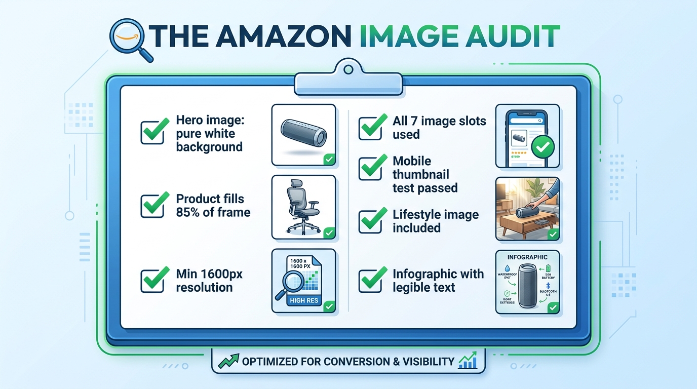
    Amazon listing image audit checklist showing all required image optimization criteria with green checkmarks

    Rather than leaving the “what to do next” question abstract, here is a practical audit framework to assess the current state of any listing’s image set. Work through this systematically on every ASIN in your catalog.

    Hero Image Audit

    • Verify background RGB value is exactly 255, 255, 255 in image editing software
    • Measure product fill ratio — is the product occupying at least 85% of the frame?
    • Check image dimensions — is the longest side at least 1,600 pixels?
    • Confirm no text, watermarks, props, or logos are present
    • Run the thumbnail test — reduce to 200px wide and evaluate clarity
    • Compare your thumbnail against the top three competitors in your search result — are you visually distinct?

    Secondary Image Audit

    • Count your current images — are you using all available slots?
    • Evaluate the sequence — does the order follow a logical buyer journey progression?
    • Assess lifestyle image demographic match — does the person/environment reflect your actual target buyer?
    • Check scale reference — is there an image that unambiguously communicates product size?
    • Review infographic text legibility — display at 400px wide and verify all text is readable
    • Check for video — is at least one product video uploaded?

    A+ Content Audit

    • Is A+ Content published on this ASIN?
    • Does the A+ Content add new information not already in the main image stack?
    • Is the A+ imagery consistent in style and quality with the main images?
    • Are comparison modules present to help buyers choose between variants or understand relative value?
    • Have Premium A+ modules been evaluated for eligibility?

    Testing Cadence

    • Is an active Manage Your Experiments test currently running on the hero image?
    • Are test results documented and archived?
    • Is there a scheduled review date for secondary image performance?

    Work through this audit once per quarter at minimum. High-volume ASINs — those generating significant revenue or ad spend — merit more frequent review, especially when competitive dynamics in the category change. A competitor launching with a dramatically better image set is a signal to accelerate your own testing cadence.

    Bringing It All Together: Your Images Are a System, Not a Collection

    The most important conceptual shift in this entire article is this: your Amazon listing images are not seven separate photographs. They are a single, sequenced visual argument for why a buyer should choose your product over every alternative available to them in that moment.

    Every slot has a defined job. The hero image earns the click. The lifestyle image earns the emotional connection. The scale reference removes a common purchase blocker. The infographic validates the analytical buyer. The close-up justifies the price premium. The use-case demonstration eliminates usage anxiety. The packaging shot completes the transaction mentally before the buyer has added to cart.

    When any slot is absent, or when it’s doing a job that belongs to a different slot, the system breaks down. Buyers fall through the gaps — they reach the end of your image stack with an unanswered question, and they go find the answer on a competitor’s listing. Often, they buy there instead.

    The sellers who understand this — who approach every image as a strategic tool within a larger system — convert at rates that make their competitors wonder what they’re doing differently. The answer is usually not that they have better products. It’s that they’ve built a visual argument systematic enough to close the sale before the buyer even gets to the bullet points.

    Start with the audit. Fix the compliance issues first. Then address the strategic gaps. Then test. Then improve. The compound effect of iterating through that cycle — audit, fix, test, improve — is the only sustainable path to conversion rates that hold up regardless of what competitors do next.