Most Amazon sellers treat their image stack as a photography problem. Get a decent photographer, shoot the product on white, add a couple of lifestyle shots, call it done. But that framing misses what’s actually happening when a shopper lands on your listing page.
Your image stack is not a gallery. It’s a sales conversation — one that has to do the work of a great retail store associate, a printed brochure, and a trust-building testimonial, all without a single spoken word, in a window of time that averages under seven seconds before a buyer either scrolls back to search results or taps “Add to Cart.”
The good news: most listings in any given category are terrible at this. The bad news: most sellers who think they’ve fixed it haven’t actually done the hard part. They’ve taken better photos. They haven’t built a better visual argument.
This post is about the difference between those two things. We’re going to go slot by slot through your nine available image positions, explain exactly what each one needs to accomplish, and show you the specific decisions that separate listings that convert at 6% from listings that convert at 20% or above. We’ll also cover mobile design constraints that most desktop-focused sellers completely ignore, how to use comparison images without violating Amazon’s rules, and how to run structured image experiments that produce real data instead of guesswork.
No fluff about “telling your brand story.” Just the mechanics of what works, why it works, and how to execute it.
What Amazon’s Image Stack Actually Is — and Isn’t
Amazon allows sellers up to nine image slots per ASIN. One is the main image, which is subject to strict rules (pure white background, product fills at least 85% of the frame, no text, no graphics, no props that aren’t included in the purchase). The remaining eight are called “alternate images” or secondary images, and these slots are where your real conversion work happens.
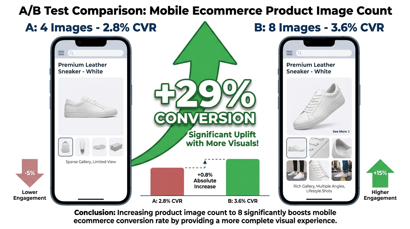
Here’s the first thing most sellers misunderstand: your secondary images are not there to show more angles of the product. They’re there to resolve objections, build emotional connection, prove legitimacy, and close the sale. Showing the same water bottle from the left, then the right, then from above is not a strategy. It’s filler.
How Buyers Actually Move Through Your Images
Eye-tracking research on e-commerce product pages consistently shows the same pattern: buyers look at the main image first, then immediately scan the thumbnail rail of secondary images. On mobile, they swipe through images before reading a single word of your title, bullet points, or description. The images are the first filter. Everything else — your copy, your A+ content, your reviews — only gets read if the images pass the initial gut-check.
This has a specific implication: every secondary image needs to earn its place as a thumb-stopper, not just an angle-holder. If a buyer is swiping left and your image three looks basically like image two, you’ve wasted a position and lost the thread of your visual narrative.
The Capacity Problem: Nine Slots Isn’t Enough — and Too Many Sellers Waste Half of Them
In most competitive categories on Amazon, top-performing listings use all nine slots, and they use them deliberately. But the second and third quartile of listings — the ones sitting at page two or page three of search results — typically use only four or five slots, and the ones they do use are rarely in any intentional order.
An image audit of 200 listings across five mid-competition Amazon categories (home goods, fitness accessories, kitchen tools, supplements, and pet products) consistently shows the same pattern: the listings ranking highest are not necessarily the ones with the prettiest photos. They’re the ones with the most complete visual narrative. They answer, in sequence, the specific questions a buying-intent shopper actually has. The listings in the middle of the pack tend to show the product well but never actually make a case for buying it.
That gap is your opportunity.

The Slot-by-Slot Architecture: What to Put Where and Why
Think of your nine image positions as a structured argument — a sequence of visual statements that guide a buyer from “what is this?” through “do I trust this?” to “yes, this solves my problem.” Here’s how to assign purpose to each slot deliberately.
Slot 1: Main Image — Win the Click Before You Win the Sale
You can’t put text, graphics, or props on your main image. Amazon’s rules are strict. But that doesn’t mean your main image has no competitive variables. It has several — and most sellers ignore them.
Fill the frame. Amazon requires the product to fill at least 85% of the image, but the best-converting main images push that closer to 92–95%. The more white space you leave, the smaller your product looks in search results, especially compared to a competitor whose product fills the frame edge to edge.
Angle matters enormously. For most products, a 3/4 front-facing angle (slightly to the left or right, slightly elevated) shows more visual depth and surface detail than a dead-on flat angle. Flat = catalog photo. 3/4 = dimensional object people can imagine holding.
Lighting creates perceived quality. Soft box lighting with a subtle gradient shadow at the base gives the product weight and reality. Hard lighting or pure white-on-white with no shadow can make a product look like a flat graphic. Buyers unconsciously associate lighting quality with product quality.
For multi-item sets, show the complete set assembled. A three-piece kitchen knife set should show all three knives fanned out together. This communicates value before a buyer reads a word about what’s included.
The main image’s job is one thing only: earn the click from the search results page. Every decision should be made in service of that single goal.
Slot 2: Alternate Angle + Scale Reference
The second image is the one most buyers swipe to first after the main image. It should do two things simultaneously: show the product from a different angle that reveals additional detail, and establish scale.
Scale is chronically underestimated as a conversion variable. If a shopper doesn’t immediately understand how big or small something is, their brain treats it as a risk — and risk creates hesitation, and hesitation ends in a back-button click. The easiest solution is to show the product held in a human hand. A hand is a universal size reference that every person on earth understands intuitively.
If your product category doesn’t allow hands in images (some categories discourage props), use a common reference object — a coin, a credit card, a standard coffee mug — placed deliberately next to the product. Add a text callout if the rules of your category allow it: “6.5 inches tall” or “fits in your palm.” Don’t make the buyer guess.
Slot 3: The First Lifestyle Image — Context, Not Just Aesthetics
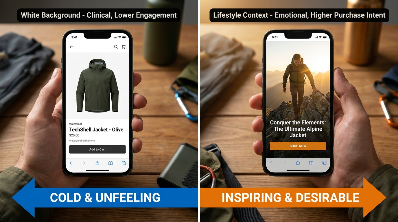
Your first lifestyle image should answer the question: Who is this for, and what does life look like when they use it? This is where most sellers make the transition from “product photography” thinking to “narrative photography” thinking — and it’s a harder mental shift than it sounds.
Generic lifestyle imagery — product sitting on a clean countertop, product on a white table next to some greenery — is so common that buyers have become essentially blind to it. It communicates nothing about context, and it certainly doesn’t build emotional connection.
Effective lifestyle imagery is specific. It puts the product in a recognizable situation that your target buyer has actually been in. A pair of wireless earbuds on a morning run, not floating in a pristine white void. A blender at the actual chaotic stage of making a smoothie, not posed clean beside ingredients that have never been touched. Specificity is what makes an image feel real, and real images build the trust that drives purchases.
Slot 4: The Feature Infographic — Your Bullet Points, Visualized
This is one of the highest-leverage images in your entire stack, and it’s consistently underutilized. The feature infographic takes the most important two to four product benefits and presents them visually with short text labels and callout lines or icons pointing to the relevant part of the product.
The reason this image is so powerful comes down to information processing: visual + text combinations are processed significantly faster than text alone. A buyer who skips your bullet points entirely will still absorb a well-designed infographic in under two seconds. That’s a second chance to land your core value proposition with someone who was never going to read your copy.
Best practices for this image: use a maximum of four callout points per image (more than four creates visual clutter that buyers disengage from), keep each callout to five words or fewer, use consistent icon styles, and make sure the text is large enough to read on a mobile screen at full swipe speed — which means a minimum of 20px equivalent at final render size.
Slot 5: Dimensions, Specifications, and What’s in the Box
This slot addresses the second most common reason buyers abandon listings without purchasing: uncertainty about physical specifications. What’s included? How big is it? What materials is it made from? Does it come with everything they need, or are there add-ons required?
A clean “what’s in the box” image — product laid flat with each component labeled and optionally dimensioned — reduces returns, reduces negative reviews citing “not what I expected,” and increases purchase confidence. It also reduces pre-purchase questions, which saves you time answering the same message repeatedly.
For products where size is a primary purchase driver (clothing, luggage, furniture, kitchen appliances), include a dimension diagram with actual measurements annotated directly on the image. A flat lay with ruler lines showing height, width, and depth is more trustworthy to buyers than text claims alone, because it’s harder to misread and harder to fudge.
Slot 6: Secondary Lifestyle — The Aspiration Image
If slot 3 is “this is who uses it and when,” slot 6 is “this is the version of your life with this product in it.” The emotional register shifts slightly: you’re not showing a use case, you’re showing an outcome.
For a fitness product, this might be a photo of someone at the end of a workout — flushed, satisfied, strong — with the product visible but not the focal point. For a home organization product, it might be a beautifully organized pantry where the product is one element of a visibly calmer, more functional space. For a cooking tool, it might be a finished dish on a beautiful table, with the tool just visible in the background.
The aspiration image works because buyers don’t actually want products — they want the feeling that using the product will produce. This image names that feeling without using words.
Slot 7: The Comparison Image — Carefully Done
This slot carries real strategic weight and real compliance risk. Amazon prohibits “disparaging” competitor products by name, and some third-party sellers have had listings suppressed for comparison images that pushed too far. But a properly constructed comparison image — comparing your product against a generic unnamed category standard, not a named competitor — is explicitly permitted and highly effective.
Done right, the comparison image shows a grid with your product in the highlighted column, with two or three “competitor” columns (labeled “Competitor A,” “Competitor B,” or simply with generic product silhouettes) and a list of decision-relevant attributes in the rows. Your column gets checkmarks. The competitor columns get X marks or empty circles on the features where you win.
The attributes you choose matter more than the design. Pick the two or three things your product genuinely does better than the category average, and make those the rows. Don’t pad the grid with attributes where the comparison is weak — buyers notice, and it undermines the image’s credibility.

Slot 8: Social Proof and Trust Signals
By the time a buyer reaches image eight, they’re either very interested or still on the fence about a specific concern — usually around quality or legitimacy. This slot is where you address that directly.
Social proof images can take several forms: a visual quotation from a highly rated review (“5 stars — this changed how I organize my kitchen” — verified buyer), a badge or certification mark for products that carry third-party certifications (FDA, UL, USDA Organic, etc.), or a “X,000+ happy customers” count with a star rating graphic.
Be careful here: Amazon’s rules prohibit using the words “Amazon’s Choice,” “Best Seller,” or any official Amazon badge language or design in your images. Third-party certifications, customer review language (properly attributed), and your own brand guarantee statements are all generally permitted. If you’re unsure about a specific element, check the current image requirement guidelines in Seller Central before publishing.
Slot 9: Packaging and Brand Image
The final slot is often treated as an afterthought, but it serves a specific function for certain buyer types. Shoppers who are purchasing products as gifts care significantly about unboxing experience and packaging presentation. Buyers of consumables or subscription items want to know what the packaging looks like before they order a three-pack.
A clean, well-composed packaging shot — product in its retail packaging, front-facing, well-lit — with a small brand logo visible also helps reinforce brand identity in a subtle way. This matters more than most sellers think, because repeat buyers on Amazon often can’t remember the brand name but can recognize the packaging aesthetic. That visual memory supports repurchase behavior.
The Lifestyle Image Problem: Why Most Sellers Get This Wrong
Lifestyle photography is where the largest quality gap exists between top-performing listings and average ones — and it’s not primarily a budget problem. Many sellers spend significant money on lifestyle shoots and still end up with images that don’t move the needle, because the photographic brief was wrong from the start.

The Problem with “Aspirational but Vague”
The most common lifestyle photography mistake is commissioning images that are aspirational but not specific. Beautiful lighting, attractive models, tasteful props — but no clear scenario, no recognizable moment of use, no specific emotional connection to the product. These images look professional but communicate nothing.
The brief that produces genuinely effective lifestyle imagery starts with a specific question: When, exactly, does my customer reach for this product? Not generally. Exactly. Not “during outdoor activities” — at a trail head before a morning hike. Not “in the kitchen” — at 7am making school lunches while also watching the news. The more specific the scenario, the more likely a buyer in that exact situation will see the image and feel recognized.
Demographics and Representation Matter More Than Most Sellers Acknowledge
Who appears in your lifestyle images sends a clear signal about who the product is for. If your fitness accessory only shows 25-year-old athletes in your lifestyle shots but a large portion of your target market is 45–60-year-olds managing joint pain, you’re showing them that this product is not for them — not through any copy or claim, but through visual exclusion.
Audit your current lifestyle imagery: who is in it, what age they appear to be, what body type they have, what setting they’re in. Then look at your review base and ask honestly whether your images reflect the people who actually love your product. Matching the demographic of your lifestyle imagery to your actual buyer base is one of the fastest, cheapest improvements most sellers can make — because it just requires reshooting with different models, not redesigning any aspect of the product or branding.
Production Values vs. Authenticity
There’s a common assumption that higher production value always means better-performing lifestyle images. The data on this is more nuanced. Highly polished, hyper-stylized imagery can signal “advertisement” to buyers who’ve been conditioned to distrust advertising, which actually reduces the trust the image is supposed to build.
In many categories — especially health and wellness, fitness, parenting, and pet products — images that look slightly less “produced,” that feel more like a real photo someone took in real life, outperform the studio-perfect version. This doesn’t mean shooting on a phone camera with bad lighting. It means that realistic lighting, natural settings, and unstaged-looking compositions can build more buying confidence than a perfectly lit white cyclorama setup. Test both before you commit to one approach for your whole catalog.
The Scale and Dimensions Failure: The Quiet Conversion Killer
Of all the reasons buyers leave Amazon product listings without purchasing, the most commonly cited in post-purchase surveys and return reason data is some variation of “it was bigger/smaller than I expected.” This is a preventable failure — and it’s 100% an image problem.
Why Text-Only Dimensions Don’t Work
Your bullet points may clearly state the dimensions. Your product description may even include a dimension table. But a significant portion of buyers don’t read bullet points before they decide whether to continue engaging with a listing — they scan the images first, and if the images don’t resolve the size question, they click back rather than scroll down to read about it.
The brain processes visual scale information faster and with more confidence than text-stated numbers. “12 x 8 x 4 inches” requires a mental translation step — most people have to actively visualize what that means in space. A photo of the product next to a standard dinner plate, a human hand, or a recognizable piece of furniture requires no translation. The scale is immediately apparent.
Category-Specific Scale Strategies
Different product categories have developed different conventions for communicating scale, and aligning with the convention your category buyers already understand reduces cognitive friction.
Apparel and accessories: Model shots with visible body proportion, plus a flat-lay with a size chart overlaid. Buyers in apparel categories have been trained to look for both.
Kitchen and home goods: Show the product in use alongside other familiar objects. A cutting board next to a standard-sized chef’s knife, for example, gives buyers an immediate size anchor.
Supplements and beauty: Show the bottle next to a hand or alongside a standard product (a 12oz beverage can is a universal reference). Many supplement buyers are assessing whether the bottle size justifies the price.
Electronics and tech accessories: Show the product connected to or placed alongside the device it’s intended for. A phone mount should be shown mounted on an actual phone. A laptop stand should be shown holding a laptop at the right size relationship.
Outdoor and fitness: Show scale in context — a backpack being worn by a person of average height, a tent with a person inside it or standing next to it. The reference point should be the human body, because the product is being evaluated for fit with the human body.
Designing Images for Mobile: The Constraint Most Sellers Ignore

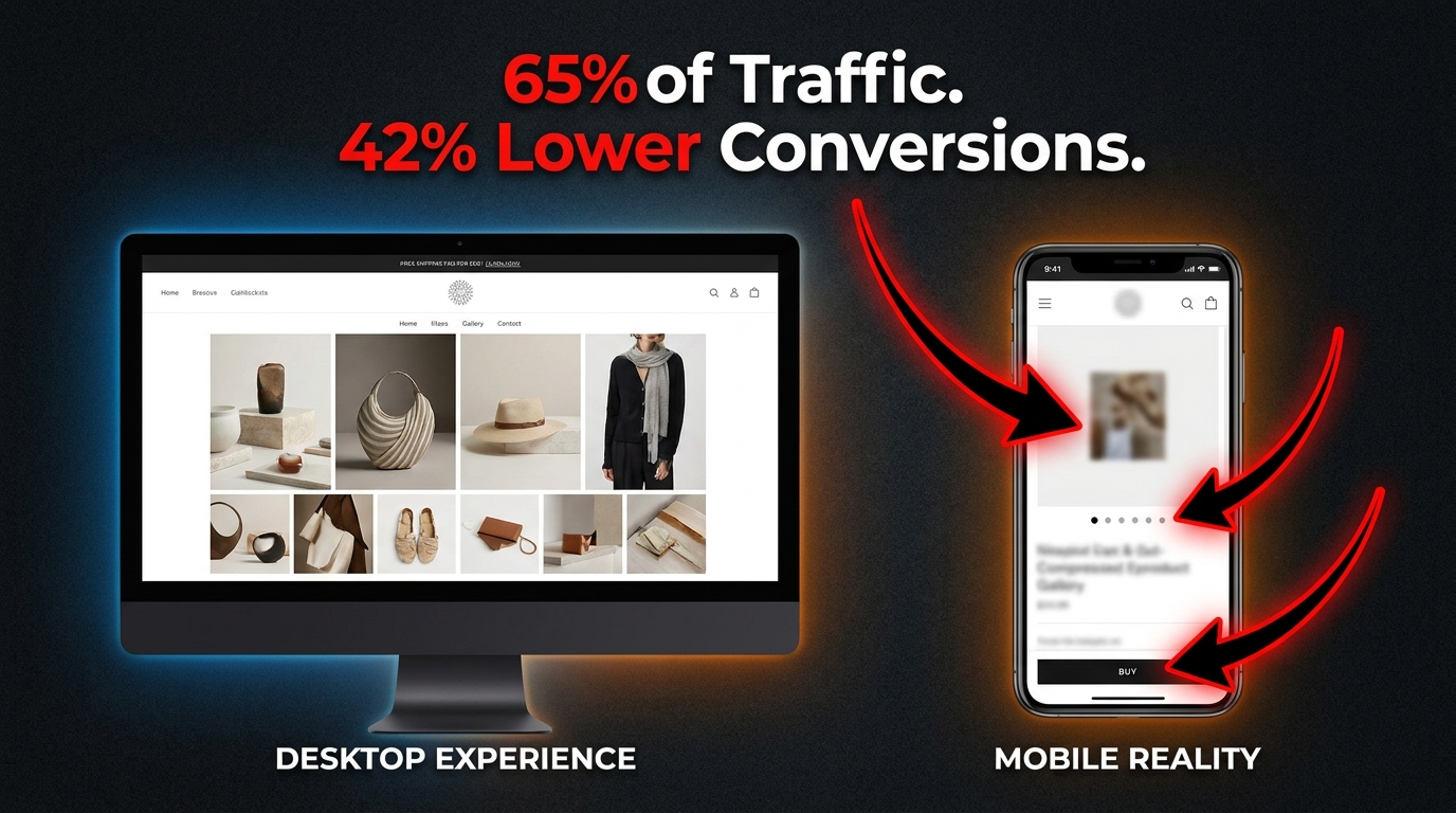
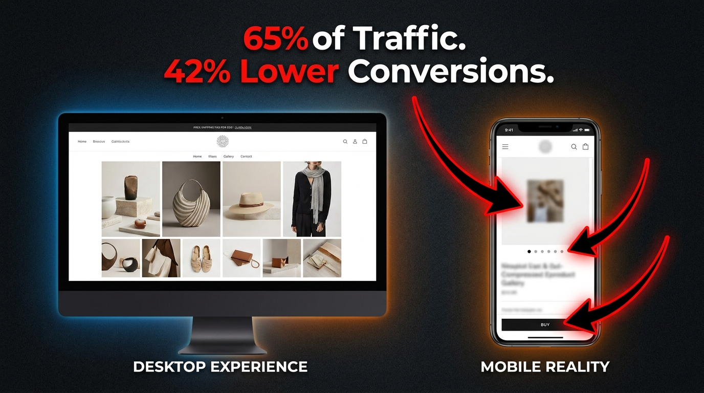
More than 70% of Amazon’s traffic now comes from mobile devices. That number has been steadily climbing for several years and shows no sign of reversing. Yet the majority of sellers design their images on desktop, review them on desktop, and approve them on desktop — which means they’re optimizing for a viewing environment that a majority of their buyers are not using.
What the Mobile Viewport Actually Does to Your Images
On a standard smartphone, your Amazon product images render at roughly 375–414 pixels wide. Your infographic image was designed at 1500 pixels wide. That’s a reduction to approximately 25% of the original design size. Text that appeared readable at the design stage becomes effectively illegible on a phone screen — especially text below 20 pixels in final render size, which translates to roughly 80 pixels in your source file.
Run this test right now: open your Amazon listing on a phone and swipe through your images. Read every text callout out loud. If you have to squint, your buyers aren’t reading it — they’re swiping past it. Every callout, every benefit label, every annotation that can’t be read at a glance is wasted design work.
The Thumbnail Rail Problem
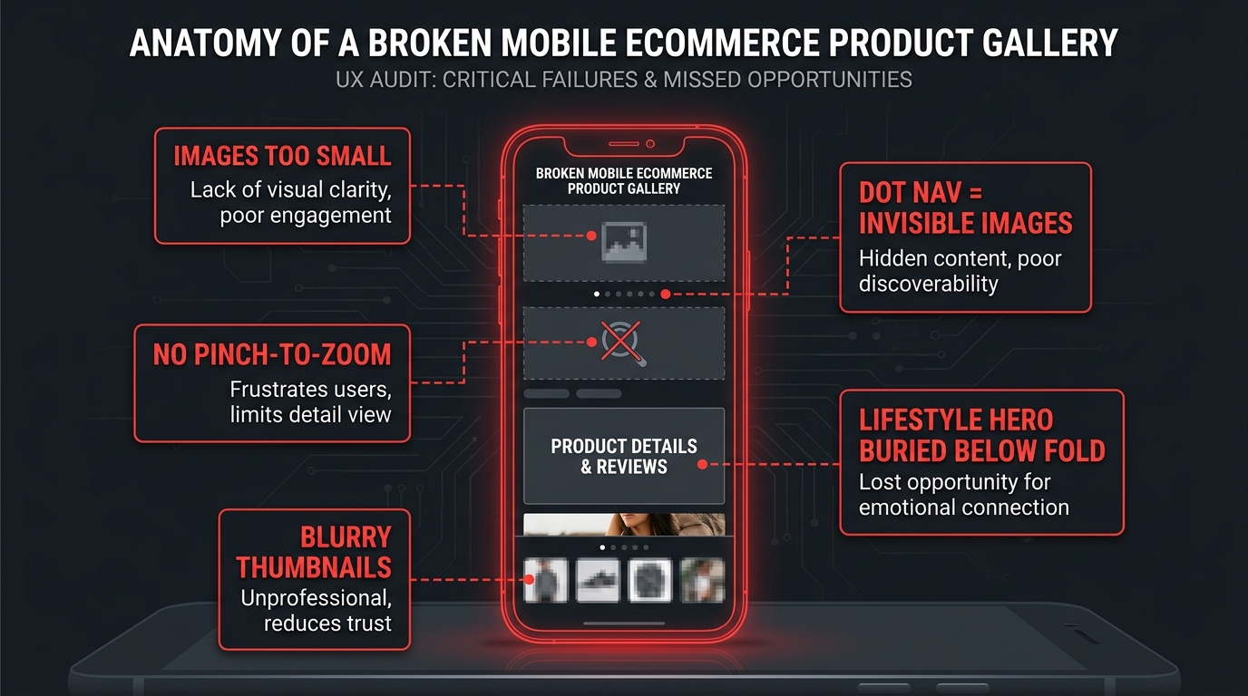
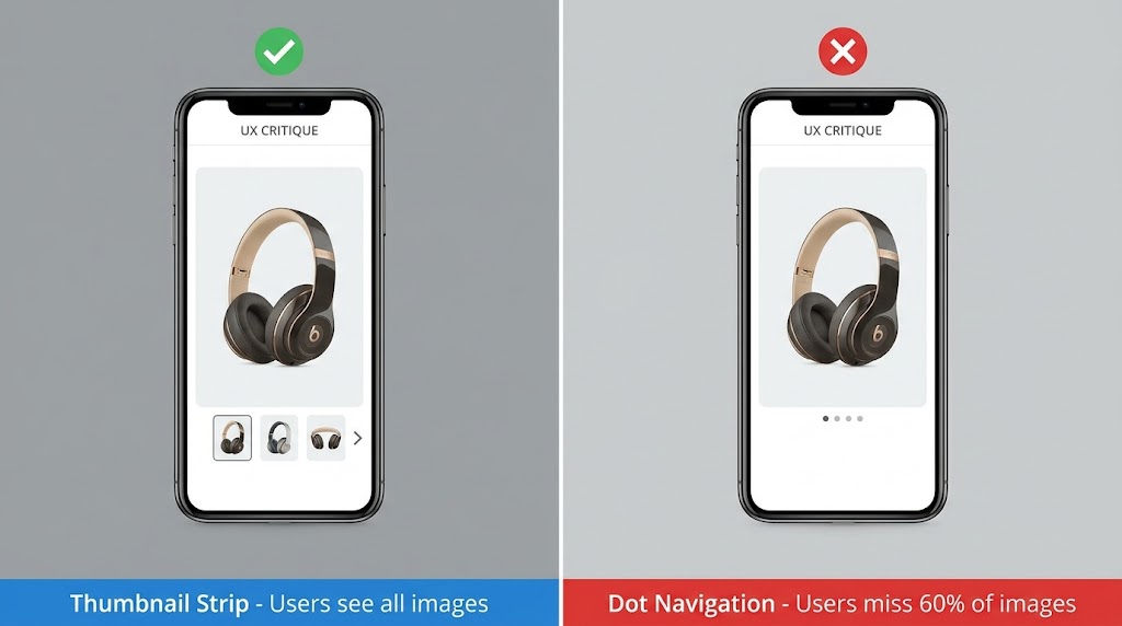
Before a buyer taps to open the full image carousel on mobile, they see a small thumbnail rail at the bottom of the main image — typically five to six tiny squares showing the first six of your images. These thumbnails are approximately 50–60 pixels wide. At that size, complex infographic designs are unrecognizable.
This means your secondary images need to be visually distinct and individually recognizable even at thumbnail scale. A lifestyle image and an infographic image should look clearly different in the thumbnail rail, so a buyer scanning those thumbnails can anticipate what each image will show before they tap it. If three of your thumbnails are visually similar (same color palette, similar composition), buyers will assume they’re showing the same thing and stop swiping before they’ve seen all your content.
Mobile-First Design Rules for Amazon Images
Adopting a mobile-first design approach for your image stack means building every design decision around how it appears at 375px wide, and only then scaling up to check how it looks on desktop. Specific rules to follow:
- Minimum text size in source file: 80px — this ensures 20px minimum at final render on mobile.
- Maximum four text elements per image — more than four creates cognitive overload at mobile scale.
- High-contrast color combinations only — light text on dark backgrounds, or dark text on light backgrounds, with at least 4.5:1 contrast ratio. Low-contrast text disappears on small screens.
- Avoid thin-line graphics or fine-detail patterns — these compress into visual noise on mobile.
- Center the most important visual element — mobile screens crop less predictably than desktop, and a centered hero element survives the rendering better than an off-center one.
Comparison Images: How to Win the Undecided Buyer Without Getting Suppressed
The undecided buyer is the most valuable buyer on Amazon, and they’re also the buyer most sellers fail to close. The undecided buyer isn’t choosing between buying your product and not buying anything — they’re choosing between your product and a competitor’s product. They’ve already decided they need the thing. They just haven’t decided who to buy it from.
For that buyer, a well-constructed comparison image is often the deciding factor. It resolves the final comparison question — “why this one instead of another one?” — without requiring the buyer to open a competitor’s listing and potentially lose the sale to them.
What Makes a Comparison Image Credible
The comparison images that build trust rather than skepticism share three characteristics. First, they compare on dimensions that buyers actually care about, not dimensions chosen specifically because your product wins all of them (buyers can sense when a comparison is rigged, and it backfires). Second, they’re visually clean — a simple grid with clear checkmarks and X marks reads faster and more credibly than a complex visual trying to make the comparison look more impressive than it is. Third, they don’t exaggerate — every claim in the comparison has to be supportable, because a competitor can report you if they believe your comparison is falsely disparaging.
Alternative Comparison Formats
Not every comparison has to be a feature grid. Before-and-after comparisons are highly effective for products where a visible transformation is the core value proposition: cleaning products, skincare, organizational tools, hair care. “Before our product / after our product” imagery is a comparison that doesn’t involve a competitor at all, which eliminates the compliance risk while still closing the same undecided buyer.
Material comparison images are another format: showing your product’s construction materials next to the inferior material used in typical alternatives (solid brass hardware versus plastic-coated hardware, for example) communicates quality differentiation without naming anyone.
Social Proof in Images: Embedding Trust Where Buyers Look First
Review data is among the most powerful purchase drivers on Amazon, but most buyers look at images before they look at reviews. This creates an opportunity that very few sellers use: bring your review evidence into the images themselves, where buyers are already looking.
Review-Quote Images Done Right
A review quote image takes a real, verbatim, highly-rated customer review and displays it as a visual — typically on a simple background with the reviewer’s first name and the star rating visible. The most effective review quotes are specific and outcome-focused: “I’ve tried six different cable organizers and this is the only one that actually stays in place” is infinitely more persuasive than “Great product, very happy with purchase.”
When selecting quotes for your review image, filter for reviews that specifically address the objections your target buyer is most likely to have. If your biggest objection is durability (“will this actually last?”), find the review that most compellingly addresses durability from a real buyer’s experience. That review quote image will do more to close skeptical buyers than any copy you write yourself, because it’s not your voice — it’s the voice of someone the buyer identifies as being like them.
Certifications and Third-Party Validations
If your product carries legitimate third-party certifications — USDA Organic, NSF Certified, UL Listed, CE marked, GMP certified, OEKO-TEX, dermatologist tested, or any other relevant third-party designation — those belong in your images. Not buried in bullet points. In the images, where buyers are already looking.
A certification badge communicates “an independent external party has verified a claim about this product” — which is categorically more trustworthy than anything you say about your own product. In categories where safety, purity, or efficacy claims matter (food, supplements, electronics, children’s products), certification imagery can be a decisive purchase trigger for buyers who are otherwise on the fence.
Customer Count Social Proof
“Trusted by 50,000+ customers” or “Join 200,000 happy shoppers” formatted as a visual element is a form of social proof that works on the principle of social consensus — the larger the crowd, the safer it feels to join it. If you have a substantial review count or verified sales history that you can credibly reflect in a customer-count claim, including it in an image (typically image 8 or as part of the lifestyle section) adds a low-cost trust signal.
Make sure the number you use is accurate and conservative — round down rather than up, and don’t project future numbers. Amazon’s policies and general FTC guidance on marketing claims apply here.
Testing Your Image Stack: Using Manage Your Experiments the Right Way

Most image optimization on Amazon is done by instinct — someone looks at two options, picks the one that feels better, and never learns whether it actually performed better. Amazon’s Manage Your Experiments (MYE) tool, available to brand-registered sellers, allows you to run legitimate A/B tests on listing content including images. Used correctly, it’s one of the highest-return tools available to sellers who qualify for it.
What Manage Your Experiments Actually Tests
MYE divides your listing’s traffic randomly between two versions of a content element. You can test main images, secondary images, titles, bullet points, and A+ content. The platform tracks which version generates higher conversion rates and click-through rates, and after a statistically sufficient sample has been collected, it tells you which version wins with a defined confidence level.
The key limitation: MYE requires Brand Registry, which requires a registered trademark. If you don’t have Brand Registry, you’re not locked out of image testing entirely — you can run manual sequential tests (change the image, wait four weeks, compare conversion rate to the previous four weeks), but these have lower reliability because you can’t control for seasonal variation, external advertising changes, and competitor activity. MYE’s simultaneous split removes most of those confounding variables.
How to Run an Image Test That Produces Useful Data
The biggest mistake sellers make in MYE tests is testing too many variables at once. If you change your main image and your infographic image in the same test, and the B version converts better, you have no idea which image change drove the improvement. Test one variable at a time. If you want to test your main image, keep every other image slot identical between version A and B.
Run each test for a minimum of four weeks — ideally six if your daily session count is below 200. Statistical significance requires a sufficient sample, and underpowered tests produce winning calls that reverse when you actually implement them. Amazon’s platform will tell you when the test has reached a defined confidence level, but “reached confidence” and “reached enough data to be reliable” are not always the same thing at low traffic volumes.
What to Test First
The testing priority should follow the same logic as the image slot architecture. Your main image drives click-through rate from search results, so a main image test has the widest impact on your listing’s performance. Start there. After you’ve found your best main image, move to secondary image two (the scale and angle image), then to your feature infographic. Each optimization builds on the previous one.
Don’t test imagery in a vacuum from other listing elements. If your main image test produces a winner, update the listing with that winner before running the next test. Running multiple sequential tests with the winning version from each gives you a compounding optimization — each improvement builds on the previous one.
The Image Audit: How to Assess Your Current Stack Before You Rebuild
Before you shoot anything new or redesign any existing images, spend time doing a structured audit of your current image stack. Most sellers who do this honestly are surprised by how many correctable problems they find — issues that don’t require new photography, just better execution of what’s already there.
The 10-Point Image Audit Checklist
- Slot count: Are all nine image slots filled? An empty slot is a pure missed opportunity. If you can’t fill all nine with distinct, purposeful content right now, identify which slots are missing and prioritize.
- Main image fill: Does your product fill at least 90% of the main image frame? Pull it up at search result size and compare it to the top three competitors. Is it larger or smaller in the thumbnail?
- Scale reference: Can a new buyer immediately understand the physical size of the product from images two through four? If not, which slot will you add a scale reference to?
- Mobile readability: View each image on a phone screen. Can you read every text callout without squinting? Count the text elements per image — are there more than four?
- Thumbnail distinctiveness: Look at your thumbnail rail with your eyes slightly unfocused. Are the six visible thumbnails visually distinct from each other? Would a buyer be able to predict what each image shows before tapping it?
- Lifestyle specificity: Does each lifestyle image show a specific, recognizable scenario, or does it show a generic “aspirational vague” composition?
- Demographic match: Do the people in your lifestyle images reflect your actual buyer base in age, body type, and context?
- Objection coverage: List the three most common objections buyers raise in your negative reviews. Does your image stack address any of them visually?
- Social proof presence: Is there at least one trust-signal image in your stack — certification, review quote, customer count, or guarantee?
- Compliance check: Do any of your current images include props not in the product, Amazon-prohibited badges, text on your main image, or comparative claims about named competitors? These are active listing suppression risks.
Score yourself honestly on each point. An average audit reveals two to four critical issues and three to five improvement opportunities. Fix the critical issues first (anything that risks suppression), then prioritize improvement opportunities by their likely conversion impact.
Common Mistakes That Tank Listings
Beyond the audit checklist, a few specific patterns show up repeatedly in underperforming listings that sellers often don’t notice until they do a structured review.
The “feature dump” infographic: listing seven, eight, or nine features in a single image with tiny text and cluttered callouts. This image tries to do too much and ends up communicating nothing. Two to four features, maximum, per infographic image. If you have eight features to communicate, use two infographic images.
The stock-photo lifestyle: licensing a stock image that vaguely relates to the product category rather than commissioning or shooting actual product lifestyle imagery. Stock photos are often identifiable as stock photos, and identified stock photography reads as “this seller didn’t bother.” It actively damages trust rather than building it.
Inconsistent visual branding across the stack: different color palettes, different font treatments, different background tones across images, creating a disjointed visual experience. Consistency of visual branding across your image stack creates a subliminal quality signal. Inconsistency creates subliminal doubt.
The information cliff: all the substantive content is front-loaded into images two through four, and images five through nine are either empty, redundant, or purely decorative. Buyers who swipe all the way to image nine are highly engaged and often very close to purchasing — leaving the back half of your stack empty or weak means losing conversions at the point where they’re most likely to close.
The Image Stack as a Living Asset, Not a One-Time Project
The biggest long-term mistake sellers make with Amazon imagery is treating it as a launch task — something you complete once when you set up the listing and then leave static indefinitely. Your competitors are continuously testing and improving their images. Your buyer demographics shift as your product matures. Review data reveals new objections you didn’t anticipate at launch. Seasonal contexts change what lifestyle imagery is relevant.
Building an Image Update Cadence
A practical image review cadence for established listings looks like this:
- Monthly: Check for any new compliance notices from Amazon, review recent negative reviews for new objections that could be addressed in imagery, check whether any infographic data or certification claims have become outdated.
- Quarterly: Review top competitor listings for significant image improvements. If a competitor has launched a new image type or format that’s clearly performing well, test a version for your own listing. Run one MYE test per quarter on your highest-traffic ASINs.
- Annually: Evaluate whether your lifestyle imagery still reflects the current buyer profile. Consider whether seasonal or trend-driven updates would improve relevance. Commission new photography if lifestyle images are more than 18 months old — visual aesthetic trends shift, and what looked current two years ago can start to feel dated.
Using Review Data to Drive Image Updates
Your review section is the single most accurate real-time research tool you have for understanding what buyers expected versus what they received. Every time a buyer mentions “smaller than I thought,” “the color was different from the photos,” “I didn’t realize it wasn’t included,” or “I was confused about how to use it,” they’re telling you exactly which image is failing.
Build a habit of reading your one-star and two-star reviews specifically for image-addressable complaints — issues that arose from the buyer not understanding something that an image could have communicated. Then trace that failure back to the specific slot in your image stack that should have handled it, and fix that slot.
This is the most data-driven image optimization approach available to sellers who don’t have Brand Registry — not fancy A/B testing, just honest analysis of where your current images are failing the buyers who are already buying from you.
Conclusion: Stop Shooting Better Photos and Start Building a Better Visual Argument
The gap between listings that convert and listings that don’t almost never comes down to photography quality alone. It comes down to whether the image stack makes a complete, sequenced, objection-resolving case for the product — or whether it just shows the product from several angles and hopes for the best.
Buyers on Amazon in 2026 are sophisticated. They’ve seen thousands of product listings. They know what a lazy infographic looks like. They know when a lifestyle image is stock. They can sense when a comparison chart has been gamed. The sellers who win consistently are the ones whose image stacks feel like they were built by someone who deeply understands their buyer — who knows exactly what question is running through the buyer’s mind at image three, and has already answered it.
The framework in this post gives you a slot-by-slot architecture to work from. But the real work is knowing your buyer well enough to fill each slot with something that speaks directly to them. The technical requirements are straightforward. The human insight is what separates an average image stack from one that converts at two or three times the category rate.
Your Action Plan, in Order
- Run the 10-point image audit on your top three ASINs this week. Fix anything flagged as a compliance risk immediately.
- Check every image on a mobile device. If text is unreadable, redesign before anything else.
- Fill every empty image slot — even placeholder lifestyle or infographic content is better than an empty position.
- Write the specific buyer objections your listing needs to address and map each one to an image slot.
- If you’re Brand Registry eligible, start a Manage Your Experiments test on your main image for your highest-traffic ASIN.
- Schedule an image review in 90 days. What changed in your reviews? What did competitors update? What needs to be tested next?
Your images are not decoration. They are your sales team, your product demo, and your brand handshake — all compressed into nine squares. Treat them with the same strategic attention you give to pricing, advertising, and inventory, and they’ll perform accordingly.