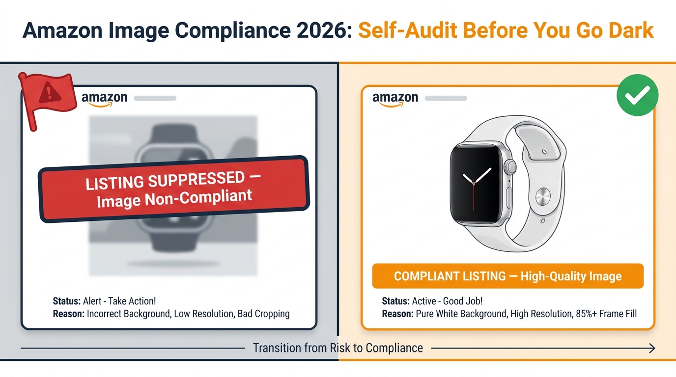
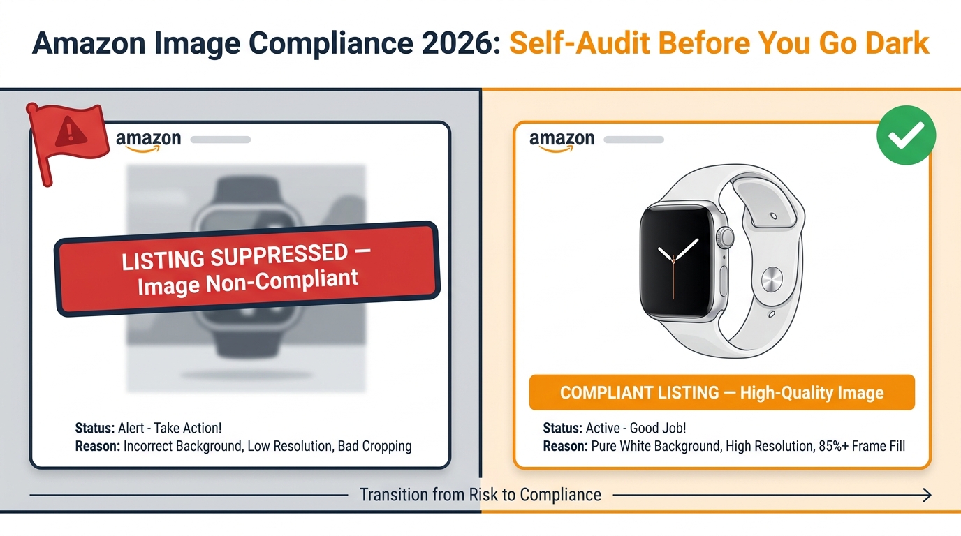
Tag: Image Optimization

  • What Your Amazon Images Actually Look Like on a Phone — And Why Most Sellers Get It Wrong

    What Your Amazon Images Actually Look Like on a Phone — And Why Most Sellers Get It Wrong

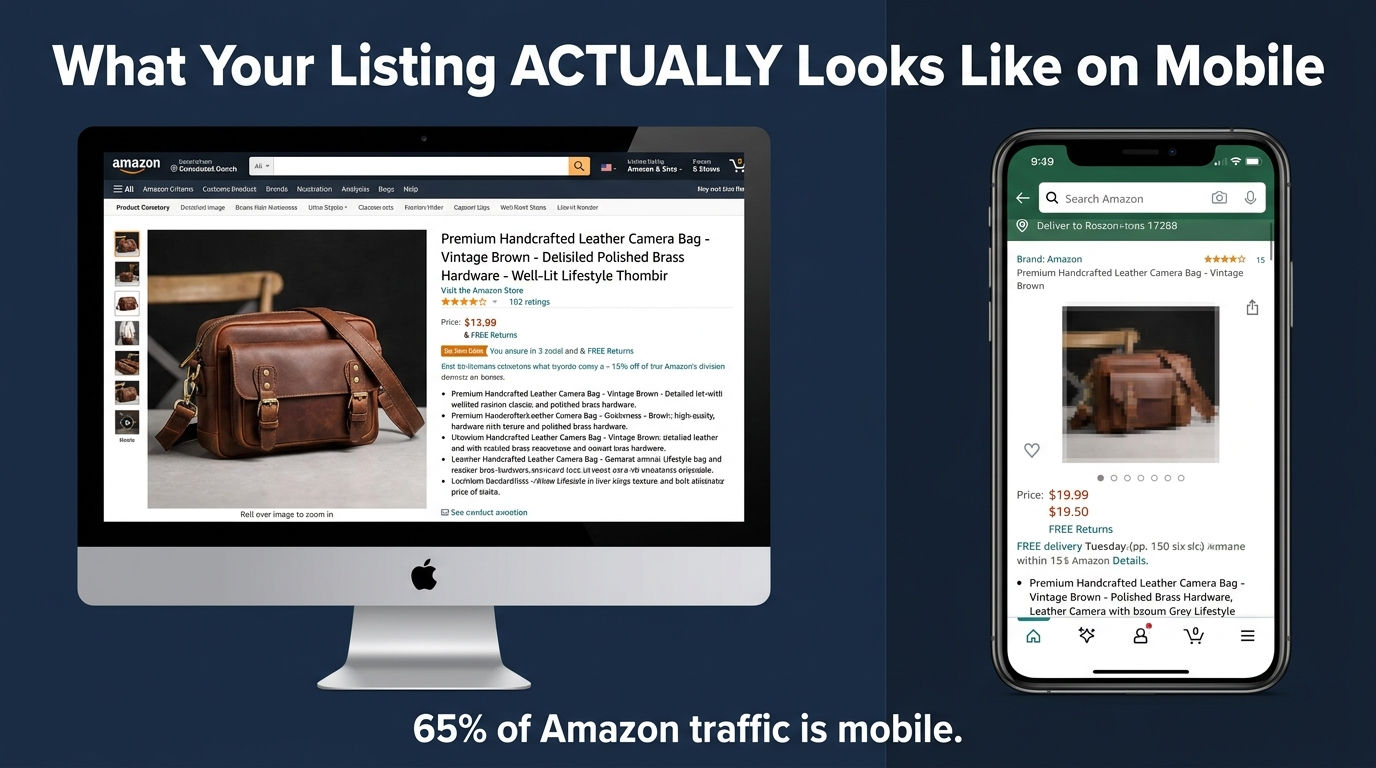
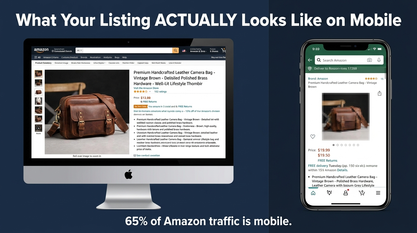
    Desktop vs mobile Amazon listing comparison showing how product images shrink dramatically on smartphone screens

    There is a remarkably common way to build an Amazon product listing: hire a photographer, take great shots on a white background, get them edited to 2000×2000 pixels, upload all eight slots, and move on. The images look sharp on your desktop. The detail is visible. The branding feels professional. You approve it all from your laptop and call it done.

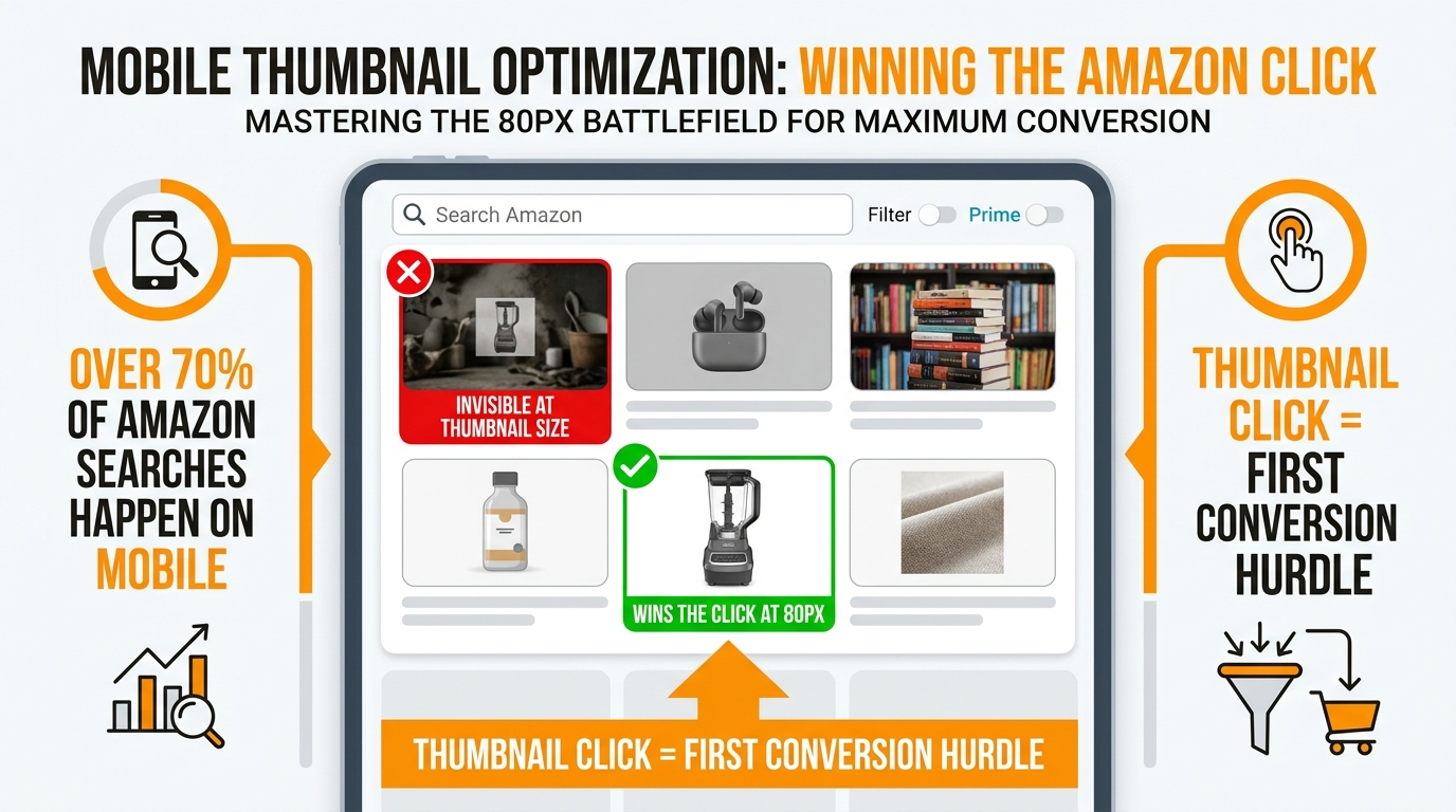
    Then your listing goes live and roughly 65% of the people who actually see it are looking at it on a phone — where your carefully composed main image is rendered as a thumbnail somewhere around 150 pixels wide. The fine detail? Gone. The clever angle that shows the product’s best feature? Invisible. The subtle texture that justified the premium price? Flattened into a grey smudge.

    This is not a hypothetical. Multiple industry datasets put Amazon’s mobile traffic share between 57% and 75% depending on category and device type, with most credible mid-2026 estimates landing around 65%. That means the majority of first impressions your listing makes are happening on screens where pixel real estate is ruthlessly scarce. And yet the workflow most sellers use to design, review, and approve product images is almost entirely desktop-first.

    This post is not about adding mobile as an afterthought. It is about rethinking the entire visual logic of how Amazon listings get built — starting from the 150-pixel thumbnail and working outward, rather than starting from a print-quality photo and hoping it scales down gracefully. The difference in click-through rate between sellers who have made this shift and those who haven’t is measurable, repeatable, and currently sitting as unclaimed upside for anyone willing to look at the problem the right way.

    Here is exactly what that shift looks like in practice.

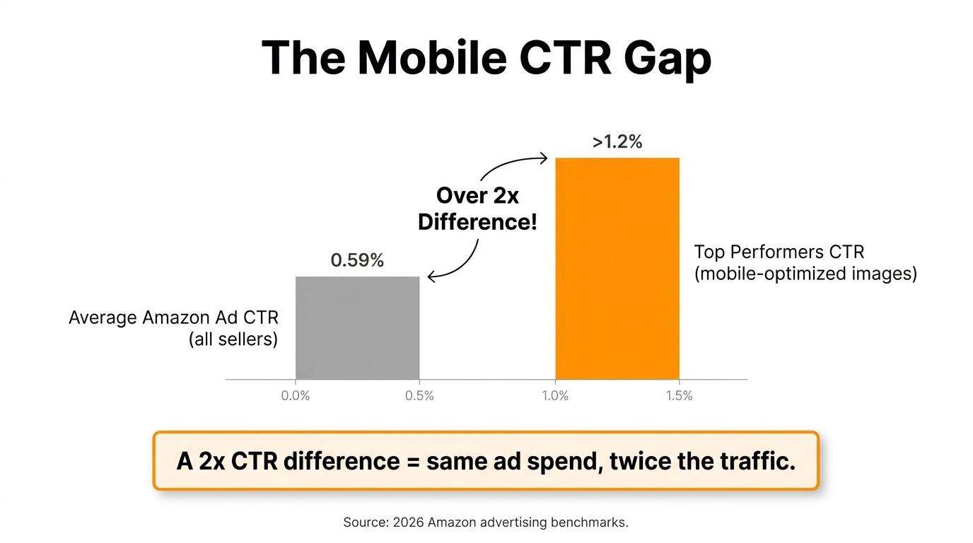
    Bar chart showing the mobile CTR gap between average Amazon sellers at 0.59% and top performers with mobile-optimized images at over 1.2%

    The 150-Pixel Problem: Understanding What Amazon Actually Shows on Mobile

    Before you can design better, you need to understand what Amazon’s mobile interface actually does with your images. Most sellers have never thought about this in mechanical terms, which is part of why so many listings look the way they do.

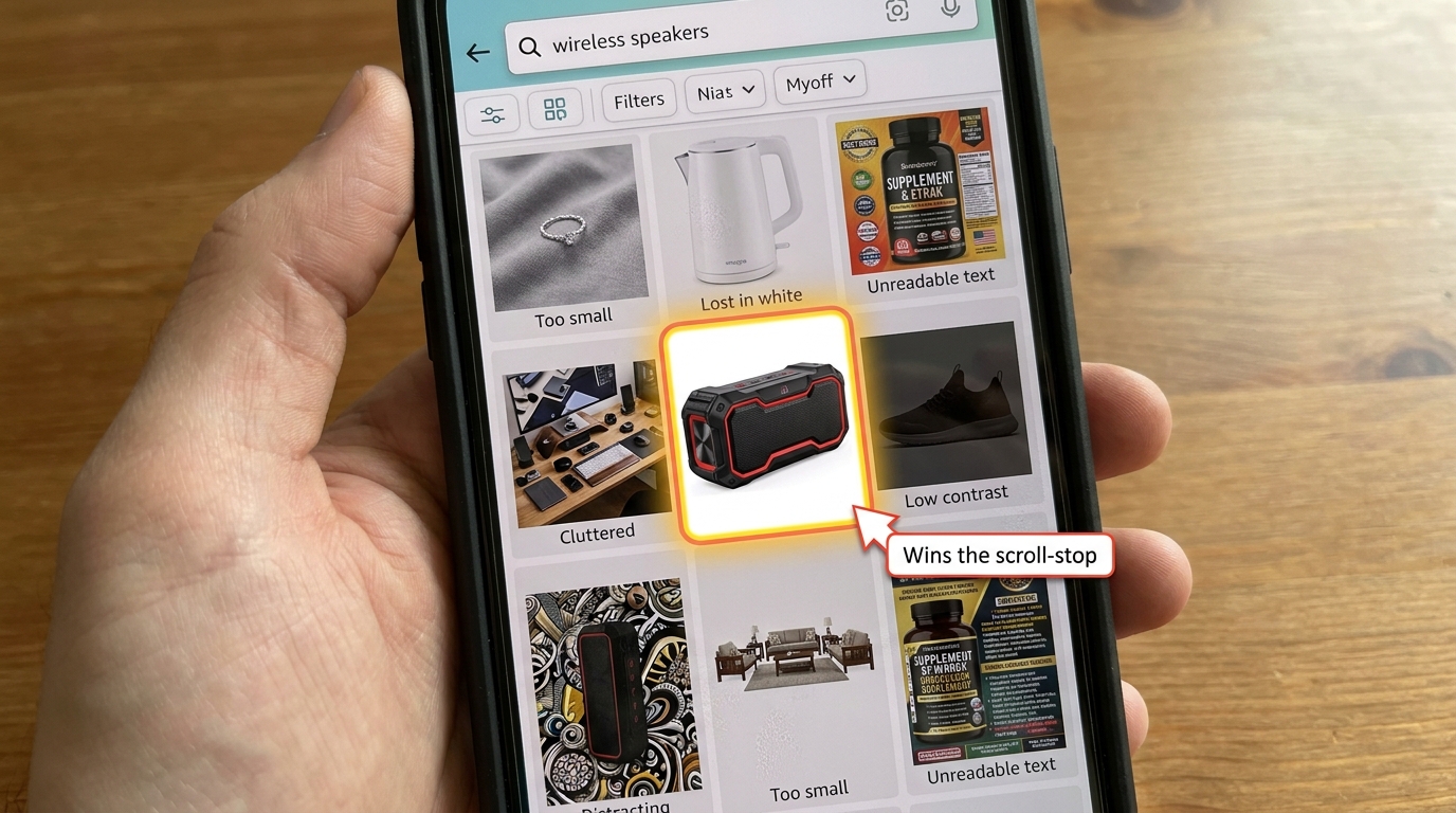
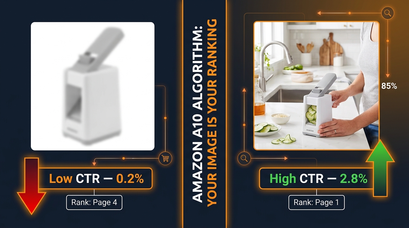
    When a shopper opens the Amazon app on their phone and types a search query, the resulting grid shows product thumbnails pulled dynamically from your main image. Amazon does not maintain separate mobile-specific images. It takes the file you uploaded — ideally 2000×2000 pixels — and compresses it on-the-fly to fit the phone’s screen layout. On a modern smartphone in a two-column grid, that effective thumbnail size typically renders somewhere between 120 and 180 pixels wide. On a one-column carousel layout, it gets more space. But the two-column grid, which is Amazon’s most common mobile search layout, is where most first impressions actually happen.

    What Survives the Compression

    At 150 pixels wide, only the boldest, most high-contrast visual information survives. This is not subjective — it is a function of how image downsampling algorithms work. The pixels that remain after compression carry the dominant colours, the sharpest edges, and the largest shapes in your original composition. Fine text, subtle shadows, thin product features, and background props all collapse into visual noise or disappear entirely.

    What this means in practice: if your product is occupying 60% of the frame in the original image — which many photographers consider a professional standard — it is occupying roughly 90 pixels of width on a mobile thumbnail. That is barely enough to distinguish the basic product shape, let alone communicate the details that differentiate your listing from a competitor.

    The Zoom Paradox

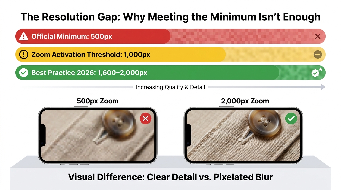
    Amazon allows shoppers to zoom into product images on the product detail page (PDP), which is why a high-resolution upload (1600px or larger) still matters. But here is the critical distinction: zoom happens after the click, not before it. High resolution supports conversion on the PDP. It does nothing for CTR from search. The click itself is driven entirely by what the shopper sees at thumbnail scale in the search grid — and that is where the 150-pixel problem lives.

    Sellers who conflate “high resolution” with “mobile-optimised” are solving the wrong problem. Resolution is a table-stakes technical requirement. Mobile optimisation is a compositional and strategic discipline that happens at a completely different level of the design process.

    How Amazon’s Mobile Grid Has Changed

    Amazon’s mobile app layout has become increasingly visual-heavy over the past 18 months. Sponsored product tiles now compete with organic results in the same grid, video thumbnails appear inline, and Amazon’s own product recommendations sit between organic rows. The practical effect is that your main image now has more visual competition than it did two years ago — from both paid placements and Amazon’s own interface elements. Thumbnails that were distinctive in a simpler grid are now getting lost in a much noisier feed.

    Amazon mobile search results grid showing how some product thumbnails stand out with bold compositions while others are lost at 150-pixel thumbnail scale

    Why Desktop-Designed Hero Images Systematically Fail on Mobile

    The root cause of the problem is not bad photography. It is a misaligned review process. Most sellers approve images on a desktop screen, often in the Seller Central interface where the image appears at several hundred pixels wide and looks excellent. The phone experience is rarely previewed in the approval workflow. This creates a systematic bias toward images that perform well at large sizes and poorly at small ones.

    The Five Most Common Failure Modes

    After reviewing hundreds of seller listings and drawing on patterns reported by Amazon-focused agencies in 2026, the same five failure modes appear repeatedly:

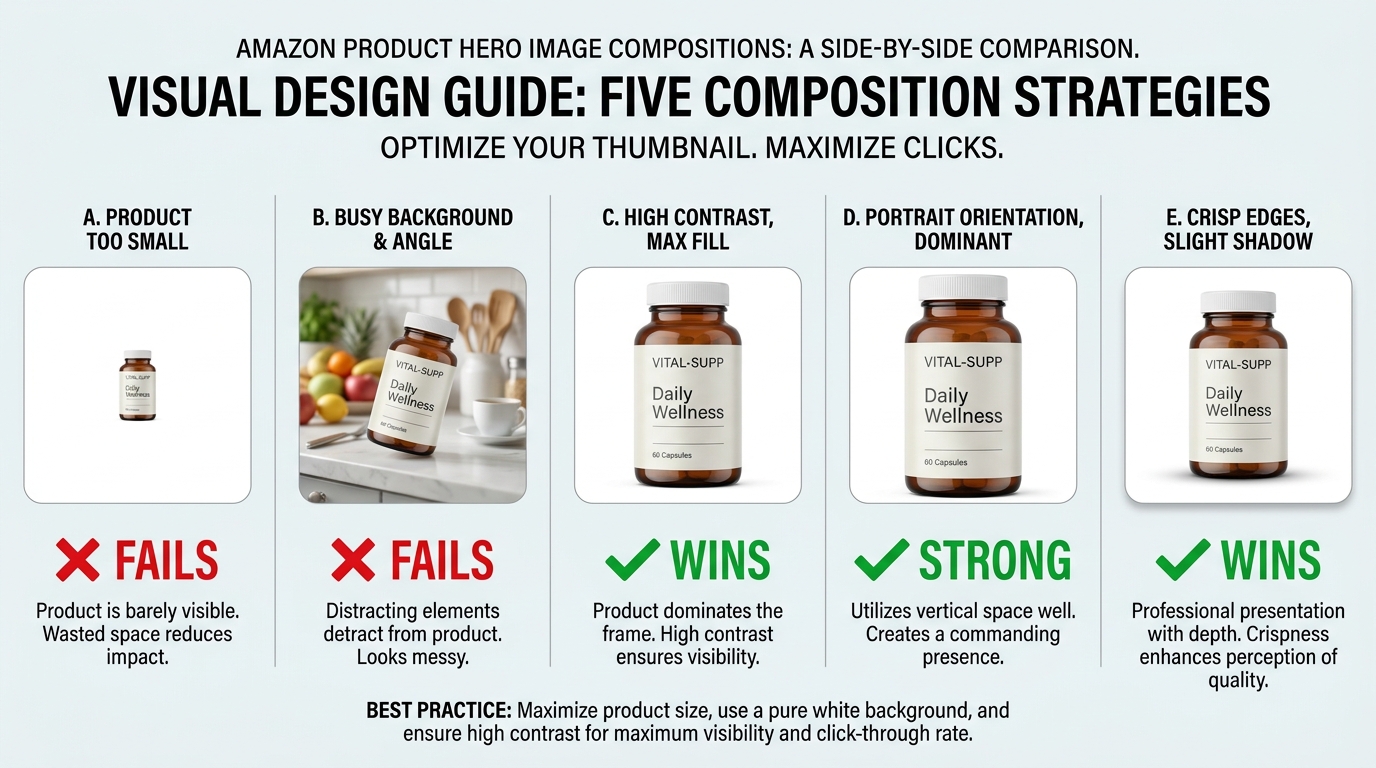
    1. Product too small in frame. A product occupying 60–70% of the image frame — which looks compositionally balanced on desktop — leaves too much white space at thumbnail scale. The product becomes a small object floating in a white void, with no visual weight to pull the eye.

    2. Angled or styled shots with contextual props. Lifestyle-adjacent main images with surfaces, backgrounds, or environmental props may look premium at full size. At 150 pixels, those props compete with the product for the only pixels that exist, making the composition read as cluttered rather than considered.

    3. Fine text or iconography on the product itself. A supplement bottle with small-print ingredients visible, a gadget with tiny ports labelled, a clothing item with a small brand logo — all of this becomes unreadable at thumbnail scale and occupies pixels that could otherwise be serving the dominant visual form.

    4. Low-contrast product against white background. White or light-coloured products — white mugs, cream-coloured organizers, silver electronics — have a well-documented visibility problem at mobile thumbnail scale. They effectively blend into the white background that Amazon’s interface uses, making the product disappear from the grid entirely.

    5. Horizontal or landscape compositions. Products photographed in a wide horizontal orientation use the full width of a square frame but leave significant vertical space empty. On a mobile phone where vertical screen space is the premium dimension, this wastes the canvas in the wrong direction.

    The Approval Gap in Practice

    Each of these failure modes is predictable and preventable — but only if the image is evaluated at the actual size it will appear in mobile search. The single most effective process change most sellers can make is to add one step to their image review workflow: before approving any hero image, screenshot the listing’s search thumbnail from the Amazon mobile app and look at it in context, surrounded by competitor thumbnails in the same search grid.

    This sounds obvious. Very few sellers do it systematically. Those who do describe it as an immediate revelation — they see their listing through the exact lens their customers are using, often for the first time.

    The Pixel-to-Purchase Pipeline: How Amazon Renders Your Images

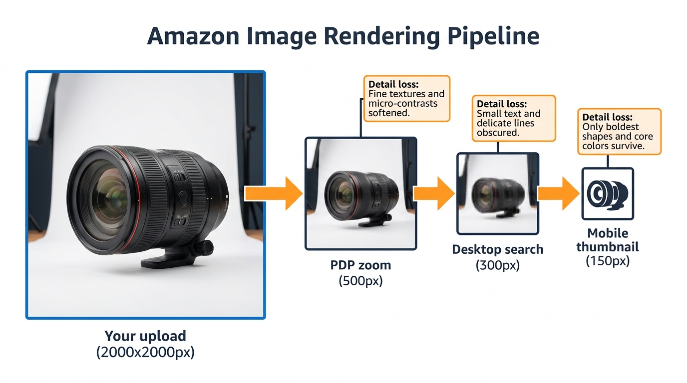
    Diagram of the Amazon image rendering pipeline showing how a 2000px upload is progressively compressed to 150px mobile thumbnails

    Understanding Amazon’s image delivery system helps you make smarter technical decisions upstream. Your original image file goes through several rendering passes before it reaches any given shopper’s screen, and each pass has different quality implications.

    Upload to CDN

    When you upload a product image to Seller Central, Amazon processes it into multiple derivative sizes and stores them on its content delivery network (CDN). These derivatives are then served based on the requesting device’s screen resolution, the layout being rendered, and network conditions. Amazon does not publicly document exactly which derivative sizes it generates, but practical testing by sellers and agencies has identified the key breakpoints: a high-resolution version for PDP zoom (typically 1000–2000px range), a medium version for desktop search (approximately 300px), and a small version for mobile thumbnails (approximately 120–180px).

    The Critical Implication: Upscaling Doesn’t Help

    If your original image is 1000×1000 pixels — the minimum Amazon requires for zoom functionality — the mobile thumbnail is being downsampled from that. If your image is 2000×2000 pixels, the thumbnail is derived from higher-quality source material, which produces marginally better compression artefacts. But the structural composition of the image — what’s in frame, at what size, with what contrast — is fixed at upload time. No amount of resolution compensates for a composition that does not work at 150 pixels.

    This means the design hierarchy is: composition first, resolution second. A 1600-pixel image with a mobile-ready composition will out-click a 3000-pixel image with a desktop-first composition every time, because clicks are won at 150 pixels where resolution differences are invisible.

    JPEG Compression Artefacts at Small Sizes

    Amazon recompresses your images as JPEG when serving them, and JPEG compression introduces artefacts that are especially visible at small sizes. High-frequency detail — thin lines, fine textures, sharp edges — degrades more than solid areas of colour. This reinforces the principle that bold, high-contrast, simple compositions survive mobile rendering better than complex, detailed ones.

    The practical takeaway: upload the largest, highest-quality JPEG or PNG you can produce, minimize fine detail in areas that are not the product itself, and make the product’s dominant shape as clean and high-contrast as the category allows.

    How Screen Pixel Density Changes the Math

    Modern smartphones typically have “Retina” or high-DPI displays, which means a thumbnail that renders at 150 CSS pixels might actually be displayed using 300 or even 450 physical pixels on the device screen. This is good news — it means your thumbnail can look sharper on a modern phone than the 150-pixel number implies. But it also means that if Amazon is serving a low-resolution thumbnail to a high-DPI screen, the image will look soft by comparison to competitors who uploaded larger files. The safe play remains uploading at 2000×2000 pixels minimum and designing the composition for legibility at 150 CSS pixels.

    Composition Rules for Scroll-Stop Power at Thumbnail Scale

    Comparison of five Amazon hero image compositions at thumbnail scale showing which compositions win scroll-stop attention and which fail

    Designing specifically for mobile thumbnail performance is a different discipline from standard product photography. It borrows from both UX design and outdoor advertising — two fields that have spent decades figuring out how to communicate in limited space at speed.

    Rule 1: The 85% Fill Rule

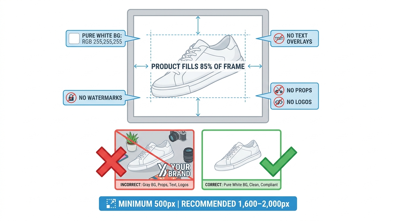
    Your product should fill at least 85% of the image frame. Not 70%, not 75% — the difference matters at thumbnail scale. Amazon’s own guidelines suggest the product should fill “most of the image,” which is deliberately vague, but practitioners consistently report that filling 85–92% of the frame produces the best thumbnail performance without violating Amazon’s rules about leaving room for the product to breathe.

    The exception is multi-pack or set products, where showing the quantity clearly is more important than a single unit filling the frame. In those cases, the set as a whole should fill 85% of the frame.

    Rule 2: Dominant Shape Clarity

    At 150 pixels, shoppers are not reading your product — they are pattern-matching against a shape silhouette. If your product’s dominant shape is ambiguous or shares its visual profile with too many competitors, it gets scrolled past. Products with strong, distinctive silhouettes — a distinctive bottle shape, an angular tool, an unusual form factor — have a natural advantage here that should be maximised by centring and isolating that silhouette as cleanly as possible.

    For commoditised shapes (rectangular electronics, cylindrical supplements, square books), the path to scroll-stop is contrast and colour, not shape differentiation. A bold product colour against pure white will generate more visual stopping power than a subtle, premium-looking composition.

    Rule 3: The White Background Contrast Problem

    White or near-white products require special handling. The options are: use a very slight drop shadow to create a visible product edge (permitted under Amazon’s rules — shadows that are cast by the product itself are allowed), ensure the product has enough colour differentiation from pure white to remain visible, or — for hero images where the category permits it — consider whether a very light grey background achieves better contrast without violating guidelines.

    Amazon strictly requires the main image to have a pure white (#FFFFFF) background. However, the product itself can include any colours, and for white or light products, maximising internal colour contrast (using the product’s logo, label, or coloured components as visual anchors) is the most effective approach.

    Rule 4: Straight-On vs. Angled Shots

    Agency data consistently shows that straight-on, front-facing product shots outperform stylistic angle shots for main image CTR in most categories. The reason is cognitive efficiency — a straight-on shot is the fastest to pattern-match, requires the least mental rotation, and communicates the product’s dominant form most efficiently at small sizes.

    Angled shots can work well for products where the three-dimensional form is a key purchase driver (furniture, kitchenware, wearables) — but even then, the angle should be chosen to maximise the product’s dominant shape, not to create visual interest for its own sake.

    Rule 5: Negative Space Is Not Your Friend at Thumbnail Scale

    Negative space is a hallmark of premium design language. It signals confidence, whitespace, restraint. On a full-size poster, it works beautifully. On a 150-pixel Amazon thumbnail, it registers as “small product, lots of nothing.” The premium signal you intended does not survive compression. Use the frame aggressively. Fill it with product.

    Secondary Images as a Mobile Swipe Story

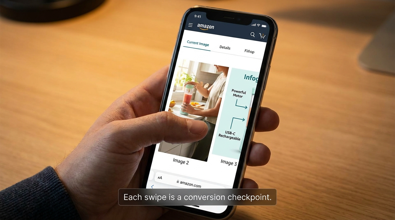
    Amazon mobile product image carousel showing secondary images in 4:5 portrait ratio filling the phone screen vertically during swipe browsing

    Once a shopper clicks through to your product detail page, the mobile experience shifts from thumbnail grid to vertical scroll. On the Amazon app, the image carousel at the top of the PDP is the first and most prominent element — it takes up the majority of the above-fold space on most phones. This is where secondary images do their work.

    Most sellers treat secondary images as supporting documentation for the main product shot: angles, close-ups, dimensions, lifestyle use. That framing is not wrong, but it misses the bigger opportunity. On mobile, the image carousel functions more like a swipeable landing page than a product gallery. Each image is a separate screen-filling moment, and each one either builds purchase intent or loses the shopper’s attention.

    The Swipe Story Framework

    Think about the sequence of your secondary images the way a copywriter thinks about a landing page: you have approximately 3–5 seconds per image before the shopper either swipes to the next or scrolls down to the listing text. The images need to carry a coherent narrative that moves from “here’s what it is” to “here’s why you want it” to “here’s why you can trust it.”

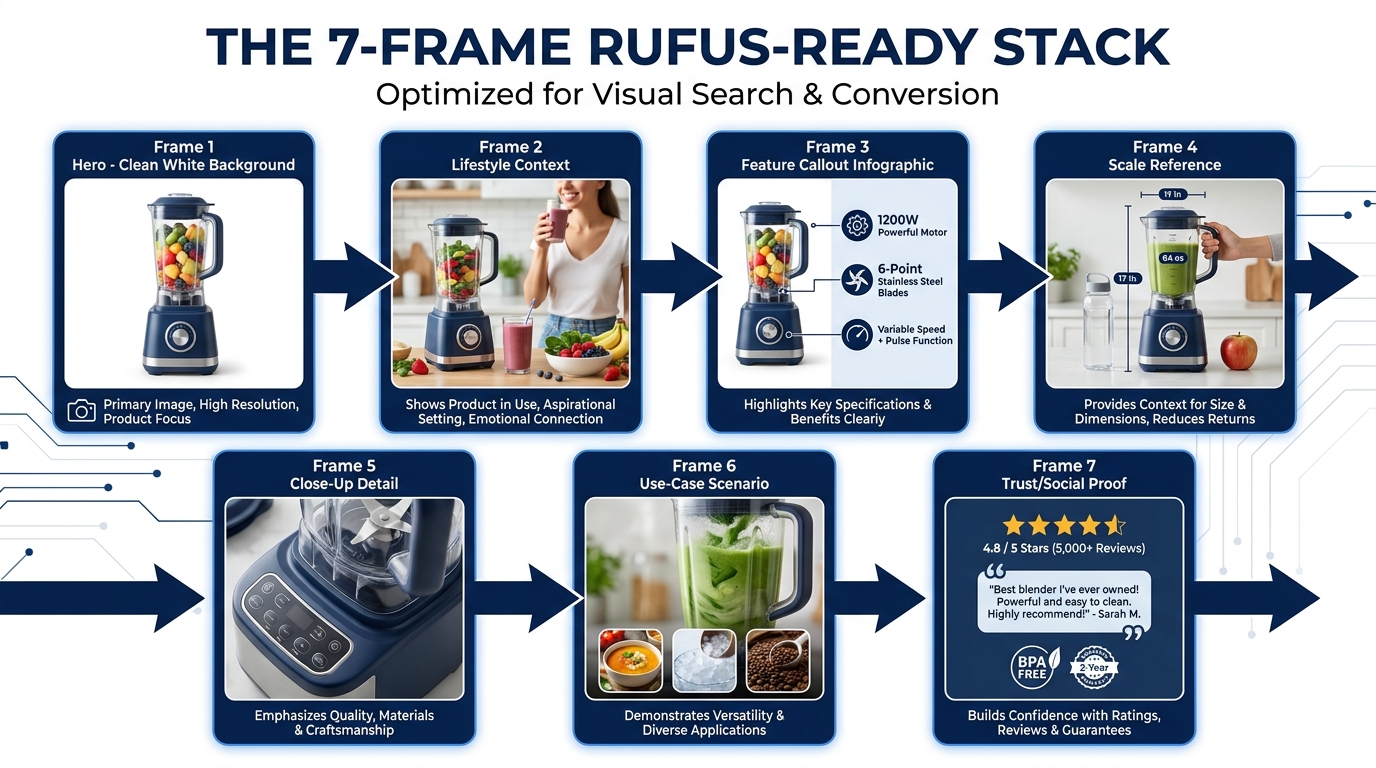
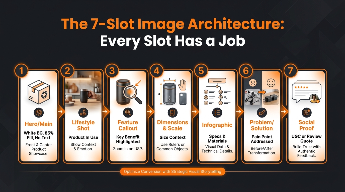
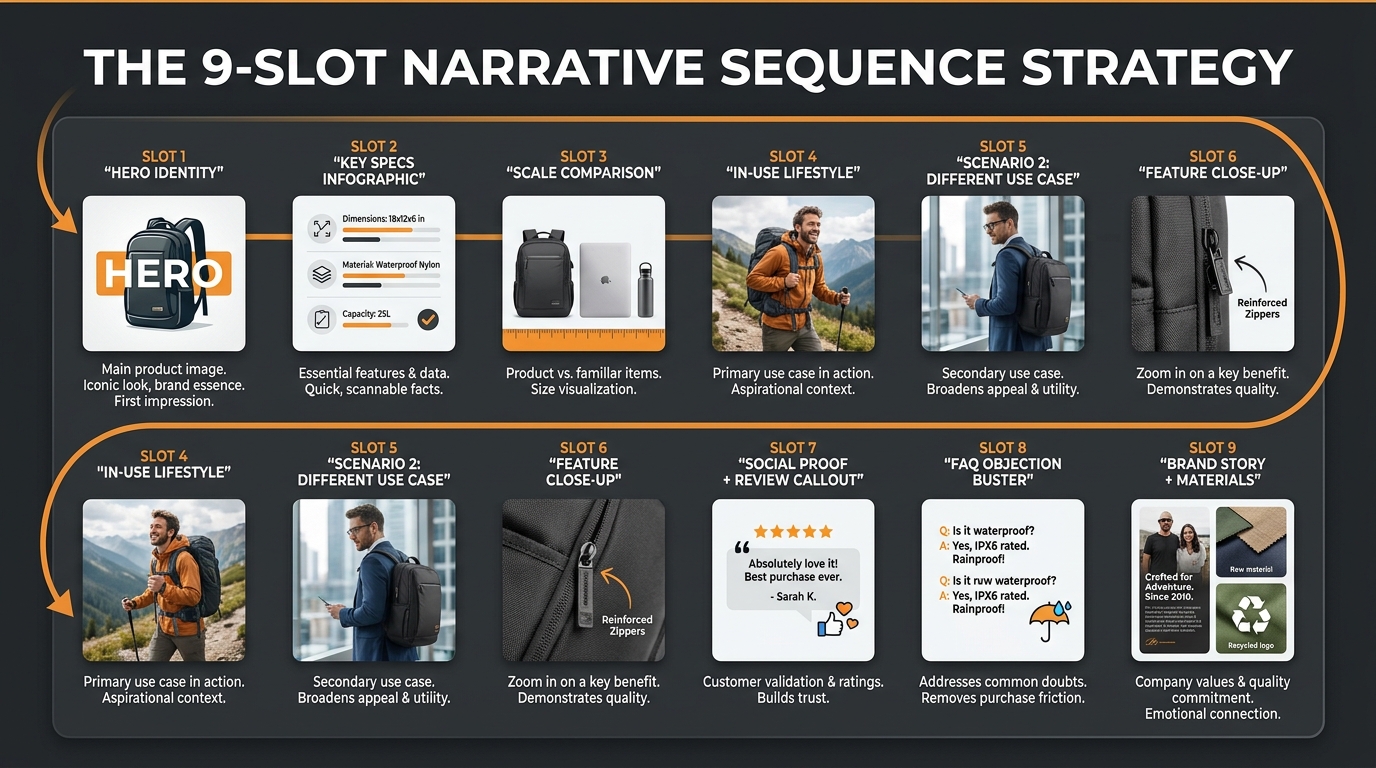
    A high-performing 8-image sequence for mobile typically follows this arc:

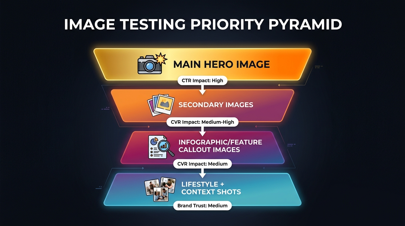
    1. Image 1 (hero): Product at its clearest, most dominant — CTR driver from search.
    2. Image 2 (hero in context): Lifestyle shot showing the product in use — establishes emotional relevance immediately after click.
    3. Image 3 (primary benefit): Infographic-style callout of the single most important product benefit or differentiator, designed to be readable at mobile size.
    4. Image 4 (proof/credibility): Certifications, awards, before/after, or comparison that answers the dominant objection for the category.
    5. Image 5 (features/specs): Labelled diagram or annotated product shot with key specs called out.
    6. Image 6 (size/fit/scale): Size comparison with familiar reference object — crucial for reducing return rates and objection-handling before purchase.
    7. Image 7 (social proof or use variety): User scenarios, variety of use cases, or secondary lifestyle shot for a different user type.
    8. Image 8 (closer/CTA): Bundle shot, product family, or guarantee/returns information — the last persuasive push before the Buy Box.

    Text on Secondary Images: The Mobile Readability Problem

    Secondary images on Amazon can include text, callouts, and infographic elements — and this is a major opportunity that many sellers misuse. The problem is designing text at a size that reads well on desktop (say, 24pt in the original 2000px image) but renders at roughly 6pt equivalent on a mobile screen. This is unreadable.

    The practical rule: any text intended to be read on mobile should be designed to be legible at no smaller than 12pt equivalent after mobile scaling. In practice, this means your original image should use significantly larger text than looks “correct” on desktop. The result will look slightly oversized on desktop and exactly right on mobile — which is the correct trade-off given where your traffic is coming from.

    Portrait Orientation for Secondary Images

    While the main hero image must adhere to Amazon’s 1:1 square ratio requirements, secondary images have more flexibility in many categories. A 4:5 portrait orientation (taller than wide) for secondary images fills more vertical screen space on a mobile phone, giving each image more visual real estate per swipe. Top-performing listings in categories that permit it are increasingly adopting this format for images 2–7 in the stack, reserving it only where the product composition makes sense.

    The key caveat: not all categories and listing types support non-square secondary images. Test carefully and ensure your images display correctly on both the mobile app and desktop before committing.

    Portrait vs. Square: The Ongoing Ratio Debate

    The question of whether to shoot in portrait or square comes up constantly in Amazon seller communities, and the answer is more nuanced than most guides suggest. Here is the current practical reality as of 2026.

    Main Image: Square Is Still the Standard

    Amazon’s main image requirement is effectively square (1:1). The platform’s search grid is built around square thumbnails, and non-square main images will either be cropped or letter-boxed, neither of which produces a reliable result. For the main image, 1:1 is not a creative choice — it is a technical constraint to work within.

    The creative opportunity within that constraint is vertical composition: even in a square frame, you can position the product at the top of the image with the base near the bottom, which tends to make the product appear larger and more imposing than centring it with equal whitespace on all sides. This is a subtle but measurable composition technique for products with significant height-to-width ratios.

    Secondary Images: Portrait Has Real Advantages

    For secondary images, portrait orientation has a genuine functional benefit on mobile — it fills more of the phone screen per image frame, giving the shopper less ambient UI chrome visible during their swipe experience. The psychological effect is immersive: the image takes over the screen rather than floating in a bordered box. Leading Amazon-focused creative agencies report that portrait secondary images tend to produce longer dwell times on the PDP carousel, which correlates with higher conversion rates.

    However, this needs to be tested for your specific product and category. Portrait images that cut off important product context due to the tighter crop can hurt conversion despite the format advantages.

    The Video Thumbnail Variable

    Amazon has expanded the presence of product videos across mobile search and PDPs. When a listing has a video, its thumbnail appears as one of the carousel items and can also appear as a sponsored tile in search results. This introduces a new design variable: the video thumbnail is not a static image you upload, but a frame captured from your video. Sellers who want their video thumbnail to be a high-performing mobile asset need to front-load their video with a visually strong opening frame that works at thumbnail scale — essentially designing a “video hero image” as the first second of the video clip.

    Testing What Works: Running Image Experiments That Actually Tell You Something

    Understanding mobile image principles is one thing. Knowing which version actually drives more clicks in your specific category with your specific customers is another. Amazon’s native testing tool and several third-party approaches exist for this, each with meaningful limitations that sellers need to understand before trusting the results.

    Manage Your Experiments (MYE): What It Measures and What It Doesn’t

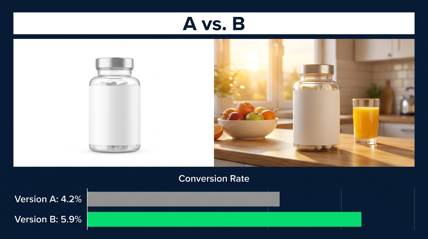
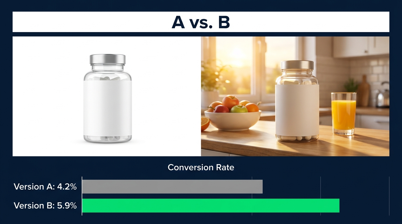
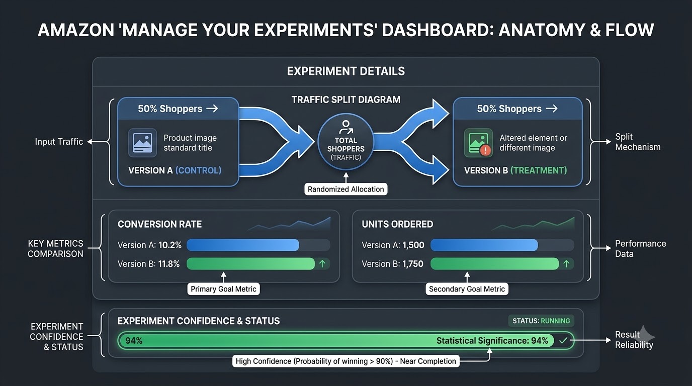
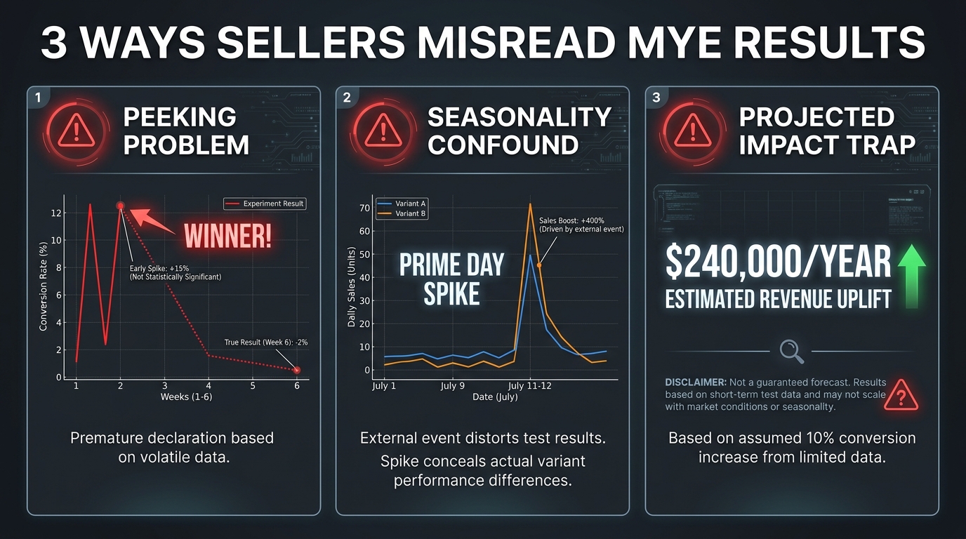
    Amazon’s Manage Your Experiments tool, available to Brand Registry sellers, allows A/B testing of listing content including main images. The platform reports on sales impact and conversion rate, and Amazon has cited cases of up to 25% sales lift from optimised listing content. Expert practitioners report typical winning-variant gains in the 5–25% range for well-run image tests.

    The critical limitation: MYE currently does not report on CTR as a standalone metric. It measures downstream conversion signals. This means a test can show one image variant selling more without telling you whether it is converting more of the same traffic or generating more clicks. For understanding mobile CTR specifically, MYE is an incomplete instrument.

    Running a Valid MYE Image Test

    For MYE results to be meaningful, several conditions need to be true. First, the test needs to run long enough to reach statistical significance — which Amazon’s own interface indicates (watch for the “significant” status before acting on results). Second, the test should change only one variable: ideally just the main image. Testing multiple simultaneous listing changes makes attribution impossible. Third, the traffic volume needs to be sufficient — low-traffic listings may take 8–12 weeks to produce statistically valid results.

    A practical workflow that many agencies use: run the MYE test for the primary sales signal, and simultaneously run a consumer panel test (using tools like PickFu or similar platforms) specifically for the mobile CTR question. Panel tests can show your image alongside competitor thumbnails in a simulated mobile grid and measure click preference directly. The two data sources together give a much more complete picture than either alone.

    The Off-Platform Testing Shortcut

    Consumer panel platforms allow you to show respondents a mockup of a mobile Amazon search result page with multiple product thumbnails and ask them which they would click. This can be done in 24–48 hours for a few hundred dollars and produces directional CTR data before you invest in a full MYE test. The limitation is that panel respondents are not in the same psychological state as actual shoppers, but for identifying obviously superior image compositions, it is a highly cost-effective first filter.

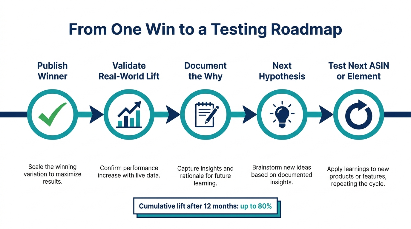
    The optimal sequence: panel test to identify the top 2 candidates, MYE to confirm which one drives more sales, then apply the learnings from that winning formula to the rest of the catalog.

    What a 10–30% CTR Lift Is Actually Worth

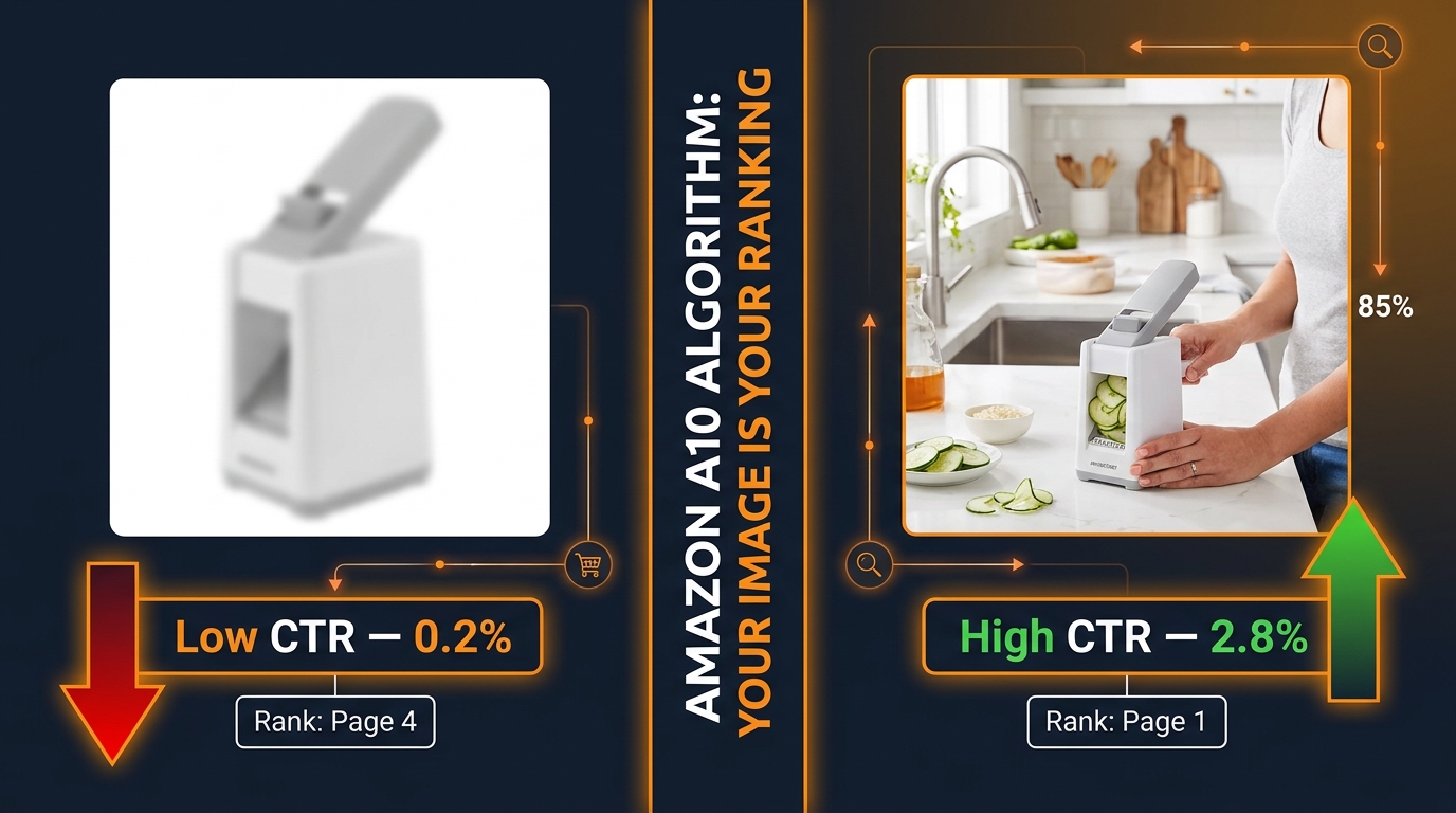
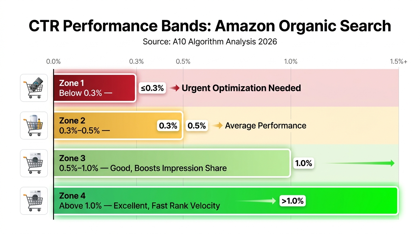
    The average Amazon sponsored ad CTR across categories sits around 0.59% as of 2026. Top-performing listings with mobile-optimised images consistently report CTRs above 1%. The arithmetic of that gap is significant: a listing running $5,000/month in ad spend at 0.59% CTR generates a certain number of clicks. The same ad spend at 1.2% CTR — achievable through image testing — generates roughly twice as many clicks at the same cost per click. That is effectively a 100% increase in traffic from the same budget, before any conversion rate effects are considered.

    Even more conservative gains are valuable at scale. A 15% CTR improvement on a listing with substantial advertising spend represents a material reduction in effective cost-per-click. Image testing is possibly the highest-ROI optimisation lever available to Amazon sellers who have not yet applied it systematically.

    The Competitive Intelligence Angle: Reading Your Category’s Visual Language

    Mobile image design does not happen in isolation. Your thumbnails compete directly against your competitors’ thumbnails in every search grid. Understanding what the dominant visual language in your category looks like — and where the visual contrast opportunity lies — is as important as understanding your own product.

    The Category Audit Method

    Before redesigning a hero image, spend 15 minutes doing a category audit from a mobile device. Open the Amazon app, search your primary keyword, screenshot the first three rows of results (including sponsored placements), and analyse what you see. Look for patterns: What colours dominate? What compositions are most common? What size do most products appear in their frames? What is the average level of visual complexity?

    What you are looking for is the category visual norm — and its inverse, which is where your differentiation opportunity lies.

    When to Blend, When to Break

    There are two strategic approaches to category visual norms, and the right one depends on your product’s position.

    Blend to belong is the right approach when your product is trying to signal category membership to shoppers who are not yet familiar with the brand. If every competitor in the “protein powder” category uses a dark, gym-aesthetic main image with bold label text, deviating too far from that language can signal “this is not the kind of protein powder you know.” Category-norm compliance builds pattern-matching trust at first glance.

    Break to stand out is the right approach when your product is sufficiently differentiated that category membership is less important than distinctive visibility. If your entire category uses the same composition conventions, a deliberately different approach — a different colour temperature, a different frame fill ratio, a different product angle — can produce dramatically more visual contrast against the grid background and thus more scroll-stopping power.

    The nuance is that breaking from category norms too aggressively can hurt conversion even when it boosts CTR, because the shopper clicks expecting one type of product and finds something that does not match their mental model. The most durable CTR gains come from breaking compositional conventions (fill, contrast, angle) without breaking the category’s fundamental visual language (colour family, product type signals, label style).

    Tracking Competitor Image Changes

    Top sellers monitor their main search grid competitors for hero image changes the same way they monitor pricing. A competitor’s sudden CTR spike — visible as a change in their sponsored ad position or organic ranking — is often preceded by an image update. Regularly screenshotting your competitive landscape from mobile gives you a longitudinal record of when competitors are experimenting and what changes seem to correlate with improved performance.

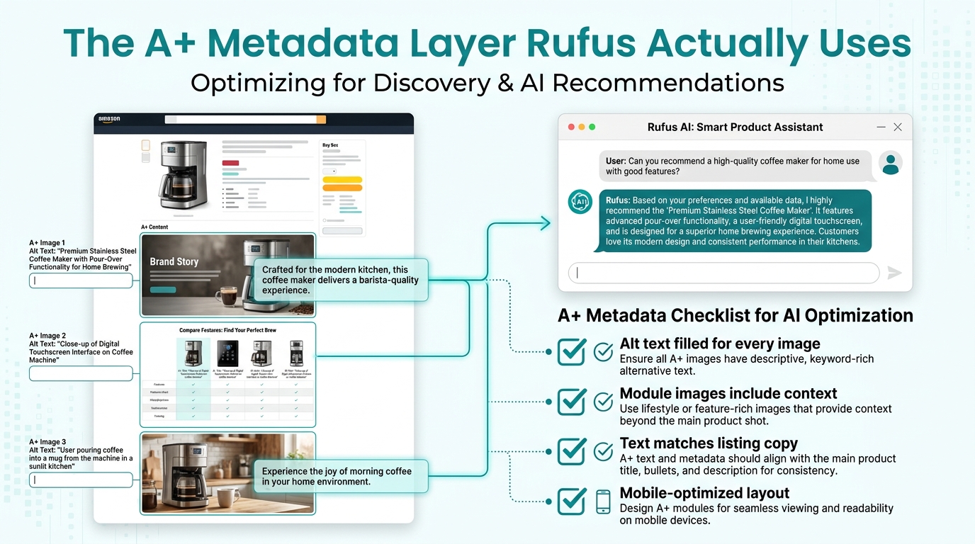
    A+ Content in the Mobile Age: What Renders vs. What Gets Skipped

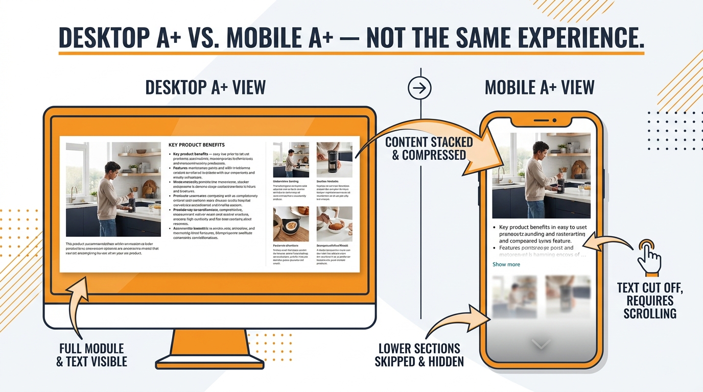
    Desktop vs mobile A+ content comparison showing how wide horizontal Amazon brand story modules stack vertically and compress on mobile devices

    A+ Content (formerly Enhanced Brand Content) has become a standard feature of well-optimised Amazon listings. Most Brand Registry sellers use it. Far fewer of them have audited how their A+ content actually renders on a mobile phone — and the gap between the desktop design and the mobile experience is often significant.

    How A+ Modules Stack on Mobile

    A+ Content uses a module-based layout system. On desktop, modules appear side by side in columns, producing a structured, magazine-style layout. On mobile, those columns collapse to a single vertical stack. The left column becomes the top section, the right column becomes the section below it, and the visual logic of the desktop layout is partially or entirely lost.

    The most common A+ mobile rendering problem: a module designed to show a product image on the left with explanatory text on the right appears on mobile as a full-width image, followed by a text block that has no visible connection to it unless the shopper is actively scrolling. The storytelling logic breaks down.

    Designing A+ for Mobile-First Reading

    The fix is to design A+ modules assuming they will be read in single-column vertical order. This means:

    • Each module should work as a standalone visual unit, not depend on what’s beside it in the desktop layout.
    • Headline text in each module should be large enough to be readable without zooming on a 6-inch screen.
    • Image-text pairings that need each other to make sense should be in the same module, not split across columns.
    • The first module visible on mobile (above the fold of the PDP scroll) is the highest-priority real estate — it should carry the most important brand message or differentiator.

    The Above-Fold Mobile PDP Reality

    On a typical Android or iOS smartphone, the above-fold area of an Amazon product detail page is dominated by the image carousel. Below that, the product title and a portion of the pricing/Buy Box appear. A+ content does not typically appear until the shopper has scrolled significantly down the page — several screens below the fold on most phones.

    This is a structural reality that should shape how A+ content is prioritised. A+ is important for conversion among shoppers who are genuinely evaluating the product, but it is not an above-fold, CTR-influencing asset. Its primary job on mobile is to reduce abandonment among engaged shoppers who are comparison-shopping or working through purchase objections. Design it for that specific job rather than treating it as a visual brand statement that most mobile shoppers will encounter at first glance.

    Premium A+ and the Mobile Brand Story

    Amazon’s Premium A+ Content (available to qualifying sellers) includes larger image modules, comparison charts, and carousel elements. On mobile, Premium A+ modules render at full width and typically look significantly better than standard A+ in the single-column layout. For brands with access to Premium A+, the mobile rendering quality is a genuine advantage worth prioritising over standard modules wherever the qualification requirements are met.

    The 8-Image Stack: Sequencing for Mobile Buyer Psychology

    Pulling together everything in this post, here is how to think about the full 8-image stack as a coherent mobile buying experience — from the first thumbnail impression in search to the final image viewed before the Add to Cart decision.

    The Click Threshold vs. The Buy Threshold

    Mobile buyer psychology on Amazon has two distinct thresholds that your image stack needs to clear in sequence. The first is the click threshold — the moment a shopper decides this thumbnail is worth opening. This decision happens in under two seconds, based almost entirely on the main hero image at thumbnail scale. The second is the buy threshold — the point in the PDP carousel where the shopper has seen enough to commit to purchase (or decides to keep shopping).

    The images from positions 2–8 primarily serve the buy threshold. They are not about stopping the scroll; they are about eliminating the reasons not to buy. Each image should be designed with a specific objection or information gap in mind.

    Objection Mapping by Image Position

    A methodical approach to secondary image sequencing starts with a list of the top 5–8 purchase objections in your category, derived from negative reviews (both yours and competitors’), customer Q&A, and return reason data. Each of images 2–8 should address a specific objection. This makes the swipe story purposeful rather than aesthetic.

    Common objection-to-image mappings across categories:

    • “I can’t tell how big it is” → Size comparison image with familiar reference object (coin, hand, everyday item)
    • “I’m not sure it will fit my use case” → Lifestyle image in the specific context the objection applies to
    • “I don’t know if it’s quality” → Material close-up, certification badge, or manufacturing detail
    • “I’ve had bad experiences with this type of product before” → Comparison chart or “what’s different about this” callout
    • “I’m not sure it’s compatible with what I have” → Compatibility or compatibility-check infographic
    • “Is it worth the price?” → Value bundle shot, value-per-unit callout, or “what’s included” flat lay

    The Mobile Text Hierarchy Rule

    Every image that includes text should follow a strict three-tier text hierarchy visible on mobile: one large headline (readable at a glance without zooming), one short supporting line (readable with mild attention), and no more than one body text element (readable only to engaged shoppers). Any text that requires a fourth level of attention is not suitable for a mobile product image and belongs in the bullet points or A+ content instead.

    Consistency of Visual Identity Across the Stack

    The eight images in the stack should feel like they belong together — same font family, same colour palette, same visual grammar. On mobile, shoppers swipe through the images quickly, and a fragmented visual identity reads as disorganised. Consistent design across the stack signals brand maturity, which is a purchase-confidence signal in its own right.

    This does not mean all images should look identical. Image 1 (white background hero) and image 2 (lifestyle scene) will naturally look different. What should be consistent is the typography style, the treatment of any overlaid text, the colour palette, and the general compositional density. A style guide document for Amazon images — covering font, colour codes, callout style, icon style, and maximum text density — is a practical tool for brands running multiple ASINs or working with multiple photographers.

    Building a Mobile-First Image Production Workflow

    The principles in this post are only useful if they get translated into the actual workflow through which images are commissioned, reviewed, and published. Here is how to restructure that workflow around mobile-first thinking rather than treating it as a checklist at the end.

    Brief the Photographer Differently

    Most product photography briefs focus on the finished large-format output: lighting style, background colour, number of angles. A mobile-first brief adds a second layer: the thumbnail behaviour requirement. Specifically, the brief should include a 150px thumbnail mockup requirement — the photographer or retoucher must deliver a 150×150 pixel crop of the hero image alongside the full-size file, allowing approval of the mobile experience separately from the full-size image.

    This single change catches most mobile failure modes before images are uploaded. If the 150px crop does not immediately communicate the product’s identity with strong visual contrast, the composition needs to be revised before approval.

    Add a Mobile Preview Step to the QA Process

    Before any product images go live, open the listing draft on a physical mobile device (or use Chrome’s mobile emulation mode to simulate a 375px wide screen) and evaluate the hero image in the context of a search grid. This takes approximately two minutes and is the most reliable way to catch mobile composition problems that are invisible on desktop.

    Create a Competitive Thumbnail Benchmark

    Maintain a screenshot library of your top 5 competitor main images at actual mobile thumbnail size. Review this quarterly. When designing or revising your own hero image, the benchmark question is: does this thumbnail generate more visual contrast against the competitive grid than our current image? If the answer is not clearly yes, the design needs more work.

    Prioritise Testing Cadence Over Perfection

    The biggest practical obstacle to improving mobile CTR through image testing is the cost and lead time of photography. Many sellers wait until they have a comprehensive photography refresh to run a test, which means testing happens rarely. A better model is to maintain a continuous testing cadence: one active MYE or panel test running at all times on your highest-traffic ASINs, with tests informed by mobile thumbnail evaluation and competitor benchmarking. Small, targeted changes tested frequently produce more learning and improvement than periodic comprehensive revisions.

    Conclusion: The Mobile Image Gap Is Real, and It Is Closeable

    The central tension in this post is straightforward: most Amazon listings are designed and reviewed in an environment (desktop) that is not representative of the environment where most shoppers first encounter them (mobile phones with 150-pixel thumbnail grids). That misalignment creates systematic, predictable underperformance — in CTR, in conversion, and ultimately in ranking and ad efficiency.

    The average Amazon sponsored ad CTR sits around 0.59%. Top sellers who have invested in mobile-optimised image stacks consistently operate above 1%. That gap is not mysterious. It is the compounded result of composition choices that work at thumbnail scale, secondary image sequences that answer buyer objections in the swipe experience, A+ content that renders coherently on a single-column mobile layout, and a testing cadence that generates learnings rather than running on assumptions.

    None of this requires a higher photography budget. It requires a different set of questions asked earlier in the process: What does this look like at 150 pixels? What does the thumbnail look like next to our top three competitors? Which of our secondary images are mobile-unreadable and need to be redesigned? Does our A+ content make sense when the columns collapse?

    The Priority Action List

    If you apply nothing else from this post, apply these five things:

    1. Screenshot your current main image at 150×150 pixels and look at it honestly. If you cannot immediately identify the product and its dominant appeal, your CTR from mobile is being suppressed right now.
    2. Product fill rate should be 85% or higher in the hero image frame. Measure it. Fix it if it is not.
    3. Check secondary image text for mobile readability. If any text requires zooming to read on a standard-size phone, it is not serving its purpose and should be redesigned.
    4. Open your A+ content on a physical mobile device and scroll through it. Identify any modules where the storytelling logic breaks down in single-column layout. Revise those modules.
    5. Start one MYE image test on your highest-traffic ASIN. Even a modest CTR lift at scale compounds into meaningful traffic and revenue gains over a full year.

    The mobile shopping experience is not a future consideration for Amazon sellers. It is the present majority experience. Designing images to meet it where it actually is — on a small screen, in a compressed grid, moving at the speed of a thumb — is the most direct path to closing the CTR gap between what your listing is doing and what it should be doing.

  • Why Your Mobile Product Gallery Is Killing Conversions (And How to Rebuild It From Scratch)

    Why Your Mobile Product Gallery Is Killing Conversions (And How to Rebuild It From Scratch)

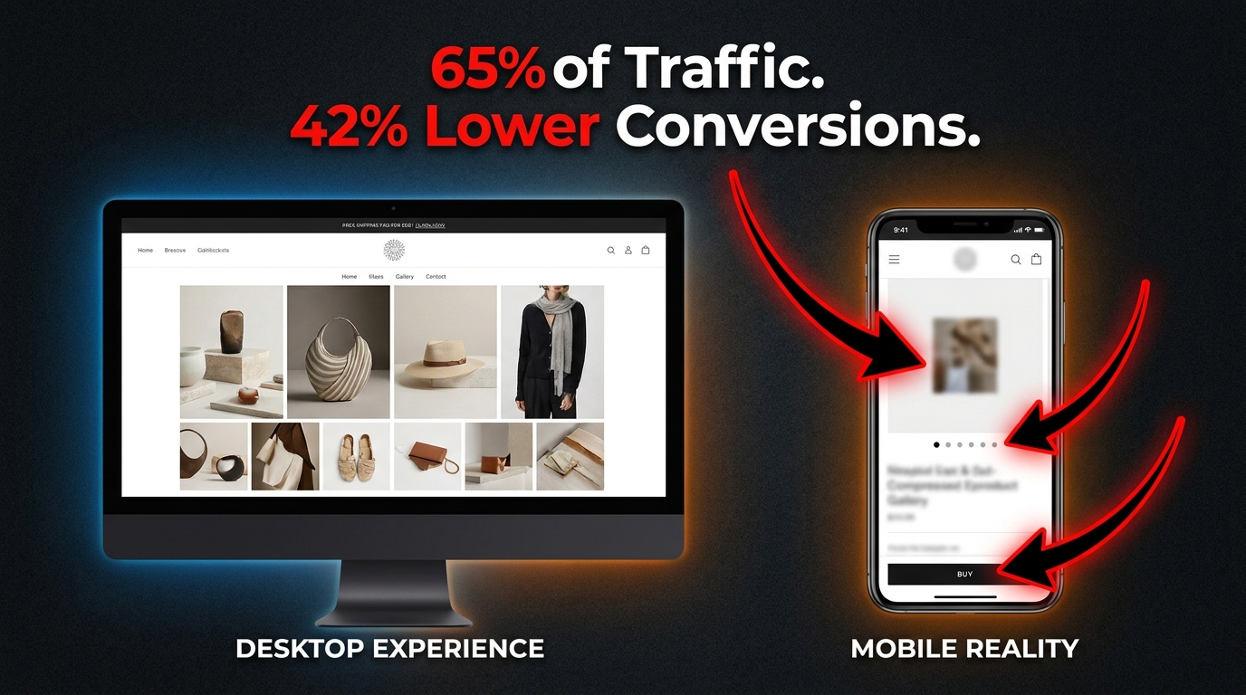
    Split-screen showing desktop vs mobile product gallery with stat: 65% of Traffic, 42% Lower Conversions

    Here is the dirty truth about mobile ecommerce in 2026: your site is getting the traffic, and then it’s quietly losing the sale. According to current benchmarks, mobile devices account for roughly 65% of all ecommerce website traffic, yet mobile conversion rates remain approximately 42% lower than desktop. That gap does not exist because mobile shoppers are less serious buyers. It exists because most product galleries were designed on a widescreen monitor and then shrunk to fit a phone.

    The consequences are not abstract. If your average desktop conversion rate sits at 3%, your mobile rate is probably hovering around 1.7%. On a store doing $2 million in annual revenue, that gap is a seven-figure problem hiding in your analytics dashboard, disguised as an industry-wide trend.

    The instinct is to blame the channel — “mobile shoppers just browse, they buy on desktop.” But the data no longer supports that narrative. Mobile devices accounted for over 51% of online spending as far back as late 2024, and that figure has climbed steadily since. The browse-now, buy-later behavior is eroding. Mobile shoppers are ready to convert. The gallery is just turning them away before they get the chance.

    This article is not about generic mobile optimization advice. It is a specific, technical examination of the product image gallery — arguably the single highest-leverage element on any product detail page — and how to rebuild it for the constraints, expectations, and behaviors of small-screen shoppers. We will cover image count, hero architecture, gesture design, navigation patterns, format selection, load performance, and contextual sequencing. Each section comes with actionable direction based on real test data, not conjecture.

    Let’s start where most audits never go: the gallery itself.

    The Anatomy of a Broken Mobile Gallery

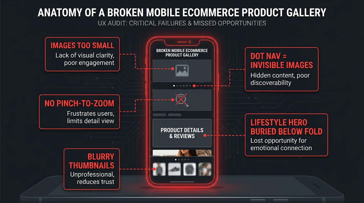
    Annotated wireframe of a broken mobile product gallery showing common UX failures including tiny images, dot navigation, and no pinch-to-zoom

    Before you can fix your gallery, you need to be able to see it the way a first-time mobile visitor does. Not in a browser developer tools panel at 390px width, and not during a quick QA pass before a product launch. You need to encounter it cold, on an actual device, with the same context a shopper has: moderate intent, no institutional knowledge of your layout, and a thumb that wants to move fast.
    When you do that audit honestly, the same cluster of failures tends to appear across most ecommerce galleries regardless of platform or price point.

    The Shrink-and-Ship Problem

    The most common failure is the simplest: the gallery was built for a 1440px desktop layout and “made responsive” by shrinking the main image and reflowing the thumbnail grid beneath it. The result on mobile is a main image that occupies 60–70% of the viewport height, a row of thumbnails that are 40–50px wide and essentially unreadable, and a tap target for navigation that is far too small for reliable use.

    This is not mobile-first design. It is mobile-tolerated design, and there is a meaningful difference. A mobile-first gallery starts with the constraint — a 390px-wide screen, a thumb in the lower quadrant of that screen, a 3G fallback connection — and designs upward from there. A shrink-and-ship gallery starts from the desktop and hopes the phone is forgiving enough to paper over the gaps.

    The Invisible Image Stack

    A related failure is what UX researchers call the “invisible image stack” — a gallery where users literally do not know additional images exist. Dot navigation indicators (the small circles beneath a carousel) are the primary culprit. Dots convey exactly one piece of information: there are more slides. They do not convey how many more, what those images show, or why the user should bother swiping. In usability testing, Baymard Institute has consistently observed users treating the primary image as the only image when dot navigation is the sole indicator that more exist. They are not lazy. The interface simply failed to give them a reason to explore further.

    The Missing Gesture Layer

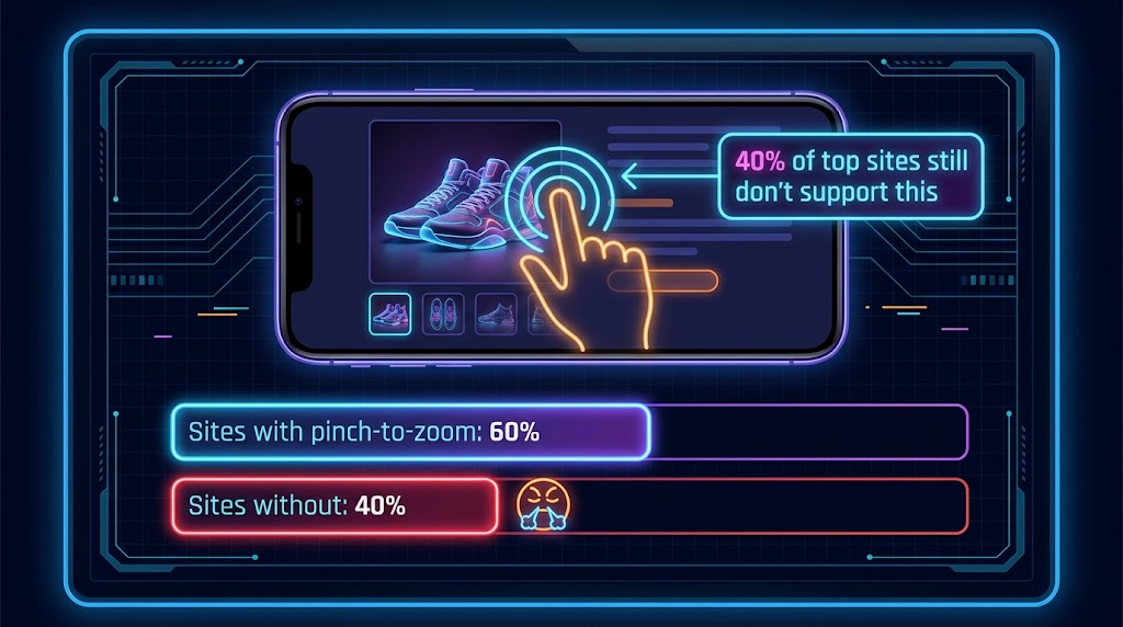
    One of the most striking findings from large-scale mobile ecommerce audits is how many sites still fail at basic gesture support. Baymard Institute’s benchmark study of the 50 top-grossing US mobile ecommerce sites found that approximately 40% did not support pinch-to-zoom or tap-to-zoom on product images. This is not a fringe edge case. Users actively attempt pinch-to-zoom on product images — it is a learned behavior from maps, camera apps, and social feeds — and when the gesture fails, it creates a moment of friction and doubt that a significant share of users never recover from before leaving the page.

    The Load Order Problem

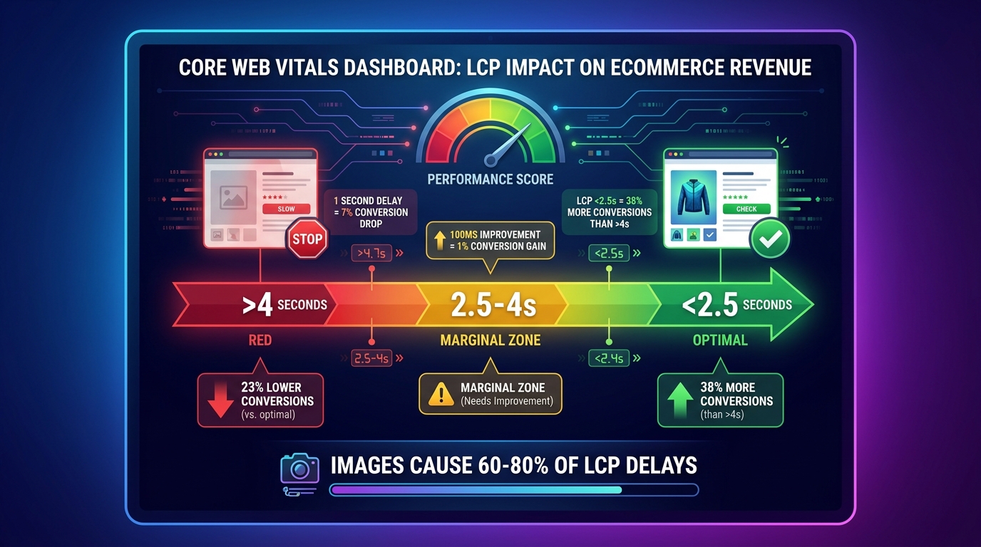
    Even galleries that are structurally sound often fail at the technical level through poor load prioritization. The hero image loads in a burst of network requests alongside navigation scripts, color swatch data, and recommendation engine calls. The result is a Largest Contentful Paint (LCP) score that sits in the “Needs Improvement” zone, a visually unstable layout as images pop in, and a first impression that feels sluggish before the user has even touched the gallery.

    These failures are not independent. They compound. A slow-loading gallery with dot navigation, no gesture support, and undersized thumbnails does not merely inconvenience users — it actively signals that the shopping experience on this site will require work. And modern mobile shoppers, conditioned by native apps and platforms like TikTok Shop and Instagram, will not do that work.

    Image Count: The 4-vs-8 Debate and What the Data Actually Says

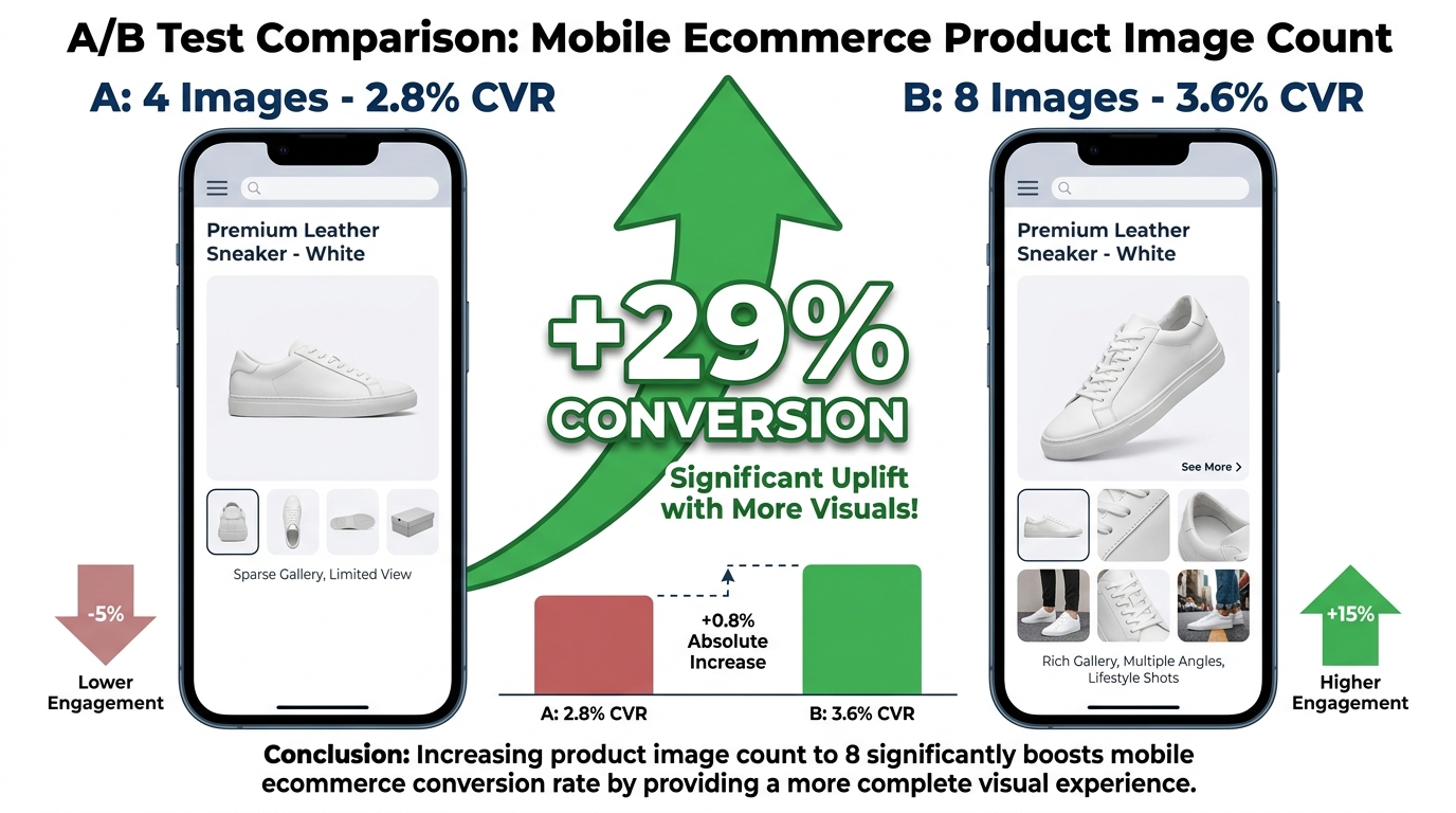
    A/B test infographic comparing 4-image gallery at 2.8% conversion versus 8-image gallery at 3.6% conversion rate with +29% uplift

    One of the most practical questions in gallery optimization is also one of the most contested: how many product images should a mobile gallery actually contain? The answer is not a single number, but the data points toward a range that most stores are not hitting — and the direction of the error is almost always too few, not too many.

    The Case for More Images

    A 2026 A/B test published by PixelPanda on mobile product pages tested one version with four product images against a variant with eight images. The eight-image variant produced a conversion rate of 3.6% compared to 2.8% for the four-image version — a 29% relative increase in conversions with no significant change in page load time. That last detail is important: the common assumption that more images slow the page and therefore hurt conversions was not borne out in this test when the images were properly sized and lazy-loaded.

    CRO practitioners and Baymard’s usability research broadly converge on a range of 6–9 images as the high-performing sweet spot for visually complex products like apparel, footwear, home goods, and electronics. Under this threshold, users feel insufficiently informed. Beyond roughly nine or ten images for most categories, the marginal value of each additional image diminishes and scroll fatigue becomes a real factor on small screens.

    What Those Images Should Cover

    Image count matters far less than image completeness. The question is not “how many?” but “does this gallery answer every question that would otherwise prevent a purchase?” For most physical products, the minimum set needed to answer that question looks like this:

    • Primary hero shot: Clean, front-facing, product in context or on white depending on category norms. This is the image that loads first and sets first impression.
    • Multiple angles: Back, side, and three-quarter views for any product where dimension, depth, or form factor influences the purchase.
    • Scale reference: An image that shows the product in relation to a familiar object or on a human body, depending on category. Scale is one of the most persistent anxiety points for mobile shoppers who cannot physically handle the product.
    • Material and texture detail: A close-up image that communicates material quality — stitching, grain, finish, weight. This is the image that replaces the in-store “touch and feel” moment.
    • Lifestyle or in-use context: At least one image showing the product being used in a real-world setting. More on this in a dedicated section below.
    • Variant differentiators: If your product has color or configuration variants, each variant should have its own gallery rather than sharing images across options.

    Category-Specific Calibration

    Not all products need eight images. A simple consumable like a supplement or a basic cable might convert well with four to five images. But for apparel, furniture, shoes, beauty products, and any category where fit, scale, or material matters, the tendency to minimize the gallery to two or three “hero-quality” images is a direct conversion penalty. Baymard’s usability research specifically flags that for visually-driven product categories, insufficient image variety is one of the top reasons users abandon the product page without adding to cart — not price, not shipping cost, but unresolved visual uncertainty.

    Hero Image Architecture: Above the Fold on a 390px Screen

    The hero image — the primary product image visible when the page first loads — does more conversion work on mobile than on any other surface. On a desktop, users can simultaneously see the product image, the product title, the price, the add-to-cart button, and several bullet points of copy. On a 390px-wide phone, they often see the hero image and very little else. That constraint changes the job the image has to do.

    Viewport Coverage and the Above-the-Fold Calculus

    There is an ongoing tension in mobile product page design between giving the hero image enough visual weight to communicate product quality and leaving enough above-the-fold real estate for price, the add-to-cart trigger, and trust signals. Tests run across service-style landing pages by teams like RicketyRoo have found that oversized hero imagery that pushes key CTAs below the fold can materially reduce conversion rates, even when the image itself is beautiful.

    The emerging best practice for product pages specifically is a hero image that occupies 55–65% of viewport height on a standard mobile screen — large enough to dominate visual attention and communicate product quality, but calibrated to keep the product title and a partial CTA visible without scrolling. This ratio is not universal across categories; fashion and luxury goods may justify taller hero images as a deliberate brand signal, while commodity products and utilities benefit from faster access to the purchase trigger.

    What the First Image Must Communicate

    The hero image on mobile is not just a picture of the product. It is the answer to the implicit first question every shopper brings to a product page: “Is this what I’m looking for?” That means the hero image needs to accomplish several things simultaneously:

    • Clearly identify the product without requiring the user to read the title
    • Communicate the product’s primary differentiating quality visually, before any copy is read
    • Be sharp, high-contrast, and readable at both full-size and thumbnail scale
    • Load fast enough that the user’s first impression is not a gray placeholder

    The last point has technical implications we cover in the image format section. But the first three are creative decisions that most teams under-invest in. Many product hero images are shot for desktop display — with fine details, complex backgrounds, and nuanced lighting that reads beautifully at 800px but compresses into visual noise at 390px. Shooting or selecting hero images specifically for mobile display is not a minor optimization; it is a fundamental rethinking of the brief.

    Prioritizing the Hero Image Preload

    From a technical standpoint, the hero image should be explicitly preloaded in the HTML head using a <link rel="preload"> tag. It should use a responsive srcset that serves an appropriately sized image for mobile viewports rather than the full desktop resolution. And it should never be lazy-loaded — it is the LCP element on most product pages and every millisecond of delay in its render has a measurable downstream effect on conversion.

    Gesture Design: Why 40% of Top Sites Still Fumble Pinch-to-Zoom

    Mobile ecommerce pinch-to-zoom gesture diagram showing 40% of top sites lack this feature, with bar chart comparing supported vs unsupported sites

    Gesture support is where the gap between what mobile users expect and what most ecommerce sites actually deliver is most stark. Pinch-to-zoom is not an advanced feature. It is a native interaction pattern that users learn from the camera, maps, and photo gallery apps that come pre-installed on every smartphone. When that gesture works on a product image, it is invisible — users simply inspect the product and move on. When it does not work, the failure is visceral and noticeable.

    The 40% Problem

    Baymard Institute’s benchmark study of the 50 top-grossing US mobile ecommerce sites found that approximately 40% of those sites did not support pinch-to-zoom or tap-to-zoom on product images. This is not a problem afflicting small stores with minimal development resources. It is present across retailers with eight- and nine-figure annual revenues. The failure typically occurs because gesture support is disabled at the viewport meta tag level (using user-scalable=no or maximum-scale=1.0), or because the gallery component uses a CSS or JavaScript configuration that intercepts touch events and prevents the browser’s native zoom from firing.

    Both causes are fixable. Neither should be acceptable in 2026.

    Implementing Gesture Support That Actually Works

    Reliable pinch-to-zoom on product images requires a few intersecting technical decisions to be made correctly:

    • Viewport meta tag: Remove user-scalable=no and maximum-scale constraints entirely. These were originally added to prevent accidental page zooms, but they also disable intentional product image inspection. Most modern UI design handles this through layout constraints, not viewport restrictions.
    • Gallery component configuration: If you’re using a JavaScript carousel library, check whether it captures all touch events. Many do, and this prevents the browser’s native pinch-zoom from activating. The library should either implement its own pinch-to-zoom or be configured to release touch events on the image element so native zoom can work.
    • Double-tap to zoom: This is a secondary interaction pattern that many users prefer over pinch, particularly when browsing one-handed. The double-tap should expand the image to 2–3× zoom and center the tap point, then a second double-tap should return to the full gallery view.
    • Zoom state management: When a user is zoomed into an image, horizontal swipe should pan within the zoomed image rather than advancing to the next gallery slide. Getting this right requires careful event handling, but failing to do so — where a swipe while zoomed jumps to the next image — is one of the most jarring gesture failures in mobile gallery UX.

    Swipe Navigation: The Direction Problem

    Beyond zoom, the horizontal swipe to advance gallery images is now a deeply embedded mental model. Users expect it to work consistently and to feel physically weighted — a slow, laggy, or jumpy swipe response is as damaging to the experience as no swipe support at all. The physics of the swipe should feel native: fast swipe advances immediately, slow swipe shows the next image partially and either snaps forward or returns based on velocity and distance traveled.

    One frequently overlooked issue is the interaction between a vertical-scrolling page and a horizontally-swiping gallery. On touch devices, the browser must decide in the first few pixels of movement whether a gesture is a page scroll or a gallery swipe. Galleries that get this wrong either hijack vertical scroll (forcing users to fight to move down the page) or fail to register legitimate horizontal swipes. The correct approach is to use touch directionality detection and claim only clearly horizontal gestures as gallery navigation, releasing ambiguous diagonal touches back to the scroll handler.

    Thumbnail vs. Dot Navigation: The Invisible Conversion Decision

    Comparison of thumbnail strip navigation versus dot navigation on mobile product gallery, showing thumbnail strip labeled with green checkmark and dot navigation with red X

    The navigation pattern you choose for your mobile gallery determines whether users discover your full image set or interact with only the first one or two images and move on. This is not a minor UX preference. It is a structural decision that shapes how much information your gallery actually delivers, and it has a direct relationship with the “visual uncertainty” that prevents mobile shoppers from converting.

    Why Dots Fail

    Dot navigation — the row of small circles beneath a carousel — has been the default gallery navigation pattern for mobile ecommerce for over a decade. It persists because it is easy to implement, takes up minimal vertical space, and follows a pattern users recognize from app onboarding flows and media carousels.

    But it fails in a specific, predictable way for product galleries. Dots tell users that additional images exist. They do not tell users what those images contain, how different they are from the current image, or whether exploring them is worth the effort. Baymard’s usability research consistently finds that users browsing product galleries on mobile with dot navigation are far more likely to treat the gallery as “basically one image with some variants” than users navigating the same gallery with visible thumbnails. The dots create an invisible image stack — users know it’s there but have no motivation to dig into it.

    The Thumbnail Strip Advantage

    A horizontally scrollable thumbnail strip placed below the main image solves the discoverability problem that dots create. Thumbnails give users immediate visual information about what each image contains — users can see at a glance that image three is a close-up of the material, image four is a lifestyle shot, and image five shows the back of the product. This preview function is not decorative. It directly reduces the cognitive work required to evaluate the product, and it surfaces additional context that users might otherwise never find.

    For mobile implementation, thumbnail strips require careful sizing and spacing decisions:

    • Thumbnail width: Minimum 60px, ideally 72–80px, to be large enough for visual content to register clearly. At 40–50px, thumbnails become abstract blobs rather than meaningful previews.
    • Active state: The currently selected image’s thumbnail should have a clear visual distinction — a border, an opacity change, or both — that communicates which image is being viewed.
    • Scrollability: For galleries with six or more images, the thumbnail strip itself should scroll horizontally. Compressing seven or eight thumbnails into a fixed-width strip makes each one illegibly small.
    • Tap-to-select: Tapping a thumbnail should update the main image display immediately, not transition through a swipe animation. Users using the thumbnail strip are scanning and selecting, not browsing sequentially, and the interface should match that intent.

    When to Use Dots Anyway

    There is a legitimate use case for dot navigation in mobile galleries: when image count is low (three or fewer images), when the images are closely similar in content and order does not matter, or when vertical real estate is so compressed that even a minimal thumbnail strip would create layout problems. Outside of those specific conditions, a visible thumbnail strip is almost always the better choice from a user comprehension and conversion standpoint.

    Image Format and Speed: WebP, AVIF, and the LCP Trap

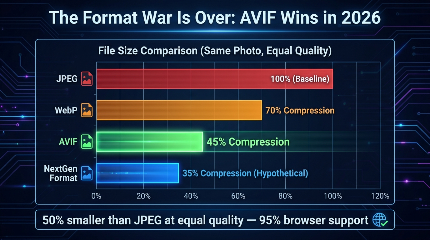
    Technical infographic showing image format file size comparison: JPEG 100%, WebP 65%, AVIF 50%, plus LCP speedometer and stat showing 1-second delay equals 20% conversion drop

    Gallery architecture and UX patterns are only part of the picture. The technical delivery of your images — their format, compression, responsive sizing, and load prioritization — has a direct, measurable effect on mobile conversion rates through page performance. Images account for roughly 50–70% of total ecommerce page weight, making them the single largest lever for mobile load time improvement.

    The Format Decision in 2026

    The image format landscape in 2026 is clearer than it has ever been. JPEG is the legacy format — still widely used, but no longer the right default for new implementations. The current choice is between WebP and AVIF, and the practical calculus looks like this:

    • WebP delivers file sizes approximately 30–35% smaller than equivalent-quality JPEG, with near-universal browser support across modern mobile and desktop browsers. It decodes quickly and works well for both photographic product images and graphics. It is the practical default for most ecommerce teams.
    • AVIF delivers file sizes approximately 45–50% smaller than JPEG — a meaningful additional reduction over WebP — with excellent perceptual quality at those compression levels. Browser support is strong across Chrome, Firefox, and Safari on modern OS versions. For sites with large image catalogs where bandwidth and CDN costs are significant, AVIF is worth the additional encoding complexity.

    The correct implementation uses the HTML <picture> element with source declarations ordered from most to least preferred (AVIF first, then WebP, then JPEG as a fallback). This ensures modern browsers use the best available format without breaking the experience on older devices.

    The LCP Trap

    Largest Contentful Paint (LCP) is Google’s measure of how quickly the largest visible element — almost always the hero product image on a product detail page — renders in the viewport. The “Good” threshold remains 2.5 seconds for mobile in 2026. Falling into the “Needs Improvement” zone (2.5–4 seconds) is not just an SEO signal concern; it is a conversion concern. Research consistently finds that a one-second delay in image loading can reduce mobile conversion rates by up to 20%. Pages loading in one second convert at 2.5 times the rate of pages that take five seconds.

    The LCP trap happens when teams optimize image format and compression but fail to address the load order of the hero image. Three technical fixes address this specifically:

    1. Preload the hero image: Add <link rel="preload" as="image" href="[hero-image-url]" imagesrcset="..."> in the document <head>. This tells the browser to start fetching the hero image as early as possible, before the DOM is parsed enough to encounter the image tag itself.
    2. Never lazy-load the hero: The hero image should have loading="eager" explicitly set (or the loading attribute omitted, which defaults to eager). Lazy loading is for below-the-fold images, not the primary above-the-fold element.
    3. Use fetchpriority="high": This newer attribute, now supported across all major browsers, signals to the browser that the hero image should be prioritized in network request scheduling above other resources competing for bandwidth during initial page load.

    Responsive Image Sizing

    Serving a 2000px-wide image to a 390px mobile screen is one of the most common and wasteful performance mistakes in ecommerce. The browser downloads the full-resolution file and then scales it down in rendering — you pay the full network cost for pixels that are never displayed at full size. Responsive images through srcset and sizes attributes solve this by instructing the browser to select the appropriately dimensioned image for the current viewport. For mobile, product hero images rarely need to exceed 800px wide; the rendering output at 390px CSS width on a 3× pixel density screen is 1170 physical pixels, meaning an 800px source image actually renders slightly larger than native, which is perfectly acceptable.

    Lifestyle vs. White Background: Context That Sells on Small Screens

    Side-by-side comparison of white background studio product shot versus lifestyle contextual image on mobile, showing emotional impact difference

    The white background versus lifestyle image debate is one of the oldest in ecommerce photography, and it is also one of the most misunderstood. The framing of “which is better?” is the wrong question. The right question is “which does what job, and in what sequence?”

    What White Background Does Well

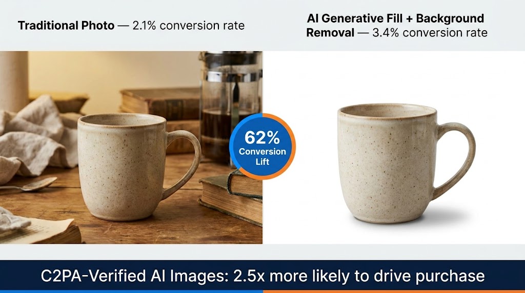
    White or neutral background images excel at one specific task: eliminating visual noise so the product itself can be assessed clearly. For product thumbnails in category pages, search results, and marketplace listings, white background images are typically more effective because they reduce cognitive load and allow rapid scanning across multiple products. They also communicate cleanliness and professionalism — a product photographed against a well-lit neutral background signals that the seller takes presentation seriously.

    On mobile product pages, a clean primary image on a white or near-white background can be highly effective as the hero shot, particularly for products where shape, proportion, and visual detail are the main purchase drivers — think electronics, kitchen tools, or precision accessories. The absence of background clutter lets the eye go straight to the product.

    Where Lifestyle Images Convert

    Lifestyle images — showing the product in use, in context, on a person, or in an environment — do a fundamentally different job. They answer questions that studio photography cannot: “How big is this in a real room?”, “What does this look like when someone is actually wearing it?”, “Does this product fit the life I imagine for myself?”

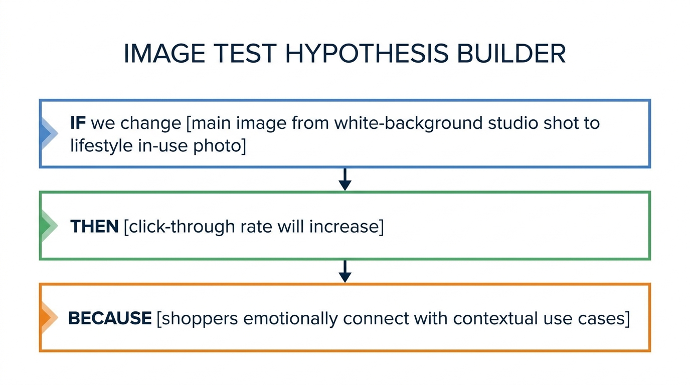
    Split tests run by ecommerce CRO practitioners have found that contextual background images can significantly increase conversion rates versus plain white backgrounds, particularly for categories where aspiration and identity play a role in the purchase decision. The ConvertMate and Nightjar findings on this topic are consistent: when users are emotionally uncertain — “I love this but I’m not sure it works for my life” — a lifestyle image resolves that uncertainty in ways that product specifications and written copy cannot.

    On mobile specifically, lifestyle images have an additional advantage: they are more visually engaging to a thumb-scrolling user who is allocating only partial attention to the experience. A striking lifestyle image can stop the scroll. A clinical studio shot, however technically correct, may not.

    The Sequencing Strategy

    The highest-performing galleries in most categories do not choose between white background and lifestyle — they sequence them deliberately. A practical sequencing framework looks like this:

    1. Image 1 (Hero): Clean, clear primary product shot. Answers “what is this product?” immediately.
    2. Images 2–3: Additional angle and detail shots. Answers “what does the whole product look like?” and “what are the specific details I should know about?”
    3. Image 4: Scale reference — product in use or next to a familiar scale object. Answers “how big is this in the real world?”
    4. Images 5–6: Lifestyle / in-context imagery. Answers “how does this fit into the life I imagine for myself?”
    5. Images 7–8 (if applicable): Material close-ups and variant-differentiating shots. Handles the final category of visual doubt before purchase.

    This progression mirrors the natural arc of a purchase decision: awareness → product assessment → scale resolution → emotional connection → final doubt elimination. A gallery that follows this arc is doing strategic persuasion work, not just providing documentation.

    Lazy Loading Strategy for Mobile Galleries

    Lazy loading — deferring the load of off-screen images until they are about to enter the viewport — is one of the most impactful and frequently misconfigured performance optimizations for mobile galleries. Done well, it dramatically reduces initial page weight and improves perceived load time. Done poorly, it creates a gallery that appears to load slowly because images are fetching just as users try to swipe to them.

    What to Lazy Load and What Not To

    The rule is simple but often violated: never lazy-load the hero image. The hero is the LCP element. Its render time is your most important performance metric on the page. Lazy-loading it — even inadvertently through a blanket loading="lazy" attribute on all images — can add hundreds of milliseconds to LCP that will show up directly in your Core Web Vitals score and your conversion rate.

    Gallery images beyond the first one are appropriate candidates for lazy loading. For a ten-image gallery, images two through ten should typically use either native lazy loading (loading="lazy") or a JavaScript-based intersection observer approach that loads each image as the user swipes toward it.

    One nuance for gallery-specific lazy loading: in a swipeable carousel, the second and third images are often pre-fetched speculatively even when they are not yet visible, because the user is likely to swipe to them within seconds. This is a deliberate trade-off — slightly higher initial data usage in exchange for seamless swipe transitions. Most modern gallery components handle this with a configurable “preload buffer” — typically set to one image ahead and behind the current view.

    CLS and the Placeholder Problem

    Cumulative Layout Shift (CLS) — the instability caused by page elements moving as assets load — is a persistent problem in lazy-loaded image galleries. When an image is not yet loaded, the browser does not know how tall the image container should be. Without explicit dimensions, the container collapses to zero height and then expands when the image loads, pushing everything below it down the page. This creates layout shifts that feel jarring and can accidentally trigger taps on the wrong elements.

    The fix is to always specify explicit width and height attributes on your image tags, or to use CSS aspect-ratio containers that maintain the correct proportions before the image loads. For product galleries where all images are the same aspect ratio (a reasonable and recommended standard), a single CSS rule can eliminate CLS across the entire gallery:

    Use a wrapper element with aspect-ratio: 1/1 (or whatever your gallery ratio is), overflow: hidden, and position: relative. Place the image inside with width: 100%; height: 100%; object-fit: contain. This reserves the correct space before the image loads and prevents any layout shift on render.

    Progressive Loading for Perceived Performance

    Beyond technical lazy loading, the perceived load quality of your gallery images matters for mobile conversion. Images that load progressively — starting from a blurry, low-quality placeholder and sharpening to full resolution — feel faster than images that appear in a sudden binary pop from invisible to fully rendered. Both WebP and AVIF support progressive rendering modes, though the specific implementation differs by format. JPEG also supports progressive encoding through interlacing. Using progressive encoding for gallery images adds minimal file size overhead and meaningfully improves the perceived load experience on slower mobile connections.

    Testing Your Gallery: A Mobile-First CRO Framework

    Understanding the principles is one thing. Building a systematic process for testing, measuring, and improving your gallery over time is what separates teams that consistently close the mobile conversion gap from teams that make one round of changes and consider the problem solved. Gallery optimization is not a project; it is an ongoing program.

    Starting With a Qualitative Audit

    Before running A/B tests, run a structured qualitative audit. This means:

    • Testing the gallery on at least three different physical mobile devices (not browser emulators) across both iOS and Android, including an older, slower device that represents the bottom quartile of your user base
    • Testing on actual network conditions — not just WiFi but 4G and simulated 3G using browser devtools throttling
    • Recording a session replay tool walkthrough on mobile (Hotjar, FullStory, or equivalent) looking specifically for rage taps on the gallery, scroll depth past gallery images, and exit patterns from the product page
    • Running a Lighthouse audit specifically on mobile to capture LCP, CLS, INP, and TBT scores alongside the performance waterfall that shows image load order

    This audit will almost always surface at least two or three high-confidence issues that are worth fixing before you start A/B testing. Fixing clear failures is not worth A/B testing — the expected improvement is unambiguous enough that a sequential before/after measurement (with appropriate time windows to account for traffic variation) is sufficient.

    Structuring A/B Tests for Gallery Elements

    When moving to controlled A/B testing, the key discipline is testing one gallery variable at a time. The main variables worth testing systematically are:

    1. Image count: Current count versus a richer gallery (typically current + 2–3 images covering identified content gaps)
    2. Hero image selection: Which image serves as the primary first impression — a clean studio shot, a lifestyle image, or an in-context detail
    3. Navigation pattern: Dot navigation versus thumbnail strip, or thumbnail strip placement (below vs. side-scrolling overlay)
    4. Gallery proportions: Image height-to-viewport ratio for the hero above the fold
    5. Zoom implementation: Tap-to-expand lightbox versus inline pinch-to-zoom

    Each test should run for a minimum of two full business-week cycles and reach statistical significance (typically 95% confidence) before drawing conclusions. Gallery behavior is subject to day-of-week effects — weekend mobile shopping behavior is often meaningfully different from weekday patterns — so shorter test windows can produce misleading results.

    Metrics Beyond Conversion Rate

    Conversion rate is the primary metric, but gallery-specific tests benefit from measuring secondary engagement metrics that give earlier signals and help interpret conversion data:

    • Gallery depth: The average number of images viewed per session. If your gallery has eight images and average depth is 1.8, you have a discoverability problem regardless of what happens to conversion rate.
    • Zoom usage rate: The percentage of sessions where the user zooms into at least one gallery image. Higher zoom usage correlates with higher purchase intent.
    • Add-to-cart rate from the product page: A more sensitive metric than overall conversion rate, since it isolates the product page’s contribution from downstream checkout friction.
    • Product page exit rate: The percentage of sessions that land on the product page and exit the site without any further interaction. A high exit rate with low gallery depth is a strong signal of inadequate visual information.

    Iteration Cadence and the Compounding Effect

    The most powerful aspect of systematic gallery testing is that improvements compound. A 15% improvement in mobile conversion rate from fixing gesture support, combined with a 12% improvement from moving to thumbnail navigation, combined with an 8% improvement from optimizing image count, produces a combined lift that is meaningfully larger than any single change. Teams that run gallery tests continuously — two to three tests per quarter, resetting the baseline with each validated improvement — routinely close half or more of the mobile-desktop conversion gap within 18 months.

    The mobile conversion gap is not an inherent property of the channel. It is, in large part, a gallery problem waiting to be solved. The data, the test frameworks, and the technical tools to solve it exist. What most teams are missing is the discipline to treat the gallery as a first-class conversion asset rather than a box to be checked during the initial product launch.
    The Full-Stack Gallery Rebuild: A Practical Starting Point

    Everything covered in the preceding sections can feel like a long list of individual improvements. For teams that need a clear starting point — particularly those doing a ground-up rebuild of their mobile product page rather than iterative optimization — here is the minimum viable gallery specification that addresses the most common, highest-impact failures.

    Technical Specification

    • Hero image: AVIF/WebP with JPEG fallback, served via <picture> element. Responsive srcset with mobile-specific 800px variant. Preloaded in document head. Never lazy-loaded. fetchpriority="high" attribute set.
    • Gallery images 2+: Same format stack. Native lazy loading (loading="lazy") with 1-image speculative preload buffer. Explicit dimensions to eliminate CLS.
    • Gallery container: CSS aspect-ratio fixed at consistent ratio (1:1 or 4:3 depending on category), preventing layout shift on load.
    • Gesture support: Pinch-to-zoom enabled via viewport meta tag (no user-scalable=no), double-tap to zoom, panning in zoomed state, swipe direction detection to distinguish gallery navigation from page scroll.

    UX Specification

    • Minimum 6 images for visually complex products, 4–5 for simple products.
    • Image sequence following the awareness → assessment → scale → emotion → doubt-elimination arc.
    • Thumbnail strip navigation for galleries with 4+ images. Minimum thumbnail width 72px. Horizontally scrollable for 7+ images. Clear active state indicator.
    • Hero image occupying 55–65% of viewport height on standard mobile screens. Product title and partial CTA visible without scrolling.
    • Dedicated image sets per product variant — no shared images across color or configuration options.

    Content Specification

    • At least one clear scale reference image per product.
    • At least one material/texture detail close-up for physical products.
    • At least one lifestyle or in-context image per product.
    • Hero image shot or selected specifically for mobile display at 390–430px width — not a repurposed desktop or marketplace image.

    This specification is not a ceiling. It is a floor — the baseline below which the gallery is materially failing to support mobile conversion. Beyond it, category-specific testing, seasonal creative testing, and incremental UX refinement will continue to yield improvements. But teams that implement this baseline consistently and correctly will close the majority of the performance gap that currently sits between their mobile traffic potential and their actual mobile revenue.

    Conclusion: The Gallery Is a Revenue Decision, Not a Design Decision

    The way most ecommerce teams think about the product gallery needs to change. It is treated as a design element — a component that gets built during initial development, iterated occasionally when something breaks, and rarely subjected to the same rigorous performance pressure as paid acquisition, checkout flow, or pricing strategy.

    That framing is wrong, and the data proves it. When mobile accounts for 65% of your traffic and converts 42% worse than desktop, the gallery — the primary vehicle through which mobile shoppers assess whether a product is worth buying — is not a design detail. It is one of the most consequential revenue levers in your entire conversion stack.

    The fixes are not particularly exotic. Support gesture interactions that users already expect. Show enough images to resolve the visual questions that would otherwise prevent a purchase. Navigate in a way that makes the full image set discoverable. Load images fast enough that slow connections do not erode the experience before it has a chance to persuade. Sequence the story that your images tell so it maps onto the natural arc of a mobile purchase decision.

    None of this requires a complete platform overhaul or a massive budget. It requires a deliberate choice to treat mobile gallery performance as a business priority — to audit it honestly, test it systematically, and iterate with the same urgency you would apply to any other underperforming revenue channel.

    The conversion gap is real. So is the opportunity to close it. The gallery is where that work starts.

  • How Amazon’s A10 Algorithm Reads Your Images — And What That Means for Ranking Velocity

    How Amazon’s A10 Algorithm Reads Your Images — And What That Means for Ranking Velocity

    Amazon A10 algorithm image CTR ranking velocity split-screen comparison showing low CTR rank page 4 vs high CTR rank page 1

    Most Amazon sellers understand, at least in theory, that better images lead to better conversions. What far fewer sellers understand is the precise mechanism by which a single image update can trigger a cascading improvement in organic rank — not over months, but sometimes within days.

    The Amazon A10 algorithm doesn’t evaluate your listing the way a human reviewer might. It doesn’t appreciate your brand story or recognize the craftsmanship in your photography. What it does track, with remarkable granularity, is behavioral data: how often shoppers click your listing when it appears in search results, how long they stay, whether they zoom into images, how far they scroll through your image stack, and ultimately whether they buy. Every one of those behaviors feeds a signal. And the signal chain starts with your main image.

    This piece is not about image “best practices” in a generic sense. It’s specifically about the relationship between image CTR signals and ranking velocity — the speed at which a listing climbs or falls in organic search position. Understanding this relationship changes how you should think about photography budgets, split testing priorities, image slot strategy, and even how you interpret your PPC data.

    We’ll cover the mechanics of the A10 algorithm’s CTR weighting, real benchmark data for what strong CTR actually looks like, the compounding loop that turns a higher click-through rate into accelerated rank gains, and a practical framework for auditing and improving your image stack from slot one through seven. By the end, you’ll have a precise mental model for why images are not just a conversion tool — they are your primary ranking lever.

    How the A10 Algorithm Changed the CTR Equation

    Infographic comparing Amazon A9 vs A10 algorithm ranking factors showing shift from ad spend and keywords to organic CTR and behavioral signals

    To understand why image CTR carries more weight today than it did three years ago, you need to understand what changed between the A9 and A10 algorithm frameworks.

    The A9 Era: Advertising as a Shortcut to Rank

    Under Amazon’s previous A9 algorithm, the primary ranking inputs were relatively straightforward: keyword relevance, sales velocity, and advertising spend. Sellers who spent heavily on Sponsored Products could manufacture the sales signals the algorithm needed to push listings up the page. PPC was, in many ways, a direct substitute for organic relevance. If you could afford to pay for enough clicks and conversions, the algorithm would reward your listing with organic visibility — regardless of whether your product or listing was genuinely the best fit for that search query.

    CTR mattered under A9, but it was downstream of ad spend. If you were paying for impressions, some clicks would follow. The algorithm was not specifically rewarding listings that earned disproportionately high click-through rates; it was primarily rewarding those that generated consistent sales volume at target keyword positions.

    The A10 Shift: CTR Becomes a Direct Input

    The A10 algorithm introduced CTR as an independent ranking signal rather than a byproduct of ad spend. This is a meaningful distinction. Under A10, the algorithm now evaluates how often your listing gets clicked relative to how often it’s shown — across both paid and organic placements. A listing that earns a higher-than-expected click-through rate on a given keyword signals to Amazon that it is a more relevant and compelling result. The algorithm responds by increasing impression share for that listing, which compounds into more opportunities to generate clicks, which feeds more sales velocity.

    According to analysis of the A10 framework, this shift was deliberately designed to reduce the pay-to-rank dynamic that had frustrated both sellers and customers. Amazon’s business model benefits from shoppers finding exactly what they want quickly — and CTR, when stripped of paid manipulation, is a useful proxy for genuine product-search relevance.

    The practical implications of this shift are significant. Under A9, a seller with a mediocre main image but a large PPC budget could still rank competitively. Under A10, that same seller will see their paid traffic convert at lower rates, their organic impression share erode, and their cost-per-click increase as Amazon’s system deprioritizes lower-engagement listings. The image quality problem that ad spend used to paper over now becomes a structural ranking liability.

    Other A10 Ranking Factors in Context

    It’s worth placing CTR within the full hierarchy of A10 ranking factors to understand its relative weight. Conversion rate remains the single most heavily weighted signal — estimated at 35–40% of the algorithm’s ranking consideration. Sales velocity is the second pillar: consistent, organic unit velocity over 1, 3, 7, 15, and 30-day rolling windows. CTR is the third major signal, with A10 weighting it measurably higher than A9 did. Rounding out the key factors are keyword relevance, seller authority (return rate, customer satisfaction, order defect rate), and external traffic quality.

    The reason CTR punches above its apparent weight is positional: it is the upstream signal that makes everything else possible. You cannot generate conversion rate data without first generating clicks. You cannot build sales velocity without conversions. CTR is the entry gate to the entire algorithm loop — and your main image is what determines whether most shoppers walk through that gate or keep scrolling.

    The Mechanics of CTR — Benchmarks, Signals, and What “Good” Actually Looks Like

    Amazon CTR benchmark zones infographic showing performance bands from below 0.3% urgent to above 1.0% excellent with ranking implications

    Before optimizing for CTR, sellers need a clear picture of what the numbers actually mean — and what the algorithm is looking for at each performance tier.

    Understanding the CTR Formula

    CTR is straightforward in calculation: (Total Clicks ÷ Total Impressions) × 100. A listing that receives 1,000 impressions and generates 15 clicks has a 1.5% CTR. What makes this number interesting on Amazon is not the raw percentage but how it compares to category averages and competitor performance on the same search terms.

    The algorithm doesn’t evaluate your CTR in isolation. It evaluates it relative to other listings that appear for the same queries. If the average CTR for your main keyword cluster is 0.4% and your listing is producing 0.9%, the algorithm interprets that delta as a strong relevance signal — your listing is resonating with shoppers beyond what baseline expectations would predict. This relative performance is what triggers impression share increases.

    CTR Performance Bands and Their Ranking Consequences

    Based on analysis of the A10 environment in 2026, the following performance bands have emerged as meaningful thresholds:

    • Below 0.3%: Poor performance that actively erodes rankings. At this level, the algorithm interprets your listing as a poor fit for its current search positions and begins reducing impression share. Sellers in this band typically see organic positions drift backward even with consistent PPC spend.
    • 0.3%–0.5%: Average performance. The algorithm treats these listings neutrally — neither rewarding nor penalizing them disproportionately. Rankings remain relatively stable but are unlikely to improve organically without intervention.
    • 0.5%–0.8%: Good performance that begins to actively compound. At this level, the algorithm starts increasing impression share in response to the above-average engagement signal. Organic rank velocity picks up, particularly for mid-tail keywords.
    • Above 1.0%: Excellent performance that triggers accelerated rank gains. Listings hitting this threshold on competitive head terms often see dramatic position improvements within 2–4 weeks. Some case studies report CTR jumps from the 9–10% range on specific product types after significant image optimization.

    For context: a whey protein seller who added clear labeling (flavor and protein count) to their main image packaging saw CTR jump from 9.3% to 17.5% — a near doubling on their primary keyword. This kind of jump is extreme, but it illustrates how a single visual change can shatter the baseline when the previous image was failing to communicate essential decision-making information.

    What the Algorithm Is Actually Detecting

    It’s tempting to think of CTR as a simple binary signal — clicked or not. The A10 algorithm is more nuanced than that. It also tracks behavioral depth signals that accompany clicks. These include zoom interactions (how many shoppers zoom into your main image), scroll depth through your full image stack, and dwell time on the product detail page. A listing that generates a high CTR but then sees shoppers immediately bounce back to search results is providing a mixed signal. The algorithm interprets this as “compelling enough to click, but not what the shopper expected.”

    This is why image stack coherence matters: the main image earns the click, but images 2 through 7 need to hold the shopper, answer their questions, and build toward conversion. A disconnect between the main image’s promise and the secondary images’ delivery creates a CTR-without-conversion pattern that the algorithm penalizes over time.

    Main Image Architecture — The Technical Specs That Control First Impressions

    The main image is the single most consequential creative asset on an Amazon listing. It renders in search results at thumbnail size, fills 85–90% of a mobile viewport above the fold on the product detail page, and drives more click decisions than any other listing element — including title, price, and review count, according to Feedvisor’s analysis of A10 ranking signals.

    The Non-Negotiable Technical Baseline

    Amazon’s image requirements for main images are strict and consequential: pure white background (RGB 255, 255, 255), product filling at least 85% of the frame, and minimum 1,000 pixels on the longest side to enable the zoom function. These aren’t arbitrary aesthetic preferences — they directly affect algorithmic performance.

    The zoom function deserves particular attention. When your image is below the 1,000-pixel threshold, Amazon’s zoom feature is disabled. This doesn’t just reduce the shopping experience; it removes a behavioral engagement signal that the A10 algorithm actively tracks. Shoppers who zoom in are demonstrating deep product interest. When that signal is absent from your listing, you’re missing one of the behavioral data points the algorithm uses to measure listing quality. The recommended resolution in 2026 is 2,000 × 2,000 pixels for square images or 2,000 × 2,500 pixels for vertical 4:5 ratio formats optimized for mobile displays.

    Frame Fill and Product Dominance

    The 85% frame-fill requirement isn’t just a policy compliance item — it’s a CTR lever. A product that dominates its image frame communicates confidence and visual clarity. When a product is small, centered in a sea of white, shoppers subconsciously register it as less significant or lower quality. At thumbnail size, a product that fills the frame is simply more visible and easier to evaluate at a glance.

    For products with complex shapes or multiple components, this means intentional composition decisions. A supplement bottle photographed at a slight angle, tilted forward, filling the frame edge-to-edge communicates very differently than the same bottle photographed straight-on at 50% frame fill. The first image competes aggressively in search results. The second disappears.

    What You Cannot Do — and the Risk of Suppression

    Amazon’s main image policy prohibits text overlays, logos, lifestyle backgrounds, borders, watermarks, and accessories that don’t come with the product. These restrictions exist specifically on the main image (slots 2–7 have more flexibility, which we’ll cover). Violations risk automatic listing suppression — not just a policy flag but an active removal from search results.

    The suppression risk is worth taking seriously. Amazon’s image recognition systems have become significantly more capable at detecting non-compliant main images, and suppressed listings generate zero impressions, zero CTR data, and zero sales velocity. Every day a listing is suppressed is a day the algorithm is receiving negative signals about that ASIN’s reliability.

    The Psychology of the First Frame

    Beyond technical compliance, the main image needs to answer one question in under 300 milliseconds: Is this what I’m looking for? That answer depends on category context. In some categories (kitchen appliances, supplements, electronics), showing the product in its most recognizable form — the packaging or primary use view — is the right call. In other categories (apparel, outdoor gear, home décor), a lifestyle-adjacent main image that communicates the product’s end state can dramatically outperform a clinical studio shot, even within the white background constraint.

    The angle, the lighting, the product’s orientation within the frame — all of these are CTR variables. A supplement brand that tested three different main image angles using Amazon’s Manage Your Experiments found that a slightly overhead angled shot showing the bottle’s label clearly outperformed a straight-on shot by enough to shift the listing two positions on its primary keyword within three weeks of the winning version going live.

    The CTR-to-Ranking Velocity Loop — How a Single Click-Through Win Compounds

    Amazon CTR ranking velocity compounding loop diagram showing virtuous cycle from better image to higher CTR to more impressions to sales velocity to higher organic rank

    The phrase “ranking velocity” refers to the speed at which a listing moves up or down organic search positions — not just whether it eventually reaches page one, but how quickly the algorithm responds to performance signals. Understanding this velocity mechanism explains why image optimization often produces faster results than other listing changes.

    Why CTR Has Outsized Velocity Effects

    When you improve your main image and CTR rises, the algorithm doesn’t just log a single positive data point. It recalibrates your listing’s impression share across all associated search terms. This means the listing gets shown to more shoppers, which generates more absolute clicks even at the same percentage rate, which produces more conversion opportunities, which builds sales velocity, which is itself one of the algorithm’s heaviest-weighted signals.

    The compounding math is striking. A 1% improvement in conversion rate — plausible from a better image stack that reduces buyer uncertainty — has been documented to double organic traffic within six months through this self-reinforcing loop. The mechanism works as follows: higher CTR → more impressions → more conversions → higher sales velocity → improved organic rank → higher search position → higher CTR from better placement → cycle repeats.

    The Impression Share Mechanic

    Impression share is one of the least-discussed but most important outputs of strong CTR performance. Amazon doesn’t show every eligible listing to every shopper for every relevant search. It makes triage decisions about which listings to surface, partly based on which ones it predicts will generate the most engagement and revenue per impression. A listing with a history of above-average CTR gets preferential treatment in this triage — it gets shown more frequently and in better positions.

    This creates an asymmetry between listings competing for the same keywords. Two sellers in the same category with similar review counts and similar pricing can have dramatically different impression volumes simply because one has consistently earned higher CTR. The algorithm is essentially betting on the higher-CTR listing to generate more revenue per search result slot, and it acts on that bet by allocating more impressions to it.

    Ranking Velocity vs. Ranking Position

    It’s important to distinguish between velocity (the rate of change in rank) and position (where you currently rank). A listing can occupy page two on a keyword and have very high velocity — meaning the algorithm is actively promoting it and it will likely reach page one quickly if the behavioral signals continue. Conversely, a listing can hold page one but have declining velocity — meaning the algorithm is quietly reducing its impression share and it will drift back if performance doesn’t improve.

    Image-driven CTR improvements primarily affect velocity. When you lift CTR, you accelerate the rate at which the algorithm promotes your listing. This is why sellers who have invested in strong images often report rapid rank jumps — sometimes 5–10 position gains within 2–4 weeks of an image update — rather than the slow incremental progress associated with keyword optimization.

    The Sales Velocity Flywheel

    Sales velocity is calculated across multiple time windows (1, 3, 7, 15, and 30 days), with more recent performance weighted more heavily. This recency bias in the algorithm means that a significant CTR improvement triggers a cascade effect: higher CTR produces more daily sales, which immediately elevates the 1-day and 3-day velocity signals, which shifts the algorithm’s ranking decision within days rather than weeks. The flywheel effect means early gains compound quickly, which is why image optimization ROI often looks remarkable when measured against the investment.

    Data from the Emplicit case study for SteadyStraps illustrates this: upgrading product images to above 1,600 pixels resolution and adding close-up and lifestyle shots lifted page views by 227.7%, sessions by 103.9%, and units ordered by 12.5% within two months. That session and view growth represents both the CTR gain (more shoppers clicking into the listing) and the velocity impact (more transactions feeding the algorithm’s confidence in the listing’s relevance).

    Secondary Images as Conversion Architects (Slots 2–7 Decoded)

    Amazon 7-slot image architecture infographic showing purpose of each image position from hero main image to social proof slot

    The main image earns the click. Secondary images (slots 2 through 7) earn the conversion. But they also earn the dwell time and scroll-through engagement signals that the A10 algorithm uses to assess listing quality beyond the initial click. The strategic architecture of your secondary image stack is not a creative preference — it’s an algorithmic input.

    Why All Seven Slots Matter

    Many sellers treat slots 2–4 as primary and leave 5–7 either empty or filled with low-quality backup images. This is a significant missed opportunity. The A10 algorithm tracks scroll-through depth on the image stack. Shoppers who scroll through all seven images demonstrate higher purchase intent and generate stronger behavioral engagement signals than those who stop at image two or three. A listing that consistently generates full-stack scroll engagement gets credit for that deep engagement in the algorithm’s listing quality assessment.

    Beyond the algorithmic credit, filling all seven slots strategically reduces the purchase objections that cause shoppers to exit the listing to look for more information. Every time a shopper leaves to search for answers about dimensions, materials, included accessories, or usage instructions, you’re generating a bounce signal that the algorithm interprets negatively — and you’re risking losing that shopper to a competitor whose listing answered their questions more completely.

    The Functional Architecture of Each Slot

    A structured approach to secondary images treats each slot as a specific job in the purchase journey:

    • Slot 2 — The Lifestyle Anchor: Place the product in context of use. This image does emotional work — it helps the shopper visualize the product in their life. For a kitchen appliance, this means a real kitchen environment. For a fitness product, an in-use action shot. Lifestyle images extend dwell time and reduce bounce by creating an emotional connection that pure product photography cannot achieve.
    • Slot 3 — The Key Feature Callout: A close-up or annotated image that highlights the product’s single most important differentiating feature. Use clear, readable text callouts. This image should answer the question: “What makes this product worth choosing over the alternatives?”
    • Slot 4 — Scale and Dimensions: Size confusion is one of the leading causes of negative reviews and returns on Amazon. An image that shows the product alongside a familiar object (a hand, a common household item, a measuring tape) resolves this objection visually. Returned items generate negative velocity signals; preventing returns through clear communication protects algorithmic standing.
    • Slot 5 — The Infographic: A data-dense image that answers specification questions: materials, dimensions, included accessories, certifications, usage instructions. This is the slot where infographic-style design earns its 30–40% conversion premium. Shoppers who need this information and find it in the image stack convert at dramatically higher rates than those who have to search for it in the bullet points.
    • Slot 6 — Problem/Solution Framing: An image that explicitly connects the product to the problem it solves. This is especially valuable for health, wellness, organizational, and home improvement products. “Before/after” compositions, pain-point callouts, or before-the-product vs. with-the-product comparisons do strong conversion work here.
    • Slot 7 — Trust Builder: Social proof imagery, user-generated content aesthetics, badge callouts (certifications, guarantees, compatibility claims), or a brand confidence statement. This final image should reduce any remaining purchase risk in the shopper’s mind.

    Text in Secondary Images: Mobile Readability Rules

    Since 67–80% of Amazon traffic originates from mobile devices in 2026, text legibility in secondary images is a functional requirement, not a design preference. The practical test is the “squint test”: reduce your secondary image to thumbnail size on a smartphone screen and determine whether the text callouts remain readable without zooming. If the text requires zooming to read, a significant portion of mobile shoppers will never see it — and those are the shoppers who most needed that information to convert.

    Practical guidelines for secondary image text: minimum 24pt equivalent font size, high-contrast color combinations (white text on dark overlay or dark text on light background), no more than 3–5 lines of text per callout, and avoid cursive or script fonts which Amazon’s Rufus AI and standard OCR systems have difficulty parsing.

    Mobile-First Reality: The Squint Test and Why Most Images Fail It

    Split-screen mobile phone mockup showing the Amazon Squint Test comparing a failing product thumbnail with tiny illegible text versus a passing thumbnail with clear readable design

    The most common image optimization mistake among Amazon sellers in 2026 is designing images for desktop and hoping they translate to mobile. They don’t. The behavioral and algorithmic consequences of mobile image failure are significant enough that this deserves its own focused treatment.

    The Scale of the Mobile-First Challenge

    Between 67% and 80% of Amazon traffic now originates from mobile devices, depending on the category. For categories with high impulse purchase rates (consumables, small accessories, health products), mobile traffic skews even higher. This means the majority of your CTR data, your conversion rate, your scroll depth, and your zoom engagement are generated by shoppers looking at a screen that is roughly 390 pixels wide.

    At that resolution, an Amazon search result tile for your product is approximately 155–170 pixels wide. This is the context in which shoppers make the decision to click or scroll past. The visual elements that differentiate a compelling main image at this size are fundamentally different from those that work at desktop resolution. Large, clearly rendered product form. Strong contrast against the white background. A single visual element that communicates the product category instantly. Anything more complex than this fails at mobile thumbnail size.

    How Mobile Failures Manifest in CTR Data

    When a main image fails the mobile squint test, the CTR consequence is not subtle. Sellers who have audited their main images against mobile preview data typically find that images designed for desktop perform 15–25% below comparable images optimized for mobile thumbnail rendering. That gap translates directly into impression share erosion, slower rank velocity, and ultimately lower organic positions.

    The mechanism is worth visualizing. A shopper scrolling through Amazon search results on their phone is processing dozens of thumbnails per second. They’re not reading titles at this stage — they’re scanning images. A product image that communicates clearly at 160 pixels stops the scroll. One that requires mental processing to interpret doesn’t. The algorithm registers each scroll-past as a non-click, which dilutes CTR, which reduces the algorithm’s confidence in the listing’s relevance for that search term.

    Rufus AI and Image Parsing

    Amazon’s Rufus AI assistant, which handles an estimated 274 million daily queries and is credited with influencing $10 billion in sales, actively reads and interprets product images using OCR and image recognition. When a shopper asks Rufus about product specifications, dimensions, or compatibility, the AI pulls information from both text fields and images. Listings with clear, OCR-readable text in secondary images receive higher relevance signals from Rufus, which can indirectly boost impressions and CTR from Rufus-assisted searches.

    This creates a new layer of image optimization: not just human-readable but machine-readable. Fonts that Rufus’s OCR struggles with (cursive, heavily stylized scripts, very small point sizes) effectively hide that information from Rufus’s awareness. The practical consequence is that listings with machine-readable image text surface more frequently in Rufus responses and benefit from the documented 60% higher conversion rate that Rufus-assisted shopping sessions generate compared to standard search sessions.

    Vertical vs. Square Format Decision

    Amazon now supports both square (1:1 at 2,000 × 2,000 pixels) and vertical (4:5 at 2,000 × 2,500 pixels) main image formats, with the vertical format increasingly favored for mobile because it occupies more screen real estate in search results. A product image formatted at 4:5 in mobile search results is approximately 15% taller than a square image, which translates to greater visual presence in the search results feed. For categories where mobile dominates, testing the vertical format often produces measurable CTR lifts without any other changes to the image content.

    Split Testing Images on Amazon — What Manage Your Experiments Actually Reveals

    Amazon’s Manage Your Experiments (MYE) tool is the most direct and reliable method for measuring the actual CTR and conversion impact of image changes on your specific ASINs. Understanding how to use it correctly — and how to interpret its outputs — separates sellers who systematically improve image performance from those who rely on intuition.

    How Manage Your Experiments Works

    Available to Brand Registry sellers through Seller Central, MYE allows you to run A/B tests on main images, secondary images, titles, bullet points, product descriptions, and A+ Content. The tool splits live traffic roughly 50/50 between the two versions, tracks performance metrics including units sold, conversion rate, and session data, and projects a 12-month sales impact if the winning version is kept live. Tests run until they reach 95% statistical significance, which typically requires between 4 and 10 weeks depending on traffic volume. Amazon’s minimum threshold is approximately 1,000 views per variant for reliable significance.

    The auto-publish feature is worth noting: once statistical significance is reached, MYE can automatically push the winning variant live without seller intervention. This is useful for sellers running multiple tests simultaneously, though manual review is worth building in for any test that produces counterintuitive results.

    What the Data Actually Shows

    Image tests through MYE consistently reveal that small, targeted changes to main images produce more statistically significant results than broad creative overhauls. A stainless steel lunch box seller who reshot their main image to show the product’s compartments open — revealing the internal organization that was the product’s key differentiator — saw CTR rise 38% within the first month of the new image going live, and cost-per-click in their PPC campaigns dropped from ₹45 to ₹29 as the improved organic performance reduced their reliance on paid placement.

    Amazon itself claims up to 20% sales lift from optimized content tested through MYE. While that figure represents a best-case outcome rather than a typical one, the mechanism behind it is real: better images that raise CTR and conversion rate generate more sales, and those sales feed the algorithm loop described earlier.

    What to Test and in What Order

    Given the upstream position of the main image in the ranking loop, it should be the first element you test — not because secondary images don’t matter, but because a main image improvement affects CTR immediately and across all keyword positions, while secondary image improvements primarily affect conversion rate on shoppers who have already clicked through. The ROI sequence is: main image first, secondary images second, title third.

    Within main image testing, prioritize angle and composition before testing stylistic elements like color grading or background gradients. Angle changes (straight-on vs. angled, flat lay vs. upright) tend to produce larger CTR deltas than aesthetic refinements. Once an angle is proven, refine within that format.

    Pre-Testing Without Waiting for Traffic: PickFu

    For ASINs with insufficient traffic to run statistically significant MYE tests within a reasonable timeframe, PickFu panels (showing images to targeted groups of Amazon Prime shoppers) provide directional data that can inform which variant is worth testing on the live listing. PickFu doesn’t measure real purchase intent, but it does surface qualitative feedback about why shoppers prefer one image over another — often revealing specific visual elements (packaging clarity, product scale, visible labeling) that can be directly actioned in the creative revision.

    The Infographic Advantage — Data Behind the 30–40% Conversion Lift

    The finding that listings with infographic-style secondary images convert 30–40% higher than those using lifestyle photography alone is one of the most consistent data points in Amazon listing optimization research. Understanding why this lift exists — and how to structure infographics to capture it — is essential for any seller treating image stack as a systematic ranking lever.

    Why Infographics Reduce Purchase Friction

    The conversion lift from infographics is not primarily about aesthetics — it’s about information density delivered at the moment of decision. When shoppers encounter an Amazon listing, they arrive with a mental checklist of questions: Does this fit my space? Is it the right material? What’s included? How does it compare to the standard? Does it have the certifications I need? Every one of these unanswered questions is a purchase friction point.

    Bullet points in the listing text answer some of these questions, but they require shoppers to shift attention from the visual scanning mode (images) to the reading mode (text). Many mobile shoppers never make that shift — they evaluate products visually and either convert or bounce based on what the images communicate. Infographics deliver specification-level information in the visual scanning mode, eliminating the need to shift to reading mode for basic product intelligence.

    Structural Elements of High-Converting Infographics

    The infographics that produce the strongest conversion signals share several structural characteristics. First, they anchor on the most common purchase objections for that product category, not on features the seller thinks are impressive. A camping tent infographic that leads with packed weight and setup time (the actual objections) will outperform one that leads with the frame material specification (a secondary consideration for most buyers).

    Second, high-converting infographics use comparison framing where applicable — showing the product against a category standard (“2x thicker than standard” or “30% lighter than competitors in class”). This frame does two jobs: it answers the quality question and it implicitly disqualifies alternatives without naming them. Third, they use visual hierarchy aggressively — one dominant claim, two to three supporting points, no more than five elements total. Cognitive overload in an infographic is as damaging as cognitive overload in any other interface; it sends shoppers back to scanning mode before they’ve absorbed the key message.

    The Dwell Time Signal from Infographic Engagement

    Beyond the direct conversion effect, well-structured infographics generate a measurable dwell time signal that the A10 algorithm registers. A shopper who spends 8 seconds on image 5 reading a detailed infographic is demonstrating deeper purchase intent than one who flips through the same image in under a second. The algorithm accumulates these behavioral depth signals across all sessions and uses them to calibrate the listing’s overall quality score. Listings that consistently generate deep engagement across the image stack are allocated better impression positioning, which feeds the CTR loop.

    When Infographics Backfire

    There are scenarios where infographic-heavy image stacks underperform. Products with strong aspirational identity (premium fashion, luxury accessories, artisan food) often see lifestyle photography outperform information-dense infographics because the purchase is emotionally driven rather than specification-driven. In these categories, an infographic with callouts and bullet points can undermine the aspirational positioning that drives conversions.

    The practical lesson: use the infographic advantage in categories where buyers are researching, comparing, or evaluating technical fit. Use lifestyle-dominant image stacks in categories where buyers are aspiring, dreaming, or gifting. Most categories contain a mix of both buyer types, which argues for a hybrid approach — lifestyle in slots 2–3, infographic in slots 4–6, emotional close in slot 7.

    Video Thumbnails and the Emerging CTR Frontier

    Product video — specifically the video thumbnail as a de facto eighth image — has emerged as a significant CTR signal that most sellers have yet to fully integrate into their ranking strategy. Data from 2026 shows that the main image video slot yields CTR lifts of 8–18% in search results compared to static main images, and 12–25% higher unit session percentage on product detail pages where video auto-previews.

    Video as a Search Result Differentiator

    Amazon increasingly surfaces video thumbnails in search results, particularly in mobile search on high-competition keywords. A listing with a strong video thumbnail — showing the product in action rather than static — stops the scroll more effectively than any static image in crowded search result pages. The movement preview triggers a pattern-interrupt response in shoppers scrolling through visually similar product listings, and the resulting CTR delta can be substantial.

    The video thumbnail image (the frame shown before play) is as important as the video itself for CTR purposes. A poorly chosen thumbnail frame that shows an indistinct or unflattering moment in the video will actually underperform a strong static main image. Intentional thumbnail selection — choosing a frame that shows the product clearly, in an emotionally resonant context, with visible motion cues — is a distinct creative decision from the video itself.

    Phone-Shot vs. Polished Brand Video Performance

    One of the counterintuitive findings from split testing data in 2026 is that authentic, phone-shot product demonstration videos often outperform polished brand production videos when placed in the image stack. The raw, unproduced aesthetic of a genuine product demo reduces buyer skepticism — it reads as an honest representation rather than a marketing production. This doesn’t mean low-quality is a virtue, but it does suggest that authenticity signals in video content can be more persuasive than production value when purchase confidence is the conversion barrier.

    Integration with the CTR Loop

    Video engagement also feeds A10 behavioral signals. Shoppers who press play on a product video demonstrate a level of purchase consideration that generates a strong positive signal in the algorithm. Video completion rate, in particular, is a high-intent signal: a shopper who watches a full 60-second product video before purchasing has provided the algorithm with evidence of considered decision-making, which correlates with lower return rates and higher review quality — both positive inputs to seller authority scores.

    Practical Image Optimization Workflow — From Audit to Rank Gains

    Knowing what matters is only useful when paired with a repeatable process for acting on it. The following workflow translates the CTR-velocity framework into a concrete sequence of actions that can be applied to any existing listing or used to set up new listings for maximum algorithmic performance from launch.
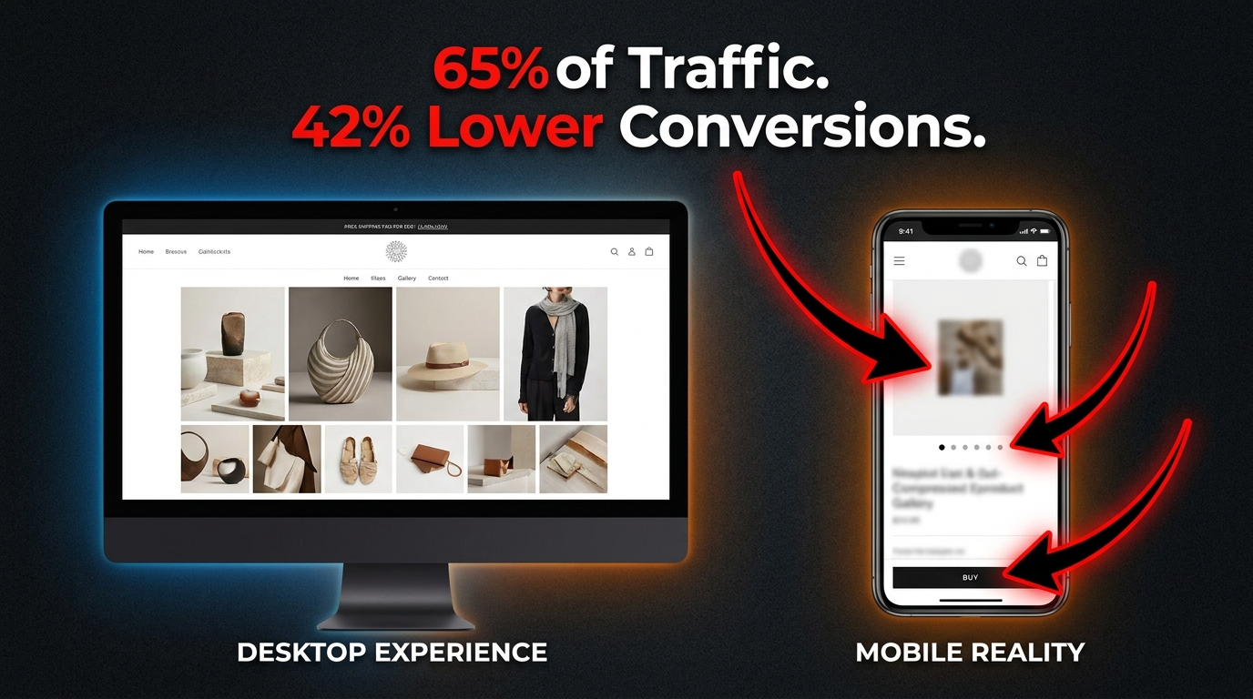
    Step 1: The CTR Baseline Audit

    Before touching any images, pull current CTR data from Seller Central’s Search Term Report (for organic performance) and your campaign reports (for paid performance). Identify the keyword clusters where your CTR is below 0.5% and flag those as priority targets. Check whether the keywords with the lowest CTR are your highest-traffic terms — those represent the largest opportunity because even a small CTR improvement on high-impression keywords produces substantial absolute click increases.

    Cross-reference low CTR keywords against competitor main images for those search terms. Open a private browser, search your primary keywords, and take screenshots of the top 10–15 thumbnails. Then add your own listing’s thumbnail to the comparison. This visual audit often reveals immediately whether your main image is visually competitive in your search results context — whether it stands out or blends in.

    Step 2: Main Image Prioritization

    Based on your CTR audit, determine whether your main image is the primary problem. Indicators of a main image problem: CTR below 0.3%, your thumbnail is visually indistinguishable from competitors, your image resolution is below 1,500 pixels (zoom function degraded), or your product fills less than 75% of the frame.

    If a main image overhaul is warranted, commission at least three distinctly different angle/composition variants. Do not attempt to test within a single image — test between fundamentally different visual approaches. Submit these to a PickFu panel of 50 Amazon Prime shoppers before spending money on MYE testing. Use PickFu responses to identify which variant resonates and why, then refine the leading variant before launching the MYE test.

    Step 3: Secondary Image Stack Architecture

    Map your current secondary images against the 7-slot architecture described earlier. Identify which slots are empty, which are low-quality filler, and which are genuinely functional. Then identify the top three purchase objections for your product category (review analysis is excellent for this — one-star and three-star reviews typically articulate the exact concerns that better images could address).

    Build or commission images that directly address those objections in the appropriate slots. Prioritize slots 4 and 5 (dimensions and infographic) if specification confusion is common in reviews. Prioritize slots 2 and 3 (lifestyle and feature callout) if reviews suggest shoppers were surprised by the product’s appearance or feel in real-world use.

    Step 4: Mobile Optimization Pass

    After creating or revising images, conduct a mobile optimization pass before uploading. Load each image on a smartphone at actual search result thumbnail size and apply the squint test. Check text readability at thumbnail scale. Verify that the product is visually dominant at small sizes. Confirm that the primary visual message communicates within 300 milliseconds of viewing.

    For secondary images with text callouts, check that font sizes, contrast ratios, and layout hierarchy survive the thumbnail size reduction. Images that look excellent at desktop resolution often reveal hidden mobile legibility problems when evaluated at actual mobile display size.

    Step 5: Measure, Iterate, Compound

    After launching updated images, set a 4-week measurement window. Track CTR changes in the Search Term Report week-over-week for the keywords you identified in the audit. Track session-to-order conversion rate changes. Track organic rank position for your top 10 keyword targets.

    In most cases, CTR improvements from main image updates are visible within 1–2 weeks. Conversion rate improvements from secondary image updates are typically visible within 3–4 weeks. Organic rank gains from the combined effect usually manifest within 4–8 weeks, depending on the competitiveness of the category and the magnitude of the CTR improvement.

    Run one variable at a time through MYE where possible. Changing multiple image elements simultaneously makes it impossible to attribute performance changes to specific decisions — and it means you can’t build the institutional knowledge of what works in your specific category that makes successive iterations progressively more effective.

    The Compounding Return on Visual Relevance

    The Amazon A10 algorithm is, at its core, a system designed to show shoppers the products most likely to satisfy their needs and generate Amazon revenue. The signals it uses to make those determinations — CTR, conversion rate, sales velocity, dwell time, scroll depth, zoom engagement — are all behavioral. And the primary driver of behavioral engagement, before any other listing element, is the image stack.

    The CTR-to-ranking velocity relationship is not linear. It compounds. A 0.4% improvement in CTR does not simply produce 0.4% more clicks — it produces a cascade of impression share gains, sales velocity increases, and organic rank improvements that multiply the initial signal. A 1% improvement in conversion rate, enabled by better secondary images and infographics, can double organic traffic within six months through the same self-reinforcing loop. These are not incremental optimizations — they are multipliers on everything else in your listing and marketing strategy.

    The practical takeaways from this analysis are worth making explicit:

    • Treat your main image as your highest-ROI marketing asset. Spending money on photography that produces a measurable CTR improvement generates returns through the algorithm that dwarf equivalent ad spend.
    • Fill all seven image slots with purpose-built content. Empty slots and filler images are missed opportunities to generate scroll depth signals, answer purchase objections, and reduce bounce rates.
    • Design for mobile thumbnails first, desktop second. The majority of your CTR data is generated at 160 pixels wide. Optimize for that context before optimizing for anything else.
    • Use Manage Your Experiments systematically. Image testing is the most direct path to understanding what actually drives CTR for your specific product in your specific category — more reliable than any general best practice.
    • Measure ranking velocity, not just rank position. A listing that gains four positions in two weeks after an image update is showing you something important about the algorithm’s response to that change. That signal should drive further investment in image quality.

    In a marketplace where millions of sellers are competing for the same search result real estate, the listings that earn clicks through genuine visual relevance will always outperform those that attempt to buy their way to visibility. Your image stack is not a supporting element of your Amazon strategy — under the A10 algorithm, it is the engine of your organic ranking velocity.

  • AI-Powered Image Optimization Hacks for 2026: The Technical Operator’s Field Guide

    AI-Powered Image Optimization Hacks for 2026: The Technical Operator’s Field Guide

    AI-powered image optimization dashboard comparing before and after load times with Core Web Vitals improvements

    Most image optimization advice is stuck in 2021. Compress your JPEGs, use lazy loading, add an alt tag — done. But the tools, formats, and techniques available in 2026 have completely changed what “good” looks like. And the gap between sites doing this right versus sites doing it the old way is no longer a minor performance difference. It’s the difference between ranking and not ranking. Between converting and bouncing. Between visible in Google Lens and invisible.

    This guide is not about basics. It’s not going to tell you to “resize your images” or “use a CDN.” It’s written for developers, technical marketers, and digital operators who already know the fundamentals and want a precise, up-to-date picture of what actually moves the needle in 2026 — with specific tools, specific tactics, and the data to back them up.

    We’ll cover the definitive format landscape (AVIF has won, and you need a strategy), AI-driven compression pipelines, edge delivery with intelligent routing, machine learning–based predictive loading, visual search optimization for Google Lens, AI-generated alt text at scale, generative AI for product imagery (and the compliance layer you can’t ignore), Core Web Vitals LCP mechanics, and a prioritized implementation stack you can act on today.

    Every section is grounded in 2026 data. Let’s get into it.

    The Format War Is Over — And AVIF Won

    Bar chart comparing JPEG, WebP, AVIF file sizes showing AVIF wins the format compression war in 2026

    For the better part of five years, the image format landscape was unsettled. WebP was supposed to replace JPEG but had stubborn Safari holdouts. AVIF had better compression but inconsistent browser support. In 2026, that debate is settled. AVIF crossed the 95% browser support threshold in early 2026, making it the clear primary delivery format for the modern web.

    The Numbers in Plain Terms

    Let’s be direct about what the compression gains actually look like in practice. AVIF delivers files that are 50% smaller than JPEG at equivalent visual quality. Compared to WebP, it’s 20–30% smaller. These aren’t marginal improvements — they represent a fundamental shift in page weight. A 1.2MB JPEG routinely compresses to a 0.2MB AVIF using tools like Imagify, an 83% size reduction with imperceptible quality loss.

    WebP itself compresses 25–35% smaller than JPEG and still carries ~97% browser support, making it the correct fallback format. The modern delivery strategy in 2026 is: AVIF primary, WebP fallback, JPEG last resort — and this should be implemented using the HTML <picture> element with srcset for responsive delivery. No exceptions, no excuses.

    What AVIF Does Technically That JPEG Cannot

    AVIF’s advantages aren’t just about compression ratios. It eliminates the blocking artifacts that JPEG produces at high compression settings — those blocky, pixelated degradation patterns that appear around edges and text. AVIF also supports HDR (High Dynamic Range) and wide color gamut natively, which matters increasingly as more displays ship with P3 or Rec. 2020 color profiles.

    For e-commerce especially, this means product images can carry richer, more accurate color representation without a file size penalty. A red sneaker photographed in HDR can render with the actual vibrancy of the original shot, not the muted, slightly off tones that JPEG compression typically introduces.

    Serving AVIF Correctly: The <picture> Pattern

    Correct implementation matters. The <picture> element enables browser-native format negotiation, meaning each visitor gets the best format their browser supports without any JavaScript overhead:

    <picture>
      <source srcset="hero.avif" type="image/avif">
      <source srcset="hero.webp" type="image/webp">
      <img src="hero.jpg" alt="[descriptive alt text]" width="1200" height="628">
    </picture>

    Always include explicit width and height attributes on the <img> element. This reserves layout space before the image loads, eliminating Cumulative Layout Shift (CLS) — a separate Core Web Vitals metric that penalizes pages where content jumps around as resources load.

    SVG for Non-Photographic Elements

    One commonly overlooked optimization: logos, icons, and UI elements should never be rasterized in the first place. SVG files are resolution-independent, meaning they render crisp at any screen size without any data overhead from serving multiple resolution variants. A complex PNG logo at 200KB can frequently be replaced by an SVG at 8KB that looks sharper on a 4K display than the PNG ever did. Audit your non-photographic image inventory and convert aggressively.

    AI Compression Tools That Actually Deliver in 2026

    AI-driven compression goes beyond applying a quality slider to a JPEG. Modern tools analyze image content at the pixel and region level, applying heavier compression to visually less-important areas (backgrounds, uniform textures, empty space) while preserving detail where the human eye will focus — faces, product edges, text overlays, fine textures.

    Content-Aware Compression: How It Works

    Tools like Photo AI Studio apply what’s called region-specific compression: the algorithm identifies high-salience areas (faces, product foregrounds, labels) and applies lighter compression there, while applying heavier compression to the sky behind a product, a blurred bokeh background, or a clean studio wall. The result is a file that’s 30–50% smaller than a uniformly compressed equivalent but appears visually indistinguishable — because the human visual system doesn’t notice compression artifacts where it isn’t looking closely.

    This is a fundamentally different approach from traditional compression, which applies the same quality setting uniformly. The practical result: a 500KB product image that would compress to 250KB with standard WebP compression can hit 150KB or less with content-aware AI compression at identical perceived quality.

    The Leading Tools and Their Actual Differentiators

    Imagify has become the benchmark for WordPress environments. Its Smart Compression mode automatically balances quality and performance targets on a per-image basis, processing at under 200ms per image and supporting batch conversion to WebP or AVIF. 93% of users rate its setup as straightforward. For volume operations, the results are consistent: a 1.2MB JPG becomes a 0.2MB AVIF through Imagify’s pipeline.

    Cloudinary is the enterprise standard. Beyond compression, it offers 50+ URL-based transformations, a built-in DAM (Digital Asset Management) layer, AI smart cropping with face and subject detection, and video optimization in the same pipeline. Its CDN runs on over 700 edge nodes (CloudFront-powered), enabling transformations at the edge rather than at origin. Case studies include Neiman Marcus reducing photoshoot volume by 50% and Stylight attributing a 2.2% conversion lift directly to Cloudinary-driven image optimization.

    ImageKit has emerged as the value-disruptive option. At $9/month on its Lite plan, it bundles a full AI feature set — background removal, auto-tagging, 50+ URL transformations, AVIF/WebP auto-delivery, and face detection-based smart cropping. It runs on 700+ edge nodes and has become the go-to for growing businesses that need enterprise-grade image infrastructure without enterprise pricing.

    ShortPixel and Kraken.io remain strong options for batch-processing existing image libraries, particularly where the primary goal is bulk compression of legacy JPEG/PNG catalogs to WebP or AVIF without a full CDN layer.

    The On-Device AI Compression Shift

    A noteworthy 2026 development: tools like TinyImage.Online are processing AVIF encoding natively in the browser using Canvas and File APIs — meaning images never leave the user’s device for compression. For privacy-sensitive workflows or scenarios where uploading proprietary product imagery to third-party servers is a concern, this represents a genuinely useful alternative to cloud-based pipelines.

    Smart CDN and Edge Delivery: Why Where You Process Matters

    World map showing AI-powered CDN edge delivery network with 700+ nodes for image optimization

    Even a perfectly compressed AVIF image delivers a poor experience if it’s served from a single origin server on the other side of the world from the user. CDN edge delivery is not new advice — but the intelligence layer that’s been added to modern image CDNs in 2026 fundamentally changes what edge delivery means for images.

    Edge Processing vs. Edge Caching: The Distinction That Matters

    Traditional CDNs cache pre-generated image variants. You upload a product image in 5 different sizes, cache all 5 at the edge, and serve the right one based on a URL parameter. This works but has a major drawback: you’re pre-generating and storing every variant you might ever need, which is storage-intensive and requires anticipating every device/size combination.

    Modern AI image CDNs like Cloudinary, ImageKit, and Imgix take a different approach: on-the-fly edge processing. When a device requests an image, the edge node generates the optimal variant in real time — the right dimensions for the requesting device’s screen, the right format for its browser, the right compression quality for its network conditions — in under 200ms. Subsequent identical requests are cached. The first request triggers transformation; all subsequent requests serve from cache. This means you maintain a single source image and the CDN’s AI layer handles every output variant dynamically.

    AI Smart Cropping: The Feature Most Teams Underuse

    Smart cropping is now table-stakes on every major image CDN — but most teams either haven’t enabled it or don’t understand its scope. AI smart cropping uses computer vision to identify the visual subject of an image — a face, a product, a focal point — and ensures that element remains centered and fully visible when the image is cropped to different aspect ratios.

    Without smart cropping, a landscape product photo cropped to a square mobile thumbnail might cut off half the product. With AI subject detection enabled, the CDN identifies the product as the focal subject and crops to keep it centered regardless of the target aspect ratio. For teams managing thousands of SKUs across multiple surface areas (PDPs, category pages, thumbnails, social), this eliminates hours of manual art direction per image.

    Network-Adaptive Quality: Serving the Right Image for the Right Connection

    The most forward-looking edge delivery feature in 2026 is network-adaptive image quality. CDNs can read the requesting device’s connection type (via the Save-Data header or the Network Information API) and serve a lighter image variant automatically to users on congested or slow connections. A user on 5G in a major city gets a full-quality AVIF. A user on a 3G mobile connection in a rural area gets a lighter WebP at 75% quality — still looking good on their screen, but loading in a fraction of the time.

    This is not something most teams configure explicitly. It’s a CDN-level setting, and enabling it is often a single checkbox. The impact on mobile conversion rates — where 62% of web traffic now originates — is measurable and immediate.

    Beyond Lazy Loading: AI Predictive Image Loading

    Lazy loading — deferring below-the-fold images until they approach the viewport — has been standard practice since 2019. In 2026, it’s the floor, not the ceiling. AI-driven predictive loading represents the next layer, and early adopters are reporting 35–50% performance gains over traditional lazy loading alone.

    How Predictive Preloading Works

    Traditional lazy loading is reactive: an image loads when it enters (or approaches) the viewport. AI predictive loading is proactive: it analyzes a user’s scroll velocity, historical navigation patterns, cursor position, and device capabilities to anticipate which images they’re likely to see next — and begins loading them before they reach the viewport.

    The technical implementation typically combines the Intersection Observer API with a lightweight ML model trained on user behavior data. The model assigns “interest scores” to off-screen images based on behavioral signals, then prioritizes preloading the highest-scoring candidates. Think of it as the image equivalent of DNS prefetching: by the time the user’s scroll reaches a product image, the download may already be complete.

    Low-Quality Image Placeholders (LQIP): The Perceived Performance Trick

    While AI predictive loading handles the actual resource timing, LQIP handles perceived performance — and the two techniques are complementary. A Low-Quality Image Placeholder is a heavily compressed, 1–2KB version of the image that loads immediately and occupies the space while the full-resolution version loads.

    In 2026, LQIP has evolved. Rather than the blurry JPEG thumbnails of earlier implementations, modern LQIPs use AI-generated dominant color blocks or gradient approximations that match the actual image’s color palette without any layout shift. The user sees a coherent, contextually appropriate placeholder rather than blank space or a spinning loader — and the transition to the full image is seamless.

    Critical Path Exception: Never Lazy-Load Your Hero Image

    This is where many implementations go wrong. Lazy loading is appropriate for below-the-fold content. The hero image — the first, largest above-the-fold image — must load as a priority resource. Lazy-loading a hero image actively harms LCP scores because it delays the browser’s early discovery and fetching of the most important visual element on the page.

    The correct approach for hero images is the opposite of lazy loading:

    <link rel="preload" as="image" href="hero.avif" type="image/avif" fetchpriority="high">

    The fetchpriority="high" attribute signals to the browser that this resource should be fetched immediately, ahead of other queued requests. Combined with a preload hint in the document <head>, this can reduce hero image load times by 0.5–1.5 seconds on typical connections — which translates directly to LCP improvements.

    Google Lens and Visual Search: The Optimization Layer Most Sites Miss

    Google Lens visual search infographic showing 12 billion monthly queries and optimization requirements for product images

    Text search optimization has been the dominant SEO paradigm for two decades. Visual search is disrupting that paradigm faster than most teams have noticed. Google Lens now processes over 12 billion visual queries per month, growing at 30% annually. Google Images independently drives 22% of all web searches. Sites that have implemented comprehensive visual search optimization report 27% higher conversion rates compared to text-only optimization strategies.

    These are not marginal numbers. They represent a major commercial channel that most competitors have not optimized for.

    How Google Lens Actually Processes Your Images

    Understanding what Google Lens does technically helps clarify what you need to optimize for. Lens uses multimodal AI to analyze images without requiring any text input. It performs object detection (identifying specific products, brands, colors), scene understanding (context and setting), and commercial intent prediction (inferring whether the user wants to buy, research, or navigate based on what they’re photographing).

    When someone photographs a product with Google Lens, the system matches the visual against Google’s product feed index, structured product data, and web imagery. The images that surface in results are those that provide strong visual signals (high resolution, clean subject, consistent lighting), strong structured data signals (Product schema, ImageObject markup), and fast-loading pages (the technical quality of the serving infrastructure matters for crawlability).

    Resolution Requirements for Visual Search Visibility

    Google’s recommendations for visual search are clear: minimum 1,200px on the longest side, ideally 2,400px+. This is higher than most teams default to for web delivery, because web performance optimization typically pushes toward smaller images. The resolution requirement for visual search is driven by the pixel-level matching algorithms Lens uses — low-resolution images don’t provide enough visual detail for accurate object detection and matching.

    The practical solution is responsive serving with high-resolution sources. Maintain source images at 2,400px+ and use your image CDN to serve device-appropriate sizes for actual page rendering. The high-resolution version stays indexed and available for Google’s crawler, while users receive right-sized images for their displays.

    Photography Practices That Drive Visual Search Rankings

    Technical optimization only works if the underlying photography provides clean visual signals. For product images specifically: shoot on consistent, neutral backgrounds (white or light grey); ensure the product fills at least 60–70% of the frame; capture multiple angles (front, side, back, detail); use consistent, studio-quality lighting that eliminates harsh shadows; and maintain consistent cropping and framing across a catalog. These practices enable Lens’s object detection models to accurately identify your product and match it against queries.

    Descriptive File Names and Stable URLs

    File naming is an underrated visual search signal. product-img-047.jpg tells Google nothing. blue-mens-running-shoes-size-10-side-view.webp provides explicit product context before any other signal is processed. Rename files descriptively before upload, and use hyphens (not underscores) as word separators per Google’s preference. Equally important: use stable, canonical URLs for images. If your CMS regenerates URLs on product updates, Google’s visual index loses continuity and your image authority resets.

    AI-Generated Alt Text and Metadata at Scale

    Over 2.2 billion people worldwide have some form of visual impairment that causes them to rely on alt text when consuming web content. Beyond accessibility — which is reason enough to get this right — Google explicitly states that it prioritizes explicit alt text over its own computer vision inference for image understanding. Writing descriptive alt text is not optional for image SEO; it’s the most direct signal you can provide.

    The problem is scale. An e-commerce catalog with 10,000 SKUs and multiple images per product can’t be manually alt-tagged at high quality. AI has solved this problem.

    How Modern AI Alt Text Generation Works

    Modern AI alt text tools use vision-language models (VLMs) like GPT-4o and Gemini to analyze image content and generate contextually appropriate descriptions. Unlike early computer vision-based tagging that produced generic labels (“product, item, image”), current VLMs understand context, composition, and commercial intent.

    For a product photo, a VLM-generated alt text might produce: “Nike Air Max 270 in midnight navy blue, side view showing full-length Air unit midsole, white outsole, and mesh upper with synthetic overlays.” That’s SEO-relevant, accessibility-compliant, and accurate — generated automatically, at scale, in under a second per image.

    Best Practices for AI-Generated Alt Text

    Even with AI generation, review the output against a few quality standards. The optimal length for alt text is 80–140 characters — enough for detail, not so long it becomes noise for screen readers. Prioritize contextual purpose over literal description: describe what the image communicates in its page context, not just its visual contents. For images that are purely decorative (dividers, background patterns), use an empty alt attribute (alt="") to signal to screen readers that the image can be skipped.

    Tools like AltText.ai support 130+ languages and integrate directly with major CMS platforms and e-commerce plugins, enabling automated alt text generation that fires on upload without manual intervention. The EU Accessibility Act, which mandated alt text compliance across digital properties, has made automated alt text generation a legal compliance concern in European markets — not just an SEO optimization.

    Beyond Alt Text: AI-Powered Image Metadata Enrichment

    AI can enrich image metadata beyond alt text. Auto-tagging — automatically assigning descriptive keyword tags to images based on their visual content — enables faster internal image search, better DAM organization, and additional structured data signals for search indexing. Platforms like Contentful’s AI layer and Cloudinary’s auto-tagging feature generate comprehensive tag sets on upload. For large teams managing thousands of images, this removes a significant manual bottleneck from the publishing workflow.

    Generative AI for Product Images: The Opportunity and the Compliance Layer You Can’t Ignore

    Split-screen comparison of traditional product photo vs AI-generated product image showing 3.4% vs 2.1% conversion rates

    AI-generated and AI-enhanced product imagery is now producing measurably better commercial outcomes than traditional photography in controlled tests — but with a critical compliance caveat that determines whether those results are positive or catastrophically negative.

    The Conversion Data on AI Product Images

    Shopify Q4 2025 data reveals a clear hierarchy: traditional photography converts at a 2.1% baseline rate. Unlabeled AI-generated images drop to 1.8% — a negative outcome driven by consumer mistrust when artificial origin is suspected but unconfirmed. C2PA-verified AI images convert at 3.4%, outperforming traditional photography by a significant margin.

    BCG’s late 2025 study adds important context: consumers are 2.5x more likely to purchase when AI imagery carries C2PA (Coalition for Content Provenance and Authenticity) verification badges. Non-compliant AI images, meanwhile, cut customer lifetime value by 15%. The compliance layer isn’t just ethical best practice — it’s a direct revenue variable.

    Background Removal and Generative Fill in Practice

    The most widely applicable AI image tools for e-commerce fall into two categories: background removal and generative fill. Remove.bg processes backgrounds in approximately 5 seconds per image via API, with 99.8% accurate removal on standard product shapes. It scales efficiently for high-volume catalogs where consistent white-background imagery is required for marketplace compliance.

    Photoroom (150M+ downloads) goes further, combining background removal with AI background generation — placing products in contextually relevant scenes (a coffee mug on a café table, a sneaker on an urban street, a skincare product in a bathroom setting) without a photoshoot. This is the AI-driven production studio model: generate dozens of lifestyle context variants from a single hero shot, A/B test them, and serve the highest-converting variant per customer segment.

    Claid specializes in bulk enhancement — upscaling, sharpening, color correction, and background replacement at catalog scale, with API integration that slots into existing DAM workflows without requiring image-by-image manual processing.

    C2PA Compliance: Not Optional in 2026

    C2PA (Coalition for Content Provenance and Authenticity) metadata embeds a cryptographically verifiable origin record into AI-generated or AI-modified images. This metadata travels with the image and can be read by compliant platforms (Adobe products, Google, most major social platforms as of early 2026) to display provenance information to end users.

    The practical implication: if you’re using AI to generate or significantly modify product imagery and you’re not embedding C2PA metadata, you’re in the quadrant that produces 1.8% conversion rates and eroding LTV. Enable C2PA output in your generative AI tools (Adobe Firefly, Photoroom Pro, and Midjourney Enterprise all support it), and display the provenance badge where your platform surfaces it. Transparency drives trust; trust drives conversion.

    Core Web Vitals and LCP: The Revenue Connection Most Teams Underestimate

    Core Web Vitals dashboard showing LCP impact zones and conversion rate correlations for ecommerce sites

    Largest Contentful Paint (LCP) measures how long it takes for the largest visible element on the page to fully load. In the vast majority of page layouts — especially product pages, landing pages, and home pages — that largest element is an image. Understanding LCP isn’t just a technical exercise; it’s a direct proxy for the commercial health of your pages.

    The LCP Thresholds and What They Cost You

    Google’s thresholds are: under 2.5 seconds = good, 2.5–4.0 seconds = needs improvement, over 4.0 seconds = poor. The conversion implications across these zones are well-documented in 2026 research:

    • A 1-second delay in page load time reduces conversions by 7%.
    • Every 100ms improvement corresponds to approximately a 1% conversion gain.
    • Sites with LCP under 2.5 seconds see 23% higher conversions than sites with LCP over 4 seconds.
    • One documented case study showed a 38% conversion lift from reducing LCP from 4.2 seconds to 1.8 seconds via AVIF/WebP implementation and hero image preloading.
    • Mobile users — 62% of total web traffic — experience LCP degradation more severely, amplifying the revenue impact on any site that hasn’t explicitly optimized for mobile image delivery.

    These aren’t theoretical numbers. They’re operational costs that compound daily on any site running above-threshold LCP scores.

    Images Are the Primary LCP Culprit

    Unoptimized images cause 60–80% of poor LCP scores. The common failure modes are:

    • Oversized source images: Serving a 3MB JPEG where a 150KB AVIF would render identically
    • Lazy-loaded hero images: The hero image is the LCP element — lazy loading it defeats the entire purpose of LCP optimization
    • No preload hint: The browser discovers the hero image late in the load cycle, after parsing HTML and CSS, rather than at parse time
    • Missing width/height attributes: Causes layout shifts (affecting CLS) and delays rendering pipeline
    • Origin-served images: No CDN, no edge delivery — every user hits the origin server regardless of geographic distance

    Diagnosing Your LCP Image Issues

    Google PageSpeed Insights (powered by Lighthouse) identifies your LCP element and its load time on mobile and desktop. Chrome DevTools Performance tab shows a waterfall view of exactly when each image starts and finishes downloading. The combination of these two tools gives you everything you need to identify which specific images are causing LCP failures — and in what order to fix them.

    Prioritize pages by commercial importance: checkout flow, product detail pages, and category pages first. Fix the LCP element on each (almost always the hero or first product image), then work outward to secondary images. For most e-commerce sites, fixing the top five template types (PDP, category page, homepage, cart, landing page) captures 80%+ of the total LCP opportunity.

    Schema Markup and Structured Data: Making Images Legible to AI Systems

    Structured data has evolved from a nice-to-have SEO enhancement to a requirement for visibility in AI-powered search surfaces. Google’s March 2026 core update tightened rich result eligibility, requiring schema to match primary page content precisely. Sites with correct schema markup occupy 72% of first-page results, and pages with rich results experience 20–40% CTR increases compared to standard listings.

    ImageObject Schema: The Specific Markup for Images

    The ImageObject schema type in JSON-LD provides Google with explicit metadata about your images — including license, copyright, caption, creator, and URL — that goes beyond what it can infer from visual analysis alone. For product images, ImageObject is typically nested within Product schema:

    <script type="application/ld+json">
    {
      "@context": "https://schema.org",
      "@type": "Product",
      "name": "Blue Running Shoes",
      "image": [
        {
          "@type": "ImageObject",
          "url": "https://example.com/shoes-front.avif",
          "description": "Blue running shoes, front view, white sole",
          "width": 1200,
          "height": 1200
        }
      ],
      "offers": {
        "@type": "Offer",
        "price": "89.99",
        "priceCurrency": "USD",
        "availability": "https://schema.org/InStock"
      }
    }
    </script>

    Products with complete schema markup are 4.2x more likely to appear in Google Shopping results. Pages with structured data earn 35% higher click-through rates from rich results. And image schema that includes license information unlocks Google Images’ licensable content filter — a growing traffic source for media and photography sites.

    Open Graph and Social Sharing Performance

    Open Graph meta tags control how your images appear when pages are shared on social platforms. Getting this wrong means your product pages share as blank or with incorrect images, losing the visual engagement that drives click-through from social contexts.

    The critical tags for image performance on social sharing:

    • og:image — the primary image URL (should be absolute, not relative)
    • og:image:width and og:image:height — allows platforms to render without downloading to determine dimensions
    • og:image:type — specify image/webp for platforms that support it (improves load speed in social feeds)
    • og:image:alt — the alt text for the shared image (accessibility on social platforms)

    The recommended minimum dimensions for Open Graph images are 1200×630px. Below this, most platforms scale up the image and display it in a reduced card format rather than the large preview card that drives significantly higher click-through rates.

    Visual Search Rich Results: The Emerging Frontier

    Google’s AI Overviews (the AI-generated summary blocks at the top of search results) increasingly surface images as evidence. Pages whose images are correctly tagged with ImageObject schema, serve at appropriate resolution, and load fast enough for Googlebot to fetch on its crawl budget are the ones appearing in these visual AI Overview citations. This is a new traffic vector — one that schema-poor sites are systematically excluded from.

    Building Your 2026 Image Optimization Implementation Stack

    Implementation priority checklist for AI image optimization in 2026 with seven numbered steps

    With all the techniques and tools covered, the question becomes prioritization. Not everything has equal leverage, and implementation resources are finite. Here’s a sequenced approach based on impact-to-effort ratio.

    Tier 1: Maximum Impact, Achievable Immediately

    1. Convert your image library to AVIF (with WebP fallback). This single change — implementable via Imagify, ShortPixel, or your image CDN’s auto-conversion — can reduce total image payload by 50–83%. It directly improves LCP, reduces bandwidth costs, and improves perceived performance across every page on your site. Do this first.

    2. Fix your hero image LCP. Add fetchpriority="high" and a <link rel="preload"> for every hero image. Remove any lazy-loading attributes from above-the-fold images. Add explicit width and height attributes to eliminate CLS. This is typically 15 minutes of implementation for a 0.5–1.5 second LCP improvement.

    3. Deploy an image CDN if you aren’t using one. ImageKit at $9/month serves more edge-delivery functionality than most teams have from their current stack. The combination of edge delivery plus AVIF auto-conversion plus smart responsive sizing covers the majority of the performance gap for most sites.

    Tier 2: High Impact, Requires More Setup

    4. Implement AI-generated alt text at scale. Integrate AltText.ai or your image CDN’s auto-tagging into your upload pipeline. Set up a rule that fires on every new image upload. Run a batch job on existing images with missing or generic alt text. This improves accessibility compliance, image SEO, and visual search indexing simultaneously.

    5. Add Product schema and ImageObject markup to all product pages. For WordPress/WooCommerce sites, plugins like Yoast SEO Premium or RankMath handle much of this automatically with minimal configuration. For custom platforms, the JSON-LD block is templatable and can be generated programmatically from product data.

    6. Implement lazy loading correctly across below-the-fold images. Use the native HTML loading="lazy" attribute — it’s supported by all modern browsers and requires no JavaScript. Reserve Intersection Observer-based implementations for scenarios where you need more granular control over loading thresholds or are implementing LQIP transitions.

    Tier 3: Advanced, Compounding Returns

    7. Implement LQIP for progressive image loading. Generate dominant-color or low-quality progressive placeholders for all above-the-fold product images. This improves perceived performance significantly, particularly on mobile connections, even when actual load times remain constant.

    8. Explore AI generative backgrounds for product imagery. Test Photoroom or Claid for a single high-traffic product category. Run an A/B test against your current photography baseline. Measure conversion, time-on-page, and bounce rate. If you generate AI images, enable C2PA metadata output from day one.

    9. Enable network-adaptive quality on your image CDN. Most CDNs offer this as a configuration flag. Enable it and monitor its effect on mobile conversion rates over 30 days. On high-mobile-traffic sites, this can produce conversion improvements of 3–8% with zero additional development work.

    10. Optimize for visual search (Google Lens) systematically. Audit your product image library against the resolution (1200px+ minimum), photography quality, and file naming standards outlined in this guide. Prioritize your highest-commercial-value SKUs first. Cross-reference with your Google Search Console image performance data to identify which product categories are already generating image search traffic — and which ones should be but aren’t.

    Tracking Progress: The Metrics That Matter

    Set up a measurement baseline before beginning any implementation so you can attribute improvements accurately. The metrics to track:

    • LCP score (mobile and desktop) via Google PageSpeed Insights or Search Console Core Web Vitals report
    • Total image payload per page type (via Chrome DevTools Network tab, filtered to images)
    • Google Images impressions and clicks via Search Console’s Search Type filter set to “Image”
    • Conversion rate by page type — segment by device type to isolate mobile image performance impact
    • CLS score — tracks layout stability improvements from adding width/height attributes

    Review these weekly for the first month after major changes, then monthly once baselines stabilize. The impact of AVIF conversion and LCP fixes typically surfaces in Google’s field data within 28–45 days of implementation, which is the time it takes for real user measurements to refresh in the Chrome UX Report.

    Conclusion: The Technical Operators Who Win on Images in 2026

    The pattern across every section of this guide is consistent: image optimization in 2026 has two distinct populations of practitioners. Those who are still operating on 2021-era mental models — compress the JPEG, add an alt tag, done — and those who understand that images are now a multi-dimensional technical performance layer intersecting with SEO, visual search, accessibility, AI transparency, and conversion rate.

    The operators in the second group are compounding advantages that compound further over time. AVIF adoption means lower bandwidth costs and better LCP today, which means better rankings tomorrow, which means more organic traffic that lands on pages already optimized to convert. AI alt text means better accessibility compliance, better image SEO, and better AI Overview citations simultaneously. C2PA compliance means higher trust, higher conversion rates, and lower risk of platform penalties as AI content regulations tighten.

    None of this requires building something from scratch. The tools exist, the pricing is accessible, and the implementation complexity is lower than it appears when you tackle the steps in the right order. Tier 1 changes — AVIF conversion, hero image LCP fix, and image CDN deployment — can realistically be completed in a single sprint by a team of two. The compounding returns start from day one.
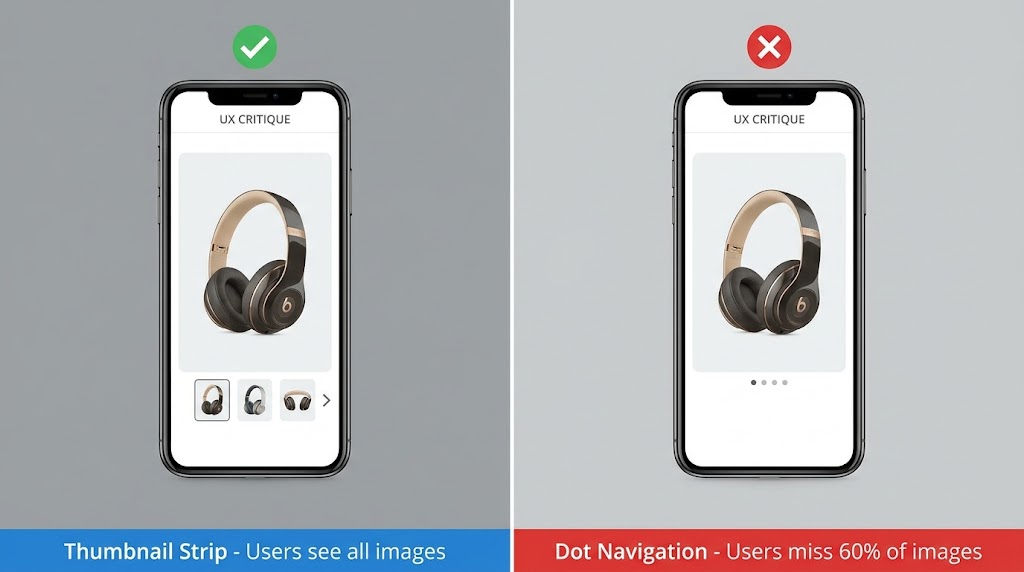
    The sites that will dominate image performance metrics in 2026 and 2027 are the ones starting these implementations today, not waiting until the next algorithm update forces the issue. The margin between optimized and unoptimized is already large enough to be commercially significant. It will only widen from here.

    Key Takeaways: Switch to AVIF primary delivery with WebP fallback. Fix your hero image’s LCP with fetchpriority="high". Deploy an AI image CDN with edge processing. Implement AI-generated alt text on upload. Add ImageObject and Product schema markup. C2PA-tag any AI-generated images. Audit for Google Lens visual search requirements. Measure LCP weekly. The order matters — start with the highest-leverage items and work down the stack.

  • What Rufus Actually Sees: The Image Optimization Tactics Amazon Sellers Are Sleeping On

    What Rufus Actually Sees: The Image Optimization Tactics Amazon Sellers Are Sleeping On

    Amazon Rufus AI scanning product listing images as data sources — hero image showing AI vision lines reading main images, infographics, and lifestyle photos

    Most Amazon sellers treat product images as a design problem. Hire a photographer. Get clean shots on white. Maybe add an infographic or two. Done.

    That worked fine when search was keyword-driven and humans were doing all the evaluating. But Amazon’s AI shopping assistant, Rufus, has fundamentally changed the relationship between your visual assets and your discoverability — and the majority of sellers haven’t caught up to it yet.

    Here’s the shift that matters: Rufus doesn’t look at your images the way a shopper does. It processes them as structured data sources. Every pixel, every text overlay, every scene in a lifestyle shot, every alt text field in your A+ Content module — Rufus is extracting meaning from all of it, cross-referencing it against its semantic knowledge graph, and deciding whether your product deserves to appear in a recommendation when someone asks a natural-language question like “What’s a good protein shaker that actually fits in a car cup holder and won’t leak?”

    As of early 2026, Rufus is handling more than 13% of all Amazon search queries, mediating an estimated 15–20% of mobile shopper sessions per quarter, and driving what analysts project to be over $10 billion in annualized incremental sales. Shoppers who interact with Rufus are reportedly 60% more likely to purchase than those who don’t. The assistant has 250 million active users and interaction growth running at 210% year-over-year.

    This isn’t a feature preview anymore. Rufus is a primary discovery mechanism — and it sees your images differently than you think it does.

    This article breaks down exactly how Rufus processes visual content, what it extracts from each image type, where most sellers are leaving discovery on the table, and a slot-by-slot framework for building a Rufus-optimized image stack from scratch.
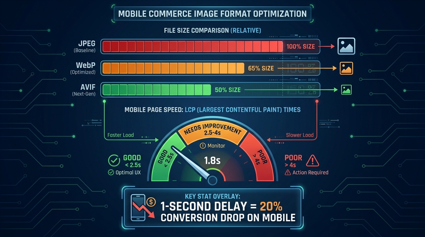
    How Rufus Actually Processes Product Images: The Multimodal Stack

    Three-layer Rufus ranking system diagram showing A10 algorithm, COSMO semantic knowledge graph, and Rufus multimodal AI with OCR and computer vision

    To optimize for Rufus, you first need to understand what kind of system you’re actually dealing with. Rufus is not a simple image ranker. It’s a multimodal AI assistant built on three interconnected layers, each of which processes your listing differently and feeds data to the next.
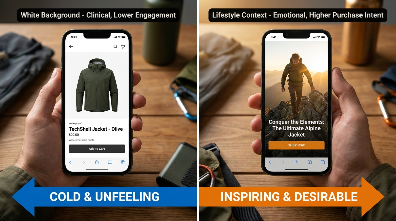
    Layer 1: The A10 Foundation

    Amazon’s A10 algorithm operates at the base of the stack. It handles the traditional signals you already know — sales velocity, click-through rates, keyword relevance from titles and backend fields, conversion history, return rates, and fulfillment performance. A10 creates your baseline discoverability, determining whether your product is even eligible to surface for a given search.

    Images play an indirect role here. A poorly optimized image gallery hurts click-through rate and conversion, which feed back into A10 as negative signals. A highly optimized gallery improves both metrics, compounding A10 performance over time. But A10 is primarily a text and behavioral signal engine — it doesn’t evaluate image content directly.

    Layer 2: The COSMO Semantic Knowledge Graph

    Above A10 sits COSMO, Amazon’s proprietary semantic knowledge graph — and this is where image optimization starts to directly matter in a new way. COSMO isn’t a keyword index. It’s a knowledge structure built from millions of behavioral assertions about what customers actually want when they use different phrases.

    COSMO connects product attributes, use cases, customer intents, and product categories into a web of semantic relationships. When a shopper says “best water bottle for hiking,” COSMO isn’t matching the phrase “hiking” to your keyword list. It’s checking whether the knowledge graph contains a strong connection between your product and the node cluster representing hiking intent — which includes attributes like capacity, material, durability, weight, and insulation.

    Visual Label Tagging is the mechanism through which your images feed COSMO. Amazon’s computer vision system scans your listing’s image gallery and applies semantic labels to what it finds: product type, setting, use context, visible features, scale indicators, and user demographics. These labels become data points in COSMO’s graph, strengthening (or failing to strengthen) the connections between your product and relevant intent clusters.

    A camping water bottle photographed only on a white background gets labeled as “water bottle — product isolated.” The same bottle photographed at a trailhead in a hiker’s backpack side pocket gets labeled with setting: outdoor, context: hiking, use-scenario: active-trail, format: portable. That’s a fundamentally richer set of graph connections — and Rufus draws on all of them when generating responses to natural-language shopping queries.

    Layer 3: Rufus Multimodal Synthesis

    Rufus sits at the top of the stack, and it’s where your images, alt text, reviews, Q&A, listing copy, and A+ content all converge into a single, synthesized understanding of your product. Rufus uses a vision-language model to process images holistically — not just extracting text from overlays, but understanding scenes, inferring product use cases, identifying product components, and even reading packaging details.

    OCR (Optical Character Recognition) is Rufus’s tool for reading embedded text. When a shopper uploads a photo of a product they saw in a store and asks Rufus to find it or suggest alternatives, Rufus can read the brand name, product specs, and model numbers directly from label text in the photo. The same capability applies to your listing images — Rufus reads every text overlay on your infographics and incorporates that data into its product understanding model.

    The result is a system where your images are not decorations. They are data inputs — and they either enrich Rufus’s model of your product or they don’t.

    Visual Label Tagging: What COSMO Learns From Your Photos

    Visual Label Tagging is the bridge between your image gallery and COSMO’s knowledge graph, and understanding it gives sellers a concrete framework for thinking about image strategy beyond aesthetics.

    What Gets Tagged and What Doesn’t

    Amazon’s computer vision system is applying semantic labels across 18 documented product categories, and those labels span several dimensions of product understanding. Here’s what the system is looking for in your images:

    • Product identity: What the item is, clearly and unambiguously. If your product is misclassified at this stage — if, for example, your kitchen tool gets tagged as something in a different category — your downstream visibility collapses. AI misclassification is a real, documented problem for sellers with ambiguous or cluttered primary images.
    • Setting and context: Where is the product being used? An image of a blender in a gym bag reads differently to COSMO than the same blender on a kitchen counter. Setting tags include: home, office, outdoor, gym, travel, camping, kitchen, office, and dozens of sub-contexts.
    • User demographics: Who is using the product? Images that show a specific user — a parent with a child, an athlete, an older adult, a professional — generate demographic tags that connect your product to relevant intent clusters like “gifts for mom” or “office supplies for professionals.”
    • Feature visibility: What product features are visually apparent? Visible handles, zippers, lids, buttons, ports, and components all generate feature tags. If your product has a key differentiating feature that isn’t visible in any image, it may not be tagged at all — even if it’s described in your bullet points.
    • Scale and size indicators: Products shown next to common reference objects (a hand, a coin, a standard cup) generate size-context tags that allow Rufus to answer size-related shopper questions accurately.

    The Knowledge Graph Connection

    Once COSMO has your Visual Label Tags, it runs them through its web of semantic intent connections. Every tag is a potential match point for a shopper query. A product tagged with setting: camping, feature: insulation visible, use-context: outdoor hydration, and material: stainless steel inferred is going to show up in far more Rufus recommendation sets than the same product tagged only as water bottle: product isolated.

    The practical implication is significant: each lifestyle image you add to your gallery is not just a conversion aid for human shoppers. It’s a tag-generation event for COSMO. Every new scene you photograph your product in adds a new cluster of intent connections to the knowledge graph. That’s compounding discoverability, and it’s entirely within your control.

    Main Image Tactics: There’s More at Stake Than Compliance

    Before and after comparison of Amazon product main image optimization for Rufus AI — generic white background versus Rufus-optimized version with callout text overlays

    Your main image is the first thing both human shoppers and Rufus’s computer vision system process. Amazon’s compliance requirements are firm: pure white background (RGB 255, 255, 255), product filling at least 85% of the frame, no props or text overlays. Those rules aren’t going away.

    But within those constraints, there are meaningful choices that dramatically affect how well Rufus understands — and therefore surfaces — your product.

    Precision Beats Minimalism

    The “cleaner is better” aesthetic that dominated Amazon photography for the past decade is no longer the whole story. Rufus’s computer vision model needs enough visual information to accurately categorize your product. That means your main image should be photographed to maximize feature clarity, not minimalism.

    Consider what a vision model needs to correctly classify a multi-tool pocket knife versus a standard pocket knife versus a Swiss Army-style multi-tool. The differences are subtle — blade count, tool arrangement, handle shape. If your main image is a tight overhead shot showing only one side of the product, you may be giving the AI insufficient information to classify your item correctly. The same product photographed at a 45-degree angle showing the tool array, the clip, and the scale relative to a hand generates more classifiable information.

    Practical rule: photograph your main image from the angle that makes your product most distinctively identifiable within its subcategory. Don’t just show the product — show what makes it that specific type of product.

    Resolution Requirements in a Multimodal World

    Amazon’s minimum image size is 1000×1000 pixels for zoom functionality to activate. For Rufus optimization, treat 2000×2000 pixels as your practical floor, and 3000×3000 or higher as ideal. Higher resolution means finer detail extraction from the computer vision model — visible texture, stitching, port sizes, label text on packaging — all of which becomes richer data input for Visual Label Tagging.

    A sharp, 2500×2500 pixel main image of a travel bag will allow the AI to tag the zipper material, the external pocket structure, the handle type, and the approximate proportions — generating a far richer initial product classification than a 1000×1000 pixel shot of the same bag.

    The “What Is This?” Test

    Before finalizing your main image, run what practitioners have started calling the “What Is This?” test. Show your main image to someone unfamiliar with the product for three seconds, then take it away. If they can’t immediately answer what the product is, what it does, and roughly who it’s for — your main image is underperforming for both humans and AI. Rufus’s vision model is making the same rapid classification judgment, and an ambiguous main image is the single most damaging image problem a listing can have.

    The Infographic Layer: OCR and the Text Rufus Is Already Extracting

    Rufus OCR scanning an Amazon product infographic water bottle image, extracting text overlays like Holds 64 oz, BPA-Free Stainless Steel, Fits Cup Holders as data tags

    Infographic images are the single highest-leverage image type for Rufus optimization — and the one where the gap between sellers who understand what’s happening and those who don’t is most pronounced.

    Rufus’s OCR capability means the text embedded in your infographic images is being read, indexed, and incorporated into its product understanding model. This isn’t a theoretical capability — it’s active, documented through Amazon’s patent filings, and confirmed by practitioner testing across categories. Every word that appears in your infographic images is a potential data point that Rufus can reference when answering shopper questions.

    Writing for OCR, Not Just for Eyes

    Most Amazon infographics are designed with human readability as the primary constraint. Clean fonts, balanced layouts, branded color schemes. That’s still important. But layered on top of that should be a second design constraint: is this text OCR-readable in a way that serves Rufus’s data extraction needs?

    OCR performance degrades with decorative fonts, very small text, low contrast text on busy backgrounds, and stylized lettering. Amazon’s OCR layer is sophisticated, but it performs best on:

    • High-contrast text (dark on light or light on dark, not mid-tone on mid-tone)
    • Clean sans-serif or serif fonts at legible sizes (minimum 18–20pt equivalent at image resolution)
    • Text that is horizontal, not rotated or curved
    • Specific, noun-phrase driven language rather than vague marketing copy

    That last point deserves more attention. “Premium Quality Construction” tells Rufus almost nothing useful. “Aircraft-grade 6061 Aluminum, 2mm Wall Thickness” tells it a great deal — material, grade, specification, and a size parameter, all in one phrase. Rufus can use the second phrase to answer questions like “what’s the most durable aluminum water bottle” or “are there aluminum bottles with thick walls.” It cannot use the first phrase for anything.

    Noun Phrases That Actually Feed COSMO

    The most effective text overlays for Rufus optimization follow a simple structure: measurable attribute + product-specific noun. Examples that generate strong COSMO connections:

    • “Holds 64 oz — Fits Standard Car Cup Holders” (capacity + compatibility)
    • “BPA-Free 18/8 Stainless Steel Construction” (material + safety attribute)
    • “Fits Wrists 6.5″–8.5″ — Adjustable Clasp” (size range + feature)
    • “1200W Motor — Crushes Ice in Under 10 Seconds” (power + performance claim)
    • “Waterproof to IPX7 — Submersible Up to 1 Meter” (certification + specification)

    Each of these phrases maps to answerable shopper questions. “What water bottle fits in a car cup holder?” — COSMO has a direct data point. “Are there stainless steel bottles that are BPA-free?” — COSMO has a direct data point. Generic phrases like “Superior Hydration” or “Built for Champions” map to nothing in COSMO’s intent graph.

    Infographic Coverage: What to Include Across Your Slots

    Sellers often dedicate one image slot to an infographic and consider it done. The more effective approach is to plan multiple infographic images covering different categories of product information:

    • Dimension/size infographic: Show actual measurements with a scale reference. Include the measurements in text (not just arrows), because OCR reads text, not line lengths.
    • Material/composition infographic: List materials, certifications, and construction details with specific, verifiable language.
    • Feature breakdown infographic: Highlight each key feature with labeled callouts, using OCR-readable noun phrases rather than category headers.
    • Compatibility/fit infographic: If your product fits, pairs with, or requires something specific, show and label it. “Compatible with AirPods Pro 2nd Gen” is the kind of text Rufus uses to surface your product for compatibility queries.

    Lifestyle Images Done Right: Intent Matching Through Scene Context

    If infographics are about feeding data to Rufus through OCR, lifestyle images are about feeding data through computer vision and Visual Label Tagging. The distinction matters, because the optimization approach is different.

    Lifestyle images generate the contextual tags that connect your product to shopper intent clusters. A product photographed in ten different settings generates ten different sets of intent-connection tags in COSMO. Each tag cluster is a pool of potential shopper queries that your product can surface in.

    Choosing Scenes Strategically, Not Aesthetically

    Most brands choose lifestyle scenes based on what looks aspirational or on-brand. A premium kitchen appliance in a beautiful minimalist kitchen. A fitness supplement in a gym. A skincare product in a spa-inspired bathroom. Those aesthetic choices are fine — but they’re not strategic choices for Rufus optimization.

    The strategic approach starts with your actual search intent data. Pull your Search Term Report from Seller Central and look at the long-tail queries that are generating impressions but low conversion. Many of those queries represent intent clusters your product could serve — but isn’t being tagged for because your images don’t show those scenarios.

    Example: A portable blender’s search term report shows queries like “blender for travel,” “mini blender dorm room,” “blender that works in hotel room,” and “blender for camping.” These are distinct intent clusters. A single lifestyle shot in a kitchen doesn’t address any of them. Shooting the same blender in a hotel room, at a campsite, and in a dorm setting — and including those as separate image slots — generates distinct Visual Label Tag clusters for each context, making the product eligible to surface in Rufus responses to all four query types.

    The User Demographic Signal

    Lifestyle images that include people generate additional demographic tagging that pure product shots cannot. COSMO’s knowledge graph includes demographic-intent connections — shoppers searching for “gifts for teenage girls” or “office accessories for working moms” are triggering intent clusters that include demographic tags.

    Include people in your lifestyle images when your product has meaningful demographic targeting. Show the actual user your product is built for. This isn’t just good marketing psychology — it’s a direct input into COSMO’s demographic tagging system, which determines whether your product surfaces for gift-giving and user-specific queries.

    Text Overlays in Lifestyle Images

    Here’s a tactic that most sellers miss entirely: lifestyle images can carry text overlays too. Unlike main images, secondary images have no restriction on overlaid text. A lifestyle image of a water bottle at a hiking trailhead can also include a small, clean callout that reads “Triple-Wall Vacuum Insulation — Stays Cold 24 Hours.” The computer vision model reads the scene and generates context tags. Rufus’s OCR reads the overlay and generates spec data. One image provides two types of data input simultaneously.

    This dual-input approach is one of the highest-ROI tactics in Rufus image optimization — it requires no additional photography, just thoughtful graphic design on images you’re already producing.

    The 9-Slot Narrative Sequence: Treating Your Gallery Like a Presentation

    Amazon 9-slot image gallery narrative sequence strategy showing story arc from Hero Identity through Key Specs, Scale Comparison, Lifestyle Use Cases, Feature Close-Up, Social Proof, FAQ, and Brand Story

    Amazon allows up to 9 product image slots, plus a video. The average seller uses 4–5. According to practitioner data, roughly 65% of sellers leave image slots empty — which means they’re leaving COSMO tag-generation opportunities on the table with every unfilled slot.

    But filling all 9 slots randomly is not better than filling 5 slots strategically. The sequence of your images matters — both for human shoppers who view them left to right and for Rufus’s processing model, which tends to weight earlier images more heavily in initial product classification.

    Here’s a framework for building a 9-slot gallery that serves both humans and Rufus’s multimodal AI simultaneously:

    Slot 1 — Hero Identity

    This is your mandatory white-background main image. Its job for Rufus is unambiguous product classification. Its job for shoppers is immediate recognition and interest. Optimize for resolution (2000px+), product angle (most distinctive and identifiable), and clarity. Pass the “What Is This?” test.

    Slot 2 — Key Specs Infographic

    Place your most OCR-rich infographic in slot 2. This is the highest-priority non-main image for Rufus data extraction. Include your most critical specifications — the ones that differentiate your product and answer the most common shopper comparison questions. Measurable attributes, certifications, compatibility notes. High-contrast text, clean font, specific noun phrases.

    Slot 3 — Scale and Size Reference

    A dedicated size-context image. Show the product next to a common reference object (a human hand, a standard mug, a 12-inch ruler) and label the key dimensions in text. This answers a consistent category of shopper questions (“How big is it actually?”) and generates size-intent tags that allow Rufus to match your product to size-specific queries.

    Slot 4 — Primary Lifestyle / Use Case 1

    Your most commercially important use-case scenario, photographed in its natural setting. Include at least one person if your product has a defined user profile. Add a subtle text callout highlighting the key benefit relevant to this scenario. This slot generates your primary COSMO intent connections.

    Slot 5 — Use Case 2 (Different Context)

    A second lifestyle scenario targeting a different intent cluster. If Slot 4 shows your product in a home kitchen, Slot 5 might show it at a campsite or in a hotel room. Every new setting is a new cluster of COSMO intent connections. Don’t repeat the same context — expand your tag coverage.

    Slot 6 — Feature Close-Up

    A high-resolution detail shot of your product’s most differentiating feature — the zipper mechanism, the lid seal, the texture of the grip, the precision of the measurements on the side. Include a labeled callout with specific language. This image addresses the “zoom-and-inspect” behavior of engaged shoppers while generating feature-specific tags for COSMO.

    Slot 7 — Social Proof or Review Callout

    An image incorporating a verified customer quote or review excerpt, combined with a lifestyle or product visual. Rufus synthesizes reviews and Q&A as part of its product understanding — placing a powerful review excerpt in your image gallery reinforces the same sentiment data Rufus is already pulling from your review set. It also addresses purchase hesitation for human shoppers at the consideration stage.

    Slot 8 — FAQ / Objection Buster

    Identify the top purchase objection or question your product receives in reviews and Q&A, and address it directly in a dedicated image. “Yes, it fits in a standard cup holder.” “Yes, the lid is dishwasher-safe.” “No, you don’t need any tools to assemble it.” This image type directly feeds Rufus’s ability to answer common shopper questions about your product — because when a shopper asks Rufus “does [product] fit in a cup holder?”, Rufus is synthesizing your listing’s entire content to generate that answer, including your image text overlays.

    Slot 9 — Brand Story / Materials / Sustainability

    Your final slot should serve long-tail search intent around brand trust, materials sourcing, ethical production, or product origin. For many categories, shoppers ask Rufus questions like “is this brand sustainable?” or “what is this made from?” A dedicated image with clear, OCR-readable text about your materials, country of manufacture, certifications (FDA, CE, organic, Fair Trade), or sustainability commitments provides Rufus with direct data to answer those queries.

    The Video Slot

    Add a product video. Rufus’s multimodal processing extends to video content in your listing gallery. A short, tight demonstration video (60–90 seconds) showing your product in use across two or three scenarios provides the richest possible context data — moving-image analysis combined with spoken or captioned content. If video is not currently part of your listing stack, it should be the next addition after filling all 9 image slots.

    A+ Content Alt Text: The Hidden Data Field Most Sellers Ignore

    Amazon A+ Content editor mockup showing a highlighted alt text input field with a detailed Rufus-optimized description, with a callout bubble reading THIS IS WHAT RUFUS READS

    Alt text in A+ Content modules is, without question, the most underutilized high-leverage input in the entire Amazon listing ecosystem. Historically, sellers ignored it because it had minimal measurable impact on traditional search ranking. The field existed primarily for accessibility — screen readers. Most sellers either left it blank or filled it with something like “Product image 1.”

    That era is over. Rufus reads alt text as a primary data source.

    Why Alt Text Now Matters for Rufus

    Rufus is a multimodal system — it processes both the visual content of images and the textual metadata associated with them. Alt text is part of that metadata layer. When you write descriptive, context-rich alt text for an A+ Content image, you’re providing Rufus with a pre-processed semantic description of what that image contains — one that it can incorporate into its product understanding model without having to rely solely on computer vision inference.

    This is particularly valuable for visual content that’s challenging for computer vision to interpret accurately — complex multi-product scene images, before-and-after comparisons, infographics with dense visual information, or product shots where the key differentiating detail is subtle (like a specific stitching pattern or locking mechanism).

    The Alt Text Formula That Works

    Effective Rufus-optimized alt text follows a specific structure: [Who] + [action/context] + [product] + [key product feature] + [relevant circumstance or outcome].

    Compare these two alt text examples for the same blender image:

    Underperforming: “Blender product lifestyle image”

    Rufus-optimized: “Woman making green smoothie with 1200-watt portable blender on kitchen countertop, using tamper to blend frozen fruit and ice, blender fits standard cup holder”

    The second version contains: a user demographic (woman), an action (making smoothie), a product name with key spec (1200-watt portable blender), a setting (kitchen countertop), a use-case detail (using tamper, frozen fruit, ice), and a compatibility attribute (fits cup holder). Rufus can reference every one of those data points when answering shopper queries.

    The first version contains: nothing useful.

    Auditing and Rewriting Your A+ Alt Text

    Open every A+ Content module you’ve published. Click into each image block and check the alt text field. For the majority of listings — especially older ones — you’ll find blank fields or placeholder text. This is one of the most time-efficient optimization tasks available to Amazon sellers in 2026, because it requires no photography, no design work, and no new content creation. It’s a text field you already have access to, and filling it correctly has a direct, documented impact on Rufus’s ability to understand and surface your product.

    Work through each image systematically. Write alt text that describes the actual content of the image — who is in it, what they’re doing, what the product is doing, what setting they’re in, and what specific product attributes are visible or implied. Keep it under 250 characters for most platforms, though Amazon’s A+ text field accepts longer inputs. Use natural language, not keyword-stuffed fragments.

    Common Image Mistakes That Suppress Rufus Visibility

    Warning infographic showing 5 image mistakes that make Rufus ignore your Amazon listing — blurry images, missing alt text, no readable text overlays, cluttered backgrounds, unfilled image slots

    Understanding what to do is only half the picture. The other half is knowing what’s actively working against you. These are the most common image problems that suppress Rufus visibility in 2026 — many of which sellers don’t recognize as optimization failures at all.

    Mistake 1: Product Misclassification at the Main Image Level

    If Rufus’s computer vision model misidentifies your product at the primary image level, every downstream recommendation and response it generates will be based on a wrong classification. This happens most often with multifunctional products, products in unusual categories, or products with ambiguous primary use cases.

    Signs your product may be misclassified: it surfaces for irrelevant queries but not relevant ones; Rufus describes it inaccurately in chat responses; your listing has normal keyword rank but poor Rufus recommendation inclusion. The fix is almost always to adjust your main image to make product identity unmistakable — cleaner angle, better crop, more identifiable composition.

    Mistake 2: Lifestyle Images With No Semantic Anchoring

    A beautiful lifestyle image that shows your product in a stunning setting but provides no additional data input — no text overlay, no specific user context, no identifiable setting — is a missed opportunity. It looks great to human shoppers but adds minimal new information to Rufus’s product model. Each image slot should be doing double duty: serving human shoppers and feeding the AI. If a lifestyle image isn’t doing both, revise it.

    Mistake 3: Inconsistent Data Between Image Text and Listing Copy

    Rufus cross-references data across your entire listing. If your infographic says “Holds 64 oz” and your bullet points say “58 oz capacity,” Rufus has a data conflict — and when data conflicts occur, the AI is likely to suppress or reduce confidence in the conflicting claims, or worse, surface the wrong information to shoppers who ask capacity questions.

    Audit your infographic text against your listing copy regularly. Spec discrepancies are extremely common — especially when listings have been updated over time without corresponding image updates. Every discrepancy is a trust signal failure for Rufus.

    Mistake 4: Unreadable Text Overlays

    Decorative fonts, low-contrast color combinations, very small text, and curved or rotated lettering all degrade OCR accuracy. A beautiful branded infographic with elegant script text may be generating zero useful data for Rufus because the OCR layer can’t parse the lettering reliably. Test your infographics by attempting to read them on a phone screen at arm’s length. If you can’t read them instantly, neither can OCR with high confidence.

    Mistake 5: Ignoring the Alt Text Fields Entirely

    We’ve covered this in detail, but it bears repeating in the context of mistakes: blank or placeholder A+ alt text is the most common and most preventable image optimization failure on Amazon today. It requires zero budget, zero photography, and minimal time. It’s a pure knowledge gap problem — sellers who know about it fix it immediately, and those who don’t continue leaving meaningful Rufus data inputs blank across every product they sell.

    Mistake 6: Low Resolution Images

    Images below 1000×1000 pixels lose zoom functionality for human shoppers, but the impact on Rufus is equally significant. Low-resolution images provide less detail for computer vision to extract, resulting in thinner Visual Label Tag sets and reduced COSMO connectivity. There is no situation in 2026 where a low-resolution image is serving your listing better than a high-resolution one. Replace them.

    How to Audit Your Current Images Against Rufus Criteria

    Knowing the optimization framework is one thing. Applying it systematically to an existing catalog is another. Here’s a practical audit process that sellers can run on any listing — new or established — to evaluate Rufus readiness and prioritize improvements.

    Step 1: The Slot Count Check

    Open each listing and count your image slots. Are all 9 filled? Is there a video? Empty slots are your first priority — they’re literally unused data input opportunities. If you’re running fewer than 7 image slots on any listing, filling the remaining slots should be your highest-leverage immediate action.

    Step 2: The Resolution Audit

    Download your current listing images and check their pixel dimensions. Anything under 1500×1500 pixels should be queued for replacement. Prioritize the main image first, then infographics (since both OCR quality and COSMO tag richness degrade with lower resolution).

    Step 3: The OCR Text Inventory

    Print or screenshot each of your infographic images. Go through them and list every piece of text that appears. Then ask: is this text specific, measurable, and noun-phrase-driven? Or is it vague marketing language? Categorize each text element as “COSMO-useful” or “COSMO-useless.” Any “COSMO-useless” text should be replaced with specific, attribute-driven language in your next image revision.

    Step 4: The Intent Coverage Map

    Pull your Search Term Report. List the top 15–20 long-tail queries that are generating impressions. Map each query to the lifestyle image in your gallery that addresses that intent. If there are high-impression queries with no corresponding lifestyle image, you’ve identified a COSMO coverage gap. Plan a lifestyle shoot or use AI image editing tools to generate images addressing those missing intent clusters.

    Step 5: The Alt Text Review

    Go into every A+ Content module. Read each alt text field. Apply the formula: [Who] + [action/context] + [product] + [key feature] + [relevant detail]. Rewrite any field that doesn’t meet that standard. This step takes an afternoon and has immediate impact — it’s the single fastest-to-implement, lowest-cost optimization available in Rufus readiness work.

    Step 6: The Consistency Cross-Check

    Compare all specifications mentioned in your infographic images against your bullet points and product description. Note every discrepancy. Resolve all of them. In cases where the correct value is unclear (product has been updated, measurement methods differ), default to the most accurate current specification and update both the image and the copy to match.

    Prioritizing Your Fixes

    Not every listing needs the same depth of attention. Prioritize your audit and fix sequence based on revenue impact: start with your highest-volume, highest-revenue ASINs first. A 10% improvement in Rufus recommendation inclusion on a $50k/month ASIN has far more impact than a complete overhaul of a $2k/month listing. Work your way down the revenue stack systematically.

    The Bigger Picture: Visual Optimization as a Discovery Channel

    Stepping back from the tactical detail, there’s a strategic shift worth naming clearly: visual optimization is no longer just a conversion tool. It has become a discovery channel in its own right.

    When Amazon launched its AI visual search feature — allowing shoppers to upload a photo and find matching or similar products — Rufus’s image processing became directly tied to product discovery in a way that had no equivalent in the keyword-only era. A shopper who photographs a competitor’s product and asks Rufus to find alternatives is triggering a visual search that Rufus answers by matching visual attributes across its product catalog. Products whose images provide rich visual data — clear feature visibility, high resolution, detailed contextual shooting — are more likely to surface in those visual search matches.

    Similarly, when Rufus generates a response to a conversational query like “What’s the best lightweight laptop bag for daily commuting under $80?”, it’s not just running a keyword match. It’s querying COSMO’s intent graph, pulling products whose tags include context: commuting, category: laptop bag, attribute: lightweight, and price-tier: budget — and those tags come substantially from your images. The seller who has shot their laptop bag in a commuting context (a person on a subway platform, entering an office building) with an infographic overlay reading “Fits 15.6" Laptops — Weighs Only 1.2 lbs” has a significant discovery advantage over the seller whose identical product sits in a white-background photo with no additional visual data.

    This is the real magnitude of Rufus image optimization: it’s not a listing tweak. It’s expanding the total surface area of queries your product can appear in — and for a discovery-first platform like Amazon, that’s the most direct path to incremental revenue growth available.

    Conclusion: Your Images Are Your Newest Ranking Signal

    The keyword optimization era taught Amazon sellers to think about discoverability in terms of text. Title keywords, bullet phrase strategy, backend search terms — the mental model was: write the right words, show up in the right searches.

    Rufus hasn’t eliminated that model, but it has added a parallel system that operates on an entirely different type of input: visual data. Computer vision is now reading your scenes. OCR is now indexing your infographic text. Alt text fields are now primary data inputs, not afterthoughts. And the Visual Label Tags that COSMO assigns to your listing are substantially determined by what you put — and how you shoot — across your 9 image slots and A+ modules.

    The sellers who understand this will use their image galleries as active optimization levers. They’ll treat each image slot as a data input opportunity. They’ll write infographic text for OCR accuracy alongside human readability. They’ll choose lifestyle scenes based on intent cluster strategy, not just aesthetic appeal. They’ll fill their alt text fields with specific, context-rich descriptions instead of leaving them blank.

    The sellers who don’t will continue treating images as a design expense — and they’ll wonder why their identical (or superior) product keeps losing out to competitors in Rufus recommendation sets.

    Here are the concrete starting points if you’re ready to close that gap:

    1. Audit your slot count today. Fill any empty image slots within the next 30 days, prioritizing highest-revenue ASINs first.
    2. Rewrite your A+ alt text. Apply the [Who + action + product + feature + detail] formula to every image in every A+ module you’ve published. This is a same-week action with no budget requirement.
    3. Replace vague infographic copy with noun-phrase-driven specifications. Every “superior quality” phrase should become a measurable specification. Every lifestyle image should carry at least one OCR-readable text callout.
    4. Map your lifestyle images to intent clusters. Use your Search Term Report to identify intent gaps in your current lifestyle coverage, and plan shoots or AI image tools to address them.
    5. Resolve every spec inconsistency between images and copy. Data conflicts undermine Rufus’s confidence in your listing. There should be zero discrepancies between what your images say and what your copy says.
    6. Add a video. If you have none, this is your next major visual asset investment. A tight, multi-context demonstration video generates richer multimodal data than any static image.

    Rufus is processing your images right now — every time a shopper opens your listing, every time a natural-language query triggers a recommendation, every time a visual search surfaces products in your category. The question isn’t whether this is happening. It’s whether you’ve given Rufus the data it needs to work in your favor.