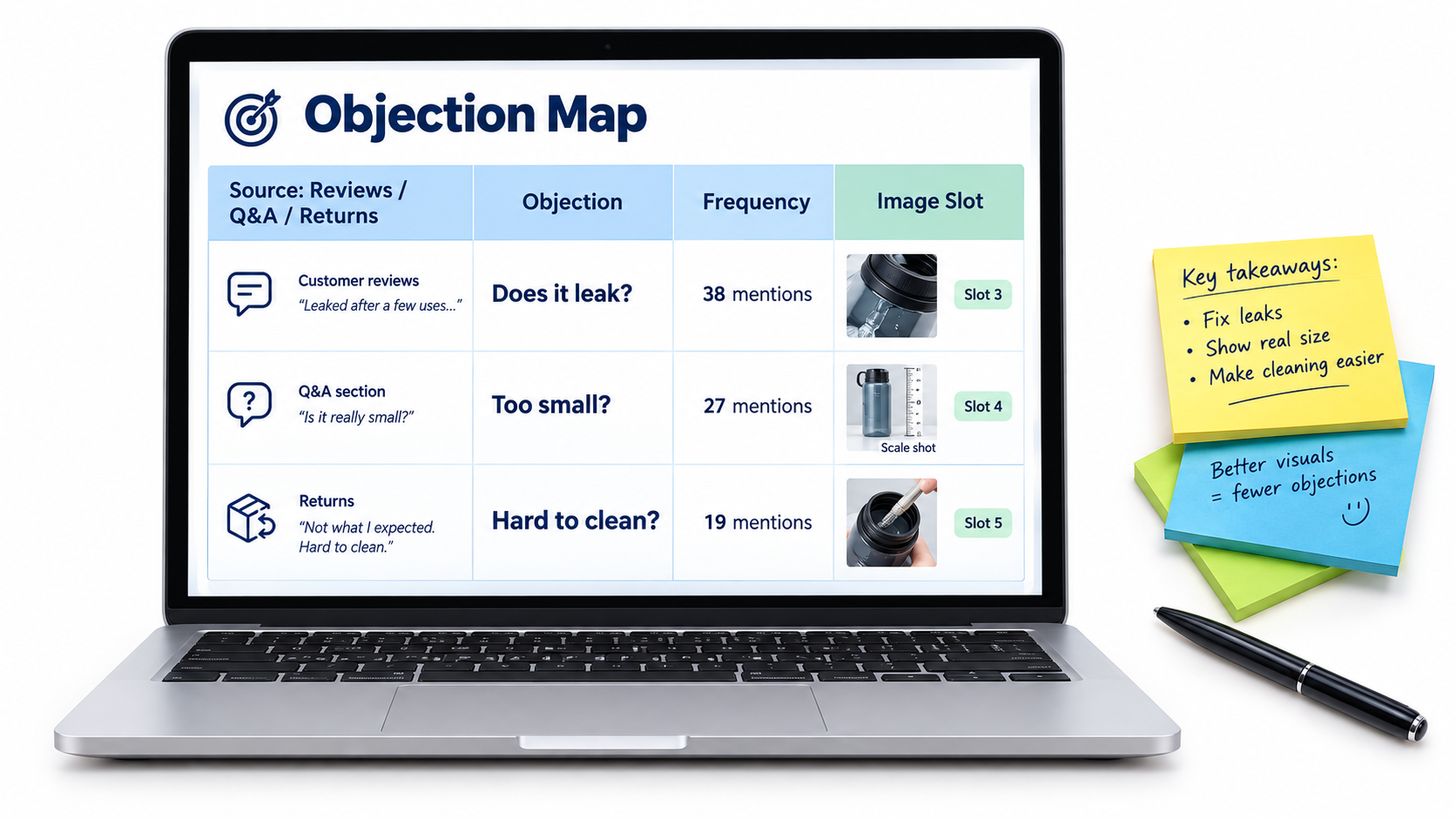
Tag: Manage Your Experiments

  • Rufus-Era Image Testing: How to Build Fast Loops That Actually Ship Winners

    Rufus-Era Image Testing: How to Build Fast Loops That Actually Ship Winners

    Most Amazon sellers treat image testing like spring cleaning — something you do once, maybe twice a year, when conversion rates slide far enough to cause real pain. Then Rufus arrived. And then Rufus became Alexa for Shopping. And quietly, without a policy announcement or a seller forum explosion, the way the platform’s AI reads and ranks product listings fundamentally shifted.

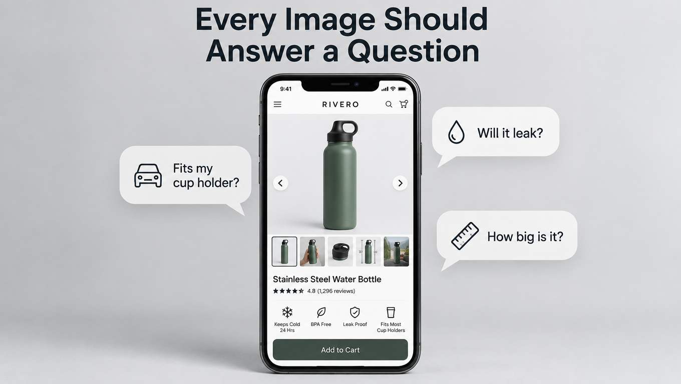
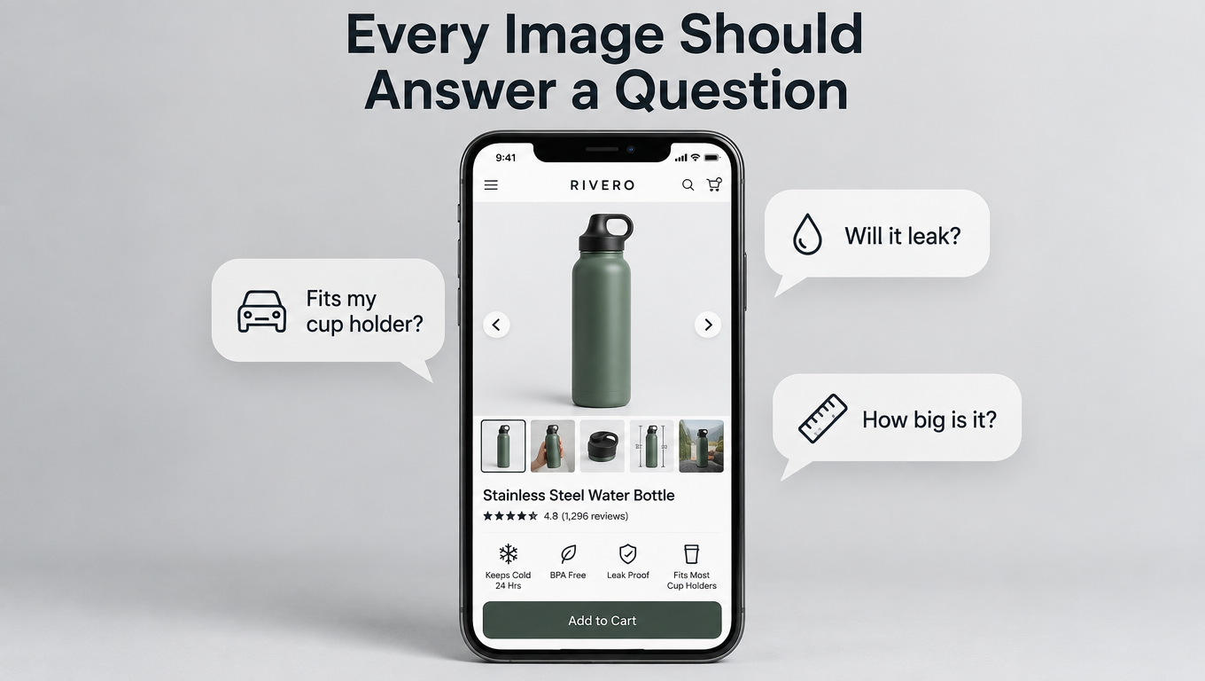
    Images are no longer just conversion assets. They are data inputs. Amazon’s shopping AI now runs optical character recognition across your packaging, applies vision-language models to understand scene context, and stitches together every image in your stack to build a holistic profile of what your product actually is — independent of whatever your title and bullets say. If your images and your copy disagree, the AI notices. If your images don’t answer the questions shoppers are actually asking, you lose the recommendation slot.

    That changes everything about how image testing should work. Not just what you test, but how fast you test it, when you ship winners, and how you build programs that compound rather than plateau. Most sellers who are running image tests at all are running them too slowly, testing the wrong variables, and waiting too long to act on results they already have. The ones pulling ahead are treating image testing as a continuous operational loop — hypothesis in, data out, winner shipped, next loop started.

    This article is about building that loop. Not the theory of it — the actual mechanics: traffic thresholds, cadence decisions, stack architecture, reading MYE results without overthinking them, and building a catalog-wide program from individual test wins.

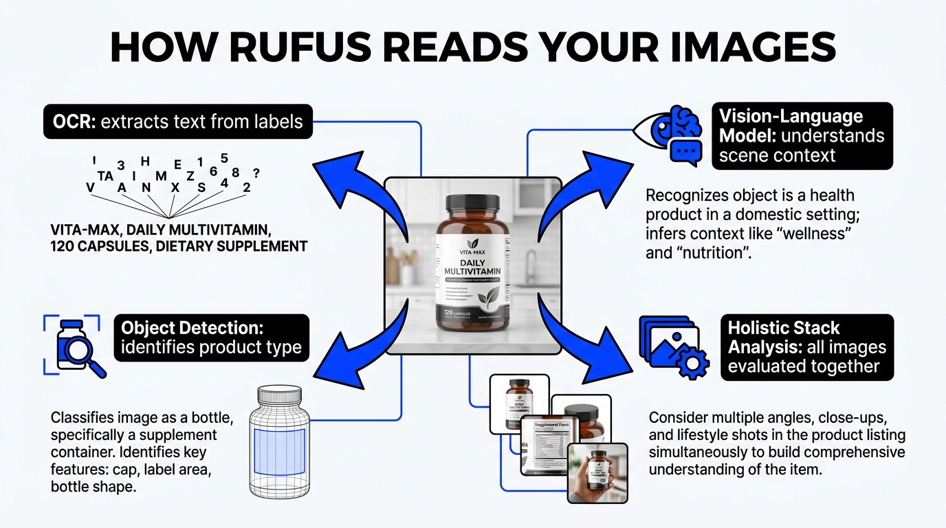
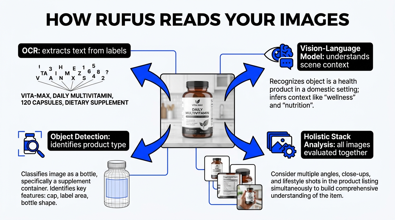
    Infographic showing how Amazon Rufus AI reads product images using OCR, vision-language models, object detection, and holistic stack analysis

    What Rufus’s Successor Actually Does with Your Images

    Amazon rebranded Rufus to Alexa for Shopping in May 2026, but the underlying multimodal AI architecture is the same, and for most sellers the rebrand is less important than understanding what the system actually does when it encounters a product listing. The short version: it reads everything, synthesizes it, and makes decisions about which products to surface based on how well the listing answers the inferred intent of a shopper’s query.

    OCR: Your Packaging Text Is Now Ranking Data

    Alexa for Shopping uses optical character recognition to extract text directly from your product images. This means the text on your label, the callouts on your infographic, the size dimensions printed on your packaging, the certifications printed in your corner badge — all of it is being read as structured data. Amazon’s computer vision stack can extract ingredient lists, feature highlights, warning labels, and dimension tables from image files with high accuracy.

    For sellers, this has an immediate implication: anything you put in text form on an image is effectively a searchable signal. A callout that reads “BPA-Free, Dishwasher Safe” on image slot three is being processed as attribute data, not just visual decoration. The question is whether that data is consistent with what your bullets and backend terms say — because inconsistencies are where the AI’s confidence in your listing drops.

    Vision-Language Models: Scene Understanding at Scale

    Beyond OCR, Amazon’s system applies vision-language models (VLMs) that jointly process the visual content of an image alongside its textual context. These models can understand that a lifestyle photo showing a woman using a yoga mat in a sunny living room signals “indoor yoga, home fitness, natural light environment” — not because of any text in the image, but because of what the model has learned about visual scenes. They understand materials, proportions, spatial relationships, and use-case contexts.

    This matters for how you structure lifestyle and context images. A lifestyle shot that shows your product in a vague, aesthetically pleasant but contextually ambiguous setting provides weak signal. A lifestyle shot that clearly communicates who uses this product, in what setting, for what purpose, provides dense signal that maps directly to shopper intent categories.

    Holistic Stack Analysis: Images Are Evaluated Together

    Perhaps the most important — and most underappreciated — aspect of how the AI processes listings is that it evaluates your images as a set, not as individual assets. The system builds a composite representation of your product from across all image slots, A+ content, and any other visual information available. This means that a strong hero image cannot compensate for a weak supporting stack. Each image either adds signal or creates noise.

    Amazon’s system handles approximately 274 million daily queries — and projections from late 2024 suggested that figure would grow to represent 35% of all Amazon searches by the end of 2025. That trajectory makes the stakes of visual optimization increasingly concrete: the AI that reads your images is mediating an enormous and growing share of product discovery.

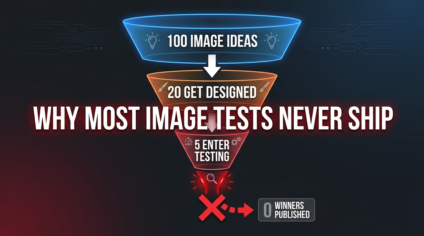
    Funnel diagram showing why most Amazon image tests never ship winners — ideas get designed but tests never reach publication

    Why Most Sellers’ Image Testing Never Ships Anything

    Before getting into what good image testing looks like, it’s worth spending time on why the default approach fails. Because the failure isn’t random — it follows a predictable pattern, and understanding it is the fastest way to stop repeating it.

    The Production Bottleneck

    The most common failure mode is a creative production bottleneck that makes the whole loop feel impossibly slow. A seller decides to test a new hero image. They brief a designer. The brief takes a week to go back and forth. The design takes another week. Review rounds take another week. By the time the variant is ready, the original moment of urgency has passed, the budget has shifted, or someone has decided to do something else. The image sits in a Google Drive folder forever.
    This is a process problem, not a creative problem. The solution is to build a testing workflow where image variants can be produced in 48–72 hours, not 2–3 weeks. This means templatized creative briefs, pre-approved brand guidelines that don’t require executive sign-off per asset, and a design partner or internal resource that treats image variants as modular components — not bespoke creative projects.

    The Wrong Variables Being Tested

    The second failure mode is testing variables that are too subtle to move the needle. Changing the position of a logo badge from the top-left to the top-right corner is not a meaningful test. Swapping between two lifestyle backgrounds that both show the same usage context is not a meaningful test. Amazon’s Manage Your Experiments tool requires enough traffic and enough data to reach statistical significance — and subtle changes that produce tiny effect sizes require enormous sample sizes to detect reliably.

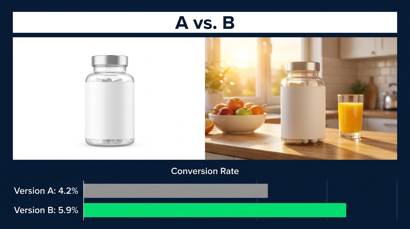
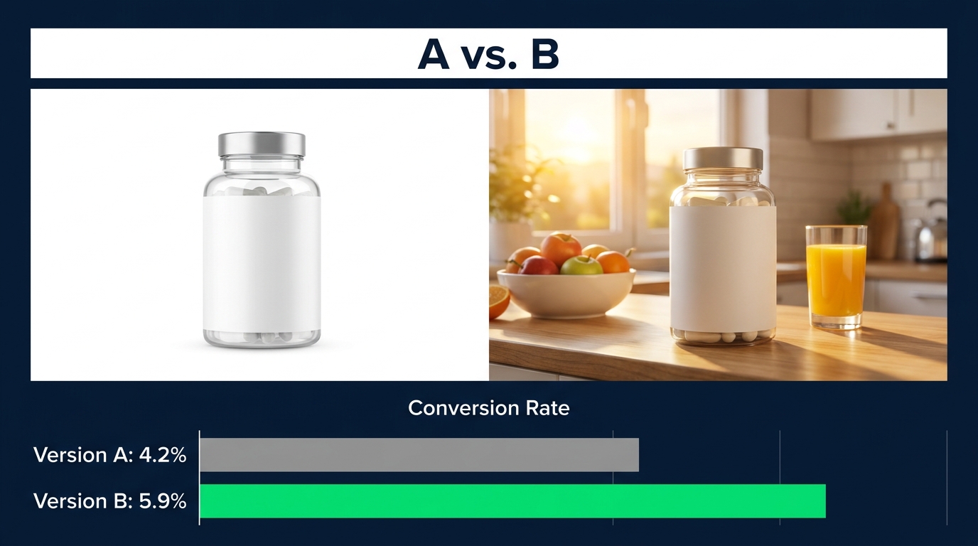
    Meaningful image tests involve clearly different hypotheses. Main image shot angle (front-facing versus angled three-quarter view) is a meaningful test. White-background product-only versus lifestyle-in-context main image is a meaningful test. Text-heavy infographic layout versus icon-driven visual layout is a meaningful test. If you can’t articulate in a single sentence what question this test is answering about shopper behavior, the test is probably not designed correctly.

    Sitting on Results Too Long

    The third failure mode — and arguably the most costly — is reaching statistical significance and then not shipping the winner. This happens for several reasons: someone wants to run additional validation, a stakeholder wasn’t looped in, the winning variant needs “a few tweaks” before going live. These delays are pure waste. The moment you have a statistically significant winner, every day you don’t ship it is a day you’re running a known-inferior image on your live listing.

    High-performing testing programs have a defined protocol for this: when the experiment declares a winner at ≥90% confidence, the winner is published within 48 hours. No committee. No additional review. Ship it, document it, and start the next loop.

    The Four-Layer Image Stack That Answers Every Shopper Question

    Before you can test effectively, you need a baseline stack that’s structured correctly. Most image stacks fail not because the individual images are bad, but because they’re not organized around the questions shoppers are actually asking. Alexa for Shopping’s AI evaluates your stack as a knowledge base — so the question is: does your knowledge base have answers to what shoppers need to know?

    The four-layer framework below isn’t the only valid structure, but it’s the one that maps most directly to how the AI processes listings and how shoppers navigate the image carousel.

    Layer 1: The Primary Hero — Machine-Readable and Click-Compelling

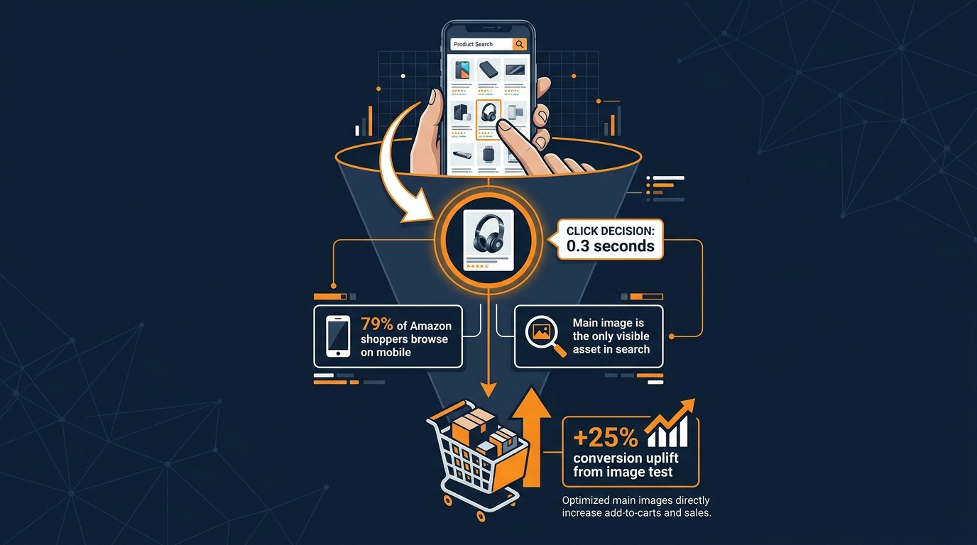
    The main image has two jobs that operate at slightly different timescales. In the short term, it drives click-through from search results — it needs to make a shopper stop scrolling and choose your product over the five others on screen. In the medium term, it’s the first frame Alexa for Shopping’s AI encounters, and it needs to communicate product category, form factor, and product identity clearly enough that the AI can classify your ASIN correctly.

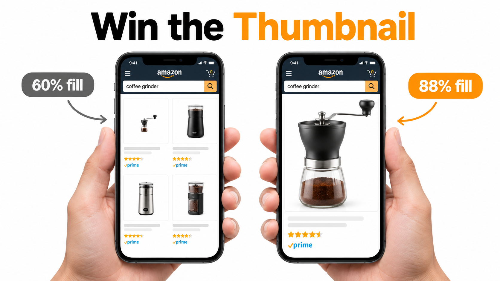
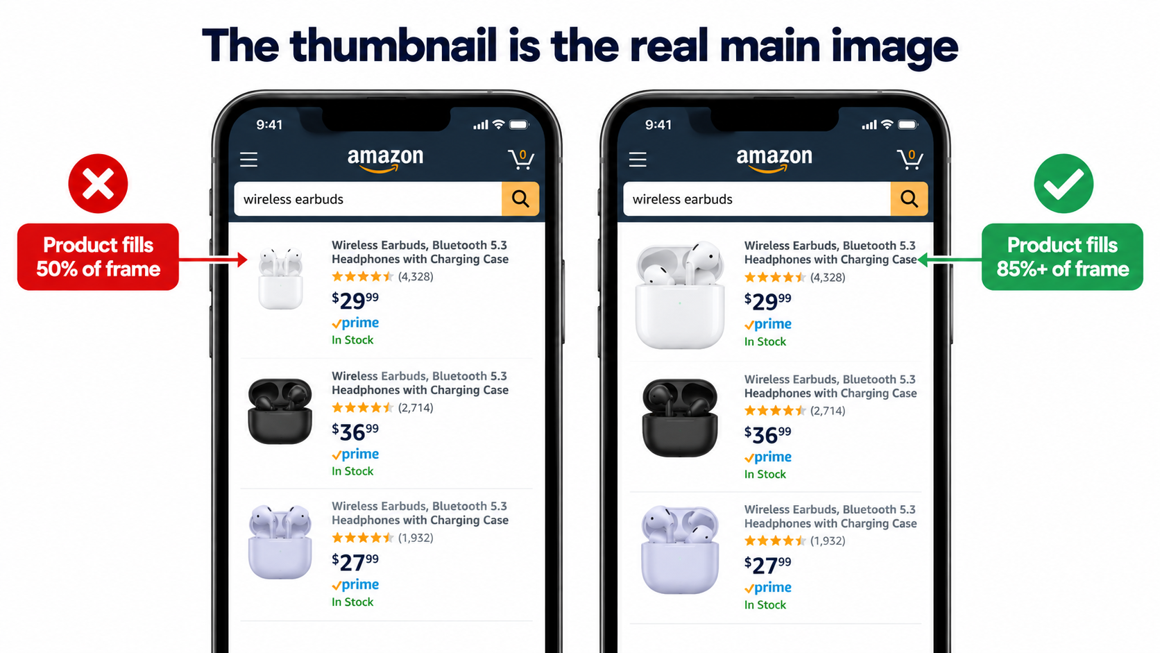
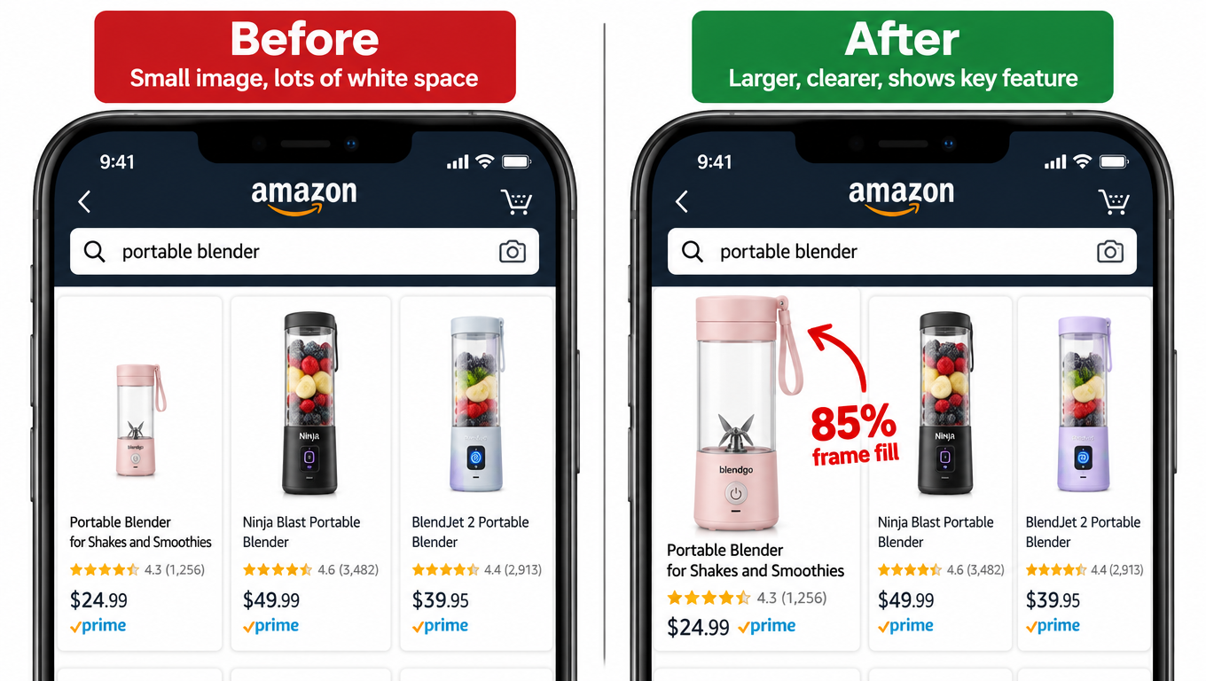
    Amazon’s guidelines require a white background for main images in most categories, and that constraint is actually useful: it forces the product to do the visual work. Strong primary images show the product in its most recognizable form, at a size that fills 85%+ of the image frame, with no clutter that could confuse either the human shopper or the machine vision system. Color accuracy matters here — visual search queries match by color and shape, and a hero image that misrepresents your product’s actual appearance creates downstream trust problems.

    Layer 2: Feature Callout Infographics — OCR-Optimized Text in Images

    The infographic images in slots two through four are where OCR-readable signals live. These are your opportunity to embed product attributes in a format the AI extracts as structured text: dimensions, materials, certifications, key ingredients, compatibility specifications. The design principle here is legibility at machine scale, not just at human scale. Text that’s stylized, low-contrast, or set against a complex background is harder for OCR to parse cleanly.

    Strong callout infographics use high-contrast text (black on white, or white on a solid brand color), a logical hierarchy from primary claim to supporting detail, and specific language that matches how shoppers search. “Fits most 5–7 inch wrists” is more useful to both the AI and the shopper than “adjustable size.” “FDA-registered facility, third-party tested” is more useful than “premium quality.”
    Layer 3: Lifestyle and Use-Case Context — Intent Signal for the AI

    Lifestyle images serve a dual purpose that’s often misunderstood. Sellers think of them primarily as aspirational — showing the product in an attractive setting to help shoppers imagine owning it. That’s still true and still important. But in the Alexa for Shopping era, lifestyle images also provide the AI with use-case context that it maps to shopper intent categories.
    A lifestyle image showing your protein powder being used immediately after a gym session, with athletic gear visible in the frame, communicates “post-workout supplement for fitness-focused buyers.” The AI can map that scene context to queries like “protein powder for after gym” or “post-workout recovery supplement” — and use that mapping to inform recommendations. The more specifically your lifestyle images communicate who, when, where, and why, the more precisely they can match to real shopper intent.

    Layer 4: Trust and Comparison Frames — Differentiation Signals

    The final layer covers comparison images, before/after demonstrations, size reference shots, and social proof visuals. These images serve the shopper who is evaluating your product against alternatives — which is precisely the moment when Alexa for Shopping is most actively involved, since comparison queries (“which protein powder has the most protein per serving”) are a core use case for the AI assistant.

    Comparison images that clearly show how your product differs from the generic category option — on dimensions shoppers care about — provide the AI with differentiation signals it can use when answering comparison questions. This is not about bashing competitors; it’s about making your advantages legible to a system that’s trying to match products to shopper priorities.

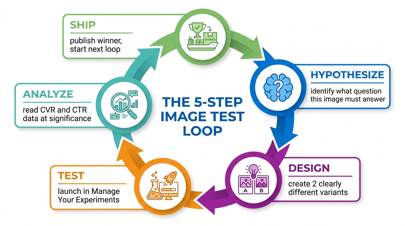
    Circular 5-step image testing loop diagram: Hypothesize, Design, Test, Analyze, Ship — for Amazon product image optimization

    Building the Testing Loop: From Hypothesis to Live Winner

    The most important shift in how high-performing Amazon brands approach image testing in 2026 is treating it as a repeating operational loop, not a project with a start and end date. Projects get deprioritized. Loops run regardless of what else is happening. The distinction sounds abstract until you see the catalog-level performance gap between brands that have internalized it and those that haven’t.

    Step 1: Write the Hypothesis Before You Brief the Designer

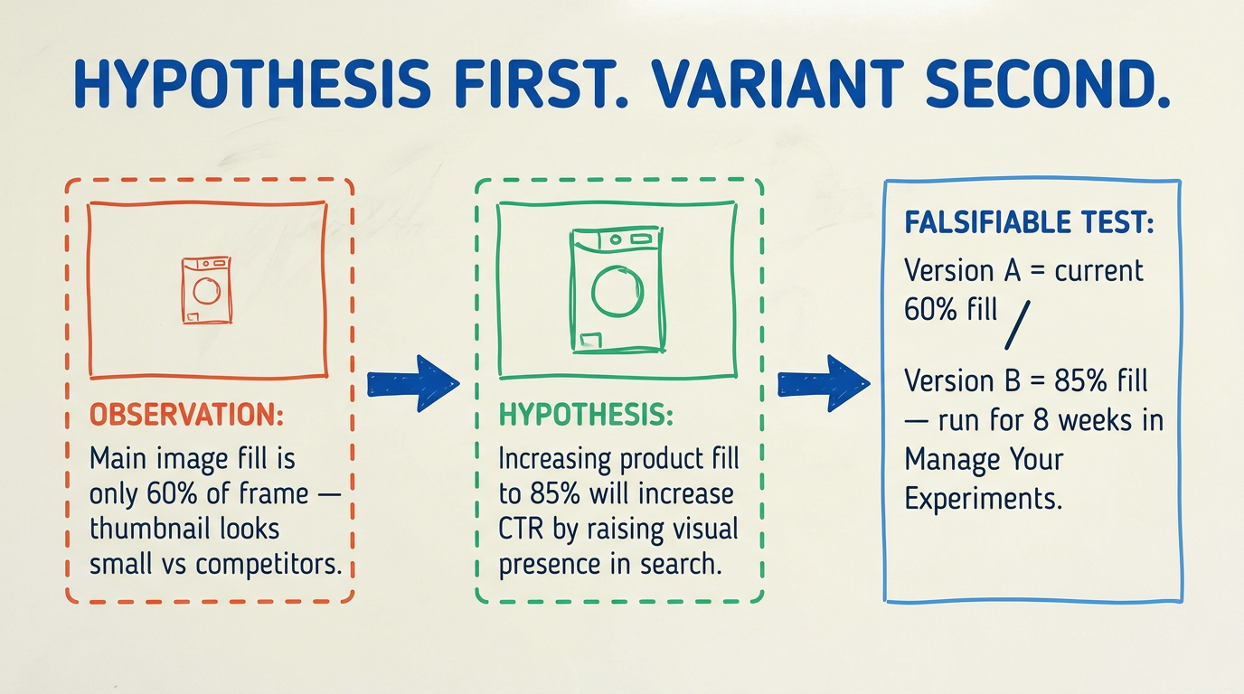
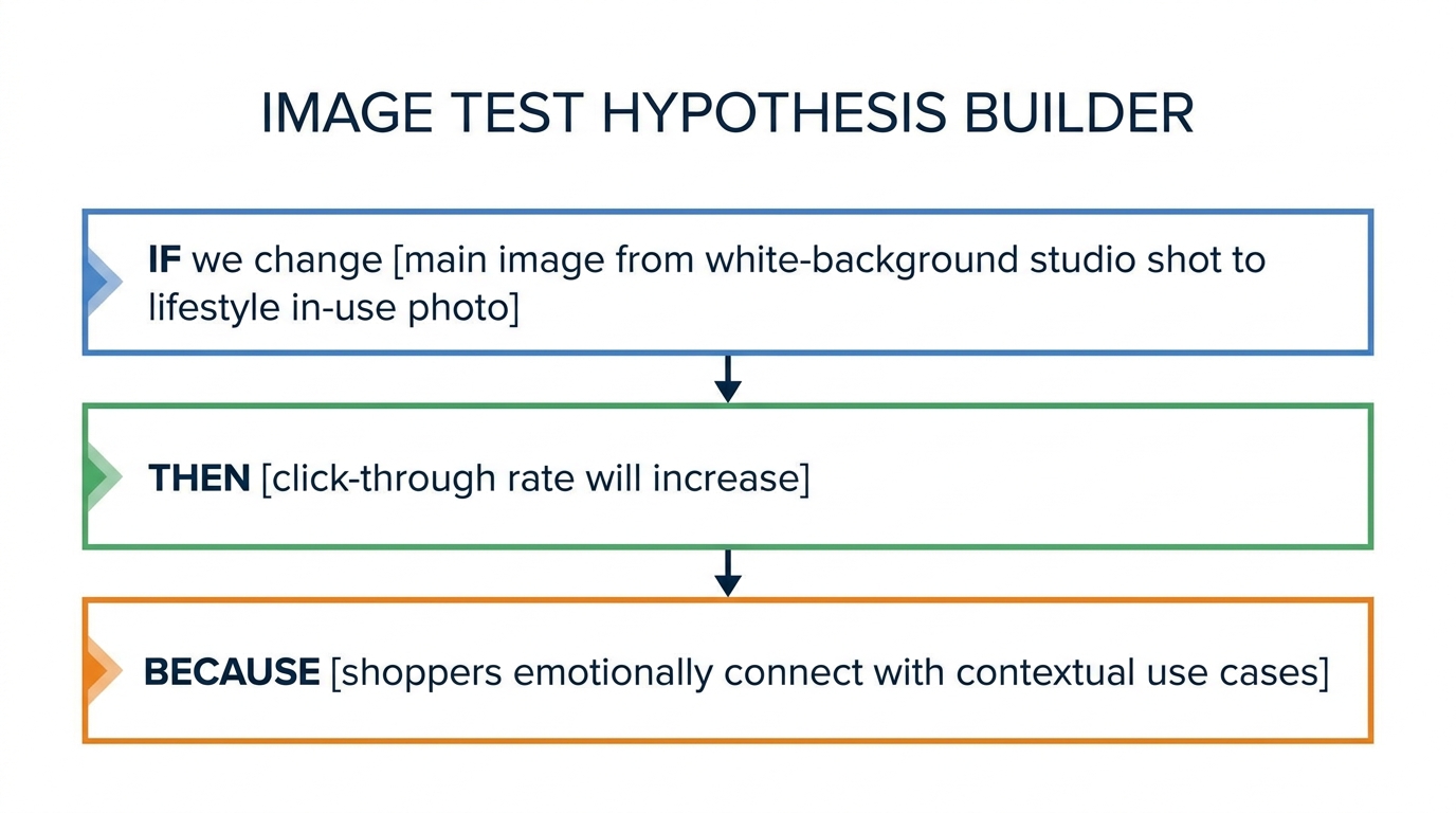
    Every image test starts with a written hypothesis that follows a simple structure: “We believe that [specific change] will [specific outcome] because [specific shopper behavior rationale].” For example: “We believe that showing the product alongside a size reference object (a hand, a common household item) will increase click-through rate because search results make size ambiguous and shoppers are currently buying and returning due to size mismatch.”

    This discipline does two things. First, it forces you to connect the visual change to a shopper behavior — which prevents tests based on aesthetic preference rather than conversion logic. Second, it gives you a clear signal to look for in results. When the experiment ends, you’re not staring at a dashboard trying to decide what the data means. You know exactly what you expected and whether the data confirms or challenges it.

    Step 2: Design Two Clearly Different Variants

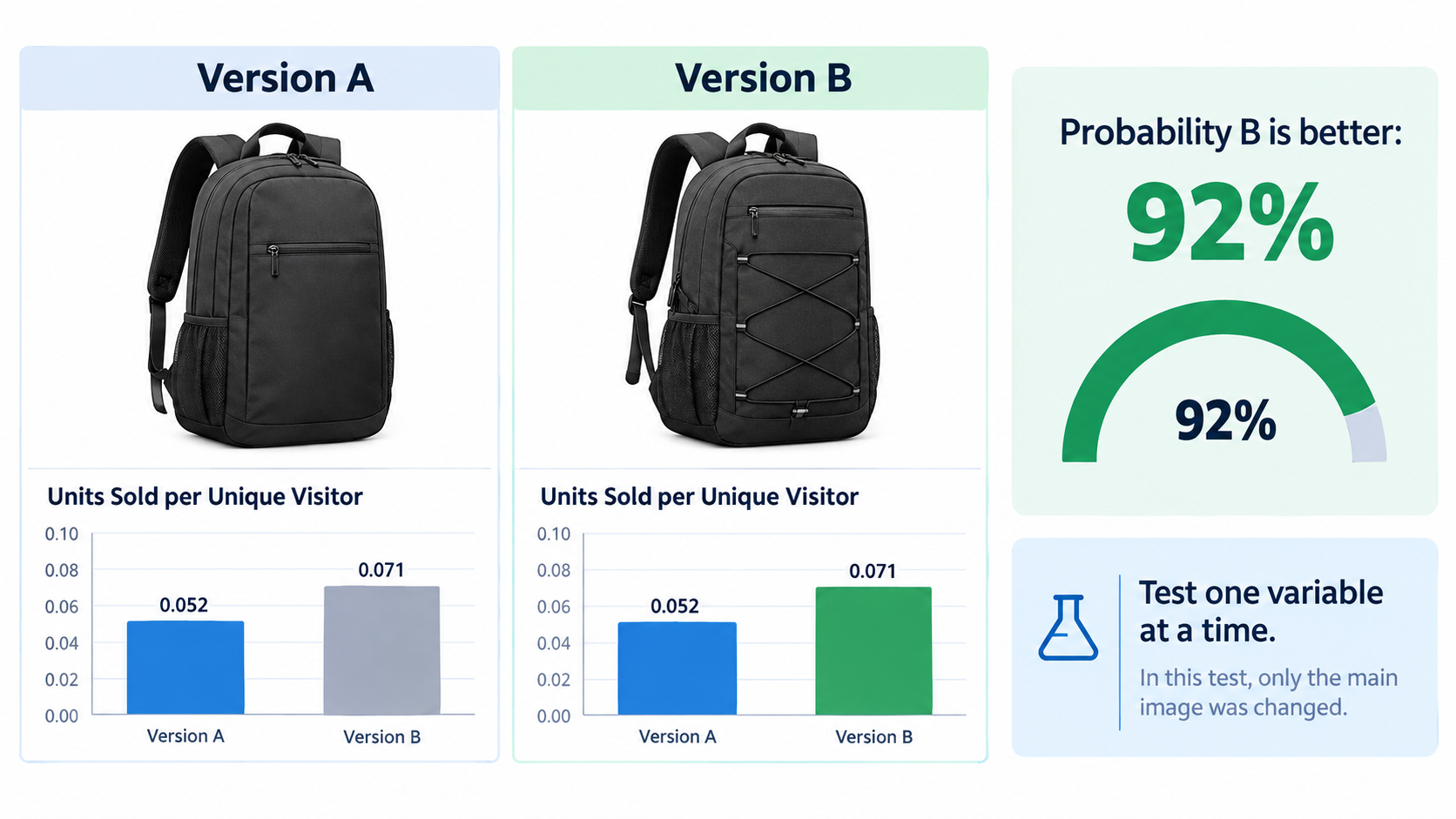
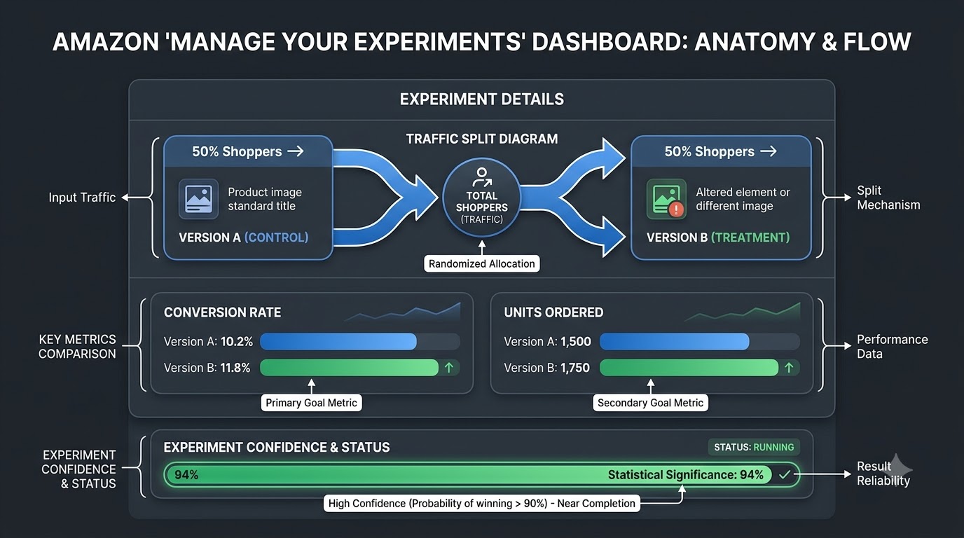
    Manage Your Experiments runs as an A/B test: control versus variant. Your job in the design phase is to make the variant meaningfully different from the control — different enough that the test can detect a real effect. The practical guideline is that if you can’t describe the difference in a single sentence of plain English, the variants aren’t different enough.

    Modular design systems make this fast. If your brand has pre-built template layers for callout badges, color backgrounds, text styles, and product angles, swapping between variants becomes a 30-minute Figma task rather than a multi-week design engagement. Building this infrastructure upfront is the single highest-leverage investment teams can make to accelerate their testing cadence.

    Step 3: Launch the Experiment with Guardrails

    Before launching, establish three things: the metric you’re optimizing for (conversion rate for most image tests; click-through rate for main image tests), the confidence threshold you’ll accept (90% minimum; 95% for decisions with major operational implications), and the “no-touch” rules for the test period — no pricing changes, no major PPC bid shifts, no title edits, no inventory disruptions if avoidable. Any of these changes introduce confounding variables that make results harder to interpret.

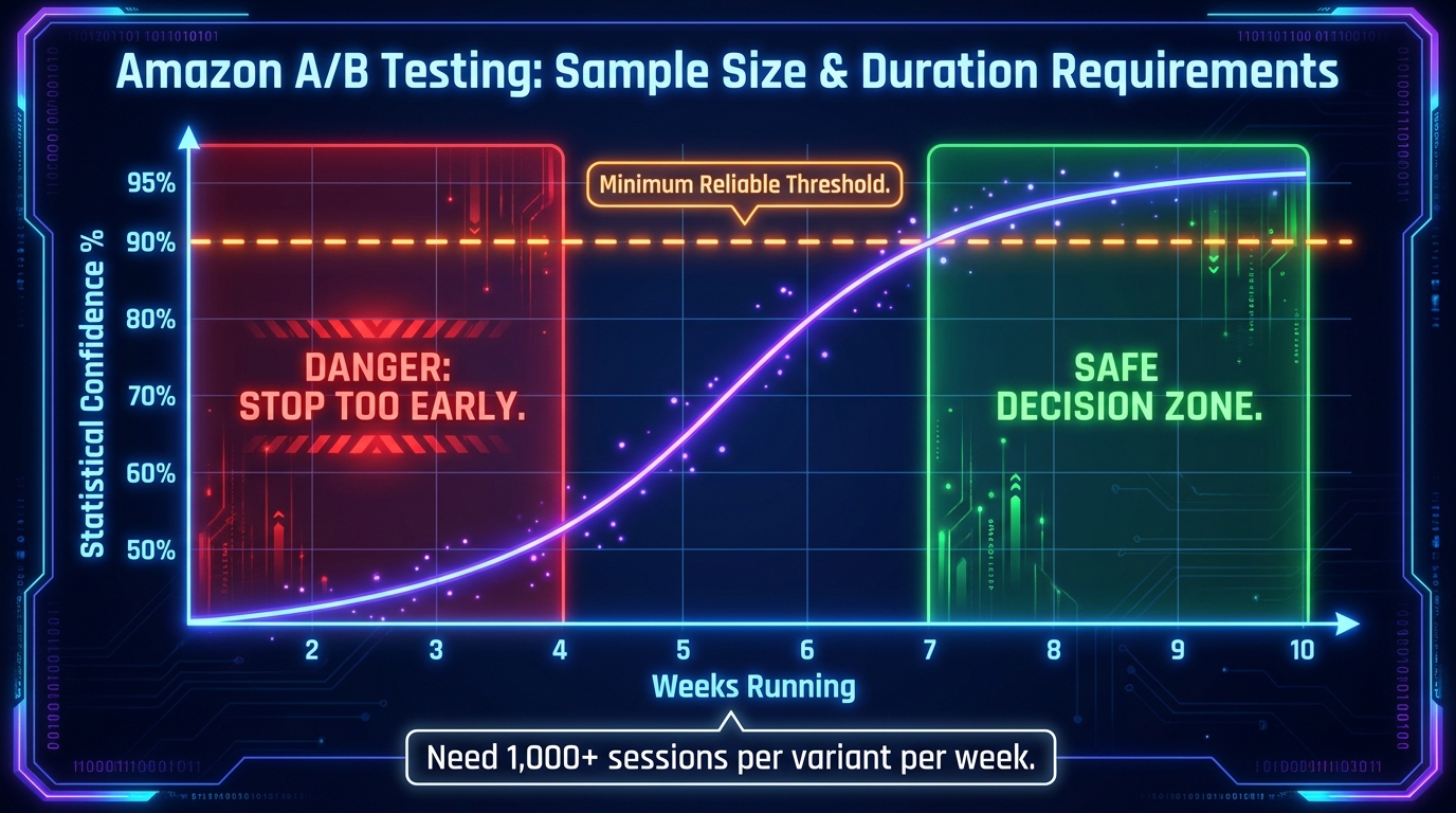
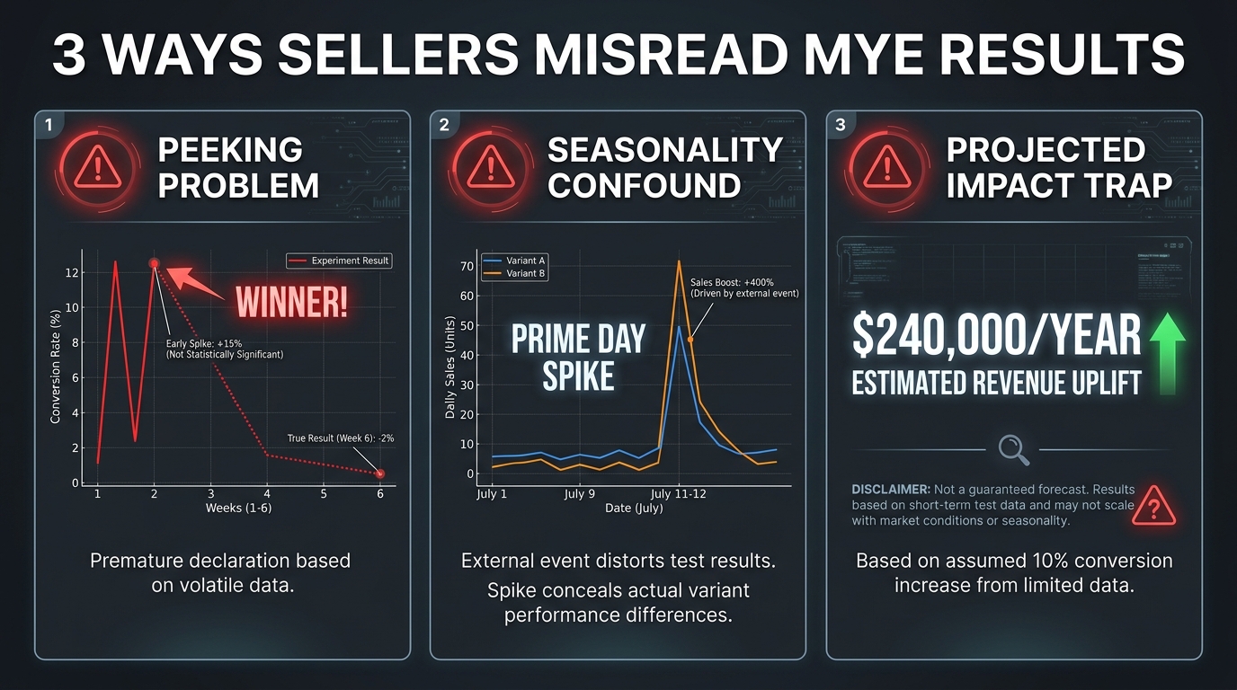
    Amazon’s MYE platform handles randomized traffic splitting automatically. Once the experiment is live, the temptation to check results daily and draw early conclusions is real — resist it. Early data is noise, not signal. Build a calendar reminder to review results at the four-week mark for high-traffic ASINs, and at the eight-week mark for mid-traffic ASINs.

    Step 4: Read the Data at Significance — Then Stop Analyzing

    MYE will tell you when a winner has been declared with statistical confidence. At that point, the analysis phase should take no more than 30 minutes: confirm the winning variant, document what changed and why it likely performed better, and record the effect size. The last point — effect size — matters because 3% conversion lift on a $2M annual revenue ASIN is a very different decision than 3% lift on a $50K ASIN.

    Step 5: Ship the Winner Within 48 Hours

    This is the step where most teams lose time and money. Once a winner is declared, publish it immediately. Assign one person the explicit responsibility of pressing the “publish winner” button within 48 hours of significance being declared, and track whether that SLA is being met. If it consistently isn’t, the workflow has a process problem that needs to be fixed at the team level.

    Traffic Thresholds and Statistical Reality: When Your ASIN Can Actually Run Tests

    One of the most common mistakes in Amazon image testing programs is applying the same cadence and approach to all ASINs regardless of traffic volume. Statistical significance in A/B testing is fundamentally a function of sample size — and your sample size is bounded by your traffic. An ASIN with 200 sessions per week cannot generate meaningful image test results in any reasonable timeframe. The math won’t allow it.

    The Minimum Viable Traffic Threshold

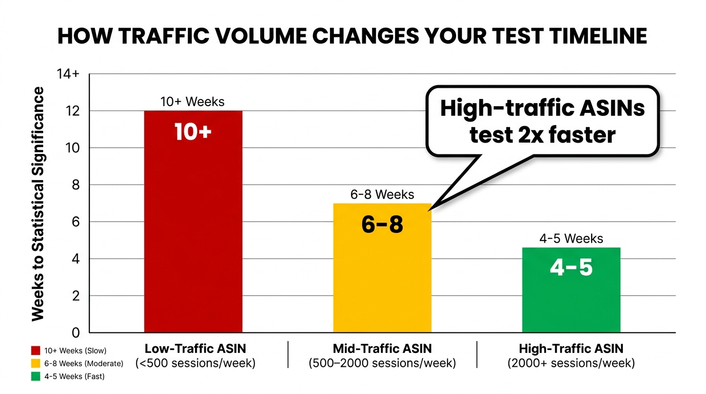
    Amazon’s own guidance and practitioner consensus in 2026 point to approximately 1,000 detail page views per variant per week as the threshold at which image tests can reach significance in a reasonable window. Below this threshold, tests run for 10+ weeks without clearing significance — and 10+ weeks of frozen creative is a long time in a competitive catalog environment.

    In practice, this means that most brand catalogs have a small number of ASINs that are genuinely testable in a productive timeframe, and a much larger number that are not. Accepting this reality — and concentrating testing resources on the ASINs that can actually generate clean data — is a better strategy than running underpowered tests across everything.

    Segmenting Your Catalog by Test-Readiness

    A useful exercise is to segment your catalog into three tiers based on weekly session volume:

    • Tier 1 (2,000+ sessions/week): Full MYE testing capability. These ASINs can reach significance in 4–5 weeks. Run a continuous testing program — one experiment ending, the next beginning. Target 4–6 completed tests per year per ASIN.
    • Tier 2 (500–2,000 sessions/week): MYE testing is viable but slower. Plan for 6–8 week test windows and prioritize the highest-impact variables only (main image first, then the most-viewed secondary slot). Target 2–3 tests per year.
    • Tier 3 (<500 sessions/week): Direct MYE testing is impractical for generating statistically valid results in a useful timeframe. For these ASINs, apply winning patterns learned from Tier 1 and Tier 2 tests without running independent experiments. Update images based on catalog-wide learning rather than ASIN-specific data.

    This tiered approach lets you run a disciplined program that generates real data where it’s possible, and applies that data intelligently where it isn’t.

    Bar chart showing how ASIN traffic volume determines testing timeline — high-traffic ASINs reach significance 2x faster than low-traffic ones

    Weekly vs. Quarterly Cadence: Matching Test Speed to ASIN Volume

    A question that generates a lot of debate in seller communities is how frequently you should be testing. The answer is that “testing cadence” conflates two different things that need to be treated separately: how frequently you launch new experiments, and how frequently you refresh creative assets whether or not you’re formally testing them.

    The Formal Testing Cadence

    For Tier 1 ASINs with genuinely high traffic, a continuous loop is the target state: the moment one experiment concludes and a winner is published, the next experiment is briefed and in design. In practice, this means your Tier 1 ASINs are in active experimentation roughly 80% of the time. You’re never sitting on stale creative for more than a few weeks.

    For Tier 2 ASINs, a quarterly cadence is more practical — one focused test per quarter, structured around the most impactful variable at that point in the ASIN’s lifecycle. New ASINs start with main image tests. Mature ASINs with strong main images move to secondary stack testing. Declining ASINs with competitive pressure get comparison and differentiation image tests.

    The Creative Refresh Cadence

    Separate from formal testing, many practitioners recommend a 7–14 day creative refresh cycle for Sponsored Brands and Sponsored Display ad creative — not necessarily changing what’s on the detail page, but rotating ad creative to combat performance fatigue. High-performing Amazon ad teams are testing 20–50 creative variations per week across campaigns. That’s not happening through MYE; it’s happening through ad creative rotation and sponsored ad A/B testing tools.

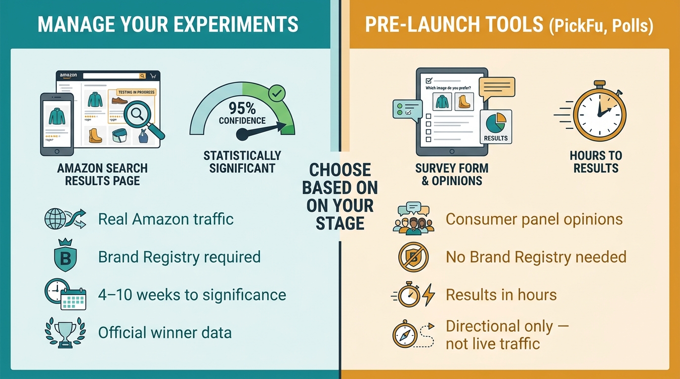
    The key distinction: ad creative testing moves at weekly cadence, generating directional signal fast. Detail page image testing moves at the pace of statistical validity, which is 4–10 weeks minimum. Both programs feed each other — ad creative tests often reveal which visual hooks drive click-through, informing the next main image test hypothesis.

    Building the Annual Testing Calendar

    The most mature teams build a 12-month testing calendar at the start of each year. For Tier 1 ASINs, map out the sequence of experiments: main image first, then infographic slot, then lifestyle sequence, then A+ content. Budget assumes one test is always active. For Tier 2 ASINs, slot one test per quarter around seasonal demand — don’t test lifestyle images right before peak season; complete that test before the traffic surge so you’re running the winning image during your highest-volume weeks.

    Timing matters more than most sellers account for. An image test running during a period of unusual traffic (Prime Day, Black Friday, holiday peak) produces results contaminated by atypical purchase behavior. The cleanest test windows are in the weeks surrounding — but not during — peak demand events.

    What a Winning Rufus-Aware Image Actually Contains

    With a solid understanding of the testing loop and cadence, it’s worth getting specific about the anatomy of images that tend to win both with human shoppers and with Alexa for Shopping’s AI. These aren’t aesthetic principles — they’re functional specifications derived from how the AI processes visual data.

    The Main Image: Three Technical Requirements

    First, product fill rate. The product should occupy at least 85% of the image frame. Amazon’s algorithm uses product size relative to frame as a signal of listing quality; undersized products suggest low-effort photography. From a conversion standpoint, larger products show more detail and reduce uncertainty.

    Second, color accuracy. Amazon’s visual search system matches products by color as well as shape. A hero image that makes a navy product look black, or a cream product look white, will misalign with visual search queries and create return rates from customers who received something different from what they expected. Photography conditions and post-processing should preserve actual product color.

    Third, shadow and background treatment. Clean white background with natural drop shadow is the standard, but the quality of that background matters — compressed artifacts, off-white backgrounds, or poorly masked edges all degrade the machine vision system’s ability to classify the product cleanly. Professional photography or consistent high-quality CGI rendering outperforms amateur product shots even when the exposure and composition look similar to the naked eye.

    Secondary Images: The Legibility Checklist

    For infographic and callout images, run through this checklist before uploading:

    • Text contrast ratio: Any text in the image should meet WCAG AA accessibility standards at minimum — this ensures OCR extraction reliability, not just human readability.
    • Claim specificity: “Lasts 3x longer” is weaker than “Lasts 6 hours on a single charge.” Specific claims are more useful to the AI as structured attributes and more persuasive to shoppers.
    • Visual hierarchy: The primary claim should be the largest element. Supporting details should be clearly subordinate. A visually flat infographic where everything competes equally gives both shoppers and the AI insufficient guidance on what’s most important.
    • Consistency with bullets: Every claim made visually in an image should be substantiated by the bullet copy. The AI checks for alignment between visual and text content; inconsistencies reduce confidence scores.

    Lifestyle Images: Context Density Over Aesthetics

    The single most actionable change most sellers can make to their lifestyle images is to increase context density. A lifestyle image shot in a beautiful but ambiguous setting — marble countertops, soft focus background, warm lighting — communicates atmosphere but not use-case. A lifestyle image showing the product actively being used, by a clearly defined person, in a clearly defined setting, for a clearly identifiable purpose, generates far more signal for the AI and far more confidence for the shopper.

    Context density doesn’t mean cluttered images. It means intentional specificity: choose one clear use case per lifestyle image, make it unmistakable, and make it the one that maps to your highest-converting shopper segment.

    From Data to Decision: How to Read MYE Results Without Overthinking Them

    One of the practical problems with running more experiments is that teams can develop a kind of analysis paralysis — staring at MYE dashboards, second-guessing results, and waiting for certainty that statistical testing, by its nature, can never fully provide. The goal is disciplined confidence, not certainty.

    The Three-Number Read

    When reviewing an experiment’s results, focus on three numbers: conversion rate for each variant, statistical confidence level, and effect size. That’s it. Other metrics — session counts, clickthrough rates at the ad level, revenue per session — can be informative context, but the primary decision should rest on whether the winning variant converts better at a confidence level you’ve pre-committed to accepting.

    If the experiment declares a winner at ≥90% confidence and the effect size is meaningful for your volume, ship the winner. If the experiment concludes without declaring a winner, that’s also information — it means the variants you tested aren’t sufficiently different in their impact on conversion, and your next test needs a bolder hypothesis.

    Understanding Inconclusive Results

    Inconclusive results (no winner declared) are significantly undervalued by most sellers. They tend to be treated as wasted effort, but they’re actually telling you something specific: the variable you tested doesn’t drive the conversion difference you need. This is enormously useful for prioritization. If two main image variants — one with the product on a white background and one with a complementary color background — produce no significant difference, that’s a strong signal that background treatment isn’t your conversion bottleneck, and you should move on to testing something else.

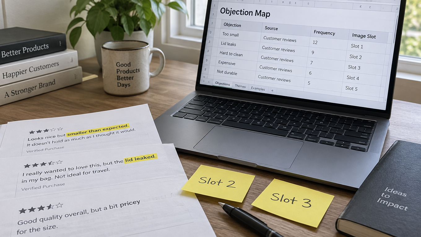
    Build a shared document that logs every experiment: hypothesis, variants, traffic volume, outcome (winner, no winner), effect size, and what you’re testing next as a result. After 8–12 experiments, patterns emerge. Certain variable categories consistently drive effects; others consistently don’t. This accumulated learning is the most valuable asset a mature testing program produces.

    The Documentation Protocol

    Document the following for every experiment, win or loss:

    1. ASIN and traffic tier
    2. Image slot tested (main, slot 2, slot 3, etc.)
    3. One-sentence hypothesis
    4. Description of control and variant
    5. Test duration and peak weekly sessions during test
    6. Outcome and confidence level
    7. Effect size (conversion rate delta)
    8. Action taken and date shipped (if winner)
    9. Next hypothesis derived from this result

    This takes 10 minutes to complete per experiment and becomes invaluable when onboarding new team members, briefing agency partners, or making the case to leadership that the testing program is generating measurable returns.

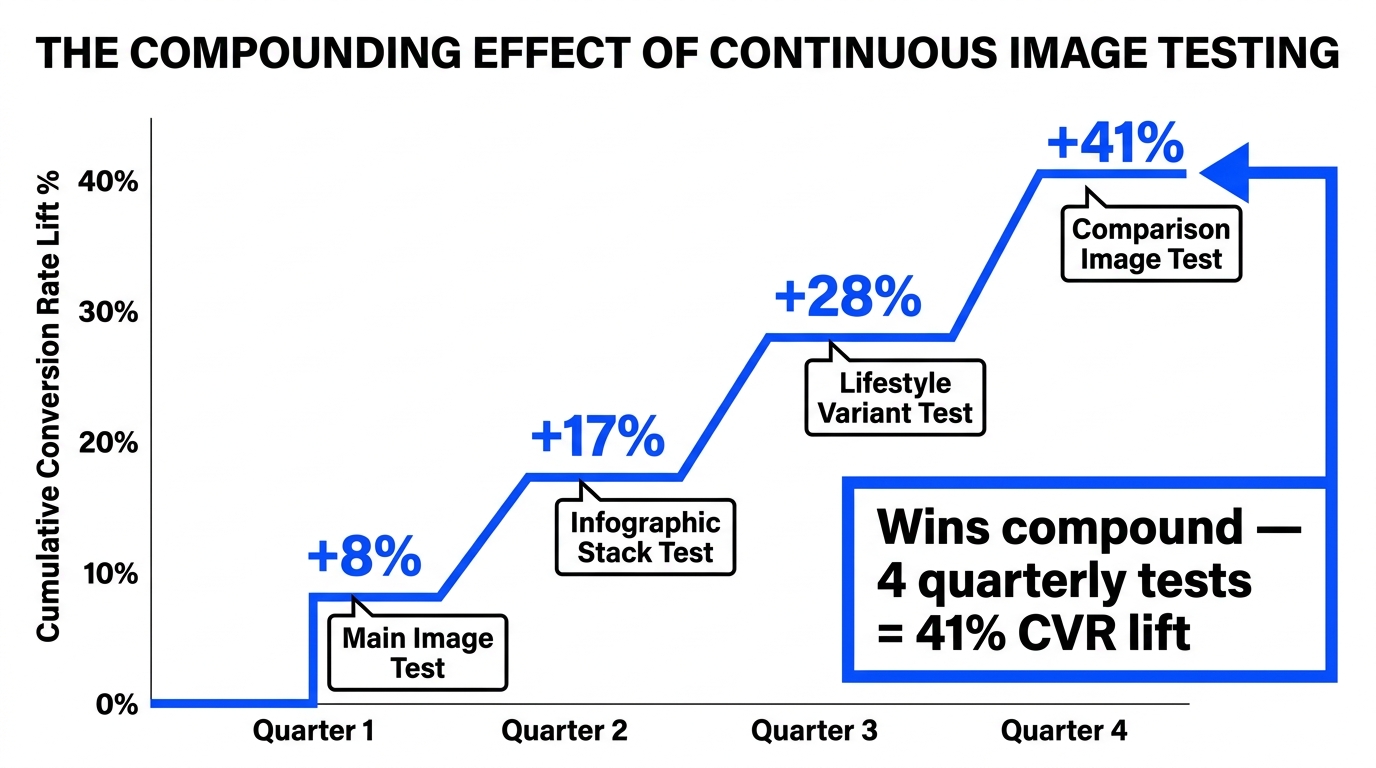
    Line chart showing the compounding effect of continuous Amazon image testing over four quarters — cumulative conversion rate lift grows from 8% to 41%

    Compounding Gains: Turning One-Off Tests Into a Catalog-Wide Program

    The difference between a seller who runs image tests and a seller who has an image testing program is compounding. Individual tests produce individual improvements. A program produces a learning infrastructure that makes each subsequent test more informed, each subsequent winner more impactful, and each dollar of testing investment worth progressively more.

    How Compounding Works in Practice

    Consider a straightforward example. A Tier 1 ASIN runs four experiments over the course of a year: main image test, infographic slot test, lifestyle variant test, and comparison image test. Each experiment, independently, produces a 6–8% lift in conversion rate. But these lifts are multiplicative, not additive — a 7% lift applied to a base that’s already been lifted 7% produces a cumulative improvement of approximately 15%, not 14%. Four experiments with 7% average lifts compound to roughly 31–35% total improvement in conversion rate over the year.

    That arithmetic is why sellers who maintain consistent testing programs accumulate structural advantages over competitors who test sporadically. The compounding effect isn’t dramatic in any single quarter, but over two to three years it creates a listing quality gap that’s very difficult for a competitor to close quickly.

    Applying Catalog-Wide Learning

    The second compounding mechanism is cross-ASIN learning. When a main image hypothesis wins consistently across multiple Tier 1 ASINs — say, product shown in use versus product shown in isolation — you can apply that winning principle to all Tier 2 and Tier 3 ASINs without running independent experiments on each. The Tier 1 tests function as the research; the rest of the catalog benefits from the findings.

    This requires treating your testing log as a shared knowledge base rather than ASIN-specific records. Build monthly or quarterly reviews where you extract cross-ASIN patterns from the past period’s experiments and update your brand image standards accordingly. Over time, your “default good image” evolves based on actual conversion data from your own catalog — not generic best practices from industry blogs (including, for the record, this one).

    Feeding Test Results Into Advertising Creative

    Image test winners from MYE should feed directly into your Sponsored Brands and Sponsored Display creative. The image that converts best on the detail page is, by definition, your strongest visual asset — it belongs in ad creative too. Teams that maintain this feedback loop between organic listing tests and paid creative see alignment benefits in both directions: organic improvements confirmed by test data, ad creative validated by conversion evidence.

    The Consistency Trap: Why Images and Copy Must Align for the AI to Trust Your Listing

    As image testing programs mature, there’s an underappreciated risk that grows alongside them: inconsistency between what your images say and what your copy says. Each time you update an image, there’s a chance that the new visual content drifts out of alignment with your bullets, title, or backend terms — and in the Alexa for Shopping era, that misalignment is a real problem.

    Why the AI Penalizes Inconsistent Listings

    Alexa for Shopping’s AI synthesizes signals from multiple sources — images, bullets, title, Q&A, reviews, and browsing behavior — to build its understanding of what a product is and what queries it should match to. When those sources conflict (an image callout says “500mg per serving” but the bullet says “400mg per serving”; an image shows the product as black but the title says “charcoal gray”), the AI’s confidence in the listing drops. Lower confidence means lower probability of being recommended for ambiguous or competitive queries.

    This isn’t theoretical. Practitioners testing listings against the AI shopping assistant have observed that listings with clean consistency between visual and text content answer shopper queries more reliably than listings with internal contradictions, even when the product is substantively the same.

    Building the Consistency Audit Into Your Testing Process

    Add a consistency check as a mandatory step before every image update, not just when launching a formal experiment. The check is simple: for every claim made in the new image, verify that claim is supported in the bullet copy. For every attribute shown visually in the new image, verify it’s represented in the backend search terms. For every lifestyle context in the new image, verify the usage context is addressed in the product description.

    If the image contains information not reflected in copy, update the copy too — or remove the claim from the image. Asymmetric information (image says more than copy supports) is a common source of AI confidence problems and, more practically, customer complaints when reality doesn’t match the image’s claims.

    The Quarterly Consistency Review

    For catalogs with more than 20 active ASINs, build a quarterly review specifically focused on listing consistency. Pull each ASIN’s current image stack alongside its current bullet copy and check for drift that has accumulated through incremental updates. This review tends to find artifacts of old test variants that were never fully cleaned up, seasonal image swaps that weren’t matched with copy updates, and product changes (formulation, packaging, sizing) that the images haven’t yet caught up to.

    Consistency isn’t just an AI optimization concern — it’s a customer experience concern. Shoppers who receive a product that matches every visual and textual promise made in the listing return less and review better. Both of those outcomes feed into the ranking signals that determine whether your ASIN keeps its position in competitive search results.

    The Operational Infrastructure That Makes All of This Possible

    Everything discussed in this article — tight testing loops, fast winner shipping, catalog-wide learning, consistency audits — requires an operational infrastructure that most sellers haven’t explicitly built. The testing strategy and the operational infrastructure are inseparable. Without the infrastructure, the strategy is aspiration.

    The Three Non-Negotiable Infrastructure Pieces

    1. A modular creative system. Your brand needs pre-approved templates for each image slot type: hero template, callout infographic template, lifestyle template, comparison template. These templates don’t eliminate creativity — they eliminate the parts of the design process that don’t add creative value (establishing brand colors, setting up file dimensions, building grid structures, exporting in correct formats). With modular templates, producing a new image variant should take hours, not days.

    2. A centralized testing log. Every experiment, documented as described in the earlier section, stored in a location that’s accessible to everyone who touches listing content — internal team, agency partners, freelance designers. Without centralized documentation, insights stay with individuals and disappear when people leave or shift roles.

    3. A defined RACI for winner shipping. Who is Responsible for pressing publish? Who is Accountable if a winner sits unshipped for more than 48 hours? Who is Consulted before a winner goes live (if anyone)? Who is Informed after a winner ships? The answer to each question should be a specific named person, not “the team.” Teams don’t ship; people ship.

    Tools That Accelerate the Loop

    Amazon’s native Manage Your Experiments platform is the primary tool for detail page testing. It’s free, it’s integrated with real listing data, and its traffic splitting and significance calculations are reliable enough for making real business decisions. The main limitation is that it requires Brand Registry and sufficient traffic — which is why the tiering framework matters.

    For ad creative testing — which moves faster and doesn’t require the same traffic thresholds — Amazon’s native creative A/B testing within Sponsored Brands campaigns provides rapid directional signal. Third-party tools like Splitly, PickFu (for pre-launch concept testing), and various listing optimization platforms can supplement native testing, particularly for lower-traffic ASINs where MYE isn’t practical.

    The tool stack is less important than the discipline of the loop. Sellers running rigorous manual testing processes with basic MYE consistently outperform sellers with sophisticated tool stacks and undisciplined processes. Tools accelerate good processes; they don’t fix bad ones.

    Conclusion: Shipping Is the Point

    Image testing in the Rufus/Alexa for Shopping era is not fundamentally different from image testing in any previous era — it’s just more consequential. The AI layer that now mediates product discovery reads your images as data, not decoration. It extracts text, understands context, and evaluates consistency. Listings that give it clear, dense, reliable signal get recommended. Listings that give it ambiguous, inconsistent, or sparse signal get passed over in favor of listings that don’t.

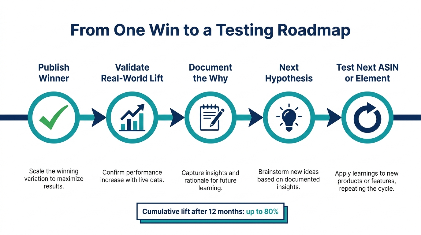
    The operational loop — hypothesize, design, test, analyze, ship — is the mechanism by which you systematically improve the quality and density of that signal over time. Every completed test either confirms something that works or eliminates something that doesn’t. Both outcomes advance your understanding of what your shoppers actually respond to, and both feed into a catalog that converts better next quarter than it does this quarter.

    But none of that happens if you don’t ship. A test that reaches significance and sits unshipped is not a learning — it’s a missed opportunity with a price tag attached. The fastest and highest-impact change most testing programs can make is not a better hypothesis or a smarter tool — it’s a 48-hour SLA on winner publication, enforced by whoever owns the catalog.

    Start there. Get one test running on your highest-traffic ASIN. Document it properly. Ship the winner within 48 hours of significance. Then start the next one. The compounding starts the moment you do.

    Key Takeaways for Implementation

    • Treat images as AI data inputs, not just human-facing assets. OCR, VLMs, and holistic stack analysis mean every visual element carries signal weight.
    • Qualify your ASINs by traffic before designing tests. Below ~1,000 weekly sessions per variant, formal A/B testing produces noise, not insight.
    • Write your hypothesis before you brief the designer. Tests without hypotheses can’t generate learning even when they produce winners.
    • Build a 48-hour winner shipping SLA with a named owner. This single change produces more value than any testing tool upgrade.
    • Apply cross-ASIN learning to your full catalog. Tier 1 wins should update the image standards for Tier 2 and Tier 3 ASINs without re-running experiments on each.
    • Audit consistency between images and copy every time you update. AI confidence drops when visual and text signals conflict — and so does customer satisfaction.
    • Build modular creative templates. If producing a test variant takes more than 72 hours, the process is slower than the market is moving.
  • Why Most Amazon Image A/B Tests Give You the Wrong Answer — And How to Fix Your Testing Architecture

    Why Most Amazon Image A/B Tests Give You the Wrong Answer — And How to Fix Your Testing Architecture

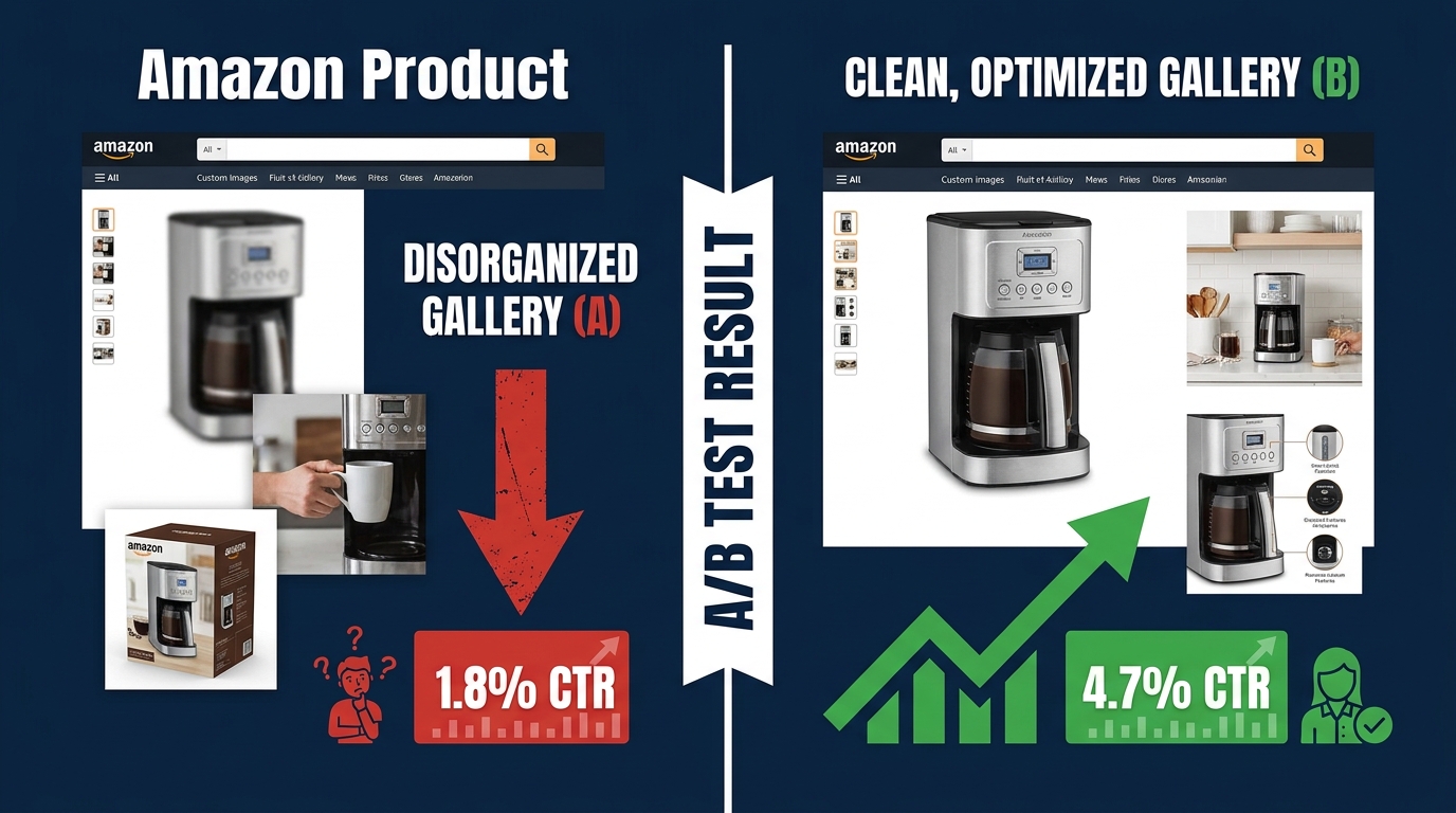
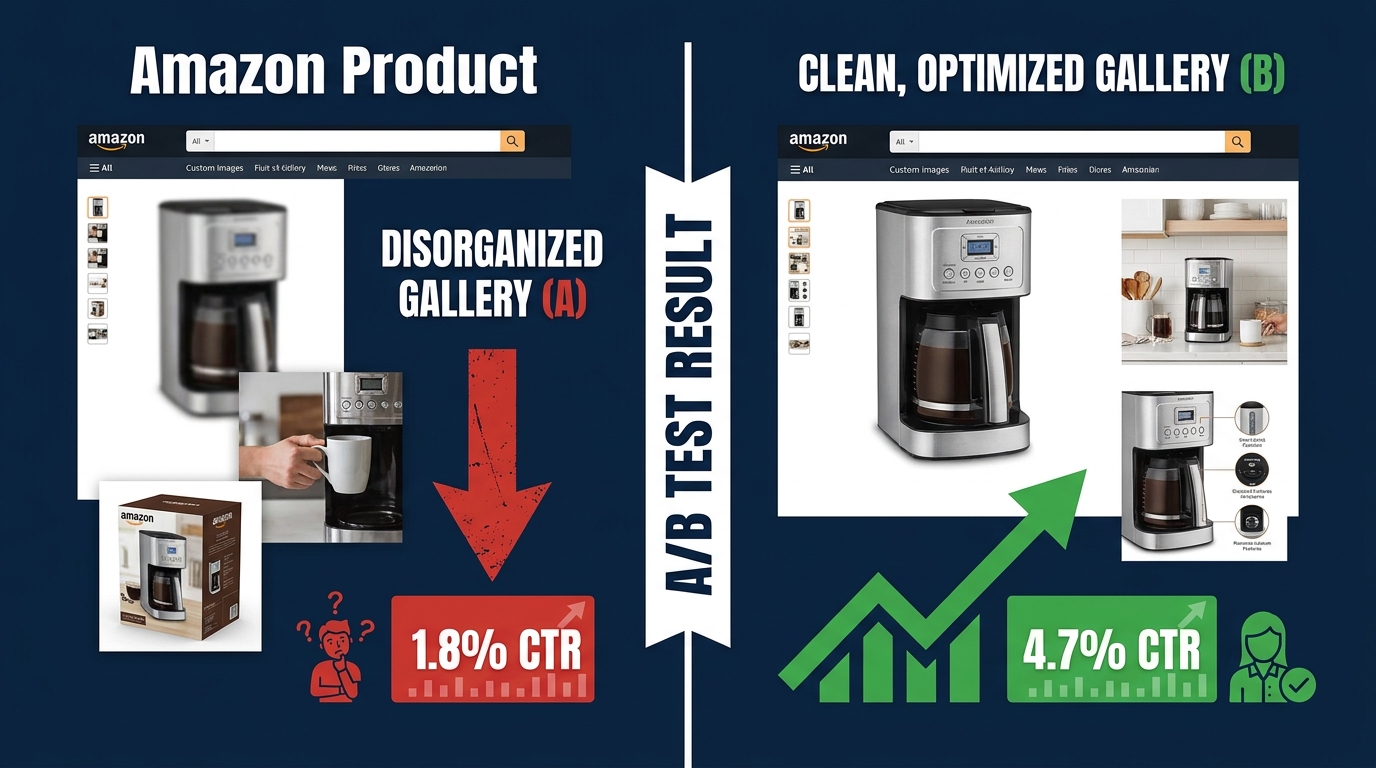
    Amazon image A/B testing split screen showing CTR improvement from 1.8% to 4.7% after gallery optimization

    There is a particular kind of confidence that comes from having run an experiment. You split-tested your main image, let it run for two weeks, saw Version B pulling slightly ahead, applied the winner, and moved on. The listing is updated. The test is done. The data has spoken.

    Except in most cases, it hasn’t. The data was inconclusive at best — and actively misleading at worst. Amazon’s own internal guidance recommends running image experiments for at least eight to ten weeks. Industry data shows most sellers stop theirs in under three. That gap is where the false confidence lives, and it is costing brands real conversion rate percentage points every single day.

    Amazon image testing is one of the highest-ROI activities a brand-registered seller can pursue. Amazon itself has documented listing optimizations producing sales lifts of up to 20–25% in controlled experiments, with even conservative image-specific tests regularly delivering 5–12% conversion rate improvements. But those results only materialize when the testing architecture is designed correctly — when you know what you’re testing, why you’re testing it, what metric actually measures success, and how long you need to wait before the result means anything.

    This article is not about whether to test your images. That question is settled: you absolutely should. This is about how the testing process breaks down, what a properly structured image testing architecture actually looks like, and how to build a gallery optimization system that compounds wins over time instead of producing noise.

    What Manage Your Experiments Actually Measures (And What It Doesn’t)

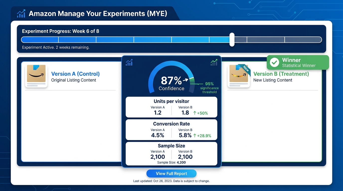
    Amazon Manage Your Experiments dashboard showing Version A vs Version B with 95% statistical significance threshold and key metrics

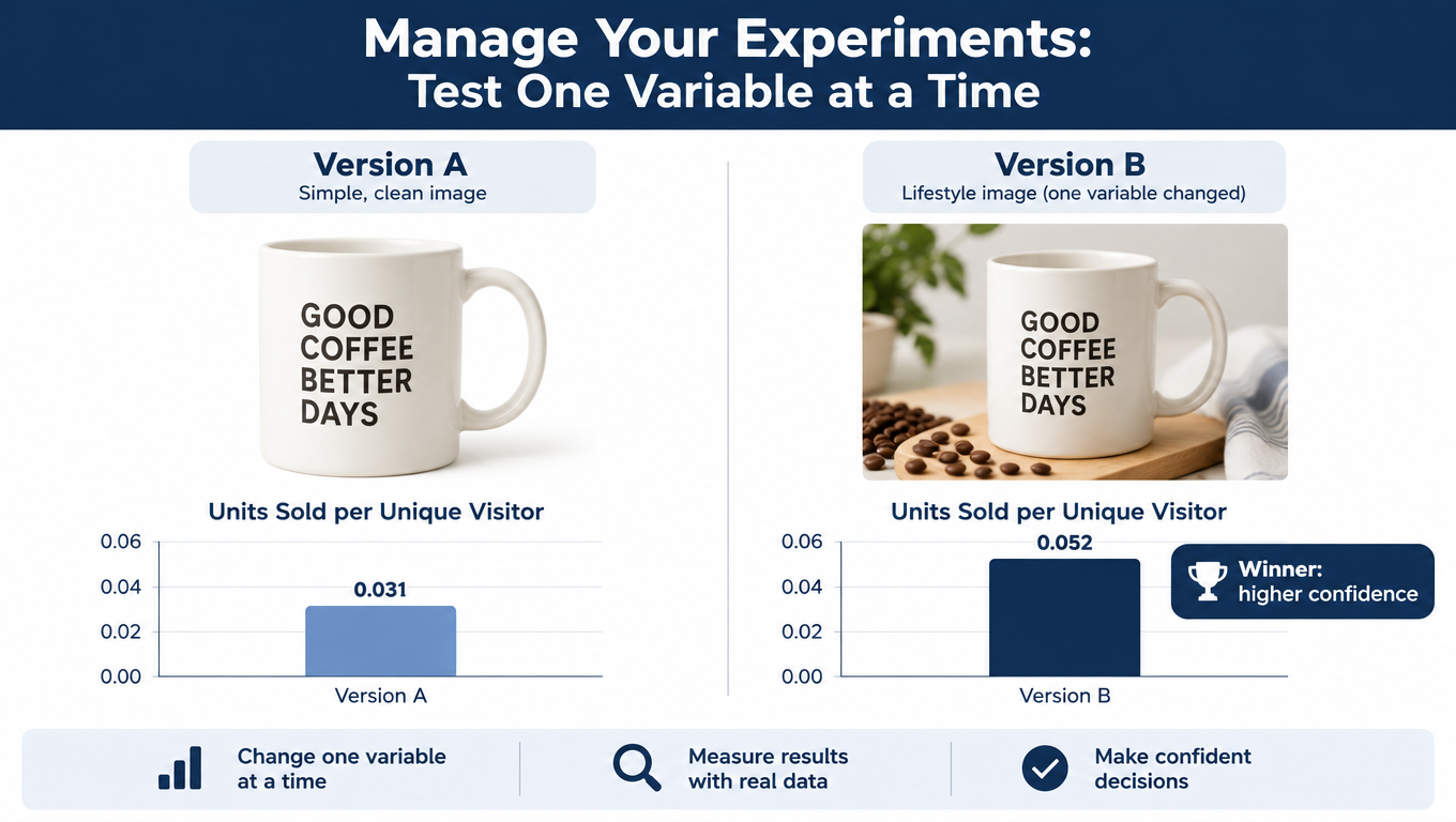
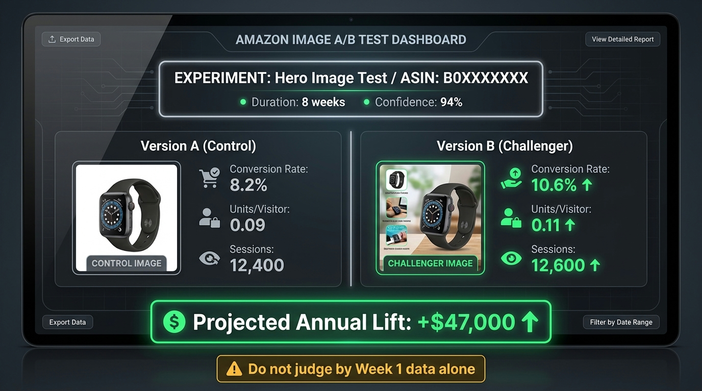
    Amazon’s Manage Your Experiments (MYE) tool, accessible via Seller Central under Brands → Manage Your Experiments, is the native A/B testing environment for Brand Registry sellers. It supports testing of main images, image stacks, titles, and A+ content. The mechanics are straightforward: traffic to your detail page is split randomly 50/50 between Version A and Version B, and Amazon tracks performance on both variants simultaneously.

    What MYE reports is genuinely useful — but it’s a narrower picture than most sellers assume.

    The Metrics MYE Tracks

    The MYE dashboard surfaces several core metrics on a weekly basis:

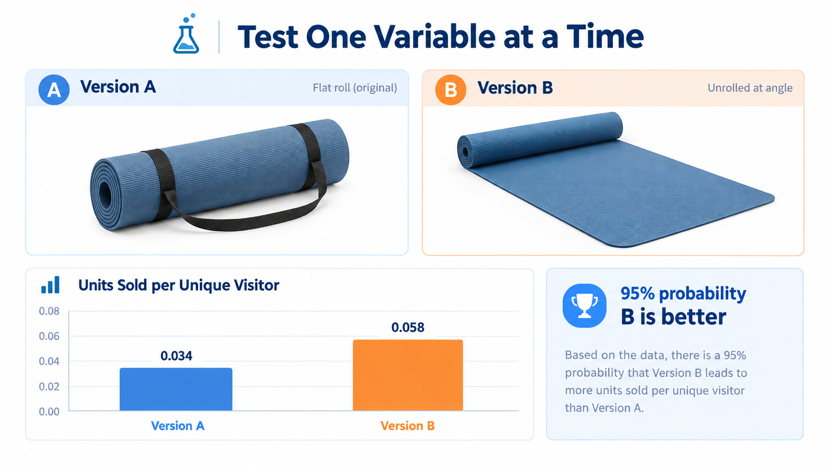
    • Units per unique visitor — the primary success metric Amazon uses to determine a winner
    • Conversion rate — the percentage of detail page visitors who complete a purchase
    • Units sold — raw unit volume per variant
    • Sample size — the number of unique shoppers who saw each version
    • Probability of winning — Amazon’s confidence estimate for which variant is better
    • Projected one-year impact — an estimated annualized sales difference based on current test data

    MYE reaches statistical significance when it achieves approximately 95% confidence that one version outperforms the other. That threshold requires sufficient sample size, which in practice means roughly 700 or more detail page views in the preceding 30 days as a minimum eligibility floor — and meaningfully more traffic than that before results become reliable.

    What MYE Does Not Tell You

    Here is where most sellers run into trouble. MYE measures on-page performance — what happens once a shopper lands on your detail page. It does not directly measure click-through rate from search results or sponsored ad placements. That means if your main image change primarily affects whether shoppers click on your listing from a search page, MYE will only partially capture that impact. The CTR lift shows up indirectly as increased traffic volume to the listing over time, but MYE itself is not a CTR measurement tool.

    MYE also cannot isolate the impact of images from concurrent changes. If your team updates ad bids, adjusts pricing, or runs a promotion during an active experiment, the results become impossible to interpret cleanly. This is not a flaw in the tool — it is a constraint every seller needs to understand and plan around.

    Eligibility Requirements in 2026

    Not every ASIN qualifies for MYE image testing. Amazon’s current requirements include active Brand Registry enrollment, sufficient recent traffic (the 700+ page views per 30 days benchmark is widely cited in the seller community), and the ASIN must be in good standing with no active policy violations. New or low-velocity products simply may not accumulate enough traffic to produce statistically meaningful results within a reasonable test window. This is not a technicality — it is one of the core reasons so many image tests produce inconclusive or misleading results.

    The Decision-Journey Framework: Mapping Each Image Slot to a Buyer Question

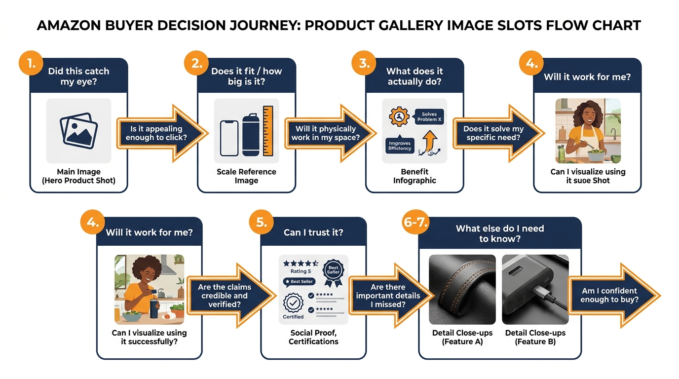
    Amazon gallery image slots mapped to buyer decision journey questions — from slot 1 hero image through slot 7 detail shots

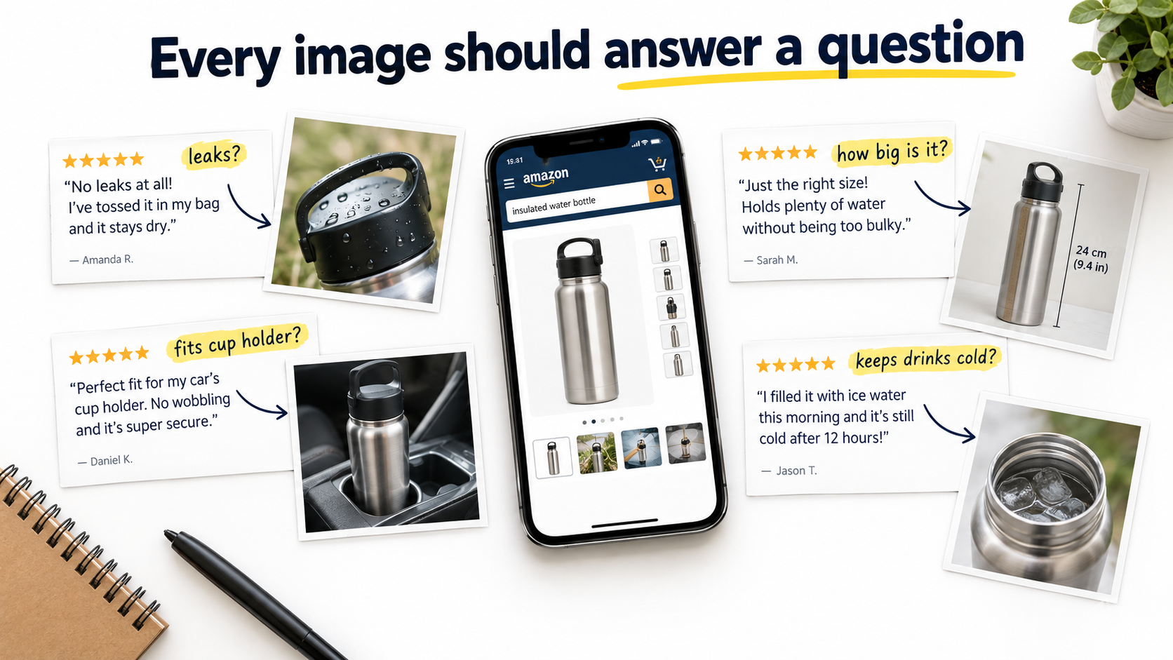
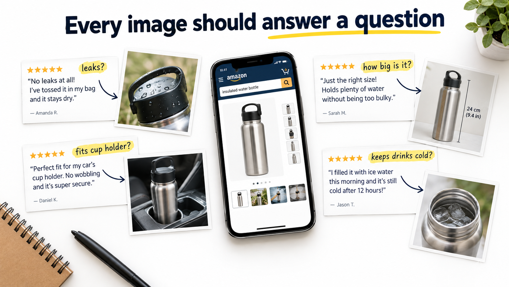
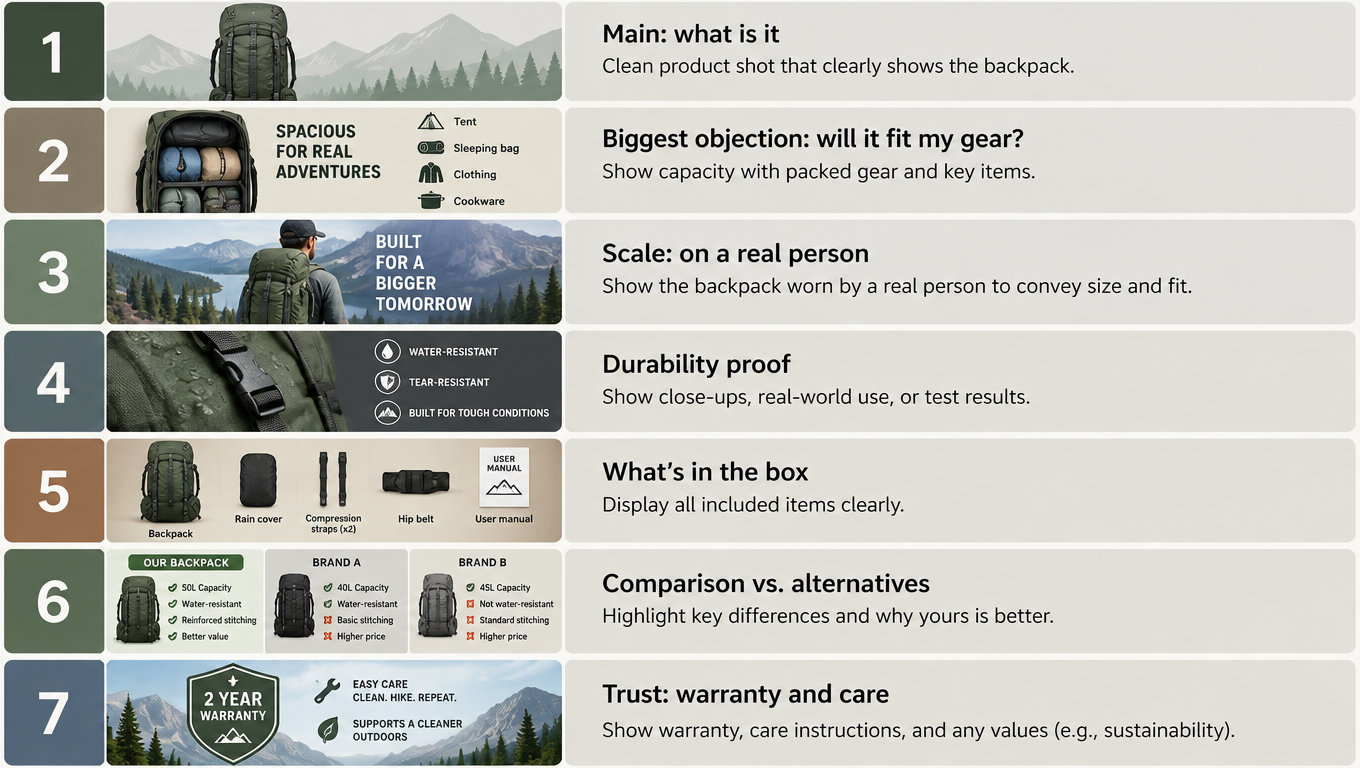
    Before you can test anything intelligently, you need a model of what each image is supposed to accomplish. The most effective framework in current practice treats the Amazon gallery not as a collection of product photos, but as a structured answer to a sequential series of buyer questions. Shoppers arrive at your listing with a mental checklist — and your images either answer those questions in order, or they don’t.

    This matters because attention decays with every swipe. Research on e-commerce shopper behavior consistently shows that the majority of detail page visitors view images sequentially from left to right. Each additional image receives progressively less attention. The first three images carry disproportionate conversion weight. If you burn those slots on redundant or low-information visuals, you have already lost the majority of marginal buyers before your most compelling content appears.

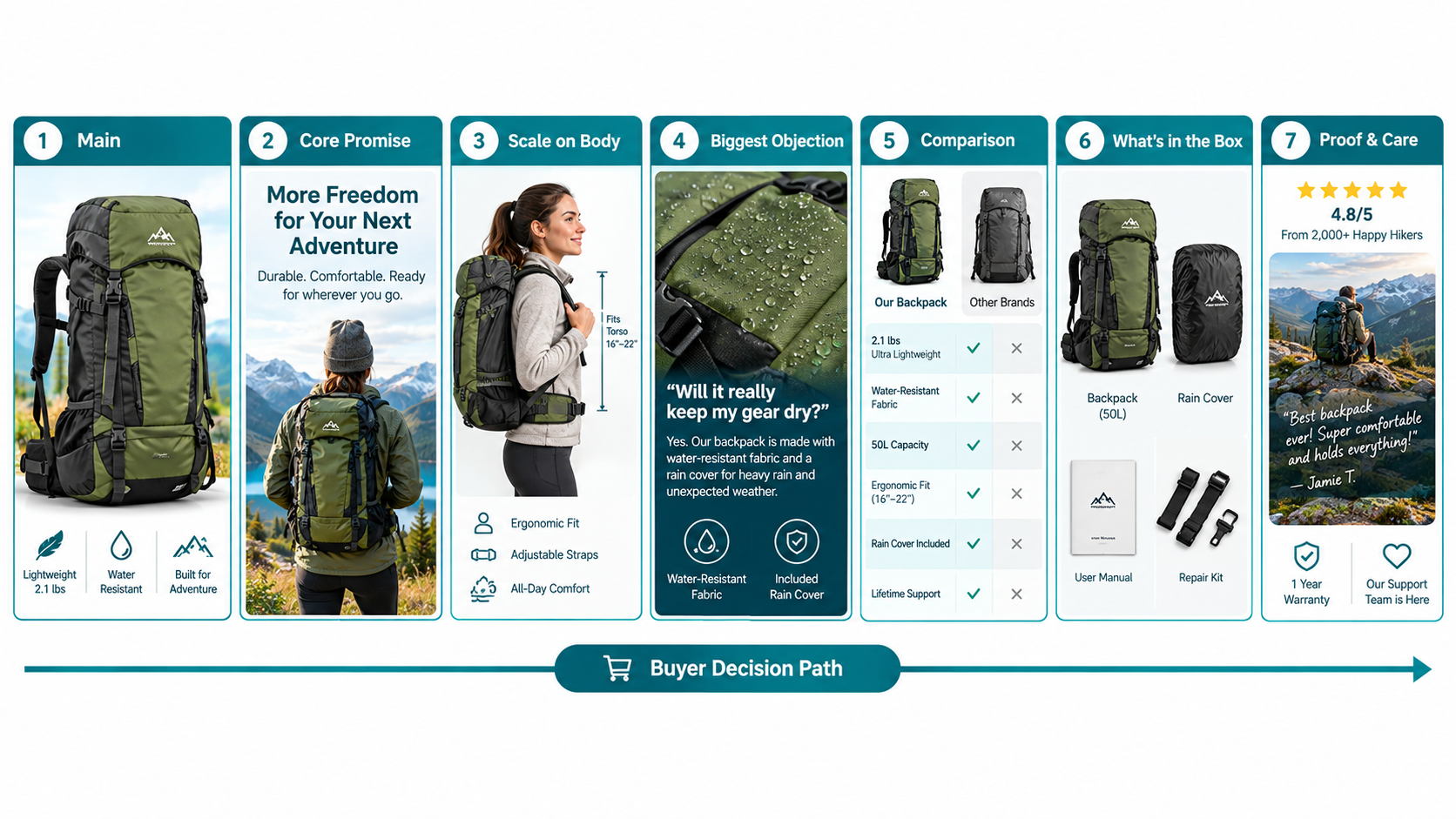
    The Seven-Slot Question Map

    Here is the decision-journey mapping that leading Amazon-focused agencies and optimization specialists have converged on in 2026:

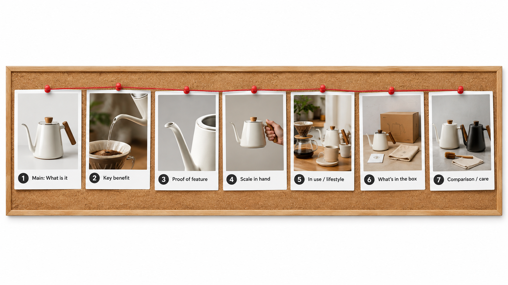
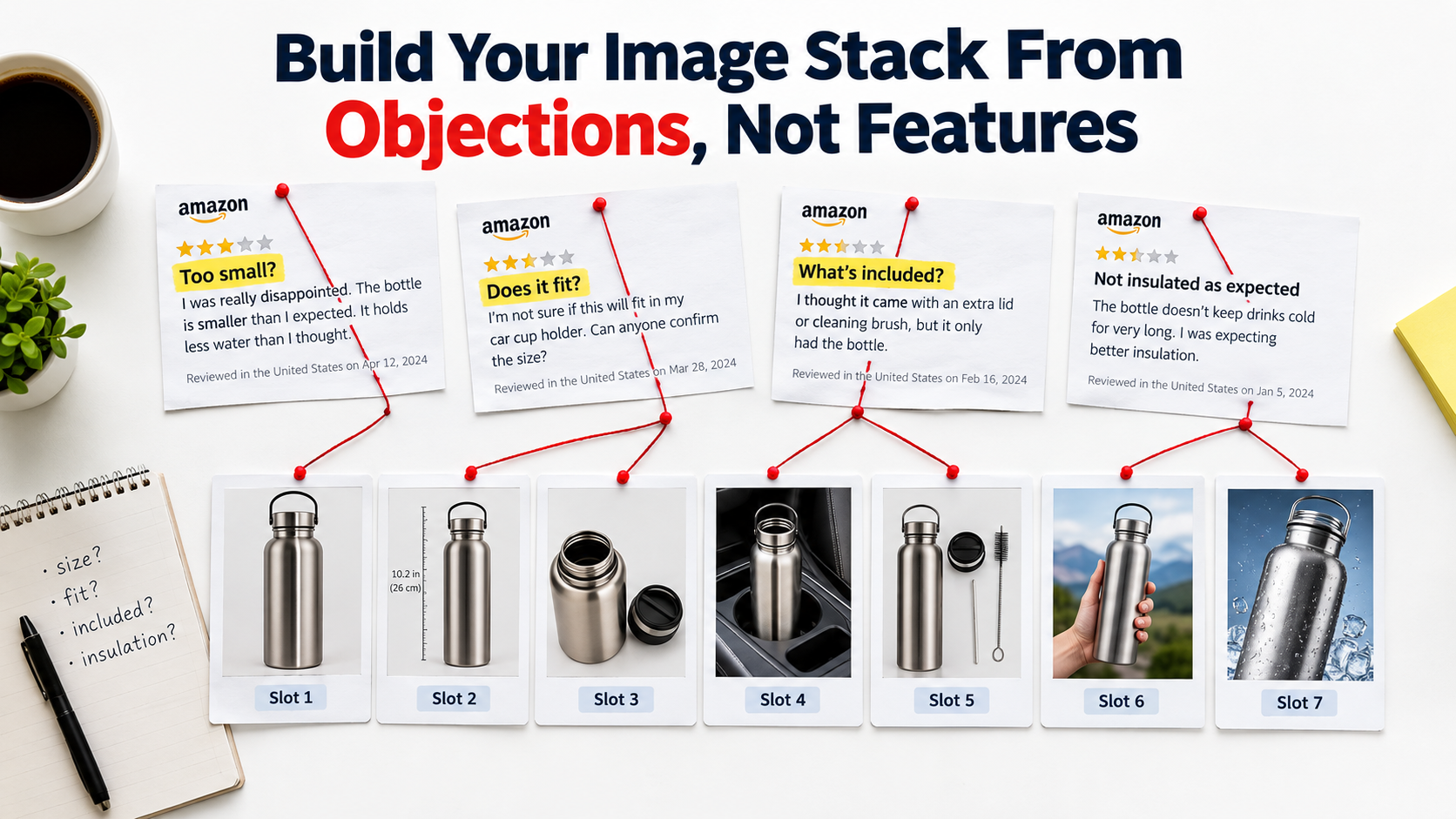
    • Slot 1 (Main Image): “Is this what I’m looking for?” — Pure recognition and category identification. Amazon’s white-background requirement constrains this slot, but everything within those constraints — product angle, negative space, size fill — is a testable variable that drives click-through from search.
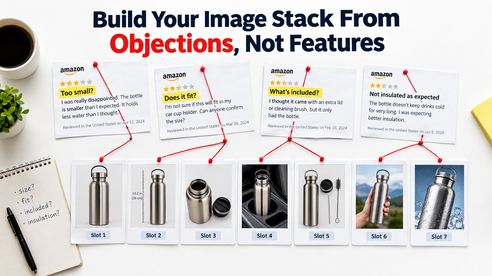
    • Slot 2: “How big is it / will it fit?” — Scale and context. Shoppers need a reference point. A product shown next to a recognizable object, in a room context, or with explicit dimension callouts answers the scale question that text rarely resolves as effectively.
    • Slot 3: “What does it actually do for me?” — The primary benefit, expressed visually. This is typically the highest-impact conversion slot after the main image. An infographic or annotated lifestyle image that communicates the top value proposition clearly outperforms generic detail shots in this position.
    • Slot 4: “Will this work in my situation?” — Use-case contextualization. A lifestyle image showing the product in realistic use addresses the “but will it work for someone like me?” question. This slot should reflect your target customer’s actual context, not a generic aspirational scenario.
    • Slot 5: “Can I trust this product?” — Credibility and proof. Certifications, awards, material quality close-ups, or social proof elements belong here. This slot handles the risk-reduction phase of the decision journey.
    • Slots 6–7: “What else do I need to know?” — Secondary details, variants, bundle contents, compatibility information. These slots serve the more engaged buyer who has already mostly decided and is validating final specifics.

    Why This Framework Changes What You Test

    Once you assign each slot a specific job in the buyer journey, your test hypotheses become much more precise. Instead of “let’s try a different image in slot 3,” you’re asking: “Does communicating the primary benefit through an annotated infographic or through a lifestyle-in-use shot produce better conversion at this stage of the decision?” That is a testable question with a clear success metric. It will produce actionable data. Generic image swaps produce noise.

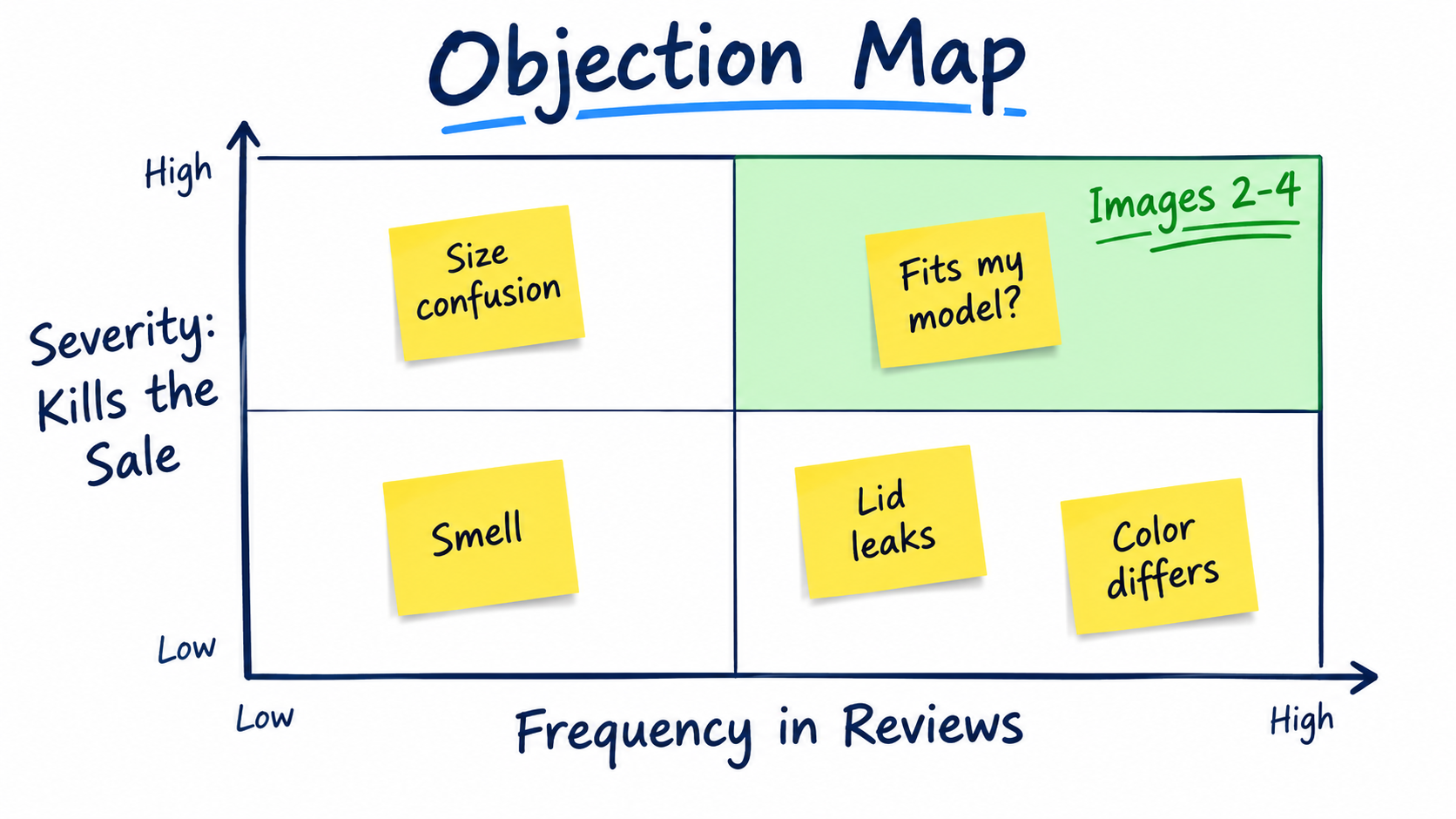
    The framework also reveals which slots have the most conversion leverage for your specific category. A product where the primary buyer objection is “I’m not sure if this is the right size” has its highest-impact test opportunity in slot 2, not slot 3. A product where the primary objection is “I’m not sure this brand is trustworthy” has its most important work to do in slot 5. The decision-journey map tells you where to focus your testing resources first.

    Main Image Testing: The One Test That Moves Everything Else

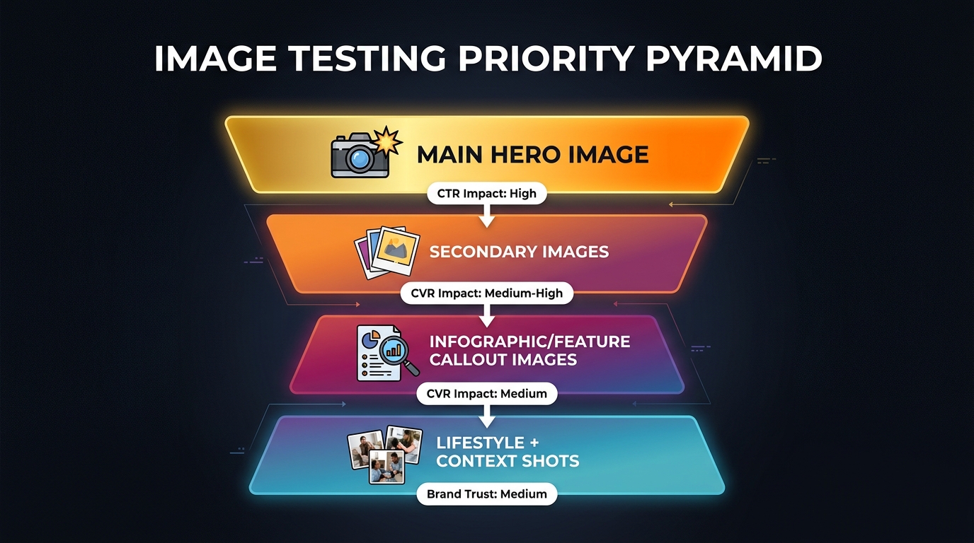
    If you can only run one test on any given ASIN, it should be the main image. No other single change to your listing — not your title, not your bullet points, not even your price in many cases — has the same upstream leverage. The main image determines whether your ASIN gets clicked from search results. Without clicks, no downstream conversion optimization matters.

    This upstream effect is what makes main image testing qualitatively different from testing secondary gallery images. A main image improvement compounds through your entire marketing funnel: more organic clicks, better ad click-through rates, higher quality scores for sponsored placements, and ultimately a more efficient cost-per-click across all campaigns. Estimated improvements in main image performance that lift CTR by even 1–2 percentage points can produce double-digit revenue changes on high-volume ASINs when the downstream math is fully accounted for.

    What to Actually Test in Your Main Image

    The most common mistake in main image testing is testing variations that are too similar to produce a detectable signal. Moving a product slightly left versus slightly right will not produce a statistically significant result in any reasonable test window. Meaningful tests require meaningful differences. The variables worth testing include:

    • Product angle: Front-facing versus three-quarter perspective versus overhead can produce dramatically different recognition rates depending on the category. Apparel, footwear, small electronics, and kitchen tools all have different “recognition angles” that convert differently.
    • Product fill and framing: Amazon’s requirement that the product occupy at least 85% of the image frame still leaves substantial room to test how the product is positioned within that frame. Products with multiple components benefit from tighter or looser compositions differently.
    • Variant shown: For listings with multiple colors, sizes, or configurations, which variant appears in the main image affects both CTR and downstream conversion. The most visually striking variant often outperforms the most popular seller.
    • Props and secondary elements: Amazon’s main image rules prohibit text and promotional badges but allow product-adjacent props in many categories. Testing with versus without contextual props — packaging, accessories, complementary items — can reveal whether context or isolation works better for your category.
    • White space distribution: More white space versus less, product higher versus lower in the frame — these subtle compositional choices affect how thumbnails render in search results, particularly on mobile screens where the image is small.

    Setting the Right Success Metric for Main Image Tests

    Because MYE measures on-page behavior and the main image’s primary job is to drive clicks from search, there is an inherent measurement challenge. The correct approach is to run MYE for the on-page conversion signal while simultaneously monitoring your Brand Analytics data for shifts in click-through rate from search. The two data sources together give you a complete picture of whether a main image change is working. Relying on MYE conversion data alone can cause you to prematurely declare a winner on a variant that converts slightly better on-page but is actually losing clicks in search — producing a net-negative outcome that the test appears to endorse.

    Gallery Slots 2–4: The Conversion Engine Most Sellers Underinvest In

    If the main image gets the click, slots 2 through 4 close the sale. This is where the majority of buying decisions are made or abandoned, and where the gap between optimized and unoptimized galleries is widest in practice. Yet most sellers either treat these slots as an afterthought — uploading whatever product photos were in the original shoot — or test them so infrequently that they go years without knowing whether their current configuration is anywhere near optimal.

    The Strategic Role of Each Slot

    The 2026 consensus among Amazon conversion specialists is to treat slots 2, 3, and 4 as three distinct conversion tools, each with a specific job:

    Slot 2 — Scale and Context: This slot addresses the single most common reason shoppers abandon product pages without purchasing: uncertainty about size. Dimension infographics, comparison shots showing the product next to everyday objects, or images showing the product in a clearly recognizable context all perform stronger here than aesthetic detail shots. Testing should focus on whether explicit measurement callouts, relative size comparisons, or in-context placement produces better conversion for your specific product category.

    Slot 3 — Primary Benefit Communication: Slot 3 is your first full infographic opportunity. The goal is to communicate your single most important value proposition as clearly and visually as possible. Best-performing implementations in 2026 show one hero benefit per image — not three benefits crowded into a single graphic. Testing should compare a single-benefit infographic against a multi-feature overview to understand whether your buyer needs persuasion depth or persuasion clarity at this stage.

    Slot 4 — Objection Handling: Every product category has a dominant purchase objection — a specific fear, uncertainty, or doubt that prevents otherwise interested shoppers from committing. Slot 4 should be engineered to address that objection directly. For a supplement, it might be an image highlighting third-party lab testing. For a kitchen appliance, it might be a dishwasher-safe components graphic. For a children’s toy, it might be safety certification callouts. The brands that have mapped their primary objection and addressed it explicitly in slot 4 consistently outperform those using generic lifestyle content in this position.

    Testing Gallery Slot Order vs. Image Content

    There are two distinct types of tests you can run on slots 2–4: testing what image goes in a slot and testing which order the slots appear in. These are separate questions requiring separate tests. Don’t conflate them. If you swap both the order and the content simultaneously, you have no way to know which change drove any performance difference you observe. Run content tests first — establish what the best image for each job is — then run order tests to optimize the sequence.

    Infographic vs. Lifestyle Images: How to Stop Arguing and Start Testing

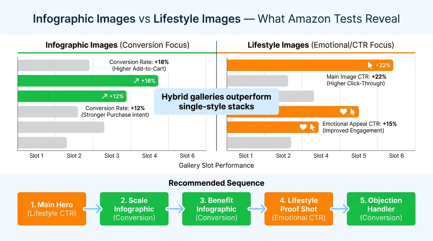
    Comparison chart showing infographic images outperforming lifestyle shots in conversion for gallery slots 2-3 while lifestyle wins on CTR and emotional appeal in slots 4-5

    The infographic versus lifestyle debate is one of the most persistent and least productive arguments in Amazon optimization circles. Practitioners on both sides have strong opinions, war stories to support those opinions, and case studies that confirm their priors. The argument persists because both sides are correct — just not universally and not in the same slots.

    The current weight of evidence, based on aggregated A/B test results from brands running systematic gallery experiments, points to a consistent pattern:

    • Infographic-heavy galleries outperform lifestyle-only galleries on conversion rate — particularly in slots 2 through 4 where information density matters most.
    • Lifestyle images outperform pure infographics on click-through rate — they generate more emotional engagement in search results and in top-of-gallery placement.
    • Hybrid galleries outperform both single-style approaches — the highest-converting galleries use a structured alternation of infographic and lifestyle content, not a uniform aesthetic throughout.

    Why Infographics Win on Conversion

    The explanation is grounded in buyer psychology. Once a shopper has clicked through to your detail page, they are in an information-gathering mode. They are asking specific questions and evaluating specific criteria. An infographic that answers those questions explicitly — with labeled callouts, comparison data, or specification graphics — removes friction from the decision process. A lifestyle image of someone enjoying the product is emotionally appealing but functionally non-specific. For a buyer trying to determine whether a mattress topper will fit their California King bed, a clear dimension infographic eliminates the objection. A photo of someone sleeping peacefully does not.

    Why Lifestyle Images Win on CTR

    The click-through dynamic is the reverse. In search results, shoppers are scanning dozens of thumbnails in seconds. What catches attention at thumbnail size is color, emotional resonance, and visual novelty — qualities that lifestyle photography tends to deliver more effectively than information-dense infographics, which become illegible at small sizes. A main image infographic with text callouts often renders as visual noise in a search results thumbnail, while a bold lifestyle image communicates category and aspiration instantly.

    Building the Hybrid Gallery

    The practical implication is a deliberate gallery structure: lifestyle or clean hero for the main image (slot 1), infographic treatment for slots 2 and 3, lifestyle-in-use for slot 4, proof/credibility content for slot 5, and a mix of detail and secondary lifestyle for slots 6 and 7. This sequence uses each image type where it performs best. But — and this is critical — the optimal balance is category-specific and buyer-specific. The only way to know the right hybrid ratio for your ASIN is to test it directly with your actual traffic.

    The sellers who skip this testing and implement the “standard” hybrid sequence are still doing better than sellers with unoptimized galleries. But they’re leaving residual optimization on the table that only their own data can capture.

    Mobile-First Gallery Design: Why Desktop-Optimized Stacks Are Losing

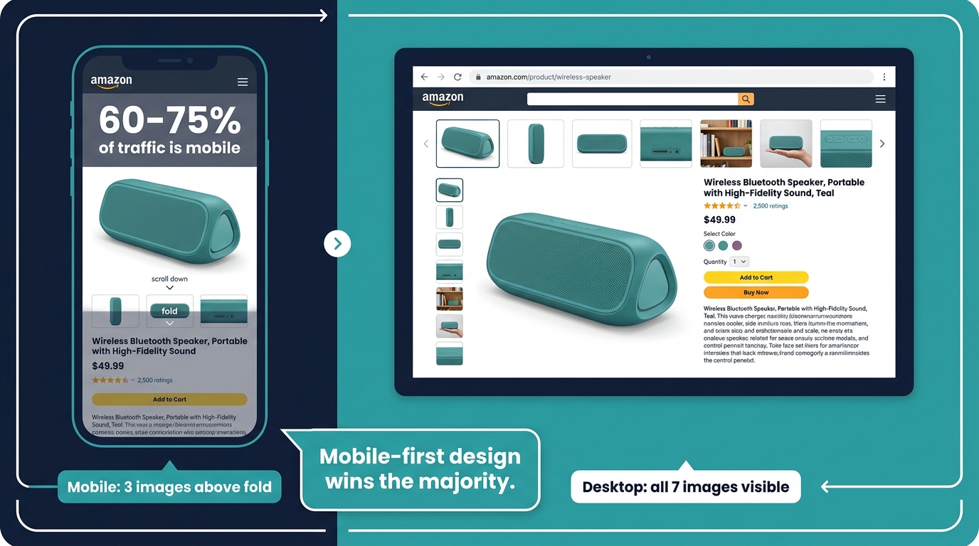
    Mobile vs desktop Amazon gallery comparison showing 60-75% of traffic is mobile with only 3 images visible above fold on smartphone

    If you design your Amazon gallery images primarily on a desktop monitor, you are optimizing for a minority of your traffic. Current estimates across the Amazon seller community put mobile traffic at 60 to 75% of all Amazon detail page visits in 2026, with some category-specific data suggesting the mobile share may be even higher for impulse and convenience categories. The practical implication for image testing is that your test results are being driven primarily by mobile user behavior — which means mobile rendering quality determines whether your tests succeed or fail.

    How Mobile Changes What Works

    Mobile Amazon browsing is structurally different from desktop in ways that directly affect gallery performance:

    Above-the-fold visibility: On a mobile screen, typically only one to three images are visible without scrolling. The main image occupies most of the screen. Slots 2 and 3 require a swipe. Slot 4 onward requires more deliberate engagement. This means the “conversion window” is tighter on mobile — your first two to three images need to do more of the total persuasion work.

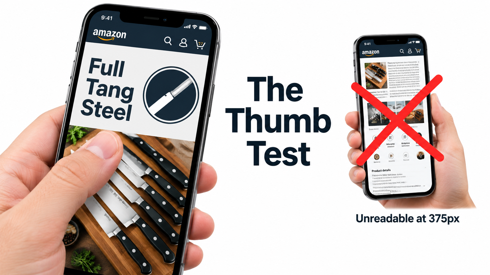
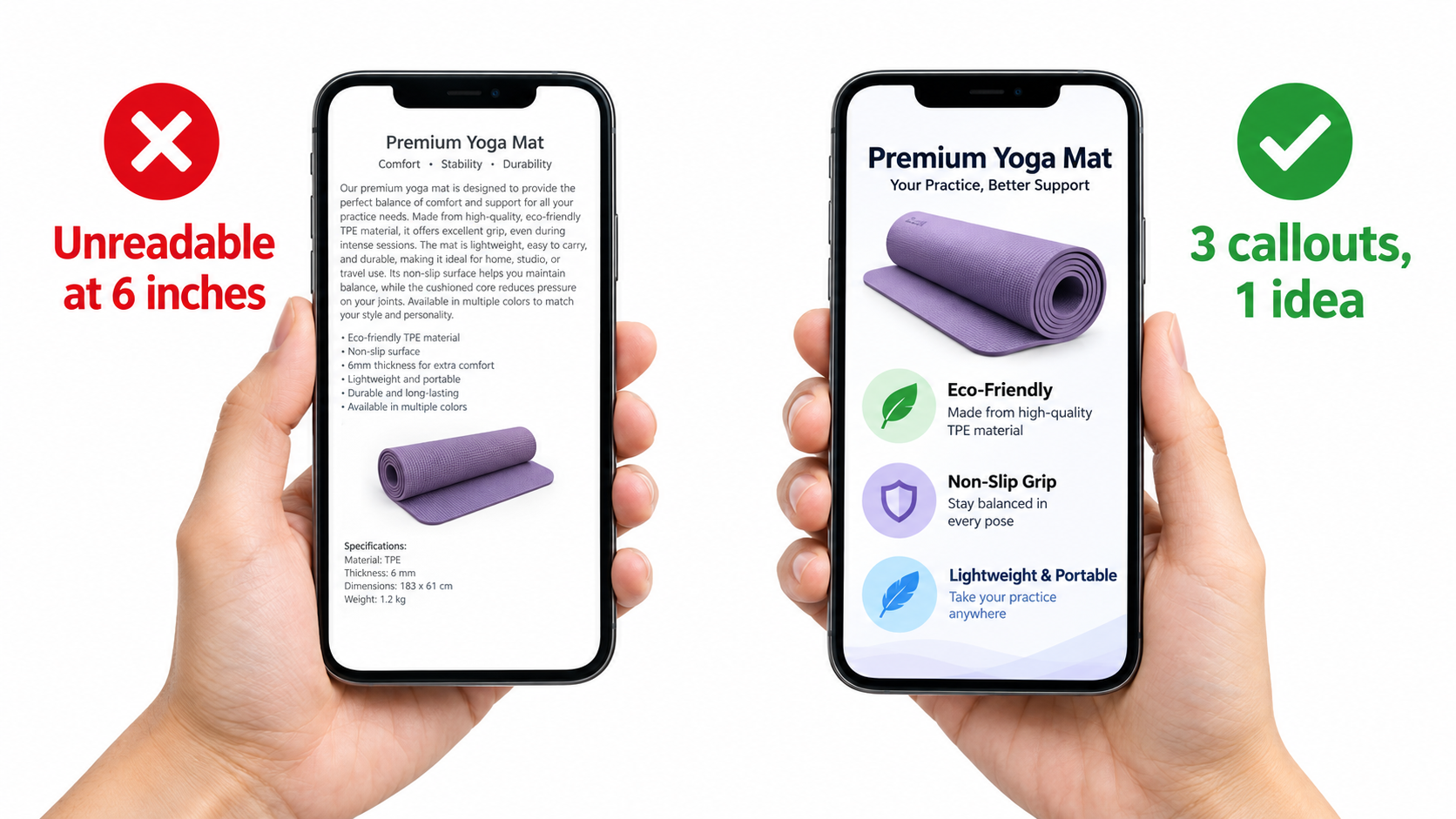
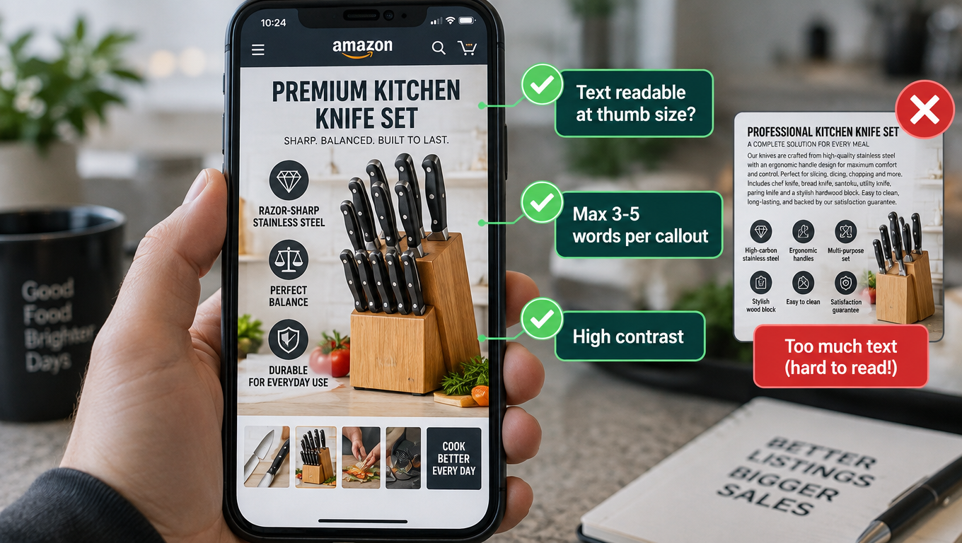
    Text legibility at swipe size: The infographic approach that works beautifully on a 27-inch desktop monitor frequently becomes unreadable on a 6-inch phone screen. Text callouts need to be larger, shorter, and more contrast-heavy to remain legible on mobile. Infographics with six or more annotation labels, multi-column layouts, or small supporting text tend to underperform on mobile even when they test well on desktop.

    Scroll behavior: Mobile shoppers swipe through images faster than desktop users scroll. Images that require five to ten seconds to fully absorb are skipped on mobile. The “one key message per image” principle is partly an aesthetic recommendation — but on mobile, it is a functional necessity. A mobile user who cannot instantly understand what an image is communicating will swipe past it without stopping.

    How to Test for Mobile Performance Specifically

    MYE does not segment results by device type, which creates a genuine blind spot for mobile-specific optimization. The workaround most brands use is off-platform testing (covered in the next section) combined with qualitative review of images on actual mobile devices before launching live tests. Before any image goes into an MYE experiment, it should be viewed on a physical iOS and Android device — not a browser developer tools emulation — at the full-screen gallery size and at the thumbnail size that appears in search results on mobile. Images that fail the readability test at mobile thumbnail size should be revised before burning four to eight weeks of live traffic data on them.

    The practical design guidelines that emerge from mobile-first testing: minimum 24-point equivalent font for any on-image text, maximum two to three key callouts per infographic, high-contrast color choices that remain legible at reduced size, and product fills that communicate clearly even when the image is cropped to a square thumbnail.

    Off-Platform Pre-Validation: The PickFu Layer Before You Burn Live Traffic

    One of the most significant shifts in how sophisticated Amazon brands approach image testing in 2026 is the adoption of off-platform pre-validation as a mandatory step before any live MYE experiment. The logic is straightforward: running a poorly designed image variant in a live test for eight weeks costs you real conversion rate and real revenue. Running it in a PickFu poll for $50 and 200 responses costs you $50 and two days. Pre-validation moves the failures out of your live listing and into the design phase where they belong.

    How the Pre-Validation Workflow Works

    The pre-validation process combines consumer research tools — most commonly PickFu, though ProductPinion and other platforms serve the same function — with Amazon’s native MYE in a two-stage workflow:

    1. Stage 1 — Concept Screening: Before investing in final production of image variants, run a poll with rough mockups or concept images asking targeted respondents which version they would be more likely to click on. The goal here is to eliminate obvious losers before they reach production. Poll respondents should be filtered to match your target buyer profile — age, gender, purchase history, relevant interests — not the general population.
    2. Stage 2 — SERP Simulation: For main image testing specifically, PickFu offers a search results page simulation format where your product appears alongside competitor listings. This tests for click-through in a competitive context — the actual environment where your main image’s job gets done. A main image variant that “wins” in an isolated head-to-head comparison may actually lose share in a real search results page where five competitors’ images are visible simultaneously.
    3. Stage 3 — MYE Confirmation: The variants that survive pre-validation then go into a live MYE test for statistical confirmation with real shopper behavior. Because only pre-validated images enter the live test, the quality of hypotheses is higher, and the probability of reaching statistical significance faster is meaningfully improved.

    The Performance Case for Pre-Validation

    The quantitative case for this two-stage approach is compelling. Brands that use PickFu pre-validation before MYE have reported reaching statistical significance in MYE in as few as seven days on high-traffic ASINs — compared to the typical six to ten weeks without pre-validation. The mechanism is straightforward: when the image variant entering the live test is already demonstrably stronger by consumer research standards, the performance gap between versions is larger, which requires less data to confirm statistically. Smaller differences require proportionally more data to detect.

    The secondary benefit is learning quality. Off-platform polls often include qualitative feedback — respondents can explain why they preferred one image over another. That qualitative data feeds directly back into the creative brief for the next round of image development, creating a systematic improvement loop that pure MYE testing cannot provide.

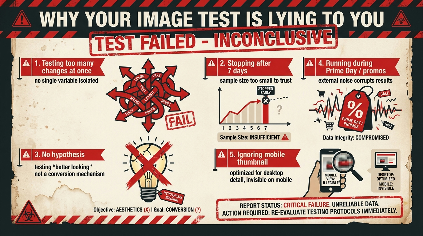
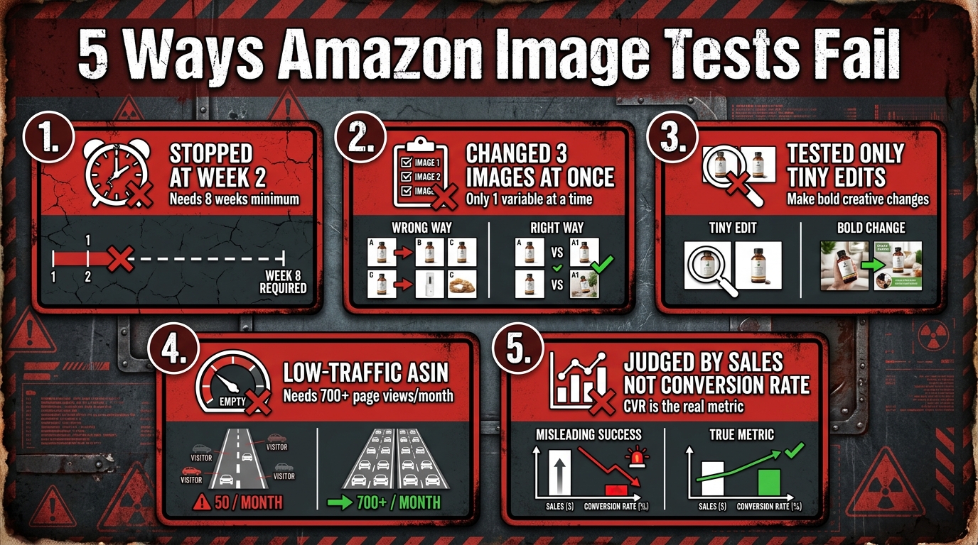
    The 5 Ways Image Tests Fail (And How to Prevent Each One)

    Five warning panels showing the most common Amazon image A/B test failure modes including premature stopping, testing multiple variables, and low-traffic ASINs

    After examining how Amazon image testing works in theory and in practice, the failure modes become predictable. Most teams encounter the same five problems repeatedly. Understanding each one specifically — including what it looks like in your data and how to prevent it — is what separates brands that compound wins over time from brands that run tests indefinitely without accumulating useful knowledge.

    Failure Mode 1: Premature Stopping

    This is the single most common cause of misleading image test results. A test that has been running for two weeks with a slight advantage for Version B is not evidence that Version B is better. It is evidence that you have accumulated approximately 25% of the data you need to reach 95% confidence. Stopping early is not just unhelpful — it actively produces false confidence. Amazon’s own guidance is explicit: image tests need four to ten weeks depending on traffic volume. High-volume ASINs can reach significance faster; low-volume ASINs may need the full ten weeks or more.

    Prevention: Set a calendar reminder to check results at the four-week mark, but commit to not acting on them until Amazon’s confidence indicator reaches at least 90% — and ideally the full 95% threshold that MYE uses to declare a winner. Use MYE’s “run to significance” option rather than setting a fixed end date wherever possible.

    Failure Mode 2: Testing Multiple Variables Simultaneously

    Updating the main image, swapping slot 3, and reordering slot 4 all within the same test period is not an experiment — it is a change event. When you observe a result (better or worse conversion), you have no way to know which change caused it. Every image test should isolate a single variable. One element, one test, one result. The throughput cost of this discipline — running tests sequentially rather than in parallel — is real but vastly outweighed by the cost of accumulating uninterpretable data.

    Prevention: Maintain a test queue, not a test batch. Prioritize which single change has the highest expected impact and test that first. Apply the winner before starting the next test. This sequential approach means each test builds on confirmed knowledge rather than uncertain confounds.

    Failure Mode 3: Testing Changes That Are Too Small

    A/B tests can only detect differences that are large enough to produce a measurable signal above the noise floor. An image where you moved the product angle by five degrees, changed the background from pure white (#FFFFFF) to off-white (#F5F5F5), or adjusted the shadow treatment is unlikely to produce a detectable conversion difference in any realistic test window. The change has to be substantive enough that a meaningful portion of buyers would actually notice and respond differently.

    Prevention: Apply the “would a different buyer population choose this?” test to your variants. If the two versions are so similar that any reasonable person would be indifferent between them, they will not produce a meaningful A/B test result. Reserve subtle refinements for after you have tested large conceptual differences that establish the right creative direction first.

    Failure Mode 4: Running Tests on Ineligible ASINs

    Amazon requires a minimum traffic threshold for MYE experiments to produce reliable results. The commonly cited benchmark is 700 or more detail page views in the prior 30 days, but in practice, getting to statistical significance quickly requires substantially more traffic than the minimum eligibility floor. Running image tests on low-velocity ASINs produces inconclusive results month after month — which some brands misinterpret as “no difference found” when the reality is “not enough data to detect a difference even if one exists.”

    Prevention: Tier your ASIN catalog by traffic volume and run active MYE tests only on high-volume products. For lower-traffic ASINs, use off-platform pre-validation tools and apply the learnings from high-traffic tests as informed defaults rather than waiting for statistically significant on-platform results that may never arrive.

    Failure Mode 5: Using the Wrong Success Metric

    Many sellers judge image tests by raw sales numbers in the first weeks of a test. This is problematic for two reasons: first, early sales data is too noisy to draw conclusions from; second, sales volume conflates organic traffic trends, paid advertising spend, and seasonal patterns with the actual image performance. The correct primary metric for gallery image tests is conversion rate (unit session percentage) — not total units sold. Conversion rate isolates the probability-of-purchase signal from traffic volume noise, making it a far cleaner measure of whether your image is doing its persuasion job.

    Prevention: When evaluating MYE results, lead with conversion rate and units per unique visitor. Use total sales as a secondary sanity check. Resist the instinct to call a winner based on a brief sales spike that coincides with a pricing change, coupon activation, or advertising budget increase during the test period.

    Building a Rolling Test Calendar: How to Compound Wins Over Time

    Individual A/B tests produce individual wins. A rolling test calendar produces a compounding optimization system. The difference in outcomes over a 12-month period between a brand that runs one or two tests per year and a brand that runs systematic quarterly testing across their top-10 ASINs is not marginal — it is often the difference between a stagnant conversion rate and a listing that has been continuously refined to near-optimal performance.

    How the Compounding Effect Works

    Imagine a brand that tests and improves their main image in Q1, winning a 3% CTR improvement. In Q2, they test gallery slots 2–3 using the learnings from Q1’s creative approach, winning a 6% conversion rate improvement. In Q3, they test lifestyle versus infographic in slot 4, winning another 4% conversion improvement. Each win compounds on top of the previous one, because the traffic improvements from Q1 mean Q2’s conversion test runs faster, and the improved conversion from Q2 means Q3’s test traffic is higher quality. The math accumulates faster than isolated tests suggest.

    The Practical Test Calendar Structure

    A functional rolling test calendar for a mid-size Amazon brand (20–50 active ASINs) looks something like this in practice:

    • Month 1–2: Main image test on your top 3 ASINs by revenue. These are your highest-leverage tests and should always be the first priority.
    • Month 2–3: Gallery slot 2–3 content tests on whichever ASINs completed their main image test. Apply the main image winner before starting the gallery test.
    • Month 3–4: Lifestyle versus infographic testing in slot 4 on the same high-priority ASINs.
    • Month 4–6: Begin the same cycle on the next tier of ASINs by traffic volume, while running refinement tests on the top ASINs based on prior results.

    The critical discipline is never running two overlapping tests on the same ASIN. Concurrent changes to the same listing contaminate both results. Use a simple shared spreadsheet or project management tool to track which ASINs are in active tests, what is being tested, when the test started, and what the result was. This institutional memory is more valuable than any individual test result.

    When to Retest

    A winning image variant is not permanent. Competitor creative evolves. Category visual norms shift. Seasonal buyer psychology changes. The general guidance in the Amazon optimization community is to retest your top ASINs’ main images every six to twelve months, with gallery slots tested on a 9–12 month cycle. A version that won convincingly 18 months ago may now be losing to newer competitor creative even though you haven’t changed anything.

    Measuring Beyond Conversion: What CTR, Returns, and Ad Efficiency Tell You

    Conversion rate is the most important metric for gallery image testing, but it is not the only one. A complete picture of image performance requires monitoring several downstream metrics that MYE does not directly surface — and which can reveal that an image is creating problems even when conversion data looks neutral or positive.

    Click-Through Rate from Organic and Paid Search

    As covered earlier, MYE does not directly measure click-through rate from search results. This creates a real measurement blind spot, particularly for main image tests. The workaround is to monitor your Brand Analytics data — specifically the Search Catalog Performance report, which shows click-through rates for your ASINs in search results — during and after image test periods. A main image change that lifts CTR even marginally on high-volume search terms produces disproportionate revenue impact, because it compounds across both organic and paid traffic.

    For sponsored product campaigns, watch your CTR metric at the campaign level during image test periods. If your main image change produces a significant CTR improvement in search results, you will see it reflected in your ad CTR within one to two weeks — well before MYE reaches statistical significance. This early signal can help validate that you are on the right creative track, even if it isn’t a final answer.

    Return Rate as an Image Quality Signal

    One of the most underused metrics in image testing is return rate. Images that overstate product quality, misrepresent color or size, or create expectations the physical product cannot meet may convert well in the short term — but they produce higher returns, negative reviews, and long-term conversion drag as the review score deteriorates. The most common return-driving image problem is color misrepresentation: product images that show colors more saturated or different from the actual product under normal lighting conditions.

    When evaluating a test winner, always check whether the winning variant is associated with a return rate increase. A 5% conversion rate improvement paired with a 3% return rate increase is not a net win — it is a warning signal that your new image may be over-promising.

    Advertising Efficiency and ROAS

    A well-optimized image gallery improves advertising efficiency because it increases the conversion rate of the shoppers your ads bring to the listing. If your gallery converts at 15% and your competitor’s converts at 22%, you are effectively paying 47% more per sale through the same advertising investment. Gallery optimization is, in this sense, one of the highest-leverage cost-reduction activities available to an Amazon advertiser — but it typically isn’t framed that way in budget discussions.

    Track your ROAS per campaign on your top-tested ASINs before and after image improvements. Sustained gallery optimization campaigns regularly produce 10–20% ROAS improvements over a 6–12 month period, simply by increasing the probability that a paid click converts. The advertising efficiency gains from systematic image testing are often larger in absolute dollar terms than the organic conversion rate improvements, because they reduce the cost basis for your entire paid traffic volume.

    Putting It All Together: The Testing Architecture That Actually Compounds

    The core insight that emerges from everything above is that Amazon image testing is not a one-time activity or a single-test improvement project. It is an architecture — a structured, sequential, hypothesis-driven system that produces compounding improvements over time when built correctly and produces noise when built incorrectly.

    The architecture has five interlocking components:

    1. The Decision-Journey Map: Assign each image slot a specific buyer question it must answer. This creates testable hypotheses instead of arbitrary creative swaps.
    2. The Pre-Validation Layer: Use off-platform tools to screen concepts before live traffic investment. This improves hypothesis quality and accelerates time to significance in live tests.
    3. The Live Testing Protocol: Run single-variable tests in MYE for the full recommended duration, using conversion rate as the primary success metric and monitoring CTR and returns as secondary signals.
    4. The Results Database: Maintain a documented record of every test hypothesis, result, and decision. This institutional memory prevents re-testing known losers and allows creative learnings to transfer across ASINs and categories.
    5. The Rolling Test Calendar: Schedule sequential tests on a structured cadence, prioritized by ASIN revenue and traffic volume, with retesting cycles built in for previously optimized listings.

    The brands that achieve sustained conversion rate improvements through image testing — the ones reporting 15–25% cumulative gains over a 12-month period — are not doing anything magical. They are simply running this architecture consistently, applying wins sequentially, and maintaining the discipline not to conflate noise with signal.

    Key Takeaways for Your Image Testing Program

    Before you run your next image test, use this checklist to assess whether your testing architecture is set up for success:

    • Traffic threshold: Does your ASIN have 700+ detail page views in the last 30 days? If not, prioritize off-platform testing instead of MYE.
    • Single variable: Are you testing exactly one change — and nothing else on the listing during the test period?
    • Meaningful difference: Are the two variants different enough that a genuine buyer would notice and potentially respond differently?
    • Slot assignment: Does each image in your gallery have a specific buyer question it is designed to answer?
    • Mobile rendering: Have you reviewed both test variants on physical mobile devices at gallery size and thumbnail size?
    • Duration commitment: Have you committed to not stopping the test before MYE reaches at least 90% confidence — and ideally 95%?
    • Pre-validation: Have you run off-platform concept screening before investing in final production versions?
    • Multi-metric monitoring: Are you tracking CTR (via Brand Analytics), return rate, and ad efficiency alongside MYE conversion data?
    • Results documentation: Is your test result going into a shared log that feeds future creative decisions?
    • Next test queued: Is the next test already scheduled so that improvement compounds continuously?

    Image testing is one of the few Amazon optimization activities where a disciplined, architecture-first approach consistently outperforms improvisation. The sellers who treat every gallery change as a hypothesis to be tested — rather than a design decision to be made — are the ones whose listings look completely different (and convert dramatically better) twelve months from now. That is the compounding dividend of building the testing architecture correctly from the start.