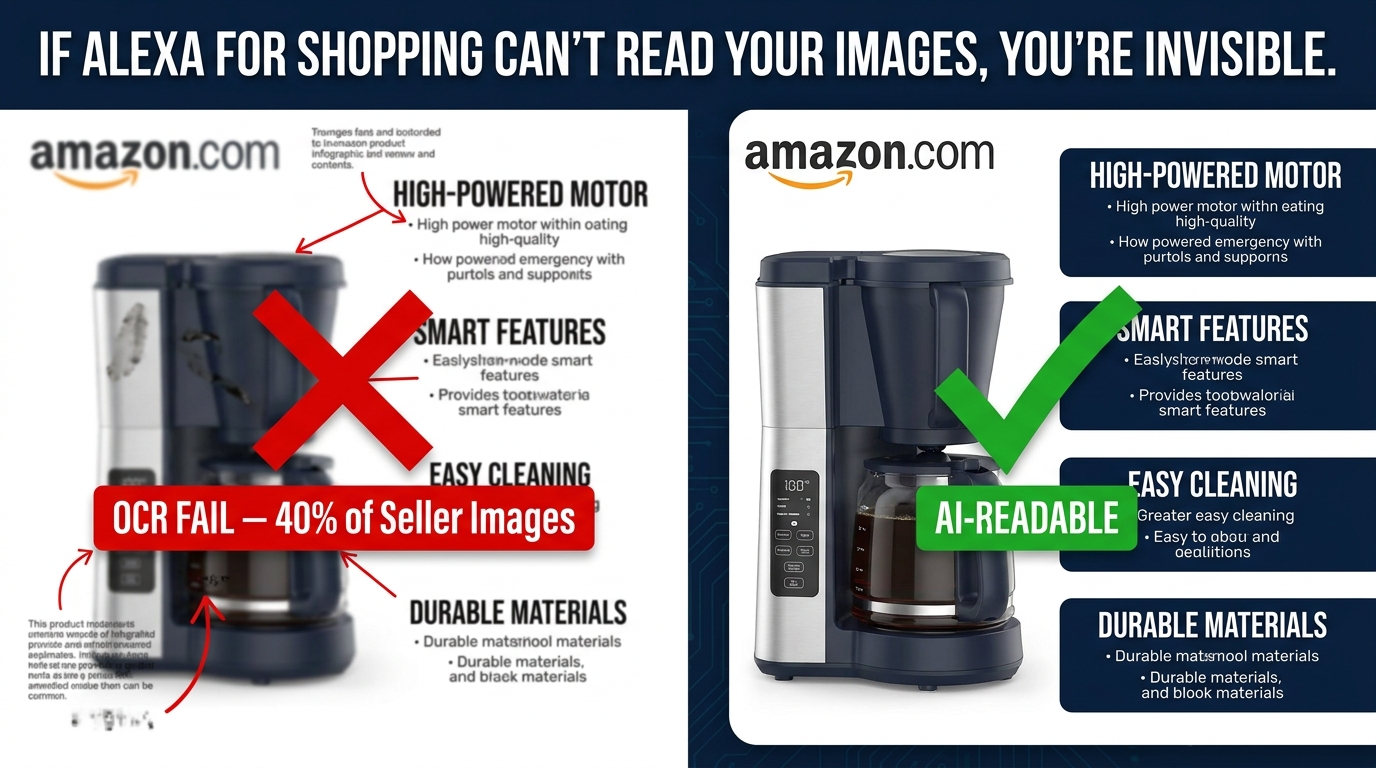
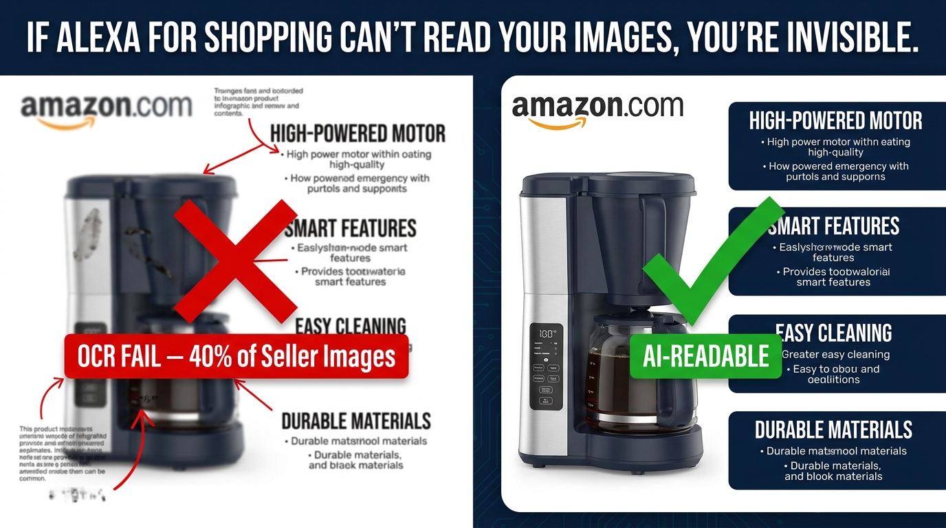
There is a peculiar irony running through a large slice of Amazon’s seller base in 2026. Brands spend real money on professional photography, graphic design, and creative direction to build image stacks they believe are doing heavy lifting on their listings. The product looks sharp. The infographic slides look polished. The lifestyle shots look aspirational. And then Alexa for Shopping — Amazon’s AI shopping assistant, which now mediates the discovery experience for hundreds of millions of shoppers — reads approximately none of the text inside those beautiful images.
Not because the AI is unsophisticated. It is, in fact, highly sophisticated. The problem is that sophistication does not compensate for bad input. When your text overlays use decorative script fonts at 14px, when your callout copy sits in light grey on a white background, when your comparison table is rendered over a busy lifestyle photograph — the OCR layer that feeds the AI assistant fails silently. No error message. No notification in Seller Central. Just a quiet, invisible gap between what your images say and what the AI assistant actually registers.
Industry practitioner data suggests this affects roughly 40% of seller images currently live on Amazon. That means four out of ten image slides in the average product listing are contributing zero textual signal to the system now ranking and recommending your products. The features you paid to showcase, the benefits you need shoppers to understand, the differentiators your brand spent years developing — they exist in your images, but not in Amazon’s model of your product.
This article is about fixing that. Specifically, it covers the technical mechanics of how Amazon’s AI stack reads (or fails to read) product images, the design and content decisions that determine OCR success or failure, and the structured approach to rebuilding your image stack so that every slide contributes legible, indexable, AI-useful information.
From Rufus to Alexa for Shopping — What Actually Changed on May 13, 2026
For most of 2024 and 2025, Amazon’s AI shopping assistant was called Rufus. It launched as a conversational chatbot embedded in the Amazon app, answering shopper questions about products, comparing options, and surfacing recommendations through natural language queries. Sellers learned to optimize their listings for Rufus, and a cottage industry of “Rufus optimization” guides emerged.
On May 13, 2026, Amazon retired the Rufus brand and folded its technology into a unified experience called Alexa for Shopping. The rebrand was more than cosmetic. Alexa for Shopping is designed as an agentic assistant — meaning it does not just answer questions, it can take purchasing-adjacent actions, surface recommendations proactively, compare products across multiple attributes simultaneously, and sit inside the search bar, product pages, the Amazon Shopping app, and Echo Show devices simultaneously.
What This Means Practically for Sellers
The core capability that sellers need to understand remains consistent from Rufus to Alexa for Shopping: the assistant uses multimodal AI to process product listings. That means it does not just read your title, bullets, and description. It also ingests your images, your A+ content, and your customer reviews, fusing all of those signals together to determine how well your product matches a given shopper’s intent.
What changed with the May 2026 transition is scope and surface area. Alexa for Shopping is no longer a sidecar chatbot — it is now woven into the core search experience. When a shopper searches for “insulated travel mug that keeps coffee hot for 8 hours,” the AI assistant is not just filtering results by keyword match. It is actively reading product listings — including image content — to determine which products best answer that specific query.
The implication for image legibility is direct: more shopper queries now flow through an AI layer that reads images. A higher percentage of your organic discovery now depends on whether the AI can extract usable signals from your visual content. The text you buried in a 12px italic font on slide three of your image stack is not a minor design choice. It is a data quality decision that affects how the AI models your product.
The No-Prime Expansion Factor
Alexa for Shopping also removed the Prime requirement that previously limited Rufus access. The assistant is now available to all Amazon shoppers regardless of subscription status. That expands the pool of queries running through AI-mediated discovery considerably — and it means the image legibility problem is not an edge case affecting a niche set of searches. It is a mainstream visibility issue for any seller whose products get surfaced through AI-assisted queries.
How the Multimodal Stack Actually Reads Your Images
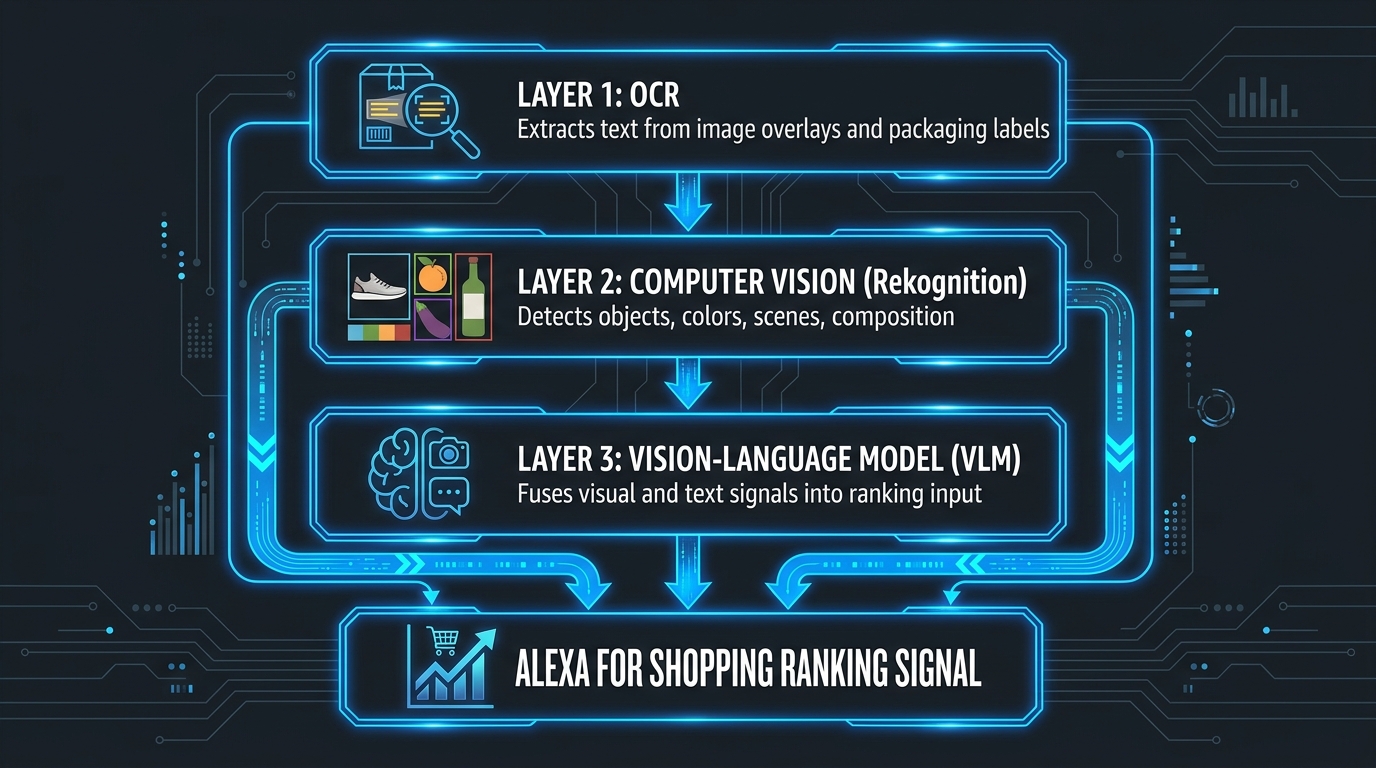
Understanding why image legibility matters requires understanding the technical pipeline that processes your images before any AI assistant ever “sees” them. Amazon does not use a single model to read product images. It uses a layered stack, and each layer has different failure modes.
Layer 1: OCR — Optical Character Recognition
The first pass on any product image is OCR. Amazon uses Amazon Rekognition — its own computer vision service — to extract text from images. Rekognition scans every pixel for character patterns, attempts to reconstruct words and phrases, and hands that extracted text off to downstream systems.
This is where most legibility failures happen. OCR is not magic. It is a pattern-matching system that performs reliably when the input is clean and degrades predictably when the input is noisy. The primary factors that determine OCR success or failure are: text size relative to image resolution, contrast ratio between text and background, font style complexity, text orientation, and the degree to which text overlaps with busy visual elements.
When OCR fails to extract your text, the downstream systems — including the ranking models and the AI assistant — receive no information about what that text said. The feature claim you highlighted in slide four simply does not exist in Amazon’s representation of your listing. It is as if you never wrote it.
Layer 2: Computer Vision via Amazon Rekognition
Alongside OCR, Amazon Rekognition runs object detection, scene classification, color analysis, and compositional analysis on every product image. This layer answers questions like: What type of product is this? What is the dominant color? Is this a lifestyle shot or a white-background product image? Are there people in this image, and if so, what are they doing?
This layer is generally more robust than OCR because it does not require text to be present at all — it works on pure visual content. But it interacts with the OCR layer in important ways. An infographic slide where the text fails OCR but the visual context is clear gives the system partial information: it knows the image exists and something about its composition, but it cannot extract the specific claims or features you were trying to communicate.
Layer 3: Vision-Language Models
The top of the stack is the Vision-Language Model (VLM) — the component that most closely resembles what we think of when we imagine “AI reading an image.” The VLM takes the outputs from OCR and computer vision as inputs and fuses them with the listing’s structured text data (title, bullets, attributes) and review data to construct a unified model of what the product is, what it does, and which shopper queries it is likely to satisfy.
This is the model that ultimately informs Alexa for Shopping’s recommendations. When a shopper asks “what’s the best yoga mat for bad knees?” the VLM is drawing on a representation of each relevant product that includes — when the image stack is legible — the text claims from your infographic slides, the visual attributes detected in your product photos, and the structured keywords in your copy.
When image text fails OCR at Layer 1, the VLM receives an impoverished representation. It can still work with your structured text data, but it has lost a meaningful input channel. In competitive categories where multiple products have similar structured text, the brands whose image text is successfully extracted by OCR have a structural advantage in how richly the AI model represents their product.
The 40% OCR Failure Rate — What It Is, Why It Happens, and What You’re Losing
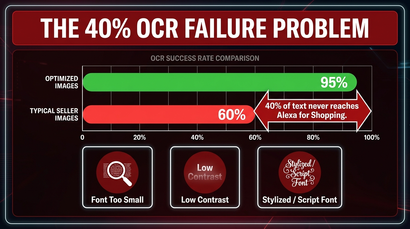
The 40% figure is not Amazon’s published statistic — Amazon does not publicly report on image OCR performance. It comes from practitioner analysis of Amazon Rekognition’s behavior across large seller catalogs, and it is consistent enough across multiple independent sources that it represents a reasonable working estimate for the scale of the problem.
The more important question is not the exact number. It is understanding which specific design decisions cause OCR to fail — because those failures are almost entirely preventable.
Failure Mode 1: Text That Is Too Small at Upload Resolution
Amazon recommends uploading product images at a minimum of 1,000 pixels on the longest side, with 2,000 pixels or higher as the recommended standard for zoom functionality. OCR systems work on pixel data. A text label that appears “readable to a human” when viewed at normal zoom can sit at 18px effective height in the raw image file — below the threshold where Rekognition reliably extracts characters.
The practical threshold from current practitioner guidance is a minimum of 24 pixels of rendered text height at the uploaded image resolution, with 36 pixels or higher as the recommended standard for reliable extraction. On a 2,000px wide image, that means headline text occupying considerably more vertical space than many current listing infographics allow.
The failure pattern is consistent: sellers design their infographic slides on a 1080px canvas in Photoshop or Canva, viewing it at 100% zoom on a large monitor. The text looks fine. They export and upload. But at the resolution Amazon processes for OCR, the body copy is effectively invisible to character recognition.
Failure Mode 2: Insufficient Contrast
OCR systems rely on contrast to distinguish characters from their background. The Web Content Accessibility Guidelines (WCAG) define a minimum contrast ratio of 4.5:1 for normal text legibility — a threshold that also maps closely to the minimum contrast level at which Amazon Rekognition reliably extracts text from images.
Common contrast failures in Amazon seller images include: light grey text on white backgrounds, white or cream text on pastel-colored panels, text that overlaps with gradient transitions in lifestyle photographs, and brand-colored text where the brand palette was chosen for aesthetic rather than accessibility reasons.
The contrast problem is compounded by JPEG compression. Amazon re-compresses uploaded images, and compression artifacts reduce effective contrast at character edges — meaning an image that barely passes a contrast threshold at upload may fall below it after Amazon’s processing pipeline.
Failure Mode 3: Decorative and Script Fonts
OCR systems are trained on the distribution of fonts that appear in real-world text. They handle common sans-serif and serif typefaces extremely well. They handle script, display, handwritten, and heavily stylized fonts poorly to catastrophically.
A brand that uses a custom calligraphic font for its headline copy, or a decorative serif with extreme weight variation, is asking the OCR system to solve a character recognition problem it was not optimized for. The system may extract garbled text, partial words, or nothing at all. From the AI’s perspective, that beautifully branded headline callout is noise.
Failure Mode 4: Text Over Busy Backgrounds
Placing text on top of lifestyle photography — a product in use, a model, an outdoor scene — creates a highly variable background that makes character segmentation difficult. Even at high contrast on average, the local contrast at individual character edges may be insufficient for reliable extraction. This is why the most OCR-reliable infographic layouts use solid or near-solid color panels behind text rather than relying on drop shadows, glows, or partial transparency to create legibility.
What You’re Losing When OCR Fails
When an infographic slide’s text fails OCR, the specific feature claims, benefit statements, and differentiating attributes in that slide do not get added to the AI’s representation of your product. For a product like a protein powder where the critical purchase factors — flavor, protein content per serving, sweetener type, protein source — are typically communicated in infographic slides rather than structured attributes, OCR failure can leave the AI with a materially incomplete picture of what makes your product relevant.
The downstream consequences include: the AI assistant answering shopper queries without being able to reference information that was in your images; your product failing to surface in intent-based queries that your image text would have satisfied; and in competitive categories, rivals with better OCR compliance getting credited with signals that your listing technically contains but cannot effectively communicate.
The Main Image Rule: Why Text-Free Remains Non-Negotiable
Before discussing how to make image text legible, it is worth being precise about where image text belongs at all. Amazon’s product image policy is unambiguous on the main image: it must show the product on a pure white background with no text overlays, no logos in the frame (other than on the product itself), no badges, and no additional props or elements.
This rule exists for multiple reasons, but from an AI-readability perspective it is actually a feature rather than a constraint. The main image slot is where Amazon’s computer vision system performs its most confident product classification. A clean white-background product shot gives the visual system clear signal about what the product is, its shape, its dominant colors, and its physical form factor. Clutter — including text — degrades that signal.
Where Text Belongs and Where It Doesn’t
The hierarchy for Amazon image text placement in 2026 is as follows:
- Main image: No text. No exceptions. Violations risk listing suppression and lose you the clean visual classification signal.
- Secondary images (slots 2–7): Text overlays are permitted and, when properly executed, are actively valuable. These are your infographic slides, benefit callouts, comparison images, and use-case demonstrations.
- A+ Content modules: Text in A+ is processed by the VLM layer and can contribute meaningful signals, particularly in comparison tables and benefit modules. More on this below.
- Amazon Stores: Image tiles in Stores have specific size specifications (3,000×1,500px for full-width tiles) and text overlay guidance that aligns with general OCR best practices.
The practical implication is that your text legibility effort should be concentrated in secondary image slots 2–7 and your A+ content. Those are the surfaces where text is both allowed and actively useful for AI indexing — and where most current sellers are failing silently.
Secondary Images as Structured Data: The New Way to Think About Infographic Slides
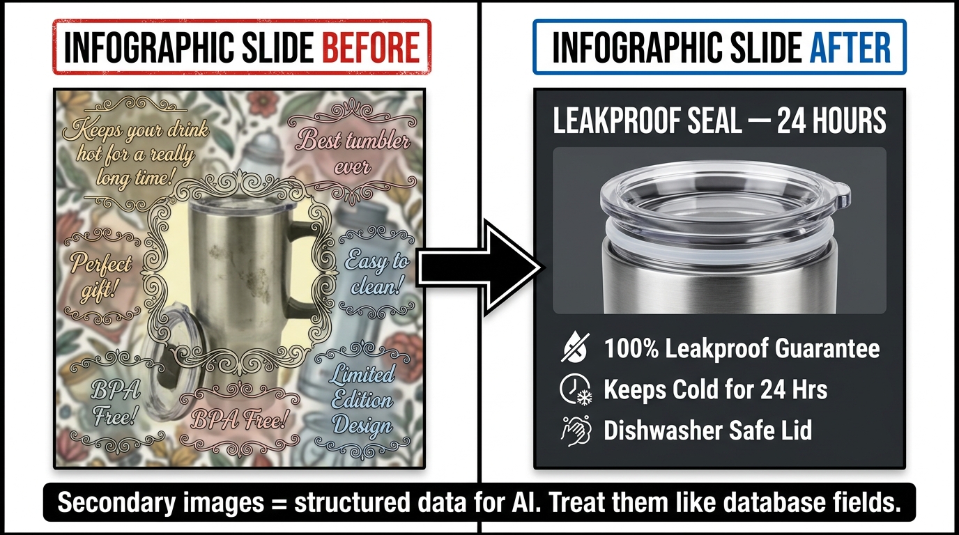
The most significant mindset shift available to Amazon sellers in 2026 is treating secondary image slots not as design canvases but as structured data entry points. This reframing has practical consequences for every decision you make about what goes in those slides and how it is presented.
In the old model, a secondary image slide existed to persuade a shopper who had already clicked on your listing. Its job was emotional and visual: make the product look good, make the brand feel premium, communicate aspirational value. Design instincts optimized for these goals produce images that are often beautiful and often OCR-incompatible.
In the current model, the secondary image slide serves two simultaneous audiences: the human shopper browsing your listing, and the AI system indexing your product. Those two audiences have different but largely compatible requirements. Humans need clarity, hierarchy, and visual appeal. The AI needs extractable text, meaningful semantic content, and consistency with your listing’s other data. Designing well for both is not a compromise — it is a discipline.
Thinking About Slides as Database Fields
Consider reframing each secondary image slot as an entry in a structured product database. If you were writing a database record for your product, what fields would you populate? Key ingredients or materials. Primary use cases. Quantified performance claims. Certifications and compliance. Comparison against the product it replaces. Size and dimension data. Compatibility information.
Each of those “fields” maps directly to a high-value infographic slide. And each slide, if its text is legible, adds that field’s content to the AI’s representation of your product. The AI can then use those fields to match your product to relevant queries it might otherwise have missed.
A protein powder listing with a legible “26g Protein Per Serving — No Artificial Sweeteners” callout in slide three gives the AI a precise, extractable data point. When a shopper asks Alexa for Shopping “what protein powder has no artificial sweeteners?” the AI has a signal to draw on. If that callout is in a 14px script font on a gradient background, that signal does not exist in the AI’s model of your product — even though you put it there.
Content Priority for Each Slot
With six secondary image slots available (and more with enhanced listings), a structured approach to slot allocation produces better AI signals than a purely creative one. A high-performing secondary image stack typically follows this hierarchy:
- Slot 2: The single most important purchase factor for your category — the one claim that most directly answers the primary shopper question. Make this the clearest, most legible slide in your entire stack.
- Slot 3: The second key purchase factor, or a quantified performance claim that supports slot 2.
- Slot 4: Ingredients, materials, certifications, or compliance information — particularly high value for categories where these are active shopper concerns.
- Slot 5: Use case or lifestyle context, with a text overlay that states the use case explicitly rather than relying on visual inference alone.
- Slot 6: Comparison, either against your own product variants or against the category standard (framed as benefit, not competitive attack, to avoid policy issues).
- Slot 7: Social proof anchor or brand story element that reinforces trust signals already present in your reviews.
This is not a rigid template — category context matters significantly. But the underlying logic — allocating each slot to a specific, meaningful data point rather than a vague benefit statement — is consistent regardless of category.
The Technical Legibility Stack — Font, Contrast, Size, and Hierarchy
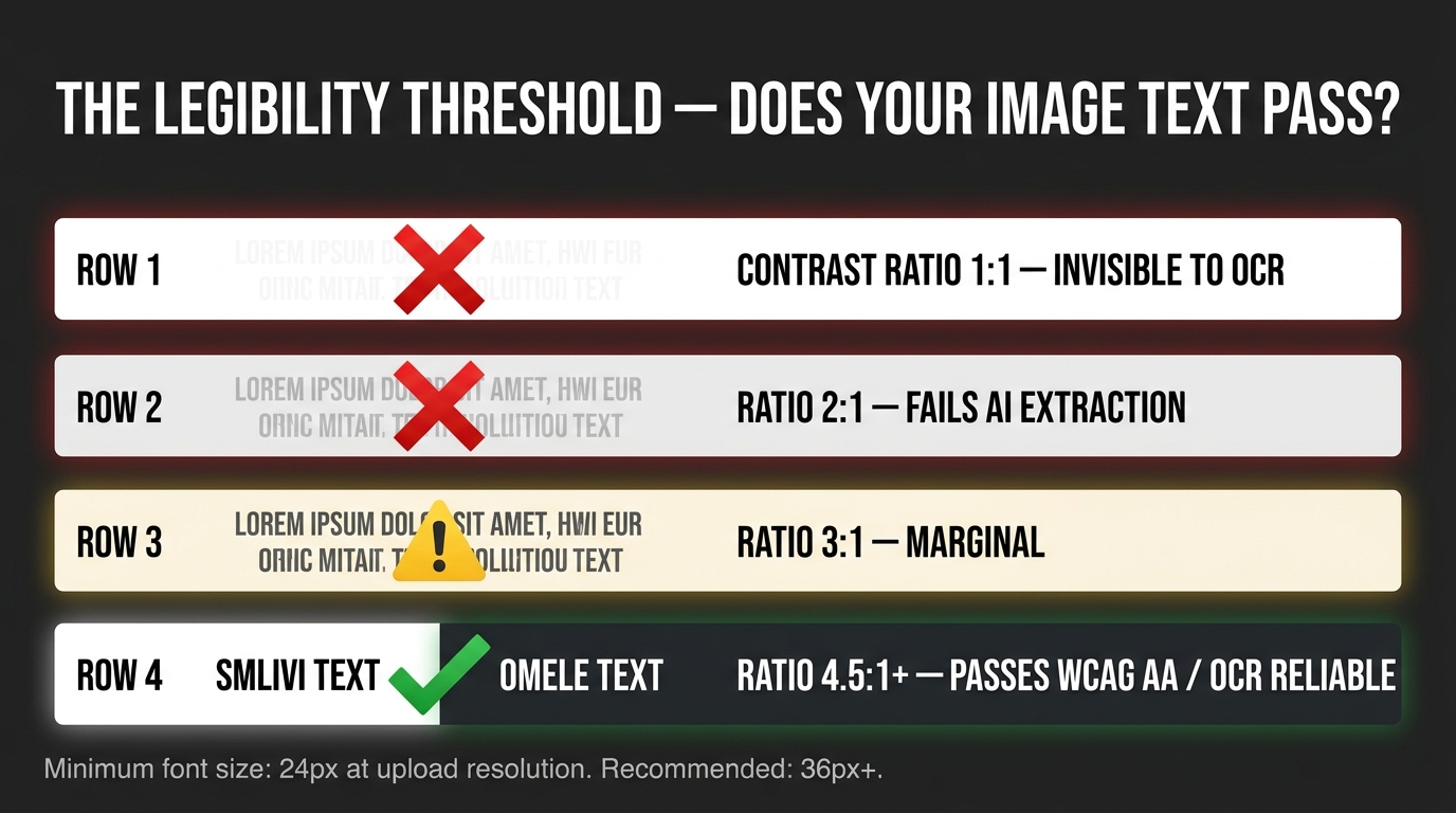
Now the specifics. The following technical parameters are derived from Amazon Rekognition’s documented OCR behavior, WCAG accessibility standards (which correlate strongly with OCR reliability), and practitioner testing across large catalog sets. These are not theoretical recommendations — they represent the thresholds at which OCR success rates shift materially.
Font Selection
Recommended: Clean sans-serif typefaces. Inter, Helvetica Neue, Montserrat, Source Sans, Open Sans, and their equivalents perform reliably in OCR extraction. These fonts have consistent stroke weights, clear character differentiation, and minimal ambiguity between similar letterforms (e.g., I, l, 1).
Acceptable with care: Heavier-weight serif typefaces with consistent stroke widths. Fonts like Playfair Display at heavy weights or Georgia Bold can perform adequately, but they introduce more OCR uncertainty than their sans-serif equivalents.
Avoid: Script fonts, handwritten fonts, ultra-thin weight variants of any typeface, condensed fonts at small sizes, and any custom brand font with unusual letterforms. If your brand guide requires a custom font, use it for hero elements only (large, single-word headlines) and fall back to a standard sans-serif for all substantive content text.
Weight consideration: Use Medium (500) to ExtraBold (800) weight variants for body copy in infographics. Ultra-light variants (100–300) consistently underperform in OCR extraction regardless of size, because thin stroke widths create insufficient contrast at character edges after JPEG compression.
Contrast Ratio
The WCAG AA standard for normal text is a contrast ratio of 4.5:1. For large text (18px+ or 14px+ bold), the minimum is 3:1. These thresholds also represent the practical boundary for reliable Amazon Rekognition OCR extraction.
In practice, aim higher. A contrast ratio of 7:1 or above — which is the WCAG AAA standard — provides a meaningful buffer against the contrast reduction introduced by Amazon’s image compression. This means:
- White (#FFFFFF) text on a dark panel (#1A1A2E or similar) is essentially foolproof.
- Near-black (#1C1C1C) text on pure white (#FFFFFF) is equally reliable.
- Brand-colored text on white backgrounds should be verified against a contrast checker before use — many brand palettes produce ratios in the 2:1–3:1 range that fail OCR.
- Text on lifestyle photo backgrounds requires careful placement to achieve consistent contrast. If you cannot guarantee 4.5:1 across the entire text area, use a solid color panel behind the text instead.
Text Size at Upload Resolution
The minimum for reliable OCR extraction is approximately 24 pixels of rendered text height at the uploaded image resolution. At the recommended upload size of 2,000 pixels on the longest side, this translates to headline text occupying roughly 3–5% of the image height, and body copy at a scale that would feel “large” by typical infographic design standards.
Practical recommendations by content type:
- Main headline / primary claim: Minimum 60–80px at 2,000px image width. This is your primary OCR target — the most important text in the slide should be the most reliably extracted.
- Supporting callouts and sub-claims: Minimum 36–48px at 2,000px width.
- Body copy or list items: Minimum 28–32px at 2,000px width. If your content cannot fit comfortably at this size, reduce the amount of text rather than the font size.
- Fine print, legal disclaimers, certification badges: Anything below 24px is likely to fail OCR. Move critical compliance information into your listing bullets or description where it will be reliably indexed.
Text Volume and Hierarchy
A common design failure is treating infographic slides as a place to say everything at once. The more text you cram into a slide, the smaller each element must be, and the lower the average OCR success rate across the slide. OCR systems also struggle with dense text blocks where character boundaries are close together.
A better approach: one primary claim per slide, expressed in the fewest words possible, at maximum size. Supporting details in a clearly differentiated secondary tier. Three or four bullet points at most per slide. White space is not wasted space — it is contrast buffer, and it gives the OCR system clear character separation to work with.
Orientation and Angle
OCR performs best on horizontally oriented text. Rotated, diagonal, or curved text paths reduce OCR accuracy significantly. If your design includes angled text for visual dynamism, assume that text will not be reliably extracted. Reserve it for purely decorative elements and keep all substantive content claims in standard horizontal orientation.
A+ Content and the Visual Indexing Opportunity Most Sellers Miss
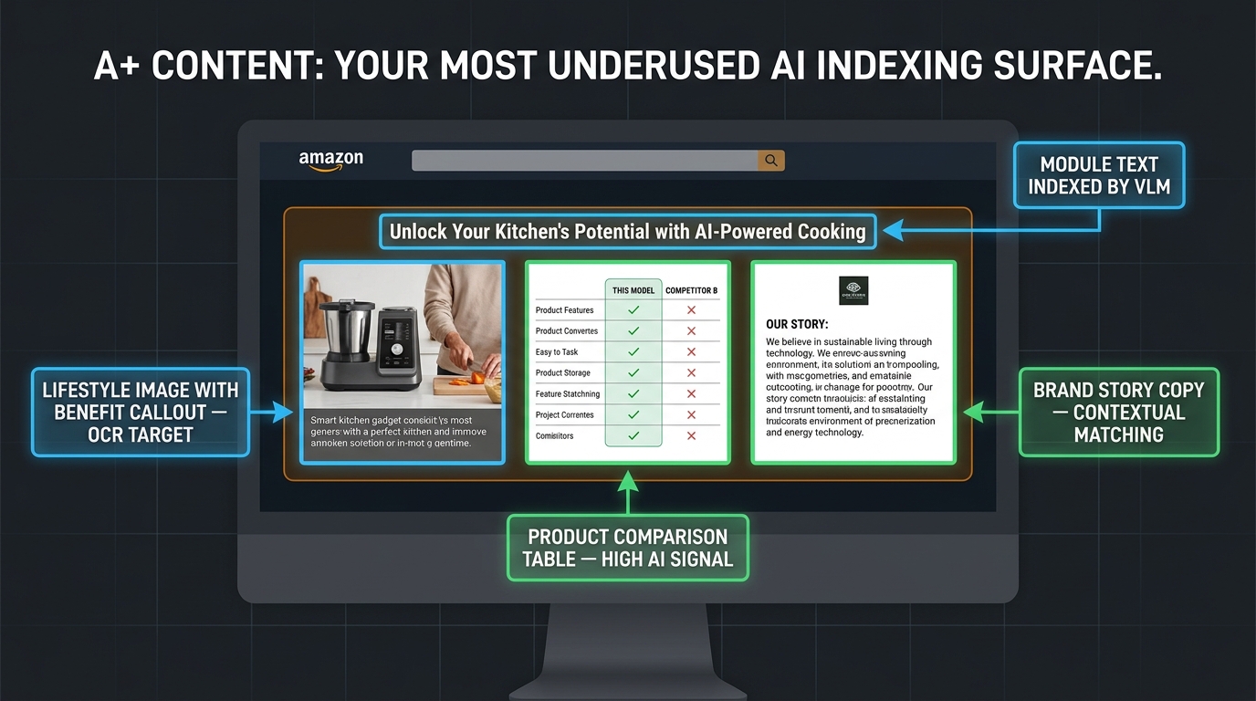
Most seller conversations about image legibility focus on the main product image stack — the seven slots visible on the product detail page. But Amazon’s multimodal AI system also processes A+ Content, and that content represents one of the most underused AI indexing surfaces in most sellers’ catalogs.
A+ Content is processed by the VLM layer of Amazon’s system — the layer that fuses visual and textual signals into a unified product representation. Because A+ Content is brand-registered content with a higher quality signal than user-generated material, it gets meaningful weight in how the AI models the product.
The Comparison Table Opportunity
A+ Content’s comparison module — which allows you to compare your product against other ASINs in your catalog — is particularly high-value from an AI indexing perspective. The structured tabular format of comparison data is highly legible to both OCR and the VLM layer. Attribute names and values in a clean table format are essentially ideal structured input for the AI system.
The mistake most sellers make with comparison modules is treating them primarily as upsell tools — designed to push shoppers toward higher-priced variants. They are also indexing tools. Every row in your comparison table is a structured feature attribute that the AI can use to match your product to relevant queries. Populate the comparison table with attributes that directly correspond to the queries your category shoppers actually ask, not just the attributes that make your premium variant look better.
Image Modules in A+ Content
Images embedded in A+ Content modules are subject to the same OCR and VLM processing as product listing images. The same legibility rules apply: high contrast, sufficient size, clean fonts, horizontal orientation, solid color panels behind text. The difference is that A+ Content images tend to be displayed at smaller effective sizes in the rendered page view, which means the resolution and text size requirements are even more critical relative to the finished image dimensions.
A useful heuristic: design A+ Content image modules as if they will be viewed on a mobile screen at 50% zoom. If the text is still legible at that scale, the OCR system will have no trouble with it. If it requires squinting, it needs to be larger.
Brand Story Modules and Contextual Matching
The brand story section of A+ Content is often treated as a brand values page — a place to talk about origin story, mission, and craftsmanship. From an AI perspective, it is also a contextual signal that helps the VLM layer understand the broader product ecosystem and shopper intent your brand serves.
Brand story copy that includes specific, concrete category language — material types, use contexts, performance characteristics — gives the AI additional context for placing your products in relevant discovery paths. Generic mission statements (“we believe in quality you can trust”) contribute nothing to AI indexing. Specific contextual language (“designed for high-altitude hiking, our insulation technology is tested at temperatures down to -20°F”) gives the AI precise signals to work with.
What to Write in Your Image Text — Content Strategy, Not Just Design Strategy
Legibility is a necessary but not sufficient condition for effective image text. The text also has to say the right thing. An OCR system that successfully extracts “OUR AMAZING QUALITY DIFFERENCE” has added very little to the AI’s model of your product. The same system successfully extracting “TESTED TO ASTM F1292 — 6-FOOT FALL PROTECTION” has added a precise, searchable, query-matching signal that could directly determine whether your product surfaces for a highly relevant shopper.
The Query-Answer Framing
The most useful framework for writing image text content is to ask: what question does this text answer, and is that the question shoppers in my category are actually asking?
Amazon’s AI shopping assistant surfaces products in response to natural language queries. Those queries have specific information needs. A shopper asking “best air purifier for pet allergies” needs to know: does this purifier capture pet dander and pet-specific allergens? A shopper asking “protein powder for women over 50” needs to know: is this appropriate for that demographic, and what specific formulation decisions reflect that?
Your image text should be answering these questions directly and explicitly. Not implicitly through lifestyle imagery and brand aesthetic, but explicitly through text that a query-matching AI can extract and use.
Precision Over Poetry
Brand copywriting instincts often push toward evocative, aspirational language. “Elevate your morning routine” is evocative. “KEEP HOT 12 HOURS / KEEP COLD 24 HOURS” is extractable. The AI assistant processes both, but only one of them becomes a usable data point when a shopper asks “which travel mug keeps coffee hot longest?”
This does not mean your images should read like a spec sheet. It means that the primary claim on each slide should be stated in precise, descriptive language before any evocative framing is added. “ULTRA-SOFT BAMBOO JERSEY — TEMPERATURE REGULATING” serves both the human shopper and the AI. “THE SLEEP YOU DESERVE” serves neither particularly well.
Numerical Specificity as an AI Signal
Numbers are exceptionally well-handled by OCR systems and are high-value signals for AI query matching. A product that states “400-THREAD COUNT” in a legible slide has given the AI a precise matchable attribute for “high thread count sheets” queries. A product that shows “SPF 50+ / PA++++” in its sunscreen infographic has given the AI classification signals for multiple protection-level queries.
Wherever your product has a quantifiable performance claim — capacity, duration, weight, dimensions, concentration, protection level, temperature range — that number should appear in your image text, legibly, in a format the OCR system can extract without ambiguity. Numbers with units beat pure superlatives every time in AI-mediated discovery.
Consistency with Structured Listing Data
One final content principle: the text in your images should be consistent with and complementary to the text in your structured listing data. The AI system fuses image text and structured text — if they contradict each other, the system may discount both. If your title says “BPA-Free” but your infographic slide says “Made with Food-Grade Stainless Steel Only — Zero Plastic Components,” the more specific image claim reinforces and extends the title claim rather than conflicting with it.
Conflicts arise when infographic slides make claims that are absent from structured data entirely — a product marketed as “Keto Certified” in images but with no dietary certification data in the structured attributes, for example. These inconsistencies create uncertainty in the AI’s model of the product and can reduce the confidence with which it surfaces your listing for relevant queries.
Testing and Validating Your Image Legibility
Knowing the rules for legible images is one thing. Verifying that your actual images pass is another. There are several practical methods for testing before you go live — and for monitoring after you do.
Pre-Upload OCR Testing
Amazon Rekognition is available as a standalone API, and you can test your images against it directly before uploading them to Seller Central. Upload your infographic slides to the Rekognition DetectText endpoint and examine the extracted text blocks. Any text that does not appear in the extraction output will not be available to downstream systems including Alexa for Shopping.
This is the most direct method for identifying OCR failures pre-upload, and it gives you actionable feedback: you can see exactly which text blocks failed to extract, adjust size and contrast accordingly, and re-test until extraction is complete.
Third-party tools that wrap this functionality in seller-friendly interfaces are also available, and several major Amazon optimization platforms have added image OCR testing modules to their toolsets in 2026 in response to growing seller awareness of the issue.
Contrast Ratio Checkers
Before finalizing any infographic slide, run each text element through a contrast ratio checker. Free web tools allow you to input the exact hex values of your text color and background color and return the precise contrast ratio. Check every text element, not just the headline. A slide where the headline passes at 7:1 but the supporting bullet points sit at 2.8:1 is still a partial OCR failure.
Manage Your Experiments — The Conversion Validation Layer
Amazon’s Manage Your Experiments tool allows brand-registered sellers to run A/B tests on product images. This is the right mechanism for validating that legibility-optimized images not only improve AI indexing but also maintain or improve human conversion rates.
The typical pattern for running image legibility tests: create a variant image set that applies the technical legibility standards above, run a 4–6 week test against your current images, and measure the impact on conversion rate, click-through rate from search, and (if available) organic rank position changes over the test period.
Sellers running these tests in 2026 consistently report that well-executed infographic improvements lift conversion rates in the 10–30% range relative to plain product photography — consistent with the broader data on secondary image impact. The key “well-executed” qualifier includes legibility as a prerequisite: cluttered, low-contrast infographics do not consistently outperform simpler approaches, and in some cases underperform them by creating visual complexity that discourages shoppers.
Monitoring After Upload
After uploading optimized images, monitor your organic visibility metrics over the following 4–8 weeks. Amazon’s catalog indexing and AI model updates operate on a crawl cycle that is not instantaneous — changes you make today may not be fully reflected in AI-mediated discovery for several weeks. This lag means that image legibility improvements produce a delayed visibility effect, which sellers sometimes misinterpret as evidence that the changes did not work.
Track your brand keyword ranking, non-brand keyword ranking, and (if you have access) the category search terms for which you appear in AI-generated responses. Improvements in non-brand keyword visibility are often the clearest signal that image OCR optimization is working, because non-brand queries rely more heavily on feature-matching signals — the kind of signals your infographic text provides when it is successfully extracted.
The Silent Compounding Effect — What Legible Images Do to Organic Rank Over Time
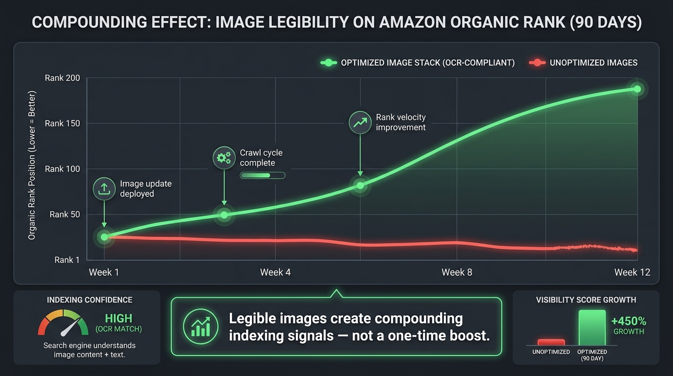
Individual image optimization produces one-time improvements. A consistent commitment to image legibility across your entire catalog produces something different: a compounding structural advantage that accumulates over time and becomes increasingly difficult for competitors to close.
Here is why it compounds. Every time Amazon’s system re-crawls and re-indexes your listing, it updates its model of your product based on all available inputs — including image text. A catalog where every secondary image and every A+ content module consistently provides high-quality, legible, semantically meaningful text gives the system more to work with on every crawl cycle. The AI’s confidence in its classification of your product increases with each successful extraction cycle.
The Relevance Score Feedback Loop
Amazon’s AI systems operate on relevance scores — continuous assessments of how well a product matches a category of queries. High-confidence, consistent signals (including legible image text that consistently confirms the same product attributes) raise the relevance score for specific query types. Higher relevance scores produce better positioning in AI-mediated discovery responses. Better positioning produces more clicks. More clicks produce better conversion data. Better conversion data raises the relevance score further.
This is a virtuous cycle that begins with the data quality of your image text. Breaking into that cycle requires nothing more exotic than making sure the text in your images is actually readable by the system that determines whether shoppers find you.
The Competitive Context
In most Amazon categories, the majority of sellers have not systematically addressed image OCR compliance. This is not an indictment — the problem was not widely understood until the scale of AI-mediated discovery became apparent in 2025 and 2026. But it means that sellers who move now to implement a legibility-first image strategy are doing so in a competitive environment where most rivals are still losing 40% of their image signals.
The window for a first-mover advantage here is meaningful but not permanent. As awareness of the issue spreads, more sellers will optimize. The sellers who build the compounding relevance score advantage now will be harder to displace later — but the advantage is only durable if the underlying catalog quality is maintained and updated as Amazon’s requirements and AI capabilities evolve.
New Products vs. Existing Catalog
For new product launches, building legibility into the image strategy from the start is significantly less costly than retrofitting an existing catalog. New listings start with no crawl history — the AI system builds its initial model of the product from the first crawl. A new product with a fully legible, well-structured image stack gives the AI a high-quality initial model, which tends to produce better early ranking than listings that require iterative improvement to reach legibility compliance.
For existing catalog items, the retrofit approach — auditing current images, identifying OCR failures, and uploading corrected versions — produces improvements but requires patience for the crawl cycle to reflect the changes. Prioritize high-volume ASINs and categories where AI-mediated discovery is demonstrably active (categories with high rates of conversational queries) for the first wave of optimization.
Building the Alexa-Ready Image Audit Process
Turning the principles above into an operational process requires a structured audit methodology. The following framework is designed to be repeatable across a catalog of any size, from a single-ASIN brand to a multi-thousand ASIN catalog operation.
Step 1: Image Inventory and OCR Baseline
Pull all current product images from your Seller Central catalog. Run each secondary image through an OCR extraction test (Amazon Rekognition API or a third-party wrapper). For each slide, record: which text blocks were successfully extracted, which failed entirely, and which were partially extracted with errors. This establishes your baseline OCR compliance rate by ASIN and by slide position.
Step 2: Prioritization by Impact
Not all ASINs are equal. Prioritize the audit and redesign effort by: organic sales volume (high-volume ASINs benefit most from ranking improvements), competitive intensity (categories with AI-active shopper queries benefit most from legibility optimization), and OCR failure rate (ASINs with the highest failure rates have the most room for improvement).
Step 3: Brief Creation for Design Teams
Before sending images to a designer or design agency, create a structured brief for each ASIN that specifies: the primary claim for each slide (one per slide), the exact text to be used (pre-written, query-aligned content, not left to designer judgment), the technical requirements (minimum font size, minimum contrast ratio, approved font families, no text over busy backgrounds), and the image resolution requirement (minimum 2,000px on longest side).
This brief-driven approach ensures that the design output is optimized for AI legibility from the start, rather than requiring a second round of corrections after design has been completed to human-centered aesthetics standards alone.
Step 4: Post-Delivery Verification
Before uploading any new image, verify: OCR extraction test passes for all substantive text elements, contrast ratio check passes at 4.5:1 minimum for all text (7:1 preferred), minimum font sizes met at delivered resolution, no substantive text appears over busy or variable backgrounds. Only images passing all four checks should be uploaded.
Step 5: Monitoring and Iteration
After upload, set a 6–8 week monitoring window. Track organic rank position for 3–5 target keywords per ASIN, click-through rate from search, and conversion rate. At the end of the monitoring window, assess whether improvements match expectations and identify any ASINs where the changes did not produce expected results for further investigation.
Conclusion: The Legibility Gap Is a Data Quality Problem — Treat It Like One
The framing of this problem as a “design issue” has caused a lot of sellers to underestimate its strategic importance. Adjusting font sizes and contrast ratios sounds like a minor creative concern. In the context of AI-mediated product discovery, it is a data quality problem — and data quality problems at scale have outsized consequences.
When approximately 40% of the text in your image stack fails to extract, you are operating with a self-inflicted data gap in how Amazon’s AI models your product. The system is doing its best to match your listing to relevant shopper queries — but it is doing so with less information than you intended to provide. The features you highlighted, the benefits you invested in demonstrating, the differentiators that justify your price point: they are present in your images, but absent from the AI’s representation of your product.
The fix is not complicated. It requires precision, discipline, and a willingness to prioritize AI legibility alongside human aesthetics in design decisions. The technical thresholds are concrete: 4.5:1 minimum contrast ratio, 24px minimum text height at upload resolution, clean sans-serif fonts, horizontal orientation, solid backgrounds behind text, one primary claim per slide expressed in specific and precise language.
Implementing those standards consistently across your secondary image stack and A+ content does not require a major creative overhaul. It requires treating every image slot as a data entry point as well as a visual communication tool — and verifying, before upload, that the data you intended to enter is actually what the system receives.
Alexa for Shopping is reading your images. The only question is whether it can actually read them.
Quick-Reference Checklist
- ☐ Main image: no text, pure white background, product only
- ☐ Secondary images: each slide has one primary claim, stated in precise language
- ☐ Minimum font size: 24px at uploaded image resolution (36px+ recommended)
- ☐ Minimum contrast ratio: 4.5:1 (7:1+ recommended for body copy)
- ☐ Font choice: clean sans-serif for all substantive content (no script, no ultra-thin weights)
- ☐ Text orientation: horizontal only for all extractable content
- ☐ Background: solid color panels behind text, not lifestyle photos
- ☐ Image resolution: minimum 2,000px on longest side
- ☐ OCR pre-test: run Rekognition DetectText before uploading
- ☐ Contrast pre-test: verify all text elements against a contrast ratio checker
- ☐ A+ content: apply same legibility standards to all image modules
- ☐ A+ comparison table: populate with query-aligned attributes, not just upsell positioning
- ☐ Content consistency: image text claims consistent with structured listing data
- ☐ Monitor post-upload: track organic rank and CTR over 6–8 week crawl window