Tag: Search Query Performance

  • What Your SQP Data Is Actually Telling You About Your Images (And How to Act on It)

    What Your SQP Data Is Actually Telling You About Your Images (And How to Act on It)

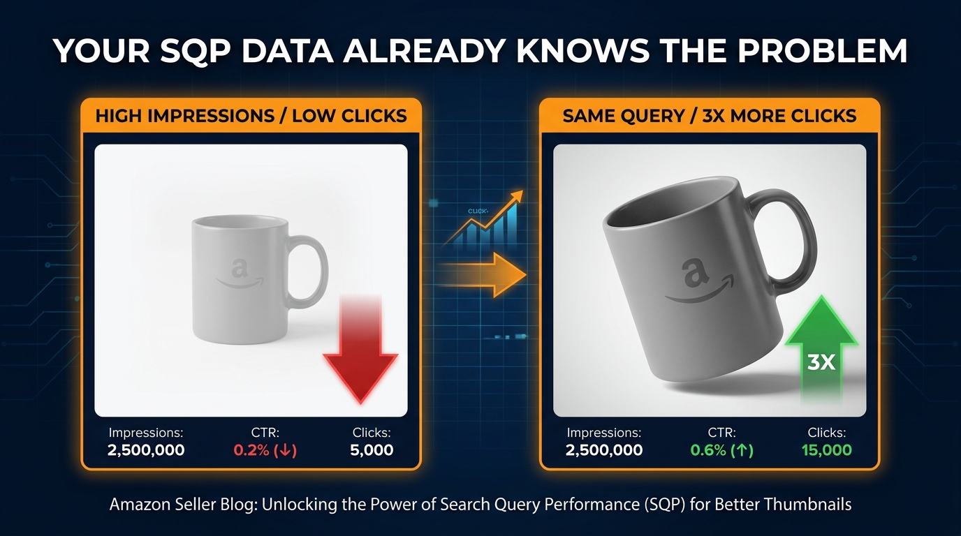
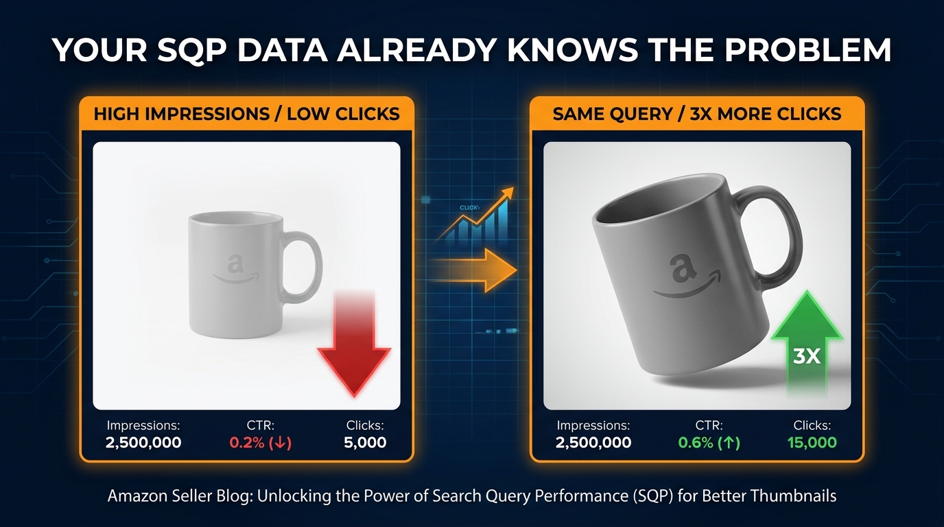
    Split-screen showing high impressions vs low clicks on identical Amazon products, with the text YOUR SQP DATA ALREADY KNOWS THE PROBLEM

    Most Amazon sellers treat the Search Query Performance (SQP) report as a keyword discovery tool. They pull it, look at what queries are driving volume, and feed those terms back into their listings and PPC campaigns. That’s not wrong — but it’s only half the job, and it’s the less valuable half.

    The more powerful use of SQP data is as an image diagnostic system. Every query in your SQP report carries a silent verdict about your main image: either shoppers are clicking on it, or they’re not. When your impression share is outpacing your click share on a given query, the market is telling you something very specific — your listing is showing up, but your thumbnail is losing the moment of decision.

    This post is about building a CTR-first methodology around that signal. Not a “make pretty images” philosophy, but a structured workflow where SQP data tells you which queries to fix, your competitive audit tells you why you’re losing them, and your image changes are tested and tracked back to the same dataset that identified the problem in the first place. It’s a closed-loop system — and it’s one that most sellers aren’t running yet, even in 2026 when the tools to do it have never been more accessible.

    The sellers who understand this have a compounding advantage: better CTR drives ranking, better ranking drives more impressions, and more impressions at higher CTR rates drive purchases — all without increasing ad spend. That’s the actual prize here.

    Why SQP Is an Image Diagnostic Tool First

    The conventional framing of SQP is that it answers the question “which keywords should I target?” But SQP’s most precise signal sits one layer deeper: it tells you, at a per-query level, how your listing performs at the moment of comparison against every competing product in those search results.

    Let’s be precise about what SQP actually measures. At the ASIN level, you get five core metrics for each query: impressions, clicks, add-to-carts, purchases, and your percentage share of each relative to the total market for that query. These five numbers describe your complete conversion funnel for every individual search term, not in aggregate, but query by query.

    The Moment SQP Becomes a Visual Feedback Signal

    When you compute your click share as a percentage of your impression share for any given query, you get a ratio that has a very specific meaning. A ratio close to 1.0 means your listing is converting impressions to clicks at roughly the same rate as competitors. A ratio significantly below 1.0 means you are consistently being chosen less often than your share of eyeballs would predict — and at that specific moment on that specific query, the thing differentiating you from every other listing is your thumbnail.

    It’s not your price — shoppers can barely process price in 0.3 seconds of glance time on a search results page. It’s not your reviews — they register as a star rating and a number, which changes very little between listings in competitive categories. It’s primarily your main image. That’s the creative variable that governs whether a shopper’s eye pauses on your listing or slides to the next one.

    This is the insight that makes SQP such a powerful image tool: it’s not showing you abstract engagement metrics — it’s showing you exactly which shopping scenarios your image is failing in, and how severe the failure is.

    What SQP Cannot Tell You Directly

    SQP doesn’t tell you why your image is losing. It doesn’t explain whether your frame fill is too small, your product angle is confusing, your background isn’t clean enough, or your packaging doesn’t match what shoppers expect to see for that query. That diagnosis requires a separate step — the competitive thumbnail audit. But SQP gives you the targeting precision to know exactly where to look. Without it, you’re guessing which images to improve and testing without a hypothesis. With it, you’re following data to the specific queries where image quality is costing you clicks at scale.

    The Impression-Click Gap: Anatomy of a Missed Click
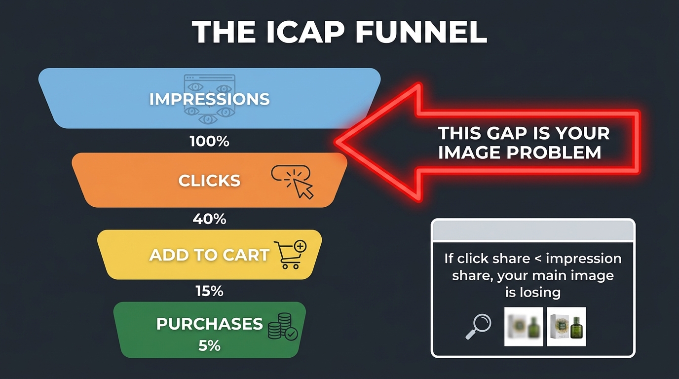
    ICAP funnel diagram showing the gap between impressions and clicks as the image problem, with click share vs impression share callout

    The impression-click gap is the core diagnostic unit of a CTR-first image strategy. Understanding its anatomy — what causes it, what makes it worse, and what conditions it can and cannot diagnose — is essential before you start pulling data.

    Defining the Gap with Precision

    For any given query in SQP, your impression share represents how often your ASIN appeared in search results when someone searched for that term, as a percentage of total appearances across all competitive ASINs. Your click share represents what percentage of all clicks on that query you captured. The gap is simple arithmetic: impression share minus click share. A gap of zero means you’re winning clicks proportionally to your visibility. A gap of 10 percentage points means for every 10 times you appear, you’re capturing 10 fewer clicks than you should be if performance were neutral.

    In practice, most competitive categories see individual ASINs with impression-click gaps of 5 to 20 percentage points, meaning the typical product is significantly underperforming on click capture relative to its visibility. The best-performing listings — the ones with highly optimized thumbnails, strong reviews, and competitive pricing — often show negative gaps, meaning their click share actually exceeds their impression share. These listings are punching above their weight in every impression they receive.

    What the Gap Is Really Measuring

    Think about what happens in a search results page interaction. A shopper types a query, Amazon displays up to 60+ ASINs across multiple pages. But eye-tracking research across e-commerce platforms consistently shows that the vast majority of clicks go to the first handful of results, with position and visual salience being the two dominant variables. Your impression share is largely a function of your ranking and PPC coverage — it tells you how often you’re in the room. Your click share is a function of what happens once you’re in the room.

    The gap, therefore, isolates the creative and pricing performance of your listing from the ranking and advertising performance. A high impression share with low click share tells you that you’ve solved the ranking problem but not the persuasion problem. That’s precisely where image optimization applies.

    The Compounding Cost of a Large Gap

    What makes the impression-click gap worth obsessing over is that it’s self-reinforcing. Amazon’s A10 algorithm factors click-through rate into ranking signals — listings that generate more clicks per impression gradually gain organic rank, which in turn generates more impressions, creating a flywheel. Conversely, listings with persistently low CTR on high-volume queries signal to the algorithm that the listing isn’t what shoppers want for that search, which can suppress organic rank over time even when keyword relevance and sales velocity are strong.

    This means a large impression-click gap isn’t just a revenue problem today — it’s a compounding ranking problem tomorrow. Fixing it through image optimization isn’t just about winning more clicks this week; it’s about building an organic rank trajectory that sustains itself without relentless advertising spend.

    Segmenting Queries by Intent Before You Touch a Single Image
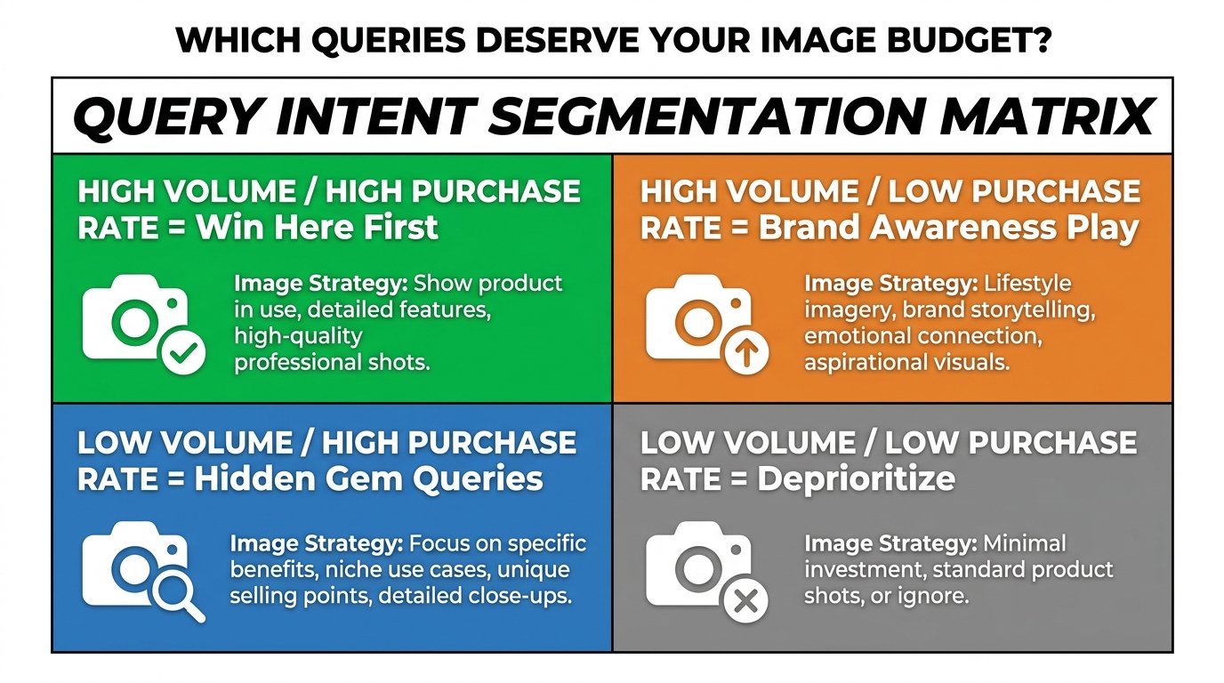
    2x2 query intent segmentation matrix showing high volume/high purchase rate vs low volume/low purchase rate quadrants for image budget prioritization

    One of the most consequential mistakes in SQP-driven image optimization is treating every query the same way. Not all queries with a large impression-click gap deserve the same response — because not all queries represent the same type of shopper, the same conversion potential, or the same type of image requirement.

    Before you commission a single reshooting session or brief a designer, you need to segment your SQP queries into buckets based on intent. This segmentation determines both the priority order of your image work and the creative direction for each set of images.

    Using the Full ICAP Funnel to Classify Intent

    SQP gives you the complete ICAP funnel data (Impressions, Clicks, Add-to-Cart, Purchases) at the query level. The shape of this funnel for each query is your intent signal. Here’s how to read it:

    • High impression share + high purchase rate relative to click rate: These are high-converting queries where every click is valuable. The funnel narrows sharply at clicks but stays wide through to purchases. These are your highest-priority image optimization targets because improving CTR here has an outsized downstream revenue impact.
    • High impression share + high click share but low cart-add rate: Shoppers are clicking but not converting. The image is working — but there’s a disconnect on the product detail page. This is a content and gallery image problem, not a main image problem.
    • High impression share + very low click share + moderate purchase rate: The classic image problem. Shoppers who do click through are buying, but too few are clicking in the first place. This is your primary CTR-first opportunity.
    • Low impression share across the board: This is a ranking or advertising coverage problem, not an image problem. No amount of image optimization will fix an ASIN that isn’t appearing for the query in the first place.

    Building the Segmentation in Practice

    Export your SQP data for the past 90 days. Create a spreadsheet with columns for each of the five ICAP metrics plus the derived ratios: click share ÷ impression share (your “click efficiency ratio”) and purchase share ÷ click share (your “post-click conversion ratio”). These two derived metrics tell you where each query sits on the problem spectrum.

    Queries with a click efficiency ratio below 0.7 and a post-click conversion ratio above 0.5 are your Tier 1 image optimization targets — they have proven buying intent but your image is losing the click competition. Sort by impression volume to find the ones where fixing the image will move the most revenue. These are the queries that deserve your first creative brief and your first Manage Your Experiments test.

    The Intent-to-Image Connection

    Intent segmentation also informs what your image should actually show. A query like “stainless steel french press 34 oz” is a high-specificity, high-intent search — the shopper knows exactly what they want, and your image needs to confirm at a glance that your product matches their mental model. A query like “coffee maker gift” is a browse-intent, low-specificity search — shoppers are evaluating options, and your image might benefit from communicating context and occasion rather than just product specs.

    This distinction matters enormously for creative direction. The same product needs different images to win different types of queries — which is exactly why the Amazon gallery exists. But for main image optimization, you need to understand which intent type represents the majority of your high-gap, high-volume queries, because that’s the shopper your thumbnail needs to convert first.

    The Competitive Thumbnail Audit: Seeing What Shoppers See
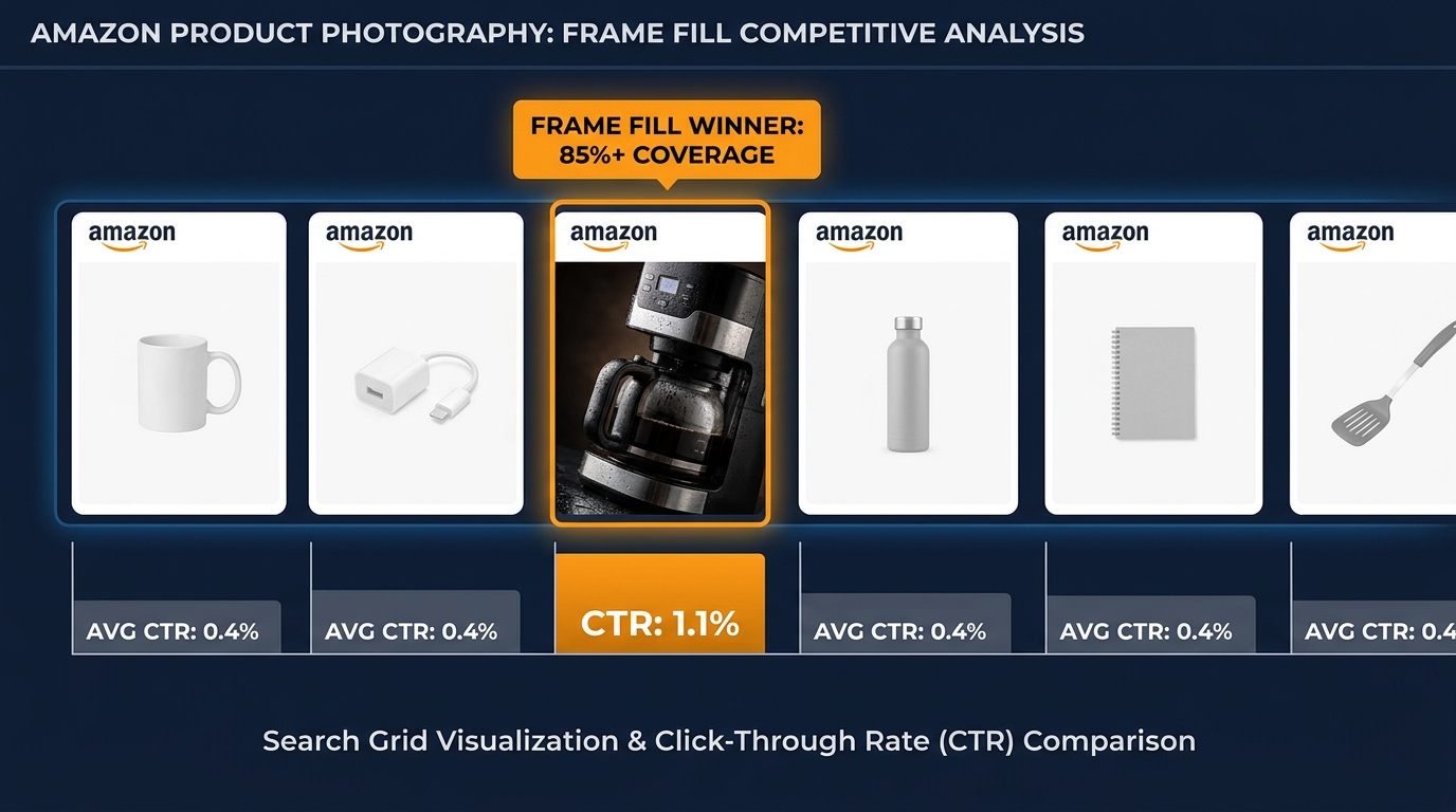
    Row of Amazon product thumbnails where one standout image with 85% frame fill dominates CTR compared to generic competitors

    SQP tells you that you’re losing clicks on a specific query. The competitive thumbnail audit tells you why — and more importantly, what winning looks like in that context. This is the step most sellers skip because it feels qualitative, but done systematically, it’s highly actionable.

    How to Run a Query-Level Thumbnail Audit

    For each of your Tier 1 queries from the intent segmentation step, open an incognito browser window (or use Amazon’s mobile app) and perform the actual search. Don’t look at the page as a seller — look at it as a shopper who has 8–10 seconds to scan results and decide where to click. Take a screenshot. Then do the following analysis:

    Step 1: Identify the visual winners. Which three to five thumbnails draw your eye first? Note what they have in common: product scale relative to the frame, background cleanliness, angle, color contrast against the white search results page, and whether any visual element creates a clear differentiation from adjacent listings.

    Step 2: Locate your ASIN. Find your own listing in the results. Does it visually stand out or blend in? Does it appear smaller, lower-contrast, or more generic than the top-performing thumbnails? Be honest about this assessment — what you see is what shoppers see.

    Step 3: Document the gap. List the specific visual differences between your thumbnail and the three most visually compelling listings on that SERP. These differences are your creative brief. Common gaps include: product fills less than 70% of the frame (competitors fill 85%+); product angle shows a less informative face of the product; packaging detail is illegible at thumbnail size; product appears in a shadow or unclean white background; key differentiators (size, color, quantity) are invisible in the thumbnail.

    What Frame Fill Actually Means

    Frame fill is the percentage of the image area that the product itself occupies. Amazon’s own seller guidelines recommend that the product occupy at least 85% of the image. But many sellers interpret this as “the product plus any packaging” — which often results in a thumbnail where the actual product looks small against the full image dimensions.

    At thumbnail size (Amazon displays main images at roughly 160×160 pixels in most grid views), a product filling 65% of the frame looks dramatically smaller than a product filling 85%. In categories where product size is a purchase decision (kitchenware, supplements, tools, outdoor equipment), that size signal can be a decisive factor in the click decision. Shoppers choose what looks bigger and more substantial, all else equal.

    Color Contrast and Category Context

    Every product category has a de facto visual language — a set of image conventions that experienced shoppers in that category have internalized. Beauty products tend to be shot with clean, clinical precision. Outdoor gear tends to use bold angles that suggest durability. Food products use color saturation that triggers appetite appeal. When your thumbnail violates category visual conventions, it registers as slightly “off” to shoppers, even if they can’t articulate why — and that feeling translates to fewer clicks.

    Conversely, when your thumbnail conforms to the best version of category visual conventions but differentiates through one specific element — an angle, a color accent, a size demonstration — you’re working with the shopper’s expectations rather than against them. The audit is your way of mapping those conventions for your specific competitive set.

    Building Your Image Priority Queue from SQP Data

    With your segmented query list and competitive audit complete, you now have enough data to build an image priority queue — a ranked list of image changes, ordered by expected revenue impact. This is where the data work pays off, because it means you’re not spending budget on image redesigns for queries that are already performing well, or for queries where the problem isn’t actually the image.

    The Priority Scoring Framework

    Score each potential image change opportunity using three inputs from your SQP analysis:

    1. Query volume: Higher monthly search volume means more impressions, which means more clicks available to capture. Weight this heavily — a 10% CTR improvement on a 50,000-impression query is worth more than a 30% improvement on a 5,000-impression query.
    2. Impression-click gap magnitude: Larger gaps represent more clicks being left on the table. An impression share of 12% with a click share of 3% is a more urgent problem than impression share of 8% with click share of 6%.
    3. Post-click conversion rate: This is your confidence signal. If the queries where you have a large gap also show strong purchase rates among the clicks you do capture, then every additional click you win is highly likely to convert to revenue.

    A simple priority score: (Query Volume × Impression-Click Gap) × Post-Click Conversion Rate. Sort your query list by this score, descending. The top 10 queries are your first image sprint. Don’t try to fix everything at once — a focused, sequenced approach produces cleaner test data and clearer attribution.

    Single-Image vs Multi-Image Strategy

    An important structural question: are all your top-priority queries being lost by the same image weakness, or are different queries revealing different creative problems?

    If your audit shows that the problem is consistent — say, frame fill is too small across the board — then a single main image redesign will address multiple queries simultaneously, and you should test one new image variant across all affected queries. But if different queries reveal different problems (one query’s SERP is dominated by lifestyle imagery while another’s is dominated by technical specification callouts), you may need to consider whether multiple listing variants, Sponsored Brands imagery, or A+ content can serve as creative solutions for the secondary queries while your main image optimizes for the primary one.

    Respecting Amazon’s Main Image Constraints

    One reality check that every CTR-first strategy must account for: Amazon’s rules for main images are specific and enforced. The main image must show only the product (no additional props, backgrounds, text overlays, or lifestyle elements) on a pure white background (RGB 255,255,255). Amazon has ramped up enforcement of these rules, with AI-based image scanning flagging non-compliant images with increasing accuracy in 2026.

    This means your creative options for the main image are narrower than they might seem: angle, frame fill, lighting, product configuration (assembled vs. components), color variant selection, and shadow treatment are your primary variables. These constraints aren’t limitations — they’re a creative challenge. The best-performing main images in competitive categories win within these rules, not by working around them. Your competitive audit should surface how the winners are doing this.

    What to Change First: Frame Fill, Angle, Overlays, or Color

    Once you have a priority queue and a creative brief from your thumbnail audit, the practical question is sequencing: which change should you make first? Not because you can only make one change, but because you can only test one hypothesis at a time and attribute the result correctly.

    The Four Primary Image Variables

    Frame fill is almost always the first change to test if your audit shows your product appearing smaller than competitors’ at thumbnail size. The mechanics are simple: crop tighter, shoot closer, or remove excess whitespace in post-production. This change is fast, cheap to implement, and often produces the largest single-variable CTR lift because it changes the product’s visual weight on the page.

    The target is 85%+ product coverage within the frame. Test at thumbnail size — not at full image size — because that’s the context in which the change matters. A product that looks perfectly framed at 1000×1000 pixels may still look small at the 160px thumbnail dimension depending on the product’s aspect ratio and shape.

    Product angle is the second variable to test when frame fill is already strong. The question is whether your current angle communicates the product’s most important attribute at thumbnail size. For a multi-tool, a top-down spread of tools might be more informative than a three-quarter view. For a supplement, a front-facing label view with legible branding might outperform an angled glamour shot. The audit tells you what angle the CTR winners in your category are using — test toward that angle if it differs from yours.

    Product configuration applies to items that can be shown assembled or disassembled, packaged or unpackaged, singular or in set quantities. For multi-packs, showing the quantity visually (three bottles arranged together) rather than relying on text to communicate it can significantly improve CTR for queries like “bulk” or “pack of 3” — because the image confirms what the query expects before the shopper has to read anything.

    Shadow and lighting treatment is a subtler variable but meaningful in categories where product quality and premium positioning matter. Hard shadows against white backgrounds can make products look lower-quality or older in photography style. A natural drop shadow or completely shadow-free shot (achieved in editing) can meaningfully shift the perceived value of the product, which affects click behavior particularly for higher-price-point items.

    What Changes to Defer

    If your audit identifies that competitors are winning with lifestyle imagery in the main image slot, don’t try to replicate this by violating Amazon’s content policies. Non-compliant main images can get your listing suppressed — which eliminates all your impressions, not just your clicks. The correct response to a lifestyle-dominated SERP is to make the strongest possible compliant main image while investing in Sponsored Brands creative for that query, where lifestyle imagery is explicitly permitted.

    Running Manage Your Experiments Without Wasting 8 Weeks
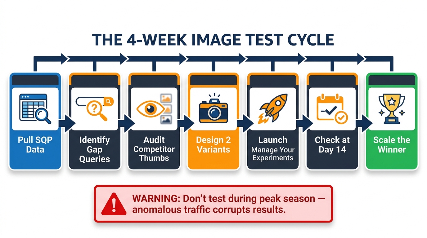
    7-step image test cycle flowchart showing the process from pulling SQP data through launching experiments to scaling the winner

    Amazon’s Manage Your Experiments (MYE) tool is the native way to A/B test main images with statistical rigor, and it’s available to brand-registered sellers with sufficient traffic. The challenge most sellers face with MYE isn’t technical — it’s methodological. They run experiments without a clear hypothesis, test too many variables simultaneously, or let tests run indefinitely without acting on the results.

    Designing a Test That Produces Actionable Data

    The single most important principle in MYE testing is one variable at a time. If you change the angle, the frame fill, and the color balance simultaneously in your test image, you cannot attribute a CTR change to any specific element. You’ll know the new image performed better (or worse), but you won’t know why — which means you can’t systematically build on the result.

    Start with the highest-priority change from your creative brief: if the audit showed frame fill is the primary gap, test only a tighter frame fill, keeping all other elements identical. If the test wins, you’ve confirmed the hypothesis and can proceed to the next variable. If it loses, you’ve ruled out frame fill and need to reassess your audit findings.

    Write your hypothesis explicitly before launching: “We believe that increasing frame fill from 65% to 85% on our main image will improve CTR on queries with high impression-click gaps by reducing our visual size disadvantage against the top three competitors on those SERPs.” This forces clarity about what you’re measuring and why, and it gives you a post-test evaluation framework beyond just “did the number go up?”

    The Traffic Threshold Problem

    MYE requires sufficient traffic to reach statistical significance within a reasonable timeframe. Amazon’s own guidance suggests experiments need at least a few hundred clicks per variant to be meaningful. For high-traffic listings, this can happen within two to three weeks. For lower-traffic ASINs, an experiment might require six to eight weeks to reach the traffic threshold — during which time market conditions, pricing, and competitive dynamics can all shift, introducing noise into the results.

    If your ASIN doesn’t have enough organic traffic to run MYE efficiently, there are two workarounds. First, consolidate your experiment to your highest-traffic ASIN in a brand and apply learnings to lower-traffic ASINs without formal testing — directional data from a high-traffic sibling product is better than no data. Second, use Sponsored Products to drive controlled traffic to both variants during the experiment period, accelerating the time to statistical significance. This costs money, but it gets you a result in half the time and significantly reduces the influence of external variables.

    Reading the Results Without Bias

    MYE results show you both statistical confidence and projected annual sales impact. The temptation is to declare a winner as soon as the confidence indicator is high — but confidence in a statistically insignificant positive result can still be misleading. Look for both high confidence (85%+ by Amazon’s indicator) and a meaningful delta in the primary metric before calling the experiment.

    Also watch what MYE measures by default: it typically optimizes for units sold, not CTR specifically. Since CTR improvements cascade through to units sold, this is usually the right metric — but if your test shows improved CTR with flat units sold, the issue may be post-click conversion, not the main image. That’s a useful finding too, and it redirects your optimization effort to the product detail page rather than the thumbnail.

    Tracking CTR Gains Back to SQP: Closing the Loop
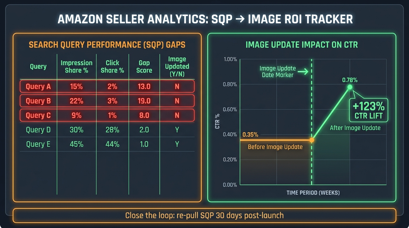
    Analytics dashboard showing SQP to image ROI tracker with before and after CTR line graph showing 123% CTR lift after image update

    This is the step that turns a one-time image fix into a repeatable system. Once you’ve made an image change and your MYE test has concluded, you need to return to SQP and measure whether the impression-click gap on your target queries actually narrowed. This closes the feedback loop — and it’s where most sellers drop the thread, walking away after the MYE result without verifying the effect in the source data.

    The 30-Day SQP Pull Protocol

    Pull your SQP data approximately 30 days after your new main image goes live (or after the MYE winner is deployed at 100%). Compare your click share on the Tier 1 queries you targeted against the click share from the 90-day period before the change. Look specifically at:

    • Did your click share increase on the target queries?
    • Did your impression share stay flat or increase (ruling out ranking changes as a confounding variable)?
    • Did your add-to-cart share and purchase share move proportionally with click share, or did click share increase while downstream metrics lagged (suggesting the new image is drawing the wrong shopper intent)?

    The third point is important and often overlooked. An image change that dramatically improves CTR but produces a parallel drop in add-to-cart rate is a warning sign — the new image may be winning clicks from shoppers whose intent doesn’t match the product. This is particularly common when sellers make images more visually dramatic in ways that create expectations the product doesn’t meet. A 40% CTR improvement that comes with a 30% conversion rate drop is a net negative. SQP catches this where MYE’s unit-sales metric might not.

    Building a Query-Level Tracking Sheet

    Maintain a persistent spreadsheet — or automate a pull using Amazon’s Brand Analytics API if your volume justifies it — that tracks, for each of your priority queries, the click efficiency ratio (click share ÷ impression share) across rolling 90-day periods. This gives you a longitudinal view of image performance that no single-point-in-time snapshot can provide.

    Update this tracking sheet every 30 days. Over time, you’ll see which queries have been permanently improved by image changes, which ones drift back toward poor CTR as competitors update their own images, and which new queries have emerged (through keyword expansion or market growth) that have entered your impression profile but are showing early signs of a click gap.

    This tracking discipline is what distinguishes a CTR-first image strategy from a one-time image refresh. The market changes. Competitors improve their thumbnails. New entrants arrive with better creative. Your SQP data will surface these dynamics before they cost you meaningful revenue — but only if you’re actually looking at it on a recurring basis.

    When Better Images Aren’t Enough: The Price, Badge, and Rating Factor

    A rigorous CTR-first strategy requires intellectual honesty about what main image optimization can and cannot fix. There are real scenarios where the impression-click gap is caused by factors that have nothing to do with your thumbnail — and chasing an image solution for a non-image problem wastes time, budget, and creative energy.

    Price as a CTR Variable

    On most Amazon search result pages, price is displayed prominently alongside the thumbnail. At desktop size, shoppers can see price before they click. This means a meaningful portion of your impression-click gap on price-sensitive queries may be attributable to price positioning rather than image quality. The diagnostic test is simple: temporarily narrow the price gap against the top two competitors on your highest-gap queries and monitor the click efficiency ratio in SQP over the subsequent 30-day period. If click share moves meaningfully with the price change while nothing else changes, price was the dominant variable — not the image.

    Review Count and Star Rating

    In some categories, review count and star rating are the primary click-decision variables, particularly for commoditized products where thumbnails are relatively undifferentiated and shoppers are using social proof as a quality shortcut. If your ASIN has significantly fewer reviews or a lower rating than the top CTR performers on your target queries, image optimization alone will not close the gap.

    The practical implication: use your click efficiency ratio as a proxy for competitive health. If your ratio is below 0.7 and you have strong images, competitive pricing, and good reviews, then image refinement is the right lever. If your ratio is below 0.7 and you have 47 reviews versus competitors with 4,700, invest in review acquisition first and revisit image optimization once social proof is no longer the dominant impression-to-click barrier.

    The Amazon Choice Badge and Coupon Flags

    One underappreciated CTR driver is badge visibility. Amazon’s Choice badges, Prime badges, and coupon flags all appear in the search results thumbnail view and demonstrably affect click-through behavior. If your competitors are running 10% or 15% off coupons that appear as bright orange flags on their thumbnails, that visual element competes directly with your image quality for click attention.

    This isn’t an argument to run coupons at all times (the economics may not support it) — but it’s a reminder that your main image doesn’t compete in isolation. Your thumbnail is the sum of the product photo, the price, any badges, the rating and review count, and the Prime eligibility indicator. All of these together constitute what a shopper sees in the 0.3-second glance that determines whether they click. Image optimization addresses one component of that bundle — and an important one — but a truly CTR-first strategy accounts for all of them.

    Scaling the System: From One ASIN to a Full Catalog

    Once you’ve run the SQP-to-image workflow successfully on one or two high-priority ASINs, the question becomes how to scale it across a larger catalog without the analytical workload becoming unmanageable. This is where systematization matters more than sophistication.

    Building the Triage Layer

    At catalog scale, you can’t do a deep competitive thumbnail audit for every ASIN every month. Instead, build a triage system that surfaces which ASINs deserve deep analysis based on their SQP signal. Create a weekly or monthly report that flags any ASIN whose average click efficiency ratio across its top 10 queries has dropped below 0.65 in the current 90-day window, compared to the prior window.

    ASINs flagged by this triage trigger go into the deep analysis queue: competitive audit, creative brief, and MYE experiment. ASINs with stable or improving ratios get a lighter-touch review — no immediate action, just continued monitoring. This approach concentrates your creative investment where the data says it matters, and keeps the system sustainable at scale.

    Building a Creative Asset Library

    As you run image experiments across your catalog, you’ll accumulate institutional knowledge about what works — which angles win in your category, what frame fill level consistently outperforms, whether your brand’s color palette helps or hurts thumbnail differentiation. Document these findings explicitly and build them into a creative brief template that your photographers and designers use for every new ASIN shoot.

    This means your new product launches start with a higher creative baseline informed by performance data from your existing catalog. Instead of launching with an image that will need to be improved after SQP data accumulates, you launch with an image built on the principles that your data has already validated. The result is shorter ramp-up times to optimal CTR and less lost revenue during the critical early weeks of a new ASIN’s life.

    Integrating SQP Review into Operations

    The final piece of scaling is operational: making SQP review a standard, recurring business rhythm rather than an occasional deep-dive. Set a monthly cadence for SQP pulls. Assign clear ownership for the analysis. Build the click efficiency ratio and impression-click gap metrics into whatever reporting dashboard your team reviews regularly. When SQP data is part of weekly business reviews alongside advertising metrics and inventory health, it stops being an advanced tool that only power users access and becomes a standard part of how your team thinks about listing health.

    At that point, the CTR-first image strategy is no longer a project — it’s a process. And that’s when the compounding advantage starts to accumulate: consistent click efficiency improvements quarter over quarter, organic rank gains that reduce dependence on paid traffic, and a visual competitive moat that takes competitors significant time to close.

    Conclusion: The Repeatable SQP-to-Image Workflow

    The core insight of a CTR-first image strategy is disarmingly simple: Amazon already tells you which queries your image is failing on — you just have to know how to read the signal. The SQP report, used as an image diagnostic tool rather than a keyword tool, gives you query-level precision about where the impression-click gap is largest, which queries have the conversion potential to make closing that gap profitable, and whether your changes are actually working.

    The workflow this produces has a clear, repeatable sequence:

    1. Pull SQP data for 90 days at the ASIN level. Compute click efficiency ratios and post-click conversion rates for each query.
    2. Segment queries by intent using the full ICAP funnel shape. Identify Tier 1 targets: high gap, high conversion, high volume.
    3. Run the competitive thumbnail audit for your top 10 priority queries. Document the specific visual differences between your ASIN and the CTR winners.
    4. Build a priority-scored image change list based on expected revenue impact (volume × gap × conversion rate).
    5. Test one change at a time through Manage Your Experiments. Write an explicit hypothesis before launching. Wait for statistical significance before acting.
    6. Close the loop in SQP 30 days post-launch. Verify that click share improved on target queries. Watch for any deterioration in add-to-cart or purchase rates that would indicate the image is attracting the wrong intent.
    7. Systematize and scale. Build triage triggers for catalog-wide monitoring. Compile creative learnings into a brief template. Make SQP review a standing business rhythm.

    What makes this system valuable isn’t any single step — it’s the closed loop. Too many Amazon optimization efforts are one-directional: change something, hope for the best. SQP-driven image optimization is iterative and self-correcting. The data that tells you where to start is the same data that tells you whether you succeeded — and that’s a structural advantage most of your competitors aren’t building yet.

    In a marketplace where the average click-through rate sits between 0.4% and 0.6% and the difference between a 0.4% CTR and a 0.8% CTR represents double the organic traffic at identical advertising spend, the sellers who take image performance seriously — and measure it with the same rigor they apply to their PPC metrics — are the ones building durable, compounding advantages. SQP is your starting point. The image is your lever. The click efficiency ratio is how you know it’s working.
  • SBV in the Era of Search Query Performance: What Your Video Ads Are Missing About Shopper Intent

    SBV in the Era of Search Query Performance: What Your Video Ads Are Missing About Shopper Intent

    For most Amazon advertisers, Sponsored Brands Video and the Search Query Performance report exist in separate mental boxes. SBV lives in the campaign console — a creative problem, a bidding problem, a CPM problem. SQP lives in Brand Analytics — a keyword intelligence tool, a competitive research exercise, something you check once a month if you remember.

    That separation is expensive. And in 2026, it’s becoming one of the clearest dividing lines between brands that are growing search share and brands that are running hard while staying still.

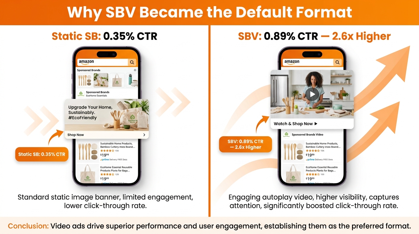
    The argument here is straightforward: SQP is the most granular first-party data Amazon gives you about what shoppers actually type, what they click, what they add to cart, and what they eventually buy. SBV is the ad format with the highest CTR on Amazon search — now sitting at roughly 0.89–1.0%, compared to 0.34% for static Sponsored Brands. When you stop treating these as separate tools and start treating them as two halves of a single diagnostic loop, something clicks into place.

    You stop guessing about which queries deserve video coverage. You stop running the same creative against search terms that are performing differently at different funnel stages. You stop measuring SBV success only through ACOS when the real question is share — impression share, click share, purchase share, on the specific searches where your category is being decided.

    This post walks through how to build that loop in 2026: what SQP actually tells you about your search funnel, how to translate its data into SBV campaign decisions, how to structure your creative for the way SBV actually gets watched (silently, on a phone, during a scroll), and how to build a review cadence that keeps the whole system self-correcting week over week.

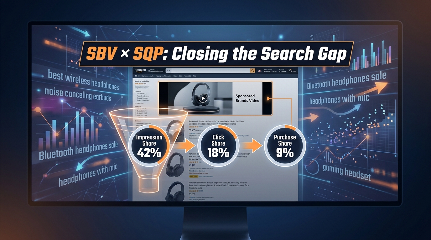
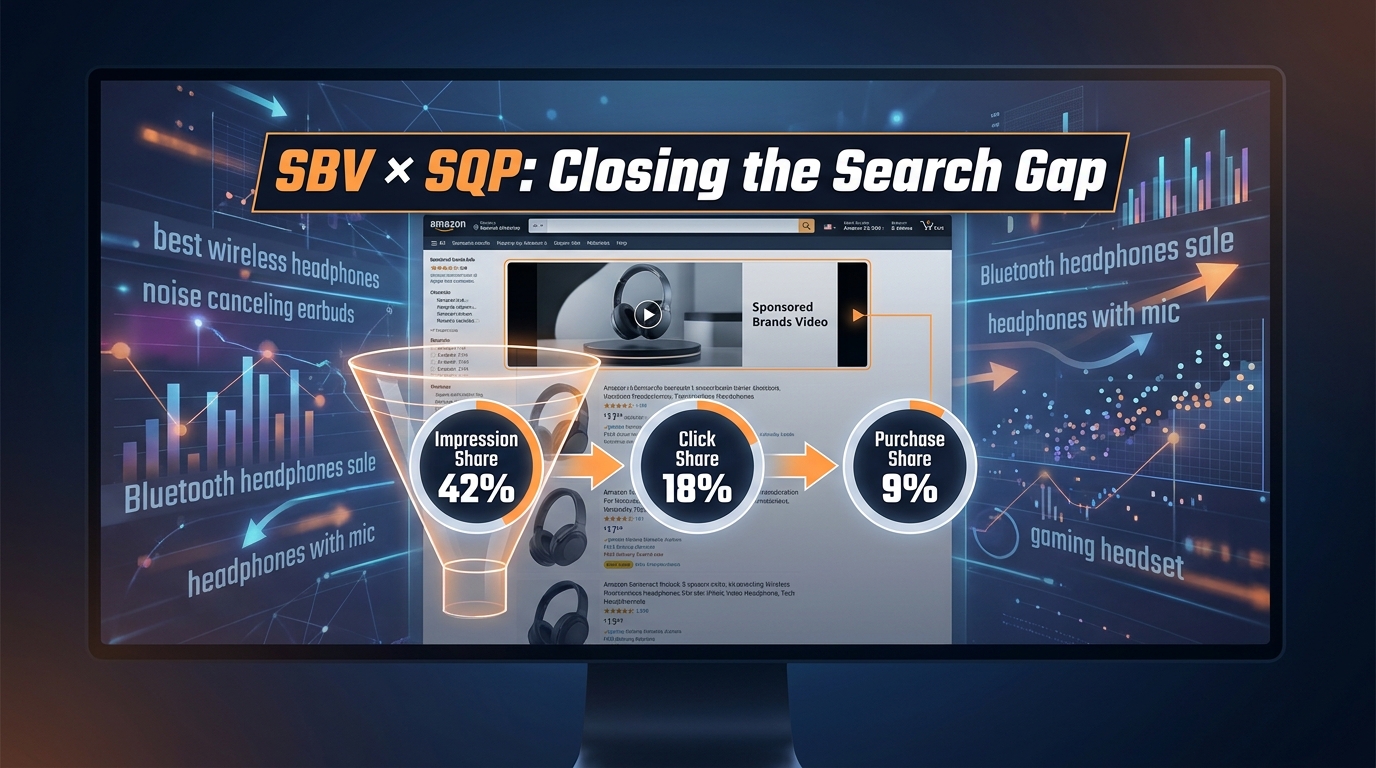
    SBV and Search Query Performance dashboard showing funnel metrics: Impression Share, Click Share, Purchase Share

    What the Search Query Performance Report Actually Tells You (And What It Doesn’t)

    The SQP report lives inside Seller Central under Brands → Brand Analytics. It’s available to brand-registered sellers and gives you first-party Amazon data at the search query level — not estimates from third-party tools, not scraped keyword data. This is what Amazon recorded shoppers actually searching, clicking, adding to cart, and purchasing, with your brand’s and ASINs’ share at each stage.

    The Four Data Points That Matter

    For each query in the report, you get four share metrics: your brand’s impression share, click share, add-to-cart share, and purchase share. Each is expressed as a percentage of the total activity on that query across all sellers. A query with 50,000 monthly searches where your brand captures 3% of impressions, 8% of clicks, 12% of add-to-carts, and 15% of purchases tells a very different story than one where you have 40% impression share but only 5% purchase share.

    The report also shows you the total query volume (as a search frequency rank rather than a raw number), the top three clicked ASINs for each query and their click shares, and the top three clicked ASINs for purchases. This competitive layer is where the real intelligence lives — you can see exactly which ASINs are winning clicks on searches you’re losing, and whether those are your own products, a competitor’s, or both.

    The Data Gaps You Need to Understand

    SQP is powerful, but it has real limitations that affect how you interpret it. First, the data is blended — it shows combined organic and paid traffic, so you cannot directly isolate how much of your impression or click share is coming from SBV ads versus organic rank versus Sponsored Products. That blending means you can’t use SQP alone to evaluate SBV; you have to correlate it with your ad console data manually.

    Second, the report has a data lag. Typically you’re looking at data that is 72 hours to a week behind real time, and the most useful view is the rolling 90-day period, not last week. For trend analysis that’s fine; for tactical daily decisions it’s not the right tool.

    Third, SQP does not break out new-to-brand vs. existing customers at the query level. You can see total purchase share, but not what percentage of those purchases came from people buying your brand for the first time. For acquisition-focused SBV strategies, you need to layer in the new-to-brand metrics from your Sponsored Brands reports separately.

    None of these gaps make SQP less valuable. They make the workflow for using it alongside SBV more specific — which is what the rest of this post addresses.

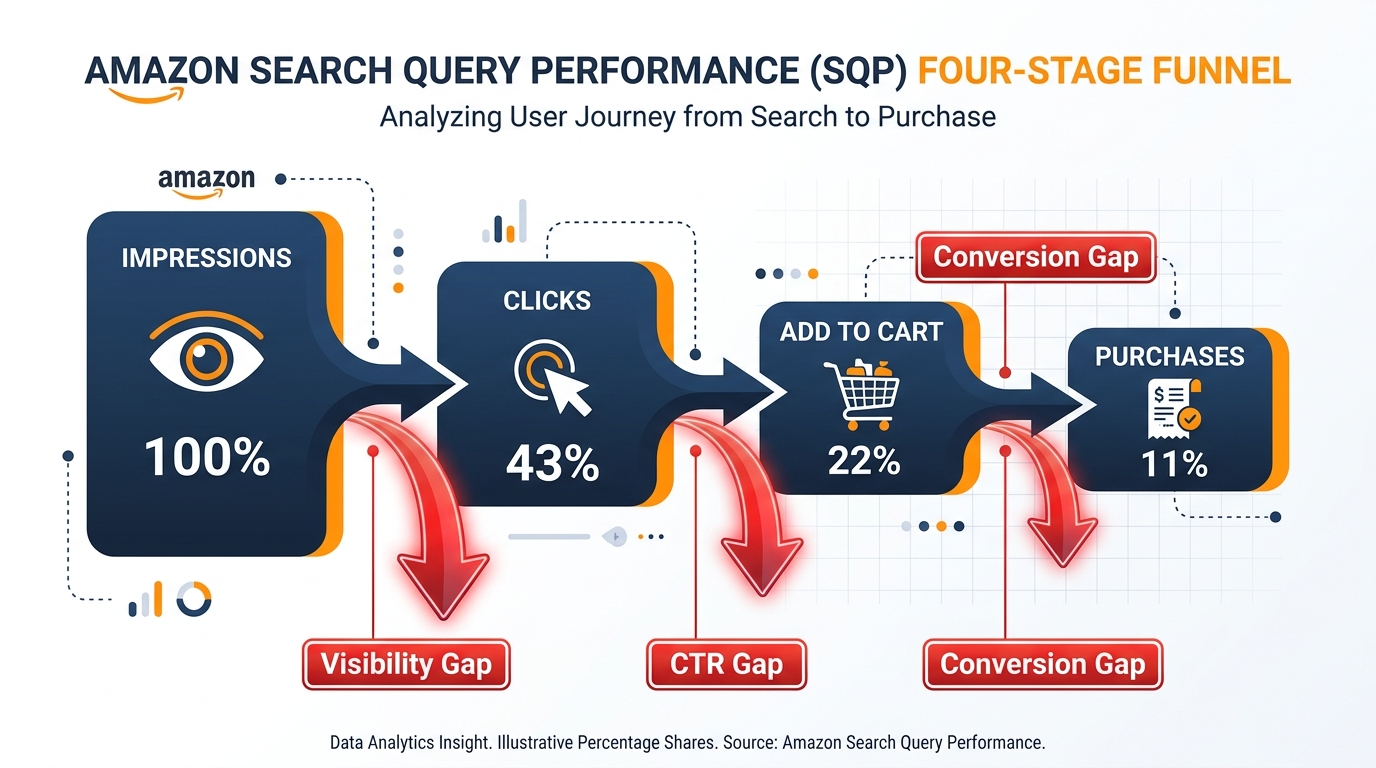
    Amazon SQP funnel showing four stages: Impressions, Clicks, Add to Cart, Purchases with drop-off rates between each stage

    Why SBV Became the Default Sponsored Brands Format

    Understanding why SBV has risen to dominance matters for this discussion because it explains why the format deserves to be treated as a strategic, query-level tool rather than just a creative add-on. The numbers behind the shift are substantial.

    The Performance Gap Is Real and Widening

    Across 2025 and into 2026, SBV has consistently benchmarked at a CTR of 0.89–1.0% — roughly 2.6 times higher than static Sponsored Brands ads, which average around 0.34–0.40%. Conversion rates (CVR) for SBV sit at approximately 11.2%, around 13% higher than image-based Sponsored Brands. Amazon’s own research found that brands adding SBV alongside static SB ads saw 25% higher CTR and 10% higher year-over-year sales growth.

    These aren’t marginal differences. At scale, a 2.6x CTR advantage on high-volume category searches compounds dramatically. If you’re running static SB on a search term that drives 50,000 monthly impressions and your CTR is 0.35%, you’re getting 175 clicks. At SBV’s 0.89% CTR, that same impression volume generates 445 clicks. With an 11% conversion rate, you’re looking at the difference between 19 and 49 attributed sales from that single query.

    Budget Allocation Has Shifted Accordingly

    By Q1 2026, approximately 58% of total Sponsored Brands spending across major advertisers has shifted to video formats, up from a minority share just two years prior. In some aggressive verticals — consumer electronics, home goods, beauty — the figure runs higher still, with some accounts directing 70–90% of their SB budget to video. The shift isn’t driven by strategy alone; it’s being reinforced by results, and those results are being measured at the query level by the advertisers running SQP analysis alongside their campaigns.

    SBV Now Has Search-Level Competitive Implications

    The consequence of this shift is that SBV has become a competitive moat for the brands using it well on high-volume category searches. A competitor who dominates top-of-search with an autoplay video ad doesn’t just win that click — they set the visual and emotional framing for every shopper who sees their product moving before anyone else’s product is visible. In categories where the differentiation between products isn’t immediately obvious from a static thumbnail, that first-mover dynamic on search results can materially distort click distribution across the entire SERP.

    This is why SBV decisions need to be made with SQP data in hand. The question isn’t “should we run video?” at a campaign level. The question is “on which specific searches is a video presence most likely to flip click share and purchase share in our favor?”

    Side-by-side comparison of static Sponsored Brands ad vs SBV video ad showing CTR difference: 0.35% vs 0.89%

    The Four-Stage Funnel Hiding Inside Your SQP Data

    Most advertisers who use SQP use it as a keyword research tool — they look for queries where they have low impression share and interpret that as “bid more.” That’s a valid use of the report, but it misses three-quarters of the diagnostic value. The real power comes from reading all four funnel stages together and understanding what different drop-off patterns mean for your strategy.

    Stage One: Impression Share — The Visibility Gate

    Impression share (IS) in SQP represents the percentage of times your brand appeared (in organic or paid results) on a given search, out of all the times that search was performed. Low impression share means shoppers are searching for something in your category and your brand is simply not present for that query. The causes can be keyword coverage gaps in your Sponsored Brands or Sponsored Products campaigns, low organic ranking due to relevance or sales velocity issues, or budget constraints causing your ads to drop off before the day is done.

    When you see low impression share on a high-volume category query, SBV is a direct intervention mechanism. Running an SBV campaign targeting that keyword ensures your brand appears — typically at the top-of-search placement where SBV inventory sits — on every eligible search, regardless of your organic rank. It’s a way to buy presence while you work on the organic improvements that take longer to materialize.

    Stage Two: Click Share — The Creative Verdict

    Click share measures what percentage of all clicks on a query went to your brand’s listings. A high impression share with a low click share is a creative and positioning problem, not a visibility problem. You’re showing up, but shoppers are choosing someone else. On organic searches, this can be driven by weak main images, non-competitive pricing, or lower review counts. On paid search, it means your ad — whether static SB or SBV — isn’t compelling enough relative to the competition to earn the click.

    This is the stage where SBV’s inherent CTR advantage is most directly applicable. If your SQP data shows a pattern of strong impression share but weak click share on a cluster of high-value queries, a targeted SBV campaign on those specific terms is a testable hypothesis. If your creative is right, you should see click share improve within a reporting period. If it doesn’t, the problem is likely product positioning, price competitiveness, or a competitor with a dominant review profile — and video won’t fix those.

    Stage Three: Add-to-Cart Share — The Intent Signal

    Add-to-cart share is the metric most advertisers overlook in SQP because it doesn’t map cleanly to any single ad report. But it’s a critical leading indicator. A healthy progression from click share to add-to-cart share (say, 12% clicks → 10% ATCs) suggests that shoppers are engaging with your product page and finding your offer credible. A severe drop-off (12% clicks → 3% ATCs) flags a listing quality issue: your price is out of range for the search intent, your images don’t deliver on the promise set by your video ad, or your product description doesn’t address the considerations that matter for that specific query.

    SBV campaigns that send traffic to a product detail page (a capability now widely available in 2026, rather than being forced to route through a Brand Store) make this ATC drop-off visible and actionable. When you send SBV traffic directly to your PDP, the relationship between your ad creative and your listing quality becomes direct and measurable. A shopper who watched your video for five seconds and clicked is primed; if they abandon on the product page, the failure is in the listing, not the ad.

    Stage Four: Purchase Share — The Real Outcome

    Purchase share is the final metric — what percentage of total purchases on a given query are going to your brand. This is the number that tells you whether all of the above is translating into business outcomes. Strong purchase share relative to click share means your conversion rate is above category average. Weak purchase share relative to strong click share means you’re attracting traffic but losing it at the purchase decision.

    Mapping purchase share back to specific queries in SQP is the closing loop in the entire framework. When you can identify a set of five, ten, or twenty queries where you have above-average impression and click share but below-average purchase share, you have a prioritized list of product-level problems to solve — and those solutions (better reviews, more competitive pricing, improved size/variant selection) will pay dividends across every traffic source, not just your SBV campaigns.

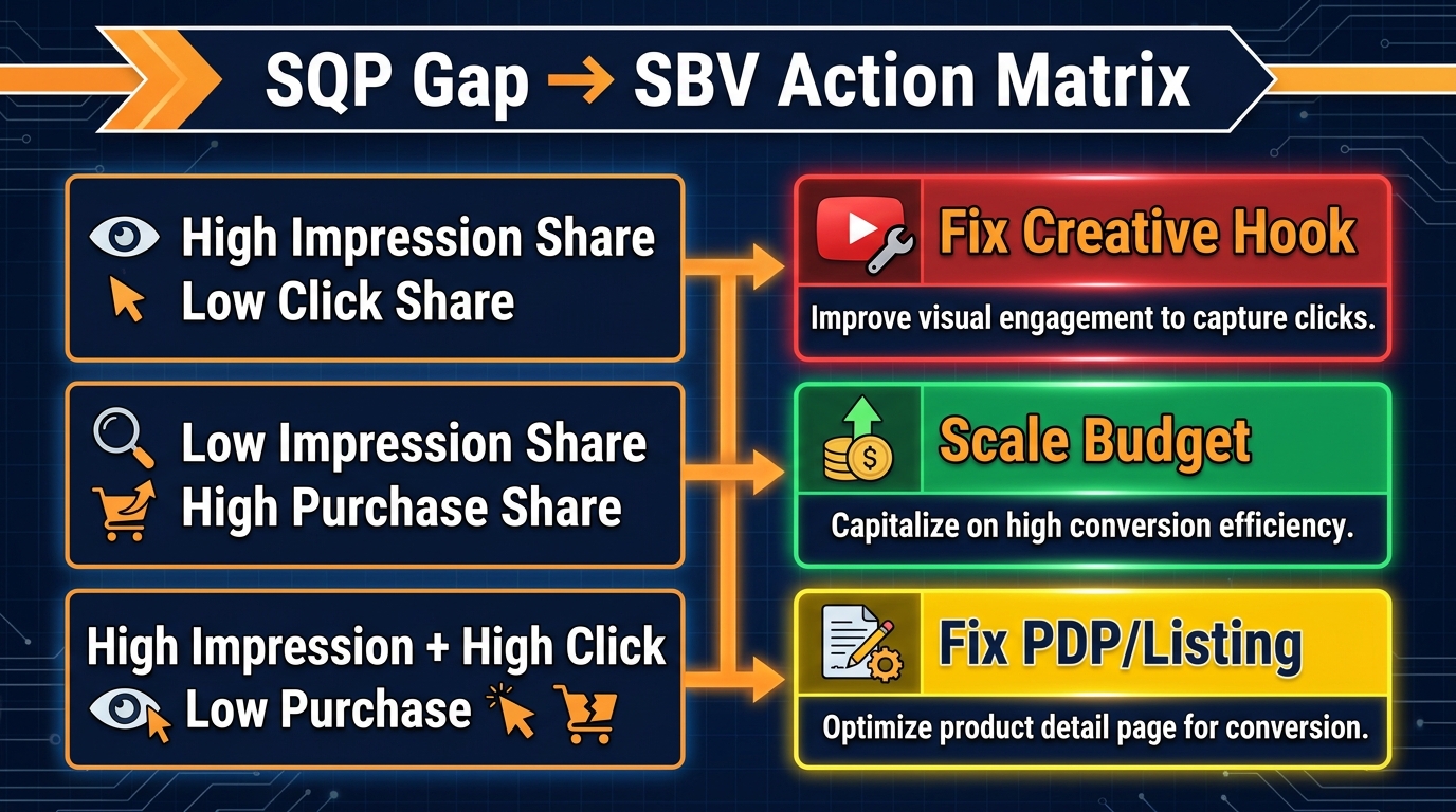
    Mapping SQP Gaps to SBV Campaign Actions

    The diagnostic value of SQP is only realized when it produces specific campaign and creative actions. Here is a practical framework for translating the four gap types into SBV decisions.

    SQP Gap to SBV Action Matrix showing three gap types and their corresponding campaign responses

    Gap Type 1: Low Impression Share on High-Volume Queries

    The action here is straightforward: build SBV campaigns with exact and phrase match targeting on the specific queries where you have low impression share. Set competitive bids — these are searches you’re currently invisible on, so the cost of not bidding is paid in lost brand awareness and lost sales, not just in ad spend. Prioritize this intervention on queries where the top-clicked ASINs in SQP are your category competitors, not your own products. Those are the searches where your brand absence is most costly.

    Monitor impression share in SQP on a four-week lag and cross-reference with your SBV impression volume in the campaign console. If your SBV campaigns are serving well but SQP impression share stays low, it suggests that organic impression is the drag — and you need to address listing relevance or sales history on those keywords, not just bid harder.

    Gap Type 2: High Impression Share, Low Click Share

    This is the pattern that most clearly indicts your creative. You’re present on the search results page — shoppers are seeing your brand — but they’re clicking on someone else. Before you conclude this is a video creative problem, check whether you’re currently running SBV or static SB on these queries. If you’re running static SB and a competitor is running SBV in the same auction, their autoplay video likely explains the CTR gap. Introducing SBV on these terms is your first test.

    If you’re already running SBV and still seeing high impression share with low click share, the problem is in the video itself. In this scenario, the solution is creative testing: specifically, testing different opening hooks, different on-screen text treatments, and different product shots in the first three seconds. The SBV CTR benchmark of 0.89–1.0% is an average across many categories and many creative quality levels. An underperforming creative can sit at 0.3% or lower; a strong one in the right category can exceed 1.5%.

    Gap Type 3: Strong Click Share, Weak Purchase Share

    When clicks are converting to purchases at a below-average rate for a given query, the question is whether the shopper arrived at a product page that was set up to close the sale. Check the landing destination of your SBV campaigns. If you’re routing to a Brand Store rather than a direct PDP, you’re adding a navigation step that a meaningful percentage of shoppers won’t complete. In 2026, SBV allows direct PDP landing — use it for conversion-sensitive queries, particularly on high-intent searches where the shopper is clearly ready to buy rather than browsing.

    Separately, cross-reference the queries where this gap appears with your pricing data and review velocity. Queries with strong purchase intent often show up in SQP as “commercial investigation” searches — terms like “best [product type] under $50” or “[product type] for [specific use case].” If your listing doesn’t have competitive pricing, sufficient reviews, or optimized A+ content for that specific use case, even a perfect SBV creative won’t generate sufficient purchase share on those searches.

    Gap Type 4: Across-the-Board Low Shares on High-Potential Queries

    Some queries will show uniformly low shares across all four stages — low impressions, low clicks, low ATCs, low purchases — but will appear in SQP with high search frequency ranks, indicating significant total volume. These are your biggest growth opportunities, and they require a phased response: start with SBV campaigns to build impression share and begin collecting click data, and simultaneously audit your product relevance to those queries by checking whether they appear in your Sponsored Products search term reports and whether your organic rank is in the top 30. If you’re not ranking organically or targeting these terms with SP campaigns, the SQP data has just surfaced a white-space opportunity that your competitors may not have mapped yet.

    Branded vs. Non-Branded Query Splits — The Diagnostic Most Sellers Skip

    One of the highest-value actions you can take with SQP data is to split your query analysis into two separate buckets: branded queries (those containing your brand name or product sub-brand) and non-branded category queries (everything else). The distribution of your funnel shares across these two buckets tells you something fundamental about your brand’s competitive position and where SBV investment has the highest expected return.

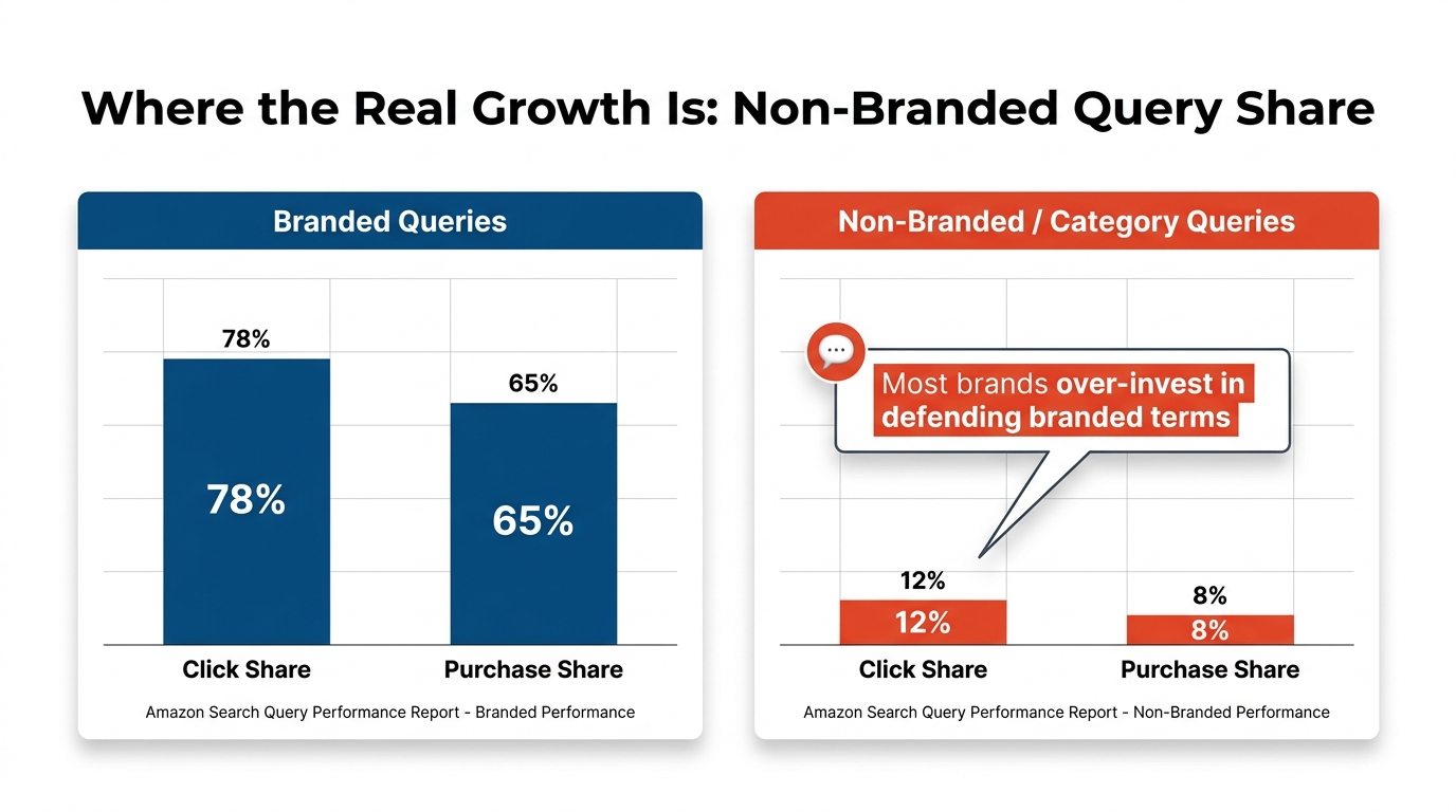
    Branded vs non-branded query performance comparison showing high shares on branded terms and low shares on category terms

    The Branded Query Profile: What It Should Look Like

    On branded queries, a healthy brand typically shows high impression share (70–90%), reasonably strong click share (50–80%), and conversion that outperforms category averages — because shoppers who type your brand name have pre-existing intent and are less likely to be diverted by a competitor’s ad. If your branded query funnel shows unexpected leaks — decent impression share but click share below 40%, for example — it often means a competitor is aggressively bidding on your brand terms with their own SBV campaigns, visually intercepting shoppers who were looking for you.

    SBV is an effective branded defense mechanism. Running SBV on your own brand terms with high bids ensures that when a shopper types your brand name, the first thing they see at the top of search is your product in motion — not a static banner and certainly not a competitor’s video. The investment required is typically modest because branded terms have lower CPCs due to your ASIN relevance advantage, but the protection value is disproportionate.

    The Non-Branded Gap: Where Revenue Is Left Behind

    The more commercially significant analysis is on non-branded category queries. This is where most brands will find their largest opportunity, and also where most brands will find their data telling an uncomfortable story. Category queries — the searches that represent the top of the consideration funnel, where shoppers are choosing between brands rather than looking for a specific one — tend to show dramatically different share profiles from branded terms.

    A brand that has 75% click share on its own branded terms will often find 8–15% click share on high-volume category terms in the same product space. That gap represents the market that isn’t thinking about you yet. SBV on category search terms is explicitly a new-to-brand acquisition play — you’re trying to put your product in motion in front of shoppers who have never bought from you, using visual storytelling to earn consideration that you didn’t have organically.

    This is where the 2026 data on SBV new-to-brand performance is most relevant. Amazon’s new-to-brand reporting for Sponsored Brands (available in the campaign reports, not SQP) shows what percentage of SBV-attributed purchases came from customers new to the brand. In categories with competitive SBV adoption, well-targeted non-branded SBV campaigns consistently show new-to-brand rates above 50–60%, compared to 20–35% for static SB on the same terms. That differential matters enormously when you’re trying to justify SBV budget as a growth investment rather than a defense expense.

    Building a Branded vs. Non-Branded SBV Portfolio

    The practical implication is that your SBV campaign architecture should explicitly distinguish between these two strategic roles. Branded SBV campaigns should be structured for efficiency and defense — tight keyword lists, high bids, direct PDP landing to minimize friction for shoppers who already know they want you. Non-branded SBV campaigns should be structured for scale and acquisition — broader match types, category and product targeting in addition to keywords, and creative designed to introduce the brand to someone who has no prior relationship with it. These two portfolio legs have different success metrics (the branded leg is measured on share retention and CVR; the non-branded leg on new-to-brand rate and click share growth on category terms) and should be evaluated separately in your weekly reporting.

    Creative Architecture: Building SBV That Survives Muted Autoplay

    The most technically sophisticated SQP-to-campaign mapping in the world produces nothing if the video creative doesn’t work in the environment where it’s actually watched. Understanding that environment precisely is the prerequisite to building SBV creative that actually converts.

    The Physical Reality of How SBV Gets Watched

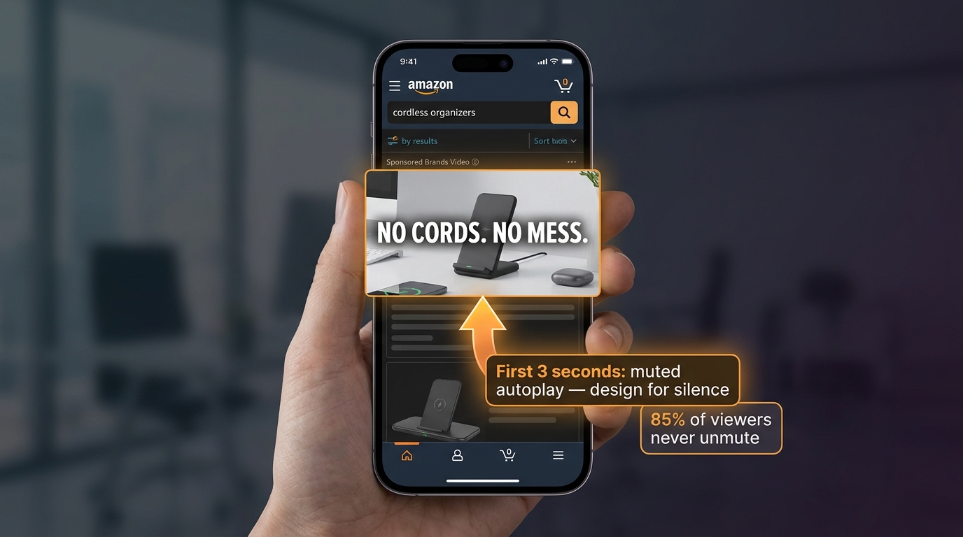
    Approximately 85% of Amazon shoppers encounter SBV on mobile devices. The ad autoplays without sound. The shopper did not choose to watch the video — they’re scrolling through search results, looking for products, and your video intersects their path. They have no inherent interest in watching it. Their attention is already partly allocated to scanning product thumbnails, prices, and review counts. You have roughly two to three seconds to make visual contact sufficient to stop the scroll.

    These conditions are not optimal for traditional video advertising conventions. Ads that open with a logo, a scene-setting shot, or a voiceover-driven product explanation will lose 80% of their potential audience before the first narrative beat lands. The shopper never heard the voiceover — the audio never played. They saw two seconds of an establishing shot that looked like generic stock footage and kept scrolling.

    Smartphone showing SBV video ad with 'NO CORDS. NO MESS.' text overlay in first 3 seconds of muted autoplay

    Designing the First Three Seconds for Silence

    Every SBV creative decision should be filtered through a single question: “Does this communicate value in the first three seconds without sound?” The answer dictates your opening frame, your text overlay strategy, and your product placement timing.

    The product should appear in frame within the first one to two seconds — not a lifestyle scene leading to the product, not a brand logo leading to a product shot, but the product itself. Shoppers on search results pages are in product-evaluation mode; meeting them where they are cognitively means showing them what they’re evaluating immediately.

    Text overlays in the first three seconds should communicate the core value proposition in four to seven words maximum. “No cords. No mess.” “Holds 3x more.” “Works in any weather.” These micro-claims are readable in the 1.5–2 seconds a shopper might spend looking at your video before deciding to stop scrolling. They don’t require sound. They don’t require watching the full video. They plant a single differentiated idea that can influence a purchase decision even if the shopper immediately scrolls past.

    Matching Creative Hooks to Query Intent

    One of the underused implications of combining SQP data with SBV is the ability to match creative hooks to specific search intent categories. A shopper searching “cordless vacuum lightweight” has a different primary consideration than one searching “cordless vacuum pet hair” — even though both queries might land on the same product. If your SBV creative opens with a lightweight portability message, it’s highly resonant for the first query and somewhat irrelevant for the second.

    In practice, this means building creative variants tied to your top query clusters rather than running one master video across all campaigns. For a brand with three distinct purchase motivators showing up in SQP data — say, price-value, a specific use case, and a design aesthetic — building three SBV creative variants and distributing them across the corresponding query clusters is a meaningful optimization lever. The infrastructure cost is manageable (Amazon’s video specs are well-documented and production doesn’t require broadcast-grade equipment), and the performance return can be substantial when you’re matching message to intent rather than averaging across all shoppers.

    The 15-Second Constraint

    Amazon’s SBV format requires video between 6 and 45 seconds, but the sweet spot for performance in most categories is 15–30 seconds. Shorter isn’t always better — a well-paced 20-second video that walks through a problem and its solution can outperform a 6-second product flash if the middle 10 seconds convert shopper interest into intent. The discipline is in not padding: every second from second four onward should be doing work, whether that’s addressing an objection, demonstrating a feature, or closing with a social proof signal (review count, bestseller badge, customer testimonial visual).

    New SBV Placements and Targeting Options in 2026

    The structural changes to where and how SBV runs in 2026 are significant enough to warrant their own section, because they change the strategic calculus for how SBV relates to SQP data.

    Direct PDP Landing: The Conversion Chain Is Shorter Now

    Historically, many SBV campaigns routed traffic to a Brand Store rather than directly to a product detail page. This made sense from a brand-building perspective — you could showcase your full catalog and give shoppers a curated brand environment. But it added friction to the purchase path for shoppers with specific high-intent searches. A shopper searching “42-inch blackout curtains” who clicks your SBV ad and lands on a Brand Store now has to navigate to the correct product. Some do; many don’t.

    In 2026, direct PDP routing in SBV is broadly available and increasingly the default choice for performance-focused campaigns. For queries identified in SQP as having high click share but weak purchase share — the pattern suggesting a conversion problem — switching SBV landing destinations from Store to direct PDP is a high-leverage, low-effort intervention. The impact on add-to-cart and purchase rates can be immediate and measurable within a two-week window.

    Expanded Targeting: Beyond Keywords

    Early SBV campaigns were almost exclusively keyword-targeted, which made them dependent on keyword selection quality. The targeting expansion in 2025 and 2026 has added product targeting (running SBV against specific competitor ASINs or your own ASIN list) and category/theme targeting to the mix. This has meaningful implications for how SQP data informs targeting strategy.

    Product-targeted SBV running against competitor ASINs identified in SQP as the top-clicked products on your target queries creates a deliberate interception strategy — your video runs on the product pages of the exact ASINs that are winning search clicks you want. Category targeting, meanwhile, allows SBV to capture purchase-stage shoppers who are browsing category pages rather than running active keyword searches. These shoppers are further along the buying journey in a different way — they’ve moved from search to browse, indicating they’re either deciding between options or exploring a category they’re unfamiliar with.

    SBV on Product Detail Pages: A Different Audience

    SBV placements have expanded beyond top-of-search to include product detail pages — where your video can appear on a competitor’s PDP, or on your own. The audience encountering SBV on a PDP is meaningfully different from the audience encountering it on search results. They’re further along the funnel, they’re actively evaluating a product, and your video has the opportunity to make a direct comparison case at the moment of maximum consideration.

    The creative approach for PDP-placed SBV should reflect this. Rather than a general category awareness hook, a video running on competitive PDPs can be more specific and comparative — emphasizing the two or three attributes where your product is demonstrably stronger than the typical category option without making explicit comparisons that violate Amazon’s advertising policies. The SQP data you’ve gathered on what drives purchase share — what differentiators are associated with strong conversion on the queries you care about — informs exactly what those differentiating messages should be.

    Measuring New-to-Brand Acquisition Through the SQP Lens

    Acquisition is the strategic justification for much of SBV investment, particularly on non-branded search terms. But measuring acquisition accurately requires understanding where the relevant data actually lives and how to stitch it together in the absence of a single integrated report.

    Where the Acquisition Data Is (And Isn’t)

    SQP shows you purchase share by query. Your Sponsored Brands campaign reports show you new-to-brand orders and new-to-brand revenue (using a 12-month lookback window to define “new” — any customer who hasn’t purchased from your brand in the past year). These two datasets don’t connect natively. You can’t look at a single query in SQP and see how many of the purchases attributed to your brand came from new customers.

    What you can do is use SQP queries as a segmentation layer for your SBV campaign structure, then read new-to-brand performance at the campaign or ad group level in your ads reports. If you’ve built an SBV campaign specifically targeting the top ten non-branded category queries identified in SQP as high-volume with low brand purchase share, you can monitor that campaign’s new-to-brand metrics directly. The SQP data tells you where the addressable audience is; the campaign reports tell you how efficiently your SBV is converting that audience into new customers.

    The 12-Month Lookback Problem

    Amazon’s new-to-brand definition uses a rolling 12-month window — a customer is “new to brand” if they haven’t purchased from you in the past year. This creates a metric that inflates apparent acquisition performance for brands with annual repurchase cycles (seasonal goods, one-time purchase items) while understating it for fast-repurchase categories like consumables, supplements, or pet food. When you’re using new-to-brand data to evaluate SBV acquisition performance, factor your category’s natural repurchase frequency into your interpretation. A 60% new-to-brand rate for an annual purchase item is less impressive than the same figure for a monthly repurchase product.

    Building a Proxy Metric for Acquisition Progress

    Because the native data stitching isn’t available, the most practical acquisition measurement framework combines three signals: new-to-brand order rate from Sponsored Brands reports (benchmarked against your baseline from pre-SBV SB campaigns), click share movement on target non-branded queries in SQP (tracked on a monthly rolling basis), and the mix of branded vs. non-branded query share in your total SQP purchase share. If all three are moving in the right direction — new-to-brand rate up, non-branded click share up, non-branded purchase share growing as a percentage of your total query-level purchases — your SBV acquisition investment is working, even if no single report tells you that directly.

    Common SBV + SQP Mistakes and How to Fix Them

    After running this framework with real data, several failure patterns come up consistently. Recognizing them early saves wasted spend and lost time.

    Mistake 1: Using SQP as a Keyword Dump for SBV

    The most common misuse of SQP in SBV strategy is treating the report as a keyword source — pulling every query with a high search rank and adding them all to an SBV campaign. This produces large keyword lists that dilute budget across queries with very different performance profiles and strategic purposes. The discipline is in segmentation: sort your SQP queries by the specific gap type they represent (impression, click, or purchase gap), and build separate SBV ad groups for each gap type. A campaign targeting queries where you have an impression gap should have different bids, creative, and match types than one targeting queries where you have a click gap.

    Mistake 2: Ignoring the Competitive Layer in SQP

    SQP shows you the top-clicked ASINs and their click shares for each query. This data is frequently scanned past in favor of the share metrics, but it contains critical intelligence for SBV creative and targeting strategy. If the ASIN winning 35% of clicks on a query you care about has a significantly lower price point than yours, no SBV creative will fully close that click gap — price is the barrier. If the winning ASIN has 3,000 reviews and yours has 120, that’s a credibility gap that video can partially address (by building brand familiarity and trust) but cannot fully overcome. Knowing which of your target queries are winnable with creative and media investment vs. which require product-level improvements changes where you focus your SBV budget.

    Mistake 3: Evaluating SBV Only Through ACOS

    ACOS (Advertising Cost of Sales) is a useful efficiency metric, but it’s the wrong primary lens for SBV campaigns targeting non-branded queries with a new-to-brand objective. A new customer acquired through an SBV campaign on a category search term has a lifetime value that extends beyond the first attributed order. An SBV campaign with a 30% ACOS on a non-branded term where 65% of purchases are new-to-brand is doing something fundamentally different — and more valuable — than an SBV campaign with a 15% ACOS on a branded term where 90% of purchasers already knew you.

    The fix is to set different ACOS targets for different strategic SBV campaign types. Branded defense SBV campaigns should be measured against your standard efficiency targets. Non-branded acquisition SBV campaigns should be measured against a blended metric that factors in new-to-brand rate and the estimated lifetime value of a new customer. If you don’t have a customer LTV estimate, even a simple multiplier (e.g., a customer acquired through a category search term is worth 1.5x a repeat purchase) changes the acceptable ACOS threshold meaningfully.

    Mistake 4: Static Creative Across Changing Query Profiles

    SQP data is not static. Query share profiles change as competitor campaigns run and pause, as your organic rank fluctuates, and as seasonal demand shifts. A set of SBV campaigns structured around SQP analysis from three months ago may be addressing funnel gaps that have already closed — or missing new gaps that have opened. Building a regular SQP review cadence (covered in the next section) and tying it to a creative refresh schedule prevents the common problem of running campaigns with creative that was correct at launch but has become increasingly mismatched to current competitive dynamics.

    Mistake 5: Treating SBV and Sponsored Products as Competing Budgets

    In accounts where total advertising budget is constrained, SBV and Sponsored Products are often positioned as competing for the same pool of money. This framing produces suboptimal outcomes. SP and SBV serve fundamentally different functions in the search funnel: SP typically dominates organic-adjacent results and captures demand from shoppers who know what they want; SBV creates demand and shifts consideration at the top of the funnel for shoppers who are still choosing between brands. The SQP funnel data makes this division explicit — when you can see which queries have strong SP-driven purchase share but low impression share from SBV formats, the case for investing in SBV as additive rather than competitive becomes data-supported rather than theoretical.

    Building a Weekly SQP Review Into Your SBV Workflow

    The framework described in this post requires a consistent operational rhythm to produce compounding results. The good news is that the weekly implementation is considerably less complex than the analytical framework behind it. Once the initial SQP analysis and campaign structure are in place, the ongoing process is a focused 30–45 minute review.

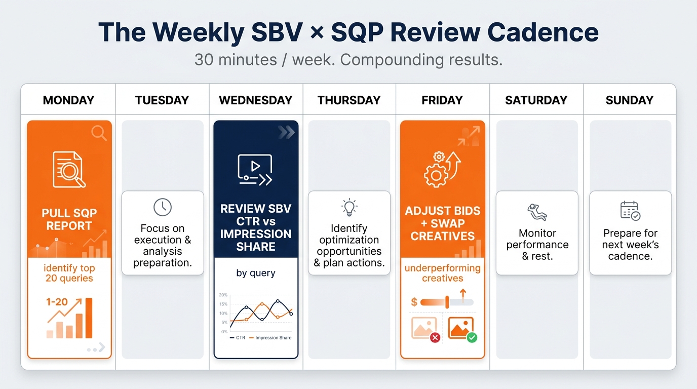
    Weekly SBV and SQP review calendar showing Monday, Wednesday, and Friday tasks for Amazon advertisers

    The Weekly Rhythm

    On Monday, pull the current week’s SBV campaign performance data from the ads console. Focus on CTR, impression volume, and new-to-brand order rate for each campaign segment (branded vs. non-branded acquisition vs. PDP-targeted). Flag any campaign where CTR has declined by more than 15% week-over-week — this is the early signal of creative fatigue or competitive creative entry.

    On Wednesday, pull the most recent available SQP data for your top 30–50 target queries. Compare impression share and click share against the prior month’s baseline. Any query where your click share has dropped by more than 3 percentage points while impression share has stayed flat or grown deserves immediate creative attention — a competitor has likely launched or improved a video ad on that term. Any query where impression share has dropped but click share has held suggests a budget delivery or bid adjustment is needed.

    On Friday, implement the week’s changes: bid adjustments on queries with delivery issues, creative swaps on campaigns showing CTR decline, and budget reallocation from underperforming query clusters to the queries where your click share is growing. Log the changes with brief rationale so the following week’s review can connect performance movements to specific interventions.

    The Monthly Recalibration

    Once a month, step back from the weekly tactical rhythm for a broader SQP analysis: which queries have entered the top 30 by search volume that weren’t in your campaign structure before? Which queries have dropped below your target search frequency rank threshold and might be worth reducing coverage on? Has your branded vs. non-branded purchase share mix moved materially? Monthly recalibrations catch the structural shifts that weekly reviews can miss, and they keep your SBV campaign architecture aligned with current market dynamics rather than the market dynamics that existed when you first set the campaigns up.

    Quarterly Creative Refresh

    SBV creative has a measurable lifecycle. Most video creatives start showing CTR decay within 8–12 weeks as the shopper population on a given query cycles through — the people who were going to respond to that specific creative have seen it and either converted or not. Build quarterly creative refresh cycles into your production planning, and use the SQP query cluster analysis to brief new creative variants that address the specific intent signals showing up in your top-performing and highest-potential query groups. A creative brief anchored in SQP data produces more purposeful videos than one anchored in brand guidelines or category conventions alone.

    The Integrated Approach: What Changes When SBV and SQP Are Treated as One System

    The shift described throughout this post — from treating SBV as a creative format and SQP as a research tool to treating them as two components of a single performance system — changes how you think about Amazon advertising investment at a fundamental level.

    When SBV decisions are driven by SQP data, the budget conversation changes. Instead of “how much should we spend on video?” the question becomes “here are seven specific queries where our purchase share is below competitive benchmarks and our creative absence is quantifiably costing us sales — here’s the investment required to address each gap, and here’s the expected share shift if we execute correctly.” That’s a much more tractable business case than the abstract argument for video advertising.

    The measurement conversation changes too. When your SBV campaigns are mapped to specific query-level gaps in SQP, success is defined by whether those gaps close over time — not just whether the campaigns hit a target ACOS. Impression share movement, click share movement, and purchase share movement on targeted queries are more meaningful indicators of whether your SBV investment is working than aggregate campaign metrics alone.

    And the creative conversation changes. When you’re building video to address a specific type of query-level gap — a click share deficit on category searches, a conversion problem on high-intent purchase searches, a defensive need on branded terms — the creative brief is much more focused. The open-ended “make a compelling brand video” brief produces generic assets. The “this video needs to stop a scroll on the query ‘lightweight vacuum for small apartment’ and communicate portability and price-value within the first three seconds” brief produces something that can actually move the metrics you’re targeting.

    SBV in the era of SQP is not a more complicated version of video advertising. It’s a more precise one. And in a category where every major brand is running video ads and CPCs are rising, precision is increasingly the margin of difference between campaigns that compound and campaigns that merely spend.

    Actionable Starting Points

    • Pull your SQP data for the last 90 days and sort by search frequency rank. Identify your top 50 queries and map your brand’s share at each of the four funnel stages for each query.
    • Categorize each query by gap type — impression gap, click gap, or purchase gap — and group them into three separate lists. These lists become the targeting and prioritization framework for your next SBV campaign build or restructure.
    • Audit your current SBV campaigns against this list. Which of your gap-priority queries are currently covered by SBV campaigns? Which are being addressed only by static SB or SP? The white-space in that audit is your immediate opportunity.
    • Split your SBV campaign architecture by strategic purpose: branded defense, non-branded acquisition, PDP interception. Set different performance benchmarks and creative briefs for each.
    • Build a video creative that communicates your primary value proposition with no sound in three seconds or fewer, with the product visible in frame within the first two seconds and a high-contrast text overlay delivering the hook. Test it against your current best performer on your highest-priority click-gap query.
    • Set a weekly 30-minute review cadence that checks CTR movement in your SBV campaigns against the corresponding queries in SQP. The two numbers, tracked together, will tell you faster than any other metric whether your search share is moving in the right direction.

    The brands winning on Amazon search in 2026 are not necessarily running more video than their competitors. They’re running video that’s better matched to what their shoppers are searching, with creative designed for how those shoppers actually watch it, on the specific queries where the gap between their share and the category leader is both measurable and closable. SQP gives you the measurement. SBV gives you the mechanism. The work is in connecting them deliberately.