Tag: AI Shopping

  • What Rufus (Now Alexa for Shopping) Actually Does With Your Product Images — A 2026 Seller’s Playbook

    What Rufus (Now Alexa for Shopping) Actually Does With Your Product Images — A 2026 Seller’s Playbook

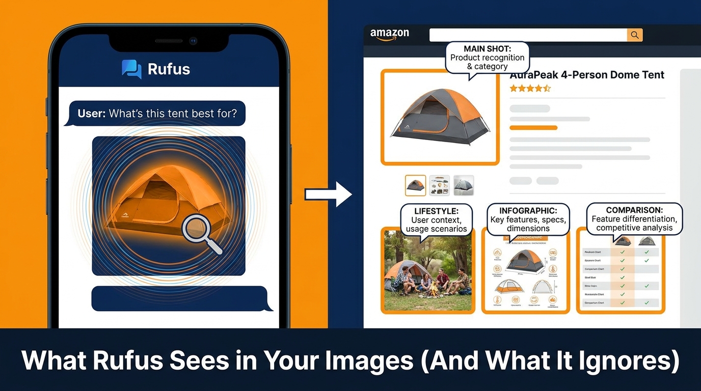
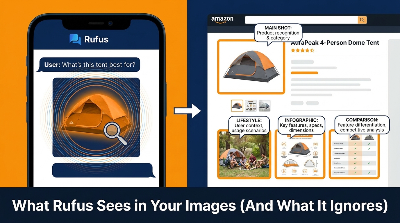
    Rufus-Ready Image Playbooks 2026 — AI shopping assistant reading product images on Amazon

    Something important happened on May 13, 2026. Amazon quietly retired the Rufus brand and absorbed its capabilities into Alexa for Shopping — a merged AI layer that now sits directly inside the Amazon search bar and acts as the primary discovery engine for hundreds of millions of shoppers worldwide. If you blinked, you missed the announcement. If you didn’t update your image strategy in response, you’re already behind.

    The rebrand wasn’t cosmetic. Alexa for Shopping combines the conversational product understanding from Rufus with the personalization engine from Alexa+, creating an AI layer that doesn’t just answer product questions — it compares, tracks prices, reads your purchase history, and increasingly makes purchase decisions on behalf of shoppers. The most consequential part of this, for anyone who sells physical products on Amazon, is how this assistant interacts with your product images.

    This isn’t another article about white backgrounds and 2000px minimum resolution. Those rules haven’t changed. What has changed is how a multimodal AI system reads, interprets, and uses your images to decide whether to recommend your product or a competitor’s. That’s the gap this playbook addresses — not the compliance checklist, but the strategy layer sitting on top of it.

    We’ll cover how the AI actually processes your images (beyond the marketing language), what a slot-by-slot image sequence should accomplish in 2026, how A+ content fits into the visual ecosystem, and how to measure whether your images are working for or against you in AI-mediated discovery. Category-specific guidance is included for the product types where this gap matters most.

    The Rebrand That Changed the Underlying Game

    Rufus launched in early 2024 as a conversational shopping assistant bolted onto Amazon search. It was useful but limited — good at answering product-specific questions when the listing gave it clear data to work with. The merge into Alexa for Shopping in May 2026 changed three things that matter for image strategy.

    Personalization Now Feeds Recommendations

    The old Rufus was relatively stateless. Ask it a question, get an answer based on the product catalog. Alexa for Shopping is different — it pulls from your Amazon purchase history, browsing behavior, Alexa device interactions, and household data to personalize what it recommends. This means a product’s visibility through the AI layer isn’t just a function of listing quality. It’s a function of listing quality relative to what a specific shopper has signaled they care about.

    The practical implication: your images need to communicate multiple use-case contexts, not just one. A single lifestyle image of a protein powder being used by a 25-year-old male athlete will serve one segment well. But if your product also fits a 45-year-old woman training for her first marathon, an image that speaks to that context dramatically expands how the AI matches your product to relevant queries from that demographic.

    Agentic Shopping Changes the Discovery Model

    Alexa for Shopping has introduced what Amazon calls “agentic” behaviors — the assistant doesn’t just surface results, it can set price alerts, add items to carts, and eventually complete purchases automatically at a shopper’s instructed price point. This shifts the discovery dynamic significantly. When a human scrolls a results page, they respond to visual cues instinctively. When an AI agent is pre-filtering the results before the human ever sees them, visual quality and information density in images become screening criteria rather than persuasion tools.

    Your images need to pass an AI screening layer before they ever get the chance to persuade a human buyer.

    Scale: 300 Million Customers, ~$12B in Incremental Sales

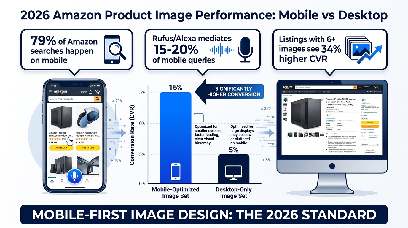
    Amazon has indicated that Alexa for Shopping (the combined Rufus + Alexa+ system) reaches approximately 300 million customers across its surfaces. Early internal estimates and third-party account reviews suggest the assistant is mediating between 15–20% of mobile shopping queries as of Q2 2026. That’s not a niche feature. That’s a significant share of your addressable audience on the platform encountering your product first through an AI lens — before they read your title, before they scan your bullets, before they see your price.

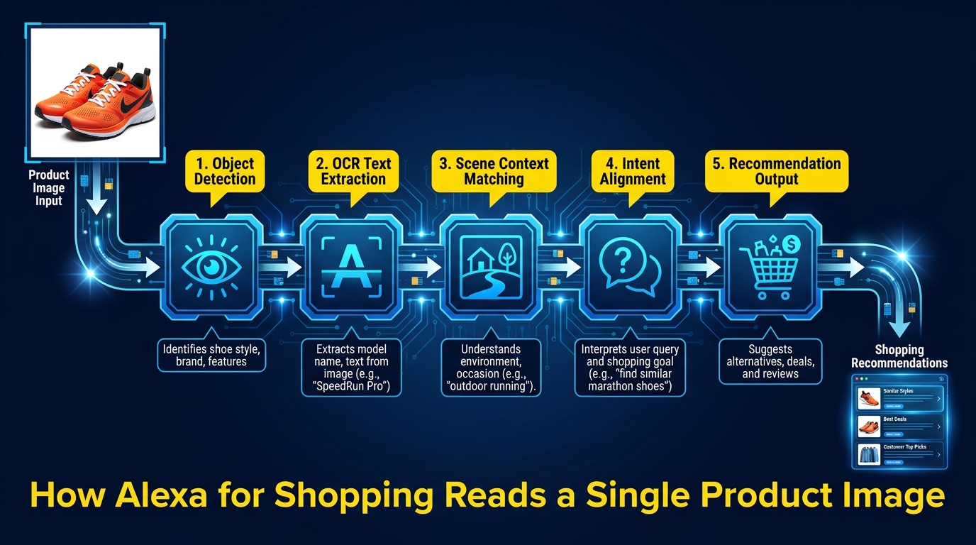
    How Alexa for Shopping reads a single product image — AI pipeline: object detection, OCR, scene context, intent alignment, recommendation output

    How Alexa for Shopping Actually Reads Your Images

    The phrase “AI reads your images” gets used liberally in seller marketing content without much explanation of what that means mechanically. Here’s the substantive version — as close to the actual architecture as publicly available information allows.

    Computer Vision: The Object Layer

    Alexa for Shopping uses a computer vision pipeline — functionally similar to Amazon Rekognition, Amazon’s own vision API — to identify objects, scenes, and contexts within each product image. This isn’t guesswork. Amazon has years of labeled training data from its own product catalog, and the models are well-calibrated at identifying objects at confidence levels that let them be used as structured attributes.

    When the AI “sees” your lifestyle image, it’s detecting: the product itself, the environment it’s in (kitchen, outdoor, gym, bedroom, office), any people present and their apparent demographic attributes, relevant co-occurring objects (a yoga mat next to a water bottle, say), and visual indicators of product features (a child using a sippy cup, confirming “kid-friendly” or “spill-proof” claims).

    These detected scene attributes are translated into signals that help match your product to intent-based queries. A search like “water bottle for hiking” will surface products whose images contain contextual outdoor/active-use signals — not just products with the word “hiking” in the title.

    OCR: The Text-Reading Layer

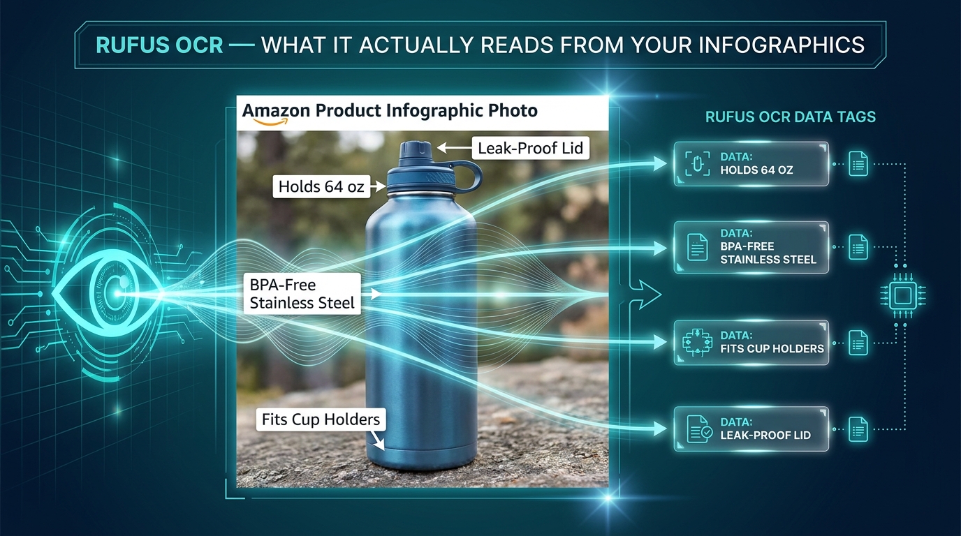
    This is the piece most sellers underestimate. Alexa for Shopping’s multimodal architecture includes OCR (optical character recognition) that reads text embedded within your product images — the callouts in your infographics, the feature labels, the size charts, the ingredient panels visible on packaging, the certifications shown on graphics.

    OCR-extracted text from images is treated as a supplementary data source alongside your listing copy and backend attributes. If your infographic image says “BPA-Free, 32oz, Dishwasher Safe” and that information also appears consistently in your bullet points, the AI has reinforced signal that these attributes are accurate and relevant. If your infographic includes claims that conflict with your copy, or includes important information that appears nowhere in your text-based listing, the AI’s confidence in surfacing your product for related queries can be affected.

    Critical implication: text in your images should be consistent with and complementary to your listing copy, not duplicative and not contradictory. The infographic isn’t just for human readers — it’s a secondary data channel feeding the same AI system that reads your backend keywords.

    The Intent-Matching Layer

    After object detection and OCR, the AI performs intent alignment — comparing what it has understood about your product from all visual signals against the semantic meaning of the shopper’s query. This is where “keyword optimization” ends and “intent optimization” begins.

    A shopper asking “what’s the best coffee maker for a small apartment” isn’t just asking about coffee makers. They’re asking about space constraints, possibly noise, convenience, and counter footprint. If your product images show your coffee maker on a tight counter in a compact kitchen setting, the AI has visual confirmation of the “small space” context. If all your images show it in a sprawling commercial kitchen, that context is absent — even if your title mentions “compact.”

    This is the core insight behind modern Rufus-ready image strategy: your images need to visually answer the questions your best customers are asking, not just show your product looking attractive.

    The Main Image: Still Non-Negotiable, Still Misunderstood

    Nothing in the AI evolution changes the fundamentals of main image compliance. Amazon’s requirements are clear: pure white background (RGB 255, 255, 255), product filling at least 85% of the frame, no additional text or graphics, no props that aren’t included with the product, and no watermarks. These rules exist for multiple reasons, and AI-mediated shopping adds one more: the main image is often the only image shown in AI-generated recommendation cards and comparison surfaces.

    Why Fill Matters More Than Ever

    When Alexa for Shopping surfaces a comparison table across three competing products, it often pulls the main image into a small thumbnail format — sometimes at 150–200px wide on mobile. At that size, a product that fills 65% of the frame becomes nearly unidentifiable. A product that fills 90% of the frame remains recognizable and communicates confidence.

    Product fill is also a proxy signal for listing quality. Amazon’s systems have extensive data correlating high fill rates with higher-quality listings and better-performing sellers. A main image at 85%+ fill doesn’t just look better to humans — it sits within a distribution of signals that the AI associates with well-maintained, trustworthy listings.

    The Thumbnail-First Mental Model

    Design your main image to work at 200px wide first, then scale up. If your product has a critical differentiator visible at scale (a unique form factor, a distinctive color, a specific configuration), it needs to be visible at thumbnail size. This is especially true in high-competition categories where Alexa for Shopping is comparing your product side-by-side with alternatives for the same query.

    Test this practically: load your listing on a mobile device, screenshot the search results page, and zoom out until your main image is about the size of a postage stamp. Can you still identify the product category and its primary distinguishing feature? If not, your main image needs work.

    Variant Differentiation in Main Images

    If your ASIN has multiple variants (color, size, configuration), each variant’s main image needs to make the differentiation immediately obvious. The AI system serves variant-specific recommendations, meaning a shopper searching for a “navy blue laptop bag” should see a navy blue main image — not a black one with a color selection UI suggesting blue is available. Incorrect or misleading variant main images not only harm conversion; they confuse the AI’s product attribute mapping and can result in your product being served for the wrong queries.

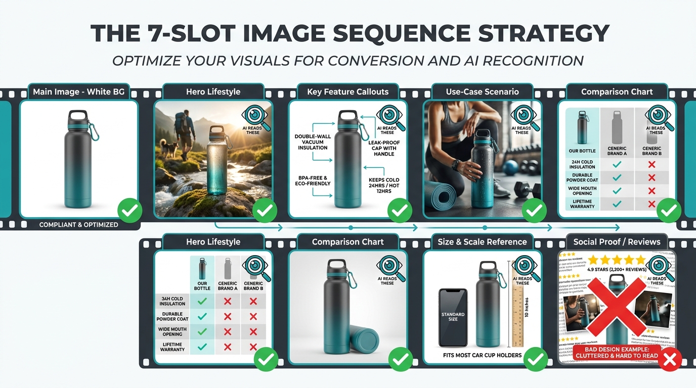
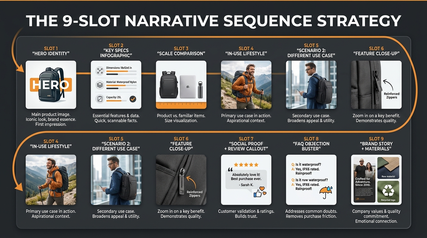
    Amazon 7-slot product image sequence strategy — each slot labeled with its role from main image to social proof

    Slots 2–4: The Answer Layer Where Rufus Finds Its Data

    If the main image is your compliance baseline, slots 2 through 4 are your AI answer engine. This is where Alexa for Shopping extracts most of its useful product intelligence — the information it needs to generate accurate, confident answers to shopper questions. Sellers who treat these slots as a second main image (same white background, product from another angle) are leaving significant opportunity on the table.

    Slot 2: The Hero Lifestyle Image

    Slot 2 is typically the first image a mobile shopper sees after tapping through from search results, which makes it your highest-value persuasion real estate. It’s also the slot most scrutinized by the AI for scene context. The brief for a strong Slot 2 image in 2026: show your product in the most common high-intent use scenario, featuring the primary buyer persona, in an environment that the AI’s scene detection will correctly classify as relevant to likely search queries.

    That last part deserves unpacking. If you sell a standing desk mat, your primary buyer is likely an office worker. But “standing desk mat” isn’t always the search query — searches like “anti-fatigue mat for home office,” “comfort mat for standing desk,” “mat for hardwood floor office” all map to the same product. A lifestyle image showing your mat in a clearly identifiable home-office setting, beneath a standing desk, with a person standing comfortably — and no competing visual noise — gives the AI’s scene-detection the environmental signals it needs to match your product to all of those query variants, not just the exact-match ones.

    Slot 3: The Feature Callout Infographic

    Slot 3 should be your primary infographic — the image that the AI’s OCR pipeline will mine for structured attribute data. Think of this as your backend keyword strategy expressed visually. The goal is to have text in this image that accurately represents your product’s key features, differentiators, and use-case attributes in language that maps to how shoppers search.

    Design principles for an OCR-optimized infographic in 2026:

    • Font size minimum 30px equivalent in the final rendered image. At the 2000px minimum resolution, this equates to text that is clearly legible at 100% zoom and survives JPEG compression without becoming muddy.
    • High contrast text-to-background ratio. White text on pastel backgrounds, or grey text on white — both fail OCR confidence thresholds. Black or dark navy on white, or white on dark solid colors, reliably pass.
    • Specific claims over generic ones. “Lasts up to 48 hours” is more useful to the AI (and to the shopper) than “long-lasting.” Numerics, certifications, and specific technical attributes give the AI facts to work with.
    • No more than 5–7 callout points. Dense, paragraph-heavy infographics don’t give the OCR system clean, attribute-level data. Bullet points and isolated callouts extract far more cleanly than flowing text.
    • Match your listing copy. Every claim in your Slot 3 infographic should appear somewhere in your bullet points or product description. Consistency reinforces the AI’s confidence in your product data.

    Slot 4: Use-Case Scenario Image

    If Slot 3 is about features, Slot 4 is about applications. The purpose of this image is to answer the class of query that starts with “for”: “for camping,” “for toddlers,” “for arthritis,” “for small dogs.” These intent modifiers are extremely common in conversational AI queries, and they’re addressed by scene context, not by feature lists.

    A tactical approach that works well: identify the top 3–5 intent-modified searches driving traffic to your category (using Amazon’s own search term reports and third-party tools), then select the highest-volume use case for Slot 4. Show the product in use, in that context, with visual cues that the AI’s scene detection will confidently classify as that use case. An outdoor cooking product photographed next to a campfire has “camping” scene signals. The same product in a neutral studio has none.

    Slots 5–7: Comparison, Scale, and Social Proof

    The back half of your image set serves different functions depending on where shoppers are in their decision process — and serves a distinct purpose for Alexa for Shopping’s comparison-generation features.

    Slot 5: The Comparison Image

    Alexa for Shopping’s most visible feature is its comparison mode — when a shopper asks it to compare products, it generates a structured table drawing from each listing’s content. Your Slot 5 comparison image gives the AI a pre-built comparison frame to work with, and it helps human shoppers at the consideration stage make quicker decisions in your favor.

    Effective comparison images in 2026 don’t compare your product to a vague “generic brand.” They compare specific configurations of your own product (size variations, feature tiers) or show your product stacked against clearly relevant alternatives with honest, data-backed differentiators. A comparison chart that shows “Our Product: 48hr battery vs. Industry Average: 8-12hr” is more defensible and more useful to the AI than a chart that cherry-picks meaningless metrics.

    If your product genuinely leads on a measurable attribute, show that gap visually. A bar chart with labeled values is more AI-readable than a comparison table with icons and ambiguous ratings.

    Slot 6: Size and Scale Reference Image

    Returns on Amazon are disproportionately driven by size mismatch — shoppers receiving products that are larger or smaller than expected. A size reference image in Slot 6 serves two purposes: reducing return rates (which directly protects your listing health metrics), and giving the AI system a concrete scale attribute to work with when answering queries like “how big is this” or “will this fit in my bag.”

    Best practice: show your product next to objects with universally understood scale (a human hand, a standard coffee mug, a regular-sized book). Avoid using objects that themselves require size interpretation (a decorative bowl, a non-standard household item). If your product has multiple size variants, a single image showing all variants side by side — with labeled dimensions — does significant work for both human shoppers and AI comparison features.

    Slot 7: Social Proof Image

    Slot 7 can serve several functions, but in 2026 the highest-performing use is a social proof image — one that reinforces trust through visual evidence. This can take several forms: a collage of real customer use-case photos (with appropriate permissions), a graphic highlighting your review count and rating, a before/after comparison where relevant, or a graphic showing certifications, safety test results, or awards your product has received.

    Alexa for Shopping pulls review data directly when generating recommendations, so your star rating and review count are factors the AI already has. But a social proof image that reinforces this through visual format creates redundant signal — the AI’s OCR may extract “4.7 stars, 2,400 reviews” from the image text, adding it to the structured data layer from your review profile. Redundant confirmation of claims makes the AI more confident in recommending your product.

    A+ Content as an Extended Image Strategy

    Most sellers think of A+ Content as a separate section below the fold — useful for human browsers who scroll that far, but disconnected from the core image strategy. This is a mistake in 2026, because Alexa for Shopping reads your full product detail page, including A+ content, when building its understanding of your product.

    How Alexa for Shopping Ingests A+ Content

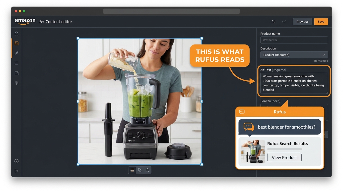
    A+ modules contain both structured image content and alt text — and the alt text on your A+ images is a critical, underused SEO and AI-readiness lever. Amazon allows brands to add alt text to every image in an A+ module. This text is indexed by Amazon and treated as a data signal by the AI. If your A+ hero module shows your product being used in a specific context, and the alt text explicitly describes that context in natural language, you’ve given the AI a clean, text-based description of the image that removes any ambiguity in scene detection.

    Fill out every alt text field in your A+ content with descriptive, intent-aligned language. Not keyword stuffing — natural language descriptions of what’s in the image and what use case it represents. This 10-minute task per module can materially improve how accurately Alexa for Shopping represents your product in contextual queries.

    The Copy-Visual Alignment Principle

    Alexa for Shopping performs a form of cross-referencing: it looks for consistency between what your text says and what your images show. A listing that claims “ideal for outdoor use” but contains only indoor lifestyle images creates a discrepancy signal. A listing that claims “ultra-compact” but shows the product in a large, spacious environment contradicts its own copy visually.

    Audit your A+ content with this lens: does every image in your A+ modules visually confirm a claim that appears somewhere in your listing copy? If yes, you have alignment. If any image introduces a context or claim that the rest of your listing doesn’t support, it creates noise in the AI’s product model — and noise reduces confidence, which reduces recommendation frequency.

    Premium A+ Content: The Structured Data Opportunity

    Sellers with Brand Registry access and sufficient review counts can access Premium A+ features, which include video, interactive comparison tables, and enhanced image carousels. In the context of Alexa for Shopping optimization, the interactive comparison table module deserves particular attention — it provides structured, table-formatted data that the AI can extract far more reliably than the same data presented in image format. If you’re choosing between adding another lifestyle image or building a well-structured comparison table in Premium A+, the table often generates more AI-extractable attribute data.

    AI-readable vs non-readable Amazon product infographic design comparison — OCR-optimized vs cluttered design

    Mobile-First Image Design in an AI-Mediated World

    The shift to mobile commerce isn’t new, but its intersection with AI-mediated discovery creates specific design constraints that sellers haven’t had to think about before. When Alexa for Shopping surfaces a product recommendation on mobile, the visual real estate is radically compressed compared to desktop — and the image has to do more work in less space.

    The Mobile Image Stack: What Actually Renders

    On the Amazon mobile app, a full-width product detail page image renders at roughly 390–430px wide on a standard iPhone screen. At that resolution, a 2000px infographic with 14pt equivalent text becomes completely illegible. Text that appears sharp and readable in your design software may not survive the compression and scaling that occurs in mobile delivery.

    The practical design standard for 2026: use a minimum text size equivalent to 30pt in your 2000px source image, which scales to approximately readable 15pt at 390px wide after proportional reduction and JPEG compression. Test every infographic image at 400px wide before uploading — if the key callout text is unreadable at that width, the AI’s OCR will likely struggle with it too, since OCR systems perform better on higher-contrast, larger characters.

    The Scroll-Stop Standard

    In a standard mobile search results view, your main image appears at roughly 150–180px wide alongside a product title and price. The decision to tap through happens in a fraction of a second. Sellers who design main images for desktop viewing — with product labels, secondary objects, and environmental context visible at large size — often find their mobile CTR significantly lower than category benchmarks.

    The “scroll-stop” standard for 2026: identify one visual element about your product that makes it distinct, and ensure that element is clearly visible at 150px wide. For commodity products, this might be a distinctive color. For feature-differentiated products, it’s the form factor that signals “this is different.” For premium products, it might be material quality suggested through surface texture. Design from that core visual element outward, not the reverse.

    AI Recommendation Cards

    When Alexa for Shopping generates a “here are the top products for your query” response, it shows a product card that typically includes the main image, title fragment, rating, and price. That card appears at roughly 120–150px wide on a standard mobile screen. Your main image needs to be immediately recognizable and contextually appropriate for the query at that size. This is why lifestyle main images — while visually appealing at large size — often underperform clean, high-fill white-background images in AI recommendation surfaces: they become visual noise at thumbnail scale.

    Mobile vs desktop Amazon image performance stats for 2026 — bar chart showing mobile-optimized listings outperform desktop-only image sets

    AI-Generated vs. Studio Photography: Making the Right Call by Image Type

    The availability of high-quality AI image generation tools has created a legitimate strategic choice for sellers: when does generative AI produce images that serve your Rufus-readiness goals, and when does it fall short of what studio photography delivers? The answer isn’t a blanket policy — it’s an image-type-by-image-type decision.

    Where AI-Generated Imagery Performs Well

    For lifestyle context images (Slots 2 and 4), generative AI has reached a point of quality and controllability where, for many product categories, it produces results that are indistinguishable from studio photography at Amazon’s rendering resolutions. The workflow advantage is speed: an AI-generated lifestyle set showing a product in five different environmental contexts — that would take days and thousands of dollars in studio time — can be produced in hours.

    Critically for Alexa for Shopping optimization, AI-generated lifestyle images can be crafted to include highly specific scene signals. You can specify exactly the environment, the demographic signals in the background, the supporting objects visible in the scene — all calibrated to match the intent-modified search queries you’re targeting. This level of control is expensive and logistically complex with studio photography.

    AI-generated backgrounds are also effective for showing product variants against contextually appropriate backdrops — a beige product variant shown in a neutral Scandinavian interior, a black variant shown in a modern dark kitchen. Variant-specific lifestyle images, prohibitively expensive to produce at scale with studio photography, become practical with generative AI tools.

    Where Studio Photography Remains Essential

    The main image is not a candidate for AI generation in 2026. Amazon’s compliance requirements — pure white background, accurate representation of the physical product — require that the product itself be photographed accurately. AI-generated product images consistently introduce subtle inaccuracies: slightly wrong proportions, altered color temperatures, incorrect label text, missing physical details. These inaccuracies can trigger customer expectation mismatches and return-rate spikes, and they can also create conflict with Amazon’s AI product attribute mapping.

    Infographic images sit in a middle ground. The product itself in the infographic needs to be accurately photographed (or rendered from a verified 3D model of the actual product). The graphical overlay elements — callout bars, icons, backgrounds, text — are entirely appropriate to produce with design tools or AI assistance. A hybrid approach (accurate product photography + AI-generated/designed graphic treatment) gives you the accuracy of studio photography and the flexibility of digital design.

    The Content Integrity Principle

    Amazon’s AI image policy — which applies regardless of whether images were generated by AI or captured in a studio — requires that product images accurately represent the item a customer will receive. The enforcement risk isn’t primarily about the generation method; it’s about accuracy. AI-generated images that accurately represent the product and its use context are compliant. Studio images that misrepresent size, color, or features are not.

    When using AI-generated lifestyle imagery, build a review step into your workflow: compare the final image against the actual physical product. Any discrepancy in color, texture, proportions, or visible details should be corrected before upload. This protects against both policy enforcement risk and customer experience issues that feed negatively into review metrics — which in turn feed into Alexa for Shopping’s product evaluation.

    Category-Specific Playbooks: Where These Rules Matter Most

    The principles above apply broadly, but their relative weight varies significantly by product category. Some categories have AI discovery dynamics that are fundamentally different from others, and image strategy should reflect those differences.

    Home and Kitchen

    This is the category where contextual scene detection matters most. Queries in home and kitchen are intensely use-case driven: “for small kitchens,” “fits in a drawer,” “works on induction,” “safe for dishwasher.” Your Slot 4 use-case image and Slot 6 size reference image carry disproportionate weight here.

    Prioritize showing your product installed or in use in a realistic home environment — a real-looking kitchen or living space, not a commercial staging environment. If your product has specific compatibility requirements (stovetop type, counter dimensions, cabinet clearance), include a simple graphic that communicates this clearly. Returns in this category are heavily driven by fit and compatibility mismatches, and images that preemptively answer these questions reduce returns and improve the review metrics that Alexa for Shopping factors into recommendations.

    Health, Beauty, and Personal Care

    AI queries in this category lean heavily on outcome and ingredient claims. “Fragrance-free,” “for sensitive skin,” “dermatologist tested,” “paraben-free” — these are the intent modifiers that dominate. Your Slot 3 infographic should prominently feature certifications, key ingredient callouts, and clinical or testing data.

    Before/after imagery, where applicable and supported by real data, performs strongly in this category both for human shoppers at the consideration stage and for the AI’s claim-verification process. Be precise: a claim of “clinically tested” with no supporting detail is less useful to the AI than “tested by 200 dermatologists, 94% saw improvement in 4 weeks.” The more specific the claim, the more the AI can confidently use it to answer relevant shopper queries.

    Sports and Outdoors

    Environmental scene detection is the dominant factor here. Queries like “for trail running,” “for ocean kayaking,” “for below-zero camping” are best addressed by lifestyle images shot (or generated with very specific prompting) in clearly identifiable natural environments. The AI’s scene detection models are well-calibrated for outdoor environments — forest vs. desert vs. ocean vs. mountain snow are reliably distinguished.

    Durability, weather resistance, and performance specifications are key attributes for this category’s AI queries. Your Slot 3 infographic should address these explicitly, with specific metrics where available (waterproofing rating, temperature range, weight capacity).

    Electronics and Tech Accessories

    Compatibility is the dominant driver of returns and query intent in electronics. “Compatible with iPhone 16,” “works with Samsung Galaxy,” “for USB-C MacBook” — these queries require your images to clearly communicate compatibility. A Slot 3 infographic that shows compatibility icons for the relevant device ecosystem your product supports — and explicitly lists model numbers or device generations — does critical work for both human shoppers and AI matching.

    Technical specification infographics perform strongly in this category. Shoppers and the AI both respond well to specs presented cleanly: battery life, range, data transfer speed, frequency range. The specificity signals product quality and gives the AI precise numerical attributes to work with in comparison queries.

    Measuring Rufus-Readiness: The Signals That Tell You Where You Stand

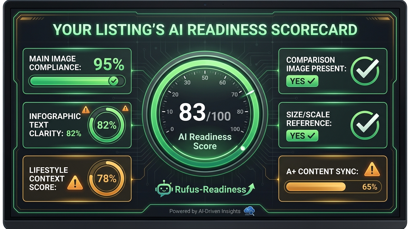
    Building Rufus-ready images is a process, not a one-time event. The only way to know whether your image strategy is working is to track the metrics that reflect AI-mediated discovery performance, and to iterate based on what the data shows.

    AI readiness scorecard for Amazon product listings — showing metrics for main image compliance, infographic clarity, lifestyle context, and A+ content sync

    Conversion Rate vs. Category Benchmark

    Amazon provides your listing conversion rate through Seller Central’s business reports. The most useful benchmark is your conversion rate relative to your category average — which Amazon also surfaces through some business intelligence tools and which third-party tools like Jungle Scout and Helium 10 approximate from their data. If your conversion rate sits below category average with adequate pricing and review metrics, your images are the most likely variable to investigate first.

    Track conversion rate changes after each image update. Image changes that produce measurable CVR improvements within 2–3 weeks are strong signal that the change addressed a real gap. Changes that move the needle less than 0.5% are likely within normal variation and don’t provide clear signal either way — you need longer test windows or larger traffic volumes to draw conclusions.

    Click-Through Rate from Search

    CTR from search results is primarily a main image metric — it reflects how often shoppers choose to click your listing when they see it among search results. A CTR below the category average with a strong main image may indicate a title or pricing issue, but a CTR below average with a weak main image is almost always an image problem. Track CTR through Amazon’s Search Term Performance report or advertising console data (which gives CTR at the keyword level).

    Return Rate and Reason Codes

    Seller Central’s returns report shows return reasons at the ASIN level. Returns coded as “item not as described,” “wrong size,” or “product did not match description” are almost always preventable with better images — specifically the scale reference image (Slot 6) and the feature callout infographic (Slot 3). If more than 3–4% of your returns cite description mismatches, your image set has a gap between what it implies and what the product delivers.

    This matters for Alexa for Shopping beyond the obvious operational cost: high return rates are a listing health signal that Amazon’s algorithm factors into both organic ranking and recommendation eligibility. Improving images to reduce returns has a compounding effect — better customer experience drives better reviews, which drives higher recommendation frequency from the AI.

    Search Query Performance Report

    Amazon’s Search Query Performance Report (available in the Brand Analytics section of Seller Central for Brand Registered sellers) shows how your ASIN performs for specific search queries — including impression share, click share, and purchase share. If you’re getting impression share but low click share on important queries, your main image is the primary culprit. If you’re getting click share but low purchase share, your supporting images (particularly the feature callout and comparison images) aren’t converting consideration into purchase.

    Map your top 20 converting search queries against the use cases represented in your image set. If high-traffic queries are intent-modified (“for X,” “best for Y”) and your images don’t contain visual scene signals for those contexts, you’ve identified a direct image strategy gap to address.

    Common Image Mistakes That Kill AI Visibility

    Before closing, it’s worth cataloging the most common image mistakes that specifically undermine Alexa for Shopping performance — because several of these are counterintuitive and still prevalent even in otherwise well-optimized listings.

    Over-Designed Infographics

    More design elements don’t equal more information extracted by the AI. Dense infographics with overlapping graphics, multiple font sizes, decorative flourishes, and low-contrast color schemes produce images that look impressive in design review but perform poorly in OCR extraction. The AI extracts a fraction of what’s visually present in a cluttered infographic. Simplify to the 5–7 most important attributes, present each one cleanly, and trust that clarity outperforms complexity every time.

    Watermarks and Brand Logos on Supporting Images

    Large watermarks and brand logos in corners of lifestyle images don’t affect human shoppers significantly — the eye adapts to and ignores them. But they do add visual noise that can interfere with the AI’s scene-detection confidence. More concretely, heavy logo placement can trigger Amazon’s image compliance review systems, which adds risk without adding meaningful value to either human shoppers or the AI’s product model.

    Disconnected Image Sets

    An image set that feels like seven different photoshoots creates a coherence problem for the AI. If your Slot 1 shows a product in glossy black, your Slot 2 lifestyle image shows a grey version, and your Slot 3 infographic shows a white version — the AI’s product model gets conflicting color attribute signals, potentially reducing confidence in any single color variant query match. Keep image sets visually consistent: same product color/variant throughout, consistent lighting treatment, coherent environmental palette across lifestyle shots.

    Claims in Images With No Copy Support

    If your infographic image claims “hypoallergenic” or “pediatrician approved” and these terms appear nowhere in your listing copy or backend attributes, the AI faces a discrepancy: the image data says one thing, the text data says another. The conservative outcome is that the AI deprioritizes the attribute when deciding whether your product is relevant to queries using those terms. The riskier outcome is that Amazon’s compliance systems flag the unsubstantiated visual claim during a catalog review.

    Ignoring Slots 5–7

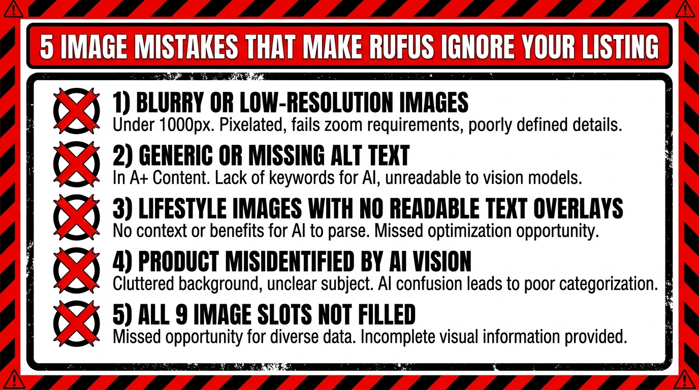
    A remarkable number of sellers still upload only 3–4 images per ASIN, leaving Slots 5–7 empty or populated with redundant views that add no new information. For Alexa for Shopping, an incomplete image set is a signal about listing quality — a well-maintained, competitive listing fills all available slots with purposeful content. Beyond the AI signal, Slots 5–7 serve real human shoppers at the consideration and decision stages. A comparison image in Slot 5 addresses the shopper who opened three tabs to compare products. A scale image in Slot 6 addresses the shopper about to abandon because they’re not sure it’ll fit. These late-funnel images convert shoppers who would otherwise leave.

    Building Your Rufus-Ready Image Audit: A Practical Starting Point

    The gap between understanding Rufus-ready image strategy and acting on it tends to be a prioritization problem. A catalog of 200 ASINs can’t all be re-imaged simultaneously. The right approach is a tiered audit that focuses your resources on the highest-impact opportunities first.

    Tier 1: High-Traffic, Below-Benchmark CVR

    Start with the ASINs that have the most traffic but convert below your category average. These listings are generating impressions — Alexa for Shopping or organic search is already serving them — but failing to convert. This is typically an image problem at the supporting image level (Slots 2–7). Run an audit of each Slot 2–4 image against the query intent driving traffic: does each image visually answer what the top converting queries are asking? If not, this is your first re-image priority.

    Tier 2: High-Volume, Main-Image CTR Issue

    Use your Search Query Performance data to identify ASINs with high impression share but low click share. This is a main image and title issue. Re-photograph the main image with higher fill, cleaner isolation, and verify the product color is rendered accurately. Thumbnail-test the new image before uploading.

    Tier 3: Complete Image Sets for All ASINs

    After addressing Tiers 1 and 2, build out complete 7-image sets for any ASIN that currently has fewer than 6 images. The incremental lift from a complete image set — with each slot serving its specific function — is consistent enough across categories that this is a reliable optimization even for lower-traffic ASINs. Use AI-generated lifestyle imagery to make this economically feasible at scale.

    The Longer Trajectory: Where Alexa for Shopping Goes Next

    Image strategy for AI-mediated discovery isn’t a problem you solve once and set aside. Alexa for Shopping is evolving actively, and the image requirements of 2026 will be the baseline of 2027. Several developments on Amazon’s roadmap suggest where this goes next.

    Visual search is expanding. Amazon’s “Search with Your Camera” feature — which lets shoppers photograph a real-world object and find matching products — is seeing increased integration with Alexa for Shopping. This means your main image needs to work not just as the product you’re selling, but as a visual reference that matches real-world objects shoppers might photograph. For product categories where design mimicry is common (furniture, home decor, accessories), this creates both a protection argument for unique visual identity and a discovery argument for images that match common real-world reference objects.

    Video is becoming an AI-readable signal. Amazon has been building video indexing capabilities into its product discovery infrastructure, and Alexa for Shopping will increasingly extract information from product videos in the same way it currently processes images. The sellers who establish strong video content now — with clear, feature-demonstrating, voice-narrated product videos — will have a head start when video indexing becomes a material ranking signal in the AI’s product model.

    Personalization will deepen. As Alexa for Shopping accumulates more behavioral data across its user base, product recommendations will become more individualized. This creates an argument for image sets that address multiple buyer personas rather than optimizing for a single target customer. Diverse use-case images, diverse lifestyle contexts, and diverse demographic signals across your full 7-image set maximizes the surface area over which the AI can match your product to individual shoppers’ intent signals.

    Conclusion: Images as Structured Data, Not Just Visual Assets

    The fundamental shift this article has been building toward is this: in 2026, your Amazon product images are no longer primarily visual persuasion tools. They are structured data inputs feeding a multimodal AI system that determines when, how, and to whom your product gets recommended. The distinction matters practically because it changes how you evaluate an image’s success.

    A beautiful lifestyle image that doesn’t contain readable text, doesn’t communicate a specific use-case context through scene signals, and doesn’t connect to the intent-modified queries driving your category traffic is failing at its primary job — even if it performs well in human user testing. The new standard is an image that works for both audiences simultaneously: the human shopper who browses and the AI layer that pre-screens and recommends.

    The playbook is actionable. Audit your current image sets against the slot-by-slot framework. Test your infographics at 400px wide for OCR-readability. Align image claims with listing copy. Build the use-case context images that match your highest-value intent-modified queries. Fill all seven slots with purposeful, distinct content. Track conversion rate, CTR, and return reason codes after each change.

    Sellers who treat this as a systematic, iterative process — rather than a one-time creative exercise — will build a compounding advantage in AI-mediated discovery. The gap between Rufus-ready listings and everything else is already visible in conversion data. As Alexa for Shopping’s footprint grows toward serving the majority of Amazon’s mobile shopping queries, that gap will widen.

    Key Takeaways: Alexa for Shopping (formerly Rufus) uses computer vision and OCR to extract structured data from your product images. Design for the AI’s reading layer first — OCR-optimized infographics, scene-specific lifestyle images, copy-consistent claims — and you’ll simultaneously improve human shopper conversion. The 7-slot image sequence should function as an answer engine: each slot addressing a specific question your target shoppers are asking.

  • What Rufus Actually Looks For in Your Images — And Why Most Sellers Are Optimizing the Wrong Things

    What Rufus Actually Looks For in Your Images — And Why Most Sellers Are Optimizing the Wrong Things

    Split-screen showing Rufus AI analyzing Amazon product images on a smartphone with annotated listing image slots

    By late 2025, more than 250 million shoppers had used Amazon’s Rufus AI assistant. Monthly active users grew 140% year-over-year. Interactions jumped 210%. And perhaps the most startling figure of all: according to Sensor Tower’s holiday analysis, Rufus-assisted sessions converted at 3.5 times the rate of non-Rufus sessions on Black Friday — making up roughly 40% of all sessions but driving 66% of purchases.

    That is not a marginal experiment. That is a structural shift in how Amazon shoppers discover and buy products. And it has profound implications for your image strategy — implications that most sellers are still getting completely wrong.

    The problem is that Rufus is not a search engine. It does not rank results the way the A9 or A10 algorithms do. It is a conversational, multimodal AI assistant that synthesizes product listings, customer reviews, Q&A data, and visual content to generate shopping recommendations in natural language. It is, in a very real sense, a different kind of customer — one that reads your images not as aesthetic assets, but as structured evidence it can cite in an answer.

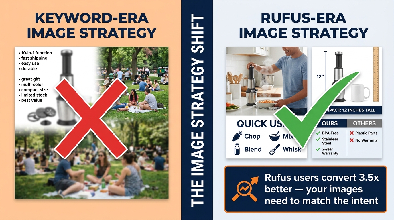
    Most image optimization advice is still written for keyword-era search: make the main image pop, add bullet-point overlays, use lifestyle photos that look good. That advice is not wrong, exactly, but it is dramatically incomplete when the entity evaluating your listing is a multimodal AI model looking for semantic richness, intent alignment, and verifiable claims.

    This post breaks down exactly what Rufus looks for in your product images, the specific image types that win recommendations, the silent mistakes that kill your Rufus visibility, and how to build an image brief that actually serves both the AI and the human customer it is advising.

    How Rufus Actually Processes Your Product Images

    Infographic diagram of Rufus multimodal AI pipeline: image ingestion, COSMO knowledge graph, and RAG answer generation stages

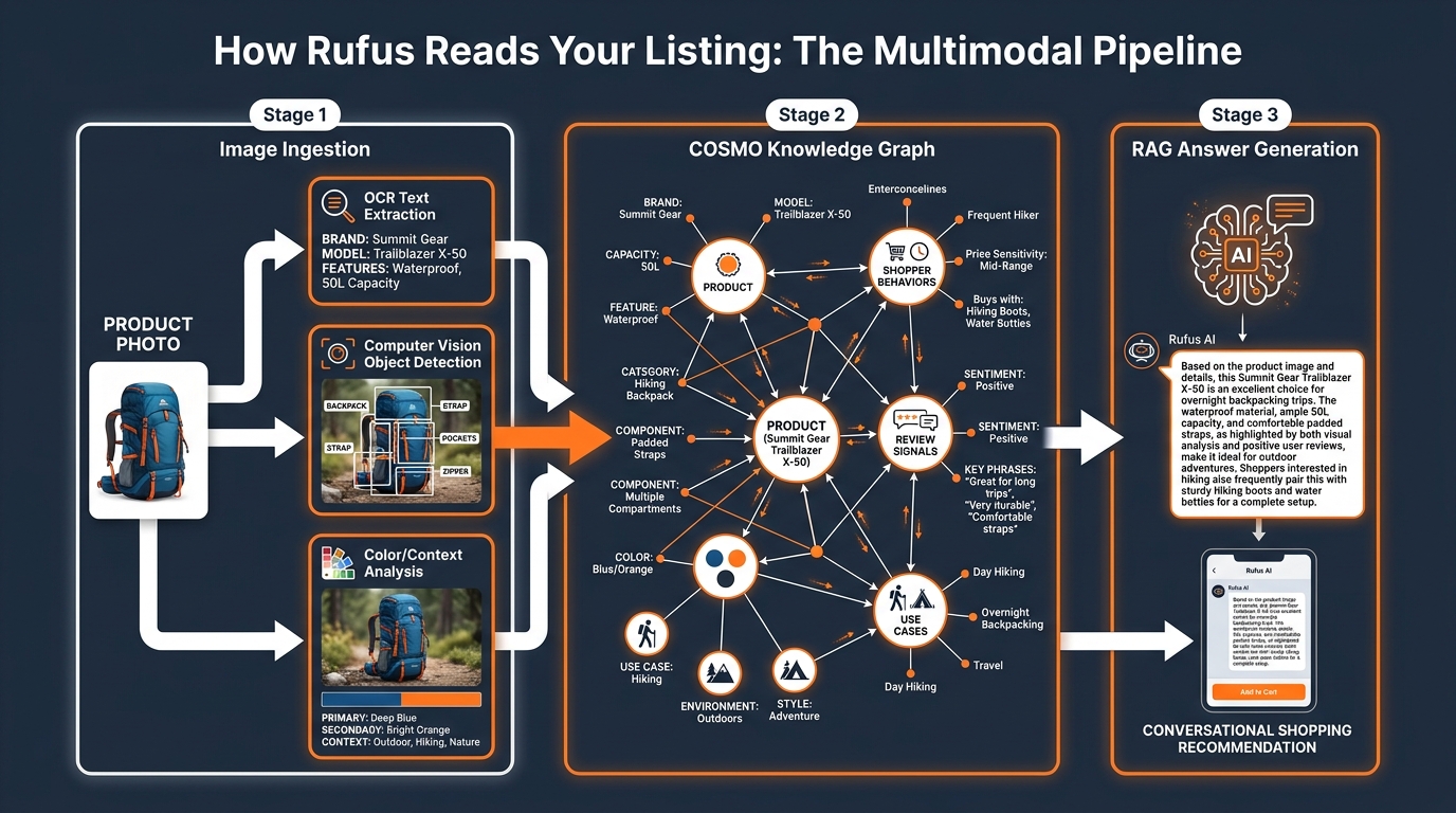
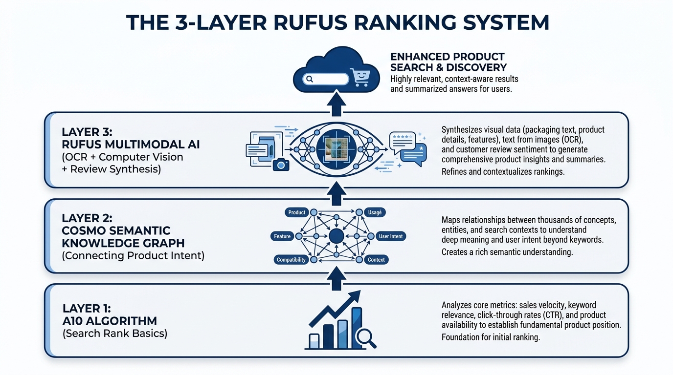
    To optimize for Rufus, you first need to understand what is actually happening under the hood when your listing gets evaluated. Amazon has not published a detailed technical specification of Rufus’s image processing pipeline, but the architecture is reasonably well understood through Amazon’s own research papers, public talks, and the COSMO system documentation.

    The COSMO Knowledge Graph

    COSMO (Common Sense Knowledge for E-Commerce) is Amazon’s large-scale product knowledge graph. It ingests data from product catalogs, customer reviews, community Q&A sessions, browsing behavior, and increasingly, visual signals extracted from product images. COSMO does not simply store text — it builds a semantic map of how products relate to use cases, contexts, shopper profiles, and competitor products.

    When Rufus receives a shopping query — say, “what’s a good camping chair for bad knees?” — it does not do a keyword match. It queries the COSMO graph to identify products whose associated signals most strongly align with the intent behind that question. Products that have strong use-case signals, clear attribute evidence, and verified claims across multiple data sources rank higher in Rufus’s reasoning process.

    Your images feed into this graph. Computer vision models extract object classes, spatial relationships, color and material attributes, and contextual cues (indoor vs. outdoor, solo use vs. group use, casual vs. professional). OCR (optical character recognition) reads text that appears within your images — ingredient callouts, feature labels, spec overlays. The extracted data gets merged with your listing text, review content, and Q&A to build a composite knowledge profile of your ASIN.

    Retrieval-Augmented Generation (RAG) and Image Evidence

    Rufus operates on a RAG architecture — it retrieves relevant product data from COSMO and related sources, then generates a conversational response grounded in that retrieved evidence. This is crucial for understanding image strategy, because it means Rufus does not just need to find your product; it needs to be able to cite your product confidently in a natural-language answer.

    If a shopper asks “which yoga mat is best for hot yoga?” and your images clearly show a person using the mat in a warm, humid studio environment alongside an infographic that reads “moisture-wicking surface” and “non-slip grip when wet,” Rufus has specific visual and textual evidence it can use to construct a confident recommendation. If your images are generic glamour shots with no use-case context, Rufus has nothing to cite — and it will surface a competitor whose listing provides that evidence.

    What Rufus Does Not Do

    It is equally important to understand the limits of Rufus’s image reading. Rufus is not parsing the aesthetic quality of your photography or applying design sensibilities. It does not penalize you for using a plain white background. It is not swayed by how stylish a lifestyle photo looks. What matters is whether the image communicates something specific and useful that can be extracted and used to answer a shopper’s question. Beauty without specificity is invisible to Rufus.

    The Intent Graph: What Questions Rufus Is Actually Trying to Answer

    Understanding Rufus optimization requires mapping out the questions Rufus is trying to answer on a shopper’s behalf. These questions fall into predictable categories, and your image set needs to provide visual evidence for each of them.

    Use-Case Questions

    “What is this product actually for?” is the most fundamental question in any Rufus interaction. Shoppers increasingly use Rufus to search by activity or purpose rather than by product name: “something for camping with toddlers,” “a bag I can use as both a gym bag and carry-on,” “a moisturizer that works under makeup.” Your images need to answer these questions visually. A lifestyle image of your backpack in an airport security line communicates “travel-friendly” far more powerfully than the word “versatile” in a bullet point.

    Who-Is-This-For Questions

    Rufus is used heavily for comparative and qualifying queries: “best for seniors,” “good for beginners,” “safe for dogs.” Images that show the product being used by a specific, recognizable demographic type — whether that is an older adult, a child, a professional in a specific setting, or an athlete in a specific sport — give Rufus the evidence it needs to confidently recommend your product to queries that contain those qualifiers.

    What-Is-Included Questions

    Shoppers regularly ask Rufus what comes in the box, what sizes are available, and whether specific accessories are included. A clear “what’s in the box” flat-lay image, or a size-comparison image showing multiple variants side by side, directly answers this query type. These images are among the most underused in most sellers’ image stacks, yet they address one of the most common Rufus query patterns.

    Is-This-Claims-True Questions

    When your listing claims “waterproof,” “BPA-free,” “machine washable,” or “fits a 15-inch laptop,” Rufus looks for corroborating evidence. The most powerful corroboration is visual: an image of the product submerged in water, an image of the certification label, an image of a laptop visibly fitting into the bag’s sleeve. These “proof images” are what allow Rufus to recommend your product with confidence rather than hedging with “the seller claims this product is waterproof.”

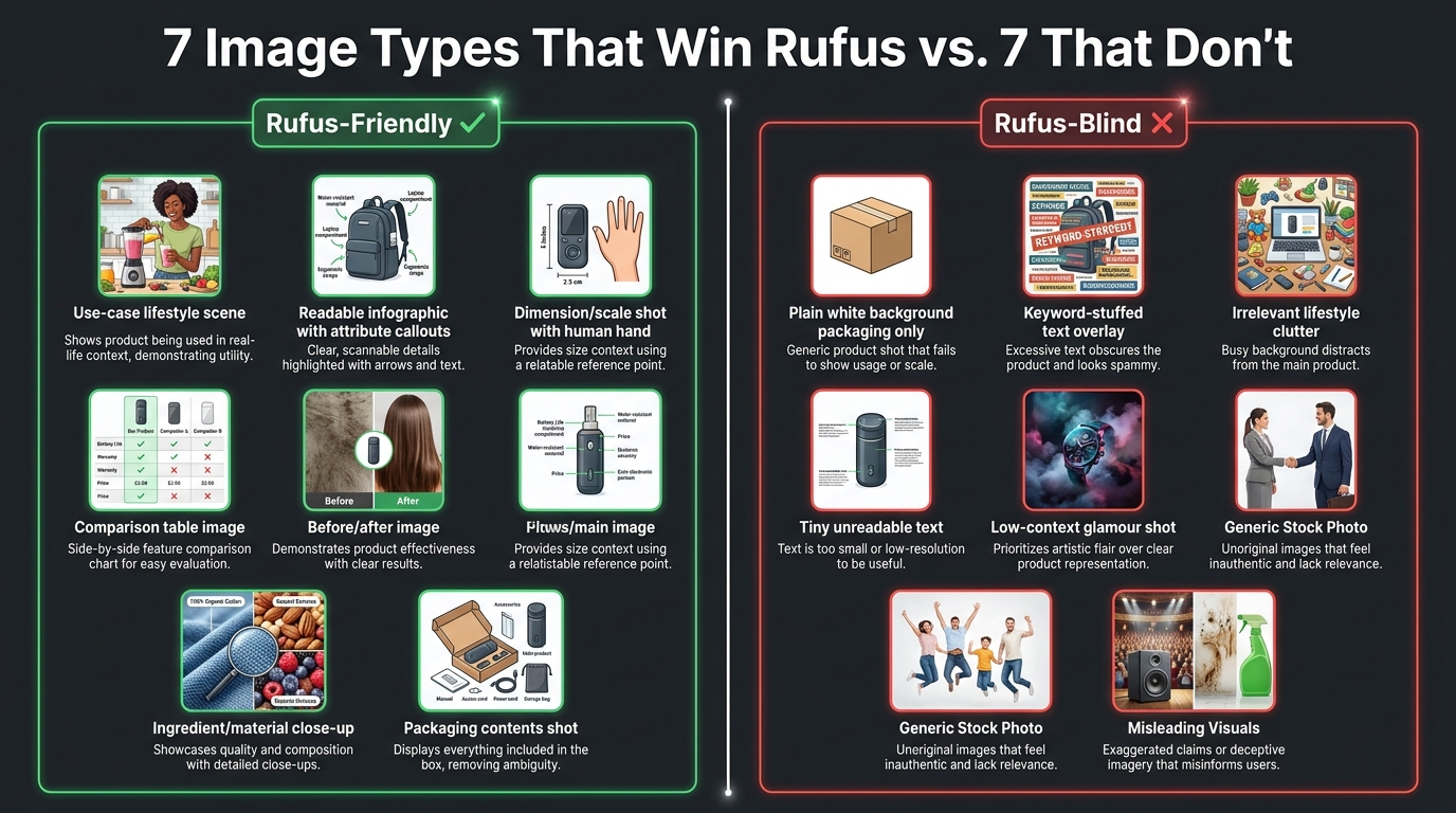
    The 7 Image Types That Win Rufus Recommendations

    Comparison chart showing 7 Rufus-friendly image types vs 7 image types that hurt Rufus visibility

    Based on the current understanding of Rufus’s multimodal evaluation and what agencies working with Rufus-optimized catalogs report, seven image types consistently outperform in Rufus recommendation frequency and post-recommendation conversion rate.

    1. The Unambiguous Main Image

    Your main image must instantly communicate exactly what the product is — not what it aspires to be, not the lifestyle it belongs to, but what it physically is. Rufus uses the main image as its first disambiguation step when processing your ASIN. An ambiguous or styled main image that obscures product type creates uncertainty in Rufus’s classification, which reduces confidence in surfacing it for specific queries. Keep the main image on white, full-frame, showing the complete product in its most recognizable form. Save the storytelling for images two through nine.

    2. Use-Case Lifestyle Shots With Specific Context

    Not all lifestyle images are created equal for Rufus. A generic “young woman smiling with coffee cup” does not tell Rufus anything useful about the mug’s use case. What works is specificity: a hiker filling the mug from a stream (signals: outdoor, adventure, portability), a parent using the mug one-handed while holding a baby (signals: parent, ease of use, one-handed operation), or a commuter sipping from it on a subway (signals: commuter, leak-proof, portable). The more specific the context, the more intent signals Rufus can extract.

    3. Readable Infographic Images With Attribute Callouts

    Infographic images — secondary images that overlay text callouts, feature labels, and attribute annotations directly on a product photo — are one of the highest-value image types in the Rufus era. The key word is “readable.” Text overlays need to be large enough for OCR to extract reliably (minimum 16px equivalent at image resolution), use plain sans-serif fonts, and describe features in natural-language phrases rather than keyword-stuffed fragments. “Adjustable lumbar support for long work sessions” is more Rufus-readable than “ERGONOMIC LUMBAR SUPPORT PREMIUM GRADE.”

    4. Scale and Dimension Reference Images

    Images that show your product next to a recognizable reference object — a human hand, a common item like a credit card or water bottle, a standard piece of furniture — directly answer the “how big is this actually?” query that Rufus fields constantly. These are especially powerful for categories where size uncertainty is a major purchase barrier: bags, storage containers, electronics accessories, home goods. A dimension callout image with actual measurements labeled (not just “compact!”) performs even better because it gives Rufus a specific, citable answer to size queries.

    5. Proof Images for Key Claims

    For any claim in your title or bullets that can be physically demonstrated, there should be a corresponding proof image. Waterproof claims: show the product in water. Heat resistance: show it next to a flame or on a hot surface. Child safety certification: show the certification mark clearly. Fit accuracy: show the product fitting the stated use (laptop in sleeve, bottle in cup holder, device in pocket). Rufus treats verified visual evidence differently from unsupported text claims, and this shows up in how confidently the assistant recommends your product.

    6. What’s-in-the-Box / Variant Comparison Images

    A flat-lay image showing every item included in the package — laid out clearly and labeled with callout arrows — is one of the most directly functional image types for Rufus’s information-retrieval task. Similarly, a grid image showing all available color or size variants side by side answers variant-selection queries without requiring Rufus to infer from text. These images reduce ambiguity, which is one of the primary things Rufus’s confidence scoring tries to minimize.

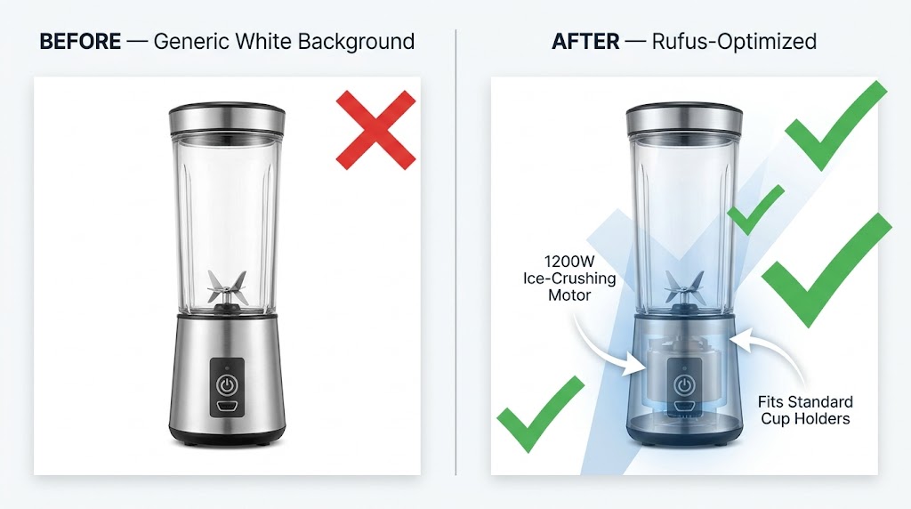
    7. Before/After and Problem-Solution Images

    This image type is particularly powerful for problem-solution products: cleaning products, skincare, organizational tools, fitness equipment, home improvement items. A split-image showing a genuine before and after state communicates the product’s core value proposition in a format that Rufus can extract as a causal relationship: “this product produces this outcome.” These images also tend to align strongly with review language, which reinforces COSMO’s confidence in the association.

    The Silent Killers: Image Mistakes That Destroy Rufus Visibility

    Split comparison of keyword-era vs Rufus-era image strategy showing the shift sellers need to make

    Just as important as knowing what works is understanding what actively hurts your Rufus visibility — and why so many otherwise well-optimized listings score poorly against Rufus’s evaluation criteria.

    Keyword-Stuffed Text Overlays

    The practice of packing as many keywords as possible into image overlays was a debatable tactic even in the keyword-search era. In the Rufus era, it is actively counterproductive. When OCR extracts text from your infographic and it reads as a fragmented list of category terms — “YOGA MAT NON SLIP THICK EXERCISE FITNESS WORKOUT GYM” — Rufus cannot construct a coherent semantic signal from it. It reads as noise rather than evidence. The OCR-extracted text needs to form sentences or at minimum natural noun phrases that describe features in the way a customer would speak them.

    Generic Lifestyle Imagery That Obscures the Product

    High-production lifestyle photography that prioritizes mood over clarity is one of the most common Rufus visibility problems. If your product is difficult to see in the lifestyle shot — positioned as a small prop in a beautifully lit scene, half-hidden in shadows for dramatic effect, or shown at an angle that obscures its key features — Rufus’s computer vision models extract little useful information from it. The aspirational lifestyle image that works beautifully for Instagram performance does not translate to meaningful Rufus evidence.

    Using Fewer Than Six Image Slots

    Amazon allows up to nine images per listing (plus video). Sellers who use three or four images are leaving enormous Rufus surface area on the table. Each image is an additional data point for COSMO’s knowledge graph. Each image slot is an opportunity to answer another category of shopper intent question. Incomplete image stacks signal to Rufus that the listing has less evidence to offer — and Rufus will default to more fully documented competitors when generating recommendations.

    Images That Contradict Review Language

    This is a subtle but significant problem. If your images show the product used in an office setting but your reviews consistently mention it being used outdoors, Rufus detects a misalignment between your visual signals and your actual customer base. The reverse is also true: if your images claim “heavy duty” but reviews mention it feeling lightweight and fragile, the contradiction weakens COSMO’s confidence in your listing’s claims. Image strategy and review sentiment need to be consistent.

    Text in Images That Cannot Be Read by OCR

    Decorative scripts, very small text, text that blends into a busy background, and text at angles that OCR cannot reliably parse — all of these are invisible to Rufus’s extraction pipeline. If important feature claims appear only in unreadable image text and not in the listing copy, they effectively do not exist for Rufus’s purposes. Any text in images that carries important feature or benefit information should also appear explicitly in bullets, titles, or A+ module copy.

    Alt Text, Overlays, and A+ Content: The Hidden Metadata Layer

    Amazon A+ Content module annotated with alt text optimization labels for Rufus AI readability

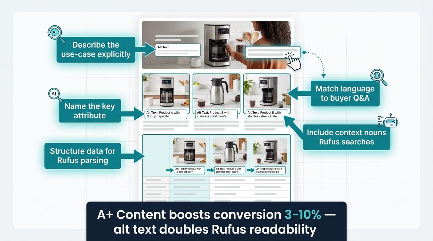
    Beyond the visible images themselves, there is a metadata layer that most sellers never think about: the alt text fields available within Amazon’s A+ Content module. This layer has become increasingly important as Rufus’s multimodal processing has matured.

    How Amazon A+ Alt Text Feeds Rufus

    When you build A+ Content modules in Seller Central, each image module has an optional alt text field. Historically, sellers left these blank or filled them with generic descriptions like “product image.” Today, these alt text fields are one of the cleaner text inputs that Rufus’s content extraction pipeline can read — because they are structured metadata rather than free-form creative copy.

    Alt text that is written to describe the actual scene depicted in the image — what the product is doing, who is using it, in what context, with what outcome — provides COSMO with precisely the kind of structured, use-case-specific evidence it needs. Think of each alt text field as a one-sentence answer to a Rufus query: “This image shows a 45L travel backpack being used as a carry-on bag in an airplane overhead compartment, demonstrating its airline-compliant dimensions.” That sentence gives Rufus four extractable signals: product type, use case, context, and compliance claim.

    Writing Alt Text That Rufus Can Use

    Effective alt text for Rufus follows a simple structure: [who] + [what] + [how/where] + [outcome or attribute]. Lead with the use-case context, not the product name. Describe what is happening, not what the image looks like. Include the specific attributes that appear in the image — materials, certifications, measurements — rather than repeating the product title. Keep each alt text field to one to three focused sentences. Avoid keyword stuffing here as aggressively as you would avoid it in image overlays — it reads as spam to a language model, not as evidence.

    A+ Content Modules as Intent-Aligned Evidence Blocks

    Beyond alt text, the structure of your A+ Content modules itself matters for Rufus. A+ modules that organize information by use case, shopper concern, and comparison (rather than just feature lists) give Rufus a pre-structured evidence library to draw from. A module titled “For the Outdoor Athlete” with specific performance attribute images serves Rufus’s classification far better than a generic “Product Features” module with the same information. The heading text of A+ modules is indexed and contributes to the overall use-case signals associated with your ASIN.

    Cross-Referencing Images and Listing Copy

    One of the most overlooked consistency requirements for Rufus optimization is ensuring that information appearing in images also appears in listing copy — and vice versa. If your infographic image highlights “fits bottles up to 32oz,” that claim should also appear in your bullet points or product description. Rufus’s RAG system gains confidence in claims when it finds them corroborated across multiple sources within the listing. A claim that appears only in an image text overlay with no textual corroboration carries less weight in the knowledge graph than a claim confirmed by both image evidence and listing text.

    Lifestyle vs. Context Shots: Why Rufus Treats These Differently

    The terms “lifestyle image” and “context shot” are often used interchangeably in Amazon seller communities, but they describe fundamentally different visual assets — and Rufus evaluates them very differently.

    What Is a Lifestyle Image?

    A lifestyle image communicates emotional and aspirational associations: the kind of person who uses this product, the world they inhabit, the feeling the product gives them. These images are high-production, atmospheric, and often prioritize mood over literal product information. They work extremely well for human conversion — they help shoppers visualize themselves using the product and create desire. For Rufus, they provide persona and demographic signals, but limited use-case or attribute evidence.

    What Is a Context Shot?

    A context shot is more literal: it shows the product in a specific, recognizable situation that directly communicates a use case or functional attribute. A camping chair next to a tent with a hiking boot visible in the foreground is a context shot for “camping” and “outdoor use.” A cutting board with vegetables on a kitchen counter next to a knife is a context shot for “cooking,” “food prep,” and “kitchen use.” The context is specific enough that Rufus’s computer vision can classify the use case without ambiguity.

    The Optimal Balance for Rufus

    The most effective approach combines both: a lifestyle image that sets the aspirational context, followed immediately by context-specific shots that answer use-case queries with more precision. If you sell a water bottle, your image stack might include: a lifestyle image of the bottle in a runner’s hand mid-race (emotional, aspirational), then a context shot of the bottle being filled from a hiking stream (outdoor/adventure use case), then a context shot of the bottle in a car cup holder with a gym bag visible (commuter/gym use case), then a context shot of the bottle next to a size reference (practical specification). Each context shot is a different Rufus query answered visually.

    Sellers who use all lifestyle imagery and no context shots tend to see Rufus performance that is strong for broad category queries (“good water bottles”) but weak for intent-specific queries (“water bottle for hiking” or “insulated water bottle for gym”). The specificity of context shots is what unlocks long-tail Rufus recommendations.

    Comparison Images: The Most Underused Asset in the Rufus Era

    If there is one image type that the current Rufus optimization conversation is most dramatically underselling, it is the product comparison image. This is partly because comparison images feel risky — they require referencing competitor products or your own product variants in a way that can feel aggressive. But they are among the highest-signal image types for Rufus’s specific query handling.

    Why Rufus Is a Comparison Machine

    Rufus is heavily used for comparative queries: “what’s the difference between X and Y,” “which is better for Z,” “should I get A or B.” Amazon has explicitly designed Rufus to help shoppers make comparative decisions. When a shopper asks Rufus “what’s the difference between whey protein and plant protein?” and your plant protein listing includes a clean comparison image showing the key attribute differences — protein content per serving, ingredient sourcing, digestion speed — Rufus has structured visual evidence it can use to surface your product in the context of that comparison query.

    Three Types of Comparison Images That Work for Rufus

    Variant comparison grids show your own product variants side by side with attribute differentiators clearly labeled: size options, color options, performance tiers. These answer the “which size should I get?” and “what’s the difference between the standard and pro version?” queries that Rufus handles constantly.

    Category comparison tables show your product against its category context — not necessarily naming competitors directly, but illustrating how its attributes relate to common category benchmarks. A comparison table showing “lightweight foam vs. memory foam vs. latex” for mattress toppers gives Rufus the evidence to surface your memory foam product when a shopper asks “which type of mattress topper is best for pressure relief?”

    Before/after comparison images show the problem and the solution in a single split frame. These are enormously powerful for Rufus because they encode a causal relationship — this product produces this outcome — that maps directly to the problem-solution query structure Rufus handles all day.

    Competitive Naming in Comparison Images

    Amazon’s policies restrict certain types of comparative advertising, so naming specific competitors in comparison images carries policy risk. The safer approach is to compare against generic category descriptions (“standard nylon,” “budget silicone,” “traditional design”) or your own product line variants. The use-case and attribute differentiation comes through clearly without the policy exposure.

    How to Audit Your Existing Image Stack Against Rufus Intent

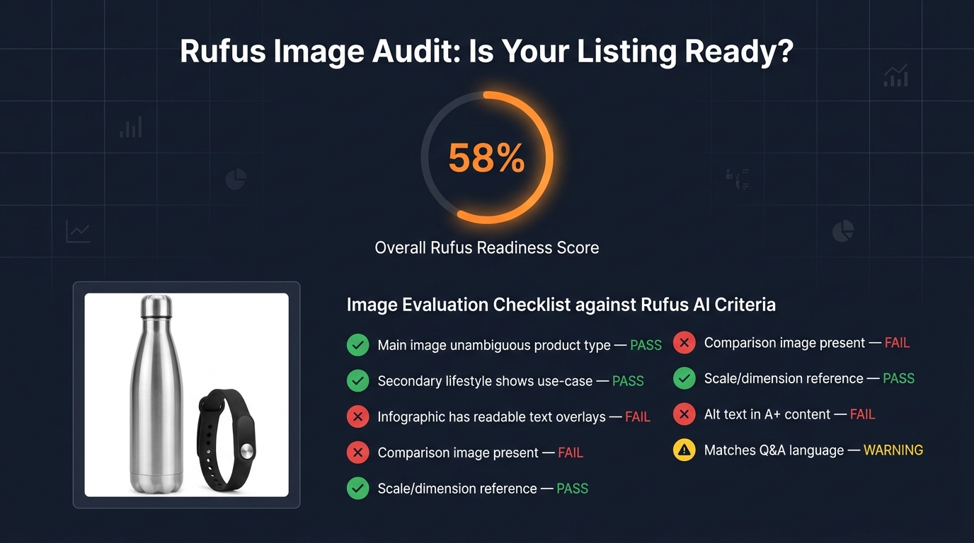
    Rufus image audit dashboard showing a product listing's image readiness score with pass/fail checklist items

    The practical question for most sellers is not “what should I build from scratch?” but “how do I evaluate what I already have and prioritize the gaps?” Here is a structured audit methodology that maps your existing image stack against Rufus’s intent-reading behavior.

    Step 1: Map Your Top Rufus Query Types

    Start by identifying the top 10–15 query types Rufus is most likely to receive for your product category. You can infer these from Amazon’s autocomplete suggestions, the “Customers Also Asked” section of your listing, your Q&A backlog, and your one- and two-star reviews (which often contain objections that Rufus queries would surface). Group them into query categories: use-case queries, who-is-it-for queries, specification queries, comparison queries, and claim-verification queries.

    Step 2: Score Each Existing Image Against Intent

    For each image in your current stack, ask a single question: which query category does this image answer? If the answer is “none” — if the image is purely decorative, aspirational without context, or visually beautiful but semantically empty — it is a low-Rufus-value asset. Score each image from 0 (no extractable intent signal) to 3 (directly and unambiguously answers a specific Rufus query type). Total the score and divide by your total number of image slots. Most listings score below 50% on this metric.

    Step 3: Identify the Gaps

    Map your query categories against your scoring results. The gaps — query categories that your current images do not answer — are your production priorities. For most sellers, the most common gaps are: no proof images for key claims, no “what’s in the box” image, no scale/dimension reference image, and no comparison image of any kind. These are the highest-ROI additions to any listing’s image stack from a Rufus-visibility perspective.

    Step 4: Check for OCR Readability

    Take your existing infographic images and run them through any free OCR tool (Google Lens, Adobe Acrobat’s OCR function, or any online OCR service). The text that the OCR tool extracts successfully is the text that Rufus’s pipeline can read. If important claims are coming back as unrecognized, those overlays need to be redesigned with larger, cleaner text before Rufus can use them. This is a 15-minute exercise that most sellers have never done and that surfaces significant optimization opportunities every time.

    Step 5: Compare Image Language to Review Language

    Pull your 50 most recent positive reviews and identify the phrases customers use to describe what they love about the product and how they use it. Then check whether those phrases and use cases appear in your image overlays and context shots. A significant gap between “how customers describe the product in reviews” and “how images describe the product” indicates that your image strategy is not aligned with COSMO’s actual evidence base — and Rufus is likely missing the use-case signals that real customers confirm.

    Aligning Image Strategy With Review Language and Q&A Signals

    One of the most powerful and least-used tactics in Rufus image optimization is mining your own review and Q&A data to guide your creative brief. This works because COSMO’s knowledge graph actively integrates review language as a signal source alongside image data — meaning images that use language and scenarios that appear in positive reviews are directly reinforcing COSMO’s existing associations for your ASIN.

    The Review-to-Image Pipeline

    Pull your reviews and identify the top five to ten use-case phrases that appear repeatedly: “great for weekend camping trips,” “perfect for my morning commute,” “exactly what I needed for my toddler’s snacks,” “holds up perfectly in the dishwasher.” Each of these phrases is a Rufus query that real customers have essentially pre-validated as a winning association for your product.

    Now ask: does your current image set visually demonstrate each of these use cases? If “great for weekend camping trips” is a top review phrase but none of your images show the product in a camping setting, you have an alignment gap that is costing you Rufus recommendations for every camping-intent query. Close that gap by commissioning a context shot that specifically depicts the camping use case — not a generic outdoors lifestyle image, but a specific camping scene that encodes the same contextual information as the review phrase.

    Q&A as a Rufus Query Preview

    Your listing’s Q&A section is essentially a preview of the queries Rufus receives about your product. Every question in your Q&A section is a question a shopper has been willing to type into a search or Q&A box rather than just buying. These are high-friction decision points. When Rufus receives a query that matches a Q&A question, it will look for evidence in your listing to construct an answer. Images that directly address the most common Q&A questions — showing the answer visually, not just stating it in copy — give Rufus the evidence confidence to surface your product for those high-friction query types.

    Video and the Rufus Surface: Short Clips as Intent Signals

    Video is increasingly part of Rufus’s content evaluation, and while still secondary to still images in most Rufus interactions, its role is growing. Amazon’s addition of short-form video to the listing surface — and the expansion of Rufus’s ability to incorporate video signals — makes video a meaningful Rufus optimization lever that most sellers are not yet using strategically.

    What Rufus Extracts From Product Video

    Rufus can evaluate video for use-case context in a similar way to still images, but with the added dimension of motion and sequence. A video that shows a product being set up, used in a specific context, and producing a visible outcome provides a temporal evidence chain that is more compelling than any single still frame. For products where the key use-case question is “how does this actually work?” — assembly products, multi-function tools, clothing with complex fit, anything with a setup process — video addresses that query type in a way still images cannot.

    Optimizing Video Length and Structure for Rufus

    For Rufus-intent alignment, the most effective product videos follow a specific structure: open with an unambiguous product identification shot (what this product is, clearly), demonstrate the primary use case within the first ten seconds, show two to three secondary use cases in sequence, and end with a clear summary of the key differentiating attribute. Keep total length under 60 seconds for primary listing video — Rufus’s evaluation models are optimized for short-form content that communicates quickly, not for long-form brand narratives.

    The video title and any caption text attached to the video are also indexable by Rufus. Write these with the same intent-alignment discipline as your image alt text: describe the use case being demonstrated, not the emotional feeling the video creates.

    Building a Rufus-Optimized Image Brief for Your Creative Team

    Everything in this post ultimately converges on a practical output: a better creative brief for your photographers, designers, and image production team. Most creative briefs are written around aesthetic goals, brand guidelines, and competitive differentiation. A Rufus-optimized brief is written around intent coverage and evidence provision.

    The Intent-Coverage Model for Image Briefs

    Structure your brief around four required image categories rather than a numbered slot list:

    Category 1: Classification images. These answer “what exactly is this product?” — the main image and one or two supporting product-clarity shots. Brief your photographer on making the product type unmistakable and the key physical attributes visible from the primary angle.

    Category 2: Use-case evidence images. These answer “what is this for and who uses it?” — typically three to four context shots depicting your top reviewed use cases. Brief your art director on depicting specific scenarios, not generic lifestyles. The scenario should be recognizable and specific enough that Rufus’s computer vision can classify the context without ambiguity.

    Category 3: Claim-verification images. These answer “is this claim true?” — infographics with readable attribute callouts, proof images for your top three to five listing claims, certifications visually represented. Brief your designer on text size, font clarity, and natural-language phrasing for all overlays.

    Category 4: Specification and comparison images. These answer “does this fit my needs specifically?” — scale references, dimension callouts, what’s-in-the-box flats, and variant comparison grids. Brief your production team on these as functional assets, not creative showcases — clean, clear, labeled, and complete.

    Adding a Rufus Review Step to Your Creative Approval Process

    Once you have established the intent-coverage model, add a Rufus review step to your image approval workflow. Before images go live, run each one through a simple test: “which Rufus query does this image help answer, and does it answer it clearly?” Any image that fails this test — that cannot be matched to a specific intent query, or that answers it ambiguously — goes back for revision or is replaced by an image from one of the four required categories above.

    This review step does not require technical AI expertise. It requires someone on your team to hold the question “what is Rufus trying to answer for the shopper?” in mind when evaluating creative assets — a different evaluative lens than the more common “does this look great?” or “does this match our brand?”

    The Shift That Is Already Happening — And What Comes Next

    Rufus’s growth trajectory — 250 million users, 3.5x conversion rates, 210% interaction growth — makes one thing clear: the shopping surface Rufus represents is not a feature that may eventually matter. It is the primary discovery surface for a large and rapidly growing segment of Amazon’s highest-intent shoppers. Sellers who are still building image stacks for keyword-era search are effectively invisible to those shoppers.

    The shift from keyword optimization to intent-evidence optimization is not a dramatic reinvention of image strategy. Most of the image types that work for Rufus — use-case lifestyle shots, infographics, proof images, comparison assets — also improve human conversion rates on the listing. The change is in the discipline and specificity with which those images are created: the difference between a lifestyle image that shows a product in a vague outdoor setting versus one that shows it in a specific, classifiable camping context; the difference between an infographic with keyword-stuffed fragments versus one with natural-language attribute sentences that OCR can extract and Rufus can cite.

    Looking ahead, Rufus’s visual capabilities will continue expanding. Amazon is already integrating Rufus with Amazon Lens (visual search) and expanding its ability to evaluate user-uploaded images as part of shopping queries. This means the contextual signals your images communicate will become even more valuable as Rufus handles more nuanced visual comparison tasks — not just “which yoga mat should I buy?” but “does this yoga mat match the kind I can see in this photo I took at my gym?”

    The sellers who will win in that environment are the ones who treat product images as a structured evidence library for an AI that is trying to help real people make real purchase decisions. Every image should earn its slot by answering a specific question that a real shopper would ask Rufus about your product. Build for that standard, and you will be building for the next five years of Amazon commerce.

    Actionable Takeaways

    • Run an OCR audit on your infographic images today. Use Google Lens or any free OCR tool to check which text Rufus can actually read. Redesign any overlay where important claims fail to extract cleanly.
    • Fill all nine image slots — every time. Incomplete image stacks signal low-evidence listings to Rufus. Every unused slot is a missed intent-coverage opportunity.
    • Write A+ alt text as one-sentence use-case answers. Use the [who] + [what] + [how/where] + [outcome] formula. Treat each alt text field as a Rufus query answered in a sentence.
    • Add one comparison image to your top ASINs this month. Variant comparison grids and category comparison tables are the highest-ROI addition for Rufus query coverage in most categories.
    • Mine your reviews for context-shot briefs. Find the top five use-case phrases in your positive reviews and verify that each one is visually represented in your image stack.
    • Structure your image brief around four intent categories, not nine numbered slots: classification, use-case evidence, claim verification, and specification/comparison.
    • Add a Rufus review step to your creative approval workflow. Before any image goes live, identify which query it answers. If the answer is “none,” revise it.
  • What Rufus Actually Sees: The Image Optimization Tactics Amazon Sellers Are Sleeping On

    What Rufus Actually Sees: The Image Optimization Tactics Amazon Sellers Are Sleeping On

    Amazon Rufus AI scanning product listing images as data sources — hero image showing AI vision lines reading main images, infographics, and lifestyle photos

    Most Amazon sellers treat product images as a design problem. Hire a photographer. Get clean shots on white. Maybe add an infographic or two. Done.

    That worked fine when search was keyword-driven and humans were doing all the evaluating. But Amazon’s AI shopping assistant, Rufus, has fundamentally changed the relationship between your visual assets and your discoverability — and the majority of sellers haven’t caught up to it yet.

    Here’s the shift that matters: Rufus doesn’t look at your images the way a shopper does. It processes them as structured data sources. Every pixel, every text overlay, every scene in a lifestyle shot, every alt text field in your A+ Content module — Rufus is extracting meaning from all of it, cross-referencing it against its semantic knowledge graph, and deciding whether your product deserves to appear in a recommendation when someone asks a natural-language question like “What’s a good protein shaker that actually fits in a car cup holder and won’t leak?”

    As of early 2026, Rufus is handling more than 13% of all Amazon search queries, mediating an estimated 15–20% of mobile shopper sessions per quarter, and driving what analysts project to be over $10 billion in annualized incremental sales. Shoppers who interact with Rufus are reportedly 60% more likely to purchase than those who don’t. The assistant has 250 million active users and interaction growth running at 210% year-over-year.

    This isn’t a feature preview anymore. Rufus is a primary discovery mechanism — and it sees your images differently than you think it does.

    This article breaks down exactly how Rufus processes visual content, what it extracts from each image type, where most sellers are leaving discovery on the table, and a slot-by-slot framework for building a Rufus-optimized image stack from scratch.

    How Rufus Actually Processes Product Images: The Multimodal Stack

    Three-layer Rufus ranking system diagram showing A10 algorithm, COSMO semantic knowledge graph, and Rufus multimodal AI with OCR and computer vision

    To optimize for Rufus, you first need to understand what kind of system you’re actually dealing with. Rufus is not a simple image ranker. It’s a multimodal AI assistant built on three interconnected layers, each of which processes your listing differently and feeds data to the next.

    Layer 1: The A10 Foundation

    Amazon’s A10 algorithm operates at the base of the stack. It handles the traditional signals you already know — sales velocity, click-through rates, keyword relevance from titles and backend fields, conversion history, return rates, and fulfillment performance. A10 creates your baseline discoverability, determining whether your product is even eligible to surface for a given search.

    Images play an indirect role here. A poorly optimized image gallery hurts click-through rate and conversion, which feed back into A10 as negative signals. A highly optimized gallery improves both metrics, compounding A10 performance over time. But A10 is primarily a text and behavioral signal engine — it doesn’t evaluate image content directly.

    Layer 2: The COSMO Semantic Knowledge Graph

    Above A10 sits COSMO, Amazon’s proprietary semantic knowledge graph — and this is where image optimization starts to directly matter in a new way. COSMO isn’t a keyword index. It’s a knowledge structure built from millions of behavioral assertions about what customers actually want when they use different phrases.

    COSMO connects product attributes, use cases, customer intents, and product categories into a web of semantic relationships. When a shopper says “best water bottle for hiking,” COSMO isn’t matching the phrase “hiking” to your keyword list. It’s checking whether the knowledge graph contains a strong connection between your product and the node cluster representing hiking intent — which includes attributes like capacity, material, durability, weight, and insulation.

    Visual Label Tagging is the mechanism through which your images feed COSMO. Amazon’s computer vision system scans your listing’s image gallery and applies semantic labels to what it finds: product type, setting, use context, visible features, scale indicators, and user demographics. These labels become data points in COSMO’s graph, strengthening (or failing to strengthen) the connections between your product and relevant intent clusters.

    A camping water bottle photographed only on a white background gets labeled as “water bottle — product isolated.” The same bottle photographed at a trailhead in a hiker’s backpack side pocket gets labeled with setting: outdoor, context: hiking, use-scenario: active-trail, format: portable. That’s a fundamentally richer set of graph connections — and Rufus draws on all of them when generating responses to natural-language shopping queries.

    Layer 3: Rufus Multimodal Synthesis

    Rufus sits at the top of the stack, and it’s where your images, alt text, reviews, Q&A, listing copy, and A+ content all converge into a single, synthesized understanding of your product. Rufus uses a vision-language model to process images holistically — not just extracting text from overlays, but understanding scenes, inferring product use cases, identifying product components, and even reading packaging details.

    OCR (Optical Character Recognition) is Rufus’s tool for reading embedded text. When a shopper uploads a photo of a product they saw in a store and asks Rufus to find it or suggest alternatives, Rufus can read the brand name, product specs, and model numbers directly from label text in the photo. The same capability applies to your listing images — Rufus reads every text overlay on your infographics and incorporates that data into its product understanding model.

    The result is a system where your images are not decorations. They are data inputs — and they either enrich Rufus’s model of your product or they don’t.

    Visual Label Tagging: What COSMO Learns From Your Photos

    Visual Label Tagging is the bridge between your image gallery and COSMO’s knowledge graph, and understanding it gives sellers a concrete framework for thinking about image strategy beyond aesthetics.

    What Gets Tagged and What Doesn’t

    Amazon’s computer vision system is applying semantic labels across 18 documented product categories, and those labels span several dimensions of product understanding. Here’s what the system is looking for in your images:

    • Product identity: What the item is, clearly and unambiguously. If your product is misclassified at this stage — if, for example, your kitchen tool gets tagged as something in a different category — your downstream visibility collapses. AI misclassification is a real, documented problem for sellers with ambiguous or cluttered primary images.
    • Setting and context: Where is the product being used? An image of a blender in a gym bag reads differently to COSMO than the same blender on a kitchen counter. Setting tags include: home, office, outdoor, gym, travel, camping, kitchen, office, and dozens of sub-contexts.
    • User demographics: Who is using the product? Images that show a specific user — a parent with a child, an athlete, an older adult, a professional — generate demographic tags that connect your product to relevant intent clusters like “gifts for mom” or “office supplies for professionals.”
    • Feature visibility: What product features are visually apparent? Visible handles, zippers, lids, buttons, ports, and components all generate feature tags. If your product has a key differentiating feature that isn’t visible in any image, it may not be tagged at all — even if it’s described in your bullet points.
    • Scale and size indicators: Products shown next to common reference objects (a hand, a coin, a standard cup) generate size-context tags that allow Rufus to answer size-related shopper questions accurately.

    The Knowledge Graph Connection

    Once COSMO has your Visual Label Tags, it runs them through its web of semantic intent connections. Every tag is a potential match point for a shopper query. A product tagged with setting: camping, feature: insulation visible, use-context: outdoor hydration, and material: stainless steel inferred is going to show up in far more Rufus recommendation sets than the same product tagged only as water bottle: product isolated.

    The practical implication is significant: each lifestyle image you add to your gallery is not just a conversion aid for human shoppers. It’s a tag-generation event for COSMO. Every new scene you photograph your product in adds a new cluster of intent connections to the knowledge graph. That’s compounding discoverability, and it’s entirely within your control.

    Main Image Tactics: There’s More at Stake Than Compliance

    Before and after comparison of Amazon product main image optimization for Rufus AI — generic white background versus Rufus-optimized version with callout text overlays

    Your main image is the first thing both human shoppers and Rufus’s computer vision system process. Amazon’s compliance requirements are firm: pure white background (RGB 255, 255, 255), product filling at least 85% of the frame, no props or text overlays. Those rules aren’t going away.

    But within those constraints, there are meaningful choices that dramatically affect how well Rufus understands — and therefore surfaces — your product.

    Precision Beats Minimalism

    The “cleaner is better” aesthetic that dominated Amazon photography for the past decade is no longer the whole story. Rufus’s computer vision model needs enough visual information to accurately categorize your product. That means your main image should be photographed to maximize feature clarity, not minimalism.

    Consider what a vision model needs to correctly classify a multi-tool pocket knife versus a standard pocket knife versus a Swiss Army-style multi-tool. The differences are subtle — blade count, tool arrangement, handle shape. If your main image is a tight overhead shot showing only one side of the product, you may be giving the AI insufficient information to classify your item correctly. The same product photographed at a 45-degree angle showing the tool array, the clip, and the scale relative to a hand generates more classifiable information.

    Practical rule: photograph your main image from the angle that makes your product most distinctively identifiable within its subcategory. Don’t just show the product — show what makes it that specific type of product.

    Resolution Requirements in a Multimodal World

    Amazon’s minimum image size is 1000×1000 pixels for zoom functionality to activate. For Rufus optimization, treat 2000×2000 pixels as your practical floor, and 3000×3000 or higher as ideal. Higher resolution means finer detail extraction from the computer vision model — visible texture, stitching, port sizes, label text on packaging — all of which becomes richer data input for Visual Label Tagging.

    A sharp, 2500×2500 pixel main image of a travel bag will allow the AI to tag the zipper material, the external pocket structure, the handle type, and the approximate proportions — generating a far richer initial product classification than a 1000×1000 pixel shot of the same bag.

    The “What Is This?” Test

    Before finalizing your main image, run what practitioners have started calling the “What Is This?” test. Show your main image to someone unfamiliar with the product for three seconds, then take it away. If they can’t immediately answer what the product is, what it does, and roughly who it’s for — your main image is underperforming for both humans and AI. Rufus’s vision model is making the same rapid classification judgment, and an ambiguous main image is the single most damaging image problem a listing can have.

    The Infographic Layer: OCR and the Text Rufus Is Already Extracting

    Rufus OCR scanning an Amazon product infographic water bottle image, extracting text overlays like Holds 64 oz, BPA-Free Stainless Steel, Fits Cup Holders as data tags

    Infographic images are the single highest-leverage image type for Rufus optimization — and the one where the gap between sellers who understand what’s happening and those who don’t is most pronounced.

    Rufus’s OCR capability means the text embedded in your infographic images is being read, indexed, and incorporated into its product understanding model. This isn’t a theoretical capability — it’s active, documented through Amazon’s patent filings, and confirmed by practitioner testing across categories. Every word that appears in your infographic images is a potential data point that Rufus can reference when answering shopper questions.

    Writing for OCR, Not Just for Eyes

    Most Amazon infographics are designed with human readability as the primary constraint. Clean fonts, balanced layouts, branded color schemes. That’s still important. But layered on top of that should be a second design constraint: is this text OCR-readable in a way that serves Rufus’s data extraction needs?

    OCR performance degrades with decorative fonts, very small text, low contrast text on busy backgrounds, and stylized lettering. Amazon’s OCR layer is sophisticated, but it performs best on:

    • High-contrast text (dark on light or light on dark, not mid-tone on mid-tone)
    • Clean sans-serif or serif fonts at legible sizes (minimum 18–20pt equivalent at image resolution)
    • Text that is horizontal, not rotated or curved
    • Specific, noun-phrase driven language rather than vague marketing copy

    That last point deserves more attention. “Premium Quality Construction” tells Rufus almost nothing useful. “Aircraft-grade 6061 Aluminum, 2mm Wall Thickness” tells it a great deal — material, grade, specification, and a size parameter, all in one phrase. Rufus can use the second phrase to answer questions like “what’s the most durable aluminum water bottle” or “are there aluminum bottles with thick walls.” It cannot use the first phrase for anything.

    Noun Phrases That Actually Feed COSMO

    The most effective text overlays for Rufus optimization follow a simple structure: measurable attribute + product-specific noun. Examples that generate strong COSMO connections:

    • “Holds 64 oz — Fits Standard Car Cup Holders” (capacity + compatibility)
    • “BPA-Free 18/8 Stainless Steel Construction” (material + safety attribute)
    • “Fits Wrists 6.5″–8.5″ — Adjustable Clasp” (size range + feature)
    • “1200W Motor — Crushes Ice in Under 10 Seconds” (power + performance claim)
    • “Waterproof to IPX7 — Submersible Up to 1 Meter” (certification + specification)

    Each of these phrases maps to answerable shopper questions. “What water bottle fits in a car cup holder?” — COSMO has a direct data point. “Are there stainless steel bottles that are BPA-free?” — COSMO has a direct data point. Generic phrases like “Superior Hydration” or “Built for Champions” map to nothing in COSMO’s intent graph.

    Infographic Coverage: What to Include Across Your Slots

    Sellers often dedicate one image slot to an infographic and consider it done. The more effective approach is to plan multiple infographic images covering different categories of product information:

    • Dimension/size infographic: Show actual measurements with a scale reference. Include the measurements in text (not just arrows), because OCR reads text, not line lengths.
    • Material/composition infographic: List materials, certifications, and construction details with specific, verifiable language.
    • Feature breakdown infographic: Highlight each key feature with labeled callouts, using OCR-readable noun phrases rather than category headers.
    • Compatibility/fit infographic: If your product fits, pairs with, or requires something specific, show and label it. “Compatible with AirPods Pro 2nd Gen” is the kind of text Rufus uses to surface your product for compatibility queries.

    Lifestyle Images Done Right: Intent Matching Through Scene Context

    If infographics are about feeding data to Rufus through OCR, lifestyle images are about feeding data through computer vision and Visual Label Tagging. The distinction matters, because the optimization approach is different.

    Lifestyle images generate the contextual tags that connect your product to shopper intent clusters. A product photographed in ten different settings generates ten different sets of intent-connection tags in COSMO. Each tag cluster is a pool of potential shopper queries that your product can surface in.

    Choosing Scenes Strategically, Not Aesthetically

    Most brands choose lifestyle scenes based on what looks aspirational or on-brand. A premium kitchen appliance in a beautiful minimalist kitchen. A fitness supplement in a gym. A skincare product in a spa-inspired bathroom. Those aesthetic choices are fine — but they’re not strategic choices for Rufus optimization.

    The strategic approach starts with your actual search intent data. Pull your Search Term Report from Seller Central and look at the long-tail queries that are generating impressions but low conversion. Many of those queries represent intent clusters your product could serve — but isn’t being tagged for because your images don’t show those scenarios.

    Example: A portable blender’s search term report shows queries like “blender for travel,” “mini blender dorm room,” “blender that works in hotel room,” and “blender for camping.” These are distinct intent clusters. A single lifestyle shot in a kitchen doesn’t address any of them. Shooting the same blender in a hotel room, at a campsite, and in a dorm setting — and including those as separate image slots — generates distinct Visual Label Tag clusters for each context, making the product eligible to surface in Rufus responses to all four query types.

    The User Demographic Signal

    Lifestyle images that include people generate additional demographic tagging that pure product shots cannot. COSMO’s knowledge graph includes demographic-intent connections — shoppers searching for “gifts for teenage girls” or “office accessories for working moms” are triggering intent clusters that include demographic tags.

    Include people in your lifestyle images when your product has meaningful demographic targeting. Show the actual user your product is built for. This isn’t just good marketing psychology — it’s a direct input into COSMO’s demographic tagging system, which determines whether your product surfaces for gift-giving and user-specific queries.

    Text Overlays in Lifestyle Images

    Here’s a tactic that most sellers miss entirely: lifestyle images can carry text overlays too. Unlike main images, secondary images have no restriction on overlaid text. A lifestyle image of a water bottle at a hiking trailhead can also include a small, clean callout that reads “Triple-Wall Vacuum Insulation — Stays Cold 24 Hours.” The computer vision model reads the scene and generates context tags. Rufus’s OCR reads the overlay and generates spec data. One image provides two types of data input simultaneously.

    This dual-input approach is one of the highest-ROI tactics in Rufus image optimization — it requires no additional photography, just thoughtful graphic design on images you’re already producing.

    The 9-Slot Narrative Sequence: Treating Your Gallery Like a Presentation

    Amazon 9-slot image gallery narrative sequence strategy showing story arc from Hero Identity through Key Specs, Scale Comparison, Lifestyle Use Cases, Feature Close-Up, Social Proof, FAQ, and Brand Story

    Amazon allows up to 9 product image slots, plus a video. The average seller uses 4–5. According to practitioner data, roughly 65% of sellers leave image slots empty — which means they’re leaving COSMO tag-generation opportunities on the table with every unfilled slot.

    But filling all 9 slots randomly is not better than filling 5 slots strategically. The sequence of your images matters — both for human shoppers who view them left to right and for Rufus’s processing model, which tends to weight earlier images more heavily in initial product classification.

    Here’s a framework for building a 9-slot gallery that serves both humans and Rufus’s multimodal AI simultaneously:

    Slot 1 — Hero Identity

    This is your mandatory white-background main image. Its job for Rufus is unambiguous product classification. Its job for shoppers is immediate recognition and interest. Optimize for resolution (2000px+), product angle (most distinctive and identifiable), and clarity. Pass the “What Is This?” test.

    Slot 2 — Key Specs Infographic

    Place your most OCR-rich infographic in slot 2. This is the highest-priority non-main image for Rufus data extraction. Include your most critical specifications — the ones that differentiate your product and answer the most common shopper comparison questions. Measurable attributes, certifications, compatibility notes. High-contrast text, clean font, specific noun phrases.

    Slot 3 — Scale and Size Reference

    A dedicated size-context image. Show the product next to a common reference object (a human hand, a standard mug, a 12-inch ruler) and label the key dimensions in text. This answers a consistent category of shopper questions (“How big is it actually?”) and generates size-intent tags that allow Rufus to match your product to size-specific queries.

    Slot 4 — Primary Lifestyle / Use Case 1

    Your most commercially important use-case scenario, photographed in its natural setting. Include at least one person if your product has a defined user profile. Add a subtle text callout highlighting the key benefit relevant to this scenario. This slot generates your primary COSMO intent connections.

    Slot 5 — Use Case 2 (Different Context)

    A second lifestyle scenario targeting a different intent cluster. If Slot 4 shows your product in a home kitchen, Slot 5 might show it at a campsite or in a hotel room. Every new setting is a new cluster of COSMO intent connections. Don’t repeat the same context — expand your tag coverage.

    Slot 6 — Feature Close-Up

    A high-resolution detail shot of your product’s most differentiating feature — the zipper mechanism, the lid seal, the texture of the grip, the precision of the measurements on the side. Include a labeled callout with specific language. This image addresses the “zoom-and-inspect” behavior of engaged shoppers while generating feature-specific tags for COSMO.

    Slot 7 — Social Proof or Review Callout

    An image incorporating a verified customer quote or review excerpt, combined with a lifestyle or product visual. Rufus synthesizes reviews and Q&A as part of its product understanding — placing a powerful review excerpt in your image gallery reinforces the same sentiment data Rufus is already pulling from your review set. It also addresses purchase hesitation for human shoppers at the consideration stage.

    Slot 8 — FAQ / Objection Buster

    Identify the top purchase objection or question your product receives in reviews and Q&A, and address it directly in a dedicated image. “Yes, it fits in a standard cup holder.” “Yes, the lid is dishwasher-safe.” “No, you don’t need any tools to assemble it.” This image type directly feeds Rufus’s ability to answer common shopper questions about your product — because when a shopper asks Rufus “does [product] fit in a cup holder?”, Rufus is synthesizing your listing’s entire content to generate that answer, including your image text overlays.

    Slot 9 — Brand Story / Materials / Sustainability

    Your final slot should serve long-tail search intent around brand trust, materials sourcing, ethical production, or product origin. For many categories, shoppers ask Rufus questions like “is this brand sustainable?” or “what is this made from?” A dedicated image with clear, OCR-readable text about your materials, country of manufacture, certifications (FDA, CE, organic, Fair Trade), or sustainability commitments provides Rufus with direct data to answer those queries.

    The Video Slot

    Add a product video. Rufus’s multimodal processing extends to video content in your listing gallery. A short, tight demonstration video (60–90 seconds) showing your product in use across two or three scenarios provides the richest possible context data — moving-image analysis combined with spoken or captioned content. If video is not currently part of your listing stack, it should be the next addition after filling all 9 image slots.

    A+ Content Alt Text: The Hidden Data Field Most Sellers Ignore

    Amazon A+ Content editor mockup showing a highlighted alt text input field with a detailed Rufus-optimized description, with a callout bubble reading THIS IS WHAT RUFUS READS

    Alt text in A+ Content modules is, without question, the most underutilized high-leverage input in the entire Amazon listing ecosystem. Historically, sellers ignored it because it had minimal measurable impact on traditional search ranking. The field existed primarily for accessibility — screen readers. Most sellers either left it blank or filled it with something like “Product image 1.”

    That era is over. Rufus reads alt text as a primary data source.

    Why Alt Text Now Matters for Rufus

    Rufus is a multimodal system — it processes both the visual content of images and the textual metadata associated with them. Alt text is part of that metadata layer. When you write descriptive, context-rich alt text for an A+ Content image, you’re providing Rufus with a pre-processed semantic description of what that image contains — one that it can incorporate into its product understanding model without having to rely solely on computer vision inference.

    This is particularly valuable for visual content that’s challenging for computer vision to interpret accurately — complex multi-product scene images, before-and-after comparisons, infographics with dense visual information, or product shots where the key differentiating detail is subtle (like a specific stitching pattern or locking mechanism).

    The Alt Text Formula That Works

    Effective Rufus-optimized alt text follows a specific structure: [Who] + [action/context] + [product] + [key product feature] + [relevant circumstance or outcome].

    Compare these two alt text examples for the same blender image:

    Underperforming: “Blender product lifestyle image”

    Rufus-optimized: “Woman making green smoothie with 1200-watt portable blender on kitchen countertop, using tamper to blend frozen fruit and ice, blender fits standard cup holder”

    The second version contains: a user demographic (woman), an action (making smoothie), a product name with key spec (1200-watt portable blender), a setting (kitchen countertop), a use-case detail (using tamper, frozen fruit, ice), and a compatibility attribute (fits cup holder). Rufus can reference every one of those data points when answering shopper queries.

    The first version contains: nothing useful.

    Auditing and Rewriting Your A+ Alt Text

    Open every A+ Content module you’ve published. Click into each image block and check the alt text field. For the majority of listings — especially older ones — you’ll find blank fields or placeholder text. This is one of the most time-efficient optimization tasks available to Amazon sellers in 2026, because it requires no photography, no design work, and no new content creation. It’s a text field you already have access to, and filling it correctly has a direct, documented impact on Rufus’s ability to understand and surface your product.

    Work through each image systematically. Write alt text that describes the actual content of the image — who is in it, what they’re doing, what the product is doing, what setting they’re in, and what specific product attributes are visible or implied. Keep it under 250 characters for most platforms, though Amazon’s A+ text field accepts longer inputs. Use natural language, not keyword-stuffed fragments.

    Common Image Mistakes That Suppress Rufus Visibility

    Warning infographic showing 5 image mistakes that make Rufus ignore your Amazon listing — blurry images, missing alt text, no readable text overlays, cluttered backgrounds, unfilled image slots

    Understanding what to do is only half the picture. The other half is knowing what’s actively working against you. These are the most common image problems that suppress Rufus visibility in 2026 — many of which sellers don’t recognize as optimization failures at all.

    Mistake 1: Product Misclassification at the Main Image Level

    If Rufus’s computer vision model misidentifies your product at the primary image level, every downstream recommendation and response it generates will be based on a wrong classification. This happens most often with multifunctional products, products in unusual categories, or products with ambiguous primary use cases.

    Signs your product may be misclassified: it surfaces for irrelevant queries but not relevant ones; Rufus describes it inaccurately in chat responses; your listing has normal keyword rank but poor Rufus recommendation inclusion. The fix is almost always to adjust your main image to make product identity unmistakable — cleaner angle, better crop, more identifiable composition.

    Mistake 2: Lifestyle Images With No Semantic Anchoring

    A beautiful lifestyle image that shows your product in a stunning setting but provides no additional data input — no text overlay, no specific user context, no identifiable setting — is a missed opportunity. It looks great to human shoppers but adds minimal new information to Rufus’s product model. Each image slot should be doing double duty: serving human shoppers and feeding the AI. If a lifestyle image isn’t doing both, revise it.

    Mistake 3: Inconsistent Data Between Image Text and Listing Copy

    Rufus cross-references data across your entire listing. If your infographic says “Holds 64 oz” and your bullet points say “58 oz capacity,” Rufus has a data conflict — and when data conflicts occur, the AI is likely to suppress or reduce confidence in the conflicting claims, or worse, surface the wrong information to shoppers who ask capacity questions.

    Audit your infographic text against your listing copy regularly. Spec discrepancies are extremely common — especially when listings have been updated over time without corresponding image updates. Every discrepancy is a trust signal failure for Rufus.

    Mistake 4: Unreadable Text Overlays

    Decorative fonts, low-contrast color combinations, very small text, and curved or rotated lettering all degrade OCR accuracy. A beautiful branded infographic with elegant script text may be generating zero useful data for Rufus because the OCR layer can’t parse the lettering reliably. Test your infographics by attempting to read them on a phone screen at arm’s length. If you can’t read them instantly, neither can OCR with high confidence.

    Mistake 5: Ignoring the Alt Text Fields Entirely

    We’ve covered this in detail, but it bears repeating in the context of mistakes: blank or placeholder A+ alt text is the most common and most preventable image optimization failure on Amazon today. It requires zero budget, zero photography, and minimal time. It’s a pure knowledge gap problem — sellers who know about it fix it immediately, and those who don’t continue leaving meaningful Rufus data inputs blank across every product they sell.

    Mistake 6: Low Resolution Images

    Images below 1000×1000 pixels lose zoom functionality for human shoppers, but the impact on Rufus is equally significant. Low-resolution images provide less detail for computer vision to extract, resulting in thinner Visual Label Tag sets and reduced COSMO connectivity. There is no situation in 2026 where a low-resolution image is serving your listing better than a high-resolution one. Replace them.

    How to Audit Your Current Images Against Rufus Criteria

    Knowing the optimization framework is one thing. Applying it systematically to an existing catalog is another. Here’s a practical audit process that sellers can run on any listing — new or established — to evaluate Rufus readiness and prioritize improvements.

    Step 1: The Slot Count Check

    Open each listing and count your image slots. Are all 9 filled? Is there a video? Empty slots are your first priority — they’re literally unused data input opportunities. If you’re running fewer than 7 image slots on any listing, filling the remaining slots should be your highest-leverage immediate action.

    Step 2: The Resolution Audit

    Download your current listing images and check their pixel dimensions. Anything under 1500×1500 pixels should be queued for replacement. Prioritize the main image first, then infographics (since both OCR quality and COSMO tag richness degrade with lower resolution).

    Step 3: The OCR Text Inventory

    Print or screenshot each of your infographic images. Go through them and list every piece of text that appears. Then ask: is this text specific, measurable, and noun-phrase-driven? Or is it vague marketing language? Categorize each text element as “COSMO-useful” or “COSMO-useless.” Any “COSMO-useless” text should be replaced with specific, attribute-driven language in your next image revision.

    Step 4: The Intent Coverage Map

    Pull your Search Term Report. List the top 15–20 long-tail queries that are generating impressions. Map each query to the lifestyle image in your gallery that addresses that intent. If there are high-impression queries with no corresponding lifestyle image, you’ve identified a COSMO coverage gap. Plan a lifestyle shoot or use AI image editing tools to generate images addressing those missing intent clusters.

    Step 5: The Alt Text Review

    Go into every A+ Content module. Read each alt text field. Apply the formula: [Who] + [action/context] + [product] + [key feature] + [relevant detail]. Rewrite any field that doesn’t meet that standard. This step takes an afternoon and has immediate impact — it’s the single fastest-to-implement, lowest-cost optimization available in Rufus readiness work.

    Step 6: The Consistency Cross-Check

    Compare all specifications mentioned in your infographic images against your bullet points and product description. Note every discrepancy. Resolve all of them. In cases where the correct value is unclear (product has been updated, measurement methods differ), default to the most accurate current specification and update both the image and the copy to match.

    Prioritizing Your Fixes

    Not every listing needs the same depth of attention. Prioritize your audit and fix sequence based on revenue impact: start with your highest-volume, highest-revenue ASINs first. A 10% improvement in Rufus recommendation inclusion on a $50k/month ASIN has far more impact than a complete overhaul of a $2k/month listing. Work your way down the revenue stack systematically.

    The Bigger Picture: Visual Optimization as a Discovery Channel

    Stepping back from the tactical detail, there’s a strategic shift worth naming clearly: visual optimization is no longer just a conversion tool. It has become a discovery channel in its own right.

    When Amazon launched its AI visual search feature — allowing shoppers to upload a photo and find matching or similar products — Rufus’s image processing became directly tied to product discovery in a way that had no equivalent in the keyword-only era. A shopper who photographs a competitor’s product and asks Rufus to find alternatives is triggering a visual search that Rufus answers by matching visual attributes across its product catalog. Products whose images provide rich visual data — clear feature visibility, high resolution, detailed contextual shooting — are more likely to surface in those visual search matches.

    Similarly, when Rufus generates a response to a conversational query like “What’s the best lightweight laptop bag for daily commuting under $80?”, it’s not just running a keyword match. It’s querying COSMO’s intent graph, pulling products whose tags include context: commuting, category: laptop bag, attribute: lightweight, and price-tier: budget — and those tags come substantially from your images. The seller who has shot their laptop bag in a commuting context (a person on a subway platform, entering an office building) with an infographic overlay reading “Fits 15.6" Laptops — Weighs Only 1.2 lbs” has a significant discovery advantage over the seller whose identical product sits in a white-background photo with no additional visual data.

    This is the real magnitude of Rufus image optimization: it’s not a listing tweak. It’s expanding the total surface area of queries your product can appear in — and for a discovery-first platform like Amazon, that’s the most direct path to incremental revenue growth available.

    Conclusion: Your Images Are Your Newest Ranking Signal

    The keyword optimization era taught Amazon sellers to think about discoverability in terms of text. Title keywords, bullet phrase strategy, backend search terms — the mental model was: write the right words, show up in the right searches.

    Rufus hasn’t eliminated that model, but it has added a parallel system that operates on an entirely different type of input: visual data. Computer vision is now reading your scenes. OCR is now indexing your infographic text. Alt text fields are now primary data inputs, not afterthoughts. And the Visual Label Tags that COSMO assigns to your listing are substantially determined by what you put — and how you shoot — across your 9 image slots and A+ modules.

    The sellers who understand this will use their image galleries as active optimization levers. They’ll treat each image slot as a data input opportunity. They’ll write infographic text for OCR accuracy alongside human readability. They’ll choose lifestyle scenes based on intent cluster strategy, not just aesthetic appeal. They’ll fill their alt text fields with specific, context-rich descriptions instead of leaving them blank.

    The sellers who don’t will continue treating images as a design expense — and they’ll wonder why their identical (or superior) product keeps losing out to competitors in Rufus recommendation sets.

    Here are the concrete starting points if you’re ready to close that gap:

    1. Audit your slot count today. Fill any empty image slots within the next 30 days, prioritizing highest-revenue ASINs first.
    2. Rewrite your A+ alt text. Apply the [Who + action + product + feature + detail] formula to every image in every A+ module you’ve published. This is a same-week action with no budget requirement.
    3. Replace vague infographic copy with noun-phrase-driven specifications. Every “superior quality” phrase should become a measurable specification. Every lifestyle image should carry at least one OCR-readable text callout.
    4. Map your lifestyle images to intent clusters. Use your Search Term Report to identify intent gaps in your current lifestyle coverage, and plan shoots or AI image tools to address them.
    5. Resolve every spec inconsistency between images and copy. Data conflicts undermine Rufus’s confidence in your listing. There should be zero discrepancies between what your images say and what your copy says.
    6. Add a video. If you have none, this is your next major visual asset investment. A tight, multi-context demonstration video generates richer multimodal data than any static image.

    Rufus is processing your images right now — every time a shopper opens your listing, every time a natural-language query triggers a recommendation, every time a visual search surfaces products in your category. The question isn’t whether this is happening. It’s whether you’ve given Rufus the data it needs to work in your favor.