Tag: amazon product photography

  • Your Amazon Images Are Answering Questions Nobody Asked: How to Build an Objection-Led Image Stack

    Your Amazon Images Are Answering Questions Nobody Asked: How to Build an Objection-Led Image Stack

    Open almost any mid-tier Amazon listing and you’ll find the same image stack. A white-background hero shot. A lifestyle photo with a smiling model. An infographic packed with six feature callouts. A dimensions diagram. Maybe a “what’s in the box” flat lay. It looks professional. It ticks every box on the agency checklist. And it often converts worse than it should.

    The problem isn’t image quality. Most sellers in 2026 can get decent photography, and AI tools have made polished graphics cheap. The problem is that the stack was built from the seller’s point of view: here are our features, here is our product, here is our brand. The shopper scrolling through those images on a phone is asking something else entirely. Will this fit? Is it smaller than it looks? Does it actually work with my model? Why are there 1-star reviews about the lid?

    When your images answer questions nobody asked, shoppers go looking for answers somewhere else. They scroll to the reviews, they bounce to a competitor, or they add to cart, hesitate, and leave. Every one of those paths costs you conversion rate, and on Amazon conversion rate feeds directly back into how much visibility your listing earns.

    This article takes a different approach to Amazon listing images. Instead of starting with a template (“slot 2 is lifestyle, slot 3 is infographic”), we start with the shopper’s objections. You’ll learn how to mine reviews, Q&A, and return reasons for the doubts that actually kill sales, how to rank those doubts, how to sequence your image slots around the buyer’s decision path, how to design for a thumb on a 6-inch screen, and how to test changes properly with Amazon’s Manage Your Experiments tool.

    No rewritten version of Amazon’s style guide. No generic “use high-resolution photos” advice. Just a repeatable process for building an image stack that does the selling for you.
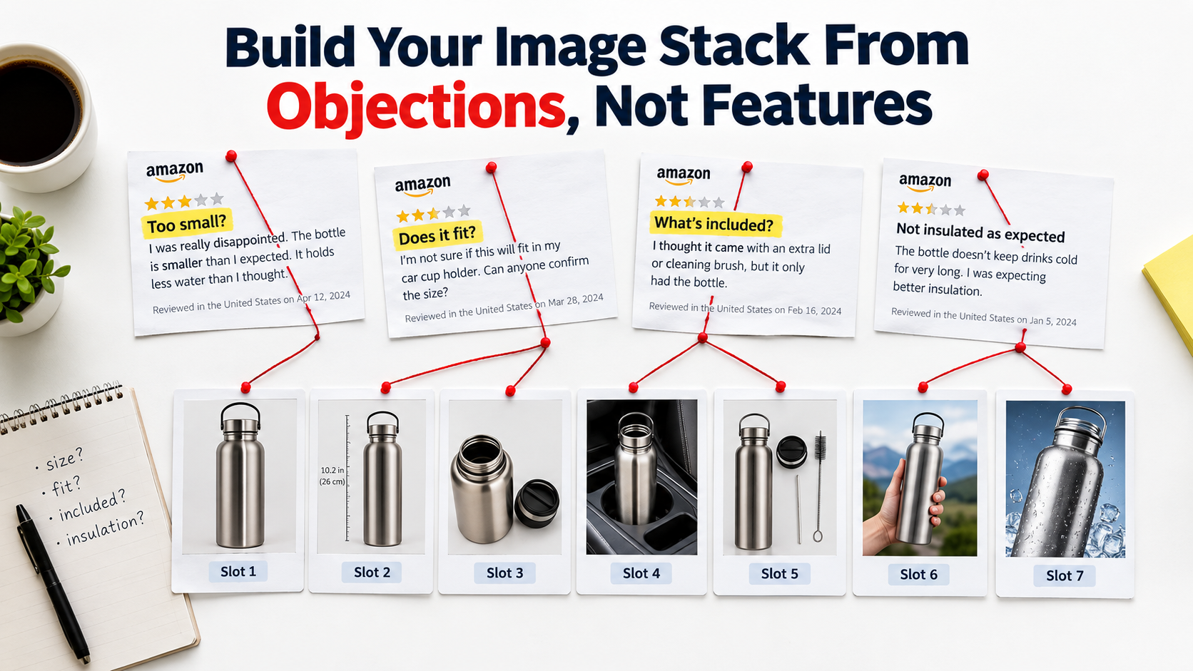
    Seller desk with highlighted Amazon review complaints linked by string to seven numbered listing image slots for a water bottle

    Why Feature-Led Image Stacks Underperform

    Most image stacks are briefed the same way. The brand owner hands a designer a list of features and a few competitor listings for reference. The designer produces an attractive set of graphics that showcase those features. Nobody asks whether those features are what the shopper is actually unsure about.

    Features are claims; objections are doubts

    A feature is something you want to say. An objection is something the shopper needs resolved before buying. These overlap less than most sellers think. A blender brand might lead with “1200W motor,” while shoppers in the reviews keep asking whether it’s loud enough to wake the house, whether the jar fits under standard kitchen cabinets, and whether it can crush ice without adding liquid.

    The 1200W claim isn’t wrong. It’s just not the thing standing between the shopper and the Buy Box. If the image stack spends three slots on motor power and zero on noise, cabinet height, or ice performance, it’s leaving the real decision unaddressed.

    The copycat problem

    Feature-led stacks also tend to converge. When every seller in a category studies the same top-ranking listings and copies their structure, the category fills up with nearly identical image sets. The shopper sees the same lifestyle shot, the same icon grid, the same “premium quality” badge across ten listings. Nothing helps them decide, so they fall back on price and review count.

    That’s a terrible place for a newer brand to compete. If your images look like everyone else’s, you’re asking the shopper to choose based on factors where established listings usually win.

    Images do the work bullets used to do

    On mobile, the image carousel sits at the top of the product page and the bullet points sit well below it. Plenty of shoppers make their decision, or abandon it, before they ever scroll down to the text. That means your images can’t just decorate the listing. They need to carry the argument that bullets carried in the desktop era: what this is, why it’s right for me, and why I shouldn’t worry.

    An objection-led stack accepts that reality. It treats each image slot as an answer to a specific question, ranked by how often that question comes up and how badly it hurts the sale when left unanswered.

    Mining Reviews, Q&A, and Returns for the Real Objections

    Before you brief a single photo, you need raw material: the actual words shoppers use when they hesitate, complain, or return. Fortunately, Amazon exposes much of this publicly, and Brand Registry gives you more of it privately.

    Source 1: Competitor 1-, 2-, and 3-star reviews

    Start with the top five to ten competitors for your main keyword. Pull their critical reviews, and pay particular attention to the 3-star ones. One-star reviews are often about shipping damage or defective units, which images can’t fix. Three-star reviews are where buyers explain what surprised them: “smaller than expected,” “didn’t realize it needed batteries,” “color is more gray than blue.”

    Every one of those surprises is an expectation failure, and expectation failures are exactly what images are built to prevent. If shoppers across the category keep saying “smaller than I thought,” the category has a scale problem, and the listing that solves it visually gets an advantage.

    Source 2: Customer questions on the detail page

    The Q&A section (and the AI-generated review summaries and “customers ask” prompts Amazon now surfaces on many listings) shows you questions people asked before buying. These are pure pre-purchase objections. Common patterns include compatibility (“Does this fit the 2024 model?”), contents (“Does it come with the charger?”), use conditions (“Can it go in the dishwasher?”), and sizing (“Will this fit a 15-inch laptop?”).

    Count repeats. If the same compatibility question appears in slightly different words twenty times across competitor listings, that’s a high-frequency objection.

    Source 3: Your own return reasons and Voice of the Customer

    If you already sell the product, your return reports and the Voice of the Customer dashboard in Seller Central are the most valuable data you have. Returns coded as “not as described” or “item different from picture” are direct evidence that your images created the wrong expectation. These aren’t just lost sales. They also count against your listing’s health metrics.

    Source 4: Search terms and the Brand Analytics data

    Brand-registered sellers can see search query performance data. Look for modifiers attached to your core keyword: “for small kitchen,” “quiet,” “leak proof,” “for travel,” “for kids.” Modifiers reveal what shoppers are filtering for, which tells you which concerns they bring to the listing before they’ve seen a single image.

    How to capture it

    Keep it simple. A spreadsheet with four columns works:

    • Verbatim quote — the shopper’s exact words
    • Source — competitor review, Q&A, your returns, search term
    • Objection theme — size, compatibility, durability, contents, noise, etc.
    • Visualizable? — yes/no: can an image actually resolve this?

    Aim for at least 100 data points for a competitive category. Verbatims matter because the exact wording often becomes the headline text on your images. Shoppers recognize their own language faster than marketing copy.

    Building the Objection Map: Frequency × Severity

    Once you have your raw list, you’ll find far more objections than you have image slots. Amazon displays up to nine images in the main carousel on most product pages, and in practice the first five to seven get the most attention. You need a way to decide what makes the cut.
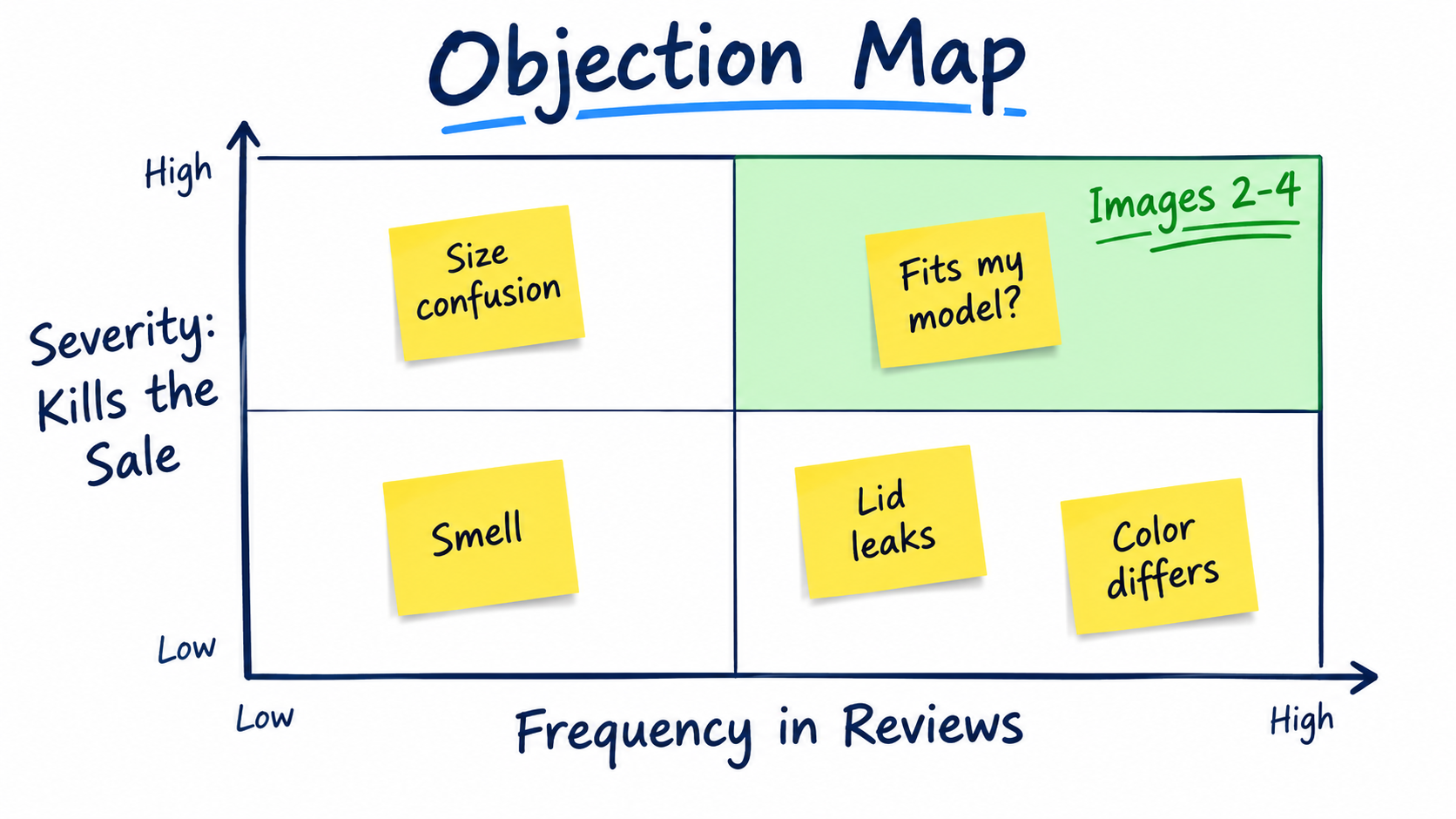
    Objection map matrix plotting review frequency against sale-killing severity with size confusion and fit questions in the top-right quadrant

    Two axes that matter

    Frequency is how often the objection appears across your data. Size confusion mentioned in 30 reviews scores higher than a strange smell mentioned in 3.

    Severity is how likely the objection is to kill the sale outright. “Will this fit my car model?” is a deal-breaker: if the answer is unclear, the shopper won’t risk it. “Is the color slightly warmer than shown?” is a mild concern that most shoppers will tolerate.

    Plot each theme on a simple 2×2 grid. Score frequency by count, and score severity from 1 to 5 based on whether the objection appears in purchase-decision language (“I almost didn’t buy because…”, “returned because…”) or in passing commentary.

    Reading the quadrants

    • High frequency, high severity: These earn the earliest secondary image slots, typically images 2 through 4. They’re the objections most shoppers bring and the ones most likely to end the session.
    • Low frequency, high severity: Address these in later slots or in A+ content. They matter to a minority, but that minority won’t buy without an answer.
    • High frequency, low severity: Often handled with a small callout on another image rather than a dedicated slot.
    • Low frequency, low severity: Leave them to bullets, the description, or nothing at all.

    Filter for what images can actually fix

    Some objections aren’t visual. “Customer service was slow” or “arrived late” can’t be fixed with a photo. Others are only partly visual: durability, for example, is hard to prove in a still image, but you can show material cross-sections, stress tests, or warranty information that address it indirectly.

    Drop the purely non-visual objections from the map and flag the partial ones for creative problem-solving. What remains is your image brief, ranked by priority.

    A worked example

    Take an insulated tumbler in a crowded category. After mining 120 data points, a seller might find these leading themes: does it fit in a car cup holder (high frequency, high severity), does the lid leak when tipped (high, high), is it dishwasher safe (high, medium), how long does ice actually last (medium, medium), and does the color match the photo (medium, low).

    The feature-led stack this seller had been running led with “double-wall vacuum insulation” and “BPA-free.” Neither appeared once as a shopper concern. The objection map suggests a different order: cup-holder fit in slot 2, a leak demonstration in slot 3, ice retention over time in slot 4, and dishwasher-safe as a callout. Same product, different conversation.

    The Main Image: Winning the Thumbnail Within the Rules

    Your secondary images can’t convert anyone who never clicks. The main image has a single job: earn the click from the search results grid. And it has to do that under the strictest rules on the platform.

    The non-negotiables

    Amazon’s main image requirements are well documented and worth keeping in front of every designer you work with. According to Amazon’s product image guidelines:

    • The background must be pure white (RGB 255, 255, 255).
    • The product should fill at least 85% of the image frame.
    • It must be a professional photograph of the actual product. No illustrations, mockups, or placeholders.
    • No text, logos, borders, color blocks, watermarks, or graphics overlaid on the product or background.
    • No multiple views of the same product in one main image.
    • The entire product must be shown, not cropped by the frame (jewelry such as necklaces is an exception).
    • No accessories or props that aren’t included and could confuse the buyer.
    • Products should be shown outside packaging unless the packaging is an important feature.
    • Category-specific rules apply. For example, shoes should be a single shoe facing left at a 45-degree angle, and women’s and men’s clothing main images should be on a human model.

    For files, Amazon recommends at least 1600 pixels on the longest side to enable the best zoom experience, with 1000 pixels as the minimum for zoom and 500 pixels as the minimum to display at all. The maximum is 10,000 pixels, and JPEG is the preferred format.

    Where the competitive edge actually lives

    Since everyone works within the same constraints, differentiation comes from the decisions inside them:

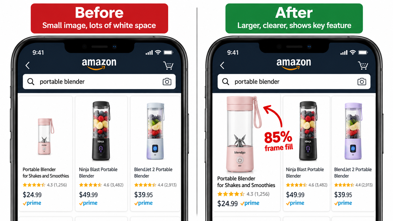
    Fill and crop. The 85% requirement is a minimum. In a thumbnail grid on a phone, a product sitting at 85% fill can look noticeably smaller than a competitor filling the frame edge to edge. Many sellers push as close to full frame as the product’s shape allows while still showing it whole.

    Angle. A straight-on shot flattens most products. A three-quarter angle shows depth and form, and often makes the product read as more substantial. Test which angle communicates the product’s main benefit fastest. A backpack might win at an angle that shows its depth; a phone case might win straight-on to show the cutouts.

    Configuration. Should the product be open or closed, assembled or folded, lid on or lid off? A folding chair shown open tells the shopper what it is; shown folded, it tells them it’s portable. Pick the configuration that answers the search intent behind your main keyword.

    Contents. For multipacks and bundles, the main image is your strongest signal of value. If you sell a 4-pack in a category full of 2-packs, showing all four units clearly is one of the most effective things you can do, as long as you show only what’s included.
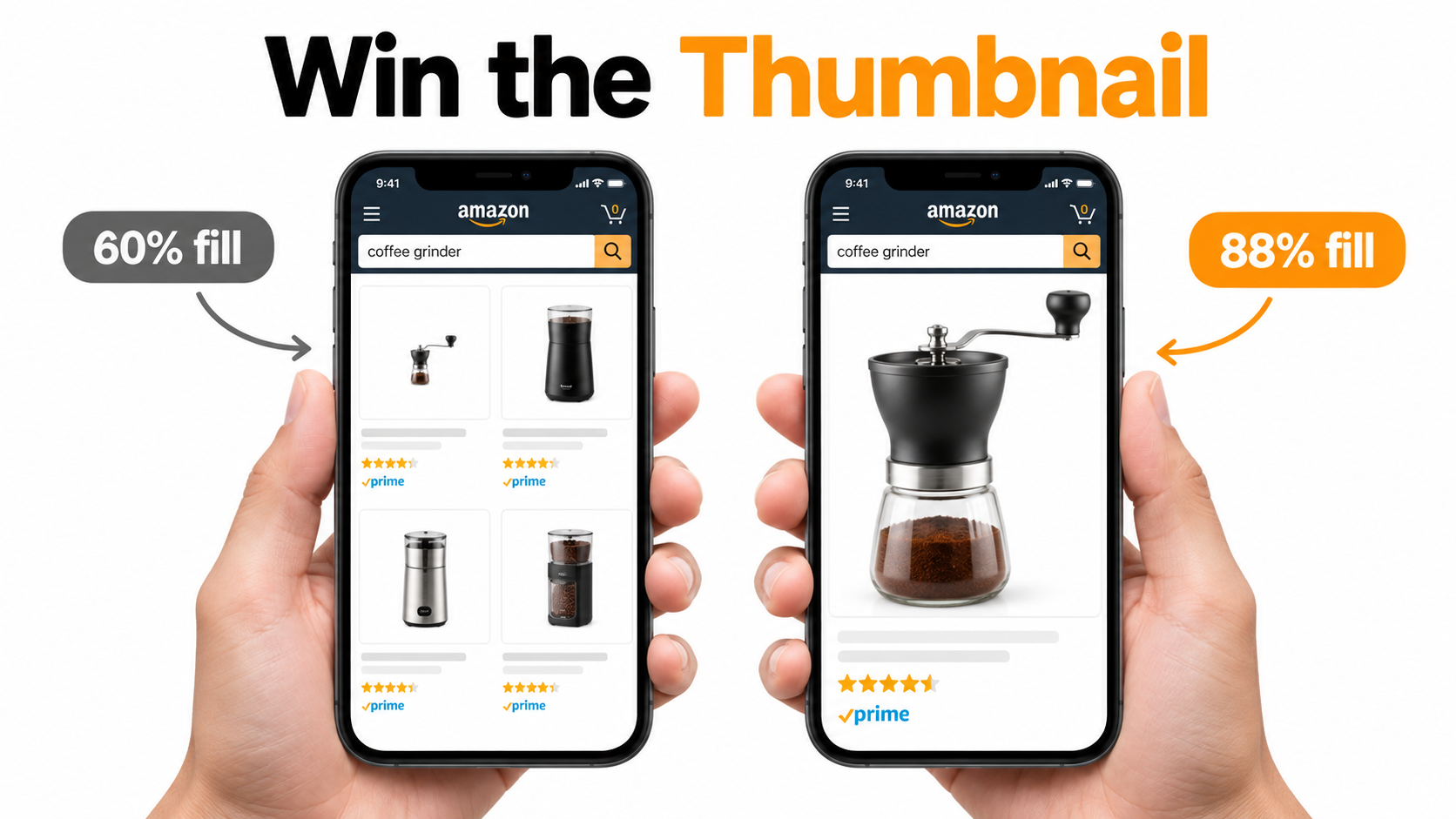
    Two smartphones comparing a coffee grinder thumbnail at 60 percent frame fill versus 88 percent frame fill in Amazon search results

    Audit in context, not in isolation

    Never approve a main image by looking at it full-screen on a desktop monitor. Screenshot the actual search results page for your main keyword on a phone, drop your candidate image into that screenshot at the real thumbnail size, and see whether it stands out from the products on either side. What looks crisp at 2000 pixels can disappear at thumbnail scale.

    Also check against sponsored placements. Your thumbnail often appears beside ads, inside carousels, and in “compare with similar items” modules. The image needs to read well in every one of those contexts.

    Sequencing Slots by Decision Stage

    Once the shopper clicks through, the order of your images matters almost as much as their content. Most people swipe through the carousel from left to right, and attention drops with each swipe. Put your most important answers early.
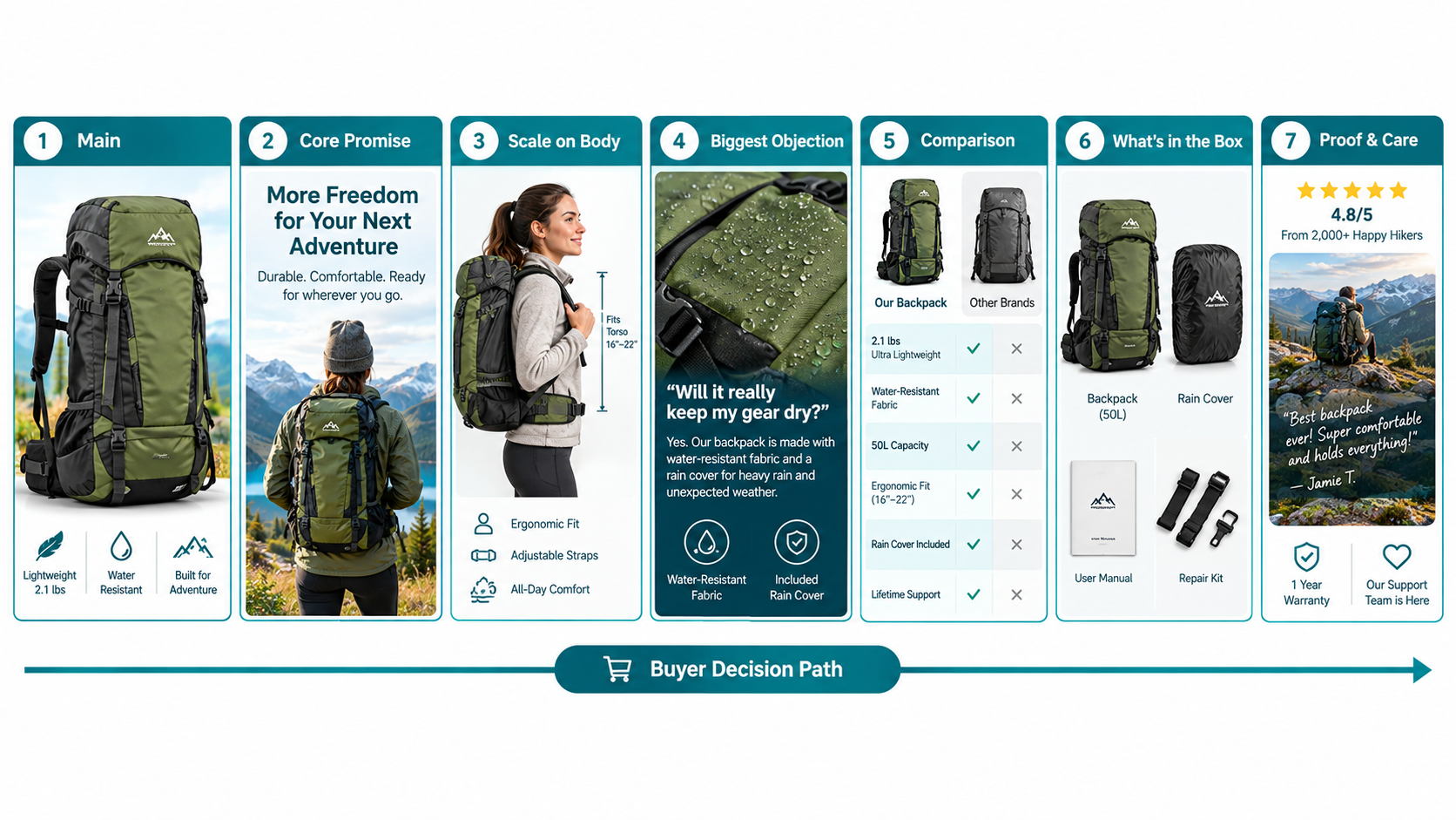
    Seven-panel storyboard of camping backpack listing images arranged along a buyer decision path from main image to proof and care

    A decision-path framework

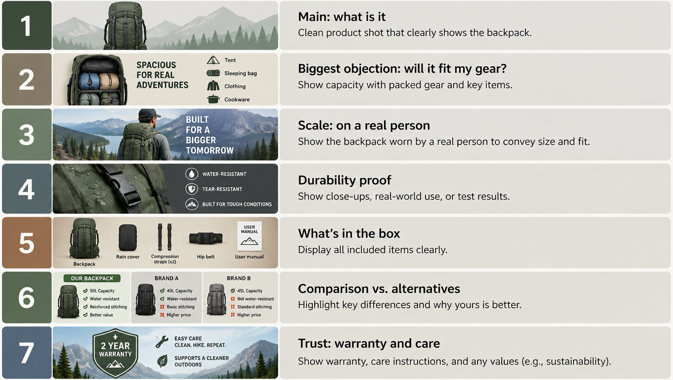
    Rather than assigning slots by image type, assign them by what the shopper needs to know at each stage of deciding:

    1. Slot 1 — Recognition: “Is this what I was looking for?” The main image handles this.
    2. Slot 2 — Core promise: “What’s the one reason this is better?” A single, clear benefit tied to the dominant search intent. Not six features. One.
    3. Slot 3 — Scale and fit: “How big is it really, and will it work for me?” Size confusion is one of the most common expectation failures across categories, so it often deserves an early slot.
    4. Slot 4 — Top objection: The highest-ranked deal-breaker from your objection map that hasn’t been covered yet. Leak-proof demo, compatibility chart, noise comparison.
    5. Slot 5 — Differentiation: “Why this one instead of the cheaper option?” A comparison against generic alternatives (not named competitors) or a breakdown of what justifies the price.
    6. Slot 6 — Contents and setup: “What exactly arrives, and how hard is it to use?” What’s in the box, assembly steps, or a quick-start visual.
    7. Slot 7 — Reassurance: Care instructions, materials certifications you can document, warranty, or brand story. This is where the shopper who’s already convinced looks for permission to buy.

    Lifestyle images: integrate, don’t isolate

    You’ll notice there’s no dedicated “lifestyle” slot. That’s deliberate. A lifestyle image showing a model smiling while holding the product answers no specific question. A lifestyle image showing a person fitting the backpack into an airline overhead bin answers “will this fit carry-on limits?” while also providing emotional context.

    Make every lifestyle shot pull double duty. Ask: what objection does this scene resolve? If the answer is “none,” the shot probably belongs in A+ content or your brand store, not in the main carousel.

    Video’s place in the sequence

    Product videos appear in the image block on many listings and can be highly effective for objections that are hard to show in stills, such as noise level, ease of assembly, or how a fabric moves. Treat video as another answer slot. A 30-second clip that demonstrates your top-ranked objection being resolved is worth more than a 90-second brand film.

    Adjust the order by category

    The framework is a starting point, not a rule. In apparel, fit and fabric often outrank everything, so scale-and-fit may move to slot 2. In supplements, contents and certifications may come earlier. In electronics accessories, compatibility frequently dominates. Your objection map, not the template, should decide the final order.

    Designing for the Thumb: Mobile Legibility Rules

    An infographic that looks great on a designer’s 27-inch monitor can become a smear of illegible text on a phone. Since a large share of Amazon browsing happens on mobile devices, legibility at phone size isn’t a nice-to-have. It’s the baseline.
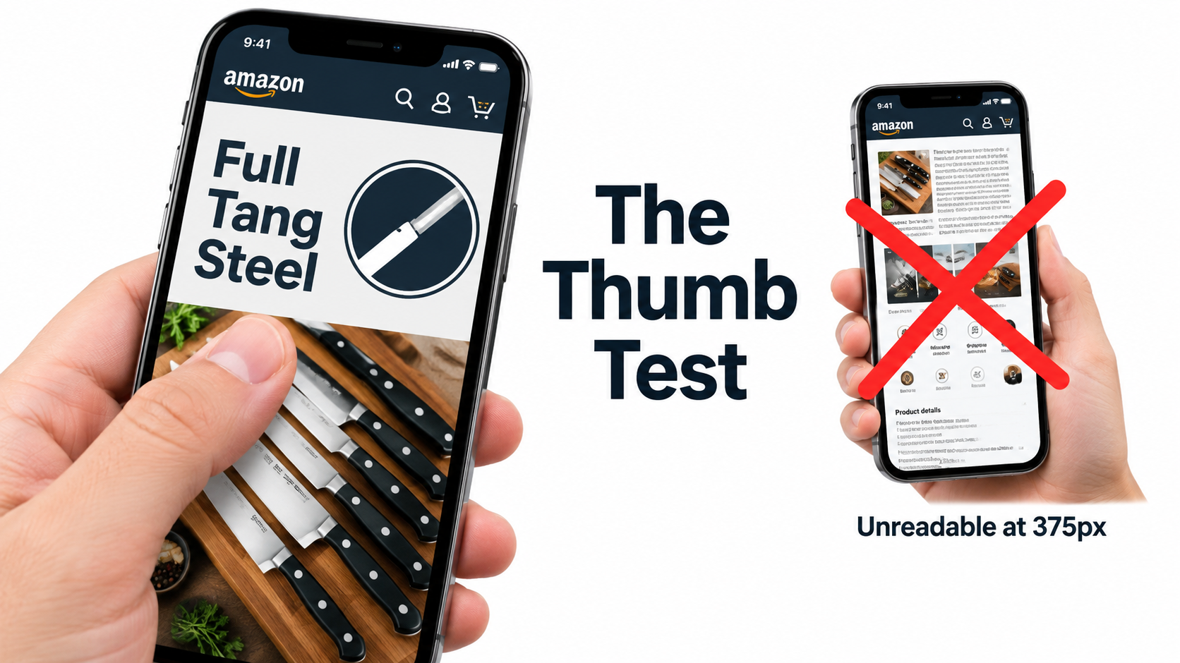
    Thumb scrolling a phone showing a clean knife set infographic with three bold words beside a cluttered unreadable version

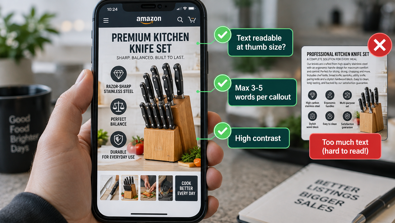
    The thumb test

    Before approving any secondary image, export it, send it to your own phone, and view it in the product carousel without zooming. Ask three questions:

    • Can I read every word without pinching to zoom?
    • Can I tell what the image is saying in under two seconds?
    • Does the product remain the visual focus, or is it buried under graphics?

    If any answer is no, the image fails. Simplify it.

    Practical type rules

    Limit headline length. A good working rule is one headline of three to seven words per image, plus no more than three short supporting callouts. If you need a paragraph to explain the image, the image isn’t doing its job.

    Use heavy weights and high contrast. Thin, elegant fonts disappear at small sizes. Bold sans-serif type in dark text on light backgrounds (or the reverse) holds up best. Avoid placing text over busy photographic areas.

    Size text relative to the canvas. On a square 2000-pixel image, headline text that’s only a few dozen pixels tall will be unreadable on a phone. Many designers work with headlines that occupy a meaningful share of image height. Test on-device rather than trusting a number.

    Use the shopper’s words. Your objection spreadsheet contains verbatims. If shoppers ask “Does it fit in a cup holder?”, the image headline “Fits Standard Cup Holders” lands faster than “Ergonomic Tapered Base Design.”

    Square canvases and safe zones

    Amazon’s carousel crops and scales images differently across devices and placements. Square canvases (1:1) display most predictably. Keep critical text and product details away from the very edges so nothing gets clipped on devices that display slightly different aspect ratios.

    Icons are not a substitute for clarity

    Icon grids are popular because they look organized. But a row of eight tiny icons with two-word labels communicates little at thumbnail size, and generic icons (a leaf for “eco-friendly,” a shield for “durable”) have been used so often they barely register. One large, specific visual demonstration beats eight small abstract icons almost every time.

    Accessibility helps everyone

    High contrast, large type, and clear visual hierarchy help shoppers with low vision, and they also help everyone viewing on a phone in bright sunlight or a dim room. Designing for accessibility and designing for mobile are largely the same discipline.

    Matching Image Types to Objection Types

    Different objections need different visual treatments. Once you know what you’re answering, picking the format becomes much easier. Here’s a field guide.

    Scale objections → reference-object and in-hand shots

    Dimension diagrams with arrows and measurements are accurate but abstract. Most people can’t visualize “10.2 × 6.8 × 3.1 inches.” Pair measurements with a familiar reference: the product in a hand, next to a smartphone, on a kitchen counter beside a standard mug, or worn on a body. The reference object does the mental math for the shopper.

    For apparel and wearables, show the product on models of different sizes when you can, and state the model’s height and the size they’re wearing. That single line answers a question that drives a large share of apparel returns.

    Compatibility objections → explicit charts and in-situ photos

    If shoppers ask “Will this fit my device?”, don’t make them guess. A clean compatibility chart listing supported models, or a photo of the product installed on the most common model, removes the doubt. Be precise and conservative. Overstating compatibility is a fast route to returns and negative reviews.

    Performance objections → demonstrations and before/after

    Claims like “leak-proof,” “stain-resistant,” or “keeps ice for 24 hours” are more believable when shown. A tumbler held upside down over a white surface, a fabric with water beading on it, or a time-lapse-style sequence of ice levels at intervals turns a claim into evidence. Make sure every demonstration is truthful and reproducible; staged results that don’t match reality will surface in reviews quickly.

    Value objections → comparison and contents images

    When your product costs more than alternatives, shoppers need a reason. A comparison image contrasting your product with a “typical” or “standard” alternative on three or four specific attributes works well. Avoid naming or showing identifiable competitor products, and avoid unverifiable superiority claims. Amazon’s guidelines and general advertising rules both apply.

    Contents images (“everything included”) address value too. Lay out every item that ships, clearly labeled. If a common accessory is not included, saying so prevents disappointment and returns.

    Effort objections → step sequences

    “Is it hard to set up?” is answered by a three- or four-step visual sequence showing assembly or installation. Keep steps few and visuals simple. If setup genuinely takes many steps, show the key ones and note the approximate time.

    Trust objections → proof, not adjectives

    “Premium quality” and “top rated” are adjectives, not proof. Trust is built through specifics: the material grade, a close-up of stitching or welds, documented certifications you hold, warranty terms, or the number of units you’ve sold if you can substantiate it. Remember that Amazon prohibits images that mimic Amazon badges such as “Amazon’s Choice” or “Best Seller,” so don’t try to borrow that trust visually.

    Variations, Bundles, and Category-Specific Considerations

    Single-ASIN thinking breaks down once you’re managing a parent-child family or selling in categories with their own rules. A few situations deserve specific attention.

    Variation families

    Each child ASIN in a variation family has its own image set, and the main image of each child appears in swatches and search results. Common mistakes include using the same secondary images across all colors (so the shopper selecting “sage green” still sees navy in slots 2 through 7) and inconsistent angles between children that make the family look disorganized.

    Keep main image angle, lighting, and fill consistent across the family so the product line looks coherent. Then make sure secondary images that show color, such as lifestyle and close-up shots, are updated for each child. Color mismatch is one of the most common “not as described” return reasons, and it’s entirely preventable.

    Size variations

    When variations differ by size, the scale objection gets sharper. A shopper choosing between a 20oz and 30oz tumbler needs to see the difference. A side-by-side image showing all sizes next to a common reference object, included in every child’s image set, often answers this better than individual dimension diagrams.

    Bundles and multipacks

    The main image for a bundle must show only what’s included, and showing everything included is usually the strongest signal of value. For larger bundles, a secondary image breaking down the components and their individual purposes helps the shopper understand why the bundle is worth more than buying one item.

    Apparel, footwear, and jewelry

    These categories have specific main image rules: on-model for adult clothing, flat lay for kids and baby clothing, a single left-facing shoe at 45 degrees for footwear, and an exception to the “no cropping” rule for jewelry such as necklaces. Secondary images in these categories lean heavily on fit, texture, and movement, which makes video and multiple on-model angles particularly valuable.

    Consumables and topicals

    For supplements, cosmetics, and food, shoppers often care about texture, ingredients, and serving size. A clear shot of the supplement facts or ingredients panel, a texture close-up, and a visual of how long one container lasts address the most frequent questions. Be careful with health and efficacy claims in image text; regulated categories carry stricter claim rules, and images are reviewed just like copy.

    Seasonal and use-case rotation

    Your objection map isn’t static. A cooler’s top objection in spring might be “will it fit in my trunk?” while in late summer it shifts to “how long does ice last in heat?” Revisit your data quarterly and consider rotating lifestyle and use-case images to match seasonal intent, while keeping the main image stable unless testing shows a reason to change it.

    Testing Properly with Manage Your Experiments

    Everything above produces hypotheses. Testing turns hypotheses into evidence. For brand-registered sellers, Amazon’s Manage Your Experiments (MYE) tool is the most reliable way to test image changes, because it splits real traffic on your actual listing rather than relying on surveys or panel feedback.
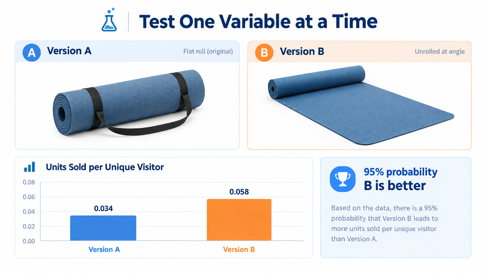
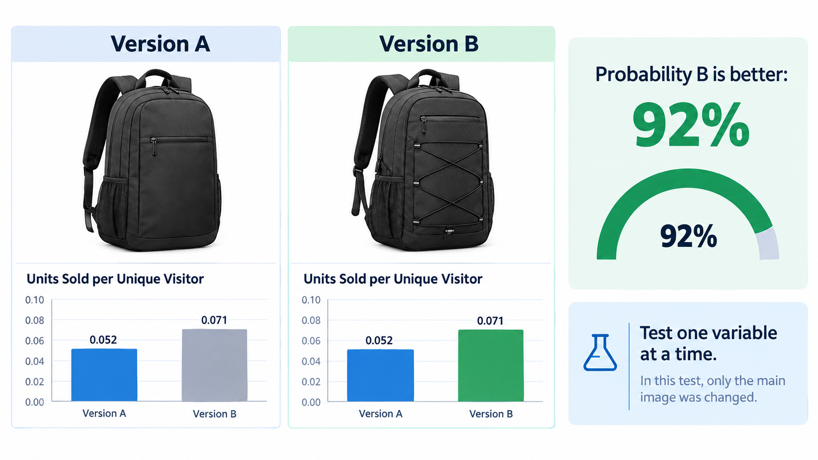
    A/B test dashboard comparing two yoga mat main images with a chart showing version B selling more units per unique visitor

    How MYE works

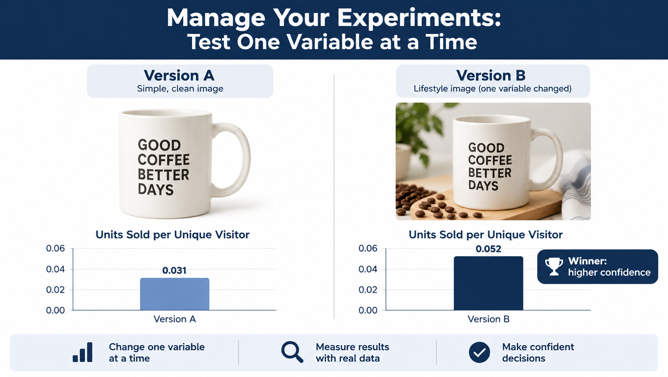
    MYE lets eligible brand owners run A/B tests on listing content, including the main image, title, bullet points, description, and A+ content. Shoppers are randomly shown one version or the other, and Amazon reports which version performed better along with a probability that the result reflects a real difference rather than chance. Experiments can be run over a set duration (typically several weeks), and listings generally need enough traffic to be eligible; Seller Central shows which of your ASINs qualify.

    Test one variable at a time

    The most common testing mistake is changing too much at once. If you swap the main image angle, the background shadow, and the product configuration together and the new version wins, you don’t know which change mattered. Next time, you’ll be guessing again.

    Isolate a single variable per experiment: angle, fill, configuration (open versus closed), or number of units shown. It takes longer, but each test produces a lesson you can apply across your catalog.

    What to test first

    Prioritize tests where the potential impact is highest:

    • Main image tests usually come first, because the main image affects click-through from search as well as conversion on the page.
    • A+ content tests are useful for testing objection-handling content that doesn’t fit in the carousel.
    • For secondary image order, where direct MYE testing may be limited, use controlled before/after comparisons with care (see below).

    Reading results honestly

    Wait for the experiment to finish. Early results swing widely and often reverse. Pay attention to the probability Amazon reports: a result with a low confidence level isn’t a win, it’s a tie, and a tie means either version is fine. Also watch the metrics beyond conversion. A main image that lifts units sold per unique visitor is the goal, but check that it doesn’t simply shift sales from one of your other ASINs.

    When you can’t use MYE

    If your ASIN doesn’t qualify, you can still learn, just with less certainty. Make one change, hold everything else stable (price, ad spend, coupons), and compare conversion rate over equal periods before and after. Account for seasonality and promotions. The data is noisier, so look for large, sustained differences rather than small swings.

    Your return reasons are a secondary signal. If you add a scale image and “smaller than expected” returns drop over the following months, that’s meaningful evidence even without a formal test.

    Build a testing log

    Record every test: hypothesis, variable changed, dates, result, confidence, and what you learned. Over time, this log becomes a brand-specific playbook. You’ll discover patterns, such as “three-quarter angles consistently beat straight-on in our category” or “showing the product in-hand lifts conversion for our smaller SKUs,” that no generic guide can tell you.

    Compliance Traps That Quietly Cost You

    An image that gets your listing suppressed converts at exactly zero. Most compliance problems aren’t dramatic violations. They’re small oversights that accumulate as listings get updated by different designers over time.

    Main image drift

    Backgrounds that look white but aren’t pure RGB 255 are a classic problem, especially after color correction or compression. A soft gray shadow is generally fine, but a background that’s slightly off-white across the whole frame can trigger issues. Check pixel values in your editing software, not just by eye.

    Text and badges sneaking onto the main image are another. “New and improved,” “2-pack,” or a small logo watermark might seem harmless, but main images aren’t allowed to carry text or graphics. Keep those for secondary slots.

    Props that imply inclusion

    If your main image shows a camera mounted on a tripod and only the tripod is for sale, shoppers may assume the camera is included. Amazon’s guidelines specifically prohibit props that could confuse the customer about what’s in the package. In secondary lifestyle images, context is fine, but consider a small “camera not included” note if confusion is likely.

    Amazon marks and badges

    Images must not include Amazon logos or trademarks, or anything resembling Amazon badges such as “Amazon’s Choice,” “Best Seller,” or “Works with Alexa” unless you’re properly authorized under Amazon’s trademark guidelines. Designers sometimes add these to comparison images or brand story graphics without realizing the risk.

    Unsubstantiated claims

    Image text is content just like bullet points. “#1 rated,” “clinically proven,” “lasts 10x longer,” or “eco-friendly” without substantiation can create problems with Amazon and, in some categories, with regulators. Every claim on an image should be one you could document if asked.

    AI-generated imagery and accuracy

    AI tools make it easy to produce lifestyle scenes and backgrounds in 2026, and many sellers use them for secondary images. The overriding rule remains accuracy: images must represent the product being sold. An AI-generated scene that subtly changes the product’s proportions, color, or details is an expectation failure waiting to happen, and it will show up in reviews and returns. Main images must be real photographs of the actual product.

    Run a quarterly image audit

    Set a recurring calendar reminder to review every active ASIN’s image set against the current guidelines. Check for policy changes in Seller Central news, look for suppressed or flagged listings, and make sure variation children haven’t drifted out of sync. Catching a problem in an audit is much cheaper than discovering it from a sales drop.

    The Objection-Led Image Workflow, Step by Step

    Here’s the full process condensed into a repeatable workflow you can run for a new launch or an existing listing that’s underperforming.

    Phase 1: Research (1–2 days)

    1. Pull critical reviews (especially 3-star) from your top 5–10 competitors.
    2. Collect pre-purchase questions from Q&A and on-page prompts.
    3. Export your own return reasons and Voice of the Customer feedback if you have sales history.
    4. Note search-term modifiers from Brand Analytics.
    5. Log at least 100 verbatims in a spreadsheet with theme tags.

    Phase 2: Prioritize (half a day)

    1. Group verbatims into objection themes.
    2. Score each theme on frequency and severity.
    3. Remove non-visual objections; flag partially visual ones.
    4. Rank the remaining themes. The top three or four become slots 2–5.

    Phase 3: Brief and produce (1–3 weeks)

    1. Write a one-line brief per slot: “This image answers [objection] by showing [visual], with headline [shopper’s words].”
    2. Plan the main image angle, fill, and configuration based on search intent.
    3. Assign a format to each objection: reference shot, chart, demo, comparison, step sequence, or proof close-up.
    4. Make every lifestyle scene answer a specific question.
    5. Produce at 1600+ pixels on a square canvas, with critical elements inside safe margins.

    Phase 4: Quality check (1 day)

    1. Run the thumb test on every secondary image.
    2. Drop the main image into a real mobile search results screenshot.
    3. Verify main image compliance: pure white background, 85%+ fill, no text, no unincluded props.
    4. Check every claim for substantiation.
    5. For variations, confirm each child’s color-dependent images match.

    Phase 5: Test and iterate (ongoing)

    1. Launch a main image MYE test with a single isolated variable, if eligible.
    2. Track conversion rate, units per session, and return reasons.
    3. Log every result.
    4. Re-mine reviews quarterly; your own new reviews will reveal objections your images still miss.

    Conclusion: Let Shoppers Write Your Image Brief

    Good Amazon listing images aren’t defined by how polished they look or how many features they squeeze in. They’re defined by how quickly they resolve the doubts that stop people from buying. The sellers who do this well don’t start in Photoshop or an AI image tool. They start in the reviews.

    The shift is simple to describe and takes discipline to carry out. Stop asking “what do we want to say about this product?” and start asking “what does the shopper need to believe before they’ll buy it?” The answers are already sitting in competitor reviews, Q&A threads, and your own return reports, often in the exact words that should go on your images.

    Here are the key takeaways to act on this week:

    • Mine before you design. Collect at least 100 shopper verbatims from reviews, Q&A, and returns before briefing any new images.
    • Rank by frequency and severity. Your earliest secondary slots belong to the objections that are common and deal-breaking.
    • Win the thumbnail within the rules. Push frame fill, choose the angle and configuration that match search intent, and judge the main image at real thumbnail size on a phone.
    • Sequence by decision stage. Recognition, core promise, scale, top objection, differentiation, contents, reassurance, then adjust for your category.
    • Pass the thumb test. One short headline, three callouts maximum, heavy type, high contrast, and the shopper’s own language.
    • Match the format to the doubt. Reference shots for scale, charts for compatibility, demonstrations for performance, comparisons for value, steps for effort, specifics for trust.
    • Test one variable at a time with Manage Your Experiments and keep a log so every test teaches you something reusable.
    • Audit quarterly for compliance drift, variation mismatches, and new objections surfacing in your own reviews.

    Your competitors are probably still briefing images from a feature list. That gives you an opening. Build your stack around what shoppers are actually worried about, and your listing stops reading like an ad and starts answering the questions buyers came with.
  • Your Amazon Images Aren’t Ugly — They’re Answering the Wrong Questions

    Your Amazon Images Aren’t Ugly — They’re Answering the Wrong Questions

    Pull up almost any mid-ranking Amazon listing in a crowded category and you’ll see the same thing. The photography is clean. The lighting is professional. There’s an infographic with icons, a lifestyle shot with a smiling model, and a “what’s in the box” flat-lay. Nothing about it is bad.

    And yet the listing converts at a fraction of the rate of the competitor two spots above it, whose images look, if anything, slightly less polished.

    This is the most common image problem on Amazon in 2026, and it’s rarely an aesthetics problem. It’s a relevance problem. The images are answering questions the shopper never asked, while ignoring the two or three doubts that actually stop them from clicking “Add to Cart.”

    Most advice on Amazon listing images focuses on specs and styling: hit 1600 pixels, use a pure white background, add a lifestyle shot, include an infographic. That advice is correct, but it’s the floor, not the ceiling. Every serious competitor already does it. What separates a well-performing image stack from a forgettable one is whether each image was planned around a specific buyer hesitation.

    This article takes that angle all the way through. Instead of a checklist of image types, you’ll get a process: how to mine your reviews, Q&A, and return reasons for the objections that matter; how to assign one job to each image slot; how to write a brief that a photographer or designer can actually execute; how to make text readable on a phone held at arm’s length; and how to test changes without fooling yourself with noisy data.

    If you’ve already got “good” images and you’re wondering why they aren’t pulling their weight, this is for you.

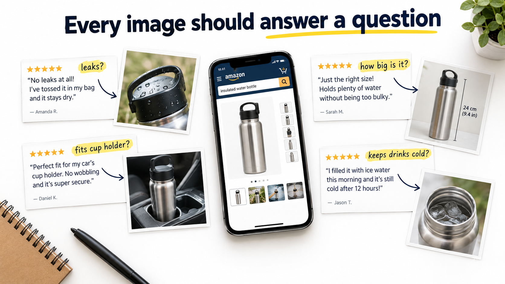
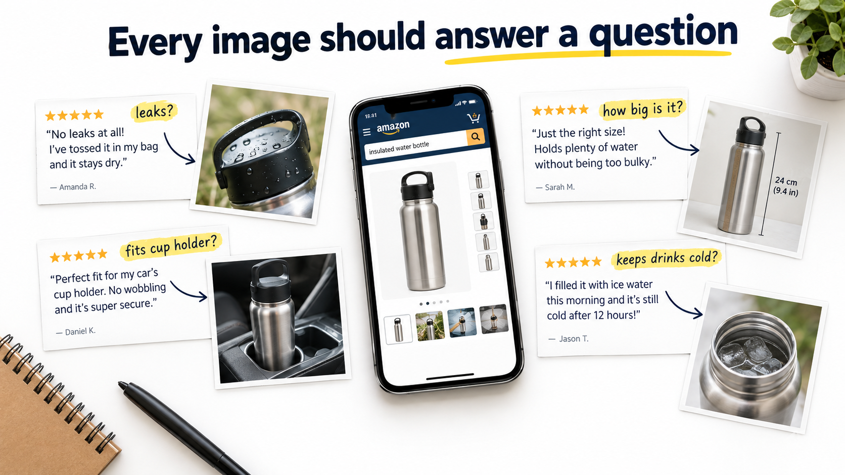
    Seller desk with a phone showing an Amazon product gallery surrounded by customer review snippets connected by arrows to matching product photos, headline reads Every image should answer a question

    Why Good-Looking Images Still Fail to Convert

    An Amazon shopper on a product detail page is not browsing a magazine. They’re running a quick, mostly subconscious risk assessment. Will this fit? Will it break? Is it the size I think it is? Does it work with the thing I already own? Is it worth more than the cheaper option I just saw?

    Images are the fastest way to answer those questions, because most shoppers swipe through the gallery before they read a single bullet point. If the gallery resolves their doubts, they buy. If it doesn’t, they hit the back button and try the next listing. The beauty of the photography is a secondary factor at best.

    The “brochure” trap

    Many image sets are designed like a brand brochure. They lead with mood, lifestyle, and broad claims (“Premium Quality,” “Built to Last,” “Perfect Gift”). These claims are unfalsifiable, which means shoppers have learned to ignore them. Every competing listing makes the same claims with the same stock-style icons.

    Brochure-style images feel productive to create because they look finished. But they spend valuable gallery slots on reassurance that doesn’t reassure anyone. A shopper worried that a lunch box leaks is not comforted by a photo of a family picnic. They want to see the lunch box upside down, full of soup, with nothing dripping out.

    The “feature dump” trap

    The opposite failure is the infographic stuffed with every feature the product has. Twelve callouts, three fonts, and arrows pointing everywhere. The logic is understandable: if each feature might matter to someone, why not show them all?

    The problem is that equal emphasis on everything means no emphasis on anything. The one feature that actually decides the purchase gets the same visual weight as a trivial detail. On a phone screen, most of the text becomes unreadable anyway.

    What high-converting image stacks do differently

    The listings that consistently outperform tend to share one trait: their images feel like they were made by someone who read the reviews. They show the exact thing people worried about. They show scale in the context people care about. They pre-empt the most common complaint about the category. They feel specific rather than generic.

    That specificity isn’t an accident of good taste. It comes from a deliberate research step that most sellers skip entirely, which is where the process starts.

    Start With Objections, Not Aesthetics: Mining the Data You Already Have

    Before anyone picks up a camera or opens a design tool, you need a ranked list of the reasons people hesitate to buy your product, or products like it. You already have most of this data. It’s just scattered across several places.

    Source 1: Your own reviews (especially 3-star)

    Five-star reviews tell you what delighted people. One-star reviews often reflect shipping damage, defective units, or mismatched expectations. Three-star reviews are frequently the most useful, because they come from customers who liked the product but had a specific reservation.

    Read through them and note every recurring phrase. “Smaller than I expected.” “Wish it came with a case.” “Hard to tell from the photos that it’s matte.” “The lid is tricky at first.” Each of these is a gap your images failed to close before purchase.

    Source 2: Competitor reviews

    If your listing is new or has few reviews, your competitors have done the market research for you. Read the critical reviews on the top five to ten listings in your niche. Category-wide complaints show up fast. If every competing blender gets complaints about noise, then noise is a buyer concern for the whole category, and whoever addresses it visually gains an edge.

    Source 3: Customer questions on the detail page

    The questions section is a direct record of what shoppers couldn’t figure out from your listing. Questions like “Will this fit a 2019 model?” or “Is the fabric see-through?” are essentially requests for a specific image. If the same question appears repeatedly, your gallery has a hole in it.

    Source 4: Return reasons and buyer messages

    Return reason codes and buyer-seller messages reveal expectation mismatches. A cluster of “not as described” or “too small” returns usually means the images set the wrong expectation. Fixing that is a two-for-one: it can lift conversion and reduce returns at the same time, because you’re attracting buyers who know exactly what they’re getting.

    Building the objection map

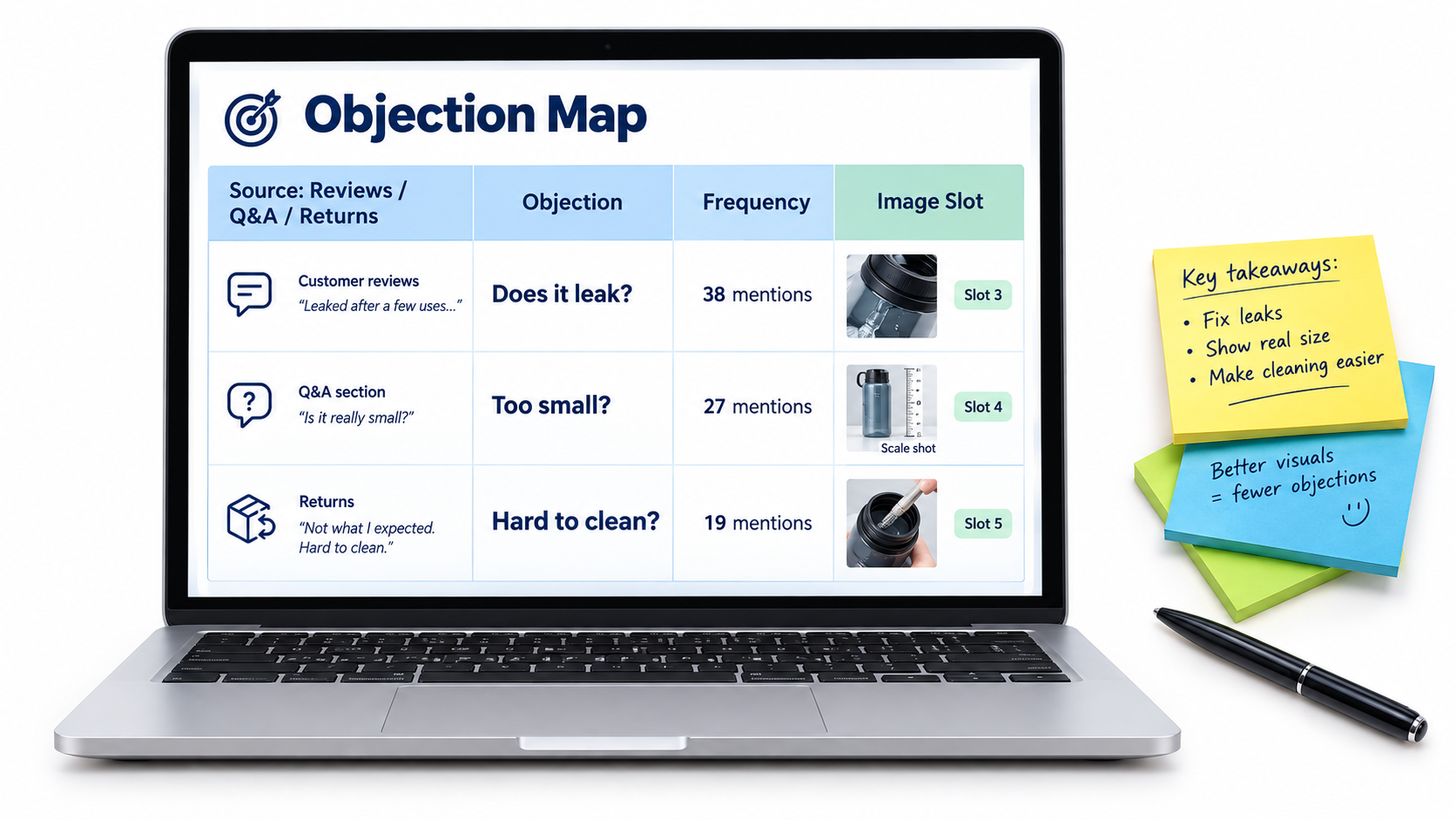
    Pull everything into a simple spreadsheet with four columns:

    • Objection: phrased the way the customer would say it (“Does it leak?”).
    • Source: reviews, competitor reviews, Q&A, returns, or messages.
    • Frequency: a rough count of how often it appears.
    • Image slot: which gallery position will answer it (filled in later).

    Sort by frequency. In most products, three to five objections account for the bulk of hesitation. Those become the backbone of your image plan. Everything else is secondary.

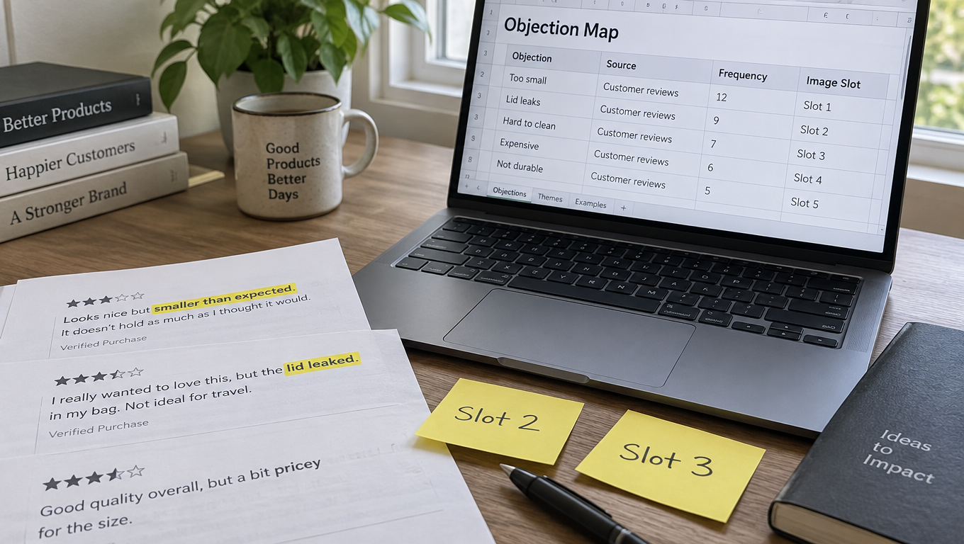
    Laptop spreadsheet titled Objection Map listing customer objections by source and frequency mapped to specific Amazon image slots

    Separate objections from desires

    Not everything on the list will be a worry. Some entries will be positive motivators: “Love that it fits in my backpack,” “Great for travel.” These are desires, and they deserve images too. But objections usually carry more weight, because a single unresolved doubt can kill a sale that five appealing features couldn’t save. Prioritize objections first, then fill remaining slots with the strongest desires.

    The Main Image: Compliance Is the Floor, the Thumbnail Is the Ceiling

    The main image has a different job from every other image in your gallery. It has to win the click in search results, where it competes against a grid of nearly identical white-background photos. And it has to do that while following Amazon’s strictest set of rules.

    The rules you can’t bend

    Amazon’s main image requirements are specific, and violating them can get a listing suppressed. As summarized by Jungle Scout from Amazon’s guidelines, the core rules include:

    • A pure white background (RGB 255, 255, 255).
    • A professional photograph of the actual product, not an illustration, mockup, or placeholder.
    • No text, logos, borders, color blocks, watermarks, or other graphics over the product or background.
    • No multiple views of a single product.
    • The entire product shown, not cut off by the frame edge (with exceptions such as necklaces).
    • No excluded accessories or props that might confuse the customer about what’s included.
    • The product shown out of its packaging, unless the packaging is an important feature.

    Across all images, Amazon specifies that the product should fill at least 85% of the frame, and that files should be 1600 pixels or larger on the longest side for the best zoom experience. Amazon’s own guidance notes that zoom “has been shown to help enhance sales.” The minimum for zoom is 1000 pixels, and JPEG is the preferred format.

    Why the thumbnail matters more than the full-size image

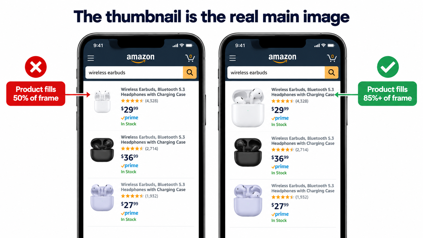
    Here’s the part many sellers overlook. In search results, especially on mobile, your main image is displayed at a small size. The detail you obsessed over in the full-resolution file is invisible. What matters is how the product reads as a small shape on white.

    Open the Amazon app, search your main keyword, and look at your listing among the results. Then ask:

    • Can you tell what the product is in under a second?
    • Does it look the same size as competitors, or noticeably smaller and lost in white space?
    • Does the angle show the product’s most recognizable side?
    • If it’s a multi-pack or bundle, is the quantity obvious at a glance?

    Phone screen comparison of Amazon search thumbnails showing a product filling 50 percent of the frame versus one filling 85 percent or more

    Legitimate ways to stand out within the rules

    You can’t add badges or text, but you still have real levers:

    • Frame fill: Crop tight. A product that fills the frame looks bigger and more substantial than one floating in white space.
    • Angle: A three-quarter angle often reveals more depth and form than a flat front view. Test which angle makes your product most recognizable.
    • Showing what’s included: If your product comes with genuinely included items that competitors don’t include, showing them (without props that aren’t included) can differentiate the offer.
    • Color and finish accuracy: A true-to-life color rendering builds trust and reduces returns. Overly saturated edits can backfire when the product arrives.
    • Lighting that shows material: Subtle shadows and highlights communicate texture, which matters for products where material quality is a buying factor.

    The main image should answer the top objection if it can

    Sometimes the most common objection can be partly addressed even in the main image. If shoppers in your category worry about quantity, a clean arrangement showing all units in the pack does that. If they worry about whether a cable is long enough, a neatly coiled cable that visibly reads as long helps. The main image can’t explain, but it can show.

    One Job Per Slot: Turning the Gallery Into a Sequence

    Once the main image wins the click, the remaining images have to win the sale. The most effective way to plan them is to give each image exactly one job, tied to an entry on your objection map.

    Why sequence matters

    Shoppers swipe through images in order, and many don’t reach the end. That means the order you choose is effectively a ranking of importance. The objection that blocks the most sales should be answered early, not buried in the sixth slot behind a lifestyle photo.

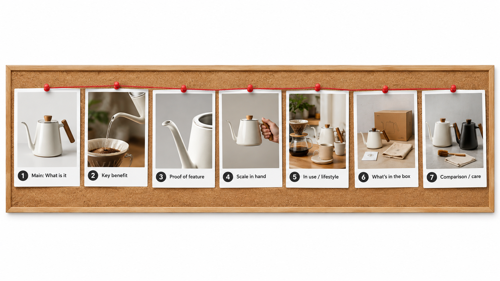
    A sample slot plan

    Every product is different, but a sequence like this works as a starting framework:

    1. Main image: What is it? Clean, compliant, thumbnail-readable.
    2. Primary benefit: The single biggest reason to choose this product, shown visually with a short headline.
    3. Top objection resolved: Proof of the feature people doubt most (leak-proof, waterproof, quiet, durable).
    4. Scale and fit: The product in a hand, on a body, next to a common object, or in its intended space, with dimensions.
    5. In use: A realistic context showing how and where it’s used, aimed at the primary customer.
    6. What’s included: Every component, clearly laid out, so there are no surprises.
    7. Second objection or comparison: Care instructions, compatibility, or a comparison against generic alternatives (without naming competitors).

    Corkboard storyboard of seven Amazon image cards for a coffee kettle, each labeled with its job from main image to comparison and care

    Proof beats claims

    Notice that the plan above emphasizes demonstration. “Leak-proof” as a text label is a claim. A photo of the container upside down over a white shirt is proof. “Durable” is a claim. A close-up of reinforced stitching with a short label explaining the stitch count is evidence.

    Whenever you can, convert a claim into a visual demonstration. Shoppers discount claims automatically. They take demonstrations seriously.

    Scale is the most underrated slot

    “Smaller than expected” is one of the most common complaints across Amazon categories. Dimension text alone doesn’t fix it, because most people can’t picture 7.5 inches. A scale image does: the product in an average adult hand, next to a smartphone, inside a standard kitchen drawer, or worn by a model with height listed.

    If scale shows up anywhere on your objection map, give it a dedicated slot with both a visual reference and printed dimensions.

    Lifestyle images need a target, not a mood

    Lifestyle photos are often the weakest images in a gallery because they’re made to look aspirational rather than relevant. A better approach: identify your primary customer from your reviews (who’s actually buying and why) and show that person in that context. If reviews show your camping stove is mostly bought by people for emergency kits, a remote mountain scene misses the point. A shot of it in a home preparedness kit speaks directly to the buyer.

    Use your video slot deliberately

    If you have access to video on your listing, treat it as an extension of the same plan rather than a separate brand film. A short clip demonstrating the top objection being resolved (the lid sealing, the fabric stretching, the device pairing) often does more than a cinematic montage.

    Writing the Image Brief: How to Get What You Actually Need

    Most disappointing image sets trace back to a weak brief. A seller sends a product and a note saying “need 7 Amazon images, white background plus lifestyle and infographics.” The photographer or designer, reasonably, produces a generic set. Nobody did anything wrong, but nobody solved the actual problem either.

    What a strong brief contains

    A good image brief gives the creative team the “why” behind each image, not just the “what.” For each slot, include:

    • Slot number and job: “Slot 3: prove the bottle doesn’t leak when tipped over in a bag.”
    • The objection it answers, in the customer’s words: paste two or three review quotes.
    • The single message: one sentence the viewer should take away.
    • Visual direction: composition, props, setting, angle, and what must be visible.
    • Text overlay (if any): a headline of a few words and no more than three short callouts.
    • Must-avoid items: props that could imply they’re included, unverifiable claims, competitor references.
    • Reference examples: screenshots of images (from any category) with the feel you want.

    Shot list vs. design list

    Split the brief into two parts. The shot list covers what needs to be photographed: angles, close-ups, model shots, scale shots, in-context setups. The design list covers what happens afterward: text overlays, callouts, arrows, comparison layouts.

    This split prevents a common problem: discovering during design that you needed a specific angle or close-up that was never shot. Planning the overlay first tells the photographer exactly which raw shots to capture, including extra negative space where text will sit.

    Shoot more than you need

    Ask for alternates on your most important slots, particularly the main image and the top-objection image. Two or three angles for the main image give you material for testing later without a reshoot. A reshoot to get one alternate angle costs far more than capturing it during the original session.

    Specify the product variants up front

    If your listing has color or size variations, decide early whether each variant gets its own full image set or only a unique main image with shared secondary images. Shoppers who switch variants and see images of the wrong color lose confidence quickly. At minimum, each variant’s main image should show that exact variant.

    A sample brief entry

    Slot 4 — Scale and fit. Objection: “Smaller than I thought” (appears in 14 reviews, 6 questions). Message: “Holds a full-size laptop and still fits under an airplane seat.” Visual: backpack on a woman of average height (list height in a small caption), shot from the side; inset photo of a 15-inch laptop sliding into the sleeve. Text: headline “Fits 15" laptops” plus dimensions. Avoid: airline logos, any item not included in the box appearing as if it’s part of the product.

    A brief like this takes longer to write. It also turns a generic image set into one that was built to sell this specific product to these specific buyers.

    Text on Secondary Images: Designing for a Phone at Arm’s Length

    Secondary images can include text, and done well, text overlays make images dramatically clearer. Done poorly, they turn into unreadable clutter that shoppers swipe past.

    The arm’s-length test

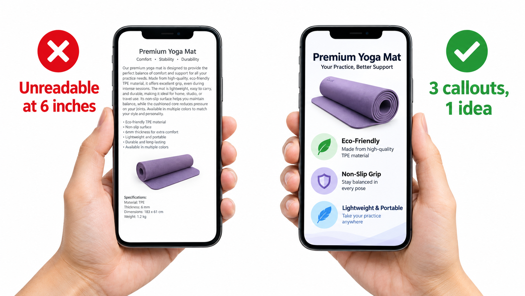
    Most Amazon browsing happens on phones. Before approving any image with text, view it on a phone at normal holding distance, not zoomed in, not on a desktop monitor. If you have to squint, the text is too small or there’s too much of it.

    A practical rule: if a callout can’t be read comfortably on a phone without zooming, cut it or enlarge it. Designers working on large monitors routinely underestimate how small their text becomes on a mobile screen.

    Hand holding a phone comparing a cluttered yoga mat infographic marked unreadable at arm's length with a clean version using three large callouts

    One idea per image

    Every secondary image should communicate one idea. That idea gets a headline of a handful of words. Supporting callouts, if any, should be limited to around three. If you find yourself needing six callouts, you probably have two or three images’ worth of content crammed into one.

    Hierarchy and contrast

    • Headline first: The largest, boldest text states the benefit, not the feature name. “Stays cold 24 hours” beats “Double-wall vacuum insulation.”
    • Supporting detail second: Smaller text can explain the how (“double-wall vacuum insulation”) for shoppers who want it.
    • High contrast: Dark text on light areas or light text on dark areas. Avoid placing text over busy parts of a photo.
    • Consistent fonts: One or two typefaces across the whole gallery. Mixed fonts make the set feel assembled rather than designed.

    Icons are not a substitute for proof

    Icon rows (“BPA-free,” “Dishwasher safe,” “Eco-friendly”) are common because they’re fast to produce. They can be useful as a quick summary, but they shouldn’t occupy a high-priority slot. They’re the visual equivalent of bullet points, and they don’t demonstrate anything. If “dishwasher safe” is a real buying concern in your category, show the product on a dishwasher rack.

    Write for shoppers who won’t read bullets

    A useful mindset: assume some shoppers will never scroll to your bullet points. If the gallery were the only thing they saw, would they understand the product, its key benefit, its size, what’s included, and why it’s better than the alternative? If not, the gallery has gaps that text overlays can fill.

    Don’t contradict the rest of the listing

    Make sure numbers in your images match your title, bullets, and product specs. Mismatched dimensions or capacities between an infographic and the bullet points erode trust and can lead to returns. Amazon’s guidelines also require that images accurately represent the product and match the product title.

    Category Rules That Change Your Image Strategy

    Amazon’s image requirements aren’t uniform across categories. Some of the most important rules apply only to certain product types, and getting them wrong can mean suppression rather than just lower conversion.

    Apparel and accessories

    According to Amazon’s guidelines as summarized by Jungle Scout, main images for women’s and men’s clothing must show the product on a human model. Multi-pack apparel items and accessories must be photographed flat (off-model) for the main image. Clothing accessories’ main images must not show any part of a mannequin, including clear or hanger-style forms. All images of kids’ and baby clothing must be photographed flat, off-model.

    For apparel, the objection map is usually dominated by fit, fabric feel, and sheerness. Secondary images should show fit from multiple angles, close-ups of fabric texture, and, where relevant, model height and size worn. A size chart image is also valuable, as long as it’s legible on mobile.

    Footwear

    Main images of shoes must show a single shoe, facing left at a 45-degree angle. Secondary images commonly address sole construction, interior comfort, width, and how the shoe looks on foot. Sizing is often the dominant objection, so an image explaining how the sizing runs can directly reduce returns.

    Models and poses

    Amazon’s main image rules state that a human model must not be shown sitting, kneeling, leaning, or lying down, though showing various physical mobilities with assistive technology like wheelchairs or prosthetics is encouraged. Keep this in mind for any category where a model appears in the main image.

    Consumables and supplements

    For consumables, the objection map often centers on ingredients, serving size, quantity per container, taste or texture, and how long a container lasts. Clear, legible label imagery and a “how many servings” visual tend to address real buyer questions. Be especially careful with claims: anything resembling a health claim in an image is subject to the same scrutiny as claims in your text.

    Electronics and accessories

    Compatibility is usually the top objection. “Will this work with my device?” A dedicated compatibility image listing supported models or standards, plus a photo of the product connected to a common device, often matters more than a lifestyle shot. Port close-ups and cable length visuals also address frequent questions.

    Home and kitchen

    Scale, cleaning, and material are recurring themes. Showing the product in a realistic kitchen or room for scale, demonstrating cleaning ease, and close-ups of material finish tend to answer what shoppers ask about most.

    Check the current rules before every shoot

    Amazon updates its style guides, and category-specific guides can be more detailed than general rules. Before a new shoot, check Seller Central’s current image requirements and any style guide for your specific category. A compliant plan is cheaper than a reshoot after a suppression.

    Testing Without Fooling Yourself

    Once you’ve built an objection-led image stack, you’ll want to know whether it actually performs better. This is where many sellers go wrong, not because they don’t test, but because they misread the results.

    Manage Your Experiments

    Amazon’s Manage Your Experiments tool, available to brand-registered sellers on eligible ASINs with sufficient traffic, lets you run A/B tests on listing content, including main images. Traffic is split between two versions, and the tool reports results including the probability that one version outperforms the other.

    This is the most reliable way to test main images on Amazon because it controls for seasonality, ad spend, and pricing changes that affect both versions equally. If your ASIN qualifies, use it before making major main image changes.

    A/B test dashboard comparing two Amazon main image versions of a backpack with charts showing units sold per visitor and a probability meter

    Rules for clean tests

    • Change one variable at a time. If Version B has a new angle, a new crop, and a new color edit, you won’t know which change mattered.
    • Let it run. Stopping a test after a few days because one version is “winning” is the fastest way to adopt a false result. Early swings are normal.
    • Avoid overlapping changes. Don’t run a major price change, coupon, or ad restructure during an image test if you can avoid it.
    • Respect inconclusive results. If neither version clearly wins, that’s useful information. It means the variable you tested isn’t what’s holding you back.

    Before-and-after comparisons are weak evidence

    If you can’t use Manage Your Experiments, you might compare conversion before and after an image change. Treat these comparisons with skepticism. A week of improved conversion after new images could reflect a competitor going out of stock, a seasonal shift, a coupon, or a change in ad traffic mix. Look at longer windows and check what else changed during the period.

    Pre-launch polling

    Consumer polling tools let you show image variations to panels of respondents and ask which they’d click or buy. These polls are fast and useful for eliminating weak options before they ever go live, especially for new listings with no traffic to test against. Their limitation is that respondents aren’t real shoppers with real intent, so treat polls as a filter, not a final verdict.

    Which metrics to watch

    For main images, click-through rate from search matters most, since the main image’s job is winning the click. For secondary images, the unit session percentage (conversion rate) on the detail page is the relevant measure. Brand Analytics data, where available, can help you compare your click and purchase share against the rest of the search results for your key terms.

    Test the objection, not just the picture

    The most valuable tests don’t compare two pretty photos. They compare two hypotheses. “Does showing the product in-hand for scale increase conversion more than showing it on a table?” A test framed this way teaches you something about your buyers that you can apply to the rest of your catalog.

    Seven Failure Patterns to Audit For Right Now

    Before redoing an entire gallery, audit what you have. These patterns show up repeatedly on underperforming listings.

    1. The main image fails the thumbnail test

    The product is too small in the frame, shot at an angle that makes it unrecognizable, or so similar to competitors that nothing distinguishes it. Fix: tighter crop, better angle, test alternates.

    2. The top objection is answered in slot 6 (or not at all)

    The thing customers worry about most is buried late in the gallery, or missing entirely. Fix: move the objection-resolving image to slot 2 or 3.

    3. Lifestyle images aimed at the wrong buyer

    The setting and model don’t match the people who actually buy. Fix: revisit your reviews to identify the real customer and use cases, then reshoot to match.

    4. No scale reference

    Dimensions exist in text, but there’s no visual comparison. “Smaller than expected” complaints keep coming in. Fix: add a dedicated scale image with a common reference object or a hand.

    5. Unreadable infographics

    Too much text, too small, too many callouts. Fix: one idea per image, a short headline, and no more than about three callouts. Check on a phone.

    6. Props that imply inclusion

    A camera shown with a microphone that’s sold separately, or a phone shown in a mount listing, without clarity about what’s included. This is both a compliance risk for main images and a source of “missing parts” returns. Fix: make inclusions unambiguous, and keep non-included items out of the main image.

    7. Inconsistency across the gallery

    Different lighting, color grading, fonts, and styles across images make the listing feel pieced together, which can quietly undermine trust. Fix: a consistent visual system across all slots.

    Running the audit

    Go through your top ten ASINs by revenue. Score each against these seven patterns. The ASINs with the most issues and the highest traffic are your best candidates for an image refresh, because they combine the most room to improve with the most visitors to benefit.

    Keeping Images Current: A Refresh Cadence That Makes Sense

    Images aren’t a one-time project. Your buyers, your competitors, and your product all change. A gallery that was well-targeted a year ago may now be answering last year’s questions.

    Triggers for a refresh

    • New recurring objections: A theme appears in recent reviews or questions that your gallery doesn’t address.
    • Rising return rates tied to expectation mismatches like size, color, or included parts.
    • Competitor shifts: A competitor upgrades their images and starts gaining click share in search results.
    • Product changes: New packaging, materials, colors, or included accessories. Images must accurately represent what ships.
    • Seasonal positioning: For giftable or seasonal products, secondary images can shift emphasis ahead of key periods.
    • Policy updates: Changes to Amazon’s image requirements or category style guides.

    A practical schedule

    For most sellers, a quarterly review of the objection map for top ASINs is a reasonable rhythm. Re-read recent reviews and questions, check return reasons, and look at the search results for your main keywords. If nothing has changed, leave the images alone. If something has, update the relevant slot rather than redoing the whole set.

    Update one slot at a time

    Incremental updates make performance easier to read. If you change the scale image and conversion improves over a meaningful period, you have a reasonable signal. If you change all seven images at once, you won’t know what worked.

    Build a reusable image system

    For sellers with larger catalogs, documenting a visual system pays off: consistent fonts, color palette, callout styles, slot sequence templates, and brief templates. New products can be planned faster, and the whole catalog looks like it belongs to one brand. This consistency also helps shoppers who browse multiple products in your storefront.

    Keep a record

    Log every image change with the date, what changed, and why. Pair that log with your conversion and click-through data. Over time, you’ll build a body of evidence about what your specific buyers respond to, which is worth more than any generic best-practice list.

    Conclusion: Build Images Around What Buyers Doubt

    Amazon listing images that perform well aren’t defined by expensive photography or flashy design. They’re defined by relevance. Each image answers a real question that a real shopper has, in the order those questions matter.

    The process comes down to a few disciplined steps:

    1. Mine the objections. Pull recurring doubts from your reviews (especially 3-star), competitor reviews, customer questions, and return reasons. Rank them by frequency.
    2. Treat compliance as the floor. Meet Amazon’s main image rules (pure white background, 85% frame fill, 1600px+ for zoom, no text or graphics), then make the main image win at thumbnail size.
    3. Give each slot one job. Answer the biggest objection early. Prioritize proof over claims. Always include a scale reference.
    4. Write a real brief. Explain the why behind every image, include customer quotes, separate the shot list from the design list, and capture alternates.
    5. Design for phones. One idea per image, a short benefit headline, about three callouts at most, and text that’s readable at arm’s length.
    6. Respect category rules. Apparel, footwear, kids’ items, and other categories have specific requirements. Check them before every shoot.
    7. Test honestly. Use Manage Your Experiments where eligible, change one variable at a time, let tests run, and treat before-and-after comparisons with caution.
    8. Refresh based on signals, not a calendar alone. Review objection maps quarterly and update individual slots when buyer concerns shift.

    If your images already look good and still aren’t converting, the fix probably isn’t a prettier reshoot. It’s a more specific one. Start by reading your last fifty reviews with a notepad open, and you’ll likely find the image your listing has been missing all along.

  • Your Amazon Images Are Answering the Wrong Questions: An Objection-First Approach to Listing Photos

    Your Amazon Images Are Answering the Wrong Questions: An Objection-First Approach to Listing Photos

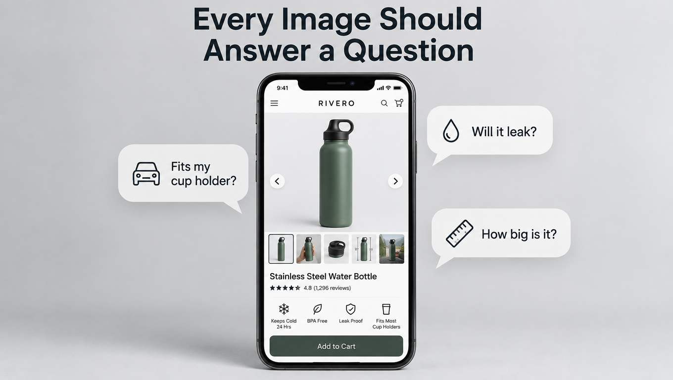
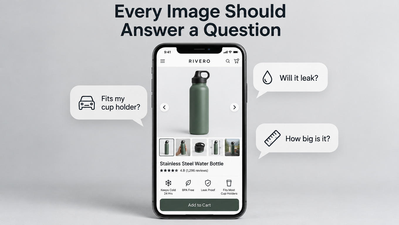
    Smartphone showing a water bottle product page surrounded by shopper questions like fits my cup holder, will it leak, and how big is it

    Open almost any Amazon listing in a crowded category and you’ll see the same image stack. A white-background hero shot, then a lifestyle photo, then an infographic with six icons, then a close-up of some texture, then a “what’s in the box” flat lay. Every image looks fine and follows the rules. And a lot of those listings still convert badly.

    The problem usually isn’t how the photos look. It’s what they’re about. Most listing images are built from the seller’s point of view: here are our features, here are our materials, here is our brand. Shoppers scroll a carousel with a different goal. They’re looking for a reason to trust the product, or a reason to hit the back button.

    Each shopper arrives with a short list of doubts. Will this fit? Is it as big as it looks? Will the lid leak? Does it work with what I already own? Will it fall apart in a month? If your images don’t answer those questions, and fast, the shopper goes back to the search results and tries a competitor whose images do.

    This article lays out an objection-first approach to Amazon listing images. You don’t start with a shot list. You start with evidence: your reviews, your competitors’ reviews, the Customer Questions section, and your return reasons. From that evidence you build an “objection map,” and each image slot gets the job of answering one specific doubt, in order of how much that doubt costs you sales.

    We’ll cover the compliance floor you can’t go below, how to pull and rank objections, how to design each slot, the limits a small phone screen puts on you, the objection patterns that show up by category, and how to test and measure with Amazon’s Manage Your Experiments tool. The goal is a process you can repeat on every ASIN in your catalog, not a single redesign that works once.

    Why Feature-First Image Stacks Underperform

    Nearly every brand builds its image stack the same way. Someone lists the product’s selling points, a designer turns each one into a slide, and a photographer shoots a few lifestyle scenes. The result is a carousel that describes the product well and does very little persuading.

    Features vs. doubts

    A feature is something the product has. A doubt is something the shopper is worried about. They sometimes overlap, but they’re often different. A seller of a folding step stool might lead with “premium ABS plastic, non-slip treads, 300 lb capacity.” The shopper’s real question might be, “Will this fit in the gap between my fridge and the wall?”

    If no image shows the folded width next to something familiar, the shopper has to find the answer in the bullets, dig through reviews, or guess. Many won’t bother. They’ll click the next listing, where the answer is in image two.

    The carousel is a decision tool, not a brochure

    Think about how people actually use the image carousel. They swipe quickly, stop on anything that looks relevant to their situation, and leave the moment they feel unsure. Every image either lowers their uncertainty or wastes their attention.

    A brochure-style stack spends its best slots on brand statements and generic lifestyle shots (“happy family in kitchen”) that answer nothing. Those images aren’t wrong. They’re just in positions where a more specific answer would do more work.

    Why it gets worse in competitive categories

    In a category with dozens of near-identical products, feature lists converge. Everyone has “BPA-free,” “premium materials,” and “easy to clean.” When features look the same, shoppers decide based on which listing handles their specific worry most clearly. That’s why objection-handling images have an outsized effect exactly where competition is heaviest.

    There’s a practical upside here too. Features are easy for competitors to copy. An image stack built from the specific complaints in your category’s reviews is much harder to copy, because it requires doing the research.

    The Compliance Floor: Rules You Build On, Not Around

    Before strategy, there’s a baseline. Amazon’s image requirements aren’t optional, and a suppressed listing converts at exactly zero. Everything in the objection-first approach sits on top of these rules.

    Requirements that apply to all images

    According to Amazon’s requirements as summarized by Jungle Scout, images must accurately represent the product for sale and match the product title. The product should fill at least 85% of the image frame.

    For the zoom experience on detail pages, Amazon asks for files of 1600 pixels or larger on the longest side. The minimum for zoom is 1000px, and the minimum for display on the site at all is 500px. Images can’t go over 10,000px on the longest side. Accepted formats are JPEG (preferred), TIFF, PNG, and non-animated GIF.

    Images also can’t be blurry, pixelated, or jagged. They can’t include Amazon logos or trademarks, or badges like “Amazon’s Choice,” “Best Seller,” or anything that looks confusingly similar. Sellers still get flagged for this one: putting a homemade “#1 Best Seller” ribbon in a secondary image is a violation.

    Main image rules specifically

    The main image has stricter rules because it appears in search results. Per the same source, main images must:

    • Have a pure white background (RGB 255, 255, 255)
    • Be a professional photograph of the actual product, not a graphic, illustration, or mockup
    • Show no text, logos, borders, color blocks, or watermarks
    • Show no excluded accessories or props that could confuse the shopper about what’s included
    • Show the entire product, not cut off by the frame (jewelry like necklaces is an exception)
    • Show the product out of its packaging, unless the packaging is an important feature
    • Show only one view of the product

    There are category-specific rules as well. Shoes must be a single shoe facing left at a 45-degree angle. Women’s and men’s clothing main images must be on a human model, while kids’ and baby clothing must be photographed flat. Clothing accessories can’t show any part of a mannequin.

    Why this matters for objection-handling

    The main image rules mean you can’t answer objections with text in slot one. Every objection-driven overlay, callout, and diagram has to go in the secondary images. As we’ll see, the main image still does a lot of objection work through angle, frame fill, and what it shows. It just has to do it visually.

    The “no excluded accessories” rule deserves attention too. Jungle Scout gives the example of a camera microphone listing that showed a camera in the main image when the camera wasn’t included. That’s a compliance problem, and it’s also an objection problem. It creates a false expectation that turns into a return and a bad review.

    Mining Objections: Where Buyer Doubts Actually Live

    The core of this approach is simple. You don’t guess what shoppers worry about. You read what they’ve already told you, across four main sources.

    Desk with laptop showing an Objection Map spreadsheet and printed customer reviews highlighted with phrases like smaller than expected and lid leaked

    Source 1: Your own 1- to 3-star reviews

    Five-star reviews tell you what people like. Middle and low reviews tell you what surprised them, and surprise is what images are supposed to prevent. Look for phrases that point to a gap between expectation and reality:

    • “Smaller than I expected” or “bigger than it looks”
    • “Didn’t realize it needed…”
    • “The color is different from the pictures”
    • “Doesn’t fit my…”
    • “Wish I’d known…”

    Each of these phrases is a direct request for an image that didn’t exist. “Smaller than expected” means you need a scale image. “Didn’t realize it needed batteries” means your what’s-in-the-box image is missing information, or doesn’t exist.

    Source 2: Competitors’ reviews

    Your own reviews show you objections your current buyers raised after buying. Competitor reviews show you objections the whole category raises, including ones your product may already solve.

    If the top three competitors all get complaints about lids leaking and your lid has a better seal, that’s not just a feature. It’s the answer to the category’s most common doubt, and it deserves a demonstration image, not a single icon on an infographic.

    Source 3: Customer Questions & Answers

    The Q&A section on your listing and competitors’ listings is a record of questions shoppers couldn’t answer from the images and bullets. Each question there represents many other shoppers who had the same doubt and simply left without asking.

    Look for repeated patterns. Compatibility questions (“Will this work with model X?”), dimension questions, and usage questions (“Can I put this in the dishwasher?”) come up constantly and translate directly into images.

    Source 4: Return reasons

    Your return reports in Seller Central include reason codes and often customer comments. Returns labeled “not as described,” “item defective,” or “didn’t fit” are expensive, because you pay for the lost sale, return processing, and often the negative review that follows.

    Returns are the most costly objections you have, because they’re doubts the shopper had after it was too late. If your images had set accurate expectations, some of those buyers would have chosen a different size or variant, and some wouldn’t have bought at all. Both outcomes cost less than a return.

    How much data is enough

    You don’t need thousands of reviews. For a newer listing, reading 50 to 100 reviews across your product and your two or three closest competitors usually shows the main patterns. The same five or six doubts tend to come up again and again. Once new reviews stop adding new objections, you have enough.

    Building the Objection Map

    Raw complaints aren’t a plan yet. The objection map turns them into a ranked list with an image assigned to each doubt.

    Step 1: Cluster and count

    Put every objection into a spreadsheet with its source. Then group similar ones. “Too small,” “smaller than pictured,” and “didn’t realize how compact” are all the same objection: size perception. Count how often each cluster appears.

    Step 2: Weight by cost

    Not all objections are equal. Rank each cluster on two things:

    • Frequency: how often it comes up across all sources
    • Severity: does it stop a purchase, cause a return, or just cause mild irritation?

    A compatibility doubt that stops a purchase entirely ranks above a cosmetic concern that shows up just as often but rarely changes the outcome. Objections tied to returns get extra weight because they cost you twice.

    Step 3: Decide the best format for each answer

    Some objections are best answered with a photo, others with a diagram, others with a comparison. A rough guide:

    • Size and scale doubts: product in a hand, next to a common object, or with dimension lines
    • Compatibility doubts: product shown with the compatible item, plus a clear list of supported models
    • Durability doubts: demonstration shots (drop, stretch, load, water) or close-ups of construction
    • “What do I get” doubts: clean flat lay with every included item labeled
    • “How does it work” doubts: numbered step sequence in a single image
    • “Why this one” doubts: comparison chart against generic alternatives

    Step 4: Assign slots by rank

    The highest-ranked objection gets the earliest secondary slot. Most shoppers don’t swipe through every image, so the order matters a great deal. The objection that loses you the most sales should be answered in image two, not image six.

    Here’s what a simplified map might look like for an insulated water bottle:

    • Leaking in a bag (high frequency, high severity, tied to returns) → Slot 2: bottle upside-down in a packed bag, “leakproof lid” callout
    • Cup holder fit (high frequency, stops purchase) → Slot 3: bottle in a car cup holder with base diameter shown
    • Actual size (medium frequency, drives returns) → Slot 4: in hand, next to a standard soda can
    • Cold retention claims (medium, skepticism) → Slot 5: ice-after-24-hours demonstration
    • Cleaning (medium, mild) → Slot 6: disassembled lid parts, dishwasher guidance

    Notice that “premium 18/8 stainless steel” isn’t a slot. It can appear as a small callout. But nobody in the reviews was worried about steel grade, so it doesn’t earn a full image.

    The Main Image: Winning the Search Grid

    The main image has a different job from the rest of the stack. It’s the only image most shoppers see before they click, and it competes in a grid of near-identical white-background thumbnails. Its first objection to answer is simple: is this the thing I’m looking for, and does it look better than the one next to it?

    Before and after comparison of an Amazon main image in a mobile search grid showing a product filling 50 percent versus 85 percent of the frame

    Frame fill is the easiest win

    Amazon’s guideline says the product should fill at least 85% of the frame. Many listings don’t come close, especially products with odd shapes or ones shot with generous margins. In a thumbnail grid, a product that fills half the frame looks smaller and less important than the competitor next to it, even if they’re physically the same size.

    Crop tightly. If your product is long and thin, like a cable, a pen, or a brush, try angling it diagonally so it covers more of the square frame without breaking any rules.

    Choose the angle that answers the first question

    Within the rules, you still pick the angle. That choice can quietly handle a major objection. If shoppers in your category care most about capacity, a slightly elevated angle that shows the opening and depth works better than a flat side view. If the key difference is a handle or a unique mechanism, angle the product so that feature is visible at thumbnail size.

    Show exactly what’s included, no more

    The rule against excluded props helps you here. A main image that shows only what ships in the box sets accurate expectations from the first impression. For multi-packs, showing every unit (where category rules allow) answers the “how many do I get?” doubt before the click.

    Test at real thumbnail size

    Before approving a main image, look at it at the size it actually appears in mobile search results, surrounded by competitor thumbnails. A screenshot of the real search page with your candidate image dropped in is the most honest review you can do. Details that look great at full resolution often disappear at thumbnail size.

    Slots 2 Through 7: Sequencing by Objection Priority

    Once a shopper clicks, the secondary images become your sales conversation. The objection map tells you what goes where. A few structural principles help the sequence work.

    Infographic showing a seven-slot Amazon image sequence for a camping backpack with each slot mapped to a buyer objection

    Slot 2: the most expensive doubt

    Image two is the most valuable secondary slot, because nearly every shopper who swipes at all will see it. Give it to the objection at the top of your map. For many products that’s size, fit, or compatibility, the doubts that stop a purchase outright.

    Resist the urge to use slot two for a brand story or a generic “key features” infographic. Those can come later. Slot two should make a shopper who was about to leave think, “Okay, it’ll work for me.”

    Slots 3 and 4: proof and scale

    The next slots usually handle the second and third objections on your map. Often one of them is a scale image. Shoppers judge size poorly from product photos, and “smaller than expected” is one of the most common complaints across many categories.

    Effective scale images use references everyone knows: a hand, a standard soda can, a credit card, a person of average height, a standard doorway. Dimension lines alone help, but most people can’t picture “7.8 inches” as well as they can picture “slightly taller than a can.”

    Slot 5: what’s in the box

    A labeled flat lay of every included item prevents a whole class of returns. It also answers questions like “does it come with a charger?” or “are the batteries included?” If something commonly expected is not included, say so clearly. That feels risky, but it’s much cheaper than a return and a one-star review saying “no charger included, very disappointed.”

    Slot 6: comparison

    Comparison images answer the “why this one instead of that one?” doubt. Amazon’s rules prohibit disparaging competitors by name, so these usually compare against “other brands” or “standard versions” in general terms. Keep them factual and focused on the two or three differences your objection research showed actually matter.

    Slot 7: trust and aftercare

    The last slots are good for lower-priority but real concerns: care instructions, warranty information, and how to get support. These reassure the more careful shoppers who swipe to the end, often the ones closest to buying.

    Where lifestyle images fit

    Lifestyle images aren’t banned in this approach. They just need a job. A lifestyle photo of the backpack on a hiker on a trail can double as a scale reference and a fit demonstration. A lifestyle photo of the bottle in a car cup holder answers the compatibility doubt directly. The best lifestyle images answer an objection while also helping the shopper picture owning the product.

    The weakest lifestyle images are the ones where the product is small in the frame and the scene says nothing specific. If you can’t name the doubt an image answers, it’s probably holding a slot that could do more.

    Video’s role

    Video appears in the image block too, and it handles some objections better than stills. Setup processes, moving mechanisms, fabric drape, and sound are hard to show in a single frame. If your objection map shows lots of “how does it work?” or “is it hard to set up?” questions, a short video focused on that exact doubt usually beats a general brand video.

    Designing for the Phone in Someone’s Hand

    Much of Amazon’s traffic comes from the mobile app, where images display on a small screen and shoppers swipe with a thumb. A perfectly planned objection map still fails if the images can’t be read on a phone.

    Hand holding a smartphone displaying an Amazon infographic with callouts about text readability, word count, and contrast

    The arm’s-length test

    Load every secondary image on an actual phone and hold it at a normal distance. Can you read every word without zooming? If not, the text is too small. Designers often build infographics on large monitors, where 14-point text looks fine, and it becomes unreadable on a phone.

    Fewer words, bigger type

    A useful rule: one main message per image, with callouts of no more than a few words each. “Leakproof lid” works. “Our patented triple-seal leakproof lid technology keeps your bag dry even when the bottle is upside down” doesn’t, at least not on the image itself. The long version belongs in the bullets.

    If an image needs a paragraph to make its point, the visual isn’t clear enough. Rework the photo so it shows the point rather than explains it.

    Contrast and backgrounds

    Light gray text on a white background, or white text on a busy lifestyle photo, disappears on a phone in bright light. Use strong contrast and consider solid or semi-opaque bands behind text. Test in daylight as well as indoors.

    Square-friendly composition

    Mobile carousels generally show images in a square or near-square format. Design secondary images in a square canvas (at least 1600 × 1600 to support zoom) so nothing important gets cropped or shrunk. Keep key text and product details away from the edges.

    One idea per swipe

    On mobile, each swipe is a fresh moment of attention. Images that cram two or three unrelated objections into a collage force the shopper to sort them out. Splitting them across separate slots usually communicates better, as long as you have slots available. If you’re out of slots, combine only closely related doubts, like size and weight together.

    Category-Specific Objection Patterns

    Every product has its own objection map, but some patterns come up reliably by category. These make a good starting point before you do your own review research, and a good check afterward.

    Apparel and footwear

    The biggest doubts are fit, fabric feel, and true color. Images that show the garment on models of different body types, with the model’s height and size listed, answer the fit question directly. Close-ups of fabric texture and stretch demonstrations help with feel. For color, photograph in neutral lighting and show the product in natural light as well, since “color was different from the photo” is a common return reason.

    Remember the category rules: adult clothing main images on a model, kids’ clothing flat, and shoes as a single left-facing shoe at 45 degrees.

    Home and kitchen

    Size and fit dominate here: will it fit in my cabinet, on my counter, in my drawer? Dimension diagrams with familiar reference objects work well. Cleaning and maintenance come next. Many kitchen product reviews mention things being hard to clean, so disassembly images and dishwasher information are worth their slot.

    Electronics and accessories

    Compatibility is the top doubt by a wide margin. The Q&A sections for chargers, cases, cables, and mounts are full of “does this work with…?” questions. A clear compatibility image with a model list, plus a photo of the product with a popular device, answers most of them. What’s included (cables, adapters, power supplies) is a close second.

    Beauty and personal care

    Shoppers want to know about results, texture, and ingredients. Texture swatches, application demonstrations, and clear ingredient callouts help. Be careful with before-and-after claims. They need to be accurate and consistent with Amazon’s policies on health and cosmetic claims, since overstated results create both compliance risk and disappointed buyers.

    Outdoor, sports, and fitness

    Durability and real-world performance lead: will it hold up, will it hold my weight, is it waterproof? Demonstration images showing load, weather, or impact carry more weight than icons that just say “durable.” Scale is also important, especially for gear that needs to fit in a car trunk, a closet, or a backpack.

    Pet products

    Size fit for the specific animal is the main doubt. Showing the product with pets of different sizes, labeled with breed or weight, answers it directly. Durability (“will my dog destroy this in a day?”) and safety materials follow.

    Testing with Manage Your Experiments

    The objection map gives you a strong hypothesis. Testing tells you whether it holds up. Amazon’s Manage Your Experiments tool lets brand-registered sellers run A/B tests on listing content, including main images, on eligible ASINs that get enough traffic.

    A/B test dashboard comparing two coffee mug main images with bar charts of units sold per visitor and a winner label

    How it works at a high level

    The tool splits traffic between two versions of the content and tracks results over the test period. Amazon lets you choose a test length, commonly in the range of several weeks, and reports results including which version performed better and how confident the tool is in that result. Eligibility and available content types can change, so check the current options in Seller Central under Brands.

    Test one variable at a time

    The most common testing mistake is changing too many things at once. If version B has a new angle, a tighter crop, and different lighting, and it wins, you don’t know which change mattered. For main images, isolate one variable per test:

    • Angle (front vs. three-quarter view)
    • Frame fill (current vs. tighter crop)
    • What’s shown (single unit vs. full multi-pack, where allowed)
    • Product orientation (upright vs. diagonal)

    Let tests run their full course

    Stopping a test early because one version looks ahead after a week is tempting and usually a mistake. Early results swing with random variation, day-of-week effects, and promotions. Run the full duration you picked, and avoid starting tests right before major sales events, which skew traffic in ways that don’t reflect normal shoppers.

    Testing secondary images

    Secondary image testing options in Manage Your Experiments have been more limited than main image testing. Where direct testing isn’t available, you can run sequential tests: change the secondary stack, hold everything else steady, and compare conversion over similar time periods. That’s less reliable than a true A/B split, since seasonality and competitor changes add noise, so treat the results as directional rather than definitive.

    What to test first

    Your objection map suggests the order. If size perception is the top objection and your main image shows the product in a way that makes it look ambiguous in scale, that’s the first test. The hypothesis goes straight from the research to the experiment, which is much more productive than testing random design preferences.

    Measuring Beyond Click-Through: Returns, Reviews, and Questions

    Most sellers judge images by click-through and conversion rate. Those numbers matter, but an objection-first approach also changes things after the purchase, and those effects are easy to miss.

    Conversion rate: the obvious metric

    Track unit session percentage (units ordered divided by sessions) in your Business Reports before and after image changes. Compare similar periods and note any price changes, promotions, or ad spend shifts that could muddy the comparison.

    Return rate: the hidden payoff

    If your new images set more accurate expectations, returns for “not as described,” “too small,” or “not compatible” should drop over the following weeks. This is often where image work pays off most, because every prevented return saves the refund, processing, and the lost inventory value if the item can’t be resold as new.

    Watch return reasons specifically, not just the overall rate. If “too small” returns fall after you add a scale image, that’s direct evidence the image did its job.

    Review content: are the same complaints fading?

    Revisit your review analysis a couple of months after the change. Are the complaints you targeted showing up less often in new reviews? Complaints dropping in new reviews, even while the total review count keeps growing, is a strong sign your images are closing expectation gaps.

    Q&A volume: fewer repeat questions

    If you added a compatibility image, new “does it work with…?” questions should slow down. A falling number of repeated questions means shoppers are finding answers in the images instead of having to ask.

    A simple scorecard

    For each ASIN you rework, track five numbers before and after:

    1. Unit session percentage
    2. Main image click-through rate (from search query performance data, where available)
    3. Return rate and top return reasons
    4. Share of new reviews mentioning your targeted objections
    5. Number of new Q&A questions on targeted topics

    This gives you a much fuller picture than conversion alone, and it helps justify photography budgets across the catalog.

    Keeping the Stack Current: Refresh Cadence and Catalog Rollout

    Objections aren’t fixed. Competitors launch new products, shopper expectations change, and your own product may get revised. An image stack that fit the category well last year may be answering yesterday’s doubts.

    Quarterly objection review

    Once a quarter, repeat a lighter version of the research: skim new reviews on your listing and your top competitors, check new Q&A entries, and look at the latest return reasons. If a new objection cluster appears, or an old one fades, update the map and the image assignments.

    Triggers for an immediate update

    • A product revision changes size, materials, included items, or compatibility
    • A new competitor enters with a clear advantage on one of your top objections
    • A spike in a specific return reason
    • A new device or standard your product needs to show compatibility with
    • A cluster of reviews describing the same surprise

    Rolling out across a catalog

    For sellers with many ASINs, doing a full objection analysis on every listing at once isn’t realistic. Prioritize by revenue and by gap: start with high-traffic listings that have below-average conversion or above-average returns. Those have the most to gain.

    Products in the same family often share objections. A full analysis on one hero product in a line can inform the image stacks for related variants, with smaller adjustments for each one’s specific differences.

    Build a reusable template

    Once you’ve done this a few times, turn it into a documented process: a review-mining template, an objection map spreadsheet, a slot-assignment guide, and a mobile checklist. That lets team members or agencies apply the approach consistently, rather than depending on one person’s instincts.

    Keep compliance in the loop

    Every refresh is also a chance to recheck compliance. Confirm main images still meet the white background and frame fill rules, that no secondary image has picked up an unauthorized badge or claim, and that resolution supports zoom. A good image that gets suppressed helps no one.

    Conclusion: Start With the Doubt, Then Pick Up the Camera

    Most Amazon listing images fail quietly. They look professional, follow the rules, and describe the product accurately, yet they don’t address the specific worries that make shoppers leave. The fix isn’t a bigger photography budget or a trendier design. It’s a change in where you start.

    Begin with evidence. Your reviews, your competitors’ reviews, the Q&A section, and your return reasons already contain a detailed list of what shoppers doubt. Cluster those doubts, rank them by how much they cost you, and give each image slot one specific doubt to settle. Then make sure every image is readable on a phone, test your main image in a controlled way, and measure the results across conversion, returns, reviews, and questions.

    Your action checklist

    1. Audit compliance first: white background, 85% frame fill, 1600px+ for zoom, no unauthorized badges, no excluded props.
    2. Mine 50 to 100 reviews across your listing and two or three competitors, focusing on 1- to 3-star feedback.
    3. Pull repeated questions from Customer Q&A and your top return reasons.
    4. Build an objection map: cluster, count, weight by severity, pick the best visual format for each doubt.
    5. Assign slots by rank: the most expensive doubt goes in slot two.
    6. Pick a main image angle that answers the first question at thumbnail size.
    7. Run the arm’s-length phone test on every secondary image.
    8. Test main image changes in Manage Your Experiments, one variable at a time, for the full duration.
    9. Track the five-number scorecard before and after.
    10. Review objections quarterly and update when products or competitors change.

    Shoppers aren’t looking at your images to admire them. They’re looking for permission to buy. Give them that permission one answered doubt at a time, and the carousel starts selling for you.

  • AI Product Image Generator A Guide for Amazon Sellers

    AI Product Image Generator A Guide for Amazon Sellers

    Think of an AI product image generator as a specialized tool that takes a single, clean photo of your product and instantly creates a full suite of professional listing images. It can generate everything from lifestyle shots and infographics to your all-important main image, effectively replacing the need for expensive photoshoots with a smarter, faster process. For anyone selling on Amazon, this means getting top-tier visuals in minutes, not weeks.

    Your New Advantage in Ecommerce Imagery

    In the fiercely competitive world of Amazon, your product images do all the heavy lifting. They're your digital storefront, your silent salesperson, and often the one thing that convinces a shopper to click "Add to Cart." For years, creating a complete set of high-converting images was a frustrating cycle of hiring photographers, finding graphic designers, and going through endless rounds of revisions.

    That old, expensive model is no longer the only option. The arrival of a dedicated AI product image generator puts the creative power right back where it belongs: in your hands. This isn't just about saving a bit of cash; it’s about gaining a critical advantage in speed and strategy that used to be impossible for most sellers.

    Before we dive into the workflow, let's look at how this new approach stacks up against the old way of doing things.

    Traditional vs AI-Powered Image Generation

    Metric Traditional Freelancer/Agency AI Product Image Generator (AlgoFuse.ai)
    Turnaround Time 2-4 weeks ~5 minutes
    Cost Per Listing $500 – $3,000+ $15 – $30
    Revision Process Slow; multiple day turnarounds Instant; generate new options in seconds
    Scalability Cost & time increase with each product Consistent cost & time, easy to scale
    Creative Basis Designer's intuition, subjective feedback Data-driven from top competitor listings

    The table makes it clear: the shift to an AI-powered workflow isn't just an incremental improvement. It represents a fundamental change in how you can approach your visual merchandising on Amazon.

    Speed Reimagined from Weeks to Minutes

    The most obvious benefit is the massive time savings. A traditional photoshoot, from finding the right person to getting your final edited images, can easily eat up two to four weeks. An AI product image generator can deliver a complete set of seven marketplace-ready images in about five minutes.

    Think about what that speed does for your business. You can:

    • Launch new products the moment they land, catching trends while they're hot.
    • Instantly refresh aging listings for a holiday promotion or to fight back against a new competitor.
    • A/B test entirely different visual angles without committing weeks and thousands of dollars to new creative.

    Shifting from Guesswork to Data-Driven Visuals

    But here's the real game-changer: modern AI tools are built on a foundation of data. Instead of just relying on a photographer's creative eye or your own best guess, a platform like AlgoFuse.ai actually analyzes what's already winning on Amazon. It scans thousands of top-performing listings for your main keyword, identifying the exact visual elements and styles that are proven to drive clicks and sales.

    Key Takeaway: The AI doesn't just create a pretty picture; it engineers an image designed to perform based on real-time market data. This data-first approach transforms your visual strategy from an art project into a measurable science.

    This process ensures your new images—from the hero shot's composition to the layout of an infographic—are already optimized to match what customers are looking for and what Amazon's algorithm favors.

    Unlocking Brand Consistency and Scalability

    As your brand expands, keeping a consistent visual identity across tens or hundreds of SKUs becomes a huge operational headache. An AI product image generator completely solves this. You can define a core visual style and apply it across your entire catalog, ensuring every single listing looks professional and feels like it belongs to your brand.

    This creates a repeatable, scalable system for your visuals. Whether you're launching your second product or your two-hundredth, you can produce high-quality, on-brand imagery without your costs or timelines spiraling out of control. It's a complete workflow shift, moving from one-off creative projects to a reliable engine for growth.

    Creating Your First Data-Driven Image Set

    Getting started with an AI product image generator is surprisingly simple, and it all boils down to one thing you already have: a decent photo of your product. This is your starting block, and the quality of everything that comes after hinges on this single image.

    Don't worry, you don't need a fancy studio setup. Just find a neutral background, like a plain white wall or even a sheet of poster board. Good, even lighting is key—try to avoid harsh shadows. Honestly, the camera on a modern smartphone is more than enough to get a sharp, clear shot.

    The whole point is to give the AI an unobstructed look at your product. From there, it can spin up a whole set of visuals designed to compete on Amazon.

    From a Single Photo to a Full Listing

    Once you've got your product photo, the real fun begins. You'll upload that image and give the AI just one more bit of information: your main Amazon keyword or the ASIN of a competitor you want to analyze. That’s it. This one action kicks off a powerful workflow that’s driven entirely by real-world market data.

    This isn't about slapping your product on a random stock background. The moment you provide that keyword, the AI dives into Amazon and analyzes what the top-selling products are doing. It's looking for patterns in:

    • Main Image Styles: What angles, lighting, and compositions are the big players using?
    • Infographic Layouts: How are competitors using text and icons to show off their product's best features?
    • Lifestyle Themes: What kind of scenes and environments are helping shoppers connect with the product and imagine it in their own lives?

    This is what makes a purpose-built e-commerce tool so different from a generic AI art generator. The images it creates aren't just a creative guess; they're based on what's already proven to work and make sales in your exact niche.

    Think of the AI as your own personal market researcher, creative director, and graphic designer all working together. It crunches data from thousands of successful listings to build a visual strategy for your product in minutes.

    In about five minutes, the entire process is done. You get a complete set of seven marketplace-ready images—a compliant main image, detailed infographics, and compelling lifestyle shots—all from that one photo and keyword.

    The difference between this and the old way of doing things is pretty stark.

    Diagram comparing traditional imagery creation (photoshoot, weeks, expensive) to AI imagery generation (minutes, affordable).

    As you can see, we're talking about a massive reduction in time and cost. What used to take weeks and cost thousands of dollars now takes minutes and costs next to nothing.

    The Science Behind the Scenes

    So what’s actually happening under the hood? It’s a clever mix of computer vision and market analysis. When you upload your photo, the AI first cleanly cuts your product out from its original background. This creates a perfect digital asset—the "actor" it can now place on any "stage."

    At the same time, the keyword analysis is building that stage. If your keyword is "coffee grinder," the AI doesn't just find a generic kitchen picture. It generates a kitchen scene with the specific type of lighting, countertop materials, and background props that are common among the top-selling coffee grinders. It learns that for a yoga mat, a calm, minimalist indoor space converts better than a busy park scene.

    This data-first approach is applied to every single image. For infographics, the AI might see that top competitors are all using a three-icon layout to call out their main benefits. For lifestyle shots, it might notice that showing the product being used by a certain demographic is a winning formula.

    The result is a strategically built image set designed from the ground up with one goal in mind: to rank higher and convert more shoppers. You can see this workflow in action yourself when you sign up and try it for free.

    Refining AI-Generated Images to Perfection

    A person types on a wireless keyboard while working on photo editing software on a dual monitor setup.

    Getting that first set of images from an AI product image generator feels like magic. In minutes, you have a nearly complete listing. But here’s something I’ve learned from experience: that first draft is your starting block, not the finish line. The real art is in the edits that follow—tweaking, regenerating, and guiding the AI until the images don’t just look good, they look perfectly on-brand.

    Think of the AI’s initial output as a fantastic, educated guess. It knows what generally works on Amazon. Your job is to inject your specific brand DNA and creative direction. The good news is, you don't need to be a Photoshop wizard. Modern tools are designed for exactly this kind of back-and-forth.

    The Iteration Loop: Your Key to Greatness

    So, let's say the AI creates a gorgeous lifestyle shot of your new kitchen gadget. It's set in a sleek, minimalist kitchen, but your brand is all about that rustic, farmhouse charm. Do you start over? Absolutely not.

    This is where the real power lies. You just select that image and tell the AI to regenerate it, maybe adding a simple prompt like "in a rustic farmhouse kitchen." A single click can give you several new options, one of which will likely nail the cozy vibe you had in your head.

    It's the same for infographics. If the text on a feature callout feels a little off from your brand’s voice, you don’t have to fire off an email to a designer and wait. You just edit the text directly inside the tool, and the image updates right there.

    Pro Tip: Don’t hesitate to hit "regenerate" a few times. I've found that each new version teaches the AI more about what you're looking for. This rapid trial-and-error is what makes this process so much faster and more affordable than the old way of doing things.

    This isn't just a niche trick; it's rapidly becoming the industry standard. AI image editing was the fastest-growing software category of 2024, exploding with a 441% year-over-year traffic increase. With nearly 20% of Americans already using AI to create images, your customers are seeing more polished visuals than ever. Keeping up isn't optional anymore. You can dive deeper into these trends by checking out the latest AI image statistics.

    Smart Edits Don’t Have to Be Expensive

    This whole process of fine-tuning works so well because of how token-based pricing is structured. In the past, every round of revisions with a photographer or graphic designer meant more hours and more money. The economics of AI are completely different.

    Generating an entire seven-image listing from scratch might cost you 90 tokens. But making a small, critical change—like swapping a background or updating the text on one image—could cost as little as 5 tokens. This model encourages you to get everything just right.

    • Swap Backgrounds: That beach scene isn’t working? Try a mountain view for just a few tokens.
    • Adjust Demographics: Need your lifestyle shot to resonate with a different audience? Regenerate it with models that better reflect your target customer.
    • A/B Test Main Images: Create a few variations of your hero image with different angles or props. The cost is so low, it’s a no-brainer.

    This approach gives you the freedom to experiment in ways that were once far too costly or time-consuming. You can test visual hypotheses and optimize every single image without ever worrying about blowing your budget.

    Taking Full Control of Your Visual Story

    At the end of the day, the editing dashboard is your creative command center. It puts you in the director's chair, giving you final say over every visual element that represents your product. This is how you ensure every image is not just a pretty picture, but a strategic asset designed to convert.

    This level of hands-on control is what separates a good listing from a great one. Whether you’re dialing in the perfect aesthetic or localizing images for an international marketplace, these refinement tools are what let you build a powerful, cohesive brand story. Once you’ve perfected your visuals, you can keep all your projects organized and accessible in your dedicated AlgoFuse.ai dashboard.

    Advanced Strategies to Turn Your Images Into Conversion Engines

    A good set of images gets you in the game. But a great set? That's what wins the sale. The difference is moving beyond just showing what your product is and instead showing what it does for the customer. This is where we shift from description to persuasion, using our images to answer questions, overcome objections, and guide a shopper straight to the "Add to Cart" button.

    This is where an ai product image generator becomes a secret weapon. Forget just making pretty lifestyle shots. You can now instantly create powerful selling tools—think comparison charts, feature callouts, and visual how-tos—that directly tackle a shopper's biggest hesitations. Your images stop being passive decoration and start actively selling.

    Telling a Visual Story That Sells

    Think of your image stack on Amazon as a silent salesperson telling a story. Each image has a specific job, and when they work together, they build a compelling case for why your product is the only one they need. If you lose their attention, you've lost the sale.

    Here’s how I think about the flow of images on a listing that consistently converts:

    • The Scroll-Stopper: This is your main image. Its only goal is to pop on a crowded search results page. It has to be clean, clear, and compelling enough to earn that first click. No distractions.
    • The "Aha!" Moment: Your second image should immediately show the product solving a real-world problem. A lifestyle shot or a simple infographic here helps the customer instantly visualize the benefit in their own life.
    • The Differentiator: Now it's time to show why you're better. Use infographics and callouts to highlight the 2-3 key features that set you apart from the competition. Is it stronger? Easier to use? More durable? Show, don't just tell.
    • The Quality Proof: Get up close. Use stylized close-ups to show off premium materials, intricate craftsmanship, or a unique design detail. This builds perceived value and justifies your price.
    • The Final Handshake: Seal the deal and remove any last-minute doubts. This is the perfect spot for a comparison chart against competitors, a "what's in the box" graphic, or an image that tells your brand story and builds trust.

    When you structure your images this way, the purchase feels like the obvious and logical next step for the shopper.

    Building High-Impact A+ Content Modules

    Premium A+ Content is where you can truly let your brand shine, and frankly, it's one of the best conversion boosters Amazon gives us. We all know that listings with A+ Content just convert better—it's not even a debate anymore. An AI image generator makes creating this rich, immersive content almost trivially easy.

    Instead of paying a designer for every single module, you can prompt the AI to create assets tailored specifically for A+ layouts.

    • Full-Width Banners: Prompt something like, "wide, cinematic lifestyle photo of [my product] on a marble kitchen island, with soft morning light from a window." This creates an aspirational feel that screams "premium brand."
    • Comparison Charts: You don't need the AI to generate the final chart with text. Instead, have it create a branded, professional-looking table template. Then, you can easily drop in your text comparing your product's features against key competitors.
    • Feature Stacks: To break up text-heavy sections, generate a series of smaller, cohesive images. Each one can illustrate a single benefit you're discussing, making the entire section more scannable and impactful.

    The explosive growth in AI image generation is a clear signal of where e-commerce is headed. The market is expected to surge from $9.10 billion in 2024 to an incredible $63.29 billion by 2030, all driven by the demand for richer visual content. This is exactly what A+ Content is built for. You can dig into the data behind these AI image generator market trends to see just how big this shift is.

    By using an AI tool for these assets, you can create a complete, top-tier brand experience in hours, not weeks. This allows you to roll out conversion-lifting A+ Content across your entire catalog, giving you a massive advantage over slower-moving competitors.

    Go Global by Looking Local: Scaling Your Brand with Image Localization

    Split image: urban street with person, outdoor cafe with coffee and cake, text 'LOCALIZE GLOBALLY'.

    Expanding your brand into new countries is one of the biggest growth opportunities for any seller. But it's also where many stumble. An image that sells like crazy in the United States could be a total dud in Germany or Japan. Success isn't just about translating your bullet points; it's about making your entire listing feel like it was made for that specific culture.

    This is exactly where an AI product image generator can become your secret weapon for global expansion.

    Not long ago, this kind of visual localization was a logistical nightmare. You'd have to fly to different countries for photoshoots, hiring local models, photographers, and stylists to get the right look. The costs were astronomical, putting true global branding out of reach for all but the largest corporations. AI completely changes the game.

    From a Single Product to a Worldwide Presence

    Let’s say you sell premium coffee beans. For your U.S. listing, you might have a lifestyle image of someone holding a big travel mug in a bustling, modern kitchen. It works perfectly. But that same image in Japan? It might not connect. A better approach could be a shot featuring a smaller, more elegant ceramic cup in a quiet, minimalist space. With an AI image generator, you can create both of those scenes in minutes, all from a single photo of your product.

    This is possible because a smart tool like AlgoFuse.ai is built to understand the subtle differences between Amazon marketplaces. It knows the visual styles, the types of environments, and even the model demographics that resonate best with shoppers in each country. You just tell the AI you’re targeting Amazon.de or Amazon.co.jp, and it gets to work creating scenes that feel genuinely local.

    How AI Nails the Cultural Details

    This goes way beyond just changing the background. A good AI tool handles the small, critical details that build trust and make a shopper feel understood.

    • Environments: The AI can place your skincare product in a bathroom that looks like it belongs in a Berlin apartment, not a sprawling Los Angeles home.
    • Props: It can surround your kitchen gadget with food and utensils that are common in that specific culture, making the scene feel instantly familiar.
    • Models: You can generate lifestyle shots with models who actually look like the local population, making your product feel more relatable and trustworthy.

    By getting these details right, your listings don't just feel translated—they feel native. This is how you meet regional marketplace standards and, more importantly, connect with customers on a deeper, emotional level.

    You're not just making a few new pictures. You're building a scalable visual strategy for every market you enter. An AI product image generator cuts the cost and complexity of global expansion by an order of magnitude, turning what used to be a months-long project into a single afternoon of work.

    The Business Case for AI-Powered Localization

    It's hard to overstate just how significant this shift is. The market for AI image generators is expected to skyrocket from roughly USD 3.16 billion in 2025 to over USD 30 billion by 2033. This explosive growth is happening because businesses have realized AI can slash image production costs by up to 95% compared to traditional photoshoots, all while delivering top-tier quality.

    With North America already making up over 41% of the market, the pressure to adopt these tools is only going to grow. You can dive deeper by reading the full report on the AI image generator market.

    For an Amazon seller, this is huge. Expanding into a new country is no longer a high-stakes bet. You can now test your product's appeal in a new market with a fully localized listing for a tiny fraction of the old cost. If it works, you've unlocked a new revenue stream. If it doesn't, you've learned a valuable lesson without a massive financial loss. This makes your global strategy faster, smarter, and far more profitable.

    Jumping into any new tool, especially one that handles your Amazon images, is bound to bring up some questions. It’s smart to be skeptical—these images are your most critical sales assets. Let's walk through some of the most common concerns I hear from sellers about using an AI product image generator.

    Can AI Images Really Compete with Professional Photography?

    Not only can they compete, but in many strategic ways, they often pull ahead. Modern tools, particularly an ai product image generator built with e-commerce in mind, create visuals that are virtually indistinguishable from high-end studio shots.

    But the real edge isn't just about quality; it's about strategy.

    Instead of just aiming for a "nice-looking" photo, these AI systems are trained on what’s actually working on Amazon. They analyze the lighting, shadows, and layouts of top-performing listings in your category. This means your images are designed for conversion right from the start.

    Plus, you get a level of speed and flexibility that a traditional photoshoot just can't offer. You can generate a dozen variations to find the perfect angle or background, something that would cost a fortune with a human photographer. The technology is surprisingly good at creating the whole package:

    • Clean, compliant main images that stand out in crowded search results.
    • Sharp infographics that clearly communicate your product’s value.
    • Believable lifestyle scenes that help shoppers imagine the product in their day-to-day life.

    Ultimately, the final images aren't just professional; they're data-driven and built specifically to perform on the Amazon marketplace.

    Do I Need Design Skills to Use This Type of Tool?

    Absolutely not. That’s one of the biggest reliefs for most sellers. Platforms like AlgoFuse.ai were built for entrepreneurs and brand managers, not for graphic designers. The entire workflow is meant to feel intuitive.

    You start with a simple, clean photo of your product. Then, you tell the AI your main keyword or give it a competitor's ASIN to analyze. That’s really it. The AI does all the heavy lifting.

    It studies the market, pinpoints the visual cues that work in your niche, and then generates a complete set of images. You don't need to mess with layers in Photoshop or write a complex brief. You just review the images in a simple dashboard and make changes with a few clicks.

    The whole point is to give you the power to create agency-quality visuals on your own terms. You're the creative director, without needing any of the technical design skills.

    How Does the Pricing Work and Is It Cost-Effective?

    Most of these advanced AI platforms run on a token-based system, which is where the savings really start to make sense. You move away from big, upfront project fees and into a much more flexible, on-demand model.

    For example, with a platform like AlgoFuse.ai, generating a full set of seven Amazon listing images might only cost you around 90 tokens. Most starter plans give you hundreds of tokens, and new users often get enough free tokens to produce their entire first listing without spending a dime.

    Now, compare that to the old way of doing things. A freelance photographer and graphic designer can easily run you $500 to over $2,000 for just one product.

    The cost-effectiveness really shines during the revision process. Need to tweak the text on an infographic or try a different lifestyle scene? That might only be 5 tokens. With a designer, that's another round of feedback and another line item on your invoice. For sellers launching multiple products, the savings can climb upwards of 95%, not to mention the turnaround time shrinking from weeks to mere minutes.

    Can the AI Create Images That Match My Brand Identity?

    Yes, and you can get surprisingly specific. This is all handled through a simple process of refining and iterating on what the AI gives you.

    The AI’s first attempt is based on what’s broadly successful for your keyword, but the editing features are where you dial in your specific brand look.

    Let's say the initial lifestyle photos look a bit too sleek and modern, but your brand has more of a warm, rustic vibe. You can just hit "regenerate" and guide the AI toward different environments, color schemes, or moods. For infographics, you can edit the text directly to make sure it matches your brand's voice.

    It becomes a quick feedback loop where you steer the AI's powerful engine until the output is not only optimized for Amazon but also a perfect reflection of your brand.


    Ready to see just how quickly you can get this done? AlgoFuse.ai gives you all the tools you need to generate a full set of high-converting, data-driven images in about five minutes. Get started for free today and create your first listing on us.