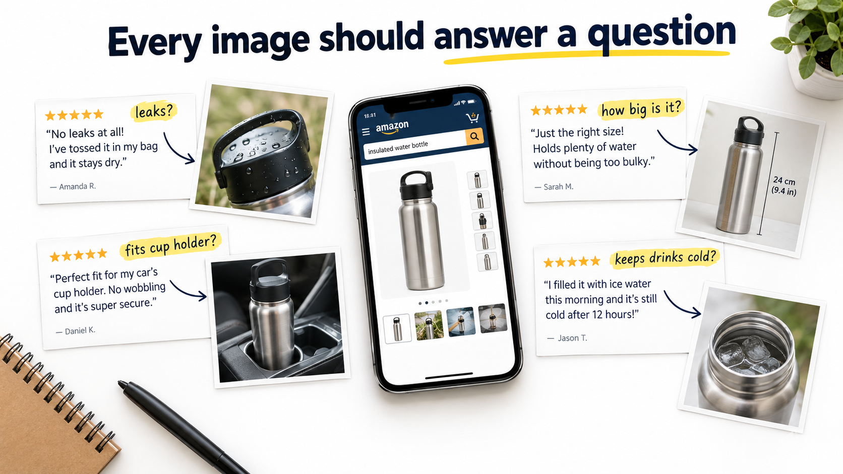
Pull up almost any mid-ranking Amazon listing in a crowded category and you’ll see the same thing. The photography is clean. The lighting is professional. There’s an infographic with icons, a lifestyle shot with a smiling model, and a “what’s in the box” flat-lay. Nothing about it is bad.
And yet the listing converts at a fraction of the rate of the competitor two spots above it, whose images look, if anything, slightly less polished.
This is the most common image problem on Amazon in 2026, and it’s rarely an aesthetics problem. It’s a relevance problem. The images are answering questions the shopper never asked, while ignoring the two or three doubts that actually stop them from clicking “Add to Cart.”
Most advice on Amazon listing images focuses on specs and styling: hit 1600 pixels, use a pure white background, add a lifestyle shot, include an infographic. That advice is correct, but it’s the floor, not the ceiling. Every serious competitor already does it. What separates a well-performing image stack from a forgettable one is whether each image was planned around a specific buyer hesitation.
This article takes that angle all the way through. Instead of a checklist of image types, you’ll get a process: how to mine your reviews, Q&A, and return reasons for the objections that matter; how to assign one job to each image slot; how to write a brief that a photographer or designer can actually execute; how to make text readable on a phone held at arm’s length; and how to test changes without fooling yourself with noisy data.
If you’ve already got “good” images and you’re wondering why they aren’t pulling their weight, this is for you.
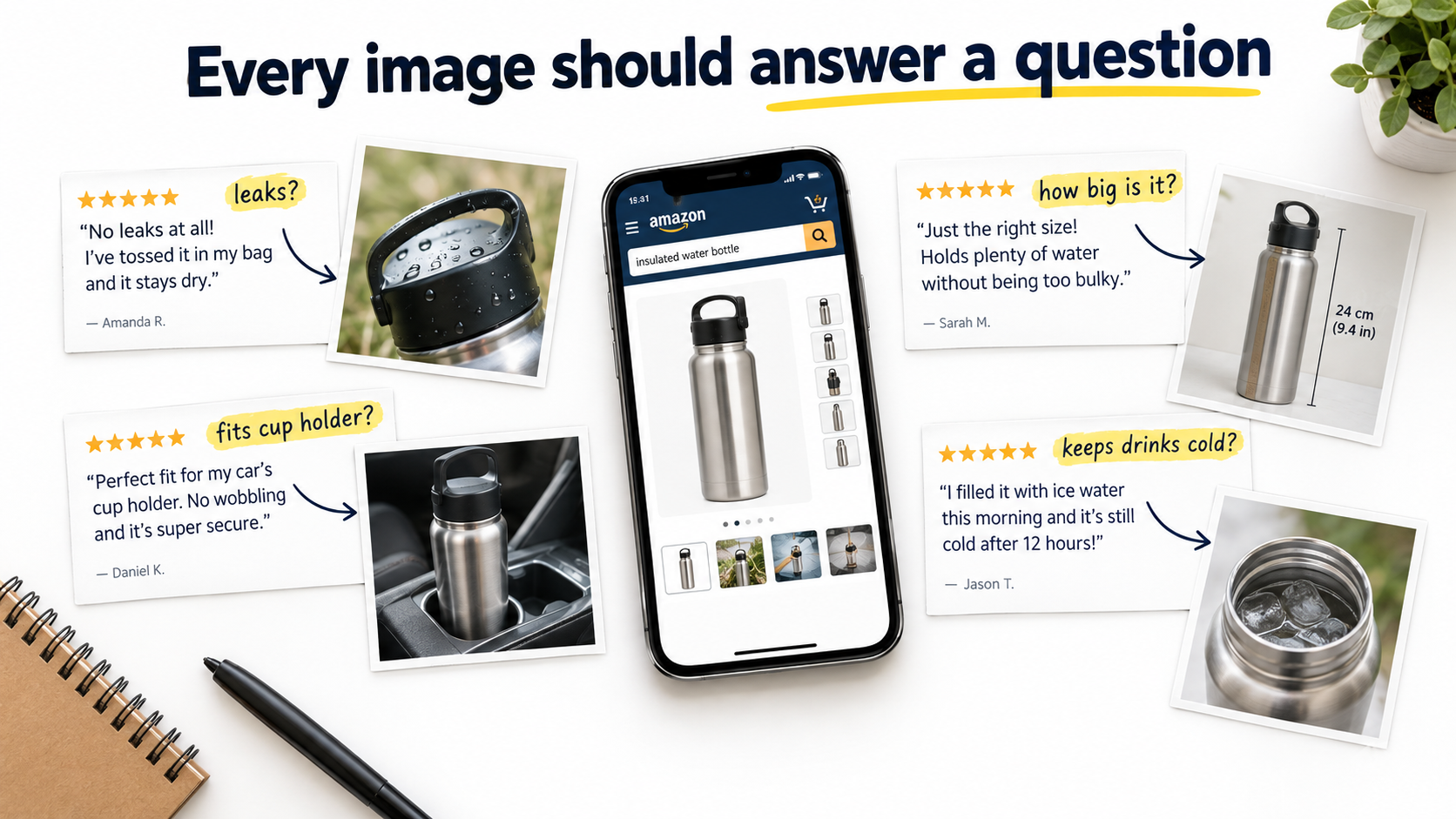
Why Good-Looking Images Still Fail to Convert
An Amazon shopper on a product detail page is not browsing a magazine. They’re running a quick, mostly subconscious risk assessment. Will this fit? Will it break? Is it the size I think it is? Does it work with the thing I already own? Is it worth more than the cheaper option I just saw?
Images are the fastest way to answer those questions, because most shoppers swipe through the gallery before they read a single bullet point. If the gallery resolves their doubts, they buy. If it doesn’t, they hit the back button and try the next listing. The beauty of the photography is a secondary factor at best.
The “brochure” trap
Many image sets are designed like a brand brochure. They lead with mood, lifestyle, and broad claims (“Premium Quality,” “Built to Last,” “Perfect Gift”). These claims are unfalsifiable, which means shoppers have learned to ignore them. Every competing listing makes the same claims with the same stock-style icons.
Brochure-style images feel productive to create because they look finished. But they spend valuable gallery slots on reassurance that doesn’t reassure anyone. A shopper worried that a lunch box leaks is not comforted by a photo of a family picnic. They want to see the lunch box upside down, full of soup, with nothing dripping out.
The “feature dump” trap
The opposite failure is the infographic stuffed with every feature the product has. Twelve callouts, three fonts, and arrows pointing everywhere. The logic is understandable: if each feature might matter to someone, why not show them all?
The problem is that equal emphasis on everything means no emphasis on anything. The one feature that actually decides the purchase gets the same visual weight as a trivial detail. On a phone screen, most of the text becomes unreadable anyway.
What high-converting image stacks do differently
The listings that consistently outperform tend to share one trait: their images feel like they were made by someone who read the reviews. They show the exact thing people worried about. They show scale in the context people care about. They pre-empt the most common complaint about the category. They feel specific rather than generic.
That specificity isn’t an accident of good taste. It comes from a deliberate research step that most sellers skip entirely, which is where the process starts.
Start With Objections, Not Aesthetics: Mining the Data You Already Have
Before anyone picks up a camera or opens a design tool, you need a ranked list of the reasons people hesitate to buy your product, or products like it. You already have most of this data. It’s just scattered across several places.
Source 1: Your own reviews (especially 3-star)
Five-star reviews tell you what delighted people. One-star reviews often reflect shipping damage, defective units, or mismatched expectations. Three-star reviews are frequently the most useful, because they come from customers who liked the product but had a specific reservation.
Read through them and note every recurring phrase. “Smaller than I expected.” “Wish it came with a case.” “Hard to tell from the photos that it’s matte.” “The lid is tricky at first.” Each of these is a gap your images failed to close before purchase.
Source 2: Competitor reviews
If your listing is new or has few reviews, your competitors have done the market research for you. Read the critical reviews on the top five to ten listings in your niche. Category-wide complaints show up fast. If every competing blender gets complaints about noise, then noise is a buyer concern for the whole category, and whoever addresses it visually gains an edge.
Source 3: Customer questions on the detail page
The questions section is a direct record of what shoppers couldn’t figure out from your listing. Questions like “Will this fit a 2019 model?” or “Is the fabric see-through?” are essentially requests for a specific image. If the same question appears repeatedly, your gallery has a hole in it.
Source 4: Return reasons and buyer messages
Return reason codes and buyer-seller messages reveal expectation mismatches. A cluster of “not as described” or “too small” returns usually means the images set the wrong expectation. Fixing that is a two-for-one: it can lift conversion and reduce returns at the same time, because you’re attracting buyers who know exactly what they’re getting.
Building the objection map
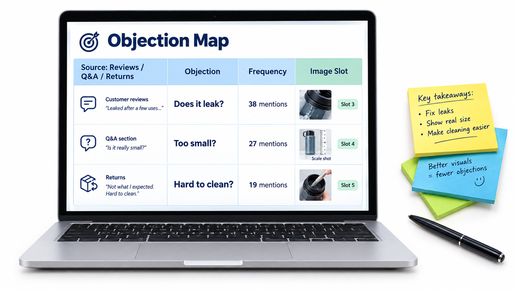
Pull everything into a simple spreadsheet with four columns:
- Objection: phrased the way the customer would say it (“Does it leak?”).
- Source: reviews, competitor reviews, Q&A, returns, or messages.
- Frequency: a rough count of how often it appears.
- Image slot: which gallery position will answer it (filled in later).
Sort by frequency. In most products, three to five objections account for the bulk of hesitation. Those become the backbone of your image plan. Everything else is secondary.
Separate objections from desires
Not everything on the list will be a worry. Some entries will be positive motivators: “Love that it fits in my backpack,” “Great for travel.” These are desires, and they deserve images too. But objections usually carry more weight, because a single unresolved doubt can kill a sale that five appealing features couldn’t save. Prioritize objections first, then fill remaining slots with the strongest desires.
The Main Image: Compliance Is the Floor, the Thumbnail Is the Ceiling
The main image has a different job from every other image in your gallery. It has to win the click in search results, where it competes against a grid of nearly identical white-background photos. And it has to do that while following Amazon’s strictest set of rules.
The rules you can’t bend
Amazon’s main image requirements are specific, and violating them can get a listing suppressed. As summarized by Jungle Scout from Amazon’s guidelines, the core rules include:
- A pure white background (RGB 255, 255, 255).
- A professional photograph of the actual product, not an illustration, mockup, or placeholder.
- No text, logos, borders, color blocks, watermarks, or other graphics over the product or background.
- No multiple views of a single product.
- The entire product shown, not cut off by the frame edge (with exceptions such as necklaces).
- No excluded accessories or props that might confuse the customer about what’s included.
- The product shown out of its packaging, unless the packaging is an important feature.
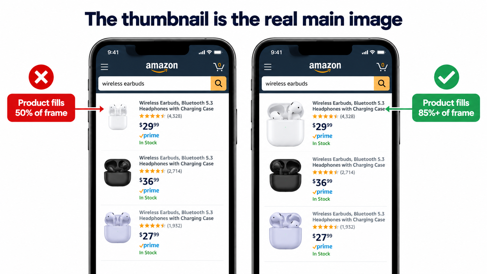
Across all images, Amazon specifies that the product should fill at least 85% of the frame, and that files should be 1600 pixels or larger on the longest side for the best zoom experience. Amazon’s own guidance notes that zoom “has been shown to help enhance sales.” The minimum for zoom is 1000 pixels, and JPEG is the preferred format.
Why the thumbnail matters more than the full-size image
Here’s the part many sellers overlook. In search results, especially on mobile, your main image is displayed at a small size. The detail you obsessed over in the full-resolution file is invisible. What matters is how the product reads as a small shape on white.
Open the Amazon app, search your main keyword, and look at your listing among the results. Then ask:
- Can you tell what the product is in under a second?
- Does it look the same size as competitors, or noticeably smaller and lost in white space?
- Does the angle show the product’s most recognizable side?
- If it’s a multi-pack or bundle, is the quantity obvious at a glance?
Legitimate ways to stand out within the rules
You can’t add badges or text, but you still have real levers:
- Frame fill: Crop tight. A product that fills the frame looks bigger and more substantial than one floating in white space.
- Angle: A three-quarter angle often reveals more depth and form than a flat front view. Test which angle makes your product most recognizable.
- Showing what’s included: If your product comes with genuinely included items that competitors don’t include, showing them (without props that aren’t included) can differentiate the offer.
- Color and finish accuracy: A true-to-life color rendering builds trust and reduces returns. Overly saturated edits can backfire when the product arrives.
- Lighting that shows material: Subtle shadows and highlights communicate texture, which matters for products where material quality is a buying factor.
The main image should answer the top objection if it can
Sometimes the most common objection can be partly addressed even in the main image. If shoppers in your category worry about quantity, a clean arrangement showing all units in the pack does that. If they worry about whether a cable is long enough, a neatly coiled cable that visibly reads as long helps. The main image can’t explain, but it can show.
One Job Per Slot: Turning the Gallery Into a Sequence
Once the main image wins the click, the remaining images have to win the sale. The most effective way to plan them is to give each image exactly one job, tied to an entry on your objection map.
Why sequence matters
Shoppers swipe through images in order, and many don’t reach the end. That means the order you choose is effectively a ranking of importance. The objection that blocks the most sales should be answered early, not buried in the sixth slot behind a lifestyle photo.
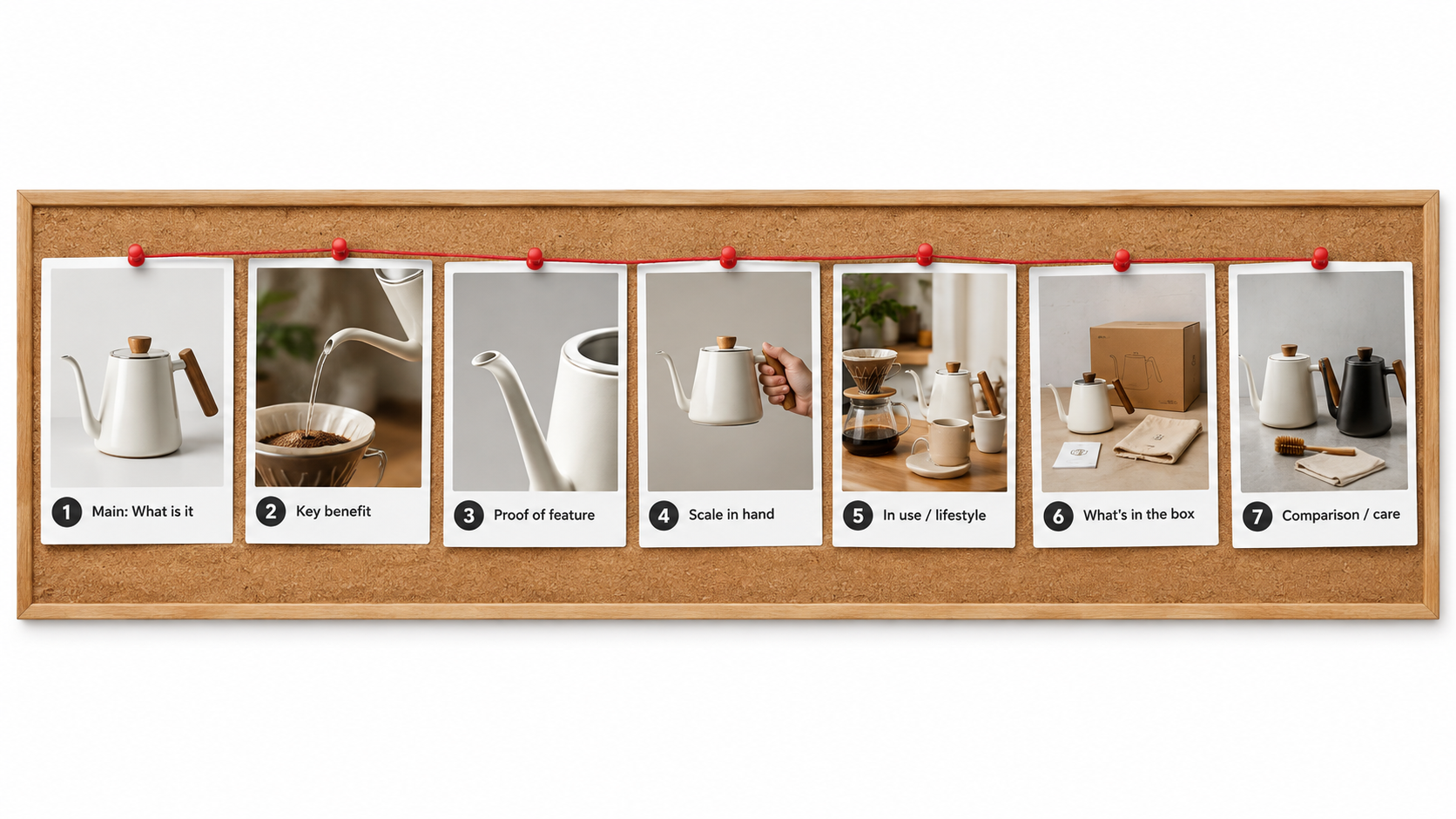
A sample slot plan
Every product is different, but a sequence like this works as a starting framework:
- Main image: What is it? Clean, compliant, thumbnail-readable.
- Primary benefit: The single biggest reason to choose this product, shown visually with a short headline.
- Top objection resolved: Proof of the feature people doubt most (leak-proof, waterproof, quiet, durable).
- Scale and fit: The product in a hand, on a body, next to a common object, or in its intended space, with dimensions.
- In use: A realistic context showing how and where it’s used, aimed at the primary customer.
- What’s included: Every component, clearly laid out, so there are no surprises.
- Second objection or comparison: Care instructions, compatibility, or a comparison against generic alternatives (without naming competitors).
Proof beats claims
Notice that the plan above emphasizes demonstration. “Leak-proof” as a text label is a claim. A photo of the container upside down over a white shirt is proof. “Durable” is a claim. A close-up of reinforced stitching with a short label explaining the stitch count is evidence.
Whenever you can, convert a claim into a visual demonstration. Shoppers discount claims automatically. They take demonstrations seriously.
Scale is the most underrated slot
“Smaller than expected” is one of the most common complaints across Amazon categories. Dimension text alone doesn’t fix it, because most people can’t picture 7.5 inches. A scale image does: the product in an average adult hand, next to a smartphone, inside a standard kitchen drawer, or worn by a model with height listed.
If scale shows up anywhere on your objection map, give it a dedicated slot with both a visual reference and printed dimensions.
Lifestyle images need a target, not a mood
Lifestyle photos are often the weakest images in a gallery because they’re made to look aspirational rather than relevant. A better approach: identify your primary customer from your reviews (who’s actually buying and why) and show that person in that context. If reviews show your camping stove is mostly bought by people for emergency kits, a remote mountain scene misses the point. A shot of it in a home preparedness kit speaks directly to the buyer.
Use your video slot deliberately
If you have access to video on your listing, treat it as an extension of the same plan rather than a separate brand film. A short clip demonstrating the top objection being resolved (the lid sealing, the fabric stretching, the device pairing) often does more than a cinematic montage.
Writing the Image Brief: How to Get What You Actually Need
Most disappointing image sets trace back to a weak brief. A seller sends a product and a note saying “need 7 Amazon images, white background plus lifestyle and infographics.” The photographer or designer, reasonably, produces a generic set. Nobody did anything wrong, but nobody solved the actual problem either.
What a strong brief contains
A good image brief gives the creative team the “why” behind each image, not just the “what.” For each slot, include:
- Slot number and job: “Slot 3: prove the bottle doesn’t leak when tipped over in a bag.”
- The objection it answers, in the customer’s words: paste two or three review quotes.
- The single message: one sentence the viewer should take away.
- Visual direction: composition, props, setting, angle, and what must be visible.
- Text overlay (if any): a headline of a few words and no more than three short callouts.
- Must-avoid items: props that could imply they’re included, unverifiable claims, competitor references.
- Reference examples: screenshots of images (from any category) with the feel you want.
Shot list vs. design list
Split the brief into two parts. The shot list covers what needs to be photographed: angles, close-ups, model shots, scale shots, in-context setups. The design list covers what happens afterward: text overlays, callouts, arrows, comparison layouts.
This split prevents a common problem: discovering during design that you needed a specific angle or close-up that was never shot. Planning the overlay first tells the photographer exactly which raw shots to capture, including extra negative space where text will sit.
Shoot more than you need
Ask for alternates on your most important slots, particularly the main image and the top-objection image. Two or three angles for the main image give you material for testing later without a reshoot. A reshoot to get one alternate angle costs far more than capturing it during the original session.
Specify the product variants up front
If your listing has color or size variations, decide early whether each variant gets its own full image set or only a unique main image with shared secondary images. Shoppers who switch variants and see images of the wrong color lose confidence quickly. At minimum, each variant’s main image should show that exact variant.
A sample brief entry
Slot 4 — Scale and fit. Objection: “Smaller than I thought” (appears in 14 reviews, 6 questions). Message: “Holds a full-size laptop and still fits under an airplane seat.” Visual: backpack on a woman of average height (list height in a small caption), shot from the side; inset photo of a 15-inch laptop sliding into the sleeve. Text: headline “Fits 15" laptops” plus dimensions. Avoid: airline logos, any item not included in the box appearing as if it’s part of the product.
A brief like this takes longer to write. It also turns a generic image set into one that was built to sell this specific product to these specific buyers.
Text on Secondary Images: Designing for a Phone at Arm’s Length
Secondary images can include text, and done well, text overlays make images dramatically clearer. Done poorly, they turn into unreadable clutter that shoppers swipe past.
The arm’s-length test
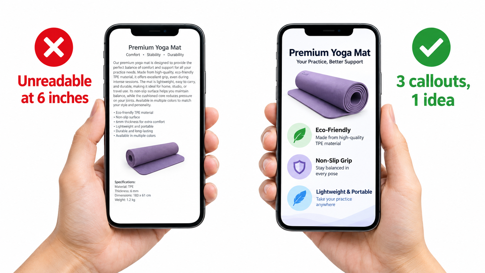
Most Amazon browsing happens on phones. Before approving any image with text, view it on a phone at normal holding distance, not zoomed in, not on a desktop monitor. If you have to squint, the text is too small or there’s too much of it.
A practical rule: if a callout can’t be read comfortably on a phone without zooming, cut it or enlarge it. Designers working on large monitors routinely underestimate how small their text becomes on a mobile screen.
One idea per image
Every secondary image should communicate one idea. That idea gets a headline of a handful of words. Supporting callouts, if any, should be limited to around three. If you find yourself needing six callouts, you probably have two or three images’ worth of content crammed into one.
Hierarchy and contrast
- Headline first: The largest, boldest text states the benefit, not the feature name. “Stays cold 24 hours” beats “Double-wall vacuum insulation.”
- Supporting detail second: Smaller text can explain the how (“double-wall vacuum insulation”) for shoppers who want it.
- High contrast: Dark text on light areas or light text on dark areas. Avoid placing text over busy parts of a photo.
- Consistent fonts: One or two typefaces across the whole gallery. Mixed fonts make the set feel assembled rather than designed.
Icons are not a substitute for proof
Icon rows (“BPA-free,” “Dishwasher safe,” “Eco-friendly”) are common because they’re fast to produce. They can be useful as a quick summary, but they shouldn’t occupy a high-priority slot. They’re the visual equivalent of bullet points, and they don’t demonstrate anything. If “dishwasher safe” is a real buying concern in your category, show the product on a dishwasher rack.
Write for shoppers who won’t read bullets
A useful mindset: assume some shoppers will never scroll to your bullet points. If the gallery were the only thing they saw, would they understand the product, its key benefit, its size, what’s included, and why it’s better than the alternative? If not, the gallery has gaps that text overlays can fill.
Don’t contradict the rest of the listing
Make sure numbers in your images match your title, bullets, and product specs. Mismatched dimensions or capacities between an infographic and the bullet points erode trust and can lead to returns. Amazon’s guidelines also require that images accurately represent the product and match the product title.
Category Rules That Change Your Image Strategy
Amazon’s image requirements aren’t uniform across categories. Some of the most important rules apply only to certain product types, and getting them wrong can mean suppression rather than just lower conversion.
Apparel and accessories
According to Amazon’s guidelines as summarized by Jungle Scout, main images for women’s and men’s clothing must show the product on a human model. Multi-pack apparel items and accessories must be photographed flat (off-model) for the main image. Clothing accessories’ main images must not show any part of a mannequin, including clear or hanger-style forms. All images of kids’ and baby clothing must be photographed flat, off-model.
For apparel, the objection map is usually dominated by fit, fabric feel, and sheerness. Secondary images should show fit from multiple angles, close-ups of fabric texture, and, where relevant, model height and size worn. A size chart image is also valuable, as long as it’s legible on mobile.
Footwear
Main images of shoes must show a single shoe, facing left at a 45-degree angle. Secondary images commonly address sole construction, interior comfort, width, and how the shoe looks on foot. Sizing is often the dominant objection, so an image explaining how the sizing runs can directly reduce returns.
Models and poses
Amazon’s main image rules state that a human model must not be shown sitting, kneeling, leaning, or lying down, though showing various physical mobilities with assistive technology like wheelchairs or prosthetics is encouraged. Keep this in mind for any category where a model appears in the main image.
Consumables and supplements
For consumables, the objection map often centers on ingredients, serving size, quantity per container, taste or texture, and how long a container lasts. Clear, legible label imagery and a “how many servings” visual tend to address real buyer questions. Be especially careful with claims: anything resembling a health claim in an image is subject to the same scrutiny as claims in your text.
Electronics and accessories
Compatibility is usually the top objection. “Will this work with my device?” A dedicated compatibility image listing supported models or standards, plus a photo of the product connected to a common device, often matters more than a lifestyle shot. Port close-ups and cable length visuals also address frequent questions.
Home and kitchen
Scale, cleaning, and material are recurring themes. Showing the product in a realistic kitchen or room for scale, demonstrating cleaning ease, and close-ups of material finish tend to answer what shoppers ask about most.
Check the current rules before every shoot
Amazon updates its style guides, and category-specific guides can be more detailed than general rules. Before a new shoot, check Seller Central’s current image requirements and any style guide for your specific category. A compliant plan is cheaper than a reshoot after a suppression.
Testing Without Fooling Yourself
Once you’ve built an objection-led image stack, you’ll want to know whether it actually performs better. This is where many sellers go wrong, not because they don’t test, but because they misread the results.
Manage Your Experiments
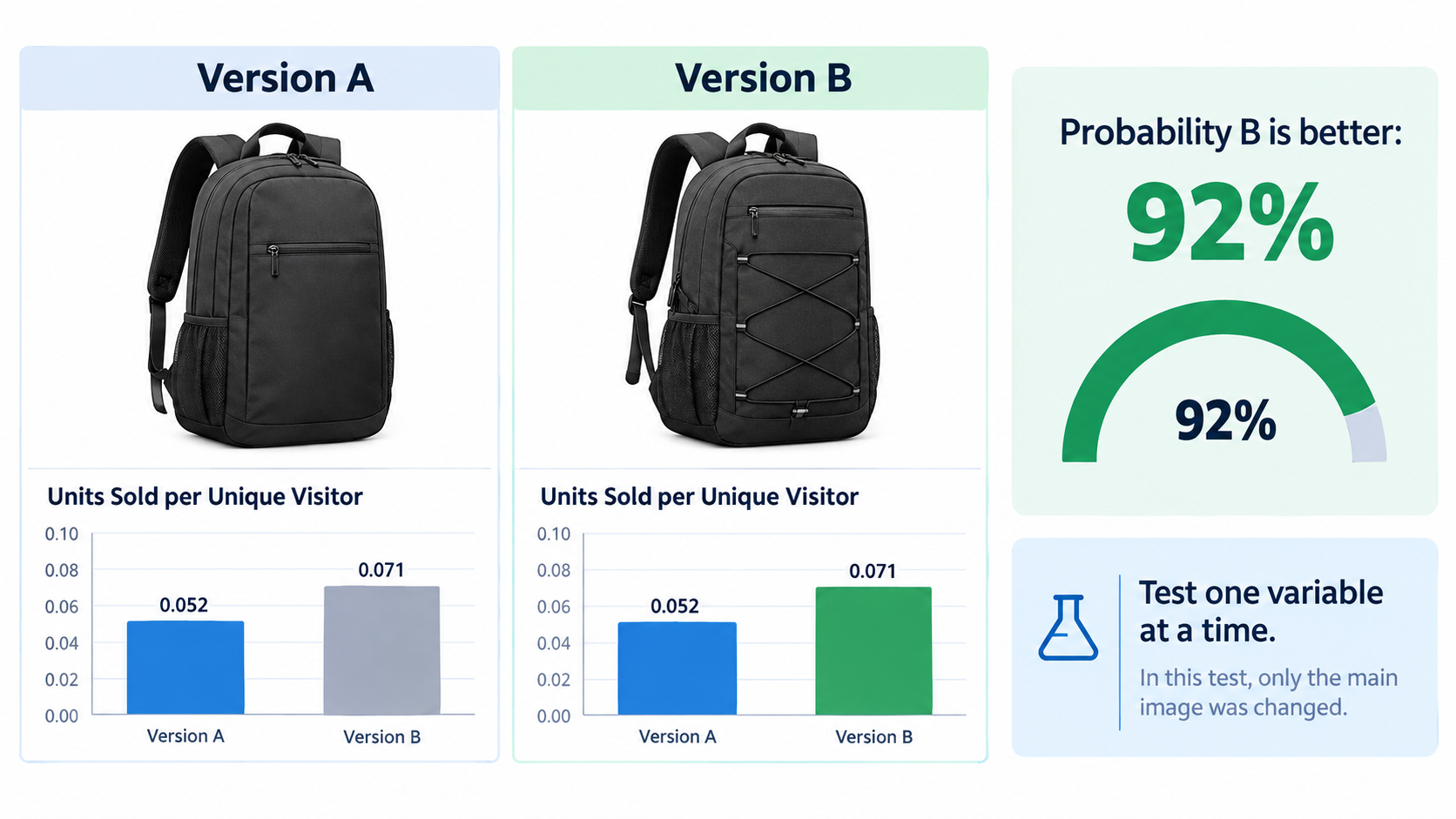
Amazon’s Manage Your Experiments tool, available to brand-registered sellers on eligible ASINs with sufficient traffic, lets you run A/B tests on listing content, including main images. Traffic is split between two versions, and the tool reports results including the probability that one version outperforms the other.
This is the most reliable way to test main images on Amazon because it controls for seasonality, ad spend, and pricing changes that affect both versions equally. If your ASIN qualifies, use it before making major main image changes.
Rules for clean tests
- Change one variable at a time. If Version B has a new angle, a new crop, and a new color edit, you won’t know which change mattered.
- Let it run. Stopping a test after a few days because one version is “winning” is the fastest way to adopt a false result. Early swings are normal.
- Avoid overlapping changes. Don’t run a major price change, coupon, or ad restructure during an image test if you can avoid it.
- Respect inconclusive results. If neither version clearly wins, that’s useful information. It means the variable you tested isn’t what’s holding you back.
Before-and-after comparisons are weak evidence
If you can’t use Manage Your Experiments, you might compare conversion before and after an image change. Treat these comparisons with skepticism. A week of improved conversion after new images could reflect a competitor going out of stock, a seasonal shift, a coupon, or a change in ad traffic mix. Look at longer windows and check what else changed during the period.
Pre-launch polling
Consumer polling tools let you show image variations to panels of respondents and ask which they’d click or buy. These polls are fast and useful for eliminating weak options before they ever go live, especially for new listings with no traffic to test against. Their limitation is that respondents aren’t real shoppers with real intent, so treat polls as a filter, not a final verdict.
Which metrics to watch
For main images, click-through rate from search matters most, since the main image’s job is winning the click. For secondary images, the unit session percentage (conversion rate) on the detail page is the relevant measure. Brand Analytics data, where available, can help you compare your click and purchase share against the rest of the search results for your key terms.
Test the objection, not just the picture
The most valuable tests don’t compare two pretty photos. They compare two hypotheses. “Does showing the product in-hand for scale increase conversion more than showing it on a table?” A test framed this way teaches you something about your buyers that you can apply to the rest of your catalog.
Seven Failure Patterns to Audit For Right Now
Before redoing an entire gallery, audit what you have. These patterns show up repeatedly on underperforming listings.
1. The main image fails the thumbnail test
The product is too small in the frame, shot at an angle that makes it unrecognizable, or so similar to competitors that nothing distinguishes it. Fix: tighter crop, better angle, test alternates.
2. The top objection is answered in slot 6 (or not at all)
The thing customers worry about most is buried late in the gallery, or missing entirely. Fix: move the objection-resolving image to slot 2 or 3.
3. Lifestyle images aimed at the wrong buyer
The setting and model don’t match the people who actually buy. Fix: revisit your reviews to identify the real customer and use cases, then reshoot to match.
4. No scale reference
Dimensions exist in text, but there’s no visual comparison. “Smaller than expected” complaints keep coming in. Fix: add a dedicated scale image with a common reference object or a hand.
5. Unreadable infographics
Too much text, too small, too many callouts. Fix: one idea per image, a short headline, and no more than about three callouts. Check on a phone.
6. Props that imply inclusion
A camera shown with a microphone that’s sold separately, or a phone shown in a mount listing, without clarity about what’s included. This is both a compliance risk for main images and a source of “missing parts” returns. Fix: make inclusions unambiguous, and keep non-included items out of the main image.
7. Inconsistency across the gallery
Different lighting, color grading, fonts, and styles across images make the listing feel pieced together, which can quietly undermine trust. Fix: a consistent visual system across all slots.
Running the audit
Go through your top ten ASINs by revenue. Score each against these seven patterns. The ASINs with the most issues and the highest traffic are your best candidates for an image refresh, because they combine the most room to improve with the most visitors to benefit.
Keeping Images Current: A Refresh Cadence That Makes Sense
Images aren’t a one-time project. Your buyers, your competitors, and your product all change. A gallery that was well-targeted a year ago may now be answering last year’s questions.
Triggers for a refresh
- New recurring objections: A theme appears in recent reviews or questions that your gallery doesn’t address.
- Rising return rates tied to expectation mismatches like size, color, or included parts.
- Competitor shifts: A competitor upgrades their images and starts gaining click share in search results.
- Product changes: New packaging, materials, colors, or included accessories. Images must accurately represent what ships.
- Seasonal positioning: For giftable or seasonal products, secondary images can shift emphasis ahead of key periods.
- Policy updates: Changes to Amazon’s image requirements or category style guides.
A practical schedule
For most sellers, a quarterly review of the objection map for top ASINs is a reasonable rhythm. Re-read recent reviews and questions, check return reasons, and look at the search results for your main keywords. If nothing has changed, leave the images alone. If something has, update the relevant slot rather than redoing the whole set.
Update one slot at a time
Incremental updates make performance easier to read. If you change the scale image and conversion improves over a meaningful period, you have a reasonable signal. If you change all seven images at once, you won’t know what worked.
Build a reusable image system
For sellers with larger catalogs, documenting a visual system pays off: consistent fonts, color palette, callout styles, slot sequence templates, and brief templates. New products can be planned faster, and the whole catalog looks like it belongs to one brand. This consistency also helps shoppers who browse multiple products in your storefront.
Keep a record
Log every image change with the date, what changed, and why. Pair that log with your conversion and click-through data. Over time, you’ll build a body of evidence about what your specific buyers respond to, which is worth more than any generic best-practice list.
Conclusion: Build Images Around What Buyers Doubt
Amazon listing images that perform well aren’t defined by expensive photography or flashy design. They’re defined by relevance. Each image answers a real question that a real shopper has, in the order those questions matter.
The process comes down to a few disciplined steps:
- Mine the objections. Pull recurring doubts from your reviews (especially 3-star), competitor reviews, customer questions, and return reasons. Rank them by frequency.
- Treat compliance as the floor. Meet Amazon’s main image rules (pure white background, 85% frame fill, 1600px+ for zoom, no text or graphics), then make the main image win at thumbnail size.
- Give each slot one job. Answer the biggest objection early. Prioritize proof over claims. Always include a scale reference.
- Write a real brief. Explain the why behind every image, include customer quotes, separate the shot list from the design list, and capture alternates.
- Design for phones. One idea per image, a short benefit headline, about three callouts at most, and text that’s readable at arm’s length.
- Respect category rules. Apparel, footwear, kids’ items, and other categories have specific requirements. Check them before every shoot.
- Test honestly. Use Manage Your Experiments where eligible, change one variable at a time, let tests run, and treat before-and-after comparisons with caution.
- Refresh based on signals, not a calendar alone. Review objection maps quarterly and update individual slots when buyer concerns shift.
If your images already look good and still aren’t converting, the fix probably isn’t a prettier reshoot. It’s a more specific one. Start by reading your last fifty reviews with a notepad open, and you’ll likely find the image your listing has been missing all along.
Leave a Reply