Tag: Amazon Sellers

  • Your Sponsored Brands Video Plays on Mute. So Why Are You Writing It for Sound?

    Your Sponsored Brands Video Plays on Mute. So Why Are You Writing It for Sound?

    Most Amazon sellers who struggle with Sponsored Brands video don’t have a bidding problem or a targeting problem. They have a mismatch problem. They make a video the way they’d make a commercial, with a voiceover carrying the story, a slow brand intro, and a logo in the first frame. Then they run it inside an ad unit that works almost nothing like a commercial.

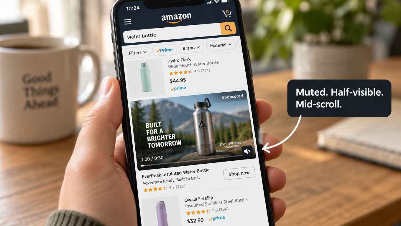
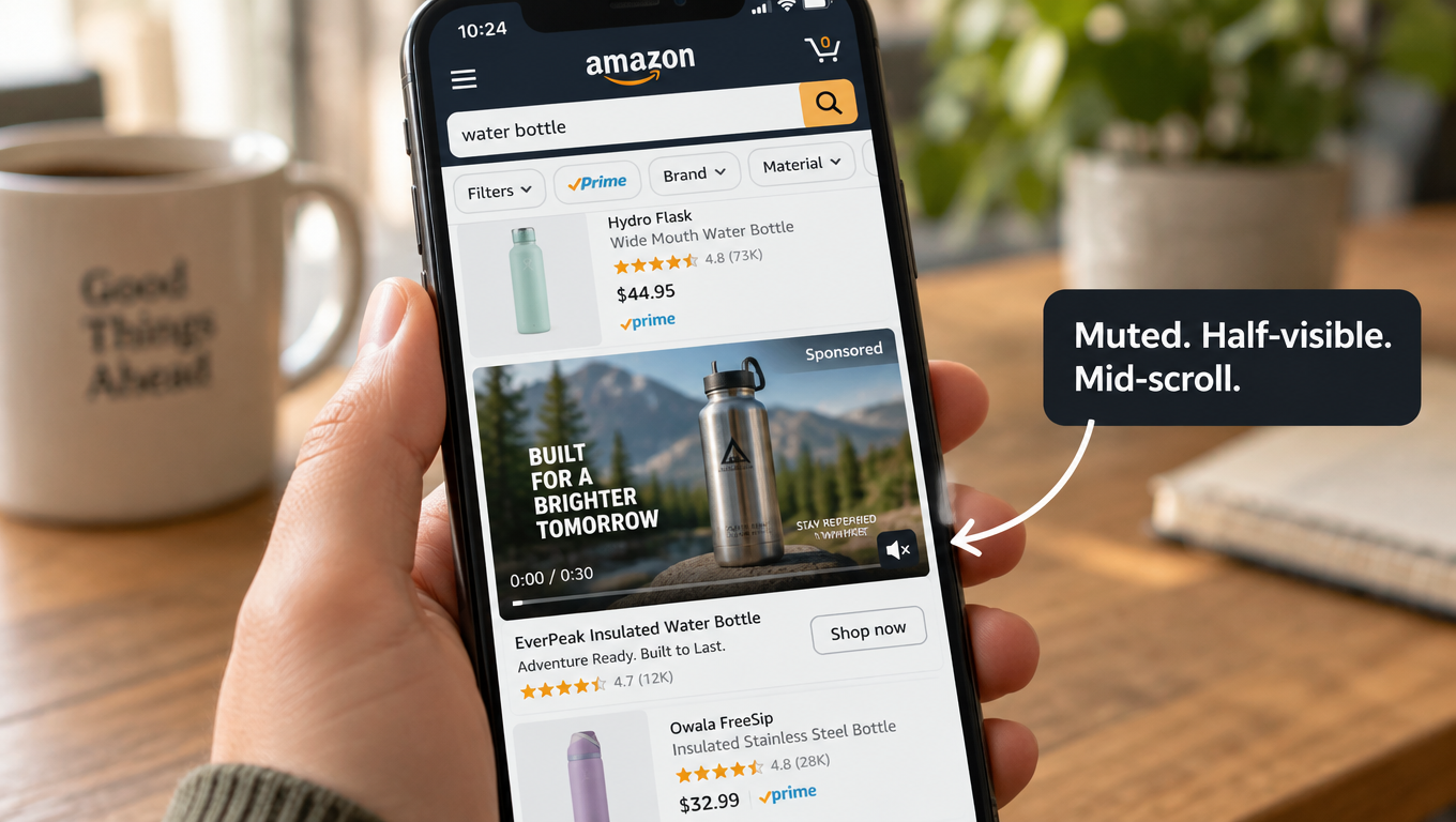
    Amazon’s own ad specifications spell out how the unit behaves. The video plays automatically once 50% of its pixels are on-screen. It always starts without audio, and a shopper has to tap a mute toggle in the lower-right corner to hear anything. It sits inside a search results page or a product detail page, surrounded by competing listings, prices, star ratings, and Prime badges. The shopper isn’t sitting back to watch. They’re scrolling to buy.

    That one detail, muted by default, should shape almost every creative decision you make. Yet it’s the detail most brands skip when they brief an editor or repurpose a social clip.

    This article doesn’t give you another list of generic “Amazon ad tips.” It works from the mechanics of the ad unit outward. We’ll look at what Amazon’s specs actually require, why they push you toward silent storytelling, how to edit to the recommended 20 seconds or less, how to choose between a Product Detail Page and a Brand Store destination, which metrics show whether your video is earning attention, and how to run tests that tell you something useful.

    The goal is simple: build Sponsored Brands videos for the way shoppers actually see them, not the way you’d like them to.
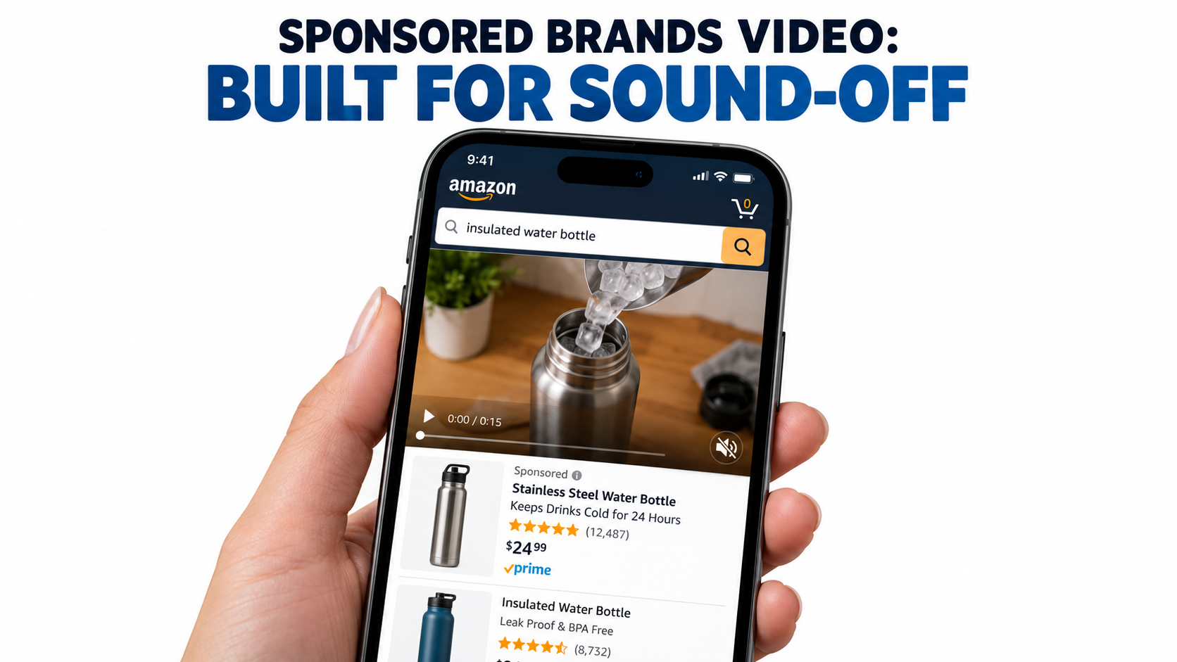
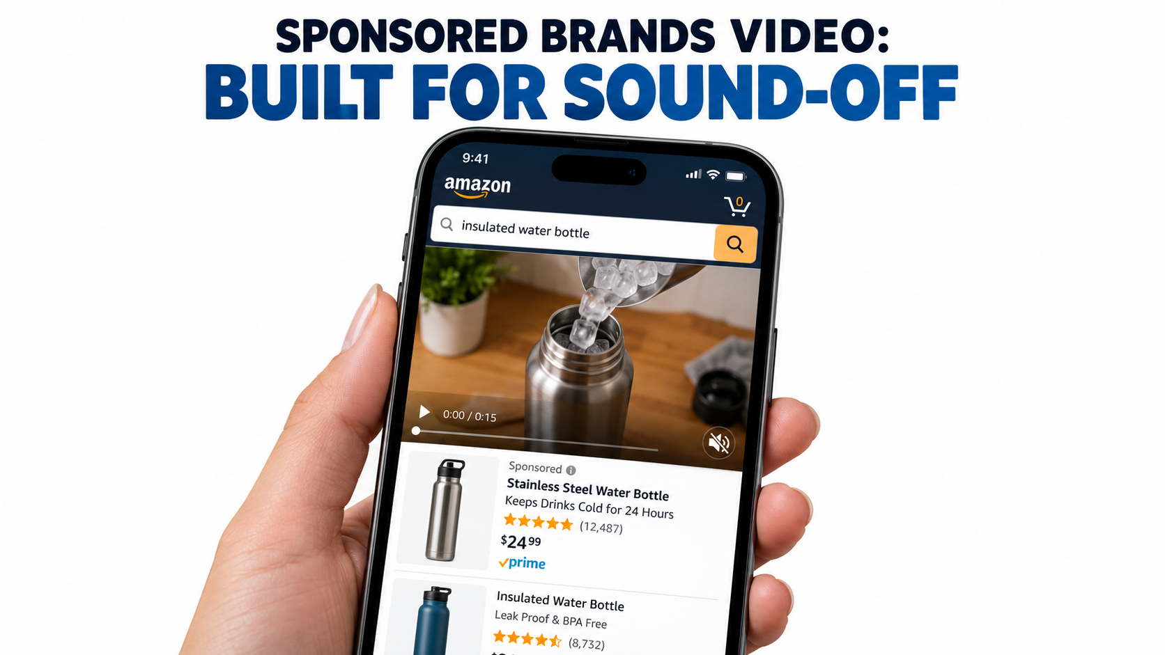
    Smartphone showing a muted autoplay Sponsored Brands video ad at the top of Amazon search results, with the mute icon in the lower right corner

    The Ad Unit You’re Actually Buying

    Before you write a script, it helps to take apart the placement piece by piece. Amazon describes Sponsored Brands as an ad product that helps shoppers discover a brand through video, image, or collection creatives. These ads show up in prominent spots such as top of search and product pages. Video is one creative format inside that product. It’s billed on a cost-per-click basis and targeted through keywords, categories, and products.

    The six parts of the unit

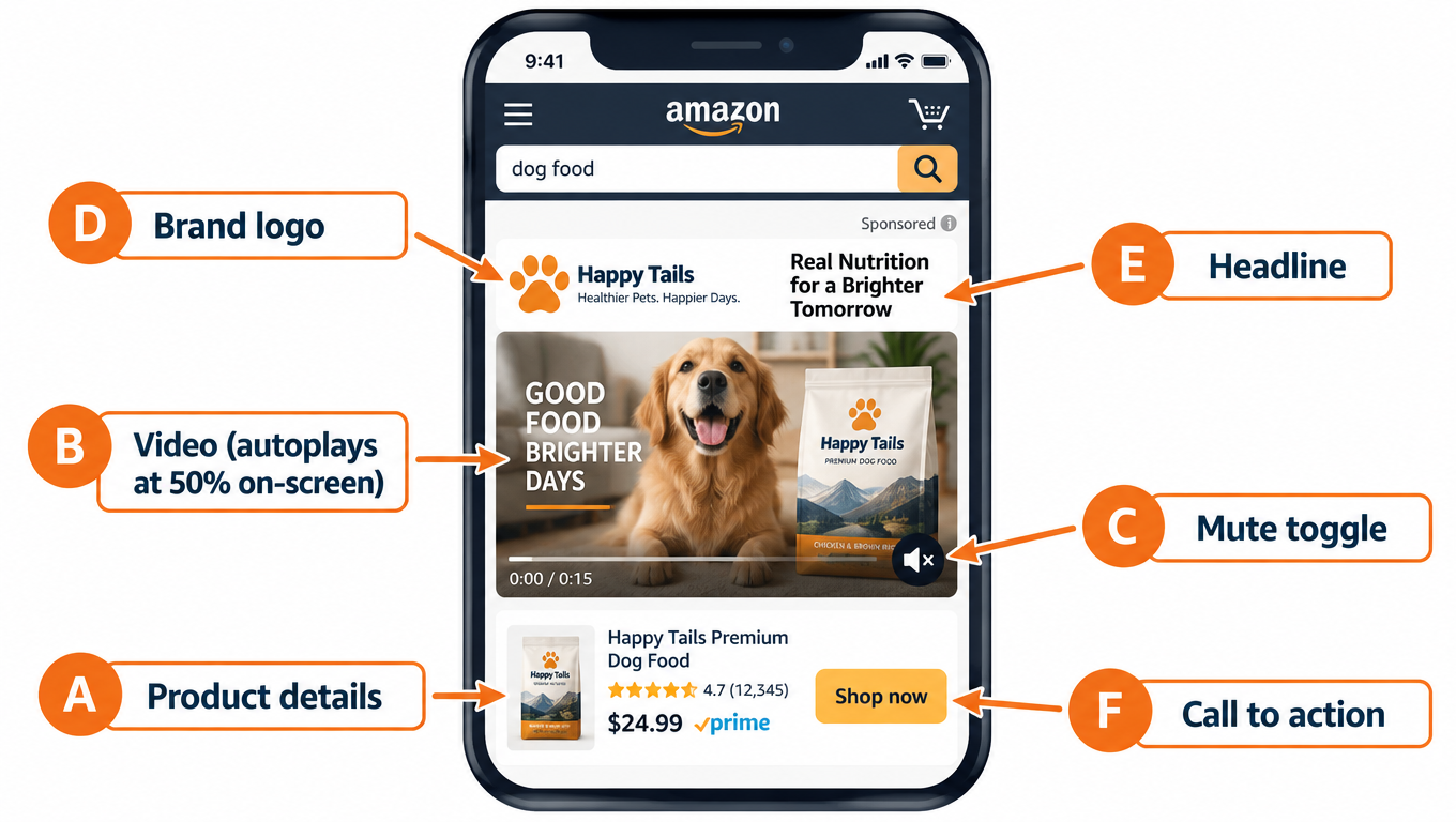
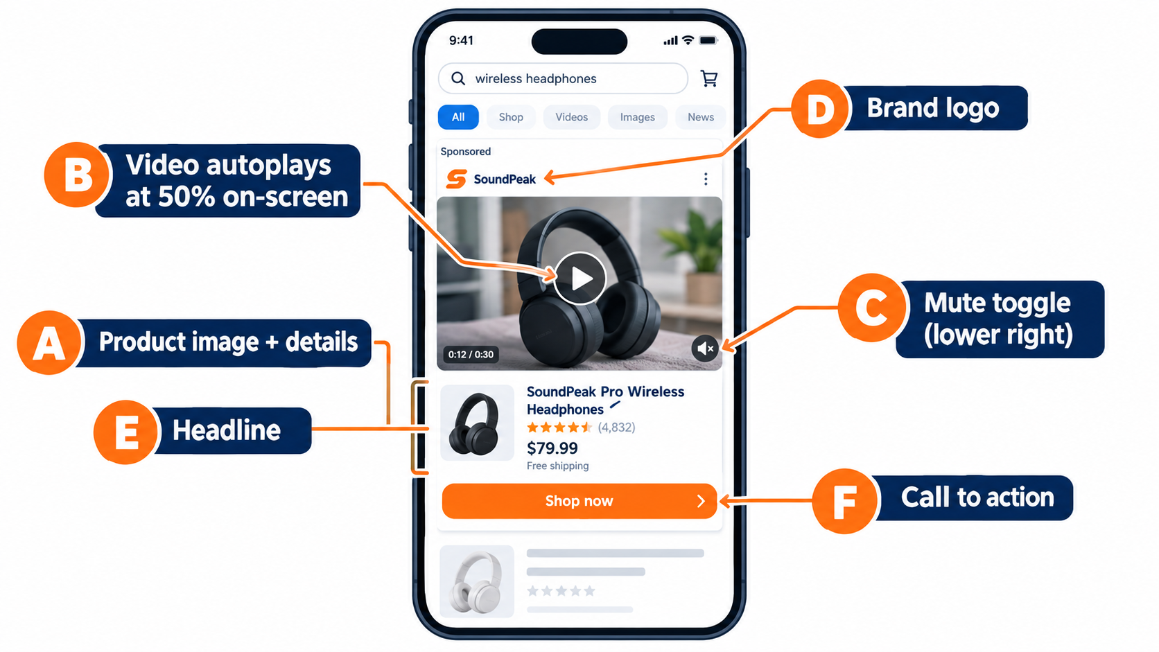
    Amazon’s spec page breaks the video ad unit into labeled parts:

    • Product details: The primary product image and related information pulled automatically from the detail page.
    • Video: Autoplays when 50% of its pixels are visible.
    • Mute toggle: Overlaid in the lower-right corner. Videos always start without audio, and the toggle isn’t shown if the video is silent.
    • Custom brand logo: Amazon recommends a clear, easy-to-read logo.
    • Headline text: Custom copy that communicates your brand’s value.
    • Call to action: Lets shoppers know they can take an action, such as visiting your Brand Store.

    Two of those parts come from your detail page, not from your video file. Your main image, title, price, and rating appear next to the video whether you plan for them or not. A weak main image or a thin review count undercuts the ad before the video even has a chance to work.

    Where it appears

    Amazon says Sponsored Brands ads may show above, alongside, or within shopping results, on both desktop and mobile. The Sponsored Brands overview lists top of search results, top of mobile search results, and top of the Amazon home page among the placements. The video spec page adds that Sponsored Brands video can also appear within detail pages.

    On the spec page, Amazon notes that Brand Store campaigns can be featured both above and below the fold of search results. In practice, a lot of video impressions show up mid-scroll inside the results grid. That’s where shoppers move fastest and pay the least attention.

    Why this framing matters

    When you see the unit as “a muted, autoplaying, 16:9 rectangle inside a busy shopping page next to my own listing data,” a lot of common creative choices start to look wrong. A cinematic slow fade-in burns seconds you don’t have. A spokesperson talking to camera says nothing to someone who never unmutes. A logo-first open tells shoppers who you are before they have any reason to care.

    Everything that follows comes from that one reframe.

    Muted by Default: Rewriting the Script for Silence

    Amazon’s wording is direct: “By default, videos always start without audio.” Shoppers can turn sound on by tapping the toggle, but that takes a deliberate action from someone who came to shop, not to watch. Your working assumption should be that most viewers will never hear your audio track.
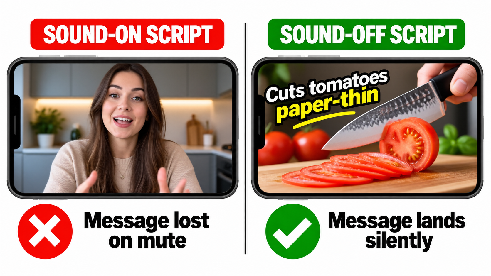
    Comparison showing a talking-head video losing its message on mute versus a captioned product demo that communicates without sound

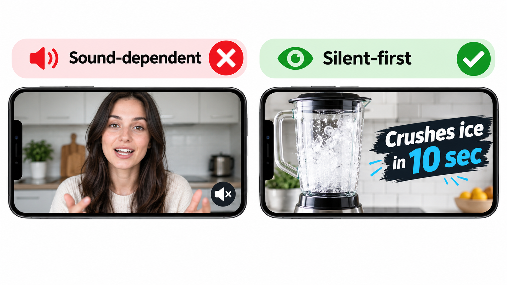
    The silent-first test

    Here’s a simple check you can run on any draft. Watch it with the sound off, once, at normal speed, on a phone. Then answer three questions:

    1. What is the product?
    2. What does it do better than the alternative?
    3. Why should I tap?

    If you can’t answer all three from the visuals and on-screen text alone, the video isn’t ready. Audio can add to the message, but it can’t be the only place the message lives.

    Show the action, not the explanation

    Silent video does best when it shows a visible change: before and after, problem and solution, ordinary versus your product. A stain disappears. A cable organizer turns a nest of wires into a clean line. A blender crushes ice in one pulse. These moments read in a fraction of a second with no narration needed.

    Products whose value is hard to see, like supplements, software accessories, or anything sold on specs, need more on-screen text to carry the claim. That’s fine. Just make sure the text is large, high contrast, short, and on screen long enough to read on a small phone.

    On-screen text rules that hold up on mobile

    • One idea per card. “Leak-proof lid” works. “Leak-proof lid with triple-seal silicone gasket and lifetime warranty” doesn’t.
    • Keep it on screen long enough. A good rule of thumb is to leave a text card up long enough to read it out loud twice.
    • Match the marketplace language. Amazon requires videos to match the language of the marketplace. English-speaking locales need English on-screen text or English voiceover, and the Italian marketplace needs Italian. If you sell across marketplaces, Amazon suggests subtitles or separate localized versions.
    • Stay away from the lower-right corner. More on that in the safe-area section below.

    Should you still use audio?

    Yes, but treat it as a bonus layer. Shoppers who do unmute are showing real interest, and a clean voiceover or satisfying product sound can reward that. Just write the audio track after the visual story is finished, not before. If your edit only makes sense with the voiceover, it’s a radio ad with pictures.

    One more point: if your video has no audio at all, Amazon says the mute toggle won’t appear. Some brands choose a fully silent cut for a cleaner frame. That’s a reasonable choice for product-demo creative where sound adds very little.

    The First Two Seconds: Designing for the Scroll

    Amazon’s creative guidance says to “showcase your product or something interesting within the first few seconds to catch the shopper’s attention.” It also says to “wait until later in the video to include your brand name and logo.” That second line goes against how many brand teams are trained to work, and it’s worth taking seriously.

    Why the logo shouldn’t open the video

    When a shopper scrolls past, your video autoplays as soon as half of it is visible. For that moment, the only question is whether the frame looks relevant to what they searched. A logo answers “who made this,” which is a question nobody has asked yet. A product in use answers “is this what I’m looking for,” which is the question every searcher has.

    The logo still matters. It belongs at the end, on an end card, after the product has earned some attention. Amazon specifically recommends an end card that clearly shows your brand name and logo.

    Three opening patterns that work silently

    1. Mid-action open. Start partway through the product doing its job: the pour, the cut, the click, the fold. No setup shot or establishing scene. The motion itself pulls the eye in a static results page.

    2. Problem frame. Open on the frustration your product fixes, like a tangled cord, a soggy lunch, or a phone at 2% battery. The shopper recognizes it right away. Then cut to the fix.

    3. Outcome first. Show the end result up front, like the spotless surface, the finished meal, or the organized drawer. Then rewind to show how you got there. This works well for categories where the result is the selling point.

    Match the opener to the search term

    This is where creative and targeting connect. If a video targets “insulated water bottle for hiking,” an opener on a trail with ice clinking into the bottle (silently showing cold retention) fits the shopper’s intent. If the same video targets “kids water bottle,” that opener misses. One generic video stretched across every keyword cluster tends to underperform a few versions with openers matched to intent.

    You don’t need a full reshoot for each version. Often a different first three seconds and a different headline are enough.

    Watch for frame clutter

    Your video plays next to your own product image, headline, and CTA, plus everything else on the page. A busy opening frame with props, patterned backgrounds, or several products competes with all of it. Clean backgrounds, one hero product, and strong contrast make that first frame read faster on a small screen.

    Specs, Safe Areas, and the Rejections You Can Avoid

    Creative rejections cost you time, and they’re usually preventable. Amazon publishes its technical specs and acceptance criteria, and most failures come from a short list of issues.
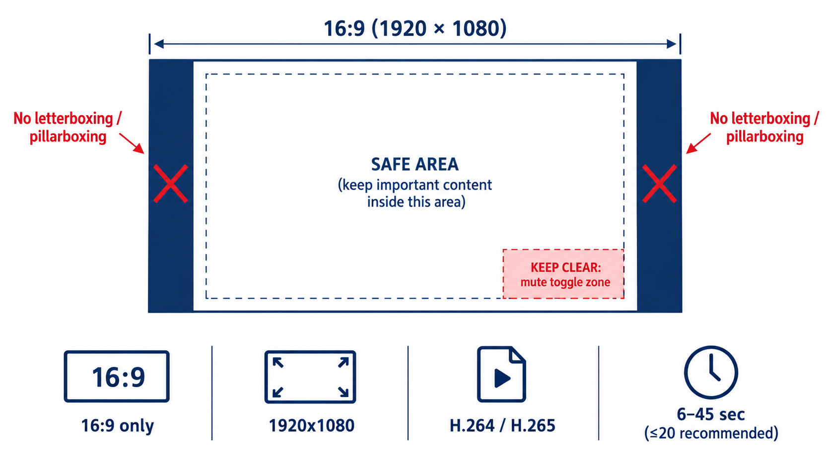
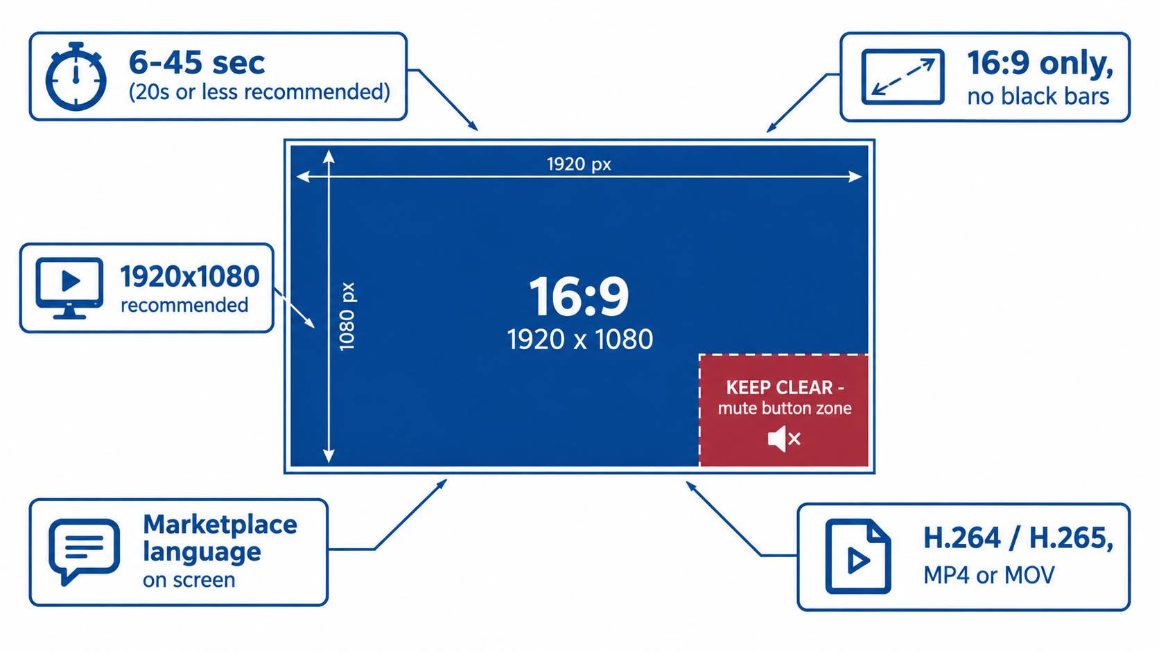
    Diagram of a 16:9 video frame showing the lower-right mute toggle zone to keep clear, with no letterboxing and the key Sponsored Brands video specs

    The technical specs

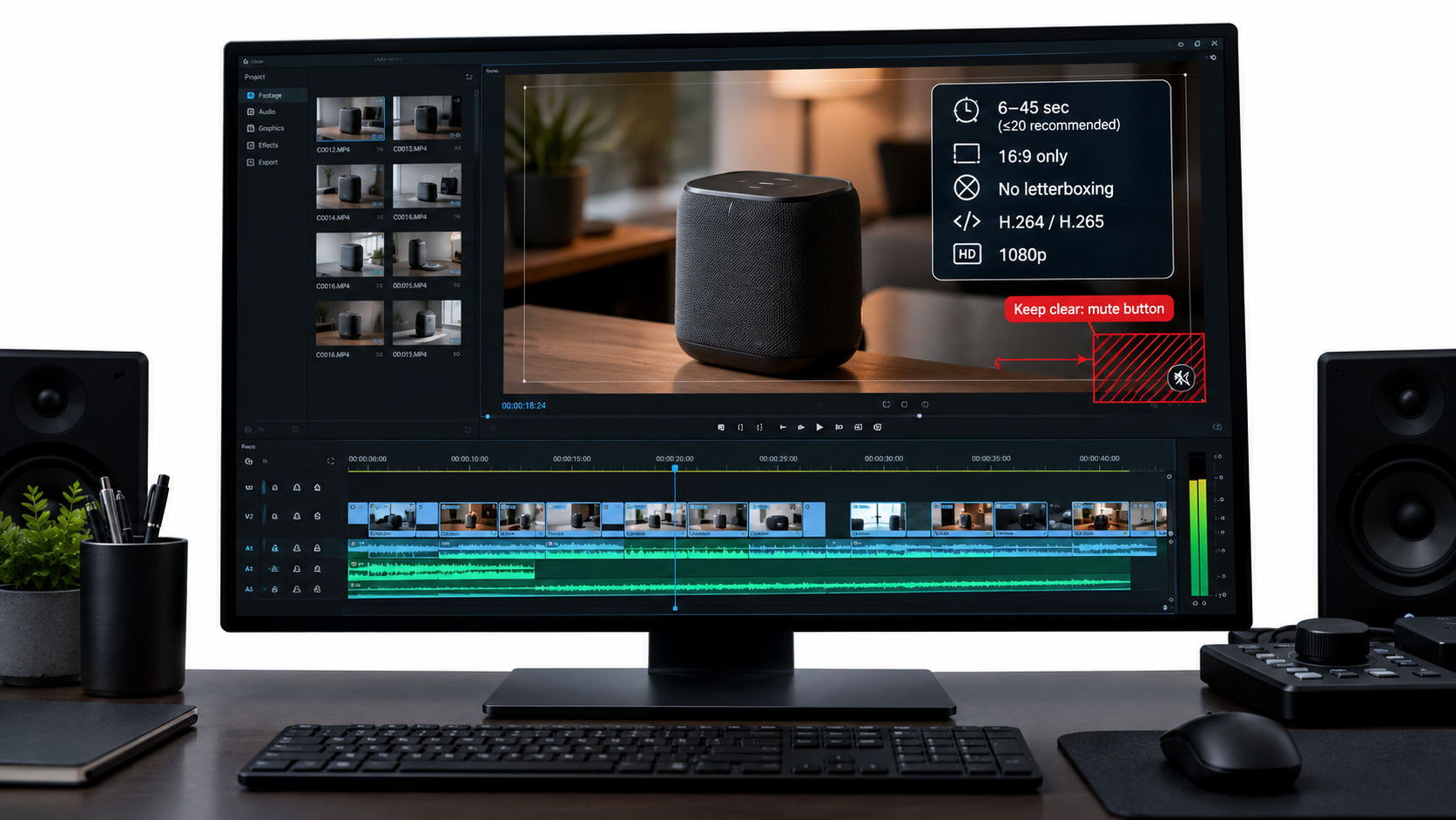
    According to Amazon’s Sponsored Brands video ad spec page:

    • Duration: 6 to 45 seconds, with 20 seconds or less “highly recommended”
    • Dimensions: 1280×720, 1920×1080, or 3840×2160 px
    • Aspect ratio: 16:9 (square pixel) only
    • File size: 500 MB or less
    • Format: .MP4 or .MOV
    • Video codec: H.264 or H.265, Main or Baseline profile
    • Frame rate: 23.976, 23.98, 24, 25, 29.97, 29.98, or 30 fps
    • Video bit rate: Minimum 1 Mbps, with 4 Mbps or higher recommended
    • Scan type: Progressive
    • Audio: PCM, AAC, or MP3; stereo or mono; minimum 96 kbps; minimum 44.1 kHz sample rate

    The 16:9 trap for social-first brands

    The most common mismatch today is vertical content. Many brands produce most of their video for vertical social feeds, and it’s tempting to reuse those assets. But Sponsored Brands video accepts 16:9 only. Dropping a 9:16 clip into a 16:9 frame creates side bars, and Amazon explicitly says to avoid letterboxing or pillarboxing, meaning horizontal or vertical black, colored, or blurred bars.

    The blurred-background trick that social editors often use to fill a horizontal frame falls under that rule too. If your source footage is vertical, you have two real choices. You can reframe it, by cropping into the shot where the resolution allows and recomposing the subject. Or you can reshoot horizontally. Plan for both orientations at the shoot so you aren’t stuck with this later.

    The lower-right safe area

    Amazon tells advertisers to avoid placing text and other important information in the lower-right corner of the video, and it provides a safe-area template. The reason is practical: that’s where the mute toggle sits. A price callout, a key claim, or a “Shop now” prompt in that corner may get covered.

    Build this into your editing template so every new video respects it automatically. Keep text in the upper and central parts of the frame, and keep the lower-right corner for background visuals only.

    Policy and language checks

    Amazon says all content must be suitable for a general audience, follow relevant laws and regulations, and meet its creative acceptance policies for sponsored ads. It recommends reviewing the Amazon Ads policies page before launch. The language-matching requirement covered earlier is also part of acceptance. A video with English text submitted to a non-English marketplace without localization is an easy rejection to avoid.

    A pre-upload checklist

    1. Is it 16:9 with no bars of any kind?
    2. Is the lower-right corner free of text and key visuals?
    3. Does the on-screen language match the target marketplace?
    4. Is the bit rate at least 4 Mbps (the recommended level), progressive scan, and at an accepted frame rate?
    5. Is the duration within 6 to 45 seconds, ideally 20 or under?
    6. Are all claims ones you can support, and suitable for a general audience?

    Editing to 20 Seconds: What to Cut and What to Keep

    Amazon allows up to 45 seconds but “highly recommends” 20 seconds or less. Its guidance explains why: the goal of the video “is not to provide all the details about the product, but rather to create a sense of excitement and curiosity that will drive viewers to your product or Stores page for more information.”

    That’s an important distinction. Your detail page already holds the bullets, the A+ content, the image stack, and the reviews. The video’s job is to earn the click, not to replace the listing.
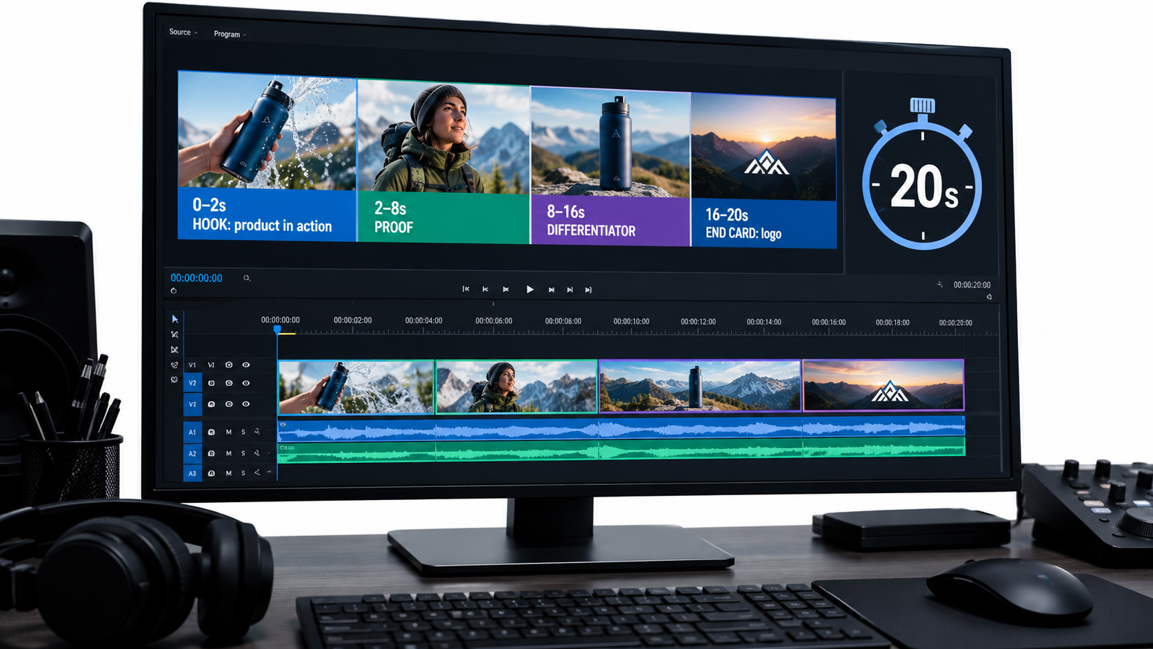
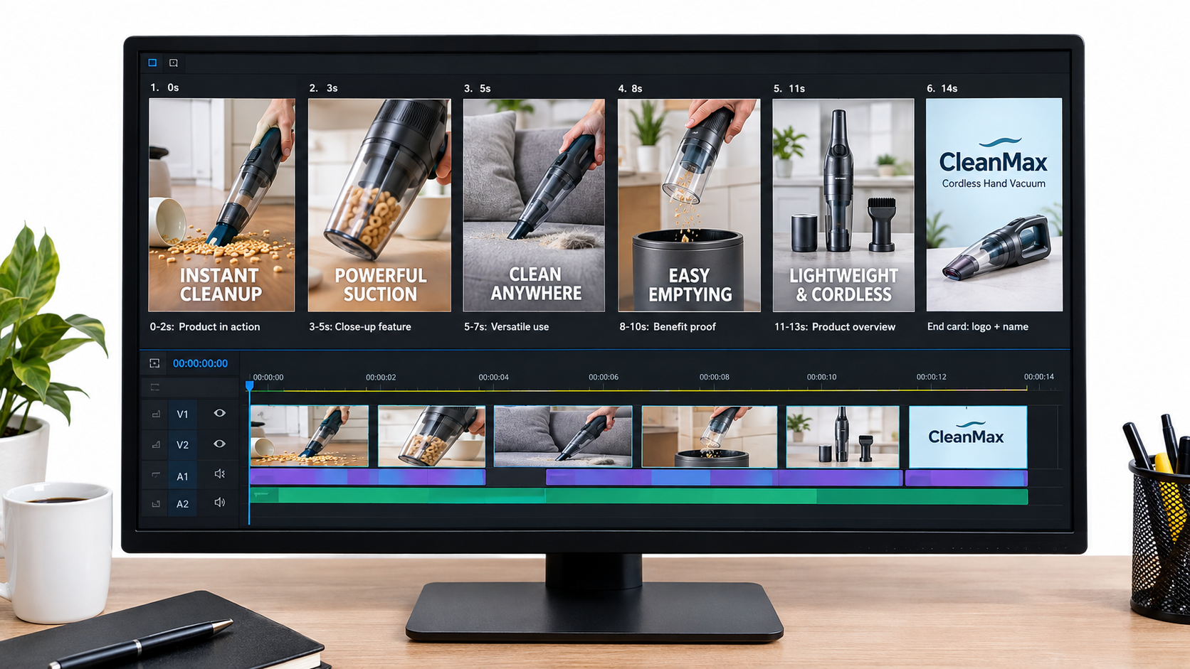
    Video editing timeline showing a 20-second Sponsored Brands video broken into hook, proof, differentiator, and end card segments

    A working 20-second structure

    This structure isn’t an Amazon rule. It’s a practical way to apply Amazon’s guidance (product early, brand later, short and clear, end card) on a fixed timeline:

    • 0–2 seconds: Hook. The product in action, or the problem it solves. No logo.
    • 2–8 seconds: Proof. The main benefit, shown visually, with one short text card.
    • 8–16 seconds: Differentiator. One or two things that set you apart from the listings around you, such as a material, a feature, or a use case.
    • 16–20 seconds: End card. Brand name and logo, shown clearly.

    What usually gets cut

    When editors trim a 45-second brand film down to 20 seconds, the same things tend to go:

    • Establishing shots. Wide lifestyle scenes that set a mood but don’t show the product.
    • Founder or spokesperson segments. These are valuable on your Brand Store or detail page, but weak in a muted autoplay unit.
    • Feature lists. Five features in 20 seconds means none of them land. Pick one or two.
    • Packaging shots. Unless the unboxing experience is the selling point, the box isn’t what shoppers are deciding on.

    Loop-awareness

    Shoppers often scroll back up or pause on a results page, so a short video may play more than once in a session. A clean end card that cuts well back to a strong opening frame looks deliberate when it repeats. A video that ends on a fade to black and restarts on a slow intro looks unfinished.

    When longer can make sense

    The 45-second ceiling exists for a reason. Complex products, like tools with several modes or devices with a setup flow, sometimes need more time to show what they do. If you go longer, front-load even more. The first 20 seconds should still work as a complete ad on their own, with the extra time adding depth for the smaller group who keep watching.

    Amazon’s guidance on production quality applies at any length. It says a “polished, high-quality, professionally-produced video is an effective way to convey the quality of your product and instill trust in your brand.” Shaky footage and bad lighting read as a low-quality product, fairly or not.

    Product Detail Page vs. Brand Store: Choosing Where the Click Goes

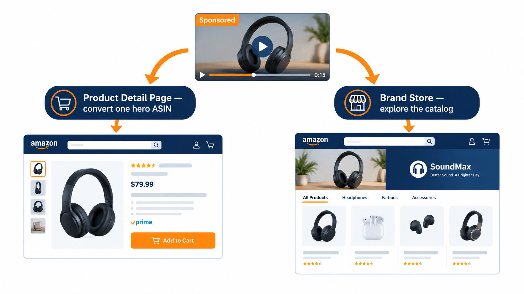
    Amazon offers two ways to connect shoppers through Sponsored Brands video. The choice affects what the video should say and how you should judge it.
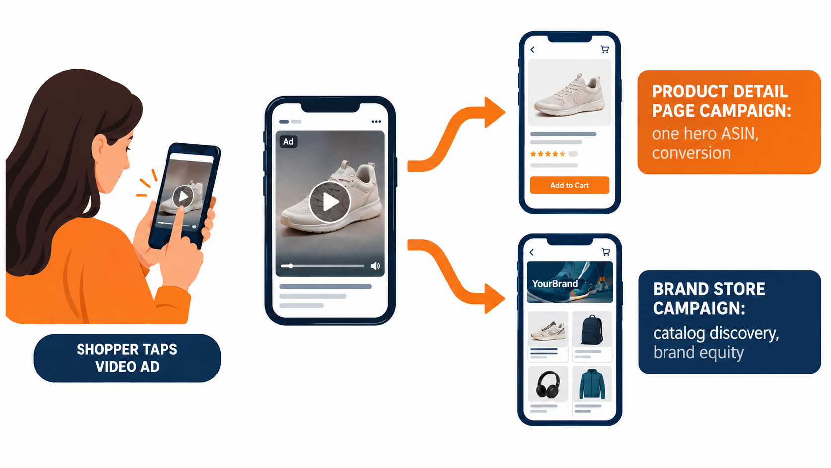
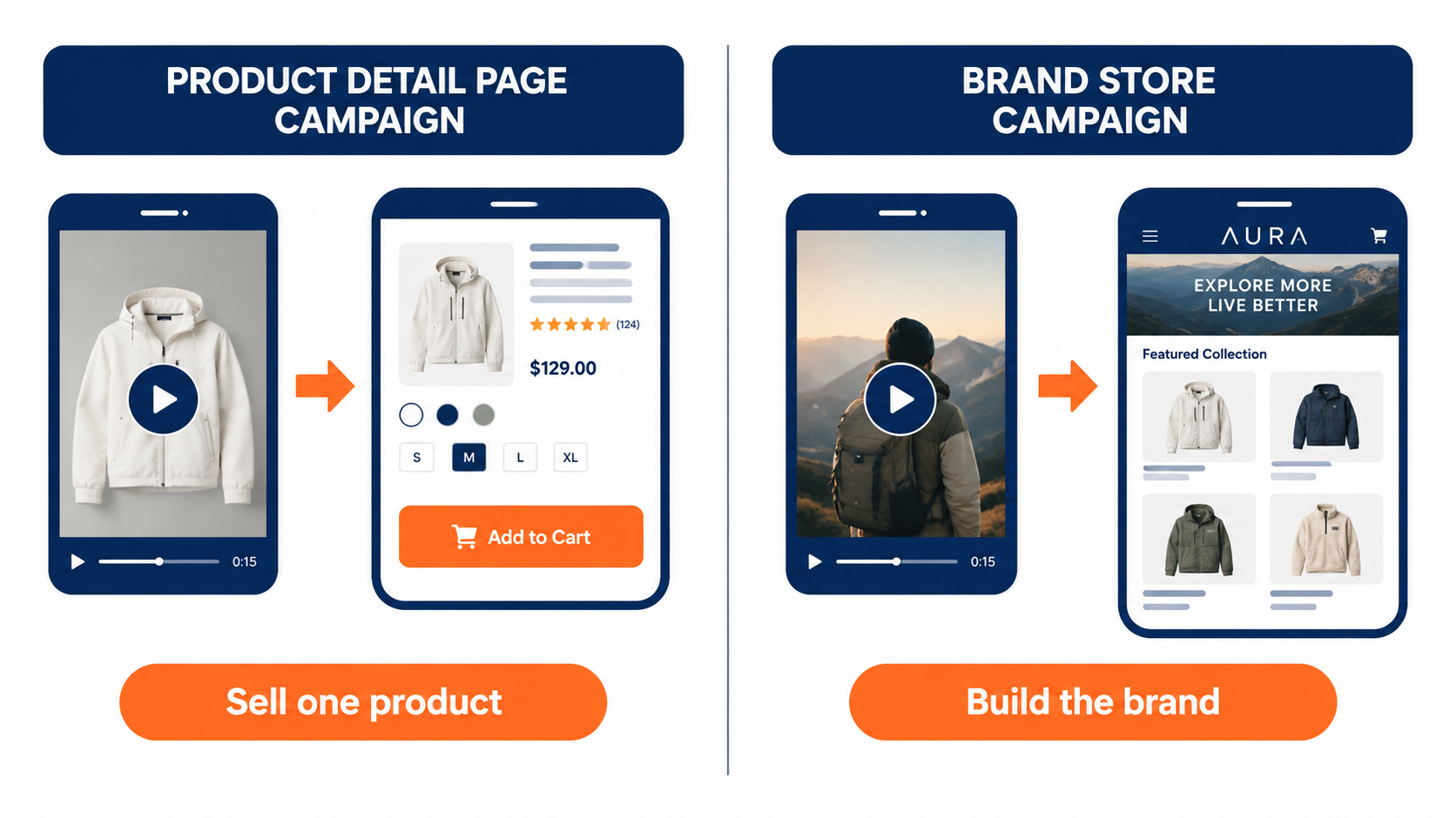
    Flowchart showing a Sponsored Brands video click going either to a single product detail page for conversion or to a Brand Store for catalog discovery

    Product Detail Page campaigns

    Amazon describes the Product Detail Page campaign as best for connecting shoppers with your product. These campaigns show in shopping results and on detail pages. The click goes straight to one listing.

    This is the more direct-response option. The video should focus on one hero product, and everything in it should support that specific listing. The match between what the video promises and what the detail page delivers matters a lot. If the video shows a blue variant and the click lands on a page defaulting to black, you’ve added friction at the worst moment.

    Good fit for: hero SKUs with strong reviews, products with a clear visual demo, and campaigns judged mainly on ACoS or ROAS.

    Brand Store campaigns

    Amazon positions the Brand Store campaign as a way to “increase brand equity and build lasting value” by sending shoppers directly to your Brand Store through shopping results. Amazon notes these can be featured above and below the fold of search results.

    The video can be broader here: a product range, a brand promise, or a lifestyle. But the silent-first rules still apply. “Broader” doesn’t mean vaguer. A video that shows three products solving three related problems in 20 seconds can work. A mood piece with no clear product usually doesn’t.

    Good fit for: brands with a deep catalog, product lines where shoppers often buy several items, and campaigns judged on new-to-brand customers or long-term value instead of immediate ROAS.

    Your Brand Store has to be ready

    Amazon’s Sponsored Brands overview says that paired with Brand Stores, the format “drives discovery, consideration, and long-term engagement with your brand.” That pairing only works if the Store is worth landing on. Before you send paid video traffic to a Store, check that:

    • The landing page matches the video’s theme. A video about travel accessories should land on a travel page, not the Store homepage.
    • The page loads with clear navigation and visible products above the fold on mobile.
    • Top sellers are easy to find, with prices and ratings showing.

    Measure them differently

    Comparing a Brand Store video campaign to a Product Detail Page campaign on ACoS alone will almost always favor the detail page campaign. That doesn’t make the Store campaign a failure. It’s doing a different job. Set separate goals for each before launch so budget decisions don’t end up penalizing the campaign meant for brand building.

    Targeting Strategy for Video: Keywords, Products, and Intent

    Amazon says Sponsored Brands video can target shoppers through keywords, categories, and products. The overview also mentions reaching relevant shoppers “through precise keyword and product targeting.” How you split those options should depend on what the video is built to do.

    Keyword targeting: match the creative to the query

    Keyword targeting puts your video in front of shoppers who just told you what they want. That’s the best case for intent-matched openers. Group keywords by intent, not just by product:

    • Use-case clusters (“blender for smoothies,” “blender for crushing ice”): each cluster gets an opener showing that exact use.
    • Problem clusters (“leak proof lunch box,” “lunch box that keeps food hot”): open on the problem being solved.
    • Branded and category head terms: broader brand-plus-product creative tends to fit better here.

    Even two or three intent-specific versions of one video give you a cleaner signal than one video spread across every term.

    Product targeting: winning a comparison

    When video runs on or around competitor detail pages through product or category targeting, the shopper is already looking at someone else’s product. Your video is a comparison whether you planned it that way or not. Creative built for this placement should make your difference obvious: a feature the competitor lacks, a material that looks better, a size or capacity advantage you can show.

    Be careful with direct comparison claims. They have to be accurate, supportable, and within Amazon’s ad policies. Showing what your product does is usually safer and works better than naming what a competitor doesn’t do.

    Defending your own listings

    Targeting your own product pages with video is a common defensive move. It fills placements that a competitor might otherwise take. Creative here can push shoppers toward upgrades, bundles, or related products in your line instead of repeating what they already know about the page they’re on.

    Placement visibility options

    Amazon also offers Sponsored Brands reserve share of voice, which its resources describe as a way “to secure top-of-search visibility and strengthen your brand presence.” For brands with a product launch, seasonal peak, or a period where top-of-search presence really matters, it’s worth checking whether that option is available in your account and how it fits with your video creative.

    The Metrics That Tell You Whether the Video Is Working

    Many sellers judge Sponsored Brands video the same way they judge Sponsored Products: clicks, spend, sales, ACoS. Those numbers matter, but they can’t tell you why a video is underperforming. For that, you need the video-specific engagement metrics in Sponsored Brands reporting. Amazon Ads offers dedicated reporting courses for Sponsored Brands, and those reports include video-specific fields.
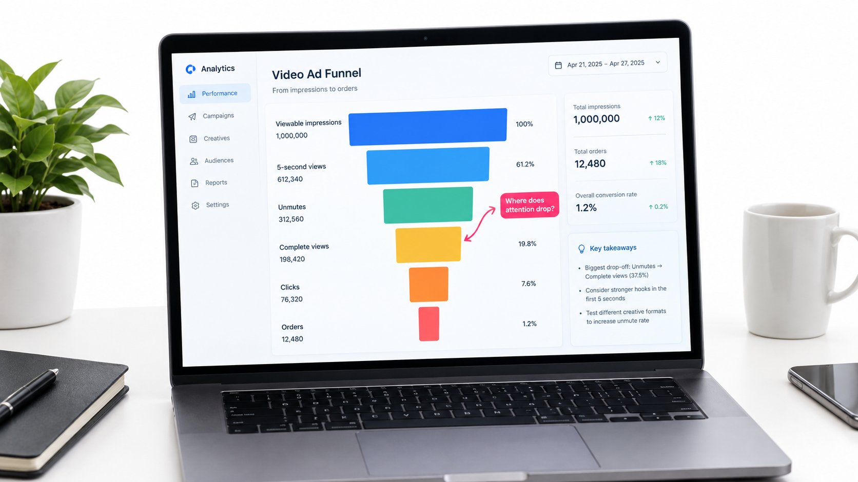
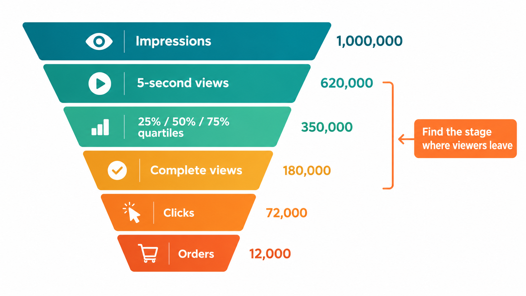
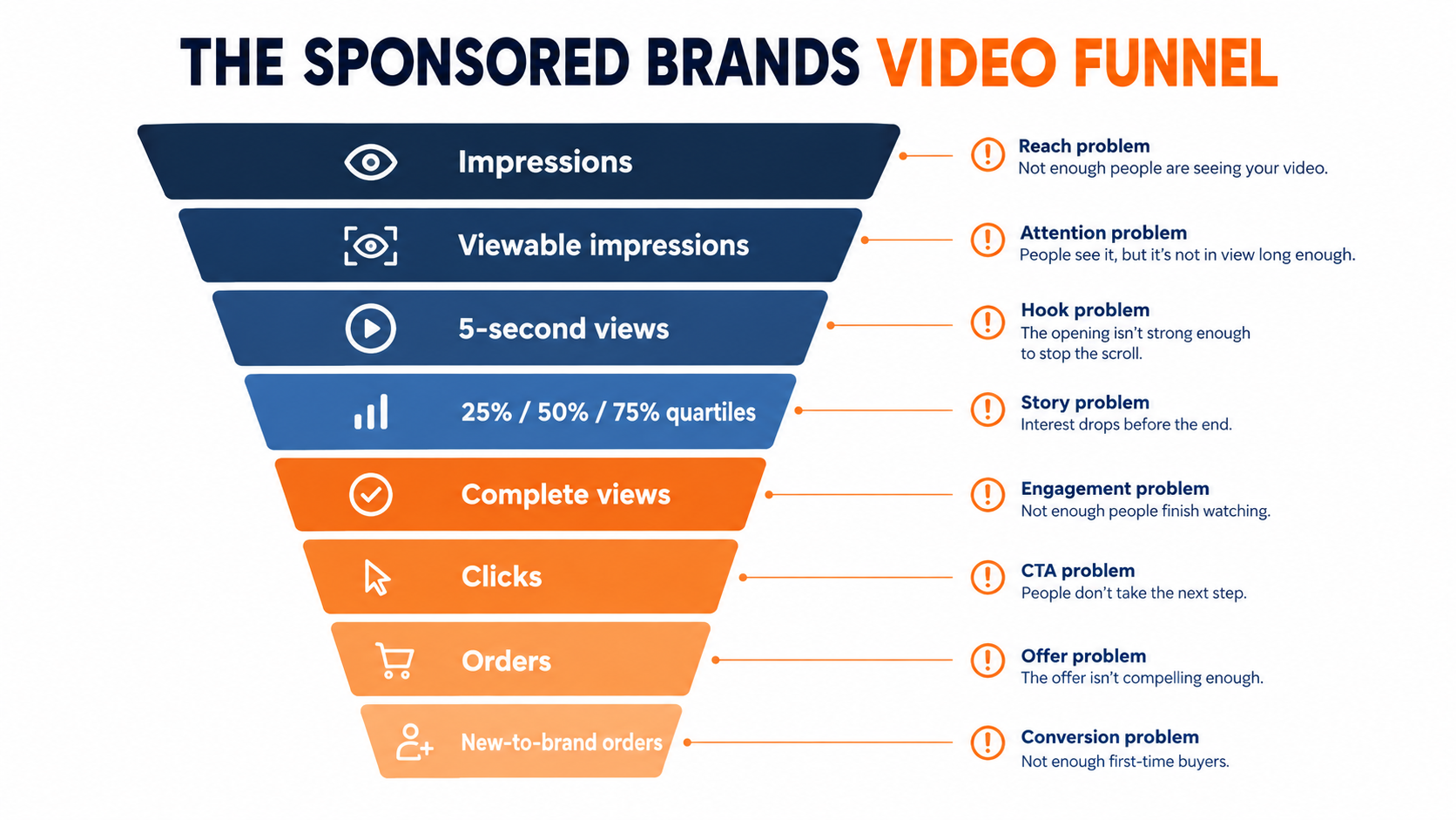
    Analytics dashboard showing a video ad funnel from viewable impressions to 5-second views, unmutes, complete views, clicks, and orders

    Read the video as a funnel

    Video reporting in Sponsored Brands typically includes fields such as viewable impressions, video quartile completions (first quartile, midpoint, third quartile, complete), 5-second views, and unmutes. Field names and availability can change, so check your current report templates in the console. Read together, they form a funnel:

    1. Viewable impressions: did the video actually get on screen?
    2. 5-second views / early quartile: did the opener hold attention?
    3. Midpoint and complete views: did the middle of the video keep people watching?
    4. Unmutes: was anyone interested enough to turn on sound?
    5. Clicks: did the video earn a visit?
    6. Orders and sales: did the landing page convert the visit?

    Diagnosing by where the drop happens

    The value of this funnel is that each drop-off points to a different fix:

    • Weak early retention: The opening isn’t working. Test a new first two seconds before touching anything else.
    • Good early retention, steep drop by midpoint: The hook works but the middle drags. Tighten the edit or move the differentiator earlier.
    • Strong views, low clicks: The video entertains but doesn’t motivate. Check the headline and CTA, and make sure the video creates curiosity instead of answering every question.
    • Healthy clicks, poor conversion: The problem is probably the landing page, the price, the reviews, or a mismatch between what the video promised and what the page shows. Not the video.
    • Almost no unmutes: That’s normal and expected. It confirms you should keep building for silence.

    Beyond last-click

    Amazon describes Sponsored Brands as supporting brand growth “across the shopping journey” and highlights the ability to understand “how and which shoppers engage with your ads.” If you have access to new-to-brand metrics, use them, especially for Brand Store campaigns. A video that brings in a high share of first-time customers can justify a higher ACoS than a video that mostly reaches people who would have bought anyway.

    A Testing Framework That Produces Real Answers

    Video testing on Amazon often turns into “we swapped the video and sales went up (or down).” With seasonality, bid changes, competitor moves, and listing edits all happening at once, that tells you very little. A more disciplined approach gives you lessons you can carry from one product to the next.

    Test one variable at a time

    Rank your variables by likely impact and test in that order:

    1. The opener (first two to three seconds). This is usually where the biggest swing in early retention comes from.
    2. The headline text in the ad unit.
    3. The main benefit shown in the proof section.
    4. Length, for example 15 seconds vs. 30 seconds.
    5. Landing destination: Product Detail Page vs. Brand Store.

    Change the opener and the headline at the same time and you won’t know which one moved the numbers.

    Keep the conditions equal

    Run versions at the same time, not one after another, so seasonality and competitor changes affect both equally. Use the same keyword set, similar bids, and similar budgets. Give each version enough impressions and clicks that the difference isn’t noise. That threshold depends on your traffic, but a handful of clicks isn’t a result.

    Build a modular asset library

    The cheapest way to test openers is to shoot for modularity from the start. At the shoot, capture:

    • Several different two-to-three-second hook clips (mid-action, problem, outcome).
    • A core proof sequence that can follow any hook.
    • Horizontal framing for everything, so 16:9 is native and not a crop.
    • A clean end card in each marketplace language you sell in.

    With that library, a new test variant is an editing job of minutes, not a new production.

    Use Amazon’s free creative tools carefully

    Amazon’s Sponsored Brands overview notes that advertisers can “use AI-powered image generation at no cost to produce branded creatives.” Tools like this can help small brands produce more variants for testing, especially for image-based Sponsored Brands creative that runs alongside video. Treat the generated assets the way you’d treat any creative: check them against your brand standards, the product’s actual appearance, and Amazon’s policies before they go live.

    Write down what you learn

    Keep a simple log of each test: hypothesis, variable, date range, results, and conclusion. After a few months you’ll have category-specific knowledge, such as “problem-first openers beat outcome-first for our kitchen line,” that no general blog post can give you.

    What the Published Case Studies Do (and Don’t) Tell You

    Amazon publishes case studies for Sponsored Brands. They’re useful, but it helps to read them closely and know what they show and what they leave out.

    HP: video as part of a full-funnel mix

    Amazon’s Sponsored Brands page features HP, which used Sponsored Brands video along with Sponsored Brands, Sponsored Products, and display ads to expand its reach globally. The reported results: impressions grew 224% year over year, clicks rose 142% year over year, and there was a 42% increase in clicks for Sponsored Brands video placements.

    The takeaway isn’t that video alone drove those numbers. HP ran video as one part of a coordinated mix. Video placements added clicks while the other ad types did their own jobs. For most brands, that’s the realistic model: Sponsored Brands video works best alongside Sponsored Products coverage, not in place of it.

    Loftie: a small business with efficient returns

    Amazon also highlights Loftie, a small business that worked with Amazon Ads on a sponsored ads campaign in 2022. The reported results were a return on ad spend of $5.66 and an advertising cost of sale of 17.68%. The case study is framed around sponsored ads broadly, not video specifically, so don’t read those figures as a video benchmark. What it does show is that brands without enterprise budgets can run efficient sponsored campaigns when the creative and the product fit.

    NF Imports: brand-building over time

    A third case on the same page describes NF Imports, a brand in Japan that started sponsored ads in 2015 and built its brand with Sponsored Brands. Amazon reports that 80% of its sales came from new customers between March 2018 and December 2022, with 30% sales growth between December 2019 and November 2022. The time frames stand out. These are results built over years, which supports treating Sponsored Brands, including video, as a long-term brand investment and not a quick ROAS fix.

    How to use case studies responsibly

    • Don’t treat them as benchmarks. Results depend on category, price point, brand strength, and competition.
    • Look at the mix. Most successful examples combine several ad types.
    • Notice the time frames. Brand-building results take time to build up.
    • Set your own baseline. Your first 60 to 90 days of video data is the benchmark that actually matters for you.

    Seven Failure Modes to Fix This Week

    If your Sponsored Brands video campaigns are underperforming, the cause is very often one of these. Each one maps back to how the ad unit works.

    1. The video needs sound to make sense

    Voiceover-led creative in a muted-by-default unit. Fix: Run the silent-first test and rebuild the story with visuals and on-screen text.

    2. The logo opens the video

    Brand identity comes before relevance. Fix: Follow Amazon’s own guidance. Product first, brand and logo later, end card last.

    3. Repurposed vertical footage with bars

    A 9:16 social clip padded into 16:9. Fix: Reframe or reshoot horizontally. Amazon says to avoid black, colored, or blurred bars.

    4. Key text in the lower-right corner

    Claims or CTAs hidden under the mute toggle. Fix: Use Amazon’s safe-area template and build it into your editing presets.

    5. Too long, too dense

    A 40-second feature tour. Fix: Cut to 20 seconds or less, as Amazon recommends, and focus on one or two benefits. Let the detail page do the explaining.

    6. One video for every keyword

    Generic creative across very different search intents. Fix: Group keywords by intent and swap in matching openers and headlines.

    7. Judging every campaign on ACoS alone

    Brand Store campaigns paused for “poor performance” when they were built for a different goal. Fix: Set separate goals for Product Detail Page and Brand Store campaigns, and read the video engagement funnel before making cuts.

    Conclusion: Build for the Unit, Not the Brief

    Sponsored Brands video isn’t hard because video production is hard. It’s hard because the ad unit has specific rules, and most creative is made without them in mind. Amazon’s specs spell those rules out: autoplay at 50% visibility, muted by default, 16:9 only, no bars, keep the lower-right corner clear, 6 to 45 seconds with 20 or less recommended, and language matched to the marketplace. Every one of those details should shape the creative.

    Brands that do well with this format usually aren’t the ones with the biggest production budgets. They’re the ones that accept how shoppers actually see the ad (fast, silent, mid-scroll, right next to their own listing data) and build for that.

    Your action checklist

    1. Audit every live video with the sound off. Can a shopper tell what the product is, why it’s better, and why to tap?
    2. Move the logo to the end. Open with the product in action or the problem it solves.
    3. Check technical compliance. 16:9, no bars, lower-right corner clear, accepted codec and frame rate, at least 4 Mbps bit rate, correct marketplace language.
    4. Cut to 20 seconds or less unless you have a specific reason to go longer, and front-load either way.
    5. Choose the destination on purpose. Product Detail Page for focused conversion, Brand Store for catalog discovery and brand equity, each with its own goals.
    6. Match openers to keyword intent clusters. Two or three variants beat one generic cut.
    7. Read the video funnel. Use viewable impressions, early views, quartile completions, clicks, and orders to find where attention drops off.
    8. Test one variable at a time, starting with the opener, and log every result.
    9. Shoot modular assets so new variants take minutes to edit instead of a new production.
    10. Treat video as part of the mix. As the HP example shows, it adds the most when it runs alongside Sponsored Products and your other ad types.

    Your video will autoplay on mute in front of a shopper who’s halfway through a scroll. Make sure it still makes sense to them.
  • What Shoppers Actually See in a Sponsored Brands Video (And Why Most Brands Edit for the Wrong Viewer)

    What Shoppers Actually See in a Sponsored Brands Video (And Why Most Brands Edit for the Wrong Viewer)

    Most Amazon Sponsored Brands video ads are made for a viewer who doesn’t exist.

    That imagined viewer sits through the whole clip with the sound on, sees the brand intro, follows the story, and clicks at the end. The person actually in front of your ad is scrolling a search results page on a phone. They’re looking for something specific. Your video starts playing only once half of it is on screen, and it plays without sound unless they tap a small button in the corner.

    That gap explains a lot of Sponsored Brands video (SBV) campaigns that look fine in the editing suite and do poorly in the account. The creative is good, but it was built for a TV-style viewer. Amazon’s own ad specs describe a very different setting: autoplay that kicks in at 50% pixel visibility, audio off by default, a mute toggle sitting on the lower-right corner, and a strict 16:9 frame with no letterboxing allowed.

    This article doesn’t go over the usual “why video matters” points. It starts from the ad unit itself, using Amazon’s published specs, and works backward to creative, landing page choice, targeting, measurement, and testing. The idea is simple. If you understand exactly what the shopper sees, in what order, and under what conditions, most creative decisions stop being matters of taste and become engineering problems.

    Each section covers one constraint of the ad unit and what it means for the decisions you make. There’s a checklist at the end you can use before your next upload.

    Smartphone showing an Amazon mobile search page mid-scroll with a muted Sponsored Brands video ad autoplaying

    1. The Viewer You’re Really Editing For

    Before talking about specs, it helps to describe the viewing situation honestly. Sponsored Brands video ads show up in shopping results on desktop and mobile. Amazon’s ad specs say they can also appear inside product detail pages. In both places the shopper came to buy something, not to watch something.

    The shopper is task-focused

    Someone who searches “insulated water bottle 32 oz” has already decided on a category and is narrowing down options. Your video is competing with product titles, star ratings, prices, Prime badges, and the organic results under it. It isn’t competing with other entertainment.

    That’s a different mindset from social video. On a social feed, people are open to being distracted. On Amazon search, a distraction only works if it answers the shopper’s question faster than the listings around it.

    The shopper is moving

    Search results are scrolled. Your video may get a second or two of partial visibility before the thumb moves on. Each frame in those first seconds has to make sense when viewed alone.

    The shopper is probably silent

    Amazon’s specs say plainly that “by default, videos always start without audio.” The shopper has to tap the mute toggle to hear anything. Some will, most likely after something on screen has already caught their attention. So sound can add to a video that already works, but it can’t carry the message.

    What this means in practice

    Put together, these three conditions describe the real viewer: task-focused, moving, and silent. Each creative choice later in this article can be checked against that description. A slow brand intro fails for the task-focused shopper. A detail that only shows up in the last frame fails for the moving one. A voiceover that carries the main benefit fails for the silent one.

    Amazon’s guidance points the same way. Its creative best practices tell advertisers to “showcase your product or something interesting within the first few seconds” and to “wait until later in the video to include your brand name and logo.” Brand-first is the habit from TV advertising, and Amazon is explicitly recommending the reverse.

    2. Anatomy of the Ad Unit: The Video Is Only One of Six Parts

    A common mistake is to treat SBV as “a video.” Amazon’s spec sheet breaks the ad unit into six components, and the video is just one of them. Knowing what the other five do shows you what the video doesn’t need to do.

    Labeled diagram of the six components of an Amazon Sponsored Brands video ad unit

    The six components

    1. Product details. The main product image and related information from the detail page are pulled in automatically.
    2. Video. It plays automatically once 50% of its pixels are on screen.
    3. Mute toggle. It sits over the lower-right corner of the video. It isn’t shown if the video has no audio.
    4. Custom brand logo. Amazon describes it as something that “makes a lasting impression.”
    5. Headline text. Custom copy that states your brand’s value.
    6. Call to action. It tells shoppers that an action is needed to reach the destination, such as your Brand Store.

    Stop making the video repeat the rest of the unit

    Product details like the image, price context, and rating signals come from the listing automatically. That means your video doesn’t have to show the price or list specs the shopper can already see beside it. The logo and headline are separate elements too, so the video doesn’t need a long branded opening to establish who you are.

    This changes how you allocate the video’s time. If the surrounding unit already handles identity and the basic facts, the video’s job gets narrower: show the one thing still images and text can’t show. That’s usually motion, scale, texture, a before-and-after change, or the product working in a real setting.

    Write the headline and video together

    Because the headline and video appear side by side, they should work as a pair. If the headline says “Keeps drinks cold for 24 hours,” the video’s opening frames shouldn’t make a different claim. They should show evidence for that one: ice still in the bottle, condensation-free steel, a time-lapse overlay. When they match, the shopper reads and watches one argument, not two competing ones.

    One practical habit is to write the headline first and then storyboard the video as visual proof of it. This also makes testing cleaner, which comes up again in Section 9.

    The CTA depends on the destination

    The call to action leads somewhere, and Amazon offers two kinds of destination for SBV: a Product Detail Page or a Brand Store. That choice matters enough that Section 6 covers it on its own. For now, the point is that the ad unit is a small system, and the video is the part that moves inside it.

    3. The 50% Rule: How Autoplay Turns Your First Seconds Into the Whole Ad

    Amazon’s specs state that the video “will play automatically when 50% of pixels are on-screen.” That one sentence has more effect on creative strategy than anything else on the spec sheet.

    What the trigger means

    Playback doesn’t start when the page loads. It starts when the ad scrolls far enough into view. On mobile, the shopper’s thumb is usually still moving at that point. The first frames play while the ad is sliding into place and often while it’s only partly visible.

    In practice, your first second plays to someone who isn’t fully looking yet. Your next second or two decides whether they stop scrolling. If the opening is a fade-in from black, a logo animation, or a slow establishing shot, it’s spent on a viewer who isn’t paying attention yet.

    Open on the product doing something

    The opening that holds up best under these conditions is the product, already in motion, already doing its job. A few examples:

    • A vacuum already picking up a visible line of debris, not a vacuum sitting in a hallway.
    • A skincare serum already being dropped onto skin, not a bottle on a marble counter.
    • A phone mount already holding a phone steady over a bumpy road, not a mount in its packaging.
    • A storage bin already being stacked into a tidy closet, not an empty bin turning on a white background.

    In each case, a viewer who only catches a fraction of a second still learns what the product does. That’s the test to use: pause the video at any point in the first two seconds and ask whether a stranger could tell what’s being sold and why.

    Front-load visual contrast

    Search results are visually busy, with white backgrounds, product cutouts, and rows of text. Opening frames that differ from that environment, through color, real-world settings, close-up texture, or people, have a better chance of being noticed than frames that look like another product image.

    Don’t swing too far and make the opening so abstract or stylized that the product disappears. Contrast is there to get attention for the product, not to replace it.

    Use loops carefully

    Some advertisers design SBV to loop cleanly so the last frame flows back into the first. That can work for short, product-focused clips. The more important question is whether the video still works when someone joins it partway through. Viewers who scroll past and come back may catch it mid-play. Clips where every segment shows the product clearly hold up better than clips that rely on narrative order.

    The brand reveal goes last, not first

    Amazon’s guidance to put the brand name and logo later in the video fits this. The logo is already in the ad unit. A branded end card, which Amazon also recommends (“include an ‘end card’ prominently displaying your brand name and logo”), is for viewers who stayed through the clip, and those viewers are the most likely to click. The first seconds belong to the product.

    4. Silent by Default: Building a Video That Sells With No Sound

    If the video starts muted and the shopper has to tap a toggle to hear it, the visual track has to carry the full message. Audio is extra.

    Comparison of a sound-dependent talking-head ad versus a silent-first product demo with on-screen text

    The silent-viewing audit

    Before you upload, watch the final cut with sound off from start to finish. Then ask:

    1. Is the main benefit clear without audio?
    2. Is any important claim spoken but not shown or written on screen?
    3. Does any scene only make sense with the voiceover, such as a talking head or an explanation over generic footage?
    4. Is there a moment where the viewer has to read a lot of text very quickly?

    If the answer to 2 or 3 is yes, the video depends on sound, and most viewers will get only part of it.

    On-screen text: short, large, and well placed

    On-screen text is the main tool for silent viewing, but it’s easy to overdo. A few principles help:

    • One idea per text card. “Cold for 24 hrs” works. “Double-wall vacuum insulation keeps beverages cold for up to 24 hours and hot for 12” is too much at scroll speed.
    • Size for mobile. The ad unit is small on a phone. Text that reads well on a desktop monitor can be illegible at thumbnail size.
    • Keep it on screen long enough. A text card that disappears before it can be read hasn’t done its job.
    • Stay out of the lower-right corner. That’s where the mute toggle sits, and Amazon specifically warns against putting text or other key information there (more in Section 5).

    Captions versus designed text

    If your video has a voiceover, you might just burn in captions. That’s better than nothing, but captions written for speech are often too long for the format. Text written specifically for the screen usually works better: shorter, punchier, and timed to the visuals, not to the narrator.

    When audio is worth including

    Audio still matters. A shopper who taps unmute is showing interest, and the soundtrack should reward that. Product sounds can carry real information: the click of a well-built latch, the hum of a quiet motor, the crunch of a blender crushing ice. A voiceover that adds detail beyond the on-screen text gives engaged viewers more.

    Amazon’s specs set minimum audio standards: PCM, AAC, or MP3 codec; stereo or mono; at least 96 kbps bit rate; and a sample rate of at least 44.1 kHz. A fully silent video is also allowed. In that case Amazon notes the mute toggle won’t appear, which clears that corner of the frame.

    Does a fully silent video make sense?

    For some products it does. If audio wouldn’t add any information, as with many apparel, home décor, or accessory products, a silent video avoids a toggle that implies there’s something to hear. For products where sound shows quality or function, like audio equipment, kitchen appliances, or tools, a well-mixed soundtrack is a real advantage for viewers who unmute. Choose based on what the product needs, not on habit.

    5. Treat the Spec Sheet as a Creative Brief

    Most teams treat Amazon’s video specs as a technical checklist to clear right before upload. It works better to read them at the start of production, because several specs constrain the creative itself, not just the file.

    Video editing monitor highlighting the lower-right safe area and Sponsored Brands video specifications

    The full spec list

    According to Amazon Ads’ published Sponsored Brands video specs:

    • Duration: 6 to 45 seconds, with 20 seconds or less “highly recommended”
    • Dimensions: 1280×720, 1920×1080, or 3840×2160 px
    • Aspect ratio: 16:9 (square pixel) only
    • File size: 500 MB or less
    • Format: .MP4 or .MOV
    • Codec: H.264 or H.265, Main or Baseline profile
    • Frame rate: 23.976, 23.98, 24, 25, 29.97, 29.98, or 30 fps
    • Video bit rate: minimum 1 Mbps, with 4 Mbps or higher recommended
    • Scan type: progressive

    Constraint 1: 16:9 only, and no bars

    This one has the biggest effect on production. Many brands now shoot mainly vertical (9:16) for social platforms. Amazon’s SBV spec allows only 16:9 and specifically says to avoid “horizontal or vertical black, color, or blurred bars.” You can’t drop a vertical TikTok clip into a blurred 16:9 frame and upload it.

    If you plan to use footage across channels, shoot wide enough to crop both ways. Frame the product with plenty of space around it so you can export a 16:9 version and a 9:16 version from the same footage. Doing this at the shoot is much cheaper than reshooting later.

    Constraint 2: the lower-right safe area

    Amazon tells advertisers to “avoid placing text and other important information in the lower right corner of the video” and provides a safe-area template. That’s where the mute toggle appears. Text, product details, or a key demonstration in that corner can be partly hidden.

    Add this to your edit templates. Many teams set up a guide overlay in their editing software marking the restricted zone so nobody has to remember it on every project.

    Constraint 3: the 20-second recommendation

    The allowed range runs to 45 seconds, but Amazon “highly recommends” 20 seconds or less. That matches the scrolling-viewer reality from Section 1. Amazon’s guidance also says the video’s purpose “is not to provide all the details about the product, but rather to create a sense of excitement and curiosity that will drive viewers to your product or Stores page for more information.”

    So the video isn’t a mini detail page. The detail page is one tap away. A good working structure for a 15–20 second SBV:

    • 0–2s: product in action, visual hook
    • 2–10s: one or two benefits shown visually, each with a short text card
    • 10–15s: a use case or result, ideally with a person or a real setting
    • Final seconds: branded end card with logo

    Constraint 4: bit rate and resolution

    The minimum is 1 Mbps, but Amazon recommends 4 Mbps or more. Fine product detail like textures, small text, and stitching breaks down quickly when heavily compressed. Exporting at 1080p with a healthy bit rate is a simple way to protect visual quality, which Amazon connects directly to trust: “A polished, high-quality, professionally-produced video is an effective way to convey the quality of your product and instill trust in your brand.”

    A pre-production checklist built from the specs

    1. Is the shot list framed for 16:9 with crop room for other formats?
    2. Do the text card positions avoid the lower-right corner?
    3. Is the script timed to 20 seconds or less?
    4. Is any on-screen text in the marketplace’s language?
    5. Is the export preset set to H.264/H.265, progressive, an approved frame rate, and 4 Mbps or more?

    6. Product Detail Page vs. Brand Store: Two Destinations, Two Different Videos

    Amazon describes two ways to connect SBV with shoppers, and they aren’t interchangeable. Choosing the destination should come before you write the script, because each one calls for a different video.

    Diagram comparing Sponsored Brands video campaigns that send traffic to a Product Detail Page versus a Brand Store

    Product Detail Page campaigns

    Amazon describes this type as “best for connecting shoppers with your product,” with ads appearing in shopping results and on detail pages. The click goes straight to one product listing.

    Here the video should be a single-product argument. Every second should support buying this specific ASIN. Showing other products from your catalog only distracts, because the shopper can’t reach them from the click.

    This campaign type suits:

    • Hero products with strong reviews and conversion history
    • Products whose main benefit is visual and easy to show in a short clip
    • Defending branded search terms or competing on high-intent category keywords

    Brand Store campaigns

    Amazon positions this type as “an effective way to increase brand equity and build lasting value by directly connecting shoppers to your Brand Store.” Amazon also says these campaigns “can be featured both above and below the fold of search results.”

    The video’s job changes here. It’s selling the brand and the range, not one item. Effective Brand Store videos tend to:

    • Set up a clear brand idea, such as a material, a design approach, or a problem you solve across products
    • Show variety, like colorways, sizes, or related items, so the click into a store makes sense
    • Promise something the store delivers, so the landing experience matches the ad

    The mismatch problem

    One common failure is a single-product demo sending traffic to a Brand Store homepage. The shopper clicks expecting the product they saw and lands on a page where they have to find it. Each extra step adds friction.

    The reverse is also a problem: a broad brand-story video that sends shoppers to one product page. Someone drawn in by the range finds a single option and may leave.

    A simple rule: the last thing the video promises should be the first thing the landing page shows.

    Building the store to receive video traffic

    If you use Brand Store destinations, make sure the store can handle the traffic. Amazon presents Sponsored Brands and Brand Stores as working together. Its product page says that “paired with Brand Stores, it drives discovery, consideration, and long-term engagement with your brand.” A store with a vague homepage, missing categories, or out-of-stock products will waste paid clicks regardless of how good the video is.

    A practical step: if a campaign’s video features one product line, consider sending traffic to a store subpage dedicated to that line, if your store structure and the campaign settings allow it, instead of the generic homepage.

    7. How Targeting Should Shape the Script

    Amazon’s spec page notes that SBV lets you “target shoppers through keywords, categories, and products.” Most advertisers treat targeting and creative as separate jobs. Usually the media buyer handles targeting and the creative team handles video. That split leaves performance on the table, because the right video depends on what the shopper was doing just before they saw it.

    Keyword targeting: answer the query

    With keyword targeting, you know what the shopper typed. That’s useful creative information. A shopper searching “quiet blender for smoothies” and one searching “high-power blender for nut butter” want different proof, even if your blender fits both.

    If budget allows, group keywords by shopper intent and give each group a video variant that opens on the matching benefit. The quiet-blender group sees a low-noise demonstration first. The power group sees thick nut butter blended smooth first. The footage can come from the same shoot, and only the order and text cards change.

    Branded keywords: reassure, don’t introduce

    Shoppers searching your brand name already know you. A brand-introduction video wastes their time. For branded terms, think about creative that shows the range, a new release, or a reason to buy from your official listing. For these shoppers the task is to confirm a decision they’re already leaning toward.

    Product targeting: the comparison context

    Amazon notes that SBV can appear inside detail pages. When you target specific products, including competitors’, the shopper is already looking at an alternative. The video becomes a comparison, whether or not you call it that.

    The best creative for this context shows a clear point of difference that matters to someone considering the targeted product. Stay within Amazon’s ad policies on comparative claims, and review the Amazon Ads Policies page before making any claim that references another brand, but focus the video on what makes your product the better choice for the shopper’s situation.

    Category targeting: broad audience, broad benefit

    Category targeting reaches a wider, less specific audience. Here the strongest benefit for the whole category usually works better than a niche one. Save niche angles for keyword groups where you know the shopper cares about them.

    A simple targeting-to-creative map

    • Generic category keywords → Video leads with the product’s main differentiator
    • Feature-specific keywords → Video leads with that exact feature in action
    • Branded keywords → Video shows range, newness, or the official-listing reason to buy
    • Competitor product targets → Video shows a clear, policy-compliant point of difference
    • Category targets → Video leads with the broadest, most universal benefit

    Not every brand can produce five variants right away. Even two, one for high-intent generic and one for competitor targets, is a clear improvement over sending one video to every audience.

    8. Reading the Numbers: What Video Metrics Actually Tell You

    Sponsored Brands video reporting adds video-specific engagement metrics on top of the usual impressions, clicks, spend, and sales. Exact column names can differ by report type and interface version, but they typically include things like 5-second views, quartile completion (25%, 50%, 75%), complete views, view-through rate, and video unmutes. Together these give you a diagnostic funnel that standard PPC metrics can’t.

    Funnel chart of Sponsored Brands video metrics from impressions through views, quartiles, clicks, and orders

    Read the funnel from top to bottom

    Each step points to a different part of the creative:

    • Impressions → early views: Did the opening stop the scroll? A weak ratio here suggests a problem with the first one or two seconds, as covered in Section 3.
    • Early views → quartile completion: Did the middle hold attention? A sharp drop between quartiles shows where the story loses people. Often it’s a slow scene, a confusing transition, or a long text card.
    • Complete views: Did people reach the end card? If few do, your branding may never be seen, so consider moving key brand cues earlier or shortening the video.
    • Unmutes: A signal of curiosity. If unmutes are high relative to views, the visuals are creating interest. Make sure the audio rewards it.
    • Clicks and orders: Did attention turn into action, and did the destination convert?

    Separate creative problems from targeting problems

    The funnel lets you tell apart problems that look the same from the outside. Low sales might come from:

    1. Weak hook: few early views relative to impressions. Fix the opening.
    2. Weak story: good early views, steep quartile drop-off. Fix the middle or shorten it.
    3. Weak click motivation: good completion, low click-through. The video entertains but doesn’t make the next step feel needed. Tighten the benefit and the headline pairing.
    4. Weak landing: good clicks, poor conversion. The problem is likely the destination (listing, price, reviews, store layout), or a mismatch between the ad’s promise and the landing page.
    5. Weak targeting: healthy video engagement but spend going to irrelevant queries. Check search term reports.

    Without video metrics, all five look like “ACOS is too high.” With them, you can identify which fix to make.

    Context from Amazon’s case studies

    Amazon’s published case studies give a sense of what’s possible when SBV is part of a wider program. Amazon reports that HP, using Sponsored Brands video together with Sponsored Brands, Sponsored Products, and display ads, saw impressions grow 224% year over year and clicks increase 142%, including a 42% increase in clicks for Sponsored Brands video placements. Separately, Amazon reports that small business Loftie achieved a ROAS of $5.66 and an ACOS of 17.68% from its sponsored ads campaign.

    Read these carefully. They’re vendor-published success stories, and the results come from multi-format programs, not SBV alone. They’re useful as examples, not as benchmarks you should expect. Your own funnel data is a much more reliable guide.

    Watch the time frame

    Sponsored Brands is positioned as a brand-building format. Amazon’s product page highlights measuring “your brand-building efforts” and getting “insights into how and which shoppers engage with your ads.” Some of SBV’s value, including new-to-brand customers, later branded searches, and store visits, may not show up in the same session’s attributed sales. Look at last-click ROAS alongside those longer-term signals before deciding a video “doesn’t work.”

    9. A Testing System That Actually Teaches You Something

    Many brands “test” SBV by uploading a new video every few weeks and comparing the results to the last one. That approach rarely teaches anything, because too many things change at once: creative, season, bids, competition, and inventory.

    Change one variable at a time

    Good creative testing isolates one change. For SBV, the useful variables, roughly in order of likely impact, are:

    1. The opening two seconds, with different hook scenes and the rest identical
    2. The main benefit shown, for example durability versus convenience
    3. Length, such as a 15-second cut against a 30-second cut of the same footage
    4. On-screen text approach, such as minimal text against benefit-heavy text
    5. Human presence, product-only against product-in-hand or lifestyle
    6. Headline pairing, same video with a different headline

    Because the hook gets the most exposure and fails most often, start there. One shoot can supply several opening variants with the rest of the video unchanged.

    Keep the comparison fair

    Run variants at the same time, not one after another, so seasonality and competition affect both equally. Keep targeting, bids, and budgets matched. Give each variant enough impressions to see a real difference before you decide. Early results based on a small sample are mostly noise.

    Decide what “winning” means beforehand

    Choose your success metric before the test starts. If you’re testing hooks, early view rate is the most direct measure. If you’re testing benefits, click-through rate and conversion matter more. Deciding the winner after looking at the data invites cherry-picking.

    Build a creative library, not a pile of one-off ads

    The real value of disciplined testing builds up over time. After a few rounds you’ll know which kinds of openings work in your category, which benefits make shoppers click, and what length your audience tolerates. Record each finding in a shared document so the next shoot starts from evidence, not guesswork.

    Where AI creative tools fit

    Amazon’s Sponsored Brands page mentions AI-powered image generation “at no cost to produce branded creatives.” Tools like this, and similar ones across the industry, can make it cheaper to produce variants of supporting assets. They don’t replace the discipline described here. Making more variants only helps if each one tests a clear hypothesis and you measure it properly. Also check that any AI-generated or AI-edited material shows your actual product accurately, because misleading product depictions create policy and customer-trust risks.

    10. Selling Across Marketplaces: Localization Is a Policy Issue, Not a Nice-to-Have

    Brands selling in more than one Amazon marketplace often want to reuse one SBV everywhere. Amazon’s specs make clear that this is a compliance problem, not just a creative preference.

    What the language rule says

    Amazon’s guidance: “Make sure your videos match the language of the marketplace they are being shown in.” Its example is that English-speaking locales need English on-screen text or voiceover, and the Italian marketplace needs Italian on-screen text or voiceover. Amazon suggests that sellers in multiple marketplaces “consider adding subtitles or creating different versions of the video tailored to each marketplace.”

    Design for localization from the start

    The silent-first approach from Section 4 helps a lot here. If the video carries its message through visuals and a few short text cards, localizing means swapping text layers, not re-recording a voiceover or reshooting.

    Practical steps:

    • Keep text on separate editable layers in the project file, never baked into footage.
    • Leave room for longer translations. Some languages need considerably more characters than English for the same idea. A text card that just fits in English may overflow in German or French.
    • Avoid text inside the footage (signs, packaging close-ups in one language) where it’s central to the message, unless you have localized packaging to film.
    • Check units and conventions. Ounces versus milliliters and Fahrenheit versus Celsius are easy to overlook in a quick translation.

    Local relevance beyond language

    Translation is the minimum. Use cases, settings, and benefits that matter may differ between marketplaces. A cooling product shown in summer heat makes sense in one region and season and less in another. Where budget allows, consider whether the lead benefit itself should change by market, not just the words on screen.

    11. Avoiding Moderation Problems Before They Cost You a Launch Window

    Every SBV campaign goes through moderation against Amazon’s creative acceptance policies for sponsored ads. Amazon states that “all content must be suitable for a general audience and must comply with all relevant laws and regulations,” and that ads not meeting these policies “will not be accepted.” A rejection right before a seasonal push can cost far more than the time it takes to fix.

    Problems that are easy to prevent

    Several issues come straight from the published specs and are simple to catch internally:

    • Letterboxing or pillarboxing: any black, colored, or blurred bars. A common cause is reformatted vertical footage.
    • Wrong aspect ratio: anything other than 16:9.
    • Language mismatch: on-screen text or voiceover that doesn’t match the marketplace.
    • Out-of-range duration: under 6 seconds or over 45 seconds.
    • Technical spec failures: unsupported frame rates, interlaced scan, codecs outside H.264/H.265, or files over 500 MB.

    Problems that need judgment

    Other issues depend on policy interpretation. Claims about performance, health, or comparisons with other products should be supportable and should follow Amazon’s policies. Amazon recommends reviewing the Amazon Ads Policies page before launch, saying it “can help you ensure that your ad is ready for Sponsored Brands video.” Doing that review before production, not after, means problematic claims never make it into the edit.

    Build moderation time into your calendar

    Moderation isn’t instant, and a rejection means revising and resubmitting. For important dates like product launches, Prime events, and seasonal peaks, plan to submit creative well ahead and keep a backup version on hand. One simple safeguard is a “conservative cut”: a version of the video with fewer claims and plain on-screen text that you can submit quickly if the main version runs into trouble.

    Use an internal QA checklist

    Before any upload, one person who didn’t edit the video should go through a fixed checklist: specs, safe area, language, claims, duration, and a full sound-off viewing. A second reviewer with fresh eyes catches problems the editor has stopped noticing after many passes through the timeline.

    12. Putting It Together: The Pre-Upload Checklist

    Sponsored Brands video gives brands one of the most noticeable placements in the Amazon shopping experience: moving, branded creative at the top of search and inside detail pages. That visibility doesn’t guarantee results on its own. It pays off when the creative fits how the ad unit actually works: autoplay at 50% visibility, muted by default, a toggle in the corner, a strict 16:9 frame, and a shopper who’s looking for something to buy.

    The main point of this article is that Amazon’s spec sheet works as a creative brief. Read that way, most of the decisions follow from it. Open on the product in action. Make the visuals carry the message without sound. Keep it to around 20 seconds. Save the logo for the end card. Match the video to the destination and the targeting. Read the funnel, not just ACOS. Test one variable at a time.

    Your pre-upload checklist

    Creative fundamentals

    • Does the first two seconds show the product in use, clearly enough to understand from one frame?
    • Does the video make sense with sound off from start to finish?
    • Is each on-screen text card a single idea, readable at mobile size, and on screen long enough?
    • Is the lower-right corner free of text and key visuals?
    • Do the brand name and logo appear mainly in the end card, not the opening?
    • Is the runtime 20 seconds or less, unless you have tested evidence for longer?

    Strategy alignment

    • Does the video match the destination: single product for a PDP, range and brand for a Brand Store?
    • Does the headline make the same claim the video shows?
    • Is the opening benefit matched to the targeting group (keyword intent, branded, competitor, or category)?
    • If it’s a Brand Store campaign, does the landing page show first what the video promised last?

    Technical and compliance

    • Is it 16:9 with no letterboxing, pillarboxing, or blurred bars?
    • Is it 1080p or higher, H.264/H.265, progressive scan, an approved frame rate, and 4 Mbps or more?
    • Is it 6 to 45 seconds and under 500 MB?
    • Do the on-screen text and voiceover match the target marketplace’s language?
    • Have the claims been checked against Amazon Ads policies?
    • Is a backup “conservative cut” ready for time-sensitive launches?

    Measurement and testing

    • Is the success metric defined before launch?
    • Are variants running at the same time with matched targeting and budget?
    • Are you tracking the full funnel (early views, quartiles, completes, unmutes, clicks, orders), not just ACOS?
    • Is each test result recorded in a shared creative-learning document?

    Final thought

    Brands that consistently do well with Sponsored Brands video aren’t necessarily the ones with the biggest production budgets. They’ve accepted what the format is: a silent, short, scroll-interrupted demonstration placed next to a headline, a logo, and a buy button. Build for that viewer and you’ll stop paying for impressions that were never going to turn into a click.

  • The Real Reason Your Sponsored Brands Videos Get Scrolled Past — It’s the Ad Unit, Not the Ad

    The Real Reason Your Sponsored Brands Videos Get Scrolled Past — It’s the Ad Unit, Not the Ad

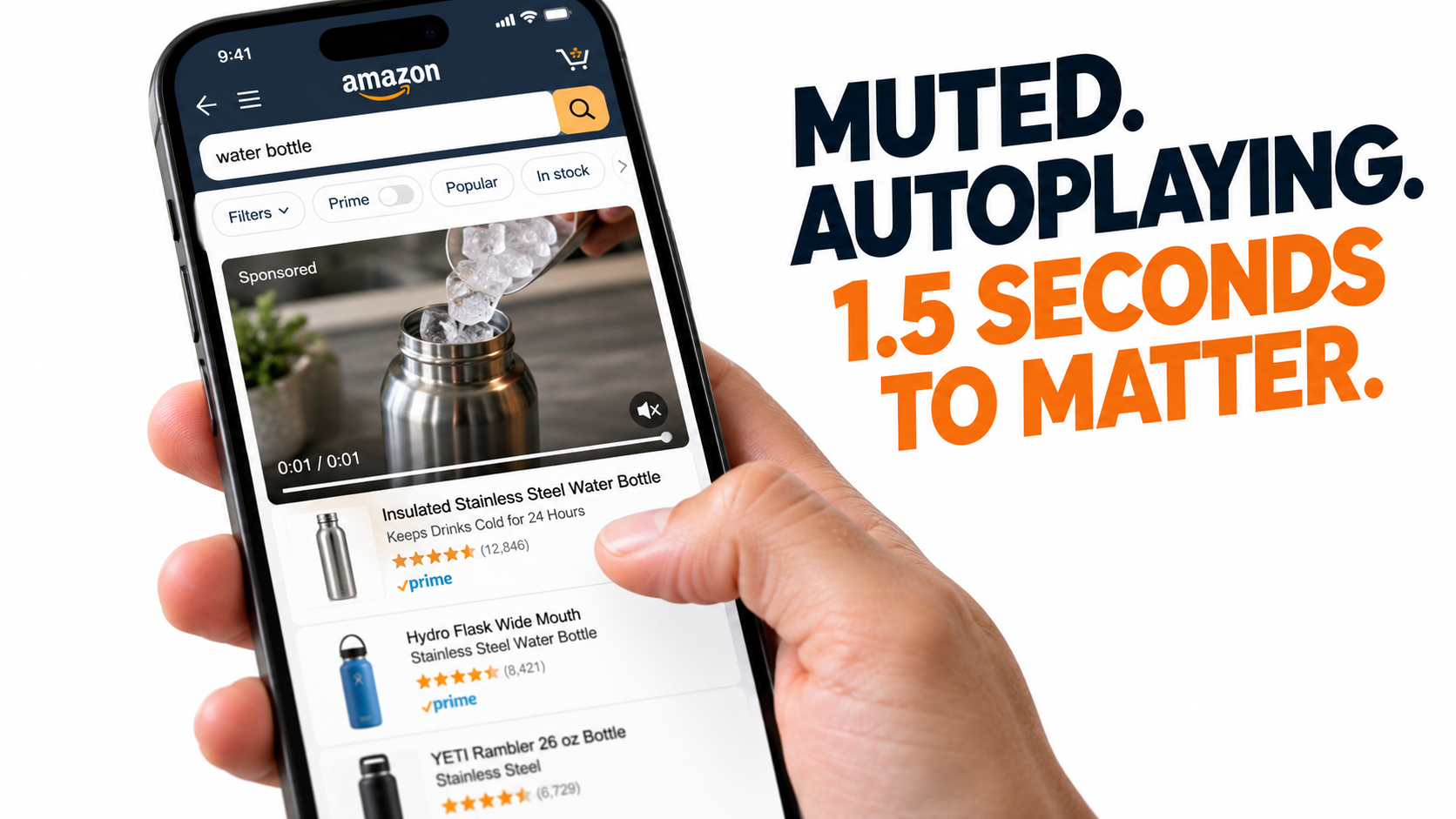
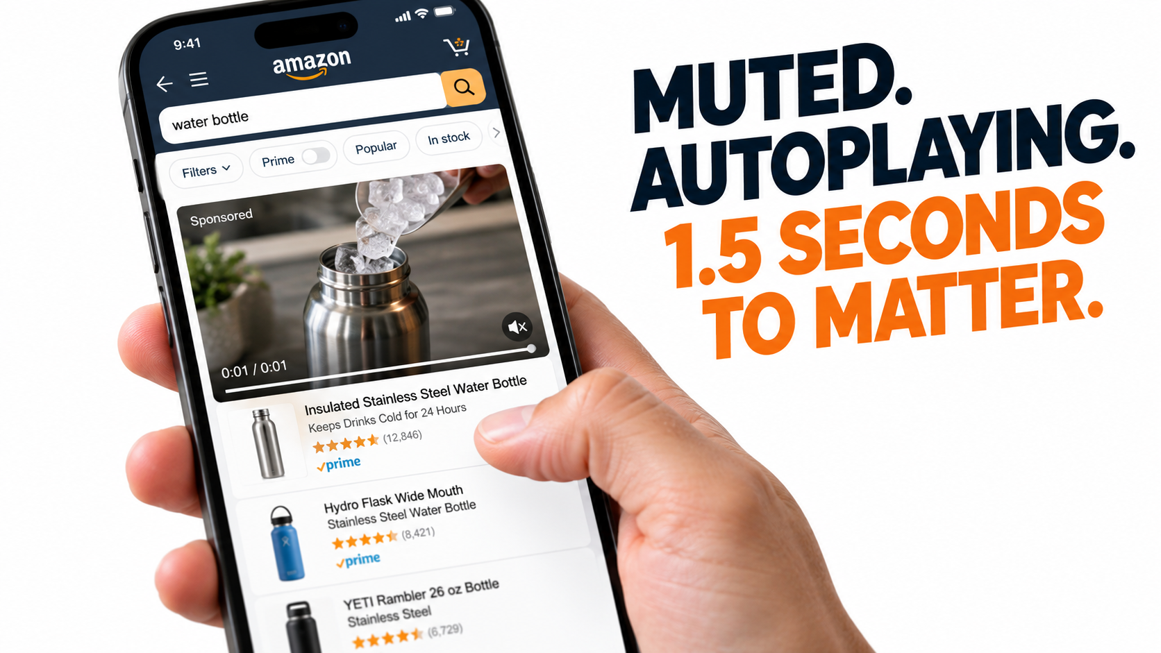
    Smartphone scrolling Amazon search results with a muted Sponsored Brands video autoplaying a water bottle being filled with ice

    Most advice about Amazon Sponsored Brands video starts with the creative: shoot better footage, add captions, show the product early. That advice isn’t wrong. But it skips the more useful question, which is what happens mechanically when a shopper meets your ad.

    Amazon’s own ad specs spell it out. The video plays automatically once 50% of its pixels are on screen. It always starts with no sound. A mute toggle sits in the lower-right corner, and the shopper has to tap it to hear anything. The primary product image and detail-page information are pulled in automatically next to the video. And all of this happens in search results or on a detail page, while the shopper is scrolling toward something else.

    So a Sponsored Brands video (SBV) isn’t a TV spot and it isn’t a TikTok. It’s a silent, autoplaying thumbnail that has to earn a glance, then a pause, then a click, all without sound and all inside a shopping interface. Brands that treat it as “our brand video, cut down” usually see poor results and decide the format doesn’t work for them.

    This guide works from that angle. Rather than another list of general Amazon PPC tips, it covers how the SBV unit is built, how each part changes what your creative has to do, how to read the video-specific metrics Amazon reports, and how to tell whether a weak campaign has a hook problem, a story problem, a targeting problem, or an offer problem.

    A note on sources: the specs, placements, and case-study figures below come from Amazon Ads’ published documentation. Where the guidance is based on operator practice instead of published data, it’s labeled that way. We haven’t made up benchmarks, because category-wide SBV averages vary too much to be useful and are often quoted without a source.

    1. The Anatomy of the Unit: Six Parts, Six Jobs

    Amazon’s ad specifications split the Sponsored Brands video unit into six labeled parts. Each one affects how you should build the creative, so it’s worth going through them one at a time.

    Annotated diagram of the Sponsored Brands video ad unit showing product details, autoplay video, mute toggle, brand logo, headline and call to action

    A. Product details (automatic)

    Amazon pulls in the primary product image and related detail-page information on its own. You can’t edit this inside the ad. Your main image, title, star rating, and price show up in the same unit as your video.

    What this means: part of your SBV’s performance comes from your listing. If the main image is weak, the rating is low, or the price looks out of line with neighboring results, a great video won’t fix it. Check the listing before you blame the creative.

    B. The video (autoplays at 50% visibility)

    Playback starts once half the video’s pixels are visible. On mobile, that often means the video begins while the shopper’s thumb is still moving. The opening frames get seen at scrolling speed.

    What this means: the first frame needs to make sense without motion or sound. Think of it as a second main image that happens to move.

    C. The mute toggle (lower right, sound off by default)

    Every video starts silent. If your file has no audio track, the toggle isn’t shown. Amazon also tells advertisers to keep text and important visuals out of the lower-right corner, because the toggle covers that area.

    What this means: sound is a bonus for the few shoppers who tap to unmute. The video has to work completely without it.

    D. Custom brand logo

    Amazon says a clear, easy-to-read logo “makes a lasting impression.” The logo sits in the ad frame, outside the video itself.

    What this means: because the frame already shows your logo, the video doesn’t need to open on it. Amazon’s creative guidance says the same thing: wait until later in the video to show your brand name and logo.

    E. Headline text

    This is custom copy that states your brand’s value. It’s the one piece of written messaging that doesn’t depend on the viewer watching.

    What this means: the headline and the video should say different things. If the video shows the product in use, the headline can carry the proof point or the differentiator the video can’t show.

    F. Call to action

    The CTA tells shoppers a click will take them to your Brand Store or detail page. Where it goes depends on which campaign type you picked, covered in the next section.

    The takeaway from the anatomy

    Put together, the six parts tell you the SBV is a composite ad. The video is one piece of it. The listing data, headline, logo, and CTA carry the rest. Good SBV creative doesn’t try to cover everything, because the frame around it already handles a lot.

    2. Pick the Destination Before You Shoot Anything

    Amazon’s specs describe two ways to run Sponsored Brands video. They look alike in the console, but they’re built for different goals, and that should change the video you make.

    Split comparison of Product Detail Page campaign versus Brand Store campaign for Sponsored Brands video

    Product Detail Page campaigns

    Amazon says this type is “best for connecting shoppers with your product.” It runs in shopping results and on detail pages, and a click goes to one product.

    The video’s job here is narrow: make one product look like the obvious pick for the search the shopper just ran. It’s a conversion ad, and the creative should read like a quick product demo.

    • Show one product and one main use case.
    • Show the most searched-for benefit first.
    • Match the video to the keywords or product targets you’re bidding on.
    • Skip lifestyle scenes that don’t show the product doing something.

    Brand Store campaigns

    Amazon positions this type as a way to “increase brand equity and build lasting value” by sending shoppers from search results to your Brand Store. The specs say these campaigns can show above and below the fold in search results.

    Here the video can cover more ground. It can introduce a product line, show a brand promise, or give shoppers a reason to browse instead of buying one item right away. Your Store has to hold up, though. A thin Store with three products and no clear layout will waste the click.

    • Show the range, or one clear brand idea that links the range.
    • Make sure the Store page you link to matches the video. If the video shows skincare, don’t land people on a homepage that opens with haircare.
    • Judge success partly on new-to-brand and Store engagement, not only same-session ROAS.

    Why teams mix them up

    A common mistake is making one video and running it in both campaign types. What you get is usually too broad to convert on a product page and too narrow to build interest in a Store. If budget limits you to one video, pick the destination that fits your main goal for the quarter and build for that.

    A simple way to decide

    1. Is the goal to take share on specific high-intent keywords? Use a Product Detail Page campaign.
    2. Is the goal to get shoppers to learn the brand or browse a catalog? Use a Brand Store campaign.
    3. Do you have one hero ASIN that drives most revenue? Start with Product Detail Page, then add a Store campaign once the Store is built out.

    3. Design for Silence First

    Every SBV starts muted, so a video that needs sound will fail with most viewers. That sounds obvious, but a lot of Amazon video still leans on voiceover to explain the product.

    The “screenshot test”

    A simple check: pause your video at any point and look at the frame alone. Can a shopper tell what the product is and why it matters? If the frame only makes sense with narration, it will lose most viewers.

    Run this on the first frame, the 2-second mark, the halfway point, and the last frame. Those are the moments most likely to be seen by a scrolling shopper, a shopper who has paused, and a shopper who stayed to the end.

    On-screen text does the work of voiceover

    Swap narration for short text overlays. A few rules that hold up across categories:

    • One idea per text card. “Keeps ice 24 hrs” works better than a whole sentence about insulation.
    • Make it big enough for a phone. The video appears at thumbnail size in mobile search. Text that looks fine on a desktop monitor may be unreadable there.
    • Keep the lower-right corner clear. Amazon specifically flags it because of the mute toggle.
    • Leave text up long enough to read. A card that flashes by in half a second doesn’t really exist for the viewer.

    Use the marketplace’s language

    Amazon’s acceptance criteria say videos must match the marketplace language. English locales need English on-screen text or voiceover, and the Italian marketplace needs Italian, for example. If you sell in several marketplaces, Amazon recommends subtitles or separate versions for each one.

    For silent-first creative this is actually easier. Swapping text overlays is cheaper than re-recording voiceover, so a text-led video costs less to localize.

    Where sound still matters

    Sound isn’t worthless. Some shoppers will unmute, and Amazon reports that as a metric (covered in section 6). For those viewers, audio can add to the experience: a satisfying product sound, music that fits the brand, a short voice line that repeats the text. Just don’t put the message only in the audio.

    4. The Opening Seconds: Show the Product Doing Something

    Amazon’s first creative guideline for SBV is to “make a great first impression” by showing “your product or something interesting within the first few seconds.” Since playback starts at 50% visibility, often mid-scroll, those seconds decide whether anything else gets watched.

    Storyboard for a Sponsored Brands video showing product in action in the first two seconds, benefit proof in the middle, and brand end card

    Openings that tend to work

    These patterns come from operator practice, not published Amazon data, but they fit the unit’s mechanics:

    • Result first. Show the product finishing the job: the stain gone, the drink still icy, the cable neatly tucked away.
    • Problem and product in the same frame. A messy floor with the vacuum already moving through it. Don’t spend seconds setting up the problem before the product appears.
    • A clear comparison. Side-by-side visuals (before/after, yours/generic) read quickly even at thumbnail size.
    • Scale or texture close-ups. For products where size or material is a common question, a close-up in the opening frame answers it right away.

    Openings that tend to fail

    • Logo intros. Amazon’s guidance says to hold the brand name and logo until later, and the frame already shows your logo.
    • Slow atmospheric shots. A sunrise over a kitchen may look good, but in a search feed it looks like nothing is happening.
    • People talking to camera with no captions. Without sound, it’s just a moving face.
    • Dark or low-contrast first frames. They blend into the page and don’t catch a scrolling eye.

    A structure for the full video

    Amazon allows 6 to 45 seconds and “highly recommends” 20 seconds or less. Within that, one workable structure is:

    1. 0–2 seconds: product in action, showing the main benefit visually.
    2. 2–10 seconds: two or three proof moments, each tied to a short text card.
    3. 10–15 seconds: a differentiator (what yours does that others don’t).
    4. Final seconds: an end card with brand name and logo, as Amazon recommends.

    Amazon’s guidance describes the video’s goal as creating “a sense of excitement and curiosity” that sends viewers to the product or Store page. It isn’t meant to cover every detail. The listing handles the details, and the video’s job is to get the click.

    Loop awareness

    Short videos often get watched more than once while a shopper reads nearby results. If your last frame cuts cleanly back into your first, a repeat view feels smooth instead of jarring. It’s a small detail, but it can help with how the ad comes across.

    5. Specs and Rejection Traps That Delay Launches

    Rejected creative is one of the most common reasons SBV launches slip. Most rejections come from a short list of spec and policy issues that are easy to catch ahead of time.

    Technical checklist of Sponsored Brands video specs with a highlighted keep-clear zone in the lower right corner for the mute button

    The published technical specs

    According to Amazon Ads’ Sponsored Brands video spec page:

    • Duration: 6 to 45 seconds (20 seconds or less highly recommended)
    • Dimensions: 1280×720, 1920×1080, or 3840×2160 px
    • Aspect ratio: 16:9 (square pixel) only
    • File size: 500MB or less
    • Format: .MP4 or .MOV
    • Codec: H.264 or H.265, Main or Baseline profile
    • Frame rate: 23.976, 23.98, 24, 25, 29.97, 29.98, or 30fps
    • Video bit rate: minimum 1 Mbps, 4 Mbps or higher recommended
    • Scan type: progressive
    • Audio: PCM, AAC, or MP3; stereo or mono; minimum 96 kbps; minimum 44.1kHz sample rate

    The 16:9 trap for vertical-first teams

    Plenty of brands now shoot mostly for vertical feeds. SBV only accepts 16:9, and Amazon’s guidelines say to avoid letterboxing or pillarboxing, meaning horizontal or vertical black, colored, or blurred bars.

    So you can’t drop a 9:16 video onto a blurred 16:9 background. If your content pipeline is built for vertical, plan horizontal framing at the shoot, or frame vertical shots wide enough to crop to 16:9 without losing the product.

    The safe-area trap

    Amazon warns against putting text or important information in the lower-right corner and provides a safe-area template. Teams that reuse YouTube or social video often have lower-third captions or disclaimers sitting right where the mute toggle goes. Re-lay text for SBV instead of reusing overlays as they are.

    The language trap

    As noted in section 3, on-screen text or voiceover has to match the marketplace language. A US brand expanding into Germany can’t reuse its English video in the German marketplace. Build a text-swap workflow early if you’re running more than one locale.

    The policy trap

    Amazon requires SBV content to meet its creative acceptance policies for sponsored ads. It must suit a general audience and follow applicable laws and regulations. Amazon suggests reviewing the Amazon Ads Policies page before launch. In practice, unsupported claims, comparison claims that name competitors, and anything that looks like a pricing promise are common reasons creative gets sent back for revisions. Read the policies closely for your category.

    A pre-upload checklist

    1. 16:9, no bars, one of the three accepted resolutions
    2. Duration 6–45s, ideally 20s or less
    3. Bit rate at or above 4 Mbps where possible
    4. Nothing important in the lower-right corner
    5. Text or voiceover in the marketplace’s language
    6. Claims supportable and category-policy compliant
    7. End card with brand name and logo
    8. Passes the screenshot test at 0s, 2s, midpoint, and end

    6. Reading the Video Funnel: The Metrics That Separate SBV From Search Ads

    Sponsored Products reporting mostly comes down to impressions, clicks, spend, and sales. Sponsored Brands video reporting adds a layer of video engagement metrics, and this is where most diagnosis happens. Teams that only look at ROAS on SBV are missing the data that explains why a campaign works or doesn’t.

    Funnel chart of Sponsored Brands video metrics from impressions through 5-second views, quartile views, clicks, orders and new-to-brand orders

    The video metrics available

    Sponsored Brands reporting in the Amazon Ads console and API includes video-specific fields such as:

    • Viewable impressions: impressions that met the viewability standard.
    • 5-second views and 5-second view rate: how many viewable impressions were watched for at least five seconds (or the whole video, if it’s shorter).
    • Quartile views: first quartile (25%), midpoint (50%), third quartile (75%), and complete views.
    • Video unmutes: how often shoppers turned the sound on.
    • View-through rate and view click-through rate: ratios that tie viewing to clicks.
    • New-to-brand metrics: orders and sales from customers who haven’t bought from your brand in the lookback window.

    Exact metric names and definitions can differ between console reports, API versions, and third-party tools, so check definitions in your own reporting view before comparing numbers across sources.

    Map each metric to a part of the creative

    These metrics are useful because each one lines up with a different part of the ad:

    • Viewable impressions vs. impressions → placement and position. If many impressions aren’t viewable, your ads may be serving below the fold or in lower-visibility spots.
    • 5-second view rate → the hook. It’s the most direct read on whether your opening frames stop the scroll.
    • Quartile drop-off → the story. A steep drop between 25% and 50% usually means the middle of the video isn’t holding interest.
    • Unmutes → curiosity. A shopper unmuting means the visuals made them want more.
    • Click-through rate → the whole unit, including headline, product details, and relevance to the search.
    • Conversion rate and ROAS → the listing and the offer after the click.
    • New-to-brand share → whether the campaign is reaching new customers or mostly reaching existing buyers.

    Why not to benchmark against “industry averages”

    You’ll find SBV benchmark numbers online, but they’re rarely sourced and they vary a lot by category, price point, and targeting mix. A 5-second view rate that’s strong for a commodity household item could be weak for a hobby product with an engaged audience. Your own history is a better baseline. Compare each new creative against your previous creative on the same targets.

    7. The Diagnostic Matrix: Is It the Hook, the Story, the Target, or the Offer?

    When an SBV campaign underperforms, the reflex is to lower bids or pause it. A better approach is to find which stage of the funnel is breaking and fix that stage. Here’s a practical matrix based on the metrics above.

    Pattern 1: Low 5-second view rate, everything else unremarkable

    Diagnosis: hook problem. Shoppers are scrolling past before the video registers.

    Fixes: rebuild the first two seconds. Put the product in motion in frame one, raise contrast, remove any logo intro, and run the screenshot test on the first frame. Keep the rest of the video the same so you can isolate the change.

    Pattern 2: Healthy 5-second views, steep drop before midpoint

    Diagnosis: story problem. The hook works but the middle doesn’t hold.

    Fixes: shorten the video. If it’s over 20 seconds, cut it down toward Amazon’s recommended length. Remove repeated shots, tighten the text cards, and move your strongest proof point earlier.

    Pattern 3: Good view metrics, low click-through rate

    Diagnosis: relevance or framing problem. People watch, but the ad doesn’t feel like an answer to what they searched.

    Fixes: check the search term report. Are you showing up for queries where the product isn’t a strong fit? Rewrite the headline so it carries information the video doesn’t. Check that the main image and price in the product-detail area hold up against nearby results.

    Pattern 4: Strong clicks, weak conversion

    Diagnosis: post-click problem. The ad did its job and the landing experience didn’t.

    Fixes: for Product Detail Page campaigns, review the listing: images, A+ content, reviews, price, availability. For Brand Store campaigns, check whether the Store page matches what the video promised. A mismatch between the ad and the landing page is a common cause.

    Pattern 5: Solid ROAS, very low new-to-brand share

    Diagnosis: the campaign mostly harvests existing demand. It may be showing mainly on branded searches where shoppers were going to find you anyway.

    Fixes: split branded and non-branded targeting into separate campaigns so you can see each one clearly. Move budget toward category and competitor-adjacent targets if acquiring new customers is the goal.

    Pattern 6: Low viewable impressions relative to total impressions

    Diagnosis: placement problem. The ad is serving where it often isn’t seen.

    Fixes: review placement-level performance and adjust bids toward placements with better visibility. For keywords that matter most to you, consider whether reserving top-of-search visibility makes sense (see the next section).

    Change one variable at a time

    The matrix only works if you change one thing at a time. Swapping the hook, headline, and targeting all at once may fix the numbers, but you won’t know why. That means you can’t apply the lesson to the next campaign.

    8. Targeting and Placement: Where the Video Actually Shows Up

    Creative gets most of the attention, but where the ad serves decides who sees it and in what frame of mind. Amazon’s Sponsored Brands materials list placements at the top of search results, in shopping results, on product detail pages, and at the top of the home page. They also note that ads can appear on desktop and mobile.

    Three targeting approaches

    Amazon says Sponsored Brands video lets advertisers “target shoppers through keywords, categories, and products.” Each one puts your video in a different context:

    • Keyword targeting puts the video in front of shoppers who just searched for something. Intent is explicit, so creative should answer the query directly.
    • Product targeting shows the video on or near specific competitor or complementary product pages. The shopper is comparing, so show a differentiator.
    • Category targeting casts a wider net. Creative should explain what the product is and why it matters, without assuming the viewer knows the product type.

    Match creative to context

    One practical result: the video that works best on high-intent branded keywords often isn’t the one that works best on competitor product pages. If budget allows, run context-specific cuts. A “why us vs. them” cut for product targeting and a “here’s the solution” cut for generic keyword targeting usually beats one generic video on both.

    Search placements vs. detail-page placements

    Amazon notes that Sponsored Brands video ads “can also be displayed within detail pages.” Detail-page placements reach shoppers who are already looking at a specific product, often a competitor’s. That’s a different moment from search, where the shopper is still scanning options.

    Report on these placements separately. Blended numbers can hide a situation where one placement does well and the other drags down the average.

    Reserve share of voice

    Amazon Ads now publishes a guide to Sponsored Brands reserve share of voice, which it describes as a way to “secure top-of-search visibility and strengthen your brand presence.” For brands defending important category keywords, or running a launch where top-of-search presence matters for a set period, this gives more predictability than an open auction.

    Look at the terms and pricing in your own account before committing. It suits situations where visibility itself is the goal, such as launches, seasonal peaks, or defending a category term, more than always-on performance campaigns.

    Branded vs. non-branded separation

    As covered in the diagnostic matrix, mixing branded and non-branded targeting in one campaign muddies the results. Branded terms usually convert at high rates and bring in few new customers. Non-branded terms do the reverse. Keeping them apart lets you judge each on the right metrics.

    9. A Creative Testing Framework That Produces Usable Answers

    SBV creative testing often turns into “we tried three videos and one did better.” Without structure, that result doesn’t teach you anything you can use next time. Here’s a framework built around the unit’s mechanics and the metrics above.

    Step 1: Pick one variable tied to one metric

    Each test should target a specific part of the funnel:

    • Testing the hook? Keep everything after second two identical. Primary metric: 5-second view rate.
    • Testing length or pacing? Keep the hook identical. Primary metric: quartile completion.
    • Testing the headline? Keep the video identical. Primary metric: click-through rate.
    • Testing the destination? Same video, Product Detail Page vs. Brand Store. Primary metrics: conversion rate and new-to-brand share.

    Step 2: Control the targeting

    Run variants against the same keywords or product targets, at the same bids, over the same dates. Otherwise differences in results may come from auction conditions, not the creative. Some teams duplicate a campaign and change only the creative. Others use Amazon’s built-in experiment tools where available. Either way, keep the conditions matched.

    Step 3: Wait for enough data

    Low-volume campaigns can swing a lot day to day. Set a minimum impression or click threshold before calling a winner, and don’t stop tests early because of a promising first few days. The right threshold depends on your traffic, so the discipline matters more than any specific number.

    Step 4: Write down the lesson, not just the winner

    “Video B won” isn’t useful for the next campaign. “Opening on the result instead of the problem raised 5-second views on non-branded terms” is. Keep a simple log of each test: hypothesis, variable, primary metric, result, and the general principle you took from it.

    Step 5: Refresh before fatigue shows up

    Shoppers on high-volume keywords may see the same video many times. Watch for a gradual decline in 5-second view rate and click-through rate on stable targeting. That usually means creative fatigue. Keep a pipeline of new hooks ready so you’re not scrambling when performance slips.

    Low-budget creative production

    Not every brand has a video studio. Some practical options:

    • Build variants from one shoot. A single well-planned product shoot can supply several hooks and cuts.
    • Test text-card variations, which cost almost nothing to change.
    • Amazon notes that Sponsored Brands offers AI-powered image generation at no cost for branded creatives. That’s mainly for image-based formats, but it can help keep visuals consistent across your Sponsored Brands mix.

    Amazon’s guidance also says “a polished, high-quality, professionally-produced video is an effective way to convey the quality of your product and instill trust in your brand.” Test cheap variants to learn what works, then spend on higher production value for the proven concept.

    10. What Amazon’s Own Case Studies Show and Don’t Show

    Amazon Ads publishes Sponsored Brands case studies on its product page. They’re worth reading for the patterns, as long as you keep in mind that they’re selected examples from the platform itself.

    HP: reach across a large catalog

    According to Amazon Ads, HP combined Sponsored Brands video with Sponsored Brands, Sponsored Products, and display ads to grow its reach globally. The reported results: impressions up 224% year over year across all product categories, and clicks up 142% year over year, including a 42% increase in clicks for Sponsored Brands video placements.

    The lesson: HP didn’t run SBV alone. Video was one layer in a full-funnel mix. SBV often works best when Sponsored Products covers high-intent searches and video adds visibility and engagement on top. Don’t judge SBV as if it has to carry the whole account.

    Loftie: small business efficiency

    Amazon Ads reports that Loftie, a small business, worked with Amazon Ads on a sponsored ads campaign in 2022 to build awareness for its sleep products. The published figures: ROAS of $5.66 and ACOS of 17.68%.

    The lesson: brand-focused sponsored ads aren’t only for large advertisers. A small brand with a clear mission and a focused product line can use them efficiently. The case study covers the broader sponsored ads campaign, though, so don’t treat those numbers as SBV-only benchmarks.

    NF Imports: new customers

    Amazon also highlights NF Imports, a brand in Japan that started sponsored ads in 2015 and used Sponsored Brands to grow. Amazon reports that about 80% of sales came from new customers between March 2018 and December 2022, with 30% sales growth between December 2019 and November 2022.

    The lesson: the new-customer figure shows why new-to-brand metrics matter when judging Sponsored Brands. If you only look at ROAS, you miss the acquisition value.

    How to read vendor case studies

    Platform case studies are useful for patterns and bad for benchmarks. They’re chosen because they turned out well, they often combine several ad types, and they rarely include the starting point you’d need for a fair comparison. Use them to shape hypotheses, then test those hypotheses in your own account.

    11. Fitting SBV Into the Rest of Your Amazon Ad Mix

    Sponsored Brands video doesn’t run on its own. How it interacts with your other campaigns affects both its measured results and its real contribution.

    SBV and Sponsored Products

    On a single search results page, a shopper might see your SBV, your Sponsored Products ad, and your organic listing. That can reinforce your presence, or it can mean several campaigns paying for the same click. Look at search term overlap between SBV and Sponsored Products campaigns. For terms where you already rank well organically and own the Sponsored Products slot, ask what the SBV is adding.

    For terms where you’re not yet visible, SBV can do more. The video format stands out from static results and can bring in shoppers who wouldn’t have scrolled to your listing.

    SBV and the Brand Store

    Amazon’s product page says Sponsored Brands, “paired with Brand Stores,” supports discovery, consideration, and long-term engagement. If you run Brand Store campaigns, the Store becomes part of your ad’s performance. Treat Store updates like landing-page work: match pages to the videos that send traffic to them, keep navigation simple, and put your best sellers where people see them first.

    SBV and attribution

    Sponsored Brands reporting attributes sales within Amazon’s attribution window. Some of those sales would have happened anyway, especially on branded terms. Other SBV value, like a shopper who watches the video, doesn’t click, and buys a week later through a branded search, may not show up clearly at the campaign level. That’s another reason to track new-to-brand metrics and branded search trends alongside ROAS.

    Budget sequencing

    A reasonable order for brands new to the format:

    1. Make sure core Sponsored Products campaigns and listings are solid.
    2. Launch a Product Detail Page SBV campaign on your top non-branded keywords for the hero ASIN.
    3. Build out the Brand Store, then add a Brand Store SBV campaign for broader category terms.
    4. Add product-targeted SBV on competitor detail pages with a comparison-focused cut.
    5. Look at reserve share of voice for launches or seasonal peaks where top-of-search presence is worth paying a premium.

    12. A 30-Day Plan for Fixing an Underperforming SBV Program

    If you already run Sponsored Brands video and the results are disappointing, here’s a structured month to find and fix the problem, built from the framework above.

    Week 1: Audit

    • Pull 60–90 days of SBV reporting, including video metrics: viewable impressions, 5-second view rate, quartiles, unmutes, CTR, conversion, and new-to-brand.
    • Split results by campaign type (Product Detail Page vs. Brand Store), placement, and branded vs. non-branded targeting.
    • Run every live video through the screenshot test and the spec checklist from section 5.
    • Review the listings and Store pages each campaign links to.

    Week 2: Diagnose and prioritize

    • Match each underperforming campaign to a pattern in the diagnostic matrix from section 7.
    • Rank fixes by expected impact and effort. Post-click fixes (listing, Store) often come first because they affect everything upstream.
    • Separate branded and non-branded targeting where they’re mixed.

    Week 3: Produce and launch tests

    • For hook problems, cut two or three new openings from existing footage.
    • For story problems, produce a shorter version at or under 20 seconds.
    • For relevance problems, rewrite headlines and prune poor-fit search terms.
    • Launch each test against matched targeting with a single variable changed.

    Week 4: Read, record, and plan the next cycle

    • Check results against your pre-set data thresholds.
    • Log the lesson from each test, not just the winner.
    • Scale winning creative to more targets, and queue the next round of hook variants before fatigue sets in.

    Conclusion: Build for How the Unit Plays

    Sponsored Brands video underperforms when teams treat it as a regular video ad that happens to run on Amazon. Amazon’s own specs describe something more specific: a silent, autoplaying clip that starts at 50% visibility, sits in a frame that already shows your product details, logo, headline, and CTA, and competes for attention while shoppers scroll.

    Once you design for that, most of the right choices follow:

    • Pick the destination first. Product Detail Page campaigns sell a product. Brand Store campaigns build the brand. Make the video for one of them.
    • Design for silence. Every message should work without sound, and text should stay out of the lower-right corner.
    • Win the first seconds. Show the product doing something, and save the logo for the end card.
    • Respect the specs. 16:9 only, no bars, 6–45 seconds with 20 or less recommended, and the marketplace’s language.
    • Read the video funnel. 5-second view rate points to the hook, quartiles to the story, CTR to relevance, and conversion to the offer.
    • Diagnose before cutting budget. Find the broken stage and fix that one thing.
    • Test one variable at a time and write down the principle, not just the winner.
    • Judge SBV within the full mix, including new-to-brand value, not ROAS alone.

    The brands that get the most from Sponsored Brands video in 2026 won’t necessarily be the ones with the biggest production budgets. They’ll be the ones that understand how the unit plays and build every frame for that.

  • Amazon Image Guidelines in 2026: The Seller’s Self-Audit Checklist Before Your Listing Goes Dark

    Amazon Image Guidelines in 2026: The Seller’s Self-Audit Checklist Before Your Listing Goes Dark

    Amazon listing compliance 2026 — suppressed listing vs compliant listing comparison infographic

    Nobody gets a warning shot. One day your ASIN is live and generating sales; the next it has vanished from search results, your ad spend is wasted on a listing that won’t convert, and the suppression notice in Seller Central traces back to a product image that looked perfectly fine to you. That is the reality of Amazon’s image enforcement in 2026 — faster, more automated, and far less forgiving than it was even eighteen months ago.

    Amazon’s image guidelines have always existed, but the gap between “technically on the books” and “actively enforced” is closing at speed. Sellers who have not revisited their image stacks recently are operating on assumptions that may already be out of date. The rules around resolution, background purity, AI-generated content, category presentation, and A+ module compliance have all shifted in ways that don’t always make the front page of seller forums until after listings start disappearing.

    This post is not about creative strategy or conversion rate optimization — there are other places for that. This is an operational self-audit. It covers every dimension of Amazon’s current image requirements that can get a listing suppressed, every category-specific trap that catches experienced sellers off guard, and the specific new compliance layer introduced in July 2026 around AI-generated imagery. Work through it section by section against your own catalog and address every gap before Amazon’s automated scanner does it for you.

    Why Image Compliance Is Now a Revenue Risk, Not Just a Quality Issue

    For years, image guidelines felt like a background consideration — something you attended to at launch, then filed away. That mental model no longer holds. Amazon’s image review system has become significantly more automated, operating closer to real-time than the old batch-review process sellers were used to. The practical consequence is that a non-compliant image uploaded today can trigger a suppression notice within hours, not days or weeks.

    What “Suppressed” Actually Means Commercially

    When Amazon suppresses a listing for an image violation, the product is removed from search results. It does not appear in organic rankings, it does not appear in Sponsored Products placements, and it cannot win the Buy Box. Any active PPC campaigns attached to the ASIN continue to consume budget in some configurations while delivering zero impressions — meaning the ad spend damage compounds the revenue loss.

    The suppression persists until a compliant image is uploaded and processed. Amazon’s help documentation states that the listing remains removed from search until a compliant main image is in place. For sellers in competitive categories with tight inventory cycles, a multi-day suppression during a peak period can set back ranking velocity in ways that take weeks to recover from, not just the days the listing was dark.

    The Enforcement Shift: Automated and Continuous

    The structural change in 2026 is not a single dramatic policy rewrite. It is a gradual but significant tightening of how existing rules are applied. Multiple seller community reports and agency audits published in the first half of 2026 describe Amazon’s image-review system as conducting more frequent, pixel-level checks — catching background purity failures, frame-fill insufficiency, text overlays, and resolution issues that human reviewers would previously have passed.

    This matters for sellers who have large legacy catalogs. An ASIN that was uploaded three years ago with an image that would have passed review then may not pass the automated checks running today. The risk is not just new listings — it is the entire catalog, including ASINs that have been live and selling quietly for years.

    Compliance as a Catalog Management Function

    The practical implication is that image compliance needs to move from a launch-time checklist into an ongoing catalog management function. Sellers with hundreds or thousands of ASINs need a systematic way to audit image stacks against current requirements, flag violations before Amazon does, and prioritize fixes by revenue at risk. The sellers who will avoid suppression events in the second half of 2026 are the ones who have already built that process — not the ones who are relying on their memory of what the rules said when they launched.

    Amazon main image compliance checklist infographic showing 85% frame fill, pure white background, no text overlays or watermarks

    The Core Main Image Rules That Still Trip Up Experienced Sellers

    Amazon’s main image requirements are the most strictly enforced and the most commonly violated. They are also the area where seller knowledge tends to be most inconsistent — the rules sound simple until you get into the specific technical definitions, which is where the violations actually live.

    The Pure White Background Standard

    Amazon requires main product images to have a pure white background. The specific value is RGB 255, 255, 255. This sounds straightforward but causes consistent problems in practice because near-white is not white. A background that reads as white to the human eye at a glance may test at RGB 240, 240, 240 or similar values — a shade that human reviewers historically let pass but that automated image analysis is increasingly catching.

    The most common sources of near-white backgrounds in practice: lightbox photography with insufficient lighting calibration, JPEG compression that introduces background noise, photos shot against an off-white seamless, and AI editing tools that add subtle gradients or shadows to the background during object isolation. If you are using automated background-removal tools in your image workflow, verify the output value with a color picker — do not assume the tool is hitting exactly 255, 255, 255 on every export.

    Product Fill: The 85% Frame Rule

    Amazon guidance consistently describes the product as needing to fill approximately 85% of the image frame. This means the product should be large, centered, and dominant within the square image space. The violations that trigger this rule are typically: products shot from too far back, excessive negative space around small items, and products positioned off-center.

    The fill requirement also interacts with the white background rule in a specific way — a product that fills only 60% of the frame leaves a large expanse of background that must be genuinely white, and any imperfection in that background becomes more visible and more likely to be flagged. Maximizing frame fill reduces background surface area and gives you less to get wrong.

    The Prohibited Overlay List

    The main image must show only the product being sold. Amazon prohibits the following on main images: text of any kind (including brand names, model numbers, promotional copy, and size callouts), logos and watermarks, props that are not included in the sale, multiple units when a single unit is listed, packaging-only shots for items where the product itself should be shown, and inset graphics or secondary images-within-images. These rules are not new, but sellers regularly add text overlays to main images in the belief that they are in secondary image slots, or upload packaging shots for consumables where Amazon expects the product itself to be visible.

    Format and File-Naming Requirements

    Amazon accepts JPEG (the recommended format), PNG, TIFF, and non-animated GIF. JPEG is preferred for file size efficiency and consistent rendering. Images must be named according to Amazon’s convention: the product identifier (typically the ASIN or UPC), followed by a period, the variant code, another period, and the file extension. Files that deviate from this naming convention may upload without an error message but can cause processing issues or prevent the image from being associated correctly with the listing variant.

    The New AI Synthetic Performer Disclosure Rule (July 2026)

    This is the single biggest new compliance requirement added to Amazon’s image framework in 2026, and many sellers are not yet aware of it. Starting in late July 2026, Amazon began notifying third-party sellers about a new disclosure requirement for product listing images, videos, and A+ content that contain photorealistic AI-generated people.

    Amazon AI synthetic performer disclosure rule infographic showing contains-synthetic-performer XMP metadata requirement for AI-generated people in listing images

    What Triggered This Rule

    The requirement originates from New York State’s synthetic performer disclosure law, which took effect in June 2026. The law requires disclosure when AI-generated photorealistic human likenesses substitute for real human performers in advertising contexts. Amazon has indicated it is aligning its platform requirements with this law, and has rolled it out globally across its stores — meaning sellers in all markets, not just those selling in New York, are subject to the requirement.

    CNBC reported that Amazon communicated the requirement to sellers in late July 2026, describing it as applying when listing images or videos contain photorealistic AI-generated people. This is a narrow but important definition — it applies specifically to photorealistic AI-generated human likenesses, not to real people whose images have been edited using AI tools, and not to cartoon characters, illustrated figures, or non-human AI-generated content.

    The Technical Requirement: Metadata, Not a Visible Label

    The disclosure is not a visible badge or overlay on the image itself. It is embedded in the image file’s metadata before upload. Sellers must add the exact keyword contains-synthetic-performer to the XMP dc:subject field of the image file using a metadata editor. Tools that support this include Adobe Bridge (via the IPTC Keywords or Subject field), ExifTool (command-line), and some batch image-processing tools that support XMP write operations.

    The specific technical steps: open the image in a metadata editor, navigate to the XMP data section, locate the dc:subject field (sometimes labeled “Subject” or “Keywords” depending on the tool), add contains-synthetic-performer as a keyword value, save the file, and then upload to Seller Central. The metadata must be embedded before the upload — Amazon’s system reads it at ingestion time.

    Who This Affects and What the Risk Is

    This rule is directly relevant to any seller who has used AI image generation tools — Midjourney, DALL-E, Stable Diffusion, Adobe Firefly, or commercial product photography services that use AI models — to create listing images that feature a person. This has become increasingly common as AI-generated lifestyle photography has dropped in cost and improved in quality. Sellers who used AI model imagery to avoid hiring human models are now required to tag those images before they can be used on the platform.

    The enforcement consequence is consistent with other image violations: Amazon may remove the non-disclosed image and, if no compliant main image remains, may suppress the listing from search. For A+ content, the module containing the non-disclosed AI image may be rejected or removed. If you have used AI-generated models in your listing imagery and have not added the metadata tag, this should be the first item you address in your audit.

    What Is Explicitly Excluded

    Amazon’s framing explicitly excludes several cases that sellers may be concerned about: real human models whose photos have been retouched, color-corrected, or otherwise edited using AI tools do not require the disclosure. AI-generated product images without any people do not require it. Illustrated or cartoon figures do not require it. The scope is specifically photorealistic AI-generated human likenesses — meaning images where the person depicted was entirely synthesized by an AI system and does not correspond to a real individual who was photographed.

    Category-Specific Rules Most Sellers Get Wrong

    Amazon’s core main image rules apply universally, but individual categories carry additional or different requirements that override general guidance. These category-specific rules are documented in Seller Central’s category-specific image standards pages, but they are easy to miss — particularly for sellers who expanded into new categories without re-reading the image standards for those categories specifically.

    Amazon category-specific image rules comparison for apparel, jewelry, and food — ghost mannequin, white background jewelry, and labeled packaging requirements

    Apparel: The Model and Mannequin Rules

    Apparel is the category with the most distinct main image requirements. For adult clothing, Amazon generally requires main images to show the garment either on a live model or on a ghost mannequin (also called an invisible mannequin). Flat-lay presentation — garments photographed laid flat on a surface — is generally not accepted for adult apparel main images, though it may be used in secondary image slots.

    The exception is children’s and baby clothing, where flat-lay or off-model presentation is more commonly accepted and in some subcategories is preferred. The distinction matters because sellers who cross-list styles across adult and children’s categories cannot use a single image approach for their entire catalog — they need category-appropriate presentation for each product.

    For model images in apparel, the model must be standing (not sitting or in motion in most cases), the garment must be the primary subject, and the background must still be pure white. Apparel sold as a set must show the complete set — not just the top or the bottom in isolation.

    Jewelry: Specifics That Catch Sellers Out

    Jewelry main images require the product on a pure white background with no props, hands, or mannequin parts visible. This catches many jewelry sellers who default to hand or wrist models for rings, bracelets, and watches — that presentation, which is standard in editorial jewelry photography, is not compliant for the main image slot on Amazon. It can be used in secondary image positions, but the main image must show the piece in isolation on white.

    For jewelry presented on a stand or bust (common for necklaces), the stand or bust itself needs careful evaluation — Amazon’s guidance indicates that props that are not part of the item being sold should not appear, and display props occupy a grey area that is increasingly being flagged. The safest approach for necklace main images is to show the piece on a flat white surface or hanging against white, rather than on a jewellery bust.

    Food and Grocery: Labeling Visibility

    Food and grocery products must show the actual product, not a lifestyle arrangement or serving suggestion on the main image. For packaged food, the product label must be fully visible and legible — partially obscured packaging is a common violation. The product must be shown as it would arrive to the customer, which means an item sold in a box should show the box (with label visible), not the contents plated or styled.

    Food listings also carry specific restrictions around claims in imagery — images suggesting health benefits, comparative claims, or third-party endorsements that are not substantiated are more likely to trigger A+ and secondary image rejections in the food category than in general merchandise categories.

    Electronics and Multi-Pack Listings

    Electronics main images should show the actual unit — not a render, not an out-of-box arrangement with multiple accessories, and not the retail box only (unless the box is specifically what’s being sold). Multi-unit or multi-pack listings should show all units that are included in the sale, which sometimes conflicts with the frame-fill requirement — sellers must balance showing all included items while keeping the image composition clean and the product(s) visually dominant.

    The Resolution and Zoom Standard Gap: Where the Official Minimum Falls Short

    Amazon’s official technical requirement sets the minimum image size at 500 pixels on the longest side. This figure appears in Seller Central help documentation and represents the absolute floor below which Amazon will not accept an image. But meeting that minimum in 2026 is functionally insufficient in almost every competitive category, and understanding exactly why matters for sellers who are auditing existing catalog images against current standards.

    Amazon image resolution comparison infographic showing 500px minimum vs 1000px zoom threshold vs 1600-2000px recommended best practice, with mobile zoom quality comparison

    The Zoom Activation Threshold

    Amazon’s product image zoom feature — the ability for shoppers to hover over or tap an image to see a magnified view — activates when the image is at least 1,000 pixels on the longest side. Below that threshold, zoom does not function and the shopper sees only the base image at whatever size it renders in the listing. This is not a new requirement, but it means that any image between 500 and 999 pixels is technically compliant but practically degraded — it passes the policy check but delivers a worse shopping experience and, by extension, a worse conversion rate.

    For competitive categories where multiple sellers are competing for the same clicks, the inability to zoom because you uploaded a 700-pixel image is a meaningful commercial disadvantage. The correct minimum for any seller who wants zoom capability is 1,000 pixels on the longest side.

    Why 1,600–2,000 Pixels Is the Practical Standard in 2026

    Most seller guides, agency standards, and professional product photography studios have converged on 1,600 to 2,000 pixels on the longest side as the practical target for 2026. The reasons are layered. First, at 1,000 pixels, zoom quality is adequate but not impressive — the image enlarges to roughly 2x but detail sharpness is limited. At 1,600 pixels and above, zoom quality becomes genuinely informative for high-detail products like electronics, textiles, and jewelry. Second, Amazon displays images at varying sizes across device types and screen resolutions, and a 2,000-pixel source image renders cleanly on high-DPI mobile displays in ways that a 1,000-pixel image does not. Third, Amazon’s own image quality assessment tools score images in part on resolution, and higher-resolution images tend to score better in those assessments.

    The upper limit Amazon imposes is 10,000 pixels on the longest side. Uploading images above that threshold causes upload failure. Somewhere in the 1,600 to 3,000 pixel range delivers the optimal combination of quality, zoom performance, file size, and upload reliability for most product types.

    Auditing Your Existing Image Resolution

    When auditing an existing catalog, the resolution check requires looking at the source file dimensions — not how the image renders on the listing page. A 700-pixel image that looks acceptable on a desktop display may be technically non-compliant for zoom and visually degraded on mobile zoom. Check the actual pixel dimensions of every main image file in your catalog and flag anything below 1,000 pixels for replacement. Anything below 1,600 pixels should be assessed against your competitive landscape — if your category competitors are all running 2,000-pixel images and your listings are at 1,000 pixels, you are at a disadvantage even though you’re technically above the zoom threshold.

    Secondary Images, Infographics, and Lifestyle: Where the Lines Now Are

    The restrictions on Amazon’s main image slot are strict. Secondary image slots — positions two through nine in the listing image carousel — operate under a different and considerably more permissive set of guidelines, but there is a common seller misconception that secondary slots are unregulated. They are not, and enforcement against secondary image violations has become more consistent in 2026.

    What Secondary Slots Allow

    Amazon’s secondary image positions allow: lifestyle photography showing the product in use, infographic-style images with text callouts highlighting product features, dimensional diagrams, comparison charts between variants, packaging or unboxing imagery, and close-up detail shots. Text overlays, logos, and icons are permitted in secondary slots when they are used to communicate product information rather than promotional claims.

    This is the correct zone for content that would be prohibited on the main image: size comparison references, material callouts, “what’s in the box” compositions, and in-context lifestyle shots. Sellers who have been putting this content on their main images (a common mistake) should move it to secondary positions rather than removing it entirely — it has real conversion value in the right slot.

    What Secondary Slots Prohibit

    Even in secondary image positions, Amazon prohibits several types of content that are consistently flagged in 2026 enforcement. These include: any content that makes health claims that are not substantiated and compliant with Amazon’s health claim policies, references to competitor products or brands, claims of Amazon’s endorsement or best-seller status (using Amazon’s trademarks or ranking badges), time-sensitive promotional pricing or urgency claims (“Limited Time Offer”, countdown timers), and any content that would mislead the buyer about what is included in the sale.

    Unsubstantiated superlatives — “The Best”, “#1 Rated”, “Premium Quality” — in secondary images are increasingly being flagged, particularly in health, beauty, and dietary supplement categories where claim scrutiny is highest. If your secondary images contain language like this without specific, documented substantiation, they are a compliance risk.

    The 2026 Enforcement Pattern for Secondary Images

    The shift in 2026 is not that Amazon has created new secondary image rules. It is that enforcement is now happening at the individual image level rather than only at the overall listing level. Previously, a listing might pass review even if one secondary image contained borderline content, because the review was holistic. Current reports indicate more granular, image-slot-level enforcement — meaning a single non-compliant secondary image can trigger that image’s removal while the rest of the listing remains live. This is actually a more targeted form of enforcement than wholesale listing suppression, but it creates catalog management complexity for sellers who need to track compliance at the individual image position level.

    A+ Content Image Rules: Module-Level Rejection Is the New Normal

    A+ Content (formerly Enhanced Brand Content) operates under its own content policies that overlap with but are distinct from the main listing image guidelines. The significant shift in 2026 is the move to module-level rejection — where individual A+ modules within a page can be rejected or removed without the entire A+ submission being declined.

    What Triggers A+ Module Rejection

    Amazon’s A+ content review process in 2026 is flagging module-level issues in several categories. The most commonly reported rejection triggers are: comparative claims that reference competitor ASINs or brands (even implicitly), health or efficacy claims that are not substantiated in compliance with Amazon’s content policies, images with unreadable text (text too small or low-contrast to read clearly), reuse of images that have already been rejected in previous A+ submissions, references to time-limited pricing or promotions, and images that fail resolution standards (A+ module images have their own size requirements, typically specified at the module level in the A+ builder).

    For the AI disclosure requirement: A+ content that contains photorealistic AI-generated people is subject to the same contains-synthetic-performer metadata requirement as main listing images. The metadata must be embedded in the image file before it is uploaded to the A+ builder.

    The Resolution Requirements Inside A+ Builder

    A+ Content modules have specific image dimension requirements that vary by module type. The A+ Content builder in Seller Central shows the required dimensions for each module as you build the page. These requirements are not the same as main image requirements — some A+ modules require wider, landscape-format images rather than square images, and the minimum pixel requirements for each module are defined by the module’s display dimensions. Uploading an undersized image to an A+ module will produce a quality warning in the builder, and if the image is significantly below specification, it may render poorly enough to trigger review rejection.

    Practical A+ Compliance Steps

    Check all active A+ pages in your brand catalog against current content standards. Pay particular attention to pages that were built before 2025 — older A+ content is more likely to contain language or comparative claims that have since become more strictly enforced. Any A+ module that includes a photorealistic AI-generated person needs the metadata disclosure added to the source image file before the page goes through its next review cycle. And review your A+ image resolutions against the builder’s specified requirements for each module type — do not assume that the images you uploaded are still rendering correctly if the module templates have changed since the content was built.

    The Automated Scanner: How Amazon’s Image Review System Actually Catches Violations

    Understanding what Amazon’s automated image review system is actually checking helps sellers understand why certain violations get caught quickly and others take longer. While Amazon does not publish a technical specification for its image-review systems, the pattern of violations that are caught quickly versus those caught during manual review cycles tells a consistent story about how automated enforcement works.

    What Gets Caught Fast

    Violations that automated systems catch most rapidly tend to be measurable, pixel-level issues. Background non-compliance (non-white background values), insufficient image resolution (images below minimum pixel counts), and image files that don’t conform to accepted format specifications are all checks that a computer vision system can perform in milliseconds. These violations are typically caught at upload time or very shortly after, often within minutes to a few hours of the image appearing on the listing.

    Text detection on main images is another area where automated enforcement appears highly effective. Optical character recognition tools can scan images for text content at scale, flagging main images that contain text overlays, watermarks, or promotional callouts. Sellers who have added even small text elements to main images — a brand name in the corner, a “New” badge, a size callout — are likely to have those violations caught quickly in the current environment.

    What Goes Through Manual Review

    More nuanced violations — claims substantiation issues in secondary images, borderline lifestyle props in main images, complex compositional judgment calls — are more likely to enter a manual review queue rather than being caught by automated scanning. This explains why some sellers report violations being flagged weeks after an image was uploaded, rather than immediately. The automated layer catches technical violations fast; the manual layer catches content policy violations on a slower cycle.

    The AI synthetic performer disclosure — the contains-synthetic-performer metadata requirement — appears to be enforced through a combination of automated metadata reading (checking for the presence or absence of the required tag) and potentially AI-based image analysis that identifies photorealistic human figures. This suggests it will be enforced on a faster cycle as the metadata-reading component is straightforward to automate.

    The Re-Upload Risk

    An important operational note: when you replace an image on an existing listing, the new image goes through the same review process as a new upload. Sellers sometimes assume that because a listing has been live for a long time, image changes will pass through faster or with less scrutiny — that assumption is incorrect. Every image replacement triggers a fresh compliance check, which means updating one image in a set can result in a compliance action on the new image even if the image it replaced was never flagged. This is not a reason to avoid updating images, but it is a reason to ensure replacement images are fully compliant before uploading rather than uploading quickly and fixing later.

    Mobile Thumbnail Optimization: The Invisible Conversion Lever

    More than 70% of Amazon shopping sessions happen on mobile devices. On mobile, the first thing a customer sees for any given product is a thumbnail image — a small, square crop of the main product image rendered at roughly 80 to 120 pixels in the search results grid. Whether that thumbnail generates a click is the first conversion decision in the purchase funnel, and most image audit processes completely ignore it.

    Amazon mobile thumbnail optimization infographic showing compliant vs non-compliant product thumbnail appearance in mobile search results

    The Thumbnail Test

    Take your main product image and reduce it to 80 pixels square in any image editor. What you see at that size is what your customer sees when they scan mobile search results. Is the product clearly identifiable? Is it centered and prominent in the frame? If the product is small, positioned in a corner, or blending into other elements, it is losing clicks to competitors whose thumbnails are bolder and more immediately clear.

    The 85% frame fill requirement that Amazon specifies for main images is also the key driver of good thumbnail performance. A product that fills most of the image frame at full size will still be clearly recognizable when the image is scaled down to thumbnail dimensions. A product that occupies 50% of the frame at full size will be hard to identify in the thumbnail grid. This is one area where compliance and commercial performance are perfectly aligned — meeting Amazon’s frame-fill requirement also gives you the best possible thumbnail performance.

    Color and Contrast Considerations

    Products that are white or light-colored face a specific thumbnail challenge: on a pure white background, a light-colored product can disappear at thumbnail scale, blending into the background in ways that make the listing appear blank or uninteresting at a glance. This is not a compliance issue — white products on white backgrounds are compliant — but it is a commercial issue that sellers of white, cream, or light-grey products need to address.

    The compliant solution for light-colored products is to ensure the product has enough definition, shadow, or surface texture to distinguish it clearly from the white background at small sizes. Subtle drop shadows (permitted in some secondary image positions but not on the main image), very precise lighting that creates depth on the product surface, and careful composition that ensures the product’s edges are clearly defined all help. If your white or light-colored product genuinely disappears against the white background at thumbnail size, this is worth a targeted photoshoot to resolve.

    Speed of Visual Recognition

    Shoppers in mobile search results are scrolling fast. Research on visual attention in e-commerce contexts consistently shows that product images have a fraction of a second to register. Images that require cognitive effort to parse — cluttered compositions, ambiguous subject positioning, products that are too small in frame — lose that attention moment. The simplest mobile thumbnail optimization is also the most compliant one: one product, centered, filling most of the frame, on clean white. No ambiguity, no clutter, no competition with supporting elements for visual attention.

    Building a Pre-Upload Image Audit Process for Your Catalog

    An effective image audit process for a live catalog needs to be systematic enough to cover every ASIN but light enough to be repeatable without consuming excessive operational resources. The following structure works for catalogs of any size, from a few dozen SKUs to tens of thousands.

    Step 1: Inventory Your Current Image Stack

    Start with a complete inventory. Use Seller Central’s inventory reports or a third-party catalog management tool to export a list of all active ASINs, their current image URLs, and their image counts. For each ASIN, you need to know: how many images are in the listing, what is the current main image, and what are the secondary image positions. Flag any ASIN with fewer than four images — the image slots you have not filled are conversion opportunities left on the table, and they are often a sign of a listing that has not been maintained.

    Step 2: Technical Compliance Check

    For the main image of each ASIN, run the following checks:

    • Pixel dimensions: Flag anything below 1,000 pixels. Prioritize fixing anything below 500 pixels (which should not exist in a live catalog but does occasionally appear in older listings).
    • Background value: Sample the background with a color picker tool and confirm RGB 255, 255, 255. Flag anything with a background value below 250 in any channel.
    • Frame fill: Estimate or measure the product’s coverage of the frame. Flag anything below 75% as a likely compliance and conversion risk.
    • Prohibited elements: Manually review each main image for text, logos, watermarks, props, and other prohibited content. This cannot be fully automated without specialized image-analysis tools, but a visual scan at scale is possible with organized review workflows.
    • AI synthetic performer: If your image production workflow has used AI image generation tools that produce human figures, identify those images and verify the contains-synthetic-performer metadata tag is embedded before upload.

    Step 3: Category Compliance Review

    Group your ASINs by category and review main images against category-specific requirements. This is most critical for apparel (model/mannequin rule), jewelry (no hands/props on main), and food (product as sold, label visible). Build a simple category-by-category compliance matrix that lists the category-specific requirements alongside your current image presentation for each group, and flag the gaps.

    Step 4: Secondary Image and A+ Review

    Review secondary images for prohibited claims, competitor references, and resolution compliance. Review all active A+ pages for outdated content, claims that no longer meet current standards, and any AI-generated human imagery that requires the metadata disclosure. Prioritize A+ pages for your highest-revenue ASINs — a rejected module on a best-seller’s page has significantly more commercial impact than a rejection on a slow-moving SKU.

    Step 5: Prioritization and Scheduling

    Not everything can be fixed at once. Build a prioritization matrix that ranks ASINs by: current sales revenue (highest revenue = highest priority), violation severity (suppression-risk violations first, optimization opportunities second), and fix complexity (simple re-crops and background fixes first, full re-shoots later). Create a fix schedule with assigned ownership and deadlines, and track progress against it. Review the queue weekly until it is clear.

    How to Recover a Suppressed Listing Fast

    If suppression has already happened, speed of recovery determines how much revenue damage you sustain and how quickly your ranking signals recover. The process is straightforward but each step needs to happen in the right sequence.

    Amazon listing suppression recovery flowchart showing step-by-step process from identifying suppressed ASIN to reinstatement within 24-72 hours

    Identify the Exact Violation

    In Seller Central, navigate to Inventory → Manage Inventory → Suppressed. The suppressed listings view will show you which ASINs are affected. Amazon typically provides a reason code or description for the suppression — read it carefully. Common image-related suppression reasons include “Main image does not meet our image standards,” “Image contains prohibited content,” and “Product image is missing.” The reason code determines your fix path — a background violation needs a different fix than a resolution violation or an overlay violation.

    If the reason is unclear or generic, compare your current main image against the complete compliance checklist above. In most cases, the violation will be identifiable visually once you know what you’re looking for.

    Prepare the Replacement Image

    Fix the specific violation identified — do not simply upload a different version of the same image if the problem hasn’t been corrected. If the background was near-white, get it to true 255, 255, 255. If the image had text, remove it. If the resolution was below minimum, source a higher-resolution file. If the AI disclosure metadata is missing, embed it before uploading. Verify the replacement image against the full technical checklist before uploading — the goal is to upload once and have it pass, not to iterate through multiple uploads while the listing remains suppressed.

    Upload and Monitor

    Upload the replacement image via Manage Inventory → Edit → Images. After uploading, allow 15–30 minutes for initial processing. After that window, check whether the listing has reappeared in search. Amazon’s help documentation indicates listings are typically reinstated relatively quickly once a compliant image is in place, but processing times vary. In practice, most image-related suppressions resolve within 24 to 72 hours of a compliant image upload.

    If the listing has not been reinstated after 48 hours and your replacement image is genuinely compliant, contact Seller Support with your case. Document the compliance of the new image (screenshot with color picker values, pixel dimensions, absence of prohibited elements) and request a manual review of the reinstatement. Having that documentation ready speeds up the support interaction considerably.

    Post-Recovery: Assess the Ranking Impact

    After reinstatement, monitor your keyword rankings for the affected ASIN over the following two weeks. A suppression of even two to three days can cause organic ranking positions to drop as the listing stops accumulating click and conversion signals during the suppression window. If rankings have declined materially, consider a targeted PPC boost on key terms to accelerate the recovery of ranking velocity while organic signals rebuild.

    What to Watch for in the Rest of 2026

    The image compliance landscape is not static. Several developments in the second half of 2026 are likely to affect sellers who are not monitoring the policy environment.

    Continued AI Disclosure Scope Expansion

    The contains-synthetic-performer requirement currently applies to photorealistic AI-generated people. As AI-generated content becomes more prevalent and as more jurisdictions adopt synthetic media disclosure laws, it is reasonable to expect Amazon to expand the scope of its disclosure requirements over time. Sellers who are building AI-generated image workflows should design those workflows with disclosure infrastructure built in from the start — retrofitting metadata tagging across a large image library is considerably more painful than including it in the production process.

    Higher Resolution Expectations

    The market standard for image resolution keeps moving upward. The 2,000-pixel recommendation that is common today in seller guidance is likely to continue migrating toward 2,500 or 3,000 pixels as display technology advances and as higher-resolution source images become the norm in competitive categories. Sellers who invest in high-resolution photography now are building an asset that will remain compliant and competitive longer than those who continue to meet the minimum and no more.

    Video and Interactive Media Compliance

    Amazon’s video content policies for product listings are becoming more aligned with the image compliance framework. The AI synthetic performer disclosure applies to videos as well as images, and the same technical metadata approach is required. As video adoption on listings continues to grow, expect video-specific compliance requirements to receive the same enforcement attention that image compliance has received in 2026.

    Automated Compliance Monitoring Tools

    The operational burden of maintaining image compliance across large catalogs is driving adoption of third-party image compliance monitoring tools that connect to the Amazon API, periodically scan listing images against compliance rules, and alert sellers to violations before Amazon’s own systems trigger suppression. These tools are maturing rapidly and are becoming cost-effective even for mid-sized catalogs. If you are managing more than 200 ASINs and doing image compliance audits manually, evaluating these tools is worth time in the second half of 2026.

    The Bottom Line: Run the Audit Now, Not After the Suppression

    Amazon’s image compliance environment in 2026 is characterized by faster, more automated enforcement against a set of rules that have not fundamentally changed but are being applied far more rigorously than they were even eighteen months ago. The sellers who will avoid suppression events are those who treat image compliance as an ongoing operational function rather than a one-time launch checklist.

    The self-audit structure above covers every dimension that matters: core main image technical requirements, the new AI synthetic performer disclosure that took effect in July 2026, category-specific rules for apparel, jewelry, and food, the resolution gap between Amazon’s official minimum and what actually performs in the market, secondary image and A+ content compliance, mobile thumbnail performance, and the recovery process when suppression does occur.

    Run this audit against your catalog this week. Prioritize by revenue at risk. Fix the suppression-risk violations first and the optimization gaps second. And build the review into a recurring cycle — not because Amazon’s fundamental rules are changing dramatically, but because your catalog is always changing, your image production workflow is always evolving, and the enforcement environment is always tightening.

    Key Takeaways for Sellers

    • Main image background must be RGB 255, 255, 255 — near-white is not white and is actively being caught by automated scanners.
    • The AI synthetic performer disclosure (contains-synthetic-performer XMP metadata) is required for all listing images, videos, and A+ content containing photorealistic AI-generated people — enforcement began July 2026.
    • Minimum 1,000px for zoom activation; 1,600–2,000px is the practical standard for competitive listings in 2026.
    • Category-specific rules for apparel (model/mannequin), jewelry (no hand props on main), and food (product as sold, label visible) are enforced separately from general image standards.
    • A+ Content is now subject to module-level rejection — individual non-compliant modules can be removed without the whole page being taken down.
    • Secondary image violations are increasingly caught at the individual image-slot level, not just at the listing level.
    • Suppression recovery is straightforward but time-sensitive — each hour of suppression means lost Buy Box access, lost ranking signals, and potentially wasted ad spend.
    • Build a repeating image compliance audit into your catalog management calendar — not just at launch.