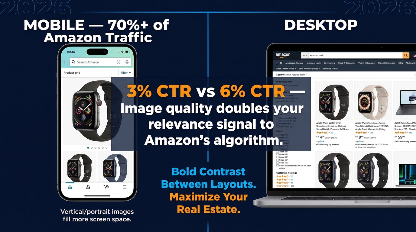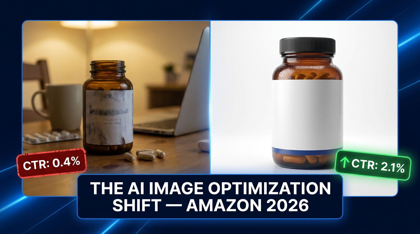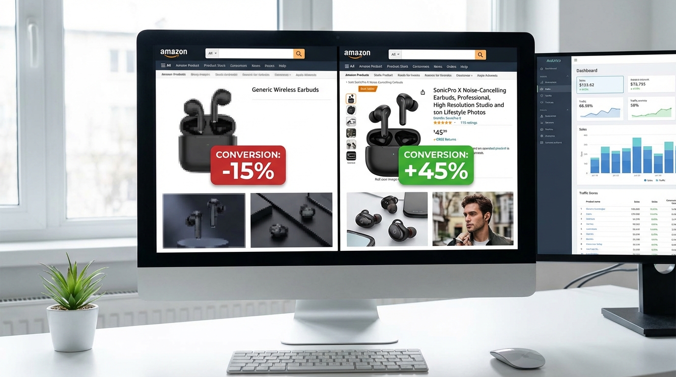
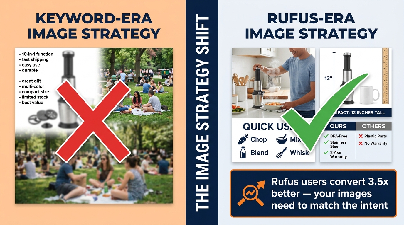
By late 2025, more than 250 million shoppers had used Amazon’s Rufus AI assistant. Monthly active users grew 140% year-over-year. Interactions jumped 210%. And perhaps the most startling figure of all: according to Sensor Tower’s holiday analysis, Rufus-assisted sessions converted at 3.5 times the rate of non-Rufus sessions on Black Friday — making up roughly 40% of all sessions but driving 66% of purchases.
That is not a marginal experiment. That is a structural shift in how Amazon shoppers discover and buy products. And it has profound implications for your image strategy — implications that most sellers are still getting completely wrong.
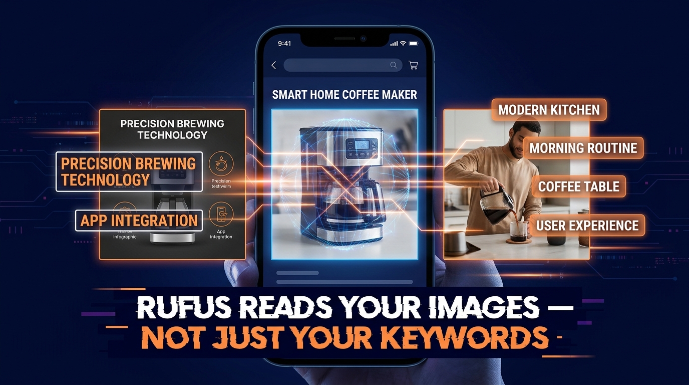
The problem is that Rufus is not a search engine. It does not rank results the way the A9 or A10 algorithms do. It is a conversational, multimodal AI assistant that synthesizes product listings, customer reviews, Q&A data, and visual content to generate shopping recommendations in natural language. It is, in a very real sense, a different kind of customer — one that reads your images not as aesthetic assets, but as structured evidence it can cite in an answer.
Most image optimization advice is still written for keyword-era search: make the main image pop, add bullet-point overlays, use lifestyle photos that look good. That advice is not wrong, exactly, but it is dramatically incomplete when the entity evaluating your listing is a multimodal AI model looking for semantic richness, intent alignment, and verifiable claims.
This post breaks down exactly what Rufus looks for in your product images, the specific image types that win recommendations, the silent mistakes that kill your Rufus visibility, and how to build an image brief that actually serves both the AI and the human customer it is advising.
How Rufus Actually Processes Your Product Images
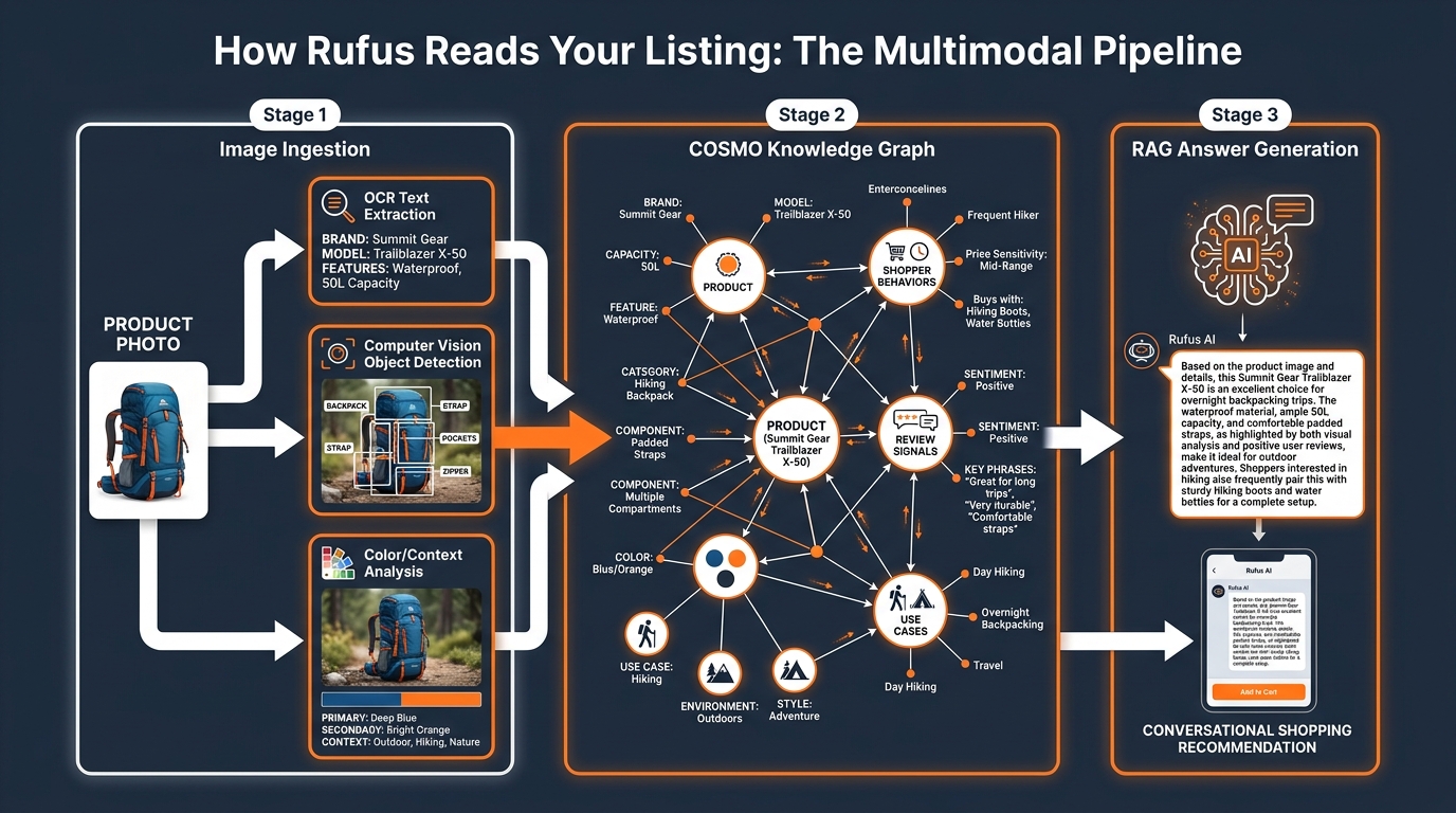
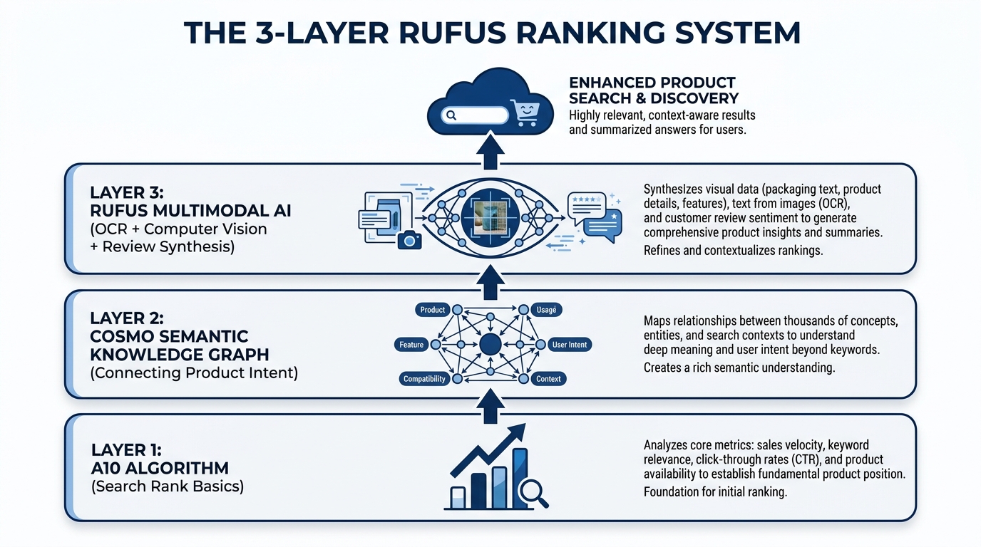
To optimize for Rufus, you first need to understand what is actually happening under the hood when your listing gets evaluated. Amazon has not published a detailed technical specification of Rufus’s image processing pipeline, but the architecture is reasonably well understood through Amazon’s own research papers, public talks, and the COSMO system documentation.
The COSMO Knowledge Graph
COSMO (Common Sense Knowledge for E-Commerce) is Amazon’s large-scale product knowledge graph. It ingests data from product catalogs, customer reviews, community Q&A sessions, browsing behavior, and increasingly, visual signals extracted from product images. COSMO does not simply store text — it builds a semantic map of how products relate to use cases, contexts, shopper profiles, and competitor products.
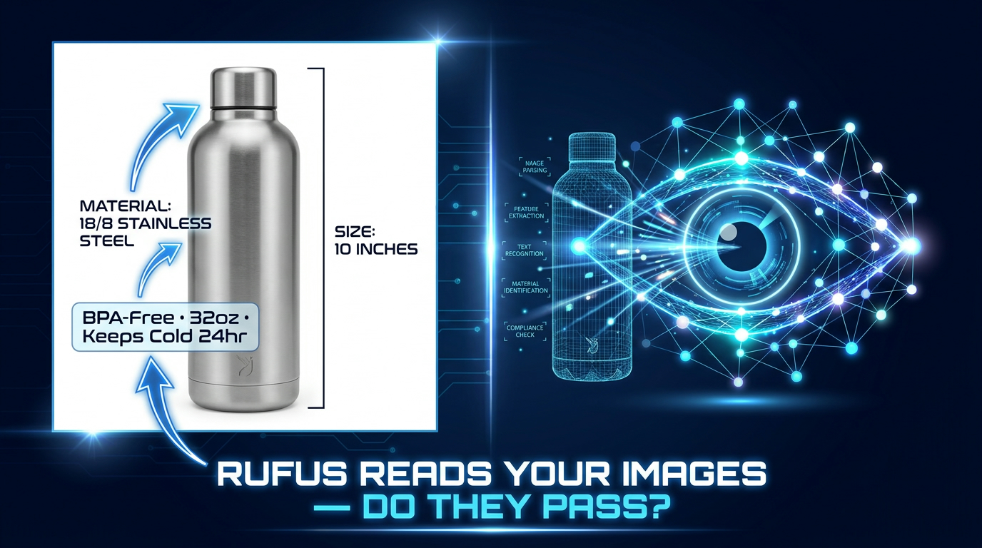
When Rufus receives a shopping query — say, “what’s a good camping chair for bad knees?” — it does not do a keyword match. It queries the COSMO graph to identify products whose associated signals most strongly align with the intent behind that question. Products that have strong use-case signals, clear attribute evidence, and verified claims across multiple data sources rank higher in Rufus’s reasoning process.
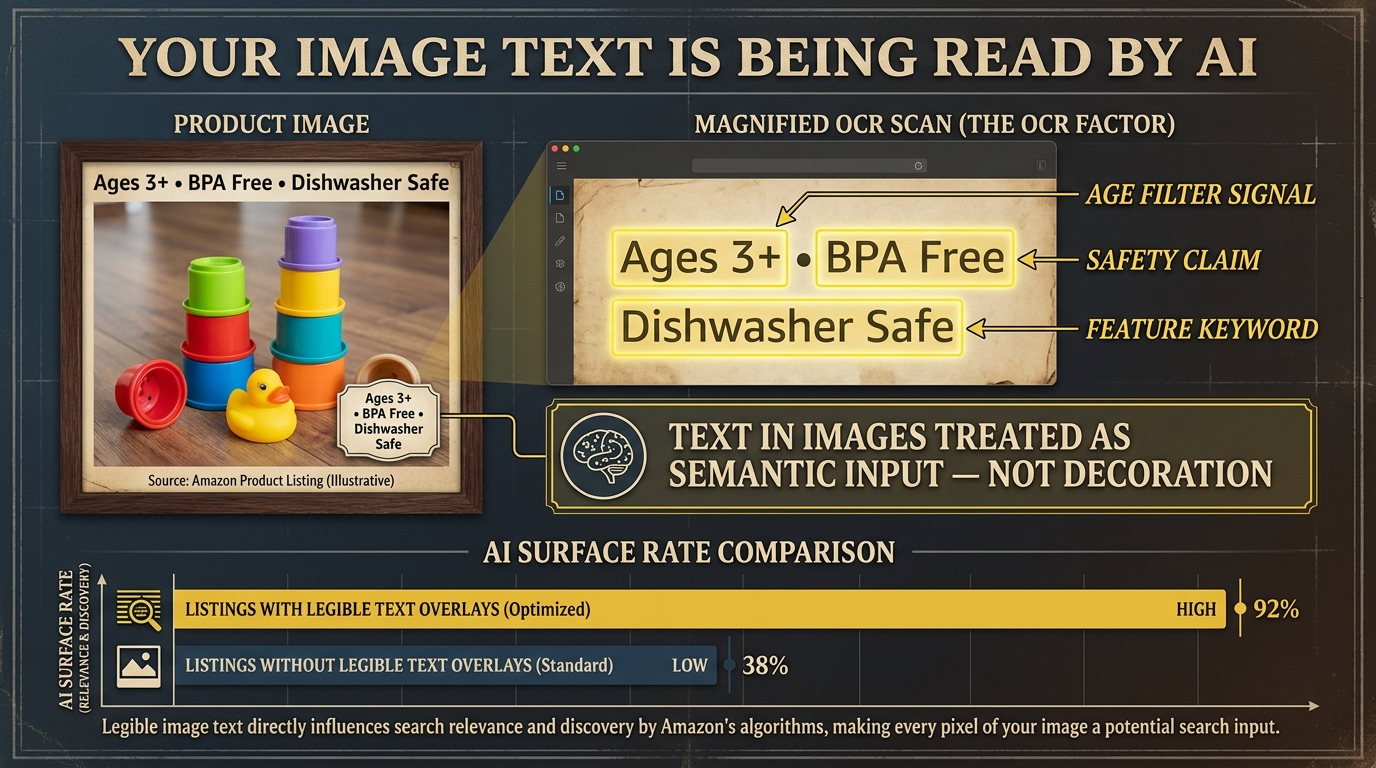
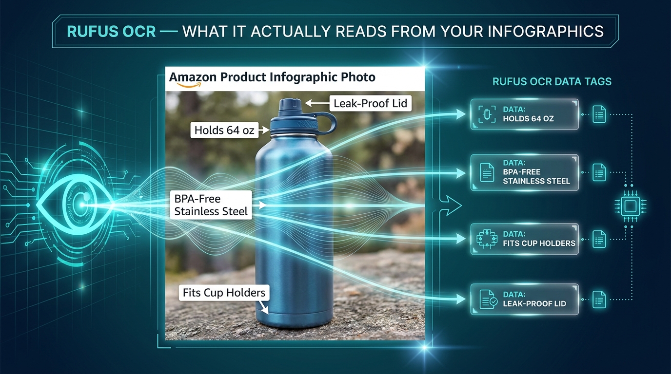
Your images feed into this graph. Computer vision models extract object classes, spatial relationships, color and material attributes, and contextual cues (indoor vs. outdoor, solo use vs. group use, casual vs. professional). OCR (optical character recognition) reads text that appears within your images — ingredient callouts, feature labels, spec overlays. The extracted data gets merged with your listing text, review content, and Q&A to build a composite knowledge profile of your ASIN.
Retrieval-Augmented Generation (RAG) and Image Evidence
Rufus operates on a RAG architecture — it retrieves relevant product data from COSMO and related sources, then generates a conversational response grounded in that retrieved evidence. This is crucial for understanding image strategy, because it means Rufus does not just need to find your product; it needs to be able to cite your product confidently in a natural-language answer.
If a shopper asks “which yoga mat is best for hot yoga?” and your images clearly show a person using the mat in a warm, humid studio environment alongside an infographic that reads “moisture-wicking surface” and “non-slip grip when wet,” Rufus has specific visual and textual evidence it can use to construct a confident recommendation. If your images are generic glamour shots with no use-case context, Rufus has nothing to cite — and it will surface a competitor whose listing provides that evidence.
What Rufus Does Not Do
It is equally important to understand the limits of Rufus’s image reading. Rufus is not parsing the aesthetic quality of your photography or applying design sensibilities. It does not penalize you for using a plain white background. It is not swayed by how stylish a lifestyle photo looks. What matters is whether the image communicates something specific and useful that can be extracted and used to answer a shopper’s question. Beauty without specificity is invisible to Rufus.
The Intent Graph: What Questions Rufus Is Actually Trying to Answer
Understanding Rufus optimization requires mapping out the questions Rufus is trying to answer on a shopper’s behalf. These questions fall into predictable categories, and your image set needs to provide visual evidence for each of them.
Use-Case Questions
“What is this product actually for?” is the most fundamental question in any Rufus interaction. Shoppers increasingly use Rufus to search by activity or purpose rather than by product name: “something for camping with toddlers,” “a bag I can use as both a gym bag and carry-on,” “a moisturizer that works under makeup.” Your images need to answer these questions visually. A lifestyle image of your backpack in an airport security line communicates “travel-friendly” far more powerfully than the word “versatile” in a bullet point.
Who-Is-This-For Questions
Rufus is used heavily for comparative and qualifying queries: “best for seniors,” “good for beginners,” “safe for dogs.” Images that show the product being used by a specific, recognizable demographic type — whether that is an older adult, a child, a professional in a specific setting, or an athlete in a specific sport — give Rufus the evidence it needs to confidently recommend your product to queries that contain those qualifiers.
What-Is-Included Questions
Shoppers regularly ask Rufus what comes in the box, what sizes are available, and whether specific accessories are included. A clear “what’s in the box” flat-lay image, or a size-comparison image showing multiple variants side by side, directly answers this query type. These images are among the most underused in most sellers’ image stacks, yet they address one of the most common Rufus query patterns.
Is-This-Claims-True Questions
When your listing claims “waterproof,” “BPA-free,” “machine washable,” or “fits a 15-inch laptop,” Rufus looks for corroborating evidence. The most powerful corroboration is visual: an image of the product submerged in water, an image of the certification label, an image of a laptop visibly fitting into the bag’s sleeve. These “proof images” are what allow Rufus to recommend your product with confidence rather than hedging with “the seller claims this product is waterproof.”
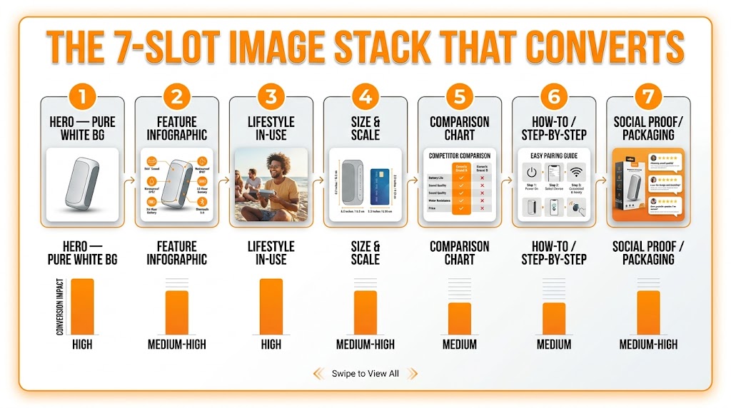
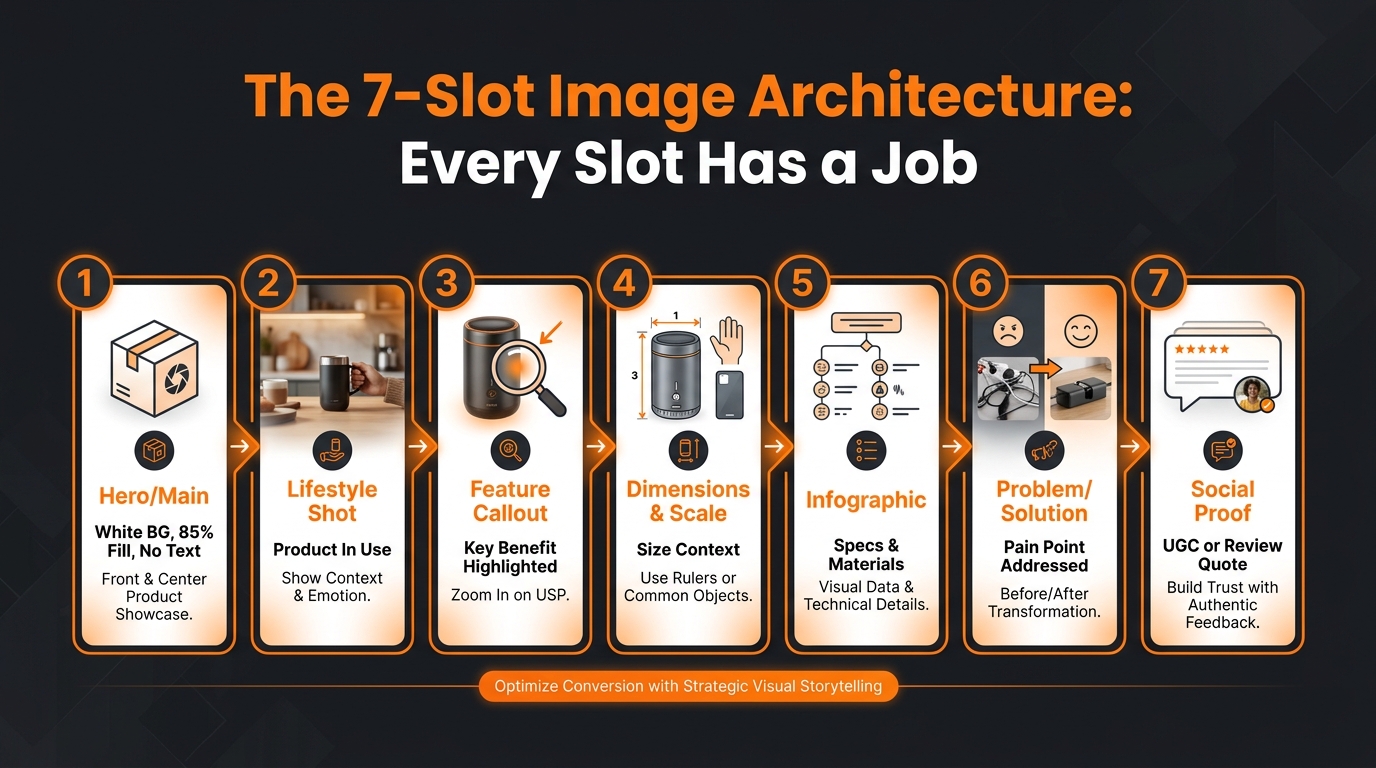
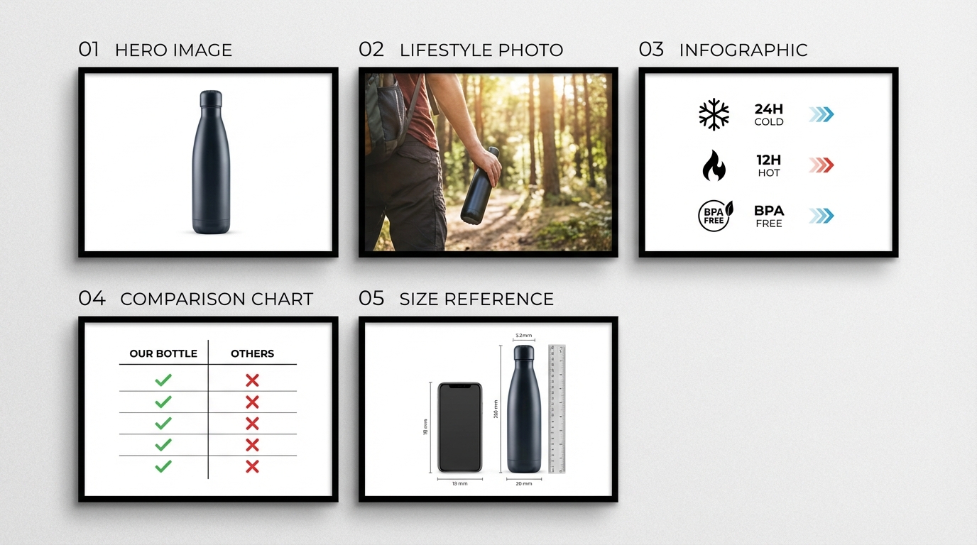
The 7 Image Types That Win Rufus Recommendations
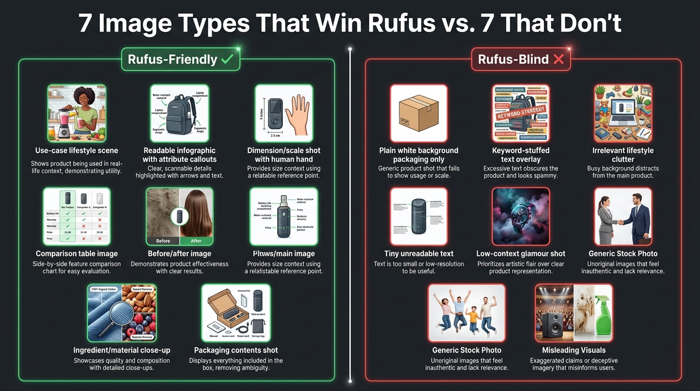
Based on the current understanding of Rufus’s multimodal evaluation and what agencies working with Rufus-optimized catalogs report, seven image types consistently outperform in Rufus recommendation frequency and post-recommendation conversion rate.
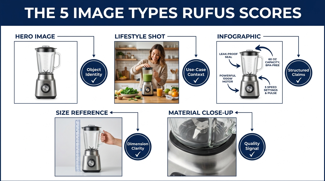
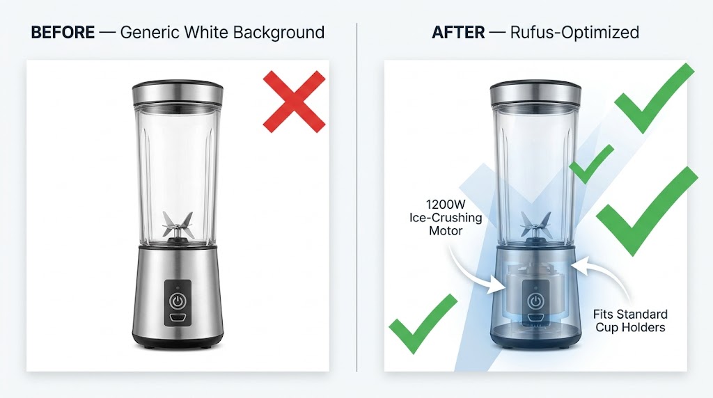
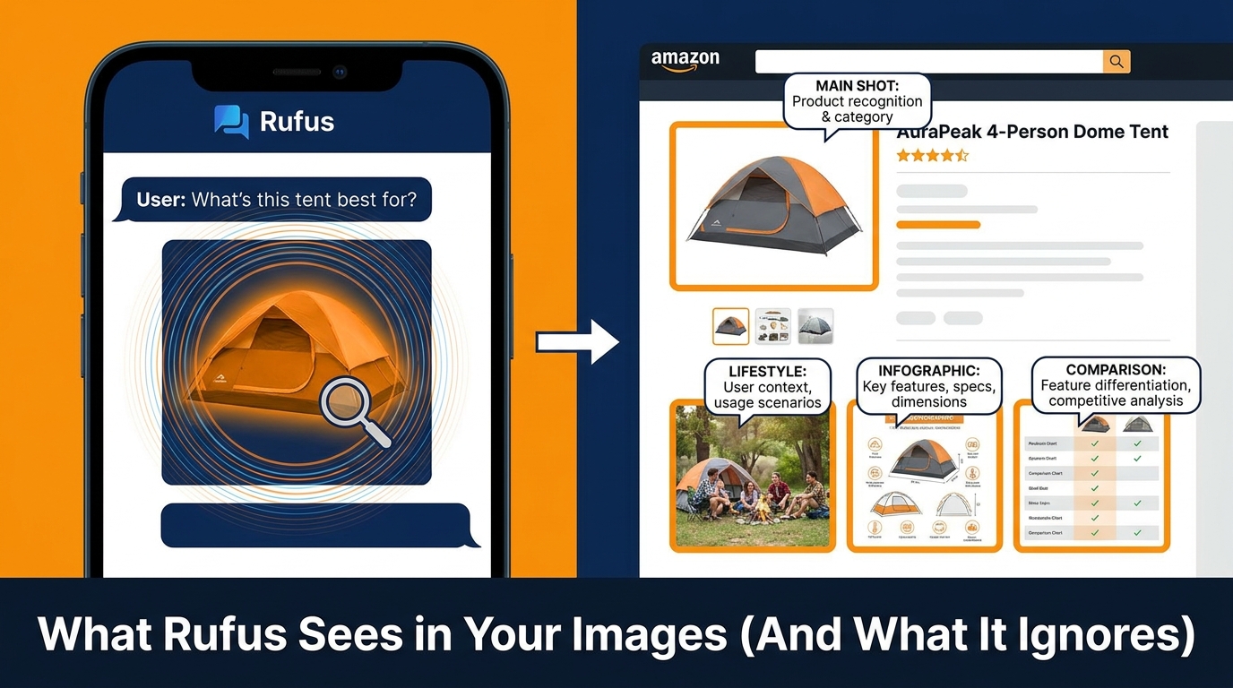
1. The Unambiguous Main Image
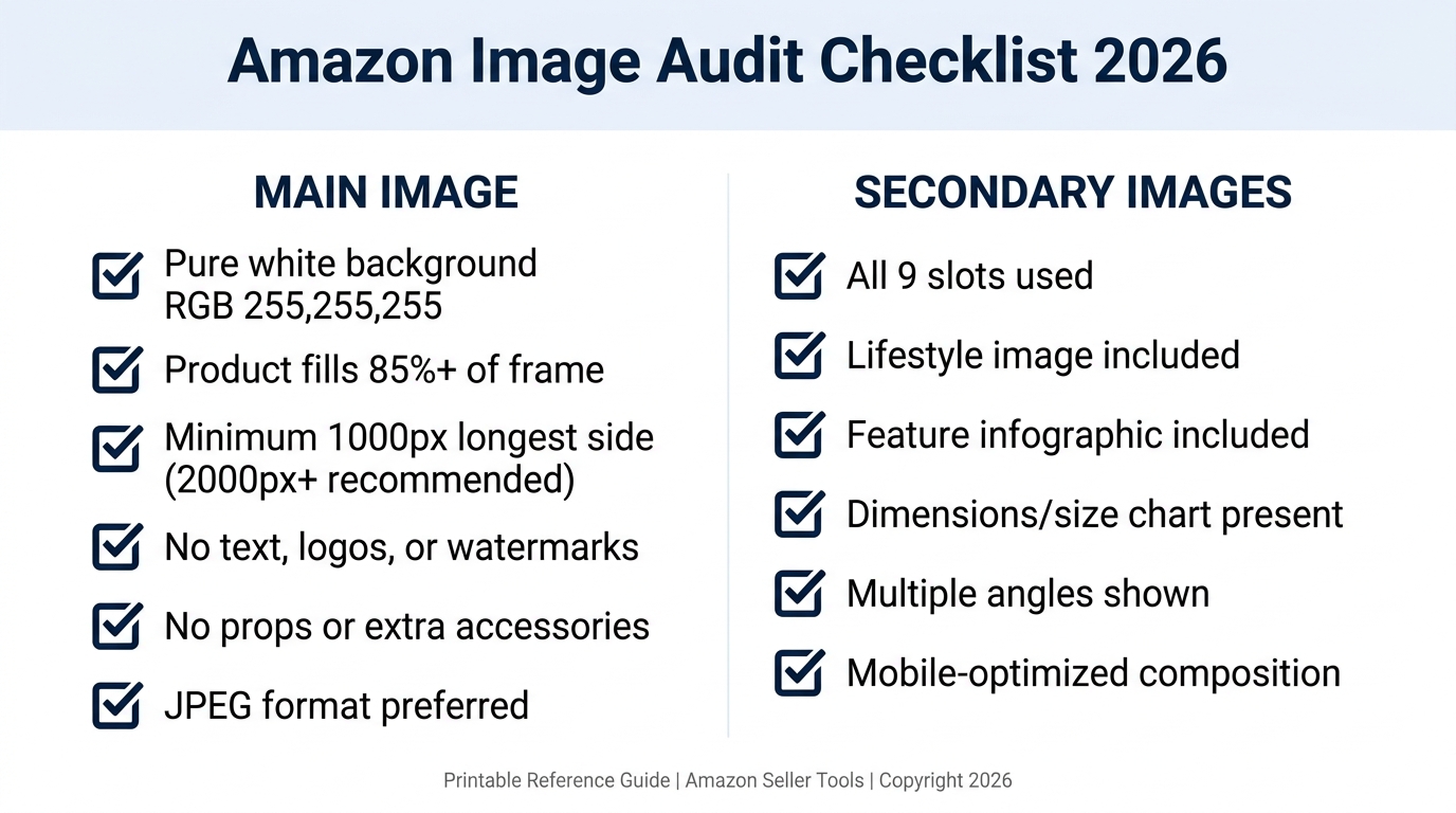
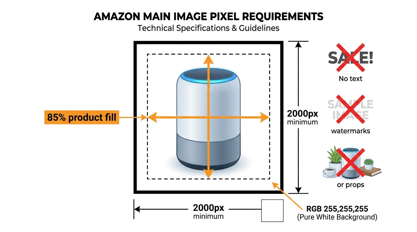
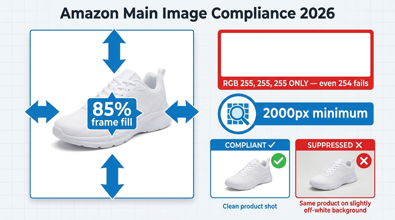
Your main image must instantly communicate exactly what the product is — not what it aspires to be, not the lifestyle it belongs to, but what it physically is. Rufus uses the main image as its first disambiguation step when processing your ASIN. An ambiguous or styled main image that obscures product type creates uncertainty in Rufus’s classification, which reduces confidence in surfacing it for specific queries. Keep the main image on white, full-frame, showing the complete product in its most recognizable form. Save the storytelling for images two through nine.
2. Use-Case Lifestyle Shots With Specific Context
Not all lifestyle images are created equal for Rufus. A generic “young woman smiling with coffee cup” does not tell Rufus anything useful about the mug’s use case. What works is specificity: a hiker filling the mug from a stream (signals: outdoor, adventure, portability), a parent using the mug one-handed while holding a baby (signals: parent, ease of use, one-handed operation), or a commuter sipping from it on a subway (signals: commuter, leak-proof, portable). The more specific the context, the more intent signals Rufus can extract.
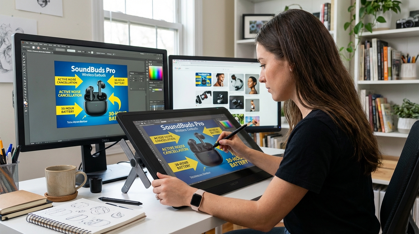
3. Readable Infographic Images With Attribute Callouts
Infographic images — secondary images that overlay text callouts, feature labels, and attribute annotations directly on a product photo — are one of the highest-value image types in the Rufus era. The key word is “readable.” Text overlays need to be large enough for OCR to extract reliably (minimum 16px equivalent at image resolution), use plain sans-serif fonts, and describe features in natural-language phrases rather than keyword-stuffed fragments. “Adjustable lumbar support for long work sessions” is more Rufus-readable than “ERGONOMIC LUMBAR SUPPORT PREMIUM GRADE.”
4. Scale and Dimension Reference Images
Images that show your product next to a recognizable reference object — a human hand, a common item like a credit card or water bottle, a standard piece of furniture — directly answer the “how big is this actually?” query that Rufus fields constantly. These are especially powerful for categories where size uncertainty is a major purchase barrier: bags, storage containers, electronics accessories, home goods. A dimension callout image with actual measurements labeled (not just “compact!”) performs even better because it gives Rufus a specific, citable answer to size queries.
5. Proof Images for Key Claims
For any claim in your title or bullets that can be physically demonstrated, there should be a corresponding proof image. Waterproof claims: show the product in water. Heat resistance: show it next to a flame or on a hot surface. Child safety certification: show the certification mark clearly. Fit accuracy: show the product fitting the stated use (laptop in sleeve, bottle in cup holder, device in pocket). Rufus treats verified visual evidence differently from unsupported text claims, and this shows up in how confidently the assistant recommends your product.
6. What’s-in-the-Box / Variant Comparison Images
A flat-lay image showing every item included in the package — laid out clearly and labeled with callout arrows — is one of the most directly functional image types for Rufus’s information-retrieval task. Similarly, a grid image showing all available color or size variants side by side answers variant-selection queries without requiring Rufus to infer from text. These images reduce ambiguity, which is one of the primary things Rufus’s confidence scoring tries to minimize.
7. Before/After and Problem-Solution Images
This image type is particularly powerful for problem-solution products: cleaning products, skincare, organizational tools, fitness equipment, home improvement items. A split-image showing a genuine before and after state communicates the product’s core value proposition in a format that Rufus can extract as a causal relationship: “this product produces this outcome.” These images also tend to align strongly with review language, which reinforces COSMO’s confidence in the association.
The Silent Killers: Image Mistakes That Destroy Rufus Visibility
Just as important as knowing what works is understanding what actively hurts your Rufus visibility — and why so many otherwise well-optimized listings score poorly against Rufus’s evaluation criteria.
Keyword-Stuffed Text Overlays
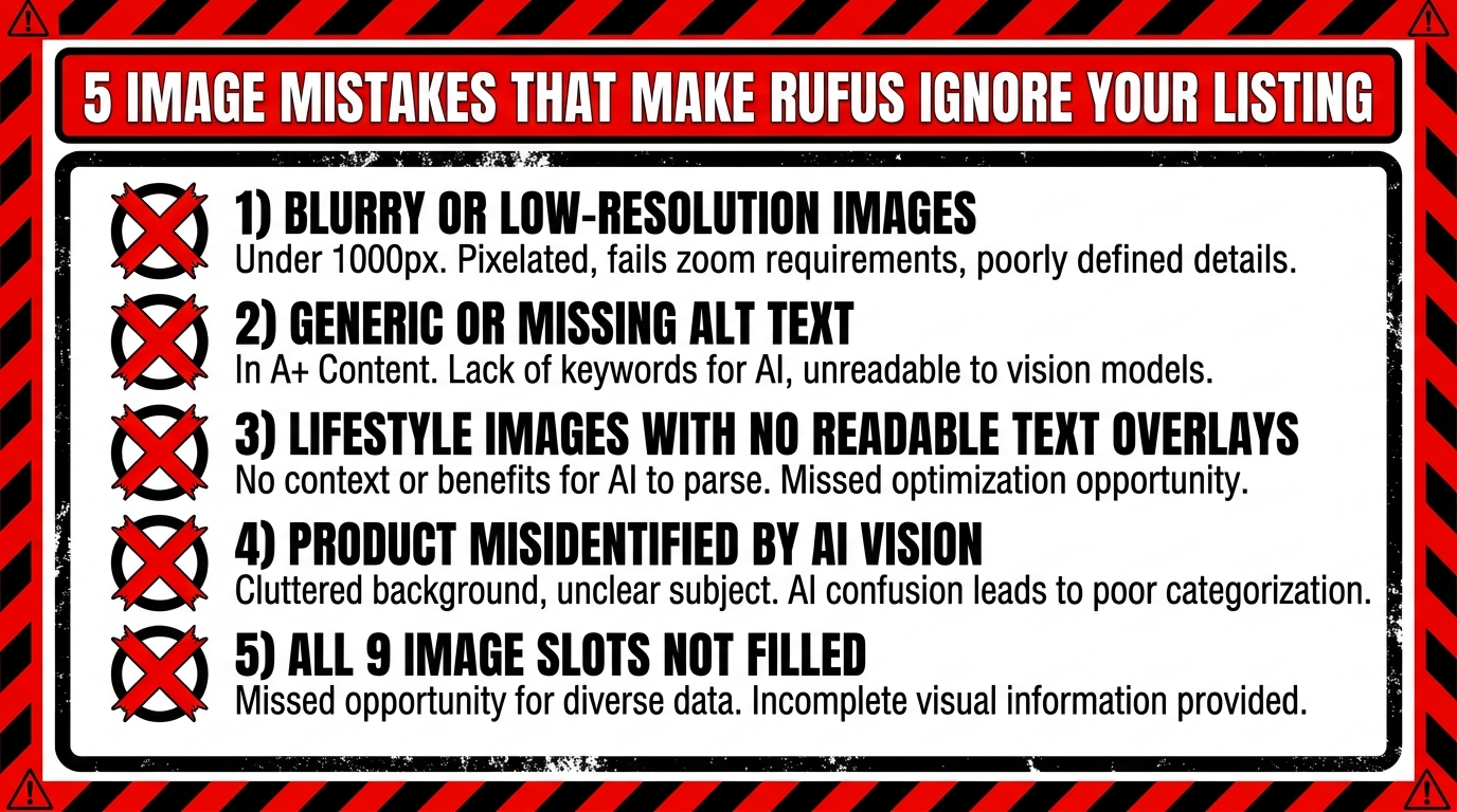
The practice of packing as many keywords as possible into image overlays was a debatable tactic even in the keyword-search era. In the Rufus era, it is actively counterproductive. When OCR extracts text from your infographic and it reads as a fragmented list of category terms — “YOGA MAT NON SLIP THICK EXERCISE FITNESS WORKOUT GYM” — Rufus cannot construct a coherent semantic signal from it. It reads as noise rather than evidence. The OCR-extracted text needs to form sentences or at minimum natural noun phrases that describe features in the way a customer would speak them.
Generic Lifestyle Imagery That Obscures the Product
High-production lifestyle photography that prioritizes mood over clarity is one of the most common Rufus visibility problems. If your product is difficult to see in the lifestyle shot — positioned as a small prop in a beautifully lit scene, half-hidden in shadows for dramatic effect, or shown at an angle that obscures its key features — Rufus’s computer vision models extract little useful information from it. The aspirational lifestyle image that works beautifully for Instagram performance does not translate to meaningful Rufus evidence.
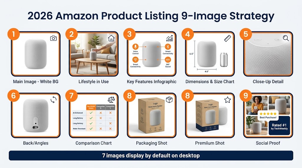
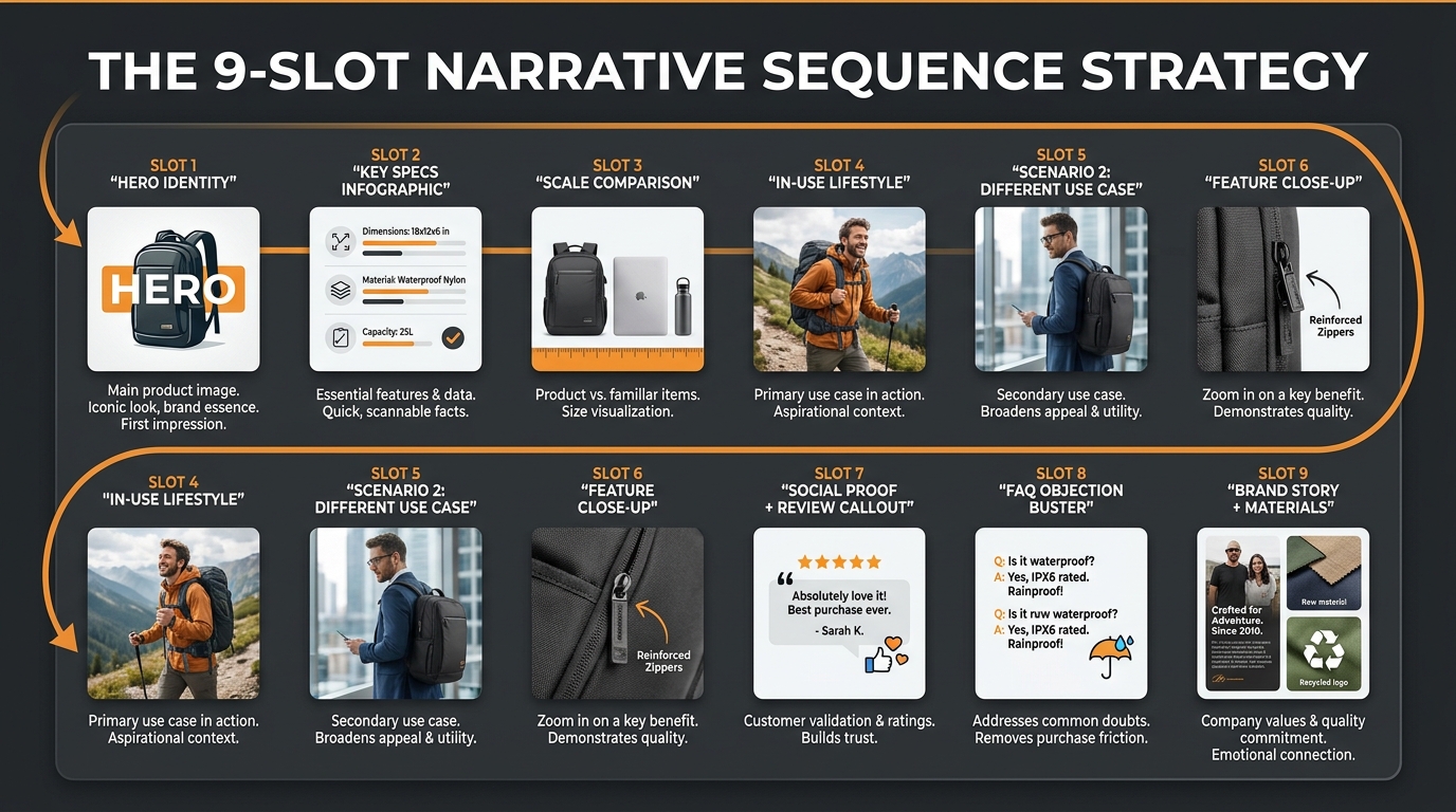
Using Fewer Than Six Image Slots
Amazon allows up to nine images per listing (plus video). Sellers who use three or four images are leaving enormous Rufus surface area on the table. Each image is an additional data point for COSMO’s knowledge graph. Each image slot is an opportunity to answer another category of shopper intent question. Incomplete image stacks signal to Rufus that the listing has less evidence to offer — and Rufus will default to more fully documented competitors when generating recommendations.
Images That Contradict Review Language
This is a subtle but significant problem. If your images show the product used in an office setting but your reviews consistently mention it being used outdoors, Rufus detects a misalignment between your visual signals and your actual customer base. The reverse is also true: if your images claim “heavy duty” but reviews mention it feeling lightweight and fragile, the contradiction weakens COSMO’s confidence in your listing’s claims. Image strategy and review sentiment need to be consistent.
Text in Images That Cannot Be Read by OCR
Decorative scripts, very small text, text that blends into a busy background, and text at angles that OCR cannot reliably parse — all of these are invisible to Rufus’s extraction pipeline. If important feature claims appear only in unreadable image text and not in the listing copy, they effectively do not exist for Rufus’s purposes. Any text in images that carries important feature or benefit information should also appear explicitly in bullets, titles, or A+ module copy.
Alt Text, Overlays, and A+ Content: The Hidden Metadata Layer
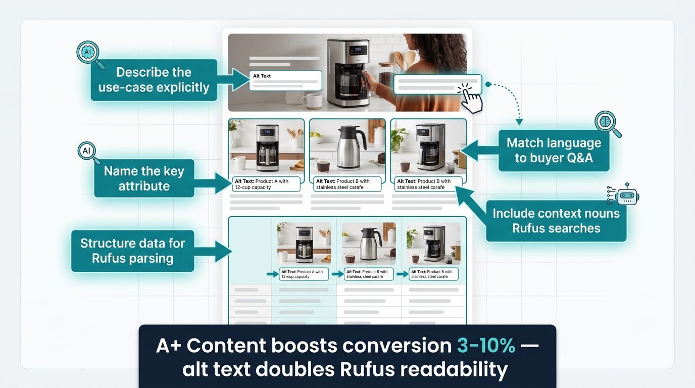
Beyond the visible images themselves, there is a metadata layer that most sellers never think about: the alt text fields available within Amazon’s A+ Content module. This layer has become increasingly important as Rufus’s multimodal processing has matured.
How Amazon A+ Alt Text Feeds Rufus
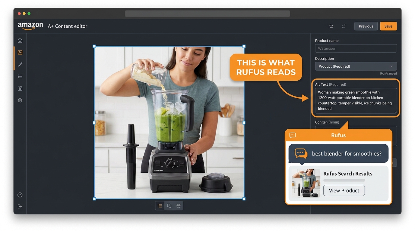
When you build A+ Content modules in Seller Central, each image module has an optional alt text field. Historically, sellers left these blank or filled them with generic descriptions like “product image.” Today, these alt text fields are one of the cleaner text inputs that Rufus’s content extraction pipeline can read — because they are structured metadata rather than free-form creative copy.
Alt text that is written to describe the actual scene depicted in the image — what the product is doing, who is using it, in what context, with what outcome — provides COSMO with precisely the kind of structured, use-case-specific evidence it needs. Think of each alt text field as a one-sentence answer to a Rufus query: “This image shows a 45L travel backpack being used as a carry-on bag in an airplane overhead compartment, demonstrating its airline-compliant dimensions.” That sentence gives Rufus four extractable signals: product type, use case, context, and compliance claim.
Writing Alt Text That Rufus Can Use
Effective alt text for Rufus follows a simple structure: [who] + [what] + [how/where] + [outcome or attribute]. Lead with the use-case context, not the product name. Describe what is happening, not what the image looks like. Include the specific attributes that appear in the image — materials, certifications, measurements — rather than repeating the product title. Keep each alt text field to one to three focused sentences. Avoid keyword stuffing here as aggressively as you would avoid it in image overlays — it reads as spam to a language model, not as evidence.
A+ Content Modules as Intent-Aligned Evidence Blocks
Beyond alt text, the structure of your A+ Content modules itself matters for Rufus. A+ modules that organize information by use case, shopper concern, and comparison (rather than just feature lists) give Rufus a pre-structured evidence library to draw from. A module titled “For the Outdoor Athlete” with specific performance attribute images serves Rufus’s classification far better than a generic “Product Features” module with the same information. The heading text of A+ modules is indexed and contributes to the overall use-case signals associated with your ASIN.
Cross-Referencing Images and Listing Copy
One of the most overlooked consistency requirements for Rufus optimization is ensuring that information appearing in images also appears in listing copy — and vice versa. If your infographic image highlights “fits bottles up to 32oz,” that claim should also appear in your bullet points or product description. Rufus’s RAG system gains confidence in claims when it finds them corroborated across multiple sources within the listing. A claim that appears only in an image text overlay with no textual corroboration carries less weight in the knowledge graph than a claim confirmed by both image evidence and listing text.
Lifestyle vs. Context Shots: Why Rufus Treats These Differently
The terms “lifestyle image” and “context shot” are often used interchangeably in Amazon seller communities, but they describe fundamentally different visual assets — and Rufus evaluates them very differently.
What Is a Lifestyle Image?
A lifestyle image communicates emotional and aspirational associations: the kind of person who uses this product, the world they inhabit, the feeling the product gives them. These images are high-production, atmospheric, and often prioritize mood over literal product information. They work extremely well for human conversion — they help shoppers visualize themselves using the product and create desire. For Rufus, they provide persona and demographic signals, but limited use-case or attribute evidence.
What Is a Context Shot?
A context shot is more literal: it shows the product in a specific, recognizable situation that directly communicates a use case or functional attribute. A camping chair next to a tent with a hiking boot visible in the foreground is a context shot for “camping” and “outdoor use.” A cutting board with vegetables on a kitchen counter next to a knife is a context shot for “cooking,” “food prep,” and “kitchen use.” The context is specific enough that Rufus’s computer vision can classify the use case without ambiguity.
The Optimal Balance for Rufus
The most effective approach combines both: a lifestyle image that sets the aspirational context, followed immediately by context-specific shots that answer use-case queries with more precision. If you sell a water bottle, your image stack might include: a lifestyle image of the bottle in a runner’s hand mid-race (emotional, aspirational), then a context shot of the bottle being filled from a hiking stream (outdoor/adventure use case), then a context shot of the bottle in a car cup holder with a gym bag visible (commuter/gym use case), then a context shot of the bottle next to a size reference (practical specification). Each context shot is a different Rufus query answered visually.
Sellers who use all lifestyle imagery and no context shots tend to see Rufus performance that is strong for broad category queries (“good water bottles”) but weak for intent-specific queries (“water bottle for hiking” or “insulated water bottle for gym”). The specificity of context shots is what unlocks long-tail Rufus recommendations.
Comparison Images: The Most Underused Asset in the Rufus Era
If there is one image type that the current Rufus optimization conversation is most dramatically underselling, it is the product comparison image. This is partly because comparison images feel risky — they require referencing competitor products or your own product variants in a way that can feel aggressive. But they are among the highest-signal image types for Rufus’s specific query handling.
Why Rufus Is a Comparison Machine
Rufus is heavily used for comparative queries: “what’s the difference between X and Y,” “which is better for Z,” “should I get A or B.” Amazon has explicitly designed Rufus to help shoppers make comparative decisions. When a shopper asks Rufus “what’s the difference between whey protein and plant protein?” and your plant protein listing includes a clean comparison image showing the key attribute differences — protein content per serving, ingredient sourcing, digestion speed — Rufus has structured visual evidence it can use to surface your product in the context of that comparison query.
Three Types of Comparison Images That Work for Rufus
Variant comparison grids show your own product variants side by side with attribute differentiators clearly labeled: size options, color options, performance tiers. These answer the “which size should I get?” and “what’s the difference between the standard and pro version?” queries that Rufus handles constantly.
Category comparison tables show your product against its category context — not necessarily naming competitors directly, but illustrating how its attributes relate to common category benchmarks. A comparison table showing “lightweight foam vs. memory foam vs. latex” for mattress toppers gives Rufus the evidence to surface your memory foam product when a shopper asks “which type of mattress topper is best for pressure relief?”
Before/after comparison images show the problem and the solution in a single split frame. These are enormously powerful for Rufus because they encode a causal relationship — this product produces this outcome — that maps directly to the problem-solution query structure Rufus handles all day.
Competitive Naming in Comparison Images
Amazon’s policies restrict certain types of comparative advertising, so naming specific competitors in comparison images carries policy risk. The safer approach is to compare against generic category descriptions (“standard nylon,” “budget silicone,” “traditional design”) or your own product line variants. The use-case and attribute differentiation comes through clearly without the policy exposure.
How to Audit Your Existing Image Stack Against Rufus Intent
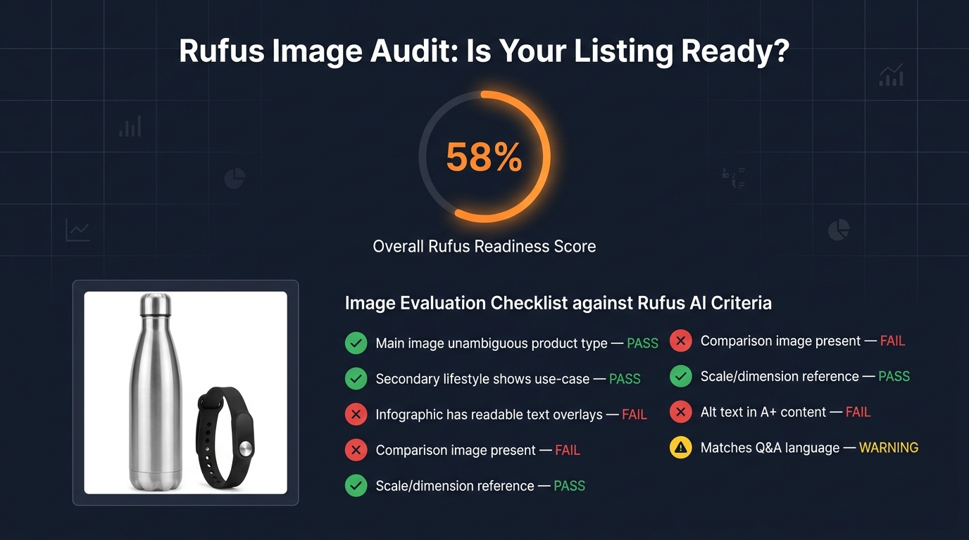
The practical question for most sellers is not “what should I build from scratch?” but “how do I evaluate what I already have and prioritize the gaps?” Here is a structured audit methodology that maps your existing image stack against Rufus’s intent-reading behavior.
Step 1: Map Your Top Rufus Query Types
Start by identifying the top 10–15 query types Rufus is most likely to receive for your product category. You can infer these from Amazon’s autocomplete suggestions, the “Customers Also Asked” section of your listing, your Q&A backlog, and your one- and two-star reviews (which often contain objections that Rufus queries would surface). Group them into query categories: use-case queries, who-is-it-for queries, specification queries, comparison queries, and claim-verification queries.
Step 2: Score Each Existing Image Against Intent
For each image in your current stack, ask a single question: which query category does this image answer? If the answer is “none” — if the image is purely decorative, aspirational without context, or visually beautiful but semantically empty — it is a low-Rufus-value asset. Score each image from 0 (no extractable intent signal) to 3 (directly and unambiguously answers a specific Rufus query type). Total the score and divide by your total number of image slots. Most listings score below 50% on this metric.
Step 3: Identify the Gaps
Map your query categories against your scoring results. The gaps — query categories that your current images do not answer — are your production priorities. For most sellers, the most common gaps are: no proof images for key claims, no “what’s in the box” image, no scale/dimension reference image, and no comparison image of any kind. These are the highest-ROI additions to any listing’s image stack from a Rufus-visibility perspective.
Step 4: Check for OCR Readability
Take your existing infographic images and run them through any free OCR tool (Google Lens, Adobe Acrobat’s OCR function, or any online OCR service). The text that the OCR tool extracts successfully is the text that Rufus’s pipeline can read. If important claims are coming back as unrecognized, those overlays need to be redesigned with larger, cleaner text before Rufus can use them. This is a 15-minute exercise that most sellers have never done and that surfaces significant optimization opportunities every time.
Step 5: Compare Image Language to Review Language
Pull your 50 most recent positive reviews and identify the phrases customers use to describe what they love about the product and how they use it. Then check whether those phrases and use cases appear in your image overlays and context shots. A significant gap between “how customers describe the product in reviews” and “how images describe the product” indicates that your image strategy is not aligned with COSMO’s actual evidence base — and Rufus is likely missing the use-case signals that real customers confirm.
Aligning Image Strategy With Review Language and Q&A Signals
One of the most powerful and least-used tactics in Rufus image optimization is mining your own review and Q&A data to guide your creative brief. This works because COSMO’s knowledge graph actively integrates review language as a signal source alongside image data — meaning images that use language and scenarios that appear in positive reviews are directly reinforcing COSMO’s existing associations for your ASIN.
The Review-to-Image Pipeline
Pull your reviews and identify the top five to ten use-case phrases that appear repeatedly: “great for weekend camping trips,” “perfect for my morning commute,” “exactly what I needed for my toddler’s snacks,” “holds up perfectly in the dishwasher.” Each of these phrases is a Rufus query that real customers have essentially pre-validated as a winning association for your product.
Now ask: does your current image set visually demonstrate each of these use cases? If “great for weekend camping trips” is a top review phrase but none of your images show the product in a camping setting, you have an alignment gap that is costing you Rufus recommendations for every camping-intent query. Close that gap by commissioning a context shot that specifically depicts the camping use case — not a generic outdoors lifestyle image, but a specific camping scene that encodes the same contextual information as the review phrase.
Q&A as a Rufus Query Preview
Your listing’s Q&A section is essentially a preview of the queries Rufus receives about your product. Every question in your Q&A section is a question a shopper has been willing to type into a search or Q&A box rather than just buying. These are high-friction decision points. When Rufus receives a query that matches a Q&A question, it will look for evidence in your listing to construct an answer. Images that directly address the most common Q&A questions — showing the answer visually, not just stating it in copy — give Rufus the evidence confidence to surface your product for those high-friction query types.
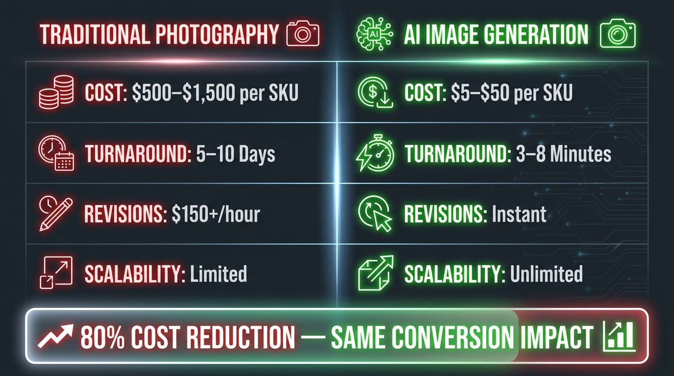
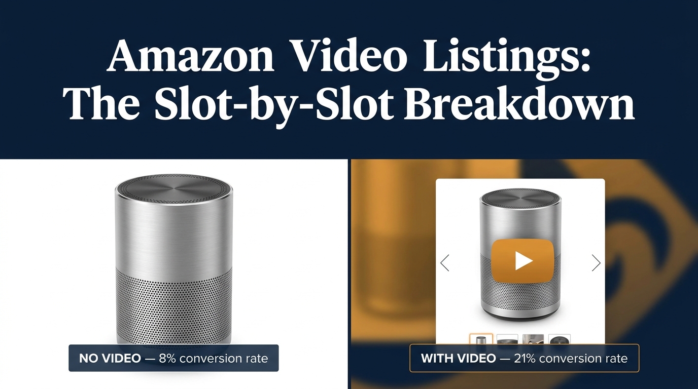
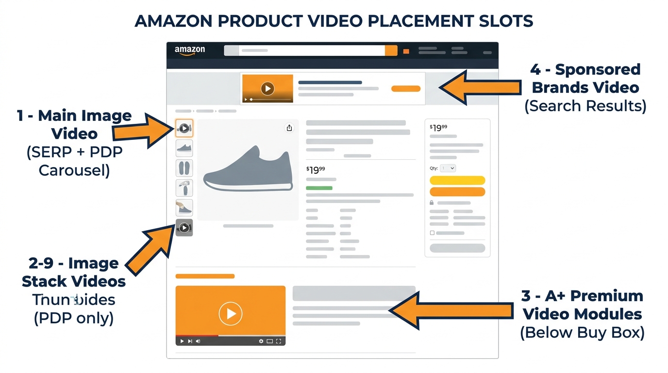
Video and the Rufus Surface: Short Clips as Intent Signals
Video is increasingly part of Rufus’s content evaluation, and while still secondary to still images in most Rufus interactions, its role is growing. Amazon’s addition of short-form video to the listing surface — and the expansion of Rufus’s ability to incorporate video signals — makes video a meaningful Rufus optimization lever that most sellers are not yet using strategically.
What Rufus Extracts From Product Video
Rufus can evaluate video for use-case context in a similar way to still images, but with the added dimension of motion and sequence. A video that shows a product being set up, used in a specific context, and producing a visible outcome provides a temporal evidence chain that is more compelling than any single still frame. For products where the key use-case question is “how does this actually work?” — assembly products, multi-function tools, clothing with complex fit, anything with a setup process — video addresses that query type in a way still images cannot.
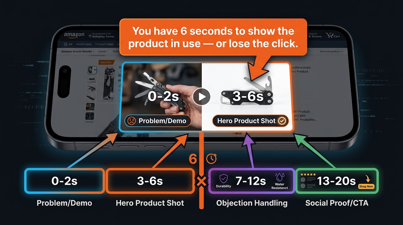
Optimizing Video Length and Structure for Rufus
For Rufus-intent alignment, the most effective product videos follow a specific structure: open with an unambiguous product identification shot (what this product is, clearly), demonstrate the primary use case within the first ten seconds, show two to three secondary use cases in sequence, and end with a clear summary of the key differentiating attribute. Keep total length under 60 seconds for primary listing video — Rufus’s evaluation models are optimized for short-form content that communicates quickly, not for long-form brand narratives.
The video title and any caption text attached to the video are also indexable by Rufus. Write these with the same intent-alignment discipline as your image alt text: describe the use case being demonstrated, not the emotional feeling the video creates.
Building a Rufus-Optimized Image Brief for Your Creative Team
Everything in this post ultimately converges on a practical output: a better creative brief for your photographers, designers, and image production team. Most creative briefs are written around aesthetic goals, brand guidelines, and competitive differentiation. A Rufus-optimized brief is written around intent coverage and evidence provision.
The Intent-Coverage Model for Image Briefs
Structure your brief around four required image categories rather than a numbered slot list:
Category 1: Classification images. These answer “what exactly is this product?” — the main image and one or two supporting product-clarity shots. Brief your photographer on making the product type unmistakable and the key physical attributes visible from the primary angle.
Category 2: Use-case evidence images. These answer “what is this for and who uses it?” — typically three to four context shots depicting your top reviewed use cases. Brief your art director on depicting specific scenarios, not generic lifestyles. The scenario should be recognizable and specific enough that Rufus’s computer vision can classify the context without ambiguity.
Category 3: Claim-verification images. These answer “is this claim true?” — infographics with readable attribute callouts, proof images for your top three to five listing claims, certifications visually represented. Brief your designer on text size, font clarity, and natural-language phrasing for all overlays.
Category 4: Specification and comparison images. These answer “does this fit my needs specifically?” — scale references, dimension callouts, what’s-in-the-box flats, and variant comparison grids. Brief your production team on these as functional assets, not creative showcases — clean, clear, labeled, and complete.
Adding a Rufus Review Step to Your Creative Approval Process
Once you have established the intent-coverage model, add a Rufus review step to your image approval workflow. Before images go live, run each one through a simple test: “which Rufus query does this image help answer, and does it answer it clearly?” Any image that fails this test — that cannot be matched to a specific intent query, or that answers it ambiguously — goes back for revision or is replaced by an image from one of the four required categories above.
This review step does not require technical AI expertise. It requires someone on your team to hold the question “what is Rufus trying to answer for the shopper?” in mind when evaluating creative assets — a different evaluative lens than the more common “does this look great?” or “does this match our brand?”
The Shift That Is Already Happening — And What Comes Next
Rufus’s growth trajectory — 250 million users, 3.5x conversion rates, 210% interaction growth — makes one thing clear: the shopping surface Rufus represents is not a feature that may eventually matter. It is the primary discovery surface for a large and rapidly growing segment of Amazon’s highest-intent shoppers. Sellers who are still building image stacks for keyword-era search are effectively invisible to those shoppers.
The shift from keyword optimization to intent-evidence optimization is not a dramatic reinvention of image strategy. Most of the image types that work for Rufus — use-case lifestyle shots, infographics, proof images, comparison assets — also improve human conversion rates on the listing. The change is in the discipline and specificity with which those images are created: the difference between a lifestyle image that shows a product in a vague outdoor setting versus one that shows it in a specific, classifiable camping context; the difference between an infographic with keyword-stuffed fragments versus one with natural-language attribute sentences that OCR can extract and Rufus can cite.
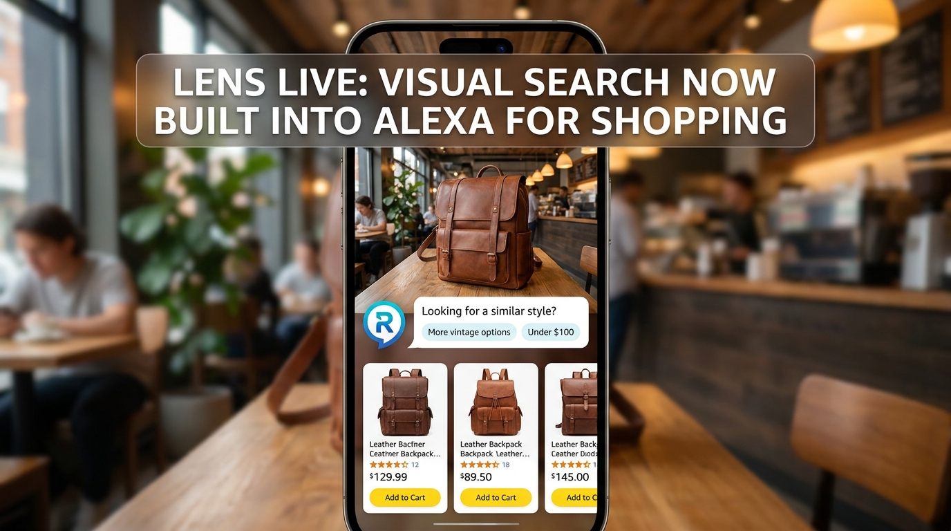
Looking ahead, Rufus’s visual capabilities will continue expanding. Amazon is already integrating Rufus with Amazon Lens (visual search) and expanding its ability to evaluate user-uploaded images as part of shopping queries. This means the contextual signals your images communicate will become even more valuable as Rufus handles more nuanced visual comparison tasks — not just “which yoga mat should I buy?” but “does this yoga mat match the kind I can see in this photo I took at my gym?”
The sellers who will win in that environment are the ones who treat product images as a structured evidence library for an AI that is trying to help real people make real purchase decisions. Every image should earn its slot by answering a specific question that a real shopper would ask Rufus about your product. Build for that standard, and you will be building for the next five years of Amazon commerce.
Actionable Takeaways
- Run an OCR audit on your infographic images today. Use Google Lens or any free OCR tool to check which text Rufus can actually read. Redesign any overlay where important claims fail to extract cleanly.
- Fill all nine image slots — every time. Incomplete image stacks signal low-evidence listings to Rufus. Every unused slot is a missed intent-coverage opportunity.
- Write A+ alt text as one-sentence use-case answers. Use the [who] + [what] + [how/where] + [outcome] formula. Treat each alt text field as a Rufus query answered in a sentence.
- Add one comparison image to your top ASINs this month. Variant comparison grids and category comparison tables are the highest-ROI addition for Rufus query coverage in most categories.
- Mine your reviews for context-shot briefs. Find the top five use-case phrases in your positive reviews and verify that each one is visually represented in your image stack.
- Structure your image brief around four intent categories, not nine numbered slots: classification, use-case evidence, claim verification, and specification/comparison.
- Add a Rufus review step to your creative approval workflow. Before any image goes live, identify which query it answers. If the answer is “none,” revise it.