Tag: eCommerce Strategy

  • What Each Amazon Image Slot Is Actually Selling (And Why Most Sellers Get It Backwards)

    What Each Amazon Image Slot Is Actually Selling (And Why Most Sellers Get It Backwards)

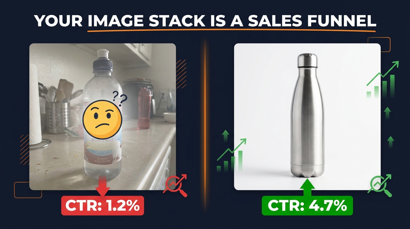
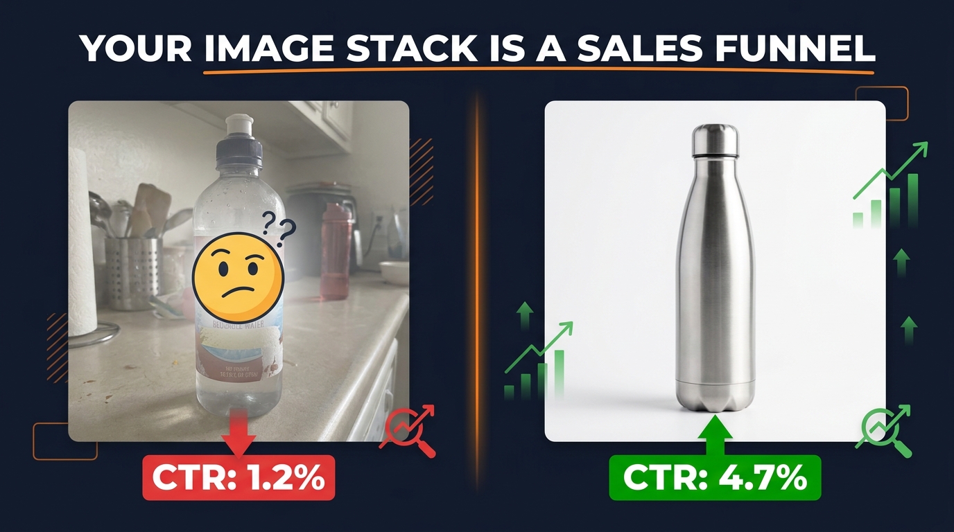
    Amazon listing image optimization: split-screen showing low-CTR cluttered image vs high-CTR clean hero image with conversion rate comparison

    Most Amazon sellers think about their image stack the same way they’d think about a product brochure: show the item, add some lifestyle photos, toss in an infographic. Done.

    That approach will get you average results — if you’re lucky. Because the sellers who are quietly outconverting you aren’t just putting up better photos. They’re thinking about each image slot as a distinct moment in a buyer’s decision-making process. Each slot has a job. Each job builds on the last. And when the whole stack works together, it functions less like a gallery and more like a sales conversation that closes itself.

    This post isn’t about technical specs (though we’ll cover them). It’s not about lighting setups or which camera to use. It’s about the decision science underneath every click that turns a browse into a buy — and how to engineer that into each one of your nine available image slots.

    Amazon gives you up to nine image slots per ASIN. The average seller uses six. The average high-converting seller treats every single one as a strategic asset with a measurable purpose. What follows is a slot-by-slot breakdown of what each image should actually be doing, why the order matters more than most sellers realize, and how to audit your existing stack with a practical framework you can apply today.


    The Silent Sales Funnel Living Inside Your Image Stack
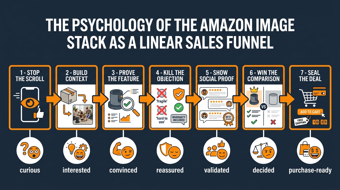
    Diagram showing Amazon image stack as a 7-step sales funnel from 'Stop the Scroll' to 'Seal the Deal' with buyer emotion states at each stage

    In traditional sales, you work through a sequence: get attention, build interest, create desire, prompt action. Amazon’s image stack mirrors this almost perfectly — but most sellers scramble the order, repeat the same information across multiple slots, or skip emotional triggers entirely in favor of product specifications.

    The result? Shoppers who arrive at a listing, scroll two images, and leave. Not because they disliked the product — but because the visual conversation didn’t give them a reason to stay.

    Why Buyers Look at Images Before Reading Anything

    Eye-tracking research in ecommerce consistently shows that shoppers interact with product images before they read titles, bullet points, or pricing context. On Amazon specifically, images dominate the upper-left of the screen on mobile — the highest-attention zone — while text lives below and to the right. This isn’t a coincidence. Amazon’s interface is designed around how people actually shop.

    The implication for sellers is significant: your images are your first — and often your only — sales pitch. A shopper who doesn’t make it past the third image is almost never going to read your bullet points. Whatever case you need to make for your product needs to be embedded in the visual experience before you ask anyone to scroll to your copy.

    The Sequence Problem

    When you put a lifestyle image second and a close-up texture shot third and a size infographic sixth, you’re creating a sequence that doesn’t follow any logical buyer journey. It’s visually inconsistent, which means shoppers have to do mental work to assemble the story themselves. Most won’t bother.

    A deliberately sequenced stack answers questions in the order buyers actually ask them. The first question is never “What’s the fabric weight?” The first question is “Is this worth my attention?” — and everything follows from there.

    Mapping Buyer Psychology to Image Slots

    Here’s a simplified map of how buyer psychology moves through the image stack, and what each stage demands:

    • Images 1–2: Attention and orientation. The buyer is asking, “Is this relevant to what I searched?” and “Does it look credible?”
    • Images 3–4: Evaluation. “Does it do what I need it to do?” and “What could go wrong?” This is where most purchases are won or lost.
    • Images 5–6: Validation. “Am I making a smart choice?” Buyers want external confirmation — social proof, expert endorsement, comparison data.
    • Images 7–9: Conviction. “Is there anything I’m missing?” These slots serve the most scrutinous buyers — the ones who need one final reason to commit.

    Every image you place in the wrong phase of this sequence creates friction. And friction, in ecommerce, translates directly into abandoned carts and lost revenue.


    Slot 1 — The Main Image: Winning the Scroll, Not Describing the Product
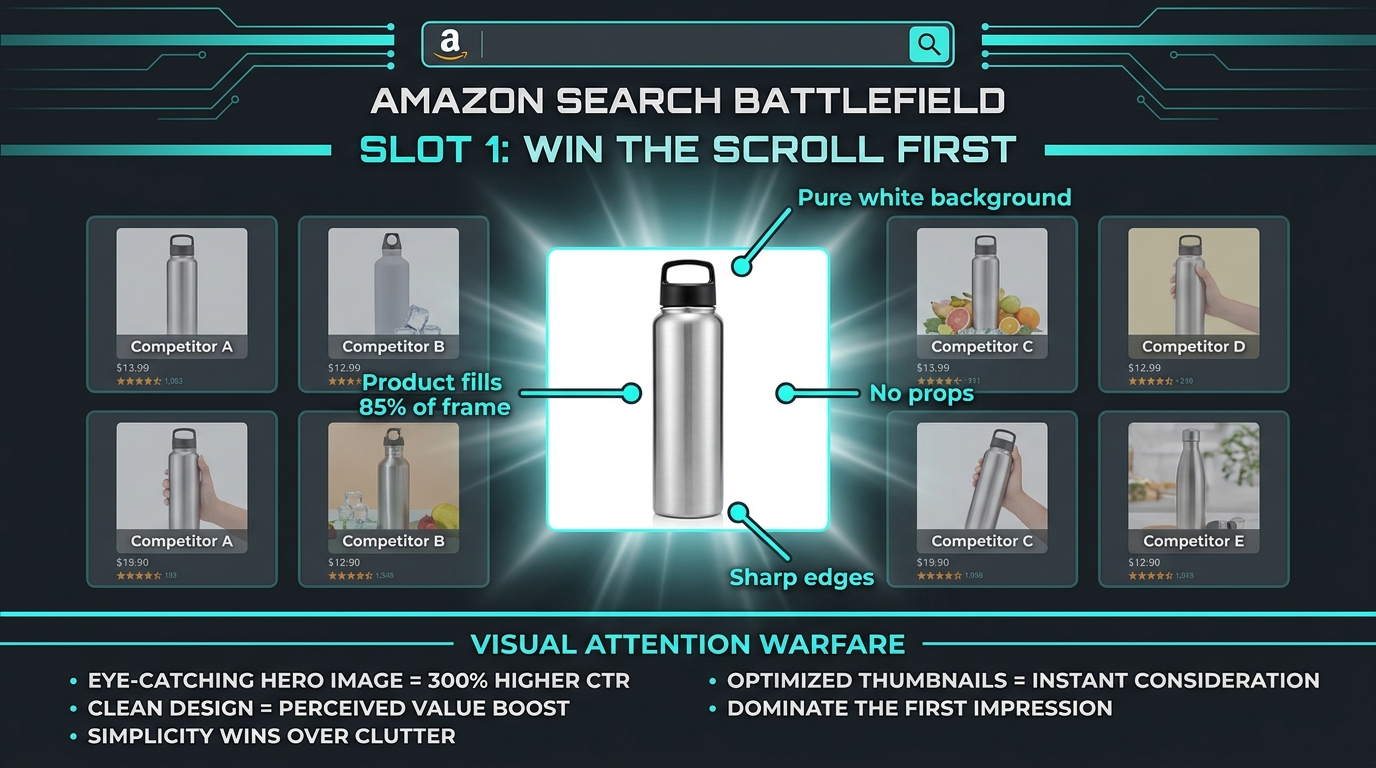
    Amazon search results page showing one product image standing out from competitors with spotlight effect, annotated with 'Product fills 85% of frame', 'Pure white background', and 'Win the Scroll First'

    Your main image has one job, and it’s not to explain your product. Its job is to win attention in a grid of thumbnails so that a shopper clicks through to your listing instead of one of the thirty other options competing for the same keyword.

    Amazon’s guidelines are explicit here: pure white background (RGB 255, 255, 255), no props, no text, no watermarks, product filling at least 85% of the frame. Those constraints aren’t arbitrary. They’re designed to create a level playing field in search — and within that playing field, the sellers who win clicks are the ones who understand what “winning attention” actually means at thumbnail size.

    The Thumbnail Problem Most Sellers Ignore

    Most sellers optimize their main image by looking at it full-size on a desktop monitor. This is exactly wrong. Your main image will be seen first as a roughly 200×200 pixel thumbnail in search results on a mobile screen. At that size, fine detail disappears. Text becomes illegible. Product edges blur together.

    The question to ask isn’t “Does this look good on my screen?” It’s “Does this image read clearly in a small grid next to eight other thumbnails on an iPhone?” That changes how you approach lighting, product angle, and negative space.

    What Actually Drives Click-Through Rate

    Several factors consistently distinguish high-CTR main images from average ones:

    • Product angle: The best-performing angle is the one that communicates the product’s primary value proposition fastest. For a backpack, that’s a three-quarter front view that shows capacity and design simultaneously. For a kitchen knife, that’s a side profile that communicates sharpness through blade geometry. There’s no universal “right” angle — the right angle is the one that does the most communication in the least amount of visual space.
    • Product scale: Filling 85% of the frame isn’t just a rule — it’s a signal of confidence. Products that look small in their thumbnails look cheap. Products that fill the frame look substantial.
    • Shadow and depth: A subtle, natural drop shadow is technically within Amazon’s guidelines (it cannot be a styled prop shadow, but a natural product shadow is acceptable). Sellers who add dimension to their main images through careful lighting often see measurably better CTR over a flat, washed-out white-on-white shot.
    • Color contrast: If your product is white, ivory, or beige, the default white background will make it disappear. The fix is aggressive lighting to create perceptible edges, or considering whether a variant in a more visible color should lead the listing.

    The “Thumbnail Test” Protocol

    Before you commit to any main image, run this three-step test. First, shrink it to roughly 200×200 pixels and look at it in isolation. Second, create a mock grid of your image alongside five competitor thumbnails pulled directly from the search page for your target keyword. Third, ask someone who isn’t familiar with your product to look at the grid for two seconds and then tell you which product caught their eye. If it isn’t yours, you haven’t won the scroll. You’ve lost the first battle before the listing page ever loads.


    Slot 2 — The Context Bridge: From “What Is It?” to “Is This for Me?”

    Once a shopper clicks through to your listing, the first secondary image they see — slot 2 — needs to immediately answer the question every shopper brings onto your page: “Is this actually what I was looking for?”

    The main image told them what the product is. Slot 2 tells them who it’s for and where it fits into their life. This is the context bridge, and it’s one of the most underused opportunities in the entire image stack.

    Lifestyle Imagery Done Right vs. Done Wrong

    Most sellers know they need a “lifestyle image” somewhere in their stack. But they often put it in the wrong slot or execute it in a way that doesn’t create identification with the target customer.

    A lifestyle image fails when it’s generic: a smiling person holding a product in a bright kitchen. It works when it’s precise: a 35-year-old woman in running gear placing your electrolyte powder into a gym bag after an early-morning workout. Every visual detail in that frame signals to a specific customer segment that the product belongs to them. The setting, the character, the moment, the other objects in the frame — all of it does targeting work that your bullet points can’t do nearly as well.

    The Identity Signal in Slot 2

    Human beings make purchase decisions partly through identity: “This is the kind of product that a person like me uses.” The slot 2 image is your best opportunity to trigger that recognition. Show your ideal buyer — not a stock photo model, but a representation specific enough that your target customer sees themselves.

    This means knowing who your buyer is before you design your images. If you’re selling a premium kitchen knife, the slot 2 image for the home cook segment looks different from the slot 2 image for the professional chef segment, even if the product is identical. The setting, the context, the emotional tone — all of it should reflect the buyer’s self-image, not just the product’s features.

    Environmental Storytelling

    Beyond the human element, the environment in slot 2 does significant storytelling work. The right background, lighting mood, and companion objects communicate product quality through association. A skincare product shown on a marble bathroom counter with soft morning light reads as premium before the buyer reads a single word. The same product shown on a plain table reads as functional. Neither is wrong — they’re just selling to different buyers with different expectations.

    The key principle: every element in your slot 2 image should be a deliberate choice that reinforces the specific brand position and buyer identity you’re targeting. Accidents in product photography don’t help you. Intentional visual decisions do.


    Slot 3 — The Feature Proof Frame: Why Bullet Points Fail Where Images Succeed

    Slot 3 is where many sellers default to their first infographic — and where a critical mistake often happens. The mistake is turning this image into a feature list: five bullet points inside a graphic box, surrounded by icons, laid over the product image. Visually busy, informationally dense, and almost completely ineffective.

    The reason is simple: that approach is just your bullet points with pictures added. It doesn’t use the unique power of a visual medium — which is to demonstrate rather than describe.

    Demonstration Over Description

    There’s a fundamental hierarchy between telling a buyer that your bag is waterproof and showing water beading off the bag’s surface in a close-up shot. The image proves the claim. The text makes it. Proof is always more persuasive than assertion — and in a marketplace where every seller is making the same claims about quality, durability, and value, visual proof is one of the few ways to genuinely differentiate.

    Slot 3 should be built around your single most important product claim — the feature that, if believed, would be most likely to move a buyer toward a purchase. Then it should show that feature in the most visually compelling way possible. Not described, demonstrated.

    The One-Claim Rule

    The temptation to pack multiple features into one image is strong, especially when you have limited slots. Resist it. The cognitive science here is clear: an image with one clear message converts better than an image with three competing messages. When buyers can’t immediately grasp what an image is trying to communicate, they move on. Clarity wins over comprehensiveness every time in a scroll environment.

    Reserve the multi-feature breakdown for later slots, after you’ve established credibility through proof. A buyer who already trusts your primary claim will engage more willingly with a denser information image later in the stack. Hit them with dense content too early, before they’re invested, and they’ll bounce.

    Close-Up Shots and Material Proof

    For physical goods where material quality matters — apparel, furniture, tools, personal care products — a macro close-up of material, construction, or finish serves as powerful feature proof. A stitching close-up on a leather wallet. A thread count detail on premium bedding. A blade edge under controlled lighting on a kitchen knife.

    These images don’t need heavy graphic design treatment. A clean, beautifully lit close-up, perhaps with a single short callout (“Full-grain leather — no bonding layers”), does more work than a feature-list infographic in the same slot. The visual itself carries the argument.


    Slot 4 — The Objection Eliminator: Turning Hesitation Into Add-to-Cart
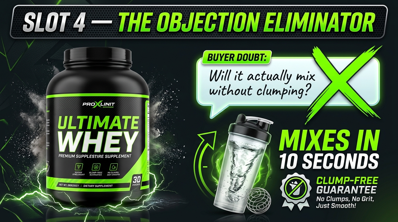
    Slot 4 objection eliminator image concept showing a buyer doubt crossed out and replaced with a product demonstration proving the claim, for a fitness supplement

    Slot 4 is, by a significant margin, the most underutilized image in most sellers’ stacks. It’s also the slot with the highest potential impact on conversion rate — because it’s positioned exactly where most buyers are on the edge of a decision.

    By the time a shopper reaches image four, they’re interested. They’ve stayed longer than a casual browser. But something is holding them back — and that something is almost always a specific objection that, if left unanswered, will send them back to the search results.

    Mining Your Reviews for Objections

    The most effective way to build slot 4 is to open your product’s review section and read every one-star and two-star review you’ve ever received. Not to feel bad about them — to extract the objections that exist in your category. What do buyers say they were worried about before buying? What disappointed them in a way that reflects a misaligned expectation? What did they complain about that competitors also get dinged on?

    These are your objections. Every common theme in your negative reviews represents a hesitation that lives in the minds of buyers who haven’t reviewed yet — because they didn’t buy.

    If you don’t have reviews yet, read your top competitors’ reviews instead. You’re entering the same category with the same buyer concerns. Mining competitor reviews for objections and addressing them proactively in your images is a legitimate competitive advantage that most new sellers never think to exploit.

    How to Visually Address an Objection

    The structure of an objection-eliminating image is: state the fear, then demolish it with evidence. Not defensively — confidently. Show the fear acknowledged and the answer provided. This works better than simply making a positive claim because it demonstrates that you understand the buyer’s concerns, which builds trust.

    Examples of this approach executed well:

    • A baby carrier brand whose reviews showed parents worried about back strain: slot 4 image shows anatomical diagram of weight distribution with orthopedic certification badge.
    • An outdoor cooler with complaints about lid seal quality: slot 4 shows the cooler fully submerged in water with the lid intact, with a callout reading “Submersion-tested. Zero leakage.”
    • A supplement with skepticism about taste: slot 4 shows a close-up of the drink mixed in a clear glass, with a badge showing “Blind taste test: 94% rated it 5 stars.”

    Each of these takes the specific fear — back pain, leaking, bad taste — and converts it into a visual proof point. That’s slot 4 working at full capacity.

    The Review-Driven Image Cycle

    Your objection image should not be a “set and forget” asset. As your review base grows, new objections emerge. Categories evolve. Buyer expectations shift. The best sellers revisit their slot 4 image every quarter, check what the most recent concerns are, and update accordingly. This makes your image stack a living conversion tool, not a static asset that ages out of relevance.


    Slot 5 — The Social Proof Visual: How to Show That People Love This

    By slot 5, you’ve established what the product is, who it’s for, what it does, and why specific fears about it are unfounded. Now the buyer needs external validation. They need to know that real people have made this purchase and been satisfied — and they need to see that evidence without leaving the image stack to go read reviews.

    This is where social proof imagery earns its place. But “social proof imagery” means something more specific than a five-star badge slapped over your product photo.

    Types of Social Proof That Translate to Images

    Social proof in the image stack can take several forms, each with different effectiveness depending on your category:

    • Star rating callouts with volume: “4.8 Stars — Over 12,000 Reviews” is a powerful signal, but only when the volume is substantial. Small review counts with high ratings actually underperform in buyer psychology compared to larger volumes at slightly lower ratings. If you have significant review volume, make it visible. If you don’t, hold this image slot for a different purpose until you do.
    • User-generated content integration: A grid of real customer photos using your product — with permission — creates authentic proof that design-only imagery can’t replicate. Even a single UGC photo integrated into a clean graphic treatment carries credibility that studio photography doesn’t, because buyers know it’s real.
    • Press and media mentions: If your product has been featured in recognizable publications, slot 5 is where that logo wall earns its keep. “As Seen In: Forbes, Good Housekeeping, Wirecutter” carries immediate credibility transfer. This only works if the publications are genuinely recognizable to your buyer demographic.
    • Expert endorsements: A quote from a relevant professional — a registered dietitian for a nutrition product, a certified personal trainer for fitness equipment — serves as specialist validation. It must be real, attributed, and specific to be effective. A generic “experts recommend” callout accomplishes nothing.
    • Award badges: Industry award recognition, “Best of” designations, or certification marks from recognized bodies translate credibility visually in a way that’s immediately parseable at scroll speed.

    Why Authenticity Is Non-Negotiable Here

    Social proof imagery fails — or worse, actively damages conversion — when buyers sense it’s manufactured. A stock-photo “testimonial” with an obviously staged smile. A rating badge with no volume number. A media logo that isn’t actually linked to a real review of your specific product. Buyers in 2026 are experienced digital shoppers with well-developed skepticism. Any proof claim that can’t survive two seconds of scrutiny is a liability, not an asset.

    If you don’t have robust social proof yet, don’t fake it. Use slot 5 for a secondary feature demonstration instead, and build this image when you have real proof to show.


    Slot 6 — The Comparison Frame: Winning Without Naming Names
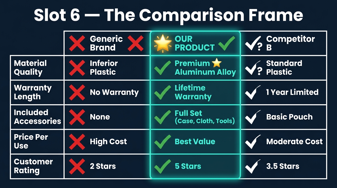
    Amazon secondary image comparison chart showing three columns — Generic Brand with red X marks, OUR PRODUCT with green checkmarks highlighted in teal, and Competitor B with partial marks — covering material quality, warranty, accessories, price per use, and rating

    Amazon prohibits explicit competitor comparisons that name specific brands and make disparaging claims. What it doesn’t prohibit is positioning your product against a category standard — and slot 6 is the perfect place to execute that positioning through a well-designed comparison chart.

    The psychological principle at work is contrast: buyers evaluate options relative to alternatives. When you control the comparison frame, you control which dimensions of comparison are most visible. A well-designed comparison chart in slot 6 makes your product’s advantages the measuring stick by which the entire category is evaluated.

    Building the Comparison Without Naming Competitors

    The standard format is a three-column grid: “Others” or “Standard Option” on the left (with red X marks), your product in the center (highlighted, with green checkmarks), and a second “standard” option on the right. The column labels avoid brand names entirely — they use category descriptors instead: “Standard Model,” “Basic Option,” “Typical Alternative.”

    The rows should be the attributes that matter most to your buyer and where your product genuinely has an advantage. This last part is critical: the comparison only works if your advantages are real. Buyers who purchase based on a comparison chart and then discover the advantages were exaggerated leave reviews that will undermine your future conversion rate. The comparison frame should be a confident statement of real differentiation, not wishful positioning.

    Choosing the Right Attributes

    The most effective comparison attributes are the ones that connect directly to the objections from slot 4. If your slot 4 image addressed fears about durability, your slot 6 comparison should include a warranty or build-specification row. If slot 4 addressed taste concerns for a food product, slot 6 might compare ingredients or formulation standards.

    This creates thematic coherence across your image stack — the same concerns get addressed from multiple angles, which compounds the persuasive effect. A buyer who saw their durability concern addressed in slot 4 and then sees it reinforced in a comparison chart in slot 6 has now received that message twice through different visual formats. Repetition in this context builds conviction, not annoyance.

    Design Principles for Readable Comparison Charts

    A comparison chart that can’t be read in three seconds has failed its purpose. The most common design mistake is too many rows and too much text — eight comparison points with paragraph-style descriptions that require zooming in to parse. At mobile image sizes, this becomes completely unreadable.

    Limit your comparison to five attributes maximum. Use icons alongside text labels for each row. Use bold color contrast (teal or green for your column, grey or red for the competitor columns) so the visual hierarchy is immediately clear. And keep every text element in the chart readable at the size it will actually appear on a buyer’s phone screen.


    Slots 7, 8, and 9 — The Deep Conviction Layer

    Buyers who make it to image seven are a specific type: they’re highly interested, likely nearly decided, but they need one or two final pieces of information before they’re ready to commit. These are not casual browsers — they’re serious evaluators. The tone and content of your later image slots should reflect that.

    What the “Conviction Layer” Buyer Needs

    By slot 7, the buyer has already absorbed your primary value proposition, your context, your feature proof, your objection responses, your social proof, and your competitive positioning. They don’t need more of the same. They need something different: information that speaks to the logistics of ownership rather than the desirability of the product.

    This includes:

    • What’s in the box: A clean flat-lay of every included item, labeled. This addresses a low-level but persistent concern: “Am I getting everything I need, or will I need to buy additional parts?” Resolving this visually before purchase prevents disappointed reviews from buyers who expected a complete kit.
    • Size and scale reference: For any product where dimensions are critical to fit or function — furniture, wearables, tools, children’s products, kitchen equipment — a size reference image showing the product next to a recognizable object (or on a person, or with a dimensional diagram) reduces the “it looked bigger online” return reason substantially.
    • Care and use instructions (visual format): For products that have a learning curve or maintenance requirements, a simple step-by-step visual guide in later image slots converts the uncertainty of “can I actually use this correctly?” into confidence. This is particularly effective for kitchen appliances, skincare devices, fitness equipment, and baby products.
    • Brand story image: For brands with a meaningful origin story, a crafted brand image in one of the later slots — showing manufacturing, sourcing, or founding mission — can create emotional investment at the moment a buyer is nearly committed. This works especially well for small-batch, artisan, or mission-driven brands where the story is a genuine differentiator.

    The Video Thumbnail Slot

    Amazon allows sellers to include a product video that appears as an additional media item in the image carousel. On desktop, it appears as an additional slot with a video icon. On mobile, it’s embedded in the image scroll. This slot is frequently left empty by sellers who don’t have video content — which is a significant missed opportunity.

    A product video in the 45–90 second range that demonstrates the product in use, covers key features visually, and includes customer testimonials can function as a condensed version of your entire image stack — plus motion, which is inherently more engaging than static images. For categories where product use isn’t immediately obvious, video has been shown to significantly reduce return rates by aligning buyer expectations with product reality before the purchase is made.


    Mobile-First Image Design: The 375px Reality Most Sellers Are Still Ignoring
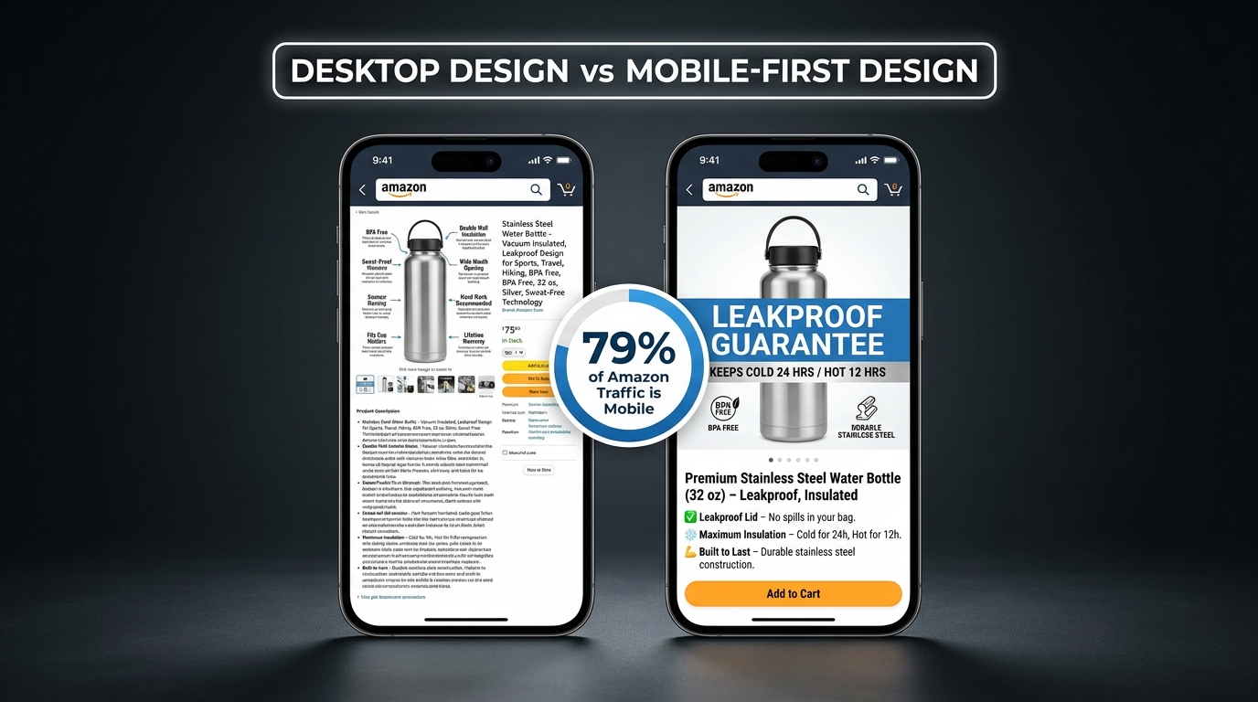
    Side-by-side mobile phone comparison showing desktop-designed Amazon listing image with illegible text vs mobile-first redesigned image with clear bold text, with stat badge showing 79% of Amazon traffic is mobile

    The majority of Amazon shopping happens on mobile devices. When you design your listing images on a 27-inch desktop monitor at full resolution, you are designing for a minority of your buyers. When you publish those images without testing them on a phone screen, you’re gambling that what looks good at 2000×2000 pixels will still communicate effectively at the 375-pixel width of a standard smartphone display.

    Often, it doesn’t.

    What Breaks on Mobile

    Several common image design choices that look fine on desktop become serious conversion problems on mobile:

    • Small callout text: Feature callout text that’s 18–24 points in a design program renders at roughly 9 points on a phone screen. That’s below comfortable reading threshold for most people, and below usable threshold for anyone over 40. Text in your secondary images needs to be dramatically larger than it feels necessary on a desktop monitor.
    • Multi-column infographic layouts: A two-column or three-column feature breakdown that’s legible on desktop becomes a dense, unreadable block on mobile. Stick to single-column vertical layouts for any text-heavy image in your stack.
    • Low-contrast color combinations: Grey text on white, or navy text on dark blue — both can be readable on a high-resolution monitor and completely inaccessible on a budget Android screen in a sunlit room. Test your image color combinations on a real device outdoors before finalizing.
    • Thin line icons: Fine-line icon styles that look sophisticated on desktop disappear on mobile. Use bold, filled icon styles for any informational graphics that need to be parseable on a phone screen.

    The Mobile Design Protocol

    Before approving any image for your listing, run it through this mobile-specific review:

    1. Open the image on your smartphone — not in a design preview, but as a saved image in your camera roll.
    2. Hold the phone at normal reading distance. Can you read every text element without pinching to zoom?
    3. Can you identify the key message of the image within two seconds, without zooming?
    4. Does the image maintain its visual impact in a bright environment (simulate outdoor viewing by adjusting your phone brightness)?

    If any of these tests fail, the image needs revision before it goes live. This protocol should be non-negotiable for every asset in your stack.

    Amazon’s Mobile Image Display Logic

    On mobile, Amazon’s product page shows the main image prominently, followed by a horizontally scrollable image strip. Buyers swipe through images in order. This means the transition between images — not just each individual image — matters. If images 3, 4, and 5 are all visually similar (same background color, same layout template, same graphic style), they’ll blur together as the buyer swipes, and the informational distinction between them will be lost.

    Use visual variety across your stack — different background tones, different layout orientations, different primary colors per section — so each image reads as a distinct moment in the visual sequence. Variety maintains attention as the buyer swipes. Uniformity creates a visual monotone that buyers tune out.


    How to Audit Your Existing Image Stack Using the “Next Slide” Test
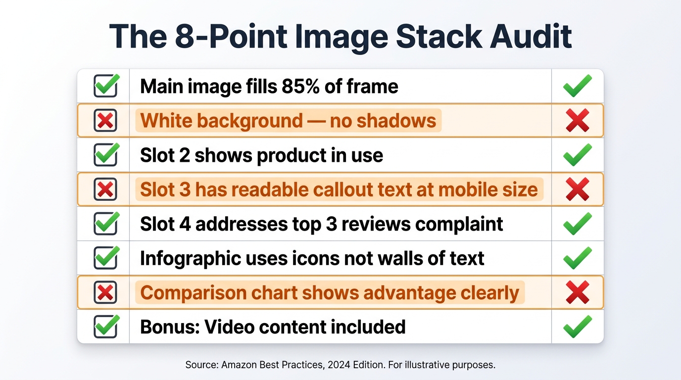
    Amazon image stack audit scorecard checklist showing 8 criteria with green checkmarks and red X marks, including main image fill, white background, mobile text readability, objection coverage, and comparison chart

    Most sellers never evaluate their image stack as a complete system. They review images individually — “this one looks good, that one needs better lighting” — without assessing whether the stack as a whole is performing a coherent conversion function. The “Next Slide” test is a structured audit framework that evaluates your image stack the same way a buyer experiences it.

    Running the Next Slide Test

    Pull up your listing on your phone. Go through each image, but before swiping to the next one, answer these two questions out loud:

    1. What does this image tell the buyer that the previous image didn’t? Every image should introduce new information, new emotional context, or new proof. If you can’t answer this question, the image is redundant — it’s taking up a slot that could be doing conversion work.
    2. Does this image give the buyer a reason to see the next one? Each image should create mild forward momentum — a visual or informational hook that makes the next slot feel necessary. If an image feels like a complete stopping point, you may be closing the sequence too early or breaking the flow.

    Do this exercise for every image in your stack. Note where the answers break down — where you can’t identify what new information is being added, or where the momentum drops off. These are your optimization priorities.

    The Eight-Point Structural Checklist

    Beyond the narrative flow test, use this structural checklist to evaluate your stack for common technical and strategic gaps:

    1. Does your main image fill at least 85% of the frame on a pure white background?
    2. Does slot 2 clearly show the product in use by a representative member of your target customer?
    3. Does slot 3 prove your single most important product claim visually — not just describe it in text?
    4. Have you read your reviews and built slot 4 around the most common hesitation buyers express?
    5. Is your social proof in slot 5 verifiable, specific, and backed by real volume data?
    6. Does your comparison chart in slot 6 highlight attributes where you genuinely outperform the category standard?
    7. Does your later-slot content address “what’s in the box,” scale/dimensions, or product use guidance?
    8. Have you tested every image on a mobile device at arm’s length, in a bright environment, without zooming?

    Any “no” answer on this checklist is a concrete optimization opportunity with a direct line to conversion rate. Prioritize the earlier slots first — improvements to slots 1–4 tend to have the largest impact because they affect the broadest portion of your traffic.

    Using Manage Your Experiments for Data-Backed Decisions

    Amazon’s “Manage Your Experiments” feature, available to brand-registered sellers, allows you to A/B test your main image against an alternate version across real traffic to your listing. This is one of the highest-value tools available to Amazon sellers for image optimization — and among the most underused.

    Run a test with your current main image against a challenger that changes one variable: the product angle, the background treatment, the product fill percentage, or the lighting style. Let it run for a minimum of four weeks to achieve statistical significance. The data it returns — click-through rate and conversion rate by image variant — is more reliable than any design instinct or competitor imitation strategy.

    Sellers who build systematic testing into their image strategy — rotating through variables, measuring results, and iterating based on data — consistently outperform those who optimize images once and leave them. Your image stack is not a launch deliverable. It’s an ongoing asset that should improve continuously alongside your review volume, your category knowledge, and your buyer feedback.


    The Economics of Getting This Right: What Conversion Rate Actually Costs You

    Before concluding, it’s worth grounding all of this in economics — because the ROI of image optimization is frequently misunderstood. Sellers who spend time and budget on their image stack sometimes view it as a creative expense. It isn’t. It’s a revenue lever with a calculable return.

    The Multiplier Effect of Conversion Rate

    Consider a listing with 5,000 sessions per month and a conversion rate of 8%. That’s 400 units sold. Raise the conversion rate to 11% through image optimization — a modest, achievable improvement — and you’re selling 550 units on the exact same traffic. No additional ad spend. No keyword changes. No price adjustments. Just more of the buyers already visiting your page making the decision to purchase.

    At any margin above zero, that 37.5% increase in units represents pure additional profit from an investment you’ve already made in driving traffic. Conversion rate improvement is the highest-leverage optimization available to most Amazon sellers because it amplifies the return on every other dollar you spend to generate visits.

    Images vs. Price as a Conversion Lever

    When conversion rate is low, many sellers reach first for the price lever — they discount, they run coupons, they undercut competitors. This works in the short term but erodes margins, trains buyers to expect lower prices, and creates a race to the bottom in competitive categories.

    Poor images are a more common cause of low conversion rates than price misalignment. A buyer who doesn’t trust the product based on visual evidence won’t be converted by a 10% discount. A buyer who can clearly see that this product will solve their specific problem, is trusted by thousands of other buyers, and outperforms the category standard on the dimensions that matter — that buyer will pay a premium, not demand a discount.

    Image optimization is, in many categories, the most effective way to sustain price integrity while improving conversion. The sellers who’ve figured this out compete differently — they’re not in the discount war, they’ve exited it entirely by building listings that justify their price point through visual evidence.


    Conclusion: Your Image Stack Is a Team, Not a Collection

    Nine image slots. Nine distinct jobs. One coherent buyer journey.

    The sellers who treat their image stack as a collection of individual photos will always be outcompeted by those who treat it as a system — each slot playing a specific role, each image building on the last, the whole sequence moving buyers through attention, evaluation, validation, and decision with deliberate intent at every step.

    The framework in this post gives you the structure to evaluate, build, and test that system for any ASIN in your catalog. Start with an audit using the Next Slide Test and the eight-point checklist. Identify your weakest slot — it’s almost certainly slot 4, the objection eliminator, based on what we see across most sellers’ stacks. Rebuild that slot using your review data. Then work outward.

    The improvement won’t happen overnight. But every slot you optimize adds incrementally to your conversion rate — and as we’ve established, conversion rate improvements are the highest-leverage investments available in your Amazon operation. The work is specific, measurable, and repeatable.

    Key Takeaways:

    • Each image slot has a specific psychological job in the buyer’s decision process. Understand the job before designing the image.
    • Slot 4 (the objection eliminator) is the most underused, highest-impact image in most sellers’ stacks. Build it from your negative reviews.
    • Design all images for mobile first — test on a real phone at arm’s length before publishing anything.
    • Use Amazon’s Manage Your Experiments tool to A/B test your main image against real traffic data.
    • Treat your image stack as a living conversion asset — update it as your reviews, category competition, and buyer behavior evolve.
    • Conversion rate improvement is more sustainable than price discounting as a growth lever. Great images let you compete on quality, not price.
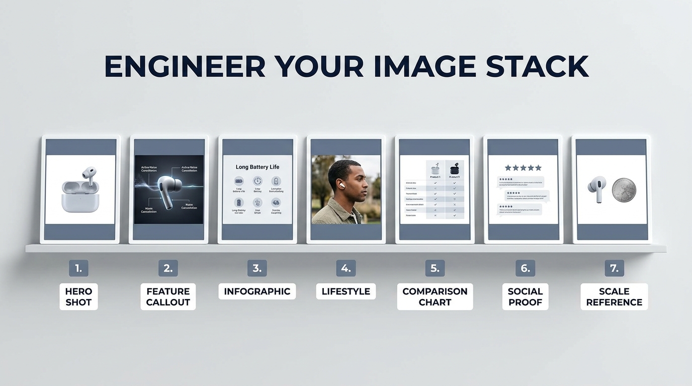
  • The Amazon Image Stack: How to Engineer Each of Your 7 Image Slots for Maximum Conversion

    The Amazon Image Stack: How to Engineer Each of Your 7 Image Slots for Maximum Conversion

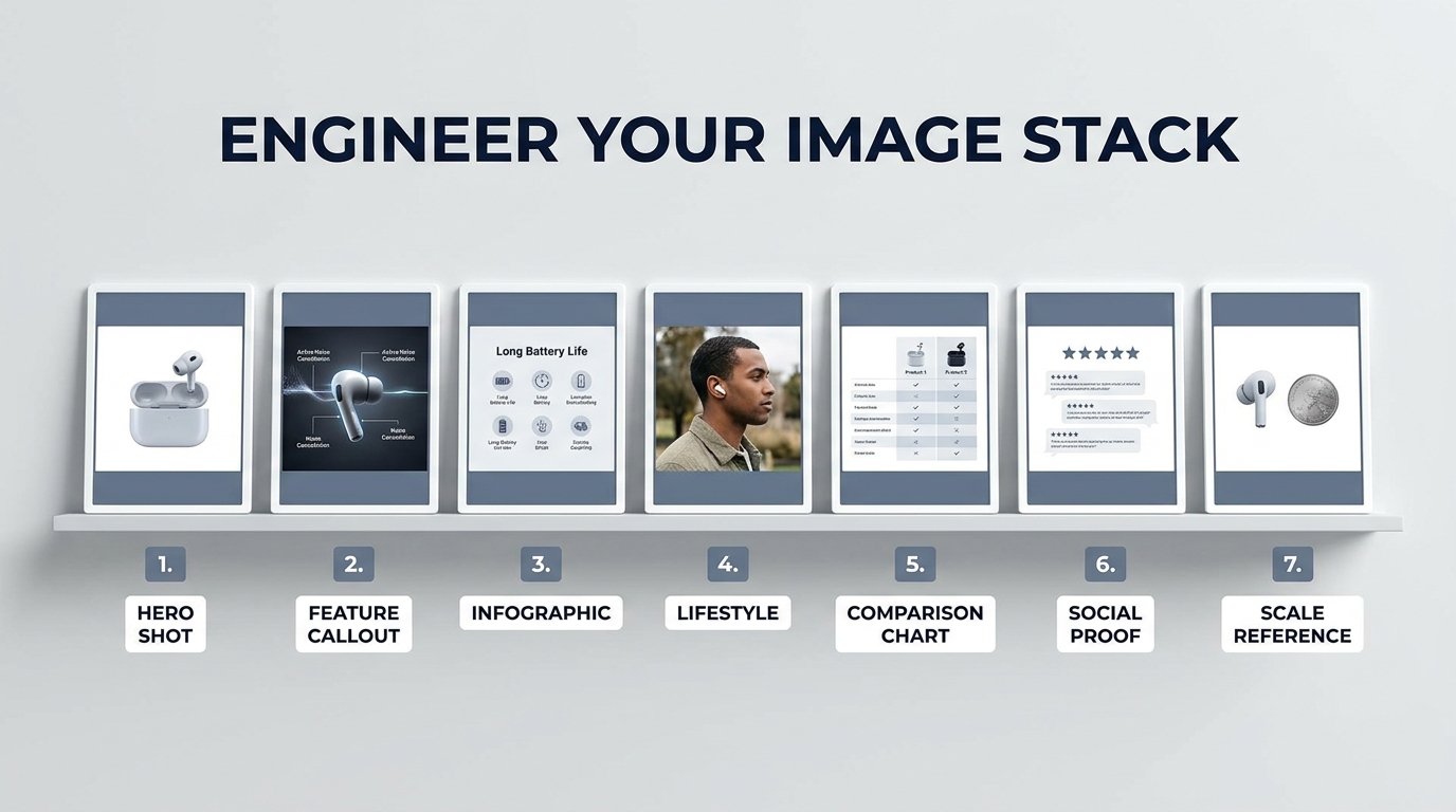
    The Amazon Image Stack — 7 numbered image slots each engineered for a specific conversion role

    Most Amazon sellers spend months sourcing the right product, weeks dialing in their pricing, and days writing keyword-dense bullet points — then hand off their images to a photographer with one instruction: “Make it look good.”

    That’s the single most expensive mistake on the platform.

    Your image stack is not a visual brochure. It is not a gallery. It is not a chance to show off your brand aesthetic. It is a conversion machine with seven distinct components, and each slot has a specific job to do in a specific order. When one slot fails its job, the buyer moves on — not to your next image, but to your competitor’s listing.

    The seller who wins on Amazon in 2026 is not necessarily the one with the prettiest photos. It’s the one who understands that a buyer moving through an image carousel is making a series of micro-decisions — and that every image either advances that decision toward purchase or stalls it. Click-through rate, session-to-order rate, return rate, ad cost efficiency — all of it traces back, in some measure, to how well your image stack does its job.

    This post is not about Amazon’s technical requirements (though we’ll cover the specs that actually matter). It’s about the strategic logic behind building an image stack that functions as a structured sales argument — one that anticipates buyer hesitation, answers objections before they form, and closes the gap between “considering” and “add to cart.”

    Let’s break down all seven slots, what each one is actually for, and how to build them with intention.

    The 7-Slot Framework: Why Each Image Position Is a Distinct Conversion Asset

    Amazon allows sellers to upload up to nine images on most categories, but the functional carousel buyers interact with most often contains seven visible slots. The remaining two sit in an overflow state that many buyers never reach on mobile — which means your real working budget is those first seven images.

    The mistake most sellers make is treating these seven slots as interchangeable. They upload seven variations of essentially the same thing: seven angle shots, or seven lifestyle photos, or a hero image followed by six infographics. None of these approaches accounts for the psychological sequence buyers move through when evaluating a product.

    The Decision Sequence Every Buyer Follows

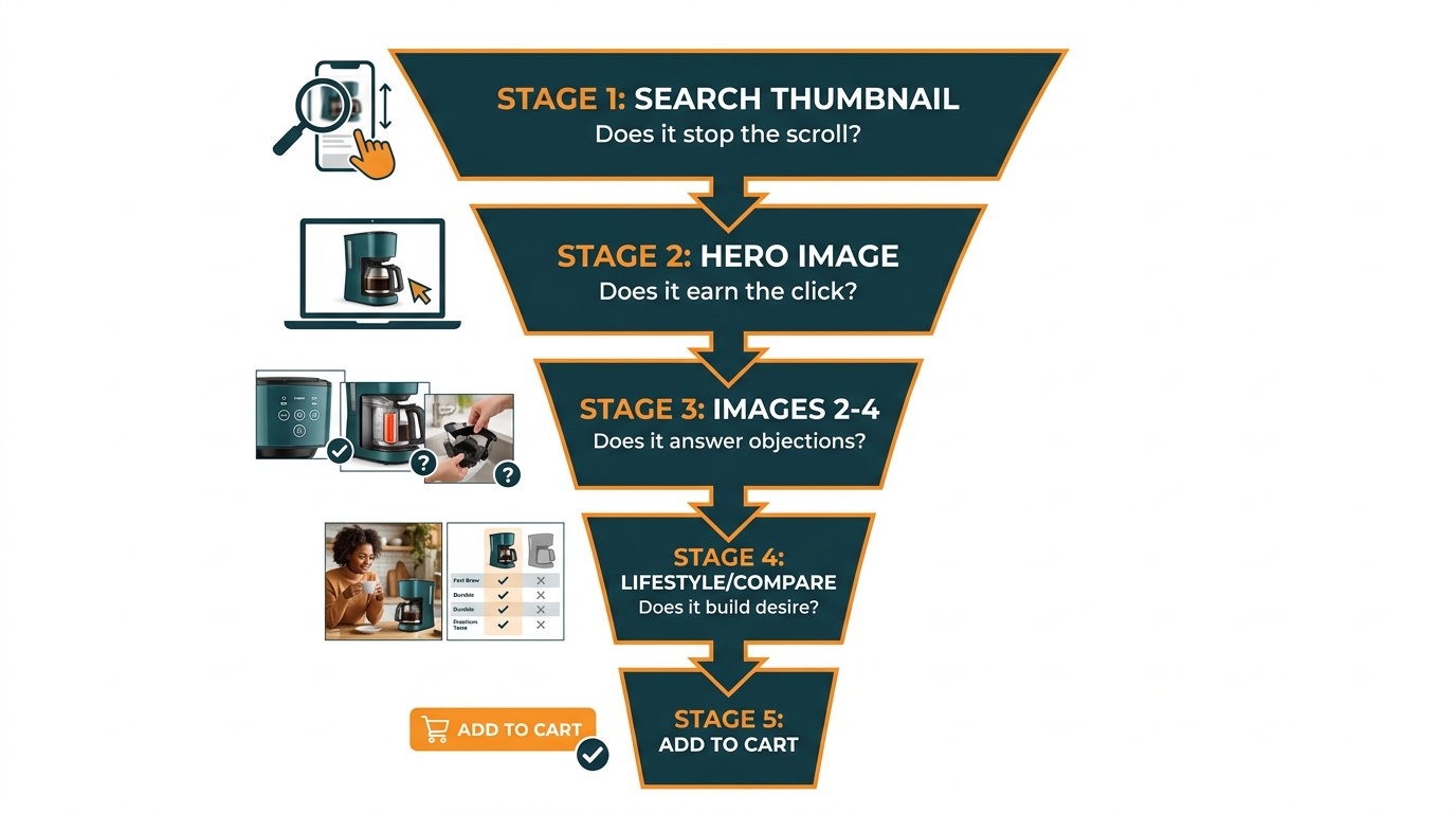
    Before a buyer clicks “Add to Cart,” they have implicitly answered a series of questions — usually in this order:

    1. Is this worth a closer look? (Search result thumbnail)
    2. Is this the right product category/style for what I need? (Hero image)
    3. Does it actually do what I need it to do? (Feature images)
    4. Is the quality what I’m expecting for the price? (Detail and material images)
    5. Will this work in my context / for my situation? (Lifestyle image)
    6. Is this better than other options I’m considering? (Comparison image)
    7. Can I trust this seller and this product? (Social proof / guarantee image)

    That is seven questions. You have seven image slots. The architecture practically builds itself — if you know what you’re doing.

    Amazon buyer journey funnel diagram showing the 5 stages from search thumbnail to Add to Cart

    Why Slot Order Matters More Than Individual Image Quality

    A stunning lifestyle photo placed at image position 2 is wasted. A buyer at position 2 is still evaluating whether your product is what they’re looking for — they’re not yet in the emotional aspirational space where a lifestyle image lands. Placing it there is the visual equivalent of asking someone to imagine themselves on vacation before you’ve told them where the hotel is.

    Conversely, a dry feature callout placed at position 6 is equally misplaced. By that point, the buyer has already emotionally engaged with the product — they need validation and reassurance, not specifications they should have seen three slots ago.

    Sequence is strategy. And most sellers have their sequence wrong.


    Image Slot 1: The Hero — Its Only Job Is the Click

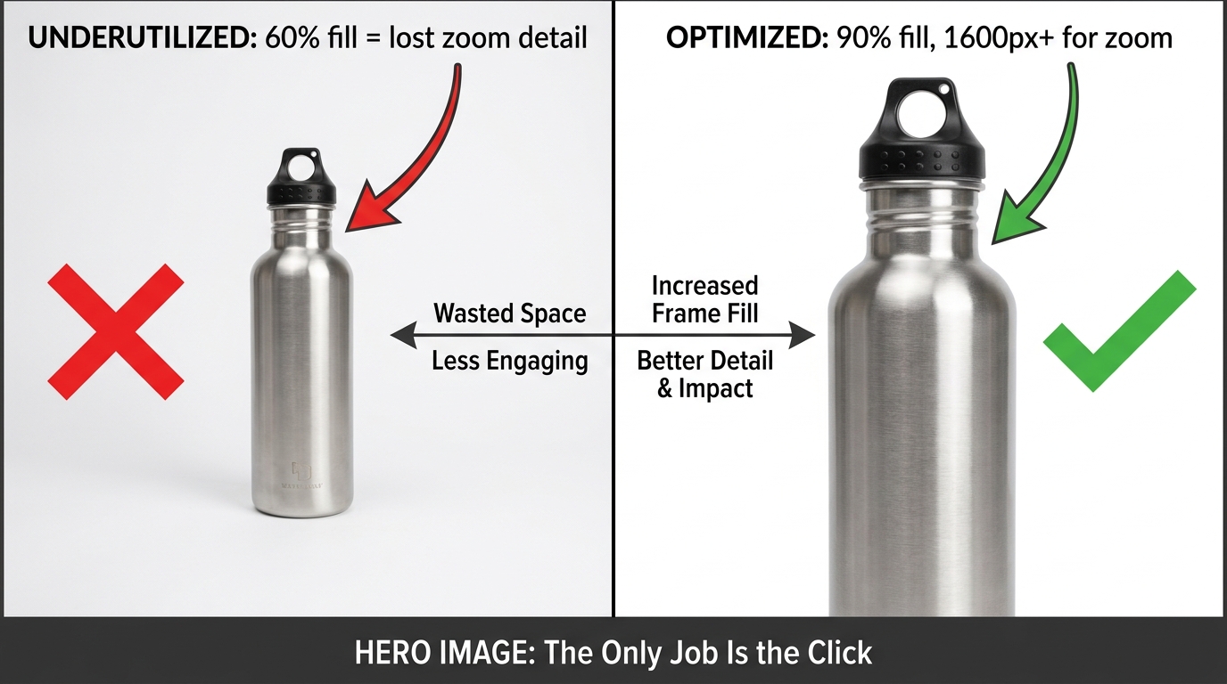
    The hero image is both the most constrained and most consequential image in your stack. Amazon’s rules here are strict: pure white background (RGB 255, 255, 255), no text overlays, no props that aren’t included in the product, no multiple views. The product must fill at least 85% of the frame, and the image must be at least 1,600 pixels on the longest side to activate zoom functionality.

    These constraints make most sellers feel like the hero image is out of their control — that it’s just a matter of having a clean photo and hitting the specs. That thinking is what separates mediocre listings from top performers.

    Split comparison showing underutilized hero image at 60% frame fill versus optimized hero at 90% fill with zoom-ready resolution

    Within the Rules, There Is Enormous Room to Win

    Within Amazon’s constraints, you still control several critical variables that determine whether your hero image earns a click from the search results page:

    • Product angle and orientation. Most categories have a default angle everyone uses. Study your top competitors’ hero images and identify the dominant angle — then test an alternative that creates visual differentiation on the search results page. A 45-degree angle vs. front-facing, a horizontal product shot vs. vertical — small variations that make your thumbnail visually distinct in a grid of identical-looking competitors.
    • Fill percentage. Shooting to 85% fill is the minimum. Shooting to 90–95% fill maximizes the perceived size and impact of your product in the thumbnail, which directly influences click-through rate. A product that looks larger relative to competitors triggers more clicks in category searches, especially on mobile where thumbnail sizes are small.
    • Variant selection. If you sell multiple colors or styles, consider which variant hero image performs best in search — not just which one looks best in isolation. A darker colored product often has higher contrast against the white background and reads better at thumbnail size. This is worth testing explicitly.
    • Zoom-readiness. The recommended 1,600px minimum for zoom is not actually optional if you care about conversion. Zoom functionality has been linked to higher conversion rates by Amazon’s own internal research, and buyers who zoom are demonstrating high purchase intent. Shoot at 2,000–3,000px to give zoom full room to work.
    • White balance precision. A hero image shot against a slightly off-white background (cream, gray-white, or cool-white) looks inconsistent on Amazon’s pure-white page template. This creates a subtle but real visual friction that signals “low effort” to buyers. Your whites must be calibrated to true 255/255/255 — not approximately white.

    The Thumbnail Test: How to Check Before You Publish

    Before finalizing your hero image, resize it to 120×120 pixels — the approximate size of an Amazon search result thumbnail on mobile. Can you still clearly tell what the product is? Does it visually stand out? Is the key product attribute (shape, material, color, form factor) immediately readable? If the answer to any of these is “not really,” your hero image will underperform in search, regardless of how well it photographs at full size.

    This thumbnail test is one of the most commonly skipped steps in listing optimization, and it explains why products with beautiful photography still struggle with click-through rate.


    Images 2 and 3: The Objection-Killers That Do the Heavy Lifting

    If your hero image earns the click, images 2 and 3 earn the session. These two slots are where the majority of buying decisions are made or abandoned — and where most sellers squander their opportunity by either repeating the hero image at a different angle or jumping prematurely to lifestyle content.

    Images 2 and 3 should be working images. They answer the immediate question a buyer has the moment they click through: “Okay, I’m looking at this product — does it actually do what I need?”

    Image 2: The Primary Benefit Statement

    Image 2 should visually communicate the single most important benefit your product delivers — not a feature, a benefit. The distinction matters enormously.

    A feature is “stainless steel double-wall construction.” A benefit is “keeps drinks cold for 24 hours.” A feature is “ultra-high-density foam.” A benefit is “wakes up without the aches.” Buyers don’t evaluate products in terms of features — they evaluate them in terms of outcomes. Image 2 should lead with the outcome.

    This image can and should include a minimal text overlay — a clear, large-font headline that names the primary benefit, supported by a secondary line that names the key feature delivering it. Keep the text to two lines maximum. The visual should support and reinforce the text, not compete with it.

    Image 3: The Key Differentiator or Counter-Objection

    By image 3, a buyer is often holding a specific concern or skepticism. They may be wondering: Is this actually durable? Will this fit my situation? Is this the right size? Image 3 is where you counter the single most common objection your category faces.

    To know what that objection is, go directly to your competitors’ negative reviews and your own. Look for the most frequently repeated concern. If three-star reviews consistently mention “the material felt cheap,” image 3 should show a close-up detail shot of the material with a callout that specifically addresses it — “Military-Grade Nylon: Tested to 200lb Tensile Strength.” If buyers keep returning products because they’re the wrong size, image 3 should show clear size context — the product held in a hand, next to a common reference object, or with explicit dimension callouts.

    The buyer who gets through images 2 and 3 without their main objection being triggered is a buyer who is likely to scroll further. The buyer whose objection is never addressed will exit — usually to read the reviews looking for reassurance, and once they’re in the reviews, you’ve lost the narrative control of your listing.


    The Infographic Slot (Image 4): Packing Density Without Visual Noise

    The infographic image is the hardest to execute well and the most commonly done badly. When it works, it’s a conversion accelerator — a single image that answers multiple questions simultaneously, speeds up the buyer’s evaluation process, and demonstrates product depth. When it fails, it creates visual noise that signals “amateur design” and actively erodes trust.

    Amazon listing infographic image showing a product with 5 clean callout annotations pointing to key features on a dark navy background

    The Five-Point Rule

    Effective Amazon infographic images share one common trait: they answer no more than five specific questions per image. The moment you try to answer six, seven, or eight points in a single infographic, visual density crosses into visual chaos. Buyers process these images quickly — often in under three seconds — and an overcrowded infographic communicates nothing memorable because it tries to communicate everything simultaneously.

    Choose five product attributes that buyers most commonly want to know before purchasing — attributes that are difficult or impossible to convey through the product photo alone. Dimensions, materials, certifications, compatibility, capacity, contents — these are infographic territory. Benefits and lifestyle outcomes are not — those belong in different slots.

    Design Principles That Separate Good Infographics from Great Ones

    • Hierarchy matters more than completeness. Not all five callouts should look identical. Weight them visually so the most important feature draws the eye first. Use size, color contrast, or proximity to the product to establish hierarchy.
    • Lines and arrows must be precise. Callout lines that don’t clearly point to the specific product area they’re describing create confusion. Every line should have an unambiguous origin and terminus. If the line points vaguely toward “the middle of the product,” redesign it.
    • Icons add credibility, not decoration. Small icons next to callout text serve a functional purpose — they make individual callout points scannable and reinforce the legitimacy of certifications or standards. An icon of a food-safe symbol next to “BPA-Free” carries more weight than the text alone.
    • Background color is a lever, not an afterthought. A dark or deep-colored background for your infographic image makes it visually distinct from the white-background hero image immediately preceding it in the carousel, which draws the eye and signals a content shift. It also gives text overlays more contrast and readability.
    • Readable at thumbnail size. The mobile thumbnail test applies here too. Your five callout points will be invisible at thumbnail size — and that’s fine. What must be readable at thumbnail size is the dominant visual: the product shape and the headline or primary callout. The detail is a reward for buyers who expand the image.

    What Belongs in an Infographic vs. What Belongs Elsewhere

    One of the most common infographic mistakes is stuffing it with lifestyle content — showing people using the product, showing aspirational settings, or including review excerpts. This dilutes the functional clarity that makes infographics valuable. Lifestyle belongs in its own slot. Social proof belongs in its own slot. The infographic slot should be exclusively dedicated to product facts — the specifications and attributes that help a buyer confirm this product is objectively right for their need.


    The Lifestyle Image (Image 5): Aspiration vs. Context — Knowing Which One to Sell

    Lifestyle images are where most sellers over-invest effort and under-invest strategy. The assumption is that a beautiful lifestyle photo — high production value, aspirational setting, professional models — is inherently effective. That’s only true if the lifestyle image is doing the right job for your product category and buyer intent.

    There are actually two fundamentally different types of lifestyle images, and they serve different conversion purposes:

    Aspirational Lifestyle: Selling an Identity

    Aspirational lifestyle images work when the buyer is purchasing a product as part of a desired self-image or social identity. Premium fitness gear, travel accessories, home décor, fashion — these categories respond to aspiration because the buyer is not just buying the product, they’re buying what owning the product says about them.

    In these categories, a lifestyle image should feature an idealized but believable version of the buyer’s target persona in an environment they aspire to. The product should be naturally integrated — not center-staged and spotlit, but present and in use. The setting, the model, the lighting, and the styling collectively communicate: “This product belongs in the life you want.”

    Contextual Lifestyle: Solving for Fit

    Contextual lifestyle images work when the buyer’s primary question is whether the product fits their specific situation — their kitchen size, their workflow, their body type, their existing setup. Office supplies, kitchen tools, pet products, organizational items, electronics — these categories are driven by practical fit, not aspiration.

    For these products, the lifestyle image should show the product in a realistic, relatable environment that mirrors the buyer’s actual context. A desk organizer photographed on a perfectly arranged, minimalist desk in a studio apartment performs differently than one photographed on a functional home office desk that looks like an actual working environment. Buyers in practical categories trust recognizable contexts over aspirational ones — the latter can feel disconnected from their reality.

    The Mistake of Conflating the Two

    Using an aspirational lifestyle image for a practical product category creates subtle cognitive dissonance — the buyer thinks “this looks nice, but is it right for me?” Using a utilitarian contextual image for an aspirational category leaves emotional value on the table. Knowing which type your product category demands is the foundation of a high-performing lifestyle slot.

    Regardless of which approach fits your category, all lifestyle images should meet one standard: the product must be in use, not simply present. A water bottle sitting on a countertop next to some fruit is decoration. A water bottle being sipped by someone mid-run is context. The difference in conversion impact is significant.


    Images 6 and 7: The Comparison and Social Proof Slots — Using the Final Slots Strategically

    By the time a buyer reaches images 6 and 7, they are in a specific psychological state: they are seriously considering your product, but they’re comparing it — consciously or unconsciously — to alternatives. Slots 6 and 7 are where you close that comparison definitively.

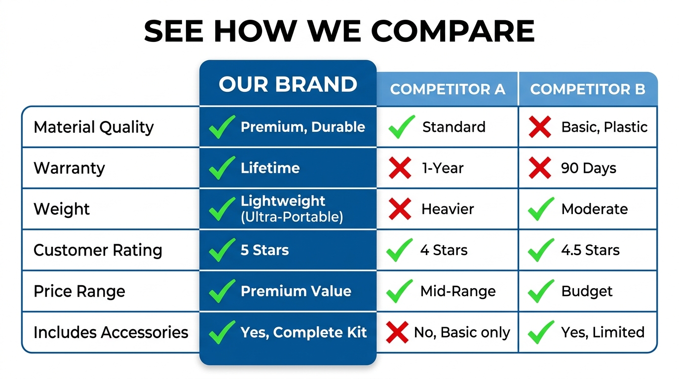
    Amazon product comparison chart showing brand vs. two competitors across 6 feature rows with green checkmarks and X marks, headline: SEE HOW WE COMPARE

    Image 6: The Comparison Frame

    A well-constructed comparison image does something that no amount of bullet copy can achieve: it presents a direct, visual side-by-side evaluation that your product wins. The key word is “wins” — this is not a neutral comparison, it’s a structured argument in which your product is the obvious conclusion.

    Effective comparison images typically use one of two formats:

    • Feature grid comparison: A three-column table comparing your product against “Typical Competitors” or “Standard Brands” across five to seven attributes where you have clear advantages. Critically, these attributes should be ones the buyer actually cares about — not ones you’ve selected because you happen to win on them. If buyers care about warranty length but not about handle material, include warranty and omit handle material, even if your handle is better.
    • Before/after or with/without comparison: For products that solve a specific problem, showing the before state (without your product) and the after state (with your product) in a clear visual split is often more emotionally compelling than a feature grid. This format works particularly well for cleaning products, organizational items, health and wellness products, and anything where the outcome is visually demonstrable.

    One important note: Amazon’s image policies prohibit claims that are unverifiable or misleading. Any comparative claims in image 6 must be accurate, non-deceptive, and ideally attributable to a specific test, standard, or source. “Lasts 3x longer” with no qualifier is a compliance risk. “Lasts 3x longer in ASTM durability testing” is defensible.

    Image 7: The Trust Closer

    The final functional image slot is where you provide the last piece of reassurance a buyer needs to make the purchase: social proof and risk reversal. This image should accomplish two things simultaneously:

    Aggregate social proof at a glance. A visual representation of your review rating and review count — “4.7 Stars | 12,000+ Verified Reviews” — is a powerful trust signal. Buyers who have scrolled through six images are invested in your product and are looking for confirmation that other buyers were satisfied. Presenting this visually, rather than letting them seek it out in the reviews section, keeps the positive narrative in your control.

    Remove the final barrier: purchase risk. A clear, bold guarantee statement — “30-Day No-Questions-Asked Returns” or “Lifetime Warranty Included” — directly addresses the last hesitation standing between the buyer and the add-to-cart button. If your return policy or warranty is a genuine competitive advantage, make it unmissable here. If it’s standard, include it anyway — buyers with a genuine reason to worry about a purchase will find this image the decisive tipping point.


    Mobile-First Optimization: How Your Images Actually Look on the Device Most Buyers Use

    As of 2026, the majority of Amazon browsing and a substantial share of purchasing happens on mobile devices. This single fact has more implications for image stack design than almost any other factor — and it’s one that most sellers account for poorly, if at all.

    Smartphone showing Amazon product detail page with tiny thumbnail carousel, annotation arrows pointing to illegible text overlays labeled 'TEXT TOO SMALL — INVISIBLE ON MOBILE', alongside corrected version with large bold benefit text

    The Mobile Carousel Behaves Differently

    On desktop, Amazon displays a large main image with a thumbnail strip below. Buyers can hover over thumbnails to preview images quickly, which means they may scan through your stack without committing to a full view of each image.

    On mobile, the image carousel is a swipe-based interface where each image occupies the full screen width — typically around 360–430 pixels wide on a standard smartphone. Buyers swipe through images at their own pace, but the swipe gesture itself creates a different pacing than the desktop hover experience. Mobile buyers tend to be faster — they swipe through images more quickly and make snap judgments about whether each image merits closer attention.

    Text Overlay Sizing: The Most Common Mobile Failure

    The most pervasive mobile optimization failure is text overlay sizing. Designers typically create listing images at 2000×2000 pixels and preview them at that size on a desktop monitor. At 2000px, a 40pt font headline looks perfectly readable. At 400px on a mobile screen, that same headline becomes borderline illegible.

    The rule of thumb: any text you want readable on mobile should be set at a minimum of 60–80pt at the 2000px design size. Subheadings and callout text should be no smaller than 40pt. Body copy, fine print, and tertiary text that’s readable on desktop will simply disappear on mobile — plan around that reality rather than hoping buyers will pinch-to-zoom.

    High-Contrast Design Isn’t Just Aesthetics

    Mobile screens are viewed in diverse lighting conditions — outdoors in sunlight, in bright retail environments, in dim rooms. High-contrast image design is a functional mobile optimization strategy, not just a visual preference. Dark text on light backgrounds or light text on dark backgrounds with strong contrast ratios ensures readability across conditions.

    Images with subtle contrast — light gray text on a white background, pale product colors against a similarly pale background — look fine on a calibrated desktop monitor. On a phone screen in midday sun, they become invisible. Before finalizing any image with text overlays, view it on your own phone in multiple lighting conditions.

    The Swipe Fatigue Problem

    Mobile buyers who have to swipe through multiple images that look nearly identical — the same product at slightly different angles, the same background with a different prop — experience swipe fatigue. Each swipe is a micro-commitment of attention, and when that commitment isn’t rewarded with genuinely new information, buyers drop off.

    This is why the strategic sequencing discussed earlier is especially important on mobile. If each of your seven images delivers a distinctly different piece of information or emotional appeal, every swipe feels rewarding. If four of your seven images are product angle variations, swipe three is likely the last one most buyers bother with.


    The Technical Specs Sellers Get Wrong (That Silently Hurt Listings)

    Amazon’s technical image requirements are straightforward on paper but routinely misunderstood in practice. Beyond the basics — JPEG format, white background for the main image, 85% product fill — there are several technical details that can silently suppress listing performance without generating an obvious error or warning.

    Resolution and Zoom: The Overlooked Revenue Driver

    Amazon’s image zoom feature — activated when buyers hover over or tap the main image — is consistently cited in Amazon’s own Seller Central documentation as a feature that “enhances sales.” This is not anecdotal: buyer behavior data shows that customers who use the zoom feature convert at substantially higher rates than those who don’t, because zoom-use is itself a signal of high purchase intent and active evaluation.

    Zoom requires a minimum image width or height of 1,000 pixels. However, this minimum produces a zoom experience that is often blurry and inadequate for showing product texture, print quality, or fine construction details. The recommended size is 1,600px on the longest side. The optimal size for high-fidelity zoom — particularly for categories where material quality, print detail, or fine construction is a purchase driver — is 2,500–3,000px.

    If your product sells on quality cues that are visible at close range, failing to enable high-resolution zoom is leaving conversion on the table. A buyer who wants to examine the stitching, the print registration, the surface texture, or the label quality and can’t zoom in clearly will default to uncertainty — and uncertainty defaults to “not buying.”

    File Size vs. Load Speed

    Amazon’s maximum file size is 10MB, and there’s a temptation to upload the largest, highest-resolution files possible. However, there’s a load speed consideration: images that are unnecessarily large take longer to render on mobile connections, creating friction in the browsing experience. The optimal balance is the highest resolution that produces a file under 2MB after compression. Most professional photography at 2000–3000px resolves well within this threshold with proper JPEG compression settings.

    JPEG Quality Settings and Compression Artifacts

    JPEG compression introduces visible artifacts — blocky distortions, color banding, smearing around high-contrast edges — when applied too aggressively. Most professional image editing tools express JPEG quality on a scale of 0–100. Amazon listing images should be exported at a minimum quality setting of 80, with 85–90 being the practical sweet spot for balancing file size and visual integrity. Settings below 75 will produce visible compression artifacts on product edges, text overlays, and fine detail areas — artifacts that may not be obvious on a casual desktop preview but are clearly visible when buyers zoom in.

    Color Profile: sRGB, Not Adobe RGB

    Images captured in Adobe RGB color space (a wider gamut often used in professional photography workflows) can display with slightly shifted, oversaturated colors when viewed in web browsers, which render images in sRGB. Always export Amazon listing images in sRGB color profile. An image that looks accurately colored in Lightroom or Photoshop with an Adobe RGB profile may look noticeably different — and potentially misleading about the product’s actual color — when viewed by buyers on a web browser.

    Color misrepresentation in images is one of the leading drivers of returns in apparel, home goods, and consumer electronics categories. The fix costs nothing: confirm your export color profile before upload.


    Using Amazon’s Manage Experiments to Test Images Like a CRO Professional

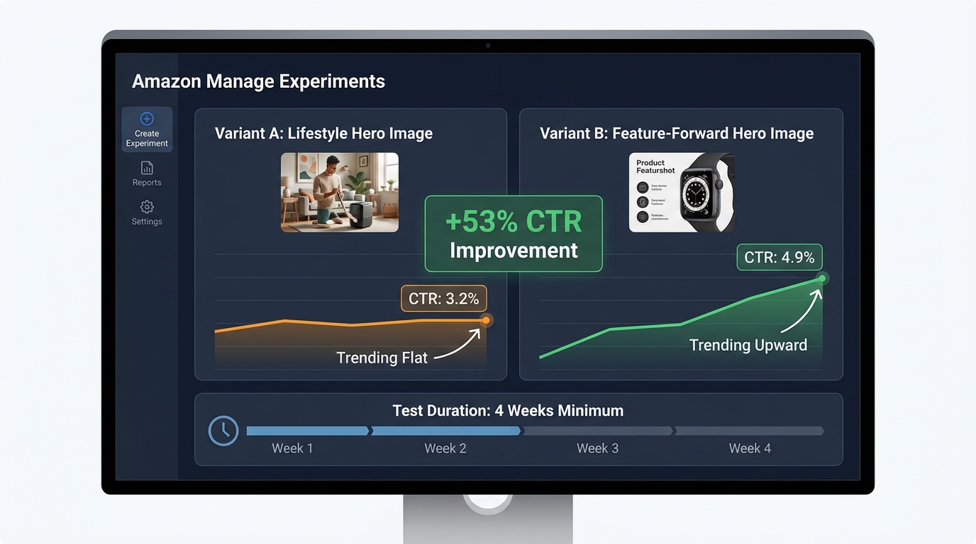
    Amazon’s Manage Experiments tool — available to brand-registered sellers — is one of the most under-utilized features in Seller Central. It enables controlled A/B testing of listing content including images, and it runs tests against live traffic with statistically tracked results. In the hands of a seller who understands what to test and how to interpret results, it is a systematic conversion rate improvement engine.

    Amazon Manage Experiments A/B test dashboard concept showing Variant A at 3.2% CTR vs Variant B at 4.9% CTR with +53% CTR improvement stat overlay and 4-week minimum test duration bar

    What to Test First

    Most sellers who access Manage Experiments start by testing the main image — which is exactly where you should start, because the main image has the highest leverage on click-through rate, which affects the entire conversion funnel downstream. A higher CTR means more sessions, which means more potential conversions from the same ad spend and the same organic ranking position.

    The most productive main image tests compare images that differ on a single meaningful variable: product angle (45-degree vs. front-facing), product variant (color A vs. color B), fill percentage (85% vs. 95%), or orientation (vertical vs. horizontal). Tests that compare images differing on multiple variables simultaneously produce ambiguous results — you can’t isolate which change drove the performance difference.

    Test Duration and Statistical Significance

    Amazon recommends running Manage Experiments tests for at least four weeks. This is a genuine minimum, not a conservative recommendation. Week-over-week traffic variation on most listings is significant enough that a two-week test can produce misleading results — a strong week 1 for variant A followed by a strong week 2 for variant B creates a false impression of A’s superiority. Four weeks smooths these variations and produces results that reflect actual buyer behavior rather than calendar noise.

    The results dashboard in Manage Experiments reports a winner with a confidence level. Only accept a result as actionable when confidence reaches 95% or higher. A 75% confidence level sounds convincing in isolation, but it means there’s a one-in-four chance the result you’re seeing is random variation. Make permanent changes only on high-confidence results.

    Testing the Secondary Image Stack

    After establishing your best-performing main image through testing, the highest-leverage next test is the full secondary image sequence — not individual images in isolation, but the entire ordered stack as a unit. Testing “Image Stack A” vs. “Image Stack B” with different sequencing, different image types in different slots, or different creative approaches to the infographic and lifestyle slots gives you a holistic conversion comparison rather than an incremental one.

    This approach is more complex to set up but produces insights that individual image tests can’t: it tells you how the complete buyer journey through your image carousel performs, not just how individual images perform in isolation.

    Reading the Data Beyond the Winner/Loser Binary

    Manage Experiments reports more than just which variant performed better overall. Pay attention to revenue per session and unit session percentage alongside click-through rate. A variant that drives higher CTR but lower revenue per session may be attracting less qualified clicks — buyers who were compelled by the image but less aligned with the actual product. The ideal test winner improves CTR and unit session percentage — more clicks from better-qualified buyers.


    The Visual Story Arc: Sequencing Images to Mirror the Buyer’s Exact Decision Journey

    Everything discussed so far — the slot-by-slot function of each image, the mobile optimization, the technical specs, the testing discipline — operates within a larger principle that the most effective image stacks share: they tell a coherent, progressive story that mirrors the buyer’s decision-making sequence.

    This is what separates a listing with good individual images from a listing with a high-converting image stack. Individual images can be technically excellent and strategically sound but still underperform if the sequence creates cognitive friction — forcing buyers to jump between emotional states, answer questions out of order, or re-orient their attention with each swipe.

    Building a Narrative Thread

    Think of your image stack as a six-minute conversation between your product and the buyer. In the first minute (hero image), you make a strong first impression that earns their interest. In the next few minutes (images 2 and 3), you answer their practical questions and address their concerns — you establish credibility. Then (image 4) you go deep on the product’s attributes, demonstrating expertise and quality. Then (image 5) you show them the life this product enables — you create desire. Then (images 6 and 7) you help them make the decision, removing competitive uncertainty and purchase risk.

    That arc — interest, credibility, depth, desire, decision — is a conversion narrative. When it flows coherently, buyers feel guided through a logical progression that ends naturally at the add-to-cart button. When the arc is broken — when desire comes before credibility, or when depth comes before interest — buyers feel disoriented, even if they can’t articulate why, and they exit.

    Visual Consistency as a Conversion Signal

    Visual consistency across your image stack — consistent color palette, consistent font system, consistent use of icons and callout style, consistent overall aesthetic — functions as a trust signal. It communicates that your brand is organized, professional, and intentional. Inconsistency — a hero image with one color temperature, an infographic with a different design language, a lifestyle image with a clashing style — creates a “patchwork” impression that buyers associate with lower-quality sellers.

    This doesn’t mean all images should look identical. Variety in background, format, and content is essential to keeping the carousel engaging. It means the images should share a visual identity: the same fonts, the same 2–3 accent colors used consistently, the same approach to callout design, the same overall quality level. A well-branded stack looks like it was designed by one person with a clear vision, not assembled from stock templates and different photographers over time.

    Category Intelligence: Study What’s Working Before You Shoot

    Before planning your image stack, spend 30–45 minutes auditing the top five listings in your category by sales rank. Screenshot their image stacks and lay them out in order. Look for patterns: What image types do the top sellers use in each slot? What backgrounds? What design approaches? Where do the high-ranked listings differ from the lower-ranked ones?

    This competitive audit accomplishes two things. First, it shows you the category visual conventions — the implicit “language” that buyers in your category already understand. Working within recognizable conventions reduces cognitive friction and signals category legitimacy. Second, it identifies opportunities for differentiation — places where your image stack can be visually distinct in ways that serve conversion rather than confuse buyers.

    Category differentiation for its own sake is a mistake — don’t be different just to stand out. But category differentiation that serves a specific buyer need — an infographic image that’s clearer, a lifestyle shot that’s more relatable, a comparison image that frames the choice more compellingly — is a direct conversion advantage.


    Practical Audit Checklist: Evaluate Your Current Image Stack Right Now

    Before building anything new, you need an honest evaluation of where your current image stack stands. Run through this checklist on every listing in your catalog:

    Technical Audit

    • ☐ Hero image background: true RGB 255/255/255 white?
    • ☐ Hero image fill: product occupying 88–95% of the frame?
    • ☐ All images at 1,600px minimum on the longest side (2,000–3,000px preferred)?
    • ☐ File format JPEG, exported with quality setting 80+?
    • ☐ Color profile set to sRGB?
    • ☐ File size under 2MB per image?
    • ☐ No text, logos, or graphics on the hero image?
    • ☐ No badges, Amazon trademarks, or third-party logos on any image?
    • ☐ All accessory/prop content in secondary images limited to what’s included in the product?

    Strategic Audit

    • ☐ Does your hero image clearly communicate what the product is at thumbnail size (120x120px)?
    • ☐ Does image 2 lead with a primary benefit (not a feature)?
    • ☐ Does image 3 counter the most common buyer objection in your category?
    • ☐ Does your infographic image have five callouts or fewer?
    • ☐ Is your lifestyle image aspirational or contextual — and is it the right type for your category?
    • ☐ Is the product in use in your lifestyle image, not just present?
    • ☐ Does your comparison image present attributes buyers actually care about?
    • ☐ Does your final image include social proof and a risk reversal element?
    • ☐ Is text in all images readable at mobile thumbnail size?
    • ☐ Are your images visually consistent (same font, color system, design language)?

    Testing Audit

    • ☐ Are you brand-registered and using Manage Experiments?
    • ☐ Have you run at least one main image test in the past 90 days?
    • ☐ Are you evaluating test results at 95%+ confidence?
    • ☐ Have you checked revenue per session alongside CTR in your test results?

    Any “no” answer on the strategic or technical checklist is a direct conversion leak. Prioritize fixes by slot order — hero image issues first, then images 2 and 3, then subsequent slots in sequence.


    Building Your Image Stack as a Sales Funnel: Final Takeaways

    The fundamental shift in how you approach Amazon listing images is this: stop thinking of them as photographs of your product, and start thinking of them as a structured sales argument delivered in visual form.

    Every slot has a specific job. Every job corresponds to a specific question in the buyer’s decision sequence. When each image does its job in the right order, you create a frictionless path from first impression to purchase decision — a path that your competitor’s listing, with its angle-variation gallery and amateur infographic, cannot match.

    Here are the core principles to carry forward:

    • Your hero image earns the click — nothing more, nothing less. Its job is CTR. Judge it on that metric and test accordingly.
    • Images 2 and 3 do more conversion work than any other secondary images. They catch the buyer in their highest-engagement moment and answer the questions that determine whether they continue or exit. Invest proportionally.
    • Infographic images work when they’re specific and limited. Five callouts maximum. Category-relevant attributes. Design that prioritizes hierarchy over density.
    • Lifestyle images require knowing whether your category buys on aspiration or practical fit. Using the wrong type creates disconnection rather than desire.
    • The final two slots close the deal. Comparison and social proof aren’t afterthoughts — they’re the images that convert buyers who are actively evaluating alternatives.
    • Mobile optimization is not optional. It is the primary viewing context, and text overlays, contrast, and swipe-to-swipe information variety must all be designed for mobile first.
    • Test systematically. Manage Experiments exists precisely for this. Sellers who use it consistently outperform those who rely on intuition over time, because image performance data is not accurately predictable — it’s measurable.

    The sellers who treat their image stack as a sales funnel — structured, sequenced, and continuously tested — don’t just outperform on conversion rate. They outperform on every downstream metric that depends on it: ad efficiency, organic ranking velocity, return rate, and overall profitability. The image stack is not a creative exercise. It is your primary sales tool on the most competitive retail platform in the world. Engineer it like one.

  • How to Work Inside Amazon’s AI Image Rules — and Actually Win

    How to Work Inside Amazon’s AI Image Rules — and Actually Win

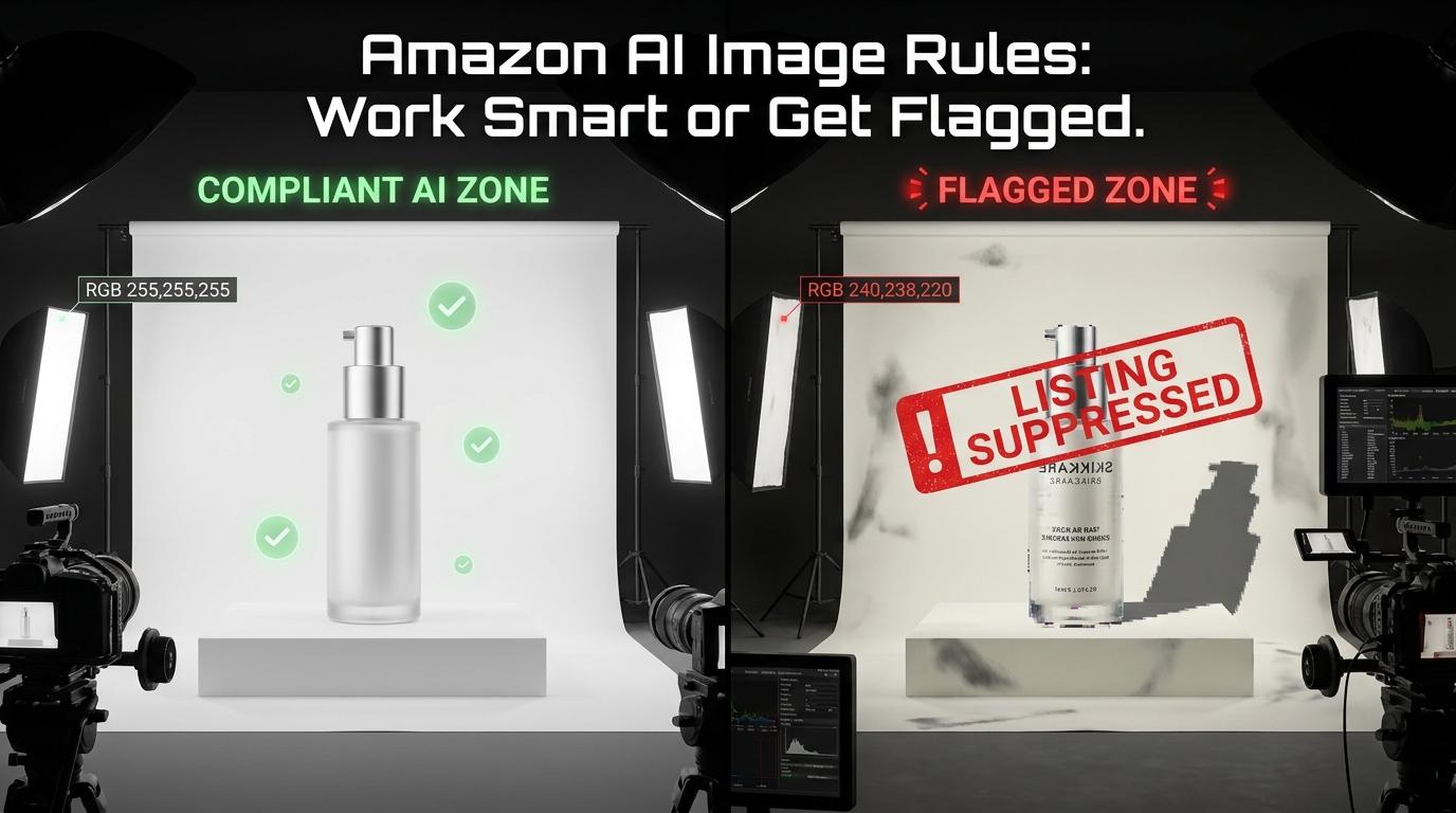
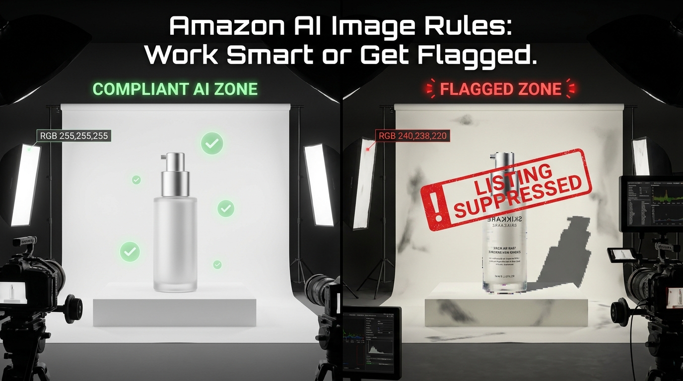
    Split-view showing compliant AI image zone versus flagged listing zone with suppression warning overlay for Amazon sellers

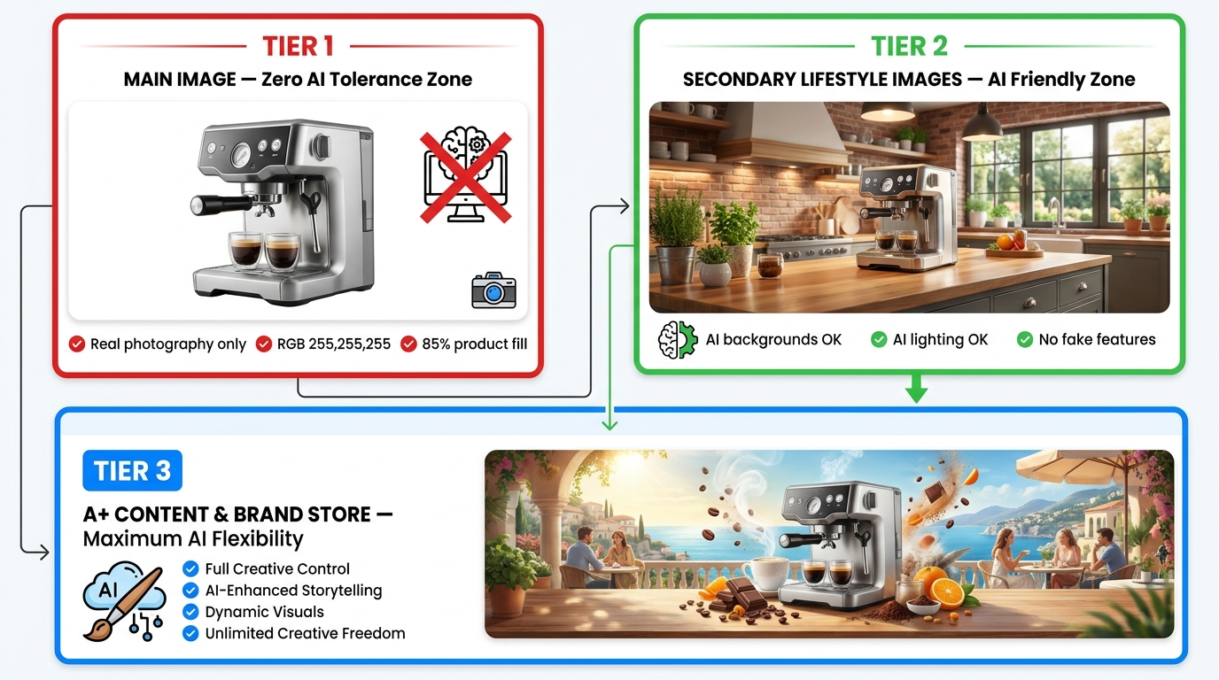
    Amazon’s AI image rules aren’t complicated. They’re available in writing, summarized by a thousand seller blogs, and reinforced by category-specific style guides that have existed for years. And yet listings still get flagged every single day — not because sellers don’t know the rules, but because they don’t have a system that applies the rules consistently at every stage of the image production pipeline.

    That’s the distinction almost every guide on this topic misses. Knowing a rule and operationalizing it are completely different problems. A seller can recite Amazon’s image requirements verbatim and still push a suppressed ASIN live, because the issue isn’t knowledge — it’s the gap between knowing and doing under the real-world pressures of a fast-moving catalog.

    This post is not about what the rules say. It’s about how to build the workflow intelligence that makes compliance automatic — where flags become rare events rather than routine recoveries. We’ll cover how to allocate AI usage across image types, what specifically triggers Amazon’s automated scanning systems, how to stress-test images before submission, and how to use Amazon’s own tools in a way that’s both compliant and genuinely performant.

    If you’re already familiar with Amazon’s policies and you’re still getting burned, this is the post for you. The goal isn’t to survive Amazon’s enforcement — it’s to make compliance your production standard so that enforcement is never a factor.

    The Three-Tier Image Framework: Where AI Can and Cannot Touch Your Listing

    Three-tier Amazon listing image hierarchy showing main image zone, secondary lifestyle image zone, and A+ content zone with compliance rules for each tier

    The first operational decision every seller needs to make — before touching any AI tool — is understanding that Amazon’s listing doesn’t have one image standard. It has three distinct image zones, each with its own risk profile, compliance ceiling, and AI-use rules. Treating them as uniform is where most multi-image catalog problems originate.

    Tier 1: The Main Image — A Near-Zero AI Tolerance Zone

    The main image slot is the strictest position in any Amazon listing. Amazon’s requirements here are well-documented and tightly enforced: pure white background (RGB 255,255,255 — not near-white, not off-white, not a 97% white that “looks the same”), product filling at minimum 85% of the image frame, no props, no additional items not included in the purchase, no text overlays, no logos, no watermarks. Resolution minimum is 1,000 pixels on the longest side, but most experts now recommend 2,000px as a practical floor given zoom functionality and future-proofing against re-spec changes.

    AI’s role in Tier 1 is almost entirely limited to post-processing cleanup — and even then, cautiously. Background removal tools and AI-powered background replacement to pure white are commonly used and generally fine, provided the output is pixel-verified and not gradient-edged. Where sellers get into trouble is using AI image generators to create the main image entirely from scratch. An AI-generated product rendering, however photorealistic, is not a photograph, and Amazon’s enforcement systems — which now incorporate ML-based artifact detection — are increasingly able to identify renders vs. real photography, particularly on hero shots where lighting consistency and shadow physics are readily compared.

    The practical rule for Tier 1: photograph the physical product, then use AI for cleanup only. Any AI that touches the product itself — its shape, color, scale, or implied features — is a compliance risk.

    Tier 2: Secondary/Lifestyle Images — The AI-Friendly Zone (With Boundaries)

    This is where AI earns its place in a seller’s workflow. Images 2 through 9 in the standard listing carousel are subject to much more lenient standards. Amazon’s core requirement for these slots is accuracy — that the images don’t misrepresent what the product is, what’s included, or what the product can do. Within that constraint, AI-generated backgrounds, environments, lifestyle scenes, and visual enhancements are broadly permitted.

    In practice, this means you can use AI to place your product in a kitchen, on a hiking trail, in a premium hotel bathroom, or on a café table — as long as the product itself is accurately rendered and the context doesn’t imply functionality the product doesn’t have. You can use AI to adjust lighting, improve scene quality, add models, and create seasonal variants. This is where most of the performance gains from AI imagery are realized, and it’s where Amazon’s own tools (covered in detail below) are explicitly designed to operate.

    Tier 3: A+ Content and Brand Store — Maximum Creative Latitude

    At the A+ Content and Brand Store level, Amazon’s creative latitude is at its widest. Here, sellers and brand-registered vendors can use AI-generated imagery, banner compositions, infographic overlays, comparison charts, and environmental scenes with relatively few restrictions beyond the core “not misleading” standard. The focus shifts from product-accurate photography to brand storytelling and conversion-focused content design.

    Critically, the AI-detection enforcement that operates on listing images is significantly less aggressive in A+ Content, where compositional complexity makes automated artifact detection harder. That said, the “accuracy” principle still applies: you cannot use A+ Content images to claim a product feature that doesn’t exist or to imply inclusion of items not sold with the product.

    The Specific AI Artifacts That Trigger Amazon’s Automated Scanners

    Technical diagnostic view showing annotated AI image artifacts that trigger Amazon automated compliance scanning — shadow inconsistency, off-white background, garbled text, and upscaling noise

    Understanding what Amazon’s automated systems are looking for is the most direct path to understanding what not to do. Amazon deploys ML-based image scanning across its catalog, and the signals that trigger automated suppression or manual review flags fall into several well-documented categories.

    Background Compliance Signals

    The most common automated flag on main images is background non-compliance. Amazon’s system doesn’t evaluate background color visually — it runs pixel-level analysis. An image that looks white to the human eye can register as RGB 250,250,250 or lower, and that delta is detectable and actionable. When AI background replacement tools process a product image, they commonly leave “fringe” pixels around the product edge that transition from the original background to white — this gradient zone is a reliable suppression trigger. The fix is not “make it look whiter.” The fix is pixel-sampling the final export to confirm every non-product pixel reads 255,255,255.

    AI image upscaling is a specific sub-problem here. Many sellers use AI upscalers to meet Amazon’s resolution requirements on images that were originally photographed at lower resolution. These tools frequently introduce compression-style banding or noise, particularly in flat background areas, that creates measurable deviation from the pure white standard. If you’re upscaling, verify the background explicitly — don’t assume the tool handled it correctly.

    Shadow and Lighting Inconsistency

    Amazon’s ML systems are trained to detect lighting inconsistencies that signal composite imagery — specifically, cases where a product has been photographed in one lighting environment and placed into a different one without correcting the shadow direction, intensity, or color temperature. This is common when AI tools auto-place products into lifestyle backgrounds and the product shadow doesn’t match the scene’s apparent light source.

    For secondary lifestyle images this generally won’t cause suppression, but it will degrade the visual credibility of the image in ways that affect conversion rates. For main images, a composite where shadows suggest the product was photographed under studio lighting but the background is a lifestyle scene is an almost certain flag. The rule of thumb: match shadow direction and soft/hard quality to the scene’s light source, or remove product shadows entirely in clean composites.

    AI-Generated Text and Label Artifacts

    Current AI image generation tools have a well-known weakness with text — rendered product labels, instruction text, brand names, and ingredient lists frequently contain garbled, nonsensical, or malformed characters that are visually obvious at zoom levels. Amazon’s systems scan for text consistency and legibility in product images, and garbled on-image text is both a suppression signal and a customer-experience flag.

    The operational fix is to never rely on AI generators to produce readable product label text. Generate the scene without legible label detail, then composite the real product label on top as a post-processing step. Alternatively, shoot the product physically and use AI only for environmental generation, compositing the physical shot into the AI-generated scene. This hybrid approach is the current best practice for AI-enhanced product imagery and eliminates the text artifact problem at source.

    Depth and Scale Inconsistency

    AI-generated lifestyle scenes frequently produce products that appear visually “pasted” — the scaling relative to scene elements is off, the perspective doesn’t match, or the depth of field blur gradient doesn’t align with where the product sits in the apparent scene depth. These signals are softer than background or text issues in terms of automated enforcement, but they register in Amazon’s image quality scoring systems, and more importantly they register with shoppers in ways that reliably reduce CTR and conversion.

    Amazon’s Own AI Tools vs. Third-Party Generators: The Compliance Risk Is Not Equal

    Side-by-side comparison dashboard of Amazon Creative Studio versus third-party AI image generator showing compliance risk, ROAS data, and policy alignment differences

    This is a point that gets surprisingly little attention in the seller community: where your AI-generated images come from matters for compliance purposes, not just quality purposes. Using Amazon’s own AI image tools creates a fundamentally different compliance profile than using external third-party generators.

    Amazon Creative Studio and the Built-In Policy Alignment Advantage

    Amazon’s own image generation tools — accessed via Creative Studio, the Ads console, Sponsored Brands creative flows, and the DSP Responsive eCommerce Creative (REC) system — are built within Amazon’s own policy framework. They generate images from product detail page data, meaning the product representation comes from your existing listing content rather than a generic AI prompt. The scenes they produce are filtered through Amazon’s own compliance guidelines at the generation layer, not the review layer.

    Amazon’s internal performance data on these tools is notable: Sponsored Brands campaigns using AI-generated lifestyle images from Creative Studio have shown approximately 10.3% higher ROAS compared to campaigns using standard product-only images, according to Amazon Ads materials. Mobile Sponsored Brands placements using AI-generated creative have shown CTR improvements of up to 40% in some Amazon-reported beta data. These numbers come from Amazon’s own systems and should be read as directionally informative rather than universally guaranteed — your category, price point, and creative quality all affect outcomes — but the direction of the signal is consistent.

    More importantly for the compliance discussion: images generated within Amazon’s own Creative Studio are pre-screened against Amazon’s policies before they’re available for use. You are significantly less likely to face an automated flag on a Creative Studio output than on an identical-looking image generated in an external tool, because the output came from a system Amazon controls and trusts.

    Third-Party AI Generators: Performance Potential, Compliance Responsibility

    External tools — Midjourney, DALL-E, Stable Diffusion, and dozens of purpose-built product photography AI platforms — offer wider creative latitude, more photorealistic outputs for many product types, and more scene variety than Amazon’s native tools. For sellers who invest in learning these tools deeply, the creative output is often significantly higher quality than what Creative Studio currently produces.

    The trade-off is that compliance responsibility sits entirely with you. Amazon’s automated systems have no knowledge of what tool produced an image — they evaluate the output against policy standards, and they do so without preferential treatment for any external vendor. The artifact risks described in the previous section are entirely your problem to catch. The solution isn’t to avoid third-party tools — it’s to build a robust pre-submission QA process that catches what Amazon’s systems will catch, before you submit.

    A Practical Hybrid Framework

    The most effective approach for brand-registered sellers is a split workflow. Use Amazon’s native Creative Studio for advertising creatives and Sponsored Brands images, where the built-in compliance assurance and direct performance data make it a clear default choice. Use third-party AI tools for secondary listing images, A+ Content, and Brand Store assets, where creative quality matters more and compliance risk is lower. Reserve traditional photography for all main images, with AI used only for post-processing background work and color correction — never for primary product rendering.

    The Secondary Image Opportunity: Where AI Has Almost No Limits

    If the main image is where AI goes to die, the secondary image carousel is where it genuinely performs. The eight available secondary image slots on a standard Amazon listing are chronically underused by most sellers — and the ones who invest in them seriously, particularly with AI-enhanced lifestyle content, see measurable conversion rate improvements that compound directly into organic ranking and paid advertising efficiency.

    What Converts in Secondary Images

    Research and seller-community data consistently point to the same secondary image patterns that convert: contextual use scenes showing the product in its natural environment, scale reference shots that help shoppers understand size, feature callout images that highlight specific product attributes with clean visual annotation, and lifestyle images showing the product with an aspirational or relatable user.

    AI is particularly effective at contextual use scenes, because these are environments that would be expensive and logistically complex to shoot physically. A camping lantern shown in a forest clearing at dusk, a kitchen appliance shown in a premium modern kitchen, a skincare product shown in a spa-like bathroom — these scenes cost thousands of dollars to stage and shoot physically but can be generated and iterated in minutes with AI tools. The compliance check is simply: does the product in the image accurately represent the product being sold, with no features, colorways, or bundled items that aren’t real?

    Feature Callout Images and Infographic Overlays

    One of the most underappreciated uses of AI in secondary images is not generating entire scenes but generating clean backgrounds and layouts for feature callout images. An AI-generated white or gradient background with your real product photograph composited onto it, combined with clean typographic callouts highlighting key features, is one of the highest-converting secondary image formats on Amazon — and it’s entirely compliant, because the image is transparently informational rather than representational.

    The compliance boundary to watch: feature callouts must be accurate. If a callout says “antimicrobial coating” and the product doesn’t have one, that’s not an AI compliance issue — it’s a broader misrepresentation issue that falls under Amazon’s customer-trust policies and can result in far more serious consequences than an image flag.

    Comparison and Size Reference Images

    AI can generate comparison imagery that helps shoppers make purchase decisions — size comparison against a common object (a coin, a hand, a standard item), before/after effect imagery for consumables, and product variant comparisons showing colorway or size differences. These formats perform particularly well in categories where size misjudgment is a common return driver. Generating these with AI rather than staging them physically saves significant production cost while improving listing quality in one of the highest-ROI secondary image formats.

    The Main Image Problem: Why AI Enhancement Often Backfires on Hero Shots

    Given the performance stakes of the main image — it’s the most direct driver of search result CTR, which is the most direct driver of organic ranking velocity — it’s worth addressing in detail why AI enhancement of the main image so often creates more problems than it solves.

    The False Economy of AI Background Removal

    AI background removal tools are reliable enough that many sellers use them as a default step in main image processing. For simple products with clean contours — a book, a box, a bottle — they work well. For products with complex edges — textured surfaces, transparent elements, mesh materials, hair, fur, multiple interlocking components — AI background removal consistently produces visible fringe artifacts, edge halos, and missing product detail that is clearly visible at the zoom levels Amazon shoppers regularly use.

    The false economy is this: running a product image through an AI background remover feels like a QA step, but it actually introduces compliance risk that didn’t exist before. A product photographed on a slightly-off-white physical backdrop, processed through a poor AI background removal that leaves artifact fringe, will perform worse and face higher suppression risk than the original image with the “wrong” background color. If you’re going to use AI for background work on main images, invest in pixel-level output verification — specifically, eyedropper-sampling the exported image at multiple background points to confirm RGB 255,255,255. Don’t eyeball it.

    The Upscaling Trap

    AI upscaling to meet Amazon’s resolution requirements is another common source of hidden compliance problems. The upscaling itself is generally fine — AI super-resolution tools do an excellent job of enhancing perceived sharpness and recovering detail. The problem is what they do to flat background areas. Where a plain white background in a lower-resolution image is genuinely flat (all pixels at 255,255,255), an AI upscaler interpolates between pixels and can introduce subtle variation in what was previously a uniform surface. The result is a high-resolution image that passes visual inspection but fails a pixel-level background uniformity check.

    The fix is to run background replacement after upscaling, not before. Upscale the image, then apply background replacement to the upscaled version, then verify RGB. This order of operations prevents the upscaling step from contaminating the background compliance.

    When Real Photography Is Non-Negotiable

    There are product categories where AI image generation for main images simply cannot produce reliable compliance-safe output in 2026: jewelry (where metal finish, gemstone color, and scale are all high-stakes and easily misrepresented by AI rendering), clothing and apparel (where texture, drape, and fit under real-world light are critical and AI consistently misrepresents them), and complex electronics (where label text, port layouts, and indicator light positions are product-specific details that AI cannot reliably replicate). In these categories, the main image must be a physical photograph. AI belongs in the supporting role, not the principal one.

    Pre-Submission QA: The 11-Point Process That Catches Issues Before Amazon Does

    11-step Amazon image compliance pre-submission QA checklist on a digital tablet interface with checkboxes and green verification marks

    The most cost-effective investment in avoiding listing suppression is a pre-submission QA process that systematically checks every compliance variable before an image ever reaches Amazon’s servers. What follows is a practical, step-by-step process that any seller or agency can implement — with tool suggestions where applicable.

    Step 1: Background RGB Verification

    Open the final image export in any image editing tool (Photoshop, GIMP, Canva Pro all work). Use the eyedropper or color picker tool to sample at least five background points: four corners and the center. Every point must read R:255, G:255, B:255. One failing sample means the image needs reprocessing before submission.

    Step 2: Product Fill Percentage Estimate

    The product should occupy approximately 85% or more of the image frame. A quick way to estimate: if the product has clear space of more than roughly 7–8% of the image width on each side, it may be undersized. For compliance-critical catalogs, some sellers use a simple grid overlay in Photoshop to measure this precisely.

    Step 3: Text and Overlay Check

    Main images cannot contain any text overlays, watermarks, logos (other than on the physical product itself), badges, “new,” “sale,” or promotional indicators, or foreign-language text. Scan the image carefully — AI-generated images sometimes include environmental text (a street sign in the background, text on a surface) that isn’t intentional but will trigger an overlay flag.

    Step 4: Shadow Consistency Analysis

    Identify the apparent light source direction from the product shadows. Confirm that the shadow direction, softness, and length are consistent with a single light source. Multiple competing shadow directions are an AI composite indicator.

    Step 5: Product Label and Text Legibility

    Zoom in on any text visible on the product — label copy, instruction text, brand name, ingredient lists, warning text. Every character must be legible and match the physical product. If AI-generated imagery produced this text area, it almost certainly needs to be replaced with a composited version from the real product.

    Step 6: Resolution Confirmation

    Check the pixel dimensions of the export. Minimum 1,000px on the longest side for listing; aim for 2,000px or higher for main images to enable full zoom functionality. JPEG export quality should be at 80%+ to avoid compression artifacts in background areas.

    Step 7: Color Accuracy Check Against Physical Product

    Place the digital image next to the physical product (or next to a color-accurate photograph of the physical product) and compare. AI-generated imagery can subtly shift color tones, especially in lighting conditions that don’t match the product’s actual surface properties. A blue product rendered 10% more saturated than it really is will generate returns and negative reviews from customers who feel misled.

    Step 8: Included Items Verification

    Every item visible in the image must be included in the purchase, or clearly labeled as a prop not included. This is an easy mistake in AI lifestyle imagery where a generated scene might include a complementary product (a glass next to a blender, a phone next to a charging stand) that isn’t part of the bundle. Amazon’s policies treat this as a misrepresentation of what the customer receives, and complaints generate flags faster than automated systems do.

    Step 9: Lifestyle vs. Main Image Slot Verification

    Confirm the right image type is in the right slot. A lifestyle image with a non-white background in the main image position will trigger an automated suppression. Double-check image slot assignments before batch uploading — this is one of the most common and most preventable suppression causes.

    Step 10: A+ Content Dimension Verification

    A+ Content images have specific dimension requirements that differ from listing images. Amazon will reject or auto-crop A+ images that don’t meet its module-specific size specs. Verify dimensions against the current A+ Content module requirements before uploading, particularly if images were generated for a different format and adapted.

    Step 11: Pixel-Level Background Spot Check on Final Export

    This is a repeat of Step 1 performed specifically on the final-format export — the actual file you’ll upload, not the working file. Color profiles can shift on export, particularly between RGB and sRGB, and what reads as 255,255,255 in your working file can sometimes shift on export if the color profile isn’t properly managed. Save in sRGB, export as JPEG, sample the background of the exported file before uploading.

    Testing Your Images Without Risking Suppression: Smart Experimentation on Amazon

    Image optimization is an ongoing process, not a one-time task. The sellers who extract maximum performance from their listings treat image selection as a testable hypothesis — not an opinion — and run structured experiments to identify which visuals drive better CTR and conversion. Doing this safely and compliantly requires understanding the testing infrastructure Amazon provides and where its limits are.

    Manage Your Experiments: The Compliant Testing Ground

    Amazon’s Manage Your Experiments (MYE) tool, available to Brand Registry sellers, is the only fully Amazon-sanctioned method for A/B testing listing content including images. The tool runs a 50/50 traffic split between two versions of a listing element — main image, title, bullet points, A+ Content — and runs until statistical significance is reached at approximately the 95% confidence level. Standard test duration ranges from 4 to 10 weeks depending on traffic volume.

    The MYE tool matters for compliance because images in an active experiment are explicitly covered under Amazon’s testing framework, meaning you’re not at risk of suppression for having a non-standard variant in test during the experiment period. However, this protection applies to the testing framework, not to images that violate hard policy rules — an image with a non-white background will still get flagged even inside an experiment.

    What to Test and How to Structure Hypotheses

    The most valuable image tests follow a principle of genuine differentiation — testing fundamentally different visual concepts rather than minor iterations of the same idea. Testing a studio shot with white background vs. the same photo with a slight vignette is not a meaningful test. Testing a pure product shot vs. a product-in-use contextual shot is a meaningful test that generates learnable signal about how your audience makes purchase decisions.

    Common high-ROI test structures: main image hero angle vs. three-quarter angle, product-only vs. product-with-scale-reference, single-product vs. multi-unit value proposition, studio lighting vs. natural light aesthetic. Each of these tests a different hypothesis about buyer psychology and generates results that are applicable across your catalog, not just the ASIN under test.

    Using Advertising Data as an Image Pre-Test

    Before committing to a full MYE test cycle, many experienced sellers use Sponsored Products and Sponsored Brands advertising data as a faster, lower-commitment signal on image quality. By running two separate campaigns with identical targeting but different image creatives, you can get directional CTR signal in 7–14 days rather than the 4–10 weeks required for a full MYE test. The data isn’t as clean — ad context differs from organic listing context — but it’s significantly faster for filtering out clearly underperforming images before they consume a full experiment cycle.

    When You Do Get Flagged: A Practical Recovery Protocol

    Amazon listing suppression recovery flowchart showing three parallel paths: automated suppression, manual review request, and escalation with step-by-step resolution process

    Despite best efforts, image flags happen. When they do, the speed and quality of your response determines how much revenue impact you take. The sellers who handle suppression most effectively are those who have a documented recovery protocol ready to execute — not those who start troubleshooting from scratch every time.

    Step 1: Diagnose Before You Act

    The first action when a suppression notice appears is diagnosis, not immediate re-upload. Amazon’s suppression notices often specify the violation type — background non-compliance, prohibited content, resolution failure, missing image requirement. Read the notice carefully before doing anything else. Acting on incorrect assumptions about what was flagged (and uploading a “fix” that doesn’t address the actual violation) extends the suppression and wastes the case-opening window.

    Access your Account Health dashboard in Seller Central and cross-reference the suppression notice with the specific ASIN and image slot affected. Identify whether the suppression is automated (immediate, policy-rule-based) or manual (involves a human review and is usually accompanied by more specific language). These require different response paths.

    Step 2: Prepare and Upload the Corrected Image

    Once the violation type is confirmed, prepare a corrected image that definitively addresses it — ideally using a physically photographed product image for main image violations to eliminate any residual AI artifact risk. Run the corrected image through your full pre-submission QA checklist before uploading. Uploading a corrected image that has a different compliance issue is a common and costly mistake that extends resolution time significantly.

    For automated suppression of main images, uploading a compliant replacement is often sufficient to trigger automatic reinstatement within 24–48 hours. Amazon’s systems re-scan uploaded images against compliance criteria, and a clean upload resolves the vast majority of automated flags without further intervention needed.

    Step 3: Open a Seller Central Case When Automated Resolution Stalls

    If a compliant replacement image doesn’t resolve the suppression within 48 hours, open a Seller Support case. The case should include: the specific ASIN, the image slot affected, a screenshot of the suppression notice, and explicit confirmation of what you’ve done to address the cited violation. Be precise and factual — Seller Support cases resolved via vague descriptions take significantly longer than cases with specific, documented evidence.

    If the suppression involves a Brand Registry listing, use the Brand Registry support channel rather than standard Seller Support. Brand Registry cases are typically handled by a more specialized support team and resolve faster for image compliance issues.

    Step 4: Escalation for Complex Cases

    For suppressions that persist beyond 5–7 business days despite compliant image uploads and active support cases, escalation options include Brand Registry executive seller relations, Amazon Vendor Central pathways for hybrid sellers, and for high-volume sellers, escalation via an Amazon Account Manager if one is assigned to the account. Escalation cases require physical product evidence — photographs or videos of the actual product demonstrating the compliance of the re-submitted image — so have this documentation ready before escalating.

    Category-Specific Nuances: One Policy, Many Interpretations

    Amazon’s image policies are written as universal standards, but their enforcement and practical interpretation vary meaningfully by product category. Understanding these category-specific nuances prevents sellers from applying a one-size-fits-all approach that may be unnecessarily restrictive in some contexts and dangerously loose in others.

    Apparel and Softlines

    Apparel has among the strictest main image requirements of any Amazon category, with additional rules around product presentation on models vs. flat-lay vs. ghost mannequin formats. Amazon’s category style guide for apparel specifies which product types require a model, which may use flat-lay presentation, and size requirements for model photography. AI-enhanced apparel photography carries high risk — fabric texture, drape, and fit under real lighting conditions are almost always misrepresented by AI rendering, and the return rate signal from misrepresented apparel is a category-level metric Amazon monitors closely.

    Health and Beauty

    The Health and Beauty category has heightened sensitivity around before/after imagery, result claims in images, and anything that implies medical benefit. AI-generated imagery in this category that includes a “before/after” comparison showing health or beauty results will be flagged for claims review independent of technical compliance. Secondary images in H&B need to be particularly clean on the “accuracy” dimension — anything that implies a clinical or medical outcome needs to be supported by the product’s actual claims and Amazon’s health claims policy.

    Consumables and Grocery

    Grocery and consumables ASINs are subject to close scrutiny on serving size representation, portion accuracy, and packaging claims. AI-generated imagery that shows a serving or portion that doesn’t accurately represent the product’s actual content per package will generate customer complaints that escalate to catalog-level reviews. This category is also subject to stricter label legibility standards, since incorrect nutritional or ingredient information in product images carries regulatory risk beyond Amazon’s internal policies.

    Home and Furniture

    Furniture and large home goods are a category where AI lifestyle imagery is particularly well-suited — the scale and staging costs of physical furniture photography are enormous, and AI-generated room scenes are both more practical and often higher quality than physical staging. The compliance watch point in this category is scale accuracy — furniture product images must represent the actual dimensions of the product, and AI-generated room scenes frequently misrepresent furniture scale relative to the room, generating returns from customers whose pieces don’t fit the space they expected based on the image.

    Building Your Compliant AI Image Stack: Tools, Workflow, and Team Roles

    Pulling together everything covered in this post into a functioning workflow requires both the right tools and clearly defined team roles. The sellers and agencies who execute this consistently well are those who’ve turned what could be ad-hoc creative decisions into a documented, repeatable production system.

    The Recommended Toolchain

    Photography: Physical photography remains the foundation for main images across all categories. Smartphone photography at 4K resolution with a proper light box and white backdrop is sufficient for most product categories — you don’t need a professional studio if you have adequate light control and a stable setup.

    Background processing: For main image background removal and replacement, tools like Adobe Photoshop’s Remove Background, Canva Pro’s background removal, or dedicated tools like Pixelcut and Clipping Magic work well — but always follow with pixel-level RGB verification of the exported file.

    AI lifestyle scene generation: For secondary image lifestyle scenes, Amazon’s own Creative Studio is the recommended primary tool for advertising creatives. For listing secondary images, dedicated AI product photography platforms like Pebblely, Booth.ai, or StudioAI (purpose-built for e-commerce product photography) produce more reliable compliance-safe outputs than general-purpose generators like Midjourney or DALL-E, because they’re designed specifically for product imagery conventions.

    AI upscaling: Topaz Photo AI or Upscale.media for resolution enhancement when original photography is below 2,000px. Always re-verify background RGB after upscaling, not before.

    A+ Content design: Canva Pro or Adobe Express for A+ Content layout work, with AI-generated background scenes composited in from your preferred generator tool. These tools handle the dimension requirements and export profiles for A+ Content formats reliably.

    Team Roles and Decision Points

    In a small seller operation, a single person handles the entire image workflow. The risk there is that the same person who generates images also approves them, which eliminates the independent QA check that catches the compliance issues a creator naturally becomes blind to. Even in a one-person operation, build in a time-gap review — generate today, QA review tomorrow with fresh eyes.

    In larger operations, the workflow should have distinct roles: image production (generates and edits), compliance QA (applies the 11-point pre-submission checklist independently), and listing upload (responsible for correct slot assignment and final submission). This separation of concerns is what prevents the “I’ll fix it after” rationalization that precedes most preventable suppression events.

    Keeping Up With Policy Changes

    Amazon’s image policies evolve. Category style guides are updated, enforcement priorities shift, and new AI-detection capabilities get deployed. Build a quarterly review of Amazon’s category-specific style guides into your operational calendar — specifically the style guide for your primary categories, the Amazon Seller Central image standards page, and the Brand Registry image policy documentation if you’re brand-registered. This takes 30 minutes per quarter and prevents surprises that take days to fix.

    Compliance as a Competitive Moat, Not a Ceiling

    The most important reframe in this entire discussion is treating image compliance as a competitive advantage rather than a constraint. In a marketplace where a meaningful portion of sellers are operating with suppression risk baked into their daily workflow, the seller who has built a system that produces compliant, high-quality images consistently — without incident and without rework — has a structural operational advantage that compounds over time.

    The Compound Effect of Clean Operations

    Every suppression event costs revenue, ranking momentum, and operational attention. A listing that goes dark for 3–5 days while a suppression resolves loses sales velocity, loses organic ranking signal, and may lose paid advertising learning data in algorithm-driven campaigns. For high-velocity ASINs, even a 48-hour suppression can cost more in lost ranking recovery than a year’s worth of image QA investment would have prevented it.

    Conversely, a catalog that has never had an image suppression maintains cleaner account health metrics, builds a stronger relationship with Amazon’s systems, and faces less friction in Brand Registry reviews, A+ Content approval, and new product launch indexing. The seller who has built compliance into their production standard accumulates these small advantages invisibly — they never show up as a line item, but they compound into meaningful catalog-level performance over 12–24 months.

    The AI Opportunity That Compliant Sellers Capture

    Here is the final, practical point: the sellers who are most cautious about AI image rules are often those who haven’t built a production system clear enough to use AI safely. The sellers who embrace AI within a disciplined workflow — using it where it’s genuinely powerful (secondary images, A+ Content, advertising creatives), keeping it out of where it’s genuinely risky (main images without physical photography anchoring), and verifying output before submission — are not just staying compliant. They’re reducing production costs, increasing listing visual quality, running more creative tests, and improving conversion rates.

    Amazon’s AI image rules, read correctly, are not a constraint on AI use. They’re a constraint on careless AI use. The distinction matters enormously in practice. Build the workflow that turns them into a standard your entire catalog runs on reliably, and the rules stop being something you manage against and start being the system that generates your competitive advantage.

    Actionable Takeaways

    • Tier your AI usage explicitly: Define which image slots in your workflow can use AI generation, which require physical photography, and which can use AI post-processing only. Write this down and enforce it as a production standard, not a guideline.
    • Implement the 11-point QA checklist as a pre-submission requirement on every image. Build it into your workflow SOP so it happens consistently, not selectively.
    • Default to Amazon’s own Creative Studio for advertising creative images and Sponsored Brands. The compliance pre-screening and documented performance data (+10.3% ROAS, up to 40% higher mobile CTR) make it the lowest-risk, reliable-return choice for that specific use case.
    • Use AI aggressively in secondary images and A+ Content — this is where the creative upside lives, where enforcement is softer, and where production cost savings are most significant relative to traditional photography.
    • Build a suppression recovery protocol before you need it. Decide now who will handle a flag, what the first three actions are, and what documentation you’ll need. Having this ready reduces revenue loss per incident by days.
    • Review category style guides quarterly. Amazon’s enforcement priorities shift with minimal announcement. Staying current takes 30 minutes per quarter and prevents surprises that take days or weeks to fix.
    • Treat compliance clean-rate as a catalog KPI. Track suppression events per quarter as a proportion of your total ASIN count. A trend in the wrong direction signals a workflow problem — the fix is process, not policy knowledge.
  • Who Actually Wins When Amazon Lets AI Build Your Lifestyle Photos — A Category-by-Category Breakdown

    Who Actually Wins When Amazon Lets AI Build Your Lifestyle Photos — A Category-by-Category Breakdown

    Split scene comparing traditional photography studio versus AI-generated lifestyle images on a laptop, with overlay text: Who Actually Wins the AI Photo Race?

    For years, the gap between a $100,000 annual ad budget and a $10,000 one on Amazon was nowhere more visible than in the photography. Big brands ran full studio shoots with professional lighting, hired models, and location-scouted lifestyle settings. Smaller sellers took product shots on a folding table in their spare bedroom. That asymmetry showed up directly in click-through rates, conversion rates, and ultimately in ranking.

    Amazon’s 2026 policy adjustments around AI-generated imagery didn’t come with a dramatic announcement — no press release, no Seller Central banner reading “AI images now allowed.” The shift was more gradual: updated image guidelines, the expansion of AI tools inside the Amazon Ads console, the rollout of Titan Image Generator through Creative Studio, and a compliance framework that began to acknowledge AI-assisted production as a normal part of the creative workflow.

    But “allowed” and “advantageous” are two very different things. And the question nobody is asking clearly enough is: which sellers actually benefit from this, and which ones are walking into a trap?

    The answer depends heavily on your product category, your current image quality baseline, how you use AI (in ads versus listings), and whether your workflow can actually catch the failure modes that AI image generation introduces before they cost you suppression events or return rate spikes. This article breaks it down by category, by seller size, and by the specific use cases where AI lifestyle images help — versus where they quietly hurt.

    What Amazon’s 2026 Policy Actually Changed — and What Didn’t

    The clearest way to understand Amazon’s 2026 stance on AI-generated lifestyle images is to separate what was always the rule from what genuinely shifted.

    The Rule That Hasn’t Changed: Hero Images Are Sacrosanct

    The main image — slot one in your listing’s image gallery — remains subject to the strictest requirements Amazon enforces. It must show the actual physical product, photographed on a pure white background (RGB 255, 255, 255), with the product filling at least 85% of the frame. No lifestyle scenes, no props, no watermarks, no AI-generated backgrounds. This hasn’t changed in 2026, and there is no credible indication it’s about to.

    What this means in practice: AI cannot replace your hero image. Any tool that claims to generate a policy-compliant main image from scratch — without a real product photograph as the base — is selling you a suppression risk. The hero shot still requires a real camera pointed at a real product.

    What Has Genuinely Shifted

    Secondary images — slots two through nine in your gallery — and all ad creative formats are where the policy movement is meaningful. Amazon’s updated compliance framework in 2026 takes the position that the tool used to create an image is less important than whether the image accurately represents the product. AI-assisted background replacement, lighting correction, scene composition, and lifestyle context generation are all considered acceptable for secondary images and ad creatives, provided the product itself is not misrepresented.

    Specifically, AI edits that alter color, dimensions, included accessories, material texture, or functionality cross the line. A background swap that places your product in a living room scene is fine. A background swap that also quietly saturates your beige product into a more photogenic cream crosses into misrepresentation territory.

    The New Disclosure Layer

    Third-party compliance guides (and emerging Seller Central documentation) point to a 2026 framework requiring sellers to indicate when product content — including images — is substantially generated by AI rather than lightly edited. This is not a checkbox in the image uploader currently; it exists more as a policy position that could be enforced retroactively. The safest interpretation is that images where the product is real but the environment is AI-generated sit in a clearly permissible zone. Images where the product itself is AI-rendered without a real photograph underneath carry meaningful policy risk.

    The Cost Math: What Photography Actually Used to Cost

    Bar chart infographic showing traditional studio photography costs of $1,500–$5,000 versus AI image generation at $0.10–$2, with bold text: 80–95% Cost Reduction

    Before evaluating whether AI lifestyle images are worth adopting, it helps to understand what the old model actually cost — and why those costs were so gatekeeping for smaller sellers.

    The Traditional Studio Cost Stack

    A standard professional product photography session in 2024–2025 ran between $1,500 and $5,000 per session for a competent freelance or mid-tier studio setup. That’s before factoring in model fees ($200–$800 per hour for experienced commercial talent), location rental for lifestyle settings ($500–$2,000 per day), post-production retouching ($50–$150 per final image), and the logistical overhead of sample shipping, scheduling, and art direction.

    For a seller with a catalog of 50 SKUs and multiple variants each, a comprehensive lifestyle shoot could represent $15,000–$40,000 in production spend — a cost that large brands absorbed without flinching and small sellers couldn’t justify. The result was predictable: small sellers competed with functional pack shots while big brands dominated the visual shelf with aspirational imagery.

    What AI Changes the Math To

    AI product photography tools in 2026 — both Amazon’s native offerings and third-party platforms — bring that per-image cost down to approximately $0.10–$2.00 per generated image, depending on the tool and usage tier. Time compression is equally dramatic: what previously required a two-week production cycle (booking, shooting, retouching, delivery) now runs from product upload to final image in minutes to hours.

    Multiple industry analyses put the aggregate cost reduction at 80–95% versus traditional studio shoots. Amazon’s own internal data shows that advertisers using AI-generated images in Creative Studio were able to advertise up to five times more products than they previously could — a direct consequence of removing the per-SKU production bottleneck.

    The Important Caveat

    Cost reduction is not value creation. A cheaper image that triggers returns, earns negative reviews about “product not as shown,” or gets suppressed for policy violations costs far more than a well-executed studio shot. The real question isn’t whether AI is cheaper — it clearly is. It’s whether the quality output is good enough for your product category, your customer expectations, and your compliance obligations. That answer varies significantly by what you’re selling.

    Category Winners: Where AI Lifestyle Images Outperform

    Side-by-side comparison showing HIGH AI BENEFIT home décor lifestyle scene versus HIGH AI RISK apparel with distorted fabric texture and color artifacts

    Not every product category responds equally to AI-generated lifestyle imagery. The categories that benefit most share a common set of characteristics: the purchase decision is context-driven, color and texture accuracy at fine detail levels matters less than placement and setting, and the emotional resonance of the image (does this fit my life?) matters more than technical precision.

    Home Décor and Furniture

    This is the strongest category fit for AI lifestyle photography, and the reasons are structural. Shoppers buying a throw pillow, a wall sconce, a coffee table, or an area rug are primarily asking: “Does this fit in a room like mine?” They want to see scale, setting, and style compatibility. AI excels at generating convincing room scenes — cozy living rooms, minimal Scandinavian kitchens, warm bedroom vignettes — and placing a real product photograph composited into that environment.

    Because home décor products are often non-reflective solids (fabric, wood, ceramic, stone), the AI rendering of the product within the scene is generally accurate. Color consistency on solid-surface items holds reasonably well across AI tools. Industry reports place CTR lifts from lifestyle versus white-background-only images at 20–40% for this category, and that lift is achievable with AI-generated scenes at a fraction of traditional photography cost.

    Kitchen and Dining

    Kitchen gadgets, cookware, food storage, and dining accessories are strong performers with AI lifestyle imagery for similar reasons. Shoppers want to see the product in use — a cutting board on a well-lit counter, a spice rack mounted in an actual kitchen, a blender staged near fresh produce. The use-case clarity that lifestyle images provide in this category directly reduces the cognitive friction of the purchase decision.

    Because kitchen items are typically matte-finish plastics, ceramics, or stainless steel, AI rendering of textures and surfaces performs adequately. The bigger challenge is scale accuracy — a blender that appears to be the size of a coffee mug in an AI-generated scene can erode trust quickly — but most modern tools handle scale reasonably well when provided with accurate product dimensions.

    Pet Products

    Pet beds, feeders, toys, and grooming tools benefit enormously from lifestyle context. Shoppers want to see an animal using the product — and while generating convincing animals in AI scenes is more technically demanding than generating a room, the category tolerance for minor realism imperfections is generally higher. A dog bed staged in a cozy corner of a living room, with an AI-generated pet composited naturally, resonates far more than the same product on a white background.

    Sports, Fitness, and Outdoor Equipment

    Yoga mats, gym equipment, camping gear, and fitness accessories benefit from aspirational scene-setting. A yoga mat on a white background tells you nothing about whether it feels like a real yoga mat. The same mat in a sunlit studio with a clean hardwood floor and soft morning light — even AI-generated — helps the shopper imagine use. Because these products tend to be simple geometrically (flat mats, round balls, angular equipment), AI compositing is generally accurate.

    Category Risks: Where AI Lifestyle Images Underperform or Create Real Problems

    The categories where AI lifestyle photography introduces meaningful risk share a different set of characteristics: the purchase decision is heavily dependent on fine material detail, exact color accuracy, complex surface rendering, or the realistic simulation of how the human body interacts with the product.

    Apparel and Fashion: The Highest-Risk Category

    Apparel is where AI lifestyle photography most frequently creates problems. The issues are multiple and compound each other. First, fabric texture rendering in AI systems is often inaccurate — what should read as a crisp cotton weave gets rendered as something ambiguous, what should look like matte denim gets a subtle sheen that changes the perception of the product entirely. Second, color fidelity on apparel is where AI fails most often: reds oversaturate, navies flatten into black, beige and cream read as gray in poorly calibrated outputs.

    Third — and most problematically — AI-generated human models in apparel lifestyle scenes carry their own distortion risks. Hands are a known failure mode, proportions can shift subtly, and the physical interaction between clothing and a body (drape, weight, fit, movement) is extraordinarily difficult for AI to render authentically. Experienced apparel shoppers notice these artifacts quickly, and the cognitive dissonance they create can tank conversion rates rather than improve them.

    The downstream consequence is returns. A buyer who purchases a “navy” jacket and receives a dark charcoal-black one — because the AI slightly darkened the product in the lifestyle scene — generates a return, a negative review, and a seller metric that Amazon’s algorithm reads as signals of listing quality problems.

    Jewelry and Accessories

    Jewelry presents a compounding set of AI rendering challenges. Reflective metal surfaces, gemstone translucency, fine engraving detail, and delicate chain rendering are all areas where current AI models produce outputs that range from plausible to obviously artificial. A diamond ring under studio lighting has a specific relationship between facets, light, and shadow that AI hasn’t yet reliably reproduced at the detail level jewelry shoppers expect. For fine jewelry in particular, AI lifestyle scenes are a fast path to negative reviews about misrepresented appearance.

    Electronics and Tech Products

    Electronics present a different kind of risk: text rendering. Screens, displays, buttons, ports, and printed labels are all areas where AI-generated product imagery introduces errors — logos rendered incorrectly, screen displays showing impossible UIs, port layouts that don’t match the actual device. For electronics, lifestyle context matters, but product accuracy matters more, and AI currently cannot guarantee accurate small-detail rendering. Electronics sellers should use AI for environmental scene building — a laptop on a desk in a home office — while ensuring the product itself is a real, retouched photograph composited into the scene.

    Small Sellers vs. Big Brands: Is This Actually a Leveling Field?

    Small Amazon seller at laptop seeing AI-generated lifestyle images with a '5x more products advertised' callout, representing the potential leveling of the competitive playing field

    The most frequently repeated claim about AI lifestyle images is that they level the playing field between small sellers and large brands. Like most simple narratives about complex systems, this is partially true and partially misleading.

    Where the Field Genuinely Levels

    The most concrete leveling effect is in advertising reach. Amazon’s own internal data shows that sellers using AI image generation in Creative Studio advertised up to five times more products than before. This is a real and meaningful change: previously, small sellers with 40-SKU catalogs couldn’t afford lifestyle creative for every product and therefore restricted their advertising to their top 10 performers. AI generation removes the per-SKU production cost barrier, which means more of the catalog becomes advertisable.

    Similarly, A+ Content — which requires lifestyle imagery to be effective — was previously inaccessible at scale for small sellers. A small brand with 200 ASINs couldn’t fund A+ creative for all of them at $400–$800 per module in photography costs. AI brings that cost down to a level where even small sellers can maintain visual consistency across their full catalog.

    Jungle Scout’s 2025 seller survey (cited in multiple 2026 industry analyses) found that approximately 41% of third-party Amazon sellers have already integrated AI image generation into their standard creative workflow. For small sellers (annual revenue under $500,000), the adoption rate was directionally similar — suggesting this isn’t only a large-brand capability.

    Where the Playing Field Remains Tilted

    The advantages large brands retain are not in production cost — they’re in quality control infrastructure, creative direction expertise, and testing capacity. A large brand using AI lifestyle images has a creative director who reviews outputs before publishing, a legal team checking compliance, and an analytics function running A/B tests to validate that AI images are actually improving ROAS before scaling.

    A small seller using the same AI tool, with the same access, but without that surrounding infrastructure is more likely to publish images with subtle quality problems that they haven’t QA-checked, run into compliance issues they weren’t aware of, and measure success by “looks good to me” rather than by actual conversion lift data.

    The leveling is real, but it’s conditional. Small sellers who develop systematic workflows around AI image generation — with quality checkpoints, compliance review steps, and performance tracking — can close a meaningful portion of the visual gap with large brands. Small sellers who use AI image generation as a quick shortcut often discover that cheap content that doesn’t perform is worse than no content at all.

    Where AI Images Actually Fail: The Quality Problems Sellers Face

    Quality control audit grid showing four AI image failure modes: Wrong Color on navy jacket, Bad Transparency on glass bottle, Scale Error on floating product, and Edge Bleed around product edges

    The failure modes of AI image generation for Amazon sellers fall into predictable categories. Understanding them is the prerequisite for building a workflow that catches them before they go live on your listing.

    Color and Material Inaccuracy

    This is the most common and most consequential failure mode. AI image generation models are not calibrated against your specific product’s colorimetry — they’re producing their best statistical guess at what the product looks like based on the input image and the scene context they’re generating. The result is consistent drift in certain color ranges.

    Navy reliably skews darker. Warm whites and creams shift toward cool grays. Reds and oranges oversaturate. Matte black products often develop a slight sheen. For products where exact color is a purchase criterion — throw pillows, upholstered furniture, paint-complementary accessories, clothing — this drift directly causes returns and negative reviews. The fix is not just to review the AI output visually, but to compare it against a calibrated color reference of the physical product before publishing.

    Transparency and Reflectivity

    Glass, crystal, acrylic, and highly polished metal surfaces present rendering challenges that current AI models handle inconsistently. A glass candle holder that should show the ambient scene through its body often gets rendered with a flat opacity that makes it look plastic. A polished stainless surface that should show a soft environmental reflection instead gets rendered as flat gray. These artifacts are immediately visible to the trained eye and erode perceived product quality — which is the opposite of what lifestyle images are supposed to achieve.

    Edge Bleeding and Compositing Artifacts

    When AI tools composite a product image into a generated lifestyle scene, the boundary between the product and the generated environment is a frequent source of artifacts. Soft edges, fringe pixels, and background “bleeding” around the product create an obvious artificial appearance. More critically for Amazon: background color bleed on a hero-image edit can cause an image that appears white to have subtle gray tones at the pixel level, triggering automated suppression by Amazon’s image processing systems.

    Scale Inconsistency

    AI lifestyle scenes often get scale wrong in ways that are subtle but damaging. A small product staged to appear larger in context (inadvertent or not) creates purchase expectations the physical product can’t meet. A large product staged in a context that makes it appear smaller creates confusion about dimensions. Amazon’s primary image standards forbid props or design elements that create false impressions of product size — and an AI-generated lifestyle scene that accidentally creates that impression carries the same compliance risk as a manually designed image that does so intentionally.

    Amazon’s Automated Detection Systems

    Amazon’s image processing infrastructure runs automated checks on submitted images. These systems flag pure-white background violations on main images, detect watermarks, identify obvious compositing artifacts in certain contexts, and can suppress listings based on image quality signals. Sellers who assume that AI-generated images will sail through these checks without review are learning otherwise — Amazon’s detection capabilities are improving alongside AI generation capabilities, and the compliance gap between “looked good in Canva” and “passed Amazon’s automated review” is real.

    AI Images in Ads vs. Listings: Two Very Different Use Cases

    One of the most persistent misunderstandings about AI lifestyle images on Amazon is treating “listing images” and “ad creative images” as equivalent. They’re not — the policy environment is different, the performance mechanics are different, and the risk profile is different.

    AI Images in Amazon Ads: The Strongest Legitimate Use Case

    Amazon’s own performance data is most clearly validated in the ad context. Sponsored Brands campaigns using AI-generated lifestyle images delivered a 10.3% higher ROAS compared to campaigns without AI images, according to Amazon Ads’ internal beta testing data cited in multiple 2026 industry analyses. Mobile Sponsored Brands placements with contextual AI lifestyle images showed up to 40% higher click-through rates versus standard product images.

    Why does the ad context work so well? Partly because the competitive baseline is low — a huge proportion of Amazon ads use plain white-background product images, which means any meaningful lifestyle scene creates instant visual differentiation in search results. Partly because ad performance is testable: you can run a plain image and a lifestyle image against each other with statistical validity in a matter of days and know which one wins before committing to catalog-wide changes.

    Amazon’s Creative Studio makes this frictionless: select a product ASIN, click generate, and the system produces multiple lifestyle creative variants from the product detail page information. The output goes directly into the ad console without touching the listing images. This is the lowest-risk, most measurable way to deploy AI lifestyle images — and the data says it works.

    AI Images in Listing Secondary Slots: Higher Stakes, More Complexity

    Using AI-generated lifestyle images in the secondary image slots of your actual listing is a higher-stakes decision. These images influence organic conversion rate — which affects your A9/A10 ranking directly. A well-executed AI lifestyle image in a secondary slot can lift CVR by 20–40% for appropriate categories (per EvolveAMZ’s 2026 analysis). A poorly executed one — wrong colors, obvious compositing artifacts, scale problems — can depress CVR and generate negative reviews that persist long after you’ve replaced the image.

    The key operational discipline is to treat listing AI image deployment the way you’d treat any listing change: as a measured test, not a bulk rollout. Test on a subset of ASINs, monitor conversion rate and return rate over a defined window, and validate that the change is performing in the right direction before applying it across the catalog.

    A+ Content: The Underrated Sweet Spot

    A+ Content modules are arguably the best use case for AI lifestyle imagery in listing content. A+ sits below the fold, carries brand storytelling weight rather than primary purchase decision weight, and has traditionally been under-resourced by small sellers because of photography costs. AI-generated lifestyle imagery for A+ Content — brand story panels, use-case scenario images, feature callout backgrounds — is low compliance risk, high visual impact, and delivers brand-building value at a scale previously inaccessible to most sellers.

    Analyses of premium A+ Content implementation in 2026 suggest conversion lifts of 8–12% for listings that upgrade from no A+ to well-designed AI-assisted A+ versus traditional A+ at no measurable quality difference when the product category is appropriate.

    The Disclosure Question: What It Means for Your Operation

    The 2026 compliance framework’s emerging AI disclosure requirement is the piece of the policy shift that sellers are paying the least attention to — and that carries the most long-term risk to ignore.

    What “Substantially Generated by AI” Likely Means

    The operative phrase in Amazon’s evolving disclosure framework is “substantially generated by AI.” Industry compliance guides interpret this as covering images where the environment, scene, or context is AI-generated — even if the product itself is a real photograph composited into that scene. This would cover the majority of “background replacement + lifestyle scene generation” workflows.

    What it likely doesn’t cover: minor AI-assisted retouching, color correction, background cleanup, or upscaling of real photographs. These are more accurately described as AI-assisted editing of authentic images rather than AI-generated content. The practical boundary is whether a human photographer originally captured the scene context, or whether the scene was algorithmically generated.

    The Current Enforcement Gap

    As of mid-2026, enforcement of AI disclosure requirements is not systematic or consistent. Sellers cannot currently check a box labeled “AI-generated lifestyle scene” when uploading images in Seller Central — the infrastructure for formalized disclosure doesn’t yet exist in the interface. The risk sellers face is not current enforcement but retroactive enforcement: if Amazon moves to systematic disclosure requirements and audits existing inventory, listings that used AI-generated scenes without disclosure could face suppression or other penalties.

    The pragmatic response is to document your AI image generation workflow internally — which images were AI-generated, which tools were used, when they were published — so that if Amazon asks, you have a clear record and can respond promptly. This is basic compliance hygiene that costs nothing but time and protects against an enforcement scenario that is probable within the next 12–18 months.

    Trust and Consumer Perception

    Beyond formal compliance, there’s a softer risk that disclosure requirements are designed to address: consumer trust. Buyers who discover that a product looked different in “lifestyle” context than in person don’t typically think “that was AI-generated imagery.” They think “this seller misled me.” The review that results doesn’t distinguish between AI and human deception — it just reads “not as pictured” and damages your listing’s conversion rate for months.

    The practical implication is that the tolerance for AI lifestyle image inaccuracy is set not by Amazon’s policy team but by your return rate, your negative review velocity, and your conversion rate. Those metrics don’t care whether the image was algorithmically generated or studio-shot — they only measure whether the image set accurate expectations that the physical product met.

    Building a Hybrid Workflow That Actually Works

    Flowchart showing the four-step hybrid photography workflow: Real Hero Shot, AI Lifestyle Scenes for Secondary Images, AI plus Brand Story for A+ Content, and AI Creatives for Ads

    The sellers who are extracting genuine value from AI lifestyle photography in 2026 are not using it as an either/or replacement for traditional photography. They’re building structured hybrid workflows that assign each image type to the production method it’s best suited for.

    Step 1: Protect the Hero Shot

    Your main image is non-negotiable. Invest in a proper hero photograph: real product, white background, correct lighting, accurate color calibration. This image is your compliance anchor, your listing’s first impression, and the foundation that the rest of your image strategy builds on. If you’re on a tight budget, a well-lit white-background photo produced with a quality smartphone and basic photo editing is sufficient for compliance — it doesn’t need to be expensive, but it does need to be real.

    Step 2: Use AI for Secondary Lifestyle Scenes — With QA Gates

    Secondary images (slots 2–8) are where AI lifestyle generation delivers real value for appropriate categories. The workflow that works: upload a clean, color-accurate product photograph, generate multiple scene variants across different lifestyle contexts, conduct a structured quality review (color accuracy against reference, scale plausibility, edge quality, material accuracy), select the two or three strongest outputs, and publish as secondary images.

    The QA gate is not optional. Sellers who skip structured quality review and publish raw AI outputs are the ones generating returns and suppression events. Build a simple checklist — color match, scale plausibility, edge quality, material render quality — and run every AI output through it before it touches a live listing.

    Step 3: Scale A+ Content With AI Confidently

    For A+ Content, AI-generated imagery is the most justified use case with the lowest risk profile. Brand story panels, feature illustration backgrounds, lifestyle module imagery — these are areas where AI output quality is more than sufficient, compliance risk is lower, and the production economics are most favorable. Use A+ Content deployment as your AI scaling engine: it’s where you can move fast, produce at volume, and see real results without the return-rate risk that comes from secondary listing image misrepresentation.

    Step 4: Test AI Lifestyle Creatives in Ads First

    Before committing AI lifestyle imagery to listing secondary slots, validate performance in Sponsored Brands campaigns first. Create a parallel creative set: your existing images versus AI-generated lifestyle alternatives. Run them against each other with equal budget allocation for two to three weeks. If the AI creative produces measurably higher CTR and ROAS, that’s your validation signal that the imagery is resonating — and it’s now a lower-risk candidate for secondary listing slots on the same products.

    This test-first approach also builds internal data that helps you make category-by-category decisions rather than applying a blanket AI adoption policy across a diverse catalog where different product types will respond very differently.

    Tool Selection Considerations

    Amazon’s native Creative Studio is the default starting point for most sellers — it’s free, integrated into the ad console, and calibrated to Amazon’s own image standards. Its outputs are optimized for Sponsored Brands and Display formats specifically. For listing secondary images and A+ Content, third-party tools (including Pixelcut, Autophoto.ai, and similar platforms) often provide more fine-grained control over scene generation, but require more explicit compliance verification before use on live listings.

    The practical guidance: use Amazon’s native tools for ad creative, where their integrated workflow eliminates friction. Use third-party tools for listing content, where you need more control over output quality and scene parameters — and apply your QA checklist rigorously before publishing.

    The Competitive Reality: Who’s Getting Left Behind

    The arrival of AI lifestyle photography as a mainstream production method on Amazon creates a new form of competitive risk that is different from the old version. Previously, the seller who couldn’t afford professional lifestyle photography was visually disadvantaged against the brand that could. The solution was clear: find budget, hire photographers, close the visual gap.

    The 2026 version of this competitive dynamic is more nuanced. The sellers who get left behind aren’t necessarily those who lack resources — they’re those who misapply AI image generation in ways that create compliance, quality, or trust problems, or who simply fail to adopt it at all while competitors are using it to expand their advertising reach by a factor of five.

    The Inaction Risk

    Sellers who are waiting for AI lifestyle image tools to be “more proven” before adopting them are already two to three years behind where the tooling actually is. Amazon’s own data from Sponsored Brands campaigns is real and validated: lifestyle images improve CTR and ROAS measurably. The cost economics are not speculative — 80–95% cost reduction versus studio photography is documented across multiple independent analyses. Waiting for more certainty in this area is a decision to concede visual ground to competitors who are moving now.

    The Overcorrection Risk

    The opposite error — wholesale replacement of professional photography with AI generation across an entire catalog, including hero images and high-risk categories like apparel — introduces compliance, quality, and trust risks that can manifest as suppression events, return rate spikes, and negative review accumulation. The sellers who are winning with AI lifestyle photography are moving selectively: right categories, right image slots, right quality controls, right measurement framework.

    Neither extreme is correct. The seller who does nothing is leaving real performance gains on the table. The seller who does everything without discipline is manufacturing a different set of problems. The competitive advantage belongs to the seller who understands the specific mechanics well enough to deploy selectively.

    What This Means for Product Photographers

    It would be incomplete to discuss the impact of AI lifestyle photography on Amazon without acknowledging its implications for the professional photographers whose business model was built around serving Amazon sellers.

    The demand for hero image photography — real product, white background, color-accurate — is not going away. Amazon’s policy guarantees the hero shot remains a real-photography requirement, which means every serious Amazon seller still needs a skilled photographer for their primary images. The category of photographers most at risk is not the product photographer per se, but specifically the lifestyle and contextual photographer whose work was deployed in secondary images and ad creative.

    What the market for professional photography on Amazon is shifting toward is differentiation: the quality ceiling for lifestyle photography that AI cannot reach. Complex multi-product scenes with interactive elements, authentic human lifestyle moments that require real talent and real models, brand story photography that carries narrative depth and emotional authenticity — these are areas where professional photographers retain a clear advantage that AI tools cannot approximate.

    The volume play — generating 50 background-replacement lifestyle images for a commodity catalog — is increasingly where AI wins. The differentiation play — creating iconic, brand-defining imagery for a premium product launch — is still firmly in human territory. Photographers who understand where that line sits and position their services above it are navigating this transition more successfully than those still competing on production speed and cost in categories AI has already commoditized.

    Conclusion: Selective Adoption Beats Wholesale Replacement

    Amazon’s 2026 policy shift on AI-generated lifestyle photography didn’t rewrite the rules of visual commerce on the platform — it clarified them in ways that favor sellers who understand the nuances. The core principle is unchanged: images must accurately represent the product. The mechanism for producing those images has expanded dramatically.

    The sellers who win in this environment share a common characteristic: they’re making decisions about AI lifestyle photography based on their specific product category, their specific image slots, and their specific customer’s tolerance for approximation versus exactness. They’re not applying a blanket “use AI everywhere” or “avoid AI entirely” policy. They’re using AI in advertising creative — where the data supporting it is clear and the risk is low. They’re using AI in secondary slots for appropriate categories — home goods, kitchen, pet, fitness — with structured quality controls. They’re deploying AI in A+ Content across their catalog because the risk-reward ratio is unambiguous. And they’re maintaining real photography for hero images because that’s what Amazon’s policy requires and what trust demands.

    Actionable Takeaways

    • Audit your catalog by category first. Before generating a single AI lifestyle image, map your ASINs to their risk profile. High-confidence AI categories (home décor, kitchen, pet, fitness) versus high-risk categories (apparel, jewelry, electronics with complex surfaces). Apply AI selectively.
    • Start in ads, not listings. Use Amazon Creative Studio to test AI lifestyle creatives in Sponsored Brands campaigns before touching listing secondary images. Let ROAS and CTR data tell you whether the imagery is resonating before committing it to the listing.
    • Build a QA checklist for AI outputs. Color match, scale accuracy, edge quality, material render accuracy, and compliance check against Amazon’s secondary image rules. Every AI output should pass this checklist before publishing.
    • Document your AI generation workflow. Record which images were AI-generated, which tools were used, and when they were published. This is compliance insurance against enforcement scenarios that are plausible within the next 12–18 months.
    • Use A+ Content as your AI scaling engine. It’s the highest-value, lowest-risk deployment for AI lifestyle imagery. If you’re behind on A+ Content coverage, AI-generated scenes are the most efficient way to close that gap across your catalog.
    • Protect your hero shot. Never compromise on main image quality and compliance. A suppressed listing from a non-compliant hero image costs far more than any savings from skipping professional photography on that slot.

    AI lifestyle photography isn’t a shortcut — it’s a production capability that requires as much strategic thought as any other major change to your listing optimization process. The sellers who approach it that way are building a durable competitive advantage. Those who treat it as a cost-cutting shortcut are finding out why the shortcut doesn’t always lead where they expected.