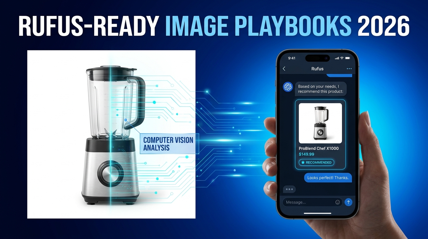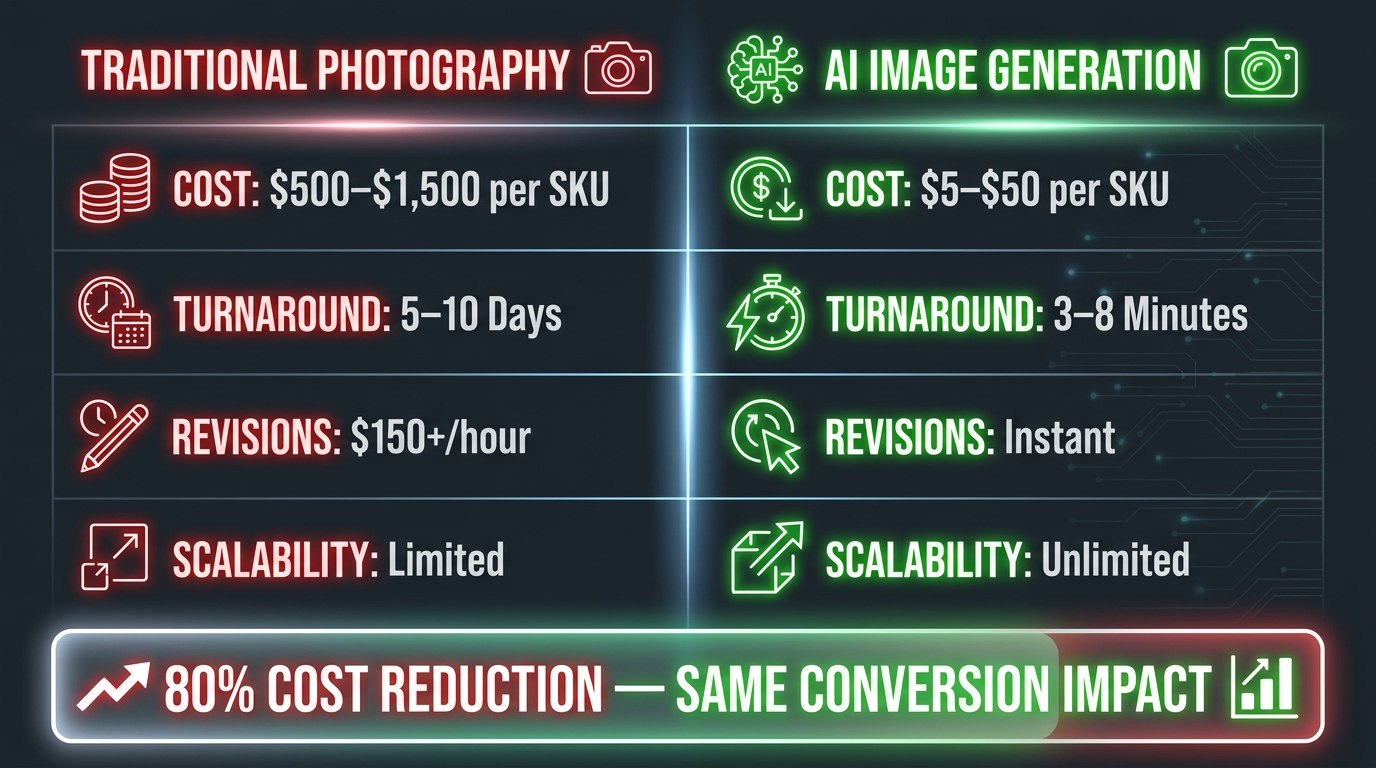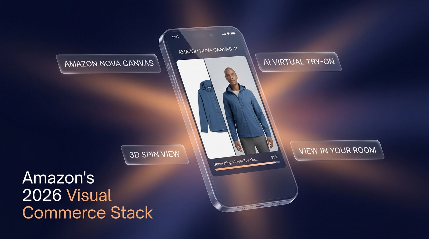
By mid-2026, AI-generated product imagery has gone from a competitive edge to table stakes. Virtually every serious Amazon seller is using some form of AI in their creative workflow — whether that’s background replacement in Photoshop, lifestyle scene generation in Midjourney, or infographic creation in Canva’s AI tools.
The problem isn’t adoption. The problem is assumption. The most common belief in seller communities right now is that if an image looks polished and professional, it’s probably fine to upload. That assumption is costing sellers listings, inventory, and in some cases, their accounts.
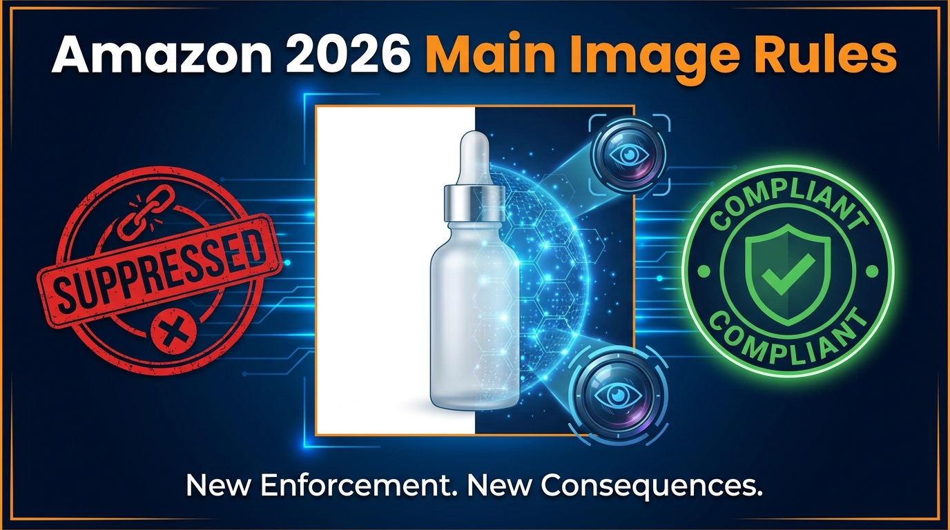
Amazon’s enforcement engine now analyzes over 300 million product images per month for guideline compliance and misrepresentation issues, with specific detection logic trained on AI-altered photographs. Suppression can be automated, fast, and issued without a warning. And the gap between what sellers think the rules allow and what Amazon actually enforces is wider than most realize.
This isn’t a review of AI tools. It’s a decision-making framework — a systematic way to determine which images in your listing can be AI-generated, which ones can be AI-enhanced, which ones need a human photographer, and exactly how to build the QA gates that keep your catalog clean.
Whether you’re running a 10-ASIN catalog or a 500-ASIN operation, the principles here apply. What changes is the scale of the damage when you get it wrong.
Amazon’s Two-Track Image System: The Rule Most Sellers Have Backwards
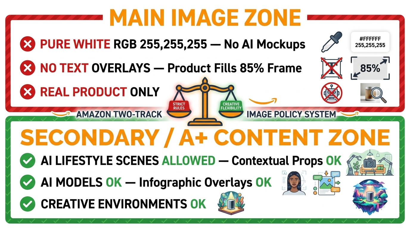
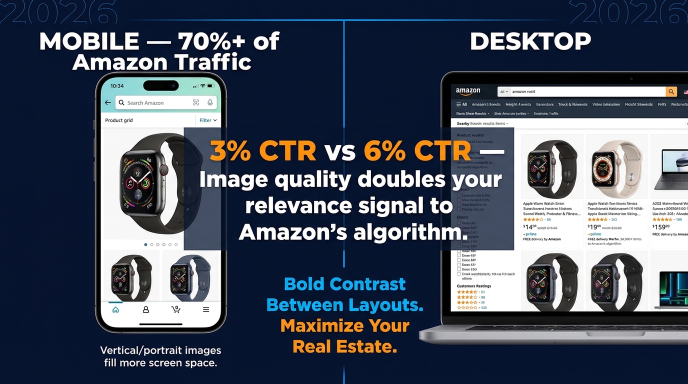
The single most important structural concept in Amazon’s image policy is one that most sellers treat as a single unified ruleset: the division between the main image (Slot 1) and all secondary images (Slots 2–9). These two categories operate under fundamentally different rules, different enforcement mechanisms, and different tolerances for AI involvement.
Getting them confused — in either direction — is where most compliant-intent workflows go wrong.
Slot 1: The Strictest Real Estate in E-Commerce
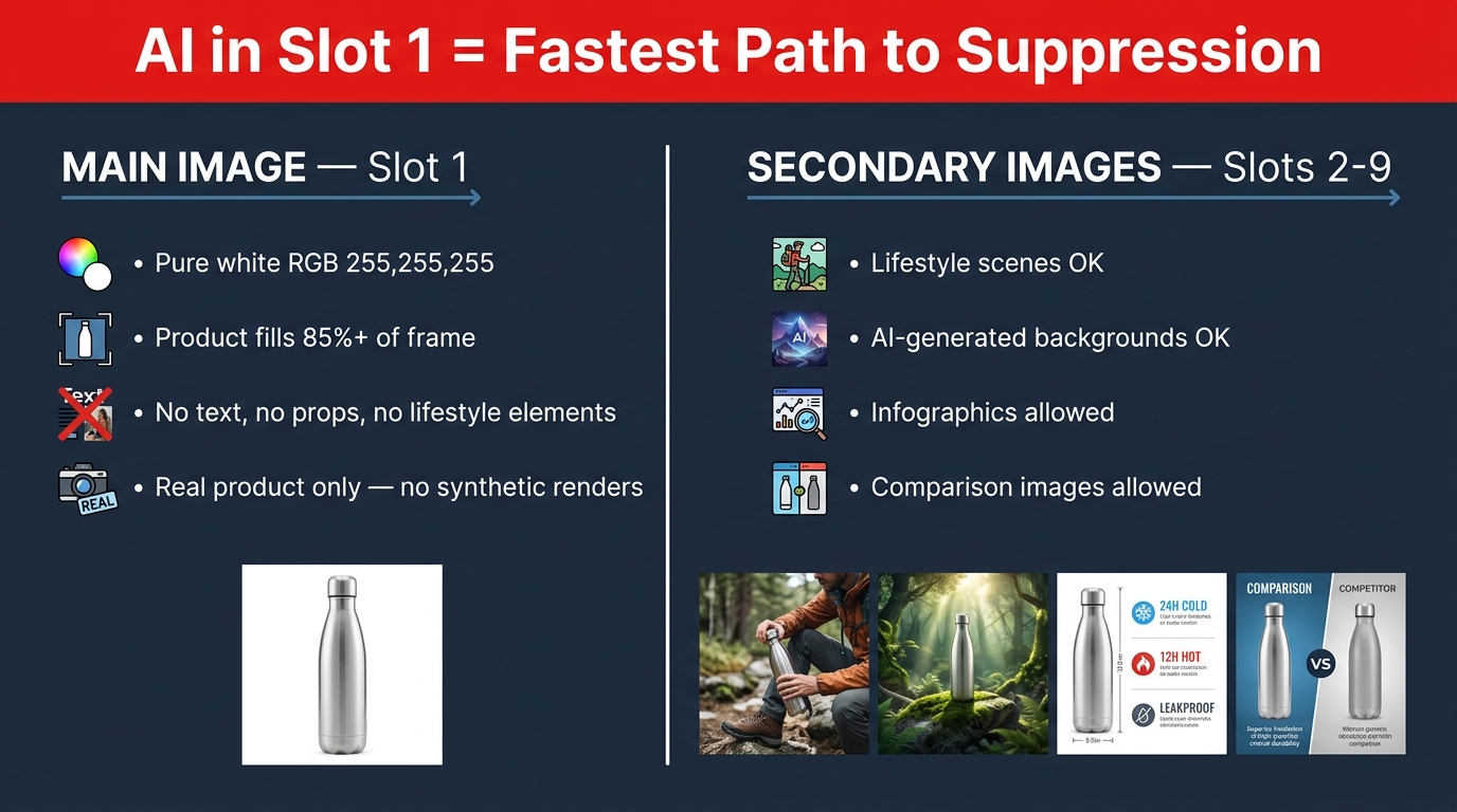
The main image is the image that appears in search results, the cart, and purchase confirmations. It is the single most scrutinized asset in your listing, and Amazon’s rules here are not guidelines — they are hard requirements enforced algorithmically:
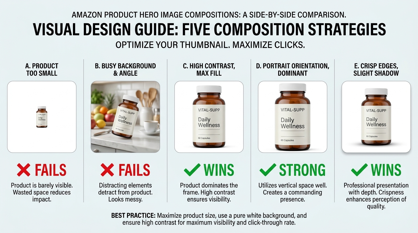
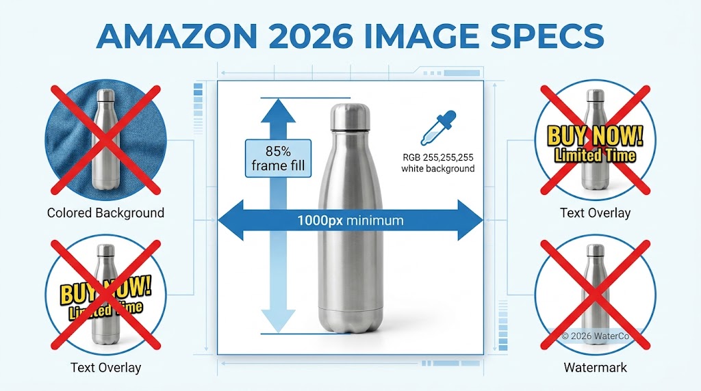
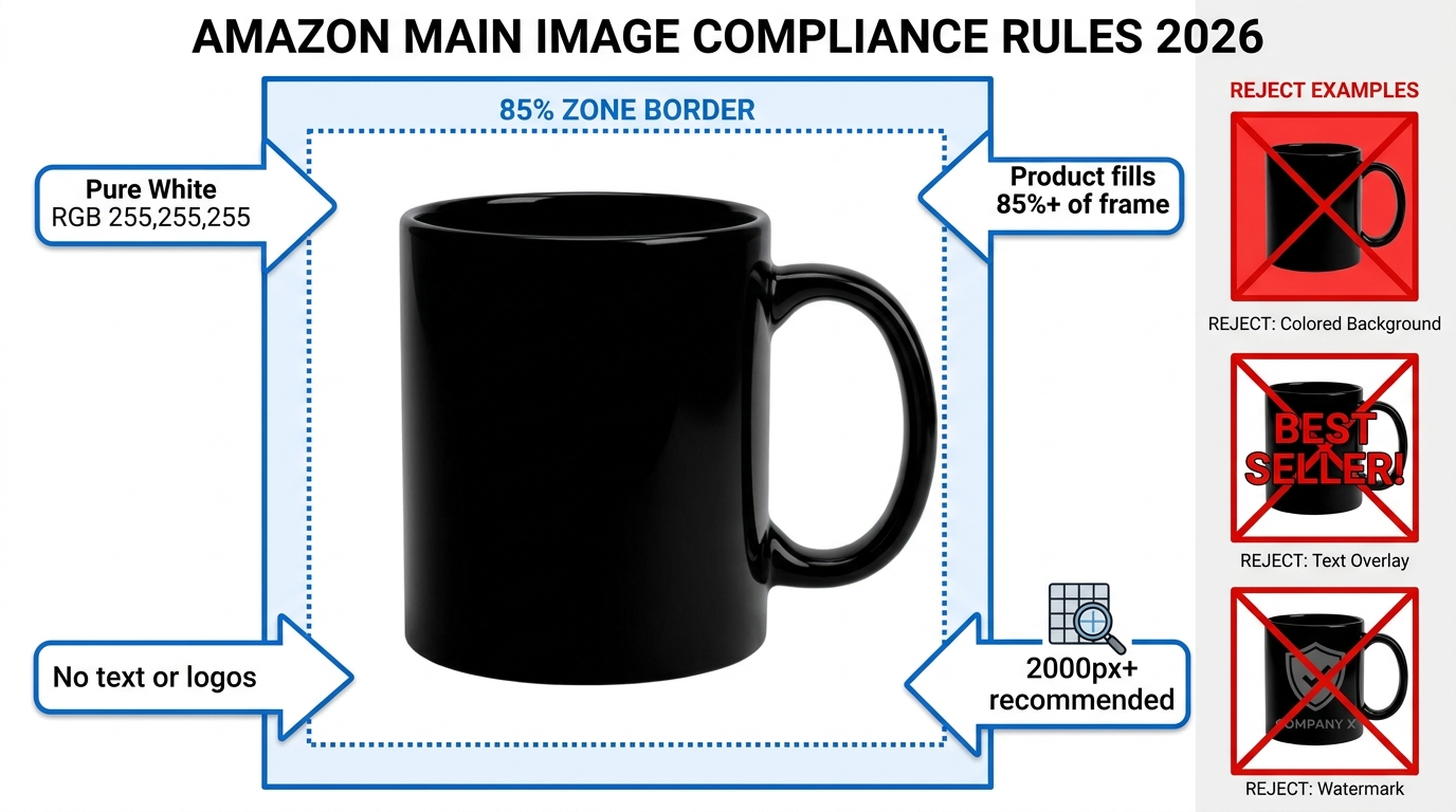
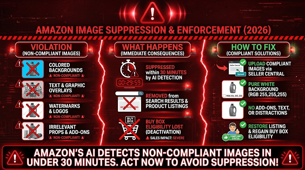
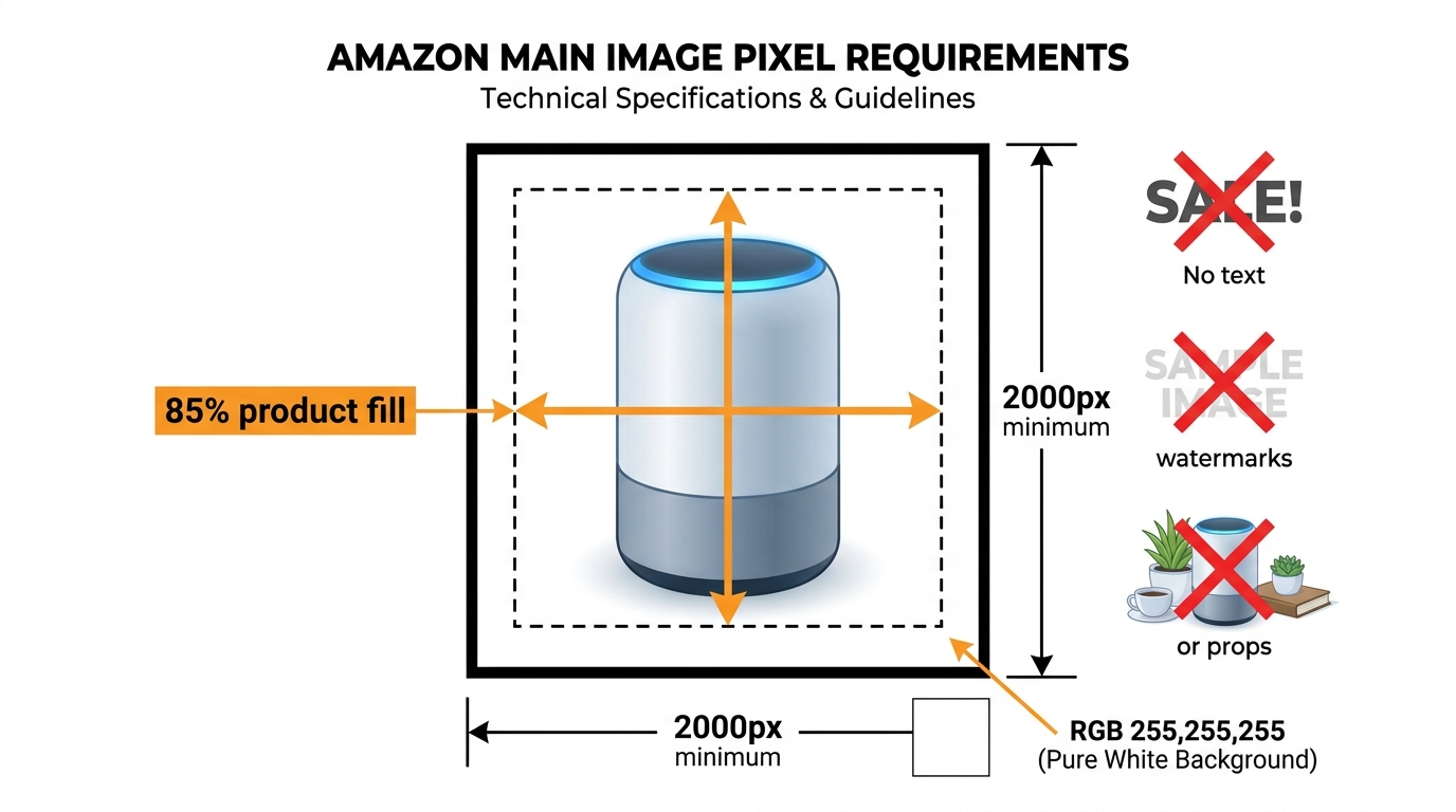
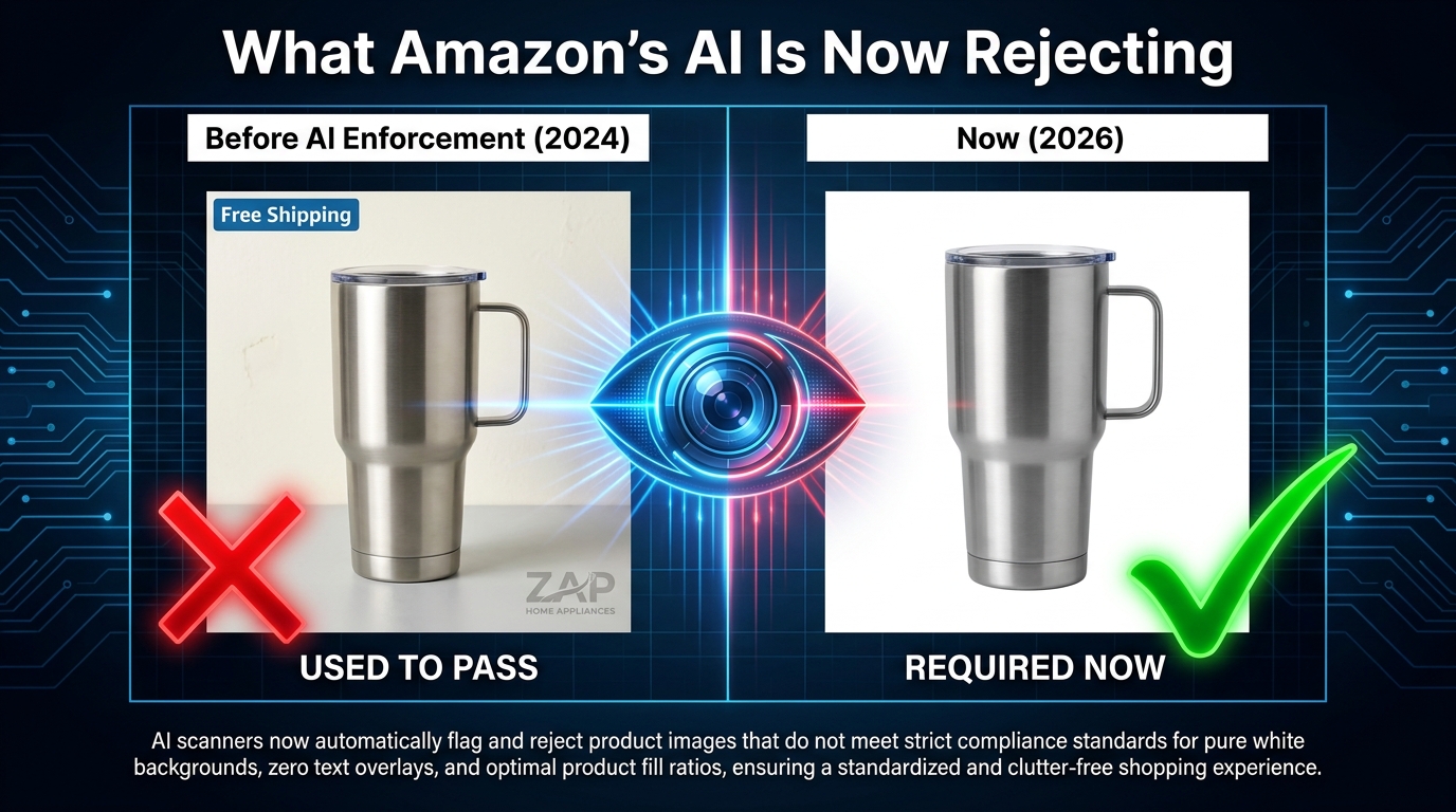
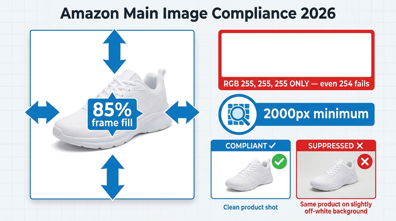
- Background: Pure white, specifically RGB 255, 255, 255. Near-white (RGB 250, 250, 250) is enough to trigger suppression. Off-white lifestyle backgrounds are an immediate violation.
- Product fill: The product must occupy at least 85% of the image frame. Excessive white space around a small product is a suppression trigger.
- No text or graphics: No logos, no promotional labels, no watermarks, no “New” or “Sale” overlays.
- No props or accessories: Nothing in the frame that isn’t included in the purchase. A wooden cutting board under a knife? Violation. A coffee mug next to a coffee machine that’s sold separately? Violation.
- Accurate product representation: The item shown must be the item sold. Not a superior version. Not a render that makes the plastic look like metal.
On the question of AI specifically: Amazon does not categorically ban AI-processed main images. But it does ban main images that are substantially AI-generated without accurately depicting the real physical product. The practical effect is near-identical. If the main image of your product was generated from a text prompt rather than a photograph of the actual item, you are in violation — regardless of how realistic it looks.
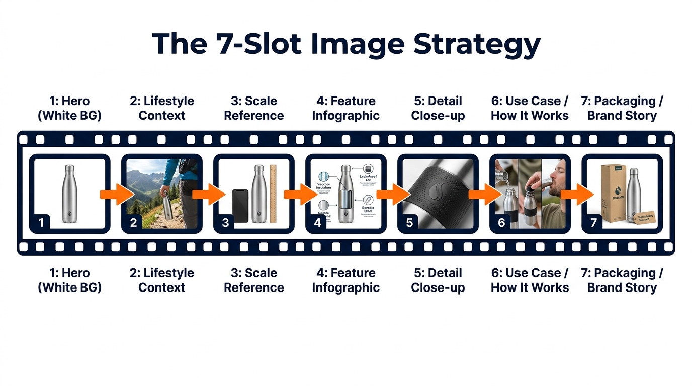
Slots 2–9: Where AI Actually Belongs in Your Workflow
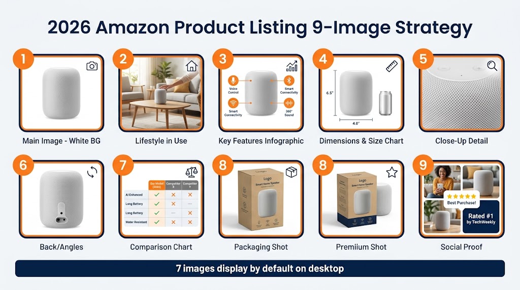
Secondary images operate under a fundamentally different philosophy. Amazon explicitly encourages the use of lifestyle photos, infographics, comparison tables, packaging shots, dimension callouts, and use-case demonstrations in these slots. And it allows AI-generated content across all of these formats — with one overarching condition: the product must still be accurately depicted.
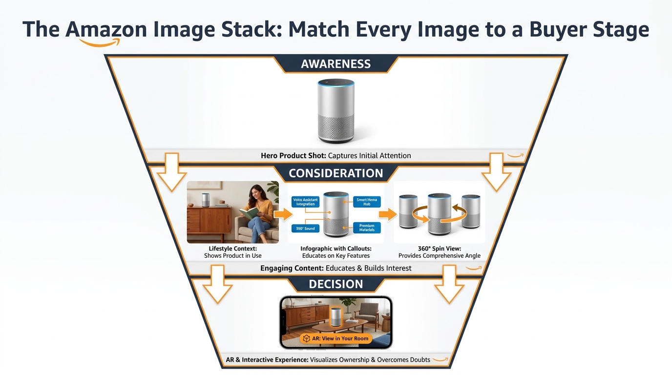
This is where the majority of your AI investment should go. Secondary images are responsible for conversion after the click. A shopper who finds your listing via search has already seen your main image. What happens in slots 2–9 determines whether they buy. This is where AI-generated lifestyle scenes, context shots, and benefit-focused infographics do measurable work — and where Amazon’s rules give you meaningful room to operate.
The practical rule of thumb: Treat Slot 1 as the domain of your real-world camera. Treat Slots 2–9 as the domain of your AI tools. Build your workflow architecture around that boundary, and most compliance problems disappear before they start.
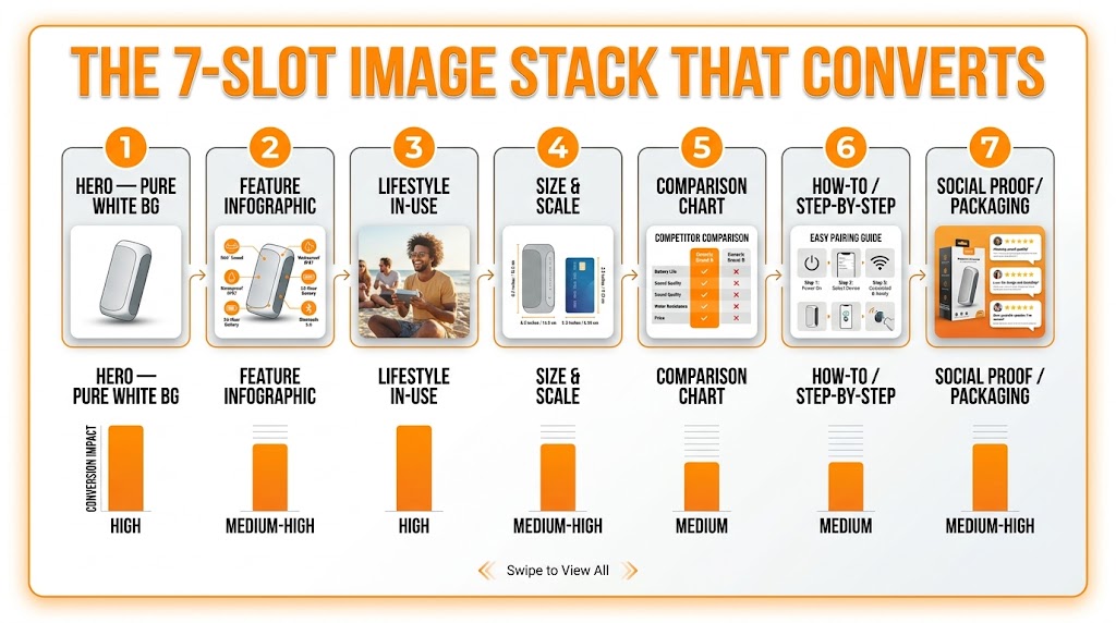
The Five Image Types and Where AI Actually Fits
Within the nine image slots Amazon provides, there are really five distinct image types that serve different conversion functions. Understanding which type can safely be AI-generated versus AI-enhanced versus must-be-photographed is the core of an intelligent workflow.
1. The Hero/Main Image
AI role: Enhancement only — never generation.
The main image must begin with a real photograph of the actual product. Where AI has a legitimate role is in the post-production of that photograph: background cleaning to achieve true RGB 255,255,255, minor color correction to match the physical product accurately, removal of dust or staging artifacts, and upscaling for pixel density requirements.
What AI cannot do here is generate the image from scratch, “improve” the product beyond its real appearance, or replace a real photo with a synthetic render — even a hyper-realistic one. The moment your main image was created primarily by a generative model rather than a camera capturing the real item, you have a compliance problem regardless of visual quality.
2. Lifestyle Images
AI role: Full generation is permitted — within accuracy constraints.
Lifestyle images are Amazon’s most AI-friendly format. You can place your product (which must still be the real product, accurately depicted) into any AI-generated environment that accurately represents a plausible use case. A real product image, composited into an AI-generated kitchen scene, a hiking trail, an office, or a bathroom — all of this is within policy.
The constraint is accuracy of use. If your AI-generated lifestyle image shows the product being used in a way that misrepresents its capabilities — implying waterproofing that doesn’t exist, suggesting it works with appliances it isn’t compatible with, or depicting a use case that could mislead about the product’s function — you are in violation. Amazon’s guidance here is clear: the lifestyle scene must be plausible and non-misleading for the actual product being sold.
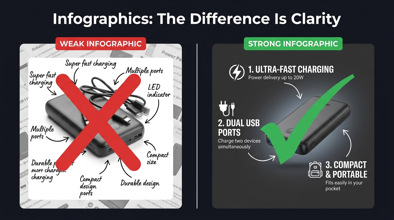
3. Infographic Overlays
AI role: Generation of background and layout — copy must be human-verified.
Infographic images — those that overlay product features, dimensions, materials, or key benefits over a product image — are one of the highest-conversion image types in most categories. They can be AI-generated in terms of their visual layout and design elements. The copy and claims that appear on those infographics, however, must be verifiably accurate and substantiated.
Amazon prohibits unsubstantiated claims in infographic images, just as it does in the listing copy itself. “Clinically proven,” “doctor recommended,” “3x more effective” — any claim without substantiation is a compliance risk regardless of which AI tool generated the graphic. Think of infographic compliance as copy compliance expressed visually.
4. Comparison Images
AI role: Layout and design generation — factual accuracy is non-negotiable.
Before/after comparisons, feature comparison tables, and competitor comparison charts are all permitted in secondary image slots. AI can generate the visual design of these. What it cannot do is fabricate the comparison data. Amazon specifically calls out misleading before/after imagery as a violation, and that prohibition applies equally whether the before/after was created in Photoshop by a human designer or generated by a diffusion model from a text prompt.
5. Packaging and Dimension Shots
AI role: Background enhancement only — packaging must be photographed accurately.
Packaging shots and dimension callouts serve a specific trust function for shoppers making purchasing decisions about physical items. These must be based on real photographs of the actual packaging. Dimensions and specifications overlaid on these images must be accurate to the manufactured product. AI can clean, enhance, and background-replace these shots, but it cannot generate the packaging from a text description.
Tool Selection Is a Legal Decision, Not a Creative One
Most Amazon sellers choose their AI image tools based on output quality, price point, or what they’ve seen recommended in Facebook groups and YouTube tutorials. That’s an understandable decision-making process — and almost certainly the wrong one for a commercial operation.
The question that actually matters when selecting AI image tools for an Amazon business isn’t “does it make beautiful images?” The question is: “Who bears the legal risk if a rights claim is filed against this content?”
The IP Indemnification Landscape in 2026
Here is where the major tools actually stand:
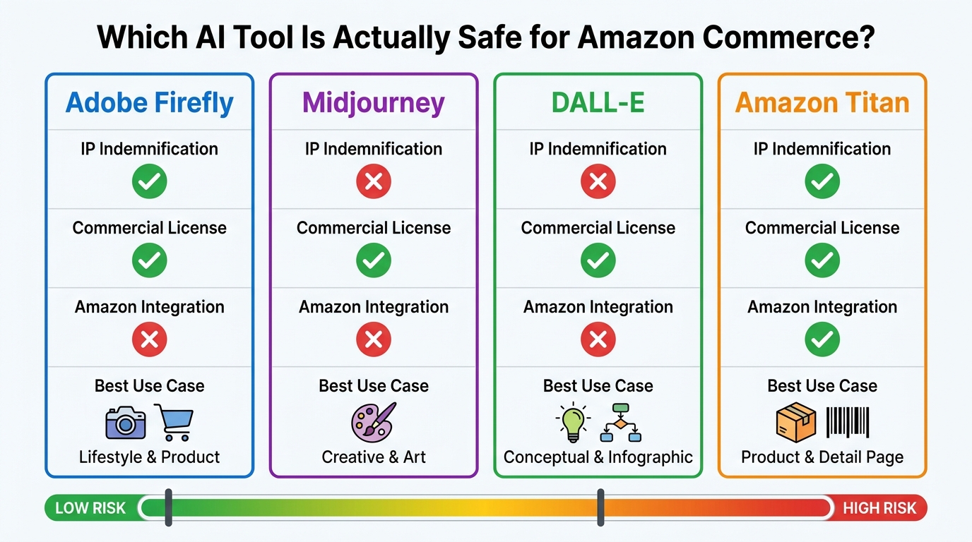
Amazon Titan Image Generator (via AWS Bedrock): Amazon offers what it describes as uncapped IP indemnification for copyright claims against outputs generated by its generally available Amazon generative AI services — including Titan Image Generator. Titan images also include an invisible watermark embedded by default, creating a documentation record that aligns with emerging AI transparency requirements. For sellers building at scale, this is the highest-protection option available. The tradeoff is that it requires AWS access and technical setup that casual sellers may find prohibitive.
Adobe Firefly (paid commercial plans): Adobe explicitly offers IP indemnification coverage for commercial outputs generated through Firefly on paid enterprise and business tiers. Firefly is also trained on licensed content from Adobe Stock and public domain material, which reduces (though doesn’t eliminate) the underlying training data risk. For most sellers who don’t want to build on AWS, Firefly on a commercial plan is the most widely accessible option with meaningful legal protection.
Midjourney: Midjourney’s terms of service allow commercial use for paid subscribers, but the platform does not offer IP indemnification. If a third party files a copyright or trademark claim against an image generated in Midjourney, the liability sits with the user. Midjourney is exceptionally capable for high-quality lifestyle imagery, and its output is often the highest-quality among consumer tools — but it carries commercial legal risk that most enterprise operations should weigh carefully.
DALL-E (via OpenAI API or ChatGPT): OpenAI does not provide general IP indemnification for DALL-E outputs. The commercial license allows use in business contexts, but the rights exposure on a per-image basis remains the user’s responsibility. DALL-E does tend to produce cleaner text rendering within images, making it useful for infographic-style assets — but the same IP risk caveat applies.
What This Means in Practice
The intelligent approach for a commercial Amazon operation is to build a tiered tool strategy: use Amazon Titan or Adobe Firefly (commercial) as the primary generation engine for any image that will go live in product listings, and reserve Midjourney or DALL-E for internal concepting, mood boarding, or creative testing where IP exposure is less consequential.
This isn’t about being overly conservative. It’s about recognizing that the cost of defending an IP claim — even an unfounded one — typically far exceeds the subscription cost difference between tools.
The Product Accuracy Trap: Where Good-Looking Images Fail
The most counterintuitive enforcement pattern Amazon sellers encounter is this: images that look the most polished and professional are sometimes the most likely to trigger a compliance action. The reason is that high-capability AI tools are very good at making products look better than they actually are — and Amazon’s enforcement system is specifically trained to detect that gap.
Amazon’s automated detection currently analyzes images for mismatches between what the image depicts and what the listing’s text data describes. Cross-referencing is happening across the product detail page, external webpages associated with the brand, customer review photos, and A+ content. When there’s a material discrepancy, the system flags the listing.
The Five Most Common Accuracy Failures
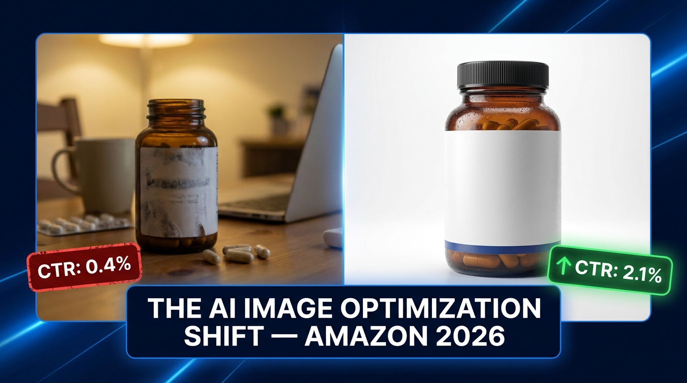
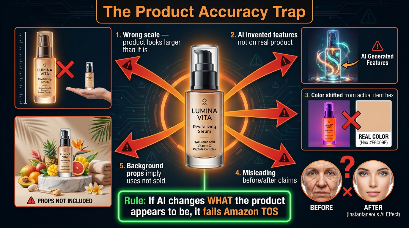
1. Scale distortion in lifestyle scenes. This is the most frequent failure mode. When sellers place a product into an AI-generated lifestyle scene, the model doesn’t always scale the product proportionally against environmental objects. A small travel candle that looks like a large jar candle in a kitchen scene, a supplement bottle that appears twice its actual size on a bathroom counter — these misrepresentations are detectable and flaggable.
The fix: always include a reference object of known dimensions in your generation prompt, and always compare the output against the real product dimensions before upload.
2. AI-invented product features. Generative models complete images based on what looks visually plausible, not what’s physically accurate. A product with a matte finish can be rendered by AI with a glossy surface. A product with three color options might be depicted in a fourth color that doesn’t exist. Stitching details, texture patterns, hardware finishes — all of these are areas where AI improvises to fill visual information gaps.
The fix: generate from a reference image of the actual product, not from a text description alone. Use tools that allow you to anchor generation to a source photograph.
3. Color accuracy drift. AI image models do not work in a color-managed pipeline the way commercial printing or photography workflows do. The output color of a product in an AI-generated scene frequently diverges from the real product’s color — sometimes subtly, sometimes dramatically. For products where color is a primary purchasing decision (apparel, home décor, paint accessories, beauty products), this is a category-A compliance risk.
The fix: validate output images against the product’s actual color using eyedropper tools in Photoshop or Figma. If the generated color is more than 10 delta-E away from the real product, the image needs correction before upload.
4. Misleading before/after imagery. Amazon explicitly prohibits before/after images that imply results that the product doesn’t deliver. AI-generated “after” states — a brighter room after using a paint product, cleaner teeth after using a whitening product, a tidier desk after using an organizer — must not exaggerate the product’s actual effect. When AI generates these “after” states, it tends to maximize contrast and improvement because that’s what looks compelling. That optimization instinct directly conflicts with Amazon’s accuracy requirements.
5. Background props implying bundled items. When an AI generates a lifestyle scene around a product, it fills the environment with contextually appropriate objects. A kitchen tool surrounded by other kitchen tools. A laptop stand shown with a laptop, keyboard, and monitor. If any of those surrounding items aren’t included in the purchase, their prominent depiction in the image can trigger a “contents not included” violation.
The Pre-Generation Brief: The Step That Separates Professional Workflows from Amateur Ones
The single most valuable operational practice separating high-volume Amazon creative teams from individual sellers who “just use AI” is the discipline of creating a detailed pre-generation brief before any AI tool is opened. This document — which doesn’t need to be elaborate — is what ensures that every image generated by any AI tool is grounded in the physical reality of the actual product.
Think of it as enforced photography-first thinking, applied to an AI workflow. Professional product photographers don’t approach a shoot without a shot list that specifies angles, lighting setups, and the physical characteristics of the product being shot. Pre-generation briefs serve the same function in an AI context.
What a Pre-Generation Brief Includes
At minimum, your brief for each product should document:
- Physical dimensions: Exact measurements in inches or centimeters, with the longest dimension noted for scale reference.
- Color specification: The actual hex code or Pantone reference for each colorway. Not “blue” — the specific shade, saturation, and finish (matte, gloss, satin, metallic).
- Material finish: Plastic vs. metal, matte vs. glossy, texture description in natural language that the AI can use as a visual anchor.
- Key features to preserve: List every visual feature that the customer might use to evaluate the product — logo placement, button position, port locations, stitching pattern, label design.
- Reference photograph: At minimum one hero reference photograph of the real product that all AI generations must be grounded in.
- What is NOT in the box: Any accessory, accompanying item, or environmental prop that should not appear prominently in generated images because it could imply inclusion.
- Permitted use scenarios: The specific use contexts that are accurate to the product and can be depicted in lifestyle scenes.
- Prohibited claims: Any performance claim, superlative, or comparison that lacks substantiation and must not appear in infographic overlays.
Teams that build this brief discipline report a 60–70% reduction in revision cycles. More importantly, they report near-elimination of TOS-triggered suppressions in their AI-generated secondary images, because every generated image is anchored to physical reality from the start rather than being corrected after the fact.
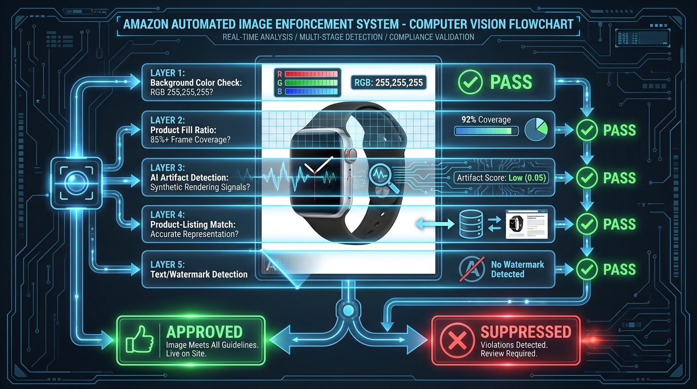
The QA Gate: A 12-Point Compliance Check Before Upload
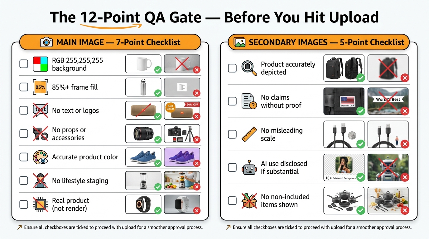
A QA gate is the mandatory human review step that happens after AI generation and before any image is uploaded to Seller Central. The fact that this step is “mandatory” needs emphasis — AI image workflows without a human QA step are workflows that will eventually fail at scale.
The following checklist is designed to be applied to every image before upload. It’s divided into main image checks and secondary image checks, reflecting the different compliance standards that apply to each.
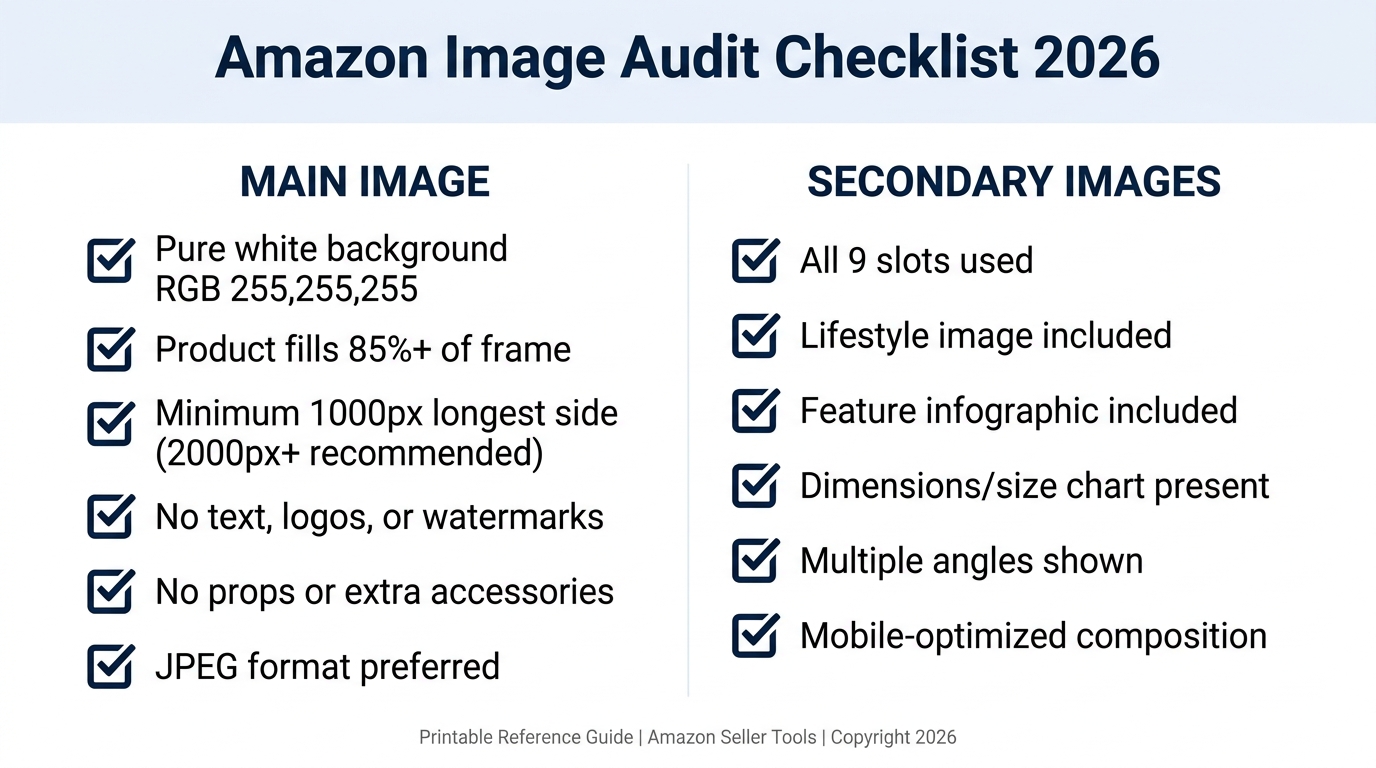
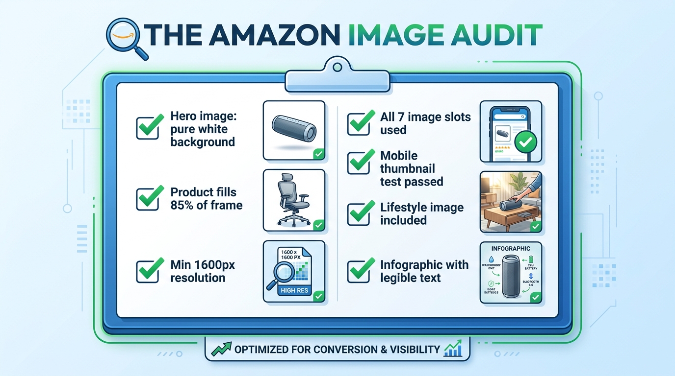
Main Image: 7-Point Checklist
- Background purity: Use an eyedropper tool to sample at least four corners and the center of the background. All samples must read RGB 255, 255, 255. Any variance triggers a re-edit.
- Product fill percentage: The product footprint should occupy at least 85% of the frame. If in doubt, measure it. This is quantifiable, not subjective.
- No text elements: No logo, no label, no overlay text, no promotional text of any kind visible in the image.
- No props in frame: Scan the image for any object that is not the product itself. Shadows of secondary objects, reflections, and partial views of staging props all count.
- Color accuracy verification: Compare the product’s color in the image against the actual product or the color specification from your brief. Evaluate under standardized conditions (neutral lighting, calibrated display).
- No AI-invented features: Cross-reference the image against the physical product for surface finish, branding, hardware details, and structural elements. If the image shows anything the real product doesn’t have, the image doesn’t go live.
- Image dimensions and format: JPEG format, sRGB color space, minimum 1000 pixels on the longest side (2000+ recommended for zoom functionality), maximum 10,000 pixels, file size under 10MB.
Secondary Images: 5-Point Checklist
- Product accuracy: Even in lifestyle and AI-generated scenes, the product itself must accurately represent the item being sold. Run the same color, finish, and feature check as for the main image.
- Claim substantiation: Every text claim visible in infographic images must have documented substantiation. If your team doesn’t have the substantiation on file, the claim comes off the image.
- Scale plausibility: Check whether the product size in the lifestyle scene is plausible relative to other objects in the frame. Compare against the product dimensions in your brief.
- No non-included items prominently depicted: Scan lifestyle scenes for items that could be interpreted as bundled with the product. If they’re present and aren’t sold with it, they need to be diminished visually or removed.
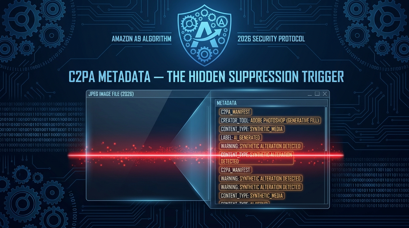
- AI disclosure assessment: Determine whether the image is “substantially AI-generated” versus AI-enhanced. Document this determination for each image in your workflow records. Apply disclosure labeling as required by Amazon’s evolving transparency guidelines.
Disclosure: What Amazon Actually Requires — and How to Build an Audit Trail
Amazon’s AI disclosure requirements have evolved significantly through 2026, and understanding the nuance is important because sellers are routinely either over-disclosing (creating unnecessary friction) or under-disclosing (creating genuine compliance exposure).
The Distinction Between Enhanced and Substantially Generated
Amazon’s current framework draws a distinction between images that have been AI-enhanced and images that are AI-generated. The practical line sits between these two scenarios:
AI-enhanced (routine editing): Background removal and replacement with a pure white background, brightness and contrast adjustment, cropping and framing, color correction to match the actual product, removal of dust or staging artifacts. Amazon does not require disclosure for these standard post-production operations when performed by AI tools. This is equivalent to what a human retoucher would do, and Amazon treats it accordingly.
Substantially AI-generated: Images where the primary visual content — the environment, the composition, the context, key visual elements — was created by a generative AI model rather than captured by a camera. Lifestyle scenes generated in Midjourney or Firefly with the product composited in, infographic layouts created entirely by AI tools, comparison visuals generated from text prompts. For these, Amazon’s 2026 guidelines indicate that disclosure is expected, particularly for content that represents a substantial AI contribution to the final image.
Building an Audit Trail
Beyond Amazon’s specific disclosure requirements, building a documented audit trail of your AI image workflow is a risk management practice that matters independently of any single platform’s rules. EU AI Act requirements, US FTC evolving guidance on AI-generated advertising content, and the general direction of consumer protection regulation all point toward increasing documentation requirements.
A practical audit trail for each AI-generated image includes:
- The tool used and version/model
- The prompt or generation parameters
- The reference photograph or source input used
- The date of generation
- The QA reviewer’s name and sign-off date
- The disclosure status determination (enhanced vs. substantially generated)
This documentation takes less than two minutes per image to complete in a simple spreadsheet. In the event of a dispute, a suppression review, or a regulatory inquiry, it is the difference between having a credible defense and having nothing.
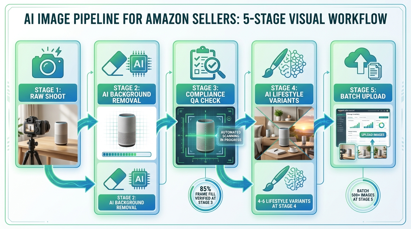
The Compliant Workflow Stack: Five Phases in Sequence
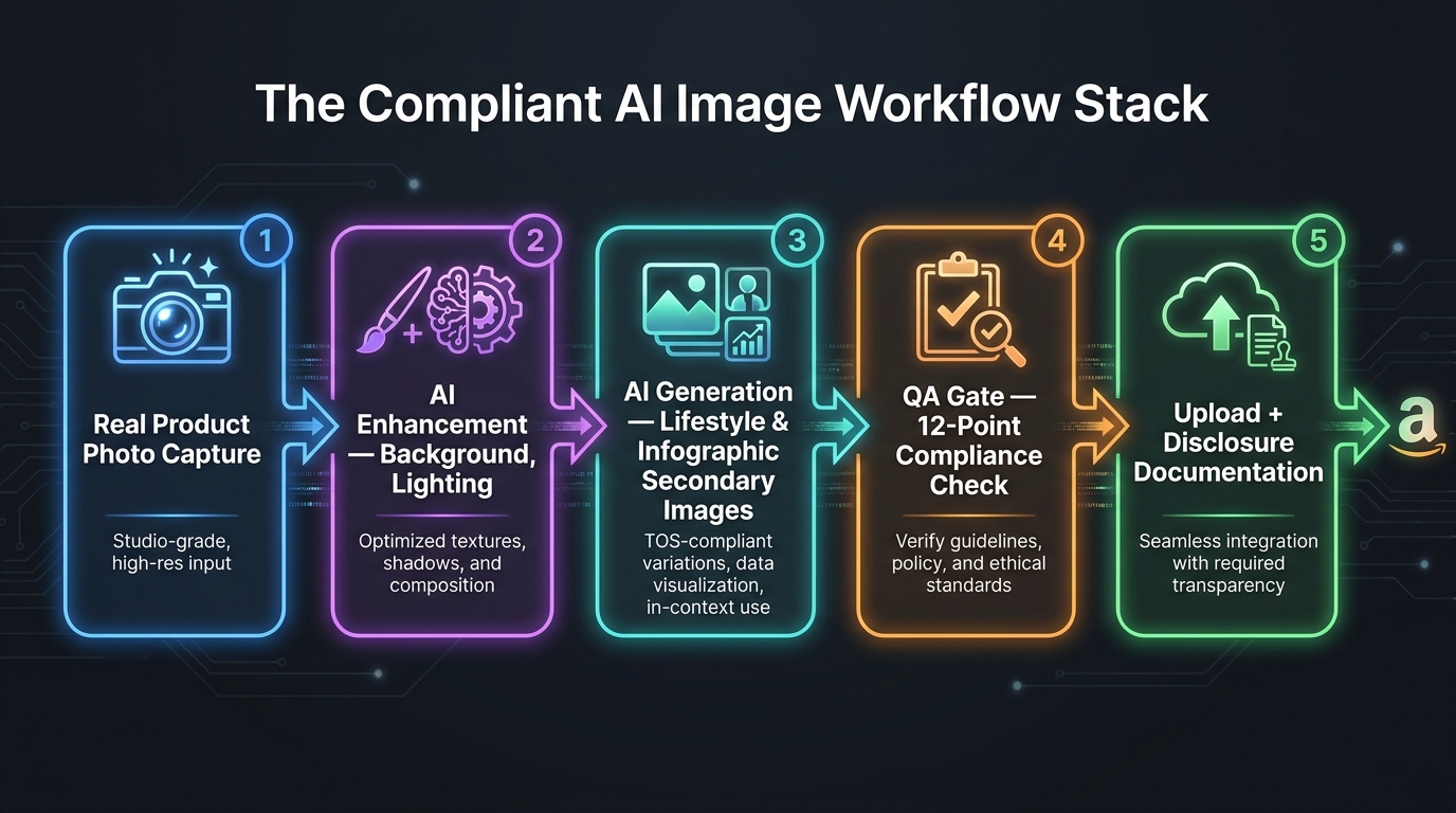
With the rules, tool selection logic, and QA criteria established, here is how they integrate into a five-phase production workflow. This sequence applies whether you’re managing one ASIN or one thousand.
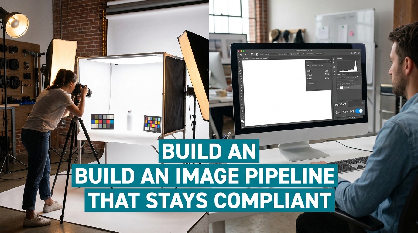
Phase 1: Real Product Photo Capture
Every compliant AI image workflow begins with a real photograph of the actual physical product. This is not optional, and it is not replaceable by AI generation — even for sellers who will ultimately use AI for every secondary image in their listing.
This photograph serves three functions. First, it is the foundation for the main image (after background cleanup and color correction). Second, it is the reference input that grounds all subsequent AI generation in the physical reality of the product. Third, it is the compliance anchor — the document that demonstrates the product being depicted is real and accurately represented.
The investment in quality photography at this phase pays compounding returns across every downstream AI generation. A well-lit, multi-angle set of reference photographs allows the AI tools in Phase 3 to produce accurate outputs with significantly fewer iterations than they can from a poorly lit, single-angle snap from a phone.
Phase 2: AI Enhancement of Base Photos
Once the real product photographs exist, AI tools enter the workflow for enhancement. This is the lowest-risk phase of AI involvement and the most universally useful.
Background removal and replacement to achieve true RGB 255,255,255 is the core function here. Adobe Photoshop’s Generative Fill, Remove.bg, and similar tools handle this reliably. Color correction to match the product’s actual color specification, upscaling for resolution requirements, and artifact removal are also appropriate here. These enhanced photographs become the main image candidates and the product source images for Phase 3.
Phase 3: AI Generation of Secondary Images
This is where the primary creative work happens and where AI tools deliver the most commercial value. Using the reference photographs from Phase 1 and the enhanced product images from Phase 2, generate:
- Lifestyle scenes in your chosen generation tool (Firefly or Titan for commercial safety), using the product image as an anchor reference
- Infographic layouts with benefit copy and feature callouts
- Comparison and before/after visuals where substantiated claims support them
- Dimension and scale reference images
During this phase, the pre-generation brief (documented in your planning stage) is your active reference. Every generation prompt should reference specific elements from the brief: the exact color, dimensions, finish, and permitted use scenarios. Generation that drifts from the brief doesn’t enter Phase 4 — it goes back for regeneration.
Phase 4: QA Gate
Every image produced in Phase 3 passes through the 12-point compliance checklist before proceeding. This is a human step, not an AI step. The QA reviewer applies the main image or secondary image checklist as appropriate, documents the disclosure status of each image, and makes a go/no-go decision on upload.
Images that fail QA go back to Phase 3 for regeneration with corrected prompts or parameters. Images that pass QA are documented (audit trail) and move to Phase 5. In a well-designed workflow, Phase 4 should reject between 15–25% of AI-generated images. If your rejection rate is near zero, your QA gate is probably too lenient.
Phase 5: Upload and Disclosure Documentation
Compliant images are uploaded to Seller Central in the correct sequence (main image in Slot 1, secondary images in the order optimized for your category’s conversion pattern). Disclosure labeling is applied as required. Audit trail records are updated with the upload date and live URL for each image.
At this phase, a final confirmation check against the live listing is valuable: view the listing as a customer would, compare the live images against what the customer will actually receive, and confirm there are no misrepresentations visible at the listing level that weren’t caught during QA.
Common Failure Patterns and How to Diagnose Them
Even well-designed workflows fail sometimes. Understanding the different types of Amazon image enforcement actions — and what specifically triggers each one — allows you to diagnose problems quickly and distinguish between a fixable mistake and a systemic workflow flaw.
Suppression vs. Flag vs. Rejection: What Each Means
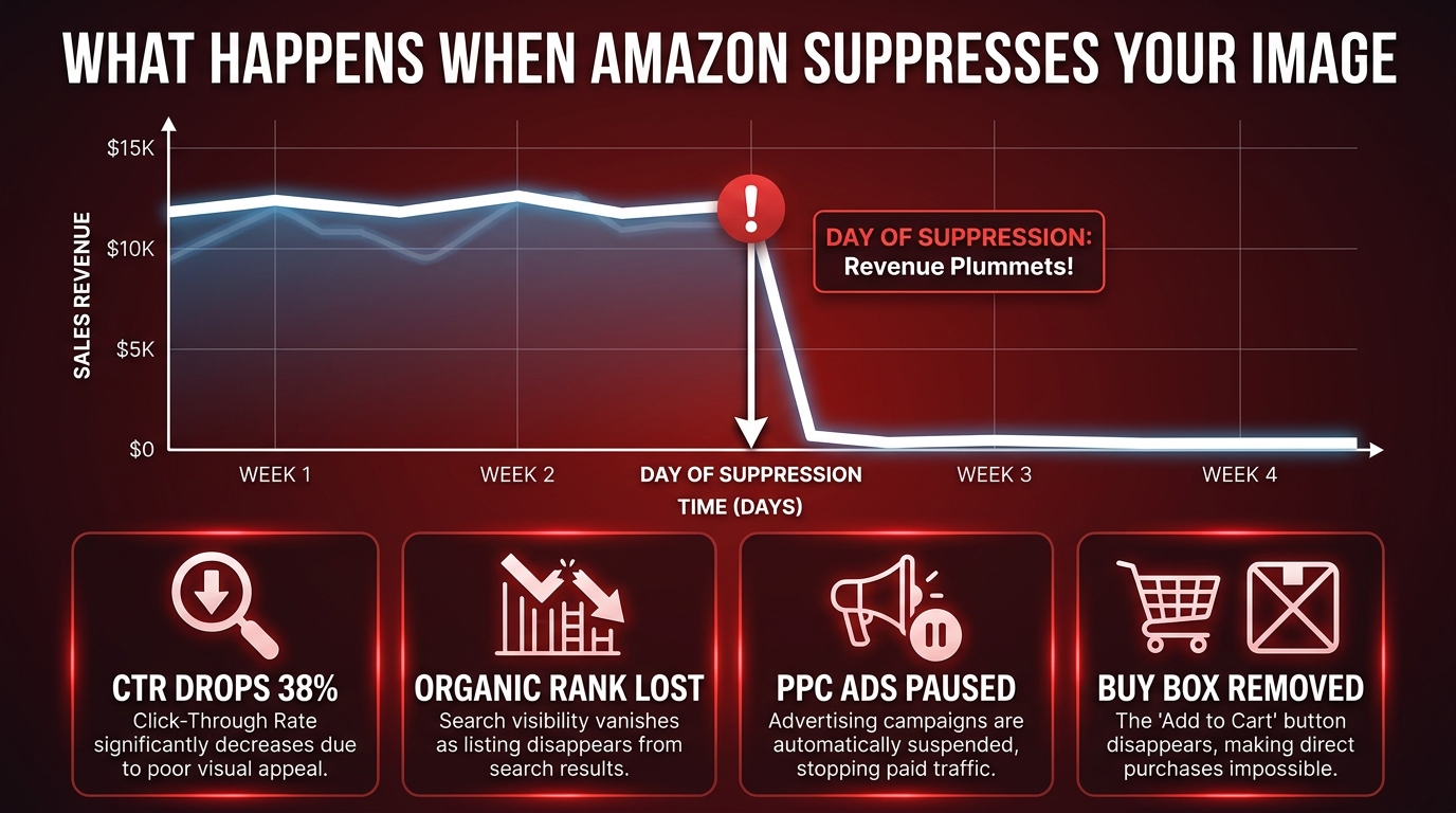
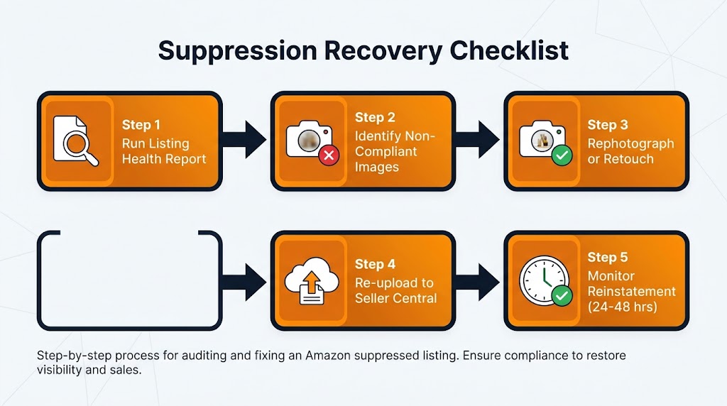
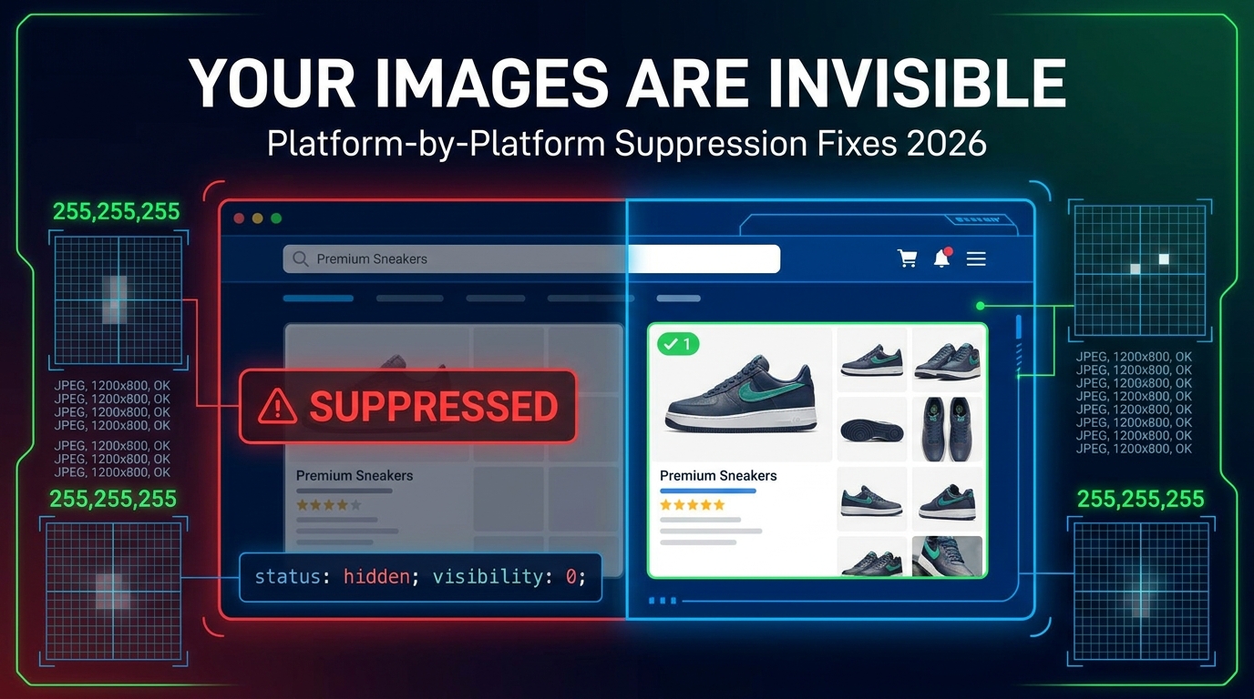
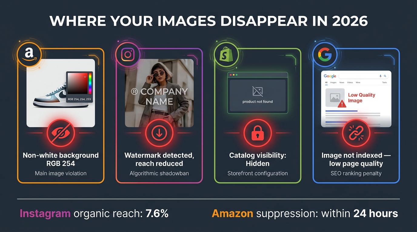
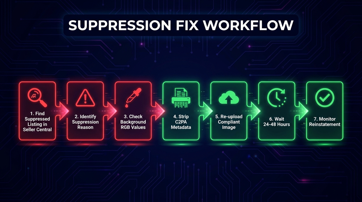
Listing suppression: The listing is removed from search results and becomes invisible to shoppers. Sales stop immediately. Suppression is typically triggered by main image violations — wrong background, excessive white space, prohibited text overlay, or product misrepresentation. It’s Amazon’s most aggressive automated enforcement action and can happen without a human reviewer ever seeing the listing. Resolution requires correcting the non-compliant image and submitting a re-review request.
Image flag/review: The image remains live but is queued for manual review. The listing continues to generate sales during review, but if the review results in a violation finding, suppression or image removal follows. Flags are more commonly triggered by secondary image issues — borderline claims, lifestyle scenes with ambiguous items, or AI disclosure concerns.
Image rejection at upload: The image is rejected during the upload process and never goes live. This typically indicates a technical violation — wrong file format, incorrect dimensions, file size exceeding limits, or a main image background that fails the automated RGB check. Rejection at upload is the least harmful outcome because it stops non-compliant images before they can create a suppression event.
The Misrepresentation Trap in Lifestyle Images
The most insidious failure pattern in AI-generated secondary images involves lifestyle scenes that accurately depict the product visually but inaccurately imply something about its capabilities through context. An outdoor furniture cushion shown in an outdoor setting where it’s clearly raining — implying weather resistance it doesn’t have. A supplement shown alongside an athlete completing a race — implying performance enhancement beyond what the product is approved to claim. A wireless charger shown with a phone model it isn’t compatible with.
These misrepresentations don’t come from AI deciding to deceive anyone. They come from AI generating what looks visually compelling and contextually appropriate, without any understanding of the product’s actual specifications or limitations. The gap between “contextually plausible” (AI’s optimization target) and “factually accurate for this specific product” (Amazon’s requirement) is where most lifestyle image failures live.
The solution is contextual review in Phase 4 that goes beyond visual accuracy and asks: “Does this scene imply anything about the product’s performance, compatibility, or capabilities that isn’t true?” That’s a question that requires domain knowledge about the product — and it’s a question that no AI QA tool can answer reliably yet. It requires a human reviewer who understands what the product actually does.
The Over-Reliance on AI for Main Image Background Cleanup
A specific failure pattern worth naming directly: the use of AI background replacement tools on main images that then fail the RGB 255,255,255 test because the tool has introduced very slight gradients, shadows, or off-white areas around the product that are invisible to the human eye but detectable by Amazon’s automated checking.
Tools like Photoshop’s Remove Background, Remove.bg, and similar AI-powered background removal tools work on probability thresholds. They identify “background” based on visual contrast and context, then replace it — but the replacement doesn’t always land at perfect pure white. Slight shadows at product edges, gradient effects near transparent product elements (glass, water bottles, clear packaging), and depth-of-field remnants can all leave patches of near-white that fail Amazon’s check.
The fix is simple but requires explicit process: after any AI background replacement, flood-fill the background layer with a clean RGB 255,255,255 value in a layer below the product, rather than relying solely on the AI replacement. This creates a guaranteed-compliant background regardless of what artifacts the AI tool left behind.
Building Your Decision Map: A Framework for Every Image Decision
The practical output of everything in this post is a set of decision rules that can be applied to every image your operation needs to produce. Rather than evaluating each image from scratch, the decision map lets you route images through the right production path from the beginning.
The Core Decision Tree
For every product image, start with three questions:
Question 1: Is this the main image (Slot 1)?
If yes → this image must begin with a real photograph. AI role is enhancement only. Apply main image 7-point checklist before upload. If the answer is no, proceed to Question 2.
Question 2: What type of secondary image is this?
If lifestyle → AI generation is permitted. Use a reference photograph as an anchor. Apply scale check, context accuracy check, and non-included items check. If infographic → AI layout generation is permitted. All copy claims must be human-verified and substantiated. If comparison/before-after → AI layout generation is permitted. Data must be factually accurate and defensible. If packaging/dimension → AI enhancement only. Real packaging must be photographed and accurately represented.
Question 3: Which tool am I using, and what is my IP exposure?
High-stakes commercial images → Amazon Titan (via Bedrock) or Adobe Firefly on a commercial plan. Lifestyle and creative secondary images where you want higher creative quality → Midjourney or DALL-E, with explicit understanding that IP risk remains with you. Internal concepting and testing → any tool.
These three questions, applied consistently, route every image to the right production process before any AI tool is opened. That’s what a decision map actually does — it front-loads the thinking so the production process is executing against clear rules rather than making compliance decisions on the fly.
Scaling the Framework Across a Large Catalog
For sellers managing hundreds of ASINs, the decision map needs to be embedded into the creative brief template and the project management system, not just kept in someone’s head. Every image brief should include a pre-filled routing decision — main or secondary, image type, tool assignment, IP tier — so that every member of the creative team is executing against the same framework regardless of which ASIN they’re working on.
The QA gate checklist should be a physical document (even a simple Notion page or Google Sheet) that is completed and signed off for every image before upload. At scale, the value of this isn’t just compliance — it’s the institutional memory it creates. When a suppression event does occur (and at sufficient catalog scale, some will), documented QA records tell you exactly which images were reviewed, by whom, and against which criteria. That’s the starting point for any meaningful root-cause analysis.
Conclusion: The Workflow Is the Strategy
AI has genuinely changed what’s possible in Amazon product imagery. The volume of high-quality lifestyle images, infographic assets, and creative variants that a single seller can produce has increased by an order of magnitude. Production costs have dropped dramatically. The creative ceiling for smaller sellers has risen significantly.
None of that changes the fact that Amazon’s enforcement infrastructure has grown commensurately. The same technology that makes image generation fast and cheap also makes image compliance checking fast and automated. Amazon now scans over 300 million product images monthly with systems trained specifically on AI-generated content detection and product misrepresentation.
The sellers who are winning in this environment aren’t the ones using the most sophisticated AI tools. They’re the ones who have built the most disciplined workflows around those tools — the pre-generation briefs, the QA gates, the audit trails, the tool selection logic tied to IP risk rather than aesthetic output. They treat the workflow itself as the strategy, not the tool.
The decision map in this post isn’t complicated. It comes down to knowing which images live in Slot 1 and which live in Slots 2–9, understanding what AI can and cannot do in each category, selecting tools based on your actual legal risk exposure, and installing a human QA gate that checks outputs against physical reality before anything goes live.
Apply that framework consistently, and you have an AI image operation that passes Amazon TOS not as a one-time achievement, but as a repeatable, scalable, documented process.
Immediate Actions to Audit Your Current Workflow
- Audit your current main images: Eyedropper sample the background RGB of your live main images. If any aren’t at 255,255,255, add them to your correction queue today.
- Identify which tool generated each of your secondary images: If you’re using Midjourney or DALL-E for live commercial content, assess whether the IP exposure is acceptable for your operation’s risk profile.
- Create a pre-generation brief template: Build one template that covers dimensions, color specs, reference photo, and prohibited claims. Apply it to every future AI image generation session.
- Build a QA gate document: Copy the 12-point checklist from this post into whatever project management tool your team uses. Make it required before any image upload.
- Start your AI image audit trail: A simple spreadsheet with tool, date, QA reviewer, and disclosure status for each AI-generated image is enough to start. Build the habit now before it’s required by policy.