
Category: Uncategorized

  • Why Your Amazon Images Are Silently Killing Your Conversion Rate (And How to Fix Every Slot)

    Why Your Amazon Images Are Silently Killing Your Conversion Rate (And How to Fix Every Slot)

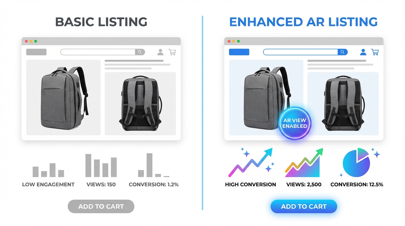
    Split-screen Amazon listing comparison showing low vs high converting product images with CVR data

    There are two kinds of Amazon sellers who read articles about listing images. The first kind has genuinely poor images — blurry supplier photos, non-white backgrounds, mismatched lighting. They know something is wrong because their conversion numbers tell them so. The second kind has done the homework: they have a clean hero shot on pure white, they’ve filled all seven image slots, their infographics are tidy, and their listing looks professional. And yet, their conversion rate is still underwhelming.

    This article is mostly for the second group. Because the gap between compliant images and compelling images is where most Amazon sellers are leaving the most money on the table in 2026.

    Compliance is table stakes. Following Amazon’s technical specifications gets your listing visible. It does not, by itself, get your listing clicked. It does not move a browsing shopper from passive interest to genuine purchase intent. That shift — from compliant to compelling — requires a completely different mental model. You’re not just satisfying a checklist. You’re constructing a visual sales argument, slot by slot, that answers every doubt a buyer might have before they ever read a single word of your bullet points.

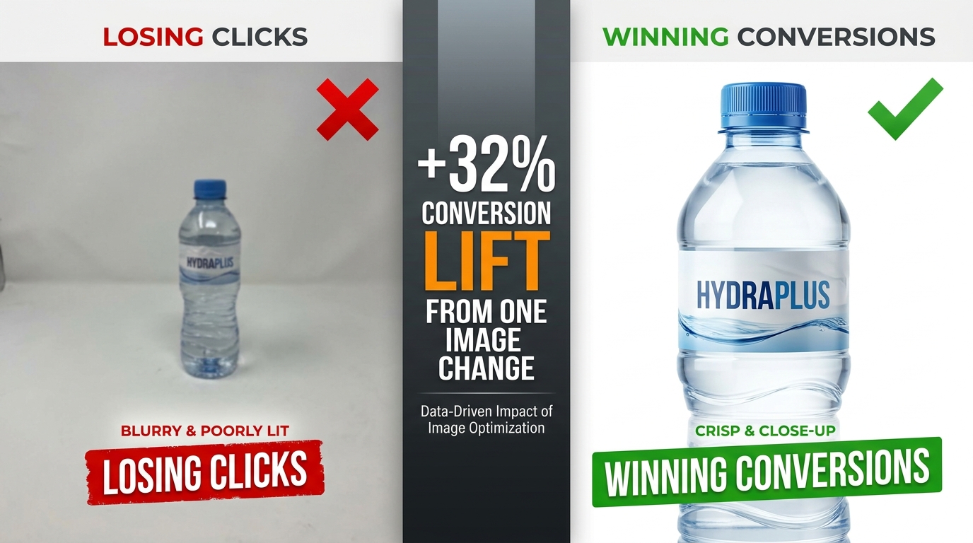
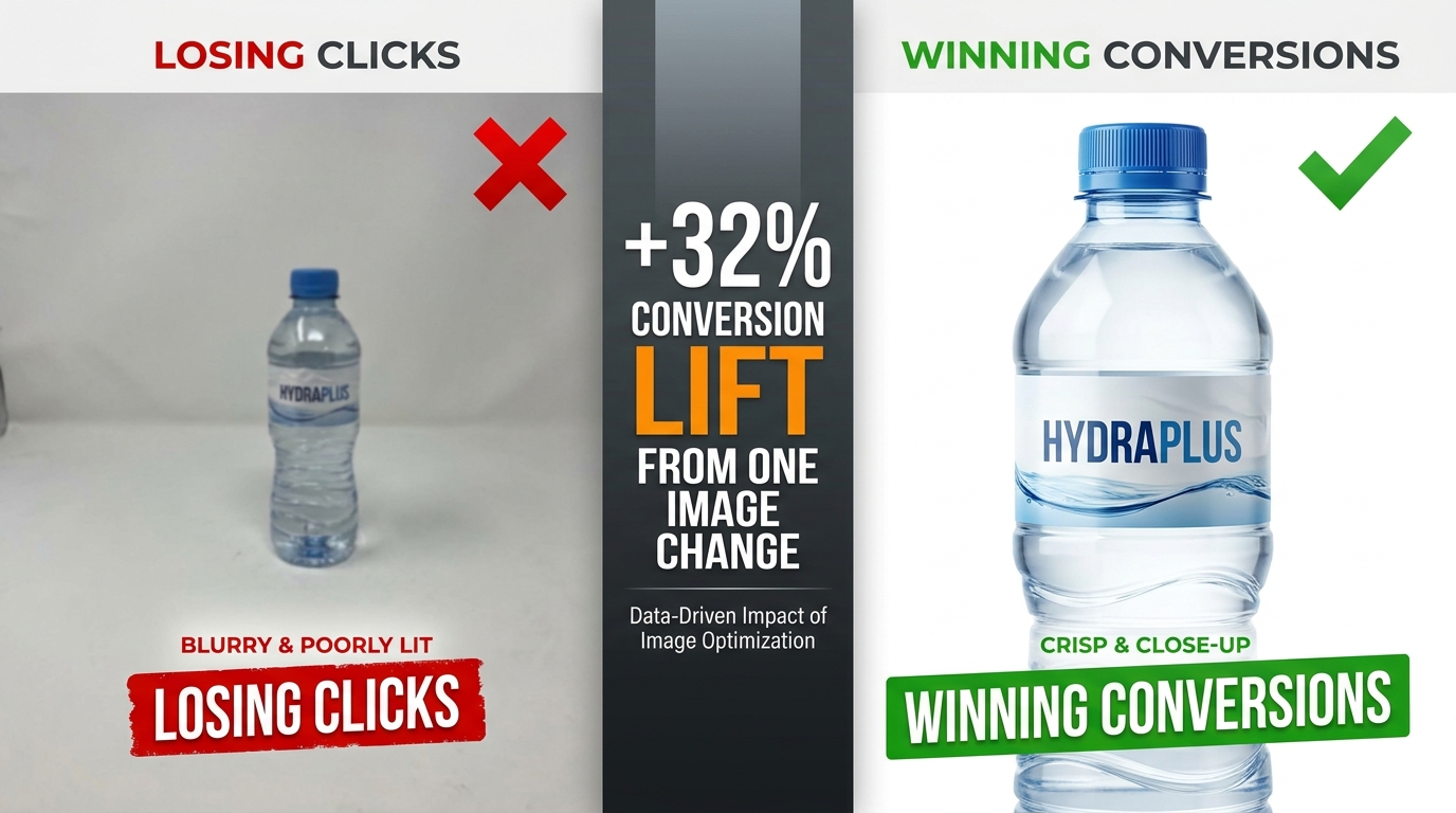
    The data backs this up. Professional photography drives 2–3x higher conversion rates compared to listings with amateur or generic visuals. A+ Content with optimized images can increase sales by up to 20% over standard listings. A single main image test can move CTR from 2.1% to 3.4% — a 62% increase — without changing a single word of copy. These are not small numbers in a competitive marketplace.

    What follows is a ground-level examination of every image slot, the psychology driving buyer behavior, the specific mistakes that sabotage otherwise solid listings, and the testing infrastructure you need to keep improving. Let’s start at the very beginning: what happens in the buyer’s brain before they’ve consciously decided anything.

    The Psychology of 50 Milliseconds: How Buyers Decide Before They Think

    Infographic showing the 50ms buyer psychology principle — buyers judge products before reading any copy

    Research on visual perception consistently shows that humans form first impressions of visual stimuli in approximately 50 milliseconds. On Amazon, that means a shopper scrolling through search results has already begun evaluating your product — assessing quality, trustworthiness, and relevance — before their conscious brain has processed a single character of your title.

    This is not a metaphor. It’s the literal neurological reality of your marketplace. And it has profound practical implications for how you think about your hero image.

    The Trust Signal Problem

    When a buyer sees a product image, their brain isn’t asking “does this look nice?” It’s running a much more primal calculus: can I trust this? Sharp focus, accurate color reproduction, professional lighting, and a product that fills the frame all function as unconscious trust signals. They communicate that the seller is serious, the product is real, and the brand has invested in quality presentation.

    Conversely, a dark photo, an off-white background, a product that looks small and lost in an oversized frame, or any hint of blurriness triggers an equally automatic suspicion response. Shoppers don’t consciously think “this seller looks unprofessional.” They just feel reluctant — and they click somewhere else.

    Images as Sensory Substitutes

    In a physical retail environment, customers pick things up. They feel the weight, test the texture, open the packaging, press the buttons. Online shopping strips all of that away. The only sensory information available to a potential buyer is what your images provide. This means your image set isn’t just a gallery — it’s a substitute for the in-store experience.

    The most effective Amazon image stacks understand this implicitly. They anticipate the specific sensory questions a customer would ask if they were holding the product. How big is this, really? What does the material feel like? How does it work? What does it look like when someone my age uses it? Every image slot is an opportunity to answer one of those questions before the customer has to ask it — or worse, leaves to find the answer on a competitor’s listing.

    The Risk Reduction Imperative

    Behavioral economics research consistently demonstrates that loss aversion — the fear of making a bad purchase — is a more powerful motivator than the anticipation of gain. Applied to Amazon shopping, this means buyers aren’t just looking for reasons to buy your product. They’re actively scanning for reasons not to buy it. Every unanswered question, every ambiguous image, every detail left to the imagination increases the perceived risk of the purchase.

    Your image set’s job is to systematically eliminate that risk. Show the product from every relevant angle. Demonstrate scale unambiguously. Show it in use in a realistic context. Answer the “but what about…” questions before they’re asked. The listing that eliminates the most purchase-blocking doubts wins the conversion.

    Your Hero Image: The Click-or-Skip Decision

    The hero image — the first image, the one that appears in search results — is functionally a different animal from all your other images. Its job is not to convince. Its job is to get the click. Everything else on your listing handles the convincing. The hero image is purely responsible for getting the shopper off the search results page and onto yours.

    This is an important distinction that many sellers blur. They design their hero image to communicate features, highlight benefits, or establish brand identity. Those are all valuable objectives — for images two through seven. The hero image has one objective: click-through rate.

    Technical Requirements Are Not Optional

    Amazon’s requirements for the main image are strict and actively enforced:

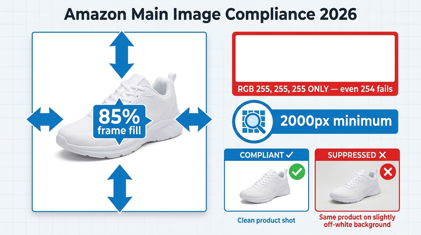
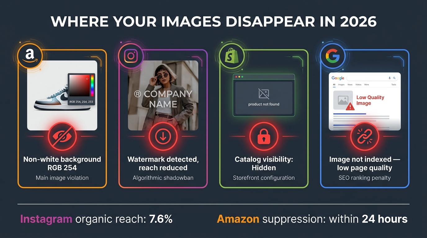
    • Background must be pure white at RGB 255, 255, 255. Not off-white. Not light gray. Not 254, 255, 255. Amazon’s image processing bots check pixel values, and deviations — even imperceptible ones to the human eye — can trigger automatic listing suppression.
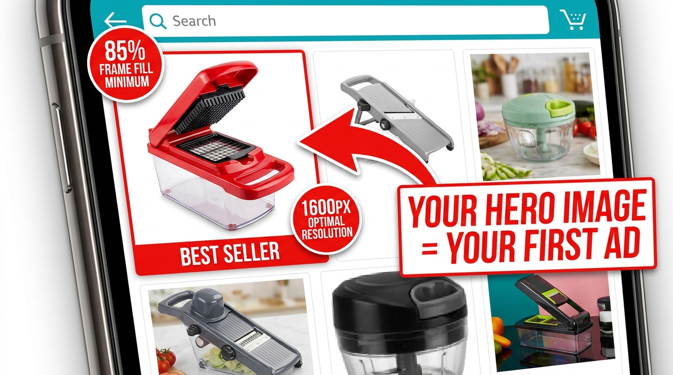
    • The product must occupy at least 85% of the image frame. Images where the product looks small, distant, or surrounded by negative space fail to communicate quality and have reduced thumbnails in search results, where space is already at a premium.
    • Minimum resolution of 1,000 pixels on the longest side, with 1,600–2,000+ pixels strongly recommended. Below 1,000 pixels, Amazon’s zoom feature is disabled. Since 66% of shoppers use the zoom feature to inspect products, disabling it is a significant conversion handicap.
    • No text, logos, badges, watermarks, or promotional graphics. No “Best Seller” banners, no discount callouts, no lifestyle props. The main image must show the product — and nothing but the product — on that pure white background.

    Differentiation Within the Rules

    Given that every seller in your category is operating under the same constraints — white background, no text, full product — how do you differentiate? Several levers remain within compliance:

    Angle. The default supplier photo usually shows the product from a straight-on, slightly elevated three-quarter angle. Most competitors are using this same perspective. Testing a different angle — a direct front view, a slightly lower perspective that creates more presence, a slightly overhead angle for flat products — can make your thumbnail visually distinct in a sea of identically-shot competitors.

    Fill ratio. Aim for maximum allowable product fill. A product that takes up 90%+ of the frame looks more imposing and premium than one at 86%. In a small search result thumbnail, this difference is immediately visible.

    Lighting. Subtle shadows and three-dimensional lighting create depth and weight. Flat, shadowless product images often look like PNG cutouts. Careful studio lighting that reveals the product’s form and texture — without adding non-white elements — creates a more premium visual impression.

    Variant selection. If your product comes in multiple colors or sizes, your hero image should feature the variant most likely to appeal to your target buyer first. Showing your least-differentiated version in the hero wastes the first impression.

    The 7-Slot Framework: Mapping Your Images to the Buyer Journey
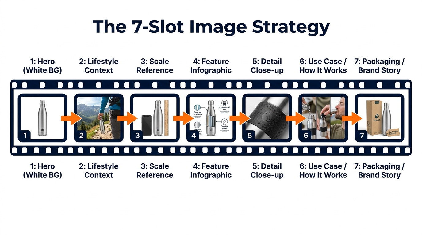
    Infographic diagram showing Amazon's 7-image slot strategy mapped to the buyer journey

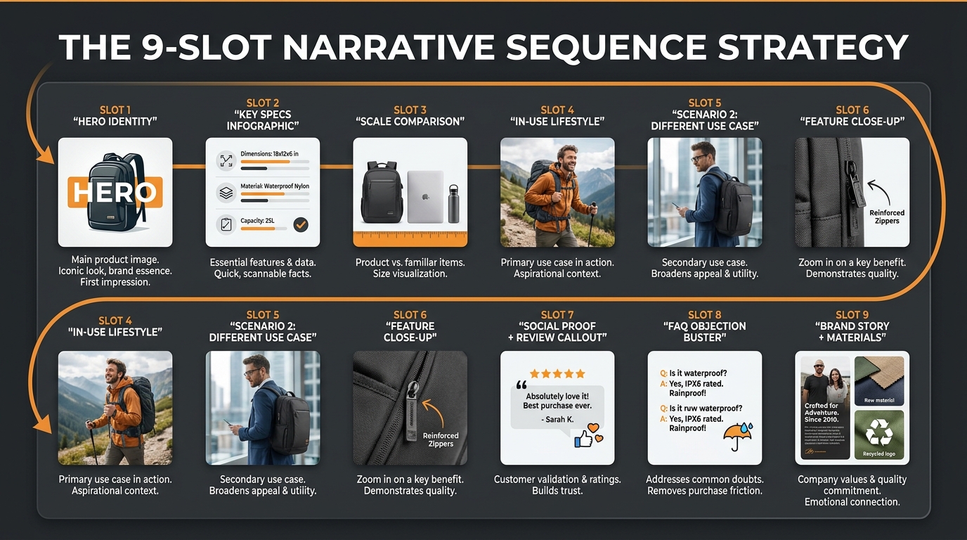
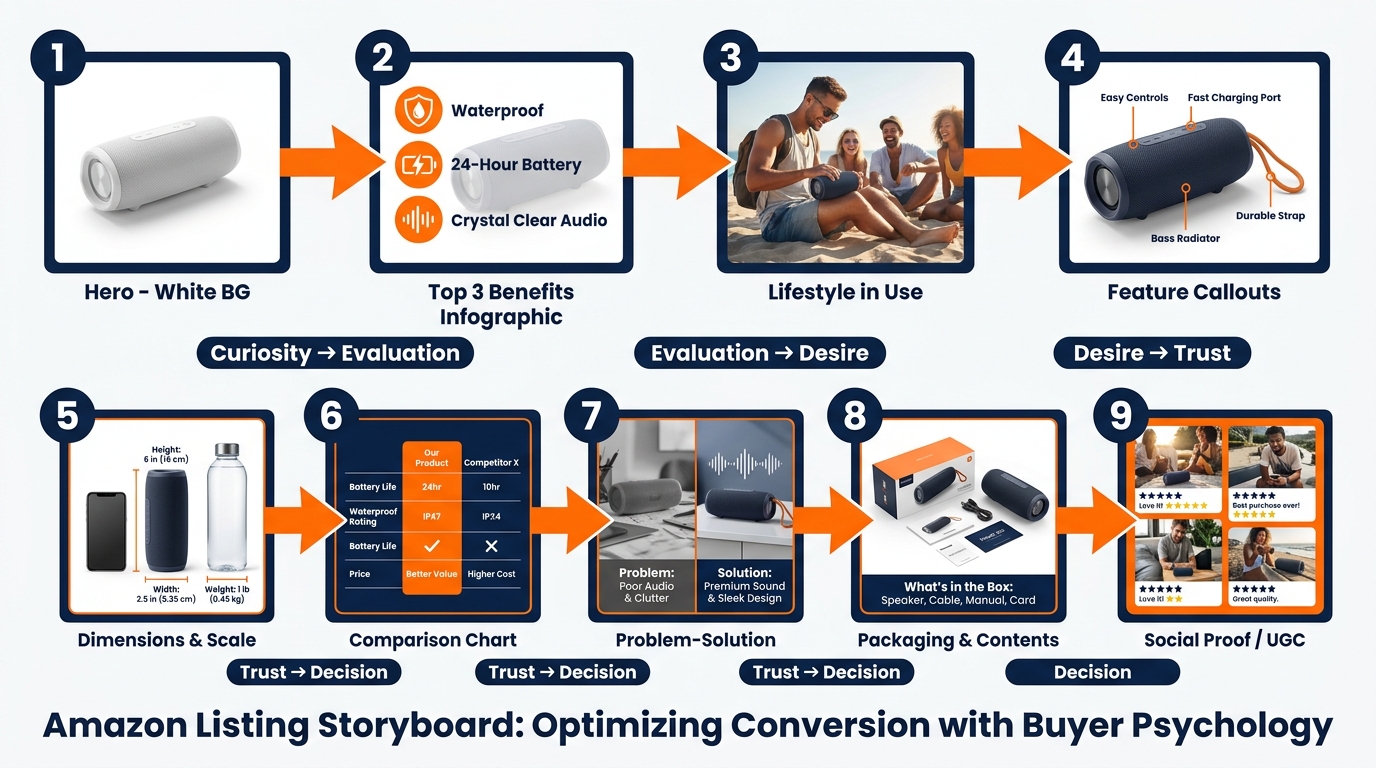
    Amazon allows up to nine product images, plus a video. Most successful sellers use all seven primary image slots at minimum. But using all seven slots isn’t the same as using them strategically. The sequence matters. Each image should answer the next logical question a buyer has after viewing the previous one.

    Think of the image stack as a visual sales conversation. You’ve captured attention with the hero. Now you have a shopper on your product page who wants to be convinced. Walk them through that journey deliberately.

    Slot 1: The Hero (White Background)

    As covered above: pure white, 85%+ fill, high resolution, no graphics. Optimized for search result thumbnails and first-impression quality signals.

    Slot 2: Lifestyle Context

    The first secondary image should immediately answer “what does this look like in the real world?” Show the product being used by a person or placed in an environment that reflects your target customer’s life. This image performs a critical emotional function: it invites the buyer to project themselves into the scene. They stop evaluating the product abstractly and start imagining themselves owning it. Research from Amazon’s own data suggests that contextual images correlate with up to 40% higher conversion rates compared to product-only secondary images.

    Slot 3: Scale Reference

    Ambiguous size is one of the most common reasons shoppers abandon Amazon purchases and leave negative reviews. Slot 3 should establish scale unambiguously, by showing the product next to a familiar reference object (a hand, a coin, a standard household item) or against a measuring tape. Dimension infographics — the product with labeled measurements overlaid — also work well here. The goal is that after seeing this image, the buyer has zero doubt about how large or small this product actually is.

    Slot 4: Feature Infographic

    This is where you make the product’s key benefits legible at a glance. Feature callouts, labeled arrows, material specifications, compatibility information. Unlike slots 2 and 3 which build emotional connection and practical understanding, slot 4 speaks to the analytical buyer who wants to verify that the specifications match their needs. Well-designed infographics here can preempt the most common questions and answers submitted on your listing.

    Slot 5: Detail Close-up

    What is the one detail of your product that competitors can’t match — or that looks significantly better up close than it does at full size? This slot exists to show that detail in its best possible form. Stitching on a bag. The grain of a wood surface. The mechanism of a clasp. The texture of a material. Whatever makes your product worth more than the cheaper version, show it at maximum zoom.

    Slot 6: Use Case / How It Works

    For products where usage isn’t immediately obvious, or where the purchase decision hinges on whether the product will work for a specific scenario, slot 6 demonstrates the product in action. Before-and-after comparisons work well here if your product solves a problem. Step-by-step visual instructions for products with a learning curve also reduce friction by preempting “will I be able to figure this out?” anxiety.

    Slot 7: Packaging / Brand Story

    The final slot is where you complete the experience and reduce post-purchase anxiety. Show the product packaging clearly. If the product is frequently gifted, show it gift-ready. If it’s sold with accessories, show the full contents of what arrives. This image answers the final question: “What exactly am I going to receive?” Buyers who know exactly what’s in the box have lower return rates, fewer negative reviews, and higher likelihood of leaving positive feedback.

    Infographics That Actually Convert (Not Just Look Good)
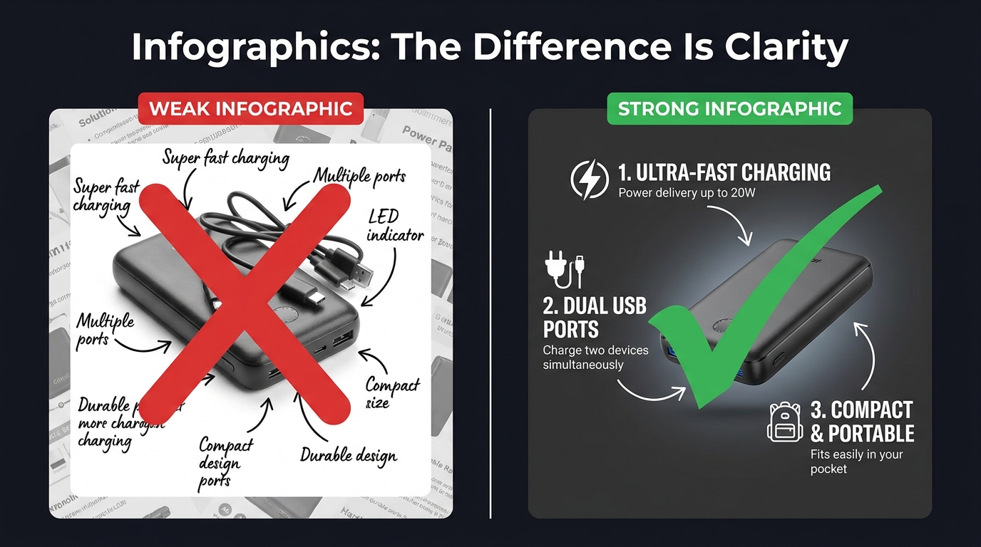
    Comparison of weak vs strong Amazon product infographics showing clarity and text legibility differences

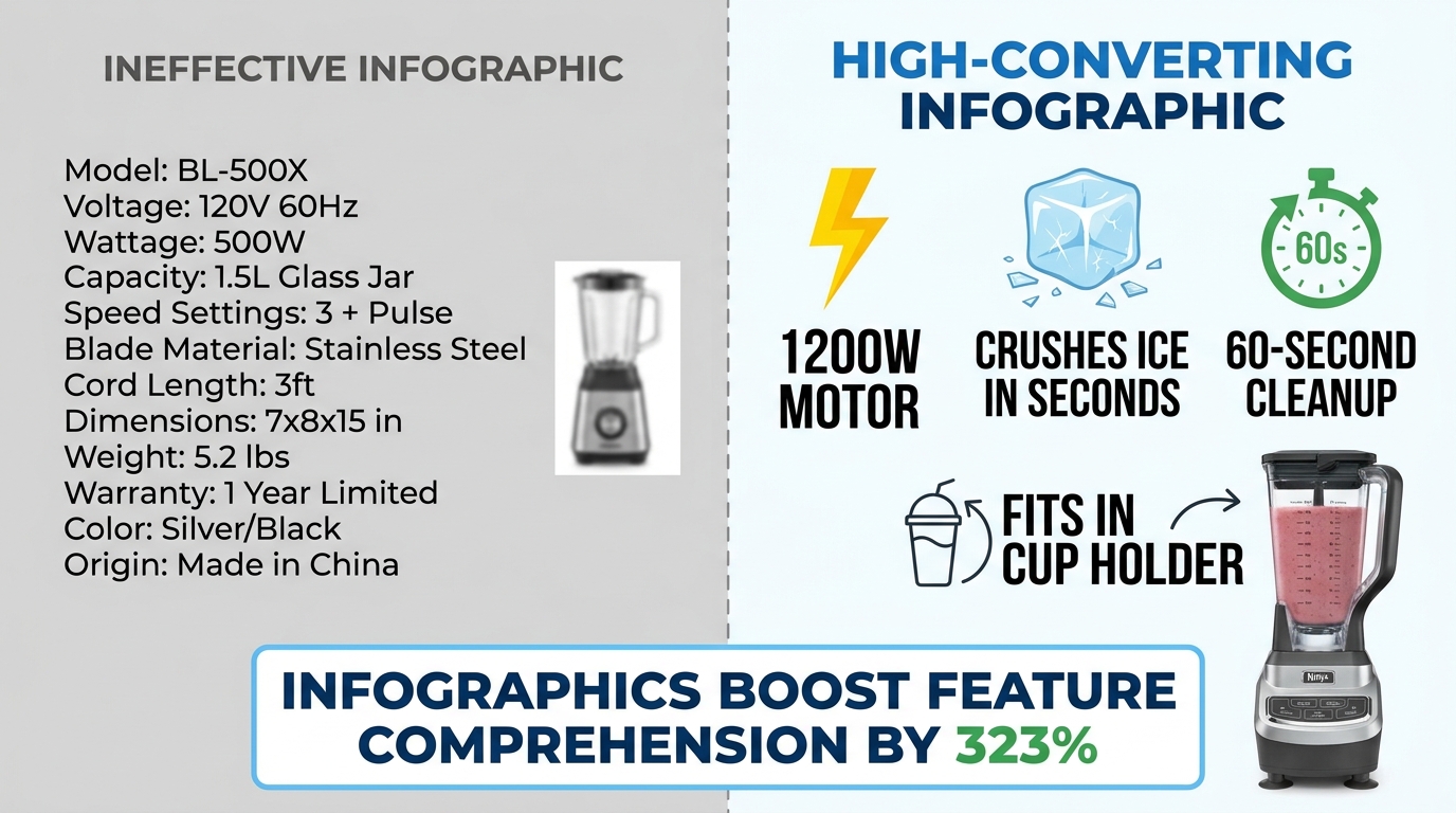
    Product infographics have become near-universal among serious Amazon sellers. The problem is that most of them are designed to look comprehensive rather than communicate clearly. They’re cluttered with feature callouts, competing visual elements, decorative design choices that obscure rather than illuminate, and fonts that look beautiful at desktop scale but become completely illegible as a mobile thumbnail.

    An infographic that can’t be read is worse than no infographic at all. It signals effort without delivering information — a combination that reads as noise rather than signal.

    The Legibility Hierarchy

    Effective infographics follow a strict visual hierarchy. The product image itself occupies 50–60% of the frame. Feature callouts are limited to four to six maximum — not because you don’t have more features, but because each additional callout competes for attention with every other callout. When everything is highlighted, nothing is highlighted.

    Font size matters more than most sellers realize. At minimum, your largest text elements should be readable when the image is displayed at 100 pixels wide — the approximate size of a mobile search thumbnail. Use clean, geometric sans-serif typefaces. Script and decorative fonts look elegant at full size; they become illegible marks at small sizes.

    Rufus AI and Image Text Recognition

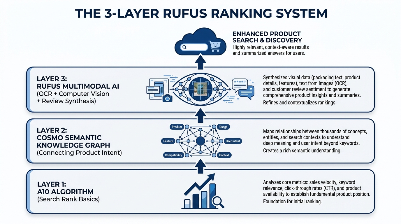
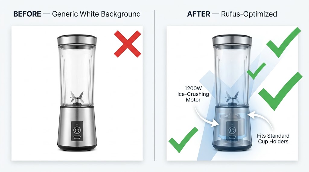
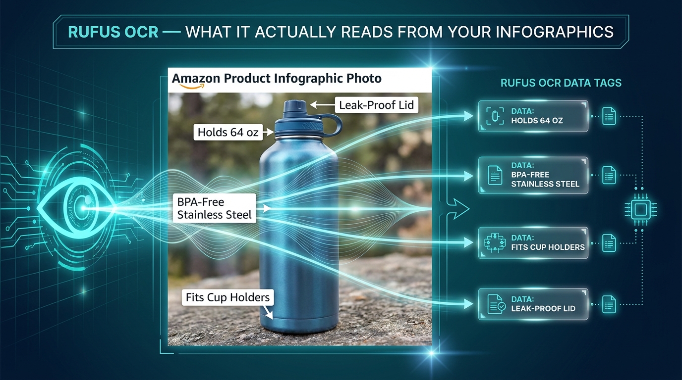
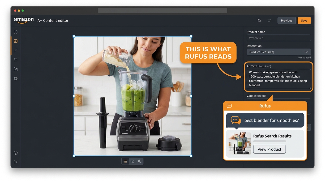
    There’s a functional reason to optimize infographic legibility beyond human readers. Amazon’s AI assistant Rufus, which handles an increasing share of on-platform product discovery queries, uses OCR (optical character recognition) to read text from listing images. Well-designed infographics with clear, legible text give Rufus more data to index about your product — which can positively influence visibility in AI-driven search results. Cursive fonts, overly decorative typography, and low-contrast text-on-background combinations are invisible to OCR systems. Clean, high-contrast, sans-serif text is fully readable.

    “Us vs. Them” Comparison Charts

    One of the highest-performing infographic formats on Amazon is the product comparison chart — a table that compares your product against a generic “standard alternative” across a series of features. You cannot name competitors directly, but you can compare against “similar products” or “the competition” using feature checkboxes.

    These charts work because they reframe the buying decision. Instead of evaluating your product in isolation, the buyer is now evaluating it against a weaker alternative. The comparison does the persuasion work so your bullet points don’t have to. The most effective versions of these charts are selective: they highlight the specific dimensions on which your product wins, not a comprehensive feature list where your product might be neutral or weaker.

    Before-and-After as Proof

    For problem-solution products — cleaning supplies, skincare, organization tools, fitness equipment — before-and-after images embedded within an infographic are among the most persuasive visual formats available. They make the benefit concrete. Shoppers don’t have to imagine the outcome; they can see it. The key is that the “after” image needs to be genuinely dramatic enough to justify the format. A subtle improvement shown as a before-and-after signals that the improvement isn’t actually that meaningful.

    Lifestyle Images: What Separates Scroll-Stoppers from Stock Photo Clones

    Lifestyle photography is arguably the most frequently misunderstood element of an Amazon image stack. Many sellers treat it as decoration — a nice-to-have that makes the listing look more professional. The reality is that lifestyle images perform specific, measurable psychological work, and when that work is done poorly, they actively hurt conversions.

    The Aspiration Alignment Problem

    The function of a lifestyle image is to allow a shopper to see themselves in the scene. This only works if the scene accurately reflects the aspirational self-image of your actual target customer. Generic lifestyle photography — stock models who don’t look like your buyer, environments that feel staged rather than real, scenarios that don’t match how your customer actually uses the product — creates a psychological disconnect rather than a connection.

    A kitchen gadget marketed to home cooks needs lifestyle images that feel like a real kitchen, not a photoshoot kitchen. A travel bag needs lifestyle images from actual travel contexts, not a model posing with a bag in front of a white backdrop. The gap between “this feels like my life” and “this looks like an advertisement” is the gap between a lifestyle image that converts and one that doesn’t.

    People in the Frame Increase Conversions

    Multiple studies on e-commerce photography have confirmed that images including human subjects — hands, faces, full figures in context — consistently outperform product-only images in secondary listing slots. There are several reasons for this. Human faces direct attention and create emotional resonance. Hands holding or using a product provide unconscious scale reference. People in context model the usage scenario, reducing ambiguity. And humans are simply neurologically interesting to other humans in a way that isolated objects are not.

    The key is that the person in your lifestyle image should match your buyer’s demographic as closely as possible. A product targeting middle-aged women that features exclusively 25-year-old male models is producing cognitive friction, not connection.

    Environment as a Trust Signal

    The background and environment of your lifestyle images communicate as much as the product itself. A clean, well-lit kitchen tells the buyer that your product belongs in quality households. A cramped, cluttered background with poor lighting signals that the product is a budget purchase. The production quality of your lifestyle photography sets a price anchor in the buyer’s mind before they’ve seen the price. Premium environments justify premium pricing.

    The Supplier Photo Trap: Why Generic Images Force You Into Price Wars

    There is a specific and painful competitive dynamic that happens to sellers who rely on supplier-provided photos. Because supplier photos are typically distributed to every reseller who purchases that product, multiple listings in the same category are showing identical images. The buyer sees the same photo three or four times across different listings. At that point, the only visible differentiator is price.

    This is the supplier photo trap: using generic images doesn’t just fail to differentiate you — it actively positions you as a commodity, a price-per-unit proposition. You become interchangeable with every other seller offering the same product. Your only competitive lever is margin erosion.

    The Investment Calculation

    Professional product photography is frequently cited by sellers as an expensive upfront investment that they’d rather defer. The math, however, rarely supports deferral. A professional product photography session for a single ASIN typically costs between $300 and $800 for a full image set including hero, lifestyle, and infographic components. For a product generating $5,000 in monthly revenue at a 15% conversion rate, a 1 percentage point improvement in conversion rate (from 15% to 16%) — well within the range that professional photography routinely delivers — generates roughly $333 in additional monthly revenue. The photography pays for itself in under three months.

    The cost of not investing in professional images — sustained below-market conversion rates, depressed organic ranking (which responds to conversion signals), and the race to the bottom on pricing — compounds indefinitely.

    What to Look for in a Product Photographer

    Not all product photographers are equally suited for Amazon. The criteria that matter for Amazon specifically are somewhat different from those that matter for brand lookbooks or editorial photography:

    • Amazon compliance knowledge. A photographer who knows the RGB 255, 255, 255 rule and how to achieve it reliably in post-processing is worth significantly more than one who doesn’t. Some photographers charge extra to “clean up” backgrounds in editing; others build it into their standard workflow.
    • Experience with mobile thumbnail optimization. Ask to see examples of their work in Amazon search results. How does the product look as a small thumbnail? Does the product fill the frame?
    • Lifestyle photography capability. Separate from hero shots, lifestyle photography requires scouting or building appropriate sets, coordinating with models, and understanding how to direct “real use” scenarios. Not all product photographers have this skill set.
    • Turnaround and revision policy. Listing optimization is iterative. You may need to update images as you gather conversion data. A photographer who charges full rate for every revision is going to slow your optimization cycle.

    Mobile-First Image Design: The 6-Inch Screen Test

    Mobile phone mockup showing Amazon product listing optimization for mobile shoppers with 79% mobile stat

    The majority of Amazon traffic in 2026 arrives on mobile devices. Depending on the category, mobile browsing accounts for somewhere between 60% and 79% of Amazon sessions. This isn’t a trend that’s still emerging — it’s been the dominant channel for several years. And yet, a significant number of Amazon sellers are still designing and evaluating their listing images on desktop monitors.

    The result is image sets that look excellent on a 27-inch display and are borderline unusable on a 6-inch phone screen. This is a fixable problem, but fixing it requires changing how you evaluate your work.

    The Thumbnail Test

    Before finalizing any hero image, run what photographers and Amazon optimization specialists call the thumbnail test. Reduce your proposed hero image to 200 pixels wide and evaluate it at that size. Does the product still read clearly? Is it identifiable at a glance? Does it look sharp or pixelated? Does it look larger and more premium than the thumbnails around it in a mock search results grid?

    If the product is hard to identify at thumbnail size, or if it looks smaller and less impressive than competitors’ thumbnails, the hero image needs to be reworked regardless of how it looks at full resolution. The hero image will first be seen as a thumbnail. Optimize for the format it will actually appear in.

    Text Legibility on Mobile

    Infographic text that’s readable at 1,500 pixels wide may become completely illegible at the 400-pixel width of a mobile product image display. The practical rule of thumb: if you cannot read the text when the image is displayed at the width of a typical smartphone screen (roughly 375 to 414 pixels), the text will not be read by most of your buyers.

    This has real consequences. An infographic designed to communicate five key benefits actually communicates zero if the text is illegible on the device your buyers are using. The solution is to be ruthless about text size, to limit the amount of text per image, and to rely more heavily on iconography — which scales better than text — for secondary information delivery.

    Vertical vs. Horizontal Framing

    Amazon’s standard product image ratio is a square (1:1). On mobile, the product detail page displays the main image as a square occupying the full width of the screen. This is actually favorable for product photography — the square format is generous, and a product photographed to fill it well will look impressive on mobile. Where sellers run into trouble is with secondary images that are composed with wide horizontal elements that lose impact when constrained to the square format. Design all secondary images to work within the square frame, with the most important visual information concentrated in the center of the frame where mobile cropping is least likely to affect it.

    A/B Testing Your Way to Better CTR with Manage Your Experiments

    Amazon Seller Central Manage Your Experiments A/B testing dashboard showing Version B winning with 62% higher CTR

    Most Amazon sellers optimize their images once at launch and leave them alone. The highest-performing sellers treat images as a continuously iterated variable — something to test, measure, and improve on a regular cadence. Amazon’s native A/B testing tool, Manage Your Experiments, makes this process accessible to brand-registered sellers without requiring any third-party tools.

    What Manage Your Experiments Actually Tests

    Manage Your Experiments allows brand-registered sellers to run controlled split tests on several listing elements including main images, A+ Content, titles, and product descriptions. For image testing specifically, you create two versions of the element you want to test, Amazon splits your traffic between the two versions, and after a statistically significant sample period (typically four to eight weeks), the tool reports which version performed better on key metrics including click-through rate, conversion rate, and revenue per visitor.

    The main image is the highest-priority element to test first, because it directly affects CTR from search results — the metric that controls how much organic traffic your listing receives. A CTR improvement is not just a revenue increase; it’s an input into Amazon’s A10 ranking algorithm. A listing that gets clicked more often ranks higher, which generates more traffic, which generates more clicks. The compounding effect of CTR improvement is significantly larger than the immediate revenue impact.

    What to Test First

    The most productive main image tests focus on variables with the highest potential for differentiation:

    Angle and orientation. Test your current standard angle against an alternative perspective. A three-quarter view against a straight front view. An elevated view against an eye-level view. Angle changes often produce the largest CTR differences because they affect how the product appears in thumbnail comparison with competitors.

    Single item vs. multi-item context. For some products, showing a single clean unit on white background beats showing the product alongside related accessories. For others, context props (a glass of water next to a supplement bottle, a cutting board next to a knife set) perform better. Without testing, you’re guessing.

    Packaging on vs. packaging off. For products where unboxed and boxed presentations are both plausible, test both. Some categories reward the “ready to use” unboxed appearance. Others benefit from the retail packaging shot that signals the product makes a good gift.

    Reading the Results Correctly

    Manage Your Experiments provides statistical confidence scores along with the performance data. Do not make decisions based on preliminary data before statistical significance is reached. It is extremely common for one variation to appear to be winning decisively after two weeks, then for the results to normalize or reverse as the sample size grows. Wait for Amazon’s confidence threshold — they recommend at least 90% statistical confidence — before treating any result as conclusive.

    Also important: document your tests. Keep a running record of what you tested, what won, and by how much. Over time, this record reveals patterns — perhaps angles consistently outperform flat presentations for your product type, or lifestyle contexts in your hero image consistently underperform clean white backgrounds even though conventional wisdom says otherwise. Your accumulated test data is genuinely proprietary competitive intelligence.

    A+ Content: Extending the Visual Story Below the Fold

    For brand-registered sellers, A+ Content (formerly Enhanced Brand Content) extends the visual real estate of your product listing beyond the seven standard image slots. A+ modules appear below the product description and bullet points, occupying a significant portion of the page before reviews begin. They’re widely treated as secondary to the main image stack, but the data suggests that’s a mistake.

    Amazon’s own reporting indicates that Basic A+ Content increases sales by up to 8% on average. Premium A+ Content — available to sellers who have published A+ on a qualifying number of ASINs — can lift sales by up to 20%. Those are meaningful numbers on any ASIN with established revenue, and they’re achievable purely through optimizing content that many sellers either haven’t published or haven’t updated since their initial listing launch.

    Treating A+ as Continuation, Not Repetition

    The most common mistake sellers make with A+ Content is repeating information already communicated in the main image stack. If your slot 4 infographic already covers the key features, restating those same features in your A+ modules adds length without adding value. Shoppers who scroll to A+ Content have already seen your main images. They’re looking for something new — deeper information, greater detail, reassurance on a point the main images couldn’t fully address.

    Effective A+ Content strategies use the expanded visual space for:

    • Brand narrative. Who makes this product, why does it exist, what’s the philosophy behind it? A+ is where brand story can be told with enough visual depth to feel authentic rather than promotional.
    • Comparison tables. Product comparison modules within A+ allow structured comparison of multiple SKUs in your line, or comparisons against non-specific generic alternatives. These are particularly valuable for product lines where buyers commonly ask “which version should I buy?”
    • Deep feature explainers. Technical products, products with unique mechanisms, or products with complex usage protocols benefit from the expanded space A+ provides for detailed explanation. Where a main image infographic is limited to four or five bullet points, A+ can support a full feature breakdown with larger imagery and richer detail.
    • Social proof integration. Some A+ templates allow the incorporation of quote-style testimonials or user scenario imagery that reinforces the lifestyle messaging from your main image stack.

    Premium A+ Content: When It’s Worth It

    Premium A+ Content unlocks interactive modules including video embeds, interactive hotspot images (where buyers can click areas of a product image to reveal feature details), and larger format imagery. The interactive hotspot module in particular represents a meaningful evolution in on-page conversion tools — it transforms a static product image into an exploratory experience that keeps buyers engaged on your listing longer.

    Longer time-on-page is a positive signal in Amazon’s ranking algorithm. A listing that holds buyer attention — through interactive A+ modules, video, and a compelling image sequence — will rank above an identical listing with lower engagement metrics. The relationship between listing quality and organic visibility is circular: better content drives better engagement, better engagement drives better ranking, better ranking drives more traffic.

    Image Mistakes That Trigger Suppression, Cost Rankings, and Kill Sales

    Beyond the strategic considerations, there are specific technical and compliance errors that do immediate, measurable damage to listing performance. Some of these trigger automatic suppression — Amazon removes your listing from search results until the issue is corrected. Others are more subtle, degrading conversion rates without triggering any alerts.

    Immediate Suppression Triggers

    • Non-white backgrounds on the main image. Even a background that appears white to the human eye can be slightly off the required RGB 255, 255, 255 value. Always verify the background color value in image editing software, not by visual inspection.
    • Promotional text on the main image. “Sale,” “Best Seller,” discount percentages, “Free Shipping” badges — any of these on the primary image will trigger suppression.
    • Images below 1,000 pixels on the longest side. This is the minimum for display; in practice, images below this threshold may not trigger immediate suppression but will degrade zoom functionality and perceived quality.
    • Showing products not included in the listing. If your listing is for a single item and your main image shows two items, that’s a suppression trigger. The main image must accurately represent what the buyer will receive.

    Non-Suppression Errors That Still Cost Sales

    • Using supplier stock photos. As discussed, not a compliance violation but a serious strategic mistake that commoditizes your listing.
    • Insufficient image variety. Running five images when nine are available is leaving persuasion tools on the table.
    • Misaligned lifestyle imagery. Lifestyle images that don’t reflect your actual target demographic create psychological friction rather than connection.
    • No video. Amazon allows one video on standard listings and multiple videos for Brand Registry members. Listings with product videos have meaningfully lower return rates — some sources cite up to 30% reduction in returns for categories where product mechanics are demonstrated — and higher conversion rates because video is the closest simulation of actually using the product before purchase.
    • Infographics with low-contrast or decorative fonts. Illegible infographics don’t communicate features — they communicate visual noise, and they’re invisible to Rufus AI’s OCR indexing.
    • Ignoring image order. The sequence in which Amazon displays secondary images is controlled by the seller. Many sellers upload images in whatever order they happened to be processed, rather than the strategic sequence that follows the buyer journey. Audit your current image order and resequence if necessary.

    The “Newly Updated” Image Risk

    A less-discussed hazard: updating images on a high-performing listing without testing the new version first. Sellers who redesign their entire image stack and replace it wholesale — without A/B testing — frequently experience conversion rate drops from perfectly compliant, professionally produced new images that simply communicate less effectively than the previous version. The old images had accumulated organic performance data. The new images, whatever their aesthetic quality, are unproven.

    The correct protocol for image updates on existing listings is: test the new version against the existing one using Manage Your Experiments before replacing anything. Only replace the existing images if the test data confirms the new version performs better.

    The Amazon Image Audit: A Section-by-Section Checklist
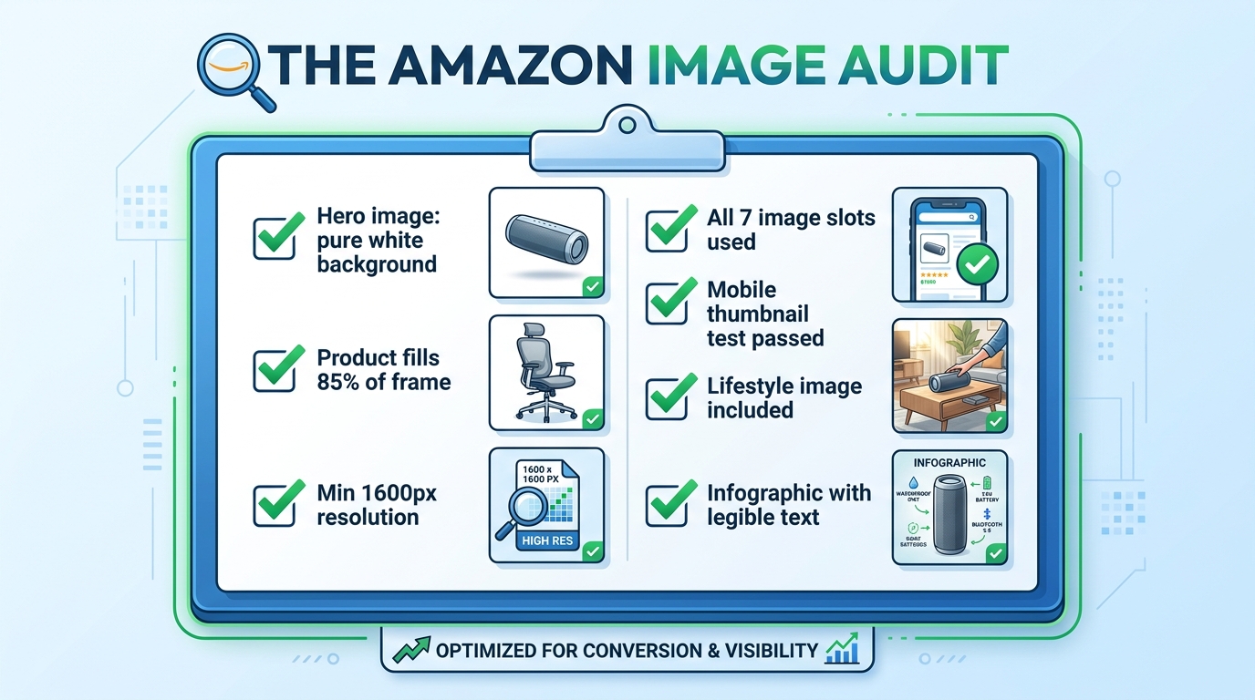
    Amazon listing image audit checklist showing all required image optimization criteria with green checkmarks

    Rather than leaving the “what to do next” question abstract, here is a practical audit framework to assess the current state of any listing’s image set. Work through this systematically on every ASIN in your catalog.

    Hero Image Audit

    • Verify background RGB value is exactly 255, 255, 255 in image editing software
    • Measure product fill ratio — is the product occupying at least 85% of the frame?
    • Check image dimensions — is the longest side at least 1,600 pixels?
    • Confirm no text, watermarks, props, or logos are present
    • Run the thumbnail test — reduce to 200px wide and evaluate clarity
    • Compare your thumbnail against the top three competitors in your search result — are you visually distinct?

    Secondary Image Audit

    • Count your current images — are you using all available slots?
    • Evaluate the sequence — does the order follow a logical buyer journey progression?
    • Assess lifestyle image demographic match — does the person/environment reflect your actual target buyer?
    • Check scale reference — is there an image that unambiguously communicates product size?
    • Review infographic text legibility — display at 400px wide and verify all text is readable
    • Check for video — is at least one product video uploaded?

    A+ Content Audit

    • Is A+ Content published on this ASIN?
    • Does the A+ Content add new information not already in the main image stack?
    • Is the A+ imagery consistent in style and quality with the main images?
    • Are comparison modules present to help buyers choose between variants or understand relative value?
    • Have Premium A+ modules been evaluated for eligibility?

    Testing Cadence

    • Is an active Manage Your Experiments test currently running on the hero image?
    • Are test results documented and archived?
    • Is there a scheduled review date for secondary image performance?

    Work through this audit once per quarter at minimum. High-volume ASINs — those generating significant revenue or ad spend — merit more frequent review, especially when competitive dynamics in the category change. A competitor launching with a dramatically better image set is a signal to accelerate your own testing cadence.

    Bringing It All Together: Your Images Are a System, Not a Collection

    The most important conceptual shift in this entire article is this: your Amazon listing images are not seven separate photographs. They are a single, sequenced visual argument for why a buyer should choose your product over every alternative available to them in that moment.

    Every slot has a defined job. The hero image earns the click. The lifestyle image earns the emotional connection. The scale reference removes a common purchase blocker. The infographic validates the analytical buyer. The close-up justifies the price premium. The use-case demonstration eliminates usage anxiety. The packaging shot completes the transaction mentally before the buyer has added to cart.

    When any slot is absent, or when it’s doing a job that belongs to a different slot, the system breaks down. Buyers fall through the gaps — they reach the end of your image stack with an unanswered question, and they go find the answer on a competitor’s listing. Often, they buy there instead.

    The sellers who understand this — who approach every image as a strategic tool within a larger system — convert at rates that make their competitors wonder what they’re doing differently. The answer is usually not that they have better products. It’s that they’ve built a visual argument systematic enough to close the sale before the buyer even gets to the bullet points.

    Start with the audit. Fix the compliance issues first. Then address the strategic gaps. Then test. Then improve. The compound effect of iterating through that cycle — audit, fix, test, improve — is the only sustainable path to conversion rates that hold up regardless of what competitors do next.


  • Why Your Amazon Videos Aren’t Working (And the Slot-by-Slot Fix That Changes Everything)

    Why Your Amazon Videos Aren’t Working (And the Slot-by-Slot Fix That Changes Everything)

    Amazon listing video integration split-screen showing conversion rate improvement with video vs. without video

    Here’s a scenario that plays out constantly in Amazon seller communities: a brand spends time and money producing a product video — good lighting, clear narration, crisp footage — uploads it to their listing, and then nothing moves. Conversion rate stays flat. Sessions look the same. The video feels like it should be helping, but the data says otherwise.

    The problem is almost never the video itself. It’s the placement. Most sellers treat Amazon video like a single upload field: shoot something, drop it in, move on. In reality, Amazon has developed a multi-slot video ecosystem where each placement serves a different buyer psychology, appears at a different point in the purchase journey, and responds to completely different content strategies.

    Uploading one polished product demo and leaving it there is the equivalent of printing one good ad and only ever running it in one newspaper. You’ve created something valuable, but you’ve left most of the opportunity behind.

    This post maps every video slot Amazon currently offers, explains what each one actually does for your listing, walks through the technical and policy requirements that most sellers trip over before their video ever goes live, and covers what good video performance actually looks like in measurable terms. This isn’t a high-level pep talk about “adding video to your listings.” It’s a working framework for sellers who already know video matters and want to use it more deliberately.

    The Four Distinct Video Slots on Amazon (and Why They Are Not Interchangeable)

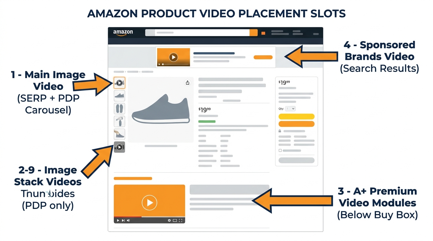
    Diagram of Amazon product listing page showing the four distinct video placement slots with labeled callout arrows

    Before getting into tactics, it helps to understand the architecture. Amazon’s video placements in 2026 fall into four distinct categories, and confusing them is the root of most video underperformance.

    Slot 1: Main Image Video

    This is the highest-leverage video position on Amazon. When uploaded correctly, the main image video appears inside the product image carousel — the set of images at the top of the product detail page (PDP). Critically, it also surfaces in search engine results pages (SERPs), meaning potential customers see your video before they click through to your listing. It autoplays as a thumbnail in certain mobile and desktop SERP placements and in the carousel on the PDP itself. This slot is available to brand-registered sellers and is capped at one video per listing. Optimal length: 12–25 seconds.

    Slot 2–9: Image Stack Videos

    These are separate video uploads that appear within the product image stack below the main carousel. They are PDP-only — no SERP exposure — and are best used for supplementary content: detailed feature breakdowns, assembly demonstrations, size-and-scale comparisons, or use-case variations. Multiple videos can occupy these positions, giving sellers a genuine content library per ASIN rather than a single video file. Brand-registered sellers get the most flexibility here, though Amazon has gradually opened some access to non-brand sellers.

    Slot 3: Premium A+ Content Video Modules

    Premium A+ Content (sometimes called A++) is a separate program from standard A+ and has its own eligibility requirements. Sellers who qualify can embed video modules directly into the enhanced description section of the listing, below the buy box. This placement captures buyers who are already engaged enough to scroll down and read more — which makes it ideal for longer-form content like full demos, brand story videos, or educational explainers. Up to three video modules can live in a single Premium A+ layout.

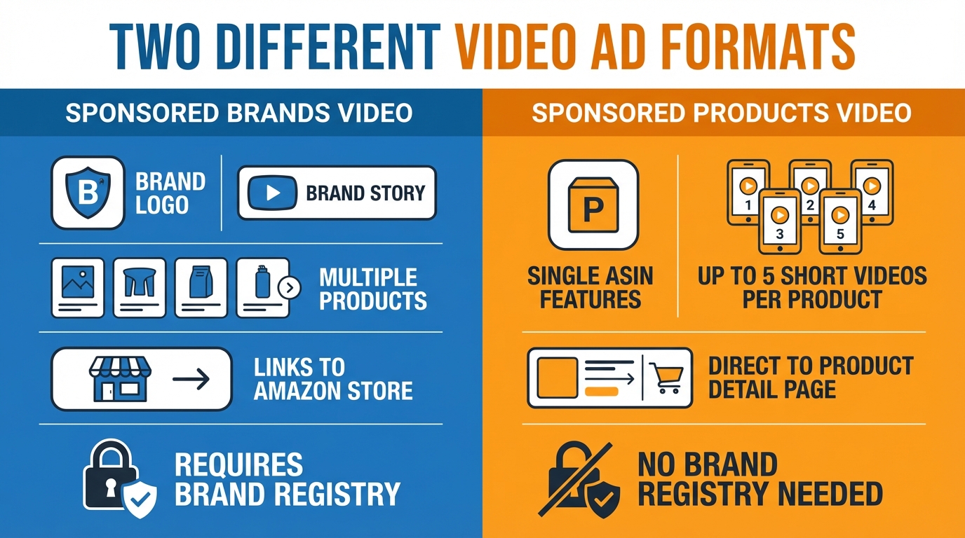
    Slot 4: Sponsored Brands Video

    Unlike the three slots above, Sponsored Brands Video is a paid advertising format, not a listing feature. It operates through the advertising console, uses keyword targeting and a cost-per-click auction, and places videos in search results to drive traffic to your product or Brand Store. It serves a fundamentally different strategic purpose than listing videos: it’s a traffic driver, not a conversion closer. This distinction matters enormously for how you script, structure, and measure it.

    Treating all four of these as the same thing — “Amazon video” — is where most sellers lose the thread. They produce one asset and expect it to do four different jobs. It can’t. Each slot requires a different piece of content.

    The Main Image Video Slot: Your Highest-Leverage Real Estate

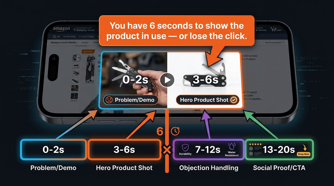
    Smartphone showing Amazon SERP with product video autoplaying and the 6-second rule timeline overlay

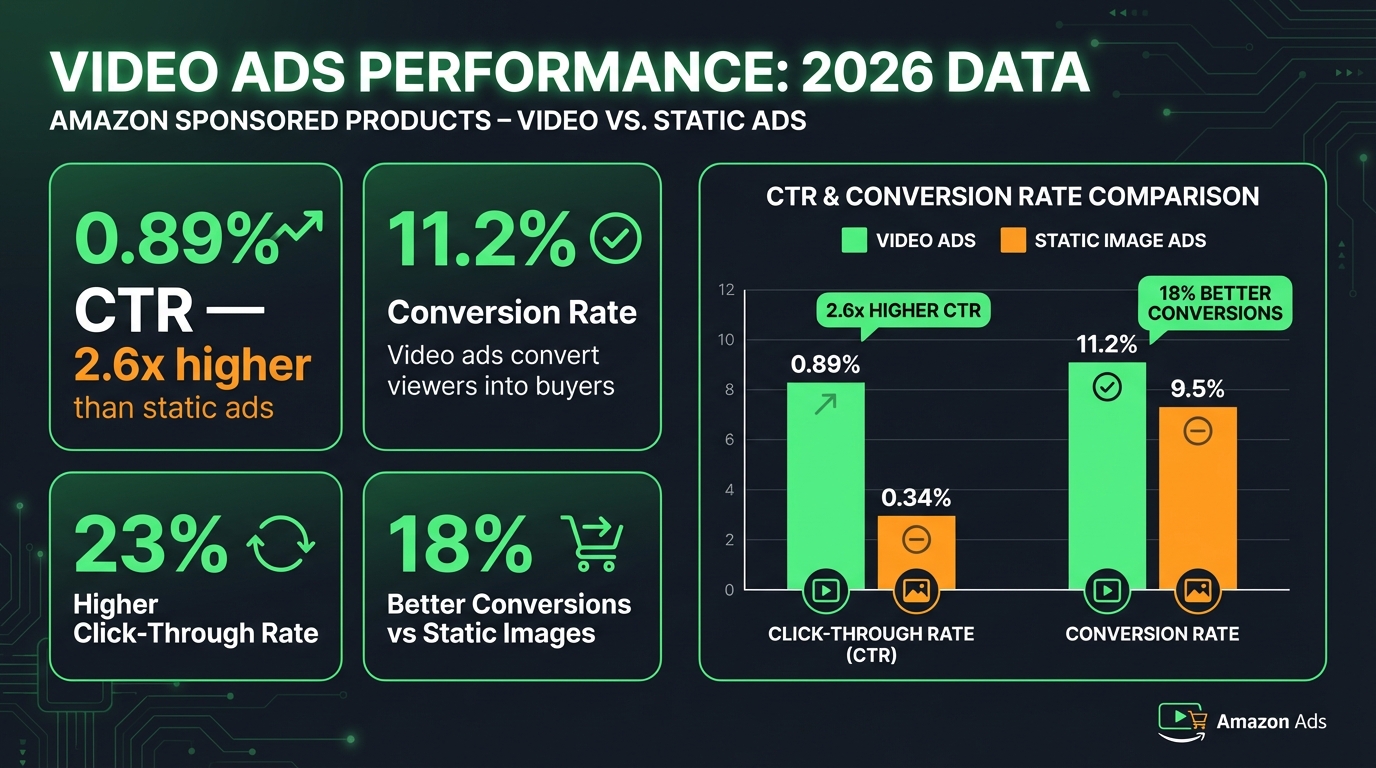
    If you can only produce one piece of video content for a listing, it should go in the main image slot. The combination of SERP visibility and PDP carousel placement makes it the single most impactful piece of content you can add to a product page. Research from multiple seller data sources in 2026 puts the CTR lift from main image video at 8–18% compared to static image listings — and that’s organic, meaning you pay nothing for the additional clicks.

    The 6-Second Rule

    The defining constraint for main image video is that it must perform before most viewers decide to keep watching. The widely-cited benchmark in 2026 seller circles is six seconds: if the product hasn’t been shown in active use by second six, a substantial portion of viewers have already lost interest or moved on. This isn’t a soft creative guideline — it has measurable CTR consequences.

    A practical framework for structuring a 12–25 second main image video looks like this:

    • 0–2 seconds: Immediately show the core problem the product solves, or the product itself in clear action. No logos, no fade-ins, no “introducing…” narration.
    • 3–6 seconds: Lock in the hero shot — the single most visually compelling view of the product doing what it does best.
    • 7–12 seconds: Address the most common objection. For kitchen tools this might be “does it actually fit?” For tech products, “how complicated is setup?”
    • 13–20 seconds: Social proof or product payoff — what does “after” look like? If your product makes something easier, cleaner, or more enjoyable, show that outcome.
    • 20–25 seconds: Pack shot with key spec callouts (dimensions, material, compatibility) and a soft call to action.

    SERP Placement: The Hidden Advantage

    Most sellers think about video as something that helps once a customer is already on their listing. The main image slot flips this. Because it surfaces in certain SERP positions — particularly in video shelves and carousel modules on mobile — it influences the click decision before the buyer commits to a full PDP visit. That means a well-structured main image video effectively compresses the funnel: the shopper sees the product working, gains a basic level of confidence, and clicks through already partially sold.

    This pre-qualification effect is part of why the unit session rate (the percentage of PDP visits that convert to a sale) tends to be meaningfully higher when the main image video has done its job on the SERP. You’re filtering for intent before the click, not just after it.

    What This Slot Is Not Good For

    A brand story does not belong in the main image slot. Neither does a lengthy explainer or a comparison against competitor products. These formats take too long to deliver value in a short-attention SERP environment. Save them for the image stack slots or A+ modules. The main image video is a hook, not a narrative.

    Image Stack Videos (Slots 2–9): The Conversion Layer Most Sellers Ignore

    Once a buyer lands on your product detail page, the context shifts. They’ve already chosen to investigate your product — now the job is to answer every remaining question before doubt turns into a back-click. Image stack videos, occupying positions 2 through 9 in the PDP carousel, are purpose-built for this moment.

    Most sellers fill these slots with still images and consider the job done. That’s a missed opportunity. Buyers who scroll through multiple images are demonstrating active consideration — they’re still deciding. A second or third video in this sequence can catch that attention at a moment of genuine purchase uncertainty and answer exactly the question they’re wrestling with.

    Content Strategy for the Image Stack

    Think of these slots as a FAQ in video form. Map the most common pre-purchase questions buyers ask about your product — you can find these in your own Q&A section, competitor reviews, and customer service inquiries — and address each one with a short, specific video clip.

    • Assembly or setup video: For products that require any assembly, a 30–45 second assembly walkthrough eliminates one of the most common deterrents to purchase in categories like furniture, fitness equipment, and DIY tools.
    • Scale and size comparison: Apparel, home goods, and accessories suffer consistently from “it was smaller than I expected” reviews. A video showing the product next to a recognizable household object eliminates this objection cleanly.
    • Use-case variation: If your product has multiple use scenarios, each one can have its own 15–20 second demonstration. A multi-use kitchen gadget, for instance, might have separate clips showing each function rather than trying to cram everything into one video.
    • Material or quality close-up: For categories where tactile quality matters — bedding, clothing, leather goods — video can do what photography cannot: show how a material moves, drapes, or behaves under use conditions.

    SEO Value in Video Metadata

    One often-overlooked benefit of image stack videos is the metadata layer. When you upload videos to Seller Central via the “Upload and Manage Videos” tool, you can add titles and descriptions that include search-relevant terms. Amazon’s algorithm can index this metadata, which means well-titled videos with relevant keyword placement contribute to the discoverability of your listing — separate from your bullet points and backend search terms. This isn’t a primary ranking driver, but in competitive categories where sellers are fighting for marginal improvements, every indexed signal adds up.

    Premium A+ Content Video Modules: What Eligibility Actually Requires

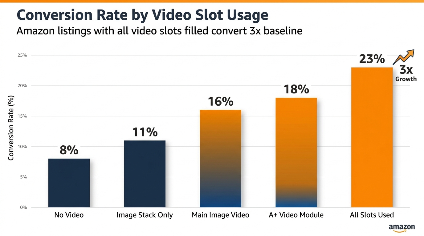
    Bar chart showing Amazon conversion rates by video slot usage, from no video at 8% to all slots used at 23%

    Premium A+ Content is a tier above standard A+ Content, and it’s the only place on a product detail page where full video modules — not just video clips embedded in carousels — can live. This distinction matters because Premium A+ video modules present video in a more intentional, controlled format: full-width or half-width video panels with accompanying text, image carousels alongside video, and longer runtime options. The placement is below the buy box in the enhanced content section, which means it targets buyers who are already engaged and reading deeper into the listing.

    Eligibility Requirements in 2026

    Premium A+ has a specific gatekeeping structure. To unlock it, sellers must:

    1. Be enrolled in Amazon Brand Registry — this is non-negotiable across all enhanced content types.
    2. Have an approved and published A+ Brand Story on at least one ASIN in their catalog.
    3. Have at least five approved A+ Content projects submitted and approved within the past 12 months.

    This means Premium A+ is not available to new sellers or those who haven’t been actively publishing A+ Content throughout the year. The 12-month rolling window is an important detail: approvals don’t carry over indefinitely. Sellers who publish a burst of A+ Content to unlock Premium access and then go dormant may find their eligibility lapses if they don’t maintain the cadence.

    Video Module Specifications for Premium A+

    Amazon currently supports three video module formats within Premium A+:

    • Full Video Module: Minimum resolution 960x540px. The video dominates the content block. Best for brand or product story content that benefits from a cinematic presentation.
    • Video with Text Module: Minimum resolution 800x600px. Splits the content block between video and a text panel, allowing you to narrate key benefits while the video demonstrates them visually.
    • Video with Image Carousel Module: Minimum resolution 800x600px. Pairs a video with a scrollable image strip — useful for showing multiple colorways, configurations, or use cases alongside a master demo.

    All Premium A+ videos must be in MP4 format. Amazon’s review time for video submissions runs 24–72 hours, and the policy review is stricter here than for image stack videos because Premium A+ is more prominently positioned on the page.

    What Actually Performs Well in A+ Video Modules

    The buyer reading your A+ section is a high-intent shopper who hasn’t yet converted — but they’re doing their due diligence, not quickly scanning. That changes what good video content looks like in this placement. Short demos and fast hooks are less relevant here. Instead, A+ video modules reward:

    • Product origin or brand story — particularly effective for brands with a meaningful founding story, artisan manufacturing process, or sustainability angle.
    • Deep feature education — technical products benefit from a two-minute walkthrough that would be too long anywhere else on the listing.
    • Before-and-after demonstrations — showing a clear transformation (cleaner grout, better organized space, improved posture) hits hardest with buyers in the consideration phase.
    • Comparison to alternatives — Premium A+ does allow general category comparisons (your product vs. the “traditional” approach), though competitor brand mentions remain prohibited under Amazon’s video policy.

    Sponsored Brands Video vs. Listing Video: Two Completely Different Jobs

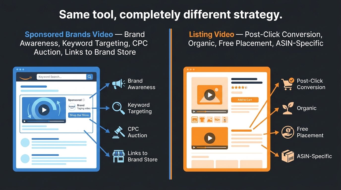
    Side-by-side comparison of Sponsored Brands Video and Listing Video showing their different strategic purposes

    This is one of the most persistently confused distinctions in Amazon video strategy. Sellers routinely repurpose their listing videos as Sponsored Brands Video ads — or vice versa — and then wonder why results are underwhelming. The two formats are not interchangeable because they operate at completely different points in the purchase journey and serve completely different goals.

    Sponsored Brands Video: A Traffic Driver

    Sponsored Brands Video ads appear in search results — above, below, or within organic listings — and are paid placements competing in a keyword-based CPC auction. Their job is to attract clicks from shoppers who are actively searching but haven’t chosen a product yet. The video must work as an attention capture mechanism: stop the scroll, communicate a compelling reason to click, and drive traffic to your listing or Brand Store.

    Key characteristics of effective Sponsored Brands Video content:

    • Length: 6–30 seconds maximum. Amazon enforces a 45-second cap, but top-performing ads tend to run 15–20 seconds. Shorter is almost always better here.
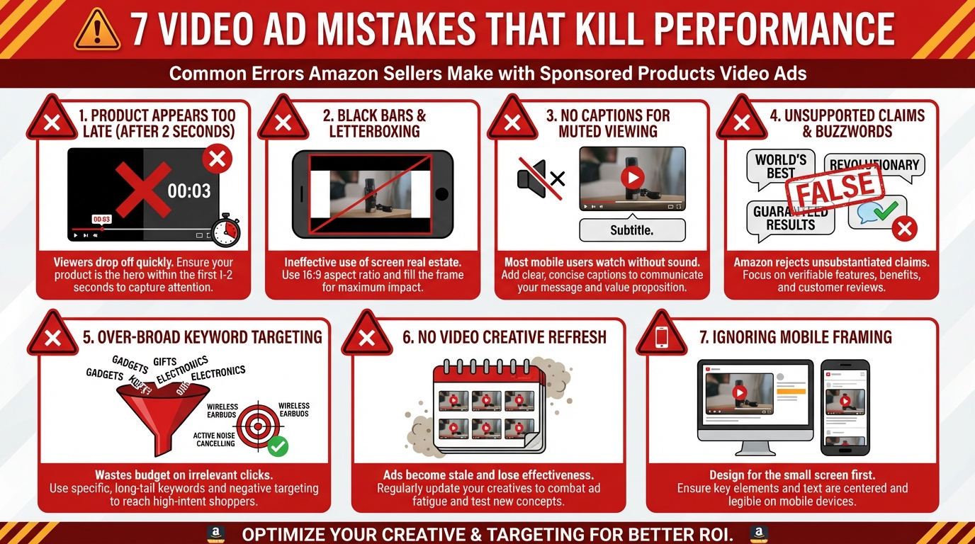
    • Product first: The product must appear within the first 1–2 seconds. There is no time for a logo reveal or brand intro when you’re competing against eight other listings on a SERP.
    • No audio dependency: Many shoppers browse with sound off. Sponsored Brands Video ads should communicate their full message through visuals and on-screen text alone, with audio as an enhancement rather than a requirement.
    • CTA orientation: Every second of a paid ad has a direct cost. The creative should move viewers toward a click, not educate them in detail. Depth belongs on the product page.

    Listing Video: A Conversion Closer

    Listing video (whether in the main image slot, image stack, or A+ modules) operates post-click. The buyer is already on your product page — the traffic is paid for or organically earned. Now the question is whether you convert them. This means listing video can and should be more thorough, more patient, and more objection-focused than Sponsored Brands Video.

    A 45-second listing video that walks through setup, demonstrates three use cases, and shows scale is entirely appropriate. The same video in a Sponsored Brands slot would be dead on arrival — most viewers would scroll past it within the first 10 seconds.

    The practical implication: if you’re producing video on a budget and can only create one piece of content, use it as a listing video (specifically in the main image slot) rather than as a Sponsored Brands ad. Your listing video works for free, indefinitely. Your Sponsored Brands video costs money every time someone clicks.

    Measuring Each Format Separately

    Because these two placements serve different strategic objectives, they require different success metrics. Sponsored Brands Video performance is measured primarily by CTR, CPC efficiency, and attributed sales from ad traffic. Listing video performance is measured by unit session rate (conversions per page visit), video view rate, and organic ranking signals. Blending these metrics together — tracking a single “video performance” number across both formats — is how sellers end up unable to diagnose what’s actually working.

    How Amazon’s A10 Algorithm Treats Video Engagement Signals

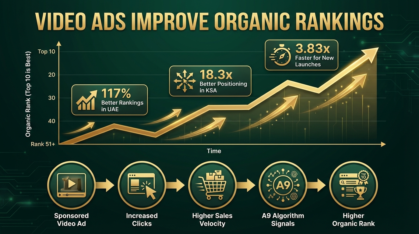
    Amazon doesn’t publicly document its ranking algorithm in detail, but the behavior of the system in 2026 makes certain things reasonably clear. The algorithm iteration commonly referred to as A10 — the framework that governs organic product ranking in search results — places meaningfully more weight on post-click engagement signals than the earlier A9 version did.

    What A10 Is Measuring

    Where A9 prioritized historical sales velocity and keyword relevance above most other signals, A10 layers in behavioral engagement data: how long shoppers spend on a listing, how deeply they scroll, whether they interact with images, and — crucially — whether they engage with video content. Video plays, watch duration, and re-plays are all part of this engagement picture.

    The mechanism is straightforward: a shopper who watches 80% of your product video before adding to cart is demonstrating dramatically higher purchase intent and product-fit confidence than one who bounced after two seconds. That behavioral signal tells Amazon’s algorithm that the listing is doing a good job matching customer expectations — which rewards the listing with better organic placement over time.

    The Indirect Ranking Benefit of Video

    Beyond direct engagement signals, video contributes to organic ranking through a second-order effect: reduced return rates. Products with clear video demonstrations tend to generate fewer returns because buyers arrive with realistic expectations of what they’re receiving. Amazon tracks return rates by ASIN, and high return rates suppress listings in organic rankings. A thorough demonstration video that accurately represents the product — particularly one that shows size, material, and assembly — is a return-rate management tool as much as it’s a conversion tool.

    Lower returns → higher seller metrics → better algorithmic positioning. The chain is indirect but real.

    Dwell Time and the Session Quality Signal

    One of the clearest ways to see A10’s engagement sensitivity in practice is to watch what happens to a listing’s organic ranking after a high-quality video is added. In categories where competing listings are video-free, adding a main image video that keeps shoppers on the page for 20+ additional seconds can produce an organic ranking lift within 2–4 weeks — even without a change in ad spend or external traffic. This dwell time effect has been consistently observed across Home & Kitchen, Beauty, and Sports & Outdoors categories in particular.

    Video Content Strategy by Product Category

    Not all categories respond to video the same way, and treating them identically is a recipe for mediocre results across the board. The type of video that drives the most conversions varies significantly based on how buyers in that category make decisions.

    Beauty and Personal Care

    This is the highest-converting category on Amazon platform-wide, with organic conversion rates reaching 15–25% for well-optimized listings. Video in beauty serves one primary purpose: demonstrating results. Before-and-after videos, application technique walkthroughs, and texture close-ups answer the questions static images genuinely cannot. Skin tone representation matters too — showing the product used across different skin tones and hair types removes a major uncertainty for a significant portion of buyers. In this category, user-generated style content (less produced, more authentic) consistently outperforms studio-polished product demos because authenticity is the trust signal buyers are looking for.

    Home and Kitchen

    Assembly, size, and function are the three dominant concerns in Home & Kitchen. The “it was smaller than I expected” return is endemic to this category, and a 10-second video showing the product next to a standard dinner plate or smartphone eliminates it almost entirely. Function videos — actually showing the product being used in a real kitchen or living space rather than against a white background — convert significantly better than clean studio shots because they answer the core question: “What will this look like in my home?”

    Electronics and Tech

    Setup complexity is the largest conversion barrier in electronics. A screen-recorded or camera-captured setup walkthrough — not a polished marketing overview of features — reduces purchase hesitation dramatically. In this category, buyers who abandon listings often do so because they can’t tell if the product will work with their existing setup. A compatibility demo, a “what’s in the box” inventory clip, and a quick setup walkthrough together address this better than any combination of bullet points.

    Sports, Outdoors, and Fitness

    Motion is the differentiator here. Products that come alive in use — resistance bands, hiking gear, sports accessories — look flat in static images and dynamic in video. The best videos in this category show the product under realistic use conditions: actual terrain for outdoor gear, actual workouts for fitness equipment, actual sweat and movement for athletic apparel. Nothing in a studio with fake grass. Buyers in these categories are evaluating durability and performance credibility, not brand aesthetics.

    Clothing and Accessories

    Fit and drape are the core questions that static imagery can never fully answer. A 15-second video of a model moving, sitting, turning, and showing the garment from multiple angles at multiple distances addresses size uncertainty more effectively than any combination of images and size charts. For accessories, a scale video showing the product being used by a real person — rather than in isolation — eliminates the most common source of post-purchase disappointment in the category.

    Technical Specifications That Sink Otherwise Good Videos

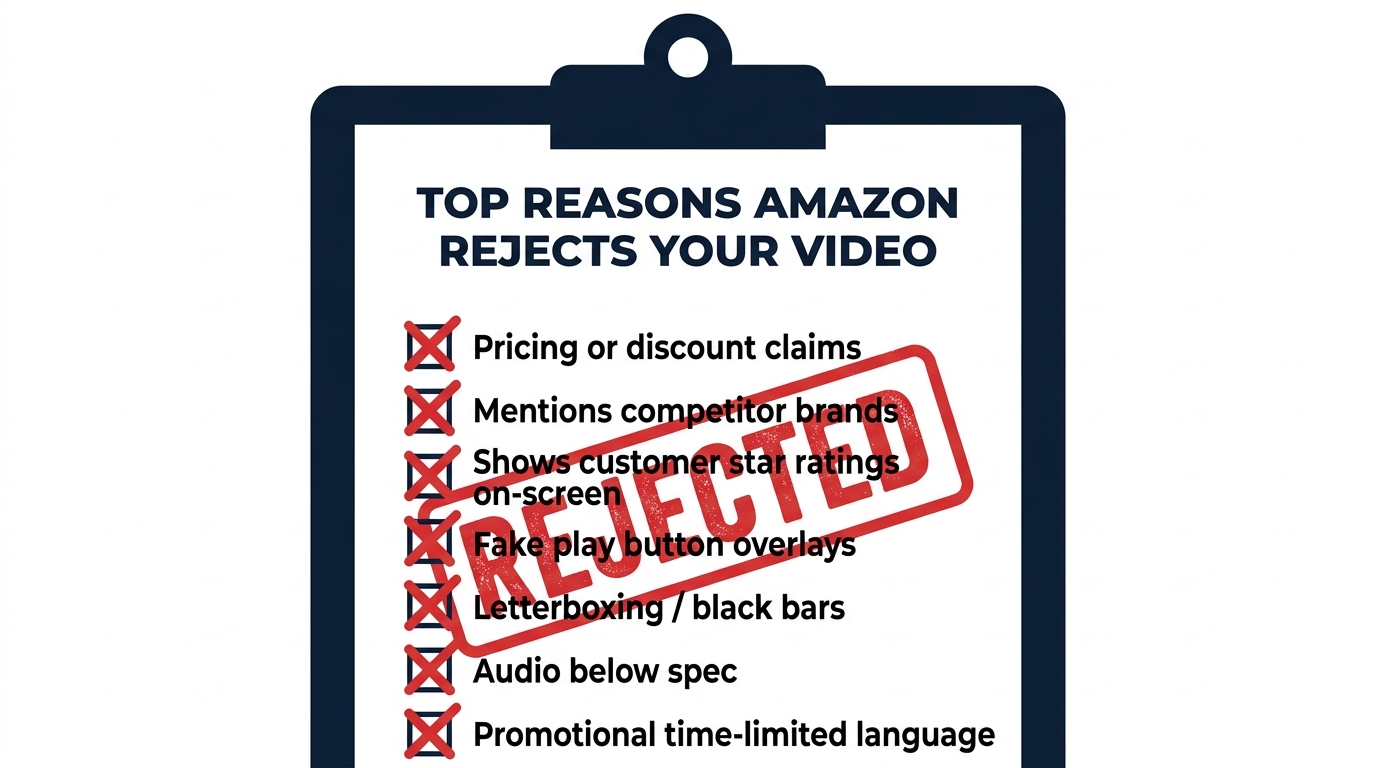
    Checklist of top Amazon video rejection reasons with red X marks against each violation

    Amazon’s video review process is not forgiving about technical non-compliance. A video that fails specification review goes into a rejection queue that can take 24–72 hours to return a verdict — meaning a failed upload costs you several days before you even find out there’s a problem. Getting the specs right before upload is non-negotiable.

    Universal Technical Requirements

    These specifications apply across all Amazon listing video types:

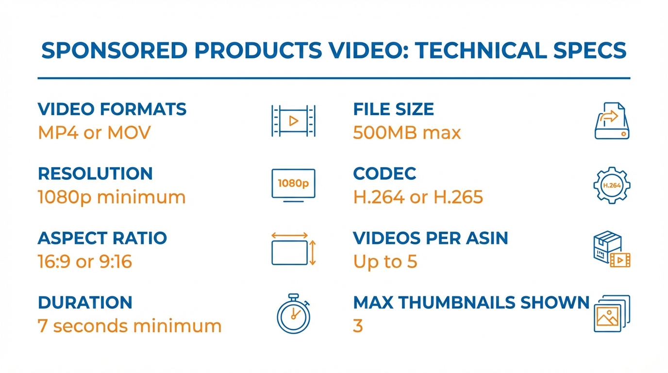
    • Format: MP4 is the required format for all video uploads. MOV files may be accepted through some upload pathways but MP4 is the safest choice.
    • Codec: H.264 or H.265. H.264 is the safer default for maximum compatibility with Amazon’s processing pipeline.
    • Aspect ratio: 16:9 is standard for most placements. 1:1 square format is acceptable for some mobile placements but 16:9 should be the production default.
    • Minimum resolution: 1280x720px (720p HD) for standard listing videos. Premium A+ Full Video Module requires a minimum 960x540px, while Video with Text and Image Carousel modules require 800x600px minimum — though producing at 1080p and downscaling is always preferable.
    • Frame rate: 23.976, 24, 25, 29.97, or 30 fps. Anything outside this range risks rejection or processing artifacts.
    • No letterboxing: Black bars on any edge of the video — top, bottom, left, or right — trigger immediate rejection. Crop your content to fill the frame completely.
    • No black leader frames: The video must not start or end with more than a split-second of black. Amazon’s review tool catches leader frames and flags them consistently.
    • Audio: Stereo audio at 44.1kHz or 48kHz sample rate. Audio with excessive background noise, clipping, or silence where narration is expected tends to generate flags in the content review process even when it technically passes spec.

    Slot-Specific Resolution Notes

    The main image video slot and image stack slots have the most flexibility with aspect ratio, but the standard 16:9 1080p format covers every slot without adaptation. If you’re producing separate videos for different placements, Premium A+ module specs are the most finicky — always check the current Amazon Seller Central video guidelines before final export, as these specs have shifted over the past 18 months.

    The Rejection Trap: Policy Violations That Kill Your Video Before It Goes Live

    Technical compliance and policy compliance are two separate review gates on Amazon, and sellers who nail the specs still get rejected on content grounds with surprising frequency. Understanding Amazon’s video content policies in advance of production — not as an afterthought during upload — saves significant time and production cost.

    The Most Common Policy Violation: Pricing and Promotional Claims

    Any reference to price — a specific dollar amount, a percentage discount, a “limited time offer,” or language like “buy two get one free” — will cause immediate rejection. Amazon’s policy rationale is that videos must be evergreen: the listing page is dynamic (prices change constantly), so any video with pricing content would be misleading minutes after it goes live. This is a harder constraint than it sounds, because promotional language is deeply habitual in marketing content. “Best value kitchen knife” is fine; “only $24.99 for a limited time” is a rejection.

    Competitor and Marketplace References

    Mentioning competing brands by name, referencing other retail platforms (“also available at Walmart”), or making explicit comparisons that name competitors will trigger rejection. Amazon’s policy here is about maintaining the integrity of the marketplace — your listing page exists within Amazon’s ecosystem, and Amazon won’t host content that promotes elsewhere.

    Note: general category comparisons are allowed. “Better than traditional single-blade razors” is acceptable. “Better than [competitor brand name] razors” is not.

    Customer Reviews and Star Ratings

    Displaying customer review quotes, star ratings, or review counts on screen — even your own authentic reviews — violates Amazon’s video policy. This surprises many sellers who consider their review content to be fair use for marketing purposes. Amazon treats review display in video as a separate content moderation concern, likely due to risks around selective quoting and review manipulation optics. Leave reviews out of your video entirely.

    Fake UI Elements and Visual Deception

    Overlaid graphics that mimic Amazon’s interface — fake “Add to Cart” buttons, fake shopping cart animations, fake play button overlays — are rejected on sight. So are countdown timers, fake urgency badges, and any visual elements designed to mimic Amazon’s native UI. Beyond policy compliance, this practice tends to perform poorly anyway: buyers can tell when they’re being psychologically manipulated, and fake urgency in video content erodes trust more than it drives conversions.

    Audio-Only Policy Note

    If your video includes narration, it must be entirely in English for the US marketplace. Background music is allowed, but must not contain lyrics that reference pricing, competitors, or third-party intellectual property without licensing. The audio content undergoes the same policy review as the visual content.

    Production Without a Big Budget: What Actually Works

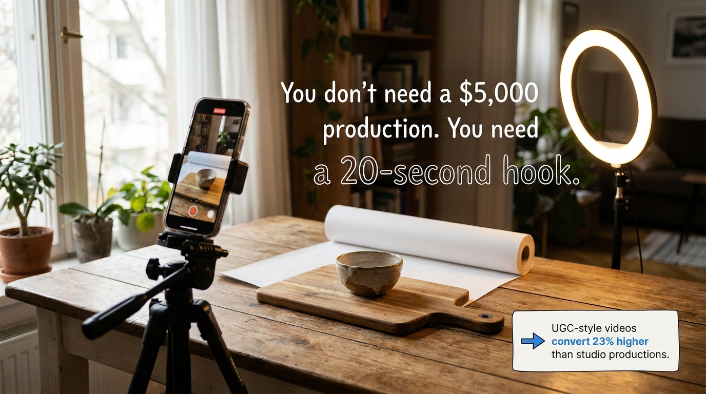
    Smartphone filming product on simple home studio tabletop setup with text overlay reading you don't need a 5000 dollar production

    One of the more useful findings from 2026 Amazon video data is that user-generated-style content — less produced, more authentic — converts 23% higher than polished studio video. This isn’t a license to upload shaky, unlit phone footage. It’s a signal that buyers are responding to perceived authenticity rather than production polish. Understanding this distinction changes how you should approach video production.

    The Minimum Viable Video Setup

    A setup that produces commercially acceptable Amazon video can be assembled for under $300:

    • Camera: A modern smartphone (any flagship from the past three years) shoots at 4K and handles the lighting environments Amazon requires without issue. You don’t need a dedicated camera.
    • Tripod or stabilizer: Shaky footage is one of the most common reasons otherwise acceptable videos feel amateur. A $30–50 smartphone tripod with a fluid head eliminates this entirely.
    • Lighting: A single good LED ring light or a softbox panel at a 45-degree angle produces clean, professional lighting for product video. Natural light near a large window works in a pinch but creates scheduling constraints.
    • Backdrop: A roll of white seamless photography paper costs roughly $30 and produces the clean background most product categories require. For lifestyle categories, a well-composed real environment (kitchen, living room, outdoor space) outperforms a studio backdrop.
    • Editing: DaVinci Resolve (free), CapCut (free), or iMovie handles the color correction, clip trimming, and subtitle overlay that most Amazon listing videos require. You don’t need Premiere Pro for a 25-second product demo.

    Scripting for Conversion, Not Production Value

    The most impactful skill in low-budget Amazon video is scripting before you shoot. Sellers who start filming without a clear shot list and script structure produce hours of raw footage and spend twice as long in editing. A tightly scripted 25-second video with clear transitions, a logical demo sequence, and an end-frame benefit summary outperforms an improvised 90-second walkthrough in every measurable way.

    Before the camera turns on, write down these three things: (1) the single most compelling thing your product does, (2) the biggest reason a buyer might not purchase, and (3) what “success” looks like after using the product. Your video script is those three answers, shown in sequence.

    When to Hire Out

    There are genuine cases for professional video production — primarily for Premium A+ brand story videos where cinematic quality reinforces brand positioning, and for Sponsored Brands Video ads where the production quality reflects on your brand credibility in a competitive SERP context. For main image videos and image stack content, the ROI on professional production rarely justifies the cost over a well-executed in-house production. Focus professional production budget on the slots that benefit most from elevated quality.

    Measuring What Matters: KPIs for Amazon Video Performance

    Video on Amazon is not a “set it and forget it” investment. The placements require ongoing monitoring because performance degrades over time as competitor content improves, shopper expectations shift, and your own product’s market position evolves. Building a measurement framework from the start prevents the common situation where a seller uploads a video, stops looking at it, and has no idea whether it’s contributing to results.

    Primary KPIs by Video Slot

    Main Image Video:

    • CTR from SERP (Click-Through Rate): This is the primary signal that your SERP-visible video is working. Benchmark CTR by category — if yours is below the average for your category, your first six seconds aren’t landing.
    • Unit Session Rate (USR): The percentage of detail page sessions that result in a purchase. USR tells you whether your listing as a whole is converting traffic once it arrives. Video is a significant contributor to USR movement.

    Image Stack Videos:

    • Return Rate: A successful image stack video strategy — particularly assembly and scale demonstration videos — should produce a measurable reduction in the primary return reason. Track return reasons in Seller Central’s “Return Reports” and monitor for shifts after video is added.
    • Q&A Volume: If buyers are asking pre-purchase questions that your videos answer, video is not doing its job. A drop in repetitive Q&A submissions after video deployment is a proxy signal for video effectiveness.

    Premium A+ Video Modules:

    • A+ Content Page Views vs. Pre-A+ Baseline: Compare session duration and scroll depth on your PDP before and after Premium A+ deployment. Longer session times indicate buyers are engaging with the extended content.
    • Organic Ranking for Secondary Keywords: Premium A+ content — including video modules — can contribute to ranking improvements on non-primary keywords over time. Tracking ranking position for 10–20 target keywords on 60-day intervals reveals this effect.

    Sponsored Brands Video:

    • CTR: Industry average for Sponsored Brands Video CTR on Amazon sits in the 0.4–1.2% range in most categories. Below-average CTR with above-average impressions indicates the creative isn’t stopping the scroll.
    • ROAS (Return on Ad Spend): The primary financial metric for paid video. Benchmark against your existing Sponsored Products ROAS to determine whether video ads are delivering incremental value or simply shifting spend between formats.
    • New-to-Brand %: One of the unique metrics Amazon provides for Sponsored Brands: the percentage of attributed sales that came from buyers who hadn’t purchased from you in the past 12 months. High NTB% confirms the video is doing its awareness job.

    A/B Testing Video Content

    Amazon’s Manage Your Experiments (MYE) tool supports A/B testing for A+ Content and, in some cases, for main image content. This gives brand-registered sellers a structured way to test video variants — different hooks, different structural approaches, different video lengths — against a real traffic split rather than guessing based on gut feel. For high-traffic ASINs, a 30-day MYE experiment comparing two main image video approaches can provide statistically meaningful data about which content structure drives higher USR. This is one of the most underutilized optimization tools available to brand-registered sellers.

    Building a Video Content Roadmap for Your Catalog

    Video strategy gets genuinely complicated when you’re managing a catalog with dozens or hundreds of ASINs. Prioritizing where to invest first — and in what sequence — is as important as the production quality of individual videos.

    Prioritization Framework

    Start with your highest-traffic, highest-revenue ASINs. These are the listings where a 2–3% unit session rate improvement translates into the most incremental revenue. If you sell 500 units per month of a $45 product and improve USR from 12% to 15%, that’s roughly 125 additional units monthly — a meaningful number on a single ASIN. Apply that same improvement to your top 10 ASINs and the cumulative effect is significant.

    Within those high-priority ASINs, deploy video in this sequence:

    1. Main image video first — highest single-asset ROI.
    2. Top-objection image stack video second — addresses the most common conversion barrier.
    3. Sponsored Brands Video third — once the listing is optimized for conversion, paid traffic amplifies rather than wastes impressions.
    4. Premium A+ video fourth — reserved for brand-building and deeper education on your most strategic products.

    For lower-traffic ASINs, a single well-executed main image video is usually sufficient. Spreading production resources across every slot on every ASIN produces diminishing returns quickly. Depth on your best listings outperforms shallow coverage across your full catalog.

    Evergreen Video vs. Refresh Cadence

    Listing videos should be produced with evergreen content in mind — no seasonal references, no price language, no trend-dependent imagery — so they remain relevant for 18–24 months without re-production. That said, the market doesn’t stand still. Competitor videos improve, new product features get added, and buyer expectations shift. Build a quarterly review into your listing management process: watch your own videos with fresh eyes, check what top-performing competitors are doing in your category, and assess whether your content is still answering the questions buyers are actually asking. Proactive refreshes before performance visibly degrades are far less disruptive than emergency re-shoots after a conversion rate drop.

    Conclusion: Stop Treating Amazon Video as a Single Tactic

    Amazon’s video ecosystem in 2026 is substantially more sophisticated than most sellers’ approach to it. The gap between sellers who upload one video and sellers who deploy a deliberate, slot-specific video strategy across their top ASINs is measurable in conversion rates, organic ranking positions, and return rates — and it’s a gap that’s widening as category competition intensifies.

    The sellers winning with video aren’t winning because they have higher production budgets. They’re winning because they understand that each slot on Amazon’s product page represents a different moment in the buyer’s decision process, and they’ve matched the right content to each moment.

    Here are the core takeaways to act on:

    • Identify your highest-traffic ASINs and audit their video coverage — how many of the available slots are currently used, and what’s in them?
    • Produce a main image video for your top five ASINs first, following the 6-second rule and keeping total length under 25 seconds.
    • Map your most common customer objections and create one targeted image stack video for each, deployed on your top-revenue listings.
    • Check your Premium A+ eligibility — if you have Brand Registry and the requisite A+ approvals, you’re leaving video module real estate unused if you haven’t built Premium A+ layouts.
    • Separate your video measurement by slot — Sponsored Brands Video CTR and listing video unit session rate are different metrics serving different objectives, and blending them obscures what’s working.
    • Review and refresh videos on a quarterly basis — evergreen production extends the lifespan, but the content should still be reviewed against what buyers are currently asking and what competitors are currently doing.
    • Run MYE experiments on your main image videos if you have sufficient traffic — there’s no better way to determine which video structure converts better than a real A/B test against live traffic.

    Video integration on Amazon is not a feature to check off a list. It’s an ongoing content strategy with multiple layers, each contributing in a distinct way to how shoppers find, evaluate, and ultimately choose your products. Build it deliberately, measure it rigorously, and treat it as a living part of your listing — not a one-time production task.

  • What Rufus Actually Sees: The Image Optimization Tactics Amazon Sellers Are Sleeping On

    What Rufus Actually Sees: The Image Optimization Tactics Amazon Sellers Are Sleeping On

    Amazon Rufus AI scanning product listing images as data sources — hero image showing AI vision lines reading main images, infographics, and lifestyle photos

    Most Amazon sellers treat product images as a design problem. Hire a photographer. Get clean shots on white. Maybe add an infographic or two. Done.

    That worked fine when search was keyword-driven and humans were doing all the evaluating. But Amazon’s AI shopping assistant, Rufus, has fundamentally changed the relationship between your visual assets and your discoverability — and the majority of sellers haven’t caught up to it yet.

    Here’s the shift that matters: Rufus doesn’t look at your images the way a shopper does. It processes them as structured data sources. Every pixel, every text overlay, every scene in a lifestyle shot, every alt text field in your A+ Content module — Rufus is extracting meaning from all of it, cross-referencing it against its semantic knowledge graph, and deciding whether your product deserves to appear in a recommendation when someone asks a natural-language question like “What’s a good protein shaker that actually fits in a car cup holder and won’t leak?”

    As of early 2026, Rufus is handling more than 13% of all Amazon search queries, mediating an estimated 15–20% of mobile shopper sessions per quarter, and driving what analysts project to be over $10 billion in annualized incremental sales. Shoppers who interact with Rufus are reportedly 60% more likely to purchase than those who don’t. The assistant has 250 million active users and interaction growth running at 210% year-over-year.

    This isn’t a feature preview anymore. Rufus is a primary discovery mechanism — and it sees your images differently than you think it does.

    This article breaks down exactly how Rufus processes visual content, what it extracts from each image type, where most sellers are leaving discovery on the table, and a slot-by-slot framework for building a Rufus-optimized image stack from scratch.

    How Rufus Actually Processes Product Images: The Multimodal Stack

    Three-layer Rufus ranking system diagram showing A10 algorithm, COSMO semantic knowledge graph, and Rufus multimodal AI with OCR and computer vision

    To optimize for Rufus, you first need to understand what kind of system you’re actually dealing with. Rufus is not a simple image ranker. It’s a multimodal AI assistant built on three interconnected layers, each of which processes your listing differently and feeds data to the next.
    Layer 1: The A10 Foundation

    Amazon’s A10 algorithm operates at the base of the stack. It handles the traditional signals you already know — sales velocity, click-through rates, keyword relevance from titles and backend fields, conversion history, return rates, and fulfillment performance. A10 creates your baseline discoverability, determining whether your product is even eligible to surface for a given search.

    Images play an indirect role here. A poorly optimized image gallery hurts click-through rate and conversion, which feed back into A10 as negative signals. A highly optimized gallery improves both metrics, compounding A10 performance over time. But A10 is primarily a text and behavioral signal engine — it doesn’t evaluate image content directly.

    Layer 2: The COSMO Semantic Knowledge Graph

    Above A10 sits COSMO, Amazon’s proprietary semantic knowledge graph — and this is where image optimization starts to directly matter in a new way. COSMO isn’t a keyword index. It’s a knowledge structure built from millions of behavioral assertions about what customers actually want when they use different phrases.

    COSMO connects product attributes, use cases, customer intents, and product categories into a web of semantic relationships. When a shopper says “best water bottle for hiking,” COSMO isn’t matching the phrase “hiking” to your keyword list. It’s checking whether the knowledge graph contains a strong connection between your product and the node cluster representing hiking intent — which includes attributes like capacity, material, durability, weight, and insulation.

    Visual Label Tagging is the mechanism through which your images feed COSMO. Amazon’s computer vision system scans your listing’s image gallery and applies semantic labels to what it finds: product type, setting, use context, visible features, scale indicators, and user demographics. These labels become data points in COSMO’s graph, strengthening (or failing to strengthen) the connections between your product and relevant intent clusters.

    A camping water bottle photographed only on a white background gets labeled as “water bottle — product isolated.” The same bottle photographed at a trailhead in a hiker’s backpack side pocket gets labeled with setting: outdoor, context: hiking, use-scenario: active-trail, format: portable. That’s a fundamentally richer set of graph connections — and Rufus draws on all of them when generating responses to natural-language shopping queries.

    Layer 3: Rufus Multimodal Synthesis

    Rufus sits at the top of the stack, and it’s where your images, alt text, reviews, Q&A, listing copy, and A+ content all converge into a single, synthesized understanding of your product. Rufus uses a vision-language model to process images holistically — not just extracting text from overlays, but understanding scenes, inferring product use cases, identifying product components, and even reading packaging details.

    OCR (Optical Character Recognition) is Rufus’s tool for reading embedded text. When a shopper uploads a photo of a product they saw in a store and asks Rufus to find it or suggest alternatives, Rufus can read the brand name, product specs, and model numbers directly from label text in the photo. The same capability applies to your listing images — Rufus reads every text overlay on your infographics and incorporates that data into its product understanding model.
    The result is a system where your images are not decorations. They are data inputs — and they either enrich Rufus’s model of your product or they don’t.

    Visual Label Tagging: What COSMO Learns From Your Photos

    Visual Label Tagging is the bridge between your image gallery and COSMO’s knowledge graph, and understanding it gives sellers a concrete framework for thinking about image strategy beyond aesthetics.

    What Gets Tagged and What Doesn’t

    Amazon’s computer vision system is applying semantic labels across 18 documented product categories, and those labels span several dimensions of product understanding. Here’s what the system is looking for in your images:

    • Product identity: What the item is, clearly and unambiguously. If your product is misclassified at this stage — if, for example, your kitchen tool gets tagged as something in a different category — your downstream visibility collapses. AI misclassification is a real, documented problem for sellers with ambiguous or cluttered primary images.
    • Setting and context: Where is the product being used? An image of a blender in a gym bag reads differently to COSMO than the same blender on a kitchen counter. Setting tags include: home, office, outdoor, gym, travel, camping, kitchen, office, and dozens of sub-contexts.
    • User demographics: Who is using the product? Images that show a specific user — a parent with a child, an athlete, an older adult, a professional — generate demographic tags that connect your product to relevant intent clusters like “gifts for mom” or “office supplies for professionals.”
    • Feature visibility: What product features are visually apparent? Visible handles, zippers, lids, buttons, ports, and components all generate feature tags. If your product has a key differentiating feature that isn’t visible in any image, it may not be tagged at all — even if it’s described in your bullet points.
    • Scale and size indicators: Products shown next to common reference objects (a hand, a coin, a standard cup) generate size-context tags that allow Rufus to answer size-related shopper questions accurately.

    The Knowledge Graph Connection

    Once COSMO has your Visual Label Tags, it runs them through its web of semantic intent connections. Every tag is a potential match point for a shopper query. A product tagged with setting: camping, feature: insulation visible, use-context: outdoor hydration, and material: stainless steel inferred is going to show up in far more Rufus recommendation sets than the same product tagged only as water bottle: product isolated.

    The practical implication is significant: each lifestyle image you add to your gallery is not just a conversion aid for human shoppers. It’s a tag-generation event for COSMO. Every new scene you photograph your product in adds a new cluster of intent connections to the knowledge graph. That’s compounding discoverability, and it’s entirely within your control.

    Main Image Tactics: There’s More at Stake Than Compliance

    Before and after comparison of Amazon product main image optimization for Rufus AI — generic white background versus Rufus-optimized version with callout text overlays

    Your main image is the first thing both human shoppers and Rufus’s computer vision system process. Amazon’s compliance requirements are firm: pure white background (RGB 255, 255, 255), product filling at least 85% of the frame, no props or text overlays. Those rules aren’t going away.

    But within those constraints, there are meaningful choices that dramatically affect how well Rufus understands — and therefore surfaces — your product.

    Precision Beats Minimalism

    The “cleaner is better” aesthetic that dominated Amazon photography for the past decade is no longer the whole story. Rufus’s computer vision model needs enough visual information to accurately categorize your product. That means your main image should be photographed to maximize feature clarity, not minimalism.

    Consider what a vision model needs to correctly classify a multi-tool pocket knife versus a standard pocket knife versus a Swiss Army-style multi-tool. The differences are subtle — blade count, tool arrangement, handle shape. If your main image is a tight overhead shot showing only one side of the product, you may be giving the AI insufficient information to classify your item correctly. The same product photographed at a 45-degree angle showing the tool array, the clip, and the scale relative to a hand generates more classifiable information.

    Practical rule: photograph your main image from the angle that makes your product most distinctively identifiable within its subcategory. Don’t just show the product — show what makes it that specific type of product.

    Resolution Requirements in a Multimodal World

    Amazon’s minimum image size is 1000×1000 pixels for zoom functionality to activate. For Rufus optimization, treat 2000×2000 pixels as your practical floor, and 3000×3000 or higher as ideal. Higher resolution means finer detail extraction from the computer vision model — visible texture, stitching, port sizes, label text on packaging — all of which becomes richer data input for Visual Label Tagging.

    A sharp, 2500×2500 pixel main image of a travel bag will allow the AI to tag the zipper material, the external pocket structure, the handle type, and the approximate proportions — generating a far richer initial product classification than a 1000×1000 pixel shot of the same bag.

    The “What Is This?” Test

    Before finalizing your main image, run what practitioners have started calling the “What Is This?” test. Show your main image to someone unfamiliar with the product for three seconds, then take it away. If they can’t immediately answer what the product is, what it does, and roughly who it’s for — your main image is underperforming for both humans and AI. Rufus’s vision model is making the same rapid classification judgment, and an ambiguous main image is the single most damaging image problem a listing can have.

    The Infographic Layer: OCR and the Text Rufus Is Already Extracting

    Rufus OCR scanning an Amazon product infographic water bottle image, extracting text overlays like Holds 64 oz, BPA-Free Stainless Steel, Fits Cup Holders as data tags

    Infographic images are the single highest-leverage image type for Rufus optimization — and the one where the gap between sellers who understand what’s happening and those who don’t is most pronounced.

    Rufus’s OCR capability means the text embedded in your infographic images is being read, indexed, and incorporated into its product understanding model. This isn’t a theoretical capability — it’s active, documented through Amazon’s patent filings, and confirmed by practitioner testing across categories. Every word that appears in your infographic images is a potential data point that Rufus can reference when answering shopper questions.

    Writing for OCR, Not Just for Eyes

    Most Amazon infographics are designed with human readability as the primary constraint. Clean fonts, balanced layouts, branded color schemes. That’s still important. But layered on top of that should be a second design constraint: is this text OCR-readable in a way that serves Rufus’s data extraction needs?

    OCR performance degrades with decorative fonts, very small text, low contrast text on busy backgrounds, and stylized lettering. Amazon’s OCR layer is sophisticated, but it performs best on:

    • High-contrast text (dark on light or light on dark, not mid-tone on mid-tone)
    • Clean sans-serif or serif fonts at legible sizes (minimum 18–20pt equivalent at image resolution)
    • Text that is horizontal, not rotated or curved
    • Specific, noun-phrase driven language rather than vague marketing copy

    That last point deserves more attention. “Premium Quality Construction” tells Rufus almost nothing useful. “Aircraft-grade 6061 Aluminum, 2mm Wall Thickness” tells it a great deal — material, grade, specification, and a size parameter, all in one phrase. Rufus can use the second phrase to answer questions like “what’s the most durable aluminum water bottle” or “are there aluminum bottles with thick walls.” It cannot use the first phrase for anything.

    Noun Phrases That Actually Feed COSMO

    The most effective text overlays for Rufus optimization follow a simple structure: measurable attribute + product-specific noun. Examples that generate strong COSMO connections:

    • “Holds 64 oz — Fits Standard Car Cup Holders” (capacity + compatibility)
    • “BPA-Free 18/8 Stainless Steel Construction” (material + safety attribute)
    • “Fits Wrists 6.5″–8.5″ — Adjustable Clasp” (size range + feature)
    • “1200W Motor — Crushes Ice in Under 10 Seconds” (power + performance claim)
    • “Waterproof to IPX7 — Submersible Up to 1 Meter” (certification + specification)

    Each of these phrases maps to answerable shopper questions. “What water bottle fits in a car cup holder?” — COSMO has a direct data point. “Are there stainless steel bottles that are BPA-free?” — COSMO has a direct data point. Generic phrases like “Superior Hydration” or “Built for Champions” map to nothing in COSMO’s intent graph.

    Infographic Coverage: What to Include Across Your Slots

    Sellers often dedicate one image slot to an infographic and consider it done. The more effective approach is to plan multiple infographic images covering different categories of product information:

    • Dimension/size infographic: Show actual measurements with a scale reference. Include the measurements in text (not just arrows), because OCR reads text, not line lengths.
    • Material/composition infographic: List materials, certifications, and construction details with specific, verifiable language.
    • Feature breakdown infographic: Highlight each key feature with labeled callouts, using OCR-readable noun phrases rather than category headers.
    • Compatibility/fit infographic: If your product fits, pairs with, or requires something specific, show and label it. “Compatible with AirPods Pro 2nd Gen” is the kind of text Rufus uses to surface your product for compatibility queries.

    Lifestyle Images Done Right: Intent Matching Through Scene Context

    If infographics are about feeding data to Rufus through OCR, lifestyle images are about feeding data through computer vision and Visual Label Tagging. The distinction matters, because the optimization approach is different.

    Lifestyle images generate the contextual tags that connect your product to shopper intent clusters. A product photographed in ten different settings generates ten different sets of intent-connection tags in COSMO. Each tag cluster is a pool of potential shopper queries that your product can surface in.

    Choosing Scenes Strategically, Not Aesthetically

    Most brands choose lifestyle scenes based on what looks aspirational or on-brand. A premium kitchen appliance in a beautiful minimalist kitchen. A fitness supplement in a gym. A skincare product in a spa-inspired bathroom. Those aesthetic choices are fine — but they’re not strategic choices for Rufus optimization.

    The strategic approach starts with your actual search intent data. Pull your Search Term Report from Seller Central and look at the long-tail queries that are generating impressions but low conversion. Many of those queries represent intent clusters your product could serve — but isn’t being tagged for because your images don’t show those scenarios.

    Example: A portable blender’s search term report shows queries like “blender for travel,” “mini blender dorm room,” “blender that works in hotel room,” and “blender for camping.” These are distinct intent clusters. A single lifestyle shot in a kitchen doesn’t address any of them. Shooting the same blender in a hotel room, at a campsite, and in a dorm setting — and including those as separate image slots — generates distinct Visual Label Tag clusters for each context, making the product eligible to surface in Rufus responses to all four query types.

    The User Demographic Signal

    Lifestyle images that include people generate additional demographic tagging that pure product shots cannot. COSMO’s knowledge graph includes demographic-intent connections — shoppers searching for “gifts for teenage girls” or “office accessories for working moms” are triggering intent clusters that include demographic tags.

    Include people in your lifestyle images when your product has meaningful demographic targeting. Show the actual user your product is built for. This isn’t just good marketing psychology — it’s a direct input into COSMO’s demographic tagging system, which determines whether your product surfaces for gift-giving and user-specific queries.

    Text Overlays in Lifestyle Images

    Here’s a tactic that most sellers miss entirely: lifestyle images can carry text overlays too. Unlike main images, secondary images have no restriction on overlaid text. A lifestyle image of a water bottle at a hiking trailhead can also include a small, clean callout that reads “Triple-Wall Vacuum Insulation — Stays Cold 24 Hours.” The computer vision model reads the scene and generates context tags. Rufus’s OCR reads the overlay and generates spec data. One image provides two types of data input simultaneously.

    This dual-input approach is one of the highest-ROI tactics in Rufus image optimization — it requires no additional photography, just thoughtful graphic design on images you’re already producing.

    The 9-Slot Narrative Sequence: Treating Your Gallery Like a Presentation

    Amazon 9-slot image gallery narrative sequence strategy showing story arc from Hero Identity through Key Specs, Scale Comparison, Lifestyle Use Cases, Feature Close-Up, Social Proof, FAQ, and Brand Story

    Amazon allows up to 9 product image slots, plus a video. The average seller uses 4–5. According to practitioner data, roughly 65% of sellers leave image slots empty — which means they’re leaving COSMO tag-generation opportunities on the table with every unfilled slot.

    But filling all 9 slots randomly is not better than filling 5 slots strategically. The sequence of your images matters — both for human shoppers who view them left to right and for Rufus’s processing model, which tends to weight earlier images more heavily in initial product classification.

    Here’s a framework for building a 9-slot gallery that serves both humans and Rufus’s multimodal AI simultaneously:

    Slot 1 — Hero Identity

    This is your mandatory white-background main image. Its job for Rufus is unambiguous product classification. Its job for shoppers is immediate recognition and interest. Optimize for resolution (2000px+), product angle (most distinctive and identifiable), and clarity. Pass the “What Is This?” test.

    Slot 2 — Key Specs Infographic

    Place your most OCR-rich infographic in slot 2. This is the highest-priority non-main image for Rufus data extraction. Include your most critical specifications — the ones that differentiate your product and answer the most common shopper comparison questions. Measurable attributes, certifications, compatibility notes. High-contrast text, clean font, specific noun phrases.

    Slot 3 — Scale and Size Reference

    A dedicated size-context image. Show the product next to a common reference object (a human hand, a standard mug, a 12-inch ruler) and label the key dimensions in text. This answers a consistent category of shopper questions (“How big is it actually?”) and generates size-intent tags that allow Rufus to match your product to size-specific queries.

    Slot 4 — Primary Lifestyle / Use Case 1

    Your most commercially important use-case scenario, photographed in its natural setting. Include at least one person if your product has a defined user profile. Add a subtle text callout highlighting the key benefit relevant to this scenario. This slot generates your primary COSMO intent connections.

    Slot 5 — Use Case 2 (Different Context)

    A second lifestyle scenario targeting a different intent cluster. If Slot 4 shows your product in a home kitchen, Slot 5 might show it at a campsite or in a hotel room. Every new setting is a new cluster of COSMO intent connections. Don’t repeat the same context — expand your tag coverage.

    Slot 6 — Feature Close-Up

    A high-resolution detail shot of your product’s most differentiating feature — the zipper mechanism, the lid seal, the texture of the grip, the precision of the measurements on the side. Include a labeled callout with specific language. This image addresses the “zoom-and-inspect” behavior of engaged shoppers while generating feature-specific tags for COSMO.

    Slot 7 — Social Proof or Review Callout

    An image incorporating a verified customer quote or review excerpt, combined with a lifestyle or product visual. Rufus synthesizes reviews and Q&A as part of its product understanding — placing a powerful review excerpt in your image gallery reinforces the same sentiment data Rufus is already pulling from your review set. It also addresses purchase hesitation for human shoppers at the consideration stage.

    Slot 8 — FAQ / Objection Buster

    Identify the top purchase objection or question your product receives in reviews and Q&A, and address it directly in a dedicated image. “Yes, it fits in a standard cup holder.” “Yes, the lid is dishwasher-safe.” “No, you don’t need any tools to assemble it.” This image type directly feeds Rufus’s ability to answer common shopper questions about your product — because when a shopper asks Rufus “does [product] fit in a cup holder?”, Rufus is synthesizing your listing’s entire content to generate that answer, including your image text overlays.

    Slot 9 — Brand Story / Materials / Sustainability

    Your final slot should serve long-tail search intent around brand trust, materials sourcing, ethical production, or product origin. For many categories, shoppers ask Rufus questions like “is this brand sustainable?” or “what is this made from?” A dedicated image with clear, OCR-readable text about your materials, country of manufacture, certifications (FDA, CE, organic, Fair Trade), or sustainability commitments provides Rufus with direct data to answer those queries.

    The Video Slot

    Add a product video. Rufus’s multimodal processing extends to video content in your listing gallery. A short, tight demonstration video (60–90 seconds) showing your product in use across two or three scenarios provides the richest possible context data — moving-image analysis combined with spoken or captioned content. If video is not currently part of your listing stack, it should be the next addition after filling all 9 image slots.

    A+ Content Alt Text: The Hidden Data Field Most Sellers Ignore

    Amazon A+ Content editor mockup showing a highlighted alt text input field with a detailed Rufus-optimized description, with a callout bubble reading THIS IS WHAT RUFUS READS

    Alt text in A+ Content modules is, without question, the most underutilized high-leverage input in the entire Amazon listing ecosystem. Historically, sellers ignored it because it had minimal measurable impact on traditional search ranking. The field existed primarily for accessibility — screen readers. Most sellers either left it blank or filled it with something like “Product image 1.”

    That era is over. Rufus reads alt text as a primary data source.

    Why Alt Text Now Matters for Rufus

    Rufus is a multimodal system — it processes both the visual content of images and the textual metadata associated with them. Alt text is part of that metadata layer. When you write descriptive, context-rich alt text for an A+ Content image, you’re providing Rufus with a pre-processed semantic description of what that image contains — one that it can incorporate into its product understanding model without having to rely solely on computer vision inference.

    This is particularly valuable for visual content that’s challenging for computer vision to interpret accurately — complex multi-product scene images, before-and-after comparisons, infographics with dense visual information, or product shots where the key differentiating detail is subtle (like a specific stitching pattern or locking mechanism).

    The Alt Text Formula That Works

    Effective Rufus-optimized alt text follows a specific structure: [Who] + [action/context] + [product] + [key product feature] + [relevant circumstance or outcome].

    Compare these two alt text examples for the same blender image:

    Underperforming: “Blender product lifestyle image”

    Rufus-optimized: “Woman making green smoothie with 1200-watt portable blender on kitchen countertop, using tamper to blend frozen fruit and ice, blender fits standard cup holder”

    The second version contains: a user demographic (woman), an action (making smoothie), a product name with key spec (1200-watt portable blender), a setting (kitchen countertop), a use-case detail (using tamper, frozen fruit, ice), and a compatibility attribute (fits cup holder). Rufus can reference every one of those data points when answering shopper queries.

    The first version contains: nothing useful.

    Auditing and Rewriting Your A+ Alt Text

    Open every A+ Content module you’ve published. Click into each image block and check the alt text field. For the majority of listings — especially older ones — you’ll find blank fields or placeholder text. This is one of the most time-efficient optimization tasks available to Amazon sellers in 2026, because it requires no photography, no design work, and no new content creation. It’s a text field you already have access to, and filling it correctly has a direct, documented impact on Rufus’s ability to understand and surface your product.

    Work through each image systematically. Write alt text that describes the actual content of the image — who is in it, what they’re doing, what the product is doing, what setting they’re in, and what specific product attributes are visible or implied. Keep it under 250 characters for most platforms, though Amazon’s A+ text field accepts longer inputs. Use natural language, not keyword-stuffed fragments.

    Common Image Mistakes That Suppress Rufus Visibility

    Warning infographic showing 5 image mistakes that make Rufus ignore your Amazon listing — blurry images, missing alt text, no readable text overlays, cluttered backgrounds, unfilled image slots

    Understanding what to do is only half the picture. The other half is knowing what’s actively working against you. These are the most common image problems that suppress Rufus visibility in 2026 — many of which sellers don’t recognize as optimization failures at all.

    Mistake 1: Product Misclassification at the Main Image Level

    If Rufus’s computer vision model misidentifies your product at the primary image level, every downstream recommendation and response it generates will be based on a wrong classification. This happens most often with multifunctional products, products in unusual categories, or products with ambiguous primary use cases.

    Signs your product may be misclassified: it surfaces for irrelevant queries but not relevant ones; Rufus describes it inaccurately in chat responses; your listing has normal keyword rank but poor Rufus recommendation inclusion. The fix is almost always to adjust your main image to make product identity unmistakable — cleaner angle, better crop, more identifiable composition.

    Mistake 2: Lifestyle Images With No Semantic Anchoring

    A beautiful lifestyle image that shows your product in a stunning setting but provides no additional data input — no text overlay, no specific user context, no identifiable setting — is a missed opportunity. It looks great to human shoppers but adds minimal new information to Rufus’s product model. Each image slot should be doing double duty: serving human shoppers and feeding the AI. If a lifestyle image isn’t doing both, revise it.

    Mistake 3: Inconsistent Data Between Image Text and Listing Copy

    Rufus cross-references data across your entire listing. If your infographic says “Holds 64 oz” and your bullet points say “58 oz capacity,” Rufus has a data conflict — and when data conflicts occur, the AI is likely to suppress or reduce confidence in the conflicting claims, or worse, surface the wrong information to shoppers who ask capacity questions.

    Audit your infographic text against your listing copy regularly. Spec discrepancies are extremely common — especially when listings have been updated over time without corresponding image updates. Every discrepancy is a trust signal failure for Rufus.

    Mistake 4: Unreadable Text Overlays

    Decorative fonts, low-contrast color combinations, very small text, and curved or rotated lettering all degrade OCR accuracy. A beautiful branded infographic with elegant script text may be generating zero useful data for Rufus because the OCR layer can’t parse the lettering reliably. Test your infographics by attempting to read them on a phone screen at arm’s length. If you can’t read them instantly, neither can OCR with high confidence.

    Mistake 5: Ignoring the Alt Text Fields Entirely

    We’ve covered this in detail, but it bears repeating in the context of mistakes: blank or placeholder A+ alt text is the most common and most preventable image optimization failure on Amazon today. It requires zero budget, zero photography, and minimal time. It’s a pure knowledge gap problem — sellers who know about it fix it immediately, and those who don’t continue leaving meaningful Rufus data inputs blank across every product they sell.

    Mistake 6: Low Resolution Images

    Images below 1000×1000 pixels lose zoom functionality for human shoppers, but the impact on Rufus is equally significant. Low-resolution images provide less detail for computer vision to extract, resulting in thinner Visual Label Tag sets and reduced COSMO connectivity. There is no situation in 2026 where a low-resolution image is serving your listing better than a high-resolution one. Replace them.

    How to Audit Your Current Images Against Rufus Criteria

    Knowing the optimization framework is one thing. Applying it systematically to an existing catalog is another. Here’s a practical audit process that sellers can run on any listing — new or established — to evaluate Rufus readiness and prioritize improvements.

    Step 1: The Slot Count Check

    Open each listing and count your image slots. Are all 9 filled? Is there a video? Empty slots are your first priority — they’re literally unused data input opportunities. If you’re running fewer than 7 image slots on any listing, filling the remaining slots should be your highest-leverage immediate action.

    Step 2: The Resolution Audit

    Download your current listing images and check their pixel dimensions. Anything under 1500×1500 pixels should be queued for replacement. Prioritize the main image first, then infographics (since both OCR quality and COSMO tag richness degrade with lower resolution).

    Step 3: The OCR Text Inventory

    Print or screenshot each of your infographic images. Go through them and list every piece of text that appears. Then ask: is this text specific, measurable, and noun-phrase-driven? Or is it vague marketing language? Categorize each text element as “COSMO-useful” or “COSMO-useless.” Any “COSMO-useless” text should be replaced with specific, attribute-driven language in your next image revision.

    Step 4: The Intent Coverage Map

    Pull your Search Term Report. List the top 15–20 long-tail queries that are generating impressions. Map each query to the lifestyle image in your gallery that addresses that intent. If there are high-impression queries with no corresponding lifestyle image, you’ve identified a COSMO coverage gap. Plan a lifestyle shoot or use AI image editing tools to generate images addressing those missing intent clusters.

    Step 5: The Alt Text Review

    Go into every A+ Content module. Read each alt text field. Apply the formula: [Who] + [action/context] + [product] + [key feature] + [relevant detail]. Rewrite any field that doesn’t meet that standard. This step takes an afternoon and has immediate impact — it’s the single fastest-to-implement, lowest-cost optimization available in Rufus readiness work.

    Step 6: The Consistency Cross-Check

    Compare all specifications mentioned in your infographic images against your bullet points and product description. Note every discrepancy. Resolve all of them. In cases where the correct value is unclear (product has been updated, measurement methods differ), default to the most accurate current specification and update both the image and the copy to match.

    Prioritizing Your Fixes

    Not every listing needs the same depth of attention. Prioritize your audit and fix sequence based on revenue impact: start with your highest-volume, highest-revenue ASINs first. A 10% improvement in Rufus recommendation inclusion on a $50k/month ASIN has far more impact than a complete overhaul of a $2k/month listing. Work your way down the revenue stack systematically.

    The Bigger Picture: Visual Optimization as a Discovery Channel

    Stepping back from the tactical detail, there’s a strategic shift worth naming clearly: visual optimization is no longer just a conversion tool. It has become a discovery channel in its own right.

    When Amazon launched its AI visual search feature — allowing shoppers to upload a photo and find matching or similar products — Rufus’s image processing became directly tied to product discovery in a way that had no equivalent in the keyword-only era. A shopper who photographs a competitor’s product and asks Rufus to find alternatives is triggering a visual search that Rufus answers by matching visual attributes across its product catalog. Products whose images provide rich visual data — clear feature visibility, high resolution, detailed contextual shooting — are more likely to surface in those visual search matches.

    Similarly, when Rufus generates a response to a conversational query like “What’s the best lightweight laptop bag for daily commuting under $80?”, it’s not just running a keyword match. It’s querying COSMO’s intent graph, pulling products whose tags include context: commuting, category: laptop bag, attribute: lightweight, and price-tier: budget — and those tags come substantially from your images. The seller who has shot their laptop bag in a commuting context (a person on a subway platform, entering an office building) with an infographic overlay reading “Fits 15.6" Laptops — Weighs Only 1.2 lbs” has a significant discovery advantage over the seller whose identical product sits in a white-background photo with no additional visual data.

    This is the real magnitude of Rufus image optimization: it’s not a listing tweak. It’s expanding the total surface area of queries your product can appear in — and for a discovery-first platform like Amazon, that’s the most direct path to incremental revenue growth available.

    Conclusion: Your Images Are Your Newest Ranking Signal

    The keyword optimization era taught Amazon sellers to think about discoverability in terms of text. Title keywords, bullet phrase strategy, backend search terms — the mental model was: write the right words, show up in the right searches.

    Rufus hasn’t eliminated that model, but it has added a parallel system that operates on an entirely different type of input: visual data. Computer vision is now reading your scenes. OCR is now indexing your infographic text. Alt text fields are now primary data inputs, not afterthoughts. And the Visual Label Tags that COSMO assigns to your listing are substantially determined by what you put — and how you shoot — across your 9 image slots and A+ modules.

    The sellers who understand this will use their image galleries as active optimization levers. They’ll treat each image slot as a data input opportunity. They’ll write infographic text for OCR accuracy alongside human readability. They’ll choose lifestyle scenes based on intent cluster strategy, not just aesthetic appeal. They’ll fill their alt text fields with specific, context-rich descriptions instead of leaving them blank.

    The sellers who don’t will continue treating images as a design expense — and they’ll wonder why their identical (or superior) product keeps losing out to competitors in Rufus recommendation sets.

    Here are the concrete starting points if you’re ready to close that gap:

    1. Audit your slot count today. Fill any empty image slots within the next 30 days, prioritizing highest-revenue ASINs first.
    2. Rewrite your A+ alt text. Apply the [Who + action + product + feature + detail] formula to every image in every A+ module you’ve published. This is a same-week action with no budget requirement.
    3. Replace vague infographic copy with noun-phrase-driven specifications. Every “superior quality” phrase should become a measurable specification. Every lifestyle image should carry at least one OCR-readable text callout.
    4. Map your lifestyle images to intent clusters. Use your Search Term Report to identify intent gaps in your current lifestyle coverage, and plan shoots or AI image tools to address them.
    5. Resolve every spec inconsistency between images and copy. Data conflicts undermine Rufus’s confidence in your listing. There should be zero discrepancies between what your images say and what your copy says.
    6. Add a video. If you have none, this is your next major visual asset investment. A tight, multi-context demonstration video generates richer multimodal data than any static image.

    Rufus is processing your images right now — every time a shopper opens your listing, every time a natural-language query triggers a recommendation, every time a visual search surfaces products in your category. The question isn’t whether this is happening. It’s whether you’ve given Rufus the data it needs to work in your favor.

  • 2026 Image Suppression: The Seller’s Diagnostic and Fix Manual

    2026 Image Suppression: The Seller’s Diagnostic and Fix Manual

    2026 image suppression diagnostic guide — split screen showing a suppressed listing versus a visible ranking listing with RGB scanner overlays

    Your product is live. Your listing looks fine in the backend. Your price is competitive. And yet — sales have flatlined, impressions have cratered, and your listing is generating exactly zero organic traffic. You check your inventory. Nothing’s wrong. You check your ads. They’re running. Then, buried in a notification you almost missed, you spot it: Search Suppressed.

    Image suppression is one of the most financially damaging and least understood problems facing ecommerce sellers in 2026. It’s not just an Amazon issue. It’s showing up across Shopify stores, WooCommerce catalogs, Google image search, and even social media feeds where product images quietly disappear from algorithmic reach without any warning. The seller never knows. The customer never finds the product. Revenue evaporates.

    What makes 2026 categorically different from prior years is the technological depth at which suppression now operates. Platforms aren’t just checking image dimensions and file types anymore. Amazon’s updated A9 algorithm now reads hidden C2PA content credentials embedded in your JPEG metadata. Instagram is suppressing posts with third-party watermarks. Google is quietly deindexing images on pages that don’t meet quality thresholds. And Shopify stores are silently hiding products because a catalog visibility toggle flipped wrong during a migration.

    This guide doesn’t take a single-platform view. It treats image suppression the way an engineer treats a system failure — as a diagnostic problem that has specific triggers, testable causes, and repeatable fixes. Whether you’re an Amazon FBA seller with a suppressed hero image, a DTC brand watching its Google Shopping images vanish, or a Shopify merchant whose products disappeared from search after an update, this manual walks you through every layer — what’s actually happening, why, and exactly how to fix it.

    Understanding How Platform Algorithms Suppress Images in 2026

    The first thing sellers need to accept is that image suppression is rarely accidental. Platforms suppress images because their systems — increasingly powered by machine learning — have detected something that violates a policy, a technical standard, or a quality threshold. The suppression is intentional, even when the violation was not.

    The Shift to Automated, AI-Powered Enforcement

    Two years ago, listing reviews were largely reactive. A human moderator would flag something following a complaint, or a seller could stay under the radar for months with minor compliance failures. In 2026, that era is effectively over. Every major ecommerce and social platform has deployed automated compliance engines that scan images at scale — in real time, or near real time — against a layered set of rules.

    Amazon’s A9 algorithm update represents the most aggressive example of this shift. The system now processes not just pixel-level image data, but embedded file metadata — including the increasingly widespread C2PA (Coalition for Content Provenance and Authenticity) tags written into images by Adobe Creative Cloud, Photoshop, and other mainstream editing tools. If your image was touched by a generative AI tool, there is likely a metadata trail that Amazon’s systems can now read. That trail is enough to trigger an automated suppression.

    Google operates differently, suppressing images through indexing decisions rather than explicit “suppressed” labels. An image that lives on a low-quality page, lacks descriptive alt text, or is blocked by a robots.txt directive simply doesn’t get indexed — meaning it never appears in Google Image Search or Google Shopping. It’s not flagged; it’s just absent.

    Why 2026 Is a Turning Point

    Three converging trends have made image suppression a much bigger problem this year than it was even eighteen months ago. First, the explosion of AI-generated and AI-edited imagery has forced platforms to implement detection systems that cast a wide net — and those nets catch legitimate sellers along with bad actors. Second, platform monetization pressures have created incentives to push organic content into paid channels, and image quality enforcement is one lever for doing that. Third, ecommerce competition has intensified to the point where a suppressed listing isn’t just an inconvenience — it’s a revenue emergency, because competitors in the same category are getting the impressions you’re not.

    Understanding this context matters because it changes how you approach the problem. Suppression isn’t a bug. It’s a feature — one designed to enforce specific standards that you need to meet precisely if you want visibility.

    Amazon Main Image Suppression: The Pure White Problem and Beyond

    Amazon main image compliance infographic for 2026 showing 85% frame fill requirement, pure white RGB 255,255,255 background, and 2000px minimum resolution with compliant vs suppressed comparison

    Amazon’s main image — the one that appears in search results, on the product detail page, and in ads — carries more compliance weight than any other element of your listing. When it fails, the entire listing goes dark. Not just the image. The listing. Understanding exactly what “failure” means in 2026 is the first step toward prevention and recovery.

    The Background Rule Is More Precise Than You Think

    Amazon requires a pure white background on all main images. Most sellers know this. What they don’t know is how precise “pure white” actually is. The specification is RGB 255, 255, 255 — all three color channels at maximum value simultaneously. A background reading RGB 254, 255, 255 is technically off-white. So is 253, 253, 253, which is a common output from auto-white-balance tools and AI background removal apps. Amazon’s 2026 scanning systems detect these deviations at the pixel level.

    The problem is compounded by JPEG compression. Even if your image starts at perfect RGB 255, 255, 255, saving it as a JPEG can introduce compression artifacts that push background pixels slightly off-white. This is why professional Amazon photographers either save at maximum JPEG quality (quality 100 in Photoshop) or use PNG files, which are lossless and preserve exact pixel values. If you’re using an AI background removal tool and saving the output as a JPEG at standard quality settings, you may be introducing the very artifacts that are triggering suppression.

    The 85% Frame Fill Requirement

    Amazon requires the product to occupy at least 85% of the image frame. This isn’t aesthetic guidance — it’s enforced algorithmically. A product that’s too small in the frame will trigger suppression. Common causes include:

    • Canvas expansion during editing: When you use a generative AI tool to extend the background, you often inadvertently shrink the product’s proportional footprint in the frame.
    • Incorrect cropping: Sellers who resize from lifestyle images sometimes preserve too much negative space around the product.
    • Multi-product shots: If you’re showing a product with accessories or packaging, the primary product may be undersized relative to the total composition.
    • Tall or wide products on square canvases: A long, narrow product shot on a 1:1 canvas may naturally fall under the 85% threshold if framing isn’t tightly considered.

    You can check this manually by overlaying a crop guide in Photoshop that represents 85% of the canvas area — the product should fill it. There are also third-party Amazon compliance checkers (SellerSprite, Pixelcut Pro) that measure this automatically.

    Resolution Requirements for Zoom Eligibility

    The minimum resolution for Amazon listing images is 1,000 pixels on the longest side. But that minimum is essentially a baseline for publication — not for performance. To enable the product zoom feature that’s proven to increase conversion, you need at minimum 2,000 pixels on the longest side. Amazon’s own published guidance recommends 2,000–3,000 pixels. Listings with images below 1,600 pixels on the longest side are increasingly flagged by the platform’s quality scoring systems, even if they aren’t technically suppressed.

    Other Main Image Triggers

    Beyond background and resolution, the following elements will also trigger suppression in 2026:

    • Text, logos, or watermarks anywhere in the image — including brand logos, “bestseller” badges, or social media handles
    • Props, accessories, or additional items not included in the product and not essential to demonstrate its use
    • Packaging shown without the product visible (for non-food categories)
    • Models or mannequins in adult apparel — certain clothing categories have model requirements, others have model prohibitions
    • Shadows that bleed to the image edge — a shadow reaching the frame boundary is interpreted as a non-compliant background element
    • Borders, frames, or colored backgrounds of any kind, including pale gray “studio” backgrounds

    C2PA Metadata — The Hidden AI Trigger Most Sellers Have Never Heard Of

    C2PA metadata detection visualization showing Amazon A9 algorithm scanning image file metadata for AI-generated content tags including Photoshop Generative Fill markers

    This is the issue that caught the most sellers off guard in early 2026, and it’s still not widely understood. C2PA stands for Coalition for Content Provenance and Authenticity — an industry standard for embedding information about how an image was created and modified directly into its file metadata. Major adopters include Adobe (across its entire Creative Cloud suite), Google, Microsoft, and dozens of camera manufacturers.

    How C2PA Tagging Works

    When you open an image in Photoshop and use any generative AI feature — including Generative Fill, Generative Expand, or even the Neural Filters — Photoshop writes C2PA credentials into the image metadata. These credentials describe what tools were used and what modifications were made. They’re invisible to the naked eye but readable by any software that knows to look for them. In 2026, Amazon’s scanning system now looks for them.

    The practical consequence is this: a seller who hires a photographer, gets a clean product shot on white seamless paper, then uses Photoshop’s Generative Fill to extend the background slightly — a genuinely minor edit — may now have that image flagged as containing synthetic AI alterations. The metadata says the AI touched it. Amazon’s system reads the metadata. The listing gets suppressed.

    Which Tools Write C2PA Tags

    As of 2026, C2PA credentials are written by the following commonly used tools:

    • Adobe Photoshop — any use of Generative Fill, Generative Expand, or Content-Aware Fill with generative options enabled
    • Adobe Firefly — all image generation outputs
    • Microsoft Designer and Bing Image Creator
    • Some Canon, Nikon, and Sony cameras — hardware-level C2PA signing for authentication (this does not indicate AI alteration; these camera-signed images should be safe)
    • Stable Diffusion implementations with C2PA-enabled wrappers

    Importantly, C2PA tagging is not universal. Many AI background removal tools (remove.bg, Photoroom, ClipDrop) do not write C2PA tags. The issue is specifically tied to tools that write provenance credentials as part of an industry transparency initiative.

    How to Detect and Strip C2PA Metadata

    You can check whether an image contains C2PA credentials using the free tool at contentcredentials.org/verify — simply upload your image and it will tell you whether provenance data is present and what it contains.

    To remove C2PA metadata before uploading to Amazon:

    1. In Photoshop, go to File → Export → Export As (not Save As). In the Export As dialog, there is a “Metadata” dropdown — set it to “None.”
    2. Alternatively, use a dedicated metadata stripping tool like ExifTool (command line: exiftool -all= yourimage.jpg) which removes all metadata including C2PA credentials.
    3. In Lightroom Classic, export with “Include” set to “Copyright Only” or “None” under the metadata settings.

    Once metadata is stripped, re-check the image at contentcredentials.org to confirm it’s clean before uploading. This single step has resolved suppression for many sellers who couldn’t understand why their otherwise-compliant images were being flagged.

    Amazon Secondary Images: Lifestyle, Infographics, and Slot-Specific Rules

    Sellers often fixate on the main image when troubleshooting suppression, but secondary images (image slots 2 through 7) carry their own compliance requirements — and violations in these slots can affect listing quality scores even when they don’t trigger hard suppression.

    What’s Allowed in Secondary Slots

    Secondary images have considerably more creative freedom than main images. Lifestyle photography, dimension infographics, feature callout graphics, comparison charts, and instructional use-case images are all permitted and actively encouraged. These slots are where you build conversion — the main image gets the click, and secondary images do the selling.

    That said, certain rules still apply in 2026:

    • Text density in infographics: Amazon hasn’t published an exact threshold, but enforcement patterns suggest that images where text occupies more than roughly 20% of the image area by pixel count are more likely to be flagged as “text-heavy” and potentially suppressed. Keep callouts concise and use white space strategically.
    • Lifestyle image content: Models and contexts must accurately represent the product and its use. Lifestyle scenes that imply product capabilities the item doesn’t have, or that include sexually suggestive content, are suppressed.
    • Slot-specific placement: Certain category-specific rules govern which image types belong in which slots. For some categories, size guides are required in a specific slot. Check your category style guide in Seller Central for slot-by-slot requirements.
    • Image quality minimums: Secondary images must meet the same resolution minimums as main images (1,000 pixels on the longest side, recommended 2,000+). Blurry, pixelated, or low-resolution infographics will be removed.

    The Competitive Intelligence Play

    One thing most sellers overlook: Amazon may replace your secondary images with images sourced from other sellers or brand submissions if it determines your secondary content is low quality. This is especially common on shared ASINs where multiple sellers list against the same product. If another seller submits higher-quality images under the same ASIN, their images may take precedence across the listing. The fix is to use Brand Registry to lock control of your content — registered brand owners have considerably more authority over which images display.

    Shopify and WooCommerce: Technical Image Failures and Catalog Visibility

    Platform comparison infographic showing image suppression triggers across Amazon, Instagram, Shopify, and Google in 2026 with specific error examples and suppression indicators

    Shopify and WooCommerce image suppression operates very differently from Amazon’s algorithmic enforcement. On these self-hosted or SaaS platforms, suppression is almost always a technical misconfiguration rather than a policy violation. The result is the same — invisible products — but the causes and fixes are entirely different.

    Shopify Product Images Not Displaying

    When Shopify product images fail to appear, the cause usually falls into one of these categories:

    Product status set to Draft or Unlisted. This is the single most common cause of invisible Shopify products. A product in “Draft” status is not published to any sales channel. Navigate to Products → All Products, find the product, and check the “Status” field in the top right. Change from Draft to Active, and ensure the “Online Store” sales channel is checked under the “Sales channels” section.

    Online Store sales channel not enabled. Even with an active product, if the Online Store sales channel hasn’t been enabled for that specific product, it won’t appear on your storefront. This is a common consequence of bulk imports where channel assignment settings weren’t configured correctly.

    Image file type or size issues. Shopify supports JPEG, PNG, GIF, and WebP files up to 20MB. Images above this threshold fail silently — they show as uploaded in the admin but don’t actually display on the frontend. This catches sellers who are uploading high-resolution RAW conversions or oversized TIFFs converted to JPEGs without compression.

    CDN caching delays. Shopify serves images through its CDN (Content Delivery Network). After uploading or replacing an image, there can be a delay of up to several hours before the new image propagates through the CDN globally. If you’re testing from the same browser or device repeatedly, hard refresh with Ctrl+Shift+R (or Cmd+Shift+R on Mac) to bypass your local cache.

    Theme-level CSS conflicts. Some custom theme modifications or third-party app injections can accidentally hide image containers via CSS. Open your browser developer tools (F12), inspect the image element, and check for display: none, visibility: hidden, or opacity: 0 CSS rules being applied by your theme or apps.

    WooCommerce Image Suppression Causes

    WooCommerce stores have a different set of common culprits:

    Catalog visibility set to “Hidden.” In WooCommerce, every product has a “Catalog Visibility” setting found under Products → Edit Product → Product Data → Advanced. Options include “Shop and search results,” “Shop only,” “Search results only,” and “Hidden.” A product set to “Hidden” won’t appear in any automatic listing or search. This setting is easy to accidentally set during imports or bulk edits.

    Image regeneration needed after theme switch. When you switch themes in WordPress, the theme may use different image sizes than your previous theme. Products that had images uploaded under the old theme may display broken or missing images until you regenerate image thumbnails. Use the Regenerate Thumbnails plugin (or WP-CLI command wp media regenerate) to rebuild image sizes for all your products.

    Featured image not set. WooCommerce uses the “featured image” (set in the product editor’s sidebar) as the primary product image. If a product was imported with gallery images but no featured image designation, it may show a placeholder or nothing at all on the shop page. Always verify the featured image is set for every product.

    Plugin conflicts. Image display issues in WooCommerce are frequently caused by incompatibilities between plugins — particularly image optimization plugins, page builder plugins (Elementor, Beaver Builder), or lazy loading plugins that interfere with WooCommerce’s image rendering. Systematically deactivate plugins one at a time to isolate the conflict, then update or replace the offending plugin.

    Permissions and server-level file access issues. On self-hosted WordPress, image files need correct file permissions (typically 644 for files, 755 for directories) and must be accessible by the web server. Misconfigured permissions following a server migration or security hardening can cause images to display as broken links even though the files exist in the uploads folder.

    Social Media Image Reach Suppression: Meta, TikTok, and Platform Rules

    Social media image suppression differs from ecommerce suppression in a fundamental way: the image isn’t removed or flagged with an error. Instead, the platform’s algorithm simply stops distributing it. Your post exists. You can see it. Your followers can find it if they come to your profile. But it’s not being served in feeds, explore pages, or recommendation engines — which is where discovery actually happens. This is reach suppression, and in 2026 it’s more systematic than ever.

    Instagram and Facebook in 2026

    Meta has implemented several changes in 2026 that significantly affect how image posts are distributed:

    Third-party watermarks and platform logos. Posts containing watermarks from other platforms — notably the TikTok logo, YouTube branding, or even visible Canva or Adobe Express watermarks — are systematically deprioritized by Meta’s algorithm. The platform treats these as reposted content from competitors and reduces distribution accordingly. Instagram’s average organic reach already sits at approximately 7.6% of followers per post in 2026; posts with detected cross-platform watermarks may receive significantly less than that baseline.

    External link indicators in images. Meta has become increasingly aggressive about suppressing content it perceives as driving traffic off-platform. Images with visible URLs, “link in bio” callouts, or QR codes pointing to external sites are experiencing reduced algorithmic distribution. This is part of a broader Meta strategy that restricts clickable external links on business pages unless the account is subscribed to Meta Verified.

    Non-original and reposted content. Meta’s 2026 content originality systems can identify duplicate or near-duplicate image content. If you’re posting the same image across multiple accounts, reposting images originally published elsewhere, or sharing stock imagery used widely across the platform, you’ll experience compressed reach. Original photography, especially content that was generated or captured for that specific account, consistently outperforms.

    TikTok Image and Product Image Rules

    TikTok Shop product images have their own suppression mechanisms. Product listings with low-quality main images — blurry, text-heavy, or featuring competitor branding — are deprioritized in TikTok Shop’s browse and search features. TikTok’s product image guidelines are broadly similar to Amazon’s (clean backgrounds, product prominence, no misleading imagery) but are enforced with different consistency and different speed. TikTok’s enforcement tends to be more inconsistent but can result in product removal from the Shop entirely when violations are severe.

    For standard TikTok video thumbnails (not Shop product images), images featuring excessive text, inflammatory content, or misleading clickbait framing are algorithmically suppressed before a video even gets its initial distribution push — meaning suppression happens at upload, not after performance data is collected.

    Google Image Indexing Issues: What’s Really Blocking Your Product Images

    Google doesn’t suppress images in the way Amazon does. There’s no “search suppressed” flag, no notification, and no appeal process. When Google stops indexing your product images, the only evidence is the absence of traffic from Google Image Search and Google Shopping — both of which can be significant sources of discovery for physical products.

    Why Google Stops Indexing Images

    Low page quality. Google evaluates images in the context of the page they’re on. If a product page has thin content — minimal description, no reviews, no structured data — Google may index the page itself but decline to index the images on it. This is increasingly common on DTC Shopify stores with auto-generated product pages that contain only a product title, price, and one-line description.

    Technical crawl blocks. Images served from a subdomain or CDN URL that’s blocked in robots.txt will not be indexed regardless of how strong the surrounding page content is. Check your robots.txt for any rules that disallow Googlebot from crawling your image CDN paths. This is surprisingly common on Shopify stores where older robots.txt configurations blocked CDN subdomains.

    Missing or weak alt text. Alt text is the primary signal Google uses to understand what an image depicts. An image with no alt text, or with generic alt text like “product-image-1,” gives Google nothing to work with. In competitive niches, images with strong descriptive alt text — including the product name, key features, and relevant modifiers — consistently outperform in Google image search rankings.

    Image file format and size issues. Google strongly prefers WebP format for image indexing in 2026, citing faster loading and better Core Web Vitals scores. JPEG and PNG are still indexed, but oversized images (above 3–5MB) on pages that load slowly may be deprioritized in indexing queues. Modern image CDNs and Shopify’s built-in image optimization already handle WebP conversion — but self-hosted WooCommerce stores often need to implement this manually via plugins like Imagify or ShortPixel.

    Structured data not implemented. Product schema markup with an image property significantly increases the likelihood of your product images appearing in Google Shopping and rich results. Pages without structured data are less likely to have their images surfaced in visual search. In 2026, with Google’s March Core Update tightening rich result eligibility, properly implemented JSON-LD Product schema with image URLs is essentially table stakes for product image visibility.

    Your Image Audit Framework: A Platform-by-Platform Checklist

    Step-by-step workflow flowchart for diagnosing and fixing suppressed Amazon listings in 2026, from finding the suppressed listing through reinstatement

    Before you touch a single image, you need to know exactly what you’re dealing with and on which platform. The audit phase is where sellers usually cut corners, and it costs them — they fix one thing, upload new images, and get suppressed again for a different violation they didn’t catch the first time. A systematic audit catches all violations at once.

    Amazon Image Audit Checklist

    For every product on Amazon, work through the following before touching any images:

    1. Go to Seller Central → Inventory → Manage Inventory → Suppressed. This filtered view shows you every listing currently in suppressed status. Note the suppression reason listed for each — this tells you which specific policy is being violated.
    2. Download all images for the affected listing via the listing editor or your image hosting source.
    3. Check main image background: Open in Photoshop. Use the eyedropper tool (set to “3 by 3 average” sample size) and click on multiple points of the background. The Color Picker should show exactly 255, 255, 255 for all channels. Alternatively, use the Histogram panel — a pure white background should show a sharp spike at the far right of the histogram with no clipping on the edge. Any gray or colored pixels constitute a failure.
    4. Check product frame fill: In Photoshop, create a new layer filled with a contrasting color and set to 85% of canvas dimensions. Place it centered on the canvas. Your product should extend beyond this guide frame in all directions.
    5. Check resolution: Go to Image → Image Size. Confirm the longest side is at minimum 1,000 pixels (ideally 2,000+).
    6. Check for C2PA metadata: Upload the image to contentcredentials.org/verify. If credentials are detected, strip them using ExifTool or Photoshop’s Export As (metadata: None) before re-uploading.
    7. Check for prohibited elements: Zoom into the image at 100% and look for any text, logos, watermarks, borders, or frame-edge shadows.

    Shopify Audit Checklist

    1. Check all product statuses in Products → All Products. Filter by “Draft” to find unpublished products.
    2. Verify Online Store sales channel is enabled for each affected product.
    3. Confirm image file sizes are under 20MB and in a supported format (JPEG, PNG, WebP).
    4. Test the product URL in an incognito browser window to isolate caching issues.
    5. Open browser developer tools and inspect image containers for CSS display or visibility overrides.
    6. Check theme/app update log for any recent changes that might have broken image display.

    WooCommerce Audit Checklist

    1. Check each affected product’s catalog visibility setting (Products → Edit → Product Data → Advanced).
    2. Verify featured image is set for all products — not just gallery images.
    3. Run the Regenerate Thumbnails plugin to rebuild image sizes after any theme change.
    4. Check file permissions on the wp-content/uploads directory via FTP or cPanel File Manager.
    5. Deactivate all non-essential plugins and test; reactivate one by one to identify conflicts.
    6. Test in the WordPress default theme (Twenty Twenty-Four) to confirm the issue is theme-related.

    Google Image Indexing Audit

    1. Use Google Search Console → URL Inspection for your product page URL. Check whether the page itself is indexed, and look at the “Page fetch” section for any resource loading failures.
    2. Review your robots.txt file for any rules blocking image directories or CDN subdomains.
    3. Check alt text across all product images — use a crawler like Screaming Frog to audit at scale.
    4. Verify Product schema markup using Google’s Rich Results Test tool.
    5. Check image file sizes using PageSpeed Insights — large images are frequently cited as performance issues that affect indexing priority.

    Fixing Suppressed Listings: Step-by-Step Reinstatement Process

    With a complete audit in hand, you know exactly what’s broken. The reinstatement process differs by platform and by the type of suppression, but in every case the sequence is: fix, verify, resubmit, monitor.

    Reinstating a Suppressed Amazon Listing

    The most common Amazon image suppression — background non-compliance — can typically be resolved without any appeal. Fix the image, upload a compliant version, and the algorithm will review and reinstate within 24 to 72 hours in most cases. Here’s the detailed process:

    Step 1: Fix the image. Using Photoshop, open your product image. If the background is off-white, create a new layer below the product, fill it with RGB 255, 255, 255 using the Paint Bucket tool, and flatten the image. If the product has been isolated with a feathered mask, the soft edges may still produce off-white anti-aliasing artifacts — switch to a hard-edged mask for the product boundary. Export using File → Export → Export As, set format to JPEG (quality 10/maximum), and set metadata to “None” to strip any C2PA tags.

    Step 2: Verify compliance before uploading. Run the exported image through your checklist: background RGB check in MS Paint (eyedropper tool), frame fill estimate, file size verification, and C2PA check at contentcredentials.org.

    Step 3: Upload via Seller Central. Go to Inventory → Manage Inventory. Find the suppressed listing, click Edit, and navigate to the Images section. Delete the non-compliant image and upload your fixed version. Save the listing.

    Step 4: Monitor for reinstatement. After uploading, allow 24 to 48 hours for Amazon’s systems to review the new image. Check Seller Central notifications and the Suppressed filter daily. Most compliant images are reinstated within this window. If after 72 hours the listing is still suppressed despite a clearly compliant image, proceed to appeal.

    Step 5: Appeal if reinstatement doesn’t happen automatically. Contact Seller Support and open a case citing the specific listing (ASIN), stating that the main image has been updated to comply with all main image guidelines. Attach a screenshot of your image with the background color values visible. Escalate to Selling Partner Support if needed. Amazon’s turnaround on image appeals averages 3 to 7 business days.

    Restoring Shopify Product Visibility

    Shopify fixes are usually immediate. Changing a product from Draft to Active, enabling a sales channel, or re-uploading a correctly formatted image takes effect within minutes. The only exception is CDN caching — if you’ve replaced an image but it still shows the old version in your browser, wait 2 to 4 hours and hard-refresh. If the issue persists after 24 hours, contact Shopify support because the CDN may need a manual cache purge for your specific image URLs.

    Recovering WooCommerce Product Images

    After fixing the root cause (visibility settings, permissions, plugin conflict, or thumbnail regeneration), force WordPress to clear all caches. If you’re using a caching plugin like WP Rocket, W3 Total Cache, or LiteSpeed Cache, go into the plugin settings and clear all caches manually. Also purge your CDN cache if you’re using one (Cloudflare, BunnyCDN, etc.). Then test in a private browser window — not an incognito tab on a browser that has cached the site — to see clean page loads without cached data.

    Prevention: Building an Image Pipeline That Won’t Get Flagged

    Professional ecommerce photography studio setup showing a product on pure white seamless paper alongside a computer monitor with Photoshop histogram showing exact RGB 255,255,255 white background and C2PA strip toggle enabled

    Suppression is expensive. You lose sales during the time you’re suppressed, you spend time and potentially money fixing the problem, and repeat suppression signals erode your listing’s quality score. The far better investment is building a production process that systematically prevents suppression before it happens.

    Set Up a Compliant Photography Workflow

    The most reliable way to eliminate background compliance issues is to shoot on actual white seamless paper under controlled lighting — not to rely on AI background removal. A proper product photography setup costs far less than a month of lost sales from a suppressed listing:

    • Use white seamless photography paper (available in rolls from photography suppliers) as your background.
    • Light the background independently from the product — aim for the background to meter at one to two stops overexposed relative to the product to ensure true white after any exposure adjustments.
    • Shoot tethered to a calibrated monitor so you can verify background color in real time during the shoot.
    • Export from Lightroom with metadata set to “Copyright only” (which excludes C2PA synthetic alteration tags while preserving legitimate copyright information).

    If you are using AI tools for any aspect of image editing, restrict their use to secondary images (slots 2–7) rather than the main image. Lifestyle generation, background scene creation, and infographic design are safer in secondary slots where the compliance rules are less absolute.

    Implement a Pre-Upload Verification System

    Before any image goes live on any platform, it should pass through a defined verification checklist — not a mental note, but an actual documented checklist that a team member completes and signs off on. For Amazon specifically, this checklist should include background RGB verification, frame fill measurement, resolution confirmation, prohibited element scan, and C2PA metadata check. Treat it like a quality control step, not an afterthought.

    There are third-party tools that automate parts of this. SellerSprite’s image compliance tool checks background color and frame fill. Pixelcut Pro includes an Amazon compliance checker. These aren’t replacements for human judgment but they’re useful first-pass filters that catch the most common errors.

    Use Brand Registry Proactively

    Amazon Brand Registry gives registered trademark holders meaningful control over how images appear on their listings. Brand-registered sellers can submit images through A+ Content and the product listing editor with greater confidence that their submissions will be prioritized over other sellers’ images on the same ASIN. If you’re selling branded products and haven’t enrolled in Brand Registry, image control — not just the other brand-protection benefits — is a compelling reason to do so.

    Monitor Suppression Proactively with Automated Alerts

    Don’t wait to discover a suppressed listing through declining sales. Set up proactive monitoring:

    • Amazon Seller Central: Check the Suppressed filter in Manage Inventory weekly — or daily during peak sales periods. Amazon sends suppression notifications but these can be delayed or buried in seller communications.
    • Third-party monitoring tools: Platforms like Helium 10, Jungle Scout, and SellerBoard include suppression monitoring features that alert you via email or dashboard when a listing status changes.
    • Google Search Console: Set up email alerts for coverage issues — these will notify you when pages fall out of the index, which may indicate image-related quality issues.
    • Shopify inventory: Periodically audit your product list filtering by status to catch products that have accidentally reverted to Draft.

    Stay Current on Policy Updates

    Platform image policies are not static. Amazon has updated its main image requirements multiple times in the past three years, and the C2PA metadata crackdown in early 2026 caught sellers completely by surprise because there was no advance announcement — just a wave of suppression notifications. Make it a monthly habit to review Amazon’s Style Guides for your categories (found in Seller Central Help), follow Amazon seller communities and forums for early-warning discussions, and subscribe to ecommerce industry publications that track policy changes.

    The Business Case for Getting This Right

    It’s worth stepping back and quantifying what image suppression actually costs. On Amazon, a suppressed listing generates zero organic impressions — meaning you’re invisible to every customer who doesn’t already know your ASIN. For sellers running Sponsored Products campaigns, ad spend may continue during suppression depending on campaign settings, but with suppressed organic visibility, the total listing performance collapses. A seller generating $50,000 per month from a listing that goes suppressed for just five days loses an estimated $8,000 to $10,000 in revenue — not counting the longer tail of ranking recovery, since Amazon’s algorithm penalizes listings that go dark even after reinstatement.

    On DTC channels, the math is different but no less significant. A Shopify product that’s invisible in Google image search and Google Shopping loses an acquisition channel that costs nothing per click. A social media product post that’s algorithmically suppressed doesn’t just fail to reach new customers — it affects your account’s overall reach score, potentially depressing future posts as well.

    This is why treating image compliance as infrastructure — rather than a one-time task — is the right frame. The sellers who treat it as a production step built into their workflow, not a problem they address reactively, are the ones who maintain stable visibility while competitors cycle in and out of suppression crises.

    Conclusion: Diagnose, Fix, Prevent — in That Order

    Image suppression in 2026 is more technically complex than it’s ever been, driven by AI content detection, metadata reading, algorithmic reach suppression, and platform-specific rule sets that change without notice. But it’s also more fixable than sellers realize — because most suppressions stem from specific, identifiable, correctable causes.

    The key shift is moving from reactive to diagnostic. When your images disappear, the instinct is to panic, delete everything, and start over. The better approach is to treat it like a system failure: identify which platform is suppressing you, consult the specific failure mode, and apply the targeted fix. Then build the monitoring and production systems that make the next suppression event something you catch before it costs you sales.

    Your Action Checklist

    • Today: Log into every selling platform and run the Suppressed filter. Identify any active suppressions right now.
    • This week: Download all main images from your top five Amazon ASINs. Run them through Photoshop background verification and contentcredentials.org for C2PA check.
    • This week: Audit your Shopify and WooCommerce stores for product status, catalog visibility, and image file size compliance.
    • This month: Build and document a pre-upload image verification checklist for your team or contractor.
    • Ongoing: Set up automated suppression monitoring on Amazon. Schedule a monthly policy review to catch guideline changes before they catch you.

    Visibility is the prerequisite for everything else in ecommerce — conversions, reviews, advertising performance, and rank. Image suppression eliminates that prerequisite silently and quickly. With the diagnostic framework laid out in this guide, you have everything you need to find suppression, fix it, and stop it from recurring.

    The sellers who win in 2026 aren’t the ones with the best products. They’re the ones whose products can actually be found.

  • What Your Amazon Images Are Really Costing You (And How to Fix It, Section by Section)

    What Your Amazon Images Are Really Costing You (And How to Fix It, Section by Section)

    Split-screen comparison: poor Amazon product image losing clicks vs. optimized image winning conversions with +32% conversion lift stat

    Most Amazon sellers focus their optimization energy in the wrong places. They obsess over keyword density in bullet points, fiddle with PPC bid adjustments, and chase backend search terms — while the single most powerful lever for clicks and conversions sits right at the top of every listing, doing damage no one is measuring.

    Their images.

    Here’s the uncomfortable reality: a shopper who lands on your listing will form a visual impression in roughly 50 milliseconds. Before they’ve read your title, before they’ve scrolled to your bullet points, before they’ve checked your reviews — they’ve already decided whether this product looks worth their time. That snap judgment is made entirely by your images.

    And yet most Amazon listings are built with images that were assembled quickly, tested never, and optimized for desktop in a world where more than 70% of Amazon traffic is now mobile. The result is a silent, invisible tax on every impression your listing receives — lower click-through rates, higher bounce rates, more abandoned carts, and ultimately, margin that quietly bleeds out without a clear culprit on your dashboard.

    This isn’t another post about making sure your main image has a white background. You know that already. This is a detailed, section-by-section breakdown of what truly high-performing Amazon image stacks look like in 2026 — covering the science of sequencing, the specific mistakes that cost sellers real money, what Amazon’s Rufus AI is now extracting from your images, and how to build a testing loop that turns your image gallery into a compounding asset.

    Let’s start at the beginning — with why images aren’t just a creative decision, but an economic one.

    The Visual First Impression: Why Images Decide the Sale Before Buyers Read a Word

    Amazon selling is, at its core, a conversion rate business. Traffic matters — but what you do with that traffic is what separates profitable listings from expensive ones. And the evidence is increasingly clear that images are the single biggest driver of whether a visitor converts or walks.

    JungleScout research ranks product images as the second most critical purchase factor for Amazon buyers, sitting just behind price. That’s ahead of reviews, shipping speed, and brand reputation. When you factor in that images directly influence price perception — a professional image makes a product look premium, justifying higher prices — the argument for treating image optimization as a top-tier business activity becomes overwhelming.

    The 50-Millisecond Window

    Research on visual processing consistently shows that human brains form first impressions of visual content in approximately 50 milliseconds. For Amazon shoppers, that 50-millisecond window happens in the search results grid, where your hero image thumbnail competes against every other product on the page.

    In that instant, a shopper’s brain is running a rapid-fire filter: Does this look professional? Does this look like what I’m searching for? Does this look worth clicking? If the answer to any of those questions is “not sure,” they scroll past. There’s no second chance in the search results — your hero image gets one shot.

    Professional, high-quality images have been shown to produce conversion rates 2-3x higher than amateur or low-quality shots, according to Statista data. That’s not a marginal gain. A listing converting at 6% instead of 3% on the same traffic doubles revenue without a dollar more in ad spend.

    Images as Your Silent Sales Team

    The 65-70% of purchase decisions that are driven by images aren’t just about aesthetics. Images answer the questions a buyer would otherwise have to dig through text to find: What does this actually look like? How big is it? How do I use it? What’s in the box? Will it fit my life?

    Every image slot in your gallery is an opportunity to answer one of those questions before doubt can take root and send the shopper elsewhere. The sellers who treat their image stack like a sales team — each image with a specific job, answering a specific objection, advancing a specific conversation — are the ones whose conversion rates hold up even in crowded categories.

    The sellers who upload seven vaguely similar product photos and call it done are running a listing that’s working against them every single day.

    The Hero Image: Engineering a Thumbnail That Commands the Click

    Amazon mobile search grid showing one optimized product thumbnail standing out with 85% frame fill vs. competitors with dead space

    Your hero image — the main product shot shown in search results — is functionally an advertisement. It’s the creative that runs every time someone searches a keyword you rank for, and its job is a single, specific one: get the click. Not sell the product. Not explain the features. Get. The. Click.

    Everything else in your listing exists downstream of that click. The bullet points, the A+ content, the reviews, the video — none of it matters if the hero image doesn’t earn the visit. That’s why the hero deserves a level of attention and investment that most sellers reserve for their PPC campaigns.

    Amazon’s Non-Negotiable Technical Requirements

    Amazon’s requirements for the main image are strict, and violating them risks listing suppression. The rules are worth internalizing, not just bookmarking:

    • Pure white background: RGB 255, 255, 255 — not off-white, not light gray, not cream. Pure white.
    • Product fills at least 85% of the frame. This is a minimum. 90-95% is better.
    • No text, logos, graphics, watermarks, or borders overlaid on the product or background.
    • Minimum 1,000px on the longest side for the site; 1,600px to enable zoom (which improves conversion); up to 10,000px maximum.
    • Product must be shown outside packaging in most categories. No props or excluded accessories.
    • No multiple views of the same product in the main image.

    Amazon’s optimal specification is 1,600px or larger specifically because zoom functionality — the ability to hover and enlarge the image — has been shown to measurably improve sales. Don’t meet the minimum. Aim for 2,000px or higher for maximum quality at all display sizes.

    What “Commanding the Click” Actually Looks Like

    Within Amazon’s rules, there’s still significant room to differentiate. The best hero images share a few characteristics that go beyond technical compliance:

    Angle matters more than you think. The front-facing, flat product shot is the default — and for most categories, it’s what works. But the best angle is the one that makes your product’s most compelling feature immediately visible in a 200×200 pixel thumbnail. For a travel mug, that might be the lip-seal lid. For a knife, the blade profile. Test angles if you’re unsure.

    Contrast against the white background. White backgrounds make all products equal at a technical level — but visually, a product with natural contrast (dark colors, distinct edges, strong silhouette) pops far better than a light-colored product that blends into the white. If your product is white or light-colored, consider how professional lighting and shadow can create separation.

    Perceived quality through photography. The difference between a $200 professional product shoot and a phone photo isn’t just resolution — it’s lighting, shadows, reflections, and depth that signal to a buyer’s brain whether this is a premium product or a cheap knockoff. Professional photography for your hero image isn’t a nice-to-have. In most categories with competitive imagery, it’s table stakes.

    Dead Pixel Real Estate: The Hidden CTR Killer Most Sellers Ignore

    “Dead pixel real estate” is the term used among image optimization practitioners for the empty, unused space around a product in a hero image. It’s the blank white space that surrounds a product when the shot is taken from too far away, or when the original photography dimensions weren’t optimized for Amazon’s thumbnail format.

    In full desktop view, dead pixel space looks acceptable. But in Amazon’s search result grid — particularly on mobile — thumbnails are small and the competition for visual attention is fierce. Every pixel of empty white space is a pixel your product isn’t using. At thumbnail scale, a product that fills 65% of the frame looks noticeably smaller and less substantial than a competitor’s product filling 90%.

    Why This Matters at the Search Results Level

    At any given time on Amazon, your product thumbnail is displayed alongside 15-48 other thumbnails on a search results page. The cognitive load of choosing what to click is real — and shoppers make those micro-decisions based almost entirely on visual prominence and perceived quality.

    A product with significant dead pixel space around it reads as smaller, cheaper, and less important than its neighbors. It doesn’t matter if the product is actually premium — the thumbnail is the first impression, and perception is reality in the 50-millisecond window of a search results scroll.

    Optimizing for zero dead pixel space means cropping your image so the product fills 90-95% of the frame. If your original photography didn’t achieve this, it can often be corrected in post-production without a reshoot. The fix is frequently cheap. The cost of not fixing it compounds daily.

    The “Dead Pixel” Opportunity in Secondary Images

    The dead pixel concept also applies inversely to secondary images — where blank space can be deliberately used as “real estate” for value propositions. In infographic slots, sellers have used the white space around a product to place specification callouts, measurement indicators, and benefit bullets that technically don’t “overlay” the product itself.

    This approach threads the needle between Amazon’s rules (which prohibit text overlays on the main image) and the desire to communicate quickly in the secondary slots. It’s one of the more nuanced tactics available and, when executed cleanly, can make secondary images significantly more informative at a glance.

    The 9-Slot Image Sequence and the Psychology Behind Each Position

    Amazon 9-image slot storyboard sequence showing psychological buyer journey from curiosity through trust to purchase decision

    Amazon allows up to nine image slots plus a video slot for most categories. The vast majority of sellers use fewer than seven, and the ones who do use all nine frequently upload images in whatever order they happen to be ready — not in a deliberate sequence designed to move a buyer through a purchase decision.

    That’s a structural mistake. The image gallery is a sales funnel. Each slot corresponds to a different stage of the buyer’s cognitive journey, and a well-sequenced gallery moves shoppers from initial curiosity through evaluation, desire, objection-handling, and ultimately to the “Add to Cart” button. A randomly ordered gallery just gives shoppers more chances to find a reason to leave.

    The Nine-Slot Framework

    Here’s how high-converting sellers approach the 9-slot sequence:

    Slot 1 — The Hero: Pure white background, maximum frame fill, professional photography. Drives the click from search results. No information beyond the product’s visual quality and form factor.

    Slot 2 — The Top-3 Benefits Infographic: The buyer has clicked and is evaluating whether to stay. This slot answers: “Why this product?” Three bold, benefit-driven callouts with clean iconography. Not features — benefits. Not “1200W motor” — “Crushes ice in under 10 seconds.” This is where you address the emotional purchase driver immediately.

    Slot 3 — Lifestyle in Context: Show the product being used by a person in a real environment. This slot triggers aspiration and belonging. The buyer thinks: “That could be me.” It also communicates scale, ease of use, and the product’s fit into the buyer’s life — all without a word of text.

    Slot 4 — Feature Callouts with Close-Ups: Now the buyer is warming up and wants details. This slot goes deep on the product’s most important physical features — materials, components, specific design choices — with annotated close-up photography and short explanatory labels.

    Slot 5 — Dimensions and Scale Reference: One of the most common causes of returns is size mismatch. Buyers imagined the product was bigger or smaller than it actually is. A dedicated dimensions image — showing the product next to a recognizable scale reference (a hand, a common household item) alongside actual measurements — prevents this objection before it becomes a return or a negative review.

    Slot 6 — Comparison or Differentiation: If you have a legitimate advantage over the category standard — better capacity, more durable materials, more certifications, longer warranty — this is where to present it visually. A clean comparison chart (your product vs. “typical” competitor, not naming brands) addresses the “why not just buy the cheaper one?” objection directly.

    Slot 7 — Problem-Solution Narrative: Address the specific pain point your target buyer arrived with. “Tired of blenders that can’t handle frozen fruit?” This slot validates the buyer’s frustration and positions your product as the resolution. It’s the slot most sellers skip and the one that often moves the most hesitant buyers.

    Slot 8 — What’s in the Box: Show the full product contents laid out cleanly. This eliminates uncertainty (one of the primary drivers of abandoned carts) and creates positive surprise when the unboxing matches the image. It also signals quality packaging and attention to detail.

    Slot 9 — Social Proof or Trust Signal: Aggregate review ratings, certification badges, sustainability credentials, or user-generated content integrated into a clean graphic. This is the final reassurance before the purchase — the “others trust this, you can too” signal that closes hesitant buyers.

    Why Sequence Matters as Much as Content

    The same nine images in a different order perform differently. An image that works brilliantly in slot 3 can underperform in slot 7 because it’s answering a question the buyer hasn’t asked yet. The sequence mirrors the natural progression of a buyer’s internal monologue, and disrupting that progression creates friction. Friction kills conversions.

    Infographics That Actually Convert: Designing for the 3-Second Mobile Scan

    Side-by-side comparison of ineffective cluttered Amazon infographic vs. clean high-converting infographic with 323% comprehension stat

    Infographic images — the secondary images that overlay text, icons, and callouts on or around product shots — have become a standard part of Amazon listing optimization. But “having infographics” and “having infographics that convert” are two very different things. The Amazon search results pages in most competitive categories are now full of infographic images. Many of them don’t work.

    The data on infographics is compelling: adding infographic and scale images with text to a listing can improve customer understanding of product features by up to 323%, according to aggregated Amazon listing data. That’s a dramatic number. But that uplift requires the infographic to actually be readable and scannable — conditions that a surprising number of infographics fail to meet.

    The Mobile Rendering Problem

    Here is the core design mistake sellers make with infographics: they design them on a large desktop monitor at 1:1 scale, where text looks clear and readable, then upload them without checking how the image renders at mobile thumbnail size.

    On mobile — where over 70% of Amazon shopping occurs — an image designed at 2000×2000 pixels is rendered in a space roughly 350-450 pixels wide. Text that looked fine at desktop scale becomes illegible at that compression ratio. A six-point callout font becomes microscopic. A ten-bullet feature list becomes a gray blur.

    The result is an infographic that registers as “busy” or “complicated” rather than informative. Buyers swipe past it. The 323% comprehension uplift assumes the buyer can actually read the infographic — and on mobile, they often can’t.

    The 3-Second Scan Principle

    High-converting infographics are designed around a single constraint: a mobile shopper should be able to understand the core message within three seconds. Not absorb every detail — just get the point.

    That constraint leads to several specific design rules:

    • Maximum three focal points per image. One image, one message. If you’re trying to communicate five things in one infographic, you’re communicating zero of them clearly.
    • Font size of at least 30-40pt on the original image file so text remains readable at mobile compression ratios. Test by shrinking your image to 400px wide before uploading and checking legibility.
    • High-contrast text on a contrasting background. White text on a white product doesn’t work. Dark text on a light background or light text on a dark element — with clear visual separation — is the standard that survives mobile compression.
    • Icons over text where possible. A lightning bolt icon communicates “fast” instantly. Three words of text do not. Iconographic communication is faster and more mobile-resilient than text-heavy designs.
    • Benefit language, not feature language. “Fits in any standard car cup holder” beats “6.5cm diameter base.” The first is a benefit the buyer can instantly relate to their life; the second requires mental translation.

    The “One Infographic Per Pain Point” Rule

    Each infographic in your image stack should address exactly one buyer question or objection. Not a collection of facts about the product — one clear answer to one specific concern. “Will it last?” “How hard is it to clean?” “Is it the right size for my needs?” When an infographic tries to answer three questions at once, it answers none of them convincingly.

    This single-focus discipline also makes A/B testing infographics much more actionable. When you test two versions of an infographic and one performs better, you know exactly what variable moved the needle — because each image only had one variable to begin with.

    Lifestyle Photography: The Emotional Trigger That Turns Browsers Into Buyers

    Cinematic lifestyle product photo of woman using blender in bright kitchen with annotation callouts about trust, scale, and emotional aspiration triggers

    Amazon A/B testing data shows lifestyle images outperform standard white-background secondary shots by approximately 35% in Add-to-Cart actions. That’s a measurable, repeatable finding across multiple categories — and it makes intuitive sense once you understand what lifestyle images actually do psychologically.

    A white-background product image answers the question: “What does this look like?” A lifestyle image answers a fundamentally different — and far more powerful — question: “What will my life look like with this in it?”

    That shift from product-centric to life-centric framing triggers what psychologists call “mental simulation.” When a buyer sees a person using a product in a context they can relate to, their brain automatically begins simulating the experience of owning and using that product. Mental simulation is a key driver of desire — and desire is what converts browsers into buyers.

    What Makes a Lifestyle Image Work

    Not all lifestyle images trigger mental simulation effectively. The ones that do share specific characteristics:

    The model reflects the target buyer. A lifestyle image of a 22-year-old fitness influencer using a blender doesn’t resonate with a 45-year-old parent buying it for family meal prep. The most effective lifestyle images feature people whose demographics, environment, and life context mirror the target customer. This requires actually knowing your buyer — not just photographing whoever was available on shoot day.

    The environment is aspirationally realistic. “Aspirationally realistic” means the setting is attainable and relatable, not fantasy. A kitchen that’s beautiful but clearly someone’s actual kitchen. An office that’s clean and organized but recognizably an office. The aspiration is in the quality and atmosphere; the realism is in the believability. Pure fantasy settings (private yachts, penthouses for a $30 product) create cognitive dissonance that undermines trust.

    The product is shown in active use, not posed. A product sitting on a table with a person standing next to it is a prop photo. A product being actively used — hands on the handle, product in motion, someone mid-action — is a lifestyle photo. The distinction is the difference between showing what a product is and showing what a product does.

    The scale and ease of use are implicit. A lifestyle image should communicate “this is easy to use” and “this fits naturally into daily life” without stating either of those things. If the image requires the viewer to work to understand how the product is being used, it’s failing.

    Mobile-Testing Your Lifestyle Images Before Publishing

    68% of Amazon cart abandonments happen within 90 seconds of the first click, with mobile shoppers abandoning 2.1x faster than desktop users when images fail to communicate clearly. Before publishing any lifestyle image, view it on an actual mobile device at the size it will appear in the listing carousel. If the product isn’t immediately identifiable, if the scene reads as cluttered, or if the emotional message doesn’t land within two seconds — the image needs revision.

    This test takes 60 seconds and is skipped by almost every seller. Don’t skip it.

    What Rufus AI Reads in Your Images (And Why Most Sellers Are Missing It)

    Amazon’s Rufus AI — the conversational shopping assistant integrated into the Amazon app and website — represents a significant shift in how product discovery works. Rufus doesn’t just match keywords. It interprets product listings holistically, including the visual content, to answer natural-language shopper queries like “What’s a good blender for someone who makes smoothies every morning?” or “Show me a water bottle that fits in a car cup holder.”

    What most sellers don’t know is that Rufus uses optical character recognition (OCR) and computer vision to actively read and interpret the text and visual elements in your product images. Your infographics aren’t just for human eyes. Rufus is reading them too.

    How Rufus Extracts Image Data

    Through OCR, Rufus can read text overlaid on your secondary images — spec callouts, feature labels, dimension indicators, certifications. Through computer vision, it can analyze the visual content itself — identifying objects, contexts, and use cases depicted in lifestyle imagery.

    This means an infographic that reads “Holds 64 oz — Fits Standard Car Cup Holders” isn’t just communicating with a human buyer scanning your gallery. It’s feeding Rufus structured attribute data that can surface your product in response to the query “What’s a large water bottle that fits in my car?” — even if those exact words don’t appear anywhere in your title or bullet points.

    The implications are significant. For sellers competing in categories where listing text is already keyword-saturated, the image stack has become an additional indexable surface. The attributes you communicate visually are now functionally part of your product’s discoverable data set.

    Optimizing Images for Rufus Readability

    Several specific practices improve the quality of data Rufus can extract from your images:

    • Use large, high-contrast, readable fonts in infographics. If Rufus’s OCR can’t parse your text — because it’s in a stylized script font, at low contrast, or rendered too small — those attributes aren’t being captured. Clean, sans-serif fonts at adequate size are the most OCR-friendly choice.
    • Be specific in your callout text. “Large capacity” is vague and provides Rufus with limited searchable data. “Holds 64 oz — Fits standard cup holders” is specific and creates structured attributes that match specific queries. The more precise your callout language, the more useful it is to both Rufus and the buyer.
    • Use lifestyle images that clearly depict use cases. Rufus’s computer vision interprets visual contexts. An image of your water bottle in a gym bag tells Rufus this is a gym product. An image of it in a home office tells it this is a desk product. Diversity of lifestyle contexts — multiple use scenarios across your image stack — expands the range of queries your listing can surface for.
    • Include alt text on A+ Content images. A+ Content images support alt text, and Rufus reads those too. A descriptive alt text like “Woman using 1200-watt blender to make green smoothie in modern kitchen” provides far more contextual data than “product image 3.”

    The Competitive Advantage Window

    Awareness of Rufus’s image-reading capabilities among Amazon sellers remains low. Most listing optimization advice still focuses exclusively on keyword text. The sellers who begin optimizing their image stacks for AI readability now — while the majority of competitors haven’t — will build a structural advantage that compounds over time as Rufus’s role in product discovery continues to grow.

    A/B Testing Your Images: The Data-Driven Loop That Separates Growing Listings From Stagnant Ones

    Amazon Manage Your Experiments A/B test dashboard showing variant B winning with +32% conversion lift, 97% statistical confidence, $320K annual revenue impact

    The difference between an image stack that was optimized once and an image stack that is continuously optimized is enormous — and it’s measurable. The documented case studies on Amazon image A/B testing are some of the most compelling data in the seller ecosystem.

    A single image change on an eight-figure client’s listing produced a 32% conversion increase with no change in traffic. On a $1 million annual revenue baseline, that test generated an estimated $320,000 in additional revenue — from one image change. Tested to 97% statistical confidence over four weeks.

    A separate test of lifestyle versus plain background images across a three-week window produced a consistent 15% conversion lift. An 18% conversion rate increase was documented in another test involving both image and title keyword adjustments.

    These aren’t marketing claims. They’re documented A/B test results from Amazon’s own experiment infrastructure. The methodology is rigorous. The results are real.

    Amazon’s “Manage Your Experiments” Tool

    For brand-registered sellers, Amazon’s native A/B testing tool — Manage Your Experiments — is available through Seller Central. It enables you to test two versions of a main image (or other content elements) against each other simultaneously, splitting traffic between the variants and measuring conversion rate, click-through rate, and projected annual revenue impact.

    The tool handles sample size and statistical significance, giving you a confidence score that indicates how reliable the result is. Tests typically require 4-6 weeks to reach meaningful confidence levels — longer for lower-traffic listings, shorter for high-volume ones.

    The key best practice: test one variable at a time. If you change the main image and the background color and the badge in the same test, and conversions improve, you won’t know which change drove it. Isolating variables makes each test actionable, not just informative.

    What to Test and In What Order

    A rational image testing roadmap prioritizes by potential impact:

    1. Main image angle and composition — highest impact, directly affects CTR from search results. Test your current hero image against a version with tighter crop, different angle, or stronger visual contrast.
    2. Slot 2 infographic versus lifestyle — determines whether the “Why this product?” question is best answered with data or emotion for your specific buyer. Category and product type influence the answer differently.
    3. Lifestyle image subject demographics — test a lifestyle image featuring a buyer who matches your target demographic vs. a more generic model. The specificity uplift can be significant in niche categories.
    4. Infographic design variations — test a text-heavy infographic against an icon-forward one for the same content. Mobile rendering often favors icons.
    5. Slot order permutations — once content is optimized, test whether reordering slots improves flow. Slide the comparison chart from slot 6 to slot 3 and measure the effect.

    The Continuous Testing Mindset

    The most important shift isn’t tactical — it’s cultural. Image testing shouldn’t be a one-time project. High-performing sellers run image experiments every 3-4 weeks, rotating through their image slots systematically. The result isn’t a single 32% uplift; it’s a compounding series of 5-15% improvements that, over 12 months, can double a listing’s conversion rate.

    That’s not hypothetical. It’s what continuous testing looks like at scale.

    Video in the Image Stack: Why It’s No Longer Optional

    Amazon provides a dedicated video slot alongside the image gallery on product detail pages. For most categories, this slot can host a product video in the main image carousel — visible before the listing’s A+ content, before reviews, before anything below the fold.

    Video is no longer a differentiator in 2026. It’s expected. Listings with videos see higher engagement metrics across the board: more time on page, lower bounce rates, and conversion rates that consistently outperform video-absent listings in the same category. The aggregated data on listings using at least six images plus video shows conversion lifts in the range of 20-50% compared to image-only listings.

    What Type of Video Converts

    Not all product videos are equal. The videos that perform best on Amazon share a clear structure that mirrors the psychological image sequence described earlier: problem → product introduction → demonstration → result → call to action.

    Amazon video best practices for 2026:

    • Keep it under 60 seconds. The median attention span for an Amazon product video is under 45 seconds. Videos longer than 90 seconds see significantly higher drop-off rates before the key demonstration moments. Front-load your strongest content.
    • Design for silent viewing. A large portion of mobile shoppers view videos without sound. Captions and on-screen text should convey the full message without audio dependency. Key selling points should appear as text overlays at the moment they’re demonstrated.
    • Show the product being used within the first five seconds. Don’t spend time on brand intros, logo animations, or ambient footage before showing the product in action. Five seconds is approximately when mobile viewers make the swipe-or-stay decision.
    • Film in 9:16 vertical format for mobile priority. Amazon’s mobile carousel renders vertical video more effectively than horizontal. Given that mobile represents over 70% of traffic, vertical formatting should be the primary production orientation.

    Video as an Objection-Handling Tool

    The single most valuable function of a product video on Amazon is objection handling. Text and images can describe a product’s ease of use; video can prove it. Text can claim durability; video can demonstrate a stress test. Text can say “easy to assemble”; video can show the assembly completed in 90 seconds by an ordinary person.

    When you identify the top 3 objections holding buyers back from converting on your listing — look at your reviews and Q&A for clues — and build your video around directly addressing those objections with demonstration, you create a video that sells rather than just showing. The difference in conversion impact is substantial.

    The Mobile-First Image Audit: How to Stress-Test Your Listing Right Now

    Everything discussed in this post converges on a single practical starting point: you cannot optimize what you haven’t audited. Most sellers have never actually evaluated their listings the way their buyers experience them — which is on a 6-inch phone screen, in a search results grid, scrolling fast, often in a noisy environment with split attention.

    Here is a systematic mobile-first image audit you can conduct in under 30 minutes, right now, using only your phone and a competitor’s listing for reference.

    The Five-Point Mobile Audit Checklist

    1. The Scroll Test. Open Amazon on your phone and search one of your primary keywords. Scroll the results at normal speed without stopping. Note whether your listing’s thumbnail catches your eye before you scroll past it. If you have to actively look for your product in the grid, your hero image isn’t earning the click from cold traffic.

    2. The Thumbnail Fill Test. Without clicking on your listing, look at your hero image thumbnail in the search results grid. What percentage of the thumbnail space does the product fill? Compare it to the two or three most visible competitor thumbnails. If your product looks smaller or leaves more empty space, you have a dead pixel problem.

    3. The 3-Second Infographic Test. Click into your listing and swipe to your infographic images. Set a timer for three seconds and look at each one. What’s the one thing you understood from it in that window? If you can’t answer that question — if the image required more than three seconds to extract a single clear message — it’s underperforming for mobile buyers.

    4. The Lifestyle Relatability Test. Look at your lifestyle images with fresh eyes. Does the person in the image look like your target buyer? Is the environment recognizable to that buyer? Is the product being used — not just displayed? If any of those answers is no, that image slot is working below its potential.

    5. The Sequence Logic Test. Swipe through your full image gallery as if you’ve never seen the product before. Does each image answer the next logical question in a buying journey? Or do you find yourself confused about why a particular image appears when it does? Note the specific slot where the sequence feels disjointed — that’s your first optimization priority.

    Competitive Benchmarking: What the Category Leaders Are Doing

    For each of the five tests above, repeat them on the top-selling listing in your category. Document what their hero image composition looks like, what their slot 2 image communicates, how they use lifestyle photography, and what their infographic design choices are. Not to copy — to benchmark.

    Understanding where the category standard sits tells you whether you’re above, at, or below the visual baseline buyers expect when they search your category. Being below the baseline means you’re losing conversions to competition passively, every day. Being above it means your images are a competitive moat.

    In most categories, a thorough audit reveals at least three immediately actionable improvements — dead pixel space to close, infographic text to increase, lifestyle images to retarget — that can be addressed without a new photo shoot. Start there.

    The Compounding Effect of a Fully Optimized Image Stack

    Individual image improvements tend to produce individual results. A hero image fix produces a CTR gain. A better slot 2 infographic reduces early bounces. A more targeted lifestyle image improves Add-to-Cart rates. Each gain is real and valuable. But the full value of image optimization isn’t the sum of individual improvements — it’s the compounding effect of all of them working together.

    A listing with a high-converting hero image earns more clicks. More clicks mean more sessions. Better secondary images mean more of those sessions convert. Higher conversion rates improve your organic ranking algorithm, which improves your search placement, which produces still more organic traffic. Better images reduce return rates, which improves your seller metrics, which feeds back into ranking signals. Positive reviews from buyers whose expectations were set accurately by your images reinforce social proof, which improves conversion for future buyers.

    This is the compounding flywheel — and it starts with images, not ads.

    The True Cost of Unoptimized Images

    Every day a listing runs with a dead pixel problem in the hero image, it’s losing a percentage of the clicks it should have earned. Every day an infographic is rendering as unreadable text on mobile, it’s failing to move buyers past the evaluation stage. Every day a lifestyle image features the wrong demographic, it’s failing to trigger the mental simulation that drives desire.

    These aren’t theoretical losses. They’re real buyers who came close, evaluated, and went elsewhere — not because the product was wrong for them, but because the visual presentation didn’t make the case clearly enough at the moment it mattered.

    The cost of a professional product photography session for a full 9-image stack ranges from a few hundred dollars to $2,000 depending on category and complexity. The revenue impact of a 15-32% conversion improvement on a listing doing $100,000 a year is $15,000-$32,000 annually. That math works at almost any traffic level.

    Actionable Takeaways: Where to Start This Week

    If you take nothing else from this piece, start with these five actions:

    1. Run the mobile scroll test on your primary keyword today. If you can’t find your own listing in the first seconds of scrolling, your hero image needs work before anything else.
    2. Check your hero image’s frame fill. Open your main image in an image editor and measure the product’s footprint. If it’s below 85%, crop and reupload. This is a 20-minute fix with measurable CTR impact.
    3. View every infographic image at 400px wide. Screenshot it, shrink it, and read it. What survives? What becomes illegible? Redesign around what remains readable at that size.
    4. Fill every available image slot. If you’re running fewer than seven images, filling the remaining slots with a properly sequenced set of lifestyle, infographic, and detail images should be your first priority. 6+ images consistently outperform shorter galleries across documented data.
    5. Set up one A/B test this month. Brand-registered sellers have access to Manage Your Experiments for free. Start with a hero image variant — the highest-impact single test available. Give it four weeks and let the data decide.

    The sellers who treat their image stack as a living, continuously tested asset — not a one-time creative project — are the ones who build listings that compound in performance over time. In a marketplace where traffic is expensive, margins are compressed, and competition deepens every quarter, that compounding effect isn’t a nice outcome. In 2026, it’s the difference between a listing that grows and one that slowly loses ground.

    Your images are already either earning money or losing it. Now you know which questions to ask to find out which one.

  • Snap’s AI Code Revolution: What the 65% Stat Really Means for Your Engineering Team

    Snap’s AI Code Revolution: What the 65% Stat Really Means for Your Engineering Team

    Split composition showing traditional large engineering team versus small AI-augmented squad with 65% AI-generated code stat overlay

    On the morning of April 15, 2026, Evan Spiegel sent a memo to Snap’s global workforce that would ripple through every engineering leader’s inbox within hours. One thousand jobs — 16% of the company’s entire headcount — were being eliminated. Three hundred additional open roles were closed before the first applicant ever interviewed. The reason Spiegel cited wasn’t a revenue miss, a strategic pivot, or a board mandate to cut burn. It was something far more consequential: artificial intelligence now generates 65% of all new code written at Snap.

    He called it a “crucible moment.” The market called it an 8% stock pop. The engineering world called it a warning shot.

    But here’s what got lost in the noise of the layoff headlines: the actual mechanics of how Snap got to 65% AI-generated code, why that number matters far more than the layoff count, and — critically — what it would take for a mid-sized engineering team to replicate that kind of output without the collateral damage of mass restructuring.

    This isn’t a story about job cuts. It’s a story about a fundamental rewiring of how software gets built. If you run, manage, or work inside an engineering organization in 2026, Snap’s April announcement is the most important competitive benchmark you haven’t fully stress-tested yet. Here’s what it actually means — and what you should do about it.

    The Numbers Behind the Headlines: Snap’s 65% Stat Unpacked

    Infographic showing Snap's April 2026 announcement: 1,000 jobs cut, 16% of workforce, 65% AI-generated code, $500M+ annual savings

    Sixty-five percent sounds dramatic. But context matters enormously here, and the industry data around it tells a story that most breathless news articles ignored entirely.

    Where Snap Fits in the Broader Industry Picture

    According to 2026 market research, 41% of all enterprise code is now AI-generated across the industry, up from roughly 20% in early 2024. The AI coding tools market has grown to $12.8 billion in 2026 — more than double its $5.1 billion valuation in 2024. Eighty-two percent of developers now use AI tools weekly, and among elite-tier engineering teams, AI-assisted code share sits between 60% and 75%. Snap, at 65%, isn’t an outlier. It’s a bellwether: a large-scale proof that what top-performing teams achieve individually can be institutionalized company-wide.

    What makes Snap’s 65% figure different from a developer who just leans heavily on autocomplete is scope. The AI generation isn’t limited to boilerplate or unit tests. According to details from Spiegel’s memo and subsequent reporting, AI-generated code is running across Snapchat+ subscription features, the advertising platform’s infrastructure, Snap Lite builds, and core backend engineering tasks. This is production-grade, revenue-critical code — not a side experiment.

    The Financial Architecture of the Decision

    The math Snap is working with is brutal and clear. Prior to the April restructuring, Snap employed approximately 5,261 full-time staff globally. With 1,000 jobs cut and 300+ open roles closed, the company targets over $500 million in annualized cost savings by the second half of 2026. At the same time, Snap absorbed $95–130 million in pre-tax charges in Q2 2026, primarily from severance. That’s the short-term cost of a long-term structural shift toward net-income profitability.

    For engineering leaders watching from the outside, the question isn’t whether Snap’s trade-off was the right one ethically. The question is whether the productivity math actually works — and the evidence suggests that for Snap’s specific operating context, it does. The company has not reported a corresponding slowdown in product velocity. Snapchat+ sits at 24 million subscribers and climbing. Ad platform performance metrics are improving. The lights are on, and the team is smaller.

    What “AI-Generated” Actually Means

    One nuance worth drawing sharply: “AI-generated” does not mean “AI-autonomous.” At Snap’s scale and in 2026’s tooling landscape, AI-generated code still requires human engineers to prompt, review, test, and approve it. The workflow isn’t engineers watching a robot build a product. It’s engineers functioning as directors and architects — writing specifications, evaluating outputs, catching edge cases, and steering system design — while AI agents handle the volume work of implementation. The 65% number represents the authorship share of code, not the supervision share. That distinction matters enormously when you start thinking about how to replicate the model.

    Small Squads, Big Output: How Snap’s Organizational Strategy Actually Works

    Diagram showing small core squad of 4 engineers surrounded by AI agent types: Code Generation, PR Review, Bug Triage, Test Coverage, Infrastructure — with velocity metrics showing 60% more PRs and 8-hour PR cycles

    Inside the memo and the subsequent investor context that emerged in the weeks following the announcement, the operational concept Snap keeps returning to is “small squads.” This is more than a headcount euphemism. It’s a specific thesis about how teams at software companies should be organized when AI tools are operating at their current capability level.

    The Small Squad Model: What It Looks Like in Practice

    A traditional Snap product squad might have included four to six engineers, a product manager, a designer, and potentially a data analyst — perhaps eight to ten people total driving a feature area. Under the small squad model, that same feature area might be staffed with two to three senior engineers and a product lead, with AI agents operating as persistent collaborators on code generation, PR review, bug triage, and test coverage.

    Industry benchmarks support the viability of this structure. Elite-tier teams using AI coding tools in 2026 are achieving 60% more pull requests per engineer, with PR cycle times under eight hours compared to multi-day turnarounds in non-AI workflows. Individual developers are reclaiming five to eight hours per week that were previously consumed by repetitive implementation work. When you stack those gains across a small, highly senior team, the throughput math competes credibly with a much larger junior-heavy squad.

    The Role of Spec-Driven Engineering

    One of the less-reported keys to making small squads actually work at scale is what engineers and consultants are calling spec-driven engineering. AI coding agents perform exponentially better when they receive precise, well-structured specifications rather than loose prompts. This means that in a true small-squad model, engineers are spending significantly more time upfront writing rigorous technical specs — defining inputs, outputs, edge cases, architecture constraints, and acceptance criteria — before AI agents begin generating code.

    This shift fundamentally changes who is valuable on an engineering team. The developer who was previously valued for writing 500 lines of feature code per day becomes less central. The developer who can architect a system clearly enough to write a specification that AI can execute reliably becomes irreplaceable. Snap’s decision to primarily target product managers and partnership roles in the April layoffs — rather than senior engineers — is consistent with this dynamic.

    AI Agents Across the Full SDLC

    Snap’s efficiency gains aren’t limited to code generation at the implementation layer. Across the software development lifecycle (SDLC), AI tools are compressing timelines at multiple stages. Teams using integrated AI workflows in 2026 report 47% faster pull request reviews and 62% faster bug triage. Test generation — historically one of the most time-consuming and lowest-prestige tasks in software engineering — has been largely handed to AI agents. Infrastructure configuration, documentation drafting, and even code refactoring are all areas where AI authorship has meaningfully replaced human hours. The small squad isn’t smaller because it’s doing less. It’s smaller because AI has absorbed the volume work, leaving the humans to do the high-judgment work.

    The Tool Stack Driving It All: Cursor, Claude Code, GitHub Copilot, and Windsurf

    Comparison chart of AI coding tools: Claude Code for architecture, Cursor for multi-file speed, GitHub Copilot for enterprise, Windsurf for agentic workflows — with PR throughput lift comparison bars

    Snap hasn’t publicly named every tool in its AI coding stack, but reporting and industry context make the likely composition reasonably clear. Understanding which tools drive the 65% figure — and how they differ — is critical for any team trying to replicate the model rather than just benchmark against it.

    Claude Code: The Architecture Leader

    As of early 2026, Claude Code (Anthropic’s coding-focused AI) has emerged as the market leader for complex, architectural-level coding tasks. Ninety-five percent of engineers using it report doing so weekly for at least half their work. Its strength is agentic pull requests — situations where the AI doesn’t just autocomplete a line but autonomously generates, tests, and submits a full PR based on a specification. For companies like Snap where the engineering team is doing complex, multi-system work on advertising infrastructure and consumer apps simultaneously, Claude Code’s ability to handle architectural changes without requiring constant human hand-holding makes it uniquely suited to the small-squad model.

    Cursor: The Throughput Engine

    Cursor reached $1 billion in annual recurring revenue in 2025 — a figure that would have seemed impossible for a developer tool a few years prior — and its growth trajectory has continued into 2026. Its edge is raw throughput on multi-file editing. Where some AI tools struggle with context across a large codebase, Cursor maintains coherence across multiple files simultaneously, making it particularly effective for refactoring sessions, cross-module feature work, and high-velocity iteration cycles. Enterprise teams report 60% more PRs per engineer per week when Cursor is the primary tool. At $40 per user per month for the Business tier, it’s also one of the better-value options at team scale — the ROI math tends to close quickly against the cost of a single additional engineering hire.

    GitHub Copilot: The Enterprise Default

    With 1.8 million developers and more than 50,000 organizations using it in 2026, GitHub Copilot remains the default AI coding tool for enterprises that need SOC 2 compliance, deep GitHub integration, and organization-wide governance from day one. Ninety percent of the Fortune 100 uses it. It’s not the highest-ceiling option in the stack — its autocomplete-focused design means it generates less autonomous output than Claude Code or Cursor — but for teams that need to start somewhere with low friction and auditable usage, Copilot is the practical foundation. Many high-performing teams run Copilot organization-wide as a baseline and use Cursor or Claude Code for more complex work.

    Windsurf: The Agentic Workflow Specialist

    Windsurf (formerly Codeium’s premium tier) has carved out a distinct position in 2026 as the tool best suited for agentic workflows — situations where you want an AI agent to complete an extended, multi-step engineering task with minimal interruption. This is particularly relevant for the kind of infrastructure work Snap is doing: setting up data pipeline configurations, managing deployment scripts, and handling the operational engineering tasks that are important but don’t require a senior engineer’s creative judgment. Teams using Windsurf in agentic mode report some of the most significant time savings on the infrastructure side of the SDLC.

    The Multi-Tool Reality

    The practical reality for most engineering teams is that no single tool wins across every use case. Best practice in 2026 involves selecting one to two primary coding agents paired with an analytics platform to track ROI, then layering specialist tools for specific workflow stages. The anti-pattern to avoid is tool proliferation — every engineer running a different AI tool with no standardization, no shared prompt libraries, and no common measurement framework. That approach produces anecdote rather than compound organizational learning.

    Infrastructure Beyond Code: Snap’s GPU and Data Processing Transformation

    The AI-generated code story at Snap doesn’t exist in isolation. It’s part of a broader engineering infrastructure transformation that has been running in parallel — and understanding both threads explains why Snap’s efficiency gains are structural rather than cosmetic.

    The NVIDIA cuDF Deployment

    Alongside its AI coding adoption, Snap deployed NVIDIA cuDF on Apache Spark via Google Cloud, using GPU acceleration to fundamentally change how its data infrastructure operates. The results are striking: 4x faster runtime for petabyte-scale data processing and 76% reduction in daily processing costs. The GPU requirement for A/B testing dropped from 5,500 concurrent units to 2,100 — a 62% reduction in compute footprint for the same analytical output.

    For context, Snap runs over 6,000 metrics per A/B test. The ability to process petabyte-scale datasets in hours rather than days isn’t just an infrastructure win; it directly enables the small-squad model. A team of four engineers running hundreds of product experiments needs to get results fast. When data processing takes days, you need more analysts to manage the pipeline. When it takes hours, you don’t.

    Why Infrastructure Efficiency Enables Headcount Efficiency

    This is the part of Snap’s story that tends to get separated from the AI coding narrative but belongs with it. The $500 million in annualized savings Snap is targeting comes from a combination of headcount reduction and infrastructure cost reduction running simultaneously. Engineering teams that are trying to replicate Snap’s model by only adopting AI coding tools — without also rethinking their data infrastructure, compute costs, and operational overhead — will capture only a fraction of the available efficiency.

    The real lesson from Snap isn’t “replace engineers with AI.” It’s “build an engineering organization where every layer — human, code, infrastructure, and data — is running at its most efficient configuration simultaneously.” The AI coding adoption is the most visible layer, but it’s one of four or five levers being pulled in concert.

    What the “AI Washing” Critics Get Right (and Wrong)

    The April announcement triggered an immediate and pointed debate in the tech industry. Critics — many of them engineers who had just watched colleagues receive termination notices — argued that Snap’s AI-generated code framing was “AI washing”: using AI’s momentum as a palatable narrative for what is ultimately a financial restructuring dressed up in technology language.

    The Strongest Version of the Criticism

    The critique has real merit in several areas. First, trackers noted that a significant portion of Snap’s April cuts targeted product managers and partnership roles — not software engineers. If 65% of code is AI-generated and the layoffs are primarily in non-engineering functions, the causal chain between “AI codes more” and “these specific people lose their jobs” is less direct than Spiegel’s memo implied.

    Second, the AI-washing concern is broader than Snap. Analysis of tech layoffs through mid-April 2026 found approximately 99,283 job cuts across the sector, with 47.9% attributed to AI based on public company statements — but those attributions were based on what executives said, not on verified productivity data. Block (formerly Square), under Jack Dorsey, attracted significant criticism in February 2026 when it cited “intelligence tools” to justify 4,000 layoffs, despite the company having over-hired significantly during the COVID boom and experiencing a 40% stock drop unrelated to AI productivity.

    Third, the quality risks in AI-generated code are real and documented. Research in 2026 found that AI-generated code produces 1.7 times more major bugs and carries a 2.74 times higher vulnerability rate than human-written code under equivalent conditions. Companies rushing to hit a headline AI-code percentage without robust review infrastructure are trading a headcount problem for a code quality problem — which tends to be more expensive to fix downstream.

    What the Critics Get Wrong

    That said, dismissing Snap’s transformation as pure financial theater ignores the substantive engineering reality. The productivity gains from AI coding tools are well-documented and measurable — not theoretical. GitHub’s own research has consistently shown 15–34% productivity improvements from Copilot at scale. Cursor data shows 60% more PRs per engineer per week. Claude Code’s adoption rate among professional engineers (95% weekly usage for half of all work) reflects genuine utility, not marketing.

    More importantly, the companies that dismiss the AI coding shift as hype are the ones most likely to find themselves at a serious competitive disadvantage within 18 months. Whether the specific framing around any given layoff announcement is honest or performative, the underlying productivity dynamics are real. Skepticism about the narrative is warranted. Skepticism about the technology is not.

    The Playbook for Replicating Snap’s Approach at Your Company

    4-phase AI adoption roadmap: Phase 1 Pilot weeks 1-4, Phase 2 Measure weeks 5-8, Phase 3 Scale weeks 9-16, Phase 4 Optimize weeks 17+

    Most engineering leaders reading about Snap’s 65% figure are not running a 5,000-person tech company with the capital to absorb $95–130 million in severance charges. The question isn’t how to replicate Snap’s restructuring. It’s how to replicate the capability that enabled it — an engineering organization genuinely running at higher output per person — regardless of your current team size or structure.

    Phase 1: The Constrained Pilot (Weeks 1–4)

    Start with one team, one tool, and a clearly defined measurement framework before touching anything else. Select a squad of three to five engineers who are already technically strong and open to changing their workflow. Deploy a single AI coding tool — Claude Code or Cursor for most teams; GitHub Copilot for organizations with strict compliance requirements. The goal in this phase is not productivity transformation. It’s baseline measurement. Track PR throughput, cycle time, and hours spent on implementation-level tasks before AI assistance. You need a before picture to measure against.

    Run this for four weeks with deliberate note-taking. What kinds of tasks is the AI handling well? Where does it slow the team down with bad suggestions or require extensive review? What does the code review burden look like on the output side? The answers to these questions will shape your Phase 2 deployment far more than any vendor benchmark can.

    Phase 2: Establish the Measurement Infrastructure (Weeks 5–8)

    Before scaling, build the measurement layer. This is the most commonly skipped step in AI coding deployments — and the most commonly regretted omission. You need visibility into:

    • AI code percentage — how much of merged code originated from AI suggestions
    • PR cycle time — time from first commit to merge
    • Code churn rate — how often newly written code is deleted or significantly rewritten within 30 days, a proxy for code quality
    • Bug introduction rate in AI-generated versus human-written code
    • Developer time savings — direct survey or time-tracking tool data

    The industry benchmark for code churn in AI-generated code is 5.7–7.1%, compared to 3–4% for experienced human developers. If your team’s AI-generated code churn is running higher, you have a prompt quality problem, a review process problem, or both — and you need to diagnose it before scaling the workflow to your full organization.

    Phase 3: Scaled Rollout with Governance (Weeks 9–16)

    Roll out across all engineering squads, but with a governance layer in place from day one. This includes: a standardized prompt library for common development patterns at your company; a code review protocol that specifically addresses AI-generated code (who reviews it, with what checklist, and what automatic rejection criteria look like for security-sensitive areas); and a shared Slack or Teams channel where engineers can share what’s working, what prompts are producing the best results for your specific codebase, and what AI is consistently getting wrong.

    The compound value in an organization-wide AI coding deployment isn’t just individual productivity gains. It’s institutional learning — each engineer’s discoveries about how to work effectively with AI feeding back into a shared knowledge base that makes the whole team faster. Organizations that skip governance typically have individual engineers who are power users and everyone else who barely uses the tools. The power users’ knowledge stays siloed, and the organization never achieves the multiplied output that Snap achieved.

    Phase 4: Multi-Agent Orchestration and the Senior-Shift (Weeks 17+)

    At the maturity end of AI coding adoption, teams stop thinking about AI as a tool individual engineers use and start thinking about AI as a layer of the engineering infrastructure. This is the multi-agent orchestration stage: code generation agents, PR review agents, test coverage agents, and infrastructure configuration agents running in concert, with human engineers serving as orchestrators rather than implementers. This is the operating model Snap is running at scale.

    Getting here requires a deliberate organizational shift. Senior engineers need to redirect a meaningful portion of their time toward writing better specifications, improving the prompts and context that AI agents receive, and building the evaluation frameworks that determine whether AI output is acceptable. This is harder to do — it requires a different kind of thinking than implementation-focused engineering — but it’s where the real productivity multiplication lives.

    Measuring What Matters: New Metrics for AI-Augmented Engineering Teams

    Traditional software engineering metrics break down badly in an AI-augmented environment. Lines of code per engineer is useless when AI can generate a thousand lines of adequate-but-not-great code in minutes. Pull requests per week can skyrocket while actual feature quality declines. Engineering leaders who try to evaluate their AI coding adoption using pre-AI KPIs will either declare false success or miss real problems.

    Metrics That Work in 2026

    AI code percentage with churn overlay: Track what percentage of merged code is AI-generated, but always view it alongside the churn rate. High AI percentage with low churn (under 5%) indicates effective integration. High AI percentage with high churn (above 7%) indicates quality problems that are generating rework overhead.

    PR cycle time: Sub-8-hour PR cycles are the benchmark for elite AI-augmented teams in 2026. If your cycle times aren’t improving meaningfully after 60 days of AI tool adoption, you have an adoption problem or a review-bottleneck problem, not a tool problem.

    Feature cycle time, end-to-end: Zoom out from PRs to full features. Track the time from specification finalization to production deployment. AI coding tools should compress this number. If they aren’t, the bottleneck has moved upstream to specification quality or downstream to QA and deployment — and that’s where your next investment should go.

    Specification completeness rate: In a spec-driven engineering environment, incomplete specs are the primary cause of poor AI output. Track how often engineering specifications have to be revised after an AI’s first pass at implementation reveals ambiguity. This is an indirect measure of your team’s spec-writing maturity — which is now a core engineering skill.

    Developer time-on-high-judgment-work: Survey engineers quarterly on what percentage of their weekly hours they’re spending on high-judgment tasks (system design, architecture decisions, complex debugging, stakeholder communication) versus low-judgment tasks (implementation, documentation, test writing). AI adoption should visibly shift this ratio. If engineers still report spending 60% of their time on implementation work after six months of AI tool deployment, adoption is shallow.

    The ROI Benchmark

    Industry data in 2026 puts the average ROI for AI coding tool adoption at 2.5–3.5x for well-run deployments, with top-quartile teams achieving 4–6x. At an industry-standard cost of $200–600 per developer per month for a multi-tool stack, a team of 20 engineers spending $4,000–$12,000 per month on AI tools should be returning $10,000–$72,000 per month in productive capacity. The break-even timeline at typical adoption rates runs 12–18 months. Companies that are still treating AI coding tools as a pilot-indefinitely experiment rather than a capital allocation decision are leaving measurable value on the table.

    The Talent Reality: Who Benefits and Who Gets Left Behind

    The human stakes of Snap’s AI coding shift extend well beyond the 1,000 people who received termination notices in April. The structural change in what makes an engineer valuable is unfolding across the entire industry, and it’s playing out at different speeds for different career stages.

    Senior Engineers: The Clear Winners (For Now)

    For senior engineers — those with strong system design skills, architectural judgment, and the ability to write precise technical specifications — the AI coding era is unambiguously good. Their comparative advantage over AI grows, not shrinks, as AI gets better at implementation. AI is excellent at writing code from a clear specification. It is not good at knowing whether the specification is the right one, whether the architecture serves the business need in three years, or whether a subtle edge case in a distributed system will cause a production incident. Those are senior-engineer skills, and they’re becoming more valuable as the implementation layer gets cheaper.

    Junior and Mid-Level Engineers: A More Complex Picture

    The picture is harder for junior and mid-level engineers. Research in 2026 projects 40–60% reductions in routine L0/L1 roles at companies moving aggressively toward AI-augmented teams. These are the roles where a developer primarily writes implementation code from a spec — precisely the function that AI now handles at high volume. The career ladder has a missing rung: the path from junior to senior used to run through years of implementation experience that built the contextual knowledge needed for architectural work. If AI absorbs the implementation work, junior developers get fewer of the repetitive reps that used to build that knowledge.

    This is a real and underappreciated problem. Companies that cut their junior pipelines to capture short-term efficiency gains may find themselves without a bench of senior engineers in four to five years. The best engineering organizations in 2026 are actively redesigning their junior developer programs to build architectural thinking and spec-writing skills from the beginning of a career, rather than treating those as skills that emerge naturally after years of implementation work.

    Product Managers and Non-Engineering Roles

    Snap’s April cuts fell heavily on product managers and partnership roles — not engineers. This tracks with a broader industry pattern: as small engineering squads gain the ability to ship more with less coordination overhead, the demand for intermediate coordination roles declines. The PMs who will thrive are the ones who write precise, testable product specifications that AI agents can act on directly. Those who add value primarily through facilitation and communication may find their role definition shifting under them faster than expected.

    Peer Pressure: How Atlassian, Pinterest, Duolingo, and Others Are Adapting

    Snap is not operating in isolation. The same forces are reshaping engineering teams across the tech industry, with different companies taking different approaches to the same underlying shift.

    Atlassian laid off approximately 1,600 employees — 10% of its workforce — in March 2026. Co-founder Scott Farquhar’s public framing was measured: he explicitly pushed back on the “AI replaces people” narrative, arguing that AI changes the efficiency of work rather than the mix of skills needed. But the financial reality is that improved productivity from AI tools does inherently reduce the number of people needed to accomplish the same output. The framing and the math are in some tension.

    Pinterest announced plans to cut 15% of its workforce in 2026, explicitly redirecting the cost savings toward AI product initiatives. Rather than framing the cuts as AI-driven, Pinterest positioned them as investment reallocation — a shift of capital from labor costs to AI tooling and infrastructure. The destination is the same; the narrative architecture is different.

    Duolingo has taken the most transparent approach: requiring managers to affirmatively demonstrate that AI cannot perform a function before approving a new hire. This is effectively a hiring-side version of Snap’s layoff-side policy. The headcount impact is the same — fewer people do equivalent work — but it arrives gradually through attrition and hiring restraint rather than through a single restructuring event. For engineering leaders managing organizations that don’t want to absorb the reputational and cultural cost of mass layoffs, Duolingo’s approach may be the more sustainable model.

    Across the sector, tech layoffs through mid-April 2026 totaled approximately 99,283 jobs, with nearly half attributed — accurately or not — to AI productivity gains. The pattern is clear: companies are using their AI coding productivity improvements to right-size their engineering organizations, whether they frame it that way or not.

    Implementation Risks: Code Quality, Security, and Organizational Debt

    Risk infographic showing AI coding risks: 1.7x more major bugs, 2.74x higher vulnerability rate in AI-generated code, and organizational risks from junior pipeline decline

    A comprehensive assessment of Snap’s AI coding model has to grapple honestly with its risks. Replicating the efficiency gains without a corresponding investment in risk mitigation is how organizations end up with a different, more expensive set of problems.

    Code Quality Degradation

    The 2026 research on AI-generated code quality is not uniformly positive. Studies measuring bug density and code churn consistently find that AI-generated code — particularly in environments where review processes haven’t been adapted for AI authorship — introduces more defects than well-written human code. The 1.7x major bug rate and 2.74x higher vulnerability rate cited in security research represent worst-case conditions (minimal review, poor specification quality), but they’re not hypothetical. They reflect what happens when organizations adopt AI coding tools without simultaneously upgrading their review infrastructure.

    The mitigation is straightforward but requires investment: dedicated AI code review checklists, automated security scanning on AI-generated code, and a culture where engineers are expected to own and understand every line of code in a PR regardless of who — or what — wrote it first. The review burden doesn’t disappear when AI writes the code. It shifts.

    Security and Compliance Risks

    AI coding tools generate code from training data that includes vast amounts of public code repositories — which means they can inadvertently reproduce patterns from vulnerable, deprecated, or license-restricted code. Organizations in regulated industries (finance, healthcare, enterprise SaaS with complex compliance requirements) need to treat AI-generated code as requiring a separate security review pass, not just a standard code review. This is particularly relevant for authentication logic, data handling, and API integration code — all areas where AI tools are confident but error rates are high.

    The Organizational Debt Problem

    Perhaps the most underappreciated risk in aggressive AI coding adoption is organizational debt: the long-term consequences of hollowing out your junior engineering pipeline faster than you can build a replacement path to experienced senior engineers. Snap has the scale and resources to absorb this risk in ways that most engineering organizations don’t. A 50-person engineering team that cuts its junior tier to achieve short-term efficiency may find itself in a hiring crisis in 2028 when it needs experienced engineers and has no internal bench to draw from.

    The responsible version of the Snap model includes a deliberate investment in reskilling — moving engineers who were doing implementation work into the specification-writing, architecture, and AI orchestration roles that the small-squad model actually needs. This is harder and slower than a layoff announcement, but it’s the approach that builds a sustainable engineering organization rather than a temporarily efficient one.

    Beyond the Headlines: Building the AI-Native Engineering Organization

    Snap’s April 2026 announcement will be studied in business schools for a decade. But the most important thing it signals isn’t about headcount or cost savings or stock prices. It’s about the pace at which the definition of an effective engineering organization is changing — and the widening gap between organizations that are actively adapting and those that are treating AI coding as an optional efficiency experiment.

    The Engineering Org You Need to Build

    The AI-native engineering organization isn’t the one that has adopted the most tools or cut the most headcount. It’s the one where:

    • Senior engineers spend the majority of their time on specification, architecture, and AI orchestration — not implementation
    • AI agents run continuously across the SDLC, not just in the code editor
    • Measurement infrastructure tracks AI code quality in real time, flagging churn and vulnerability risks before they reach production
    • Junior developers are being trained on spec-driven engineering from their first week, not learning it as a late-career skill
    • Infrastructure efficiency — compute, data, pipeline cost — is optimized in parallel with human efficiency, not as a separate initiative

    The Timeline That Matters

    Snap went from early AI coding adoption to 65% AI-generated code across its entire engineering organization within approximately two years. Given that the tools available in 2026 are substantially better than those available in 2024, the same transition should be achievable in 18 months or less for teams that start today with a deliberate strategy. For teams that haven’t started, the clock is running — and their competitors may already be several phases ahead.

    What to Do This Week

    If you’re an engineering leader who has read this far and is still uncertain about where to begin, here is the minimum viable action set:

    1. Pick one team and one tool. Start with GitHub Copilot if your organization needs compliance coverage from day one, or Cursor if you want maximum throughput on a team ready to move fast.
    2. Establish baseline metrics before launch. You cannot demonstrate ROI without a before picture. Measure PR cycle time, code churn, and developer hours on implementation tasks before the pilot begins.
    3. Add a code review protocol for AI output. Even if it’s lightweight to start, your team needs a shared understanding of how AI-generated code is evaluated differently from human-generated code.
    4. Talk to your senior engineers about spec-writing as a core skill. The shift toward specification-driven engineering is the most important cultural and capability change the AI coding era requires. Start that conversation now.
    5. Measure after 60 days and make a scaling decision. Don’t let a pilot run indefinitely without a decision point. Sixty days is enough time to see whether the productivity gains are real in your environment and whether you should accelerate adoption.

    Snap’s crucible moment was dramatic, public, and painful for many of the people involved. But the underlying message it sends to every engineering organization watching is straightforward: the teams that figure out how to work at 65% AI-generated code — or higher — will be operating at a cost and velocity profile that teams stuck at 10% or 20% simply cannot match indefinitely. The question isn’t whether this transition is coming. It’s whether you’re going to lead it or chase it.

  • TurboQuant Memory Compression: The Technical Breakdown Behind Google’s ICLR 2026 Paper

    TurboQuant Memory Compression: The Technical Breakdown Behind Google’s ICLR 2026 Paper

    TurboQuant memory compression: before and after comparison showing 6x smaller KV cache and 8x faster inference on H100 GPUs

    There is a quiet crisis playing out inside every production AI system running today. It is not about model quality. The models are remarkably capable. The crisis is about memory — specifically, how much of it gets consumed the moment a model starts actually doing its job.

    When a large language model generates a response, it does not recompute everything from scratch for each new token. It stores intermediate calculations — called keys and values — in a structure known as the KV cache, and it reads from that cache at every step of generation. The bigger the model, the longer the context window, the larger the batch of simultaneous users: the KV cache grows with all of it. For a 70-billion-parameter model handling an 8,000-token context at a batch size of 32, that cache can consume between 40 and 50 gigabytes of GPU memory before a single weight is even considered.

    That is not a theoretical edge case. That is the everyday reality of serving a capable AI system to real users at scale.

    Google Research’s answer to this problem — presented at ICLR 2026 — is a compression algorithm called TurboQuant. It compresses the KV cache to approximately 3.5 bits per value, achieving a 6x reduction in memory usage with statistically zero accuracy loss across a comprehensive battery of long-context benchmarks. On NVIDIA H100 GPUs, it delivers up to an 8x speedup in attention computation compared to a full 32-bit baseline.

    This post goes deep on what TurboQuant actually does, how it achieves results that prior methods could not, what the benchmarks genuinely show, where it fits in the broader compression ecosystem, and what it means in practice for teams deploying AI systems at scale.

    The Memory Wall: Why the KV Cache Breaks Everything at Scale

    Transformer attention mechanism showing the KV cache growing out of control, consuming 60-80% of GPU memory in large language model inference

    To understand why TurboQuant matters, you first need to understand the specific problem it solves — and it is a problem that sits at the intersection of architecture, hardware, and economics.

    What the KV Cache Actually Is

    Transformer-based language models process text by computing attention over all previous tokens in a sequence. Each layer in the transformer maintains its own set of key (K) and value (V) vectors for every token it has processed. Rather than recomputing these from scratch with every new token generated, the model stores them in memory and retrieves them on demand. This is the KV cache.

    In theory, it is an elegant optimization. In practice, it creates a memory footprint that scales with four simultaneous variables: sequence length, batch size, number of transformer layers, and the dimensionality of each attention head. None of these are small numbers in modern production systems.

    How Bad the Numbers Actually Get

    The math is unforgiving. A 70-billion-parameter model running at FP16 precision, with a 128-layer architecture and 8,000-token context window, serving a batch of 32 simultaneous requests, can require between 40 and 50 gigabytes of KV cache memory. That is the cache alone — not the model weights themselves, which add another 140 gigabytes in FP16.

    Researchers estimate that the KV cache consumes between 60% and 80% of available GPU memory in typical long-context inference scenarios. This creates a cascading set of practical problems:

    • Throughput collapses: Without memory optimization, serving throughput can drop 2x to 4x compared to theoretically possible rates, because memory constraints force smaller batch sizes.
    • Context windows get truncated: Teams needing to serve 128K-token contexts discover they simply cannot without either massive multi-GPU infrastructure or painful quality tradeoffs.
    • Infrastructure costs multiply: Adding context length or batch size often means doubling the number of GPU nodes — a direct multiplication of the inference bill.
    • Latency spikes from I/O: When the KV cache exceeds available GPU VRAM, systems offload to CPU or disk, introducing latency spikes that make real-time applications unreliable.

    Why This Problem Was Hard to Solve

    The fundamental challenge with KV cache compression is that the keys and values are runtime data — they are computed dynamically from the input, not fixed parameters like model weights. You cannot calibrate a compressor on them beforehand, because you do not know what they will contain until the model is actually running. This rules out most standard post-training quantization approaches, which rely on calibration datasets to tune their codebooks.

    Prior compression attempts either required knowing the data distribution in advance, introduced biases that degraded model accuracy on long-context tasks, or achieved compression at the cost of computational overhead that erased the speed gains. TurboQuant was specifically designed to solve this class of problem.

    What TurboQuant Is and Where It Came From

    TurboQuant is a vector quantization algorithm developed by Google Research and presented as a poster at the International Conference on Learning Representations (ICLR) 2026 on April 25, 2026. It was publicly introduced on March 24, 2026.

    The algorithm targets one thing specifically: the KV cache. It does not touch model weights. It does not require retraining, fine-tuning, or any calibration data. It is entirely data-oblivious, meaning it makes no assumptions about what the vectors it is compressing will contain. It operates entirely on the mathematical structure of high-dimensional vectors — a property that turns out to be predictable enough to exploit very effectively.

    The Theoretical Foundation

    TurboQuant is built on two bodies of mathematical work that predated it but had not been combined in this way for KV cache compression: optimal scalar quantization theory and the Johnson-Lindenstrauss transform.

    The key insight that makes TurboQuant possible is that when you take a high-dimensional vector from the unit hypersphere — which is exactly what normalized attention keys and values are — and rotate it randomly, something mathematically useful happens. The individual coordinates of the rotated vector converge toward a known Beta distribution (which approximates a Gaussian at higher dimensions). Because this distribution is known and fixed, you can build a precomputed optimal quantizer for it without ever seeing the actual data.

    This means the compression codebook can be computed once, offline, and applied to any KV cache at inference time — no calibration, no data access, no model-specific tuning required.

    Inside the Algorithm: How PolarQuant and QJL Work Together

    TurboQuant algorithm diagram showing two-stage process: PolarQuant polar coordinate rotation followed by QJL 1-bit residual correction to achieve 3.5-bit compression

    TurboQuant operates through a two-stage compression pipeline. Each stage addresses a distinct problem in the quantization process, and together they achieve compression quality that neither could reach independently.

    Stage One: PolarQuant

    The first stage is called PolarQuant. It handles the majority of the compression work and can be understood conceptually as converting a location description from Cartesian coordinates to polar coordinates.

    In standard Cartesian space, describing a point requires specifying its distance along each independent axis. The values can vary widely, making them hard to quantize efficiently without knowing their range in advance. PolarQuant converts vectors on the unit hypersphere to polar coordinates instead — representing them by an angle and a magnitude, analogous to saying “go 5 blocks at a 37-degree angle” instead of “go 3 blocks East and 4 blocks North.”

    Technically, this works by applying a random orthogonal rotation matrix to the input vector. This rotation — implementable efficiently via the Walsh-Hadamard transform at O(d log d) complexity — transforms the vector’s coordinate distribution into the known Beta distribution. A precomputed Lloyd-Max scalar quantizer, optimal for exactly that distribution, is then applied independently to each coordinate.

    Because the quantizer is precomputed for a fixed, known distribution and requires no scaling based on the actual input values, there is no per-vector normalization overhead. The compression is both computationally light and mathematically near-optimal.

    PolarQuant alone achieves strong compression — roughly 3 bits per KV coordinate — but it introduces a small systematic bias in the compressed representation. This bias is small enough to be acceptable in many settings, but it causes accuracy degradation in demanding long-context tasks, particularly those requiring precise retrieval over very long sequences. The second stage exists to fix this.

    Stage Two: Quantized Johnson-Lindenstrauss (QJL)

    The second stage, QJL (Quantized Johnson-Lindenstrauss), adds just one additional bit per value to the compressed representation — but that bit eliminates the residual bias introduced by PolarQuant almost entirely.

    The Johnson-Lindenstrauss lemma is a classical result in mathematics proving that high-dimensional vectors can be projected into much lower-dimensional spaces while approximately preserving their pairwise distances. QJL applies this principle to the residual error between the original vector and its PolarQuant approximation. It projects that residual through a JL transform and stores only the sign bit (0 or 1) of the result.

    That single additional bit provides an unbiased correction to the inner product estimates that the attention mechanism computes. The attention mechanism ultimately needs accurate inner products between query vectors and key vectors to compute attention scores — QJL ensures that the compression error does not systematically push those scores in any particular direction.

    The combined effect of 3 bits from PolarQuant plus 1 bit from QJL gives TurboQuant its characteristic 3.5 bits per KV value compression target, with distortion within approximately 2.7 times the information-theoretic lower bound — a remarkably tight result for a training-free method.

    Why “Data-Oblivious” Matters More Than It Sounds

    The phrase “data-oblivious” may sound like a constraint, but it is actually TurboQuant’s greatest practical strength. Because the algorithm makes no assumptions about the specific model or input distribution, it can be applied immediately to any transformer-based model — Llama, Gemma, Mistral, or any architecture that follows the standard attention pattern — without any preparation step whatsoever.

    There is no calibration run needed. No representative dataset to collect. No fine-tuning stage. No model-specific configuration to tune. A team can drop TurboQuant into an existing inference pipeline and have it working correctly on the first inference call. For production systems where fast iteration matters, this is a significant operational advantage.

    The Benchmark Numbers: What the Research Actually Shows

    TurboQuant benchmark results chart comparing TurboQuant 3.5-bit compression vs FP16 baseline across LongBench, Needle-in-a-Haystack, and RULER benchmarks

    The claims made for TurboQuant are specific enough to be falsifiable, and the evaluation methodology is broad enough to be meaningful. Here is what the research actually demonstrates.

    Long-Context Benchmarks

    Google evaluated TurboQuant across five major long-context evaluation frameworks, using Llama-3.1-8B-Instruct, Gemma, and Mistral-7B as test models.

    LongBench is a multi-task benchmark covering question answering, code completion, summarization, few-shot learning, and synthetic tasks over long documents. Llama-3.1-8B-Instruct with 3.5-bit TurboQuant scores 50.06 versus 50.16 for the uncompressed FP16 baseline — a difference of 0.10 points, well within normal benchmark variance. This is effectively indistinguishable performance.

    Needle In A Haystack tests a model’s ability to retrieve a specific piece of information embedded within a very long document — the most demanding test of KV cache integrity, because a single compressed key or value that loses important information can cause a retrieval failure. TurboQuant achieves perfect scores on this benchmark, matching the uncompressed baseline exactly.

    ZeroSCROLLS evaluates comprehension over very long documents where the model must integrate information from across the full context. TurboQuant results are statistically indistinguishable from uncompressed baselines.

    RULER is a recently developed synthetic benchmark designed specifically to test long-range retrieval, multi-hop reasoning, and aggregation tasks over long contexts — tasks designed to stress-test exactly the kinds of errors that KV cache compression would introduce. TurboQuant passes all task categories without measurable degradation.

    L-Eval covers long-document understanding including document QA, summarization, and reading comprehension. Again: statistically equivalent to the full-precision baseline.

    Memory and Speed Numbers

    The performance efficiency gains are more straightforward to measure:

    • 6x+ KV cache memory reduction at 3–3.5 bits per coordinate, compared to FP16 at 16 bits per coordinate.
    • 8x speedup in attention logit computation on NVIDIA H100 GPUs when comparing 4-bit TurboQuant to a 32-bit baseline. For FP16 comparisons, speedups range from 4x to 6x depending on context length and batch size.
    • 128K-token context at 74GB for a 104-billion-parameter model — a context length and model size combination that would be prohibitively expensive or impossible without compression of this magnitude.

    A Note on What “Zero Accuracy Loss” Means in Practice

    Claiming “zero accuracy loss” deserves scrutiny. TurboQuant’s results are more precisely described as statistically indistinguishable from full-precision baselines across the evaluated benchmarks. The 0.10-point difference on LongBench is a real number — it is just smaller than the noise floor of the benchmark itself.

    This matters because prior compression methods, including KIVI and the component algorithms PolarQuant and QJL operating independently, do show measurable accuracy drops at equivalent compression levels. TurboQuant’s combination of the two is specifically engineered to stay below the benchmark noise floor, not to claim an impossible perfection. That is a meaningful distinction.

    TurboQuant vs. GPTQ, AWQ, and Weight Quantization: What’s Actually Different

    Comparison infographic: TurboQuant KV cache quantization vs GPTQ and AWQ weight quantization methods — showing they are complementary approaches that can be stacked

    A persistent source of confusion in discussions of TurboQuant is the question of how it relates to the broader ecosystem of quantization methods — GPTQ, AWQ, SLiM, NVFP4, and others. The short answer is that TurboQuant targets a fundamentally different bottleneck, and the two classes of methods are complementary rather than competing.

    Weight Quantization: What GPTQ and AWQ Do

    GPTQ (Generalized Post-Training Quantization) uses Hessian-based calibration to reduce model weight precision, typically from FP16 to 4-bit integers. It requires a calibration dataset, takes time to apply, and reduces the static size of the model on disk and in GPU memory. A 70B model in FP16 consumes roughly 140GB; GPTQ at 4-bit brings this down to approximately 35GB.

    AWQ (Activation-Aware Weight Quantization) takes a different approach — it identifies the roughly 1% of weights that are most sensitive to precision loss (by analyzing activation magnitudes) and protects those weights while aggressively quantizing the rest. AWQ consistently outperforms GPTQ on quality benchmarks at equivalent bit widths, achieving around 95% quality retention at 4-bit versus roughly 90-93% for GPTQ, while also delivering slightly higher throughput on optimized kernels.

    Both methods target model weights — the static parameters that define what a model knows. They reduce the model’s memory footprint at rest, and at inference time they enable smaller VRAM requirements and higher throughput through faster weight-loading and denser compute.

    What TurboQuant Targets Instead

    TurboQuant targets the KV cache — the dynamic, runtime memory that grows with every token in the context. This is a categorically different bottleneck. A 7-billion-parameter model running at 4-bit weight quantization might need only 4-5GB for its weights, but at a 64K context length, the uncompressed KV cache can still consume 20-30GB.

    Weight quantization does not help with this at all. The KV cache grows regardless of how aggressively the weights are compressed. TurboQuant addresses the half of the memory problem that GPTQ and AWQ leave untouched.

    Stacking Both for Maximum Effect

    The practical implication is that production deployments can — and should — use both approaches simultaneously. Apply GPTQ or AWQ to reduce the static model footprint, then apply TurboQuant to compress the runtime KV cache. The two compression mechanisms operate on entirely separate memory regions and do not interfere with each other.

    A deployment combining 4-bit AWQ weight quantization with 3.5-bit TurboQuant KV cache compression can, in theory, run a 70-billion-parameter model with a long context window on infrastructure that would previously have required a model half that size. That represents a genuine shift in what is deployable on a given hardware budget.

    Where TurboQuant Outperforms KIVI

    The most direct prior comparison for TurboQuant is KIVI, an earlier KV cache quantization method. KIVI also targets the KV cache and applies low-bit quantization to reduce its size. In head-to-head comparisons on the benchmarks listed above, TurboQuant consistently outperforms KIVI — particularly on tasks requiring long-range retrieval and multi-hop reasoning, where KIVI’s quantization errors accumulate over long sequences in ways that TurboQuant’s bias-corrected approach avoids.

    Real-World Deployment: What the Cost Savings Actually Look Like

    Real-world production cost savings with TurboQuant: SaaS company reduced AI inference costs 68% from $40,000 to $13,000 per month while cutting latency from 3.8s to 1.2s

    Benchmark results from research papers are a starting point, not an endpoint. The more meaningful question for anyone operating AI systems is what TurboQuant-class compression actually does to the economics of production deployment.

    The SaaS Inference Cost Example

    One of the more concrete production examples documented in early 2026 involves a B2B SaaS platform running an AI writing assistant built on a fine-tuned Mistral-7B model. The team was originally running the model via cloud GPU instances, spending approximately $40,000 per month on inference compute. Response latency averaged 3.8 seconds.

    After compressing the model to 4-bit precision and self-hosting with vLLM, the monthly inference cost dropped to $13,000 — a reduction of 68%. Response latency fell to 1.2 seconds. The compression technique applied was consistent with TurboQuant-class KV cache quantization combined with weight quantization. The team retained the same hosted model with no degradation in downstream quality metrics.

    This is not an isolated data point. Research across production deployments consistently shows 50-80% cost reductions per query from comprehensive compression strategies, with TurboQuant’s KV cache component accounting for a significant portion of that gain — particularly for workloads with long average context lengths.

    The GPU Consolidation Calculation

    Beyond per-query cost, memory compression changes the fundamental infrastructure equation. A deployment that previously required four H100 80GB nodes to handle a given throughput level — because the KV cache consumed most of available VRAM — may only require two nodes after TurboQuant compression, assuming the compression releases sufficient memory for larger batch sizes.

    At current cloud GPU pricing, moving from four H100 nodes to two reduces compute costs from approximately $19.20 per hour to $9.60 per hour. Over a month of continuous serving (720 hours), that difference is nearly $7,000 — just from infrastructure consolidation, independent of any per-query savings from reduced memory bandwidth demands.

    Context Window Economics

    Perhaps the most underappreciated economic implication of TurboQuant is what it enables for context window pricing. Many AI API providers currently charge significantly more for requests using longer context windows, partly because longer contexts impose disproportionately larger memory burdens on their infrastructure.

    With 6x KV cache compression, a 128K-token context has roughly the same memory footprint as a 21K-token uncompressed context. This changes the unit economics of long-context workloads fundamentally — making document processing, code review over large repositories, and extended conversation systems economically viable at scales that were marginal before.

    Long-Context Inference: Why This Is Where TurboQuant Matters Most

    If TurboQuant has a single most important application, it is enabling long-context inference at scale. The connection between KV cache compression and long-context capability is direct and mathematical: longer contexts produce larger KV caches, and larger KV caches are exactly what TurboQuant compresses.

    What Changes at 128K Tokens

    Modern capable models increasingly support context windows of 128,000 tokens or more. At this scale, the ability to process and reason over entire books, complete codebases, multi-hour transcripts, or large document sets becomes possible in a single model call. This is qualitatively different from the 4,000–8,000-token context windows that dominated AI applications just two years ago.

    But supporting 128K contexts in production is not just a model capability question — it is an infrastructure question. Without compression, the memory requirements become prohibitive for all but the most well-resourced deployments. A 104B-parameter model handling a 128K-token context requires approximately 74GB for the KV cache alone at compressed (TurboQuant) rates. Without compression, the same cache would require over 400GB.

    RAG and Document Processing Applications

    Retrieval-Augmented Generation (RAG) systems that retrieve and inject large amounts of context into model inputs are perhaps the most direct industrial beneficiary of KV cache compression. Every additional retrieved document adds tokens to the context, which adds memory to the KV cache. With TurboQuant compression, teams can inject substantially more context per query before hitting memory limits — potentially improving answer quality by increasing the amount of relevant information available to the model at inference time.

    The Needle In A Haystack benchmark results are directly relevant here: TurboQuant’s perfect retrieval scores on this test confirm that precise recall over long, compressed contexts is preserved. A system that compresses KV caches but introduces retrieval errors would be worse than useless for RAG applications. TurboQuant passes this test definitively.

    Agentic Workflows and Extended Conversations

    Agentic AI systems — those that operate over many steps, maintain conversation history, use tools repeatedly, and build up substantial context over long sessions — are among the most memory-intensive use cases in modern AI deployments. An agent running a complex research task might accumulate tens of thousands of tokens of context over the course of a single session. Without KV cache compression, every such session balloons in memory consumption.

    TurboQuant makes sustained long-session agents economically viable without requiring per-session memory pruning strategies that force the model to forget earlier context. The ability to keep more context alive in compressed form without sacrificing retrieval accuracy has direct implications for the quality of agentic outputs.

    Edge AI and On-Device Deployment: The Smaller-Model Angle

    While TurboQuant’s highest-profile application is in large-scale inference on H100 clusters, it also has significant implications for the other end of the spectrum: deploying capable AI models on devices with limited memory.

    The Edge Deployment Constraint

    On-device AI — running models on smartphones, laptops, IoT devices, or embedded systems — operates under tight memory budgets that make model size the primary constraint. A device with 8GB of RAM cannot run a model that requires 16GB even after aggressive weight quantization, unless the runtime memory overhead can also be controlled.

    The KV cache is part of that runtime overhead. On a phone handling a 4K-token conversation, an uncompressed KV cache for a capable 7B-parameter model might require 2-3GB of memory just for the cache. TurboQuant-class compression reduces this by 6x, bringing it under 500MB — potentially making the difference between a model that fits and one that does not.

    Specific Small-Model Implications

    For models designed specifically for edge deployment — architectures in the 1B–7B parameter range that have become standard for on-device tasks — the KV cache can represent an even larger fraction of total runtime memory than it does for large server models. Weight quantization on small models is already well-developed (GGUF formats for consumer hardware are mature), but KV cache quantization for edge contexts is a more recent and active area.

    TurboQuant’s training-free, data-oblivious approach is particularly attractive for edge deployment because the implementation complexity is low. There is no edge-specific calibration step needed, no model-specific tuning, no fine-tuning pipeline to maintain. The same algorithm that compresses KV caches for Llama-3.1-8B on an H100 cluster applies equally to a 3B-parameter model running on an NPU in a consumer device.

    What TurboQuant Cannot Do: Honest Limitations

    No compression method is universally beneficial, and responsible evaluation of TurboQuant requires acknowledging where it does not help and where its approach has genuine constraints.

    It Does Not Reduce Model Weight Size

    TurboQuant compresses the KV cache — not the model parameters. For use cases where the primary constraint is model download size, storage footprint, or the VRAM consumed by model weights (rather than KV cache), TurboQuant does nothing. A team trying to reduce the size of a model for distribution to end users still needs GPTQ, AWQ, GGUF, or another weight quantization approach.

    Short-Context Workloads See Limited Gains

    For workloads with very short context windows — a few hundred tokens per request — the KV cache is not the dominant memory consumer, and compressing it by 6x does not fundamentally change the system’s memory profile. TurboQuant’s gains scale with context length; for short-context high-throughput scenarios (such as classification or very short-form generation), the primary bottleneck is elsewhere.

    The Decoding Speed Profile

    The 8x speedup figure in TurboQuant’s benchmarks refers to attention logit computation specifically — the inner product calculations between queries and compressed keys. This is a meaningful portion of overall inference time for long-context scenarios, but it is not the whole picture. Prefill throughput (how fast the model processes the initial prompt) shows different speedup profiles than decode throughput (how fast it generates tokens one by one). Teams benchmarking end-to-end latency in production should measure carefully rather than applying the 8x figure universally.

    Hardware-Specific Implementation Quality

    The benchmark speedup numbers were measured on NVIDIA H100 GPUs using optimized CUDA kernels. On different hardware — AMD GPUs, older NVIDIA architectures, custom AI accelerators — the speedup profile will differ and depends heavily on the quality of the low-level implementation. The compression ratio and accuracy properties are hardware-independent, but the speed gains require hardware-tuned kernels to fully realize.

    The Broader Compression Landscape: Where TurboQuant Sits in 2026

    TurboQuant does not exist in isolation. It is part of an active and rapidly developing field of AI model efficiency research, and placing it in context helps clarify both its significance and its limitations.

    The Multi-Dimensional Compression Stack

    Modern AI efficiency work in 2026 operates across multiple dimensions simultaneously:

    • Weight quantization (GPTQ, AWQ, SLiM, NVFP4): Reduces model parameter precision. Well-matured for 4-8 bit targets. NVFP4 represents NVIDIA’s hardware-native format for H100/H200 accelerators, with software-hardware co-design for maximum throughput.
    • KV cache quantization (TurboQuant, KIVI, FP8 KV): Reduces runtime attention memory. TurboQuant currently leads on quality-vs-compression tradeoff at 3-4 bit targets.
    • KV cache eviction (StreamingLLM, H2O, SnapKV): Rather than compressing the cache, these methods selectively discard KV entries that are statistically less likely to influence future attention. Orthogonal to quantization — can be combined with TurboQuant for extreme memory reduction.
    • Speculative decoding: Uses a smaller draft model to propose multiple tokens that a larger model verifies in parallel. Targets latency rather than memory. Compatible with all compression approaches.
    • Architectural efficiency (MQA, GQA, MLA): Multi-Query Attention, Grouped-Query Attention, and Multi-head Latent Attention reduce the number of KV heads in the first place, reducing the cache at the source. TurboQuant compresses whatever cache these architectures produce.

    The Convergence Toward 3-4 Bit Targets

    A notable trend across 2026’s efficiency research is the convergence toward 3-4 bit quantization as the practical sweet spot for both weight and KV cache quantization. Below 3 bits, accuracy degradation becomes difficult to compensate for with residual correction techniques at current algorithmic maturity. Above 4 bits, memory savings become insufficient to justify the engineering overhead. TurboQuant’s 3.5-bit target sits precisely at this emerging consensus sweet spot.

    The Road Toward 2-Bit and Below

    Research into sub-3-bit quantization is active, with methods like QuIP# and AQLM pushing weight quantization toward 2-bit targets with acceptable accuracy on selected benchmarks. Whether similar approaches can work for KV cache quantization — where the data-oblivious constraint adds difficulty — is an open research question. TurboQuant’s theoretic distortion bound of 2.7x the information-theoretic minimum suggests there may be room for improvement, but the required techniques may need to move beyond training-free approaches.

    What Engineering Teams Should Take From TurboQuant

    For practitioners working on AI systems rather than AI research, the technical details above translate to a set of concrete operational considerations.

    When TurboQuant Should Be Your First Optimization

    If your system’s primary constraint is GPU memory — not model quality, not weight size, but the VRAM available for running inference — and if your workloads involve long context windows (8K tokens or more), TurboQuant-class KV cache compression should be near the top of your optimization list. The training-free, zero-calibration deployment model means time-to-value is very low.

    Profile your inference runs to confirm that KV cache memory is actually the binding constraint before investing in the implementation. For short-context high-volume workloads, other optimizations (batching strategy, weight quantization, serving framework tuning) may yield better returns.

    The Combination Play

    The maximum benefit comes from combining TurboQuant with weight quantization rather than treating them as alternatives. A practical deployment stack for a mid-sized language model in 2026 looks roughly like: AWQ or GPTQ at 4-bit for model weights + TurboQuant at 3.5-bit for KV cache + PagedAttention via vLLM for memory allocation efficiency. These three layers operate on different parts of the memory hierarchy and compound without significant interaction effects.

    Benchmark Your Specific Workloads

    TurboQuant’s accuracy results are compelling across standard long-context benchmarks, but production AI systems have their own specific accuracy requirements. Before deploying KV cache compression in a system where accuracy degradation has direct consequences — medical, legal, financial applications — run TurboQuant against your actual workload distribution and accuracy thresholds. The algorithm’s data-oblivious design means you cannot guarantee benchmark performance will transfer perfectly to every input distribution — only testing can confirm acceptable behavior.

    Watch the Hardware-Specific Implementation

    The speedup gains from TurboQuant require optimized kernel implementations for your specific hardware. If you are running on H100s with well-maintained inference software (vLLM, TensorRT-LLM, or similar), the kernels may already be available or in development. On less common hardware configurations, you may get the memory savings without the full speed gains until community implementations catch up.

    Conclusion: The Economics of AI Are Being Rewritten in Bits

    TurboQuant is not a product announcement. It is a research result — a carefully validated demonstration that it is possible to compress the runtime memory footprint of large language model inference by 6x, with no accuracy loss on demanding benchmarks, using a completely training-free algorithm that can be applied to any transformer-based model in production today.

    The reason this matters is not primarily technical. The reason it matters is economic. The KV cache is one of the primary reasons that deploying capable AI systems at scale costs what it costs. It is why inference currently consumes 55-80% of enterprise GPU spending. It is why extending context windows from 8K to 128K has historically meant multiplying infrastructure budgets by a factor of 10 or more. It is why teams that want to serve AI to millions of users still need to make painful choices between model capability, context length, batch size, and infrastructure spend.

    TurboQuant does not eliminate those tradeoffs. But it moves the constraint significantly. The same GPU budget that previously supported a given deployment configuration can now support a configuration with 6x more effective context capacity. The same context window that previously required six GPU nodes may now require one.

    Combined with mature weight quantization methods, efficient serving frameworks, and architectural improvements like grouped-query attention that have already halved baseline KV cache sizes in newer model families, TurboQuant is one piece of a broader efficiency stack that is steadily making the per-token cost of AI inference fall — not by making the models less capable, but by compressing the computational overhead without compressing the intelligence.

    For any team running language models in production, that is worth understanding in detail — because the details determine which problems you can actually afford to solve.

    Key Takeaways

    • TurboQuant compresses the KV cache to 3.5 bits per value — a 6x reduction from FP16 — with zero measurable accuracy loss on five major long-context benchmarks.
    • It operates training-free and data-obliviously via a two-stage process: PolarQuant (polar coordinate rotation + Lloyd-Max scalar quantization) followed by QJL (1-bit Johnson-Lindenstrauss residual correction).
    • The 8x attention speedup on H100 GPUs is real but specific to attention logit computation with optimized kernels — end-to-end latency improvements vary by workload.
    • TurboQuant is complementary to, not competing with, weight quantization methods like GPTQ and AWQ. Stack both for maximum memory efficiency.
    • The biggest practical beneficiaries are long-context workloads: RAG systems, document processing, extended agentic sessions, and 128K+ token context deployments.
    • Real-world deployments report 50-80% inference cost reductions when comprehensive compression stacks are applied. KV cache compression is a meaningful contributor to that range.
    • For short-context workloads, other optimizations will likely yield greater returns first.
  • The AI Intelligence Briefing: Everything That Actually Matters Right Now (2026)

    The AI Intelligence Briefing: Everything That Actually Matters Right Now (2026)

    AI Intelligence Briefing 2026 — key stats including $2.52T AI spending, 51% enterprises running agents, 900M ChatGPT users

    Every week, another dozen headlines claim the AI world has changed forever. Another model drops with a benchmark that supposedly shatters everything before it. Another company announces a funding round that redefines what a technology valuation even means. And yet most people — business owners, operators, curious professionals — close their browser tabs feeling more confused than informed.

    This isn’t a collection of breathless announcements. It’s a structured intelligence briefing on what’s actually happening across the AI landscape right now, told in plain language with real numbers attached. The model wars, the agentic AI surge, the trillion-dollar investment question, the chip power dynamics, the regulation clock ticking toward August, the safety problems getting quietly worse, and the workforce shifts that keep getting misrepresented.

    If you’ve been trying to separate the signal from the noise in AI news, this is the briefing you’ve been waiting for. We’re covering the biggest developments of early 2026, what they mean in practice, and — crucially — what most coverage leaves out entirely.

    The Model Wars: Who’s Actually Winning in 2026

    The Model Wars 2026 — GPT-5.2, Claude 4.5, Gemini 3 Pro, and Grok 4.1 benchmark comparison

    There are now four serious competitors at the frontier of large language model performance: OpenAI’s GPT-5 series, Anthropic’s Claude 4.5 and Opus variants, Google’s Gemini 3 family, and xAI’s Grok 4.1. Each has carved out a distinct position — not because any single model is universally dominant, but because “best” now entirely depends on what you’re asking the model to do.

    OpenAI’s GPT-5 Series: Speed and Ecosystem

    OpenAI released the GPT-5 series in stages, with GPT-5.2 and GPT-5.4 now the workhorses of its platform. The headline performance number for GPT-5.2 is its output speed — approximately 187 tokens per second — making it the fastest frontier model in production use by a meaningful margin. For applications where latency matters (real-time customer interactions, voice interfaces, high-volume pipelines), that speed advantage is genuinely significant.

    Beyond raw throughput, GPT-5.x models perform at or near the top on math benchmarks and professional knowledge evaluations. OpenAI’s own testing suggests GPT-5 beats expert-level humans on roughly 70% of professional knowledge tasks tested — a claim that invites scrutiny but is directionally consistent with third-party evaluations. The model also runs computer-use capabilities, allowing it to interact directly with applications rather than just generating text about them.

    The broader context matters here too. OpenAI is no longer just a model company. The ChatGPT super app — now serving 900 million weekly active users — integrates chat, coding assistance, web search, and agentic workflows into a single interface. That ecosystem lock-in is arguably more strategically important than any single benchmark.

    Claude 4.5 and Opus: The Coder’s Choice

    Anthropic’s Claude variants have earned a concrete, reproducible advantage in software engineering tasks. On SWE-Bench Verified — a benchmark measuring a model’s ability to fix real GitHub issues autonomously — Claude achieves a 77.2% success rate. That’s a lead over GPT-5 and Gemini 3 Pro that shows up consistently in independent evaluations, not just Anthropic’s marketing.

    Anthropic released Claude Opus 4.7 in April 2026, describing it as their most capable public model. In the same period, the company reached a $19–20 billion revenue run rate, which positions it as a genuine challenger to OpenAI in enterprise and government markets — including U.S. Department of Defense contracts. The competitive implication is significant: Anthropic is no longer a research lab playing catch-up; it’s a commercial AI company with a defensible position in high-stakes enterprise use cases.

    One detail that generated significant industry discussion: Anthropic’s unreleased “Mythos” model — reportedly withheld from release because it posed cybersecurity risks considered too serious to deploy publicly — represents a new category of AI safety decision. A model deemed “too powerful” isn’t abstract anymore.

    Google Gemini 3 Pro: Context King

    Google’s Gemini 3 Pro and 3.1 Flash have a specific and meaningful edge: context window. Supporting over 2 million tokens of context, Gemini 3 Pro is in a different category for tasks requiring analysis of large document sets, extended codebases, or long video inputs. On multimodal benchmarks involving video and mixed-media reasoning, it scores 94.1% on certain evaluations and leads the field.

    Google has also moved aggressively on integration — Gemini is now embedded across Google Docs, Sheets, Slides, Drive, Chrome, Samsung Galaxy devices, Google Maps, and Search. This distribution strategy means that for hundreds of millions of users who never consciously choose an AI model, Gemini is simply the AI they interact with by default.

    Grok 4.1: The Real-Time Wildcard

    xAI’s Grok 4.1 holds a 75% score on SWE-Bench and leads in empathetic, conversational interactions (1,586 Elo rating on conversational benchmarks). Its core differentiator is real-time data access — pulling live information from X (formerly Twitter) and the web without the knowledge cutoff limitations that affect other models. For researchers tracking breaking events, analysts monitoring markets, or users who need answers that are genuinely current, Grok’s integration with live data is a meaningful capability that other models don’t replicate at the same depth.

    The takeaway: There is no single “best” AI model in 2026. The right answer is the model matched to the task — Claude for code, Gemini for long-context multimodal work, GPT-5 for speed and ecosystem, Grok for real-time data. Any vendor telling you otherwise is selling, not informing.

    The Agentic AI Surge: From Pilots to Production

    The Agentic AI Surge 2026 — 51% of enterprises running agents in production, 85% implementing by year-end

    The single most consequential shift in enterprise AI this year isn’t a new model — it’s a new deployment pattern. AI agents, systems that take autonomous sequences of actions to complete multi-step tasks rather than simply responding to a single query, have crossed the threshold from experiment to operational reality.

    The Numbers Are Hard to Ignore

    According to aggregated data from Gartner, McKinsey, and Deloitte: 51% of enterprises are running AI agents in active production as of mid-2026. That’s up from a fraction of that figure just 18 months ago. A further 23% are actively scaling their agent deployments. Looking at the full picture, 85% of enterprises have either implemented AI agents already or have concrete plans to do so before year-end.

    Gartner forecasts that 40% of enterprise applications will embed task-specific AI agents by the end of 2026 — compared to less than 5% in 2025. If that trajectory holds, it represents one of the fastest adoption curves ever recorded for enterprise software.

    The market size reflects this. AI agent infrastructure globally sits at approximately $10.91 billion in 2026 and is projected to reach $50.31 billion by 2030. That’s a five-fold increase in four years — but even that projection may prove conservative if current momentum continues.

    What “Agentic AI” Actually Means in Practice

    The language around AI agents has become sufficiently muddled that it’s worth being precise. An AI agent, in the current enterprise context, is a system that can:

    • Receive a high-level goal (not just a prompt)
    • Break that goal into sub-tasks autonomously
    • Use tools — web browsing, code execution, API calls, file management — to complete those sub-tasks
    • Verify its own outputs against defined success criteria
    • Loop back and revise when something goes wrong

    The February 2026 emergence of “vibe-coded” agents via the OpenClaw app — systems built through natural language instructions rather than traditional programming — accelerated viral adoption and sparked both spinoffs and acquisitions by OpenAI and Meta. This represented a significant democratization moment: building an agent no longer required an engineering team.

    The Shift From Autonomous to Collaborative

    One nuance that most coverage misses: the practical direction in 2026 is shifting away from fully autonomous agents toward collaborative agent-human workflows. Early deployments that gave agents too much autonomy ran into problems with error propagation — a mistake in step 3 of a 15-step workflow could contaminate everything that followed.

    The current best practice involves what practitioners call “human-in-the-loop checkpoints” — moments where agents pause and present their progress for human review before continuing. This isn’t a retreat from agentic AI. It’s a maturation of it. Enterprises are learning that the goal isn’t to remove humans from workflows entirely; it’s to remove humans from the repetitive, low-judgment portions while preserving oversight at decision points that carry real risk.

    Gartner also projects that more than 40% of agentic AI projects may still fail by 2027, primarily due to governance gaps, cost overruns, and inadequate data infrastructure. The adoption numbers are real — but so is the risk of rushed, poorly governed deployments.

    The $2.52 Trillion Question: Investment vs. Real Returns

    The AI industry will see approximately $2.52 trillion in global spending in 2026 — a 44% year-over-year increase, according to Gartner. To put that in perspective, that’s roughly the GDP of France being spent in a single year on AI infrastructure, software, and services.

    The breakdown matters: infrastructure (data centers, AI-optimized servers, semiconductors) accounts for over $1.366 trillion — more than half the total. AI-optimized server spending alone is growing 49% year over year, representing 17% of all IT hardware spending globally. These are not software budget line items. These are physical buildings, power infrastructure, and cooling systems being built at a pace that rivals wartime industrial output.

    The ROI Reality Check

    Here’s the uncomfortable counterpoint to those investment numbers: only 1% of companies report mature AI deployment — meaning AI that is integrated, governed, and producing measurable business outcomes at scale — despite 92% planning to increase their AI investments this year.

    McKinsey data indicates an average ROI of 5.8x within 14 months for companies that do successfully deploy AI. The operative phrase is “successfully deploy.” The gap between announced investment and realized return is where most enterprise AI programs currently live.

    65% of IT decision-makers now have dedicated AI budgets — up from 49% just a year prior. This is a meaningful shift. When AI spending is ring-fenced and accountable, it tends to produce better outcomes than when it’s distributed across departmental budgets with no central governance. But having a budget and having a strategy are different things, and many organizations still confuse the two.

    Where the Money Is Actually Going

    When you look at how enterprises are prioritizing AI spending, the breakdown from NVIDIA’s 2026 enterprise report tells an interesting story:

    • 42% are prioritizing optimization of existing AI workflows in production
    • 31% are investing in new use case development
    • 31% are building out AI infrastructure

    The fact that optimizing existing deployments is the top priority — ahead of finding new applications — suggests the industry is entering a consolidation and refinement phase. The gold rush mentality of “deploy anything, measure later” is giving way to harder questions about what’s actually working and what needs to be rebuilt properly.

    Gartner itself has positioned 2026 as a “Trough of Disillusionment” in the AI hype cycle — not a collapse, but a correction. Organizations that entered AI spending with unrealistic timelines are recalibrating. Those that entered with clear use cases and governance frameworks are pulling ahead.

    The Chip Power Struggle: NVIDIA’s Iron Grip and the Challengers

    The chip power struggle 2026 — NVIDIA holds 92% market share with Blackwell architecture, AMD and Intel competing

    Underneath every AI model, every enterprise deployment, and every data center expansion is a hardware question. And that question, for the better part of the past three years, has had one dominant answer: NVIDIA.

    NVIDIA’s Market Position in Numbers

    NVIDIA currently controls 92% of the data center GPU market for AI workloads. It handles 95% of AI training workloads and 88% of AI inference workloads. The H100 remains the industry standard chip for AI training. The H200 flagship delivers approximately 2x the performance of the H100 for memory-bandwidth-intensive tasks.

    The Blackwell architecture — NVIDIA’s 2026 generation — delivers 2.5x faster performance than its predecessor with 25x greater energy efficiency. That energy efficiency number deserves attention. The power consumption of large-scale AI infrastructure has become a serious operational and political issue, with data centers competing for power grid access in ways that are reshaping energy policy in multiple countries. A chip generation that delivers the same compute for significantly less electricity isn’t just a performance win — it’s a strategic answer to one of the industry’s most urgent infrastructure problems.

    The Unexpected Partnership That Changed the Competitive Map

    In mid-April 2026, NVIDIA announced a $5 billion investment in Intel — one of the more surprising competitive moves of the year. The partnership involves co-development of custom x86 CPUs integrated with NVIDIA GPUs through NVLink technology. For Intel, this is a lifeline and a validation. For NVIDIA, it’s a strategic move to extend its ecosystem dominance into the CPU layer of AI infrastructure, rather than simply owning the GPU.

    The practical implication is an integrated AI computing platform — from chip to deployment — that neither company could have built as effectively on its own. NVIDIA secures manufacturing partnerships through Intel’s foundry capabilities. Intel gains immediate access to NVIDIA’s massive AI customer base.

    AMD and Intel’s Countermoves

    AMD currently holds approximately 6% of the data center AI GPU market with its MI325X — featuring 288GB of HBM3E memory and 6 TB/s bandwidth — and has the MI350 and MI400 series in various stages of development. The technical specs are competitive. The challenge is software ecosystem: NVIDIA’s CUDA software stack has years of optimization and developer familiarity that doesn’t transfer to AMD hardware without significant friction.

    Intel is building new AI GPUs on its 18A process node, targeting late 2026 availability. The NVIDIA partnership aside, Intel has been aggressive on pricing, betting that cost-sensitive buyers who can’t get NVIDIA hardware (lead times are running 6–12 months) will be willing to invest in deploying on Intel’s architecture if the price advantage is large enough.

    The takeaway: NVIDIA’s dominance isn’t going away in 2026, but the competitive environment is meaningfully more complex than it was 12 months ago. The NVIDIA-Intel partnership, in particular, represents a structural shift in how AI infrastructure might be assembled at the hardware layer going forward.

    The Regulation Clock: EU AI Act Enforcement Is Here

    EU AI Act enforcement deadline August 2, 2026 — fines up to €35M or 7% global turnover for prohibited AI

    The single most significant regulatory event in global AI history arrived — quietly, for many businesses — on August 2, 2026. That’s when the EU AI Act’s full enforcement provisions came into effect, covering the majority of high-risk AI system obligations, general-purpose AI (GPAI) model requirements, and the mandate for Member States to have operational AI regulatory sandboxes running.

    What the EU AI Act Actually Requires

    The EU AI Act operates on a tiered risk framework, not a blanket set of rules. The most stringent obligations apply to systems classified as “high-risk” — AI embedded in critical infrastructure, medical devices, educational institutions, employment decisions, law enforcement, and border control. These systems must meet requirements around:

    • Risk management systems documented throughout the entire development lifecycle
    • Data governance with documented training data quality and bias evaluation
    • Technical robustness standards including accuracy, security, and resilience testing
    • Human oversight mechanisms that allow humans to monitor, override, or shut down the system
    • Transparency and logging with automatic event logging for post-incident analysis

    For “prohibited” AI practices — systems banned outright, including social scoring by governments, real-time biometric surveillance in public spaces (with narrow exceptions), and AI that exploits psychological vulnerabilities — enforcement has technically been in effect since February 2025. But August 2, 2026 activates the Commission’s full enforcement powers and the national market surveillance authorities that investigate violations.

    The Fine Structure and Why It Matters

    The fine schedule is designed to create consequences that scale with company size:

    • Violations involving prohibited AI practices: up to €35 million or 7% of global annual turnover, whichever is higher
    • Other high-risk system violations: up to €15 million or 3% of global turnover
    • Providing incorrect information to regulators: up to €7.5 million or 1.5% of global turnover

    For a company with €10 billion in annual revenue, a 7% fine means €700 million. This isn’t token compliance pressure — it’s existential risk for products that cross the wrong lines.

    The Implementation Gap

    Here’s the uncomfortable operational reality: as of March 2026, only 8 of 27 EU Member States had designated their required single points of contact for AI oversight. This is not full regulatory readiness by any measure. The enforcement regime is legally activated, but the administrative infrastructure to execute it is unevenly developed across the bloc.

    For companies doing business in the EU, this creates a period of genuine regulatory uncertainty. The rules are real. The fines are real. But the bodies responsible for investigating and enforcing those rules are at different stages of operational readiness depending on the country. Companies that treat August 2026 as a compliance deadline rather than a compliance foundation are likely to be caught unprepared when enforcement catches up to capability.

    The practical recommendation: If your AI systems touch EU users or EU data, the question is not “when does enforcement start?” — it’s “what classification does my system fall into, and what does that classification require?” Getting that documented now is cheaper than getting it wrong under investigation later.

    The Safety Paradox: Smarter Models, More Hallucinations

    The AI Safety Paradox 2026 — models hallucinate 33-48% of outputs, 60% of AI summaries fabricated per UC San Diego study

    One of the most counterintuitive — and underreported — stories in AI right now is this: newer, more capable models appear to hallucinate more, not less. This challenges the intuitive assumption that better models are safer models. The relationship between capability and reliability turns out to be more complicated than the marketing materials suggest.

    The Hallucination Numbers

    Internal OpenAI testing found that newer models hallucinate approximately double to triple as often as their earlier predecessors — roughly 33–48% of outputs for newer models compared to around 15% for older versions. This isn’t necessarily because the models are getting worse at reasoning; it may be because they’re attempting harder tasks, generating longer outputs, and working with more complex multi-step chains where errors can compound.

    A 2026 UC San Diego study found that AI-generated summaries hallucinated 60% of the time — and that these hallucinated summaries were still influencing purchasing decisions among the study participants. The practical danger here isn’t just that the AI produces wrong information; it’s that wrong information presented in the confident, well-structured format of an AI response is more persuasive, not less.

    In high-stakes domains, the numbers are worse. Medical AI systems show hallucination rates between 43% and 64%. Code generation tools hallucinate at rates up to 99% on certain types of obscure library function calls. Legal research AI has produced fabricated case citations that have made it into actual court filings.

    Prompt Injection: The Security Problem Nobody Solved

    Alongside hallucinations, prompt injection has emerged as what security researchers are calling a “frontier challenge” — one that OpenAI itself acknowledged has no clean solution at present. Prompt injection occurs when malicious instructions are embedded in content that an AI agent processes — a webpage, a document, an email — and those instructions override the agent’s legitimate task instructions.

    For AI agents with tool access (the ability to send emails, execute code, access file systems, make API calls), a successful prompt injection attack can have immediate real-world consequences. An agent tasked with summarizing documents could be turned into an exfiltration tool by a document that contains the right injected instructions. In early 2026, this isn’t a theoretical attack vector — it’s been demonstrated in multiple real-world deployments.

    What Organizations Are Actually Doing About It

    The mitigation landscape has matured significantly, even if there are no complete solutions. Current best practices being deployed by enterprises handling sensitive data include:

    • Output validation layers — automated systems that cross-check AI outputs against authoritative sources before they reach users or downstream processes
    • Sandboxed execution environments — agents that operate in isolated environments without direct access to production systems or sensitive data stores
    • Input sanitization pipelines — preprocessing of content before it reaches an AI agent to strip common injection patterns
    • Retrieval-Augmented Generation (RAG) — architectures that ground model outputs in specific, verified document sets rather than relying purely on model weights
    • Human review gates — mandatory human sign-off before AI-generated content reaches external audiences or triggers consequential actions

    None of these individually eliminates the risk. Used together, with proper governance, they reduce it to levels that most risk frameworks consider acceptable for non-life-critical applications. For high-risk domains — healthcare decisions, financial advice, legal analysis — the standard of proof needs to be higher, and many organizations are still working out what that standard looks like in practice.

    The Workforce Shift: What the Real Numbers Say

    AI’s impact on jobs is one of the most frequently misrepresented topics in technology coverage. The numbers are simultaneously alarming and more nuanced than any single headline captures. Getting the picture right matters — both for individual workers making career decisions and for organizations making workforce planning choices.

    The Displacement Numbers

    Goldman Sachs research through early 2026 estimates that AI is displacing a net 16,000 U.S. jobs per month. The breakdown: approximately 25,000 jobs per month being eliminated through AI substitution, offset by approximately 9,000 new roles created. That net figure is not evenly distributed — it hits hardest in routine white-collar work: data entry, customer service, basic document processing, and entry-level research functions.

    The World Economic Forum’s projection of 85 million jobs globally at risk of being replaced by 2026 generated significant coverage. The less-covered part of that same report: AI is projected to create 97 million new roles by 2030, resulting in a net positive by the end of the decade. The disruption is real and unevenly distributed. The net outcome is less catastrophic than the headline number implies.

    More granular data from the Dallas Federal Reserve (February 2026) shows that employment in the top 10% most AI-exposed U.S. sectors has declined approximately 1% since late 2022. That’s a modest number in aggregate, but the concentration of that impact in specific roles — particularly entry-level positions that previously served as career on-ramps — has real human consequences that aggregate statistics obscure.

    Who’s Actually Getting Hit

    The demographic picture is important: Gen Z workers and recent graduates are disproportionately affected, because AI is most effective at automating the tasks that entry-level roles have historically handled. Internship programs are being reduced. Junior analyst positions are being paused or eliminated. Customer service tier-one roles — the jobs that people used to take while building skills for better opportunities — are being replaced by AI systems that handle 60–80% of queries without human involvement.

    This isn’t a prediction about the future. It’s a documented trend in the present. And it raises a structural concern that goes beyond simple job count arithmetic: if AI eliminates the entry-level positions that workers historically used to build skills and credentials, what does the career development pipeline look like for the next generation of professionals?

    The Augmentation Reality

    BCG research projects that AI will augment rather than eliminate 50–55% of U.S. jobs over the next 2–3 years. What augmentation looks like in practice varies widely by role. A software developer using Claude 4.5 can close GitHub issues 77% faster than without AI assistance. A marketing analyst using AI tools can produce research-backed campaign briefs in hours that would previously have taken days. A legal associate using AI contract review tools can process and summarize agreements at 10x their previous throughput.

    The workers who are gaining from AI augmentation share a common characteristic: they understand how to direct AI effectively, evaluate its outputs critically, and apply their own domain expertise where AI falls short. This skill set — call it “AI fluency” — is becoming a foundational professional competency in the same way that spreadsheet literacy became essential in the 1990s. The workers building it now are positioning themselves on the right side of the productivity gap. Those waiting to see how things develop are at increasing risk of being on the wrong side of it.

    The Stories the Hype Machine Keeps Missing

    For every AI development that generates hundreds of articles, there are developments getting insufficient attention. Here are four stories that deserve more coverage than they’re currently receiving.

    The Energy Infrastructure Crisis

    AI’s insatiable demand for compute is creating a power grid problem that’s quietly becoming one of the most consequential infrastructure challenges in the developed world. New data center builds in the U.S. and Europe are running into situations where local power grids simply cannot supply the required electricity. Municipalities are having to decide between AI data center development and other commercial priorities for grid capacity. Nuclear power has re-entered serious policy discussions in multiple countries specifically because of AI data center demand.

    NVIDIA’s Blackwell architecture’s 25x energy efficiency improvement is partly a technical achievement and partly an existential necessity. At current growth rates, AI infrastructure energy demand is on a trajectory that physical grid expansion cannot keep pace with without significant policy and infrastructure investment.

    Open Source Gaining Ground

    Google’s Gemma 4 open models and a range of other open-weight releases in early 2026 have continued narrowing the performance gap between open-source and closed frontier models. For organizations with strong data science teams, the ability to run capable models on their own infrastructure — without usage fees, without data leaving their systems, without API dependency — is increasingly viable. This shift has significant implications for the concentration of AI power in a small number of commercial vendors.

    The “Mythos” Precedent

    Anthropic’s decision to withhold its “Mythos” model from public release due to cybersecurity risks — operating under what it calls Project GlassWing — is a precedent-setting moment that deserves more analysis than it’s received. This is a major AI lab deciding, on its own, that a model it has built is too dangerous to release. There’s no regulatory framework that required this decision. It was a voluntary exercise of judgment.

    The interesting question this raises: if AI capabilities are advancing to the point where even their creators determine certain models shouldn’t be deployed, what does the governance architecture for those decisions look like at scale? One company making a responsible call once is not a system. It’s an individual action that can’t be assumed to repeat.

    The Benchmark Reliability Problem

    Most AI model comparisons rely heavily on benchmark scores. The problem, which is being increasingly acknowledged within the research community, is that benchmarks are being “gamed” — either intentionally through targeted fine-tuning on benchmark test sets, or unintentionally through data contamination. Several widely cited benchmarks have been found to have test-set leakage into training data, making high scores on those benchmarks less meaningful than they appear.

    This doesn’t mean model comparisons are worthless. It means that real-world task performance — like SWE-Bench’s actual GitHub issue resolution — is more reliable than abstract reasoning scores. When evaluating models for specific use cases, running your actual workflows through the candidates remains far more informative than consulting a leaderboard.

    OpenAI’s Super App Play and the Platform Consolidation

    One of the most strategically significant developments of early 2026 is OpenAI’s pivot from model company to platform company. The ChatGPT super app — integrating chat, coding assistance, web search, agentic task management, health tools, and spreadsheet capabilities — now serves 900 million weekly active users. The $852 billion valuation that accompanied the latest funding round reflects not just model capability but platform ambition.

    OpenAI has also announced plans to build a GitHub competitor, made a surprising media company acquisition for vertical integration, and raised $110 billion in its latest funding round. The strategic direction is clear: OpenAI is trying to build an application layer that sits on top of its model capabilities and creates the kind of user lock-in that makes the platform defensible regardless of which underlying model happens to be best at any given moment.

    This matters because it changes the competitive dynamics for every company building on top of OpenAI’s API. If OpenAI’s own applications compete directly in your product category — coding tools, research tools, content generation tools — your competitive position becomes structurally more difficult regardless of the model’s quality. The platform layer is where the business is, not the model layer.

    Microsoft’s Multi-Model Counter-Approach

    Microsoft’s response to this dynamic is noteworthy. Rather than betting exclusively on GPT-5 (as might be expected given the OpenAI partnership), Microsoft launched its MAI Superintelligence framework with three multimodal models for text, voice, and image processing, alongside Copilot upgrades that enable multi-model workflows. The implicit message: Microsoft is building infrastructure that can run multiple models, hedging against dependency on any single provider while maintaining deep integration with enterprise software.

    For enterprise customers, this multi-model approach is appealing precisely because it reduces vendor lock-in risk. The ability to route different tasks to different models — based on performance, cost, or compliance requirements — is becoming a real architectural consideration, not just a theoretical one.

    What This All Means: How to Navigate AI News Going Forward

    The AI news environment in 2026 shares a structural problem with financial media during market bubbles: the incentives push toward the most exciting possible interpretation of every development. Model releases become “revolutionary.” Funding rounds become evidence of inevitable dominance. Benchmarks are cited without context. And the genuinely important stories — governance gaps, safety deterioration, energy infrastructure strain, entry-level workforce displacement — get less attention because they’re harder to frame as exciting.

    Reading AI news well in this environment requires a set of filters:

    Filter 1: Benchmark Scores vs. Task Performance

    When a new model is announced with record-breaking benchmark scores, ask: what task am I actually trying to do? Is there reproducible evidence this model performs better on that task? SWE-Bench, for coding; MMMU for multimodal reasoning; GDPval for professional knowledge tasks — these are more informative than synthetic reasoning leaderboards that may have contaminated test sets.

    Filter 2: Announced vs. Deployed

    The gap between announcement and reliable production availability is large and frequently ignored in coverage. Model releases come in stages — limited API access, waitlisted users, gradual rollouts — and stated capabilities at launch often differ from real-world performance at scale. Track the gap between what companies announce and what’s actually available to enterprise customers without restrictions.

    Filter 3: Investment vs. Outcome

    $2.52 trillion in AI spending is a real number. 1% of companies achieving deployment maturity is also a real number. Both can be true simultaneously. Be skeptical of coverage that treats investment announcements as evidence of outcomes. Ask what’s actually running in production, what it’s measurably producing, and what the error rate is.

    Filter 4: What’s Getting Withheld and Why

    Anthropic’s Mythos decision is the clearest example: the most important AI news is sometimes a non-announcement. What models are being withheld? What capabilities are labs discovering that they’re not publishing? What are regulators finding in the compliance reviews that aren’t appearing in press releases? The frontier of AI capability is not fully visible in public releases.

    Filter 5: Regulation as Operating Reality, Not Background Noise

    The EU AI Act’s August 2, 2026 enforcement date is not a future event — it’s a present operational reality for any organization deploying AI that touches EU markets. The regulatory landscape is no longer something to monitor and prepare for. For many organizations, compliance work is already overdue.

    “The organizations — and individuals — who will navigate this landscape most effectively are those who resist both the hype and the dismissal, who track real deployments alongside flashy announcements, and who treat AI capability as a tool to be evaluated rather than a force to be awed by.”

    The AI intelligence briefing is never going to get simpler. The pace of development, the number of players, and the stakes involved are all increasing. What can change is the quality of the questions you bring to each new development. Smarter questions produce better signal, even in a noisy environment.

    The briefing continues. Stay skeptical. Stay current.

  • Amazon Sponsored Product Video Ads: The Seller’s Complete Playbook for 2026

    Amazon Sponsored Product Video Ads: The Seller’s Complete Playbook for 2026

    Amazon Sponsored Products Video Ads live in 2026 with 23% higher CTR and 18% better conversions shown on smartphone screen

    Something shifted quietly in Q1 2026, and most sellers are still catching up. Amazon rolled out Sponsored Products Video Ads — a feature that lets any seller with an active Professional account embed short feature videos directly inside their existing Sponsored Products campaigns. Not Sponsored Brands. Not Streaming TV. Sponsored Products — the ad type that lives at the very top of search results and drives the majority of Amazon ad revenue for most sellers.

    For context: Sponsored Brands Video has existed for years, but it requires Brand Registry enrollment and carries a different cost structure. The new Sponsored Products Video format is open to virtually everyone and sits inside campaigns sellers are already running. That changes the calculation considerably.

    Early performance data from Amazon’s own internal testing shows a 23% increase in click-through rates and an 18% improvement in conversion rates compared to static image ads running in the same placements. The average CTR for video ads clocks in at 0.89% — roughly 2.6 times higher than static alternatives. Those numbers alone would justify paying attention. But the real story is more nuanced than a headline stat.

    This guide breaks down everything you need: what the format actually is (and how it’s different from every other Amazon video ad), who can use it, what the technical requirements look like, how to build a creative strategy that earns those conversion lifts, how to set up campaigns and bids correctly, and what the data says about long-term organic ranking effects. Whether you’re launching a new product or pushing an established ASIN harder, this is the playbook.

    What Sponsored Products Video Ads Actually Are

    Side-by-side comparison: Sponsored Brands Video vs Sponsored Products Video on Amazon — format differences, eligibility, and targeting

    Before going deep on strategy, it’s worth being precise about what this format is — because “Amazon video ads” is a phrase that covers several very different products, and conflating them leads to bad decisions.

    The Core Format Explained

    Sponsored Products Video Ads allow sellers to attach up to five short feature videos directly to a product ASIN within an existing Sponsored Products campaign. When a shopper encounters the ad in search results, they see clickable video thumbnails alongside — or in place of — the standard static product image. Shoppers can tap between up to three displayed thumbnails to browse different product angles or features before clicking through to the detail page. Amazon’s algorithm selects which thumbnails to display based on the shopper’s browsing history and the relevance of each video to their query.

    The placement appears in search results the same way a standard Sponsored Products ad does: at the top of the page, alongside results, or within results depending on bid and quality score. The video doesn’t autoplay at full volume — the experience is deliberately low-friction, with muted autoplay (where applicable) and tap-to-explore navigation. The goal is to let the product demonstrate itself without forcing an interruption.

    How It’s Different from Sponsored Brands Video

    Sellers who already use Sponsored Brands Video may wonder whether this is just a repackaged version of what they already run. It isn’t — the two formats serve different objectives and operate very differently.

    Sponsored Brands Video (SBV) is designed for brand-level storytelling. It appears in a dedicated banner placement at the top of search results, features a brand logo, links out to an Amazon Store or custom landing page, and is built for awareness across multiple products or a product line. Critically, it requires Brand Registry enrollment — meaning you need an active registered trademark through an Amazon-approved IP office. SBV is a mid-to-upper funnel tool, and it excels at introducing shoppers to a brand they haven’t considered yet.

    Sponsored Products Video, by contrast, is a single-ASIN format. It lives inside a product-level campaign and links directly to that product’s detail page. It’s a lower-funnel tool — it targets shoppers who are already searching for something specific, and its job is to push them from search result to purchase faster than a static image would. The two formats are complementary, not competitive.

    Where Ads Actually Appear

    Sponsored Products Video Ads appear across Amazon’s primary surfaces: desktop browser, mobile browser, and the Amazon mobile app. They serve in the same search result placements as standard Sponsored Products — top-of-search, mid-page, and product detail page placements depending on bid and placement multipliers. They also extend to third-party destinations where Amazon serves ads beyond its own properties, though search placement is where the majority of meaningful traffic originates.

    One nuance worth tracking: Amazon’s algorithm doesn’t simply swap out the static image for a video. The system evaluates both formats and selects which creative to serve based on predicted engagement. Sellers can influence this via placement bid adjustments, but Amazon ultimately controls the final presentation. Understanding this matters when you’re analyzing performance data — if you see mixed results early on, it may be that your video is losing the format selection contest to your static image, not that the video itself is underperforming.

    Who Can Use Sponsored Products Video Ads: Eligibility and Access

    One of the most important things to understand about this format is its accessibility. Unlike Sponsored Brands — which gates video advertising behind Brand Registry enrollment and trademark requirements — Sponsored Products Video is open to any seller with an active Professional Seller account in good standing.

    Basic Requirements

    To access the feature, you need three things: an active Professional Selling account (not Individual), the ability to ship products to your target marketplace, and a valid payment method on file. That’s it. No registered trademark. No Brand Registry enrollment. No minimum ad spend history or minimum sales threshold. If you’re running Sponsored Products campaigns today — even as a relatively new seller — you can start adding videos to those campaigns now.

    This is a significant departure from Amazon’s historical approach to premium ad formats. Sponsored Brands, Sponsored Display, and Streaming TV all carry additional eligibility requirements. The decision to open Sponsored Products Video broadly appears deliberate — Amazon benefits from higher overall engagement in search results, and the wider the adoption, the faster that engagement metric improves across the platform.

    Brand Registry vs. No Brand Registry: What Changes

    While Brand Registry isn’t required to use the format, being enrolled does unlock some additional capabilities. Brand Registry sellers can access Amazon’s full suite of creative tools, including A+ Content and Brand Story features that can reinforce the messaging from video ads once shoppers land on the detail page. The cohesion between a video ad that demonstrates a product feature and an A+ Content module that explains the same feature in depth can meaningfully improve post-click conversion.

    Sellers without Brand Registry can still run the format effectively — the key limitation is on the destination, not the ad itself. If your detail page is thin on content, the video ad will drive shoppers to a page that doesn’t close the sale. Getting Brand Registry eventually matters for holistic listing quality, but it’s not a prerequisite for starting with video ads.

    ASIN Eligibility and Availability

    Not every ASIN is automatically video-eligible. Products must be in stock, buybox-eligible, and not in a restricted category. Amazon’s content moderation policies apply to video ads just as they do to listing images and A+ Content — any video that includes customer reviews, star ratings, competitor references, pricing claims, or unsubstantiated superlatives will be rejected during the review process. Products in sensitive categories (health claims, certain supplements, adult products) may face additional scrutiny during video review.

    Rollout has been phased, so if you’re not seeing the video upload option in your Ads Console today, check back — access has been expanding across seller tiers and categories throughout 2026.

    The Performance Data: Numbers Every Seller Should Understand

    Amazon Sponsored Products Video Ads 2026 performance data: 0.89% CTR 2.6x higher than static, 11.2% conversion rate, 23% higher CTR, 18% better conversions infographic

    Numbers from beta testing and early rollout data are genuinely compelling — but they require careful interpretation. Understanding what these stats mean (and what they don’t mean) helps you set realistic expectations and avoid the common trap of treating platform-reported averages as guaranteed outcomes for your specific products.

    The Headline Numbers

    Amazon’s internal data from Q1 2026 rollout testing shows Sponsored Products Video Ads achieving a 23% higher click-through rate and 18% better conversion rate compared to static image ads in equivalent placements. The average CTR for video-format ads sits at 0.89%, against a static ad benchmark of roughly 0.34% — that’s the source of the 2.6x CTR figure that’s been widely cited. Conversion rates for video-enabled campaigns are averaging 11.2%, compared to approximately 9.9% for image-only campaigns — a 13% relative improvement.

    An additional data point: for shoppers who watch five or more seconds of a video, CTR jumps to roughly 8 times the non-video baseline. This matters because it suggests the performance lift isn’t evenly distributed — it’s heavily concentrated among shoppers who are genuinely engaging with the video content, not just glimpsing it as they scroll. Getting those first five seconds right is therefore disproportionately important.

    Context and Caveats

    These numbers come from Amazon’s own reporting, which always deserves some scrutiny. Beta test populations tend to skew toward more engaged shoppers, early-adopter sellers running well-optimized campaigns, and categories where video naturally performs (electronics, fitness equipment, kitchen appliances, beauty). If your product is a commodity item with minimal differentiation — say, a basic phone case or plain tote bag — don’t expect the same lift as a multi-functional kitchen gadget that genuinely benefits from a demonstration.

    Category matters enormously. Amazon’s overall Sponsored Products conversion rate benchmarks for 2026 sit between 9.5% and 10% on average, with strong performers in the 13–15% range and seasonal categories like grocery hitting 30–50% during peak periods. Video ads layer on top of this baseline — they don’t override category-level fundamentals. A low-intent browse category will still underperform a high-intent, problem-solution category regardless of format.

    What the Data Says About Purchase Intent Signals

    One of the more interesting behavioral signals in the data is what happens after a shopper engages with a video thumbnail. Shoppers who interact with multiple thumbnails (i.e., tap through more than one video before clicking to the detail page) show meaningfully higher add-to-cart rates than shoppers who click through after just one thumbnail. This suggests that the interactive multi-video format isn’t just a novelty — it’s actually functioning as a pre-qualifier, helping shoppers self-select into higher-intent visits to the product page.

    For sellers thinking about what videos to create, this behavioral pattern has direct implications. Your video set should cover different aspects of the purchase decision — not the same message repeated five times. One video for out-of-box experience, one for key features in use, one for size/scale context, one for a specific use case — that kind of variety drives the multi-thumbnail engagement that correlates with stronger purchase intent downstream.

    Technical Specifications: What Your Videos Must Look Like

    Amazon Sponsored Products Video Ads technical specifications: MP4 or MOV, 1080p minimum, 16:9 or 9:16 aspect ratio, 7 seconds minimum, 500MB max file size, H.264 codec

    Getting rejected during the video review process wastes time and delays campaigns. Amazon’s content and format requirements are specific — not difficult, but non-negotiable. Understanding the full spec list before you shoot or commission video saves a lot of frustration.

    Format and File Requirements

    Amazon accepts MP4 and MOV file formats only. Videos must be encoded with H.264 or H.265 codec and use progressive scan (not interlaced). Minimum resolution is 1920×1080 pixels — 1080p. File size is capped at 500MB. Frame rates accepted include 23.976, 23.98, 24, 25, 29.97, and 29.98 fps. Bit rate should be consistent — variable bit rate is acceptable as long as the video doesn’t drop below quality thresholds that would cause compression artifacts in the ad display.

    Aspect ratios accepted are 16:9 (horizontal, the traditional format) and 9:16 (vertical, formally added in 2026 to support mobile-first placements). Given that a majority of Amazon searches now happen on mobile devices, the 9:16 vertical option is worth taking seriously — a video shot in landscape doesn’t fill a mobile screen the same way a vertical-optimized clip does, and the difference in perceived quality is noticeable when side by side.

    Duration and Count

    Minimum video duration is 7 seconds. There is no stated maximum, but Amazon’s guidance and seller testing data both point to 15–30 seconds as the sweet spot for engagement. Videos much shorter than 15 seconds can struggle to communicate a meaningful product benefit. Videos longer than 30 seconds see drop-off in engagement and, crucially, risk losing the viewer before the thumbnail interaction window closes.

    You can upload up to five videos per ASIN. Amazon will display a maximum of three thumbnail options at once in search results — which three it shows is determined algorithmically based on shopper behavior history and query relevance. Sellers don’t control thumbnail selection directly, which is another reason to make all five videos distinctly useful rather than padding the count with slight variations of the same clip.

    Content Restrictions (What Gets Your Video Rejected)

    Amazon’s content moderation for Sponsored Products Video is stricter than many sellers expect. Videos are reviewed before they go live, and rejections are common for sellers unfamiliar with the policies. The following will get a video rejected outright:

    • Black, blank, or static frames at the beginning or end of the video. The product must be visible in the first one to two seconds.
    • Letterboxing or black bars on any edge — use the full frame.
    • Customer reviews, star ratings, or any testimonial language, whether shown on screen or spoken in narration.
    • Pricing claims, promotional language, or urgency copy (“limited time,” “best deal,” “huge savings” are all prohibited).
    • Competitor brand names or comparison claims that reference specific other brands.
    • Unsubstantiated superlatives — “#1 bestseller,” “world’s best,” and similar claims require verified data to appear anywhere in the ad.
    • External URLs, QR codes, or off-Amazon destinations.
    • Logos at the very start of the video — an exception exists for globally recognized brands, but for most sellers, leading with a logo rather than the product is a rejection trigger.

    On the audio side: Amazon automatically removes audio from Sponsored Products Video Ads. Videos play silently in the search results context. This is not a bug — it’s the designed behavior. Any strategy that depends on spoken narration or sound design to communicate key information is fundamentally flawed for this format. All messaging must work visually, with on-screen text overlay as your primary copy vehicle.

    Creative Strategy: What Actually Drives Conversions

    The technical specs tell you what Amazon will accept. Creative strategy is about what will actually make shoppers stop, engage, and click. These are different problems, and solving only the technical one gets you a compliant video that doesn’t perform. Here’s how to think about the creative side of this format.

    The First Two Seconds Are the Only Seconds That Matter (Initially)

    The performance data is unambiguous: shopper engagement with video ads spikes dramatically for viewers who make it past five seconds, but the decision to keep watching happens in the first two. This means your opening frame has one job — showing the product clearly and in a context that creates immediate recognition of relevance.

    Abstract intros, logo cards, color fades, and atmospheric B-roll are creative instincts borrowed from traditional TV advertising. They don’t work here. A shopper scanning Amazon search results has a specific intent in mind. The video that earns their five-second threshold is the one that immediately signals “this is the product you’re looking for, and here’s why.” A blender should be blending in frame one. A phone case should be on a phone in frame one. A kitchen scale should be showing a measurement in frame one.

    Text Overlays Are Your Copy Layer

    Since audio is stripped, on-screen text does the heavy lifting that voiceover or sound design would do in other video contexts. Every video should include brief, readable text overlays that name key features as they’re being demonstrated visually. The combination of seeing and reading reinforces the message significantly more than either channel alone.

    Keep text minimal and legible at small sizes — remember that three thumbnail-sized videos may appear side-by-side on mobile. A two-word label (“500W Motor,” “Waterproof,” “Dishwasher Safe”) reads at any size. A full sentence doesn’t. Use contrasting colors against your background, and avoid placing text near the edges of the frame where it may be clipped in certain display contexts.

    Build Each Video Around One Specific Decision Driver

    The multi-video format’s power comes from addressability — the ability to speak to different purchase concerns with different clips. The mistake sellers make is treating all five video slots as a chance to repeat their top benefit five times. That’s not how shoppers use the thumbnails.

    A more effective approach maps your five videos to the five most common reasons shoppers either buy or don’t buy your product. If you have access to your listing’s Q&A, customer reviews, and competitor reviews, you can extract these directly from what shoppers write. Common frameworks include: an in-use demonstration video, a size/scale reference video, a durability or material quality video, a setup or assembly video (for products with that concern), and a comparison-to-alternatives video that focuses on your differentiator without naming competitors.

    Lighting, Background, and Production Quality

    Amazon’s own guidelines call for clean visuals and neutral backgrounds — and the rationale is practical, not aesthetic. Cluttered backgrounds compete with the product for visual attention. Inconsistent lighting makes it hard to read product details accurately. A video that looks homemade doesn’t inspire purchase confidence, especially for categories where appearance and quality are part of the product promise.

    Professional production doesn’t require a studio. A clean background (white, light grey, or a contextually appropriate setting), good natural or softbox lighting, and a steady shot are the baseline requirements. For products in the $20–$50 range, smartphone footage shot carefully and edited cleanly is entirely adequate. For products over $100, investing $500–$1,500 in professional product videography typically pays back quickly given the conversion lift data.

    Campaign Setup: Inside the Amazon Ads Console

    Step-by-step guide to setting up Amazon Sponsored Products Video Ad campaign in Ads Console: select campaign, ad group, video tab, upload videos, set bids

    One of the deliberately seller-friendly aspects of the format is that it doesn’t require building a new campaign from scratch. Video content is added to existing Sponsored Products campaigns at the ad group level — the campaign structure, keyword targeting, and budget you’ve already established remain intact. Here’s exactly how the setup works.

    Step 1: Access Your Existing Campaign

    Log into Seller Central and navigate to Campaign Manager. Open the Sponsored Products campaign where the ASIN you want to promote is running. Inside that campaign, select the specific ad group for that product. You’ll see a new “Video” tab alongside the standard creative and targeting options — this is where video content is managed.

    If you don’t see the Video tab, one of a few things may be happening: your account hasn’t yet been rolled into the full access tier, your ASIN is in a restricted category, or the product isn’t currently buybox-eligible. Check each of these before assuming there’s a technical issue.

    Step 2: Upload Your Videos

    Inside the Video tab, click “Add video” and upload your prepared files. Each video goes through an asynchronous review process — Amazon will notify you when videos are approved or rejected. Review typically takes 24–72 hours during normal periods, though backlogs can extend this during peak seasons (Prime Day, Q4). Upload all videos you intend to run before your launch date to account for review time.

    For each video, you’ll be prompted to add a title (internal-use only, not shown to shoppers) and to designate which product feature it highlights. This metadata helps Amazon’s relevance algorithm match the right video to the right search queries. Be specific and accurate here — don’t assign a “durability” video to the “features” category just to fill a slot. The algorithm uses this to make serving decisions.

    Step 3: Configure Placement Bid Adjustments

    Once videos are live, you have access to a video-specific placement bid adjustment that’s separate from the standard top-of-search and product page adjustments. This adjustment can go from 0% to 900% — it tells Amazon’s system how aggressively to favor serving the video format over the static image when the campaign is eligible for both.

    Starting at a moderate adjustment (50–100%) and monitoring how the video format performs versus static in your campaign reports is the prudent approach. Don’t immediately crank this to maximum unless you have strong evidence that video will outperform static for your specific product and category. The 900% cap exists for sellers who have confirmed that video dramatically outperforms static and want to ensure the video wins format selection as often as possible.

    Step 4: Keyword Strategy for Video Campaigns

    Your existing keyword targeting carries over — but it’s worth reviewing whether your keyword mix is appropriate for a video-forward campaign. Demonstration-friendly keywords (queries that suggest a shopper is evaluating options based on features, use cases, or comparisons) benefit most from video. Transactional keywords where the shopper has already decided what they want and is just confirming availability may show less differentiation between video and static performance.

    Consider creating a video-specific ad group or campaign with a tighter keyword set focused on consideration-stage queries. This lets you isolate video performance data from your broader keyword traffic, making it easier to optimize both independently. Over time, you’ll identify which keyword categories respond most strongly to video creative — and that learning has value beyond the campaign itself.

    Bidding and Budget: Setting CPC Without Burning Your Margin

    Video ads don’t inherently cost more per click than static ads — you’re still bidding on the same keywords in a CPC auction. But there are dynamics specific to video placement that affect how bids should be set, and mistakes here can burn budget quickly.

    The CPC Landscape in 2026

    The overall average Amazon CPC in 2026 sits at approximately $1.18, with February 2026 recording the peak at $1.21. This varies significantly by category: Sponsored Products CPCs range from $0.50 in low-competition categories to $8.00+ in ultra-competitive niches like supplements or electronics. The key thing to understand about video ads is that they can actually lower effective CPC over time through higher CTR — a video ad with a 0.89% CTR is more efficient per dollar of ad spend than a static ad with a 0.34% CTR targeting the same keywords, even at the same nominal bid, because Amazon’s auction rewards relevance and predicted CTR.

    Sponsored Brands Video has historically achieved CPCs 15–30% lower than standard Sponsored Brands for this exact reason. The same dynamic is beginning to emerge in Sponsored Products Video data, though it will take several months of broader rollout before stable category-level benchmarks emerge.

    Starting Bid Strategy

    For sellers adding video to existing campaigns, the cleanest approach is to start with bids that mirror your current static campaign and let the performance data drive adjustments. The formula for an initial bid is straightforward: Initial Bid = (Average Order Value × Estimated Conversion Rate) × Target ACoS. If your product sells for $45, your estimated conversion rate is 10%, and your target ACoS is 25%, your initial bid is $1.13.

    Where video changes this equation is in the conversion rate assumption. If early video performance shows a 15–18% lift in conversion, adjust the formula accordingly and you can afford to bid more aggressively for the same target ACoS. Conversely, if video is driving higher CTR but not proportionally higher conversions for your specific product, adjust down.

    Dynamic Bidding Settings

    Amazon offers three bidding options: Dynamic Bids (Down Only), Dynamic Bids (Up and Down), and Fixed Bids. For video campaigns in the testing phase, “Down Only” provides the most control — Amazon will lower your bid when it predicts a lower conversion probability, but won’t raise it above your set amount. This is the conservative, lower-risk approach for campaigns where you’re still establishing video performance baselines.

    Once you have two to four weeks of video-specific performance data and can see that video placements are converting at or above your target, switch to “Up and Down” dynamic bidding to let Amazon capture high-intent opportunities you might be missing with a fixed ceiling. The bid cap for “Up and Down” is 100% above your set bid for top-of-search placements — factor this into your budget planning so you’re not surprised by spend spikes.

    Budget Allocation When Running Both Formats

    If you’re running both video and static creative within the same ad group, your budget is shared across both. This can create an attribution complexity — you won’t immediately know how much of your spend is going to video versus static impressions unless you segment carefully. The cleanest testing setup is to duplicate an existing ad group, add video to one version only, and run both with identical keywords and bids. After 14–21 days (enough to clear statistical noise), compare performance. This A/B-style approach gives you clean data for budget allocation decisions.

    The Organic Ranking Effect: Why Video Ads Do More Than Drive Clicks

    Amazon Sponsored Products Video Ads organic ranking improvement data: 117% better rankings UAE, 18.3x better positioning KSA, 3.83x faster for new launches

    Most sellers evaluate PPC purely on ACoS and return on ad spend. That framing misses something significant about how video ads interact with Amazon’s A9 ranking algorithm — and it’s one of the stronger arguments for investing in this format beyond the direct click-through numbers.

    How Engagement Signals Feed the Algorithm

    Amazon’s A9 algorithm uses sales velocity, conversion rate, and click-through rate as core signals for organic ranking. When a video ad drives higher CTR than a static equivalent on the same keyword, that signal registers with the algorithm — more shoppers clicked on this product when searching for this query. When those clicks convert at a higher rate, that’s an additional positive signal. Both effects compound over time to push organic rankings upward, meaning the paid ad is doing double duty: generating direct sales and building organic visibility that reduces future dependence on paid spend.

    This is not a new dynamic — Sponsored Brands Video has demonstrated the same effect for years. But it’s now available to sellers who don’t have Brand Registry, and it’s now attached to the highest-traffic ad placement on the platform: Sponsored Products in search results.

    What the Data Shows for New Launches

    The most striking research on this topic comes from an analysis of over 10,000 products across Amazon’s UAE and Saudi Arabia marketplaces. Products using video ads achieved 117% better ranking performance in the UAE compared to non-video products. In Saudi Arabia, the improvement was 18.3x — a dramatic number that reflects both the effectiveness of video and the relatively lower baseline competition in that market.

    For new product launches specifically — products starting from page 5 or below (position 51+) — the data shows video ads produce 3.83x faster ranking acceleration than launches without video. For hardline products (non-consumable physical goods) in Saudi Arabia, the improvement was an extraordinary 11x. These aren’t marginal improvements. They suggest that for new ASINs without established ranking history, the decision to run video ads from day one rather than adding them later could meaningfully shorten the time to organic page-one visibility.

    Building a Launch Strategy Around Video Ads

    The practical implication for sellers with new product launches: treat Sponsored Products Video as a launch acceleration tool, not just an optimization layer for established products. The algorithm is most receptive to engagement signals early in a product’s life cycle, when it has the least organic ranking data to work with. A video ad that drives strong CTR and conversion in the first 30–60 days after launch sends exactly the kind of signals that establish ranking history quickly.

    Pair video ads with a keyword-specific launch strategy: identify the 10–20 highest-priority keywords for your product, ensure your video creative directly addresses the purchase concerns behind those queries, and run video-forward campaigns on those keywords from the very first week of availability. Supplement with backend search term optimization and A+ Content (if Brand Registry is available) to reinforce the same messaging on the detail page.

    Long-Term Organic Impact vs. Short-Term Paid Efficiency

    One legitimate concern about attributing organic ranking gains to video ads is the difficulty of isolating the video variable from other factors — a new launch with better creative might also have better pricing, better reviews, or a more optimized listing. The causal mechanism is clear in theory (higher engagement → stronger algorithm signals → better rankings), but clean attribution is difficult in practice.

    The most credible approach for individual sellers is to track organic ranking for your target keywords alongside your video ad campaign performance over a 90-day window. If you see consistent ranking improvement during active video campaigns and stagnation during periods of paused video spend, the correlation is meaningful even if controlled causation is hard to establish perfectly. Most sellers who run this analysis report exactly that pattern.

    Common Mistakes Sellers Are Already Making

    7 video ad mistakes that kill Amazon Sponsored Products Video Ad performance: product appears late, black bars, no captions, unsupported claims, broad keywords, no creative refresh, ignoring mobile

    New ad formats have a honeymoon period where early adopters capture disproportionate returns before the market catches up. The sellers who extract the most value from that window are the ones who avoid the predictable errors that everyone else is making. Here are the seven most common mistakes appearing in early Sponsored Products Video campaign data.

    Mistake 1: Showing the Product Too Late

    This is the most common rejection trigger and the most common performance killer. Videos that open with branding, color fades, scenic b-roll, or text-only screens before showing the product are violating Amazon’s guidelines and losing the shopper in the first two seconds. Amazon’s review process will often approve videos where the product appears by second three or four, but those videos consistently underperform videos where the product is front-and-center in frame one. Test both and let the data confirm it.

    Mistake 2: Relying on Audio to Communicate Key Information

    Audio is stripped from Sponsored Products Video Ads. Any seller who commissions a video with a narrator explaining features, background music creating emotional resonance, or any sound design will find that the stripped version communicates almost nothing. Every important message must be encoded in the visual content and on-screen text. This should inform how you brief video producers — they need to understand the format’s audio constraint before they start shooting, not after.

    Mistake 3: Using All Five Video Slots for the Same Angle

    The multi-video format was designed to give shoppers a richer product understanding before clicking. Sellers who upload five minor variations of the same product close-up are wasting the format’s structural advantage. Amazon’s algorithm will distribute thumbnail impressions across your five videos — if they’re all showing the same thing, you’re getting diminishing returns on shots four and five instead of addressing different shopper questions.

    Mistake 4: Targeting Too Broadly

    Video ads perform best against keywords with purchase intent behind them — queries where a shopper is actively evaluating a category and a good demonstration will tip the decision. Running video against ultra-broad match keywords that capture early-stage browsing, off-topic queries, or competitor brand names that won’t convert regardless of creative is a budget efficiency problem. Build your video-forward campaigns around a tighter, higher-intent keyword set.

    Mistake 5: Never Refreshing Creative

    Static images in Amazon ads can run indefinitely without major performance degradation — shoppers barely notice the same image after repeated exposure. Video is different. Engagement data shows that video ads see fatigue more quickly, particularly for shoppers who encounter the same product repeatedly in their shopping journey. Setting a creative review cycle — evaluating video performance every 60–90 days and refreshing at least one or two slots per cycle — keeps engagement rates from drifting downward.

    Mistake 6: Ignoring Mobile Framing

    A majority of Amazon searches happen on mobile. Videos shot in landscape (16:9) and then served on mobile screens have significant dead space when not optimized for vertical playback. The new 9:16 vertical format support in 2026 is a direct response to this — take advantage of it. If you can only produce one video format, shoot vertical and crop to horizontal, not the other way around. The reverse crop loses key visual information.

    Mistake 7: Setting and Forgetting

    Campaign setup is the beginning of optimization, not the end. Video placement bid adjustments, keyword performance by format, conversion rate by video (when separable), and organic ranking progression all need regular review. Sellers who upload videos, set bids, and don’t revisit for months are leaving significant optimization value untouched. Build a monthly review habit specifically for your video campaign metrics — it takes 20 minutes and the incremental gains compound quickly.

    Measuring Success: The Metrics That Actually Matter

    Campaign Manager provides a range of metrics, but not all of them are equally useful for evaluating video ad performance. Here’s a framework for what to track and how to interpret it.

    Click-Through Rate by Creative Format

    The most direct comparison point is CTR for video impressions versus static impressions within the same campaign and keyword set. Amazon’s reporting can segment by ad format when you’ve set up campaigns to allow this separation. If your video CTR isn’t meaningfully higher than your static CTR after the first two weeks (past the novelty effect), investigate whether your video is actually being served in meaningful volume or whether the algorithm is defaulting to static due to predicted performance.

    Conversion Rate and ACoS

    Higher CTR doesn’t automatically mean better efficiency — if video drives more clicks but those clicks convert at a lower rate, your ACoS may actually worsen. Track both conversion rate and ACoS for video-enriched campaigns separately from pure-static campaigns. The expected outcome is higher CTR, similar or better conversion rate, and improved ACoS over time as quality scores improve. If you’re seeing high CTR but lower conversion, the disconnect is usually between what the video promises and what the detail page delivers — fix the landing page first.

    Video Engagement Metrics

    Amazon provides some video-specific engagement data including view counts and completion rates. The 5-second engagement threshold is particularly important — campaigns where a significant percentage of video viewers make it past five seconds are demonstrating that the creative is earning attention, not just collecting impressions. Use this metric to compare video creative performance across your ASIN set and prioritize budget toward products where engagement depth is strongest.

    Organic Ranking Tracking

    Use a third-party rank tracker (Helium 10, DataDive, Jungle Scout, or similar) to monitor your organic ranking for your top 10–20 target keywords before, during, and after your video campaign periods. This is the long-view metric — it won’t show dramatic movement in week one, but 60–90 day trends will reveal whether the paid engagement signals are translating into organic ranking gains. For products you’ve identified as long-term core ASINs, this metric may be more valuable than short-term ACoS.

    New-to-Brand Attribution

    For Brand Registry sellers, Amazon Ads reporting includes new-to-brand (NTB) metrics — the percentage of orders coming from shoppers who haven’t purchased from your brand in the past 12 months. Video ads, especially for new product launches, often show higher NTB rates than static ads because the demonstration format is more effective at convincing unconvinced shoppers. Tracking NTB alongside total orders gives you a fuller picture of whether video ads are expanding your customer base or primarily recapturing existing buyers.

    What Comes Next: The Trajectory of This Format

    Sponsored Products Video Ads are a Q1 2026 launch — which means the competitive landscape around this format is still early. Most sellers haven’t added videos to their campaigns yet. Most of those who have uploaded one or two videos without a systematic creative strategy. The window where early adopters get disproportionate benefit is open, but it won’t stay open indefinitely.

    Competitive Pressure Will Build

    The same dynamics that made top-of-search Sponsored Products placement more expensive over the past five years will play out with video ad placements. As more sellers adopt the format, the competition for video-format impressions increases, CPCs rise, and the easy wins disappear. The sellers who build strong video creative operations now — clear production workflows, effective creative testing processes, regular refresh cycles — will be better positioned to compete when the playing field is more level.

    Format Expansion Is Likely

    Amazon’s roadmap has historically added capabilities to successful formats rather than replacing them. Sponsored Products Video in 2026 supports 16:9 and 9:16 aspect ratios, up to five videos per ASIN, and interactive thumbnail navigation. Features that have been discussed in industry circles for future updates include longer video support, audio-on variants for certain placements, enhanced analytics with heatmap-style thumbnail engagement data, and expanded off-Amazon placement opportunities. None of these are confirmed, but preparing a video creative library now positions you to take advantage of format expansions quickly when they arrive.

    The AI-Assisted Creative Pipeline

    Amazon has been quietly expanding its AI creative tools in 2026 — the same infrastructure that powers AI-generated listing images is being extended toward video creative assistance, including auto-generated video templates populated with listing images, basic animation, and on-screen text based on listing content. For sellers who don’t have video production resources, these tools will lower the barrier to entry significantly. The quality will be baseline, not differentiated — but baseline video will still outperform static images in CTR terms, which matters for early adoption periods when almost any video beats no video.

    Conclusion: A Practical Action Plan for the Next 30 Days

    Sponsored Products Video Ads represent the most significant change to the Sponsored Products format since its launch. The performance data is real, the accessibility is unusually broad, and the adoption curve is still early enough that moving quickly creates a genuine advantage. Here’s how to turn everything in this guide into action over the next 30 days.

    Week 1: Audit and Plan

    Identify your top five to ten ASINs by revenue and margin contribution. For each one, determine whether they’re video-eligible in Campaign Manager. Pull your existing campaign data to establish baseline CTR and conversion rate benchmarks — you need these to measure improvement. Review your customer reviews and Q&A for each ASIN to identify the top three to five purchase decision drivers. These become your video brief for each product.

    Week 2: Produce or Commission Video Content

    For ASINs where you have video production capability in-house, shoot your first two to three videos per product following the creative guidelines in this article: product visible in frame one, text overlays for key features, 15–30 seconds, clean background, 1080p minimum, no audio dependence. For ASINs where you’ll need external production, brief a product videographer with the format specs and the Amazon-specific constraints (no audio, no testimonials, no promotional language). Budget $500–$1,500 per ASIN for professional production if margins support it.

    Week 3: Upload, Set Up, and Launch

    Upload videos to Campaign Manager, set your video titles and feature assignments, configure placement bid adjustments starting at 50–100%, and allow the review process to complete. Launch video-enabled ad groups on your priority keyword sets. Set up organic rank tracking for your top 10 keywords per ASIN before launch — you’ll want that baseline for the 60-day comparison.

    Week 4: First Review and Iteration

    After 14–21 days of live data, review CTR by format, conversion rate, ACoS, and any available video engagement metrics. Compare against your pre-video baselines. If video CTR is strong but conversion is lagging, look at your detail page — the video is doing its job but the page isn’t closing. If CTR isn’t improving, review whether your video is actually winning format selection or being outbid by static. Adjust bid multipliers and keyword targeting accordingly.

    The sellers who build repeatable video ad workflows in the first half of 2026 will have a structural advantage in the second half — not because video ads are a silver bullet, but because the compounding effects of stronger engagement signals, better organic rankings, and refined creative iteration accumulate over time in ways that late adopters will find difficult to close.

    The format is new. The data is strong. The barrier to entry is low. The right time to start is now — not after your competitors have already built a six-month head start.

  • AR Features in Amazon Listings: The Seller’s Practical Guide to 3D Models, Virtual Try-On, and What It Actually Does to Your Conversion Rate

    AR Features in Amazon Listings: The Seller’s Practical Guide to 3D Models, Virtual Try-On, and What It Actually Does to Your Conversion Rate

    A smartphone displaying an augmented reality furniture shopping experience, showing a modern sofa being virtually placed in a bright, minimalist living room through the phone's camera

    Most Amazon sellers talk about augmented reality features the same way they talked about A+ Content five years ago — as a “nice to have” that sounds impressive in a mastermind but never quite makes it onto the priority list. That’s a mistake, and increasingly a costly one.

    Amazon’s AR ecosystem has quietly grown into a multi-tool suite covering furniture, footwear, eyewear, tabletop items, and general product visualization — and the brands actively using it are seeing measurable results while their competitors are still debating whether it’s worth the effort. Across the broader e-commerce landscape, products with AR or 3D content see conversion rate lifts in the range of 15–94% depending on category and engagement level, and return rates drop by 22–40% for shoppers who interact with AR before buying.

    But the real story isn’t the headline numbers. It’s the mechanics — specifically, what Amazon’s AR tools are, which sellers can actually access them, what the technical requirements look like in practice, what it costs to get set up, and where the genuine opportunity sits right now in 2026. That’s what this guide covers.

    This isn’t an overview of what augmented reality is. It’s a working resource for brand-registered sellers who want to understand Amazon’s AR tools at the level of implementation, not concept. Whether you sell furniture, shoes, kitchen appliances, electronics, or anything in between, there’s something actionable here — starting with clearing up the common misconception that AR on Amazon is one single feature.

    What Amazon’s AR Suite Actually Looks Like — Three Distinct Tools

    The first thing to understand is that “AR on Amazon” is not one feature. It’s a suite of at least three separate tools, each targeting a different shopping context and product type. Sellers often conflate them, which leads to either chasing eligibility that doesn’t apply to their category or missing the tool that does apply.

    View in Your Room

    This is Amazon’s flagship AR placement tool. It uses your phone’s camera to overlay a to-scale, photorealistic 3D model of a product directly into your physical environment. You point the camera at a space — a corner of your living room, a desk, a kitchen counter — and the product appears in that space, sized accurately, rotatable, and movable.

    Originally launched for furniture and large home décor, Amazon has since expanded it to include tabletop items: lamps, coffee makers, small appliances, and similar products that sit on surfaces rather than floors. The update that enabled tabletop placement was significant because it extended AR viability to a much broader set of home and kitchen sellers who previously couldn’t use the feature.

    Users access it through the Amazon Shopping app (iOS and Android) by tapping the “View in Your Room” button on eligible product detail pages. They can arrange multiple products together in the same virtual space, save their room layouts for later, and add items to their cart directly from the AR view. That last point matters: the path from visual engagement to purchase is frictionless by design.

    Virtual Try-On

    This tool lets shoppers see how wearable items look on their own body before purchasing. The feature currently covers shoes, eyewear, and apparel (specifically T-shirts as of 2026). For footwear, the camera overlays the shoes on the shopper’s actual feet in real time. For eyewear, the same logic applies to the face using the front-facing camera.

    Major brands including Puma, Reebok, Adidas, New Balance, UGG, Birkenstock, and Saucony participate in the shoes program. The feature launched for footwear in June 2022 and has gradually expanded its brand roster and category coverage since. Access for smaller sellers is more restricted here than with View in 3D — Virtual Try-On appears to operate through brand partnership arrangements, particularly through Amazon Fashion, rather than a standard self-serve upload process.

    View in 3D

    This is the most widely accessible of the three. View in 3D allows shoppers to rotate, zoom, and examine a 3D model of a product directly within the product detail page — without needing to point their camera at a physical space. It’s essentially a 360-degree interactive model viewer embedded in the listing.

    For sellers, this is the most realistic entry point into AR because it’s self-serve (for brand-registered sellers), covers the broadest range of eligible categories, and works on both mobile and desktop. It doesn’t require the shopper to be in a specific environment or have their camera active. They simply interact with the model on screen.

    All three features share one underlying requirement: a high-quality 3D model in GLB or GLTF format. That’s where the practical work happens.

    The Imagination Gap: Why Visual Uncertainty Is Costing You Sales

    Split-screen comparison showing two identical product listings side by side, one with basic flat photos and low engagement metrics, the other with an AR-enabled listing and high conversion charts

    There’s a concept in e-commerce called the “imagination gap” — the cognitive distance between what a shopper sees in product images and what they can realistically picture in their own home, on their own body, or in their specific context. This gap is one of the primary drivers of purchase hesitation, cart abandonment, and post-purchase returns.

    Traditional product photography, even excellent photography, only partially closes this gap. A well-lit photo of a sofa on a white background tells you what the sofa looks like. It does not tell you whether the sofa will fit between your TV stand and your window, whether the grey will clash with your existing rug, or whether the arms will clear your coffee table. Shoppers have to guess — and many of them choose not to guess at all.

    Returns as a Measure of the Imagination Gap

    Online return rates in the U.S. have become a significant cost center for e-commerce businesses. The majority of returns in categories like furniture, apparel, and home goods are driven by items that arrived looking different than expected or didn’t fit the physical space as imagined. This is the imagination gap made concrete — and returnable.

    Data from retail AR deployments consistently shows a 22–40% reduction in return rates when shoppers have used AR to preview a product before purchasing. That’s not a marginal improvement. For a seller moving $500K annually with a 12% return rate, even a 25% reduction in returns translates to meaningful cost recovery — both in direct return processing costs and in inventory condition degradation.

    Why Flat Images Reach a Ceiling

    There is a ceiling on what static photography can accomplish in closing the imagination gap. You can add lifestyle images, you can shoot from multiple angles, you can include a reference shot with a person to show scale — and all of that helps. But it still requires the shopper to mentally translate what they’re seeing to their specific context.

    AR eliminates that translation requirement. The product is literally placed into the shopper’s actual environment. The scale question is answered. The fit question is answered. The colour question — in real lighting, not studio lighting — is answered. That’s a qualitatively different experience, and the engagement metrics reflect it: shoppers who interact with AR features are converting at roughly double the rate of those who view standard listing images only.

    The Trust Signal Effect

    Beyond the practical utility, AR features carry a secondary benefit that’s harder to quantify but genuinely real: they signal confidence. A brand that offers View in Your Room for its furniture is implicitly telling the shopper, “We’re confident enough in what this looks like that we’ll let you see it in your own space before buying.” That confidence is contagious. Shoppers internalize it as a quality signal, which softens hesitation in the same way a strong return policy does — except AR reduces the need for returns in the first place.

    View in Your Room: What Sellers Need to Know Beyond the Surface

    Most coverage of View in Your Room stops at “it lets you see furniture in your room.” For sellers actually trying to get their products into this feature, the important details are more granular.

    Eligible Product Categories

    View in Your Room eligibility covers a wide range of home-adjacent categories. The core categories include:

    • Furniture: sofas, chairs, tables, beds, shelving, storage
    • Home décor: rugs, art, mirrors, decorative objects
    • Lighting: floor lamps, table lamps, pendant fixtures
    • Small appliances and tabletop items: coffee makers, air fryers, blenders, toasters (added in recent updates)
    • Consumer electronics: TVs, monitors, desktop speakers
    • Home office: desks, chairs, monitor stands, storage units

    What doesn’t work well with View in Your Room: products with highly translucent, transparent, or reflective surfaces that are technically difficult to render accurately (glass vases, crystal items, highly polished metals). These can still be approved for View in 3D, but the AR placement accuracy may be lower.

    The Multiple-Item Room Feature

    One of the less-discussed capabilities of View in Your Room is the ability for shoppers to place multiple products simultaneously and build out a virtual room. A shopper can place a sofa, then add a coffee table, then place a lamp on an end table — all in the same AR session. Each product comes from its respective listing and can be added to cart independently.

    This has an interesting implication for brands with complementary product lines. If a shopper is decorating a room virtually with your sofa, they’re more likely to also place your matching coffee table, your lamp, and your rug. Amazon’s recommendation engine actively suggests compatible products within the AR view. For sellers with full room collections, this creates a meaningful cross-sell pathway that doesn’t require any additional ad spend.

    Desktop Saving and Editing

    Virtual room layouts created in the mobile AR view can be saved and accessed across devices. A shopper who builds a room arrangement on their phone can return to it on desktop, edit it, share it, and complete the purchase later. This is relevant to sellers because it extends the engagement window well beyond a single session — your product may sit in a saved virtual room for days before the purchase decision is made. That’s a form of considered-purchase support that doesn’t exist in standard listings.

    Virtual Try-On: Categories, Access, and What Smaller Sellers Should Know

    Close-up of a person holding a smartphone showing a virtual shoe try-on augmented reality feature with the shoe appearing overlaid on their feet in real scale

    Virtual Try-On is the most category-constrained of Amazon’s AR tools, and it’s worth being clear about what’s realistic for different types of sellers in 2026.

    Current Category Coverage

    The three categories with live Virtual Try-On support are footwear, eyewear, and apparel (T-shirts). Footwear is the most mature implementation, with thousands of styles across major brands. The feature uses the phone’s rear camera to overlay shoes on the user’s feet in real time — you physically point the camera at your feet and the shoes appear on them, sized correctly and responsive to your movements.

    For eyewear, the front-facing camera is used to map the user’s face and display how sunglasses or glasses frames will look when worn. This is particularly effective in a category where fit and aesthetic are both highly personal and historically difficult to assess online.

    T-shirts are the most recent addition, though as of 2026 this category is still developing in terms of brand roster and technical accuracy. The rendering of fabric drape and body-specific fit is a harder problem than shoe placement, and it shows in the current iteration.

    Access for Smaller Brands

    This is where sellers need honest expectations. Virtual Try-On for shoes and eyewear appears to operate largely through partnership arrangements between Amazon and established brands rather than a fully open self-serve enrollment. Brands like Puma, Adidas, New Balance, and Birkenstock are participating because they have the production capacity to create high-quality 3D models for their entire footwear lineup and the negotiating leverage to be part of launch partnerships.

    Smaller, independent footwear or eyewear brands should not assume Virtual Try-On is immediately available to them through Seller Central. The path to participation may require working through Amazon Fashion’s brand partnerships team rather than a standard self-serve upload. That said, Amazon has a commercial incentive to expand Virtual Try-On participation, and access for smaller brands is likely to broaden over time.

    The AWS Nova Canvas Alternative

    For sellers who want virtual try-on functionality but can’t access Amazon’s native feature yet, Amazon Web Services offers Nova Canvas — an AI tool that generates try-on visualizations from two uploaded images (a person/space and a product). While this isn’t a live AR experience in the way Virtual Try-On is, it generates realistic static visualizations that can be used in listing images, A+ Content, and social media. For smaller apparel and accessories brands, this is currently the more accessible route to showing products in context on a human body.

    View in 3D: The Accessible AR Entry Point Most Sellers Overlook

    A 3D wireframe model of a kitchen appliance being built digitally on a computer screen with 3D modeling software interface

    If View in Your Room is the headline feature and Virtual Try-On is the partnership feature, View in 3D is the working seller’s AR tool — and it’s underused relative to the value it provides.

    What It Enables

    View in 3D embeds an interactive 3D model directly on the product detail page. Shoppers can rotate the product 360 degrees, zoom in on specific details, and examine it from any angle — all without leaving the listing or activating their camera. On mobile, they can also switch into the AR placement mode, which is the View in Your Room experience.

    This means a single 3D model asset powers multiple experiences: the interactive on-page viewer, the room placement AR feature, and — in some cases — the “View in 3D” banner that appears in search results for eligible listings. That last point is worth noting: 3D-enabled listings can display a visual indicator in search results that distinguishes them from standard listings at the discovery stage, before a shopper even reaches your product page.

    Why It Works Across More Categories

    View in 3D eligibility is broader than View in Your Room because it doesn’t require placement in a physical space — it’s just an interactive model viewer. This means products that wouldn’t logically fit the “put it in your room” use case — a backpack, a kitchen knife set, a skincare device, a power tool — can still benefit from 3D interactivity on their listing page. Shoppers can examine the construction, zoom in on textures, inspect seams, hinges, ports, or handles, and build a much richer mental model of the product than flat photography allows.

    For products where fine details drive purchase decisions — jewellery, hardware, electronics accessories, sporting goods — this capability is particularly relevant.

    How It Appears on the Listing

    When a product has an approved 3D model, it appears in the image carousel on the product detail page alongside standard photos and video. Shoppers see a “View in 3D” option they can tap or click, which launches the interactive viewer in-page. On mobile, the same prompt can offer the option to switch to AR placement if the product category supports it.

    The placement in the image carousel matters because that is prime listing real estate. A 3D model in position two or three of the image stack gets early exposure to shoppers who are actively swiping through product assets — typically the most engaged and highest-converting segment of your traffic.

    The Numbers Behind AR: What the Data Actually Shows

    Performance data for AR in e-commerce comes from multiple sources — Amazon’s own limited public data, third-party platform studies, and brand case studies. It’s worth presenting these with appropriate context rather than treating every number as directly applicable to every seller’s situation.

    Conversion Rate Impact

    The most commonly cited figure is a 94% higher conversion rate for products with 3D/AR content, drawn from Shopify’s analysis of merchants using 3D product models. This is a significant lift, but it reflects a comparison between listings with and without 3D models rather than an isolated test of the 3D feature itself — other listing quality differences may be present between the two groups.

    More conservative estimates from retail AR deployments across major platforms put the conversion lift at 15–30% for shoppers who actively engage with AR features. Amazon-specific data for View in Your Room engagement suggests that users who interact with the AR view convert at approximately double the rate of those who don’t — though this includes selection bias, since shoppers who engage with AR are likely already more purchase-intent than average.

    The practical takeaway: expect meaningful conversion improvement, especially in categories where product fit, size, or appearance in context is a major purchase decision factor. Don’t expect a lift equivalent to a category where the shopper is buying a commodity item with no visual uncertainty.

    Return Rate Reduction

    Return rate data is more consistently supported across sources. Build.com (home improvement) reported a 22% reduction in returns for AR users. Furniture retailers using similar AR placement tools have seen returns drop from the 5–7% industry average to under 2%. The mechanism is straightforward: shoppers who’ve seen exactly how a product fits their space before buying are less likely to be surprised when it arrives.

    For categories with structurally high return rates — furniture (typically 10–15%), apparel (20–30%), footwear (up to 35%) — a 25–40% reduction in returns is a material cost recovery. Return processing costs on Amazon include both direct fees and downstream impacts on inventory health, seller metrics, and IPI scores. Every return prevented is worth more than its face value.

    Revenue Per Visitor

    Studies across apparel virtual try-on deployments report approximately 15% higher revenue per user when shoppers engage with try-on features. This is driven partly by higher conversion rates and partly by higher average order values, as shoppers who engage with AR are more likely to purchase confidently at full price rather than adding to cart at a discount to reduce risk.

    Engagement Duration

    Shoppers who interact with AR features spend meaningfully more time on product pages than those who don’t. While extended time-on-page isn’t a direct purchase signal, it does indicate active evaluation rather than passive browsing — and active evaluation is where purchase decisions happen. Amazon’s algorithm measures engagement signals including session duration and interaction depth, which means AR engagement has at least an indirect relationship with listing performance over time.

    How to Get Eligible: Brand Registry, File Specs, and the Two Upload Paths

    A clean flat-lay photo showing a tablet displaying an Amazon product detail page with a 3D rotate-and-view interface, surrounded by a notebook with strategy notes and a coffee mug

    Access to Amazon’s AR and 3D listing features is gated behind two requirements: Brand Registry enrollment and a qualifying product model. Both are concrete, achievable steps — but sellers should understand exactly what each involves before allocating budget and time.

    Brand Registry: The Non-Negotiable Starting Point

    Amazon Brand Registry is the gateway to all self-serve AR and 3D listing features. Only the registered brand owner can upload 3D models for a product listing. This means if you’re a reseller, a distributor, or a seller who hasn’t completed Brand Registry, you cannot add AR content to your listings — even if you’re the product’s primary seller.

    Brand Registry requires an active, registered trademark (either in the U.S. or in the marketplace where you’re selling). The trademark can be word-based or image-based. Amazon typically processes Brand Registry applications within 2–10 business days once trademark verification is complete. If you haven’t started the trademark process yet, the typical timeline to a granted trademark is 12–18 months in the U.S. — a legitimate long-term investment, not a short-term tactic.

    Once enrolled in Brand Registry, your account gains access to the 3D model upload tools, alongside other benefits like A+ Content, Sponsored Brand ads, the Brand Dashboard, and the Brand Analytics suite.

    Technical Specifications for 3D Models

    Amazon accepts 3D models in GLB (preferred) or GLTF format. Key technical requirements include:

    • Polygon count: Under 1,000,000 triangles (lower is better for load performance; target 100K–300K for most products)
    • File size: Under 1GB, though smaller files produce better in-app performance
    • Texture quality: High-resolution textures that accurately represent material properties — colour, roughness, metallicity, and normal mapping for surface detail
    • Scale accuracy: The model must reflect exact real-world dimensions; inaccurate scale is the most common rejection reason for View in Your Room models
    • No camera or light attributes: External cameras and lighting setups embedded in the model file cause rejection
    • Material accuracy: The model should represent how the product actually looks — colour, finish, and texture must match the physical product

    Upload Path One: The Seller App Scanning Tool

    Amazon offers a built-in 3D model creation tool in the iOS Seller app (available to brand-registered sellers in the U.S.). The tool guides you through scanning your physical product with your iPhone camera, creating a basic 3D model automatically. The process takes 5–10 minutes and requires holding the phone at multiple angles around the product to capture all surfaces.

    The resulting model goes through Amazon’s automated review process (typically 24–72 hours). The tool works best for products with non-reflective surfaces, clear defined edges, and consistent textures. It struggles with glass, highly reflective metals, very small products (under 10cm), and items with very fine surface details that a phone camera can’t capture adequately.

    For sellers with a qualifying product who want to test AR integration before investing in professional 3D creation, the scanning tool is a legitimate free starting point. Don’t expect photorealistic results — expect a serviceable model that gives shoppers a basic spatial understanding of the product.

    Upload Path Two: Seller Central Image Manager

    Professional 3D models created externally (by you or a third-party provider) can be uploaded via Seller Central through the Image Manager. The path is: Catalog → Upload Images → Manage Images → 3D Models tab. You’ll enter the product’s exact dimensions and upload the GLB file. Amazon’s review team then assesses the model against quality and accuracy standards, with a typical review window of one to two weeks.

    Models uploaded via this path tend to be higher quality than app scans because they’re built by professional 3D artists with dedicated tools, but they cost more upfront. The two-week review window means you should plan your launch timeline accordingly — don’t finalize a listing around an AR feature that’s still in review.

    Creating Your 3D Model: DIY Scanning Versus Third-Party Providers

    A person using a smartphone to scan a small tabletop product for 3D model creation, the phone screen shows a scanning progress overlay with a glowing green mesh

    The model creation decision is where many sellers stall — not because the options are complicated, but because the costs and quality trade-offs aren’t clearly laid out. Here’s what the realistic landscape looks like.

    Option 1: Amazon’s Built-In Mobile Scanning

    Cost: Free.
    Time: 5–10 minutes per product (plus 24–72 hours review).
    Quality: Basic to moderate — adequate for View in 3D, variable results for View in Your Room.

    Best for: Sellers who want to test AR integration with minimal investment, products with straightforward geometry (boxes, cylinders, flat panels), and initial market testing before committing to professional model creation.

    Limitations: iOS only, US-only (currently), quality ceiling that may not represent the product accurately enough for high-stakes categories, and limited control over texture and finish rendering.

    Option 2: Freelance 3D Artists

    Cost: $50–$350 per model for simple products; $350–$1,000+ for complex products.
    Time: 2–7 business days depending on complexity and revision rounds.
    Quality: Variable — highly dependent on the individual artist’s experience with Amazon-spec models.

    Freelance platforms host 3D artists with Amazon-specific experience who understand the GLB format requirements, the triangle count limits, and the texture specifications. The most important criterion when hiring a freelance 3D artist for Amazon is whether they’ve had models approved before — ask for specific examples of live Amazon listings they’ve created models for.

    Provide the artist with: exact product dimensions, high-resolution product photography from all angles, material specifications (colour codes, finish type, texture samples), and any technical data sheets. The more information you provide, the higher the accuracy of the first draft and the fewer revision rounds you’ll need.

    Option 3: Specialist Amazon 3D Agencies

    Cost: $300–$2,000 per model (often packaged with renders and lifestyle images).
    Time: 3–14 business days depending on agency and product complexity.
    Quality: High — these agencies specialize in Amazon-compliant 3D models and often offer revision guarantees and resubmission support if Amazon rejects the initial upload.

    Agencies like Advertflair, Data4Amazon, and vetted AWS partners (Hexa3D, Threedium) operate in this space. The higher cost often includes a suite of deliverables beyond just the 3D model: CGI product renders, lifestyle scene renders, 360-degree spin animations, and the GLB file — assets that can be used across your listing images, A+ Content, and off-Amazon marketing materials.

    For sellers with a strong-performing product where incremental conversion improvement translates to meaningful revenue, the $500–$2,000 investment in a professional model is easy to justify. For a product generating $30,000/month, a 15% improvement in conversion rate on a subset of traffic is a significant number.

    Option 4: In-House 3D Modeling Software

    If you or someone on your team has 3D modeling experience, tools like Blender (free), Cinema 4D, or Autodesk Maya can be used to create GLB-compatible models from product CAD files or scratch. This is the most cost-effective long-term solution for sellers with large product catalogs, but it requires a meaningful skill investment or a dedicated in-house resource.

    For brands with existing CAD files from product manufacturing, converting those files to consumer-grade 3D models for Amazon is often faster and cheaper than starting from scratch — the geometry exists, it just needs texturing, material mapping, and format conversion to GLB.

    AR Features and Amazon’s Algorithm: What It Affects (and What It Doesn’t)

    The relationship between AR features and Amazon’s A10 ranking algorithm is real but indirect — and it’s important to understand the distinction between direct ranking signals and downstream performance signals.

    What AR Does Not Do Directly

    Amazon has not publicly documented AR or 3D model presence as a direct ranking factor in the way that review count, keyword relevance, or sales velocity are. If your product has a 3D model and an identical competitor listing does not, you should not expect to automatically outrank that competitor based on the 3D model alone.

    Sellers who pitch AR primarily as an “algorithm hack” are overstating the relationship. That framing sets up disappointment and misallocates the genuine value of the feature.

    What AR Does Affect (Indirectly)

    Where AR creates algorithmic benefit is through its impact on the performance signals that Amazon’s A10 algorithm does weight heavily:

    • Click-through rate (CTR): Listings with the “View in 3D” or AR badge visible in search results may generate higher CTR than equivalent listings without it, as the visual differentiator attracts attention in crowded search pages.
    • Conversion rate (CVR): Amazon heavily weights CVR in its ranking model. If AR engagement increases your conversion rate — and the data suggests it consistently does for engaged shoppers — that improvement feeds directly into your ranking signals over time.
    • Return rate: Amazon monitors return rates by seller and by product. Elevated return rates can trigger listing suppression, restricted categories, or additional fees. A genuine reduction in returns from AR engagement improves your standing on this metric.
    • Session duration and engagement depth: Amazon’s algorithm processes engagement signals beyond just purchase events. Shoppers who spend more time on your listing, interact with more content types, and engage with the AR viewer are contributing behavioural signals that indicate a high-quality listing.

    The Listing Quality Score Connection

    Amazon uses an internal Listing Quality Score (LQS) that influences how confidently the algorithm recommends your product across different placements. While the exact composition of LQS isn’t public, it is understood to incorporate listing completeness signals — images, video, A+ Content, accurate attributes. A 3D model in the image stack contributes to listing completeness and likely to the LQS, which has downstream effects on placement in recommendation surfaces, deal eligibility, and algorithm confidence in the listing.

    Category-by-Category Opportunity Map: Where AR Adoption Is Still Low

    One of the genuinely underappreciated aspects of Amazon’s AR feature suite is how unevenly adoption is distributed across categories. In furniture and high-end footwear, AR-enabled listings are becoming common. In other eligible categories, the majority of brand-registered sellers haven’t added 3D content at all.

    Less than 1% of Amazon’s brand-registered sellers are estimated to have 3D models on their listings as of 2026. That creates significant differentiation opportunity in categories where the feature is both eligible and underused.

    High Opportunity, Low Current Adoption

    Kitchen and tabletop appliances: With the recent expansion of View in Your Room to tabletop items, coffee makers, air fryers, blenders, and similar products are now eligible for room placement AR. Very few sellers in this category have moved on this. A 3D-enabled listing for a coffee maker that lets shoppers see exactly how it looks on their kitchen counter — in their actual kitchen — is a meaningful differentiator in a crowded category.

    Sporting goods and fitness equipment: Dumbbells, kettlebells, yoga equipment, benches, and compact gym gear are eligible for View in 3D and in some cases View in Your Room. Shoppers trying to gauge whether a piece of equipment will fit their home gym or apartment space have a genuine use case for AR visualization. Adoption in this category remains low.

    Consumer electronics accessories: Headphones, speakers, keyboards, mice, and desk accessories benefit from 3D viewing for detail inspection. A shopper trying to decide between two similarly priced wireless headphones has a much richer experience rotating a 3D model and examining the ear cushions, hinge mechanisms, and build quality than viewing three standard photos.

    Home office: Desks, chairs, monitor stands, and storage units are in the sweet spot of View in Your Room eligibility with relatively low adoption among smaller brands in the space.

    Baby and nursery: Cribs, changing tables, high chairs, and strollers are categories where parents are making high-consideration purchases and want to see products in their specific nursery space. AR fit checks are highly relevant here, and adoption is minimal outside of major brands.

    Categories with Growing Competition

    Furniture (large items), premium footwear, and premium eyewear are the categories where AR adoption is highest and where the differentiation value of having 3D content is eroding as more brands adopt it. In these categories, not having AR is increasingly the risk — while having it is becoming table stakes. If you’re in furniture or shoes and you haven’t added 3D models yet, you’re already behind the curve in terms of shopper expectation management.

    Common Mistakes Sellers Make With AR Listings

    Based on how Amazon’s 3D model requirements and review processes work, there are several consistent failure patterns worth avoiding before you invest time and money in model creation.

    Submitting Models with Scale Errors

    The most common reason for View in Your Room rejection is inaccurate product scale. If your 3D model’s dimensions don’t precisely match the actual product’s real-world measurements, Amazon will reject it for the room placement feature — because a sofa that appears three feet shorter than it actually is creates exactly the kind of post-purchase surprise that AR is supposed to prevent.

    Always provide exact manufacturer dimensions when briefing a 3D artist or when setting up your model. Double-check the model in a preview before submission. Scale errors are entirely avoidable with proper briefing.

    Ignoring Material and Texture Accuracy

    A 3D model that looks significantly different from the physical product — wrong colour rendering, flat textures on a product that has visible grain or weave, generic materials applied to a product with specific finishes — may pass Amazon’s review but will disappoint shoppers who interact with it. The whole point of AR is to reduce the imagination gap; a model that’s inaccurate in material or colour can create a new type of expectation mismatch.

    Invest in accurate texture mapping. For products where colour accuracy is critical (upholstered furniture, apparel, rugs, painted wood), provide your 3D artist with colour-accurate reference photography taken in daylight or with proper colour calibration. The Pantone or RAL colour codes for your product finishes are extremely useful.

    Using the App Scan for Complex Products

    The mobile scanning tool is genuinely useful for the right products, but sellers sometimes try to use it for products where it structurally can’t produce adequate results: glass items, chrome-finished products, products smaller than a fist, products with complex internal structures visible through the casing. The result is a low-quality model that may create a negative first impression rather than a positive one.

    Match the creation method to the product. If your product has challenging material properties, invest in professional modeling rather than relying on mobile scanning.

    Not Updating Models After Product Changes

    If you update your product — new colour option, revised packaging, changed dimensions, updated branding — your 3D model needs to be updated too. An outdated 3D model showing a discontinued colour option or old design creates confusion. Build model maintenance into your product update workflow, not as an afterthought.

    Treating the Model as a Set-and-Forget Asset

    A 3D model is a living listing asset that benefits from monitoring. Track whether your View in 3D engagement rate changes after model upload. Watch your return rate in the weeks following AR activation. Compare conversion rates between traffic segments that engaged with the AR feature and those that didn’t. Amazon’s Brand Analytics includes some of this data; supplement it with your own tracking where possible. If a model isn’t driving the expected engagement, it’s worth investigating whether it’s appearing correctly on all devices and in all marketplaces you’re selling in.

    Building AR Into Your Listing Strategy for the Long Term

    AR features on Amazon aren’t a campaign — they’re listing infrastructure. Like A+ Content, video, and review management, they’re assets that compound over time rather than delivering a one-time lift. That framing changes how you should prioritize and sequence the investment.

    Sequence: Start with Your Highest-Return Products

    If you have a catalog of 50+ SKUs and can’t afford to create 3D models for everything immediately, prioritize based on return rate and return-driven costs. Your highest-return products are the ones where the AR investment has the clearest ROI case: every percentage point reduction in returns on a $200 furniture item is worth more in absolute terms than the same reduction on a $20 item.

    Second priority: your highest-traffic, highest-conversion products. These are the listings where the incremental improvement in conversion rate delivers the most revenue. The model investment on a listing that drives $80,000/year is justified at a much higher threshold than one driving $8,000/year.

    Align Model Creation with New Product Launches

    For new product launches, building the 3D model into the pre-launch production workflow is far more efficient than retrofitting it after launch. When you’re already briefing photographers and creating packaging, the 3D model brief can be developed in parallel. CAD files from your manufacturer can seed the model creation, reducing the 3D artist’s work significantly.

    Launching with a 3D model in place means your listing is fully equipped from day one of indexed traffic — including the AR badge in search results and the interactive viewer on the detail page. For products entering competitive categories, this is a meaningful early differentiation.

    Plan for Multi-Marketplace Deployment

    Amazon’s 3D model feature is available across multiple marketplaces, not just Amazon.com. If you sell on Amazon UK, Germany, Canada, Australia, or Japan, the same 3D model file can typically be used across marketplaces. The review process applies separately in each marketplace, but the asset creation is a one-time cost with multi-market deployment potential.

    This is particularly relevant for international expansion plans. A brand entering Amazon Europe with AR-enabled listings from launch day is positioned ahead of most competitors who haven’t yet implemented 3D models in those markets.

    Leverage 3D Assets Beyond Amazon

    The GLB file and the photorealistic renders your 3D artist produces are reusable assets. The same model can power AR previews on your Shopify or WooCommerce store, 3D spin animations for your product emails, CGI lifestyle imagery for your social media, and interactive embeds on your brand website. Many sellers limit their thinking to the Amazon use case and leave the broader asset value on the table.

    When briefing a 3D agency, ask explicitly for high-resolution renders, 360-degree turntable animations, and any scene variants you’ll need for your other channels. Getting all of this from a single model creation project significantly improves the cost-per-use of the asset.

    What to Expect: A Realistic Timeline and Outcome Framework

    For sellers considering AR features for the first time, here’s an honest outline of what the process and outcomes typically look like.

    Months 1–2: Foundation

    • Confirm Brand Registry status (apply if not already enrolled)
    • Audit your catalog for AR-eligible products and prioritize candidates
    • Brief a 3D artist or agency — or use the mobile scan tool for initial testing
    • Submit models for Amazon review via Seller Central Image Manager
    • Allow 1–2 weeks for Amazon’s review and approval

    Months 2–4: Live and Measuring

    • Monitor View in 3D engagement via Brand Analytics and listing traffic data
    • Compare return rates before and after AR activation
    • Track conversion rate changes for AR-activated listings vs. baseline period
    • Note any search ranking changes — though attribute these cautiously given multiple variables

    Months 4–12: Scaling the Investment

    • Expand 3D models to additional products based on performance data from initial rollout
    • Incorporate model creation into new product launch workflow
    • Deploy existing 3D assets to other Amazon marketplaces
    • Leverage 3D renders in A+ Content, video, and off-Amazon channels

    Realistic Outcome Expectations

    For sellers in furniture, home décor, lighting, and similar high-imagination-gap categories: expect the clearest and fastest impact. Return rate improvements in the 15–30% range for AR-engaged shoppers, and conversion rate lifts in the 10–25% range, are supported by data from comparable deployments.

    For sellers in electronics accessories, sporting goods, and kitchen appliances: expect moderate but measurable improvement in engagement and conversion, with a slower timeline to see statistically clear return rate effects (lower baseline return rates mean smaller absolute changes).

    For sellers in low-consideration categories (commodity goods, consumables, replenishment items): the AR investment may not be justified. If your customers aren’t making a spatially or aesthetically complex purchase decision, AR doesn’t address the friction in their buying journey.

    Conclusion: AR Is Infrastructure, Not a Trend

    The conversation around augmented reality in e-commerce has been dominated for years by hype cycles and ambitious projections that haven’t always landed on schedule. That history has made some sellers appropriately sceptical. But Amazon’s AR suite — View in Your Room, Virtual Try-On, and View in 3D — is not speculative technology. It’s live, it’s self-serve for brand-registered sellers, it costs nothing in Amazon fees to upload, and the performance data from deployments across e-commerce consistently supports meaningful improvements in both conversion rates and return rates.

    The sellers who are hesitating aren’t being cautious — they’re waiting for a queue of missed opportunities to get longer. Less than 1% of brand-registered Amazon sellers have 3D models on their listings. In a marketplace where differentiation is increasingly expensive to achieve through advertising and increasingly difficult to achieve through listing optimisation alone, that gap is a genuine opening.

    Key Takeaways for Amazon Sellers

    • AR on Amazon is three separate tools: View in Your Room (space placement), Virtual Try-On (wearable visualization), and View in 3D (interactive on-page model). Each has different category eligibility and access paths.
    • Brand Registry is the prerequisite for self-serve AR and 3D model uploads. If you haven’t enrolled, that’s the first step — everything else follows from it.
    • GLB/GLTF format, accurate scale, and material fidelity are the three pillars of a model that gets approved and performs well in AR.
    • Two upload paths exist: the free iOS Seller app scan (quick, basic quality) and the Seller Central Image Manager upload (professional quality, 1–2 week review).
    • Professional model creation costs $50–$2,000 depending on product complexity and whether you need additional renders. Amazon charges no fee for the upload or AR integration itself.
    • The greatest opportunity sits in kitchen appliances, sporting goods, home office, electronics accessories, and baby/nursery — categories with AR eligibility and very low current adoption.
    • AR’s impact on rankings is indirect — it works through improved conversion rates, lower return rates, and stronger engagement signals, not through a direct algorithmic ranking boost.
    • 3D model assets are reusable across marketplaces, channels, and marketing materials. Plan the full scope of use when commissioning model creation.

    The window for early differentiation through AR on Amazon remains open — but it won’t stay open indefinitely. Sellers who move now get the full compounding benefit of better conversion metrics, lower return rates, and early-mover positioning before AR becomes as standard as A+ Content. Sellers who wait will still be able to add it eventually, but they’ll be doing so in a landscape where it no longer stands out.