Amazon has spent years publishing image requirements that most sellers skimmed, nodded at, and then quietly ignored. A slightly gray background here, an extra badge there, a resolution a few hundred pixels below the recommended minimum — and nothing happened. The listing stayed live, the ads kept running, the orders kept coming.
That era is over.
In 2026, Amazon’s approach to image compliance has shifted from passive guidance to active enforcement. The platform is suppressing listings, replacing images without seller permission, penalizing ranking velocity, and — for the first time — requiring explicit disclosure when AI tools have been used to create or substantially alter product visuals. For many sellers, this is the first time image quality has had a direct, measurable line to revenue loss rather than just a vague warning in Seller Central.
But enforcement is only part of the story. The deeper shift is structural. Amazon is using image quality as a proxy for catalog authority — and who controls the images on a given ASIN is now, in many cases, a question with a clear legal answer that didn’t exist in previous years. Brand Registry, Brand Catalog Lock, and Amazon’s own image replacement capabilities have combined to fundamentally redraw the boundary between brand owner rights and reseller expectations.
This post doesn’t rehash the basic checklist of white backgrounds and pixel counts. It goes deeper: into what the policy shift actually means for catalog control, who wins and loses in the brand-vs-reseller image war, how category-specific rules are changing the creative brief, where AI-generated imagery fits now and where it doesn’t, and what a genuinely future-proof image strategy looks like heading into the second half of 2026.
From Suggestion to Suppression: How Amazon’s Image Enforcement Mechanism Changed
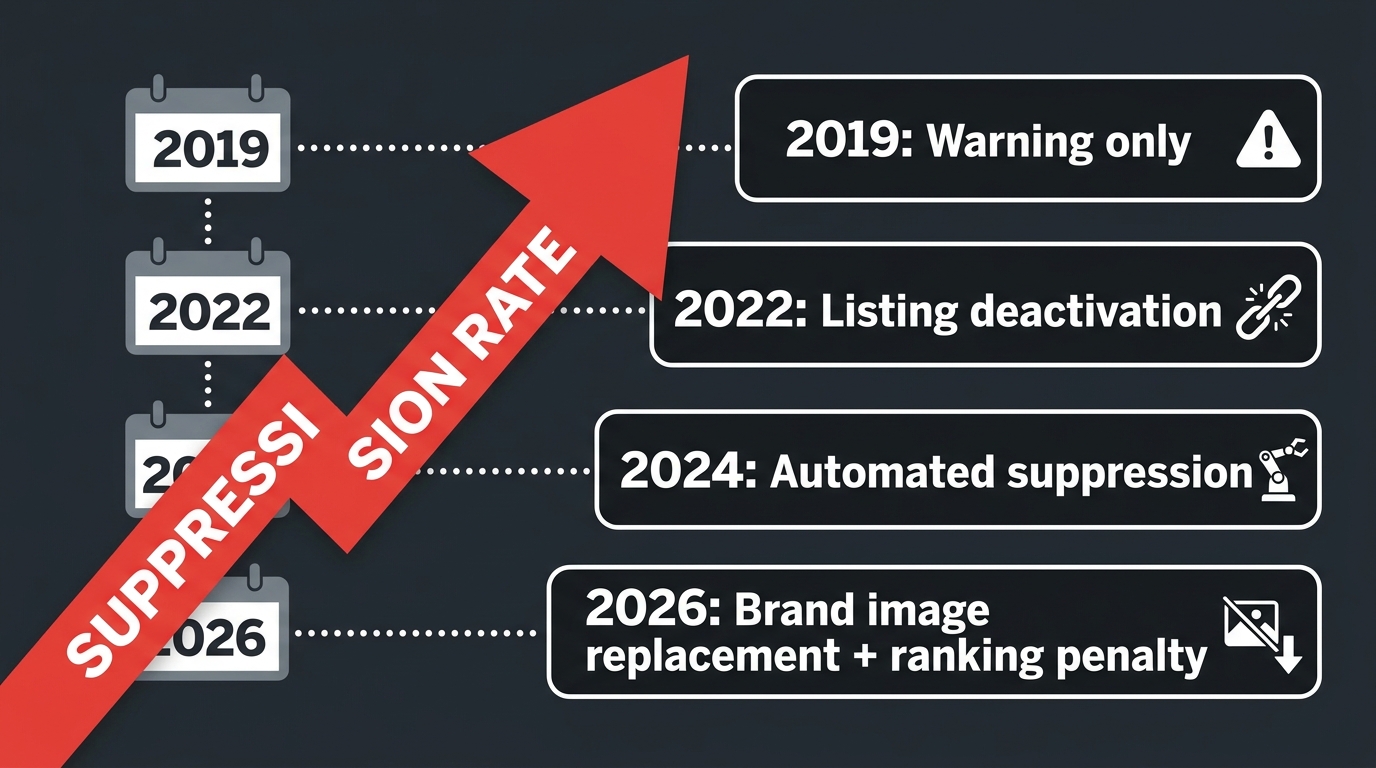
To understand where Amazon image policy is in 2026, you have to understand where it was five years ago. Through most of 2019–2022, Amazon’s image guidelines functioned more like style recommendations than enforceable rules. Sellers who didn’t meet the white-background requirement would occasionally receive an email. Listings that used obviously misleading composite photos might get flagged through manual review. But the enforcement mechanism was slow, inconsistent, and largely reactive — triggered by complaints rather than automated crawls.
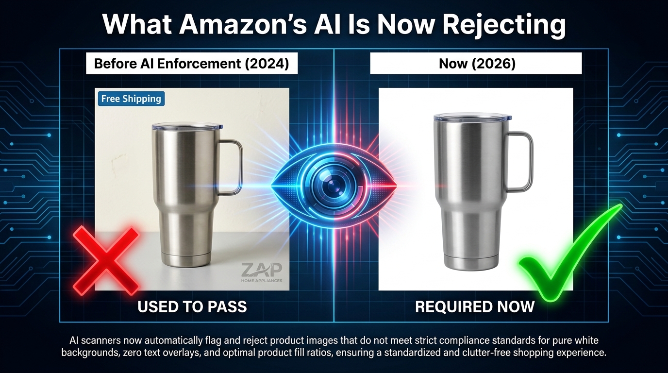
That changed as Amazon invested heavily in automated listing quality systems. By 2024, machine-scored visual checks were flagging non-compliant images at scale. By Spring 2026, enforcement had shifted again — from flagging to acting.
What “Active Enforcement” Now Looks Like
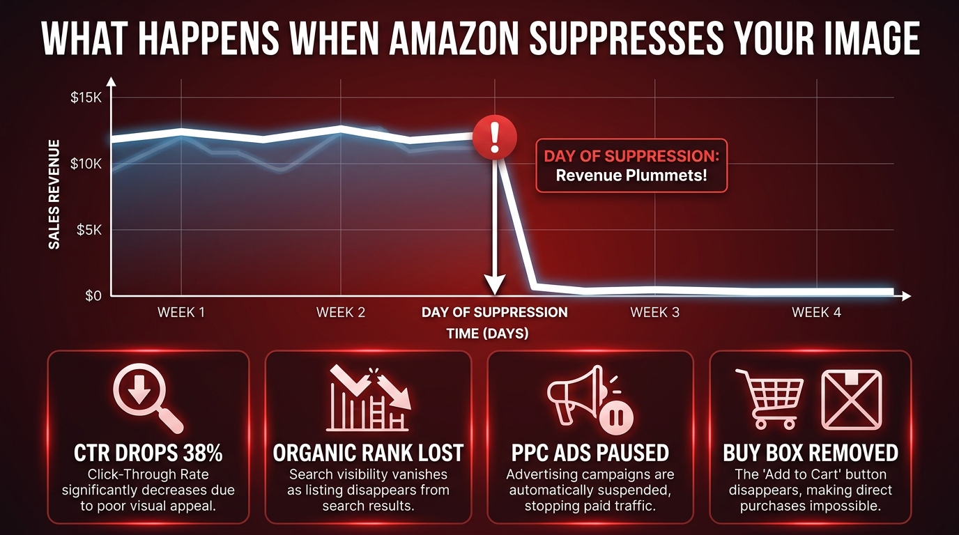
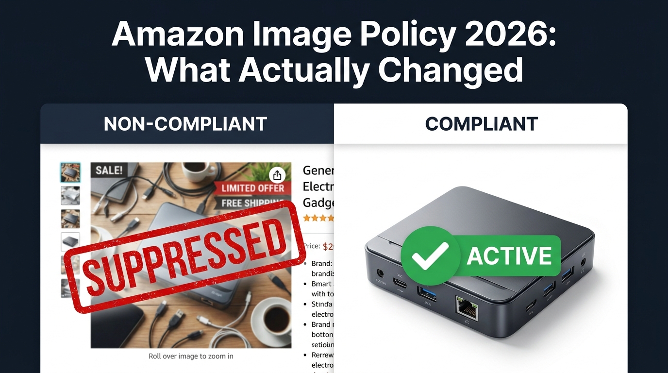
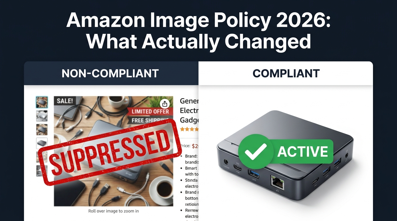
The current enforcement framework operates across several escalating tiers. A first-tier violation — say, a main image where the product fills only 70% of the frame instead of the required 85% — may result in a listing quality warning and reduced visibility in search. A second-tier violation, such as a main image with a colored background or watermarks, now more reliably triggers automatic listing suppression, pulling the ASIN from search results until the image is corrected and re-indexed.
The third tier is where 2026 has genuinely moved the goalposts: Amazon can now replace your non-compliant or lower-quality main image with an image from another seller’s contribution to the same ASIN’s catalog. This applies even to brand-registered sellers if another contributor’s image is deemed more compliant or higher quality. The implications of this are significant — and we’ll examine them in detail when we get to the brand-vs-reseller dynamic.
The Re-Indexing Penalty Is the Hidden Cost
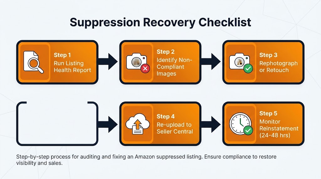
Suppression is visible. Re-indexing delay is not — but it’s arguably the more damaging consequence for competitive listings. When a non-compliant image is fixed and a listing is reinstated, Amazon does not immediately return it to its previous search position. The re-indexing process can take anywhere from a few hours to several days, and during that window, the listing’s organic ranking signals decay. For high-velocity SKUs during peak demand periods, even a 48-hour visibility gap can translate directly into lost Best Seller Rank, reduced review velocity, and reduced ad efficiency as historical conversion data is disrupted.
Repeat violations add an additional layer of risk: sellers who accumulate multiple image-related listing suppressions now face account-level risk flags, which can affect Account Health Rating scores, Best Seller badge eligibility, and in the most severe cases, broader suspension review.
The Speed of the New Automated System
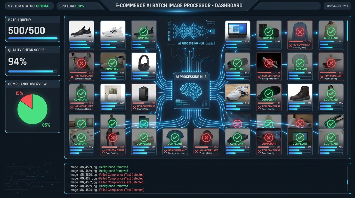
Perhaps the most practically important change for sellers managing large catalogs is the speed of enforcement. Under the old system, a non-compliant image might persist undetected for weeks. Under the current automated scanning infrastructure, violations are typically detected within 24–72 hours of upload. For sellers managing hundreds or thousands of ASINs, this changes the risk calculus entirely — a bulk image upload that goes wrong can suppress dozens of listings simultaneously before a human has had a chance to review the output.
The Resolution Ratchet — Why 1,600×1,600px Is the New Floor
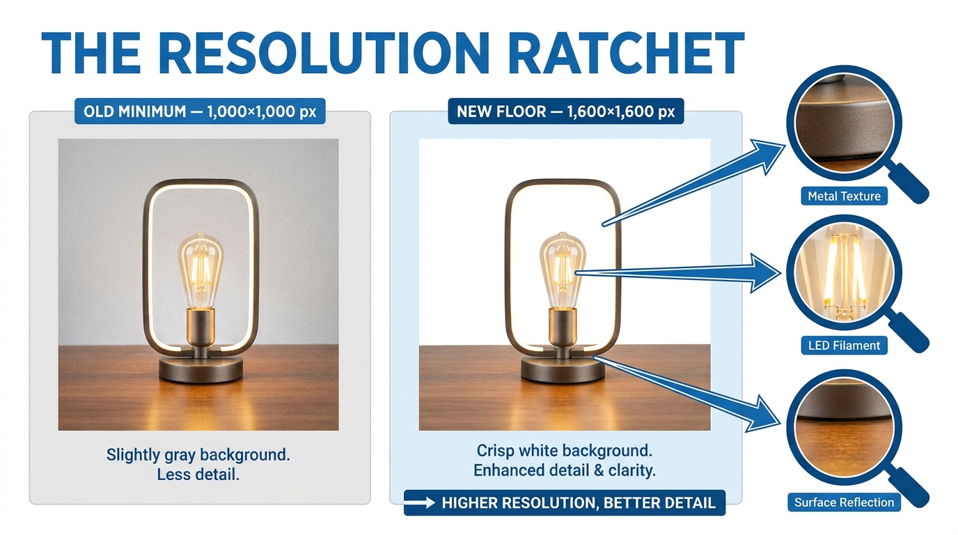
The most concrete technical change to image policy in 2026 is the effective raising of the minimum resolution threshold. Amazon’s legacy guidance — the 1,000-pixel minimum on the longest side — was set in an era where desktop browsing dominated and smartphone screens were significantly lower resolution than they are today. In practice, many sellers shot at exactly 1,000×1,000px, or just slightly above, treating the stated minimum as a target rather than a floor.
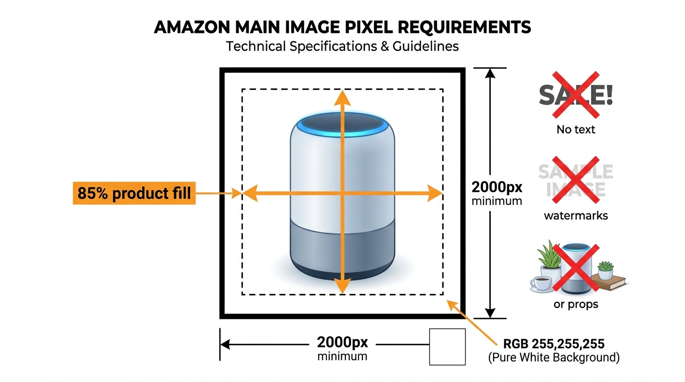
Current guidance, reflected in updated Seller Central documentation and widely reported by compliance-focused agencies in early 2026, now effectively treats 1,600×1,600 pixels as the functional minimum for images to avoid quality degradation flags and to maintain full zoom functionality. The official recommended size of 2,000 pixels or more on the longest side has not changed, but the zone between 1,000px and 1,600px — previously acceptable — now presents meaningful compliance risk.
Why Zoom Capability Is a Business Metric, Not a Technical Detail
Zoom capability matters more than most sellers realize. Amazon’s zoom feature activates only when an image’s longest side exceeds 1,000 pixels — but at 1,000px, the zoomed view is noticeably pixelated on modern high-density screens. At 1,600×1,600px, zoom quality improves substantially. At 2,000px and above, it becomes a genuine purchase-confidence tool, especially in categories where product details — fabric texture, connector types, ingredient panels, stitching quality — materially influence buying decisions.
Shoppers who can’t zoom in clearly enough to verify a product detail don’t email customer service to ask. They click the back button and look at the next listing. This is a bounce that never registers as a bounce in your Seller Central data — it just shows up as a lower conversion rate that you can’t directly attribute to image resolution.
The Background Uniformity Threshold
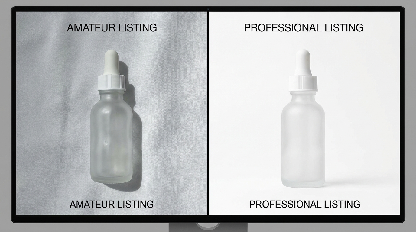
Alongside resolution, Amazon has introduced a machine-measured background uniformity standard. Main images are now algorithmically evaluated for background cleanliness, with a reported threshold requiring the background area to meet a 95% clean-white standard before passing automated checks. This means images with subtle color casts from incorrect studio lighting, slight gray tones from JPEG compression artifacts, or micro-shadows at product edges are now failing automated checks that would have passed in previous years.
This is particularly challenging for sellers who photograph products against physical white backdrops rather than using digital cutout workflows. Physical photography in consumer-grade studios regularly produces backgrounds with color temperatures that read as slightly warm or cool in automated systems — even when they look white to the human eye. The practical implication is that many sellers need to either invest in post-production workflows that guarantee true RGB 255,255,255 backgrounds, or shift to digital-first photography setups that include automated background replacement as a standard step.
The Product-to-Frame Coverage Requirement
The product-fills-85%-of-the-frame requirement has been in Amazon’s guidelines for years, but enforcement had been lax. In 2026, this is being machine-checked more reliably. Products with significant white-space padding around them — a common artifact of catalog photography shoots where images are cropped loosely for flexibility — now risk failing automated frame-coverage checks. Sellers who maintain large image libraries from older photoshoots should audit their existing assets against this requirement before automated suppression does it for them.
The Brand Owner vs. Reseller Image War — Who Controls the Detail Page Now?

Of all the shifts embedded in Amazon’s 2026 image policy evolution, the redistribution of catalog authority between brand owners and resellers may be the most commercially significant — and the least discussed. This isn’t purely a technical compliance question. It’s a fundamental restructuring of who has the right to determine what a product looks like on Amazon’s detail page.
How Brand Registry Changed the Image Equation
Amazon Brand Registry has existed since 2017, but its practical authority over image content on shared ASINs has steadily expanded. In 2026, Brand Registry enrollment gives brand owners a substantially strengthened position: Amazon explicitly ties Brand Registry to “enhanced oversight of detail page content for ASINs when Amazon recognizes you as the brand owner,” and this includes images.
In practical terms, brand-registered sellers can now contribute images to shared ASINs with a higher level of authority than resellers contributing to the same listing. When a conflict exists between a brand owner’s submitted image and a reseller’s image, Amazon’s system increasingly defaults to the brand owner’s version — regardless of when the competing image was uploaded.
Brand Catalog Lock: The Mechanism Most Sellers Haven’t Heard Of
Beyond Brand Registry’s general authority, a feature broadly referred to as Brand Catalog Lock allows brand owners to effectively freeze the content of their registered ASINs against unauthorized changes. When Catalog Lock is active, resellers who are not explicitly authorized by the brand owner cannot modify listing images, titles, or bullet points — even if they are legitimate, authorized resellers of the physical product.
This is where the commercial friction becomes significant. A reseller who has been selling a brand’s product for years, has contributed compliant, high-quality images to shared ASINs, and has no IP dispute with the brand owner can find their image contributions ignored or overridden by the brand’s catalog lock. The reseller’s right to sell the product is unchanged — their right to control how it looks on the product page has effectively been nullified.
Amazon’s Own Image Replacement Capability
The most aggressive mechanism in Amazon’s current toolkit is its own ability to replace images on any listing. Amazon has expanded its authority to substitute a seller’s non-compliant or lower-quality image with images from other contributors — or, in some reported cases, with images that Amazon’s own systems source. This applies even to brand-registered sellers if their images fail automated quality checks while another contributor to the same ASIN has passing images on file.
The specific categories where this image replacement is most actively occurring include electronics, clothing, furniture, supplements, and cosmetics — precisely the categories with the highest competitive density and the highest volume of multi-seller shared ASINs. For brands that have invested in professional photography as a core brand asset, discovering that Amazon has replaced your main image with a competitor-sourced photo of the same product is not a minor inconvenience. It’s a brand integrity issue that requires active catalog monitoring to catch.
What This Means for Reseller Business Models
For pure reseller businesses — sellers who stock and sell other brands’ products without being the brand owner — the 2026 landscape represents a material tightening of operational constraints. Strategies that relied on uploading differentiated or higher-quality images to boost conversion on shared ASINs are no longer reliably available when the brand owner has Brand Registry enrollment and catalog authority active.
The practical response for resellers in this environment involves prioritizing unregistered brands where catalog authority is not locked, pursuing authorized reseller agreements that include explicit image contribution rights, and shifting competitive strategy toward dimensions that brand catalog lock cannot touch — pricing, fulfillment, review management, and advertising.
AI-Generated Images and the New Disclosure Requirement
The use of AI tools in product photography workflows has exploded over the past two years. Background removal and replacement tools, AI-powered upscalers, generative fill for context and lifestyle settings, and fully AI-generated product composites have all become standard parts of many sellers’ image production processes. For a while, Amazon had no specific rules about any of this — the image just needed to meet the technical requirements. That has now changed.
What the Disclosure Requirement Actually Covers
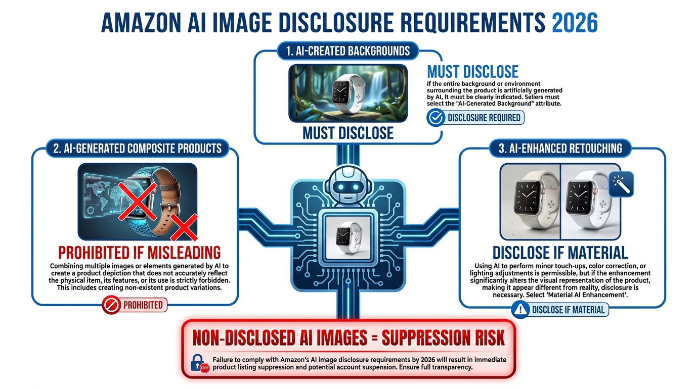
Amazon’s 2026 guidance introduces an AI disclosure requirement for product images and listing content where AI was used to create or significantly modify the image. This applies to several distinct scenarios:
- AI-created backgrounds: If you used a generative AI tool to replace the background of your product photo — even with a clean white background — this technically falls under the disclosure requirement if the background was generated rather than photographed.
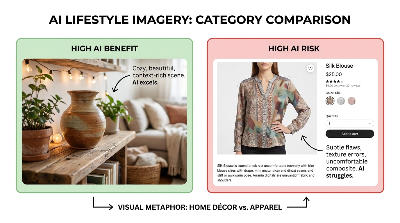
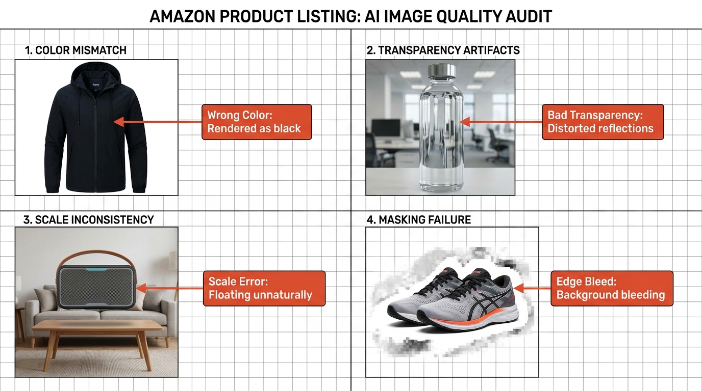
- AI-generated product composites: Images where the product itself or its key visual attributes were materially altered or generated by AI are prohibited if they misrepresent the physical product. A supplement bottle with a label that looks slightly different in the AI-generated image than it does in real life, or a furniture piece where AI has smoothed out a visible seam, crosses the line from retouching into misrepresentation.
- AI-enhanced retouching: Significant AI-driven enhancements — not basic color correction, but structural modifications to the product’s appearance — require disclosure when they create a materially different impression of the product.
How Enforcement Is Playing Out in Practice
In practice, Amazon’s enforcement of AI disclosure is still evolving. The clearest enforcement pressure is arriving around peak shopping periods — Prime Day being the most prominent example — when Amazon’s automated systems run more aggressive compliance sweeps. Listings with images that fail provenance checks or that have been flagged by algorithmic signals as likely AI-generated without disclosure face suppression risk particularly during these high-stakes windows.
The more nuanced reality is that Amazon’s systems aren’t yet capable of detecting every AI-generated image with perfect accuracy. What they can detect is a set of hallmark patterns: impossibly perfect shadows, textures that don’t match real-world material properties, background gradients that no physical photography setup would produce. These detection capabilities will improve. Sellers who are building AI into their image workflows now need to treat disclosure as a permanent part of the process, not a temporary hurdle to work around.
The Legitimate Use Case for AI in Amazon Images
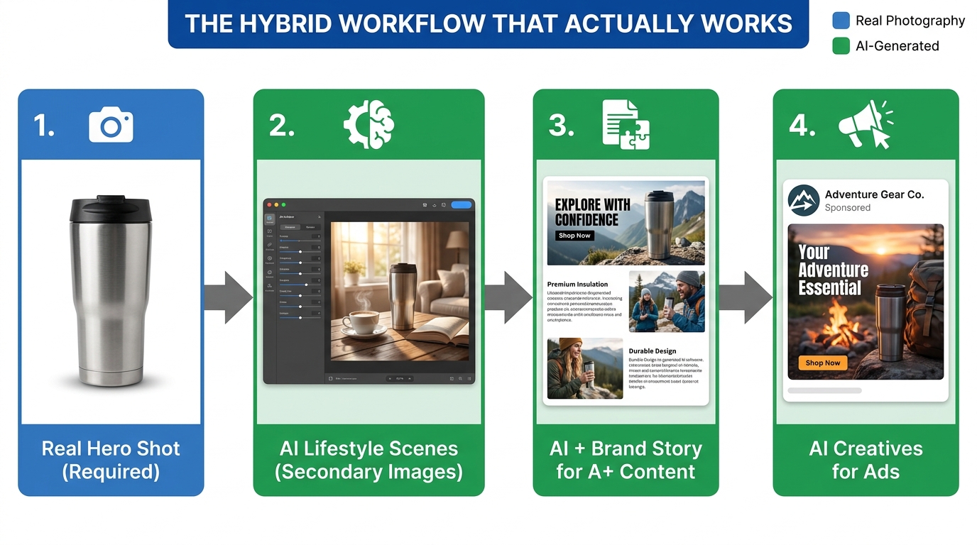
It’s important to note that Amazon is not banning AI from product image workflows. The requirement is disclosure and accuracy, not prohibition. AI tools that genuinely improve image quality without misrepresenting the product — high-quality upscaling, background cleanup to achieve the 255,255,255 white standard, intelligent cropping to meet the 85% frame coverage requirement — remain legitimate tools when used transparently and disclosed appropriately.
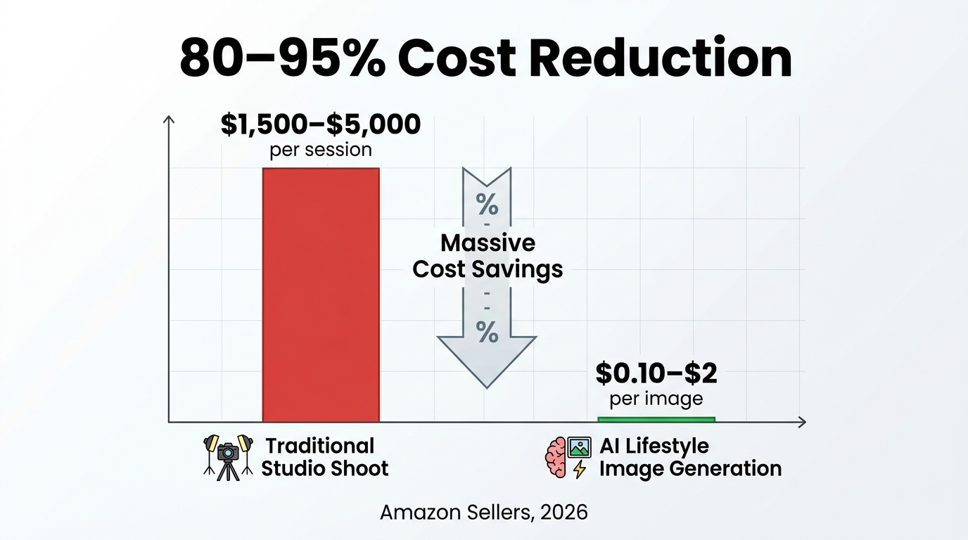
The commercial opportunity here is real. Sellers who build compliant AI-assisted image workflows that meet disclosure requirements while producing superior image quality will have a production-speed and cost-structure advantage over those relying entirely on traditional studio photography. The constraint isn’t AI use — it’s undisclosed AI use that produces inaccurate product representations.
Category-by-Category: What Changed for Apparel, Beauty, and Electronics
While the broad technical requirements and enforcement escalation apply across all categories, three categories have received specific updated guidance in 2026 that goes beyond the baseline. If you’re selling in apparel, beauty, or electronics, the category-specific requirements represent the most material policy change to your image strategy.
Apparel: Model Requirements, Ghost Mannequin, and Size Accuracy
Apparel has long had the most complex image requirements on Amazon, and 2026 has added specificity to several existing rules. On live models, the guidance tightens expectations around how size and fit are represented: model measurements must be disclosed in a standardized way, and images where styling choices — heavy tucking, pinning, or model posture — significantly misrepresent how a garment fits on a real body are now treated as accuracy violations, not just styling choices.
Ghost mannequin images — product shots where the mannequin is digitally removed — remain permitted but now need to meet stricter standards for completeness and shape accuracy. An AI-generated ghost mannequin composite that flattens or idealizes the garment’s actual drape in ways that don’t reflect real-world wear is increasingly treated as a misleading representation. For apparel sellers using AI-powered ghost mannequin services, a review of outputs against the 2026 accuracy standards is warranted.
Beauty: Ingredient Claims, Before/After, and Skin Tone Representation
Beauty category images in 2026 are subject to tightened rules on three fronts. First, any image that visually implies a specific ingredient claim — showing an ingredient label highlighted in a way that draws attention to a benefit claim — now needs to align precisely with claims that are verifiable and compliant under Amazon’s substantiation requirements. Images and copy claims are being evaluated as a combined unit for consistency.
Second, before-and-after style images — long a staple of skincare and cosmetics listings — face significantly stricter guidelines. Images that imply dramatic, visually demonstrable results from a product are subject to the same substantiation requirements as text claims, and digitally enhanced “after” states in composite images are treated as misrepresentation.
Third, Amazon has introduced guidance on skin tone representation in beauty images, requiring that lifestyle and model images across beauty categories represent a diverse range of skin tones. While this is framed as a quality guideline rather than a hard compliance requirement, listings where all model images use a single skin tone are receiving lower Listing Quality Scores — which has downstream implications for both organic visibility and advertising efficiency.
Electronics: Multi-Angle Requirements, Port Accuracy, and Technical Spec Callouts
Electronics listings in 2026 face tighter expectations around the completeness and accuracy of product angles. Where a consumer electronics product has ports, connectors, or physical controls that materially affect purchase decisions, Amazon’s updated guidance expects these to be visually represented in the image gallery. A wireless speaker listing where no image clearly shows the charging port type or button placement is now more likely to receive a listing quality flag than it would have under previous guidelines.
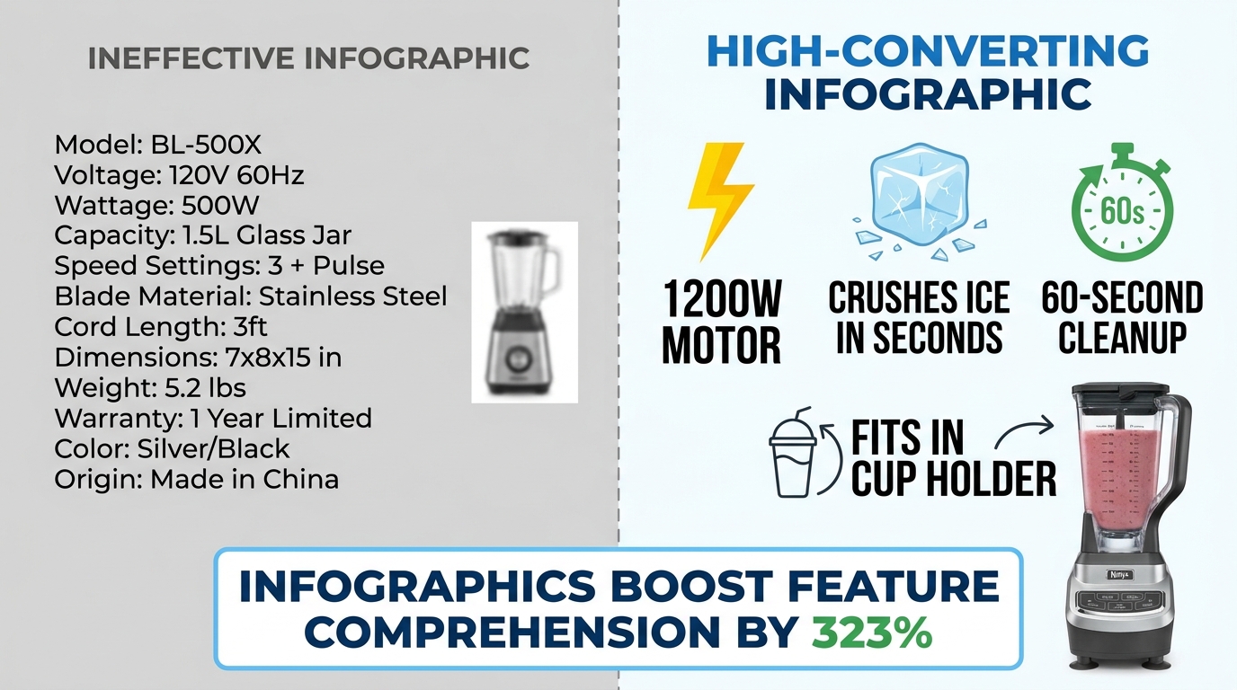
Technical specification callouts in secondary images — a common infographic convention in electronics — are now being checked for alignment with listing specifications. An image that shows “USB-C charging” when the product uses Micro-USB, or that displays a battery life graphic that doesn’t match the listed technical specifications, is treated as a misrepresentation violation rather than a minor inconsistency.
Amazon’s Mobile-Visual Turn and What It Demands from Your Image Stack

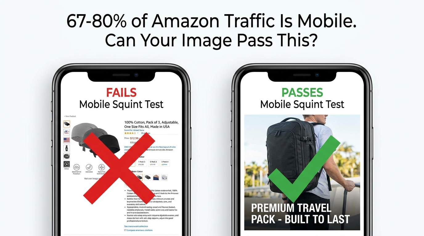
Amazon’s platform has gone mobile-first not by announcement, but by mathematics. Current estimates put more than 70% of Amazon browsing happening on mobile devices, and the shopping app’s visual interface has been redesigned repeatedly to put images — not text — at the center of the discovery experience. This shift has compounding effects on what a high-performing image stack actually needs to do.
The Thumbnail Decision: Your Main Image as a 150-Pixel Ad
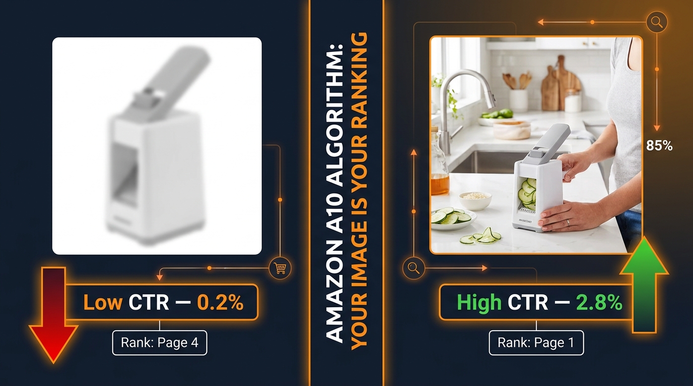
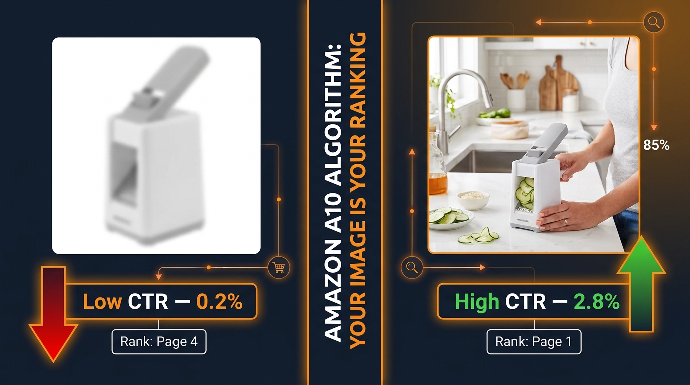
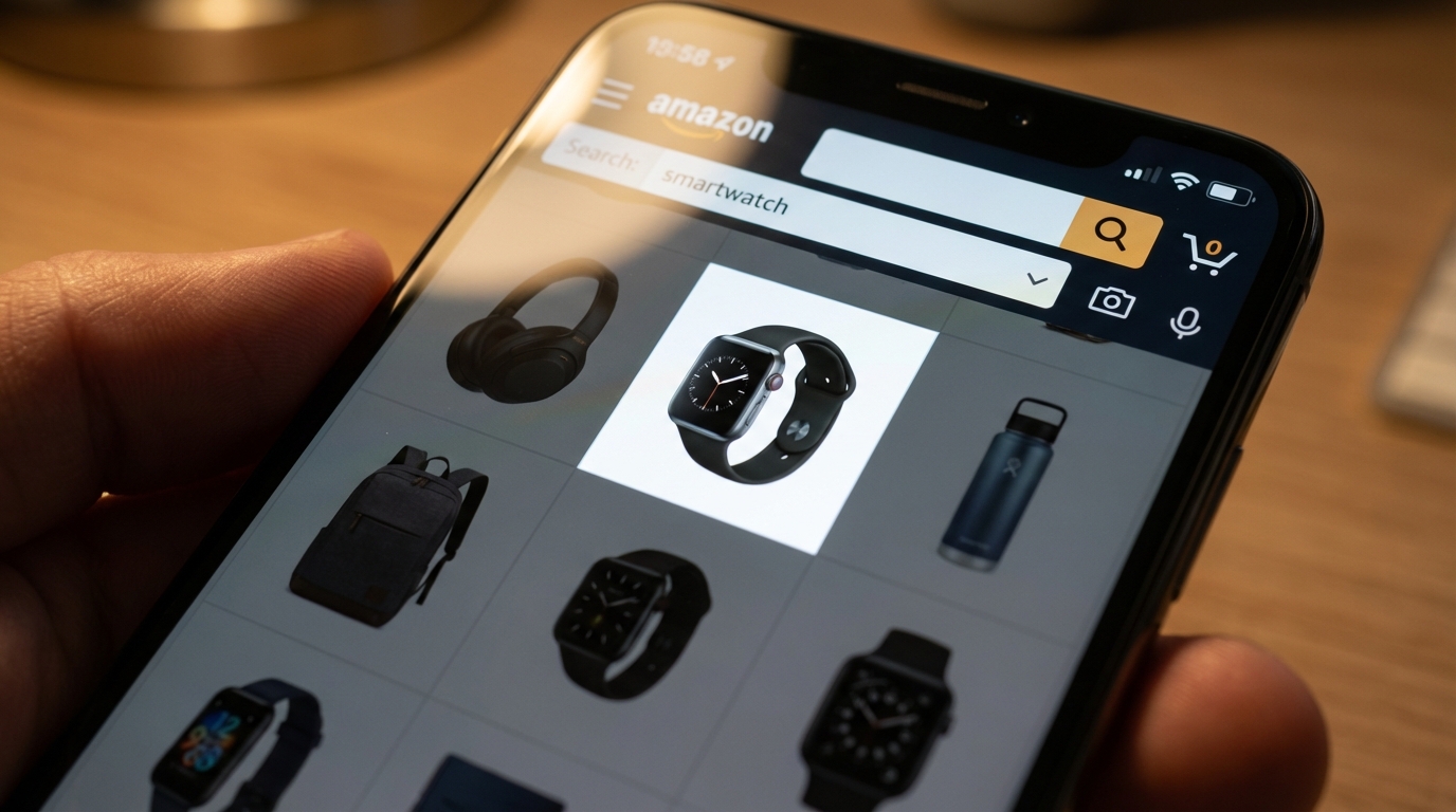
On mobile search results, your main image renders as a thumbnail at roughly 150–200 pixels. At that scale, fine detail disappears. Text overlays become unreadable. Products with busy backgrounds blend into each other. The competitive implication is that your main image needs to work as a standalone communication tool at tiny scale — the product must be immediately recognizable, the value proposition must be implied by the visual composition, and the image must stand out against the surrounding listing grid.
This is a fundamentally different design brief than optimizing for the desktop product detail page, where the main image renders at 500px or more and supports zoom. Sellers who are optimizing their main images purely for the desktop detail page view are likely underperforming on mobile search, where most of their impression volume actually lives.
Amazon Lens and Visual Search: A New Discovery Surface
Amazon’s visual search capability — Amazon Lens — has become a material discovery surface in 2026. Visual searches on Amazon grew approximately 70% year-over-year according to Amazon’s own reported data, driven primarily by the Lens camera feature in the Amazon Shopping app and the “More like this” feature in search results. Younger shoppers in particular are using visual search as an entry point to product discovery rather than keyword search.
For image optimization, this creates a new set of questions. Visual search systems match product images against query images using image embedding similarity — which means your product’s visual identity in its main image needs to closely match the visual appearance of the actual product in real-world contexts where someone might photograph it. A highly stylized, cropped, or heavily retouched main image that doesn’t look like the product “in the wild” may perform well in keyword search but underperform in visual search matching.
Portrait Ratio and the Scroll Behavior Shift
While Amazon’s current image specifications still default to a square format for main images, there is growing evidence in third-party research and agency testing that portrait-ratio images — taller than wide — perform better on mobile browse pages where vertical scrolling dominates. Amazon has not officially endorsed portrait ratios for main images, but sellers in fashion, home goods, and cosmetics categories who have tested portrait-ratio main images in Manage Experiments report meaningful lift in click-through rate on mobile, where portrait images claim more vertical screen space in the search grid.
This is an area where Amazon’s official guidance and observed conversion behavior diverge — which puts sellers in the position of choosing between strict policy compliance and potential click-through optimization. The prudent approach is to test within the bounds of Amazon’s stated specifications first, using Manage Experiments to generate actual data before assuming any format change is net positive for your specific category and customer base.
A+ Content, Premium A+, and Video — Where the Real Image Battleground Is
Much of the compliance discussion in 2026 focuses on main images and gallery slots, which makes sense because those are where suppression risk lives. But the more commercially interesting question for many established brands isn’t compliance — it’s differentiation. And the differentiation battleground has shifted decisively toward A+ Content, Premium A+, and product video.
A+ Content: Still the Baseline, Not the Differentiator
Standard A+ Content — available to all Brand Registry-enrolled sellers at no additional cost — has become so widely adopted that it functions more as a minimum viable listing requirement than a differentiation tool. Most competitive categories now have the majority of top-10 listings featuring A+ content. A listing without A+ in these categories is immediately visually inferior to its neighbors regardless of how strong its gallery images are. Standard A+ is table stakes; it’s no longer a source of competitive advantage.
Within standard A+ though, image quality matters considerably more than most sellers recognize. Amazon’s A+ image specifications require files under 2MB in JPEG or PNG format with RGB color profiles. The module designs within A+ vary in how much visual space they give to photography, and the most conversion-effective A+ layouts are those that pair high-quality, purpose-shot photography with clean, legible text modules that tell a coherent product story rather than just restating bullet points in graphic form.
Premium A+: The Gap Between Eligible and Using It Well
Premium A+ is available to Brand Registry sellers who meet Amazon’s eligibility thresholds, and it includes capabilities that standard A+ doesn’t: interactive hotspot modules, enhanced comparison charts, full-width image backgrounds, and embedded video. The conversion lift data from Premium A+ versus standard A+ is material — Amazon’s own internal estimates have cited conversion rate improvements of up to 20% for well-executed Premium A+ versus standard A+ in comparable categories.
The challenge is that many brands who have access to Premium A+ are either not using it or not using it effectively. Interactive hotspot modules require product images where specific features can be meaningfully highlighted — which is a different photography brief than standard gallery shots. Full-width backgrounds require images that work compositionally at 1464×600 pixel banner dimensions — another entirely different brief. Brands treating Premium A+ as a simple upgrade from standard A+ by just stretching the same assets into the new modules are capturing a fraction of the available conversion uplift.
Product Video: The Engagement Asset That Most Listings Still Don’t Have
Product video on Amazon detail pages remains dramatically underutilized relative to its conversion impact. Studies and agency reports consistently show that listings with product video — whether in the main image gallery slot or embedded in A+ content — see meaningfully higher engagement time and add-to-cart rates, particularly for products with a use-case or assembly component that static images don’t communicate well.
The practical barrier to product video has historically been production cost. This barrier has largely dissolved. High-quality product videos can now be produced with smartphone cameras, basic lighting setups, and accessible editing software at a cost that makes video economical even for single-SKU sellers. The competitive implication is that in 2026, not having product video is increasingly an active disadvantage rather than a neutral omission.
Amazon’s specifications for product video in listings — no more than 500MB file size, acceptable formats including MP4 and MOV, minimum 1280×720 resolution — have not changed significantly, but enforcement of video content accuracy is tightening in parallel with image enforcement. Product demonstration videos that show capabilities the product doesn’t actually have, or that misrepresent assembly complexity, are now treated with the same scrutiny as misleading product images.
Building a Compliant, High-Converting Image Stack in 2026
Compliance and conversion are not opposing forces. The image requirements that Amazon is enforcing in 2026 are, by and large, the same requirements that produce better shopper experiences and higher conversion rates. The seller who treats compliance as a minimum threshold and then builds a genuinely strong image set above that threshold is simultaneously reducing suppression risk and improving commercial performance.
The Image Slot-by-Slot Brief
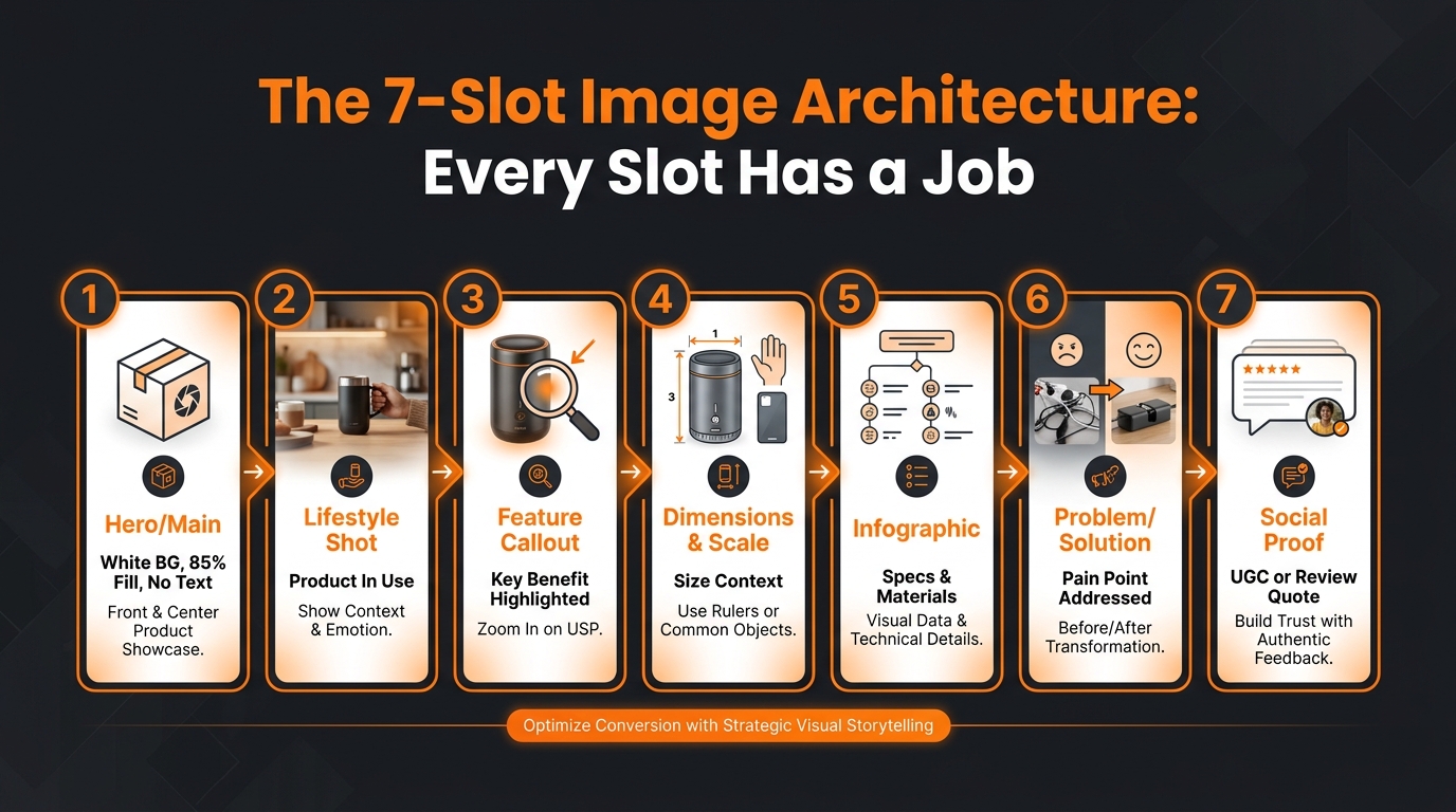
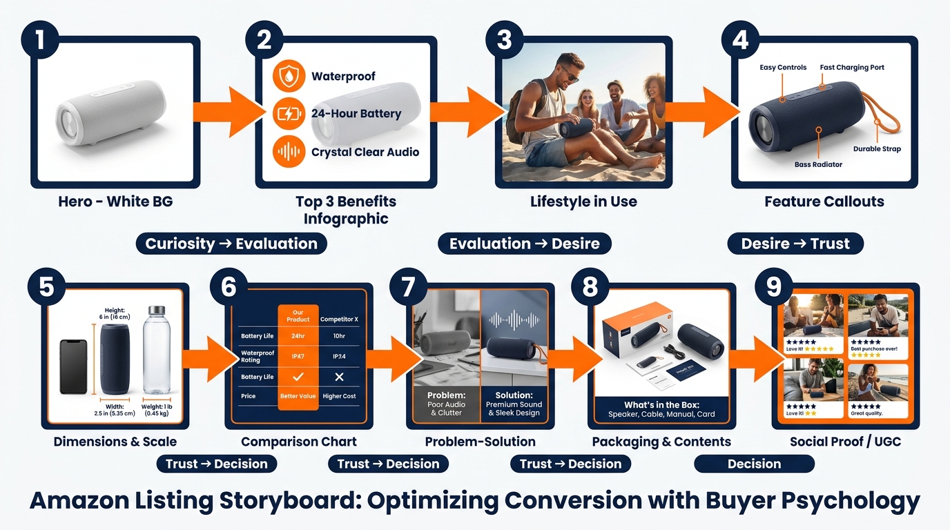
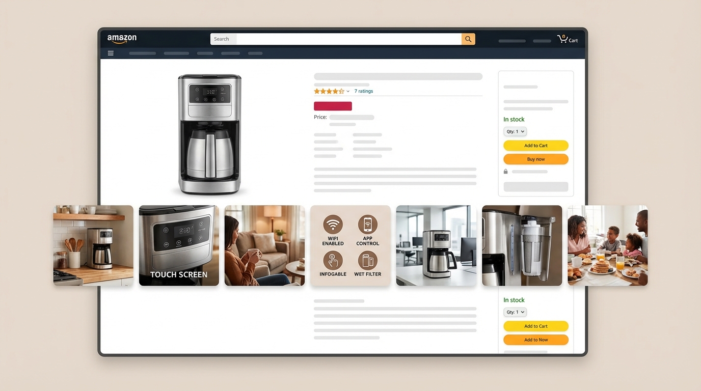
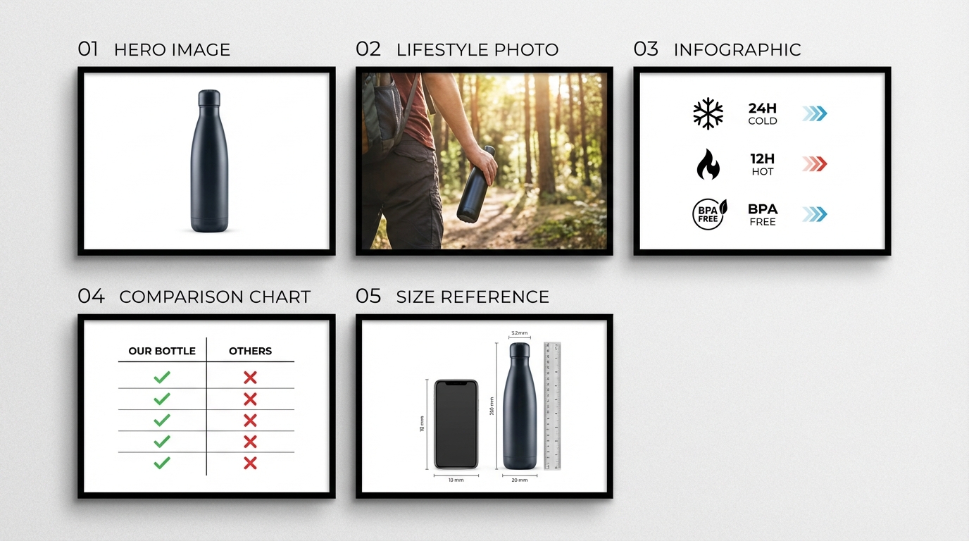
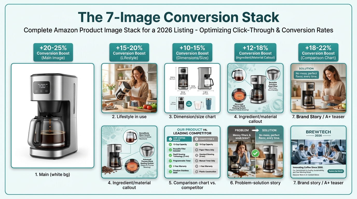
A complete, high-performing Amazon image set in 2026 typically occupies all available image slots — currently up to 9 in most categories. Each slot should have a specific job:
- Slot 1 (Main image): Compliant, pure white background, product fills 85%+ of frame, 1,600px minimum on longest side, no text or badges, immediately readable as a thumbnail at 150px. This image’s only job is to win the click from search results.
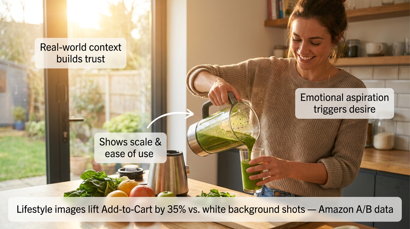
- Slot 2 (Lifestyle/in-use): Product shown in its real-world context, with a person or environment that reflects your actual customer. This image converts browsers who need to visualize the product in their life before committing.
- Slot 3 (Scale/dimensions): A size reference image that eliminates the “how big is this actually?” question. Surprisingly few sellers use this slot effectively despite it being one of the highest-rated trust signals in buyer research.
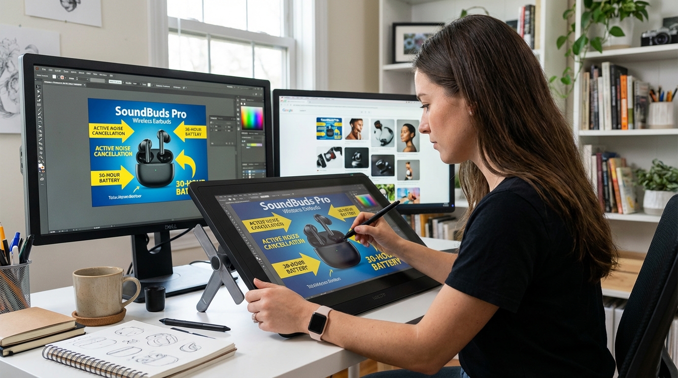
- Slot 4 (Feature callouts/infographic): Your key product benefits visualized, not just listed. Text at this stage is fine in secondary images — just ensure it’s legible at mobile zoom levels and accurate to listed specifications.
- Slot 5 (Ingredient/material detail): Close-up of the product texture, material quality, or construction detail. This is your proof-of-quality image, converting shoppers who are skeptical about physical quality from a photo.
- Slot 6 (Comparison or differentiation): A structured comparison — ideally against a generic alternative or against the problem your product solves — that frames your product as the obvious choice. Keep this factually accurate to avoid compliance risk.
- Slot 7+ (Story/brand credibility): Use remaining slots for a brand narrative, packaging detail, certifications, or social proof visualization. These images don’t close the sale — they build the trust that removes the final friction.
Testing Is No Longer Optional
The expansion of Amazon’s Manage Experiments tool to a wider range of sellers means that A/B testing main images is now accessible to most brand-registered sellers. Best practices for main image testing in 2026 have become significantly more sophisticated: testing a single variable at a time (angle vs. angle, not angle vs. completely different composition), running tests for the full Amazon-recommended minimum duration of four weeks to avoid statistical noise, and reading results at the audience-segment level rather than just in aggregate.
Third-party tools like PickFu have also become mainstream components of the pre-launch image testing workflow, allowing sellers to gather consumer preference data on image options before committing to a live test. The combination of pre-launch consumer preference testing and live A/B testing through Manage Experiments gives sellers a much more reliable signal on image performance than the historical practice of choosing images based on internal creative preference.
The Audit You Should Run Before Prime Day
Given the documented pattern of Amazon running more aggressive compliance sweeps around peak shopping events, an image audit of your full catalog ahead of Prime Day and Q4 peak season should be standard operating procedure. A practical audit checklist for 2026 includes:
- Resolution check: every main image at 1,600px minimum on longest side.
- Background check: main images reviewed against RGB 255,255,255 standard, not just by eye.
- Frame coverage: product occupies at least 85% of frame in main image.
- Text/watermark scan: no text, logos, or badges visible in main images.
- AI disclosure status: any AI-assisted images flagged and disclosure requirements reviewed.
- Category-specific compliance: apparel model requirements, beauty claim alignment, electronics spec accuracy.
- Image slot completion: all available image slots populated.
The Compliance Risk You Probably Haven’t Modeled Yet
Most sellers have thought about image compliance in terms of individual ASINs: does this listing have compliant images or not? The risk model that most sellers have not built is a catalog-level, financial-impact model that quantifies what coordinated image suppression across multiple ASINs in a peak trading window actually costs.
Modeling the True Cost of Suppression Events
Consider a seller with 200 active ASINs, where roughly 20% have images that are borderline on resolution or background uniformity — a realistic proportion based on industry audit data. If a compliance sweep suppresses 40 ASINs for 72 hours during a peak period, the revenue impact is not just 72 hours of zero sales on those ASINs. It includes the re-indexing decay period that follows reinstatement, the advertising budget waste on suppressed listings where ads continue to accrue impressions with no conversion, the potential BSR decay that affects organic ranking for weeks after the suppression event, and the customer trust signal damage for any buyers who encountered a suppressed or degraded listing during their purchase journey.
When modeled honestly, the cost of a coordinated suppression event during a peak period for a mid-size Amazon business can easily exceed $50,000–$200,000 in lost revenue equivalent — far more than the cost of a proactive image audit and remediation program.
The Account Health Dimension
Account Health Rating — the score Amazon uses to assess a seller’s overall compliance standing and eligibility for programs like Seller Fulfilled Prime, Sponsored Brands, and certain promotional placements — is increasingly sensitive to image-related violations. Sellers whose Account Health Rating degrades due to repeated image suppression events may find themselves ineligible for programs they’ve been using without issue for years. The relationship between image compliance and account-level program eligibility is not well-documented by Amazon but is increasingly reported by sellers navigating the 2026 enforcement environment.
Building Compliance Into the Workflow, Not the Audit
The most effective response to the 2026 compliance environment isn’t more frequent audits — it’s integrating compliance checks into the image production workflow so that non-compliant images are caught before upload rather than after suppression. This means:
- Production-stage validation: Adding automated resolution and background checks to image production workflows before assets are uploaded to Seller Central.
- Upload-stage review: Using third-party Seller Central integrations or internal QA processes that flag images before they go live.
- Monitoring-stage alerts: Implementing listing health monitoring that flags suppression events immediately — many sellers discover suppressed listings only when they notice a revenue drop in their dashboard, by which point the re-indexing damage has already begun.
Where Amazon’s Image Policy Is Heading — and How to Stay Ahead
Amazon’s image policy evolution in 2026 is not an endpoint. It’s a waypoint in a longer structural shift toward platform-enforced visual quality standards, brand-owner catalog authority, and AI-integrated image verification. Understanding the direction of travel matters as much as understanding the current rules.
The Image Policy Trends Worth Watching
Several trends in the current environment point toward where policy is likely to go over the next 12–24 months. First, the AI disclosure requirement will almost certainly become more standardized and machine-enforceable. Right now, disclosure is primarily a self-certification process. As Amazon’s image analysis capabilities improve, detection of undisclosed AI modification will become more automated, and the penalties for non-disclosure will likely become more severe.
Second, the brand-owner image authority trajectory is toward even greater control, not less. Brand Catalog Lock, Brand Registry’s expanding suite of catalog protection tools, and Amazon’s own image replacement capabilities are all moving in the same direction: toward a catalog where brand owners have near-complete authority over how their products are presented, and where resellers who want to influence presentation need explicit brand authorization to do so.
Third, the minimum technical bar will continue to rise. The shift from 1,000px to 1,600px as the effective minimum is not a one-time adjustment — it reflects a platform responding to higher-resolution device screens and more sophisticated shopper expectations. As 4K and OLED displays become standard even in mid-range smartphones, the resolution and color accuracy requirements for images that look “good” will continue to increase.
The Strategic Position to Build Now
Sellers who navigate the 2026 image policy environment most effectively will share a set of operating characteristics: they treat image assets as strategic investments with trackable ROI, not production costs to minimize; they maintain compliant, complete image sets across their full catalog as a baseline, not just for top sellers; they have monitoring systems that detect suppression events within hours rather than days; and they are building AI-assisted image workflows that are compliant by design, with disclosure practices baked in from the start.
The broader implication is that visual presentation on Amazon is no longer a creative function operating separately from the commercial strategy. Image quality, compliance, and catalog control are now directly connected to organic visibility, advertising efficiency, account health, and revenue protection. In 2026, the sellers who treat their image stack with the same rigor they apply to pricing strategy, inventory management, and PPC structure will be the ones whose catalogs hold up when the next compliance sweep runs.
Actionable Takeaways
- Audit your entire catalog for resolution and background compliance before the next peak shopping window. Don’t rely on images that were compliant under 2019 standards — re-evaluate against 2026 thresholds.
- If you are a brand owner with Brand Registry enrollment, activate catalog content controls proactively rather than reactively. The tools exist — using them prevents unauthorized image changes before they happen.
- If you are a reseller, re-evaluate your image contribution strategy on brand-registered ASINs and redirect creative investment toward listings where you have real catalog authority.
- Review your AI image production workflow against Amazon’s disclosure requirements. Build disclosure practices into your process now, before enforcement tightens further.
- Implement listing health monitoring that alerts you to suppression events in real time, not retroactively.
- Treat A+ Content and product video as baseline requirements, not optional upgrades. In competitive categories, listings without these assets are already at a structural disadvantage.
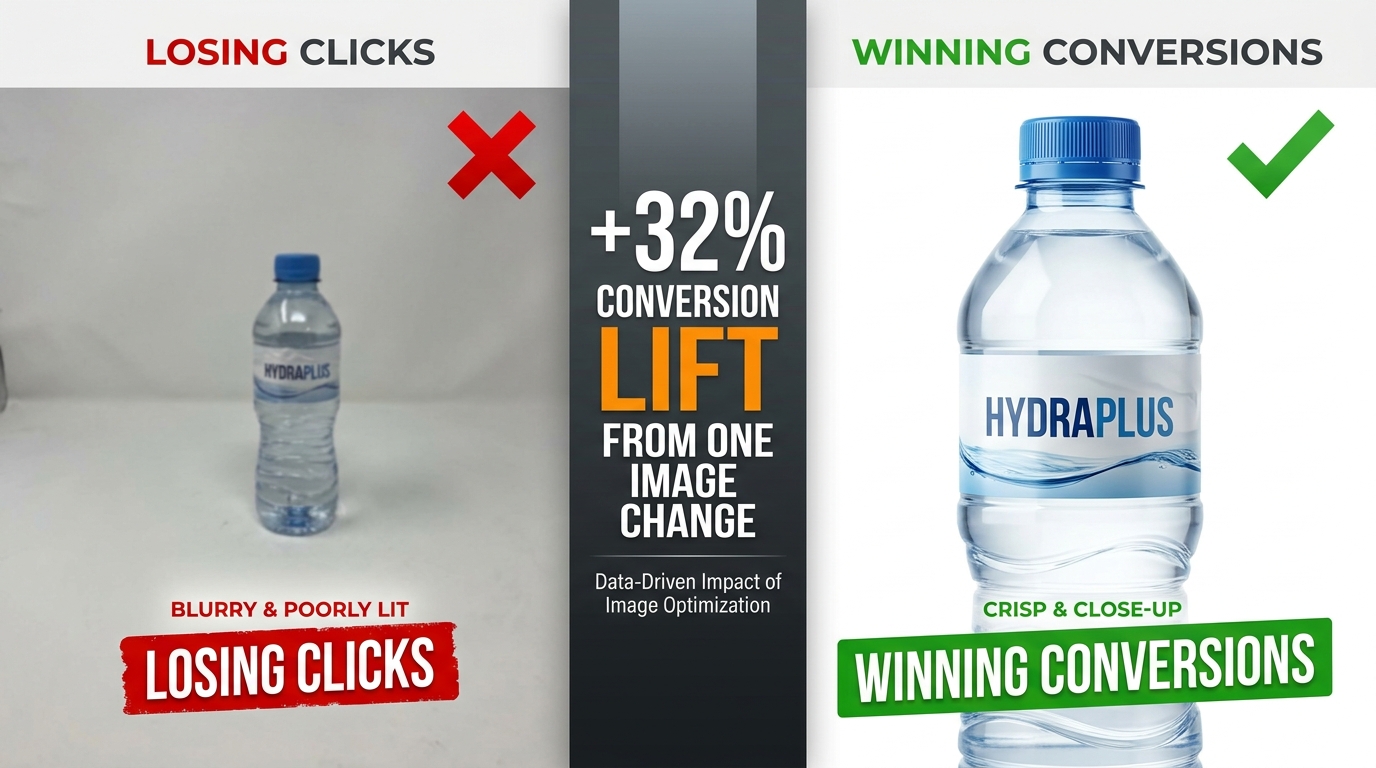
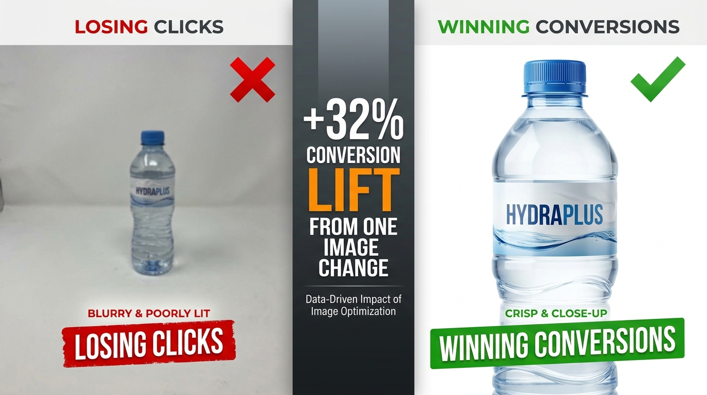
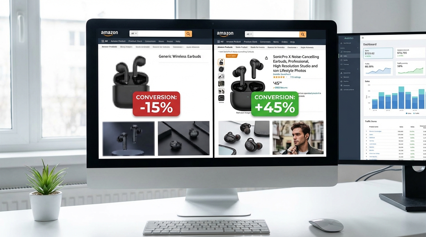
- Test your main image using both pre-launch consumer preference tools and Amazon Manage Experiments. The difference between the right and wrong main image can be a 15–25% difference in click-through rate — a gap that compounds across your advertising spend and organic impressions.
Amazon’s image policy shifts are not, at their core, about compliance for compliance’s sake. They reflect a platform moving toward higher-quality visual commerce — one where the detail page experience reliably matches the physical product, where brand owners control their brand presentation, and where AI tools are used transparently rather than covertly. The sellers who align with that direction, rather than working against it, will find the 2026 environment far less threatening than it appears in a suppression notification email.