
Tag: Conversion Rate Optimization

  • AR Features in Amazon Listings: The Seller’s Practical Guide to 3D Models, Virtual Try-On, and What It Actually Does to Your Conversion Rate

    AR Features in Amazon Listings: The Seller’s Practical Guide to 3D Models, Virtual Try-On, and What It Actually Does to Your Conversion Rate

    A smartphone displaying an augmented reality furniture shopping experience, showing a modern sofa being virtually placed in a bright, minimalist living room through the phone's camera

    Most Amazon sellers talk about augmented reality features the same way they talked about A+ Content five years ago — as a “nice to have” that sounds impressive in a mastermind but never quite makes it onto the priority list. That’s a mistake, and increasingly a costly one.

    Amazon’s AR ecosystem has quietly grown into a multi-tool suite covering furniture, footwear, eyewear, tabletop items, and general product visualization — and the brands actively using it are seeing measurable results while their competitors are still debating whether it’s worth the effort. Across the broader e-commerce landscape, products with AR or 3D content see conversion rate lifts in the range of 15–94% depending on category and engagement level, and return rates drop by 22–40% for shoppers who interact with AR before buying.

    But the real story isn’t the headline numbers. It’s the mechanics — specifically, what Amazon’s AR tools are, which sellers can actually access them, what the technical requirements look like in practice, what it costs to get set up, and where the genuine opportunity sits right now in 2026. That’s what this guide covers.

    This isn’t an overview of what augmented reality is. It’s a working resource for brand-registered sellers who want to understand Amazon’s AR tools at the level of implementation, not concept. Whether you sell furniture, shoes, kitchen appliances, electronics, or anything in between, there’s something actionable here — starting with clearing up the common misconception that AR on Amazon is one single feature.

    What Amazon’s AR Suite Actually Looks Like — Three Distinct Tools

    The first thing to understand is that “AR on Amazon” is not one feature. It’s a suite of at least three separate tools, each targeting a different shopping context and product type. Sellers often conflate them, which leads to either chasing eligibility that doesn’t apply to their category or missing the tool that does apply.

    View in Your Room

    This is Amazon’s flagship AR placement tool. It uses your phone’s camera to overlay a to-scale, photorealistic 3D model of a product directly into your physical environment. You point the camera at a space — a corner of your living room, a desk, a kitchen counter — and the product appears in that space, sized accurately, rotatable, and movable.

    Originally launched for furniture and large home décor, Amazon has since expanded it to include tabletop items: lamps, coffee makers, small appliances, and similar products that sit on surfaces rather than floors. The update that enabled tabletop placement was significant because it extended AR viability to a much broader set of home and kitchen sellers who previously couldn’t use the feature.

    Users access it through the Amazon Shopping app (iOS and Android) by tapping the “View in Your Room” button on eligible product detail pages. They can arrange multiple products together in the same virtual space, save their room layouts for later, and add items to their cart directly from the AR view. That last point matters: the path from visual engagement to purchase is frictionless by design.

    Virtual Try-On

    This tool lets shoppers see how wearable items look on their own body before purchasing. The feature currently covers shoes, eyewear, and apparel (specifically T-shirts as of 2026). For footwear, the camera overlays the shoes on the shopper’s actual feet in real time. For eyewear, the same logic applies to the face using the front-facing camera.

    Major brands including Puma, Reebok, Adidas, New Balance, UGG, Birkenstock, and Saucony participate in the shoes program. The feature launched for footwear in June 2022 and has gradually expanded its brand roster and category coverage since. Access for smaller sellers is more restricted here than with View in 3D — Virtual Try-On appears to operate through brand partnership arrangements, particularly through Amazon Fashion, rather than a standard self-serve upload process.

    View in 3D

    This is the most widely accessible of the three. View in 3D allows shoppers to rotate, zoom, and examine a 3D model of a product directly within the product detail page — without needing to point their camera at a physical space. It’s essentially a 360-degree interactive model viewer embedded in the listing.

    For sellers, this is the most realistic entry point into AR because it’s self-serve (for brand-registered sellers), covers the broadest range of eligible categories, and works on both mobile and desktop. It doesn’t require the shopper to be in a specific environment or have their camera active. They simply interact with the model on screen.

    All three features share one underlying requirement: a high-quality 3D model in GLB or GLTF format. That’s where the practical work happens.

    The Imagination Gap: Why Visual Uncertainty Is Costing You Sales
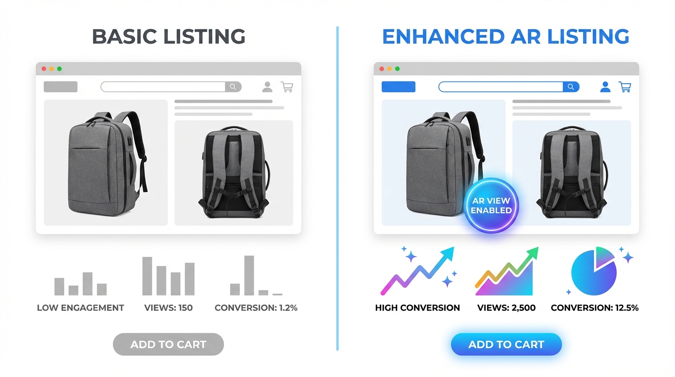
    Split-screen comparison showing two identical product listings side by side, one with basic flat photos and low engagement metrics, the other with an AR-enabled listing and high conversion charts

    There’s a concept in e-commerce called the “imagination gap” — the cognitive distance between what a shopper sees in product images and what they can realistically picture in their own home, on their own body, or in their specific context. This gap is one of the primary drivers of purchase hesitation, cart abandonment, and post-purchase returns.

    Traditional product photography, even excellent photography, only partially closes this gap. A well-lit photo of a sofa on a white background tells you what the sofa looks like. It does not tell you whether the sofa will fit between your TV stand and your window, whether the grey will clash with your existing rug, or whether the arms will clear your coffee table. Shoppers have to guess — and many of them choose not to guess at all.

    Returns as a Measure of the Imagination Gap

    Online return rates in the U.S. have become a significant cost center for e-commerce businesses. The majority of returns in categories like furniture, apparel, and home goods are driven by items that arrived looking different than expected or didn’t fit the physical space as imagined. This is the imagination gap made concrete — and returnable.

    Data from retail AR deployments consistently shows a 22–40% reduction in return rates when shoppers have used AR to preview a product before purchasing. That’s not a marginal improvement. For a seller moving $500K annually with a 12% return rate, even a 25% reduction in returns translates to meaningful cost recovery — both in direct return processing costs and in inventory condition degradation.

    Why Flat Images Reach a Ceiling

    There is a ceiling on what static photography can accomplish in closing the imagination gap. You can add lifestyle images, you can shoot from multiple angles, you can include a reference shot with a person to show scale — and all of that helps. But it still requires the shopper to mentally translate what they’re seeing to their specific context.

    AR eliminates that translation requirement. The product is literally placed into the shopper’s actual environment. The scale question is answered. The fit question is answered. The colour question — in real lighting, not studio lighting — is answered. That’s a qualitatively different experience, and the engagement metrics reflect it: shoppers who interact with AR features are converting at roughly double the rate of those who view standard listing images only.

    The Trust Signal Effect

    Beyond the practical utility, AR features carry a secondary benefit that’s harder to quantify but genuinely real: they signal confidence. A brand that offers View in Your Room for its furniture is implicitly telling the shopper, “We’re confident enough in what this looks like that we’ll let you see it in your own space before buying.” That confidence is contagious. Shoppers internalize it as a quality signal, which softens hesitation in the same way a strong return policy does — except AR reduces the need for returns in the first place.

    View in Your Room: What Sellers Need to Know Beyond the Surface

    Most coverage of View in Your Room stops at “it lets you see furniture in your room.” For sellers actually trying to get their products into this feature, the important details are more granular.

    Eligible Product Categories

    View in Your Room eligibility covers a wide range of home-adjacent categories. The core categories include:

    • Furniture: sofas, chairs, tables, beds, shelving, storage
    • Home décor: rugs, art, mirrors, decorative objects
    • Lighting: floor lamps, table lamps, pendant fixtures
    • Small appliances and tabletop items: coffee makers, air fryers, blenders, toasters (added in recent updates)
    • Consumer electronics: TVs, monitors, desktop speakers
    • Home office: desks, chairs, monitor stands, storage units

    What doesn’t work well with View in Your Room: products with highly translucent, transparent, or reflective surfaces that are technically difficult to render accurately (glass vases, crystal items, highly polished metals). These can still be approved for View in 3D, but the AR placement accuracy may be lower.

    The Multiple-Item Room Feature

    One of the less-discussed capabilities of View in Your Room is the ability for shoppers to place multiple products simultaneously and build out a virtual room. A shopper can place a sofa, then add a coffee table, then place a lamp on an end table — all in the same AR session. Each product comes from its respective listing and can be added to cart independently.

    This has an interesting implication for brands with complementary product lines. If a shopper is decorating a room virtually with your sofa, they’re more likely to also place your matching coffee table, your lamp, and your rug. Amazon’s recommendation engine actively suggests compatible products within the AR view. For sellers with full room collections, this creates a meaningful cross-sell pathway that doesn’t require any additional ad spend.

    Desktop Saving and Editing

    Virtual room layouts created in the mobile AR view can be saved and accessed across devices. A shopper who builds a room arrangement on their phone can return to it on desktop, edit it, share it, and complete the purchase later. This is relevant to sellers because it extends the engagement window well beyond a single session — your product may sit in a saved virtual room for days before the purchase decision is made. That’s a form of considered-purchase support that doesn’t exist in standard listings.

    Virtual Try-On: Categories, Access, and What Smaller Sellers Should Know
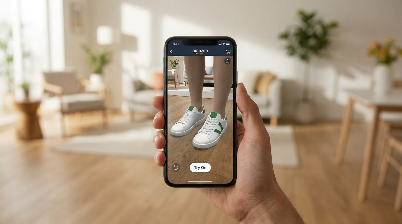
    Close-up of a person holding a smartphone showing a virtual shoe try-on augmented reality feature with the shoe appearing overlaid on their feet in real scale

    Virtual Try-On is the most category-constrained of Amazon’s AR tools, and it’s worth being clear about what’s realistic for different types of sellers in 2026.

    Current Category Coverage

    The three categories with live Virtual Try-On support are footwear, eyewear, and apparel (T-shirts). Footwear is the most mature implementation, with thousands of styles across major brands. The feature uses the phone’s rear camera to overlay shoes on the user’s feet in real time — you physically point the camera at your feet and the shoes appear on them, sized correctly and responsive to your movements.

    For eyewear, the front-facing camera is used to map the user’s face and display how sunglasses or glasses frames will look when worn. This is particularly effective in a category where fit and aesthetic are both highly personal and historically difficult to assess online.

    T-shirts are the most recent addition, though as of 2026 this category is still developing in terms of brand roster and technical accuracy. The rendering of fabric drape and body-specific fit is a harder problem than shoe placement, and it shows in the current iteration.

    Access for Smaller Brands

    This is where sellers need honest expectations. Virtual Try-On for shoes and eyewear appears to operate largely through partnership arrangements between Amazon and established brands rather than a fully open self-serve enrollment. Brands like Puma, Adidas, New Balance, and Birkenstock are participating because they have the production capacity to create high-quality 3D models for their entire footwear lineup and the negotiating leverage to be part of launch partnerships.

    Smaller, independent footwear or eyewear brands should not assume Virtual Try-On is immediately available to them through Seller Central. The path to participation may require working through Amazon Fashion’s brand partnerships team rather than a standard self-serve upload. That said, Amazon has a commercial incentive to expand Virtual Try-On participation, and access for smaller brands is likely to broaden over time.

    The AWS Nova Canvas Alternative

    For sellers who want virtual try-on functionality but can’t access Amazon’s native feature yet, Amazon Web Services offers Nova Canvas — an AI tool that generates try-on visualizations from two uploaded images (a person/space and a product). While this isn’t a live AR experience in the way Virtual Try-On is, it generates realistic static visualizations that can be used in listing images, A+ Content, and social media. For smaller apparel and accessories brands, this is currently the more accessible route to showing products in context on a human body.

    View in 3D: The Accessible AR Entry Point Most Sellers Overlook

    A 3D wireframe model of a kitchen appliance being built digitally on a computer screen with 3D modeling software interface

    If View in Your Room is the headline feature and Virtual Try-On is the partnership feature, View in 3D is the working seller’s AR tool — and it’s underused relative to the value it provides.

    What It Enables

    View in 3D embeds an interactive 3D model directly on the product detail page. Shoppers can rotate the product 360 degrees, zoom in on specific details, and examine it from any angle — all without leaving the listing or activating their camera. On mobile, they can also switch into the AR placement mode, which is the View in Your Room experience.

    This means a single 3D model asset powers multiple experiences: the interactive on-page viewer, the room placement AR feature, and — in some cases — the “View in 3D” banner that appears in search results for eligible listings. That last point is worth noting: 3D-enabled listings can display a visual indicator in search results that distinguishes them from standard listings at the discovery stage, before a shopper even reaches your product page.

    Why It Works Across More Categories

    View in 3D eligibility is broader than View in Your Room because it doesn’t require placement in a physical space — it’s just an interactive model viewer. This means products that wouldn’t logically fit the “put it in your room” use case — a backpack, a kitchen knife set, a skincare device, a power tool — can still benefit from 3D interactivity on their listing page. Shoppers can examine the construction, zoom in on textures, inspect seams, hinges, ports, or handles, and build a much richer mental model of the product than flat photography allows.

    For products where fine details drive purchase decisions — jewellery, hardware, electronics accessories, sporting goods — this capability is particularly relevant.

    How It Appears on the Listing

    When a product has an approved 3D model, it appears in the image carousel on the product detail page alongside standard photos and video. Shoppers see a “View in 3D” option they can tap or click, which launches the interactive viewer in-page. On mobile, the same prompt can offer the option to switch to AR placement if the product category supports it.

    The placement in the image carousel matters because that is prime listing real estate. A 3D model in position two or three of the image stack gets early exposure to shoppers who are actively swiping through product assets — typically the most engaged and highest-converting segment of your traffic.

    The Numbers Behind AR: What the Data Actually Shows

    Performance data for AR in e-commerce comes from multiple sources — Amazon’s own limited public data, third-party platform studies, and brand case studies. It’s worth presenting these with appropriate context rather than treating every number as directly applicable to every seller’s situation.

    Conversion Rate Impact

    The most commonly cited figure is a 94% higher conversion rate for products with 3D/AR content, drawn from Shopify’s analysis of merchants using 3D product models. This is a significant lift, but it reflects a comparison between listings with and without 3D models rather than an isolated test of the 3D feature itself — other listing quality differences may be present between the two groups.

    More conservative estimates from retail AR deployments across major platforms put the conversion lift at 15–30% for shoppers who actively engage with AR features. Amazon-specific data for View in Your Room engagement suggests that users who interact with the AR view convert at approximately double the rate of those who don’t — though this includes selection bias, since shoppers who engage with AR are likely already more purchase-intent than average.

    The practical takeaway: expect meaningful conversion improvement, especially in categories where product fit, size, or appearance in context is a major purchase decision factor. Don’t expect a lift equivalent to a category where the shopper is buying a commodity item with no visual uncertainty.

    Return Rate Reduction

    Return rate data is more consistently supported across sources. Build.com (home improvement) reported a 22% reduction in returns for AR users. Furniture retailers using similar AR placement tools have seen returns drop from the 5–7% industry average to under 2%. The mechanism is straightforward: shoppers who’ve seen exactly how a product fits their space before buying are less likely to be surprised when it arrives.

    For categories with structurally high return rates — furniture (typically 10–15%), apparel (20–30%), footwear (up to 35%) — a 25–40% reduction in returns is a material cost recovery. Return processing costs on Amazon include both direct fees and downstream impacts on inventory health, seller metrics, and IPI scores. Every return prevented is worth more than its face value.

    Revenue Per Visitor

    Studies across apparel virtual try-on deployments report approximately 15% higher revenue per user when shoppers engage with try-on features. This is driven partly by higher conversion rates and partly by higher average order values, as shoppers who engage with AR are more likely to purchase confidently at full price rather than adding to cart at a discount to reduce risk.

    Engagement Duration

    Shoppers who interact with AR features spend meaningfully more time on product pages than those who don’t. While extended time-on-page isn’t a direct purchase signal, it does indicate active evaluation rather than passive browsing — and active evaluation is where purchase decisions happen. Amazon’s algorithm measures engagement signals including session duration and interaction depth, which means AR engagement has at least an indirect relationship with listing performance over time.

    How to Get Eligible: Brand Registry, File Specs, and the Two Upload Paths
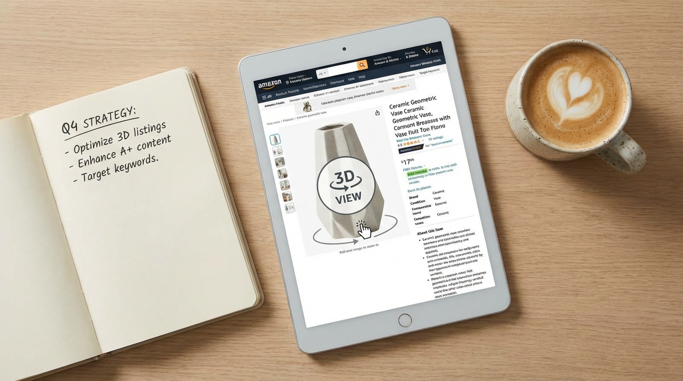
    A clean flat-lay photo showing a tablet displaying an Amazon product detail page with a 3D rotate-and-view interface, surrounded by a notebook with strategy notes and a coffee mug

    Access to Amazon’s AR and 3D listing features is gated behind two requirements: Brand Registry enrollment and a qualifying product model. Both are concrete, achievable steps — but sellers should understand exactly what each involves before allocating budget and time.

    Brand Registry: The Non-Negotiable Starting Point

    Amazon Brand Registry is the gateway to all self-serve AR and 3D listing features. Only the registered brand owner can upload 3D models for a product listing. This means if you’re a reseller, a distributor, or a seller who hasn’t completed Brand Registry, you cannot add AR content to your listings — even if you’re the product’s primary seller.

    Brand Registry requires an active, registered trademark (either in the U.S. or in the marketplace where you’re selling). The trademark can be word-based or image-based. Amazon typically processes Brand Registry applications within 2–10 business days once trademark verification is complete. If you haven’t started the trademark process yet, the typical timeline to a granted trademark is 12–18 months in the U.S. — a legitimate long-term investment, not a short-term tactic.

    Once enrolled in Brand Registry, your account gains access to the 3D model upload tools, alongside other benefits like A+ Content, Sponsored Brand ads, the Brand Dashboard, and the Brand Analytics suite.

    Technical Specifications for 3D Models

    Amazon accepts 3D models in GLB (preferred) or GLTF format. Key technical requirements include:

    • Polygon count: Under 1,000,000 triangles (lower is better for load performance; target 100K–300K for most products)
    • File size: Under 1GB, though smaller files produce better in-app performance
    • Texture quality: High-resolution textures that accurately represent material properties — colour, roughness, metallicity, and normal mapping for surface detail
    • Scale accuracy: The model must reflect exact real-world dimensions; inaccurate scale is the most common rejection reason for View in Your Room models
    • No camera or light attributes: External cameras and lighting setups embedded in the model file cause rejection
    • Material accuracy: The model should represent how the product actually looks — colour, finish, and texture must match the physical product

    Upload Path One: The Seller App Scanning Tool

    Amazon offers a built-in 3D model creation tool in the iOS Seller app (available to brand-registered sellers in the U.S.). The tool guides you through scanning your physical product with your iPhone camera, creating a basic 3D model automatically. The process takes 5–10 minutes and requires holding the phone at multiple angles around the product to capture all surfaces.

    The resulting model goes through Amazon’s automated review process (typically 24–72 hours). The tool works best for products with non-reflective surfaces, clear defined edges, and consistent textures. It struggles with glass, highly reflective metals, very small products (under 10cm), and items with very fine surface details that a phone camera can’t capture adequately.

    For sellers with a qualifying product who want to test AR integration before investing in professional 3D creation, the scanning tool is a legitimate free starting point. Don’t expect photorealistic results — expect a serviceable model that gives shoppers a basic spatial understanding of the product.

    Upload Path Two: Seller Central Image Manager

    Professional 3D models created externally (by you or a third-party provider) can be uploaded via Seller Central through the Image Manager. The path is: Catalog → Upload Images → Manage Images → 3D Models tab. You’ll enter the product’s exact dimensions and upload the GLB file. Amazon’s review team then assesses the model against quality and accuracy standards, with a typical review window of one to two weeks.

    Models uploaded via this path tend to be higher quality than app scans because they’re built by professional 3D artists with dedicated tools, but they cost more upfront. The two-week review window means you should plan your launch timeline accordingly — don’t finalize a listing around an AR feature that’s still in review.

    Creating Your 3D Model: DIY Scanning Versus Third-Party Providers

    A person using a smartphone to scan a small tabletop product for 3D model creation, the phone screen shows a scanning progress overlay with a glowing green mesh

    The model creation decision is where many sellers stall — not because the options are complicated, but because the costs and quality trade-offs aren’t clearly laid out. Here’s what the realistic landscape looks like.

    Option 1: Amazon’s Built-In Mobile Scanning

    Cost: Free.
    Time: 5–10 minutes per product (plus 24–72 hours review).
    Quality: Basic to moderate — adequate for View in 3D, variable results for View in Your Room.

    Best for: Sellers who want to test AR integration with minimal investment, products with straightforward geometry (boxes, cylinders, flat panels), and initial market testing before committing to professional model creation.

    Limitations: iOS only, US-only (currently), quality ceiling that may not represent the product accurately enough for high-stakes categories, and limited control over texture and finish rendering.

    Option 2: Freelance 3D Artists

    Cost: $50–$350 per model for simple products; $350–$1,000+ for complex products.
    Time: 2–7 business days depending on complexity and revision rounds.
    Quality: Variable — highly dependent on the individual artist’s experience with Amazon-spec models.

    Freelance platforms host 3D artists with Amazon-specific experience who understand the GLB format requirements, the triangle count limits, and the texture specifications. The most important criterion when hiring a freelance 3D artist for Amazon is whether they’ve had models approved before — ask for specific examples of live Amazon listings they’ve created models for.

    Provide the artist with: exact product dimensions, high-resolution product photography from all angles, material specifications (colour codes, finish type, texture samples), and any technical data sheets. The more information you provide, the higher the accuracy of the first draft and the fewer revision rounds you’ll need.

    Option 3: Specialist Amazon 3D Agencies

    Cost: $300–$2,000 per model (often packaged with renders and lifestyle images).
    Time: 3–14 business days depending on agency and product complexity.
    Quality: High — these agencies specialize in Amazon-compliant 3D models and often offer revision guarantees and resubmission support if Amazon rejects the initial upload.

    Agencies like Advertflair, Data4Amazon, and vetted AWS partners (Hexa3D, Threedium) operate in this space. The higher cost often includes a suite of deliverables beyond just the 3D model: CGI product renders, lifestyle scene renders, 360-degree spin animations, and the GLB file — assets that can be used across your listing images, A+ Content, and off-Amazon marketing materials.

    For sellers with a strong-performing product where incremental conversion improvement translates to meaningful revenue, the $500–$2,000 investment in a professional model is easy to justify. For a product generating $30,000/month, a 15% improvement in conversion rate on a subset of traffic is a significant number.

    Option 4: In-House 3D Modeling Software

    If you or someone on your team has 3D modeling experience, tools like Blender (free), Cinema 4D, or Autodesk Maya can be used to create GLB-compatible models from product CAD files or scratch. This is the most cost-effective long-term solution for sellers with large product catalogs, but it requires a meaningful skill investment or a dedicated in-house resource.

    For brands with existing CAD files from product manufacturing, converting those files to consumer-grade 3D models for Amazon is often faster and cheaper than starting from scratch — the geometry exists, it just needs texturing, material mapping, and format conversion to GLB.

    AR Features and Amazon’s Algorithm: What It Affects (and What It Doesn’t)

    The relationship between AR features and Amazon’s A10 ranking algorithm is real but indirect — and it’s important to understand the distinction between direct ranking signals and downstream performance signals.

    What AR Does Not Do Directly

    Amazon has not publicly documented AR or 3D model presence as a direct ranking factor in the way that review count, keyword relevance, or sales velocity are. If your product has a 3D model and an identical competitor listing does not, you should not expect to automatically outrank that competitor based on the 3D model alone.

    Sellers who pitch AR primarily as an “algorithm hack” are overstating the relationship. That framing sets up disappointment and misallocates the genuine value of the feature.

    What AR Does Affect (Indirectly)

    Where AR creates algorithmic benefit is through its impact on the performance signals that Amazon’s A10 algorithm does weight heavily:

    • Click-through rate (CTR): Listings with the “View in 3D” or AR badge visible in search results may generate higher CTR than equivalent listings without it, as the visual differentiator attracts attention in crowded search pages.
    • Conversion rate (CVR): Amazon heavily weights CVR in its ranking model. If AR engagement increases your conversion rate — and the data suggests it consistently does for engaged shoppers — that improvement feeds directly into your ranking signals over time.
    • Return rate: Amazon monitors return rates by seller and by product. Elevated return rates can trigger listing suppression, restricted categories, or additional fees. A genuine reduction in returns from AR engagement improves your standing on this metric.
    • Session duration and engagement depth: Amazon’s algorithm processes engagement signals beyond just purchase events. Shoppers who spend more time on your listing, interact with more content types, and engage with the AR viewer are contributing behavioural signals that indicate a high-quality listing.

    The Listing Quality Score Connection

    Amazon uses an internal Listing Quality Score (LQS) that influences how confidently the algorithm recommends your product across different placements. While the exact composition of LQS isn’t public, it is understood to incorporate listing completeness signals — images, video, A+ Content, accurate attributes. A 3D model in the image stack contributes to listing completeness and likely to the LQS, which has downstream effects on placement in recommendation surfaces, deal eligibility, and algorithm confidence in the listing.

    Category-by-Category Opportunity Map: Where AR Adoption Is Still Low

    One of the genuinely underappreciated aspects of Amazon’s AR feature suite is how unevenly adoption is distributed across categories. In furniture and high-end footwear, AR-enabled listings are becoming common. In other eligible categories, the majority of brand-registered sellers haven’t added 3D content at all.

    Less than 1% of Amazon’s brand-registered sellers are estimated to have 3D models on their listings as of 2026. That creates significant differentiation opportunity in categories where the feature is both eligible and underused.

    High Opportunity, Low Current Adoption

    Kitchen and tabletop appliances: With the recent expansion of View in Your Room to tabletop items, coffee makers, air fryers, blenders, and similar products are now eligible for room placement AR. Very few sellers in this category have moved on this. A 3D-enabled listing for a coffee maker that lets shoppers see exactly how it looks on their kitchen counter — in their actual kitchen — is a meaningful differentiator in a crowded category.

    Sporting goods and fitness equipment: Dumbbells, kettlebells, yoga equipment, benches, and compact gym gear are eligible for View in 3D and in some cases View in Your Room. Shoppers trying to gauge whether a piece of equipment will fit their home gym or apartment space have a genuine use case for AR visualization. Adoption in this category remains low.

    Consumer electronics accessories: Headphones, speakers, keyboards, mice, and desk accessories benefit from 3D viewing for detail inspection. A shopper trying to decide between two similarly priced wireless headphones has a much richer experience rotating a 3D model and examining the ear cushions, hinge mechanisms, and build quality than viewing three standard photos.

    Home office: Desks, chairs, monitor stands, and storage units are in the sweet spot of View in Your Room eligibility with relatively low adoption among smaller brands in the space.

    Baby and nursery: Cribs, changing tables, high chairs, and strollers are categories where parents are making high-consideration purchases and want to see products in their specific nursery space. AR fit checks are highly relevant here, and adoption is minimal outside of major brands.

    Categories with Growing Competition

    Furniture (large items), premium footwear, and premium eyewear are the categories where AR adoption is highest and where the differentiation value of having 3D content is eroding as more brands adopt it. In these categories, not having AR is increasingly the risk — while having it is becoming table stakes. If you’re in furniture or shoes and you haven’t added 3D models yet, you’re already behind the curve in terms of shopper expectation management.

    Common Mistakes Sellers Make With AR Listings

    Based on how Amazon’s 3D model requirements and review processes work, there are several consistent failure patterns worth avoiding before you invest time and money in model creation.

    Submitting Models with Scale Errors

    The most common reason for View in Your Room rejection is inaccurate product scale. If your 3D model’s dimensions don’t precisely match the actual product’s real-world measurements, Amazon will reject it for the room placement feature — because a sofa that appears three feet shorter than it actually is creates exactly the kind of post-purchase surprise that AR is supposed to prevent.

    Always provide exact manufacturer dimensions when briefing a 3D artist or when setting up your model. Double-check the model in a preview before submission. Scale errors are entirely avoidable with proper briefing.

    Ignoring Material and Texture Accuracy

    A 3D model that looks significantly different from the physical product — wrong colour rendering, flat textures on a product that has visible grain or weave, generic materials applied to a product with specific finishes — may pass Amazon’s review but will disappoint shoppers who interact with it. The whole point of AR is to reduce the imagination gap; a model that’s inaccurate in material or colour can create a new type of expectation mismatch.

    Invest in accurate texture mapping. For products where colour accuracy is critical (upholstered furniture, apparel, rugs, painted wood), provide your 3D artist with colour-accurate reference photography taken in daylight or with proper colour calibration. The Pantone or RAL colour codes for your product finishes are extremely useful.

    Using the App Scan for Complex Products

    The mobile scanning tool is genuinely useful for the right products, but sellers sometimes try to use it for products where it structurally can’t produce adequate results: glass items, chrome-finished products, products smaller than a fist, products with complex internal structures visible through the casing. The result is a low-quality model that may create a negative first impression rather than a positive one.

    Match the creation method to the product. If your product has challenging material properties, invest in professional modeling rather than relying on mobile scanning.

    Not Updating Models After Product Changes

    If you update your product — new colour option, revised packaging, changed dimensions, updated branding — your 3D model needs to be updated too. An outdated 3D model showing a discontinued colour option or old design creates confusion. Build model maintenance into your product update workflow, not as an afterthought.

    Treating the Model as a Set-and-Forget Asset

    A 3D model is a living listing asset that benefits from monitoring. Track whether your View in 3D engagement rate changes after model upload. Watch your return rate in the weeks following AR activation. Compare conversion rates between traffic segments that engaged with the AR feature and those that didn’t. Amazon’s Brand Analytics includes some of this data; supplement it with your own tracking where possible. If a model isn’t driving the expected engagement, it’s worth investigating whether it’s appearing correctly on all devices and in all marketplaces you’re selling in.

    Building AR Into Your Listing Strategy for the Long Term

    AR features on Amazon aren’t a campaign — they’re listing infrastructure. Like A+ Content, video, and review management, they’re assets that compound over time rather than delivering a one-time lift. That framing changes how you should prioritize and sequence the investment.

    Sequence: Start with Your Highest-Return Products

    If you have a catalog of 50+ SKUs and can’t afford to create 3D models for everything immediately, prioritize based on return rate and return-driven costs. Your highest-return products are the ones where the AR investment has the clearest ROI case: every percentage point reduction in returns on a $200 furniture item is worth more in absolute terms than the same reduction on a $20 item.

    Second priority: your highest-traffic, highest-conversion products. These are the listings where the incremental improvement in conversion rate delivers the most revenue. The model investment on a listing that drives $80,000/year is justified at a much higher threshold than one driving $8,000/year.

    Align Model Creation with New Product Launches

    For new product launches, building the 3D model into the pre-launch production workflow is far more efficient than retrofitting it after launch. When you’re already briefing photographers and creating packaging, the 3D model brief can be developed in parallel. CAD files from your manufacturer can seed the model creation, reducing the 3D artist’s work significantly.

    Launching with a 3D model in place means your listing is fully equipped from day one of indexed traffic — including the AR badge in search results and the interactive viewer on the detail page. For products entering competitive categories, this is a meaningful early differentiation.

    Plan for Multi-Marketplace Deployment

    Amazon’s 3D model feature is available across multiple marketplaces, not just Amazon.com. If you sell on Amazon UK, Germany, Canada, Australia, or Japan, the same 3D model file can typically be used across marketplaces. The review process applies separately in each marketplace, but the asset creation is a one-time cost with multi-market deployment potential.

    This is particularly relevant for international expansion plans. A brand entering Amazon Europe with AR-enabled listings from launch day is positioned ahead of most competitors who haven’t yet implemented 3D models in those markets.

    Leverage 3D Assets Beyond Amazon

    The GLB file and the photorealistic renders your 3D artist produces are reusable assets. The same model can power AR previews on your Shopify or WooCommerce store, 3D spin animations for your product emails, CGI lifestyle imagery for your social media, and interactive embeds on your brand website. Many sellers limit their thinking to the Amazon use case and leave the broader asset value on the table.

    When briefing a 3D agency, ask explicitly for high-resolution renders, 360-degree turntable animations, and any scene variants you’ll need for your other channels. Getting all of this from a single model creation project significantly improves the cost-per-use of the asset.

    What to Expect: A Realistic Timeline and Outcome Framework

    For sellers considering AR features for the first time, here’s an honest outline of what the process and outcomes typically look like.

    Months 1–2: Foundation

    • Confirm Brand Registry status (apply if not already enrolled)
    • Audit your catalog for AR-eligible products and prioritize candidates
    • Brief a 3D artist or agency — or use the mobile scan tool for initial testing
    • Submit models for Amazon review via Seller Central Image Manager
    • Allow 1–2 weeks for Amazon’s review and approval

    Months 2–4: Live and Measuring

    • Monitor View in 3D engagement via Brand Analytics and listing traffic data
    • Compare return rates before and after AR activation
    • Track conversion rate changes for AR-activated listings vs. baseline period
    • Note any search ranking changes — though attribute these cautiously given multiple variables

    Months 4–12: Scaling the Investment

    • Expand 3D models to additional products based on performance data from initial rollout
    • Incorporate model creation into new product launch workflow
    • Deploy existing 3D assets to other Amazon marketplaces
    • Leverage 3D renders in A+ Content, video, and off-Amazon channels

    Realistic Outcome Expectations

    For sellers in furniture, home décor, lighting, and similar high-imagination-gap categories: expect the clearest and fastest impact. Return rate improvements in the 15–30% range for AR-engaged shoppers, and conversion rate lifts in the 10–25% range, are supported by data from comparable deployments.

    For sellers in electronics accessories, sporting goods, and kitchen appliances: expect moderate but measurable improvement in engagement and conversion, with a slower timeline to see statistically clear return rate effects (lower baseline return rates mean smaller absolute changes).

    For sellers in low-consideration categories (commodity goods, consumables, replenishment items): the AR investment may not be justified. If your customers aren’t making a spatially or aesthetically complex purchase decision, AR doesn’t address the friction in their buying journey.

    Conclusion: AR Is Infrastructure, Not a Trend

    The conversation around augmented reality in e-commerce has been dominated for years by hype cycles and ambitious projections that haven’t always landed on schedule. That history has made some sellers appropriately sceptical. But Amazon’s AR suite — View in Your Room, Virtual Try-On, and View in 3D — is not speculative technology. It’s live, it’s self-serve for brand-registered sellers, it costs nothing in Amazon fees to upload, and the performance data from deployments across e-commerce consistently supports meaningful improvements in both conversion rates and return rates.

    The sellers who are hesitating aren’t being cautious — they’re waiting for a queue of missed opportunities to get longer. Less than 1% of brand-registered Amazon sellers have 3D models on their listings. In a marketplace where differentiation is increasingly expensive to achieve through advertising and increasingly difficult to achieve through listing optimisation alone, that gap is a genuine opening.

    Key Takeaways for Amazon Sellers

    • AR on Amazon is three separate tools: View in Your Room (space placement), Virtual Try-On (wearable visualization), and View in 3D (interactive on-page model). Each has different category eligibility and access paths.
    • Brand Registry is the prerequisite for self-serve AR and 3D model uploads. If you haven’t enrolled, that’s the first step — everything else follows from it.
    • GLB/GLTF format, accurate scale, and material fidelity are the three pillars of a model that gets approved and performs well in AR.
    • Two upload paths exist: the free iOS Seller app scan (quick, basic quality) and the Seller Central Image Manager upload (professional quality, 1–2 week review).
    • Professional model creation costs $50–$2,000 depending on product complexity and whether you need additional renders. Amazon charges no fee for the upload or AR integration itself.
    • The greatest opportunity sits in kitchen appliances, sporting goods, home office, electronics accessories, and baby/nursery — categories with AR eligibility and very low current adoption.
    • AR’s impact on rankings is indirect — it works through improved conversion rates, lower return rates, and stronger engagement signals, not through a direct algorithmic ranking boost.
    • 3D model assets are reusable across marketplaces, channels, and marketing materials. Plan the full scope of use when commissioning model creation.

    The window for early differentiation through AR on Amazon remains open — but it won’t stay open indefinitely. Sellers who move now get the full compounding benefit of better conversion metrics, lower return rates, and early-mover positioning before AR becomes as standard as A+ Content. Sellers who wait will still be able to add it eventually, but they’ll be doing so in a landscape where it no longer stands out.
  • The Visual Selling System: A Seller’s Complete Guide to Amazon Listing Image Optimization

    The Visual Selling System: A Seller’s Complete Guide to Amazon Listing Image Optimization

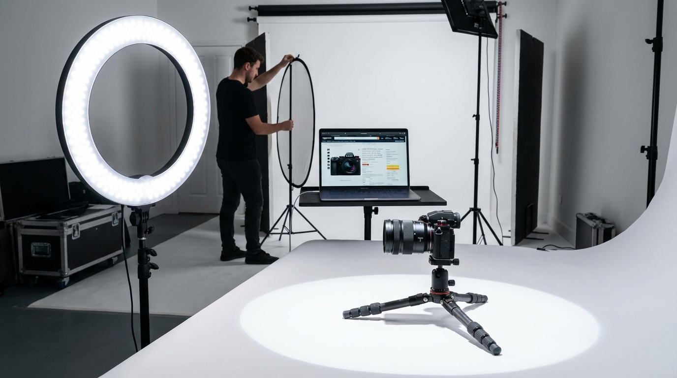
    Professional Amazon product photography studio setup with camera, ring light, and white backdrop

    Most Amazon sellers put their energy into keywords, bids, and backend settings. They spend hours inside Seller Central tweaking search terms, adjusting PPC budgets, and monitoring BSR — and then upload whatever product photos they have lying around.

    That’s a serious mismatch of effort.

    Before a shopper reads your title, before they scan your bullet points, before they even register your price — they’ve already processed your images. Research from behavioural science shows that the brain forms an initial visual impression in under 50 milliseconds. That’s not a metaphor for “pretty fast.” That’s a measurable neurological response that happens before conscious thought kicks in.

    On Amazon, where a search results page presents a shopper with dozens of competing thumbnails in a single glance, your main image is your entire first impression. And your secondary image gallery is your silent sales team — the one that closes the deal when a shopper actually lands on your listing.

    This guide is about building what we call a Visual Selling System: a deliberate, sequenced, tested set of images that works at every stage of the buyer journey — from the search results thumbnail, through the listing gallery, down to A+ Content. We’ll cover the technical requirements, the psychological principles, the sequencing strategy, the testing process, and the specific mistakes that quietly kill conversions even on otherwise well-optimised listings.

    If you already have images live, this guide will help you diagnose exactly what’s underperforming and why. If you’re building a new listing from scratch, it will help you get the foundation right the first time.

    The Science Behind First Impressions: What Happens in 50 Milliseconds

    Understanding why images matter at the neurological level helps sellers make better decisions — not just about photo quality, but about composition, colour, and content sequencing.

    The 50-Millisecond Rule

    The widely cited 50-millisecond figure comes from research into visual processing: the human brain can form an aesthetic and emotional judgement about a visual stimulus before the prefrontal cortex — the part responsible for rational decision-making — even gets involved. This means buyers are “deciding” whether a product looks trustworthy, premium, cheap, or irrelevant before they’ve had a chance to think about it consciously.

    On Amazon, this plays out at the thumbnail level. In a search grid, your main image is competing with eight or more other products simultaneously. The shopper’s eye will be drawn to whichever thumbnail feels most visually clear, appropriately sized, and emotionally resonant. Products that lose at this stage don’t get clicked — and if they don’t get clicked, no amount of optimised copy, pricing strategy, or review volume can save them.

    Images Are Processed 60,000 Times Faster Than Text

    The brain processes visual information approximately 60,000 times faster than it processes written language. This is why a crisp, well-composed product image communicates trust and quality instantly, while a blurry or poorly-framed photo creates doubt — even if the product description is excellent.

    According to Baymard Institute research, 56% of online shoppers’ first action on a product detail page is to explore the product images — not the title, not the price, not the reviews. The images are the product, as far as the shopper’s brain is concerned.

    How Images Reduce Purchase Anxiety

    One of the key jobs of your image gallery is to reduce what conversion rate researchers call “purchase anxiety” — the uncertainty a buyer feels when they can’t physically touch, hold, or test a product before buying.

    High-quality images with multiple angles, close-ups of materials and finishes, size reference shots, and in-context lifestyle photography all work together to answer unspoken questions: Is this well-made? Is it the right size? Will it fit in my space? Does it look as good in real life as it does in the photo? Each image that answers one of these questions removes a reason not to buy.

    This is why listings with 7 to 9 strategically sequenced images consistently outperform listings with fewer — it’s not about filling slots, it’s about answering objections visually before they become reasons to leave.

    Amazon’s Image Rules — The Full Technical Breakdown

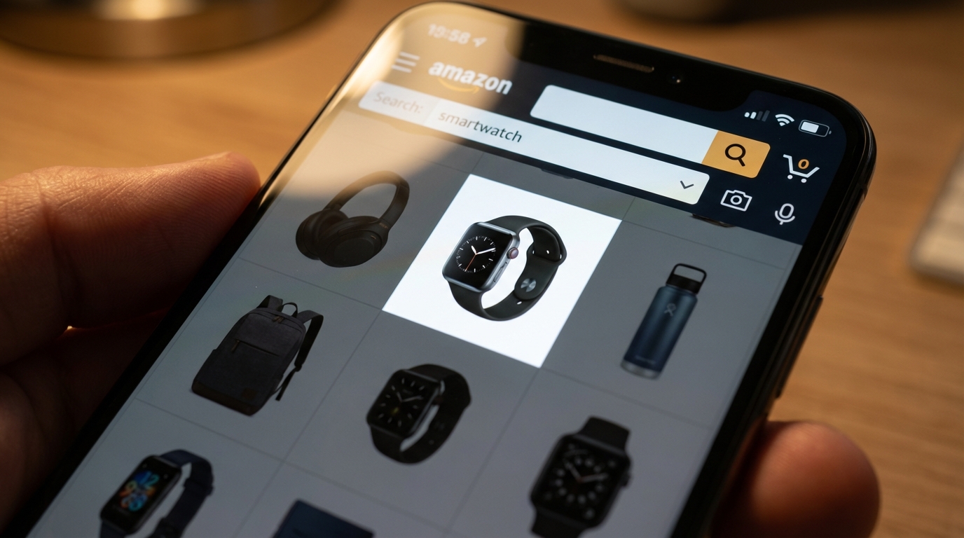
    Smartphone showing Amazon product listing search results with thumbnail images in a grid view

    Before thinking about strategy, every seller needs a solid command of Amazon’s technical requirements. Non-compliant images don’t just look unprofessional — they can get your listing suppressed entirely, which means zero visibility regardless of how much you’re spending on advertising.

    Universal Image Requirements (All Slots)

    These rules apply to every image in your listing, not just the main image:

    • File formats: JPEG (.jpg or .jpeg), PNG (.png), TIFF (.tif), or GIF (.gif — non-animated only). JPEG is preferred.
    • Maximum file size: 10MB for standard product images; 2MB for A+ Content images.
    • Minimum resolution: 500 pixels on the longest side for the listing to appear at all. But 500px images will look terrible — treat this as an absolute floor, not a target.
    • Zoom threshold: 1,000 pixels on the longest side enables zoom. 1,600 pixels is the point at which zoom works well. 2,000+ pixels delivers the sharpest zoom experience.
    • Maximum resolution: 10,000 pixels on the longest side.
    • Image quality: Images must not be blurry, pixelated, or have jagged edges.
    • No Amazon branding: Images cannot include any Amazon logos, the Prime badge, “Amazon’s Choice,” “Best Seller,” or any similar Amazon-owned marks.
    • Accuracy: Images must accurately represent what the buyer will receive. Showing accessories or components that aren’t included in the purchase is a violation.

    Main Image Requirements (Slot 1 Only)

    Amazon’s main image rules are stricter — and enforced more aggressively — than the rules for secondary images. Violations here are the most common cause of listing suppression.

    • Pure white background: RGB values must be exactly 255, 255, 255. Off-white (cream, eggshell, light grey) will not pass. Amazon’s automated systems are calibrated to detect this, and they’re not forgiving.
    • Product fill: The product must occupy at least 85% of the image frame.
    • No text, logos, watermarks, or graphics: The main image must show the product only — no overlaid copy, no brand logos, no borders or colour blocks.
    • Professional photography only: No graphics, illustrations, mockups, or placeholder images. This is a product photo, not a render.
    • Single view: The main image must show a single view of the product, not multiple angles combined in one image.
    • No props or excluded accessories: Props that suggest additional included items are not permitted.
    • Model positioning (apparel): Clothing for men and women must be shown on a human model. Kids’ and baby clothing must be photographed flat (off-model). Models must not sit, kneel, lean, or lie down.
    • Shoes: Must show a single shoe facing left at a 45-degree angle.

    Secondary Image Flexibility

    Images in slots 2–9 have far more creative freedom. You can include lifestyle photography, infographics with text overlays, comparison charts, how-to diagrams, size guides, and close-up material shots. This is where strategic visual storytelling happens — the main image gets the click, but the secondary images close the sale.

    The Hero Image: Your One Chance to Win the Click

    Your main image has a single job: get the shopper to click on your listing instead of a competitor’s. Everything else — conversion rate, sales volume, PPC efficiency — depends on winning this first interaction.

    Why Most Main Images Underperform

    Compliance is the floor, not the ceiling. Plenty of listings follow every rule Amazon sets while still having main images that do little to differentiate the product from its competitors. The most common problems aren’t technical violations — they’re strategic failures.

    The product is too small in the frame. Meeting the 85% fill requirement doesn’t mean hitting it exactly. Many sellers hit 85–87% and leave meaningful visual real estate unused. The goal should be as large as possible while keeping the full product visible — ideally 90–95% of the frame.

    The angle doesn’t show the best face of the product. Default photography often shows the “obvious” angle — straight-on front view — without considering which angle makes the product look most compelling and three-dimensional. A slight 3/4 angle, for example, often communicates form and depth better than a dead-on flat shot.

    The image competes poorly at thumbnail size. With 70%+ of Amazon traffic coming from mobile devices, your main image thumbnail is often displayed at roughly 160–200 pixels wide. If your product doesn’t read clearly at that size — if its key features or silhouette become ambiguous — you’re losing clicks.

    Main Image Tactics That Win

    Shoot for contrast, not just quality. A technically beautiful photograph of a dark product on a white background can still get lost if every competitor is shooting the same way. Look at your search results page and ask: what would make a thumbnail stand out from this specific grid? Sometimes a slight shadow, a subtle angle, or the orientation of the product makes a meaningful difference.

    Show the product’s unique silhouette. If your product has a distinctive shape or design element, make sure that’s visible and prominent in the main image. This is what helps repeat shoppers and branded browsers recognise your product quickly.

    Use the maximum resolution you can produce. The quality difference between a 1,600px and a 2,500px image is visible when shoppers zoom. Zoom usage is strongly correlated with purchase intent — a shopper who zooms in is seriously evaluating your product. Give them the sharpest possible view.

    Run the thumbnail test. Before finalising your main image, shrink it down to 200×200 pixels and look at it on a phone screen. Is the product instantly recognisable? Is the most important feature visible? Does it look more appealing than the competitors at the same size? If the answer to any of these is “no,” the image isn’t optimised for search.

    Building a High-Converting Image Sequence (Slots 2–9)

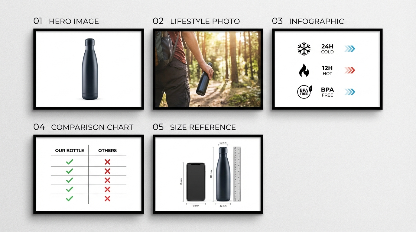
    Flat lay diagram of Amazon product listing image sequence showing numbered image slots for hero, lifestyle, infographic, comparison, and size reference

    The image gallery is not a collection of nice photos. It’s a structured argument — a visual case that answers objections, communicates value, and guides the shopper from “that looks interesting” to “add to cart.”

    Thinking about it this way changes how you approach each slot. Each image has a job. A slot that doesn’t pull its weight is a missed opportunity to address a specific buyer concern that could have been resolved before they clicked away.

    The Recommended 9-Image Framework

    This sequence has been validated across product categories through A/B testing data and conversion rate analysis. It’s a starting framework, not a rigid formula — your category, product type, and audience will require adjustments. But starting from this structure is far better than guessing.

    Slot 1 — Hero/Main Image: Pure white background. The best possible view of the product. See the previous section for detail.

    Slot 2 — Value Proposition Graphic: The first secondary image should answer the question every shopper is silently asking: What does this do for me, and why should I choose this one? This isn’t a list of features — it’s a clear, visually-communicated statement of the core benefit. Keep it simple: one headline benefit, clean typography, and the product shown prominently. Think of this as your product’s billboard.

    Slot 3 — Key Features Infographic: Now you can start getting specific. Use this slot to highlight 3–5 standout features with short callout text and visual indicators (arrows, icons, close-up crops). Focus on the features that differentiate your product from generic alternatives — not “high quality” or “durable,” but the specific thing you’ve built or included that competitors haven’t.

    Slot 4 — Lifestyle Shot: Show the product in use, in context. This is where emotional connection happens. The shopper needs to visualise themselves or someone like them using this product. Match the setting, mood, and demographic to your target buyer.

    Slot 5 — Size and Scale Reference: One of the most common sources of buyer uncertainty — and returns — is a product that’s bigger or smaller than expected. Use a scale reference shot (product held in a hand, placed next to a known object, shown in a room) with a dimension diagram or measurement overlay. This single image reduces a significant proportion of “not as described” returns.

    Slot 6 — Comparison or Differentiation Chart: A clean comparison chart showing how your product stacks up against a “standard” alternative gives considered shoppers the information they need to justify their choice. Make the visual argument for your product clearly.

    Slot 7 — Materials / Close-Up Detail: For products where material quality, texture, finish, or construction method is a purchase driver (homeware, apparel, electronics accessories, outdoor gear), a macro close-up that shows actual material quality builds tangible trust. This is particularly important in categories where buyers have been burned by cheap knock-offs.

    Slot 8 — Use Case or How-To: If your product requires any setup, assembly, or has multiple uses, a step-by-step visual guide or a multiple-use-case graphic gives the shopper confidence they’ll actually be able to use what they’re buying. This also reduces post-purchase returns caused by confusion about how the product works.

    Slot 9 — Social Proof or Brand Story: A final image that includes genuine review sentiment, user-generated imagery (where permitted), or a brief brand statement rounds out the gallery. This is your last chance to build trust before the shopper makes a decision. Keep it authentic — shoppers are highly attuned to marketing language that feels manufactured.

    Front-Loading Is Critical on Mobile

    On desktop, Amazon typically shows 4–5 images in the gallery preview. On mobile, the number is even smaller, and many shoppers scroll without tapping to expand. This means the information in slots 2 and 3 needs to carry the weight of your entire secondary gallery for a meaningful portion of your audience. Front-load your most important persuasion elements — don’t save the best for slot 8.

    Infographics That Actually Inform vs. Clutter

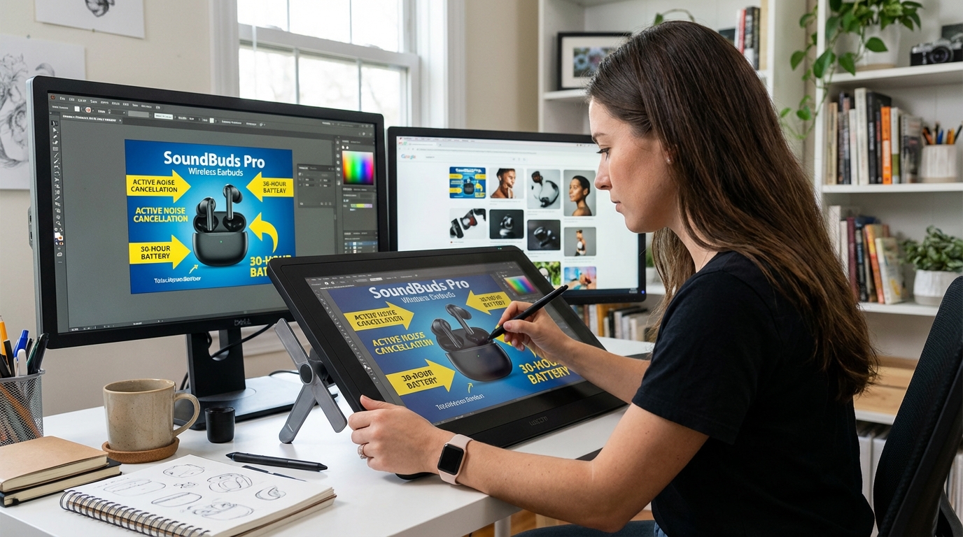
    Graphic designer creating Amazon product infographic with callout arrows and feature highlights on a design tablet

    Infographic images are the most misunderstood slot in an Amazon listing. At their best, they communicate product benefits quickly, clearly, and in a way that text never could. At their worst — and this is more common — they’re visually cluttered, text-heavy images that shoppers skip because they look like effort to read.

    The difference between an infographic that converts and one that doesn’t almost always comes down to editorial discipline.

    The One-Idea-Per-Image Rule

    The most common infographic mistake is trying to include too much in a single image. Sellers see 9 available image slots and try to build a single “features overview” image that covers everything — 12 bullet points, 4 icons, a diagram, and a tagline — all on one 2000x2000px canvas.

    The result is a visual that, on a mobile screen, is completely unreadable. Shoppers swipe past it in the same 50 milliseconds they gave your main image.

    Effective infographics follow a simple editorial principle: one core idea per image. A single feature, shown clearly, explained briefly, with visual design that makes the point without needing to be read in full. A shopper who glances at your image for three seconds should be able to extract the key message without squinting or zooming.

    Typography Rules for Amazon Infographics

    Text overlays on Amazon infographics need to work at mobile thumbnail size — approximately 160–200 pixels wide in search results, and somewhat larger on the product page gallery. Practical guidelines:

    • Font size: Body callout text should be a minimum of 30 points when exported at your final image size. Headline text should be larger — 40–60pt at minimum.
    • Font weight: Bold or semi-bold weights are far easier to read at reduced sizes than regular or light weights.
    • Contrast: White text on a dark or coloured background, or dark text on a light background, with sufficient contrast ratio. Low-contrast combinations — light grey on white, for example — are effectively invisible on mobile.
    • Sans-serif typefaces: Serif fonts look elegant at large sizes but become difficult to read at small sizes. Stick to clean sans-serif typefaces for callout text.
    • Maximum 20–30 words of text per image: If you’re writing more than this on a single infographic image, you’re writing copy, not creating a visual. Move the extra information to your bullet points or A+ Content.

    Benefit Language vs. Feature Language

    Product managers and sellers often think in terms of features: dimensions, materials, certifications, technical specifications. These matter — but they need to be translated into benefit language for your infographic callouts.

    Feature language: “Constructed from 420D ripstop nylon”
    Benefit language: “Resists tearing and water — built to last outdoors”

    Feature language: “3,000mAh battery capacity”
    Benefit language: “Up to 72 hours between charges”

    The feature is the evidence; the benefit is the reason to buy. Your infographic callouts should lead with the benefit and support it with the feature, not the other way around.

    Icons, Arrows, and Visual Hierarchy

    Good infographic design uses visual elements — arrows, lines, circles, icons — to direct the eye and establish hierarchy. Arrows from callout text to the specific product feature being referenced are clearer than floating text that requires the shopper to work out what’s being described. Icons associated with specific benefits (a water droplet for waterproofing, a shield for durability) add visual weight and aid comprehension without adding words.

    Whitespace is not wasted space. Infographics with room to breathe — clear product image, isolated callouts, generous margins — convert better than packed-full designs that feel visually stressful to look at.

    Lifestyle Photography: Setting the Scene That Sells

    Consumer product photographed in a warm lifestyle setting with natural golden hour light and shallow depth of field

    Lifestyle images serve a fundamentally different psychological function than product-on-white images. They don’t inform — they create desire. They answer not “what is this?” but “what would my life look like if I owned this?”

    That emotional function is what makes lifestyle photography so powerful, and also what makes it so easy to get wrong.

    The Visualisation Effect

    Consumer psychology research consistently shows that when people can vividly visualise themselves using a product, their intent to purchase increases significantly. This is known as the “visualisation effect,” and it’s why experiential and aspirational imagery outperforms purely descriptive photography in conversion testing.

    A cutting board photographed flat on a white background tells the shopper it’s a cutting board. A cutting board shown in a well-lit kitchen, with fresh ingredients around it and a confident home cook using it, tells a story about the kind of cooking experience the shopper could have. The difference in purchase intent between these two images — all else being equal — can be substantial.

    Matching the Scene to the Buyer

    The most important principle of lifestyle photography is audience alignment. The setting, the model (if used), the mood, the colour palette, and the supporting props should all feel like they belong in the life of your target buyer — not your life, not your brand’s aspirational version of your buyer’s life, but an accurate and relatable representation of who actually buys this product.

    This means doing real buyer research before briefing a lifestyle shoot. What does your customer’s home look like? What activities do they do? What aesthetic do they prefer? Look at your reviews, your Q&A section, and your customer demographics data in Seller Central — and then brief your photographer accordingly.

    Lifestyle images that miss the mark — a premium product in a budget-looking setting, or a practical everyday item shot in an artificially aspirational environment — create a subconscious disconnect that reduces trust rather than building it.

    Colour Psychology in Lifestyle Backgrounds

    Background environments in lifestyle photography communicate mood before content. The colour temperature, saturation, and dominant hues in your lifestyle images create an emotional frame around your product before the shopper consciously registers the product itself.

    • Warm tones (amber, orange, warm yellow): Evoke energy, comfort, activity, and warmth. Effective for food products, homeware, fitness equipment, and outdoor gear.
    • Cool tones (blue, grey, white): Communicate calm, cleanliness, precision, and professionalism. Effective for tech accessories, health and wellness products, and productivity tools.
    • Natural greens and earth tones: Suggest sustainability, organic quality, and connection with nature. Effective for supplements, natural beauty, and outdoor lifestyle products.
    • Neutral, minimalist palettes: Communicate premium quality and understated sophistication. Effective for higher-price-point products in any category.

    The key is intentionality. Your lifestyle backgrounds should be chosen, not defaulted to. The colour choices you make in your secondary images are brand-building decisions, and the cumulative effect of a consistent visual palette across your gallery contributes to how premium — or how generic — your product feels.

    Human Models and Relatability

    Lifestyle images that include a human model — particularly one using or benefiting from the product — perform consistently well in A/B tests. The presence of a person creates an immediate point of emotional identification for the viewer.

    Key considerations when casting models: demographic match matters far more than idealistic beauty standards. A shopper who sees someone recognisably like themselves using a product engages with that image more deeply than they do with an aspirational model who looks nothing like them. For mass-market products, diverse model representation also significantly broadens the proportion of your audience who feel that image is “for them.”

    Mobile-First Image Design: The 70% You’re Probably Ignoring

    Over 70% of Amazon’s traffic in 2026 comes from mobile devices. That statistic has been climbing steadily for years and shows no signs of reversing. Despite this, a significant number of sellers still design and evaluate their listing images primarily on desktop — and what looks sharp and clear on a 27-inch monitor can be effectively unreadable on a 6-inch phone screen.

    The Mobile Search Grid Reality

    On a typical mobile screen, the Amazon search results grid shows two products side-by-side. Each product thumbnail takes up approximately half the screen width — roughly 160–180 pixels wide. At this size, fine detail disappears, small text becomes illegible, and any image that isn’t visually bold and simple gets visually lost.

    This has specific implications for main image composition:

    • Products with complex shapes or fine detail need to be oriented so their most distinctive silhouette or feature is visible at thumbnail size.
    • Any props or contextual elements that take up frame space at the expense of product size become liabilities, not assets.
    • Strong contrast between product and background is more important at small sizes — a white product on a pure white background with weak shadow definition can essentially disappear in the mobile grid.

    The Mobile Detail Page Experience

    When a shopper lands on your product page on mobile, images dominate the above-the-fold view. On most mobile devices, the main image takes up 85–90% of the viewport. The shopper swipes horizontally through images before scrolling down to see any text.

    This means that on mobile, your images are doing the work that bullet points and titles do on desktop — they are the first and often primary source of product information. Every image needs to be designed with the assumption that a meaningful portion of your audience will make their purchase decision based on images alone.

    Testing Your Images on a Real Mobile Device

    This sounds obvious, but it’s a step that many sellers skip. Before finalising any image, view it on an actual mobile device — not just a browser window resized to mobile dimensions. Open the Amazon app, find a comparable competitor listing, and compare how your image looks against theirs on a real screen.

    Specific things to check:

    • Thumbnail readability: In the search grid, can you instantly tell what the product is?
    • Text legibility: In your infographic images, is all callout text readable without zooming?
    • Swipe experience: Does the sequence of images feel coherent and progressive on a fast swipe-through?
    • Lifestyle image impact: Does the mood and visual quality translate to mobile, or does the image look muddy and small?

    A+ Content Images: Extending the Visual Story Below the Fold

    For brand-registered sellers, A+ Content offers additional image real estate below the main gallery — a dedicated storytelling section that sits between the bullet points and the customer reviews. Used well, A+ Content is a meaningful conversion driver. Used poorly, it’s ignored.

    How A+ Content Changes the Conversion Equation

    Amazon’s own data has consistently shown that listings with A+ Content see higher conversion rates than comparable listings without it. The mechanism is straightforward: A+ Content gives shoppers more visual and contextual information, which reduces purchase uncertainty and builds confidence.

    But the benefit of A+ Content comes from content quality, not content presence. A listing with a single, well-designed A+ module that clearly communicates a product’s story outperforms a listing stuffed with generic filler images that don’t add meaningful information.

    A+ Content Image Technical Specifications

    A+ Content has its own set of image requirements that differ from standard gallery images:

    • File formats: JPEG, PNG, or static GIF (no animated GIFs, no BMP).
    • Maximum file size: 2MB per image (significantly smaller than the 10MB limit for gallery images).
    • Minimum resolution: 72 DPI; 300 DPI recommended for sharpest output.
    • Module-specific dimensions: Standard modules typically require 970x300px; Premium A+ background images require 1464x600px minimum on desktop and 600x450px minimum on mobile. Three-image feature modules use 300x300px per image. Four-image grid modules use 220x220px per image.
    • Colour space: RGB only (no CMYK — CMYK files render incorrectly on screen).
    • Text overlays: Must be legible on mobile; text should cover no more than 30% of the image area to avoid flagging for keyword stuffing.

    Strategic A+ Content Image Planning

    The most effective A+ Content treats the section as a continuation of the gallery story — not a repeat of it. Common A+ Content image strategies that add genuine value include:

    Brand narrative imagery: Photography or designed assets that communicate where the brand comes from, what it stands for, and why that matters. This builds emotional investment that pure product photography can’t achieve.

    Expanded comparison tables: A detailed comparison of your full product range, or a more comprehensive comparison against category alternatives, gives considered shoppers the information they need to make a confident choice.

    Usage scenario deep-dives: Where your gallery lifestyle image showed one use case, A+ Content allows you to show multiple scenarios — different contexts, different users, different applications — that expand the product’s perceived versatility and relevance.

    Detail and craftsmanship close-ups: The larger format of A+ Content modules allows for material and construction detail photography that’s more impactful than what fits in a standard gallery slot. For premium products, this is where you make the quality case most effectively.

    Split Testing Your Images: How to Use Data to Pick Winners

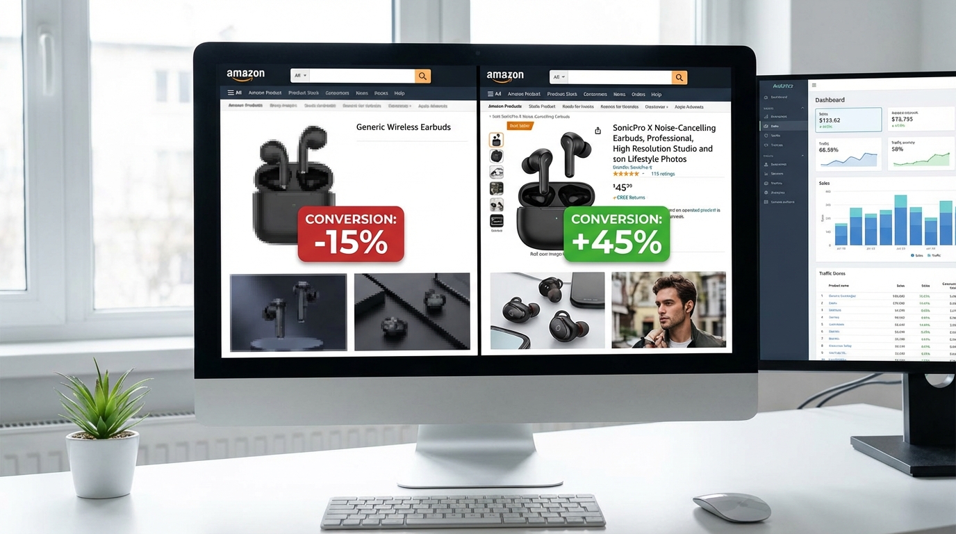
    Side-by-side comparison on a monitor showing Amazon product listing with poor versus optimised professional images and analytics dashboard

    Intuition and design sense have limits. The only reliable way to know which images actually perform better with your specific audience is to test them. Amazon’s Manage Your Experiments (MYE) tool provides exactly this capability for brand-registered sellers — and the results can be significant.

    What Manage Your Experiments Actually Measures

    MYE runs an A/B test that splits traffic between two listing variants — typically your current images versus a challenger set — and measures performance across several metrics:

    • Click-through rate (CTR): The proportion of shoppers who see your product in search and click through to your listing. CTR is primarily driven by your main image and title.
    • Conversion rate: The proportion of shoppers who visit your listing and make a purchase. Conversion is driven primarily by the full image gallery, bullet points, price, and reviews.
    • Units sold per session: How many units the average visitor session results in.
    • Revenue: Total sales generated by each variant over the test period.

    Real Results from Image Split Testing

    Split testing data from real Amazon experiments illustrates why this is worth the effort:

    • A main image change — switching from one angle to another — has been documented to produce CTR lifts of 21% in individual cases, with corresponding improvements in advertising cost of sale (ACOS) of around 20%, since more clicks per impression means less spend required per sale.
    • Colour-focused main image changes (testing product against a coloured background vs. white, for applicable categories) have in some cases doubled CTR — from 0.9% to 1.8% — which has a compounding effect on both organic and paid visibility.
    • Full gallery optimisation (revising all secondary images, not just the main image) has been associated with conversion rate improvements of 14–32% in documented case studies.
    • One published case study showed a main image test generating $30,000 in additional monthly revenue without any increase in PPC spend, purely from improved CTR feeding higher-volume organic traffic.

    Running an Effective Image Test

    Test one variable at a time. If you change both the main image and three secondary images simultaneously, you can’t know which change drove the result. Start with the main image — it has the highest leverage — then test secondary images individually or as a complete set swap.

    Allow enough statistical significance. MYE requires a minimum number of sessions and a defined confidence level before it calls a winner. Don’t end a test early because one variant is trending ahead — early leads reverse frequently. Follow the platform’s statistical guidance.

    Define what “winning” means before you start. Are you optimising for CTR (which improves PPC efficiency), conversion rate (which improves organic rank), or revenue per session (which accounts for both)? Knowing this in advance prevents you from post-rationalising results to confirm what you hoped to find.

    Document everything. Keep a record of what you tested, when, what the result was, and what you concluded. This becomes an invaluable reference as your catalogue grows and your testing programme matures.

    Testing Options Beyond Manage Your Experiments

    MYE is not the only way to gather image performance data. External tools, including PickFu (a paid panel testing service), allow you to present image variants to a screened panel of respondents who match your target demographic and collect preference data and qualitative feedback before you run a live test. This is particularly useful for main image validation before a new listing launches — you get directional data before the listing goes live, rather than after.

    Common Image Mistakes That Suppress and Kill Conversions

    A structured audit of the most common Amazon listing image errors reveals patterns that consistently appear across categories and seller types. Many of these are easy to fix once identified — the challenge is knowing to look for them.

    Technical Violations That Trigger Suppression

    Off-white backgrounds on main images. This is the number one cause of listing suppression. Sellers often use “near white” — cream, very light grey, 250/250/250 instead of 255/255/255 — because their photographer produced it, or because their editing pipeline didn’t calibrate to pure white. Amazon’s automated detection is configured to catch this, and suppression can happen without warning.

    Product not filling 85% of the frame. Under-filling the frame is both a compliance issue and a performance issue — smaller products get fewer clicks because they communicate less confidence and visual presence in the search grid.

    Resolution under 1,000 pixels. Any image below 1,000 pixels on the longest side disables the zoom function. Given that a significant proportion of engaged shoppers zoom before purchasing, disabling zoom is a conversion leak that’s entirely within the seller’s control to fix.

    Including excluded accessories in main images. A product photo that includes items not sold in the listing — a laptop stand photographed with a laptop, for example, when only the stand is for sale — is a compliance violation that can result in suppression and is also a source of buyer confusion and negative reviews.

    Design Errors That Undermine Trust

    Inconsistent image style across the gallery. A main image that looks like it was shot professionally, followed by secondary images that are visually inconsistent — different lighting, different colour grading, different quality level — signals that the listing wasn’t put together with care. Shoppers are not consciously aware of this, but it contributes to a subconscious sense of unreliability.

    Generic stock lifestyle images. Using lifestyle photography that doesn’t specifically show your product in context — or that uses settings and models so generic they could belong to any listing in the category — adds no persuasive value. Shoppers can tell the difference between authentic lifestyle photography and stock image filler.

    Low-contrast or decorative text in infographics. Callout text that uses thin fonts, low-contrast colour combinations, or small type sizes is functionally invisible on mobile. If your infographic text can’t be read by someone holding their phone at arm’s length, it’s not doing the job it was designed to do.

    Misleading scale. Products photographed in ways that obscure their actual size generate returns and negative reviews at a higher rate than almost any other image error. Scale reference shots are not optional for products where size expectations vary significantly.

    Strategic Failures That Limit Conversions

    Not using all available image slots. A listing with 4 images where 9 slots are available is leaving substantial sales on the table. Every unfilled slot is a missed opportunity to address a buyer objection, communicate a feature, or strengthen an emotional connection. Fill all 9 slots with purpose-built images.

    Duplicate information across images. Showing the same angle of the product twice, or repeating the same feature callout in two different images, wastes gallery space that could be used to address a different buyer concern.

    Images that look great in isolation but don’t work as a sequence. Individual images need to work together as a coherent narrative. If the gallery jumps from main image, to a random lifestyle shot, to a confused infographic, to a dimension chart, shoppers who are quickly swiping through will struggle to construct a coherent understanding of what they’re buying and why it’s worth buying.

    The Image Stack as a Conversion System: Putting It All Together

    We’ve covered a significant amount of ground in this guide, and it’s worth stepping back to connect the individual elements into the larger picture.

    Your Amazon listing images are not a series of independent creative decisions. They’re an interconnected system — a visual selling machine — where every component plays a specific role in moving a shopper from initial discovery to completed purchase.

    The Buyer Journey Your Images Must Serve

    Think about what a shopper actually experiences when they encounter your product:

    1. They see your thumbnail in the search grid. Their brain forms an instant impression — attractive or unappealing, trustworthy or cheap, relevant or not. This is your main image’s job.
    2. They click through and their eye immediately goes to the image carousel. They swipe once, maybe twice, before looking at your title or price. This is your Slots 2–3 job.
    3. If the first two images have answered the basic questions, they continue scrolling. They look for emotional connection, scale confirmation, feature validation. This is Slots 4–7’s job.
    4. If they’re still engaged, they read the bullet points and check the reviews — but they’ve already made a provisional decision, and these just confirm or deny it. Your images set the frame for how the text is interpreted.
    5. For a subset of seriously considered purchases, they scroll to A+ Content for additional depth. A+ images close the remaining distance to purchase for these shoppers.

    Each stage of this journey requires a different visual response. Building a Visual Selling System means thinking about each image in terms of which stage it serves and what specific objection or question it resolves.

    The Continuous Improvement Cycle

    Image optimisation is not a one-time project. The listings that maintain strong conversion rates over time are the ones where sellers treat their image gallery as a living asset — one that gets audited, tested, and updated on a regular cycle.

    A practical schedule that works for most sellers:

    • Monthly: Check for listing suppression alerts and verify technical compliance for all main images.
    • Quarterly: Review conversion rate trends. If a listing is declining without an obvious external cause (pricing, competition, seasonality), the image gallery should be one of the first places you investigate.
    • Every 6 months: Run a full gallery audit — compare your images against your top-performing competitors and identify where your visual presentation is weaker. Brief new images based on findings.
    • Ongoing: Keep at least one Manage Your Experiments test running on your highest-revenue ASINs at all times. The data compounds over time.

    Prioritisation for Maximum Impact

    If you’re working through an existing catalogue and have limited time and resources, prioritise in this order:

    1. Main image compliance first. A suppressed listing generates zero sales. Check every main image for pure white backgrounds, product fill percentage, and prohibited elements before anything else.
    2. Main image CTR second. Your highest-traffic, highest-revenue ASINs are where a main image improvement delivers the most immediate financial return. Test before you change — baseline your CTR first.
    3. Complete your secondary gallery. Any listing with fewer than 7 images should have its gallery completed before you invest time in refining individual images. Fill the slots with purpose-built content.
    4. Mobile-optimise your infographics. Audit all text overlay images on a real phone. Fix readability issues immediately — this is often a quick design fix with meaningful conversion impact.
    5. Add A+ Content. If you’re brand-registered and don’t have A+ Content on your top-performing listings, this is an unambiguous opportunity. Even basic A+ Content with well-executed images will improve conversion rates.

    Final Takeaways

    Product images are the highest-leverage element of an Amazon listing. They’re what shoppers see first, process fastest, and rely on most heavily when making purchase decisions. Yet many sellers treat their image galleries as an afterthought — something to complete before launch and revisit only when things go wrong.

    The data is clear. Optimised images lift click-through rates. They improve conversion rates. They reduce returns. They make advertising more efficient by generating more sales per click. And they compound — a listing with excellent images maintains its performance advantage over time, while competitors with inferior galleries continue to lose ground.

    Build the Visual Selling System. Test it, improve it, and treat it as the strategic asset it actually is.