Tag: product photography

  • What Your Amazon Images Are Really Costing You (And How to Fix It, Section by Section)

    What Your Amazon Images Are Really Costing You (And How to Fix It, Section by Section)

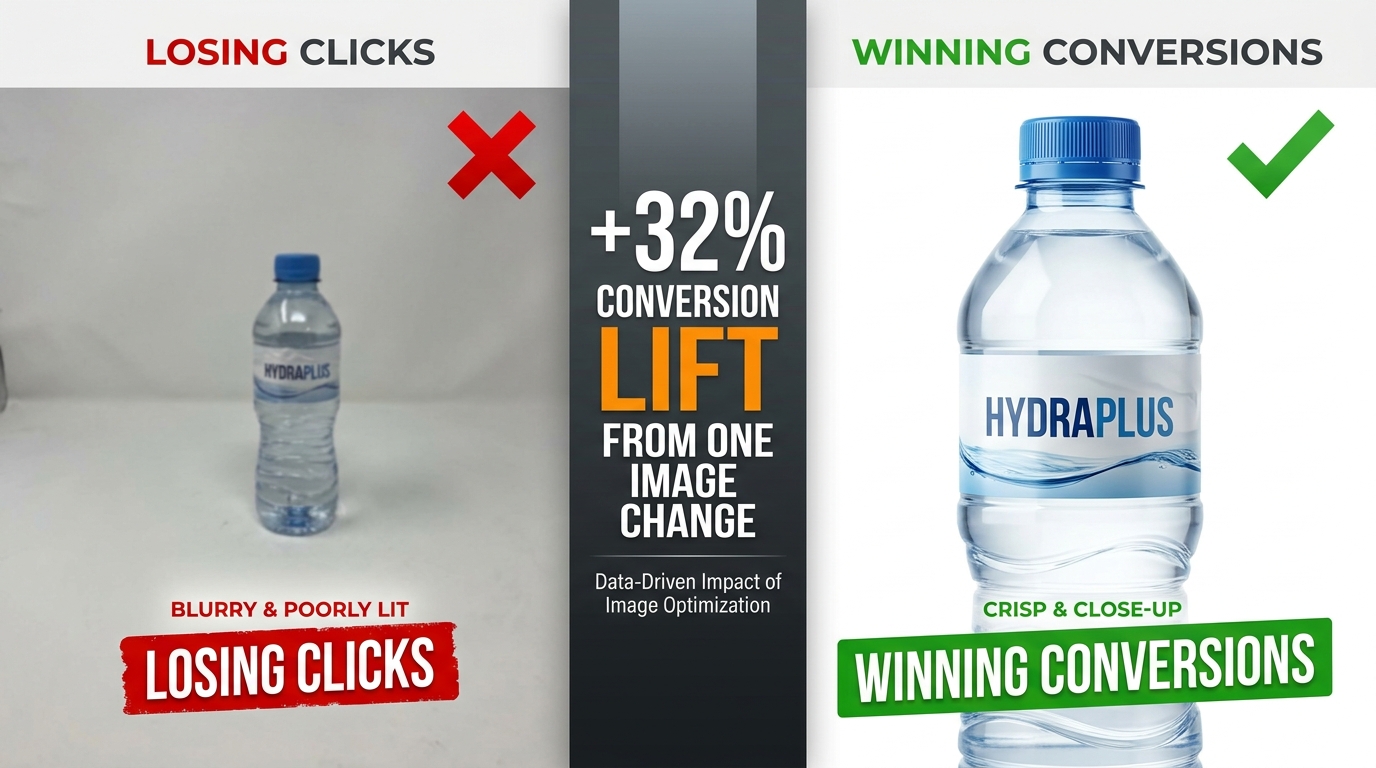
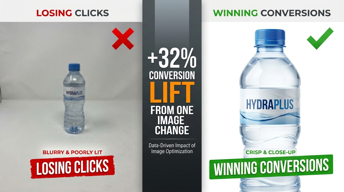
    Split-screen comparison: poor Amazon product image losing clicks vs. optimized image winning conversions with +32% conversion lift stat

    Most Amazon sellers focus their optimization energy in the wrong places. They obsess over keyword density in bullet points, fiddle with PPC bid adjustments, and chase backend search terms — while the single most powerful lever for clicks and conversions sits right at the top of every listing, doing damage no one is measuring.

    Their images.

    Here’s the uncomfortable reality: a shopper who lands on your listing will form a visual impression in roughly 50 milliseconds. Before they’ve read your title, before they’ve scrolled to your bullet points, before they’ve checked your reviews — they’ve already decided whether this product looks worth their time. That snap judgment is made entirely by your images.

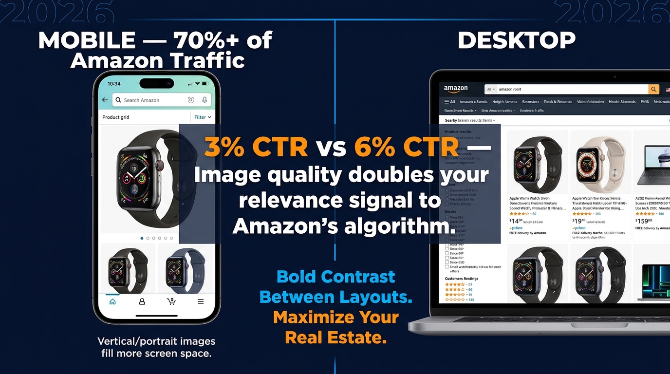
    And yet most Amazon listings are built with images that were assembled quickly, tested never, and optimized for desktop in a world where more than 70% of Amazon traffic is now mobile. The result is a silent, invisible tax on every impression your listing receives — lower click-through rates, higher bounce rates, more abandoned carts, and ultimately, margin that quietly bleeds out without a clear culprit on your dashboard.

    This isn’t another post about making sure your main image has a white background. You know that already. This is a detailed, section-by-section breakdown of what truly high-performing Amazon image stacks look like in 2026 — covering the science of sequencing, the specific mistakes that cost sellers real money, what Amazon’s Rufus AI is now extracting from your images, and how to build a testing loop that turns your image gallery into a compounding asset.

    Let’s start at the beginning — with why images aren’t just a creative decision, but an economic one.

    The Visual First Impression: Why Images Decide the Sale Before Buyers Read a Word

    Amazon selling is, at its core, a conversion rate business. Traffic matters — but what you do with that traffic is what separates profitable listings from expensive ones. And the evidence is increasingly clear that images are the single biggest driver of whether a visitor converts or walks.

    JungleScout research ranks product images as the second most critical purchase factor for Amazon buyers, sitting just behind price. That’s ahead of reviews, shipping speed, and brand reputation. When you factor in that images directly influence price perception — a professional image makes a product look premium, justifying higher prices — the argument for treating image optimization as a top-tier business activity becomes overwhelming.

    The 50-Millisecond Window

    Research on visual processing consistently shows that human brains form first impressions of visual content in approximately 50 milliseconds. For Amazon shoppers, that 50-millisecond window happens in the search results grid, where your hero image thumbnail competes against every other product on the page.

    In that instant, a shopper’s brain is running a rapid-fire filter: Does this look professional? Does this look like what I’m searching for? Does this look worth clicking? If the answer to any of those questions is “not sure,” they scroll past. There’s no second chance in the search results — your hero image gets one shot.

    Professional, high-quality images have been shown to produce conversion rates 2-3x higher than amateur or low-quality shots, according to Statista data. That’s not a marginal gain. A listing converting at 6% instead of 3% on the same traffic doubles revenue without a dollar more in ad spend.

    Images as Your Silent Sales Team

    The 65-70% of purchase decisions that are driven by images aren’t just about aesthetics. Images answer the questions a buyer would otherwise have to dig through text to find: What does this actually look like? How big is it? How do I use it? What’s in the box? Will it fit my life?

    Every image slot in your gallery is an opportunity to answer one of those questions before doubt can take root and send the shopper elsewhere. The sellers who treat their image stack like a sales team — each image with a specific job, answering a specific objection, advancing a specific conversation — are the ones whose conversion rates hold up even in crowded categories.

    The sellers who upload seven vaguely similar product photos and call it done are running a listing that’s working against them every single day.

    The Hero Image: Engineering a Thumbnail That Commands the Click

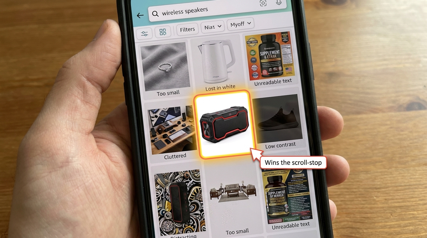
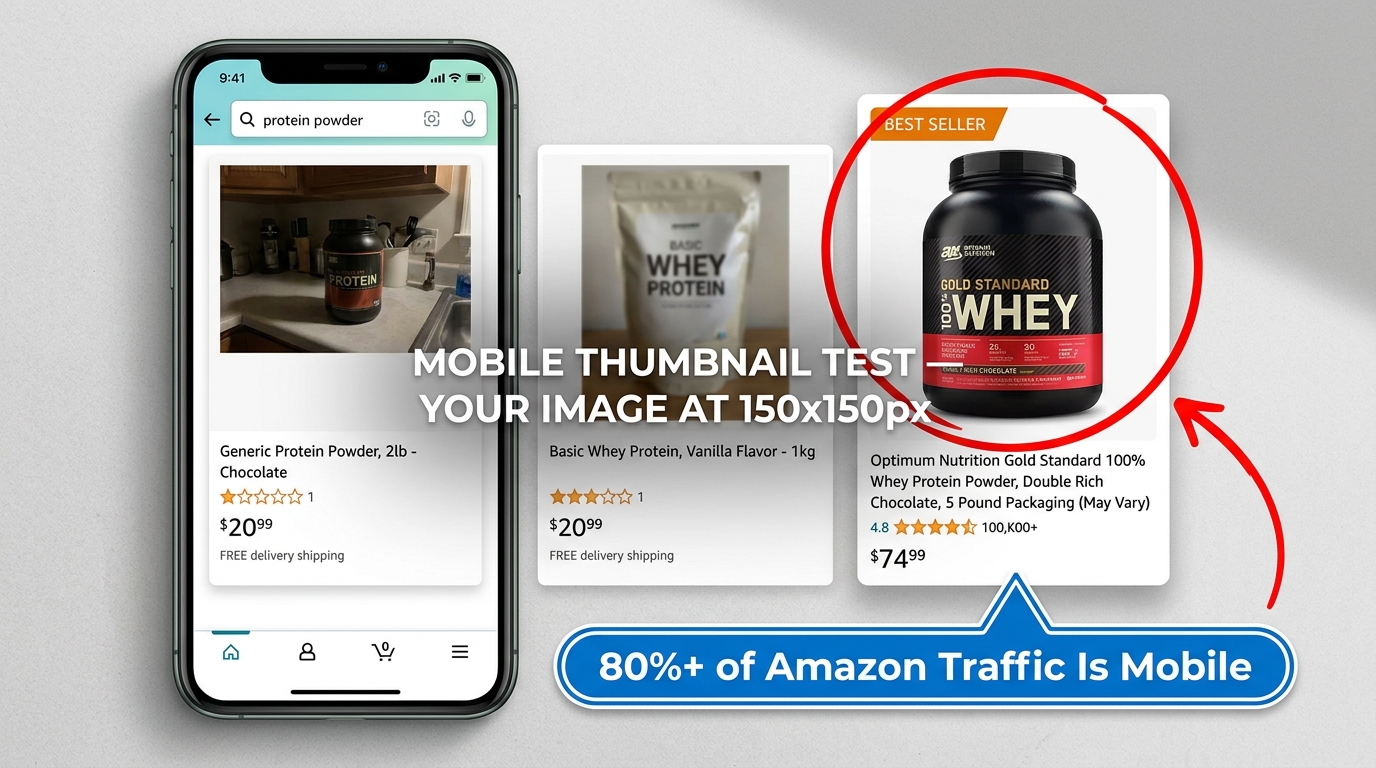
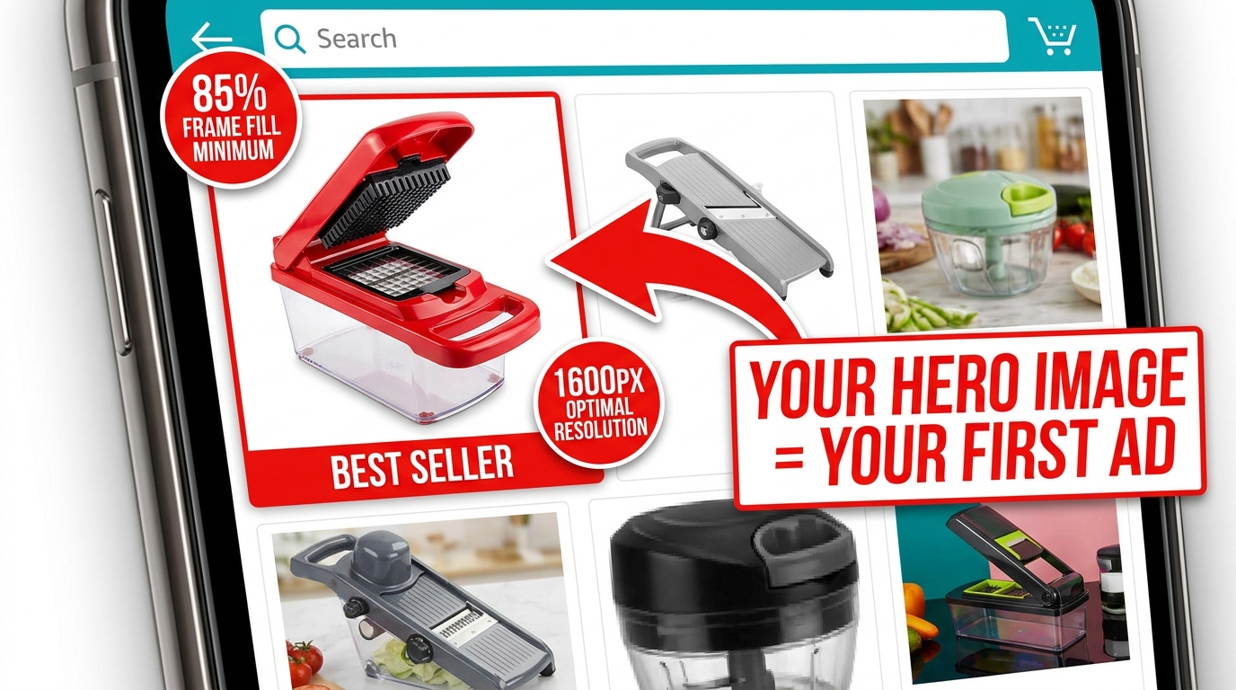
    Amazon mobile search grid showing one optimized product thumbnail standing out with 85% frame fill vs. competitors with dead space

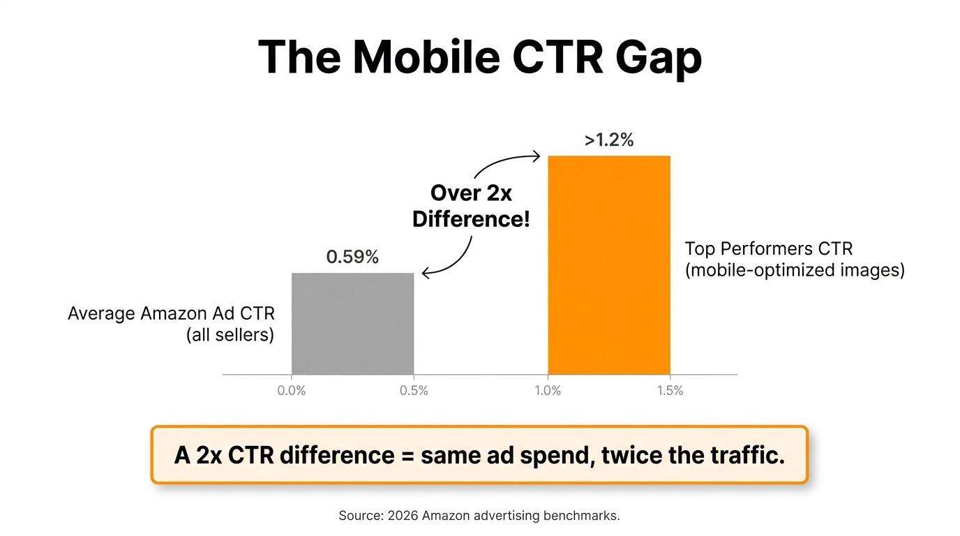
    Your hero image — the main product shot shown in search results — is functionally an advertisement. It’s the creative that runs every time someone searches a keyword you rank for, and its job is a single, specific one: get the click. Not sell the product. Not explain the features. Get. The. Click.

    Everything else in your listing exists downstream of that click. The bullet points, the A+ content, the reviews, the video — none of it matters if the hero image doesn’t earn the visit. That’s why the hero deserves a level of attention and investment that most sellers reserve for their PPC campaigns.

    Amazon’s Non-Negotiable Technical Requirements

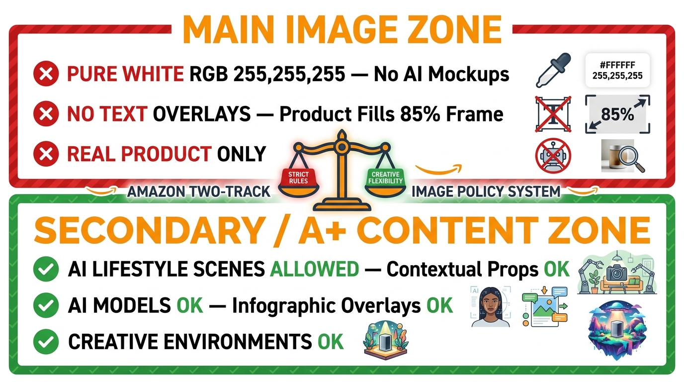
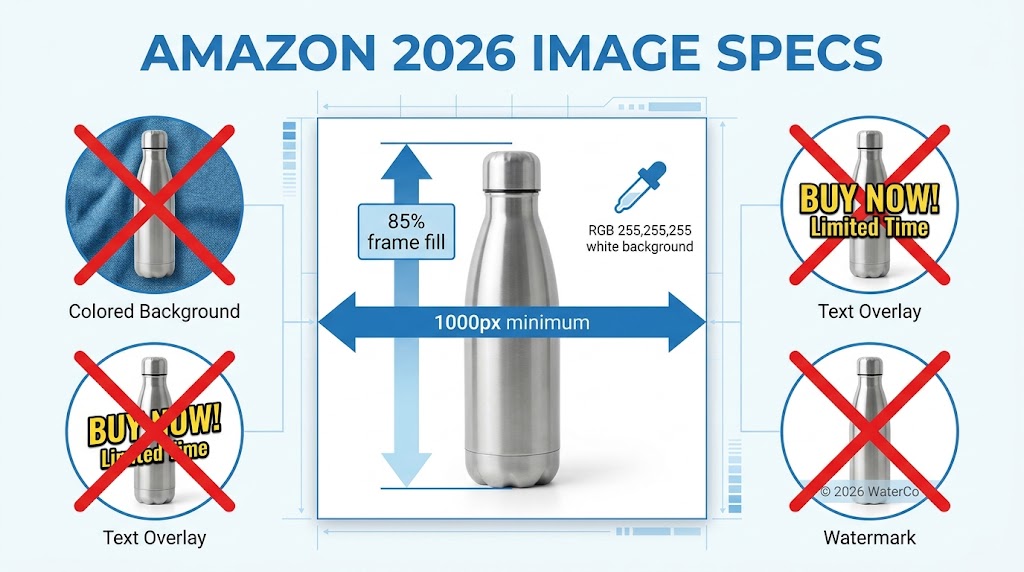
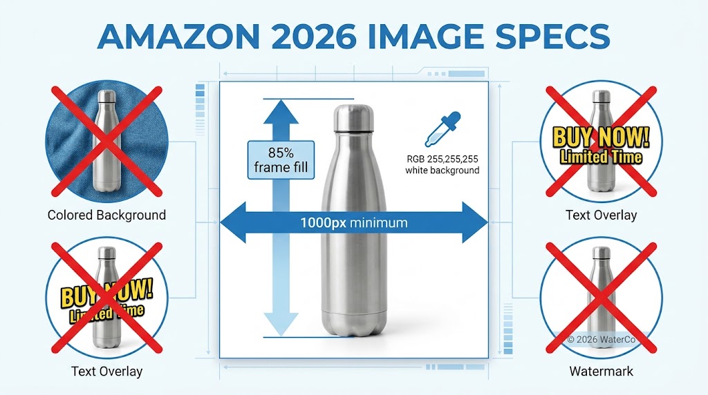
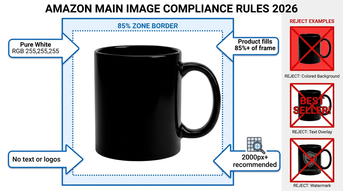
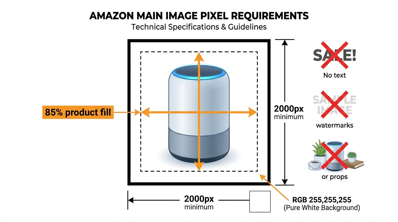
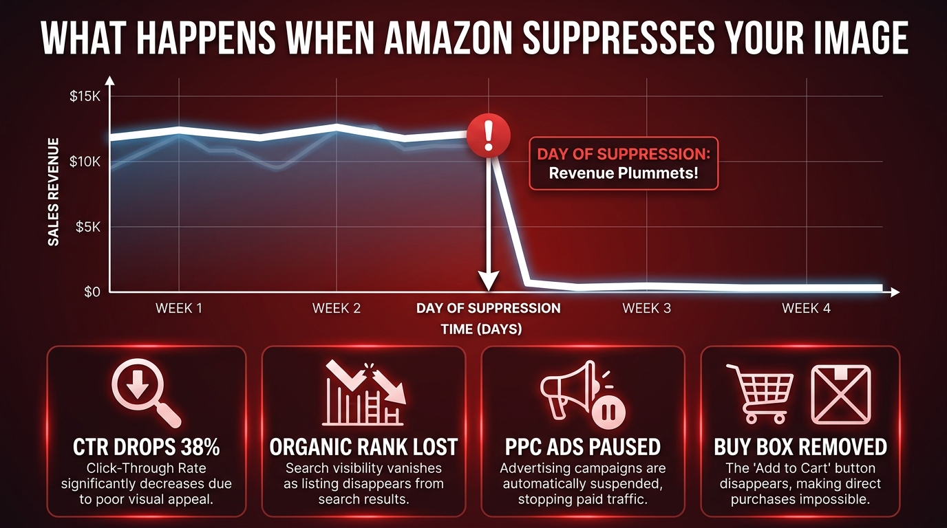
    Amazon’s requirements for the main image are strict, and violating them risks listing suppression. The rules are worth internalizing, not just bookmarking:

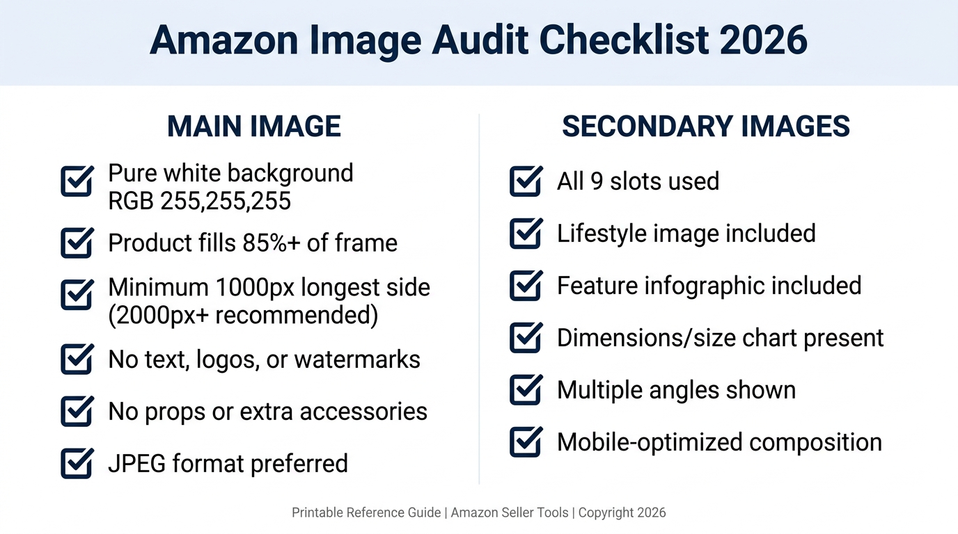
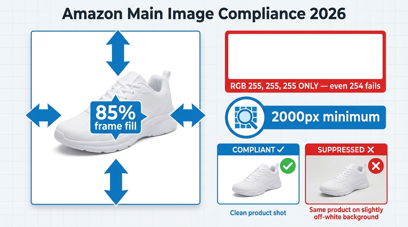
    • Pure white background: RGB 255, 255, 255 — not off-white, not light gray, not cream. Pure white.
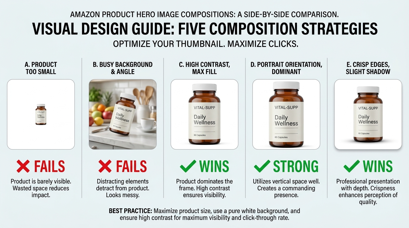
    • Product fills at least 85% of the frame. This is a minimum. 90-95% is better.
    • No text, logos, graphics, watermarks, or borders overlaid on the product or background.
    • Minimum 1,000px on the longest side for the site; 1,600px to enable zoom (which improves conversion); up to 10,000px maximum.
    • Product must be shown outside packaging in most categories. No props or excluded accessories.
    • No multiple views of the same product in the main image.

    Amazon’s optimal specification is 1,600px or larger specifically because zoom functionality — the ability to hover and enlarge the image — has been shown to measurably improve sales. Don’t meet the minimum. Aim for 2,000px or higher for maximum quality at all display sizes.

    What “Commanding the Click” Actually Looks Like

    Within Amazon’s rules, there’s still significant room to differentiate. The best hero images share a few characteristics that go beyond technical compliance:

    Angle matters more than you think. The front-facing, flat product shot is the default — and for most categories, it’s what works. But the best angle is the one that makes your product’s most compelling feature immediately visible in a 200×200 pixel thumbnail. For a travel mug, that might be the lip-seal lid. For a knife, the blade profile. Test angles if you’re unsure.

    Contrast against the white background. White backgrounds make all products equal at a technical level — but visually, a product with natural contrast (dark colors, distinct edges, strong silhouette) pops far better than a light-colored product that blends into the white. If your product is white or light-colored, consider how professional lighting and shadow can create separation.

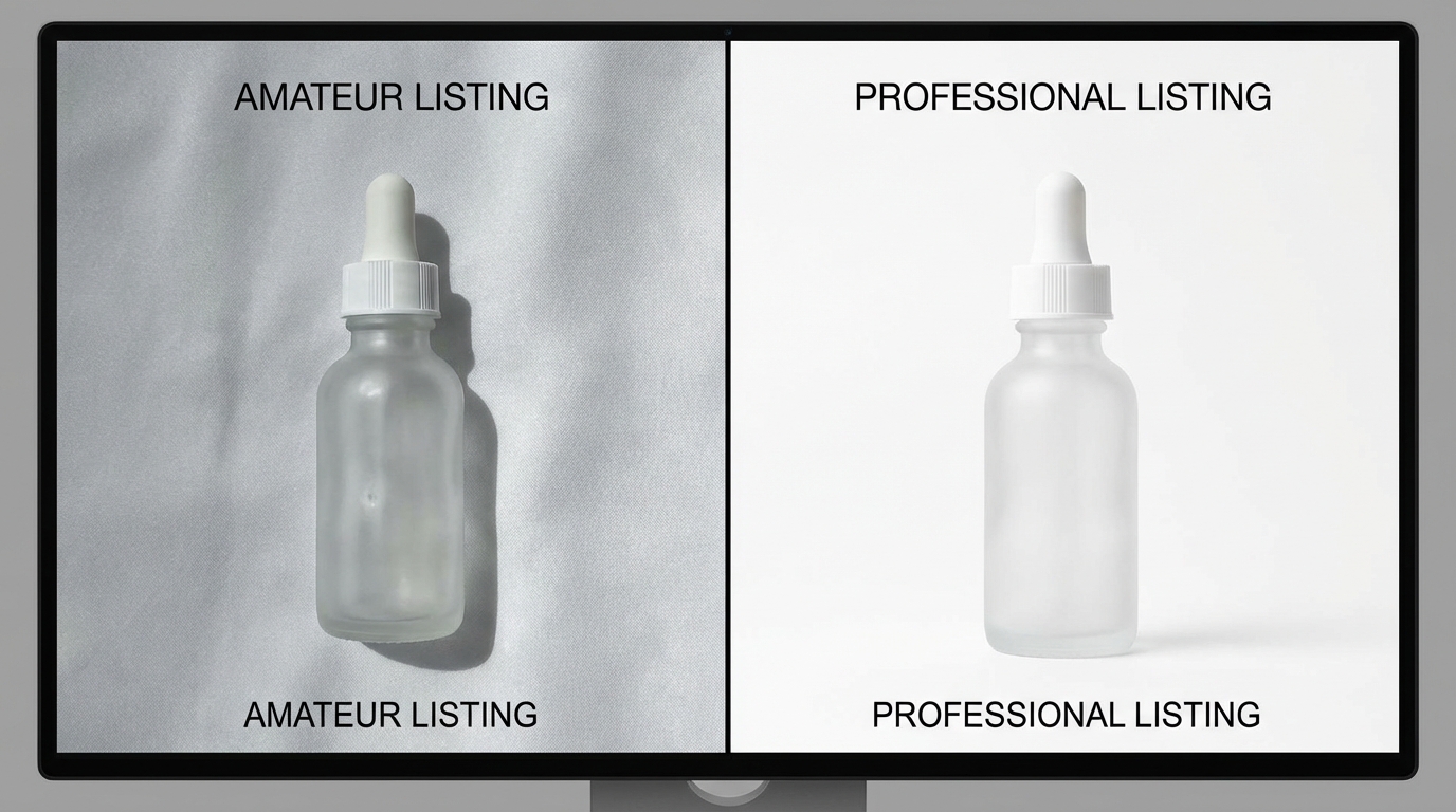
    Perceived quality through photography. The difference between a $200 professional product shoot and a phone photo isn’t just resolution — it’s lighting, shadows, reflections, and depth that signal to a buyer’s brain whether this is a premium product or a cheap knockoff. Professional photography for your hero image isn’t a nice-to-have. In most categories with competitive imagery, it’s table stakes.

    Dead Pixel Real Estate: The Hidden CTR Killer Most Sellers Ignore

    “Dead pixel real estate” is the term used among image optimization practitioners for the empty, unused space around a product in a hero image. It’s the blank white space that surrounds a product when the shot is taken from too far away, or when the original photography dimensions weren’t optimized for Amazon’s thumbnail format.

    In full desktop view, dead pixel space looks acceptable. But in Amazon’s search result grid — particularly on mobile — thumbnails are small and the competition for visual attention is fierce. Every pixel of empty white space is a pixel your product isn’t using. At thumbnail scale, a product that fills 65% of the frame looks noticeably smaller and less substantial than a competitor’s product filling 90%.


    Why This Matters at the Search Results Level

    At any given time on Amazon, your product thumbnail is displayed alongside 15-48 other thumbnails on a search results page. The cognitive load of choosing what to click is real — and shoppers make those micro-decisions based almost entirely on visual prominence and perceived quality.

    A product with significant dead pixel space around it reads as smaller, cheaper, and less important than its neighbors. It doesn’t matter if the product is actually premium — the thumbnail is the first impression, and perception is reality in the 50-millisecond window of a search results scroll.

    Optimizing for zero dead pixel space means cropping your image so the product fills 90-95% of the frame. If your original photography didn’t achieve this, it can often be corrected in post-production without a reshoot. The fix is frequently cheap. The cost of not fixing it compounds daily.

    The “Dead Pixel” Opportunity in Secondary Images

    The dead pixel concept also applies inversely to secondary images — where blank space can be deliberately used as “real estate” for value propositions. In infographic slots, sellers have used the white space around a product to place specification callouts, measurement indicators, and benefit bullets that technically don’t “overlay” the product itself.

    This approach threads the needle between Amazon’s rules (which prohibit text overlays on the main image) and the desire to communicate quickly in the secondary slots. It’s one of the more nuanced tactics available and, when executed cleanly, can make secondary images significantly more informative at a glance.

    The 9-Slot Image Sequence and the Psychology Behind Each Position

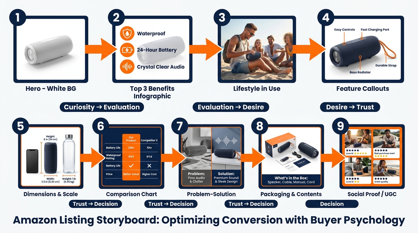
    Amazon 9-image slot storyboard sequence showing psychological buyer journey from curiosity through trust to purchase decision

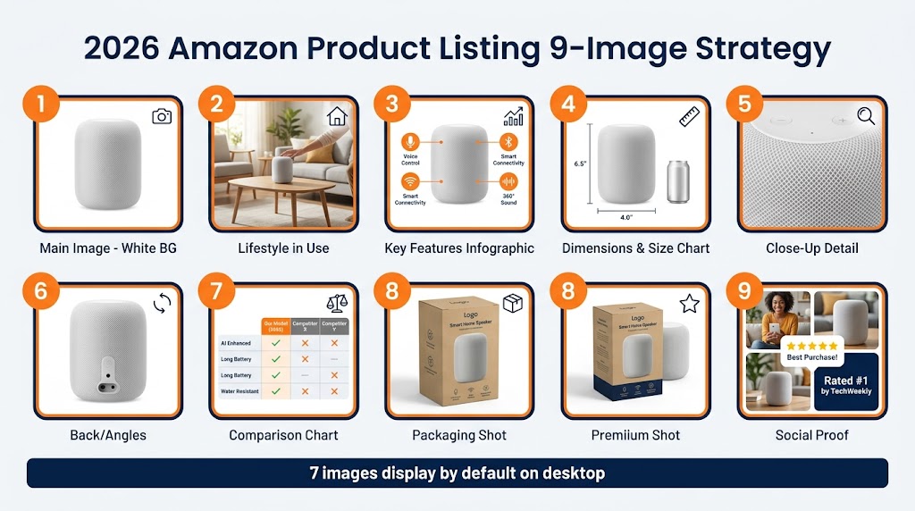
    Amazon allows up to nine image slots plus a video slot for most categories. The vast majority of sellers use fewer than seven, and the ones who do use all nine frequently upload images in whatever order they happen to be ready — not in a deliberate sequence designed to move a buyer through a purchase decision.

    That’s a structural mistake. The image gallery is a sales funnel. Each slot corresponds to a different stage of the buyer’s cognitive journey, and a well-sequenced gallery moves shoppers from initial curiosity through evaluation, desire, objection-handling, and ultimately to the “Add to Cart” button. A randomly ordered gallery just gives shoppers more chances to find a reason to leave.

    The Nine-Slot Framework

    Here’s how high-converting sellers approach the 9-slot sequence:

    Slot 1 — The Hero: Pure white background, maximum frame fill, professional photography. Drives the click from search results. No information beyond the product’s visual quality and form factor.

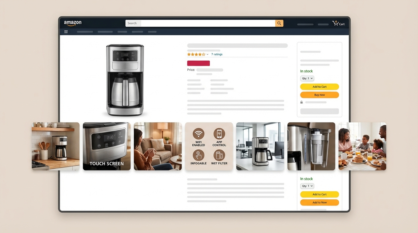
    Slot 2 — The Top-3 Benefits Infographic: The buyer has clicked and is evaluating whether to stay. This slot answers: “Why this product?” Three bold, benefit-driven callouts with clean iconography. Not features — benefits. Not “1200W motor” — “Crushes ice in under 10 seconds.” This is where you address the emotional purchase driver immediately.

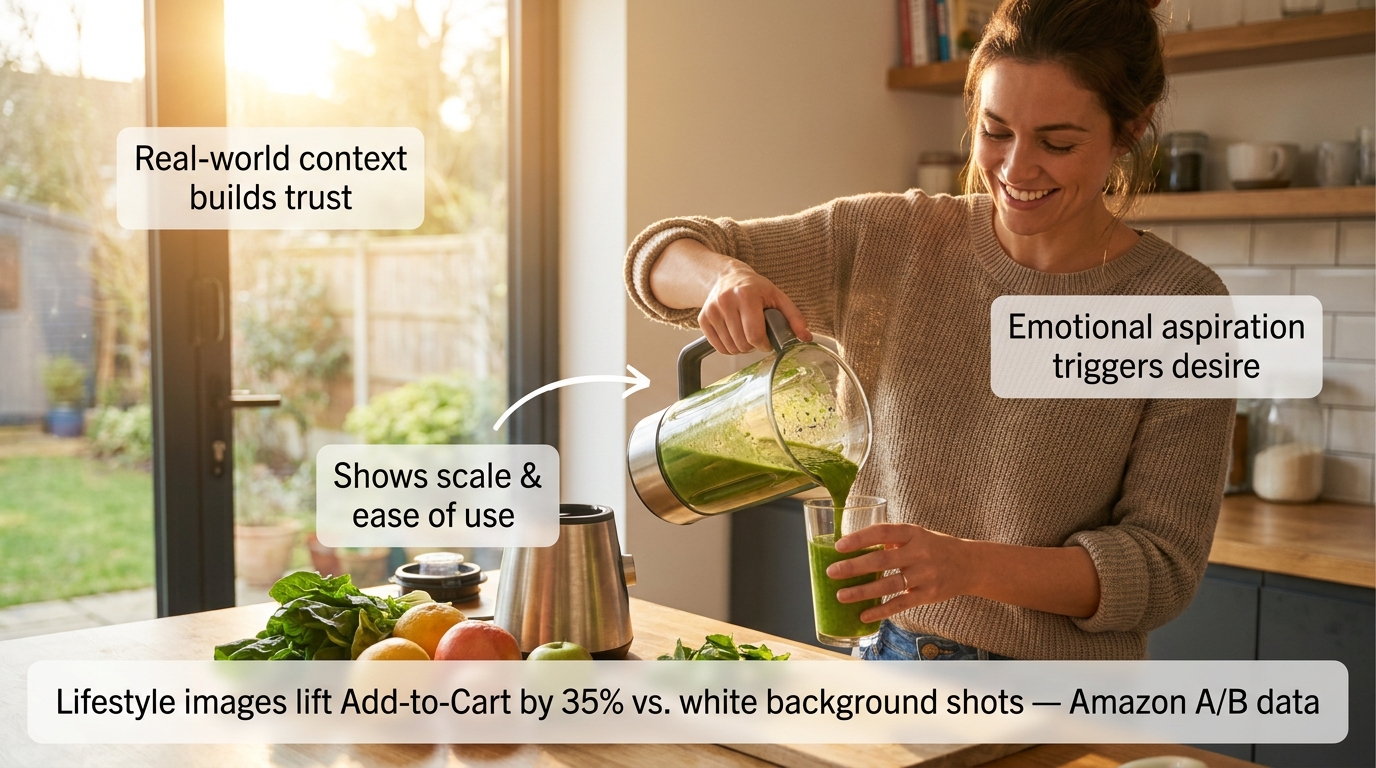
    Slot 3 — Lifestyle in Context: Show the product being used by a person in a real environment. This slot triggers aspiration and belonging. The buyer thinks: “That could be me.” It also communicates scale, ease of use, and the product’s fit into the buyer’s life — all without a word of text.

    Slot 4 — Feature Callouts with Close-Ups: Now the buyer is warming up and wants details. This slot goes deep on the product’s most important physical features — materials, components, specific design choices — with annotated close-up photography and short explanatory labels.

    Slot 5 — Dimensions and Scale Reference: One of the most common causes of returns is size mismatch. Buyers imagined the product was bigger or smaller than it actually is. A dedicated dimensions image — showing the product next to a recognizable scale reference (a hand, a common household item) alongside actual measurements — prevents this objection before it becomes a return or a negative review.

    Slot 6 — Comparison or Differentiation: If you have a legitimate advantage over the category standard — better capacity, more durable materials, more certifications, longer warranty — this is where to present it visually. A clean comparison chart (your product vs. “typical” competitor, not naming brands) addresses the “why not just buy the cheaper one?” objection directly.

    Slot 7 — Problem-Solution Narrative: Address the specific pain point your target buyer arrived with. “Tired of blenders that can’t handle frozen fruit?” This slot validates the buyer’s frustration and positions your product as the resolution. It’s the slot most sellers skip and the one that often moves the most hesitant buyers.

    Slot 8 — What’s in the Box: Show the full product contents laid out cleanly. This eliminates uncertainty (one of the primary drivers of abandoned carts) and creates positive surprise when the unboxing matches the image. It also signals quality packaging and attention to detail.

    Slot 9 — Social Proof or Trust Signal: Aggregate review ratings, certification badges, sustainability credentials, or user-generated content integrated into a clean graphic. This is the final reassurance before the purchase — the “others trust this, you can too” signal that closes hesitant buyers.

    Why Sequence Matters as Much as Content

    The same nine images in a different order perform differently. An image that works brilliantly in slot 3 can underperform in slot 7 because it’s answering a question the buyer hasn’t asked yet. The sequence mirrors the natural progression of a buyer’s internal monologue, and disrupting that progression creates friction. Friction kills conversions.

    Infographics That Actually Convert: Designing for the 3-Second Mobile Scan

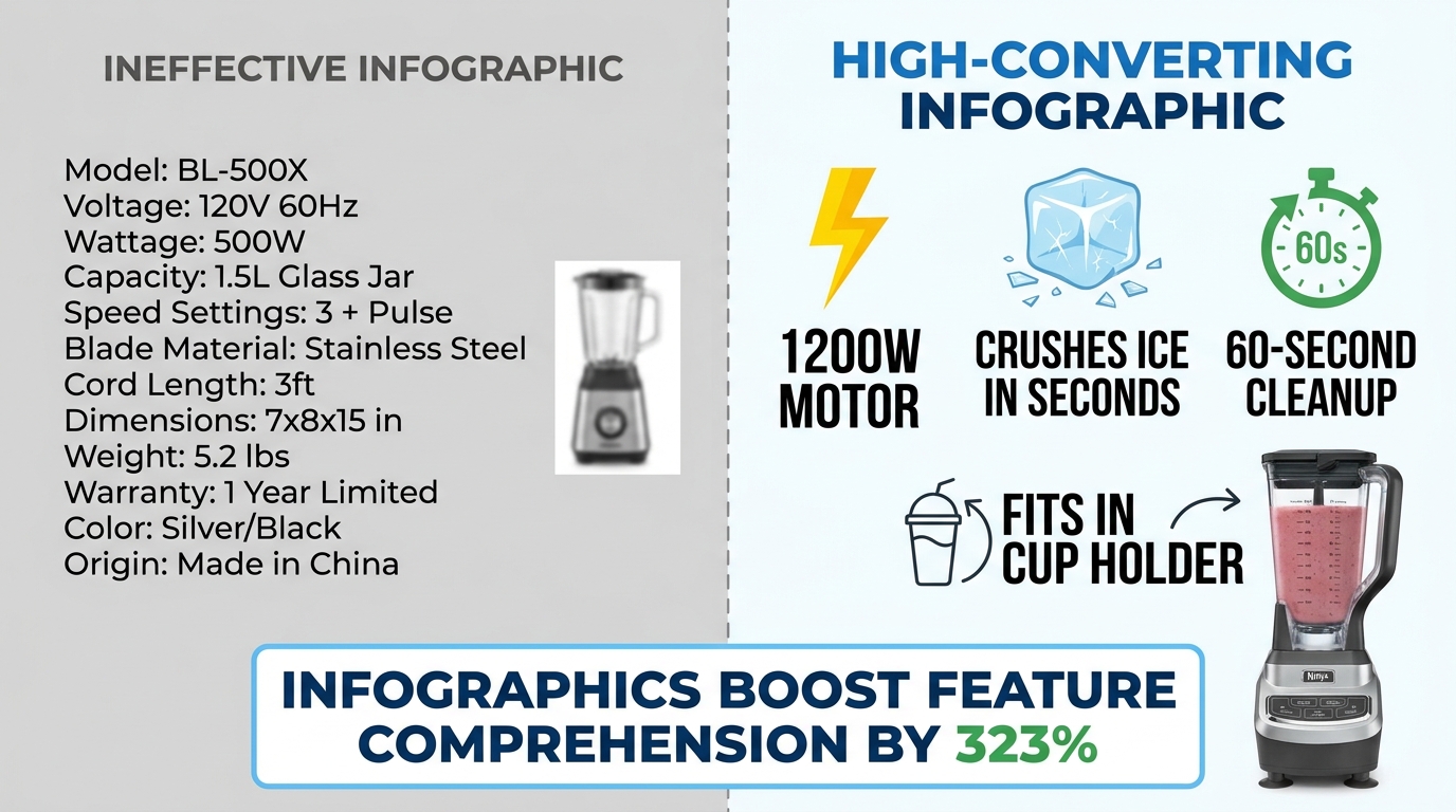
    Side-by-side comparison of ineffective cluttered Amazon infographic vs. clean high-converting infographic with 323% comprehension stat

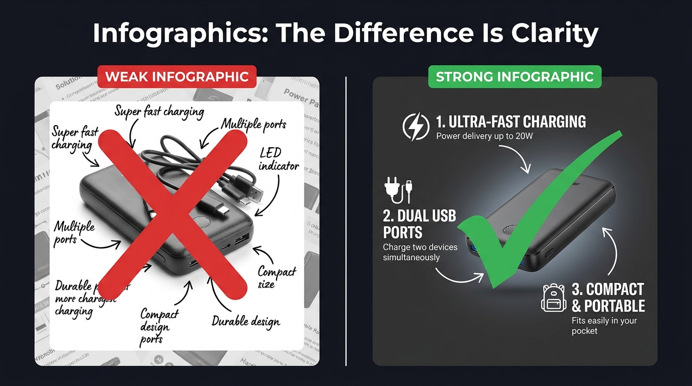
    Infographic images — the secondary images that overlay text, icons, and callouts on or around product shots — have become a standard part of Amazon listing optimization. But “having infographics” and “having infographics that convert” are two very different things. The Amazon search results pages in most competitive categories are now full of infographic images. Many of them don’t work.

    The data on infographics is compelling: adding infographic and scale images with text to a listing can improve customer understanding of product features by up to 323%, according to aggregated Amazon listing data. That’s a dramatic number. But that uplift requires the infographic to actually be readable and scannable — conditions that a surprising number of infographics fail to meet.

    The Mobile Rendering Problem

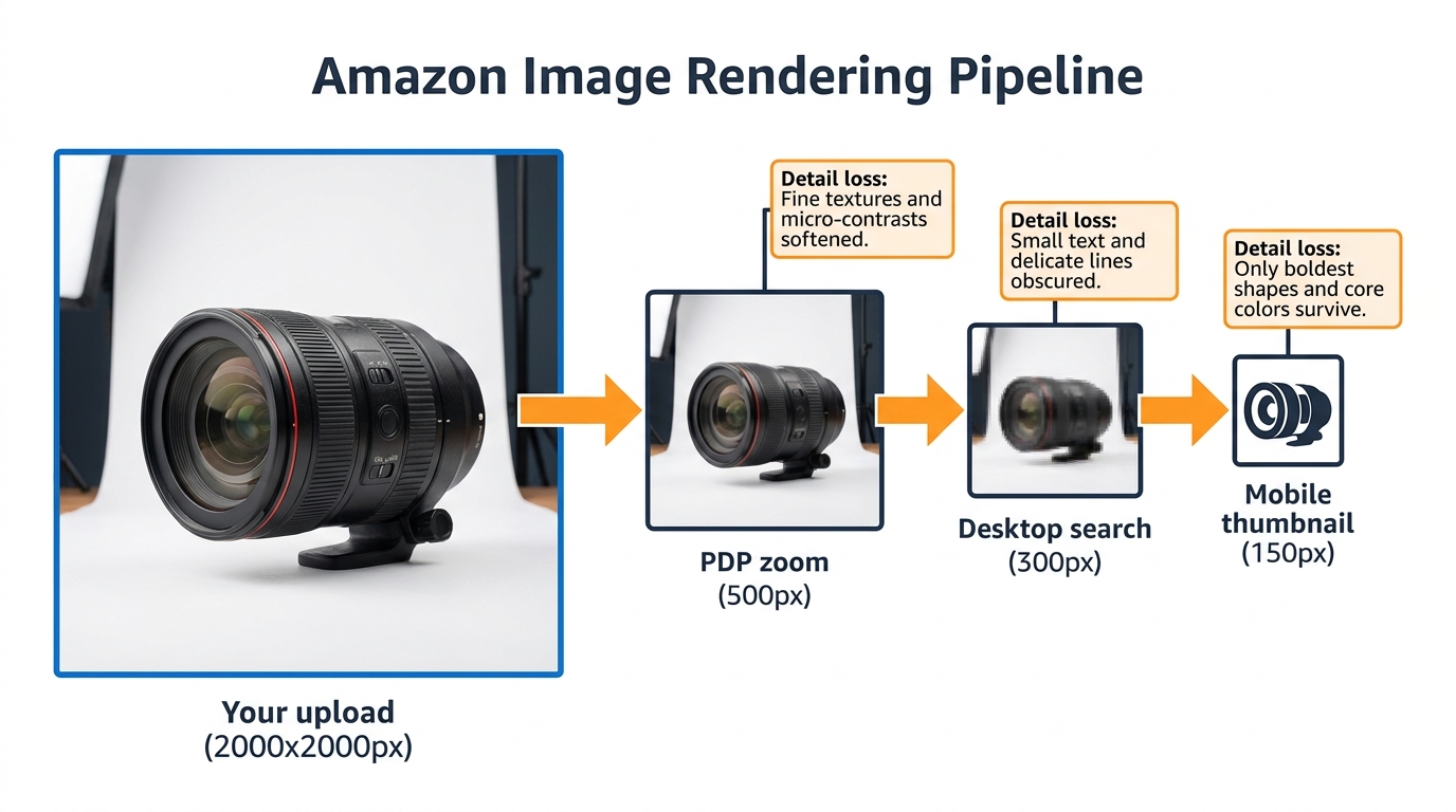
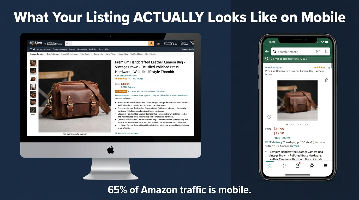
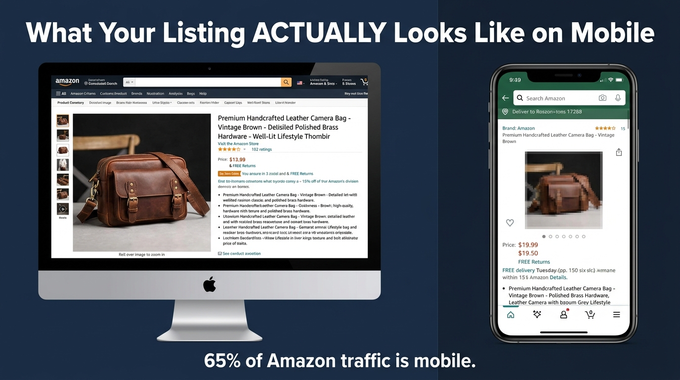
    Here is the core design mistake sellers make with infographics: they design them on a large desktop monitor at 1:1 scale, where text looks clear and readable, then upload them without checking how the image renders at mobile thumbnail size.

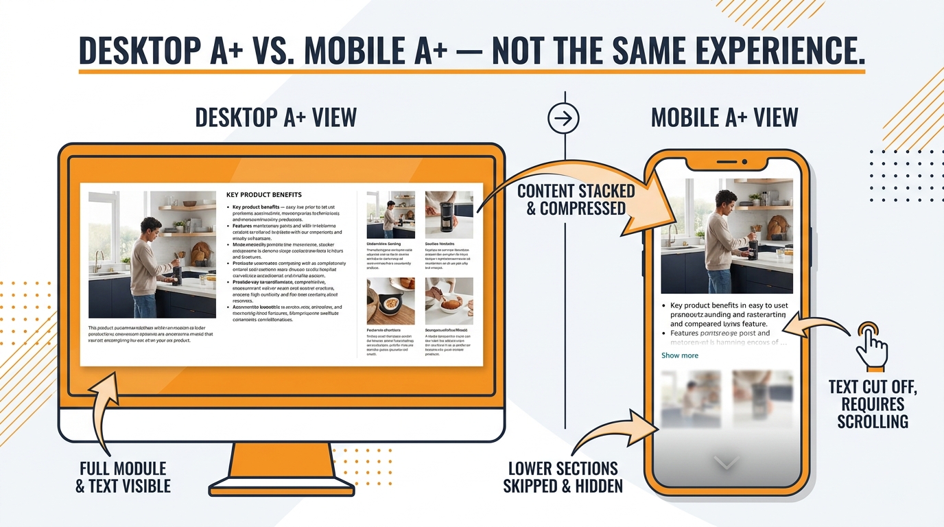
    On mobile — where over 70% of Amazon shopping occurs — an image designed at 2000×2000 pixels is rendered in a space roughly 350-450 pixels wide. Text that looked fine at desktop scale becomes illegible at that compression ratio. A six-point callout font becomes microscopic. A ten-bullet feature list becomes a gray blur.

    The result is an infographic that registers as “busy” or “complicated” rather than informative. Buyers swipe past it. The 323% comprehension uplift assumes the buyer can actually read the infographic — and on mobile, they often can’t.

    The 3-Second Scan Principle

    High-converting infographics are designed around a single constraint: a mobile shopper should be able to understand the core message within three seconds. Not absorb every detail — just get the point.

    That constraint leads to several specific design rules:

    • Maximum three focal points per image. One image, one message. If you’re trying to communicate five things in one infographic, you’re communicating zero of them clearly.
    • Font size of at least 30-40pt on the original image file so text remains readable at mobile compression ratios. Test by shrinking your image to 400px wide before uploading and checking legibility.
    • High-contrast text on a contrasting background. White text on a white product doesn’t work. Dark text on a light background or light text on a dark element — with clear visual separation — is the standard that survives mobile compression.
    • Icons over text where possible. A lightning bolt icon communicates “fast” instantly. Three words of text do not. Iconographic communication is faster and more mobile-resilient than text-heavy designs.
    • Benefit language, not feature language. “Fits in any standard car cup holder” beats “6.5cm diameter base.” The first is a benefit the buyer can instantly relate to their life; the second requires mental translation.

    The “One Infographic Per Pain Point” Rule

    Each infographic in your image stack should address exactly one buyer question or objection. Not a collection of facts about the product — one clear answer to one specific concern. “Will it last?” “How hard is it to clean?” “Is it the right size for my needs?” When an infographic tries to answer three questions at once, it answers none of them convincingly.

    This single-focus discipline also makes A/B testing infographics much more actionable. When you test two versions of an infographic and one performs better, you know exactly what variable moved the needle — because each image only had one variable to begin with.

    Lifestyle Photography: The Emotional Trigger That Turns Browsers Into Buyers

    Cinematic lifestyle product photo of woman using blender in bright kitchen with annotation callouts about trust, scale, and emotional aspiration triggers

    Amazon A/B testing data shows lifestyle images outperform standard white-background secondary shots by approximately 35% in Add-to-Cart actions. That’s a measurable, repeatable finding across multiple categories — and it makes intuitive sense once you understand what lifestyle images actually do psychologically.

    A white-background product image answers the question: “What does this look like?” A lifestyle image answers a fundamentally different — and far more powerful — question: “What will my life look like with this in it?”

    That shift from product-centric to life-centric framing triggers what psychologists call “mental simulation.” When a buyer sees a person using a product in a context they can relate to, their brain automatically begins simulating the experience of owning and using that product. Mental simulation is a key driver of desire — and desire is what converts browsers into buyers.

    What Makes a Lifestyle Image Work

    Not all lifestyle images trigger mental simulation effectively. The ones that do share specific characteristics:

    The model reflects the target buyer. A lifestyle image of a 22-year-old fitness influencer using a blender doesn’t resonate with a 45-year-old parent buying it for family meal prep. The most effective lifestyle images feature people whose demographics, environment, and life context mirror the target customer. This requires actually knowing your buyer — not just photographing whoever was available on shoot day.

    The environment is aspirationally realistic. “Aspirationally realistic” means the setting is attainable and relatable, not fantasy. A kitchen that’s beautiful but clearly someone’s actual kitchen. An office that’s clean and organized but recognizably an office. The aspiration is in the quality and atmosphere; the realism is in the believability. Pure fantasy settings (private yachts, penthouses for a $30 product) create cognitive dissonance that undermines trust.

    The product is shown in active use, not posed. A product sitting on a table with a person standing next to it is a prop photo. A product being actively used — hands on the handle, product in motion, someone mid-action — is a lifestyle photo. The distinction is the difference between showing what a product is and showing what a product does.

    The scale and ease of use are implicit. A lifestyle image should communicate “this is easy to use” and “this fits naturally into daily life” without stating either of those things. If the image requires the viewer to work to understand how the product is being used, it’s failing.

    Mobile-Testing Your Lifestyle Images Before Publishing

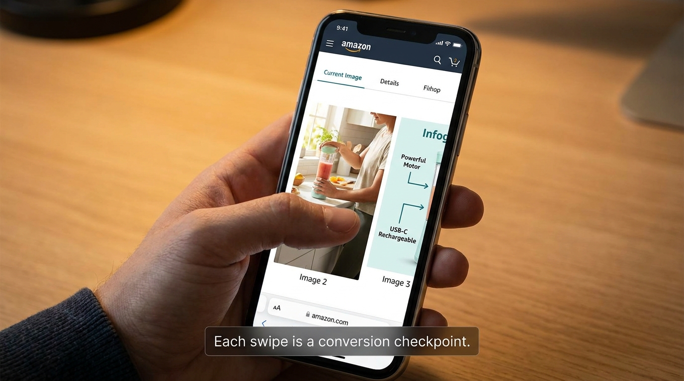
    68% of Amazon cart abandonments happen within 90 seconds of the first click, with mobile shoppers abandoning 2.1x faster than desktop users when images fail to communicate clearly. Before publishing any lifestyle image, view it on an actual mobile device at the size it will appear in the listing carousel. If the product isn’t immediately identifiable, if the scene reads as cluttered, or if the emotional message doesn’t land within two seconds — the image needs revision.

    This test takes 60 seconds and is skipped by almost every seller. Don’t skip it.

    What Rufus AI Reads in Your Images (And Why Most Sellers Are Missing It)

    Amazon’s Rufus AI — the conversational shopping assistant integrated into the Amazon app and website — represents a significant shift in how product discovery works. Rufus doesn’t just match keywords. It interprets product listings holistically, including the visual content, to answer natural-language shopper queries like “What’s a good blender for someone who makes smoothies every morning?” or “Show me a water bottle that fits in a car cup holder.”

    What most sellers don’t know is that Rufus uses optical character recognition (OCR) and computer vision to actively read and interpret the text and visual elements in your product images. Your infographics aren’t just for human eyes. Rufus is reading them too.

    How Rufus Extracts Image Data

    Through OCR, Rufus can read text overlaid on your secondary images — spec callouts, feature labels, dimension indicators, certifications. Through computer vision, it can analyze the visual content itself — identifying objects, contexts, and use cases depicted in lifestyle imagery.

    This means an infographic that reads “Holds 64 oz — Fits Standard Car Cup Holders” isn’t just communicating with a human buyer scanning your gallery. It’s feeding Rufus structured attribute data that can surface your product in response to the query “What’s a large water bottle that fits in my car?” — even if those exact words don’t appear anywhere in your title or bullet points.

    The implications are significant. For sellers competing in categories where listing text is already keyword-saturated, the image stack has become an additional indexable surface. The attributes you communicate visually are now functionally part of your product’s discoverable data set.

    Optimizing Images for Rufus Readability

    Several specific practices improve the quality of data Rufus can extract from your images:

    • Use large, high-contrast, readable fonts in infographics. If Rufus’s OCR can’t parse your text — because it’s in a stylized script font, at low contrast, or rendered too small — those attributes aren’t being captured. Clean, sans-serif fonts at adequate size are the most OCR-friendly choice.
    • Be specific in your callout text. “Large capacity” is vague and provides Rufus with limited searchable data. “Holds 64 oz — Fits standard cup holders” is specific and creates structured attributes that match specific queries. The more precise your callout language, the more useful it is to both Rufus and the buyer.
    • Use lifestyle images that clearly depict use cases. Rufus’s computer vision interprets visual contexts. An image of your water bottle in a gym bag tells Rufus this is a gym product. An image of it in a home office tells it this is a desk product. Diversity of lifestyle contexts — multiple use scenarios across your image stack — expands the range of queries your listing can surface for.
    • Include alt text on A+ Content images. A+ Content images support alt text, and Rufus reads those too. A descriptive alt text like “Woman using 1200-watt blender to make green smoothie in modern kitchen” provides far more contextual data than “product image 3.”

    The Competitive Advantage Window

    Awareness of Rufus’s image-reading capabilities among Amazon sellers remains low. Most listing optimization advice still focuses exclusively on keyword text. The sellers who begin optimizing their image stacks for AI readability now — while the majority of competitors haven’t — will build a structural advantage that compounds over time as Rufus’s role in product discovery continues to grow.

    A/B Testing Your Images: The Data-Driven Loop That Separates Growing Listings From Stagnant Ones

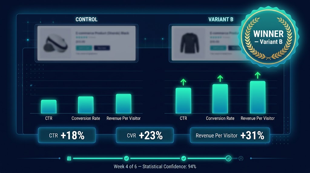
    Amazon Manage Your Experiments A/B test dashboard showing variant B winning with +32% conversion lift, 97% statistical confidence, $320K annual revenue impact

    The difference between an image stack that was optimized once and an image stack that is continuously optimized is enormous — and it’s measurable. The documented case studies on Amazon image A/B testing are some of the most compelling data in the seller ecosystem.

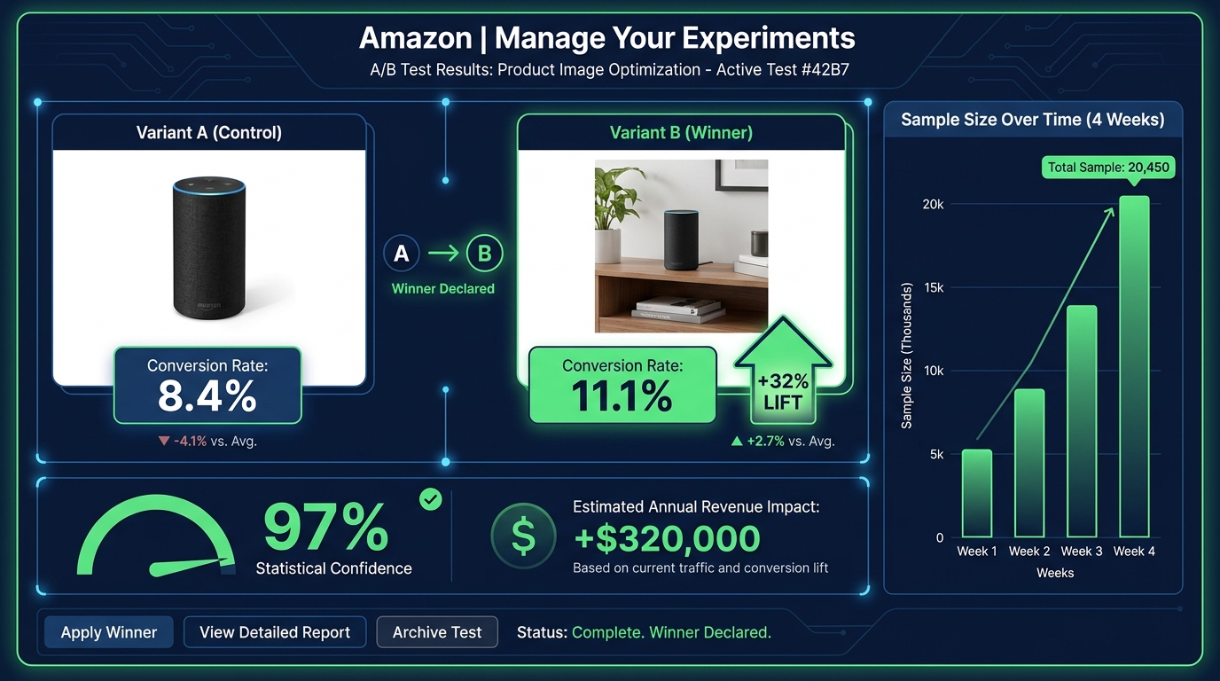
    A single image change on an eight-figure client’s listing produced a 32% conversion increase with no change in traffic. On a $1 million annual revenue baseline, that test generated an estimated $320,000 in additional revenue — from one image change. Tested to 97% statistical confidence over four weeks.

    A separate test of lifestyle versus plain background images across a three-week window produced a consistent 15% conversion lift. An 18% conversion rate increase was documented in another test involving both image and title keyword adjustments.

    These aren’t marketing claims. They’re documented A/B test results from Amazon’s own experiment infrastructure. The methodology is rigorous. The results are real.

    Amazon’s “Manage Your Experiments” Tool

    For brand-registered sellers, Amazon’s native A/B testing tool — Manage Your Experiments — is available through Seller Central. It enables you to test two versions of a main image (or other content elements) against each other simultaneously, splitting traffic between the variants and measuring conversion rate, click-through rate, and projected annual revenue impact.

    The tool handles sample size and statistical significance, giving you a confidence score that indicates how reliable the result is. Tests typically require 4-6 weeks to reach meaningful confidence levels — longer for lower-traffic listings, shorter for high-volume ones.

    The key best practice: test one variable at a time. If you change the main image and the background color and the badge in the same test, and conversions improve, you won’t know which change drove it. Isolating variables makes each test actionable, not just informative.

    What to Test and In What Order

    A rational image testing roadmap prioritizes by potential impact:

    1. Main image angle and composition — highest impact, directly affects CTR from search results. Test your current hero image against a version with tighter crop, different angle, or stronger visual contrast.
    2. Slot 2 infographic versus lifestyle — determines whether the “Why this product?” question is best answered with data or emotion for your specific buyer. Category and product type influence the answer differently.
    3. Lifestyle image subject demographics — test a lifestyle image featuring a buyer who matches your target demographic vs. a more generic model. The specificity uplift can be significant in niche categories.
    4. Infographic design variations — test a text-heavy infographic against an icon-forward one for the same content. Mobile rendering often favors icons.
    5. Slot order permutations — once content is optimized, test whether reordering slots improves flow. Slide the comparison chart from slot 6 to slot 3 and measure the effect.

    The Continuous Testing Mindset

    The most important shift isn’t tactical — it’s cultural. Image testing shouldn’t be a one-time project. High-performing sellers run image experiments every 3-4 weeks, rotating through their image slots systematically. The result isn’t a single 32% uplift; it’s a compounding series of 5-15% improvements that, over 12 months, can double a listing’s conversion rate.

    That’s not hypothetical. It’s what continuous testing looks like at scale.

    Video in the Image Stack: Why It’s No Longer Optional

    Amazon provides a dedicated video slot alongside the image gallery on product detail pages. For most categories, this slot can host a product video in the main image carousel — visible before the listing’s A+ content, before reviews, before anything below the fold.

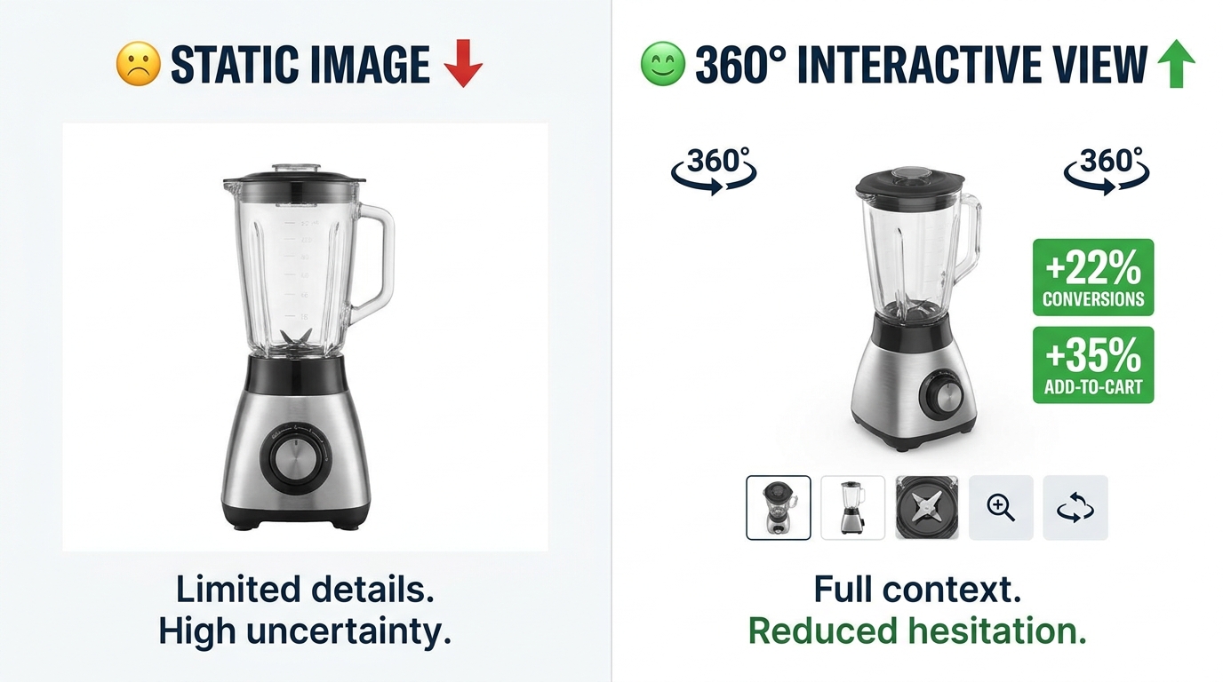
    Video is no longer a differentiator in 2026. It’s expected. Listings with videos see higher engagement metrics across the board: more time on page, lower bounce rates, and conversion rates that consistently outperform video-absent listings in the same category. The aggregated data on listings using at least six images plus video shows conversion lifts in the range of 20-50% compared to image-only listings.

    What Type of Video Converts

    Not all product videos are equal. The videos that perform best on Amazon share a clear structure that mirrors the psychological image sequence described earlier: problem → product introduction → demonstration → result → call to action.

    Amazon video best practices for 2026:

    • Keep it under 60 seconds. The median attention span for an Amazon product video is under 45 seconds. Videos longer than 90 seconds see significantly higher drop-off rates before the key demonstration moments. Front-load your strongest content.
    • Design for silent viewing. A large portion of mobile shoppers view videos without sound. Captions and on-screen text should convey the full message without audio dependency. Key selling points should appear as text overlays at the moment they’re demonstrated.
    • Show the product being used within the first five seconds. Don’t spend time on brand intros, logo animations, or ambient footage before showing the product in action. Five seconds is approximately when mobile viewers make the swipe-or-stay decision.
    • Film in 9:16 vertical format for mobile priority. Amazon’s mobile carousel renders vertical video more effectively than horizontal. Given that mobile represents over 70% of traffic, vertical formatting should be the primary production orientation.

    Video as an Objection-Handling Tool

    The single most valuable function of a product video on Amazon is objection handling. Text and images can describe a product’s ease of use; video can prove it. Text can claim durability; video can demonstrate a stress test. Text can say “easy to assemble”; video can show the assembly completed in 90 seconds by an ordinary person.

    When you identify the top 3 objections holding buyers back from converting on your listing — look at your reviews and Q&A for clues — and build your video around directly addressing those objections with demonstration, you create a video that sells rather than just showing. The difference in conversion impact is substantial.

    The Mobile-First Image Audit: How to Stress-Test Your Listing Right Now

    Everything discussed in this post converges on a single practical starting point: you cannot optimize what you haven’t audited. Most sellers have never actually evaluated their listings the way their buyers experience them — which is on a 6-inch phone screen, in a search results grid, scrolling fast, often in a noisy environment with split attention.

    Here is a systematic mobile-first image audit you can conduct in under 30 minutes, right now, using only your phone and a competitor’s listing for reference.

    The Five-Point Mobile Audit Checklist

    1. The Scroll Test. Open Amazon on your phone and search one of your primary keywords. Scroll the results at normal speed without stopping. Note whether your listing’s thumbnail catches your eye before you scroll past it. If you have to actively look for your product in the grid, your hero image isn’t earning the click from cold traffic.

    2. The Thumbnail Fill Test. Without clicking on your listing, look at your hero image thumbnail in the search results grid. What percentage of the thumbnail space does the product fill? Compare it to the two or three most visible competitor thumbnails. If your product looks smaller or leaves more empty space, you have a dead pixel problem.

    3. The 3-Second Infographic Test. Click into your listing and swipe to your infographic images. Set a timer for three seconds and look at each one. What’s the one thing you understood from it in that window? If you can’t answer that question — if the image required more than three seconds to extract a single clear message — it’s underperforming for mobile buyers.

    4. The Lifestyle Relatability Test. Look at your lifestyle images with fresh eyes. Does the person in the image look like your target buyer? Is the environment recognizable to that buyer? Is the product being used — not just displayed? If any of those answers is no, that image slot is working below its potential.

    5. The Sequence Logic Test. Swipe through your full image gallery as if you’ve never seen the product before. Does each image answer the next logical question in a buying journey? Or do you find yourself confused about why a particular image appears when it does? Note the specific slot where the sequence feels disjointed — that’s your first optimization priority.

    Competitive Benchmarking: What the Category Leaders Are Doing

    For each of the five tests above, repeat them on the top-selling listing in your category. Document what their hero image composition looks like, what their slot 2 image communicates, how they use lifestyle photography, and what their infographic design choices are. Not to copy — to benchmark.

    Understanding where the category standard sits tells you whether you’re above, at, or below the visual baseline buyers expect when they search your category. Being below the baseline means you’re losing conversions to competition passively, every day. Being above it means your images are a competitive moat.

    In most categories, a thorough audit reveals at least three immediately actionable improvements — dead pixel space to close, infographic text to increase, lifestyle images to retarget — that can be addressed without a new photo shoot. Start there.

    The Compounding Effect of a Fully Optimized Image Stack

    Individual image improvements tend to produce individual results. A hero image fix produces a CTR gain. A better slot 2 infographic reduces early bounces. A more targeted lifestyle image improves Add-to-Cart rates. Each gain is real and valuable. But the full value of image optimization isn’t the sum of individual improvements — it’s the compounding effect of all of them working together.

    A listing with a high-converting hero image earns more clicks. More clicks mean more sessions. Better secondary images mean more of those sessions convert. Higher conversion rates improve your organic ranking algorithm, which improves your search placement, which produces still more organic traffic. Better images reduce return rates, which improves your seller metrics, which feeds back into ranking signals. Positive reviews from buyers whose expectations were set accurately by your images reinforce social proof, which improves conversion for future buyers.

    This is the compounding flywheel — and it starts with images, not ads.

    The True Cost of Unoptimized Images

    Every day a listing runs with a dead pixel problem in the hero image, it’s losing a percentage of the clicks it should have earned. Every day an infographic is rendering as unreadable text on mobile, it’s failing to move buyers past the evaluation stage. Every day a lifestyle image features the wrong demographic, it’s failing to trigger the mental simulation that drives desire.

    These aren’t theoretical losses. They’re real buyers who came close, evaluated, and went elsewhere — not because the product was wrong for them, but because the visual presentation didn’t make the case clearly enough at the moment it mattered.

    The cost of a professional product photography session for a full 9-image stack ranges from a few hundred dollars to $2,000 depending on category and complexity. The revenue impact of a 15-32% conversion improvement on a listing doing $100,000 a year is $15,000-$32,000 annually. That math works at almost any traffic level.

    Actionable Takeaways: Where to Start This Week

    If you take nothing else from this piece, start with these five actions:

    1. Run the mobile scroll test on your primary keyword today. If you can’t find your own listing in the first seconds of scrolling, your hero image needs work before anything else.
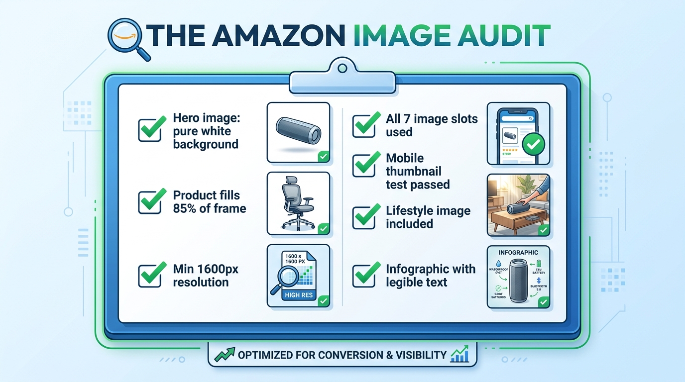
    2. Check your hero image’s frame fill. Open your main image in an image editor and measure the product’s footprint. If it’s below 85%, crop and reupload. This is a 20-minute fix with measurable CTR impact.
    3. View every infographic image at 400px wide. Screenshot it, shrink it, and read it. What survives? What becomes illegible? Redesign around what remains readable at that size.
    4. Fill every available image slot. If you’re running fewer than seven images, filling the remaining slots with a properly sequenced set of lifestyle, infographic, and detail images should be your first priority. 6+ images consistently outperform shorter galleries across documented data.
    5. Set up one A/B test this month. Brand-registered sellers have access to Manage Your Experiments for free. Start with a hero image variant — the highest-impact single test available. Give it four weeks and let the data decide.

    The sellers who treat their image stack as a living, continuously tested asset — not a one-time creative project — are the ones who build listings that compound in performance over time. In a marketplace where traffic is expensive, margins are compressed, and competition deepens every quarter, that compounding effect isn’t a nice outcome. In 2026, it’s the difference between a listing that grows and one that slowly loses ground.

    Your images are already either earning money or losing it. Now you know which questions to ask to find out which one.

  • AI Background Swaps for Amazon Images: The Complete Execution Guide (2026)

    AI Background Swaps for Amazon Images: The Complete Execution Guide (2026)

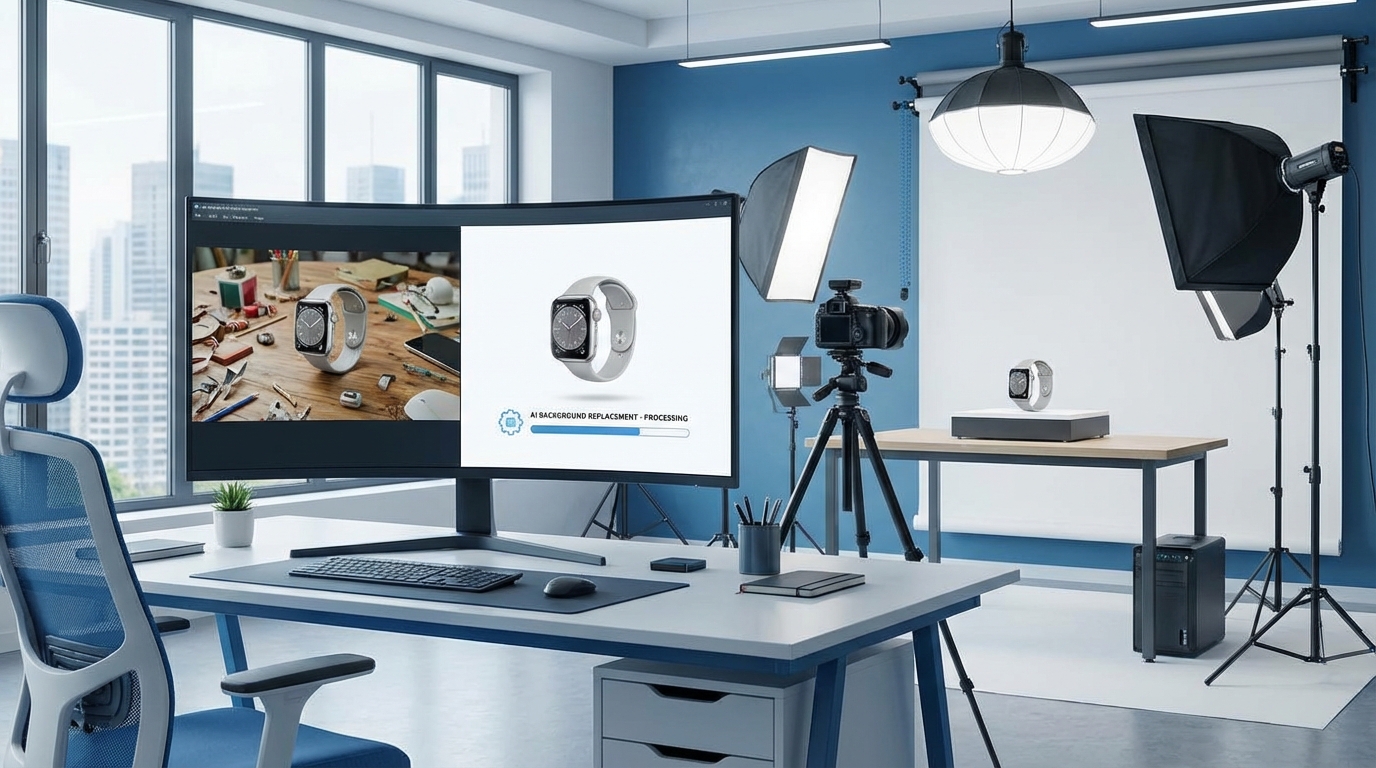
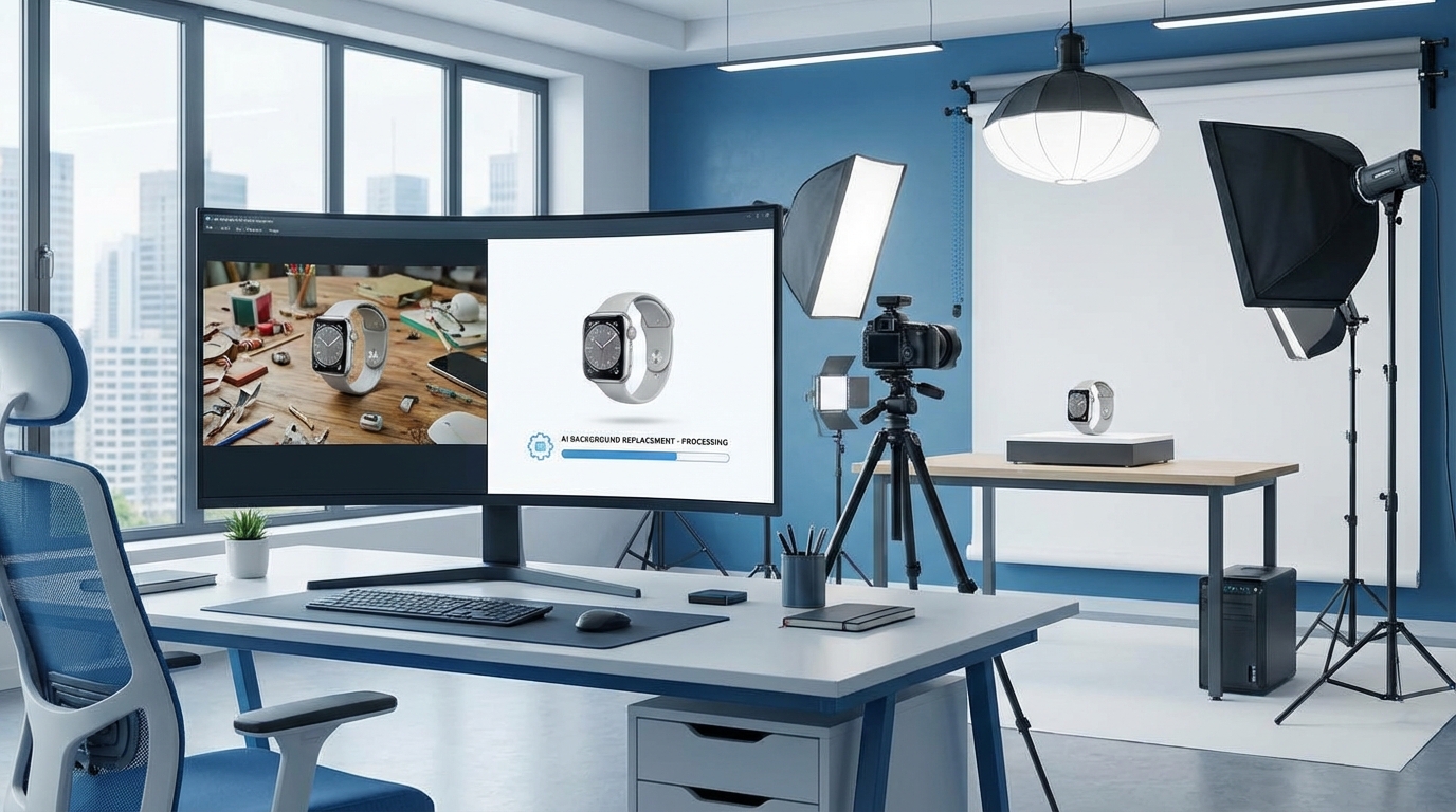
    Professional Amazon product photography studio showing AI-powered background replacement workflow on a monitor

    There is a significant gap between knowing that AI background swaps exist and actually executing them without getting your listings suppressed, your conversions tanked, or your catalog looking like it was assembled by three different teams on three different days.

    Most guides on this topic stop at “upload your photo, click remove background, done.” That’s roughly the equivalent of teaching someone to drive by explaining how a steering wheel turns. True — but dangerously incomplete.

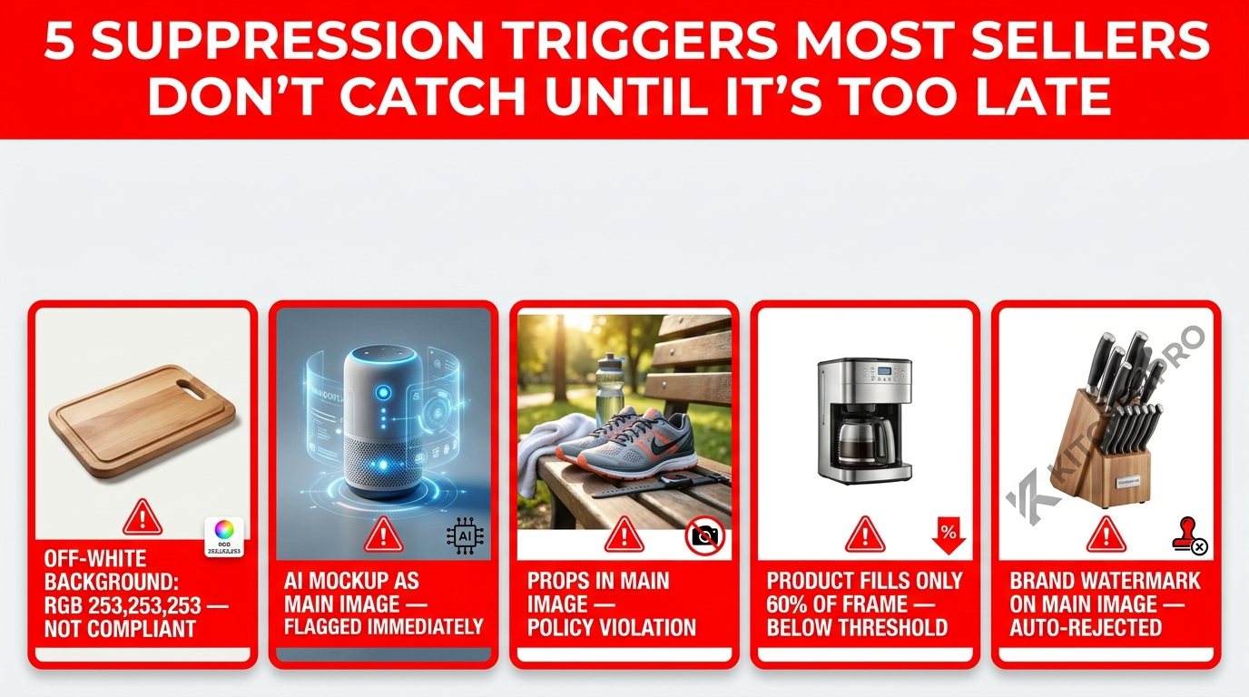
    In 2026, Amazon’s AI detection systems have become meaningfully more sophisticated. The margin between a compliant image and a suppressed listing is sometimes a single pixel value. A background that reads as white on your screen — say RGB 254,255,255 — can trigger algorithmic rejection during Amazon’s automated image audit. Meanwhile, for secondary images, the sellers who understand how to build a proper lifestyle image sequence are pulling conversion lifts of 15% to 56% over those who treat the secondary slots as an afterthought.

    This guide is not a tool comparison. It’s not a “here are five AI apps you should try” roundup. It’s an end-to-end execution guide: how to feed AI tools the right inputs, how to verify outputs meet Amazon’s exact standards, how to structure your image sequence for each product category, how to build a QA process that catches problems before Amazon does, and how to scale this across a catalog without it becoming a full-time job.

    Whether you have 10 SKUs or 10,000, the framework here applies. Let’s build it properly.

    Why Background Swaps Are Now Table Stakes, Not an Edge

    Two years ago, a seller who deployed AI background swaps across their catalog had a genuine visual advantage over competitors still paying $400 per product photoshoot. That window has largely closed. Today, AI background removal is accessible to every seller at every price point — and Amazon’s own built-in tools mean even sellers who have never heard of Photoroom or Claid.ai are using AI image enhancement whether they know it or not.

    What this means in practice: the baseline has risen. A clean white background on your main image is no longer a differentiator. It is the minimum viable standard. The sellers who are pulling ahead are not the ones who can remove a background — it’s the ones who execute the entire image stack with precision.

    The Three Layers of Visual Competition on Amazon

    Understanding where background swaps fit within the broader visual competition on Amazon requires thinking in three distinct layers.

    Layer 1 — Search results compliance: Your main image must pass Amazon’s automated checks. This is pure compliance work. A suppressed listing earns zero conversions regardless of how compelling the product is. AI background swaps at this layer are about reliability and speed — getting every SKU to a compliant main image without a $500 photoshoot.

    Layer 2 — Click-through from search: The main image is what drives the click. Within search results, buyers are comparing thumbnails at roughly 200×200 pixels. The questions are: Does the product look clean? Does the thumbnail read well at small sizes? Is the product taking up enough of the frame? Background quality matters here, but so do product clarity, angle, and fill ratio.

    Layer 3 — Conversion on the listing page: Once a buyer clicks through, the secondary images take over. This is where lifestyle backgrounds, in-context shots, and structured image sequences drive purchase decisions. Conversion data consistently shows that secondary lifestyle images — not the main white background image — are the primary conversion lever at this stage.

    AI background swaps touch all three layers, but the execution approach differs for each. Conflating them — using the same tool, same settings, and same workflow for all three — is where most sellers underperform.

    The Input Quality Trap: Why Your AI Tool Is Only as Good as Your Source Photo

    Comparison of two Amazon product images showing off-white background with artifacts versus perfect pure white compliant background

    The single most common reason AI background swaps produce poor results — artifacts, halos, fuzzy edges, mismatched lighting — is not tool quality. It is source photo quality. Every major AI background tool is a machine learning system trained to identify foreground from background. When that boundary is ambiguous in your source photo, the tool guesses. And it guesses wrong.

    What Makes a Source Photo AI-Friendly

    There are specific characteristics that make a product photo easy for AI to work with, and sellers who understand this can dramatically improve their output quality without upgrading their tools.

    Contrast between product and background: AI edge detection works by identifying contrast boundaries. A white product photographed on a white background gives the model almost nothing to work with. If you are shooting your own source photos, use a mid-gray or light blue backdrop — then let AI replace it with pure white afterward. The contrast at the product edge will be far sharper, resulting in cleaner cutouts.

    Consistent, diffuse lighting: Hard directional light creates cast shadows on the background. Those shadows become part of what the AI “sees” — and it often can’t distinguish a product shadow from a dark edge on the product itself. Use a diffuse light setup (softboxes, ring lights, or natural window light from multiple angles) to minimize background shadows before shooting.

    Minimum viable resolution: Amazon requires a minimum of 1,000 pixels on the longest side, but you should be supplying AI tools with images at 2,000 pixels or higher. Most AI background tools downsample input images to some degree during processing. Starting at 2,000+ pixels gives you meaningful headroom to maintain Amazon’s required resolution in the output.

    Sharp product edges: Motion blur, shallow depth of field at product edges, or optical distortion near the frame corners will all degrade edge detection quality. Product images should be shot on a tripod with sufficient depth of field to keep the entire product in sharp focus.

    The “Garbage In” Problem at Scale

    For sellers working with supplier-provided images, the challenge compounds. Supplier photos are often shot under inconsistent conditions, compressed multiple times, and delivered at low resolution. Running these through an AI background tool does not rescue them — it produces compliant-looking images that still look cheap because the underlying product detail is soft, color-shifted, or poorly lit.

    The practical rule: if a supplier image is below 1,500 pixels on the longest side, has visible compression artifacts, or shows the product under harsh single-source lighting, it is worth the investment to reshoot before running any AI workflow. The AI will improve a mediocre photo. It cannot fix a fundamentally broken one.

    Amazon’s Compliance Minefield: Exactly What Gets Listings Suppressed in 2026

    Amazon’s image compliance enforcement has shifted from primarily human moderation to AI-driven automated audits. This change matters because automated systems are neither lenient nor inconsistent — they apply the same rule the same way every time. Understanding exactly where those rules sit is the difference between a live listing and a suppressed one.

    The Pure White Requirement Is More Strict Than You Think

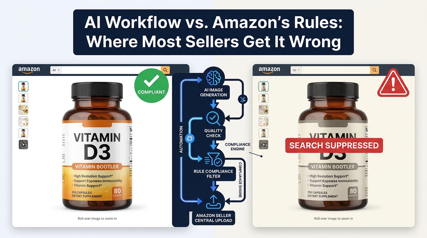
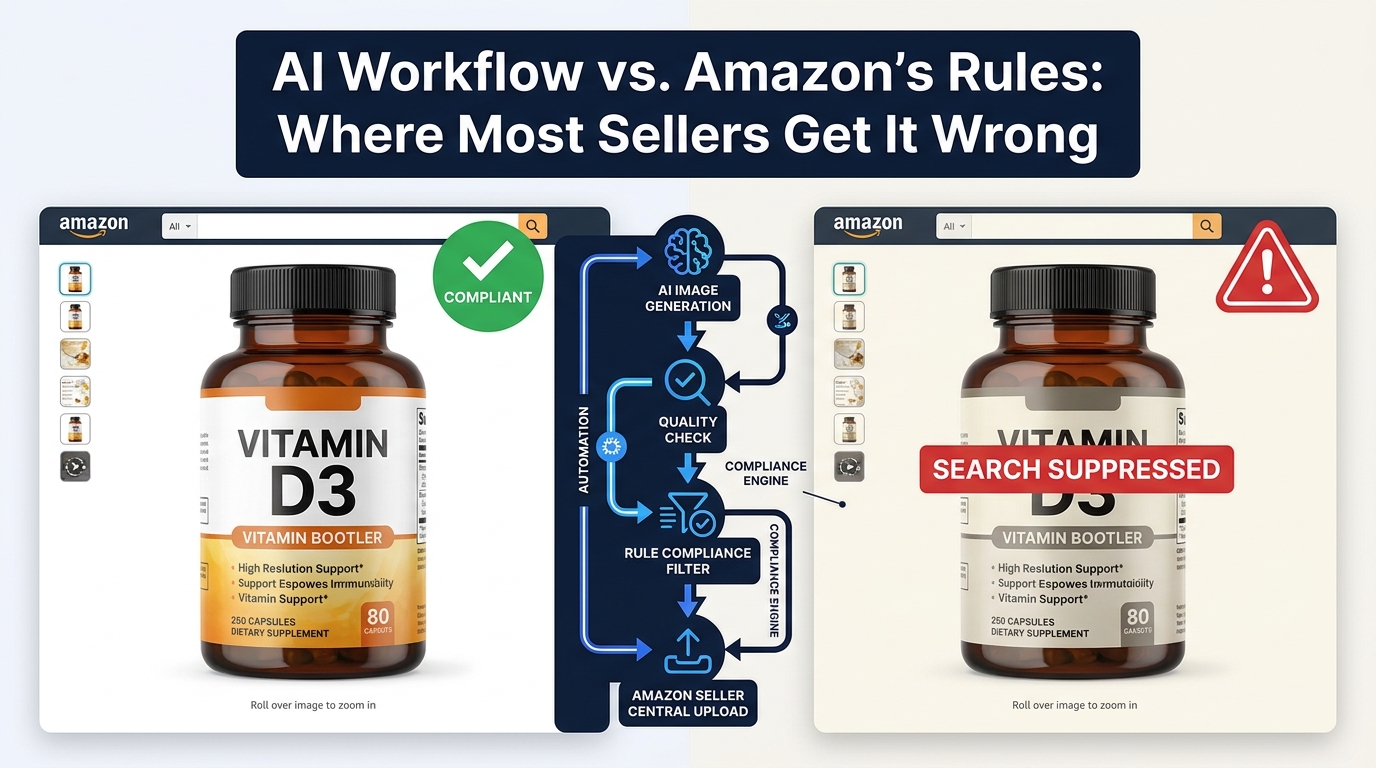
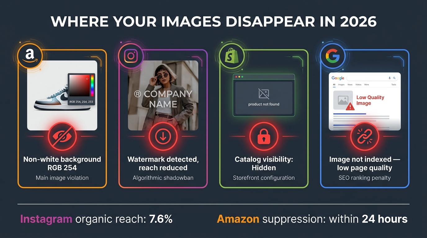
    Amazon’s stated requirement for main images is a pure white background. The actual enforcement standard is RGB 255,255,255 — the maximum value of white in 8-bit color space. A background that reads as RGB 254,255,255 — one digit off, imperceptible to the human eye — can trigger Amazon’s algorithmic rejection during an image audit.

    This is not a theoretical risk. In 2026, Amazon’s image compliance AI runs periodic audits across active listings, not just at the point of upload. A listing that passed initial review can be flagged and suppressed weeks later if its main image fails a fresh audit cycle.

    The practical implication: when verifying AI output, use a pixel color picker tool (available in Photoshop, GIMP, or free browser extensions) to sample multiple points in the background. Every sampled point should return exactly 255,255,255. If any point returns a value below 255 in any channel, the background needs further processing.

    Shadows, Halos, and the Floating Product Problem

    Three specific visual artifacts generate a disproportionate share of compliance failures:

    Cast shadows: AI tools vary significantly in how they handle product shadows. Some remove all shadows — which can make products look weightless and unreal. Others retain natural shadows — which, if they extend into the background area, violates Amazon’s white background requirement. The correct approach for main images is to use a tool that generates a subtle “ground shadow” directly beneath the product, contained within the product footprint, rather than a cast shadow spreading across the background.

    Edge halos: A semi-transparent ring of color around the product edge is the telltale sign of imprecise edge detection. It happens when the AI retains some color from the original background as it blends into the product edge. This is particularly common on products with fine details — hair, fur, fabric fringes, transparent packaging, or clear liquid in a bottle. Most tools have a “refine edge” or “defringe” step specifically for this; skipping it is where halos get baked into the final output.

    Floating crops: When a product is placed on a white background without any shadow or surface reference, it can appear to float. While not always a compliance issue, floating products score lower in Amazon’s image quality ranking algorithms and can trigger secondary review. A minimal ground contact shadow — one that stays within compliance — resolves this.

    The Hyper-Realistic Render Problem

    Amazon’s 2026 AI detection specifically targets “hyper-realistic” 3D renders and fully AI-generated product images used as main images. The enforcement logic is that AI-generated main images may misrepresent the actual product — a legitimate concern given how generative AI can hallucinate product details.

    The distinction Amazon draws is between AI-enhanced photographs (background removal and replacement applied to a real photo) and AI-generated images (a product synthesized entirely by generative AI). The former is permitted — and is exactly what background swap tools do. The latter is flagged. The risk arises when sellers use generative AI to create product images that don’t reflect the actual item in the listing.

    Tool Selection by Use Case: What Each Platform Actually Does Well

    Various Amazon product categories arranged in lifestyle settings showing category-specific background photography approaches

    The tool landscape for AI background swaps has consolidated significantly. Rather than naming a single “best” tool — a designation that changes as each platform ships updates — the more useful frame is understanding which capability set each tool excels at, and matching that to your specific production need.

    Pure Background Removal (Main Image Compliance)

    When the primary need is reliable, high-accuracy background removal for main image compliance — particularly for large catalogs processed in batch — the tools that consistently perform are those built on dedicated segmentation models trained specifically on product photography. Remove.bg and Claid.ai lead this category, with reported accuracy rates around 98.7% on standard product shapes. The caveat: that accuracy rate drops on complex edges (hair, fur, transparent items, mesh fabrics) and is where manual refinement steps become necessary.

    For sellers processing hundreds of SKUs, API access matters. Both Claid.ai and Remove.bg expose robust APIs that integrate directly into inventory management workflows, allowing background removal to trigger automatically when a new supplier image is received. This removes the manual upload step entirely for routine compliance processing.

    Lifestyle Background Generation (Secondary Images)

    For generating contextual lifestyle backgrounds — placing a product on a kitchen counter, in a bedroom setting, on a hiking trail — the tools performing best in 2026 are those using diffusion-based generative models that can accept a text prompt describing the desired scene. Photoroom’s AI Scene Generator, Adobe Firefly’s generative background fill, and PicCopilot’s contextual background engine all work in this mode.

    The key differentiator here is prompt specificity. Generic prompts produce generic backgrounds. Specific prompts — describing surface material, lighting direction, time of day, prop placement, and depth of field — produce backgrounds that feel intentionally styled rather than algorithmically generated. This distinction matters because buyers can often identify AI-generated lifestyle imagery from human-styled photography, and the reaction to each differs.

    All-in-One Amazon Workflow Platforms

    A third category of tools — Photoroom, Pebblely, and Canva’s Magic Studio among them — combines background removal, lifestyle scene generation, Amazon-specific compliance templates, and basic infographic overlay capabilities in a single platform. These are best suited for sellers managing their image production in-house without a dedicated design team. The trade-off is that all-in-one platforms typically produce slightly lower precision than dedicated removal tools and slightly less sophisticated generative backgrounds than specialized generative AI tools. For most mid-size sellers, that trade-off is entirely reasonable.

    Enterprise Batch Processing Infrastructure

    At catalog scales above 1,000 SKUs, tool selection shifts toward infrastructure rather than individual applications. Amazon’s own Rekognition service, combined with AWS Fargate for compute scaling, can process more than 100,000 images per day in a production pipeline. This approach requires engineering investment upfront but eliminates per-image pricing at high volumes and integrates directly with existing AWS infrastructure that many large sellers are already using.

    Category-by-Category Background Strategy

    The right background approach varies by product category. Not because Amazon’s main image requirements change — they don’t; pure white applies universally — but because the secondary image strategy that drives conversions differs substantially based on how buyers shop and what visual information they need before purchasing.

    Apparel and Soft Goods

    Apparel presents the most technically challenging edge detection problem. Fabric edges — particularly knitwear, lace, fleece, and sheer fabrics — have semi-transparent boundaries that most AI tools handle imperfectly. The practical workaround is to shoot on a light gray or light blue background rather than white, which maximizes contrast at the fabric edge, then replace with white in post-processing.

    For secondary images, the conversion data for apparel overwhelmingly favors on-model photography over flat lays or white-background alternatives. Buyers purchasing apparel need to see fit, drape, and proportion — information that a flat lay or isolated product shot cannot convey. AI background swaps on on-model shots work well when the model is shot on a clean backdrop, but they require careful attention to hair edges and skin tones at the boundary between model and background.

    Electronics and Small Gadgets

    Electronics tend to have hard, defined edges — the ideal scenario for AI background removal. The main challenge in this category is reflective surfaces. Glossy plastic, metal casings, and glass screens reflect the original background, embedding color casts into the product itself that don’t disappear when you remove the background. A product shot against a gray background will often have gray reflections in its screen or casing that persist after removal.

    The professional approach for electronics is to use diffuse white tent lighting for the source photography — an approach that minimizes reflections by surrounding the product with uniform white light. For secondary images in electronics, in-context shots (product on a desk, plugged in and in use, alongside complementary devices) consistently outperform pure studio backgrounds because buyers are assessing how the product fits into their existing setup.

    Beauty and Personal Care

    Beauty products — skincare, cosmetics, haircare — have some of the strongest performance data for lifestyle backgrounds in secondary images. The category is visually driven, with buyers making significant purchase decisions based on brand aesthetic and perceived quality. Background choices in secondary images are therefore a brand signal, not just a compliance exercise.

    Effective lifestyle backgrounds for beauty products lean toward textural surfaces: marble, linen, brushed concrete, aged wood. These convey quality and intentionality without overwhelming the product. AI-generated versions of these backgrounds, prompted specifically with material, color palette, and lighting direction, can achieve results that are difficult to distinguish from styled photo shoots.

    Home Goods and Kitchen Products

    Home goods benefit most from in-situ photography — showing the product in an actual room context. An AI-generated background showing a kitchen counter, a living room shelf, or a dining table setting provides buyers with immediate scale reference and answers the implicit question: “Will this look good in my home?” Conversion lifts for home goods with in-context secondary images are among the highest measured, with documented increases of 34% or more over studio-only approaches.

    The Secondary Image Stack: Building a Lifestyle Sequence That Converts

    Amazon product listing page mockup showing a sequence of lifestyle secondary images including in-context use scenarios, detail shots, and infographic overlays

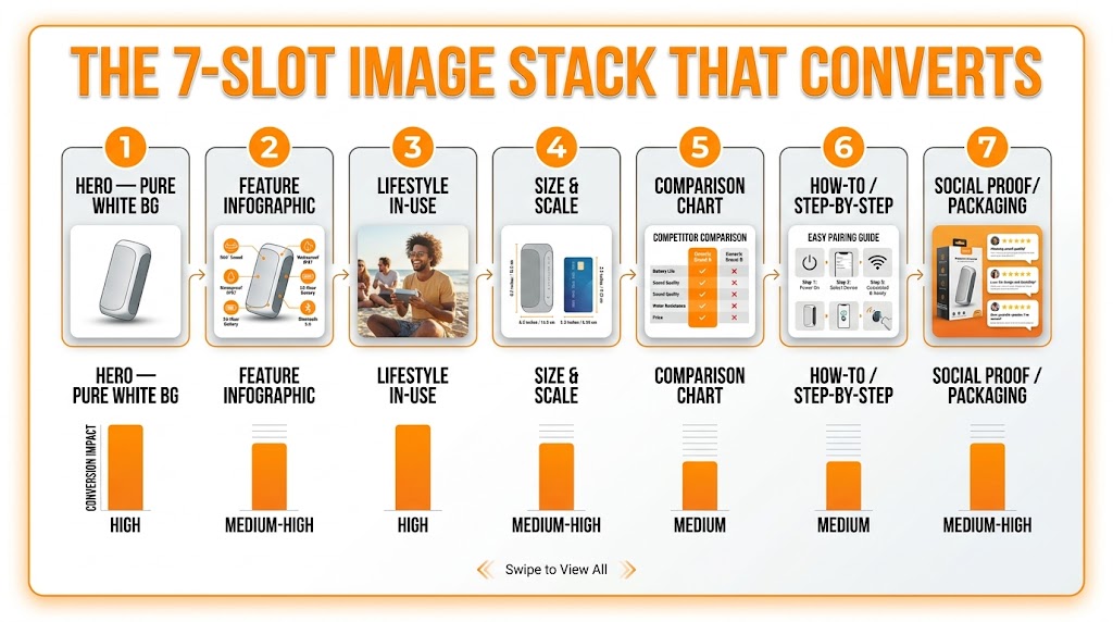
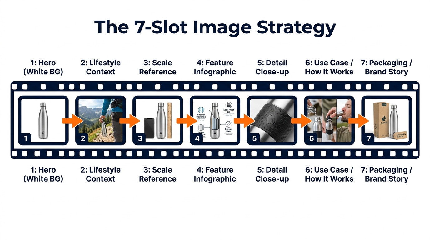
    Amazon allows up to seven images per listing (one main, six secondary), plus a video slot. The secondary image sequence is where most sellers underperform — either by repeating the same angle with minor variations, or by treating the slots as an afterthought after the main image is sorted.

    A high-converting secondary image stack tells a story. It moves the buyer through a deliberate sequence that addresses every major purchase objection before the buyer has to scroll to the bullet points or reviews.

    The Seven-Slot Framework

    Think about your secondary image slots as chapters in a brief visual narrative:

    Slot 1 — Alternative angle / full context: A second view of the product, often at a different angle or showing multiple units/variants. Still on white or minimal background. This slot answers: “What does the rest of the product look like?”

    Slot 2 — In-use lifestyle shot: The product being used by a person or shown in its natural environment. This is typically the highest-conversion secondary image. Background should be contextually relevant but not visually overwhelming. AI-generated lifestyle backgrounds work well here when the scene is specific and styled.

    Slot 3 — Scale reference: A shot that clearly communicates size — product held in hand, shown next to a recognizable object, or against a simple background with dimension callouts. Buyers systematically underestimate or overestimate size from main images alone.

    Slot 4 — Feature highlight or infographic: Close-up detail on a key product feature, or an infographic overlay on a clean background highlighting specs, materials, or certifications. This slot is where text is appropriate (Amazon permits text on secondary images).

    Slot 5 — Social proof visual: A “before and after,” a result photo, or a comparison against an inferior alternative. This is particularly powerful in categories where efficacy matters — supplements, cleaning products, skincare.

    Slot 6 — Secondary lifestyle: A different context or use case from Slot 2. If Slot 2 showed the product in a home setting, Slot 6 might show it outdoors, in a different room, or in a different color variant.

    Slot 7 — Brand or trust signal: A clean brand-consistent image that reinforces quality — packaging shot, certifications displayed, brand aesthetic reinforcement. This is the final impression before the buyer makes a decision.

    Background Coherence Across the Stack

    One of the most common and costly errors in secondary image sequences is visual incoherence. Each image looks like it came from a different shoot — different lighting color temperature, different shadow depth, different level of visual busyness. When AI-generated lifestyle backgrounds are created independently for each image using different prompts, this incoherence compounds.

    The fix is to establish background parameters before generating any images. Define a color palette (warm or cool tones?), a surface material (concrete, wood, marble, fabric?), a lighting direction (left-lit or right-lit?), and a scene depth (shallow focus or full environment?). Apply those parameters consistently across every AI-generated background in the stack. The result is a cohesive visual identity that signals professionalism and brand intentionality.

    A+ Content and the Background Swap Connection

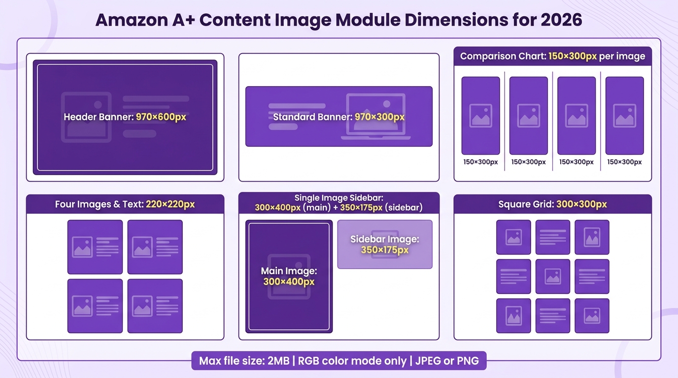
    Amazon’s A+ Content module (formerly Enhanced Brand Content) gives Brand Registry sellers an additional canvas below the fold — typically 1,500 to 2,000 additional pixels of visual real estate that appears before customer reviews. Most sellers treat A+ Content as a separate exercise from their image stack. The sellers converting better have figured out that they are part of the same visual system.

    Background Consistency Between Listing Images and A+ Content

    A buyer who sees warm wood-textured lifestyle backgrounds in your secondary images and then scrolls to A+ Content modules rendered with cold concrete and clinical lighting experiences a visual discontinuity. It doesn’t make them leave — but it creates a subtle signal of inconsistency that chips away at perceived brand quality.

    When generating AI backgrounds for secondary images, export the background settings (or save the specific scene/prompt) and apply the same aesthetic to A+ Content modules. This creates visual continuity from the first search thumbnail all the way down the listing page — a coherent brand experience that builds trust without buyers consciously noticing why it feels right.

    Using Background Swaps in A+ Comparison Charts

    A+ Content’s comparison chart module — which shows your full product line side by side — is an opportunity that most sellers waste. Products photographed under different conditions, by different photographers, with different post-processing produce a chart that looks chaotic rather than curated.

    AI background swaps are the fastest fix for this: take every product in the comparison chart through the same background removal and replacement workflow, using the same background color and shadow treatment. The result is a comparison chart where all products look visually consistent, reinforcing the impression of a coherent, professionally run brand.

    The QA Process Most Sellers Skip — And Pay For Later

    E-commerce brand building showing rows of product bottles photographed in different lifestyle settings using AI for scalability

    AI background swap tools produce outputs that look good at a glance and fail Amazon’s compliance checks in ways that only appear at the pixel level. Running a proper QA process before uploading images is not optional — it is the difference between images that stay live and images that silently get your listings suppressed during an audit cycle you weren’t watching.

    The Four-Point QA Checklist for Main Images

    Every main image should be verified against four specific criteria before upload:

    1. Background pixel value: Open the image in Photoshop, GIMP, or any editor with a color picker. Sample at least 10 points distributed across the background area — corners, edges, and center. Every sampled point should return exactly RGB 255,255,255. A single point below this threshold requires further processing.

    2. Product fill ratio: Amazon requires the product to occupy at least 85% of the image frame. Use the ruler or measurement tool to verify. This is particularly easy to miss when using batch processing — tools often leave excessive padding around products to ensure no edges are cropped, which can result in a product filling only 70–75% of the frame.

    3. Edge artifact inspection: Zoom to 200–300% magnification and trace the product edge. Look specifically for: semi-transparent halo pixels (discard and reprocess), jagged stair-step artifacts on curved edges (apply edge smoothing), and hard white outlines indicating aggressive edge cutting (apply defringe).

    4. Shadow compliance: If the tool added a ground shadow, verify it is fully contained within the product footprint and does not extend into the background. A shadow that spills more than a few pixels beyond the product base into the background technically violates the white background requirement.

    Secondary Image QA Priorities

    Secondary images don’t face the same pixel-perfect white background requirement, but they face their own compliance and quality checks. Specifically:

    No misleading product representation: AI-generated lifestyle backgrounds cannot show the product doing something it doesn’t do, in a size it doesn’t come in, or with accessories not included. This sounds obvious, but AI hallucinations — the tendency of generative models to add plausible-but-fictional details — can introduce these issues without the seller noticing.

    Text compliance: Secondary images may include text (this is one of the key differences from main images), but that text cannot make unsubstantiated health or safety claims, cannot include external website URLs, and cannot include Amazon’s branded terms. AI image tools sometimes generate backgrounds with legible environmental text (storefront signs, book spines) — scan output images for any legible text that wasn’t intentionally placed.

    Resolution verification: Every image should meet Amazon’s minimum 1,000px longest side. For secondary images that will appear in A+ Content modules, 2,000px or above is recommended given the larger display dimensions.

    Building QA Into the Workflow, Not After It

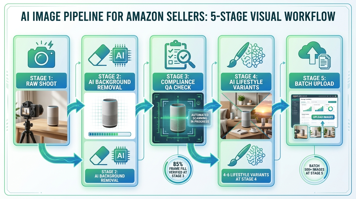
    The most efficient QA process is one that catches errors as early in the pipeline as possible rather than after all images have been processed. For batch workflows, this means running a small pilot batch of 10–20 images first, reviewing all outputs against the checklist, and adjusting tool settings before processing the full catalog. Changes to edge refinement settings, padding percentage, or shadow treatment at the pilot stage save hours of rework at full scale.

    Batch Processing at Scale: The Real Cost-Benefit Math

    Digital dashboard showing AI image batch processing workflow with compliance status indicators and quality check metrics

    The economics of AI background swaps at catalog scale are compelling — but the numbers sellers cite are often oversimplified. The real cost math requires accounting for more than just the per-image processing cost.

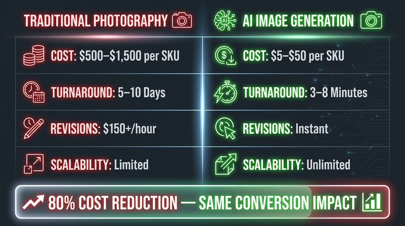
    The True Cost of Traditional Product Photography

    A traditional product photoshoot in 2026 typically costs between $200 and $5,000 per session, depending on the photographer, studio rental, styling, and post-processing. At an average of $75–$500 per finished image (accounting for the session cost spread across the number of final deliverables), a seller with a 500-SKU catalog faces photography costs in the range of $37,500 to $250,000 just for the initial shoot — before accounting for the need to refresh images for seasonal campaigns, new variants, or compliance updates.

    AI Batch Processing Economics by Catalog Size

    AI background processing costs in 2026 range from approximately $0.05 to $2.00 per image, depending on the tool, plan tier, and whether API or manual processing is used. The following breaks down what this means at practical catalog sizes:

    Small catalog (50 SKUs, 7 images each = 350 images): AI processing cost of approximately $35–$700 per catalog cycle, compared to $26,250+ for traditional photography. Even at the high end of AI pricing, the savings are substantial. At this scale, the primary benefit is speed — AI can process 350 images in hours versus the days or weeks required to schedule and complete a full studio shoot.

    Mid-size catalog (500 SKUs, 7 images each = 3,500 images): AI processing at $0.10–$0.25 per image comes to approximately $350–$875 per catalog cycle. Traditional photography at comparable quality: $262,500+. The savings fund an entire year of AI subscriptions and still leave significant budget for other investments. Annual AI tool subscription costs for this volume typically run $600–$2,400 depending on the platform.

    Large catalog (5,000+ SKUs): At this scale, per-image API pricing becomes the critical cost lever. Negotiated API pricing can bring costs below $0.05 per image. Processing 35,000 images (5,000 SKUs at 7 images) costs approximately $1,750 — a rounding error compared to the alternative. The primary investment at this scale is engineering time to build and maintain the processing pipeline, typically a one-time cost of $10,000–$50,000 for a well-built system.

    The Hidden Costs That Get Ignored

    Three costs are consistently overlooked in AI background swap ROI calculations:

    QA labor: Even at 98.7% accuracy, a 5,000-image batch will produce approximately 65 images with errors requiring manual review or reprocessing. At three minutes per flagged image, that is over three hours of QA labor per catalog cycle. This should be factored into the cost model.

    Tool-switching friction: Many sellers use multiple tools — one for removal, one for lifestyle generation, one for infographic overlays. Each tool-switching step adds time and creates format compatibility issues. The hidden cost of a fragmented tool stack can exceed the cost of a more capable all-in-one platform that eliminates the switching.

    Reprocessing cycles: Listings that get suppressed due to image compliance failures require reprocessing and re-upload. If your QA process is insufficient, suppression-driven reprocessing adds 20–40% to your true image production cost. A robust upfront QA process is not overhead — it is insurance against a significantly more expensive downstream failure.

    Amazon’s Tightening AI Detection: Future-Proofing Your Image Stack

    Amazon’s investment in image quality AI is not static. The detection systems that determine compliance are updated regularly, and the trend since 2024 has been toward stricter enforcement, not looser. Sellers who build their image workflow around current minimum requirements are building on sand — what passes today may not pass in six months.

    What Tighter Detection Looks Like in Practice

    Amazon’s current AI detection capabilities include identification of off-white backgrounds (the RGB 255,255,255 enforcement described above), detection of “hyper-realistic” AI-generated main images that lack the natural imperfections of real photography, and flagging of images where the product fills less than 85% of the frame. Each of these capabilities has been tightened over the past 24 months.

    The likely direction of future tightening includes: more precise hallucination detection in secondary images (catching AI-generated accessories or background elements that don’t reflect what’s in the box), tighter enforcement of text-in-image rules, and potentially automated cross-referencing between listing images and product reviews (comparing review photos from buyers against listing images to detect misrepresentation).

    The Principles That Stay Stable

    While specific thresholds may tighten, the underlying principles of Amazon’s image compliance have been consistent: accurate representation, white-background main images, and no misleading elements. Building your image workflow around these principles — rather than around exactly meeting the current minimum — creates resilience against future enforcement changes.

    Practically, this means: always use real product photographs as your source material (never generate the product itself with AI), always verify backgrounds against the strictest current standard, and always err toward more rather than less product fill in the frame. These practices will remain correct regardless of how detection systems evolve.

    Staying Current Without Constant Monitoring

    Amazon does not always proactively notify sellers of image policy changes. The most reliable way to stay current is to monitor the Amazon Seller Central “News” section and to subscribe to category-specific policy update notifications. Additionally, periodic audits of your own catalog — using the same compliance checklist described in the QA section — will catch issues before Amazon’s automated systems do.

    Building Your Internal SOP: Turning This Into a Repeatable System

    Everything described in this guide is only as valuable as the system you build around it. A one-time image upgrade for your top 20 listings is a tactical fix. A documented standard operating procedure that governs how every new SKU enters your catalog is a structural advantage that compounds over time.

    The Five Components of a Functional Image SOP

    1. Source image standards: Define exactly what qualifies as an acceptable source photo before AI processing begins. Minimum resolution, background type, lighting requirements, and edge clarity standards. Any supplier image that doesn’t meet the standard goes back for reshoot or rejection rather than entering the AI workflow.

    2. Tool and settings documentation: For each tool in your stack, document the specific settings used for each image type. Background removal edge refinement settings, shadow treatment preferences, lifestyle background prompt templates, output format and resolution. When team members change or tools update, documented settings prevent quality regression.

    3. QA checklist (printed and digital): The four-point main image QA checklist and secondary image compliance checks should be a written document, not institutional memory. Every image that goes to Amazon should be verified against the checklist by whoever processes it.

    4. Naming and file organization convention: AI batch processing produces large numbers of files quickly. Without a consistent naming convention — ProductSKU_ImageType_Version_Date — catalog management becomes unmanageable within weeks. Establish the convention before the first batch runs.

    5. Refresh triggers: Define the conditions that trigger an image refresh cycle: new variant added, compliance suppression notification received, seasonal campaign launch, performance decline in conversion rate below a defined threshold, major product change. Without defined triggers, image stacks go stale by default.

    Who Owns This Process

    In most Amazon seller operations, image production lives in an unclear zone between the marketing team, the catalog manager, and whatever VA or freelancer is available. The sellers with the most consistent image quality have a clearly designated owner for the image SOP — someone whose responsibility it is to maintain the standards document, run or oversee QA, and manage the tool stack.

    This does not require a full-time hire. It requires clear ownership. Assigning the SOP to an existing team member with defined time allocation produces substantially better results than treating image production as a shared responsibility that falls to whoever has bandwidth.

    Actionable Takeaways: Your 10-Point Execution Checklist

    To close, here is a condensed reference checklist distilling the core execution principles from this guide. Use it as a review against your current image workflow.

    1. Audit your source photos first. Identify which SKUs have AI-friendly source images (high contrast, diffuse lighting, 2,000px+) and which require reshoot before any AI processing makes sense.
    2. Verify pure white using a color picker, not your eyes. Every background sample point on main images must return exactly RGB 255,255,255. This is non-negotiable and non-approximable.
    3. Match your tool to your use case. Use a dedicated removal tool for main image compliance batch processing; use a generative lifestyle tool for secondary images; consider all-in-one platforms only if you lack the time to manage a multi-tool stack.
    4. Define category-specific background strategies. Apparel, electronics, beauty, and home goods each have different secondary image conversion drivers. Identify yours before generating lifestyle backgrounds.
    5. Build your secondary image stack as a deliberate seven-slot sequence. Each slot should serve a specific buyer objection or information need, not simply fill space with additional product angles.
    6. Establish visual coherence parameters before generating any lifestyle backgrounds. Color palette, surface material, lighting direction, and scene depth should be defined and applied consistently across all images in a listing.
    7. Run a pilot batch before full-scale processing. Test tool settings on 10–20 images, verify against QA checklist, then scale.
    8. Include QA labor in your cost model. Even at high accuracy rates, errors occur. Factor the review time into your per-image economics.
    9. Build for tighter enforcement, not current minimums. Amazon’s detection systems improve continuously. Practices that meet current standards comfortably will survive enforcement updates; practices that barely meet them won’t.
    10. Document everything in a written SOP with a designated owner. A process that lives in someone’s head stops when that person does. Write it down, assign ownership, and review it quarterly.

    Conclusion

    AI background swaps have moved from a competitive edge to a baseline production requirement for serious Amazon sellers. The technology is accessible, the cost economics are clear, and the conversion data from lifestyle backgrounds in secondary image slots is consistent enough that there is no reasonable argument for not using it.

    What differentiates the sellers who benefit from this technology from those who merely use it is execution quality. The compliance minefield is real — off-by-one pixel values, edge artifacts, shadow spill, and AI-detection of generated main images all represent live risks to listing visibility. The conversion opportunity is real — but only when secondary images are structured as a deliberate sequence rather than a collection of loosely related photos.

    The sellers who are building durable advantages from AI image production are not simply running photos through a background removal API. They are building workflows with defined input standards, consistent output verification, category-specific background strategies, and documented processes that scale without quality degradation.

    That is the actual work. It is less glamorous than the demos in tool marketing videos, but it is the work that separates a catalog that converts from one that merely exists. Start with one category, build the SOP, verify the output, and then scale what works. The compounding effect of a clean, consistent, compliance-proof image stack across hundreds of SKUs is more durable than any single listing optimization you can make.

  • The Visual Selling System: A Seller’s Complete Guide to Amazon Listing Image Optimization

    The Visual Selling System: A Seller’s Complete Guide to Amazon Listing Image Optimization

    Professional Amazon product photography studio setup with camera, ring light, and white backdrop

    Most Amazon sellers put their energy into keywords, bids, and backend settings. They spend hours inside Seller Central tweaking search terms, adjusting PPC budgets, and monitoring BSR — and then upload whatever product photos they have lying around.

    That’s a serious mismatch of effort.

    Before a shopper reads your title, before they scan your bullet points, before they even register your price — they’ve already processed your images. Research from behavioural science shows that the brain forms an initial visual impression in under 50 milliseconds. That’s not a metaphor for “pretty fast.” That’s a measurable neurological response that happens before conscious thought kicks in.

    On Amazon, where a search results page presents a shopper with dozens of competing thumbnails in a single glance, your main image is your entire first impression. And your secondary image gallery is your silent sales team — the one that closes the deal when a shopper actually lands on your listing.

    This guide is about building what we call a Visual Selling System: a deliberate, sequenced, tested set of images that works at every stage of the buyer journey — from the search results thumbnail, through the listing gallery, down to A+ Content. We’ll cover the technical requirements, the psychological principles, the sequencing strategy, the testing process, and the specific mistakes that quietly kill conversions even on otherwise well-optimised listings.

    If you already have images live, this guide will help you diagnose exactly what’s underperforming and why. If you’re building a new listing from scratch, it will help you get the foundation right the first time.

    The Science Behind First Impressions: What Happens in 50 Milliseconds

    Understanding why images matter at the neurological level helps sellers make better decisions — not just about photo quality, but about composition, colour, and content sequencing.

    The 50-Millisecond Rule

    The widely cited 50-millisecond figure comes from research into visual processing: the human brain can form an aesthetic and emotional judgement about a visual stimulus before the prefrontal cortex — the part responsible for rational decision-making — even gets involved. This means buyers are “deciding” whether a product looks trustworthy, premium, cheap, or irrelevant before they’ve had a chance to think about it consciously.

    On Amazon, this plays out at the thumbnail level. In a search grid, your main image is competing with eight or more other products simultaneously. The shopper’s eye will be drawn to whichever thumbnail feels most visually clear, appropriately sized, and emotionally resonant. Products that lose at this stage don’t get clicked — and if they don’t get clicked, no amount of optimised copy, pricing strategy, or review volume can save them.

    Images Are Processed 60,000 Times Faster Than Text

    The brain processes visual information approximately 60,000 times faster than it processes written language. This is why a crisp, well-composed product image communicates trust and quality instantly, while a blurry or poorly-framed photo creates doubt — even if the product description is excellent.

    According to Baymard Institute research, 56% of online shoppers’ first action on a product detail page is to explore the product images — not the title, not the price, not the reviews. The images are the product, as far as the shopper’s brain is concerned.

    How Images Reduce Purchase Anxiety

    One of the key jobs of your image gallery is to reduce what conversion rate researchers call “purchase anxiety” — the uncertainty a buyer feels when they can’t physically touch, hold, or test a product before buying.

    High-quality images with multiple angles, close-ups of materials and finishes, size reference shots, and in-context lifestyle photography all work together to answer unspoken questions: Is this well-made? Is it the right size? Will it fit in my space? Does it look as good in real life as it does in the photo? Each image that answers one of these questions removes a reason not to buy.

    This is why listings with 7 to 9 strategically sequenced images consistently outperform listings with fewer — it’s not about filling slots, it’s about answering objections visually before they become reasons to leave.

    Amazon’s Image Rules — The Full Technical Breakdown

    Smartphone showing Amazon product listing search results with thumbnail images in a grid view

    Before thinking about strategy, every seller needs a solid command of Amazon’s technical requirements. Non-compliant images don’t just look unprofessional — they can get your listing suppressed entirely, which means zero visibility regardless of how much you’re spending on advertising.

    Universal Image Requirements (All Slots)

    These rules apply to every image in your listing, not just the main image:

    • File formats: JPEG (.jpg or .jpeg), PNG (.png), TIFF (.tif), or GIF (.gif — non-animated only). JPEG is preferred.
    • Maximum file size: 10MB for standard product images; 2MB for A+ Content images.
    • Minimum resolution: 500 pixels on the longest side for the listing to appear at all. But 500px images will look terrible — treat this as an absolute floor, not a target.
    • Zoom threshold: 1,000 pixels on the longest side enables zoom. 1,600 pixels is the point at which zoom works well. 2,000+ pixels delivers the sharpest zoom experience.
    • Maximum resolution: 10,000 pixels on the longest side.
    • Image quality: Images must not be blurry, pixelated, or have jagged edges.
    • No Amazon branding: Images cannot include any Amazon logos, the Prime badge, “Amazon’s Choice,” “Best Seller,” or any similar Amazon-owned marks.
    • Accuracy: Images must accurately represent what the buyer will receive. Showing accessories or components that aren’t included in the purchase is a violation.

    Main Image Requirements (Slot 1 Only)

    Amazon’s main image rules are stricter — and enforced more aggressively — than the rules for secondary images. Violations here are the most common cause of listing suppression.

    • Pure white background: RGB values must be exactly 255, 255, 255. Off-white (cream, eggshell, light grey) will not pass. Amazon’s automated systems are calibrated to detect this, and they’re not forgiving.
    • Product fill: The product must occupy at least 85% of the image frame.
    • No text, logos, watermarks, or graphics: The main image must show the product only — no overlaid copy, no brand logos, no borders or colour blocks.
    • Professional photography only: No graphics, illustrations, mockups, or placeholder images. This is a product photo, not a render.
    • Single view: The main image must show a single view of the product, not multiple angles combined in one image.
    • No props or excluded accessories: Props that suggest additional included items are not permitted.
    • Model positioning (apparel): Clothing for men and women must be shown on a human model. Kids’ and baby clothing must be photographed flat (off-model). Models must not sit, kneel, lean, or lie down.
    • Shoes: Must show a single shoe facing left at a 45-degree angle.

    Secondary Image Flexibility

    Images in slots 2–9 have far more creative freedom. You can include lifestyle photography, infographics with text overlays, comparison charts, how-to diagrams, size guides, and close-up material shots. This is where strategic visual storytelling happens — the main image gets the click, but the secondary images close the sale.

    The Hero Image: Your One Chance to Win the Click

    Your main image has a single job: get the shopper to click on your listing instead of a competitor’s. Everything else — conversion rate, sales volume, PPC efficiency — depends on winning this first interaction.

    Why Most Main Images Underperform

    Compliance is the floor, not the ceiling. Plenty of listings follow every rule Amazon sets while still having main images that do little to differentiate the product from its competitors. The most common problems aren’t technical violations — they’re strategic failures.

    The product is too small in the frame. Meeting the 85% fill requirement doesn’t mean hitting it exactly. Many sellers hit 85–87% and leave meaningful visual real estate unused. The goal should be as large as possible while keeping the full product visible — ideally 90–95% of the frame.

    The angle doesn’t show the best face of the product. Default photography often shows the “obvious” angle — straight-on front view — without considering which angle makes the product look most compelling and three-dimensional. A slight 3/4 angle, for example, often communicates form and depth better than a dead-on flat shot.

    The image competes poorly at thumbnail size. With 70%+ of Amazon traffic coming from mobile devices, your main image thumbnail is often displayed at roughly 160–200 pixels wide. If your product doesn’t read clearly at that size — if its key features or silhouette become ambiguous — you’re losing clicks.

    Main Image Tactics That Win

    Shoot for contrast, not just quality. A technically beautiful photograph of a dark product on a white background can still get lost if every competitor is shooting the same way. Look at your search results page and ask: what would make a thumbnail stand out from this specific grid? Sometimes a slight shadow, a subtle angle, or the orientation of the product makes a meaningful difference.

    Show the product’s unique silhouette. If your product has a distinctive shape or design element, make sure that’s visible and prominent in the main image. This is what helps repeat shoppers and branded browsers recognise your product quickly.

    Use the maximum resolution you can produce. The quality difference between a 1,600px and a 2,500px image is visible when shoppers zoom. Zoom usage is strongly correlated with purchase intent — a shopper who zooms in is seriously evaluating your product. Give them the sharpest possible view.

    Run the thumbnail test. Before finalising your main image, shrink it down to 200×200 pixels and look at it on a phone screen. Is the product instantly recognisable? Is the most important feature visible? Does it look more appealing than the competitors at the same size? If the answer to any of these is “no,” the image isn’t optimised for search.

    Building a High-Converting Image Sequence (Slots 2–9)

    Flat lay diagram of Amazon product listing image sequence showing numbered image slots for hero, lifestyle, infographic, comparison, and size reference

    The image gallery is not a collection of nice photos. It’s a structured argument — a visual case that answers objections, communicates value, and guides the shopper from “that looks interesting” to “add to cart.”

    Thinking about it this way changes how you approach each slot. Each image has a job. A slot that doesn’t pull its weight is a missed opportunity to address a specific buyer concern that could have been resolved before they clicked away.

    The Recommended 9-Image Framework

    This sequence has been validated across product categories through A/B testing data and conversion rate analysis. It’s a starting framework, not a rigid formula — your category, product type, and audience will require adjustments. But starting from this structure is far better than guessing.

    Slot 1 — Hero/Main Image: Pure white background. The best possible view of the product. See the previous section for detail.

    Slot 2 — Value Proposition Graphic: The first secondary image should answer the question every shopper is silently asking: What does this do for me, and why should I choose this one? This isn’t a list of features — it’s a clear, visually-communicated statement of the core benefit. Keep it simple: one headline benefit, clean typography, and the product shown prominently. Think of this as your product’s billboard.

    Slot 3 — Key Features Infographic: Now you can start getting specific. Use this slot to highlight 3–5 standout features with short callout text and visual indicators (arrows, icons, close-up crops). Focus on the features that differentiate your product from generic alternatives — not “high quality” or “durable,” but the specific thing you’ve built or included that competitors haven’t.

    Slot 4 — Lifestyle Shot: Show the product in use, in context. This is where emotional connection happens. The shopper needs to visualise themselves or someone like them using this product. Match the setting, mood, and demographic to your target buyer.

    Slot 5 — Size and Scale Reference: One of the most common sources of buyer uncertainty — and returns — is a product that’s bigger or smaller than expected. Use a scale reference shot (product held in a hand, placed next to a known object, shown in a room) with a dimension diagram or measurement overlay. This single image reduces a significant proportion of “not as described” returns.

    Slot 6 — Comparison or Differentiation Chart: A clean comparison chart showing how your product stacks up against a “standard” alternative gives considered shoppers the information they need to justify their choice. Make the visual argument for your product clearly.

    Slot 7 — Materials / Close-Up Detail: For products where material quality, texture, finish, or construction method is a purchase driver (homeware, apparel, electronics accessories, outdoor gear), a macro close-up that shows actual material quality builds tangible trust. This is particularly important in categories where buyers have been burned by cheap knock-offs.

    Slot 8 — Use Case or How-To: If your product requires any setup, assembly, or has multiple uses, a step-by-step visual guide or a multiple-use-case graphic gives the shopper confidence they’ll actually be able to use what they’re buying. This also reduces post-purchase returns caused by confusion about how the product works.

    Slot 9 — Social Proof or Brand Story: A final image that includes genuine review sentiment, user-generated imagery (where permitted), or a brief brand statement rounds out the gallery. This is your last chance to build trust before the shopper makes a decision. Keep it authentic — shoppers are highly attuned to marketing language that feels manufactured.

    Front-Loading Is Critical on Mobile

    On desktop, Amazon typically shows 4–5 images in the gallery preview. On mobile, the number is even smaller, and many shoppers scroll without tapping to expand. This means the information in slots 2 and 3 needs to carry the weight of your entire secondary gallery for a meaningful portion of your audience. Front-load your most important persuasion elements — don’t save the best for slot 8.

    Infographics That Actually Inform vs. Clutter

    Graphic designer creating Amazon product infographic with callout arrows and feature highlights on a design tablet

    Infographic images are the most misunderstood slot in an Amazon listing. At their best, they communicate product benefits quickly, clearly, and in a way that text never could. At their worst — and this is more common — they’re visually cluttered, text-heavy images that shoppers skip because they look like effort to read.

    The difference between an infographic that converts and one that doesn’t almost always comes down to editorial discipline.

    The One-Idea-Per-Image Rule

    The most common infographic mistake is trying to include too much in a single image. Sellers see 9 available image slots and try to build a single “features overview” image that covers everything — 12 bullet points, 4 icons, a diagram, and a tagline — all on one 2000x2000px canvas.

    The result is a visual that, on a mobile screen, is completely unreadable. Shoppers swipe past it in the same 50 milliseconds they gave your main image.

    Effective infographics follow a simple editorial principle: one core idea per image. A single feature, shown clearly, explained briefly, with visual design that makes the point without needing to be read in full. A shopper who glances at your image for three seconds should be able to extract the key message without squinting or zooming.

    Typography Rules for Amazon Infographics

    Text overlays on Amazon infographics need to work at mobile thumbnail size — approximately 160–200 pixels wide in search results, and somewhat larger on the product page gallery. Practical guidelines:

    • Font size: Body callout text should be a minimum of 30 points when exported at your final image size. Headline text should be larger — 40–60pt at minimum.
    • Font weight: Bold or semi-bold weights are far easier to read at reduced sizes than regular or light weights.
    • Contrast: White text on a dark or coloured background, or dark text on a light background, with sufficient contrast ratio. Low-contrast combinations — light grey on white, for example — are effectively invisible on mobile.
    • Sans-serif typefaces: Serif fonts look elegant at large sizes but become difficult to read at small sizes. Stick to clean sans-serif typefaces for callout text.
    • Maximum 20–30 words of text per image: If you’re writing more than this on a single infographic image, you’re writing copy, not creating a visual. Move the extra information to your bullet points or A+ Content.

    Benefit Language vs. Feature Language

    Product managers and sellers often think in terms of features: dimensions, materials, certifications, technical specifications. These matter — but they need to be translated into benefit language for your infographic callouts.

    Feature language: “Constructed from 420D ripstop nylon”
    Benefit language: “Resists tearing and water — built to last outdoors”

    Feature language: “3,000mAh battery capacity”
    Benefit language: “Up to 72 hours between charges”

    The feature is the evidence; the benefit is the reason to buy. Your infographic callouts should lead with the benefit and support it with the feature, not the other way around.

    Icons, Arrows, and Visual Hierarchy

    Good infographic design uses visual elements — arrows, lines, circles, icons — to direct the eye and establish hierarchy. Arrows from callout text to the specific product feature being referenced are clearer than floating text that requires the shopper to work out what’s being described. Icons associated with specific benefits (a water droplet for waterproofing, a shield for durability) add visual weight and aid comprehension without adding words.

    Whitespace is not wasted space. Infographics with room to breathe — clear product image, isolated callouts, generous margins — convert better than packed-full designs that feel visually stressful to look at.

    Lifestyle Photography: Setting the Scene That Sells

    Consumer product photographed in a warm lifestyle setting with natural golden hour light and shallow depth of field

    Lifestyle images serve a fundamentally different psychological function than product-on-white images. They don’t inform — they create desire. They answer not “what is this?” but “what would my life look like if I owned this?”

    That emotional function is what makes lifestyle photography so powerful, and also what makes it so easy to get wrong.

    The Visualisation Effect

    Consumer psychology research consistently shows that when people can vividly visualise themselves using a product, their intent to purchase increases significantly. This is known as the “visualisation effect,” and it’s why experiential and aspirational imagery outperforms purely descriptive photography in conversion testing.

    A cutting board photographed flat on a white background tells the shopper it’s a cutting board. A cutting board shown in a well-lit kitchen, with fresh ingredients around it and a confident home cook using it, tells a story about the kind of cooking experience the shopper could have. The difference in purchase intent between these two images — all else being equal — can be substantial.

    Matching the Scene to the Buyer

    The most important principle of lifestyle photography is audience alignment. The setting, the model (if used), the mood, the colour palette, and the supporting props should all feel like they belong in the life of your target buyer — not your life, not your brand’s aspirational version of your buyer’s life, but an accurate and relatable representation of who actually buys this product.

    This means doing real buyer research before briefing a lifestyle shoot. What does your customer’s home look like? What activities do they do? What aesthetic do they prefer? Look at your reviews, your Q&A section, and your customer demographics data in Seller Central — and then brief your photographer accordingly.

    Lifestyle images that miss the mark — a premium product in a budget-looking setting, or a practical everyday item shot in an artificially aspirational environment — create a subconscious disconnect that reduces trust rather than building it.

    Colour Psychology in Lifestyle Backgrounds

    Background environments in lifestyle photography communicate mood before content. The colour temperature, saturation, and dominant hues in your lifestyle images create an emotional frame around your product before the shopper consciously registers the product itself.

    • Warm tones (amber, orange, warm yellow): Evoke energy, comfort, activity, and warmth. Effective for food products, homeware, fitness equipment, and outdoor gear.
    • Cool tones (blue, grey, white): Communicate calm, cleanliness, precision, and professionalism. Effective for tech accessories, health and wellness products, and productivity tools.
    • Natural greens and earth tones: Suggest sustainability, organic quality, and connection with nature. Effective for supplements, natural beauty, and outdoor lifestyle products.
    • Neutral, minimalist palettes: Communicate premium quality and understated sophistication. Effective for higher-price-point products in any category.

    The key is intentionality. Your lifestyle backgrounds should be chosen, not defaulted to. The colour choices you make in your secondary images are brand-building decisions, and the cumulative effect of a consistent visual palette across your gallery contributes to how premium — or how generic — your product feels.

    Human Models and Relatability

    Lifestyle images that include a human model — particularly one using or benefiting from the product — perform consistently well in A/B tests. The presence of a person creates an immediate point of emotional identification for the viewer.

    Key considerations when casting models: demographic match matters far more than idealistic beauty standards. A shopper who sees someone recognisably like themselves using a product engages with that image more deeply than they do with an aspirational model who looks nothing like them. For mass-market products, diverse model representation also significantly broadens the proportion of your audience who feel that image is “for them.”

    Mobile-First Image Design: The 70% You’re Probably Ignoring

    Over 70% of Amazon’s traffic in 2026 comes from mobile devices. That statistic has been climbing steadily for years and shows no signs of reversing. Despite this, a significant number of sellers still design and evaluate their listing images primarily on desktop — and what looks sharp and clear on a 27-inch monitor can be effectively unreadable on a 6-inch phone screen.

    The Mobile Search Grid Reality

    On a typical mobile screen, the Amazon search results grid shows two products side-by-side. Each product thumbnail takes up approximately half the screen width — roughly 160–180 pixels wide. At this size, fine detail disappears, small text becomes illegible, and any image that isn’t visually bold and simple gets visually lost.

    This has specific implications for main image composition:

    • Products with complex shapes or fine detail need to be oriented so their most distinctive silhouette or feature is visible at thumbnail size.
    • Any props or contextual elements that take up frame space at the expense of product size become liabilities, not assets.
    • Strong contrast between product and background is more important at small sizes — a white product on a pure white background with weak shadow definition can essentially disappear in the mobile grid.

    The Mobile Detail Page Experience

    When a shopper lands on your product page on mobile, images dominate the above-the-fold view. On most mobile devices, the main image takes up 85–90% of the viewport. The shopper swipes horizontally through images before scrolling down to see any text.

    This means that on mobile, your images are doing the work that bullet points and titles do on desktop — they are the first and often primary source of product information. Every image needs to be designed with the assumption that a meaningful portion of your audience will make their purchase decision based on images alone.

    Testing Your Images on a Real Mobile Device

    This sounds obvious, but it’s a step that many sellers skip. Before finalising any image, view it on an actual mobile device — not just a browser window resized to mobile dimensions. Open the Amazon app, find a comparable competitor listing, and compare how your image looks against theirs on a real screen.

    Specific things to check:

    • Thumbnail readability: In the search grid, can you instantly tell what the product is?
    • Text legibility: In your infographic images, is all callout text readable without zooming?
    • Swipe experience: Does the sequence of images feel coherent and progressive on a fast swipe-through?
    • Lifestyle image impact: Does the mood and visual quality translate to mobile, or does the image look muddy and small?

    A+ Content Images: Extending the Visual Story Below the Fold

    For brand-registered sellers, A+ Content offers additional image real estate below the main gallery — a dedicated storytelling section that sits between the bullet points and the customer reviews. Used well, A+ Content is a meaningful conversion driver. Used poorly, it’s ignored.

    How A+ Content Changes the Conversion Equation

    Amazon’s own data has consistently shown that listings with A+ Content see higher conversion rates than comparable listings without it. The mechanism is straightforward: A+ Content gives shoppers more visual and contextual information, which reduces purchase uncertainty and builds confidence.

    But the benefit of A+ Content comes from content quality, not content presence. A listing with a single, well-designed A+ module that clearly communicates a product’s story outperforms a listing stuffed with generic filler images that don’t add meaningful information.

    A+ Content Image Technical Specifications

    A+ Content has its own set of image requirements that differ from standard gallery images:

    • File formats: JPEG, PNG, or static GIF (no animated GIFs, no BMP).
    • Maximum file size: 2MB per image (significantly smaller than the 10MB limit for gallery images).
    • Minimum resolution: 72 DPI; 300 DPI recommended for sharpest output.
    • Module-specific dimensions: Standard modules typically require 970x300px; Premium A+ background images require 1464x600px minimum on desktop and 600x450px minimum on mobile. Three-image feature modules use 300x300px per image. Four-image grid modules use 220x220px per image.
    • Colour space: RGB only (no CMYK — CMYK files render incorrectly on screen).
    • Text overlays: Must be legible on mobile; text should cover no more than 30% of the image area to avoid flagging for keyword stuffing.

    Strategic A+ Content Image Planning

    The most effective A+ Content treats the section as a continuation of the gallery story — not a repeat of it. Common A+ Content image strategies that add genuine value include:

    Brand narrative imagery: Photography or designed assets that communicate where the brand comes from, what it stands for, and why that matters. This builds emotional investment that pure product photography can’t achieve.

    Expanded comparison tables: A detailed comparison of your full product range, or a more comprehensive comparison against category alternatives, gives considered shoppers the information they need to make a confident choice.

    Usage scenario deep-dives: Where your gallery lifestyle image showed one use case, A+ Content allows you to show multiple scenarios — different contexts, different users, different applications — that expand the product’s perceived versatility and relevance.

    Detail and craftsmanship close-ups: The larger format of A+ Content modules allows for material and construction detail photography that’s more impactful than what fits in a standard gallery slot. For premium products, this is where you make the quality case most effectively.

    Split Testing Your Images: How to Use Data to Pick Winners

    Side-by-side comparison on a monitor showing Amazon product listing with poor versus optimised professional images and analytics dashboard

    Intuition and design sense have limits. The only reliable way to know which images actually perform better with your specific audience is to test them. Amazon’s Manage Your Experiments (MYE) tool provides exactly this capability for brand-registered sellers — and the results can be significant.

    What Manage Your Experiments Actually Measures

    MYE runs an A/B test that splits traffic between two listing variants — typically your current images versus a challenger set — and measures performance across several metrics:

    • Click-through rate (CTR): The proportion of shoppers who see your product in search and click through to your listing. CTR is primarily driven by your main image and title.
    • Conversion rate: The proportion of shoppers who visit your listing and make a purchase. Conversion is driven primarily by the full image gallery, bullet points, price, and reviews.
    • Units sold per session: How many units the average visitor session results in.
    • Revenue: Total sales generated by each variant over the test period.

    Real Results from Image Split Testing

    Split testing data from real Amazon experiments illustrates why this is worth the effort:

    • A main image change — switching from one angle to another — has been documented to produce CTR lifts of 21% in individual cases, with corresponding improvements in advertising cost of sale (ACOS) of around 20%, since more clicks per impression means less spend required per sale.
    • Colour-focused main image changes (testing product against a coloured background vs. white, for applicable categories) have in some cases doubled CTR — from 0.9% to 1.8% — which has a compounding effect on both organic and paid visibility.
    • Full gallery optimisation (revising all secondary images, not just the main image) has been associated with conversion rate improvements of 14–32% in documented case studies.
    • One published case study showed a main image test generating $30,000 in additional monthly revenue without any increase in PPC spend, purely from improved CTR feeding higher-volume organic traffic.

    Running an Effective Image Test

    Test one variable at a time. If you change both the main image and three secondary images simultaneously, you can’t know which change drove the result. Start with the main image — it has the highest leverage — then test secondary images individually or as a complete set swap.

    Allow enough statistical significance. MYE requires a minimum number of sessions and a defined confidence level before it calls a winner. Don’t end a test early because one variant is trending ahead — early leads reverse frequently. Follow the platform’s statistical guidance.

    Define what “winning” means before you start. Are you optimising for CTR (which improves PPC efficiency), conversion rate (which improves organic rank), or revenue per session (which accounts for both)? Knowing this in advance prevents you from post-rationalising results to confirm what you hoped to find.

    Document everything. Keep a record of what you tested, when, what the result was, and what you concluded. This becomes an invaluable reference as your catalogue grows and your testing programme matures.

    Testing Options Beyond Manage Your Experiments

    MYE is not the only way to gather image performance data. External tools, including PickFu (a paid panel testing service), allow you to present image variants to a screened panel of respondents who match your target demographic and collect preference data and qualitative feedback before you run a live test. This is particularly useful for main image validation before a new listing launches — you get directional data before the listing goes live, rather than after.

    Common Image Mistakes That Suppress and Kill Conversions

    A structured audit of the most common Amazon listing image errors reveals patterns that consistently appear across categories and seller types. Many of these are easy to fix once identified — the challenge is knowing to look for them.

    Technical Violations That Trigger Suppression

    Off-white backgrounds on main images. This is the number one cause of listing suppression. Sellers often use “near white” — cream, very light grey, 250/250/250 instead of 255/255/255 — because their photographer produced it, or because their editing pipeline didn’t calibrate to pure white. Amazon’s automated detection is configured to catch this, and suppression can happen without warning.

    Product not filling 85% of the frame. Under-filling the frame is both a compliance issue and a performance issue — smaller products get fewer clicks because they communicate less confidence and visual presence in the search grid.

    Resolution under 1,000 pixels. Any image below 1,000 pixels on the longest side disables the zoom function. Given that a significant proportion of engaged shoppers zoom before purchasing, disabling zoom is a conversion leak that’s entirely within the seller’s control to fix.

    Including excluded accessories in main images. A product photo that includes items not sold in the listing — a laptop stand photographed with a laptop, for example, when only the stand is for sale — is a compliance violation that can result in suppression and is also a source of buyer confusion and negative reviews.

    Design Errors That Undermine Trust

    Inconsistent image style across the gallery. A main image that looks like it was shot professionally, followed by secondary images that are visually inconsistent — different lighting, different colour grading, different quality level — signals that the listing wasn’t put together with care. Shoppers are not consciously aware of this, but it contributes to a subconscious sense of unreliability.

    Generic stock lifestyle images. Using lifestyle photography that doesn’t specifically show your product in context — or that uses settings and models so generic they could belong to any listing in the category — adds no persuasive value. Shoppers can tell the difference between authentic lifestyle photography and stock image filler.

    Low-contrast or decorative text in infographics. Callout text that uses thin fonts, low-contrast colour combinations, or small type sizes is functionally invisible on mobile. If your infographic text can’t be read by someone holding their phone at arm’s length, it’s not doing the job it was designed to do.

    Misleading scale. Products photographed in ways that obscure their actual size generate returns and negative reviews at a higher rate than almost any other image error. Scale reference shots are not optional for products where size expectations vary significantly.

    Strategic Failures That Limit Conversions

    Not using all available image slots. A listing with 4 images where 9 slots are available is leaving substantial sales on the table. Every unfilled slot is a missed opportunity to address a buyer objection, communicate a feature, or strengthen an emotional connection. Fill all 9 slots with purpose-built images.

    Duplicate information across images. Showing the same angle of the product twice, or repeating the same feature callout in two different images, wastes gallery space that could be used to address a different buyer concern.

    Images that look great in isolation but don’t work as a sequence. Individual images need to work together as a coherent narrative. If the gallery jumps from main image, to a random lifestyle shot, to a confused infographic, to a dimension chart, shoppers who are quickly swiping through will struggle to construct a coherent understanding of what they’re buying and why it’s worth buying.

    The Image Stack as a Conversion System: Putting It All Together

    We’ve covered a significant amount of ground in this guide, and it’s worth stepping back to connect the individual elements into the larger picture.

    Your Amazon listing images are not a series of independent creative decisions. They’re an interconnected system — a visual selling machine — where every component plays a specific role in moving a shopper from initial discovery to completed purchase.

    The Buyer Journey Your Images Must Serve

    Think about what a shopper actually experiences when they encounter your product:

    1. They see your thumbnail in the search grid. Their brain forms an instant impression — attractive or unappealing, trustworthy or cheap, relevant or not. This is your main image’s job.
    2. They click through and their eye immediately goes to the image carousel. They swipe once, maybe twice, before looking at your title or price. This is your Slots 2–3 job.
    3. If the first two images have answered the basic questions, they continue scrolling. They look for emotional connection, scale confirmation, feature validation. This is Slots 4–7’s job.
    4. If they’re still engaged, they read the bullet points and check the reviews — but they’ve already made a provisional decision, and these just confirm or deny it. Your images set the frame for how the text is interpreted.
    5. For a subset of seriously considered purchases, they scroll to A+ Content for additional depth. A+ images close the remaining distance to purchase for these shoppers.

    Each stage of this journey requires a different visual response. Building a Visual Selling System means thinking about each image in terms of which stage it serves and what specific objection or question it resolves.

    The Continuous Improvement Cycle

    Image optimisation is not a one-time project. The listings that maintain strong conversion rates over time are the ones where sellers treat their image gallery as a living asset — one that gets audited, tested, and updated on a regular cycle.

    A practical schedule that works for most sellers:

    • Monthly: Check for listing suppression alerts and verify technical compliance for all main images.
    • Quarterly: Review conversion rate trends. If a listing is declining without an obvious external cause (pricing, competition, seasonality), the image gallery should be one of the first places you investigate.
    • Every 6 months: Run a full gallery audit — compare your images against your top-performing competitors and identify where your visual presentation is weaker. Brief new images based on findings.
    • Ongoing: Keep at least one Manage Your Experiments test running on your highest-revenue ASINs at all times. The data compounds over time.

    Prioritisation for Maximum Impact

    If you’re working through an existing catalogue and have limited time and resources, prioritise in this order:

    1. Main image compliance first. A suppressed listing generates zero sales. Check every main image for pure white backgrounds, product fill percentage, and prohibited elements before anything else.
    2. Main image CTR second. Your highest-traffic, highest-revenue ASINs are where a main image improvement delivers the most immediate financial return. Test before you change — baseline your CTR first.
    3. Complete your secondary gallery. Any listing with fewer than 7 images should have its gallery completed before you invest time in refining individual images. Fill the slots with purpose-built content.
    4. Mobile-optimise your infographics. Audit all text overlay images on a real phone. Fix readability issues immediately — this is often a quick design fix with meaningful conversion impact.
    5. Add A+ Content. If you’re brand-registered and don’t have A+ Content on your top-performing listings, this is an unambiguous opportunity. Even basic A+ Content with well-executed images will improve conversion rates.

    Final Takeaways

    Product images are the highest-leverage element of an Amazon listing. They’re what shoppers see first, process fastest, and rely on most heavily when making purchase decisions. Yet many sellers treat their image galleries as an afterthought — something to complete before launch and revisit only when things go wrong.

    The data is clear. Optimised images lift click-through rates. They improve conversion rates. They reduce returns. They make advertising more efficient by generating more sales per click. And they compound — a listing with excellent images maintains its performance advantage over time, while competitors with inferior galleries continue to lose ground.

    Build the Visual Selling System. Test it, improve it, and treat it as the strategic asset it actually is.

  • Your Guide to an AI Product Image Generator for Amazon Listings

    Your Guide to an AI Product Image Generator for Amazon Listings

    At its core, an AI product image generator is your on-demand creative studio. It’s a specialized tool that uses artificial intelligence to spin up a full suite of professional, high-converting product photos from just one or two simple pictures of your item. For anyone selling on Amazon, this means you can get all your lifestyle shots, infographics, and main images done in minutes, without ever hiring a photographer or graphic designer.

    Why Visuals Are Your Most Powerful Sales Tool on Amazon

    On Amazon, your product images do the heavy lifting. They’re your silent salesperson. When a shopper lands on your page, they can’t hold your product or see it in action. All they have are your pictures. This is where so many sellers stumble—they treat their images like a chore to be checked off, not as the single most important factor driving their sales.

    Let’s be blunt: generic, uninspired images don't just blend in; they actively repel customers. They scream "amateur," raise doubts about your product's quality, and send shoppers straight to your competitor’s more polished listing. This directly tanks your click-through rate, your session time, and, ultimately, your sales velocity and BSR.

    The Staggering Cost of Traditional Photography

    Think about the old way of getting this done. A traditional product photoshoot is a long, expensive headache. It usually looks something like this:

    • First, you have to find and hire a freelance photographer or an agency.
    • Then, you’re shipping your valuable inventory out for the shoot.
    • Next comes all the back-and-forth to coordinate models, props, and locations.
    • You wait days, sometimes weeks, to get the final edited photos back.
    • Finally, the invoice arrives, often for thousands of dollars for just a handful of images.

    The whole process is slow, rigid, and incredibly expensive. Want to create a few images for a Christmas promotion or test a different lifestyle angle? You have to fire up that entire costly cycle all over again. For sellers with more than a few SKUs or those looking to expand internationally, this model just doesn't scale.

    To put it in perspective, let's compare the two approaches side-by-side.

    Traditional vs AI-Powered Image Generation: A Quick Comparison

    The table below breaks down the core differences in cost, time, and output quality between the old-school route and using an AI platform for your Amazon listing images.

    Metric Traditional Method (Freelancer/Agency) AI Product Image Generator (e.g., AlgoFuse.ai)
    Cost $1,000 – $5,000+ per photoshoot $29 – $99 per month for unlimited generations
    Turnaround Time 1-4 weeks 2-5 minutes
    Image Variety Limited to the original shoot concepts Infinite variations and concepts on demand
    Scalability Low; each new product requires a new shoot High; easily generate images for entire catalogs
    Flexibility Low; revisions are costly and time-consuming High; instantly test new scenes, models, and styles

    As you can see, the shift isn't just about incremental improvement; it's a fundamental change in how you can approach your visual marketing.

    The Rise of AI in Ecommerce Visuals

    This is exactly why the AI image generator market is booming. The industry is projected to jump from USD 412.51 million in 2025 to an incredible USD 1,747.63 million by 2034. That explosive growth is driven by the non-stop demand for better visuals in ecommerce, particularly on a competitive battlefield like Amazon. With a dominant 40.34% market share, North America is leading this charge. You can dig into the full report on this market's rapid expansion for more details.

    An AI product image generator completely upends the traditional model. Instead of dropping thousands on a single shoot, you get the power to create infinite visual concepts whenever you want, for a tiny fraction of the cost.

    This isn't just about saving a buck, though. Modern tools like AlgoFuse.ai give you a serious strategic edge because they're built with market intelligence at their core. By analyzing what's working for top-selling products across 19 different Amazon marketplaces, these platforms can generate visuals that are already dialed in for conversion. The AI knows what kinds of infographics, lifestyle scenes, and feature callouts are grabbing customers' attention in your niche right now.

    This data-first approach takes all the guesswork out of the equation. You get agency-quality visuals that are engineered to sell from the get-go. You’re no longer just making pretty pictures; you’re deploying a targeted visual strategy designed to capture attention and build trust instantly.

    Creating High-Converting Amazon Images From a Single Photo

    This is where the real magic happens. Forget the weeks of back-and-forth with photographers and the thousands of dollars spent on photoshoots. You can take one simple, clean product photo and turn it into a complete set of seven conversion-ready Amazon images.

    The whole approach is built for speed and, more importantly, for what actually works on Amazon right now. You don't need to be a prompt engineer or a graphic designer. The AI handles the creative work by first analyzing what’s already winning in your market.

    It All Starts With One Good Photo

    Everything hinges on your source image, but getting it right is surprisingly straightforward. You don't need a professional studio shot; a high-resolution photo from a modern smartphone will do the job perfectly.

    The goal is just to give the AI a clean, unobstructed view of your product. For the best results, keep these tips in mind:

    • Stick to a plain, neutral background. A simple white or light gray backdrop makes it easy for the AI to isolate your product perfectly.
    • Get the lighting right. You want even, consistent light. Try to avoid harsh shadows or bright glares that might hide product details. Natural light from a nearby window is usually your best bet.
    • Capture a clear, head-on angle. Think of this as your main "hero" shot. It should show the product clearly and accurately.

    This single image is the only raw material you need. It becomes a "digital twin" that the AI will place into dozens of different scenes, infographics, and lifestyle shots. A solid input photo is the foundation for sharp, professional, and convincing final images.

    Let Market Intelligence Guide the Way

    Once your photo is ready, this is where a platform like AlgoFuse.ai really changes the game. Instead of asking you to dream up creative prompts from scratch, it starts with hard data. All you do is enter your main target keyword or the ASIN of a top competitor.

    This simple action kicks off a real-time analysis of the top-performing listings for that exact keyword on Amazon. The AI immediately gets to work identifying which types of images are currently driving the most clicks and sales.

    This is the core advantage, and it can't be overstated. The AI isn't just generating pretty pictures at random. It’s reverse-engineering the visual strategies of the most successful sellers in your niche, giving you a proven blueprint to follow.

    The system studies everything—the camera angles, the benefits highlighted in infographics, the demographics of models in lifestyle photos, and even how comparison charts are structured. It then synthesizes all these best practices to build a custom image strategy just for your product.

    Generating Your Full 7-Image Stack in Minutes

    After the market analysis is done, the AI generates a complete set of seven essential Amazon images all at once. The whole process usually takes about five minutes.

    Here’s a look at the kind of image set you can expect and why each one is so critical for driving sales:

    • The Main Image: A perfect hero shot on a pure white background, ready to go and fully compliant with Amazon's rules.
    • Two Lifestyle Images: These place your product in realistic, aspirational settings that help your target customer imagine it in their own life. You get a couple of different contexts to show off its versatility.
    • A Benefit-Focused Infographic: This one gets straight to the point, calling out 3-5 key benefits with clean icons and short text. It instantly answers the customer’s biggest question: "What's in it for me?"
    • A Feature Callout Image: This image zooms in on specific technical features, materials, or dimensions. It’s all about building trust and showcasing quality.
    • A Comparison Chart: A powerful tool that positions your product against a generic competitor, making it obvious why yours is the better choice.
    • A Final "In-Use" or Brand Shot: This last image often reinforces the brand story or shows the positive outcome of using your product, leaving a lasting impression.

    This visual shows just how much this modern AI workflow simplifies the journey from a single photo to a full-fledged Amazon listing.

    Flowchart comparing traditional image generation process with AI image generation workflow, from capture to usage.

    The takeaway here is the incredible compression of time and resources. What once took weeks of coordination and a whole creative team is now an automated task that’s over in minutes. You get a complete, market-tested set of visuals without writing a single prompt or hiring outside help. This one-click generation is the new playbook for launching and optimizing products at a speed that was impossible just a few years ago.

    Refining Your AI-Generated Images for Maximum Impact

    Getting your first set of AI images is a great start, but the real magic happens next. Don't think of those initial outputs as the finished product. Instead, see them as a solid foundation you can build on. The best part is that you can refine, tweak, and perfect these visuals without ever leaving the platform.

    This is where an ai product image generator evolves from a simple generator into an interactive creative suite. The top-tier tools come with built-in AI editing features, letting you make surprisingly specific changes with just a few words.

    A person uses a stylus on a tablet displaying a photo gallery of various landscape images, on a wooden desk.

    Fine-Tuning Images with AI Editing

    Let's say one of your new lifestyle shots is almost perfect, but the background feels a little flat. Instead of regenerating a whole new batch, you can just edit what you have.

    For example, imagine your product is a portable blender, and the AI placed it on a generic kitchen counter. That's fine, but it doesn't scream "on-the-go." You can simply command the AI to "change the background to a hiking trail at sunrise." In moments, the tool swaps out the entire scene, intelligently keeping your product as the perfectly lit hero.

    This kind of prompt-based editing is a massive time-saver. You can use it for all sorts of things:

    • Change the setting: Swap a plain living room for a high-end modern office or a relaxing beach scene.
    • Add or alter props: Place a steaming mug next to your coffee maker or add a smartphone beside your new tech gadget to show scale.
    • Update infographic text: Quickly change "Durable Design" to a more compelling "Built to Last a Lifetime."

    It’s these quick, targeted adjustments that turn a good image into a great one that nails your specific marketing angle.

    Generating Variations for A/B Testing

    Here’s where things get really interesting. Because creating a completely new image concept is so fast and affordable, you can finally stop guessing and start A/B testing your visual strategy.

    The ability to instantly create and test different visual hypotheses is a huge advantage. You're no longer debating what your audience might want to see; you're using real data to optimize for conversions.

    Let's say you're selling a premium desk chair. You could generate two completely different lifestyle images to see which performs better:

    1. The "Professional" Angle: An image of the chair in a sleek, minimalist home office to attract remote workers and executives.
    2. The "Gamer" Angle: The same chair but in a high-tech gaming rig with RGB lighting, targeting the massive gaming community.

    By running both images in your listing (or in your ad campaigns), you’ll get clear data on which one drives more clicks and sales. This iterative process takes the expensive guesswork out of building your brand's visual identity. Platforms like AlgoFuse.ai make it easy to start creating and testing your own image variations.

    This rapid evolution is part of a huge shift in e-commerce. The AI image generator market, valued at USD 3.16 billion in 2025, is on track to hit a staggering USD 30.02 billion by 2033. This incredible growth is fueled by sellers who now have 24/7 access to agency-quality visuals, helping them slash costs and boost conversions. To see how this boom is impacting sellers worldwide, you can explore more insights on the AI image market's growth.

    Localizing Your Product Images for Global Amazon Sales

    Taking your brand global on Amazon is a massive opportunity, but I’ve seen countless sellers stumble right out of the gate with a simple, yet costly, mistake. They just copy their US-based product images and paste them into their listings for Amazon.de, Amazon.co.jp, or Amazon.com.au. This is a surefire way to scream "foreign seller" to local shoppers, instantly killing trust and your conversion rate.

    What resonates with a customer in Ohio can feel completely alien to a buyer in Osaka. That classic family barbecue scene that works wonders in Australia? It might just look odd and out of place in Germany. To truly succeed worldwide, you need to go beyond just translating text—you have to localize your visuals. This is where a good ai product image generator becomes one of your most valuable assets for international growth.

    A triptych showing an outdoor restaurant, a table setting with 'LOCALIZE VISUALS' text, and a pagoda building.

    Why One-Size-Fits-All Images Don't Work

    Cultural context is everything. A generic lifestyle photo with North American models in a sprawling suburban home just won't connect with a shopper in Tokyo who lives in a smaller, more modern apartment. It creates a subtle but powerful disconnect, making your product feel like it wasn't made for them.

    This is a huge blind spot I see all the time. Sellers pour money into logistics and professional translations but then treat their most powerful sales tool—their images—as an afterthought. The result is predictable: lower conversion rates, fewer clicks, and a painfully slow start in a promising new market.

    Don’t let your visuals betray your global ambitions. A localized image tells a shopper, "We made this for you and your lifestyle," which is one of the most powerful messages you can send in e-commerce.

    Crafting Culturally Authentic Scenes with AI

    Instead of dealing with the logistical nightmare and high cost of photoshoots in every single country, you can use a quality ai product image generator to spin up authentic, localized scenes in just a few minutes. The trick is using a platform that’s actually built for this kind of detailed, specific generation.

    Let's say you're selling a premium coffee grinder. Here’s how you could adapt your imagery for three totally different markets:

    • For Amazon.com (USA): You might generate a shot of the grinder on a big granite countertop in a spacious, open-concept kitchen, maybe with a family milling about in the background.
    • For Amazon.it (Italy): The scene could shift to a cozy, sun-drenched kitchen, with the grinder sitting next to a classic stovetop Moka pot on a rustic wooden table.
    • For Amazon.co.jp (Japan): Here, you'd want to place the grinder in a compact, minimalist kitchen, focusing on clean lines, organization, and a feeling of calm efficiency.

    Each image is selling the exact same product, but they’re speaking a completely different visual language—one that feels familiar, authentic, and aspirational to the local shopper. That's how you build an instant connection and show you've done your homework.

    Tapping into Marketplace Data for Smarter Localization

    The really powerful AI platforms, like AlgoFuse.ai, take this a step further by basically doing the cultural research for you. Instead of guessing what a typical German kitchen looks like, the AI can analyze the top-performing competitor listings directly on Amazon.de.

    This completely changes the game for sellers. The workflow is incredibly straightforward:

    • You pick the marketplace you're targeting, like Amazon UK.
    • You enter your main product keyword.
    • The AI scans the current best-sellers in that country for that keyword.
    • It then generates a complete set of listing images, including lifestyle shots, that mirror the models, environments, and overall aesthetic that is already proven to convert with British shoppers.

    This process removes all the cultural guesswork. Your visual strategy is now grounded in real-time market data, not stereotypes. You're not just making a "British-looking" scene; you're creating a scene that aligns with the visual trends dominating your niche on that exact Amazon storefront. This is how you build trust and drive sales from day one, no matter where in the world you decide to sell.

    Understanding Pricing and Calculating Your Return on Investment

    Whenever you consider a new tool, the first question is always, "What's this going to cost me?" With an AI product image generator, the pricing can feel a bit different. Most platforms, AlgoFuse.ai included, run on a token or credit system instead of a simple per-image fee.

    At first, that might seem abstract, but it’s actually built to give you more control over your budget. You’re not paying a flat rate for every single image. Instead, you use a certain number of tokens for specific tasks. This means you can match your spending directly to your needs, whether you're creating an entire image stack from scratch or just making a few minor edits. It’s a far cry from the rigid, all-or-nothing project fees you get from a photography studio.

    Breaking Down the Token Costs

    So, what does this look like in the real world? Let’s use AlgoFuse.ai as an example. The token cost is tied directly to how much work the AI has to do. A simple task uses fewer tokens, while a more complex one will use more. It’s that straightforward.

    Here's a quick look at the costs you can expect:

    • Full 7-Image Listing: Generating a complete set of seven images—your main shot, lifestyle photos, infographics, and even a comparison chart—all from just one photo costs 90 tokens.
    • Premium A+ Content Module: Need a beautiful banner or a custom module for your A+ Content? That’ll run you 60 tokens.
    • Simple Image Edit: Just want to swap out a background or change some text? That’s a quick fix and only costs 5 tokens.

    This structure ensures you’re only paying for what you actually use. A full visual overhaul for a new product has a predictable, manageable cost, while tweaking a listing for a holiday promotion becomes almost trivially inexpensive.

    Calculating Your Immediate ROI

    This is where the numbers really start to make sense. A traditional product photoshoot can easily set you back $2,000 to $5,000 and take weeks of planning and execution. With an AI platform, you can get a more comprehensive and market-tested set of visuals in minutes, often for less than the cost of a dinner out. The savings are immediate, often cutting your creative costs by up to 95%.

    By moving from expensive, one-off photoshoots to a low-cost subscription, you’re turning a major capital expense into a small, predictable operational cost. This frees you up to test, iterate, and refresh your listings whenever you want, not just when the budget allows.

    This isn't a niche trend; it's a massive market shift. Analysts are painting a very aggressive picture of where this technology is headed. For instance, MarkNtel Advisors projects the AI image generator market will skyrocket from USD 9.10 billion in 2024 to USD 63.29 billion by 2030. That’s a compound annual growth rate of 38.16%. This explosion is being driven by the relentless growth of e-commerce and the need for high-volume sellers to work more efficiently.

    Strategies for Maximizing Your Token Value

    You can stretch your investment even further if you're smart about it. When you’re evaluating plans, look for features designed to give you maximum value over time.

    For example, some higher-tier plans offer token rollover, which lets your unused tokens from one month carry over to the next. This is a fantastic feature for sellers whose creative needs come in waves. You won't have to worry about losing the value you've already paid for during a slow month.

    Most importantly, you should never have to buy a tool blind. A good platform will let you test it out first. We give new users free starter credits on AlgoFuse.ai—enough to generate a complete 7-image listing for a product. This gives you a chance to see the quality for yourself and get a feel for the workflow before you ever pull out your credit card.

    If you have questions about how plans or billing works, it's always smart to have a look at the fine print. You can check out the company's refund and subscription terms right on their site. That kind of transparency is exactly what you should look for when making an investment in your brand’s future.

    Common Questions About AI Product Image Generators

    Whenever I talk to sellers about using AI for their product photos, the same few questions always pop up. It’s new territory, so a healthy dose of skepticism is natural. Let’s get straight to it and address the most common concerns I hear from Amazon sellers diving into these tools.

    Can AI Really Replace a Professional Product Photographer?

    For the bread-and-butter images you need on an Amazon listing, the answer is yes, it absolutely can. While you might still hire a photographer for a huge, artistic brand campaign, an ai product image generator is built for the specific, conversion-focused images that actually drive sales on the marketplace.

    Think about the standard image stack for a successful listing. An AI can knock these out in minutes, not weeks:

    • Lifestyle shots that show your product in a real-world setting.
    • Infographics that clearly highlight key benefits with clean text and icons.
    • Comparison charts that stack your product up against the competition.

    These are the workhorse images that do the heavy lifting for your conversion rate. Getting them done with a traditional photographer is often slow and costly. The AI automates this, giving you a full set of assets that are perfectly tailored for the Amazon environment with incredible speed.

    Do I Need Design Skills to Use These Tools?

    Not at all. This is probably the biggest misconception holding sellers back. The best platforms are built for entrepreneurs and marketers, not professional graphic designers. The entire process is designed to be intuitive from the get-go.

    You won’t be wrestling with complex software or trying to become an expert prompt engineer. The most effective systems are guided by real market data. You just give it a single photo of your product, and the AI handles the composition, lighting, and graphic design elements based on what’s already proven to sell in your niche.

    The whole point of these tools is to eliminate the technical headaches of great design. If you can upload a photo and type a simple phrase, you have everything it takes to create a complete, high-converting image set.

    What Kind of Photo Do I Need to Start With?

    Simple is best. You don’t need a fancy, professionally lit studio shot. In fact, a single, clean photo of your product against a plain white or neutral background works perfectly. This gives the AI a clear, unobstructed "map" of your product's shape, texture, and details.

    Honestly, a high-resolution photo from a modern smartphone is usually more than enough. When you provide a clean "digital twin" of your product, you give the AI the best possible foundation to work from. It can then accurately place that item into countless different scenes and graphics. Don't overthink it—a clear shot is all you need to get started.

    How Does the AI Know What Images Convert Well on Amazon?

    This is the real magic that separates a generic image tool from one built specifically for e-commerce. Advanced platforms like AlgoFuse.ai aren't just creating pretty pictures; they're performing real-time market analysis to inform every image they generate.

    Here's a look under the hood:

    1. You start by giving it your main keyword or the ASIN of a direct competitor.
    2. The AI instantly goes to work, scanning the top-performing listings for that exact keyword in your marketplace.
    3. It then identifies the visual patterns, layouts, and benefit callouts that are winning clicks and sales right now.

    This data-first approach is what makes the results so effective. The AI isn't just guessing what might look good. It's applying the proven visual strategies of your most successful competitors directly to your own product, giving you a massive shortcut to a listing that converts.


    Ready to stop guessing and start generating visuals that are engineered to sell? Try AlgoFuse.ai today and create your first complete, data-driven Amazon image set for free. https://www.algofuse.ai