
Author: algofuse

  • Amazon SBV Targeting Shifts: What Actually Changed This Month (And What It Means for Your Campaigns)

    Amazon SBV Targeting Shifts: What Actually Changed This Month (And What It Means for Your Campaigns)

    Amazon SBV Targeting Changed in 2026 — What's Different This Month

    Sponsored Brands Video has quietly crossed a threshold. For the first three years of its existence, SBV sat in the “worth testing” column of most Amazon ad plans — a creative novelty with limited inventory, unclear attribution, and enough operational friction to justify a perpetual to-do status. That era is over.

    By Q1 2026, SBV accounted for roughly 58% of total Sponsored Brands spend across managed accounts, according to practitioner data from multiple agency portfolios. It is no longer the experimental arm of your Sponsored Brands strategy. For most categories, it is the Sponsored Brands strategy. And that shift in format dominance is happening at exactly the same time Amazon is rewriting the rules around how SBV targeting works, where the ads can appear, how bids are adjusted, and how performance gets measured.

    This month brought three distinct targeting changes that work together in ways most advertisers haven’t fully absorbed yet: SBV inventory became eligible for Rufus AI placements, Amazon formally ended negative placement bid adjustments for Sponsored Brands as of June 15, and the January 2026 view-attribution model change is now producing real reporting variances in live accounts. Layered on top of that is the ongoing expansion of behavior-based audience bid adjustments — a cart abandonment signal that most brands are still leaving on the table.

    This post breaks down each change, what it actually does to your targeting mechanics, and what the practical response looks like at the campaign level.

    The Three-Layer Shift Nobody Is Treating as a Package

    Most coverage of SBV targeting in 2026 picks one story: the Rufus angle, the bid adjustment update, or the attribution tweak. The problem with treating these as separate developments is that they interact. Understanding any one of them in isolation gives you an incomplete picture of what’s actually happening to your campaign economics.

    Layer One: Where Your Ads Now Appear

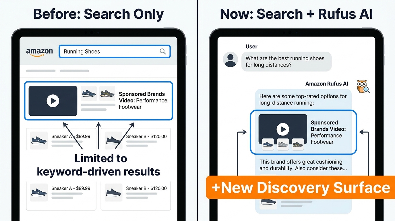
    SBV inventory is now Rufus-eligible. That means a video creative that was previously limited to search results pages — triggered by keyword matches — can now surface inside Amazon’s AI-powered shopping assistant when Rufus detects relevant intent. This is a supply-side change. The targeting inputs you enter in Campaign Manager (keywords, categories, products) remain your lever, but the placement logic has expanded beyond the search results page that used to be the only destination.

    Layer Two: How You Can Adjust Bids

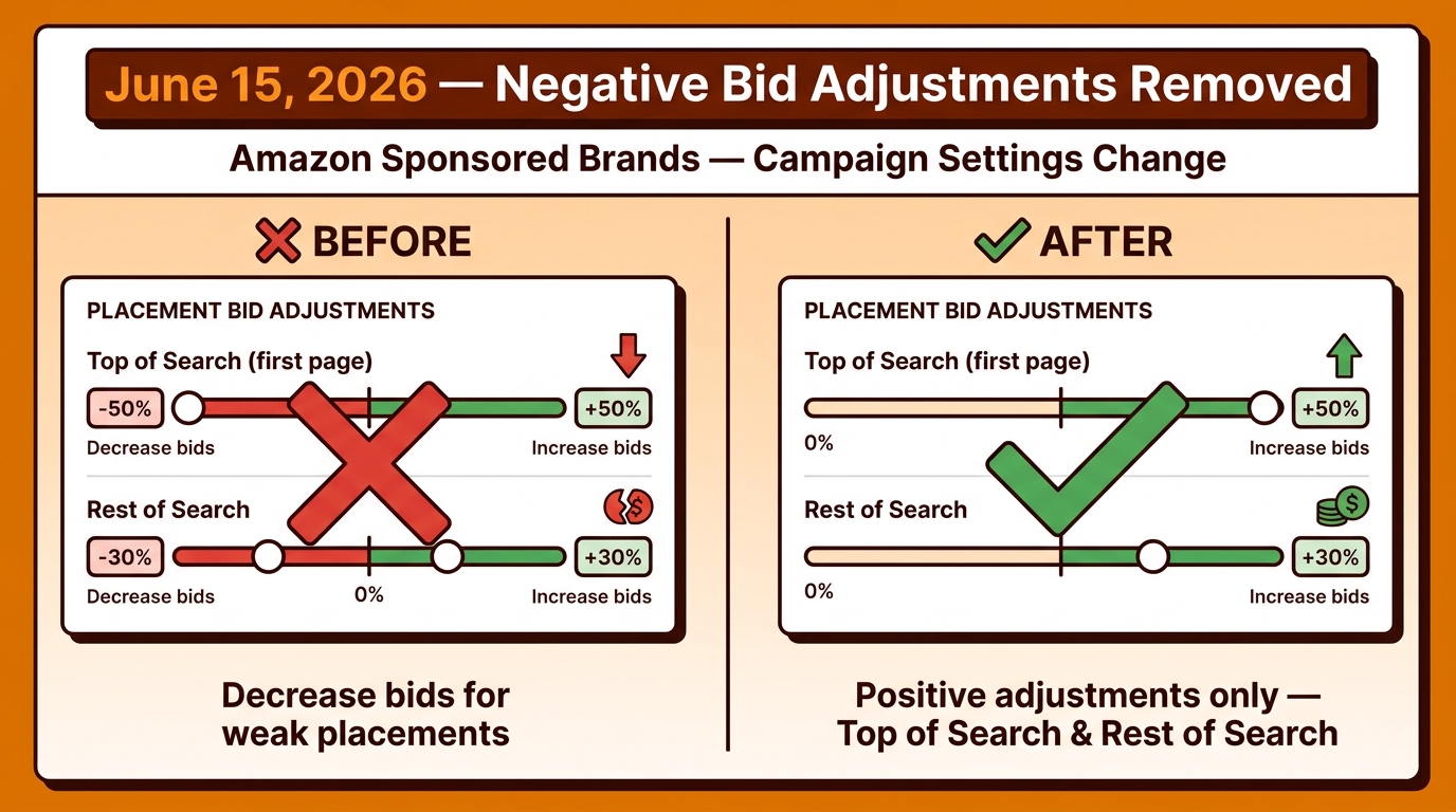
    Amazon cut the negative placement bid adjustment for Sponsored Brands. Prior to June 15, 2026, advertisers could suppress spend in poor-performing placements by applying downward percentage adjustments. That lever is gone for any new settings. The only placement controls remaining are positive adjustments for Top of Search and Rest of Search. This isn’t a minor housekeeping update — it removes a meaningful optimization lever that many sophisticated advertisers relied on to protect efficiency in weaker inventory.

    Layer Three: How Performance Gets Reported

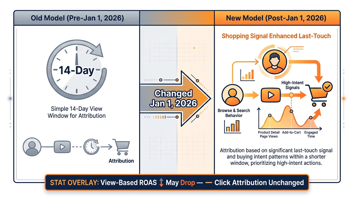
    Since January 1, 2026, Amazon shifted from a simple 14-day view-through attribution window to a shopping-signal enhanced last-touch model for certain Sponsored Brands and vCPM placements. View-based ROAS, purchases, and sales metrics can look materially different under the new model — not because campaigns are performing differently, but because attribution is being assigned differently. If your SBV reports look like the bottom fell out of view-attributed sales without a corresponding drop in clicks or conversion rate, this is probably the cause.

    Put these three layers together: your SBV ads are appearing in more places, you have fewer levers to suppress bad placements, and the metrics you’re watching to gauge efficiency may have shifted downward on their own. That’s the environment you’re operating in as of this month.

    Rufus Eligibility: What It Means When Your Video Enters AI Territory

    Amazon Rufus AI expanding SBV ad placement beyond traditional search — Before and After comparison

    Rufus is Amazon’s conversational AI shopping assistant, and its usage numbers have climbed steadily since launch. Shoppers are increasingly using it to ask questions like “what’s the best protein powder under $40 with no artificial sweeteners” rather than typing keyword strings into the search bar. The results Rufus returns are not identical to standard search results — they blend product recommendations, editorial-style summaries, and, now, ad inventory.

    SBV being Rufus-eligible changes the discovery model for video in a way that has no real precedent in Amazon advertising history.

    The Reach Implication

    In traditional SBV placements, your reach is bounded by search volume. If your keyword gets 50,000 monthly searches, your potential impression pool is capped somewhere below that number. Rufus placements operate on conversational intent signals, not just keyword frequency. A shopper who asks Rufus a specific product question might never have searched the keyword you’re targeting — but if Rufus determines your product is relevant to their query, your SBV creative can appear anyway.

    This expands the ceiling of potential impressions for a given SBV campaign. The same creative that was competing for keyword-triggered placements is now eligible for a second, semantically driven inventory pool. Agency commentary suggests this is particularly meaningful for category leaders and brands with strong product-level relevance signals, because Rufus’s recommendations skew toward established, well-reviewed products.

    The Attribution Complication

    Rufus placements don’t behave exactly like search placements from an attribution standpoint. When a shopper interacts with an ad in a Rufus context, the path to purchase may involve more steps, more comparison behavior, and a longer decision cycle than a shopper who sees a video while actively searching a specific keyword. This makes last-click attribution less clean as a performance signal for SBV specifically.

    The practical implication: if your SBV campaigns start showing higher impression volumes without a proportional increase in clicks or attributed sales, Rufus eligibility is the likely explanation. This doesn’t mean the additional impressions are worthless — but it does mean you need to broaden your measurement lens to capture brand-lift and new-to-brand outcomes rather than expecting direct last-click attribution for every Rufus exposure.

    What You Should Do About It

    Short term: audit your SBV impression trends over the past 60 days and look for a volume step-change that doesn’t correlate with bid increases or budget expansions. If you see one, you’re likely seeing Rufus eligibility in action. Segment your analysis by placement and check whether CTR on the new inventory is running meaningfully lower than your search placements — lower CTR in Rufus contexts is expected, not a sign of poor creative performance.

    Longer term: invest in the creative quality signals that Amazon’s AI weighs most heavily. Rufus recommendations, like all recommendation systems, favor products with strong review volume, competitive pricing, and complete listing content. Your SBV ad getting served in a Rufus context is only valuable if the product page it points to can close the consideration gap. If your listings are thin, Rufus eligibility gives you impressions but no conversions.

    The End of Negative Placement Bid Adjustments: June 15, 2026

    Amazon Sponsored Brands negative placement bid adjustments discontinued June 15, 2026 — before and after settings panel

    This is the change that has the most immediate, measurable impact on advertiser control — and it received the least public attention relative to its actual effect.

    Before June 15, 2026, Sponsored Brands campaigns allowed you to apply negative percentage adjustments to placements outside Top of Search. If Rest of Search was delivering poor efficiency for your category, you could dial it down — say, -50% — while leaving your Top of Search bids aggressive. This gave experienced advertisers a meaningful way to concentrate spend where conversion rates were strongest.

    Amazon has now standardized Sponsored Brands placement adjustments to accept only positive values. Existing campaigns that had negative adjustments in place can continue running with those settings for now, but no new negative adjustments are being accepted. The practical effect is that advertisers can no longer suppress underperforming placements — only amplify preferred ones.

    Why Amazon Made This Change

    Amazon doesn’t explain the rationale for ad product changes in public communications, but the pattern is consistent with the broader trajectory of Sponsored Brands product development: reduce friction for entry-level advertisers at the cost of control levers for sophisticated ones. Positive-only bid adjustments are conceptually simpler and easier to onboard new advertisers with. They also, not coincidentally, tend to result in higher total spend across the auction since there’s no suppression mechanism to limit bid floor from below.

    The Efficiency Risk

    For brands that used negative placement adjustments strategically, this change has a direct cost implication. Rest of Search placements tend to perform differently across categories — in some verticals, they drive strong discovery volume; in others, they’re a drain on budget with conversion rates well below Top of Search equivalents. Without the ability to suppress those placements, that budget either gets absorbed into less efficient inventory or requires manual bid-level management to compensate.

    The workaround for most advertisers is a shift in strategy: rather than using placement adjustments to suppress bad inventory, you’ll need to use base bids and keyword-level exclusions to control where spend concentrates. This is more granular work, but it’s the only remaining lever. Some practitioners are also experimenting with campaign segmentation — splitting high-priority branded keywords into their own campaigns with aggressive positive Top-of-Search adjustments, while letting broad discovery campaigns run without placement controls at all.

    What Existing Campaigns Retain

    If you have Sponsored Brands campaigns with negative placement adjustments already set before June 15, those settings are reportedly still active. The cutoff applies only to new settings changes. This makes it particularly important to audit your existing campaigns now, because if you modify those campaigns for other reasons — adding new keywords, adjusting budgets, restructuring targeting — you may lose the ability to re-apply the negative values when you save. Document what you have before touching anything.

    The January 2026 Attribution Model Change: Why Your View-Based Numbers Shifted

    Amazon January 2026 view attribution model change — old 14-day window vs new shopping signal enhanced last-touch model

    Attribution changes in Amazon advertising are often the slowest to surface in practitioner awareness because the numbers don’t come with a label reading “this decreased because the measurement model changed.” They just look like performance dropped. Several months into 2026, accounts that hadn’t absorbed the January 1 change are still troubleshooting performance gaps that are actually methodology gaps.

    Here’s what changed: Amazon replaced the straightforward 14-day view-through attribution window for certain Sponsored Brands and Sponsored Display vCPM placements with what it calls a “shopping-signal enhanced last-touch model.” Under the old model, if a shopper viewed your SBV ad and purchased within 14 days, that purchase was attributed to your ad — full stop. Under the new model, Amazon applies additional shopping behavior signals to determine last-touch attribution. If another ad or organic interaction is deemed a more proximate cause of purchase, the view may not get credit even if it happened within the 14-day window.

    What Gets Affected

    The change affects view-based attribution only. Click attribution — the most commonly tracked signal for most Sponsored Brands campaigns — is unchanged. This means campaigns where most reported conversions came from clicks will see minimal reporting impact. Campaigns where a significant portion of reported conversions came from views (common in high-volume SBV campaigns with broad reach) will see the sharpest decline.

    Sponsored Brands Video is disproportionately exposed here because video views — especially autoplay views on mobile — generate large view-attribution volumes relative to click volumes. A video that plays to completion in a search result may not generate a click but creates a view event. If that viewer purchases later, the old model would have credited the SBV campaign. The new model may not.

    How to Diagnose the Impact in Your Account

    Pull a year-over-year (or pre/post January 1, 2026) comparison of your SBV campaigns and look specifically at the ratio of view-attributed conversions to click-attributed conversions. If view-attributed sales dropped sharply while click-attributed sales held steady or grew, you’re looking at a measurement methodology shift rather than a real performance decline. The actual shopper behavior hasn’t changed — only which touchpoint gets the credit.

    This has significant implications for campaign optimization if you’re using reported ROAS to make bid decisions. If your ROAS targets were calibrated against the old attribution model, they’re now overstating efficiency requirements under the new one. Some brands are finding that campaigns they would have paused or cut — based on ROAS data — are actually performing well on clicks and conversion rate when you strip view attribution out of the analysis.

    The Broader Measurement Adjustment

    The cleanest response is to establish a new performance baseline dated from January 1, 2026, and stop comparing current SBV ROAS to pre-January figures as if they’re on the same measurement scale. They’re not. Use your post-January baseline as your reference point for optimization decisions, and where possible, lean on click-based metrics — click-through rate, detail page view rate, add-to-cart rate, and conversion rate — as your primary efficiency signals. These are unaffected by the attribution model change and give you a stable lens on whether your campaigns are actually working.

    Behavior-Based Audience Bid Adjustments: The Cart Signal Amazon Made Accessible

    Amazon Sponsored Brands audience bid adjustment segments — New to Brand, Clicked or Added to Cart, Purchased Brand Product

    While the removal of negative placement adjustments took away one optimization lever, Amazon simultaneously expanded another: audience-level bid adjustments for Sponsored Brands, including SBV. This is a relatively new capability in the Sponsored Brands ecosystem, and most advertisers are not using it systematically.

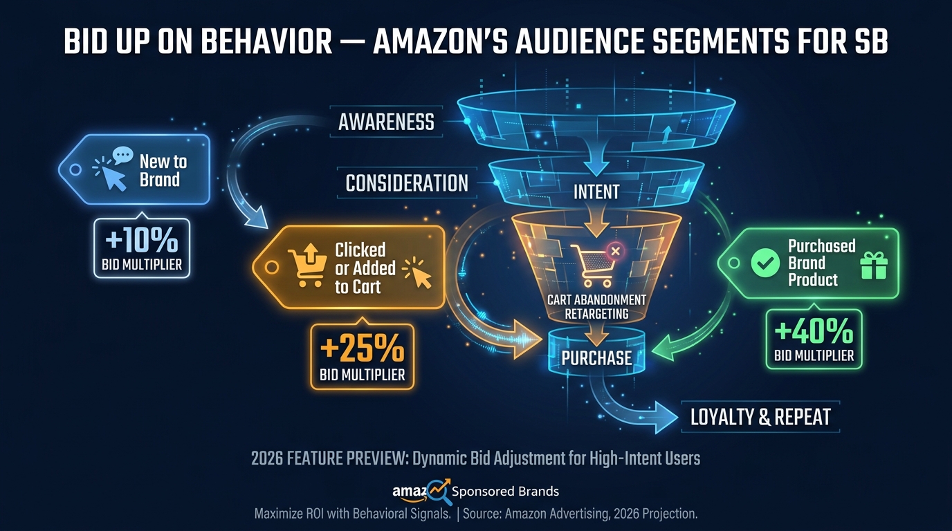
    Amazon now allows bid adjustments for three prebuilt audience segments within Sponsored Brands campaigns:

    • New-to-brand shoppers — first-time customers with no brand purchase history in the past 12 months
    • Clicked or added brand’s product to cart — high-intent shoppers who engaged but didn’t convert
    • Purchased brand’s product — existing customers being targeted for repeat purchase or cross-sell

    These are not separate campaign types — they’re layered on top of your existing targeting to adjust how aggressively Amazon bids when a qualifying shopper matches your keyword or category target. You can bid up, bid down, or hold neutral for each segment independently.

    The Cart Abandonment Angle

    The “Clicked or Added to Cart” segment is the most commercially significant of the three. Shopping cart abandonment on Amazon is a real behavioral pattern — shoppers often add products during a browse session and return days later to complete purchase, or they abandon entirely. Being able to bid up for these shoppers within a Sponsored Brands Video campaign means your video creative can specifically re-engage people who already demonstrated intent with your product. Amazon’s internal data cited a 16.3% average conversion rate improvement for advertisers who increased bids for the “Clicked or Added to Cart” audience — a figure from managed account analysis that should be treated as directionally useful rather than guaranteed.

    How to Set It Up Strategically

    The most effective deployment of audience bid adjustments depends on what you’re optimizing for. If your primary goal is customer acquisition (new-to-brand growth), bias your adjustments toward the NTB segment. If you’re operating with a tight ROAS target and want to concentrate spend on highest-probability conversions, the “Clicked or Added to Cart” segment deserves a meaningful bid premium — industry practitioners report 20–35% bid increases for this segment as a starting point, with optimization from there based on conversion data.

    For the “Purchased Brand’s Product” segment, the calculus depends heavily on your product lifecycle. For consumables or regularly replenished products (supplements, household goods, pet food), bidding up on existing customers makes strong commercial sense. For durables or single-purchase items, bidding aggressively to re-engage existing customers wastes spend on people with low incremental conversion probability — in these cases, a bid decrease or neutral setting is more appropriate.

    The Interaction With SBV Creative

    Audience bid adjustments work differently with video creative than with static Sponsored Brands, because the engagement signal for SBV is the video itself. When a cart abandoner sees your SBV creative, the video gives you a storytelling opportunity that a static image can’t — you can address the consideration gap that kept them from converting the first time. This is why the combination of audience bid adjustments targeting high-intent segments and SBV creative specifically designed to handle objections or demonstrate use cases is particularly powerful in 2026. The targeting layer finds the right person; the creative does the persuasion work the keyword search ad couldn’t finish.

    Keyword vs. Category vs. Product Targeting in SBV: Where the Math Favors Each One

    SBV Targeting Type Comparison: Keyword vs Category vs Product ASIN — which wins where in 2026

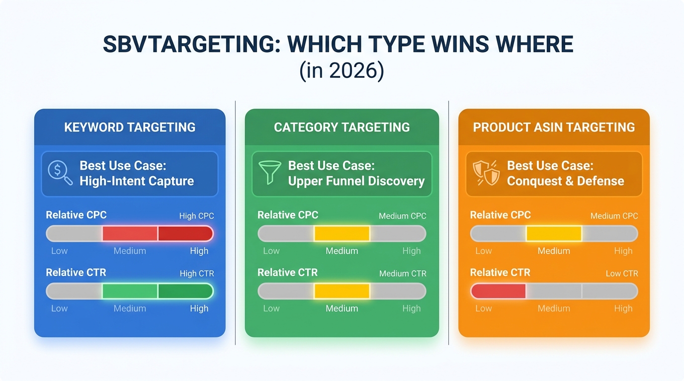
    SBV supports three core targeting types — keyword, category, and product/ASIN targeting — and the strategic logic for each has sharpened considerably as SBV has matured from experiment to primary format. With the bid control and placement changes this month, the relative positioning of each targeting type has shifted.

    Keyword Targeting: Still the Highest-Intent Layer

    Keyword targeting remains the backbone of most SBV campaigns because it matches against active purchase intent — a shopper who types “stainless steel travel mug 20oz” is communicating exactly what they’re looking for. SBV on keyword targets benefits from the same intent signal that makes Sponsored Products so effective, but adds the engagement power of video.

    In 2026, keyword targeting for SBV is most defensible when segmented by match type with rigorous negative management. Broad match in SBV is increasingly semantic — Amazon’s algorithm now surfaces SBV ads for related queries even when the exact keyword phrase is absent. This expands reach (useful) but can also pull in lower-relevance traffic that inflates spend without driving conversions. Best practice is to use broad match primarily for discovery and query harvesting, phrase for controlled expansion around your proven core terms, and exact match for high-intent branded and product-specific terms where conversion rates are established.

    Typical keyword-targeted SBV benchmarks in competitive categories: CPC in the $0.90–$2.50 range depending on category, with CTR running 0.4–1.2%. These numbers are category-dependent enough that using them as targets rather than expectations is wise.

    Category Targeting: Upper Funnel Discovery at Lower Cost

    Category targeting for SBV matches your ads against shoppers browsing within a product category, regardless of the specific search query. The reach is broader, the intent signal is weaker, and — critically — the CPCs are usually lower than equivalent keyword targets. This makes category targeting an efficient upper-funnel tool, particularly for new products, seasonal pushes, or brands trying to grow new-to-brand exposure without paying premium keyword rates.

    The trade-off is conversion efficiency. Category-targeted SBV typically converts at a lower rate than keyword-targeted SBV, which means ACoS runs higher if you’re measuring purely on direct attribution. The correct frame for evaluating category targeting is new-to-brand metrics and detail page view rates, not raw ACoS. If a category-targeted SBV campaign is bringing in first-time brand customers at an acceptable cost-per-new-customer, the higher apparent ACoS is an artifact of measuring a discovery campaign on a conversion metric.

    Product/ASIN Targeting: Competitive Conquest and Defense

    Product targeting places your SBV on competitor detail pages or on the detail pages of complementary products. The strategic applications are conquest (appear on competitor listings to intercept undecided shoppers) and complementary targeting (appear on products that pair naturally with yours to drive basket building).

    SBV is a particularly effective format for product targeting because video creative in a conquest context gets to make the comparison case that a shopper is already implicitly making. When someone is on a competitor’s product page, they’re already in active consideration — your video can show why your product is the better choice without waiting for a keyword search to trigger the opportunity.

    The conversion economics for product-targeted SBV tend to sit between keyword and category targeting — better intent signal than category (they’re on a directly relevant page), but less immediate than keyword (they haven’t committed to a search query). CPCs on product targeting are highly variable based on the competitive value of the ASIN being targeted.

    Why Broad Match Is Semantically Smarter — and More Dangerous — in 2026

    Broad match keyword behavior in Sponsored Brands campaigns has evolved significantly over the past 18 months, and the 2026 version is materially different from what advertisers built their negative keyword lists around in 2023–2024.

    Amazon’s current broad match algorithm is increasingly semantic — it’s not pattern-matching on word overlap but attempting to infer topical relevance. A broad match keyword like “protein shake” might now trigger on queries like “muscle recovery supplements” or “post-workout nutrition” even when neither word in the original keyword appears in the search query. For discovery purposes, this is valuable: you’re capturing relevant intent that keyword synonym logic would have missed.

    The Hidden Exposure Problem

    The danger is that semantic broad match also finds adjacencies that are topically related but commercially irrelevant to your specific product. A supplement brand targeting “protein shake” on broad match might surface for “weight loss tea” queries because the algorithm infers a shared “health and wellness” intent cluster. For video ads, where there’s a higher cost of impression (both financially and in terms of brand perception), irrelevant placements do more damage than they do in text ad formats.

    The practical response is more frequent search term report audits for broad match SBV campaigns — at minimum weekly, ideally every few days for high-spend accounts. The goal isn’t to eliminate broad match, which is genuinely useful for discovering new converting terms, but to build a negative keyword list fast enough that irrelevant traffic gets cut before it compounds.

    The Tiered Match Type Architecture

    The structural approach that most experienced SBV advertisers are using in 2026 is a tiered campaign architecture: separate campaigns for broad, phrase, and exact match — not all three match types mixed into a single campaign. This gives you clean performance data per match type, easier budget allocation, and the ability to graduate proven broad-match terms into exact-match campaigns where you can bid more aggressively on proven intent.

    Broad match serves as the discovery layer. Phrase serves as the expansion layer for terms that have shown relevance but haven’t hit the conversion volume threshold for exact. Exact serves as the scaling layer for your best-performing, most intent-rich terms. Budget allocation typically tilts toward exact, with broad and phrase funded at levels sufficient for learning without overwhelming spend on lower-efficiency inventory.

    The Negative Keyword Discipline

    One underappreciated implication of semantic broad match in SBV is that negative keywords need to be semantic too. It’s no longer enough to add the obvious irrelevant terms. You need to review search term reports with an eye for intent clusters — groups of queries that share a topical relationship with your keyword but represent a different buyer intent than what your product serves. Adding individual keywords one by one to your negative list will always lag behind a semantic broad match algorithm. Adding negative keyword themes — blocking an entire intent cluster — is more durable.

    New-to-Brand Metrics: The Only Honest Scorecard for SBV Discovery Campaigns

    The single biggest measurement mistake SBV advertisers make in 2026 is evaluating discovery campaigns on efficiency metrics designed for conversion campaigns. ACoS is a conversion metric. ROAS is a conversion metric. When you apply them to upper-funnel SBV campaigns — category targeting, broad match, Rufus-eligible impressions — you’re asking the wrong question and getting answers that will lead you to cut campaigns that are actually working.

    Amazon’s new-to-brand (NTB) metrics exist precisely for this purpose. Amazon defines a new-to-brand customer as someone who has not purchased from your brand in the past 12 months. NTB orders, NTB sales, NTB order rate, and NTB percentage of total orders are all available in Sponsored Brands reporting — and for SBV specifically, they are the most honest indicators of whether a discovery campaign is doing its job.

    Setting NTB Targets

    The correct benchmark for NTB performance varies by category and brand maturity. Brands with high category awareness and strong organic search volume typically see SBV NTB rates in the 40–60% range for category-targeted campaigns, because their brand recognition means some returning customers will be triggered by video even in discovery contexts. Newer brands or brands in lower-awareness categories often see NTB rates above 70% for category-targeted SBV — the ad is almost exclusively finding people who haven’t bought from them before, which is exactly what it’s supposed to do.

    The KPI framework worth tracking alongside NTB metrics: detail page view rate (DPVR), Store visit rate where applicable, branded search lift (measured separately via Brand Analytics), and cost per new-to-brand order. This last metric — spend divided by NTB orders — gives you an acquisition cost figure that can be evaluated against your customer lifetime value rather than against a short-window ROAS target.

    Why This Changes Optimization Decisions

    When NTB metrics are your primary scorecard for SBV discovery campaigns, your optimization decisions look completely different from ACoS-optimized decisions. A campaign running at 45% ACoS on a direct attribution basis might look like a budget drain under ROAS optimization but might be delivering NTB orders at $18 cost-per-acquisition against a $120 average order value and a customer who buys again twice per year. That math supports increasing budget, not cutting it — but only if you’re using the right measurement framework.

    What Smart Advertisers Are Restructuring Right Now

    Taken together, the SBV targeting shifts of 2026 — Rufus eligibility, the end of negative placement adjustments, the attribution model change, and the expansion of audience bid levers — point to a clear restructuring pattern among the advertisers navigating them most effectively.

    Campaign Architecture Overhaul

    The most common structural response is separating SBV campaigns by targeting objective rather than by targeting type. Instead of one SBV campaign with keyword, category, and product targeting all mixed together, leading practitioners are running:

    • High-intent keyword campaigns (exact/phrase match, aggressive bids, strong positive Top-of-Search adjustment)
    • Discovery campaigns (category targeting, broad match, evaluated on NTB metrics)
    • Conquest campaigns (product/ASIN targeting against specific competitor pages)
    • Retargeting campaigns (audience bid adjustments for the “Clicked or Added to Cart” segment, layered on keyword targeting)

    This separation gives clean measurement per objective and allows budget allocation to reflect strategic priority rather than letting mixed campaigns blur the performance signal.

    Creative Alignment to Targeting Context

    The other major structural shift is treating SBV creative as context-dependent rather than one-size-fits-all. A video built to perform in a keyword-intent context (someone actively searching your category) should be different from a video built to perform in a Rufus or category-browse context (someone exploring options, not yet committed).

    In a high-intent keyword context, the video can be direct and conversion-focused — lead with the product, establish key benefits quickly, clear CTA. In a discovery or Rufus context, where the shopper is in an earlier consideration stage, the video needs to do more brand-building work: establish relevance to a problem or need, differentiate from the category broadly, build enough curiosity to drive the click.

    Most advertisers are running one SBV creative per campaign. The ones seeing the strongest results are running two: one for intent capture, one for discovery. The investment is one additional video script and production run — and the performance difference in well-segmented campaigns is significant enough that this is increasingly standard practice rather than a luxury.

    Reporting Framework Reset

    Given the attribution model change, the final structural adjustment is recalibrating performance baselines and removing pre-January 2026 data from optimization decision-making for any SBV campaigns with meaningful view-attribution volume. This means resetting ROAS targets, rebuilding ACoS benchmarks from post-January data, and creating separate tracking for click-attributed and view-attributed metrics so changes in either can be isolated.

    Actionable Takeaways: What to Do This Week

    The targeting environment for SBV in 2026 is meaningfully more complex than it was 12 months ago — more surfaces, fewer suppression levers, a shifted attribution model, and new behavior-based controls to manage. Here’s a practical action list for the immediate term:

    1. Audit your SBV impression trends over the past 60 days. Look for step-changes in impressions that don’t correlate with bid or budget increases. This is your first signal of Rufus eligibility affecting delivery.
    2. Document every Sponsored Brands campaign with negative placement adjustments before touching them. Editing any campaign setting may clear your ability to retain those values. Screenshot what you have.
    3. Set January 1, 2026 as your attribution baseline for SBV performance evaluation. Do not benchmark current view-based ROAS against pre-January data. They’re not measuring the same thing.
    4. Activate audience bid adjustments for the “Clicked or Added to Cart” segment in any SBV campaign targeting your own category. Start with a 20% bid increase and test over 30 days against control campaigns.
    5. Separate your SBV campaigns by targeting objective — intent capture, discovery, conquest — so performance measurement is clean per goal and budget allocation reflects strategic priority.
    6. Shift discovery campaign success metrics to NTB orders and cost-per-NTB-order rather than ACoS. Establish an acceptable cost-per-new-customer ceiling based on your average order value and repeat purchase rate.
    7. Run weekly search term reports on all broad match SBV campaigns and build semantic negative keyword themes — not just individual term exclusions. You’re managing a semantic algorithm; your negatives need to work the same way.
    8. Consider a two-creative strategy for high-spend SBV accounts: one intent-focused video for keyword targeting, one consideration-stage video for category and Rufus-eligible placements.

    SBV is no longer a supplementary format you can manage on autopilot. The combination of expanded placement surfaces, reduced bid suppression controls, and a shifted measurement model means the gap between well-managed and poorly managed SBV campaigns is wider in 2026 than it’s ever been. Advertisers who treat the current targeting environment as identical to 2024’s will see that reflected in their numbers. Those who engage with what’s actually changed — surface by surface, lever by lever — will find that SBV is producing the best returns it ever has.

    Conclusion

    The SBV targeting landscape in 2026 looks fundamentally different from the one most advertisers built their playbooks against. Three overlapping changes — Rufus AI eligibility, the removal of negative placement bid adjustments, and the attribution model shift — are working together to change both where your ads appear and how you measure whether they’re working. At the same time, new behavior-based audience controls and cleaner NTB reporting are giving advertisers better levers to work with — if they actually use them.

    The advertisers who will navigate this well aren’t the ones who watched SBV become the dominant Sponsored Brands format and kept doing what they were doing. They’re the ones treating the current moment as a prompt to restructure: cleaner campaign architecture, more deliberate creative differentiation, recalibrated measurement baselines, and active management of the new audience and match type dynamics Amazon has put in front of them.

    SBV’s evolution from test format to primary channel happened faster than most ad managers expected. The targeting infrastructure around it is evolving just as fast. The question isn’t whether to engage with these changes — it’s whether you engage before or after your competitors do.

  • Why Most Sellers Are Using Amazon’s SBV Video Generator Wrong — And What the Data Actually Shows

    Why Most Sellers Are Using Amazon’s SBV Video Generator Wrong — And What the Data Actually Shows

    Amazon’s SBV Video Generator has been available to U.S. sellers since its broader rollout, and by mid-2026 it expanded to Canada, India, Mexico, France, Germany, Italy, Spain, and the UK. It’s free. It’s built directly into the Amazon Ads console. It generates up to six ad-ready video variants from a single ASIN in minutes.

    And yet the majority of sellers using it are doing so in a way that leaves significant performance on the table.

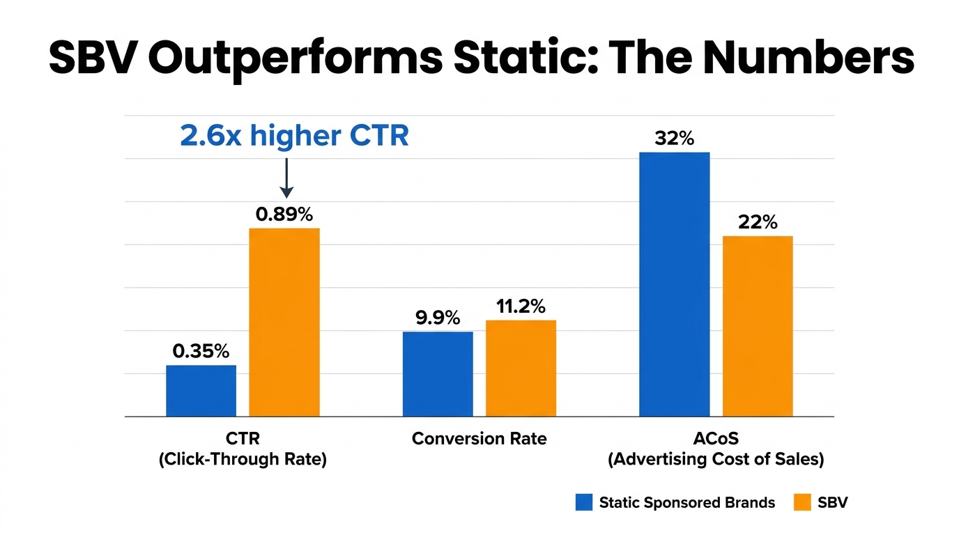
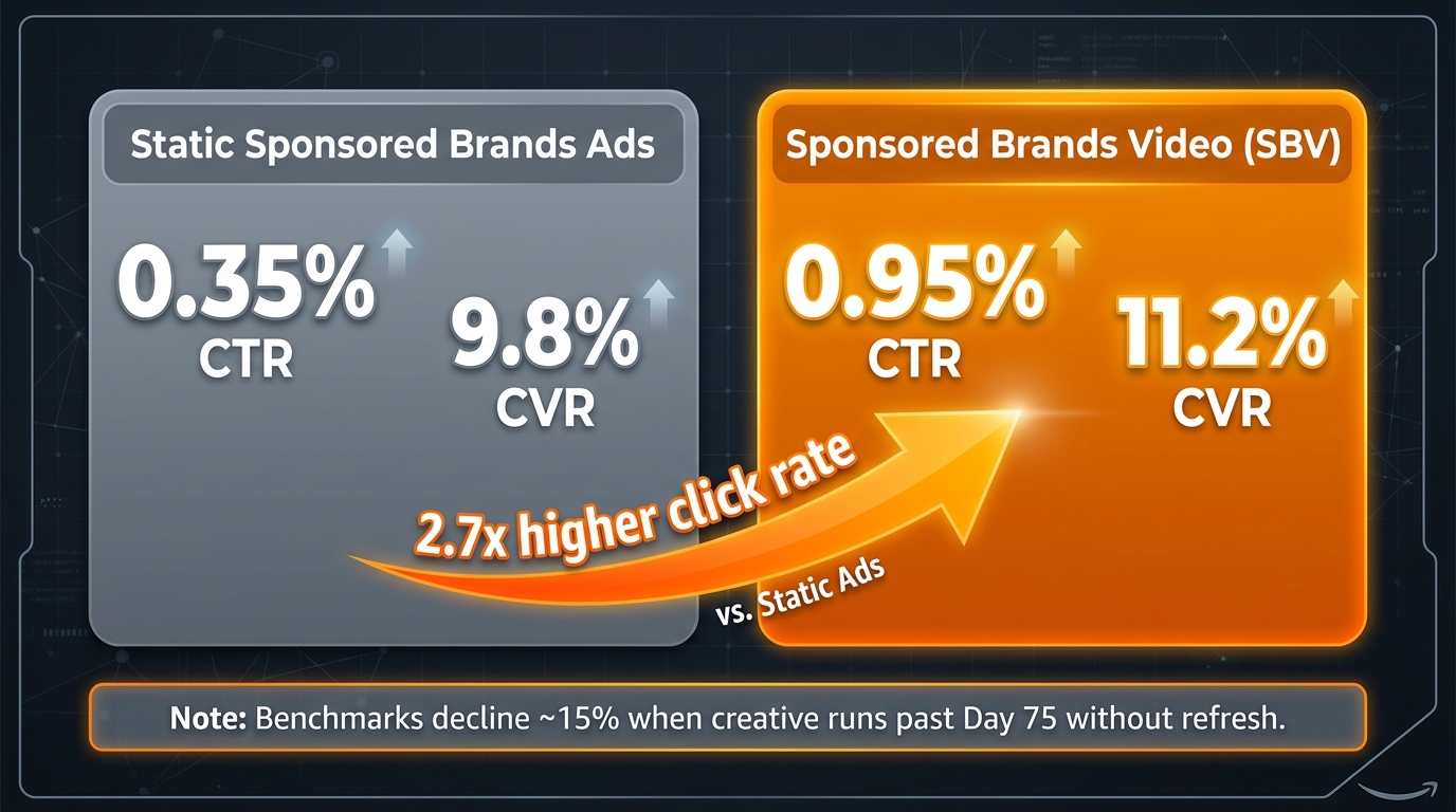
    The problem isn’t the tool. Sponsored Brands Video consistently benchmarks at a 0.89%–1.0% CTR — approximately 2.6 times higher than static Sponsored Brands ads — and a conversion rate around 11.2%, roughly 13% better than image-based alternatives. ACoS frequently runs 15–45% lower than Sponsored Products in well-managed accounts. The format demonstrably works.

    The gap is between access and execution. Most sellers either treat the generator as a one-and-done production tool, misunderstand how the ad actually renders in a live shopping environment, or apply a brand-storytelling framework to a format that demands conversion logic. Those mismatches compound quietly — producing campaigns that spend budget, generate impressions, and deliver mediocre returns that get blamed on the format instead of the execution.

    This piece is about closing that gap. We’ll cover what the tool actually does under the hood, the muted-autoplay reality that changes everything about creative structure, how to use the six-variant output as a genuine testing engine, what targeting configurations actually work, and how to build a campaign stack that moves from test to scale without blowing your budget in the process.

    Amazon SBV Video Generator workflow showing ASIN selection and six AI-generated video variants in the Amazon Ads console

    What the SBV Video Generator Actually Does (Beyond the Marketing Copy)

    Amazon’s official description of the Video Generator is that it “creates ad-ready videos from a product image or ASIN in minutes.” That’s accurate but incomplete. Understanding the mechanics matters because the tool’s architecture shapes what you can and can’t optimize from the output.

    The Input-to-Output Pipeline

    The generator works by pulling structured data from your product detail page — title, bullet points, primary images, and brand name — and feeding that into a multi-scene video construction model. It’s not simply animating your main listing image. The updated model, which Amazon began rolling out in 2026, now includes enhanced motion shot generation: the ability to take a still product image and synthesize realistic in-use motion, including scenes featuring people and pets where contextually appropriate.

    The result is six 15-second video options, each built around a different scene composition, text animation style, or product emphasis. Some variants will lead with the product floating in a clean environment. Others will show the product in use or place it in a lifestyle context derived from your listing’s imagery and copy. You don’t control which six you get before generation — but you do get to choose which one to deploy, and you can regenerate if none of the initial set is usable.

    What You Can Customize Post-Generation

    Inside Creative Studio, after generation, you have editing access to several elements: headline copy, font selection, logo placement, color palette adjustments, and to a degree, music selection. What you can’t do is restructure the core video timeline or re-sequence the motion scenes. The generated video comes as a pre-built sequence. You’re working with the frame, not the architecture.

    This matters strategically. It means your primary lever for differentiation isn’t in-editor customization — it’s in what you feed the tool going in. Listings with richer imagery, more specific bullet point copy, and cleaner product photography produce measurably stronger generator outputs. A listing with a single white-background hero image and generic bullet points will produce six variants that look nearly identical to each other. A listing with multiple contextual lifestyle images and specific benefit-driven bullet points gives the model more material to work with, and the output variance across the six variants increases meaningfully.

    Video Summarization and Upload Pathways

    The generator also supports a second input pathway: you can upload an existing video clip, and the tool will summarize it into an ad-ready shorter format. This is particularly useful for brands that have product demo footage from external shoots or UGC content. Rather than treating the generator as purely a creation tool, treating it as a compression and formatting tool for existing assets opens up a different use case — one that combines the polish of professionally shot footage with the speed of AI-assisted editing.

    The key spec boundary: the output needs to fit within the 6–45 second window (Amazon recommends 20 seconds or less, with 15 seconds being the sweet spot), and must meet the 16:9 aspect ratio, MP4/MOV format, and H.264/H.265 codec requirements before it can be submitted for review.

    The Muted Autoplay Reality: Why Audio Is a Red Herring

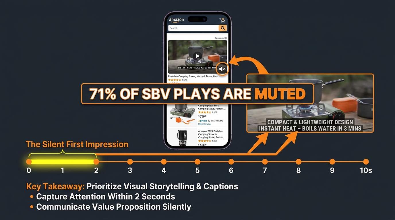
    Smartphone showing Amazon search results with muted SBV ad playing, stat overlay showing 71% of SBV plays are muted in 2026

    This is the single most consequential thing most sellers get wrong about SBV creative strategy, and it’s almost never discussed at the campaign-setup level.

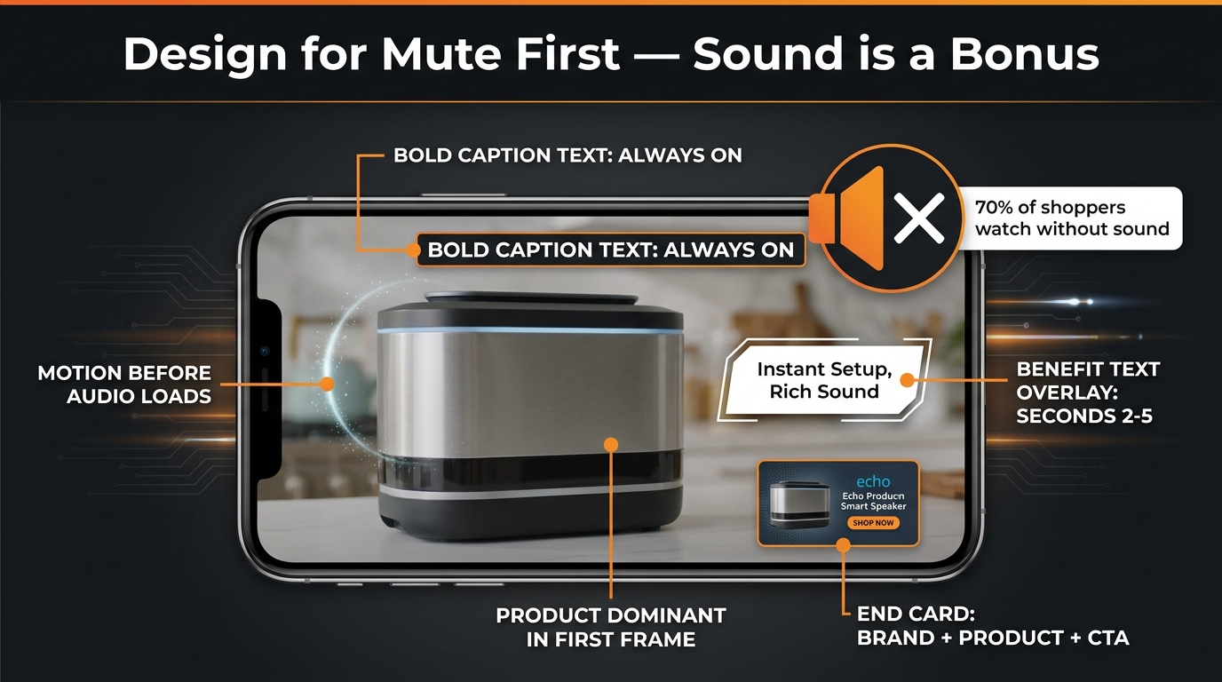
    Amazon Sponsored Brands Video ads autoplay muted by default. Sound only activates if a shopper explicitly taps the mute toggle. By 2026, approximately 71% of all SBV plays are muted — up from an estimated 64% in 2024. That number is going in one direction as mobile shopping continues to grow and as shoppers increasingly browse Amazon in contexts where audio is socially inappropriate (commuting, offices, shared spaces).

    The practical implication is stark: if your SBV creative relies on a voiceover to communicate your product’s key benefit, you are communicating nothing to more than seven in ten people who see your ad. The voiceover isn’t a backup — it’s the primary communication channel for most professionally produced videos. And it’s inaudible for the majority of your impressions.

    What “Mute-First” Creative Actually Means

    Designing for muted autoplay isn’t just about adding subtitles to an existing video. It requires rethinking the entire communication hierarchy. In a muted environment, the following elements carry 100% of the message:

    • The first frame: What does the shopper see in the literal first second before they decide to keep scrolling or watch?
    • Motion quality: Is the movement interesting enough to slow the scroll even without audio cues?
    • On-screen text overlays: These are not supplemental. They are the primary copy channel.
    • Product visibility: Is the product large, clear, and unambiguous in the frame?

    Amazon’s generator, when working well, builds text animation into the video structure by default. But the default text it pulls is often the product title — which is typically optimized for keyword indexing, not for human readability in a 2-second window. Sellers who accept the default title as their on-screen headline are missing an opportunity. The headline field in Creative Studio is where your actual conversion hook lives. It should answer the question a high-intent shopper is implicitly asking when they search for your product: not “what is this?” but “why this one?”

    The Captions Question

    Amazon recommends closed captions for SBV, and they’re worth adding — but captions are not a substitute for strong on-screen text design. Captions are small, typically rendered at the bottom of the frame, and read at audio pace. On-screen text overlays, by contrast, can be sized, positioned, and timed for impact. The most effective SBV creatives use large, high-contrast overlay text (think 3–4 words maximum per card) that communicates the key benefit independent of any audio track. Captions handle the audio transcript. The overlay text handles the persuasion.

    For sellers using the Video Generator, this has a specific tactical implication: after generation, open the Creative Studio editor and review every text element for muted readability. Ask whether someone scrolling at normal speed, with no audio, would understand within two seconds what the product is and why they should click. If the answer is no, you have editing work to do before launch.

    The 15-Second Architecture: How to Structure Every Frame

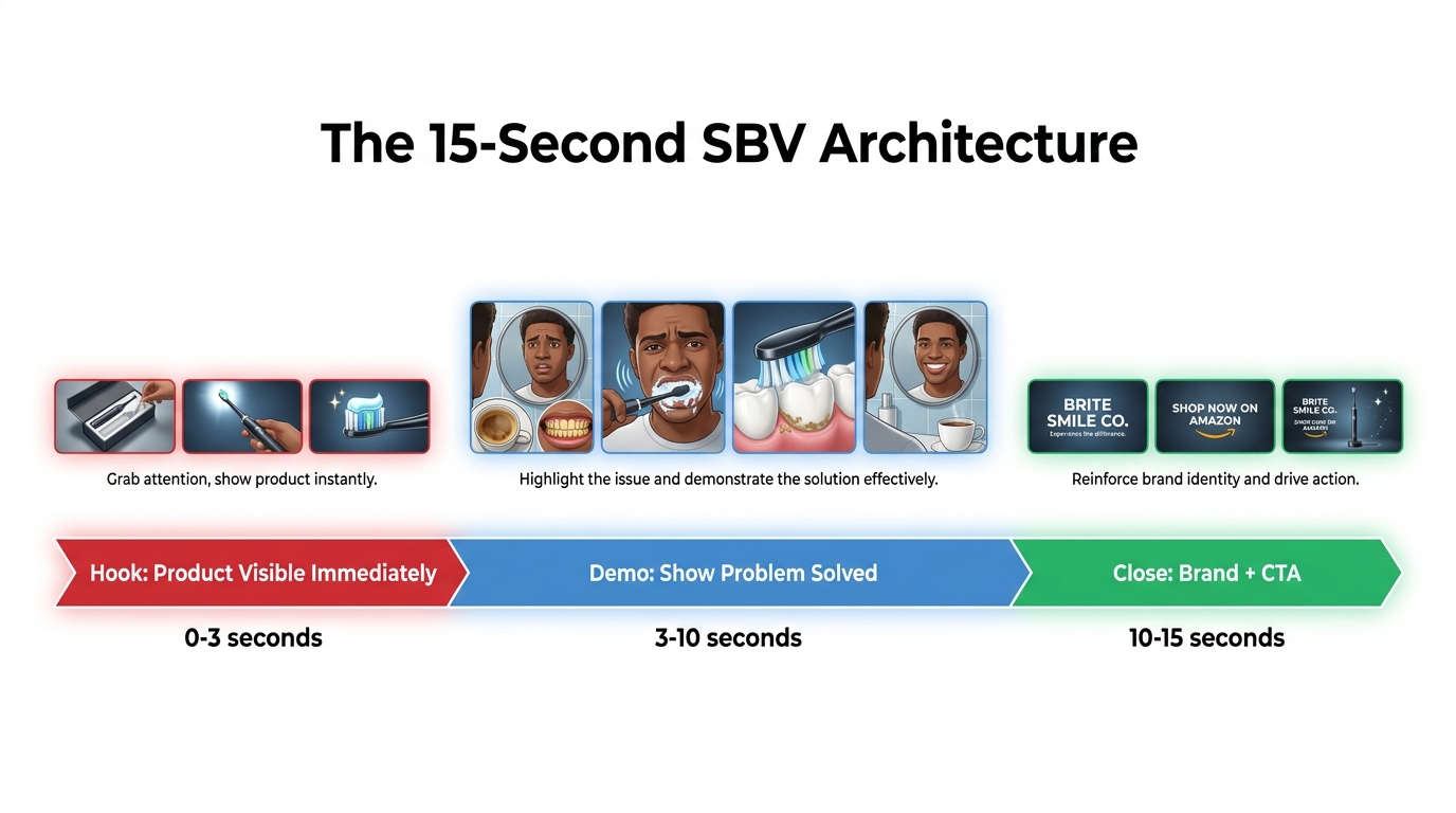
    Diagram showing the ideal 15-second Amazon SBV video structure divided into three phases: Hook (0-3s), Demo (3-10s), and Close with CTA (10-15s)

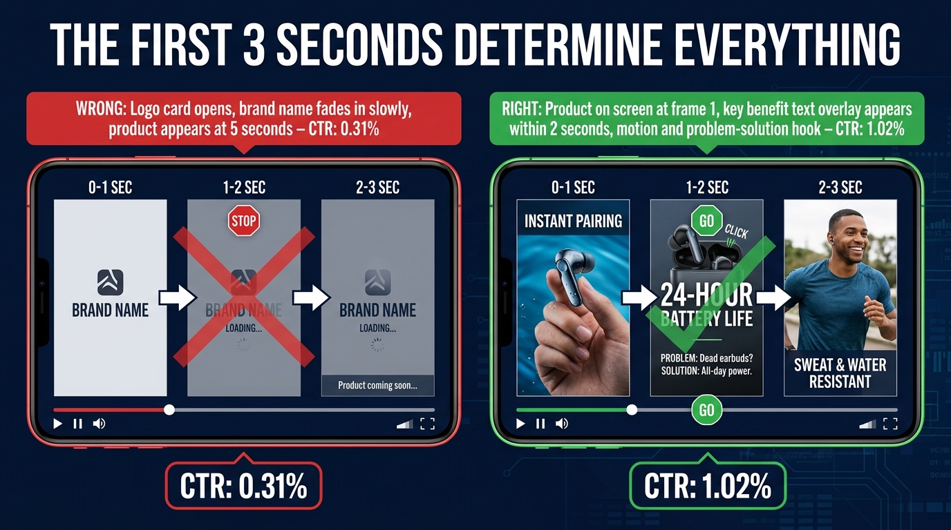
    Amazon’s own guidance says to show the product within the first two seconds and its function within the first five. Those aren’t aspirational suggestions — they’re based on drop-off data from the platform’s video analytics. Shoppers who don’t see a clear product in the opening seconds scroll past. The decision to engage or continue happens almost immediately.

    The 15-second window isn’t just a technical constraint. It’s a communication architecture. When you approach it structurally, every second has a job.

    Seconds 0–3: The Hook

    The hook’s only job is to stop the scroll and establish what the product is. Not what it’s great at, not who makes it, not a brand logo. The product, clearly visible, in a context that signals relevance to the shopper’s search. If they searched for “insulated water bottle,” they need to see a water bottle — not a lifestyle scene that eventually reveals a water bottle.

    The most common mistake in this window is the brand intro. Opening with a logo animation or a brand name card is a pattern inherited from broadcast television, where audiences are captive. Amazon shoppers are not captive. A logo intro in the first three seconds is a conversion killer because it communicates nothing to a shopper who doesn’t already know your brand — and the shoppers you need to convince are precisely those who don’t know you yet.

    The Video Generator, by default, sometimes produces logo-first or lifestyle-first openings depending on how it interprets your listing data. This is one of the most important things to check and, if necessary, edit or regenerate before launch.

    Seconds 3–10: The Demo or Proof Point

    This is where you show the product doing something, or solving something, or being used in a way that makes the key benefit tangible. The enhanced motion shot feature in the updated Video Generator is particularly valuable here — for products that benefit from in-use demonstration (tools, kitchen gadgets, fitness equipment, skincare, pet products), an AI-generated motion sequence showing the product being used can be more persuasive than a static lifestyle image.

    If you have multiple key differentiators, this seven-second window can handle two of them — but only if the transitions are clean and the text overlays are distinct and readable. Cramming three or four proof points into this section results in nothing landing. Discipline matters. Pick the one or two benefits that match the search intent of the keywords you’re targeting, and let those breathe.

    Seconds 10–15: The Close

    The close doesn’t need to be elaborate. A clean product name, a brief brand logo appearance (here, not at the start), and optionally a single CTA phrase (“Shop Now,” “See All Sizes,” or a specific proof point like “4.7 Stars, 12,000 Reviews”). Shoppers who have watched to this point are already engaged — they don’t need to be convinced again. They need to be directed.

    One frequently missed opportunity in the close: if your product has a strong social proof number (review count, star rating, or a bestseller badge), surfacing it in the final seconds adds measurable conversion weight. Unlike a landing page where shoppers actively look for this information, an SBV ad controls the information sequence. Putting your strongest proof point at the end, after the interest is established, is structurally sound.

    Six Variants, One Strategy: Using the Generator as a Creative Testing Engine

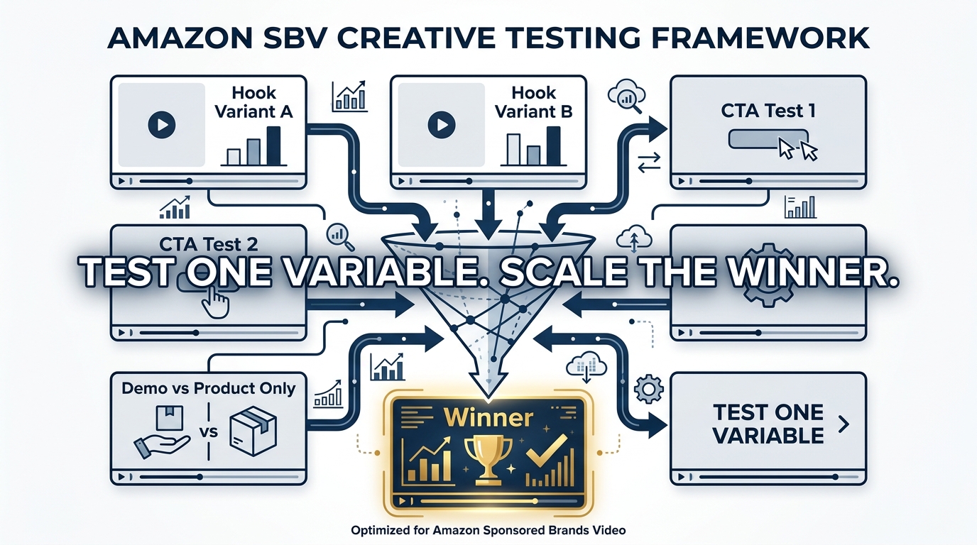
    A/B testing framework showing six SBV video variants being tested and funneled down to one winning creative

    The most underutilized aspect of the Video Generator isn’t any individual feature — it’s the six-variant output structure itself. Most sellers pick one variant they like aesthetically and launch it. That’s the wrong use of the tool.

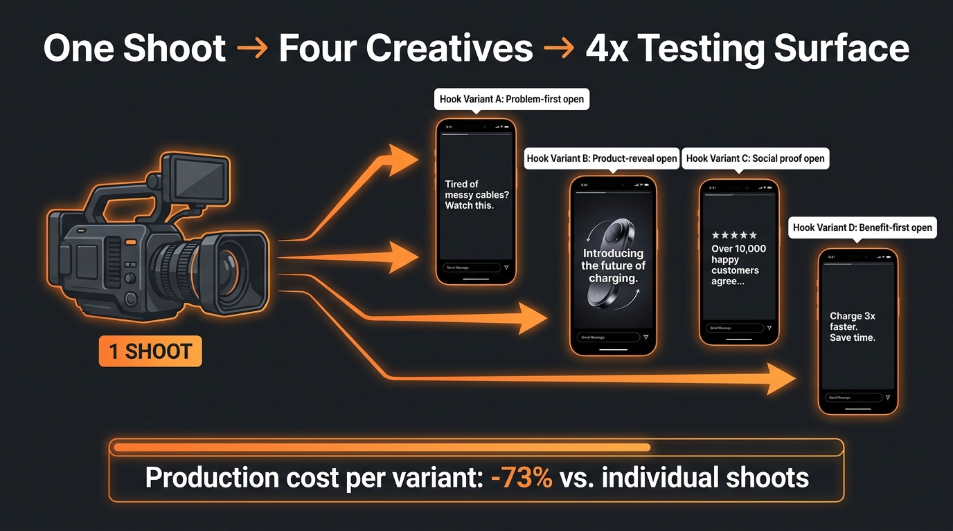
    The six variants are a creative testing starter pack. They give you differentiated creative options at zero additional production cost. The correct workflow is to treat them as hypotheses and the campaign as the experiment.

    Designing the Test Before You Launch

    Effective creative testing on SBV requires an upfront decision about what variable you’re testing. The generator gives you six different compositions, but they may vary across multiple dimensions simultaneously — scene type, text placement, pacing, and color treatment. That makes direct A/B comparisons difficult unless you impose some structure on the test design.

    The most practical approach for sellers without a dedicated media buying team: run two to three variants simultaneously in separate ad groups within the same campaign, with identical keyword targeting and bids. Let them run until each has accumulated enough data (typically at least 1,000 impressions per variant at a minimum, with 5,000+ giving more reliable signal), then compare primarily on CTR first, then conversion rate, and finally ACoS or ROAS.

    CTR is the right leading indicator for creative testing because it reflects how well the creative is connecting with the audience at the point of impression — before any product page variables intervene. A creative that wins on CTR but underperforms on conversion usually has a messaging mismatch between the ad and the listing, not a creative problem per se. A creative that performs on both CTR and conversion is your winner to scale.

    The Variable Isolation Framework

    Once you’ve identified a general winner from the generator’s output, the next iteration should isolate specific variables. Amazon’s analytics suite now provides view-through rate (VTR), 5-second views, quartile views (what percentage watched 25%, 50%, 75%, and 100% of the video), and sound-on view rate. These metrics make it possible to diagnose where in the 15-second arc a variant is winning or losing the viewer.

    If a variant has strong 5-second views but drops off sharply at the 50% quartile, the hook is working but the middle section is losing people. If the 5-second view rate is low relative to impressions, the hook itself needs reworking. If sound-on rates are higher than average, your audio may be contributing meaningfully — or your visual hook is strong enough to make shoppers curious about what’s being said.

    Refresh Cadence

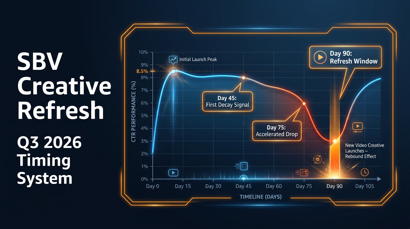
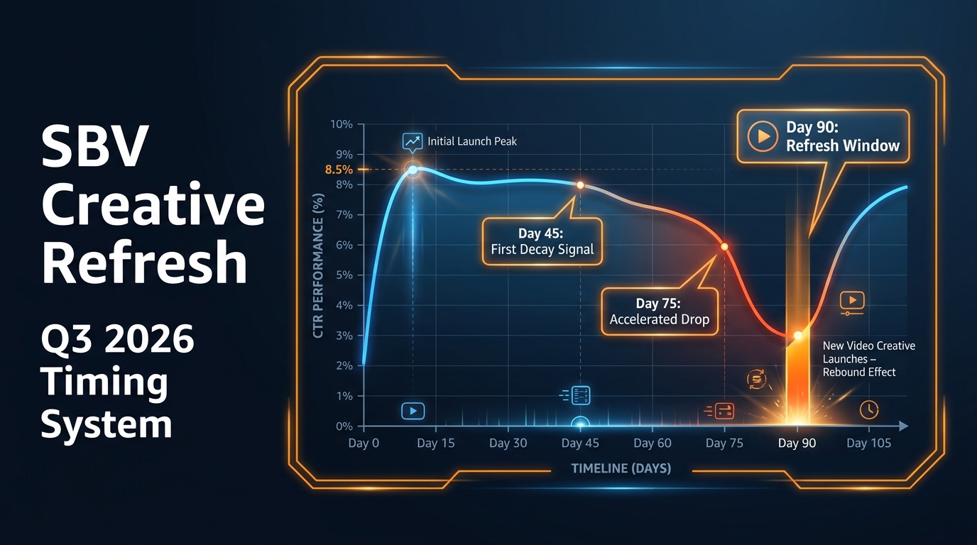
    Creative fatigue on Amazon video is real, though it manifests differently than on social platforms. Because SBV impressions are tied to search queries (not social feeds), the same shopper sees your ad repeatedly only if they’re searching frequently for your keyword. In high-competition categories, refresh cycles of 60–90 days are reasonable. In lower-volume categories, a strong creative can run for 6 months or more without significant performance decay.

    The generator makes frequent refreshes economically viable in a way that professional video production never could. A monthly creative refresh cycle that would cost thousands in production fees costs nothing except the time to run the generator and evaluate the output. This changes the economics of creative iteration substantially, particularly for smaller sellers and growing brands.

    Targeting and Placement: Where SBV Actually Wins

    The video format is powerful. But video format advantages are realized only at the right intersection of placement, intent, and keyword relevance. Getting the targeting wrong negates the creative.

    Search Intent Is the Foundation

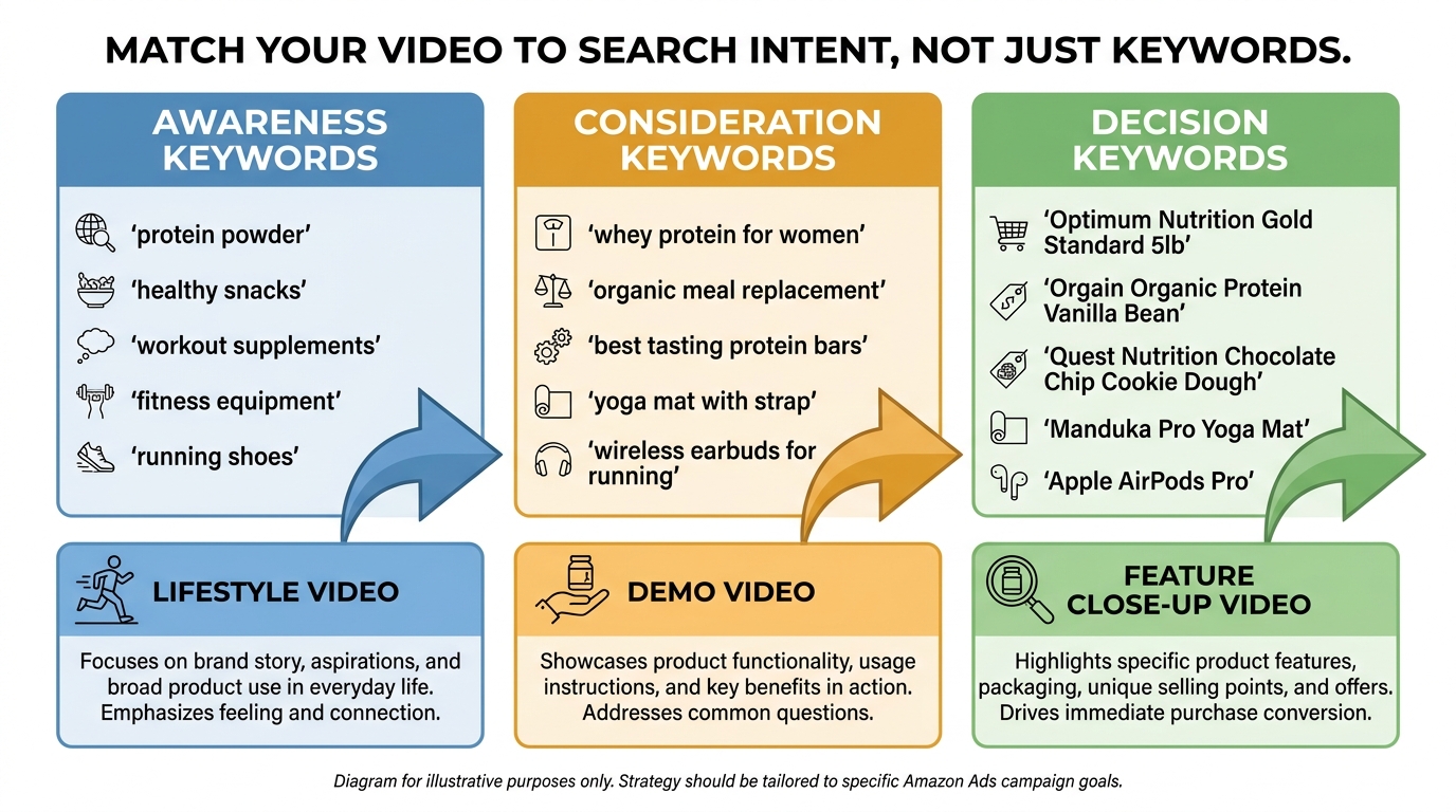
    Sponsored Brands Video appears primarily at the top of search results and within search results pages. This is fundamentally different from display or video advertising on other platforms. The audience is not passive — they are actively searching, expressing high purchase intent through their query. Your video creative needs to be evaluated against the intent of the keyword, not just as a standalone piece of content.

    A video showing your product being unboxed might perform well against branded keywords from existing customers who already know your product. The same video against competitive conquesting keywords (targeting a competitor’s product name) needs a different message — one that speaks to comparison shopping and why someone should switch. The creative and the keyword need to align.

    Match Type Configuration

    The strongest SBV campaigns in 2026 are overwhelmingly exact and phrase match-led. Broad match on SBV is not inherently wrong, but it introduces keyword misalignment risk that’s harder to control in a video format. A static ad displayed against an irrelevant query wastes budget. A video displayed against an irrelevant query wastes budget and impressions — and because SBV competes partly on a quality-signal basis, irrelevant impressions can degrade campaign health over time.

    The recommended structure is a tiered approach:

    • Tier 1 (Exact Match): Your highest-converting commercial terms. These are the queries where you know purchase intent is highest. Bid more aggressively here and keep the keyword list tight — 10 to 20 terms maximum per ad group.
    • Tier 2 (Phrase Match): Variations and longer-tail derivatives of your core terms. Useful for capturing intent signals you haven’t thought of explicitly.
    • Tier 3 (Broad Match / Category / Product Targeting): For discovery and expansion. Use this tier with strict negative keyword management and lower bids. Treat it as a research campaign that feeds intelligence into Tiers 1 and 2.

    Product Targeting as a Complement

    ASIN and category targeting in SBV is an underused configuration. By targeting competitor ASINs — particularly those with high review counts or bestseller status — you place your video in a context where comparison intent is already active. A shopper viewing a competitor’s listing and seeing your SBV creative in the search results immediately before or after is seeing you in a direct comparison context.

    This works best when your creative addresses the comparison directly — whether that’s price, a specific feature advantage, or a proof point (review count, certifications, material quality) that your competitor’s product lacks. Generic creative deployed against competitive ASIN targeting wastes the placement. Specific, comparative creative in this context can produce outsized conversion rates because the shopper is already in a decision-making mindset.

    The AI Creative vs. Professional Video Debate: What the Numbers Say

    Performance comparison chart showing SBV vs static Sponsored Brands ads with CTR, conversion rate, and ACoS metrics side by side

    The question of whether to use the Video Generator or invest in professional video production comes up constantly in seller communities, and the answer is more nuanced than either camp typically acknowledges.

    The Cost Reality

    Professional video production for Amazon advertising ranges from a few hundred dollars for a basic product showcase from a freelance videographer to several thousand for a multi-scene, talent-featuring, professionally edited commercial-grade video. Agency-produced SBV creative can run considerably higher when licensing, talent fees, and revision rounds are factored in.

    The generator costs nothing. That’s not a small difference in scale — it changes the decision calculus entirely for sellers who would otherwise skip video advertising entirely due to production cost.

    Where Each Wins

    Professionally produced video consistently delivers in contexts where differentiation is the primary goal: hero videos for brand storefronts, launch campaign assets for flagship products, or creative that needs to showcase complex features that require real-world filming. A food product that needs to show texture, steam, and color saturation realistically will produce a better output from professional production than from AI image-to-motion synthesis. A complex fitness device with moving parts and multiple configuration options needs actual product footage to demonstrate properly.

    The Video Generator wins in three specific contexts:

    • Volume testing: When you need multiple creative variants quickly to identify what resonates with your audience before investing in professional production.
    • New product launches: When a product hasn’t yet generated enough sales or reviews to justify professional video spend, AI-generated creative allows you to run SBV from day one.
    • Long-tail keyword campaigns: High-volume professional creative is wasted on low-impression keyword targets. AI-generated creative is the appropriate cost level for these placements.

    The intelligent approach isn’t either/or. It’s using the generator for testing and discovery, then investing professional production spend into the specific message and format that your test data shows is working. You’re not guessing what to film — you’re filming what the data told you to.

    Quality Ceiling Considerations

    It would be misleading to suggest AI-generated video is indistinguishable from professional production. In categories where visual sophistication is a brand signal — luxury goods, premium beauty, gourmet food — the AI generator’s output can look inconsistent with a brand’s positioning. The enhanced motion shots are more realistic than the first-generation tool, but they’re still identifiable as AI-generated to a trained eye.

    However, Amazon shoppers looking at SBV ads in search results are not evaluating production quality against a Hollywood standard. They’re evaluating relevance, product clarity, and benefit communication in a 2–3 second window. In that context, a clean, well-structured AI-generated video frequently outperforms a polished professional video that opens with a brand logo and takes five seconds to show the product.

    Category-Specific Playbooks: What Works Varies Wildly by Product Type

    SBV creative strategy isn’t uniform across categories. The same structural principles apply, but the execution varies substantially based on what the product needs to demonstrate, who the buyer is, and what objections need to be addressed in 15 seconds.

    Hard Goods and Tools

    For physical products where the mechanism of action matters — power tools, kitchen equipment, fitness devices, storage solutions — the demo-centric video format performs strongly. The video’s job is to show the product solving a problem that the shopper already knows they have. Use the 3–10 second window to show the product in active use, not just on display. The enhanced motion shots from the updated generator work particularly well here: for a drill, show it drilling. For a blender, show it blending. The specificity of the action is what builds confidence.

    On-screen text in this category should address the most common purchase hesitation. For tools: durability signals, compatibility information, or a notable specification. For kitchen equipment: capacity, material quality (stainless steel vs. plastic), or ease of cleaning. These aren’t glamorous copy points, but they directly address what’s stopping the click-to-purchase conversion.

    Health, Beauty, and Personal Care

    This category has the highest creative performance variance on SBV, partly because benefit claims are regulated and partly because results-based claims are hard to demonstrate in 15 seconds. The most effective creative in this space tends to be benefit-led with strong social proof: not “this moisturizer hydrates better” but “4.8 stars | 20,000+ Reviews | Dermatologist Tested.” Claims that Amazon reviews have already validated are more credible in an ad context than unsubstantiated superlatives.

    The generator’s lifestyle scene capability is particularly relevant here. A skincare product shown in a clean, aspirational bathroom setting with appropriate lighting is more effective than the same product on a white background. If your listing has lifestyle images, those feed the generator more useful material — another reason why listing image investment pays dividends beyond organic ranking.

    Supplements and Consumables

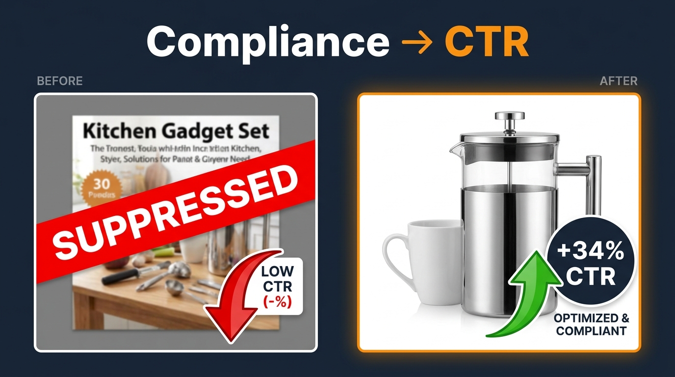
    Compliance is the primary constraint. SBV creative for supplements must avoid disease claims, health claims that cross FDA lines, and before/after content that implies specific outcomes. The generator will produce creative from your listing data, but if your bullets are aggressively worded, you may generate a video with claim language that triggers Amazon’s ad review rejection.

    Pre-submission review of all on-screen text against Amazon’s ad policy guidelines is not optional in this category. A rejected SBV creative loses review time (typically 24–72 hours), which is expensive during launch windows or peak seasons. The safest structure: lead with the product clearly, use ingredient or format specifics in the demo section (e.g., “30-Day Supply | Non-GMO | Gluten Free”), and close with star rating and review count.

    Apparel and Fashion

    This is the category where the Video Generator is most limited by its current capabilities. Apparel advertising relies heavily on fit, drape, texture in motion, and the way a garment looks on a human body — details that AI-generated product-in-use shots handle inconsistently. The current generator’s human motion sequences are more convincing for product-with-person adjacency than for on-body apparel demonstration.

    The recommendation for apparel sellers is to use the generator primarily for the upload-and-summarize pathway: shoot brief on-model footage (even 30 seconds of simple model content with a smartphone), then use the tool to compress and format it into an ad-ready 15-second creative. This keeps production costs low while maintaining the visual fidelity the category requires.

    Metrics That Actually Matter: Reading SBV Analytics Beyond CTR

    CTR is the most-reported SBV metric, and it’s genuinely useful as a creative indicator. But treating CTR as the singular performance metric leads to suboptimal decisions. The SBV analytics suite contains richer diagnostic signals that most sellers aren’t using.

    The Quartile View Stack

    Amazon’s video analytics report quartile completion rates: the percentage of viewers who watched 25%, 50%, 75%, and 100% of the video. These numbers, read as a stack, tell you exactly where your creative is losing people.

    A healthy 15-second SBV creative typically shows a steep initial drop (25% → 50%) followed by a relatively flat slope (50% → 100%). Early drop is expected — many shoppers make the scroll-or-stop decision in the first few seconds. But if the drop from 25% to 50% is unusually steep, your first three seconds aren’t compelling enough to sustain engagement. If the 75% → 100% drop is large, your close isn’t earning the final attention — which often means the product and benefit were established but the CTA isn’t clear enough to complete the sequence.

    5-Second View Rate

    This metric deserves more attention than it typically gets. The 5-second view rate tells you what percentage of people who saw the ad watched at least five seconds. High 5-second view rate with low CTR is a specific pattern that means: the creative is interesting enough to watch but isn’t triggering intent to click. This usually signals a creative-keyword mismatch — the video is engaging but isn’t speaking to the specific intent behind the search query.

    Low 5-second view rate against high impressions is a more urgent problem: the first seconds aren’t working. This is the trigger to either regenerate with the Video Generator or directly edit the opening frames in Creative Studio.

    Sound-On Rate

    Given that 71% of plays are muted, a sound-on rate significantly above 30% is meaningful. It tells you that something in the visual creative is generating enough engagement for shoppers to actively unmute — which correlates with higher downstream conversion in most categories. Tracking sound-on rate as a creative quality signal is more useful than tracking it as a reach metric.

    View-Through Conversions

    Amazon’s attribution window for SBV includes view-through conversions — purchases that happened within a defined window after someone saw your video ad, even without clicking it. These are attributed differently by Amazon’s reporting tools and are frequently undercounted in seller-side analysis. Sellers who evaluate SBV purely on direct click-to-purchase metrics systematically undervalue the format. SBV’s influence on brand recall and subsequent organic search is real and measurable through view-through attribution — but only if you’re looking for it.

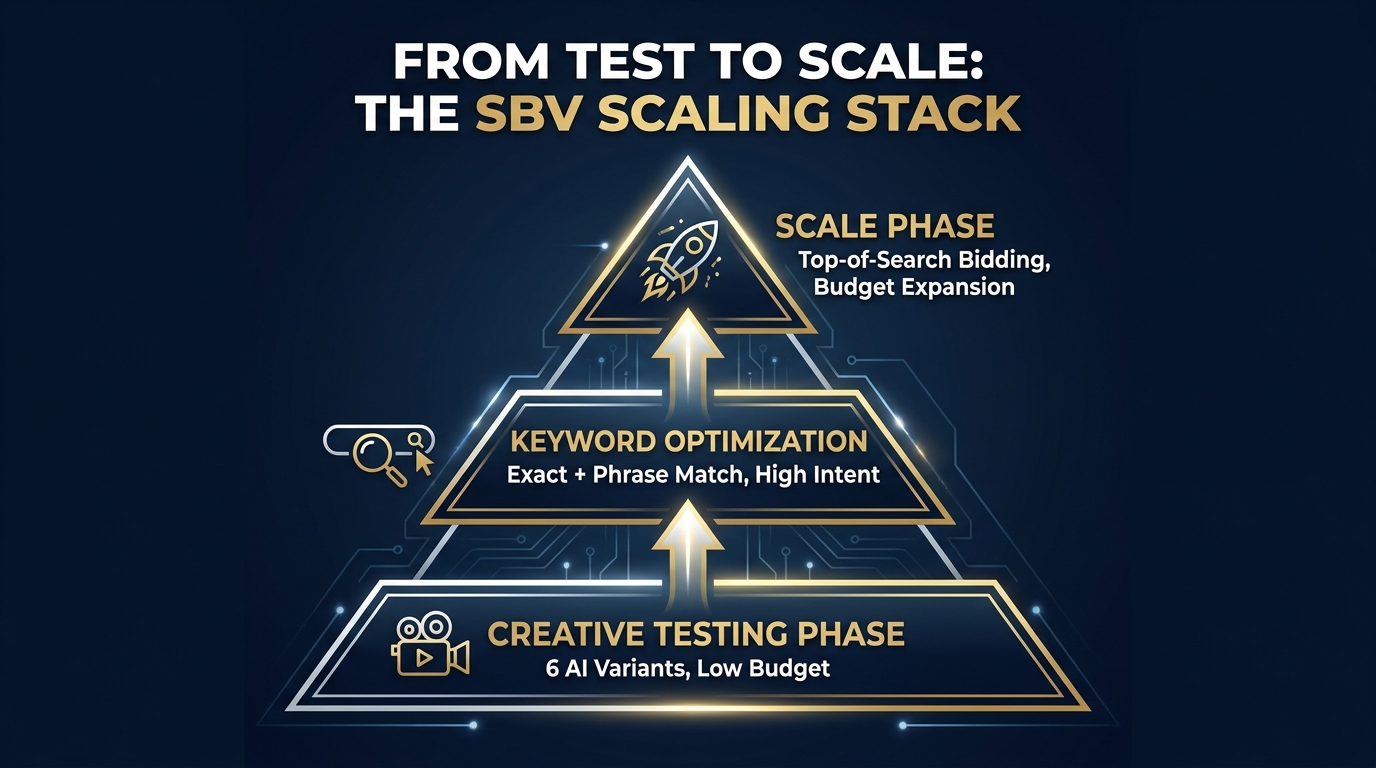
    The Scaling Stack: Moving from Test Wins to Full Campaign Structure

    SBV campaign scaling stack pyramid diagram showing Creative Testing at base, Keyword Optimization in middle, and Scale Phase at top

    Once you have a winning creative and a validated keyword configuration, the structural question is how to build around that win without eroding the performance signal that made it valuable.

    Campaign Architecture for SBV

    The most robust SBV campaign structures in 2026 separate intent tiers into distinct ad groups or campaigns with individual budget allocations. This allows for differentiated bidding by intent level and prevents a single high-spend term from dominating the account’s performance picture and obscuring underperformance elsewhere.

    A recommended structure for a mid-size catalog:

    • Campaign 1 — Branded Defense: Exact match on your own brand terms. Budget and bid set to ensure 90%+ impression share. Creative can be brand-reinforcing since these are existing brand-aware shoppers.
    • Campaign 2 — High-Intent Core: Exact and phrase match on your top commercial keywords. This is your primary volume and ROAS engine. Budget should be your largest allocation.
    • Campaign 3 — Competitive Conquesting: ASIN targeting against competitor products and category-level targeting. Creative must address comparison directly. Budget is secondary to creative quality here.
    • Campaign 4 — Discovery / Exploration: Broad match and category targeting for keyword research and incremental reach. Lowest budgets, harvest insights, feed winners into Campaign 2.

    Bid Strategy for Top-of-Search Dominance

    SBV’s primary placement is top-of-search, and capturing that placement consistently requires actively managing placement bid adjustments. Amazon’s default automated bidding for Sponsored Brands will optimize toward clicks, but top-of-search dominance for high-intent keywords often requires a manual bid adjustment specifically for that placement.

    The standard framework: set your base bid to a level that delivers consistent page 1 visibility, then use a top-of-search placement modifier of 25–50% for your highest-converting terms. Monitor impression share weekly in the early stages. If you’re capturing less than 60% of available impressions for a high-priority keyword, the bid needs to increase or the creative quality score needs improvement — or both.

    Budget Pacing and Dayparting

    SBV campaigns on Amazon don’t natively support dayparting — you can’t schedule ads to run only during peak shopping hours. But budget pacing settings and the distinction between standard and accelerated delivery affect when your budget is consumed throughout the day. For categories with strong evening shopping patterns, standard delivery (which spreads budget across the day) can result in budget depletion before peak hours. Monitoring time-of-day impression data through Amazon’s reporting and adjusting daily budgets accordingly is a manual but effective workaround.

    Common Failure Patterns and How to Avoid Them

    After covering what works, it’s worth being explicit about the patterns that consistently undermine SBV performance. These aren’t hypothetical — they show up repeatedly in account audits and campaign reviews.

    Launching Without Reviewing Generator Output

    The Video Generator is not an autonomous system that produces perfect creative. It works from your listing data, and if your listing data is mediocre — generic images, keyword-stuffed bullets, low-quality product photography — the generator will produce mediocre creative. Sellers who generate and launch without a review step are at risk of running ads with logo-first openers, off-brand color treatments, or on-screen text lifted verbatim from a keyword-optimized title that reads like gibberish in a 2-second window.

    The review step takes 10 minutes. It should be non-negotiable.

    Running All Six Variants in One Campaign

    More variants doesn’t mean more data faster if the budget is split too thin. Six variants in one campaign with a $20/day budget means roughly $3.30 per variant per day — which won’t generate enough impressions for meaningful signal within a reasonable time window. Either reduce the variant count to two or three for testing, or ensure the campaign budget is sufficient to give each variant at least 500 impressions per day.

    Ignoring Negative Keywords

    SBV campaigns without negative keyword management bleed budget. The format is expensive per click relative to Sponsored Products, which means irrelevant clicks cost more both in absolute terms and in ACoS impact. Negative keyword management should begin at campaign launch, informed by your auto-targeting history if you have it, and should be reviewed weekly in the first month.

    Treating SBV as an Awareness Format

    This is a mindset failure more than a tactical one. Some sellers, particularly those with offline marketing backgrounds, position SBV as a brand-building awareness format and evaluate it on reach and impressions. On Amazon, SBV appears in high-intent search results. The shopper has already expressed a purchase intent through their query. Treating the format as awareness-only is leaving conversion opportunity uncaptured.

    SBV should be evaluated as a conversion-driving format with brand reinforcement as a secondary benefit — not the other way around. Campaign structure, creative decisions, and bid strategy all follow from that framing.

    Static Headline Across All Keywords

    The headline field in Creative Studio is set once and applies to the ad across all keywords. This creates an inevitable mismatch: a headline optimized for a broad category search term (“Best Kitchen Knives”) is less relevant for a highly specific query (“8-inch chef knife high carbon steel”). The workaround is to segment keyword campaigns tightly enough that a single headline is reasonably relevant to the entire keyword set within each campaign. More segmentation means more headline specificity, which means higher relevance and better performance.

    The Real Advantage Is Speed — and What to Do With It

    The SBV Video Generator changes Amazon advertising in one fundamental way: it removes the production time and cost barrier to video creative iteration. That’s not a minor convenience — it’s a structural shift in what creative testing looks like for Amazon sellers.

    Before tools like this existed, a brand running SBV had one or two video assets. They might test one against the other, but the cost of producing more variants meant creative testing cycles stretched over months. Production budgets constrained how aggressively you could learn. Smaller brands couldn’t afford to participate in the format at all.

    Today, the generator produces six variants in minutes at no cost. A seller who understands how to use that output strategically can run a complete creative learning cycle — generate, test, read analytics, identify the winner, iterate — in two to three weeks. Then repeat. That velocity of creative learning compounds over time. An account running structured SBV testing every 60 days accumulates more creative intelligence in one year than an account that produced two professional videos and ran them indefinitely.

    The sellers who will get the most from this tool are not the ones who appreciate the convenience. They’re the ones who recognize that the real output isn’t a video — it’s data about what their customers respond to at the moment of search intent. The video is the mechanism. The learning is the asset.

    Actionable Takeaways

    • Audit your listing first. The generator is only as good as the imagery and copy you feed it. Upgrade your listing images before generating, not after.
    • Review every generated variant for muted-autoplay performance. Can a shopper understand the product and its key benefit in two seconds with no audio? If not, edit or regenerate.
    • Use the six variants as a structured test, not a menu. Run two to three in parallel with identical targeting, read the analytics after meaningful impression volume, and scale the winner.
    • Segment your keywords tightly enough that your headline is relevant to every term in the ad group. Relevance compounds.
    • Track quartile views and 5-second view rate, not just CTR and ROAS. The diagnostic value of video analytics is only realized if you’re actually reading the full set of metrics.
    • Treat AI creative as your testing layer, professional production as your scaling layer. Let the data tell you what to produce, then invest in producing it well.
    • Build negative keyword lists from day one. SBV is expensive enough per click that irrelevant traffic materially damages ACoS.

    The format’s performance data is clear. The tool is free and increasingly capable. The sellers who will dominate SBV in the next 12 months won’t be the ones with the largest video production budget — they’ll be the ones who build a systematic creative and testing process around a tool that most of their competitors are either ignoring or using halfway.

  • Why Most Amazon Sponsored Brand Videos Fail in the First 3 Seconds (And What to Do About It)

    Why Most Amazon Sponsored Brand Videos Fail in the First 3 Seconds (And What to Do About It)

    Amazon Sponsored Brand Video ad playing silently on a search results page with bold text overlay: 3 Seconds. That's all you get.

    There is a quiet crisis playing out in Amazon ad accounts right now. Brands are spending real money — sometimes thousands of dollars a month — on Sponsored Brand Video campaigns that autoplay perfectly, meet every technical requirement, pass review, and still convert at a fraction of what they should. The videos look fine. The targeting seems reasonable. But the results are disappointing, and most advertisers have no clear idea why.

    The answer, in most cases, comes down to the first three seconds — and the deeply counterintuitive reality of what a Sponsored Brand Video actually is in the context of Amazon’s search experience. It is not a YouTube pre-roll. It is not a social media Reel. It is a silent, autoplaying unit dropped directly into a shopper’s keyword search results, and that distinction changes everything about how the creative needs to behave.

    This post is not a beginner’s guide to what Sponsored Brand Video is or how to set up a campaign in Seller Central. If you need that, Amazon’s own learning console covers it well. What this piece covers is the harder problem: why technically correct SBV campaigns consistently underperform, what the creative and structural decisions that actually drive results look like, and how to measure performance in ways that tell you something useful beyond a top-line ACoS number.

    The mechanics here matter. And they are almost never discussed at the level of specificity that makes a difference.

    What Amazon’s SBV Placement Actually Looks Like to a Shopper

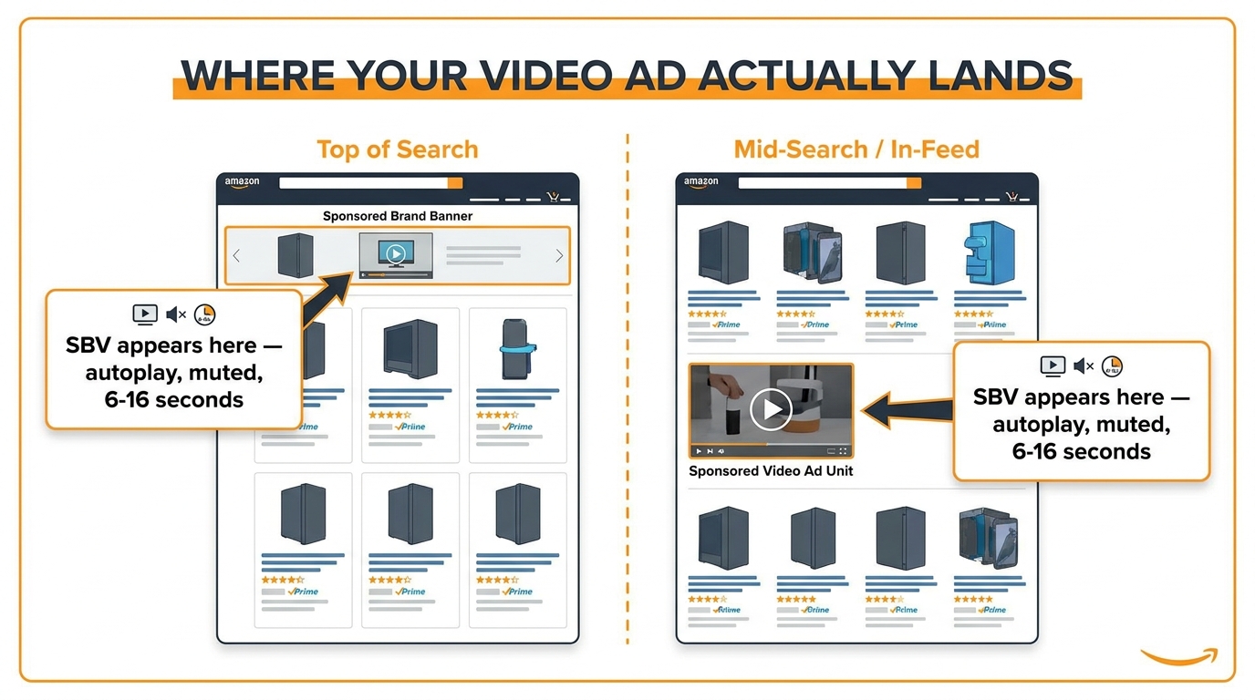
    Infographic showing Amazon search results page layout with labeled SBV placements: Top of Search and Mid-Search In-Feed positions with annotation: SBV appears here — autoplay, muted, 6-16 seconds

    Before you can fix your creative, you need a precise mental model of where it lives and what surrounds it. This is where most sellers go wrong before a single frame is filmed.

    Sponsored Brand Video ads appear in two primary positions on Amazon’s search results pages. The first is the in-feed placement — your video appears between rows of organic and sponsored product listings, typically after the first or second row of results. The second, available through reserve share of voice (SOV) buying, places SBV at the top of search, above all other results.

    The In-Feed Context Is the Default — and It’s Brutal

    For the vast majority of advertisers running standard SBV campaigns, in-feed is where your video lands. Here is what that actually means for the shopper experience: a person has just typed a keyword into Amazon’s search bar. They are actively scanning results — usually left to right, top to bottom, in the rapid product-grid mode that years of Amazon shopping have hardwired into their behavior. Their primary cognitive task is evaluating product thumbnails, prices, star ratings, and Prime badges.

    Then your video starts playing. Automatically. Without sound. While they’re already in the middle of evaluating other products.

    The video appears in a 16:9 or square aspect ratio depending on format, with the product title and a “Shop now” prompt displayed beside or below the video frame. On mobile, the experience is slightly different — the video takes up more vertical real estate and can feel more immersive, but the silent autoplay behavior remains the same.

    The Shopper’s Attention Is Already Divided

    This is the key context that most creative briefs ignore entirely. When someone searches for “stainless steel water bottle” and scrolls past your SBV, they are not waiting to be entertained. They are not in content consumption mode. They are in decision mode. They have a purchase intent, and they are comparing options as fast as their eyes can move.

    This means your video needs to accomplish something very different from what works in entertainment-adjacent placements. It needs to interrupt a scanning behavior — not invite passive viewing. That requires a completely different visual language than what most video agencies produce by default.

    On desktop, the video panel typically shows alongside your headline and product ASIN. On mobile, the video is more prominent. In both cases, the viewer has not opted in. They have not pressed play. The video is simply there, running, and they have a fraction of a second to decide whether it warrants a pause in their scrolling.

    The Silent Autoplay Problem: Why Your First 3 Seconds Are Everything

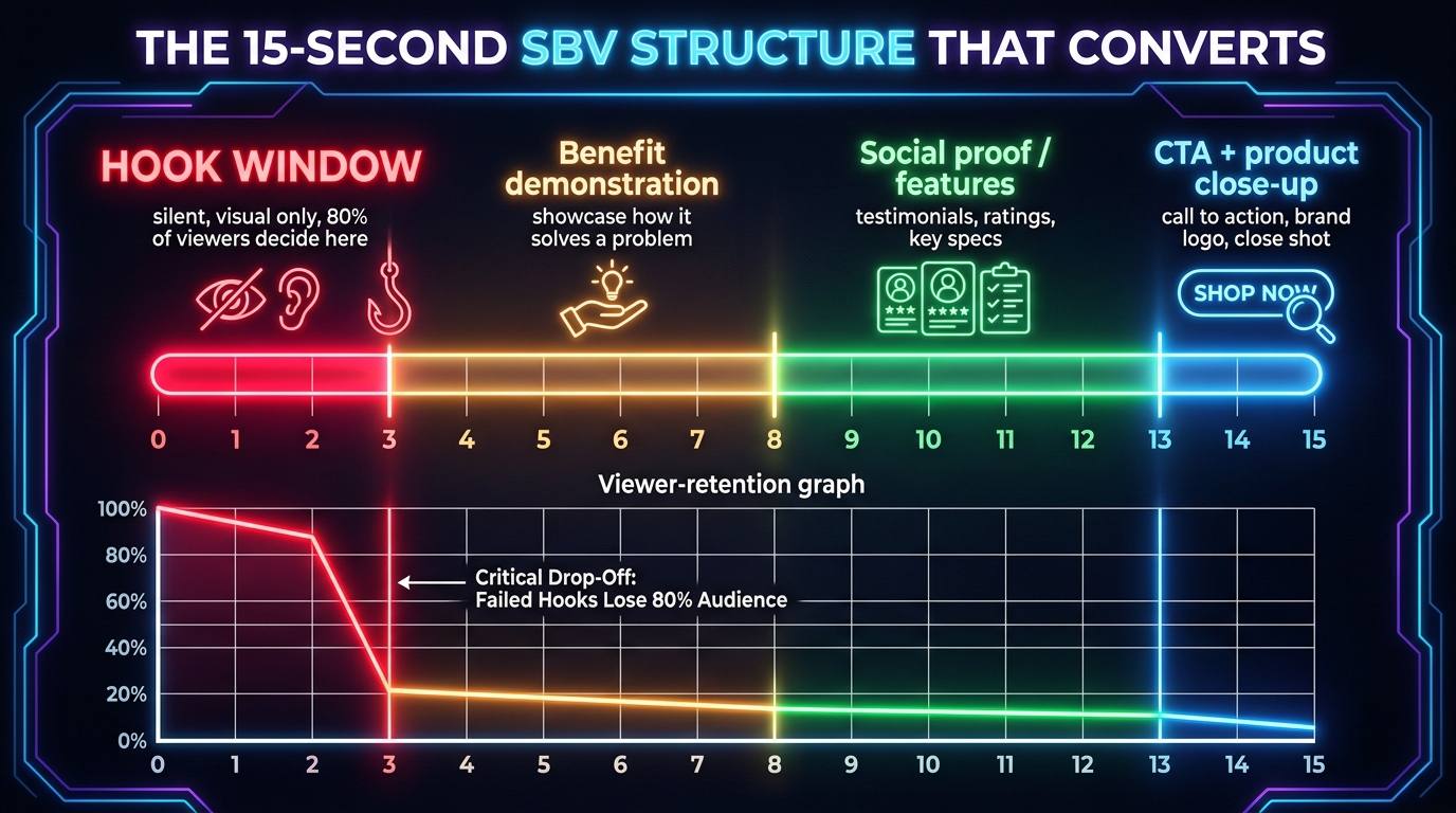
    Timeline infographic showing a 15-second SBV broken into color-coded zones: 0-3 seconds hook window in red, 3-8 benefit demo in amber, 8-13 social proof in green, 13-15 CTA in blue, with a viewer retention graph showing sharp drop-off at 3 seconds

    Amazon’s Sponsored Brand Video plays on mute by default. The viewer can tap or click to enable audio, but the overwhelming majority never do — particularly when the video fails to earn that action in the opening seconds. This is not a minor technical footnote. It is the single most consequential constraint on SBV creative strategy, and it is dramatically underweighted in most advertisers’ creative planning.

    Think about what that means in practice: every element of your story-telling structure that depends on a voiceover — the product benefit read, the brand positioning statement, the emotional music swell — is effectively invisible to the shopper unless you have already convinced them to tap for sound. And the only thing that earns that tap is what they see in the first two to three seconds.

    The 3-Second Visual Test

    A useful way to audit your existing SBV creative is to mute the video, fast-forward to the very first frame, and ask: if a shopper scrolling a search results page catches just this moment — zero context, zero audio — do they immediately understand what the product is and why it’s interesting? If the answer is “probably not,” you have identified why your video’s CTR is underperforming.

    The most common failure pattern is a video that opens with:

    • A brand logo animation or fade-in
    • A scenic B-roll shot that establishes mood but not product
    • A lifestyle scene where the product is partially visible or small in frame
    • Text cards that require reading (and therefore time) to process
    • A talking head or spokesperson whose words you cannot hear

    Every one of those approaches requires audio or time — and in the in-feed SBV context, you have been granted neither.

    What the Hook Window Actually Requires

    The opening three seconds of a high-performing SBV need to accomplish two things without sound: establish the product clearly (ideally in the context of the problem it solves or the desire it fulfills) and create enough visual interest that the shopper pauses the scroll. That is the entire job of the hook window. Not to explain the product. Not to build brand equity. Not to entertain. Just: stop the scroll and make the product legible.

    This is why product-in-motion shots — where the item is shown being used, filled, squeezed, poured, assembled, opened, or activated — consistently outperform static reveals or beauty shots in the first few frames. Motion catches peripheral attention on a scrolling page even without sound. A water bottle being filled with ice and water tells you more about the product’s appeal in two seconds, silently, than a polished studio reveal with a brand anthem playing over it.

    The practical implication: when briefing a video production team on SBV creative, the first directive should not be “tell our brand story.” It should be “what does a shopper need to see in two seconds, with no audio, to understand what this product does and why they might want it?”

    The Role of On-Screen Text

    On-screen text is underutilized in most SBV creative and overused in the wrong places. Text that appears within the first three seconds needs to be large, short, and immediately scannable — think three to five words maximum. “Finally sleeps through the night” over a baby monitor. “Zero leaks, guaranteed” over a water bottle. “Cuts meal prep by half” over a kitchen gadget. These are not taglines. They are visual answers to the shopper’s implicit question: “what does this product do for me, and why should I care?”

    Text that appears after the third second can be denser, but should still be designed assuming no audio will ever play. Every piece of spoken copy in your voiceover track should have a visual counterpart — either on-screen text, a demonstration, or a clearly visible result.

    Matching Video Creative to Search Intent, Not Just Keywords

    Keyword intent mapping diagram showing three columns: Awareness Keywords in blue, Consideration Keywords in amber, Decision Keywords in green, with arrows showing which video creative type matches each stage — lifestyle for awareness, demo for consideration, feature close-up for decision

    Most SBV campaigns are built around a keyword list and a single video. The video performs differently across those keywords, and most advertisers have no framework for understanding why. The reason is almost always intent mismatch: a creative designed for one stage of the buyer journey is being served to shoppers at a completely different stage.

    Amazon’s search queries exist on a spectrum from broad category exploration to brand-specific purchase intent. A shopper typing “coffee grinder” is in a different mental state than one typing “Baratza Encore burr coffee grinder.” The first is browsing and comparing categories. The second is close to a purchase decision, likely comparing price and bundle options on a specific model. Serving both shoppers the same video — and expecting it to perform equally — is a structural mistake, not a creative one.

    Awareness-Intent Keywords: What They Demand Creatively

    Broad, category-level searches are awareness territory. The shopper doesn’t necessarily know your brand and may not have a clear product preference. For these queries, your SBV creative needs to first establish category relevance, then differentiate. A video that opens with a lifestyle scene — showing the problem being solved or the desire being fulfilled — performs better here than a feature-dense product demo.

    The goal at awareness is to answer: “Why does this type of product exist, and why might I want it?” Your brand is secondary to the product category explanation. Many advertisers make the mistake of running heavily branded creative against broad terms, which produces high impressions, low clicks, and confusing ACoS data because the creative was never designed for that audience’s decision stage.

    Consideration-Intent Keywords: The Sweet Spot for Most SBV

    Mid-funnel queries — “best insulated water bottle,” “sous vide cooker for beginners,” “noise canceling headphones under $100” — represent the consideration stage. The shopper knows what they want in a general sense and is actively comparing options. This is where most SBV campaigns should focus their primary creative effort.

    At the consideration stage, a product demonstration that shows distinguishing features is most effective. The shopper wants to understand what makes your product different from the alternatives they’re already considering. Visual comparisons (before/after, with/without, yours versus a generic alternative) work well here. The key is that the differentiation needs to be visually legible within the first five to seven seconds, before most casual scrollers have moved on.

    Decision-Intent Keywords: Don’t Over-Sell What’s Already Sold

    High-intent searches — brand-name queries, highly specific product searches, model numbers — represent shoppers close to purchase. Your SBV creative for these terms should be different in character: less about education, more about conversion triggers. Social proof (a quick flash of star ratings or user counts), value reinforcement (Prime shipping badge, bundle offers), and a fast path to the CTA are more appropriate here than a long benefit explanation the shopper doesn’t need.

    The practical structure for managing intent mismatch is campaign separation. Run three SBV campaigns with the same ASIN destination but different keyword tiers and, ideally, different creative versions tailored to each intent level. Yes, this means producing more than one video. That upfront investment almost always pays back in measurably better CTR and conversion rates across the funnel.

    Technical Specifications — and the Hidden Approval Traps

    Amazon’s SBV technical requirements are published and straightforward at the surface level. But there are several less-obvious approval patterns that regularly cause campaigns to be rejected or require re-submission, costing advertisers days of live campaign time. Understanding them upfront saves real money.

    The Published Requirements

    Amazon requires SBV creative to meet the following baseline specifications:

    • File format: MP4 or MOV
    • Duration: 6 to 45 seconds (the practical sweet spot is 15-30 seconds for most product categories)
    • Resolution: Minimum 1920 x 1080 pixels (1080p); 4K is accepted
    • Aspect ratio: 16:9 (widescreen) is the standard; some placements now support square (1:1) and vertical (9:16) formats, particularly on mobile
    • File size: Maximum 500MB
    • Frame rate: 23.976, 24, 25, 29.97, or 30 fps
    • Audio: Stereo, 44.1 kHz minimum, though the creative must work without audio
    • Letter-boxing and pillar-boxing: Black bars are not permitted — the creative must fill the full frame

    The Approval Traps Most Sellers Hit

    Competitor brand mentions or visual comparisons: Amazon’s review policy prohibits explicit competitor references, including showing a competing product’s packaging, logo, or name. Comparative claims (“beats Brand X”) will trigger rejection even if they are factually accurate. This is more strictly enforced in SBV than in listing copy, largely because the video is more visible.

    Superlative claims without substantiation: “The world’s best,” “the most powerful,” “the only product that” — these claims require substantiation documentation attached to the submission, or they will be rejected. Most sellers don’t realize substantiation needs to be submitted alongside the creative, not just referenced in brand copy elsewhere.

    Price and promotion mentions: Displaying a specific price or promotional discount within the video itself is not permitted. “On sale now” or “$29.99” in the video frame will block approval. You can reference promotions in the headline text field adjacent to the video, but not within the creative itself.

    Prohibited content categories: Even for products sold on Amazon, certain categories face additional scrutiny in video creative — this includes alcohol, supplements making specific health claims, and products with age restrictions. If your product is in one of these categories, build extra review time into your campaign launch timeline.

    Low-quality audio mixed too hot: Even though most viewers never enable audio, Amazon’s review team does listen to the audio track. Music that peaks above acceptable levels, distorted voiceovers, or abrupt audio cuts can trigger a manual rejection. Ensure proper audio mastering even if you believe audio will rarely be heard.

    Reducing Re-Submission Cycles

    The practical way to minimize rejections is to conduct an internal creative compliance review against Amazon’s advertising policies before submission — not after production. The most expensive creative mistake is discovering a policy violation after a $5,000 video shoot and having to either re-edit significantly or re-shoot elements. Policy review should be a pre-production step, not a post-production one.

    The Three Creative Frameworks That Consistently Outperform

    2x2 comparison grid showing four video creative approaches for Amazon ads with CTR performance badges: Product Demo HIGH, Lifestyle MEDIUM, Problem/Solution VERY HIGH, Talking Head LOW

    Not all video creative frameworks are equal in the SBV context. Three structures reliably outperform the rest across a broad range of product categories, and understanding why each works helps you choose the right one for your specific situation.

    Framework 1: Problem → Solution

    This is the highest-performing framework for SBV across most consumer product categories, primarily because it gives the shopper immediate context for why the product exists. The structure is simple: the opening two to three seconds visualize a recognizable problem or frustration — a leaky container, a tangled cord, a poor night’s sleep — and the next few seconds show the product solving it cleanly and conclusively.

    What makes this framework powerful in the SBV context specifically is that the problem visualization works without audio. The viewer sees the frustration and recognizes it — or doesn’t, in which case the product probably wasn’t for them anyway. The product reveal as the solution then carries immediate meaning because the context is already established.

    The mistake most brands make with this framework is spending too long on the problem. Two to three seconds on the problem is typically enough. More than that, and the shopper has already mentally moved on before the solution appears.

    Framework 2: Product in Use — Feature-Forward Demo

    This framework works particularly well for products with a distinctive physical feature or user experience that is hard to communicate through static images alone. Think a blender with an unusual blade mechanism, a camping gear product with a clever folding design, or a skincare device with a visible treatment function.

    The structure opens directly on the product in active use — hands visible, product doing its thing — and then uses on-screen text callouts to annotate key features as they appear on screen. It’s essentially a product demonstration with running commentary, but the commentary is visual text rather than voiceover, making it fully functional in mute mode.

    This framework tends to drive strong conversion rates when CTR is achieved, because shoppers who engage with a feature-forward demo already have higher purchase intent — they wanted to know how the product worked, and the video answered that directly.

    Framework 3: Social Proof Montage

    For established products with significant review volume (typically 1,000+ reviews at 4.5 stars or higher), a social proof framework can be highly effective. This approach opens with a bold stat — “47,000 five-star reviews” or “Rated #1 in [category]” — displayed prominently on screen in the first two seconds, then transitions into a fast montage of product use cases, happy outcomes, or diverse user contexts.

    The social proof framework works because it answers the shopper’s primary purchase anxiety — “but does it actually work?” — within the first seconds, before they’ve had a chance to scroll away. The challenge is that it requires real, substantiated social proof to be honest and compliant. Fabricating or exaggerating review counts in video creative is a policy violation with real consequences.

    What Doesn’t Work: The Brand Story Video

    The least effective SBV creative type is the brand story video — a cinematic piece that focuses on company heritage, founder narrative, or brand mission before establishing what the product is or does. This format can work beautifully on YouTube or in Connected TV advertising, where viewers are in a content consumption context. On Amazon search results, where a shopper is actively comparing products, it almost universally underperforms.

    The reason is simple: the brand story format requires the viewer to invest attention before receiving any product-relevant information. In the SBV context, that attention investment is never granted. The viewer’s scanning behavior has already moved on before the video reaches its point.

    Structuring Your SBV Campaign for Actual Profitability

    Creative quality is only half of the SBV performance equation. How your campaigns are structured — keyword match types, bidding strategy, portfolio organization, and negative keyword management — determines whether good creative reaches the right audience at a cost that makes the channel profitable.

    The Single-Theme Campaign Structure

    A common structural error is building a single SBV campaign with a broad mix of keywords — brand terms, category terms, competitor terms, and long-tail variations all in one ad group. This makes it nearly impossible to manage bids intelligently, because each keyword tier has very different conversion rates and value metrics.

    A more functional structure separates SBV campaigns by keyword intent tier, as discussed in the creative section, but also by match type. Running broad match in a separate campaign from phrase and exact match allows you to control spending on discovery versus spending on performance terms, and to bid more aggressively on terms with demonstrated conversion history.

    Bid Strategy: Start Manual, Earn Automatic

    Amazon offers both manual and automatic campaign types for SBV. The temptation — especially for sellers already running profitable auto campaigns for Sponsored Products — is to start with automatic bidding and let the algorithm do the work. This rarely produces good results in the early phase of an SBV campaign.

    The reason is data density. Automatic bidding requires a meaningful click and conversion dataset to optimize toward. In the early weeks of an SBV campaign, when impressions are building but clicks and conversions are still sparse, the algorithm has too little signal to bid intelligently. Starting with manual bidding, setting conservative CPCs, and letting data accumulate over four to six weeks before transitioning to automatic — or using manual with Amazon’s bid adjustments enabled — produces more consistent early results.

    The Top-of-Search Bid Modifier Question

    SBV campaigns include an option to increase bids for top-of-search placement. This is a genuinely useful lever, but it needs to be deployed with data rather than instinct. Top-of-search placement commands higher CPCs and drives more impressions, but whether those impressions convert at a rate that justifies the premium varies significantly by category and keyword.

    The practical approach: run your initial SBV campaign without the top-of-search bid modifier, collect four to six weeks of placement-level data, and then evaluate whether top-of-search placement is generating proportionally better conversion rates. If it is, the premium is worth it. If top-of-search clicks convert at the same rate as in-feed clicks, you’re paying more for positioning that isn’t delivering proportional return.

    Negative Keywords: The Spend Drain Most SBV Advertisers Ignore

    Negative keyword management is often treated as a Sponsored Products discipline and neglected in SBV campaigns. This is a significant and measurable source of wasted ad spend. Because SBV can appear for broad and phrase match searches, your video may be serving against completely irrelevant queries — and because the video impression is effectively free (you pay per click in most SBV configurations), it’s easy to miss the problem in standard reporting until you dig into search term data.

    The SBV-Specific Negative Keyword Problem

    SBV campaigns can suffer from a particular type of irrelevance that doesn’t show up in impression or spend data: high-impression, low-click-rate terms that signal the video is appearing in front of shoppers who have no interest in the product but are triggering the ad through loose keyword matching. These terms don’t cost much per unit of impression, but they do affect your overall campaign quality metrics and can be a signal that your CTR benchmarks are being pulled down by irrelevant traffic.

    Downloading your search term report monthly (or weekly for larger-spend campaigns) and scanning for queries with high impressions and zero clicks is an essential housekeeping task for any active SBV campaign. Add irrelevant terms as exact-match negatives at the campaign level, and review any high-spend terms that are generating clicks but not conversions — these may warrant phrase-level negative exclusions.

    Competitor Campaign Negatives

    If you are running SBV campaigns targeting competitor keywords — a common and legitimate strategy for building brand awareness against comparison-shopping behavior — you need to actively manage the inverse: ensuring your competitor-targeting campaign doesn’t accidentally serve against your own brand keywords, and ensuring your brand-defense campaign doesn’t pick up competitor traffic through broad match.

    Cross-campaign negative keyword management at the portfolio level is one of the most overlooked structural elements in Amazon advertising. It prevents internal cannibalization, keeps CPCs lower on your own brand terms, and makes performance data cleaner to interpret.

    What the HP and Loftie Case Studies Actually Teach Us

    Amazon’s own published case studies for Sponsored Brand Video provide some of the clearest available benchmarks for what strong SBV performance looks like in practice — and what it takes to get there. The numbers are instructive, but so is the strategy behind them.

    HP: Scale and Mix Matter as Much as Creative Quality

    Hewlett-Packard’s case study in Amazon’s advertising resources showed 224% year-over-year impression growth and a 142% YoY increase in clicks from running Sponsored Brand Video alongside Sponsored Brands image and Sponsored Products campaigns. Specifically, SBV placements contributed a 42% click increase.

    The primary lesson here is about advertising mix. HP wasn’t running SBV in isolation — they were running it as part of a coordinated multi-format strategy where SBV contributed upper-funnel visibility while Sponsored Products drove lower-funnel conversions. The attribution halo effect — where shoppers exposed to a Sponsored Brand Video subsequently convert through an organic click or a Sponsored Products click — is real, and single-campaign ACoS measurement misses it entirely.

    For most brands, the practical implication is that SBV’s contribution to revenue cannot be accurately assessed by looking only at conversions directly attributed to SBV clicks. It needs to be evaluated against a broader set of metrics including changes in organic rank, branded search volume, and new-to-brand customer acquisition rates during periods when SBV is active versus when it’s paused.

    Loftie: The Benchmark Numbers Worth Knowing

    Loftie, a small brand selling a premium sleep clock, achieved a 17.68% ACoS and a $5.66 ROAS through their Amazon advertising campaign — which incorporated Sponsored Brand Video as a core element. These are strong performance numbers for a premium-priced consumer product in a competitive wellness category.

    What’s significant about the Loftie numbers is the category context: a high-consideration purchase (a premium sleep device priced above the category average) where shoppers need more information than a static product image can provide before committing to a purchase. This is the product profile where SBV tends to show its clearest advantages — products with a story to tell that a thumbnail cannot communicate.

    For commodity products where shoppers primarily compare on price and Prime shipping status, SBV’s relative advantage over Sponsored Products is smaller. For products that require explanation, demonstration, or emotional connection to convert — electronics, fitness equipment, premium kitchen tools, specialized outdoor gear, skincare with complex ingredients — the video format carries disproportionate conversion value because it compresses the education required for purchase.

    How to Measure SBV Performance Beyond ACoS

    Dashboard mockup showing Amazon Sponsored Brand Video campaign metrics: ACoS 17.7% in green, ROAS 5.66x in gold, CTR 0.62% in blue, New-to-Brand percentage 43% in purple, with a bar chart comparing SBV vs image campaigns across CTR, conversion rate, and brand searches

    ACoS (Advertising Cost of Sale) is the default metric most Amazon advertisers use to evaluate campaign performance. For Sponsored Products, it’s a reasonably clean and actionable signal. For SBV, it’s a necessary metric but a dangerously incomplete one. Relying on ACoS alone for SBV performance evaluation leads to two predictable mistakes: prematurely pausing campaigns that are generating unmeasured value, or continuing to run campaigns that look acceptable on ACoS but are not actually building the brand metrics that justify the upper-funnel investment.

    New-to-Brand Metrics: The SBV Signal That Actually Matters

    Amazon provides new-to-brand (NTB) metrics for Sponsored Brand campaigns, including SBV. These metrics show what percentage of your attributed sales came from customers who had not purchased from your brand in the previous 12 months. This is the clearest available proxy for whether your SBV is doing genuine brand-building work versus capturing demand that Sponsored Products would have converted anyway.

    A healthy SBV campaign in a competitive category typically shows NTB rates of 40-60% or higher. If your SBV’s NTB rate is below 30%, you are largely reaching customers who already know your brand — which means SBV is functioning as a retargeting or retention tool rather than a discovery vehicle. That’s not inherently wrong, but it should change how you evaluate its cost relative to alternatives.

    Branded Search Lift as a Proxy for Awareness Effect

    One underutilized measurement approach for SBV is tracking changes in branded keyword search volume during periods when SBV campaigns are active versus inactive. Amazon Brand Analytics provides branded search data, and comparing monthly trends against SBV spend periods can reveal whether your video campaigns are moving the needle on brand awareness in ways that don’t show up in direct attribution.

    This approach is imperfect — branded search volume is influenced by many factors beyond advertising — but consistent, meaningful increases in branded searches during high-SBV-spend periods, followed by declines when SBV is paused, are a reasonable signal of the channel’s awareness contribution. Systematically alternating SBV on and off on a monthly cycle (while holding other campaign spend constant) can create a rough A/B framework for measuring this effect.

    Click-Through Rate as Creative Quality Signal

    CTR in SBV campaigns is one of the most directly actionable metrics for creative performance. While absolute CTR benchmarks vary significantly by category and keyword competition, relative CTR between your own creative variants tells you clearly which hooks, frameworks, and visual approaches are resonating with shoppers. A video with a CTR of 0.5% is performing meaningfully better than one at 0.2% in the same campaign context, and the gap almost always comes back to the first three seconds.

    Track CTR weekly, not just monthly, particularly when testing new creative. The signal appears quickly — within the first 1,000 to 2,000 impressions, a meaningful pattern in CTR is usually visible.

    View Rate and the Attention Quality Question

    Amazon provides view-through data for SBV — showing what percentage of viewers watched a significant portion of the video. This metric is less actionable for immediate bidding decisions, but it is valuable for creative evaluation. A high CTR with a low view-through rate suggests shoppers are clicking but not engaging with the product page experience that follows. A lower CTR with a high view-through rate suggests the video is engaging those who do stop, but the hook isn’t stopping enough scrollers initially.

    These patterns point to different creative fixes: hook improvement for the low-CTR case, landing page and product page optimization for the high-CTR-low-conversion case.

    Common Creative Mistakes Even Experienced Sellers Make

    Even advertisers who understand the basics of SBV make a consistent set of production and creative decisions that limit performance. These are the patterns that appear most frequently in underperforming campaigns.

    Repurposing Social Media Video Wholesale

    A significant portion of the SBV content running on Amazon today was originally produced for Instagram Reels, TikTok, or YouTube Shorts and repurposed with minimal modification. The vertical orientation may have been reformatted to 16:9, but the creative structure, pacing, and audio dependency are unchanged.

    Social media video is built for a context where viewers are open to content consumption, audio is more commonly enabled (especially with earbuds), and the algorithm rewards content that generates extended watch time. Amazon SBV requires almost the opposite creative logic. Repurposing social video for SBV without rethinking the structure for the silent, scan-interrupt context typically produces mediocre results.

    Ignoring the Mobile Shopper Majority

    A majority of Amazon search activity in 2026 happens on mobile devices. SBV on mobile has different visual dynamics than on desktop — the video takes up more screen real estate, text needs to be larger to read comfortably on a smaller screen, and the proximity of the “Shop now” prompt to the video frame affects the click-through behavior. Creative designed and reviewed only on desktop will often look and perform differently on mobile.

    The fix is straightforward but often skipped: review all SBV creative on a mobile device before submission, specifically checking that on-screen text is readable at mobile scale and that the product is clearly visible in the smaller mobile frame’s rendering context.

    Running a Single Creative for Six Months

    Creative fatigue is well-documented in social media advertising, and while Amazon’s ad frequency model is different (you’re targeting searches rather than audiences), the same principle applies: a single piece of creative running unchanged for months will see performance decay. The video that drove strong results in its first six weeks will typically underperform by week twenty.

    Building a quarterly creative refresh cycle — whether that means a new video or a meaningfully edited variant — is part of a functional SBV program, not a luxury. The production budget for SBV does not need to be lavish; a refreshed hook sequence or a new opening three-second scenario can be produced relatively inexpensively if the underlying product footage is already available.

    Building a Testing Cadence That Actually Produces Learnings

    A/B testing framework diagram for Amazon SBV campaigns showing Variant A opening with brand logo marked with red X and Variant B opening with product in motion marked with green checkmark, with results table showing CTR 0.21% vs 0.58% and CVR 8.2% vs 14.7%

    Most sellers who run SBV testing do it wrong — not because they lack discipline, but because the test structure itself is flawed in ways that prevent clean learning. Setting up SBV tests that produce genuinely actionable data requires specificity about what you’re testing, how you’re isolating variables, and how long you’re collecting data before drawing conclusions.

    The One-Variable Rule

    The most important principle in SBV creative testing is testing one variable at a time. This sounds obvious, but it’s violated constantly. A brand produces two videos — Video A is a product demo and Video B is a lifestyle sequence — and then runs them simultaneously. Video B wins on CTR. But did it win because of the creative framework? The opening scene? The on-screen text? The different color palette? There is no way to know, and the “learning” from the test cannot be applied reliably to the next creative.

    A more productive approach is to test a single creative element at a time. Test two versions of the same video that differ only in the opening three seconds — same product, same structure, same audio, different visual hook. When one version outperforms the other, you know specifically what drove the difference: the hook. Then test the next variable. It takes longer to cycle through all the elements you want to understand, but each test produces a clean, applicable learning.

    Statistical Significance and Sample Size

    The temptation to pull conclusions from SBV tests too early is one of the most common mistakes in the channel. With a typical SBV CTR in the 0.2-0.6% range, you need a meaningful number of impressions to separate a real performance difference from statistical noise. As a rough rule, wait until each variant has accumulated at least 5,000 impressions and at least 20 clicks before drawing any conclusions from CTR data. For conversion rate data, you need substantially more — at least 50 attributed sales per variant before the conversion rate difference is meaningful.

    For most mid-size sellers, reaching statistical confidence in an SBV test will take four to eight weeks. That timeline should be built into the testing plan from the outset, not discovered frustratingly after a premature call is made.

    The Testing Metrics Hierarchy

    When evaluating SBV test results, use a metrics hierarchy that reflects what you can and cannot cleanly attribute:

    1. CTR — cleanest signal, most directly tied to creative quality, available quickest
    2. Detail Page View Rate — how many clicks led to meaningful engagement with the product page
    3. Add-to-Cart Rate — a mid-funnel conversion signal that accumulates faster than purchase data
    4. Purchase Conversion Rate — the ultimate signal, but requires the most data and time to be reliable
    5. New-to-Brand Rate — context for whether the creative is reaching new versus existing customers

    Lead with CTR for creative hooks tests. Move down the hierarchy as you have sufficient data. Don’t optimize for ACoS until you have clean signals from CTR and conversion rate separately.

    When SBV Earns Its Budget — and When It Doesn’t

    Honest evaluation of any ad format includes recognizing the conditions under which it delivers genuine value versus the conditions where budget might be better allocated elsewhere. SBV is a genuinely powerful format, but it is not universally the right tool for every Amazon advertising situation.

    SBV Earns Its Place When

    Sponsored Brand Video tends to deliver its strongest relative performance when the product has a use-case or benefit that is difficult to communicate through a static thumbnail. Products with visible, demonstrable functionality — appliances, personal care devices, fitness equipment, outdoor gear, complex kitchen tools, specialized storage solutions — show the clearest conversion lift from video versus image ads.

    SBV also performs well when the brand is in active growth mode and genuinely wants to reach new customers rather than simply harvest existing demand. The new-to-brand metrics are most compelling for brands with low category awareness that need to introduce shoppers to a product type they may not yet have searched for specifically.

    Finally, SBV earns its budget when the product price point creates enough consideration friction that shoppers benefit from more information before clicking. Higher-price-point products ($50+, especially $100+) in competitive categories typically show stronger SBV performance because the additional information the video provides reduces purchase hesitation more meaningfully than it would for a $12 commodity item.

    Where SBV Tends to Underperform

    SBV tends to deliver weaker relative performance for low-consideration commodity products where purchase decisions are driven almost entirely by price and Prime availability. If a shopper searching for “AA batteries” or “paper towels” is going to buy whatever is cheapest and Prime-eligible, a video explaining the product’s merits is unlikely to move the needle meaningfully over a straightforward Sponsored Products presence.

    Highly brand-loyal categories also present a challenge for SBV as a discovery tool. If shoppers in your category search by brand name 70% of the time and almost never convert on a competitive brand’s ad, SBV’s new-to-brand acquisition proposition is weakened. In these categories, SBV might still be worth running for brand defense and repeat purchase reinforcement, but the acquisition-oriented metrics should be evaluated with that context in mind.

    Building Your SBV Program for the Long Term

    The most successful SBV programs on Amazon in 2026 share a few structural characteristics that go beyond any single campaign or creative decision. They treat video advertising as a recurring practice rather than a one-time campaign launch, they build a library of creative assets that can be remixed and refreshed without full re-production, and they invest in measurement infrastructure that connects SBV activity to business outcomes that matter beyond the ad console.

    The Creative Asset Library Approach

    Rather than commissioning a single polished video for each SBV campaign, brands that perform consistently well over time tend to build a modular asset library: a set of product footage clips, lifestyle scenes, customer testimonial snippets, and feature demonstration shots that can be assembled into different creative configurations as testing reveals what works.

    This approach significantly reduces the per-video production cost of ongoing creative refresh and makes A/B testing more feasible, because producing a variant that changes only the opening hook is a simple editing task rather than a full production job. The upfront investment in comprehensive footage capture — a full day of product and lifestyle shooting that generates hours of raw material — pays for itself many times over in the flexibility it creates for ongoing creative iteration.

    Connecting SBV to the Broader Funnel

    The highest-performing use of SBV is not as a standalone direct-response vehicle but as the top-of-funnel layer in a coordinated Amazon advertising architecture. SBV drives awareness and consideration. Sponsored Products with brand-tailored promotion captures the conversion from shoppers who encountered the video. Brand Store traffic from SBV clicks provides a richer product discovery experience. And Amazon DSP retargeting can re-engage shoppers who watched the video but didn’t convert immediately.

    Each of these layers compounds the others’ effectiveness. Shoppers who have seen your SBV creative are more likely to click your Sponsored Products ad when they encounter it in subsequent searches — even if they don’t consciously connect the two touchpoints. The video exposure creates a familiarity signal that reduces the cognitive friction of clicking on an ad from a brand they recognize, however dimly, from a previous search.

    The Actionable Checklist: What to Audit in Your SBV Today

    If you are running Sponsored Brand Video campaigns right now, here are the specific checks worth making before your next optimization pass:

    1. Watch your own video on mute, from the first frame. Ask yourself: in three seconds, without audio, does a shopper know exactly what this product does? If not, your hook needs work.
    2. Check your search term report. Download it, sort by impressions, and identify high-impression/zero-click terms. Add the irrelevant ones as negatives this week.
    3. Pull your new-to-brand rate. If it’s below 30%, your SBV is functioning as a retention tool — evaluate whether that’s the best use of that ad spend.
    4. Check whether you have more than one creative running. If you’ve been running the same video for more than 90 days, schedule a creative refresh or at least a hook variant test.
    5. Review your campaign structure. Are brand terms, competitor terms, and category terms in separate campaigns? If not, your bidding is likely miscalibrated across intent tiers.
    6. Look at mobile rendering. Open your ad on a smartphone and check whether your on-screen text is readable and your product is clearly visible in the mobile frame.
    7. Set a top-of-search bid modifier only if you have data supporting it. If you enabled the modifier at launch and haven’t checked placement-level performance since, pull that data now.

    Conclusion

    Sponsored Brand Video is one of the most capable advertising tools available to Amazon sellers and vendors in 2026 — and one of the most consistently underexecuted. The gap between what SBV can do and what most campaigns actually deliver is not primarily a budget problem or a platform problem. It is a creative and strategic execution problem rooted in a fundamental misreading of the format’s context.

    When you treat SBV as a television commercial or a social media video that happens to run on Amazon, you get television-and-social performance: moderate impressions, weak CTR, and an ACoS number that’s hard to justify. When you treat it as what it actually is — a silent, autoplaying scroll-interruptor in a high-intent search environment — and engineer every creative and structural decision around that reality, the format rewards you with meaningfully better click-through rates, lower cost-per-new-customer, and compounding brand-awareness effects that make every other element of your Amazon advertising work better.

    The first three seconds are not a teaser. They are the entire argument. Build them accordingly.

  • Why Your Amazon Image Stack Is a Silent Sales Funnel (And Most Sellers Are Wasting 6 Out of 7 Slots)

    Why Your Amazon Image Stack Is a Silent Sales Funnel (And Most Sellers Are Wasting 6 Out of 7 Slots)

    Most Amazon sellers think about their product images the same way they think about a brochure: collect your best-looking photos, put the cleanest one first, and hope for the best. It’s a passive approach — and it’s why so many listings with genuinely good products still convert at 8% when their competitors are converting at 22%.

    Here’s the reality: Amazon gives every seller up to seven image slots plus a video slot. That’s seven sequential touchpoints with a potential buyer who is already on your listing page — already interested enough to click. The only question is whether your images are doing the work of a skilled salesperson or just filling space.

    The sellers who consistently hit conversion rates above 15% don’t think of their image stack as a gallery. They think of it as a sales funnel. Each slot has a specific job. Each image hands off to the next. Together, they move a curious browser through doubt, interest, desire, and finally commitment — without the buyer ever reading a single bullet point.

    This post breaks down exactly how to engineer that funnel, slot by slot, with a clear framework for what each image needs to accomplish, what mistakes are silently killing conversions in each position, and how to adapt the strategy for mobile-first browsing behavior. We’ll also cover Amazon’s evolving multi-seller image rules, the right way to run image experiments without tanking your BSR, and the specific design decisions that separate high-converting image stacks from the ones that just look decent.

    Amazon listing image stack engineered as a 7-stage sales funnel with each slot labeled by conversion purpose

    How Amazon Shoppers Actually Consume Your Images

    Before you can design a high-converting image stack, you need to understand how buyers actually interact with your listing page — because it’s almost nothing like how most sellers imagine it.

    The Image-First Decision Pattern

    Shoppers on Amazon make their first purchase judgment in the image stack, not the copy. Multiple eye-tracking studies on e-commerce product pages consistently show that visual content is processed before text, and that the image carousel is the single most-engaged element on any product detail page. On desktop, buyers scan the hero image, check the price, then scan the secondary images — often before their eyes ever reach the bullet points. On mobile, the image takes up the entire initial viewport, meaning bullets and title are often not seen at all until the buyer actively scrolls down.

    This isn’t a minor behavioral quirk. It fundamentally changes what your images need to do. If a shopper’s buying decision is largely formed before they read your copy, your images can’t just support the listing — they have to carry it.

    The Mobile Scroll Pattern

    More than 80% of Amazon traffic now comes from mobile devices. On a smartphone, a shopper opens your listing and sees exactly one image: your hero. They swipe through the carousel horizontally. If your secondary images are text-heavy, poorly composed, or don’t load the key information in the top third of the frame (because mobile crops vertical images aggressively), buyers often swipe past without absorbing anything.

    The majority of sellers design their images on desktop screens, where a 1500×1500 square looks perfectly proportioned. That same image on a mobile thumbnail shrinks to roughly 300×300 pixels. Text that looked fine at full resolution becomes a blurry mess at thumbnail scale. Callouts that were clear on a 27-inch monitor are illegible on a 6-inch phone screen. This mismatch between design context and consumption context is one of the most common and most costly image mistakes in the Amazon seller community.

    The 8-Second Decision Window

    Amazon’s internal data, shared in various seller sessions and reported by sellers who’ve participated in brand-building programs, suggests that the average time between a product page load and a buyer’s binary decision — stay or leave — is somewhere between six and ten seconds. During that window, a shopper typically views one to three images. Your image stack doesn’t have the luxury of building a case over seven leisurely slides. It needs to hook, convince, and reinforce — fast.

    Eye-tracking heatmap showing Amazon shoppers engage with images before reading copy on product detail pages

    Slot 1 — The Hero Image: Your Only Job Is to Win the Click

    The hero image has one purpose and one purpose only: get the click on the search results page. Not explain the product. Not show every feature. Not look aesthetically interesting. Win. The. Click.

    Everything else — the story, the proof, the lifestyle, the differentiation — lives in slots two through seven. The hero image’s job is over the moment the buyer taps your listing. Misunderstanding this is the most expensive single mistake in Amazon image optimization.

    Amazon’s Technical Requirements (And the Rules That Actually Matter)

    Amazon requires hero images to be on a pure white background (RGB 255,255,255), with the product occupying at least 85% of the frame. No additional objects, no props, no text overlays, no logos beyond what’s physically on the product packaging, and no watermarks. These aren’t optional guidelines — violations can trigger suppression of your listing from search results, which is a conversion problem that no amount of image quality can fix.

    Beyond the mandatory requirements, the most important technical spec is image resolution. Amazon recommends a minimum of 1000 pixels on the longest side to enable the zoom function, but 2000 pixels or more is the practical standard for a sharp, zoomable view. Shoppers who zoom are significantly more engaged buyers. A blurry zoom experience tells a buyer their product might be lower quality than advertised — even when it isn’t.

    What Makes a Hero Image Win Clicks in a Competitive Category

    In search results, your hero image appears as a thumbnail roughly 200-250 pixels wide, surrounded by your competitors. The question isn’t “does my hero look good?” — it’s “does my hero stand out in a grid of 20 similar products?”

    The most effective hero images tend to share a few specific characteristics. First, the product fills as much of the frame as the rules allow — the 85% minimum is a floor, not a target. Products that fill 90-95% of the frame read as larger and more substantial at thumbnail size. Second, the angle reveals the product’s defining feature at a glance. For a kitchen gadget, that might be the cutting mechanism. For a bag, the organizational interior. For skincare, the texture and finish of the packaging. The angle should instantly communicate “this is what makes this product worth clicking.”

    Third — and this is where most sellers leave money on the table — the hero image should be tested against the category context. Open your main keyword’s search results page and take a screenshot of the grid. Your hero should either match the dominant visual style well enough to look credible, or intentionally break from it in a way that draws the eye. Both strategies can work. Having a hero that’s just slightly different from competitors in an unremarkable way — which is most listings — works for neither.

    Before and after comparison of Amazon hero images showing how small visual changes drive significant CTR improvements

    Slot 2 — The Problem Frame: Lead with Pain, Not Product

    Buyers on Amazon are almost always shopping to solve a problem or fulfill a desire. They’re not searching for “stainless steel insulated tumbler” because they’re fascinated by metallurgy — they’re searching because their coffee goes cold, their water bottle leaks, or their current cup is ugly and they’re tired of it. The problem came first. The product is the answer.

    Slot 2 is the most underutilized position in the image stack, and the reason is simple: most sellers skip directly to showing more product shots. They add another angle of the product from slot 1, maybe with slightly different lighting. This is a massive missed opportunity.

    The Problem-Agitation-Solution Structure

    The most effective second images follow a structure borrowed from copywriting: briefly name the problem, make it feel real and relatable, then position the product as the specific solution. In image format, this typically means a two-panel or three-panel design. Panel one shows the friction or frustration the customer experiences without this product — a cluttered cabinet, a stained car seat, a wilting plant. Panel two introduces the product with a short, direct headline that addresses the pain point directly.

    The goal is for a buyer to see this image and think “yes, that’s exactly the problem I have.” When that recognition happens, they’re no longer comparison shopping — they’re evaluating whether your specific product is the right solution. That’s a fundamentally different mental state, and it’s significantly more likely to convert.

    What Problem Framing Is Not

    Problem framing is not the same as negative advertising. You’re not attacking competitors or dramatizing suffering — you’re reflecting the buyer’s existing experience back to them in a way that builds immediate relevance and empathy. The tone should be knowing and helpful, not alarmist. A split image that shows a tangled mess of charging cables on one side and your organized cable management solution on the other hits the right note. An image that depicts someone in distress or uses dramatic language tends to feel off-brand and can actually reduce purchase intent.

    The product category matters significantly here. In the health and wellness space, problem framing around pain, fatigue, or discomfort needs careful handling. In home organization, outdoor gear, or kitchen tools, it’s almost always fair game and highly effective. Know your buyer’s emotional language before designing this image.

    Amazon listing slot 2 problem frame image design showing before/after panels that lead with buyer pain points

    Slot 3 — The Proof Engine: Feature Callouts That Reduce Cognitive Friction

    By the time a buyer reaches your third image, they’ve moved past initial interest and are starting to evaluate. They’re asking questions: What exactly is this made of? How does it work? What am I actually getting for this price? Slot 3 is where you answer those questions visually, before doubt has a chance to pull them toward the back button.

    Designing Effective Feature Callout Images

    The classic approach is a clean product image — not necessarily white background, though that works — with labeled callout lines pointing to specific physical features of the product. Think of it as an exploded diagram from a high-quality instruction manual, but designed to sell rather than instruct. Each callout should follow the same formula: name the feature, then state the specific benefit to the buyer.

    “BPA-free tritan plastic” is a feature callout. “BPA-free tritan plastic — safe for kids, dishwasher-proof” is a benefit callout. The second version does twice the work in roughly the same visual space. The feature tells buyers what the product is made of. The benefit tells them why that matters for their specific life.

    Four to six callouts is the sweet spot for most product categories. Fewer than four and you’re leaving qualification work undone. More than six and the image becomes visually cluttered, which is especially damaging on mobile where the viewer is already navigating a small screen. Every callout that makes it onto your image should be answering a question or concern that your target customer actually has — not every feature you could possibly list, but the ones that move buyers from interested to convinced.

    Certifications, Third-Party Testing, and Trust Signals

    Slot 3 is also the right place to introduce certifications, safety ratings, and third-party validation that applies to your product’s core features. An FSC-certified wood product, an NSF-certified water filter, a USDA Organic supplement, a UL-listed electrical product — these symbols of external verification carry significant trust weight with buyers who are unfamiliar with your brand.

    The key is to integrate these trust signals visually rather than just stacking logos in a corner. A callout line that says “NSF Certified — independently tested for contaminant removal” is far more powerful than a small NSF logo floating at the bottom of the image with no context. Buyers who notice a certification often don’t know exactly what it means — your callout text is the explanation that closes the sale.

    Amazon product image with feature callout lines showing ingredient benefits and certifications to build buyer trust

    Slot 4 — Lifestyle Context: Selling the Version of Themselves the Buyer Wants to Be

    People don’t just buy products. They buy into an identity, a version of their life that’s slightly better, more organized, more stylish, more capable, or more comfortable than the one they have today. Slot 4 is where that aspiration lives in your image stack — and when it’s done well, it’s often the single most powerful conversion driver after the hero image.

    The Difference Between Lifestyle Images That Convert and Ones That Just Look Nice

    The most common lifestyle image mistake is prioritizing aesthetics over specificity. A beautifully lit product photo on a marble countertop looks professional, but it doesn’t sell the product — it just says “this is the kind of brand that uses marble countertops.” The lifestyle images that actually move conversion rates show the specific target buyer in the specific context where they’d use this product, experiencing the specific outcome the product delivers.

    For a camping water filter, that means showing someone on a trail, filter in hand, drawing water from a stream — not a model holding the product in a studio with a pine tree backdrop. For a meal prep container, that means a tidy, colorful refrigerator shelf with five containers stacked and labeled, not just a single container on a kitchen counter. For a laptop stand, that means a realistic home office setup with the stand elevating a laptop to eye level, a person sitting with good posture — not just the stand holding a laptop in empty space.

    The specificity tells the buyer’s subconscious: “this product is for you, for exactly this situation.” Vague lifestyle imagery doesn’t make that connection nearly as effectively.

    Casting and Demographic Alignment

    If your lifestyle image includes a person — which it often should, because human faces drive engagement — the person in the image should visually match your target buyer’s demographic as closely as possible. This isn’t about exclusion; it’s about recognition. When a 40-year-old woman shopping for a yoga mat sees another 40-year-old woman using it in a way that reflects her actual practice, the product feels made for her. That feeling is conversion.

    Sellers who use generic stock photography — a 25-year-old fitness model doing an advanced pose — often miss the broader audience who would have bought the product but didn’t see themselves in the image. Custom lifestyle photography, while more expensive to produce than stock, consistently outperforms stock in A/B tests precisely because of this specificity.

    Slot 5 — The Comparison Image: How to Differentiate Without Getting Suppressed

    Comparison images are among the most powerful tools in a seller’s visual arsenal — and among the most frequently misused. When executed correctly, a comparison image directly answers the question every buyer is asking by the fifth image: “Why should I buy this instead of the other options I’m considering?” When executed poorly, it can get your listing suppressed, earn policy violations, or simply alienate buyers who resent feeling marketed to.

    What Amazon’s Policies Actually Allow

    Amazon’s image guidelines prohibit images that make false or misleading claims, reference specific competing products by name or with identifiable packaging, or use competitor brand names in a way that implies endorsement or creates confusion. What the policies do allow is a significant amount of space: you can compare your product against a generic “standard” version, show a before/after with your product vs. an inferior generic alternative, or use a comparison chart that evaluates attributes without identifying competitors by name.

    The practical standard that passes review is the “us vs. the category” comparison rather than “us vs. Brand X.” A chart that shows your product checking boxes on material quality, warranty length, certifications, and included accessories — while a “standard version” column shows gaps — makes the competitive case without putting a target on your listing. This approach has become something of a visual convention in highly competitive categories, which means buyers now recognize the format and know how to read it immediately.

    The Attribute Selection Problem

    The comparison attributes you choose in your chart are as important as the format. A comparison image that highlights attributes where your product wins but glosses over attributes where it’s equal to or worse than competitors reads as manipulative — and savvy buyers notice. The stronger approach is to choose comparison attributes that are genuinely important to buyers in your category and where you have a legitimate advantage. Four to six attributes, all of which your product wins or ties, is a more credible presentation than eight attributes where you cherry-picked the five you win and quietly omitted the three you don’t.

    If you can, build your comparison attributes around the objections you see most frequently in your negative reviews or competitor negative reviews. Those are the real buying concerns — and a comparison image that addresses them directly is essentially preemptive objection handling at the visual level.

    Slot 6 — Social Proof and Scale: Making the Crowd Visible

    By slot 6, a buyer who is still in your image stack is seriously considering a purchase. They’ve seen the product, understood the features, felt the lifestyle connection, and compared the value proposition. What they need now is confirmation that other people made this same decision and are glad they did. That’s the job of social proof imagery.

    Review Pulls Done Right

    One of the most direct social proof formats in Amazon listings is a review pull image — a screenshot or typeset version of a real five-star review, presented prominently with the reviewer’s first name and the key sentiment highlighted. This is legal and allowed under Amazon’s guidelines, provided you’re using reviews from Amazon shoppers on your own listing (not fabricated quotes) and not implying Amazon’s endorsement.

    The reviews you choose matter more than the format. The best review pull images feature reviews that address a specific concern or outcome — not just “great product, love it!” but “I was skeptical about the size but it fits perfectly in my bag and hasn’t leaked once in three months.” That specificity mirrors the buyer’s internal dialogue in a way that generic praise cannot. Buyers reading that review don’t just see approval — they see themselves in the situation the reviewer described.

    Numbers as Social Proof

    If your product has crossed meaningful volume thresholds, scale signals can be powerful in this slot. “Over 50,000 units sold” or “Trusted by customers in 42 countries” communicates popularity and validation without relying on individual testimonials. The key word is “meaningful” — a claim like “1,000+ happy customers” reads as small, not reassuring. The threshold depends on your category and price point, but generally speaking, usage or sales numbers work best when they’re large enough that the buyer’s first reaction is surprise or impression, not skepticism.

    Award badges, press mentions, and “as seen in” callouts also belong in this slot if they’re genuine and recognizable to your buyer. A mention in a major consumer publication relevant to your category carries credibility. A logo for an outlet your buyer has never heard of adds no value and can actually make the listing look desperate. Be selective.

    Slot 7 — The Closer: Resolve the Last Objection Before Checkout

    The seventh image slot is the last image in the standard carousel before a buyer either adds to cart, scrolls to reviews, or leaves. This is your final opportunity to remove any remaining friction — and the nature of that friction depends entirely on your product and category.

    The Three Closer Strategies

    The most effective slot 7 images typically take one of three approaches, depending on what’s most likely to stall the buyer at this point in the decision.

    The Guarantee Image. For products where buyers commonly worry about quality, durability, or fit, a clear visualization of your warranty or satisfaction guarantee removes the financial risk of the purchase. “30-Day No-Questions-Asked Returns” in large, readable type on a clean background, with your brand’s tone of voice in the supporting copy, does two things simultaneously: it addresses the fear of a bad purchase and it signals confidence in the product’s quality. A seller who offers a strong guarantee but doesn’t visualize it is leaving that trust signal buried in bullet points where most mobile shoppers never read.

    The Bundle Reveal or What’s Included Image. For products that come with accessories, multiple pieces, or complementary items, a clean flat-lay of everything in the box is enormously effective in the final slot. Buyers often don’t realize the full value of what they’re purchasing until they see all of the components laid out together. This image format also reduces post-purchase disappointment and return rates, because buyers know exactly what they’re getting before checkout. A “what’s in the box” image with labeled items and a headline like “Everything You Need, Right Out of the Box” is both reassuring and compelling.

    The Objection Annihilator. If your negative reviews consistently cluster around one or two themes — assembly difficulty, size discrepancy, material concerns — address those objections directly in slot 7. An image that says “Assembly takes under 5 minutes — no tools required” with a simple visual demonstration of the steps is more powerful than any number of bullet points defending the product. You’re catching the buyer right at the point of departure and giving them the specific reassurance that might tip them back toward adding to cart.

    Mobile-First Image Design: The Specs That Actually Matter in 2026

    Designing for desktop and hoping for the best on mobile is a strategy that was marginal five years ago and is simply indefensible today. With the overwhelming majority of Amazon browsing happening on smartphones, every design decision in your image stack needs to be validated on mobile before it goes live.

    Resolution and Zoom Quality

    Amazon’s minimum image requirement is 500 pixels on the longest side, but that produces images that look soft and unprofessional at full screen on a modern high-DPI smartphone display. The working standard among high-performing sellers is 2000×2000 pixels for square images, which delivers sharp zoom capability and looks clean across all device types. If you’re using a third-party image creation tool or working with a freelance designer, confirm the delivery resolution before the images go live — low resolution is often invisible until the images are actually published and viewed on a high-DPI screen.

    Text Sizing and the Mobile Readability Test

    This is where most image stacks fail silently. Text that looks perfectly readable on a 1500×1500 image on a desktop monitor often becomes completely illegible when that same image is compressed to a 360-pixel-wide mobile viewport. The practical rule most experienced Amazon designers use: if any text in your image is below approximately 40 points at the native image resolution, it’s likely too small to read reliably on mobile. Headlines and feature callout labels should be significantly larger than this — 60-80 points at native resolution is not uncommon in well-optimized listing images.

    The simplest test: export your image, open it on your own smartphone, and view it at the size Amazon would display it in the carousel. If you’re squinting, your buyer will be squinting too — and squinting buyers don’t buy.

    The Top-Third Composition Rule

    On mobile, Amazon sometimes crops the bottom of listing images slightly, and the primary visual weight of the image is always concentrated at whatever the user sees first when they swipe to that slide. The most important text or visual element in each image should sit in the top half of the frame, ideally the top third. Callouts, headlines, and key claims buried in the bottom 20% of an image are frequently missed entirely by mobile users whose thumbs are already poised to swipe to the next image.

    Mobile-first Amazon image design showing font size requirements and composition rules for smartphone shoppers

    Amazon’s Multi-Seller Image Policy: What Changed and What It Means for Your Stack

    In early 2024, Amazon made a significant change to how images are displayed on product detail pages for hardlines product categories. Where previously a single seller’s images controlled the listing’s visual presentation, Amazon now has the ability to pull images from multiple selling partners — or supplement from Amazon’s own image library — when a listing’s image set doesn’t meet minimum requirements.

    The Three Required Images

    Under the updated guidelines, each product detail page in affected categories should have at minimum three specific image types: a product image on a white background, a product image in a contextual environment (lifestyle), and an image showing size and fit information. These aren’t suggestions — they’re the baseline that Amazon uses to evaluate whether a listing’s image set is complete enough to display without supplementation.

    The practical implication is significant: if your listing is missing any of these three required image types, Amazon may now display images from other sellers or from its own sources in your slots. For brand-registered sellers whose products are the subject of that ASIN, this is rarely a problem if the listing is fully optimized. For sellers who’ve been running lean on images — two or three slots only — this policy creates a real risk that a competitor’s image of the same generic product appears on your listing, potentially with different branding or visual messaging than your own.

    Brand Registry Sellers vs. Resellers

    The policy’s impact is most acute for resellers of branded products they don’t manufacture. Amazon’s selection process for which seller’s images to display considers brand ownership and licensing rights, giving brand-registered manufacturers a significant advantage in controlling the listing’s visual presentation. For private label sellers who are the sole seller of their ASIN, the risk is lower — but the mandate to maintain a complete, high-quality image set is now more important than ever, because an incomplete image set is effectively an invitation for Amazon to fill the gaps.

    The takeaway is straightforward: having the minimum three required images isn’t a strategy, it’s a floor. The sellers who protect their listing’s visual identity most effectively are the ones with all seven slots filled with purpose-built, high-quality content — because a complete, high-performing image stack gives Amazon no reason to supplement, and gives buyers no reason to look elsewhere.

    Testing and Iterating: Running Image Experiments Without Losing Ground

    Understanding what makes a great image stack conceptually is one thing. Knowing whether your specific images are actually converting your specific audience is only answerable through testing. Amazon provides brand-registered sellers with a native testing tool — Manage Your Experiments — that allows A/B testing of listing images. Using it correctly is the difference between systematic improvement and expensive guessing.

    How Manage Your Experiments Works for Images

    Manage Your Experiments lets you test two versions of a listing element — including main images and A+ content — simultaneously against a live audience. Amazon automatically splits traffic between the two versions and measures conversion rate, units sold, and revenue per customer across both arms of the test. At the end of the experiment period, the platform identifies a statistically significant winner (if one exists) and allows you to apply it permanently to the listing.

    The most important discipline in running image experiments is testing one variable at a time. The temptation when you have a new image set is to swap all seven slots at once and see what happens overall. The problem with this approach is that you learn nothing useful — if your new image set converts better, you don’t know which image drove the improvement. If it converts worse, you don’t know what broke it. Systematic testing means changing one slot per experiment, running the test to statistical completion, applying the winner, and then moving to the next slot.

    Experiment Duration and the BSR Problem

    Most Amazon A/B tests need a minimum of four to six weeks to generate statistically meaningful data, and sometimes longer for lower-velocity ASINs. This is one of the places where sellers create problems for themselves by ending tests early based on early results. A test that looks like a clear winner after two weeks can reverse after four weeks once seasonal traffic patterns, pricing fluctuations, or advertising changes normalize in the data.

    The BSR concern that keeps many sellers from testing is valid but manageable. Image testing through Manage Your Experiments doesn’t directly penalize your ranking — Amazon’s algorithm sees conversion rates from both image versions and they tend to average out during the test period. What you want to avoid is a scenario where you manually swap images outside the testing tool in a way that creates a sudden, noticeable drop in conversion — which can signal to the algorithm that the listing has changed unfavorably. Using the native testing tool handles the traffic split in a way that protects ranking stability during the experiment.

    What to Test First — and in What Order

    The highest-leverage image to test is always the hero image, because it affects both click-through rate on search results and the initial impression on the product page. Even a small CTR improvement at this level compounds across every subsequent stage of the funnel. Start with hero image variants before testing any secondary images.

    After the hero, the second-highest-leverage test in most categories is slot 2 or slot 3 — the images that engage buyers who clicked through and are actively evaluating. Testing different framings of the problem, different callout structures, or different lifestyle contexts in these early secondary positions often surfaces significant conversion differences. Slots 5 through 7 are worth testing, but their impact tends to be narrower, since only the most engaged potential buyers reach those images in the first place.

    Amazon Manage Your Experiments A/B test showing image variant performance comparison with conversion rate lift data

    The Production Reality: Building a Full Image Stack on Different Budgets

    A common frustration with image optimization advice is that it often assumes an unlimited budget for professional photography, graphic design, and creative testing. The reality for most Amazon sellers — especially newer private label brands or sellers expanding into new categories — is that every dollar spent on imagery needs to justify itself against other uses of capital. Here’s how the math actually works across different budget levels.

    The High-Budget Approach (and Its Trade-Offs)

    A professional Amazon-specialized product photography shoot with a seasoned e-commerce photographer, art direction, and post-production — including lifestyle setups with models — typically runs between $1,500 and $5,000 for a full listing image set, depending on the product category, number of lifestyle setups, and the production company’s expertise with Amazon-specific requirements. Infographic design on top of that adds another $500-$1,500 depending on complexity.

    The argument for this investment is straightforward on paper: if a properly optimized image stack lifts your conversion rate from 10% to 15% on a product doing $20,000 a month in revenue, that’s an additional $10,000 in monthly revenue for the same ad spend. The full image set pays for itself in weeks. The counterargument is that there’s no guarantee the professional images will outperform a DIY version — which is why testing matters even after high-budget production.

    The Mid-Budget Approach: Hybrid Production

    The most cost-effective full-stack approach for most sellers is a hybrid model: professional white-background hero photography (which requires controlled lighting conditions that are genuinely hard to replicate cheaply) combined with DIY or AI-assisted lifestyle and infographic images. This means one to two hundred dollars for a professional hero shoot, and the remaining slots built in Canva, Adobe Express, or a dedicated Amazon listing image tool like Creativio or Glorify.

    The hero image is the one slot where cutting corners directly costs you money, because it determines your CTR in search results. Everything else in the stack can be produced more economically without a proportional loss in conversion performance — especially if you’re testing and iterating rather than trying to produce the “perfect” image set in one shot.

    AI-Assisted Image Production in 2026

    The landscape for AI-generated product imagery has shifted considerably, and it now represents a legitimate option for specific image types in the stack — particularly lifestyle backgrounds, comparison chart design, and infographic layout. AI tools specialized in product photography can composite a product (extracted from a reference photo) into a variety of realistic environments without a physical lifestyle shoot. For sellers testing multiple lifestyle contexts before investing in a full shoot, this is a useful and significantly less expensive approach.

    The important caveat: AI-generated images are subject to Amazon’s standard accuracy requirements — the image must accurately represent the product as it will be received by the buyer. Using AI to place your product in a realistic context that matches its actual use is acceptable. Using AI to make your product look larger, higher-quality, or significantly different from its physical reality is a policy violation that generates returns, negative reviews, and potential listing suppression. The technology is a production shortcut, not a license to misrepresent.

    The Image Stack Audit: A Practical Checklist for Every Listing

    Before we wrap up, here’s a practical audit framework you can apply to every listing in your catalog today. The goal isn’t perfection — it’s systematic identification of the highest-impact gaps so you know exactly where to focus improvement efforts.

    Hero Image Checklist

    • Pure white background (RGB 255,255,255 — not off-white or light gray)
    • Product fills at least 85% of the frame — ideally 90-95%
    • Minimum 2000px on longest side for sharp zoom quality
    • No text overlays, logos, or props beyond what’s on the product itself
    • The defining feature is visible at thumbnail size — test by shrinking to 200px wide
    • The hero has been tested against at least one variant — or is scheduled for testing

    Secondary Image Checklist

    • Slot 2 addresses the buyer’s core problem — not just another product angle
    • Slot 3 includes 4-6 feature callouts with both feature name and buyer benefit
    • Slot 4 shows the specific target buyer in the specific use context — not generic stock lifestyle
    • Slot 5 includes a comparison image that uses category-generic comparison rather than named competitors
    • Slot 6 includes social proof — review pulls, usage numbers, or certification signals
    • Slot 7 resolves the last objection — guarantee, bundle reveal, or specific concern addressed

    Mobile Readability Checklist

    • No text in images smaller than 40pt at native resolution
    • Primary visual element and key text sit in the top half of the frame
    • All images reviewed on smartphone at actual carousel size before publishing
    • Images are JPEG format, sRGB color profile, and under 10MB (Amazon’s technical requirements)

    Conclusion: Seven Slots, One Story, One Sale

    The Amazon image stack is not a gallery — it’s a sequential conversation with a buyer who is already at your door. Every slot has a specific moment in that conversation where it fits, a specific psychological job it needs to do, and a specific cost when it doesn’t do that job well. Most sellers hand that conversation over to chance by treating their image set as a collection of individual assets rather than a unified, purposefully sequenced narrative.

    The sellers whose listings convert consistently above category averages — the ones who seem to charge more, rank better, and generate better reviews — almost always have image stacks that tell a complete story: here’s what we are, here’s the problem we solve, here’s the proof, here’s your life with this product, here’s why we’re different, here’s what other buyers experienced, and here’s why you can buy with confidence today. That’s not complicated. But it requires intention.

    Start with an audit of your current image stack against the checklist above. Identify which slots are doing their jobs and which are just filling space. Prioritize fixing the hero image if it hasn’t been tested, then work your way through the secondary images one at a time. Use Manage Your Experiments for every meaningful change. Keep mobile at the center of every design decision.

    The conversion rate improvement that comes from a properly engineered image stack isn’t marginal — it’s often the single largest lever available to a seller without changing the product, the price, or the advertising strategy. That’s a lot of upside sitting in seven JPEG files. Make them work for every dollar they cost to produce.

  • EU AI Act Transparency: What Newsrooms Must Change Now

    EU AI Act Transparency: What Newsrooms Must Change Now

    EU AI Act transparency rules for newsrooms — Article 50 now enforceable from August 2026

    On 2 August 2026, something significant happened that most newsrooms either weren’t prepared for, or spent years assuming was still “a future problem.” The EU AI Act’s Article 50 transparency obligations became fully enforceable — and with them came a set of concrete, legally binding requirements around how media organisations in the European Union (and those reaching EU audiences) disclose, label, and account for their use of artificial intelligence in editorial and audience-facing contexts.

    This wasn’t a soft launch. The penalties are real. The obligations are specific. And the definitions — particularly around what counts as “human editorial control” — are narrower than most newsrooms assumed when they first read the headlines.

    The industry’s response has been a scramble. Many publishers had AI policies in place, but policies are not the same as compliant workflows. A policy document sitting in a shared drive does not constitute editorial responsibility in the eyes of the regulation. A grammar check does not constitute substantive human review. A chatbot described vaguely as “our digital assistant” does not satisfy Article 50’s user-disclosure requirements.

    This article is not about whether AI in journalism is good or bad. That debate is ongoing and irrelevant to the compliance deadline that has already passed. What matters now is operational reality: what exactly do newsrooms have to change, what does a compliant workflow look like in practice, and where are the genuine grey zones that editorial and legal teams need to resolve urgently?

    We’ll work through each of the core obligations, the enforcement architecture, the C2PA provenance standard that is emerging as the technical backbone of compliance, and what major newsrooms are actually doing — as opposed to what they say in press releases.


    Article 50: The Specific Clauses That Actually Apply to Journalism

    Three Article 50 obligations for newsrooms under the EU AI Act: chatbots, public-interest text, and deepfakes

    The EU AI Act is a large and complex piece of legislation, but the portion that applies most directly to newsrooms is narrower than most coverage suggests. Article 50, titled “Transparency obligations for providers and deployers of certain AI systems,” is where most of the operational weight falls for media organisations.

    There are three distinct transparency obligations within Article 50 that newsrooms need to understand separately, because they have different triggers, different exemptions, and different compliance paths.

    Obligation 1: Chatbots and Reader-Facing AI Interactions

    If your newsroom runs a system that interacts directly with users — a reader chatbot, a Q&A tool, an AI-powered help assistant on your website or app — Article 50 requires that users be informed they are interacting with an AI system. This disclosure must happen at the start of the interaction, in a clear and distinguishable way that is accessible to users.

    The one exception is where it is “obvious from the context” that the interaction is with an AI. That is a high bar. A chatbot embedded in a news website that responds in natural language to reader queries is not obviously AI simply because AI chatbots have become common. “Obvious from context” means cases where the AI nature is inherent to the experience — think of a clearly branded AI tool with robot iconography, a system named “AI Assistant” in explicit terms, or interfaces where no reasonable user could be under any illusion.

    If your chatbot is named after your brand, answers questions in a personalised, conversational way, and doesn’t explicitly flag its AI nature upfront, you are almost certainly in scope and need to add a clear disclosure at the beginning of every session.

    Obligation 2: AI-Generated or AI-Manipulated Text on Matters of Public Interest

    This is the most consequential obligation for editorial teams. Article 50 requires that when AI-generated or AI-manipulated text is published to inform the public on matters of public interest, deployers must disclose that the text was artificially generated or manipulated.

    “Matters of public interest” is intentionally broad. It covers news reporting, political analysis, public health information, financial commentary, court coverage, environmental reporting — essentially anything a newsroom might publish that informs citizens about the world they live in. The threshold is not “investigative journalism.” A routine earnings report generated by AI and published to a financial news readership falls within scope.

    There is an exemption: disclosure is not required if the text has undergone human review or editorial control, and if a natural or legal person holds editorial responsibility for the publication. But this exemption is far narrower than it first appears — and we’ll examine exactly where that line sits in the next section.

    Obligation 3: Deepfake Disclosure — No Exemptions

    The third obligation has no editorial carve-out. When a deployer uses an AI system to create or manipulate image, audio, or video content in a way that resembles real persons, objects, places, or events and would falsely appear authentic — a deepfake — the content must be clearly disclosed as artificially generated or manipulated.

    This applies regardless of intent. A recreated historical scene, an AI-generated portrait of a real public figure, a synthetic audio clip of a politician’s voice used in a podcast — all require clear labeling. The disclosure must be visible and accessible at the point of first exposure to the content, not buried in a footnote or an about page.

    For newsrooms experimenting with AI-generated illustrations, synthetic video explainers, or AI voice narration, this obligation is not optional. It applies immediately, and there is no “journalistic purpose” defence that suspends it.


    The “Human Editorial Control” Exception — And Why Most Newsrooms Are Misreading It

    What qualifies as human editorial control under EU AI Act — spectrum from spell-check to substantive review

    The phrase “human editorial control” has become something of a lifeline in newsroom discussions about the EU AI Act. The thinking goes: “We always have humans reviewing content before it goes out, so we’re fine.” That assumption needs to be corrected immediately.

    The European Commission’s implementation guidance is explicit: superficial, solely formal, or procedural checks do not qualify as human review or editorial control for the purposes of Article 50’s exemption. Spell-checking does not count. Grammar correction does not count. A cursory read before hitting publish does not count.

    What the Exemption Actually Requires

    To invoke the human editorial control exception and avoid mandatory disclosure, a newsroom must demonstrate two things simultaneously:

    First: that the content underwent substantive human review — meaning a real content check where the reviewing editor has the authority to amend or reject the material. Not format it. Not correct typos. Assess whether the content is accurate, appropriate, and editorially sound, and be empowered to make changes or refuse publication.

    Second: that a natural or legal person holds editorial responsibility for the publication. This is a legal concept: there must be an identifiable, accountable individual or organisation who is responsible for the editorial decisions made in publishing that piece. Anonymous workflows, fully automated publishing pipelines, and systems where no human is accountable do not satisfy this requirement.

    Both conditions must be met simultaneously. Substantive review without editorial accountability doesn’t clear the bar. Editorial accountability without substantive review doesn’t either.

    The Practical Problem for Automation-Heavy Workflows

    Where this bites hardest is in the kind of semi-automated publishing workflows many digital newsrooms have built over the past three years. AI drafts a piece on earnings data, sports results, weather events, or traffic incidents. A sub-editor glances at it for formatting. It publishes. In that scenario, the “glance” does not constitute substantive review under the regulation’s terms.

    Newsrooms that have built high-volume, low-touch publishing pipelines — particularly those serving financial data, sports results, or local information verticals where AI-generated text has been adopted at scale — face the most acute compliance exposure. Either the human review step must be meaningfully deepened, or the disclosure label must be added. There is no third option.

    Documenting the Review

    There is also a documentation dimension that hasn’t received enough attention. The exemption is only as strong as the evidence that supports it. If a national market surveillance authority investigates and asks how substantive human review was applied to a specific article published without a disclosure label, the newsroom needs to be able to demonstrate that process. Editorial sign-off logs, CMS audit trails, and review checklists are not bureaucratic overhead — they are the evidential record that makes the exemption defensible.

    Publishers that cannot produce that record are in a weak position regardless of what their internal AI policy says. Process design and documentation infrastructure are two sides of the same compliance coin.


    Reader-Facing AI Tools: The Chatbot Disclosure Problem Nobody Is Solving Fast Enough

    If the editorial text obligations feel like they live primarily in the newsroom’s internal workflow, the chatbot disclosure requirement is different: it’s a product change. And product changes at media organisations tend to move slowly through engineering backlogs, stakeholder reviews, and design cycles.

    The practical problem is that many newsrooms deployed reader-facing AI tools during the 2024–2025 wave of investment in digital reader engagement. These tools go by various names: AI search assistants, “ask our newsroom” chatbots, personalised news briefing tools, subscriber Q&A interfaces. Some are built on off-the-shelf models with thin branded overlays. Others are custom implementations.

    Regardless of how they were built, if they interact directly with EU users in natural language, they need a clear, accessible, session-opening disclosure that the user is interacting with an AI system. This isn’t a label buried in the terms of service. It must appear before or at the very start of the interaction.

    What “Clear and Distinguishable” Means in Practice

    The regulation’s language requires that AI disclosure be “clear and distinguishable.” For a chatbot interface, that translates to practical product requirements:

    • A visible message at the start of every session — not just the first session — that identifies the system as AI
    • Language that is unambiguous to a general audience, not insider jargon (“powered by LLM” is not clear disclosure to a general reader)
    • Accessibility compliance — the disclosure must be usable by readers with visual impairments or other accessibility needs
    • Persistence across device and session resets — clearing cookies should not permanently suppress the disclosure

    Newsrooms that built their chatbots on third-party AI platforms also need to understand where their compliance responsibility sits. Under Article 50, the obligation falls on the deployer — the newsroom — not the AI provider. Using GPT-4o or Claude as the backend does not transfer responsibility to OpenAI or Anthropic. If your newsroom’s chatbot is non-compliant, your newsroom is accountable.

    The Opportunity Inside the Obligation

    There is a non-obvious upside to this requirement for newsrooms that approach it well. Readers are currently operating in an environment of deep uncertainty about what is and isn’t AI-generated in the content they consume. A clear, confident, design-led disclosure — “This is an AI assistant. It doesn’t replace our journalists, but it can help you navigate our coverage.” — is a trust signal, not a trust loss. Publishers that frame the required disclosure as a credibility statement rather than a legal disclaimer may find it strengthens rather than undermines reader relationships.


    Deepfakes, Synthetic Media, and the Visual Journalism Challenge

    The deepfake labeling obligation is where the EU AI Act intersects most sharply with the ongoing visual media integrity crisis. For newsrooms, synthetic imagery and AI-manipulated video are no longer hypothetical concerns — they are operational realities at multiple points in the publishing pipeline.

    The obligation is this: any AI-generated or AI-manipulated image, audio, or video content that resembles real persons, objects, places, or events and would falsely appear authentic must be disclosed as artificially generated or manipulated. This applies at the point of first exposure — meaning the label must accompany the content where a reader or viewer first encounters it, not appear only on a separate credits or methods page.

    Where Newsrooms Are Most Exposed

    The obvious cases are where newsrooms consciously generate synthetic imagery — AI-illustrated explainers, AI-generated portrait art for opinion pieces, synthetic recreations of historical events. These are clearly in scope and relatively easy to label.

    The more difficult cases involve AI manipulation rather than outright generation:

    • AI upscaling and restoration: Using AI tools to enhance archival footage or low-resolution photographs for publication. If the enhancement changes details in ways that make the image appear more “authentic” than the original, this may qualify as AI manipulation under the regulation.
    • AI-generated narration: Text-to-speech narration for video content or podcasts, particularly where the voice is designed to sound natural and human. If listeners would not immediately recognise this as synthetic, it falls under the deepfake/synthetic audio provision.
    • AI-enhanced interview footage: Noise reduction, background removal, or visual enhancement applied to video interviews before broadcast. Where AI tools materially alter the appearance of real persons, the manipulation clause applies.
    • Stock imagery from AI sources: Newsrooms using AI-generated stock images in editorial contexts — particularly images depicting real-seeming scenes, crowds, or people — must label these as AI-generated.

    The Retroactivity Question

    A useful and often overlooked detail: the European Commission has confirmed that content created before 2 August 2026 does not need retroactive labeling. The obligation applies to new publications from that date forward. This matters for newsrooms with large archives — the compliance burden is prospective, not retrospective, which is a genuine operational relief for organisations with millions of archived assets.

    However, the absence of retroactive requirements does not mean archive workflows are off the hook. Any archived content that is republished, updated, re-promoted, or re-served to EU audiences after 2 August 2026 may trigger fresh obligations if it contains AI-generated or AI-manipulated material meeting the disclosure threshold.


    C2PA and Machine-Readable Provenance: From Pilot Project to Newsroom Infrastructure

    C2PA Content Credentials showing AI disclosure metadata embedded in a news image — the provenance standard for newsrooms

    The EU AI Act imposes transparency obligations at the disclosure level — what newsrooms tell readers. But a parallel technical standard has been gaining serious traction as the mechanism for how that transparency is implemented at the asset level: the Coalition for Content Provenance and Authenticity (C2PA) and its Content Credentials standard.

    C2PA is an open technical standard that attaches cryptographically signed provenance metadata to digital media assets. Content Credentials record where a piece of media came from, how it was edited, what tools were used, and — as of the C2PA 2.4 specification released in April 2026 — whether and how AI was involved in its creation or modification.

    What C2PA 2.4 Adds for Newsrooms

    The April 2026 release of C2PA 2.4 is directly relevant to EU AI Act compliance in several ways. The new specification introduced a dedicated c2pa.ai-disclosure assertion — a machine-readable field specifically designed to capture AI involvement in content creation. This is not informal metadata; it is a structured, tamper-evident record that can be read by browsers, platforms, and content management systems that support the standard.

    Additional 2.4 features relevant to newsroom compliance include:

    • Repository receipt assertion: A verifiable record of where and when content was deposited, creating an auditable publication timestamp
    • HTML embedding support: Allows Content Credentials to be embedded in web-published content, not just media files — directly relevant to AI-generated news articles
    • JSON-based serialization for testing and validation: Makes it easier for technical teams to verify credentials in development and QA
    • Live video support: Extends provenance tracking into broadcast and streaming contexts

    C2PA now reports more than 6,000 members and affiliates across the media technology ecosystem. Major camera manufacturers have begun embedding C2PA support at the capture stage, which means provenance chains can start at the point of creation rather than being added retrospectively.

    C2PA Is Not a Silver Bullet

    It would be a mistake to treat C2PA as a complete compliance solution. Independent researchers have noted that Content Credentials should be treated as trust signals, not proof of truth, particularly in high-stakes reporting contexts. The standard records what was declared at the time of creation — it cannot independently verify whether those declarations are accurate.

    A newsroom that embeds C2PA metadata claiming “human review: confirmed” while running a fully automated publishing pipeline has not achieved compliance — it has created a fraudulent provenance record, which is arguably a more serious problem. C2PA is only as reliable as the processes it documents. Used honestly, it is a powerful tool. Used as cover for non-compliant workflows, it becomes a liability.

    The right framing for C2PA in a newsroom compliance context is: the machine-readable layer that makes your human review and disclosure processes legible to systems, platforms, and regulators. It amplifies good processes. It does not substitute for them.


    The Three-Tier Penalty Structure — And What It Means for Publishers

    EU AI Act penalty tiers for publishers: up to €35M for prohibited practices, €15M for transparency violations, €7.5M for misleading regulators

    The EU AI Act’s enforcement architecture is tiered, and understanding which tier applies to different types of violations is essential for prioritising compliance investment. Not all violations carry the same exposure, and misunderstanding the penalty structure leads to misallocated effort.

    Tier 1: Prohibited AI Practices — Up to €35 Million or 7% of Global Turnover

    The highest penalty tier applies to prohibited AI practices — systems that are banned outright under the regulation regardless of safeguards. These include subliminal manipulation systems, social scoring systems, and certain biometric identification applications. Most newsrooms are extremely unlikely to be deploying anything in this category. The 7% / €35 million tier is relevant background context, not a realistic risk for standard editorial AI use.

    Tier 2: Most Other Obligations Including Transparency — Up to €15 Million or 3% of Global Turnover

    This is the tier that directly applies to Article 50 transparency violations. Failure to disclose AI-generated public-interest text, failure to label deepfakes, failure to identify AI chatbot interactions — all of these fall into the €15 million or 3% of worldwide annual turnover category, whichever is higher.

    The “whichever is higher” clause is important. For a large international publisher with significant global revenue, 3% of worldwide annual turnover may substantially exceed €15 million. The calculation is not limited to EU revenue — it is global turnover.

    Enforcement is carried out by national market surveillance authorities in each EU member state, coordinated by the European AI Office. As of the time of writing, there are no publicly confirmed EU AI Act fines issued to media organisations. But the absence of early enforcement action should not be read as a signal that enforcement won’t come. Early enforcement phases typically focus on building precedent through high-visibility cases, and major media organisations publishing AI-generated content without disclosure are exactly the kind of high-visibility target that creates useful regulatory precedent.

    Tier 3: Supplying Incorrect or Misleading Information — Up to €7.5 Million or 1%

    The third tier applies specifically to providing incorrect or misleading information to regulators during an investigation or audit. This is a critical detail for newsrooms building their compliance documentation: the record you create matters not just for demonstrating compliance, but for the interaction with enforcement authorities if a complaint is filed. Incomplete, inaccurate, or retroactively constructed documentation creates exposure at this third tier on top of any underlying substantive violation.

    Jurisdiction: Who Is Actually in Scope?

    One question that arises frequently for non-EU publishers is whether the regulation applies to them. The answer is nuanced. The EU AI Act applies to AI systems placed on the EU market or put into service in the EU. Publishers based outside the EU who target EU audiences with AI-generated content — through a European website, a European app, or content distributed to EU readers — are deployers operating in the EU market. The extraterritorial reach is similar in structure to GDPR, and publishers who applied the “we’re not a European company” reasoning to GDPR and were subsequently caught by enforcement should not repeat that mistake here.


    What a Compliant AI Editorial Workflow Actually Looks Like

    Compliant AI editorial workflow: AI draft, CMS logging, substantive human review, editorial sign-off, disclosure label, C2PA metadata

    Regulatory compliance is not a policy problem — it is a workflow problem. A thoughtfully worded AI policy that isn’t embedded in the actual publishing process is as useful as a fire safety plan that nobody has read. The real question is: what does the daily operational reality of a compliant newsroom look like?

    The emerging industry consensus points to a six-stage framework that can be adapted to different CMS environments, team structures, and content types.

    Stage 1: AI Use Classification at the Point of Creation

    Every piece of content in scope needs to be classified by how AI was used in its creation. This isn’t binary — there is a spectrum from “AI suggested a headline” through “AI drafted the full article” to “AI generated the images.” Newsrooms need a classification taxonomy that captures this spectrum and assigns compliance obligations based on the degree of AI involvement.

    Practical implementation: a mandatory field in the CMS at the drafting stage. Writers and editors log AI involvement as a structured data field, not a free-text note. This creates the audit trail. Options might include: No AI use / AI used for research assistance only / AI used to generate draft content / AI generated content with human revision / AI fully generated content published under human review.

    Stage 2: Substantive Human Review — Logged and Attributable

    For content where AI was used to draft or generate material that will be published as public-interest information, the reviewing editor must conduct a substantive content review — not a format check. The review must be logged: editor name, timestamp, and ideally a structured attestation that the review covered content accuracy, editorial appropriateness, and factual verification.

    This is where many newsrooms will need to redesign workflows rather than just add a field. If the current process involves a sub-editor reviewing AI output for format before it auto-publishes, that process needs a new step: a content-level review by a named editor with the authority to reject or substantially amend the piece. The editorial sign-off should not be the same step as the formatting check.

    Stage 3: Disclosure Decision

    After substantive human review, a disclosure decision is made. If the content meets the substantive review plus editorial responsibility criteria, a disclosure label is still recommended as best practice (more on this below) but may not be legally required. If any doubt exists — about the adequacy of the review, the degree of AI involvement, or whether the content qualifies as a “matter of public interest” — the default should be to disclose.

    The principle of default disclosure is simpler and more defensible than attempting to fine-tune exactly which pieces need labels. It also builds reader trust over time, which has measurable commercial value for publishers whose audience relationships are a core business asset.

    Stage 4: Label Implementation in CMS

    The disclosure label must appear in the content itself — not only in a general “how we use AI” page. For web articles, this typically means a visible inline label at the top or bottom of the piece, styled to be clearly distinguishable from body text. For audio and video, disclosure is required at first exposure — typically at the opening of the piece or in a title card.

    CMS implementation should make the label automatic when the AI classification field indicates disclosure is required, rather than relying on manual label addition. Human memory is not a reliable compliance mechanism at publishing scale.

    Stage 5: C2PA Metadata Embedding

    For newsrooms adopting the C2PA standard — which is increasingly recommended by industry bodies as the technical implementation layer for provenance — the c2pa.ai-disclosure assertion should be embedded at this stage. The metadata records the AI involvement, the human review attestation, the responsible editor, and the publication timestamp in a machine-readable, tamper-evident format.

    C2PA integration currently requires technical work at the CMS or asset management level. Newsrooms without in-house technical capacity may need vendor support, and selecting CMS partners or DAM systems that are building native C2PA support is increasingly a compliance-driven procurement consideration.

    Stage 6: Vendor and Third-Party AI Accountability

    Many newsrooms use AI capabilities through third-party tools — content generation platforms, AI-assisted research tools, automated translation services. The regulation’s compliance obligation falls on the deployer (the newsroom), not the AI provider. Each third-party AI tool used in the editorial workflow should be audited for what it does, what data it processes, and what the compliance obligations are for the newsroom as its deployer.

    This is particularly important for tools where the AI involvement is not obvious — translation tools with neural output, auto-tagging and categorisation systems, recommendation engines, SEO tools that suggest or rewrite content. If any of these touch public-facing content at a scale or in a way that matters for Article 50, they belong in the compliance inventory.


    What Major Newsrooms Are Actually Doing

    Examining what the major broadcast and print newsrooms have publicly committed to reveals both the current state of the industry and where significant gaps remain between declared principle and operational practice.

    BBC: The Strictest Public Standard

    The BBC has the clearest and most stringent publicly stated AI policy of any major broadcaster. Its published guidance takes the position that generative AI should not directly create news, current affairs, or factual journalism — except in cases where AI use is itself the subject of the report, or where it is used for clearly illustrative purposes. The BBC requires human editorial oversight and transparent audience disclosure for any AI-assisted material that could mislead viewers or readers.

    The BBC uses AI in a limited, supervised set of applications: accessibility tools, subtitles, anonymisation of contributors, translation, and formatting. In each case, journalist review precedes publication. Its public-facing disclosure language — including explicit “How we used AI” labeling — puts it ahead of most of its peers in terms of operational transparency.

    What’s notable about the BBC approach is that it does not try to minimise disclosure or define the human review exception as broadly as possible. Its policy default is transparency, and it treats the editorial carve-out as a narrow backstop rather than a broad escape valve.

    Wire Services: Structured AI Use with Human Oversight

    The major wire services — AP, Reuters, Bloomberg — operate in a different context to broadcast or print newsrooms. They produce enormous volumes of content at high speed, and have been using structured data-driven text generation for financial and sports reporting since before the current AI wave. Their challenge under Article 50 is that the volume of AI-involved content is high, and the review workflows need to be robust enough to qualify as substantive at that scale.

    The pattern across wire services has been task-specific AI use with defined human review gates — AI assists with drafts, humans verify and sign off. The compliance question is whether those review gates are genuinely substantive or whether the speed and volume requirements of wire journalism are creating de facto rubber-stamp approval processes. That is not a question that can be answered by public policy statements; it requires process audits.

    Digital-Native Publishers: The Highest Risk Category

    The segment facing the most acute compliance risk is the digital-native publishing sector, where AI-assisted or AI-generated content at high volume has become a cost-reduction strategy in the context of advertising market pressure. Local news networks, content aggregation platforms, and SEO-driven publishing operations that have adopted AI generation at scale often have the thinnest human review processes and the least documented editorial accountability structures.

    For these publishers, the Article 50 exemption path — relying on human editorial control to avoid disclosure requirements — may be legally unavailable because the review processes genuinely don’t meet the substantive review threshold. The compliant path in that case is not to claim an exemption they cannot support, but to implement disclosure labeling consistently. That is not a comfortable commercial outcome for publishers whose business model depends on AI-generated content appearing indistinguishable from human-written material. But the regulation does not accommodate that business model without disclosure.


    The AI Inventory Audit: Where Every Newsroom Needs to Start

    Before any of the workflow changes described above can be implemented effectively, a newsroom needs to know what it is actually dealing with. The starting point for EU AI Act compliance is an AI use inventory: a comprehensive map of every AI system, tool, or capability used anywhere in the editorial and publishing operation.

    This is harder than it sounds. AI capabilities have infiltrated newsroom workflows through procurement decisions made at many different levels and in many different departments — editorial, tech, product, marketing, audience, operations. Many of these decisions were made before the EU AI Act compliance requirements were fully understood. The result is that most newsrooms have AI running in places their compliance and legal teams aren’t fully aware of.

    The Inventory Framework

    An effective AI inventory for compliance purposes should capture the following for each AI system or tool in use:

    • What the tool does: Specific function in the newsroom workflow
    • Where AI involvement is in the chain: Drafting, editing, translation, recommendation, metadata generation, image processing, chatbot, etc.
    • Output type: Text, image, audio, video, or data — and whether those outputs reach the audience directly or inform editorial decisions
    • Volume: How many pieces of content or interactions per day/week involve this tool
    • EU audience exposure: Whether output from this tool is served to EU users
    • Current disclosure status: Is this disclosed to users? Is there a disclosure mechanism? Is it adequate under Article 50?
    • Current review process: What human review, if any, applies before AI output is published or served?
    • Compliance status: Does the current process meet Article 50 requirements? What gaps exist?

    The inventory should be maintained as a living document, not a one-time exercise. New AI tools enter newsroom workflows constantly — through vendor updates, individual tool adoption by staff, product development, and third-party integrations. A compliance inventory that’s six months out of date is not a compliance inventory.

    Prioritising Remediation After the Audit

    Once the inventory exists, remediation can be prioritised by risk and effort. The highest-priority items are those that combine high EU audience exposure, high AI involvement in content reaching readers, and thin or absent human review processes. These are the cases where enforcement exposure is greatest and where the absence of disclosure labeling is hardest to defend.

    Lower-priority items include AI tools used for internal editorial support — research assistance, summarisation, headline brainstorming — that don’t directly generate content published to readers. These still belong in the inventory, and some may require governance documentation, but they are less likely to trigger Article 50 obligations because they don’t produce the final published output.

    The inventory also creates the foundation for vendor conversations. Where third-party AI tools contribute to compliance risk, the newsroom needs to know whether those vendors are meeting their own obligations under the regulation, and whether the contractual arrangements allocate compliance responsibility in a way that protects the newsroom as deployer.


    Beyond Compliance: The Editorial Credibility Case for Transparency

    Every discussion of EU AI Act compliance in newsrooms should eventually move beyond the regulatory minimum to a more fundamental question: what does transparent AI use actually do for editorial credibility?

    The backdrop matters. Public trust in media is at historically low levels across most European markets. Misinformation concerns are high. The emergence of large-scale AI-generated content — much of it low-quality, some of it deliberately deceptive — has created a credibility environment where readers are genuinely uncertain about what they can trust. In that environment, clear and honest disclosure of AI use is not a liability for quality journalism. It is a differentiator.

    Newsrooms that get ahead of the regulation — not just meeting its minimum requirements but building genuinely transparent AI disclosure practices that give readers real information about how content was created — are building a trust asset that has long-term value. Readers who know a publication is honest about its AI use, clear about where human journalists remain central, and transparent about the limitations of AI assistance are more likely to sustain subscriptions, share content, and maintain loyalty through the inevitable controversies that all media organisations face.

    The regulation provides the external pressure. The editorial credibility case provides the internal motivation. Newsrooms that experience compliance as burden alone will implement the minimum. Newsrooms that understand it as an opportunity to rebuild reader trust will go further — and likely end up in a stronger competitive position as a result.

    The Distinction That Builds Trust

    The most effective disclosure language doesn’t just say “this article involved AI.” It explains what role AI played, what a human journalist contributed, and what the editorial accountability structure was. “This article was drafted using AI tools and reviewed for accuracy and editorial judgment by [Editor Name]” is substantially more informative than “AI-assisted.” The difference is the difference between compliance as disclosure and disclosure as communication.

    That distinction is worth investing in. It requires editorial teams to think carefully about what readers actually need to know to calibrate their trust appropriately — not just what the regulation technically requires. That is a harder question, and a more interesting one, than “do we need a label or not?”

    The Compliance Checklist: What Newsrooms Need to Action Now

    The August 2026 deadline has passed. The obligations are in force. What follows is a practical action checklist for editorial, legal, product, and technology teams working through compliance implementation.

    Immediate Actions (This Week)

    1. Audit every reader-facing AI tool for chatbot disclosure compliance. If a tool interacts with EU users in natural language, verify that an AI-identity disclosure appears at the start of each session in clear, accessible language.
    2. Identify all AI-generated or AI-manipulated content currently live on EU-accessible properties that was published after 2 August 2026 without disclosure. Assess each case for whether the substantive human review exemption applies, and add labels where it does not.
    3. Issue interim editorial guidance making clear that grammar checks and cursory reviews do not constitute the substantive human review that exempts content from disclosure. Every editor who approves AI-involved content needs to understand what they’re actually attesting to.

    Short-Term Actions (Next 30 Days)

    1. Complete the AI use inventory. Map every AI tool in the editorial and publishing workflow, assess its compliance status, and document gaps.
    2. Redesign the publication workflow for high-volume AI-generated content categories to include a genuine substantive review step with named editorial sign-off.
    3. Add AI involvement fields to your CMS at the drafting and editing stages. Make logging mandatory, not optional.
    4. Review vendor contracts for third-party AI tools to confirm compliance responsibility allocation and assess vendor-side obligations under the AI Act.
    5. Brief your legal and compliance team on the specific Article 50 penalty structure and the evidentiary requirements for the human editorial control exemption.

    Medium-Term Actions (60–90 Days)

    1. Implement C2PA Content Credentials for image, audio, and video assets. Prioritise assets involving AI generation or manipulation where deepfake disclosure is required.
    2. Develop standardised disclosure language for different content types — text articles, videos, audio pieces, AI chatbot interactions — that goes beyond the regulatory minimum to actually communicate AI’s role to readers.
    3. Establish an ongoing AI governance process — a recurring review of AI use, new tool adoption, and compliance status, with clear ownership (legal, editorial, or a dedicated compliance role).
    4. Train editorial staff on the regulation — particularly what substantive human review means, what the human editorial control exemption requires, and what documentation is needed to support it.
    5. Consider the December 2026 machine-readable marking deadline for generative AI provider-side requirements. If your newsroom is operating AI systems as a provider rather than a deployer in any capacity, the December obligations may apply.

    Conclusion: Compliance Is the Floor, Not the Ceiling

    The EU AI Act’s Article 50 transparency requirements are not the most complex regulatory challenge newsrooms have ever faced. They are narrower, in scope and obligation, than GDPR was in its early implementation phase. The core requirements — disclose AI chatbots, label deepfakes, disclose AI-generated public-interest text without substantive human review — are understandable.

    The difficulty is not conceptual. It is operational. Compliant workflows require genuine process redesign, documented editorial accountability, and technical implementation that most newsrooms haven’t fully completed. The gap between having an AI policy and running a compliant AI operation is the gap between intention and infrastructure.

    The newsrooms that will be in the best position — legally, commercially, and editorially — are not the ones that minimise their disclosure obligations, but the ones that use the regulatory moment to build transparency practices that readers can actually see, evaluate, and trust. The regulation sets the floor. Editorial credibility, reader trust, and long-term commercial resilience are the reasons to go higher.

    The AI Act will be enforced. The first major media enforcement actions will generate significant coverage and create reputational consequences that extend far beyond the fine itself. The choice is whether your newsroom is positioned as a publisher that got ahead of this, or one that got caught.

    The deadline has passed. The obligations are real. And the time for treating compliance as a future project has run out.

  • What OpenAI and Anthropic Actually Changed This Year — And Why Most Marketers Have Already Fallen Behind

    What OpenAI and Anthropic Actually Changed This Year — And Why Most Marketers Have Already Fallen Behind

    OpenAI and Anthropic split-screen editorial showing marketing data streams and workflow automation symbols — What Changed in AI and What Marketers Missed

    The marketing industry has a strange relationship with AI product news. Every major announcement from OpenAI or Anthropic generates a wave of LinkedIn posts, newsletter breakdowns, and hot takes — followed by almost zero change in how most marketing teams actually work. The announcements get consumed. The implications don’t.

    That gap has quietly widened throughout 2026. While most marketing teams are still debating whether to add AI to their content process, the underlying platforms they depend on have been undergoing structural changes — to their APIs, their pricing models, their ad products, their memory architecture, and their positioning against each other. Some of those changes are deadline-driven: if you’re running automations built on certain OpenAI infrastructure, there is a hard cutoff date approaching that will break those workflows entirely. Others are strategic: Claude’s public usage data now tells us exactly which marketing tasks AI is actually being used for at scale, and the answer is more specific than most people assume.

    This is not a list of product features you didn’t read about. It’s a forensic look at what both companies actually changed, what it means for how marketing operates, and what the teams paying close attention are doing differently because of it. The updates covered here range from API deprecations and ad platform mechanics to model pricing, memory architecture, brand discovery, and a usage index that tells a surprisingly honest story about where AI automation is actually landing in marketing organizations.

    Start with the data, because it reframes everything else.

    The Anthropic Economic Index: What Real Claude Usage Data Actually Tells Marketers

    Anthropic Economic Index bar chart showing automation API usage rising sharply while augmentation usage declines — Claude API Traffic February 2026

    In March 2026, Anthropic published its Economic Index — a detailed analysis of how Claude is actually being used across its API and consumer products. Most marketing coverage of AI skips straight to product features. Anthropic’s index is more useful than that: it breaks down real usage patterns at the category level, which means it functions as the closest thing we have to an honest audit of where AI is actually creating value in business workflows.

    The headline finding for marketers is this: API traffic is becoming automation-dominant. The share of Claude usage classified as “augmentation” — where a human interacts with Claude to assist their own thinking — has been declining in the API category. Meanwhile, the “automation” share — where Claude executes tasks without active human oversight — has been rising. On the consumer Claude.ai product, the mix looks different. Augmentation remains dominant there. But in the API, where businesses build integrations and workflows, automation is increasingly the primary mode.

    Sales and Outreach Automation Doubled as a Share of API Workflows

    Among the marketing-adjacent specifics: business sales and outreach automation at least doubled as a share of API workflows between the baseline measurement period and February 2026. The specific tasks driving this growth include lead qualification, customer data enrichment, and cold-email drafting — not the AI marketing use cases that tend to dominate conference talks, but the repetitive, data-handling tasks that scale well and produce measurable time savings.

    Content generation at scale also appears prominently in the index’s automation categories. Ad creative production, campaign reporting, and research synthesis are cited in Anthropic’s own case study documentation as production-grade use cases — with documented time savings like 30 minutes to 30 seconds per ad, case studies produced in 30 minutes instead of 2.5 hours, and more than 100 hours per month saved on influencer scripts. These aren’t experimental claims; they’re from companies that have integrated Claude into operational workflows and measured the output.

    What This Means for How Marketing Teams Should Be Thinking About Claude

    The implication is that the teams getting the most value from Claude are not using it as a better search engine or a drafting assistant they occasionally ask for suggestions. They’re using it as an execution layer — connecting it to their CRM, their ad platforms, their analytics, and their email tools, and letting it run repeatable task sequences without requiring a human in the loop for each step.

    Most marketing teams have not made that transition. They’re still in the augmentation phase: asking Claude to help them write something, improve something, or think through something. That’s valuable. But it’s also the use case that scales least well, because it still requires a human hour for every Claude session. The automation-dominant workflows are where Claude becomes compounding infrastructure rather than a convenient tool.

    The index also matters for positioning reasons. Anthropic is clearly tracking the shift and building its API product roadmap around it. The upcoming releases, enterprise integrations, and pricing decisions all reflect a company that now sees itself primarily as a workflow platform for developers and automation teams — not a consumer chatbot. Marketers who still think of Claude as a chat product are working from an outdated mental model of what it is.

    OpenAI’s Quiet API Overhaul — And the Marketing Automations That Are About to Break

    OpenAI Assistants API shutdown countdown clock showing August 26 2026 deadline with migration path diagram from Assistants API to Responses API

    If you or your team have built any kind of AI-powered workflow on top of OpenAI’s Assistants API, you need to stop reading this section and check your implementation first. The Assistants API is being shut down on August 26, 2026. There is no extension in the official deprecation notice. After that date, calls to Assistants endpoints stop working.

    OpenAI’s replacement is the Responses API — a newer, more streamlined foundation that OpenAI says has now reached feature parity with Assistants. The Responses API is already processing more token activity than the legacy Chat Completions API, which signals that the migration is genuinely underway in the developer community. But for marketing teams that built internal tools, chatbots, content workflows, or automation scripts on top of Assistants without close developer oversight, the deadline may have gone unnoticed entirely.

    What Breaks — And for Which Teams

    The workflows most at risk are those that depend on Assistants-specific functionality: Threads (for multi-turn conversation state), Runs (for executing assistant instructions), vector stores (for document retrieval), the code interpreter (for data analysis within conversations), and file-handling features tied to assistant persistence. If any of those capabilities are embedded in a marketing workflow — automated campaign reporting, a chatbot that handles customer queries, a tool that processes uploaded briefs — that workflow needs to be rewritten against the Responses API before the deadline.

    The Responses API operates differently from Assistants in how it handles state and context. Rather than managing Threads and Runs as persistent objects, the Responses API works with conversation context that developers pass directly in their application code. It’s arguably simpler in design, but it requires migration work rather than a simple endpoint swap. Teams that have never formally audited their OpenAI dependencies are the ones most exposed here.

    The Parallel Deprecation: Prompt Objects Are Also Going Away

    The Assistants API sunset is the highest-stakes deprecation on the current OpenAI timeline, but it’s not the only one. OpenAI also began de-emphasizing reusable Prompt Objects — a feature from its API dashboard that let developers save and version prompt templates — starting June 3, 2026, with the v1/prompts endpoint scheduled for shutdown on November 30, 2026.

    This is less immediately critical than the Assistants shutdown, but it matters for any team that used Prompt Objects to manage a library of standardized prompts across campaigns, content templates, or brand voice guidelines. The migration path here is to move prompt text directly into application code — which is also the direction OpenAI’s Responses API is pushing developers anyway. Centralized, API-managed prompt libraries are being replaced by app-managed prompt text, which means marketing teams that built their prompt governance around OpenAI’s dashboard tooling need to find a new home for that infrastructure.

    GPT-4o Is Already Retired from ChatGPT

    One more development that may have slipped past marketing teams using ChatGPT for day-to-day work: GPT-4o was retired from the ChatGPT product in February 2026. The model that dominated marketing conversations in 2024 and 2025 is no longer the active model in the interface most people are using. This matters less for API users who can still specify model versions explicitly, but for teams whose “AI process” is essentially opening ChatGPT and prompting it, the underlying model they’ve been calibrating their prompts and workflows against has already changed.

    ChatGPT Ads Are a Real Channel Now — But the Mechanics Are Not What You’d Expect

    ChatGPT sponsored product placements shown below organic AI answer in a chat interface labeled as Sponsored — new advertising real estate below the fold in ChatGPT

    OpenAI launched a self-serve Ads Manager beta in May 2026. By August, ChatGPT Ads had expanded to 31 European markets. Product carousels are live in shopping-related prompts. Conversion-optimized bidding — equivalent to Google’s oCPC — is available. Geographic targeting and exclusions, daily budgets with rolling pacing, and bulk management tools are all on the platform. For anyone who tracks advertising platforms closely, this trajectory has the shape of a new channel maturing fast.

    But the mechanics are different enough from Google and Meta that treating them the same way will produce confusion rather than results.

    Where the Ads Actually Appear

    OpenAI has been explicit about the format: sponsored placements appear below ChatGPT’s organic answer, clearly labeled as “Sponsored,” separate from the content of the AI response. OpenAI has stated that ads do not influence the model’s answers — the organic response and the sponsored result are independently determined. This is a structurally different proposition than Google search ads, where the ad and the organic result compete for the same attention in a ranked list. In ChatGPT, the organic answer lands first. The sponsored placement lands after it.

    That positioning has real implications for when sponsored placements are likely to work. A user who gets a complete, satisfying answer to their question from ChatGPT and then sees a sponsored product underneath is in a different mental state than a user scrolling a search results page. They’ve already been answered. The sponsored unit is less “answer this question” and more “here’s a relevant option now that you know what you’re looking for.” That’s closer to the role of a well-placed Amazon product listing than a Google search ad.

    Measurement Is Still the Weak Link

    The honest assessment from marketers who have tested the channel is that measurement is still early-stage. Conversion tracking, attribution, and incremental lift measurement — the infrastructure that makes performance advertising defensible in a budget review — are not as mature as they are on Google or Meta. OpenAI has added a Conversions campaign objective and conversion-optimized bidding, which signals that the tooling is moving in the right direction. But the underlying data signals are different: ChatGPT’s user base doesn’t come with the decades of behavioral data and conversion modeling that underpin Google’s bidding algorithms.

    The practical recommendation for most marketing teams right now is to treat ChatGPT Ads as a test channel rather than a core channel. The inventory is real, the format is live, and the audience — people actively querying an AI assistant about a topic relevant to your product — is genuinely high-intent. But without solid attribution infrastructure and enough volume to draw statistically meaningful conclusions, scaling budget here ahead of measurement confidence is a mistake. Set a modest test budget, track rigorously against a clear hypothesis, and resist the pressure to conclude too early.

    Who Benefits Most Right Now

    The categories seeing the most natural fit with ChatGPT’s ad format are those where users consult an AI assistant before making a purchase decision: consumer electronics, software tools, financial products, travel, and higher-consideration retail items. If your product category involves research before buying — the kind of research people increasingly do in a chat interface rather than a search box — you’re in the right position to test this early. Impulse categories and brand-awareness plays are less naturally suited to the current format.

    Claude’s Shift From Chatbot to Workflow Engine — What It Actually Changes for Teams

    The single most consequential thing Anthropic did in 2026 wasn’t a model release. It was a product repositioning. Claude is no longer being built or marketed as a chatbot. It’s being built as workflow infrastructure — and the product decisions made throughout the year reflect that shift in ways that have direct operational implications for marketing teams.

    Claude Opus 4.6: 1M Token Context and Context Compaction

    Claude Opus 4.6 introduced a 1 million token context window, plus a feature called context compaction — which allows long-running tasks to continue without hitting context limits. Previously, AI-assisted work that required maintaining a large body of information (a full campaign brief, an entire website’s content, months of performance data) would hit context limits that forced either truncation or re-loading. With 1M token context and compaction, those constraints become significantly less binding.

    For marketing applications, this opens up use cases that were previously impractical: analyzing a complete competitive content landscape in a single session, maintaining coherence across a very long document production workflow, processing months of campaign data and returning insights without needing to break it into chunks. These aren’t features that will matter to marketers who use Claude casually. They matter enormously to teams building production-grade, data-heavy workflows on top of the API.

    Agent Teams in Claude Code

    Claude Code — Anthropic’s developer-facing coding assistant — gained the ability to run agent teams: multiple AI agents working in parallel on different subtasks of a single project. This sounds like a developer feature, and in the first instance it is. But its implications for marketing operations are real and arriving sooner than most teams expect.

    As marketing workflows become more automated, the underlying execution is increasingly done by networks of AI agents rather than single-threaded AI interactions. A workflow that monitors competitor activity, generates content, checks it against brand guidelines, and queues it for review involves at least four distinct task types that can be executed in parallel by different agents. The tooling for running those kinds of multi-agent marketing systems is being built now, and Claude Code’s agent team architecture is one of the infrastructure layers that makes it possible.

    Adaptive Thinking and Effort Controls

    Anthropic also added adaptive thinking and configurable effort controls to its newer models. Effort controls let developers and operators specify how much reasoning depth Claude applies to a given task — more effort for complex analysis, less for high-volume routine generation. For marketing teams building automated content pipelines, this is a meaningful cost and quality lever: you can run high-effort reasoning for campaign strategy and low-effort processing for routine product description drafts, all within the same system, without paying premium reasoning costs on every task.

    This is the kind of operational control that was previously only available to teams with deep AI engineering resources. As it surfaces in the API with more accessible configuration, it becomes relevant to marketing operators who are building systems rather than just using them.

    The Memory and Projects Architecture That Should Change How Marketers Work in ChatGPT

    One of the least-discussed structural changes in ChatGPT’s 2026 product evolution is what happened to memory and project-scoping. These features were announced without much fanfare, but they fundamentally change how a serious marketing user should be using the product.

    Project-Only Memory: Context That Stays Where You Put It

    ChatGPT Projects now support a project-only memory mode. When enabled, the memory from sessions within a project stays inside that project — it doesn’t bleed into other chats, and outside memories don’t leak into the project context. Projects can also carry their own custom instructions, file libraries, and persistent context.

    For marketing teams, this creates something meaningfully different from the generic ChatGPT experience: a dedicated workspace where an AI assistant maintains consistent knowledge of your brand voice, your campaign goals, your audience segments, and your style guidelines — without you having to re-explain those things in every session. A project configured for a specific client account, a specific product launch, or a specific content vertical can be set up once and then maintained with ongoing context that accumulates over time.

    Teams that haven’t structured their ChatGPT usage around Projects are leaving that efficiency on the table. They’re still operating in stateless sessions — prompting from scratch, re-establishing context, re-uploading reference documents — when they could be running in a persistent project environment where the AI already knows what it needs to know.

    Business Users Can Now See Memory Sources

    OpenAI also added visibility into memory sourcing for Business plan users. Personalized responses now show which memories, past chats, and custom instructions shaped the answer — which means marketers can audit how their AI context is being applied and correct it when it drifts. This is a governance feature, not just a product feature. For teams managing AI use at the account level, it addresses one of the longstanding concerns about AI “going native” with context over time: you can now see the source, correct it, and maintain control over what the system knows about you.

    The Organizational Shift This Requires

    Adopting Projects and structured memory isn’t a technical task — it’s an organizational one. It requires deciding what information belongs in each project, who has access to which projects, how custom instructions get maintained and updated, and what file libraries should be included. For teams that haven’t thought about this, it feels like overhead. For teams that have done it once, it fundamentally changes how much setup friction there is in every subsequent AI session. The investment is front-loaded; the returns compound daily.

    Claude Artifacts: The Interactive Deliverable Layer Most Marketing Teams Haven’t Found Yet

    Claude Artifacts panel showing an interactive ROI calculator with live-updating bar chart alongside a marketing professional reviewing campaign budget tools at a standing desk

    Claude Artifacts started as a side-panel feature for displaying generated code, documents, or visualizations. It’s become considerably more capable — and its implications for marketing work have quietly outpaced the attention it’s received.

    What Artifacts Actually Are Now

    Artifacts allow Claude to generate interactive, browser-native outputs — not just text that you copy out of the chat. The range of things that can be produced as an Artifact includes: functional ROI calculators, lead-generation quizzes, landing-page HTML prototypes, campaign dashboards, interactive client reports, and persona explorer tools. These are shareable, viewable in any browser, and don’t require any engineering work to deploy for internal review or client presentation.

    The “Live Artifacts” capability extended this further: Artifacts can be connected to live data sources — Google Sheets, Notion, Slack, Gmail — and refresh automatically when underlying data changes. A campaign dashboard that pulls from a live Google Sheet and auto-refreshes is now buildable in Claude without writing custom application code.

    Why This Matters for Marketing Teams

    The value proposition here is not “replace your design team” or “replace your developers.” It’s much more specific: compress the time from brief to testable asset. When a marketing team needs to show a client what an ROI calculator might look like, or wants to internally validate a lead-gen quiz concept before investing in build, or needs to quickly prototype a campaign comparison dashboard for a review meeting — those use cases used to require either wireframing tools, developer time, or a long wait. With Artifacts, they can be produced in the same session where the brief is being discussed.

    The category of work this most directly affects is what might be called “first draft physical deliverables” — the interactive outputs that used to require a handoff between ideation and production. A copywriter could describe a concept, but couldn’t produce a working prototype. An Artifact closes that gap. The prototype isn’t polished enough for production, but it’s good enough to make a decision, which is all a prototype needs to do.

    The Shareable Link Dimension

    Claude Code can now generate shareable live pages and dashboards for team collaboration — Artifacts that function as mini-applications with a URL anyone can visit. For marketing agencies presenting work to clients, or for in-house teams distributing campaign tools to field teams, this creates a category of low-code marketing asset that previously didn’t exist. It’s not replacing your website, your app, or your analytics platform. It’s filling the gap between “concept in a deck” and “full production deployment” — a gap where enormous amounts of marketing time and money currently disappear.

    The Ad-Free vs. Ad-Supported AI Split — Why It’s Now a Brand Strategy Decision

    In February 2026, when OpenAI announced it was testing ads in ChatGPT, Anthropic made a counter-move that was largely underreported in marketing coverage. Anthropic publicly positioned Claude as an ad-free AI product. The company’s “Keep Thinking” brand campaign — which ran at the Super Bowl level of visibility — explicitly differentiated Claude’s positioning around intellectual integrity, uninfluenced answers, and the absence of advertising as a revenue model.

    The Marketing Sentiment Gap This Created

    The response from the market was measurable. Anthropic’s brand campaign generated more favorable online sentiment than OpenAI’s, even though OpenAI drew more total brand mentions by volume. Ramp’s May 2026 AI Index — one of the cleaner proxies for enterprise AI adoption — showed Anthropic reaching 34.4% business adoption in April, with OpenAI at 32.3%. It was reportedly the first time Anthropic led that benchmark. Anthropic’s month-over-month gain was also steeper than OpenAI’s during the same period.

    This is a small data window, and it would be wrong to over-interpret a single index report. But the directional signal is interesting: the “ad-free” positioning appears to have resonated with business adopters, particularly at a moment when ChatGPT’s advertising ambitions were being actively discussed in the press. Enterprise buyers, who are frequently more sensitive to data use and information-integrity questions than consumer users, may be responding to a brand promise that their AI assistant’s answers aren’t shaped by advertiser interests.

    What This Means for Brands Choosing Between the Platforms

    For marketing teams that currently use both OpenAI and Anthropic products interchangeably, the ad-free vs. ad-supported distinction is starting to matter in a way that goes beyond feature comparison. The question of which platform your team works on is increasingly also a question of what that platform’s incentive structure is — and whether that incentive structure aligns with the outputs you’re trusting it to produce.

    This isn’t a condemnation of OpenAI’s approach. Sponsored placements below AI answers are clearly labeled and reportedly do not influence the model’s output. But the optics matter, and in high-stakes marketing contexts — research, competitive analysis, brand strategy — teams may begin to have principled preferences about which AI platform they use for which task type. That’s a governance question that most marketing organizations haven’t formalized yet but will need to.

    Model Selection Has Become a Real Budget Decision — The Cost Math for Marketing Teams

    Claude model pricing comparison showing Haiku 4.5 at $1 per million tokens, Sonnet 4.6 at $3, and Opus 4 at $5 input with corresponding output rates and use case recommendations, plus cancelled Sonnet 5 price increase callout

    When most marketing teams first start using Claude or ChatGPT, model selection doesn’t feel like a budget decision. The interfaces are mostly opaque about which model is running, subscriptions feel like flat-rate products, and the differences between model tiers feel abstract until you actually need them. That framing no longer holds.

    The Anthropic Pricing Landscape in 2026

    Current public API rates for Claude models sit at approximately:

    • Claude Haiku 4.5: $1 per million input tokens / $5 per million output tokens — positioned for high-volume, routine content generation where speed and cost-efficiency matter more than deep reasoning depth.
    • Claude Sonnet 4.6: $3 per million input tokens / $15 per million output tokens — the workhorse model for balanced workflows: research-assisted writing, campaign analysis, moderate-complexity content generation.
    • Claude Opus 4: $5 per million input tokens / $25 per million output tokens — reserved for deep reasoning, long-running complex tasks, advanced strategy work, and multi-step agent execution where quality ceiling matters most.

    One notable pricing development: a previously announced price increase for Sonnet 5 — which would have raised it to $3/$15 per million tokens on September 1, 2026 — was cancelled. The introductory rate became the standard rate. For teams that had already modeled that increase into their cost projections, the cancellation is a positive development. But it also signals something about where Anthropic sees competitive pressure: keeping mid-tier model costs accessible is clearly a priority.

    The Subscription-to-API Billing Shift for Agentic Workflows

    The more operationally significant pricing change is less visible than token rates: Anthropic has shifted programmatic and agentic Claude usage onto separate metered billing, even for users who hold Claude Pro or Max subscriptions. If your team is running Claude through a third-party automation tool, or if Claude Code is being used for headless agentic workflows, that usage now runs through API-rate billing rather than being included in a flat subscription.

    For teams that haven’t read the fine print, this can produce unexpectedly high invoices. A marketing automation pipeline that seemed to be covered under a flat subscription can cross into metered API billing territory depending on how it’s invoked. The mitigation is straightforward — audit your Claude usage across tools, understand where API keys vs. subscription credentials are being used, and model costs at the API rate for any automation that runs without direct human interaction. The math is not complicated once you know to do it; the risk is in not knowing to look.

    Matching Model to Task Type

    The practical guidance that follows from the pricing structure is model-task alignment. Sonnet is the correct default for the vast majority of marketing work: content generation, research summaries, email drafts, social copy, campaign briefs, and standard analysis. Opus earns its higher price point for work where reasoning depth genuinely matters: competitive strategy, complex multi-document synthesis, high-stakes copy where subtlety and judgment are required. Haiku is the right model for high-volume, templated production runs — large-scale product description generation, processing inbound form data, or any workflow where you’re running thousands of short-input calls.

    Teams that default every task to Opus because “it’s the best” are paying a significant premium over teams that match model tier to task requirements. At meaningful automation scale, that premium compounds to a material budget difference.

    Citation Grounding and GEO — How AI Discovery Is Quietly Replacing Search for Brand Visibility

    Split-screen comparison of traditional Google search results labeled 2022 Search equals Links versus AI chat interface with cited answer labeled 2026 Search equals Citations showing GEO strategy for brand visibility

    Both OpenAI and Anthropic now offer real-time web search and citation grounding as standard features in their consumer and API products. When a user asks ChatGPT or Claude about a topic — including brand comparisons, product recommendations, software evaluations, or market research questions — the AI actively retrieves current web content and cites its sources. The sources it cites become the visible endorsements in the answer.

    The marketing implication is significant, and most teams haven’t begun to adapt to it.

    What “Cited in an AI Answer” Actually Means for a Brand

    When a potential customer asks ChatGPT “what’s the best email marketing platform for e-commerce” and ChatGPT cites three specific sources in its answer, those three sources have, in a meaningful sense, won the search. The user may not click through to all three — they may not click through to any. But the brands those sources discuss have been positioned as relevant answers to the query, without any traditional SEO click required.

    This is what practitioners are calling Generative Engine Optimization (GEO): the practice of creating content that is likely to be cited by AI models when answering queries relevant to your brand. It’s related to SEO but meaningfully different in mechanics. Traditional SEO optimizes for crawlability, link authority, and keyword matching. GEO optimizes for citability: creating content that AI models will treat as a credible, specific, up-to-date source that answers the kind of question your target audience is asking.

    The Content Formats AI Models Prefer to Cite

    The evidence from how citation grounding works in practice points to specific content characteristics that make a source more likely to be cited:

    • Specificity over generality: Content that makes precise, verifiable claims — statistics, named case studies, specific timeframes — is more citable than content that hedges broadly.
    • Recency: Both OpenAI and Anthropic’s real-time search prioritizes recent sources. Content published or updated in the last 90 days is significantly more likely to be retrieved than evergreen content from 18 months ago.
    • Authoritative domain signals: Publications with established domain authority, independent reviews, and third-party citations are cited more frequently than owned brand content alone. Being cited by a credible third party is more valuable than self-publishing the same claim.
    • Question-answer format: Content explicitly structured as answers to specific questions — FAQs, how-to articles, research briefs — aligns well with how AI retrieval systems process queries and match sources.

    AI Ad Spend as a Proxy for Where Attention Is Going

    Sensor Tower data cited in recent marketing reports showed AI-related ad spend reaching $1.3 billion through May 2026, up 48% year-over-year. More broadly, U.S. consumer attention on AI platforms has risen sharply enough that both OpenAI and Anthropic have launched significant above-the-line brand campaigns. Anthropic’s “Keep Thinking” Super Bowl campaign and OpenAI’s mass-market brand advertising represent a recognition that the platforms themselves are now marketing battlegrounds — which means the audiences on those platforms are large enough and engaged enough to matter for brand strategy.

    For marketers, the implication is that brand visibility increasingly requires being present in three distinct places: traditional search results, AI-cited content, and the growing inventory of AI platform advertising. Teams focused exclusively on any one of those channels are already operating with a narrower reach than they realize.

    What Marketing Teams Doing This Well Actually Look Like in Practice

    The question that follows from all of this isn’t “what did OpenAI and Anthropic announce?” It’s “what have the teams paying attention actually changed about how they work?” Based on what’s visible in the market, several consistent patterns emerge among the marketing organizations that have adapted meaningfully to the 2026 AI landscape.

    They’ve Separated Their AI Stack Into Tiers

    The highest-performing marketing teams have stopped treating AI as a single tool and started treating it as a tiered infrastructure. They have a distinct setup for interactive AI-assisted work (ChatGPT Projects with persistent memory and custom instructions, or Claude.ai with structured context), a separate setup for API-driven automated workflows (Claude API or OpenAI Responses API with explicit model selection by task type), and a monitoring layer for tracking what’s being cited and what’s not in AI-generated answers about their category.

    Most marketing teams have only the first tier, partially implemented. The gap is in the second and third — the automation layer and the citation monitoring layer — both of which require slightly more technical investment but deliver outsized returns in efficiency and visibility.

    They’ve Conducted an API Audit

    Any team running OpenAI-based automations has done a dependency audit against the Assistants API shutdown timeline. This means identifying every workflow, tool, or integration that calls OpenAI’s API, checking whether it uses Assistants-specific endpoints, and prioritizing migration for anything that does. This is not a marketing task — it’s a developer task — but marketing leaders in high-performing organizations have made it a priority item by escalating the deadline and its implications upward.

    They’ve Started Testing GEO Alongside SEO

    Forward-looking content teams are now explicitly tracking which of their content pieces appear as citations in AI-generated answers. This requires running periodic test queries on both ChatGPT (with web search enabled) and Claude across the key questions their target audience is likely to ask, and auditing whether their own content or a competitor’s content is being cited in response. Where a competitor is being cited and they are not, that gap becomes a content brief. Where their own content is being cited, they understand what formats and structures are working and can replicate them.

    They’ve Mapped Claude Artifacts to Their Prototyping Workflow

    Marketing teams that have integrated Claude Artifacts have done so not by replacing their production tools but by inserting Artifacts into the gap between ideation and formal production. The Artifact becomes the deliverable for the alignment meeting — functional enough to make a real decision, fast enough to create during the conversation that generates the brief. This doesn’t require any technical change to downstream tooling; it just requires recognizing that the gap between “talking about an idea” and “seeing it working” has effectively closed.

    The Widening Gap — And What to Do About It This Week

    The single thread connecting everything covered in this post is the widening gap between AI product development pace and marketing team adaptation pace. OpenAI and Anthropic are shipping meaningful changes — to API architecture, ad products, memory features, model capabilities, pricing structure, and brand positioning — on timelines measured in weeks and months. Most marketing teams are adapting on timelines measured in quarters and years.

    That gap produces real costs. Teams running on deprecated infrastructure face hard shutdowns. Teams without structured memory are re-paying the cost of context in every AI session. Teams not running cost-optimized model selection are overpaying on automation at scale. Teams not thinking about GEO are losing citation share to competitors who are. None of these costs are catastrophic individually. But they compound, and the teams accumulating all of them simultaneously are operating at a meaningful disadvantage relative to the teams that have addressed each one.

    The good news is that most of these gaps are closable with focused attention over a short period. The API audit is a one-time exercise. Project setup in ChatGPT takes an afternoon. A GEO monitoring practice can be bootstrapped with existing tools. Model-to-task mapping is a decision that can be documented and distributed to anyone running automated workflows. Claude Artifacts can be introduced to a content team in a single working session.

    The issue isn’t complexity. It’s attention. And the teams that have been paying attention — that read the deprecation notices, that set up Projects, that tested the ad formats, that tracked the citations — are building a compounding advantage that will be much harder to close six months from now than it is today.

    The marketer’s job in 2026 is not to keep up with every AI announcement. It’s to know which announcements have operational consequences, and act on those before the consequences arrive.

    Seven Actionable Takeaways

    1. Audit your OpenAI dependencies now. If you have any workflows, tools, or integrations using the Assistants API, migration to the Responses API must be complete before August 26, 2026. Check Prompt Objects usage too for the November 30 deadline.
    2. Set up ChatGPT Projects for your key marketing workstreams. Configure project-only memory, add custom instructions for brand voice and guidelines, and add reference files. This is a one-time setup with daily compounding returns.
    3. Map your Claude API usage to model tiers. Haiku for high-volume routine tasks, Sonnet for standard marketing work, Opus for complex strategy and analysis. Audit whether subscription or API billing is applying to your agentic workflows.
    4. Add a GEO monitoring practice. Run weekly test queries on ChatGPT (web search on) and Claude for the key questions your audience asks, and track whether your content or a competitor’s is being cited. Use the gaps as content briefs.
    5. Try Claude Artifacts for your next internal prototype. The next time your team needs to align on what an interactive asset should look like, build a working version in Claude before commissioning production. Use it to make the decision, not as the final deliverable.
    6. Test ChatGPT Ads with a disciplined hypothesis. If your product category involves research-led purchase decisions, allocate a modest test budget, define a clear measurement hypothesis, and track rigorously before scaling.
    7. Form a view on the ad-free vs. ad-supported distinction for your high-stakes AI use cases. This doesn’t have to be a binary choice, but it should be a conscious one — particularly for research, competitive analysis, and strategy tasks where perceived information integrity matters.
  • When the Human in the Loop Stops Looking: How to Design AI Guardrails That Actually Hold

    When the Human in the Loop Stops Looking: How to Design AI Guardrails That Actually Hold

    Split-screen diagram showing an autonomous AI workflow on the left and a human approval gate blocking execution on the right — the guardrail layer concept visualized

    There is a comforting story that many organisations tell themselves when they deploy AI automation: we have a human in the loop. It shows up in governance documents, vendor pitches, board presentations, and regulatory filings. It implies control. It implies safety. It implies that someone, somewhere, is watching.

    Most of the time, it is not true — or at least, not in the way that matters.

    The human in the loop may exist on paper. There may be a named reviewer, an approval step, and a checkbox in the workflow. But if that reviewer is processing 400 alerts a day, if the approval step has no time for genuine scrutiny, and if the checkbox was last questioned six months ago, then what you have is not a guardrail. It is a rubber stamp with a job title attached.

    This is the uncomfortable reality facing AI teams across financial services, healthcare, legal, operations, and customer-facing automation in 2026. Human-in-the-loop (HITL) oversight has, in many deployments, become a compliance fiction — a paper control that exists in design docs but dissolves under real operational pressure. The AI continues. The decisions continue. And the consequences accumulate until something goes visibly wrong.

    What follows is not a philosophical argument for more oversight. It is a practical design guide for building HITL guardrails that create actual control: systems where human intervention is meaningful, well-placed, time-bounded, auditable, and structurally protected from the fatigue and volume pressures that erode it. The difference between nominal oversight and real oversight is almost never about intentions. It is almost always about architecture.

    Why “Human-in-the-Loop” Has Become a Compliance Fiction

    The phrase “human-in-the-loop” was coined in an era when AI systems were slow, narrow, and produced outputs infrequently enough that human review was genuinely feasible. A radiologist reviewing an AI-flagged scan. An underwriter checking an automated credit recommendation. A content moderator reading a flagged post. In those contexts, the human had time, had context, and had clear authority to act on what they found.

    Agentic AI has changed the operating conditions completely. Modern automation systems don’t produce one output at a time — they execute chains of actions, call external APIs, write to databases, send communications, and make downstream decisions in milliseconds. The volume of events that could theoretically require human review has grown by orders of magnitude. The humans available to review them have not.

    The Volume Gap Is Structural, Not Solvable by Hiring

    When an AI agent is running a procurement workflow, it might evaluate hundreds of vendor records, trigger dozens of approval requests, and send multiple purchase orders within a single business day. If every action requires a human sign-off, the system is either going to grind to a halt — killing the value proposition of automation entirely — or the human sign-offs are going to become reflexive. Reviewers will learn to approve quickly because the alternative is a backlogged queue and an angry operations manager.

    This is not a failure of individual discipline. It is a predictable consequence of flawed system design. Organisations that place human oversight at every step of an AI workflow have effectively designed for rubber-stamping. They have created the appearance of control while guaranteeing that genuine scrutiny will be crowded out by volume.

    The Confidence Illusion

    A second structural problem is what researchers call automation bias — the well-documented tendency for humans to over-trust automated recommendations, particularly when the system has been reliably correct in recent history. Studies on AI-assisted hiring decisions found that human reviewers followed biased AI recommendations approximately 90% of the time, even when the underlying model had demonstrable flaws. In coding-agent oversight experiments, meaningful human intervention occurred in only 9–26% of cases where a problem was actually visible to the reviewer.

    The implication is uncomfortable: putting a human in the loop does not automatically mean the human is exercising judgment. When the AI has been right ninety-nine times, the hundredth review feels redundant. The reviewer’s attention migrates from “is this correct?” to “how quickly can I clear this?” The checkpoint remains in the workflow while the checking disappears.

    What Regulators Are Beginning to Demand Instead

    Regulatory language around AI oversight has started to catch up with this problem. The emerging standard, reflected across multiple 2026 governance frameworks, is not “human-in-the-loop” but meaningful human control — a definition that requires demonstrated capacity for intervention, not just a named reviewer in a workflow diagram. Meaningful control means the reviewer had sufficient time to evaluate the action, sufficient context to understand its consequences, clear authority to stop or modify it, and an auditable record that proves the review actually happened. A click on an approve button does not satisfy this definition unless the system design made genuine deliberation possible.

    This is a meaningful shift in the standard of care. And most current HITL implementations do not meet it.

    The Four Failure Modes That Kill HITL in Practice

    Four-quadrant infographic showing the main human-in-the-loop failure modes: rubber stamping, queue overload, unclear escalation authority, and decision fatigue

    Across enterprise AI deployments in 2026, four distinct failure patterns account for the vast majority of cases where human oversight breaks down. Understanding them as systemic design failures — not individual behavioural failures — is essential to building something better.

    Failure Mode 1: Rubber Stamping at Scale

    Rubber stamping is the most common and least visible failure mode. It happens when reviewers face high volumes of AI-generated decisions that have historically been correct, and gradually shift from evaluating each one to approving all of them reflexively. The approval step is retained in the workflow; the deliberation it was meant to enforce has quietly disappeared.

    The warning signs are measurable: approval rates above 95%, median review times under ten seconds, and a very low rate of modifications or rejections. None of these metrics prove wrongdoing. They prove that the guardrail has degraded into a formality. Well-designed HITL systems treat these metrics as control health indicators, not just throughput numbers.

    Failure Mode 2: Queue Overload and Alert Fatigue

    Queue overload is rubber stamping’s close cousin, but with a different cause. Rather than gradual habituation, it results from a sudden or sustained spike in review volume that overwhelms available reviewer capacity. This is especially common after AI scope expansions — when a new automation covers additional processes, the review queue grows faster than team size.

    Research on AI-heavy oversight workflows found that heavy review queues can reduce reviewer productivity by up to 22% and are associated with a 33% increase in decision fatigue. When fatigue is high, error rates in review decisions climb by approximately 39%. These are not marginal effects. They represent a complete inversion of the intended safety function — the busier the oversight layer, the less safe the system becomes.

    Failure Mode 3: Ambiguous Escalation Authority

    Escalation authority failure is subtler but equally damaging. It occurs when the organisational design around HITL is unclear about who has the power to stop an AI action, modify its parameters, or override a previous approval. In practice, this often means that reviewers who identify a problem don’t know whether they can act unilaterally, need a second sign-off, need to escalate to a specific role, or need to create a support ticket that will take 48 hours to resolve.

    Ambiguous escalation paths create perverse incentives. Reviewers who lack clear stop authority tend to approve uncertain actions to avoid becoming blockers — pushing the risk downstream rather than up the escalation chain. The result is that the cases most deserving of careful scrutiny are the ones most likely to receive a reflexive approval, because stopping them feels procedurally unclear.
    Failure Mode 4: The Missing Feedback Loop

    The fourth failure mode is the absence of any mechanism to learn from review outcomes. In most HITL implementations, the reviewer approves or rejects an action, and that decision disappears into a log somewhere. There is no systematic tracking of whether approved actions produced good outcomes, whether rejected actions would have been safe, or whether specific action types are consistently generating borderline decisions that deserve recalibration.

    Without this feedback loop, HITL becomes static. The same thresholds, the same review criteria, and the same escalation paths apply six months after deployment as on day one — regardless of how the underlying model’s behaviour or the business context has changed. The guardrail that was correctly calibrated at launch drifts increasingly out of alignment with actual risk.

    Action-Level vs. Agent-Level Thinking — Getting the Unit of Control Right

    Perhaps the single most important conceptual shift in designing effective HITL guardrails is moving from agent-level thinking to action-level thinking. This distinction sounds technical but has enormous practical consequences.

    The Agent-Level Mistake

    Agent-level thinking says: this AI agent is trusted (or not trusted), and human oversight applies to the agent as a whole. In practice, this produces two failure patterns. Either the agent is deemed trustworthy and gets broad autonomous authority — meaning high-risk individual actions slip through without review — or the agent is distrusted and every action it takes requires approval, creating the volume problem described above.

    Neither approach is correct, because agents don’t carry uniform risk. A customer service AI might safely and accurately answer hundreds of routine queries every day, but occasionally attempt to issue a refund above a policy limit, update billing information, or send a bulk communication to a VIP segment. The routine queries pose negligible risk. The billing update and the bulk send are potentially irreversible and high-impact. Treating the agent as a single unit of trust means applying the same oversight posture to all of these — which is either too restrictive or too permissive, depending on where you set the bar.

    Action-Level Classification

    Action-level thinking says: each discrete tool call or decision that an AI agent can take has its own risk profile, which should be assessed independently. The unit of control is the action, not the agent. An AI agent might have 30 available tools and be fully autonomous on 20 of them, lightly monitored on seven, require human approval on two, and be prohibited from using one entirely.

    This approach requires more upfront work — you need to classify each action before you deploy — but it produces dramatically better outcomes. Reviewers only see the actions that genuinely warrant review. Automation value is preserved for low-risk operations. The human oversight layer remains thin enough to sustain genuine deliberation.

    How to Annotate Actions for Risk

    In practice, action-level classification means annotating each tool or function in your agent’s toolkit with a risk profile before deployment. The minimum viable annotation set includes four dimensions:

    • Reversibility: Can this action be undone without significant effort or loss? Sending an internal Slack message is easily reversible. Deleting a database record is not.
    • Blast radius: How many users, records, or downstream systems does this action affect? Updating a single SKU price is narrow. Sending a promotional email to 50,000 customers is wide.
    • Confidence sensitivity: Is this an action where model hallucination or miscalibration would produce significant harm, even if the action itself is technically reversible?
    • Compliance exposure: Does this action touch regulated data, financial transactions, or legally consequential decisions where documented human review is required?

    These four dimensions, scored and combined into a composite risk tier, determine which oversight posture applies to each action. The scoring doesn’t need to be complex — a simple four-tier system (auto-execute, monitor, human review, hard block) is sufficient for most deployments and far more durable than elaborate scoring models that nobody maintains.

    The Risk Classification Matrix: Reversibility, Blast Radius, Confidence, and Compliance

    Risk classification matrix for AI actions showing four zones: auto-execute, execute with monitoring, human review gate, and hard stop — mapped by reversibility and blast radius

    The most durable risk classification framework in current HITL design plots actions across two primary axes — reversibility and blast radius — and uses confidence and compliance flags as modifiers that can elevate an action’s tier. This approach is gaining traction precisely because it is stable: it doesn’t depend on model confidence scores (which fluctuate) or on subjective judgment calls (which produce inconsistent results across reviewers).

    Tier 1: Auto-Execute with Logging

    Actions in this tier are reversible and narrow in scope. The model can execute them autonomously, but every execution is logged with enough detail to reconstruct what happened and why. Examples include: retrieving read-only data from an internal API, generating a draft response for human review (where the human sends, not the AI), sending an internal notification to a named individual, or creating a task in a project management tool.

    The key characteristic of Tier 1 is that nothing bad can happen at scale. If the model makes a wrong call, the action can be undone without compounding consequences. The human oversight in this tier is asynchronous — a periodic audit of logs rather than a live approval gate. This is how you preserve automation throughput without abandoning traceability.

    Tier 2: Execute with Monitoring

    Tier 2 covers actions that are either moderately wide in blast radius or moderately difficult to reverse, but not both simultaneously. The model can still execute autonomously, but the execution triggers real-time monitoring alerts if outputs fall outside expected parameters. A human doesn’t approve the action before it happens, but a human does see it immediately afterward and can intervene to reverse it within a short window.

    Examples: updating a product listing (reversible but visible to customers), escalating a support ticket to a different team (reversible but involves another person’s workflow), or running a query that writes non-critical data to a secondary system. The monitoring window — the period during which a human can reverse without significant cost — should be explicitly defined and enforced by the system, not assumed.

    Tier 3: Human Review Gate

    Tier 3 is where the traditional HITL checkpoint belongs. Actions that are either irreversible or have wide blast radius require a human to explicitly approve before execution. This is not a notification — it is a blocking gate. The AI workflow pauses, submits a structured request to a named reviewer, and waits. Execution only proceeds on explicit approval, modification, or within a defined timeout period (after which the action escalates or fails safe).

    The essential design discipline here is that Tier 3 should be narrow. If every action ends up in Tier 3, you’ve recreated the queue overload problem. The goal is to route to Tier 3 only the actions where a meaningful human review genuinely changes the risk-adjusted outcome.

    Tier 4: Hard Block

    Some actions should not be executable by the AI under any circumstances, regardless of model confidence. Tier 4 actions are blocked at the orchestration layer — the system cannot even submit them for human approval, because the risk of an approved execution is too high or the regulatory prohibition is too absolute. Examples: permanently deleting a customer record, initiating a wire transfer above a defined threshold, publishing content that references a prohibited topic, or invoking an external API that a legal review has flagged as out-of-scope.

    The Tier 4 list should be agreed in writing by legal, compliance, and operations before any agent goes to production. It should be enforced in code, not in policy documents. Policy documents get bypassed; code-enforced blocks do not.

    Designing the Draft→Execute Checkpoint (The One Gate That Actually Matters)

    Technical pipeline diagram showing the Draft-to-Execute checkpoint in an agentic AI workflow, with structured approval card, SLA timer, and named reviewer

    Within the Tier 3 approval pattern, there is one design decision that determines whether human review is real or performative: where precisely in the execution sequence the human checkpoint sits. The answer that the most effective 2026 deployments have converged on is the draft→execute boundary — and getting this right is worth spending serious design time on.

    Why the Draft→Execute Boundary?

    An agentic AI typically goes through a planning phase before acting. It reasons about what it needs to do, selects tools, determines parameters, and arrives at an intended action. At this point, the action exists as a plan — a draft. It has not yet been committed to the world. This is the ideal moment for human intervention, because:

    • The AI has fully specified what it intends to do, so the reviewer can evaluate a concrete action with known parameters rather than an abstract plan
    • Nothing irreversible has happened yet
    • Modification is possible without undoing any real-world state
    • The computational work of planning is already done, so the human is genuinely accelerated by the AI’s output rather than slowed down by having to understand a partial state

    Checkpoints placed after partial execution are significantly less valuable. If an agent has already sent three emails but wants approval to send a fourth, the reviewer’s capacity to stop harm is already diminished by the actions that preceded the gate. Checkpoints placed too early — before the agent has fully planned — require the reviewer to evaluate an incomplete picture, which invites both false positives and false negatives.

    The Structured Request Card

    The quality of human review at the draft→execute checkpoint depends entirely on how much context the reviewer receives. Most HITL implementations fail here by presenting the reviewer with a single question: “Approve this action?” with minimal surrounding information.

    Effective implementations submit a structured request card to the reviewer that includes:

    • Intent: What is the AI trying to accomplish and why? (A brief natural-language summary of the agent’s reasoning)
    • Action specification: The exact tool call, API endpoint, and parameters that will be executed on approval
    • Downstream effects: What happens after this action executes? What systems are affected?
    • Risk flag: Why did this action trigger human review? (Which risk dimension crossed the threshold)
    • Rollback options: If this action is approved and later found to be wrong, how is it reversed?
    • SLA timer: How much time does the reviewer have before the request expires or escalates?

    This is substantially more work to build than a simple approve/deny prompt. It is also the difference between a reviewer who can make an informed decision and a reviewer who is clicking blind. Teams that invest in structured request cards consistently report higher reviewer confidence, more selective approval patterns, and — critically — a higher rate of legitimate modifications before approval, which is evidence that genuine deliberation is happening.

    Parameter Locking After Approval

    One underappreciated risk in approval workflows is parameter mutation — the possibility that an action’s parameters change between the moment a reviewer approves it and the moment it executes. This can happen due to race conditions in the orchestration layer, or in adversarial scenarios involving prompt injection into the agent’s context.

    The defensive pattern is to cryptographically bind the approved parameters at the moment of approval, and verify that binding immediately before execution. If the parameters have changed, the execution is blocked and the approval is voided. This is not a theoretical concern — it is a known attack vector in agentic systems, and it is cheap to defend against with standard cryptographic techniques.

    Circuit Breakers, Dead Man’s Switches, and Other Containment Primitives

    Human approval gates address the decision-level risk of AI actions. But they don’t address the systemic risk of an AI workflow that continues operating when something has gone wrong at a higher level — a model that is misbehaving, a workflow that has entered an unexpected state, or an approval queue that has gone silent because all reviewers are unavailable. For these scenarios, HITL design needs containment primitives: automated mechanisms that stop or constrain agent activity when conditions drift outside safe parameters.

    The Circuit Breaker

    A circuit breaker is a monitoring mechanism that tracks operational signals across the agent’s recent history and trips (suspending or throttling the agent) when those signals indicate something abnormal. The signals worth monitoring include: approval rejection rate (a sudden spike suggests the agent is entering unfamiliar territory), approval latency (a sudden drop may indicate rubber-stamping), action volume per unit time (a sudden spike may indicate a runaway loop), and downstream error rates (API failures, database exceptions, or downstream system alerts that suggest executed actions are not landing correctly).

    When a circuit breaker trips, the agent pauses. It doesn’t continue executing. It alerts the operations team with a diagnostic summary of what triggered the trip, and waits for a human decision about whether to resume, modify parameters, or shut down. This is fundamentally different from an approval gate — it’s a systemic health check, not an action-level review.

    The Dead Man’s Switch

    A dead man’s switch is a complementary pattern that addresses the specific risk of an approval queue going dark. When a Tier 3 action is submitted for human review and no response is received within the defined SLA window, the action should not automatically proceed. That would defeat the entire purpose of requiring approval. Instead, it should either:

    • Escalate: Route to a secondary reviewer or escalation owner, with an alert that the primary reviewer missed their SLA
    • Fail safe: Cancel the action entirely and log the timeout with enough context to reconstruct the decision later
    • Downgrade and log: In some deployments, a timeout might trigger a lower-risk alternative action (e.g., instead of sending a bulk email, queue it for manual review tomorrow)

    The key principle is that silence is not consent. An unreviewed action should never default to execution. The system should treat a missing response as a signal that something is wrong with the oversight layer — not as implicit approval.

    Blast Radius Limits as Hard Constraints

    Beyond approval gates and circuit breakers, the most underused containment primitive is the hard blast-radius limit: a cap on the scale of any single action, enforced by the orchestration layer rather than relying on the agent’s judgment. Examples: no single automated send to more than 5,000 email addresses without human approval; no single automated price update affecting more than 100 SKUs; no write operation touching more than 500 database records in a single transaction.

    These limits don’t eliminate risk — an agent can still take harmful actions at scale by making many small requests. But they dramatically reduce the blast radius of a single miscalibrated action, and they give the circuit breaker time to trip before catastrophic harm accumulates. They also make the system’s behaviour more predictable and auditable, which matters for both internal governance and regulatory review.

    The Reviewer Experience Problem — Why Fatigue Is a System Design Issue

    Illustration of reviewer decision fatigue as a system design failure — a conveyor belt of AI approval requests overwhelming a single human reviewer, contrasting the intended vs real model of oversight

    Even a well-designed approval gate — with structured request cards, parameter locking, and clear escalation paths — will degrade over time if the reviewer experience is not actively managed. Decision fatigue is not a character flaw. It is a predictable biological consequence of sustained high-volume decision-making, and it is the responsibility of system designers to account for it, not to assume it away.

    The Fatigue Curve

    Research on decision quality in high-volume review settings consistently finds that accuracy begins to degrade after sustained periods of repetitive decisions. The specific numbers vary by domain — clinical research tends to show earlier degradation than operational review — but the directional finding is consistent: the more repetitive and high-volume the review task, the faster the quality decline. In heavy AI oversight settings, the combination of decision fatigue and automation bias creates error rate increases of approximately 39% compared to controlled review conditions.

    The implication is that reviewing 100 Tier 3 decisions in a sitting is not the same as reviewing 10. The first 20 decisions get genuine scrutiny. The next 40 get diminishing attention. The final 40 are likely to produce approval rates indistinguishable from rubber-stamping. If your HITL system routes enough actions to require a single reviewer to handle 100 approvals in a day, you have designed for failure.

    Structural Remedies

    The most effective structural remedies for reviewer fatigue are:

    • Queue volume limits: Set a maximum number of Tier 3 approvals that any single reviewer is expected to process per session (a common target is 15–25, after which a secondary reviewer takes over or the queue pauses). This sounds operationally constraining. In practice, if your Tier 3 routing is correctly calibrated, you should never be generating this volume unless something has gone wrong upstream.
    • Rotation: Distribute review responsibility across multiple named reviewers, rotating on a scheduled basis. Single-reviewer HITL is a concentration risk — the guard goes on holiday and the system runs without meaningful oversight for two weeks.
    • Quality sampling: Periodically redirect a sample of approved actions to a secondary reviewer for quality check. This creates accountability without adding to primary reviewer workload, and it generates data on where the primary review is drifting.
    • Friction reduction: Make the review process as cognitively efficient as possible without making it reflexive. Structured request cards reduce the cognitive effort of gathering context. Keyboard shortcuts, pre-populated modification templates, and clear visual hierarchy reduce the friction of intervention without reducing its substance.
    • Anomaly salience: When a review request contains something genuinely unusual — an action parameter outside historical norms, a model confidence score below a threshold, a blast radius above average — flag it visually. Don’t rely on reviewers to notice anomalies through careful reading when their attention is already divided.

    Measuring Control Health, Not Just Approval Rates

    The most powerful anti-fatigue tool is measurement. Organisations that track approval rate, review time, modification rate, and rejection rate per reviewer — and flag statistical anomalies — are able to detect fatigue-related degradation before it causes harm. An approval rate that has drifted from 60% to 95% over three months is a signal that something has changed in how reviews are being conducted. It might mean the agent has gotten better. It might mean the reviewers have gotten faster in the wrong direction. You need to know which.

    Building the Audit Trail That Proves Control Was Real

    An audit trail serves two distinct purposes in HITL design, and conflating them leads to systems that serve neither well. The first purpose is operational: the audit trail lets you reconstruct what happened after something goes wrong, enabling diagnosis, remediation, and learning. The second purpose is governance: the audit trail proves to regulators, auditors, or courts that human oversight was genuinely exercised at the required points, with sufficient context and authority.

    What Needs to Be in the Log

    A log entry that records “Action X was approved by User Y at Time Z” is operationally minimal and governmentally insufficient. A meaningful audit record for a Tier 3 approval should capture:

    • The exact action specification submitted for review (tool, parameters, intended scope)
    • The structured request card content, including the AI’s stated reasoning and the risk flag that triggered review
    • The reviewer identity and role, with a timestamp of when the review request was received and when the decision was made
    • The decision: approved, rejected, or modified — and if modified, the specific parameters that changed
    • The outcome: what the action actually did when it executed, including any downstream system responses
    • A cryptographic link between the approved parameters and the executed parameters, proving they match

    This is significantly richer than most current audit implementations. It is also the minimum required to prove meaningful oversight in a post-incident review or regulatory examination.

    Immutability and Chain of Custody

    Audit logs are only as trustworthy as their integrity guarantees. Logs stored in mutable databases that the AI system itself can write to are insufficient for governance purposes — if the AI can write logs, it can theoretically alter them. The standard for high-assurance HITL audit trails is append-only storage with cryptographic integrity verification: each log entry is signed, and the signature chain makes post-hoc modification detectable. This is not an exotic requirement — standard logging infrastructure supports it — but it needs to be designed in from the start, not added as an afterthought after a compliance review.

    Making Audit Data Operationally Useful

    Beyond governance, audit data should feed directly into HITL calibration. A well-structured log enables ongoing analysis of: which action types are generating the most borderline approvals (candidates for Tier reclassification), which reviewer decisions are most often associated with subsequent downstream errors (signals about reviewer calibration), and which circuit breaker trips are most common (signals about model drift or scope expansion). Teams that treat their audit trail as a calibration instrument, not just an archive, continuously improve the accuracy of their risk classification over time.

    From Guardrail to Governance — Connecting HITL Design to Accountability Structures

    The Meaningful Oversight Stack — a vertical layered architecture showing infrastructure controls, runtime enforcement, risk classification, human approval gates, audit trails, and governance accountability

    Guardrail design is a technical problem with an organisational solution. Even a perfectly engineered HITL system will fail if the governance structures around it are ambiguous. Who owns the decision to change a Tier classification? Who has authority to override a rejected action? Who is accountable when an approved action causes harm? Who reports HITL health metrics to leadership, and on what cadence?

    These are not questions that engineering teams can answer in isolation. They require explicit decisions by operations, legal, compliance, and executive leadership — and those decisions need to be documented, communicated to reviewers, and reviewed periodically as the AI deployment evolves.

    Named Accountability, Not Shared Accountability

    Shared accountability is a well-documented governance antipattern. When everyone is responsible for AI oversight, no one is. Effective HITL governance assigns named accountability for specific aspects of the system: a named owner for Tier classification decisions, a named escalation authority for overrides, a named operations lead responsible for monitoring control health metrics, and a named executive owner who receives periodic reporting and is formally accountable for outcomes.

    This is not bureaucratic overhead. It is the mechanism by which the governance layer actually functions. Without named accountability, the first question asked after a failure — “who was responsible for this?” — produces either silence or collective finger-pointing. With named accountability, it produces a person, a record, and the basis for a substantive post-incident review.

    Override Authority and Its Limits

    Every HITL system needs a clearly defined override mechanism — a way for a sufficiently senior authority to approve an action that the standard risk classification would block, or to modify a Tier 4 restriction in exceptional circumstances. Without this, the system becomes brittle: legitimate edge cases can’t be handled without breaking the guardrail architecture entirely.

    The design constraints on override authority are equally important. Overrides should require documented justification, secondary sign-off at a defined authority level, and a time-limited scope (an override that applies to one action instance, not permanently to an action class). They should be logged as prominently as regular approvals, and they should be periodically reviewed in aggregate: a pattern of frequent overrides on a specific action type is a signal that the Tier classification is wrong, not that the guardrail should be routinely bypassed.

    Board-Level Reporting

    HITL governance is increasingly being treated as a board-level concern in regulated industries, and the direction of travel in 2026 governance frameworks suggests this is spreading to unregulated domains as well. Board reporting on AI oversight health should include, at minimum: the volume of Tier 3 and Tier 4 actions per period, approval rates and modification rates, circuit breaker trip events and their causes, any override activity and its justification, and changes to Tier classification since last reporting.

    This reporting creates upward accountability that is absent in purely operational HITL implementations. When the board sees a 97% approval rate and asks whether that reflects genuine scrutiny or systemic rubber-stamping, it creates pressure for substantive answers. That pressure is healthy. It is the organisational immune system doing its job.

    A Practical Build-Order for Teams Starting From Scratch

    The design framework described in this article can feel overwhelming when approached as a single project. In practice, effective HITL systems are built incrementally, with each phase adding fidelity to a foundation that is minimal but correct from the start. Here is a build order that consistently produces durable systems without requiring a complete pre-launch investment.

    Phase 1: Classify Before You Deploy (Weeks 1–2)

    Before writing a single line of orchestration code, sit down with operations, legal, and compliance and classify every action your AI agent can take using the four dimensions: reversibility, blast radius, confidence sensitivity, and compliance exposure. Assign each action a Tier. Agree on the Tier 4 block list in writing and get legal sign-off.

    This classification exercise takes two to four days for a typical enterprise deployment. It prevents the most common category of HITL failure: actions that were never intended to be autonomous but were inadvertently left ungated because nobody explicitly checked.

    Phase 2: Build the Gate, Not the Review Interface (Weeks 2–4)

    The first engineering priority is implementing the blocking gate in the orchestration layer for all Tier 3 and Tier 4 actions. The gate doesn’t need to be beautiful — a simple interrupt that pauses execution and logs the pending action is sufficient to start. The Tier 4 hard block should be implemented in the same sprint.

    The review interface — the structured request card, the approval workflow, the SLA timer — comes second. This ordering matters because it ensures that the blocking mechanism exists before the review interface is designed around it, rather than having a review interface that the blocking mechanism is assumed to enforce but actually doesn’t.

    Phase 3: Structured Request Cards and Named Reviewers (Weeks 4–6)

    Once the gate is in place and you have a basic approve/deny mechanism, invest in the structured request card. Interview your reviewers about what information they need to make confident decisions. Build the card format around those requirements. Assign named reviewers with explicit SLA expectations. Implement the escalation path (what happens when a reviewer doesn’t respond within the SLA window).

    Phase 4: Circuit Breakers and Containment (Weeks 6–8)

    With the basic gate functioning, add circuit breakers tied to the operational signals most relevant to your deployment: approval rejection rate, action volume, and downstream error rate. Define the trip conditions before you implement the breakers — it’s very easy to set thresholds that are either so tight the breaker trips constantly or so loose it never trips until damage has accumulated.

    Phase 5: Audit Trail and Calibration Loop (Weeks 8–12)

    Build the full audit trail with immutable logging, including the cryptographic parameter binding between approval and execution. Then set up the calibration reporting: a weekly or monthly review of approval rates, modification rates, rejection rates, and circuit breaker events. Use this data to adjust Tier classifications and refine the structured request card format.

    Phase 6: Governance Formalisation (Ongoing)

    Formalise the governance structures: named accountability, override authority documentation, and board-level reporting. This is the layer that keeps the technical system honest over time. Without it, the guardrails remain a technical artefact that gradually drifts away from organisational risk requirements as the business evolves. With it, the system has a review cycle that catches drift before it causes harm.

    The Distinction That Actually Matters: Nominal Oversight vs. Meaningful Control

    The gap between nominal oversight and meaningful control is where most enterprise AI incidents originate. Not from absent humans, but from humans who are present in the workflow but absent in practice — overwhelmed by volume, habituated to approval, unclear on authority, or simply clicking through a process that was designed to look like governance without functioning as one.

    The design principles in this article all point toward the same underlying standard: every element of your HITL system should be tested against the question, “Does this actually enable a human to stop or modify this action based on genuine understanding?” Not: “Does this create a record that a human was involved?” Not: “Does this slow the workflow down enough to look like oversight?” But: “Does a real person, with real context, real time, and real authority, have a genuine opportunity to intervene?”

    The Three Questions Every HITL System Should Be Able to Answer

    At any point in the lifecycle of an AI deployment, there are three questions that a well-designed HITL system should be able to answer from its logs and metrics:

    1. For any specific action that executed in the past 90 days: Who reviewed it, what information did they have, what did they decide, and did the executed action match what they approved?
    2. For the reviewer population as a whole: Is the approval rate, modification rate, and review time consistent with genuine deliberation, or are the patterns consistent with rubber-stamping?
    3. For the current risk classification: Are the Tier assignments still appropriate given how the model’s behaviour and the business context have evolved since they were last set?

    If a system cannot answer all three questions from its operational data, it has oversight infrastructure but not oversight control. The distinction is not semantic — it is the difference between an organisation that can demonstrate it had meaningful human control of its AI actions, and one that can demonstrate only that it had a policy document saying it should.

    Guardrails as a Living System

    The final point worth making is that HITL design is not a one-time engineering task. It is a living system that requires active maintenance. Models drift. Business context changes. New action types are added to agent toolkits. Reviewers change. Regulatory requirements evolve. A guardrail architecture that is correct at launch will be incorrect 12 months later if no one has reviewed it.

    The calibration loop described in Phase 5 of the build order is not an optional feature. It is what keeps the guardrail honest. Teams that build the feedback mechanism in from the start — and fund the operational time to actually use it — consistently maintain more durable oversight than those that treat HITL as a launch deliverable and move on.

    The human in the loop only holds if the loop is designed to hold them.

    Key Takeaways

    • Classify actions, not agents. Risk and oversight posture belong at the action level, not the agent level. Every tool call should have an explicit Tier assignment before deployment.
    • Gate at the draft→execute boundary. The most effective human checkpoint sits between the AI’s planning phase and its execution phase — after full specification, before any real-world commitment.
    • Structured request cards make the difference. Reviewers who receive full context — intent, parameters, downstream effects, risk flag, rollback options — make meaningfully different decisions than those presented with a bare approve/deny prompt.
    • Silence is not consent. SLA timeouts on unreviewed actions should trigger escalation or fail-safe cancellation, never automatic execution.
    • Reviewer fatigue is a design problem. Queue volume limits, rotation, and anomaly salience are engineering choices, not management policies.
    • Approval rate is a control health metric. A rate above 95% is a warning sign, not a success signal. Track it, explain it, and act on it.
    • Audit trails must be immutable and operationally useful. Log enough to reconstruct decisions. Store logs in ways that prevent post-hoc alteration. Use audit data to calibrate risk classification continuously.
    • Named accountability is non-negotiable. Shared responsibility for AI oversight is no responsibility. Every HITL system needs named owners, named escalation paths, and named board-level accountability.
  • When to Pull the Trigger on a New SBV: A Data-Driven Creative Refresh System for Q3 2026

    When to Pull the Trigger on a New SBV: A Data-Driven Creative Refresh System for Q3 2026

    SBV Creative Refresh Cadence Q3 2026 — CTR decay timeline showing Day 45, Day 75, and Day 90 refresh thresholds

    Every Amazon advertiser running Sponsored Brands Video eventually hits the same moment: performance is softening, something feels off, but nobody can say with confidence whether the creative is tired, the keywords have shifted, or the bids need adjusting. So nothing changes. The same video keeps running. And the numbers keep drifting.

    This is the creative refresh problem — and it is far more costly than most sellers realize. The issue is not that teams don’t know how to refresh an SBV. It’s that they don’t have a reliable system for knowing when to do it, what to change, or how many variants to keep in rotation at once. Most guidance on the subject either offers a vague “refresh every few months” rule or a blanket “always be testing” platitude that doesn’t translate into actual production schedules or campaign structures.

    Q3 makes this harder. It is the most operationally fragmented quarter of the Amazon advertising calendar — split between Prime Day pressure, a mid-summer lull, and a back-to-school surge that arrives before most brands have recovered their Q2 budgets. Each of those phases has a different audience mindset, a different competitive landscape, and a different job for your video creative to do. Running the same SBV across all three is not a neutral decision. It is an active performance drag.

    This post is about building a repeatable creative refresh system specifically tuned for Q3 2026 conditions. It covers the performance signals that tell you a creative has peaked, the production model that makes refreshing affordable, the seasonal calendar that tells you which kind of creative each phase requires, and the hook-testing architecture that turns every refresh into a learning cycle rather than a one-off replacement.

    The goal is a system you can run on repeat — not just a Q3 tactic, but a quarterly operating rhythm that compound-improves over time.

    Why Q3 Accelerates Creative Decay Faster Than Any Other Quarter

    Creative fatigue is a year-round problem, but Q3 compresses it in ways that other quarters do not. Three structural forces converge between July and September that make the decay curve significantly steeper than what you see in Q1 or Q4.

    Auction Pressure and CPM Spikes Change the Exposure Equation

    When CPMs spike around Prime Day — and they do, sharply — your SBV impression volume often contracts even if your budget holds steady. That means the same creative is being served to a narrower, more saturated slice of your audience. The effective frequency per user goes up even when total impressions go down. Fatigue sets in faster, and the CTR decay signals arrive earlier than your calendar would suggest.

    This is counterintuitive. Most teams treat Prime Day as a period of high reach. In practice, for mid-tier and smaller budgets, it is a period of high repetition — because the most cost-efficient impression pockets fill up quickly, and your creative ends up cycling through the same high-intent audience segments repeatedly. A creative that might normally last 75 days on a stable CPM environment can show meaningful decay in 45 days during a high-competition event window.

    Audience Mindset Shifts Three Times in One Quarter

    Q3 is not one season — it is three. In June and early July, shoppers are in deal-hunting mode, actively evaluating products with intent to buy at a discount. By late July and August, that urgency evaporates. Browsing becomes more casual, comparison shopping stretches out, and conversion rates across most categories soften. Then, from mid-August into September, back-to-school purchasing kicks in with a different kind of intent: category-led, often gift or household driven, and much more use-case specific.

    A video creative written for a deal-hunting mindset performs differently when that audience is in casual browsing mode. The urgency cues that worked in July feel false in August. The problem-solution hook that resonated during the lull may feel too soft once back-to-school urgency picks up again. Creative that isn’t refreshed to match these shifting mindsets does not just underperform — it actively creates dissonance between what the shopper expects and what the ad delivers.

    Competitive Creative Volume Is at Its Peak

    Q3 is when most mid-to-large brands run their biggest creative investments ahead of Q4. That means the competitive SBV landscape in your category is at its densest between July and September. Your shopper is seeing more video ads, more polished creative, and more variation from competitors — which raises the effective “freshness bar” that your own creative has to clear to generate a click.

    In categories with multiple strong SBV competitors, a creative that launched in early July can feel genuinely stale by mid-August, not because of absolute time elapsed, but because the category’s creative environment has moved around it. Refresh cadence in Q3 has to account for competitive context, not just your own campaign performance data in isolation.

    The Performance Signal Stack: Knowing Exactly When Creative Has Fatigued

    The single biggest mistake in SBV creative management is waiting for a dramatic performance collapse before acting. By the time CTR has fallen 30% below baseline and CVR has softened alongside it, the creative has already burned through weeks of deteriorating performance. The goal is to catch the signal early — at the first consistent deviation from baseline — and respond before the full decay curve plays out.

    There are four metrics worth monitoring as a stack, in this order of priority:

    1. CTR Versus Your Own Campaign Baseline

    Generic CTR benchmarks for SBV cluster around 0.89%–1.0% across categories, but your baseline is what matters. If your campaign launched at 1.1% CTR and is now running at 0.91%, that is an 18% decline from your own starting point — a meaningful signal regardless of where it sits relative to category averages.

    The trigger threshold practitioners consistently cite is a sustained 10–15% week-over-week decline relative to your own campaign’s recent average (not a single-week dip, which could be noise). A 15% or greater consistent decline is broadly treated as a high-confidence fatigue signal that warrants a creative review, if not an immediate refresh.

    2. Impression-to-Click Divergence

    When impressions stay flat or grow while clicks fall, you are almost certainly looking at creative fatigue rather than a targeting or bid problem. If impressions were falling alongside clicks, the culprit could be auction dynamics, budget changes, or keyword relevance shifts. But stable or rising impressions with declining clicks is the clearest possible signal that people are seeing your ad and scrolling past it — which is a creative problem, not a campaign structure problem.

    Set up a simple weekly export in your Amazon Ads console that tracks impressions and clicks as a ratio. Watch the trend line, not just individual data points.

    3. CVR Holding While CTR Falls

    This is a nuanced but important signal. If CTR is declining but conversion rate on the clicks that do happen is holding steady or even improving, the creative may not be fatigued in the traditional sense. It may be self-selecting for a more qualified subset of clickers. That is a different problem — typically a relevance mismatch where your video is attracting slightly fewer but more intent-rich viewers.

    In that scenario, an aggressive creative refresh may not be the right first move. Instead, review keyword targeting to see whether the audience pool has drifted, or test a broader hook before replacing the entire creative. Full replacement is warranted when both CTR and CVR are declining together — that combination signals that the creative is failing to attract qualified attention, not just broad attention.

    4. New-to-Brand (NTB) Rate Trend

    Sponsored Brands Video is fundamentally a top-funnel and mid-funnel tool. Its primary job is to bring new customers into a brand’s ecosystem, and NTB rate is the metric that shows whether it’s doing that work. If NTB purchase rate is declining over your campaign’s lifetime, the creative is likely reaching the same repeat buyers it was reaching last month — which suggests audience saturation and is a refresh signal, even if CTR and CVR look acceptable on the surface.

    NTB rate declining by more than 10 percentage points from campaign launch is worth flagging for review. It is a leading indicator that the creative’s reach is narrowing even if other numbers haven’t moved dramatically yet.

    The 45-75-90 Framework: Three Decay Thresholds That Actually Matter

    Q3 Amazon advertising three-act seasonal calendar showing Prime Day, July Lull, and Back-to-School creative refresh zones

    The practitioner consensus on SBV creative lifespan has converged on a set of three specific thresholds that function as decision points, not just calendar milestones. Understanding what happens at each threshold — and what action it calls for — is more useful than picking any single cadence rule and applying it uniformly.

    Day 45: The First Review Gate

    At 45 days of continuous serving, most SBV campaigns have accumulated enough impression volume to produce statistically meaningful performance data. This is not typically when creative is fatigued — it is when you should conduct your first structured review and ask whether early signals of decay are present.

    At this point, compare your week-1 through week-3 average CTR against your most recent week. If the trend is flat or positive, the creative is holding. If there’s a consistent downward slope — even if the absolute numbers look acceptable — document it as a signal to watch. The Day 45 review is a check-in, not a replacement decision. For most hero-SKU campaigns, creative is still productive at Day 45. But this is when you should already have your next creative variant in production, so that you are not scrambling to replace a fatigued asset after it has already deteriorated.

    Day 75: The Action Threshold

    By Day 75, performance data shows a consistent pattern: CTR decay that started around Day 45 has had time to compound. If you saw a 10% CTR decline between days 30 and 45, you will typically see that same decline rate continue or accelerate through Day 60–75. The creative that launched strong is now reliably underperforming its own baseline.

    Day 75 is when most practitioners trigger an active refresh. Not necessarily a complete creative overhaul — often a hook swap (the first 3 seconds) while keeping the remainder of the video intact is enough to reset performance without requiring a full re-shoot. The key action at this threshold is to pause the fatigued creative, launch the new variant in the same campaign structure (keeping bids, targets, and match types constant), and run the comparison over a 14-day validation window.

    For high-traffic campaigns or competitive categories where impression velocity is high, Day 75 should be treated as a hard deadline rather than a guideline. The more impressions you are serving per day, the faster frequency builds and the more compressed the decay curve becomes.

    Day 90: The Hard Reset Deadline

    At 90 days, any SBV creative that has not already been refreshed should be considered overdue. Data shows that performance decay past Day 75 does not typically stabilize — it accelerates. The curve steepens between Day 75 and Day 90 because audience saturation compounds: the people most likely to click have already clicked (or decided not to), and the remaining impression pool is less qualified.

    Waiting past 90 days without a refresh is a measurable cost. The performance drag during an extended fatigue period is not just lower CTR — it tends to pull bids down (because relevance score factors are affected by engagement signals), which means you may also lose placement competitiveness that you will need to rebuild when the new creative launches.

    There is one legitimate exception to the 90-day deadline: broad evergreen campaigns targeting top-of-funnel awareness keywords with very low frequency per user. In those campaigns — typically category-level keyword targeting in low-CPM environments — creative refresh cycles of 120 days are defensible because individual audience members see the ad far less often. But for any campaign running on branded, competitor, or high-intent transactional keywords, 90 days is the outer limit.

    The Q3 Creative Calendar: Mapping Refresh Windows to the Season’s Three Acts

    Applying the 45-75-90 framework mechanically across Q3 misses the seasonal dimension. Q3 2026 is not a uniform block of time — it has three distinct phases, each requiring a different creative job-to-be-done. A well-structured Q3 creative calendar aligns refresh timing with these phase transitions rather than treating them as independent events.

    Act 1: The Prime Day Window (Late June Through Early July)

    With Amazon moving Prime Day into late June in 2026, the traditional “Q3 starts with Prime Day” logic has shifted slightly — the event pulls peak demand pressure into Q2’s final weeks, but its reverberations carry through early July. For SBV creative, the Prime Day window calls for conversion-focused video: short (15 seconds or less), product-dominant, deal-led where applicable, and structured around urgency-compatible messaging.

    This creative should already be live two to three weeks before the event, warming the audience before auction pressure peaks. Plan for this creative to enter its Day 45 review window in mid-to-late July — meaning if it launched in early-to-mid June, you should be assessing it for decay signals by late July, exactly when Act 2 begins. That timing alignment is not accidental: it creates a natural handoff between your Prime Day creative and your lull-period variant.

    Act 2: The July Lull (Mid-July Through Mid-August)

    After Prime Day excitement fades, Amazon advertising enters one of the year’s softer demand windows. CPMs often ease, competition thins slightly, and shoppers shift from transactional intent toward more exploratory browsing. This phase is genuinely underused by most advertisers, and it presents one of Q3’s best opportunities.

    The right SBV for Act 2 is not a conversion-first spot — it is a brand narrative or product education creative. Show the product in use. Demonstrate the problem it solves with more context than a quick cut. Build consideration rather than driving immediate purchase. This creative can be slightly longer (up to 20–25 seconds, though Amazon’s recommended maximum remains 20 seconds), because the shopping session in this window is more patient and browsing-oriented.

    This is also the phase to use SBV for retargeting-adjacent messaging — creative that speaks to people who have already seen your brand but haven’t converted, using social proof angles, comparison framing, or use-case specificity that wasn’t possible in a tight 12-second Prime Day spot.

    Act 3: The Back-to-School Build (Mid-August Through September)

    As back-to-school demand ramps up, the creative brief changes again. This phase is category-specific and use-case driven. Shoppers are buying with a purpose — equipping a student, setting up a dorm, restocking household essentials. Your SBV needs to speak to that context explicitly.

    The Act 3 creative should be ready to launch by the second week of August at the latest, because by then you will be approaching the Day 45 review window on your Act 2 creative (assuming it launched in mid-July). The transition between Act 2 and Act 3 creative is one of the highest-leverage creative refresh decisions of the quarter — if you miss it, you are running consideration-stage creative into a conversion-stage audience.

    Modular Production: How to Make One Shoot Pay for Four Creatives

    Modular SBV video production system showing one shoot producing four creative hook variants for Amazon Sponsored Brands Video testing

    The most common reason brands don’t refresh SBV creative on a 60–90 day cycle is production cost. Traditional video production — agency briefing, shoot day, post-production, approval cycles — can run $5,000 to $25,000 per finished asset. At that cost structure, refreshing creative three or four times in a single quarter is not economically feasible for most sellers.

    Modular production solves this problem by disaggregating the production investment from the number of creative outputs. The core principle: shoot once for a master asset library, then edit multiple variants at minimal incremental cost.

    The Master Shoot Philosophy

    A well-planned SBV shoot should capture three to four times more raw footage than you need for any single creative. That means shooting multiple hook sequences (different openers using the same product), multiple demonstration angles, multiple use-case scenarios, and multiple end-card treatments — all in one production day.

    The incremental cost of capturing three additional 5-second hook variants on the same shoot day is close to zero — some additional setup time, a slightly longer call sheet, and a bit more post-production editing. But those three extra hook sequences become the raw material for four distinct SBV creatives rather than one. The per-creative production cost drops dramatically, and you have a refresh-ready asset library before your first creative even launches.

    The Four-Variant Architecture

    A practical modular system produces four variants from one shoot:

    • Variant A — Problem-first hook: Opens with a visual representation of the problem your product solves. The product appears as the solution in seconds 3–5. Works especially well for awareness-stage targeting on broad keywords.
    • Variant B — Product-reveal hook: Product is on screen immediately, with a bold benefit text overlay in the first two seconds. Designed for high-intent keywords where the shopper already knows the category and needs to be quickly shown why your product is the right choice.
    • Variant C — Social proof hook: Opens with a proof signal — a number (rating count, units sold, years in market), a customer outcome, or a comparative claim — before the product appears. Effective when your product has genuine credibility signals that competitors lack.
    • Variant D — Benefit-first hook: Leads with the outcome or use case (“Finally, a [product] that [specific benefit]”) before showing the product in action. Useful for mid-funnel retargeting and for categories where benefit differentiation is the primary purchase driver.

    These four variants share the same body content (demonstration, key features, end card) and differ only in their first 3–5 seconds. That shared body content means the edit time for variants B, C, and D after variant A is complete is a fraction of the original production cost — typically one to two hours of editor time per variant, not a full production cycle.

    Evergreen Body Content

    The section of your SBV between the hook and the end card — typically seconds 5 through 15 — should be designed as evergreen content that stays valid across seasonal phases. Product demonstration, key feature callouts, quality signals, and use-case visuals that don’t have a seasonal shelf life. This is the content that lets you refresh hooks while holding the body constant — you are not re-making the ad, you are re-opening it with different context.

    End cards are the other swappable element: the final 2–3 seconds showing brand name, logo, and a CTA. Seasonal end cards (“Shop Prime Day Deals,” “Back to School Ready,” “Explore the Collection”) can be dropped in at the editing stage without touching the rest of the creative. This gives you seasonal relevance with minimal marginal cost.

    What Actually Works in the First Three Seconds (And Why It Drives Everything Else)

    Split screen comparison of wrong vs right SBV hook approach showing logo-first open versus product-first open with CTR data

    Amazon’s own creative guidance for Sponsored Brands Video is explicit on one point above all others: show the product in the first two seconds. Show its key benefit within the first five seconds. This is not a stylistic preference — it is a behavioral reality driven by how shoppers interact with autoplay video in a shopping environment.

    SBV plays automatically in search results pages, without sound, while the shopper is actively scanning for products. They did not come to Amazon to watch a video. They came to find something to buy. Any creative opening that prioritizes brand identity, mood setting, or cinematic framing over product clarity is competing against the shopper’s attention rather than working with it.

    The High-Cost Mistake: Logo-First Openings

    The most common, most expensive first-three-seconds mistake in SBV is opening with a logo card — typically two to three seconds of the brand name fading in over a colored background or lifestyle shot, with the product appearing afterward. This structure is intuitive from a brand-marketing perspective (establish identity, then present the product) but it is behaviorally counterproductive in a shopping context.

    The shopper is looking at the product, the price, the title, and the images in the search results around your ad. The moment your video starts playing, they have a fraction of a second to decide whether to look at it or keep scrolling. A logo card gives them no reason to look. There is nothing in those two seconds that connects to their purchase intent. The product — the thing they are actively searching for — is absent when their attention is highest.

    Opening with the product, moving, in context, is the structural correction. It does not need to be dramatic. A clean overhead shot of the product being used, a quick cut from problem to solution, a close-up that reveals a specific feature — any of these work better than a logo fade because they immediately answer the question the shopper is implicitly asking: “Is this relevant to what I’m looking for?”

    Motion Is the Attention Trigger

    Because SBV is surrounded by static content — product images, titles, star ratings — motion itself is a differentiating signal. The eye naturally tracks movement in a field of still images. This means the quality of motion in your first frame matters: a slow, subtle pan is less effective than a deliberate, purposeful movement that communicates action or result.

    High-performing SBV openers typically use one of three motion strategies: a pour or application (product being used in its primary function), a before-and-after transition (problem state to solved state in a fast cut), or a product reveal (movement that exposes the product from a hidden or partial starting position). All three create the expectation of something happening — which is exactly the cognitive hook needed to pause a scroll.

    The Text Overlay Rule

    Since most SBV plays without sound, the text overlay in the first three seconds carries the burden of delivering your verbal message. Best practice, validated by Amazon’s own guidance and practitioner testing, is to overlay a short benefit statement (five to eight words maximum) that reinforces what the visual is showing — not duplicates it, and not provides entirely different information.

    If the visual shows a product being poured into a glass, the text might read “No flavor additives. Just pure hydration.” That reinforces the health benefit implied by the visual rather than saying “Our water bottle is great” or providing product specs that make the viewer read rather than watch. The text-visual alignment in the first three seconds is what makes the message land for a sound-off viewer in the same way it would with audio.

    Sound-Off Architecture: Designing for How Shoppers Actually Watch

    Sound-off SBV design principles showing a smartphone with labeled callouts for caption text, product dominance, motion timing, and end card

    SBV autoplays on mute. This is not a limitation to work around — it is the fundamental design constraint that should govern every creative decision, from shot selection to pacing to text placement. A creative that works only with sound is not a sound creative strategy. It is a partial creative that delivers a fraction of its potential message to the majority of its audience.

    The practical implication is that your SBV needs to tell its complete story visually, with text support, before audio ever enters the equation. Sound is an enhancement for the minority of viewers who tap to unmute — it is not the primary channel of communication.

    Caption Placement and Duration

    Captions should appear throughout the video, not just at the beginning. Every spoken claim that appears in the audio track should have a corresponding text element on screen at the same time. This is not traditional captioning (small text at the bottom of frame) — it is bold, designed, on-brand text treatment that integrates with the visual composition rather than sitting below it.

    Common sizing mistakes: too small to read on mobile at a glance, or placed in the lower third where it competes with Amazon’s own interface text below the video player. Text should be large enough to read without the viewer moving their phone closer, and positioned in the upper two-thirds of the frame where it’s clear of platform UI elements.

    Pacing for No-Sound Viewing

    Audio pacing in video production is often used to set the emotional rhythm — music builds tension, a voiceover provides connective tissue between scenes, sound effects create emphasis. Without audio, pacing has to be carried entirely by visual rhythm: cut frequency, motion speed, and text timing.

    High-performing muted SBV creative tends to have faster cut pacing than traditional brand video — approximately one cut every two to three seconds rather than the four-to-six-second holds common in awareness advertising. This keeps the viewing experience active even without music driving momentum. But faster cuts only work if each cut advances the narrative: a new angle on the same product at the same moment adds nothing, while a cut from product-in-use to product-result-shown advances the story meaningfully.

    The End Card as a Silent CTA

    The final two to three seconds of your SBV — the end card — are the most neglected real estate in most brand video creative. Most end cards default to a logo lockup on a solid color background, which is a dead moment in a sound-off environment. Nobody is moved to click by seeing a logo they already saw mentioned twice in the body of the ad.

    A more effective end card for sound-off viewers includes three elements: the product prominently visible (not just the brand logo), a clear action prompt in text (“Shop Now” or the specific product category), and ideally a proof element (star rating, “Amazon’s Choice” badge, key differentiator in text). This turns the end card from a branding placeholder into a mini product card — a final moment that gives the viewer a clear reason to click before the video loops.

    Hook Testing as a Refresh Strategy: Running SBV Like a CRO Program

    The most operationally efficient way to manage creative refresh is to treat every new SBV launch as a structured test rather than a replacement. This reframe changes both the production plan (you are always creating variants, not single creatives) and the measurement framework (every creative transition produces a learning, not just a reset).

    The Single-Variable Test Structure

    The cardinal rule of SBV hook testing is to change only one variable per test. This is the same principle that makes conversion rate optimization disciplined rather than intuitive: if you change the hook, the body content, the pacing, and the end card simultaneously, you cannot attribute the performance difference to any specific element. The test produces a winner but not a learning.

    In practice, the most productive single variable to test in SBV is the hook — the first three to five seconds. This is where the highest-leverage performance differential exists, and it is the element that is easiest to isolate in a modular production system (since the body and end card can stay constant). Changing only the hook across two variants, running them in the same campaign against the same keywords at the same bids and budgets, gives you a clean read on which opening framing drives stronger CTR — and that learning informs your next production cycle.

    Minimum Test Duration and Traffic Thresholds

    SBV creative tests need enough traffic to reach statistical validity before drawing conclusions. A practical minimum is 1,000 impressions per variant — with 2,000+ preferred — before making a call on which creative to pause. In high-traffic campaigns on competitive keywords, this threshold can be reached in five to seven days. In lower-volume campaigns, it may take two to three weeks.

    The implication for refresh scheduling: if you are planning a Day 75 refresh, you should launch your test variant at Day 60 — giving yourself a 15-day overlap window in which both creatives run, you gather the impressions needed for a valid comparison, and you identify the winner before the original creative deteriorates further. This keeps you ahead of the decay curve rather than reacting to it.

    Building a Hook Learning Log

    Every SBV test produces a data point about which opening framing resonates with your specific audience. Over time, those data points add up to a body of knowledge about your buyers: do they respond better to problem framing or benefit framing? Do they click on social proof faster than product reveals? Does a before-and-after opener outperform a feature highlight for your category?

    This knowledge does not live in any Amazon console dashboard — it has to be deliberately tracked in a log. A simple spreadsheet that records the hook type, the test period, the CTR difference, and the campaign context is enough. Over four to six test cycles, patterns emerge that genuinely compress future production time — because you are not guessing at hook strategy anymore, you are executing based on accumulated evidence from your own audience.

    The Real Cost of NOT Refreshing: Benchmarks and What They Mean

    Amazon SBV vs static Sponsored Brands benchmark comparison showing 0.95% CTR and 11.2% CVR for video versus 0.35% CTR for static ads

    Most discussions about SBV creative refresh focus on how to do the refresh. Fewer quantify the business impact of not doing it — and that gap in framing is partly why refresh decisions get deprioritized in busy quarters like Q3.

    Let’s look at what the numbers actually say about the cost of creative fatigue.

    The Baseline Performance Gap

    SBV outperforms static Sponsored Brands meaningfully. Current benchmark data puts SBV CTR at approximately 0.89%–1.0% versus roughly 0.35% for static Sponsored Brands image ads — a gap of approximately 2.6x to 2.9x. CVR benchmarks for SBV sit around 11.2%, compared to approximately 9.8% for static formats. These are not marginal differences; they represent a meaningful top-of-funnel and mid-funnel advantage that justifies SBV’s higher creative production cost.

    But that advantage is contingent on creative freshness. A fatigued SBV that has been running for 90–120 days without refresh is not benchmarking at 0.95% CTR. It may be at 0.6% or lower — which narrows or eliminates the gap versus a fresh static Sponsored Brand. The premium format loses its premium performance, and the brand is spending on video production without capturing the corresponding benefit.

    The Compound Cost Calculation

    Consider a campaign spending $5,000 per month on SBV, launching at 1.0% CTR and 11% CVR. At Day 45, CTR begins declining. By Day 75, it is at 0.78% CTR — a 22% decline. By Day 90 (with no refresh), it is at 0.62% CTR — a 38% decline from launch.

    On a $5,000 monthly budget, that 38% CTR decline translates to approximately 38% fewer clicks for the same spend — and if CVR has also softened by 10–15 percentage points (which is common when both CTR and CVR decay together), the combined impact on attributed purchases can be substantial. That is real revenue erosion that accrues silently while the campaign technically keeps running.

    Against that cost, a modular hook swap — four to six hours of editor time, perhaps $500–$800 in production cost — represents a straightforward return. The math of a timely refresh almost always favors action over inaction.

    The Placement Erosion Risk

    Amazon’s ad auction factors in relevance signals, and sustained engagement decline can affect placement competitiveness over time. This is the least-discussed cost of creative fatigue: it is not just that your existing creative underperforms — it is that the performance drag may require higher bids to recover the same placement position once you do launch fresh creative. The refresh cost is not just production; it includes the recovery period needed to rebuild placement efficiency that deteriorated while the fatigued creative ran.

    This reinforces the case for proactive refresh — ahead of the decay curve — over reactive replacement after performance has significantly declined. Catching fatigue at Day 45–60 and refreshing by Day 75 preserves placement momentum. Replacing at Day 105 after extended performance deterioration requires rebuilding it.

    Building a Q3 SBV Operating Rhythm That Survives the Quarter

    All of the frameworks above are only useful if they translate into an actual operational cadence — a schedule, with specific dates, tied to specific production milestones and campaign actions. Q3 is operationally busy, and without a locked schedule, creative refresh decisions get deferred until they’re urgent rather than executed while they’re strategic.

    The Q3 Creative Production Schedule

    A practical Q3 SBV operating rhythm looks like this:

    • May / Early June: Shoot master asset library for the full quarter. Capture all hook variants, seasonal end cards, and body content in one production session. Brief should include Prime Day conversion hooks, lull-phase brand narrative hooks, and back-to-school use-case hooks.
    • Early June: Edit and approve Act 1 (Prime Day) creative — product-first conversion variant. Launch two to three weeks before the Prime Day window. Set Day 45 review date in the calendar for mid-to-late July.
    • Mid-July (Day 45 review): Conduct CTR baseline comparison. If decay is present, begin editing Act 2 (lull-phase) creative immediately. If performance is holding, extend review window but do not extend beyond Day 75.
    • Late July (Day 60–75): Launch Act 2 creative (brand narrative / retargeting hook). Run overlapping test with Act 1 for 10–14 days to validate which variant wins. Pause underperformer.
    • Early August: Set Day 45 review date for Act 2 creative (mid-September). Begin editing Act 3 (back-to-school) creative from existing asset library — swap in seasonal end card and use-case hook.
    • Mid-August: Launch Act 3 creative. Run overlap test with Act 2 for validation. This creative carries you through September and into Q4 planning.

    The One Rule That Holds the System Together

    The refresh calendar only works if creative production is decoupled from campaign urgency. Brands that wait until a creative is visibly fatiguing before starting production will always be behind — because production takes time, and urgent production is expensive production. The modular system works because all the raw material is captured in advance, and “refreshing” becomes an editing task rather than a production task.

    The operational rule is simple: when a new creative launches, the next creative variant should already be in editing. By the time the current creative reaches its Day 45 review, its replacement should be ready to deploy. This keeps the system running ahead of decay rather than reacting to it.

    Conclusion: The Refresh Cadence Is the Strategy

    Sponsored Brands Video is not just a format — it is a performance system. And like any performance system, it degrades without maintenance. The question is not whether your SBV creative will fatigue in Q3 2026. It will. The question is whether you have a structure in place to catch the decay early, replace creative efficiently, and use every refresh as a learning cycle rather than a reset.

    The 45-75-90 framework gives you the decision thresholds. The Q3 seasonal calendar gives you the brief for each phase. Modular production gives you the economics that make quarterly refresh viable. Hook testing gives you the methodology that compounds your learnings over time. Sound-off architecture ensures your creative actually communicates with the audience you are paying to reach.

    None of these elements are complicated in isolation. What makes them powerful is running them as a system — a repeatable operating rhythm that treats creative refresh as a scheduled operational event, not an emergency response.

    Q3 2026 is a three-act season with three distinct audience mindsets, three different creative jobs to be done, and a compressed competitive environment that makes timely refresh more important than in any other quarter. The brands that build this system now — before the Prime Day window opens — will enter August with fresh creative, accumulated hook learnings, and a production library that carries them through September and into Q4 planning without scrambling.

    The ones who don’t will be refreshing creatives in August under pressure, guessing at hooks, and spending Q4 budget recovering placements they could have held all along.

    The refresh cadence is the strategy. Everything else is execution.

    Key Takeaways for Q3 2026 SBV Creative Refresh

    • Treat Day 45 as your review gate, Day 75 as your action threshold, and Day 90 as your hard deadline — never let a hero SBV run past 90 days without assessment.
    • Monitor the impression-to-click divergence metric weekly: rising impressions with falling clicks is the clearest creative fatigue signal available.
    • Plan three distinct creative briefs for Q3’s three phases — Prime Day conversion, lull-phase brand narrative, and back-to-school use-case — not one creative stretched across the quarter.
    • Shoot all Q3 creative in one May/June production session using a modular master-library approach. Refreshing should be an editing task, not a production task.
    • Always open with the product on screen in the first two seconds. Never lead with a logo card in a shopping context.
    • Design every SBV for sound-off viewing first. Text overlays, purposeful motion, and an end card with visible product are non-negotiable for a muted autoplay environment.
    • Test one hook variable at a time. Build a hook learning log that compounds your audience knowledge across every refresh cycle.
  • How Amazon’s 2026 Image Rules Became a CTR Weapon (If You Know How to Use Them)

    How Amazon’s 2026 Image Rules Became a CTR Weapon (If You Know How to Use Them)

    Amazon image compliance versus CTR: split-screen showing suppressed listing versus optimized listing with +34% CTR result

    Most Amazon sellers treat image compliance the same way they treat tax filing: something you do so you don’t get in trouble, not something you do to get ahead. That framing is costing them real money.

    Here’s the thing: Amazon’s 2026 image rules aren’t just a legal fence around your listings. They’re a design spec. And sellers who read them as a design spec — rather than a constraint — are finding that the exact same rules that suppress non-compliant listings also create a clear advantage for sellers who execute them well.

    The median CTR across Amazon search results in Q1 2026 sits at just 0.42%. The top decile hits 1.08%. That’s a 2.5x gap between average and excellent — and in category after category, the biggest single driver of that gap isn’t price, isn’t title length, isn’t even review count. It’s the main image. One controlled test across 847 ASINs and 2.4 million impressions found that optimized main images delivered 34% higher CTR than baseline. A separate brand-level A/B test showed a +53% CTR lift when the main image was reworked to maximize both compliance and thumbnail clarity.

    This post isn’t about recapping what the rules say. It’s about showing you how to use the rules as a competitive weapon — starting with the exact moments where compliance and performance converge, and ending with a repeatable system for turning every image audit into a CTR audit at the same time.

    What Amazon’s Image Rules Actually Say in 2026 — The Full Technical Spec

    Amazon main image 2026 technical specification diagram with labeled callout arrows showing all compliance requirements

    Before you can weaponize the rules, you need to understand them precisely — not in the vague way most sellers do (“white background, no text, right?”), but with enough detail to know where the actual gray zones are and where Amazon gives you more room than most sellers use.

    The Main Image Requirements

    Amazon’s official image policy for the main (hero) image in 2026 requires the following:

    • Pure white background: RGB value of 255, 255, 255 — not off-white, not light gray, not cream. Amazon’s automated systems now scan background pixel values, so near-white doesn’t pass the way it used to.
    • Single product, accurately represented: The item must match what you’re selling. No bundles in the main image unless the bundle is what’s being sold.
    • 85% frame fill: The product must occupy at least 85% of the image frame. This is both a compliance floor and, as we’ll show later, a CTR floor.
    • No text, logos, watermarks, or promotional graphics: No “Best Seller” badges, no brand logos, no “Buy 2 Get 1” callouts. None of it.
    • No props, accessories, or unrelated objects: Unless the prop is part of the product or sold with it.
    • No lifestyle imagery: No person using the product, no environmental context, no hands.
    • File format: JPEG (preferred), PNG, TIFF, or GIF. No animated GIFs for the main image.
    • Resolution: Minimum 500px on the longest side. Minimum 1,000px recommended for zoom activation. Amazon recommends 2,000px or above for best zoom quality.
    • Maximum file size: 10,000px on the longest side. Most platforms accept up to 10MB per image.

    Secondary Image Rules

    The rules for secondary images (slots 2 through 9) are significantly more relaxed. Lifestyle photography is allowed, infographics with text overlays are allowed, comparison charts are allowed, model shots are allowed. The main compliance requirements that still apply are:

    • Images must accurately represent the product and not be misleading.
    • Images must not contain obscene, offensive, or illegal content.
    • Images must not include links, URLs, or calls to visit external sites.
    • Images must meet the same resolution minimums (500px floor, 1,000px+ recommended).
    • Photorealistic AI-generated people must carry the contains-synthetic-performer metadata tag (more on this below).

    Where Most Sellers Misread the Spec

    The most common misread: treating the 85% frame fill as a suggestion rather than a floor. Amazon’s enforcement on this has tightened noticeably in 2026, and many listings that historically escaped suppression with 65–70% frame fill are now being flagged. The second most common misread is on resolution — shooting at exactly 1,000px rather than 2,000px or above, which technically meets the floor but loses you zoom quality, which affects time-on-page and conversion downstream.

    The Enforcement Reality: What Gets Flagged, Suppressed, and When

    Amazon image enforcement pipeline flowchart showing compliant versus suppressed listing paths and account health consequences

    Knowing the rules is one thing. Knowing how Amazon enforces them in practice is another — and the 2026 enforcement environment is significantly more automated and less forgiving than it was even 18 months ago.

    How Amazon’s Automated Scanner Works

    Amazon uses image recognition systems that scan uploaded images against the compliance spec at the point of upload and on an ongoing basis for existing listings. The system checks background purity (pixel-level RGB analysis), frame fill percentage, the presence of overlaid text or logos, and in some categories, product authenticity signals. What this means practically: an image that passed a year ago may now trigger a flag if the system’s sensitivity has been updated. Sellers have reported retroactive suppression on listings that had been live for months without issue.

    The Suppression Cascade

    When Amazon flags a main image violation, the consequences escalate in stages:

    1. Image removal: The non-compliant image is removed, but the listing may remain live temporarily with a placeholder or another image.
    2. Search suppression: If the main image is removed and no compliant replacement is immediately uploaded, the ASIN is suppressed from search results. No impressions. No traffic. No sales. This is the most acute business risk.
    3. Account health flag: Repeated violations or slow remediation generate policy violation flags in the Account Health dashboard, which can affect your Seller Performance score and, in serious cases, Buy Box eligibility.
    4. Escalation: In cases of repeated or high-severity violations, enforcement can escalate toward account-level review. This is rare for pure image violations, but the risk is real if suppression events are ignored or remediated slowly.

    The No-Grace-Period Reality

    The clearest shift in 2026 enforcement is that Amazon appears to be extending less grace period between violation detection and suppression than it historically did. Sellers who previously had days to correct a flagged image before losing search visibility are now reporting much shorter windows — sometimes hours. The operational implication is that image compliance needs to be a proactive process, not a reactive one. Waiting for a suppression notice before auditing your images is too slow.

    Key insight: Every hour your main image is suppressed, you’re running at zero impressions. For a mid-performing ASIN doing 200 daily units, even a 12-hour suppression event can represent meaningful lost revenue — and if you’re running PPC during the suppression, you’re spending ad budget on a listing shoppers can’t find organically.

    The July 2026 AI Disclosure Rule: What the “contains-synthetic-performer” Tag Actually Requires

    In July 2026, Amazon introduced a new compliance layer specifically targeting the wave of AI-generated imagery entering the marketplace. The rule is specific and technical, and many sellers using AI image tools are currently non-compliant without knowing it.

    What the Rule Requires

    If any listing image, product video, or A+ content contains a photorealistic AI-generated person, that file must include the metadata keyword contains-synthetic-performer — embedded at the file level using IPTC or XMP metadata — before upload to Amazon.

    The rule is tied to New York State’s synthetic performer disclosure requirements, but Amazon has applied it platform-wide. Amazon also indicates it may surface a shopper-facing indicator on listings with tagged synthetic performer content, though what that indicator looks like in practice is still evolving.

    What It Does and Doesn’t Apply To

    Amazon has been reasonably clear on scope:

    • Applies to: Photorealistic AI-generated people in product images, A+ content images, and product videos. This includes AI-generated models in lifestyle shots, AI-generated people in infographics, and AI-rendered human figures in video content.
    • Does not apply to: Real people (even if AI-edited or retouched), non-photorealistic AI illustrations or artwork, fictional characters from TV/film/games, and images with no human figures.

    The Practical Workflow Problem

    The operational challenge is that most AI image generation tools — Midjourney, DALL-E, Stable Diffusion, and their derivatives — do not automatically embed contains-synthetic-performer metadata in output files. Sellers using these tools to create lifestyle images with AI models need to add the tag manually using metadata editing software (Adobe Bridge, ExifTool, Lightroom’s metadata panel) before uploading to Seller Central.

    Non-compliance with this rule triggers the same enforcement cascade as other image violations: image removal, potential suppression, and account health flags. Given how widely AI image generation has been adopted by Amazon sellers in the past 18 months, this rule is already affecting a significant number of active listings whose sellers may not yet realize they’re exposed.

    The CTR Math: Why Compliant Isn’t the Same as Competitive

    Here’s the central argument of this entire post, stated plainly: Amazon’s image compliance rules create the floor. They don’t determine the ceiling.

    Two listings can both be 100% compliant — pure white background, correct frame fill, no text overlays, high resolution — and have wildly different CTR performance. The compliance spec tells you the minimum viable image. CTR performance is determined by how far above that minimum your image actually is.

    The CTR Gap Is Real and Measurable

    Amazon’s search environment in 2026 is more competitive than it has ever been. Category pages in popular niches routinely feature dozens of compliant listings, all technically meeting the spec. In that environment, compliance doesn’t differentiate you — it just keeps you in the game. What differentiates you is how your image performs at thumbnail size, how immediately recognizable your product is, how well it contrasts with adjacent listings, and how much visual confidence it projects.

    The data from Q1 2026 is instructive: median CTR across tracked Amazon search results is 0.42%. The top decile sits at 1.08%. A well-documented study across 2.4 million impressions and 847 ASINs showed that image optimization — specifically main image quality and frame composition — drove a 34% CTR improvement over baseline. Top-performing images in that study reached 8.7% CTR versus the 6.5% baseline for already-decent images. These aren’t anomalies. They’re consistent with what sellers see when they use Amazon’s own A/B testing tools to compare images systematically.

    The Competitive Angle Most Sellers Miss

    Most sellers look at competitor images to understand what’s typical in their category. The more useful frame is to look at competitor images and identify where they’re compliant but visually weak. An 85% frame fill listing where the product barely contrasts against the white background is compliant but exploitable. A competitor using the minimum 1,000px resolution (good enough for compliance, not great for zoom) is exploitable. A seller who hasn’t run a thumbnail test in 12 months is exploitable.

    Compliance sets a floor everyone has to clear. CTR optimization is about how high above that floor you can get — and how far above your competitors you go.

    Main Image Mechanics: Maximizing CTR Inside the Rules

    The main image is the single biggest CTR lever on Amazon. It’s the first thing a shopper sees in search results, it’s the dominant visual element on mobile (which accounts for the majority of Amazon browsing), and it determines whether a shopper pauses or scrolls past. Everything else — price, reviews, title, Prime badge — is secondary to whether the main image stops the scroll.

    Frame Fill: Push Beyond the Minimum

    Amazon requires 85% frame fill. The sellers with the highest-CTR main images typically run 88–92%. The difference matters because at thumbnail size — where most shoppers first see your product — a few percentage points of additional frame fill can meaningfully increase the visual impact of the product. The image has to work at roughly 150–200px on mobile. Anything that reduces product presence at that size is a CTR penalty.

    Push to the edges of the compliance space, not just the center of it.

    Angle Selection Is Undervalued

    Most sellers shoot the “standard” angle — whatever a professional product photographer considers the natural default. For some product types this is correct. For many others, it isn’t. The best angle for CTR is the one that makes the product:

    • Most immediately recognizable at thumbnail size
    • Most differentiated from competitor main images
    • Most visually dominant in the frame

    A kitchen knife shot straight on from the side is a stick. Shot at a slight angle showing the blade face, handle curve, and edge profile simultaneously, it’s an object. The compliance rules don’t specify angle — that’s entirely your creative space, and it’s where a lot of CTR is left on the table.

    Contrast Engineering

    White background means your product is going to be surrounded by white — both on the Amazon product page and next to every other white-background main image in the search results. Products that are also white, cream, or light-colored can visually disappear. This is a compliance-adjacent CTR problem that requires deliberate contrast engineering.

    Solutions within the rules include: shooting at an angle that emphasizes a darker edge or shadow, using careful lighting to create natural depth and shadow that separates the product from the background, shooting the product at an angle where its most visually interesting (and typically higher-contrast) feature faces the camera, or for products with multiple color variants, setting the default main image to the highest-contrast variant.

    Resolution and Zoom Quality

    The compliance minimum is 500px. The zoom activation threshold is 1,000px. But the practical standard for a competitive listing in 2026 is 2,000px or above. High-resolution images activate Amazon’s zoom feature, which allows shoppers to examine detail — and this zoom behavior is associated with significantly longer page engagement, which in turn supports conversion downstream. Meeting the compliance floor on resolution while leaving zoom quality on the table is a common performance gap.

    The Mobile Thumbnail Test (And Why Most Sellers Never Run It)

    Side-by-side mobile phone comparison showing low-CTR versus high-CTR Amazon product thumbnail performance on smartphone screens

    The single most underused image quality test in Amazon selling is also the simplest: pull up your listing on a smartphone, navigate to the search results page for your main keyword, and look at your product thumbnail in the context of the actual search results feed.

    Most sellers never do this. They review images in Seller Central on a desktop monitor, where everything looks large and detailed. But the context where the image actually has to work — and where the first impression is formed — is a 150px thumbnail on a mobile screen, surrounded by competitors’ thumbnails, competing for a shopper’s attention in 1–2 seconds.

    What the Test Reveals

    When you run the mobile thumbnail test, you’ll typically surface one or more of these common problems:

    • Pale products that blend into the white background: At thumbnail size, a light-colored product against white can look like an empty square. This is an immediate CTR killer and one of the most common problems for home goods, personal care, and supplement categories.
    • Text that’s too small to read: Even if you’re not running text on the main image (which you shouldn’t be for the hero slot), secondary images with text overlays that looked fine at full size can become illegible at thumbnail. This affects the secondary images visible in mobile carousels.
    • Confusing silhouettes: Some products are hard to identify at small sizes, especially if the standard angle doesn’t communicate the shape clearly. A phone case shot flat might look like a rectangle. Shot at an angle showing the camera cutout, corner chamfers, and button positions, it reads as a phone case instantly.
    • Visual noise: Props that are technically compliant (i.e., sold with the product) but visually cluttering at small sizes reduce the cognitive clarity of the thumbnail.

    Running the Test Systematically

    The most rigorous version of the mobile thumbnail test involves:

    1. Searching your primary keyword on a real mobile device (not a browser mobile preview)
    2. Taking a screenshot of the search results page
    3. Zooming in on your thumbnail alongside your top 5 competitors
    4. Asking someone unfamiliar with your product to identify what each thumbnail shows in 2 seconds
    5. Rating each thumbnail on immediate recognizability, contrast against white, and visual appeal

    This process is informal but powerful. It consistently surfaces problems that desktop review misses entirely. The best practice is to run this test before uploading any new main image, and to re-run it any time a competitor makes a significant image change in your category.

    Secondary Image Architecture: Turning a Gallery Into a Conversion Engine

    Amazon secondary image gallery sequence diagram showing the ideal 6-slot image architecture for maximum conversion

    Once the main image wins the click, the secondary image gallery takes over the conversion job. These slots — up to eight additional images beyond the main image — are where compliance restrictions loosen significantly and where most sellers leave the biggest performance gap.

    The compliance rules for secondary images are minimal: accurate representation, no external URLs, resolution floors, and the new AI synthetic performer tagging requirement. Everything else is creative space. Yet most sellers fill their secondary galleries with generic manufacturer images, repeated angles, or poorly-optimized lifestyle shots that don’t connect with buyer psychology.

    The Gallery Architecture That Works in 2026

    High-converting secondary image stacks in 2026 follow a deliberate structure that treats each slot as answering a specific buyer question, in order of importance:

    Slot 2 — The Key Benefit Infographic: Lead with an image that answers the buyer’s primary question. What is this product? What does it do? What’s its single most important feature? Use a clean infographic with large, mobile-readable text. Research on secondary image performance consistently shows that slot 2 is one of the highest-engagement positions, especially on mobile where it appears immediately adjacent to the main image.

    Slot 3 — The Lifestyle/In-Use Shot: Show the product being used in context. The psychological mechanism here is ownership visualization — helping the shopper mentally place themselves with the product. Lifestyle shots that show a realistic scenario (not a styled magazine shoot) consistently outperform overly-produced imagery in conversion testing.

    Slot 4 — Size and Scale Reference: One of the most common reasons buyers abandon a listing is uncertainty about dimensions. A dedicated size/scale image — showing the product next to a recognizable reference object, or with precise dimensions annotated — directly addresses this objection before a shopper has to go looking for the information in the bullet points.

    Slot 5 — Feature Detail or Close-Up: A high-resolution detail shot that shows quality, materials, finishes, or a specific feature that matters to your buyer. This is where premium positioning gets made or lost visually — a close-up that shows craftsmanship or quality detail builds trust that text claims alone can’t match.

    Slot 6 — What’s in the Box: A clean, organized lay-flat or arranged shot showing exactly what comes with the product. This answers the “what am I actually getting?” question and reduces post-purchase disappointment (which drives returns and negative reviews).

    Slots 7–9 — Category-Specific Content: Use these slots for comparison charts (your product vs. competitors or alternatives), before/after imagery, customer use-case scenarios, or certification and testing proof points. The specific mix depends heavily on your category and the primary objections your buyer has.

    The Mobile-First Gallery Rule

    Research on Amazon mobile shopper behavior consistently shows that slots 2–4 receive the most secondary image engagement on mobile — because these are the images that appear in the initial carousel swipe without requiring the shopper to scroll or tap “view all images.” Design your most important content for these three slots. Don’t bury your scale reference in slot 7 or your key benefit infographic in slot 8.

    Text Overlay Standards for Secondary Images

    Text overlays on secondary images are allowed and effective — but they need to be mobile-readable. The practical standard: any text you add to a secondary image should be legible when the image is viewed at 300px wide on a phone screen. This typically means headline font sizes of 24px equivalent or above when the image is at full resolution, with high contrast (dark text on light backgrounds or white text on dark/colored panels). If the text is too small to read comfortably on a phone, it’s adding visual noise rather than information.

    A/B Testing With Manage Your Experiments: A Practical Framework

    Amazon Manage Your Experiments dashboard showing A/B image test results with +53% CTR, +8% CVR, and statistical significance indicators

    Opinions about images don’t matter. Test data does. Amazon’s native A/B testing tool — Manage Your Experiments — is available to Brand Registry sellers and allows you to split-test images, titles, A+ content, bullet points, and descriptions against real traffic on your own ASINs.

    For image optimization, this tool is one of the most underused performance levers on the platform. It’s not perfect — you need a certain traffic volume for results to reach statistical significance, and tests can take two to four weeks to generate reliable data — but it’s the only tool that gives you real Amazon shopper behavior data on your specific product in your specific category.

    How to Structure an Image Test

    Effective image A/B testing through Manage Your Experiments follows a clear structure:

    Test one variable at a time. The most common mistake is changing the main image entirely (angle, composition, and styling all at once) and then not knowing which change drove the result. Test one meaningful difference per experiment: angle vs. angle, tight crop vs. looser crop, with lifestyle context vs. without. Isolation is what turns test results into replicable learning.

    Define your success metric before you start. Amazon reports multiple metrics — conversion rate, units sold, units per unique visitor, and estimated annual sales impact. Know which metric you’re optimizing for before you interpret results. For a new ASIN with low visibility, CTR improvement may matter more. For a mature ASIN with good traffic, conversion rate improvement may be the priority.

    Let the test reach significance. Stopping early because one variant looks like it’s winning is one of the most common — and most expensive — testing mistakes. Amazon’s system reports statistical significance and a probability score. Don’t act on results below 95% confidence. For lower-traffic ASINs, this may require running the test for four to six weeks rather than two.

    Document and build a library. Every test result — win, lose, or inconclusive — is data. Build a record of what you tested, what the result was, and what hypothesis it confirmed or refuted. Over time, this library becomes a playbook for new product launches that starts from your category’s established best practices rather than from zero.

    What the Data Shows About Image Tests

    The published case study data on Amazon image A/B testing is encouraging. The Channel Key / Jason Markk case showed a +53% CTR improvement and +8% conversion rate improvement from a main image change — with the test also driving +22% improvement in advertising conversion rate. The Rewarx study across 847 ASINs found a 34% CTR improvement for optimized images versus baseline, with top performers reaching 8.7% CTR. These numbers represent real revenue impact: a 34% CTR improvement on an ASIN generating $10,000/month in revenue translates directly to additional sales, assuming conversion rate holds.

    The Psychology Behind High-CTR Images: What Buyers Are Actually Processing

    Understanding the mechanics of why certain images outperform others — not just the empirical fact that they do — helps you make better creative decisions without needing to test every possible variant.

    The Three-Second Visual Scan

    Behavioral research on online shopping consistently shows that shoppers form an initial impression of a listing in one to three seconds. In that window, they’re not reading titles or checking prices — they’re processing the main image. The image triggers a rapid, largely unconscious evaluation: Does this look like what I’m looking for? Does this look high-quality? Does this look like it’s worth clicking on?

    This is why clarity, contrast, and immediate recognizability matter so much at thumbnail size. The main image has to pass a subconscious “worth my attention” test before any conscious evaluation of price, title, or reviews can happen. Fail that test, and the shopper’s eye moves to the next listing in under a second.

    Trust Signals in the First Frame

    High-resolution, professionally lit product photography isn’t just aesthetically better — it’s a trust signal. Shoppers use image quality as a proxy for seller credibility. A blurry, poorly-lit, or badly-composed main image communicates something the shopper may not consciously articulate but strongly responds to: if the seller didn’t invest in presenting their product well, maybe the product isn’t worth investing in either.

    This effect is especially pronounced in categories where there are many low-quality or counterfeit products (electronics accessories, supplements, home goods). In those categories, professional image quality is one of the fastest trust differentiators available, because it’s visible before any review reading or seller research.

    Ownership Visualization and the Gallery Role

    Research in consumer psychology has established that “ownership visualization” — the mental simulation of owning and using a product — is a significant driver of purchase intent. Lifestyle images in the secondary gallery directly activate this psychological mechanism. When a shopper can vividly imagine using a product in a context that feels real and relevant to their own life, purchase intent increases substantially.

    This is why lifestyle images that feature realistic scenarios — a person their age, in a setting that resembles their home or life, doing something they actually do — outperform studio-styled lifestyle imagery with generic models in aspirational but irrelevant settings. The goal isn’t beautiful. The goal is recognizable.

    Common Compliance Mistakes That Are Quietly Killing Your Traffic

    Amazon image compliance audit checklist showing 12 compliance risks and CTR killers that suppress listings and reduce click-through rates

    Beyond the obvious violations (colored backgrounds, text watermarks on main images), there are a set of compliance mistakes that are common, subtle, and often go undetected until they cause a suppression event. Here are the ones generating the most enforcement activity in 2026:

    1. Near-White Backgrounds That Fail RGB Verification

    Stock photo platforms and many product photography services deliver images with backgrounds that look white on screen but are actually light gray (RGB 245, 245, 245), warm white (RGB 250, 248, 240), or slightly tinted. Amazon’s automated scanner checks background pixel values and flags non-255,255,255 backgrounds. The fix: any professional product photographer or photo editor can bring a background to true white. In post-production, this is a 30-second adjustment. Without it, it’s a suppression risk.

    2. Props That “Come With” the Product But Aren’t Disclosed

    Sellers sometimes include a prop in the main image — a charging cable, a carrying case, a remote control — without the prop being part of the sold product. Amazon’s policy is clear: the main image should only show what’s being sold. Including accessories or props that aren’t included in the purchase creates both a compliance risk and a customer trust issue (when the product arrives without the prop shown).

    3. AI-Generated Models Without Metadata Tags

    As noted above, any photorealistic AI-generated person in a listing image or A+ content needs the contains-synthetic-performer XMP metadata tag before upload. Many sellers using AI tools for lifestyle photography don’t realize this tag isn’t added automatically by their generation tool. This is currently one of the fastest-growing compliance failure points on the platform.

    4. Low-Resolution Files Submitted at the Minimum

    Submitting images at exactly 500px or 1,000px meets the compliance floor but creates downstream issues: no zoom capability at 500px, marginal zoom quality at 1,000px, and potential quality flags if Amazon’s systems evaluate image clarity below a threshold. The operational standard should be 2,000px minimum, with 3,000px preferred for main images in competitive categories.

    5. Old Images Not Re-Audited After Policy Updates

    Amazon’s enforcement interpretation tightens periodically — what was acceptable under previous enforcement thresholds may now trigger flags. Sellers who set images once and don’t re-audit regularly are accumulating compliance risk on their catalog over time. The July 2026 AI metadata requirement is a perfect example: it created compliance exposure on existing listings that were already live and previously fine.

    6. Category-Specific Rules Being Missed

    Beyond the universal image requirements, many categories have additional specific rules. Apparel must show items on a human model or hanger. Electronics may have specific image composition requirements. Food products have labeling-in-image requirements in some categories. Selling across multiple categories without researching category-specific image requirements is a frequent source of unexpected suppression events.

    Building a Repeatable Image Compliance + CTR System

    The highest-performing Amazon sellers in 2026 don’t treat image compliance and image performance as separate workstreams. They treat them as a single integrated system that runs on a regular cadence. Here’s what that system looks like in practice.

    The Quarterly Image Audit

    Every three months, every ASIN in your catalog should go through a structured image audit that checks:

    • Background RGB values (use a color picker tool or ask your editor to confirm)
    • Frame fill percentage (eyeball check against the 85%+ standard)
    • Resolution verification (file property check — confirm 2,000px+ on longest side)
    • Main image compliance against current Amazon policy (no text, no props, single product)
    • AI-generated content metadata check if any AI imagery is in use
    • Mobile thumbnail test against current top 5 competitors
    • Category-specific rule check for any policy updates

    This doesn’t have to be time-intensive. For most sellers, a structured checklist applied to each ASIN takes 15–20 minutes per listing. The cost of not doing it — a suppression event on a high-revenue ASIN — can easily run into thousands of dollars of lost revenue for every day the listing is dark.

    The Ongoing Testing Cadence

    For any ASIN generating more than 500 units per month, you should have an ongoing image testing program using Manage Your Experiments. The recommended cadence:

    • One active test per ASIN at all times for your top 20 ASINs
    • Main image tested first — it has the highest impact on CTR
    • Secondary image architecture tested second — particularly slot 2 infographic vs. lifestyle
    • Test results documented and reviewed quarterly to identify patterns across your catalog

    Pre-Launch Image Review for New ASINs

    New product launches should include a formal image review step before the listing goes live. By the time a listing is suppressed on launch day, you’ve already potentially wasted PPC spend, lost early sales velocity, and compromised the ASIN’s early performance window — which has downstream effects on organic ranking and review acquisition.

    The pre-launch checklist is the same as the quarterly audit checklist, but run before the listing is submitted rather than after a problem surfaces. This is a 20-minute investment that protects your entire launch budget.

    Connecting Compliance to Revenue Metrics

    The final element of a mature image system is connecting compliance events to revenue impact, so that image management is understood as a business priority rather than a back-office task. When a suppression event occurs, calculate the revenue impact: how many units per day does that ASIN typically sell, and how long was it suppressed? What was the cost to PPC campaigns during the suppression? Did the suppression affect the ASIN’s organic rank?

    When image management is measured in revenue terms — rather than just violation counts — it gets the investment and priority it deserves. A single avoided suppression event on a major ASIN can easily justify the cost of a full quarterly image audit across your entire catalog.

    The Bottom Line: Compliance Is Your Floor, CTR Is Your Ceiling

    Amazon’s 2026 image rules are stricter, more automated, and more consequential than they have been at any point in the platform’s history. The enforcement reality is that violations now carry less grace period and faster suppression cascades. The AI metadata requirement has introduced a new compliance surface that many sellers haven’t yet addressed. And the ongoing tightening of background purity and frame fill standards means that images that passed six months ago may be at risk today.

    But here’s the competitive opportunity embedded in all of that: tighter enforcement means more suppression events for non-compliant sellers, which means more organic visibility for sellers who are fully and consistently compliant. Every time a competitor gets suppressed, they effectively disappear from search results — and that traffic has to go somewhere.

    Compliance keeps you in the game. Image optimization is how you win it.

    The sellers pulling 1.08% CTR in a market where the median is 0.42% aren’t doing it with secret tools or proprietary data. They’re doing it by running the mobile thumbnail test. By pushing frame fill to 90% instead of 85%. By choosing the angle that reads immediately at 150px. By structuring their secondary galleries around buyer psychology instead of available assets. By A/B testing relentlessly and building on what works.

    Start with a compliance audit. Then run the mobile thumbnail test on your top five ASINs. Then set up your first Manage Your Experiments image test. None of these steps requires a big budget or a large team. All of them compound over time into a real, measurable performance advantage.

    Key takeaways:

    • Amazon’s 2026 enforcement is automated, fast, and less forgiving — suppression can happen within hours of a violation being detected.
    • The July 2026 AI synthetic performer rule requires IPTC/XMP metadata tagging on any photorealistic AI-generated person in your images before upload.
    • Compliant does not mean competitive — the CTR gap between median (0.42%) and top decile (1.08%) listings is driven by image quality and composition, not compliance status.
    • The mobile thumbnail test is the fastest, cheapest image audit you can run — and most sellers never do it.
    • Secondary image galleries should be architected around buyer psychology: answering questions in order of importance, with critical content in slots 2–4.
    • Manage Your Experiments is the only tool that gives you real A/B data on your images from actual Amazon shoppers. Use it on every eligible ASIN above 500 units/month.
    • Build a quarterly compliance + performance audit into your operations calendar and measure its impact in revenue terms.