Author: algofuse

  • Amazon’s SBV Creative Rules: The Rejection Patterns Nobody Warns You About (And How to Clear Moderation First Time)

    Amazon’s SBV Creative Rules: The Rejection Patterns Nobody Warns You About (And How to Clear Moderation First Time)

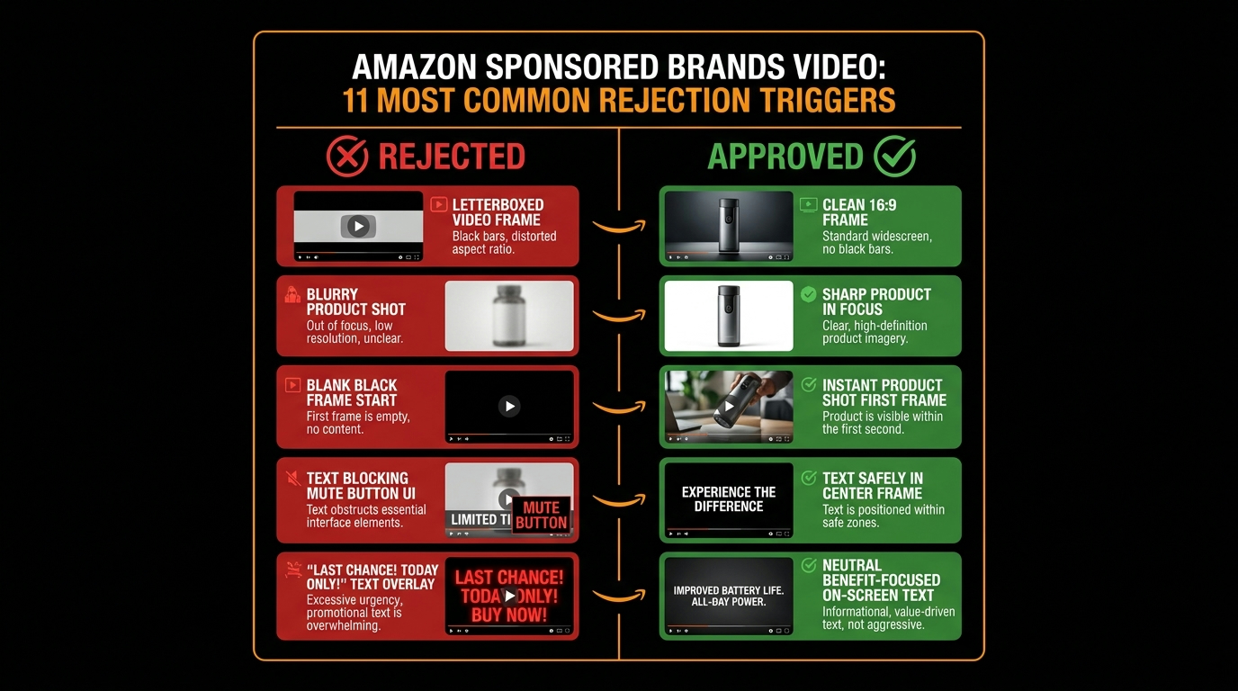
    Amazon SBV creative compliance — rejected vs approved video ad comparison

    You spend a week producing a Sponsored Brand Video. The scriptwriter nails the hook. The product shots are clean. The editor exports a gorgeous 15-second cut. You upload it to Amazon Ads, set your targeting, and hit submit — then wait.

    Twenty-four hours later: Rejected.

    The rejection reason? A catch-all phrase like “does not meet creative acceptance policies.” No specific line item. No timestamp. No frame reference. Just a wall of policy language and a button that says Edit Ad.

    This is the everyday reality for brands running Sponsored Brands Video (SBV) campaigns on Amazon in 2026. The ad format is one of the highest-performing placements in the entire Amazon Ads ecosystem — SBV consistently delivers higher click-through rates and better return on ad spend than static Sponsored Brands — but it comes with a moderation layer that can be opaque, unforgiving, and expensive to navigate by trial and error.

    The problem isn’t that Amazon’s rules are unreasonable. Most of them are logical once you understand the reasoning. The problem is that the rules are scattered across multiple help pages, the rejection messages rarely pinpoint the actual violation, and the 24–72 hour review window means every failed submission costs you real campaign time — especially painful when you’re approaching a product launch or seasonal peak.

    This article takes a different approach to the topic. Rather than listing specs you can already find on the ad specs page, we’re going to walk through the patterns behind rejections: what the moderation system is actually looking for, which violations are auto-rejected versus manually flagged, where the most experienced advertisers consistently get tripped up, and how to build a production workflow that exits the rejection cycle for good.

    Whether you’re a brand manager producing your first SBV or a PPC agency running dozens of video campaigns simultaneously, understanding the logic behind Amazon’s SBV moderation — not just the rules themselves — is the difference between clearing moderation on the first submission and burning days on revision loops.

    How Amazon’s SBV Moderation Machine Actually Works

    Amazon SBV moderation pipeline flowchart showing automated pre-check, content policy scan, and human review stages

    Before you can fix what’s going wrong, you need to understand what’s actually reviewing your ad. Amazon’s SBV moderation is not a single system — it’s a layered pipeline that moves through automated checks before human reviewers ever see your creative, if they see it at all.

    Stage 1: Automated Technical Pre-Check

    The moment you submit an SBV creative, it enters an automated pre-check that validates against a set of hard technical parameters. This stage happens quickly — often within minutes — and it’s purely mechanical. The system is checking whether your file conforms to the published specifications before anything else happens.

    If your file fails at this stage, the rejection is typically faster than the standard 24–72 hour window. You’ll receive a policy violation notice, but the actual trigger is technical rather than editorial. Common failures here include unsupported file formats, codec mismatches, files that exceed the 500 MB size limit, or videos submitted with an aspect ratio other than 16:9. This stage has no nuance — it’s binary.

    Stage 2: Automated Content Policy Scan

    Ads that pass the technical pre-check move to an automated content scan. This is where machine-learning models evaluate frame-level content, on-screen text, and metadata against Amazon’s creative acceptance policies. The system is specifically looking for patterns associated with known rejection categories: black or blank frames, letterboxing artifacts, text placed outside the safe zone, and flagged keyword patterns in on-screen copy.

    This stage is where many experienced advertisers get surprised. A video that looks perfectly fine on a desktop preview can fail the content scan because of elements that aren’t visible to the naked eye — a two-frame black leader at the start of the video, a barely-perceptible crop that technically qualifies as pillarboxing, or on-screen text that enters the lower-right quadrant during a transition.

    Stage 3: Human Review

    Ads that pass the automated scans — or are flagged for ambiguous content that the automated system can’t definitively reject — enter a human review queue. This is where the standard 24–72 hour window applies. Human reviewers apply Amazon’s policy guidelines with discretion, which means two things: borderline cases can go either way, and the same creative submitted twice to the human review queue may receive different outcomes depending on the reviewer.

    Amazon recommends submitting SBV creatives approximately one week before your intended campaign launch date. That buffer exists precisely because of the review-rejection-revision cycle. Brands that account for this buffer in their production timelines avoid the panic of a rejected ad two days before a Prime Day promotion.

    What “Instant Rejection” Actually Means

    When practitioners talk about “instant rejections,” they’re typically referring to automated pre-check failures or content scan failures — rejections that happen in minutes rather than hours. These are the most consistent and predictable rejections because they’re rule-based rather than judgment-based. They’re also the most preventable, because every single trigger is documented in Amazon’s published specs.

    The practical implication: most instant rejections are entirely within your control before you submit. The sections that follow break down exactly which triggers cause them.

    The Technical Spec Traps: Format, Codec, and File Configuration

    Amazon’s technical requirements for SBV are specific, and they’re not flexible. The moderation system does not partially accept non-conforming files or apply tolerances. If your video doesn’t match the exact specification on any hard-limit parameter, it will be rejected.

    Here’s the full mandatory technical specification as of 2026:

    • Duration: 6–45 seconds. Amazon strongly recommends 20 seconds or less — longer videos see progressively lower completion rates, which affects performance data even if they pass moderation.
    • Aspect ratio: 16:9 only, with square pixels. No vertical formats, no 1:1 square, no custom ratios.
    • Dimensions: 1280×720 (HD), 1920×1080 (Full HD), or 3840×2160 (4K). Non-standard resolutions — even close ones like 1280×534 — will fail.
    • File format: MP4 or MOV only.
    • Video codec: H.264 or H.265 (HEVC).
    • Frame rate: 23.976, 24, 25, 29.97, or 29.98 fps. Variable frame rate files are a common failure point — always export at a fixed frame rate.
    • File size: Maximum 500 MB.

    The Codec Trap That Catches Video Editors

    One of the most common technical rejection patterns among intermediate-level advertisers involves codec export settings. Many video editing and motion graphics tools export H.264 files that technically conform to the codec requirement but use a profile or level not supported by Amazon’s ingest pipeline. The most frequently flagged: H.264 files exported at High Profile Level 4.2 or above, or files that use a bitrate configuration incompatible with Amazon’s streaming requirements.

    The safe export settings for most SBV work are H.264 at High Profile Level 4.0 or below, with a video bitrate between 1 Mbps and 50 Mbps. If you’re using DaVinci Resolve, Premiere Pro, or Final Cut Pro, explicitly set the profile and level in your export settings rather than relying on “automatic” or “match source” presets — those can produce technically valid but Amazon-incompatible files.

    Variable Frame Rate: The Hidden Failure Mode

    Footage shot on modern smartphones — including professional-grade footage from iPhones and Android flagship devices — is often recorded in variable frame rate (VFR) mode. This is a feature designed to smooth motion during screen recordings and certain video modes. When these files are uploaded directly as SBV creatives without being converted to a constant frame rate (CFR), they frequently fail Amazon’s technical pre-check.

    The fix is straightforward: run all footage through a transcoding step that enforces a fixed frame rate before the final export. Tools like HandBrake (free) or Adobe Media Encoder can perform this conversion reliably. Building this step into your production workflow eliminates this rejection cause entirely.

    File Size and the 500 MB Wall

    At 4K resolution with high-quality encoding, a 45-second video can easily exceed 500 MB. The most common scenario where this becomes a problem: brands creating premium lifestyle content at 4K who apply minimal compression to preserve visual quality. The solution isn’t to sacrifice quality — it’s to target the shortest effective duration (Amazon’s own recommendation of 20 seconds or less), export at 1080p (which is the effective delivery resolution for most Amazon placements anyway), and use efficient bitrate settings that stay well below the file size ceiling.

    The Black Frame Problem: Why Your Opener Is the Most Dangerous Moment

    Side-by-side comparison of letterboxed rejected video ad versus approved full-frame SBV creative

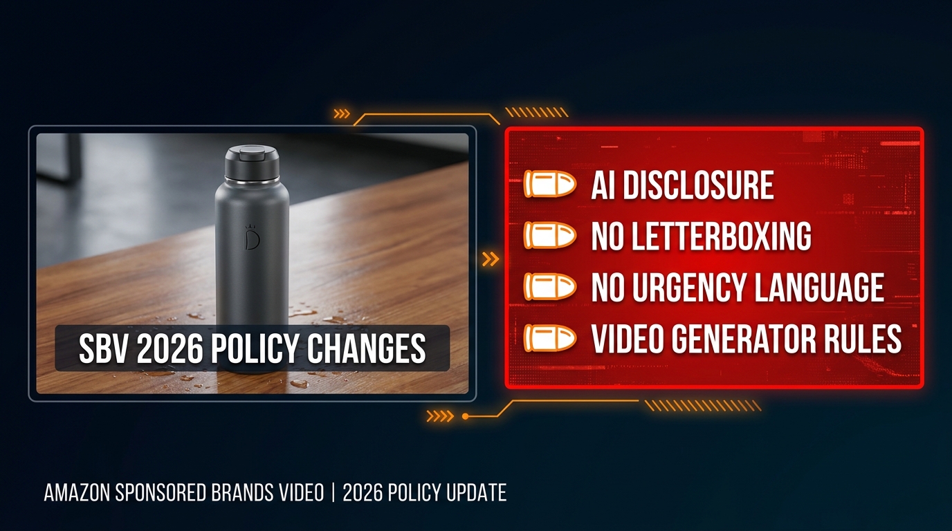
    Amazon is explicit: Sponsored Brands Video ads must not contain black or blank frames at the start or end of the video. This is one of the most consistently enforced rules in the entire SBV policy framework, and it’s one of the most common causes of automated rejection.

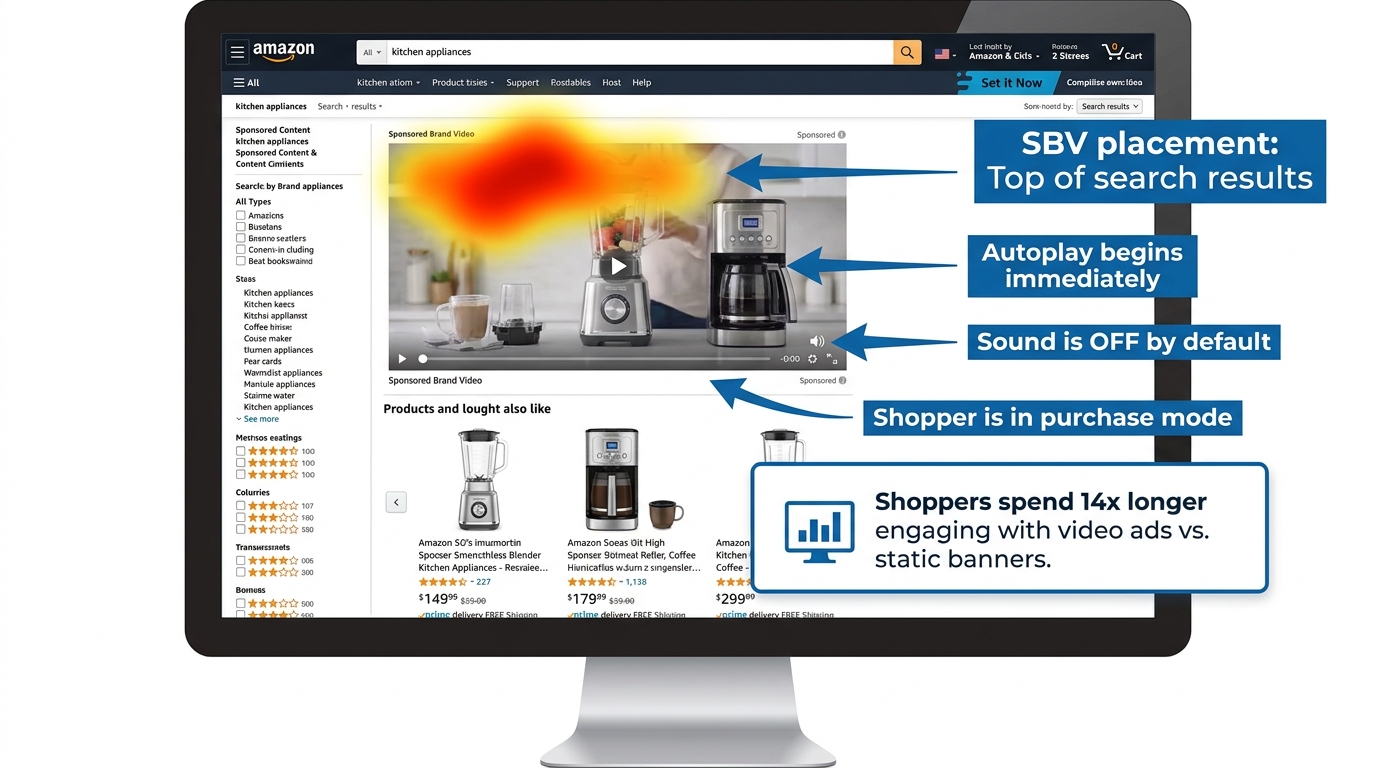
    The rule exists because SBV ads autoplay in search results. When a shopper scrolls past a sponsored placement, the video begins playing immediately without user interaction. A black frame opener — even a single frame — creates a dead moment in the customer experience, effectively making the ad appear broken during the most critical window of attention capture.

    Where Black Frames Come From

    Most black frame violations are not intentional. They come from three primary sources in standard video production workflows:

    Edit suite default handles: Many non-linear editing systems (NLEs) add a default black frame or handle at the start and end of sequences. In a broadcast or streaming context, this is standard practice. For SBV, it’s an instant rejection trigger. Check your export settings explicitly — look for “add handles” or “pad duration” options and disable them.

    Fade-to-black transitions: Ending a video with a fade to black, while visually elegant, produces exactly the kind of black frames that trigger rejection. If your creative ends with a branded end card, ensure the final frame holds on solid content — logo, product, or brand color — rather than fading out.

    Motion graphics rendering artifacts: After Effects and similar compositing tools can produce blank frames at the start of a composition if the work area isn’t precisely set. A common scenario: a composition begins with a title card that has a one-frame delay in its in-animation. The final render exports a black frame before the animation begins.

    How to Audit for Black Frames Before Submission

    The most reliable method is to use a media analysis tool to inspect the first and last ten frames of your export before submission. Adobe Premiere’s Source Monitor, DaVinci Resolve’s Scopes panel, or a free tool like MediaInfo can all identify blank frames. The quickest manual check: scrub your exported video’s first and last three seconds at 1:1 playback speed. The first visible frame should be full content. The last visible frame should be full content.

    If you’re producing SBV at volume — multiple creatives per ASIN or across a large catalog — this audit step should be codified into your QA checklist rather than left to individual editor judgment.

    Letterboxing, Pillarboxing, and the Aspect Ratio Graveyard

    Amazon requires SBV creatives to be full-bleed 16:9 with no horizontal or vertical black, color, or blurred bars. This rule encompasses letterboxing (horizontal bars at the top and bottom), pillarboxing (vertical bars on the left and right), and windowboxing (bars on all four sides). It also covers “faux” letterboxing — cases where a production team adds aesthetic black bars to simulate a cinematic widescreen look.

    This is one of the most misunderstood rules in SBV creative, because letterboxing is a standard part of broadcast and streaming video aesthetics. Many video production teams create content that looks deliberate and high-quality with letterbox bars applied as a stylistic choice. On Amazon, that’s an automatic rejection.
    The Source Footage Problem

    Letterboxing often enters an SBV creative not from a stylistic choice, but from a source footage mismatch. The most common scenario: a brand has an existing TV commercial or YouTube ad shot at a non-standard widescreen ratio (like 2.39:1 or 2.35:1) that they want to repurpose for SBV. When that 2.39:1 footage is placed in a 16:9 sequence, the editing software automatically adds letterbox bars to preserve the original framing.

    The fix requires a creative decision: reframe the original footage to fill the 16:9 canvas (which involves cropping and re-compositing the shots), or produce a native 16:9 version of the creative from the beginning. Repurposing 2.39:1 content for SBV without reframing will almost always produce a rejected ad, regardless of how good the underlying creative is.

    Color and Blur Bars: The Less Obvious Violations

    Amazon’s rule specifically mentions not just black bars, but “color or blurred bars.” This matters because some brands attempt to work around the letterboxing prohibition by filling the bars with a brand color or a blurred version of the video content. Both approaches violate the same rule. The policy requires full-bleed native content across the entire frame — there is no compliant workaround for a non-16:9 source asset beyond actually reframing the content.

    Square Pixel Verification

    Amazon’s spec requires 16:9 at square pixels. This is a specification that’s easy to satisfy with modern cameras and editing tools, but it can be violated by older footage shot with anamorphic or non-square pixel codecs. If you’re working with archival footage or content captured on certain professional broadcast cameras, verify the pixel aspect ratio in your media metadata (MediaInfo or VLC’s codec information panel will show this) before including it in your SBV creative.

    The Safe Zone Nobody Uses Correctly

    Amazon SBV safe zone diagram showing the lower-right corner as unsafe and correct logo placement in upper-left

    Amazon’s SBV spec includes a safe area template — a defined region within the 16:9 frame where text, logos, and other key visual elements should be placed to avoid being covered by the Amazon shopping UI. The critical rule: do not place important text, logos, or call-to-action elements in the lower-right corner of the video.

    When an SBV ad plays in Amazon’s search results, the shopping interface overlays UI elements on the video — pricing information, star ratings, and interactive controls. On mobile devices in particular, these elements occupy the lower-right portion of the video frame. Any critical creative element placed in that zone can be partially or entirely obscured during playback, degrading the customer experience and, in some cases, triggering a moderation rejection for placing key information in an obscured zone.

    What the Safe Zone Rule Actually Requires

    The rule is specifically about the lower-right corner — not the entire bottom of the frame, and not the lower-left. However, experienced SBV practitioners apply a more conservative interpretation in practice: keep all critical elements (brand logo, headline text, product claims, call-to-action copy) within the central 80% of the frame, away from all four edges.

    This conservative approach exists because Amazon displays SBV across multiple placements and device types, and the exact position of UI overlay elements varies. What’s cleanly visible on a 1920×1080 desktop browser may be partially obscured on a 375×667 mobile screen. Centering key creative elements eliminates the variability.

    The Logo Placement Pattern That Keeps Getting Rejected

    One of the most consistently misunderstood applications of the safe zone rule involves brand logos on end cards. Many brands use a standard corporate video template that places the logo in the lower-right corner of the final frame — the classic television “bug” position. When that template is applied to SBV without modification, the logo lands in exactly the position Amazon’s spec flags as unsafe.

    The solution is simple but requires explicit communication with your video production team: brand logos on SBV end cards should be positioned in the upper-left, upper-center, or center of the frame. Not lower-right. The end card is often the most brand-critical moment of the video — the moment shoppers associate your product with your brand — and having it obscured by Amazon’s UI is both a policy risk and a performance risk.

    Text Density in the Safe Zone

    Being inside the safe zone isn’t sufficient on its own. Amazon also evaluates the legibility of on-screen text — text must be readable at the display sizes used across Amazon placements, which includes mobile screens where SBV renders at relatively small dimensions. Text that’s technically within the safe zone but is too small to read, too densely packed, or placed against a low-contrast background can still trigger a moderation flag for poor creative quality.

    A practical guideline: use a minimum font size equivalent to 36pt at 1080p resolution, maintain at least a 4.5:1 contrast ratio between text and background, and limit on-screen text to one or two key messages at a time. SBV is not a slideshow — dense text copy that works in a static banner fails in an autoplay video format.

    Audio Rules That Silently Kill Approvals

    Audio is one of the least-discussed categories of SBV rejection, which is ironic given that a significant percentage of SBV ads are watched without sound. Amazon’s audio specifications exist both for the ads that play with audio and for the compliance architecture around how audio is formatted and delivered. Violating them is a rejection trigger even when audio is not the primary communication channel for the creative.

    Technical Audio Requirements

    Amazon’s SBV audio specifications require:

    • Codec: PCM, AAC, or MP3
    • Channels: Stereo or mono only (no 5.1 surround or multichannel formats)
    • Minimum bitrate: 96 kbps
    • Sample rate: Minimum 44.1 kHz
    • Streams: One audio stream only — multiple audio tracks will cause failure

    The single audio stream requirement catches production teams who include multiple audio tracks in their export — for example, a music bed on track 1 and voiceover on track 2, exported as separate stems rather than mixed down to a single stereo or mono track. This is standard practice in broadcast delivery and completely incompatible with Amazon’s SBV requirements.

    The Muted Video Question

    Because SBV autoplays on mute in most contexts, many brands produce SBV creatives that rely entirely on visual communication, with no meaningful audio component. This is a legitimate strategic choice. However, Amazon still requires a valid audio stream in the file — submitting a video with no audio track, or with a corrupted audio track, will fail technical review.

    If your SBV creative is intentionally audio-light, include a minimal audio element — a soft ambient track or a clean music bed at low volume — to satisfy the technical requirement without conflicting with your visual-first communication strategy. The audio will autoplay muted anyway; its primary function in this context is technical compliance, not storytelling.

    Audio Quality Signals

    Amazon’s content review also evaluates audio quality as a component of overall creative quality. Ads with audible clipping, excessive background noise, or distorted audio can be flagged during human review under “does not meet creative acceptance policies” — particularly if the audio issue is severe enough to create a poor customer experience. If your SBV creative includes voiceover or product demonstration audio, ensure it’s recorded at a consistent level with no clipping artifacts before export.

    Prohibited Claims: What You Cannot Say or Show

    Amazon SBV prohibited content checklist showing banned claims versus compliant alternatives

    Amazon’s SBV creative acceptance policy maintains a list of content categories and claim types that will trigger rejection regardless of how well the video conforms to technical specifications. These are policy-level rejections, and they require content changes rather than technical fixes.

    Pricing and Promotional Claims

    Any mention of specific pricing, discounts, or promotional offers in the video creative itself is prohibited. This includes on-screen text like “$19.99,” “Save 30%,” “Limited Time Offer,” or “Today Only.” It also includes spoken pricing in voiceover and visual representations of price tags, discount badges, or sale stickers within the video frame.

    The reasoning is clear: Amazon’s own product listing infrastructure handles pricing information dynamically. Pricing in the video creative would be inaccurate the moment a price changes, creating a misleading customer experience. The policy closes this gap by prohibiting pricing from the creative entirely.

    The practical implication for brands that run SBV around promotional events like Prime Day or Lightning Deals: the video itself cannot reference the deal. The campaign targeting and the product detail page carry the promotional messaging. The creative must be promotion-agnostic to pass moderation and remain compliant for the ad’s full run duration.

    Unverified Superlatives and Exaggerated Claims

    Claims like “the best,” “the most effective,” “#1,” “world-class,” or “guaranteed to work” require substantiation that is independently verifiable — and for SBV, that substantiation cannot live only in the video. Amazon’s policy requires that claims be accurate, verifiable, and not misleading. Vague superlatives without a specific qualifying context (“the #1 rated blender in the U.S.” with a cited source) fall under unsubstantiated claims and are a moderation rejection risk.

    The common fix is specificity: instead of “the best coffee maker on the market,” use a verifiable, specific claim derived from your product’s actual attributes: “Brews at the precise 205°F optimal extraction temperature” or “650+ five-star reviews” with the review count reflecting your actual listing data.

    Amazon Trademark and Intellectual Property Restrictions

    SBV creatives cannot use Amazon’s trademarks, logos, or branded visual elements. This includes the Amazon smile logo, the Amazon wordmark, Prime branding, and any other Amazon-owned intellectual property. The restriction applies to both on-screen visual elements and audio mentions of Amazon branding in a manner that implies endorsement or official partnership.

    This rule catches brands who include screenshots of their Amazon listing — which naturally contains Amazon branding — within their SBV creative. The screenshot approach is also problematic for a separate reason covered in the next section.

    Distracting, Inappropriate, and Low-Quality Content

    Amazon’s policy prohibits content that is violent, gory, sexually explicit, frightening, or otherwise unsuitable for a general audience. It also prohibits creative elements designed to simulate clickbait mechanisms — animated cursors, fake notification badges, simulated “click here” prompts, or elements that mimic interactive UI controls to manipulate user behavior.

    Ads with rapidly flashing, blinking, or pulsing visual effects are flagged both for creative quality reasons and for accessibility compliance. This applies to strobing effects used in transitions, text animations with high-frequency flash rates, and background effects that create a disorienting viewing experience.

    The Competitive Comparison Trap

    Comparative advertising — showing or claiming that your product is better than a named competitor — is one of the most nuanced areas of Amazon’s SBV policy, and it’s a trap that catches brands who assume that standard marketing practices apply on Amazon the same way they apply in other media environments.

    What’s Explicitly Prohibited

    Amazon’s moderation consistently rejects SBV creatives that include:

    • Explicit naming of competitor brands in the video (“unlike Brand X, our product…”)
    • Display of competitor product packaging, logos, or trademarks in the video frame
    • Side-by-side comparisons that position a specific competitor’s product against yours
    • Claims that directly rank your product above named competitors (“#1 vs. the competition”)

    The policy reflects both Amazon’s desire to maintain a neutral marketplace environment and the practical difficulty of verifying comparative claims at moderation scale. Even if your comparative claim is accurate and substantiated, the moderation review process applies a categorical prohibition rather than a case-by-case evaluation of claim accuracy.

    The Category Comparison Workaround

    What is allowed — and what experienced SBV advertisers use effectively — is category-level differentiation without named competitors. Demonstrating your product’s advantages against a generic category alternative (“unlike typical blenders that struggle with frozen ingredients, our motor handles…”) is compliant as long as no specific competitor brand is named or visually represented.

    Similarly, claims substantiated by third-party test data, independent certifications, or verifiable consumer research data can position your product’s performance without crossing into comparative advertising territory. The rule of thumb: if a competitor brand’s name or product could be removed from your messaging without changing its core point, you’re likely in compliant territory. If the message only makes sense with the competitor named, you’re in violation territory.

    Screenshots of Amazon Search Results

    A subtle competitive comparison violation that catches many brands: including screenshots of Amazon search results pages in their SBV creative to show their product ranking. This is prohibited for two reasons. First, it may contain competitor brand names or listings in the search results. Second, it uses Amazon’s branded UI without permission. This type of creative — however compelling it may seem as social proof — will almost always fail moderation.

    Text Overlays, Captions, and Readability Standards

    On-screen text in SBV is not just a creative choice — it’s a policy compliance area. Amazon evaluates text overlays during the moderation review for legibility, placement, and content. Getting this wrong is one of the most common causes of human review rejections (as opposed to automated technical rejections).

    The Language Matching Requirement

    All text in SBV creatives must match the primary language of the marketplace where the ad will run. An English-language ad submitted to Amazon.com must have English on-screen text. If the same video will run across multiple international Amazon marketplaces, separate language-specific versions must be produced and submitted for each marketplace.

    This rule has practical implications for brands that produce a single “global” video creative and attempt to use it across multiple Amazon regional marketplaces. The video must be localized at the language level, not just at the targeting level.

    Legibility Standards in Practice

    Amazon’s reviewers evaluate whether text is actually readable at the display sizes used across Amazon placements. The variables that affect legibility: font size (too small fails), font weight (too light against a busy background fails), contrast (insufficient color contrast against background fails), and duration (text that appears for fewer than one second is unlikely to be readable and may be flagged).

    The practical guidance from experienced SBV producers: use bold, high-contrast text in a large, clean sans-serif font. Hold text on screen for a minimum of two to three seconds. Ensure the background behind text is either a solid color, a strongly blurred background, or a dark overlay panel that provides consistent contrast. Test your video at 375px wide (simulating a mobile device at reduced resolution) before submission.

    Text as the Only Information Source

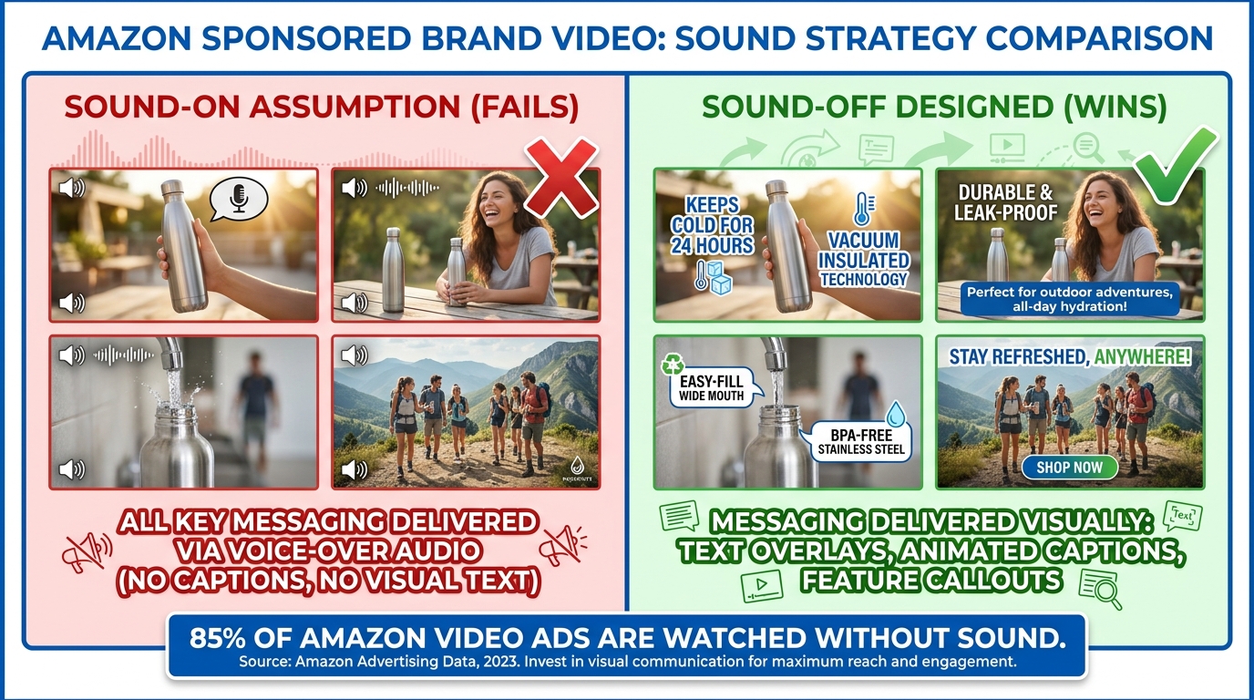
    Because SBV autoplays muted, many effective SBV creatives use on-screen text as the primary communication vehicle — essentially functioning as a captioned product demonstration. This is not only compliant, it’s strategically sound given the muted autoplay environment. Amazon’s own guidance acknowledges this by not requiring audio content to be the primary communication channel.

    The caveat: text-heavy SBV creatives must still satisfy all the legibility and safe zone requirements. A “muted-first” strategy doesn’t reduce the text compliance requirements — it increases their importance, since text is doing all the communicative work.

    The Resubmission Game: How to Recover Fast When Rejected

    Even with the best pre-flight process, SBV rejections happen. When they do, the speed and quality of your response determines whether a rejected ad becomes a minor inconvenience or a campaign-disrupting problem.

    Reading the Rejection Notice Correctly

    Amazon’s rejection notices for SBV typically cite the relevant policy category rather than a specific technical parameter or frame timestamp. The most common rejection message formats reference “creative acceptance policies” with a link to the policy page, or cite a specific category like “audio/video quality” or “prohibited content.”

    The challenge is that these category-level rejection reasons don’t always tell you exactly what the problem is. The diagnostic approach: cross-reference the rejection category against the full list of possible violations within that category, and conduct a systematic audit of your creative against each potential trigger. A rejection under “audio/video quality” should prompt you to check black frames, letterboxing, resolution conformance, codec settings, frame rate consistency, and safe zone adherence — not just the first issue you notice.

    The Resubmission Timeline

    Once you’ve fixed the identified issue and resubmitted, the ad re-enters Amazon’s moderation queue from the beginning. Re-submissions typically receive a response within a similar 24–72 hour window, though in practice many practitioners report faster responses on resubmissions that fail the automated checks (because the failure is detected early in the pipeline).

    For campaign launches with hard deadlines, build a two-rejection buffer into your timeline. If you’re targeting a Monday launch, submit your creative the Monday before. If it’s rejected and corrected by Wednesday, you have a second submission window and can still hit your launch date. Agencies running SBV at scale often maintain this buffer as standard procedure.

    When to Appeal vs. When to Fix and Resubmit

    Amazon provides a formal appeal mechanism within the Amazon Ads console for ad review decisions. However, appeals are most effective in specific, narrow circumstances: when a rejection appears to be a clear system error (your ad is rejected for a policy violation it demonstrably does not contain), or when a human reviewer has applied a policy inconsistently compared to currently running ads in the same category.

    For the vast majority of SBV rejections, the faster and more reliable path is to fix the creative and resubmit rather than pursue an appeal. Appeal cycles can take three to five business days and may not produce a different outcome if the creative genuinely violates the cited policy. Fix-and-resubmit cycles, by contrast, can be completed in 48 hours with a clean, compliant asset.

    Building a Rejection Log

    For brands running SBV across a large catalog or agencies managing multiple brand accounts, maintaining a structured rejection log significantly reduces repeat errors. Each rejection entry should record: the creative filename, the rejection category cited, the specific policy violation identified through diagnosis, and the fix applied. Over time, this log reveals patterns — most brands have one or two chronic violation categories that account for the majority of their rejections, and addressing those upstream in the production workflow produces an immediate improvement in approval rates.

    Building a Pre-Flight Checklist for Zero-Rejection SBV Production

    Zero-rejection SBV pre-flight checklist showing technical, content, and audio requirements

    The most effective way to eliminate SBV rejections is to move compliance upstream — into the creative brief, the production process, and the export workflow — rather than treating it as a post-production problem. A structured pre-flight checklist, applied before every SBV submission, makes first-submission approval the standard outcome rather than the optimistic hope.

    Category 1: Technical Specs (Pre-Export)

    These items should be confirmed in your project settings before rendering the final export:

    • Sequence/composition set to 1920×1080 or 1280×720, 16:9, square pixels
    • Frame rate set to a fixed value (23.976, 24, 25, 29.97, or 29.98 fps)
    • Total duration between 6 and 45 seconds (20 seconds or less strongly preferred)
    • Export format set to MP4 or MOV
    • Video codec set to H.264 (High Profile, Level 4.0 or below) or H.265
    • Audio mixed down to a single stereo or mono track, AAC or PCM codec, minimum 96 kbps, 44.1 kHz sample rate
    • No handles or padding added to the beginning or end of the export

    Category 2: Content Checks (Pre-Export)

    These items should be verified during the final creative review, before rendering:

    • First frame: full-bleed content visible, no black or blank frames
    • Last frame: full-bleed content visible, no black or blank frames, no fade-to-black ending
    • Aspect ratio: no letterbox, pillarbox, or windowbox bars anywhere in the video
    • No color bars or blurred bars used as workarounds for non-16:9 source footage
    • Logo and brand elements: positioned away from the lower-right corner
    • All on-screen text: within the safe zone, legible at mobile scale, minimum two-second hold duration
    • No pricing, discount, or promotional claims in video or on-screen text
    • No competitive brand names, logos, or product comparisons
    • No Amazon trademarks, logos, or UI elements
    • No flashing, strobe, or rapid pulsing visual effects
    • No fake UI elements, simulated cursors, or clickbait mechanisms
    • Content appropriate for a general audience (no violent, explicit, or frightening content)
    • All text matches the language of the target marketplace

    Category 3: Post-Export Verification

    These items should be confirmed after rendering the final export file, before uploading:

    • Open the exported file in a media player and scrub through the first and last three seconds to visually confirm no black frames
    • Check file size: confirm it is below 500 MB
    • Verify file metadata using MediaInfo or equivalent: confirm codec, frame rate (fixed, not variable), and pixel aspect ratio
    • Preview the video at reduced size (simulate mobile) to confirm text legibility
    • Confirm audio plays correctly on the final export (no silent track, no distortion)

    Integrating the Checklist Into Your Workflow

    The checklist is most effective when it’s assigned to a specific role in your production workflow — not left as a shared responsibility that nobody specifically owns. In an agency setting, this is typically a dedicated QA step performed by a compliance reviewer or senior editor before any SBV is submitted. For in-house brands, it can be the responsibility of whoever owns the Amazon Ads account, performed as the final step before uploading.

    Consider using a shared digital checklist tool (Notion, Airtable, or even a Google Sheet) that creates a record for each SBV submission. This creates accountability, enables pattern analysis when rejections do occur, and ensures the checklist is applied consistently rather than relying on individual memory.

    The Performance Case for Getting This Right

    It’s worth stepping back from pure compliance mechanics to consider the broader performance context. The effort required to produce rejection-proof SBV creative is not just about avoiding frustration — it directly affects campaign economics.

    Every day a SBV campaign is delayed by a rejection cycle is a day of lost impressions at top-of-search placements. For campaigns running during time-sensitive periods — product launches, category promotions, seasonal peaks — a single rejection cycle can cost more in lost opportunity than the entire production budget of the video.

    Beyond timing, the creative qualities that satisfy Amazon’s moderation requirements — clear product visibility from the first frame, legible and well-placed text, clean audio, no black frames, full-bleed visuals — are also the creative qualities that produce stronger performance metrics. The compliance requirements and the performance requirements for SBV are almost perfectly aligned: what passes moderation is also what converts shoppers.

    Amazon’s own guidance consistently reinforces this. The recommendation to show the product clearly within the first few seconds, to keep videos to 20 seconds or less, to use the video to “demonstrate how the product and brand fit into customers’ lives” — these are both compliance guidelines and performance guidelines. The brand that builds a production workflow designed around compliance will, almost inevitably, also build a production workflow that produces higher-performing creative.

    Conclusion: Stop Treating SBV Compliance as an Afterthought

    The SBV rejection patterns documented in this article are not mysterious or arbitrary. Every rule Amazon enforces has a logical basis in customer experience, marketplace integrity, or content suitability. Black frame and letterboxing rules exist because autoplay ads that look broken create a poor customer experience. Safe zone rules exist because Amazon’s UI physically occupies that space on shoppers’ screens. Pricing and comparative claim rules exist because inaccurate claims in video creative are much harder for Amazon to dynamically correct than inaccurate text on a product page.

    Understanding the why behind each rule makes compliance intuitive rather than mechanical. And when compliance is intuitive, it gets built into the creative brief, the production process, and the export workflow — not left as a last-minute checklist item that gets skipped when deadlines are tight.

    The brands and agencies that have eliminated SBV rejection loops share one common characteristic: they treat creative compliance as part of the creative process, not as a post-production obstacle. They brief their video teams with Amazon’s safe zone template open. They export with verified settings rather than default presets. They audit their files before uploading rather than hoping the moderation system gives them useful feedback.

    The actionable takeaways from this piece:

    1. Build and document your SBV export settings as a saved preset in your editing and rendering tools — never rely on default exports.
    2. Add a five-minute post-export verification step to every SBV production: open the file, scrub the first and last three seconds, check metadata with MediaInfo.
    3. Design your SBV end cards with the logo in the upper-left or center — never lower-right.
    4. Strip pricing, discount, and competitive comparison language from SBV scripts at the briefing stage, not at the compliance review stage.
    5. Submit SBV creatives at least one week before campaign launch to absorb a rejection-resubmission cycle without affecting your go-live date.
    6. Maintain a rejection log and review it quarterly — most brands have one or two chronic violation categories, and fixing them at the source eliminates the majority of their rejection volume.

    Amazon’s SBV format will continue to be one of the highest-value placements in its advertising ecosystem. The brands that invest in getting compliance right from the start will spend more of their time capitalizing on that value — and less of it waiting for moderation queues to clear.

  • SBV Product Targeting: The Structural Playbook Most Amazon Advertisers Skip

    SBV Product Targeting: The Structural Playbook Most Amazon Advertisers Skip

    SBV Product Targeting Architecture vs Keyword Targeting — split infographic showing the two approaches side by side

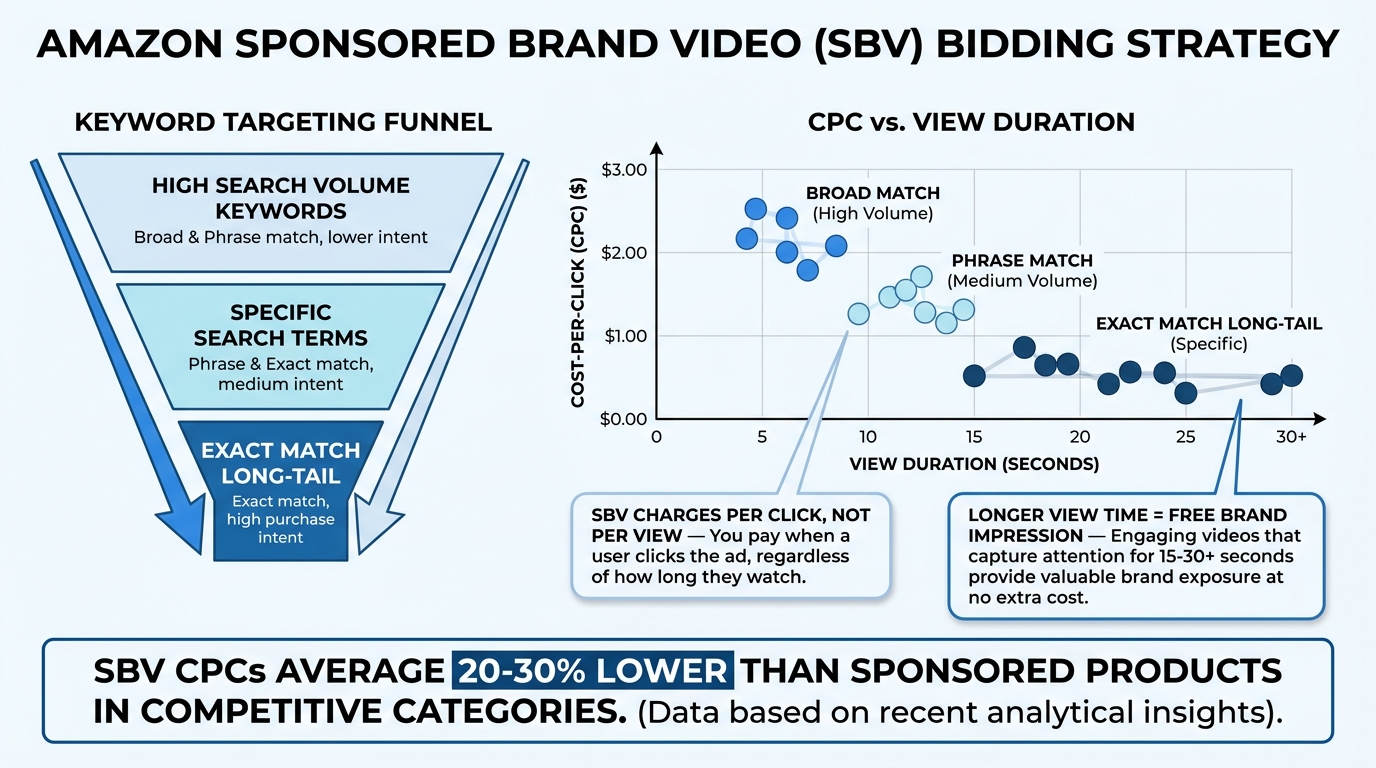
    Most Amazon advertisers who run Sponsored Brands Video are only operating at half capacity. They set up their SBV campaigns against a keyword list, point the creative at a product detail page or Brand Store, check the ACOS weekly, and call it a strategy. The video format gets the credit — or the blame — while the targeting layer goes almost completely unexamined.

    That’s a significant structural gap, and it’s one that’s widening in 2026. As more brands pile into SBV with keyword-centric campaigns, the product targeting side of the format is becoming one of the least-contested, highest-potential spaces in Amazon advertising. The inventory is different, the intent signals are different, the creative requirements are different, and — critically — the measurement framework needs to be completely different too.

    This isn’t a post about why SBV is good or how to make a video. It’s a deep dive into the product targeting architecture specifically: how it works mechanically, how to structure campaigns around objective-based segments rather than ad group dumps, how to set bids that actually reflect placement behavior, and how to measure what matters when your audience isn’t searching for you — they’re actively looking at a competitor.

    If you’ve already moved some SBV budget into product targeting and seen mixed results, this is for you. If you haven’t started, this will show you exactly why you’re leaving measurable efficiency gains on the table.

    Why SBV Product Targeting Is a Fundamentally Different Channel

    The default mental model for Sponsored Brands Video is a search channel. A shopper types a query, a video unit appears at the top or inline within results, and the shopper either clicks or doesn’t. That model works — SBV consistently outperforms static Sponsored Brands on CTR in search environments, with multi-account analyses showing video CTR running roughly 2–3× higher than image-based formats on equivalent keywords.

    Product targeting breaks this model entirely. When you run SBV with product or category targeting, your ad is no longer appearing to someone in search mode. It’s appearing to someone in evaluation mode — someone who has already clicked through to a product detail page and is actively deciding whether to buy that specific item. The psychology, the buying stage, and the competitive dynamic are all different.

    The Intent Gap Between Search and PDP

    Consider what a shopper is doing when they land on a competitor’s ASIN page. They’ve already navigated past the search results. They’ve chosen to invest time in evaluating a specific product. They’re reading reviews, examining images, comparing prices, and deciding. This is not a passive audience — it’s arguably the highest-intent audience on the entire platform, and they’re sitting on someone else’s listing.

    That’s what product-targeted SBV is actually reaching: a shopper who is milliseconds from making a purchase decision, but hasn’t committed yet. The creative job is completely different from search. You’re not trying to get attention. You’re trying to interrupt an evaluation and create a better alternative in the moment.

    Where Product-Targeted SBV Actually Appears

    Amazon’s placement inventory for product-targeted SBV has expanded meaningfully. The primary placement is below A+ content on the product detail page itself, where a video carousel surfaces to shoppers who are deep into their product review. But product-targeted SBV also feeds into inline search placements, meaning the same campaign targeting competitor ASINs can also appear in search results for the queries those ASINs rank for.

    This dual-placement behavior is one of the more underappreciated mechanics of the format. You’re not just buying PDP inventory when you product-target — you’re also getting adjacent search exposure without fighting in the top-of-search keyword auction. That’s a meaningful cost advantage in high-competition categories.

    The CPC Difference — And Why It’s Structural

    Product-targeted SBV CPCs consistently run lower than top-of-search keyword CPCs in competitive categories. This is partly a supply-demand story — fewer advertisers are using this targeting method — but it’s also structural. PDP placements don’t trigger the same aggressive bidding behavior as keyword auctions because fewer brands have set up dedicated product-targeting campaigns with serious budget allocation. The floor is lower, and the ceiling is higher for efficiency-minded buyers who get there first.

    Diagram showing where Amazon SBV ads appear across placements — top of search, inline, below fold, and product detail page

    The Three Campaign Archetypes: Defensive, Conquesting, and Cross-Sell

    The single biggest structural mistake in SBV product targeting is treating it as one undifferentiated campaign type. Advertisers who are seeing inconsistent results typically have one campaign mixing competitor ASINs, their own ASINs, and vague category targets — all measured against the same ACOS target. That’s a recipe for budget waste and misleading performance data.

    Advanced practitioners in 2026 are building SBV product targeting around three distinct campaign archetypes, each with different ASIN lists, different bid levels, different creative, and different success metrics. Here’s how each one works.

    Three campaign archetypes for SBV product targeting — Defensive, Conquesting, and Cross-Sell infographic

    Archetype 1: Defensive Product Targeting

    Defensive campaigns target your own ASINs. The goal is to prevent competitor video ads from appearing on your product detail pages while reinforcing the purchase decision for shoppers who are already on your listing. This is often the first type of SBV product targeting an account should set up, because it protects existing conversion paths before you go on offense elsewhere.

    Defensive campaign setup involves targeting your own top-selling ASINs (and their variations) with your SBV creative. Since these shoppers are already on your page, the creative can be softer — focused on reassurance, key differentiators, and social proof. The conversion rate in defensive campaigns tends to be higher than in any other product targeting type because the audience is already warm and already intent-matched to your product.

    Key metrics to watch in defensive campaigns: conversion rate, spend efficiency (ACOS), and — if you have Brand Analytics access — the ratio of shoppers who view your ad on your own PDP but then proceed to a competitor. A defensive campaign doing its job keeps that exit rate low.

    Bidding philosophy for defensive campaigns: you can often sustain higher bids here than in conquesting campaigns because the audience is higher quality and you’re protecting existing revenue rather than acquiring new. Think of it like defending territory you already own — the cost of losing it is higher than the cost of holding it.

    Archetype 2: Conquesting Product Targeting

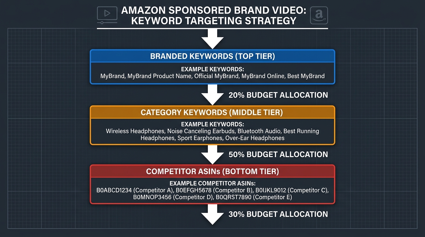
    Conquesting campaigns target competitor ASINs. This is the most talked-about use case for SBV product targeting, but also the most frequently misexecuted. The common mistake is targeting every competitor ASIN in the category without any filtering logic, which produces bloated impression counts, low conversion rates, and a misleading ACOS story.

    Effective conquesting requires ASIN selection criteria, not just ASIN lists. The strongest-performing conquesting targets share specific characteristics:

    • Price parity or slight premium: Targeting ASINs priced significantly higher than your product creates natural comparison advantage. Targeting ASINs priced lower usually backfires — you’re interrupting shoppers who are looking for a cheaper option and won’t convert on your higher-priced alternative.
    • Review vulnerability: ASINs with ratings below 4.1, or those with a significant volume of recent 1- and 2-star reviews mentioning specific issues you don’t have, are high-value conquesting targets. Shoppers in doubt are shoppers who can be redirected.
    • Adjacent feature gaps: Competitor ASINs that lack features your product has — and where those features are prominent in customer reviews — are ideal targets for video creative that leads with that specific differentiator.
    • Stockout or inventory risk signals: Competitors experiencing frequent stockouts or long shipping delays are among the best short-term conquesting opportunities.

    Conquesting campaign metrics must be held to different standards than defensive. The conversion rate will be lower — you’re reaching shoppers who had already chosen a different product. The success metric is not ACOS in isolation; it’s new-to-brand order rate and customer acquisition cost relative to other awareness channels. More on this in the measurement section below.

    Archetype 3: Cross-Sell Product Targeting

    Cross-sell campaigns target your own ASINs or complementary products with creative that promotes a different ASIN — typically a bundle item, an accessory, or the next tier up. If you sell coffee equipment and someone is on your grinder listing, a well-placed video for your pour-over kettle is a natural extension of their purchase journey.

    Cross-sell campaigns are the most overlooked of the three archetypes, but they often deliver the strongest ROAS because the audience is already proven — they’re buying in your category, often from your brand. The creative brief is different: the hook is the connection between what they’re looking at and what you’re showing, not a head-to-head comparison.

    Cross-sell SBV also creates a valuable data feedback loop. When you see which ASIN pairings drive the strongest cross-sell conversion, that data informs your listing content, bundle strategy, and even your A+ content cross-links. The campaign becomes both a revenue driver and a product development signal.

    ASIN Targeting vs. Category Targeting — The Strategic Decision Matrix

    Within SBV product targeting, Amazon gives you two main levers: target specific ASINs, or target product categories (with optional refinements by price range, brand, rating, and Prime eligibility). These are not interchangeable, and mixing them without a clear logic creates campaigns that are impossible to read and optimize.

    ASIN targeting vs category targeting comparison chart showing efficiency vs scale tradeoff in SBV campaigns

    When ASIN Targeting Is the Right Tool

    ASIN targeting is the precision instrument. Use it when you have specific, data-identified targets that meet your conquesting criteria — competitor ASINs with the characteristics described above, your own defensive ASIN list, or specific cross-sell pairings. ASIN targeting gives you exact placement control, exact impression attribution, and clean performance data at the target level.

    The primary downside of ASIN targeting is scale. A list of 20–50 carefully selected competitor ASINs will only serve so many impressions. As those ASINs receive your ads and their shoppers either convert or don’t, you exhaust the inventory relatively quickly. This is why ASIN targeting campaigns require active curation — you need to continuously add new targets as market conditions shift and remove targets that are either converting too poorly or showing budget exhaustion.

    Best practice: keep ASIN-targeted campaigns at a size you can actually review weekly. For most accounts, that means segmented lists of 30–100 ASINs per campaign, broken out by product line or competitive cluster. Larger lists become unmanageable and obscure performance signals.

    When Category Targeting Makes More Sense

    Category targeting is the volume lever. Use it when you want to reach the broadest possible in-category audience — particularly in new-to-brand customer acquisition scenarios — without the curation overhead of maintaining ASIN lists. Category targeting with refinements (price range, minimum rating, Prime eligible only) can produce surprisingly tight audiences while maintaining much higher impression volume than ASIN lists.

    The tradeoff is relevance noise. A category target by definition includes ASINs that may be only tangentially related to your product, or that serve audiences with different intent profiles. Your creative has to work harder because the match between audience and message is less precise. CTR will typically run higher in category campaigns (more inventory = more impressions from browsing shoppers), but conversion rates will lag ASIN-targeted campaigns.

    The Hybrid Structure Most Advanced Accounts Use

    The most effective SBV product targeting architecture combines both within a single objective, run as separate campaigns with shared learnings:

    1. Phase 1 — Category Discovery: Run a category-targeted SBV campaign with broad refinements. Let it gather impression and click data across the category for 3–4 weeks.
    2. Phase 2 — ASIN Mining: Pull the Search Term Report (which, in product targeting mode, shows you which specific ASINs served your ad and at what efficiency). Identify the top-performing individual ASINs from the category campaign.
    3. Phase 3 — Graduated to ASIN Targeting: Migrate your best category performers into a dedicated ASIN-targeted campaign with more aggressive bids, where you can control placement and budget with surgical precision.

    This phased approach uses category targeting as a discovery engine and ASIN targeting as the scaled, optimized execution layer. It avoids the guesswork of building ASIN lists from scratch and prevents you from allocating serious budget to targets you haven’t validated yet.

    Bid Architecture: Why Flat Bids in Product Targeting Campaigns Are Leaving Money on the Table

    The majority of Amazon advertisers running SBV product targeting are using flat bids — one CPC applied uniformly across all targets in a campaign, with maybe a coarse placement modifier on top. This approach ignores the dramatic differences in conversion value across different placement types and different target segments.

    Understanding Placement Behavior in Product Targeting

    SBV product targeting campaigns serve across multiple placements, each with different user intent profiles and conversion rates:

    • Product Detail Page (PDP) placements: Below A+ content in the video carousel. These are typically mid-to-high intent — the shopper is deep in evaluation. Conversion rates here are among the highest for product-targeted campaigns.
    • Top of Search placements: Even with product targeting enabled, SBV can surface at the top of search results for relevant queries. These impressions have high visibility but lower specificity — the intent is search-driven, not evaluation-driven.
    • Rest of Search / Below Fold: Impressions lower in the search results page. These tend to deliver more volume at lower CPCs, with moderate conversion rates.

    Amazon’s placement bid modifiers — which let you increase or decrease bids for top-of-search and product detail page placements specifically — are the levers to use here. But most advertisers apply modifiers based on habit or best guesses rather than actual performance data.

    How to Build a Data-Driven Bid Tier Structure

    The correct approach is to run a placement analysis first. After 3–4 weeks of campaign data, pull the Placement Report and segment performance by placement type. This will show you cost-per-click, conversion rate, and ACOS or ROAS for each placement independently. From this data, you can calculate an implied justified bid per placement based on your target ACOS.

    If your PDP placement is converting at twice the rate of your top-of-search placement, your base bid + PDP modifier should reflect that — not be set at an arbitrary 50% uplift because that “feels right.” The math should drive the modifier.

    Practically, advanced practitioners are segmenting bids across three tiers:

    • Tier 1 — Defensive PDP (own ASINs): Highest bid, because conversion rate is strongest and cost of losing the placement to a competitor is highest.
    • Tier 2 — Conquesting PDP (competitor ASINs): Mid-range bid, with tighter ACOS targets and emphasis on NTB metrics rather than immediate ROAS.
    • Tier 3 — Category/Search hybrid placements: Lower base bid, placement modifiers suppressed or neutral, volume-focused with discovery intent.

    This tier structure makes it possible to hold each campaign to an appropriate, objective-specific standard rather than blending everything into an account-average ACOS that masks which segments are actually performing.

    The Negative ASIN Layer: The Single Most Overlooked Optimization in SBV

    Ask most advertisers running SBV product targeting how their negative ASIN strategy works, and you’ll get a blank stare. The majority of product targeting campaigns have no negative ASIN list whatsoever. This is a significant missed optimization, and in 2026 it’s one of the clearest differentiators between accounts running SBV at intermediate versus advanced levels.

    Why Negative ASINs Matter More in Product Targeting Than Keyword Campaigns

    In keyword campaigns, negative keywords filter out irrelevant search queries. In product targeting campaigns, negative ASINs filter out specific product pages where your ad should not appear — competitor listings that are too far outside your price range, categories that generate clicks but never convert, your own product variants that would create internal cannibalization, or ASINs associated with audiences who have fundamentally different needs than your ideal buyer.

    Without negative ASINs, your campaign is effectively serving on every page in the category or ASIN list with equal weight. This means a portion of your budget consistently flows to placements that have never converted and never will — but because the data is blended, it’s invisible in aggregate performance numbers.

    Building Your Negative ASIN List: Four Categories to Address

    1. Price-Mismatched ASINs
    If your product is priced at $45, targeting ASINs priced at $12–18 creates an audience mismatch. Shoppers on budget product pages are budget-motivated; your video ad appearing with a $45 product will rarely convert them. Pull the ASIN targeting report, filter by ASINs with high impressions and zero conversions, cross-reference with pricing data, and negative-match the price outliers.

    2. Own-Brand Cannibalization ASINs
    If your conquesting campaign is accidentally appearing on your own product pages (which can happen in broad category campaigns), you’re paying to reach your own customers. Negative-match your entire brand ASIN catalog from any conquesting or category campaigns.

    3. High-Click, Zero-Convert Chronic Underperformers
    After 30+ days of data, identify ASINs in your targeting that have accumulated 15+ clicks with zero conversions. Some of these will eventually convert; many won’t. Apply a spending threshold (e.g., 2× your target CPA with no order) and systematically negative-match chronic underperformers. Review and update this list monthly.

    4. Category Bleed ASINs
    When using category targeting with broad category nodes, Amazon sometimes serves your ad on loosely related sub-categories that aren’t actually your competitive set. Identify sub-category ASINs that are generating spend but are clearly off-target (wrong product type, wrong audience) and negative-match those ASIN prefixes or specific products.

    Negative ASIN Review Cadence

    Best practice is to audit your negative ASIN lists on a 30-day cycle, not as a one-time setup. Market conditions change, competitor ASINs change (new products, pricing shifts, review changes), and what was a valid target six weeks ago may now be a chronic money drain. Build negative ASIN review into your monthly PPC workflow as a standing agenda item alongside bid reviews.

    Creative That Actually Works in Product Targeting Environments

    SBV creative best practices — video timeline breakdown showing the first-3-seconds rule and key production requirements

    SBV product targeting introduces creative requirements that don’t apply in keyword environments — and getting the creative wrong is the fastest way to waste a well-built targeting structure. The mechanics of how your video appears on a product detail page versus in search results create distinct behavioral contexts that most advertisers don’t account for in production.

    The Autoplay-Muted Problem

    All SBV ads autoplay on mute. This is a known format behavior, but its creative implications are frequently underweighted. When your video appears on a competitor’s product detail page, the shopper is reading — they’re scanning reviews, looking at images, checking Q&A sections. Your video starts playing silently in the lower portion of the page.

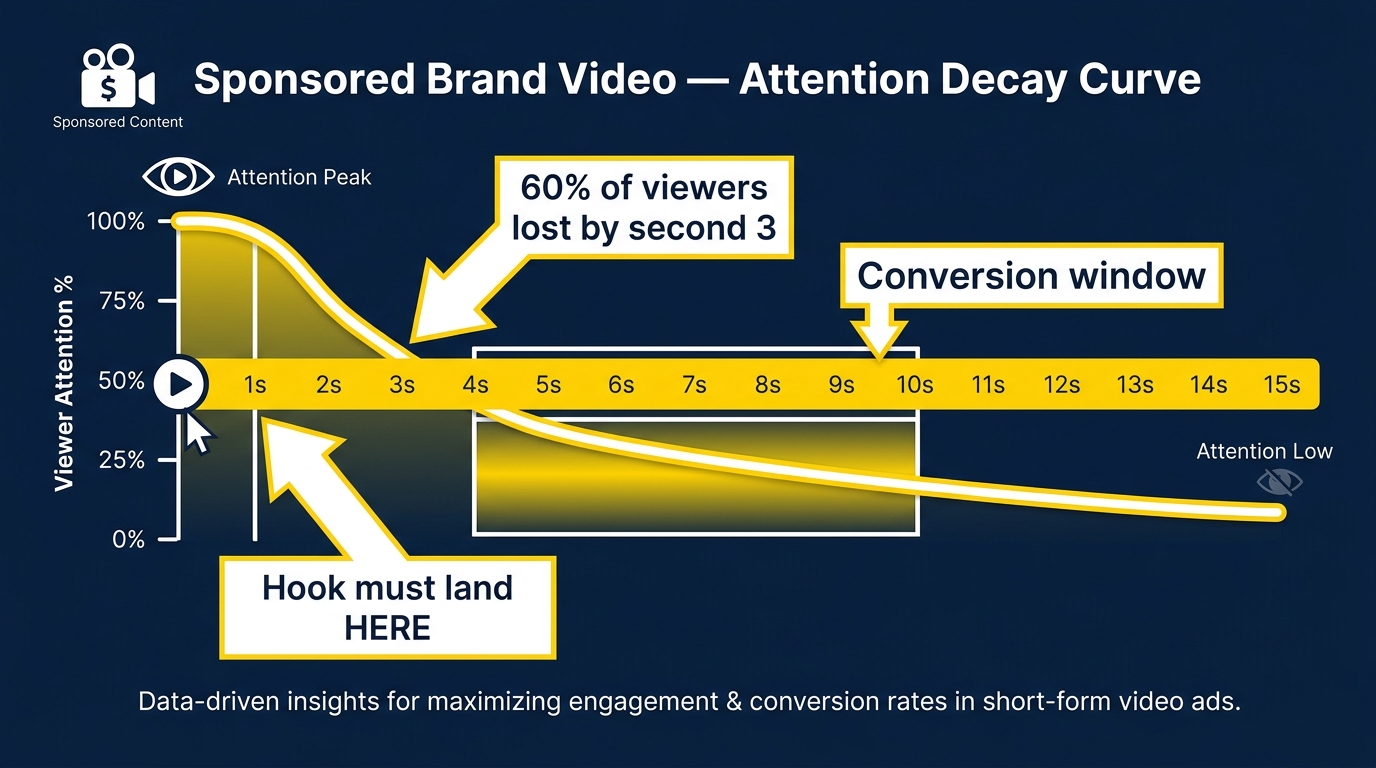
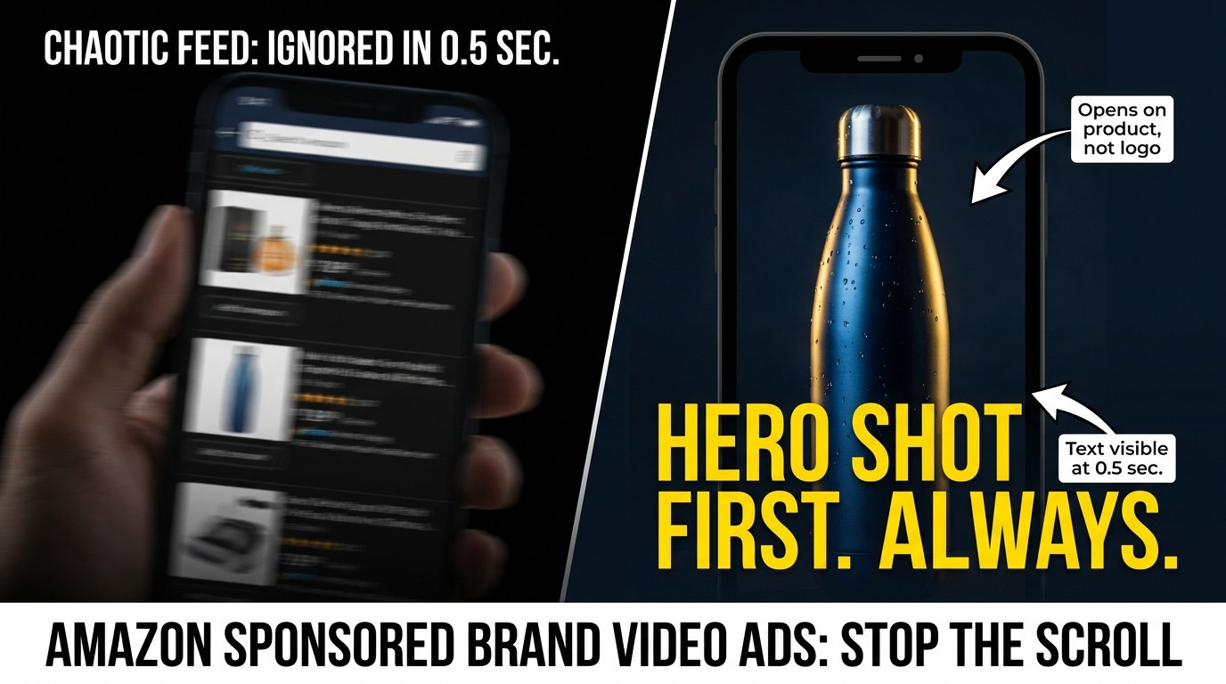
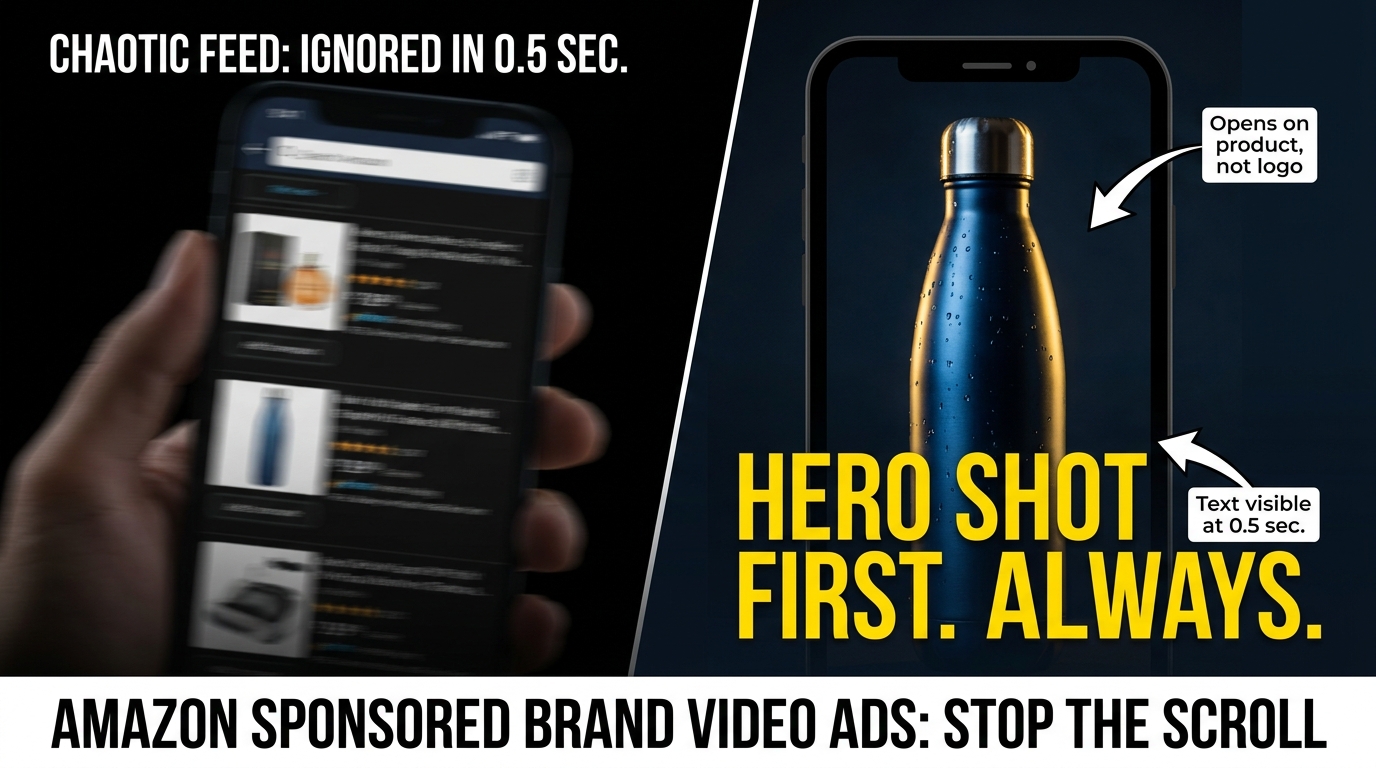
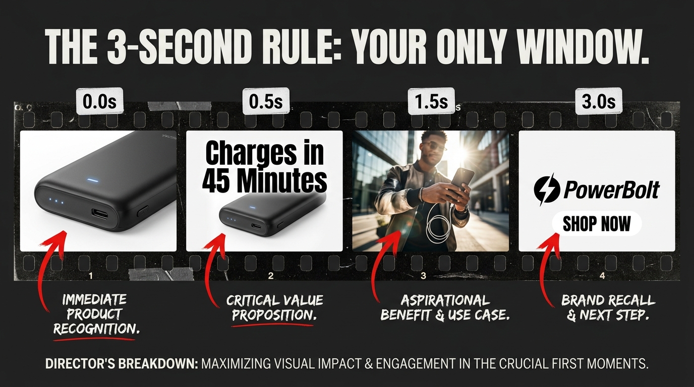
    This means your video must communicate its core message visually within the first 3 seconds — not just audio-visually. On-screen text, bold product close-ups, and motion that signals the product category are non-negotiables. A video that opens with a lifestyle scene, ambient music, and no text overlay is a video that disappears into the background noise of the page. A video that opens with a clear product shot and a one-line text hook earns a tap to unmute and a click.

    The First-3-Seconds Rule in Product Targeting Context

    Amazon’s own research and practitioner data consistently affirm that the first three seconds of an SBV creative determine whether a viewer engages further. In a PDP placement, this is even more stark: the shopper is already mentally engaged with a different product. Your video is an interruption. That interruption needs to be worth their attention immediately — not after a slow intro or a logo reveal.

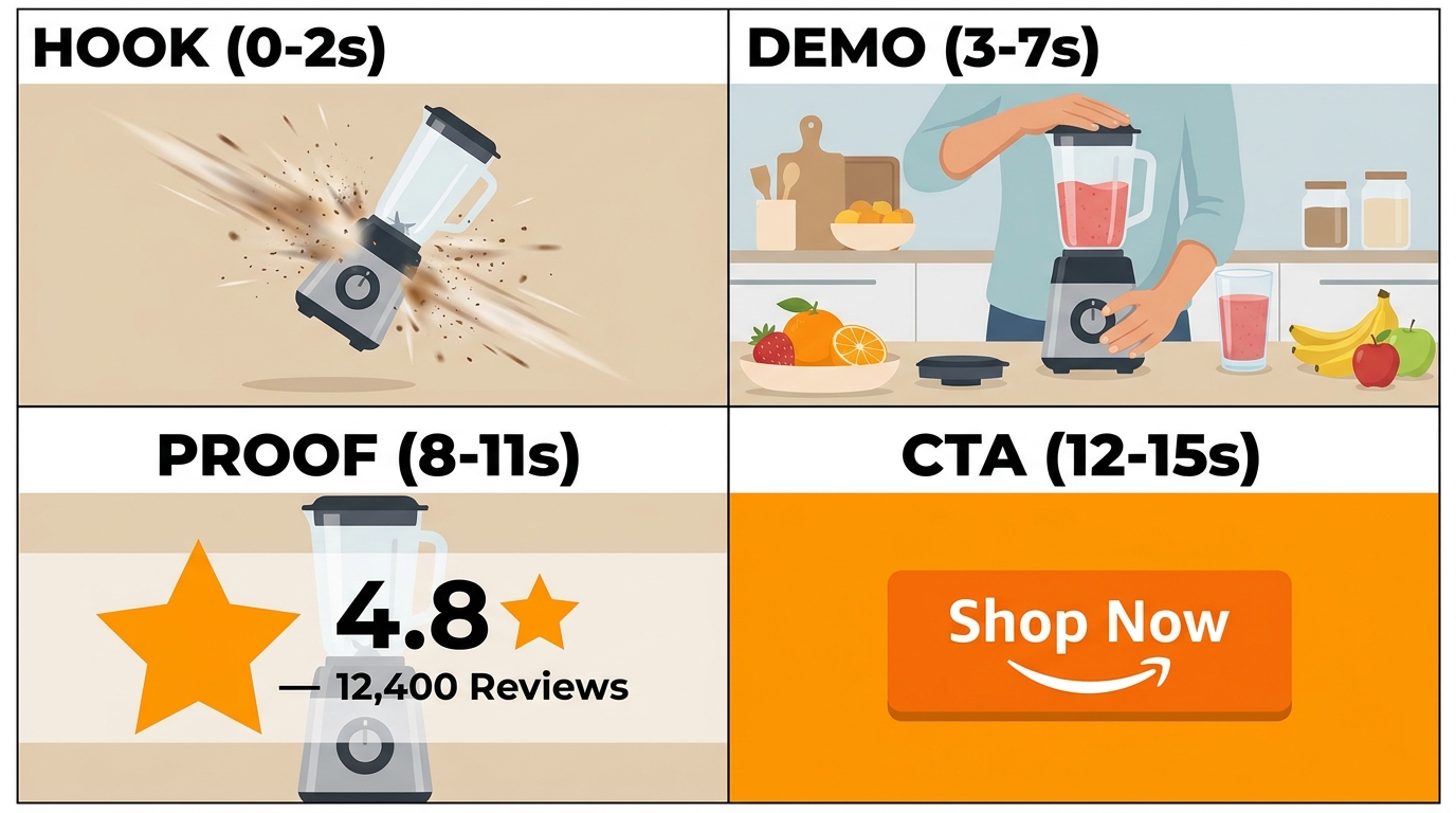
    High-performing product-targeted SBV creatives typically follow this structure:

    • 0–3 seconds: Product clearly visible, bold text overlay with a problem statement or differentiator, no slow zoom or fade-in. The product is the first frame, not the third.
    • 3–8 seconds: Key benefit articulated visually and in text — show the product doing the thing, not a person looking satisfied in an abstract setting.
    • 8–13 seconds: Proof layer — star rating callout, specific feature demonstration, before/after, or a testimonial-style text overlay.
    • 13–15 seconds: Clear call to action. “Shop Now.” “Compare.” “See the difference.” Short, direct, matching the competitive context.

    Why Product Targeting Creative Should Differ From Search Creative

    This is the creative strategy gap most brands don’t close. Advertisers who build one SBV video and run it across both keyword campaigns and product targeting campaigns are treating fundamentally different placement contexts with the same message. Search creative can afford a slightly softer hook because the shopper typed a query that signals intent — you already have some relevance. Product targeting creative has to earn relevance in the first moment because the shopper didn’t ask to see you.

    The most effective approach is to build separate creative variants for each campaign archetype:

    • Defensive creative: Reinforcement-focused. Lead with social proof, key features, reassurance. The shopper is already on your page — the creative job is confirmation, not conquest.
    • Conquesting creative: Comparison-friendly but not aggressive. Lead with your differentiator relative to the type of product you’re appearing on. If you’re conquesting a competitor with poor reviews for durability, open with a product demonstration that speaks directly to that gap.
    • Cross-sell creative: Context-connector. The hook is the pairing, not the product itself. Connect what the shopper is looking at to what you’re showing them, and the relevance does the heavy lifting.

    Amazon’s video production specs allow 6–45 seconds for SBV, with 15–30 seconds consistently recommended as the sweet spot. In product targeting placements, 15 seconds is often sufficient — the creative job is more surgical than in brand awareness contexts.

    Measuring What Actually Matters: NTB Metrics, AMC, and Incrementality

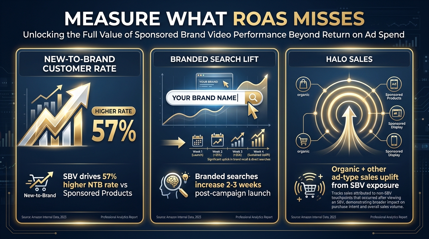
    New-to-Brand NTB measurement framework for Amazon SBV — funnel diagram showing NTB order rate, NTB percentage of sales, and AMC measurement

    The measurement failure in most SBV product targeting accounts is applying keyword campaign metrics to product targeting campaigns. ACOS as a primary success metric is meaningful in search — where the shopper had purchasing intent baked in from the query. In product targeting, where you’re reaching shoppers who were going to buy a competitor’s product moments ago, ACOS as a standalone metric is actively misleading.

    New-to-Brand Metrics: The Right Primary KPI for Conquesting Campaigns

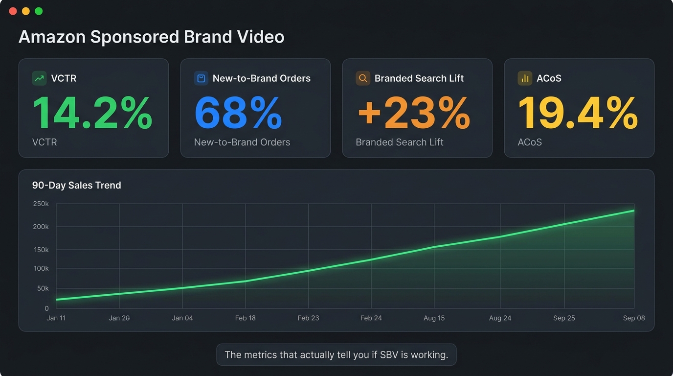
    Amazon makes new-to-brand (NTB) metrics natively available for Sponsored Brands campaigns, including SBV. These metrics report the number of orders from customers who haven’t purchased from your brand in the past 12 months, as well as NTB sales volume and NTB percentage of total orders.

    For conquesting campaigns, NTB rate should be the first metric you look at — not ACOS. A conquesting campaign with a 45% ACOS and a 78% NTB order rate is doing something fundamentally valuable: it’s finding new customers who wouldn’t have discovered your brand otherwise. Evaluated purely on ACOS, that campaign looks inefficient. Evaluated on customer acquisition cost relative to your average customer lifetime value, it may be one of the most profitable campaigns in the account.

    NTB metrics also help you separate genuine acquisition performance from cross-sell noise. If your “conquesting” campaign is actually driving repeat buyers (low NTB rate), it’s not conquesting at all — it’s retargeting existing customers, which means your ASIN selection is off and you’re showing up on listings your own customers are also browsing.

    Amazon Marketing Cloud: The Attribution Intelligence Layer

    Amazon Marketing Cloud (AMC) is the SQL-based data clean room that allows advertisers to run cross-channel attribution queries against impression, click, and conversion data that isn’t available in standard Campaign Manager reports. For SBV product targeting, AMC enables two analysis types that are not possible with native reporting:

    Overlap analysis: AMC can show you what percentage of shoppers who were exposed to your SBV product targeting campaign were also exposed to Sponsored Products or Sponsored Display campaigns targeting the same audiences. If there’s significant overlap, you may be over-spending by reaching the same shoppers multiple times across formats — AMC makes this visible so you can deconflict campaigns or adjust frequency caps.

    Path-to-purchase analysis: AMC can show how SBV product targeting fits into the full customer journey. For many brands, the data reveals that SBV product targeting functions as a mid-funnel touchpoint — shoppers who see a SBV ad on a competitor’s page don’t always convert immediately, but they’re more likely to convert when later exposed to a keyword ad or when they return to the product directly. This path-level view makes SBV’s contribution legible in a way that last-click attribution models completely miss.

    The Incrementality Question

    The hardest question in SBV product targeting measurement is: would these sales have happened anyway? For defensive campaigns targeting your own ASINs, a version of this question is always lurking — if you weren’t running the defensive campaign, how many of those purchases would your competitor have captured?

    Incrementality testing for SBV is possible through geographic holdout structures or Amazon’s own lift study options (available to larger-budget advertisers through managed accounts). But for accounts that don’t have access to formal lift studies, the practical proxy is to monitor your conversion rate on defended ASINs relative to ASINs where you’ve deliberately paused defensive coverage. The delta provides a directional estimate of what the campaign is actually protecting.

    Mining Existing Campaign Data to Build Your Product Target Lists

    One of the most common questions practitioners ask is: where do I get the ASINs to target? The answer is almost always in data you already have — you’re just not looking in the right reports.

    The Sponsored Products Search Term Report

    If you’re running Sponsored Products with product targeting already, your Search Term Report contains a goldmine of ASIN-level data. In product targeting mode, the report shows you which specific ASINs triggered your Sponsored Products ads — including competitor ASINs where your ads appeared, and critically, which ones converted. Start your SBV product target list with the top-converting ASINs from your SP product targeting report. These are validated targets with proven purchase intent correlation.

    Brand Analytics Competitor Data

    Amazon Brand Analytics provides the Market Basket analysis (what items customers buy together) and the search frequency report (which ASINs rank for the same queries your products rank for). The Market Basket data identifies natural cross-sell targets for your cross-sell archetype campaigns. The query-based overlap data identifies which competitor ASINs are fighting for the same search traffic you are — prime conquesting targets.

    Sponsored Display Report Mining

    If you’re running Sponsored Display with product targeting, those campaigns have been collecting conversion data on ASIN-level targets for potentially months. Pull the Targeting Report from your Sponsored Display campaigns and sort by conversion rate and orders. The top performers are high-confidence SBV product targets. You already know they convert — now put a video creative in front of those placements and give the format’s higher CTR a chance to amplify the results.

    Reverse-Engineering Competitors’ Targeting

    One underutilized signal is your own listing’s traffic data. In Seller Central’s traffic reports and Brand Analytics, you can see which search terms are driving shoppers to your PDP. Many of those shoppers are also browsing competitor ASINs that rank for the same terms. Use the overlap between your top traffic-driving terms and the ASINs that rank in the top 5 for those terms to build a conquesting ASIN list anchored to validated, high-intent search queries.

    The Five Most Common SBV Product Targeting Mistakes

    Even well-intentioned advertisers consistently make the same structural errors in SBV product targeting. Recognizing these patterns is often faster than building a new strategy from scratch.

    Mistake 1: One Campaign for All Three Archetypes

    Combining defensive, conquesting, and cross-sell targets in a single campaign makes it impossible to set appropriate bids, measure against the right success metrics, or optimize creative relevance. The campaign performance looks mediocre in aggregate because you’re blending three fundamentally different audience types. The fix: segment into three separate campaigns from the start, even if the initial budgets are small.

    Mistake 2: Applying ACOS Targets That Were Built for Keywords

    Your keyword SBV campaigns are measured against an ACOS target calibrated to search intent conversion rates. Applying that same target to conquesting product targeting campaigns will cause you to pause campaigns that are actually acquiring valuable new customers at a healthy long-term cost. Build separate ACOS benchmarks for each archetype, or shift primary measurement to NTB metrics for conquesting specifically.

    Mistake 3: Static ASIN Lists That Never Get Updated

    Amazon’s competitive landscape shifts continuously. Products get stocked out, prices change, review profiles evolve, new competitors enter the category. A conquesting ASIN list built once and left untouched for six months is likely targeting some ASINs that no longer exist, some that have materially changed, and missing new vulnerabilities that opened up since the list was built. Monthly ASIN list maintenance is not optional — it’s core to making product targeting work at scale.

    Mistake 4: No Segmentation Within Category Targets

    Running a top-level category target with no refinements is essentially broadcasting your ad to every ASIN in the category, regardless of price, rating, or relevance. Amazon’s category targeting refinements — minimum/maximum price, minimum star rating, Prime eligibility — are meaningful filters that should always be applied to narrow category campaigns toward your actual competitive set. An unrefined category target can inflate impression counts while delivering poor efficiency.

    Mistake 5: Using Search-Optimized Creative for PDP Placements

    As covered in the creative section, the video that works in keyword search environments is not the same video that works on a competitor’s product detail page. Running a single creative across both environments means both are underoptimized. Even a simple adjustment — adding product-name text overlay in the first frame and swapping the hook from an awareness message to a comparison message — can meaningfully lift CTR in PDP placements without rebuilding the creative from scratch.

    Building the SBV Product Targeting Engine: A Structural Checklist

    The most effective SBV product targeting programs share a common structural foundation. Here’s the checklist that advanced practitioners use as a baseline before scaling spend:

    Campaign Architecture

    • Separate campaigns for defensive, conquesting, and cross-sell objectives — never mixed
    • ASIN targeting and category targeting in separate campaigns, not mixed in the same ad group
    • Budget allocation weighted toward the archetype with strongest validated performance, not based on assumption
    • Negative ASIN list active from launch, not added as an afterthought

    Targeting Hygiene

    • Conquesting ASIN list sourced from SP Search Term Report, Brand Analytics competitor data, and category ranking overlap
    • Conquesting ASIN list filtered by price parity, rating vulnerability, and category relevance
    • Category refinements applied: minimum rating 4.0+, price band aligned to your competitive tier, Prime eligible
    • Monthly ASIN list review cadence scheduled in advance
    • Negative ASIN list reviewed monthly and updated based on 30-day performance data

    Bid Structure

    • Placement report reviewed after 3–4 weeks of data to understand PDP vs. search performance split
    • Placement modifiers set based on actual conversion rate data, not default assumptions
    • Separate bid tiers for defensive (higher), conquesting (mid-range), and category discovery (lower)

    Measurement Framework

    • NTB order rate tracked as primary KPI for all conquesting campaigns
    • ACOS used as a secondary efficiency guardrail, not the primary go/no-go metric
    • AMC overlap analysis run quarterly to identify cross-format audience duplication
    • Defensive campaigns evaluated by conversion rate protection and observable PDP exit rate signals

    Creative

    • Separate creative variants for PDP placements and search placements where budget allows
    • First 3 seconds: product visible, text overlay present, no silent ambient opener
    • Captions or text overlays that communicate the message fully without audio
    • Creative reviewed and refreshed every 60–90 days to prevent engagement fatigue in high-frequency placements

    Conclusion: Product Targeting Is Where SBV Actually Gets Interesting

    Sponsored Brands Video is frequently discussed as a creative format — a way to stand out in search with motion and sound. That framing is accurate but incomplete. The format’s highest structural potential isn’t in keyword targeting at all. It’s in the product targeting layer, where intent signals are sharper, competitive displacement is direct, and the measurement story can actually reflect the full value of customer acquisition rather than just click-through efficiency.

    The brands that will pull ahead in SBV product targeting over the next 12–18 months aren’t the ones with the biggest video production budgets. They’re the ones that build the architectural discipline first: three campaign archetypes with distinct objectives, ASIN lists that are actively curated, bids calibrated to placement behavior, and measurement frameworks that look at NTB rate and long-term customer value rather than last-click ACOS.

    Most of your competitors are running SBV on keywords. Fewer are running it on products. Almost none have built the full architecture described here. That gap is opportunity — but it’s narrowing as more sophisticated advertisers migrate their budgets toward product targeting inventory in 2026.

    The structural playbook exists. The data infrastructure to execute it is available to most Seller Central accounts. What’s missing, for most, is the deliberate decision to treat product targeting as a first-class citizen of the SBV strategy rather than a secondary checkbox on the campaign setup screen.

    Start with one archetype — defensive is usually the lowest-risk entry point — build the measurement framework before you scale, and let data drive your ASIN list evolution from there. The architecture described above scales cleanly from a few hundred dollars a month to six-figure monthly budgets. The structural decisions made early determine how cleanly it scales later.

  • Coinbase for Agents: What It Actually Does to Fintech Automation (And What It Doesn’t)

    Coinbase for Agents: What It Actually Does to Fintech Automation (And What It Doesn’t)

    AI agent at a crypto trading terminal with USDC wallet and Base blockchain network — the non-human customer has arrived

    For most of fintech’s history, the question at the center of every product decision has been the same: what does the human want? Payment flows, KYC frameworks, API rate limits, spending controls — all of it was engineered around a human at one end of the transaction, even when that human was buried five layers deep inside an automated workflow.

    That assumption is cracking. Not theoretically — in production, right now, in 2026.

    Coinbase’s “Coinbase for Agents” infrastructure, built on top of the CDP (Coinbase Developer Platform) AgentKit, has done something more structurally significant than launching another crypto product. It has begun treating the AI agent as the primary financial actor — an entity that holds a wallet, initiates payments, executes trades, subscribes to data services, and settles obligations with stablecoins, all without a human clicking “confirm.”

    This is not the same conversation as “AI in fintech.” Robo-advisors, fraud detection models, and underwriting algorithms have used AI inside fintech systems for years. What Coinbase for Agents represents is different: giving the AI itself financial agency. The model doesn’t just recommend — it transacts.

    The implications for anyone building or operating fintech infrastructure in 2026 are difficult to overstate. But so are the gaps, the risks, and the parts of the story that aren’t making it into the press releases. This article covers all of them — the actual architecture, the real use cases, the meaningful differences from traditional fintech automation, and the compliance questions that will define whether this technology scales or stalls.

    What “Coinbase for Agents” Actually Is — And What the Headlines Miss

    The phrase “Coinbase for Agents” has been used loosely enough that it’s worth pinning down precisely. It refers to a suite of Coinbase Developer Platform (CDP) products designed specifically for AI agents as the primary user type — not a human-facing product that agents can optionally access, but infrastructure architected from the ground up around non-human financial actors.

    The core components are:

    • CDP AgentKit — The developer SDK that gives AI agents secure wallet management and onchain action capabilities. AgentKit is model-agnostic (works with LangChain, Eliza, Vercel AI SDK, and others), framework-flexible, and supports EVM-compatible networks plus Solana.
    • Agentic Wallets — Programmable crypto wallets purpose-built for non-human actors, with configurable spending limits, policy-based controls, and multi-network support across Base, Ethereum, and Solana.
    • x402 Payment Protocol — An HTTP-native stablecoin micropayment standard built on the long-dormant HTTP 402 “Payment Required” status code, enabling instant pay-per-request transactions between agents and APIs.
    • MCP Integration — Native compatibility with Anthropic’s Model Context Protocol (MCP), allowing Claude, ChatGPT, and other models to connect to CDP tooling as external actions within their agent stacks.
    • Agentic Trading — A consumer-facing product launched in 2026 that allows AI agents connected to Coinbase accounts to autonomously execute crypto trades and pay for premium market data on behalf of users.

    What the headlines tend to flatten is the distinction between these layers. Some coverage treats AgentKit as the whole story. Others focus on Agentic Trading as a consumer curiosity. The more consequential angle — and the one relevant to enterprise and developer teams — is how these components compose into a full financial automation stack for software agents that previously had no native way to hold or move money.

    The Shift from API Access to Financial Agency

    Traditional fintech APIs let software systems query balances, initiate transfers, and read transaction histories — but always on behalf of a verified human account holder. The software is the messenger; the human is the principal. Coinbase for Agents inverts this by making the agent itself the account holder. It can own assets, execute value transfers, pay for services it needs, and settle obligations with counterparties — all without routing every action through a human-owned account.

    That architectural distinction matters enormously for what kinds of automation become possible. An AI agent that needs to pay a data API for each query, tip a content creator for a used asset, or split a payment across multiple counterparts after completing a task — none of that works smoothly on traditional banking rails. All of it is native to the Coinbase for Agents stack.

    AgentKit: The Technical Layer That Makes It Work

    Coinbase AgentKit technical architecture diagram connecting AI models to blockchain networks via CDP

    AgentKit is the foundational SDK sitting underneath everything else. Built on the Coinbase Developer Platform SDK, it provides four core capabilities that collectively answer the question: how does an AI agent actually interact with financial infrastructure?

    Secure Wallet Management

    AgentKit allows AI agents to create and manage crypto wallets without requiring a human account to serve as the parent entity. Each agent wallet is isolated, with its own keys managed through CDP’s infrastructure. The critical design choice here is that wallet creation is programmatic — an orchestration system can spin up purpose-specific wallets for individual agent tasks and tear them down afterward, rather than using a single shared wallet that creates both security and accounting headaches.

    This matters practically. A research agent that needs to pay per API call, a trading agent managing a portfolio, and a yield agent seeking DeFi returns can each operate from separate wallets with separate spending limits and separate audit trails. The financial footprint of each agent task is cleanly separable — which is the prerequisite for any serious internal governance model.

    Onchain Action Library

    AgentKit ships with a library of predefined onchain actions: token transfers, swaps, smart contract deployments, NFT interactions, DeFi protocol integrations, and custom contract calls. These actions are exposed as callable tools that any connected AI framework can use. When a LangChain agent or a Claude MCP server requests an onchain action, AgentKit handles the transaction construction, gas estimation, signing, and broadcast — abstracting the blockchain complexity entirely away from the agent logic above it.

    The extensibility here is significant. Teams can add custom actions by extending the base toolkit, which means proprietary DeFi integrations, company-specific smart contract interactions, or industry-specific financial primitives can be wrapped and made available as first-class agent capabilities alongside the out-of-box ones.

    Multi-Network and Framework Agnosticism

    AgentKit’s deliberate neutrality on both the model side and the network side reflects a considered design philosophy. On the AI side, the toolkit doesn’t care whether the agent is powered by Claude, GPT-4o, Gemini, or an open-source model — it exposes a standard interface that any framework can consume. On the blockchain side, it supports any EVM-compatible network plus Solana, which in practice means Base (Coinbase’s own L2), Ethereum mainnet, and the growing ecosystem of EVM chains.

    The Base network preference isn’t just branding. Base offers transaction finality in roughly two seconds and fees typically measured in fractions of a cent — both of which matter materially for the kind of high-frequency, low-value transactions that characterize agent micropayment patterns.

    MCP Connectivity

    The integration with Anthropic’s Model Context Protocol is where AgentKit connects to the broader ecosystem of AI tooling. With MCP, Claude-based agents can treat CDP capabilities as externally-accessed tools — meaning a Claude agent can trigger an onchain payment, check a wallet balance, or execute a swap through the same tool-calling interface it uses for web search or code execution. More than 10,000 public MCP servers are now active in the ecosystem, and 75+ Claude connectors have been built on the protocol, which makes MCP compatibility a serious distribution lever for any infrastructure provider.

    x402: The Protocol That Wants to Replace API Keys

    x402 payment protocol comparison: old API payment friction vs instant stablecoin micropayments — 75.41M transactions in 30 days

    The HTTP status code 402 has technically existed since 1991. It was defined in the original HTTP specification as “Payment Required” and was immediately reserved for future use — future use that never arrived, because the internet had no native mechanism for machines to actually pay for things programmatically. That reserved status code sat dormant for over three decades.

    x402 finally activates it.

    How the Protocol Actually Works

    The flow is architecturally simple, which is precisely why it’s significant. An AI agent makes an HTTP request to a resource or API. If payment is required, the server returns a 402 status code along with a payment manifest detailing the price, accepted currencies, and supported blockchain networks. The client — which in this context is the AI agent’s wallet infrastructure — reads the manifest, executes the stablecoin payment onchain, and retries the original request with a payment proof header. The server verifies the proof and grants access.

    The entire cycle happens in seconds. No account creation. No KYC. No API key provisioning. No subscription management. No waiting for a billing cycle. The agent pays for exactly what it uses, precisely when it uses it, and the payment is settled on-chain with cryptographic proof attached to every request.

    The Numbers Behind Early Adoption

    x402 has crossed thresholds that move it from prototype to measurable infrastructure. In a recent 30-day window, the protocol processed 75.41 million transactions with $24.24 million in volume across approximately 94,000 buyers and 22,000 sellers. Those figures tell a specific story: the transaction count vastly exceeds what you’d expect from human-initiated micropayments. The volume is being driven by agent-scale request patterns — high frequency, low individual value, continuous operation.

    What’s particularly notable is the buyer-to-seller ratio. Roughly four buyers per seller suggests a market structure where a relatively small number of API providers and data sources are being accessed by a much larger, rapidly growing population of agents. That ratio will likely invert or flatten as more sellers integrate the protocol, but the early shape indicates real demand-side pull.

    x402 vs. Traditional API Monetization

    The traditional API economy runs on a model that was designed for human developers: create an account, submit to terms of service, add a payment method, purchase a subscription tier or credit bundle, receive an API key, rotate that key periodically for security, and manage billing at the end of each cycle. Every step in that process assumes a human making deliberate decisions.

    For an AI agent operating autonomously — discovering APIs dynamically, needing to pay per request based on actual usage, potentially interacting with thousands of different services — that model creates enormous friction. x402 collapses that friction to a single atomic transaction that happens inline with the request itself. The agent’s wallet pays; the API serves. No human has to provision credentials, manage subscriptions, or reconcile billing in between.

    This is not a marginal improvement. It’s a different category of interaction that makes whole classes of agent behavior economically viable that previously weren’t — including real-time data access, specialized compute purchases, and agent-to-agent service markets.

    The USDC-First Architecture: Why Stablecoins, Why Now

    Every component of the Coinbase for Agents stack settles primarily in USDC — Coinbase’s co-issued US dollar stablecoin — with execution typically happening on the Base L2 network. This is not the only technically possible design, but it’s a deliberate strategic choice with real operational logic behind it.

    Why Not Volatile Crypto

    An AI agent making autonomous payments cannot dynamically adjust its behavior to account for an asset that might be worth 30% less by the time a transaction settles. The moment you introduce price volatility into a programmatic payment flow, you create a class of problems — miscalculated budgets, unexpected losses, broken accounting logic — that defeat much of the purpose of automation. USDC’s peg to the US dollar eliminates this variable. The agent that approves a $0.003 per-request payment is paying $0.003, not $0.003 ± market conditions.

    Why Not Traditional Fiat

    The alternative — routing autonomous agent payments through traditional fiat rails — runs into a different set of problems. ACH transfers settle in one to three business days and require the originating account to be linked to a verified banking relationship. Wire transfers are faster but expensive and still require human-associated accounts. Card transactions involve interchange fees, chargeback risk, and card network rules that weren’t written with autonomous software actors in mind.

    USDC on Base settles in approximately two seconds with fees often below one cent. For micropayments at agent scale — potentially millions of transactions per day — the economics of traditional fiat rails are simply not viable.

    Programmable Spending Controls

    One of the quieter but more important features of the Agentic Wallet infrastructure is the ability to define programmable spending policies. Rather than giving an agent unrestricted access to a wallet, operators can configure per-transaction limits, daily caps, allowlisted counterparty addresses, and approval requirements for transactions above certain thresholds.

    This is the feature that bridges the gap between what autonomous agents can theoretically do and what enterprise risk management will actually allow in production. An agent with an uncapped, unconstrained wallet is an obvious liability. An agent with a $50 daily spend limit that can only transact with pre-approved counterparties is a much more manageable operational unit — even if it’s still fundamentally autonomous.

    Real-World Use Cases Already Running in 2026

    Beyond the architectural framing, a set of concrete use patterns has emerged in the market. Some are developer-scale experiments; others are at production volume. Understanding which is which matters for teams evaluating where to invest attention.

    Pay-Per-Request Data and Compute Access

    The most mature use case is agent-driven API payments via x402. Research agents, trading agents, and data analysis pipelines are using the protocol to access premium data sources on a per-query basis — paying for satellite imagery, financial data feeds, market microstructure data, and AI inference endpoints without pre-purchasing subscription access. The economic advantage is real: agents pay only for what they use, and data providers receive payment atomically rather than managing billing relationships.

    Gaming and Digital Asset Economies

    The clearest production-scale case study in the Coinbase ecosystem is Blocklords Dynasty, a web3 game using CDP’s Paymaster to enable gasless onboarding. The numbers are publicly available: 1.2 million-plus wallets supported, 50 million-plus in-game transactions, and 250,000-plus daily active users — all without requiring players to manually manage wallet operations. This case demonstrates something important: agent-style wallet infrastructure works at scale when the complexity is appropriately abstracted away from the end user.

    FereAI and Autonomous Trading Research

    FereAI, highlighted in Coinbase’s developer case study materials, demonstrates the agentic trading research pattern: an AI agent that monitors market conditions, accesses premium data (paying via stablecoin micropayments), performs analysis, and executes trades within configured parameters — all autonomously. The agent acquires what it needs to operate as it needs it, rather than requiring a human to pre-provision all its resources.

    Autonomous Treasury Management

    An emerging enterprise pattern is treasury agents that autonomously manage onchain liquidity — moving idle balances into yield-generating DeFi positions, rebalancing allocations based on rate changes, and executing internal transfers between business units. These agents operate within pre-approved policy parameters and generate complete audit trails through the immutability of onchain records. The appeal for finance teams is obvious: yield optimization that runs continuously without requiring round-the-clock human oversight.

    Agent-to-Agent Service Markets

    The most forward-looking pattern is one where AI agents sell services to other AI agents — a research agent contracting a computation agent for processing power, or a data-cleaning agent billing a downstream pipeline agent for its output. x402 makes this technically feasible with no intermediary infrastructure required. Whether this pattern reaches meaningful scale in 2026 or 2027 remains to be seen, but the protocol-level groundwork is in place.

    How Coinbase for Agents Differs from Traditional Fintech Automation APIs

    Comparison chart: Coinbase AgentKit vs traditional fintech automation APIs across settlement rail, speed, KYC requirements, and programmability

    There’s a temptation to frame Coinbase for Agents as the next evolution of traditional fintech automation APIs — as though Plaid, Stripe Treasury, or banking-as-a-service platforms are simply being superseded. That framing gets it wrong. These are different tools designed for different problems, and understanding the distinction is essential for making intelligent build-vs-integrate decisions.

    The Rail Difference

    Traditional fintech automation APIs — whether from Plaid, Stripe, Marqeta, or direct bank API programs — operate on fiat rails: ACH, wire transfer, card networks, and emerging real-time payment systems like RTP and FedNow. These rails are deeply integrated with the regulated banking system, which means they carry both the protections and the constraints of that system: FDIC insurance, Regulation E consumer protections, established chargebacks, and institutional counterparty trust.

    Coinbase for Agents operates primarily on crypto rails — Base blockchain, Ethereum, Solana — settled in USDC. The assets are not FDIC-insured. There are no chargebacks. The transaction finality is cryptographic rather than institutional. These aren’t necessarily disadvantages, but they are fundamentally different risk and trust characteristics that any responsible deployment needs to account for.

    The Identity Difference

    Every traditional fintech API assumes a verified identity at some layer of the stack. Plaid links to a real bank account belonging to a real, KYC’d person. Stripe processes payments on behalf of a registered business. Even banking-as-a-service platforms that abstract the bank relationship still require identity verification at onboarding.

    Coinbase for Agents — particularly through x402 — explicitly removes the identity requirement for transacting. An agent can pay for and receive API access with no account creation, no identity documents, and no human name attached to the transaction. This is enormously useful for agent scalability and removes significant operational friction. It also creates a meaningful accountability gap that has regulatory implications discussed in the next section.

    The Programmability Difference

    Traditional fintech automation allows programmability within defined parameters set by banking partners and card networks. You can automate transfers, trigger conditional payments, and build rules-based workflows — but the programmability ceiling is set by the banking institution or payment network’s API contract, not by what you technically want to do.

    AgentKit allows substantially deeper programmability: arbitrary smart contract interactions, custom DeFi strategy execution, agent-defined payment splits, and new token mechanics that have no analog in the traditional payments world. The ceiling is much higher. So is the surface area for things going wrong in novel ways.

    Where They Complement Rather Than Compete

    The most pragmatic framing is that these two approaches handle different parts of the automation stack well. Traditional fintech APIs remain the right tool for fiat-denominated transactions, regulated financial products, consumer-facing banking experiences, and any workflow that requires the trust infrastructure of the traditional banking system. Coinbase for Agents is the right tool for crypto-native value transfer, agent-to-agent micropayments, programmable onchain treasury management, and any workflow where the agent itself needs to be the financial principal rather than a proxy for a human account.

    Many real-world deployments in 2026 will use both — a traditional banking API for fiat settlement with counterparties, and AgentKit for the internal agent economy that manages and moves the crypto-denominated portion of a treasury or operational budget.

    The Multi-Agent Stack: Orchestration, Delegation, and DeFi

    Multi-agent financial automation system with orchestrator agent delegating to payment, yield, trading, and reporting sub-agents

    Single-agent deployments are the entry point, but the architectural direction clearly points toward multi-agent systems — hierarchical networks of specialized agents where financial authority is delegated, not concentrated.

    The Orchestrator-Executor Model

    The pattern that’s emerging in more sophisticated deployments looks like this: an orchestrator agent at the top of the hierarchy receives a high-level objective (optimize treasury yield while maintaining $X in liquid reserves), breaks it into sub-tasks, and delegates those sub-tasks to specialized executor agents, each of which has its own wallet with spending limits appropriate to its function.

    A payment executor handles disbursements to vendors and counterparties. A yield executor manages DeFi positions. A trading executor handles market operations within a risk-bounded policy. A reporting executor writes audit records and generates human-readable summaries for oversight review. None of these agents can operate outside their defined scope — the programmable wallet policies enforce that constraint at the infrastructure level, not just in application code.

    This architecture matters because it mirrors the way enterprise finance teams already think about role separation and controls. A treasury analyst doesn’t have the same authorization as a CFO. The same principle applies to agent hierarchies, and AgentKit’s programmable wallet policies make it technically enforceable rather than just a policy document.

    DeFi Integration: Yield and Liquidity Automation

    One of the more practically significant use cases emerging from the multi-agent pattern is automated DeFi yield management for corporate treasuries. Enterprises with crypto-denominated reserves — or those choosing to hold stablecoin working capital — can deploy agents that continuously seek yield across approved DeFi protocols, adjusting positions based on rate changes, liquidity depth, and counterparty risk scores.

    This is not theoretical. The DeFi yield automation pattern is already visible in sophisticated crypto-native organizations and is migrating toward more traditional enterprise contexts as the tooling matures. The key difference from human-managed DeFi positions is continuous operation: an agent doesn’t sleep, doesn’t take weekends off, and doesn’t miss a yield opportunity because someone was in a meeting. The value proposition is the same as any treasury automation, amplified by the 24/7 nature of onchain markets.

    Agent-to-Agent Delegation and Trust

    Multi-agent systems introduce a new class of trust question that doesn’t exist in single-agent deployments: when Agent A delegates a financial task to Agent B, how does the infrastructure verify that Agent B’s actions are actually within the scope of that delegation, and not a compromised or misbehaving agent acting outside its authority?

    This is an active area of development in the CDP ecosystem. Onchain delegation records — where the authorization scope of each agent is written to the blockchain as an immutable artifact — represent one architectural answer. Spending policy enforcement at the wallet level, independent of the agent’s own code, represents another layer of protection. But the full trust architecture for complex multi-agent financial systems is still being worked out in the field.

    The Compliance and Risk Problem Nobody Is Talking About Loudly Enough

    The compliance gap in autonomous AI agent payments — regulatory risk, sanctions screening, spending limits, and accountability void

    Every honest analysis of Coinbase for Agents has to spend serious time here, because the compliance and risk profile of autonomous agent payments is genuinely unresolved — and the people who will be most affected are the enterprises and developers building on top of this infrastructure, not the infrastructure providers themselves.

    The Accountability Gap

    Traditional financial regulation is built on a foundational assumption: there is always a human legal entity responsible for every financial transaction. The KYC/AML framework exists to verify who that entity is and to ensure they’re not on a sanctions list. When an AI agent transacts autonomously, with no human identity attached to the transaction at the point of execution, the accountability question becomes genuinely unclear.

    Coinbase’s position is that the human or business that configures and deploys the agent is the legally responsible party, and that the programmable spending limits and pre-approved counterparty lists represent the controls that make this manageable. That’s a reasonable position, but it hasn’t been tested at scale by regulators yet. Financial institutions with existing BSA/AML obligations who are considering deploying agent payment infrastructure need to get clear answers from compliance counsel before going live — not after a regulator raises a question.

    Sanctions Screening at Agent Speed

    OFAC sanctions screening is a standard requirement for financial institutions transacting in US dollars. For human-initiated transactions, screening a counterparty before transaction execution is straightforward — there’s a human in the loop who can pause while the check runs. For an autonomous agent executing high-frequency transactions at machine speed, real-time sanctions screening needs to be embedded at the wallet infrastructure level, not as an afterthought in application code.

    Coinbase says it incorporates screening on agentic wallets, and programmable allowlists of counterparty addresses provide a structural control. But the granularity and coverage of that screening — particularly for complex DeFi interactions where funds flow through multiple smart contracts before reaching their destination — is a live risk management question that hasn’t been fully answered publicly.

    Unauthorized Overspending and Agent Drift

    Programmable spending limits are necessary but not sufficient. A limit of $100 per day prevents catastrophic loss on a single runaway agent, but it doesn’t prevent a systematically misconfigured agent from spending its full daily limit on unintended transactions every single day. The combination of spending limits, counterparty allowlists, and transaction-purpose logging is the minimum viable control set — but organizations need to think carefully about how they’ll detect and respond to agent behavior that’s “within limits” but wrong in direction.

    Agent observability — real-time visibility into what each agent is doing, what it’s paying for, and whether that aligns with its intended purpose — is not a feature that comes out of the box. It requires deliberate instrumentation, and for financial applications, it should be treated with the same rigor as any financial system audit capability.

    Smart Contract Risk

    For agents interacting with DeFi protocols, smart contract risk is a distinct category from operational risk. A bug in a DeFi protocol’s smart contract can result in loss of funds with no recourse — there’s no FDIC insurance, no chargebacks, no dispute resolution mechanism. Enterprises considering DeFi integration through AgentKit need explicit policies on approved protocols, smart contract audit requirements, and maximum exposure limits per protocol — again, independent of spending limit policies that only address the amount spent, not where it’s spent.

    What Enterprise Finance and Engineering Teams Should Actually Do Right Now

    Given everything above — the genuine capability, the real limitations, and the open compliance questions — what’s the actionable path forward for organizations evaluating Coinbase for Agents in 2026?

    Start with a Contained, Observable Use Case

    The highest-confidence first deployment is one where: the agent’s financial scope is small and well-defined; the counterparties it transacts with are pre-approved and limited; the transaction volume is low enough to monitor manually at first; and the value at stake from a mistake is below a threshold that would be materially damaging. Pay-per-API-call for a single internal research pipeline, or automated micropayments for a developer tooling workflow, fit this profile well.

    Starting with autonomous treasury management or open-ended trading agents is not the right initial move, regardless of how compelling the use case appears on paper. The compliance groundwork, the monitoring infrastructure, and the organizational understanding of how agent financial behavior works all need to be established before scale.

    Build Observability Before You Build Features

    Before any agent wallet goes live with real funds, the organization needs the ability to see every transaction that agent executes in near-real-time, with enough context to understand why the transaction happened and whether it aligned with the agent’s intended purpose. Onchain records provide an audit trail, but they don’t provide intent context — that has to be logged at the application layer and linked to the transaction IDs.

    This is non-negotiable for financial applications. The regulator who asks “why did your agent pay this counterparty on this date?” needs to get an answer, and “the AI decided to” is not a compliant response.

    Engage Compliance Counsel on the Identity Question

    The identity gap in x402 and agent wallet transactions is the most significant open regulatory question in this space. Organizations operating in regulated industries — banking, lending, insurance, securities — need to get clear legal guidance on how autonomous agent transactions interact with their existing BSA/AML obligations before deploying at any meaningful scale. The answer may be “you need to layer additional screening on top of what the infrastructure provides” or “you need to ensure the human principal’s identity is verifiably associated with each agent wallet.” Get that guidance in writing, then build accordingly.

    Use Programmable Policies as a First-Line Control, Not a Last Resort

    Spending limits, counterparty allowlists, and time-based transaction caps should be configured before any agent wallet is funded, not added reactively after an incident. Treat the programmable policy layer as a first-class engineering deliverable with its own review and approval process — not as a setting to configure quickly before launch.

    Track the Regulatory Direction

    The regulatory environment for autonomous agent payments is in genuine flux in 2026. The CFTC has issued guidance on AI in derivatives markets. The OCC has published letters on crypto asset activities in national banks. The EU’s Markets in Crypto Assets Regulation (MiCA) creates a distinct compliance surface for European deployments. None of these frameworks fully address autonomous agent payments yet — they’re all evolving to catch up with the technology. Organizations need a process for tracking this evolution and updating their internal policies when the external requirements crystallize.

    The Bigger Picture: What This Means for Fintech Architecture in 2026 and Beyond

    Coinbase for Agents is not arriving in isolation. It’s part of a broader structural shift in how software systems relate to financial infrastructure — one that will take years to fully settle but whose direction is now clear enough to plan around.

    The Agentic AI Market Trajectory

    The agentic AI market was valued at approximately $5.25 billion in 2024 and is projected to reach $199 billion by 2034 at a compound annual growth rate of roughly 36%. McKinsey has projected $3–5 trillion in global agentic commerce volume by 2030. Even discounted heavily for typical market projection optimism, the trajectory suggests that the financial infrastructure supporting autonomous agents is going to become a substantial category — not a niche.

    The question for organizations isn’t whether agentic payments will become significant, but whether their financial infrastructure will be positioned to support them when they need to. Building familiarity now, with small and contained use cases, is substantially cheaper than trying to retrofit agentic payment capabilities into systems designed entirely around human-initiated transactions after the market has moved.

    The New Financial User Type

    Perhaps the most useful mental model for understanding what Coinbase for Agents actually changes is this: financial infrastructure has historically had two user types — consumers and businesses. Both are human legal entities. Coinbase for Agents introduces a third user type: the software agent, which is not a human, not a business in the traditional legal sense, but is nonetheless initiating and completing financial transactions at scale.

    That new user type requires new infrastructure (programmable wallets, agent-native payment protocols), new compliance frameworks (accountability models for non-human actors, real-time screening at machine speed), and new governance thinking (how organizations maintain meaningful oversight of agents that may be executing thousands of transactions per day). None of that is fully built yet. But Coinbase for Agents is the first serious attempt to lay the rails.

    Who Builds the Guardrails?

    The important question that 2026 leaves partially unanswered is: who is responsible for the governance layer that sits between raw agent capability and responsible financial operation? Coinbase provides the infrastructure; the programmable policy layer offers some controls. But the organizational governance, the compliance workflows, the incident response playbooks for runaway agents, and the regulatory engagement — those responsibilities fall squarely on the organizations deploying the technology.

    This is identical to the dynamic that played out with cloud infrastructure a decade ago. AWS could offer security groups and IAM roles, but organizations that got breached because they misconfigured those controls couldn’t point to Amazon as the responsible party. The same principle will apply here. Infrastructure providers are building the rails. Operators are responsible for what runs on them.

    Conclusion: The Machine as Financial Principal

    Coinbase for Agents — AgentKit, x402, Agentic Wallets, and the broader CDP stack — represents a coherent answer to a question that fintech has been quietly circling for years: when AI agents become capable of executing complex, multi-step tasks autonomously, how do they handle the parts of those tasks that require money to change hands?

    The answer Coinbase has built is not a graft of crypto capability onto existing financial infrastructure. It’s a purpose-built financial stack for non-human actors — one that treats programmability, speed, auditability, and minimal human dependency as first-order design requirements rather than features to add later.

    The x402 protocol’s 75.41 million transactions in 30 days suggest this isn’t a paper architecture. The Blocklords deployment at 50 million-plus onchain transactions demonstrates that agent wallet infrastructure works under real load. The FereAI case study shows autonomous trading and research agents operating productively within defined parameters. The momentum is real.

    But the compliance questions are equally real, and they haven’t been resolved by the technology. The accountability gap for autonomous agent transactions, the sanctions screening requirements at machine speed, the smart contract risk in DeFi integrations, and the regulatory frameworks that are still playing catch-up — these are not edge cases to be handled later. They are the conditions of responsible deployment, and organizations that skip this work will encounter it in a less comfortable context.

    The machine is now a customer. The infrastructure for that reality is being built faster than the governance frameworks that need to surround it. The organizations that get this right in 2026 will have a meaningful advantage when the governance catches up — because they’ll have already built the habits, the observability, and the risk management discipline that compliant deployment requires.

    The non-human customer has arrived. The question is whether your financial infrastructure is ready to serve it responsibly.

    Key Takeaways for Practitioners

    • Coinbase for Agents (CDP AgentKit + x402 + Agentic Wallets) creates a full financial stack for AI agents as first-class financial principals — not just as interfaces for human accounts.
    • x402 has already processed 75.41M transactions in a 30-day window, confirming real production momentum beyond developer experiments.
    • USDC on Base provides the settlement layer: ~2-second finality, sub-cent fees, and price stability without the volatility of unpegged crypto assets.
    • The compliance accountability gap — who is legally responsible when an autonomous agent transacts? — is the most important unresolved question for enterprise deployment in 2026.
    • Traditional fintech APIs and Coinbase for Agents are complementary, not competing: fiat rails remain appropriate for most consumer and institutional fiat flows; agent-native rails handle the autonomous, crypto-settled portion of the stack.
    • Start with a contained, observable use case with pre-approved counterparties and low financial exposure before moving to treasury automation or open-ended trading agents.
    • Build observability infrastructure before building features — every agent transaction needs enough logged context to reconstruct why it happened.
  • How To Build an AI Newsroom Triage Stack

    How To Build an AI Newsroom Triage Stack

    The AI Newsroom Triage Stack — a modern newsroom control room with live data streams, wire feed dashboards, and the AI pipeline layers displayed on multiple monitors.

    Every newsroom has the same problem. It just has different names for it. Some call it “the firehose.” Others call it “the noise problem.” Beat reporters call it “the reason I missed that story.” Editors call it “Thursday.” The fundamental challenge is this: the volume of incoming information that could be newsworthy is growing faster than any team’s capacity to evaluate it manually — and that gap is now large enough to constitute an existential operational risk for many organizations.

    In 2026, a mid-size regional newsroom monitors anywhere from dozens to hundreds of wire feeds, social media streams, government data sources, press release wires, tip lines, and reader submissions simultaneously. A wire service like AP or Reuters processes thousands of items per day. A newsroom running social listening tools is ingesting signals from platforms generating hundreds of millions of posts per hour. The math is unworkable if the only filtering mechanism is a human sitting at a desk hitting refresh.

    AI offers a way out — but not the way most newsrooms initially imagine. The instinct is to reach for a chatbot or an automated writer. The actual need is for a triage stack: a layered system that sits between the raw information flood and the editorial team, separating signal from noise, scoring urgency and relevance, routing items to the right people, and flagging anything that needs human verification before it moves further. Building it well is an operational engineering challenge as much as it is an editorial one.

    This guide is for the newsrooms — and the editors, heads of product, and engineering leads inside them — who have moved past “should we use AI?” and landed on the harder question: “How do we architect this properly so it actually works at production speed without burning trust or missing the story that matters?”

    We’re going layer by layer.

    The Triage Problem Nobody Puts Numbers On

    Before designing a solution, it helps to be precise about the actual problem — which most newsrooms aren’t. “There’s too much to keep up with” is not an operational specification. It’s a feeling. And building infrastructure around feelings produces architectures that feel good but don’t solve the right problem.

    The triage problem in a modern newsroom has at least four distinct dimensions that each require different technical responses.

    Volume: The Raw Intake Problem

    Dataminr, one of the most widely deployed signal-detection platforms in journalism, ingests data from over one million public real-time sources and processes approximately 43 terabytes of raw data per day. That’s not the scale of a social platform — that’s the scale at which journalism’s inputs now operate. Roughly 1,500 newsrooms worldwide use Dataminr or similar tools to help surface signal from that volume, but most still lack any systematic layer between the tool’s outputs and the editorial team.

    The AP feeds alone generate thousands of alerts, dispatches, and updates across a business day. Add in AFP, Reuters, PRNewswire, state government feeds, scanner audio, weather services, court record APIs, and your own tip inbox, and a newsroom of twenty journalists is looking at an intake volume that would have required a wire room of fifty in the pre-digital era.

    Velocity: The Speed-Accuracy Tradeoff

    The second dimension of the problem is time pressure. Breaking news doesn’t wait for a thorough editorial evaluation. But publishing on a bad signal creates its own category of harm — corrections, credibility damage, and in extreme cases, direct public harm. The window between “signal arrives” and “editor needs to decide whether to act on it” is increasingly measured in minutes, not hours.

    This creates the core triage tension: speed and accuracy are inversely related at the edges of performance. A triage system that prioritizes speed will surface false signals. One that prioritizes accuracy will be too slow. The architecture’s job is to narrow that tradeoff — to give editors high-confidence, quickly-surfaced signals that still carry enough metadata for fast human verification.

    Relevance: The Coverage-Area Mismatch

    Not all signals are relevant to all newsrooms. A wire alert about a municipal bond default in Louisiana is high priority for a Louisiana local newsroom and irrelevant noise for a Toronto-based technology publication. A triage stack that doesn’t account for editorial identity — the specific beats, geographies, audiences, and coverage mandates of a particular newsroom — produces a generic alert stream that editors quickly learn to ignore.

    This is one of the central design failures in early-generation AI newsroom tools. They were built to be broadly useful rather than specifically relevant. The result was alert fatigue at scale: systems that cried wolf often enough that editors developed immunity to their outputs.

    Quality: The Downstream Trust Problem

    The fourth dimension is the hardest to quantify but the most consequential: when AI is part of the information pathway, its errors compound. A misclassified signal that gets routed to the wrong desk may sit unread. A signal with fabricated context that gets routed to the right desk may be acted upon. The Reuters Institute’s 2026 Journalism, Media and Technology Trends and Predictions survey found that while 44% of senior news leaders describe their AI initiatives as “promising,” 42% describe them as disappointing. The gap between those groups is largely explained by whether they built quality controls into the stack from the beginning — or bolted them on after something went wrong.

    Funnel diagram showing the AI signal vs. noise problem in journalism — millions of daily news items filtering down to a tiny stream of actionable stories, illustrating why systematic AI triage is necessary.

    What a Triage Stack Actually Is (vs. What People Think It Is)

    The term “AI newsroom triage stack” gets used in a lot of different ways, and the definitional sloppiness creates real confusion when teams go to build one. It’s worth being precise.

    A triage stack is not an AI writer. It is not a chatbot that journalists query. It is not a recommendation engine for what to publish next. It is not a single tool, a single vendor, or a single model. It is not a replacement for editorial judgment.

    A triage stack is a layered technical system that manages the intake and initial processing of incoming information signals. Its purpose is to answer four questions automatically and continuously:

    1. Is this worth looking at? (Relevance and urgency scoring)
    2. What is it? (Classification — topic, beat, geography, format, risk level)
    3. Who should see it? (Routing — desk assignment, journalist assignment, archive)
    4. How confident are we? (Verification confidence scoring — does this need a human check before action?)

    Everything downstream of those four questions — whether to pursue the story, how to frame it, what to publish — remains fully in human editorial hands. The stack’s job is not to make editorial decisions. It is to make human editorial decisions possible at scale and speed without requiring humans to manually process every intake item.

    The “Stack” Metaphor and Why It Matters

    The word “stack” is intentional and important. Like a technology stack in software engineering, a newsroom triage stack is a set of layered components that each do a specific job and pass outputs to the next layer. You can swap out individual components without rebuilding the whole system. You can add layers without breaking what exists. You can test and measure each layer independently.

    This is architecturally significant because it means the stack can grow with your organization’s capabilities. A newsroom just starting out might only build layers 1 and 2 — ingestion and basic classification. A more mature operation adds routing logic, then a verification gate, then feedback loops that improve model performance over time. The stack is a roadmap as much as it is a system.

    The Reuters Institute’s 2026 survey data supports this layered approach. Among news leaders, 97% say back-end automation is important to their organization — but only a minority have fully deployed multi-layer systems. Most organizations have one or two functional layers and are working toward integration. Understanding the full architecture helps teams build intentionally toward it rather than accumulating disconnected tools.

    Technical architecture diagram of an AI newsroom triage stack showing five layers: Ingestion, Classification and Scoring, Routing Engine, Verification Gate, and Human Editorial Review, each with labeled inputs and outputs.

    Layer 1 — Ingestion: The Art of Getting Everything In

    Every triage stack begins with an ingestion layer, and it’s the layer most organizations underinvest in. The temptation is to skip ahead to the interesting parts — the AI classification, the smart routing. But a triage stack built on an incomplete or poorly structured ingestion layer is like a fire department that only monitors some of the city’s smoke detectors. You won’t know what you’re missing until you miss it.

    The Source Inventory Problem

    The first job of ingestion design is defining the universe of sources your newsroom needs to monitor. This is harder than it sounds because it requires editorial input, not just engineering input. The list of sources that should flow into a newsroom’s triage system is a reflection of that newsroom’s coverage mandate — which means it needs to be defined by editors, not derived algorithmically.

    A practical source inventory exercise looks something like this: start with your current beat structure and ask, for each beat, what are the authoritative real-time data sources that would generate a newsworthy signal? Wire services (Reuters, AP, AFP) are the obvious starting point. But a courts beat needs court filing systems. A local government beat needs council agenda monitors, public record APIs, and planning application feeds. An environment beat needs regulatory filing databases and emissions sensor networks. A breaking news desk needs scanner audio transcription, social media monitoring, and emergency services feeds.

    The ingestion layer needs to accommodate all of these, which means handling a diverse set of formats: structured data (APIs, JSON feeds, XML), semi-structured data (RSS, email newsletters, PDF documents), and unstructured data (social media posts, audio transcriptions, tip line submissions).

    Normalization: The Unglamorous Foundation

    Every source delivers data differently. Wire services use industry-standard IPTC metadata schemas. Social platforms deliver flat JSON with platform-specific fields. Government data comes in Excel spreadsheets, PDFs, and occasionally fax-derived HTML. Tip line submissions are free-text email.

    The normalization step transforms all of this into a unified internal schema before anything downstream tries to process it. At minimum, every normalized item in the system should carry: a source identifier, a timestamp, a raw content field, a geography tag (even if null), a content type, and an intake channel. This is not glamorous work, but every layer above it depends on it being done correctly and consistently.

    A poorly normalized ingestion layer — one where some items arrive with rich metadata and others arrive as plain text strings — forces every downstream model to make assumptions about data it doesn’t have. Those assumptions accumulate into classification errors that are difficult to trace back to their root cause.

    Rate Control and Deduplication

    Two operational problems that surface quickly in production: burst rate handling and deduplication. Wire services do not send items at a steady rate. Major breaking news events generate surges that can be orders of magnitude above baseline volume — exactly the moment when your triage stack is most important and most likely to be overwhelmed.

    The ingestion layer needs a queue architecture (typically a message queue like Kafka or a managed equivalent) that decouples intake speed from processing speed. Items arrive in the queue as fast as sources generate them; downstream layers process them at whatever rate they can sustain. During surges, the queue buffers the difference, ensuring nothing is dropped.

    Deduplication is equally important. The same breaking news event will generate signals across multiple sources simultaneously. Without deduplication logic, the classification layer will process the same story five times and route five separate alerts to the same editor, which is both noisy and trust-eroding. Deduplication can be as simple as content fingerprinting (catching near-identical text from different wire sources) or as sophisticated as semantic clustering (identifying that different-language items are reporting on the same event).

    Layer 2 — Classification and Scoring: Teaching the System What Matters

    Once items are normalized and in the queue, the classification layer answers the question: “What is this, and how much does it matter?” This is where most of the AI-specific engineering work lives — and where most of the design decisions with the largest downstream consequences are made.

    The Classification Schema

    Classification without a clear schema produces outputs that are technically accurate and editorially useless. Before building any model, the newsroom needs a defined classification taxonomy — a structured set of labels that every item can be assigned to, which reflects how the newsroom actually organizes its work.

    A typical classification schema for a general-interest newsroom includes at minimum: topic category (politics, business, crime, health, science, sports, etc.), geographic scope (local, regional, national, international), content type (breaking news, developing story, feature opportunity, data release, press release, reader tip), and audience relevance (scored against the newsroom’s specific coverage areas).

    Some organizations add a “news value” dimension — an attempt to score items on traditional newsworthiness criteria like proximity, prominence, impact, and novelty. This is the hardest dimension to automate reliably, and there’s reasonable debate about whether it should be. News value judgments are where editorial identity lives, and automating them entirely risks producing a homogenized, algorithmically average definition of news that serves no particular audience well.

    Model Architecture Choices

    The classification layer typically combines two types of models. A fine-tuned language model (often a smaller, faster model rather than a frontier-scale LLM) handles the initial topic and content-type classification, operating on the normalized text of each item. These models can be trained on the newsroom’s own historical coverage decisions — “stories we published” vs. “stories we didn’t” — which produces classification that reflects the organization’s specific editorial identity rather than a generic definition of news.

    Above that sits an LLM enrichment step for items that score above a relevance threshold. Rather than running every single item through an expensive frontier model, the architecture uses the fast classifier to filter first, then applies LLM reasoning only to items that have already been identified as potentially significant. This LLM step generates a structured summary, extracts entities (people, organizations, locations, dates), and produces a context note — essentially a first-pass briefing that an editor can scan in seconds rather than reading the full source item.

    Urgency Scoring: The Time Dimension

    Classification tells you what something is. Urgency scoring tells you how fast you need to act on it. These are different dimensions that require different model logic.

    Urgency scoring draws on signals like: the rate at which other sources are picking up the same event (velocity), the severity of the event type (a natural disaster ranks higher urgency than a quarterly earnings release), the time sensitivity of the content (court filing deadlines, election results), and whether the item updates or contradicts something already in the system (a correction to a story already in progress is urgent regardless of topic).

    The output of the scoring step is a composite number — typically a 0-1 score — that the routing layer uses to determine what happens next. Items above 0.8 get flagged as “breaking” and routed immediately to the on-duty breaking desk with a push notification. Items between 0.5 and 0.8 go into the standard priority queue. Items below 0.5 are either archived for context or routed to a slow queue for batch review at the daily editorial meeting.

    Layer 3 — Routing Logic: Getting the Right Story to the Right Person

    Routing is where the triage stack interfaces directly with how the newsroom is organized, which makes it simultaneously the most valuable layer and the most organizationally complex one to build. An item with a perfect classification and a correct urgency score still produces no value if it lands in the wrong inbox.

    Side-by-side comparison of manual newsroom triage versus AI-assisted triage, showing the dramatic difference in response time and story miss rate between the two approaches.

    Routing Rules vs. Routing Models

    The routing layer can be implemented as rule-based logic, model-based logic, or a hybrid — and the choice matters for different organizations at different stages of maturity.

    Rule-based routing is deterministic and auditable. “If topic = crime AND geography = [our coverage area] AND urgency > 0.7, route to breaking desk.” Rules are easy to explain to editors, easy to modify, and easy to debug when they produce the wrong output. They’re also brittle: a crime story that is actually a political story about police accountability may route incorrectly. Rules don’t handle edge cases or nuance.

    Model-based routing uses learned routing decisions — typically trained on historical assignment data showing which desk handled which type of story — to handle the ambiguous cases that rules miss. Models generalize better across edge cases but are harder to inspect. When a model routes something to the wrong desk, it’s not always clear why.

    The practical recommendation for most newsrooms is a hybrid: deterministic rules for the high-confidence, clearly-defined cases (which represent the majority of volume), and model-based routing for the ambiguous items that rules can’t classify cleanly. This keeps most of the routing logic transparent and explainable while using model capability where it actually adds value.

    Availability State and Capacity Awareness

    A routing system that ignores the real-world availability of the humans it’s routing to is a routing system that creates bottlenecks. If the breaking desk already has three active stories in progress and the system routes a fourth item there, the fourth item may not get the attention it needs.

    More sophisticated routing implementations integrate with the newsroom’s assignment desk or project management system to maintain a real-time picture of capacity. A journalist flagged as “on deadline” doesn’t receive new assignments. A desk with high queue depth triggers an escalation to the senior editor for re-allocation. AP’s Local News AI initiative has documented pilots like WFMZ-TV’s incoming tips sorter, where AI-assisted routing matched tip type to available reporter capacity rather than defaulting to a single tips inbox — a design that meaningfully reduced time from tip receipt to reporter assignment.

    Soft Routing: Context Delivery

    Routing an item to a desk is necessary but not sufficient. The item also needs to arrive with the context that enables fast editorial evaluation. This is what differentiates a triage stack from a sophisticated alert system.

    Every routed item should arrive at the desk with a structured package: the source item, the LLM-generated summary from the classification layer, the entity extraction (who is involved, where, what organization), the urgency score and rationale, any prior coverage from the newsroom’s archive on the same entities or topic, and a confidence indicator showing how sure the system is about its classification and routing decision. The editor opening this package should be able to make an initial “pursue or pass” decision in under thirty seconds without reading the raw source material.

    Layer 4 — The Verification Gate: Zero-Trust for Editorial Signals

    Here is where many triage stacks fail silently. The verification layer is the piece that separates a responsible AI-assisted newsroom from an organization that has simply automated the ways it can get things wrong faster.

    The AI newsroom verification gate concept — a news signal passing through layered security checkpoints including source check, hallucination detector, and cross-reference matching before being cleared for desk review.

    What the Verification Gate Checks

    The zero-trust principle, borrowed from cybersecurity architecture, states that no signal should be trusted by default, regardless of its source. In the context of a newsroom triage stack, this means: even if a signal came from a reliable wire service and was classified with high confidence, the verification layer still runs a set of checks before the item is cleared for editorial action.

    These checks fall into several categories:

    Source provenance verification. Is this item from the source it claims to be from? Wire feed spoofing and cloned feed injection attacks are real threats in an environment where newsrooms are ingesting hundreds of sources automatically. The verification layer should validate source authentication against a whitelist, flag items from sources that haven’t been explicitly approved, and alert on anomalous patterns from known sources (sudden volume spikes, unusual metadata, content that doesn’t match the source’s known editorial patterns).

    Hallucination detection in LLM-generated summaries. Any item that passed through an LLM enrichment step in the classification layer has a non-trivial probability of containing fabricated details, invented quotes, or incorrect entity associations. Magid’s AccuracyCheck, which launched in 2026 as the first hallucination detector built specifically for newsroom workflows, operates on this principle — flagging content transformations where LLM outputs diverge from the source material in ways that could be factually harmful. Equivalent verification logic needs to be built into any triage stack that uses LLMs for enrichment.

    Cross-reference matching. Does this item conflict with existing, verified information already in the newsroom’s knowledge base? A breaking alert claiming a particular public figure made a statement that directly contradicts verified reporting from three hours ago should not route to the desk as a clean signal — it should route as a “potential conflict, verify before acting.”

    Deepfake and synthetic media flagging. For triage stacks that ingest social media content, image and video verification has become a non-optional layer in 2026. The Reuters Institute’s 2026 trends survey specifically flagged “AI slop, deepfakes, and misinformation” as a tier-one concern for news leaders. Any item arriving with associated media from social sources should pass through a synthetic media detection check before the media is treated as documentary evidence of the event.

    Confidence Scores and Escalation Thresholds

    The verification gate’s output is not a binary pass/fail. It produces a confidence score for each check, and the combination of those scores determines the escalation threshold. Items that pass all checks with high confidence move to the routing layer with minimal friction. Items that trigger any check below the confidence threshold are flagged for mandatory human verification before any editorial action can be taken.

    Setting these thresholds is an editorial policy decision, not an engineering decision. The engineering team can build the threshold mechanism; the editor-in-chief (or their designated editorial standards lead) defines what confidence levels are acceptable for different content types. Breaking news from a trusted wire source under verified authentication might proceed with a lower cross-reference confidence threshold. UGC content from social media should have much higher verification requirements before editorial action.

    Layer 5 — Human Escalation and Override Design

    The triage stack’s job is to reduce the volume of items that require human attention, not to eliminate human judgment from the process. Layer 5 is not an afterthought — it is a designed interface between the automated system and the editorial team, and its design quality determines whether editors treat the system as a trusted tool or learn to work around it.

    The Escalation Interface

    Every item that reaches human review should arrive in a priority-ordered queue with a consistent structure. Editors should never have to guess why something was escalated or what action is being requested of them. The interface design should make the required decision explicit: “Do you want to assign this to a reporter?” “Is this story still developing — flag for follow-up?” “Should this be discarded?” Each action option should take one click or keystroke.

    The escalation interface also needs a feedback mechanism that flows back into the stack. When an editor discards an item that the system flagged as high priority, that is a training signal. When an editor assigns a story that the system scored as low relevance, that is a training signal in the other direction. These feedback loops are what allow the stack to improve over time — and they only work if the interface makes providing feedback fast enough that editors actually do it during normal workflow rather than treating it as an additional burden.

    Override Logic: When Humans Rewrite the Rules

    Breaking news is by definition unpredictable. A triage stack built only on historical patterns will systematically undervalue truly novel events — the first occurrence of a new type of crisis, an unexpected development in a dormant story, a signal category the system has never seen before. These are precisely the stories where editorial judgment is most valuable and where algorithmic confidence is lowest.

    The override design allows editors to escalate any item — regardless of system score — to urgent status, to manually route items the system misclassified, and to trigger a “newsroom state change” that modifies global routing and scoring behavior for a defined period. When a major breaking story is confirmed, the editor activating this mode signals to the entire stack that routing priorities should shift: all items related to this topic should now escalate immediately, items about other topics can buffer longer, and the verification gate should apply the highest-stringency checks to any new claims about the developing event.

    The 75% Threshold and Why It Matters

    The Reuters Institute’s 2026 survey found that 75% of senior news leaders expect “agentic tools” — autonomous AI systems that monitor, summarize, and propose actions — to have a large impact on their organizations. This is an important number, but it needs to be read carefully. Expectation of impact is not the same as confirmation that autonomous operation is desirable. The most successful triage stack implementations in 2026 are those that use agentic AI to dramatically reduce what humans need to review, while maintaining clear human authority over every item that moves past the system into editorial action.

    The goal is not a fully autonomous newsroom. It is a newsroom where human attention is concentrated on the decisions that actually require human judgment, rather than diluted across thousands of intake items that could have been processed automatically.

    Tooling Decisions: Build, Buy, or Integrate?

    One of the most common questions newsroom leaders face when designing a triage stack is whether to build custom components, purchase vendor solutions, or integrate existing tools into a coherent architecture. The honest answer is that most organizations will do all three — but the right mix depends on where editorial differentiation lives.

    What to Buy

    The ingestion and signal-detection layer is generally where vendor solutions provide the best ROI. Tools like Dataminr (used in over 1,500 newsrooms), Google News Initiative’s real-time monitoring tools, and various social listening platforms have built ingestion infrastructure at a scale that no individual newsroom could replicate cost-effectively. Buying these capabilities at the ingestion layer makes sense — the signal-detection problem is not where editorial differentiation lives.

    Verification tools are also increasingly available as purchasable components. Magid’s AccuracyCheck offers hallucination detection purpose-built for journalism. Deepfake detection is available through several vendors as an API. Source authentication can be handled through established content authentication protocols like C2PA, which major news organizations have already adopted for their own content production.

    What to Build

    The classification schema and routing logic are where newsrooms should invest in custom builds. These layers encode editorial identity — what stories your newsroom covers, how it defines newsworthiness, which desks exist, and how they’re organized. A vendor’s out-of-the-box routing solution will be built around a generic definition of newsroom structure that likely doesn’t match yours.

    The feedback loop mechanism — the system that captures editorial decisions and flows them back into model training — is almost always a custom build. It needs to integrate with your specific editorial workflow tools, your publishing system, your assignment desk software. This integration surface is different for every organization.

    What to Integrate

    The LLM enrichment step in the classification layer is typically handled through API integration with a frontier model provider. OpenAI, Anthropic, Google, and others offer APIs suitable for this use case. The architecture should abstract this integration behind an interface that allows swapping providers without rebuilding the rest of the stack — a principle that’s become increasingly important as the LLM market continues to evolve and pricing structures change.

    Arc XP (now one of the dominant content management platforms in news) has built AI integration points into its editorial workflow that several newsrooms are using as the interface layer between their triage stack outputs and their publishing systems. For organizations already running Arc, this is the integration path of least resistance.

    Measuring Your Stack: The Metrics That Actually Matter

    AI newsroom triage metrics dashboard showing signal accuracy rate, false positive rate, mean time to desk assignment, escalation rate, and 24-hour story volume histogram.

    A triage stack that isn’t measured isn’t managed. Most organizations that have deployed early AI newsroom tools have no formal measurement framework — which means they have no way to know whether the system is improving, degrading, or drifting away from editorial intent over time. The metrics framework below addresses the four performance dimensions of a triage stack: throughput, accuracy, speed, and editorial alignment.

    Throughput Metrics

    Intake volume by source. How many items per day flow through each ingestion source? This baseline metric identifies when sources are unexpectedly quiet (possible feed failure) or unusually noisy (possible data quality issue).

    Escalation rate. What percentage of intake items are escalated to human review rather than auto-processed or archived? A healthy escalation rate depends on the newsroom’s capacity and mandate, but most organizations target somewhere between 15-30%. If it drifts higher, the system is generating too much work for humans. If it drifts lower, the system may be incorrectly discarding items that should reach editors.

    Editor action rate on escalated items. Of items that reach human review, what percentage result in editorial action (assignment, follow-up, publication)? This metric measures the relevance of the escalation layer. If editors are regularly discarding items the system escalated as high priority, the classification model needs retraining.

    Accuracy Metrics

    Classification accuracy. Measured against a human-labeled test set, how accurately does the classification layer assign topic, geography, and content type? Target accuracy benchmarks will vary by category — geography classification is typically simpler than news value scoring — but any classification error rate above roughly 10-15% for primary categories creates meaningful routing problems downstream.

    False positive rate in verification. What percentage of items flagged by the verification gate as requiring human review turn out to be clean signals? A false positive rate above 20-30% in the verification layer degrades editor trust in the gate’s outputs — editors stop taking the flags seriously and start bypassing verification review, which defeats the gate’s entire purpose.

    Miss rate. The hardest metric to measure and the most important. How often does the system fail to surface a story that human review (in a post-hoc audit) would have identified as significant? This requires periodic retrospective auditing: reviewing items the system archived or scored as low relevance to check whether any significant stories were missed. Even a monthly audit of a random sample provides valuable signal about model degradation.

    Speed Metrics

    Mean time from intake to desk assignment. The elapsed time between an item entering the ingestion queue and arriving at a journalist’s or editor’s queue. This is the metric that directly captures the speed value of the triage stack relative to manual processing.

    Breaking news response latency. Specifically for high-urgency items, how long between item arrival and editor notification? This metric should be tracked separately from general throughput speed because it reflects the performance of the system under the conditions where it matters most.

    Editorial Alignment Metrics

    Coverage area match rate. What percentage of items routed to a given desk actually fall within that desk’s defined coverage mandate? High match rates indicate the routing logic is accurately reflecting editorial structure. Low match rates indicate routing model drift.

    Feedback loop utilization rate. What percentage of escalated items receive explicit editor feedback (action taken, dismissed, re-routed)? Low utilization means the feedback mechanism isn’t being used, which means the model isn’t improving from editorial signal. This is often a UI problem — the interface for providing feedback is too slow or disruptive to use in normal workflow.

    The Governance Layer: Where Editorial Policy Meets Engineering

    The governance layer is not a technical component of the triage stack. It is the organizational framework that defines how the stack is allowed to operate — what decisions it can make autonomously, what decisions require human approval, and who is accountable when things go wrong. Most newsroom triage failures in 2026 trace back not to technical errors but to governance gaps.

    The Accountability Question

    When a triage stack misclassifies a signal, routes an unverified claim to the wrong desk, and that claim gets published before a human catches the error, who is accountable? The engineering team that built the classifier? The editor who didn’t read the verification flag? The news director who approved the stack’s deployment without defining escalation protocols? This question needs to be answered before the stack is deployed, not after the incident.

    Most mature implementations adopt a clear principle: the stack produces recommendations; humans make decisions. Under this framework, any editorial failure that results in publication is accountable to the human in the chain who approved the action, regardless of the AI inputs that led to that decision. This preserves editorial accountability structures while still allowing the system to operate with genuine autonomy at the triage level.

    Model Governance: Version Control and Audit Trails

    Every model deployed in the stack — classifiers, routing models, LLM enrichment calls — should be under version control with documented deployment logs. When a model is updated or retrained, the change should be recorded, tested against a held-out editorial test set, and approved by both the engineering lead and an editorial representative before deployment. This is not optional overhead; it is the mechanism that allows the organization to trace classification changes back to specific model updates when auditing for miss rates or false positive spikes.

    The audit trail is also necessary for regulatory compliance in jurisdictions where AI-assisted editorial decisions are subject to transparency requirements — a legal landscape that is evolving rapidly in 2026 across the EU, UK, and several US states.

    The Editorial Policy Document

    The governance layer requires a written editorial policy that defines: which intake sources are approved for automated processing; which content types require mandatory human verification before editorial action; what the escalation thresholds are for different urgency levels; how overrides work; and how the organization discloses AI assistance in its editorial process to its audience. This document is a living artifact — it should be reviewed quarterly as the stack evolves — and it should be jointly owned by editorial leadership and the engineering or product team, not authored unilaterally by either.

    The Reuters Institute’s 2026 survey found that newsrooms with explicit written AI governance policies were significantly more likely to describe their AI initiatives as “promising” rather than “disappointing.” The document itself isn’t the solution, but writing it forces the organizational clarity that makes coherent implementation possible.

    Common Stack Failure Modes (and How to Avoid Them)

    Warning-style infographic showing five common AI newsroom triage stack failure modes: alert fatigue, routing drift, verification bypass, monoculture signals, and governance gap.

    The failure modes of AI newsroom triage stacks fall into a small number of recognizable patterns. Understanding them before you build is significantly cheaper than discovering them after you’ve deployed.

    Alert Fatigue: The Death of Trust

    Alert fatigue is the failure mode that kills more triage stacks than any technical problem. It happens when the system surfaces too many items to the human review layer — either because the relevance thresholds are set too low, because the classification model is underperforming, or because the escalation rate metric isn’t being monitored. Editors who receive fifty “priority” alerts per day and find that fewer than ten of them were worth acting on will, within weeks, stop treating any of them as priority. At that point, the stack has become noise on top of noise.

    The countermeasure is ruthless calibration of escalation thresholds during initial deployment. Start with the threshold set high — only escalate items with very high urgency and relevance scores — and lower it gradually as you gather data on editor action rates. It is far better to miss some stories in the first weeks of operation and build editor confidence in what does surface than to flood the queue and train editors to ignore it.

    Routing Drift: The Silent Degradation

    Classification models degrade over time as the news environment evolves. A routing model trained on six months of historical assignment data from early 2026 will have learned patterns that reflect the news topics of that period. As story types, coverage priorities, and desk structures change, the model’s routing decisions drift away from current editorial intent without any obvious failure — items still get routed, they just increasingly go to the wrong place.

    The countermeasure is scheduled retraining and the coverage area match rate metric described earlier. Set a calendar trigger for quarterly model review and use the match rate data to identify which routing categories are drifting before the drift becomes operationally significant.

    Verification Bypass: The Speed Trap

    During breaking news events, when editorial speed pressure is highest and the triage stack is working hardest, the verification layer is most likely to be bypassed. Editors under pressure to publish before a competitor can rationalize skipping the verification gate for items that “look right.” This is exactly backward — high-speed, high-stakes events are when verification is most important, because errors published under breaking news conditions spread fastest and are hardest to correct.

    The countermeasure is both technical and cultural. Technically, the highest-urgency items should trigger the most stringent verification checks automatically, with UI-level friction that makes bypassing the gate a deliberate, logged action rather than a passive omission. Culturally, editorial leadership needs to establish clearly that publication speed is never a justification for bypassing verification — and that the stack is designed to provide verified signals fast enough that the speed argument doesn’t hold.

    Monoculture Signals: The Training Data Problem

    If the triage stack is trained primarily on a newsroom’s own historical coverage decisions, it will learn to surface stories that resemble stories you’ve already covered. This is appropriate for core beat coverage. It is actively harmful for identifying emerging stories, underrepresented communities, or novel event types that fall outside historical patterns.

    The countermeasure is diversity in training signal. Supplement internal historical data with editorial input on coverage areas the newsroom wants to develop, not just maintain. Explicitly weight the classification schema to include signals from sources that serve audiences not well represented in existing coverage. Build a periodic “cold start” review that surfaces items the system scored below escalation threshold to human review — a random sample process that can catch patterns the model has been systematically missing.

    The Governance Gap: When Engineering Ships Without Editorial

    The most damaging failure mode is organizational rather than technical: a triage stack built and deployed by an engineering or product team without genuine joint ownership from editorial leadership. When this happens, the system reflects engineering assumptions about news value and editorial workflow that may not match how the newsroom actually operates. Editors encounter a system that routes items to the wrong people, uses classification categories that don’t match their mental model, and generates verification flags for things they consider obvious while passing things they would have caught. Trust evaporates quickly.

    The countermeasure is co-design from the start. The classification schema, routing rules, verification thresholds, and escalation interface should all be co-designed by an engineering lead and an editorial representative working in genuine partnership. The editorial representative isn’t a stakeholder who reviews deliverables — they are an owner of the system’s editorial logic, with authority to change it.

    The Stack Is Not the Strategy: A Closing Argument

    It’s worth ending with a counterintuitive note. A well-built AI triage stack will make your newsroom significantly more operationally capable. It will reduce the volume of items that require human attention, improve the speed at which significant signals reach editors, and produce structured context that enables faster, better-informed editorial decisions. These are meaningful gains.

    But a triage stack does not tell you what to do with the signals it surfaces. It does not replace editorial judgment about newsworthiness. It does not resolve questions about coverage priorities, resource allocation, or editorial identity. And it does not substitute for the relationships — with sources, communities, and audiences — that produce the stories that matter most and that no automated system will ever reliably surface from a wire feed.

    The 42% of news leaders in the Reuters Institute’s 2026 survey who describe their AI initiatives as disappointing are not, for the most part, dealing with technical failures. They are dealing with the gap between what the technology can do and what the organization hoped it would do. A triage stack reduces the operational burden of intake. It does not resolve the deeper question of what a newsroom is for, who it serves, and why those people should trust it.

    That question remains entirely human. The stack just creates the conditions in which humans have more time to answer it well.

    Actionable Takeaways

    • Start with a source inventory. Before writing a single line of code, map every source your newsroom should be monitoring. Have an editor drive this exercise, not an engineer.
    • Build the classification schema before the model. The taxonomy of topics, geographies, content types, and urgency levels you define will shape everything downstream. Get editorial buy-in on this schema before building anything that depends on it.
    • Set escalation thresholds conservatively and adjust upward. It is easier to earn editor trust by surfacing fewer but more relevant items than to rebuild trust after alert fatigue sets in.
    • Treat the verification gate as non-negotiable. Every LLM enrichment output should pass through a hallucination detection check before it reaches an editor. This is not optional overhead — it is the mechanism that keeps AI-generated context from becoming a source of errors rather than a source of speed.
    • Instrument your stack from day one. False positive rate, escalation rate, editor action rate, and mean time to desk assignment should all be tracked in a dashboard that both engineering and editorial leadership can see. Measurement drives improvement; absence of measurement drives drift.
    • Write the governance policy before you launch. The document that defines what the stack can do autonomously, what requires human approval, and who is accountable for editorial failures is easier to write before deployment than to retrofit after an incident.
    • Plan for model retraining from day one. The classification model you ship on launch day will need to be retrained within three to six months as the news environment and your coverage priorities evolve. Budget for this operationally before you start, not as an afterthought when performance starts to drift.
  • Why Most Self-Healing Automations Heal the Wrong Thing (And How to Design Ones That Don’t)

    Why Most Self-Healing Automations Heal the Wrong Thing (And How to Design Ones That Don’t)

    Self-healing AI automation feedback loop diagram showing the OBSERVE, DIAGNOSE, DECIDE, ACT, LEARN cycle

    The pitch is compelling enough that almost everyone buys it the first time: build AI automation that can detect its own failures and fix them — without a human in the loop. You deploy it. Something breaks. The system, as advertised, “heals” itself. Your dashboard stays green. Everybody relaxes.

    Then, six weeks later, you discover that the automation has been quietly re-routing a class of transactions to a fallback path, and those transactions haven’t actually been completing. They’ve been disappearing. The system healed itself so efficiently that nobody noticed the underlying process was failing thousands of times a day.

    This is the central paradox of self-healing AI automation in 2026: the systems that are best at recovering from failures are also the best at hiding them. A green dashboard built on top of an improperly designed self-healing layer is more dangerous than a red one, because at least a red dashboard prompts someone to look.

    This post is not an argument against self-healing automation — it genuinely works, it genuinely reduces downtime, and teams that implement it well report detection accuracy improvements from 67% to 94%, and auto-resolution rates reaching 80% of all production incidents. But “implementing it well” requires understanding what self-healing is actually supposed to fix, how the feedback loop should be structured, and — critically — which failure modes it will make worse if you design it carelessly.

    Here is the full architecture: the failure taxonomy, the control loop, the resilience layers, the governance model, and the anti-patterns that turn self-healing systems into sophisticated liability generators.

    The Five Failure Classes Self-Healing Must Actually Address

    Infographic showing the five failure classes that self-healing automation must address: transient, structural drift, semantic, dependency, and model degradation

    The first mistake most teams make is treating all automation failures as the same category of problem. They build a single “self-healing” mechanism — usually retry logic or a simple restart trigger — and apply it everywhere. This works for one type of failure. It makes four others worse.

    Before you design any self-healing system, you need a failure taxonomy. These are the five distinct classes your automation will encounter, and they require fundamentally different remediation strategies.

    1. Transient Failures

    These are the failures that resolve themselves if you wait. A network timeout. A downstream API rate-limit response. A temporary database lock. They’re caused by conditions that are inherently unstable and time-bound, and they account for a large percentage of what automation systems report as failures on a given day. Retry logic with exponential backoff is the correct and sufficient response. Applying anything more sophisticated — AI diagnosis, human escalation, re-routing logic — to transient failures is wasted complexity that slows your system down and pollutes your incident logs with noise.

    2. Structural Drift

    Structural drift is what happens when the environment the automation was built for has changed in a way that breaks the automation’s assumptions. In test automation, this is the classic locator problem: a UI element gets a new ID, and the test script can no longer find it. In RPA, it’s a desktop application that updated its layout. In data pipelines, it’s a source API that added required parameters. These failures are not transient — they will happen again every single run until someone fixes the underlying cause. Self-healing automation in this class means detecting the structural change, finding an alternative selector or mapping, applying the fix, and logging the change for human review. The AI component here is useful and well-established. Studies from RPA deployments report 70–90% reductions in UI-change-related failures when this class of healing is properly applied.

    3. Semantic Failures

    Semantic failures are the hardest class to automate remediation for, and the most dangerous to get wrong. This is when the automation runs successfully by every technical measure, but does the wrong thing. An AI classification model routes invoices to the wrong approval queue. A sentiment analysis step misreads a customer complaint as neutral. An extraction automation pulls the right field from the wrong version of a document. Semantic failures don’t throw errors. They produce outputs that look valid. The self-healing logic for this class must include output validation — comparing results against expected distributions, flagging statistical outliers, and routing to human review when confidence drops below a defined threshold. Attempting to auto-remediate semantic failures without human review is where systems create the kind of invisible damage described in this post’s opening paragraph.

    4. Dependency Failures

    These occur when a component your automation depends on — an upstream service, a third-party API, a data feed — fails independently of your system. The correct self-healing strategy here is circuit breaking: detecting that a dependency is unhealthy, stopping outbound requests to protect both your system and the failing dependency, and initiating a controlled degradation path. This might mean switching to a cached data source, queuing work for later processing, or switching to an alternative provider. The AI component in dependency failure remediation is primarily in predicting which dependencies are likely to fail before they do, based on latency trends and error rate patterns — so you can pre-warm alternatives rather than scrambling during an outage.

    5. Model Degradation

    For automation systems that include AI models, model degradation is its own failure class. The model doesn’t break — it just gets progressively worse. Training data becomes stale. The real-world distribution of inputs drifts away from the distribution the model was trained on. A model that was 94% accurate when deployed might be making decisions at 71% accuracy six months later, without any single failure event that would trigger a conventional alarm. Self-healing for model degradation requires continuous monitoring of output distributions, accuracy proxies, and feature statistics, with automated retraining triggers when drift crosses defined thresholds. This is covered in depth later in this post.

    The ODDAL Loop: The Architecture That Makes Healing Systematic

    Most self-healing implementations are reactive: something breaks, a recovery script fires, the system tries to continue. This architecture works for transient failures and nothing else. For all other failure classes, you need a proactive control loop that treats observability as a first-class design primitive rather than an afterthought bolted on after deployment.

    The loop has five phases. Getting the sequence right is non-negotiable — skipping or conflating any phase is the single most reliable way to produce a system that heals the wrong thing.

    Phase 1 — Observe

    Observability in the context of self-healing is not the same as logging. Logging records what happened. Observability gives you the telemetry — metrics, traces, structured events, model output statistics — needed to detect anomalies before they become failures. The critical design decision here is instrumenting for the right signals. For infrastructure, this means latency percentiles and error rates. For data pipelines, it means row counts, null rates, and distribution statistics on key fields. For ML components, it means tracking prediction confidence scores, output distributions, and a rolling sample of predictions versus ground-truth labels where available. Teams that skip this phase try to build self-healing on top of reactive error logs, which means they only see failures after they’ve already caused damage.

    Phase 2 — Diagnose

    Once an anomaly is detected, the system needs to classify it correctly before deciding what to do. This is where AI earns its place in the loop — not as the thing that fixes failures, but as the thing that correctly identifies what kind of failure it is. An LLM-based diagnosis agent can parse logs, compare the anomaly signature against a catalog of known failure patterns, assess blast radius, and produce a structured failure classification with a confidence score. The output of the diagnosis phase should be: failure class (using your taxonomy), estimated root cause, confidence level, and recommended remediation action. It should explicitly not be an autonomous fix — that comes next, with governance.

    Phase 3 — Decide

    The decide phase is where most self-healing systems either get too aggressive or not aggressive enough. Too aggressive: any diagnosed failure triggers immediate auto-remediation, regardless of confidence or impact. Not aggressive enough: everything gets escalated to humans, defeating the point of automation entirely. The correct model is a tiered confidence and risk framework, covered in detail in a later section. The key design principle is that the decide phase must be explicitly modeled — it should not be an implicit consequence of the diagnosis. Every possible remediation action should have a documented threshold for when it fires automatically, when it fires with notification, and when it requires explicit human approval.

    Phase 4 — Act

    The act phase executes the chosen remediation. Good remediation actions share four properties: they are idempotent (running them twice doesn’t make things worse), reversible (there is a rollback path), scoped (they affect the smallest possible part of the system), and observable (they produce a log entry that confirms the action was taken and what changed). Actions that fail any of these four tests should not be automated. A restart of a failed service is idempotent, reversible, scoped, and observable. A bulk data correction across a production database is probably none of those things and should require explicit human approval regardless of diagnosis confidence.

    Phase 5 — Learn

    The learn phase is what separates a self-healing system from a self-recovering one. Self-recovery handles the incident. Self-healing permanently reduces the probability of that incident happening again. Learning means feeding the outcome of each incident — what was diagnosed, what action was taken, whether it worked — back into the diagnosis model, the playbook catalog, and the threshold configuration. Over time, a well-designed learn phase produces a system whose auto-resolution rate increases, whose false-positive alert rate decreases, and whose diagnosis accuracy improves. The case study data showing detection accuracy jumping from 67% to 94% over three months reflects exactly this dynamic — the system was learning from each resolved incident.

    Layered Resilience: Where Classic Patterns Meet AI-Driven Repair

    Layered resilience architecture showing retry logic, circuit breakers, and dead-letter queues with AI diagnosis agent

    Self-healing is not a replacement for classic resilience engineering patterns. It is an extension of them. Teams that try to build AI-native self-healing from scratch without the underlying resilience primitives in place are skipping steps that have decades of production validation behind them. The right architecture layers AI-driven healing on top of — not instead of — circuit breakers, retry logic, and dead-letter queues.

    Layer 1: Retry Logic with Exponential Backoff

    This is the baseline. Every network call, every API integration, every external dependency interaction should be wrapped in retry logic that uses exponential backoff with jitter. “Jitter” — randomizing the wait time slightly on each retry — prevents the thundering-herd problem where thousands of simultaneous retries hit a recovering service at the exact same moment and knock it back down. The right configuration for most production systems is three attempts, starting at 100ms, doubling each time, with a maximum wait of around 30 seconds. Retries are appropriate only for transient failures — idempotent operations where re-executing the same request cannot cause duplicate state changes. Write operations that are not idempotent need idempotency keys or sequence numbers before retry logic applies safely.

    Layer 2: Circuit Breakers

    When retries keep failing — when a dependency isn’t just slow but structurally broken — you need a circuit breaker. The pattern has three states: closed (normal operation, all requests pass through), open (dependency marked as unhealthy, all requests fail fast without attempting the call), and half-open (a probe state where a small number of requests are allowed through to test whether the dependency has recovered). Circuit breakers protect your system from cascading failures by preventing resource exhaustion on calls that will fail anyway. They also protect struggling downstream services from being hammered by retry storms. The AI addition to this layer is predictive circuit breaking — using latency trend data and error rate patterns to open the circuit before failure rate crosses the threshold, rather than after.

    Layer 3: Dead-Letter Queues

    Some failures can’t be handled immediately, but they also can’t be discarded. A dead-letter queue (DLQ) is a holding area for messages or tasks that have exhausted their retry budget. Items in the DLQ are preserved rather than lost, and they become the target of both automated and manual remediation efforts. A well-designed DLQ integration does three things beyond simple storage: it categorizes items by failure type upon entry (so the AI diagnosis agent doesn’t have to re-process cold data), it sets an expiration policy that’s appropriate to the business context, and it surfaces volume metrics to an alerting system so that a spike in DLQ depth triggers review before items expire. In business-process automation, the DLQ is where semantic failures typically land — they weren’t technically invalid, but something about them didn’t meet validation thresholds, and a human needs to make the call.

    Where AI-Driven Repair Fits in the Stack

    AI-driven repair sits above all three classic layers, not below them. Its job is to handle the failures that Layer 1, 2, and 3 have captured but not resolved — those that require contextual diagnosis, adaptive remediation, or structural change to fix. An AI diagnosis agent reading DLQ contents and classifying failure types is a force multiplier on the classic stack. An AI agent attempting to replace Layer 1 retry logic is a performance liability and a governance nightmare.

    Confidence Thresholds and the Human-in-the-Loop Gate Model

    Confidence threshold model showing three decision gates: auto-resolve at high confidence, flag and notify at medium confidence, halt and escalate at low confidence

    The most consequential design decision in a self-healing system is not the detection algorithm or the remediation playbook. It is the threshold model that determines when the system acts autonomously, when it notifies a human and proceeds, and when it stops and waits for explicit approval. Get this wrong in either direction and you’ve built a system that’s either useless or dangerous.

    The Three-Gate Model

    A practical, field-tested threshold model uses three gates based on a combination of diagnosis confidence score and estimated impact of the remediation action.

    Gate 1 — Auto-Resolve (High confidence + Low impact): Confidence score above 90%, remediation action is reversible and scoped. The system acts autonomously, logs the action with full detail, and sends a low-priority notification to the owning team. No human approval required. Example: retry a failed API call, restart a hung worker process, re-route traffic from an unhealthy pod.

    Gate 2 — Flag and Notify (Medium confidence or Medium impact): Confidence score between 60–89%, or remediation action affects more than a single component. The system proposes a specific remediation, notifies the on-call engineer with full diagnosis context, and proceeds with the action after a defined window (typically 15–30 minutes) unless the engineer overrides. This preserves velocity while ensuring a human sees high-frequency healing events before they compound. Example: update an API authentication credential that has rotated, apply a schema migration to bring a downstream consumer back in sync.

    Gate 3 — Halt and Escalate (Low confidence or High impact): Confidence score below 60%, or the remediation action could affect data integrity, financial transactions, or production databases. The system halts the affected workflow, fires a high-priority alert, and presents the diagnosis and candidate remediation options to the on-call engineer for explicit approval. Example: any bulk data operation, any action affecting a payment processing pipeline, any remediation that modifies a core configuration file.

    Setting Thresholds Is Not a One-Time Decision

    Threshold calibration is an ongoing operational task, not a deployment setting. Teams that set thresholds at deployment and never revisit them end up with systems that were calibrated against early failure patterns and are operating on stale assumptions six months later. A governance practice that reviews threshold performance monthly — measuring auto-resolution correctness rate, false-positive escalation rate, and missed-escalation incidents — is what keeps the model well-calibrated over time. The target metrics: auto-resolved actions should have a post-validation pass rate above 95%; escalations should have a confirmation rate below 20% (meaning most human reviews confirm the system’s diagnosis was correct and the escalation was appropriate, not that the system was wrong).

    Regulated Environments Require Stricter Default Thresholds

    In financial services, healthcare, and other regulated verticals, the gate model needs additional constraints beyond confidence and impact. Some remediation actions may be prohibited from automation entirely under regulatory frameworks, regardless of confidence score. Others require a documented audit trail before they can be replicated. Before deploying a self-healing layer in a regulated context, the compliance team needs to review the full remediation playbook and flag which actions have regulatory implications — and those actions should be moved to Gate 3 by policy, independent of the AI’s confidence assessment.

    Drift, Schema Change, and Model Degradation: The Slow Failures Nobody Notices

    ML pipeline monitoring dashboard showing covariate drift detection, model degradation accuracy chart, and schema mismatch alerts

    Fast failures are comparatively easy to handle. They produce errors, they trigger alerts, they have clear timestamps. Slow failures — the ones that degrade over weeks or months — are the ones that destroy confidence in automation systems, because they’re often discovered not by the system’s own monitoring, but by a downstream stakeholder who notices that something seems off.

    There are three categories of slow failure that self-healing architectures must address specifically, with their own detection and remediation strategies.

    Covariate Drift: When the World Stops Matching the Training Data

    Covariate drift occurs when the statistical distribution of inputs to an AI model shifts away from the distribution the model was trained on, without the outputs immediately showing obvious errors. A fraud detection model trained on transaction patterns from 2024 may be systematically underflagging a new class of fraud that emerged in late 2026. A document extraction model trained on a specific invoice template may silently degrade as suppliers update their templates. The distribution of inputs has changed; the model’s weights haven’t.

    Detecting covariate drift requires monitoring feature statistics — mean, variance, and distribution shape of key input fields — in the live environment and comparing them against baseline statistics captured at training time. Statistical tests like the Kolmogorov-Smirnov test or Population Stability Index (PSI) can be run as scheduled pipeline steps and used to trigger alerts when drift exceeds a defined threshold. The remediation — automated or human-approved — is typically a retraining trigger that pulls recent production data into the training set and re-validates the model before deploying the update.

    Schema Change: When Upstream Data Stops Matching Expectations

    Schema changes are among the most common causes of silent data pipeline failures. An upstream team renames a column, drops a field, changes a data type from string to integer, or starts populating a previously null field. The pipeline downstream doesn’t break loudly — it either throws a handled exception and continues with nulls, or misinterprets the changed field and produces subtly wrong outputs. One industry estimate puts the annual cost of data downtime at $3.6 million per organization, and schema change is one of the primary contributors.

    Self-healing for schema change requires schema registry integration and contract testing at pipeline ingestion points. When a new batch of data arrives, the pipeline should validate it against the expected schema before processing. On mismatch, the detection should classify the type of change — additive (new fields added, generally safe), breaking (fields renamed or dropped, requires remediation), or type-changing (field type altered, requires explicit validation logic). Additive changes can often be handled automatically with conservative defaults. Breaking changes should route to Gate 2 or Gate 3, depending on the affected pipeline’s downstream impact.

    Model Degradation: Measuring What You Can’t Directly Observe

    The hardest slow-failure class to detect is model degradation in cases where you don’t have ground-truth labels available in real time. A model making predictions about customer churn won’t have its predictions validated for 30, 60, or 90 days — by the time you know whether the prediction was right, the model has made thousands more decisions without feedback. Two proxy approaches bridge this gap: output distribution monitoring (tracking whether the distribution of predicted classes or scores is shifting over time relative to the baseline) and confidence score monitoring (tracking whether the model’s own internal confidence scores are trending downward, which often precedes measurable accuracy degradation).

    When either proxy metric triggers an alert, the self-healing response is calibrated: first, flag recent predictions that fell in the degraded confidence range for human spot-check review; second, accelerate the ground-truth collection timeline where possible (which might mean sampling a subset of predictions for manual validation); third, trigger a candidate retraining run in a shadow environment and hold it for evaluation before any production deployment. The decision to swap the degraded model for the retrained candidate should always be a Gate 2 or Gate 3 action — the cost of deploying a worse model than the one it replaces is typically higher than the cost of a short review delay.

    Anti-Patterns: How Self-Healing Creates New Fragility

    Split comparison showing self-healing anti-patterns versus correct design practices for AI automation systems

    Every pattern introduced to reduce fragility has a failure mode of its own. Self-healing is no exception. The following are the anti-patterns most commonly observed in production deployments — not theoretical edge cases, but patterns that teams have shipped, regretted, and had to retrofit out of live systems.

    Silent Healing: The “Green Dashboard” Trap

    This is the anti-pattern described in the introduction. The self-healing system recovers from failures without surfacing them, resulting in a monitoring dashboard that looks healthy while the underlying system is in a degraded state. Every healing action should generate a visible log entry, categorized by failure class and remediation applied. Healing event volume should be tracked as its own metric — and a spike in healing frequency should trigger an alert, because it means the system is working harder than normal to maintain normal-looking outputs. A system that is healing five times per hour is not operating normally; it is compensating for something that needs a structural fix.

    Over-Healing: Masking Real Defects

    In test automation, this is the phenomenon where self-healing tools keep test suites green by automatically adapting to UI changes — including changes that represent genuine defects in the product under test. The tests pass; the product is broken. The same failure mode exists in production automation: a self-healing system that automatically routes failing tasks around a broken downstream component may be hiding the fact that the downstream component has a data quality problem that’s been growing for weeks. Self-healing logic should escalate on healing frequency, not just on healing failure. If the same type of failure is being healed repeatedly, that pattern itself is an alert condition requiring root cause investigation.

    Confidence Theater

    This anti-pattern occurs when teams implement confidence scoring in their diagnosis layer but set all the thresholds so permissively that the confidence score never actually gates an action. Everything routes to Gate 1. The confidence score becomes a number that appears in logs but doesn’t influence behavior. This is worse than not having confidence scoring at all, because it gives the appearance of governance without the substance — a situation that tends to surface badly in post-incident reviews or audits. Threshold calibration should be treated as a security-review-grade design decision, with explicit documentation of why specific thresholds were chosen and what evidence supports them.

    Feedback Loop Neglect

    The learn phase of the ODDAL loop is the first thing cut when teams are under delivery pressure. The system detects, diagnoses, and acts — but the outcomes never feed back into the diagnosis model. Over time, the diagnosis model becomes stale. Failure patterns that have been resolved at the root cause level still generate alerts. New failure patterns that weren’t in the original training set get misclassified. The system’s auto-resolution rate plateaus or starts declining. Teams that skip the learn phase end up with a self-healing system that requires more and more manual reconfiguration to stay accurate — gradually converging back on the same maintenance burden it was supposed to eliminate.

    Scope Creep in Remediation Actions

    Remediation playbooks have a natural tendency to expand. An action that started as “restart the failed service” gets amended over time to “restart the failed service and also clear the cache and also reset the connection pool.” Each amendment makes intuitive sense when it’s added, but the cumulative effect is a remediation action that is no longer idempotent, no longer reversible in a single step, and much harder to audit when something goes wrong. Each remediation action in the playbook should have an explicit scope contract — what it changes, what it does not change, and what validation step confirms the action succeeded. Any amendment to a playbook action should go through the same review process as a code change.

    Governance, Audit Trails, and the Accountability Gap

    When a human makes a bad decision, there is accountability: a person who made the call, a reasoning chain that can be reviewed, and an organizational process for learning from the error. When an automated system makes a bad decision, the accountability structure often doesn’t exist unless it was deliberately designed in from the start. This gap is not hypothetical — it is the central complaint of every compliance and audit team that has reviewed an AI automation deployment.

    What an Audit Trail Must Capture

    Every automated action taken by a self-healing system should generate an immutable audit record containing: the timestamp and unique identifier of the incident; the raw telemetry that triggered the alert; the diagnosis output, including failure class, confidence score, and the evidence used to reach that diagnosis; the remediation action selected and the gate level it fell into; whether the action was autonomous or required human approval and — if human-approved — who approved it and when; and the post-remediation validation result confirming whether the action succeeded. This record needs to be stored somewhere that the self-healing system itself cannot modify — either an append-only log store or an external audit system.

    Role Clarity: Who Owns the System’s Decisions

    In organizations that haven’t explicitly assigned ownership of self-healing automation decisions, audit questions produce paralysis. “Who approved this change?” gets answered with “the system did it automatically” — which is not a satisfactory answer for a regulator, a post-incident review board, or a customer whose data was affected. The governance model should define: a system owner responsible for threshold configuration and playbook review; a review board (at minimum one engineer and one process owner) that approves playbook changes; and an escalation owner who is paged when Gate 3 actions occur. These are not roles that need to be full-time dedicated positions — but they need to be named, documented, and actively maintained.

    Review Cadences That Keep Governance Real

    Governance that exists only on paper is worse than no governance — it creates the illusion of oversight without the substance. Three review cadences keep self-healing governance meaningful in practice: a weekly review of healing event volume and Gate 1/2/3 distribution (to catch threshold drift early), a monthly review of diagnosis accuracy and false-positive rate (to calibrate the learn phase), and a quarterly full playbook review (to retire stale remediation actions, add new ones for emerging failure patterns, and re-validate scope contracts). Each review should produce a written record — even a brief one — that confirms the review occurred and notes any threshold or playbook changes made as a result.

    Building the Feedback Loop That Actually Learns

    The learn phase is where self-healing automation creates durable value rather than temporary convenience. Without it, you have a system that responds to failures. With it, you have a system that progressively encounters fewer failures over time — because each incident makes the system smarter about both detecting and preventing the next one. Building this loop in practice requires four specific components that many implementations omit.

    Component 1: Outcome Labeling

    For the diagnosis model to learn, it needs labeled outcomes: did the remediation action actually resolve the failure, or did the failure recur? This sounds obvious but is frequently absent. Many systems log that an action was taken but not whether it worked. Outcome labeling requires a post-remediation validation step — a check that runs some defined interval after the action to confirm the target system is operating normally and that the same failure signature hasn’t re-appeared. The validation result becomes the ground-truth label that trains the next iteration of the diagnosis model.

    Component 2: Pattern Immunization

    When a failure pattern has been resolved at root cause — not just remediated at symptom level — the system should update its detection rules to recognize that the pattern has been fixed and should no longer trigger that specific remediation path. This prevents the system from continuing to alert on conditions that no longer exist, which is a major source of alert fatigue in mature deployments. Pattern immunization is the automation equivalent of a doctor updating a patient’s treatment history: “this was a problem, it’s been fixed, don’t keep treating it.”

    Component 3: Counterfactual Logging

    Counterfactual logging tracks cases where the system would have taken an action but didn’t — either because confidence was too low, or because a human overrode the proposed remediation. These cases are at least as valuable as successful resolutions for training the diagnosis model. A high rate of human overrides on a specific failure class tells you that your diagnosis model is wrong about that class and needs more training data. A high rate of Gate 3 escalations that humans approve without modification tells you the threshold is set too conservatively and could be moved to Gate 2.

    Component 4: Replay Testing

    Any change to the diagnosis model, remediation playbooks, or confidence thresholds should be validated against a historical dataset of real incidents before it goes to production. Replay testing re-runs past incidents through the updated system and compares the proposed actions against the documented correct resolutions. This catches regressions — cases where a change that improves handling of a new failure pattern inadvertently degrades handling of an existing one. It’s the equivalent of a unit test suite for the self-healing system itself.

    Implementation Sequence: Where to Start and What to Instrument First

    For teams that are building self-healing automation for the first time, or retrofitting it onto existing pipelines, the sequencing of implementation matters considerably. Teams that try to build all five ODDAL phases simultaneously produce systems that are over-engineered, hard to debug, and often abandoned. The right sequence builds foundation before capability.

    Phase 0 (Weeks 1–2): Failure Inventory

    Before writing any self-healing code, spend two weeks doing a structured failure inventory of your existing automation. Collect every failure that occurred in the past 90 days, classify it by the five-category taxonomy above, and measure its frequency and resolution time. This inventory tells you where to aim first. In most organizations, this analysis reveals that 60–70% of automation failures fall into the transient and structural drift categories — the two classes that have the most mature self-healing tooling available and where quick wins are achievable.

    Phase 1 (Weeks 3–6): Baseline Resilience

    Implement the classic resilience stack: retry logic with exponential backoff on all external calls, circuit breakers on high-traffic dependency integrations, and a dead-letter queue for all message-based workflows. Instrument all three layers with metrics. This phase should reduce your overall failure rate by 40–60% before any AI-driven healing is introduced, and it establishes the telemetry baseline the AI diagnosis layer will need.

    Phase 2 (Weeks 7–12): Observe and Diagnose

    Build the observability layer and the AI diagnosis agent. Start with a narrow failure taxonomy — two or three of the most frequent failure classes identified in your inventory — and train the diagnosis model on historical incident data. Instrument the DLQ to feed the diagnosis agent automatically. At this stage, the agent should produce diagnoses and confidence scores but not take autonomous action yet. This “diagnostic shadow mode” validates accuracy before you give the system any power to act.

    Phase 3 (Weeks 13–18): Gate 1 Automation

    Enable Gate 1 autonomous actions only — those with high confidence and low impact. This is typically retry-class and service-restart-class remediations. Run for four weeks with close monitoring of healing event volume, auto-resolution correctness, and false-positive rate. Calibrate thresholds based on live performance. Only expand to Gate 2 automation once Gate 1 performance metrics are stable and the audit trail is confirmed to be complete.

    Phase 4 (Ongoing): Learn, Expand, and Govern

    Introduce Gate 2 actions, activate the learn phase with outcome labeling and replay testing, and establish the three review cadences. Gradually expand the failure taxonomy coverage as the diagnosis model accumulates training data. Treat every human override and every Gate 3 escalation as a learning event, not an operational interruption. Over a well-governed 12-month deployment, teams following this sequence consistently report auto-resolution rates reaching 70–80% of all incidents, with detection accuracy above 90% — numbers that are genuinely transformational for operational teams, but only achievable when the foundation is built correctly.

    What Genuine Self-Healing Looks Like at Scale

    A few observable characteristics separate systems that are genuinely self-healing from those that are merely self-recovering with a more sophisticated dashboard.

    Genuine self-healing systems have a declining incident rate over time. The number of incidents per thousand automation runs decreases month over month, because each resolved incident feeds back into detection and prevention. Systems that are only self-recovering have a flat or rising incident rate — the system handles failures efficiently, but it doesn’t prevent them.

    They have traceable healing histories. For any production failure, you can trace the full resolution chain: what was detected, what was diagnosed, what confidence score applied, what action was taken, what validation confirmed the fix. This traceability is not just a governance asset — it’s a diagnostic asset. When something unexpected happens, the audit trail is the fastest path to root cause.

    They have improving diagnosis models. The accuracy of failure classification goes up over time, not just at deployment. Teams can point to the training data added from real incidents and show how it changed the model’s behavior on specific failure classes. This is the evidence that the learn phase is actually working rather than being a checkbox.

    And they have shrinking human review queues. Gate 2 and Gate 3 escalations decrease in volume as the system learns which actions are safe to automate, and the humans who review escalations report that the system’s proposed remediations are correct and actionable more often than not. Human reviewers stop treating the escalation queue as a source of unexpected surprises and start treating it as a quality-control step for genuinely complex cases — which is exactly what the design intended.

    Conclusion: The Discipline Behind the Automation

    Self-healing AI automation is a genuine operational capability, not a vendor feature flag. But it is a capability that requires architectural discipline to deliver on its promise — because the same properties that make it effective at handling failures also make it effective at hiding them, if the design is careless.

    The framing that tends to produce the best outcomes is this: self-healing automation is not a way to reduce the need for operational vigilance. It is a way to direct operational vigilance toward the failures that actually matter — the complex, ambiguous, structurally significant ones that require human judgment — while handling the high-volume, well-understood failures autonomously. The goal is not to eliminate human attention; it is to make human attention more valuable by focusing it correctly.

    The teams that get this right share a common characteristic: they treat the self-healing layer as a first-class engineering concern, not an operational convenience. They invest in the failure taxonomy. They build the observability layer before the healing layer. They set and govern confidence thresholds with the same rigor they apply to security policies. They run the learn phase as a continuous process, not a post-deployment afterthought.

    Done right, the numbers are compelling: auto-resolution rates in the 70–80% range, detection accuracy above 90%, MTTR reductions of 30–60%, and — crucially — a declining failure rate that compounds over time as the system accumulates operational history. Done wrong, it produces a very confident-looking system making the same mistakes repeatedly, behind a dashboard that always shows green.

    The difference between those two outcomes is almost entirely in the design decisions made before the first line of code is written.

    Key Takeaways:

    • Classify failures into five distinct types before designing any remediation. Each type needs a different strategy.
    • Build the classic resilience stack (retries, circuit breakers, DLQs) first. AI-driven healing augments it — it doesn’t replace it.
    • Use a three-gate confidence threshold model to decide when to act autonomously, notify-and-proceed, or halt-and-escalate.
    • Monitor for slow failures — drift, schema changes, and model degradation — with specific detection pipelines, not just generic alerting.
    • Treat healing event frequency as an alert condition. A spike in healing volume is a signal that something structural needs fixing.
    • Build the learn phase from day one. Outcome labeling, pattern immunization, counterfactual logging, and replay testing are what turn self-recovery into genuine self-healing.
    • Audit trails are not optional. Every autonomous action needs an immutable record with full context.
  • The Q3 SBV Operator’s Manual: Navigating Amazon’s Overhauled Ad Console in 2026

    The Q3 SBV Operator’s Manual: Navigating Amazon’s Overhauled Ad Console in 2026

    Q3 SBV Playbook — Amazon Ad Console 2026 dashboard with campaign metrics and video creative thumbnails

    Q3 is the quarter that separates Amazon advertisers who plan from those who react. Between Prime Day’s compressed auction windows, back-to-school category surges, and the lead-up to Q4, Sponsored Brands Video (SBV) spend concentrates faster and harder in July through September than at almost any other time of year. And in 2026, you’re doing all of that on a platform that looks and behaves meaningfully differently than it did twelve months ago.

    Amazon’s Ad Console has gone through three overlapping shifts that collectively change how you set up campaigns, read performance data, and make optimization decisions. The Unified Campaign Manager has merged Sponsored Ads and DSP workflows under one roof. The shopping-signal enhanced attribution model went live on January 1, 2026, rewriting how view-through conversions get credited. And SBV placements themselves have expanded — your ads are now showing up in surfaces that didn’t exist as formal inventory last year, including search adjacencies tied to Rufus, Amazon’s conversational AI shopping assistant.

    Most advertisers have noticed the changes. Fewer have actually rebuilt their workflows to account for them. The operators who are winning Q3 right now aren’t spending more — in many cases they’re spending the same or less. They’re winning because their campaign architecture, creative strategy, bid logic, and reporting interpretation are all calibrated to how the console actually works today, not how it worked in 2024 or early 2025.

    This is a ground-level operator’s manual for that calibration. It covers campaign structure, creative best practices, bid management in a rising-CPC environment, the new reporting reality post-attribution-shift, and a four-week ramp schedule for Prime Day. Everything is specific to Q3 2026 conditions — not generic SBV advice you’ve read before.


    What Actually Changed in Amazon’s Ad Console — The Three Shifts That Matter

    Before you can optimize for Q3, you need an accurate mental model of the platform you’re working with. There are three structural changes that matter more than anything else for SBV operators right now.

    1. The Unified Campaign Manager: One Interface, New Complexity

    Amazon has been rolling out a Unified Campaign Manager that brings Sponsored Products, Sponsored Brands (including SBV), Sponsored Display, and Amazon DSP line items into a single buying and reporting environment. Previously, DSP campaigns and Sponsored Ads campaigns lived in entirely separate interfaces with separate reporting logic, separate optimization levers, and separate planning tools.

    For SBV specifically, this matters in two ways. First, campaign planning now shows real-time supply and inventory forecasts that pull from both the Sponsored Ads and DSP auction pools, giving you a more complete picture of available impressions before you commit budget. Second, performance reporting now sits alongside streaming TV, audio, and programmatic display data — which sounds useful until you realize that the default views often blend metrics in ways that obscure SBV-specific performance.

    The practical implication: if you’re managing SBV in the new interface and your ROAS numbers look confusing, check whether you’re looking at a campaign-level view that aggregates across ad types or a format-specific view. The unified interface’s flexibility is also its biggest risk for operators who don’t set up custom report views from day one.

    The other major shift in Campaign Manager is the consolidation of AI-assisted bid suggestions, automation rules, and creative recommendations into a single sidebar panel. These tools aren’t new in concept, but they’re now surfaced far more prominently — and the default automation settings have shifted toward heavier algorithm control. Unless you’ve explicitly reviewed your campaign automation settings recently, there’s a real chance Amazon is making optimization decisions you didn’t authorize.

    2. Shopping-Signal Enhanced Attribution: What Your January Numbers Are Telling You

    On January 1, 2026, Amazon switched Sponsored Brands (including SBV), Sponsored Display, and certain DSP placements over to a shopping-signal enhanced last-touch attribution model. The mechanics are worth understanding precisely because they directly affect how you read SBV performance.

    Under the previous model, view-through attribution was relatively permissive: if a shopper saw your SBV ad and then purchased your product within the attribution window, that sale was credited to the ad view — even if significant time passed or other touchpoints intervened. The new model uses Amazon’s proprietary shopping behavior signals to evaluate whether an ad view actually influenced the purchase decision. If the signals suggest the view was incidental — say, the shopper saw the ad but had already added the product to their cart from an organic search — the conversion credit is withheld or reduced.

    The result: view-through attributed sales numbers have dropped materially for most advertisers since January. Click-through attribution, importantly, is unchanged. This means ROAS calculations that depended heavily on view-through sales look worse now, not because your campaigns are performing worse, but because the measurement methodology tightened.

    This is not a minor footnote. Advertisers who set SBV target ROAS thresholds in 2025 and haven’t recalibrated them will be making optimization decisions — pausing campaigns, cutting bids, reallocating budget — based on numbers that are structurally lower than what they used to be. The underlying performance hasn’t changed. The reporting of that performance has.

    Amazon Ad Console unification infographic showing old separate consoles vs new unified Campaign Manager with attribution model change callout

    3. The Bulksheet 2.0 Workflow

    Amazon retired its legacy bulksheet format in late 2023 and has since been incrementally expanding Bulksheets 2.0. As of mid-2026, the updated format supports a wider range of campaign settings — including SBV-specific creative fields and audience bid adjustments — that the original bulksheets couldn’t touch. If your team is still working from bulksheet templates built in 2024, those templates are almost certainly missing fields that the new format requires for certain campaign types, and the silent failures that result (campaigns going live without bid adjustments, for example) are easy to miss in large-scale builds.

    For agencies and brand teams managing multiple ASINs or catalog-wide SBV coverage, auditing your bulksheet templates against the current field spec is not optional work. It’s the foundation everything else sits on.


    The SBV Placement Map Has Expanded — Know Where Your Ads Are Actually Showing

    One of the most consequential and least-discussed changes to SBV in the past several months is the quiet expansion of where these ads actually appear. In prior years, SBV was effectively a top-of-search and inline-search format. In 2026, the inventory is broader — and not all placements perform equally.

    Amazon Sponsored Brands Video placement map showing top of search, inline search, product detail page, and Rufus AI conversational results zones

    Top of Search (Row 1)

    This remains the highest-value SBV placement and commands the largest share of competition and CPC spend. Top-of-search video ads appear before the first organic result and autoplay immediately on page load — the placement has maximum attention because shoppers haven’t yet committed to any specific result. Conversion rates here are strong, but the CPCs are proportionally elevated, and Q3 auction pressure makes this placement especially expensive in the weeks surrounding Prime Day.

    Inline Search

    Inline placements appear between rows of organic search results — typically after rows 3–5 of organic listings. Shoppers at this point have scanned multiple results without clicking, which makes them a high-intent audience actively comparing options. SBV in inline positions often achieves competitive conversion rates at lower CPCs than top-of-search, making this the efficiency sweet spot for Q3 budget management.

    Product Detail Page (PDP) Placements

    SBV now appears on product detail pages, primarily in the below-the-fold inventory zones. These placements are valuable for conquest campaigns — your brand’s video showing up on a competitor’s listing — and for upsell/cross-sell scenarios within your own catalog. PDP SBV typically has lower click-through rates than search-based placements, but the cost is correspondingly lower, and the audience intent profile (someone already deep in a product evaluation) can make it a powerful addition to a full-funnel SBV mix.

    The Rufus Adjacency

    Amazon’s Rufus AI assistant is increasingly integrated into the shopping search experience, and early evidence suggests that sponsored inventory — including SBV — is beginning to appear in or adjacent to Rufus-powered conversational results. This inventory is not yet formally documented as a standalone placement in standard campaign reports, but advertisers running broad keyword coverage are seeing impression patterns consistent with non-traditional placements. It’s worth monitoring your impression share by placement segment closely in Q3 and flagging anomalous patterns for investigation.


    Building Your Q3 SBV Campaign Architecture

    Given the placement landscape above, the most effective Q3 SBV structure separates campaigns by intent tier rather than by product line. This gives you granular bid and budget control at the level that actually matters — the type of search query driving the impression — and prevents your branded defense budget from being consumed by low-converting category exploration traffic.

    Amazon SBV three-tier campaign architecture pyramid showing branded defense, competitor conquesting, and category exploration campaigns with keyword and bid settings

    Tier 1: Branded Defense Campaigns

    Your brand-name keywords are the cheapest, highest-converting search terms you own. Running SBV against your own branded queries serves two functions: it prevents competitors from conquesting your name (a video ad landing above an organic brand result is far more disruptive than a static headline ad), and it reinforces your brand narrative for repeat purchasers who are searching directly for you.

    For Q3, set branded defense campaign budgets conservatively — these campaigns are efficient enough that over-spending is rarely the problem. The priority is coverage: exact match on every branded term variant, phrase match on common misspellings and product model numbers, and a separate exact-match campaign for branded terms combined with category modifiers (e.g., “[brand] protein powder” if that’s your category).

    Bid setting for branded defense: start with a fixed bid that’s 10–15% above the minimum suggested bid in the console, and apply a placement bid adjustment of +50–75% for top-of-search. The goal is to own the top placement on your own brand name without participating in the broader category auction at that rate.

    Tier 2: Competitor Conquesting Campaigns

    Competitor keyword targeting is where Q3 strategy gets interesting. In categories with multiple viable alternatives, shoppers searching competitor brand names are in an active decision-making phase — they’re not loyal buyers, they’re evaluating options. SBV’s autoplay, product-first creative format is particularly effective in this context because it can demonstrate your product’s differentiation before the shopper ever processes a single word of a listing title.

    Structure competitor campaigns with exact match on the top 10–15 competitor brand names and product names in your category. Keep these in separate ad groups from your category keywords — the conversion profile and optimal bid are different, and mixing them muddies your optimization signal.

    A critical note for Q3: competitor conquesting CPCs spike dramatically around Prime Day because every brand is doing the same thing simultaneously. Build a budget cap rule in Campaign Manager that prevents your conquesting campaigns from consuming more than 25–30% of your total SBV budget on any single day during the Prime Day window. The CPCs during peak days rarely produce ROAS that justifies uncapped spend, and the efficiency damage can follow you into the post-event period when you’ve depleted budget that could’ve been deployed more effectively.

    Tier 3: Category Exploration Campaigns

    Category keywords — terms that describe what you sell without naming any brand — are your new customer acquisition engine. These campaigns typically run at lower efficiency than branded or competitor campaigns, but they’re the mechanism by which you reach shoppers who don’t know your brand exists yet.

    For SBV specifically, category exploration campaigns benefit from auto-targeting as a discovery layer. Run a separate auto-targeting SBV campaign alongside your manual keyword campaigns, pull the search term report weekly, and promote high-converting terms from auto to manual with tested bids. This is a slower loop than Sponsored Products auto-to-manual migration because SBV requires more data to form statistically valid conclusions, but it’s a reliable way to find non-obvious keyword opportunities that manual research misses.

    Use “Dynamic bids — down only” for category exploration campaigns during Q3. The volatility in CPCs during and around Prime Day makes “dynamic bids — up and down” a risk that’s difficult to budget-cap without limiting your reach on the terms that are actually converting.


    Creative That Converts in a Muted, Mobile-First Environment

    The technical specs for SBV haven’t changed dramatically in 2026: 6–45 seconds, 16:9 aspect ratio, MP4 or MOV, maximum 500MB, minimum resolution 1280×720. Amazon still recommends 20 seconds or fewer for best performance. But understanding the specs is the starting point, not the finish line. The creative decisions that separate high-performing SBV from average SBV are behavioral, not technical.

    Amazon SBV silent autoplay creative strategy infographic showing smartphone with muted product video, captions, and on-screen text annotations for sound-off design

    The 1.5-Second Rule

    The frequently cited advice to show your product in the first three seconds has become the floor, not the standard. SBV autoplays muted as shoppers scroll through search results — which means your video is competing for visual attention against product images, ratings, and pricing that a shopper can process in under a second. In a mobile feed, if your product isn’t identifiable by frame two or three, a significant portion of your audience has already scrolled past.

    The benchmark to aim for in 2026: your hero product should be clearly visible and recognizable within the first 1.5 seconds of the video. Not in a product shot that fades in at the two-second mark — actually visible, with sufficient size and contrast to register on a phone screen being scrolled at reading speed.

    The most reliable creative structure for achieving this is what practitioners call the “product-first reveal”: the video opens directly on the product against a clean, high-contrast background, with a benefit statement appearing as text overlay within the first two seconds. No brand intro, no animated logo, no scene-setting — product first, benefit second, everything else after that if time allows.

    The Silent-First Framework

    SBV ads autoplay muted. Shoppers can tap to unmute, but the research on shopping video behavior consistently shows that the majority of views happen without sound. Your SBV creative needs to be fully comprehensible without audio — not “mostly comprehensible with some audio-dependent moments,” but entirely self-contained as a silent experience.

    This means every piece of information that matters for conversion needs to be on screen as text or demonstrated visually. If your current SBV relies on a voiceover to communicate a key benefit (“Now with 2x the protein of leading competitors”), that benefit is invisible to most of your audience. High-contrast text overlays, benefit bullet points that appear as the video progresses, and a clear on-screen CTA at the end are not nice-to-haves. They’re the primary communication mechanism for the majority of your impressions.

    The practical checklist for a silent-first SBV review:

    • Watch the video with the sound off on a phone screen (not a desktop monitor).
    • Every claim, benefit, and feature communicated via audio should also appear as on-screen text.
    • The primary call-to-action (“Shop Now,” “See All Sizes,” “Limited Time Deal”) must be visible on screen — not only implied by the product page it links to.
    • Text must be large enough and high-contrast enough to read without zooming at standard mobile scroll speed.
    • The video should communicate its core proposition in the first 10 seconds even if the viewer never watches the final 5–10 seconds.

    Length and Pacing for Q3 Intent

    The sweet spot for SBV length in competitive Q3 conditions is 15–18 seconds. At that length, you have enough time for a product reveal, two or three benefit callouts as text overlays, a use-case demonstration or lifestyle context moment, and a closing CTA. Beyond 20 seconds, completion rates drop and the per-second cost of serving the remaining creative increases without a corresponding increase in conversion signal.

    For Prime Day specifically, shorter is better. Shoppers during peak Prime Day hours are processing deals at higher velocity than normal browsing sessions — their attention window for any single piece of creative is compressed. If you have a 25-second evergreen SBV that’s performing well in normal conditions, consider creating a 12–15 second Prime Day variant that front-loads the deal mechanics (discount percentage, limited availability) and cuts the slower narrative sections.


    Bid Management in a Rising CPC Environment

    Amazon SBV CPCs are structurally higher in 2026 than they were in 2024–2025, driven by three concurrent forces: more advertisers running SBV campaigns (the format has gone from a specialty tactic to a standard media buy), more compressed search inventory as ad placements take up larger screen real estate, and AI-assisted bidding tools that tend to push bids toward the platform’s revenue-maximizing equilibrium rather than the individual advertiser’s efficiency point.

    Amazon Q3 CPC inflation chart showing SBV cost-per-click benchmarks rising from normal Q2 through pre-Prime Day ramp to Prime Day peak with 40-80% spike callout

    The Prime Day CPC Reality Check

    During Prime Day windows, Sponsored Products CPCs have been documented at $2.50–$8.00 for top keywords, up 15–25% from 2025. For SBV, the CPC premium during peak days typically runs 40–80% above baseline — and in highly competitive categories (supplements, electronics accessories, home goods), the upper end of that range is not unusual.

    The counterintuitive piece: conversion rates during Prime Day surge 4–8x above normal baseline. Which means the ROAS math can still work even at 60% higher CPCs — but only if you’ve entered the auction with a realistic budget, a bid structure that prevents runaway spend on low-intent queries, and creative that converts efficiently at the higher intent levels shoppers bring to peak shopping events.

    The brands that get destroyed on Q3 ROAS are typically the ones who didn’t build budget caps, applied the same max bids to all campaigns regardless of intent tier, and ran the same creative they’ve been running since April without a Prime Day-specific variant. All three of those mistakes compound each other.

    The Guardrail Bidding Method

    The most durable SBV bid management framework for Q3 is what’s being called the guardrail method: let Amazon’s automated bidding handle intra-day optimization within a hard floor and ceiling you define, rather than either fully manual bidding (too slow to respond to auction changes) or fully automated bidding (too willing to overspend on Amazon’s behalf).

    The setup works as follows. At the campaign level, set your default bid at roughly 80% of what historical data suggests a converting click is worth at your target ACOS. This is your floor — the minimum you’re willing to pay. Then apply placement bid adjustments that modulate up or down from that base depending on where in the placement hierarchy you want to concentrate spend:

    • Top of search: +40–60% bid adjustment for branded defense, +20–30% for category campaigns
    • Inline search: No adjustment (base bid)
    • Product pages: -20–30% bid adjustment (lower CPCs acceptable because of lower CVR)

    Set a daily budget cap rule in Campaign Manager that pauses the campaign if spend exceeds 110% of your planned daily budget — this prevents a single high-traffic day from consuming a week’s worth of budget. Review the cap weekly during Q3, not monthly, because Prime Day week requires a deliberate budget exception rather than the rule doing your thinking for you.

    Hour-of-Day Bid Adjustments

    SBV conversion rates are not uniform across the day. In most categories, late morning (9am–12pm local time) and evening (7pm–10pm) outperform mid-afternoon hours by material margins. Using third-party dayparting tools or Amazon’s scheduling features to suppress bids during your category’s low-conversion windows — typically early morning and late afternoon — is one of the clearest efficiency levers available in Q3.

    The caveat: Prime Day behavior deviates significantly from normal day-of-week and hour-of-day patterns. Run higher bids throughout the Prime Day window rather than applying your normal dayparting schedule, and restore standard scheduling once you’re 48 hours past the end of the event.


    Keyword Architecture That Works With the New Console

    Keyword strategy for SBV operates differently than for Sponsored Products, and the new console interface has created some traps for operators who manage both ad types with similar logic.

    Match Type Strategy for Q3

    SBV auctions are noisier than SP auctions for most keywords because the video format attracts broader initial interest — shoppers may click a video ad out of curiosity rather than purchase intent, inflating apparent CTR while deflating conversion rate. This means broad match on SBV campaigns is generally more wasteful than it is on Sponsored Products, and exact match should carry a much larger share of your SBV spend than it does in your SP mix.

    A practical Q3 match type allocation for SBV:

    • Exact match: 60–70% of budget — your proven converters, tightly controlled
    • Phrase match: 20–25% of budget — expansion with moderate query relevance control
    • Broad match: 10–15% of budget — discovery only, with aggressive negative filtering

    During Prime Day week specifically, consider pulling broad match down to 5% or eliminating it entirely. The CPC cost of broad match waste during peak auction periods is significantly higher than during normal weeks, and your budget is better concentrated on proven converters.

    Negative Keyword Discipline

    SBV negative keyword management is one of the highest-leverage and most under-executed tasks in Amazon PPC. Because SBV appears prominently in search results, it attracts impressions on tangentially related queries that would never generate a sale — informational queries, comparison queries (“X vs Y”), queries that contain your keyword but indicate a fundamentally different product need.

    Build your Q3 negative keyword list from three sources: your own search term report from the past 90 days (filter for queries with 5+ clicks and zero conversions), your competitor’s product terms that appear in your auto campaign (you don’t want to pay for clicks from shoppers who searched a specific competitor model and ended up on your detail page by accident), and common category-adjacent terms that don’t match your product’s actual use case.

    Apply negative keywords at both the campaign level (for terms you never want any ad group to appear on) and the ad group level (for terms that are relevant to some ad groups but not others). The new Campaign Manager interface makes this granular — use it.

    Product Targeting as a Complement

    Product targeting (targeting specific ASINs rather than keywords) deserves its own SBV campaign separate from keyword campaigns. SBV on PDPs — particularly competitor PDPs — functions as a visual interruption for shoppers who have reached a decision page and haven’t yet committed. The creative requirements are slightly different here: rather than leading with broad category benefit messaging, PDP-targeted SBV should lead with your competitive differentiation — why your product is the better choice for someone who just read through a competitor’s listing.

    Keep ASIN-targeted SBV in dedicated campaigns so you can set bids and evaluate performance separately from keyword-driven traffic. PDP placements typically justify 20–35% lower bids than equivalent keyword placements, and mixing them creates a blended cost structure that masks your actual efficiency at each placement type.


    The Bulk Sheet 2.0 Workflow for Scale

    For advertisers managing SBV across large catalogs — ten or more active SBV campaigns, or quarterly builds involving dozens of new ASINs — the updated Bulksheets 2.0 format is the operational backbone that makes scale manageable. The new format has meaningful differences from the legacy version that are worth understanding before you build your Q3 campaigns at volume.

    The key structural change in Bulksheets 2.0 is the addition of explicit SBV creative fields. You can now specify video file associations, headline text, logo image, and landing page URL directly in the bulksheet row for each SBV creative — rather than having to configure these manually in the console after uploading the campaign skeleton. For teams building ten or more SBV campaigns at once, this alone saves several hours of post-upload work per build cycle.

    Audience bid adjustment fields are also now included in Bulksheets 2.0. This means you can specify your Amazon Audiences targeting adjustments (for remarketing audiences, in-market segments, and lifestyle audiences) directly in the bulksheet, rather than layering them in post-upload. In Q3, where audience-adjusted bidding on high-intent segments — particularly shoppers who have viewed your product page in the past 7–14 days — can meaningfully improve SBV efficiency, having this in the bulksheet template from the start prevents the common mistake of launching campaigns without audience adjustments in place.

    Practical recommendations for the Q3 build:

    • Download a fresh Bulksheets 2.0 template from the current console rather than using a saved template from 2024 or early 2025 — the field spec has been updated and legacy templates will throw silent errors on SBV-specific fields.
    • Build a Q3-specific bulksheet master template that includes your three campaign tiers (branded defense, competitor conquesting, category exploration), pre-populated bid adjustment logic, and a standard negative keyword list.
    • Use the template’s custom label columns to tag Q3 spend by initiative (e.g., “Prime Day Ramp,” “Back-to-School,” “Core Q3”) so you can filter campaign performance by strategic intent in reporting, not just by campaign name.

    Reading SBV Reporting After the Attribution Shift

    The January 1, 2026 attribution model change has made standard SBV reporting more complicated to interpret, and the operators who are making the best optimization decisions right now are the ones who have rebuilt their KPI hierarchy to reflect the new reality.

    Amazon SBV attribution reporting infographic comparing before and after January 2026 model change showing click-through vs view-through attribution differences

    The Metrics That Matter Now

    The shopping-signal enhanced model reduces view-through conversion credit selectively — it affects instances where Amazon’s signals suggest the ad view wasn’t a meaningful influencing factor. What this means in practice is that view-through ROAS has become a noisier signal, subject to swings based on factors outside your direct control (how Amazon’s signal model evaluates the shopping context, changes in attribution logic, etc.).

    The metrics that have become more reliable as primary optimization signals:

    • Click-through ROAS (CTROAS): Unchanged by the attribution model shift. If you can isolate click-through attributed sales in your reporting view, this is now your cleanest ROAS signal for SBV.
    • New-to-Brand (NTB) percentage: Amazon’s NTB metric measures what share of attributed purchases came from customers who hadn’t purchased from your brand in the trailing 12 months. For SBV as a discovery format, NTB% is a better measure of upper-funnel impact than ROAS, and it’s unaffected by the view attribution changes.
    • Click-Through Rate (CTR): A rising CTR on a stable impression base tells you your creative is improving at capturing attention — an important leading indicator that precedes conversion improvement by 2–4 weeks.
    • Detail Page Views (DPV): How many clicks led to a product detail page view. Tracking DPV alongside purchase conversion rate helps separate traffic quality issues (clicks that don’t result in DPVs, suggesting targeting misalignment) from listing conversion issues (DPVs that don’t result in purchases, suggesting the listing itself is underperforming).

    The View-Through Trap

    The temptation after the attribution shift is to panic-optimize on view-through ROAS that now looks lower than it did six months ago. Resist it. If you pause or reduce bids on SBV campaigns purely because view-through attributed sales have declined, you may be cutting campaigns that are genuinely driving conversion influence — you’re just no longer getting credit for all of it.

    A more disciplined approach: before making any bid or budget decision based on ROAS for an SBV campaign, look at whether click-through ROAS is also declining. If click-through ROAS is holding steady or improving while view-through ROAS has dropped, the attribution model change is the likely explanation, not a deterioration in underlying campaign performance. Optimization decisions should be driven by the click-through signal in that scenario, not the view-through signal.

    Build a custom reporting view in Campaign Manager that surfaces click-through attributed sales and view-through attributed sales as separate columns. The default reporting view combines them, and the blended number is the most misleading way to evaluate SBV performance right now.


    Q3 Competitive Intelligence for SBV

    No SBV strategy exists in a vacuum — you’re bidding in an auction that your competitors are also participating in, and understanding their patterns gives you leverage that pure keyword and bid optimization can’t provide. Q3 specifically creates competitive intelligence opportunities because competitor behavior around Prime Day follows patterns that are worth mapping in advance.

    Monitoring Competitor SBV Presence

    Amazon’s Brand Analytics tools, specifically the Search Query Performance report and the Search Terms report, show you which keywords are generating high impression share for your category. Cross-referencing these with the auction insights report (available at the campaign level for your active SBV campaigns) tells you where you’re winning top placements and where you’re being outbid.

    The practical move pre-Q3: run an auction insights pull on your top 20 branded and category keywords in June, and identify the 3–5 competitors who appear most frequently in the top placement. These are the advertisers your bidding strategy needs to account for most directly. If any of them have materially increased their impression share since Q1, they’ve either raised bids or added new campaigns — both of which signal an aggressive Q3 posture that will inflate your CPCs in shared auction segments.

    Exploiting Competitor Gaps

    Prime Day creates predictable competitor behavior that generates exploitable gaps. Advertisers who didn’t plan adequately for Prime Day often exhaust their daily campaign budgets by early afternoon — which means top-of-search placements that were fully contested at 10am are available at lower CPCs by 2pm. If your SBV campaigns are still running with budget in the afternoon on Prime Day, you’re often paying less for the same placements that were far more expensive in the morning session.

    Consider budget scheduling that intentionally conserves 30–40% of your Prime Day SBV budget for afternoon deployment. The shopping volume is highest in the morning, but the afternoon efficiency window — when competitor budgets have exhausted and yours haven’t — can produce dramatically better ROAS per dollar of spend. This requires discipline: resist the instinct to spend everything as fast as possible on Prime Day morning.

    The Post-Prime Day Recovery Window

    Many advertisers cut ad spend sharply in the 3–5 days following Prime Day, treating it as a post-event cool-down period. This creates a window where SBV inventory is less contested and CPCs revert toward (or below) baseline while conversion intent is still elevated from shoppers who were browsing during Prime Day but didn’t complete purchases.

    Keep a minimum budget allocation running for your branded defense and top-performing category SBV campaigns for the five business days following Prime Day. The cost per conversion in this window often outperforms even the most efficient non-Prime day campaigns, because the demand signal from the event lingers while the supply side (competitor bids and budgets) has temporarily retracted.


    The Pre-Prime Day Ramp: A Four-Week Setup Schedule

    Prime Day in 2026 falls in Q3, and the campaigns that perform best on Prime Day are invariably the ones built and validated six weeks before it — not the ones set up the week before. Here’s a week-by-week framework for the four weeks prior to the event.

    Week 1 (Four Weeks Out): Architecture and Creative Audit

    • Audit all existing SBV campaigns against the Q3 architecture model: branded defense, competitor conquesting, category exploration. Identify gaps, redundant campaigns, and campaigns with targeting overlap that’s inflating your effective CPCs.
    • Pull the past 90 days of search term reports and identify the top 20 performing and top 20 wasted-spend keywords. These form the basis of your Q3 positive and negative keyword lists.
    • Review all active SBV creative against the silent-first framework. Identify any video where a key benefit claim exists only in the audio track, and flag it for revision or replacement.
    • Download a fresh Bulksheets 2.0 template and build your Q3 campaign skeleton in the sheet, ready for upload once bids and keywords are finalized.

    Week 2 (Three Weeks Out): Build and Launch New Campaigns

    • Upload your Q3 campaign architecture via Bulksheets 2.0. Launch all three tiers with moderate initial bids — you want two weeks of performance data before Prime Day, not one.
    • Launch your Prime Day-specific SBV creative variants. If you have a 20-second evergreen video, create a 12–15 second version that front-loads deal messaging.
    • Set up all campaign automation rules and budget caps. Define your max daily spend limits for each campaign tier for both Prime Day week and normal-run weeks.
    • Build your custom reporting view in Campaign Manager: click-through ROAS, NTB%, CTR, and DPV as primary columns. View-through sales as a secondary column, not the headline metric.

    Week 3 (Two Weeks Out): Performance Review and Bid Refinement

    • Review the initial performance data from the newly launched campaigns. Identify under-performing keywords (high spend, low conversion) and apply negative matches or bid reductions.
    • Identify your top three to five converting keywords across all SBV campaigns — these are the terms that will anchor your Prime Day bidding. Raise bids on these terms to secure top placements during the event window.
    • Conduct an auction insights pull across your top keywords and note which competitors have increased their impression share since your Week 1 audit. Adjust your competitor conquesting budget plan accordingly.
    • Finalize and upload your Prime Day-specific creative variants and confirm they’re approved and active before the event window opens.

    Week 4 (One Week Out): Final Configuration and Checks

    • Increase daily budgets across all SBV campaigns to your Prime Day allocation — not on Prime Day morning, but five days before, so there’s no risk of budget approval delays limiting your spend during the event.
    • Disable your normal dayparting schedule and switch to the 24-hour high-bid schedule for the duration of Prime Day week.
    • Brief your optimization team (or set calendar reminders for yourself) to check campaign performance at 8am, 12pm, and 4pm during Prime Day. The three check-in points correspond to the morning launch, midday budget exhaustion risk, and afternoon efficiency window.
    • Confirm all budget cap automation rules are active and set correctly. One uncapped campaign during Prime Day can consume a month’s SBV budget in 48 hours.

    Conclusion: The Q3 SBV Operator’s Checklist

    The advertisers who will win Q3 SBV are the ones who treat the platform’s current state as the operating environment — not the platform as it was a year ago. Amazon’s Ad Console in 2026 is a more capable, more complex, and in some ways more opaque system than it was. The attribution model has changed. The interface has unified in ways that create new default behaviors. The placement inventory has expanded into surfaces that aren’t fully documented. And CPCs are higher than they’ve ever been going into Prime Day.

    None of that makes SBV a harder bet. In fact, SBV is delivering stronger relative performance versus static Sponsored Brands in 2026 than at almost any point since the format launched — roughly 58% of total SB spend is now flowing through video, and the conversion advantage over static creatives is well-documented. The format works. The challenge is managing it competently on a platform that has changed more in the past six months than in the two years before that.

    Use this as your pre-Q3 checklist:

    • Architecture: Three separate campaign tiers — branded defense, competitor conquesting, category exploration — with separate budgets, bids, and negative keyword logic.
    • Creative: Product visible in 1.5 seconds. All key benefits communicated as on-screen text. Primary CTA on screen. Silent-first test passed on a phone screen.
    • Bids: Guardrail bidding structure with placement adjustments by tier. Prime Day budget caps in Campaign Manager. Dayparting disabled for Prime Day week.
    • Keywords: Exact match carrying 60–70% of SBV budget. Broad match down to 10% or eliminated for Prime Day week. Negative keyword list refreshed from the past 90 days of search term data.
    • Reporting: Custom view with click-through ROAS and NTB% as primary metrics. View-through sales as secondary column only. Year-over-year comparison baseline adjusted for the Jan 1 attribution model change.
    • Competitive: Auction insights pulled on top 20 keywords. Competitor budget-exhaustion window identified. Post-Prime Day recovery campaigns pre-planned.
    • Schedule: All Q3 campaign builds complete by Week 2. Prime Day creative variants approved and live. Four-week ramp schedule populated with named accountabilities.

    Q3 rewards preparation. The platform has changed — but so has the opportunity. Operators who have recalibrated to the new Ad Console reality are finding that well-structured SBV campaigns are reaching customers at scale and cost that would have been impossible with static formats. The window to build that advantage before Prime Day is closing. Build the architecture now, and the rest of Q3 will run on systems rather than scrambles.

  • What Your Amazon Images Actually Look Like on a Phone — And Why Most Sellers Get It Wrong

    What Your Amazon Images Actually Look Like on a Phone — And Why Most Sellers Get It Wrong

    Desktop vs mobile Amazon listing comparison showing how product images shrink dramatically on smartphone screens

    There is a remarkably common way to build an Amazon product listing: hire a photographer, take great shots on a white background, get them edited to 2000×2000 pixels, upload all eight slots, and move on. The images look sharp on your desktop. The detail is visible. The branding feels professional. You approve it all from your laptop and call it done.

    Then your listing goes live and roughly 65% of the people who actually see it are looking at it on a phone — where your carefully composed main image is rendered as a thumbnail somewhere around 150 pixels wide. The fine detail? Gone. The clever angle that shows the product’s best feature? Invisible. The subtle texture that justified the premium price? Flattened into a grey smudge.

    This is not a hypothetical. Multiple industry datasets put Amazon’s mobile traffic share between 57% and 75% depending on category and device type, with most credible mid-2026 estimates landing around 65%. That means the majority of first impressions your listing makes are happening on screens where pixel real estate is ruthlessly scarce. And yet the workflow most sellers use to design, review, and approve product images is almost entirely desktop-first.

    This post is not about adding mobile as an afterthought. It is about rethinking the entire visual logic of how Amazon listings get built — starting from the 150-pixel thumbnail and working outward, rather than starting from a print-quality photo and hoping it scales down gracefully. The difference in click-through rate between sellers who have made this shift and those who haven’t is measurable, repeatable, and currently sitting as unclaimed upside for anyone willing to look at the problem the right way.

    Here is exactly what that shift looks like in practice.

    Bar chart showing the mobile CTR gap between average Amazon sellers at 0.59% and top performers with mobile-optimized images at over 1.2%

    The 150-Pixel Problem: Understanding What Amazon Actually Shows on Mobile

    Before you can design better, you need to understand what Amazon’s mobile interface actually does with your images. Most sellers have never thought about this in mechanical terms, which is part of why so many listings look the way they do.

    When a shopper opens the Amazon app on their phone and types a search query, the resulting grid shows product thumbnails pulled dynamically from your main image. Amazon does not maintain separate mobile-specific images. It takes the file you uploaded — ideally 2000×2000 pixels — and compresses it on-the-fly to fit the phone’s screen layout. On a modern smartphone in a two-column grid, that effective thumbnail size typically renders somewhere between 120 and 180 pixels wide. On a one-column carousel layout, it gets more space. But the two-column grid, which is Amazon’s most common mobile search layout, is where most first impressions actually happen.

    What Survives the Compression

    At 150 pixels wide, only the boldest, most high-contrast visual information survives. This is not subjective — it is a function of how image downsampling algorithms work. The pixels that remain after compression carry the dominant colours, the sharpest edges, and the largest shapes in your original composition. Fine text, subtle shadows, thin product features, and background props all collapse into visual noise or disappear entirely.

    What this means in practice: if your product is occupying 60% of the frame in the original image — which many photographers consider a professional standard — it is occupying roughly 90 pixels of width on a mobile thumbnail. That is barely enough to distinguish the basic product shape, let alone communicate the details that differentiate your listing from a competitor.

    The Zoom Paradox

    Amazon allows shoppers to zoom into product images on the product detail page (PDP), which is why a high-resolution upload (1600px or larger) still matters. But here is the critical distinction: zoom happens after the click, not before it. High resolution supports conversion on the PDP. It does nothing for CTR from search. The click itself is driven entirely by what the shopper sees at thumbnail scale in the search grid — and that is where the 150-pixel problem lives.

    Sellers who conflate “high resolution” with “mobile-optimised” are solving the wrong problem. Resolution is a table-stakes technical requirement. Mobile optimisation is a compositional and strategic discipline that happens at a completely different level of the design process.

    How Amazon’s Mobile Grid Has Changed

    Amazon’s mobile app layout has become increasingly visual-heavy over the past 18 months. Sponsored product tiles now compete with organic results in the same grid, video thumbnails appear inline, and Amazon’s own product recommendations sit between organic rows. The practical effect is that your main image now has more visual competition than it did two years ago — from both paid placements and Amazon’s own interface elements. Thumbnails that were distinctive in a simpler grid are now getting lost in a much noisier feed.

    Amazon mobile search results grid showing how some product thumbnails stand out with bold compositions while others are lost at 150-pixel thumbnail scale

    Why Desktop-Designed Hero Images Systematically Fail on Mobile

    The root cause of the problem is not bad photography. It is a misaligned review process. Most sellers approve images on a desktop screen, often in the Seller Central interface where the image appears at several hundred pixels wide and looks excellent. The phone experience is rarely previewed in the approval workflow. This creates a systematic bias toward images that perform well at large sizes and poorly at small ones.

    The Five Most Common Failure Modes

    After reviewing hundreds of seller listings and drawing on patterns reported by Amazon-focused agencies in 2026, the same five failure modes appear repeatedly:

    1. Product too small in frame. A product occupying 60–70% of the image frame — which looks compositionally balanced on desktop — leaves too much white space at thumbnail scale. The product becomes a small object floating in a white void, with no visual weight to pull the eye.

    2. Angled or styled shots with contextual props. Lifestyle-adjacent main images with surfaces, backgrounds, or environmental props may look premium at full size. At 150 pixels, those props compete with the product for the only pixels that exist, making the composition read as cluttered rather than considered.

    3. Fine text or iconography on the product itself. A supplement bottle with small-print ingredients visible, a gadget with tiny ports labelled, a clothing item with a small brand logo — all of this becomes unreadable at thumbnail scale and occupies pixels that could otherwise be serving the dominant visual form.

    4. Low-contrast product against white background. White or light-coloured products — white mugs, cream-coloured organizers, silver electronics — have a well-documented visibility problem at mobile thumbnail scale. They effectively blend into the white background that Amazon’s interface uses, making the product disappear from the grid entirely.

    5. Horizontal or landscape compositions. Products photographed in a wide horizontal orientation use the full width of a square frame but leave significant vertical space empty. On a mobile phone where vertical screen space is the premium dimension, this wastes the canvas in the wrong direction.

    The Approval Gap in Practice

    Each of these failure modes is predictable and preventable — but only if the image is evaluated at the actual size it will appear in mobile search. The single most effective process change most sellers can make is to add one step to their image review workflow: before approving any hero image, screenshot the listing’s search thumbnail from the Amazon mobile app and look at it in context, surrounded by competitor thumbnails in the same search grid.

    This sounds obvious. Very few sellers do it systematically. Those who do describe it as an immediate revelation — they see their listing through the exact lens their customers are using, often for the first time.

    The Pixel-to-Purchase Pipeline: How Amazon Renders Your Images

    Diagram of the Amazon image rendering pipeline showing how a 2000px upload is progressively compressed to 150px mobile thumbnails

    Understanding Amazon’s image delivery system helps you make smarter technical decisions upstream. Your original image file goes through several rendering passes before it reaches any given shopper’s screen, and each pass has different quality implications.

    Upload to CDN

    When you upload a product image to Seller Central, Amazon processes it into multiple derivative sizes and stores them on its content delivery network (CDN). These derivatives are then served based on the requesting device’s screen resolution, the layout being rendered, and network conditions. Amazon does not publicly document exactly which derivative sizes it generates, but practical testing by sellers and agencies has identified the key breakpoints: a high-resolution version for PDP zoom (typically 1000–2000px range), a medium version for desktop search (approximately 300px), and a small version for mobile thumbnails (approximately 120–180px).

    The Critical Implication: Upscaling Doesn’t Help

    If your original image is 1000×1000 pixels — the minimum Amazon requires for zoom functionality — the mobile thumbnail is being downsampled from that. If your image is 2000×2000 pixels, the thumbnail is derived from higher-quality source material, which produces marginally better compression artefacts. But the structural composition of the image — what’s in frame, at what size, with what contrast — is fixed at upload time. No amount of resolution compensates for a composition that does not work at 150 pixels.

    This means the design hierarchy is: composition first, resolution second. A 1600-pixel image with a mobile-ready composition will out-click a 3000-pixel image with a desktop-first composition every time, because clicks are won at 150 pixels where resolution differences are invisible.

    JPEG Compression Artefacts at Small Sizes

    Amazon recompresses your images as JPEG when serving them, and JPEG compression introduces artefacts that are especially visible at small sizes. High-frequency detail — thin lines, fine textures, sharp edges — degrades more than solid areas of colour. This reinforces the principle that bold, high-contrast, simple compositions survive mobile rendering better than complex, detailed ones.

    The practical takeaway: upload the largest, highest-quality JPEG or PNG you can produce, minimize fine detail in areas that are not the product itself, and make the product’s dominant shape as clean and high-contrast as the category allows.

    How Screen Pixel Density Changes the Math

    Modern smartphones typically have “Retina” or high-DPI displays, which means a thumbnail that renders at 150 CSS pixels might actually be displayed using 300 or even 450 physical pixels on the device screen. This is good news — it means your thumbnail can look sharper on a modern phone than the 150-pixel number implies. But it also means that if Amazon is serving a low-resolution thumbnail to a high-DPI screen, the image will look soft by comparison to competitors who uploaded larger files. The safe play remains uploading at 2000×2000 pixels minimum and designing the composition for legibility at 150 CSS pixels.

    Composition Rules for Scroll-Stop Power at Thumbnail Scale

    Comparison of five Amazon hero image compositions at thumbnail scale showing which compositions win scroll-stop attention and which fail

    Designing specifically for mobile thumbnail performance is a different discipline from standard product photography. It borrows from both UX design and outdoor advertising — two fields that have spent decades figuring out how to communicate in limited space at speed.

    Rule 1: The 85% Fill Rule

    Your product should fill at least 85% of the image frame. Not 70%, not 75% — the difference matters at thumbnail scale. Amazon’s own guidelines suggest the product should fill “most of the image,” which is deliberately vague, but practitioners consistently report that filling 85–92% of the frame produces the best thumbnail performance without violating Amazon’s rules about leaving room for the product to breathe.

    The exception is multi-pack or set products, where showing the quantity clearly is more important than a single unit filling the frame. In those cases, the set as a whole should fill 85% of the frame.

    Rule 2: Dominant Shape Clarity

    At 150 pixels, shoppers are not reading your product — they are pattern-matching against a shape silhouette. If your product’s dominant shape is ambiguous or shares its visual profile with too many competitors, it gets scrolled past. Products with strong, distinctive silhouettes — a distinctive bottle shape, an angular tool, an unusual form factor — have a natural advantage here that should be maximised by centring and isolating that silhouette as cleanly as possible.

    For commoditised shapes (rectangular electronics, cylindrical supplements, square books), the path to scroll-stop is contrast and colour, not shape differentiation. A bold product colour against pure white will generate more visual stopping power than a subtle, premium-looking composition.

    Rule 3: The White Background Contrast Problem

    White or near-white products require special handling. The options are: use a very slight drop shadow to create a visible product edge (permitted under Amazon’s rules — shadows that are cast by the product itself are allowed), ensure the product has enough colour differentiation from pure white to remain visible, or — for hero images where the category permits it — consider whether a very light grey background achieves better contrast without violating guidelines.

    Amazon strictly requires the main image to have a pure white (#FFFFFF) background. However, the product itself can include any colours, and for white or light products, maximising internal colour contrast (using the product’s logo, label, or coloured components as visual anchors) is the most effective approach.

    Rule 4: Straight-On vs. Angled Shots

    Agency data consistently shows that straight-on, front-facing product shots outperform stylistic angle shots for main image CTR in most categories. The reason is cognitive efficiency — a straight-on shot is the fastest to pattern-match, requires the least mental rotation, and communicates the product’s dominant form most efficiently at small sizes.

    Angled shots can work well for products where the three-dimensional form is a key purchase driver (furniture, kitchenware, wearables) — but even then, the angle should be chosen to maximise the product’s dominant shape, not to create visual interest for its own sake.

    Rule 5: Negative Space Is Not Your Friend at Thumbnail Scale

    Negative space is a hallmark of premium design language. It signals confidence, whitespace, restraint. On a full-size poster, it works beautifully. On a 150-pixel Amazon thumbnail, it registers as “small product, lots of nothing.” The premium signal you intended does not survive compression. Use the frame aggressively. Fill it with product.

    Secondary Images as a Mobile Swipe Story

    Amazon mobile product image carousel showing secondary images in 4:5 portrait ratio filling the phone screen vertically during swipe browsing

    Once a shopper clicks through to your product detail page, the mobile experience shifts from thumbnail grid to vertical scroll. On the Amazon app, the image carousel at the top of the PDP is the first and most prominent element — it takes up the majority of the above-fold space on most phones. This is where secondary images do their work.

    Most sellers treat secondary images as supporting documentation for the main product shot: angles, close-ups, dimensions, lifestyle use. That framing is not wrong, but it misses the bigger opportunity. On mobile, the image carousel functions more like a swipeable landing page than a product gallery. Each image is a separate screen-filling moment, and each one either builds purchase intent or loses the shopper’s attention.

    The Swipe Story Framework

    Think about the sequence of your secondary images the way a copywriter thinks about a landing page: you have approximately 3–5 seconds per image before the shopper either swipes to the next or scrolls down to the listing text. The images need to carry a coherent narrative that moves from “here’s what it is” to “here’s why you want it” to “here’s why you can trust it.”

    A high-performing 8-image sequence for mobile typically follows this arc:

    1. Image 1 (hero): Product at its clearest, most dominant — CTR driver from search.
    2. Image 2 (hero in context): Lifestyle shot showing the product in use — establishes emotional relevance immediately after click.
    3. Image 3 (primary benefit): Infographic-style callout of the single most important product benefit or differentiator, designed to be readable at mobile size.
    4. Image 4 (proof/credibility): Certifications, awards, before/after, or comparison that answers the dominant objection for the category.
    5. Image 5 (features/specs): Labelled diagram or annotated product shot with key specs called out.
    6. Image 6 (size/fit/scale): Size comparison with familiar reference object — crucial for reducing return rates and objection-handling before purchase.
    7. Image 7 (social proof or use variety): User scenarios, variety of use cases, or secondary lifestyle shot for a different user type.
    8. Image 8 (closer/CTA): Bundle shot, product family, or guarantee/returns information — the last persuasive push before the Buy Box.

    Text on Secondary Images: The Mobile Readability Problem

    Secondary images on Amazon can include text, callouts, and infographic elements — and this is a major opportunity that many sellers misuse. The problem is designing text at a size that reads well on desktop (say, 24pt in the original 2000px image) but renders at roughly 6pt equivalent on a mobile screen. This is unreadable.

    The practical rule: any text intended to be read on mobile should be designed to be legible at no smaller than 12pt equivalent after mobile scaling. In practice, this means your original image should use significantly larger text than looks “correct” on desktop. The result will look slightly oversized on desktop and exactly right on mobile — which is the correct trade-off given where your traffic is coming from.

    Portrait Orientation for Secondary Images

    While the main hero image must adhere to Amazon’s 1:1 square ratio requirements, secondary images have more flexibility in many categories. A 4:5 portrait orientation (taller than wide) for secondary images fills more vertical screen space on a mobile phone, giving each image more visual real estate per swipe. Top-performing listings in categories that permit it are increasingly adopting this format for images 2–7 in the stack, reserving it only where the product composition makes sense.

    The key caveat: not all categories and listing types support non-square secondary images. Test carefully and ensure your images display correctly on both the mobile app and desktop before committing.

    Portrait vs. Square: The Ongoing Ratio Debate

    The question of whether to shoot in portrait or square comes up constantly in Amazon seller communities, and the answer is more nuanced than most guides suggest. Here is the current practical reality as of 2026.

    Main Image: Square Is Still the Standard

    Amazon’s main image requirement is effectively square (1:1). The platform’s search grid is built around square thumbnails, and non-square main images will either be cropped or letter-boxed, neither of which produces a reliable result. For the main image, 1:1 is not a creative choice — it is a technical constraint to work within.

    The creative opportunity within that constraint is vertical composition: even in a square frame, you can position the product at the top of the image with the base near the bottom, which tends to make the product appear larger and more imposing than centring it with equal whitespace on all sides. This is a subtle but measurable composition technique for products with significant height-to-width ratios.

    Secondary Images: Portrait Has Real Advantages

    For secondary images, portrait orientation has a genuine functional benefit on mobile — it fills more of the phone screen per image frame, giving the shopper less ambient UI chrome visible during their swipe experience. The psychological effect is immersive: the image takes over the screen rather than floating in a bordered box. Leading Amazon-focused creative agencies report that portrait secondary images tend to produce longer dwell times on the PDP carousel, which correlates with higher conversion rates.

    However, this needs to be tested for your specific product and category. Portrait images that cut off important product context due to the tighter crop can hurt conversion despite the format advantages.

    The Video Thumbnail Variable

    Amazon has expanded the presence of product videos across mobile search and PDPs. When a listing has a video, its thumbnail appears as one of the carousel items and can also appear as a sponsored tile in search results. This introduces a new design variable: the video thumbnail is not a static image you upload, but a frame captured from your video. Sellers who want their video thumbnail to be a high-performing mobile asset need to front-load their video with a visually strong opening frame that works at thumbnail scale — essentially designing a “video hero image” as the first second of the video clip.

    Testing What Works: Running Image Experiments That Actually Tell You Something

    Understanding mobile image principles is one thing. Knowing which version actually drives more clicks in your specific category with your specific customers is another. Amazon’s native testing tool and several third-party approaches exist for this, each with meaningful limitations that sellers need to understand before trusting the results.

    Manage Your Experiments (MYE): What It Measures and What It Doesn’t

    Amazon’s Manage Your Experiments tool, available to Brand Registry sellers, allows A/B testing of listing content including main images. The platform reports on sales impact and conversion rate, and Amazon has cited cases of up to 25% sales lift from optimised listing content. Expert practitioners report typical winning-variant gains in the 5–25% range for well-run image tests.

    The critical limitation: MYE currently does not report on CTR as a standalone metric. It measures downstream conversion signals. This means a test can show one image variant selling more without telling you whether it is converting more of the same traffic or generating more clicks. For understanding mobile CTR specifically, MYE is an incomplete instrument.

    Running a Valid MYE Image Test

    For MYE results to be meaningful, several conditions need to be true. First, the test needs to run long enough to reach statistical significance — which Amazon’s own interface indicates (watch for the “significant” status before acting on results). Second, the test should change only one variable: ideally just the main image. Testing multiple simultaneous listing changes makes attribution impossible. Third, the traffic volume needs to be sufficient — low-traffic listings may take 8–12 weeks to produce statistically valid results.

    A practical workflow that many agencies use: run the MYE test for the primary sales signal, and simultaneously run a consumer panel test (using tools like PickFu or similar platforms) specifically for the mobile CTR question. Panel tests can show your image alongside competitor thumbnails in a simulated mobile grid and measure click preference directly. The two data sources together give a much more complete picture than either alone.

    The Off-Platform Testing Shortcut

    Consumer panel platforms allow you to show respondents a mockup of a mobile Amazon search result page with multiple product thumbnails and ask them which they would click. This can be done in 24–48 hours for a few hundred dollars and produces directional CTR data before you invest in a full MYE test. The limitation is that panel respondents are not in the same psychological state as actual shoppers, but for identifying obviously superior image compositions, it is a highly cost-effective first filter.

    The optimal sequence: panel test to identify the top 2 candidates, MYE to confirm which one drives more sales, then apply the learnings from that winning formula to the rest of the catalog.

    What a 10–30% CTR Lift Is Actually Worth

    The average Amazon sponsored ad CTR across categories sits around 0.59% as of 2026. Top-performing listings with mobile-optimised images consistently report CTRs above 1%. The arithmetic of that gap is significant: a listing running $5,000/month in ad spend at 0.59% CTR generates a certain number of clicks. The same ad spend at 1.2% CTR — achievable through image testing — generates roughly twice as many clicks at the same cost per click. That is effectively a 100% increase in traffic from the same budget, before any conversion rate effects are considered.

    Even more conservative gains are valuable at scale. A 15% CTR improvement on a listing with substantial advertising spend represents a material reduction in effective cost-per-click. Image testing is possibly the highest-ROI optimisation lever available to Amazon sellers who have not yet applied it systematically.

    The Competitive Intelligence Angle: Reading Your Category’s Visual Language

    Mobile image design does not happen in isolation. Your thumbnails compete directly against your competitors’ thumbnails in every search grid. Understanding what the dominant visual language in your category looks like — and where the visual contrast opportunity lies — is as important as understanding your own product.

    The Category Audit Method

    Before redesigning a hero image, spend 15 minutes doing a category audit from a mobile device. Open the Amazon app, search your primary keyword, screenshot the first three rows of results (including sponsored placements), and analyse what you see. Look for patterns: What colours dominate? What compositions are most common? What size do most products appear in their frames? What is the average level of visual complexity?

    What you are looking for is the category visual norm — and its inverse, which is where your differentiation opportunity lies.

    When to Blend, When to Break

    There are two strategic approaches to category visual norms, and the right one depends on your product’s position.

    Blend to belong is the right approach when your product is trying to signal category membership to shoppers who are not yet familiar with the brand. If every competitor in the “protein powder” category uses a dark, gym-aesthetic main image with bold label text, deviating too far from that language can signal “this is not the kind of protein powder you know.” Category-norm compliance builds pattern-matching trust at first glance.

    Break to stand out is the right approach when your product is sufficiently differentiated that category membership is less important than distinctive visibility. If your entire category uses the same composition conventions, a deliberately different approach — a different colour temperature, a different frame fill ratio, a different product angle — can produce dramatically more visual contrast against the grid background and thus more scroll-stopping power.

    The nuance is that breaking from category norms too aggressively can hurt conversion even when it boosts CTR, because the shopper clicks expecting one type of product and finds something that does not match their mental model. The most durable CTR gains come from breaking compositional conventions (fill, contrast, angle) without breaking the category’s fundamental visual language (colour family, product type signals, label style).

    Tracking Competitor Image Changes

    Top sellers monitor their main search grid competitors for hero image changes the same way they monitor pricing. A competitor’s sudden CTR spike — visible as a change in their sponsored ad position or organic ranking — is often preceded by an image update. Regularly screenshotting your competitive landscape from mobile gives you a longitudinal record of when competitors are experimenting and what changes seem to correlate with improved performance.

    A+ Content in the Mobile Age: What Renders vs. What Gets Skipped

    Desktop vs mobile A+ content comparison showing how wide horizontal Amazon brand story modules stack vertically and compress on mobile devices

    A+ Content (formerly Enhanced Brand Content) has become a standard feature of well-optimised Amazon listings. Most Brand Registry sellers use it. Far fewer of them have audited how their A+ content actually renders on a mobile phone — and the gap between the desktop design and the mobile experience is often significant.

    How A+ Modules Stack on Mobile

    A+ Content uses a module-based layout system. On desktop, modules appear side by side in columns, producing a structured, magazine-style layout. On mobile, those columns collapse to a single vertical stack. The left column becomes the top section, the right column becomes the section below it, and the visual logic of the desktop layout is partially or entirely lost.

    The most common A+ mobile rendering problem: a module designed to show a product image on the left with explanatory text on the right appears on mobile as a full-width image, followed by a text block that has no visible connection to it unless the shopper is actively scrolling. The storytelling logic breaks down.

    Designing A+ for Mobile-First Reading

    The fix is to design A+ modules assuming they will be read in single-column vertical order. This means:

    • Each module should work as a standalone visual unit, not depend on what’s beside it in the desktop layout.
    • Headline text in each module should be large enough to be readable without zooming on a 6-inch screen.
    • Image-text pairings that need each other to make sense should be in the same module, not split across columns.
    • The first module visible on mobile (above the fold of the PDP scroll) is the highest-priority real estate — it should carry the most important brand message or differentiator.

    The Above-Fold Mobile PDP Reality

    On a typical Android or iOS smartphone, the above-fold area of an Amazon product detail page is dominated by the image carousel. Below that, the product title and a portion of the pricing/Buy Box appear. A+ content does not typically appear until the shopper has scrolled significantly down the page — several screens below the fold on most phones.

    This is a structural reality that should shape how A+ content is prioritised. A+ is important for conversion among shoppers who are genuinely evaluating the product, but it is not an above-fold, CTR-influencing asset. Its primary job on mobile is to reduce abandonment among engaged shoppers who are comparison-shopping or working through purchase objections. Design it for that specific job rather than treating it as a visual brand statement that most mobile shoppers will encounter at first glance.

    Premium A+ and the Mobile Brand Story

    Amazon’s Premium A+ Content (available to qualifying sellers) includes larger image modules, comparison charts, and carousel elements. On mobile, Premium A+ modules render at full width and typically look significantly better than standard A+ in the single-column layout. For brands with access to Premium A+, the mobile rendering quality is a genuine advantage worth prioritising over standard modules wherever the qualification requirements are met.

    The 8-Image Stack: Sequencing for Mobile Buyer Psychology

    Pulling together everything in this post, here is how to think about the full 8-image stack as a coherent mobile buying experience — from the first thumbnail impression in search to the final image viewed before the Add to Cart decision.

    The Click Threshold vs. The Buy Threshold

    Mobile buyer psychology on Amazon has two distinct thresholds that your image stack needs to clear in sequence. The first is the click threshold — the moment a shopper decides this thumbnail is worth opening. This decision happens in under two seconds, based almost entirely on the main hero image at thumbnail scale. The second is the buy threshold — the point in the PDP carousel where the shopper has seen enough to commit to purchase (or decides to keep shopping).

    The images from positions 2–8 primarily serve the buy threshold. They are not about stopping the scroll; they are about eliminating the reasons not to buy. Each image should be designed with a specific objection or information gap in mind.

    Objection Mapping by Image Position

    A methodical approach to secondary image sequencing starts with a list of the top 5–8 purchase objections in your category, derived from negative reviews (both yours and competitors’), customer Q&A, and return reason data. Each of images 2–8 should address a specific objection. This makes the swipe story purposeful rather than aesthetic.

    Common objection-to-image mappings across categories:

    • “I can’t tell how big it is” → Size comparison image with familiar reference object (coin, hand, everyday item)
    • “I’m not sure it will fit my use case” → Lifestyle image in the specific context the objection applies to
    • “I don’t know if it’s quality” → Material close-up, certification badge, or manufacturing detail
    • “I’ve had bad experiences with this type of product before” → Comparison chart or “what’s different about this” callout
    • “I’m not sure it’s compatible with what I have” → Compatibility or compatibility-check infographic
    • “Is it worth the price?” → Value bundle shot, value-per-unit callout, or “what’s included” flat lay

    The Mobile Text Hierarchy Rule

    Every image that includes text should follow a strict three-tier text hierarchy visible on mobile: one large headline (readable at a glance without zooming), one short supporting line (readable with mild attention), and no more than one body text element (readable only to engaged shoppers). Any text that requires a fourth level of attention is not suitable for a mobile product image and belongs in the bullet points or A+ content instead.

    Consistency of Visual Identity Across the Stack

    The eight images in the stack should feel like they belong together — same font family, same colour palette, same visual grammar. On mobile, shoppers swipe through the images quickly, and a fragmented visual identity reads as disorganised. Consistent design across the stack signals brand maturity, which is a purchase-confidence signal in its own right.

    This does not mean all images should look identical. Image 1 (white background hero) and image 2 (lifestyle scene) will naturally look different. What should be consistent is the typography style, the treatment of any overlaid text, the colour palette, and the general compositional density. A style guide document for Amazon images — covering font, colour codes, callout style, icon style, and maximum text density — is a practical tool for brands running multiple ASINs or working with multiple photographers.

    Building a Mobile-First Image Production Workflow

    The principles in this post are only useful if they get translated into the actual workflow through which images are commissioned, reviewed, and published. Here is how to restructure that workflow around mobile-first thinking rather than treating it as a checklist at the end.

    Brief the Photographer Differently

    Most product photography briefs focus on the finished large-format output: lighting style, background colour, number of angles. A mobile-first brief adds a second layer: the thumbnail behaviour requirement. Specifically, the brief should include a 150px thumbnail mockup requirement — the photographer or retoucher must deliver a 150×150 pixel crop of the hero image alongside the full-size file, allowing approval of the mobile experience separately from the full-size image.

    This single change catches most mobile failure modes before images are uploaded. If the 150px crop does not immediately communicate the product’s identity with strong visual contrast, the composition needs to be revised before approval.

    Add a Mobile Preview Step to the QA Process

    Before any product images go live, open the listing draft on a physical mobile device (or use Chrome’s mobile emulation mode to simulate a 375px wide screen) and evaluate the hero image in the context of a search grid. This takes approximately two minutes and is the most reliable way to catch mobile composition problems that are invisible on desktop.

    Create a Competitive Thumbnail Benchmark

    Maintain a screenshot library of your top 5 competitor main images at actual mobile thumbnail size. Review this quarterly. When designing or revising your own hero image, the benchmark question is: does this thumbnail generate more visual contrast against the competitive grid than our current image? If the answer is not clearly yes, the design needs more work.

    Prioritise Testing Cadence Over Perfection

    The biggest practical obstacle to improving mobile CTR through image testing is the cost and lead time of photography. Many sellers wait until they have a comprehensive photography refresh to run a test, which means testing happens rarely. A better model is to maintain a continuous testing cadence: one active MYE or panel test running at all times on your highest-traffic ASINs, with tests informed by mobile thumbnail evaluation and competitor benchmarking. Small, targeted changes tested frequently produce more learning and improvement than periodic comprehensive revisions.

    Conclusion: The Mobile Image Gap Is Real, and It Is Closeable

    The central tension in this post is straightforward: most Amazon listings are designed and reviewed in an environment (desktop) that is not representative of the environment where most shoppers first encounter them (mobile phones with 150-pixel thumbnail grids). That misalignment creates systematic, predictable underperformance — in CTR, in conversion, and ultimately in ranking and ad efficiency.

    The average Amazon sponsored ad CTR sits around 0.59%. Top sellers who have invested in mobile-optimised image stacks consistently operate above 1%. That gap is not mysterious. It is the compounded result of composition choices that work at thumbnail scale, secondary image sequences that answer buyer objections in the swipe experience, A+ content that renders coherently on a single-column mobile layout, and a testing cadence that generates learnings rather than running on assumptions.

    None of this requires a higher photography budget. It requires a different set of questions asked earlier in the process: What does this look like at 150 pixels? What does the thumbnail look like next to our top three competitors? Which of our secondary images are mobile-unreadable and need to be redesigned? Does our A+ content make sense when the columns collapse?

    The Priority Action List

    If you apply nothing else from this post, apply these five things:

    1. Screenshot your current main image at 150×150 pixels and look at it honestly. If you cannot immediately identify the product and its dominant appeal, your CTR from mobile is being suppressed right now.
    2. Product fill rate should be 85% or higher in the hero image frame. Measure it. Fix it if it is not.
    3. Check secondary image text for mobile readability. If any text requires zooming to read on a standard-size phone, it is not serving its purpose and should be redesigned.
    4. Open your A+ content on a physical mobile device and scroll through it. Identify any modules where the storytelling logic breaks down in single-column layout. Revise those modules.
    5. Start one MYE image test on your highest-traffic ASIN. Even a modest CTR lift at scale compounds into meaningful traffic and revenue gains over a full year.

    The mobile shopping experience is not a future consideration for Amazon sellers. It is the present majority experience. Designing images to meet it where it actually is — on a small screen, in a compressed grid, moving at the speed of a thumb — is the most direct path to closing the CTR gap between what your listing is doing and what it should be doing.

  • The Hidden Clock Problem: Why AI Agents Burn Developer Hours Before They Ship a Single Task

    The Hidden Clock Problem: Why AI Agents Burn Developer Hours Before They Ship a Single Task

    AI Agents: The Hidden Time Cost — developer burnout vs production success split-screen

    There’s a specific kind of meeting that happens inside engineering teams around week twelve of an AI agent project. Someone pulls up the original timeline. The first bullet point says “production-ready in six weeks.” Nobody laughs. The mood is just quiet.

    This is not a story about AI being hard. It’s a story about where the hours actually go — and why the teams burning the most time are usually not the ones with the hardest problems. They’re the ones who didn’t audit the clock before they started building.

    In 2026, the production adoption curve for AI agents is steeper than it’s ever been. A LangChain survey of over 1,300 professionals found that 57.3% of organizations already have agents running in production, with another 30.4% actively developing and planning to deploy. That sounds like momentum. But read two lines further and the picture changes: quality issues are the top production barrier for 32% of respondents, latency for 20%, and the broader research paints a starker number — roughly 80% of AI agent projects never reach stable production at all.

    The gap between “demo worked” and “this is running reliably at 2am on a Tuesday” is where the hours disappear. And the causes are almost never what teams expect. The model is rarely the problem. The framework choice rarely matters as much as advertised. What kills time — and budgets, and morale — are the systems decisions that teams put off until the last possible moment.

    This piece is about those decisions. Not as a theoretical checklist, but as a concrete account of where the production clock actually starts, what makes it run faster, and what trips it to a dead stop.


    The Pilot-to-Production Gap Nobody Talks About Honestly

    Timeline infographic showing pilot phase taking weeks but production hardening taking months

    The pilot phase of an AI agent project moves fast. You pick a use case, wire up a language model, connect a couple of tools, and within a few days or weeks you have something that looks genuinely impressive in a demo. Stakeholders get excited. Roadmap slots get carved out. Headcount gets allocated.

    Then the real work begins — and most teams are not ready for it.

    What “6-10 Weeks to Production” Actually Requires

    The teams that genuinely ship production-grade agents in six to ten weeks share a defining characteristic: they treat the pilot as a throwaway. Not because the pilot doesn’t matter, but because they know the demo code has nothing to do with what will run in production. The pilot is a feasibility signal. The production build starts at week zero with a different mindset entirely.

    For focused, single-use-case agents — a support triage bot, a code review assistant, a data extraction pipeline — the 6-10 week window is achievable if teams have four things in place before writing a single line of agent logic: a clean data contract, a scoped permission model, an evaluation harness, and a deployment runway with at least one human approval gate baked in from the start.

    Remove any one of those four and the timeline stretches. Remove two and you’re looking at months, not weeks.

    Where Most Enterprise Teams Actually Land

    For the majority of enterprises, the realistic trajectory looks very different. A March 2026 survey found that 78% of enterprises have AI agent pilots running, but fewer than 15% have reached production. The pilot-to-production failure rate sits between 70% and 88% depending on the study and the industry — roughly two to three times higher than the failure rate for traditional IT projects of similar scope.

    The time cost is equally sobering. AI agent total cost of ownership is commonly underestimated by 40-60% versus initial budgets, and projects that do fail before production have typically burned between twelve and eighteen months of developer time before being cancelled. That’s not a niche problem. That’s the median outcome for teams that don’t treat production hardening as a first-class engineering discipline from day one.

    The frustrating part is that the bottlenecks are predictable. They show up in the same order, on the same types of projects, at the same phases. Teams just keep underestimating them because the demo was so clean.


    Why the Model Is Almost Never the Problem

    When an AI agent project stalls or fails, the instinct is often to blame the model. It hallucinated. It misunderstood the tool schema. It gave inconsistent outputs. And while none of those things are untrue, the research on production agent failures tells a different story about root causes.

    The LangChain 2026 survey data shows 32% of teams cite quality as their top production barrier and 20% cite latency. But when you unpack what “quality” means in practice, it’s rarely about the model’s underlying capability — it’s almost always about the surrounding system failing to constrain, evaluate, or recover from model behavior appropriately.

    Integration Failures Outpace Model Failures

    The dominant production failure mode in 2026 is integration-layer brittleness. Agents fail when the tools they depend on return unexpected schemas. They fail when external APIs go down and there’s no graceful fallback path. They fail when the context they need isn’t where they expect it — because no one mapped out the full data graph before deployment.

    These are not model problems. These are classic distributed systems problems wearing an AI costume. The agent is just a new kind of orchestrator, and orchestrators fail in the ways all orchestrators fail: bad contracts between components, no circuit breakers, no retries with backoff, no meaningful error states.

    Latency Is an Architecture Problem, Not a Model Problem

    The second major complaint — latency — is similarly architectural. A multi-step agent that makes five sequential tool calls at 800ms each doesn’t have a model latency problem. It has a parallelism problem and a caching problem. Teams that treat latency as something to optimize later discover that retrofitting concurrency into an agent workflow is far more expensive than designing for it up front.

    The practical implication: before choosing your model, map your tool call graph. Identify which calls can be parallelized. Build the latency budget into your architecture review. If your acceptable response time is two seconds and your naive sequential implementation takes six, no model upgrade will close that gap.

    Hallucinated Tool Calls: The Underrated Failure Vector

    One specific failure mode deserves more attention than it gets: tool hallucination. This is when an agent invokes a tool with parameters that look plausible but are semantically wrong — a date in the wrong format, an ID from the wrong namespace, a query that bypasses the intended data scope. Commercial LLMs hallucinate package names in roughly 5.2% of generated implementations, and tool call hallucination rates in production agents are in a similar range.

    At low call volumes this is a nuisance. At high call volumes it’s a data integrity problem. And it’s almost entirely preventable with strict tool schemas, input validation at the boundary, and output contracts that the agent can verify before acting.


    The Permission Trap: Over-Privileged Agents and Production Explosions

    AI agent permission risk spectrum from read-only to read-write-delete with risk gauges

    If there is one single engineering decision that distinguishes the teams with clean production records from the teams with incidents, it is this: how they handle tool permissions from the start.

    The LangChain survey data on this is illuminating. Very few respondents allow their agents to read, write, and delete freely. Most teams allow either read-only tool permissions or require human approval for write and delete actions. This is not timidity — it is hard-won operational wisdom.

    Why Teams Default to Over-Permissioning

    The path of least resistance in agent development is to give the agent broad permissions so it can complete the demo without hitting access errors. This works great in a sandbox. In production it means that any reasoning error, any hallucinated tool call, any edge case in the prompt — has the full destructive potential of the permissions you granted.

    The principle of least privilege is not a new idea. It is the foundation of secure system design going back decades. But it requires knowing, at design time, exactly what your agent needs to touch — and that requires doing the unglamorous work of mapping every tool call to the minimum necessary permission scope before writing the first integration.

    Building a Permission Model That Scales

    Production-grade agents use a tiered permission model. The first tier is read-only access to the data and APIs the agent needs to understand its context. The second tier is write access to low-stakes, easily reversible outputs — drafting a document, creating a task, updating a field that a human reviews before it goes anywhere meaningful. The third tier, if it exists at all, is high-consequence write access gated behind an explicit human approval step.

    The practical implementation looks like this: start every agent in read-only mode. Document every capability it needs. For each write capability, define what makes a write action reversible versus irreversible. Irreversible actions — deleting records, sending external communications, executing financial transactions — get human approval gates that cannot be bypassed regardless of what the agent decides.

    Teams that build this model before they build the agent logic spend maybe an extra day or two in design. Teams that retrofit it after their first production incident spend weeks.

    The “Confused Deputy” Problem in Multi-Agent Systems

    As agent architectures scale toward multi-agent orchestration — one agent spawning sub-agents, each with their own tool access — the permission problem compounds. This is sometimes called the “confused deputy” problem: a sub-agent operating under the elevated trust of its parent, taking actions the parent system was never designed to authorize.

    The mitigation is not architectural elegance — it’s operational discipline. Each agent in a multi-agent system gets its own minimal permission scope. Orchestrator agents never pass their own credentials to sub-agents. Sub-agents cannot escalate privileges without triggering a verification step. These are not exotic requirements. They are the same patterns that govern microservice security at scale, applied to a new execution context.


    Prompt Drift and the Runtime Mismatch Problem

    One of the more insidious ways AI agent projects accumulate hidden time cost is through what practitioners now call prompt drift. This is not a single catastrophic failure. It’s a slow degradation — prompt changes made informally, model versions updated without re-evaluating agent behavior, tool schemas that evolve while the prompts that reference them do not.

    The result is an agent that worked well at launch and gradually becomes unreliable over the following weeks. The failure mode is hard to diagnose because nothing obviously broke. The agent still runs. It still produces outputs. But the quality of those outputs has shifted, and nobody noticed until a user complaint surfaced or a downstream system started receiving garbage data.

    Treating Prompts Like Code (Not Notes)

    The foundational fix is to treat prompts as first-class code artifacts. That means version control. It means code review. It means that any change to a prompt is subject to the same discipline as a change to application logic — because it is a change to application logic.

    Teams that have internalized this practice run prompt changes through their evaluation harness before merging them. They maintain a changelog for prompt versions the same way they maintain a changelog for API versions. When a model upgrade is planned, they run their eval suite against the new model version before flipping the switch — not after.

    Runtime Mismatch: The Gap Between Dev and Production

    A related problem is runtime mismatch: the agent behaved correctly in development because the development environment was clean, deterministic, and had none of the entropy that production data brings. In production, the data is messier, the edge cases are real, and the tool responses include things no one planned for — empty results, malformed JSON, rate limit errors, partial data mid-stream.

    Agents built for clean data fail noisily in production. The fix requires deliberately injecting messiness into your test environment: adversarial inputs, malformed tool responses, timeout simulations, and real-world data samples that expose the gaps between what the agent expects and what it actually gets.

    This is not testing for its own sake. Every hour spent stress-testing against production-realistic conditions before launch is worth roughly five to ten hours of incident response after it. The math on this is not close.


    Building the Evaluation Layer Before You Ship

    AI agent CI/CD pipeline diagram with evaluation gates, behavioral contract checks, and canary deploy stages

    The most consistent pattern across teams that ship agents reliably and quickly is the investment they make in evaluation infrastructure before the agent touches production traffic. Not as a final QA step. As a continuous pipeline that runs against every significant change.

    The 2026 LangChain survey found that offline evaluation was cited as a testing strategy by 39.8% of respondents, compared to 32.5% using online evaluation — with many teams supplementing both with manual expert review. That gap reflects the difficulty of real-time evaluation, but the teams closing it fastest are the ones that treat evals as an engineering discipline, not a research exercise.

    What a Production-Grade Eval Harness Looks Like

    A practical evaluation harness for an AI agent has four layers. The first is unit evals: deterministic tests for specific agent behaviors. Does the agent correctly classify an input as requiring human approval? Does it format the tool call correctly for a given input type? These should run in under a second and be part of your standard CI pipeline.

    The second layer is integration evals: end-to-end test cases that run the full agent workflow against a representative test dataset. These catch the cases where each component works individually but something breaks in the interaction. Expect these to take minutes, not seconds, and run them on every PR that touches agent logic or tool schemas.

    The third layer is behavioral evals: tests that probe the agent’s reasoning on edge cases, adversarial inputs, and distribution-shifted examples. These are harder to make fully automated and often require periodic human review, but they should be running continuously in some form — either through automated sampling or scheduled review cycles.

    The fourth layer is production shadow evals: routing a percentage of real production traffic to a challenger version of the agent and comparing outputs without serving the challenger’s results to users. This is the closest you can get to production feedback before a full rollout, and it surfaces failure modes that no synthetic test dataset will find.

    CI/CD Gates That Actually Block Regressions

    The architectural shift that makes evals useful rather than ornamental is wiring them into your deployment pipeline as hard gates. A prompt change that causes a 5% regression on your core eval dataset should block the deployment, the same way a failing unit test blocks a code merge.

    This requires defining your quality thresholds before you write your evals. What is the acceptable hallucination rate for your use case? What is the acceptable task completion rate? What is the maximum latency you’ll tolerate at p95? These aren’t questions you can answer after launch. They have to be answered during design, because they determine what your eval suite is trying to prove.

    Teams that do this work upfront spend more time in the first two weeks of a project. They spend dramatically less time on the next twelve.


    The Human-in-the-Loop Spectrum: From Read-Only to Autonomous

    Human oversight of AI agents is often framed as a binary: either the agent is autonomous or a human is approving every action. The reality of production deployments is far more nuanced — and the teams that ship fastest are the ones that map out the entire oversight spectrum before deployment rather than defaulting to one extreme or the other.

    Designing Oversight at Action Granularity

    The right mental model is to think about oversight not at the agent level but at the action level. Every action an agent can take should be classified on two axes: reversibility and consequence magnitude.

    A read action is fully reversible and usually low consequence — no approval needed. A draft output that goes to a human review queue before being published is technically irreversible once sent, but the consequence is low and the review step is built in — still no hard gate required. A database write that modifies production records is harder to reverse and potentially high consequence — approval gate required. A financial transaction or an external communication is essentially irreversible and potentially catastrophic — multi-step human authorization required.

    Mapping this grid for your specific agent and its specific tool set is an hour or two of work that replaces weeks of incident response. The LangChain data confirms that production teams gravitate toward this naturally: most allow read-only by default, with write and delete access requiring explicit human approval or policy-based escalation.

    Graduated Autonomy as a Trust-Building Protocol

    The most operationally sound approach to agent deployment is graduated autonomy: start the agent with more restrictive permissions and more human checkpoints than you think necessary, then loosen constraints as the agent demonstrates reliable behavior on measurable quality metrics.

    This is not indefinite hand-holding. It’s a trust-building protocol with defined milestones. After X transactions with zero incorrect outputs and zero policy violations, the agent earns the right to operate with less oversight in that action category. The milestones are defined in advance, the measurement is automated, and the trust expansion is a deliberate engineering decision — not something that just happens because nobody revoked the training wheels.

    Organizations that deploy AI agents with this kind of graduated autonomy architecture report significantly fewer production incidents than those that launch at full autonomy and work backwards. The direction of travel matters as much as the destination.


    Agent Observability Is Not API Monitoring

    Two-panel comparison: traditional API monitoring with clean bar charts versus AI agent observability with complex multi-step reasoning traces

    One of the most common mistakes teams make when deploying AI agents is assuming their existing monitoring stack will tell them what they need to know about agent behavior. It won’t — and understanding why is critical to not flying blind in production.

    Traditional application monitoring captures latency, error rate, and throughput. These metrics matter for agents too, but they tell you almost nothing about whether the agent is doing the right thing. An agent can return a 200 OK in 800ms with a perfectly coherent-looking output — and be completely wrong about what it just did.

    What Agent Observability Actually Requires

    Effective observability for a production AI agent requires capturing and storing the full reasoning trace: every step the agent took, every tool call it made, every decision point where it chose one path over another, and the complete context window at each step. This is not a logs problem. It’s a structured trace problem, and it requires purpose-built tooling or a significant investment in building trace collection into your agent’s execution framework.

    The reason this matters operationally is that most agent failures are not obvious from outputs alone. An agent that gave a wrong answer may have done so because it misread a tool response, because its context was corrupted by a previous step, because a permission error was silently swallowed, or because a reasoning loop caused it to discard the correct answer before generating the visible one. Without the full trace, debugging that failure requires re-running the agent under identical conditions and hoping to reproduce it — which, given the nondeterministic nature of language model inference, often doesn’t work.

    The Evaluation-Observability Feedback Loop

    The practice that separates production-mature teams from everyone else is running continuous evaluations directly against production traffic. Not just logging outputs and reviewing them manually. Running automated quality checks — hallucination detection, task completion scoring, policy adherence checks — on sampled real-world agent runs and feeding the results back into both the monitoring dashboard and the next iteration of the eval harness.

    This creates a feedback loop: production behavior informs eval design, eval results gate deployments, and deployment behavior generates the next round of production data. Teams that build this loop early find that their agents improve continuously. Teams that skip it find that their agents degrade continuously — and by the time anyone notices, the cause is buried under weeks of untraced production traffic.

    Alerting for Behavioral Drift, Not Just Uptime

    Uptime alerts matter. But for AI agents, the more operationally dangerous failure mode is silent quality degradation — the agent is up, it’s responding, and it’s getting progressively worse at its job. Setting up behavioral drift alerts means defining measurable quality metrics (task completion rate, refusal rate, tool error rate, downstream outcome metrics where available) and alerting when those metrics cross a threshold relative to a rolling baseline.

    The threshold setting is not a one-time exercise. It requires revisiting as the agent’s scope or the underlying data distribution shifts. But having a behavioral health monitor in place — even an imperfect one — is the difference between catching quality degradation in hours versus weeks.


    Staged Rollouts, Rollback, and the Art of Graduated Deployment

    The single deployment pattern that consistently saves the most developer hours over the lifetime of a production agent is not the most sophisticated one. It’s the oldest one: don’t give the new thing all of the traffic at once.

    Staged rollouts — canary deploys, traffic splitting, shadow mode — are not new ideas. But they are systematically underused in AI agent deployments, partly because teams treat their agent as a service to be deployed rather than a behavior to be trusted incrementally.

    Canary Deploys for Agents: The Mechanics

    A canonical canary deploy for an AI agent routes a small percentage of real traffic — typically 1-5% initially — to the new agent version while the rest continues running the current version. The canary runs under full observability, with automated quality checks comparing its behavior against the current version’s baseline on the same inputs where possible.

    If the canary’s quality metrics match or exceed the baseline over a defined observation window (typically 24-72 hours depending on traffic volume), the rollout advances to 25%, then 50%, then 100%. If quality metrics degrade at any stage, the canary is immediately rolled back and the trace data from the degradation is used to diagnose the cause before the next attempt.

    The key implementation requirement is that every agent version needs a unique identifier that’s propagated through the trace. Without this, you can’t separate the canary’s behavior from the baseline’s behavior in your observability data, and the whole exercise becomes meaningless.

    Rollback Planning: Before You Ship, Not After

    Rollback strategy should be designed before the first deployment, not formulated during an incident at 2am. The questions to answer up front are: How quickly can you revert to the previous agent version? What state does the agent maintain across sessions, and how does a version rollback affect that state? Are there any irreversible actions the current deploy might have taken that a rollback can’t undo?

    For stateless agents, rollback is usually straightforward — point traffic back at the previous image and you’re done. For stateful agents that maintain session context, conversation history, or task progress, rollback is more complex because the previous version may not be able to interpret the state that the new version left behind.

    Designing for rollback compatibility from the start — maintaining backward compatibility in state schemas, versioning your context format, keeping the rollback path clear in your deployment infrastructure — is the kind of engineering discipline that feels like overhead until the first incident, at which point it pays for itself entirely.


    What 6–10 Week Teams Do Differently

    Side-by-side comparison of fast teams shipping in 6-10 weeks versus slow teams taking 6-18 months with key differentiating practices

    The teams that consistently ship production AI agents in six to ten weeks rather than six to eighteen months are not working with fundamentally different technology stacks. They’re not operating under lighter regulatory requirements or with easier use cases. The gap is almost entirely in how they make decisions about scope, architecture, and process — specifically, how early they make the decisions that most teams defer.

    Ruthless Scope Discipline

    Fast teams scope one use case and ship it fully before touching the next one. Not “one platform with multiple agent capabilities.” One agent, one task, one definition of done. The reason is not lack of ambition — it’s that the production hardening work for any single use case (evals, permission model, observability, rollback) is substantial enough on its own without compounding it with the integration complexity of multiple simultaneous capabilities.

    Slow teams scope platforms. They build agents that are designed from day one to handle ten different task types, because the demo showed ten things the model could do and someone extrapolated that into a roadmap. The ten-task platform hits production in months — if it hits production at all. The one-task agent hits production in weeks, generates real operational data, and informs every subsequent capability addition with ground truth rather than assumptions.

    Mature Frameworks, Not Custom Orchestration

    Fast teams use mature agent frameworks — LangGraph, LlamaIndex, Semantic Kernel, Autogen — rather than building custom orchestration logic. The frameworks are not perfect. They make choices you might not have made. But they have solved the hard infrastructure problems (state management, tool schema handling, trace collection, retry logic) in ways that a custom build will spend weeks reproducing, and they have active communities that surface and fix production failure modes quickly.

    Custom orchestration is a choice that makes sense when you have specific architectural requirements that no existing framework can satisfy. For the vast majority of production agent use cases, it is a month of engineering time spent on infrastructure that could have been spent on the application layer. The teams that resist the temptation to build custom orchestration “for control” ship faster and maintain their agents more easily.

    Eval Gates and Permission Contracts Before Agent Logic

    This is the discipline that most distinguishes fast teams from slow ones: the evaluation harness and the permission contract exist before the first line of agent logic is written. They are not afterthoughts. They are the first deliverable, because they define what “correct” looks like and what the agent is allowed to touch — and without those definitions, you are building without a specification.

    Fast teams treat the week they spend building evals and defining tool contracts as the most important investment of the project. Slow teams treat evals as a pre-launch activity and discover at launch that they don’t know what correct behavior looks like well enough to evaluate it systematically.

    Staged Rollout Plans Written in Advance

    Fast teams have a rollout plan on paper before the first deployment. Who sees the agent first? What is the canary percentage? What quality thresholds trigger advancement versus rollback? What is the escalation path if something goes wrong? These are not complicated questions. They take a couple of hours to answer. But teams that answer them before deployment behave very differently during deployment than teams that wing it — because they have a shared, pre-agreed definition of success and failure that removes the need for real-time debate during an incident.


    The Technical Debt Clock Starts on Day One

    Every AI agent project accumulates technical debt. This is not a failure of engineering discipline — it’s the nature of building at the frontier of a rapidly evolving technology. But there is a meaningful difference between debt that is acknowledged, tracked, and paid down intentionally, and debt that accumulates invisibly until it becomes a structural problem.

    The New Shapes of Agent Technical Debt

    In 2026, the dominant forms of AI agent technical debt are not in the model layer. They are in the surrounding system. MIT Sloan has documented the emergence of what it calls “AI-generated code that does not work well in complex systems” — large firms accumulating piles of agent-generated integrations and scaffolding that work in isolation but create brittle dependencies at scale.

    Prompt debt is the most prevalent form: prompts that were written for an early version of the agent’s scope, never properly refactored as the scope expanded, and now contain contradictory instructions, outdated context, and deprecated tool references that the agent works around in unpredictable ways. This kind of debt is nearly invisible until it causes a production regression, at which point tracing it back to its source is a significant engineering effort.

    Tool contract debt is equally common: integrations that were built against a specific version of an external API, never versioned properly, and silently degrading as the external API evolves. The agent continues to operate, but the semantic meaning of the data it’s working with has shifted in ways that the agent’s prompt and logic cannot account for.

    Paying Down Debt Before It Compounds

    The practical approach to managing agent technical debt is to treat it the same way mature engineering teams treat software technical debt: with a regular audit cadence and an explicit allocation of engineering time for refactoring, not just feature development.

    A quarterly prompt audit — systematically reviewing every agent prompt against the current version of the agent’s task scope, tool contracts, and eval results — catches most prompt drift before it reaches critical mass. A quarterly tool contract review — verifying that every integration is still operating against the expected API version and data format — catches silent degradation before it becomes a production incident.

    Teams that build these audit cycles into their operational calendar from the first production launch spend a few days per quarter on agent maintenance. Teams that don’t spend weeks per year on incident response and mystery debugging. The math favors the maintenance investment by a significant margin.

    Scope Creep and the “One More Tool” Problem

    The most common driver of agent technical debt is scope creep — specifically, the incremental addition of new tool capabilities to an agent that was originally designed for a narrower task. Each new tool adds integration surface area, permission requirements, potential failure modes, and interactions with existing tools that the eval suite may not cover.

    The discipline of adding tool capabilities through a formal change process — with a permission review, an eval update, and a canary deploy — rather than as informal additions keeps scope creep visible and manageable. Informal tool additions are how agents go from “reliably handles five task types” to “unreliably handles nine task types and nobody is sure what changed.”


    The Actual Cost of Getting This Wrong

    Before wrapping up, it’s worth being explicit about what’s at stake — not in abstract terms, but in the operational and financial terms that engineering decisions actually get evaluated on.

    A failed AI agent project that burns twelve to eighteen months of developer time and gets cancelled before production doesn’t just lose the cost of the build. It loses the opportunity cost of what those engineers could have shipped instead. It erodes stakeholder confidence in AI investment more broadly. And in an environment where 78% of enterprises are trying to move AI agents from pilot to production, it puts the organization further behind on a capability that is increasingly competitive-table-stakes.

    The projects that succeed — the 12-15% that reach stable production — do so not because they had more resources or a better model or a luckier use case. They succeed because they treated the production engineering discipline as seriously as the AI engineering discipline. They built the scaffolding before they built the capability. They made the boring architectural decisions early so they didn’t have to make them in crisis mode later.

    This is not a philosophical point. It is a practical one. The teams burning the most hours on AI agents in 2026 are not the ones doing hard things. They are the ones deferring easy decisions until they become expensive problems.


    Conclusion: Ship Faster by Building the Right Things First

    The promise of AI agents — automating hours of human work, handling complex multi-step workflows, operating reliably at scale — is real. The path to delivering on that promise is not the one that leads through the fastest demo or the most impressive pilot. It runs through the unglamorous work that most teams put off: permissions, evals, observability, and rollback planning.

    The teams shipping in six to ten weeks are not moving faster because they skip steps. They are moving faster because they do the right steps in the right order. They scope aggressively, define correctness before they build for it, gate permissions before they grant them, and plan their rollout before they execute it. None of this is technically complex. All of it requires discipline.

    Key Takeaways for Engineering Teams

    • Start with scope, not capability: One agent, one task, one definition of done. Ship that fully before adding the next capability.
    • Build your eval harness before your agent logic: If you can’t define what correct looks like, you can’t build toward it or verify that you’ve achieved it.
    • Default to read-only permissions and earn write access: Over-permissioning is not a time-saver. It is a risk accumulator that compounds with every production hour.
    • Treat prompts like code: Version control, code review, and change management apply to prompts the same way they apply to application logic.
    • Build observability for reasoning, not just uptime: Full reasoning traces are the only way to diagnose agent failures after the fact.
    • Write your rollout plan and rollback plan before deploying: Decisions made in advance are better than decisions made during incidents.
    • Schedule quarterly agent debt audits: Prompt drift and tool contract degradation are predictable and preventable with minimal regular investment.
    • Graduated autonomy is a feature, not a crutch: Agents that earn expanded permissions over time are more reliable and easier to maintain than agents launched at full autonomy.

    The hidden clock on every AI agent project is ticking from the moment the first design decision gets made. The question is whether it’s counting down to a production launch or to the point where someone pulls up the original timeline and the room goes quiet.

    The engineering practices that determine which outcome you get are available, well-documented, and increasingly standardized. The teams winning in 2026 aren’t waiting to discover them through failure. They’re applying them from week one.

  • The Click-Gap Problem: A Diagnostic Framework for Turning Low-CTR Listings Into Click Magnets Through Image CRO

    The Click-Gap Problem: A Diagnostic Framework for Turning Low-CTR Listings Into Click Magnets Through Image CRO

    Split-screen comparison showing a low-CTR product thumbnail at 0.21% versus an optimized image at 1.47% CTR, illustrating the click-gap problem in ecommerce listings

    You are generating thousands of impressions. Shoppers are seeing your products in search results, in sponsored placements, in category grids. And then almost none of them click.

    That gap — between being seen and being chosen — is the click-gap problem. It is one of the most expensive inefficiencies in ecommerce because you are paying for the traffic infrastructure (ads, SEO, catalog management) and getting almost none of the revenue it should produce. A listing sitting at 0.30% CTR on a high-intent keyword is not a ranking failure. It is a persuasion failure. And the persuasion happens almost entirely through your image.

    Most guides on this topic jump straight to image tips: use a white background, fill the frame, show the product in use. That advice is not wrong, but it skips the most important step — diagnosing why your CTR is low before touching a single pixel. The wrong image fix for the right problem can waste weeks of testing and thousands of dollars in traffic.

    This article builds a structured, diagnostic approach to image CRO for low-CTR listings. It starts with the question most sellers never ask (“Is it actually an image problem?”), moves through the visual psychology of the thumbnail, covers the specific anatomy decisions that separate high-CTR main images from average ones, and ends with a testing discipline rigorous enough to produce results you can trust — and replicate.

    The goal is not more clicks. It is more of the right clicks, from the right shoppers, who convert. There is a meaningful difference, and confusing the two is where most image CRO efforts fall apart.

    What “Low CTR” Is Actually Telling You — And What It Isn’t

    Before anything else, you need to be precise about what low CTR means in your specific context, because the signal is frequently misread. A CTR of 0.40% on a broad, low-intent keyword at position seven means something entirely different from a CTR of 0.40% on a high-intent, branded adjacent keyword at position two. Both look identical in an aggregate report. They are not the same problem.

    Benchmark Calibration: What Is Actually Low?

    Across Amazon’s advertising ecosystem in 2026, the average CTR for Sponsored Products sits between 0.34% and 0.58% depending on the category and placement type. Top-performing listings in competitive categories regularly exceed 1.0%, and outliers in well-optimized niches can push past 2.0%. On Google Shopping, the general ecommerce average hovers around 1.5–2.5% for products in strong positions.

    These numbers are not targets. They are orientation points. Your actual benchmark is your category’s median CTR at your average position — not the platform average. A kitchen appliance at 0.70% CTR in a category where the median is 0.50% is performing well, even though the absolute number looks unimpressive. A supplement at 0.70% CTR in a category where strong listings average 1.40% is significantly underperforming.

    The first act of image CRO is to pull this data and compare like-for-like. Segment by placement, keyword intent tier, and device before drawing any conclusions about what needs to change.

    Three Things Low CTR Might Mean (Only One Is an Image Problem)

    Low CTR typically points to one of three root causes, and only one of them is primarily solved through image optimization:

    • Position drag: Your listing appears at position eight or lower. At that depth in a search grid, even the best thumbnail gets limited attention. CTR drops sharply after position three on most marketplaces — not because the image is weak, but because scroll depth is shallow. Fixing the image here produces marginal gains. Fixing the rank produces material ones.
    • Intent mismatch: You are appearing for queries where shoppers are not yet ready to buy the specific product you sell. The listing gets impressions but the shopper’s mental model does not match your thumbnail — so they scroll past regardless of image quality. This is a keyword and listing strategy problem, not an image problem.
    • Visual appeal failure: Your listing is appearing in strong positions for well-matched queries and still losing clicks to competitors. This is where image CRO delivers the most direct value. The image is failing to compete at the moment of comparison.

    Treating every case of low CTR as a visual appeal failure — and rushing to redesign images — is one of the most common and costly mistakes in ecommerce CRO. Run the diagnostic before you run the experiment.

    The 4-Layer Diagnostic — Finding the Real Problem Before You Touch a Pixel

    Four-layer CTR diagnostic framework infographic showing how to identify root causes of low click-through rate before making any image changes

    A structured diagnostic prevents you from solving the wrong problem. The following four-layer framework, applied sequentially, will tell you exactly where to focus your effort before a single image is changed.

    Layer 1 — Query Intent Mapping

    Start by pulling your impression and CTR data segmented by keyword. Sort by impressions descending and look at the CTR for your highest-impression, lowest-CTR terms. Now classify those terms by intent stage: informational (what is X?), comparative (X vs Y, best X for Z), and transactional (buy X, X price, X discount).

    If your lowest-CTR impressions are clustering around informational and comparative queries, you have a targeting problem masquerading as an image problem. Your listing is being shown to shoppers who are not ready to click to buy — and no image redesign will change that. The fix is upstream: tighten your keyword strategy so your product appears in front of transactional intent.

    Layer 2 — Position Reality Check

    Next, segment CTR by average position. Pull data for keywords where your average position is above position four and compare CTR to those where you average below position five. The difference will typically be dramatic. Expected CTR for position one on Amazon Sponsored Products can be three to four times higher than position five for the same keyword.

    If the majority of your low-CTR impressions are at low positions, that is the lever to pull first. Bid adjustments, relevance improvements, and listing optimization that improves organic rank will generate more CTR recovery than any image work alone.

    Layer 3 — Competitive Visual Audit

    Now narrow to keywords where you have strong position (top three) but still underperform on CTR relative to category benchmarks. This is your image problem territory. Manually search those keywords and screenshot the results page. Look at your thumbnail in the context where shoppers actually see it — surrounded by competitors.

    Ask: Does your image pop or blend in? Is the product clearly visible at thumbnail size? Does your image communicate the product category instantly, or does it require mental effort to parse? Are competitors using trust cues (badge overlays, size call-outs, bundle shots) that you are not using?

    This competitive visual audit tells you what “winning” looks like in your specific context before you start generating hypotheses.

    Layer 4 — Trust Signal Inventory

    The final diagnostic layer looks at the non-image factors that appear alongside your thumbnail in search results: star rating, review count, price relative to competitors, shipping badge (Prime, fast delivery), and any promotional labels. A 3.8-star rating next to a 4.7-star competitor means your image has to work significantly harder to close the trust gap. If your price is 40% above the category median, that affects CTR regardless of image quality.

    These factors are not image CRO levers, but they set the context within which your image must operate. Knowing where they sit tells you how much weight the image alone needs to carry — and whether image optimization is sufficient or needs to be paired with other listing improvements.

    The Physics of the Thumbnail — How Visual Hierarchy Governs the First Click

    Eye-tracking heatmap on a mobile ecommerce search grid showing how high-contrast, frame-filling product thumbnails attract 2.3x more gaze time than cluttered or small-product images

    The click decision on a product thumbnail is not a deliberate choice in most cases. It happens in under two seconds, driven by pre-conscious visual processing before rational evaluation even begins. This is not metaphor — it is well-established visual cognition: the visual cortex processes low-level image features like size, contrast, and color in parallel, routing attention toward the most visually dominant element before slower cognitive systems have a chance to assess content.

    For ecommerce thumbnails, this means the battle for the click is largely won or lost on structural visual properties, not on design sophistication or production quality alone.

    The Four Structural Drivers of Visual Dominance

    Eye-tracking research across ecommerce and digital advertising contexts consistently identifies four image properties that determine which thumbnail in a grid captures attention first:

    1. Relative size of the primary subject. A product that fills 85–90% of the thumbnail frame commands more visual weight than one that fills 40–50%. This is one of the most consistent findings in thumbnail research, and one of the most frequently violated rules in product photography. Many sellers photograph products on large white backgrounds that leave enormous amounts of dead space — space that competitors use to fill the frame and win the attention competition.
    2. Edge contrast. The boundary between the product and its background needs to be visually sharp and high-contrast to pop in a crowded grid. A matte beige supplement bottle on an off-white background disappears. The same bottle photographed against pure white (or given a slight drop shadow to create edge separation) becomes instantly visible. The contrast of the product edge against its surround is a stronger CTR predictor than production polish.
    3. Color singularity. Thumbnails with one visually dominant color attract fixations faster than those with complex, multi-color compositions. This does not mean every product should use a single color scheme — it means the thumbnail should have one clear visual focal point from which the eye can then explore. Split compositions, multiple SKUs in a single shot, and complex backgrounds all fragment attention and reduce the click pull of any individual element.
    4. Human and face elements. Where relevant to the product category, including a human face or hand in the thumbnail significantly increases first-fixation rates. This is especially powerful for personal care, fitness, food, and lifestyle products. The visual system is tuned to detect faces and skin at very high speed — using this effect in product thumbnails can provide a substantial CTR advantage in categories where it is permitted and natural.

    The Thumbnail Is a Competition, Not a Canvas

    A critical shift in perspective: your thumbnail is not evaluated in isolation. It is evaluated in a grid, surrounded by competitor images, all competing for the same fixation. An image that looks elegant and professional in a design review can be completely invisible in the search results context it actually lives in.

    This means every image decision should be made with the competitive context in mind. When you do your competitive visual audit (Layer 3), look specifically at which thumbnails in the grid your eye lands on first. Then reverse-engineer the structural properties that made that happen. That is your optimization target.

    Hero Image Anatomy — What the Highest-CTR Main Images Have in Common

    Before-and-after product thumbnail comparison showing a water bottle with 0.28% CTR versus optimized version at 1.61% CTR, demonstrating hero image anatomy improvements

    Once the diagnostic confirms that your main image is the bottleneck, the next question is: what specifically needs to change? Across well-documented ecommerce tests, the highest-CTR main images share a consistent set of structural decisions. These are not aesthetic preferences — they are functional properties that each serve a specific role in the click decision.

    Frame Fill: The 85% Rule

    Industry testing data, supported by multiple agency-reported experiments, consistently points to products filling 80–90% of the image frame as a CTR-positive configuration. The practical target is approximately 85% fill on the main axis of the product (height for vertically-oriented products, width for horizontally-oriented ones).

    This is not about filling every pixel — it is about ensuring the product appears dominant within the thumbnail. When a product fills only 40–50% of the frame, the whitespace around it communicates absence rather than elegance. Shoppers reading a search grid quickly associate larger apparent product size with higher quality and greater confidence in what they are getting. The visual shortcut “bigger in thumbnail = more product for my money” is powerful and persistent.

    To achieve strong frame fill without violating marketplace guidelines (most require pure white backgrounds and no obscuring of the product), adjust the crop at photography or post-production stage rather than digitally enlarging a small source image. Low-resolution scaling degrades edge sharpness, which hurts the contrast properties that drive visual dominance.

    Angle and Dimensionality

    Flat, straight-on product shots are the default and the worst-performing configuration for most product categories. A slight three-quarter angle (typically 15–30 degrees from front-facing) adds perceived dimensionality to the product, communicates that it is a physical object with real-world depth, and makes the listing feel more informative — as though you are already showing the shopper more than competitors are.

    The specific optimal angle varies by category. For bottles and cylindrical packaging (supplements, beverages, personal care), a slight downward-angle three-quarter view shows the cap and label simultaneously — two trust elements in one image. For electronics, a three-quarter top-right perspective shows the front face, one side, and the top, maximizing the product information per image pixel. For apparel, in-use shots on a model (where permitted) consistently outperform flat lay because they answer the fit question that straight-on pack shots do not.

    Label and Packaging Legibility at Thumbnail Scale

    The main image on most marketplaces is displayed at 150–200 pixels wide in the search results grid on desktop, and even smaller on mobile. At these dimensions, a product label with fine print, complex design, and multiple typefaces becomes visual noise rather than a trust signal. The name recognition and category comprehension that your label is supposed to provide simply does not render at that resolution.

    High-CTR listings solve this by ensuring that at thumbnail scale, two things are legible: the product name (or brand name if it carries recognition) and the category signal (what kind of product this is). Everything else on the label is secondary, and it is acceptable — often preferable — to angle or frame the product so that the primary brand and category text is visible while secondary detail information is not the focus.

    Test your images at actual thumbnail display sizes before finalizing any main image decision. Download the competitor search grid screenshot at full resolution, paste your candidate image into it at the actual display size, and evaluate legibility and visual dominance in that context. This single step eliminates most bad decisions before they go live.

    Image Resolution as a Trust Signal

    Amazon’s current guideline requires a minimum of 1,000 pixels on the longest side to enable zoom functionality, but the practical standard for competitive listings is 1,600–2,000 pixels. High-resolution images that display crisply, even when a shopper zooms in, function as a proxy for product quality. The reasoning is intuitive: a brand that cares about the quality of its product photographs is signaling something about the care it takes with the product itself.

    More importantly, high-resolution source images allow you to crop aggressively in post-production to achieve better frame fill without introducing visible compression artifacts or blur. Shoot at higher resolution than you think you need, then crop to optimize the thumbnail — not the other way around.

    The Background Decision — White vs. Lifestyle and When Each Wins

    Infographic comparing white background versus lifestyle background product image performance across marketplace search, Google Shopping, and social ads contexts

    One of the most debated questions in ecommerce image strategy is whether the main image background should be plain white or a contextual lifestyle scene. The answer most practitioners eventually arrive at is that it depends — but the factors that govern the decision are more specific than most guides acknowledge.

    Why White Typically Wins on Marketplace Search Grids

    In a marketplace search results grid, your product competes for attention against 15–20 other thumbnails simultaneously. Most of those thumbnails also use white backgrounds (because marketplace rules often require them). In this context, a white background does not make your image disappear — it places your product on the same visual “stage” as competitors and lets the product’s own shape, color, and edge properties do the competitive differentiation work.

    Data from marketplace testing consistently shows white-background listings generating 15–20% higher CTR in search grid contexts compared to colored or complex backgrounds when all other variables are held equal. The mechanism is that white reduces cognitive load: the shopper’s visual system does not need to parse a scene — it can immediately evaluate the product itself.

    There is also a compliance dimension. Most major marketplaces (Amazon, Walmart Marketplace, Zalando) require pure white or light neutral backgrounds for main images. Lifestyle images in the main image slot on these platforms are either prohibited or cause automated suppression risk. This limits the choice on marketplace channels — but it does not mean lifestyle imagery has no role in CTR optimization.

    When Lifestyle Backgrounds Win

    In social commerce contexts, display advertising, Google Shopping sponsored placements, and category-level browse experiences (rather than keyword-level search), lifestyle imagery frequently outperforms white-background photography on CTR. The mechanism shifts: in these contexts, the product is competing not just against other products but against all other content in the feed. An emotionally resonant lifestyle scene stops the scroll in a way that a product on a white background does not.

    The category of product also matters substantially. For high-consideration or emotionally driven purchases — furniture, fashion, fitness equipment, home decor, personal care — lifestyle context answers the key pre-click question (“Does this product fit my life?”) in a way that isolated product shots cannot. For utilitarian or functional purchases (office supplies, commodity hardware, replacement parts), lifestyle context adds cognitive overhead without adding relevant information, and white-background clarity wins.

    The Practical Resolution: Test by Channel, Not by Philosophy

    The most productive approach to the background debate is to treat it as a testable hypothesis rather than a settled decision. For marketplace main images, default to white unless your category’s top performers are consistently using lifestyle backgrounds (some categories — notably apparel — have evolved norms where model/lifestyle shots outperform studio shots even in search). For all off-marketplace placements, test lifestyle variants against white-background shots with statistical rigor, segmented by placement type.

    Do not apply the same creative decision to every channel just because it reduces production complexity. A brand that shoots a lifestyle variant for social and a white-background variant for marketplace search will, in most categories, meaningfully outperform one that uses the same image everywhere.

    Mobile-First Thumbnail Design — Engineering for the Screen That Drives Most of the Clicks

    Mobile accounts for more than 60% of ecommerce browsing traffic in 2026, and the figure skews even higher on social-driven discovery channels. Yet the majority of image optimization workflows are still conducted on desktop — where images look dramatically different from how they render on the device most shoppers are actually using. This is a structural gap in most brands’ image CRO programs.

    The Mobile Display Disadvantage

    On a standard Amazon mobile search result, the product thumbnail renders at approximately 160–180 pixels wide — roughly the width of a postage stamp on a modern smartphone screen. At this size, any product that fills less than 70% of the frame becomes difficult to identify with confidence. Labels with font sizes below approximately 24pt in the source image become unreadable. Complex compositions with multiple visual elements become indistinguishable noise.

    The mobile context also introduces scroll velocity: mobile shoppers browse faster and with less deliberate attention than desktop shoppers. The window in which your thumbnail needs to capture interest and communicate enough value to generate a click is compressed to under 1.5 seconds in a scrolling grid view. Every millisecond of visual complexity your image adds to the parsing task costs clicks.

    Designing for the Thumb-Stop Moment

    Mobile-optimized thumbnails share several properties that support quick identification and click motivation at small display sizes:

    • Vertical or square aspect ratio orientation. On mobile devices, the natural scroll direction is vertical, and the screen is portrait-oriented. Images that fill the vertical space of their thumbnail cell — typically square images that appear taller relative to their width in a grid — dominate the visual space more effectively than landscape-oriented or letterboxed compositions. If your product has a natural vertical orientation (bottles, boxes, standing figures), orient the image to maximize vertical fill.
    • Single focal point, no secondary competition. The mobile thumbnail is not the place to communicate multiple features. It has one job: get the click. That means one product, one dominant visual element, and as much whitespace reduction as the marketplace rules allow. Every additional element in the frame is a subtraction from the click-pull of the primary product.
    • Punchy color or high edge contrast for instant category identification. At thumbnail scale on mobile, the product needs to be immediately identifiable as what it is. Color is the fastest category signal available. If your product comes in multiple colors, choose the hero image variant that has the highest contrast against white — typically the most saturated or darkest color variant. The muted beige version may be your best-selling SKU, but the electric blue variant may generate significantly more initial clicks that then convert across all color options.
    • File optimization for fast mobile loading. A thumbnail that loads slowly loses clicks regardless of how compelling the image is. Target under 200KB for thumbnail-sized images served to mobile browsers. Use WebP format where the platform allows it, and serve appropriately sized image dimensions (a 2000px image scaled to 180px via CSS is downloading 10x the necessary data). Slow-loading product grids cause scroll continuation — shoppers scroll past rather than wait.

    The Mobile Test Protocol

    Before any image goes live, apply this simple mobile preview test: display your candidate image on an actual mobile device at the size it will appear in search results (screenshot a competitor’s search grid and overlay your image at the same scale). Evaluate it from arm’s length, not up close. The questions to ask: Can you identify the product category in under one second? Does the product appear prominent and confident, or small and tentative? Is there any label text that is attempting to communicate at a scale where it is unreadable?

    Run this test on iOS and Android, and on both high-resolution and standard-resolution displays, because the rendering quality varies and an image that looks sharp on a Retina display can appear noticeably softer on a lower-PPI screen.

    Secondary Image Strategy — Turning the Product Gallery Into a Conversion Engine

    Product gallery order strategy infographic showing 7 images sequenced as a funnel from CTR driver through engagement, decision, and conversion stages

    Most image CRO conversations focus almost entirely on the main image, which is understandable — it is the primary CTR driver. But there is a meaningful secondary effect that is frequently overlooked: on many platforms, the secondary images in a product gallery are partially visible in search results as thumbnail scrolls or additional slot previews, and they are always visible the moment a shopper lands on the product detail page. Getting secondary image strategy right is how you convert the clicks the main image generates.

    The Gallery Is a Funnel

    Think of the product image gallery not as a collection of product photos but as a structured persuasion sequence. Each image should answer the shopper’s next-most-pressing question in the order those questions naturally arise. The structure that consistently performs well across product categories follows this logic:

    1. Image 1 (Hero): Gets the click from search. Clean, high-contrast, frame-filling main image on white background. Its only job is to generate the click.
    2. Image 2 (In-Context Use): Answers “What does this actually look like when I use it?” Shows the product in a realistic lifestyle setting that your target buyer would recognize as their own life.
    3. Image 3 (Feature Callout): Highlights the most important differentiating feature or benefit with clear text overlay annotations. This is where your key claim — faster recovery, longer battery, softer material — gets visual proof rather than just a text bullet.
    4. Image 4 (Scale and Size Reference): Answers the dimension question before the shopper has to ask. Show the product next to a recognizable object (a hand, a standard household item, an identifiable landmark object) that makes the physical size immediately intuitive. This image alone removes one of the top reasons shoppers abandon product pages without adding to cart.
    5. Image 5 (Social Proof): A UGC-style or review-aesthetic shot that shows the product being used by real people, accompanied by a highlighted review or star rating graphic. Social proof at the image level lands faster than review text further down the page.
    6. Image 6 (Objection Buster): Pre-empts the most common concern or question that causes shoppers to leave without buying. For supplements: safety, ingredient quality, or certifications. For electronics: compatibility or warranty terms. For apparel: fit guidance or return policy. Make this visual and specific.
    7. Image 7 (What’s Included): Shows the complete package contents clearly. Buyers frequently question what comes in the box — an explicit flat-lay of all included components removes this uncertainty at a critical moment in the decision process.

    The Secondary Image CTR Effect

    On platforms that preview secondary images in the search grid (including some Amazon browse contexts, Walmart, and many direct-to-consumer platforms with hover-preview functionality), secondary image quality and relevance has a documented positive effect on CTR beyond the main image alone. Shoppers who hover or swipe to see additional images before clicking are exhibiting pre-click evaluation behavior — they are considering a deeper engagement before committing to the product page.

    For listings in this position, image 2 functions almost as a second hero image, and deserves equivalent production quality and strategic consideration. A compelling lifestyle shot as image 2 can convert a “maybe” hover into a committed click.

    The Testing Discipline — Running Image Experiments That Actually Tell You Something

    A/B test dashboard on mobile showing image variants being tested with statistical significance meter reaching 95% confidence, with testing discipline annotations

    The difference between image CRO that compounds over time and image CRO that produces noise is almost entirely in the testing methodology. Most ecommerce brands run informal image “tests” — they update the main image, watch the numbers for a week, and conclude whether it worked. This approach produces false positives and false negatives in roughly equal measure, and the learning does not accumulate because the conditions were never controlled enough to be replicable.

    Image A/B testing in ecommerce is currently seeing a shift toward more rigorous statistical discipline, driven partly by the realization that many past “wins” were regression to the mean or seasonal effects rather than genuine image performance improvements.

    The Single Variable Principle

    Every image test should isolate one variable. Not “new image vs. old image” — that changes everything simultaneously (background, angle, crop, color, subject, composition) and tells you nothing about which specific change drove the result. Instead: same subject, same background, different crop (frame fill). Or: same crop, same background, different angle. Or: same product shot, with and without text overlay annotation.

    This feels slow. It is also the only way to build a knowledge base that transfers to future products and future tests. When you know that a three-quarter angle outperforms front-facing by 18% for your product category, that learning applies across your catalog. When you know that lifestyle-background image 2 outperforms studio-background image 2 for your category’s pre-click behavior, you can make that decision with confidence for new products without re-running the test.

    Sample Size and Duration Requirements

    Image tests fail to reach trustworthy conclusions most often because they are ended too early. The minimum viable sample for an image CTR test is approximately 1,000 impressions per variant, at a minimum, and realistically 2,000–5,000 impressions per variant for low-CTR listings where the absolute click numbers will be small. For statistical significance at the 95% confidence level (the standard threshold for actionable decisions), lower-traffic listings may need to run tests for three to six weeks.

    The practical implication: prioritize your image testing resources toward your highest-traffic listings first. A 15% CTR improvement on a listing receiving 100,000 monthly impressions generates far more incremental clicks and revenue than a 25% CTR improvement on a listing receiving 5,000 impressions. Build your test queue in traffic priority order.

    The Right Success Metrics

    CTR alone is a dangerously incomplete success metric for image tests. It is possible — and more common than most sellers realize — to increase CTR while simultaneously decreasing conversion rate, resulting in higher traffic costs and lower revenue. This happens when an image change attracts curious clicks from shoppers who are not genuinely intent-matched to the product.

    The complete measurement stack for an image test should include:

    • Primary: CTR (from search/ad impressions to product page)
    • Secondary: Conversion rate (from product page to add-to-cart and purchase)
    • Business metric: Revenue per thousand impressions (RPM) or revenue per visitor (RPV)

    A winning image test produces CTR gains without significant CVR degradation — ideally it improves both. If your image change increases CTR by 20% but decreases CVR by 15%, the net effect on revenue is minimal and the test result should be treated as a failed experiment, not a success. The shopper you attracted with the new image was a different shopper from the one your product is actually suited to serve.

    Testing Velocity and the Compounding Learning Effect

    The brands that pull the furthest ahead on image CRO are not those that run the most sophisticated individual tests — they are the ones that run the most tests, period. A disciplined program running two to three image tests per month per product line, each following the single-variable protocol and reaching statistical significance, generates a compounding library of category-specific image knowledge that translates directly to new product launches.

    Build a test log: record every test, every variable, every result, every significance level, and every device and placement segment. After twelve months of this discipline, you will have a set of image principles specific to your category that no competitor who is not running the same discipline can easily replicate. That is a durable competitive advantage.

    Packaging Labels as Micro-Ads — Making Your Product Communicate at Thumbnail Scale

    For products where the packaging label is visible in the main image — supplements, food and beverage, personal care, household goods, cosmetics — the label is one of the most consistently underutilized CTR levers available. Most brands treat label design as a brand identity exercise conducted entirely at print resolution, with no consideration for how the label reads and communicates at 160 pixels wide on a mobile device.

    The Thumbnail Legibility Standard

    At thumbnail display sizes, only two to three elements of any product label will be legible. Every other element becomes visual texture at best, unresolvable noise at worst. The question for image CRO is: which two or three elements are most likely to generate a click if a shopper can read them?

    In most categories, the answer follows this hierarchy: first, the product category identifier (what this product is — “Vitamin C,” “Protein Powder,” “Moisturizer”); second, the primary claim or differentiation (“1000mg,” “Plant-Based,” “SPF 50”); third, the brand name if it carries category recognition.

    Evaluate your current main image at 160px width. Identify which of these three elements are currently readable. For most listings, the answer is: none of them with confidence. The label design that looks elegant in a brand style guide frequently fails entirely as a communication vehicle at marketplace thumbnail scale.

    Label-to-Image Orientation Optimization

    One of the highest-leverage, lowest-cost image improvements available to many physical product sellers is simply re-orienting the product in the photograph so that the primary claim text on the label faces the camera more directly, at an angle and size that makes it legible at thumbnail scale.

    This does not require a full reshoot in many cases. If the product is cylindrical (a supplement bottle, a beverage can, a spray), rotating the product 20–30 degrees to bring the primary label text more perpendicular to the camera can dramatically improve label legibility without changing the overall composition. The product still sits on a white background at the same frame fill — but the shopper can now read “Vitamin C 1000mg” from the search grid thumbnail, which answers a key selection criterion before the click even happens.

    Products where the label is positioned to face the front of the shot, at the maximum scale that the image resolution supports, consistently outperform competing listings where the label is angled away or positioned as a secondary element in the composition. The label is not just a design element — it is your product’s on-shelf sales message, functioning as a micro-advertisement every time a shopper scans the search results.

    Text Overlay as a Label Supplement

    On marketplaces and channels where text overlays on product images are permitted (secondary images on Amazon, most direct-to-consumer platforms, Google Shopping, social commerce), a small, clean text callout in the main or secondary image can supplement what the label cannot communicate at thumbnail scale. A simple “1000mg” badge or “3-Pack Value” indicator positioned in a corner of the image answers a decision criterion before the click, pre-qualifying the shopper and improving the match between who clicks and who converts.

    Keep overlay text minimal, high-contrast (white or near-white text on a dark background rectangle, or vice versa), and positioned so it does not overlap the product itself. Overlays that compete visually with the product reduce rather than enhance the image’s effectiveness.

    The CTR-to-CVR Bridge — Avoiding the Click Gains That Hurt Revenue

    There is a seductive but dangerous simplification in image CRO: treating click-through rate as the objective function. Optimizing purely for clicks, without integrating the downstream conversion analysis, produces a specific failure mode that is both common and financially damaging: you attract more clicks from less qualified shoppers, your conversion rate drops, your advertising cost per sale increases, and your overall profitability worsens — even as your CTR dashboard shows a green line pointing up.

    Image Honesty as a Conversion Principle

    The most durable CTR improvements come from images that attract more of the right shoppers, not simply more shoppers. An image that accurately represents the product’s size, color, texture, and use context while being visually compelling in the search grid will produce clicks from shoppers who are genuinely interested in what the product actually is. These clicks convert at higher rates, return at lower rates, and leave better reviews.

    Conversely, an image that is manipulated to look more impressive than the product actually is — artificially color-saturated, showing a lifestyle context that overstates the product’s prestige, or cropped to obscure size information — can generate higher CTR in the short term while producing elevated return rates, lower conversion, and review profiles that erode future CTR performance as the star rating drops.

    This is the bridge between CTR and CVR: image authenticity. The image should be optimized to be as visually compelling as the actual product genuinely is — not more so. Within that constraint, every structural improvement (better frame fill, stronger contrast, clearer label communication) is a legitimate and sustainable CTR lever.

    Reading the Funnel After an Image Change

    Every time an image test produces a CTR winner, the analysis should not stop at CTR. Allow at least two weeks of post-change data to accumulate, then evaluate the complete funnel: impressions → clicks → add-to-cart rate → purchase conversion rate → return rate (where trackable). A successful image change produces CTR gains accompanied by stable or improving downstream metrics. CTR gains accompanied by CVR degradation of more than 5–10% relative should be investigated before being declared a success.

    The practical implementation requires that your test tracking captures downstream conversions, not just clicks. On Amazon, the Search Query Performance report and the Advertising console together provide enough data to evaluate this funnel for ad-driven traffic. For organic traffic, Brand Analytics (available to brand-registered sellers) provides search-to-click and click-to-purchase data segmented by ASIN.

    Building the Feedback Loop

    The most sophisticated image CRO programs create a feedback loop between image performance data and product development. When an image test reveals that a particular feature callout (say, “dishwasher-safe” shown visually in image 3) produces material CVR improvements, that information should flow back to the product team as evidence that this feature is a key purchase driver — and potentially warrant more prominent placement on physical packaging, more prominent mention in the product title, and higher production investment in communicating it visually across all formats.

    Images are the customer research medium most ecommerce brands are not using. What shoppers respond to in image tests tells you what they care about — at a level of specificity that surveys and focus groups rarely achieve because the decision is revealed by behavior, not stated preference.

    Building a Repeatable Image CRO System — From One-Off Fixes to Compounding Advantage

    The individual tactics covered in this article — frame fill, angle optimization, background selection, label legibility, mobile preview testing, gallery sequencing, statistical discipline — each deliver value as standalone improvements. But the brands that generate sustained, compounding CTR improvement treat image CRO as a system, not a project.

    The Four Pillars of a Sustainable Image CRO Program

    A repeatable image CRO system rests on four organizational pillars that work in combination:

    1. Ongoing Competitive Monitoring. The competitive context of your thumbnail changes continuously as new sellers enter, incumbents optimize, and seasonal changes shift the visual landscape. Schedule a quarterly competitive visual audit for your top-selling keywords — screenshot the results grid, evaluate where your thumbnail stands, and identify if the competitive standard has shifted since your last optimization. What was visually dominant in January may be table stakes by September.

    2. A Structured Test Calendar. Image testing without a calendar defaults to reactive testing — you change images when something looks broken rather than systematically improving what is already working. A structured calendar allocates testing capacity across your product catalog in priority order (traffic volume, margin contribution, strategic importance) and schedules specific variable tests rather than general “image updates.” Two to three tests per month per priority product is a sustainable pace for most ecommerce organizations.

    3. A Knowledge Repository. Record every test result: the hypothesis, the variant, the sample size, the result, the confidence level, the device segmentation, and the downstream CVR impact. Over time, this repository becomes a category-specific image intelligence asset that accelerates new product launch decisions and prevents re-testing variables that have already been resolved. It is also the documentation you need if image CRO responsibilities ever change hands within your organization.

    4. Cross-Channel Image Governance. Establish a rule that requires channel-appropriate image variants rather than universal image application. Marketplace main image (white background, high fill, label-forward). Marketplace secondary images (structured funnel sequence). Social commerce (lifestyle-first, UGC-adjacent). Display advertising (feature-callout forward, with text overlay). Implementing this governance reduces the frequency of channel-mismatched creative decisions that look fine in review but underperform in their actual deployment environment.

    The Compounding Advantage Explained

    CTR improvement compounds in a way that is often underappreciated. On most marketplace advertising platforms, CTR is a direct input into the relevance score that determines your organic and paid ranking. A listing that achieves a higher CTR gets shown more frequently for the same budget, receives a ranking signal boost that pushes it higher in organic results, and then generates even more impressions — which give it more statistical power for further image tests.

    The relationship is not linear. A 30% CTR improvement does not simply produce 30% more clicks. It produces better ranking, more impressions, higher organic visibility, and often a lower cost-per-click on advertising because the platform rewards higher-CTR creative with better placement efficiency. Over six to twelve months of compounding, a disciplined image CRO program can fundamentally shift the economics of a product’s presence on a marketplace — not because any single image change was dramatic, but because each incremental improvement built on the last.

    Actionable Starting Points

    If you are at the beginning of this process, the most efficient starting sequence is:

    1. Run the four-layer diagnostic on your five highest-impression, lowest-CTR listings. Confirm which ones have a genuine image problem before touching anything.
    2. For confirmed image problems: conduct a competitive visual audit at actual thumbnail size on a mobile device. Document what the CTR leaders are doing structurally that you are not.
    3. Identify the single highest-impact variable to test first (usually frame fill or angle for most physical product categories).
    4. Set up the test with proper sample size planning, run to statistical significance, measure the full funnel (CTR + CVR + RPM), and log the result.
    5. Roll out the winner, then identify the next variable. Repeat.

    Image CRO is not about finding a perfect configuration that permanently fixes a listing. It is about building the organizational practice of treating your product images as living performance assets — tested, measured, improved, and adapted to a competitive landscape that never stands still. The brands that do this consistently do not need perfect images on day one. They need a system that makes each week’s images better than last week’s.

    That system, applied with diagnostic rigor and statistical discipline, is how low-CTR listings become click magnets — and stay that way.

  • SBV Creative Testing: Why the First 15 Seconds Are the Only Seconds That Matter

    SBV Creative Testing: Why the First 15 Seconds Are the Only Seconds That Matter

    SBV creative testing hero image showing a 15-second video hook performance dashboard with hook rate benchmarks and rising metrics

    There is a number that changes everything about how you should approach video advertising: 3. Three seconds. That is the window you have to stop a scroll, establish relevance, and earn the next twelve seconds of a viewer’s attention. Everything that comes after — the product demo, the social proof, the call-to-action — is irrelevant if you have not cleared that threshold first.

    SBV creative testing — whether you are working with Amazon Sponsored Brands Video or applying the broader short-form boost video methodology across Meta, TikTok, and retail media — has evolved into a rigorous, data-driven discipline built around one central insight: the hook is the ad. Everything else is execution. The brands closing the gap between creative spend and measurable return are the ones treating the first 15 seconds not as a format constraint, but as a decision architecture.

    This article is not about creative inspiration or mood boards. It is about the mechanics of hook construction, the benchmarks that separate winners from expensive guesses, and the testing architecture that transforms a single lucky creative into a repeatable system. We will cover the six hook types that consistently outperform across platforms, the four-stage metric waterfall that diagnoses creative health, and the kill/keep/scale decision framework that most teams skip — burning budget on creatives they should have cut in day three.

    If your video ads feel like they should be performing better than they are, the problem almost always lives in the first three seconds. Here is how to find it, fix it, and build a system that keeps finding winners at velocity.

    What SBV Creative Testing Actually Is (and What Most Teams Get Wrong)

    The term “creative testing” gets used loosely across performance marketing to mean almost anything — running two versions of an ad, trying a new colour palette, swapping a headline. That is not creative testing. That is creative guessing with extra steps.

    SBV creative testing is a structured, methodology-first approach to video ad production and evaluation. The core principle is simple: isolate one variable at a time, let the data decide, and build learning systems rather than chasing one-off wins. Applied to short-form video, this means treating your 15-second ad not as a single creative unit, but as three distinct, testable components — the hook (seconds 0–3), the proof layer (seconds 3–10), and the call-to-action anchor (seconds 10–15) — and testing them separately before assembling a complete winner.

    The Modular Creative Framework

    Most brands approach video production the way they approach television commercials: conceive the full 15 or 30-second narrative, produce it, run it, and hope. This approach fails systematically in performance media because it makes it impossible to know which element drove the result — or killed it.

    The modular framework flips that logic. You begin by testing hooks exclusively. Keep the offer identical. Keep the target audience identical. Keep the product demonstration identical in the body of the ad. Change only the opening 2–3 seconds across 10 to 20 variants. That single-variable constraint is what converts raw results into actionable intelligence.

    Once you have identified a hook that clears your performance thresholds, you port it into the body-layer test. Then you test CTA variants. By the time you have a “full creative winner,” you know exactly why it won. That knowledge compounds: each hook test teaches you something transferable about your audience’s psychology, their pain points, and the visual language they respond to. That is the difference between a lucky creative and a learning machine.

    Why Most Brands Start at the Wrong Layer

    The most common mistake in SBV testing is investing the majority of production budget and testing cycles in the body of the ad — the product demo, the lifestyle footage, the animated proof points — while running only one or two hook variants. It is intuitively backwards: the hook is the smallest creative unit to produce and the highest-leverage variable to test, yet it receives the least systematic attention.

    A 2026 analysis of structured creative testing accounts found that brands running 15–30 hook variants across a testing window outperformed those running fewer than five variants significantly on CPA efficiency, not because they had better creative instincts, but because they had more decision data. Volume in testing is not a vanity metric — it is a sample size problem. With two hook variants, you cannot trust a winner. With twenty, the signal is real.

    The Muted Majority: Building Hooks That Win Without Sound

    Infographic showing 71% of video ads play muted, comparing audio-only hooks versus visual plus text overlay hooks for performance advertising

    Before you write a single hook script, you need to accept one uncomfortable reality about where your ad actually lands: most people will never hear it. Amazon Sponsored Brands Video ads autoplay muted by default — the audio control is tucked in the lower-right corner, and most viewers never touch it. Across paid social platforms, the pattern is similar. Estimates from practitioners in 2026 consistently put muted impressions at 70–75% of total SBV plays.

    This is not a technical footnote. It is a fundamental design constraint that invalidates entire categories of hook strategy.

    The Visual-First Hook Design Imperative

    A hook built around a compelling voiceover — “Are you still paying too much for X?” — loses approximately three-quarters of its audience before the question even registers. An audio-led hook is not a hook at all for the majority of your impressions. It is silence overlaid on moving pixels.

    Visual-first hooks operate on a completely different logic. They use three primary tools to communicate instantly without sound:

    • Bold on-screen text overlays — Large, high-contrast text that delivers the hook’s message in the first 1–2 seconds. Not a subtitle. Not a lower-third. A statement that is the first thing the eye lands on when the video begins.
    • Product-in-action visuals — Showing the product being used, the transformation occurring, or the outcome already achieved. The brain processes visual narrative faster than it processes text. A before/after in two seconds is more efficient than six seconds of explanation.
    • Motion as attention signal — Rapid, deliberate movement in the first frame — a hand reaching into frame, a product dropping into shot, a sudden colour change — that triggers the reticular activating system and breaks the passive scroll state.

    The Silent Hook Checklist

    Before any hook variant goes into testing, run it through this filter: mute the video entirely and watch only the first three seconds. Ask these questions: Does the viewer know what product category this is? Does the viewer understand the benefit or problem being addressed? Is there a reason to keep watching? If the answer to any of these is no, the hook is not ready to test. It is ready to rebuild.

    For Amazon SBV specifically, the silent-hook imperative is compounded by the placement context. These ads appear in search results, between a shopper and the product they were already looking for. The bar for disruption without sound is high — you are competing with organic listings and the shopper’s existing intent. Your silent hook has to be more interesting than whatever they were about to click.

    Hook Taxonomy: The 6 Types That Win Consistently

    Visual taxonomy of 6 winning video hook types including product outcome showcase, pattern interrupt, curiosity gap, frustration-led, polarizing claim, and story tease

    A 2026 analysis of 34,635 short-form video creatives identified a clear performance hierarchy among hook types. The top-performing category — product/outcome showcases — averaged approximately 2× the views of the worst-performing hook type in the dataset. That is a 100% performance gap driven entirely by the opening frame. Here are the six hook types that the data consistently rewards.

    1. Product/Outcome Showcase

    The highest-performing hook type in large-scale analysis. The mechanic is simple: show the result, the transformation, or the product in its most compelling moment of use within the first two seconds. No preamble. No context-setting. The outcome is the hook.

    For an e-commerce product, this might be a before/after visual of the problem solved — a cluttered desk versus an organized one, dull hair versus glossy and styled, a leaking pipe joint versus a clean, sealed fix. For a supplement brand, it is the product being held up against a clean background with a specific claim in the text overlay: “Dropped 12lbs in 6 weeks.” The specificity is the hook. Vague benefit statements (“feel better every day”) are not outcomes. Data points and concrete results are.

    Why does this work? It skips the audience’s ambient skepticism about advertising by delivering the value proposition before they have time to register that they are watching an ad. By the time the brain has processed what it saw, curiosity has already replaced cynicism.

    2. Pattern Interrupt

    The pattern interrupt hook exploits a neurological reflex. The brain in scroll mode is running a filtering heuristic — everything that looks like typical content gets processed passively, while genuine novelty or unexpectedness triggers a shift to active attention. The pattern interrupt is a deliberate violation of what the viewer expected to see next.

    Effective pattern interrupts include: an unexpected colour combination that does not match the platform’s native aesthetic, an unusual camera angle or motion direction, someone doing something that the viewer cannot immediately categorise, or a sudden sonic contrast (if the viewer has audio on). On TikTok and Instagram Reels, where native content norms are extremely established, a pattern interrupt has to be meaningfully different — not just “unusual” by television standards, but unusual by feed standards.

    3. Curiosity Gap / Open Loop

    The curiosity gap hook withholds a piece of information the viewer wants, then makes continuing to watch the only way to get it. The brain physiologically dislikes unresolved questions — it is one of the most reliable drives in human cognition. A well-constructed open loop turns that neurological drive into view time.

    Effective curiosity gap hooks are specific, not vague. “You’re making a mistake with your morning routine” is weak — it is too broad and too generic to feel personal. “The one thing dermatologists say you should never do before applying SPF” is stronger — it names a category expert, implies a specific prohibited action, and creates a concrete stakes feeling. The viewer knows something has been withheld that is directly relevant to them. That specificity is what generates the drive to keep watching rather than scrolling past.

    4. Frustration-Led Opening

    Naming a pain point that the viewer already has — before you pitch any solution — creates an instant relevance bridge. The frustration-led hook says “I know what you are dealing with” before you say “I have something that fixes it.” The structure is typically: identify the frustration, validate it briefly, then transition to the product as the resolution.

    The most effective frustration-led hooks are category-specific and granular. “Tired of dry skin” is too common. “Tired of your moisturiser pilling under makeup by 10am” speaks to a specific, lived experience that only people with that exact problem will recognise — and when they do, the recognition is powerful enough to pause the scroll.

    5. Polarizing Claim

    A bold, counterintuitive statement that challenges received wisdom in the product’s category. The polarizing claim hook works because it triggers a disagreement or surprise response — both of which are cognitively engaging states that interrupt passive processing. “Stop using sunscreen every day” (for a product that challenges conventional SPF guidance) or “Protein shakes are making your gains slower” (for a brand with an alternative approach) forces the viewer into an active stance: agree, disagree, or investigate further. All three outcomes require continued watching.

    The risk with polarizing claims is that they attract the wrong audience if not precisely targeted, or alienate existing customers who agree with the conventional view. Structural discipline in audience targeting is therefore more important with this hook type than with others.

    6. Story Tease

    The story tease hook drops the viewer mid-narrative, forcing them into the “what happens next” position. It borrows the mechanics of serialised content — the mid-episode cliffhanger — and applies them to a 15-second ad unit. The opening frame might show someone in an extreme situation (“I almost quit my business last year”), a visible emotional state without context (tears, relief, shock), or an action already in progress. The incompleteness of the narrative is what sustains attention through the remainder of the ad.

    Story tease hooks work particularly well with UGC-style creative, where the format naturally mimics personal social content. A founder talking directly to camera, mid-story, with visible emotional authenticity generates the parasocial pull that polished studio video cannot replicate.

    The Metrics That Tell You If Your Hook Actually Worked

    Hook diagnostic waterfall infographic showing four stages: hook rate, hold rate, completion rate, and conversion with 2026 benchmarks for Meta and TikTok

    One of the most costly errors in SBV creative testing is optimising for the wrong metric. Teams that evaluate hook performance using click-through rate alone miss the crucial diagnostic layer that sits between impression and click — the attention metrics that tell you where in the ad the viewer disengaged and why.

    The correct evaluation framework is a sequential waterfall: four metrics in order, each one revealing a different layer of creative health.

    Stage 1: Hook Rate

    Hook rate is defined as the percentage of impressions that result in at least a 3-second view (on Meta and most SBV placements) or a 2-second view (on TikTok’s native measurement). It is the primary signal for how effectively the opening frame is stopping the scroll.

    2026 benchmarks from multi-account datasets show clear performance tiers across platforms:

    • Meta (Facebook/Instagram): Median hook rate 28%; top 25% clear 37%; top 10% reach 45%
    • Instagram Reels: Median 31%; top 25% reach 40%; top 10% reach 50%
    • TikTok: Median 33%; top 25% reach 44%; top 10% reach 55%

    A hook rate below 25% is a clear signal to rebuild the opening. At that level, the creative is losing approximately three-quarters of its impression pool in the first three seconds — everything downstream is irrelevant because the audience is gone. A hook rate above 40% on Meta or 44% on TikTok places you in the top quartile of performers. That is the threshold where it is worth investing in body and CTA testing.

    Stage 2: Hold Rate

    Hold rate measures what happens after the hook works. It is typically defined as the percentage of 3-second viewers who continue watching to at least 25% of the video’s total length. The target benchmark is 50% or above — meaning at least half of everyone who stayed for your hook should be engaged enough to continue through the proof layer.

    A high hook rate paired with a low hold rate is a specific diagnostic: your hook is compelling, but your body content is not delivering on the promise the hook made. This is one of the most common failure modes in short-form creative — a pattern interrupt or curiosity gap that grabs attention, followed by a generic product demonstration that fails to resolve the tension. The viewer was promised something interesting; they got a catalogue shot.

    Stage 3: Completion Rate

    Completion rate (often measured at the 75% or 100% view mark) indicates whether the narrative arc of your 15-second ad is strong enough to carry viewers to your CTA. The target for 75% completion in a competitive 2026 environment is approximately 18% or above across the total impression pool. Completion rate below 12% suggests a structural problem in the back half of the ad — either the proof layer is too long, the energy drops after the hook, or the CTA is poorly positioned.

    Stage 4: Conversion Signal

    Cost per conversion relative to your target is the final gatekeeper. A creative can clear all three upstream metrics and still fail at conversion if the offer, landing page, or product-market fit is misaligned. Conversely, a creative with a slightly weaker hold rate but strong conversion signal should be retained and iterated — the funnel math may still work.

    The waterfall reads from top to bottom. You diagnose at each stage before drawing conclusions about the creative as a whole.

    The Testing Architecture: Lab Campaigns vs. Scaling System

    Lab versus system creative testing architecture diagram showing discovery lab and scaling system environments with feedback loop for paid social video

    The structural breakthrough that separates sophisticated SBV testing from casual creative experimentation is the two-environment model: a dedicated Discovery Lab campaign and a separate Scaling System campaign. Running both simultaneously in the same campaign architecture is one of the most common structural errors in paid social creative testing — and it is expensive.

    The Discovery Lab

    The lab is where you find winners. Its defining characteristics are:

    • Strict variable isolation: Only one creative element changes between variants — ideally the hook. Audience, bid strategy, ad format, placement, and offer are held constant across the entire lab campaign.
    • Controlled budget allocation: Equal spend distributed across all variants. If any single creative receives a disproportionate spend share from algorithmic optimisation before the test window closes, the comparison is compromised.
    • Fixed test windows: Five to seven days is the standard testing period for most placements. Shorter windows risk insufficient data; longer windows risk creative fatigue contaminating results.
    • Volume commitment: Effective lab testing requires 10–20 hook variants minimum per cycle. With fewer than 10 variants, the winner that emerges may simply have gotten the most favourable initial impression distribution. With 15–20 variants tested simultaneously, genuine statistical separation becomes visible.

    The Scaling System

    The scaling system is where proven winners live. Creatives that clear your hook rate, hold rate, and conversion thresholds in the lab are ported into consolidated campaigns with full algorithmic optimisation enabled. Here, you want the platform’s machine learning doing what it does best: finding the specific users within your audience who are most likely to convert to that specific creative, and allocating spend accordingly.

    The critical discipline is never introducing untested creative into the scaling system. That is what the lab is for. The system is reserved for creatives that have already demonstrated performance credentials. Mixing tested and untested creative in the same campaign confuses the algorithmic signal and degrades the system’s ability to optimise.

    The Feedback Loop

    The two-environment model only compounds its value over time if learnings flow from the system back into the lab. Every winner in the system tells you something about hook psychology, visual preference, or message framing that should inform the next lab cycle. Teams that treat each testing cycle as independent are leaving the most valuable asset — accumulated creative intelligence — on the table.

    Leading performance creative teams build explicit documentation systems for this: a hook library that records every variant tested, its metric outcomes, and the qualitative hypothesis it was testing. Over three to six months of consistent lab cycling, that library becomes a predictive resource. You stop guessing which hook types will resonate and start making educated directional bets based on what your specific audience has already rewarded.

    Structuring a 15-Second Creative for Maximum Hook Power

    Anatomy of a 15-second video ad hook timeline showing three segments: 0-3 seconds hook, 3-10 seconds proof layer, and 10-15 seconds CTA anchor with viewer attention curve

    Knowing what hook types work and understanding the metrics are necessary conditions for SBV testing excellence. But the structural architecture of the 15-second creative itself — how the seconds are allocated, what each segment must accomplish, and how the components interact — is what determines whether good hook theory translates into good hook execution.

    Seconds 0–3: The Commitment Frame

    This window exists for one purpose: to earn the next twelve seconds. It does not need to explain the product. It does not need to establish brand credibility. It does not need to demonstrate the full value proposition. It needs to create a state of curiosity, recognition, or disruption that makes stopping feel like a loss.

    Operationally, this means your most powerful visual asset, your most specific claim, your most dramatic moment — whatever that is for your product — goes here. Not in the middle. Not as a payoff. Here, in the first three seconds, where most of your audience will still be watching. The instinct to “build up” to the good part is the creative instinct that kills SBV performance. There is no building up. There is only the good part, placed at the front.

    For Amazon SBV specifically: the product should appear on screen within the first two seconds. Amazon’s own research shows that CTR rises materially as view length increases past the five-second mark — but you only reach five seconds if you earned seconds one through four with a compelling visual hook. Show the product, show the outcome it delivers, or show the problem it solves. Do it immediately.

    Seconds 3–10: The Proof Layer

    The proof layer is where you honour the promise the hook made. If your hook was a curiosity gap (“The one thing dermatologists never tell you about daily SPF”), seconds 3–10 must deliver the promised insight — not tease it further, not digress, but deliver it clearly and specifically. Betraying the hook’s implied contract is the fastest route to a low hold rate despite a high hook rate.

    Effective proof layers use one or more of three structural elements: a product-in-use demonstration that shows the mechanism of action, a specific data point or social proof signal that validates the claim, or a transformation visual that makes the outcome tangible. The best-performing 15-second SBV creatives use all three compressed into seven seconds. That requires tight scripting and intentional visual sequencing — every frame earns its place or gets cut.

    Seconds 10–15: The Anchor

    The anchor closes the loop opened by the hook and directs the viewer toward the next action. In 15-second creative, this is not a traditional call-to-action sequence — there is not enough time for elaborate instruction. The anchor is a reinforcement of the core claim plus one direct action directive: “Shop now,” “Learn more,” “Try it today.” Simple, specific, and tied back to the opening frame’s promise.

    A common anchor error is introducing new information in the final five seconds — a secondary benefit, a disclaimer, a brand history statement. This creates cognitive interference at the exact moment the viewer is being directed toward conversion. The last five seconds should feel like a resolution, not a new chapter. Reinforce what you already said, name the action, and get out.

    UGC vs. Polished Creative in SBV Testing

    A consistent finding in 2026 performance creative data is that UGC-style vertical video — creator-shot, lower production value, native to the feed context — outperforms studio-produced polished creative on most performance metrics across Meta, TikTok, and Reels placements. Short-form vertical video under 30 seconds now drives approximately 78% of top-performing e-commerce campaigns across these platforms, with UGC skewing heavily within that segment.

    The mechanism is not mysterious. UGC looks like the content around it. It passes the first-frame pattern matching test that most ads fail — rather than immediately registering as an interruption, it blends into the feed’s native aesthetic long enough for the hook’s actual content to register before the viewer’s advertising filter activates.

    The caveat is fatigue velocity. UGC-style content fatigues faster than polished creative because the format’s novelty is lower — audiences in high-impression-frequency environments see similar-looking content repeatedly and begin dismissing it passively. This makes high-velocity creative production a non-negotiable complement to the UGC strategy. If you are running UGC-style hooks, you need a pipeline of new variants, not a single winner you milk until performance collapses.

    The Kill/Keep/Scale Decision Framework

    Kill keep scale decision framework for creative testing showing three columns with criteria for killing, continuing to test, or scaling video ad creatives

    The decision architecture for SBV creative outcomes is the element most often left informal — a gut-feel call made by whoever is looking at the dashboard that day. Formalising it into explicit, pre-agreed thresholds removes the subjectivity that allows poor performers to survive and borderline winners to be cut prematurely.

    Kill: When to Stop Spending

    A creative should be killed when it fails one or more of these conditions:

    • Hook rate falls below 25% after a meaningful impression volume (minimum 1,000–2,000 impressions depending on spend).
    • Cost per conversion exceeds your target threshold by 40% or more, and the trend shows no improvement over the test window.
    • The creative reaches your pre-defined spend threshold (typically 1–2× your target CPA for the first data decision point) without generating a single conversion.

    The discipline here is speed. Most under-performing creatives are kept alive far longer than the data justifies, either because the creative took effort to produce or because the team is not aligned on kill criteria. Pre-define these thresholds before the test begins, not after results come in. A threshold agreed in advance is a rule. A threshold decided after seeing results is a rationalisation.

    Keep Testing: Ambiguous Data States

    Some creatives live in a genuinely uncertain zone — hook rate in the 26–30% range, conversion signal present but statistically thin, hold rate marginal. These warrant continued testing at a controlled budget rather than a hard kill or premature scale decision. The holding pattern has a defined end point: a pre-agreed impression or spend threshold beyond which you will make a final call regardless of how ambiguous the signal remains.

    The ambiguous zone is where many teams stall. They keep creatives alive indefinitely because they cannot commit to a kill, spending modest budget continuously without ever generating enough data for a real decision. Building an explicit “keep testing” budget ceiling — beyond which the decision becomes kill — eliminates this failure mode.

    Scale: When Winners Earn More Budget

    A creative is ready to scale when it clears all of these:

    • Hook rate at or above 30% (Meta/SBV) or 33%+ (TikTok).
    • Hold rate at 50% or above of 3-second viewers continuing to the 25% watch mark.
    • Cost per conversion at or below your target, with a stable or improving trend.
    • Sufficient impression volume to trust the signal (typically 3,000+ impressions and 5+ conversions for directional confidence).

    When these criteria are met, the creative moves from the lab into the scaling system with a meaningful budget increase. The key discipline at this stage is monitoring for fatigue: even genuine winners have a performance lifecycle. On TikTok and Meta, high-frequency placements can fatigue a winning creative in as little as two to three weeks. Watch the hook rate trend daily during scale. A declining hook rate on a previously strong creative is the earliest signal that fatigue is setting in, well before CPA deterioration becomes visible.

    The 5–10% Reality

    The most grounding benchmark in SBV creative testing is this: across structured testing programmes, only 5–10% of tested creatives become true scale-ready winners. That is not a failure rate — it is the expected outcome of a functioning test system. The implication is clear: the input volume of creative variants you feed into the lab must be high enough that 5–10% of winners still constitutes a meaningful, scalable creative portfolio. If you are running five variants per test cycle, a 10% winner rate gives you half a winner per cycle. If you are running 20 variants per cycle, it gives you two winners.

    Volume in testing is a multiplier on the entire system. It is the variable that most teams underinvest in because production feels expensive — and it feels expensive because teams are still producing full-length, highly polished ads rather than lean, hook-focused variants designed specifically for testing.

    Creative Fatigue and Velocity: The Hidden Bottleneck

    The operational challenge that follows a successful SBV testing programme is one that most teams do not anticipate until they hit it: you need a continuous supply of new hook variants. Winning a test is not the endpoint. It is the beginning of a race against fatigue.

    How Fatigue Works in Practice

    Creative fatigue in paid social video has a specific signature. Hook rate begins declining — typically 5–10 percentage points below the creative’s initial performance — while the ad’s completion rate and conversion metrics remain relatively stable. This is the early warning window: the opening frame has been seen enough times by enough of your audience that its novelty has worn off, but the body of the ad still performs for those who make it through.

    The correct response at this stage is not to kill the creative but to test new hooks against the same proven body. This is the compounding efficiency of modular creative production: because your body layer was already validated, you do not need to re-test it. You only need new opening frames — a much lower production effort than rebuilding the entire creative.

    Building a Creative Pipeline

    The teams winning in SBV creative testing in 2026 are not running campaigns. They are running production pipelines. The distinction matters: a campaign mindset produces one creative at a time, launches it, evaluates it, and then produces the next one. A pipeline mindset maintains a continuous backlog of hook variants in production, in testing, and in rotation, with explicit replenishment triggers.

    A basic pipeline looks like this: for every creative currently in the scaling system, maintain three to five new hook variants in the lab at any given time. When a scaling creative shows early fatigue signals (hook rate declining for two consecutive reporting periods), a replacement should already be in the lab pipeline — not being briefed for production. Two to three weeks of lead time between briefing a new hook variant and having tested performance data is standard. That lag is the gap that kills performance for teams without a pipeline.

    AI-Assisted Hook Variation

    The most significant structural change in SBV creative production in 2026 is the integration of AI-assisted variation generation into the hook testing workflow. AI tools are now being used at several points in the process: generating alternative hook scripts from a single winning hook concept, producing text overlay variations at volume, and creating preliminary visual treatments that can be rapidly tested before committing to full production.

    The practical effect is a dramatic compression of the production timeline for testing variants. Where producing 20 distinct hook variations might previously have required a week or more of creative team capacity, AI-assisted production can compress that to one to two days for the scripting and text-based variation layer. This does not eliminate the need for human creative judgment — the best AI-assisted hook programmes still use human reviewers to filter generated variants for brand appropriateness and strategic alignment — but it breaks the production bottleneck that previously limited testing volume.

    Amazon SBV-Specific Considerations for Hook Testing

    While the broader principles of hook testing apply across platforms, Amazon Sponsored Brands Video has specific constraints, measurement tools, and behavioural context that require particular attention in how you design and evaluate your testing programme.

    The Search Intent Context

    Amazon SBV ads appear in search results — immediately above or below organic listings for keywords you are bidding on. This placement context is fundamentally different from TikTok or Meta, where ads interrupt an entertainment or social browsing state. On Amazon, the viewer is in an active purchase consideration mode. They searched for something, and your ad appears in their results.

    This changes the optimal hook strategy in a specific way: the most effective Amazon SBV hooks are relevance-confirming rather than purely attention-grabbing. A pattern interrupt that might work brilliantly on TikTok — an unexpected visual that has nothing obvious to do with the product category — can create confusion in a search context where the viewer has a specific intent already activated. The Amazon SBV hook needs to confirm category relevance in the first frame, then differentiate. Show the product, show the problem it solves, then earn attention through specificity and proof — in that order.

    Amazon’s View-Through Metrics for Testing

    Amazon’s reporting tools have evolved to give SBV advertisers clearer hook-level diagnostic data through quartile view rates. These metrics show what percentage of your impression pool reached each 25% mark of the video — essentially a coarser version of the hold-rate measurement used on Meta and TikTok. For hook testing on Amazon, the critical metric is the 25% quartile view rate: what percentage of impressions watched past the initial hook frame.

    Agency practitioners running structured Amazon SBV tests use 10–14 day test windows, equal spend allocation across variants, and the 25% quartile view rate as the primary hook performance signal. Amazon’s CTR data provides the conversion-funnel signal: multiple analyses confirm a notable CTR lift for viewers who watch past the five-second mark compared to those who drop before it. That lift represents the commercial value of a hook that holds attention through the proof layer’s initial beat.

    Technical Specifications That Affect Hook Design

    Amazon SBV ads have a defined display area in search results — the video plays in-line with a product title and star rating visible below it. This means the bottom portion of your video frame is partially obscured by the product information panel. Design your most critical hook text overlays to appear in the upper two-thirds of the frame to ensure they are not cut off by the product information display.

    Video length for Amazon SBV runs from 6 to 45 seconds, but 15 seconds is the dominant performing format for testing and initial creative launches. Ads under 15 seconds avoid the mid-roll drop-off that longer formats experience while still providing enough time for the three-part hook/proof/anchor structure to operate effectively.

    The Compound Effect of Systematic Hook Testing

    The individual creative wins — a hook variant that beats its control by 40% on hook rate — are valuable in isolation. But the cumulative value of a systematic SBV creative testing programme is qualitatively different from the sum of its individual test results. The compound effect is what separates brands that run creative testing from brands that have a creative testing system.

    The Learning Flywheel

    Each hook test answers a question about your audience’s psychology. Does this audience respond to outcome-showcase hooks more than frustration-led hooks? Does a direct problem statement outperform a curiosity gap for this product category? Does UGC-style opening footage retain more viewers than a polished product shot for this price point?

    These questions are not answerable through intuition or industry benchmarks. They are answerable only through systematic testing against your specific audience with your specific product. And every test cycle that adds to your hook library compounds the accuracy of your directional hypotheses for the next cycle. By the end of month three of a disciplined testing programme, you are not starting from zero with each new hook concept — you are building on a documented understanding of what your audience has already told you it responds to.

    Before and After: What Hook Rewrites Actually Do

    Consider the before/after arc of a typical hook optimisation across a 60-day testing cycle. A brand launches its initial SBV campaign with a hook built around the founder’s story — a story-tease open that feels authentic and engaging to the team that made it. The hook rate lands at 22% on Meta. The hold rate is reasonable at 48%, suggesting the body of the ad works for the people who stay through the opening. But 78% of the impression pool is leaving before the story has a chance to land.

    Testing cycle one introduces five new hook variants: a product-outcome showcase with a specific result claim, a frustration-led open naming a category pain point, a curiosity gap built around expert positioning, a polarising claim about a conventional category approach, and a pattern interrupt using unexpected motion in the first frame. After seven days at equal spend, the outcome-showcase and frustration-led hooks both clear 32% hook rate — a 45% improvement over the original. The curiosity gap reaches 29%. The other two are killed.

    Testing cycle two takes the two proven hook mechanics and tests six variations of each — different result claims, different problem statements, different visual executions of the same structural type. The best variant from this cycle reaches 38% hook rate, landing in the top quartile for the platform. It gets ported to the scaling system. The brand’s cost per conversion drops by approximately 28% from the original campaign baseline, driven almost entirely by the improvement in impression-to-engagement conversion in the first three seconds of the ad.

    That is what hook testing does at the operating level. Not incremental creative improvement. Compounding structural efficiency, built one three-second frame at a time.

    Building Creative Intelligence as a Competitive Moat

    The final compounding effect of systematic hook testing is competitive. The hook library you build over six months of structured SBV testing — what hook types work for your category, which emotional triggers your audience responds to, which visual patterns hold attention — is not publicly available. Your competitors cannot see your test results. They cannot see your hook rate data. They can see your ads, if they are paying attention, but they cannot see the systematic learning that produced them.

    This is one of the few genuine information advantages still available in performance digital advertising. Platform algorithms are increasingly commoditised — everyone is bidding on the same audiences with the same tools. The creative itself, and the organised intelligence behind it, is where differentiated performance comes from. A brand that has run 200 hook tests over 12 months has a fundamentally different information asset than a brand that has run 10.

    What a Functional SBV Testing Programme Looks Like Week by Week

    Translating the framework into operational reality requires a weekly cadence with clear ownership, defined deliverables, and non-negotiable data review points. Here is what a functioning SBV creative testing operation looks like in practice.

    Week 1: Lab Setup and Baseline

    Launch the discovery lab campaign with 10–15 hook variants. Set equal budget allocation. Define your test window end date (day 5–7). Brief the next batch of hook variants for production so they are ready to enter the lab before the current cycle closes. Establish the kill/keep/scale thresholds in writing, agreed by all stakeholders before results come in.

    Week 2: First Data Review and Kill Decisions

    At the test window close, review all variants against the diagnostic waterfall. Kill variants with hook rate below 25% and no conversion signal. Flag ambiguous performers with their data status and a spend cap for a continued watch period. Identify any variants clearing 30%+ hook rate for potential scaling.

    Week 3: Scale Winners and Launch Next Cycle

    Port qualifying winners into the scaling system. Launch the next batch of hook variants in a fresh lab cycle. Begin building new hook variants for the following cycle based on learnings from cycle one — which hook types outperformed, which emotional angles resonated, which visual patterns achieved the highest hook rate.

    Ongoing: Fatigue Monitoring and Pipeline Replenishment

    Check hook rate trends on all scaling creatives weekly. When any scaling creative shows a two-period declining hook rate trend, accelerate the next lab cycle to ensure replacement candidates are in pipeline. Document every test result — variant description, hook type, metric outcomes, and qualitative hypothesis being tested — in a shared hook library. Review the library monthly for emerging patterns that should inform the next briefing cycle.

    The Mindset Shift That Makes SBV Testing Work

    Every principle in this article rests on a single underlying premise that is harder to internalise than it sounds: you are not in the business of making great ads. You are in the business of finding great hooks at volume, systematically, using data rather than intuition.

    Great ads, in the traditional creative sense, are one-off achievements. They require exceptional creative instinct, expensive production, and favourable market timing. The SBV testing framework produces something less poetic and more reliable: a repeatable process for identifying which 3-second opening frames resonate with a specific audience, at a specific moment, in a specific placement context — and then capitalising on that knowledge before the signal decays.

    The teams that execute this well share a specific characteristic: they are comfortable with the math of failure. In any given lab cycle, 90–95% of what they produce will not scale. They accept that before they start. They design their production pipeline to absorb that failure rate without friction. And they know that every failed test is not a sunk cost — it is a data point in the hook library, a question answered, a direction eliminated, a future decision made faster.

    Actionable Takeaways

    1. Audit your current SBV creative for hook rate. If you are not measuring hook rate (3-second view rate ÷ impressions), add it to your reporting dashboard immediately. It is the single most actionable early diagnostic available to you.
    2. Run a hook-only test cycle. Keep your best-performing body and CTA content constant. Test 10–15 different opening frames, each representing a different hook type from the taxonomy above. Let the data identify your highest-performing category.
    3. Design for muted viewing first. Before launching any SBV hook, watch it on mute and ask: does this communicate clearly enough to earn continued viewing without audio?
    4. Formalise your kill/keep/scale thresholds. Write them down. Agree on them with your team before the campaign launches. Do not negotiate with data after results come in.
    5. Build a hook library. Document every test result. After three months, patterns will emerge that are specific to your product and audience — and those patterns are more valuable than any external benchmark.
    6. Calculate your required production volume. If 5–10% of tested hooks become scale-ready winners, and you need two to three winners active at any time to maintain performance, work backward from those numbers to determine how many hook variants you need to produce per month. Then build a pipeline that reliably produces that volume.

    The first 15 seconds of your video ad are not a creative challenge. They are a data problem. And data problems, unlike creative challenges, have systematic solutions. Build the system. Run the tests. Let the hooks tell you what your audience wants — before the algorithm makes that decision for you.