Category: Uncategorized

  • What Rufus Actually Looks For in Your Images — And Why Most Sellers Are Optimizing the Wrong Things

    What Rufus Actually Looks For in Your Images — And Why Most Sellers Are Optimizing the Wrong Things

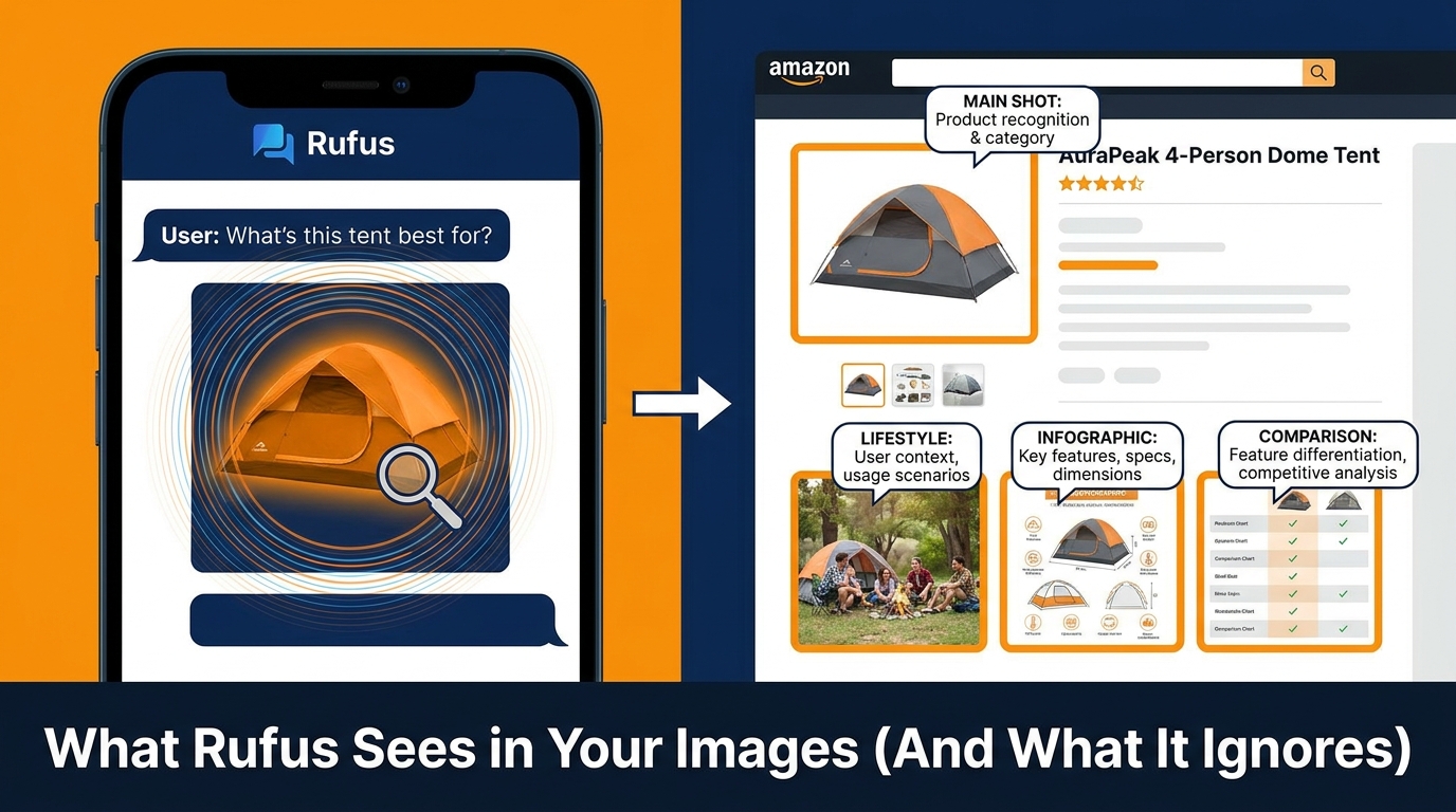
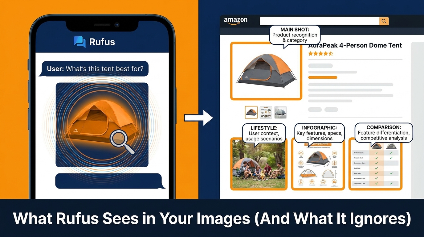
    Split-screen showing Rufus AI analyzing Amazon product images on a smartphone with annotated listing image slots

    By late 2025, more than 250 million shoppers had used Amazon’s Rufus AI assistant. Monthly active users grew 140% year-over-year. Interactions jumped 210%. And perhaps the most startling figure of all: according to Sensor Tower’s holiday analysis, Rufus-assisted sessions converted at 3.5 times the rate of non-Rufus sessions on Black Friday — making up roughly 40% of all sessions but driving 66% of purchases.

    That is not a marginal experiment. That is a structural shift in how Amazon shoppers discover and buy products. And it has profound implications for your image strategy — implications that most sellers are still getting completely wrong.

    The problem is that Rufus is not a search engine. It does not rank results the way the A9 or A10 algorithms do. It is a conversational, multimodal AI assistant that synthesizes product listings, customer reviews, Q&A data, and visual content to generate shopping recommendations in natural language. It is, in a very real sense, a different kind of customer — one that reads your images not as aesthetic assets, but as structured evidence it can cite in an answer.

    Most image optimization advice is still written for keyword-era search: make the main image pop, add bullet-point overlays, use lifestyle photos that look good. That advice is not wrong, exactly, but it is dramatically incomplete when the entity evaluating your listing is a multimodal AI model looking for semantic richness, intent alignment, and verifiable claims.

    This post breaks down exactly what Rufus looks for in your product images, the specific image types that win recommendations, the silent mistakes that kill your Rufus visibility, and how to build an image brief that actually serves both the AI and the human customer it is advising.

    How Rufus Actually Processes Your Product Images
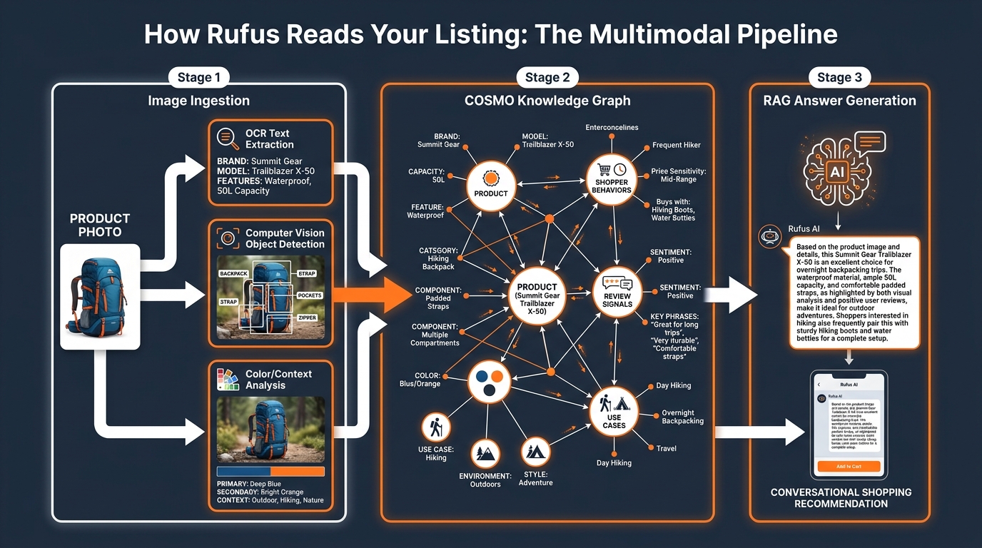
    Infographic diagram of Rufus multimodal AI pipeline: image ingestion, COSMO knowledge graph, and RAG answer generation stages

    To optimize for Rufus, you first need to understand what is actually happening under the hood when your listing gets evaluated. Amazon has not published a detailed technical specification of Rufus’s image processing pipeline, but the architecture is reasonably well understood through Amazon’s own research papers, public talks, and the COSMO system documentation.

    The COSMO Knowledge Graph

    COSMO (Common Sense Knowledge for E-Commerce) is Amazon’s large-scale product knowledge graph. It ingests data from product catalogs, customer reviews, community Q&A sessions, browsing behavior, and increasingly, visual signals extracted from product images. COSMO does not simply store text — it builds a semantic map of how products relate to use cases, contexts, shopper profiles, and competitor products.

    When Rufus receives a shopping query — say, “what’s a good camping chair for bad knees?” — it does not do a keyword match. It queries the COSMO graph to identify products whose associated signals most strongly align with the intent behind that question. Products that have strong use-case signals, clear attribute evidence, and verified claims across multiple data sources rank higher in Rufus’s reasoning process.

    Your images feed into this graph. Computer vision models extract object classes, spatial relationships, color and material attributes, and contextual cues (indoor vs. outdoor, solo use vs. group use, casual vs. professional). OCR (optical character recognition) reads text that appears within your images — ingredient callouts, feature labels, spec overlays. The extracted data gets merged with your listing text, review content, and Q&A to build a composite knowledge profile of your ASIN.

    Retrieval-Augmented Generation (RAG) and Image Evidence

    Rufus operates on a RAG architecture — it retrieves relevant product data from COSMO and related sources, then generates a conversational response grounded in that retrieved evidence. This is crucial for understanding image strategy, because it means Rufus does not just need to find your product; it needs to be able to cite your product confidently in a natural-language answer.

    If a shopper asks “which yoga mat is best for hot yoga?” and your images clearly show a person using the mat in a warm, humid studio environment alongside an infographic that reads “moisture-wicking surface” and “non-slip grip when wet,” Rufus has specific visual and textual evidence it can use to construct a confident recommendation. If your images are generic glamour shots with no use-case context, Rufus has nothing to cite — and it will surface a competitor whose listing provides that evidence.

    What Rufus Does Not Do

    It is equally important to understand the limits of Rufus’s image reading. Rufus is not parsing the aesthetic quality of your photography or applying design sensibilities. It does not penalize you for using a plain white background. It is not swayed by how stylish a lifestyle photo looks. What matters is whether the image communicates something specific and useful that can be extracted and used to answer a shopper’s question. Beauty without specificity is invisible to Rufus.

    The Intent Graph: What Questions Rufus Is Actually Trying to Answer

    Understanding Rufus optimization requires mapping out the questions Rufus is trying to answer on a shopper’s behalf. These questions fall into predictable categories, and your image set needs to provide visual evidence for each of them.

    Use-Case Questions

    “What is this product actually for?” is the most fundamental question in any Rufus interaction. Shoppers increasingly use Rufus to search by activity or purpose rather than by product name: “something for camping with toddlers,” “a bag I can use as both a gym bag and carry-on,” “a moisturizer that works under makeup.” Your images need to answer these questions visually. A lifestyle image of your backpack in an airport security line communicates “travel-friendly” far more powerfully than the word “versatile” in a bullet point.

    Who-Is-This-For Questions

    Rufus is used heavily for comparative and qualifying queries: “best for seniors,” “good for beginners,” “safe for dogs.” Images that show the product being used by a specific, recognizable demographic type — whether that is an older adult, a child, a professional in a specific setting, or an athlete in a specific sport — give Rufus the evidence it needs to confidently recommend your product to queries that contain those qualifiers.

    What-Is-Included Questions

    Shoppers regularly ask Rufus what comes in the box, what sizes are available, and whether specific accessories are included. A clear “what’s in the box” flat-lay image, or a size-comparison image showing multiple variants side by side, directly answers this query type. These images are among the most underused in most sellers’ image stacks, yet they address one of the most common Rufus query patterns.

    Is-This-Claims-True Questions

    When your listing claims “waterproof,” “BPA-free,” “machine washable,” or “fits a 15-inch laptop,” Rufus looks for corroborating evidence. The most powerful corroboration is visual: an image of the product submerged in water, an image of the certification label, an image of a laptop visibly fitting into the bag’s sleeve. These “proof images” are what allow Rufus to recommend your product with confidence rather than hedging with “the seller claims this product is waterproof.”

    The 7 Image Types That Win Rufus Recommendations

    Comparison chart showing 7 Rufus-friendly image types vs 7 image types that hurt Rufus visibility

    Based on the current understanding of Rufus’s multimodal evaluation and what agencies working with Rufus-optimized catalogs report, seven image types consistently outperform in Rufus recommendation frequency and post-recommendation conversion rate.

    1. The Unambiguous Main Image

    Your main image must instantly communicate exactly what the product is — not what it aspires to be, not the lifestyle it belongs to, but what it physically is. Rufus uses the main image as its first disambiguation step when processing your ASIN. An ambiguous or styled main image that obscures product type creates uncertainty in Rufus’s classification, which reduces confidence in surfacing it for specific queries. Keep the main image on white, full-frame, showing the complete product in its most recognizable form. Save the storytelling for images two through nine.

    2. Use-Case Lifestyle Shots With Specific Context

    Not all lifestyle images are created equal for Rufus. A generic “young woman smiling with coffee cup” does not tell Rufus anything useful about the mug’s use case. What works is specificity: a hiker filling the mug from a stream (signals: outdoor, adventure, portability), a parent using the mug one-handed while holding a baby (signals: parent, ease of use, one-handed operation), or a commuter sipping from it on a subway (signals: commuter, leak-proof, portable). The more specific the context, the more intent signals Rufus can extract.

    3. Readable Infographic Images With Attribute Callouts

    Infographic images — secondary images that overlay text callouts, feature labels, and attribute annotations directly on a product photo — are one of the highest-value image types in the Rufus era. The key word is “readable.” Text overlays need to be large enough for OCR to extract reliably (minimum 16px equivalent at image resolution), use plain sans-serif fonts, and describe features in natural-language phrases rather than keyword-stuffed fragments. “Adjustable lumbar support for long work sessions” is more Rufus-readable than “ERGONOMIC LUMBAR SUPPORT PREMIUM GRADE.”

    4. Scale and Dimension Reference Images

    Images that show your product next to a recognizable reference object — a human hand, a common item like a credit card or water bottle, a standard piece of furniture — directly answer the “how big is this actually?” query that Rufus fields constantly. These are especially powerful for categories where size uncertainty is a major purchase barrier: bags, storage containers, electronics accessories, home goods. A dimension callout image with actual measurements labeled (not just “compact!”) performs even better because it gives Rufus a specific, citable answer to size queries.

    5. Proof Images for Key Claims

    For any claim in your title or bullets that can be physically demonstrated, there should be a corresponding proof image. Waterproof claims: show the product in water. Heat resistance: show it next to a flame or on a hot surface. Child safety certification: show the certification mark clearly. Fit accuracy: show the product fitting the stated use (laptop in sleeve, bottle in cup holder, device in pocket). Rufus treats verified visual evidence differently from unsupported text claims, and this shows up in how confidently the assistant recommends your product.

    6. What’s-in-the-Box / Variant Comparison Images

    A flat-lay image showing every item included in the package — laid out clearly and labeled with callout arrows — is one of the most directly functional image types for Rufus’s information-retrieval task. Similarly, a grid image showing all available color or size variants side by side answers variant-selection queries without requiring Rufus to infer from text. These images reduce ambiguity, which is one of the primary things Rufus’s confidence scoring tries to minimize.

    7. Before/After and Problem-Solution Images

    This image type is particularly powerful for problem-solution products: cleaning products, skincare, organizational tools, fitness equipment, home improvement items. A split-image showing a genuine before and after state communicates the product’s core value proposition in a format that Rufus can extract as a causal relationship: “this product produces this outcome.” These images also tend to align strongly with review language, which reinforces COSMO’s confidence in the association.

    The Silent Killers: Image Mistakes That Destroy Rufus Visibility
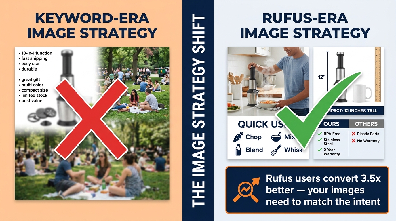
    Split comparison of keyword-era vs Rufus-era image strategy showing the shift sellers need to make

    Just as important as knowing what works is understanding what actively hurts your Rufus visibility — and why so many otherwise well-optimized listings score poorly against Rufus’s evaluation criteria.

    Keyword-Stuffed Text Overlays

    The practice of packing as many keywords as possible into image overlays was a debatable tactic even in the keyword-search era. In the Rufus era, it is actively counterproductive. When OCR extracts text from your infographic and it reads as a fragmented list of category terms — “YOGA MAT NON SLIP THICK EXERCISE FITNESS WORKOUT GYM” — Rufus cannot construct a coherent semantic signal from it. It reads as noise rather than evidence. The OCR-extracted text needs to form sentences or at minimum natural noun phrases that describe features in the way a customer would speak them.

    Generic Lifestyle Imagery That Obscures the Product

    High-production lifestyle photography that prioritizes mood over clarity is one of the most common Rufus visibility problems. If your product is difficult to see in the lifestyle shot — positioned as a small prop in a beautifully lit scene, half-hidden in shadows for dramatic effect, or shown at an angle that obscures its key features — Rufus’s computer vision models extract little useful information from it. The aspirational lifestyle image that works beautifully for Instagram performance does not translate to meaningful Rufus evidence.

    Using Fewer Than Six Image Slots

    Amazon allows up to nine images per listing (plus video). Sellers who use three or four images are leaving enormous Rufus surface area on the table. Each image is an additional data point for COSMO’s knowledge graph. Each image slot is an opportunity to answer another category of shopper intent question. Incomplete image stacks signal to Rufus that the listing has less evidence to offer — and Rufus will default to more fully documented competitors when generating recommendations.

    Images That Contradict Review Language

    This is a subtle but significant problem. If your images show the product used in an office setting but your reviews consistently mention it being used outdoors, Rufus detects a misalignment between your visual signals and your actual customer base. The reverse is also true: if your images claim “heavy duty” but reviews mention it feeling lightweight and fragile, the contradiction weakens COSMO’s confidence in your listing’s claims. Image strategy and review sentiment need to be consistent.

    Text in Images That Cannot Be Read by OCR

    Decorative scripts, very small text, text that blends into a busy background, and text at angles that OCR cannot reliably parse — all of these are invisible to Rufus’s extraction pipeline. If important feature claims appear only in unreadable image text and not in the listing copy, they effectively do not exist for Rufus’s purposes. Any text in images that carries important feature or benefit information should also appear explicitly in bullets, titles, or A+ module copy.

    Alt Text, Overlays, and A+ Content: The Hidden Metadata Layer
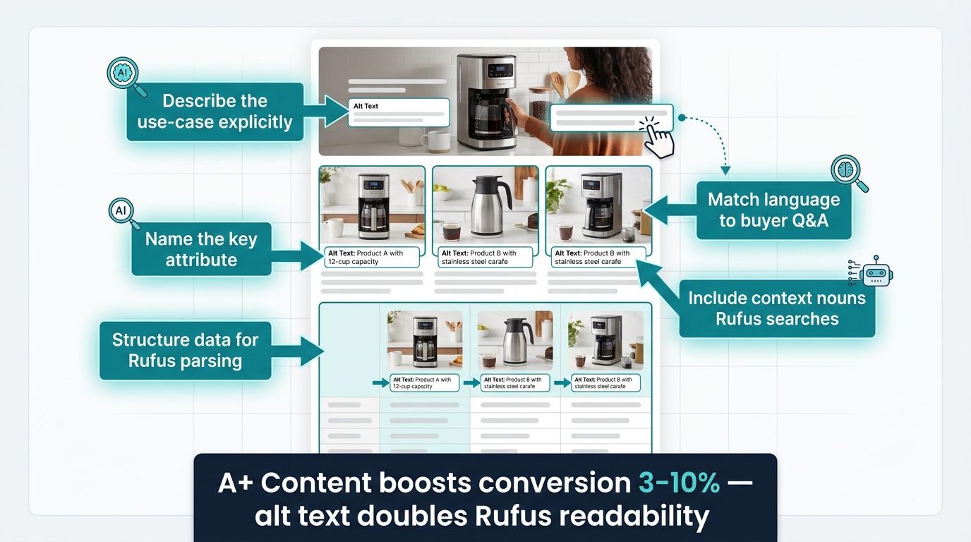
    Amazon A+ Content module annotated with alt text optimization labels for Rufus AI readability

    Beyond the visible images themselves, there is a metadata layer that most sellers never think about: the alt text fields available within Amazon’s A+ Content module. This layer has become increasingly important as Rufus’s multimodal processing has matured.

    How Amazon A+ Alt Text Feeds Rufus

    When you build A+ Content modules in Seller Central, each image module has an optional alt text field. Historically, sellers left these blank or filled them with generic descriptions like “product image.” Today, these alt text fields are one of the cleaner text inputs that Rufus’s content extraction pipeline can read — because they are structured metadata rather than free-form creative copy.

    Alt text that is written to describe the actual scene depicted in the image — what the product is doing, who is using it, in what context, with what outcome — provides COSMO with precisely the kind of structured, use-case-specific evidence it needs. Think of each alt text field as a one-sentence answer to a Rufus query: “This image shows a 45L travel backpack being used as a carry-on bag in an airplane overhead compartment, demonstrating its airline-compliant dimensions.” That sentence gives Rufus four extractable signals: product type, use case, context, and compliance claim.

    Writing Alt Text That Rufus Can Use

    Effective alt text for Rufus follows a simple structure: [who] + [what] + [how/where] + [outcome or attribute]. Lead with the use-case context, not the product name. Describe what is happening, not what the image looks like. Include the specific attributes that appear in the image — materials, certifications, measurements — rather than repeating the product title. Keep each alt text field to one to three focused sentences. Avoid keyword stuffing here as aggressively as you would avoid it in image overlays — it reads as spam to a language model, not as evidence.

    A+ Content Modules as Intent-Aligned Evidence Blocks

    Beyond alt text, the structure of your A+ Content modules itself matters for Rufus. A+ modules that organize information by use case, shopper concern, and comparison (rather than just feature lists) give Rufus a pre-structured evidence library to draw from. A module titled “For the Outdoor Athlete” with specific performance attribute images serves Rufus’s classification far better than a generic “Product Features” module with the same information. The heading text of A+ modules is indexed and contributes to the overall use-case signals associated with your ASIN.

    Cross-Referencing Images and Listing Copy

    One of the most overlooked consistency requirements for Rufus optimization is ensuring that information appearing in images also appears in listing copy — and vice versa. If your infographic image highlights “fits bottles up to 32oz,” that claim should also appear in your bullet points or product description. Rufus’s RAG system gains confidence in claims when it finds them corroborated across multiple sources within the listing. A claim that appears only in an image text overlay with no textual corroboration carries less weight in the knowledge graph than a claim confirmed by both image evidence and listing text.

    Lifestyle vs. Context Shots: Why Rufus Treats These Differently

    The terms “lifestyle image” and “context shot” are often used interchangeably in Amazon seller communities, but they describe fundamentally different visual assets — and Rufus evaluates them very differently.

    What Is a Lifestyle Image?

    A lifestyle image communicates emotional and aspirational associations: the kind of person who uses this product, the world they inhabit, the feeling the product gives them. These images are high-production, atmospheric, and often prioritize mood over literal product information. They work extremely well for human conversion — they help shoppers visualize themselves using the product and create desire. For Rufus, they provide persona and demographic signals, but limited use-case or attribute evidence.

    What Is a Context Shot?

    A context shot is more literal: it shows the product in a specific, recognizable situation that directly communicates a use case or functional attribute. A camping chair next to a tent with a hiking boot visible in the foreground is a context shot for “camping” and “outdoor use.” A cutting board with vegetables on a kitchen counter next to a knife is a context shot for “cooking,” “food prep,” and “kitchen use.” The context is specific enough that Rufus’s computer vision can classify the use case without ambiguity.

    The Optimal Balance for Rufus

    The most effective approach combines both: a lifestyle image that sets the aspirational context, followed immediately by context-specific shots that answer use-case queries with more precision. If you sell a water bottle, your image stack might include: a lifestyle image of the bottle in a runner’s hand mid-race (emotional, aspirational), then a context shot of the bottle being filled from a hiking stream (outdoor/adventure use case), then a context shot of the bottle in a car cup holder with a gym bag visible (commuter/gym use case), then a context shot of the bottle next to a size reference (practical specification). Each context shot is a different Rufus query answered visually.

    Sellers who use all lifestyle imagery and no context shots tend to see Rufus performance that is strong for broad category queries (“good water bottles”) but weak for intent-specific queries (“water bottle for hiking” or “insulated water bottle for gym”). The specificity of context shots is what unlocks long-tail Rufus recommendations.

    Comparison Images: The Most Underused Asset in the Rufus Era

    If there is one image type that the current Rufus optimization conversation is most dramatically underselling, it is the product comparison image. This is partly because comparison images feel risky — they require referencing competitor products or your own product variants in a way that can feel aggressive. But they are among the highest-signal image types for Rufus’s specific query handling.

    Why Rufus Is a Comparison Machine

    Rufus is heavily used for comparative queries: “what’s the difference between X and Y,” “which is better for Z,” “should I get A or B.” Amazon has explicitly designed Rufus to help shoppers make comparative decisions. When a shopper asks Rufus “what’s the difference between whey protein and plant protein?” and your plant protein listing includes a clean comparison image showing the key attribute differences — protein content per serving, ingredient sourcing, digestion speed — Rufus has structured visual evidence it can use to surface your product in the context of that comparison query.

    Three Types of Comparison Images That Work for Rufus

    Variant comparison grids show your own product variants side by side with attribute differentiators clearly labeled: size options, color options, performance tiers. These answer the “which size should I get?” and “what’s the difference between the standard and pro version?” queries that Rufus handles constantly.

    Category comparison tables show your product against its category context — not necessarily naming competitors directly, but illustrating how its attributes relate to common category benchmarks. A comparison table showing “lightweight foam vs. memory foam vs. latex” for mattress toppers gives Rufus the evidence to surface your memory foam product when a shopper asks “which type of mattress topper is best for pressure relief?”

    Before/after comparison images show the problem and the solution in a single split frame. These are enormously powerful for Rufus because they encode a causal relationship — this product produces this outcome — that maps directly to the problem-solution query structure Rufus handles all day.

    Competitive Naming in Comparison Images

    Amazon’s policies restrict certain types of comparative advertising, so naming specific competitors in comparison images carries policy risk. The safer approach is to compare against generic category descriptions (“standard nylon,” “budget silicone,” “traditional design”) or your own product line variants. The use-case and attribute differentiation comes through clearly without the policy exposure.

    How to Audit Your Existing Image Stack Against Rufus Intent
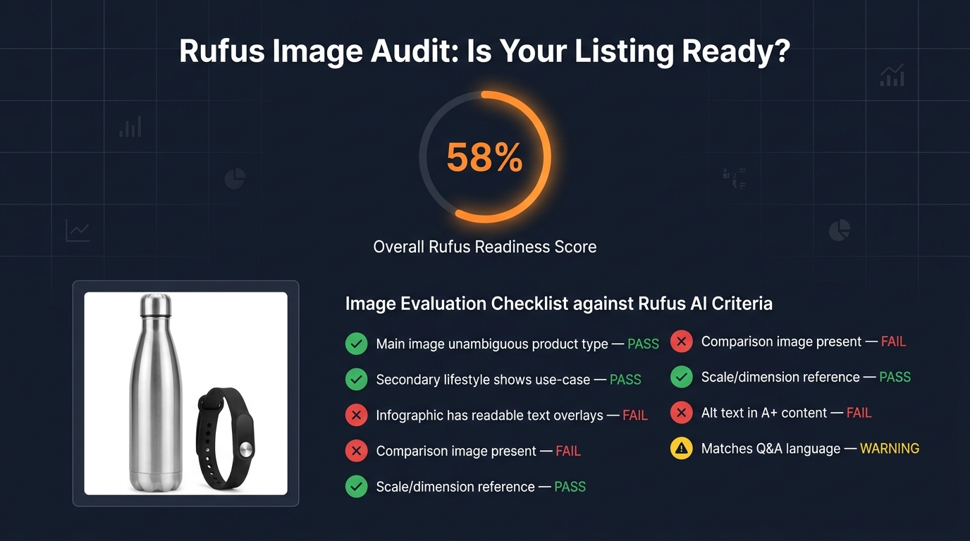
    Rufus image audit dashboard showing a product listing's image readiness score with pass/fail checklist items

    The practical question for most sellers is not “what should I build from scratch?” but “how do I evaluate what I already have and prioritize the gaps?” Here is a structured audit methodology that maps your existing image stack against Rufus’s intent-reading behavior.

    Step 1: Map Your Top Rufus Query Types

    Start by identifying the top 10–15 query types Rufus is most likely to receive for your product category. You can infer these from Amazon’s autocomplete suggestions, the “Customers Also Asked” section of your listing, your Q&A backlog, and your one- and two-star reviews (which often contain objections that Rufus queries would surface). Group them into query categories: use-case queries, who-is-it-for queries, specification queries, comparison queries, and claim-verification queries.

    Step 2: Score Each Existing Image Against Intent

    For each image in your current stack, ask a single question: which query category does this image answer? If the answer is “none” — if the image is purely decorative, aspirational without context, or visually beautiful but semantically empty — it is a low-Rufus-value asset. Score each image from 0 (no extractable intent signal) to 3 (directly and unambiguously answers a specific Rufus query type). Total the score and divide by your total number of image slots. Most listings score below 50% on this metric.

    Step 3: Identify the Gaps

    Map your query categories against your scoring results. The gaps — query categories that your current images do not answer — are your production priorities. For most sellers, the most common gaps are: no proof images for key claims, no “what’s in the box” image, no scale/dimension reference image, and no comparison image of any kind. These are the highest-ROI additions to any listing’s image stack from a Rufus-visibility perspective.

    Step 4: Check for OCR Readability

    Take your existing infographic images and run them through any free OCR tool (Google Lens, Adobe Acrobat’s OCR function, or any online OCR service). The text that the OCR tool extracts successfully is the text that Rufus’s pipeline can read. If important claims are coming back as unrecognized, those overlays need to be redesigned with larger, cleaner text before Rufus can use them. This is a 15-minute exercise that most sellers have never done and that surfaces significant optimization opportunities every time.

    Step 5: Compare Image Language to Review Language

    Pull your 50 most recent positive reviews and identify the phrases customers use to describe what they love about the product and how they use it. Then check whether those phrases and use cases appear in your image overlays and context shots. A significant gap between “how customers describe the product in reviews” and “how images describe the product” indicates that your image strategy is not aligned with COSMO’s actual evidence base — and Rufus is likely missing the use-case signals that real customers confirm.

    Aligning Image Strategy With Review Language and Q&A Signals

    One of the most powerful and least-used tactics in Rufus image optimization is mining your own review and Q&A data to guide your creative brief. This works because COSMO’s knowledge graph actively integrates review language as a signal source alongside image data — meaning images that use language and scenarios that appear in positive reviews are directly reinforcing COSMO’s existing associations for your ASIN.

    The Review-to-Image Pipeline

    Pull your reviews and identify the top five to ten use-case phrases that appear repeatedly: “great for weekend camping trips,” “perfect for my morning commute,” “exactly what I needed for my toddler’s snacks,” “holds up perfectly in the dishwasher.” Each of these phrases is a Rufus query that real customers have essentially pre-validated as a winning association for your product.

    Now ask: does your current image set visually demonstrate each of these use cases? If “great for weekend camping trips” is a top review phrase but none of your images show the product in a camping setting, you have an alignment gap that is costing you Rufus recommendations for every camping-intent query. Close that gap by commissioning a context shot that specifically depicts the camping use case — not a generic outdoors lifestyle image, but a specific camping scene that encodes the same contextual information as the review phrase.

    Q&A as a Rufus Query Preview

    Your listing’s Q&A section is essentially a preview of the queries Rufus receives about your product. Every question in your Q&A section is a question a shopper has been willing to type into a search or Q&A box rather than just buying. These are high-friction decision points. When Rufus receives a query that matches a Q&A question, it will look for evidence in your listing to construct an answer. Images that directly address the most common Q&A questions — showing the answer visually, not just stating it in copy — give Rufus the evidence confidence to surface your product for those high-friction query types.

    Video and the Rufus Surface: Short Clips as Intent Signals

    Video is increasingly part of Rufus’s content evaluation, and while still secondary to still images in most Rufus interactions, its role is growing. Amazon’s addition of short-form video to the listing surface — and the expansion of Rufus’s ability to incorporate video signals — makes video a meaningful Rufus optimization lever that most sellers are not yet using strategically.

    What Rufus Extracts From Product Video

    Rufus can evaluate video for use-case context in a similar way to still images, but with the added dimension of motion and sequence. A video that shows a product being set up, used in a specific context, and producing a visible outcome provides a temporal evidence chain that is more compelling than any single still frame. For products where the key use-case question is “how does this actually work?” — assembly products, multi-function tools, clothing with complex fit, anything with a setup process — video addresses that query type in a way still images cannot.

    Optimizing Video Length and Structure for Rufus

    For Rufus-intent alignment, the most effective product videos follow a specific structure: open with an unambiguous product identification shot (what this product is, clearly), demonstrate the primary use case within the first ten seconds, show two to three secondary use cases in sequence, and end with a clear summary of the key differentiating attribute. Keep total length under 60 seconds for primary listing video — Rufus’s evaluation models are optimized for short-form content that communicates quickly, not for long-form brand narratives.

    The video title and any caption text attached to the video are also indexable by Rufus. Write these with the same intent-alignment discipline as your image alt text: describe the use case being demonstrated, not the emotional feeling the video creates.

    Building a Rufus-Optimized Image Brief for Your Creative Team

    Everything in this post ultimately converges on a practical output: a better creative brief for your photographers, designers, and image production team. Most creative briefs are written around aesthetic goals, brand guidelines, and competitive differentiation. A Rufus-optimized brief is written around intent coverage and evidence provision.

    The Intent-Coverage Model for Image Briefs

    Structure your brief around four required image categories rather than a numbered slot list:

    Category 1: Classification images. These answer “what exactly is this product?” — the main image and one or two supporting product-clarity shots. Brief your photographer on making the product type unmistakable and the key physical attributes visible from the primary angle.

    Category 2: Use-case evidence images. These answer “what is this for and who uses it?” — typically three to four context shots depicting your top reviewed use cases. Brief your art director on depicting specific scenarios, not generic lifestyles. The scenario should be recognizable and specific enough that Rufus’s computer vision can classify the context without ambiguity.

    Category 3: Claim-verification images. These answer “is this claim true?” — infographics with readable attribute callouts, proof images for your top three to five listing claims, certifications visually represented. Brief your designer on text size, font clarity, and natural-language phrasing for all overlays.

    Category 4: Specification and comparison images. These answer “does this fit my needs specifically?” — scale references, dimension callouts, what’s-in-the-box flats, and variant comparison grids. Brief your production team on these as functional assets, not creative showcases — clean, clear, labeled, and complete.

    Adding a Rufus Review Step to Your Creative Approval Process

    Once you have established the intent-coverage model, add a Rufus review step to your image approval workflow. Before images go live, run each one through a simple test: “which Rufus query does this image help answer, and does it answer it clearly?” Any image that fails this test — that cannot be matched to a specific intent query, or that answers it ambiguously — goes back for revision or is replaced by an image from one of the four required categories above.

    This review step does not require technical AI expertise. It requires someone on your team to hold the question “what is Rufus trying to answer for the shopper?” in mind when evaluating creative assets — a different evaluative lens than the more common “does this look great?” or “does this match our brand?”

    The Shift That Is Already Happening — And What Comes Next

    Rufus’s growth trajectory — 250 million users, 3.5x conversion rates, 210% interaction growth — makes one thing clear: the shopping surface Rufus represents is not a feature that may eventually matter. It is the primary discovery surface for a large and rapidly growing segment of Amazon’s highest-intent shoppers. Sellers who are still building image stacks for keyword-era search are effectively invisible to those shoppers.

    The shift from keyword optimization to intent-evidence optimization is not a dramatic reinvention of image strategy. Most of the image types that work for Rufus — use-case lifestyle shots, infographics, proof images, comparison assets — also improve human conversion rates on the listing. The change is in the discipline and specificity with which those images are created: the difference between a lifestyle image that shows a product in a vague outdoor setting versus one that shows it in a specific, classifiable camping context; the difference between an infographic with keyword-stuffed fragments versus one with natural-language attribute sentences that OCR can extract and Rufus can cite.

    Looking ahead, Rufus’s visual capabilities will continue expanding. Amazon is already integrating Rufus with Amazon Lens (visual search) and expanding its ability to evaluate user-uploaded images as part of shopping queries. This means the contextual signals your images communicate will become even more valuable as Rufus handles more nuanced visual comparison tasks — not just “which yoga mat should I buy?” but “does this yoga mat match the kind I can see in this photo I took at my gym?”

    The sellers who will win in that environment are the ones who treat product images as a structured evidence library for an AI that is trying to help real people make real purchase decisions. Every image should earn its slot by answering a specific question that a real shopper would ask Rufus about your product. Build for that standard, and you will be building for the next five years of Amazon commerce.

    Actionable Takeaways

    • Run an OCR audit on your infographic images today. Use Google Lens or any free OCR tool to check which text Rufus can actually read. Redesign any overlay where important claims fail to extract cleanly.
    • Fill all nine image slots — every time. Incomplete image stacks signal low-evidence listings to Rufus. Every unused slot is a missed intent-coverage opportunity.
    • Write A+ alt text as one-sentence use-case answers. Use the [who] + [what] + [how/where] + [outcome] formula. Treat each alt text field as a Rufus query answered in a sentence.
    • Add one comparison image to your top ASINs this month. Variant comparison grids and category comparison tables are the highest-ROI addition for Rufus query coverage in most categories.
    • Mine your reviews for context-shot briefs. Find the top five use-case phrases in your positive reviews and verify that each one is visually represented in your image stack.
    • Structure your image brief around four intent categories, not nine numbered slots: classification, use-case evidence, claim verification, and specification/comparison.
    • Add a Rufus review step to your creative approval workflow. Before any image goes live, identify which query it answers. If the answer is “none,” revise it.

  • The Quiet Ship: How Operators Are Embedding AI Agents Into Client Ops Without Blowing Up the Relationship

    The Quiet Ship: How Operators Are Embedding AI Agents Into Client Ops Without Blowing Up the Relationship

    AI agents quietly integrating into client operations dashboard at night — no disruptions detected

    There was no press release. No kickoff meeting with slides about “the AI journey.” No change management consultant brought in at $400 an hour to prepare the team for transformation. One day, the tickets started resolving faster. The reports landed in inboxes before anyone asked for them. The follow-up emails went out on time, every time, without a reminder.

    That’s what a well-executed AI agent deployment actually looks like from the client side: unremarkable. Frictionless. Invisible in the best possible sense.

    In 2026, the operators who are winning at AI aren’t the ones running the loudest pilot programs or publishing the most ambitious AI roadmaps. They’re the ones shipping agents quietly into client workflows — wrapping them around existing tools, constraining them carefully, measuring obsessively, and expanding scope only after the trust is earned. It’s not glamorous. It doesn’t make for great conference presentations. But it’s producing the only thing that ultimately matters: compounding operational value that clients can’t imagine going without.

    This piece is about how that quiet ship actually works — the deployment patterns, the trust mechanics, the governance realities, the billing shifts, and the specific failure modes that turn “quiet” into “catastrophic.” If you’re an operator, agency, or in-house team trying to move AI agents from demo to production inside someone else’s workflow, this is the operating manual no one hands you.


    Why “Quiet” Became the Dominant Deployment Strategy

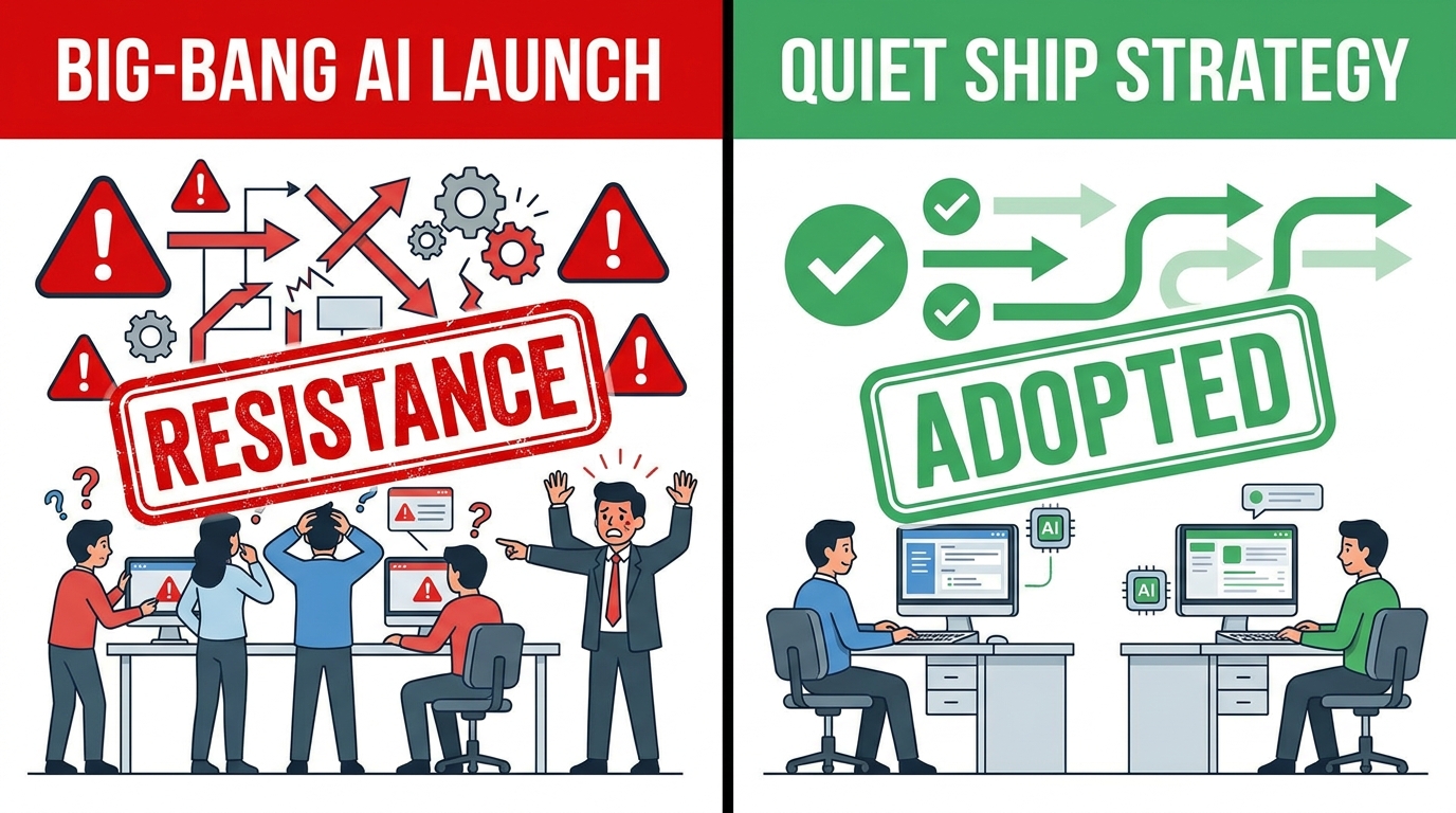
    Comparison between Big-Bang AI Launch with resistance versus Quiet Ship Strategy with smooth adoption

    The instinct, when you’ve built something genuinely useful, is to announce it. To build excitement, align stakeholders, and generate organizational momentum. This instinct is almost always wrong when you’re deploying AI agents into someone else’s operations.

    The announcement approach creates a threat surface. It surfaces every latent concern — about job displacement, data privacy, vendor lock-in, and loss of control — before the agent has had a chance to prove it’s harmless. You’re fighting those concerns with a pitch deck and a demo, not with three months of evidence that the system works.

    The Organizational Physics of Change Resistance

    Change resistance in organizations is proportional to the size and visibility of the change being announced. A “we’re rolling out an enterprise AI agent platform” announcement triggers CTO reviews, HR consultations, union conversations (in applicable environments), and a raft of stakeholder meetings that can add months to a deployment timeline before a single line of code runs in production.

    Contrast that with embedding a narrow agent that auto-classifies incoming support tickets inside a helpdesk system the team already uses. Nobody calls a meeting about a classification feature. It ships on a Tuesday. By Friday, resolution times have dropped noticeably and the team is asking when the next update lands.

    This isn’t deception — it’s sequencing. The difference is whether you’re asking for permission to try something, or whether you’re demonstrating value first and expanding the conversation from a position of proven results.

    The Budget Reallocation Dynamic

    There’s a structural reason why quiet deployment is accelerating in 2026: a significant share of AI agent budgets isn’t new money. According to a Redpoint CIO survey cited widely in enterprise tech circles, roughly 45% of new AI agent budget is coming from existing SaaS line items being reallocated — not from net-new procurement decisions. That means agents are often being slipped into workflows as feature upgrades within tools clients are already paying for, rather than as new vendor relationships requiring fresh approval processes.

    This has profound implications for how agents get introduced. When the agent lives inside Salesforce, ServiceNow, or Microsoft 365 — tools the client already owns and trusts — the deployment conversation is fundamentally different. It’s not “should we adopt AI?” It’s “should we turn on this feature?” The answer to the second question is almost always yes.

    The Proof-Then-Discuss Model

    The teams making the most consistent progress with client-side agent deployments have internalized a simple sequencing rule: demonstrate value at small scale, build a data story, then surface the conversation about what’s actually happening. By the time clients learn they’ve been running an AI agent for six weeks, they’ve also seen a 25% drop in resolution times, a 15% improvement in response accuracy, or a 40-hour monthly reduction in manual reporting. The data reframes the conversation entirely.

    This isn’t universally applicable — regulated industries, data-sensitive environments, and clients with explicit AI disclosure requirements need different approaches, which we’ll cover later. But for a wide swath of business operations, the proof-then-discuss model outperforms the announce-then-prove model by a significant margin when it comes to sustained adoption.


    The Anatomy of a Shadow-Mode Rollout

    Shadow mode is the technical and operational pattern that makes quiet deployment possible. It’s not a single configuration or product feature — it’s a philosophy of deployment that runs an agent in parallel with existing workflows without yet giving it the authority to act on its own conclusions.

    What Shadow Mode Actually Means in Practice

    In a shadow-mode deployment, the agent observes, processes, and generates outputs — but those outputs go to a human reviewer rather than directly to the end system. The agent might draft a reply to every incoming customer email, but a human sends (or modifies) the actual response. The agent might generate a daily financial reconciliation report, but a finance manager reviews it before it’s filed.

    The operational benefits of this phase are often underappreciated. Shadow mode is simultaneously a quality assurance layer and a training ground. You’re collecting data on where the agent performs well and where it needs calibration. You’re identifying edge cases that weren’t visible in development. And crucially, you’re building an accuracy record that becomes the foundation for expanding the agent’s autonomy later.

    Teams that skip shadow mode in favor of going directly to autonomous production often discover the hard way that “worked perfectly in the demo environment” and “works correctly on real client data, at volume, without supervision” are two very different things. The gap between those two states is what shadow mode is designed to surface safely.

    The Shadow-to-Production Transition

    The transition from shadow mode to supervised autonomy — where the agent acts independently on a defined subset of tasks — typically hinges on an accuracy threshold. Operators who are doing this well set explicit criteria before shadow mode begins: something like “when the agent’s suggested response matches human-reviewed output with 95% accuracy across 500 cases, we transition to autonomous handling for that case type.” This removes the transition decision from subjective judgment and anchors it in data, which also makes the conversation with clients much cleaner.

    The subset selection matters enormously here. The first tasks you hand to autonomous agent operation should be the highest-volume, lowest-stakes, most-repetitive category in the workflow — the stuff that’s genuinely low-risk to automate and where errors, if they occur, are easy to catch and cheap to correct. For customer support, this typically means password resets, order status inquiries, and knowledge base lookups. For finance ops, it’s routine invoice matching against purchase orders. For content operations, it’s metadata tagging and asset routing.

    Observability From Day One

    The technical requirement that separates sustainable shadow-mode deployments from ones that quietly accumulate debt is observability. Every agent interaction should produce a logged trace: what the agent received as input, what it queried or retrieved, what decision logic it applied, what output it generated, and — if applicable — what a human did with that output. This isn’t optional overhead. It’s the data substrate that makes the entire deployment defensible, improvable, and auditable.

    In practice, this means choosing agent infrastructure that emits structured logs, instrumenting custom workflows to capture decision traces, and building simple dashboards that surface accuracy rates, escalation rates, and anomaly patterns. The goal is that at any moment, you can answer the question: “What did the agent do this week, and how do we know it was correct?” If you can’t answer that question, you don’t have a production agent — you have a liability.


    Which Client Ops Functions Actually Welcome Agents First

    Not all operational functions are equally receptive to agent embedding. The ones that adopt most readily share a cluster of characteristics: high task volume, high repetition, clear correctness criteria, and low political sensitivity around the specific work being automated. Understanding this landscape is critical for choosing where to start — and where to be patient.

    Customer Support and Ticket Operations

    This is the single most mature area for agent deployment, and the ROI data is the clearest. Enterprises with production-grade customer support agents are reporting 60–80% of Level 1 tickets resolved autonomously, with average resolution times dropping from the multi-hour range to under 15 minutes. Customer satisfaction scores are improving alongside these efficiency gains rather than degrading, which addresses the most common objection to support automation.

    The reason support works so well is that it maps perfectly to agent capabilities: there’s a high volume of structurally similar tasks, the right answer is usually discoverable from existing documentation and systems, and the feedback loop is fast. When an agent handles a ticket incorrectly, the customer typically says so immediately, which makes the error recoverable and creates a clean training signal.

    Finance and Back-Office Reconciliation

    Finance operations teams are among the quietest early adopters of agents, which is somewhat counterintuitive given the sensitivity of the work. The pattern that’s emerging isn’t agents replacing financial judgment — it’s agents eliminating the mechanical data-gathering and matching work that consumes enormous volumes of skilled finance time without requiring any of that skill.

    A typical entry point here is accounts payable automation: an agent that reads incoming invoices, matches them against purchase orders in the ERP system, flags discrepancies for human review, and routes clean matches for approval. The human touch remains for exceptions and judgment calls. The agent handles the high-volume routine matching that previously required a full-time AP clerk or two. The transition to autonomous operation on clean-match cases is relatively low-risk and often doesn’t require any stakeholder announcement at all — it looks, from the team’s perspective, like the AP software got smarter.

    Sales and CRM Support

    CRM hygiene is a perennial pain point in sales organizations — the gap between the data that should be in Salesforce and the data that actually is in Salesforce is a constant source of friction. Agents that observe sales rep activity (email sends, meeting notes, call transcripts) and automatically update CRM records are one of the cleanest current deployment patterns because the value proposition is immediately visible to the people whose workflow it’s improving.

    Sales teams don’t resist tools that save them from data entry. This creates a natural adoption pathway that doesn’t require top-down mandate. The agent improves daily life for the people using it, which generates organic advocacy that tends to accelerate deployment into adjacent functions.

    IT Service Management

    IT ops is another high-velocity adoption area. The helpdesk function in particular — password resets, access provisioning, hardware requests, software license management — is structurally identical to customer support in terms of the agent deployment pattern. Organizations running agents in ITSM workflows are reporting 50–70% reduction in ticket resolution times for Tier 1 issues, with significant secondary benefits in team focus and morale as IT staff are freed from mechanical request fulfillment for higher-complexity work.


    The Trust Ladder: From Observation to Autonomy

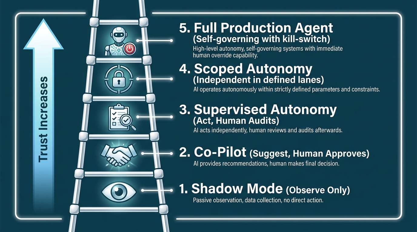
    The Trust Ladder: five-rung diagram from Shadow Mode observation through to Full Production Agent autonomy

    The single most useful mental model for managing agent deployment in client operations is the trust ladder — a staged progression of autonomy levels that each agent earns through demonstrated performance rather than inherits from a launch plan.

    Rung 1: Shadow Mode (Observe Only)

    At this stage, the agent runs in parallel with the human workflow but has no ability to act on its outputs. It reads, processes, and generates — but everything it produces goes to a reviewer, not to a destination system. The primary purpose here is calibration: does the agent’s understanding of the task match reality? Where does it perform well? Where does it hallucinate, miss context, or apply the wrong logic? Shadow mode should be the default starting position for any new agent in a new environment, regardless of how well the agent performed in development or staging.

    Rung 2: Co-Pilot (Suggest, Human Approves)

    The agent’s outputs are now surfaced to human operators as suggested actions, drafts, or recommendations — but the human explicitly approves before anything is sent or executed. This is a critical rung because it builds familiarity and trust with the people in the workflow while still maintaining full human accountability. It also creates excellent feedback data: when a human modifies an agent suggestion, that modification is a signal about where the agent’s model needs refinement.

    Rung 3: Supervised Autonomy (Act, Human Audits)

    The agent now acts independently on defined task categories, but humans review its actions on a regular audit cadence rather than approving each one individually. This is a significant shift in operational pattern — the human is no longer in the critical path of execution, only in the quality assurance path. The audit process should be structured: a regular sample review (say, 10% of agent actions, reviewed weekly) with explicit criteria for what triggers a correction or rollback.

    Rung 4: Scoped Autonomy (Independent in Defined Lanes)

    At this rung, the agent operates fully autonomously within a precisely defined operational scope, with no routine human review required. The guardrails are system-level: the agent has access only to the data and systems it needs for its defined tasks, it can take only the actions within its permitted action space, and any attempt to act outside that scope triggers an automatic escalation to human review. This is the sweet spot for most current production deployments — meaningful automation with meaningful boundaries.

    Rung 5: Full Production Agent (Self-Governing with Kill-Switch)

    This is a full autonomous agent with broad operational scope, self-monitoring capabilities, and the ability to reason about its own action boundaries. Very few client ops deployments should be at this rung in 2026 — the infrastructure, governance, and track record requirements are substantial. But for specific, well-understood, heavily monitored workflows (certain financial reconciliation pipelines, high-volume data processing operations), this level of autonomy is achievable and increasingly justified by ROI.

    The critical point across all rungs: promotion up the trust ladder should always be triggered by performance data, never by schedule or budget pressure. Moving an agent to the next rung before it’s earned that autonomy is how quiet deployments become very loud problems.


    The Governance Gap: What It Actually Looks Like in Production

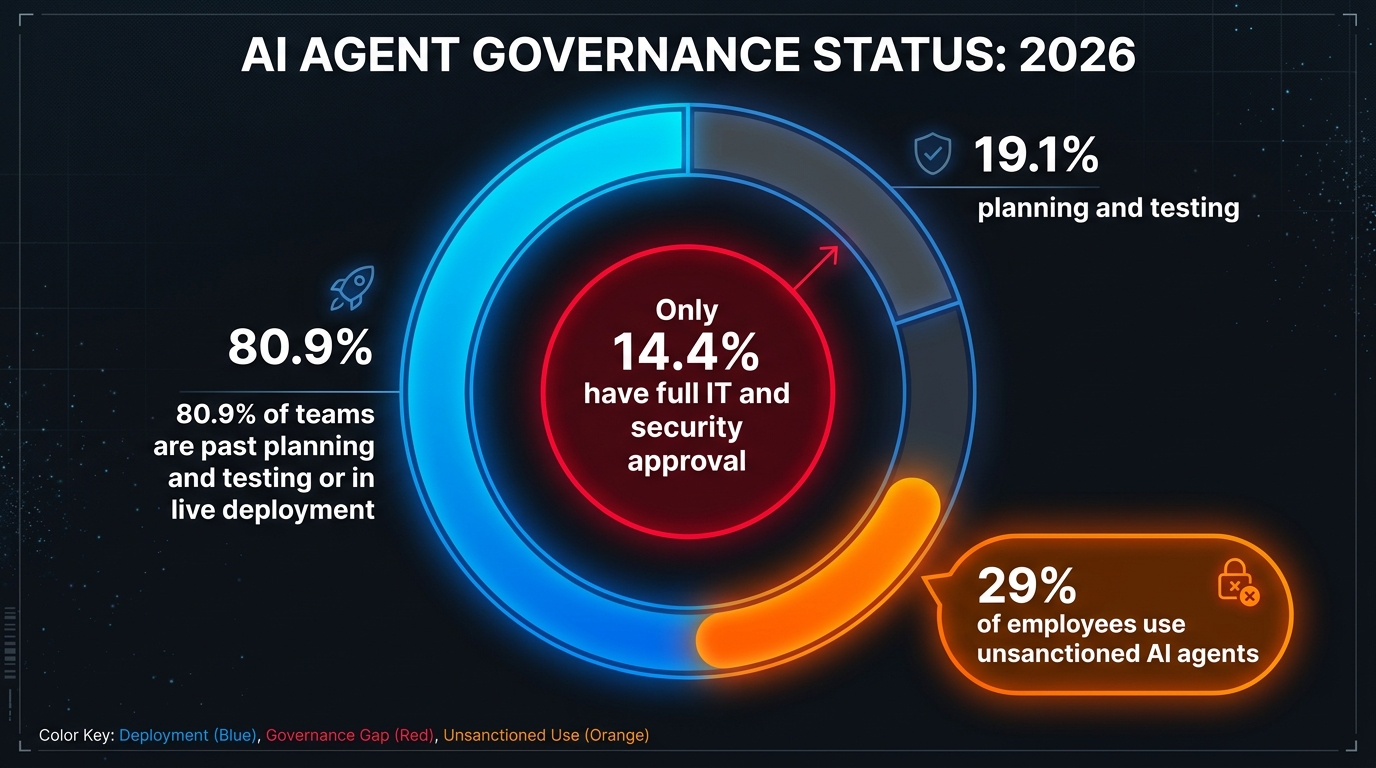
    Donut chart: 80.9% of AI agent teams are in live deployment while only 14.4% have full IT and security approval — the governance gap in 2026

    Here’s the uncomfortable reality sitting underneath the “quiet deployment” trend: governance is not keeping pace with deployment. Not even close.

    According to a 2026 survey by Gravitee, 80.9% of technical teams are past planning and actively testing or running agents in live environments. The same survey found that only 14.4% of organizations have full IT and security approval for their agent fleet. Separately, Microsoft’s February 2026 Cyber Pulse report found that 29% of employees have used unsanctioned AI agents for work tasks — agents that IT neither approved nor monitors.

    The Three Governance Failures That Keep Happening

    Over-permissioned access. Agents are frequently granted broader data and system access than they actually need to perform their defined tasks. This is often a convenience decision made during setup that nobody revisits after deployment. An agent that has read-write access to the entire CRM when it only needs to update contact fields in one object type is an unnecessary liability — both as a security surface and as a potential source of unintended data modifications.

    Absent identity controls. In multi-agent environments, agents are sometimes operating without clear identity scoping — which means there’s no clean answer to “which agent took that action and why?” This matters for incident investigation, regulatory audit, and simply for understanding what’s happening inside a complex workflow. Every agent in production should have a distinct identity with scoped permissions, not shared credentials or inherited environment access.

    No observability, no incident protocol. This is the most operationally dangerous gap. Teams deploying agents without structured logging and monitoring are essentially flying blind. When something goes wrong — and in any sufficiently complex deployment, something eventually goes wrong — they have no way to reconstruct what happened, no mechanism for fast remediation, and no data for preventing recurrence. The absence of an incident response protocol specifically for AI agent failures is particularly common, because organizations adapted their incident playbooks for software bugs and infrastructure failures, not for cases where an autonomous agent made a series of contextually plausible but factually incorrect decisions at volume.

    The Regulator Is Watching

    The EU AI Act’s operational requirements are increasingly shaping governance practices for any organization with European clients or operations. High-risk AI system classifications are being applied to agents that participate in credit decisions, HR workflows, and certain customer-facing operations — which brings documentation, audit trail, and human oversight requirements that many current deployments would fail to satisfy. Even organizations outside the EU’s direct jurisdiction are finding that enterprise clients with EU exposure are pushing AI governance requirements down into their vendor and agency agreements.

    The practical implication: governance documentation is now a sales asset, not just a compliance cost. Operators who can present a clear agent governance framework — identity controls, permission scoping, audit logs, escalation protocols, incident playbooks — are increasingly differentiated in client acquisition conversations, particularly in financial services, healthcare, and regulated manufacturing.


    How Billing Models Shift When Agents Do the Work

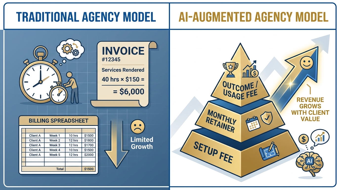
    Before-and-after billing model transformation: from traditional hourly agency invoicing to AI-augmented tiered pricing pyramid

    When an agent handles what used to be 40 hours of human labor, billing on hours becomes economically incoherent. This is the central commercial tension that agencies and service operators are navigating as AI agents mature inside client workflows.

    The Hours Problem

    Traditional service billing — hours multiplied by rate — breaks in two directions when agents enter the picture. Either you bill the same hours for dramatically less work (which clients eventually notice and resent), or you bill for the actual hours spent (which are now a fraction of what they were, compressing revenue even as you deliver more value). Neither outcome is sustainable. The model has to change.

    What’s emerging in practice across agencies and managed service providers deploying agents for clients is a three-layer hybrid structure:

    • Setup fee: A one-time or annual charge for agent design, integration, configuration, and initial calibration. This captures the upfront engineering investment and sets a clear value anchor for the engagement.
    • Monthly retainer: An ongoing fee for monitoring, optimization, governance maintenance, and strategic iteration on the agent’s behavior. This is the recurring revenue base — and it should be scoped around the outcomes being sustained, not the hours being worked.
    • Outcome or usage component: A variable fee tied to agent activity volume or specific business outcomes — tickets handled, leads qualified, documents processed, invoices reconciled. This component scales with client growth and directly links agency revenue to client value.

    The Margin Math

    The economics of this model are compelling when properly constructed. An agency that previously delivered a client ops service with three full-time team members can often achieve better outcomes with one senior strategist, one agent engineer, and a well-configured agent stack. The labor cost drops significantly while the value delivered stays constant or improves. If billing is anchored to value and outcome rather than hours, margin expands substantially.

    The key risk in the transition is underpricing the retainer relative to the value being delivered. There’s a tendency to anchor new pricing to old labor costs — to say “we used to charge $15,000/month for three people, now we’ll charge $8,000/month for the agent setup plus one person.” That math reflects the input cost reduction without capturing the output value improvement. A better framing: what would a client pay to achieve the operational outcomes the agent is delivering? Price toward that number, then work backward to ensure your margin is sustainable.

    Client Conversations About Efficiency Gains

    There’s a version of this conversation that’s awkward and a version that isn’t. The awkward version is when a client discovers that the 40 hours they’re paying for is now being done in 8, and feels like they’ve been overcharged. The clean version is when the conversation shifts to: “We can now deliver X outcome reliably, at this service level, for this price — and we can show you exactly how.” The agent becomes a capability and reliability story, not an hours story. Operators who make this reframe early — ideally before the agent deploys, as part of the scope-setting conversation — protect the commercial relationship rather than straining it.


    The RPA Trap: Why Silent Rollouts Fail the Same Way Twice

    Graveyard of failed tech deployments — RPA 2018, chatbots 2020, shadow AI 2023 — with a new AI agent carrying guardrails walking past

    If you were operating in enterprise tech in 2018, the current AI agent moment will feel familiar in uncomfortable ways. Robotic Process Automation went through nearly identical dynamics: rapid initial deployment, impressive demo-environment results, widespread confidence that this time the technology was mature enough to skip the boring governance work — followed by a wave of expensive failures as bots broke on real-world data variability, process changes, and brittle integration points.

    The organizations that had the worst RPA outcomes in 2018–2020 were, almost universally, the ones that moved fastest from proof of concept to scale without building the operational infrastructure to support what they were scaling. The same pattern is emerging with AI agents in 2026, and it’s important enough to name directly.

    The Four Recurring Failure Patterns

    “Demo worked, production broke.” Agents perform well against clean, curated test data. Real client environments have messy, inconsistent, poorly structured data — and agents that weren’t tested against production data quality will hit edge cases that weren’t anticipated and may fail silently in ways that are worse than obvious errors. The fix is mandatory production data testing before any live deployment, with a representative sample of real operational inputs.

    Process change without agent update. An agent configured against a workflow at time T will behave as if the workflow is still configured at time T indefinitely, unless someone explicitly updates it when the workflow changes. In RPA, this produced “zombie bots” that were processing transactions according to rules that no longer reflected business reality, sometimes for months before anyone noticed. With AI agents, the failure mode is more subtle — the agent doesn’t crash, it just quietly applies outdated logic to current operations. The operational requirement is explicit process change management that includes an “update the agent” step whenever underlying workflows change.

    No owner, no accountability. RPA implementations frequently failed because nobody owned them after deployment. The implementation team moved on, the agent ran unsupervised, and when something went wrong there was no institutional knowledge about how it worked or how to fix it. AI agents need operational owners — named individuals or teams who are responsible for monitoring, updating, and maintaining each agent in production. Without this, agents degrade quietly until they cause a problem loudly.

    Scaling before hardening. The temptation to scale a successful proof of concept quickly, before building robust governance and monitoring infrastructure, is the pattern that turns manageable small-scale deployments into large-scale crises. The companies that are doing this correctly in 2026 treat initial production deployment as a separate phase from scale — they harden the deployment in the initial environment, gather operational data, build the support infrastructure, and only then expand to adjacent functions or additional clients.

    The 78% Stuck-at-Pilot Problem

    Current data suggests approximately 78% of enterprises report having AI agent pilots in some form, but fewer than 15% successfully scale those pilots to full production deployment. This “pilot purgatory” isn’t primarily a technology problem — it’s a governance and organizational problem. The pilots that stay in pilot are usually ones where the deployment infrastructure (observability, ownership, change management, billing model) was never built alongside the agent itself. Building the operational wrapper around the agent isn’t slower than shipping the agent first — it’s the same timeline, when done correctly from the start.


    Building the Ops Stack That Makes Quiet Deployment Stick

    Quiet deployment doesn’t mean minimal infrastructure. In fact, it requires more careful infrastructure design than high-visibility deployments, precisely because the agent is operating without the ongoing scrutiny that announced programs typically receive. The stack has to do the oversight that humans aren’t actively performing.

    The Four Infrastructure Requirements

    Structured logging and traceability. Every agent action needs a structured log entry that captures: timestamp, input received, tool calls made, data sources accessed, decision logic applied, output generated, and confidence or certainty signals where available. This log is the foundation of every other governance capability — auditing, incident response, performance analysis, compliance documentation. Deploying an agent without structured logging is operationally indefensible.

    Permission-scoped identity. Each agent should have a dedicated service identity with permissions scoped precisely to the data and systems it needs — and nothing beyond that. This isn’t just a security practice; it’s an operational clarity practice. When you know that Agent A has read access to the ticketing system and write access only to the “resolved” status field, you have a clear picture of what that agent can and cannot do. That clarity matters enormously when you’re debugging anomalies or explaining agent behavior to a client.

    Kill-switch and circuit breaker mechanisms. Every production agent needs a fast, reliable mechanism for stopping it immediately if something goes wrong. This is the operational equivalent of a circuit breaker in electrical systems — a mechanism that sacrifices one component’s functionality to protect the overall system from damage. The kill-switch should be documented, tested, and practiced. If it takes more than five minutes to stop a misbehaving agent, the kill-switch design needs to be rethought.

    Escalation routing for edge cases. Agents should be designed to recognize when they’re encountering situations outside their training distribution and route those cases to human reviewers rather than attempting to handle them autonomously. This requires explicit out-of-distribution detection in the agent design — rules or model-level signals that trigger escalation when confidence falls below a threshold or when input patterns don’t match expected categories. The alternative — an agent that attempts to handle every input regardless of whether it understands it — is the design that produces the incidents that end client relationships.

    Choosing the Right Orchestration Layer

    In 2026, the orchestration landscape for production agent deployments has consolidated somewhat around a few key patterns. Agents built on top of established enterprise platforms (Microsoft Copilot Studio, Salesforce Agentforce, ServiceNow Now Assist) benefit from the security, identity, and audit infrastructure already built into those platforms. This is often the right choice for client environments that already have these platforms in place — the governance infrastructure is substantially pre-built.

    Custom agent stacks built on frameworks like LangChain, LlamaIndex, or proprietary orchestration layers offer more flexibility but require more governance work to be built from scratch. The right choice depends on the client environment, the specific workflow being automated, and the governance requirements — not on which framework is most exciting to the engineering team.


    Measuring What Matters When Agents Are Invisible

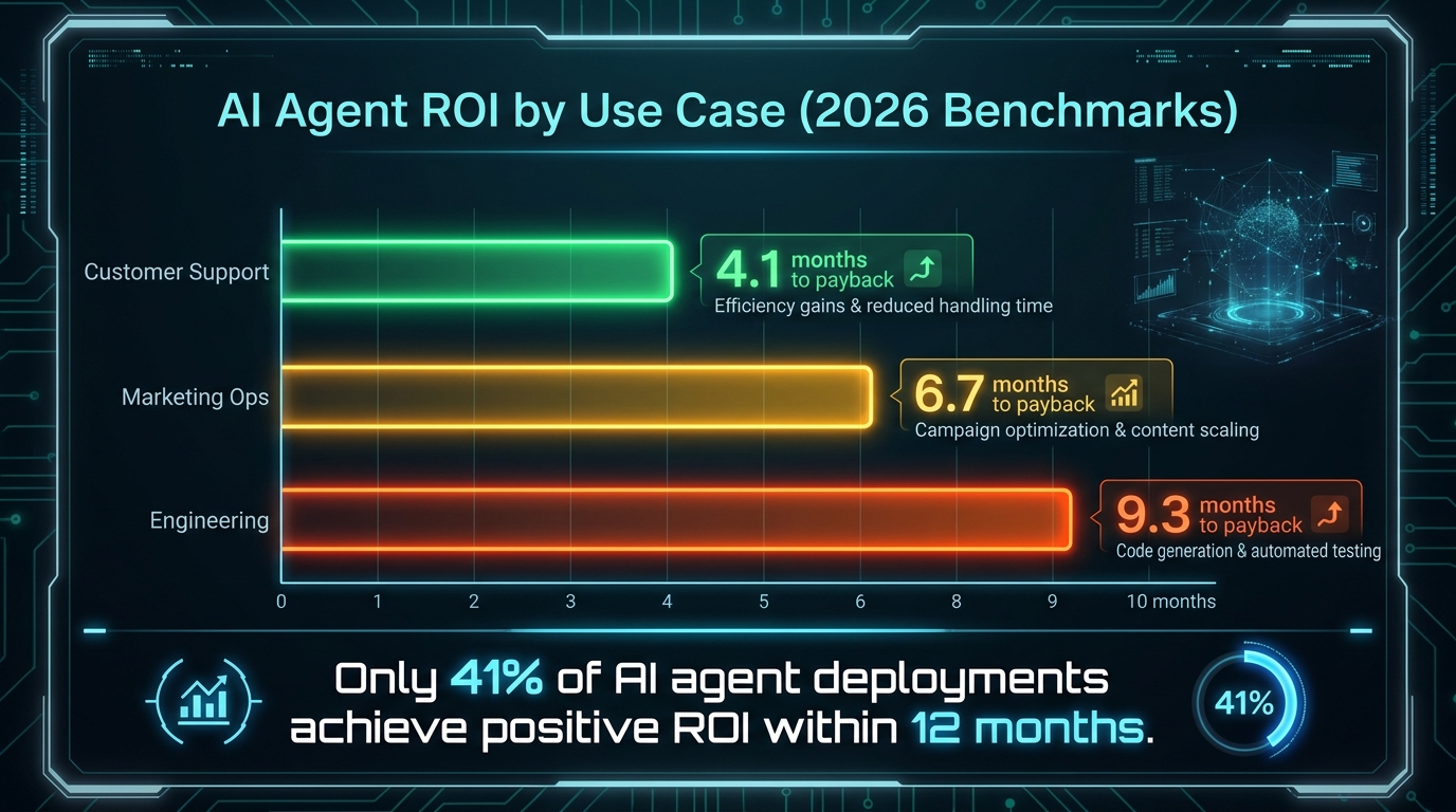
    AI Agent ROI by use case: customer support 4.1 months payback, marketing ops 6.7 months, engineering 9.3 months — only 41% achieve positive ROI within 12 months

    Quiet deployment creates a measurement challenge that loud deployment doesn’t: there’s no shared baseline event (the launch) from which everyone is measuring improvement. When an agent deploys invisibly into an existing workflow, the before-and-after comparison requires retrospective baseline data — and if you didn’t capture that baseline data before deployment, the ROI story becomes difficult to tell convincingly.

    Establishing the Pre-Deployment Baseline

    Before any agent goes into shadow mode, at minimum four baseline metrics should be captured and documented for the specific workflow being targeted:

    • Volume: How many transactions, tickets, tasks, or interactions does this workflow process per day/week/month?
    • Cycle time: How long does it take from input to output on an average case? What’s the range (95th percentile vs. median)?
    • Error rate or quality rate: What percentage of outputs require correction, rework, or escalation in the current human-driven workflow?
    • Labor cost: How many hours of human time does the workflow consume, and at what fully-loaded cost?

    These four numbers, captured before deployment, create the denominator for every ROI calculation you’ll ever want to make about this agent. Without them, you’re arguing from anecdote rather than evidence — which works fine for early stakeholder enthusiasm but fails at renewal conversations and program expansion discussions.

    The ROI Benchmarks That Are Holding in 2026

    Current data on AI agent payback timelines in client operations is giving operators a realistic expectation-setting framework. Customer support agents are showing the fastest payback — a median of approximately 4.1 months to positive ROI in mature deployments. Marketing operations agents (content routing, campaign data management, lead qualification support) are averaging around 6.7 months to payback. Engineering operations (PR review assistance, documentation automation, CI/CD pipeline management) are taking approximately 9.3 months.

    Across all categories, only about 41% of deployments achieve positive ROI within 12 months. That’s not a failure rate — it’s a reflection of the fact that deployments that treat agents as drop-in automation tools, without investing in the operational infrastructure and ongoing optimization that mature deployments require, tend to plateau at modest efficiency gains rather than compounding toward the 3–6x returns that well-managed deployments achieve.

    The Metrics That Catch Silent Failures

    Standard productivity metrics (tickets resolved, time saved, labor cost reduced) are necessary but not sufficient for managing agent-embedded workflows. Silent failures — cases where the agent is technically operating but producing systematically incorrect outputs — won’t show up in volume or time metrics. The metrics that catch silent failures are:

    • Escalation rate trend: If the rate at which cases escalate to human review is drifting upward, the agent is encountering more cases it can’t handle — either because the workflow evolved, the data quality changed, or the underlying model is decaying against new input patterns.
    • Re-open rate: In support workflows, if customers are reopening tickets that the agent marked as resolved, that’s a quality signal that something in the agent’s resolution logic isn’t working.
    • Human correction rate in audit samples: If the percentage of agent actions being corrected in audit reviews is increasing, that’s an early warning of systematic drift that needs investigation before it becomes a client-facing problem.

    The Conversation You Eventually Have to Have

    Here’s the thing about quiet deployment: it’s a starting strategy, not a permanent one. At some point — usually around the 60–90 day mark in a healthy deployment — the agent’s presence becomes visible enough that the conversation shifts from implicit to explicit. Either the client notices the improvement and asks what changed, or you proactively surface the story because you need their input on expanding scope.

    How you handle this conversation largely determines whether quiet deployment was a smart sequencing decision or a trust-eroding deception. The difference is entirely in the framing.

    Framing the Reveal as a Value Story, Not a Confession

    The wrong framing: “We’ve actually been running an AI agent in your workflow for the past eight weeks without telling you.” This activates every concern about autonomy, transparency, and control that a careful stakeholder would reasonably have.

    The right framing: “Over the past eight weeks, we’ve been testing a new workflow automation capability in observation mode, calibrating it carefully against your specific data and processes. Here’s what we’ve measured. Here’s the accuracy data. Here’s what it’s been handling. At this point, we think there’s a significant opportunity to expand its scope — and we wanted to walk you through the results before we have that conversation.”

    The difference isn’t spin. It’s accurate characterization of what actually happened. Shadow mode is testing, not deployment. Co-pilot is assisted operation, not autonomous action. The language of careful, measured iteration is both accurate and palatable in a way that “we deployed AI into your ops without asking” simply isn’t.

    What Clients Actually Want to Know

    When clients learn they’ve been running agents, the questions they actually ask — as opposed to the objections that might never materialize — tend to center on a small set of practical concerns:

    • Can I see what it’s been doing? (Observability documentation answers this.)
    • What happens when it gets something wrong? (Escalation protocol and error correction process answer this.)
    • Who’s responsible for it? (Operational ownership structure answers this.)
    • Can I turn it off? (Kill-switch documentation answers this.)
    • Is our data safe? (Permission scoping and data handling documentation answer this.)

    These are all answerable questions if the deployment was built with proper governance from the start. Operators who have the governance infrastructure can answer them in one meeting and accelerate rather than stall the relationship. Operators who deployed quickly without governance infrastructure are in a very difficult position when these questions come up — and they always come up eventually.

    The Clients Who Need the Conversation First

    It’s worth being explicit about when the quiet approach isn’t appropriate. Regulated industries — healthcare (HIPAA), financial services (SOC 2, relevant financial regulation), legal, and any environment subject to the EU AI Act’s high-risk provisions — typically have explicit disclosure requirements for automated decision-making systems. Deploying agents in these environments without upfront governance conversations and documented compliance frameworks isn’t just commercially risky; it may be directly non-compliant.

    Similarly, any client workflow that touches end-user data in ways that could implicate privacy regulation (GDPR, CCPA, applicable state laws) requires upfront clarity about how agent-processed data is handled, stored, and auditable. Getting this conversation right at the beginning is substantially easier than explaining a compliance gap after the fact.


    Ship Quietly, Govern Loudly

    The most successful AI agent operators in 2026 share a counterintuitive operating philosophy: they’re maximally conservative about deployment noise and maximally serious about operational governance. They ship quietly not because they’re hiding something, but because they’ve learned that value demonstrated is more persuasive than value announced. They govern loudly not because regulators are forcing them to, but because governance is what makes quiet deployments sustainable instead of fragile.

    The practical takeaways from this model are concrete:

    • Start in shadow mode, always. Not because you don’t trust the agent, but because you need real data from the real environment before you expand autonomy. No production environment is the same as the development environment.
    • Earn each rung of the trust ladder through performance data. Timeline pressure is not a valid reason to promote an agent to the next autonomy level. Data is.
    • Build governance before you need it. Structured logging, permission scoping, and escalation protocols are not overhead — they’re the infrastructure that makes the deployment defensible, scalable, and client-safe.
    • Capture your baseline before you ship. Volume, cycle time, error rate, and labor cost — four numbers, documented before deployment, that make every future ROI conversation clean and convincing.
    • Evolve the billing model toward outcomes. Hours billing breaks when agents are doing the hours. The sooner you reframe around value and outcomes, the cleaner the commercial relationship will be as deployment matures.
    • Know when to have the conversation first. Regulated environments and data-sensitive clients need governance alignment upfront, not after the fact. Quiet deployment is a strategy for specific contexts, not a universal approach.

    The organizations that are building durable AI agent capabilities inside client operations aren’t the ones making the most noise about it. They’re the ones whose clients simply notice, at some point, that things work better than they used to — and who, when asked what changed, have a clear, data-backed, governance-documented answer ready to give.

    That’s the quiet ship. And in 2026, it’s the ship that’s actually arriving at port.

  • How to Build an AI Image Workflow That Amazon’s Enforcement System Won’t Touch

    How to Build an AI Image Workflow That Amazon’s Enforcement System Won’t Touch

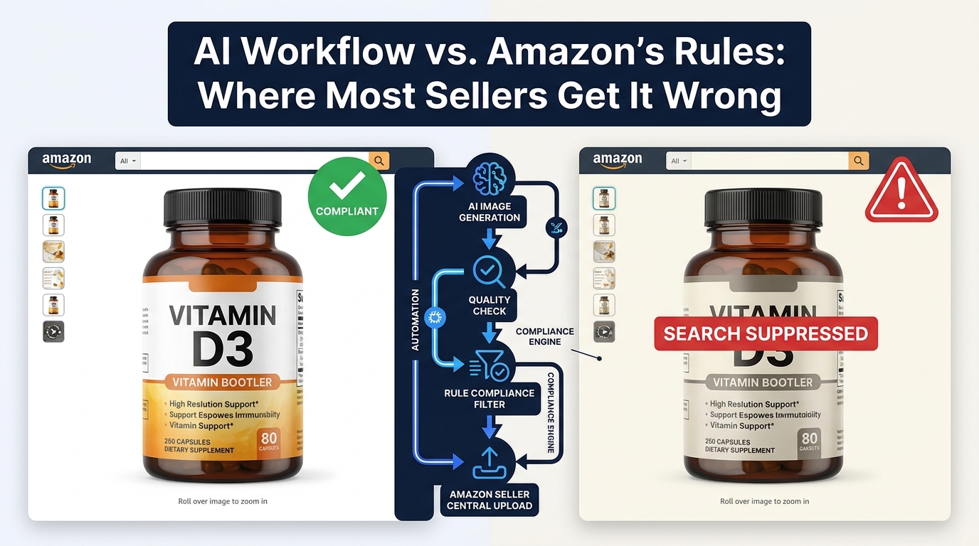
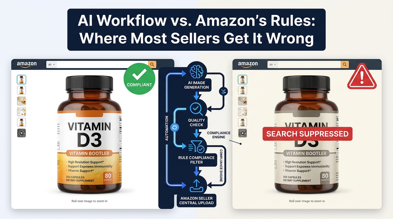
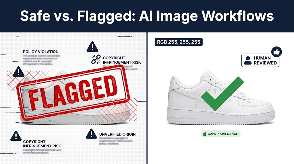
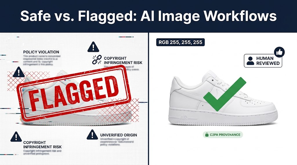
    AI image workflow compliance vs Amazon enforcement: compliant listing versus search suppressed listing comparison

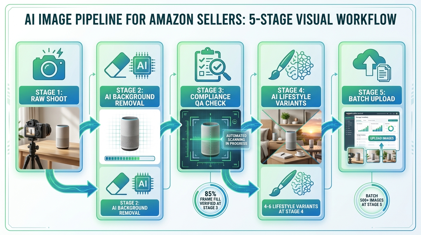
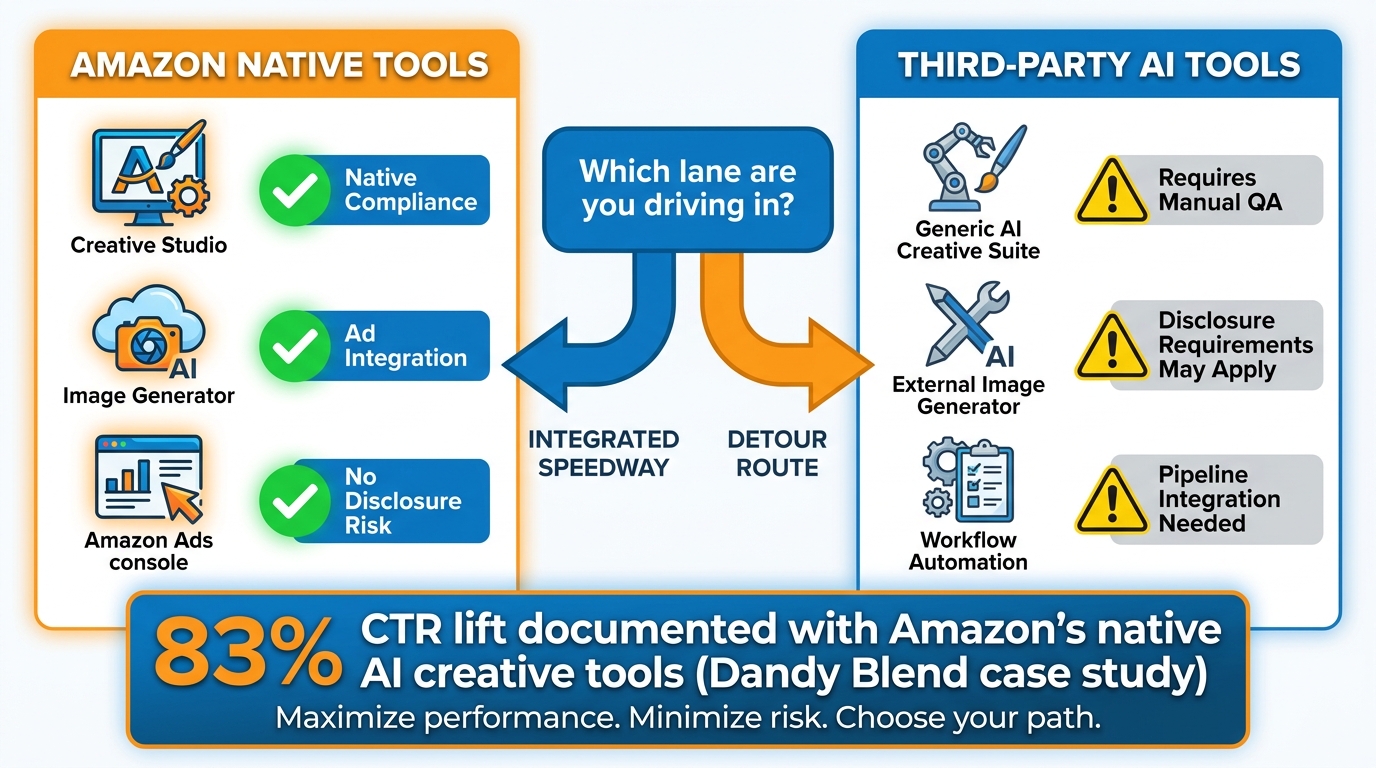
    AI image generation has moved from experimental novelty to standard practice across Amazon’s seller ecosystem. By 2026, the majority of active sellers are using some form of AI-assisted imagery — whether that’s a background removal tool, a lifestyle scene generator, an AI model compositor, or Amazon’s own native creative tools inside the Ads console. The capability has never been more accessible.

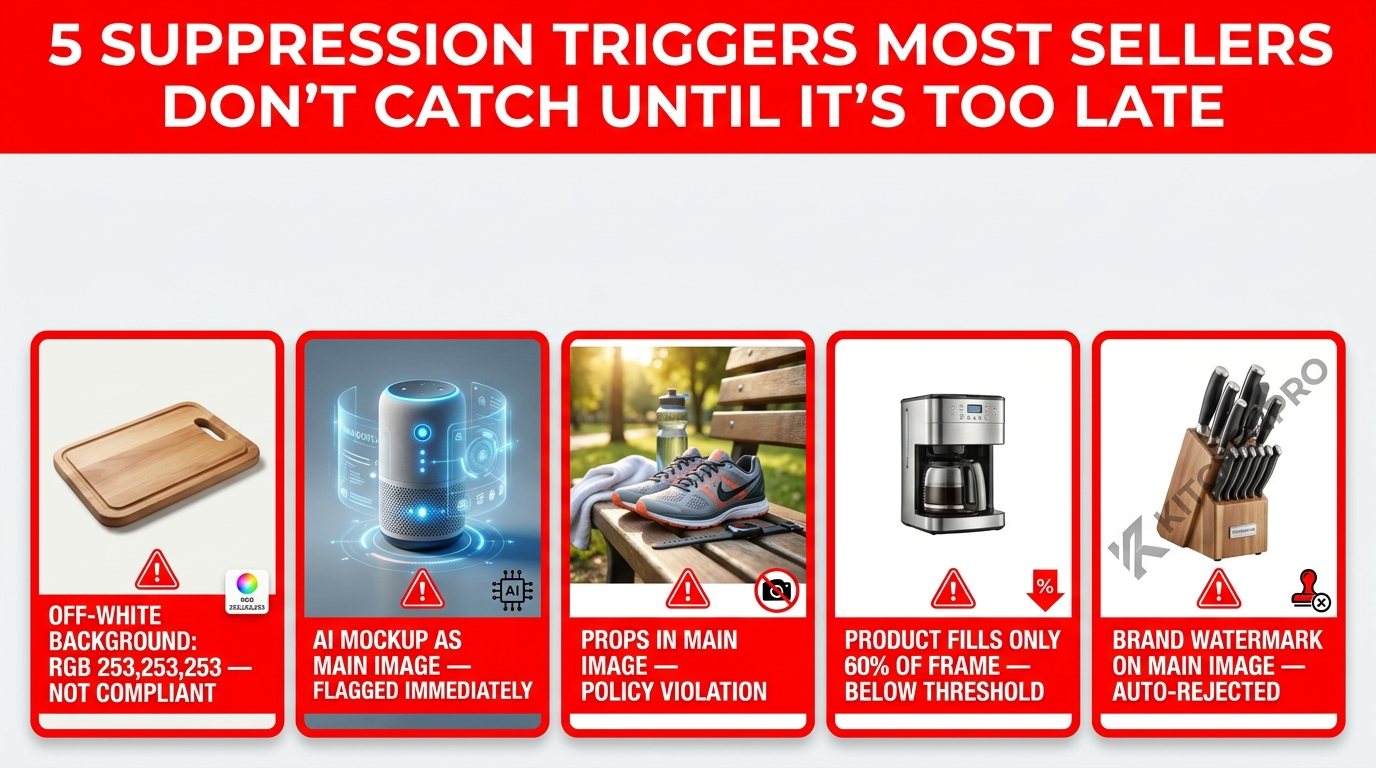
    The problem is that most sellers are building their AI image workflows backwards. They start with “what can this tool generate?” rather than “what does Amazon’s enforcement system actually scan for?” Those two questions lead to very different workflows — and the gap between them is where listings get suppressed, images get rejected, and, in serious cases, accounts face action.

    Amazon’s automated enforcement in 2026 is faster, more granular, and more technically precise than it was two years ago. Computer vision models scan listing images at upload and on an ongoing basis. They check background color values at the pixel level, measure product fill ratios within the frame, detect signs of synthetic rendering, and cross-reference what’s shown in an image against what the product detail page actually claims to sell. Enforcement that once took days now happens in minutes — sometimes faster than a seller can refresh Seller Central.

    This guide is not about whether you can use AI images on Amazon. You can. It’s about how to structure a workflow that uses AI at every appropriate stage, stays within the rules that Amazon’s system enforces, and builds in compliance as a technical property of the pipeline itself rather than a manual afterthought you hope doesn’t get missed.

    There is a meaningful difference between “we use AI for images” and “we have a workflow where every AI-generated or AI-assisted image is guaranteed to be compliant before it touches Seller Central.” This guide will help you close that gap.

    The Two-Track Rule: Why Amazon’s Policy Treats Main Images and Secondary Images Completely Differently

    Amazon two-track image policy infographic: strict main image rules versus permissive secondary and A+ content rules

    The single most important thing to understand about Amazon’s image rules — and the thing that most AI workflow guides gloss over — is that Amazon operates a fundamentally two-track policy. The rules governing your main (hero) image and the rules governing your secondary images and A+ content are not just different in degree. They are different in kind.

    Getting these two tracks confused is the root cause of most compliance failures in AI image workflows. A seller who understands exactly where each track begins and ends can use AI aggressively, efficiently, and without risk. A seller who treats both tracks as operating under the same rules will either under-use AI (leaving creative value on the table) or over-apply it to the main image (and trigger suppression).

    Track One: The Main Image — Maximum Constraint

    Amazon’s main product image rules in 2026 exist essentially unchanged from their core intent, but enforcement precision has tightened considerably. The requirements are non-negotiable:

    • Pure white background: The background must be RGB 255,255,255. Not 253,253,253. Not 250,250,250. Not “off-white.” The specific hex value is #FFFFFF, and Amazon’s computer vision system is capable of detecting deviations that would be imperceptible to the human eye at normal display sizes. A background that looks white on your monitor but reads as 252,252,252 at the pixel level will trigger a non-compliance flag.
    • Real product only: The item depicted must be the actual product being sold. Not a 3D render of the product. Not an AI-generated representation of what the product looks like. Not a mockup. The real, physical item as it actually exists. This is the main image rule that has the most direct implications for AI workflows — AI-generated or AI-rendered main images are not acceptable.
    • Product fill ratio: The product should occupy approximately 85% of the image frame. Too much white space and the image fails the threshold; too tightly cropped and important product details may be cut off. Most compliance failures here come from background removal tools that leave excessive white padding around a small product silhouette.
    • No text, graphics, or overlays: No watermarks, no brand logos, no “new” badges, no pricing callouts, no promotional text of any kind. This includes subtle watermarking that exists as part of a photographer’s or agency’s standard output.
    • No props or additional objects: The main image should show the product and nothing else. Contextual props, staging items, or environmental elements that would be acceptable in secondary images are not permitted on the main image.

    Where does AI fit into main images? Specifically and narrowly: AI tools are acceptable for editing and enhancing photographs of real products. AI background removal to achieve that pure white standard is not only acceptable but is now the dominant workflow for doing it efficiently. AI-powered edge cleanup, shadow correction, and color calibration are all legitimate main image workflows. What AI cannot do is replace the real product photograph with a synthetic representation.

    Track Two: Secondary Images and A+ Content — Significant Creative Freedom

    The secondary image slots (positions 2 through 9) and Amazon’s A+ Content module operate under substantially different rules — and this is where AI’s full creative capability can be deployed without constraint, provided the images remain accurate and non-misleading.

    For secondary images and A+ content, AI-generated and AI-assisted imagery is permitted for:

    • Lifestyle and contextual scenes: AI-generated environments, rooms, outdoor settings, and contextual scenes showing the product in use. The product itself should be real and accurately represented; the environment around it can be entirely AI-generated.
    • AI-generated models: Amazon permits the use of AI-generated models in lifestyle images, subject to standard content guidelines (accuracy in skin tone representation, appropriate dress standards, etc.).
    • Infographic overlays: Callout text, dimension annotations, feature labels, and benefit comparisons are all permitted in secondary images and A+ content — something that is explicitly prohibited in the main image.
    • Composite and comparison images: Before/after comparisons, size reference images, and multi-product views can all be AI-assisted without compliance risk in these secondary positions.
    • Mood and contextual backgrounds: Studio-quality environmental backgrounds, brand aesthetic scenes, and aspirational settings that communicate product use cases are fully permitted.

    The primary compliance constraint in the secondary track remains truth in advertising: whatever your secondary images show must not misrepresent what the buyer will receive. You cannot use AI to make the product look larger, more feature-rich, or higher quality than it actually is. But the creative latitude for storytelling, context, and visual brand communication is wide.

    Inside Amazon’s Automated Enforcement: What the Scanner Actually Checks

    Amazon automated image enforcement system diagram showing computer vision detection layers for background, fill ratio, AI artifacts, and product matching

    Amazon doesn’t publish technical documentation on its enforcement algorithms. What’s known about how automated image scanning works comes from a combination of official policy documentation, Seller Central error messages, and the observed patterns reported by sellers who have experienced suppression and successfully diagnosed the cause.

    Understanding what the scanner is checking — at least at the functional level — is essential for building a workflow that pre-empts failures before images are submitted.

    Background Color Detection

    This is the most precise and unforgiving check in Amazon’s main image scan. Amazon’s system evaluates the pixel values in the background region of the main image against the target value of RGB 255,255,255. The detection is not limited to sampling a few pixels — it evaluates the background area comprehensively.

    The practical implication: background removal tools that output a “visually white” result are not sufficient. You need a tool that explicitly outputs true pure white (RGB 255,255,255) in background regions and that handles edge pixels cleanly. Many background removal tools produce slight color fringing or semi-transparent edge pixels that composite over white in a way that looks correct on screen but reads as slightly non-white to a pixel-level scanner.

    The fix: after any AI background removal step, your pipeline should include a programmatic background color verification step that checks the actual pixel values in the background region — not just a visual review — before the image proceeds to upload.

    Product Fill Ratio Analysis

    Amazon’s scanner detects how much of the image frame the product actually occupies. This is a classic computer vision task: segment the product from the background, measure the bounding area of the product segmentation, and calculate the ratio against the total frame area.

    The most common failure mode here is a background removal workflow that produces a correctly white background but leaves excessive white space around a small product. A product that occupies only 50–60% of the frame may pass visual inspection but fail the automated fill ratio threshold.

    Some tools address this with automatic crop-and-frame functionality — after removing the background, they automatically reframe the product to ensure adequate fill. If your workflow doesn’t include this step, it’s a gap worth closing.

    AI Artifact and Synthetic Rendering Detection

    This is the enforcement layer that has evolved most significantly in 2026. Amazon now deploys computer vision models capable of distinguishing between photographs of real products and AI-generated or 3D-rendered representations.

    What does the scanner look for? The patterns that distinguish AI-generated imagery include: unnaturally smooth surface textures, inconsistent micro-shadow behavior, edge sharpness that doesn’t conform to optical physics, depth-of-field patterns that don’t match real lens characteristics, and repetitive texture artifacts that are characteristic of generative models.

    This does not mean that AI cannot touch main images at all — AI-powered photo editing that starts from a real photograph typically doesn’t produce these synthetic artifacts in a way that triggers flags. What triggers this check is using AI to generate the product image from scratch, or using AI to significantly reconstruct product surfaces in ways that produce synthetic-looking output.

    Product-Listing Correspondence Check

    Beyond the image itself, Amazon’s enforcement system cross-references what is visually depicted in listing images against the product’s title, category, and detail page claims. An image showing a product significantly different in color, size, or configuration from what the title and bullet points describe is a compliance risk.

    This check matters specifically for AI workflows because AI lifestyle generators can inadvertently introduce product modifications: changing a product’s color to better match a background scene, altering the apparent size, or including accessories that are not part of the actual product. Each of these is a potential match failure between the image and the listing data.

    Text and Watermark Detection

    OCR-based scanning detects text in main images — including promotional copy, watermarks, and even subtle branding that photographers embed in their deliverables. In AI workflows, this can surface unexpectedly if generation prompts inadvertently produce text-like patterns or if AI-enhanced images retain photographer metadata visible in the image itself.

    The Main Image Red Lines: Where AI Has Zero Margin for Error

    Given the enforcement architecture described above, the rules for AI usage in main image workflows are essentially these: AI can edit real photographs; AI cannot create main images.

    This is a crisp, workable distinction — but in practice it creates specific edge cases that sellers get wrong.

    The 3D Render Problem

    High-quality 3D product renders have been used as Amazon main images for years, with varying levels of enforcement. In 2026, enforcement against render-based main images has become significantly more consistent. Amazon’s AI-artifact detection is better calibrated to identify renders specifically — even photorealistic ones produced from premium 3D software.

    If your catalog has historically used 3D renders for main images, this is the year to replace them with real product photography. The compliance risk of continuing with renders has increased materially. The good news is that AI-assisted photography workflows have reduced the cost and time required to produce main image-quality real product photos — making the transition operationally achievable even for large catalogs.

    The AI Enhancement Overreach Problem

    AI photo enhancement tools exist on a spectrum from “subtle touch-up” to “full surface regeneration.” At the subtle end — exposure correction, color calibration, minor blemish removal, edge cleanup after background removal — AI enhancement is safe and appropriate. At the aggressive end — where the tool is reconstructing product surfaces, changing material textures, or using inpainting to “improve” how the product looks — you risk creating an image that Amazon’s scanner treats as synthetic and that also potentially misrepresents the product.

    The practical rule of thumb: if you would be comfortable showing the AI-enhanced main image to the customer alongside the actual product they’ll receive, and the difference is invisible, the enhancement is probably within acceptable bounds. If the enhancement makes the product look materially better or different from what the customer will receive, it’s both a compliance risk and a returns risk.

    The Background Replacement Subtlety

    Background replacement tools for main images — which remove whatever background exists in a raw product photo and replace it with pure white — are not just acceptable but are now standard practice. The compliance concern with these tools isn’t whether you use them; it’s whether the output actually meets the pure white standard.

    Many background replacement tools use a soft-edge algorithm that produces semi-transparent pixels at the product edge. When these semi-transparent edge pixels are composited over white in your design tool, they look fine. But when Amazon processes the uploaded file, what it may see are edge pixels with RGB values like 240,240,240 — technically not white, technically a background color violation. Your pipeline needs to account for this by forcing edge pixels to full opacity against the white background, or by using a background replacement tool that outputs hard-edged white directly.

    Where AI Has Full Creative License: Secondary Images, Lifestyle, and A+ Content

    If main image compliance is about constraint and precision, secondary image strategy is about creative ambition. This is where a well-designed AI workflow creates genuine competitive advantage — not by bending rules, but by producing, at scale and speed, the kind of rich visual content that drives conversion.

    AI Lifestyle Scene Generation

    The lifestyle secondary image — the product placed in a real-world context, shown in use, embedded in an aspirational environment — has consistently demonstrated higher conversion impact than white-background secondary images in most product categories. A consumer goods product shown in a kitchen setting. A fitness accessory shown in use during a workout. A home décor piece shown in a styled living room.

    These images have historically required professional photography budgets: studio time, location fees, model fees, prop sourcing, and post-production. For large catalogs with many SKUs, the economics frequently meant that only hero products received proper lifestyle photography.

    AI lifestyle generation changes that calculus. Tools like Amazon’s own Image Generator (available through the Amazon Ads console), along with third-party platforms purpose-built for product placement in AI-generated environments, can produce credible lifestyle images for every SKU in a catalog — not just the hero products. The product photograph used as a starting point needs to accurately represent the real item; the environment, styling, and context around it can be AI-generated.

    Infographic and Feature Call-Out Images

    Secondary image slots are frequently used for infographic-style images: text callouts identifying key product features, dimension annotations, comparison charts, and benefit-focused visual copy. AI workflows can automate the generation of these images at scale, particularly for catalogs with consistent product structures — the same callout template populated with different feature details for each SKU.

    This is an area where AI excels at scale but where human review remains important: the product claims made in infographic secondary images need to be accurate for each specific ASIN. An AI-generated infographic that claims a feature the product doesn’t have is a policy violation regardless of how visually polished it is.

    A+ Content Visual Modules

    Amazon’s A+ Content (formerly Enhanced Brand Content) allows brand-registered sellers to replace the standard product description with rich visual modules. These modules support full-width imagery, comparison charts, lifestyle photography, and mixed text-image layouts.

    A+ Content image requirements are more permissive than listing images — they function essentially as brand creative content rather than product-specific compliance photography. AI-generated imagery is well-suited for A+ Content production, particularly for creating consistent visual brand language across a catalog.

    The compliance constraints that apply to A+ Content relate mainly to content accuracy (no claims the product can’t support) and prohibited content categories (restricted categories like health claims have additional content rules). The image generation method itself — AI-generated or otherwise — is not a primary compliance concern at this level.

    Building Your Compliance-First AI Pipeline: The Five-Stage Architecture

    5-stage AI image pipeline for Amazon sellers: raw shoot, AI background removal, compliance QA, lifestyle variants, batch upload

    The specific tools in your AI image stack matter less than the architecture of the pipeline they sit within. A compliance-first pipeline treats Amazon’s technical requirements not as a checklist to run through at the end, but as constraints encoded into each stage of the process — making it structurally impossible for non-compliant images to reach Seller Central.

    Here’s the five-stage architecture that accomplishes this:

    Stage 1: Raw Shoot — Building the Correct Foundation

    Everything in the pipeline flows from the quality of the original product photograph. AI tools downstream can correct a lot, but they cannot generate compliance properties that the raw image fundamentally lacks. A raw product photo that is blurry, poorly lit, inaccurately colored, or shot at a resolution below 1,000px on the longest side cannot be reliably made compliant through AI processing alone.

    The practical standard for raw shoot inputs into an AI pipeline: minimum 2,000px on the longest side (4,000px is better), accurate product color rendering, clean product surface (dust, fingerprints, and packaging damage that you wouldn’t want in the final image should be addressed at the shoot, not in post), and if possible, shot against a controlled background (even a light gray sweep) to give background removal tools clean material to work with.

    The good news is that modern smartphone cameras at the flagship level produce raw material that meets these standards for most product categories. A dedicated product photography setup — a lightbox, two side lights, and a white or light gray background — combined with a recent flagship phone is sufficient for generating the raw inputs that the rest of this pipeline requires.

    Stage 2: AI Background Removal and White Canvas Creation

    This is the stage where AI earns its keep most clearly for main images. The goal of this stage is to output a product image isolated on an exactly-RGB-255,255,255 background, with clean edges, correct product fill ratio, and no edge pixel artifacts.

    The tools for this step — Removal.AI, PhotoRoom, Remove.bg, and several others built specifically for e-commerce workflows — have reached a level of quality where the output is routinely better than what manual Photoshop masking would produce for most product types. The key capability to require of whichever tool you choose: explicit control over background color output (not “white” but specifically RGB 255,255,255) and edge rendering options that produce clean, non-fringing product silhouettes.

    After background removal, your pipeline should auto-crop and reframe the product to achieve approximately 85% frame fill. Many of the dedicated e-commerce background tools handle this automatically. If yours doesn’t, a simple post-processing step that measures the product bounding box and crops to achieve the target ratio is worth building in.

    Stage 3: Automated Compliance QA Check

    This is the stage that most workflows skip — and it’s the most valuable addition to a compliance-first pipeline. Before any image moves forward, an automated QA step runs a set of checks that mirror what Amazon’s enforcement scanner looks for:

    • Background color verification: Sample pixels from multiple background regions and confirm RGB values are 255,255,255. Flag any deviation for human review.
    • Product fill ratio measurement: Calculate the percentage of frame area occupied by the product. Flag images below 80% for reframing.
    • Resolution check: Confirm the image is at least 1,000px on the longest side (1,600px minimum recommended, 2,000px+ preferred).
    • Text and logo detection: Run OCR and logo detection on the image. Flag any detected text or watermarks for review.
    • File format and naming verification: Confirm correct file format (JPEG is most reliable for Amazon), correct file naming convention (ASIN or other product identifier, no special characters).

    This QA step can be implemented with computer vision APIs (Amazon’s own Rekognition service from AWS is a logical choice given the context), open-source image processing libraries like OpenCV, or purpose-built compliance checking tools. The implementation complexity is not high; the value is significant. Images that fail any QA check are routed back for correction before they ever reach Seller Central, which means your suppression rate drops to near zero.

    Stage 4: AI Lifestyle and Secondary Image Generation

    With a verified, compliant main image in place, Stage 4 generates the secondary image set. This is where AI operates with the most latitude and produces the most creative value.

    The input for this stage is typically the product’s white-background cutout from Stage 2 (the product image without any background), which gets composited into AI-generated or AI-selected environments. The prompt or scene selection strategy at this stage should be guided by category-specific best practices: what lifestyle contexts have demonstrated conversion performance in your product category? What use cases does your customer base identify with?

    A well-designed Stage 4 produces a set of lifestyle variants for each SKU in a consistent visual style. The Amazon Ads Image Generator (accessed through the Creative Studio in the advertising console) is a natural tool for this step if you’re generating lifestyle images for ad creatives. For listing secondary images, third-party tools with product-in-scene compositing capabilities are currently more flexible.

    Stage 5: Batch Upload and Catalog Management

    The final stage manages the transfer of QA-verified images into Seller Central at scale. For catalogs with hundreds or thousands of SKUs, manual upload is not a viable workflow. Amazon’s Seller Central supports bulk image upload via feed files, and the SP-API enables programmatic image upload and management for sellers with sufficient technical resources or third-party catalog management tools.

    At this stage, the critical compliance consideration is ASIN matching — confirming that each image file is correctly associated with the right ASIN before upload. An error at this stage that puts the wrong product’s image on a live listing is both an immediate policy violation and a customer experience problem that can generate negative reviews and return requests before you catch it.

    Amazon’s Own AI Tools vs. Third-Party: Knowing Which Lane to Drive In

    Amazon native AI tools versus third-party AI tools comparison: compliance, integration, and disclosure requirements

    One of the most practical decisions in designing an AI image workflow for Amazon is where to use Amazon’s own tools versus third-party AI platforms. The answer isn’t “one or the other” — it’s understanding what each is optimized for and routing work accordingly.

    What Amazon’s Native Tools Are Built For

    Amazon has deployed AI image generation tools in two primary contexts: the Image Generator and Creative Studio (accessed through the Amazon Ads console, aimed at ad creative production) and AI-assisted listing tools within Seller Central (including the AI listing generator and various enhancement features).

    The native tools have specific advantages:

    Native compliance context: When Amazon’s own tool generates an image for use in its own ad system, it applies its own content rules within the generation process. Images produced by Amazon’s Creative Studio tools for Sponsored Brands and Sponsored Display ads are generated within a guardrailed context where the most obvious policy violations are difficult to produce accidentally.

    Ad system integration: For images destined for Sponsored Products, Sponsored Brands, or Sponsored Display campaigns, the Amazon Ads tools have direct integration into the campaign creation workflow. There’s no separate upload step, no format conversion, and no compliance review lag — images go directly into the ad unit.

    Performance data: Images created through Amazon’s ad creative tools are eligible for Amazon’s own performance reporting and A/B testing infrastructure. You can run creative tests against each other and get direct ROAS and CTR attribution, which third-party tools operating outside Amazon’s ad ecosystem cannot provide at the same level of granularity.

    The performance data from Amazon’s own tools is compelling: one documented case study (Dandy Blend’s Sponsored Brands campaign) recorded an 83% CTR lift when switching to AI-generated lifestyle creatives produced through Amazon’s image tools. Sponsored Brands ads using custom lifestyle images combined with Store spotlight formats have shown conversion rates 57.8% higher than those using standard product images alone, according to Amazon’s own campaign data.

    Where Third-Party Tools Are More Capable

    Amazon’s native tools are optimized for ad creative production within the Amazon Ads ecosystem. For listing image workflows — the main image, the secondary gallery, A+ Content modules — third-party tools currently offer more capability:

    Listing image production: Amazon’s native AI tools are not primarily designed to produce listing gallery images. Background removal, product-in-scene lifestyle compositing, and infographic generation for listing images is better handled by third-party tools built specifically for e-commerce product photography workflows.

    Batch processing at scale: Third-party tools generally offer better batch processing capabilities for large catalogs. If you’re processing 500 or 5,000 SKUs, you need workflow automation features — template-based generation, bulk export, catalog integration — that Amazon’s native tools don’t currently provide at the listing image level.

    Creative control and brand consistency: For brands with established visual identities, third-party tools generally offer more control over the visual output — specific color palettes, lighting styles, background environments, and brand aesthetic elements that must be consistent across a catalog.

    The Disclosure Question

    As Amazon’s policy has tightened around AI disclosure, the question of when and how to disclose that images were AI-generated or AI-assisted has become more relevant. Amazon’s Brand Registry tools and some upload workflows now include AI disclosure fields.

    The clearest guidance: images generated by Amazon’s own tools within its own systems don’t require separate seller-level disclosure. For third-party AI-generated images uploaded to listings, the disclosure requirements are evolving and may vary by program. Amazon’s KDP already requires explicit AI disclosure; standard marketplace listing policy on this point continues to develop.

    The conservative approach — and the one that minimizes compliance risk — is to disclose AI usage in image creation through whatever mechanism Amazon provides in your upload workflow, and to maintain documentation of which images were AI-generated versus photographed, in case Amazon’s disclosure requirements become more formal and auditable.

    Common Workflow Mistakes That Trigger Suppression (And How to Fix Each One)

    5 common Amazon image workflow mistakes that trigger listing suppression: off-white background, AI mockup main image, lifestyle props, low fill ratio, watermark

    Understanding compliance architecture in the abstract is useful. But the practical value comes from knowing the specific failure modes that actually cause suppression — the mistakes that real workflows make repeatedly, the ones that trigger the “Search Suppressed” status that costs revenue while you diagnose and fix them.

    Mistake 1: The Off-White Background That Passed Visual Review

    This is the most common suppression trigger in AI-assisted main image workflows. A background removal tool outputs what appears to be a white background. The seller approves it visually. It passes human review at every stage. Amazon’s automated scanner flags it as non-compliant.

    Why it happens: Many background removal tools output a background that reads as white on a standard display but registers as RGB 252–253 at the pixel level due to anti-aliasing and blending algorithms. Amazon’s scanner checks actual pixel values.

    The fix: Add a Stage 3 QA step that programmatically samples background pixels and confirms exact RGB 255,255,255 values. If background pixels deviate from pure white, route the image back for re-processing or use a “fill with pure white” post-processing step to force correct values.

    Mistake 2: Using an AI Mockup or 3D Render as the Main Image

    Sellers who invested in 3D product renders several years ago frequently continue to use them as main images because they look excellent and the original compliance risk was low. In 2026, Amazon’s synthetic image detection is reliably identifying high-quality renders as non-photographic, and suppression rates for render-based main images have increased significantly.

    The fix: Audit your catalog for SKUs where the main image is a 3D render or AI-generated representation rather than a photograph of the actual product. Prioritize replacement starting with your highest-revenue ASINs. A real product photography workflow does not need to be expensive — a well-lit tabletop setup with an AI background removal step in Stage 2 can produce compliant main images efficiently.

    Mistake 3: Lifestyle Scene Accidentally Assigned as the Main Image

    In batch upload workflows, especially when processing large catalogs quickly, image position assignments sometimes get swapped. A lifestyle secondary image — which is perfectly compliant in position 2 or 3 — gets uploaded as the main image and immediately fails the background, props, and context requirements for position 1.

    The fix: Build ASIN-image position mapping verification into your Stage 5 batch upload process. Each image file should be tagged with both its ASIN and its intended position number. A pre-upload check that confirms main images meet main image criteria (white background, no props) before submission catches this class of error.

    Mistake 4: Photographer or Agency Watermarks in Deliverables

    Some photography agencies and freelancers deliver images with subtle watermarks or copyright marks embedded — either visible in a corner or embedded in a way that becomes detectable by OCR scanning even if not immediately obvious to human reviewers.

    The fix: Add OCR and watermark detection to your Stage 3 QA checklist. Require photography vendors to deliver clean, watermark-free files as a contractual standard. Confirm with your agency that their deliverables do not include any embedded text or graphic marks before they enter your pipeline.

    Mistake 5: AI Lifestyle Images That Subtly Misrepresent the Product

    This mistake doesn’t always trigger automated suppression immediately — it may surface later as customer complaints, high return rates, or a policy flag during a listing audit. When AI lifestyle generators composite a product into a scene, they sometimes alter the product’s apparent color (to better match the scene’s lighting), apparent size (relative to scene elements), or apparent material texture (to better match the aesthetic of the environment).

    The fix: Include a human review step specifically for secondary lifestyle images that checks the product’s appearance in the composited scene against the actual product. Is the color accurate? Is the size relationship to scene elements plausible? Does the product surface look like what the buyer will receive? This review should be standard before any AI-generated lifestyle image enters the live listing.

    Testing and Pre-Screening: How to Validate Images Before They Hit Seller Central

    Beyond the pipeline QA steps described in Stage 3, there are several approaches to pre-screen images against Amazon’s enforcement criteria before they go live. The goal of pre-screening is to identify compliance risks before they translate into suppressed listings — catching problems in a controlled environment rather than discovering them when a live ASIN disappears from search.

    Amazon’s Image Upload Preview

    Seller Central’s image upload interface provides visual feedback on images as they’re being prepared for submission. While this feedback catches some obvious issues, it does not replicate the full depth of Amazon’s post-upload enforcement scanning. An image can pass Seller Central’s upload-time check and still be flagged by the compliance system within 24–48 hours. Do not treat upload success as compliance confirmation.

    Test ASIN Image Validation

    One approach used by sellers managing large catalog image updates is to upload the new image set to a low-volume test ASIN before rolling it out across the full catalog. This provides real-world exposure to Amazon’s enforcement system on a low-stakes ASIN and reveals whether the image style, generation method, or specific characteristics of the images trigger compliance flags under live conditions.

    The limitation: this approach is slow and cannot be parallelized across a large catalog at the same time. It’s most useful when validating a new workflow or a new generation style before deploying it at scale, rather than as a routine per-image validation method.

    AWS Rekognition-Based Pre-Screening

    Amazon’s own AWS Rekognition computer vision service provides image analysis capabilities that overlap with the kind of image quality checks Amazon runs on marketplace listings. Specifically, Rekognition can detect image quality issues, faces and objects in images, text in images via its DetectText API, and general image content moderation flags.

    Using Rekognition as a pre-screening step in your pipeline provides a degree of “would Amazon flag this?” signal before images reach Seller Central. It’s not a perfect proxy for Amazon’s marketplace-specific image scanner — they are different systems — but it’s a meaningful additional check that catches broad categories of issues using infrastructure from the same parent company.

    Visual Comparison Against Amazon’s Page Background

    A simple but effective pre-screen: render your main image on a canvas with Amazon’s exact background color (RGB 255,255,255) and examine it at multiple zoom levels. Any background color deviation becomes immediately visible when the image is composited against the identical background color it will sit against on the live product detail page. This catches visual background issues that might be missed when reviewing the image against a slightly different shade of white in your design tool.

    Scaling the Workflow: Batch Processing Without Losing Compliance Control

    The compliance architecture described in the previous sections is straightforward to implement for a small number of images. The challenge is maintaining that same compliance reliability when the workflow scales to hundreds or thousands of SKUs — where manual review at every stage is not operationally viable.

    Template-Based Generation for Consistency

    At scale, AI image generation should operate from templates rather than from unconstrained generation. A template specifies: the image dimensions and aspect ratio, the background specification for main images (pure white, enforced in the template settings), the product fill ratio target, the lifestyle scene style and category for secondary images, and the infographic layout and font system for callout images.

    Template-based generation ensures that the output of Stage 4 is consistent across thousands of SKUs — not just in visual style, but in the specific technical properties (dimensions, background color, file format) that determine compliance. When generation happens inside a template constraint system, the compliance QA in Stage 3 is validating against known, expected outputs rather than reviewing unconstrained generation results.

    Tiered Human Review at Scale

    Even in a highly automated pipeline, human review doesn’t disappear at scale — it shifts to exception handling. In a well-designed batch workflow, the automated QA system handles 100% of technical compliance checks and passes or fails each image automatically. Images that pass all automated checks proceed to upload without additional human review. Images that fail any automated check are routed to a human review queue for diagnosis and reprocessing. A sample of automatically-passed images — perhaps 5–10% of the batch, randomly selected — receives human spot-check review to validate that the automated checks are performing correctly and to catch any edge cases the automation is missing.

    This tiered model allows a large catalog to be processed at scale while maintaining a meaningful human quality gate — focused where it adds the most value rather than uniformly applied across every image.

    Version Control for Image Assets

    At catalog scale, image version control becomes critical. When Amazon flags a listing for image compliance issues, you need to be able to identify exactly which image version is live, when it was uploaded, what processing steps it went through, and what the QA results were for that specific file. Without version control, diagnosing and correcting a suppression issue in a large catalog becomes a manual investigation that wastes significant time.

    A simple implementation: maintain a log file or database entry for each image that records the ASIN, image position, file name, upload date, QA results for each check, generation method (photographed, AI-enhanced, AI-generated), and current live status. When suppression occurs, the log provides immediate diagnostic information without requiring manual review of your entire asset library.

    What Amazon’s Enforcement Is Moving Toward — And How to Build Ahead of It

    Amazon’s image enforcement capability in 2026 is more sophisticated than it was two years ago — and it will be more sophisticated two years from now than it is today. Building a workflow that is compliant with current rules is necessary but not sufficient; building a workflow that is architecturally positioned to remain compliant as rules and enforcement evolve is the more durable investment.

    Disclosure Requirements Are Going to Become More Formal

    Amazon’s KDP already requires explicit disclosure of AI-generated content. This model — where AI involvement in content creation must be formally declared — is likely to extend to marketplace product images as Amazon’s ability to detect AI-generated images improves and as regulatory pressure on AI disclosure in commercial contexts increases.

    Building documentation of your image generation methods now — which images are photographed, which are AI-enhanced, which are AI-generated in secondary positions — positions your catalog for this likely requirement without requiring a retroactive audit. Treat image provenance documentation as standard catalog hygiene, not as a future compliance task.

    Product-Image Correspondence Verification Will Tighten

    Amazon’s cross-referencing of image content against listing data is an area of active development. As the technology for extracting structured product attributes from images improves, Amazon will increasingly be able to verify not just “is this a compliant image?” but “is this image consistent with the product’s listed color, size, configuration, and category?”

    This has implications for AI-generated lifestyle images where the product appearance is altered even slightly in the compositing process. The practice of maintaining accurate product representation in all images — not just main images — is already a policy requirement; the enforcement mechanism for verifying it is becoming more automated and comprehensive.

    Real-Time Enforcement Is Becoming the Default

    Historical Amazon image enforcement operated on a lag: you could upload a non-compliant image and it might remain live for days or weeks before being flagged. In 2026, automated enforcement increasingly operates in near real-time, with some compliance checks running at upload. The direction of travel is toward instantaneous enforcement — where a non-compliant image is rejected or suppressed at the moment of submission rather than after it goes live.

    The practical implication: the value of pre-submission compliance QA in your pipeline increases as Amazon’s enforcement speed increases. The window for “upload it and see if it gets flagged” is closing. Compliance needs to be verified before submission, not discovered through the enforcement system after the fact.

    Conclusion: Build Compliance In, Not On Top

    The fundamental shift in thinking that leads to an AI image workflow that Amazon’s enforcement won’t touch is this: compliance is an architectural property, not a checklist item. Workflows that bolt compliance checking onto the end — “we’ll review for compliance before uploading” — are fragile. Workflows where compliance is structurally enforced at each stage are robust at any scale.

    The two-track policy framework is the conceptual foundation: main images are photographed reality, AI-enhanced within narrow limits; secondary images and A+ content are where AI’s full creative capability is legitimately deployed. Everything else flows from understanding those two tracks and building a pipeline that never confuses which track a given image is operating in.

    Your Compliance-First AI Image Workflow Checklist

    • Audit your current main images: Are any of them 3D renders, AI-generated representations, or AI-reconstructed photographs? Replace those first.
    • Implement programmatic background verification: Add a pixel-level RGB check for background color to your QA stage. Visual review of “looks white” is not sufficient.
    • Set product fill ratio targets: Confirm your background removal and cropping tools are outputting ~85% product fill. Add automated fill ratio measurement to your QA pipeline.
    • Build a text and watermark detection step: Run OCR on all main images before upload. Flag any detected text for review.
    • Deploy AI aggressively in secondary positions: Lifestyle scenes, infographics, comparison images, A+ Content modules — this is where AI creates genuine scale economics and conversion value. Stop rationing AI usage here.
    • Test AI lifestyle images for product accuracy: Before publishing, verify that the product’s color, size, and appearance in composited lifestyle images matches what the buyer will receive.
    • Document image provenance: Maintain a log of generation method for each image. This positions your catalog for formal AI disclosure requirements as they evolve.
    • Use Amazon’s native tools for ad creatives: For Sponsored Brands and Sponsored Display, Amazon’s Creative Studio tools offer native compliance guardrails and direct ad integration.
    • Build version control for your image assets: You need to know exactly what’s live on every ASIN to diagnose and remediate suppression issues quickly at scale.
    • Treat pre-submission QA as non-optional at scale: As Amazon moves toward real-time enforcement, the window for catching compliance issues after they go live is shrinking. Build it into the pipeline before submission, every time.

    Amazon’s rules around AI images are not obstacles to using AI effectively in your listing workflow. They are parameters that, once clearly understood, define exactly where AI creates value without risk and where it creates risk without additional value. Work within the parameters, and AI becomes one of the most operationally significant tools available to a serious Amazon catalog operation.

  • The SBV Targeting Mix That Most Brands Get Wrong: Broad, Category & Product Chaining Explained

    The SBV Targeting Mix That Most Brands Get Wrong: Broad, Category & Product Chaining Explained

    SBV Targeting Mix infographic showing Broad, Category, and Product layers in a funnel structure

    Most brands running Sponsored Brands Video on Amazon have figured out the basics: shoot a short video, pick some keywords, set a bid, and let it run. What far fewer have figured out is how to structure the targeting itself — not as a single campaign with a handful of keywords, but as a deliberate, three-layer system where broad match, category targeting, and product targeting each play a distinct role, and where the outputs of one layer actively feed the next.

    That sequenced approach — what practitioners now call campaign chaining — is quietly separating the brands scaling efficiently on SBV from those spinning their wheels at a mediocre ACoS. And the gap is widening in 2026, now that SBV has graduated from an optional format to the dominant Sponsored Brands format. By Q1 2026, mature brand advertisers are directing roughly 58% of their total Sponsored Brands budget to video. The format is no longer an experiment. How you structure its targeting is the deciding factor.

    This article is about that structure. We’ll break down exactly how broad, category, and product targeting differ in SBV — not just in definition, but in where they show up in the funnel, what creative they demand, what ACoS to expect, and how data flows between them. Then we’ll walk through the chaining workflow itself: a repeatable, step-by-step process for turning Sponsored Products data into SBV campaigns that already have a head start.

    Whether you’re managing a growing brand account, running agency campaigns, or building out a more systematic Amazon PPC structure in 2026, the framework here will give you a concrete operating model rather than another list of generic tips.

    What SBV Actually Is in 2026 — and Why It’s Now the Default SB Format

    Sponsored Brands Video has technically existed since 2019, but the version running in 2026 is meaningfully different from what most advertisers first experimented with. Several structural changes have compounded to make SBV the go-to format within the Sponsored Brands family — and understanding those changes is important context before getting into targeting mechanics.

    From Optional to Default

    For most of SBV’s early history, it was treated as a supplementary format — something to test alongside traditional Sponsored Brands headline ads, not something to anchor your entire SB strategy around. That calculus has shifted decisively. Mature advertisers now allocate the majority of Sponsored Brands budget to video, and Amazon’s own internal guidance consistently positions SBV as the highest-performing SB creative type across most categories.

    The reasons are straightforward. Video autoplays when 50% of its pixels are on screen — no click required to capture attention. In a search results feed dominated by static imagery, a moving creative is a pattern interrupt. And in top-of-search placement, SBV occupies a dominant strip of real estate that static Sponsored Brands cannot replicate.

    What SBV Can Now Target

    SBV now supports two primary targeting modes, each with sub-options:

    • Keyword targeting: Broad match, phrase match, and exact match — all available for SBV. Each match type functions the same way it does in Sponsored Products, but now attached to a video creative.
    • Product and category targeting: Target specific ASINs (individual product pages) or entire product categories and subcategories. This places your SBV ad on competitor or complementary product detail pages, or across a curated slice of the Amazon catalog.

    Critically, SBV can now also drive traffic to a product detail page rather than only a Store page. This was a significant restriction for years — SBV required a Store destination. Removing that constraint opened product targeting on SBV to single-ASIN advertisers and made PDP-to-PDP conquest viable at the Sponsored Brands level.

    The Multi-ASIN SBV Addition

    Amazon has also expanded SBV to support up to three ASINs in a single video ad, driving to a product collection or Store. This multi-ASIN SBV is still in rolling availability, but for brands with product lines rather than hero SKUs, it opens category-level storytelling at a price point previously reserved for DSP campaigns. A video ad showcasing three complementary products across a category is structurally different from a single-product demonstration — and it changes how you think about both creative and targeting.

    Placements to Know

    SBV appears primarily in two placements. Top of search is the premium strip at the very top of Amazon search results — above all organic listings and Sponsored Products. Product detail page placement puts your video in the middle of a competitor or complementary ASIN’s listing page, directly in the consideration zone of an active shopper. Both placements serve different intent signals, which directly informs which targeting type belongs where — something we’ll get into in detail.

    SBV placement diagram showing top-of-search and product detail page video ad placements with 142% higher detail page view rate callout

    The Three Targeting Layers: How Broad, Category, and Product Actually Differ

    Broad, category, and product targeting get talked about as if they’re interchangeable tactical options you can pick based on mood. They’re not. Each one has a different audience entry point, a different intent signal, different volume-versus-efficiency tradeoffs, and a different relationship to your creative. Getting those distinctions right is what makes a targeting mix coherent rather than just a collection of campaigns.

    Three-column infographic comparing Broad Match, Category Targeting, and Product Targeting for Amazon SBV with ACoS and CVR benchmarks

    Broad Match: The Discovery Layer

    Broad match keyword targeting in SBV functions as your widest possible net within a search query universe. When you add “stainless steel water bottle” as a broad match keyword, Amazon will serve your video against a range of search terms that contain variations, synonyms, and related queries — not just exact instances of that phrase. The algorithm decides what’s “close enough.”

    The core value proposition of broad match is volume and discovery. It’s how you find query variations you didn’t know existed. It’s how you capture long-tail intent signals you couldn’t have manually predicted. For new SBV campaigns, or for entering a new subcategory where you don’t have historical data, broad match gives the algorithm room to learn where your creative performs best.

    The tradeoff is efficiency. Broad match campaigns will surface irrelevant queries. They require active search term harvesting to identify both positive keywords to promote and negative keywords to suppress. The expected ACoS on a broad match SBV campaign in 2026 is generally higher — often sitting in the 28–40% range for mid-competition categories — than more refined targeting types. That’s not a bug; it’s the cost of exploration. The discipline is treating it explicitly as a discovery mechanism, not a performance mechanism.

    Who uses broad match SBV well: Brands in expansive categories with many search entry points, or advertisers actively building out their keyword list. Also useful when launching a new product and needing to identify which query families your audience actually searches from.

    Category Targeting: The Contextual Mid-Funnel Layer

    Category targeting shifts the logic entirely. Instead of targeting a search query, you’re targeting a segment of the Amazon catalog — a category, subcategory, or refined slice of Amazon’s product taxonomy. Your SBV ad appears on product listing pages and search result pages within that category space.

    This targeting type is often misunderstood. Many advertisers try it, see lower CVR than product targeting, and abandon it. But category targeting’s job isn’t to maximize purchase rate — it’s to capture category-level consideration. It places your video in front of shoppers who are actively browsing within your product space, even if they haven’t typed a specific high-intent query yet.

    Within category targeting, Amazon allows refinement by brand, price range, star rating, and Prime eligibility. These filters are powerful. A category targeting campaign for “yoga mats” filtered to price range $30–$70 and 4+ star reviews is no longer spray-and-pray — it’s a contextual campaign aimed at value-conscious, quality-validated shoppers. That’s a meaningful audience definition at the Sponsored Brands level.

    Expected ACoS for category targeting SBV ranges widely but often sits in the 20–35% band for established advertisers with well-defined categories. Category campaigns tend to deliver higher impressions and broader new-to-brand reach than product targeting, but lower CVR than ASIN-level targeting. Think of it as the bridge between discovery and conversion — the layer where shoppers are aware they need something and are evaluating options.

    Who uses category targeting SBV well: Brands with strong positioning relative to an entire category (price, quality, differentiation). Also powerful for brands looking to increase category share and new-to-brand customer acquisition, not just harvest existing demand.

    Product Targeting: The Precision and Conquest Layer

    Product targeting — ASIN-level targeting — is where SBV gets surgical. You specify exactly which product pages you want your video to appear on. That could mean your own PDPs (cross-sell and upsell), direct competitor ASINs, or complementary products whose shoppers are logical prospects for your category.

    This targeting type consistently delivers the highest CVR of the three because the intent signal is as explicit as it gets: someone is actively on a specific product page, comparing options. A video ad that appears on a competitor’s listing page for someone who’s almost ready to buy is targeting the last mile of the decision journey.

    Product targeting ACoS for SBV tends to run lower than broad or category — often in the 15–25% range for competitive advertisers — though this varies by category and how aggressively you’re bidding against high-volume ASINs. The tradeoff is volume. You’re limited to the traffic that individual ASINs receive. To scale, you need ASIN lists rather than single targets — typically built from Sponsored Products data, which is exactly where the chaining methodology comes in.

    Three use cases for product targeting SBV:

    1. Conquest: Target competitor ASINs in the same subcategory to intercept comparison shoppers.
    2. Defense: Target your own ASINs to suppress competitor ads on your PDPs and reinforce your brand.
    3. Complement capture: Target adjacent ASINs whose buyers also logically need your product (e.g., targeting coffee grinder listings if you sell pour-over brewers).

    Why Campaign Chaining Changes the Whole Equation

    Campaign chaining is the methodology at the center of high-performance SBV in 2026. The basic principle: instead of building SBV campaigns in isolation, you use the output of campaigns that have already run — Sponsored Products, specifically — to seed your SBV targeting with targets that have already proven they convert.

    This changes the risk profile of SBV dramatically. Instead of launching a broad SBV campaign and hoping the algorithm finds your buyers, you enter SBV with a shortlist of keywords and ASINs that have a documented performance track record. You’ve already paid for the learning. Chaining lets you apply it.

    Campaign chaining diagram showing Sponsored Products proven winners being cloned into SBV campaigns with performance stats

    Why SP Is the Right Source of Truth

    Sponsored Products campaigns are the workhorses of most Amazon PPC accounts. They generate the most impression volume, collect the most search term data, and typically run long enough to accumulate statistically meaningful performance signals. By the time you’re ready to scale an SBV campaign, your SP data contains months of click, purchase, and ACoS signals across hundreds or thousands of keywords and ASIN targets.

    Mining that data for SBV candidates isn’t complicated — it’s systematic. Keywords that clear your ACoS threshold in SP, have at least 5–10 purchases, and show strong click-through rates are the obvious starting pool. ASIN targets from SP product targeting campaigns that show similar efficiency metrics become your product targeting seed list for SBV.

    The logic is that if a keyword converts in a text-based Sponsored Products ad, it almost certainly represents genuine purchase intent. Adding a video creative to that same keyword in a Sponsored Brands Video campaign doesn’t change the intent signal — it only makes your creative more engaging. You’re betting on a stronger creative format against a proven demand signal. That’s a much better bet than broad-match guessing.

    What Happens Without Chaining

    Without a chaining approach, most SBV campaigns are built from intuition: advertisers pick keywords they think are relevant, set bids based on rough CPC expectations, and wait for results. This is how SBV campaigns end up running at 45% ACoS for months while accumulating no useful data — because the targeting itself was never validated before spend was committed.

    The absence of chaining also produces fragmentation. Advertisers run SBV and SP campaigns against overlapping targets without coordinating them, which means they’re bidding against themselves in auctions, inflating CPCs on their best terms, and splitting credit across campaigns without understanding true incremental contribution. A chaining approach forces coordination by design: SP is the testing ground, SBV is the scaling vehicle, and the handoff between them is explicit.

    Building a Broad Match SBV Campaign: Discovery at Scale

    Even with a chaining workflow, broad match SBV campaigns have a legitimate place in a mature account structure. They’re not the first place to deploy budget, but they’re a necessary component for accounts that want to continue finding new keyword territory rather than only exploiting what SP has already discovered.

    When to Launch a Broad Match SBV Campaign

    The clearest trigger for a broad match SBV campaign is when your SP search term reports start showing diminishing returns — when the same core keywords keep appearing in winners, and new queries are rarely surfacing. This is a signal that your current keyword coverage is saturating and that new demand discovery requires a different net. Broad SBV, with its higher-impact creative, often surfaces intent patterns that broad match SP doesn’t because video engages differently than a standard text-and-image listing ad.

    A second trigger is launching into a new product line or subcategory. When you have no SP data for a new ASIN, broad SBV is a legitimate first-mover strategy — you’re buying learning at the Sponsored Brands level with a creative that can build recall even when it doesn’t convert immediately.

    Structural Rules for Broad Match SBV

    Broad match SBV campaigns require tighter governance than other targeting types precisely because of their scope. A few structural rules that high-performing advertisers follow:

    • Negative keyword management is non-negotiable. Every two weeks, pull the search term report from your broad SBV campaigns and add irrelevant queries as negatives at the campaign level. Without this, spend bleeds to unrelated queries quickly.
    • Budget caps should be conservative at launch. Broad match SBV is a learning investment. Start with a daily budget no higher than 15–20% of your total SBV allocation. Scale only after clear positive signals (ACoS trending down, specific queries emerging as consistent winners).
    • Seed with category-relevant themes, not brand terms. Broad match SBV for brand keywords is largely wasted budget — exact match or Sponsored Products branded campaigns handle that more efficiently. Broad SBV earns its place on non-branded category discovery terms where you’re genuinely trying to expand coverage.
    • Single-ASIN creative is safer at launch. Broad match SBV sends traffic to a product detail page or Store. For discovery campaigns where you’re not sure which product will resonate most, driving to a curated Store page gives you flexibility. For pure efficiency, single-product SBV creatives with a direct PDP destination typically outperform multi-destination setups in broad targeting.

    Harvesting from Broad Match SBV

    The output of a broad SBV campaign isn’t just sales — it’s data. Every 2–4 weeks, extract the search term performance report from your broad SBV campaign and sort by orders and ACoS. Queries with 3+ purchases below your ACoS target are candidates to move to phrase or exact match SBV campaigns. Queries that appear in both SP reports and SBV reports with consistent performance are candidates for elevation to their own tightly targeted SBV campaign — closing the chaining loop.

    Category Targeting: The Mid-Funnel Lever Most Advertisers Underuse

    Category targeting in SBV occupies the most underused position in most brand advertising stacks. Advertisers who’ve tried it tend to have had one of two experiences: they targeted a category that was too broad (all of “Sports & Outdoors,” for example), got massive impressions with terrible CVR, and wrote it off. Or they targeted a tight subcategory with too little traffic and saw minimal scale. Neither outcome is the format’s fault — both reflect targeting choices, not structural flaws.

    How to Size Category Targeting Correctly

    The starting point for a category targeting SBV campaign is the right level of the category hierarchy. Amazon’s category taxonomy has several levels: top-level categories (like “Beauty & Personal Care”), subcategories (“Skin Care”), and sub-subcategories (“Face Moisturizers”). The sweet spot for SBV category targeting is usually two to three levels deep — specific enough to reach relevant shoppers, broad enough to have meaningful traffic volume.

    For a brand selling face serums, “Face Moisturizers” is probably the right entry level for category SBV — it captures adjacent consideration shoppers while staying within the relevant product space. “Skincare” would be too broad. “Anti-Aging Serums” might be too narrow for a category campaign (product targeting is better at that level of specificity).

    Applying Refinements That Actually Work

    Amazon’s category targeting refinements — price range, brand, star rating, Prime eligibility — are often glossed over in PPC guides, but they’re among the most powerful tools for making category SBV efficient. Some practical applications:

    • Price range filtering: If your product is priced at $45, filter the category campaign to show on products priced $30–$60. You’re capturing shoppers already in your price tier’s consideration set, not confusing budget shoppers with a premium offer.
    • Star rating filtering: Excluding products with very low average ratings (under 3.5 stars) can improve efficiency. Shoppers on low-rated products are often already disappointed and in “find an alternative” mode — a potentially high-value moment. Conversely, showing on 4+ star products means competing with well-validated listings, which can be harder. Test both approaches and measure.
    • Brand exclusion: You can exclude specific brands from your category targeting, which is useful for filtering out private-label products from Amazon itself or brands where the audience fit is poor. This also prevents spend against your own listings in category targeting, which can happen when your ASIN appears within the same category.

    Category Targeting for New-to-Brand Acquisition

    One of the most compelling use cases for category SBV is new-to-brand (NTB) customer acquisition. Amazon Advertising’s own data shows that brands using two or more video solutions see a 15% lift in incremental reach versus brands using only one. Category targeting SBV is designed for exactly this scenario: you’re reaching shoppers who are actively in your category space but haven’t encountered your brand specifically. The video format creates a brand impression that text-based Sponsored Products can’t — even if the shopper doesn’t click immediately, the exposure plants a brand signal that influences later searches.

    For NTB-focused category campaigns, the creative should lean toward brand storytelling rather than pure product demonstration. You’re making an introduction, not closing a sale. This is one of the few SBV contexts where a Store destination might outperform a single PDP, since it gives the curious new shopper a full brand context rather than dropping them directly into a purchase funnel for a product they’ve just discovered.

    Product Targeting: Precision, Conquesting, and Defense

    Product targeting is where SBV gets closest to a traditional direct-response mechanism. The targeting is explicit, the intent signal is clear, and the feedback loops are fast. It’s also the most versatile of the three targeting types — the same structural approach applies whether you’re playing offense against competitors or defense on your own listings.

    Building a Conquesting ASIN List

    Competitor conquesting in SBV starts with a well-built ASIN list. A high-quality conquesting list isn’t just “every competitor ASIN in my category” — that produces bloated campaigns where most traffic is from ASINs with low relevance to your specific product. A focused conquesting list is built around:

    • Direct substitutes: Products that solve the same problem at a similar price point. Shoppers on these pages have nearly identical purchase intent to your core buyer.
    • Products with known weaknesses: Competitor ASINs with review patterns that highlight pain points your product solves. These shoppers are often actively looking for an alternative.
    • High-traffic ASINs in your subcategory: Volume matters. Targeting 20 ASINs with 1,000 monthly sessions each beats targeting 200 ASINs with 50 sessions each. Use keyword research tools, BSR data, and your own SP competitor targeting reports to identify high-traffic targets.

    Start with a list of 20–50 ASINs. Too few and you’ll have scale problems. Too many and you lose the ability to analyze which specific targets are driving performance — you end up with a blended ACoS that hides inefficiencies.

    Defensive Product Targeting on Your Own ASINs

    Self-targeting — running SBV product targeting against your own ASINs — is one of the most underused applications of the format. On a high-traffic listing, Amazon allows multiple ads to appear, and competitors will bid for placement on your PDPs. A defensive SBV campaign targeting your own listings means your video ad appears in the product targeting zone of your own page, reinforcing your brand and effectively crowding out competitor video placements that would otherwise occupy that space.

    For brands with multiple ASINs in the same category, self-targeting also enables internal cross-sell. A shopper on your top-selling SKU sees a video featuring your expanded product line. The ACoS on self-targeting campaigns is often higher than conquesting (you’re paying to advertise to shoppers already on your page), but the strategic value — brand reinforcement, competitive suppression, and cross-sell — often justifies the cost, particularly for high-traffic hero SKUs.

    Complement Targeting: The Often-Missed Play

    Complement targeting is product targeting aimed at adjacent products whose buyers are likely candidates for your category. The logic: a shopper actively purchasing hiking boots is a probable prospect for hiking socks. A shopper on a premium notebook is likely interested in a quality pen. A shopper browsing espresso machines is in the market for coffee beans.

    Complement targeting in SBV is particularly effective because video can quickly communicate the product relationship — “pairs perfectly with” or “the natural next step” — in 15 seconds of autoplay in a way that a static ad simply cannot. The creative becomes part of the targeting logic.

    The Chaining Workflow: Step-by-Step from SP Winners to SBV Campaigns

    Here’s the operational process for executing campaign chaining in practice. This isn’t theoretical — it’s a repeatable workflow that can run on a monthly or biweekly cadence for most active accounts.

    Step 1: Mine Sponsored Products for Proven Winners

    Pull two reports from your SP campaigns: the Search Term Report and the Targeting Report (for product/ASIN targets). Apply the following filters to each:

    • Minimum 5–10 purchases in the lookback period (typically 60–90 days)
    • ACoS at or below your target threshold
    • Minimum 100–200 clicks (enough statistical weight to trust the data)

    From the Search Term Report, you’re extracting keyword candidates for broad match and phrase match SBV campaigns. From the Targeting Report (product/ASIN targets), you’re extracting ASIN candidates for product targeting SBV campaigns. Document both lists separately — they go into different campaign types.

    Step 2: Segment by Campaign Type

    Sort your extracted data into three buckets:

    1. High-intent exact queries (5+ orders, low ACoS, specific query) → candidate for exact match SBV keyword campaign
    2. Broad category themes (queries that represent a family of intent rather than a single query) → candidate for phrase or broad match SBV campaign
    3. Proven ASIN targets (specific competitor or complement ASINs that converted in SP product targeting) → candidate for product targeting SBV campaign

    This segmentation ensures you’re building SBV campaigns with intentional scope at each stage. You’re not dumping all SP winners into a single SBV campaign and hoping it works — you’re matching the scale and intent of each target type to the appropriate SBV campaign structure.

    Step 3: Build the SBV Campaign Structure

    Create separate campaigns for each targeting type — never mix broad keyword, category, and product targeting in the same SBV campaign. Keeping them separate preserves your ability to evaluate performance cleanly and adjust bids independently. A combined campaign where broad keyword targets and ASIN targets share a budget and blended ACoS is analytical noise.

    Recommended campaign names (for organization):

    • [Brand] | SBV | Broad | [Category Theme]
    • [Brand] | SBV | Category | [Subcategory Name]
    • [Brand] | SBV | Product | Conquest | [ASIN Group]
    • [Brand] | SBV | Product | Defense | Own ASINs

    Step 4: Set Starting Bids by Campaign Intent

    Bid strategy for SBV differs by targeting type because the expected CPCs and conversion rates differ:

    • Broad match SBV: Start conservatively — 20–30% below your SP broad match CPCs for equivalent terms. You’re paying for the video format premium but want room to optimize before committing full bids.
    • Category targeting SBV: Bids here compete against other advertisers targeting the same category. Start at roughly equivalent CPCs to your SP category targeting campaigns and adjust based on impression share and ACoS after 2 weeks.
    • Product targeting SBV: These often command higher bids because the intent signal is stronger and the placement (on a specific PDP) is premium. Start at a slight premium over your SP product targeting CPC for the same ASINs — typically 10–20% higher.

    Step 5: Monitor, Harvest, and Promote

    At 2-week intervals, evaluate each campaign layer against its intended role:

    • Broad campaigns: harvest new winning queries, add negatives, promote individual winners to phrase/exact match campaigns
    • Category campaigns: evaluate by subcategory performance if you’ve split by category tier; look at new-to-brand attribution and impression share
    • Product targeting campaigns: sort by ASIN-level ACoS; promote top ASIN performers to higher bids, suppress underperformers

    The output of this review doesn’t just optimize existing campaigns — it generates the next round of chaining targets. High-performing queries from your broad SBV become the seed list for your next exact match SBV campaign. High-converting ASINs from product targeting become priorities for bid increases and budget allocation. The cycle is self-reinforcing.

    Creative Considerations for Each Targeting Type

    The SBV creative — the video itself — is not one-size-fits-all across targeting types. Because each targeting layer reaches a different audience at a different stage of the purchase journey, the creative job is different at each layer. Most advertisers miss this entirely, running the same video against broad keyword, category, and product targeting campaigns without considering how the context changes what the video needs to do.

    Creative for Broad Match SBV

    Broad match audiences are in discovery mode. They’re exploring a category, not sure which brand they want. The creative priority here is recognition and relevance: the video needs to immediately communicate what the product is and why it’s worth considering. Brand identity matters here — logo placement, brand color consistency, and a clear product category signal in the first 2–3 seconds. This is not the video to go deep on features and specifications. It’s the video to make the brand and product memorable in a 15-second autoplay window.

    Because broad match SBV autoplays muted, captions are not optional — they’re structurally necessary. Any key benefit communicated only via audio is invisible to the majority of viewers. The visual track must carry the message independently.

    Creative for Category Targeting SBV

    Category targeting audiences are actively browsing. They know what type of product they need — they’re evaluating which specific product and brand to choose. Creative for category SBV should emphasize differentiation: what makes your product the right choice within this category. This is the layer where benefit-led messaging (not just product demonstration) earns its place. “Why our version is better” — whether that’s ingredient quality, price-to-value, design, durability — is the creative logic for category audiences.

    Creative for Product Targeting SBV

    Product targeting audiences are at maximum consideration. They’re on a specific product page, actively comparing. This is the closest SBV gets to bottom-of-funnel, and the creative should reflect that with conversion intent: clear product demonstration, social proof signals (bestseller badge, star rating callout), and a direct call to action. For conquest campaigns, the creative can lean into the comparison frame implicitly — showcasing a specific advantage or value that the target product is commonly criticized for lacking. You’re not attacking the competitor explicitly (Amazon’s ad policies don’t permit that), but you’re showing your strength at exactly the moment a shopper is evaluating alternatives.

    Budget Allocation Across the Three Targeting Types

    Budget allocation across the SBV targeting mix isn’t a fixed formula, but there are principles that guide how mature advertisers structure their spend. The right split depends on your account stage, category competitiveness, and whether you’re in growth or efficiency mode.

    SBV budget allocation pie chart showing 30% broad match, 35% category targeting, 35% product targeting split with strategic callouts

    The Starting Allocation Model

    For brands new to the three-layer SBV structure, a reasonable starting split is:

    • 30% to broad match keyword campaigns — treated as a learning budget, not a revenue budget
    • 35% to category targeting campaigns — your mid-funnel consideration driver and NTB acquisition layer
    • 35% to product targeting campaigns — your highest-efficiency, highest-CVR layer, seeded from SP data

    This split acknowledges that product targeting and category targeting are typically more efficient than broad match, while reserving enough broad match budget to keep discovery active. As product targeting campaigns prove themselves (ACoS below threshold, consistent orders), budget migrates from broad to product targeting on roughly a monthly cadence.

    Adjusting for Account Stage

    A newer account with limited SP data should weight broad more heavily — perhaps 50% — because it doesn’t yet have the historical chaining material to build strong product and category targeting campaigns. As the SP data accumulates, that broad allocation shrinks and the product/category split grows.

    A mature account with rich SP data and proven ASIN targets can often run with only 15–20% in broad match SBV, reserving the rest for category and product targeting where the learning investment has already been made. The overall SBV budget itself — typically around 58% of total Sponsored Brands spend for mature accounts — stays constant. It’s the internal distribution that shifts as data matures.

    Total PPC Budget Context

    For context: within a full Amazon PPC account structure, Sponsored Products typically commands 60–65% of total ad spend, with Sponsored Brands (including SBV) taking roughly 20–25%, and Sponsored Display or DSP filling the remainder. Within that SB allocation, SBV is the dominant format. So SBV’s share of total account spend is meaningful but not dominant — it’s the highest-leverage component of a Sponsored Brands strategy, not a replacement for Sponsored Products.

    Measurement: What Metrics Actually Matter at Each Layer

    One of the most common SBV measurement mistakes is applying the same metrics equally to all three targeting types. Broad match campaigns should not be held to the same CVR and ACoS standard as product targeting campaigns — the audiences are too different. Applying uniform efficiency metrics across a multi-layer structure produces the wrong optimization decisions: you’ll kill broad campaigns that are doing their job correctly (discovery) because they look bad next to product targeting campaigns that are doing a completely different job.

    SBV measurement dashboard showing vCTR, 5-second view rate, ACoS by targeting type, and new-to-brand metrics with funnel optimization labels

    Metrics by Targeting Layer

    Broad match SBV — primary metrics:

    • New-to-brand (NTB) purchase rate: The percentage of orders from customers who haven’t bought from you on Amazon in the last 12 months. High NTB rates in broad campaigns confirm they’re doing discovery work, not just converting existing brand buyers.
    • 5-second view rate: The percentage of video impressions where the viewer watched at least 5 seconds. This is a proxy for creative relevance — low 5-second view rates on a broad campaign often signal a creative or keyword match problem, not a targeting problem.
    • Search term harvest rate: How many new viable keyword candidates (below ACoS threshold) are you extracting per review cycle? Broad campaigns that stop generating new candidates are saturating and should have their budgets redeployed.
    • ACoS (secondary): Important for guardrails but not the primary optimization metric for a discovery campaign. Set a ceiling (e.g., no more than 45% ACoS for broad SBV) rather than an optimization target.

    Category targeting SBV — primary metrics:

    • New-to-brand percentage and total NTB orders: Category campaigns should show a disproportionately high share of NTB customers. If most category SBV orders are from returning customers, the campaign is redundant with product targeting and should be restructured.
    • Impression share by subcategory: Are you maintaining visibility within the category segments you’re targeting? Impression share decline without CPM changes suggests growing competition in those category segments.
    • ACoS (primary): Category targeting campaigns are mid-funnel but should still perform within a defined ACoS range. The 20–35% range is typical; anything above 40% consistently suggests the category-to-product fit isn’t strong enough.
    • Detail page view rate: What percentage of video impressions result in a detail page view? Low DPVR on a category campaign suggests the creative isn’t creating enough pull to move shoppers toward your listing.

    Product targeting SBV — primary metrics:

    • ACoS and ROAS (primary): Product targeting is the efficiency layer. These campaigns should meet or beat your account-wide ACoS target consistently. If they don’t, either the ASIN list needs pruning or the bids need adjustment.
    • CVR: Conversion rate from click to purchase. Product targeting SBV should show the highest CVR of your three targeting types. Consistently low CVR in product targeting suggests either a product listing quality issue (reviews, images, pricing) or a product-to-ASIN targeting mismatch.
    • ASIN-level attribution: Which specific ASINs are driving performance? Product targeting campaigns need ASIN-level reporting to identify the 20% of targets driving 80% of conversions. Those high-performers deserve bid increases and budget priority. The tail can be suppressed.

    Video-Specific Metrics to Track Across All Layers

    Amazon’s video attribution reporting has expanded significantly. Beyond standard PPC metrics, SBV campaigns now surface:

    • vCTR (video click-through rate): Clicks divided by video impressions. For SBV, a healthy vCTR typically falls between 0.5% and 1.2% depending on category and targeting type. Product targeting SBV tends to show lower vCTR than broad match (fewer impressions, but more intent per impression) — this is expected and not a problem.
    • Video completion rate (quartiles): What percentage of viewers reach 25%, 50%, 75%, and 100% of the video? A steep drop-off at the 25% mark is a creative signal — the opening isn’t compelling enough. A strong completion rate all the way through is evidence of creative quality that justifies continued budget.
    • View-through attribution: Purchases attributed to viewers who watched the video but didn’t click. This metric captures brand influence that click-based attribution misses entirely — it’s particularly relevant for broad and category campaigns where the video’s role is influence, not just direct response.

    Common Mistakes That Undermine the Targeting Mix

    Even advertisers who understand the three-layer model intellectually often make structural mistakes in execution. These are the most common failure modes worth flagging explicitly.

    Mixing Targeting Types in a Single Campaign

    Putting broad keyword targets and product ASIN targets in the same SBV campaign is the most frequent structural error. The resulting blended ACoS makes it impossible to know which targeting type is performing and which is dragging. Budget can’t be allocated optimally. Bids can’t be set appropriately. The only remedy is to rebuild the campaign structure with clean separation from the start.

    Treating All Three Layers as Conversion Campaigns

    Holding a broad match SBV campaign to the same ACoS standard as a product targeting campaign will produce a systematic decision to cut the broad campaign the moment it underperforms — even when it’s generating valuable discovery data and new-to-brand orders. Each layer needs its own success criteria that match its role in the funnel.

    Skipping the Chaining Step Entirely

    Building SBV product targeting campaigns without first validating targets in Sponsored Products is expensive trial-and-error. You’re paying Sponsored Brands-level CPMs to learn which ASINs convert — something SP product targeting campaigns can determine much more cost-effectively. The chaining workflow exists precisely to avoid this waste. Use it.
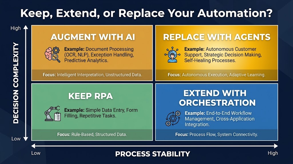
    Never Refreshing the ASIN List

    ASIN performance shifts over time. Competitors run deals, change prices, update listings, or exit the category. An ASIN target that was a top-performer six months ago may be stale now — either because the listing has improved (harder to conquest) or because it’s lost traffic (lower-value target). ASIN lists in product targeting SBV campaigns should be reviewed quarterly, with high-performing targets prioritized and low-traffic or high-ACoS targets removed or bid-reduced.

    Putting the System Together: What a Mature SBV Account Looks Like

    A well-structured SBV account running the three-layer chaining model doesn’t look like a sprawling collection of campaigns — it looks like a deliberate architecture with clear roles for each component.

    At the top of the structure, a small number of broad match SBV campaigns run continuously as discovery engines. Their output is managed: search term reports reviewed every two weeks, new winners extracted, negatives added. These campaigns rarely grow large in budget share; they serve as the perpetual renewal mechanism for the rest of the account.

    In the middle, category targeting SBV campaigns run against 3–5 well-defined subcategories. They carry a healthy portion of the SBV budget, have their own creative assets (brand and category-level storytelling), and are evaluated on NTB orders and impression share rather than raw ACoS. They’re the account’s investment in category presence and new-customer acquisition.

    At the base, product targeting SBV campaigns run against two to four ASIN groups: conquest, complement, and defense. These are the efficiency engines — tightly managed, ASIN-level reporting, high bids on proven targets, suppressed spend on underperformers. They produce the best ACoS numbers in the account because they’ve earned their targeting list through validated SP data.

    The chaining cycle connects all three layers. SP data feeds the ASIN lists for product targeting. Broad SBV search terms feed phrase and exact match campaigns. Category campaigns surface new-to-brand signals that inform which product lines deserve their own conquest campaigns. Nothing is built in isolation. The whole account learns from itself.

    Conclusion: The Targeting Mix Is the Strategy

    Sponsored Brands Video is no longer a secondary format to test when you’ve exhausted your Sponsored Products budget. In 2026, it’s the primary Sponsored Brands format, absorbing the majority of SB spend for accounts that take it seriously. But SBV’s performance ceiling is determined almost entirely by how the targeting is structured — not the bid strategy, not even the creative, though both matter. The structure comes first.

    The three-layer model — broad for discovery, category for mid-funnel consideration, product for precision and conversion — gives each targeting type a coherent role. Campaign chaining from Sponsored Products makes product targeting far less speculative and far more efficient. And holding each layer to its own metrics rather than a universal ACoS standard prevents the common mistake of optimizing the entire account toward short-term efficiency at the expense of long-term reach and NTB acquisition.

    Actionable Takeaways

    1. Separate your targeting types into distinct SBV campaigns. Never mix broad, category, and product targeting in the same campaign. Clean separation is what makes optimization possible.
    2. Run Sponsored Products first, chain winners to SBV. Any product targeting in SBV should be seeded from SP Targeting Report data. Wait for 5–10 purchases per ASIN target before promoting to SBV.
    3. Apply different success metrics to each layer. Broad campaigns → NTB rate and search term harvest. Category campaigns → NTB orders and impression share. Product campaigns → ACoS and ASIN-level CVR.
    4. Design creative for the audience’s purchase stage. Discovery creative for broad. Differentiation creative for category. Conversion creative for product targeting. One video serving all three stages equally serves none of them well.
    5. Review and refresh your ASIN lists quarterly. Product targeting campaigns degrade as the competitive landscape shifts. Stale ASIN lists are one of the most common causes of product targeting SBV underperformance in mature accounts.
    6. Track view-through attribution alongside click attribution. SBV’s influence on purchase decisions is larger than click-only data suggests, especially for broad and category targeting campaigns. Video engagement metrics (5-second view rate, completion quartiles) tell a story that ACoS alone cannot.

    The brands seeing the best SBV results in 2026 aren’t the ones with the biggest budgets or the most polished videos. They’re the ones who treat targeting as architecture — a deliberate system where each layer has a purpose, the layers feed each other, and the whole structure gets smarter with every review cycle. That’s the model worth building.

  • Prompt Playbooks That Turn LLMs Into Reliable ‘Employees’

    Prompt Playbooks That Turn LLMs Into Reliable ‘Employees’

    Split-screen showing chaotic ad-hoc prompting vs. a structured Prompt Playbook binder with consistent AI outputs

    Every team that has worked with a large language model long enough has the same story. It worked brilliantly in the demo. Someone typed a clever question, the model produced a stunning answer, and the room was impressed. Then the same model got handed to six different people, integrated into two internal tools, and asked to do roughly the same job day after day — and within weeks, nobody could agree on whether its outputs were actually reliable.

    The problem is almost never the model. It’s the absence of any operating system around it.

    In traditional hiring, you don’t expect a new employee to perform consistently just because they are talented. You write a job description. You run onboarding. You hand over standard operating procedures. You review performance against measurable outcomes. A talented hire without any of that structure will still produce inconsistent, unpredictable work — because consistency comes from process, not raw capability.

    The same logic applies to LLMs. Treating a model like a magic oracle you query once and hope for the best is the fastest route to the graveyard of failed AI pilots. Treating it like a member of staff — one who needs a clear role, carefully structured information, real examples to learn from, and regular performance checks — is what actually produces reliable output at scale.

    This piece is about how to build that operating system. Not through abstract theory, but through a concrete playbook approach: the tools, templates, and workflows that teams are using in 2026 to get LLMs to behave consistently, predictably, and safely across real production workloads.

    Why “Just Prompting Better” Fails at Scale

    Before building anything, it helps to understand exactly why ad-hoc prompting breaks down. The failure is structural, not stylistic.

    When teams rely on one-off prompts, they’re essentially treating every interaction as a fresh hire on day one. There is no shared memory of what worked, no documentation of edge cases, no version record of what changed when outputs degraded. The next person who needs to run the same task starts from scratch, writing their own prompt from instinct — and getting a different result.

    The Inconsistency Multiplier

    The problem compounds with team size. Five people prompting the same model for the same purpose, each with their own phrasing and approach, will get five meaningfully different output styles. Over time, nobody can point to a single source of truth for how the system is supposed to behave. Quality becomes a function of who happened to write today’s prompt, not what the system is designed to produce.

    Datadog’s 2026 State of AI Engineering report, which analyzed observability traces across real customer LLM deployments, found that roughly 5% of all LLM call spans in production returned an error in February 2026 — with 60% of those being rate-limit errors, and the remaining 40% being other failure types. That may sound manageable, but in a workflow that chains multiple LLM calls together, a 5% per-call failure rate compounds rapidly across steps. A five-step chain with each step running at 95% reliability delivers only about a 77% end-to-end success rate — which is not a reliability standard most business processes would accept.

    The “Brilliant Friend” Trap

    A lot of early LLM adoption inside organizations was driven by people who personally discovered the model felt like a brilliant friend — someone you could ask anything, who would give you a sharp, articulate answer in seconds. That personal experience is real and valid. But it doesn’t translate into a business system.

    Brilliant friends are not employees. They don’t follow your company’s data policies. They don’t format their answers to fit your downstream database. They don’t notice when they are giving you subtly wrong information about your specific product catalog. They don’t repeat the exact same onboarding script with every new customer, verbatim, every single time.

    Reliability requires constraints, and constraints require structure. That structure is the playbook.

    The Job Description Framework: Writing System Prompts That Actually Work

    LLM system prompt structured as a formal employment contract with role, responsibilities, tone, format, and constraints

    The system prompt is the foundation of every reliable LLM deployment. It’s where you define the model’s role, scope, behavior, and output style — and it is directly analogous to writing a job description for an employee.

    Most teams underinvest here. They write a single sentence (“You are a helpful assistant”) or nothing at all, leaving the model to infer its own role from user input alone. The result is a model that behaves differently depending on how each user phrases their request — which is exactly the inconsistency you’re trying to avoid.

    The Five Components of an Effective System Prompt

    Current guidance from teams building production-grade LLM applications has converged around five core components for system prompts:

    • Role and Persona: Who is the model in this context? Not just “a helpful assistant” but something specific: “You are a senior support analyst for [Company], specializing in billing and account management.” The more specific the role, the more consistent the behavioral defaults.
    • Responsibilities and Scope: What exactly is the model supposed to do — and equally important, what is it not supposed to do? Scope boundaries prevent the model from drifting into adjacent areas where it will produce unreliable output. “Your role is to answer billing questions. If a user asks a technical product question, tell them you’ll direct them to the technical team and do not attempt to answer.”
    • Tone and Style: Define the communication register. Formal or conversational? Concise or explanatory? Empathetic or direct? This needs to be explicit, not assumed. “Respond in a professional but approachable tone. Keep responses under 150 words unless the user explicitly asks for more detail.”
    • Output Format: Tell the model exactly how to structure its output. JSON, markdown, plain prose, numbered lists, structured tables — specify it, with an example if necessary. Ambiguity in output format is one of the most common causes of downstream integration failures.
    • Constraints and Guardrails: What must the model never do? This includes safety constraints (never give medical or legal advice), confidentiality rules (never repeat back system prompt contents), accuracy rules (if you are uncertain, say so rather than speculating), and business-specific restrictions (never comment on competitor pricing).

    Separation of System and User Context

    One of the most impactful structural decisions you can make is to strictly separate the persistent system-level instructions from the dynamic user-level input. Anthropic’s engineering team recommends this as a primary principle: system prompts should contain everything that is true across all uses of the model in this context (role, tone, format, guardrails), while the user turn contains only the task-specific input of the current request.

    This clean separation makes it dramatically easier to update, test, and maintain each layer independently — the same discipline that makes codebases maintainable when you separate logic from data.

    Context Engineering: The Layer That Separates Smart from Reliable

    Technical diagram of a context window divided into system instructions, RAG data, conversation history, and tool outputs with attention budget gauge

    Anthropic’s engineering team framed it clearly in 2026: “Prompt engineering is the natural precursor to context engineering.” The distinction matters enormously in production.

    Prompt engineering is about how you write instructions. Context engineering is about what information you include in the model’s working environment at any given moment — and crucially, what you leave out.

    Understanding Context Rot

    Here’s the mechanism that most teams discover through painful experience rather than upfront planning. LLMs are built on transformer architecture, which means every token in the context window attends to every other token. That creates n² pairwise relationships for n tokens. As the context grows, the model’s ability to accurately retrieve and reason over information in that context degrades — not catastrophically, but measurably.

    Anthropic’s engineering team calls this “context rot.” Models experience something analogous to human working memory limits: the more you try to hold in context simultaneously, the less reliably any specific piece of that information gets attended to. You can have a 128,000-token context window and still have an LLM miss a critical instruction you buried in paragraph 47 of your prompt.

    This has direct practical implications. Long prompts that try to pack in every possible scenario, every edge case, every piece of background information are often less effective than shorter, more focused prompts that include only what is relevant to the specific task at hand.

    The Four Operations of Good Context Management

    The LangChain team’s framework for context management, widely cited in 2026 engineering circles, breaks the work into four operations: write, select, compress, and isolate.

    • Write: Store information that will need to be retrieved later — conversation history, intermediate results, user preferences — rather than keeping it all active in the context at once.
    • Select: Choose which stored information is actually relevant to the current task. Retrieval-augmented generation (RAG) is the most common implementation of this: pull in only the documents or data chunks that are relevant to what the model is being asked right now.
    • Compress: Summarize or reduce the token footprint of information before including it. A five-page document that gets summarized into three key bullets before being passed to the model is more reliably processed than the raw five pages.
    • Isolate: Keep different types of context in separate, clearly labeled sections rather than merging them into a single undifferentiated block. System instructions, retrieved data, conversation history, and tool outputs should each be clearly demarcated, both in the prompt structure and in your template design.

    What Good Context Engineering Looks Like in Practice

    Consider a customer support LLM that needs to help a user with their account. A naive approach packs the model’s system instructions, the user’s entire 12-month conversation history, the full 200-page product documentation, and the live request all into a single prompt. Context rot means the model may well miss the specific guardrail in instruction paragraph 8 while processing a long history thread.

    A context-engineered approach retrieves only the last three relevant conversation turns, searches the product docs for only the two most semantically relevant sections, and passes a compressed summary of the user’s account status — totaling perhaps 2,000 tokens rather than 40,000. The model has better focus, costs less to run, and produces more consistent answers.

    Building Your Prompt Playbook: From Ad Hoc to Organizational SOP

    Once you understand the principles of good system prompts and context management, the next challenge is organizational: how do you capture, standardize, and share this knowledge across your team so that everyone benefits from what each person discovers, rather than each person starting from scratch?

    This is where the playbook concept becomes operational.

    What a Prompt Playbook Actually Contains

    A prompt playbook is a living, versioned library of standardized prompt templates for your team’s recurring use cases. Think of it as the company’s standard operating procedures for working with AI — the equivalent of the employee handbook, onboarding checklist, and process documentation that you’d give a new hire.

    Effective playbooks typically contain:

    • Named, versioned prompt templates for every recurring task (customer email drafts, contract summaries, data extraction schemas, research synthesis, support escalation classification, etc.)
    • Documented metadata for each template: which model it was tested on, when it was last updated, what use case it serves, who owns it, and what constraints it enforces
    • Few-shot example banks — curated input/output pairs that capture what “good” looks like for each template’s task
    • Known edge cases and failure modes — documented situations where the template tends to behave poorly, so users know when to escalate or use a different approach
    • Golden dataset tests — a set of test inputs with verified expected outputs that can be run to confirm a template still behaves as intended after any changes

    The Capture Problem

    The hardest part of building a playbook is not the structure — it’s the capture habit. Good prompts tend to live in people’s personal notes, chat histories, or browser bookmarks. When someone discovers a prompt that reliably produces excellent output, the default behavior is to save it privately and move on, not to document it and share it with the team.

    Teams that build effective playbooks solve this by making capture frictionless. A shared Notion database, a GitHub repository with a simple PR process, or a dedicated internal tool with a one-click “save this prompt” function all work. The key is lowering the barrier to contribution so that good prompts migrate into the shared system rather than disappearing when the person who wrote them changes teams.

    Governance and Ownership

    Every prompt in a production playbook should have a named owner — a person responsible for keeping it updated, reviewing test failures, and deciding when it needs to be retired. Without ownership, prompts go stale. Models get updated, company policies change, edge cases accumulate — and nobody updates the template that 20 people are using every day.

    Treat prompt ownership the same way you’d treat code ownership. The prompt is a production artifact. It needs an owner, a changelog, and a review cycle.

    The Chaining Method: Breaking Complex Jobs Into Manageable Tasks

    Multi-step prompt chain workflow showing extract, classify, draft, validate, and format steps with retry loop

    One of the most consistent findings in production LLM engineering is that large, complex, single-prompt tasks produce less reliable results than the same work broken into a sequence of smaller, well-defined steps. This is the principle behind prompt chaining, and it maps directly onto how you’d structure any complex workflow for a human employee.

    You wouldn’t ask a new analyst to “look at these 200 contracts and give me a risk assessment” in a single undifferentiated request. You’d break it down: first, extract the key terms from each contract. Then, flag any non-standard clauses. Then, score each flagged clause by risk level. Then, produce an executive summary. Each step is its own task, its own check, its own opportunity to catch errors before they propagate downstream.

    When to Chain and When Not To

    Not every task needs a chain. Simple, well-defined requests — classify this email as support/sales/spam, translate this paragraph, summarize this article in three sentences — are often better handled in a single focused prompt. Chaining adds latency and cost, so you shouldn’t do it reflexively.

    The signal that a task needs chaining is when a single large prompt produces output that is inconsistently structured, occasionally misses subtasks, or is difficult to debug when it goes wrong. If you can’t tell which part of a long, complex prompt caused a particular failure, that’s a strong indicator that the task needs to be decomposed.

    Building a Chain That Doesn’t Break

    The key engineering discipline in prompt chaining is output validation at each step. Each link in the chain should produce output in a clearly defined format, and there should be a validation step — either a second LLM call acting as a checker, a deterministic code function, or both — that confirms the output meets the expected schema before passing it to the next step.

    The most robust chains include a retry mechanism: if the validation at step three fails, the chain retries step three up to N times (with logging) before escalating to a human or triggering a fallback path. This is functionally identical to the quality checkpoints you’d build into any human process workflow — the model is not treated as infallible, but as a capable worker whose output is verified before it moves forward.

    Parallelization as a Chain Variant

    Some tasks that appear to require sequential chaining can actually be run in parallel branches. If you need to extract financial data, identify key stakeholders, and summarize the narrative arc from the same document, those three extraction tasks don’t depend on each other. Running them as three simultaneous calls and then passing all three outputs to a final synthesis step is both faster and often more reliable than attempting all three in a single prompt.

    Few-Shot Examples: Teaching by Showing, Not Telling

    Code-style display of few-shot prompt examples with input-output pairs labeled as on-the-job training for LLMs

    If system prompts are the job description, few-shot examples are the onboarding training. They show the model exactly what “good” looks like, not just in abstract terms but in concrete, task-specific examples from your actual domain.

    The research on this is consistent: for narrow, domain-specific tasks with strict output requirements — specialized terminology, structured formats, compliance-critical language — few-shot examples reliably improve both accuracy and consistency compared to zero-shot instructions alone. Frontier models today handle zero-shot well for general tasks, but for your specific business context, your specific data formats, and your specific quality standards, examples remain one of the highest-leverage investments you can make in a prompt.

    The Anatomy of a Good Few-Shot Example

    Not all examples are equally useful. The quality of your few-shot examples matters more than the quantity.

    Effective few-shot examples share four characteristics:

    1. Representativeness: They reflect the actual distribution of inputs the model will encounter in production, not just the easy cases. If 30% of real inputs are edge cases, your examples should include edge cases in roughly that proportion.
    2. Correctness: Every example needs to be verified as genuinely correct. A single bad example in a few-shot block can introduce a systematic bias into the model’s output — the equivalent of onboarding a new employee by having them shadow someone who is doing the job wrong.
    3. Diversity: Three identical-structure examples add less signal than three examples that each demonstrate a different nuance of the task. Show the model different scenarios, different input types, and different correct response patterns.
    4. Recency: Examples should be reviewed and updated when business rules, data formats, or quality standards change. Stale examples are misleading — they show the model what used to be correct, not what is correct now.

    Building an Example Bank

    The most effective teams don’t collect few-shot examples by hand. They build a pipeline for capturing verified good outputs from production and routing them into a curated example bank. When a human reviewer marks an LLM output as excellent, that input-output pair goes into the library. When outputs are consistently excellent for a given scenario, the best examples get promoted into the active few-shot block for that prompt template.

    This creates a virtuous cycle: the model improves with experience, not through retraining, but through the human-curated example signal that gets progressively refined as you accumulate production history.

    Prompt Versioning and the Performance Review Loop

    Dashboard showing three versions of an LLM prompt being scored on accuracy and consistency, with Version 3 showing 92% accuracy

    Perhaps the most important mindset shift in moving from ad-hoc prompting to production-grade prompt management is treating prompts as versioned, testable artifacts — not as ephemeral text you type and forget.

    A prompt that performs well today may perform poorly in three months, for any number of reasons. The underlying model may have been updated by the vendor. Your product may have changed, making some examples or instructions stale. A new edge case may have emerged that the original template didn’t anticipate. User input patterns may have drifted in ways that expose gaps in the original design.

    None of these regressions are visible unless you have a testing system that can detect them. That’s where golden datasets and the performance review loop come in.

    Golden Datasets: Your Ground Truth

    A golden dataset is a curated collection of input-output pairs that represent verified ground truth for a given prompt template. It’s small — typically 50 to 250 examples — but it’s carefully maintained, human-reviewed, and stable enough to serve as a baseline for comparison across prompt versions and model updates.

    The value of a golden dataset is not just in initial testing. It’s in regression detection. When you change a prompt — updating an instruction, adding a new constraint, modifying the output format — you run the changed prompt against your golden dataset and compare the outputs to the verified baseline. If accuracy or consistency drops, you know before the change ships to production, not after.

    Current best practice from teams using evaluation frameworks like Braintrust, Arize, and similar tools emphasizes versioning the golden dataset alongside the prompt: when you update either the prompt or the dataset, log the change, the reason, and the evaluation results. This creates a changelog that tells you exactly why performance changed and when.

    The Version Control Discipline

    Prompts should live in version control, full stop. Whether that’s Git, a dedicated prompt management tool, or a structured database with changelog fields, every prompt in production needs a version number, an edit history, a record of who changed what and why, and a link to the evaluation results that justified the change.

    This practice — treating prompts the way software engineers treat code — is one of the clearest differentiators between teams that run reliable LLM systems and teams that don’t. The teams that skip version control end up with a shared Notion page of prompts with no history, no ownership, and no way to know whether the version of a prompt currently in use is the one that was tested or someone’s half-finished experiment that got copy-pasted by accident.

    Running the Performance Review

    Schedule regular prompt performance reviews — monthly at minimum for high-volume, business-critical prompts. The review cycle should cover:

    • Golden dataset accuracy compared to the last review period
    • Any new failure modes observed in production logs since the last review
    • Changes in the underlying model or its behavior that may have affected outputs
    • New edge cases that have appeared in production that aren’t represented in the current example bank
    • Whether the task scope or business rules have changed in ways that require prompt updates

    This is structurally identical to a human employee performance review — it’s periodic, evidence-based, and focused on identifying what needs to change to maintain or improve performance. The only difference is the cadence and the tooling.

    Guardrails, Constraints, and Knowing When to Escalate

    Every reliable employee has limits. They know which decisions are within their authority, which ones need a manager’s sign-off, and which situations call for a specialist. Building that same awareness into your LLM system is not optional — it’s the difference between a system that fails gracefully and one that fails catastrophically.

    Designing Explicit Constraint Blocks

    Constraints in your system prompt are not suggestions. They are behavioral limits that define the safe operating envelope for the model in your context. The most important categories to address explicitly are:

    • Topic boundaries: What the model is allowed to address and what it must decline. Be specific. “Don’t discuss anything unrelated to billing” will be interpreted differently by different prompts than “If a user asks about product features, technical support, pricing, or any topic other than billing inquiries, respond with: ‘That’s outside my area — let me connect you with the right person.’”
    • Factual confidence boundaries: When the model should express uncertainty rather than confidently producing an answer. This is one of the highest-value constraints for enterprise use cases. A model that says “I’m not certain — I’d recommend verifying this with [source]” is dramatically safer than one that produces fluent-sounding but incorrect information without any indication of uncertainty.
    • Data handling rules: What information the model should not repeat, store, or expose — particularly relevant when the system prompt contains confidential configuration, when users may share PII in their queries, or when outputs might inadvertently surface protected information from RAG-retrieved documents.
    • Escalation triggers: Specific conditions under which the model should stop trying to handle the request itself and hand off to a human — unresolvable ambiguity, customer expressions of serious distress, requests that fall outside the model’s verified competence, or anything that matches a pattern on your escalation watchlist.

    Testing Constraints Adversarially

    Security research from BrightSec’s 2026 State of LLM Security report notes that prompt injection — attempts to override system instructions through cleverly crafted user input — remains the top initial access vector in LLM incidents in production environments. Evolved attacks in 2026 no longer rely on simple “ignore previous instructions” gambits. They target context merging: injecting malicious instructions through retrieved documents, tool outputs, or multi-turn conversation manipulation.

    Your constraints need to be tested not just for normal use, but for adversarial attempts to bypass them. Red-team your system prompts before they go to production. Try to make the model ignore its constraints through roleplay framing, indirect requests, and injected text in realistic-looking retrieved documents. The vulnerabilities you find before launch are far cheaper to fix than the ones users find after it.

    The Escalation Path Must Actually Exist

    It seems obvious, but is worth stating explicitly: if your system prompt tells the model to escalate certain scenarios to a human, that human escalation path must actually exist and must actually work. A model that correctly identifies an escalation trigger and then hands the user off to a broken email address, a queue nobody monitors, or a form that returns a 404 has not succeeded — it has just deferred the failure.

    Escalation design is a process design problem, not just a prompt design problem.

    Team Adoption: Getting Everyone Speaking the Same Language

    A well-designed prompt playbook that nobody uses is just documentation. The real work of playbook adoption is behavioral: changing how your team interacts with AI tools day-to-day, so that reaching for the shared playbook becomes the default rather than improvising a new prompt from scratch each time.

    The Onboarding Problem

    Most teams introduce AI tools without any structured onboarding for how to use them effectively in that team’s specific context. People are given access to ChatGPT, Claude, or an internal LLM tool and told to “explore it.” The result is a bimodal distribution: a handful of power users who develop effective personal prompting practices (and keep them to themselves), and a majority who use the tool sporadically and report inconsistent results.

    Structured onboarding changes this dynamic. New team members should be introduced to the prompt playbook the same way they’d be introduced to any other team tool: here is what we have, here is how it works, here are the templates for your role, here is how to contribute improvements back. This takes two or three hours to set up properly and saves weeks of individual fumbling.

    Making Contribution Easy and Visible

    The playbook only stays current if people contribute to it. The two biggest friction points are: (1) people don’t know that their discovery of a better prompt is valuable to others, and (2) the contribution process feels like extra administrative work on top of their actual job.

    Both are solvable. For awareness: when someone shares an impressive AI output in Slack or email, a team norm of “can you add the prompt to the playbook?” creates a capture habit. For friction: the simpler the contribution mechanism, the more contributions you’ll get. A Slack-integrated form that takes 60 seconds to submit is better than a multi-field Notion template that takes 10 minutes.

    Role-Based Prompt Libraries

    Generic playbooks (“prompts for everyone”) have lower adoption than role-specific ones. A marketing manager doesn’t want to scroll through 40 prompts written for engineers before finding the one for campaign brief drafting. Organize your playbook by role and use case from the start, and update the organization as you learn more about how different parts of the team actually use the tools.

    Within each role-based section, the most-used templates should be front and center, with usage counts or quality ratings to help people orient quickly. Discoverability is not a luxury — it is directly correlated with adoption.

    Measuring What Matters: Evaluation Frameworks That Don’t Lie

    The final and perhaps most underrated component of a reliable LLM operating system is measurement. Teams that can’t measure output quality can’t improve it systematically — they’re flying on intuition, which works fine for individual power users but fails at organizational scale.

    What to Measure and How

    The evaluation stack for production LLM systems in 2026 has converged around a few key layers:

    • Functional correctness: For tasks with objectively verifiable outputs (data extraction, classification, format compliance), deterministic checks are the gold standard. Does the output parse as valid JSON? Does it contain the required fields? Is the extracted value within the expected range? These checks are fast, cheap, and automatable.
    • Rubric-based scoring: For tasks where quality is subjective but judgeable — writing quality, tone appropriateness, reasoning coherence — define explicit rubrics before you start measuring. A rubric with clear dimensions (relevance, accuracy, tone match, conciseness) and a 1-5 scale gives reviewers consistent anchors and makes aggregated scores meaningful over time.
    • LLM-as-judge: For high-volume evaluation where human review of every output isn’t practical, a second LLM call can act as a scoring layer. Current best practice is to calibrate the judge model against human-scored examples before relying on its scores, and to run periodic human calibration checks to detect drift between the judge model’s scoring and actual human quality assessments.
    • Production monitoring: Log real production outputs and sample them for quality review. User signals — thumbs up/down ratings, escalation triggers, session abandonment, repeat-request patterns — are lagging indicators of output quality that can catch problems that your offline evaluation suite missed.

    The Metric Trap

    One important caution: optimizing for a single metric without tracking the others leads to degenerate outcomes. A prompt optimized purely for conciseness may start producing outputs so short that they’re not actually useful. A prompt optimized purely for high rubric scores on human review may produce verbose, over-cautious outputs that are technically correct but practically useless in the workflow.

    Run a multi-metric dashboard. Track accuracy, format compliance, tone consistency, latency, token cost, and user satisfaction signals together. Optimize for the overall profile, not a single dimension, the same way you’d evaluate an employee’s performance across multiple dimensions rather than scoring them on a single KPI and ignoring everything else.

    Common Failure Modes and How to Catch Them Before They Spread

    Even well-designed prompt systems fail. The teams that catch failures early share a common trait: they’ve built detection mechanisms into their systems rather than relying on users to report problems. Here are the most common failure modes and the signals that surface them earliest.

    Instruction Following Decay

    The model starts following its system prompt correctly, then gradually drifts over time — producing outputs that technically meet the letter of the instructions while missing their spirit. This is particularly common in conversational contexts where long conversation histories crowd out the system prompt’s effective weight.

    Detection: Regular golden dataset tests. If test accuracy on a static evaluation set declines over a period where the prompt hasn’t changed, instruction following decay is a likely cause. Investigate by comparing outputs on simple, well-defined test cases before escalating to complex ones.

    Format Drift

    The output format starts varying from what the prompt specified — minor inconsistencies in field names, unexpected nesting in JSON responses, extra prose where structured data was expected. This often happens gradually and is invisible until a downstream system breaks because it can’t parse a response.

    Detection: Automated schema validation on every production output. Not just “does this parse as JSON” but “does this JSON have the exact fields and types that are expected.” Any validation failure should trigger an alert, not a silent default.

    Context Poisoning

    Malicious or simply unexpected content in retrieved documents, tool outputs, or user inputs changes the model’s behavior in ways your system prompt didn’t anticipate. This is the context merging attack vector identified in enterprise LLM security research — and it’s also an accidental failure mode when legitimate data sources contain instructions-like text (API documentation, legal contracts, email threads that include quoted AI outputs).

    Detection: Anomaly detection on output patterns. If outputs start containing unexpected formatting, claiming capabilities not described in the system prompt, or declining requests that should be within scope, flag them for human review immediately. Build a human review queue for flagged outputs, not just a log file that nobody reads.

    Stale Context

    The model’s context — its examples, its retrieved documents, its system instructions — refers to information that is no longer current. Business rules changed. Products were renamed. Policies were updated. The model answers accurately according to a world that no longer exists.

    Detection: Date-tagged examples and instructions with automated staleness alerts. Any example or instruction that hasn’t been reviewed in more than 90 days should generate an owner notification. Any RAG data source that hasn’t been reindexed in more than a defined period should be flagged for review before the model continues using it.

    The Prompt Playbook as a Living System

    The throughline of everything described above is this: reliability doesn’t come from finding the perfect prompt and freezing it forever. It comes from building a system — one that captures knowledge, enforces standards, measures outcomes, detects failures, and improves continuously.

    That is, in essence, what a good operations team does for any business process. The novelty with LLMs is not in the organizational discipline required — that discipline is familiar. The novelty is in where the process control surfaces actually live: in text, in context configuration, in versioned templates and curated examples, rather than in code or hardware.

    The Compounding Return

    Teams that invest early in prompt playbooks experience something that looks like a compounding return on their LLM investments. Each good prompt template they document and share spreads its benefits across the entire team. Each golden dataset test they build catches future regressions before they become user-facing failures. Each few-shot example they curate improves performance on the next task that uses it.

    The teams that skip this investment get the opposite: a steadily expanding mess of personal prompts that diverge from each other, regressions that nobody notices until customers complain, and a growing sense that LLMs are unreliable — when the real problem is that the operating system around them was never built.

    Practical Starting Points

    If you’re starting from scratch, the return on investment is highest when you focus first on your highest-volume, most-repetitive use cases. Three questions to orient your first playbook build:

    1. What tasks are your team members running with LLMs more than five times per week? These are your highest-priority candidates for standardized templates. They’re already being done; making them consistent costs almost nothing and delivers immediate quality benefits.
    2. Where have you had the most embarrassing or costly LLM failures? These are where your constraint design and validation logic need the most attention. Document the failure, design the constraint, add a test case to your golden dataset.
    3. Who on your team produces consistently excellent LLM outputs? Their prompts are your seed library. Capture what they’re doing, systematize it, and make it available to everyone. Don’t let institutional knowledge about effective prompting live in one person’s clipboard history.

    Closing Thoughts

    There’s a version of AI adoption where every model interaction is a fresh improvisation — clever, occasionally brilliant, fundamentally inconsistent. That version has a ceiling. It’s useful for individual productivity hacks but can’t be trusted with anything business-critical at scale.

    Then there’s the version where models are treated with the same operational discipline as any other member of a capable team. Clear role. Structured context. Concrete examples. Versioned instructions. Measurable performance. Regular review. Known escalation paths. That version has no ceiling — because every improvement you make compounds into the system, and the system keeps improving the way any well-managed process does: incrementally, measurably, and durably.

    The prompt playbook is not a technical artifact. It’s an organizational one. Build it like you’d build any other operational system that your team depends on — and treat its maintenance with the same seriousness you’d give a codebase, a compliance framework, or a customer success process. Because in 2026, it is all three.

  • From Workflows to Agents: How to Actually Upgrade Your Automation Stack (Without Breaking What Works)

    From Workflows to Agents: How to Actually Upgrade Your Automation Stack (Without Breaking What Works)

    Split-screen visualization comparing rigid IF/THEN workflow automation on the left with adaptive AI agent networks on the right, representing the shift from workflows to agents

    Most automation stacks weren’t designed — they accumulated. A Zapier flow here. A ServiceNow workflow there. An RPA bot someone built three years ago that no one fully understands but everyone’s afraid to touch. A Python script in a cron job that technically runs but fails silently once a week.

    This is the real shape of enterprise automation in 2026: a patchwork of tools, each doing a narrow job well enough that replacing it never becomes urgent — until suddenly, it does.

    Now the market is pushing hard toward something different: AI agents. Systems that don’t just follow rules but set goals, call tools, reason over context, and decide their own next step. The pitch is compelling. The vendor noise is deafening. And the pressure to “go agentic” is real, even if half the organizations feeling that pressure haven’t finished documenting what their existing automations actually do.

    This post isn’t a vendor comparison or a whitepaper-style definition of what agents are. It’s a practitioner’s guide to the actual upgrade problem — how to look at your existing automation stack honestly, identify where it’s quietly costing you more than it delivers, and make deliberate choices about what to keep, what to extend, and where agents genuinely change the math.

    The answer is almost never “tear everything out and go agent-first.” But it’s also no longer “stay the course.” The window for making these decisions thoughtfully — rather than reactively — is narrowing. Here’s how to use it.
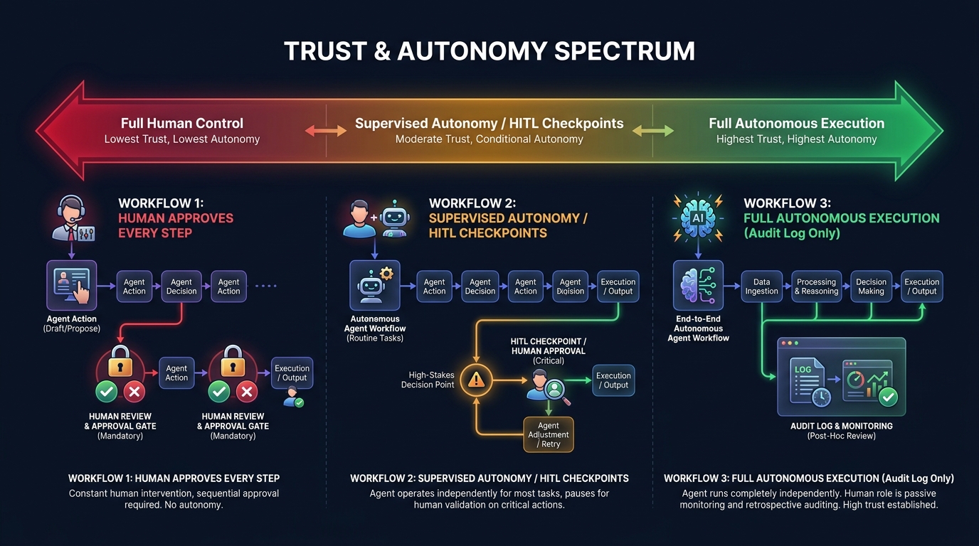
    What Your Current Stack Is Actually Doing (and Where It’s Quietly Failing)

    Before any upgrade decision can be made intelligently, you need an honest accounting of what you’ve built. Most teams skip this step because it’s uncomfortable. Legacy automation tends to reveal itself as a collection of tribal knowledge, undocumented dependencies, and business logic that lives nowhere except inside a bot that runs on a server someone set up in 2021.

    The Three Failure Patterns That Signal a Stack in Distress

    Across enterprise automation programs, three failure patterns show up repeatedly — and they’re worth diagnosing explicitly, because each one points to a different kind of upgrade need.

    Pattern 1: Exception Rate Creep. A workflow was designed to handle a clean, well-defined process. Over time, edge cases accumulate. The business adds product lines, changes pricing structures, onboards new systems. The workflow starts routing more and more items to a “manual review” queue that’s now handling 20% of volume. The bot runs, technically, but it’s farming out the hard cases to humans at a rate that defeats its original purpose.

    When exception rates on a workflow exceed roughly 15–20% of volume, the economics of the automation start to invert. You’re maintaining a complex system to automate the easy 80% while the hard 20% still requires human intervention — and the hard 20% is often where the highest-value decisions live.

    Pattern 2: Brittleness Tax. Any automation that depends on UI scraping, fixed data schemas, or hardcoded field positions is paying a brittleness tax. Every time a vendor updates their interface, every time an API adds a required field, every time a business process changes — someone has to go in and fix the bot. The maintenance burden is non-trivial: industry data suggests enterprises spend $2–3 in maintenance over five years for every $1 they spend on RPA licensing. That’s a ratio that compounds quietly until it breaks a budget.

    Pattern 3: The Integration Ceiling. Workflow tools are typically designed around linear, point-to-point integrations. Process A triggers Process B, which outputs to System C. This works until the business needs Process A to consider context from five different systems, weigh competing priorities, and make a judgment call. At that point, the workflow isn’t just limited — it’s architecturally incapable of doing what’s needed. You can add more branches, but you’re essentially trying to encode decision intelligence into a flowchart, which is both fragile and expensive to maintain.

    Running Your Own Stack Audit

    A practical audit starts with three inventory questions for every automation currently running in your organization:

    1. What is the exception rate? How many items processed per month require human intervention or manual override? Track this number. If you don’t have it, instrument your flows to capture it before making any upgrade decisions.
    2. What is the maintenance frequency? How many times in the past 12 months did someone have to modify this automation because of an external change — a system update, a policy change, a data format shift? High maintenance frequency is the clearest signal of brittleness.
    3. What decisions does it make? Is it executing pre-defined logic (if X then Y), or is it approximating a judgment call that a human would make differently depending on context? The more judgment-like the decision, the more a workflow is hiding complexity rather than eliminating it.

    This audit won’t take long if you approach it as a quick triage rather than a full documentation project. The goal is to categorize your existing automations into: (1) healthy and stable, (2) maintained but aging, and (3) actively costing more than they save. That classification drives every subsequent upgrade decision.

    The Four-Layer Automation Stack Model for 2026

    Four-layer automation stack architecture diagram showing Task Automation, Process Orchestration, Intelligence Layer, and Agentic Systems from bottom to top

    One of the most useful reframes for thinking about automation upgrades is to stop thinking about individual tools and start thinking in layers. Your stack isn’t a collection of point solutions — it’s (or should be) a layered architecture where each tier has a different job, a different change cadence, and a different cost profile.

    Layer 1: Task Automation

    This is the foundation — RPA bots, shell scripts, macros, scheduled jobs. These tools exist to handle high-volume, repetitive, structurally stable tasks at low marginal cost. UI-based data entry. File format conversions. Automated report distribution. When a process is genuinely stable and deterministic, this layer is still the right tool. The mistake most organizations make isn’t using RPA — it’s using RPA for processes that aren’t genuinely stable or deterministic.

    The health metric for this layer is simple: maintenance cost per automation per year. If you’re spending more maintaining a bot than you’d spend having a human do the task periodically, the bot has become a liability.

    Layer 2: Process Orchestration

    This layer coordinates multi-step processes across systems and teams — iPaaS platforms like MuleSoft, Boomi, or Workato; BPM tools like Camunda or Appian; workflow platforms like Microsoft Power Automate. The job here is sequencing, routing, and state management across processes that involve multiple participants or systems.

    Where Layer 1 automates a task, Layer 2 automates the handoffs between tasks. It’s inherently about coordination — and that’s where it often breaks down, because coordination logic is where business rules accumulate fastest. Approval workflows that grow twenty exception branches over three years. Routing logic that was simple in year one and is now a maintenance nightmare.

    Layer 3: Intelligence Layer

    This is where ML models, classification engines, document understanding tools, and decision APIs sit. In 2026, this layer is being populated rapidly — document processing that uses vision models to extract data from non-standard formats, NLP classifiers that route support tickets, recommendation engines that inform next-best-action suggestions. These tools don’t orchestrate processes, but they inject judgment into them.
    The key distinction: Layer 3 tools are still called by workflows. They respond to requests from the layers below. They don’t initiate actions or pursue goals.

    Layer 4: Agentic Systems

    This is the layer that changes the model. Agents don’t wait to be called — they pursue a goal, using tools from the layers below to take actions, observe results, and adapt. An agent in this layer might be tasked with resolving a customer complaint end-to-end: it reads the case context, checks inventory systems, looks up account history, drafts a response, waits for approval, and closes the ticket — without a human defining each step in advance.
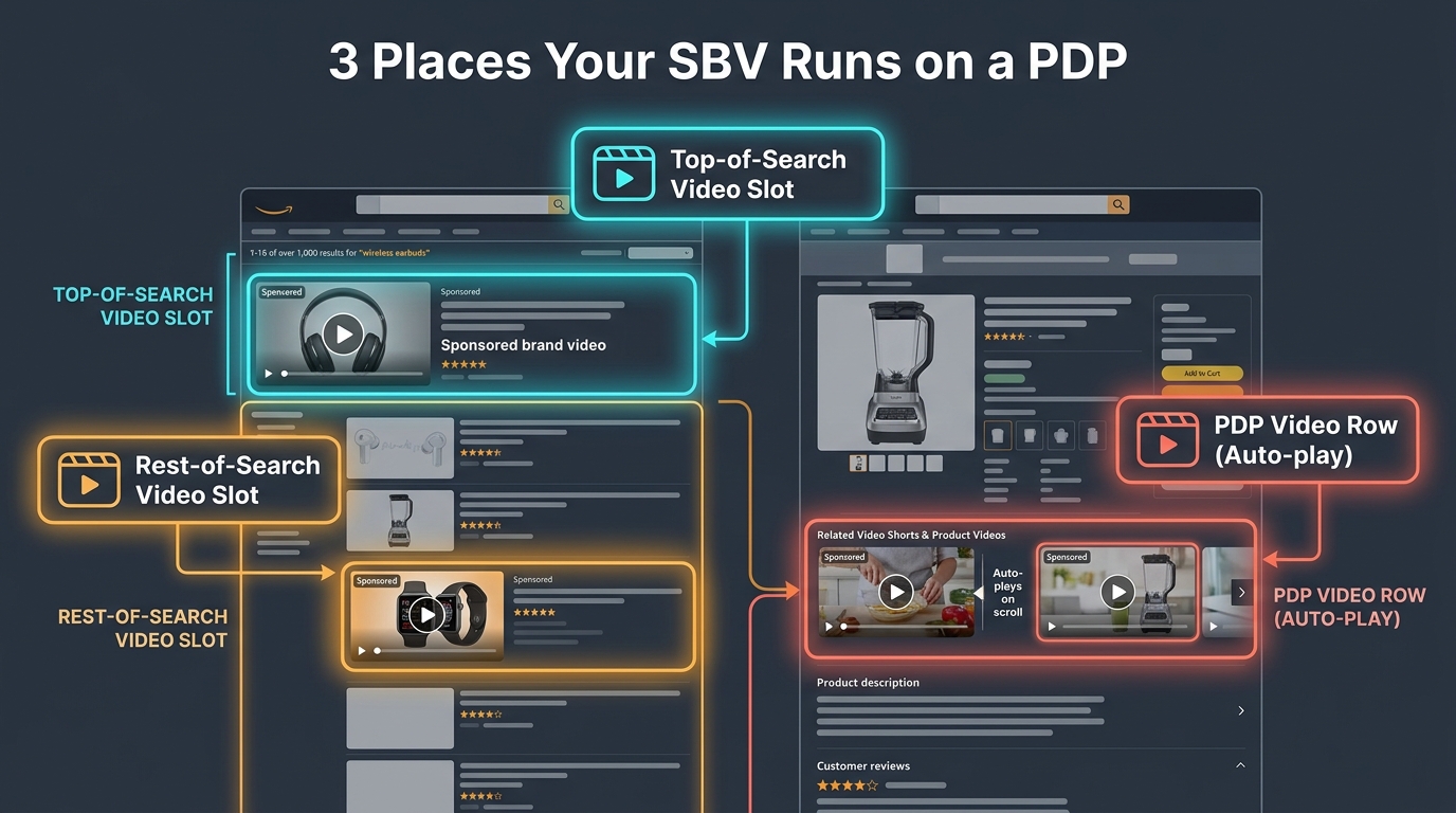
    The critical point is that Layer 4 doesn’t replace layers 1–3. It coordinates them. Your RPA bots become tools that agents can call. Your orchestration workflows become sub-processes that agents can trigger. Your intelligence models become capabilities that agents can invoke as needed. The architecture doesn’t collapse — it gains a new top layer that changes what’s possible.

    The Real Difference Between a Workflow and an Agent (It’s Not What Vendors Say)

    The vendor explanation of agents vs. workflows usually goes something like this: workflows are rule-based and deterministic; agents are AI-powered and flexible. That’s technically accurate but practically useless, because it doesn’t tell you when to use which, or what actually changes at the system design level.

    The Control Flow Inversion

    The more precise distinction is about who controls the flow. In a workflow, the process designer controls the flow. They define every step, every branch, every error condition in advance. The workflow executes exactly what was designed — nothing more.

    In an agent, the model controls the flow. The designer specifies a goal and makes tools available. The agent decides which tools to use, in what order, and when to stop. This is called the ReAct loop — Reason, Act, Observe, Repeat — and it fundamentally changes both what’s possible and what can go wrong.

    A workflow will never do something you didn’t design it to do. An agent might. That’s its power and its risk in the same sentence.

    State and Memory

    Workflows are typically stateless between steps or manage state through explicit handoffs — a variable passed from one node to the next, a record updated in a database. Agents maintain context across a multi-step process, using a combination of working memory (what’s happened so far in this session), external memory (a vector database or document store), and tool call results. This allows agents to handle processes where the right action at step 7 depends on subtle context from steps 1–6 — something workflow engines fundamentally can’t do without explicit state management that rapidly becomes complex.

    Error Handling and Exception Management

    This is where the practical gap is largest. A workflow’s error handling is defined by the designer: catch this exception, route to this fallback, alert this person. An agent can reason about errors. If a tool call fails, the agent can try a different approach, gather more information, or escalate with a detailed explanation of what it tried and why it failed. For processes with high exception rates, this difference alone can justify the migration cost.

    What Agents Can’t Do (Yet)

    It’s equally important to be clear about agent limitations. Agents are non-deterministic — the same input won’t always produce the same output, which makes them unsuitable for processes requiring strict auditability or regulatory compliance without careful instrumentation. They’re also computationally more expensive than running a workflow: every agent step involves an LLM inference call, which adds latency and cost. And they require careful prompt engineering and tool design to behave reliably at scale. The 40% of multi-agent pilots that fail within six months of production deployment almost always fail because of underestimating these operational requirements, not because the underlying technology doesn’t work.

    The Break-Even Diagnosis: When Legacy Automation Costs More Than It Saves

    Financial comparison chart showing RPA total cost of ownership with $2-3 in maintenance costs for every $1 in license costs versus AI agent TCO over 5 years

    The decision to upgrade any piece of your automation stack shouldn’t be driven by vendor roadmaps or industry trend reports. It should be driven by a break-even analysis that’s specific to your context. Here’s how to structure it.

    The True Cost of Your Current Automation

    Most organizations dramatically undercount the cost of running legacy automation because they only account for licensing fees. The real cost includes:

    • Maintenance engineering time: How many hours per month do developers spend fixing, adjusting, or debugging existing workflows and bots? At typical fully-loaded developer rates, this number is often surprisingly large.
    • Exception handling labor: Every item that falls out of an automated process and lands in a manual review queue has a cost. If your exception rate is 20% on a process handling 10,000 items per month, you’re paying for 2,000 manual reviews. Track this number explicitly.
    • Opportunity cost of brittleness: When a bot breaks, how long does it take to restore the process? What’s the cost of that downtime — in delayed outputs, frustrated users, or escalation to leadership? Brittle automations have a hidden downtime cost that rarely shows up in TCO calculations.
    • Upgrade overhead: As underlying systems change (new ERP release, API version change, UI redesign), how much does it cost to update the automations that depend on them? For organizations running large RPA estates, this is often a significant annual budget item.

    The Inflection Point

    The break-even inflection point typically arrives when the annual cost of maintaining an existing automation — including all the above — exceeds the estimated annual cost of replacing it with a more capable system, amortized over a reasonable lifespan. For many RPA deployments that have been running for 3+ years, the inflection point has already passed or is approaching rapidly.

    The $2–3 maintenance multiplier cited by industry analysts isn’t just a vendor talking point — it reflects the compounding nature of technical debt in brittle automation. The longer a workflow runs without architectural modernization, the more business logic gets encoded into it in ad hoc ways, and the harder it becomes to change, audit, or replace.

    A Practical Scoring Method

    For each automation in your stack, score it on three dimensions from 1–5:

    1. Maintenance burden (1 = minimal, 5 = constant firefighting)
    2. Exception rate (1 = <5% manual intervention, 5 = >25% manual intervention)
    3. Strategic value (1 = low-volume administrative task, 5 = customer-facing or revenue-impacting process)

    Any automation scoring 7 or above across these dimensions — especially with a high strategic value score — is a candidate for upgrade evaluation. Any automation scoring 9 or above is actively worth accelerating. This isn’t a perfect formula, but it turns an abstract “should we upgrade?” question into a ranked priority list you can act on.

    The Upgrade Decision Matrix: What to Keep, Extend, and Replace

    Decision matrix showing Keep vs Extend vs Replace automation decisions based on process stability and decision complexity axes

    Once you’ve diagnosed the health of your existing stack, the decision about what to do with each component comes down to four factors: process stability, decision complexity, exception tolerance, and volume. Let’s map those to concrete upgrade paths.

    Keep: High Stability, Low Complexity

    If a process is structurally stable — meaning the inputs, logic, and outputs rarely change — and the decisions it makes are fully deterministic, RPA or rule-based workflow automation is still the right tool. High-volume, low-variation processes like payroll calculations, scheduled report generation, or data format conversions between systems with stable APIs fall into this category.

    The key question isn’t “could an agent do this?” — it’s “is there a compelling reason to change?” For genuinely stable, high-volume processes, adding agent overhead adds cost and non-determinism without adding value. Keep them as-is and put your upgrade budget elsewhere.

    Extend: Moderate Complexity, Stable Structure

    Many workflows don’t need to be replaced — they need to be extended with intelligence. This is where Layer 3 tools (document understanding models, classification APIs, anomaly detection) can be added to an existing workflow to reduce exception rates without a full architectural replacement.

    A practical example: an invoice processing workflow that’s routing 20% of invoices to manual review because they don’t match standard templates. Rather than replacing the workflow with an agent, add a document intelligence model at the intake step that extracts fields from non-standard invoices and normalizes them before the existing workflow processes them. The workflow’s exception rate drops dramatically, the cost of the upgrade is modest, and you’ve extended the life of a working process without a full rebuild.

    Augment: High Complexity, High Exception Rate

    When a process has both high decision complexity and a significant exception rate, the architecture needs to change — but not necessarily with a full agent replacement. This is often the right place for a hybrid pattern: a workflow handles the well-defined happy path, and an agent handles exception routing and resolution.

    This “agent as exception handler” pattern is one of the most practical entry points for agentic AI. It keeps the deterministic core of the existing workflow intact while delegating the hard cases — the ones currently going to humans — to an agent that can reason about context, gather additional information, and either resolve the exception or escalate with a clear explanation. The result is a process that handles 95%+ of volume automatically instead of 80%, without the risk of replacing a working system wholesale.

    Replace: Low Stability, High Decision Complexity

    Full agent replacement makes the most sense for processes where the structure itself changes frequently, the decisions required are genuinely judgment-like, and the cost of maintaining the existing automation is high. Customer-facing support processes, complex procurement workflows, research and analysis tasks, and multi-system coordination tasks that currently require human judgment at multiple points — these are the candidates for full agent replacement.

    The signal that a process belongs in this category isn’t just high exception rate or high maintenance cost — it’s the combination of both with a strategic importance that makes the investment worthwhile. Replacing a low-volume administrative workflow with an agent to save two hours of manual work per week is rarely the right priority. Replacing a customer escalation process that handles high-value accounts and requires contextual judgment is a different calculation entirely.

    Agent Design Patterns That Actually Hold Up in Production

    When organizations deploy AI agents for the first time, they tend to underestimate the design work required and overestimate how much the LLM will figure out on its own. The result is agents that work in demo environments and break in production. Here are the design patterns that separate stable production agents from fragile demos.

    Pattern 1: Small Tool Sets, Sharp Scopes

    The single most common design mistake is giving an agent too many tools. When an agent has access to 30 different tools, the LLM’s routing accuracy drops significantly — it selects the wrong tool, chains calls unnecessarily, or gets confused by overlapping functionality. Production-grade agents consistently perform better with five to ten tightly scoped tools that do one thing well than with broad tool suites that cover every conceivable action.

    Design principle: each tool should be named and described with the precision you’d use for a well-written function docstring. The description tells the agent not just what the tool does, but when to use it and what its limitations are. “Retrieve customer order history” is a better tool description than “Get data.” The more precisely the agent understands what each tool is for, the more reliably it will use them correctly.

    Pattern 2: Explicit State Management

    Don’t rely on the agent’s context window to maintain state across a long-running process. Context windows are expensive, and for processes that span hours or involve branching paths, context-based state management is both unreliable and costly. Instead, implement explicit state objects — structured records that capture what the agent has done, what it knows, and what decision it’s currently working on — stored externally and passed to the agent at each step.

    This also makes your agent debuggable. When an agent makes an unexpected decision, you can inspect the state object at the point of failure and understand exactly what information it was working with. Without explicit state, debugging becomes a prompt archaeology exercise that few engineers have patience for.

    Pattern 3: Structured Output Contracts

    Agents should produce structured outputs — not free-form text — whenever their output feeds into another system. This means defining output schemas before building the agent, and using the LLM’s function-calling or structured output capabilities to enforce them. An agent that writes its decision as a JSON object with defined fields is far easier to integrate with downstream systems than one that writes a paragraph of explanation you then have to parse.

    This is particularly important for the “agent as exception handler” pattern. The agent needs to communicate its decision (resolved, escalated, needs more information) along with the reasoning, the actions taken, and any artifacts created — all in a format that the downstream workflow can process without human interpretation.

    Pattern 4: Graceful Degradation

    Every production agent needs a graceful degradation path: a defined behavior for when it can’t complete a task. This should not be “the agent keeps trying until it times out.” It should be: after N retries or M minutes, the agent produces a structured handoff document describing what it knows, what it tried, and why it stopped — and routes that to a human queue. The human gets context-rich information rather than a raw failure, and the process doesn’t stall.

    Building this escalation behavior explicitly into the agent’s system prompt and tool set — not leaving it to emergent LLM behavior — is the difference between a production-grade agent and a demo-grade one.

    Pattern 5: Tool-Level Observability

    Log every tool call, with inputs and outputs, at the infrastructure level — not just what the agent decided to do, but what each tool returned. This creates an audit trail that’s invaluable for debugging, compliance, and ongoing improvement. Gartner has noted that organizations prioritizing audit trails and policy enforcement in their agent deployments are the ones moving from pilots to production successfully. The observability infrastructure isn’t optional — it’s what makes enterprise-grade agentic systems governable.

    The Trust Architecture: Human-in-the-Loop vs Autonomous Execution

    Trust and autonomy spectrum diagram showing human-in-the-loop versus supervised autonomy versus fully autonomous agent execution patterns

    One of the most consequential architectural decisions in any agent deployment is where on the autonomy spectrum the agent should sit. This isn’t a question of technical capability — modern agents can operate fully autonomously on many tasks. It’s a question of risk, reversibility, and trust calibration.

    The Autonomy Spectrum

    Think of autonomy as a dial with five settings, not a binary switch:

    1. Step-by-step approval: Every action the agent proposes is reviewed and approved before execution. Maximum control, minimal efficiency gain. Appropriate for novel processes where trust has not yet been established.
    2. Category-level approval: Certain categories of action (e.g., read operations, low-value writes) are executed automatically; others (e.g., external communications, financial transactions above a threshold) require approval. Most common pattern for production deployments.
    3. Exception-only escalation: The agent runs autonomously but must escalate defined categories of decision — high-value transactions, PII handling, legally sensitive actions. This is appropriate once the agent has demonstrated reliable behavior over a meaningful production period.
    4. Autonomous with audit: The agent runs fully autonomously, but all actions are logged in real time and reviewable. Appropriate for well-understood, low-risk processes with clear rollback capabilities.
    5. Fully autonomous: No human in the loop. Extremely limited appropriate use cases — typically low-stakes, well-constrained, easily reversible tasks with extensive instrumentation.

    Setting the Right Level for Your Context

    The right autonomy level isn’t determined by how confident you are in the LLM — it’s determined by the reversibility and blast radius of the actions the agent can take. An agent that reads data and generates a draft document can sit at level 4 or 5 comfortably. An agent that sends external emails, initiates financial transactions, or modifies production databases should stay at level 2 or 3 until a significant track record of reliable behavior is established.

    Recent industry guidance makes the point sharply: naming a human reviewer is not governance. If approval workflows don’t have defined decision rights, clear escalation criteria, and trained reviewers who actually engage with the agent’s reasoning rather than rubber-stamping it, human-in-the-loop is theater, not control. The organizational design of the review process matters as much as the technical implementation.

    Building Toward Higher Autonomy Over Time

    The practical approach is to start at a more controlled level than you think you need and increase autonomy as the agent demonstrates reliability on specific action categories. Track false positive rates (agent takes an action it shouldn’t have) and false negative rates (agent escalates something it should have handled) over time. When both rates are consistently low for a defined category of action, consider expanding autonomy for that category specifically — not for the entire agent at once.

    This graduated trust model is more work upfront but dramatically more robust than deploying a fully autonomous agent on day one and discovering its failure modes in production.

    The Migration Path: Moving from Workflows to Agents Without Breaking the Stack

    Four-phase automation stack migration roadmap from Audit and Classify through Stabilize, Augment, and Agent-First phases with timeline milestones

    The biggest migration mistake organizations make is treating the shift to agents as a replacement project rather than an evolution project. The goal isn’t to rip out your existing automation stack — it’s to build a capable agent layer on top of an automation stack that’s been deliberately prepared to support it.

    Phase 1: Audit and Classify (Weeks 1–6)

    This is the inventory work described earlier — scoring every existing automation on maintenance burden, exception rate, and strategic value. The output of this phase is a tiered list of automations in three categories: healthy (leave alone), aging (extend), and broken (fix or replace).

    The non-obvious work in this phase is documenting the business logic embedded in existing automations. When you eventually migrate a process to an agent, the agent needs to understand the business rules it’s enforcing. If those rules live only inside a workflow tool’s conditional logic and no one has written them down in plain language, you’ll spend significant time reverse-engineering them. Capturing that logic during the audit phase is valuable even if you end up keeping the workflow.

    Phase 2: Stabilize and Instrument (Weeks 4–12)

    Before adding agents to your stack, make your existing automation foundations more solid. This means two things: stabilizing brittle automations that agents will depend on (because an agent that calls a flaky RPA bot will itself behave flakily), and adding observability to your existing flows so you have baseline metrics to compare against.

    Instrumentation is particularly important here. If you don’t know your current exception rate, throughput, and error rate, you can’t evaluate whether an agent upgrade is actually an improvement. Set up logging and monitoring on your existing automations during this phase — not just because it’s good practice, but because it gives you the data you’ll need to make the upgrade case and measure results afterward.

    Phase 3: Augment with AI (Months 2–6)

    Start adding intelligence to your highest-exception workflows before deploying full agents. This is the “extend” strategy from the upgrade matrix — adding document intelligence, classification models, or decision APIs to reduce exception rates on existing processes.

    The wins from this phase are typically fast and measurable, which is valuable for building internal confidence. An invoice processing workflow that goes from 22% exception rate to 8% exception rate after adding a document intelligence model is a clear, quantifiable result — exactly the kind of evidence that builds organizational appetite for the more ambitious agent work in Phase 4.

    Phase 4: Agent-First on Select Processes (Months 4–12)

    Choose two or three processes from your “replace” tier — high strategic value, high exception rate, high maintenance burden — and design full agent replacements for them. Start with the exception handling pattern: keep the existing workflow’s happy path, replace the exception queue with an agent. This limits blast radius while demonstrating agent capability on a real production process.

    Once the exception-handling agents are stable and trusted, extend scope incrementally. The goal by the end of month 12 isn’t to have migrated your entire stack to agents — it’s to have two or three production agents running reliably, with the team’s capability and confidence to expand from there. Organizations that try to go all-in on agents in a single migration effort almost always have a harder time than those that build agent competency gradually.

    What “Agent-First” Design Actually Means for Your Team

    There’s a lot of loose language about “agent-first” design in 2026, most of it meaning “use agents for things.” That’s not design — it’s a preference. Agent-first design is a specific set of architectural and organizational practices that make agent deployments more likely to succeed at scale.

    Design for Goals, Not Steps

    Traditional automation design starts with a process map: step 1, step 2, branch condition, step 3. Agent-first design starts with a goal definition: what outcome should the agent produce, and how will we know if it’s been achieved? The goal definition drives everything else — which tools the agent needs, what data sources it needs access to, what decision criteria it’s working with, and what success looks like.

    This sounds like a subtle shift, but it changes the entire design conversation. Teams that have spent years mapping processes struggle with goal-oriented design because they’re used to specifying behavior rather than specifying outcomes. The transition requires a different mental model — closer to how you’d brief a human analyst than how you’d spec out a workflow.

    Tools as First-Class Interfaces

    In agent-first design, every system capability that an agent might need is exposed as a well-defined tool. This isn’t just an API catalog — it’s a deliberate interface design exercise. Each tool needs a clear purpose, well-defined inputs and outputs, error states that the agent can reason about, and a description accurate enough that the LLM routes to it correctly.

    Organizations that do this well essentially build an agent API layer over their existing system landscape. This has a valuable side effect: it forces the kind of system documentation that’s often missing from legacy environments. The work of defining tools for agents is also the work of understanding what your systems actually do.

    Team Structure and Skill Sets

    Agent-first design requires a different team composition than traditional workflow automation. You still need process analysts who understand the business logic. But you also need engineers who understand LLM behavior, context window management, and prompt engineering — skills that are distinct from both traditional software development and data science. And you need operations staff who can monitor agent behavior in production, evaluate edge cases, and decide when to adjust autonomy levels.

    The 73% of Fortune 500 companies reportedly deploying multi-agent workflows in 2026 are doing so with teams that have a mix of these skills, typically assembled through a combination of reskilling existing staff and targeted hiring. Organizations that try to run agent programs with only workflow automation engineers or only data scientists tend to hit capability ceilings quickly.

    Metrics That Matter: Tracking Your New Automation Stack’s Performance

    As your stack evolves, the metrics you use to track it need to evolve too. Traditional automation metrics — bot uptime, process cycle time, cost per transaction — don’t capture the performance characteristics that matter most in an agent-augmented stack.

    Task Completion Rate (End-to-End)

    For agent-handled processes, the most important metric isn’t whether the agent ran without errors — it’s whether the process completed without human intervention. This is the full end-to-end completion rate, including exception cases that the agent handled autonomously. If your exception-handling agent is resolving 85% of escalated cases without passing to a human, that’s the number that shows value.

    Escalation Quality

    When an agent does escalate, measure the quality of the escalation — specifically, whether the human reviewing it has everything they need to make a decision without going back to source systems. An agent that escalates with a clear summary of what it knows, what it tried, and why it’s stuck is delivering value even in the escalation. An agent that escalates with no context is just moving the problem upstream.

    Exception Rate Trajectory

    Track the exception rate across your full automation stack over time, segmented by process. A healthy stack should show a declining exception rate as agents and AI augmentation are added. If exception rates are stable or rising despite agent additions, that’s a signal of either poor agent design or misaligned expectations about what the agent should be handling.

    Maintenance Cost per Automation (Annualized)

    As you migrate from legacy workflows to agent-handled processes, track the annualized engineering cost of maintaining each automation. The expected direction is that agent-handled processes should have lower maintenance costs over time — not because agents don’t need tuning, but because they’re more adaptable to change than brittle rule-based systems. If your agent maintenance costs are running higher than the workflows they replaced, that’s a design problem worth diagnosing before expanding scope.

    Autonomy Level Trend

    For each production agent, track the autonomy level over time. Are agents earning more autonomy as they demonstrate reliability, or are they staying at high supervision levels indefinitely? Agents that never graduate to higher autonomy levels either aren’t performing reliably enough to justify it or are operating in an organizational context where the trust-building process hasn’t been formalized. Either way, the metric surfaces the issue.

    The Stack Shift Is Already Happening — Whether You Direct It or Not

    The adoption statistics for agentic AI in 2026 are striking not because of their size, but because of their trajectory. Gartner tracked a 1,445% surge in multi-agent system inquiries between Q1 2024 and Q2 2025. Organizations already running agent programs average 12 agents in deployment, with projections for 67% growth in that number over the next two years. McKinsey’s surveys consistently show automation and decision-making as the two leading AI use cases across enterprise functions, with 72% of companies having adopted AI in at least one business function.

    This isn’t a technology story that’s still playing out in research labs. It’s a production story playing out in operations centers, finance teams, support organizations, and engineering departments at scale. The organizations deciding not to act aren’t choosing to wait — they’re ceding the decision to their vendors, their competitors, and their own teams’ workarounds.

    The Real Risk Isn’t Moving Too Fast

    Most enterprise teams think of agent adoption as a risk of moving too quickly: deploying agents that aren’t ready, breaking processes, losing control. That risk is real and worth managing carefully, which is why the phased migration and trust architecture frameworks above exist.

    But the risk of moving too slowly is just as real and less often articulated. Legacy automation stacks compound their own technical debt. Every year spent maintaining brittle workflows instead of building more capable systems is a year of compounding maintenance cost, declining competitive capability, and organizational inertia that makes the eventual migration harder. The organizations with the most successful agent programs in 2026 didn’t start with agents — they started with disciplined automation foundations several years earlier and had the stack prepared when agents became viable.

    Three Decisions You Can Make This Quarter

    You don’t need a multi-year transformation program to start this work. Three decisions are actionable in the next 90 days:

    1. Run the audit. Score your existing automations using the maintenance burden, exception rate, and strategic value framework. Identify your top three candidates for upgrade evaluation. This work takes days, not weeks, and it anchors all subsequent decisions in data rather than vendor conversations.
    2. Pick one augmentation target. Choose one high-exception workflow and identify one AI component — document intelligence, a classification API, a decision model — that could meaningfully reduce its exception rate. Implement it as a standalone layer addition, without rebuilding the workflow. This gives your team hands-on experience with AI-augmented automation at low risk and high learning value.
    3. Draft your agent design principles. Before building any agents, document the principles your team will follow: tool scope limits, state management approach, escalation requirements, autonomy level framework, and success metrics. These principles don’t need to be perfect — they need to exist, so you’re designing agents rather than just deploying them.

    The shift from workflows to agents isn’t a single migration event. It’s an ongoing evolution of how your organization uses automation — one that benefits enormously from being directed deliberately rather than allowed to drift. The organizations that build this competency now, with discipline and clarity about what they’re building and why, will have a structural advantage that’s hard to close once it’s established.

    The stack doesn’t upgrade itself. But it doesn’t have to be rebuilt from scratch either. The path forward is incremental, evidence-driven, and already being walked by the organizations that understand what they’re actually trying to accomplish.

  • The Operator’s Guide to Product-Detail-Page SBV Targeting: What’s Actually Working in 2026

    The Operator’s Guide to Product-Detail-Page SBV Targeting: What’s Actually Working in 2026

    SBV PDP Targeting - The Unconquered Edge in Amazon Ads 2026 with performance metrics dashboard

    Most Amazon advertisers are running Sponsored Brands Video the same way they ran Sponsored Products five years ago: pick some keywords, set a bid, let it ride. That approach still works — but it leaves one of the most potent targeting modes in the entire Amazon ad stack almost completely untouched.

    Product Detail Page (PDP) targeting for Sponsored Brands Video is not new on the platform, but the way it functions in 2026 — the placements available, the intent level of shoppers it reaches, and the mechanics that separate profitable campaigns from money-pit ones — has changed enough that treating it like legacy keyword SBV is actively costing brands revenue.

    This guide is for the operator who already runs SBV campaigns and wants to understand why PDP targeting deserves its own budget line, its own creative, and its own optimization logic. We’ll cover the placement mechanics that most sellers have never audited, the data that makes the case for shifting budget, and the exact campaign structures and creative rules that practitioners are using to pull consistently profitable results in 2026.

    No theory padding. No basic definitions of what Sponsored Brands is. This is for people who are already in the console and want to go deeper.

    What PDP SBV Targeting Is — and Why It’s Not Just Another Keyword Campaign

    To understand why PDP SBV targeting behaves differently, you need to understand where the shopper is in their decision journey when your ad reaches them.

    A keyword-targeted SBV campaign intercepts a shopper during the search phase — they typed something into the search bar, they’re browsing results, they haven’t landed anywhere specific yet. The intent is real but the decision is still open. You’re competing against every other result on that search page, including organic listings, Sponsored Products, and potentially several other video ads.

    A PDP-targeted SBV campaign reaches a shopper who has already clicked through to a specific product page. That’s a fundamentally different cognitive moment. They selected something worth investigating. They’re actively evaluating. They’re reading reviews, looking at images, comparing price and shipping. The decision window is compressed, and the stakes of every ad impression are higher.

    The Targeting Mechanics Under the Hood

    When you set up a Sponsored Brands Video campaign and choose “Product targeting” instead of “Keyword targeting,” Amazon gives you three targeting levers:

    • Individual ASIN targeting: You specify exact ASINs — your competitors’ listings, complementary products, or even your own products you want to defend or cross-sell from.
    • Category targeting: You target a broad or refined product category, hitting the PDPs of everything within that category that shoppers visit.
    • Refined category targeting: You narrow by price range, star rating, brand, and Prime eligibility within a category — giving you surgical control over which PDPs you appear on.

    These three modes have very different risk-reward profiles and require different bidding logic, which we’ll cover in detail later. The key distinction from keyword targeting is that product targeting campaigns live and die by the quality of your ASIN list and category refinements, not by search term match quality.

    A Critical Format Distinction Most Sellers Miss

    Until recently, Sponsored Brands Video campaigns that directed traffic to a product detail page (rather than a Brand Store) were limited in where they could appear at top-of-search. Amazon has progressively loosened this restriction. As of early 2026, SBV campaigns can route traffic directly to a PDP and still earn top-of-search video placements, rest-of-search video placements, AND dedicated PDP video slots.

    This is the capability change that makes the current moment worth paying close attention to. Previously, the full placement menu was only available for Store-destination campaigns. The ability to drive directly to a PDP while still getting full placement access means you can finally run SBV as a pure direct-response unit — measurable conversion at every placement level.

    The Three Placement Slots: Where Your SBV Actually Shows on a PDP

    Three placement zones where Sponsored Brands Video appears on Amazon product detail pages — top-of-search, rest-of-search, and PDP video row

    Most sellers check their placement report once and assume SBV just “shows in search.” The reality is more nuanced — and understanding each slot’s behavior is the difference between a campaign that runs profitably and one that burns budget at the wrong moments.

    Slot 1: Top-of-Search Video

    This is the signature SBV placement — the full-width, autoplay video that appears at the very top of the search results page, above all other ads and organic listings. It commands the most attention on the SERP and correspondingly carries the highest CPCs.

    For PDP-targeted SBV campaigns, this placement still fires when the shopper searches for terms related to the ASINs you’re targeting. So if you’re targeting competitor ASINs, your ad can appear at top-of-search when someone searches for that competitor’s brand or product type. The connection to PDP targeting here is that Amazon’s system serves your ad contextually based on the target ASINs’ associated search terms — you don’t control keyword matching directly, but the system routes impressions based on where your target ASINs typically appear in search.

    This placement typically delivers the highest volume but the lowest conversion rate of the three slots, since shoppers are still at the browse stage. Budget allocation here should be weighted toward brand categories where your video tells a decisive story quickly.

    Slot 2: Rest-of-Search Video

    These are the video tiles that appear mid-page within the search results, interspersed between organic and sponsored product listings. Lower CPCs than top-of-search, slightly higher intent (shoppers have scrolled and are comparing), but also lower visibility since they compete with a crowded page.

    Rest-of-search placements are often undervalued in placement report analysis because the impression volume is high but CVR looks modest in aggregate. The smarter filter is to break out rest-of-search by the specific ASIN targets triggering those impressions. You’ll often find a cluster of competitor ASINs driving disproportionately profitable rest-of-search traffic — those are your targets for bid increases, and a sign to build dedicated campaigns around those specific ASINs.

    Slot 3: The PDP Video Row

    This is the placement that most operators underestimate. When a shopper lands on a product detail page, Amazon frequently serves a video row containing two to three SBV units. One of these typically autoplays (muted, with subtitles) while the others require a click to start. The shopper is already on a competitor’s — or your own — product page when they see this.

    The intent level at this placement is exceptional. The shopper has self-selected into product evaluation mode. If your video interrupts their review-reading with a clear, differentiated message about a better alternative (conquest) or a complementary product (cross-sell), the conditions for conversion are significantly stronger than at the search stage.

    PDP video row placements typically carry lower CPCs than top-of-search — practitioners report ranges of $0.80 to $1.20 in many categories — which creates a structural efficiency advantage when conversion rates are high. This is the slot where a precisely targeted SBV campaign, backed by strong creative, produces the most defensible ROAS in the entire Sponsored Brands format family.

    The Numbers Behind the Opportunity

    Performance comparison chart showing keyword-only SBV targeting vs PDP product targeting, with ROAS and CVR differences highlighted

    It’s worth being precise about what the data actually shows here, because the numbers circulating around SBV performance are frequently conflated across different targeting types and campaign structures. Here’s what the evidence actually supports in 2026.

    SBV vs. Static Sponsored Brands: The Format-Level Case

    Across agency portfolios tracking mixed SBV and static headline Sponsored Brands performance, SBV shows approximately 1.6x higher CTR and roughly 1.3x higher conversion rate compared to static headline ads in the same categories. This is the format-level advantage — video outperforms static in engagement and conversion regardless of targeting type.

    As of Q1 2026, SBV now accounts for approximately 58% of total Sponsored Brands spend across managed brand portfolios, according to data from Velocity Sellers. Some advanced advertisers have pushed that figure even further — operators running optimized accounts report allocating upward of 90% of their Sponsored Brands budget to video, because that’s where the majority of impressions and placements are now concentrated.

    Amazon’s own case studies support the shift. HP reported a 224% increase in impressions and 42% more clicks on SBV placements compared to equivalent static Sponsored Brands campaigns in the same period. The brand Loftie ran SBV campaigns with an ROAS of 5.66 and an ACoS of 17.68% — figures that most categories would consider strong performance for top-of-funnel spend.

    Product Targeting vs. Keyword Targeting: The Targeting-Level Case

    This is where the data gets more directly relevant to PDP SBV targeting specifically. Pacvue’s analysis of product targeting versus competitor keyword targeting campaigns found that product targeting delivered 177% higher ROAS and a five percentage point higher conversion rate than equivalent competitor keyword campaigns over the same period.

    The mechanism behind this gap is largely CPC-driven. Product targeting campaigns in most categories face less auction competition than branded or high-volume keyword campaigns, resulting in lower average CPCs. When you pair lower acquisition costs with higher intent (PDP shoppers vs. search browsers), the ROAS math improves on both sides of the equation simultaneously.

    It’s worth noting that this data comes from general Sponsored Products and Sponsored Brands product targeting, not exclusively SBV. But the directional advantage holds when practitioners run controlled tests within their own accounts — PDP-targeted SBV campaigns consistently outperform keyword-only SBV when properly structured.

    The New-to-Brand Dimension

    Amazon now tracks new-to-brand (NTB) metrics for Sponsored Brands campaigns with a 12-month look-back window. What this reveals for PDP SBV targeting is significant: when you successfully conquest a competitor’s PDP and convert that shopper, a large proportion of those conversions are NTB — buyers who had never purchased from your brand before on Amazon.

    This reframes the ROAS calculation. A PDP SBV conversion that looks break-even on first-purchase ACoS may be strongly positive on a lifetime-value-adjusted basis if that buyer becomes a repeat customer. Advertisers measuring SBV PDP targeting purely on 14-day ROAS are systematically undervaluing the channel.

    Campaign Architecture: How to Structure PDP SBV Campaigns That Don’t Bleed Budget

    The most common structural mistake in PDP SBV campaigns is mixing targeting modes in the same campaign. Conquest ASIN targeting, defensive own-ASIN targeting, and category targeting should almost never share a campaign — their bid logic, creative requirements, and success metrics are different enough that pooling them creates unresolvable optimization conflicts.

    The Three-Campaign PDP SBV Framework

    Operators running the most defensible PDP SBV setups in 2026 typically use a three-campaign structure:

    1. Conquest Campaign: Targets specific competitor ASINs, one campaign per competitor cluster (by price band, feature set, or sub-category). Budget is offensive — you’re paying to intercept shoppers evaluating alternatives.
    2. Defensive Campaign: Targets your own ASINs with SBV pointing to related products, bundles, or higher-margin variants. Budget is protective — you’re preventing competitors from running conquest campaigns on your PDPs without owning that impression yourself.
    3. Category Expansion Campaign: Uses refined category targeting (filtered by price, rating, and Prime) to cast a wider net for discovery-stage shoppers. Budget is prospecting — this is the highest-funnel of the three and should carry the most conservative ROAS expectations.

    ASIN List Management: The Hidden Lever

    The ASIN list in your conquest campaign is not a set-it-and-forget-it input. It needs active management on a cadence that most sellers don’t apply to their Sponsored Brands campaigns.

    Specifically, you should audit your ASIN target list monthly for:

    • Out-of-stock ASINs: Targeting an out-of-stock competitor ASIN still costs you ad spend but sends shoppers to a page where your competitor’s product isn’t available — meaning you’re paying for impressions that create confusion, not conversion opportunities.
    • Rating changes: A competitor ASIN that drops below 3.8 stars is still worth targeting but for different creative reasons. Your video’s comparison angle should shift accordingly.
    • Price changes: If a competitor drops price significantly, your conquest creative may be making an implicit price comparison that no longer holds. Monitor this, especially around major events like Prime Day.
    • New ASIN entrants: Use category analytics tools to identify new ASINs gaining traction in your competitive set and add them to your conquest targeting before they establish organic ranking.

    Bid Architecture Within PDP SBV Campaigns

    Sponsored Brands Video campaigns use a single bid across all placements — there are no placement modifiers at the campaign level the way Sponsored Products offers. This is a meaningful constraint that should influence your campaign structure decisions.

    Because top-of-search placement typically has both higher CPCs and lower CVR than PDP video row placement, a single bid optimized for PDP-level efficiency will often underbid for top-of-search — and vice versa. One practical workaround practitioners use is running duplicate campaigns with different bids: one optimized for search placement traffic (higher bid, broader creative hook), one for PDP placement traffic (lower bid, more direct comparison creative). The placement data in your reports will show which campaign is feeding which slot, and you can adjust bids accordingly over time.

    The Conquest Play: Targeting Competitor ASINs With SBV Video

    Conquest vs Defense strategy for SBV PDP targeting — split screen showing competitor ASIN conquest and own PDP defense

    Conquest targeting — placing your SBV ad on a competitor’s product detail page — is arguably the highest-value application of PDP SBV in 2026, and it’s the one most practitioners are still underinvesting in relative to the opportunity.

    Why Conquesting on Competitor PDPs Works So Well Right Now

    Three conditions align in 2026 to make this particularly effective:

    First, CPCs remain relatively low. Competitor ASIN product targeting typically carries lower CPCs than branded keywords for the same competitor. Many brands aggressively defend their search terms but largely ignore their own PDPs as an ad placement context — meaning the auction for their PDP slots is less competitive than the search auction for their brand name. You can often reach the same shopper (someone already evaluating your competitor) for less money by targeting their ASIN directly.

    Second, the shopper’s decision is reversible at the PDP stage. Unlike a shopper who has already added something to cart, a PDP visitor hasn’t committed. They’re reading, comparing, sometimes tabbing between multiple product pages. An autoplay video that highlights a clear and specific reason to consider an alternative can genuinely interrupt the conversion path — if the creative does the work required.

    Third, SBV is visually dominant on the PDP in ways that static ads are not. A Sponsored Products ad appearing on a competitor PDP is typically a small, easy-to-ignore image tile. An autoplay SBV unit in the video row actively demands attention — motion in a static-image-heavy environment is the oldest psychological interrupt in advertising.

    Which Competitor ASINs to Target First

    Not all competitor ASINs are equal conquest targets. The highest-value targets share a specific profile:

    • High review volume with unresolved negative themes. If a competitor’s top-reviewed ASIN has recurring complaints in 1–3 star reviews (e.g., “battery dies too fast” or “material feels cheap”), and your product addresses those exact pain points, your conquest creative can be built around that specific gap. This is messaging precision that general keyword ads can’t match.
    • High traffic, moderate conversion rate. ASINs with strong search rank but lower-than-category-average conversion rates indicate shoppers who are interested in the category but not fully sold on that particular product. Those are the browsers most receptive to an alternative.
    • Complements, not just direct competitors. Some of the best conquest targets aren’t direct competitors at all — they’re high-traffic complementary products. If you sell coffee grinders, targeting high-volume coffee maker ASINs can surface your product to buyers who are actively building a coffee setup. The intent alignment is strong even though the products don’t directly compete.

    What Conquest SBV Creative Needs to Do

    Creative for conquest campaigns must assume zero brand familiarity. The shopper on a competitor’s PDP has never heard of you and has mentally anchored on the product they’re looking at. Your video has approximately three seconds to disrupt that anchor before they scroll past.

    The most effective conquest SBV creative structures follow a specific pattern: open with the pain point or limitation the competitor’s reviews reveal, introduce your product as the resolution without explicitly naming the competitor (Amazon’s guidelines prohibit direct competitor references in ad creative), and close with a single, specific differentiator that the shopper can act on immediately.

    Generic brand awareness creative — beautiful lifestyle shots, sweeping brand statements, logo reveals — performs poorly in conquest contexts. The shopper doesn’t care about your brand story. They care about whether your product solves the problem they came to Amazon to solve. Your video must answer that question before the three-second mark.

    The Defensive Play: Protecting Your Own PDPs

    If you are not running defensive SBV targeting on your own ASINs, your competitors almost certainly are. That is not hyperbole — it is an operational reality for any brand with meaningful sales volume in a competitive category. Your product detail pages are live advertising real estate that someone else is currently monetizing at your expense.

    The Economics of PDP Defense

    The mathematics of defensive SBV targeting are often misunderstood. Many brands look at the cost of running ads on their own ASINs and see it as redundant spend — “we’re paying to show ads to people already on our page.” This framing is backwards.

    Without defensive targeting, the PDP video row on your listing serves your competitors’ SBV ads. That means a shopper who arrived on your PDP — through organic search, your own keyword ads, or direct traffic — is being shown a video ad for a competing product before they’ve made a purchase decision. You paid to acquire that shopper (in ad spend, SEO effort, or both), and someone else is finishing the conversion.

    Defensive SBV targeting on your own ASINs doesn’t eliminate that competitive slot — Amazon will fill it regardless. What it does is ensure that the video playing in that slot is yours, keeping the attention on your product ecosystem rather than handing it to a competitor.

    Cross-Sell and Upsell as Defensive Strategy

    Defensive SBV doesn’t have to point to the same ASIN being targeted. Some of the highest-efficiency applications route shoppers from one of your ASINs to a higher-margin variant, a complementary product, or a bundle that increases average order value.

    Sponsored Brands Video now supports up to three ASINs per ad unit, meaning a single SBV creative can showcase a product family. A shopper on your entry-level product’s PDP can be shown a video that demonstrates the premium version’s additional capabilities — using the defensive targeting to drive upsell rather than simply protecting the existing conversion.

    This also applies to seasonal and inventory management strategies. If you’re overstocked on a specific variant and understocked on your hero ASIN, defensive SBV targeting can redirect PDP traffic across your catalog in a way that supports inventory goals without requiring external promotion or price adjustment.

    Setting Bids for Defensive Campaigns

    Defensive campaigns can typically operate at lower bids than conquest campaigns, because the competition for your own ASIN slots is largely your choice. If you’re running a defensively targeted SBV on ASIN X, the main competing bidders for that placement are other advertisers also targeting ASIN X — which, counterintuitively, often means lower auction competition than search-based placements.

    A practical starting approach: set defensive campaign bids at 70–80% of your equivalent keyword campaign bids, monitor impression share and placement frequency for the first 30 days, then adjust based on whether competitors are still appearing in your PDP video rows despite the defensive coverage.

    Creative Strategy for PDP SBV: What the Video Needs to Do Differently

    SBV creative blueprint storyboard showing 5-frame 15-second video structure for PDP targeting campaigns on Amazon

    The video creative requirements for PDP-targeted SBV are meaningfully different from what works in keyword-targeted SBV. Yet most brands run a single video across all their Sponsored Brands Video campaigns — the same asset they’d use for a general brand awareness play, dropped into a context where it will almost certainly underperform.

    The 15-Second Window: A Non-Negotiable Constraint

    Amazon’s guidance, supported by practitioner performance data, consistently points to 15–20 seconds as the optimal SBV length. Within that window, your video needs to accomplish several things in sequence:

    • 0–3 seconds: Show the product prominently and clearly. No black screens, no slow logo builds, no aerial landscape shots. Amazon’s own specs flag slow openings as a top creative error. The shopper’s thumb is already on the scroll — the first frame must earn the next three seconds.
    • 3–7 seconds: State the core problem or benefit. This is where PDP-specific creative diverges most dramatically from keyword creative. For conquest targeting, this section should echo the pain point visible in the competitor’s reviews. For defensive targeting, it should reinforce the primary reason your customers chose your product.
    • 7–12 seconds: Show the product solving the problem. Utility footage — the product in actual use — consistently outperforms lifestyle shots in Amazon’s video placements. Aspirational imagery works on Instagram; functional demonstration works on Amazon. The shopper needs to see that the product does what it claims.
    • 12–14 seconds: One specific differentiator, stated explicitly. Not “premium quality.” Not “trusted by thousands.” One specific, concrete claim: “2x battery life,” “food-grade materials,” “assembles in 60 seconds.” This is the line that justifies the click.
    • 14–15 seconds: Call to action. Keep it simple. “Shop Now” works. Elaborate CTAs don’t add conversion lift.

    Silent Design Is Not Optional

    Amazon autoplays SBV units muted. The majority of shoppers will watch some or all of your video without sound — either because they’re in a public space, their device is muted, or they simply haven’t opted in to audio. This means every frame of your video needs to communicate effectively as a silent visual experience.

    Practical requirements: all key text overlays must appear on screen for at least 1.5 seconds (not flashed in transitions), subtitles should match your audio track verbatim rather than summarizing it, and the product’s core benefit should be demonstrable visually without relying on a voiceover to explain what’s happening on screen.

    Brands that treat SBV as a “video ad” in the traditional television sense — where the audio carries the story and the visuals are supporting — will consistently underperform against brands that treat it as an animated infographic with optional sound.

    Single-ASIN vs. Multi-ASIN Creative: When to Use Which

    Single-ASIN videos — one product, one message — outperform multi-ASIN product collection videos in almost every direct-response context. The reason is focus: a video that tries to showcase three products in 15 seconds allocates roughly five seconds per product, which is not enough time to establish the problem-solution arc for any of them.

    Multi-ASIN creative makes more sense for defensive campaigns where you’re trying to present a product family on your own PDP, or for category expansion campaigns where brand-level awareness is the goal rather than immediate conversion. For conquest campaigns, always use single-ASIN creative centered on the specific use case that differentiates you from the competitor ASIN you’re targeting.

    New-to-Brand Metrics: Reframing What PDP SBV Is Actually Optimizing

    Sponsored Brands campaigns — including SBV — report new-to-brand metrics that most Amazon advertisers glance at without fully integrating into their optimization decisions. For PDP SBV targeting, NTB metrics aren’t a secondary reporting column. They’re often the primary value driver of the channel, and ignoring them leads to systematic underinvestment.

    What NTB Metrics Actually Tell You About PDP SBV

    Amazon’s NTB metrics track whether a Sponsored Brands conversion was from a customer who had not purchased from your brand on Amazon in the prior 12 months. For PDP conquest campaigns specifically, NTB rates are typically high — you’re intercepting shoppers who found a competitor first, meaning many of them have no prior purchase history with your brand.

    A conquest SBV campaign with a 14-day ROAS that looks marginal (say, 2.5:1) but an NTB rate of 65% is generating a customer acquisition engine, not just a revenue driver. If your brand has any repeat purchase rate above zero, the lifetime value of those new-to-brand buyers will almost certainly make the economics work even at a modest first-purchase ROAS.

    The practical implication: set separate ROAS targets for conquest SBV campaigns vs. defensive or keyword SBV campaigns. Conquest campaigns that generate high NTB rates should be evaluated against a customer acquisition cost target, not a pure ROAS threshold. Blending these campaigns into a single ROAS target will cause you to underfund the channel that’s actually growing your customer base.

    The 12-Month Look-Back Window: What It Changes

    The 12-month look-back window means NTB is defined strictly — any buyer who purchased from your brand within the last year is excluded from NTB counts. This matters for interpretation in a few ways:

    In seasonal categories, your NTB rate will spike outside of peak season (when existing customers have already bought) and compress during peak season (when existing customers repurchase). Don’t interpret a falling NTB rate during your peak season as evidence that PDP SBV is becoming less effective at customer acquisition — it’s a measurement artifact of your category’s purchase cycle.

    In subscription-adjacent categories, a high NTB rate on conquest campaigns and a low NTB rate on defensive campaigns is actually the ideal pattern — it means conquest is acquiring new buyers while defensive campaigns are serving your existing customer base (who continue to purchase and therefore fall outside NTB counting).

    Bid Optimization and the Full-Funnel Stack

    Three-layer Amazon advertising funnel showing SBV PDP targeting at top, Sponsored Products in middle, and Sponsored Display retargeting at bottom

    PDP SBV targeting doesn’t operate in isolation. Its real performance ceiling is reached when it’s integrated with Sponsored Products product targeting and Sponsored Display retargeting as a three-layer funnel. Each layer does a distinct job, and the failure modes are different if any layer is absent.

    Layer 1: SBV on PDPs (Awareness and Intent Capture)

    SBV at the PDP placement level is your impression layer — it generates initial exposure among high-intent shoppers who have self-selected into product evaluation. Because SBV appears before many shoppers have made a final decision, a percentage of viewers will click through but not immediately convert. This is not a failure of the campaign; it’s the expected behavior of a mid-funnel exposure.

    The mistake is expecting SBV PDP targeting to close every conversion on the first impression. It won’t — and campaigns optimized for first-click ROAS will be over-restricted in ways that starve the top of the funnel.

    Layer 2: Sponsored Products Product Targeting (Conversion Layer)

    Sponsored Products campaigns with the same ASIN targets as your SBV conquest campaigns create a reinforcing presence on the same PDPs. Where SBV occupies the video row (motion, demonstration, brand story), Sponsored Products appear as image tiles in the “sponsored” sections — typically below the main product information and in the “customers also viewed” zone.

    Running both formats on the same target ASINs creates a multi-touch exposure for shoppers who are genuinely evaluating. A shopper who sees your SBV video, doesn’t click, keeps scrolling, and then sees your Sponsored Products image tile is receiving a second exposure in the same session — which consistently improves conversion probability. The combined CPC investment across both formats is typically lower than attempting to win top-of-search keyword placement alone.

    Layer 3: Sponsored Display Retargeting (Re-Engage and Close)

    Sponsored Display views retargeting captures shoppers who viewed your SBV ad but didn’t convert, serving follow-up impressions across Amazon and Amazon-adjacent surfaces (including Twitch, third-party apps using Amazon’s DSP, and Fire TV). This is the persistence layer — it keeps your brand visible to shoppers who were interested but didn’t act in the session.

    The critical integration point: SD retargeting audiences generated from SBV PDP campaign traffic tend to be higher quality than audiences from general search exposure, because those viewers self-selected into product comparison mode. A shopper who watched your conquest SBV on a competitor’s PDP and then left without converting is demonstrably interested in your category. Retargeting that audience with Sponsored Display (using product imagery and price) closes a meaningful proportion of those delayed conversions.

    Budget Allocation Across the Three Layers

    There’s no universal budget ratio, but practitioners running effective full-funnel stacks in competitive categories tend to weight roughly as follows as a starting framework: SBV PDP targeting receives the largest allocation because it drives the exposure events that feed the other two layers. A rough starting split of 60% SBV, 30% Sponsored Products product targeting, and 10% Sponsored Display retargeting provides coverage across the funnel while keeping the top layer properly funded.

    Adjust this based on your category’s typical consideration period. Short consideration cycles (impulse purchases, consumables) may weight more heavily toward Sponsored Products. Long consideration cycles (appliances, high-ticket items) benefit from a larger Sponsored Display retargeting allocation because the delay between first exposure and conversion can span days or weeks.

    Common Mistakes Killing PDP SBV Performance

    For all the opportunity PDP SBV targeting represents, the practical execution failures are predictable enough to document. These are the patterns that show up most consistently in underperforming campaigns.

    Mistake 1: Using the Same Creative Across Conquest and Keyword Campaigns

    This is the most prevalent error. A brand records one SBV video — typically a solid general-purpose brand video with a lifestyle hook and broad benefit statement — and runs it across all their Sponsored Brands Video campaigns. It performs adequately on keyword campaigns where search intent provides context. On conquest PDP campaigns, it typically underperforms because it doesn’t speak to the shopper’s specific moment.

    The fix is to treat conquest campaigns as requiring their own creative brief. The video should be written with the target competitor ASIN’s review themes in mind, and its first three seconds should address the specific concern driving shoppers to evaluate alternatives in that competitive set.

    Mistake 2: Ignoring the ASIN Target Report

    Sponsored Brands product targeting campaigns generate an ASIN-level report showing which specific ASIN targets are driving impressions, clicks, spend, and conversions. Most operators never look at this report. Those who do consistently find a 20/80 pattern: a small minority of target ASINs drive the majority of profitable clicks, while a large tail of ASINs consumes budget with no measurable return.

    Running a monthly audit of the ASIN target report and pausing underperforming targets is one of the highest-leverage optimization actions available in PDP SBV campaigns. The cleared budget can be reallocated to increase bids on the ASINs that are actually converting.

    Mistake 3: Setting Bids Based on Keyword Campaign Logic

    Product targeting CPCs and their relationship to conversion rates are structurally different from keyword targeting. Brands that import their keyword bid logic into product targeting campaigns will typically either overbid (spending at keyword CPCs for traffic that converts worse at top-of-search) or underbid (missing the PDP placements where the real value is) depending on which direction they default.

    Start PDP SBV product targeting bids fresh, at Amazon’s suggested bid for the specific ASINs you’re targeting. Then let at least 200 clicks accumulate before making significant bid adjustments. The first 30–60 days of a PDP SBV campaign are data-collection phases, not optimization phases.

    Mistake 4: Not Separating Conquest and Defense Into Distinct Campaigns

    Blending own-ASIN defensive targeting and competitor ASIN conquest targeting in a single campaign creates budget competition between placements with fundamentally different bid ceilings. A high-value conquest target ASIN may warrant a $1.50 bid, while defensive bids on your own ASIN might only require $0.70 to achieve coverage. In a shared campaign, Amazon’s system will optimize toward the easiest impression wins — often the lower-bid slots — while underserving the higher-bid conquest targets where the real upside lives.

    Mistake 5: Measuring SBV PDP Performance in a 7-Day Attribution Window

    Sponsored Brands uses a 14-day attribution window by default, and this is appropriate for PDP SBV campaigns specifically because the consideration period for a shopper who views your ad on a competitor PDP is often longer than seven days. Evaluating performance on a 7-day window will consistently undercount attributed conversions and lead to premature budget cuts on campaigns that are actually working.

    Always compare SBV PDP campaign performance on a 14-day window. If your reporting tool defaults to 7 days, override it manually for this campaign type.

    Building a 90-Day Activation Plan

    The research and framework above is useful; a sequenced action plan is actionable. Here’s how to build a PDP SBV program from scratch over 90 days without overextending budget or generating conclusions from underpowered data.

    Days 1–30: Foundation and Data Collection

    Start with a single conquest campaign targeting your five highest-traffic competitor ASINs. Use your existing best-performing SBV creative if you have one, or a clean single-ASIN utility video if you’re building from scratch. Set bids at Amazon’s suggested level for each ASIN target. Set a daily budget at a level you can sustain for 30 days without attribution pressure — you need data, not performance within the first week.

    Simultaneously, launch a defensive campaign targeting your top-five highest-traffic own ASINs with SBV pointing to your second-best-selling complementary product. Keep bids conservative (70% of your keyword campaign bids). Let both campaigns run without touching bids for the first 21 days.

    Days 31–60: First Optimization Round

    Pull the ASIN target report for both campaigns. Pause any ASIN targets with more than 50 clicks and zero conversions. Increase bids by 15% on any ASIN targets with conversion rates above your category benchmark. Review NTB percentages and annotate them separately from ROAS for reporting purposes.

    If conquest campaign ROAS is below target, diagnose the creative before touching bids. Review CTR (low CTR usually indicates a creative hook problem, not a bid problem) and detail page view rate (high CTR but low DPVR indicates the landing PDP page itself may need work).

    Days 61–90: Scaling and Integration

    Expand your ASIN target list based on 60-day learnings. Add the next tier of competitor ASINs. Launch the Sponsored Display retargeting layer using the audience generated from your SBV PDP campaign viewers. Begin testing a second SBV creative variant — ideally one that opens with a different hook — against your control video.

    By day 90, you should have enough data to make a clear budget allocation decision: whether PDP SBV deserves a permanent, dedicated budget line in your advertising plan, and what the ROAS floor looks like when NTB value is factored in. For most brands operating in competitive categories, the answer will be yes — and the question becomes how much to scale, not whether to continue.

    The Structural Advantage That Won’t Last Forever

    Every effective advertising tactic on Amazon follows a predictable arc: a window of relative underuse, a period of strong ROI for early adopters, then broader adoption that compresses the efficiency advantage as more advertisers enter the auction. PDP SBV targeting is currently in the middle section of that arc.

    The underlying mechanics — lower CPCs than keyword targeting, higher intent than search placements, autoplay visual dominance on competitor pages — are structural, not accidental. They reflect genuine differences in how PDP-stage shoppers behave and how the SBV auction is currently priced.

    But the auction pricing is a function of advertiser participation, and as more brands recognize that their competitor PDPs are underdefended real estate, the CPCs for high-value ASIN targets will rise. The brands that build their PDP SBV infrastructure now — the campaigns, the ASIN lists, the creative assets, the optimization routines — will be operating from established accounts with historical data and quality scores when that competition arrives. The brands that wait will be starting from zero in a more expensive market.

    The operational moves are specific: separate your campaign types, build creative for the placement context rather than the format, read the NTB data as a customer acquisition metric rather than a secondary reporting column, and integrate with Sponsored Products and Sponsored Display to close the funnel. None of these are conceptually difficult. The advantage goes to the advertisers who execute them now, while the efficiency window is still open.

    Key Takeaways

    • PDP SBV targeting and keyword SBV targeting require different logic: campaign structure, creative, bidding, and success metrics are all distinct.
    • Three placement slots exist on and around PDPs; the PDP video row specifically carries lower CPCs and higher intent than top-of-search, making it the highest-efficiency SBV placement in many categories.
    • Product targeting delivers 177% higher ROAS than competitor keyword targeting in controlled comparisons — a structural advantage driven by lower CPCs and higher shopper intent.
    • Conquest and defense are different strategies that should never share a campaign. Conquest intercepts competitor shoppers; defense prevents competitors from intercepting yours.
    • SBV creative for PDP placements must be built for silent viewing and must deliver the core message in the first three seconds. Generic brand videos will underperform.
    • NTB metrics reframe the ROAS math: conquest campaigns generating high new-to-brand rates should be evaluated on customer acquisition cost, not first-purchase ROAS alone.
    • The three-layer funnel — SBV PDP targeting + Sponsored Products product targeting + Sponsored Display retargeting — closes more of the consideration period than any single ad type alone.
    • The efficiency window is open but won’t stay that way. Brands building PDP SBV infrastructure in 2026 will have a meaningful head start when auction competition intensifies.
  • The SBV Targeting Matrix: How to Build Sponsored Brand Video Combos That Actually Win in 2026

    The SBV Targeting Matrix: How to Build Sponsored Brand Video Combos That Actually Win in 2026

    SBV Targeting Matrix 2026 — Sponsored Brand Video targeting combos dashboard

    Sponsored Brand Video is no longer a novelty format sellers reluctantly test with leftover budget. In 2026, it commands 58% of total Sponsored Brands spend across major Amazon advertising accounts, and agencies managing $4 million or more in monthly Amazon ad spend now route 90–95% of their Sponsored Brands budget directly into SBV. The format has earned that trust. It generates 2.6 times more clicks than static Sponsored Brands creatives. It autoplays directly in search results, captures mobile scroll attention faster than any banner, and it puts your product in motion at the exact moment a shopper is forming a purchase decision.

    But here’s what most coverage of Sponsored Brand Video misses entirely: the format itself isn’t the advantage anymore. At this point, every serious Amazon advertiser knows SBV outperforms static SB. The new battleground is targeting architecture — specifically, which targeting inputs you combine, in which campaign structures, against which shopper intents.

    A single-layer SBV campaign running broad keywords will pick up volume. But it won’t win the category. The advertisers who are extracting the best ACoS numbers, the strongest new-to-brand customer rates, and the most durable ROAS from SBV in 2026 are running deliberate targeting combos: specific pairings of keyword types, product targets, category refinements, and audience layers that are matched — intentionally — to specific shopper moments and video creative types.

    This article breaks down the four highest-performing targeting combos in SBV for 2026, the structural logic behind each, how to align your creative to your targeting intent, and how to build a budget architecture that lets all four run simultaneously without cannibalizing each other.


    Why Targeting Combos Matter More Than the Format Itself

    The Combo Logic — single targeting vs multi-layer targeting comparison for Sponsored Brand Video

    The case for targeting combinations in SBV isn’t abstract. It comes from a fundamental truth about how Amazon’s ad auction works: the platform rewards relevance, and relevance is contextual. A shopper searching “best stainless steel water bottle” is in a different decision state than someone browsing an ASIN page for a competing brand’s product. Both are potential buyers. But they respond to different creative angles, they convert at different rates, and they carry different lifetime value profiles.

    A single targeting approach treats them identically. A well-constructed targeting combo treats them differently — serving each segment the most relevant version of your SBV campaign, with appropriate bids, appropriately tuned creative signals.

    The Structural Problem with Single-Layer SBV

    When you run a Sponsored Brand Video campaign with only broad keyword targeting and no product targeting layer, you’re essentially fishing with one hook. You’ll catch what swims past it. You won’t intercept anything, position against anyone, or defend anything proactively.

    The consequences show up in your data in predictable ways: high impression volume, mediocre CTR on competitive terms, and a search term report that’s a mix of high-intent buyers and window-shoppers. Your budget gets distributed across all of them at roughly the same efficiency — or worse, at worse efficiency — because broad match is capturing terms you haven’t optimized against.

    Meanwhile, competitors who’ve built structured targeting combos are appearing on the same search pages with tighter message-to-query alignment, lower wastage, and in the case of product targeting, on product detail pages where your brand name never even appears in the organic auction.

    What Amazon’s 2026 Auction Rewards

    Amazon’s ad auction in 2026 has become significantly more signal-rich. Product targeting — which requires the “Drive page visits” objective in SBV campaigns — now unlocks placement on both search results and product detail pages simultaneously. Category targeting with refinement filters (price range, star rating, brand exclusions) narrows the competitive set Amazon is placing you against. Audience layering via DSP and in-market signals introduces behavioral context that pure keyword targeting can’t reach.

    The platforms that consistently deliver the lowest-cost qualified traffic in 2026 are those that match targeting signal to shopper intent with precision. The combo approach is how you do that inside a single advertising channel.


    The Foundation: Campaign Structure That Supports Combo Targeting

    Before getting into the specific combos, it’s worth being precise about the structural requirements that allow them to work. You cannot run all four targeting types inside a single SBV campaign and expect clean data. The goal of combo targeting isn’t to throw everything at one campaign — it’s to run separate, deliberately structured campaigns that each own a specific targeting intent and a specific shopper moment.

    One Product Per Campaign, One Intent Per Ad Group

    The highest-performing SBV structures in 2026 follow a consistent pattern: one product (or tightly related product variant) per SBV campaign, and one intent — keyword or product targeting — per ad group within that campaign. This structure enables clean performance attribution. When campaign A (keyword targeting, exact match, branded terms) is performing differently from campaign B (competitor ASIN product targeting), you know precisely why and can act on each independently.

    Mixing keyword and product targeting within the same ad group conflates two different shopper contexts. The CTR patterns are different, the conversion paths are different, and the optimal bid strategies are different. Keep them separate from the start and you avoid having to untangle them later.

    Campaign Objectives: “Drive Page Visits” Is Not Optional

    This is a structural prerequisite that often trips up advertisers who came up in Sponsored Products: to access product targeting in Sponsored Brand Video, you must select the “Drive page visits” campaign objective — not “Grow impression share.” If you launch an SBV campaign under “Grow impression share,” product targeting is simply unavailable. You’re locked into keyword-only targeting, which is half the capability set.

    The practical implication is that most effective SBV combo strategies default to “Drive page visits” across the board. The click destination should be a single product detail page, not your Storefront. Sending traffic to a Store adds a navigation step between the click and the conversion, and most advanced practitioners in 2026 have moved away from Store linking for SBV unless the campaign objective is explicitly brand awareness at scale.

    Match Type Segmentation Within Keyword Campaigns

    Within keyword-based SBV campaigns, match type segmentation still matters — but not for the reason beginners assume. The reason to separate exact, phrase, and broad match into different campaigns (or at minimum different ad groups) isn’t bid control alone. It’s search term visibility. Broad match and phrase match campaigns will surface new search terms continuously. Exact match campaigns will tell you precisely which known terms are converting at what cost. Running them together without segmentation means your search term report is a blended picture where you can’t accurately attribute performance to a specific match type’s contribution.

    In practice: start discovery-oriented campaigns (broad/phrase) at moderate bids, harvest converting search terms into exact match campaigns at elevated bids, and use negative keywords aggressively in broad campaigns to prevent the two audiences from overlapping.


    Combo #1 — The Interception Play: Exact Keywords + Competitor ASIN Product Targeting

    Combo 1: Exact Keyword plus Competitor ASIN targeting — the SBV interception play

    This is the most aggressive targeting combo in the SBV toolkit, and it’s also the one that most directly threatens competitors’ ad spend efficiency. The logic: exact keyword campaigns capture shoppers actively searching for a product type with declared intent; competitor ASIN product targeting campaigns intercept the same shopper profile on a competitor’s product detail page, during the comparison phase. Together, they cover the shopper at two critical decision moments — search and comparison — with your SBV creative as the interruption.

    Why the Two Layers Reinforce Each Other

    Shoppers who enter a high-intent search query and see your SBV in results but don’t click immediately will often end up on a competitor product page moments later — especially if the competitor’s organic listing wins that search result. Without competitor ASIN product targeting, you disappear from that shopper’s experience entirely at the comparison stage. With it, your video re-enters their view while they’re actively reading competitor reviews, studying competitor price points, and most critically, looking for reasons to switch.

    This is the interception mechanic: your SBV doesn’t need to win the first impression to convert the shopper. It needs to be present at the decision moment. Competitor ASIN targeting ensures you are.

    Building Your Competitor ASIN Target List

    Effective competitor ASIN targeting requires a well-researched target list, not a mass blast. The highest-performing approach uses three tiers of targets:

    • Direct substitutes: Products in your exact category and price band with strong review counts (500+ reviews, 4.0–4.5 stars). These shoppers are actively comparing and haven’t decided. Your video can be the differentiating demonstration they’re looking for.
    • Weak competitors: Products in your category with sub-4.0 ratings, older review dates, or noticeably weaker imagery. These shoppers are often quietly disappointed by what they’re looking at — your video arrives at exactly the right moment of receptiveness.
    • High-volume category leaders: The ASINs getting the most organic traffic in your category. Bidding on these is more expensive but the traffic volume justifies it if your product has a genuine differentiation story to tell in 15–20 seconds.

    Bid Strategy for the Interception Combo

    Keyword and ASIN targeting bids should be set independently based on their respective conversion data, not at parity. Exact keyword campaigns generally bid higher because search intent is explicit and conversion windows are shorter. Competitor ASIN product targeting typically requires slightly lower bids, because the shopper’s intent is real but the context is comparison rather than active search — conversion rates are often 15–30% lower than exact keyword campaigns, and your bid ceiling should reflect that.

    A common mistake is over-bidding competitor ASIN targeting to “win every placement” on a top competitor’s page. This inflates spend without proportionally improving conversions. Set initial bids conservatively — 60–70% of your equivalent exact keyword bid — then adjust upward only for the specific ASINs showing strong conversion data after 2–3 weeks.

    Creative Alignment for the Interception Combo

    The SBV creative running against this combo needs to do one specific job: win a direct comparison fast. The first 3 seconds must establish your product visually and signal superiority over the category. Avoid purely brand-building intros (your logo for 3 seconds, then a slow reveal) — those work against you when the shopper is actively on a competitor’s page. Lead with the strongest differentiator: durability test, material quality, feature comparison, or verified social proof from a real use case.


    Combo #2 — The Filter Funnel: Category Targeting + Price and Star Rating Refinements

    Combo 2: Category targeting with price and star rating filter funnel for Sponsored Brand Video

    Category targeting without refinement is a scatter gun. You’re bidding to appear next to every product in a category, which can mean appearing next to sub-$10 commodities when you’re a premium product, or appearing next to highly-rated market leaders when your product has 150 reviews and a 4.2-star average. Both scenarios waste spend and suppress CTR because the shopper context mismatches your value proposition.

    The filter funnel solves this by layering refinements onto category targeting — creating a narrower but significantly more qualified audience for your SBV to reach.

    Price Range Refinement: The Positioning Signal

    Price range filters in category targeting aren’t just about efficiency — they’re a strategic positioning tool. By setting minimum and maximum price thresholds for the products your SBV will appear next to, you’re selecting the competitive set you want to be seen against.

    For premium products: set the filter floor at your price point or slightly below it. You’re appearing next to competitors at similar price tiers, which means the shopper has already self-selected for price tolerance — they’re not bargain hunting, they’re evaluating value. Your SBV creative’s job is to win the quality argument, not the price argument.

    For value-tier products: consider targeting a slightly higher price band than your own product. A shopper browsing a $45 product who sees your SBV advertising a $29 alternative with comparable features is an extremely receptive audience. The price differential becomes part of your conversion argument without you needing to explicitly state it in the video.

    Star Rating Refinement: Qualifying the Audience Quality

    Star rating filters cut two ways in the filter funnel combo. Setting a floor of 4.0 stars means your SBV appears next to products that are performing well — but that’s actually where you want to be for consideration-stage shoppers. A shopper on a 4.2-star product is in genuine deliberation mode. They’re comparing, they haven’t committed, and they’re receptive to seeing an alternative make its case.

    Setting a ceiling of 4.5 stars (avoiding 5-star products with thousands of reviews) is a practical efficiency tactic: hyper-dominant listings with near-perfect review profiles attract highly loyal shoppers who are essentially going through a checkout confirmation motion. Your conversion rate will be low there regardless of how good your video is.

    A strong filter funnel setup looks like this: target your core category, set price range to 80–150% of your product’s price, and filter for 4.0–4.6 star products. This concentrates your impressions on the segment of the market where genuine switching behavior is most likely.

    When to Run Filter Funnel vs. Competitor ASIN Targeting

    These two combos are not in competition — they serve different scaling purposes. Competitor ASIN targeting gives you precision against specific known targets and is ideal for products where you’ve done detailed competitive research. The filter funnel scales reach across a broader qualified audience without requiring you to enumerate every specific ASIN. Use both: competitor ASIN targeting for your top 15–25 direct rivals, and filter funnel category targeting as a wider net that captures emerging competitors and shoppers you haven’t specifically mapped yet.


    Combo #3 — The Loyalty Fence: Branded Keyword Defense + Complementary ASIN Targeting

    Most Amazon advertisers run some version of branded keyword defense — bidding on their own brand name to protect search real estate from competitor conquest campaigns. Fewer think about pairing that defense with complementary ASIN targeting to close the loyalty loop. This combo isn’t about conquest. It’s about retention, upsell, and expanding wallet share from an already-warm audience.

    Branded Keyword Defense With SBV: Different Goals, Different Metrics

    When you run SBV against branded keywords, the conversion rate is typically the highest of any SBV campaign — because the shopper has already named you. They’re not browsing; they’re looking for you specifically. This should change how you think about the SBV creative for this campaign. It doesn’t need to win a comparison. It doesn’t need to establish brand recognition. It needs to reinforce the purchase decision the shopper has already made and move them to checkout efficiently.

    Branded defense SBV creative works best when it showcases specific product benefits the shopper may not have fully considered — a bundle option, a key feature they might have missed, or social proof from verified buyers that confirms they’re making a good choice. The 15-second version of “you’ve already decided well, here’s why that’s true” is a more effective branded defense than a general brand awareness video.

    The ACoS on branded SBV campaigns will often look the best in your account — but be careful not to let that create over-dependency on branded spend. These shoppers may have converted anyway without the ad. The real test is incrementality: check your new-to-brand rate on branded SBV campaigns. If it’s near zero, the campaign is primarily accelerating existing intent rather than creating new demand.

    Complementary ASIN Targeting: Expanding the Basket

    Complementary ASIN targeting is the underused half of this combo. Instead of targeting competitors, you target products that work with yours — accessories, consumables that pair with your device, protective cases for your electronics product, refill pods for your product system, replacement parts, or simply products in an adjacent use-case category that the same customer would logically buy.

    A shopper on the product detail page of a compatible product is in a purchase mindset. They’re not comparing you to anything — there’s no competitive tension. Your SBV arrives as a relevant, useful discovery: “You’re buying this. You might also need this.” The conversion mechanics here are closer to a cross-sell than a conquest.

    Building a good complementary ASIN list requires thinking through your customer’s use case holistically. If you sell yoga mats, target yoga blocks, straps, and bags. If you sell coffee subscriptions, target French press brewers, pour-over equipment, and coffee grinders. If you sell laptop stands, target mechanical keyboards, webcams, and USB hubs. The broader your complementary ecosystem, the more surface area this combo creates.

    Bidding and Budget for the Loyalty Fence

    Branded keyword defense typically commands high bids — competitors are actively trying to conquest your brand terms, and the conversion value justifies paying to defend. Complementary ASIN targeting, by contrast, is often significantly underpriced because fewer advertisers are competing for those placements. Starting bids 40–50% below your branded keyword CPCs and scaling based on conversion data is the right approach. You may find some complementary ASIN placements converting at lower ACoS than your highest-performing keyword campaigns — because the shopper context is already purchase-ready.


    Combo #4 — The Prospecting Engine: Broad Match Keywords + In-Market Audience Signals

    The first three combos are primarily mid-to-bottom funnel: they target shoppers in active consideration. The prospecting engine combo reaches earlier — finding shoppers who are in-category but haven’t yet searched your specific product type, or who have shown behavioral signals of being in-market without entering an explicit search query. This is where SBV’s awareness capabilities are most useful, and where most advertisers leave the most volume on the table.

    What Broad Match Actually Captures in 2026

    Broad match keyword targeting in SBV has changed meaningfully since 2024. Amazon’s match type algorithms have become significantly more semantic — a broad match keyword like “outdoor cooking” may now serve your SBV for searches like “portable grill for camping,” “best charcoal smoker,” or “backyard BBQ equipment” depending on your product’s category context. This is both the power and the risk of broad match: reach is genuinely expanded, but the quality of that reach varies widely.

    The key to making broad match work in a prospecting combo is treating it as a discovery mechanism rather than a conversion mechanism. Set expectations accordingly: broad match SBV campaigns will have lower CTR, higher spend per click, and longer conversion windows than exact match campaigns. Their job is to surface new search terms, build brand recall in a wide audience, and feed harvested terms into your exact match campaigns. Judge them on those metrics, not on direct ACoS alone.

    In-Market Audience Layering via Amazon DSP

    Amazon’s in-market audience segments allow advertisers to layer behavioral intent signals — derived from browsing and purchase history — on top of keyword-based targeting. In 2026, Amazon’s AI-powered targeting has made these signals increasingly granular: in-market segments can now be as specific as “shoppers who viewed 3+ products in category X in the last 14 days without purchasing” or “repeat purchasers in category Y with a history of trading up to premium price tiers.”

    For SBV specifically, this layering is most effective when used with broad match keyword campaigns. A broad match SBV campaign running alone will cast a wide net that captures a lot of general traffic. Layering in-market audience signals narrows that net toward the shoppers who already have behavioral indicators of purchase intent — making your broad match spend significantly more efficient without sacrificing the discovery function.

    Note: full audience layering on SBV requires a DSP relationship or integration. Advertisers running purely through Seller Central don’t have access to the same audience depth. But even within the Seller Central environment, Amazon’s standard product targeting and category targeting options now incorporate some behavioral signal weighting that approximates audience layering for sellers without DSP access.

    The Flywheel Effect of the Prospecting Combo

    The prospecting engine combo, run consistently, creates a flywheel for your other campaigns. As broad match SBV generates impressions and clicks from a wide audience, Amazon’s systems accumulate conversion signal data on your product — which improves quality score, which lowers your effective CPCs across all match types, which improves organic ranking signal. The brand recall effect from high impression volume also means shoppers who don’t click the first time are more likely to convert when they encounter your product in organic results or in exact match campaigns later.

    This is the most capital-intensive combo to run correctly — broad match campaigns with proper audience layering require a larger budget tolerance and a longer measurement window — but it’s also the combo that creates compounding returns over time in ways the other three combos alone cannot.


    Creative-to-Targeting Alignment: Your Video Must Match the Intent You’re Targeting

    Sponsored Brand Video creative to targeting alignment — puzzle showing video type matched to targeting intent

    The four targeting combos above require four different creative approaches. Running identical video creative across all four campaigns is one of the most common and costly mistakes in advanced SBV strategy. Each targeting context creates a different shopper moment, and the video creative that performs best in each context is specifically calibrated to that moment.

    The 15-Second Framework by Targeting Combo

    Amazon’s official specifications allow SBV creative to run 6–45 seconds, with 20 seconds or less strongly recommended. Independent performance data from agencies running at scale in 2026 consistently points to 15–20 seconds as the optimal window. Here’s how to structure those seconds differently for each combo:

    Interception combo (Exact Keywords + Competitor ASINs): The first 2–3 seconds must be a visual product reveal that communicates superiority immediately. Don’t open with your logo. Open with the product doing the thing the shopper is trying to solve. Seconds 4–10: feature demonstration with on-screen text callouts (size, material, durability, speed — whatever the decision variable is). Seconds 11–15: social proof (star rating, number of reviews, or a direct comparison claim).

    Filter funnel combo (Category + Refinements): These shoppers are browsing, not searching for you specifically. The opening needs to establish relevance to the category first, then transition to your differentiation. Seconds 1–4: product in natural use environment (contextual relevance). Seconds 5–12: key benefit demonstration with comparison language (“unlike standard [category product], ours…”). Seconds 13–15: clean CTA with price point visible.

    Loyalty fence combo (Branded Keywords + Complementary ASINs): Two different creatives are ideal here. For branded keywords: open with the product they already know, then lead into the feature they might have missed or the bundle option. For complementary ASINs: lead with the pairing story (“perfect with your [related product]”), show the combined use case, then the individual product. These are the most narrative-friendly of the four combo types.

    Prospecting engine combo (Broad Match + In-Market): Top-of-funnel creative. Brand visibility matters more here than direct conversion triggers. Open with problem identification (the pain the shopper might have), transition to product as solution, end with brand recall elements. Don’t over-optimize for immediate CTR — this creative’s job is to plant recognition seeds that mature across touchpoints.

    Technical Creative Requirements That Kill Performance

    Beyond strategy, the technical execution of SBV creative has direct performance implications that get overlooked. Key requirements for 2026:

    • Silent-first design: SBV autoplays without sound on most placements. If your video’s entire value proposition is in spoken dialogue, you’re invisible to the majority of shoppers. Every key message needs to be communicated visually or through on-screen text overlays.
    • Mobile-first composition: The majority of Amazon shopping in 2026 happens on mobile. Vertical or square product compositions in the video frame outperform wide-shot, landscape compositions on mobile placements. Products should be large in frame, not small subjects in a wide scene.
    • Text overlay legibility at speed: On-screen text that communicates features, specifications, or social proof must be readable within 1–2 seconds of appearance. Use high-contrast text (white on dark background or dark on light background), large font sizes, and limit each text card to 5–7 words maximum.
    • No black frames at the start: Amazon’s guidelines explicitly discourage opening with black frames. The very first frame of your SBV is competing against every other element on the search results page for visual attention. Lead with movement, color, or product visibility from frame one.

    Negative Targeting as a Precision Instrument

    Negative targeting in SBV campaigns is not a cleanup task. It’s a precision instrument that, when used proactively, changes the competitive dynamics of your targeting combos. Advertisers who treat negative targeting as a reactive step — adding negatives only after seeing wasted spend in the search term report — are permanently one step behind. The advertisers running the tightest SBV operations in 2026 build negative keyword and negative ASIN lists before campaigns launch.

    Strategic Negative Keywords by Campaign Type

    Each of the four targeting combos has a predictable set of negative keywords that should be applied from day one:

    Interception combo: Negative out your own branded keywords. You don’t want your competitor-targeting ASIN campaign spending budget on shoppers searching for you by name — you have a dedicated branded campaign for that. Also negative out heavily modified queries that indicate off-category intent: “repair kit,” “replacement part,” “manual” (if you’re targeting product browsers, not people trying to fix something they already own).

    Filter funnel combo: Negative out terms indicating price sensitivity below your threshold (“cheap,” “affordable,” “budget,” “under $X” if X is below your price point). Also negative out brand names — both your own and specific competitors — to prevent your category campaign from overlapping with your targeted campaigns.

    Loyalty fence combo: Negative out non-branded queries from the branded keyword defense campaign to keep it clean. From complementary ASIN campaigns, negative out your own ASINs (you don’t want to pay to appear on your own product pages in competition with organic placement).

    Prospecting engine combo: Apply your entire harvested negative list from existing campaigns at launch. Every unproductive search term you’ve already identified across other ad types should be negative in your broad match SBV from day one. This saves you the cost of rediscovering known dead ends.

    Negative ASIN Targeting

    Negative ASIN targeting — excluding specific product pages from your product targeting campaigns — is underused and high-value. Common targets for negative ASINs include:

    • Your own product ASINs (prevent self-cannibalization in category and competitor ASIN campaigns)
    • ASINs in the wrong price tier (if your filter funnel isn’t granular enough, manual negative ASIN exclusions can remove the specific low-price outliers that get through)
    • Out-of-stock or “currently unavailable” competitor ASINs (these generate impressions but near-zero conversions since the shopper has no immediate alternative need)
    • ASINs with predominantly negative reviews (sub-3.0 stars) — shoppers on these pages are often in “return research” mode, not purchase mode

    Budget Architecture for Multi-Combo SBV Campaigns

    Budget architecture for multi-combo Sponsored Brand Video campaigns — allocation chart across targeting types

    Running four targeting combos simultaneously requires deliberate budget architecture. Without it, Amazon’s optimization algorithms will naturally favor the campaigns with the highest historical conversion rate — typically branded keyword defense — and underspend on prospecting campaigns that have inherently longer conversion windows. Left unchecked, this self-reinforcing cycle produces an account that’s efficient on paper but stagnant in growth.

    A Starting Budget Allocation Framework

    There’s no universal allocation that works across all categories, product maturity stages, or competitive intensities. But the following starting framework is consistent with what high-performing accounts managing SBV at scale in 2026 tend to use as a baseline:

    • Interception combo (Exact Keywords + Competitor ASINs): ~30% — This is the primary conversion engine and typically earns a significant budget share, especially in competitive categories.
    • Filter funnel combo (Category + Refinements): ~25% — Scalable reach at qualified efficiency; this is where growth campaigns live.
    • Loyalty fence combo (Branded Keywords + Complementary ASINs): ~20–25% — Higher conversion rates justify consistent spend; complementary ASIN budget can flex up if basket-building data is strong.
    • Prospecting engine combo (Broad Match + In-Market): ~20–25% — This is the investment budget. Lower immediate ROAS, longer-term flywheel effect. Underfunding this consistently stunts new-to-brand acquisition.

    These percentages should shift based on product lifecycle stage. A newly launched product needs a heavier prospecting and filter funnel allocation (50–60% of budget toward awareness and consideration). A mature product with strong organic ranking can weight more heavily toward interception and loyalty fence combos (defending and converting established demand).

    Portfolio Bidding vs. Individual Campaign Bidding

    Portfolio bidding — Amazon’s feature that allows you to set budget caps and bid optimization rules across a group of campaigns — has become more useful for multi-combo SBV management in 2026. You can create a portfolio for each combo type and set portfolio-level budget caps that prevent any single combo from consuming the full SBV budget when Amazon’s algorithm over-serves one campaign type.

    The practical setup: one portfolio per combo, with a budget cap set at 10–15% above the intended allocation. This gives each combo room to take advantage of high-opportunity traffic moments without blowing the budget ceiling. Review portfolio spend allocation weekly and rebalance when actual spend drifts more than 20% from target allocation.

    Day-Parting and Day-of-Week Adjustments

    Amazon’s bid adjustment features allow time-of-day and day-of-week multipliers on certain campaign types. In 2026, the data from large SBV accounts shows consistent patterns: prospecting campaigns perform better on weekday mornings (10am–2pm), when shoppers are browsing leisurely. Interception campaigns (competitor ASIN targeting specifically) perform better on evenings and weekends, when comparison shopping is more deliberate and less time-pressured. Branded defense campaigns have relatively flat performance curves by time of day.

    These patterns will vary by category — consumer electronics, for example, shows different temporal behavior than consumables or pet products. Use at least 30 days of hourly impression and conversion data before applying time-of-day adjustments, and treat them as optimizations rather than defaults.


    Measuring What Actually Matters in SBV Targeting Combos

    The metrics that matter for multi-combo SBV campaigns are not the same as the metrics for Sponsored Products optimization. The tendency to judge every Amazon ad campaign by ACoS alone produces systematically bad SBV strategy — because SBV, particularly in the prospecting and filter funnel combos, creates value across a longer time horizon than its immediate attributed conversions capture.

    New-to-Brand Rate: The Metric That Separates Growth from Recycling

    Amazon’s new-to-brand (NTB) metric tracks the percentage of purchases attributed to an ad campaign that came from first-time buyers of your brand on Amazon. For SBV combos specifically, this is the most important indicator of whether a campaign is growing your customer base or recirculating existing demand.

    Benchmark NTB rates by combo type:

    • Prospecting engine combo: Should show NTB rates of 70%+ consistently. If it’s below 60%, your broad match terms are capturing too much existing demand rather than finding new buyers.
    • Interception combo: Should show NTB rates of 50–70%. You’re targeting competitor-adjacent shoppers — most should be first-time brand buyers.
    • Filter funnel combo: Similar to interception, NTB 50–65% is a healthy target.
    • Loyalty fence combo: NTB here should be lower — 20–40% for branded keyword defense, 50–65% for complementary ASIN campaigns. Lower NTB on branded defense is normal; higher NTB on complementary ASIN is a healthy indicator.

    Return on Ad Spend vs. Total Advertising Cost of Sale

    Both ROAS and ACoS are incomplete pictures for SBV combo assessment. Total ACoS (TACoS) — which factors organic revenue into the denominator — is a better metric for evaluating the full impact of SBV, because the brand recall and impression volume generated by well-run SBV combos has measurable impact on organic conversion rates over time.

    Track TACoS at the product level, not just the campaign level. As SBV spending increases, a product’s TACoS should trend downward over 60–90 days if the campaign structure is working — because organic conversion improves as the product gains awareness and social proof reinforcement. If TACoS stays flat or increases despite growing SBV investment, the creative or targeting alignment needs diagnosis.

    Video Completion Rate and Its Role in Targeting Diagnostics

    Amazon provides view-through rate (VTR) data for SBV — the percentage of impressions where the video was watched to completion. Most sellers ignore this metric entirely. Used correctly, it’s a targeting quality diagnostic.

    When VTR is high but CTR is low on a particular targeting combo, the creative is engaging but the targeting context is misaligned — shoppers are watching but not converting, which often means the video is reaching the wrong segment. When both VTR and CTR are low, the creative isn’t engaging enough for the context. When VTR is low but CTR is high, you have an unusually strong call-to-action that’s driving clicks before full video view — that’s actually fine, but test a shorter creative version.

    Use VTR and CTR together as a 2×2 diagnostic matrix across your four targeting combos. The combinations will tell you clearly where the creative-targeting alignment is working and where it isn’t.


    Putting It All Together: A Four-Week Launch Protocol

    The targeting combos described in this article are most effective when launched in a specific sequence. Launching all four simultaneously without data creates budget competition and messy performance signals. This four-week protocol sequences launches to build a clean data foundation.

    Week 1 — Launch branded defense + exact keyword campaigns only. These are your highest-signal campaigns with predictable conversion behavior. They establish a performance baseline and generate the first rounds of search term data. Set bids at category average CPCs and let data accumulate.

    Week 2 — Add competitor ASIN targeting and complementary ASIN targeting. Now you have product targeting layers running alongside your keyword campaigns. Watch for budget cannibalization — if the ASIN targeting campaigns spend all their daily budget before 10am, your bids are too high or your ASIN list needs refinement. Adjust to ensure all active campaigns reach their daily budget cap naturally over a full day of serving.

    Week 3 — Launch filter funnel category targeting with refinements. Use price and star rating data from Week 1–2 competitor analysis to set your filter parameters. Run this in parallel but in a separate portfolio with its own budget cap so it doesn’t compete directly with the precision campaigns from Weeks 1–2.

    Week 4 — Add broad match prospecting campaigns with in-market layering where available. By Week 4, you have three weeks of search term, ASIN performance, and category data. Use this to pre-populate your broad match negative keyword list extensively. The broad match campaign now launches with dozens of negatives applied, which significantly reduces the time and spend required for the initial discovery phase.

    After the four-week launch sequence, establish a biweekly optimization rhythm: harvest new search terms from broad campaigns into exact campaigns, update negative lists, rebalance bid multipliers based on accumulated conversion data, and review portfolio budget allocation versus actual spend.


    What to Watch as Amazon’s SBV Capabilities Evolve

    Amazon continues to expand Sponsored Brand Video capabilities in ways that will directly affect targeting combo strategy in 2026 and beyond. Several developments are worth tracking closely:

    Dynamic TV Creative integration: Amazon’s 2026 Upfronts announcement of Dynamic TV Creative — which uses browsing and shopping data to personalize repeat ad exposures across Prime Video and retail media — signals that the same behavioral data that powers SBV targeting will eventually be applied to a unified full-funnel creative delivery system. Advertisers already familiar with SBV targeting combos will be better positioned to leverage this when it reaches the self-serve layer.

    Broader audience signal access for Seller Central advertisers: Amazon has been incrementally expanding the audience targeting features available to Seller Central advertisers, reducing the gap between what DSP advertisers can do and what self-serve advertisers can access. In-market audience layering, currently more robust through DSP, will likely become more accessible through Campaign Manager over time.

    Video format diversification: Amazon is testing multiple SBV placement types, including product page video placements that are distinct from search results placements. As these expand, the structural logic of separating campaigns by placement type — currently common in Sponsored Products — will apply equally to SBV. Start thinking about SBV placement segmentation now, before it becomes a required optimization.

    AI-driven creative personalization: Amazon’s creative services and third-party tools are beginning to automate A/B testing of SBV creative elements — thumbnail variations, opening frame options, on-screen text variations — at the campaign level. As this capability matures, the creative-targeting alignment principles described in this article will be applied dynamically rather than manually, but the underlying logic (right message for right intent) remains the same.


    Conclusion: The Targeting Combo Mindset

    The Sponsored Brand Video format is not a strategy. It’s a vehicle. What you put in it — which shoppers you reach, at which moment, with which creative message, at which bid level — determines whether that vehicle gets you somewhere worth going or circles the same intersection burning fuel.

    The targeting combos outlined in this article represent the four primary shopper moments where SBV can win in 2026: active search interception, category browse qualification, loyalty reinforcement, and top-of-funnel prospecting. Each requires a different targeting architecture, a different creative approach, and a different measurement lens. Running all four simultaneously, with deliberate budget allocation and a four-week staggered launch, creates the kind of multi-layer market presence that compounds over time.

    The accounts doing this well in 2026 are not necessarily outspending competitors. Many of them are outspending on a few campaigns while dramatically underinvesting in others. The advantage comes from spending the right amount in the right targeting context — which starts with knowing which targeting context you’re actually in.

    Your Immediate Action Checklist

    • Audit your current SBV campaigns: are you running keyword-only, or do you have product targeting campaigns (requires “Drive page visits” objective)?
    • Build your competitor ASIN target list across three tiers: direct substitutes, weak competitors, and high-volume category leaders.
    • Set up filter funnel category targeting with price range (80–150% of your product’s price) and star rating (4.0–4.6) refinements.
    • Create separate SBV creatives for each targeting combo — particularly differentiate your interception creative (comparison-focused) from your prospecting creative (problem-solution focused).
    • Audit your negative keyword lists across existing SBV campaigns and expand proactively before launching new combos.
    • Establish new-to-brand rate tracking as a primary metric, alongside TACoS at the product level, for all SBV campaign performance reviews.
    • Review video creative for silent-first compliance: does your video communicate its full value proposition visually, without relying on audio?

    The gap between SBV accounts that perform and those that merely spend is, in most cases, not the format. It’s the targeting architecture. Build the combos, align the creatives, and measure what actually moves.

  • Why Your Mobile Product Gallery Is Killing Conversions (And How to Rebuild It From Scratch)

    Why Your Mobile Product Gallery Is Killing Conversions (And How to Rebuild It From Scratch)

    Split-screen showing desktop vs mobile product gallery with stat: 65% of Traffic, 42% Lower Conversions

    Here is the dirty truth about mobile ecommerce in 2026: your site is getting the traffic, and then it’s quietly losing the sale. According to current benchmarks, mobile devices account for roughly 65% of all ecommerce website traffic, yet mobile conversion rates remain approximately 42% lower than desktop. That gap does not exist because mobile shoppers are less serious buyers. It exists because most product galleries were designed on a widescreen monitor and then shrunk to fit a phone.

    The consequences are not abstract. If your average desktop conversion rate sits at 3%, your mobile rate is probably hovering around 1.7%. On a store doing $2 million in annual revenue, that gap is a seven-figure problem hiding in your analytics dashboard, disguised as an industry-wide trend.

    The instinct is to blame the channel — “mobile shoppers just browse, they buy on desktop.” But the data no longer supports that narrative. Mobile devices accounted for over 51% of online spending as far back as late 2024, and that figure has climbed steadily since. The browse-now, buy-later behavior is eroding. Mobile shoppers are ready to convert. The gallery is just turning them away before they get the chance.

    This article is not about generic mobile optimization advice. It is a specific, technical examination of the product image gallery — arguably the single highest-leverage element on any product detail page — and how to rebuild it for the constraints, expectations, and behaviors of small-screen shoppers. We will cover image count, hero architecture, gesture design, navigation patterns, format selection, load performance, and contextual sequencing. Each section comes with actionable direction based on real test data, not conjecture.

    Let’s start where most audits never go: the gallery itself.

    The Anatomy of a Broken Mobile Gallery

    Annotated wireframe of a broken mobile product gallery showing common UX failures including tiny images, dot navigation, and no pinch-to-zoom

    Before you can fix your gallery, you need to be able to see it the way a first-time mobile visitor does. Not in a browser developer tools panel at 390px width, and not during a quick QA pass before a product launch. You need to encounter it cold, on an actual device, with the same context a shopper has: moderate intent, no institutional knowledge of your layout, and a thumb that wants to move fast.

    When you do that audit honestly, the same cluster of failures tends to appear across most ecommerce galleries regardless of platform or price point.

    The Shrink-and-Ship Problem

    The most common failure is the simplest: the gallery was built for a 1440px desktop layout and “made responsive” by shrinking the main image and reflowing the thumbnail grid beneath it. The result on mobile is a main image that occupies 60–70% of the viewport height, a row of thumbnails that are 40–50px wide and essentially unreadable, and a tap target for navigation that is far too small for reliable use.

    This is not mobile-first design. It is mobile-tolerated design, and there is a meaningful difference. A mobile-first gallery starts with the constraint — a 390px-wide screen, a thumb in the lower quadrant of that screen, a 3G fallback connection — and designs upward from there. A shrink-and-ship gallery starts from the desktop and hopes the phone is forgiving enough to paper over the gaps.

    The Invisible Image Stack

    A related failure is what UX researchers call the “invisible image stack” — a gallery where users literally do not know additional images exist. Dot navigation indicators (the small circles beneath a carousel) are the primary culprit. Dots convey exactly one piece of information: there are more slides. They do not convey how many more, what those images show, or why the user should bother swiping. In usability testing, Baymard Institute has consistently observed users treating the primary image as the only image when dot navigation is the sole indicator that more exist. They are not lazy. The interface simply failed to give them a reason to explore further.

    The Missing Gesture Layer

    One of the most striking findings from large-scale mobile ecommerce audits is how many sites still fail at basic gesture support. Baymard Institute’s benchmark study of the 50 top-grossing US mobile ecommerce sites found that approximately 40% did not support pinch-to-zoom or tap-to-zoom on product images. This is not a fringe edge case. Users actively attempt pinch-to-zoom on product images — it is a learned behavior from maps, camera apps, and social feeds — and when the gesture fails, it creates a moment of friction and doubt that a significant share of users never recover from before leaving the page.

    The Load Order Problem

    Even galleries that are structurally sound often fail at the technical level through poor load prioritization. The hero image loads in a burst of network requests alongside navigation scripts, color swatch data, and recommendation engine calls. The result is a Largest Contentful Paint (LCP) score that sits in the “Needs Improvement” zone, a visually unstable layout as images pop in, and a first impression that feels sluggish before the user has even touched the gallery.

    These failures are not independent. They compound. A slow-loading gallery with dot navigation, no gesture support, and undersized thumbnails does not merely inconvenience users — it actively signals that the shopping experience on this site will require work. And modern mobile shoppers, conditioned by native apps and platforms like TikTok Shop and Instagram, will not do that work.

    Image Count: The 4-vs-8 Debate and What the Data Actually Says

    A/B test infographic comparing 4-image gallery at 2.8% conversion versus 8-image gallery at 3.6% conversion rate with +29% uplift

    One of the most practical questions in gallery optimization is also one of the most contested: how many product images should a mobile gallery actually contain? The answer is not a single number, but the data points toward a range that most stores are not hitting — and the direction of the error is almost always too few, not too many.

    The Case for More Images

    A 2026 A/B test published by PixelPanda on mobile product pages tested one version with four product images against a variant with eight images. The eight-image variant produced a conversion rate of 3.6% compared to 2.8% for the four-image version — a 29% relative increase in conversions with no significant change in page load time. That last detail is important: the common assumption that more images slow the page and therefore hurt conversions was not borne out in this test when the images were properly sized and lazy-loaded.

    CRO practitioners and Baymard’s usability research broadly converge on a range of 6–9 images as the high-performing sweet spot for visually complex products like apparel, footwear, home goods, and electronics. Under this threshold, users feel insufficiently informed. Beyond roughly nine or ten images for most categories, the marginal value of each additional image diminishes and scroll fatigue becomes a real factor on small screens.

    What Those Images Should Cover

    Image count matters far less than image completeness. The question is not “how many?” but “does this gallery answer every question that would otherwise prevent a purchase?” For most physical products, the minimum set needed to answer that question looks like this:

    • Primary hero shot: Clean, front-facing, product in context or on white depending on category norms. This is the image that loads first and sets first impression.
    • Multiple angles: Back, side, and three-quarter views for any product where dimension, depth, or form factor influences the purchase.
    • Scale reference: An image that shows the product in relation to a familiar object or on a human body, depending on category. Scale is one of the most persistent anxiety points for mobile shoppers who cannot physically handle the product.
    • Material and texture detail: A close-up image that communicates material quality — stitching, grain, finish, weight. This is the image that replaces the in-store “touch and feel” moment.
    • Lifestyle or in-use context: At least one image showing the product being used in a real-world setting. More on this in a dedicated section below.
    • Variant differentiators: If your product has color or configuration variants, each variant should have its own gallery rather than sharing images across options.

    Category-Specific Calibration

    Not all products need eight images. A simple consumable like a supplement or a basic cable might convert well with four to five images. But for apparel, furniture, shoes, beauty products, and any category where fit, scale, or material matters, the tendency to minimize the gallery to two or three “hero-quality” images is a direct conversion penalty. Baymard’s usability research specifically flags that for visually-driven product categories, insufficient image variety is one of the top reasons users abandon the product page without adding to cart — not price, not shipping cost, but unresolved visual uncertainty.

    Hero Image Architecture: Above the Fold on a 390px Screen

    The hero image — the primary product image visible when the page first loads — does more conversion work on mobile than on any other surface. On a desktop, users can simultaneously see the product image, the product title, the price, the add-to-cart button, and several bullet points of copy. On a 390px-wide phone, they often see the hero image and very little else. That constraint changes the job the image has to do.

    Viewport Coverage and the Above-the-Fold Calculus

    There is an ongoing tension in mobile product page design between giving the hero image enough visual weight to communicate product quality and leaving enough above-the-fold real estate for price, the add-to-cart trigger, and trust signals. Tests run across service-style landing pages by teams like RicketyRoo have found that oversized hero imagery that pushes key CTAs below the fold can materially reduce conversion rates, even when the image itself is beautiful.

    The emerging best practice for product pages specifically is a hero image that occupies 55–65% of viewport height on a standard mobile screen — large enough to dominate visual attention and communicate product quality, but calibrated to keep the product title and a partial CTA visible without scrolling. This ratio is not universal across categories; fashion and luxury goods may justify taller hero images as a deliberate brand signal, while commodity products and utilities benefit from faster access to the purchase trigger.

    What the First Image Must Communicate

    The hero image on mobile is not just a picture of the product. It is the answer to the implicit first question every shopper brings to a product page: “Is this what I’m looking for?” That means the hero image needs to accomplish several things simultaneously:

    • Clearly identify the product without requiring the user to read the title
    • Communicate the product’s primary differentiating quality visually, before any copy is read
    • Be sharp, high-contrast, and readable at both full-size and thumbnail scale
    • Load fast enough that the user’s first impression is not a gray placeholder

    The last point has technical implications we cover in the image format section. But the first three are creative decisions that most teams under-invest in. Many product hero images are shot for desktop display — with fine details, complex backgrounds, and nuanced lighting that reads beautifully at 800px but compresses into visual noise at 390px. Shooting or selecting hero images specifically for mobile display is not a minor optimization; it is a fundamental rethinking of the brief.

    Prioritizing the Hero Image Preload

    From a technical standpoint, the hero image should be explicitly preloaded in the HTML head using a <link rel="preload"> tag. It should use a responsive srcset that serves an appropriately sized image for mobile viewports rather than the full desktop resolution. And it should never be lazy-loaded — it is the LCP element on most product pages and every millisecond of delay in its render has a measurable downstream effect on conversion.

    Gesture Design: Why 40% of Top Sites Still Fumble Pinch-to-Zoom

    Mobile ecommerce pinch-to-zoom gesture diagram showing 40% of top sites lack this feature, with bar chart comparing supported vs unsupported sites

    Gesture support is where the gap between what mobile users expect and what most ecommerce sites actually deliver is most stark. Pinch-to-zoom is not an advanced feature. It is a native interaction pattern that users learn from the camera, maps, and photo gallery apps that come pre-installed on every smartphone. When that gesture works on a product image, it is invisible — users simply inspect the product and move on. When it does not work, the failure is visceral and noticeable.

    The 40% Problem

    Baymard Institute’s benchmark study of the 50 top-grossing US mobile ecommerce sites found that approximately 40% of those sites did not support pinch-to-zoom or tap-to-zoom on product images. This is not a problem afflicting small stores with minimal development resources. It is present across retailers with eight- and nine-figure annual revenues. The failure typically occurs because gesture support is disabled at the viewport meta tag level (using user-scalable=no or maximum-scale=1.0), or because the gallery component uses a CSS or JavaScript configuration that intercepts touch events and prevents the browser’s native zoom from firing.

    Both causes are fixable. Neither should be acceptable in 2026.

    Implementing Gesture Support That Actually Works

    Reliable pinch-to-zoom on product images requires a few intersecting technical decisions to be made correctly:

    • Viewport meta tag: Remove user-scalable=no and maximum-scale constraints entirely. These were originally added to prevent accidental page zooms, but they also disable intentional product image inspection. Most modern UI design handles this through layout constraints, not viewport restrictions.
    • Gallery component configuration: If you’re using a JavaScript carousel library, check whether it captures all touch events. Many do, and this prevents the browser’s native pinch-zoom from activating. The library should either implement its own pinch-to-zoom or be configured to release touch events on the image element so native zoom can work.
    • Double-tap to zoom: This is a secondary interaction pattern that many users prefer over pinch, particularly when browsing one-handed. The double-tap should expand the image to 2–3× zoom and center the tap point, then a second double-tap should return to the full gallery view.
    • Zoom state management: When a user is zoomed into an image, horizontal swipe should pan within the zoomed image rather than advancing to the next gallery slide. Getting this right requires careful event handling, but failing to do so — where a swipe while zoomed jumps to the next image — is one of the most jarring gesture failures in mobile gallery UX.

    Swipe Navigation: The Direction Problem

    Beyond zoom, the horizontal swipe to advance gallery images is now a deeply embedded mental model. Users expect it to work consistently and to feel physically weighted — a slow, laggy, or jumpy swipe response is as damaging to the experience as no swipe support at all. The physics of the swipe should feel native: fast swipe advances immediately, slow swipe shows the next image partially and either snaps forward or returns based on velocity and distance traveled.

    One frequently overlooked issue is the interaction between a vertical-scrolling page and a horizontally-swiping gallery. On touch devices, the browser must decide in the first few pixels of movement whether a gesture is a page scroll or a gallery swipe. Galleries that get this wrong either hijack vertical scroll (forcing users to fight to move down the page) or fail to register legitimate horizontal swipes. The correct approach is to use touch directionality detection and claim only clearly horizontal gestures as gallery navigation, releasing ambiguous diagonal touches back to the scroll handler.

    Thumbnail vs. Dot Navigation: The Invisible Conversion Decision

    Comparison of thumbnail strip navigation versus dot navigation on mobile product gallery, showing thumbnail strip labeled with green checkmark and dot navigation with red X

    The navigation pattern you choose for your mobile gallery determines whether users discover your full image set or interact with only the first one or two images and move on. This is not a minor UX preference. It is a structural decision that shapes how much information your gallery actually delivers, and it has a direct relationship with the “visual uncertainty” that prevents mobile shoppers from converting.

    Why Dots Fail

    Dot navigation — the row of small circles beneath a carousel — has been the default gallery navigation pattern for mobile ecommerce for over a decade. It persists because it is easy to implement, takes up minimal vertical space, and follows a pattern users recognize from app onboarding flows and media carousels.

    But it fails in a specific, predictable way for product galleries. Dots tell users that additional images exist. They do not tell users what those images contain, how different they are from the current image, or whether exploring them is worth the effort. Baymard’s usability research consistently finds that users browsing product galleries on mobile with dot navigation are far more likely to treat the gallery as “basically one image with some variants” than users navigating the same gallery with visible thumbnails. The dots create an invisible image stack — users know it’s there but have no motivation to dig into it.

    The Thumbnail Strip Advantage

    A horizontally scrollable thumbnail strip placed below the main image solves the discoverability problem that dots create. Thumbnails give users immediate visual information about what each image contains — users can see at a glance that image three is a close-up of the material, image four is a lifestyle shot, and image five shows the back of the product. This preview function is not decorative. It directly reduces the cognitive work required to evaluate the product, and it surfaces additional context that users might otherwise never find.

    For mobile implementation, thumbnail strips require careful sizing and spacing decisions:

    • Thumbnail width: Minimum 60px, ideally 72–80px, to be large enough for visual content to register clearly. At 40–50px, thumbnails become abstract blobs rather than meaningful previews.
    • Active state: The currently selected image’s thumbnail should have a clear visual distinction — a border, an opacity change, or both — that communicates which image is being viewed.
    • Scrollability: For galleries with six or more images, the thumbnail strip itself should scroll horizontally. Compressing seven or eight thumbnails into a fixed-width strip makes each one illegibly small.
    • Tap-to-select: Tapping a thumbnail should update the main image display immediately, not transition through a swipe animation. Users using the thumbnail strip are scanning and selecting, not browsing sequentially, and the interface should match that intent.

    When to Use Dots Anyway

    There is a legitimate use case for dot navigation in mobile galleries: when image count is low (three or fewer images), when the images are closely similar in content and order does not matter, or when vertical real estate is so compressed that even a minimal thumbnail strip would create layout problems. Outside of those specific conditions, a visible thumbnail strip is almost always the better choice from a user comprehension and conversion standpoint.

    Image Format and Speed: WebP, AVIF, and the LCP Trap

    Technical infographic showing image format file size comparison: JPEG 100%, WebP 65%, AVIF 50%, plus LCP speedometer and stat showing 1-second delay equals 20% conversion drop

    Gallery architecture and UX patterns are only part of the picture. The technical delivery of your images — their format, compression, responsive sizing, and load prioritization — has a direct, measurable effect on mobile conversion rates through page performance. Images account for roughly 50–70% of total ecommerce page weight, making them the single largest lever for mobile load time improvement.

    The Format Decision in 2026

    The image format landscape in 2026 is clearer than it has ever been. JPEG is the legacy format — still widely used, but no longer the right default for new implementations. The current choice is between WebP and AVIF, and the practical calculus looks like this:

    • WebP delivers file sizes approximately 30–35% smaller than equivalent-quality JPEG, with near-universal browser support across modern mobile and desktop browsers. It decodes quickly and works well for both photographic product images and graphics. It is the practical default for most ecommerce teams.
    • AVIF delivers file sizes approximately 45–50% smaller than JPEG — a meaningful additional reduction over WebP — with excellent perceptual quality at those compression levels. Browser support is strong across Chrome, Firefox, and Safari on modern OS versions. For sites with large image catalogs where bandwidth and CDN costs are significant, AVIF is worth the additional encoding complexity.

    The correct implementation uses the HTML <picture> element with source declarations ordered from most to least preferred (AVIF first, then WebP, then JPEG as a fallback). This ensures modern browsers use the best available format without breaking the experience on older devices.

    The LCP Trap

    Largest Contentful Paint (LCP) is Google’s measure of how quickly the largest visible element — almost always the hero product image on a product detail page — renders in the viewport. The “Good” threshold remains 2.5 seconds for mobile in 2026. Falling into the “Needs Improvement” zone (2.5–4 seconds) is not just an SEO signal concern; it is a conversion concern. Research consistently finds that a one-second delay in image loading can reduce mobile conversion rates by up to 20%. Pages loading in one second convert at 2.5 times the rate of pages that take five seconds.

    The LCP trap happens when teams optimize image format and compression but fail to address the load order of the hero image. Three technical fixes address this specifically:

    1. Preload the hero image: Add <link rel="preload" as="image" href="[hero-image-url]" imagesrcset="..."> in the document <head>. This tells the browser to start fetching the hero image as early as possible, before the DOM is parsed enough to encounter the image tag itself.
    2. Never lazy-load the hero: The hero image should have loading="eager" explicitly set (or the loading attribute omitted, which defaults to eager). Lazy loading is for below-the-fold images, not the primary above-the-fold element.
    3. Use fetchpriority="high": This newer attribute, now supported across all major browsers, signals to the browser that the hero image should be prioritized in network request scheduling above other resources competing for bandwidth during initial page load.

    Responsive Image Sizing

    Serving a 2000px-wide image to a 390px mobile screen is one of the most common and wasteful performance mistakes in ecommerce. The browser downloads the full-resolution file and then scales it down in rendering — you pay the full network cost for pixels that are never displayed at full size. Responsive images through srcset and sizes attributes solve this by instructing the browser to select the appropriately dimensioned image for the current viewport. For mobile, product hero images rarely need to exceed 800px wide; the rendering output at 390px CSS width on a 3× pixel density screen is 1170 physical pixels, meaning an 800px source image actually renders slightly larger than native, which is perfectly acceptable.

    Lifestyle vs. White Background: Context That Sells on Small Screens

    Side-by-side comparison of white background studio product shot versus lifestyle contextual image on mobile, showing emotional impact difference

    The white background versus lifestyle image debate is one of the oldest in ecommerce photography, and it is also one of the most misunderstood. The framing of “which is better?” is the wrong question. The right question is “which does what job, and in what sequence?”

    What White Background Does Well

    White or neutral background images excel at one specific task: eliminating visual noise so the product itself can be assessed clearly. For product thumbnails in category pages, search results, and marketplace listings, white background images are typically more effective because they reduce cognitive load and allow rapid scanning across multiple products. They also communicate cleanliness and professionalism — a product photographed against a well-lit neutral background signals that the seller takes presentation seriously.

    On mobile product pages, a clean primary image on a white or near-white background can be highly effective as the hero shot, particularly for products where shape, proportion, and visual detail are the main purchase drivers — think electronics, kitchen tools, or precision accessories. The absence of background clutter lets the eye go straight to the product.

    Where Lifestyle Images Convert

    Lifestyle images — showing the product in use, in context, on a person, or in an environment — do a fundamentally different job. They answer questions that studio photography cannot: “How big is this in a real room?”, “What does this look like when someone is actually wearing it?”, “Does this product fit the life I imagine for myself?”

    Split tests run by ecommerce CRO practitioners have found that contextual background images can significantly increase conversion rates versus plain white backgrounds, particularly for categories where aspiration and identity play a role in the purchase decision. The ConvertMate and Nightjar findings on this topic are consistent: when users are emotionally uncertain — “I love this but I’m not sure it works for my life” — a lifestyle image resolves that uncertainty in ways that product specifications and written copy cannot.

    On mobile specifically, lifestyle images have an additional advantage: they are more visually engaging to a thumb-scrolling user who is allocating only partial attention to the experience. A striking lifestyle image can stop the scroll. A clinical studio shot, however technically correct, may not.

    The Sequencing Strategy

    The highest-performing galleries in most categories do not choose between white background and lifestyle — they sequence them deliberately. A practical sequencing framework looks like this:

    1. Image 1 (Hero): Clean, clear primary product shot. Answers “what is this product?” immediately.
    2. Images 2–3: Additional angle and detail shots. Answers “what does the whole product look like?” and “what are the specific details I should know about?”
    3. Image 4: Scale reference — product in use or next to a familiar scale object. Answers “how big is this in the real world?”
    4. Images 5–6: Lifestyle / in-context imagery. Answers “how does this fit into the life I imagine for myself?”
    5. Images 7–8 (if applicable): Material close-ups and variant-differentiating shots. Handles the final category of visual doubt before purchase.

    This progression mirrors the natural arc of a purchase decision: awareness → product assessment → scale resolution → emotional connection → final doubt elimination. A gallery that follows this arc is doing strategic persuasion work, not just providing documentation.

    Lazy Loading Strategy for Mobile Galleries

    Lazy loading — deferring the load of off-screen images until they are about to enter the viewport — is one of the most impactful and frequently misconfigured performance optimizations for mobile galleries. Done well, it dramatically reduces initial page weight and improves perceived load time. Done poorly, it creates a gallery that appears to load slowly because images are fetching just as users try to swipe to them.

    What to Lazy Load and What Not To

    The rule is simple but often violated: never lazy-load the hero image. The hero is the LCP element. Its render time is your most important performance metric on the page. Lazy-loading it — even inadvertently through a blanket loading="lazy" attribute on all images — can add hundreds of milliseconds to LCP that will show up directly in your Core Web Vitals score and your conversion rate.

    Gallery images beyond the first one are appropriate candidates for lazy loading. For a ten-image gallery, images two through ten should typically use either native lazy loading (loading="lazy") or a JavaScript-based intersection observer approach that loads each image as the user swipes toward it.

    One nuance for gallery-specific lazy loading: in a swipeable carousel, the second and third images are often pre-fetched speculatively even when they are not yet visible, because the user is likely to swipe to them within seconds. This is a deliberate trade-off — slightly higher initial data usage in exchange for seamless swipe transitions. Most modern gallery components handle this with a configurable “preload buffer” — typically set to one image ahead and behind the current view.

    CLS and the Placeholder Problem

    Cumulative Layout Shift (CLS) — the instability caused by page elements moving as assets load — is a persistent problem in lazy-loaded image galleries. When an image is not yet loaded, the browser does not know how tall the image container should be. Without explicit dimensions, the container collapses to zero height and then expands when the image loads, pushing everything below it down the page. This creates layout shifts that feel jarring and can accidentally trigger taps on the wrong elements.

    The fix is to always specify explicit width and height attributes on your image tags, or to use CSS aspect-ratio containers that maintain the correct proportions before the image loads. For product galleries where all images are the same aspect ratio (a reasonable and recommended standard), a single CSS rule can eliminate CLS across the entire gallery:

    Use a wrapper element with aspect-ratio: 1/1 (or whatever your gallery ratio is), overflow: hidden, and position: relative. Place the image inside with width: 100%; height: 100%; object-fit: contain. This reserves the correct space before the image loads and prevents any layout shift on render.

    Progressive Loading for Perceived Performance

    Beyond technical lazy loading, the perceived load quality of your gallery images matters for mobile conversion. Images that load progressively — starting from a blurry, low-quality placeholder and sharpening to full resolution — feel faster than images that appear in a sudden binary pop from invisible to fully rendered. Both WebP and AVIF support progressive rendering modes, though the specific implementation differs by format. JPEG also supports progressive encoding through interlacing. Using progressive encoding for gallery images adds minimal file size overhead and meaningfully improves the perceived load experience on slower mobile connections.

    Testing Your Gallery: A Mobile-First CRO Framework

    Understanding the principles is one thing. Building a systematic process for testing, measuring, and improving your gallery over time is what separates teams that consistently close the mobile conversion gap from teams that make one round of changes and consider the problem solved. Gallery optimization is not a project; it is an ongoing program.

    Starting With a Qualitative Audit

    Before running A/B tests, run a structured qualitative audit. This means:

    • Testing the gallery on at least three different physical mobile devices (not browser emulators) across both iOS and Android, including an older, slower device that represents the bottom quartile of your user base
    • Testing on actual network conditions — not just WiFi but 4G and simulated 3G using browser devtools throttling
    • Recording a session replay tool walkthrough on mobile (Hotjar, FullStory, or equivalent) looking specifically for rage taps on the gallery, scroll depth past gallery images, and exit patterns from the product page
    • Running a Lighthouse audit specifically on mobile to capture LCP, CLS, INP, and TBT scores alongside the performance waterfall that shows image load order

    This audit will almost always surface at least two or three high-confidence issues that are worth fixing before you start A/B testing. Fixing clear failures is not worth A/B testing — the expected improvement is unambiguous enough that a sequential before/after measurement (with appropriate time windows to account for traffic variation) is sufficient.

    Structuring A/B Tests for Gallery Elements

    When moving to controlled A/B testing, the key discipline is testing one gallery variable at a time. The main variables worth testing systematically are:

    1. Image count: Current count versus a richer gallery (typically current + 2–3 images covering identified content gaps)
    2. Hero image selection: Which image serves as the primary first impression — a clean studio shot, a lifestyle image, or an in-context detail
    3. Navigation pattern: Dot navigation versus thumbnail strip, or thumbnail strip placement (below vs. side-scrolling overlay)
    4. Gallery proportions: Image height-to-viewport ratio for the hero above the fold
    5. Zoom implementation: Tap-to-expand lightbox versus inline pinch-to-zoom

    Each test should run for a minimum of two full business-week cycles and reach statistical significance (typically 95% confidence) before drawing conclusions. Gallery behavior is subject to day-of-week effects — weekend mobile shopping behavior is often meaningfully different from weekday patterns — so shorter test windows can produce misleading results.

    Metrics Beyond Conversion Rate

    Conversion rate is the primary metric, but gallery-specific tests benefit from measuring secondary engagement metrics that give earlier signals and help interpret conversion data:

    • Gallery depth: The average number of images viewed per session. If your gallery has eight images and average depth is 1.8, you have a discoverability problem regardless of what happens to conversion rate.
    • Zoom usage rate: The percentage of sessions where the user zooms into at least one gallery image. Higher zoom usage correlates with higher purchase intent.
    • Add-to-cart rate from the product page: A more sensitive metric than overall conversion rate, since it isolates the product page’s contribution from downstream checkout friction.
    • Product page exit rate: The percentage of sessions that land on the product page and exit the site without any further interaction. A high exit rate with low gallery depth is a strong signal of inadequate visual information.

    Iteration Cadence and the Compounding Effect

    The most powerful aspect of systematic gallery testing is that improvements compound. A 15% improvement in mobile conversion rate from fixing gesture support, combined with a 12% improvement from moving to thumbnail navigation, combined with an 8% improvement from optimizing image count, produces a combined lift that is meaningfully larger than any single change. Teams that run gallery tests continuously — two to three tests per quarter, resetting the baseline with each validated improvement — routinely close half or more of the mobile-desktop conversion gap within 18 months.

    The mobile conversion gap is not an inherent property of the channel. It is, in large part, a gallery problem waiting to be solved. The data, the test frameworks, and the technical tools to solve it exist. What most teams are missing is the discipline to treat the gallery as a first-class conversion asset rather than a box to be checked during the initial product launch.

    The Full-Stack Gallery Rebuild: A Practical Starting Point

    Everything covered in the preceding sections can feel like a long list of individual improvements. For teams that need a clear starting point — particularly those doing a ground-up rebuild of their mobile product page rather than iterative optimization — here is the minimum viable gallery specification that addresses the most common, highest-impact failures.

    Technical Specification

    • Hero image: AVIF/WebP with JPEG fallback, served via <picture> element. Responsive srcset with mobile-specific 800px variant. Preloaded in document head. Never lazy-loaded. fetchpriority="high" attribute set.
    • Gallery images 2+: Same format stack. Native lazy loading (loading="lazy") with 1-image speculative preload buffer. Explicit dimensions to eliminate CLS.
    • Gallery container: CSS aspect-ratio fixed at consistent ratio (1:1 or 4:3 depending on category), preventing layout shift on load.
    • Gesture support: Pinch-to-zoom enabled via viewport meta tag (no user-scalable=no), double-tap to zoom, panning in zoomed state, swipe direction detection to distinguish gallery navigation from page scroll.

    UX Specification

    • Minimum 6 images for visually complex products, 4–5 for simple products.
    • Image sequence following the awareness → assessment → scale → emotion → doubt-elimination arc.
    • Thumbnail strip navigation for galleries with 4+ images. Minimum thumbnail width 72px. Horizontally scrollable for 7+ images. Clear active state indicator.
    • Hero image occupying 55–65% of viewport height on standard mobile screens. Product title and partial CTA visible without scrolling.
    • Dedicated image sets per product variant — no shared images across color or configuration options.

    Content Specification

    • At least one clear scale reference image per product.
    • At least one material/texture detail close-up for physical products.
    • At least one lifestyle or in-context image per product.
    • Hero image shot or selected specifically for mobile display at 390–430px width — not a repurposed desktop or marketplace image.

    This specification is not a ceiling. It is a floor — the baseline below which the gallery is materially failing to support mobile conversion. Beyond it, category-specific testing, seasonal creative testing, and incremental UX refinement will continue to yield improvements. But teams that implement this baseline consistently and correctly will close the majority of the performance gap that currently sits between their mobile traffic potential and their actual mobile revenue.

    Conclusion: The Gallery Is a Revenue Decision, Not a Design Decision

    The way most ecommerce teams think about the product gallery needs to change. It is treated as a design element — a component that gets built during initial development, iterated occasionally when something breaks, and rarely subjected to the same rigorous performance pressure as paid acquisition, checkout flow, or pricing strategy.

    That framing is wrong, and the data proves it. When mobile accounts for 65% of your traffic and converts 42% worse than desktop, the gallery — the primary vehicle through which mobile shoppers assess whether a product is worth buying — is not a design detail. It is one of the most consequential revenue levers in your entire conversion stack.

    The fixes are not particularly exotic. Support gesture interactions that users already expect. Show enough images to resolve the visual questions that would otherwise prevent a purchase. Navigate in a way that makes the full image set discoverable. Load images fast enough that slow connections do not erode the experience before it has a chance to persuade. Sequence the story that your images tell so it maps onto the natural arc of a mobile purchase decision.

    None of this requires a complete platform overhaul or a massive budget. It requires a deliberate choice to treat mobile gallery performance as a business priority — to audit it honestly, test it systematically, and iterate with the same urgency you would apply to any other underperforming revenue channel.

    The conversion gap is real. So is the opportunity to close it. The gallery is where that work starts.

  • The Operator’s Guide to AI-Assisted Image Workflows That Don’t Get You Flagged

    The Operator’s Guide to AI-Assisted Image Workflows That Don’t Get You Flagged

    There’s a particular kind of pain that hits ecommerce operators in the gut: you spend three weeks perfecting an AI-assisted image workflow — the backgrounds are flawless, the lifestyle shots look editorial, the variant photography is consistent across 200 SKUs — and then the platform flags half your catalog overnight. No warning. No specific reason. Just “does not comply with our image policies.”

    The frustrating part isn’t the suppression itself. It’s that nobody in your organization can explain exactly what tripped the wire. Was it the near-white background on the hero shot? The AI-generated model in the lifestyle image? The missing metadata? A phantom copyright signal from a training dataset? You don’t know, and the platform’s auto-response doesn’t tell you.

    This happens because most teams approach AI image workflows as a creative problem rather than a compliance engineering problem. They invest heavily in prompting, iteration, and visual quality — and treat policy adherence as an afterthought, something to sort out if something goes wrong. In 2026, that approach is no longer tenable.

    Platforms have matured their enforcement infrastructure dramatically. Amazon, Meta, TikTok, Etsy, Walmart, and Shopify are all running multimodal AI classifiers at scale against uploaded content. The EU AI Act’s Article 50 transparency obligations came into force in August 2026, adding a layer of legal exposure that extends beyond individual platform rules. New content provenance standards like C2PA are being baked into creative tools by Adobe, Nikon, Canon, and others — and some platforms are beginning to read them.

    This guide is built for operators who are already running AI image workflows — or are planning to — and want to understand precisely what gets you flagged, how detection actually works, what compliance infrastructure you need, and how to build a workflow that survives enforcement at scale. It covers technical requirements, tool selection, metadata strategy, human review checkpoints, legal obligations, and appeal protocols. In short: everything the creative briefing deck leaves out.

    Split-screen infographic showing flagged AI product image on left versus compliant AI-assisted product image on right with C2PA provenance badge and pure white background

    How Platforms Actually Detect AI Images in 2026 — The Technical Reality

    Most sellers operate on a mixture of myths when it comes to how platforms identify problematic AI images. The common assumption is that platforms are running some form of AI-generation detector — a classifier that reads an image and outputs a probability score that says “this was made by Midjourney.” That assumption is not entirely wrong, but it dramatically understates the sophistication and diversity of what’s actually happening at the infrastructure level.

    Pixel-Level Technical Audits

    Before any AI-detection model even runs, most major marketplace platforms apply a set of deterministic technical rules. These are not AI — they’re rules engines, and they’re extremely good at their job.

    Amazon’s main image compliance system, for example, enforces a pure white background at the pixel level. “Pure white” means RGB (255, 255, 255) — exactly. Not (254, 255, 254). Not (253, 253, 253). AI background-removal tools are notorious for generating near-white backgrounds that look white to the human eye but fail this test. Some AI upscalers and generative fill tools introduce subtle color casts at the edge of the product that push background pixels away from pure white. These listings get auto-suppressed before any human reviewer sees them.

    Similar pixel-level rules govern image dimensions (minimum 1000 pixels on the longest side for Amazon’s zoom functionality), file format (JPEG, PNG, TIFF only on most platforms), and file size ceilings. AI-generated images in particular can have unusual compression artifacts, especially when output through pipelines that convert between model formats before final export. Platforms detect these as technical violations, not as “AI” violations.

    Semantic and Contextual AI Classifiers

    Above the technical rules layer sits a semantic classification layer. These multimodal AI models don’t just look at pixel values — they interpret the content of the image in relation to the product listing’s text. This is where things get more nuanced.

    Amazon’s visual compliance system cross-references the image against the product title, bullet points, and category. If your AI-generated lifestyle scene shows a kitchen appliance on a dining table set for six people, but your title says “single-serve coffee maker,” the classifier may flag the image for implying use cases or contexts that don’t match the product. If an AI-generated model appears to be wearing a watch on one wrist while your listing is for a bracelet, the classifier may flag it as showing an unadvertised accessory.

    Google’s ALF (Advertiser Large Foundation Model), deployed at scale in 2026, can achieve recall gains of over 40 percentage points versus prior systems on certain violation types, according to internal reporting cited by industry observers. Meta uses similar multimodal stacks to screen ad creatives before delivery. These systems are making fewer false positives than earlier-generation classifiers, but they’re catching many more genuine violations — including subtle ones that prior tools missed entirely.

    AI Artifact Detection

    Dedicated AI-generation detection is a third and separate layer. These classifiers look for the specific artifacts that generative models tend to produce: frequency-domain anomalies in the image (generative models produce images with characteristic spectral signatures), unnatural edge smoothness, incorrect or physically impossible lighting directions, and inconsistencies in reflections and shadows.

    The honest truth about these detectors, though, is that they are imperfect. NewsGuard reported in 2026 that leading AI-image detectors can still generate significant false-positive rates — correctly shot product photographs being flagged as AI-generated because of certain post-processing steps. This is actually a source of risk for sellers who aren’t using AI: certain lighting rigs, background choices, and post-production workflows can produce images that pattern-match to AI generation.

    Crucially, most platforms do not auto-remove content solely because AI-detection classifiers score it as AI-generated. The trigger is more often the combination of a high AI-probability score plus a policy-relevant concern (misleading imagery, background non-compliance, IP signals, etc.).

    Metadata and Provenance Scanning

    The fourth layer of detection is increasingly important and widely underestimated: metadata and provenance checking. Platforms are beginning to read EXIF data, IPTC data, and — in the early stages — C2PA Content Credentials. EXIF data from AI tools often records the originating software name (e.g., “Adobe Photoshop Generative Fill” or “Midjourney”). While no major marketplace currently auto-rejects images based solely on EXIF AI software tags, this metadata creates an evidence trail that can be used in human reviews of flagged accounts.

    Technical diagram showing platform visual compliance engine with pixel analysis, metadata scanning, AI artifact detection, and perceptual hash checker feeding into listing approved or suppressed outcomes

    The Compliance Stack: Five Layers That Separate Safe Workflows from Risky Ones

    The teams that run AI image workflows at scale without persistent flagging problems aren’t doing something exotic. They’re not finding loopholes or gaming detection systems. They’ve simply built a compliance stack with five distinct layers that work together — rather than treating compliance as a single step at the end of the creative process.

    Layer 1 — Policy Mapping Per Marketplace

    The first layer is documentation that most teams skip entirely: a live, maintained policy map for every marketplace where images are published. This isn’t a one-time read of the policy page. Marketplace image policies changed materially at least three times across major platforms between January and June 2026. The map needs to record the following for each platform:

    • Whether AI-generated or AI-edited images are permitted (and the distinction between the two)
    • Whether disclosure is required, and if so, where (product description field, metadata, image alt text, separate form)
    • Specific technical requirements: background color values, minimum dimensions, maximum file size, permitted formats
    • Whether model likeness rights need to be documented
    • The applicable policy version date (so you can demonstrate you were compliant with the rules at the time of upload)

    Someone in the workflow needs to own this document and review it actively — not just when something goes wrong. Set a calendar alert for a monthly policy audit of every active platform.

    Layer 2 — Source Asset Control

    The second layer governs what goes into the AI workflow. The most common source of compliance risk isn’t the AI output — it’s the AI input. Training images, reference photos, base product shots, and lifestyle scene references all need to be clean from an IP perspective.

    If you’re pulling reference images from the web to use as style references in Midjourney or as ControlNet inputs in Stable Diffusion, you’re introducing copyright risk at the source. If your base product photography was done under a photographer contract that doesn’t explicitly grant you rights to use those images in AI training or generation workflows, you may have a gap in your rights chain. If your lifestyle reference includes architecture, branded elements, recognizable people, or trademarked objects, those can bleed into outputs and trigger IP flags.

    Source asset control means: use only owned, licensed, or clearly cleared reference assets; maintain a register of source asset provenance; and check all inputs against your rights documentation before they enter any AI tool.

    Layer 3 — Tool Configuration and Output Standards

    The third layer covers how your AI tools are configured and how their outputs are standardized before they move downstream. This is an operational layer, not just a creative one. Output standards should be documented explicitly and enforced technically where possible.

    For main product images: pure white background (RGB 255,255,255) confirmed by eyedropper tool in post-processing — not assumed. For lifestyle images: no product inclusions beyond what’s in the ASIN, no competitor products in frame, no before/after implications, no health or results claims implied visually. For all images: minimum 1500px on the long side (leaving headroom above most platforms’ minimum), sRGB color space, JPEG at 85–90% quality to avoid compression artifacts that can trigger technical flags.

    Layer 4 — Human-in-the-Loop Review Gates

    The fourth layer is systematic human review at specific checkpoints — not a blanket “someone looks at every image.” The EU AI Act’s Article 14 formalized human oversight as a requirement for high-impact AI systems, and the principle is sound even where regulation doesn’t yet mandate it. Strategic placement of review gates is more effective than volume reviewing.

    In practice, three review gates tend to capture most risk: (1) a compliance check before any AI-generated or AI-edited asset is approved for final post-processing, (2) a technical check after post-processing is complete and before upload, and (3) a policy verification after live publication confirming the image displays correctly and hasn’t triggered any platform warnings. The people conducting each gate should have documented authority to reject and escalate — not just a passive sign-off role.

    Layer 5 — Audit Trail and Provenance Documentation

    The fifth layer is what saves you when everything else fails. An audit trail is not just a log file — it’s a structured record that lets you demonstrate the provenance, review history, and compliance status of every published image in your catalog. What needs to be captured: the source asset(s) used, the AI tool and version, the prompt or generation parameters, the date of generation, the reviewer who approved it, the policy version checked against, and the upload date and platform-specific asset ID.

    This record doesn’t need to be sophisticated. A shared spreadsheet with a row per asset per marketplace is a functional starting point. What matters is that it exists, is consistent, and is retained for at least 12 months after an asset is taken down (relevant for the EU AI Act’s record-keeping provisions and for appeal evidence purposes).

    Choosing Your AI Tools by Risk Profile: Firefly vs. Midjourney vs. Stable Diffusion

    Not all AI image tools carry the same compliance risk profile, and the selection of your core toolset has real downstream consequences for how exposed you are to flagging. The decision isn’t only about image quality — it’s about IP architecture, provenance support, commercial licensing clarity, and the kind of audit evidence each tool can generate.

    Three-column comparison chart showing Adobe Firefly as low risk, Midjourney as medium risk, and Stable Diffusion as variable risk for ecommerce product photography compliance

    Adobe Firefly: The Low-Risk Workhorse

    Adobe Firefly occupies a distinctive position in this space for one structural reason: it was trained exclusively on Adobe Stock images, openly licensed content, and public domain material. Adobe has contractually committed to indemnifying enterprise customers against copyright infringement claims arising from Firefly-generated content used within the platform’s terms. No other major generative AI tool makes this commitment as explicitly.

    For ecommerce use cases, Firefly is best deployed for: background generation and removal on real product photos, generative fill for small areas of an image (extending a canvas, filling a gap, removing an unwanted element), and creating simple lifestyle backgrounds that will be composited with real product photography. It is weaker than Midjourney for creative atmospheric shots and weaker than Stable Diffusion for highly customized or technical outputs.

    Crucially, Firefly generates C2PA Content Credentials by default — every output image carries a cryptographically signed provenance manifest identifying Adobe Firefly as the generation tool. In 2026, Adobe expanded this to enterprise workflows through GenStudio for Performance Marketing and the Content Authenticity API, including support for enterprise certificates and invisible TrustMark watermarking. This makes Firefly outputs the most provenance-legible of any major AI image tool — an advantage that will compound as platforms begin reading Content Credentials more systematically.

    Midjourney: High Quality, Medium Risk

    Midjourney consistently produces the most visually compelling lifestyle and creative imagery of any general-purpose generative tool. For hero campaign shots, editorial-style product spreads, and social media lifestyle content, it remains the tool of choice for many creative teams. The compliance risk profile, however, is more complex.

    Midjourney’s training data provenance is not fully disclosed, and the company does not offer IP indemnification. Commercial use rights are included in paid subscriptions, but “commercial use” has nuances — particularly around reproducing recognizable artistic styles, generating content that resembles specific artists’ work, or producing images that incorporate architectural or trademarked elements from the training corpus.

    Midjourney outputs do not include C2PA Content Credentials. EXIF metadata is typically minimal. This means that if a Midjourney-generated image is ever challenged, your documentation needs to come entirely from your own workflow records — prompts, generation logs, review records — rather than from embedded provenance in the file itself.

    The appropriate role for Midjourney in a compliant workflow: secondary images, lifestyle scenes, campaign visuals, and social content — not main product images, SKU-critical shots, or any image where product accuracy is essential. And every Midjourney output should be reviewed against your policy map before publication.

    Stable Diffusion: Powerful, Variable Risk

    Stable Diffusion and its ecosystem (including ComfyUI, AUTOMATIC1111, and various fine-tuned model derivatives) represent the highest-customization and highest-variability risk profile in the stack. The risk isn’t that Stable Diffusion is inherently more dangerous — it’s that the ecosystem is more diverse, which means compliance depends almost entirely on which model weights you’re running, where they came from, and what they were trained on.

    Community-fine-tuned models on platforms like Civitai frequently have unclear IP provenance. Models fine-tuned on brand-specific styles, celebrity likenesses, or copyrighted product designs could generate outputs that carry real IP liability. Additionally, NSFW model variants are sometimes distributed alongside commercial models in ways that require careful configuration management to ensure they’re not inadvertently enabled in production workflows.

    When running Stable Diffusion in a compliant enterprise workflow: use only models with clear, documented training data provenance; run your own fine-tuning on owned datasets where possible; generate metadata logs through your pipeline configuration; and pipe all outputs through the same human review and technical check gates as any other AI tool. Stable Diffusion’s strengths — precise product-on-background compositing, ControlNet-guided consistency, batch processing at scale — make it genuinely useful when managed properly.

    The Metadata Imperative: C2PA, Content Credentials, and What Provenance Actually Means for Sellers

    Content provenance was an academic concern two years ago. In 2026, it’s becoming operational infrastructure. The C2PA (Coalition for Content Provenance and Authenticity) standard — whose members include Adobe, Microsoft, Google, Sony, Nikon, Canon, BBC, and the Associated Press — defines a technical specification for cryptographically binding a provenance record to a media asset.

    How C2PA Actually Works

    Traditional EXIF metadata is editable and unverifiable. Anyone can open an image in a metadata editor and change the “Software” field from “Midjourney” to “Canon EOS R5.” EXIF provides context, not trust.

    C2PA Content Credentials work differently. They use SHA-256 hashing of the image content plus X.509 certificates and COSE signing (a cryptographic signature standard) to bind a provenance manifest to the image. The manifest records: who or what created the image, what AI tools were used, what edits were applied, and when. If the image is subsequently edited, the manifest is either updated with a new signing event or the original credential is invalidated — making tampering detectable, if not impossible.

    Because the credential is cryptographically tied to the image content hash, you can’t simply transfer credentials between images or modify the image after signing without breaking the chain. This makes C2PA a genuine trust anchor rather than just a label.

    Infographic showing C2PA Content Credentials provenance chain for a product image traveling through camera source, Adobe Firefly AI edit, human review checkpoint, and platform upload with cryptographic signatures at each step

    Where C2PA Adoption Stands in 2026

    C2PA support is now embedded in Adobe Firefly, Adobe Photoshop (for generative edits), and several camera manufacturers (Nikon, Sony, Leica) who sign images at the capture level. Cloudflare integrated C2PA into its Cloudflare Images CDN service, meaning images transformed (resized, cropped, optimized) by Cloudflare can carry forward a manifest that records both the camera signature and the CDN transformation.

    On the platform side, adoption is in its early stages. Content Credentials are readable by Adobe’s own Content Authenticity website and by a growing set of browser extensions and verification tools. No major ecommerce marketplace currently reads C2PA as part of its primary moderation pipeline. However, the EU AI Act’s Article 50 requirement for machine-readable marking of AI-generated content explicitly aligns with C2PA as a compliant implementation approach — which means the regulatory pull toward platform adoption is building.

    The Practical Value for Sellers Today

    Even before platforms mandate C2PA reading, embedding Content Credentials in your AI image outputs provides three immediate benefits:

    First, it gives you an authoritative, tamper-resistant record of your asset’s provenance for your own audit trail — more reliable than a spreadsheet entry, because it’s embedded in the file itself. Second, in any dispute or appeal with a marketplace, a C2PA manifest showing your approved workflow is stronger evidence than a claim that you followed the right process. Third, as platforms begin reading Content Credentials, your assets will be recognized as coming from known, trusted tools — reducing the probability of false-positive flags from AI-detection classifiers that are uncertain about an image’s provenance.

    Practical implementation: where you’re using Adobe Firefly or Photoshop, Content Credentials are generated by default — ensure they’re not being stripped by your post-processing or CDN pipeline. For tools that don’t generate C2PA natively (Midjourney, most Stable Diffusion deployments), use the C2PA open-source toolkit (available at c2pa.org) to attach a manifest to your output images post-generation, recording your own organization’s signing identity.

    Human-in-the-Loop Checkpoints That Actually Prevent Flags

    Human review in AI image workflows tends to be either over-engineered (every image reviewed by three people before anything moves) or under-engineered (a final “does this look okay?” before upload). Neither extreme works well. The former creates bottlenecks that teams eventually bypass under deadline pressure; the latter misses the specific, technically defined issues that cause platform flags.

    Effective human-in-the-loop (HITL) design is about placing the right checks at the right points in the workflow, with reviewers who know specifically what they’re looking for at each gate.

    Gate 1: Pre-Processing Compliance Review

    This review happens on the raw AI output, before any post-processing. Its purpose is to catch issues that post-processing can’t fix and that downstream reviews will miss because they’re looking at the finished version.

    The reviewer at this gate should be checking: Does the AI output show any product that isn’t in this specific ASIN? Does any generated human model or body part appear in a way that could imply health results, physical transformation, or performance claims? Does the output contain any recognizable brand logos, identifiable architecture, or faces that aren’t covered by model/likeness clearances? Does the image imply any accessories, components, or items that don’t come with the product?

    This isn’t a creative review — it’s a policy compliance review. The person doing it should have the relevant platform policy pages open, not the brand brief.

    Gate 2: Technical Specification Check

    This review happens after all post-processing (background replacement, compositing, retouching, color correction) and before any export or upload. It uses a technical checklist, not human judgment.

    For main product images: confirm background is pure white (255,255,255) using an eyedropper or color picker on multiple points across the background area, not just one corner. Confirm dimensions meet or exceed platform minimums on both axes. Confirm file size is within platform limits. Confirm color profile is sRGB (not Adobe RGB or P3, which can cause color rendering issues on some marketplace displays). Confirm no text, logo, or watermark appears on the image (against Amazon and most marketplace rules for main images).

    This check can and should be partially automated with scripts or tools. But a human should confirm the output of the automation — not just trust that the script ran without errors.

    Gate 3: Live Publication Audit

    A third, often neglected review happens after the image is live. Rendering on the actual platform can differ from the image preview in your DAM or design tool. Background pure-white can appear off-white on certain display profiles. Image compression applied by the platform after upload can alter the appearance of generated edges. The listing context (title, category, bullets) can create a semantic mismatch with the image that wasn’t apparent when reviewing the image in isolation.

    This review doesn’t need to happen immediately at upload — within 24 to 48 hours is sufficient. But it should be a documented step with a pass/fail record, not an informal check.

    EU AI Act Article 50: What It Means for Your Image Pipeline

    The EU AI Act’s Chapter IV transparency obligations — specifically Article 50 — came into force in August 2026. For anyone running AI-assisted image workflows for ecommerce, this regulation introduces legal exposure that operates independently of platform-level enforcement. You can comply perfectly with Amazon’s image policies and still have Article 50 obligations.

    EU AI Act Article 50 infographic showing August 2026 deadline, provider and deployer obligations for synthetic content marking, and penalty structure up to 1.5% of global annual turnover

    Who Is Affected and How

    Article 50’s obligations fall on two categories of actors: providers (companies that develop and deploy AI systems that generate synthetic content) and deployers (companies that use those AI systems to produce content for publication). If you’re an ecommerce operator using Adobe Firefly or Midjourney to create product imagery, you are a deployer under the regulation.

    Article 50(2) requires providers of AI systems that generate synthetic images to ensure their outputs are “marked in a machine-readable format and detectable as artificially generated or manipulated.” This is the obligation that falls primarily on Adobe, Midjourney, and similar tool developers — and Adobe’s C2PA integration is the clearest implementation of this requirement in the market.

    Article 50(4) extends to deployers: where content constitutes a “deepfake” — meaning AI-generated or AI-manipulated image, audio, or video content that a person could mistake for authentic — deployers must disclose that the content is AI-generated. This disclosure obligation applies unless the content is used for clearly artistic, satirical, or fictional purposes that are obvious to the viewer.

    What “Deepfake” Means in a Product Image Context

    The regulation’s use of the term “deepfake” is broader than its common colloquial meaning (face-swapping). In the Article 50(4) context, it covers AI-generated or AI-manipulated product imagery that realistically depicts a product or scene in a way that could be mistaken for a genuine photograph. A lifestyle scene generated entirely by AI that shows your product in a kitchen context that was never actually photographed may fall within scope.

    This doesn’t mean every AI background swap is a legal problem — the regulation applies to realistic synthetic depictions that could mislead, not to clearly abstract or stylized images. But the practical grey zone is large, and legal guidance from firms that have reviewed the regulation suggests erring on the side of disclosure where there is doubt.

    What Disclosure Actually Looks Like in Practice

    For ecommerce product listings, disclosure in the EU context likely means including a statement in the product description or a platform-specific disclosure field indicating that the image contains AI-generated elements. Several legal commentators note that this is a rapidly evolving compliance area — the EU is still developing detailed guidance, and there are no enforcement actions specifically targeting ecommerce product images as of mid-2026. But the legal obligation exists, and it’s prudent to build disclosure into your workflow now rather than retrofit it under pressure.

    Practically: maintain a record of which listings include AI-generated or AI-edited imagery, and include a brief disclosure in the product description section for EU-targeted listings. Something as simple as “Product lifestyle images were created with AI assistance” satisfies the spirit of the requirement and creates an evidence record if questions arise later.

    Penalties for non-compliance with Article 50 can reach 1.5% of global annual turnover under the AI Act’s enforcement framework — a number that becomes material fast for any business operating at meaningful revenue scale.

    The Pre-Publish Checklist: What to Verify Before Any AI Image Goes Live

    The most operationally useful tool in any AI image workflow is a standardized pre-publish checklist. Not a creative brief. Not a brand style guide. A compliance checklist that asks binary, verifiable questions — pass or fail — before any image goes live on any platform.

    18-point pre-publish AI image compliance checklist organized into technical, provenance, and legal columns with checkboxes, green approved marks, and one red failed flag for near-white background detection

    The checklist below synthesizes requirements across Amazon, Meta, TikTok Shop, Etsy, Walmart Marketplace, and Shopify, as well as EU AI Act Article 50 obligations. Not every item applies to every platform — flag the applicable items for each platform in your policy map.

    Technical Checks

    1. Background color (main image): Confirmed RGB 255,255,255 by pixel measurement across at least five background points, including corners and center edge regions.
    2. Dimensions: Minimum 1000px on the longest side (1500px recommended for headroom); confirm both axes for square images.
    3. File format: JPEG, PNG, or TIFF per platform requirement; no WebP for platforms that don’t support it.
    4. File size: Within the platform’s maximum (Amazon: 10MB; Meta: varies by format). Check after all post-processing — file sizes can inflate after generative edits.
    5. Color profile: sRGB confirmed in the image metadata. Not Adobe RGB. Not Display P3.
    6. Compression artifacts: No visible blocking, banding, or generative-edge artifacts around the product outline. Zoom to 100% and inspect edges.
    7. Text and overlays: No text, watermarks, or logos on main product images (Amazon, Walmart). Platform-specific exceptions for secondary images confirmed.

    Provenance and Workflow Checks

    1. Source asset log: Every source image input to the AI workflow is recorded with origin, license, and rights confirmation.
    2. AI tool and version: The specific tool, version, and generation parameters (prompt or settings) are logged in the workflow record for this asset.
    3. Edit history: All post-generation edits (background replacement, retouching, compositing, color correction) are recorded with the tool and operator.
    4. C2PA manifest: If the tool supports Content Credentials (Adobe Firefly, Photoshop generative), confirm the credential is present and not stripped by downstream processing.
    5. Human review sign-off: Both compliance review (Gate 1) and technical check (Gate 2) are recorded as complete with reviewer names and dates.
    6. Platform policy version: The policy version checked against is recorded (so you can demonstrate compliance-at-time-of-upload if rules change later).

    Legal and Policy Checks

    1. No third-party IP: No identifiable brand logos, trademarked objects, recognizable artwork, or copyrighted architectural elements are visible in the image.
    2. Model and likeness rights: Any AI-generated human model or partial likeness is confirmed as either: (a) generated without reference to a real person’s likeness, or (b) produced under a licensed model consent covering commercial use. Note: New York’s Synthetic Performer Law (in effect from June 2026) adds specific restrictions on synthetic replicas of real performers.
    3. No misleading product implications: The image does not show products, accessories, quantities, or configurations beyond what is included in the purchase. No before/after implications. No results claims (particularly for health, beauty, and supplement categories).
    4. EU disclosure: For EU-targeted listings with AI-generated or significantly AI-edited imagery, a disclosure statement is included in the product description.
    5. Platform-specific compliance confirmed: Any platform-specific category rules (e.g., Amazon medical device imaging requirements, TikTok Shop video thumbnail policies) have been checked and the image complies.

    When You Get Flagged Anyway: Appeal Workflows That Actually Work

    Even well-designed workflows produce flags. AI-detection classifiers generate false positives. Rules change and retroactively affect previously compliant images. Platform enforcement is inconsistent, and what passes review in one country’s marketplace version may be flagged in another. Having a structured appeal workflow ready before you need it is not pessimism — it’s operational maturity.

    Flowchart showing the five-step appeal workflow for flagged AI product images, from identifying the specific policy violation through gathering evidence and submitting via the correct platform channel to reinstatement or escalation

    Step 1: Identify the Specific Rule That Was Triggered

    Before doing anything else, pin down exactly which policy clause the platform says was violated. Don’t accept “does not meet our image guidelines” as a sufficient error description. Platform notifications at the listing level often include a violation code or category — find it. If you can’t locate a specific policy clause, use the platform’s seller support channel to request one before submitting an appeal.

    This matters because the appeal language needs to reference the specific rule, demonstrate you understand what it requires, show evidence of compliance, and explain any remediation. An appeal that argues “our image is fine” without reference to the specific policy is significantly less likely to succeed than one that cites the exact clause and marshals evidence against it.

    Step 2: Assemble Your Evidence Package

    Your audit trail and workflow documentation now pay off. A strong evidence package for an AI image appeal contains:

    • The original product photograph that served as the base for any AI-assisted edits (this is your “authenticity anchor” — it shows the product is real)
    • Documentation of the specific AI tool and workflow used (tool name, version, what the AI did vs. what was done manually)
    • A C2PA manifest export if available, showing the provenance chain
    • The technical specification check results for the image in question (pixel measurements, file metadata)
    • Human review records showing who approved the image, when, and against which policy version
    • Screenshots or exports of the platform’s own policy page as it existed at the time of upload

    For false-positive AI detection flags specifically: the most powerful evidence is the original, unedited product photograph that preceded the AI-assisted edits, plus documentation showing that the physical product was photographed and the AI was only used for background, post-processing, or enhancement — not to fabricate the product itself.

    Step 3: Write the Appeal Correctly

    Platform appeal interfaces are designed for brevity, not nuance. Stay focused. A good appeal states: the specific violation alleged, the specific policy clause referenced, why you believe the image complies (or what you’ve changed to bring it into compliance), and what evidence you’re providing. Keep it under 300 words. Attach evidence as the platform’s interface allows.

    Do not argue that the AI detection was “wrong” in general terms. Do not assert that your product is high quality or that you’re a good-faith seller. Both arguments are irrelevant to the technical compliance question and can signal to automated appeal-scoring systems that your response is non-specific.

    A critical caution from Meta’s own guidance applies broadly: repeated failed appeals on the same account can have a compounding negative effect on your account health score, which can make future flags more likely and future appeals less successful. Only appeal when you have substantive grounds. If the image was genuinely non-compliant, correct it and upload a new version rather than appealing.

    Step 4: Follow the Correct Channel

    Platform-specific appeal routing matters. On Amazon, listing suppression due to image non-compliance is typically addressed through Seller Central’s “Manage Your Listings” interface under “Fix Stranded Inventory” or “Suppressed Listings” depending on the flag type. Account-level flags and repeat violations escalate to the Account Health dashboard. Using the wrong channel doesn’t just slow resolution — it can route your appeal to a queue that never reaches a human reviewer.

    On Meta, ad rejections have a formal “Request Review” option within Ads Manager; on TikTok Shop, there’s a dedicated appeal path in the Seller Center under “Policy Violations.” Know these routes in advance for every platform you’re active on — not after you’re already locked out.

    Building an Audit Trail That Protects You in Disputes and Regulatory Reviews

    An audit trail is the structural backbone of every other compliance layer in this guide. It’s what transforms a good process into a defensible one. Without it, your workflow’s compliance depends entirely on human memory and the hope that platforms take your word for it. With it, you have timestamped, version-controlled evidence that can be produced on demand in any dispute, regulatory inquiry, or appeal.

    What a Functional Audit Trail Records

    The minimum viable audit trail for AI-assisted image workflows records the following fields per asset per marketplace:

    • Asset ID: A unique identifier that connects your internal record to the platform’s live listing (ASIN, product URL, ad creative ID)
    • Source asset(s): File names, origins, and license references for every input image used in the AI workflow
    • AI tool: Tool name, version, and type of AI operation (generation, generative fill, background removal, upscaling)
    • Generation parameters: Prompt text, seed, style settings, or equivalent documentation of how the output was produced
    • Operator: Who ran the generation step
    • Review records: Gate 1 reviewer, Gate 2 reviewer, dates, pass/fail results
    • Policy version: The policy document and version number checked at each review gate
    • Publication date: When the image went live on each platform
    • Status: Current status (live, replaced, removed) with reason and date for any status change

    Tooling Options for Audit Trail Management

    At small scale (under 200 active SKUs with AI-assisted imagery), a well-structured shared spreadsheet or Notion database is genuinely adequate. The discipline of consistent, complete entry matters far more than the sophistication of the tool.

    At medium scale (200–2000 SKUs), the audit trail should be integrated with your Digital Asset Management (DAM) system. Tools like Bynder, Canto, Brandfolder, and Air all support custom metadata fields that can capture workflow records against specific assets. Some DAM platforms have started offering AI-specific metadata fields in 2026 in response to regulatory pressure. The goal is that any asset in your DAM is associated with its full compliance record, not just its visual metadata.

    At large scale (2000+ SKUs or agency operations managing multiple catalogs), the audit trail needs to be an automated output of the workflow itself. Platforms like Puntt, Bannerflow, and custom-built workflow engines can generate compliance logs automatically at each production step, with human approval gates creating signed timestamps. This is the architecture described in Article 12 (Record-Keeping) and Article 17 (Quality Management System) of the EU AI Act for high-risk systems — and it’s becoming the de facto standard for enterprise marketing operations teams even below the regulatory threshold.

    Retention, Access, and the Regulatory Timeline

    How long do you need to keep audit records? The EU AI Act’s record-keeping provisions for high-risk AI systems reference a minimum of 10 years, but Article 50 (which applies to synthetic content transparency) doesn’t specify a retention period. A practical minimum for ecommerce operators is 12 months from the date an asset is taken down from all platforms — this covers the window for most platform dispute processes and is a defensible starting point for regulatory inquiries.

    Access controls on the audit trail matter too. The records should be accessible to compliance, legal, and senior operations personnel without going through the creative team — so that in the event of an escalated dispute, the evidence can be retrieved and produced without depending on the people who may be implicated in the dispute.

    From Ad-Hoc AI Use to a Compliance-Native Image Operation

    The gap between “we use AI for some images” and “we run a compliant AI image workflow” is not primarily a technical gap — it’s an organizational one. The tools exist. The standards exist. The regulatory requirements are documented. What’s missing in most operations is the deliberate structure that connects them into a coherent system.

    The Maturity Progression

    Most ecommerce teams move through a recognizable maturity progression in their AI image workflows:

    Stage 1 — Ad hoc: Individual team members or freelancers use AI tools for specific images when it’s convenient. No policy map. No audit trail. No standard outputs. High exposure to flags, no documentation to appeal with.

    Stage 2 — Tool-led: A defined set of AI tools is adopted across the team. Some informal standards exist (e.g., “we always use Firefly for backgrounds”). But compliance is still ad hoc, reviews are informal, and audit trails are incomplete. The flagging rate drops but doesn’t go away.

    Stage 3 — Process-led: Formal workflow documentation, review gates, and technical checklists are in place. A policy map is maintained. Audit trails are structured. The team can appeal flags with evidence. This is the target state for most growing ecommerce operations.

    Stage 4 — Compliance-native: Compliance logic is embedded in the tools and systems themselves — automated technical checks, DAM-integrated audit records, C2PA provenance on all outputs, automated policy monitoring. Human review is strategic rather than exhaustive. This is enterprise standard and the direction regulatory pressure is pushing the market.

    The Fastest Path to Stage 3

    You don’t need to build everything at once. The highest-leverage moves, in order, are:

    First, build and maintain your policy map. One document, one owner, reviewed monthly. This single action prevents the most common source of unexpected flags: not knowing the current rule. Second, implement Gate 2 (technical specification check) as a mandatory pre-upload step. The specific, measurable nature of technical violations means this gate catches flags that no amount of creative judgment can prevent. Third, create the minimum viable audit trail in whatever tool your team already uses. Imperfect records started now are worth far more than perfect records planned for later. Fourth, shift new image generation toward Firefly for any workflow where background creation, generative fill, or lifestyle background generation is needed — the IP indemnity and C2PA provenance are structural advantages that compound over time.

    Each of these steps can be completed in a week. Together, they move most operations from Stage 1 or 2 to something close to Stage 3 in a month.

    Conclusion: Compliance Is the New Creative Moat

    The ecommerce operators who will build durable advantages in AI image workflows over the next two to three years won’t be the ones with the most creative AI prompts or the most impressive lifestyle shots. They’ll be the ones who can produce AI-assisted imagery at volume, at speed, without losing listings to flags, without burning time on avoidable appeals, and without accumulating regulatory exposure as the EU AI Act matures into enforcement.

    That’s not a creative achievement — it’s an operational one. And it’s built from the same unglamorous materials that underlie every reliable operation: documented processes, clear ownership, consistent execution, and a paper trail that holds up when something goes wrong.

    The platforms are getting better at detection. The regulators are writing enforcement guidance. The tools are maturing to produce more provenance-legible outputs. The window to retrofit compliance onto an existing AI image operation is still open — but it’s narrowing. Teams that build the compliance stack now will spend their time creating. Teams that ignore it will spend their time appealing.

    Key Takeaways

    • Platform detection is multi-layered. Pixel-level technical rules, semantic AI classifiers, AI artifact detection, and metadata scanning all operate independently — compliance with one doesn’t guarantee compliance with all.
    • Your tool choice is a compliance decision. Adobe Firefly’s IP indemnity and C2PA support make it the lowest-risk foundation for ecommerce image workflows. Midjourney and Stable Diffusion have legitimate roles but require more robust internal controls.
    • Metadata is evidence. C2PA Content Credentials are the most defensible form of provenance documentation available. Preserve them through your pipeline; don’t let post-processing strip them.
    • Human review should be strategic, not exhaustive. Three targeted gates — compliance review, technical specification check, and live publication audit — catch more actual violations than broad, informal review of every image.
    • EU AI Act Article 50 is in force. If you’re serving EU customers with AI-generated or significantly AI-edited imagery that could be mistaken for a photograph, disclosure obligations apply regardless of what the marketplace requires.
    • Appeals work when you have documentation. The audit trail you build before a flag is the evidence package you produce after one. The two are the same thing.
    • Start with the policy map and Gate 2. These two changes alone prevent the majority of preventable flags and cost less than a day of effort to implement.