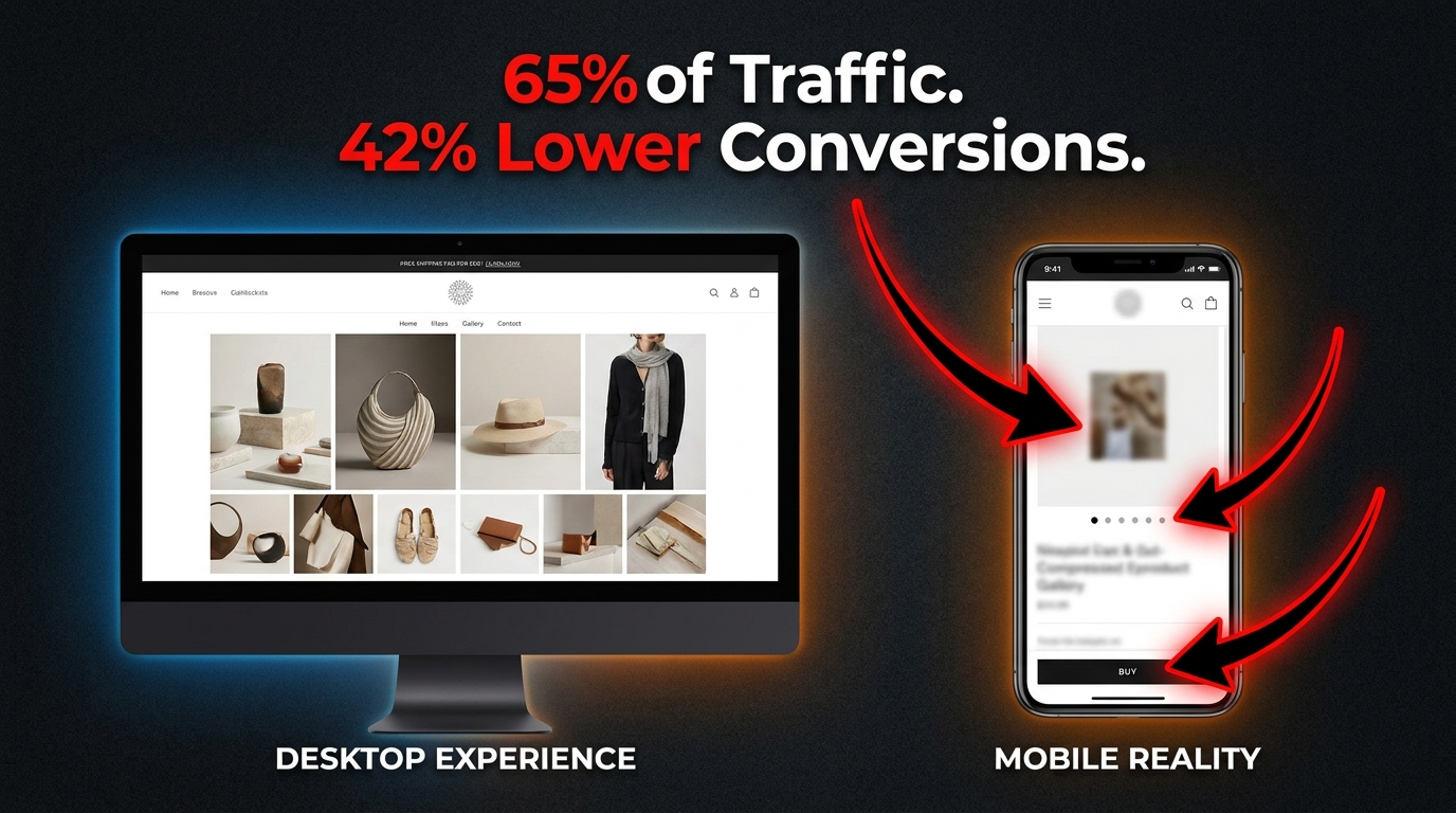
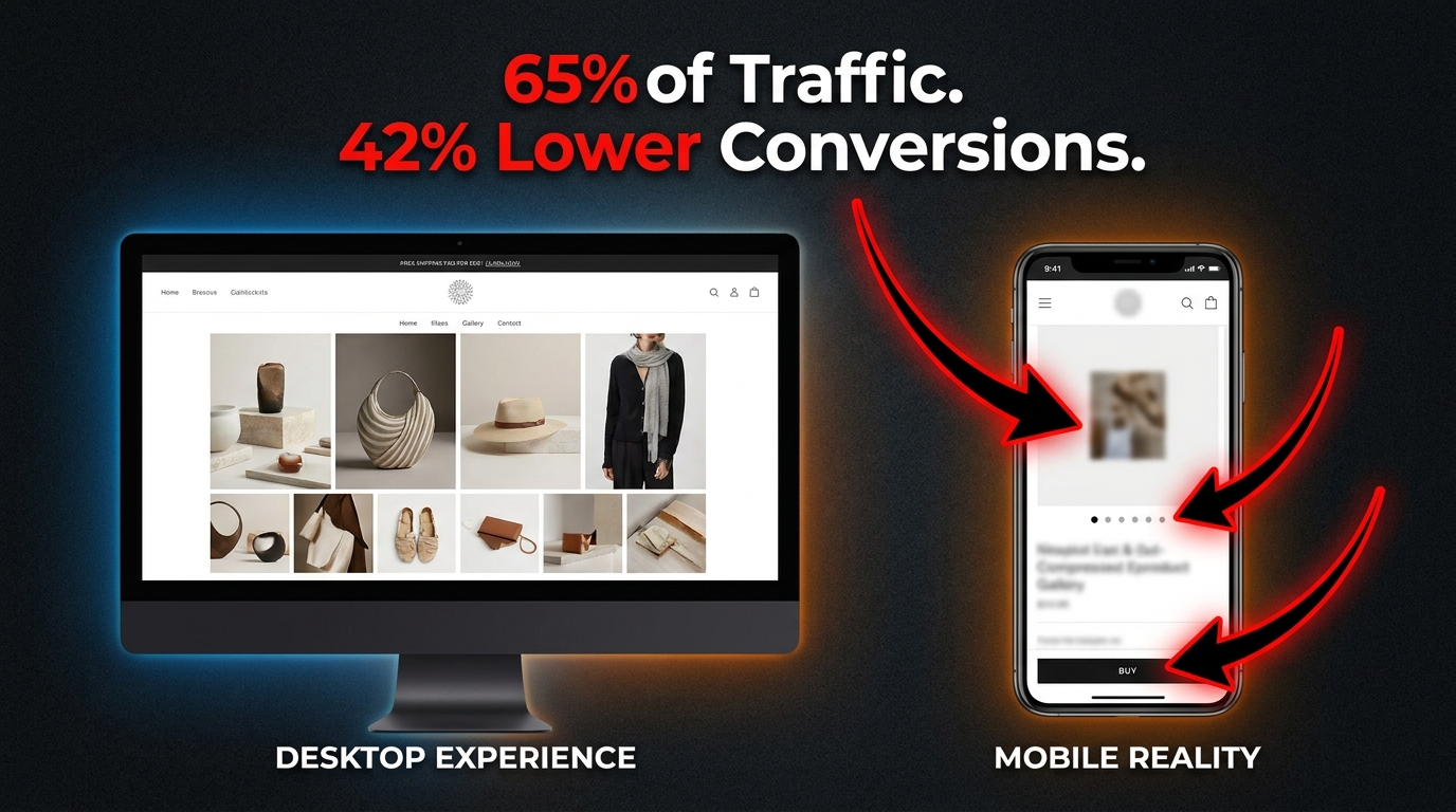
Here is the dirty truth about mobile ecommerce in 2026: your site is getting the traffic, and then it’s quietly losing the sale. According to current benchmarks, mobile devices account for roughly 65% of all ecommerce website traffic, yet mobile conversion rates remain approximately 42% lower than desktop. That gap does not exist because mobile shoppers are less serious buyers. It exists because most product galleries were designed on a widescreen monitor and then shrunk to fit a phone.
The consequences are not abstract. If your average desktop conversion rate sits at 3%, your mobile rate is probably hovering around 1.7%. On a store doing $2 million in annual revenue, that gap is a seven-figure problem hiding in your analytics dashboard, disguised as an industry-wide trend.
The instinct is to blame the channel — “mobile shoppers just browse, they buy on desktop.” But the data no longer supports that narrative. Mobile devices accounted for over 51% of online spending as far back as late 2024, and that figure has climbed steadily since. The browse-now, buy-later behavior is eroding. Mobile shoppers are ready to convert. The gallery is just turning them away before they get the chance.
This article is not about generic mobile optimization advice. It is a specific, technical examination of the product image gallery — arguably the single highest-leverage element on any product detail page — and how to rebuild it for the constraints, expectations, and behaviors of small-screen shoppers. We will cover image count, hero architecture, gesture design, navigation patterns, format selection, load performance, and contextual sequencing. Each section comes with actionable direction based on real test data, not conjecture.
Let’s start where most audits never go: the gallery itself.
The Anatomy of a Broken Mobile Gallery
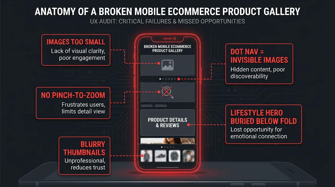
Before you can fix your gallery, you need to be able to see it the way a first-time mobile visitor does. Not in a browser developer tools panel at 390px width, and not during a quick QA pass before a product launch. You need to encounter it cold, on an actual device, with the same context a shopper has: moderate intent, no institutional knowledge of your layout, and a thumb that wants to move fast.
When you do that audit honestly, the same cluster of failures tends to appear across most ecommerce galleries regardless of platform or price point.
The Shrink-and-Ship Problem
The most common failure is the simplest: the gallery was built for a 1440px desktop layout and “made responsive” by shrinking the main image and reflowing the thumbnail grid beneath it. The result on mobile is a main image that occupies 60–70% of the viewport height, a row of thumbnails that are 40–50px wide and essentially unreadable, and a tap target for navigation that is far too small for reliable use.
This is not mobile-first design. It is mobile-tolerated design, and there is a meaningful difference. A mobile-first gallery starts with the constraint — a 390px-wide screen, a thumb in the lower quadrant of that screen, a 3G fallback connection — and designs upward from there. A shrink-and-ship gallery starts from the desktop and hopes the phone is forgiving enough to paper over the gaps.
The Invisible Image Stack
A related failure is what UX researchers call the “invisible image stack” — a gallery where users literally do not know additional images exist. Dot navigation indicators (the small circles beneath a carousel) are the primary culprit. Dots convey exactly one piece of information: there are more slides. They do not convey how many more, what those images show, or why the user should bother swiping. In usability testing, Baymard Institute has consistently observed users treating the primary image as the only image when dot navigation is the sole indicator that more exist. They are not lazy. The interface simply failed to give them a reason to explore further.
The Missing Gesture Layer
One of the most striking findings from large-scale mobile ecommerce audits is how many sites still fail at basic gesture support. Baymard Institute’s benchmark study of the 50 top-grossing US mobile ecommerce sites found that approximately 40% did not support pinch-to-zoom or tap-to-zoom on product images. This is not a fringe edge case. Users actively attempt pinch-to-zoom on product images — it is a learned behavior from maps, camera apps, and social feeds — and when the gesture fails, it creates a moment of friction and doubt that a significant share of users never recover from before leaving the page.
The Load Order Problem
Even galleries that are structurally sound often fail at the technical level through poor load prioritization. The hero image loads in a burst of network requests alongside navigation scripts, color swatch data, and recommendation engine calls. The result is a Largest Contentful Paint (LCP) score that sits in the “Needs Improvement” zone, a visually unstable layout as images pop in, and a first impression that feels sluggish before the user has even touched the gallery.
These failures are not independent. They compound. A slow-loading gallery with dot navigation, no gesture support, and undersized thumbnails does not merely inconvenience users — it actively signals that the shopping experience on this site will require work. And modern mobile shoppers, conditioned by native apps and platforms like TikTok Shop and Instagram, will not do that work.
Image Count: The 4-vs-8 Debate and What the Data Actually Says
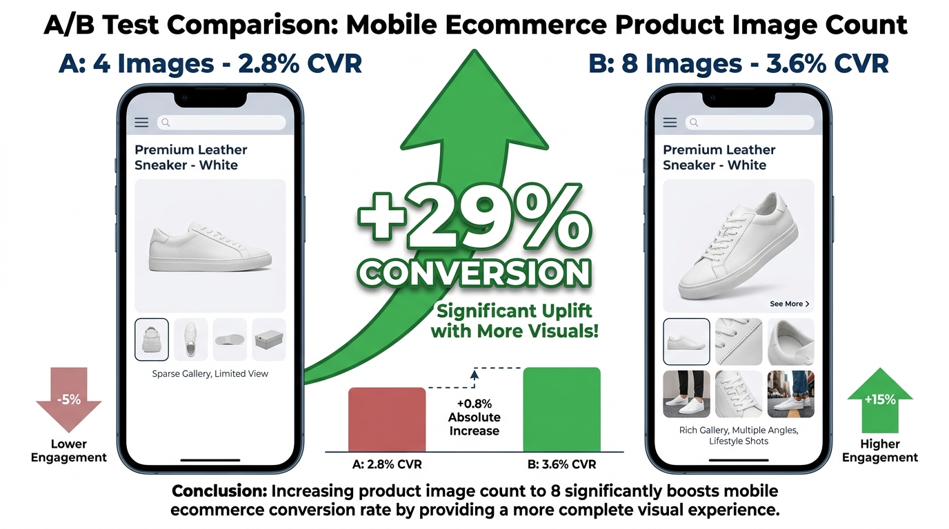
One of the most practical questions in gallery optimization is also one of the most contested: how many product images should a mobile gallery actually contain? The answer is not a single number, but the data points toward a range that most stores are not hitting — and the direction of the error is almost always too few, not too many.
The Case for More Images
A 2026 A/B test published by PixelPanda on mobile product pages tested one version with four product images against a variant with eight images. The eight-image variant produced a conversion rate of 3.6% compared to 2.8% for the four-image version — a 29% relative increase in conversions with no significant change in page load time. That last detail is important: the common assumption that more images slow the page and therefore hurt conversions was not borne out in this test when the images were properly sized and lazy-loaded.
CRO practitioners and Baymard’s usability research broadly converge on a range of 6–9 images as the high-performing sweet spot for visually complex products like apparel, footwear, home goods, and electronics. Under this threshold, users feel insufficiently informed. Beyond roughly nine or ten images for most categories, the marginal value of each additional image diminishes and scroll fatigue becomes a real factor on small screens.
What Those Images Should Cover
Image count matters far less than image completeness. The question is not “how many?” but “does this gallery answer every question that would otherwise prevent a purchase?” For most physical products, the minimum set needed to answer that question looks like this:
- Primary hero shot: Clean, front-facing, product in context or on white depending on category norms. This is the image that loads first and sets first impression.
- Multiple angles: Back, side, and three-quarter views for any product where dimension, depth, or form factor influences the purchase.
- Scale reference: An image that shows the product in relation to a familiar object or on a human body, depending on category. Scale is one of the most persistent anxiety points for mobile shoppers who cannot physically handle the product.
- Material and texture detail: A close-up image that communicates material quality — stitching, grain, finish, weight. This is the image that replaces the in-store “touch and feel” moment.
- Lifestyle or in-use context: At least one image showing the product being used in a real-world setting. More on this in a dedicated section below.
- Variant differentiators: If your product has color or configuration variants, each variant should have its own gallery rather than sharing images across options.
Category-Specific Calibration
Not all products need eight images. A simple consumable like a supplement or a basic cable might convert well with four to five images. But for apparel, furniture, shoes, beauty products, and any category where fit, scale, or material matters, the tendency to minimize the gallery to two or three “hero-quality” images is a direct conversion penalty. Baymard’s usability research specifically flags that for visually-driven product categories, insufficient image variety is one of the top reasons users abandon the product page without adding to cart — not price, not shipping cost, but unresolved visual uncertainty.
Hero Image Architecture: Above the Fold on a 390px Screen
The hero image — the primary product image visible when the page first loads — does more conversion work on mobile than on any other surface. On a desktop, users can simultaneously see the product image, the product title, the price, the add-to-cart button, and several bullet points of copy. On a 390px-wide phone, they often see the hero image and very little else. That constraint changes the job the image has to do.
Viewport Coverage and the Above-the-Fold Calculus
There is an ongoing tension in mobile product page design between giving the hero image enough visual weight to communicate product quality and leaving enough above-the-fold real estate for price, the add-to-cart trigger, and trust signals. Tests run across service-style landing pages by teams like RicketyRoo have found that oversized hero imagery that pushes key CTAs below the fold can materially reduce conversion rates, even when the image itself is beautiful.
The emerging best practice for product pages specifically is a hero image that occupies 55–65% of viewport height on a standard mobile screen — large enough to dominate visual attention and communicate product quality, but calibrated to keep the product title and a partial CTA visible without scrolling. This ratio is not universal across categories; fashion and luxury goods may justify taller hero images as a deliberate brand signal, while commodity products and utilities benefit from faster access to the purchase trigger.
What the First Image Must Communicate
The hero image on mobile is not just a picture of the product. It is the answer to the implicit first question every shopper brings to a product page: “Is this what I’m looking for?” That means the hero image needs to accomplish several things simultaneously:
- Clearly identify the product without requiring the user to read the title
- Communicate the product’s primary differentiating quality visually, before any copy is read
- Be sharp, high-contrast, and readable at both full-size and thumbnail scale
- Load fast enough that the user’s first impression is not a gray placeholder
The last point has technical implications we cover in the image format section. But the first three are creative decisions that most teams under-invest in. Many product hero images are shot for desktop display — with fine details, complex backgrounds, and nuanced lighting that reads beautifully at 800px but compresses into visual noise at 390px. Shooting or selecting hero images specifically for mobile display is not a minor optimization; it is a fundamental rethinking of the brief.
Prioritizing the Hero Image Preload
From a technical standpoint, the hero image should be explicitly preloaded in the HTML head using a <link rel="preload"> tag. It should use a responsive srcset that serves an appropriately sized image for mobile viewports rather than the full desktop resolution. And it should never be lazy-loaded — it is the LCP element on most product pages and every millisecond of delay in its render has a measurable downstream effect on conversion.
Gesture Design: Why 40% of Top Sites Still Fumble Pinch-to-Zoom
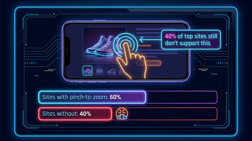
Gesture support is where the gap between what mobile users expect and what most ecommerce sites actually deliver is most stark. Pinch-to-zoom is not an advanced feature. It is a native interaction pattern that users learn from the camera, maps, and photo gallery apps that come pre-installed on every smartphone. When that gesture works on a product image, it is invisible — users simply inspect the product and move on. When it does not work, the failure is visceral and noticeable.
The 40% Problem
Baymard Institute’s benchmark study of the 50 top-grossing US mobile ecommerce sites found that approximately 40% of those sites did not support pinch-to-zoom or tap-to-zoom on product images. This is not a problem afflicting small stores with minimal development resources. It is present across retailers with eight- and nine-figure annual revenues. The failure typically occurs because gesture support is disabled at the viewport meta tag level (using user-scalable=no or maximum-scale=1.0), or because the gallery component uses a CSS or JavaScript configuration that intercepts touch events and prevents the browser’s native zoom from firing.
Both causes are fixable. Neither should be acceptable in 2026.
Implementing Gesture Support That Actually Works
Reliable pinch-to-zoom on product images requires a few intersecting technical decisions to be made correctly:
- Viewport meta tag: Remove
user-scalable=noandmaximum-scaleconstraints entirely. These were originally added to prevent accidental page zooms, but they also disable intentional product image inspection. Most modern UI design handles this through layout constraints, not viewport restrictions. - Gallery component configuration: If you’re using a JavaScript carousel library, check whether it captures all touch events. Many do, and this prevents the browser’s native pinch-zoom from activating. The library should either implement its own pinch-to-zoom or be configured to release touch events on the image element so native zoom can work.
- Double-tap to zoom: This is a secondary interaction pattern that many users prefer over pinch, particularly when browsing one-handed. The double-tap should expand the image to 2–3× zoom and center the tap point, then a second double-tap should return to the full gallery view.
- Zoom state management: When a user is zoomed into an image, horizontal swipe should pan within the zoomed image rather than advancing to the next gallery slide. Getting this right requires careful event handling, but failing to do so — where a swipe while zoomed jumps to the next image — is one of the most jarring gesture failures in mobile gallery UX.
Swipe Navigation: The Direction Problem
Beyond zoom, the horizontal swipe to advance gallery images is now a deeply embedded mental model. Users expect it to work consistently and to feel physically weighted — a slow, laggy, or jumpy swipe response is as damaging to the experience as no swipe support at all. The physics of the swipe should feel native: fast swipe advances immediately, slow swipe shows the next image partially and either snaps forward or returns based on velocity and distance traveled.
One frequently overlooked issue is the interaction between a vertical-scrolling page and a horizontally-swiping gallery. On touch devices, the browser must decide in the first few pixels of movement whether a gesture is a page scroll or a gallery swipe. Galleries that get this wrong either hijack vertical scroll (forcing users to fight to move down the page) or fail to register legitimate horizontal swipes. The correct approach is to use touch directionality detection and claim only clearly horizontal gestures as gallery navigation, releasing ambiguous diagonal touches back to the scroll handler.
Thumbnail vs. Dot Navigation: The Invisible Conversion Decision
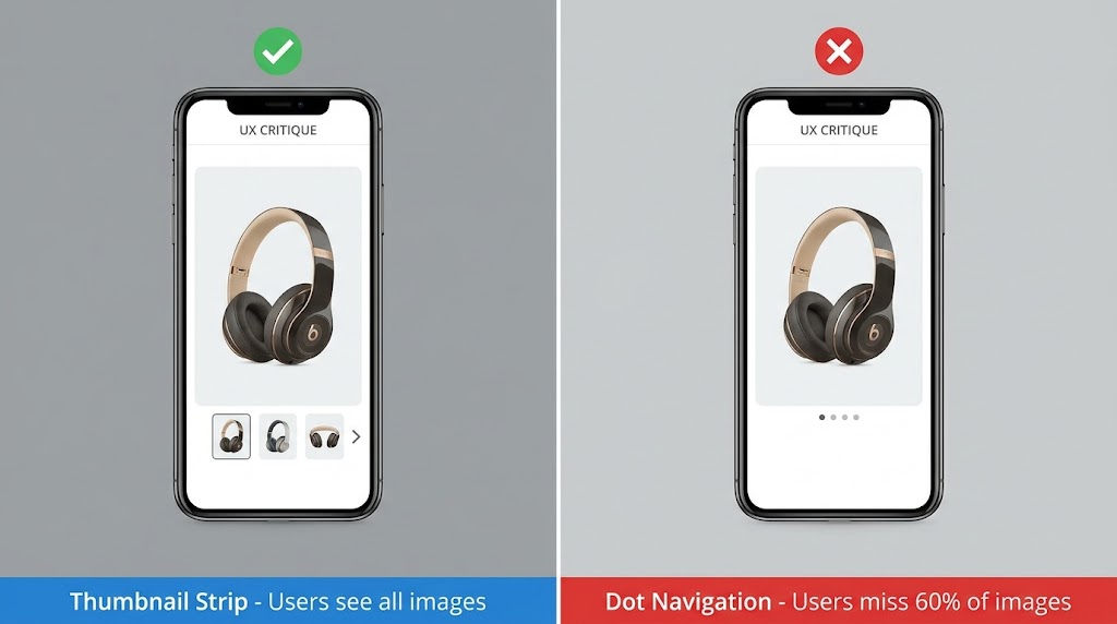
The navigation pattern you choose for your mobile gallery determines whether users discover your full image set or interact with only the first one or two images and move on. This is not a minor UX preference. It is a structural decision that shapes how much information your gallery actually delivers, and it has a direct relationship with the “visual uncertainty” that prevents mobile shoppers from converting.
Why Dots Fail
Dot navigation — the row of small circles beneath a carousel — has been the default gallery navigation pattern for mobile ecommerce for over a decade. It persists because it is easy to implement, takes up minimal vertical space, and follows a pattern users recognize from app onboarding flows and media carousels.
But it fails in a specific, predictable way for product galleries. Dots tell users that additional images exist. They do not tell users what those images contain, how different they are from the current image, or whether exploring them is worth the effort. Baymard’s usability research consistently finds that users browsing product galleries on mobile with dot navigation are far more likely to treat the gallery as “basically one image with some variants” than users navigating the same gallery with visible thumbnails. The dots create an invisible image stack — users know it’s there but have no motivation to dig into it.
The Thumbnail Strip Advantage
A horizontally scrollable thumbnail strip placed below the main image solves the discoverability problem that dots create. Thumbnails give users immediate visual information about what each image contains — users can see at a glance that image three is a close-up of the material, image four is a lifestyle shot, and image five shows the back of the product. This preview function is not decorative. It directly reduces the cognitive work required to evaluate the product, and it surfaces additional context that users might otherwise never find.
For mobile implementation, thumbnail strips require careful sizing and spacing decisions:
- Thumbnail width: Minimum 60px, ideally 72–80px, to be large enough for visual content to register clearly. At 40–50px, thumbnails become abstract blobs rather than meaningful previews.
- Active state: The currently selected image’s thumbnail should have a clear visual distinction — a border, an opacity change, or both — that communicates which image is being viewed.
- Scrollability: For galleries with six or more images, the thumbnail strip itself should scroll horizontally. Compressing seven or eight thumbnails into a fixed-width strip makes each one illegibly small.
- Tap-to-select: Tapping a thumbnail should update the main image display immediately, not transition through a swipe animation. Users using the thumbnail strip are scanning and selecting, not browsing sequentially, and the interface should match that intent.
When to Use Dots Anyway
There is a legitimate use case for dot navigation in mobile galleries: when image count is low (three or fewer images), when the images are closely similar in content and order does not matter, or when vertical real estate is so compressed that even a minimal thumbnail strip would create layout problems. Outside of those specific conditions, a visible thumbnail strip is almost always the better choice from a user comprehension and conversion standpoint.
Image Format and Speed: WebP, AVIF, and the LCP Trap
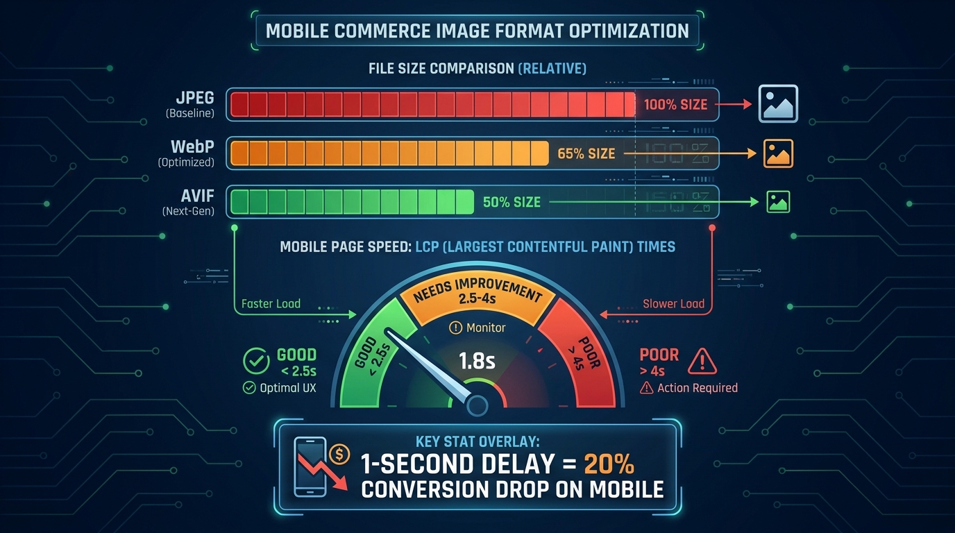
Gallery architecture and UX patterns are only part of the picture. The technical delivery of your images — their format, compression, responsive sizing, and load prioritization — has a direct, measurable effect on mobile conversion rates through page performance. Images account for roughly 50–70% of total ecommerce page weight, making them the single largest lever for mobile load time improvement.
The Format Decision in 2026
The image format landscape in 2026 is clearer than it has ever been. JPEG is the legacy format — still widely used, but no longer the right default for new implementations. The current choice is between WebP and AVIF, and the practical calculus looks like this:
- WebP delivers file sizes approximately 30–35% smaller than equivalent-quality JPEG, with near-universal browser support across modern mobile and desktop browsers. It decodes quickly and works well for both photographic product images and graphics. It is the practical default for most ecommerce teams.
- AVIF delivers file sizes approximately 45–50% smaller than JPEG — a meaningful additional reduction over WebP — with excellent perceptual quality at those compression levels. Browser support is strong across Chrome, Firefox, and Safari on modern OS versions. For sites with large image catalogs where bandwidth and CDN costs are significant, AVIF is worth the additional encoding complexity.
The correct implementation uses the HTML <picture> element with source declarations ordered from most to least preferred (AVIF first, then WebP, then JPEG as a fallback). This ensures modern browsers use the best available format without breaking the experience on older devices.
The LCP Trap
Largest Contentful Paint (LCP) is Google’s measure of how quickly the largest visible element — almost always the hero product image on a product detail page — renders in the viewport. The “Good” threshold remains 2.5 seconds for mobile in 2026. Falling into the “Needs Improvement” zone (2.5–4 seconds) is not just an SEO signal concern; it is a conversion concern. Research consistently finds that a one-second delay in image loading can reduce mobile conversion rates by up to 20%. Pages loading in one second convert at 2.5 times the rate of pages that take five seconds.
The LCP trap happens when teams optimize image format and compression but fail to address the load order of the hero image. Three technical fixes address this specifically:
- Preload the hero image: Add
<link rel="preload" as="image" href="[hero-image-url]" imagesrcset="...">in the document<head>. This tells the browser to start fetching the hero image as early as possible, before the DOM is parsed enough to encounter the image tag itself. - Never lazy-load the hero: The hero image should have
loading="eager"explicitly set (or the loading attribute omitted, which defaults to eager). Lazy loading is for below-the-fold images, not the primary above-the-fold element. - Use
fetchpriority="high": This newer attribute, now supported across all major browsers, signals to the browser that the hero image should be prioritized in network request scheduling above other resources competing for bandwidth during initial page load.
Responsive Image Sizing
Serving a 2000px-wide image to a 390px mobile screen is one of the most common and wasteful performance mistakes in ecommerce. The browser downloads the full-resolution file and then scales it down in rendering — you pay the full network cost for pixels that are never displayed at full size. Responsive images through srcset and sizes attributes solve this by instructing the browser to select the appropriately dimensioned image for the current viewport. For mobile, product hero images rarely need to exceed 800px wide; the rendering output at 390px CSS width on a 3× pixel density screen is 1170 physical pixels, meaning an 800px source image actually renders slightly larger than native, which is perfectly acceptable.
Lifestyle vs. White Background: Context That Sells on Small Screens
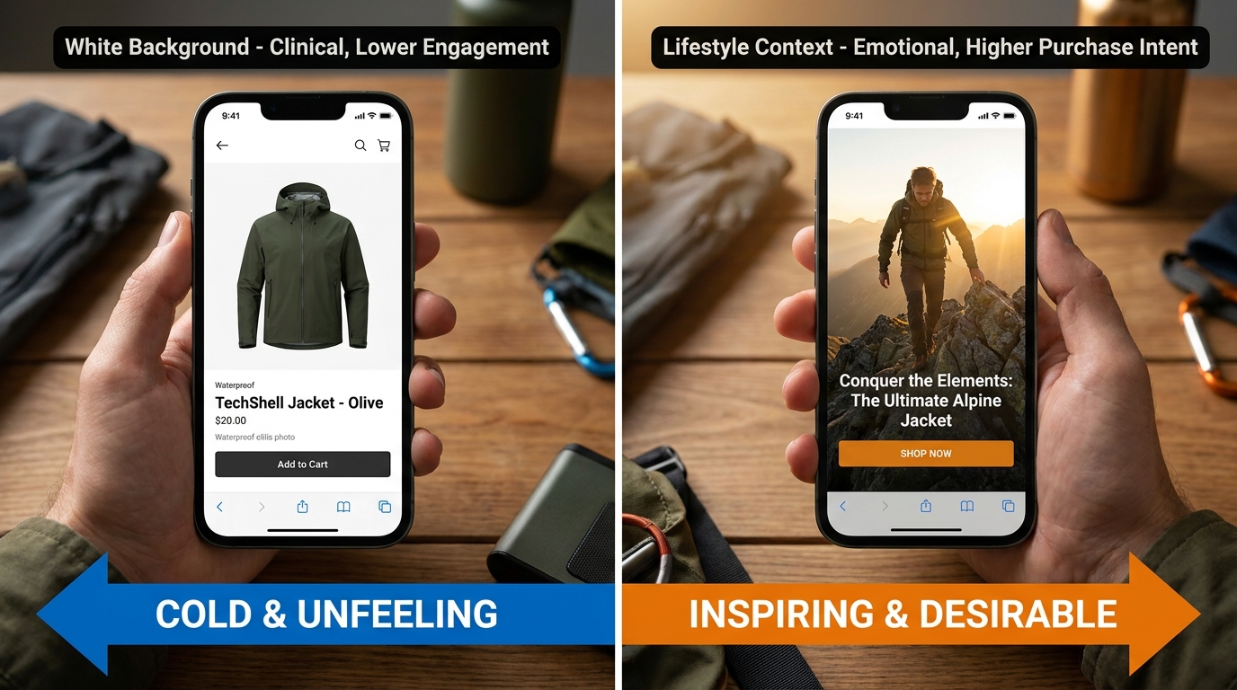
The white background versus lifestyle image debate is one of the oldest in ecommerce photography, and it is also one of the most misunderstood. The framing of “which is better?” is the wrong question. The right question is “which does what job, and in what sequence?”
What White Background Does Well
White or neutral background images excel at one specific task: eliminating visual noise so the product itself can be assessed clearly. For product thumbnails in category pages, search results, and marketplace listings, white background images are typically more effective because they reduce cognitive load and allow rapid scanning across multiple products. They also communicate cleanliness and professionalism — a product photographed against a well-lit neutral background signals that the seller takes presentation seriously.
On mobile product pages, a clean primary image on a white or near-white background can be highly effective as the hero shot, particularly for products where shape, proportion, and visual detail are the main purchase drivers — think electronics, kitchen tools, or precision accessories. The absence of background clutter lets the eye go straight to the product.
Where Lifestyle Images Convert
Lifestyle images — showing the product in use, in context, on a person, or in an environment — do a fundamentally different job. They answer questions that studio photography cannot: “How big is this in a real room?”, “What does this look like when someone is actually wearing it?”, “Does this product fit the life I imagine for myself?”
Split tests run by ecommerce CRO practitioners have found that contextual background images can significantly increase conversion rates versus plain white backgrounds, particularly for categories where aspiration and identity play a role in the purchase decision. The ConvertMate and Nightjar findings on this topic are consistent: when users are emotionally uncertain — “I love this but I’m not sure it works for my life” — a lifestyle image resolves that uncertainty in ways that product specifications and written copy cannot.
On mobile specifically, lifestyle images have an additional advantage: they are more visually engaging to a thumb-scrolling user who is allocating only partial attention to the experience. A striking lifestyle image can stop the scroll. A clinical studio shot, however technically correct, may not.
The Sequencing Strategy
The highest-performing galleries in most categories do not choose between white background and lifestyle — they sequence them deliberately. A practical sequencing framework looks like this:
- Image 1 (Hero): Clean, clear primary product shot. Answers “what is this product?” immediately.
- Images 2–3: Additional angle and detail shots. Answers “what does the whole product look like?” and “what are the specific details I should know about?”
- Image 4: Scale reference — product in use or next to a familiar scale object. Answers “how big is this in the real world?”
- Images 5–6: Lifestyle / in-context imagery. Answers “how does this fit into the life I imagine for myself?”
- Images 7–8 (if applicable): Material close-ups and variant-differentiating shots. Handles the final category of visual doubt before purchase.
This progression mirrors the natural arc of a purchase decision: awareness → product assessment → scale resolution → emotional connection → final doubt elimination. A gallery that follows this arc is doing strategic persuasion work, not just providing documentation.
Lazy Loading Strategy for Mobile Galleries
Lazy loading — deferring the load of off-screen images until they are about to enter the viewport — is one of the most impactful and frequently misconfigured performance optimizations for mobile galleries. Done well, it dramatically reduces initial page weight and improves perceived load time. Done poorly, it creates a gallery that appears to load slowly because images are fetching just as users try to swipe to them.
What to Lazy Load and What Not To
The rule is simple but often violated: never lazy-load the hero image. The hero is the LCP element. Its render time is your most important performance metric on the page. Lazy-loading it — even inadvertently through a blanket loading="lazy" attribute on all images — can add hundreds of milliseconds to LCP that will show up directly in your Core Web Vitals score and your conversion rate.
Gallery images beyond the first one are appropriate candidates for lazy loading. For a ten-image gallery, images two through ten should typically use either native lazy loading (loading="lazy") or a JavaScript-based intersection observer approach that loads each image as the user swipes toward it.
One nuance for gallery-specific lazy loading: in a swipeable carousel, the second and third images are often pre-fetched speculatively even when they are not yet visible, because the user is likely to swipe to them within seconds. This is a deliberate trade-off — slightly higher initial data usage in exchange for seamless swipe transitions. Most modern gallery components handle this with a configurable “preload buffer” — typically set to one image ahead and behind the current view.
CLS and the Placeholder Problem
Cumulative Layout Shift (CLS) — the instability caused by page elements moving as assets load — is a persistent problem in lazy-loaded image galleries. When an image is not yet loaded, the browser does not know how tall the image container should be. Without explicit dimensions, the container collapses to zero height and then expands when the image loads, pushing everything below it down the page. This creates layout shifts that feel jarring and can accidentally trigger taps on the wrong elements.
The fix is to always specify explicit width and height attributes on your image tags, or to use CSS aspect-ratio containers that maintain the correct proportions before the image loads. For product galleries where all images are the same aspect ratio (a reasonable and recommended standard), a single CSS rule can eliminate CLS across the entire gallery:
Use a wrapper element with
aspect-ratio: 1/1(or whatever your gallery ratio is),overflow: hidden, andposition: relative. Place the image inside withwidth: 100%; height: 100%; object-fit: contain. This reserves the correct space before the image loads and prevents any layout shift on render.
Progressive Loading for Perceived Performance
Beyond technical lazy loading, the perceived load quality of your gallery images matters for mobile conversion. Images that load progressively — starting from a blurry, low-quality placeholder and sharpening to full resolution — feel faster than images that appear in a sudden binary pop from invisible to fully rendered. Both WebP and AVIF support progressive rendering modes, though the specific implementation differs by format. JPEG also supports progressive encoding through interlacing. Using progressive encoding for gallery images adds minimal file size overhead and meaningfully improves the perceived load experience on slower mobile connections.
Testing Your Gallery: A Mobile-First CRO Framework
Understanding the principles is one thing. Building a systematic process for testing, measuring, and improving your gallery over time is what separates teams that consistently close the mobile conversion gap from teams that make one round of changes and consider the problem solved. Gallery optimization is not a project; it is an ongoing program.
Starting With a Qualitative Audit
Before running A/B tests, run a structured qualitative audit. This means:
- Testing the gallery on at least three different physical mobile devices (not browser emulators) across both iOS and Android, including an older, slower device that represents the bottom quartile of your user base
- Testing on actual network conditions — not just WiFi but 4G and simulated 3G using browser devtools throttling
- Recording a session replay tool walkthrough on mobile (Hotjar, FullStory, or equivalent) looking specifically for rage taps on the gallery, scroll depth past gallery images, and exit patterns from the product page
- Running a Lighthouse audit specifically on mobile to capture LCP, CLS, INP, and TBT scores alongside the performance waterfall that shows image load order
This audit will almost always surface at least two or three high-confidence issues that are worth fixing before you start A/B testing. Fixing clear failures is not worth A/B testing — the expected improvement is unambiguous enough that a sequential before/after measurement (with appropriate time windows to account for traffic variation) is sufficient.
Structuring A/B Tests for Gallery Elements
When moving to controlled A/B testing, the key discipline is testing one gallery variable at a time. The main variables worth testing systematically are:
- Image count: Current count versus a richer gallery (typically current + 2–3 images covering identified content gaps)
- Hero image selection: Which image serves as the primary first impression — a clean studio shot, a lifestyle image, or an in-context detail
- Navigation pattern: Dot navigation versus thumbnail strip, or thumbnail strip placement (below vs. side-scrolling overlay)
- Gallery proportions: Image height-to-viewport ratio for the hero above the fold
- Zoom implementation: Tap-to-expand lightbox versus inline pinch-to-zoom
Each test should run for a minimum of two full business-week cycles and reach statistical significance (typically 95% confidence) before drawing conclusions. Gallery behavior is subject to day-of-week effects — weekend mobile shopping behavior is often meaningfully different from weekday patterns — so shorter test windows can produce misleading results.
Metrics Beyond Conversion Rate
Conversion rate is the primary metric, but gallery-specific tests benefit from measuring secondary engagement metrics that give earlier signals and help interpret conversion data:
- Gallery depth: The average number of images viewed per session. If your gallery has eight images and average depth is 1.8, you have a discoverability problem regardless of what happens to conversion rate.
- Zoom usage rate: The percentage of sessions where the user zooms into at least one gallery image. Higher zoom usage correlates with higher purchase intent.
- Add-to-cart rate from the product page: A more sensitive metric than overall conversion rate, since it isolates the product page’s contribution from downstream checkout friction.
- Product page exit rate: The percentage of sessions that land on the product page and exit the site without any further interaction. A high exit rate with low gallery depth is a strong signal of inadequate visual information.
Iteration Cadence and the Compounding Effect
The most powerful aspect of systematic gallery testing is that improvements compound. A 15% improvement in mobile conversion rate from fixing gesture support, combined with a 12% improvement from moving to thumbnail navigation, combined with an 8% improvement from optimizing image count, produces a combined lift that is meaningfully larger than any single change. Teams that run gallery tests continuously — two to three tests per quarter, resetting the baseline with each validated improvement — routinely close half or more of the mobile-desktop conversion gap within 18 months.
The mobile conversion gap is not an inherent property of the channel. It is, in large part, a gallery problem waiting to be solved. The data, the test frameworks, and the technical tools to solve it exist. What most teams are missing is the discipline to treat the gallery as a first-class conversion asset rather than a box to be checked during the initial product launch.
The Full-Stack Gallery Rebuild: A Practical Starting Point
Everything covered in the preceding sections can feel like a long list of individual improvements. For teams that need a clear starting point — particularly those doing a ground-up rebuild of their mobile product page rather than iterative optimization — here is the minimum viable gallery specification that addresses the most common, highest-impact failures.
Technical Specification
- Hero image: AVIF/WebP with JPEG fallback, served via
<picture>element. Responsive srcset with mobile-specific 800px variant. Preloaded in document head. Never lazy-loaded.fetchpriority="high"attribute set. - Gallery images 2+: Same format stack. Native lazy loading (
loading="lazy") with 1-image speculative preload buffer. Explicit dimensions to eliminate CLS. - Gallery container: CSS aspect-ratio fixed at consistent ratio (1:1 or 4:3 depending on category), preventing layout shift on load.
- Gesture support: Pinch-to-zoom enabled via viewport meta tag (no user-scalable=no), double-tap to zoom, panning in zoomed state, swipe direction detection to distinguish gallery navigation from page scroll.
UX Specification
- Minimum 6 images for visually complex products, 4–5 for simple products.
- Image sequence following the awareness → assessment → scale → emotion → doubt-elimination arc.
- Thumbnail strip navigation for galleries with 4+ images. Minimum thumbnail width 72px. Horizontally scrollable for 7+ images. Clear active state indicator.
- Hero image occupying 55–65% of viewport height on standard mobile screens. Product title and partial CTA visible without scrolling.
- Dedicated image sets per product variant — no shared images across color or configuration options.
Content Specification
- At least one clear scale reference image per product.
- At least one material/texture detail close-up for physical products.
- At least one lifestyle or in-context image per product.
- Hero image shot or selected specifically for mobile display at 390–430px width — not a repurposed desktop or marketplace image.
This specification is not a ceiling. It is a floor — the baseline below which the gallery is materially failing to support mobile conversion. Beyond it, category-specific testing, seasonal creative testing, and incremental UX refinement will continue to yield improvements. But teams that implement this baseline consistently and correctly will close the majority of the performance gap that currently sits between their mobile traffic potential and their actual mobile revenue.
Conclusion: The Gallery Is a Revenue Decision, Not a Design Decision
The way most ecommerce teams think about the product gallery needs to change. It is treated as a design element — a component that gets built during initial development, iterated occasionally when something breaks, and rarely subjected to the same rigorous performance pressure as paid acquisition, checkout flow, or pricing strategy.
That framing is wrong, and the data proves it. When mobile accounts for 65% of your traffic and converts 42% worse than desktop, the gallery — the primary vehicle through which mobile shoppers assess whether a product is worth buying — is not a design detail. It is one of the most consequential revenue levers in your entire conversion stack.
The fixes are not particularly exotic. Support gesture interactions that users already expect. Show enough images to resolve the visual questions that would otherwise prevent a purchase. Navigate in a way that makes the full image set discoverable. Load images fast enough that slow connections do not erode the experience before it has a chance to persuade. Sequence the story that your images tell so it maps onto the natural arc of a mobile purchase decision.
None of this requires a complete platform overhaul or a massive budget. It requires a deliberate choice to treat mobile gallery performance as a business priority — to audit it honestly, test it systematically, and iterate with the same urgency you would apply to any other underperforming revenue channel.
The conversion gap is real. So is the opportunity to close it. The gallery is where that work starts.
Leave a Reply