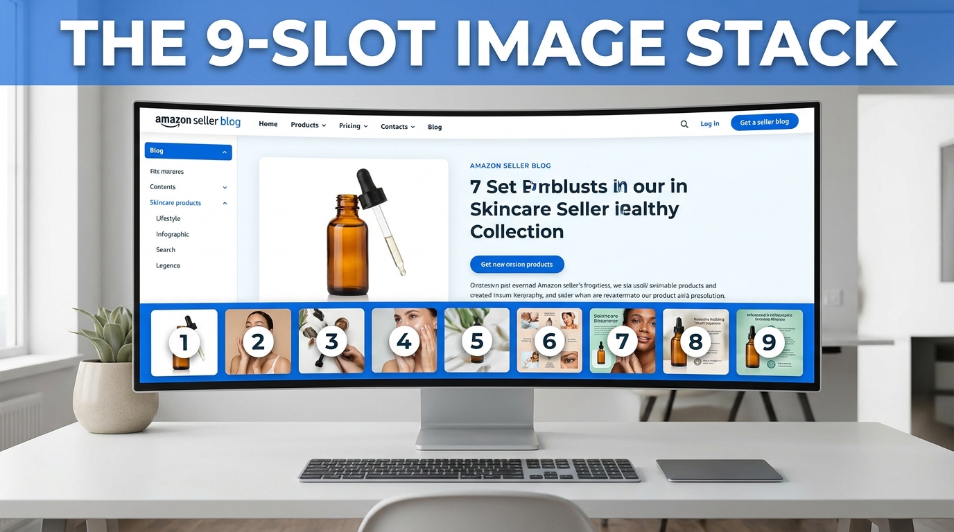
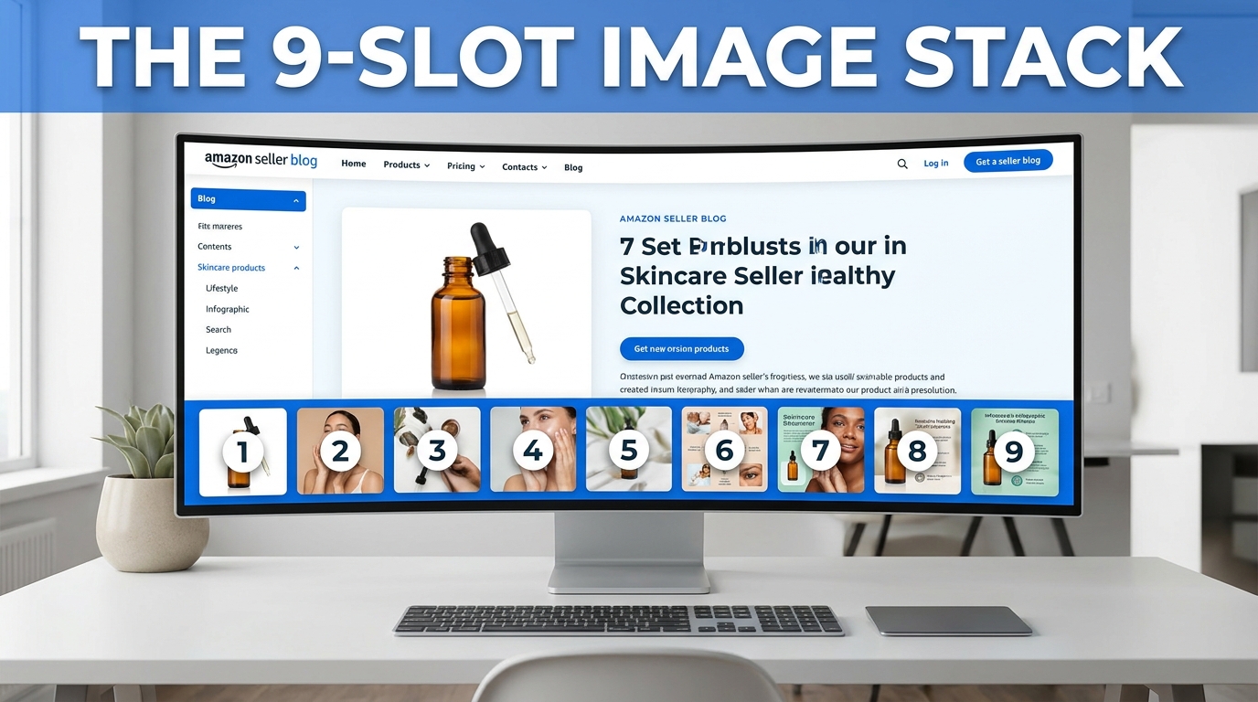
Most Amazon sellers treat their image gallery like a photo dump. They shoot the product from six angles, upload whichever files look sharpest, and call it done. Then they wonder why their listing converts at 6% when the category average sits closer to 12%.
The problem isn’t the quality of the individual images. It’s the absence of any coherent strategy connecting them. Amazon gives you nine image slots — and for most sellers, those nine slots function as nine separate, disconnected photographs rather than a single, integrated sales argument.
That’s the shift this article is about.
Think of your nine image slots not as a gallery, but as a funnel. Each slot has a job. Each image should move a specific type of buyer — at a specific stage of their decision process — one step closer to clicking “Add to Cart.” When sellers approach their image stacks this way, the results are measurable: independent testing consistently shows that a well-sequenced, strategically built image stack outperforms a generic one by 30–80% in conversion rate, depending on the category.
The framework below maps each slot to a stage in the buyer journey: from the first-glance awareness of the search results page, through the curiosity of early clicks, into the deeper evaluation of features and proof, and finally to the confidence required to purchase. Understanding what buyers need at each stage — and then giving it to them in the right order — is what separates high-converting listings from expensive photo shoots that do nothing.
Let’s build your image stack from the ground up.
Why Your Image Gallery Is Actually a Sales Funnel
Before diving into individual slots, it’s worth establishing the mental model that makes everything else click. Amazon’s buyer journey is compressed. Unlike a retail store where a shopper might browse for thirty minutes before deciding, the typical Amazon purchase decision — from search results to add-to-cart — can happen in under ninety seconds. Your images have to do the work that a physical store, a salesperson, and a product demo would do in the real world, and they have to do it faster.
Eye-tracking research on e-commerce product pages consistently shows that the image area receives more attention than any other element — more than the title, more than the bullet points, and far more than the description. Shoppers look at images first. They use images to decide whether to read anything else. If the images don’t hold them, the text never gets a chance.
The Four Stages Your Images Must Serve
Mapping the buyer journey to the image stack looks like this:
- Awareness (Slot 1): The shopper is scanning search results. They’re not thinking about your product specifically — they’re looking for something worth clicking. Your main image has to compete for attention in a grid of competitors.
- Interest (Slots 2–3): The shopper has clicked through. They’re curious but not committed. These slots must justify the click and pull them deeper into the listing.
- Desire (Slots 4–7): The shopper is evaluating. They want to understand what the product does, how it looks in real life, whether it fits their space or body or use case, and why it’s better than the alternatives they’ve already looked at.
- Action (Slots 8–9): The shopper is on the edge of a decision. These final slots remove remaining doubt, answer unspoken objections, and give the final push that converts browsing into buying.
Every image in a well-built stack has a clear assignment within this progression. When a slot is wasted on a redundant angle or a generic lifestyle shot that doesn’t add new information, that’s a buyer stage left unaddressed — and an objection left unanswered.
How Amazon Displays Your Images
On desktop, Amazon shows the main image prominently on the left, with the secondary images stacked as thumbnails below or beside it. On mobile — which now accounts for more than 60% of Amazon browsing sessions — the images are displayed as a swipeable carousel. This matters for sequencing: mobile shoppers swipe left to right in order, so your narrative has to work linearly. There’s no random access. Slot 2 must make sense coming after Slot 1, and Slot 5 must feel like a natural continuation of Slot 4.
Additionally, since January 2024, Amazon has the ability to pull images from multiple selling partners onto a single product detail page if required images are missing. This means that if your listing lacks key image types — a white-background main shot, an in-environment shot, or a size/fit image — Amazon may supplement your gallery with images from other sellers or its own sources. You lose creative control. You lose brand consistency. And you lose the narrative sequence you’ve built. Filling all nine slots intentionally isn’t optional anymore.
Slot 1 — The Hero Image: The Scroll-Stopping Science Behind Your Main Image
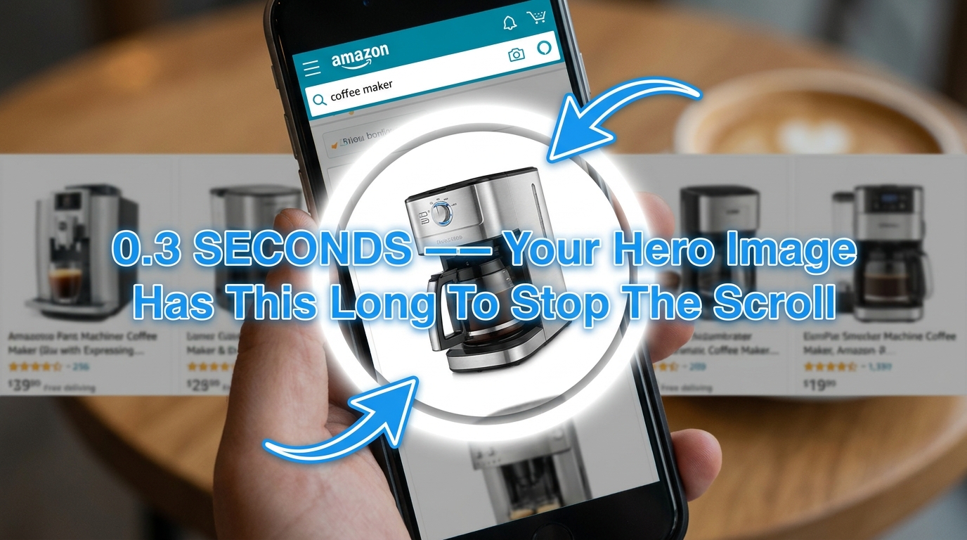
Your main image — the one that appears in search results — is the single most important creative asset in your entire Amazon operation. It determines click-through rate (CTR). And because CTR is a direct input into the A10 algorithm’s assessment of listing relevance and demand, your main image is also, indirectly, a ranking signal. A weak main image doesn’t just hurt conversion; it reduces the organic traffic you receive in the first place.
Amazon’s image guidelines for the main image are well-known: pure white background (RGB 255, 255, 255), product occupying at least 85% of the frame, no watermarks, no lifestyle elements, no text overlays. These rules exist to create a consistent browsing experience. What sellers often miss is that “compliant” and “compelling” are two different things — and compliance is only the floor, not the ceiling.
What Actually Makes a Hero Image Stand Out
When every product in a search results grid is displayed on a white background, differentiation comes from the product itself: its color, its shape, its angle, and how much it fills the frame. Several factors consistently separate high-CTR hero images from average ones:
- Fill the frame aggressively. Amazon requires 85% frame coverage, but the best-performing hero images push 90–95%. The product should look large, prominent, and confident — not small and floating.
- Choose the most communicative angle. The “front” of a product isn’t always the most informative face. For a backpack, for instance, a three-quarter rear angle that shows the straps, back panel, and side pockets simultaneously often outperforms a flat front shot. Ask: which single angle communicates the most about what this product is?
- Color contrast matters more than color preference. If your product is navy blue and most of your competitors’ products are also navy blue, consider a color variant as your hero — or a shoot with a slightly different angle that creates stronger visual contrast against white. Warm-toned products often pop harder against pure white than cool-toned ones.
- Avoid visual clutter. Multi-pack products are a common hero image mistake. When sellers stack five bottles of vitamins together to show quantity, the image becomes busy and hard to read at thumbnail size. Consider showing the single unit cleanly, and communicating multi-pack value through the title and secondary images instead.
- Shadows and depth. A subtle, natural shadow beneath the product (not a hard drop shadow) can prevent the product from looking like it’s floating weightlessly. This small detail increases perceived product solidity and realism.
The Thumbnail Test
Before finalizing any hero image, zoom out. Reduce the image on your screen until it’s roughly 150–200 pixels wide — approximately the size it appears in Amazon’s search results on a desktop browser. Can you still tell what the product is? Is it clear, sharp, and distinct? If it blurs into a vague shape at thumbnail size, it will not stop scrolls. The best hero images pass the thumbnail test immediately: you know exactly what you’re looking at within a fraction of a second.
Run this test against your top three competitors’ hero images side by side. How does yours compare? If theirs are cleaner, larger, or more visually distinct at thumbnail size, that’s directly costing you clicks — and you have a specific, fixable problem.
Slots 2–3 — The Hook Images: Turning Click-Through Into Genuine Interest
The shopper has clicked your listing. They’ve passed the awareness stage. Now they’re in the interest stage — they want to know if this product is worth their time. Slots 2 and 3 need to answer the question the buyer has at this moment: “Okay, but why this one?”
This is where many sellers make a critical sequencing mistake: they use Slots 2 and 3 for more white-background product angles. Another shot of the same product from a slightly different perspective. These images are not advancing the buyer’s decision process. The buyer has already seen the product. They don’t need to see it from the left side versus the right side — they need to understand why it’s better than what they’ve already scrolled past.
Slot 2: The “Why This” Image
Slot 2 should answer the comparison question. What makes this product different from the alternatives? The most effective approach here is a hero-adjacent image that introduces your product’s core benefit — ideally with a short, bold text overlay that can be read without any prior context.
Think of this image as your opening argument. In a physical retail setting, this is when the salesperson says: “The thing that makes this one unique is…” You have a single frame to make that statement. The image should do the visual heavy lifting, and a short three-to-five word text callout can reinforce the core message without overwhelming the frame.
Examples of strong Slot 2 approaches by category:
- Supplements: A side-by-side ingredient comparison showing your formulation versus the “standard” version, with a clear visual hierarchy emphasizing what you’ve added or excluded.
- Kitchen tools: The product in action — mid-use, showing the output (a perfectly sliced vegetable, a beautifully frothed coffee) alongside the tool that produced it.
- Electronics: A shot that communicates the core use case immediately — headphones on a person’s head, earbuds shown with a phone to confirm compatibility and scale.
Slot 3: The “This Is For Me” Image
By Slot 3, the buyer is deciding whether this product is relevant to their specific situation. Slot 3 should be your first audience-targeted image. Use it to signal who this product is for — through context, setting, or a human model that your target customer can identify with.
If you sell a yoga mat, Slot 3 might show a woman in her thirties doing a yoga pose in a clean home studio — communicating “this is for health-conscious women who practice at home.” If you sell a camping cookset, it might show the product on a campfire with a tent visible in the background — “this is for outdoor adventurers.” The goal isn’t to exclude anyone; it’s to help the right buyer immediately self-identify as your customer. That identification accelerates the decision process significantly.
Slots 4–5 — The Evaluation Images: Features, Benefits, and the Infographic Sweet Spot
The buyer has moved into the desire stage. They’re no longer evaluating whether to stay on your listing — they’re actively gathering information to justify a purchase. Slots 4 and 5 are where sellers have the most room to be strategic, and where the gap between average and excellent listings tends to be widest.
Slot 4: The Feature Infographic
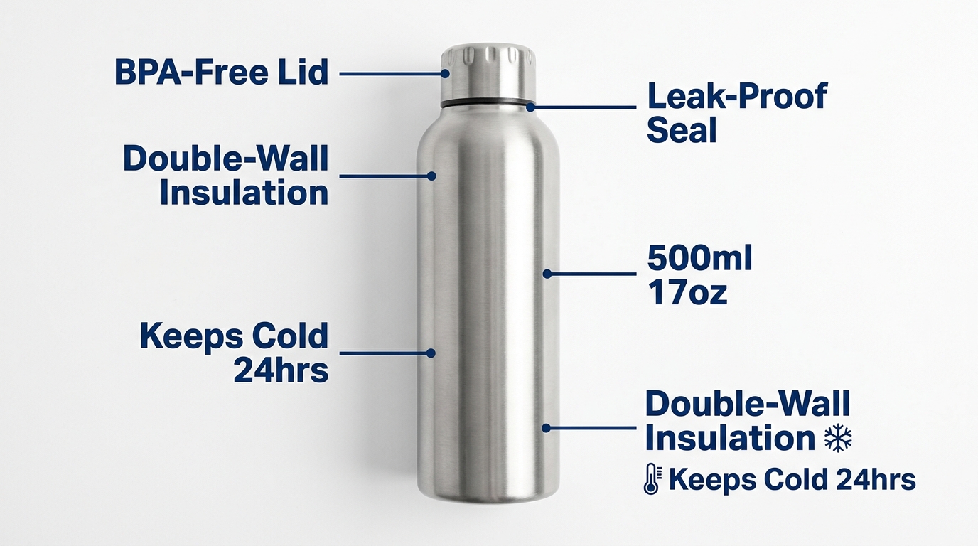
Slot 4 is your primary infographic slot. An infographic image combines a clear product photograph with annotated text callouts that highlight specific features or specifications. Done well, this image does in three seconds what it would take a buyer two minutes to extract from your bullet points.
The key principles of an effective Amazon infographic:
- Lead with benefits, not features. “Keeps cold for 24 hours” outperforms “double-wall vacuum insulation” even though they describe the same thing. Buyers want outcomes, not specs. Use the spec as supporting evidence for the benefit, not as the headline.
- Limit callout points to five or six. More than six callouts create visual congestion and the eye doesn’t know where to start. Choose your five most compelling selling points and let them breathe.
- Use clean annotation lines. Fine, straight lines connecting text callouts to product details look professional. Cluttered, curved, or overlapping lines look amateur. White or light-grey lines on a white background tend to work better than heavy dark lines that compete visually with the product.
- Match your typography to your brand. Use the same font family, weight, and color palette across all your annotated images. This creates visual consistency that signals brand maturity and builds trust.
- Ensure readability at mobile size. Callout text that’s perfectly legible on a desktop monitor may be too small to read on a phone screen. Target a minimum font size equivalent to 14–16pt at full image resolution (2000 × 2000 pixels at 72dpi). When the image is compressed to mobile size, the text should still be scannable.
Slot 5: The Lifestyle Image — Selling the Outcome

Lifestyle images serve a fundamentally different psychological function than product images. Where a product image shows what something is, a lifestyle image shows what something enables. This is the difference between selling an object and selling an identity.
Neuroscience research on consumer behavior shows that purchasing decisions are driven primarily by emotion and rationalized afterward by logic. A buyer looking at a standing desk doesn’t want to see a desk on a white background — they want to see themselves at that desk: organized, focused, productive, healthy. The lifestyle image creates that mental simulation. When a buyer can picture themselves using the product, purchase intent increases substantially.
Effective lifestyle photography for Slot 5 follows a few consistent principles:
- Show the product in use, not just in frame. A kitchen knife displayed next to vegetables isn’t a lifestyle image — it’s a styled product shot. A kitchen knife cutting through a butternut squash, held by someone cooking in a real kitchen, is a lifestyle image. The difference is active use versus passive presence.
- Make the human model aspirational but relatable. Your model should represent your ideal customer — not necessarily in terms of demographics, but in terms of the life they’re living in the image. The setting, the clothing, the expression, and the activity should all communicate the lifestyle your product enables.
- Use real environments, not artificial sets. Backgrounds that look like studio sets with fake props undermine authenticity. Real locations — real kitchens, real offices, real outdoor environments — photograph authentically and communicate trust. The difference is visible to buyers even when they can’t articulate it.
- Control for brand palette in the environment. You can’t always control the exact color of a rock face or a kitchen countertop, but you can choose locations whose color palette harmonizes with your brand. Warm-toned brands should shoot in warm-toned environments; cool-toned brands in environments with slate, grey, white, or blue.
Slot 6 — The Proof Image: Turning Skepticism Into Confidence
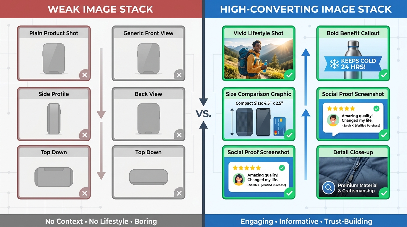
By Slot 6, a buyer is usually in evaluation mode. They’ve decided they like the product — now they’re trying to decide if they trust it. This is the stage at which comparison shopping happens, review-reading happens, and hesitation peaks. The proof image is designed specifically to address this skepticism.
Types of Proof That Work in an Image Format
Proof comes in several forms, and the most effective Slot 6 images leverage whichever type is most relevant to the buyer’s likely objection:
- Comparison charts. A clean, honest comparison between your product and “standard alternatives” (without naming competitors, which Amazon prohibits) can be powerful. Columns showing your product versus a generic version across five or six criteria, with checkmarks and X marks, communicate superiority clearly and quickly. The key word here is “honest” — cherry-picking criteria to make your product look good damages trust with buyers who’ve done enough research to notice the omissions.
- Awards, certifications, and testing credentials. If your product has been independently tested, certified by a recognized body, or won an industry award, Slot 6 is the place for it. FDA-registered, OEKO-TEX certified, dermatologist-tested, NSF-certified for water quality — these credentials carry real weight with skeptical buyers and should be displayed prominently as a graphic element within a clean image layout.
- Social proof aggregates. Some sellers use Slot 6 to display a stylized version of their review data — “4.7 Stars | 12,000+ Reviews” displayed as a graphic element within a lifestyle or product image. This works particularly well for newer products that haven’t yet accumulated enough reviews to be immediately visible in the listing header, or for products where competitor review counts are significantly higher.
- Before-and-after imagery. In categories where transformation is the core value proposition — skincare, cleaning products, organizational tools — a genuine before-and-after image in Slot 6 can be the most persuasive image in the entire stack. The critical word is “genuine”: buyers have become sophisticated at detecting digitally enhanced before-and-afters, and a result that looks too clean or too dramatic can backfire into doubt rather than confidence.
What to Avoid in Proof Images
Overstating. The temptation in a proof image is to make every claim as strong as possible — every checkmark, every certificate, every superlative. But buyers who feel oversold become skeptical. A proof image that acknowledges a limitation (your product is best for X but not designed for Y) can actually increase trust by demonstrating that you’re not trying to be everything to everyone. Selective honesty is more persuasive than comprehensive boasting.
Slot 7 — The Size and Scale Image: The Return-Prevention Slot
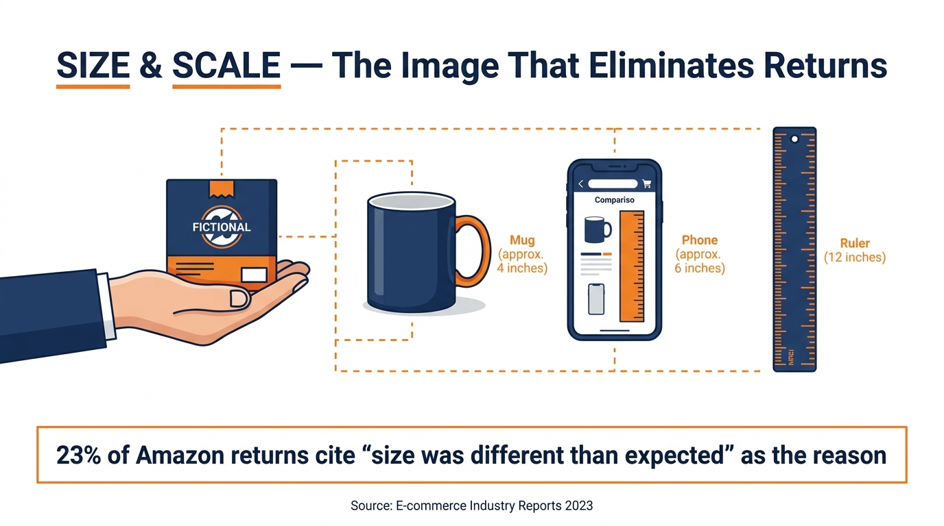
Size perception is one of the most consistent sources of Amazon returns. Buyers receive a product, and it’s not what they imagined from the images. It’s smaller than expected. Or larger. Or thinner. Or heavier. The listing dimensions were technically accurate — but accurate numbers in a text field don’t create accurate mental models in the way a good size comparison image does.
Studies on online shopping return behavior consistently place “item was not as described” and “size was different than expected” among the top three reasons for returns on Amazon. A dedicated size and scale image in Slot 7 directly addresses this problem — and reducing return rate has benefits beyond the obvious: lower return rates protect seller metrics, preserve review velocity, and reduce FBA fee exposure from inventory that cycles in and out of returned status.
How to Build an Effective Size Image
The goal is to create a mental measurement that the buyer can anchor to an object they already know. Abstract dimensions — “12 inches tall” — require a mental calculation. Comparison references — “about the height of a standard wine bottle” — create an immediate, intuitive sense of scale.
Effective size image approaches include:
- Hand-hold shots. A product held in a human hand is one of the fastest and most effective size communication tools available. Hands are a universal reference point; every buyer knows how big a hand is. For small products especially — earbuds, jewelry, travel accessories — a clean hand-hold shot against a white or neutral background immediately communicates actual size far more accurately than any dimension listing.
- Familiar object comparisons. Place your product next to objects your buyer is certain to own or recognize: a standard coffee mug, an iPhone (labeled as such), a tennis ball, a dollar bill, a ruler. Dimension annotations (“H: 9.5″ / W: 4.2″”) layered on top of the comparison complete the image. The visual reference does the intuitive work; the numbers provide the logical confirmation.
- In-context scale shots. For home goods, furniture, or décor items, showing the product installed or placed in a real room with recognizable furniture creates scale context that dimensions alone cannot replicate. A rug that fills a defined living room space communicates its size far more effectively than “8 × 10 feet” in a bullet point.
- Multi-variant size comparisons. If you sell a product in multiple sizes, Slot 7 is an ideal place to show all variants side by side with clear labels. This reduces confusion, reduces the likelihood of buyers ordering the wrong size and returning it, and can subtly upsell to a larger variant if the visual comparison makes the value obvious.
Slot 8 — The Detail and Close-Up Image: Building Tactile Trust
Online retail has a fundamental sensory gap: buyers can’t touch the product. They can’t feel the stitching on a jacket, press the buttons on a gadget to test their travel, or run a finger along the edge of a kitchen knife. The close-up detail image is how you partially close that gap — by showing the product at a level of magnification that reveals texture, quality, and craftsmanship in a way that builds tactile confidence.
The detail image works because of a well-documented psychological phenomenon called the “endowment effect” — the tendency for people to place higher value on things they feel they already possess. Close-up images that reveal texture and material quality trigger a partial version of this effect: the buyer begins to feel a sense of ownership before they’ve purchased, because they feel like they already know the product physically.
What to Shoot in Slot 8
The best detail images focus on the element of the product that is hardest to communicate through a full-product shot — usually the element that most directly signals quality or differentiates from cheaper alternatives:
- Material texture. The weave pattern of a fabric, the grain of a leather, the brushed finish of aluminum — these details communicate quality at a glance when shot at the right magnification. A macro lens or a tightly cropped shot from a standard camera can achieve this without specialized equipment.
- Mechanism and construction details. Hinges, zippers, seams, joints, buttons, connectors — these are the parts of a product that buyers touch most often in real life, and they’re the parts that reveal quality or lack thereof most clearly. If your product has a heavy-duty zipper where competitors have a flimsy one, a tight shot of that zipper with a brief annotation (“YKK #5 Heavy-Duty Zipper”) is a powerful conversion signal for buyers who’ve been burned by cheap alternatives.
- Finish and surface quality. Gloss, matte, brushed, polished — surface finish is highly visible at close range and nearly invisible in full-product shots. A close-up that shows a premium surface finish positions your product as a higher-quality option without making a single explicit claim.
- Packaging and unboxing details. For gift-oriented products, premium packaging is part of the value proposition. A close-up of the packaging — the logo embossment, the ribbon closure, the custom tissue paper — communicates care and investment in presentation that the product shot alone cannot.
Technical Considerations for Detail Shots
Detail images require tighter control over lighting than full-product shots. Macro photography amplifies every flaw — dust, smudges, minor imperfections in the product surface — as much as it amplifies the intended textures. Clean your product meticulously before close-up shooting. Use diffused lighting (a softbox or light tent) to reduce harsh reflections on shiny surfaces. And shoot at the highest available resolution to retain sharpness after the image is compressed to Amazon’s display size.
Slot 9 — The Final Slot: What Top Sellers Do With Their Last Image
Slot 9 is the most underutilized position in the Amazon image stack. Most sellers either leave it empty, repeat a variant of an earlier image, or upload something generic that adds nothing to the buyer’s decision process. Top sellers treat Slot 9 as their closing argument — the final thing they say to a buyer who is still on the fence.
Four High-Impact Uses for Slot 9
1. The Objection-Buster Image
By Slot 9, a buyer who hasn’t yet converted has a remaining objection. What is it? The most common are: “What if it breaks?” “What if it doesn’t fit?” “What if it arrives damaged?” An image that directly addresses your category’s most common lingering objection — displaying your warranty terms, your return policy, your size exchange guarantee — can be the deciding factor. Bold text overlays work well here: “Lifetime Warranty. No Questions Asked.” displayed cleanly over a premium product image is a straightforward and effective closing image.
2. The Usage Instruction Image
For products with any complexity to their setup, use, or maintenance, a clean step-by-step usage graphic in Slot 9 reduces the anxiety of “I’m not sure I’ll know how to use this.” This is particularly effective for electronic gadgets, assembly-required items, skincare products with specific application methods, and dietary supplements with specific protocols. Buyers who feel confident they can use a product successfully are significantly more likely to purchase it.
3. The Complete Contents Image
A clean flat-lay image showing every item included in the package — laid out neatly with labels — eliminates the “what exactly am I getting?” uncertainty that can stall decisions in the final moments. This image is particularly valuable for bundles, multi-piece sets, or products where the accessories and extras are part of the value proposition. “Everything shown above is included” as a text overlay turns this image into both an informational asset and a minor proof element.
4. The Brand Story Snapshot
For brands with a meaningful origin story, a genuine commitment to sustainability, or a charitable giving component, Slot 9 can carry a condensed brand story image. This isn’t marketing fluff — it’s the kind of contextual information that can tip a purchase decision in your favor when a buyer is choosing between products of otherwise similar appeal. “Family-owned since 2009” or “1% of every sale funds clean water projects” resonates with the segment of buyers who consider brand values in their purchase decisions. These buyers tend to be lower-return, higher-review-rate customers — exactly the cohort that improves your seller metrics over time.
The Most Costly Image Stack Mistakes (And How to Fix Them)
Understanding the right approach to each slot is one thing. But even sellers who know the framework make systematic mistakes that undermine the entire image stack. These are the most common — and the most expensive.
Mistake 1: All Images at the Same Distance and Angle
When every image in a stack shows the product at roughly the same distance, from roughly the same angle, with the same lighting, the buyer’s eye has no reason to pause on any single image. Visual variety — close-ups, wide shots, angles, lifestyle contexts — creates visual rhythm that keeps the buyer engaged through the full stack. Plan your image sequence to include at least three different distances (full product, medium, close-up) and at least two different contexts (studio, environment, in-use).
Mistake 2: Text Overlays That Are Too Small or Too Dense
The most common infographic failure is text that’s been designed for desktop viewing without being tested at mobile scale. On a 375-pixel-wide phone screen, text that was perfectly readable on a 27-inch monitor becomes illegible. As a rule of thumb, if you can comfortably read your callout text when the image is displayed at 300 pixels wide on your screen, it will read well on mobile. If you need to squint, it needs to be larger.
Mistake 3: Lifestyle Images With No Product Visibility
Lifestyle images that are so focused on the model, setting, or aesthetic that the product becomes secondary defeat their own purpose. A beautiful atmospheric photo where the product is small, partially obscured, or blending into the background adds visual appeal but provides no conversion value. The product should still be clearly visible and recognizable in every image — even when it’s shown in context rather than isolation.
Mistake 4: Inconsistent Visual Style Across the Stack
Brand consistency isn’t about using a logo in every image. It’s about maintaining a coherent visual language — consistent color palette, consistent typography, consistent lighting style, consistent compositional approach — across all images. When a buyer swipes through an image stack and each image looks like it was produced by a different photographer with a different brief, the cumulative impression is disorganization. That impression transfers to the product itself in the buyer’s mind.
Mistake 5: Not Updating Images After Reviews Reveal Patterns
Your reviews are the most honest feedback you’ll ever receive about what your images are — and aren’t — communicating. When reviews repeatedly mention that a product was “smaller than expected,” your size image isn’t doing its job. When reviews say “exactly as described,” your infographic images are working. When buyers ask in the Q&A section about a feature that’s already displayed in one of your images, that image isn’t visible enough or clear enough. Treat your review data as ongoing image audit data and update your stack accordingly — at minimum, quarterly.
How to Test Your Image Stack and Measure What’s Working
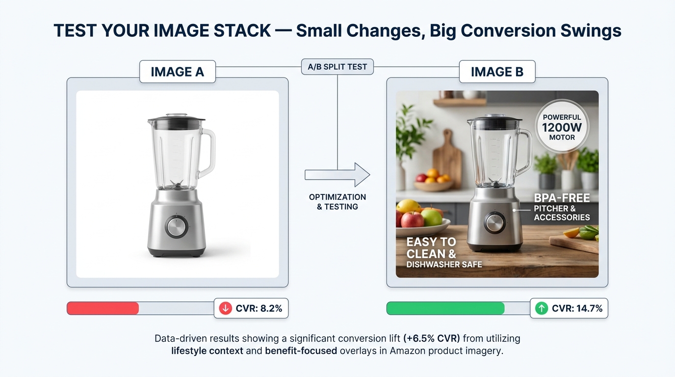
Building a strategically sequenced image stack is the starting point. Testing and iterating it is how you compound that initial investment into steadily improving conversion performance over time. The sellers who consistently outperform their categories aren’t those with the best instincts — they’re the ones with the most structured testing processes.
Amazon’s Built-In Testing: Manage Your Experiments
Amazon’s Manage Your Experiments (MYE) tool, available to Brand Registry members, allows you to A/B test different versions of listing content — including main images and secondary images — against real traffic. The test serves each version to a portion of your visitors and measures the resulting conversion rate, click-through rate, and revenue per session data directly. After a statistically significant sample is reached, the winning version is displayed to all shoppers.
Using MYE effectively requires a clear hypothesis before testing. Don’t change your main image to something completely different and see what happens — that approach doesn’t teach you anything replicable. Instead, test one specific variable at a time: the angle of the hero image, the presence or absence of a text overlay in Slot 2, a comparison chart versus a lifestyle image in Slot 6. Single-variable testing produces learnings that transfer to your broader catalog.
Third-Party Audience Testing: PickFu and Similar Platforms
For sellers who want feedback before committing to a live test — or who have insufficient traffic volume to reach statistical significance quickly through MYE — consumer panel testing tools allow you to poll a defined audience about image preferences in real time. These platforms let you present two or three image options to several hundred respondents who match your target demographic, and receive both vote data and written qualitative feedback about why respondents preferred one option over another.
The qualitative feedback is often more valuable than the preference data. When a respondent says “I chose this one because I could tell right away what it was for,” you’ve learned something about clarity. When they say “I preferred the other one because this one made the product look smaller,” you’ve identified a scale perception issue. These insights translate directly into actionable image improvements.
Reading Your Conversion Data for Image Signals
Even without formal testing, your existing data contains image performance signals. The clearest ones to monitor:
- CTR from search results (via Search Term Report data): Low CTR relative to your category suggests your hero image is underperforming. The product appears in search, buyers see it, and don’t click. That’s a hero image problem.
- Sessions-to-orders conversion rate (via Business Reports): Low conversion rate relative to your category despite healthy CTR suggests buyers are clicking but not buying. That’s a secondary image stack problem — the buyer was interested enough to click but the images didn’t close the sale.
- Return rates with reason codes: High return rates citing description mismatch or size concerns point specifically to gaps in your infographic and size images.
- Review sentiment analysis: What do one-star and two-star reviews say? If they consistently mention a specific attribute — durability, size, instructions — that attribute isn’t adequately addressed in your image stack.
Building Your Image Stack Production Process
Knowing what each slot should contain is one thing. Building a sustainable production process for creating, reviewing, and updating those images efficiently is another — and it’s the gap between sellers who get strong images for their flagship product and sellers who maintain image quality consistently across a growing catalog.
The Pre-Shoot Brief
Whether you’re working with a professional photographer, a design agency, or producing images yourself, the most important document in the production process is the pre-shoot brief. A good brief specifies:
- The target customer for this product (not a demographic — a person, with a name, a situation, and a specific problem this product solves)
- The primary benefit to lead with in the infographic
- The setting and model type for the lifestyle image
- The specific detail element to feature in the close-up
- The size reference objects to use in the scale image
- The brand color palette, fonts, and any existing brand assets to incorporate
- The specific objection the Slot 6 proof image should address
With this brief in place, a photographer can deliver exactly what each slot needs. Without it, even a talented photographer will make creative decisions that may produce beautiful images without serving the conversion goals of each specific slot.
Prioritizing Image Updates Across a Large Catalog
If you have dozens or hundreds of ASINs, you can’t optimize every image stack simultaneously. Prioritize using a simple framework: rank your ASINs by revenue contribution and by current conversion rate. The ASINs with high revenue contribution but below-category-average conversion rates are your highest-priority targets — they have the most traffic to leverage and the most conversion improvement available. Tackle those first, then work down the list systematically.
For lower-priority ASINs, ensure the basics are covered: a strong hero image, at least one infographic, and a lifestyle image. The more sophisticated slots (proof, comparison, detail) can be developed as you work down the priority list. A functional three-image stack outperforms a missing or incomplete one — don’t let perfect be the enemy of good when you’re working across a large catalog.
Conclusion: Your Images Are Your Best Salesperson
Amazon is a visual marketplace where buying decisions are made primarily through images, and where most sellers treat their image gallery as an afterthought rather than a strategic asset. The gap between these two realities is where conversion opportunity lives.
The 9-slot image stack framework reframes those nine positions as a complete, sequential sales argument — one that guides buyers from first awareness through skepticism to purchase-ready confidence. Each slot has a specific job. Each job maps to a specific stage of the buyer journey. When all nine slots work together in sequence, the result is a listing that feels coherent, trustworthy, and genuinely useful to the buyer — which is exactly what drives conversion.
The actionable takeaways:
- Audit your existing stack today against the slot-by-slot framework above. Identify which stages of the buyer journey you’re currently addressing, and which are absent.
- Prioritize by impact. If your CTR from search is low, your hero image needs attention first. If CTR is healthy but conversion is lagging, the secondary stack is the problem.
- Test one variable at a time. Use MYE for live traffic tests and consumer panels for pre-launch validation. Build a library of learnings that transfers across your catalog.
- Treat reviews as image feedback. Every review that mentions size confusion, feature uncertainty, or expectation mismatch is an image brief for your next update cycle.
- Brief before you shoot. The quality of your image output is determined by the quality of your pre-shoot brief, not the quality of your camera or photographer alone.
Your product is already on Amazon. Your price is competitive. Your copy is decent. The buyers are there. The difference between the listing they convert on and the listing they skip past is almost always visual — and it’s almost always fixable.
Leave a Reply