Most advice on Amazon listing images reads like a compliance checklist: white background, 85% frame fill, add an infographic, add a lifestyle shot. Follow it and you get a listing that looks like every other listing in the category. It is technically correct and commercially forgettable.
This article takes a different route. Instead of asking “what images should a listing have?”, it asks “what is the shopper trying to decide, and which image settles that question?” Each image slot becomes a job. When a slot has no job, it is wasted. When two slots do the same job, one of them is wasted.
A note on sources: the technical specifications below come from Amazon’s published image requirements, which change periodically. Check Seller Central for your category before you brief a photographer. I have deliberately avoided quoting conversion-lift percentages, because most of the numbers circulating online are unsourced. Where I describe effects, treat them as hypotheses to test in your own account.
1. The two decisions your images actually have to win
A listing faces two separate decisions, and they reward different images.
Decision one: the click
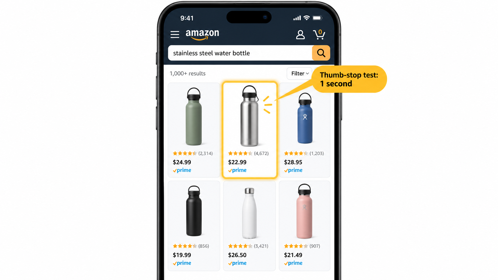
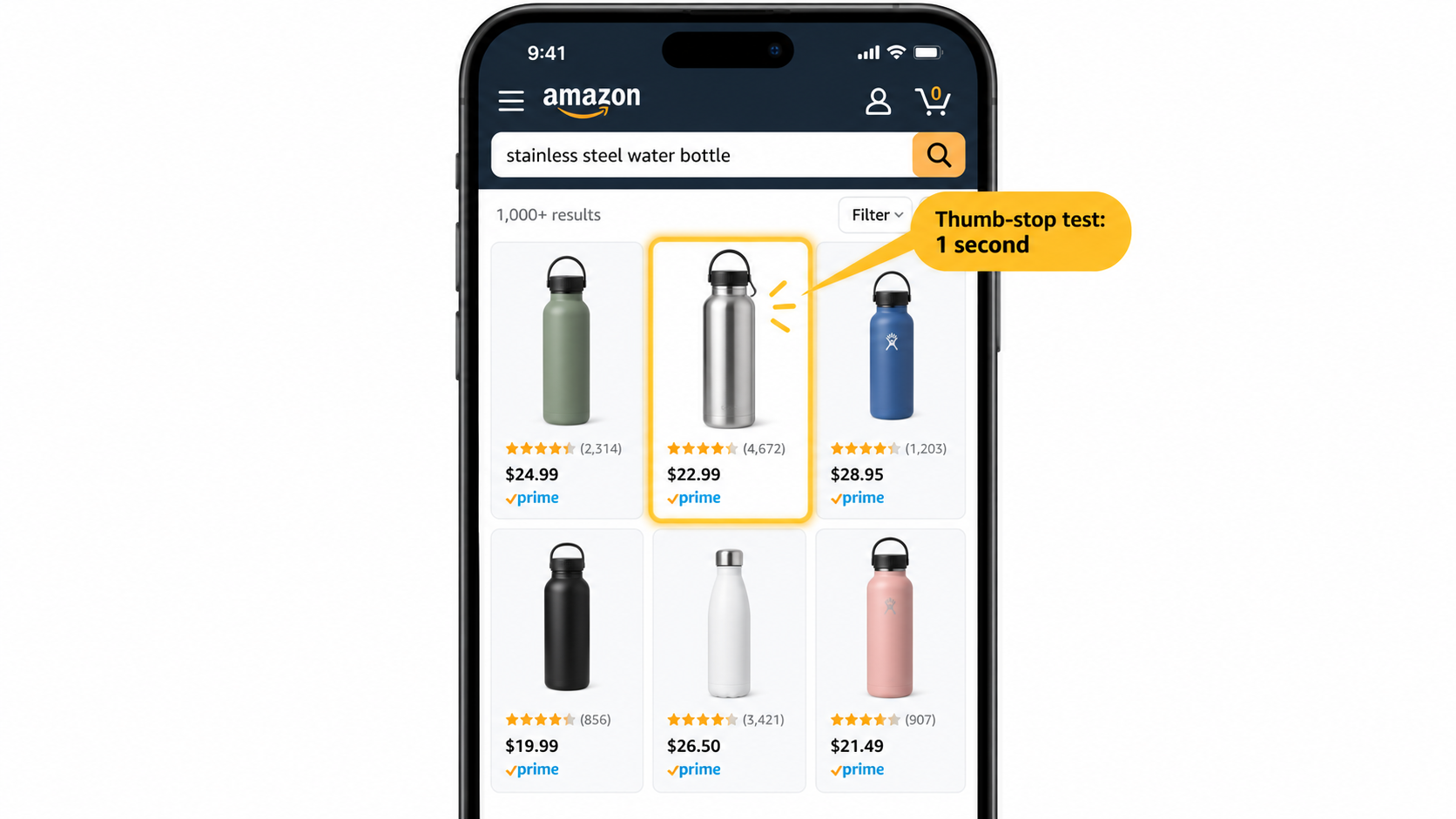
On a search results page, the shopper sees one image, a title fragment, a price, a rating and sometimes a badge. Only the main image is yours to control visually. Its job is to make the right buyer pause and click, and nothing more.
Decision two: the purchase
Once on the product page, the shopper moves through the gallery, bullets, reviews and A+ content. The secondary images carry persuasion. Their job is to remove reasons not to buy.
Confusing these is the most common mistake. Sellers load the main image with claims and badges, hoping to persuade, and in doing so break Amazon’s rules or make the thumbnail unreadable. Meanwhile their secondary images are pretty but answer nothing.
2. The technical floor: what Amazon requires before creativity matters
Creative work sits on top of a set of rules. Miss them and the listing can be suppressed, which no amount of design fixes.
- Main image background: pure white (RGB 255, 255, 255).
- Main image content: a professional photo or accurate render of the actual product. No added text, logos, badges, watermarks or inset graphics. The product should fill most of the frame, commonly cited as around 85%.
- Resolution: the longest side should be at least 1,000 pixels to enable zoom. Many sellers shoot at 2,000 pixels or more so there is room to crop and for zoom to stay sharp.
- Formats: JPEG, PNG, TIFF or GIF; JPEG is the usual choice.
- Gallery size: up to nine image slots in most categories, with video sharing the gallery.
- Color: RGB, not CMYK, to avoid shifted colors after upload.
Category-specific rules exist, notably in apparel, jewelry and some regulated categories, and Amazon has also published policy about AI-generated imagery. If you use generated or retouched visuals, make sure they represent the product accurately. Misrepresentation, not the tool used, is where listings get into trouble.
3. Map every slot to a shopper question
Here is the core framework. Before shooting anything, write the questions a skeptical buyer would ask, in order. Then assign one image to each.
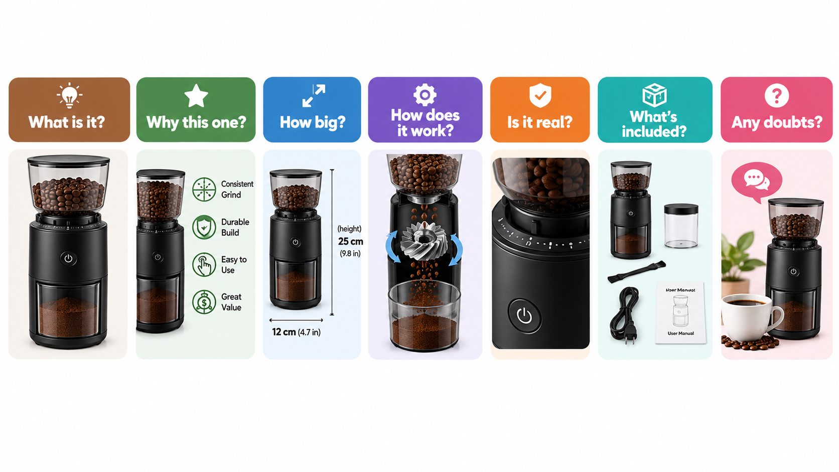
- “What is this?” The main image. Clear, uncluttered, correct angle.
- “Why this one over the others?” The primary differentiator, stated in a few words alongside the product.
- “Will it fit or suit me?” Dimensions, scale against a familiar object, or a person using it.
- “How does it work?” A feature or mechanism callout, or a before/after.
- “Does it look real in my life?” A lifestyle image showing context and use.
- “What do I get?” Everything in the box, including accessories.
- “What if I’m wrong?” Warranty, certifications, materials, care, or comparison to alternatives.
This order is a starting point, not a law. A supplement buyer’s biggest worry is trust and ingredients; a furniture buyer’s is size. Reorder slots two to seven around whichever objection is most likely to kill the sale in your category.
4. Finding your real objections
You do not need to guess. Your market has already told you what worries it.
Mine negative and three-star reviews
Read your own and your top competitors’ reviews. Phrases like “smaller than expected”, “wasn’t sure it would fit”, “color looked different” or “hard to assemble” are image briefs in disguise. Each recurring complaint is a question an image could have answered before purchase.
Read the Q&A section
Customer questions on the listing are direct evidence of missing information. If three people ask whether it is dishwasher safe, that belongs in an image, not buried in a bullet.
Check returns and customer service reasons
Return reason codes in Seller Central often reveal mismatches between expectation and reality. “Not as described” and “wrong size” are usually image problems.
Tally the findings. The top three objections get dedicated slots. Everything else can share space or be dropped.
5. The main image: win the thumbnail
Judge your main image at the size shoppers actually see, which is small, often on a phone, surrounded by competitors. Shrink it to roughly thumbnail size and ask three questions.
- Can you tell what the product is in about a second?
- Does it look different from the three listings beside it?
- Is the most appealing or most informative angle showing?
Choosing the angle
The default straight-on shot is not always best. A three-quarter angle usually shows depth and features. For products with an opening, such as a bottle, a bag or a container, showing the opening or contents can signal function immediately. For sets, show the full set at once so quantity is obvious.
Differentiate within the rules
You cannot add text, but you can control angle, lighting, crop within the allowed fill, whether the product is shown open or closed, and the items included in the frame. If every competitor shows a closed product, showing yours open may stand out. Test it rather than assume.
6. Secondary images: designing for a small screen
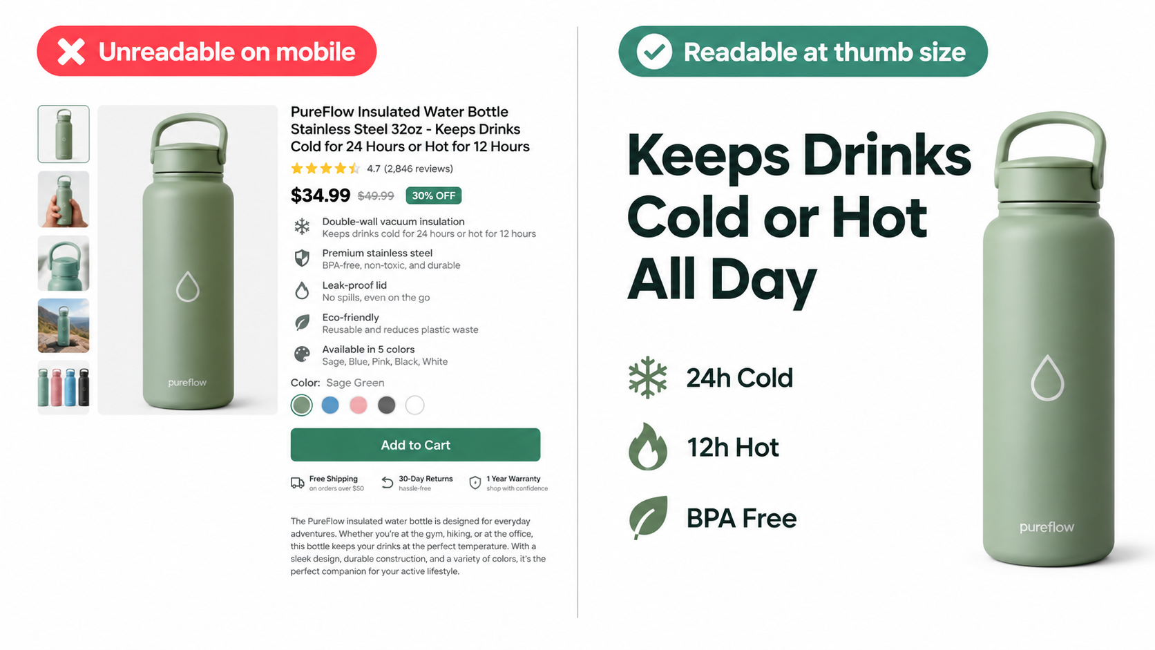
Many shoppers browse on mobile, where a gallery image appears at a fraction of the size you see in your design tool. The failure pattern is predictable: dense infographics with six callouts and 10-point text that become unreadable.
One image, one message
Give each image a single headline of roughly three to six words and no more than two or three supporting elements. If you need to say more, you need another image or the text belongs in A+ content.
Practical legibility rules
- Preview every image at phone width before approving it.
- Use high contrast between text and background.
- Make the product the visual anchor; text supports it.
- Keep consistent fonts, colors and iconography across the set so it reads as one system.
- Avoid tiny comparison tables; use large icons or checkmarks instead.
7. Lifestyle images that earn their slot
A lifestyle image is not decoration. It must answer “will this work for someone like me?” Use it to show scale, use case and the type of buyer.
Show the moment of use
An image of the product in the act of being used communicates more than a styled flat lay. A blender mid-pour, a backpack on a commuter, a desk organizer holding real clutter.
Match the buyer, not your taste
Models, settings and props should reflect your actual customer. Review demographics and use cases in your reviews to decide. A glossy studio kitchen may feel aspirational but fail to convince someone with a small apartment.
Show scale honestly
Hands, common objects and people are fast scale cues. Misleading scale creates returns and bad reviews, which cost more than the click was worth.
8. Infographics and comparison images
Infographic images work when they resolve something the photo cannot: dimensions, compatibility, materials, mechanisms. They fail when they restate the bullet points.
Dimensions and fit
Include measurements with the product drawn to proportion. For wearables and furniture, add a reference to a person or familiar object.
Comparison images
Compare your product against “ordinary alternatives” generically, or against your own variants. Be careful naming competitors; Amazon has rules about comparative claims and trademarks, and unverifiable claims invite complaints.
Claims and compliance
Health, safety, environmental and “best” or “number one” claims need substantiation. If you cannot prove it, do not print it on an image.
9. Video, 360 views and the rest of the gallery
The gallery supports video and, in some categories, 360-degree or 3D views. Video is particularly useful for products where function is hard to convey in stills, such as tools, gadgets and anything with a mechanism.
Keep videos short, lead with the benefit in the first few seconds, and make them understandable without sound, since many shoppers browse muted. Treat the video as one of your slots with its own assigned question, usually “how does it work?” or “what is it like in use?”.
10. Testing: turning opinions into evidence
Image debates in a team usually end with the loudest opinion winning. Testing replaces that.
Use Manage Your Experiments where available
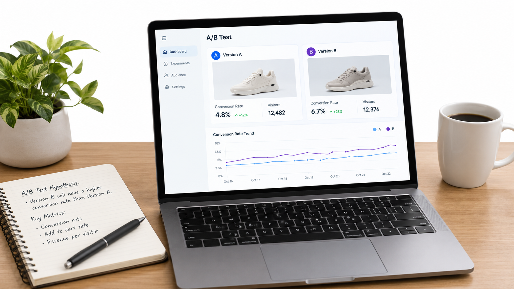
Brand-registered sellers can run split tests on main images, titles, bullets and A+ content through Manage Your Experiments. Amazon splits traffic and reports results with a statistical confidence indicator.
Test one variable and write the hypothesis first
Example: “Showing the product open will increase click-through because competitors show it closed.” Change only that. If you change angle, background and props together, you will not learn why a variant won.
Choose the right metric
Main image tests should be judged on click-through and then on conversion. A higher click rate paired with a lower conversion can mean the image attracts the wrong buyers. Secondary image tests are better judged on conversion rate.
Let tests run
Stopping early on a lucky week produces false winners. Run long enough to span a full buying cycle and reach the confidence threshold the tool reports.
If you cannot test
Without brand registry, change one image at a time and compare sessions, unit session percentage and click-through from your Business Reports and Brand Analytics, noting seasonality and price changes that could muddy the result.
11. A production workflow that scales across a catalog
Once the logic is clear, repeatability matters, especially for brands with dozens of ASINs.
- Research brief: a one-page summary of the top objections, competitor image patterns and category rules.
- Shot list by question: each image is named by the question it answers, not by shot type.
- Template system: shared layouts, fonts and icon sets so variants stay consistent while content changes.
- Mobile review: approval happens on a phone, not a monitor.
- Compliance check: main image rules, claims, accuracy of any generated or retouched elements.
- Test and log: record hypothesis, variant and result so learnings carry across products.
Refresh images when reviews reveal new objections, when competitors shift visual patterns, or when the product changes. A listing image set is a living asset.
12. Common mistakes and a quick audit
Mistakes that quietly cost sales
- Several images that repeat the same message.
- Text too small to read on a phone.
- No scale reference.
- Lifestyle images with no clear product focus.
- Claims in images that contradict the bullets or the physical product.
- Never testing the main image after launch.
Ten-minute audit
- Open your listing on a phone. Can you understand the offer from images alone?
- Write the question each image answers. Any blanks or duplicates?
- Compare your top objection in reviews with your gallery. Is it addressed?
- Shrink the main image to thumbnail size next to three competitors. Does it stand out?
- Check compliance against current category requirements.
Conclusion: design for decisions, not for a checklist
Optimized listing images are not about having nine slots filled. They are about making a buyer’s decision easy. Treat the main image as a click engine, and every secondary image as the answer to one specific doubt.
Start with this week’s actions: pull your three most common objections from reviews and Q&A, assign each to an image, and review the gallery on a phone. Then pick one hypothesis and test it. Repeat that cycle, and your images will improve on evidence rather than guesswork.
Leave a Reply