

There is a remarkably common way to build an Amazon product listing: hire a photographer, take great shots on a white background, get them edited to 2000×2000 pixels, upload all eight slots, and move on. The images look sharp on your desktop. The detail is visible. The branding feels professional. You approve it all from your laptop and call it done.
Then your listing goes live and roughly 65% of the people who actually see it are looking at it on a phone — where your carefully composed main image is rendered as a thumbnail somewhere around 150 pixels wide. The fine detail? Gone. The clever angle that shows the product’s best feature? Invisible. The subtle texture that justified the premium price? Flattened into a grey smudge.
This is not a hypothetical. Multiple industry datasets put Amazon’s mobile traffic share between 57% and 75% depending on category and device type, with most credible mid-2026 estimates landing around 65%. That means the majority of first impressions your listing makes are happening on screens where pixel real estate is ruthlessly scarce. And yet the workflow most sellers use to design, review, and approve product images is almost entirely desktop-first.
This post is not about adding mobile as an afterthought. It is about rethinking the entire visual logic of how Amazon listings get built — starting from the 150-pixel thumbnail and working outward, rather than starting from a print-quality photo and hoping it scales down gracefully. The difference in click-through rate between sellers who have made this shift and those who haven’t is measurable, repeatable, and currently sitting as unclaimed upside for anyone willing to look at the problem the right way.
Here is exactly what that shift looks like in practice.
The 150-Pixel Problem: Understanding What Amazon Actually Shows on Mobile
Before you can design better, you need to understand what Amazon’s mobile interface actually does with your images. Most sellers have never thought about this in mechanical terms, which is part of why so many listings look the way they do.
When a shopper opens the Amazon app on their phone and types a search query, the resulting grid shows product thumbnails pulled dynamically from your main image. Amazon does not maintain separate mobile-specific images. It takes the file you uploaded — ideally 2000×2000 pixels — and compresses it on-the-fly to fit the phone’s screen layout. On a modern smartphone in a two-column grid, that effective thumbnail size typically renders somewhere between 120 and 180 pixels wide. On a one-column carousel layout, it gets more space. But the two-column grid, which is Amazon’s most common mobile search layout, is where most first impressions actually happen.
What Survives the Compression
At 150 pixels wide, only the boldest, most high-contrast visual information survives. This is not subjective — it is a function of how image downsampling algorithms work. The pixels that remain after compression carry the dominant colours, the sharpest edges, and the largest shapes in your original composition. Fine text, subtle shadows, thin product features, and background props all collapse into visual noise or disappear entirely.
What this means in practice: if your product is occupying 60% of the frame in the original image — which many photographers consider a professional standard — it is occupying roughly 90 pixels of width on a mobile thumbnail. That is barely enough to distinguish the basic product shape, let alone communicate the details that differentiate your listing from a competitor.
The Zoom Paradox
Amazon allows shoppers to zoom into product images on the product detail page (PDP), which is why a high-resolution upload (1600px or larger) still matters. But here is the critical distinction: zoom happens after the click, not before it. High resolution supports conversion on the PDP. It does nothing for CTR from search. The click itself is driven entirely by what the shopper sees at thumbnail scale in the search grid — and that is where the 150-pixel problem lives.
Sellers who conflate “high resolution” with “mobile-optimised” are solving the wrong problem. Resolution is a table-stakes technical requirement. Mobile optimisation is a compositional and strategic discipline that happens at a completely different level of the design process.
How Amazon’s Mobile Grid Has Changed
Amazon’s mobile app layout has become increasingly visual-heavy over the past 18 months. Sponsored product tiles now compete with organic results in the same grid, video thumbnails appear inline, and Amazon’s own product recommendations sit between organic rows. The practical effect is that your main image now has more visual competition than it did two years ago — from both paid placements and Amazon’s own interface elements. Thumbnails that were distinctive in a simpler grid are now getting lost in a much noisier feed.
Why Desktop-Designed Hero Images Systematically Fail on Mobile
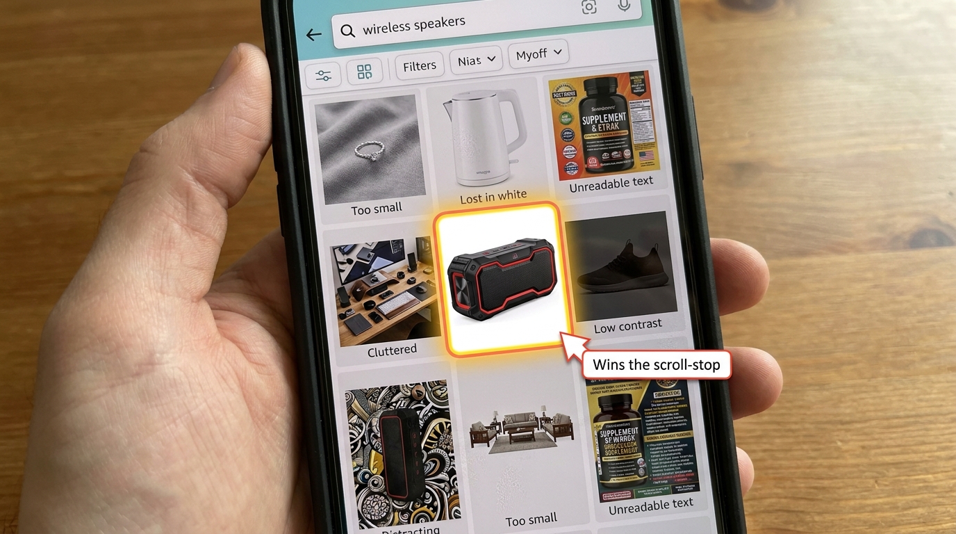
The root cause of the problem is not bad photography. It is a misaligned review process. Most sellers approve images on a desktop screen, often in the Seller Central interface where the image appears at several hundred pixels wide and looks excellent. The phone experience is rarely previewed in the approval workflow. This creates a systematic bias toward images that perform well at large sizes and poorly at small ones.
The Five Most Common Failure Modes
After reviewing hundreds of seller listings and drawing on patterns reported by Amazon-focused agencies in 2026, the same five failure modes appear repeatedly:
1. Product too small in frame. A product occupying 60–70% of the image frame — which looks compositionally balanced on desktop — leaves too much white space at thumbnail scale. The product becomes a small object floating in a white void, with no visual weight to pull the eye.
2. Angled or styled shots with contextual props. Lifestyle-adjacent main images with surfaces, backgrounds, or environmental props may look premium at full size. At 150 pixels, those props compete with the product for the only pixels that exist, making the composition read as cluttered rather than considered.
3. Fine text or iconography on the product itself. A supplement bottle with small-print ingredients visible, a gadget with tiny ports labelled, a clothing item with a small brand logo — all of this becomes unreadable at thumbnail scale and occupies pixels that could otherwise be serving the dominant visual form.
4. Low-contrast product against white background. White or light-coloured products — white mugs, cream-coloured organizers, silver electronics — have a well-documented visibility problem at mobile thumbnail scale. They effectively blend into the white background that Amazon’s interface uses, making the product disappear from the grid entirely.
5. Horizontal or landscape compositions. Products photographed in a wide horizontal orientation use the full width of a square frame but leave significant vertical space empty. On a mobile phone where vertical screen space is the premium dimension, this wastes the canvas in the wrong direction.
The Approval Gap in Practice
Each of these failure modes is predictable and preventable — but only if the image is evaluated at the actual size it will appear in mobile search. The single most effective process change most sellers can make is to add one step to their image review workflow: before approving any hero image, screenshot the listing’s search thumbnail from the Amazon mobile app and look at it in context, surrounded by competitor thumbnails in the same search grid.
This sounds obvious. Very few sellers do it systematically. Those who do describe it as an immediate revelation — they see their listing through the exact lens their customers are using, often for the first time.
The Pixel-to-Purchase Pipeline: How Amazon Renders Your Images
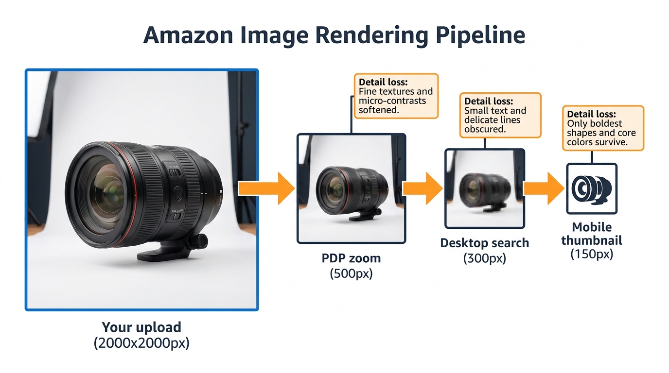
Understanding Amazon’s image delivery system helps you make smarter technical decisions upstream. Your original image file goes through several rendering passes before it reaches any given shopper’s screen, and each pass has different quality implications.
Upload to CDN
When you upload a product image to Seller Central, Amazon processes it into multiple derivative sizes and stores them on its content delivery network (CDN). These derivatives are then served based on the requesting device’s screen resolution, the layout being rendered, and network conditions. Amazon does not publicly document exactly which derivative sizes it generates, but practical testing by sellers and agencies has identified the key breakpoints: a high-resolution version for PDP zoom (typically 1000–2000px range), a medium version for desktop search (approximately 300px), and a small version for mobile thumbnails (approximately 120–180px).
The Critical Implication: Upscaling Doesn’t Help
If your original image is 1000×1000 pixels — the minimum Amazon requires for zoom functionality — the mobile thumbnail is being downsampled from that. If your image is 2000×2000 pixels, the thumbnail is derived from higher-quality source material, which produces marginally better compression artefacts. But the structural composition of the image — what’s in frame, at what size, with what contrast — is fixed at upload time. No amount of resolution compensates for a composition that does not work at 150 pixels.
This means the design hierarchy is: composition first, resolution second. A 1600-pixel image with a mobile-ready composition will out-click a 3000-pixel image with a desktop-first composition every time, because clicks are won at 150 pixels where resolution differences are invisible.
JPEG Compression Artefacts at Small Sizes
Amazon recompresses your images as JPEG when serving them, and JPEG compression introduces artefacts that are especially visible at small sizes. High-frequency detail — thin lines, fine textures, sharp edges — degrades more than solid areas of colour. This reinforces the principle that bold, high-contrast, simple compositions survive mobile rendering better than complex, detailed ones.
The practical takeaway: upload the largest, highest-quality JPEG or PNG you can produce, minimize fine detail in areas that are not the product itself, and make the product’s dominant shape as clean and high-contrast as the category allows.
How Screen Pixel Density Changes the Math
Modern smartphones typically have “Retina” or high-DPI displays, which means a thumbnail that renders at 150 CSS pixels might actually be displayed using 300 or even 450 physical pixels on the device screen. This is good news — it means your thumbnail can look sharper on a modern phone than the 150-pixel number implies. But it also means that if Amazon is serving a low-resolution thumbnail to a high-DPI screen, the image will look soft by comparison to competitors who uploaded larger files. The safe play remains uploading at 2000×2000 pixels minimum and designing the composition for legibility at 150 CSS pixels.
Composition Rules for Scroll-Stop Power at Thumbnail Scale
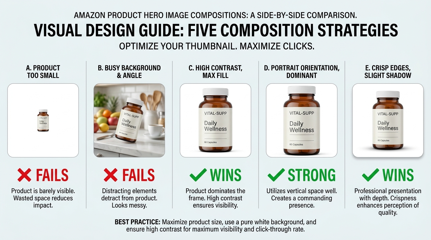
Designing specifically for mobile thumbnail performance is a different discipline from standard product photography. It borrows from both UX design and outdoor advertising — two fields that have spent decades figuring out how to communicate in limited space at speed.
Rule 1: The 85% Fill Rule
Your product should fill at least 85% of the image frame. Not 70%, not 75% — the difference matters at thumbnail scale. Amazon’s own guidelines suggest the product should fill “most of the image,” which is deliberately vague, but practitioners consistently report that filling 85–92% of the frame produces the best thumbnail performance without violating Amazon’s rules about leaving room for the product to breathe.
The exception is multi-pack or set products, where showing the quantity clearly is more important than a single unit filling the frame. In those cases, the set as a whole should fill 85% of the frame.
Rule 2: Dominant Shape Clarity
At 150 pixels, shoppers are not reading your product — they are pattern-matching against a shape silhouette. If your product’s dominant shape is ambiguous or shares its visual profile with too many competitors, it gets scrolled past. Products with strong, distinctive silhouettes — a distinctive bottle shape, an angular tool, an unusual form factor — have a natural advantage here that should be maximised by centring and isolating that silhouette as cleanly as possible.
For commoditised shapes (rectangular electronics, cylindrical supplements, square books), the path to scroll-stop is contrast and colour, not shape differentiation. A bold product colour against pure white will generate more visual stopping power than a subtle, premium-looking composition.
Rule 3: The White Background Contrast Problem
White or near-white products require special handling. The options are: use a very slight drop shadow to create a visible product edge (permitted under Amazon’s rules — shadows that are cast by the product itself are allowed), ensure the product has enough colour differentiation from pure white to remain visible, or — for hero images where the category permits it — consider whether a very light grey background achieves better contrast without violating guidelines.
Amazon strictly requires the main image to have a pure white (#FFFFFF) background. However, the product itself can include any colours, and for white or light products, maximising internal colour contrast (using the product’s logo, label, or coloured components as visual anchors) is the most effective approach.
Rule 4: Straight-On vs. Angled Shots
Agency data consistently shows that straight-on, front-facing product shots outperform stylistic angle shots for main image CTR in most categories. The reason is cognitive efficiency — a straight-on shot is the fastest to pattern-match, requires the least mental rotation, and communicates the product’s dominant form most efficiently at small sizes.
Angled shots can work well for products where the three-dimensional form is a key purchase driver (furniture, kitchenware, wearables) — but even then, the angle should be chosen to maximise the product’s dominant shape, not to create visual interest for its own sake.
Rule 5: Negative Space Is Not Your Friend at Thumbnail Scale
Negative space is a hallmark of premium design language. It signals confidence, whitespace, restraint. On a full-size poster, it works beautifully. On a 150-pixel Amazon thumbnail, it registers as “small product, lots of nothing.” The premium signal you intended does not survive compression. Use the frame aggressively. Fill it with product.
Secondary Images as a Mobile Swipe Story
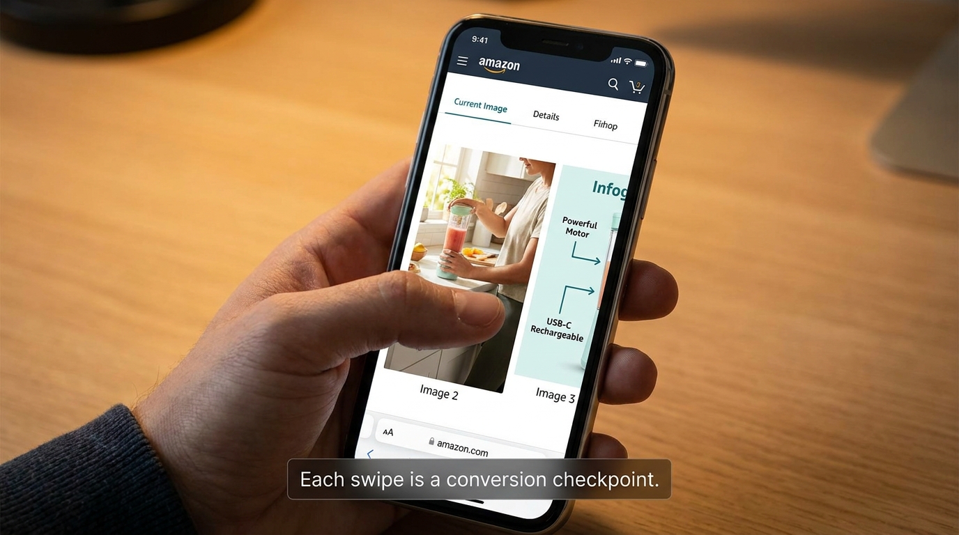
Once a shopper clicks through to your product detail page, the mobile experience shifts from thumbnail grid to vertical scroll. On the Amazon app, the image carousel at the top of the PDP is the first and most prominent element — it takes up the majority of the above-fold space on most phones. This is where secondary images do their work.
Most sellers treat secondary images as supporting documentation for the main product shot: angles, close-ups, dimensions, lifestyle use. That framing is not wrong, but it misses the bigger opportunity. On mobile, the image carousel functions more like a swipeable landing page than a product gallery. Each image is a separate screen-filling moment, and each one either builds purchase intent or loses the shopper’s attention.
The Swipe Story Framework
Think about the sequence of your secondary images the way a copywriter thinks about a landing page: you have approximately 3–5 seconds per image before the shopper either swipes to the next or scrolls down to the listing text. The images need to carry a coherent narrative that moves from “here’s what it is” to “here’s why you want it” to “here’s why you can trust it.”
A high-performing 8-image sequence for mobile typically follows this arc:
- Image 1 (hero): Product at its clearest, most dominant — CTR driver from search.
- Image 2 (hero in context): Lifestyle shot showing the product in use — establishes emotional relevance immediately after click.
- Image 3 (primary benefit): Infographic-style callout of the single most important product benefit or differentiator, designed to be readable at mobile size.
- Image 4 (proof/credibility): Certifications, awards, before/after, or comparison that answers the dominant objection for the category.
- Image 5 (features/specs): Labelled diagram or annotated product shot with key specs called out.
- Image 6 (size/fit/scale): Size comparison with familiar reference object — crucial for reducing return rates and objection-handling before purchase.
- Image 7 (social proof or use variety): User scenarios, variety of use cases, or secondary lifestyle shot for a different user type.
- Image 8 (closer/CTA): Bundle shot, product family, or guarantee/returns information — the last persuasive push before the Buy Box.
Text on Secondary Images: The Mobile Readability Problem
Secondary images on Amazon can include text, callouts, and infographic elements — and this is a major opportunity that many sellers misuse. The problem is designing text at a size that reads well on desktop (say, 24pt in the original 2000px image) but renders at roughly 6pt equivalent on a mobile screen. This is unreadable.
The practical rule: any text intended to be read on mobile should be designed to be legible at no smaller than 12pt equivalent after mobile scaling. In practice, this means your original image should use significantly larger text than looks “correct” on desktop. The result will look slightly oversized on desktop and exactly right on mobile — which is the correct trade-off given where your traffic is coming from.
Portrait Orientation for Secondary Images
While the main hero image must adhere to Amazon’s 1:1 square ratio requirements, secondary images have more flexibility in many categories. A 4:5 portrait orientation (taller than wide) for secondary images fills more vertical screen space on a mobile phone, giving each image more visual real estate per swipe. Top-performing listings in categories that permit it are increasingly adopting this format for images 2–7 in the stack, reserving it only where the product composition makes sense.
The key caveat: not all categories and listing types support non-square secondary images. Test carefully and ensure your images display correctly on both the mobile app and desktop before committing.
Portrait vs. Square: The Ongoing Ratio Debate
The question of whether to shoot in portrait or square comes up constantly in Amazon seller communities, and the answer is more nuanced than most guides suggest. Here is the current practical reality as of 2026.
Main Image: Square Is Still the Standard
Amazon’s main image requirement is effectively square (1:1). The platform’s search grid is built around square thumbnails, and non-square main images will either be cropped or letter-boxed, neither of which produces a reliable result. For the main image, 1:1 is not a creative choice — it is a technical constraint to work within.
The creative opportunity within that constraint is vertical composition: even in a square frame, you can position the product at the top of the image with the base near the bottom, which tends to make the product appear larger and more imposing than centring it with equal whitespace on all sides. This is a subtle but measurable composition technique for products with significant height-to-width ratios.
Secondary Images: Portrait Has Real Advantages
For secondary images, portrait orientation has a genuine functional benefit on mobile — it fills more of the phone screen per image frame, giving the shopper less ambient UI chrome visible during their swipe experience. The psychological effect is immersive: the image takes over the screen rather than floating in a bordered box. Leading Amazon-focused creative agencies report that portrait secondary images tend to produce longer dwell times on the PDP carousel, which correlates with higher conversion rates.
However, this needs to be tested for your specific product and category. Portrait images that cut off important product context due to the tighter crop can hurt conversion despite the format advantages.
The Video Thumbnail Variable
Amazon has expanded the presence of product videos across mobile search and PDPs. When a listing has a video, its thumbnail appears as one of the carousel items and can also appear as a sponsored tile in search results. This introduces a new design variable: the video thumbnail is not a static image you upload, but a frame captured from your video. Sellers who want their video thumbnail to be a high-performing mobile asset need to front-load their video with a visually strong opening frame that works at thumbnail scale — essentially designing a “video hero image” as the first second of the video clip.
Testing What Works: Running Image Experiments That Actually Tell You Something
Understanding mobile image principles is one thing. Knowing which version actually drives more clicks in your specific category with your specific customers is another. Amazon’s native testing tool and several third-party approaches exist for this, each with meaningful limitations that sellers need to understand before trusting the results.
Manage Your Experiments (MYE): What It Measures and What It Doesn’t
Amazon’s Manage Your Experiments tool, available to Brand Registry sellers, allows A/B testing of listing content including main images. The platform reports on sales impact and conversion rate, and Amazon has cited cases of up to 25% sales lift from optimised listing content. Expert practitioners report typical winning-variant gains in the 5–25% range for well-run image tests.
The critical limitation: MYE currently does not report on CTR as a standalone metric. It measures downstream conversion signals. This means a test can show one image variant selling more without telling you whether it is converting more of the same traffic or generating more clicks. For understanding mobile CTR specifically, MYE is an incomplete instrument.
Running a Valid MYE Image Test
For MYE results to be meaningful, several conditions need to be true. First, the test needs to run long enough to reach statistical significance — which Amazon’s own interface indicates (watch for the “significant” status before acting on results). Second, the test should change only one variable: ideally just the main image. Testing multiple simultaneous listing changes makes attribution impossible. Third, the traffic volume needs to be sufficient — low-traffic listings may take 8–12 weeks to produce statistically valid results.
A practical workflow that many agencies use: run the MYE test for the primary sales signal, and simultaneously run a consumer panel test (using tools like PickFu or similar platforms) specifically for the mobile CTR question. Panel tests can show your image alongside competitor thumbnails in a simulated mobile grid and measure click preference directly. The two data sources together give a much more complete picture than either alone.
The Off-Platform Testing Shortcut
Consumer panel platforms allow you to show respondents a mockup of a mobile Amazon search result page with multiple product thumbnails and ask them which they would click. This can be done in 24–48 hours for a few hundred dollars and produces directional CTR data before you invest in a full MYE test. The limitation is that panel respondents are not in the same psychological state as actual shoppers, but for identifying obviously superior image compositions, it is a highly cost-effective first filter.
The optimal sequence: panel test to identify the top 2 candidates, MYE to confirm which one drives more sales, then apply the learnings from that winning formula to the rest of the catalog.
What a 10–30% CTR Lift Is Actually Worth
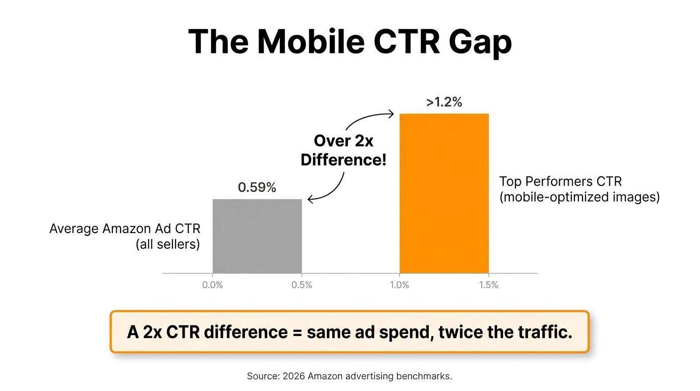
The average Amazon sponsored ad CTR across categories sits around 0.59% as of 2026. Top-performing listings with mobile-optimised images consistently report CTRs above 1%. The arithmetic of that gap is significant: a listing running $5,000/month in ad spend at 0.59% CTR generates a certain number of clicks. The same ad spend at 1.2% CTR — achievable through image testing — generates roughly twice as many clicks at the same cost per click. That is effectively a 100% increase in traffic from the same budget, before any conversion rate effects are considered.
Even more conservative gains are valuable at scale. A 15% CTR improvement on a listing with substantial advertising spend represents a material reduction in effective cost-per-click. Image testing is possibly the highest-ROI optimisation lever available to Amazon sellers who have not yet applied it systematically.
The Competitive Intelligence Angle: Reading Your Category’s Visual Language
Mobile image design does not happen in isolation. Your thumbnails compete directly against your competitors’ thumbnails in every search grid. Understanding what the dominant visual language in your category looks like — and where the visual contrast opportunity lies — is as important as understanding your own product.
The Category Audit Method
Before redesigning a hero image, spend 15 minutes doing a category audit from a mobile device. Open the Amazon app, search your primary keyword, screenshot the first three rows of results (including sponsored placements), and analyse what you see. Look for patterns: What colours dominate? What compositions are most common? What size do most products appear in their frames? What is the average level of visual complexity?
What you are looking for is the category visual norm — and its inverse, which is where your differentiation opportunity lies.
When to Blend, When to Break
There are two strategic approaches to category visual norms, and the right one depends on your product’s position.
Blend to belong is the right approach when your product is trying to signal category membership to shoppers who are not yet familiar with the brand. If every competitor in the “protein powder” category uses a dark, gym-aesthetic main image with bold label text, deviating too far from that language can signal “this is not the kind of protein powder you know.” Category-norm compliance builds pattern-matching trust at first glance.
Break to stand out is the right approach when your product is sufficiently differentiated that category membership is less important than distinctive visibility. If your entire category uses the same composition conventions, a deliberately different approach — a different colour temperature, a different frame fill ratio, a different product angle — can produce dramatically more visual contrast against the grid background and thus more scroll-stopping power.
The nuance is that breaking from category norms too aggressively can hurt conversion even when it boosts CTR, because the shopper clicks expecting one type of product and finds something that does not match their mental model. The most durable CTR gains come from breaking compositional conventions (fill, contrast, angle) without breaking the category’s fundamental visual language (colour family, product type signals, label style).
Tracking Competitor Image Changes
Top sellers monitor their main search grid competitors for hero image changes the same way they monitor pricing. A competitor’s sudden CTR spike — visible as a change in their sponsored ad position or organic ranking — is often preceded by an image update. Regularly screenshotting your competitive landscape from mobile gives you a longitudinal record of when competitors are experimenting and what changes seem to correlate with improved performance.
A+ Content in the Mobile Age: What Renders vs. What Gets Skipped
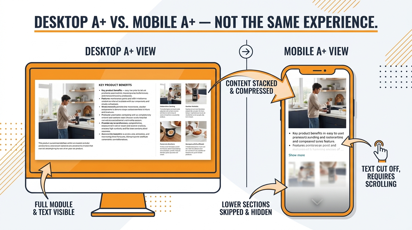
A+ Content (formerly Enhanced Brand Content) has become a standard feature of well-optimised Amazon listings. Most Brand Registry sellers use it. Far fewer of them have audited how their A+ content actually renders on a mobile phone — and the gap between the desktop design and the mobile experience is often significant.
How A+ Modules Stack on Mobile
A+ Content uses a module-based layout system. On desktop, modules appear side by side in columns, producing a structured, magazine-style layout. On mobile, those columns collapse to a single vertical stack. The left column becomes the top section, the right column becomes the section below it, and the visual logic of the desktop layout is partially or entirely lost.
The most common A+ mobile rendering problem: a module designed to show a product image on the left with explanatory text on the right appears on mobile as a full-width image, followed by a text block that has no visible connection to it unless the shopper is actively scrolling. The storytelling logic breaks down.
Designing A+ for Mobile-First Reading
The fix is to design A+ modules assuming they will be read in single-column vertical order. This means:
- Each module should work as a standalone visual unit, not depend on what’s beside it in the desktop layout.
- Headline text in each module should be large enough to be readable without zooming on a 6-inch screen.
- Image-text pairings that need each other to make sense should be in the same module, not split across columns.
- The first module visible on mobile (above the fold of the PDP scroll) is the highest-priority real estate — it should carry the most important brand message or differentiator.
The Above-Fold Mobile PDP Reality
On a typical Android or iOS smartphone, the above-fold area of an Amazon product detail page is dominated by the image carousel. Below that, the product title and a portion of the pricing/Buy Box appear. A+ content does not typically appear until the shopper has scrolled significantly down the page — several screens below the fold on most phones.
This is a structural reality that should shape how A+ content is prioritised. A+ is important for conversion among shoppers who are genuinely evaluating the product, but it is not an above-fold, CTR-influencing asset. Its primary job on mobile is to reduce abandonment among engaged shoppers who are comparison-shopping or working through purchase objections. Design it for that specific job rather than treating it as a visual brand statement that most mobile shoppers will encounter at first glance.
Premium A+ and the Mobile Brand Story
Amazon’s Premium A+ Content (available to qualifying sellers) includes larger image modules, comparison charts, and carousel elements. On mobile, Premium A+ modules render at full width and typically look significantly better than standard A+ in the single-column layout. For brands with access to Premium A+, the mobile rendering quality is a genuine advantage worth prioritising over standard modules wherever the qualification requirements are met.
The 8-Image Stack: Sequencing for Mobile Buyer Psychology
Pulling together everything in this post, here is how to think about the full 8-image stack as a coherent mobile buying experience — from the first thumbnail impression in search to the final image viewed before the Add to Cart decision.
The Click Threshold vs. The Buy Threshold
Mobile buyer psychology on Amazon has two distinct thresholds that your image stack needs to clear in sequence. The first is the click threshold — the moment a shopper decides this thumbnail is worth opening. This decision happens in under two seconds, based almost entirely on the main hero image at thumbnail scale. The second is the buy threshold — the point in the PDP carousel where the shopper has seen enough to commit to purchase (or decides to keep shopping).
The images from positions 2–8 primarily serve the buy threshold. They are not about stopping the scroll; they are about eliminating the reasons not to buy. Each image should be designed with a specific objection or information gap in mind.
Objection Mapping by Image Position
A methodical approach to secondary image sequencing starts with a list of the top 5–8 purchase objections in your category, derived from negative reviews (both yours and competitors’), customer Q&A, and return reason data. Each of images 2–8 should address a specific objection. This makes the swipe story purposeful rather than aesthetic.
Common objection-to-image mappings across categories:
- “I can’t tell how big it is” → Size comparison image with familiar reference object (coin, hand, everyday item)
- “I’m not sure it will fit my use case” → Lifestyle image in the specific context the objection applies to
- “I don’t know if it’s quality” → Material close-up, certification badge, or manufacturing detail
- “I’ve had bad experiences with this type of product before” → Comparison chart or “what’s different about this” callout
- “I’m not sure it’s compatible with what I have” → Compatibility or compatibility-check infographic
- “Is it worth the price?” → Value bundle shot, value-per-unit callout, or “what’s included” flat lay
The Mobile Text Hierarchy Rule
Every image that includes text should follow a strict three-tier text hierarchy visible on mobile: one large headline (readable at a glance without zooming), one short supporting line (readable with mild attention), and no more than one body text element (readable only to engaged shoppers). Any text that requires a fourth level of attention is not suitable for a mobile product image and belongs in the bullet points or A+ content instead.
Consistency of Visual Identity Across the Stack
The eight images in the stack should feel like they belong together — same font family, same colour palette, same visual grammar. On mobile, shoppers swipe through the images quickly, and a fragmented visual identity reads as disorganised. Consistent design across the stack signals brand maturity, which is a purchase-confidence signal in its own right.
This does not mean all images should look identical. Image 1 (white background hero) and image 2 (lifestyle scene) will naturally look different. What should be consistent is the typography style, the treatment of any overlaid text, the colour palette, and the general compositional density. A style guide document for Amazon images — covering font, colour codes, callout style, icon style, and maximum text density — is a practical tool for brands running multiple ASINs or working with multiple photographers.
Building a Mobile-First Image Production Workflow
The principles in this post are only useful if they get translated into the actual workflow through which images are commissioned, reviewed, and published. Here is how to restructure that workflow around mobile-first thinking rather than treating it as a checklist at the end.
Brief the Photographer Differently
Most product photography briefs focus on the finished large-format output: lighting style, background colour, number of angles. A mobile-first brief adds a second layer: the thumbnail behaviour requirement. Specifically, the brief should include a 150px thumbnail mockup requirement — the photographer or retoucher must deliver a 150×150 pixel crop of the hero image alongside the full-size file, allowing approval of the mobile experience separately from the full-size image.
This single change catches most mobile failure modes before images are uploaded. If the 150px crop does not immediately communicate the product’s identity with strong visual contrast, the composition needs to be revised before approval.
Add a Mobile Preview Step to the QA Process
Before any product images go live, open the listing draft on a physical mobile device (or use Chrome’s mobile emulation mode to simulate a 375px wide screen) and evaluate the hero image in the context of a search grid. This takes approximately two minutes and is the most reliable way to catch mobile composition problems that are invisible on desktop.
Create a Competitive Thumbnail Benchmark
Maintain a screenshot library of your top 5 competitor main images at actual mobile thumbnail size. Review this quarterly. When designing or revising your own hero image, the benchmark question is: does this thumbnail generate more visual contrast against the competitive grid than our current image? If the answer is not clearly yes, the design needs more work.
Prioritise Testing Cadence Over Perfection
The biggest practical obstacle to improving mobile CTR through image testing is the cost and lead time of photography. Many sellers wait until they have a comprehensive photography refresh to run a test, which means testing happens rarely. A better model is to maintain a continuous testing cadence: one active MYE or panel test running at all times on your highest-traffic ASINs, with tests informed by mobile thumbnail evaluation and competitor benchmarking. Small, targeted changes tested frequently produce more learning and improvement than periodic comprehensive revisions.
Conclusion: The Mobile Image Gap Is Real, and It Is Closeable
The central tension in this post is straightforward: most Amazon listings are designed and reviewed in an environment (desktop) that is not representative of the environment where most shoppers first encounter them (mobile phones with 150-pixel thumbnail grids). That misalignment creates systematic, predictable underperformance — in CTR, in conversion, and ultimately in ranking and ad efficiency.
The average Amazon sponsored ad CTR sits around 0.59%. Top sellers who have invested in mobile-optimised image stacks consistently operate above 1%. That gap is not mysterious. It is the compounded result of composition choices that work at thumbnail scale, secondary image sequences that answer buyer objections in the swipe experience, A+ content that renders coherently on a single-column mobile layout, and a testing cadence that generates learnings rather than running on assumptions.
None of this requires a higher photography budget. It requires a different set of questions asked earlier in the process: What does this look like at 150 pixels? What does the thumbnail look like next to our top three competitors? Which of our secondary images are mobile-unreadable and need to be redesigned? Does our A+ content make sense when the columns collapse?
The Priority Action List
If you apply nothing else from this post, apply these five things:
- Screenshot your current main image at 150×150 pixels and look at it honestly. If you cannot immediately identify the product and its dominant appeal, your CTR from mobile is being suppressed right now.
- Product fill rate should be 85% or higher in the hero image frame. Measure it. Fix it if it is not.
- Check secondary image text for mobile readability. If any text requires zooming to read on a standard-size phone, it is not serving its purpose and should be redesigned.
- Open your A+ content on a physical mobile device and scroll through it. Identify any modules where the storytelling logic breaks down in single-column layout. Revise those modules.
- Start one MYE image test on your highest-traffic ASIN. Even a modest CTR lift at scale compounds into meaningful traffic and revenue gains over a full year.
The mobile shopping experience is not a future consideration for Amazon sellers. It is the present majority experience. Designing images to meet it where it actually is — on a small screen, in a compressed grid, moving at the speed of a thumb — is the most direct path to closing the CTR gap between what your listing is doing and what it should be doing.
Leave a Reply