Most Amazon sellers judge their listing images the way they’d judge a portfolio: is it sharp, is it on-brand, does it look premium? Those things matter. But they aren’t the question a shopper is asking while flicking through your image carousel on a phone at 11 p.m.
The shopper’s question is simpler and less forgiving: “Is there any reason I shouldn’t buy this?” Every image you upload either answers that question or dodges it. When images dodge, shoppers go to the reviews, the Q&A, the AI shopping assistant, or a competitor’s listing. Some of them come back. A lot of them don’t.
This article takes a deliberately narrow view of listing images. It isn’t about algorithms, 360° spins, AR, or AI-generated photography; those topics are covered elsewhere. It’s about something more basic that most catalogs still get wrong: what job each image slot is supposed to do, and how to assign those jobs based on the actual objections your buyers have.
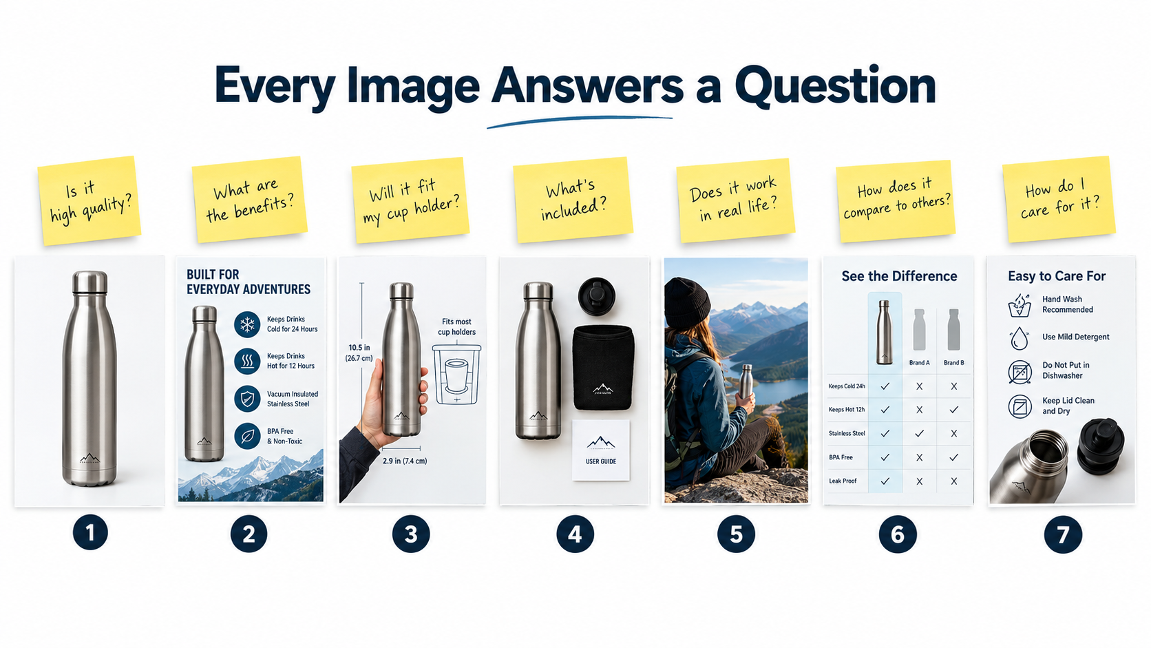
Think of the image stack as a sales conversation that happens without a salesperson. The main image starts the conversation. The secondary images handle the questions, in the order a buyer would naturally ask them. And the last few images close the remaining risks so the buyer can click “Add to Cart” without hesitating.
Below, you’ll find a method for building an objection inventory from data you already have, a slot-by-slot map of what each image should accomplish, the design rules that keep those images readable on a phone, how images feed Amazon’s AI shopping assistant (renamed Alexa for Shopping in May 2026), and a testing approach that treats your image sequence as the variable, not just individual pictures.
Why “Good-Looking” Images Still Lose Sales: The Objection Gap
There’s a common pattern in underperforming listings. The photography is professional. The infographics use the brand palette. Everything looks polished. And yet the conversion rate sits below the category average, and the reviews keep repeating the same complaints.
The cause usually isn’t image quality. It’s what we can call the objection gap: the distance between the questions buyers actually have and the questions your images answer.
What the objection gap looks like in practice
Picture a listing for a collapsible silicone food container set. The images show the containers stacked beautifully, a lifestyle shot of a family picnic, an infographic listing “BPA-free, eco-friendly, space-saving,” and a close-up of the lid color options.
Now look at the reviews and Q&A for that category. The recurring questions are: Do the lids leak when the container is on its side? Can they go in the microwave with the lid on? How small do they get when collapsed, really? Do they hold odors from tomato sauce?
None of the images answers any of those questions. The listing looks great and says almost nothing a hesitant buyer needs to hear.
Why sellers fall into this trap
- Images are briefed by marketers, not by support data. The brief lists features the brand is proud of, not the doubts customers report.
- Designers work at desktop size. An infographic that reads fine on a 27-inch monitor turns into unreadable texture on a phone.
- Images are made once and never revisited. Meanwhile, new reviews surface new objections every month.
- Competitor copying. Sellers look at the top three listings and recreate their image types, inheriting the same blind spots.
Reframing the goal
The fix is a change in the brief. Instead of “show the product attractively,” each image gets a single objection to resolve. “Prove it doesn’t leak.” “Show the real collapsed height next to a phone.” “Show what fits in the box and what doesn’t.”
Attractiveness still matters, but it becomes the delivery method, not the point. A beautiful image that answers nothing is decoration. A plain image that answers the top buyer question is a sales tool.
Building Your Objection Inventory From Data You Already Have
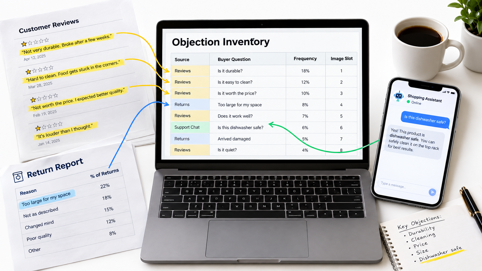
Before you redesign a single image, you need a list of the doubts that stand between browsers and buyers. The good news: you don’t need a survey or a research budget. Amazon and your own operations already produce most of this data.
Source 1: Your own reviews (especially 2–4 stars)
One-star reviews are often about shipping damage or defects. Five-star reviews are often vague. The richest objection data tends to live in the middle: reviews that say “good, but I wish I’d known…” Those phrases are almost a direct brief for an image.
Read at least the most recent 50–100 reviews and tag each complaint or surprise with a short label: “size smaller than expected,” “color differs from photo,” “hard to assemble,” “doesn’t fit model X.”
Source 2: Competitor reviews
Your competitors’ critical reviews show you objections that apply to the whole product type. If buyers of every competing yoga mat complain about a chemical smell out of the box, that’s a category-level doubt your images can address before the buyer even considers it.
Source 3: Customer questions and the AI shopping assistant
The customer questions section on your detail page is a public list of things your listing failed to make obvious. Every question there represents shoppers who had to stop and ask instead of buying.
Amazon’s generative AI assistant adds another layer. According to Amazon, the assistant (launched as Rufus and renamed Alexa for Shopping on May 13, 2026) is trained on the product catalog, customer reviews, community Q&A, and information from across the web, and shoppers use it to ask product-specific questions like “is this pickleball paddle good for beginners?” while on a detail page. Those are exactly the questions your images should answer visually before a shopper thinks to type them.
Source 4: Return reasons and support tickets
Return reason codes such as “not as described,” “didn’t fit,” or “wrong item ordered” are expensive objection data. Each one is a buyer whose doubt wasn’t raised before purchase and turned into a cost afterward. Support inbox messages (“does this come with batteries?”) belong on the list too.
Turning raw notes into a ranked inventory
Put everything in one sheet with four columns: the objection in the buyer’s own words, the source, how often it appears, and its severity (does it stop a sale, or just slow it?). Then sort.
Most products end up with five to eight meaningful objections. That number matters, because it roughly matches the number of image slots you have to work with. Your image stack is essentially a ranked answer list.
A useful rule of thumb: if an objection appears in reviews, Q&A, and returns, it deserves its own dedicated image, ideally in the first four slots.
Slot 1: The Main Image Is a Click Contract
The main image has a different job from every other image. It doesn’t handle objections on the detail page; it earns the visit in the first place. It’s a promise made in a search grid: “This is the thing you’re looking for, and it’s worth a tap.”
The rules you can’t bend
Amazon’s main image requirements are strict, and violations can lead to listing suppression. Based on Amazon’s published requirements (as summarized by Jungle Scout), main images must:
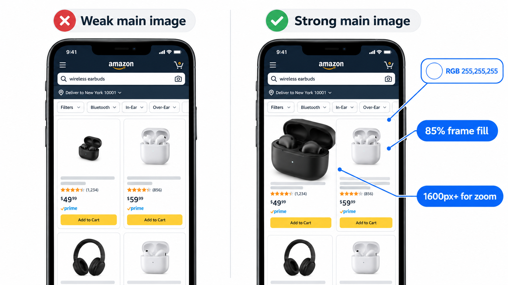
- Use a pure white background (RGB 255, 255, 255).
- Be a professional photograph of the actual product. Graphics, illustrations, mockups, and placeholders aren’t allowed.
- Contain no text, logos, borders, color blocks, watermarks, or other graphics.
- Show the entire product, not cut off by the frame (jewelry such as necklaces excepted), and outside its packaging unless the packaging is an important feature.
- Avoid excluded accessories or props that could confuse customers about what’s included.
- Not show multiple views of a single product.
Across all images, the product should fill at least 85% of the frame, and files of 1,600 pixels or larger on the longest side enable the best zoom experience. The minimum for zoom is 1,000 pixels, and the minimum for display is 500. JPEG is the preferred format. Some categories add their own rules; women’s and men’s clothing main images must show the product on a human model, for example, and shoe main images must show a single shoe facing left at a 45-degree angle.
Winning inside the rules
Since every competitor is working with the same white background, the differences come from things that are easy to overlook:
- Frame fill. 85% is the floor, not the target. Crop as tight as the rules allow so your product looks physically larger in the grid than the listings next to it.
- Angle. A straight-on shot often flattens a product. A three-quarter angle shows depth and two faces at once, which usually reads better as a thumbnail.
- Lighting and edges. Products that are white or silver can disappear into a white background. Subtle shadowing and clean edge definition stop that from happening.
- Bundle honesty. If you sell a two-pack, show two. A main image that undersells the quantity loses clicks; one that oversells it drives returns.
The contract part
Here’s why “click contract” is a useful frame. Whatever your main image implies, the detail page must deliver. If the main image makes a backpack look roomy and the size image reveals it’s compact, you’ve broken the contract, and the shopper bounces annoyed.
So the main image should be the most attractive accurate view of the product. Its job is to draw in the buyers who will be happy with what they find, not every possible buyer.
Slot 2: The “What Is This and Why Should I Care?” Frame
Once a shopper taps through, the second image is the first thing they see when they swipe. On mobile, this is often where the decision to keep exploring or go back to search happens.
Its single job: orient and differentiate
The second image should answer two questions in about two seconds: What exactly is this? and Why this one rather than the others?
That usually means a hero-style infographic: the product, one short headline stating the core outcome, and two or three supporting callouts. Not eight. Not a paragraph.
Lead with the outcome, not the spec
“18/8 stainless steel, double-wall vacuum insulation” is a spec. “Ice stays frozen for 24 hours” is an outcome. Buyers translate specs into outcomes in their heads, but many won’t bother. Do it for them.
The spec still has a place, but as a supporting callout that makes the outcome believable, not as the headline.
Choose the differentiator from your objection inventory
This is where the inventory starts paying off. If the most frequent category complaint is leaking, and your product genuinely solves it, “Leak-proof, even upside down” belongs on image two, not image six.
Ask: of everything this product does, which single claim most directly neutralizes the biggest category-level doubt? That claim earns the headline.
Common mistakes in slot 2
- A second lifestyle image. Lifestyle shots are useful, but too early they delay the information buyers want.
- A brand story. “Founded by two hikers in Colorado” can live in A+ content or the Brand Story. It rarely wins a sale from slot two.
- Overloaded callouts. When everything is highlighted, nothing is. Three callouts, maximum.
- Unverifiable superlatives. “Best quality ever” doesn’t answer anything and can create compliance risk. Specific, provable claims work harder.
A quick test
Show image two on a phone to someone unfamiliar with the product for three seconds, then take it away. Ask what the product is and what makes it different. If they can’t answer both, the image is doing too much or too little.
Slots 3–4: Prove the Core Claim, Then Settle the Size Question
Image two makes a promise. Images three and four should back it up and then handle the objection that causes more disappointment than almost any other in e-commerce: size and scale.
Slot 3: Proof, not repetition
If slot two says “leak-proof,” slot three should show leak-proof: the container upside down over a white napkin, a cross-section of the gasket, a sequence of the lid being locked. If slot two says “stays sharp longer,” slot three might show the blade’s edge geometry or the material layers.
Effective proof images tend to fall into a few types:
- Demonstration: the product doing the thing under realistic or slightly tough conditions.
- Cutaway or exploded view: the internal construction that explains why the claim is true.
- Before/after: visible results, where the category allows it and the result is honest.
- Certification or testing context: only when the certification is real and permitted. Never imitate Amazon badges; Amazon prohibits images that include its badges, such as “Amazon’s Choice” or “Best Seller,” or anything confusingly similar.
Slot 4: The size and scale image
“Smaller than expected” is one of the most common phrases in product reviews across almost every category. It’s a pure objection-gap problem: the buyer didn’t misread anything; they just couldn’t picture the size from photos taken against white with nothing for reference.
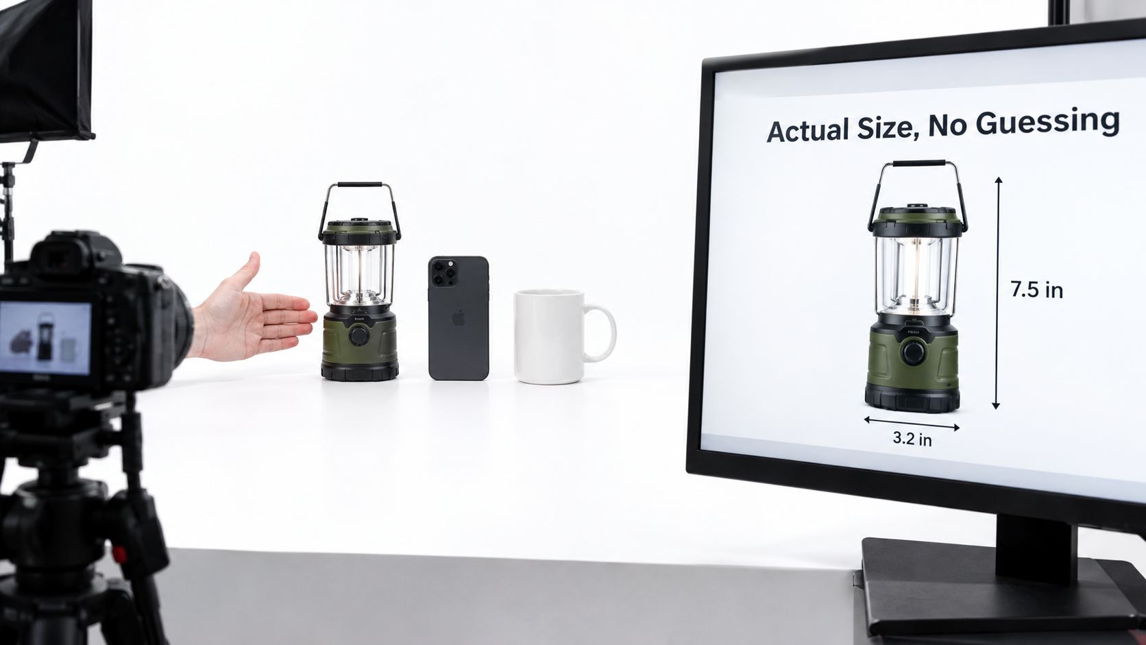
A strong size image combines two things:
- Dimension lines with clear numbers, in the units your marketplace’s shoppers use (inches in the U.S., centimeters in most other marketplaces).
- A familiar reference object: a hand, a smartphone, a coffee mug, a standard sheet of paper, a person. Numbers alone don’t help most people visualize; “about the size of a phone” does.
Choosing the right reference object
The reference should match how the product is used. A travel pillow belongs next to a carry-on bag or on a person in an airplane seat. A desk organizer belongs on a desk next to a laptop. A pet bed belongs with a dog whose breed and weight are labeled.
For products with compatibility concerns, such as phone cases, car accessories, or replacement parts, the scale image can merge with a fit image: the product installed, with the compatible models listed in large type.
Why this order works
Promise (slot 2), proof (slot 3), and reality check (slot 4) follow the natural order of a buyer’s thinking. First “what does it do?”, then “is that true?”, then “but will it work for me?” When images follow that sequence, the shopper’s next question is always answered by the next swipe.
Slots 5–6: What’s in the Box and What Life With It Looks Like
By the fifth image, a buyer who is still swiping is seriously interested. The remaining questions shift from “is this right?” to “what exactly am I getting?” and “can I picture owning it?”
Slot 5: The “what’s included” flat lay
An organized, top-down shot of every item in the package, each labeled, prevents a whole class of returns and negative reviews. It answers questions like:
- Does it come with batteries, a charger, or a cable, and which type?
- Are mounting screws or tools included?
- How many pieces are in the set, exactly?
- Is the carrying case part of the purchase?
Equally important is what isn’t included. If a power adapter is sold separately, saying so plainly on this image costs you a few sales from people who would have been disappointed anyway, and spares you the returns and one-star reviews from those who would have bought.
Remember Amazon’s rule that images must accurately represent the product for sale. A flat lay that includes props not in the box creates confusion and potential policy issues.
Slot 6: Lifestyle with a purpose
Lifestyle images often get placed in slot two or three by default. Under an objection-led approach, they usually move later. That’s not because they don’t matter; it’s because they do their best work once the factual questions are settled.
A good lifestyle image does at least one of these jobs:
- Identifies the buyer. The setting and person signal “this is for people like you.” A kitchen scale shown in a serious home baker’s kitchen speaks to a different buyer than one shown next to a meal-prep tray.
- Shows the use case most people didn’t think of. A storage bin shown in a car trunk, not just a closet, expands the reasons to buy.
- Handles an emotional objection. “Will this look cheap in my living room?” is a real question for home goods. A well-styled room answers it.
Avoiding generic lifestyle shots
The weakest lifestyle images are interchangeable: a smiling person holding the product in a generic bright room. Ask what specific doubt or desire the image addresses. If you can’t name one, the image is filler.
Add a short caption overlay when it helps: “Fits under most airline seats” on a travel bag in a cabin turns a mood shot into an answer.
Slot 7 and Beyond: Risk Reversal and the Final Objections
The final image slots are where many listings run out of ideas and repeat earlier content. That’s a missed opportunity. The last images should handle whatever risk is left: the doubts that make a buyer add to cart but not check out, or save for later and never return.
The comparison image
A comparison chart helps buyers who are actively choosing between options. There are two kinds, and they work differently:
- Internal comparison: your product versus your other sizes, models, or bundles. This reduces the “wrong variant” problem and can steer buyers toward the option that best fits them.
- Category comparison: your product versus a generic “ordinary” version. Keep it factual and avoid naming or showing competitor brands, which creates policy and legal risk.
Keep comparison charts to four or five rows, with checkmarks and large type. A twelve-row table is unreadable on mobile.
Care, maintenance, and longevity
“How do I clean it?” and “How long will it last?” are quiet objections. They rarely show up as the top question, but they influence buyers in categories like kitchenware, textiles, baby gear, and outdoor equipment. A simple care image (dishwasher-safe top rack, machine-washable cover, replaceable filter) removes uncertainty about ongoing hassle.
Compatibility and requirements
For anything that connects to, fits into, or depends on something else, a clear compatibility image is often more valuable than any lifestyle shot. List the models, the dimensions it fits, the app or operating system it needs, and anything it won’t work with.
Warranty and support, carefully
If you offer a warranty or responsive support, a clean image stating it can reassure cautious buyers. Make sure every claim is accurate and matches what you actually provide. Overpromising here turns a trust signal into a liability.
Don’t forget video
Where available, a product video in the image block can carry objections that still images struggle with, such as assembly difficulty, noise level, texture, or motion. Treat it like any other slot: give it one or two objections to resolve, show the answer in the first few seconds, and assume it will often be watched without sound.
Designing for the Thumb: Mobile Legibility Rules
Everything above fails if the images can’t be read on a phone. Many sellers design infographics on a large monitor, approve them at full size, and never check how they look at the size most shoppers actually see them.
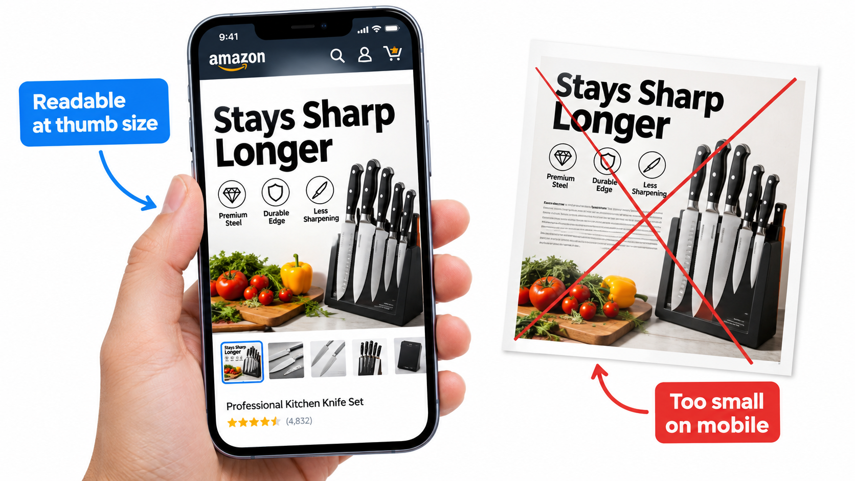
Rule 1: Design at phone size first
Create a preview frame that matches a typical phone screen and review every infographic there before approving it. If you have to pinch to zoom to read a callout, the text is too small. Most shoppers won’t zoom; they’ll swipe.
Rule 2: One headline, three callouts, no paragraphs
A practical upper limit for a secondary image is a headline of about three to six words plus up to three short callouts. If an idea needs a paragraph to explain, it belongs in the bullets or A+ content, or it needs to be split across two images.
Rule 3: Contrast beats branding
Light gray text on white or brand-color text on a busy photo can look elegant at full size and disappear on a phone in sunlight. Use high-contrast text, solid backing shapes behind callouts, and heavier font weights than you’d use in print.
Rule 4: Square canvases and safe zones
Square images display consistently across Amazon’s desktop and mobile layouts. Keep key text away from the edges, where cropping or rounded corners in some layouts can clip it. Remember the 85% frame-fill guideline and the 1,600-pixel-plus size for zoom.
Rule 5: Let the product stay the hero
Infographics sometimes shrink the product to a small corner so text has room. That trades the strongest visual signal for weaker ones. Keep the product large; place callouts around it with leader lines rather than covering it in text blocks.
Rule 6: Localize, don’t just translate
If you sell in multiple marketplaces, a text-heavy image in the wrong language is close to useless. Swap units, reference objects, and phrasing for each market. A reference object that’s familiar in one country may not be in another.
A five-minute mobile audit
- Open your listing on a phone, not a desktop browser in a narrow window.
- Swipe through each image for no more than two seconds.
- Write down what each image told you, in your own words.
- Compare that list to your objection inventory.
- Any image you couldn’t summarize in a sentence needs simplifying.
Images as Machine-Readable Content: Answering the AI Assistant, Too
Your images aren’t only seen by people anymore. Amazon’s AI shopping assistant draws on the product catalog, reviews, and Q&A to answer shoppers’ questions, and Amazon describes it as helping customers compare products and get answers to specific questions on product detail pages. On May 13, 2026, Amazon renamed the assistant from Rufus to Alexa for Shopping.
This piece won’t speculate about exactly how Amazon’s systems parse image pixels; Amazon hasn’t published those details. But there are practical implications that hold regardless.
Consistency between images and text matters more
When an infographic says “holds 32 oz” and the bullet says “30 oz capacity,” a human might not notice. An assistant summarizing your listing, or a shopper comparing answers, might. Contradictions create doubt. Audit your images against your title, bullets, and specifications so every number matches.
Answer questions in both places
The objection inventory should drive your text as well as your images. If “is it dishwasher safe?” is a top question, answer it visually in a care image and in plain words in the bullets. Images persuade humans fast; text gives any system that reads your listing an unambiguous answer.
Watch what the assistant says about you
A practical habit: periodically open your own listing and ask the assistant the top questions from your inventory. If the answers are vague, wrong, or pulled from a complaining review, that’s a signal your listing content, including your images and their matching text, isn’t stating the answer clearly enough.
Real photography carries more weight
Shoppers who ask an assistant “is this durable?” and then swipe the images are looking for visual confirmation. Real demonstration photos tend to carry more credibility than renderings in secondary slots, and Amazon requires the main image to be a professional photograph of the actual product. Renders have their place in exploded views and cutaways, but proof images should look like proof.
Testing the Sequence, Not Just the Picture
Most image testing on Amazon focuses on the main image: version A versus version B, which one drives more clicks and sales. That’s valuable. But an objection-led approach suggests a second, less common test: the order of secondary images.
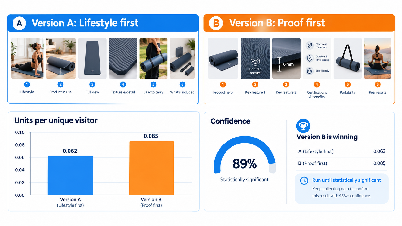
Manage Your Experiments: the native option
Brand-registered sellers can use Amazon’s Manage Your Experiments tool to run A/B tests on listing content, including main images, titles, and A+ content, on eligible ASINs with enough traffic. Amazon splits traffic between versions and reports results along with a confidence measure, which helps avoid declaring a winner based on noise.
Check the current eligibility and supported content types in Seller Central before planning, because Amazon updates the tool periodically and which content types are testable has changed over time.
Testing secondary image order when native testing isn’t available
Where a direct secondary-image test isn’t available for your listing, you can run a careful sequential test: run sequence A for a fixed period, switch to sequence B for an equal period, and compare unit session percentage (conversion rate) from Business Reports. This is less rigorous than a true split test because seasonality, ads, pricing, and competition shift over time. To reduce noise:
- Hold price, coupons, and ad budgets steady during both periods.
- Avoid holiday periods, Prime events, and major competitor launches.
- Run each period long enough to collect meaningful traffic; a few days rarely is.
- Change only the order or one image at a time, never everything at once.
Hypotheses worth testing
- Proof-first vs. lifestyle-first: does moving the demonstration image to slot two outperform an aspirational lifestyle shot?
- Size image position: does moving the scale image earlier reduce “smaller than expected” returns without hurting conversion?
- Headline framing: outcome-based headlines vs. specification-based headlines on the slot-two infographic.
- Comparison chart inclusion: does an internal variant comparison lift conversion on multi-size listings, or just shift sales between sizes?
Measure beyond conversion rate
The objection-led approach should show up in more places than unit session percentage. Watch return rates and return reasons, the volume of new customer questions, and the themes of new reviews. If you added a “what’s included” image and “missing parts” complaints drop, that’s a win even if conversion barely moves.
The Quarterly Image Audit: Keeping the Stack Honest
An image stack built from today’s objections will drift out of date. New reviews raise new doubts, competitors change the comparison set, and product revisions can make old images inaccurate. A light quarterly audit keeps the stack matched to reality.
Step 1: Refresh the objection inventory
Pull reviews, questions, and return reasons from the last 90 days. Add new objections, update frequencies, and note any that have disappeared, ideally because your images now answer them.
Step 2: Map every image to an objection
Write the objection each image answers next to its slot number. Any image without a clear objection is a candidate for replacement. Any top-five objection without an image is a gap to fill.
Step 3: Check compliance
- Main image: pure white background, no text or graphics, full product visible, actual product photo, at least 85% frame fill.
- All images: accurate to the product for sale, no Amazon logos, trademarks, or badge look-alikes, sharp with no pixelation, 1,600 pixels or more on the longest side for zoom.
- Category-specific rules for apparel, shoes, kids and baby, and jewelry where relevant.
Step 4: Check consistency
Confirm that every number and claim in your images matches the title, bullets, specifications, and A+ content, especially after product revisions or packaging changes.
Step 5: Run the mobile check
Repeat the five-minute phone audit. Pay attention to any images added since the last review; new infographics are the most likely to have been approved at desktop size.
Step 6: Pick one test for next quarter
Choose the single highest-value hypothesis from the audit, whether that’s a new proof image, a reordered sequence, or a reframed headline, and test it. One well-run test per quarter, per important ASIN, builds steady improvement without overwhelming your team.
Conclusion: Treat Your Image Stack as Answers, Not Artwork
High-converting Amazon listing images aren’t defined by a particular style, a specific number of infographics, or a trendy format. They’re defined by whether a hesitant shopper finds the answer to their next question on the next swipe.
That shift in thinking changes how you brief designers, how you order images, how you judge them, and how you test them. It also ties image work to data you already collect: reviews, questions, returns, and what Amazon’s own AI assistant is telling shoppers about your product.
Key takeaways
- Start with an objection inventory. Pull doubts from mid-star reviews, competitor reviews, customer questions, AI assistant answers, returns, and support tickets. Rank them by frequency and severity.
- Give every slot one job. Main image earns the click; slot two orients and differentiates; slots three and four prove the claim and settle size; slots five and six show what’s included and what ownership looks like; later slots handle comparison, care, compatibility, and remaining risk.
- Treat the main image as a contract. Make it the most attractive accurate view, fully compliant with Amazon’s white-background, no-text, full-product, 85% fill rules.
- Design for the thumb. One headline, three callouts, high contrast, product kept large, reviewed at phone size before approval.
- Keep images and text consistent. Contradictions confuse shoppers and the systems that summarize your listing. Answer top questions both visually and in plain text.
- Test sequences, not just pictures. Use Manage Your Experiments where eligible, run disciplined sequential tests where not, and measure returns, questions, and review themes alongside conversion.
- Audit quarterly. Objections change. Your images should too.
Pick your highest-revenue ASIN this week. Build its objection inventory, write the objection next to each image slot, and see how many slots are answering nothing. For most catalogs, that one exercise shows more improvement potential than any new photoshoot.
Leave a Reply