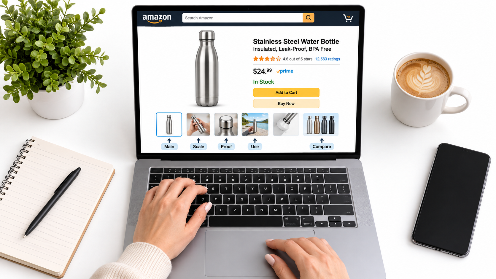
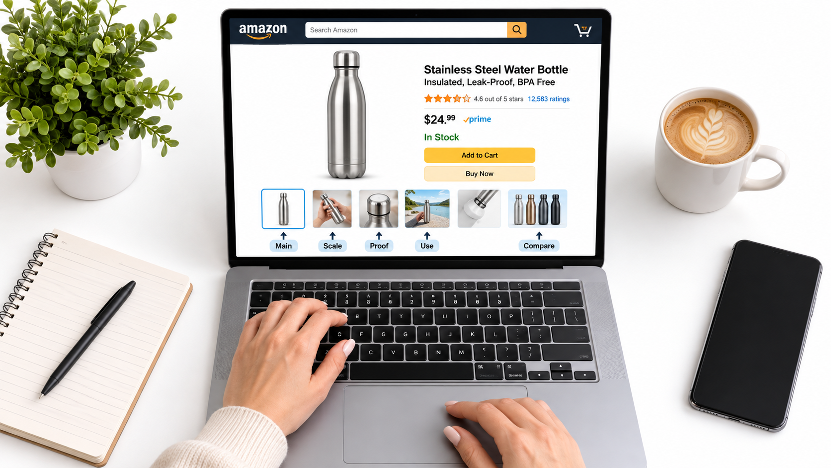
Most advice on Amazon listing images reads like a shot list: white-background hero, infographic, lifestyle, size chart, repeat. Sellers follow it and end up with a gallery that looks professional and still converts poorly.
The problem is that a shot list describes what to photograph. It says nothing about what the shopper is worried about. This article takes a different approach: treat your image stack as an objection map, where every slot exists to remove one specific reason not to buy.
A note on sourcing: the research tools I had access to returned no usable results when this post was written, so I have deliberately avoided citing conversion statistics. The technical specs below are Amazon’s long-standing requirements, but check Seller Central for your category, since rules vary and change. Everything else is a working framework you can test yourself.
Why a Gallery Is the Wrong Mental Model
A gallery is something you look at for pleasure. A listing is something a skeptical person scans while comparing four other tabs.
That shopper is not asking “is this pretty?” They are asking: What is it? How big is it? Will it work for me? Is it good quality? Why this one over the cheaper one? Each of those questions is an objection, and each image either answers one or wastes a slot.
The cost of an unanswered objection
When a question goes unanswered, shoppers do one of three things: they open the reviews to hunt for the answer, they message nobody and leave, or they buy and return the item. The third is the most expensive, and it often traces back to an image that implied something the product could not deliver.
Step One: Collect Your Real Objections
Do not guess at objections. Mine them from sources you already own.
- Negative and three-star reviews for your product and your top three competitors. Look for repeated phrases like “smaller than expected” or “didn’t fit.”
- Customer questions on your listing and competitors’ listings.
- Return reason codes in Seller Central.
- Customer service messages and pre-sale questions.
- Positive reviews, which reveal what people were surprised and pleased by. Those are your proof points.
Put them in a spreadsheet, tally frequency, and rank them. The top five to seven become your image brief.
Step Two: Sort Objections Into Five Types
Almost every objection falls into a handful of buckets. Naming them makes the brief easier to write.
- Identity: What exactly am I getting? (contents, variants, what’s included)
- Size and fit: Will it fit my space, body, device, or hand?
- Function: Does it do the thing, and how?
- Trust: Is it well made, safe, and from a legitimate brand?
- Choice: Why this over alternatives?
A product with a high return rate from sizing confusion needs two size images, not one. A commodity with lots of lookalikes needs a stronger choice image. The map lets the data decide.
The Main Image: Win the One-Second Scan
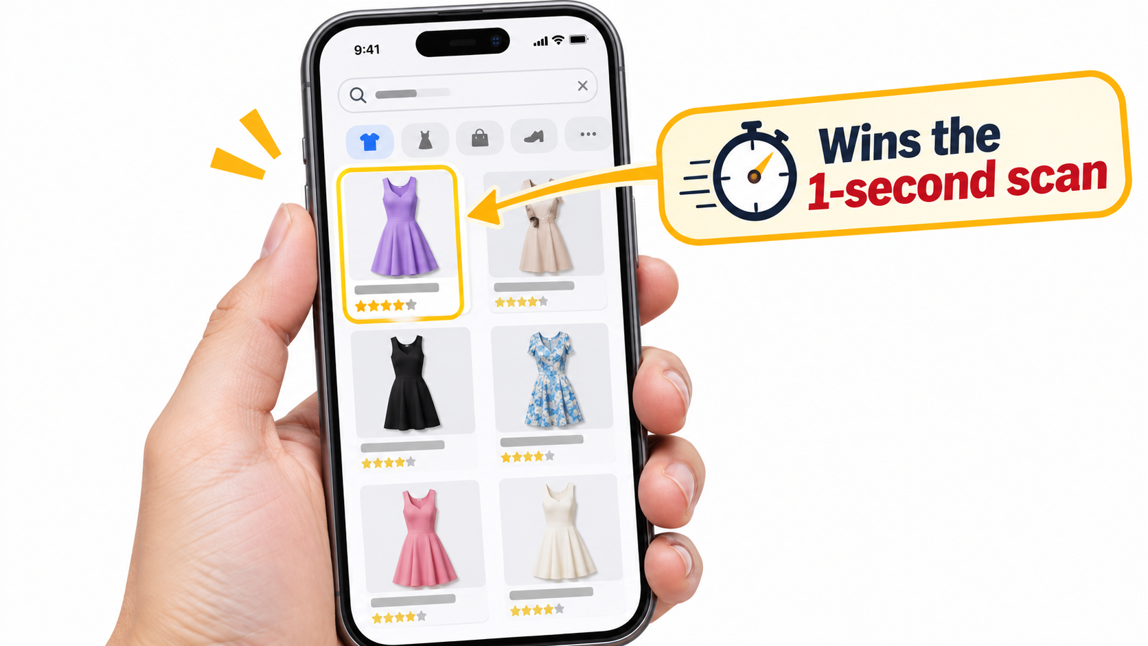
The main image answers only one question: “Is this what I searched for, and is it worth a click?” It does not need to explain features. It needs to be legible at thumbnail size on a phone.
The technical baseline
Amazon’s standard requirements for main images include a pure white background (RGB 255, 255, 255), a product that fills most of the frame (commonly cited as around 85%), no text, badges, or watermarks, and a minimum of 1,000 pixels on the longest side to enable zoom. Many sellers go to 2,000 pixels or more so the zoom stays sharp. Always confirm against current category guidelines, because apparel, for example, has extra rules.
Where the real decisions are
Within those rules you still choose the angle, the lighting, and what is visible. A few practical choices:
- Show the angle that makes the product’s shape recognizable, not the one that looks most artistic.
- If the product has a distinctive feature (a spout, a handle, a texture), pick the angle that displays it.
- For multipacks, show the true quantity so the count is obvious without reading the title.
- Check how it looks next to competitors in an actual search result. Contrast against neighbors matters more than quality in isolation.
Image Two: Answer Identity and Contents
The second slot is valuable because many shoppers swipe at least once. Use it to settle “what do I get?” This could be an in-the-box layout, the variants, or a clean group shot with short labels.
If your product has accessories, label them. Shoppers often assume extras are not included, and a clear contents image removes doubt and cuts down “missing item” complaints.
Size and Fit: The Most Underused Slot
Size confusion drives returns in many categories. A dimension diagram is useful, but a comparison to a familiar object or a person’s hand is often more intuitive than numbers alone.
Ways to show scale
- A hand holding the product, with a dimension line overlay.
- The product next to a common object (a phone, a coffee mug, a standard door).
- A fit chart with a model’s height and the size worn, for wearables.
- Before-and-after space shots for furniture or storage.
Keep the numbers large. If a shopper has to zoom in to read the measurements on a phone, the image has failed.
Function: Show It Working, Don’t Just List It
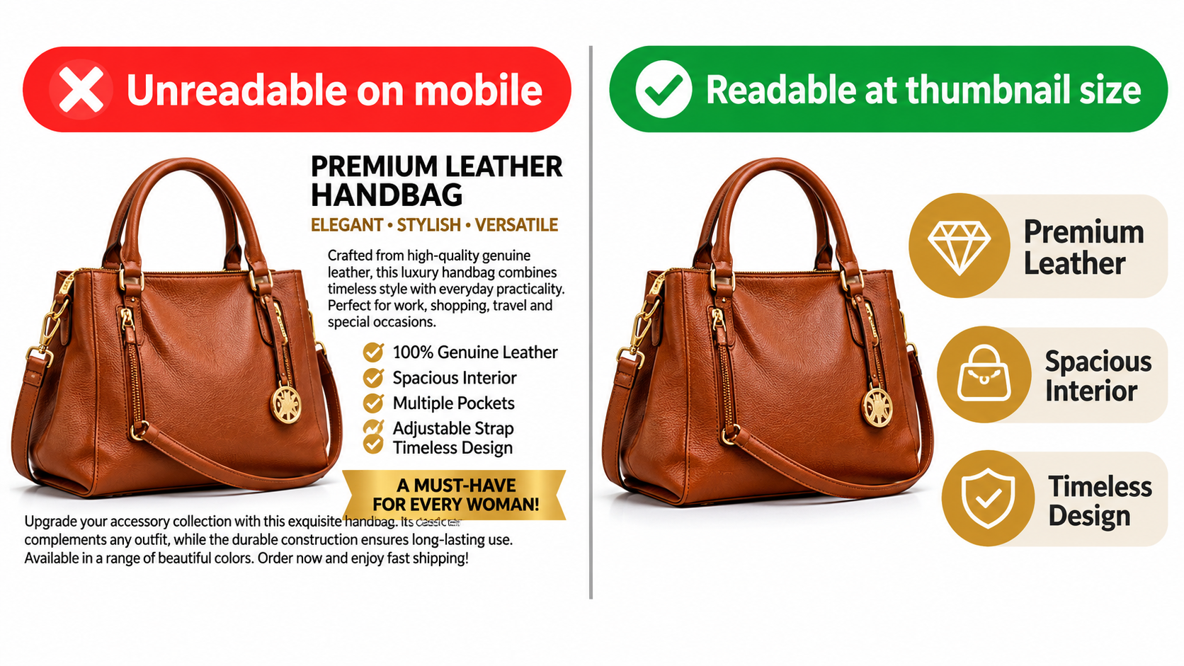
Infographics fail when they become feature dumps. Ten bullet points in small type is the same thing as the listing’s bullets, only harder to read.
The three-callout rule
Limit each functional image to one idea and no more than three short callouts. If the image is about leak-proofing, it should show leak-proofing: a bottle upside down over a laptop, a close-up of the seal. The text supports the picture, not the other way around.
A quick test: shrink the image to roughly the size it appears on a phone. If you cannot tell what the point is in two seconds, simplify it.
Trust: Materials, Proof, and Real People
Trust images address quality worries that photos alone cannot settle. Close-ups of stitching, thickness, finish, and material texture help. So do certifications, but only ones you actually hold and can document.
Be careful with claims. Anything that sounds like a health, safety, or performance guarantee needs to be accurate and, where applicable, compliant. An overreaching claim can cost you the listing, and an exaggerated one costs you a return and a review.
Lifestyle images that earn their slot
A lifestyle photo is not automatically a trust builder. It works when it shows the product in the context your buyer imagines, with believable people and settings. Generic stock-style scenes add little. Specific ones, like a camper pouring from the bottle at a trailhead, let shoppers picture ownership.
Choice: Handle the Comparison Directly
Shoppers are already comparing. A comparison image does it on your terms, usually as a simple table of your product against “typical” alternatives. Avoid naming competitors’ brands, and keep every claim true and verifiable.
Pick the two or three differences that matter most to the buyer, drawn from your review mining, not the ones you are proudest of. If your edge is a thicker material or a longer warranty, say that plainly.
Sequencing: Order the Stack by Objection Rank
With the objections ranked, sequencing becomes straightforward. After the main image, put the most frequent objection first. Mobile shoppers see the first few images most, so those slots should carry your heaviest concerns.
A sample sequence for a drinkware product might be:
- Main image, true to the product.
- Size and capacity with a hand for scale.
- Leak-proof demonstration (top return complaint).
- Materials and insulation proof.
- Lifestyle use in the target setting.
- Comparison against typical alternatives.
- What’s included and variants.
A different product with different returns would reorder this. That is the point.
Video, A+ Content, and Consistency
Video and A+ content are part of the same map. A short video can show function better than any still, and A+ modules give you room for the deeper explanation that does not fit on a thumbnail. Keep the visual language consistent across all of it: the same colors, the same type, the same claims.
Contradictions between the gallery and the A+ section are a common trust leak. If the image says 24 oz and the module says 22 oz, the shopper notices.
Testing: One Variable at a Time
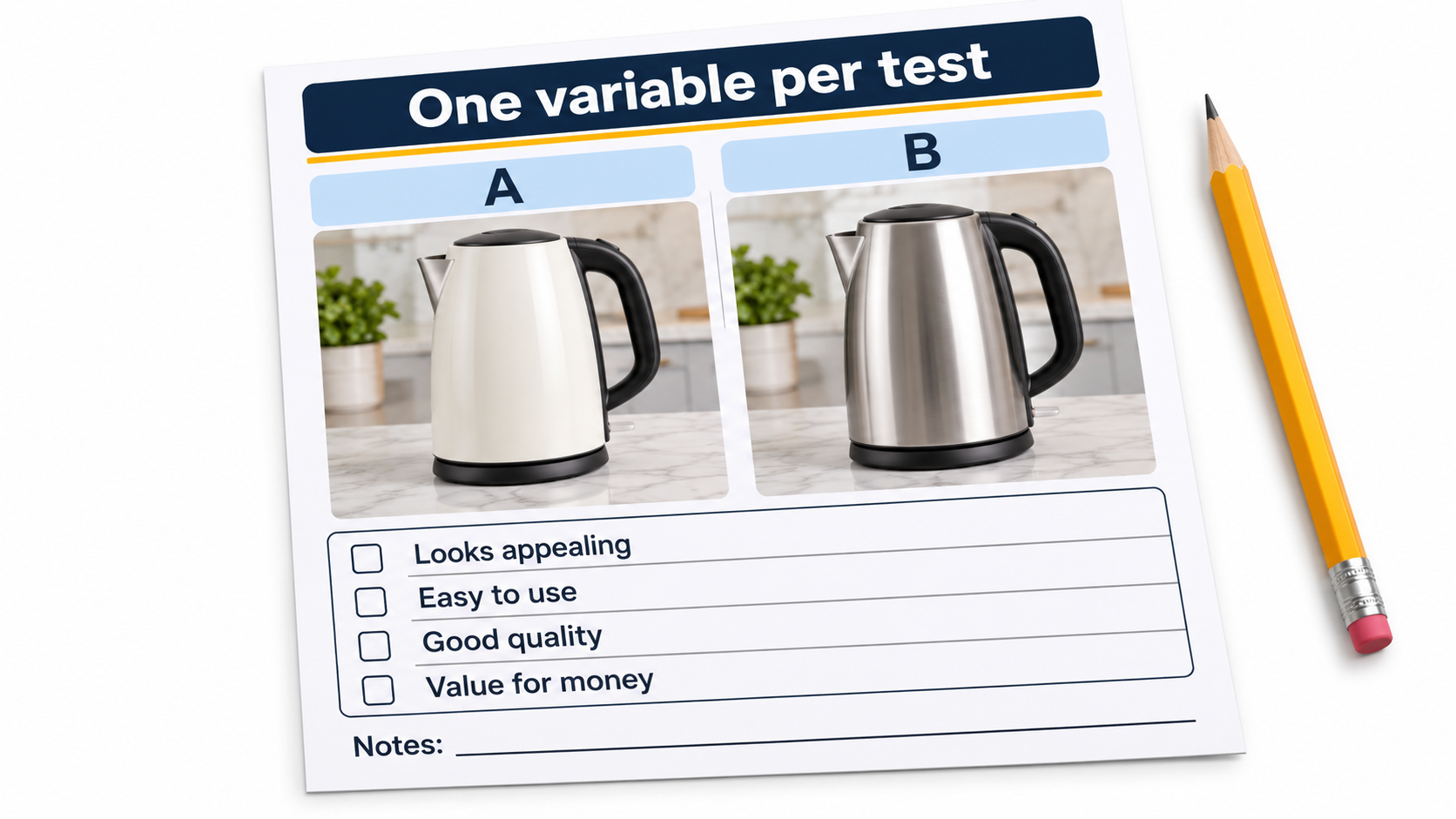
Brand-registered sellers can run experiments through Amazon’s Manage Your Experiments tool, which lets you compare main image and A+ variants. Whatever tool you use, the discipline is the same.
- Change one thing. New angle or new background, not both.
- Write the hypothesis first. “Showing the hand-scale image in slot two will reduce size-related returns.”
- Let it run long enough to reach a reliable result rather than stopping at the first lead.
- Track more than conversion. Watch returns and review language afterward.
Avoid testing during major promotions or seasonal spikes, because shopper mix changes and muddies results.
A Practical Workflow You Can Start This Week
- Export reviews, questions, and return reasons. Tally the top objections.
- Label each as identity, size, function, trust, or choice.
- Assign one image per top objection and write a one-sentence brief for each.
- Shoot or design with thumbnail legibility in mind.
- Check the gallery on an actual phone, in search results, beside competitors.
- Launch, then test the main image first, followed by slot two.
- Re-run the objection mining every quarter. Objections shift as the product and market do.
Common Mistakes to Avoid
- Using the same lifestyle shot in several slots with different crops.
- Tiny text that is only readable on a desktop monitor.
- Showing accessories or features that are not included.
- Copying a top competitor’s gallery, including their weaknesses.
- Ignoring category-specific image rules and risking suppression.
- Treating images as a one-time project.
Conclusion
Optimized Amazon listing images are not the prettiest ones. They are the ones that answer the right questions, in the right order, at the size the shopper actually sees them.
Start with your reviews and returns, build the objection map, and let it dictate your shot list. Then test one change at a time and update the map as the data comes in. That loop is a more durable advantage than any template.
Leave a Reply