Most advice on Amazon listing images reads like a checklist: white background, 2000 pixels, seven images, add an infographic. Follow it and you get a listing that looks like every competitor’s. The better question is what each image is there to do.
This guide treats your image set as two separate jobs: winning the click in search results, then answering the questions that stop a shopper from buying. Everything else follows from that split.
A note on sourcing: the technical figures below come from Amazon’s long-standing published image guidelines. I could not retrieve live benchmark data while writing, so I have deliberately left out conversion-lift percentages. Check current requirements in Seller Central for your category, and run your own tests to get numbers.
Job one: the main image wins the click
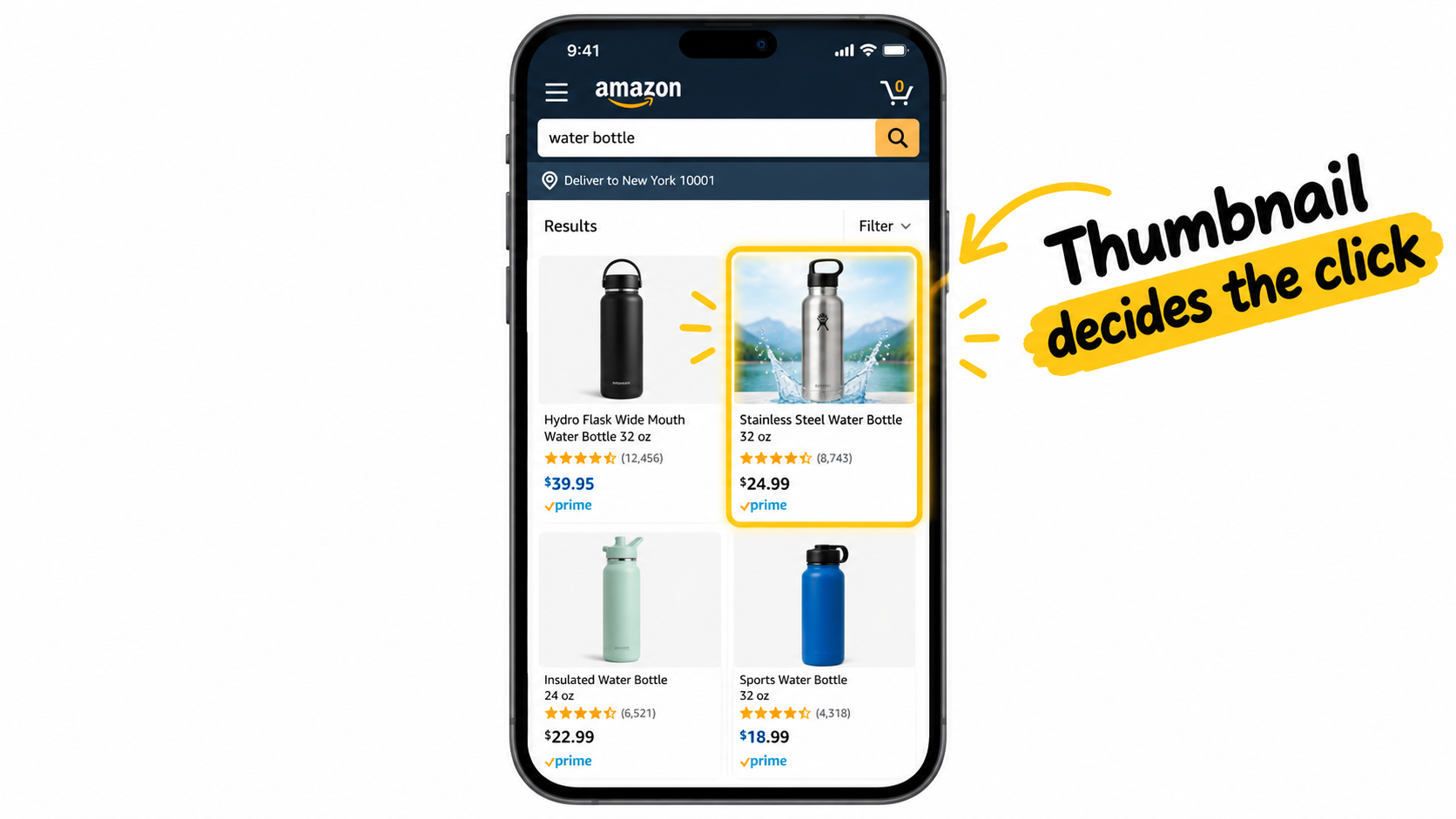
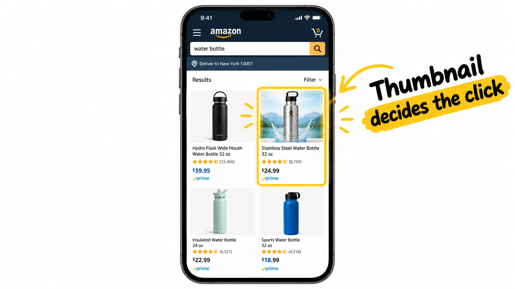
In search results, shoppers see your main image, title, price, rating and review count. That is all. Your other images do nothing until someone clicks.
So the main image is judged against its neighbours on the same results page. The test is not “is this a nice photo?” but “does this stand out among eight similar products, at roughly the size of a thumbnail?”
What Amazon requires
- Pure white background (RGB 255, 255, 255).
- A professional photo of the actual product, not a drawing or illustration.
- The product should fill roughly 85% or more of the frame.
- No added text, logos, badges or watermarks.
- At least 1000 pixels on the longest side to enable zoom; 2000 is a common target.
Where you still have room to differentiate
The rules limit decoration, not decisions. You still choose the angle, the crop, the lighting and what is shown. Showing contents of a set, such as every included piece, can communicate value instantly. A slightly angled view often shows depth better than a flat front shot.
Look at your top ten search competitors side by side. If yours blends in, change the angle or the arrangement before anything else.
Job two: the remaining images answer objections
Once a shopper lands on the listing, they are asking silent questions. Will it fit? Is it well made? How is it different? Is it worth the price? What do I get?
Instead of assigning images to generic slot names, write down the five to eight questions your buyers actually ask. Pull them from the Q&A section, one- and two-star reviews, and returns reasons. Then assign each image one question.
Mining reviews for your image brief
Negative reviews are the best creative brief available. If three reviewers say “smaller than expected,” your second image should be a scale shot with a hand or a common object next to the product. If people say “didn’t realise batteries weren’t included,” show what’s in the box.
Positive reviews tell you which benefit to lead with, in the customers’ own words. Use those phrases in your callouts.
- Export or copy 50 to 100 reviews across star ratings.
- Group comments by theme: size, material, ease of use, durability, value.
- Rank the themes by frequency.
- Give each top theme its own image.
A question-led stack, example by example
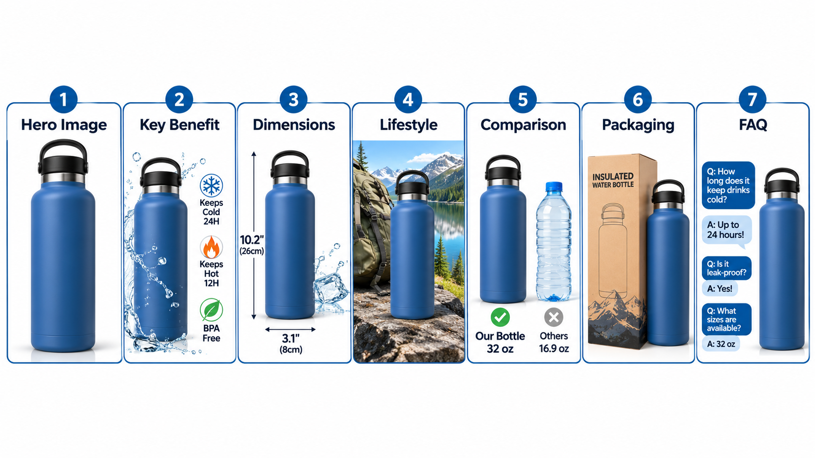
Image 1: Which product is this?
The clean main image. Its only job is the click.
Image 2: Why should I pick this one?
Your single strongest differentiator, with one headline and the product visible. Do not list six features. Pick one.
Image 3: How big is it?
Dimensions or a scale reference. This is one of the most common reasons for returns across categories, so it earns a slot.
Image 4: What does it look like in use?
A lifestyle shot with a plausible customer in a plausible setting. Match the setting to your actual buyer, not an aspirational one.
Image 5: How does it compare?
A comparison against generic alternatives, or a before-and-after. Avoid naming competitors’ brands.
Image 6: What’s included?
Contents and accessories laid out clearly.
Image 7: What about my worry?
Warranty, certifications, care instructions, or a FAQ. Address the top objection from your reviews here.
Design for the phone screen first
A large share of Amazon browsing happens on mobile, where an image may be only a few centimetres wide. Text that looks fine on a desktop monitor becomes unreadable.
Practical legibility rules
- Limit each image to one headline and, at most, three short supporting callouts.
- Keep headlines to about five words.
- Use high-contrast text and avoid thin fonts.
- Preview every image at thumbnail size before approving it.
- Keep key content away from the edges, since the display crops differently across devices.
A quick test: shrink the image to about 300 pixels wide and look away from the screen for a moment. If you can still say what it communicates, it works.
Sequence matters because most shoppers do not see every image
Many shoppers swipe through only a few images. Put your highest-value information early. The first three should be able to carry the sale alone, with later images supporting the shoppers who need more reassurance.
Also think about how images flow. Alternating between graphic and photographic images keeps the set from feeling like a wall of text.
Consistency builds trust
A set of images that share fonts, colours and lighting looks like it came from a real brand. Mismatched styles look like a reseller, and can raise doubts about authenticity.
- Pick two fonts and a colour palette tied to your brand.
- Keep icon style consistent.
- Match the product colour exactly across images; colour mismatch drives returns.
Be careful with claims and AI-generated visuals
Any claim in an image, such as “waterproof” or “BPA-free,” needs to be true and supportable. Images that misrepresent the product can trigger policy issues and generate negative reviews.
If you use AI tools for lifestyle scenes or backgrounds, the product itself must still be accurately depicted: correct shape, colour, proportions and features. Review Amazon’s current policy before relying on generated imagery, particularly for the main image.
Test like an operator
Amazon’s Manage Your Experiments tool lets brand-registered sellers run split tests on main images and other content. Test one variable at a time, and let the test run long enough to reach meaningful results, which Amazon indicates through its own confidence reporting.
What to test first
- Main image angle or crop.
- Which differentiator leads image 2.
- Lifestyle versus infographic in slot 4.
- Adding a scale image.
Record each result. After a few tests you will know what your category’s buyers respond to, which is worth more than any general benchmark.
A simple production workflow
- Research: collect competitor images and review themes.
- Brief: one question and one message per image.
- Shoot or generate: photograph the product at high resolution with several angles and a scale reference.
- Design: add callouts, checking mobile legibility.
- Review: check against policy and accuracy.
- Test and iterate: use experiments and revisit quarterly.
Key takeaways
- Separate the jobs: main image wins the click, the rest answer objections.
- Build the stack from real review and Q&A language.
- Design for thumbnail and phone size first.
- Put the strongest information in the first three images.
- Keep every claim accurate and every visual consistent.
- Test one variable at a time and keep a log.
Treat your images as answers to buyer questions rather than slots to fill, and the rest of the process gets much easier to prioritise.
Leave a Reply