Most advice on Amazon listing images reads like a checklist: white background, high resolution, add an infographic, add a lifestyle shot. Follow it and you end up with a listing that is technically compliant and looks like every competitor’s.
This article takes a different route. Instead of asking “what goes in each slot,” it asks “what question is the shopper silently asking at each moment, and which image answers it?” That framing produces a short written image brief before anyone opens a camera or a design tool. It also makes testing far more useful.
A note on sourcing: Amazon’s image requirements change, and category-specific rules vary. Where this article states a technical requirement, it reflects Amazon’s long-standing published guidance. Always confirm against Seller Central for your category before producing assets. We avoid quoting conversion statistics we cannot verify, because most circulating numbers come from vendor blogs with no methodology.
Why a slot checklist produces forgettable listings
Amazon gives you a main image plus several additional images, and a video slot. The platform structure invites you to think in slots. But a shopper does not experience slots. They experience a sequence of doubts.
A checklist treats every image as a deliverable. A brief treats every image as an answer. The difference shows up in the details: a checklist gives you “lifestyle image,” while a brief gives you “show a 6-foot adult carrying this on a commute so a buyer can judge the size.”
The three moments an image has to win
- The scroll moment: the main image in search results, where the only job is earning a click.
- The evaluation moment: images two through four, where the shopper decides whether this product fits their need.
- The reassurance moment: the later images and video, where the shopper looks for reasons not to worry about returns, size, compatibility or quality.
Each moment has a different audience mindset, so each deserves different creative logic.
The main image: win the click, not the argument
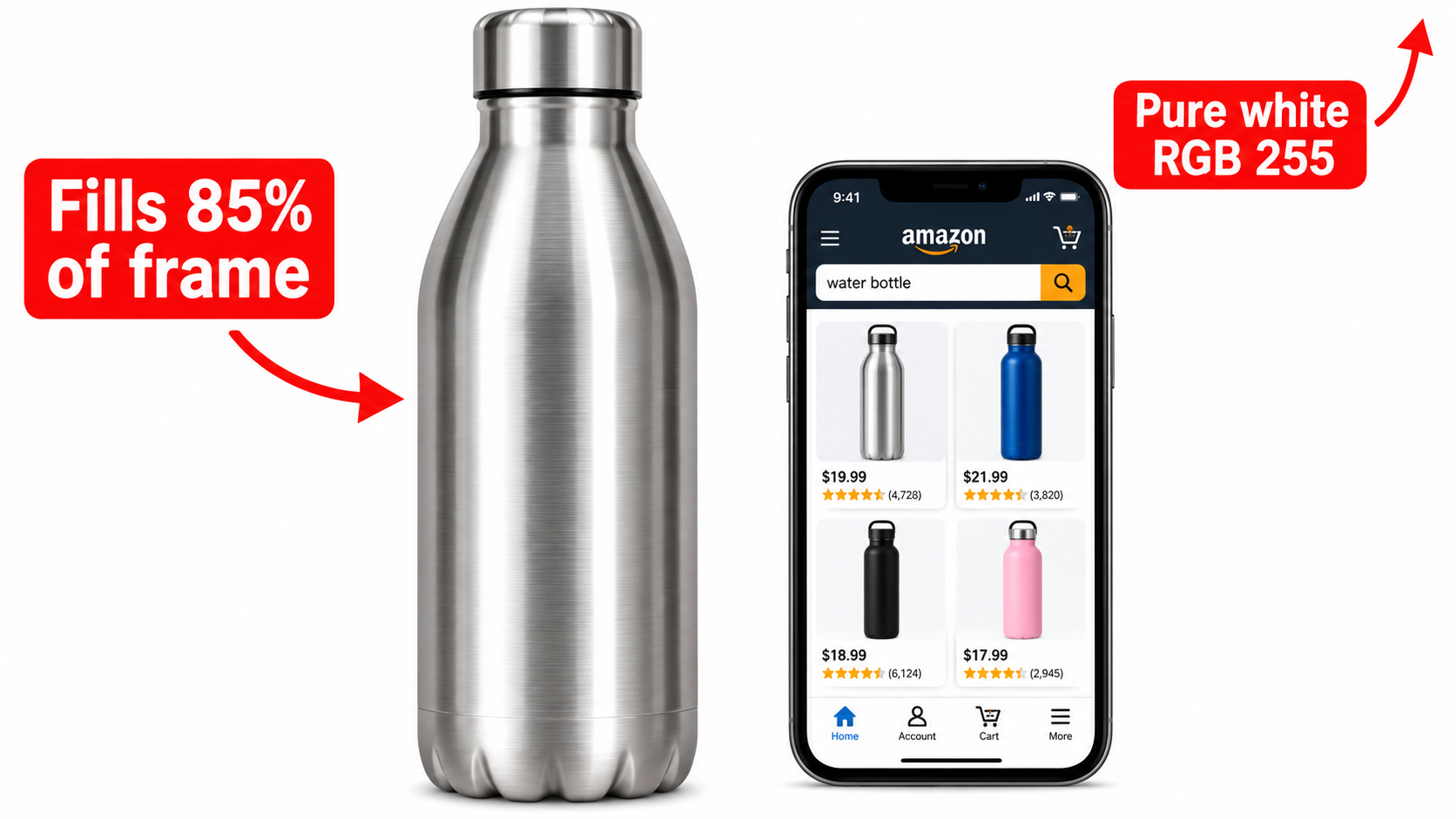
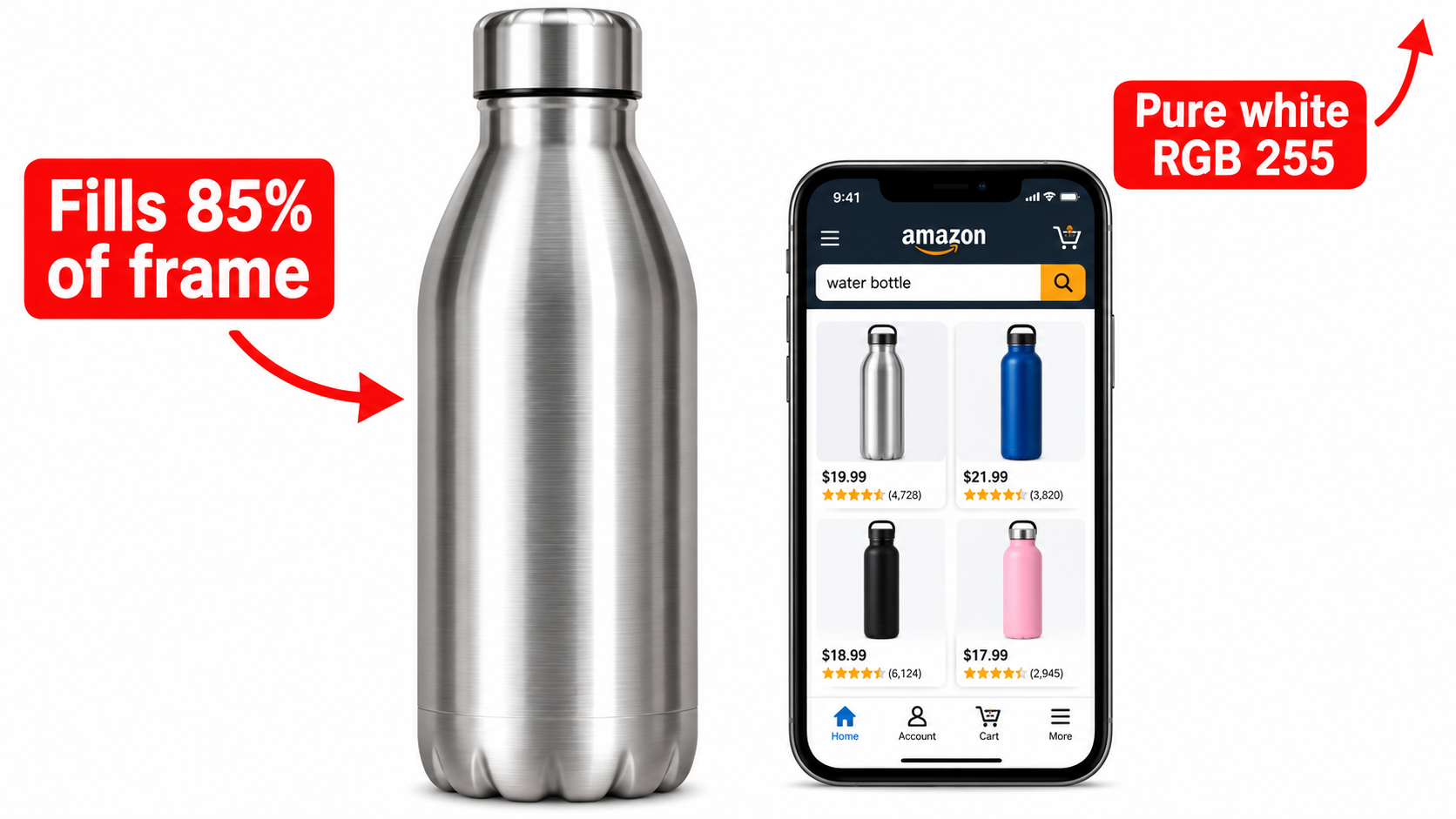
Amazon’s main image rules are strict and widely known: a pure white background (RGB 255,255,255), the product fills most of the frame (commonly cited as around 85%), no text, badges or watermarks, and no props that are not included in the sale. The image must be a professional photo or accurate render rather than an illustration for most categories.
Resolution matters too. Amazon’s guidance is a longest side of at least 1,000 pixels to enable zoom, and many sellers produce 2,000 pixels or larger to keep it crisp.
Where creativity actually lives inside the rules
If everyone obeys the same rules, differentiation happens in choices the rules do not cover:
- Angle: a three-quarter view usually communicates shape and depth better than a flat front view.
- Crop and scale: at thumbnail size, a product that is tall and thin may fill the frame less than a squat one. Test how yours reads at roughly the size of a search thumbnail.
- Contents shown: where permitted, showing the product with what ships with it (for example, a set arranged neatly) can signal value.
- Lighting and shadow: soft natural shadows add dimension; harsh, clipped edges look cheap.
- Color accuracy: a main image that looks different from the product in hand creates returns.
The competitor-grid exercise
Search your primary keyword, screenshot the first page on a phone, and shrink it. Squint. Which listings do your eyes land on, and why? Write down what makes the standouts distinct (size in frame, color, angle). Then check whether your image would disappear. This takes ten minutes and is more useful than any template.
Write the image brief before you shoot anything
The brief is a one-page document. For each image position it lists the shopper question, the proof that answers it, and the evidence you have.
Where the questions come from
- Customer reviews, yours and competitors’: look for repeated phrases like “smaller than expected,” “doesn’t fit,” “hard to clean.”
- The Q&A section: every question asked is an image you have not made yet.
- Return reasons: in Seller Central, returns data tells you what the listing failed to communicate.
- Negative reviews of competitors: these are objections you can pre-empt visually.
A sample brief row
Position 3. Question: “Will this fit on my counter?” Proof: product beside a common object for scale, with dimensions labeled. Evidence: eleven reviews mention size confusion. This row is specific enough that a designer can execute it without guessing.
Building the image stack
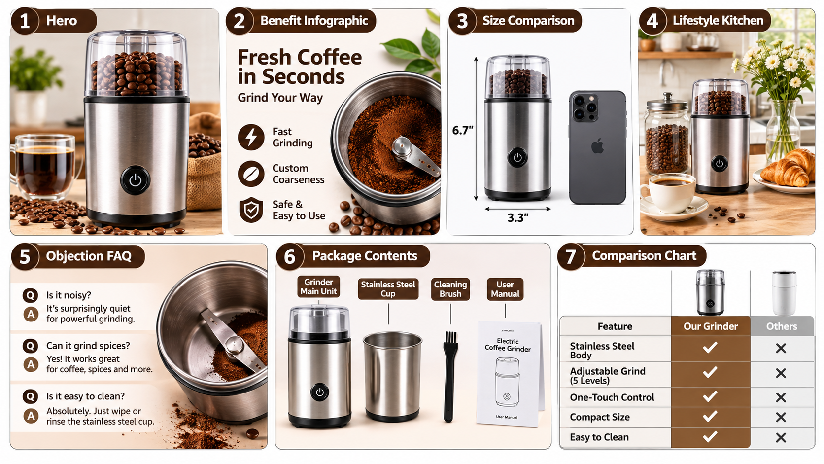
With questions ranked by how often they appear, the stack practically assembles itself. A common order that works for many categories:
- Main image: the click.
- Primary benefit image: the single biggest reason to buy, stated in a few words.
- Scale and dimensions: removes the most common source of disappointment.
- In-use lifestyle: lets the shopper picture ownership.
- Objection handler: material, safety, compatibility, cleaning, whichever your data flags.
- What’s in the box: reduces unpleasant surprises.
- Comparison or variant overview: helps choose between options or against generic alternatives.
Reorder by category, not by habit
Apparel shoppers want fit and fabric on a body early. Supplements shoppers want label clarity and trust signals. Tools and electronics shoppers want compatibility and specs. Your own question ranking should override any generic order.
Keep a consistent visual system
Use one font family, two or three brand colors and consistent icon styling. Consistency makes a stack feel like a single argument rather than seven separate ads.
Infographics that survive a phone screen
A large share of Amazon browsing happens on mobile, so design for a small screen first. The most common failure is an image that looks excellent on a monitor and becomes unreadable at phone size.
Practical legibility rules
- Limit each image to one message and a few short callouts.
- Use large, high-contrast type. If you must zoom to read it, it is too small.
- Prefer icons and arrows to paragraphs.
- Leave breathing room around the product.
- Preview every image at actual phone size before approving.
Text inside images and search
Amazon’s systems can read text in images, which is why accurate, relevant wording in graphics matters. Do not treat image text as a place to stuff keywords. Write for the shopper; anything else risks misleading claims and compliance trouble.
Lifestyle images that do real work
Lifestyle shots fail when they are merely pretty. They succeed when they carry information: who uses the product, where, how large it is, and what the result looks like.
Casting and context
Show the person your best customer resembles. A parent for a lunchbox, a hiker for a pack. Specific context beats generic smiling models.
Show the product doing its job
A blender in a pretty kitchen is decoration. A blender with a finished smoothie and an ingredient list shows the outcome. Aim for the second kind.
Objections, comparisons and honest claims
Comparison charts and objection images are among the most useful slots, and also the riskiest. Claims must be accurate and supportable. Avoid unverified superlatives such as “best” or unsubstantiated health or safety claims, and be careful naming competitors, since Amazon policy and trademark law both apply.
Safer comparison structures
- Your product versus “typical alternatives” on measurable attributes.
- Your own variants side by side (sizes, bundles, strengths).
- Before and after, only where results are genuinely representative.
If you use AI tools to create or edit images, check Amazon’s current policies on AI-generated content and make sure the product shown is accurate to what ships.
Video, A+ Content and image consistency
The listing’s image carousel does not stand alone. A+ Content modules lower on the page reinforce the same story, and video can demonstrate what stills cannot, such as assembly, motion or texture. Make sure your messages align. If your benefit image promises “installs in two minutes,” your video should show it.
Also keep variation images consistent. If each color or size has different image quality, shoppers read that as inconsistent product quality.
Test like an operator, not a gambler
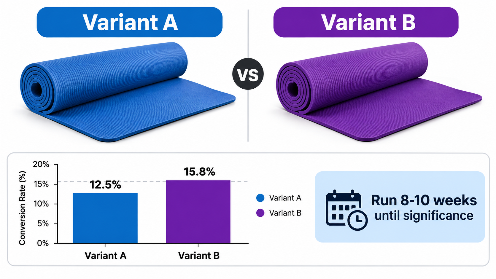
Amazon’s Manage Your Experiments tool, available to Brand Registry sellers, lets you split-test main images, titles and A+ Content. It handles traffic splitting and statistical significance for you.
Rules for useful experiments
- Change one thing: angle, crop or color, not all three.
- Write a hypothesis: “A closer crop will raise click-through because the product reads larger on mobile.”
- Let it run: end early and you will chase noise. Follow the tool’s significance guidance.
- Test where traffic is high: low-traffic ASINs take too long to reach a result.
- Log results: a record of wins and losses becomes your category playbook.
What to measure
Main image tests mostly move click-through. Secondary image changes show up in conversion rate and return rate. Track both, since a picture that over-promises can raise conversion while quietly raising returns.
A practical workflow and the mistakes to avoid
A five-step workflow
- Mine reviews, Q&A and returns for the top five shopper questions.
- Write the one-page image brief, one row per image.
- Shoot or design, previewing at phone size throughout.
- Check each asset against category rules and claim accuracy.
- Launch, then test the main image first, followed by the benefit image.
Common mistakes
- Treating all seven slots as equally important when two or three carry most of the weight.
- Crowding infographics with text.
- Using images that do not match the real product, leading to returns and bad reviews.
- Skipping a return-reason audit.
- Redesigning everything at once, which makes results impossible to interpret.
Conclusion: images are answers
Optimized listing images are not defined by compliance with a template. They are defined by how efficiently they answer the questions that stop a shopper from buying. Compliance gets you in the door; the brief gets you the sale.
Start this week with three actions: pull your return reasons and top negative reviews, write the five questions they imply, and map each to an image. Then run a single main image test. Repeat that loop and your listing improves for evidence-based reasons rather than taste.
Leave a Reply