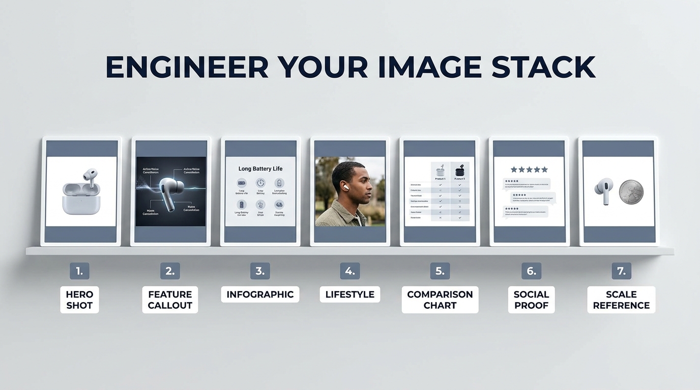
Most Amazon sellers spend months sourcing the right product, weeks dialing in their pricing, and days writing keyword-dense bullet points — then hand off their images to a photographer with one instruction: “Make it look good.”
That’s the single most expensive mistake on the platform.
Your image stack is not a visual brochure. It is not a gallery. It is not a chance to show off your brand aesthetic. It is a conversion machine with seven distinct components, and each slot has a specific job to do in a specific order. When one slot fails its job, the buyer moves on — not to your next image, but to your competitor’s listing.
The seller who wins on Amazon in 2026 is not necessarily the one with the prettiest photos. It’s the one who understands that a buyer moving through an image carousel is making a series of micro-decisions — and that every image either advances that decision toward purchase or stalls it. Click-through rate, session-to-order rate, return rate, ad cost efficiency — all of it traces back, in some measure, to how well your image stack does its job.
This post is not about Amazon’s technical requirements (though we’ll cover the specs that actually matter). It’s about the strategic logic behind building an image stack that functions as a structured sales argument — one that anticipates buyer hesitation, answers objections before they form, and closes the gap between “considering” and “add to cart.”
Let’s break down all seven slots, what each one is actually for, and how to build them with intention.
The 7-Slot Framework: Why Each Image Position Is a Distinct Conversion Asset
Amazon allows sellers to upload up to nine images on most categories, but the functional carousel buyers interact with most often contains seven visible slots. The remaining two sit in an overflow state that many buyers never reach on mobile — which means your real working budget is those first seven images.
The mistake most sellers make is treating these seven slots as interchangeable. They upload seven variations of essentially the same thing: seven angle shots, or seven lifestyle photos, or a hero image followed by six infographics. None of these approaches accounts for the psychological sequence buyers move through when evaluating a product.
The Decision Sequence Every Buyer Follows
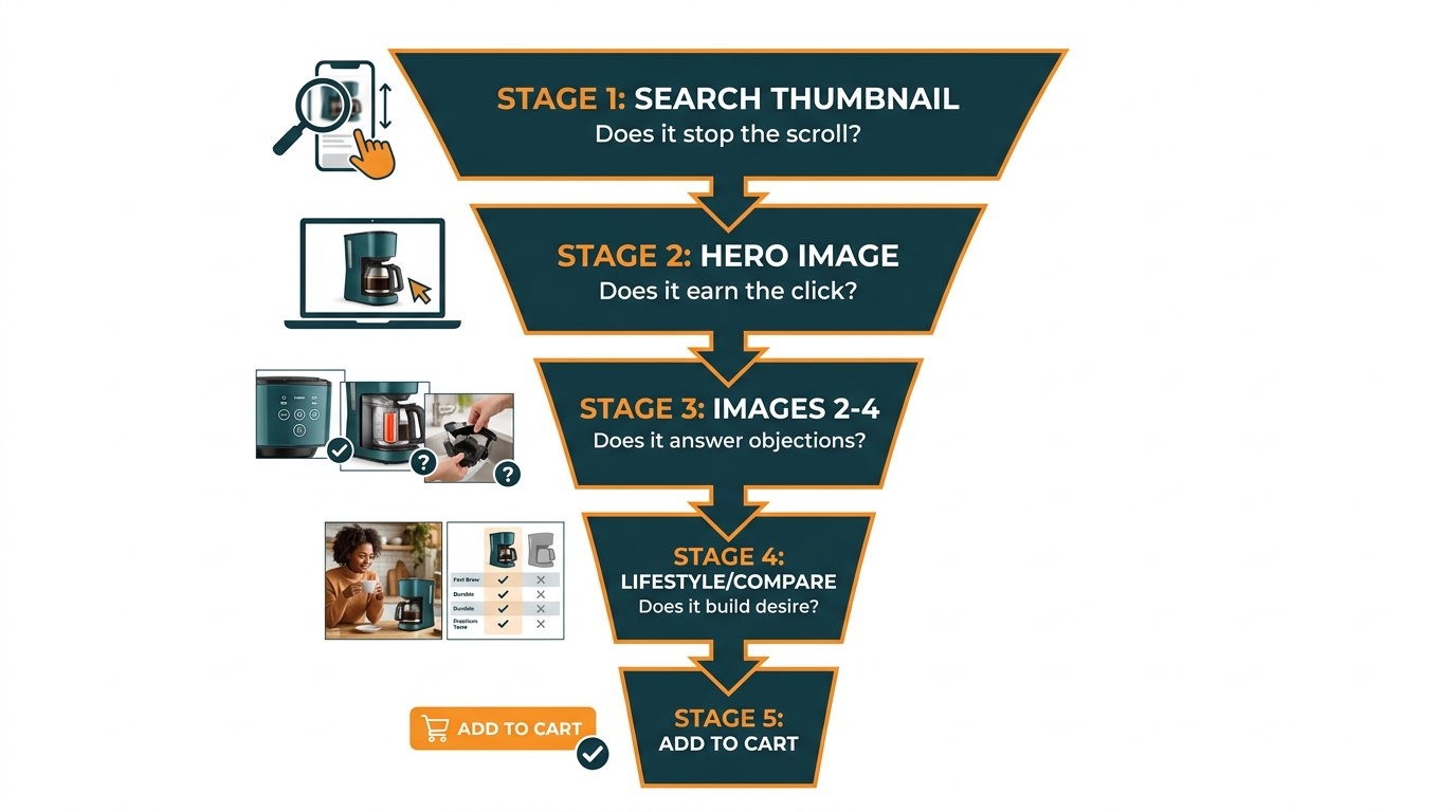
Before a buyer clicks “Add to Cart,” they have implicitly answered a series of questions — usually in this order:
- Is this worth a closer look? (Search result thumbnail)
- Is this the right product category/style for what I need? (Hero image)
- Does it actually do what I need it to do? (Feature images)
- Is the quality what I’m expecting for the price? (Detail and material images)
- Will this work in my context / for my situation? (Lifestyle image)
- Is this better than other options I’m considering? (Comparison image)
- Can I trust this seller and this product? (Social proof / guarantee image)
That is seven questions. You have seven image slots. The architecture practically builds itself — if you know what you’re doing.
Why Slot Order Matters More Than Individual Image Quality
A stunning lifestyle photo placed at image position 2 is wasted. A buyer at position 2 is still evaluating whether your product is what they’re looking for — they’re not yet in the emotional aspirational space where a lifestyle image lands. Placing it there is the visual equivalent of asking someone to imagine themselves on vacation before you’ve told them where the hotel is.
Conversely, a dry feature callout placed at position 6 is equally misplaced. By that point, the buyer has already emotionally engaged with the product — they need validation and reassurance, not specifications they should have seen three slots ago.
Sequence is strategy. And most sellers have their sequence wrong.
Image Slot 1: The Hero — Its Only Job Is the Click
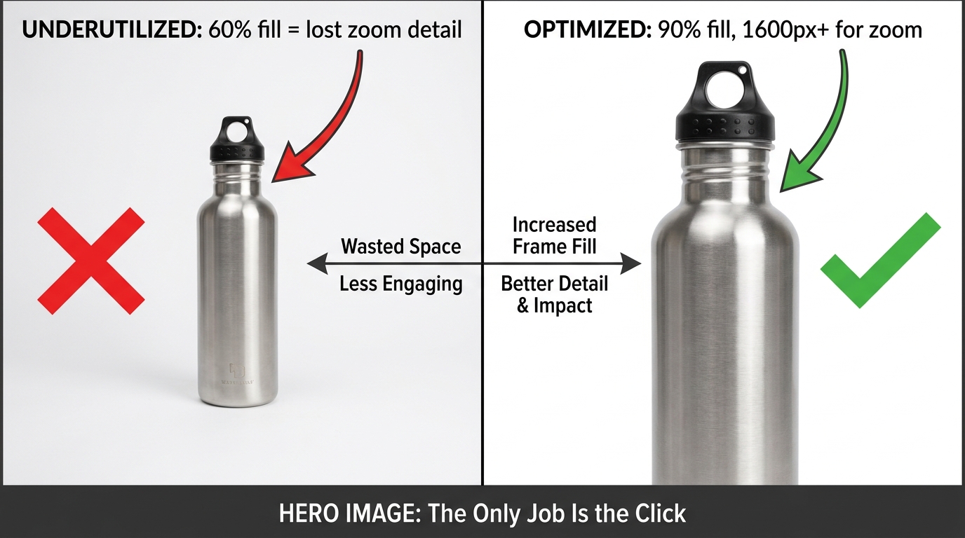
The hero image is both the most constrained and most consequential image in your stack. Amazon’s rules here are strict: pure white background (RGB 255, 255, 255), no text overlays, no props that aren’t included in the product, no multiple views. The product must fill at least 85% of the frame, and the image must be at least 1,600 pixels on the longest side to activate zoom functionality.
These constraints make most sellers feel like the hero image is out of their control — that it’s just a matter of having a clean photo and hitting the specs. That thinking is what separates mediocre listings from top performers.
Within the Rules, There Is Enormous Room to Win
Within Amazon’s constraints, you still control several critical variables that determine whether your hero image earns a click from the search results page:
- Product angle and orientation. Most categories have a default angle everyone uses. Study your top competitors’ hero images and identify the dominant angle — then test an alternative that creates visual differentiation on the search results page. A 45-degree angle vs. front-facing, a horizontal product shot vs. vertical — small variations that make your thumbnail visually distinct in a grid of identical-looking competitors.
- Fill percentage. Shooting to 85% fill is the minimum. Shooting to 90–95% fill maximizes the perceived size and impact of your product in the thumbnail, which directly influences click-through rate. A product that looks larger relative to competitors triggers more clicks in category searches, especially on mobile where thumbnail sizes are small.
- Variant selection. If you sell multiple colors or styles, consider which variant hero image performs best in search — not just which one looks best in isolation. A darker colored product often has higher contrast against the white background and reads better at thumbnail size. This is worth testing explicitly.
- Zoom-readiness. The recommended 1,600px minimum for zoom is not actually optional if you care about conversion. Zoom functionality has been linked to higher conversion rates by Amazon’s own internal research, and buyers who zoom are demonstrating high purchase intent. Shoot at 2,000–3,000px to give zoom full room to work.
- White balance precision. A hero image shot against a slightly off-white background (cream, gray-white, or cool-white) looks inconsistent on Amazon’s pure-white page template. This creates a subtle but real visual friction that signals “low effort” to buyers. Your whites must be calibrated to true 255/255/255 — not approximately white.
The Thumbnail Test: How to Check Before You Publish
Before finalizing your hero image, resize it to 120×120 pixels — the approximate size of an Amazon search result thumbnail on mobile. Can you still clearly tell what the product is? Does it visually stand out? Is the key product attribute (shape, material, color, form factor) immediately readable? If the answer to any of these is “not really,” your hero image will underperform in search, regardless of how well it photographs at full size.
This thumbnail test is one of the most commonly skipped steps in listing optimization, and it explains why products with beautiful photography still struggle with click-through rate.
Images 2 and 3: The Objection-Killers That Do the Heavy Lifting
If your hero image earns the click, images 2 and 3 earn the session. These two slots are where the majority of buying decisions are made or abandoned — and where most sellers squander their opportunity by either repeating the hero image at a different angle or jumping prematurely to lifestyle content.
Images 2 and 3 should be working images. They answer the immediate question a buyer has the moment they click through: “Okay, I’m looking at this product — does it actually do what I need?”
Image 2: The Primary Benefit Statement
Image 2 should visually communicate the single most important benefit your product delivers — not a feature, a benefit. The distinction matters enormously.
A feature is “stainless steel double-wall construction.” A benefit is “keeps drinks cold for 24 hours.” A feature is “ultra-high-density foam.” A benefit is “wakes up without the aches.” Buyers don’t evaluate products in terms of features — they evaluate them in terms of outcomes. Image 2 should lead with the outcome.
This image can and should include a minimal text overlay — a clear, large-font headline that names the primary benefit, supported by a secondary line that names the key feature delivering it. Keep the text to two lines maximum. The visual should support and reinforce the text, not compete with it.
Image 3: The Key Differentiator or Counter-Objection
By image 3, a buyer is often holding a specific concern or skepticism. They may be wondering: Is this actually durable? Will this fit my situation? Is this the right size? Image 3 is where you counter the single most common objection your category faces.
To know what that objection is, go directly to your competitors’ negative reviews and your own. Look for the most frequently repeated concern. If three-star reviews consistently mention “the material felt cheap,” image 3 should show a close-up detail shot of the material with a callout that specifically addresses it — “Military-Grade Nylon: Tested to 200lb Tensile Strength.” If buyers keep returning products because they’re the wrong size, image 3 should show clear size context — the product held in a hand, next to a common reference object, or with explicit dimension callouts.
The buyer who gets through images 2 and 3 without their main objection being triggered is a buyer who is likely to scroll further. The buyer whose objection is never addressed will exit — usually to read the reviews looking for reassurance, and once they’re in the reviews, you’ve lost the narrative control of your listing.
The Infographic Slot (Image 4): Packing Density Without Visual Noise
The infographic image is the hardest to execute well and the most commonly done badly. When it works, it’s a conversion accelerator — a single image that answers multiple questions simultaneously, speeds up the buyer’s evaluation process, and demonstrates product depth. When it fails, it creates visual noise that signals “amateur design” and actively erodes trust.
The Five-Point Rule
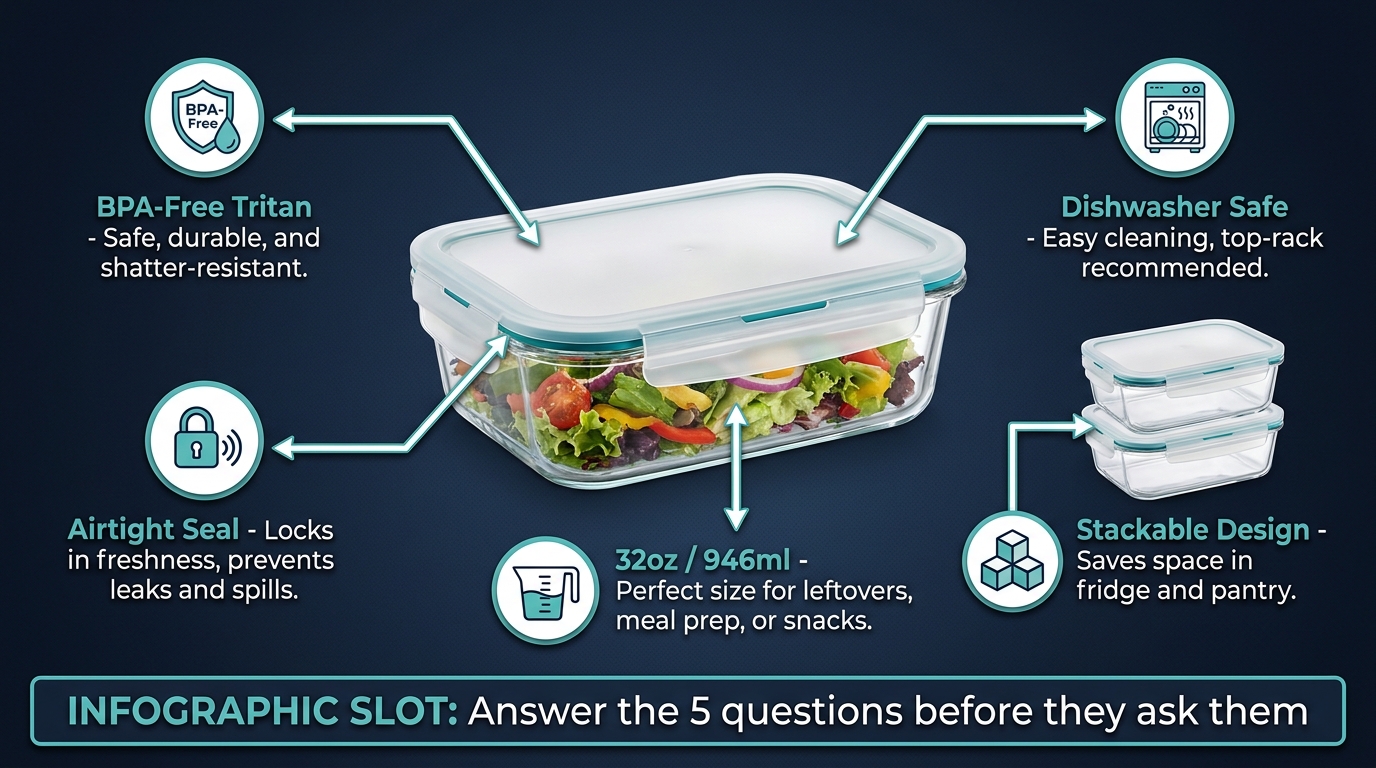
Effective Amazon infographic images share one common trait: they answer no more than five specific questions per image. The moment you try to answer six, seven, or eight points in a single infographic, visual density crosses into visual chaos. Buyers process these images quickly — often in under three seconds — and an overcrowded infographic communicates nothing memorable because it tries to communicate everything simultaneously.
Choose five product attributes that buyers most commonly want to know before purchasing — attributes that are difficult or impossible to convey through the product photo alone. Dimensions, materials, certifications, compatibility, capacity, contents — these are infographic territory. Benefits and lifestyle outcomes are not — those belong in different slots.
Design Principles That Separate Good Infographics from Great Ones
- Hierarchy matters more than completeness. Not all five callouts should look identical. Weight them visually so the most important feature draws the eye first. Use size, color contrast, or proximity to the product to establish hierarchy.
- Lines and arrows must be precise. Callout lines that don’t clearly point to the specific product area they’re describing create confusion. Every line should have an unambiguous origin and terminus. If the line points vaguely toward “the middle of the product,” redesign it.
- Icons add credibility, not decoration. Small icons next to callout text serve a functional purpose — they make individual callout points scannable and reinforce the legitimacy of certifications or standards. An icon of a food-safe symbol next to “BPA-Free” carries more weight than the text alone.
- Background color is a lever, not an afterthought. A dark or deep-colored background for your infographic image makes it visually distinct from the white-background hero image immediately preceding it in the carousel, which draws the eye and signals a content shift. It also gives text overlays more contrast and readability.
- Readable at thumbnail size. The mobile thumbnail test applies here too. Your five callout points will be invisible at thumbnail size — and that’s fine. What must be readable at thumbnail size is the dominant visual: the product shape and the headline or primary callout. The detail is a reward for buyers who expand the image.
What Belongs in an Infographic vs. What Belongs Elsewhere
One of the most common infographic mistakes is stuffing it with lifestyle content — showing people using the product, showing aspirational settings, or including review excerpts. This dilutes the functional clarity that makes infographics valuable. Lifestyle belongs in its own slot. Social proof belongs in its own slot. The infographic slot should be exclusively dedicated to product facts — the specifications and attributes that help a buyer confirm this product is objectively right for their need.
The Lifestyle Image (Image 5): Aspiration vs. Context — Knowing Which One to Sell
Lifestyle images are where most sellers over-invest effort and under-invest strategy. The assumption is that a beautiful lifestyle photo — high production value, aspirational setting, professional models — is inherently effective. That’s only true if the lifestyle image is doing the right job for your product category and buyer intent.
There are actually two fundamentally different types of lifestyle images, and they serve different conversion purposes:
Aspirational Lifestyle: Selling an Identity
Aspirational lifestyle images work when the buyer is purchasing a product as part of a desired self-image or social identity. Premium fitness gear, travel accessories, home décor, fashion — these categories respond to aspiration because the buyer is not just buying the product, they’re buying what owning the product says about them.
In these categories, a lifestyle image should feature an idealized but believable version of the buyer’s target persona in an environment they aspire to. The product should be naturally integrated — not center-staged and spotlit, but present and in use. The setting, the model, the lighting, and the styling collectively communicate: “This product belongs in the life you want.”
Contextual Lifestyle: Solving for Fit
Contextual lifestyle images work when the buyer’s primary question is whether the product fits their specific situation — their kitchen size, their workflow, their body type, their existing setup. Office supplies, kitchen tools, pet products, organizational items, electronics — these categories are driven by practical fit, not aspiration.
For these products, the lifestyle image should show the product in a realistic, relatable environment that mirrors the buyer’s actual context. A desk organizer photographed on a perfectly arranged, minimalist desk in a studio apartment performs differently than one photographed on a functional home office desk that looks like an actual working environment. Buyers in practical categories trust recognizable contexts over aspirational ones — the latter can feel disconnected from their reality.
The Mistake of Conflating the Two
Using an aspirational lifestyle image for a practical product category creates subtle cognitive dissonance — the buyer thinks “this looks nice, but is it right for me?” Using a utilitarian contextual image for an aspirational category leaves emotional value on the table. Knowing which type your product category demands is the foundation of a high-performing lifestyle slot.
Regardless of which approach fits your category, all lifestyle images should meet one standard: the product must be in use, not simply present. A water bottle sitting on a countertop next to some fruit is decoration. A water bottle being sipped by someone mid-run is context. The difference in conversion impact is significant.
Images 6 and 7: The Comparison and Social Proof Slots — Using the Final Slots Strategically
By the time a buyer reaches images 6 and 7, they are in a specific psychological state: they are seriously considering your product, but they’re comparing it — consciously or unconsciously — to alternatives. Slots 6 and 7 are where you close that comparison definitively.
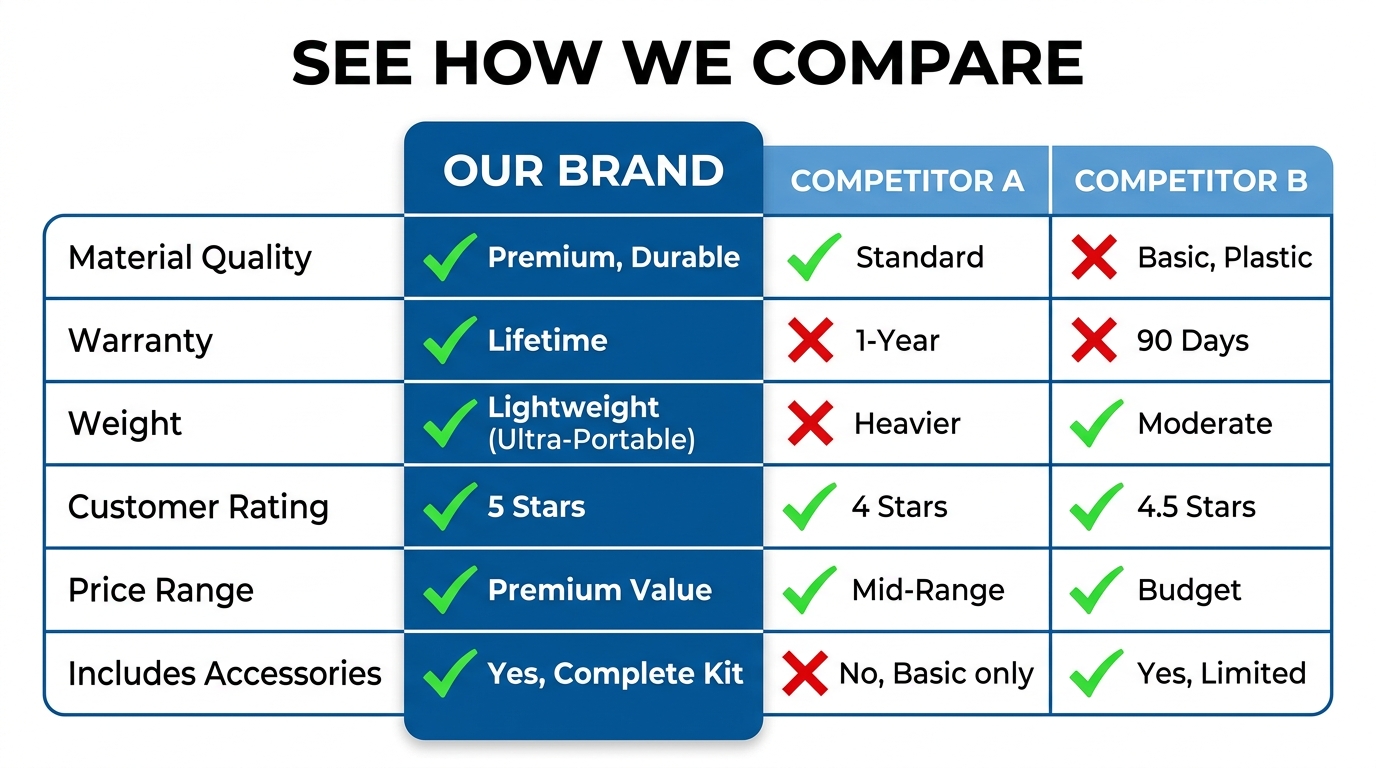
Image 6: The Comparison Frame
A well-constructed comparison image does something that no amount of bullet copy can achieve: it presents a direct, visual side-by-side evaluation that your product wins. The key word is “wins” — this is not a neutral comparison, it’s a structured argument in which your product is the obvious conclusion.
Effective comparison images typically use one of two formats:
- Feature grid comparison: A three-column table comparing your product against “Typical Competitors” or “Standard Brands” across five to seven attributes where you have clear advantages. Critically, these attributes should be ones the buyer actually cares about — not ones you’ve selected because you happen to win on them. If buyers care about warranty length but not about handle material, include warranty and omit handle material, even if your handle is better.
- Before/after or with/without comparison: For products that solve a specific problem, showing the before state (without your product) and the after state (with your product) in a clear visual split is often more emotionally compelling than a feature grid. This format works particularly well for cleaning products, organizational items, health and wellness products, and anything where the outcome is visually demonstrable.
One important note: Amazon’s image policies prohibit claims that are unverifiable or misleading. Any comparative claims in image 6 must be accurate, non-deceptive, and ideally attributable to a specific test, standard, or source. “Lasts 3x longer” with no qualifier is a compliance risk. “Lasts 3x longer in ASTM durability testing” is defensible.
Image 7: The Trust Closer
The final functional image slot is where you provide the last piece of reassurance a buyer needs to make the purchase: social proof and risk reversal. This image should accomplish two things simultaneously:
Aggregate social proof at a glance. A visual representation of your review rating and review count — “4.7 Stars | 12,000+ Verified Reviews” — is a powerful trust signal. Buyers who have scrolled through six images are invested in your product and are looking for confirmation that other buyers were satisfied. Presenting this visually, rather than letting them seek it out in the reviews section, keeps the positive narrative in your control.
Remove the final barrier: purchase risk. A clear, bold guarantee statement — “30-Day No-Questions-Asked Returns” or “Lifetime Warranty Included” — directly addresses the last hesitation standing between the buyer and the add-to-cart button. If your return policy or warranty is a genuine competitive advantage, make it unmissable here. If it’s standard, include it anyway — buyers with a genuine reason to worry about a purchase will find this image the decisive tipping point.
Mobile-First Optimization: How Your Images Actually Look on the Device Most Buyers Use
As of 2026, the majority of Amazon browsing and a substantial share of purchasing happens on mobile devices. This single fact has more implications for image stack design than almost any other factor — and it’s one that most sellers account for poorly, if at all.

The Mobile Carousel Behaves Differently
On desktop, Amazon displays a large main image with a thumbnail strip below. Buyers can hover over thumbnails to preview images quickly, which means they may scan through your stack without committing to a full view of each image.
On mobile, the image carousel is a swipe-based interface where each image occupies the full screen width — typically around 360–430 pixels wide on a standard smartphone. Buyers swipe through images at their own pace, but the swipe gesture itself creates a different pacing than the desktop hover experience. Mobile buyers tend to be faster — they swipe through images more quickly and make snap judgments about whether each image merits closer attention.
Text Overlay Sizing: The Most Common Mobile Failure
The most pervasive mobile optimization failure is text overlay sizing. Designers typically create listing images at 2000×2000 pixels and preview them at that size on a desktop monitor. At 2000px, a 40pt font headline looks perfectly readable. At 400px on a mobile screen, that same headline becomes borderline illegible.
The rule of thumb: any text you want readable on mobile should be set at a minimum of 60–80pt at the 2000px design size. Subheadings and callout text should be no smaller than 40pt. Body copy, fine print, and tertiary text that’s readable on desktop will simply disappear on mobile — plan around that reality rather than hoping buyers will pinch-to-zoom.
High-Contrast Design Isn’t Just Aesthetics
Mobile screens are viewed in diverse lighting conditions — outdoors in sunlight, in bright retail environments, in dim rooms. High-contrast image design is a functional mobile optimization strategy, not just a visual preference. Dark text on light backgrounds or light text on dark backgrounds with strong contrast ratios ensures readability across conditions.
Images with subtle contrast — light gray text on a white background, pale product colors against a similarly pale background — look fine on a calibrated desktop monitor. On a phone screen in midday sun, they become invisible. Before finalizing any image with text overlays, view it on your own phone in multiple lighting conditions.
The Swipe Fatigue Problem
Mobile buyers who have to swipe through multiple images that look nearly identical — the same product at slightly different angles, the same background with a different prop — experience swipe fatigue. Each swipe is a micro-commitment of attention, and when that commitment isn’t rewarded with genuinely new information, buyers drop off.
This is why the strategic sequencing discussed earlier is especially important on mobile. If each of your seven images delivers a distinctly different piece of information or emotional appeal, every swipe feels rewarding. If four of your seven images are product angle variations, swipe three is likely the last one most buyers bother with.
The Technical Specs Sellers Get Wrong (That Silently Hurt Listings)
Amazon’s technical image requirements are straightforward on paper but routinely misunderstood in practice. Beyond the basics — JPEG format, white background for the main image, 85% product fill — there are several technical details that can silently suppress listing performance without generating an obvious error or warning.
Resolution and Zoom: The Overlooked Revenue Driver
Amazon’s image zoom feature — activated when buyers hover over or tap the main image — is consistently cited in Amazon’s own Seller Central documentation as a feature that “enhances sales.” This is not anecdotal: buyer behavior data shows that customers who use the zoom feature convert at substantially higher rates than those who don’t, because zoom-use is itself a signal of high purchase intent and active evaluation.
Zoom requires a minimum image width or height of 1,000 pixels. However, this minimum produces a zoom experience that is often blurry and inadequate for showing product texture, print quality, or fine construction details. The recommended size is 1,600px on the longest side. The optimal size for high-fidelity zoom — particularly for categories where material quality, print detail, or fine construction is a purchase driver — is 2,500–3,000px.
If your product sells on quality cues that are visible at close range, failing to enable high-resolution zoom is leaving conversion on the table. A buyer who wants to examine the stitching, the print registration, the surface texture, or the label quality and can’t zoom in clearly will default to uncertainty — and uncertainty defaults to “not buying.”
File Size vs. Load Speed
Amazon’s maximum file size is 10MB, and there’s a temptation to upload the largest, highest-resolution files possible. However, there’s a load speed consideration: images that are unnecessarily large take longer to render on mobile connections, creating friction in the browsing experience. The optimal balance is the highest resolution that produces a file under 2MB after compression. Most professional photography at 2000–3000px resolves well within this threshold with proper JPEG compression settings.
JPEG Quality Settings and Compression Artifacts
JPEG compression introduces visible artifacts — blocky distortions, color banding, smearing around high-contrast edges — when applied too aggressively. Most professional image editing tools express JPEG quality on a scale of 0–100. Amazon listing images should be exported at a minimum quality setting of 80, with 85–90 being the practical sweet spot for balancing file size and visual integrity. Settings below 75 will produce visible compression artifacts on product edges, text overlays, and fine detail areas — artifacts that may not be obvious on a casual desktop preview but are clearly visible when buyers zoom in.
Color Profile: sRGB, Not Adobe RGB
Images captured in Adobe RGB color space (a wider gamut often used in professional photography workflows) can display with slightly shifted, oversaturated colors when viewed in web browsers, which render images in sRGB. Always export Amazon listing images in sRGB color profile. An image that looks accurately colored in Lightroom or Photoshop with an Adobe RGB profile may look noticeably different — and potentially misleading about the product’s actual color — when viewed by buyers on a web browser.
Color misrepresentation in images is one of the leading drivers of returns in apparel, home goods, and consumer electronics categories. The fix costs nothing: confirm your export color profile before upload.
Using Amazon’s Manage Experiments to Test Images Like a CRO Professional
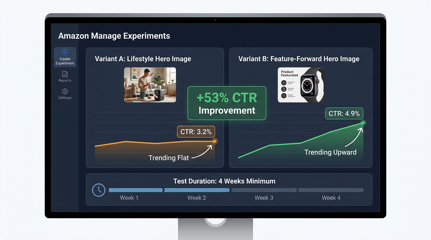
Amazon’s Manage Experiments tool — available to brand-registered sellers — is one of the most under-utilized features in Seller Central. It enables controlled A/B testing of listing content including images, and it runs tests against live traffic with statistically tracked results. In the hands of a seller who understands what to test and how to interpret results, it is a systematic conversion rate improvement engine.
What to Test First
Most sellers who access Manage Experiments start by testing the main image — which is exactly where you should start, because the main image has the highest leverage on click-through rate, which affects the entire conversion funnel downstream. A higher CTR means more sessions, which means more potential conversions from the same ad spend and the same organic ranking position.
The most productive main image tests compare images that differ on a single meaningful variable: product angle (45-degree vs. front-facing), product variant (color A vs. color B), fill percentage (85% vs. 95%), or orientation (vertical vs. horizontal). Tests that compare images differing on multiple variables simultaneously produce ambiguous results — you can’t isolate which change drove the performance difference.
Test Duration and Statistical Significance
Amazon recommends running Manage Experiments tests for at least four weeks. This is a genuine minimum, not a conservative recommendation. Week-over-week traffic variation on most listings is significant enough that a two-week test can produce misleading results — a strong week 1 for variant A followed by a strong week 2 for variant B creates a false impression of A’s superiority. Four weeks smooths these variations and produces results that reflect actual buyer behavior rather than calendar noise.
The results dashboard in Manage Experiments reports a winner with a confidence level. Only accept a result as actionable when confidence reaches 95% or higher. A 75% confidence level sounds convincing in isolation, but it means there’s a one-in-four chance the result you’re seeing is random variation. Make permanent changes only on high-confidence results.
Testing the Secondary Image Stack
After establishing your best-performing main image through testing, the highest-leverage next test is the full secondary image sequence — not individual images in isolation, but the entire ordered stack as a unit. Testing “Image Stack A” vs. “Image Stack B” with different sequencing, different image types in different slots, or different creative approaches to the infographic and lifestyle slots gives you a holistic conversion comparison rather than an incremental one.
This approach is more complex to set up but produces insights that individual image tests can’t: it tells you how the complete buyer journey through your image carousel performs, not just how individual images perform in isolation.
Reading the Data Beyond the Winner/Loser Binary
Manage Experiments reports more than just which variant performed better overall. Pay attention to revenue per session and unit session percentage alongside click-through rate. A variant that drives higher CTR but lower revenue per session may be attracting less qualified clicks — buyers who were compelled by the image but less aligned with the actual product. The ideal test winner improves CTR and unit session percentage — more clicks from better-qualified buyers.
The Visual Story Arc: Sequencing Images to Mirror the Buyer’s Exact Decision Journey
Everything discussed so far — the slot-by-slot function of each image, the mobile optimization, the technical specs, the testing discipline — operates within a larger principle that the most effective image stacks share: they tell a coherent, progressive story that mirrors the buyer’s decision-making sequence.
This is what separates a listing with good individual images from a listing with a high-converting image stack. Individual images can be technically excellent and strategically sound but still underperform if the sequence creates cognitive friction — forcing buyers to jump between emotional states, answer questions out of order, or re-orient their attention with each swipe.
Building a Narrative Thread
Think of your image stack as a six-minute conversation between your product and the buyer. In the first minute (hero image), you make a strong first impression that earns their interest. In the next few minutes (images 2 and 3), you answer their practical questions and address their concerns — you establish credibility. Then (image 4) you go deep on the product’s attributes, demonstrating expertise and quality. Then (image 5) you show them the life this product enables — you create desire. Then (images 6 and 7) you help them make the decision, removing competitive uncertainty and purchase risk.
That arc — interest, credibility, depth, desire, decision — is a conversion narrative. When it flows coherently, buyers feel guided through a logical progression that ends naturally at the add-to-cart button. When the arc is broken — when desire comes before credibility, or when depth comes before interest — buyers feel disoriented, even if they can’t articulate why, and they exit.
Visual Consistency as a Conversion Signal
Visual consistency across your image stack — consistent color palette, consistent font system, consistent use of icons and callout style, consistent overall aesthetic — functions as a trust signal. It communicates that your brand is organized, professional, and intentional. Inconsistency — a hero image with one color temperature, an infographic with a different design language, a lifestyle image with a clashing style — creates a “patchwork” impression that buyers associate with lower-quality sellers.
This doesn’t mean all images should look identical. Variety in background, format, and content is essential to keeping the carousel engaging. It means the images should share a visual identity: the same fonts, the same 2–3 accent colors used consistently, the same approach to callout design, the same overall quality level. A well-branded stack looks like it was designed by one person with a clear vision, not assembled from stock templates and different photographers over time.
Category Intelligence: Study What’s Working Before You Shoot
Before planning your image stack, spend 30–45 minutes auditing the top five listings in your category by sales rank. Screenshot their image stacks and lay them out in order. Look for patterns: What image types do the top sellers use in each slot? What backgrounds? What design approaches? Where do the high-ranked listings differ from the lower-ranked ones?
This competitive audit accomplishes two things. First, it shows you the category visual conventions — the implicit “language” that buyers in your category already understand. Working within recognizable conventions reduces cognitive friction and signals category legitimacy. Second, it identifies opportunities for differentiation — places where your image stack can be visually distinct in ways that serve conversion rather than confuse buyers.
Category differentiation for its own sake is a mistake — don’t be different just to stand out. But category differentiation that serves a specific buyer need — an infographic image that’s clearer, a lifestyle shot that’s more relatable, a comparison image that frames the choice more compellingly — is a direct conversion advantage.
Practical Audit Checklist: Evaluate Your Current Image Stack Right Now
Before building anything new, you need an honest evaluation of where your current image stack stands. Run through this checklist on every listing in your catalog:
Technical Audit
- ☐ Hero image background: true RGB 255/255/255 white?
- ☐ Hero image fill: product occupying 88–95% of the frame?
- ☐ All images at 1,600px minimum on the longest side (2,000–3,000px preferred)?
- ☐ File format JPEG, exported with quality setting 80+?
- ☐ Color profile set to sRGB?
- ☐ File size under 2MB per image?
- ☐ No text, logos, or graphics on the hero image?
- ☐ No badges, Amazon trademarks, or third-party logos on any image?
- ☐ All accessory/prop content in secondary images limited to what’s included in the product?
Strategic Audit
- ☐ Does your hero image clearly communicate what the product is at thumbnail size (120x120px)?
- ☐ Does image 2 lead with a primary benefit (not a feature)?
- ☐ Does image 3 counter the most common buyer objection in your category?
- ☐ Does your infographic image have five callouts or fewer?
- ☐ Is your lifestyle image aspirational or contextual — and is it the right type for your category?
- ☐ Is the product in use in your lifestyle image, not just present?
- ☐ Does your comparison image present attributes buyers actually care about?
- ☐ Does your final image include social proof and a risk reversal element?
- ☐ Is text in all images readable at mobile thumbnail size?
- ☐ Are your images visually consistent (same font, color system, design language)?
Testing Audit
- ☐ Are you brand-registered and using Manage Experiments?
- ☐ Have you run at least one main image test in the past 90 days?
- ☐ Are you evaluating test results at 95%+ confidence?
- ☐ Have you checked revenue per session alongside CTR in your test results?
Any “no” answer on the strategic or technical checklist is a direct conversion leak. Prioritize fixes by slot order — hero image issues first, then images 2 and 3, then subsequent slots in sequence.
Building Your Image Stack as a Sales Funnel: Final Takeaways
The fundamental shift in how you approach Amazon listing images is this: stop thinking of them as photographs of your product, and start thinking of them as a structured sales argument delivered in visual form.
Every slot has a specific job. Every job corresponds to a specific question in the buyer’s decision sequence. When each image does its job in the right order, you create a frictionless path from first impression to purchase decision — a path that your competitor’s listing, with its angle-variation gallery and amateur infographic, cannot match.
Here are the core principles to carry forward:
- Your hero image earns the click — nothing more, nothing less. Its job is CTR. Judge it on that metric and test accordingly.
- Images 2 and 3 do more conversion work than any other secondary images. They catch the buyer in their highest-engagement moment and answer the questions that determine whether they continue or exit. Invest proportionally.
- Infographic images work when they’re specific and limited. Five callouts maximum. Category-relevant attributes. Design that prioritizes hierarchy over density.
- Lifestyle images require knowing whether your category buys on aspiration or practical fit. Using the wrong type creates disconnection rather than desire.
- The final two slots close the deal. Comparison and social proof aren’t afterthoughts — they’re the images that convert buyers who are actively evaluating alternatives.
- Mobile optimization is not optional. It is the primary viewing context, and text overlays, contrast, and swipe-to-swipe information variety must all be designed for mobile first.
- Test systematically. Manage Experiments exists precisely for this. Sellers who use it consistently outperform those who rely on intuition over time, because image performance data is not accurately predictable — it’s measurable.
The sellers who treat their image stack as a sales funnel — structured, sequenced, and continuously tested — don’t just outperform on conversion rate. They outperform on every downstream metric that depends on it: ad efficiency, organic ranking velocity, return rate, and overall profitability. The image stack is not a creative exercise. It is your primary sales tool on the most competitive retail platform in the world. Engineer it like one.
Leave a Reply