Most advice on Amazon listing images starts with the camera: lighting, backgrounds, retouching. That is the wrong starting point. The listings that convert tend to be the ones where someone decided what each image had to prove before anyone took a photo.
This post treats listing images as a planning problem. It covers a brief-first method: define the shopper’s doubts, assign each doubt to an image slot, then produce and test. Note that I could not retrieve fresh third-party statistics while researching this piece, so I have left out conversion percentages. The technical specs below are Amazon’s long-standing guidelines. Confirm them in Seller Central before you ship files, because requirements change.
Why Image Problems Start Before the Shoot
A typical failed image set looks like this: seven photos of the same product from slightly different angles, plus one cluttered graphic. Every image answers the same question (“what does it look like?”) and none answer the others.
Shoppers on Amazon cannot touch the product. Images stand in for handling, measuring, and asking a salesperson. Each slot should reduce one specific uncertainty.
The cost of shooting first
Reshoots are expensive. Planning the stack on paper first means the photographer captures the right scale shots, usage scenes, and detail close-ups in one session.
Step One: Write the Doubt List
Before opening a design tool, list every reason a shopper might not buy. Mine three sources:
- Negative and 3-star reviews for your product and the top three competitors.
- Customer questions on competitor listings.
- Return reasons in your own Seller Central reports.
Group them into categories: size, fit, material, compatibility, how it works, what is included, and trust. The most frequent categories earn the earliest slots.
The Main Image: A Thumbnail Job
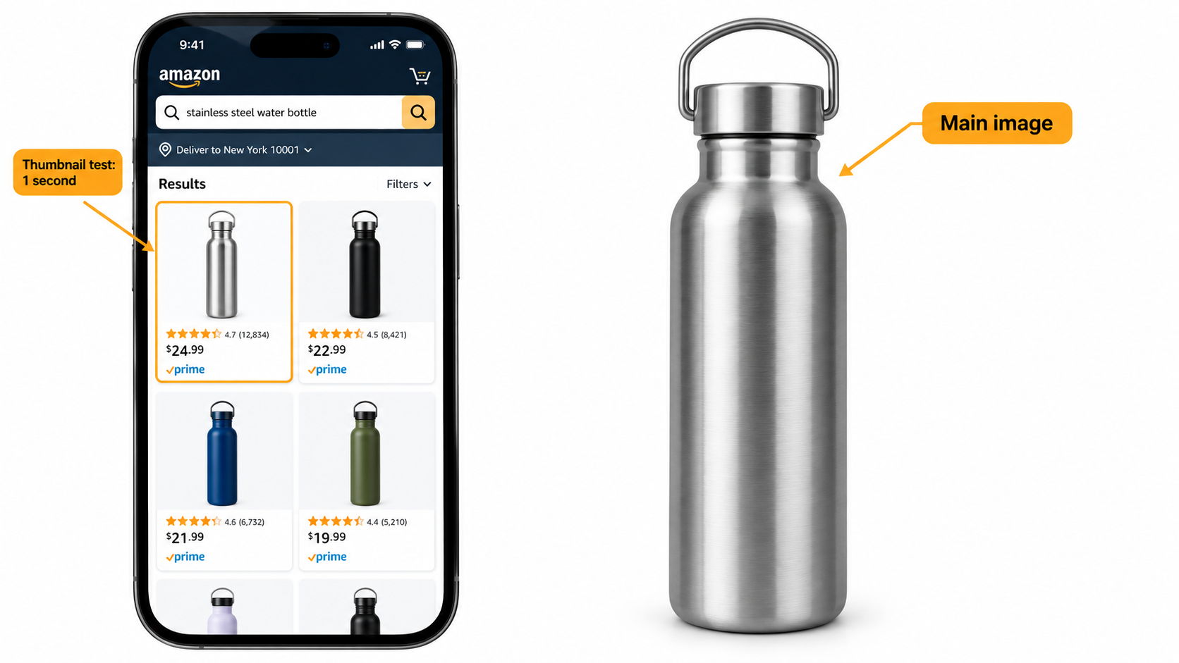
The main image does one job: earn the click from a search results page, usually viewed small on a phone. It competes against a row of similar products.
Technical rules to respect
- Pure white background (RGB 255, 255, 255).
- The product should fill roughly 85% or more of the frame.
- No text, logos, badges, or watermarks added to the image; no props that are not included.
- At least 1000 pixels on the longest side enables zoom; 2000 pixels or more is the common practice.
- Actual product, not an illustration, with accurate color.
Winning within the rules
Since everyone has a white background, differences come from angle, crop, and what is visible. Show the most identifying feature: the opening of a bottle, the dial of a grinder, the texture of a fabric. Do the one-second test: shrink the image to thumbnail size and ask whether a stranger can name the product and one distinguishing trait.
Designing the Image Stack Slot by Slot
Amazon typically allows up to seven images plus video in many categories. Treat the slots as a sequence, because many shoppers do not get past the third.
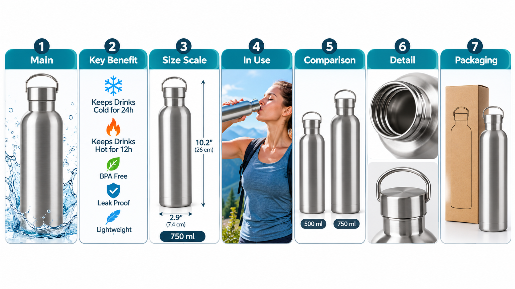
- Main: the clean hero.
- Key benefit: the single strongest reason to buy, stated in a few words.
- Scale: the product with a hand, a person, or a familiar object, or labeled dimensions.
- In use: a realistic scene for the primary use case.
- Comparison or “what’s included”: variants, kit contents, or a simple comparison against generic alternatives.
- Detail: material, stitching, ports, or mechanism.
- Trust or secondary use: certifications you can document, warranty, or an alternate use.
Reorder to match your doubt list. A product that is returned for size issues should put scale in slot two.
Infographic Text That Actually Gets Read
On mobile, small text disappears. Keep overlay copy to a short headline of a few words and at most three supporting labels. Use high contrast and large type.
Rules of thumb
- One message per image.
- Test legibility at phone-thumbnail size, not on your monitor.
- Only make claims you can substantiate; unverifiable claims create compliance and review risk.
- Keep the text consistent with your bullet points so the page does not contradict itself.
Lifestyle Images: Credibility Over Aesthetics
A lifestyle shot should look like the product’s real context. A kitchen tool belongs in a believable kitchen, used by a plausible person. Overly staged scenes can feel like stock photography and reduce trust.
Match the scene to the buyer. If your reviews show a surprising use (for example, travelers buying a product designed for home), reflect it in a secondary slot.
Video and Alternative Formats
Product video can sit in the same gallery and often answers questions that stills cannot, such as how a mechanism works. Keep early seconds informative, and design for sound-off viewing with captions. Categories vary in what extras are available, so check what your listing supports.
Testing: Treat the Stack as a Hypothesis
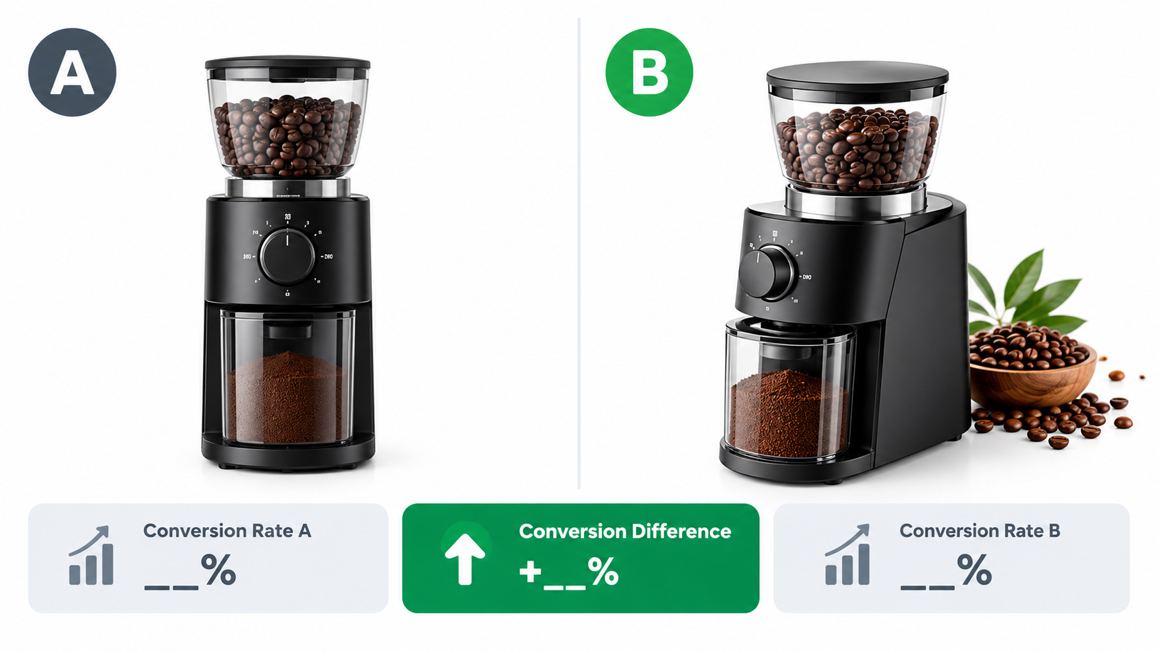
Amazon’s Manage Your Experiments tool, available to Brand Registry sellers, lets you test main images and other content against a variant. Third-party tools exist as well.
How to run a clean test
- Change one variable: angle, crop, or one infographic.
- Let it run until the tool reports a statistically meaningful result, rather than stopping at the first lead.
- Avoid testing during promotions or stockouts, which distort traffic.
- Record each result in a shared log so lessons accumulate.
Judge on conversion rate and click-through rate separately. A main image can raise clicks while attracting poorly qualified shoppers.
Compliance and Common Rejection Causes
- Text or badges on the main image.
- Product cropped or filling too little of the frame.
- Props that suggest items not included.
- Low resolution that blocks zoom.
- AI-generated or heavily edited visuals that misrepresent the product. Keep imagery faithful to what ships.
Check Amazon’s current style guide for your category, as apparel, jewelry, and other categories have specific rules.
A Production Checklist
- Build the doubt list from reviews, questions, and returns.
- Assign each top doubt to a slot.
- Write a shot list with the text for each infographic.
- Shoot with both hero and in-use scenes in one session.
- Review every image at thumbnail size on a phone.
- Upload, then test one variable at a time.
- Revisit the doubt list quarterly using new reviews.
Conclusion
Good listing images are decisions made in advance. Start with what shoppers fear, assign each fear to a slot, keep the main image simple and recognizable, and test changes one at a time. The camera is the last step, not the first.
Next action: pull your last 50 reviews and returns, write the doubt list, and compare it with your current seven images. The gaps will tell you what to reshoot.
Leave a Reply