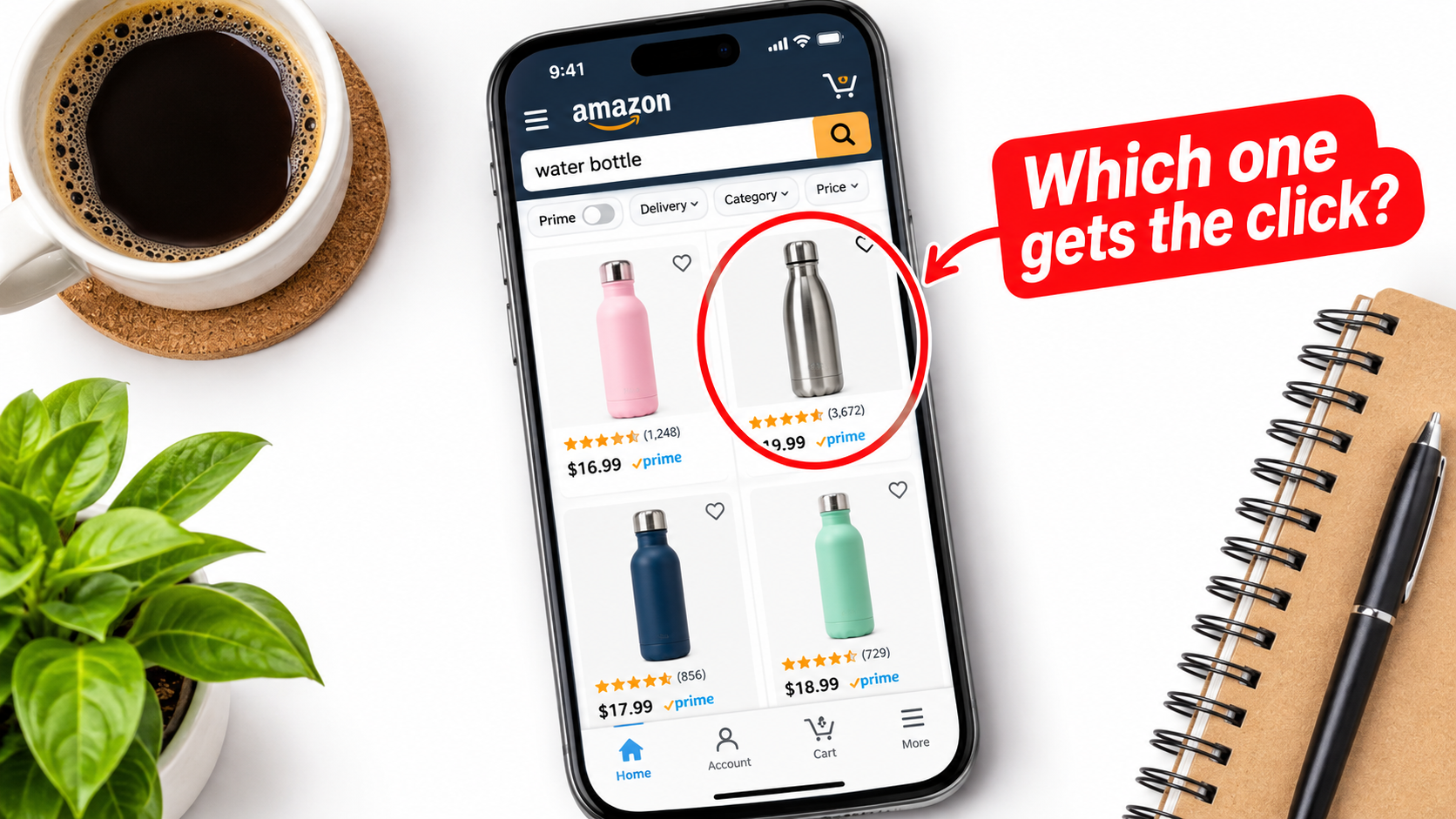
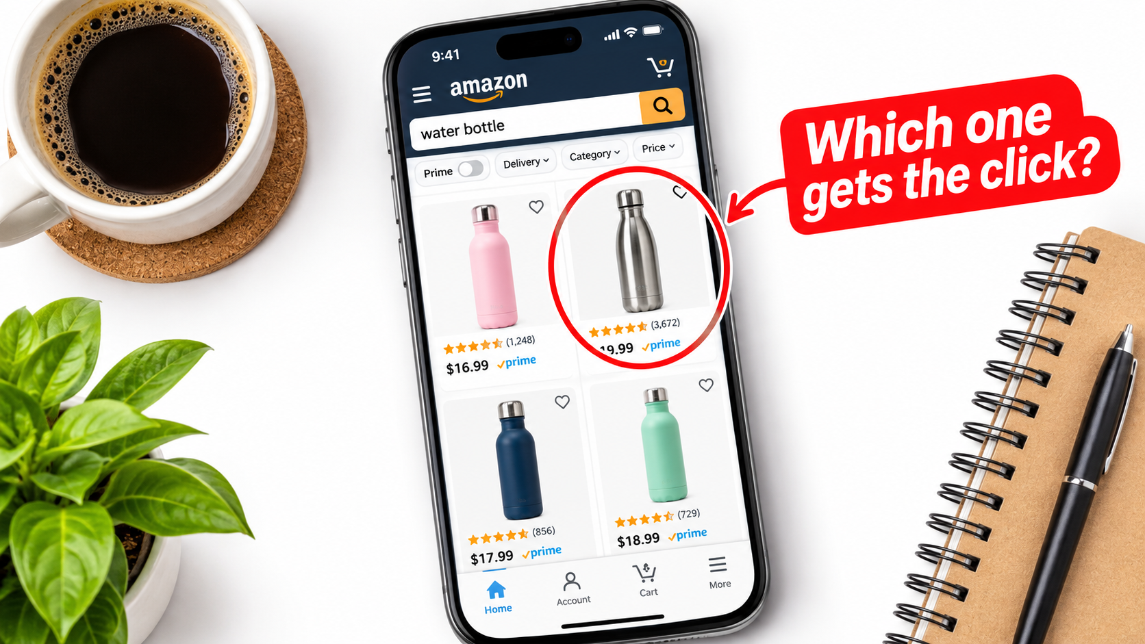
Most advice about Amazon listing images reads like a spec sheet. White background, 1000 pixels, nine slots, done. Those rules matter, but they only get an image approved. They do not get it chosen.
A better way to think about it: every image in your listing answers a question a shopper is silently asking. Is this the thing I searched for? How big is it? Will it work for me? Is it better than the one next to it? Can I trust this seller?
This article builds an image strategy around those questions. It covers the technical rules, the role of each slot, mobile behavior, production on a budget, and how to test changes without fooling yourself.
A note on sources: I could not pull fresh third-party data while preparing this piece, so I have deliberately avoided quoting conversion statistics. Where I describe rules, check them against Amazon’s current Seller Central style guide for your category, since requirements vary and change.
The Real Job of Each Image
A listing has two audiences at two moments. In search results, the shopper sees only your main image, small, next to competitors. On the detail page, they see the full stack and decide whether to buy.
These are different jobs. The main image earns the click. The remaining images earn the purchase. Mixing them up is the most common mistake: sellers cram benefits into the main image and then waste secondary slots on repeats of the same angle.
Think in terms of questions
Before shooting anything, write down the ten questions a buyer needs answered. Pull them from your reviews, your competitors’ reviews, and the Q&A section. The one-star reviews are especially useful, because they tell you what the images failed to prevent.
Typical categories of question include size, material, compatibility, what is in the box, how it is used, and how it differs from alternatives. Each image should retire one or two of them.
Main Image: Win the Thumbnail
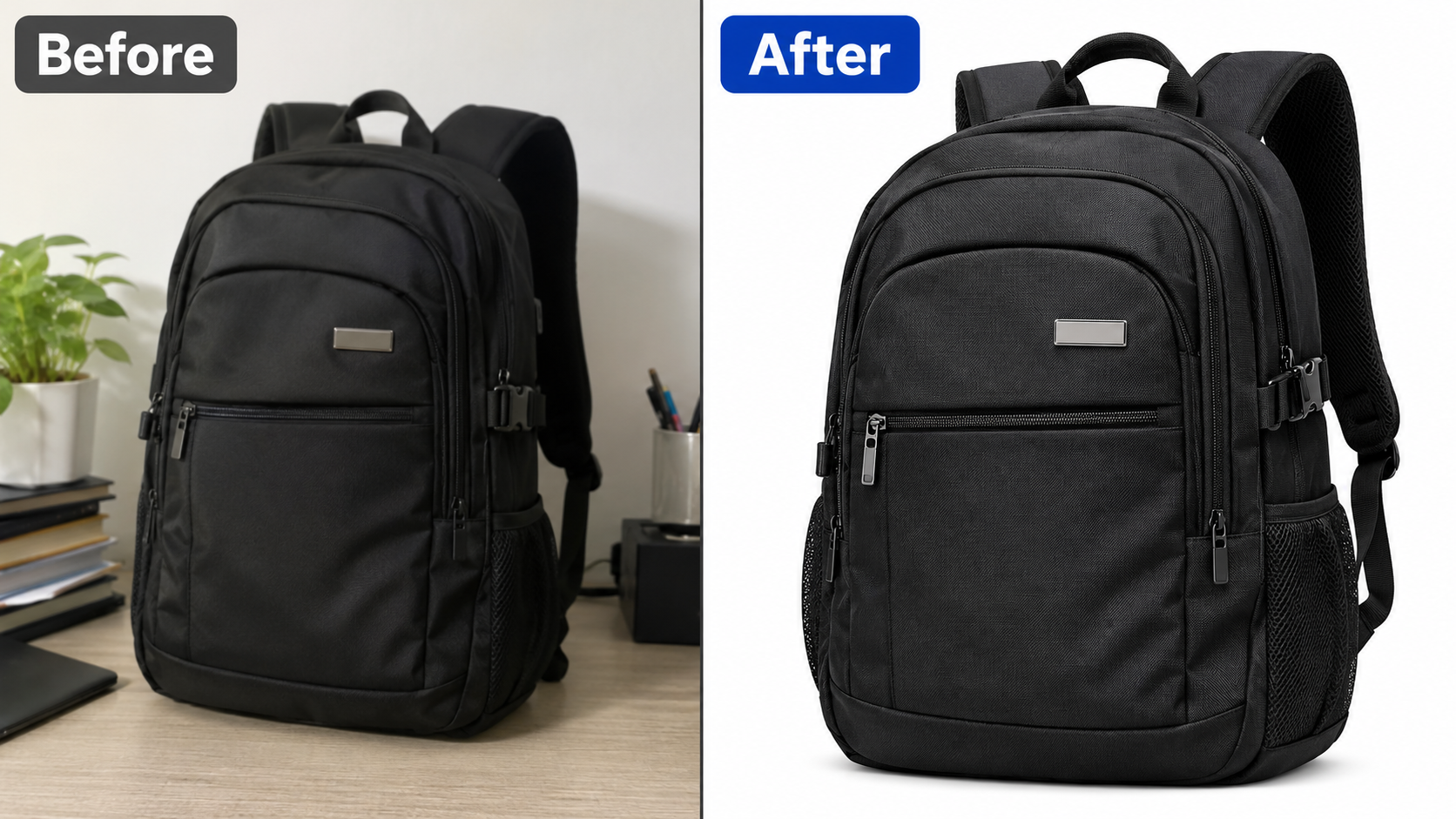
The main image has strict rules. In general, Amazon requires a pure white background (RGB 255, 255, 255), the product as the dominant element, no text, logos or watermarks added over the image, and no props that are not included in the sale. The product should fill most of the frame, commonly cited as around 85 percent. Images should be large enough to enable zoom, with 1000 pixels on the longest side the commonly recommended minimum.
Always confirm the exact rules for your category, since apparel, jewelry and others have their own conventions.
What actually differentiates a main image
If everyone follows the same rules, the differences are in the choices the rules leave open.
- Angle: A three-quarter view usually shows depth and shape better than a flat front view. Pick the angle that makes the product’s identity obvious.
- Fill: Crop tight within the rules. A product that is small in the frame looks small in the grid.
- Lighting: Soft, even light with a gentle shadow gives dimension. Flat, blown-out lighting makes products look like cutouts.
- Contents: If you sell a set, showing everything included can signal value instantly, provided the rules allow it.
- Color accuracy: Mismatched color is a leading cause of returns. Calibrate your shots.
Do the thumbnail squint test
Take a search results screenshot for your main keyword. Place your image into it and shrink the view to phone size. Squint. Can you identify the product, its color, and a reason to click it, within a second? If a competitor stands out more, find out why before changing anything.
The Image Stack as a Conversation
Treat the secondary images as a sequence, not a set. Shoppers swipe through the first few and often stop. So order them by importance, with the strongest answer to the biggest objection in slot two.
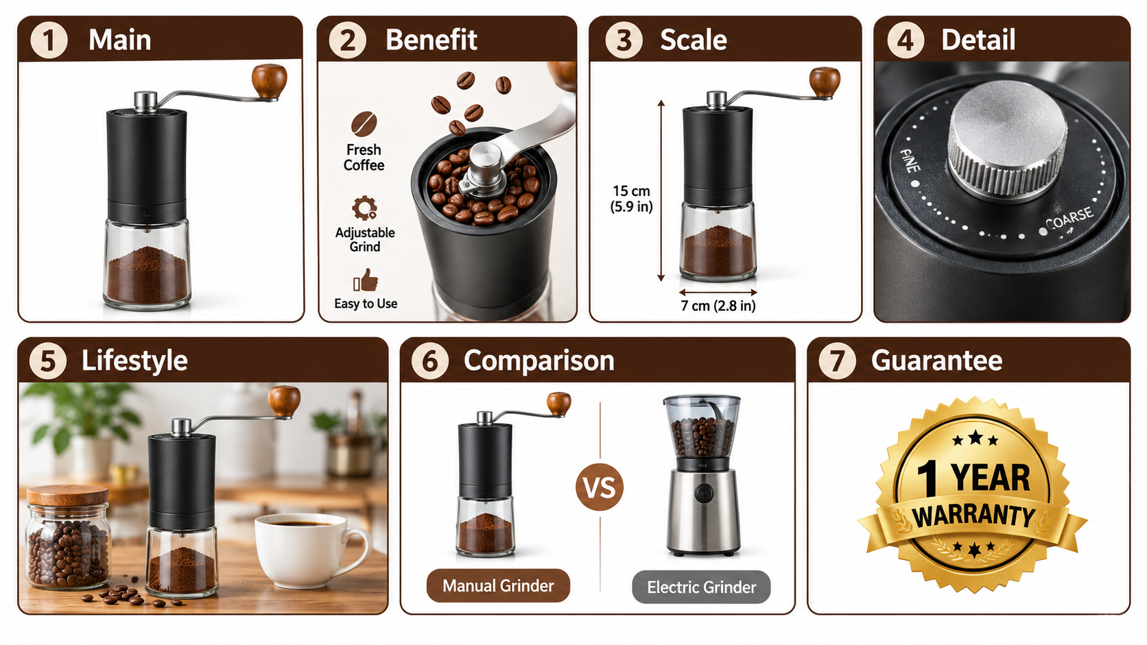
Amazon allows several secondary images, commonly up to eight in addition to the main slot, plus video. Use them, but only if each one says something new.
Slot-by-Slot Framework
Slot 2: The primary benefit
Lead with the single strongest reason to buy, shown rather than listed. One headline, one visual proof. If the product’s value is speed, show the before and after time. If it is durability, show it under stress.
Slot 3: Scale and size
Size confusion drives returns and negative reviews. Show the product in a hand, next to a familiar object, or with dimension lines. This is one of the cheapest images to make and one of the most useful.
Slot 4: Detail and materials
Close-ups of the features that justify the price: stitching, finish, ports, mechanisms. Use short callouts with arrows. Keep text large enough to read on a phone.
Slot 5: Lifestyle in context
Show the product being used by the kind of person who buys it, in a believable setting. Avoid over-staged scenes. The goal is for the buyer to imagine owning it.
Slot 6: Comparison or how it works
A simple comparison chart against generic alternatives, or a three-step usage diagram, reduces uncertainty. Do not name competitor brands, and keep claims you can substantiate.
Slot 7: Trust and what is included
Warranty, certifications you actually hold, package contents, and support. Close with reassurance rather than another feature.
Designing for the Phone First
A large share of Amazon browsing happens on mobile, so design for a narrow screen. Image text that looks fine on a desktop becomes unreadable on a phone.
- Use a minimum of large, bold text, with one idea per image.
- Keep key elements away from the edges, where cropping or interface overlays can interfere.
- Check high contrast between text and background.
- Preview every image at actual phone size before uploading.
A useful rule: if you cannot read an infographic arm’s length away on your own phone, rewrite it with fewer words.
Infographics That Inform Instead of Decorate
Many infographic images fail because they list features without hierarchy. A buyer does not want eight bullet points on an image; they want to understand the product.
A simple structure
- A short headline stating the benefit.
- One dominant product visual.
- Three callouts at most, tied to visible parts of the product.
Make sure the text on the image matches your listing copy and does not make claims the category forbids, such as unsupported medical or “best seller” language.
Producing Quality Without a Studio Budget
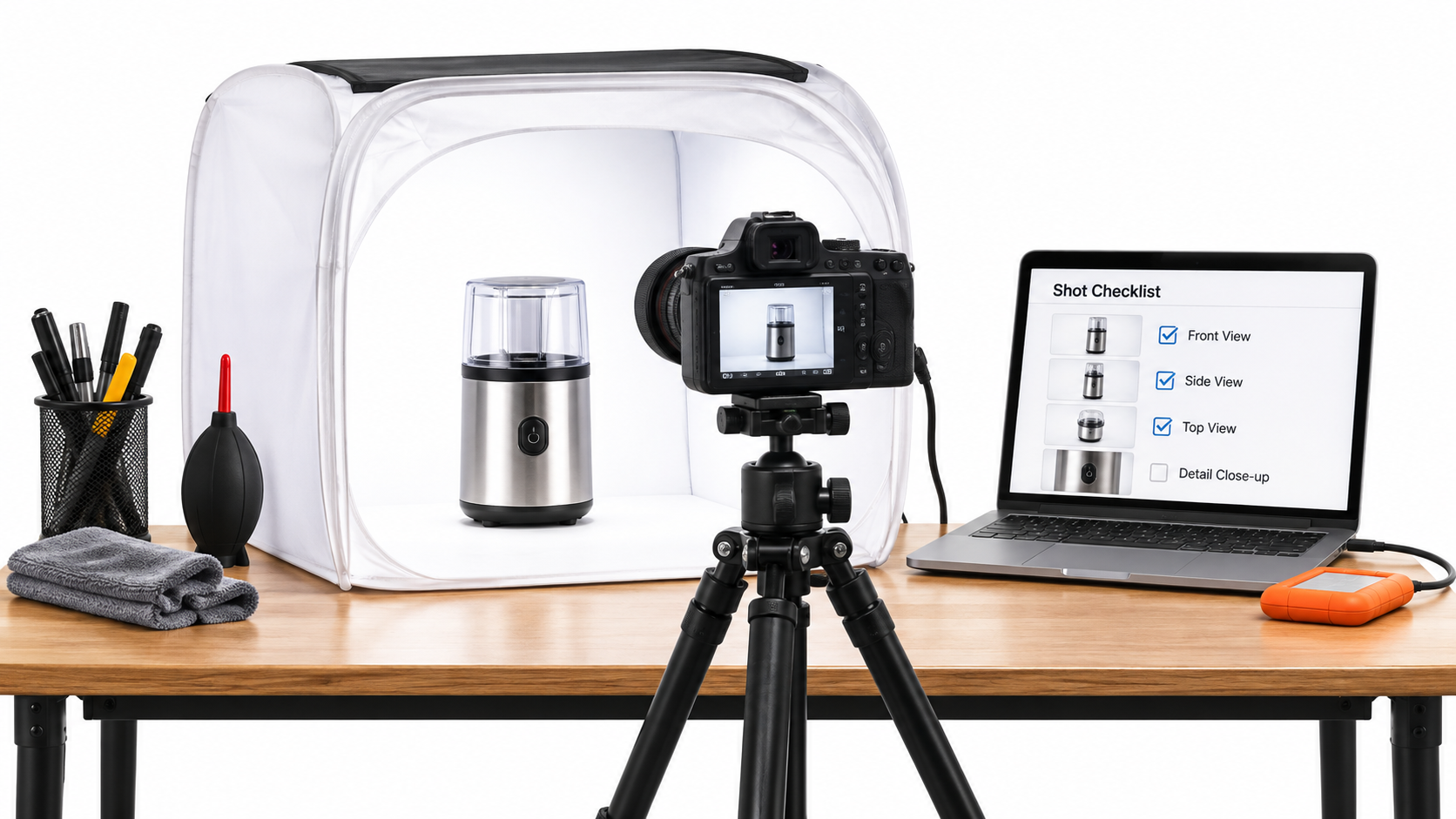
You do not need an expensive setup to start. A light tent, a tripod, consistent lighting, and a decent camera or recent smartphone can produce clean main images. Shoot in the highest resolution available and edit conservatively.
When to hire out
Hire a professional for lifestyle shots with people, complex products with reflective surfaces, and any hero product that drives most of your revenue. Do the simple ones, like scale and detail, yourself.
A note on AI-generated imagery
AI tools can help with backgrounds, mockups and variants, but the product shown must be accurate. Amazon has been tightening expectations around misleading imagery, so never let a generated image alter the real product’s shape, color or features. Review current policy before relying on it.
Testing: How to Learn Without Fooling Yourself
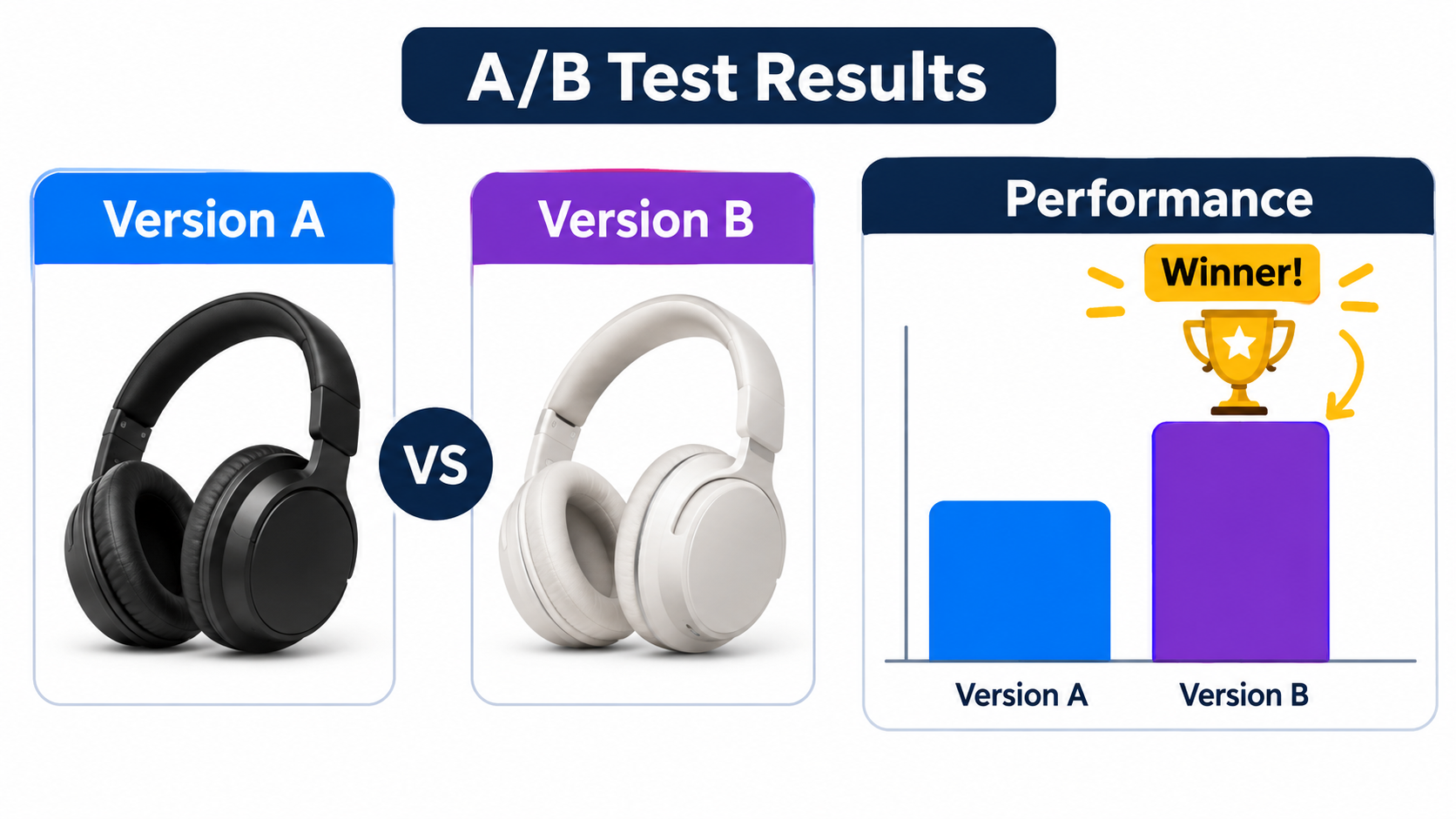
Brand-registered sellers can use Amazon’s Manage Your Experiments to compare two versions of main images, A+ content and other elements. It splits traffic, so you are not comparing this week with last week, which is the mistake most sellers make when they swap an image and watch sales.
Rules for clean tests
- Change one variable at a time.
- Run long enough to reach the reported significance, rather than stopping early on a lucky streak.
- Test the highest-traffic listings first, since they reach results faster.
- Record every result, including the losses.
If you cannot run formal experiments, compare before and after periods only when advertising, pricing and seasonality are stable, and treat the results as directional.
Common Mistakes That Quietly Cost Sales
- Repeating angles. Five images of the same front view answer one question five times.
- Small, unreadable text. Fine on a monitor, useless on a phone.
- Misleading composition. Props or accessories that are not included cause returns and complaints.
- Inconsistent style. Different fonts, colors and lighting across the stack look careless.
- Ignoring reviews. Your customers already told you what confused them.
- Setting and forgetting. Competitors change. Revisit images at least quarterly.
A Practical Checklist and Next Steps
- Collect the top ten buyer questions from reviews and Q&A.
- Audit your main image against the top five competitors at phone size.
- Map each question to a slot. Cut or rewrite repeats.
- Reshoot or redesign scale, detail and comparison images first. They are cheap and effective.
- Check technical compliance: white background, no overlays on the main image, sufficient resolution.
- Test your main image using Manage Your Experiments, then the second slot.
- Review results, log learnings, and repeat.
The goal is not a prettier gallery. It is a listing where every image removes a reason not to buy. Start with the questions, and the layouts tend to follow.
Leave a Reply