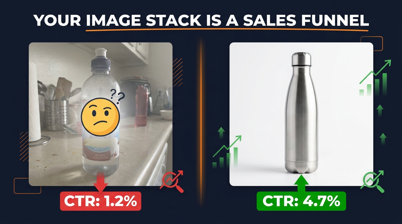
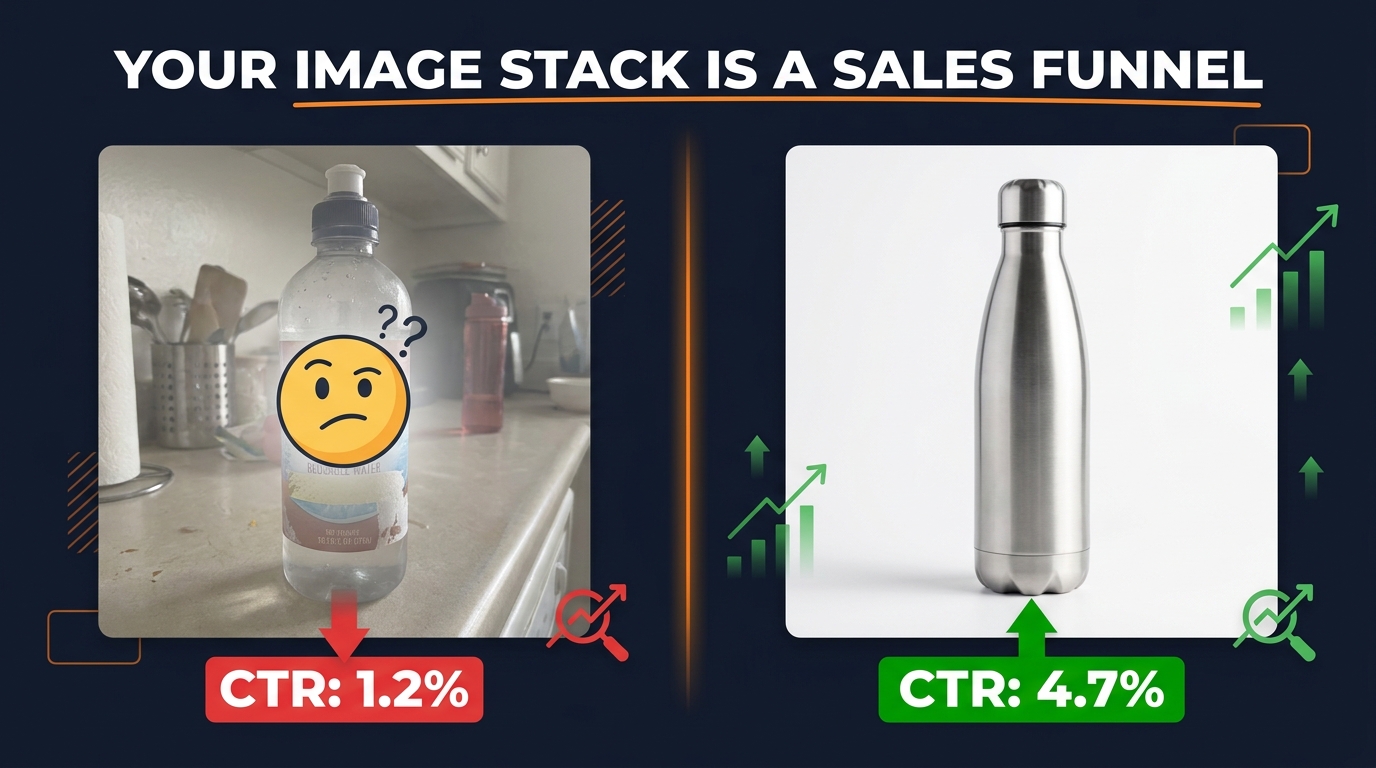
Most Amazon sellers think about their image stack the same way they’d think about a product brochure: show the item, add some lifestyle photos, toss in an infographic. Done.
That approach will get you average results — if you’re lucky. Because the sellers who are quietly outconverting you aren’t just putting up better photos. They’re thinking about each image slot as a distinct moment in a buyer’s decision-making process. Each slot has a job. Each job builds on the last. And when the whole stack works together, it functions less like a gallery and more like a sales conversation that closes itself.
This post isn’t about technical specs (though we’ll cover them). It’s not about lighting setups or which camera to use. It’s about the decision science underneath every click that turns a browse into a buy — and how to engineer that into each one of your nine available image slots.
Amazon gives you up to nine image slots per ASIN. The average seller uses six. The average high-converting seller treats every single one as a strategic asset with a measurable purpose. What follows is a slot-by-slot breakdown of what each image should actually be doing, why the order matters more than most sellers realize, and how to audit your existing stack with a practical framework you can apply today.
The Silent Sales Funnel Living Inside Your Image Stack
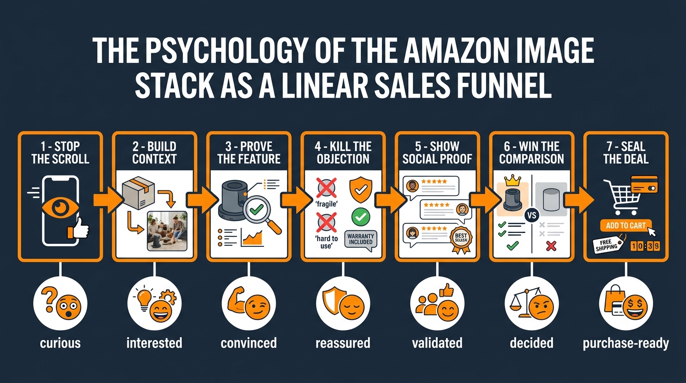
In traditional sales, you work through a sequence: get attention, build interest, create desire, prompt action. Amazon’s image stack mirrors this almost perfectly — but most sellers scramble the order, repeat the same information across multiple slots, or skip emotional triggers entirely in favor of product specifications.
The result? Shoppers who arrive at a listing, scroll two images, and leave. Not because they disliked the product — but because the visual conversation didn’t give them a reason to stay.
Why Buyers Look at Images Before Reading Anything
Eye-tracking research in ecommerce consistently shows that shoppers interact with product images before they read titles, bullet points, or pricing context. On Amazon specifically, images dominate the upper-left of the screen on mobile — the highest-attention zone — while text lives below and to the right. This isn’t a coincidence. Amazon’s interface is designed around how people actually shop.
The implication for sellers is significant: your images are your first — and often your only — sales pitch. A shopper who doesn’t make it past the third image is almost never going to read your bullet points. Whatever case you need to make for your product needs to be embedded in the visual experience before you ask anyone to scroll to your copy.
The Sequence Problem
When you put a lifestyle image second and a close-up texture shot third and a size infographic sixth, you’re creating a sequence that doesn’t follow any logical buyer journey. It’s visually inconsistent, which means shoppers have to do mental work to assemble the story themselves. Most won’t bother.
A deliberately sequenced stack answers questions in the order buyers actually ask them. The first question is never “What’s the fabric weight?” The first question is “Is this worth my attention?” — and everything follows from there.
Mapping Buyer Psychology to Image Slots
Here’s a simplified map of how buyer psychology moves through the image stack, and what each stage demands:
- Images 1–2: Attention and orientation. The buyer is asking, “Is this relevant to what I searched?” and “Does it look credible?”
- Images 3–4: Evaluation. “Does it do what I need it to do?” and “What could go wrong?” This is where most purchases are won or lost.
- Images 5–6: Validation. “Am I making a smart choice?” Buyers want external confirmation — social proof, expert endorsement, comparison data.
- Images 7–9: Conviction. “Is there anything I’m missing?” These slots serve the most scrutinous buyers — the ones who need one final reason to commit.
Every image you place in the wrong phase of this sequence creates friction. And friction, in ecommerce, translates directly into abandoned carts and lost revenue.
Slot 1 — The Main Image: Winning the Scroll, Not Describing the Product
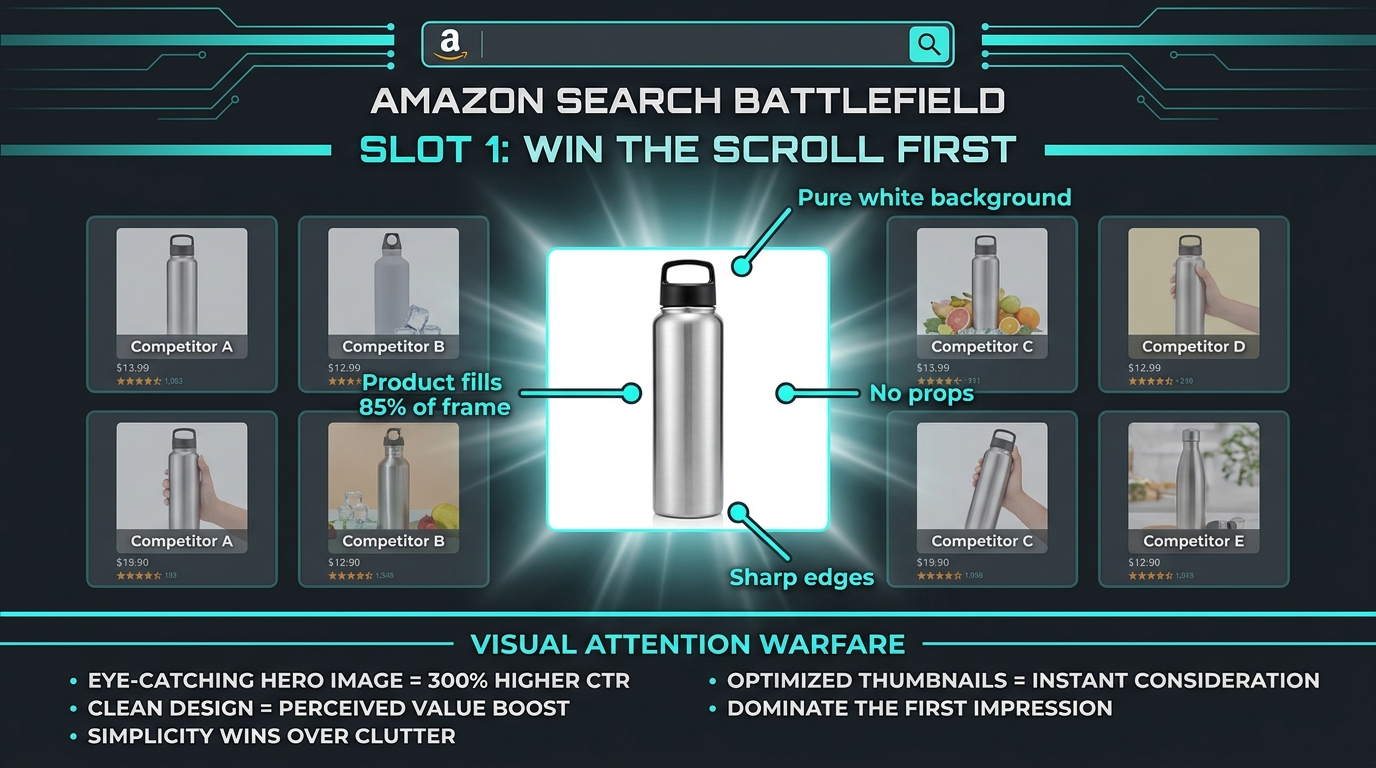
Your main image has one job, and it’s not to explain your product. Its job is to win attention in a grid of thumbnails so that a shopper clicks through to your listing instead of one of the thirty other options competing for the same keyword.
Amazon’s guidelines are explicit here: pure white background (RGB 255, 255, 255), no props, no text, no watermarks, product filling at least 85% of the frame. Those constraints aren’t arbitrary. They’re designed to create a level playing field in search — and within that playing field, the sellers who win clicks are the ones who understand what “winning attention” actually means at thumbnail size.
The Thumbnail Problem Most Sellers Ignore
Most sellers optimize their main image by looking at it full-size on a desktop monitor. This is exactly wrong. Your main image will be seen first as a roughly 200×200 pixel thumbnail in search results on a mobile screen. At that size, fine detail disappears. Text becomes illegible. Product edges blur together.
The question to ask isn’t “Does this look good on my screen?” It’s “Does this image read clearly in a small grid next to eight other thumbnails on an iPhone?” That changes how you approach lighting, product angle, and negative space.
What Actually Drives Click-Through Rate
Several factors consistently distinguish high-CTR main images from average ones:
- Product angle: The best-performing angle is the one that communicates the product’s primary value proposition fastest. For a backpack, that’s a three-quarter front view that shows capacity and design simultaneously. For a kitchen knife, that’s a side profile that communicates sharpness through blade geometry. There’s no universal “right” angle — the right angle is the one that does the most communication in the least amount of visual space.
- Product scale: Filling 85% of the frame isn’t just a rule — it’s a signal of confidence. Products that look small in their thumbnails look cheap. Products that fill the frame look substantial.
- Shadow and depth: A subtle, natural drop shadow is technically within Amazon’s guidelines (it cannot be a styled prop shadow, but a natural product shadow is acceptable). Sellers who add dimension to their main images through careful lighting often see measurably better CTR over a flat, washed-out white-on-white shot.
- Color contrast: If your product is white, ivory, or beige, the default white background will make it disappear. The fix is aggressive lighting to create perceptible edges, or considering whether a variant in a more visible color should lead the listing.
The “Thumbnail Test” Protocol
Before you commit to any main image, run this three-step test. First, shrink it to roughly 200×200 pixels and look at it in isolation. Second, create a mock grid of your image alongside five competitor thumbnails pulled directly from the search page for your target keyword. Third, ask someone who isn’t familiar with your product to look at the grid for two seconds and then tell you which product caught their eye. If it isn’t yours, you haven’t won the scroll. You’ve lost the first battle before the listing page ever loads.
Slot 2 — The Context Bridge: From “What Is It?” to “Is This for Me?”
Once a shopper clicks through to your listing, the first secondary image they see — slot 2 — needs to immediately answer the question every shopper brings onto your page: “Is this actually what I was looking for?”
The main image told them what the product is. Slot 2 tells them who it’s for and where it fits into their life. This is the context bridge, and it’s one of the most underused opportunities in the entire image stack.
Lifestyle Imagery Done Right vs. Done Wrong
Most sellers know they need a “lifestyle image” somewhere in their stack. But they often put it in the wrong slot or execute it in a way that doesn’t create identification with the target customer.
A lifestyle image fails when it’s generic: a smiling person holding a product in a bright kitchen. It works when it’s precise: a 35-year-old woman in running gear placing your electrolyte powder into a gym bag after an early-morning workout. Every visual detail in that frame signals to a specific customer segment that the product belongs to them. The setting, the character, the moment, the other objects in the frame — all of it does targeting work that your bullet points can’t do nearly as well.
The Identity Signal in Slot 2
Human beings make purchase decisions partly through identity: “This is the kind of product that a person like me uses.” The slot 2 image is your best opportunity to trigger that recognition. Show your ideal buyer — not a stock photo model, but a representation specific enough that your target customer sees themselves.
This means knowing who your buyer is before you design your images. If you’re selling a premium kitchen knife, the slot 2 image for the home cook segment looks different from the slot 2 image for the professional chef segment, even if the product is identical. The setting, the context, the emotional tone — all of it should reflect the buyer’s self-image, not just the product’s features.
Environmental Storytelling
Beyond the human element, the environment in slot 2 does significant storytelling work. The right background, lighting mood, and companion objects communicate product quality through association. A skincare product shown on a marble bathroom counter with soft morning light reads as premium before the buyer reads a single word. The same product shown on a plain table reads as functional. Neither is wrong — they’re just selling to different buyers with different expectations.
The key principle: every element in your slot 2 image should be a deliberate choice that reinforces the specific brand position and buyer identity you’re targeting. Accidents in product photography don’t help you. Intentional visual decisions do.
Slot 3 — The Feature Proof Frame: Why Bullet Points Fail Where Images Succeed
Slot 3 is where many sellers default to their first infographic — and where a critical mistake often happens. The mistake is turning this image into a feature list: five bullet points inside a graphic box, surrounded by icons, laid over the product image. Visually busy, informationally dense, and almost completely ineffective.
The reason is simple: that approach is just your bullet points with pictures added. It doesn’t use the unique power of a visual medium — which is to demonstrate rather than describe.
Demonstration Over Description
There’s a fundamental hierarchy between telling a buyer that your bag is waterproof and showing water beading off the bag’s surface in a close-up shot. The image proves the claim. The text makes it. Proof is always more persuasive than assertion — and in a marketplace where every seller is making the same claims about quality, durability, and value, visual proof is one of the few ways to genuinely differentiate.
Slot 3 should be built around your single most important product claim — the feature that, if believed, would be most likely to move a buyer toward a purchase. Then it should show that feature in the most visually compelling way possible. Not described, demonstrated.
The One-Claim Rule
The temptation to pack multiple features into one image is strong, especially when you have limited slots. Resist it. The cognitive science here is clear: an image with one clear message converts better than an image with three competing messages. When buyers can’t immediately grasp what an image is trying to communicate, they move on. Clarity wins over comprehensiveness every time in a scroll environment.
Reserve the multi-feature breakdown for later slots, after you’ve established credibility through proof. A buyer who already trusts your primary claim will engage more willingly with a denser information image later in the stack. Hit them with dense content too early, before they’re invested, and they’ll bounce.
Close-Up Shots and Material Proof
For physical goods where material quality matters — apparel, furniture, tools, personal care products — a macro close-up of material, construction, or finish serves as powerful feature proof. A stitching close-up on a leather wallet. A thread count detail on premium bedding. A blade edge under controlled lighting on a kitchen knife.
These images don’t need heavy graphic design treatment. A clean, beautifully lit close-up, perhaps with a single short callout (“Full-grain leather — no bonding layers”), does more work than a feature-list infographic in the same slot. The visual itself carries the argument.
Slot 4 — The Objection Eliminator: Turning Hesitation Into Add-to-Cart
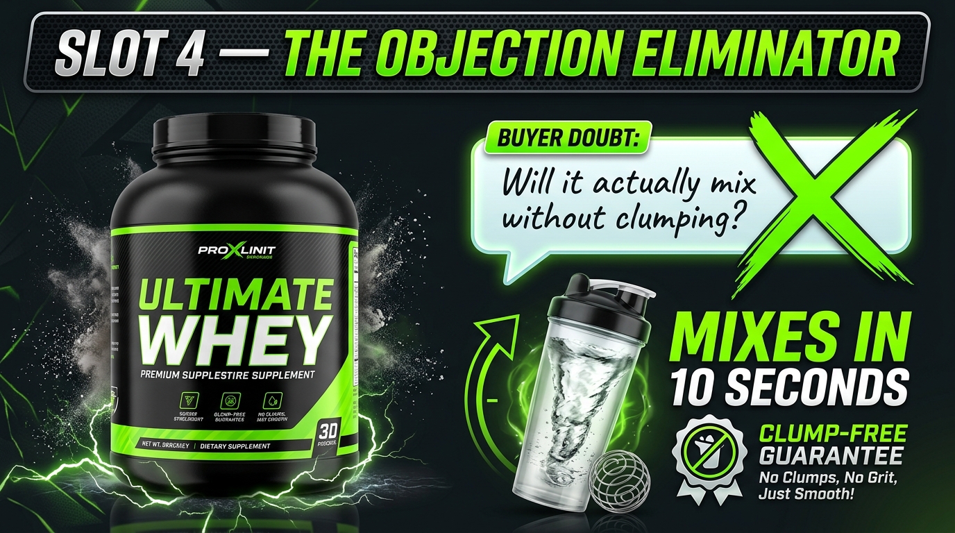
Slot 4 is, by a significant margin, the most underutilized image in most sellers’ stacks. It’s also the slot with the highest potential impact on conversion rate — because it’s positioned exactly where most buyers are on the edge of a decision.
By the time a shopper reaches image four, they’re interested. They’ve stayed longer than a casual browser. But something is holding them back — and that something is almost always a specific objection that, if left unanswered, will send them back to the search results.
Mining Your Reviews for Objections
The most effective way to build slot 4 is to open your product’s review section and read every one-star and two-star review you’ve ever received. Not to feel bad about them — to extract the objections that exist in your category. What do buyers say they were worried about before buying? What disappointed them in a way that reflects a misaligned expectation? What did they complain about that competitors also get dinged on?
These are your objections. Every common theme in your negative reviews represents a hesitation that lives in the minds of buyers who haven’t reviewed yet — because they didn’t buy.
If you don’t have reviews yet, read your top competitors’ reviews instead. You’re entering the same category with the same buyer concerns. Mining competitor reviews for objections and addressing them proactively in your images is a legitimate competitive advantage that most new sellers never think to exploit.
How to Visually Address an Objection
The structure of an objection-eliminating image is: state the fear, then demolish it with evidence. Not defensively — confidently. Show the fear acknowledged and the answer provided. This works better than simply making a positive claim because it demonstrates that you understand the buyer’s concerns, which builds trust.
Examples of this approach executed well:
- A baby carrier brand whose reviews showed parents worried about back strain: slot 4 image shows anatomical diagram of weight distribution with orthopedic certification badge.
- An outdoor cooler with complaints about lid seal quality: slot 4 shows the cooler fully submerged in water with the lid intact, with a callout reading “Submersion-tested. Zero leakage.”
- A supplement with skepticism about taste: slot 4 shows a close-up of the drink mixed in a clear glass, with a badge showing “Blind taste test: 94% rated it 5 stars.”
Each of these takes the specific fear — back pain, leaking, bad taste — and converts it into a visual proof point. That’s slot 4 working at full capacity.
The Review-Driven Image Cycle
Your objection image should not be a “set and forget” asset. As your review base grows, new objections emerge. Categories evolve. Buyer expectations shift. The best sellers revisit their slot 4 image every quarter, check what the most recent concerns are, and update accordingly. This makes your image stack a living conversion tool, not a static asset that ages out of relevance.
Slot 5 — The Social Proof Visual: How to Show That People Love This
By slot 5, you’ve established what the product is, who it’s for, what it does, and why specific fears about it are unfounded. Now the buyer needs external validation. They need to know that real people have made this purchase and been satisfied — and they need to see that evidence without leaving the image stack to go read reviews.
This is where social proof imagery earns its place. But “social proof imagery” means something more specific than a five-star badge slapped over your product photo.
Types of Social Proof That Translate to Images
Social proof in the image stack can take several forms, each with different effectiveness depending on your category:
- Star rating callouts with volume: “4.8 Stars — Over 12,000 Reviews” is a powerful signal, but only when the volume is substantial. Small review counts with high ratings actually underperform in buyer psychology compared to larger volumes at slightly lower ratings. If you have significant review volume, make it visible. If you don’t, hold this image slot for a different purpose until you do.
- User-generated content integration: A grid of real customer photos using your product — with permission — creates authentic proof that design-only imagery can’t replicate. Even a single UGC photo integrated into a clean graphic treatment carries credibility that studio photography doesn’t, because buyers know it’s real.
- Press and media mentions: If your product has been featured in recognizable publications, slot 5 is where that logo wall earns its keep. “As Seen In: Forbes, Good Housekeeping, Wirecutter” carries immediate credibility transfer. This only works if the publications are genuinely recognizable to your buyer demographic.
- Expert endorsements: A quote from a relevant professional — a registered dietitian for a nutrition product, a certified personal trainer for fitness equipment — serves as specialist validation. It must be real, attributed, and specific to be effective. A generic “experts recommend” callout accomplishes nothing.
- Award badges: Industry award recognition, “Best of” designations, or certification marks from recognized bodies translate credibility visually in a way that’s immediately parseable at scroll speed.
Why Authenticity Is Non-Negotiable Here
Social proof imagery fails — or worse, actively damages conversion — when buyers sense it’s manufactured. A stock-photo “testimonial” with an obviously staged smile. A rating badge with no volume number. A media logo that isn’t actually linked to a real review of your specific product. Buyers in 2026 are experienced digital shoppers with well-developed skepticism. Any proof claim that can’t survive two seconds of scrutiny is a liability, not an asset.
If you don’t have robust social proof yet, don’t fake it. Use slot 5 for a secondary feature demonstration instead, and build this image when you have real proof to show.
Slot 6 — The Comparison Frame: Winning Without Naming Names
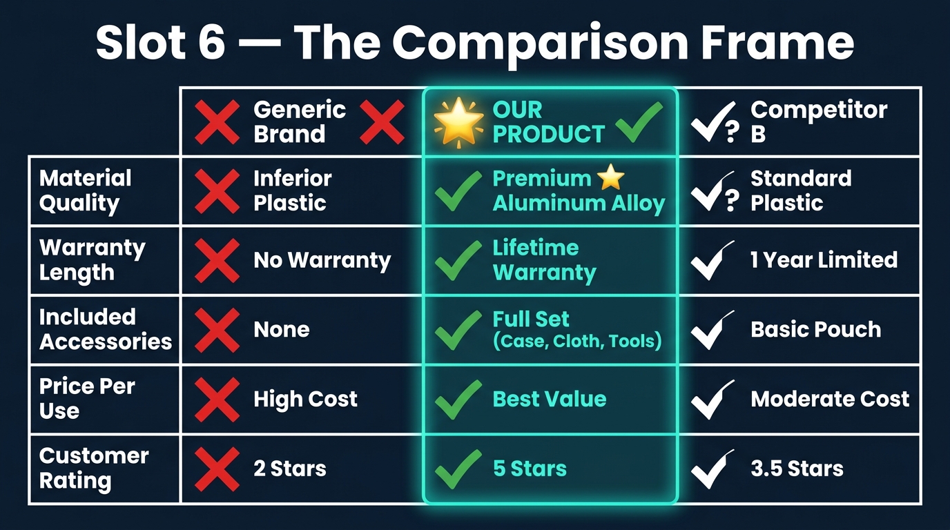
Amazon prohibits explicit competitor comparisons that name specific brands and make disparaging claims. What it doesn’t prohibit is positioning your product against a category standard — and slot 6 is the perfect place to execute that positioning through a well-designed comparison chart.
The psychological principle at work is contrast: buyers evaluate options relative to alternatives. When you control the comparison frame, you control which dimensions of comparison are most visible. A well-designed comparison chart in slot 6 makes your product’s advantages the measuring stick by which the entire category is evaluated.
Building the Comparison Without Naming Competitors
The standard format is a three-column grid: “Others” or “Standard Option” on the left (with red X marks), your product in the center (highlighted, with green checkmarks), and a second “standard” option on the right. The column labels avoid brand names entirely — they use category descriptors instead: “Standard Model,” “Basic Option,” “Typical Alternative.”
The rows should be the attributes that matter most to your buyer and where your product genuinely has an advantage. This last part is critical: the comparison only works if your advantages are real. Buyers who purchase based on a comparison chart and then discover the advantages were exaggerated leave reviews that will undermine your future conversion rate. The comparison frame should be a confident statement of real differentiation, not wishful positioning.
Choosing the Right Attributes
The most effective comparison attributes are the ones that connect directly to the objections from slot 4. If your slot 4 image addressed fears about durability, your slot 6 comparison should include a warranty or build-specification row. If slot 4 addressed taste concerns for a food product, slot 6 might compare ingredients or formulation standards.
This creates thematic coherence across your image stack — the same concerns get addressed from multiple angles, which compounds the persuasive effect. A buyer who saw their durability concern addressed in slot 4 and then sees it reinforced in a comparison chart in slot 6 has now received that message twice through different visual formats. Repetition in this context builds conviction, not annoyance.
Design Principles for Readable Comparison Charts
A comparison chart that can’t be read in three seconds has failed its purpose. The most common design mistake is too many rows and too much text — eight comparison points with paragraph-style descriptions that require zooming in to parse. At mobile image sizes, this becomes completely unreadable.
Limit your comparison to five attributes maximum. Use icons alongside text labels for each row. Use bold color contrast (teal or green for your column, grey or red for the competitor columns) so the visual hierarchy is immediately clear. And keep every text element in the chart readable at the size it will actually appear on a buyer’s phone screen.
Slots 7, 8, and 9 — The Deep Conviction Layer
Buyers who make it to image seven are a specific type: they’re highly interested, likely nearly decided, but they need one or two final pieces of information before they’re ready to commit. These are not casual browsers — they’re serious evaluators. The tone and content of your later image slots should reflect that.
What the “Conviction Layer” Buyer Needs
By slot 7, the buyer has already absorbed your primary value proposition, your context, your feature proof, your objection responses, your social proof, and your competitive positioning. They don’t need more of the same. They need something different: information that speaks to the logistics of ownership rather than the desirability of the product.
This includes:
- What’s in the box: A clean flat-lay of every included item, labeled. This addresses a low-level but persistent concern: “Am I getting everything I need, or will I need to buy additional parts?” Resolving this visually before purchase prevents disappointed reviews from buyers who expected a complete kit.
- Size and scale reference: For any product where dimensions are critical to fit or function — furniture, wearables, tools, children’s products, kitchen equipment — a size reference image showing the product next to a recognizable object (or on a person, or with a dimensional diagram) reduces the “it looked bigger online” return reason substantially.
- Care and use instructions (visual format): For products that have a learning curve or maintenance requirements, a simple step-by-step visual guide in later image slots converts the uncertainty of “can I actually use this correctly?” into confidence. This is particularly effective for kitchen appliances, skincare devices, fitness equipment, and baby products.
- Brand story image: For brands with a meaningful origin story, a crafted brand image in one of the later slots — showing manufacturing, sourcing, or founding mission — can create emotional investment at the moment a buyer is nearly committed. This works especially well for small-batch, artisan, or mission-driven brands where the story is a genuine differentiator.
The Video Thumbnail Slot
Amazon allows sellers to include a product video that appears as an additional media item in the image carousel. On desktop, it appears as an additional slot with a video icon. On mobile, it’s embedded in the image scroll. This slot is frequently left empty by sellers who don’t have video content — which is a significant missed opportunity.
A product video in the 45–90 second range that demonstrates the product in use, covers key features visually, and includes customer testimonials can function as a condensed version of your entire image stack — plus motion, which is inherently more engaging than static images. For categories where product use isn’t immediately obvious, video has been shown to significantly reduce return rates by aligning buyer expectations with product reality before the purchase is made.
Mobile-First Image Design: The 375px Reality Most Sellers Are Still Ignoring
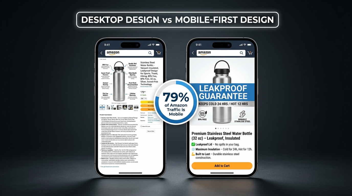
The majority of Amazon shopping happens on mobile devices. When you design your listing images on a 27-inch desktop monitor at full resolution, you are designing for a minority of your buyers. When you publish those images without testing them on a phone screen, you’re gambling that what looks good at 2000×2000 pixels will still communicate effectively at the 375-pixel width of a standard smartphone display.
Often, it doesn’t.
What Breaks on Mobile
Several common image design choices that look fine on desktop become serious conversion problems on mobile:
- Small callout text: Feature callout text that’s 18–24 points in a design program renders at roughly 9 points on a phone screen. That’s below comfortable reading threshold for most people, and below usable threshold for anyone over 40. Text in your secondary images needs to be dramatically larger than it feels necessary on a desktop monitor.
- Multi-column infographic layouts: A two-column or three-column feature breakdown that’s legible on desktop becomes a dense, unreadable block on mobile. Stick to single-column vertical layouts for any text-heavy image in your stack.
- Low-contrast color combinations: Grey text on white, or navy text on dark blue — both can be readable on a high-resolution monitor and completely inaccessible on a budget Android screen in a sunlit room. Test your image color combinations on a real device outdoors before finalizing.
- Thin line icons: Fine-line icon styles that look sophisticated on desktop disappear on mobile. Use bold, filled icon styles for any informational graphics that need to be parseable on a phone screen.
The Mobile Design Protocol
Before approving any image for your listing, run it through this mobile-specific review:
- Open the image on your smartphone — not in a design preview, but as a saved image in your camera roll.
- Hold the phone at normal reading distance. Can you read every text element without pinching to zoom?
- Can you identify the key message of the image within two seconds, without zooming?
- Does the image maintain its visual impact in a bright environment (simulate outdoor viewing by adjusting your phone brightness)?
If any of these tests fail, the image needs revision before it goes live. This protocol should be non-negotiable for every asset in your stack.
Amazon’s Mobile Image Display Logic
On mobile, Amazon’s product page shows the main image prominently, followed by a horizontally scrollable image strip. Buyers swipe through images in order. This means the transition between images — not just each individual image — matters. If images 3, 4, and 5 are all visually similar (same background color, same layout template, same graphic style), they’ll blur together as the buyer swipes, and the informational distinction between them will be lost.
Use visual variety across your stack — different background tones, different layout orientations, different primary colors per section — so each image reads as a distinct moment in the visual sequence. Variety maintains attention as the buyer swipes. Uniformity creates a visual monotone that buyers tune out.
How to Audit Your Existing Image Stack Using the “Next Slide” Test
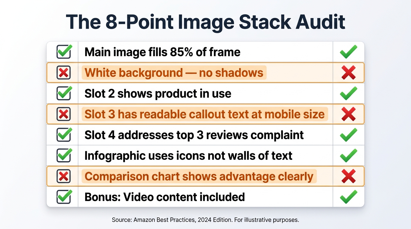
Most sellers never evaluate their image stack as a complete system. They review images individually — “this one looks good, that one needs better lighting” — without assessing whether the stack as a whole is performing a coherent conversion function. The “Next Slide” test is a structured audit framework that evaluates your image stack the same way a buyer experiences it.
Running the Next Slide Test
Pull up your listing on your phone. Go through each image, but before swiping to the next one, answer these two questions out loud:
- What does this image tell the buyer that the previous image didn’t? Every image should introduce new information, new emotional context, or new proof. If you can’t answer this question, the image is redundant — it’s taking up a slot that could be doing conversion work.
- Does this image give the buyer a reason to see the next one? Each image should create mild forward momentum — a visual or informational hook that makes the next slot feel necessary. If an image feels like a complete stopping point, you may be closing the sequence too early or breaking the flow.
Do this exercise for every image in your stack. Note where the answers break down — where you can’t identify what new information is being added, or where the momentum drops off. These are your optimization priorities.
The Eight-Point Structural Checklist
Beyond the narrative flow test, use this structural checklist to evaluate your stack for common technical and strategic gaps:
- Does your main image fill at least 85% of the frame on a pure white background?
- Does slot 2 clearly show the product in use by a representative member of your target customer?
- Does slot 3 prove your single most important product claim visually — not just describe it in text?
- Have you read your reviews and built slot 4 around the most common hesitation buyers express?
- Is your social proof in slot 5 verifiable, specific, and backed by real volume data?
- Does your comparison chart in slot 6 highlight attributes where you genuinely outperform the category standard?
- Does your later-slot content address “what’s in the box,” scale/dimensions, or product use guidance?
- Have you tested every image on a mobile device at arm’s length, in a bright environment, without zooming?
Any “no” answer on this checklist is a concrete optimization opportunity with a direct line to conversion rate. Prioritize the earlier slots first — improvements to slots 1–4 tend to have the largest impact because they affect the broadest portion of your traffic.
Using Manage Your Experiments for Data-Backed Decisions
Amazon’s “Manage Your Experiments” feature, available to brand-registered sellers, allows you to A/B test your main image against an alternate version across real traffic to your listing. This is one of the highest-value tools available to Amazon sellers for image optimization — and among the most underused.
Run a test with your current main image against a challenger that changes one variable: the product angle, the background treatment, the product fill percentage, or the lighting style. Let it run for a minimum of four weeks to achieve statistical significance. The data it returns — click-through rate and conversion rate by image variant — is more reliable than any design instinct or competitor imitation strategy.
Sellers who build systematic testing into their image strategy — rotating through variables, measuring results, and iterating based on data — consistently outperform those who optimize images once and leave them. Your image stack is not a launch deliverable. It’s an ongoing asset that should improve continuously alongside your review volume, your category knowledge, and your buyer feedback.
The Economics of Getting This Right: What Conversion Rate Actually Costs You
Before concluding, it’s worth grounding all of this in economics — because the ROI of image optimization is frequently misunderstood. Sellers who spend time and budget on their image stack sometimes view it as a creative expense. It isn’t. It’s a revenue lever with a calculable return.
The Multiplier Effect of Conversion Rate
Consider a listing with 5,000 sessions per month and a conversion rate of 8%. That’s 400 units sold. Raise the conversion rate to 11% through image optimization — a modest, achievable improvement — and you’re selling 550 units on the exact same traffic. No additional ad spend. No keyword changes. No price adjustments. Just more of the buyers already visiting your page making the decision to purchase.
At any margin above zero, that 37.5% increase in units represents pure additional profit from an investment you’ve already made in driving traffic. Conversion rate improvement is the highest-leverage optimization available to most Amazon sellers because it amplifies the return on every other dollar you spend to generate visits.
Images vs. Price as a Conversion Lever
When conversion rate is low, many sellers reach first for the price lever — they discount, they run coupons, they undercut competitors. This works in the short term but erodes margins, trains buyers to expect lower prices, and creates a race to the bottom in competitive categories.
Poor images are a more common cause of low conversion rates than price misalignment. A buyer who doesn’t trust the product based on visual evidence won’t be converted by a 10% discount. A buyer who can clearly see that this product will solve their specific problem, is trusted by thousands of other buyers, and outperforms the category standard on the dimensions that matter — that buyer will pay a premium, not demand a discount.
Image optimization is, in many categories, the most effective way to sustain price integrity while improving conversion. The sellers who’ve figured this out compete differently — they’re not in the discount war, they’ve exited it entirely by building listings that justify their price point through visual evidence.
Conclusion: Your Image Stack Is a Team, Not a Collection
Nine image slots. Nine distinct jobs. One coherent buyer journey.
The sellers who treat their image stack as a collection of individual photos will always be outcompeted by those who treat it as a system — each slot playing a specific role, each image building on the last, the whole sequence moving buyers through attention, evaluation, validation, and decision with deliberate intent at every step.
The framework in this post gives you the structure to evaluate, build, and test that system for any ASIN in your catalog. Start with an audit using the Next Slide Test and the eight-point checklist. Identify your weakest slot — it’s almost certainly slot 4, the objection eliminator, based on what we see across most sellers’ stacks. Rebuild that slot using your review data. Then work outward.
The improvement won’t happen overnight. But every slot you optimize adds incrementally to your conversion rate — and as we’ve established, conversion rate improvements are the highest-leverage investments available in your Amazon operation. The work is specific, measurable, and repeatable.
Key Takeaways:
- Each image slot has a specific psychological job in the buyer’s decision process. Understand the job before designing the image.
- Slot 4 (the objection eliminator) is the most underused, highest-impact image in most sellers’ stacks. Build it from your negative reviews.
- Design all images for mobile first — test on a real phone at arm’s length before publishing anything.
- Use Amazon’s Manage Your Experiments tool to A/B test your main image against real traffic data.
- Treat your image stack as a living conversion asset — update it as your reviews, category competition, and buyer behavior evolve.
- Conversion rate improvement is more sustainable than price discounting as a growth lever. Great images let you compete on quality, not price.
Leave a Reply